
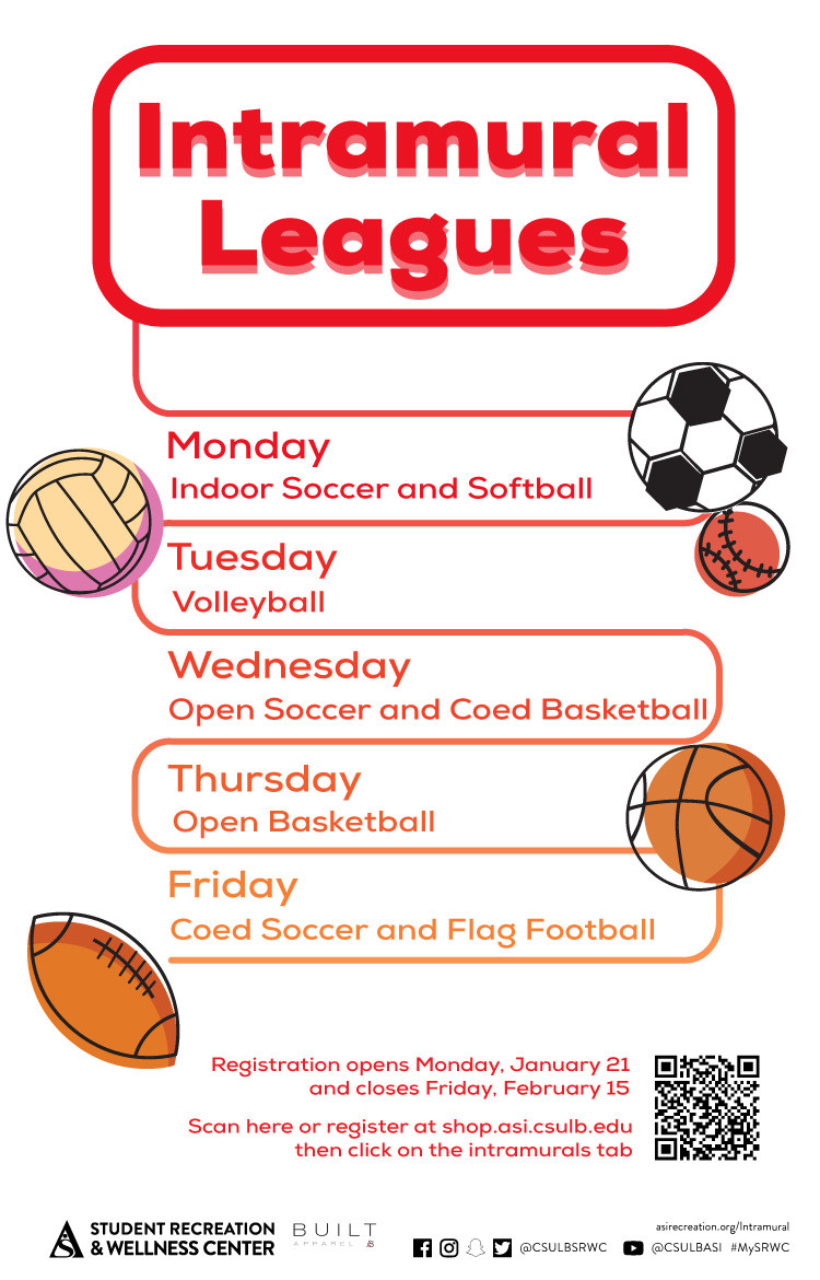
BEGIN:VCALENDAR
VERSION:2.0
PRODID:DPCALENDAR
CALSCALE:GREGORIAN
BEGIN:VTIMEZONE
TZID:America/Los_Angeles
X-MICROSOFT-CDO-TZID:13
BEGIN:DAYLIGHT
DTSTART:20260308T100000
TZOFFSETFROM:-0800
TZOFFSETTO:-0700
TZNAME:PDT
END:DAYLIGHT
BEGIN:STANDARD
DTSTART:20261101T090000
TZOFFSETFROM:-0700
TZOFFSETTO:-0800
TZNAME:PST
END:STANDARD
BEGIN:DAYLIGHT
DTSTART:20270314T100000
TZOFFSETFROM:-0800
TZOFFSETTO:-0700
TZNAME:PDT
END:DAYLIGHT
END:VTIMEZONE
X-WR-TIMEZONE:America/Los_Angeles
BEGIN:VEVENT
DTSTART;TZID=America/Los_Angeles:20170322T100000
DTEND;TZID=America/Los_Angeles:20170324T190000
RRULE:FREQ=WEEKLY;BYDAY=MO,TU,WE,TH,FR;INTERVAL=1;UNTIL=20170324T235900Z
EXDATE:20170323T170000Z,20170324T170000Z
UID:8481D995-1D5D-4E2C-99AD-5461FF45B94B
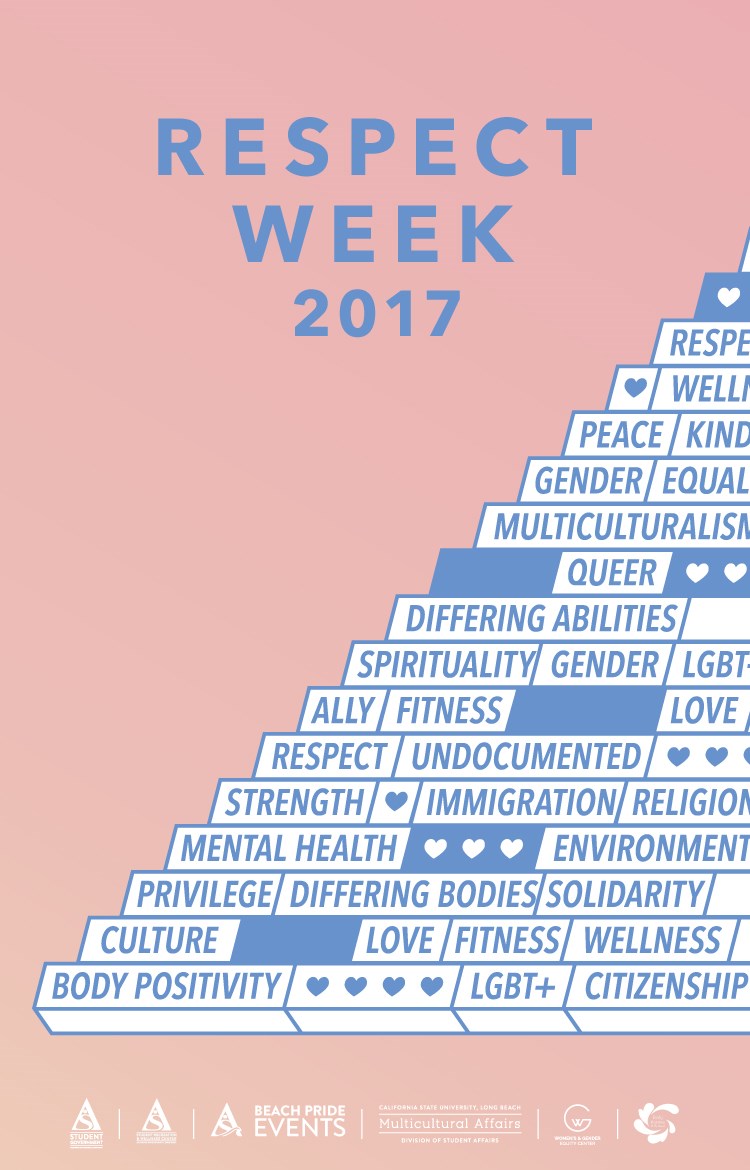
SUMMARY:Respect Week 2017
DTSTAMP:20170209T184500Z
DESCRIPTION:\N    \N        \N            \N                \N                    \N                        \N                            \N                                \N                                    Date\N                                    3/22 - 3/24\N                                \N                                \N                                    Location\N                                    SRWC & USU\N                                \N                                \N                                    Time\N                                    Varies\N                                \N                            \N                            \N                                \N                                    Description\N                                    Wednesday, March 22\N                                                                            \N                                        Respecting Differences in Interfaith Dialogue | 12 - 1PM | USU-303\N                                        Self Defense Class | 5 - 7PM | SRWC Main Court C\N                                        Wheelchair Basketball | 5 - 7PM | SRWC Main Court C\N                                    \N                                    Thursday, March 23\N                                                                            \N                                        Respect Fest | 11AM - 1PM | USU North Lawn\N                                    \N                                    Friday, March 24\N                                                                            \N                                        VIP Friday | 10AM - 12PM | SRWC Main Court C\N                                        Social Justice in the Classroom | 12 - 1:30PM | MCC Conference Room\N                                    \N                                \N                            \N                        \N                    \N                              \N              \N        \N        \N            \N        \N    \N 
X-ALT-DESC;FMTTYPE=text/html:<div class="container-fluid">    <div class="row">        <div class="col-md-6">            <div class="container-fluid module_round_box-gray">                <div class="row">                    <div class="col-md-12">                        <div class="container-fluid">                            <div class="row">                                <div class="col-md-4">                                    <small>Date</small>                                    <p style="font-weight: 500; font-size: 1.2em;">3/22 - 3/24</p>                                </div>                                <div class="col-md-4">                                    <small>Location</small>                                    <p style="font-weight: 500; font-size: 1.2em;">SRWC &amp; USU</p>                                </div>                                <div class="col-md-4">                                    <small>Time</small>                                    <p style="font-weight: 500; font-size: 1.2em;">Varies</p>                                </div>                            </div>                            <div class="row">                                <div class="col-md-12">                                    <small>Description</small><br />                                    <p style="font-weight: 500; font-size: 1.2em;"><strong>Wednesday, March 22</strong></p>                                    <ul style="font-weight: 500; font-size: 1.2em;">                                                                                <li>Respecting Differences in Interfaith Dialogue | 12 - 1PM | USU-303</li>                                        <li>Self Defense Class | 5 - 7PM | SRWC Main Court C</li>                                        <li>Wheelchair Basketball | 5 - 7PM | SRWC Main Court C</li>                                    </ul>                                    <p style="font-weight: 500; font-size: 1.2em;"><strong>Thursday, March 23</strong></p>                                    <ul style="font-weight: 500; font-size: 1.2em;">                                                                                <li>Respect Fest | 11AM - 1PM | USU North Lawn</li>                                    </ul>                                    <p style="font-weight: 500; font-size: 1.2em;"><strong>Friday, March 24</strong></p>                                    <ul style="font-weight: 500; font-size: 1.2em;">                                                                                <li>VIP Friday | 10AM - 12PM | SRWC Main Court C</li>                                        <li>Social Justice in the Classroom | 12 - 1:30PM | MCC Conference Room</li>                                    </ul>                                </div>                            </div>                        </div>                    </div>                </div>                          </div>          </div>        <div class="col-md-6">            <img src="images/enjoy/calendar/respect-week-2017-poster.jpg" alt="Respect Week 2017 poster" />        </div>    </div></div> 
LOCATION:
GEO:0.00000000;0.00000000
LAST-MODIFIED:20170321T221210Z
X-ACCESS:1
X-HITS:136
X-URL:
X-COLOR:007DAA
END:VEVENT
BEGIN:VEVENT
DTSTART;TZID=America/Los_Angeles:20171113T140000
DTEND;TZID=America/Los_Angeles:20171116T150000
RRULE:FREQ=WEEKLY;BYDAY=MO,TU,WE,TH,FR;INTERVAL=1;UNTIL=20171116T235900Z
EXDATE:20171114T220000Z,20171115T220000Z,20171116T220000Z
UID:96EA61BC-866C-4C17-AA1C-52C2CD86120C
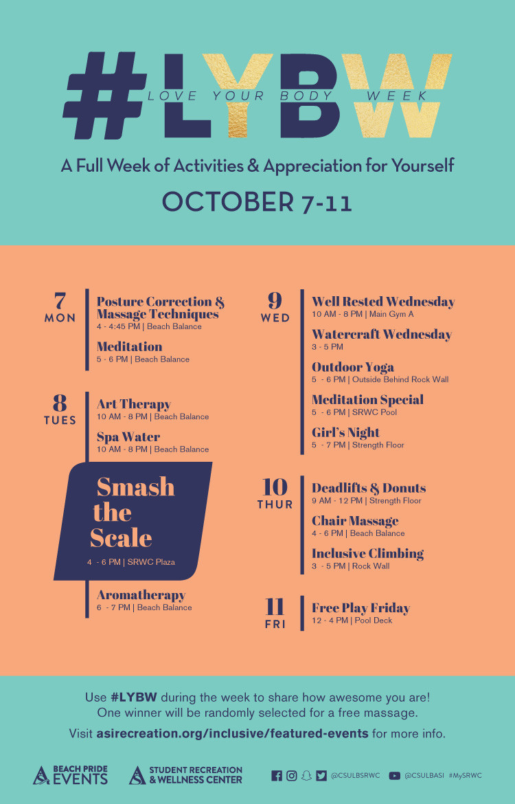
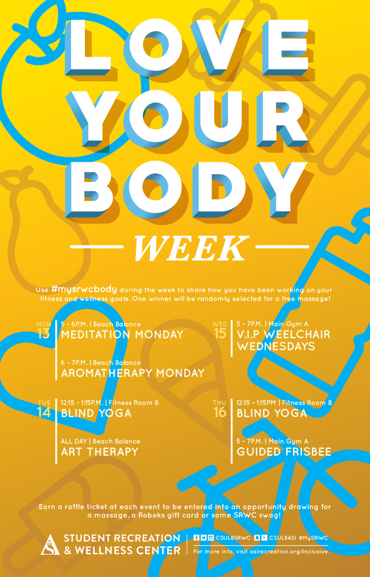
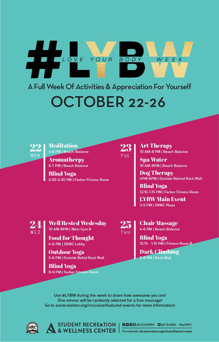
SUMMARY:Love Your Body Week
DTSTAMP:20171109T224617Z
DESCRIPTION:\N    \N        \N            \N                \N                    \N                        \N                            \N                                \N                                    Date\N                                    Varies\N                                \N                                \N                                    Location\N                                    Varies\N                                \N                                \N                                    Time\N                                    Varies\N                                \N                            \N                            \N                                \N                                    Description\N                                    \N                                \N                            \N                        \N                    \N                              \N              \N        \N        \N            \N        \N    \N
X-ALT-DESC;FMTTYPE=text/html:<div class="container-fluid">    <div class="row">        <div class="col-md-6">            <div class="container-fluid module_round_box-gray">                <div class="row">                    <div class="col-md-12">                        <div class="container-fluid">                            <div class="row">                                <div class="col-md-4">                                    <small>Date</small>                                    <p style="font-weight: 500; font-size: 1.2em;">Varies</p>                                </div>                                <div class="col-md-4">                                    <small>Location</small>                                    <p style="font-weight: 500; font-size: 1.2em;">Varies</p>                                </div>                                <div class="col-md-4">                                    <small>Time</small>                                    <p style="font-weight: 500; font-size: 1.2em;">Varies</p>                                </div>                            </div>                            <div class="row">                                <div class="col-md-12">                                    <small>Description</small>                                    <p style="font-weight: 500; font-size: 1.2em;"></p>                                </div>                            </div>                        </div>                    </div>                </div>                          </div>          </div>        <div class="col-md-6">            <img src="images/enjoy/calendar/love-your-body-week-fall-2017-poster.jpg" alt="Love Your Body Week poster" />        </div>    </div></div>
X-ACCESS:1
X-HITS:0
X-URL:
X-COLOR:007DAA
END:VEVENT
BEGIN:VEVENT
DTSTART;TZID=America/Los_Angeles:20180201T160000
DTEND;TZID=America/Los_Angeles:20180201T163000
RRULE:FREQ=MONTHLY;BYDAY=1TH,2TH;INTERVAL=1;UNTIL=20180510T235900Z
EXDATE:20180209T000000Z,20180302T000000Z,20180309T000000Z,20180405T230000Z,20180412T230000Z,20180503T230000Z,20180510T230000Z
UID:5FCAAAD4-339F-4587-9C69-BDC2AAB74C9D
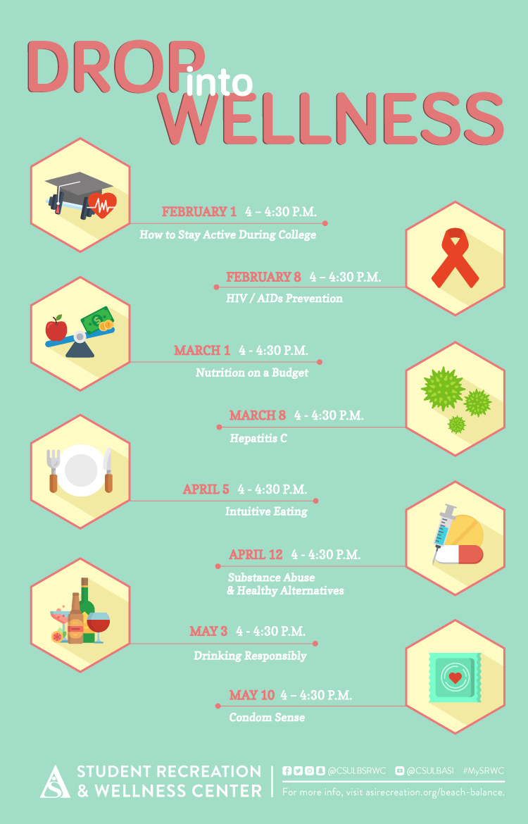
SUMMARY:Drop into Wellness
DTSTAMP:20180123T200719Z
DESCRIPTION:\N    \N        \N            \N                \N                    \N                        \N                            \N                                \N                                    Date\N                                    2/1\N                                \N                                \N                                    Location\N                                    SRWC\N                                \N                                \N                                    Time\N                                    4pm - 4:30pm\N                                \N                            \N                            \N                                \N                                    Description\N                                    How to stay active during college.\N                                \N                            \N                        \N                    \N                              \N              \N        \N                  \N            \N        \N    \N
X-ALT-DESC;FMTTYPE=text/html:<div class="container-fluid">    <div class="row">        <div class="col-md-6">            <div class="container-fluid module_round_box-gray" style="padding: 40px 15px;">                <div class="row">                    <div class="col-md-12">                        <div class="container-fluid">                            <div class="row">                                <div class="col-md-4">                                    <small>Date</small>                                    <p style="font-weight: 500; font-size: 1.2em;">2/1</p>                                </div>                                <div class="col-md-4">                                    <small>Location</small>                                    <p style="font-weight: 500; font-size: 1.2em;">SRWC</p>                                </div>                                <div class="col-md-4">                                    <small>Time</small>                                    <p style="font-weight: 500; font-size: 1.2em;">4pm - 4:30pm</p>                                </div>                            </div>                            <div class="row">                                <div class="col-md-12">                                    <small>Description</small>                                    <p>How to stay active during college.</p>                                </div>                            </div>                        </div>                    </div>                </div>                          </div>          </div>        <div class="col-md-6">                      <img src="images/enjoy/calendar/srwc-drop-into-wellness-event-s18-poster.jpg" alt="Drop into Wellness poster" />        </div>    </div></div>
LOCATION:
GEO:0.00000000;0.00000000
LAST-MODIFIED:20180123T201059Z
X-ACCESS:1
X-HITS:0
X-URL:
X-COLOR:007DAA
END:VEVENT
BEGIN:VEVENT
DTSTART;TZID=America/Los_Angeles:20180201T180000
DTEND;TZID=America/Los_Angeles:20180201T190000
RRULE:FREQ=WEEKLY;BYDAY=TH;INTERVAL=1;UNTIL=20180223T235900Z
EXDATE:20180209T020000Z,20180216T020000Z,20180223T020000Z
UID:60092393-91E2-46F2-8329-59318ED81126
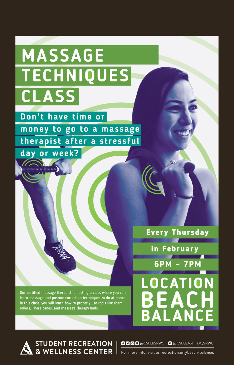
SUMMARY:Massage Techniques Class
DTSTAMP:20180123T202225Z
DESCRIPTION:\N    \N        \N            \N                \N                    \N                        \N                            \N                                \N                                    Date\N                                    2/1\N                                \N                                \N                                    Location\N                                    SRWC\N                                \N                                \N                                    Time\N                                    6pm - 7pm\N                                \N                            \N                            \N                                \N                                    Description\N                                    Don't have time or money to go to a massage therapist after a stressful day or week?\N                                    Our certified massage therapist is hosting a class where you can learn massage and posture correction techniques to do at home. In this class, you will learn how to properly use tools like foam rollers, Thera canes, and massage therapy balls.\N                                \N                            \N                        \N                    \N                              \N              \N        \N                  \N            \N        \N    \N
X-ALT-DESC;FMTTYPE=text/html:<div class="container-fluid">    <div class="row">        <div class="col-md-6">            <div class="container-fluid module_round_box-gray" style="padding: 40px 15px;">                <div class="row">                    <div class="col-md-12">                        <div class="container-fluid">                            <div class="row">                                <div class="col-md-4">                                    <small>Date</small>                                    <p style="font-weight: 500; font-size: 1.2em;">2/1</p>                                </div>                                <div class="col-md-4">                                    <small>Location</small>                                    <p style="font-weight: 500; font-size: 1.2em;">SRWC</p>                                </div>                                <div class="col-md-4">                                    <small>Time</small>                                    <p style="font-weight: 500; font-size: 1.2em;">6pm - 7pm</p>                                </div>                            </div>                            <div class="row">                                <div class="col-md-12">                                    <small>Description</small>                                    <p>Don't have time or money to go to a massage therapist after a stressful day or week?</p>                                    <p>Our certified massage therapist is hosting a class where you can learn massage and posture correction techniques to do at home. In this class, you will learn how to properly use tools like foam rollers, Thera canes, and massage therapy balls.</p>                                </div>                            </div>                        </div>                    </div>                </div>                          </div>          </div>        <div class="col-md-6">                      <img src="images/enjoy/calendar/srwc-massage-technique-s18-poster.jpg" alt="Massage Techniques class poster" />        </div>    </div></div>
LOCATION:
GEO:0.00000000;0.00000000
LAST-MODIFIED:20180123T202352Z
X-ACCESS:1
X-HITS:0
X-URL:
X-COLOR:007DAA
END:VEVENT
BEGIN:VEVENT
DTSTART;TZID=America/Los_Angeles:20180202T150000
DTEND;TZID=America/Los_Angeles:20180202T213000
RRULE:FREQ=WEEKLY;BYDAY=FR;INTERVAL=1;UNTIL=20180223T235900Z
EXDATE:20180209T230000Z,20180216T230000Z,20180223T230000Z
UID:EFFDEAF4-6A6D-4C55-88F4-8C7B8762B56D
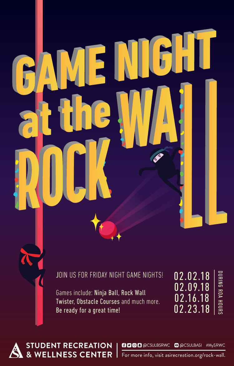
SUMMARY:Game Night at the Rock Wall
DTSTAMP:20180123T190527Z
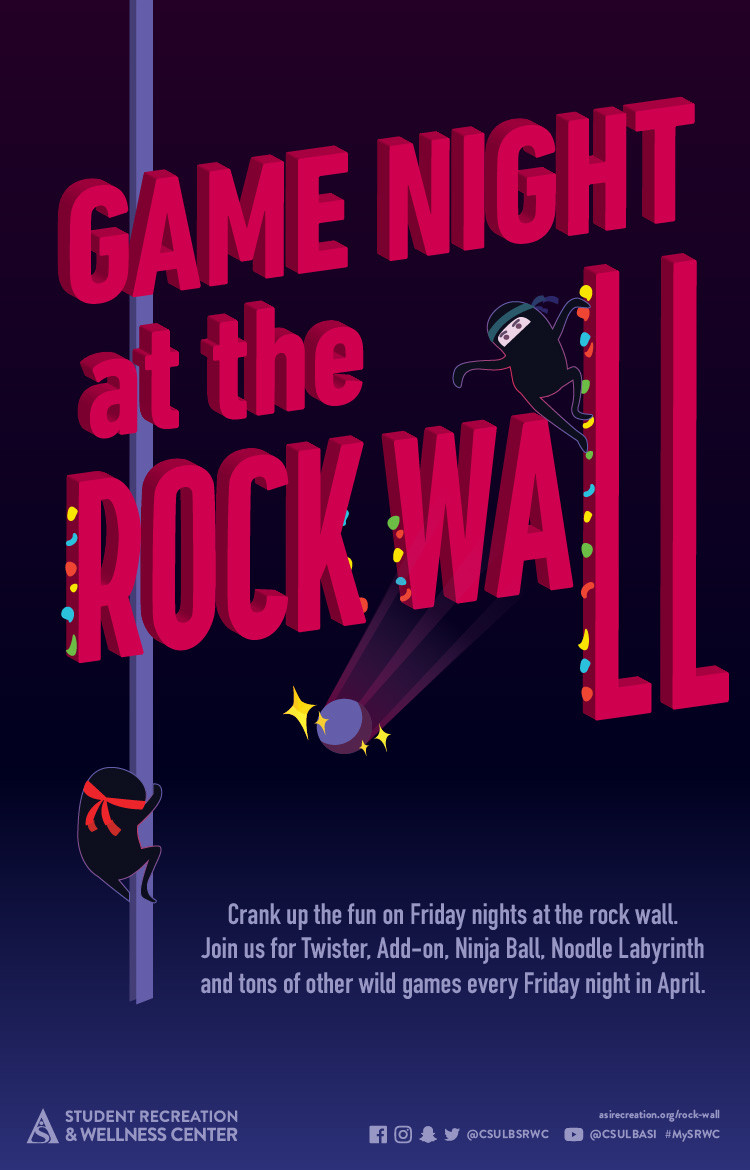
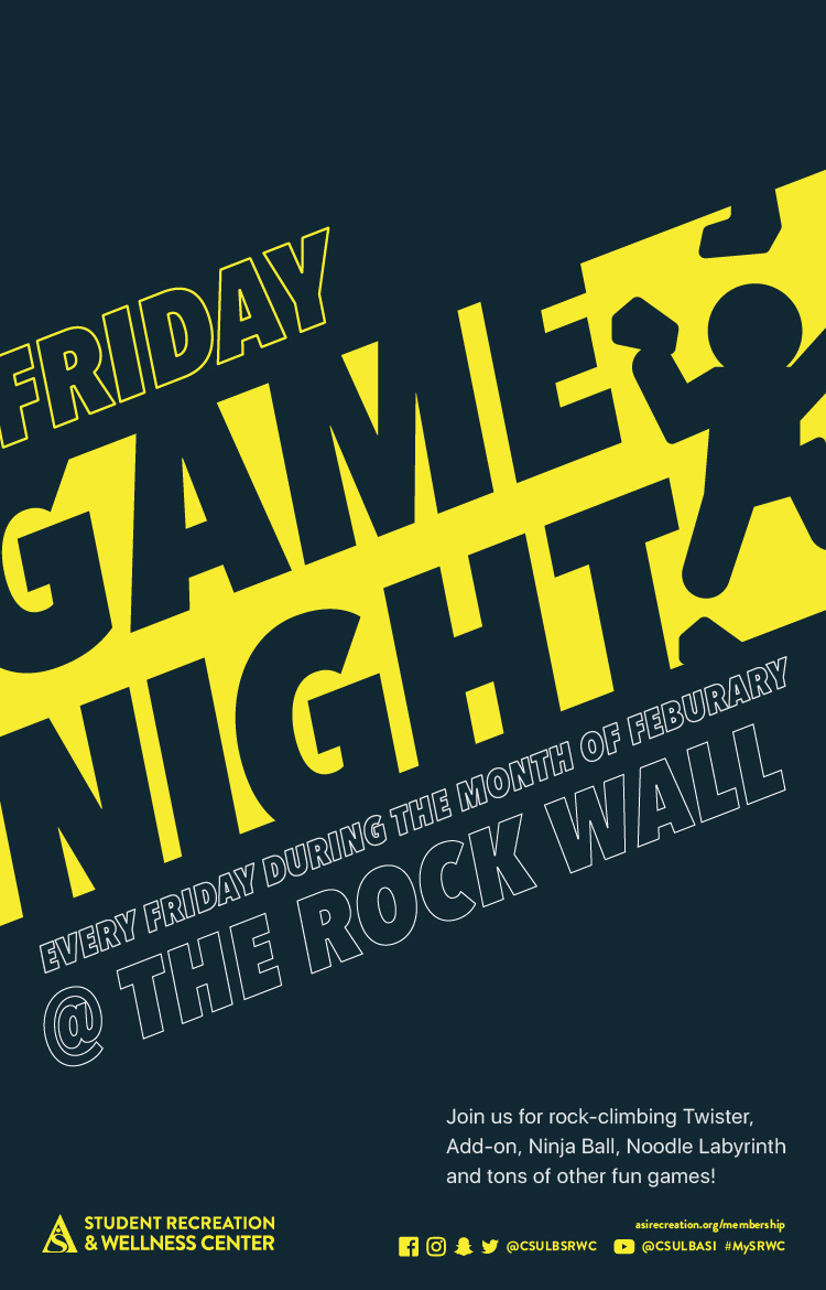
DESCRIPTION:\N    \N        \N            \N                \N                    \N                        \N                            \N                                \N                                    Date\N                                    2/2\N                                \N                                \N                                    Location\N                                    SRWC Rock Wall\N                                \N                                \N                                    Time\N                                    During ROA Hours\N                                \N                            \N                            \N                                \N                                    Description\N                                    Join us for friday night game nights! Games include: Ninja Ball, Rock Wall Twister, Obstacle Courses and much more. Be ready for a great time!\N                                \N                            \N                        \N                    \N                              \N              \N        \N                  \N            \N        \N    \N
X-ALT-DESC;FMTTYPE=text/html:<div class="container-fluid">    <div class="row">        <div class="col-md-6">            <div class="container-fluid module_round_box-gray" style="padding: 40px 15px;">                <div class="row">                    <div class="col-md-12">                        <div class="container-fluid">                            <div class="row">                                <div class="col-md-4">                                    <small>Date</small>                                    <p style="font-weight: 500; font-size: 1.2em;">2/2</p>                                </div>                                <div class="col-md-4">                                    <small>Location</small>                                    <p style="font-weight: 500; font-size: 1.2em;">SRWC Rock Wall</p>                                </div>                                <div class="col-md-4">                                    <small>Time</small>                                    <p style="font-weight: 500; font-size: 1.2em;">During ROA Hours</p>                                </div>                            </div>                            <div class="row">                                <div class="col-md-12">                                    <small>Description</small>                                    <p>Join us for friday night game nights! Games include: Ninja Ball, Rock Wall Twister, Obstacle Courses and much more. Be ready for a great time!</p>                                </div>                            </div>                        </div>                    </div>                </div>                          </div>          </div>        <div class="col-md-6">                      <img src="images/enjoy/calendar/srwc-game-night-event-s18-poster.jpg" alt="Game Night at the Rock Wall poster" />        </div>    </div></div>
LOCATION:
GEO:0.00000000;0.00000000
LAST-MODIFIED:20180123T192040Z
X-ACCESS:1
X-HITS:0
X-URL:
X-COLOR:007DAA
END:VEVENT
BEGIN:VEVENT
DTSTART;TZID=America/Los_Angeles:20180209T130000
DTEND;TZID=America/Los_Angeles:20180209T144500
RRULE:FREQ=MONTHLY;BYDAY=2FR;INTERVAL=1;UNTIL=20180406T235900Z
EXDATE:20180309T210000Z
UID:BCF36D72-99CC-486C-A556-1C7BD73C2D70
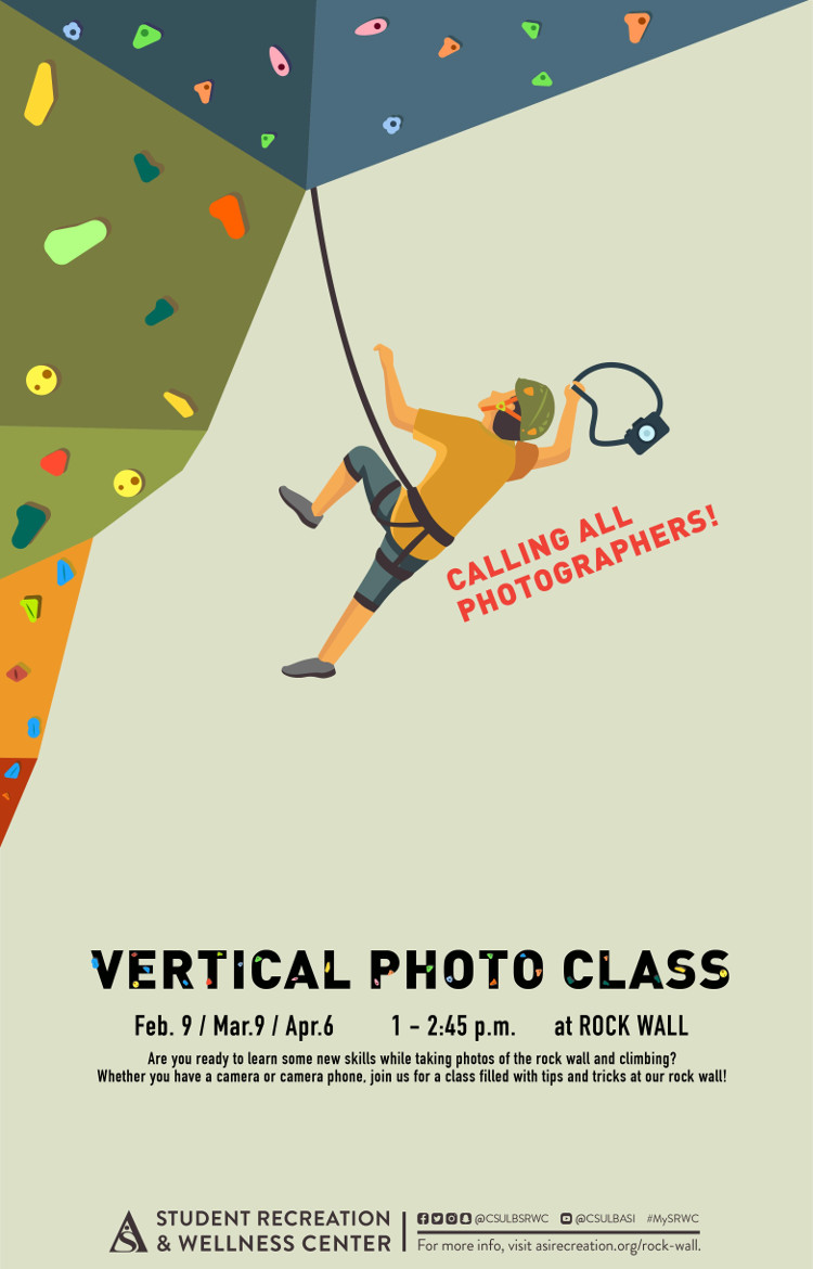
SUMMARY:Vertical Photo Class
DTSTAMP:20180205T183929Z
DESCRIPTION:\N    \N        \N            \N                \N                    \N                        \N                            \N                                \N                                    Date\N                                    2/9\N                                \N                                \N                                    Location\N                                    Rock Wall\N                                \N                                \N                                    Time\N                                    1PM - 2:45PM\N                                \N                            \N                            \N                                \N                                    Description\N                                    Are you ready to learn some new skills while taking photos of the rock wall and climbing? Whether you have a camera or camera phone, join us for a class filled with tips and tricks at our rock wall!\N                                \N                            \N                        \N                    \N                              \N              \N        \N                  \N            \N        \N    \N
X-ALT-DESC;FMTTYPE=text/html:<div class="container-fluid">    <div class="row">        <div class="col-md-6">            <div class="container-fluid module_round_box-gray" style="padding: 40px 15px;">                <div class="row">                    <div class="col-md-12">                        <div class="container-fluid">                            <div class="row">                                <div class="col-md-4">                                    <small>Date</small>                                    <p style="font-weight: 500; font-size: 1.2em;">2/9</p>                                </div>                                <div class="col-md-4">                                    <small>Location</small>                                    <p style="font-weight: 500; font-size: 1.2em;">Rock Wall</p>                                </div>                                <div class="col-md-4">                                    <small>Time</small>                                    <p style="font-weight: 500; font-size: 1.2em;">1PM - 2:45PM</p>                                </div>                            </div>                            <div class="row">                                <div class="col-md-12">                                    <small>Description</small>                                    <p style="font-weight: 500; font-size: 1.2em;">Are you ready to learn some new skills while taking photos of the rock wall and climbing? Whether you have a camera or camera phone, join us for a class filled with tips and tricks at our rock wall!</p>                                </div>                            </div>                        </div>                    </div>                </div>                          </div>          </div>        <div class="col-md-6">                      <img src="images/enjoy/calendar/vertical-photo-class-poster.jpg" alt="Vertical Photo Class poster" />        </div>    </div></div>
LOCATION:
GEO:0.00000000;0.00000000
LAST-MODIFIED:20180208T185559Z
X-ACCESS:1
X-HITS:0
X-URL:
X-COLOR:007DAA
END:VEVENT
BEGIN:VEVENT
DTSTART;TZID=America/Los_Angeles:20180220T123000
DTEND;TZID=America/Los_Angeles:20180220T153000
RRULE:FREQ=MONTHLY;BYMONTHDAY=20;INTERVAL=1;UNTIL=20180321T235900Z
EXDATE:20180320T193000Z
UID:5A8C49A2-A665-4D9F-9047-3C5E56F13CD6
SUMMARY:Project Chill in the USU
DTSTAMP:20180216T182154Z
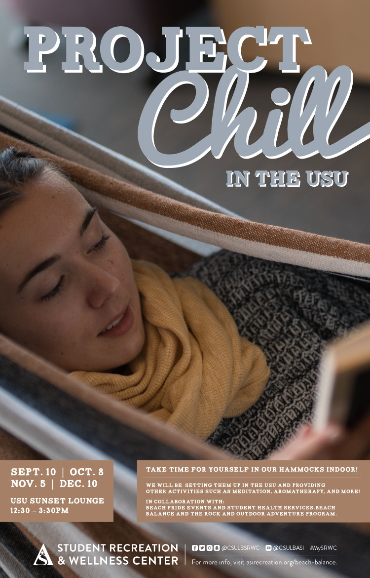
DESCRIPTION:\N    \N        \N            \N                \N                    \N                        \N                            \N                                \N                                    Date\N                                    2/20\N                                \N                                \N                                    Location\N                                    USU Sunset Lounge\N                                \N                                \N                                    Time\N                                    12.30pm - 3.30pm\N                                \N                            \N                            \N                                \N                                    Description\N                                    This coming Tuesday, SRWC Beach Balance hosts a version of the popular Project Chill in the University Student Union! Come rest, relax and re-charge yourself in one of our hammocks in the USU. If you miss this one, the next dates we'll be in the USU are March 20 and April 24!\N                                \N                            \N                        \N                    \N                              \N              \N        \N                  \N             \N        \N    \N
X-ALT-DESC;FMTTYPE=text/html:<div class="container-fluid">    <div class="row">        <div class="col-md-6">            <div class="container-fluid module_round_box-gray" style="padding: 40px 15px;">                <div class="row">                    <div class="col-md-12">                        <div class="container-fluid">                            <div class="row">                                <div class="col-md-4">                                    <small>Date</small>                                    <p style="font-weight: 500; font-size: 1.2em;">2/20</p>                                </div>                                <div class="col-md-4">                                    <small>Location</small>                                    <p style="font-weight: 500; font-size: 1.2em;">USU Sunset Lounge</p>                                </div>                                <div class="col-md-4">                                    <small>Time</small>                                    <p style="font-weight: 500; font-size: 1.2em;">12.30pm - 3.30pm</p>                                </div>                            </div>                            <div class="row">                                <div class="col-md-12">                                    <small>Description</small>                                    <p>This coming Tuesday, SRWC Beach Balance hosts a version of the popular Project Chill in the University Student Union! Come rest, relax and re-charge yourself in one of our hammocks in the USU.</p> <p>If you miss this one, the next dates we'll be in the USU are March 20 and April 24!</p>                                </div>                            </div>                        </div>                    </div>                </div>                          </div>          </div>        <div class="col-md-6">                      <img src="images/enjoy/calendar/project-chill-in-the-usu-poster.jpg" alt="Project Chill poster" />         </div>    </div></div>
LOCATION:
GEO:0.00000000;0.00000000
LAST-MODIFIED:20180315T010156Z
X-ACCESS:1
X-HITS:414
X-URL:
X-COLOR:007DAA
END:VEVENT
BEGIN:VEVENT
DTSTART;TZID=America/Los_Angeles:20180220T174500
DTEND;TZID=America/Los_Angeles:20180220T183000
RRULE:FREQ=WEEKLY;BYDAY=TU,WE,SA;INTERVAL=1;UNTIL=20180225T235900Z
EXDATE:20180222T014500Z,20180225T014500Z
UID:55CCDF46-8515-48CC-88EF-C0F387F5632C
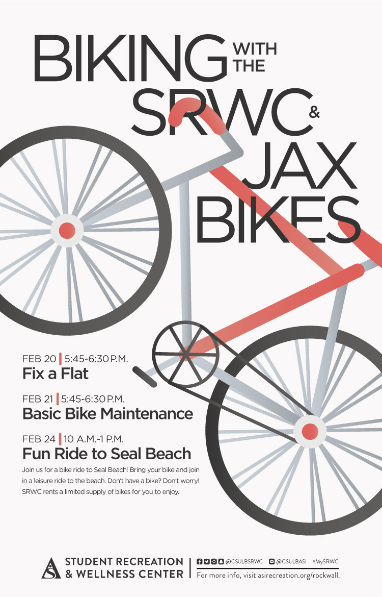
SUMMARY:Biking With the SRWC & JAX Bikes
DTSTAMP:20180215T001744Z
DESCRIPTION:\N    \N        \N            \N                \N                    \N                        \N                            \N                                \N                                    Date\N                                    2/20\N                                \N                                \N                                    Location\N                                    SRWC\N                                \N                                \N                                    Time\N                                    Varies\N                                \N                            \N                            \N                                \N                                    Description\N                                    Join us for a bike ride to Seal Beach! Bring your bike and join in a leisure ride to the brach. Don't have a bike? Don't worry! SRWC rents a limited supply of bikes for you to enjoy.\N                                    \N                                        Fix a Flat: Feb. 20, 5:45 - 6:30 P.M.\N                                        Basic Bike Maintenance: Feb. 21, 5:45 - 6:30 P.M.\N                                        Fun Ride to Seal Beach: Feb. 24, 10 A.M. - 1 P.M.\N                                    \N                                \N                            \N                        \N                    \N                              \N              \N        \N                  \N            \N        \N    \N
X-ALT-DESC;FMTTYPE=text/html:<div class="container-fluid">    <div class="row">        <div class="col-md-6">            <div class="container-fluid module_round_box-gray" style="padding: 40px 15px;">                <div class="row">                    <div class="col-md-12">                        <div class="container-fluid">                            <div class="row">                                <div class="col-md-4">                                    <small>Date</small>                                    <p style="font-weight: 500; font-size: 1.2em;">2/20</p>                                </div>                                <div class="col-md-4">                                    <small>Location</small>                                    <p style="font-weight: 500; font-size: 1.2em;">SRWC</p>                                </div>                                <div class="col-md-4">                                    <small>Time</small>                                    <p style="font-weight: 500; font-size: 1.2em;">Varies</p>                                </div>                            </div>                            <div class="row">                                <div class="col-md-12">                                    <small>Description</small>                                    <p>Join us for a bike ride to Seal Beach! Bring your bike and join in a leisure ride to the brach. Don't have a bike? Don't worry! SRWC rents a limited supply of bikes for you to enjoy.</p>                                    <ul>                                        <li><strong>Fix a Flat: </strong>Feb. 20, 5:45 - 6:30 P.M.</li>                                        <li><strong>Basic Bike Maintenance: </strong>Feb. 21, 5:45 - 6:30 P.M.</li>                                        <li><strong>Fun Ride to Seal Beach: </strong>Feb. 24, 10 A.M. - 1 P.M.</li>                                    </ul>                                </div>                            </div>                        </div>                    </div>                </div>                          </div>          </div>        <div class="col-md-6">                      <img src="images/enjoy/calendar/biking-with-the-srwc-jax-bikes-poster.jpg" alt="Biking With the SRWC and JAX Bikes poster" />        </div>    </div></div>
LOCATION:
GEO:0.00000000;0.00000000
LAST-MODIFIED:20180215T001814Z
X-ACCESS:1
X-HITS:0
X-URL:
X-COLOR:007DAA
END:VEVENT
BEGIN:VEVENT
DTSTART;TZID=America/Los_Angeles:20180223T140000
DTEND;TZID=America/Los_Angeles:20180223T190000
RRULE:FREQ=MONTHLY;BYDAY=2FR,3FR;INTERVAL=1;UNTIL=20180317T235900Z
EXDATE:20180309T220000Z,20180316T210000Z
UID:00E44E8C-04F5-4136-AEF5-2B3AC4E52885
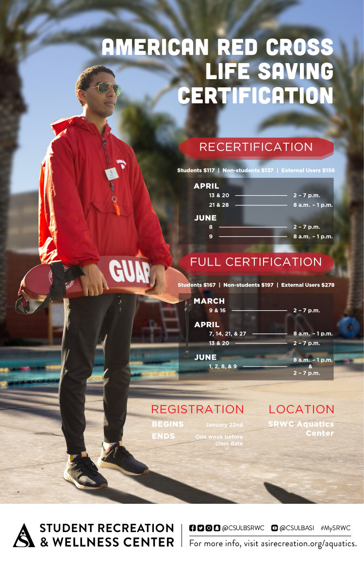
SUMMARY:American Red Cross Life Saving Certification
DTSTAMP:20180205T183929Z
DESCRIPTION:\N    \N        \N            \N                \N                    \N                        \N                            \N                                \N                                    Date\N                                    3/9\N                                \N                                \N                                    Location\N                                    SRWC Aquatics Center\N                                \N                                \N                                    Time\N                                    Varies\N                                \N                            \N                            \N                                \N                                    Description\N                                    Recertification: Students $117 | Non-students $137 | External Users $156\N                                    Full Certification: Students $167 | Non-students $197 | External Users $278\N                                \N                            \N                        \N                    \N                              \N              \N        \N                  \N            \N        \N    \N
X-ALT-DESC;FMTTYPE=text/html:<div class="container-fluid">    <div class="row">        <div class="col-md-6">            <div class="container-fluid module_round_box-gray" style="padding: 40px 15px;">                <div class="row">                    <div class="col-md-12">                        <div class="container-fluid">                            <div class="row">                                <div class="col-md-4">                                    <small>Date</small>                                    <p style="font-weight: 500; font-size: 1.2em;">3/9</p>                                </div>                                <div class="col-md-4">                                    <small>Location</small>                                    <p style="font-weight: 500; font-size: 1.2em;">SRWC Aquatics Center</p>                                </div>                                <div class="col-md-4">                                    <small>Time</small>                                    <p style="font-weight: 500; font-size: 1.2em;">Varies</p>                                </div>                            </div>                            <div class="row">                                <div class="col-md-12">                                    <small>Description</small>                                    <p style="font-weight: 500; font-size: 1.2em;">Recertification: Students $117 | Non-students $137 | External Users $156</p>                                    <p style="font-weight: 500; font-size: 1.2em;">Full Certification: Students $167 | Non-students $197 | External Users $278</p>                                </div>                            </div>                        </div>                    </div>                </div>                          </div>          </div>        <div class="col-md-6">                      <img src="images/enjoy/calendar/american-red-cross-life-saving-certification-poster.jpg" alt="American Red Cross Life Saving Certification poster" />        </div>    </div></div>
LOCATION:
GEO:0.00000000;0.00000000
LAST-MODIFIED:20180224T010317Z
X-ACCESS:1
X-HITS:0
X-URL:
X-COLOR:007DAA
END:VEVENT
BEGIN:VEVENT
DTSTART;TZID=America/Los_Angeles:20180302T110000
DTEND;TZID=America/Los_Angeles:20180302T131500
RRULE:FREQ=MONTHLY;BYDAY=1FR;INTERVAL=1;UNTIL=20180407T235900Z
EXDATE:20180406T180000Z
UID:91D2FDF7-C68D-4387-9404-AD29EAE386CE
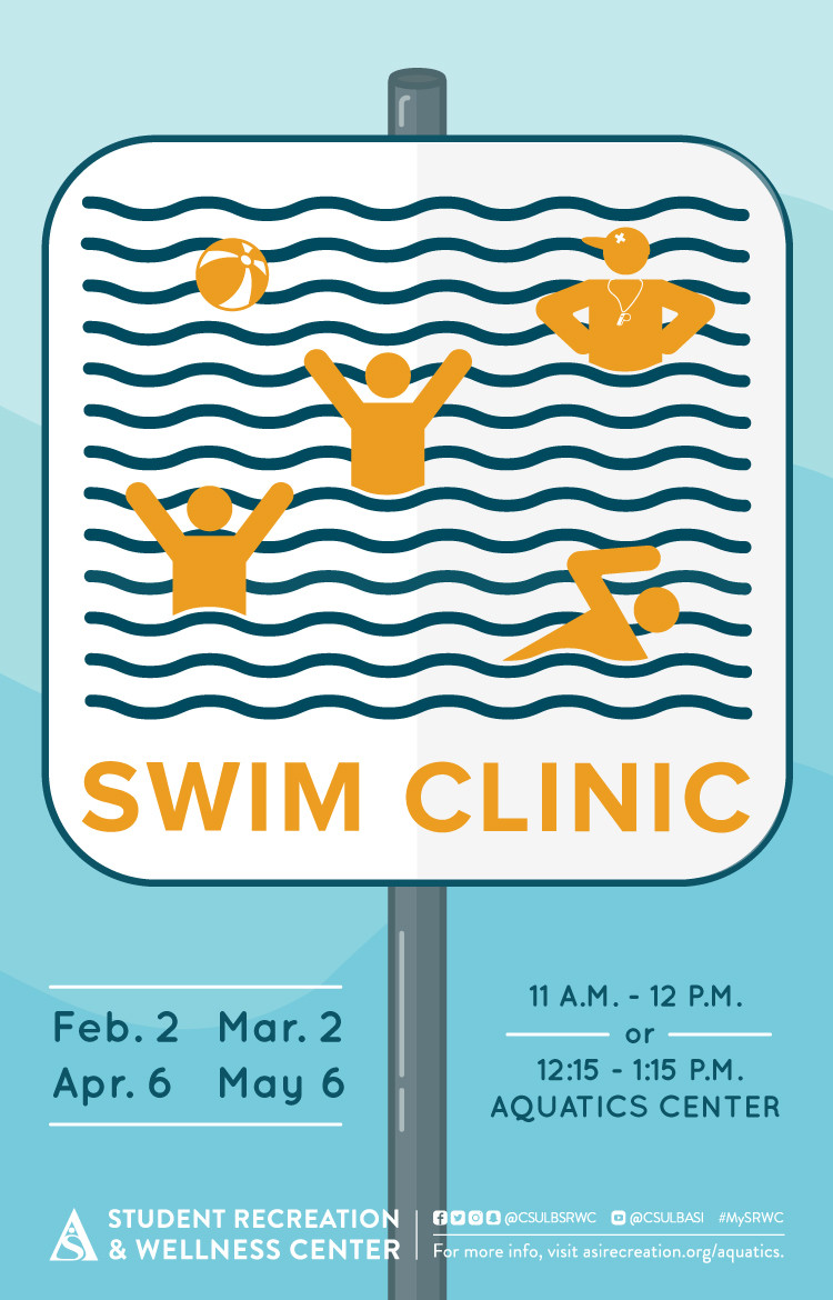
SUMMARY:Swim Clinic
DTSTAMP:20180123T191529Z
DESCRIPTION:\N    \N        \N            \N                \N                    \N                        \N                            \N                                \N                                    Date\N                                    3/2\N                                \N                                \N                                    Location\N                                    SRWC Aquatics Center\N                                \N                                \N                                    Time\N                                    11AM - 12PM or 12:15PM - 1:15PM\N                                \N                            \N                            \N                                \N                                    Description\N                                    Swim Clinic\N                                \N                            \N                        \N                    \N                              \N              \N        \N                  \N            \N        \N    \N
X-ALT-DESC;FMTTYPE=text/html:<div class="container-fluid">    <div class="row">        <div class="col-md-6">            <div class="container-fluid module_round_box-gray" style="padding: 40px 15px;">                <div class="row">                    <div class="col-md-12">                        <div class="container-fluid">                            <div class="row">                                <div class="col-md-4">                                    <small>Date</small>                                    <p style="font-weight: 500; font-size: 1.2em;">3/2</p>                                </div>                                <div class="col-md-4">                                    <small>Location</small>                                    <p style="font-weight: 500; font-size: 1.2em;">SRWC Aquatics Center</p>                                </div>                                <div class="col-md-4">                                    <small>Time</small>                                    <p style="font-weight: 500; font-size: 1.2em;">11AM - 12PM or 12:15PM - 1:15PM</p>                                </div>                            </div>                            <div class="row">                                <div class="col-md-12">                                    <small>Description</small>                                    <p style="font-weight: 500; font-size: 1.2em;">Swim Clinic</p>                                </div>                            </div>                        </div>                    </div>                </div>                          </div>          </div>        <div class="col-md-6">                      <img src="images/enjoy/calendar/swim-clinic-poster.jpg" alt="Swim Clinic poster" />        </div>    </div></div>
LOCATION:
GEO:0.00000000;0.00000000
LAST-MODIFIED:20180224T013553Z
X-ACCESS:1
X-HITS:0
X-URL:
X-COLOR:007DAA
END:VEVENT
BEGIN:VEVENT
DTSTART;TZID=America/Los_Angeles:20180307T110000
DTEND;TZID=America/Los_Angeles:20180307T140000
RRULE:FREQ=MONTHLY;BYDAY=1WE;INTERVAL=1;UNTIL=20180502T235900Z
EXDATE:20180404T180000Z,20180502T180000Z
UID:E539827E-595C-4EE3-B4D7-EDD4C9383A0A
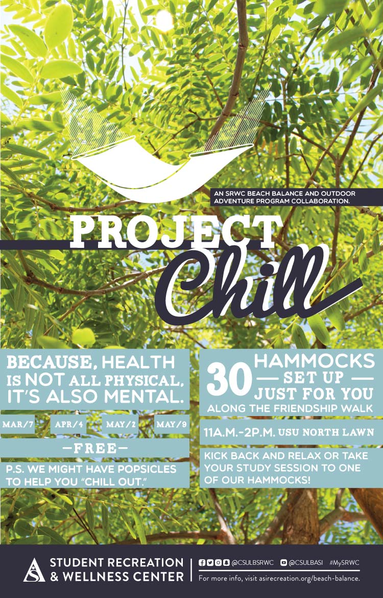
SUMMARY:Project Chill
DTSTAMP:20180123T191529Z
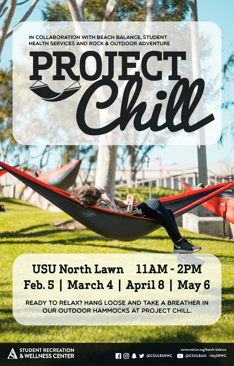
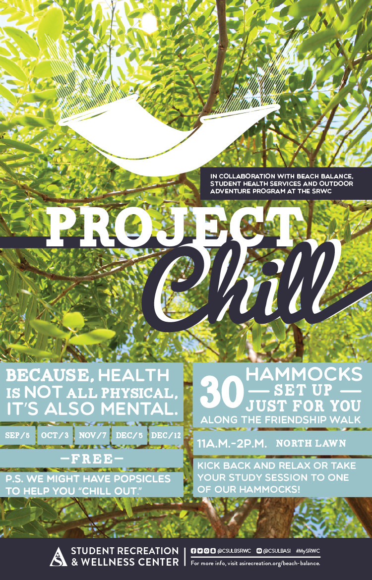
DESCRIPTION:\N    \N        \N            \N                \N                    \N                        \N                            \N                                \N                                    Date\N                                    3/7\N                                \N                                \N                                    Location\N                                    USU North Lawn\N                                \N                                \N                                    Time\N                                    11am - 2pm\N                                \N                            \N                            \N                                \N                                    Description\N                                    30 Hammocks set up just for you along the friendship walk. Kick back and relax or take your study session to one of our hammocks! Because, Health is not all physical. It's also mental. FREE! P.S. we might have popsicles to help you "Chill Out"\N                                \N                            \N                        \N                    \N                              \N              \N        \N                  \N            \N        \N    \N
X-ALT-DESC;FMTTYPE=text/html:<div class="container-fluid">    <div class="row">        <div class="col-md-6">            <div class="container-fluid module_round_box-gray" style="padding: 40px 15px;">                <div class="row">                    <div class="col-md-12">                        <div class="container-fluid">                            <div class="row">                                <div class="col-md-4">                                    <small>Date</small>                                    <p style="font-weight: 500; font-size: 1.2em;">3/7</p>                                </div>                                <div class="col-md-4">                                    <small>Location</small>                                    <p style="font-weight: 500; font-size: 1.2em;">USU North Lawn</p>                                </div>                                <div class="col-md-4">                                    <small>Time</small>                                    <p style="font-weight: 500; font-size: 1.2em;">11am - 2pm</p>                                </div>                            </div>                            <div class="row">                                <div class="col-md-12">                                    <small>Description</small>                                    <p>30 Hammocks set up just for you along the friendship walk. Kick back and relax or take your study session to one of our hammocks! Because, Health is not all physical. It's also mental. FREE! P.S. we might have popsicles to help you "Chill Out"</p>                                </div>                            </div>                        </div>                    </div>                </div>                          </div>          </div>        <div class="col-md-6">                      <img src="images/enjoy/calendar/srwc-project-chill-s18-poster.jpg" alt="Project Chill poster" />        </div>    </div></div>
LOCATION:
GEO:0.00000000;0.00000000
X-ACCESS:1
X-HITS:0
X-URL:
X-COLOR:007DAA
END:VEVENT
BEGIN:VEVENT
DTSTART;TZID=America/Los_Angeles:20180402T160000
DTEND;TZID=America/Los_Angeles:20180402T170000
RRULE:FREQ=WEEKLY;BYDAY=MO;INTERVAL=1;UNTIL=20180423T235900Z
EXDATE:20180409T230000Z,20180416T230000Z,20180423T230000Z
UID:35E8E2AD-8D1F-4609-886D-0AC611294A7D
SUMMARY:Aroma Therapy
DTSTAMP:20180329T185505Z
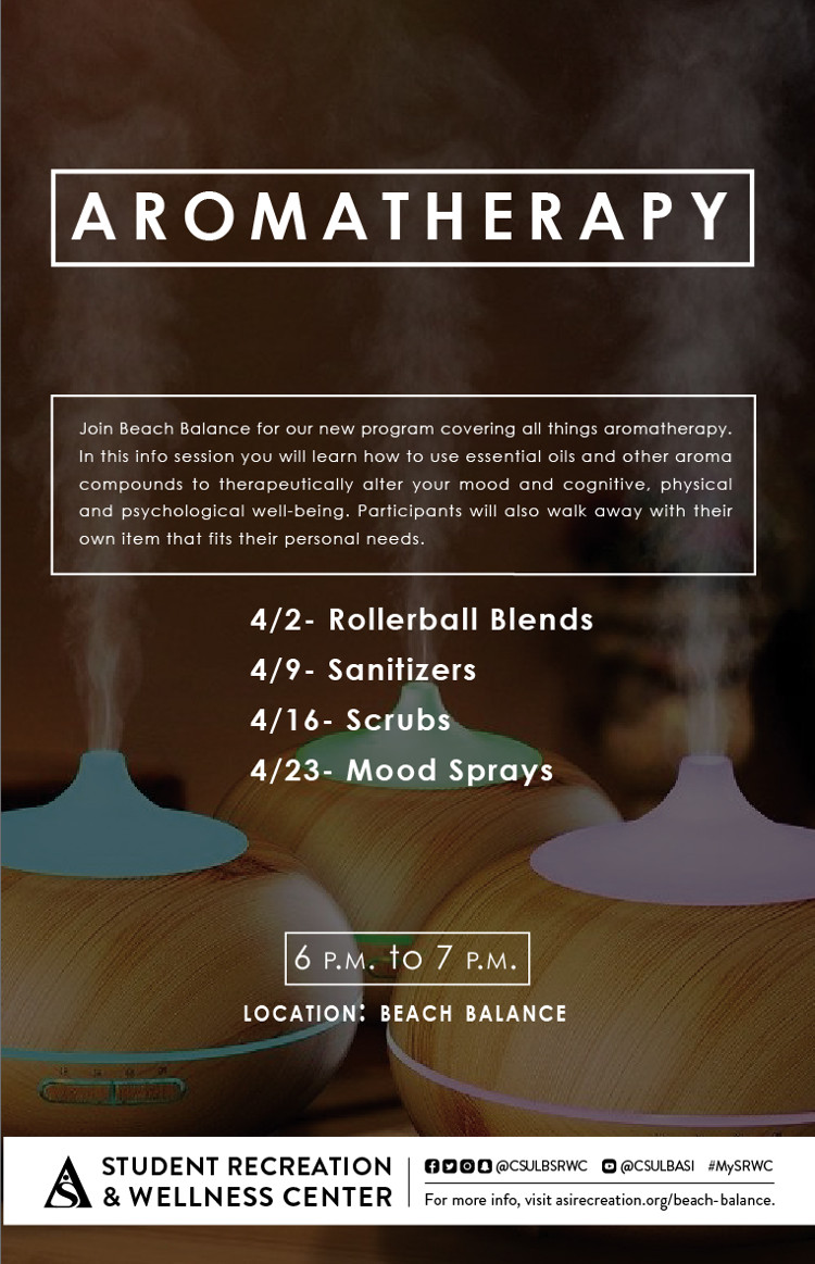
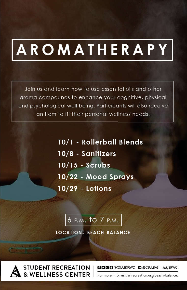
DESCRIPTION:\N\N\N\N\N\N\N\NDate\N4/2\N\NLocation\NBeach Balance\N\NTime\N4PM - 5PM\N\N\N\NDescription\NJoin beach Balance for our new program covering all things aromatherapy. In this info session you will learn how to use essential oils and other aroma compounds to therapeutically alter your mood and cognitive, physical and psychological well-being. Participants will also walk away with their own item that fits their personal needs.\N\N    4/2- Rollerball Blends\N    4/9- Sanitizers\N    4/16- Scubs\N    4/23- Mood Sprays\N\N\N\N\N\N\N\N\N\N\N
X-ALT-DESC;FMTTYPE=text/html:<div class="container-fluid"><div class="row"><div class="col-md-6"><div class="container-fluid module_round_box-gray" style="padding: 40px 15px;"><div class="row"><div class="col-md-12"><div class="container-fluid"><div class="row"><div class="col-md-4"><small>Date</small><p style="font-weight: 500; font-size: 1.2em;">4/2</p></div><div class="col-md-4"><small>Location</small><p style="font-weight: 500; font-size: 1.2em;">Beach Balance</p></div><div class="col-md-4"><small>Time</small><p style="font-weight: 500; font-size: 1.2em;">4PM - 5PM</p></div></div><div class="row"><div class="col-md-12"><small>Description</small><p style="font-weight: 500; font-size: 1.2em;">Join beach Balance for our new program covering all things aromatherapy. In this info session you will learn how to use essential oils and other aroma compounds to therapeutically alter your mood and cognitive, physical and psychological well-being. Participants will also walk away with their own item that fits their personal needs.</p><ul>    <li>4/2- Rollerball Blends</li>    <li>4/9- Sanitizers</li>    <li>4/16- Scubs</li>    <li>4/23- Mood Sprays</li></ul></div></div></div></div></div></div></div><div class="col-md-6"><img src="images/enjoy/calendar/aromatherapy-poster-s18.jpg" alt="aromatherapy poster" /></div></div></div>
LOCATION:
GEO:0.00000000;0.00000000
X-ACCESS:1
X-HITS:11
X-URL:
X-COLOR:007DAA
END:VEVENT
BEGIN:VEVENT
DTSTART;TZID=America/Los_Angeles:20180403T150000
DTEND;TZID=America/Los_Angeles:20180403T220000
RRULE:FREQ=WEEKLY;BYDAY=TU;INTERVAL=1;UNTIL=20180425T235900Z
EXDATE:20180410T220000Z,20180417T220000Z,20180424T220000Z
UID:E7BCD522-7284-477A-AE50-CEACC4BA4BB1
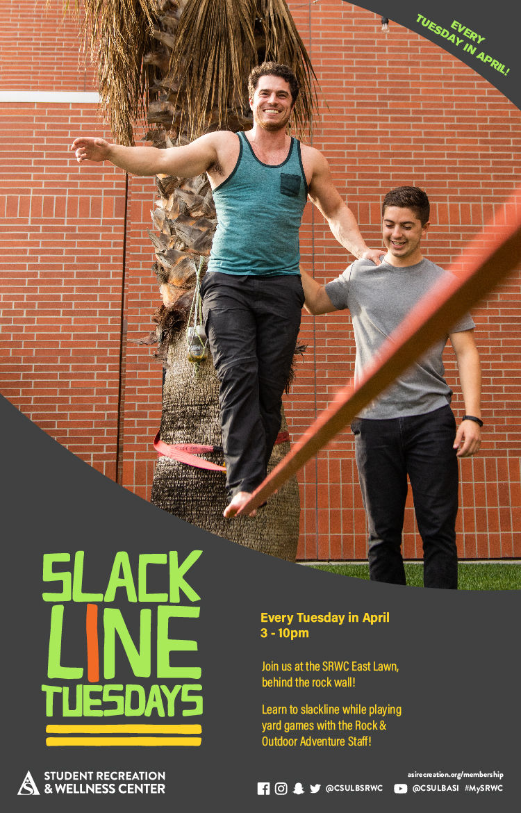
SUMMARY:Slacklining
DTSTAMP:20180405T002823Z
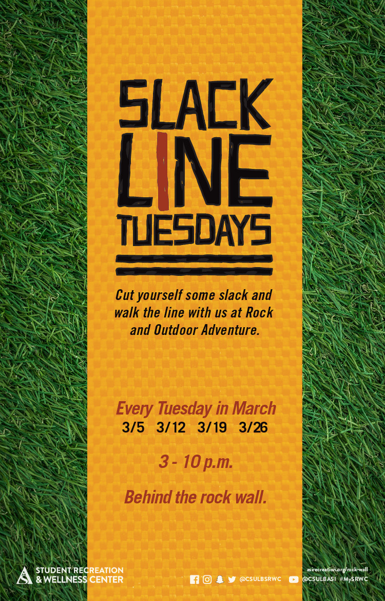
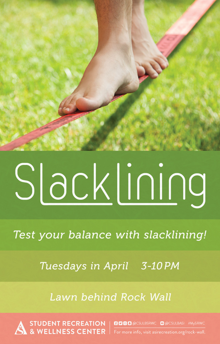
DESCRIPTION:\N    \N        \N            \N                \N                    \N                        \N                            \N                                Date\N                                Every Tuesday in April\N                                \N                                Location\N                                    Lawn Behing Rock Wall\N                                \N                                Time\N                                    3PM - 10PM\N                                \N                            \N                            \N                                Description\N                                    Test your balancing with slacklining!\N                                \N                            \N                        \N                    \N                \N            \N        \N        \N    \N
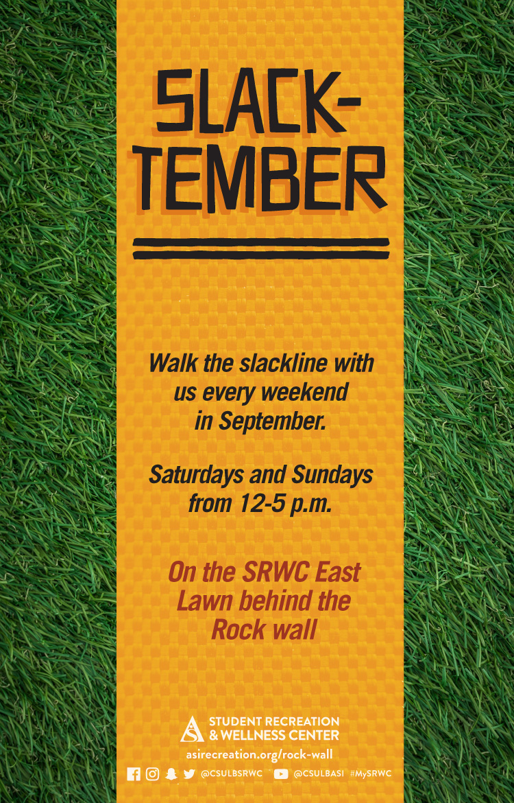
X-ALT-DESC;FMTTYPE=text/html:<div class="container-fluid">    <div class="row">        <div class="col-md-6">            <div class="container-fluid module_round_box-gray" style="padding: 40px 15px;">                <div class="row">                    <div class="col-md-12">                        <div class="container-fluid">                            <div class="row">                                <div class="col-md-4"><small>Date</small>                                <p style="font-weight: 500; font-size: 1.2em;">Every Tuesday in April</p>                                </div>                                <div class="col-md-4"><small>Location</small>                                    <p style="font-weight: 500; font-size: 1.2em;">Lawn Behing Rock Wall</p>                                </div>                                <div class="col-md-4"><small>Time</small>                                    <p style="font-weight: 500; font-size: 1.2em;">3PM - 10PM</p>                                </div>                            </div>                            <div class="row">                                <div class="col-md-12"><small>Description</small>                                    <p style="font-weight: 500; font-size: 1.2em;">Test your balancing with slacklining!</p>                                </div>                            </div>                        </div>                    </div>                </div>            </div>        </div>        <div class="col-md-6"><img src="images/enjoy/calendar/slacklining-s18-poster.jpg" alt="Slacklining poster" /></div>    </div></div>
LOCATION:
GEO:33.78506600;-118.10841400
X-ACCESS:1
X-HITS:0
X-URL:
X-COLOR:007DAA
END:VEVENT
BEGIN:VEVENT
DTSTART;TZID=America/Los_Angeles:20180407T080000
DTEND;TZID=America/Los_Angeles:20180407T130000
RRULE:FREQ=WEEKLY;BYDAY=FR,SA;INTERVAL=1;UNTIL=20180429T235900Z
EXDATE:20180413T150000Z,20180414T150000Z,20180420T150000Z,20180421T150000Z,20180427T150000Z,20180428T150000Z
UID:33A172E8-D6F6-4732-91AD-C96F7EA44C50
SUMMARY:American Red Cross Life Saving Certification
DTSTAMP:20180205T183929Z
DESCRIPTION:\N    \N        \N            \N                \N                    \N                        \N                            \N                                \N                                    Date\N                                    3/9\N                                \N                                \N                                    Location\N                                    SRWC Aquatics Center\N                                \N                                \N                                    Time\N                                    Varies\N                                \N                            \N                            \N                                \N                                    Description\N                                    Recertification: Students $117 | Non-students $137 | External Users $156\N                                    Full Certification: Students $167 | Non-students $197 | External Users $278\N                                \N                            \N                        \N                    \N                              \N              \N        \N                  \N            \N        \N    \N
X-ALT-DESC;FMTTYPE=text/html:<div class="container-fluid">    <div class="row">        <div class="col-md-6">            <div class="container-fluid module_round_box-gray" style="padding: 40px 15px;">                <div class="row">                    <div class="col-md-12">                        <div class="container-fluid">                            <div class="row">                                <div class="col-md-4">                                    <small>Date</small>                                    <p style="font-weight: 500; font-size: 1.2em;">3/9</p>                                </div>                                <div class="col-md-4">                                    <small>Location</small>                                    <p style="font-weight: 500; font-size: 1.2em;">SRWC Aquatics Center</p>                                </div>                                <div class="col-md-4">                                    <small>Time</small>                                    <p style="font-weight: 500; font-size: 1.2em;">Varies</p>                                </div>                            </div>                            <div class="row">                                <div class="col-md-12">                                    <small>Description</small>                                    <p style="font-weight: 500; font-size: 1.2em;">Recertification: Students $117 | Non-students $137 | External Users $156</p>                                    <p style="font-weight: 500; font-size: 1.2em;">Full Certification: Students $167 | Non-students $197 | External Users $278</p>                                </div>                            </div>                        </div>                    </div>                </div>                          </div>          </div>        <div class="col-md-6">                      <img src="images/enjoy/calendar/american-red-cross-life-saving-certification-poster.jpg" alt="American Red Cross Life Saving Certification poster" />        </div>    </div></div>
LOCATION:
GEO:0.00000000;0.00000000
LAST-MODIFIED:20180224T011207Z
X-ACCESS:1
X-HITS:0
X-URL:
X-COLOR:007DAA
END:VEVENT
BEGIN:VEVENT
DTSTART;TZID=America/Los_Angeles:20180523T203000
DTEND;TZID=America/Los_Angeles:20180622T213000
RRULE:FREQ=WEEKLY;BYDAY=WE,FR;INTERVAL=1;UNTIL=20180623T235900Z
EXDATE:20180526T033000Z,20180531T033000Z,20180602T033000Z,20180607T033000Z,20180609T033000Z,20180614T033000Z,20180616T033000Z,20180621T033000Z,20180623T033000Z
UID:B2396776-34D5-43C7-B0D5-DA4761630730
SUMMARY:Summer Instructional Classes (Pilates Reformer)
DTSTAMP:20180423T233643Z
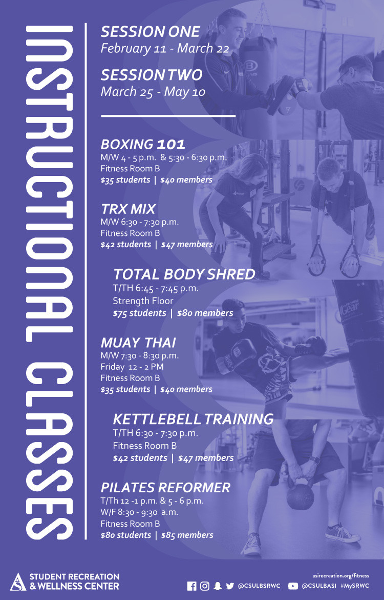
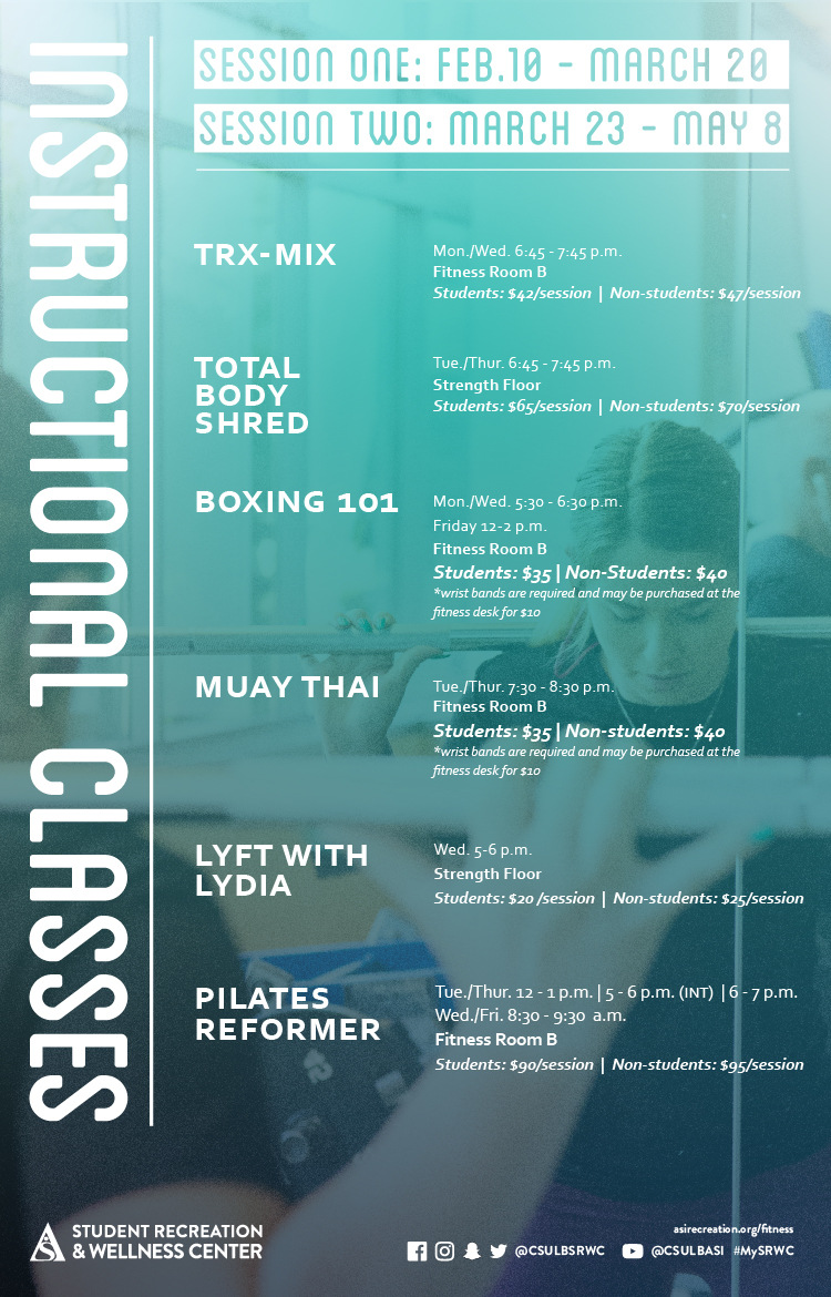
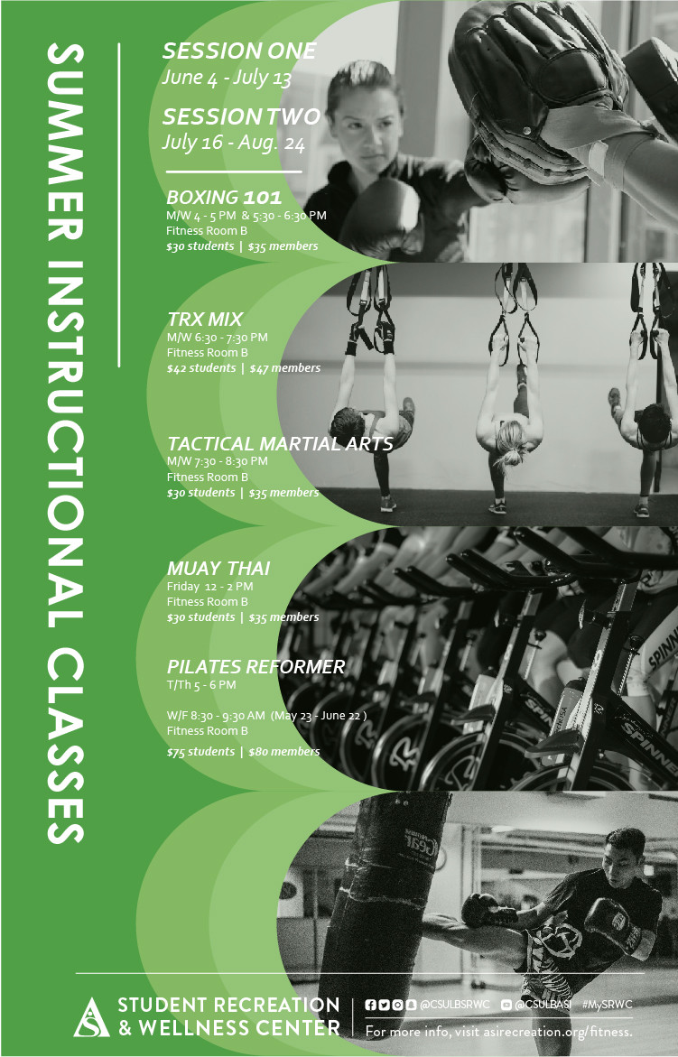
DESCRIPTION:\N\N\N\N\N\N\N\NDate\N5/23\N\NLocation\NFitness Room B\N\NTime\N8.30pm - 9.30pm\N\N\N\NDescription\NSESSION ONEJune 4 - July 13\NSESSION TWOJuly 16 - Aug 24\N\NBOXING 101M/W 4-5 PM and 5.30-6.30 PMFitness Room B$30 students and $35 members\NTRX MIXM/W 6.30-7.30 PM Fitness Room B$42 students and $47 members\NTACTICAL MARTIAL ARTSM/W 7.30-8.30 PM Fitness Room B$30 students and $35 members\NMUAY THAIFriday 12-2 PMFitness Room B$30 students and $35 members\NPILATES REFORMERT/Th 5-6 PMW/F 8.30-9.30 PM (May 23-June 22)Fitness Room B$75 students and $80 members\N\N\N\N\N\N\N\N\N\N
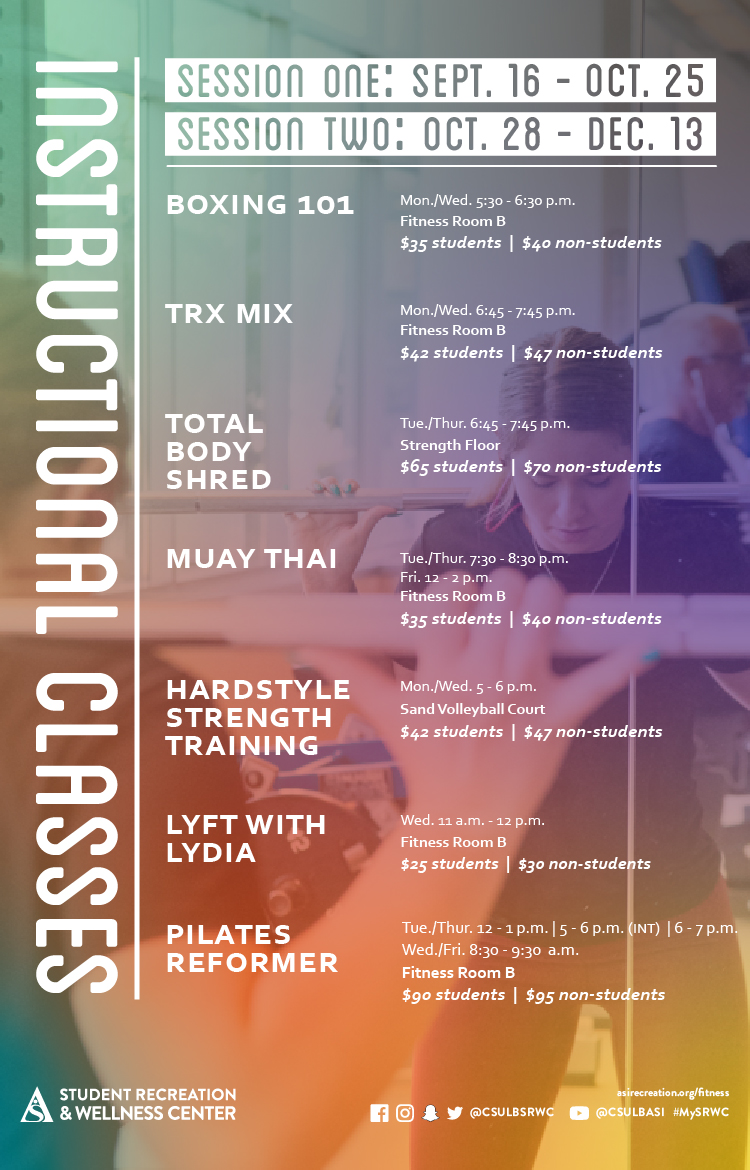
X-ALT-DESC;FMTTYPE=text/html:<div class="container-fluid"><div class="row"><div class="col-md-6"><div class="container-fluid module_round_box-gray" style="padding: 40px 15px;"><div class="row"><div class="col-md-12"><div class="container-fluid"><div class="row"><div class="col-md-4"><small>Date</small><p style="font-weight: 500; font-size: 1.2em;">5/23</p></div><div class="col-md-4"><small>Location</small><p style="font-weight: 500; font-size: 1.2em;">Fitness Room B</p></div><div class="col-md-4"><small>Time</small><p style="font-weight: 500; font-size: 1.2em;">8.30pm - 9.30pm</p></div></div><div class="row"><div class="col-md-12"><small>Description</small><p><strong>SESSION ONE</strong><br />June 4 - July 13</p><p><strong>SESSION TWO</strong><br />July 16 - Aug 24</p><hr /><p><strong>BOXING 101</strong><br />M/W 4-5 PM and 5.30-6.30 PM<br />Fitness Room B<br />$30 students and $35 members</p><p><strong>TRX MIX</strong><br />M/W 6.30-7.30 PM <br />Fitness Room B<br />$42 students and $47 members</p><p><strong>TACTICAL MARTIAL ARTS</strong><br />M/W 7.30-8.30 PM <br />Fitness Room B<br />$30 students and $35 members</p><p><strong>MUAY THAI</strong><br />Friday 12-2 PM<br />Fitness Room B<br />$30 students and $35 members</p><p><strong>PILATES REFORMER</strong><br />T/Th 5-6 PM<br />W/F 8.30-9.30 PM (May 23-June 22)<br />Fitness Room B<br />$75 students and $80 members</p></div></div></div></div></div></div></div><div class="col-md-6"><img src="images/enjoy/calendar/summer-instructional-classes-s18-poster.jpg" alt="Summer Instructional classes spring 18 poster" /></div></div></div>
LOCATION:
GEO:0.00000000;0.00000000
X-ACCESS:1
X-HITS:0
X-URL:
X-COLOR:007DAA
END:VEVENT
BEGIN:VEVENT
DTSTART;TZID=America/Los_Angeles:20180601T080000
DTEND;TZID=America/Los_Angeles:20180601T130000
RRULE:FREQ=WEEKLY;BYDAY=FR,SA;INTERVAL=1;UNTIL=20180610T235900Z
EXDATE:20180602T150000Z,20180608T150000Z,20180609T150000Z
UID:3CF6299E-5831-46CD-8004-CBE9C9731E58
SUMMARY:American Red Cross Life Saving Certification
DTSTAMP:20180205T183929Z
DESCRIPTION:\N    \N        \N            \N                \N                    \N                        \N                            \N                                \N                                    Date\N                                    6/1\N                                \N                                \N                                    Location\N                                    SRWC Aquatics Center\N                                \N                                \N                                    Time\N                                    8AM - 1PM\N                                \N                            \N                            \N                                \N                                    Description\N                                    Recertification: Students $117 | Non-students $137 | External Users $156\N                                    Full Certification: Students $167 | Non-students $197 | External Users $278\N                                \N                            \N                        \N                    \N                              \N              \N        \N                  \N            \N        \N    \N
X-ALT-DESC;FMTTYPE=text/html:<div class="container-fluid">    <div class="row">        <div class="col-md-6">            <div class="container-fluid module_round_box-gray" style="padding: 40px 15px;">                <div class="row">                    <div class="col-md-12">                        <div class="container-fluid">                            <div class="row">                                <div class="col-md-4">                                    <small>Date</small>                                    <p style="font-weight: 500; font-size: 1.2em;">6/1</p>                                </div>                                <div class="col-md-4">                                    <small>Location</small>                                    <p style="font-weight: 500; font-size: 1.2em;">SRWC Aquatics Center</p>                                </div>                                <div class="col-md-4">                                    <small>Time</small>                                    <p style="font-weight: 500; font-size: 1.2em;">8AM - 1PM</p>                                </div>                            </div>                            <div class="row">                                <div class="col-md-12">                                    <small>Description</small>                                    <p style="font-weight: 500; font-size: 1.2em;">Recertification: Students $117 | Non-students $137 | External Users $156</p>                                    <p style="font-weight: 500; font-size: 1.2em;">Full Certification: Students $167 | Non-students $197 | External Users $278</p>                                </div>                            </div>                        </div>                    </div>                </div>                          </div>          </div>        <div class="col-md-6">                      <img src="images/enjoy/calendar/american-red-cross-life-saving-certification-poster.jpg" alt="American Red Cross Life Saving Certification poster" />        </div>    </div></div>
LOCATION:
GEO:0.00000000;0.00000000
LAST-MODIFIED:20180224T011933Z
X-ACCESS:1
X-HITS:26
X-URL:
X-COLOR:007DAA
END:VEVENT
BEGIN:VEVENT
DTSTART;TZID=America/Los_Angeles:20180604T120000
DTEND;TZID=America/Los_Angeles:20180825T140000
RRULE:FREQ=WEEKLY;BYDAY=FR;INTERVAL=1;UNTIL=20180825T235900Z
EXDATE:20180608T190000Z,20180615T190000Z,20180622T190000Z,20180629T190000Z,20180706T190000Z,20180713T190000Z,20180720T190000Z,20180727T190000Z,20180803T190000Z,20180810T190000Z,20180817T190000Z,20180824T190000Z
UID:448D8F16-FB1F-42C4-9309-46019F4CFE1C
SUMMARY:Summer Instructional Classes (Muay Thai)
DTSTAMP:20180423T232632Z
DESCRIPTION:\N\N\N\N\N\N\N\NDate\N6/08\N\NLocation\NFitness Room B\N\NTime\N12pm - 2pm\N\N\N\NDescription\NSESSION ONEJune 4 - July 13\NSESSION TWOJuly 16 - Aug 24\N\NBOXING 101M/W 4-5 PM and 5.30-6.30 PMFitness Room B$30 students and $35 members\NTRX MIXM/W 6.30-7.30 PM Fitness Room B$42 students and $47 members\NTACTICAL MARTIAL ARTSM/W 7.30-8.30 PM Fitness Room B$30 students and $35 members\NMUAY THAIFriday 12-2 PMFitness Room B$30 students and $35 members\NPILATES REFORMERT/Th 5-6 PMW/F 8.30-9.30 PM (May 23-June 22)Fitness Room B$75 students and $80 members\N\N\N\N\N\N\N\N\N\N
X-ALT-DESC;FMTTYPE=text/html:<div class="container-fluid"><div class="row"><div class="col-md-6"><div class="container-fluid module_round_box-gray" style="padding: 40px 15px;"><div class="row"><div class="col-md-12"><div class="container-fluid"><div class="row"><div class="col-md-4"><small>Date</small><p style="font-weight: 500; font-size: 1.2em;">6/08</p></div><div class="col-md-4"><small>Location</small><p style="font-weight: 500; font-size: 1.2em;">Fitness Room B</p></div><div class="col-md-4"><small>Time</small><p style="font-weight: 500; font-size: 1.2em;">12pm - 2pm</p></div></div><div class="row"><div class="col-md-12"><small>Description</small><p><strong>SESSION ONE</strong><br />June 4 - July 13</p><p><strong>SESSION TWO</strong><br />July 16 - Aug 24</p><hr /><p><strong>BOXING 101</strong><br />M/W 4-5 PM and 5.30-6.30 PM<br />Fitness Room B<br />$30 students and $35 members</p><p><strong>TRX MIX</strong><br />M/W 6.30-7.30 PM <br />Fitness Room B<br />$42 students and $47 members</p><p><strong>TACTICAL MARTIAL ARTS</strong><br />M/W 7.30-8.30 PM <br />Fitness Room B<br />$30 students and $35 members</p><p><strong>MUAY THAI</strong><br />Friday 12-2 PM<br />Fitness Room B<br />$30 students and $35 members</p><p><strong>PILATES REFORMER</strong><br />T/Th 5-6 PM<br />W/F 8.30-9.30 PM (May 23-June 22)<br />Fitness Room B<br />$75 students and $80 members</p></div></div></div></div></div></div></div><div class="col-md-6"><img src="images/enjoy/calendar/summer-instructional-classes-s18-poster.jpg" alt="Summer Instructional classes spring 18 poster" /></div></div></div>
LOCATION:
GEO:0.00000000;0.00000000
X-ACCESS:1
X-HITS:0
X-URL:
X-COLOR:007DAA
END:VEVENT
BEGIN:VEVENT
DTSTART;TZID=America/Los_Angeles:20180604T160000
DTEND;TZID=America/Los_Angeles:20180824T170000
RRULE:FREQ=WEEKLY;BYDAY=MO,WE;INTERVAL=1;UNTIL=20180825T235900Z
EXDATE:20180606T230000Z,20180611T230000Z,20180613T230000Z,20180618T230000Z,20180620T230000Z,20180625T230000Z,20180627T230000Z,20180702T230000Z,20180704T230000Z,20180709T230000Z,20180711T230000Z,20180716T230000Z,20180718T230000Z,20180723T230000Z,20180725T230000Z,20180730T230000Z,20180801T230000Z,20180806T230000Z,20180808T230000Z,20180813T230000Z,20180815T230000Z,20180820T230000Z,20180822T230000Z
UID:41A82485-E96E-4AFD-8DA2-C6498582FC42
SUMMARY:Summer Instructional Classes
DTSTAMP:20180423T211933Z
DESCRIPTION:\N\N\N\N\N\N\N\NDate\N6/04\N\NLocation\NFitness Room B\N\NTime\N4pm - 5pm\N\N\N\NDescription\NSESSION ONEJune 4 - July 13\NSESSION TWOJuly 16 - Aug 24\N\NBOXING 101M/W 4-5 PM and 5.30-6.30 PMFitness Room B$30 students and $35 members\NTRY MIXM/W 6.30-7.30 PM and 5.30-6.30 PMFitness Room B$42 students and $47 members\NTACTICAL MATERIAL ARTSM/W 7.30-8.30 PM Fitness Room B$30 students and $35 members\NMUAY THAIFriday 12-2 PMFitness Room B$30 students and $35 members\NPILATES REFORMERT/Th 5-6 PMW/F 8.30-9.30 PM (May 23-June 22)Fitness Room B$75 students and $80 members\N\N\N\N\N\N\N\N\N\N
X-ALT-DESC;FMTTYPE=text/html:<div class="container-fluid"><div class="row"><div class="col-md-6"><div class="container-fluid module_round_box-gray" style="padding: 40px 15px;"><div class="row"><div class="col-md-12"><div class="container-fluid"><div class="row"><div class="col-md-4"><small>Date</small><p style="font-weight: 500; font-size: 1.2em;">6/04</p></div><div class="col-md-4"><small>Location</small><p style="font-weight: 500; font-size: 1.2em;">Fitness Room B</p></div><div class="col-md-4"><small>Time</small><p style="font-weight: 500; font-size: 1.2em;">4pm - 5pm</p></div></div><div class="row"><div class="col-md-12"><small>Description</small><p><strong>SESSION ONE</strong><br />June 4 - July 13</p><p><strong>SESSION TWO</strong><br />July 16 - Aug 24</p><hr /><p><strong>BOXING 101</strong><br />M/W 4-5 PM and 5.30-6.30 PM<br />Fitness Room B<br />$30 students and $35 members</p><p><strong>TRY MIX</strong><br />M/W 6.30-7.30 PM and 5.30-6.30 PM<br />Fitness Room B<br />$42 students and $47 members</p><p><strong>TACTICAL MATERIAL ARTS</strong><br />M/W 7.30-8.30 PM <br />Fitness Room B<br />$30 students and $35 members</p><p><strong>MUAY THAI</strong><br />Friday 12-2 PM<br />Fitness Room B<br />$30 students and $35 members</p><p><strong>PILATES REFORMER</strong><br />T/Th 5-6 PM<br />W/F 8.30-9.30 PM (May 23-June 22)<br />Fitness Room B<br />$75 students and $80 members</p></div></div></div></div></div></div></div><div class="col-md-6"><img src="images/enjoy/calendar/summer-instructional-classes-s18-poster.jpg" alt="Summer Instructional classes spring 18 poster" /></div></div></div>
LOCATION:
GEO:0.00000000;0.00000000
X-ACCESS:1
X-HITS:0
X-URL:
X-COLOR:007DAA
END:VEVENT
BEGIN:VEVENT
DTSTART;TZID=America/Los_Angeles:20180604T173000
DTEND;TZID=America/Los_Angeles:20180824T183000
RRULE:FREQ=WEEKLY;BYDAY=MO,WE;INTERVAL=1;UNTIL=20180825T235900Z
EXDATE:20180607T003000Z,20180612T003000Z,20180614T003000Z,20180619T003000Z,20180621T003000Z,20180626T003000Z,20180628T003000Z,20180703T003000Z,20180705T003000Z,20180710T003000Z,20180712T003000Z,20180717T003000Z,20180719T003000Z,20180724T003000Z,20180726T003000Z,20180731T003000Z,20180802T003000Z,20180807T003000Z,20180809T003000Z,20180814T003000Z,20180816T003000Z,20180821T003000Z,20180823T003000Z
UID:E0C04046-1DE9-439A-A5DC-C78CFCB03D06
SUMMARY:Summer Instructional Classes (Boxing 101)
DTSTAMP:20180423T215225Z
DESCRIPTION:\N\N\N\N\N\N\N\NDate\N6/04\N\NLocation\NFitness Room B\N\NTime\N5.30pm - 6.30pm\N\N\N\NDescription\NSESSION ONEJune 4 - July 13\NSESSION TWOJuly 16 - Aug 24\N\NBOXING 101M/W 4-5 PM and 5.30-6.30 PMFitness Room B$30 students and $35 members\NTRY MIXM/W 6.30-7.30 PM Fitness Room B$42 students and $47 members\NTACTICAL MATERIAL ARTSM/W 7.30-8.30 PM Fitness Room B$30 students and $35 members\NMUAY THAIFriday 12-2 PMFitness Room B$30 students and $35 members\NPILATES REFORMERT/Th 5-6 PMW/F 8.30-9.30 PM (May 23-June 22)Fitness Room B$75 students and $80 members\N\N\N\N\N\N\N\N\N\N
X-ALT-DESC;FMTTYPE=text/html:<div class="container-fluid"><div class="row"><div class="col-md-6"><div class="container-fluid module_round_box-gray" style="padding: 40px 15px;"><div class="row"><div class="col-md-12"><div class="container-fluid"><div class="row"><div class="col-md-4"><small>Date</small><p style="font-weight: 500; font-size: 1.2em;">6/04</p></div><div class="col-md-4"><small>Location</small><p style="font-weight: 500; font-size: 1.2em;">Fitness Room B</p></div><div class="col-md-4"><small>Time</small><p style="font-weight: 500; font-size: 1.2em;">5.30pm - 6.30pm</p></div></div><div class="row"><div class="col-md-12"><small>Description</small><p><strong>SESSION ONE</strong><br />June 4 - July 13</p><p><strong>SESSION TWO</strong><br />July 16 - Aug 24</p><hr /><p><strong>BOXING 101</strong><br />M/W 4-5 PM and 5.30-6.30 PM<br />Fitness Room B<br />$30 students and $35 members</p><p><strong>TRY MIX</strong><br />M/W 6.30-7.30 PM <br />Fitness Room B<br />$42 students and $47 members</p><p><strong>TACTICAL MATERIAL ARTS</strong><br />M/W 7.30-8.30 PM <br />Fitness Room B<br />$30 students and $35 members</p><p><strong>MUAY THAI</strong><br />Friday 12-2 PM<br />Fitness Room B<br />$30 students and $35 members</p><p><strong>PILATES REFORMER</strong><br />T/Th 5-6 PM<br />W/F 8.30-9.30 PM (May 23-June 22)<br />Fitness Room B<br />$75 students and $80 members</p></div></div></div></div></div></div></div><div class="col-md-6"><img src="images/enjoy/calendar/summer-instructional-classes-s18-poster.jpg" alt="Summer Instructional classes spring 18 poster" /></div></div></div>
LOCATION:
GEO:0.00000000;0.00000000
LAST-MODIFIED:20180423T215415Z
X-ACCESS:1
X-HITS:0
X-URL:
X-COLOR:007DAA
END:VEVENT
BEGIN:VEVENT
DTSTART;TZID=America/Los_Angeles:20180604T183000
DTEND;TZID=America/Los_Angeles:20180824T193000
RRULE:FREQ=WEEKLY;BYDAY=MO,WE;INTERVAL=1;UNTIL=20180825T235900Z
EXDATE:20180607T013000Z,20180612T013000Z,20180614T013000Z,20180619T013000Z,20180621T013000Z,20180626T013000Z,20180628T013000Z,20180703T013000Z,20180705T013000Z,20180710T013000Z,20180712T013000Z,20180717T013000Z,20180719T013000Z,20180724T013000Z,20180726T013000Z,20180731T013000Z,20180802T013000Z,20180807T013000Z,20180809T013000Z,20180814T013000Z,20180816T013000Z,20180821T013000Z,20180823T013000Z
UID:F24B7771-5F15-48B7-9B00-AA01E39A3EAE
SUMMARY:Summer Instructional Classes (TRX Mix)
DTSTAMP:20180423T223936Z
DESCRIPTION:\N\N\N\N\N\N\N\NDate\N6/04\N\NLocation\NFitness Room B\N\NTime\N6.30pm - 7.30pm\N\N\N\NDescription\NSESSION ONEJune 4 - July 13\NSESSION TWOJuly 16 - Aug 24\N\NBOXING 101M/W 4-5 PM and 5.30-6.30 PMFitness Room B$30 students and $35 members\NTRX MIXM/W 6.30-7.30 PM Fitness Room B$42 students and $47 members\NTACTICAL MARTIAL ARTSM/W 7.30-8.30 PM Fitness Room B$30 students and $35 members\NMUAY THAIFriday 12-2 PMFitness Room B$30 students and $35 members\NPILATES REFORMERT/Th 5-6 PMW/F 8.30-9.30 PM (May 23-June 22)Fitness Room B$75 students and $80 members\N\N\N\N\N\N\N\N\N\N
X-ALT-DESC;FMTTYPE=text/html:<div class="container-fluid"><div class="row"><div class="col-md-6"><div class="container-fluid module_round_box-gray" style="padding: 40px 15px;"><div class="row"><div class="col-md-12"><div class="container-fluid"><div class="row"><div class="col-md-4"><small>Date</small><p style="font-weight: 500; font-size: 1.2em;">6/04</p></div><div class="col-md-4"><small>Location</small><p style="font-weight: 500; font-size: 1.2em;">Fitness Room B</p></div><div class="col-md-4"><small>Time</small><p style="font-weight: 500; font-size: 1.2em;">6.30pm - 7.30pm</p></div></div><div class="row"><div class="col-md-12"><small>Description</small><p><strong>SESSION ONE</strong><br />June 4 - July 13</p><p><strong>SESSION TWO</strong><br />July 16 - Aug 24</p><hr /><p><strong>BOXING 101</strong><br />M/W 4-5 PM and 5.30-6.30 PM<br />Fitness Room B<br />$30 students and $35 members</p><p><strong>TRX MIX</strong><br />M/W 6.30-7.30 PM <br />Fitness Room B<br />$42 students and $47 members</p><p><strong>TACTICAL MARTIAL ARTS</strong><br />M/W 7.30-8.30 PM <br />Fitness Room B<br />$30 students and $35 members</p><p><strong>MUAY THAI</strong><br />Friday 12-2 PM<br />Fitness Room B<br />$30 students and $35 members</p><p><strong>PILATES REFORMER</strong><br />T/Th 5-6 PM<br />W/F 8.30-9.30 PM (May 23-June 22)<br />Fitness Room B<br />$75 students and $80 members</p></div></div></div></div></div></div></div><div class="col-md-6"><img src="images/enjoy/calendar/summer-instructional-classes-s18-poster.jpg" alt="Summer Instructional classes spring 18 poster" /></div></div></div>
LOCATION:
GEO:0.00000000;0.00000000
LAST-MODIFIED:20180423T230311Z
X-ACCESS:1
X-HITS:0
X-URL:
X-COLOR:007DAA
END:VEVENT
BEGIN:VEVENT
DTSTART;TZID=America/Los_Angeles:20180604T193000
DTEND;TZID=America/Los_Angeles:20180824T203000
RRULE:FREQ=WEEKLY;BYDAY=MO,WE;INTERVAL=1;UNTIL=20180825T235900Z
EXDATE:20180607T023000Z,20180612T023000Z,20180614T023000Z,20180619T023000Z,20180621T023000Z,20180626T023000Z,20180628T023000Z,20180703T023000Z,20180705T023000Z,20180710T023000Z,20180712T023000Z,20180717T023000Z,20180719T023000Z,20180724T023000Z,20180726T023000Z,20180731T023000Z,20180802T023000Z,20180807T023000Z,20180809T023000Z,20180814T023000Z,20180816T023000Z,20180821T023000Z,20180823T023000Z
UID:7AF02164-CE42-4398-AD14-6AFDC44DD7E4
SUMMARY:Summer Instructional Classes (Tactical Martial Arts)
DTSTAMP:20180423T231518Z
DESCRIPTION:\N\N\N\N\N\N\N\NDate\N6/04\N\NLocation\NFitness Room B\N\NTime\N7.30pm - 8.30pm\N\N\N\NDescription\NSESSION ONEJune 4 - July 13\NSESSION TWOJuly 16 - Aug 24\N\NBOXING 101M/W 4-5 PM and 5.30-6.30 PMFitness Room B$30 students and $35 members\NTRX MIXM/W 6.30-7.30 PM Fitness Room B$42 students and $47 members\NTACTICAL MARTIAL ARTSM/W 7.30-8.30 PM Fitness Room B$30 students and $35 members\NMUAY THAIFriday 12-2 PMFitness Room B$30 students and $35 members\NPILATES REFORMERT/Th 5-6 PMW/F 8.30-9.30 PM (May 23-June 22)Fitness Room B$75 students and $80 members\N\N\N\N\N\N\N\N\N\N
X-ALT-DESC;FMTTYPE=text/html:<div class="container-fluid"><div class="row"><div class="col-md-6"><div class="container-fluid module_round_box-gray" style="padding: 40px 15px;"><div class="row"><div class="col-md-12"><div class="container-fluid"><div class="row"><div class="col-md-4"><small>Date</small><p style="font-weight: 500; font-size: 1.2em;">6/04</p></div><div class="col-md-4"><small>Location</small><p style="font-weight: 500; font-size: 1.2em;">Fitness Room B</p></div><div class="col-md-4"><small>Time</small><p style="font-weight: 500; font-size: 1.2em;">7.30pm - 8.30pm</p></div></div><div class="row"><div class="col-md-12"><small>Description</small><p><strong>SESSION ONE</strong><br />June 4 - July 13</p><p><strong>SESSION TWO</strong><br />July 16 - Aug 24</p><hr /><p><strong>BOXING 101</strong><br />M/W 4-5 PM and 5.30-6.30 PM<br />Fitness Room B<br />$30 students and $35 members</p><p><strong>TRX MIX</strong><br />M/W 6.30-7.30 PM <br />Fitness Room B<br />$42 students and $47 members</p><p><strong>TACTICAL MARTIAL ARTS</strong><br />M/W 7.30-8.30 PM <br />Fitness Room B<br />$30 students and $35 members</p><p><strong>MUAY THAI</strong><br />Friday 12-2 PM<br />Fitness Room B<br />$30 students and $35 members</p><p><strong>PILATES REFORMER</strong><br />T/Th 5-6 PM<br />W/F 8.30-9.30 PM (May 23-June 22)<br />Fitness Room B<br />$75 students and $80 members</p></div></div></div></div></div></div></div><div class="col-md-6"><img src="images/enjoy/calendar/summer-instructional-classes-s18-poster.jpg" alt="Summer Instructional classes spring 18 poster" /></div></div></div>
LOCATION:
GEO:0.00000000;0.00000000
X-ACCESS:1
X-HITS:0
X-URL:
X-COLOR:007DAA
END:VEVENT
BEGIN:VEVENT
DTSTART;TZID=America/Los_Angeles:20180820T100000
DTEND;TZID=America/Los_Angeles:20180820T200000
RRULE:FREQ=WEEKLY;BYDAY=MO;INTERVAL=1;UNTIL=20181225T235900Z
EXDATE:20180827T170000Z,20180903T170000Z,20180910T170000Z,20180917T170000Z,20180924T170000Z,20181001T170000Z,20181008T170000Z,20181015T170000Z,20181022T170000Z,20181029T170000Z,20181105T180000Z,20181112T180000Z,20181119T180000Z,20181126T180000Z,20181203T180000Z,20181210T180000Z,20181217T180000Z,20181224T180000Z
UID:6FF38359-E6C9-4EC5-9F9F-182063BD5738
SUMMARY:Beach Balance Bingo
DTSTAMP:20180626T232808Z
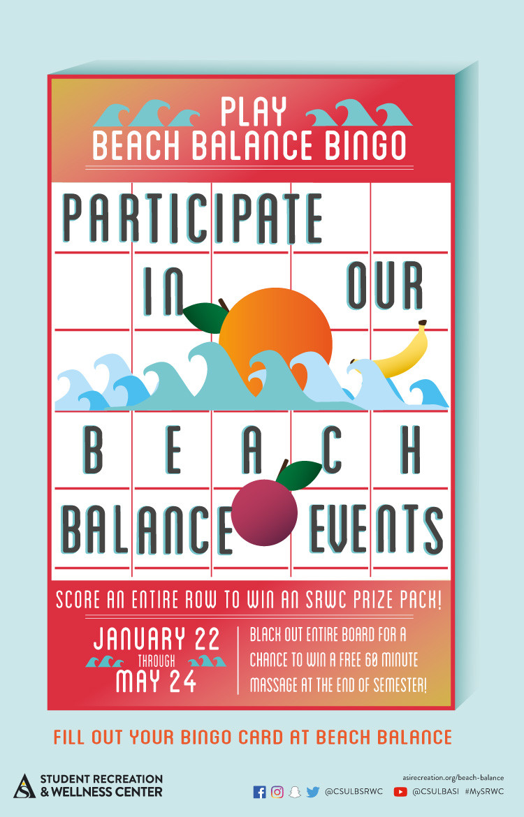
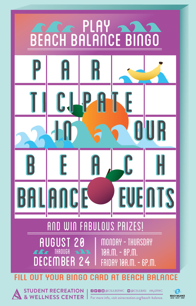
DESCRIPTION:\N\N\N\N\N\N\N\NDate\N8/20\N\NLocation\NBeach Balance\N\NTime\N10:00 AM - 8:00 PM\N\N\N\NDescription\NParticipate in our Beach Balance Event and Win Fabulous Prizes.\N\N\N\N\N\N\N\N\N\N
X-ALT-DESC;FMTTYPE=text/html:<div class="container-fluid"><div class="row"><div class="col-md-6"><div class="container-fluid module_round_box-gray" style="padding: 40px 15px;"><div class="row"><div class="col-md-12"><div class="container-fluid"><div class="row"><div class="col-md-4"><small>Date</small><p style="font-weight: 500; font-size: 1.2em;">8/20</p></div><div class="col-md-4"><small>Location</small><p style="font-weight: 500; font-size: 1.2em;">Beach Balance</p></div><div class="col-md-4"><small>Time</small><p style="font-weight: 500; font-size: 1.2em;">10:00 AM - 8:00 PM</p></div></div><div class="row"><div class="col-md-12"><small>Description</small><p>Participate in our Beach Balance Event and Win Fabulous Prizes.</p></div></div></div></div></div></div></div><div class="col-md-6"><img src="images/enjoy/calendar/fall-2018/beach-bingo-F18-Event-Poster.jpg" alt="Beach Balance Bingo Fall 2018" /></div></div></div>
LOCATION:
GEO:0.00000000;0.00000000
LAST-MODIFIED:20181026T203036Z
X-ACCESS:1
X-HITS:0
X-URL:
X-COLOR:007DAA
END:VEVENT
BEGIN:VEVENT
DTSTART;TZID=America/Los_Angeles:20180824T100000
DTEND;TZID=America/Los_Angeles:20180824T180000
RRULE:FREQ=WEEKLY;BYDAY=FR;INTERVAL=1;UNTIL=20181224T235900Z
EXDATE:20180831T170000Z,20180907T170000Z,20180914T170000Z,20180921T170000Z,20180928T170000Z,20181005T170000Z,20181012T170000Z,20181019T170000Z,20181026T170000Z,20181102T170000Z,20181109T180000Z,20181116T180000Z,20181123T180000Z,20181130T180000Z,20181207T180000Z,20181214T180000Z,20181221T180000Z
UID:6B42275D-4EFE-4010-93AB-E00DB577B2B1
SUMMARY:Beach Balance Bingo
DTSTAMP:20180626T232808Z
DESCRIPTION:\N\N\N\N\N\N\N\NDate\N8/24\N\NLocation\NBeach Balance\N\NTime\N10:00 AM - 8:00 PM\N\N\N\NDescription\NParticipate in our Beach Balance Event and Win Fabulous Prizes.\N\N\N\N\N\N\N\N\N\N
X-ALT-DESC;FMTTYPE=text/html:<div class="container-fluid"><div class="row"><div class="col-md-6"><div class="container-fluid module_round_box-gray" style="padding: 40px 15px;"><div class="row"><div class="col-md-12"><div class="container-fluid"><div class="row"><div class="col-md-4"><small>Date</small><p style="font-weight: 500; font-size: 1.2em;">8/24</p></div><div class="col-md-4"><small>Location</small><p style="font-weight: 500; font-size: 1.2em;">Beach Balance</p></div><div class="col-md-4"><small>Time</small><p style="font-weight: 500; font-size: 1.2em;">10:00 AM - 8:00 PM</p></div></div><div class="row"><div class="col-md-12"><small>Description</small><p>Participate in our Beach Balance Event and Win Fabulous Prizes.</p></div></div></div></div></div></div></div><div class="col-md-6"><img src="images/enjoy/calendar/fall-2018/beach-bingo-F18-Event-Poster.jpg.jpg" alt="Project Chill fall 18 poster" /></div></div></div>
LOCATION:
GEO:0.00000000;0.00000000
LAST-MODIFIED:20181026T203050Z
X-ACCESS:1
X-HITS:0
X-URL:
X-COLOR:007DAA
END:VEVENT
BEGIN:VEVENT
DTSTART;TZID=America/Los_Angeles:20180827T120000
DTEND;TZID=America/Los_Angeles:20180831T130000
RRULE:FREQ=WEEKLY;BYDAY=MO,TU,WE,TH,FR;INTERVAL=1;UNTIL=20180901T235900Z
EXDATE:20180828T190000Z,20180829T190000Z,20180830T190000Z,20180831T190000Z
UID:66A217BA-25ED-4BBA-BF13-42BB0199E739
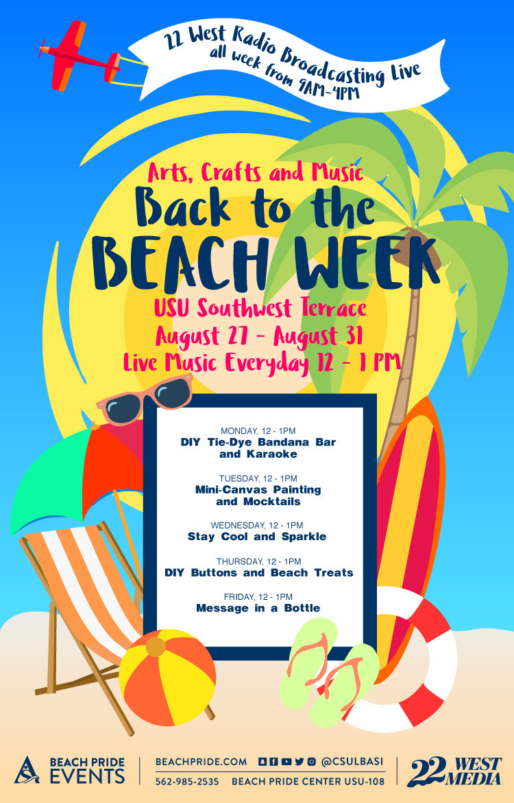
SUMMARY:Back To The Beach Week
DTSTAMP:20180822T234540Z
DESCRIPTION:\N	\N		\N			\N				\N					\N						\N							\N								Date\N									8/27-8/31\N								\N								Location\N									USU Southest Terrace\N								\N								Time\N									12pm-1pm\N								\N							\N							\N								Description\N                                    MONDAY\N                                    DIY Tie-Dye Bandana Bar and karaoke\N                                    \N                                    TUESDAY\N                                    Mini-Canvas Painting and Mocktails\N                                    \N                                    WEDNESDAY\N                                     Stay Cool and Sparkle\N                                    \N                                    MONDAY\N                                    DIY Buttons and Beach Treats\N                                    \N                                    MONDAY\N                                    Message in a Bottle\N                                    \N                                    \N								\N							\N						\N					\N				\N			\N		\N		\N			\N		\N	\N
X-ALT-DESC;FMTTYPE=text/html:<div class="container-fluid">	<div class="row">		<div class="col-md-6">			<div class="container-fluid module_round_box-gray" style="padding: 40px 15px;">				<div class="row">					<div class="col-md-12">						<div class="container-fluid">							<div class="row">								<div class="col-md-4"><small>Date</small>									<p style="font-weight: 500; font-size: 1.2em;">8/27-8/31</p>								</div>								<div class="col-md-4"><small>Location</small>									<p style="font-weight: 500; font-size: 1.2em;">USU Southest Terrace</p>								</div>								<div class="col-md-4"><small>Time</small>									<p style="font-weight: 500; font-size: 1.2em;">12pm-1pm</p>								</div>							</div>							<div class="row">								<div class="col-md-12"><small>Description</small>                                    <P>MONDAY<br>                                    DIY Tie-Dye Bandana Bar and karaoke                                    </P>                                    <P>TUESDAY<br>                                    Mini-Canvas Painting and Mocktails                                    </P>                                    <P>WEDNESDAY<br>                                     Stay Cool and Sparkle                                    </P>                                    <P>MONDAY<br>                                    DIY Buttons and Beach Treats                                    </P>                                    <P>MONDAY<br>                                    Message in a Bottle                                    </P>                                    								</div>							</div>						</div>					</div>				</div>			</div>		</div>		<div class="col-md-6">			<img src="images/enjoy/calendar/fall-2018/back-to-the-beach-week-poster.jpg" alt="Back To The Beach Week" />		</div>	</div></div>
LAST-MODIFIED:20180822T190733Z
X-ACCESS:1
X-HITS:0
X-URL:
X-COLOR:007DAA
END:VEVENT
BEGIN:VEVENT
DTSTART;TZID=America/Los_Angeles:20180904T170000
DTEND;TZID=America/Los_Angeles:20180906T180000
RRULE:FREQ=WEEKLY;BYDAY=TU,WE;INTERVAL=1;UNTIL=20180906T235900Z
EXDATE:20180906T000000Z
UID:05FE7254-9F9D-42E3-A1C0-FE635D11EECB
SUMMARY:Intramural Officials Wanted
DTSTAMP:20180626T234540Z
DESCRIPTION:\N	\N		\N			\N				\N					\N						\N							\N								Date\N									9/5\N								\N								Location\N									MAC Gym\N								\N								Time\N									5pm-6pm\N								\N							\N							\N								Description\N									Basketball flag football soccer\N								\N							\N						\N					\N				\N			\N		\N		\N			\N		\N	\N
X-ALT-DESC;FMTTYPE=text/html:<div class="container-fluid">	<div class="row">		<div class="col-md-6">			<div class="container-fluid module_round_box-gray" style="padding: 40px 15px;">				<div class="row">					<div class="col-md-12">						<div class="container-fluid">							<div class="row">								<div class="col-md-4"><small>Date</small>									<p style="font-weight: 500; font-size: 1.2em;">9/5</p>								</div>								<div class="col-md-4"><small>Location</small>									<p style="font-weight: 500; font-size: 1.2em;">MAC Gym</p>								</div>								<div class="col-md-4"><small>Time</small>									<p style="font-weight: 500; font-size: 1.2em;">5pm-6pm</p>								</div>							</div>							<div class="row">								<div class="col-md-12"><small>Description</small>									<p>Basketball flag football soccer</p>								</div>							</div>						</div>					</div>				</div>			</div>		</div>		<div class="col-md-6">			<img src="images/enjoy/calendar/fall-2018/intramural-officials-poster.jpg" alt="Intramural Officials" />		</div>	</div></div>
LOCATION:
GEO:0.00000000;0.00000000
LAST-MODIFIED:20180808T192743Z
X-ACCESS:1
X-HITS:156
X-URL:
X-COLOR:007DAA
END:VEVENT
BEGIN:VEVENT
DTSTART;TZID=America/Los_Angeles:20180904T170000
DTEND;TZID=America/Los_Angeles:20180905T190000
RRULE:FREQ=WEEKLY;BYDAY=MO,TU,WE,TH,FR;INTERVAL=1;UNTIL=20180906T235900Z
EXDATE:20180906T000000Z
UID:9309522B-5853-43E9-9263-AC689DE8DB8C
SUMMARY:VIP TRIAL TOURNAMENTS
DTSTAMP:20180817T234540Z
DESCRIPTION:\N	\N		\N			\N				\N					\N						\N							\N								Date\N									9/4\N								\N								Location\N									Main Gym A\N								\N								Time\N									5pm-7pm\N								\N							\N							\N								Description\N									3 ON 3 WHEELCHAIR BASKETBALL\N									Love basketball? Sign up at our intramural desk and learn how to play and compete from a different perspective. First 4 Teams to sign up win free SRWC merchandise! Top team gets t-shirt and other prizes.\N								\N							\N						\N					\N				\N			\N		\N		\N			\N		\N	\N
X-ALT-DESC;FMTTYPE=text/html:<div class="container-fluid">	<div class="row">		<div class="col-md-6">			<div class="container-fluid module_round_box-gray" style="padding: 40px 15px;">				<div class="row">					<div class="col-md-12">						<div class="container-fluid">							<div class="row">								<div class="col-md-4"><small>Date</small>									<p style="font-weight: 500; font-size: 1.2em;">9/4</p>								</div>								<div class="col-md-4"><small>Location</small>									<p style="font-weight: 500; font-size: 1.2em;">Main Gym A</p>								</div>								<div class="col-md-4"><small>Time</small>									<p style="font-weight: 500; font-size: 1.2em;">5pm-7pm</p>								</div>							</div>							<div class="row">								<div class="col-md-12"><small>Description</small>									<p><strong>3 ON 3 WHEELCHAIR BASKETBALL</strong></p>									<p>Love basketball? Sign up at our intramural desk and learn how to play and compete from a different perspective. First 4 Teams to sign up win free SRWC merchandise! Top team gets t-shirt and other prizes.</p>								</div>							</div>						</div>					</div>				</div>			</div>		</div>		<div class="col-md-6">			<img src="images/enjoy/calendar/fall-2018/VIP_trial_tournaments_F18_poster.jpg" alt="VIP Trial Tournaments" />		</div>	</div></div>
LOCATION:
GEO:0.00000000;0.00000000
LAST-MODIFIED:20180817T170738Z
X-ACCESS:1
X-HITS:0
X-URL:
X-COLOR:007DAA
END:VEVENT
BEGIN:VEVENT
DTSTART;TZID=America/Los_Angeles:20180905T110000
DTEND;TZID=America/Los_Angeles:20180913T140000
RRULE:FREQ=MONTHLY;BYDAY=1WE;INTERVAL=1;UNTIL=20181213T235900Z
EXDATE:20181003T180000Z,20181107T190000Z,20181205T190000Z
UID:060A2792-0C02-4DF2-8B6A-3EBCF6C918FC
SUMMARY:Project Chill New
DTSTAMP:20180828T232808Z
DESCRIPTION:\N    \N        \N            \N                \N                    \N                        \N                            \N                                Date\N                                    9/5\N                                \N                                Location\N                                    NORTH LAWN\N                                \N                                Time\N                                    11 AM - 2 PM\N                                \N                            \N                            \N                                Description\N                                    BECAUSE, HEALTH IS NOT ALL PHYSICAL, IT'S ALSO MENTAL.\N                                    30 hammocks set up just for you along the friendship walk\N                                    Kick back and relax or take your study session to one of our hammocks!\N                                    -FREE- \N                                    P.S. we might have popsicles to help you "chill out"\N                                \N                            \N                        \N                    \N                \N            \N        \N        \N            \N        \N    \N
X-ALT-DESC;FMTTYPE=text/html:<div class="container-fluid">    <div class="row">        <div class="col-md-6">            <div class="container-fluid module_round_box-gray" style="padding: 40px 15px;">                <div class="row">                    <div class="col-md-12">                        <div class="container-fluid">                            <div class="row">                                <div class="col-md-4"><small>Date</small>                                    <p style="font-weight: 500; font-size: 1.2em;">9/5</p>                                </div>                                <div class="col-md-4"><small>Location</small>                                    <p style="font-weight: 500; font-size: 1.2em;">NORTH LAWN</p>                                </div>                                <div class="col-md-4"><small>Time</small>                                    <p style="font-weight: 500; font-size: 1.2em;">11 AM - 2 PM</p>                                </div>                            </div>                            <div class="row">                                <div class="col-md-12"><small>Description</small>                                    <p><strong>BECAUSE, HEALTH IS NOT ALL PHYSICAL, IT'S ALSO MENTAL.</strong></p>                                    <p>30 hammocks set up just for you along the friendship walk</p>                                    <p>Kick back and relax or take your study session to one of our hammocks!</p>                                    <p>-FREE- <br>                                    P.S. we might have popsicles to help you "chill out"</p>                                </div>                            </div>                        </div>                    </div>                </div>            </div>        </div>        <div class="col-md-6">            <img src="images/enjoy/calendar/fall-2018/project-chill-poster.jpg" alt="Project Chill fall 18 poster" />        </div>    </div></div>
LOCATION:
GEO:0.00000000;0.00000000
LAST-MODIFIED:20180828T225957Z
X-ACCESS:1
X-HITS:0
X-URL:
X-COLOR:007DAA
END:VEVENT
BEGIN:VEVENT
DTSTART;TZID=America/Los_Angeles:20180912T170000
DTEND;TZID=America/Los_Angeles:20180913T190000
RRULE:FREQ=WEEKLY;BYDAY=MO,TU,WE,TH,FR;INTERVAL=1;UNTIL=20180914T235900Z
EXDATE:20180914T000000Z
UID:4E0BF44E-C305-4A68-BC7D-483B1914FBF6
SUMMARY:Intramural Tournament Fall 2018
DTSTAMP:20180904T234540Z
DESCRIPTION:\N    \N        \N            \N                \N                    \N                        \N                            \N                                Date\N                                    9/12 & 9/13\N                                \N                                Location\N                                    SRWC\N                                \N                                Time\N                                    5:00 PM - 7:00 PM\N                                \N                            \N                            \N                                Description\N                                    E-Sports Deadline to register is Sept. 11. Prize: NBA 2K19.\N                                \N                            \N                        \N                    \N                \N            \N        \N        \N    \N
X-ALT-DESC;FMTTYPE=text/html:<div class="container-fluid">    <div class="row">        <div class="col-md-6">            <div class="container-fluid module_round_box-gray" style="padding: 40px 15px;">                <div class="row">                    <div class="col-md-12">                        <div class="container-fluid">                            <div class="row">                                <div class="col-md-4"><small>Date</small>                                    <p style="font-weight: 500; font-size: 1.2em;">9/12 & 9/13</p>                                </div>                                <div class="col-md-4"><small>Location</small>                                    <p style="font-weight: 500; font-size: 1.2em;">SRWC</p>                                </div>                                <div class="col-md-4"><small>Time</small>                                    <p style="font-weight: 500; font-size: 1.2em;">5:00 PM - 7:00 PM</p>                                </div>                            </div>                            <div class="row">                                <div class="col-md-12"><small>Description</small>                                    <p><strong>E-Sports</strong> Deadline to register is Sept. 11. Prize: NBA 2K19.</p>                                </div>                            </div>                        </div>                    </div>                </div>            </div>        </div>        <div class="col-md-6"><img src="images/enjoy/calendar/fall-2018/intramural-tournament-october-poster.jpg" alt="Intramural Tournament Fall 2018" /></div>    </div></div>
LOCATION:
GEO:0.00000000;0.00000000
LAST-MODIFIED:20180904T203345Z
X-ACCESS:1
X-HITS:27
X-URL:
X-COLOR:007DAA
END:VEVENT
BEGIN:VEVENT
DTSTART;TZID=America/Los_Angeles:20180915T120000
DTEND;TZID=America/Los_Angeles:20181202T130000
RRULE:FREQ=MONTHLY;BYDAY=3WE;INTERVAL=1;UNTIL=20181202T235900Z
EXDATE:20180919T190000Z,20181017T190000Z,20181121T200000Z
UID:1CAABE5F-4854-45BA-91ED-ECA2C7CF503A
SUMMARY:Outdoor Adventure Trip
DTSTAMP:20180829T234540Z
DESCRIPTION:\N    \N        \N            \N                \N                    \N                        \N                            \N                                Date\N                                    9/5\N                                \N                                Location\N                                    NORTH LAWN\N                                \N                                Time\N                                    12:30 - 3:30 PM\N                                \N                            \N                            \N                                Description\N\N                                    STONEY POINT PARK CLIMBING\N                                    Fee: $35 students & $70 non-student\N                                        Register by: 9.12 at 10 PM\N                                    \N\N                                \N                            \N                        \N                    \N                \N            \N        \N        \N            \N        \N    \N
X-ALT-DESC;FMTTYPE=text/html:<div class="container-fluid">    <div class="row">        <div class="col-md-6">            <div class="container-fluid module_round_box-gray" style="padding: 40px 15px;">                <div class="row">                    <div class="col-md-12">                        <div class="container-fluid">                            <div class="row">                                <div class="col-md-4"><small>Date</small>                                    <p style="font-weight: 500; font-size: 1.2em;">9/5</p>                                </div>                                <div class="col-md-4"><small>Location</small>                                    <p style="font-weight: 500; font-size: 1.2em;">NORTH LAWN</p>                                </div>                                <div class="col-md-4"><small>Time</small>                                    <p style="font-weight: 500; font-size: 1.2em;">12:30 - 3:30 PM</p>                                </div>                            </div>                            <div class="row">                                <div class="col-md-12"><small>Description</small>                                    <p>STONEY POINT PARK CLIMBING</p>                                    <p>Fee: $35 students &amp; $70 non-student<br>                                        Register by: 9.12 at 10 PM                                    </p>                                </div>                            </div>                        </div>                    </div>                </div>            </div>        </div>        <div class="col-md-6">            <img src="images/enjoy/calendar/fall-2018/outdoor-adventures-poster.jpg" alt="Outdoor Adventure Trip" />        </div>    </div></div>
LAST-MODIFIED:20180829T170634Z
X-ACCESS:1
X-HITS:0
X-URL:
X-COLOR:007DAA
END:VEVENT
BEGIN:VEVENT
DTSTART;TZID=America/Los_Angeles:20180918T140000
DTEND;TZID=America/Los_Angeles:20181127T153000
RRULE:FREQ=MONTHLY;BYDAY=4TU;INTERVAL=1;UNTIL=20181128T235900Z
EXDATE:20180925T210000Z,20181023T210000Z,20181127T220000Z
UID:8FB3E7D7-5C97-4E7C-9A64-0F0C56850D6A
SUMMARY:Take a SEC with the EXEC
DTSTAMP:20180911T234540Z
DESCRIPTION:\N    \N        \N            \N                \N                    \N                        \N                            \N                                Date\N                                    9/18\N                                \N                                Location\N                                    Coffee Bean Plaza\N                                \N                                Time\N                                    2:00PM - 3:30PM\N                                \N                            \N                            !-- \N                                Description\N                                    Cut yourself some slack and walk the line with us every Tuesday in September\N                                \N                             --!>\N                        \N                    \N                \N            \N        \N        \N    \N
X-ALT-DESC;FMTTYPE=text/html:<div class="container-fluid">    <div class="row">        <div class="col-md-6">            <div class="container-fluid module_round_box-gray" style="padding: 40px 15px;">                <div class="row">                    <div class="col-md-12">                        <div class="container-fluid">                            <div class="row">                                <div class="col-md-4"><small>Date</small>                                    <p style="font-weight: 500; font-size: 1.2em;">9/18</p>                                </div>                                <div class="col-md-4"><small>Location</small>                                    <p style="font-weight: 500; font-size: 1.2em;">Coffee Bean Plaza</p>                                </div>                                <div class="col-md-4"><small>Time</small>                                    <p style="font-weight: 500; font-size: 1.2em;">2:00PM - 3:30PM</p>                                </div>                            </div>                            <!-- <div class="row">                                <div class="col-md-12"><small>Description</small>                                    <p>Cut yourself some slack and walk the line with us every Tuesday in September</p>                                </div>                            </div> --!>                        </div>                    </div>                </div>            </div>        </div>        <div class="col-md-6"><img src="images/enjoy/calendar/fall-2018/executive-officer-town-halls-poster.jpg" alt="Executive Officer Town Halls" /></div>    </div></div>
LOCATION:
GEO:0.00000000;0.00000000
LAST-MODIFIED:20180911T191646Z
X-ACCESS:1
X-HITS:0
X-URL:
X-COLOR:007DAA
END:VEVENT
BEGIN:VEVENT
DTSTART;TZID=America/Los_Angeles:20180924T180000
DTEND;TZID=America/Los_Angeles:20180928T200000
RRULE:FREQ=WEEKLY;BYDAY=MO,TU,WE,TH,FR;INTERVAL=1;UNTIL=20180929T235900Z
EXDATE:20180926T010000Z,20180927T010000Z,20180928T010000Z,20180929T010000Z
UID:6D727D6A-48D2-440A-983C-E5CAC061DC04
SUMMARY:Intramural League Fall 2018
DTSTAMP:20180829T234540Z
DESCRIPTION:\N    \N        \N            \N                \N                    \N                        \N                            \N                                Date\N                                    12/5\N                                \N                                Location\N                                    MAC Gym\N                                \N                                Time\N                                    5:30 PM - 7:00 PM\N                                \N                            \N                            \N                                Description\N\N                                    Team meeting will begin the week of Sept. 17 \N                                    Cost: $15 per person\N                                    \N                                    Participants can join as many leagues or tournaments as they want with this one-time semester fee\N                                    \N                                    Sign up at www.imleagues.com/csulb\N                                    \N                                \N                            \N                        \N                    \N                \N            \N        \N        \N            \N        \N    \N\N
X-ALT-DESC;FMTTYPE=text/html:<div class="container-fluid">    <div class="row">        <div class="col-md-6">            <div class="container-fluid module_round_box-gray" style="padding: 40px 15px;">                <div class="row">                    <div class="col-md-12">                        <div class="container-fluid">                            <div class="row">                                <div class="col-md-4"><small>Date</small>                                    <p style="font-weight: 500; font-size: 1.2em;">12/5</p>                                </div>                                <div class="col-md-4"><small>Location</small>                                    <p style="font-weight: 500; font-size: 1.2em;">MAC Gym</p>                                </div>                                <div class="col-md-4"><small>Time</small>                                    <p style="font-weight: 500; font-size: 1.2em;">5:30 PM - 7:00 PM</p>                                </div>                            </div>                            <div class="row">                                <div class="col-md-12"><small>Description</small>                                    <p>Team meeting will begin the week of Sept. 17 <br>                                    Cost: $15 per person                                    </p>                                    <p>Participants can <u>join as many leagues or tournaments</u> as they want with this <u>one-time semester fee</u>                                    </p>                                    <p>Sign up at www.imleagues.com/csulb</p>                                                                    </div>                            </div>                        </div>                    </div>                </div>            </div>        </div>        <div class="col-md-6">            <img src="images/enjoy/calendar/fall-2018/intramural-league-poster.jpg" alt="Intramural League Fall 2018" />        </div>    </div></div>
LAST-MODIFIED:20180829T210903Z
X-ACCESS:1
X-HITS:0
X-URL:
X-COLOR:007DAA
END:VEVENT
BEGIN:VEVENT
DTSTART;TZID=America/Los_Angeles:20180926T160000
DTEND;TZID=America/Los_Angeles:20180926T170000
RRULE:FREQ=MONTHLY;BYDAY=-1WE;INTERVAL=1;UNTIL=20181129T235900Z
EXDATE:20181031T230000Z,20181129T000000Z
UID:5B46782C-335F-481D-9B07-3B3499A486A2
SUMMARY:Mission For Nutrition
DTSTAMP:20180626T234540Z
DESCRIPTION:\N    \N        \N            \N                \N                    \N                        \N                            \N                                Date\N                                    09/26\N                                \N                                Location\N                                    Aquatic Center\N                                \N                                Time\N                                    4pm - 5pm\N                                \N                            \N                            \N                                Description\N                                    Join us at the Pool deck for free food and a cooking demo presemted by our Beach Balance and Outdoor Adventure staff\N                                    We will be making camping inspired recipes that are nutrient dense and affordable.\N                                    Cooking Outdoor has never been this fun!\N                                \N                            \N                        \N                    \N                \N            \N        \N        \N    \N
X-ALT-DESC;FMTTYPE=text/html:<div class="container-fluid">    <div class="row">        <div class="col-md-6">            <div class="container-fluid module_round_box-gray" style="padding: 40px 15px;">                <div class="row">                    <div class="col-md-12">                        <div class="container-fluid">                            <div class="row">                                <div class="col-md-4"><small>Date</small>                                    <p style="font-weight: 500; font-size: 1.2em;">09/26</p>                                </div>                                <div class="col-md-4"><small>Location</small>                                    <p style="font-weight: 500; font-size: 1.2em;">Aquatic Center</p>                                </div>                                <div class="col-md-4"><small>Time</small>                                    <p style="font-weight: 500; font-size: 1.2em;">4pm - 5pm</p>                                </div>                            </div>                            <div class="row">                                <div class="col-md-12"><small>Description</small>                                    <p>Join us at the Pool deck for free food and a cooking demo presemted by our Beach Balance and Outdoor Adventure staff</p>                                    <p>We will be making camping inspired recipes that are nutrient dense and affordable.</p>                                    <p>Cooking Outdoor has never been this fun!</p>                                </div>                            </div>                        </div>                    </div>                </div>            </div>        </div>        <div class="col-md-6"><img src="images/enjoy/calendar/fall-2018/mission-for-nutrition-F18-Poster.jpg" alt="Mission For Nutrition fall 18 poster" /></div>    </div></div>
LOCATION:
GEO:0.00000000;0.00000000
LAST-MODIFIED:20180718T181952Z
X-ACCESS:1
X-HITS:16
X-URL:
X-COLOR:007DAA
END:VEVENT
BEGIN:VEVENT
DTSTART;TZID=America/Los_Angeles:20181001T180000
DTEND;TZID=America/Los_Angeles:20181001T190000
RRULE:FREQ=WEEKLY;BYDAY=MO;INTERVAL=1;UNTIL=20181030T235900Z
EXDATE:20181009T010000Z,20181016T010000Z,20181023T010000Z,20181030T010000Z
UID:0DD25B59-CF52-48ED-B644-616DAD85FFE3
SUMMARY:Aromatherathy
DTSTAMP:20180626T232808Z
DESCRIPTION:\N	\N		\N			\N				\N					\N						\N							\N								Date\N									10/1 - 10/29\N								\N								Location\N									Beach Balance\N								\N								Time\N									6 PM - 7 PM\N								\N							\N							\N								Description\N									Join us and learn how to yse essential oils and other aroma compunds to encahnces your cognitives, physical and pyschological well-being. Participants will also receive an item to fit their personal wellness needs.\N								\N							\N						\N					\N				\N			\N		\N		\N			\N		\N	\N
X-ALT-DESC;FMTTYPE=text/html:<div class="container-fluid">	<div class="row">		<div class="col-md-6">			<div class="container-fluid module_round_box-gray" style="padding: 40px 15px;">				<div class="row">					<div class="col-md-12">						<div class="container-fluid">							<div class="row">								<div class="col-md-4"><small>Date</small>									<p style="font-weight: 500; font-size: 1.2em;">10/1 - 10/29</p>								</div>								<div class="col-md-4"><small>Location</small>									<p style="font-weight: 500; font-size: 1.2em;">Beach Balance</p>								</div>								<div class="col-md-4"><small>Time</small>									<p style="font-weight: 500; font-size: 1.2em;">6 PM - 7 PM</p>								</div>							</div>							<div class="row">								<div class="col-md-12"><small>Description</small>									<p>Join us and learn how to yse essential oils and other aroma compunds to encahnces your cognitives, physical and pyschological well-being. Participants will also receive an item to fit their personal wellness needs.</p>								</div>							</div>						</div>					</div>				</div>			</div>		</div>		<div class="col-md-6">			<img src="images/enjoy/calendar/fall-2018/aroma-therapy-F18-event-poster.jpg" alt="Aromatherapy fall 18 poster" />		</div>	</div></div>
LOCATION:
GEO:0.00000000;0.00000000
LAST-MODIFIED:20181026T203204Z
X-ACCESS:1
X-HITS:69
X-URL:
X-COLOR:007DAA
END:VEVENT
BEGIN:VEVENT
DTSTART;TZID=America/Los_Angeles:20181022T123000
DTEND;TZID=America/Los_Angeles:20181022T153000
RRULE:FREQ=WEEKLY;BYDAY=MO,TU,WE,TH,FR;INTERVAL=1;UNTIL=20181225T235900Z
EXDATE:20181023T193000Z,20181024T193000Z,20181025T193000Z,20181026T193000Z,20181029T193000Z,20181030T193000Z,20181031T193000Z,20181101T193000Z,20181102T193000Z,20181105T203000Z,20181106T203000Z,20181107T203000Z,20181108T203000Z,20181109T203000Z,20181112T203000Z,20181113T203000Z,20181114T203000Z,20181115T203000Z,20181116T203000Z,20181119T203000Z,20181120T203000Z,20181121T203000Z,20181122T203000Z,20181123T203000Z,20181126T203000Z,20181127T203000Z,20181128T203000Z,20181129T203000Z,20181130T203000Z,20181203T203000Z,20181204T203000Z,20181205T203000Z,20181206T203000Z,20181207T203000Z,20181210T203000Z,20181211T203000Z,20181212T203000Z,20181213T203000Z,20181214T203000Z,20181217T203000Z,20181218T203000Z,20181219T203000Z,20181220T203000Z,20181221T203000Z,20181224T203000Z,20181225T203000Z
UID:EAF85C10-D15C-4215-9750-0A200B223FA9
SUMMARY:Love Your Body Week
DTSTAMP:20181005T232808Z
DESCRIPTION:\N    \N        \N            \N                \N                    \N                        \N                            \N                                Date\N                                    10/8\N                                \N                                Location\N                                    USU SUNSET LOUNGE\N                                \N                                Time\N                                    12:30 - 3:30 PM\N                                \N                            \N                            \N                                Description\N                                    TAKE TIME FOR YOURSELF IN OUR HAMMOCKS INDOOR!\N                                    WE WILL BE SETTING THEM UP IN THE USU AND PROVIDING OTHER ACTIVITIES SUCH AS MEDITATION, AROMATHERAPY AND MORE!\N                                    IN COLLABORATION WITH:\N                                    BEACH PRIDE EVENTS AND STUDENT HEALTH SERVICES, BEACH BALANCE AND THE ROCK AND OUTDOOR ADVENTURE PROGRAM.\N                                \N                            \N                        \N                    \N                \N            \N        \N        \N            \N        \N    \N
X-ALT-DESC;FMTTYPE=text/html:<div class="container-fluid">    <div class="row">        <div class="col-md-6">            <div class="container-fluid module_round_box-gray" style="padding: 40px 15px;">                <div class="row">                    <div class="col-md-12">                        <div class="container-fluid">                            <div class="row">                                <div class="col-md-4"><small>Date</small>                                    <p style="font-weight: 500; font-size: 1.2em;">10/8</p>                                </div>                                <div class="col-md-4"><small>Location</small>                                    <p style="font-weight: 500; font-size: 1.2em;">USU SUNSET LOUNGE</p>                                </div>                                <div class="col-md-4"><small>Time</small>                                    <p style="font-weight: 500; font-size: 1.2em;">12:30 - 3:30 PM</p>                                </div>                            </div>                            <div class="row">                                <div class="col-md-12"><small>Description</small>                                    <p><strong>TAKE TIME FOR YOURSELF IN OUR HAMMOCKS INDOOR!</strong></p>                                    <p>WE WILL BE SETTING THEM UP IN THE USU AND PROVIDING OTHER ACTIVITIES SUCH AS MEDITATION, AROMATHERAPY AND MORE!</p>                                    <p>IN COLLABORATION WITH:</p>                                    <p>BEACH PRIDE EVENTS AND STUDENT HEALTH SERVICES, BEACH BALANCE AND THE ROCK AND OUTDOOR ADVENTURE PROGRAM.</p>                                </div>                            </div>                        </div>                    </div>                </div>            </div>        </div>        <div class="col-md-6">            <img src="images/enjoy/calendar/fall-2018/project-chill-F18-Event-Poster.jpg" alt="Project Chill fall 18 poster" />        </div>    </div></div>
LAST-MODIFIED:20181005T193816Z
X-ACCESS:1
X-HITS:0
X-URL:
X-COLOR:007DAA
END:VEVENT
BEGIN:VEVENT
DTSTART;TZID=America/Los_Angeles:20181023T100000
DTEND;TZID=America/Los_Angeles:20181023T200000
RRULE:FREQ=WEEKLY;BYDAY=MO,TU,WE,TH,FR;INTERVAL=1;UNTIL=20181026T235900Z
EXDATE:20181024T170000Z,20181025T170000Z,20181026T170000Z
UID:60DD2219-8ECA-435D-A507-F2DB967728F8
SUMMARY:Love Your Body Week
DTSTAMP:20181005T234540Z
DESCRIPTION:\N    \N        \N            \N                \N                    \N                        \N                            \N                                Date\N                                    10/23\N                                \N                                Location\N                                    Varies\N                                \N                                Time\N                                    Varies\N                                \N                            \N                            \N                                Description\NArt Therapy\N   10AM-8PM|Beach Balance\N\NSpa Water\N10AM-8PM|Beach Balance\N\NDog Therapy\N4PM-6PM|Outside Behind Rock Wall\N\NBlind Yoga\N12:15PMPM-1:15PM|Faber Fitness Room\N\NLYBW Main Event\N3PM-5PM|SRWC Plaza\N\N                                \N                            \N                        \N                    \N                \N            \N        \N        \N            \N        \N    \N
X-ALT-DESC;FMTTYPE=text/html:<div class="container-fluid">    <div class="row">        <div class="col-md-6">            <div class="container-fluid module_round_box-gray" style="padding: 40px 15px;">                <div class="row">                    <div class="col-md-12">                        <div class="container-fluid">                            <div class="row">                                <div class="col-md-4"><small>Date</small>                                    <p style="font-weight: 500; font-size: 1.2em;">10/23</p>                                </div>                                <div class="col-md-4"><small>Location</small>                                    <p style="font-weight: 500; font-size: 1.2em;">Varies</p>                                </div>                                <div class="col-md-4"><small>Time</small>                                    <p style="font-weight: 500; font-size: 1.2em;">Varies</p>                                </div>                            </div>                            <div class="row">                                <div class="col-md-12"><small>Description</small><p>Art Therapy<br>   10AM-8PM|Beach Balance</p><p>Spa Water<br>10AM-8PM|Beach Balance</p><p>Dog Therapy<br>4PM-6PM|Outside Behind Rock Wall</p><p>Blind Yoga<br>12:15PMPM-1:15PM|Faber Fitness Room</p><p>LYBW Main Event<br>3PM-5PM|SRWC Plaza</p>                                </div>                            </div>                        </div>                    </div>                </div>            </div>        </div>        <div class="col-md-6">            <img src="images/enjoy/calendar/fall-2018/love-your-body-week-poster.jpg" alt="Love your body week" />        </div>    </div></div>
LAST-MODIFIED:20181005T205417Z
X-ACCESS:1
X-HITS:0
X-URL:
X-COLOR:007DAA
END:VEVENT
BEGIN:VEVENT
DTSTART;TZID=America/Los_Angeles:20181106T170000
DTEND;TZID=America/Los_Angeles:20181107T190000
RRULE:FREQ=WEEKLY;BYDAY=MO,TU,WE,TH,FR;INTERVAL=1;UNTIL=20181108T235900Z
EXDATE:20181108T010000Z
UID:8AA23DB0-C94B-4E03-AC0B-281A6D89DC3F
SUMMARY:VIP TRIAL TOURNAMENTS
DTSTAMP:20180817T234540Z
DESCRIPTION:\N	\N		\N			\N				\N					\N						\N							\N								Date\N									11/6\N								\N								Location\N									Main Gym A\N								\N								Time\N									5pm-8pm\N								\N							\N							\N								Description\N									3 ON 3 GOAL BALL\N									Want to challenge your badmintonskills? Sign up at our intramural desk and learn how to play and complete from a different perspective. First 4 teams to sign up win free SRWC merchandise! Top team gets t-shirt and other prizes.\N								\N							\N						\N					\N				\N			\N		\N		\N			\N		\N	\N
X-ALT-DESC;FMTTYPE=text/html:<div class="container-fluid">	<div class="row">		<div class="col-md-6">			<div class="container-fluid module_round_box-gray" style="padding: 40px 15px;">				<div class="row">					<div class="col-md-12">						<div class="container-fluid">							<div class="row">								<div class="col-md-4"><small>Date</small>									<p style="font-weight: 500; font-size: 1.2em;">11/6</p>								</div>								<div class="col-md-4"><small>Location</small>									<p style="font-weight: 500; font-size: 1.2em;">Main Gym A</p>								</div>								<div class="col-md-4"><small>Time</small>									<p style="font-weight: 500; font-size: 1.2em;">5pm-8pm</p>								</div>							</div>							<div class="row">								<div class="col-md-12"><small>Description</small>									<p><strong>3 ON 3 GOAL BALL</strong></p>									<p>Want to challenge your badmintonskills? Sign up at our intramural desk and learn how to play and complete from a different perspective. First 4 teams to sign up win free SRWC merchandise! Top team gets t-shirt and other prizes.</p>								</div>							</div>						</div>					</div>				</div>			</div>		</div>		<div class="col-md-6">			<img src="images/enjoy/calendar/fall-2018/VIP_trial_tournaments_F18_poster.jpg" alt="VIP Trial Tournaments" />		</div>	</div></div>
LOCATION:
GEO:0.00000000;0.00000000
LAST-MODIFIED:20180817T172025Z
X-ACCESS:1
X-HITS:0
X-URL:
X-COLOR:007DAA
END:VEVENT
BEGIN:VEVENT
DTSTART;VALUE=DATE:20190101
DTEND;VALUE=DATE:20190102
RRULE:FREQ=WEEKLY;BYDAY=MO;INTERVAL=1;UNTIL=20190228T235900Z
EXDATE:20190107,20190114,20190121,20190128,20190204,20190211,20190218,20190225
UID:24059C90-1F77-433C-BA81-6B44FE328E3E
SUMMARY:Personal Training
DTSTAMP:20181214T002808Z
DESCRIPTION:\N\N\N\N\N\N\N\NDate\N1/1\N\NLocation\NSRWC\N\NTime\NVaries\N\N\N\NDescription\NAll student costs have been discounted!\N\N\N\N\N\N\N\N\N\N
X-ALT-DESC;FMTTYPE=text/html:<div class="container-fluid"><div class="row"><div class="col-md-6"><div class="container-fluid module_round_box-gray" style="padding: 40px 15px;"><div class="row"><div class="col-md-12"><div class="container-fluid"><div class="row"><div class="col-md-4"><small>Date</small><p style="font-weight: 500; font-size: 1.2em;">1/1</p></div><div class="col-md-4"><small>Location</small><p style="font-weight: 500; font-size: 1.2em;">SRWC</p></div><div class="col-md-4"><small>Time</small><p style="font-weight: 500; font-size: 1.2em;">Varies</p></div></div><div class="row"><div class="col-md-12"><small>Description</small><p>All student costs have been discounted!</p></div></div></div></div></div></div></div><div class="col-md-6"><img src="images/enjoy/calendar/spring-2019/srwc-personal-training-2019-poster.jpg" alt="srwc personal trainer poster" /></div></div></div>
LOCATION:
GEO:0.00000000;0.00000000
LAST-MODIFIED:20181213T225432Z
X-ACCESS:1
X-HITS:0
X-URL:
X-COLOR:007DAA
END:VEVENT
BEGIN:VEVENT
DTSTART;VALUE=DATE:20190121
DTEND;VALUE=DATE:20190122
RRULE:FREQ=WEEKLY;BYDAY=MO;UNTIL=20190215T235900Z
EXDATE:20190128,20190204,20190211
UID:5938E438-DB2B-40E0-8338-2CF86FEF6724
SUMMARY:Intramural Leagues
DTSTAMP:20181127T004540Z
DESCRIPTION:\N	\N		\N			\N				\N					\N						\N							\N								Date\N									01/21 - 02/15\N								\N								Location\N									SRWC\N								\N								Time\N									All Day\N								\N							\N							\N								Description\N                                                                        Registration opens Monday, January 21 and closes Friday, February 15.\N								\N							\N						\N					\N				\N			\N		\N		\N			\N		\N	\N
X-ALT-DESC;FMTTYPE=text/html:<div class="container-fluid">	<div class="row">		<div class="col-md-6">			<div class="container-fluid module_round_box-gray" style="padding: 40px 15px;">				<div class="row">					<div class="col-md-12">						<div class="container-fluid">							<div class="row">								<div class="col-md-4"><small>Date</small>									<p style="font-weight: 500; font-size: 1.2em;">01/21 - 02/15</p>								</div>								<div class="col-md-4"><small>Location</small>									<p style="font-weight: 500; font-size: 1.2em;">SRWC</p>								</div>								<div class="col-md-4"><small>Time</small>									<p style="font-weight: 500; font-size: 1.2em;">All Day</p>								</div>							</div>							<div class="row">								<div class="col-md-12"><small>Description</small>                                                                        <p>Registration opens Monday, January 21 and closes Friday, February 15.</p>								</div>							</div>						</div>					</div>				</div>			</div>		</div>		<div class="col-md-6">			<img src="images/enjoy/calendar/fall-2018/intramural-leagues-poster.jpg" alt="Intramural Leagues" />		</div>	</div></div>
LOCATION:
GEO:0.00000000;0.00000000
LAST-MODIFIED:20181127T004512Z
X-ACCESS:1
X-HITS:0
X-URL:
X-COLOR:007DAA
END:VEVENT
BEGIN:VEVENT
DTSTART;VALUE=DATE:20190122
DTEND;VALUE=DATE:20190123
RRULE:FREQ=WEEKLY;BYDAY=MO;INTERVAL=2;UNTIL=20190310T235900Z
EXDATE:20190204,20190218,20190304
UID:F3ED91A1-A247-44EF-BFAC-E133896BEDB8
SUMMARY:Belay A Mile 
DTSTAMP:20190111T002808Z
DESCRIPTION:\N\N\N\N\N\N\N\NDate\NJanuary 22 - May 18\N\NLocation\NSRWC\N\NTime\NVaries\N\N\N\NDescription\N    \N         \N           Become the ultimate belayer by belaying your friends up a whole mile at our rock wall. Complete the challenge by the end of the semester to get an awesome prize!\N        \N    \N\N\N\N\N\N\N\N\N\N\N\N
X-ALT-DESC;FMTTYPE=text/html:<div class="container-fluid"><div class="row"><div class="col-md-6"><div class="container-fluid module_round_box-gray" style="padding: 40px 15px;"><div class="row"><div class="col-md-12"><div class="container-fluid"><div class="row"><div class="col-md-4"><small>Date</small><p style="font-weight: 500; font-size: 1.2em;">January 22 - May 18</p></div><div class="col-md-4"><small>Location</small><p style="font-weight: 500; font-size: 1.2em;">SRWC</p></div><div class="col-md-4"><small>Time</small><p style="font-weight: 500; font-size: 1.2em;">Varies</p></div></div><div class="row"><div class="col-md-12"><small>Description</small>    <article>        <p>            Become the ultimate belayer by belaying your friends up a whole mile at our rock wall. Complete the challenge by the end of the semester to get an awesome prize!        </p>    </article></div></div></div></div></div></div></div><div class="col-md-6"><img src="images/enjoy/calendar/spring-2019/belay-a-mile-poster.jpg" alt="belay a mile poster" /></div></div></div>
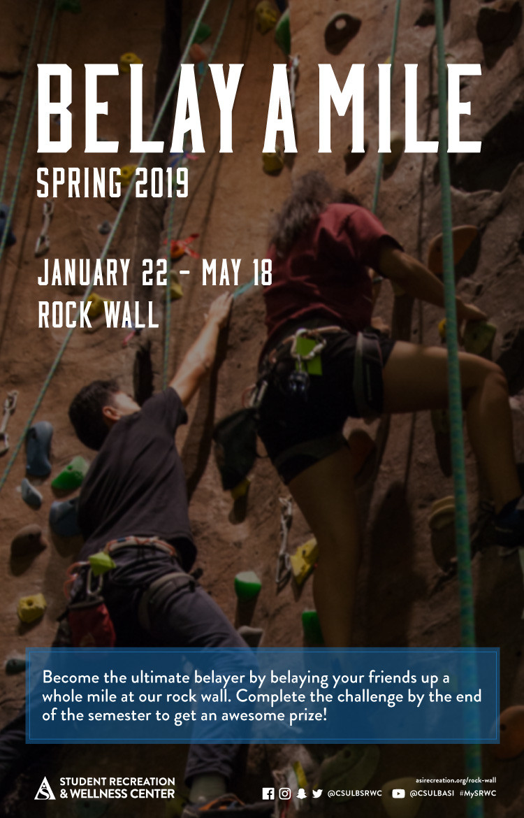
LOCATION:
GEO:0.00000000;0.00000000
LAST-MODIFIED:20190110T174548Z
X-ACCESS:1
X-HITS:0
X-URL:
X-COLOR:007DAA
END:VEVENT
BEGIN:VEVENT
DTSTART;VALUE=DATE:20190122
DTEND;VALUE=DATE:20190123
RRULE:FREQ=WEEKLY;BYDAY=FR;INTERVAL=2;UNTIL=20190429T235900Z
EXDATE:20190125,20190208,20190222,20190308,20190322,20190405,20190419
UID:CFE547B5-56BE-4B93-A53A-D7CE5DE19AA0
SUMMARY:Outdoor Adventure Trips
DTSTAMP:20190109T002808Z
DESCRIPTION:\N\N\N\N\N\N\N\NDate\NVaries\N\NLocation\NSRWC\N\NTime\NVaries\N\N\N\NDescription\N    \N         \N            Sign-ups begin on Tuesday, January 22. Spots are limited. Below is a list of dates and locations. \N        \N        \N            February 9 Stoney Point Park Climbing. Fee: $35 students and $70 non-students. Register by: February 6 at 10 PM. \N            March 9 Black Star Canyon Hike. Fee: $30 students and $60 non-students. Register by: March 4 at 10 PM. \N            March 23 and March 24 Point Mugu Camp & Hike. Fee: $65 students and $130 non-students. Register by: March 18 at 10 PM.\N            April 13 and April 14 Backpack Switzer Falls & Bear Canyon. Fee: $65 students and $130 non-students. Register by: April 8 at 10 PM.\N            April 20 Echo Mountain Hike. Fee: $30 students and $60 non-students. Register by: April 15 at 10 PM.\N            May 5 Crystal Cove Yoga Adventure. Fee: $35 students and $70 non-students. Register by: April 29 at 10 PM.\N        \N    \N\N\N\N\N\N\N\N\N\N\N\N
X-ALT-DESC;FMTTYPE=text/html:<div class="container-fluid"><div class="row"><div class="col-md-6"><div class="container-fluid module_round_box-gray" style="padding: 40px 15px;"><div class="row"><div class="col-md-12"><div class="container-fluid"><div class="row"><div class="col-md-4"><small>Date</small><p style="font-weight: 500; font-size: 1.2em;">Varies</p></div><div class="col-md-4"><small>Location</small><p style="font-weight: 500; font-size: 1.2em;">SRWC</p></div><div class="col-md-4"><small>Time</small><p style="font-weight: 500; font-size: 1.2em;">Varies</p></div></div><div class="row"><div class="col-md-12"><small>Description</small>    <article>        <p>             Sign-ups begin on Tuesday, January 22. Spots are limited. Below is a list of dates and locations.         </p>        <ul>            <li>February 9 Stoney Point Park Climbing. Fee: $35 students and $70 non-students. Register by: February 6 at 10 PM. </li>            <li>March 9 Black Star Canyon Hike. Fee: $30 students and $60 non-students. Register by: March 4 at 10 PM. </li>            <li>March 23 and March 24 Point Mugu Camp & Hike. Fee: $65 students and $130 non-students. Register by: March 18 at 10 PM.</li>            <li>April 13 and April 14 Backpack Switzer Falls & Bear Canyon. Fee: $65 students and $130 non-students. Register by: April 8 at 10 PM.</li>            <li>April 20 Echo Mountain Hike. Fee: $30 students and $60 non-students. Register by: April 15 at 10 PM.</li>            <li>May 5 Crystal Cove Yoga Adventure. Fee: $35 students and $70 non-students. Register by: April 29 at 10 PM.</li>        </ul>    </article></div></div></div></div></div></div></div><div class="col-md-6"><img src="images/enjoy/calendar/spring-2019/outdoor-trips-poster.jpg" alt="outdoor trips poster" /></div></div></div>
LAST-MODIFIED:20190821T221607Z
X-ACCESS:1
X-HITS:0
X-URL:
X-COLOR:007DAA
END:VEVENT
BEGIN:VEVENT
DTSTART;VALUE=DATE:20190122
DTEND;VALUE=DATE:20190123
RRULE:FREQ=WEEKLY;BYDAY=TU;INTERVAL=1;UNTIL=20190524T235900Z
EXDATE:20190129,20190205,20190212,20190219,20190226,20190305,20190312,20190319,20190326,20190402,20190409,20190416,20190423,20190430,20190507,20190514,20190521
UID:2D04C377-83F8-4E6B-996B-2F13E988CDC0
SUMMARY:SPA Water Tuesday 
DTSTAMP:20190108T002808Z
DESCRIPTION:\N\N\N\N\N\N\N\NDate\NJanuary 22 Through May 24\N\NLocation\NSRWC\N\NTime\NDuring Beach Balance Operation Hours\N\N\N\NDescription\N\N    Bring your water bottle for free fruity infused iced water! \N\N\N\N\N\N\N\N\N\N\N
X-ALT-DESC;FMTTYPE=text/html:<div class="container-fluid"><div class="row"><div class="col-md-6"><div class="container-fluid module_round_box-gray" style="padding: 40px 15px;"><div class="row"><div class="col-md-12"><div class="container-fluid"><div class="row"><div class="col-md-4"><small>Date</small><p style="font-weight: 500; font-size: 1.2em;">January 22 Through May 24</p></div><div class="col-md-4"><small>Location</small><p style="font-weight: 500; font-size: 1.2em;">SRWC</p></div><div class="col-md-4"><small>Time</small><p style="font-weight: 500; font-size: 1.2em;">During Beach Balance Operation Hours</p></div></div><div class="row"><div class="col-md-12"><small>Description</small><p>    Bring your water bottle for free fruity infused iced water! </p></div></div></div></div></div></div></div><div class="col-md-6"><img src="images/enjoy/calendar/spring-2019/beach-balance-weekly-events-poster.jpg" alt="beach balance weekly events poster" /></div></div></div>
LOCATION:
GEO:0.00000000;0.00000000
LAST-MODIFIED:20190107T183139Z
X-ACCESS:1
X-HITS:7
X-URL:
X-COLOR:007DAA
END:VEVENT
BEGIN:VEVENT
DTSTART;TZID=America/Los_Angeles:20190122T100000
DTEND;TZID=America/Los_Angeles:20190122T180000
RRULE:FREQ=WEEKLY;BYDAY=FR;INTERVAL=1;UNTIL=20190524T235900Z
EXDATE:20190125T180000Z,20190201T180000Z,20190208T180000Z,20190215T180000Z,20190222T180000Z,20190301T180000Z,20190308T180000Z,20190315T170000Z,20190322T170000Z,20190329T170000Z,20190405T170000Z,20190412T170000Z,20190419T170000Z,20190426T170000Z,20190503T170000Z,20190510T170000Z,20190517T170000Z,20190524T170000Z
UID:75F11104-C32B-4A3B-BE91-573647C73978
SUMMARY:Play Beach Balance Bingo
DTSTAMP:20190108T002808Z
DESCRIPTION:\N\N\N\N\N\N\N\NDate\NJanuary 22 Through May 24\N\NLocation\NSRWC\N\NTime\NVaries\N\N\N\NDescription\NParticipate in our beach balance Events\NScore an entire row to win an SRWC prize pack!\NBlack out entire board for a chance to win a free 60 minute massage at the end of semester! \N\N\N\N\N\N\N\N\N\N
X-ALT-DESC;FMTTYPE=text/html:<div class="container-fluid"><div class="row"><div class="col-md-6"><div class="container-fluid module_round_box-gray" style="padding: 40px 15px;"><div class="row"><div class="col-md-12"><div class="container-fluid"><div class="row"><div class="col-md-4"><small>Date</small><p style="font-weight: 500; font-size: 1.2em;">January 22 Through May 24</p></div><div class="col-md-4"><small>Location</small><p style="font-weight: 500; font-size: 1.2em;">SRWC</p></div><div class="col-md-4"><small>Time</small><p style="font-weight: 500; font-size: 1.2em;">Varies</p></div></div><div class="row"><div class="col-md-12"><small>Description</small><p>Participate in our beach balance Events</p><p>Score an entire row to win an SRWC prize pack!</p><p>Black out entire board for a chance to win a free 60 minute massage at the end of semester! </P></div></div></div></div></div></div></div><div class="col-md-6"><img src="images/enjoy/calendar/spring-2019/beach-balance-bingo-poster.jpg" alt="beach balance bingo poster" /></div></div></div>
LOCATION:
GEO:0.00000000;0.00000000
LAST-MODIFIED:20190214T184007Z
X-ACCESS:1
X-HITS:3
X-URL:
X-COLOR:007DAA
END:VEVENT
BEGIN:VEVENT
DTSTART;TZID=America/Los_Angeles:20190122T100000
DTEND;TZID=America/Los_Angeles:20190122T200000
RRULE:FREQ=WEEKLY;BYDAY=TU;INTERVAL=1;UNTIL=20190524T235900Z
EXDATE:20190129T180000Z,20190205T180000Z,20190212T180000Z,20190219T180000Z,20190226T180000Z,20190305T180000Z,20190312T170000Z,20190319T170000Z,20190326T170000Z,20190402T170000Z,20190409T170000Z,20190416T170000Z,20190423T170000Z,20190430T170000Z,20190507T170000Z,20190514T170000Z,20190521T170000Z
UID:E76C7408-43DD-4C0E-91C5-2420AD93F1F9
SUMMARY:Art Therapy
DTSTAMP:20190108T002808Z
DESCRIPTION:\N\N\N\N\N\N\N\NDate\NJanuary 22 Through May 24\N\NLocation\NSRWC\N\NTime\N10AM - 8PM\N\N\N\NDescription\N\N    Come unleash your creative spirit with art therapy! Free coloring pages and supplies will be providied in our\N    wellness room!\N\N\N\N\N\N\N\N\N\N\N
X-ALT-DESC;FMTTYPE=text/html:<div class="container-fluid"><div class="row"><div class="col-md-6"><div class="container-fluid module_round_box-gray" style="padding: 40px 15px;"><div class="row"><div class="col-md-12"><div class="container-fluid"><div class="row"><div class="col-md-4"><small>Date</small><p style="font-weight: 500; font-size: 1.2em;">January 22 Through May 24</p></div><div class="col-md-4"><small>Location</small><p style="font-weight: 500; font-size: 1.2em;">SRWC</p></div><div class="col-md-4"><small>Time</small><p style="font-weight: 500; font-size: 1.2em;">10AM - 8PM</p></div></div><div class="row"><div class="col-md-12"><small>Description</small><p>    Come unleash your creative spirit with art therapy! Free coloring pages and supplies will be providied in our    wellness room!</p></div></div></div></div></div></div></div><div class="col-md-6"><img src="images/enjoy/calendar/spring-2019/art-therapy-poster.jpg" alt="art therapy poster" /></div></div></div>
LOCATION:
GEO:0.00000000;0.00000000
LAST-MODIFIED:20190108T002202Z
X-ACCESS:1
X-HITS:0
X-URL:
X-COLOR:007DAA
END:VEVENT
BEGIN:VEVENT
DTSTART;TZID=America/Los_Angeles:20190122T100000
DTEND;TZID=America/Los_Angeles:20190122T180000
RRULE:FREQ=WEEKLY;BYDAY=FR;INTERVAL=1;UNTIL=20190524T235900Z
EXDATE:20190125T180000Z,20190201T180000Z,20190208T180000Z,20190215T180000Z,20190222T180000Z,20190301T180000Z,20190308T180000Z,20190315T170000Z,20190322T170000Z,20190329T170000Z,20190405T170000Z,20190412T170000Z,20190419T170000Z,20190426T170000Z,20190503T170000Z,20190510T170000Z,20190517T170000Z,20190524T170000Z
UID:DF93D3D8-8194-491B-B202-65419A020509
SUMMARY:Foam Rolling Friday 
DTSTAMP:20190108T002808Z
DESCRIPTION:\N\N\N\N\N\N\N\NDate\NJanuary 22 Through May 24\N\NLocation\NSRWC\N\NTime\NDuring beach balance hours\N\N\N\NDescription\N\N    Use our therapy canes, muscle roller sticks, and foam rollers, which will be set up in our wellness room for a quiet place to stretch. \N\N\N\N\N\N\N\N\N\N\N
X-ALT-DESC;FMTTYPE=text/html:<div class="container-fluid"><div class="row"><div class="col-md-6"><div class="container-fluid module_round_box-gray" style="padding: 40px 15px;"><div class="row"><div class="col-md-12"><div class="container-fluid"><div class="row"><div class="col-md-4"><small>Date</small><p style="font-weight: 500; font-size: 1.2em;">January 22 Through May 24</p></div><div class="col-md-4"><small>Location</small><p style="font-weight: 500; font-size: 1.2em;">SRWC</p></div><div class="col-md-4"><small>Time</small><p style="font-weight: 500; font-size: 1.2em;">During beach balance hours</p></div></div><div class="row"><div class="col-md-12"><small>Description</small><p>    Use our therapy canes, muscle roller sticks, and foam rollers, which will be set up in our wellness room for a quiet place to stretch. </p></div></div></div></div></div></div></div><div class="col-md-6"><img src="images/enjoy/calendar/spring-2019/beach-balance-weekly-events-poster.jpg" alt="beach balance weekly events poster" /></div></div></div>
LOCATION:
GEO:0.00000000;0.00000000
LAST-MODIFIED:20190214T183725Z
X-ACCESS:1
X-HITS:0
X-URL:
X-COLOR:007DAA
END:VEVENT
BEGIN:VEVENT
DTSTART;VALUE=DATE:20190123
DTEND;VALUE=DATE:20190124
RRULE:FREQ=WEEKLY;BYDAY=WE;INTERVAL=1;UNTIL=20190524T235900Z
EXDATE:20190130,20190206,20190213,20190220,20190227,20190306,20190313,20190320,20190327,20190403,20190410,20190417,20190424,20190501,20190508,20190515,20190522
UID:4B3A3BD3-9877-4419-91A3-9654E67BA28D
SUMMARY:Well-Rested Wednesday 
DTSTAMP:20190108T002808Z
DESCRIPTION:\N\N\N\N\N\N\N\NDate\NJanuary 22 Through May 24\N\NLocation\NSRWC\N\NTime\NDuring Beach Balance Operation Hours\N\N\N\NDescription\N\N    Take a nap in our hammocks in the wellness room where it is dark, air-conditioned and serence. \N\N\N\N\N\N\N\N\N\N\N
X-ALT-DESC;FMTTYPE=text/html:<div class="container-fluid"><div class="row"><div class="col-md-6"><div class="container-fluid module_round_box-gray" style="padding: 40px 15px;"><div class="row"><div class="col-md-12"><div class="container-fluid"><div class="row"><div class="col-md-4"><small>Date</small><p style="font-weight: 500; font-size: 1.2em;">January 22 Through May 24</p></div><div class="col-md-4"><small>Location</small><p style="font-weight: 500; font-size: 1.2em;">SRWC</p></div><div class="col-md-4"><small>Time</small><p style="font-weight: 500; font-size: 1.2em;">During Beach Balance Operation Hours</p></div></div><div class="row"><div class="col-md-12"><small>Description</small><p>    Take a nap in our hammocks in the wellness room where it is dark, air-conditioned and serence. </p></div></div></div></div></div></div></div><div class="col-md-6"><img src="images/enjoy/calendar/spring-2019/beach-balance-weekly-events-poster.jpg" alt="beach balance weekly events poster" /></div></div></div>
LOCATION:
GEO:0.00000000;0.00000000
LAST-MODIFIED:20190107T220714Z
X-ACCESS:1
X-HITS:22
X-URL:
X-COLOR:007DAA
END:VEVENT
BEGIN:VEVENT
DTSTART;TZID=America/Los_Angeles:20190122T170000
DTEND;TZID=America/Los_Angeles:20190122T180000
RRULE:FREQ=WEEKLY;BYDAY=MO;INTERVAL=1;UNTIL=20190524T235900Z
EXDATE:20190129T010000Z,20190205T010000Z,20190212T010000Z,20190219T010000Z,20190226T010000Z,20190305T010000Z,20190312T000000Z,20190319T000000Z,20190326T000000Z,20190402T000000Z,20190409T000000Z,20190416T000000Z,20190423T000000Z,20190430T000000Z,20190507T000000Z,20190514T000000Z,20190521T000000Z
UID:9B8094E6-EF59-4374-945E-CFBABE016DCC
SUMMARY:Meditation Monday 
DTSTAMP:20190108T002808Z
DESCRIPTION:\N\N\N\N\N\N\N\NDate\NJanuary 22 Through May 24\N\NLocation\NSRWC\N\NTime\N5pm - 6pm\N\N\N\NDescription\N\N    Take some time for yourself to de-stress and relax through meditation every Monday during Beach hours of operation. \N    Join us for guided meditation from 5PM - 6 PM. \N\N\N\N\N\N\N\N\N\N\N
X-ALT-DESC;FMTTYPE=text/html:<div class="container-fluid"><div class="row"><div class="col-md-6"><div class="container-fluid module_round_box-gray" style="padding: 40px 15px;"><div class="row"><div class="col-md-12"><div class="container-fluid"><div class="row"><div class="col-md-4"><small>Date</small><p style="font-weight: 500; font-size: 1.2em;">January 22 Through May 24</p></div><div class="col-md-4"><small>Location</small><p style="font-weight: 500; font-size: 1.2em;">SRWC</p></div><div class="col-md-4"><small>Time</small><p style="font-weight: 500; font-size: 1.2em;">5pm - 6pm</p></div></div><div class="row"><div class="col-md-12"><small>Description</small><p>    Take some time for yourself to de-stress and relax through meditation every Monday during Beach hours of operation.     Join us for guided meditation from 5PM - 6 PM. </p></div></div></div></div></div></div></div><div class="col-md-6"><img src="images/enjoy/calendar/spring-2019/beach-balance-weekly-events-poster.jpg" alt="beach balance weekly events poster" /></div></div></div>
LOCATION:
GEO:0.00000000;0.00000000
LAST-MODIFIED:20190107T182809Z
X-ACCESS:1
X-HITS:6
X-URL:
X-COLOR:007DAA
END:VEVENT
BEGIN:VEVENT
DTSTART;TZID=America/Los_Angeles:20190124T160000
DTEND;TZID=America/Los_Angeles:20190124T180000
RRULE:FREQ=WEEKLY;BYDAY=TH;INTERVAL=1;UNTIL=20190524T235900Z
EXDATE:20190201T000000Z,20190208T000000Z,20190215T000000Z,20190222T000000Z,20190301T000000Z,20190308T000000Z,20190314T230000Z,20190321T230000Z,20190328T230000Z,20190404T230000Z,20190411T230000Z,20190418T230000Z,20190425T230000Z,20190502T230000Z,20190509T230000Z,20190516T230000Z,20190523T230000Z
UID:63D2D4D9-CC99-4EBD-A0CC-56D7A523B56F
SUMMARY:Chair Masage Thursday
DTSTAMP:20190108T002808Z
DESCRIPTION:\N\N\N\N\N\N\N\NDate\NJanuary 22 Through May 24\N\NLocation\NSRWC\N\NTime\N4PM - 6PM\N\N\N\NDescription\N\N    Release some tension with a FREE 5-10 minute chair massage from 4PM to 6PM. \N\N\N\N\N\N\N\N\N\N\N
X-ALT-DESC;FMTTYPE=text/html:<div class="container-fluid"><div class="row"><div class="col-md-6"><div class="container-fluid module_round_box-gray" style="padding: 40px 15px;"><div class="row"><div class="col-md-12"><div class="container-fluid"><div class="row"><div class="col-md-4"><small>Date</small><p style="font-weight: 500; font-size: 1.2em;">January 22 Through May 24</p></div><div class="col-md-4"><small>Location</small><p style="font-weight: 500; font-size: 1.2em;">SRWC</p></div><div class="col-md-4"><small>Time</small><p style="font-weight: 500; font-size: 1.2em;">4PM - 6PM</p></div></div><div class="row"><div class="col-md-12"><small>Description</small><p>    Release some tension with a FREE 5-10 minute chair massage from 4PM to 6PM. </p></div></div></div></div></div></div></div><div class="col-md-6"><img src="images/enjoy/calendar/spring-2019/beach-balance-weekly-events-poster.jpg" alt="beach balance weekly events poster" /></div></div></div>
LOCATION:
GEO:0.00000000;0.00000000
LAST-MODIFIED:20190107T220734Z
X-ACCESS:1
X-HITS:0
X-URL:
X-COLOR:007DAA
END:VEVENT
BEGIN:VEVENT
DTSTART;TZID=America/Los_Angeles:20190125T130000
DTEND;TZID=America/Los_Angeles:20190125T150000
RRULE:FREQ=WEEKLY;BYDAY=FR;INTERVAL=1;UNTIL=20190419T235900Z
EXDATE:20190201T210000Z,20190208T210000Z,20190215T210000Z,20190222T210000Z,20190301T210000Z,20190308T210000Z,20190315T200000Z,20190322T200000Z,20190329T200000Z,20190405T200000Z,20190412T200000Z,20190419T200000Z
UID:3C133E33-4DF7-481E-8DC3-E37EFA366E46
SUMMARY:Rock Climbing Classes - Belay Basics
DTSTAMP:20190108T002808Z
DESCRIPTION:\N\N\N\N\N\N\N\NDate\NJanuary 25\N\NLocation\NSRWC\N\NTime\N1pm - 3pm\N\N\N\NDescription\N \N    Want to climb like a pro? Learn all the pro-skills to become a competent climber indoors and outdoors. \N    Check out our array of climbing classes taught by our experienced rock wall staff!\N\N\N    Learn basic technical skills for top rope climbing. Drop into any class to get started.  \N\N\N\N\N\N\N\N\N\N\N\N
X-ALT-DESC;FMTTYPE=text/html:<div class="container-fluid"><div class="row"><div class="col-md-6"><div class="container-fluid module_round_box-gray" style="padding: 40px 15px;"><div class="row"><div class="col-md-12"><div class="container-fluid"><div class="row"><div class="col-md-4"><small>Date</small><p style="font-weight: 500; font-size: 1.2em;">January 25</p></div><div class="col-md-4"><small>Location</small><p style="font-weight: 500; font-size: 1.2em;">SRWC</p></div><div class="col-md-4"><small>Time</small><p style="font-weight: 500; font-size: 1.2em;">1pm - 3pm</p></div></div><div class="row"><div class="col-md-12"><small>Description</small><p>     Want to climb like a pro? Learn all the pro-skills to become a competent climber indoors and outdoors.     Check out our array of climbing classes taught by our experienced rock wall staff!</p><p>    Learn basic technical skills for top rope climbing. Drop into any class to get started.  </p></div></div></div></div></div></div></div><div class="col-md-6"><img src="images/enjoy/calendar/spring-2019/climbing-classes-poster.jpg" alt="climbing classes poster" /></div></div></div>
LOCATION:
GEO:0.00000000;0.00000000
LAST-MODIFIED:20190107T214946Z
X-ACCESS:1
X-HITS:0
X-URL:
X-COLOR:007DAA
END:VEVENT
BEGIN:VEVENT
DTSTART;VALUE=DATE:20190128
DTEND;VALUE=DATE:20190129
RRULE:FREQ=WEEKLY;BYDAY=MO;INTERVAL=3;UNTIL=20190518T235900Z
EXDATE:20190218,20190311,20190401,20190422,20190513
UID:31639E6E-8EE3-43DC-94AE-F8BA455E0D38
SUMMARY:Mile High Challenge 
DTSTAMP:20190109T002808Z
DESCRIPTION:\N\N\N\N\N\N\N\NDate\NJanuary 22 - May 18\N\NLocation\NSRWC\N\NTime\NVaries\N\N\N\NDescription\N    \N         \N            Forget walking a mile in their shoes-come climb a mile in ours! Climb the 25 foot tall rock wall 211 times by the end of the semester to win a free shirt and be part of our Mile High team. \N        \N    \N\N\N\N\N\N\N\N\N\N\N\N
X-ALT-DESC;FMTTYPE=text/html:<div class="container-fluid"><div class="row"><div class="col-md-6"><div class="container-fluid module_round_box-gray" style="padding: 40px 15px;"><div class="row"><div class="col-md-12"><div class="container-fluid"><div class="row"><div class="col-md-4"><small>Date</small><p style="font-weight: 500; font-size: 1.2em;">January 22 - May 18</p></div><div class="col-md-4"><small>Location</small><p style="font-weight: 500; font-size: 1.2em;">SRWC</p></div><div class="col-md-4"><small>Time</small><p style="font-weight: 500; font-size: 1.2em;">Varies</p></div></div><div class="row"><div class="col-md-12"><small>Description</small>    <article>        <p>             Forget walking a mile in their shoes-come climb a mile in ours! Climb the 25 foot tall rock wall 211 times by the end of the semester to win a free shirt and be part of our Mile High team.         </p>    </article></div></div></div></div></div></div></div><div class="col-md-6"><img src="images/enjoy/calendar/spring-2019/mile-high-challenge-poster.jpg" alt="mile high challenge poster" /></div></div></div>
LOCATION:
GEO:0.00000000;0.00000000
LAST-MODIFIED:20190108T235557Z
X-ACCESS:1
X-HITS:0
X-URL:
X-COLOR:007DAA
END:VEVENT
BEGIN:VEVENT
DTSTART;TZID=America/Los_Angeles:20190128T100000
DTEND;TZID=America/Los_Angeles:20190128T200000
RRULE:FREQ=WEEKLY;BYDAY=MO;INTERVAL=1;UNTIL=20190513T235900Z
EXDATE:20190204T180000Z,20190211T180000Z,20190218T180000Z,20190225T180000Z,20190304T180000Z,20190311T170000Z,20190318T170000Z,20190325T170000Z,20190401T170000Z,20190408T170000Z,20190415T170000Z,20190422T170000Z,20190429T170000Z,20190506T170000Z,20190513T170000Z
UID:D874E21B-BFB5-4C84-B3C0-5066BCEA58AA
SUMMARY:Self-Guided Meditation
DTSTAMP:20190117T002808Z
DESCRIPTION:\N    \N    \N    \N    \N    \N    \N    \N    Date\N    Varies\N    \N    Location\N    SRWC\N    \N    Time\N    Varies\N    \N    \N    \N    Description\N        \N            \N                Self-Guided Meditation\N                     \N                        Time: Mondays January 28 - May 13 10am - 8pm.\N                        Location: Beach Balance Wellness Room. \N                    \N                \N    \N                Guided Meditation\N                     \N                        Time: Every Monday during the Spring Semester (except April 1) 5pm - 6pm. \N                        Location: Beach Balance Wellness Room. \N                    \N                \N    \N                Special Edition Meditation\N                     \N                        Time: Tuesday, February 5 3pm - 3:45pm. \N                        Location: Japanese Garden. \N                    \N                     \N                        Time: Thursday, April 11 12pm - 12:45pm. \N                        Location: University Student Union. \N                    \N                     \N                        Time: Tuesday, May 14 3pm - 3:45pm. \N                        Location: SRWC Poolside. \N                    \N                \N            \N        \N    \N    \N    \N    \N    \N    \N    \N    \N    \N    
X-ALT-DESC;FMTTYPE=text/html:<div class="container-fluid">    <div class="row">    <div class="col-md-6">    <div class="container-fluid module_round_box-gray" style="padding: 40px 15px;">    <div class="row">    <div class="col-md-12">    <div class="container-fluid">    <div class="row">    <div class="col-md-4"><small>Date</small>    <p style="font-weight: 500; font-size: 1.2em;">Varies</p>    </div>    <div class="col-md-4"><small>Location</small>    <p style="font-weight: 500; font-size: 1.2em;">SRWC</p>    </div>    <div class="col-md-4"><small>Time</small>    <p style="font-weight: 500; font-size: 1.2em;">Varies</p>    </div>    </div>    <div class="row">    <div class="col-md-12"><small>Description</small>        <article>            <ul>                <li>Self-Guided Meditation                    <ul>                         <li>Time: Mondays January 28 - May 13 10am - 8pm.</li>                        <li>Location: Beach Balance Wellness Room. </li>                    </ul>                </li>                    <li>Guided Meditation                    <ul>                         <li>Time: Every Monday during the Spring Semester (except April 1) 5pm - 6pm. </li>                        <li>Location: Beach Balance Wellness Room. </li>                    </ul>                </li>                    <li>Special Edition Meditation                    <ul>                         <li>Time: Tuesday, February 5 3pm - 3:45pm. </li>                        <li>Location: Japanese Garden. </li>                    </ul>                    <ul>                         <li>Time: Thursday, April 11 12pm - 12:45pm. </li>                        <li>Location: University Student Union. </li>                    </ul>                    <ul>                         <li>Time: Tuesday, May 14 3pm - 3:45pm. </li>                        <li>Location: SRWC Poolside. </li>                    </ul>                </li>            </ul>        </article>    </div>    </div>    </div>    </div>    </div>    </div>    </div>    <div class="col-md-6"><img src="images/enjoy/calendar/spring-2019/meditation-events-poster.jpg" alt="meditation events poster" /></div>    </div>    </div>
LOCATION:
GEO:0.00000000;0.00000000
LAST-MODIFIED:20190116T181145Z
X-ACCESS:1
X-HITS:0
X-URL:
X-COLOR:007DAA
END:VEVENT
BEGIN:VEVENT
DTSTART;VALUE=DATE:20190201
DTEND;VALUE=DATE:20190202
RRULE:FREQ=WEEKLY;BYDAY=TU;INTERVAL=1;UNTIL=20190228T235900Z
EXDATE:20190205,20190212,20190219,20190226
UID:CC97FB0C-3AE7-4C2B-B756-F7953BA9C19B
SUMMARY:February Mini Challenge Series 
DTSTAMP:20190115T002808Z
DESCRIPTION:\N\N\N\N\N\N\N\NDate\NEveryday in February\N\NLocation\NSRWC\N\NTime\NVaries\N\N\N\NDescription\N    \N         \N           Love a good challenge? Try our favorite mini-challenges! Compete against your peers all month in trials of speed, strength, endurance and problem-solving. \N        \N    \N\N\N\N\N\N\N\N\N\N\N
X-ALT-DESC;FMTTYPE=text/html:<div class="container-fluid"><div class="row"><div class="col-md-6"><div class="container-fluid module_round_box-gray" style="padding: 40px 15px;"><div class="row"><div class="col-md-12"><div class="container-fluid"><div class="row"><div class="col-md-4"><small>Date</small><p style="font-weight: 500; font-size: 1.2em;">Everyday in February</p></div><div class="col-md-4"><small>Location</small><p style="font-weight: 500; font-size: 1.2em;">SRWC</p></div><div class="col-md-4"><small>Time</small><p style="font-weight: 500; font-size: 1.2em;">Varies</p></div></div><div class="row"><div class="col-md-12"><small>Description</small>    <article>        <p>            Love a good challenge? Try our favorite mini-challenges! Compete against your peers all month in trials of speed, strength, endurance and problem-solving.         </p>    </article></div></div></div></div></div></div></div><div class="col-md-6"><img src="images/enjoy/calendar/spring-2019/feb-mini-challenges-poster.jpg" alt="february mini challenge poster" /></div></div></div>
LOCATION:
GEO:0.00000000;0.00000000
LAST-MODIFIED:20190116T000248Z
X-ACCESS:1
X-HITS:0
X-URL:
X-COLOR:007DAA
END:VEVENT
BEGIN:VEVENT
DTSTART;VALUE=DATE:20190211
DTEND;VALUE=DATE:20190212
RRULE:FREQ=WEEKLY;BYDAY=MO;INTERVAL=2;UNTIL=20190510T235900Z
EXDATE:20190225,20190311,20190325,20190408,20190422,20190506
UID:C0772150-CC40-414A-9E01-149C59483FF9
SUMMARY:Instructional Classes 
DTSTAMP:20190116T002808Z
DESCRIPTION:\N\N\N\N\N\N\N\NDate\NVaries\N\NLocation\NSRWC\N\NTime\NVaries\N\N\N\NDescription\N    \N         \N            Insructional Classes. Session one starts February 11 - March 22. Session two starts March 25 - May 10.\N        \N        \N            Boxing 101 \N                 \N                    Time: Monday and Wednesday 4pm - 5pm & 5:30pm - 6:30pm.\N                    Location: Fitness Room B. \N                    Fee: $35 students and $40 members. \N                \N            \N\N            TRX Mix \N                 \N                    Time: Monday and Wednesday 6:30pm - 7:30pm. \N                    Location: Fitness Room B. \N                    Fee: $42 students and $47 members \N                \N            \N\N            Total Body Shred\N                 \N                    Time: Tuesday and Thursday 6:45pm - 7:45pm. \N                    Location: Strength Floor. \N                    Fee: $75 students and $80 members \N                \N            \N\N            Muay Thai\N                 \N                    Time: Monday and Wednesday 7:30pm - 8:30pm & Fidays from 12pm - 2pm. \N                    Location: Fitness Room B. \N                    Fee: $35 students and $40 members. \N                                \N            \N\N            Kettlebell Training \N                 \N                    Time: Tuesday and Thursday 6:30pm - 7:30pm. \N                    Location: Fitness Room B. \N                    Fee: $42 students and $47 members.  \N                      \N            \N\N            Pilates Reformer \N                 \N                    Time: Tuesday and Thursday 12pm - 1pm & 5pm - 6pm. Wednesday and Fridays from 8:30am - 9:30am \N                    Location: Fitness Room B. \N                    Fee: $80 students and $85 members. \N                      \N            \N        \N    \N\N\N\N\N\N\N\N\N\N\N\N
X-ALT-DESC;FMTTYPE=text/html:<div class="container-fluid"><div class="row"><div class="col-md-6"><div class="container-fluid module_round_box-gray" style="padding: 40px 15px;"><div class="row"><div class="col-md-12"><div class="container-fluid"><div class="row"><div class="col-md-4"><small>Date</small><p style="font-weight: 500; font-size: 1.2em;">Varies</p></div><div class="col-md-4"><small>Location</small><p style="font-weight: 500; font-size: 1.2em;">SRWC</p></div><div class="col-md-4"><small>Time</small><p style="font-weight: 500; font-size: 1.2em;">Varies</p></div></div><div class="row"><div class="col-md-12"><small>Description</small>    <article>        <p>             Insructional Classes. Session one starts February 11 - March 22. Session two starts March 25 - May 10.        </p>        <ul>            <li>Boxing 101                 <ul>                     <li>Time: Monday and Wednesday 4pm - 5pm & 5:30pm - 6:30pm.</li>                    <li>Location: Fitness Room B. </li>                    <li>Fee: $35 students and $40 members.</li>                 </ul>            </li>            <li>TRX Mix                 <ul>                     <li>Time: Monday and Wednesday 6:30pm - 7:30pm. </li>                    <li>Location: Fitness Room B. </li>                    <li>Fee: $42 students and $47 members</li>                 </ul>            </li>            <li>Total Body Shred                <ul>                     <li>Time: Tuesday and Thursday 6:45pm - 7:45pm. </li>                    <li>Location: Strength Floor. </li>                    <li>Fee: $75 students and $80 members</li>                 </ul>            </li>            <li>Muay Thai                <ul>                     <li>Time: Monday and Wednesday 7:30pm - 8:30pm & Fidays from 12pm - 2pm. </li>                    <li>Location: Fitness Room B. </li>                    <li>Fee: $35 students and $40 members.</li>                 </ul>                            </li>            <li>Kettlebell Training                 <ul>                     <li>Time: Tuesday and Thursday 6:30pm - 7:30pm. </li>                    <li>Location: Fitness Room B. </li>                    <li>Fee: $42 students and $47 members. </li>                 </ul>                  </li>            <li>Pilates Reformer                 <ul>                     <li>Time: Tuesday and Thursday 12pm - 1pm & 5pm - 6pm. Wednesday and Fridays from 8:30am - 9:30am </li>                    <li>Location: Fitness Room B. </li>                    <li>Fee: $80 students and $85 members.</li>                 </ul>                  </li>        </ul>    </article></div></div></div></div></div></div></div><div class="col-md-6"><img src="images/enjoy/calendar/spring-2019/instructional-classes-poster.jpg" alt="instructional classes poster" /></div></div></div>
LOCATION:
GEO:0.00000000;0.00000000
LAST-MODIFIED:20190115T234723Z
X-ACCESS:1
X-HITS:0
X-URL:
X-COLOR:007DAA
END:VEVENT
BEGIN:VEVENT
DTSTART;TZID=America/Los_Angeles:20190213T160000
DTEND;TZID=America/Los_Angeles:20190213T170000
RRULE:FREQ=MONTHLY;BYDAY=2WE;INTERVAL=1;UNTIL=20190509T235900Z
EXDATE:20190313T230000Z,20190410T230000Z,20190508T230000Z
UID:E9C88190-482A-4A7E-BD17-3E8E63F59EE8
SUMMARY:Coffee With A Trainer
DTSTAMP:20190117T002808Z
DESCRIPTION:\N    \N    \N    \N    \N    \N    \N    \N    Date\N    February 13\N    \N    Location\N    SRWC\N    \N    Time\N    4pm - 5pm\N    \N    \N    \N    Description\N        \N             Strength training for Woman.\N        \N    \N    \N    \N    \N    \N    \N    \N    \N    \N    
X-ALT-DESC;FMTTYPE=text/html:<div class="container-fluid">    <div class="row">    <div class="col-md-6">    <div class="container-fluid module_round_box-gray" style="padding: 40px 15px;">    <div class="row">    <div class="col-md-12">    <div class="container-fluid">    <div class="row">    <div class="col-md-4"><small>Date</small>    <p style="font-weight: 500; font-size: 1.2em;">February 13</p>    </div>    <div class="col-md-4"><small>Location</small>    <p style="font-weight: 500; font-size: 1.2em;">SRWC</p>    </div>    <div class="col-md-4"><small>Time</small>    <p style="font-weight: 500; font-size: 1.2em;">4pm - 5pm</p>    </div>    </div>    <div class="row">    <div class="col-md-12"><small>Description</small>        <article>            <p> Strength training for Woman.</p>        </article>    </div>    </div>    </div>    </div>    </div>    </div>    </div>    <div class="col-md-6"><img src="images/enjoy/calendar/spring-2019/coffee-with-a-trainer-poster.jpg" alt="coffee with a trainer poster" /></div>    </div>    </div>
LOCATION:
GEO:0.00000000;0.00000000
LAST-MODIFIED:20190116T202148Z
X-ACCESS:1
X-HITS:0
X-URL:
X-COLOR:007DAA
END:VEVENT
BEGIN:VEVENT
DTSTART;TZID=America/Los_Angeles:20190215T140000
DTEND;TZID=America/Los_Angeles:20190215T150000
RRULE:FREQ=WEEKLY;BYDAY=FR;INTERVAL=1;UNTIL=20190504T235900Z
EXDATE:20190222T220000Z,20190301T220000Z,20190308T220000Z,20190315T210000Z,20190322T210000Z,20190329T210000Z,20190405T210000Z,20190412T210000Z,20190419T210000Z,20190426T210000Z,20190503T210000Z
UID:396C9FC0-0BE9-4F05-B197-E280FA912305
SUMMARY:Rock Climbing Class - Intermediate Technique
DTSTAMP:20190108T002808Z
DESCRIPTION:\N\N\N\N\N\N\N\NDate\NFebruary 15\N\NLocation\NSRWC\N\NTime\N2pm - 3pm\N\N\N\NDescription\N \N    Want to climb like a pro? Learn all the pro-skills to become a competent climber indoors and outdoors. \N    Check out our array of climbing classes taught by our experienced rock wall staff!\N\N\N    Learn new ways to climb efficiently with different moves and techniques including crack climbing. \N\N\N\N\N\N\N\N\N\N\N\N
X-ALT-DESC;FMTTYPE=text/html:<div class="container-fluid"><div class="row"><div class="col-md-6"><div class="container-fluid module_round_box-gray" style="padding: 40px 15px;"><div class="row"><div class="col-md-12"><div class="container-fluid"><div class="row"><div class="col-md-4"><small>Date</small><p style="font-weight: 500; font-size: 1.2em;">February 15</p></div><div class="col-md-4"><small>Location</small><p style="font-weight: 500; font-size: 1.2em;">SRWC</p></div><div class="col-md-4"><small>Time</small><p style="font-weight: 500; font-size: 1.2em;">2pm - 3pm</p></div></div><div class="row"><div class="col-md-12"><small>Description</small><p>     Want to climb like a pro? Learn all the pro-skills to become a competent climber indoors and outdoors.     Check out our array of climbing classes taught by our experienced rock wall staff!</p><p>    Learn new ways to climb efficiently with different moves and techniques including crack climbing. </p></div></div></div></div></div></div></div><div class="col-md-6"><img src="images/enjoy/calendar/spring-2019/climbing-classes-poster.jpg" alt="climbing classes poster" /></div></div></div>
LOCATION:
GEO:0.00000000;0.00000000
LAST-MODIFIED:20190107T214715Z
X-ACCESS:1
X-HITS:0
X-URL:
X-COLOR:007DAA
END:VEVENT
BEGIN:VEVENT
DTSTART;TZID=America/Los_Angeles:20190222T130000
DTEND;TZID=America/Los_Angeles:20190222T150000
RRULE:FREQ=WEEKLY;BYDAY=FR;INTERVAL=1;UNTIL=20190510T235900Z
EXDATE:20190301T210000Z,20190308T210000Z,20190315T200000Z,20190322T200000Z,20190329T200000Z,20190405T200000Z,20190412T200000Z,20190419T200000Z,20190426T200000Z,20190503T200000Z,20190510T200000Z
UID:9E08A0C1-2A5E-4C10-80E4-4603BC66FBFA
SUMMARY:Rock Climbing Classes - Learn To Lead
DTSTAMP:20190108T002808Z
DESCRIPTION:\N\N\N\N\N\N\N\NDate\NFebruary 22\N\NLocation\NSRWC\N\NTime\N1pm - 3pm\N\N\N\NDescription\N \N    Want to climb like a pro? Learn all the pro-skills to become a competent climber indoors and outdoors. \N    Check out our array of climbing classes taught by our experienced rock wall staff!\N\N\N    Learn to lead belay and lead climb in an indoor setting.  \N\N\N\N\N\N\N\N\N\N\N\N
X-ALT-DESC;FMTTYPE=text/html:<div class="container-fluid"><div class="row"><div class="col-md-6"><div class="container-fluid module_round_box-gray" style="padding: 40px 15px;"><div class="row"><div class="col-md-12"><div class="container-fluid"><div class="row"><div class="col-md-4"><small>Date</small><p style="font-weight: 500; font-size: 1.2em;">February 22</p></div><div class="col-md-4"><small>Location</small><p style="font-weight: 500; font-size: 1.2em;">SRWC</p></div><div class="col-md-4"><small>Time</small><p style="font-weight: 500; font-size: 1.2em;">1pm - 3pm</p></div></div><div class="row"><div class="col-md-12"><small>Description</small><p>     Want to climb like a pro? Learn all the pro-skills to become a competent climber indoors and outdoors.     Check out our array of climbing classes taught by our experienced rock wall staff!</p><p>    Learn to lead belay and lead climb in an indoor setting.  </p></div></div></div></div></div></div></div><div class="col-md-6"><img src="images/enjoy/calendar/spring-2019/climbing-classes-poster.jpg" alt="climbing classes poster" /></div></div></div>
LOCATION:
GEO:0.00000000;0.00000000
LAST-MODIFIED:20190107T214944Z
X-ACCESS:1
X-HITS:0
X-URL:
X-COLOR:007DAA
END:VEVENT
BEGIN:VEVENT
DTSTART;VALUE=DATE:20190301
DTEND;VALUE=DATE:20190302
RRULE:FREQ=WEEKLY;BYDAY=FR;INTERVAL=2;UNTIL=20190531T235900Z
EXDATE:20190315,20190329,20190412,20190426,20190510,20190524
UID:E0CC5830-14BC-4BD2-822F-30CDD0AFFAE6
SUMMARY:Free Nutrition Counseling 
DTSTAMP:20190108T002808Z
DESCRIPTION:\N\N\N\N\N\N\N\NDate\NMarch - May\N\NLocation\NSRWC\N\NTime\NVaries\N\N\N\NDescription\N \N    Schedule a FREE nutrition counseling appointment with a one-on-one peer nutrition counselor to achieve goals of weight loss, weight gain, sports nutrition or overall health improvement.\N\N\N \N    Come into Beach Balance for more information. \N\N\N\N\N\N\N\N\N\N\N\N
X-ALT-DESC;FMTTYPE=text/html:<div class="container-fluid"><div class="row"><div class="col-md-6"><div class="container-fluid module_round_box-gray" style="padding: 40px 15px;"><div class="row"><div class="col-md-12"><div class="container-fluid"><div class="row"><div class="col-md-4"><small>Date</small><p style="font-weight: 500; font-size: 1.2em;">March - May</p></div><div class="col-md-4"><small>Location</small><p style="font-weight: 500; font-size: 1.2em;">SRWC</p></div><div class="col-md-4"><small>Time</small><p style="font-weight: 500; font-size: 1.2em;">Varies</p></div></div><div class="row"><div class="col-md-12"><small>Description</small><p>     Schedule a FREE nutrition counseling appointment with a one-on-one peer nutrition counselor to achieve goals of weight loss, weight gain, sports nutrition or overall health improvement.</p><p>     Come into Beach Balance for more information. </p></div></div></div></div></div></div></div><div class="col-md-6"><img src="images/enjoy/calendar/spring-2019/beach-balance-nutrition-poster.jpg" alt="beach balance nutrition poster" /></div></div></div>
LOCATION:
GEO:0.00000000;0.00000000
LAST-MODIFIED:20190116T010049Z
X-ACCESS:1
X-HITS:21
X-URL:
X-COLOR:007DAA
END:VEVENT
BEGIN:VEVENT
DTSTART;TZID=America/Los_Angeles:20190305T150000
DTEND;TZID=America/Los_Angeles:20190305T220000
RRULE:FREQ=WEEKLY;BYDAY=TU;INTERVAL=1;UNTIL=20190331T235900Z
EXDATE:20190312T220000Z,20190319T220000Z,20190326T220000Z
UID:FB9CBBE1-7089-4098-88A4-BB3F359863F9
SUMMARY:Slackline Tuesdays
DTSTAMP:20190116T002808Z
DESCRIPTION:\N\N\N\N\N\N\N\NDate\NMarch 5\N\NLocation\NSRWC Behind the rock wall\N\NTime\N3pm - 10pm\N\N\N\NDescription\N    \N         \N            Cut yourself some slack and walk the line with us at Rock and Outdoor Adventure.\N        \N    \N\N\N\N\N\N\N\N\N\N\N\N
X-ALT-DESC;FMTTYPE=text/html:<div class="container-fluid"><div class="row"><div class="col-md-6"><div class="container-fluid module_round_box-gray" style="padding: 40px 15px;"><div class="row"><div class="col-md-12"><div class="container-fluid"><div class="row"><div class="col-md-4"><small>Date</small><p style="font-weight: 500; font-size: 1.2em;">March 5</p></div><div class="col-md-4"><small>Location</small><p style="font-weight: 500; font-size: 1.2em;">SRWC Behind the rock wall</p></div><div class="col-md-4"><small>Time</small><p style="font-weight: 500; font-size: 1.2em;">3pm - 10pm</p></div></div><div class="row"><div class="col-md-12"><small>Description</small>    <article>        <p>             Cut yourself some slack and walk the line with us at Rock and Outdoor Adventure.        </p>    </article></div></div></div></div></div></div></div><div class="col-md-6"><img src="images/enjoy/calendar/spring-2019/slackline-tuesdays-poster.jpg" alt="slackline tuesdays poster" /></div></div></div>
LOCATION:
GEO:0.00000000;0.00000000
LAST-MODIFIED:20190115T222802Z
X-ACCESS:1
X-HITS:5
X-URL:
X-COLOR:007DAA
END:VEVENT
BEGIN:VEVENT
DTSTART;TZID=America/Los_Angeles:20190305T160000
DTEND;TZID=America/Los_Angeles:20190305T180000
RRULE:FREQ=WEEKLY;BYDAY=WE;INTERVAL=1;UNTIL=20190501T235900Z
EXDATE:20190307T000000Z,20190313T230000Z,20190320T230000Z,20190327T230000Z,20190403T230000Z,20190410T230000Z,20190417T230000Z,20190424T230000Z,20190501T230000Z
UID:648A1372-264D-40F7-9654-E283D7AF5CB1
SUMMARY:Intramural Tournament
DTSTAMP:20181127T004540Z
DESCRIPTION:\N    \N        \N            \N                \N                    \N                        \N                            \N                                Date\N                                    3/5\N                                \N                                Location\N                                    SRWC\N                                \N                                Time\N                                    4PM - 6PM\N                                \N                            \N                             \N                                Description\N                                    All events are free! Sign up at the intramural desk today!\N                                    \NPrizes for the winners!\N                                \N                             \N                        \N                    \N                \N            \N        \N        \N    \N
X-ALT-DESC;FMTTYPE=text/html:<div class="container-fluid">    <div class="row">        <div class="col-md-6">            <div class="container-fluid module_round_box-gray" style="padding: 40px 15px;">                <div class="row">                    <div class="col-md-12">                        <div class="container-fluid">                            <div class="row">                                <div class="col-md-4"><small>Date</small>                                    <p style="font-weight: 500; font-size: 1.2em;">3/5</p>                                </div>                                <div class="col-md-4"><small>Location</small>                                    <p style="font-weight: 500; font-size: 1.2em;">SRWC</p>                                </div>                                <div class="col-md-4"><small>Time</small>                                    <p style="font-weight: 500; font-size: 1.2em;">4PM - 6PM</p>                                </div>                            </div>                             <div class="row">                                <div class="col-md-12"><small>Description</small>                                    <p>All events are free! Sign up at the intramural desk today!                                    </p><p>Prizes for the winners!</p>                                </div>                            </div>                         </div>                    </div>                </div>            </div>        </div>        <div class="col-md-6"><img src="images/enjoy/calendar/spring-2019/intramural-tournaments-poster.jpg" alt="Intramural Tournament" /></div>    </div></div>
LOCATION:
GEO:0.00000000;0.00000000
LAST-MODIFIED:20181127T001601Z
X-ACCESS:1
X-HITS:0
X-URL:
X-COLOR:007DAA
END:VEVENT
BEGIN:VEVENT
DTSTART;TZID=America/Los_Angeles:20190319T150000
DTEND;TZID=America/Los_Angeles:20190319T170000
RRULE:FREQ=WEEKLY;BYDAY=MO,TU,WE,TH,FR;INTERVAL=1;UNTIL=20190320T235900Z
EXDATE:20190320T220000Z
UID:81420332-E256-4045-8F6F-5C234FC6DDDE
SUMMARY:WheelChair Volleyball
DTSTAMP:20181214T002808Z
DESCRIPTION:\N\N\N\N\N\N\N\NDate\N3/19\N\NLocation\NSRWC\N\NTime\N3 PM - 5PM\N\N\N\NDescription\NDrop in free events. Giveaways for participating!\N\N\N\N\N\N\N\N\N\N
X-ALT-DESC;FMTTYPE=text/html:<div class="container-fluid"><div class="row"><div class="col-md-6"><div class="container-fluid module_round_box-gray" style="padding: 40px 15px;"><div class="row"><div class="col-md-12"><div class="container-fluid"><div class="row"><div class="col-md-4"><small>Date</small><p style="font-weight: 500; font-size: 1.2em;">3/19</p></div><div class="col-md-4"><small>Location</small><p style="font-weight: 500; font-size: 1.2em;">SRWC</p></div><div class="col-md-4"><small>Time</small><p style="font-weight: 500; font-size: 1.2em;">3 PM - 5PM</p></div></div><div class="row"><div class="col-md-12"><small>Description</small><p>Drop in free events. Giveaways for participating!</p></div></div></div></div></div></div></div><div class="col-md-6"><img src="images/enjoy/calendar/spring-2019/spring-inclusive-events-poster.jpg" alt="spring 2019 wheelchair volleyball poster" /></div></div></div>
LOCATION:
GEO:0.00000000;0.00000000
LAST-MODIFIED:20181213T203632Z
X-ACCESS:1
X-HITS:0
X-URL:
X-COLOR:007DAA
END:VEVENT
BEGIN:VEVENT
DTSTART;TZID=America/Los_Angeles:20190319T150000
DTEND;TZID=America/Los_Angeles:20190319T170000
RRULE:FREQ=WEEKLY;BYDAY=MO,TU,WE,TH,FR;INTERVAL=1;UNTIL=20190221T235900Z
UID:B4DC34D3-177B-484F-94E1-4BEE38C19876
SUMMARY:WheelChair Volleyball
DTSTAMP:20181214T002808Z
DESCRIPTION:\N\N\N\N\N\N\N\NDate\N3/19\N\NLocation\NSRWC\N\NTime\N3 PM - 5PM\N\N\N\NDescription\NDrop in free events. Giveaways for participating!\N\N\N\N\N\N\N\N\N\N
X-ALT-DESC;FMTTYPE=text/html:<div class="container-fluid"><div class="row"><div class="col-md-6"><div class="container-fluid module_round_box-gray" style="padding: 40px 15px;"><div class="row"><div class="col-md-12"><div class="container-fluid"><div class="row"><div class="col-md-4"><small>Date</small><p style="font-weight: 500; font-size: 1.2em;">3/19</p></div><div class="col-md-4"><small>Location</small><p style="font-weight: 500; font-size: 1.2em;">SRWC</p></div><div class="col-md-4"><small>Time</small><p style="font-weight: 500; font-size: 1.2em;">3 PM - 5PM</p></div></div><div class="row"><div class="col-md-12"><small>Description</small><p>Drop in free events. Giveaways for participating!</p></div></div></div></div></div></div></div><div class="col-md-6"><img src="images/enjoy/calendar/spring-2019/spring-inclusive-events-poster.jpg" alt="spring 2019 wheelchair volleyball poster" /></div></div></div>
LOCATION:
GEO:0.00000000;0.00000000
LAST-MODIFIED:20181213T202304Z
X-ACCESS:1
X-HITS:2
X-URL:
X-COLOR:007DAA
END:VEVENT
BEGIN:VEVENT
DTSTART;VALUE=DATE:20190405
DTEND;VALUE=DATE:20190406
RRULE:FREQ=WEEKLY;BYDAY=FR;INTERVAL=1;UNTIL=20190427T235900Z
EXDATE:20190412,20190419,20190426
UID:50839486-7926-41F9-A237-B9F5A3539659
SUMMARY:Game Night at the Rock Wall 
DTSTAMP:20190109T002808Z
DESCRIPTION:\N\N\N\N\N\N\N\NDate\NApril 05\N\NLocation\NSRWC\N\NTime\NFriday Nights\N\N\N\NDescription\N \N    Crank up the fun on Friday nights at the rock wall. Join us for Twister, Add-on, Ninja Ball, Noodle Labyrinth and tons of other wild games every Friday night in April.  \N\N\N\N\N\N\N\N\N\N\N\N
X-ALT-DESC;FMTTYPE=text/html:<div class="container-fluid"><div class="row"><div class="col-md-6"><div class="container-fluid module_round_box-gray" style="padding: 40px 15px;"><div class="row"><div class="col-md-12"><div class="container-fluid"><div class="row"><div class="col-md-4"><small>Date</small><p style="font-weight: 500; font-size: 1.2em;">April 05</p></div><div class="col-md-4"><small>Location</small><p style="font-weight: 500; font-size: 1.2em;">SRWC</p></div><div class="col-md-4"><small>Time</small><p style="font-weight: 500; font-size: 1.2em;">Friday Nights</p></div></div><div class="row"><div class="col-md-12"><small>Description</small><p>     Crank up the fun on Friday nights at the rock wall. Join us for Twister, Add-on, Ninja Ball, Noodle Labyrinth and tons of other wild games every Friday night in April.  </p></div></div></div></div></div></div></div><div class="col-md-6"><img src="images/enjoy/calendar/spring-2019/friday-game-night-poster.jpg" alt="friday game night poster" /></div></div></div>
LOCATION:
GEO:0.00000000;0.00000000
LAST-MODIFIED:20190108T164640Z
X-ACCESS:1
X-HITS:0
X-URL:
X-COLOR:007DAA
END:VEVENT
BEGIN:VEVENT
DTSTART;TZID=America/Los_Angeles:20190410T120000
DTEND;TZID=America/Los_Angeles:20190410T130000
RRULE:FREQ=WEEKLY;BYDAY=WE;INTERVAL=1;UNTIL=20190424T235900Z
EXDATE:20190417T190000Z,20190424T190000Z
UID:658F1F4C-D4FD-4C8E-873A-72CD02AD4AED
SUMMARY:Noon Time Events
DTSTAMP:20190117T002808Z
DESCRIPTION:\N\N\N\N\N\N\N\NDate\NApril 10\N\NLocation\NUSU SouthWest terrance\N\NTime\N12PM - 1PM\N\N\N\NDescription\N\N  Asian American & Pacific Islander Heritage Month Kickoff\N\N\N\N\N\N\N\N\N\N\N
X-ALT-DESC;FMTTYPE=text/html:<div class="container-fluid"><div class="row"><div class="col-md-6"><div class="container-fluid module_round_box-gray" style="padding: 40px 15px;"><div class="row"><div class="col-md-12"><div class="container-fluid"><div class="row"><div class="col-md-4"><small>Date</small><p style="font-weight: 500; font-size: 1.2em;">April 10</p></div><div class="col-md-4"><small>Location</small><p style="font-weight: 500; font-size: 1.2em;">USU SouthWest terrance</p></div><div class="col-md-4"><small>Time</small><p style="font-weight: 500; font-size: 1.2em;">12PM - 1PM</p></div></div><div class="row"><div class="col-md-12"><small>Description</small><p>  Asian American & Pacific Islander Heritage Month Kickoff</p></div></div></div></div></div></div></div><div class="col-md-6"><img src="images/enjoy/calendar/spring-2019/noontime-april-poster.jpg" alt="noon time events poster" /></div></div></div>
LOCATION:
GEO:0.00000000;0.00000000
LAST-MODIFIED:20190313T215828Z
X-ACCESS:1
X-HITS:1
X-URL:
X-COLOR:007DAA
END:VEVENT
BEGIN:VEVENT
DTSTART;VALUE=DATE:20190823
DTEND;VALUE=DATE:20190824
RRULE:FREQ=MONTHLY;BYDAY=2MO,4MO;INTERVAL=1;UNTIL=20191224T235900Z
EXDATE:20190826,20190909,20190923,20191014,20191028,20191111,20191125,20191209,20191223
UID:355FAF52-08F3-4DF7-9F9A-77229151995D
SUMMARY:Beach Balance Weekly Programs
DTSTAMP:20190809T232808Z
DESCRIPTION:\N    \N        \N            \N                \N                    \N                        \N                            \N                                \N                                    Date\N                                    Aug 26 - Dec 17\N                                \N                                \N                                    Location\N                                     \N                                        USU 309 | SRWC 203\N                                    \N                                \N                                \N                                    Time\N                                    Varies\N                                \N                            \N                            \N                                \N                                    Description\N                                    \N                                        \N                                            \N                                                Description\N                                                \N                                                    Meditation Monday\N                                                    \N                                                        (INSTRUCTED)\N                                                        USU 4 - 5 PM | SRWC 5 - 6 PM\N                                                    \N                                                    \N                                                        Take some time for yourself to de-stress and relax through meditation\N                                                            every\N                                                            Monday during Beach Balance hours of operation.\N                                                    \N                                                \N            \N                                                \N                                                    Spa Water Tuesday\N                                                    \N                                                        USU 10 - 6 PM | SRWC 10 AM - 8 PM\N                                                    \N                                                    \N                                                        Bring your water bottle for free, fruity-infused iced water!\N                                                    \N                                                \N            \N                                                \N                                                    Art Therapy Tuesday\N                                                    \N                                                        USU 10 AM - 6 PM | SRWC 10 AM - 8 PM\N                                                    \N                                                    \N                                                        De-stress and unleash your creative side with our various coloring pages,\N                                                            paints,\N                                                            markers and even Play-Doh!\N                                                    \N                                                \N            \N                                                \N                                                    Well-rested Wednesday\N                                                    \N                                                        USU 10 AM - 6 PM | SRWC 10 AM - 8 PM\N                                                    \N                                                    \N                                                        Take a nap in our hammocks in the wellness room where it is dark,\N                                                            air-conditioned\N                                                            and serene.\N                                                    \N                                                \N            \N                                                \N                                                    Thoughtful Thursday\N                                                    \N                                                        USU 10 AM - 6 PM | SRWC 10 AM - 8 PM\N                                                    \N                                                    \N                                                        Take time for yourself and enjoy our various health and wellness books\N                                                            and\N                                                            resources in our Beach Balance Wellness room! This is great time to\N                                                            rest,\N                                                            recharge and reflect.\N                                                    \N                                                \N            \N                                                \N                                                    Free Chair Massage\N                                                    \N                                                        SRWC 4 - 6 PM\N                                                    \N                                                    \N                                                        Release some tension with a FREE 5-10 minute chair massage.\N                                                    \N                                                \N            \N                                                \N                                                    Foam Rolling Friday\N                                                    \N                                                        USU 10 AM - 4 PM | SRWC 10 AM - 6 PM\N                                                    \N                                                    \N                                                        Come visit our wellness rooms for a quiet place to stretch and use our\N                                                            therapy\N                                                            canes, foam rollers and muscle roller sticks.\N                                                    \N                                                \N            \N                                                \N                                                    *Some weekly events are not offered during holidays, during fall or spring\N                                                        breaks. Winter and summer may have reduced offerings.\N                                                \N                                            \N                                        \N                                    \N                                \N                            \N                        \N                    \N                \N            \N        \N\N        \N            \N        \N    \N
X-ALT-DESC;FMTTYPE=text/html:<div class="container-fluid">    <div class="row">        <div class="col-md-6">            <div class="container-fluid module_round_box-gray" style="padding: 40px 15px;">                <div class="row">                    <div class="col-md-12">                        <div class="container-fluid">                            <div class="row">                                <div class="col-md-4" itemprop="startDate" content="2019-08-23">                                    <small>Date</small>                                    <p style="font-weight: 500; font-size: 1.2em;">Aug 26 - Dec 17</p>                                </div>                                <div class="col-md-4" itemprop="location" itemscope itemtype="http://schema.org/Place">                                    <small itemprop="address" itemscope                                        itemtype="http://schema.org/PostalAddress">Location</small>                                    <p style="font-weight: 500; font-size: 1.2em;" itemprop="name">                                         USU 309 | SRWC 203                                    </p>                                </div>                                <div class="col-md-4" itemprop="endDate" content="2019-08-23">                                    <small>Time</small>                                    <p style="font-weight: 500; font-size: 1.2em;">Varies</p>                                </div>                            </div>                            <div class="row">                                <div class="col-md-12">                                    <small>Description</small>                                    <div itemprop="description">                                        <div class="row">                                            <div class="col-md-12">                                                <small>Description</small>                                                <div itemprop="description">                                                    <p style="font-weight: 500; font-size: 1.2em;">Meditation Monday</p>                                                    <div class="col-md-6">                                                        <p>(INSTRUCTED)</p>                                                        <p>USU 4 - 5 PM | SRWC 5 - 6 PM</p>                                                    </div>                                                    <div class="col-md-6">                                                        <p>Take some time for yourself to de-stress and relax through meditation                                                            every                                                            Monday during Beach Balance hours of operation.</p>                                                    </div>                                                </div>                                                            <div class="row">                                                    <p style="font-weight: 500; font-size: 1.2em;">Spa Water Tuesday</p>                                                    <div class="col-md-6">                                                        <p>USU 10 - 6 PM | SRWC 10 AM - 8 PM</p>                                                    </div>                                                    <div class="col-md-6">                                                        <p>Bring your water bottle for free, fruity-infused iced water!</p>                                                    </div>                                                </div>                                                            <div class="row">                                                    <p style="font-weight: 500; font-size: 1.2em;">Art Therapy Tuesday</p>                                                    <div class="col-md-6">                                                        <p>USU 10 AM - 6 PM | SRWC 10 AM - 8 PM</p>                                                    </div>                                                    <div class="col-md-6">                                                        <p>De-stress and unleash your creative side with our various coloring pages,                                                            paints,                                                            markers and even Play-Doh!</p>                                                    </div>                                                </div>                                                            <div class="row">                                                    <p style="font-weight: 500; font-size: 1.2em;">Well-rested Wednesday</p>                                                    <div class="col-md-6">                                                        <p>USU 10 AM - 6 PM | SRWC 10 AM - 8 PM</p>                                                    </div>                                                    <div class="col-md-6">                                                        <p>Take a nap in our hammocks in the wellness room where it is dark,                                                            air-conditioned                                                            and serene.</p>                                                    </div>                                                </div>                                                            <div class="row">                                                    <p style="font-weight: 500; font-size: 1.2em;">Thoughtful Thursday</p>                                                    <div class="col-md-6">                                                        <p>USU 10 AM - 6 PM | SRWC 10 AM - 8 PM</p>                                                    </div>                                                    <div class="col-md-6">                                                        <p>Take time for yourself and enjoy our various health and wellness books                                                            and                                                            resources in our Beach Balance Wellness room! This is great time to                                                            rest,                                                            recharge and reflect.</p>                                                    </div>                                                </div>                                                            <div class="row">                                                    <p style="font-weight: 500; font-size: 1.2em;">Free Chair Massage</p>                                                    <div class="col-md-6">                                                        <p>SRWC 4 - 6 PM</p>                                                    </div>                                                    <div class="col-md-6">                                                        <p>Release some tension with a FREE 5-10 minute chair massage.</p>                                                    </div>                                                </div>                                                            <div class="row">                                                    <p style="font-weight: 500; font-size: 1.2em;">Foam Rolling Friday</p>                                                    <div class="col-md-6">                                                        <p>USU 10 AM - 4 PM | SRWC 10 AM - 6 PM</p>                                                    </div>                                                    <div class="col-md-6">                                                        <p>Come visit our wellness rooms for a quiet place to stretch and use our                                                            therapy                                                            canes, foam rollers and muscle roller sticks.</p>                                                    </div>                                                </div>                                                            <div class="row">                                                    <p>*Some weekly events are not offered during holidays, during fall or spring                                                        breaks. Winter and summer may have reduced offerings.</p>                                                </div>                                            </div>                                        </div>                                    </div>                                </div>                            </div>                        </div>                    </div>                </div>            </div>        </div>        <div class="col-md-6">            <img src="images/enjoy/calendar/fall-2019/srwc-beach-balance-weekly-programs-poster.jpg"            alt="srwc instructional classes poster" />        </div>    </div></div>
LOCATION:
GEO:0.00000000;0.00000000
LAST-MODIFIED:20190927T211517Z
X-ACCESS:1
X-HITS:0
X-URL:
X-COLOR:007DAA
END:VEVENT
BEGIN:VEVENT
DTSTART;VALUE=DATE:20190826
DTEND;VALUE=DATE:20190827
RRULE:FREQ=MONTHLY;BYDAY=1TU,3TU;INTERVAL=1;UNTIL=20191218T235900Z
EXDATE:20190903,20190917,20191001,20191015,20191105,20191119,20191203,20191217
UID:B180317D-2763-4E56-BD91-37A47B089FCB
SUMMARY:Mile High Challenge
DTSTAMP:20190806T232808Z
DESCRIPTION:\N	\N		\N			\N				\N					\N						\N							\N								\N									Date\N									August 26 - December 17\N								\N								\N									Location\N                                    SRWC Rock Wall\N								\N								\N									Time\N									\N								\N							\N							\N								\N									Description\N									\N										Climb the 25ft tall rock wall 211 times by the end of the semester and receive a shirt to prove you did it!\N									\N								\N							\N						\N					\N				\N			\N		\N\N        \N	\N
X-ALT-DESC;FMTTYPE=text/html:<div class="container-fluid">	<div class="row">		<div class="col-md-6">			<div class="container-fluid module_round_box-gray" style="padding: 40px 15px;">				<div class="row">					<div class="col-md-12">						<div class="container-fluid">							<div class="row">								<div class="col-md-4" itemprop="startDate" content="2019-08-26">									<small>Date</small>									<p style="font-weight: 500; font-size: 1.2em;">August 26 - December 17</p>								</div>								<div class="col-md-4" itemprop="location" itemscope itemtype="http://schema.org/Place">									<small itemprop="address" itemscope itemtype="http://schema.org/PostalAddress">Location</small>                                    <p style="font-weight: 500; font-size: 1.2em;">SRWC Rock Wall</p>								</div>								<div class="col-md-4" itemprop="endDate" content="2019-08-26">									<small>Time</small>									<p style="font-weight: 500; font-size: 1.2em;"></p>								</div>							</div>							<div class="row">								<div class="col-md-12">									<small>Description</small>									<div itemprop="description">										<p>Climb the 25ft tall rock wall 211 times by the end of the semester and receive a shirt to prove you did it!</p>									</div>								</div>							</div>						</div>					</div>				</div>			</div>		</div>        <div class="col-md-6"><img src="images/enjoy/calendar/summer-2019/srwc-mile-high-challenge-poster.jpg" alt="srwc mile high challenge poster" /></div>	</div></div>
LOCATION:
GEO:33.78520800;-118.10846500
LAST-MODIFIED:20190927T194851Z
X-ACCESS:1
X-HITS:0
X-URL:
X-COLOR:007DAA
END:VEVENT
BEGIN:VEVENT
DTSTART;VALUE=DATE:20190826
DTEND;VALUE=DATE:20190827
RRULE:FREQ=WEEKLY;BYDAY=MO;INTERVAL=1;UNTIL=20191224T235900Z
EXDATE:20190902,20190909,20190916,20190923,20190930,20191007,20191014,20191021,20191028,20191104,20191111,20191118,20191125,20191202,20191209,20191216,20191223
UID:DEFEE70E-F642-4A51-AD77-E0006C62C774
SUMMARY:Personal Training
DTSTAMP:20181214T002808Z
DESCRIPTION:\N	\N		\N			\N				\N					\N						\N							\N								\N									Date\N									August 26 - December 12\N								\N								\N									Location\N                                    SRWC\N								\N								\N									Time\N									Varies\N								\N							\N							\N								\N									Description\N									\N                                        All student costs have been discounted!\N									\N								\N							\N						\N					\N				\N			\N		\N        \N	\N
X-ALT-DESC;FMTTYPE=text/html:<div class="container-fluid">	<div class="row">		<div class="col-md-6">			<div class="container-fluid module_round_box-gray" style="padding: 40px 15px;">				<div class="row">					<div class="col-md-12">						<div class="container-fluid">							<div class="row">								<div class="col-md-4" itemprop="startDate" content="2019-08-26">									<small>Date</small>									<p style="font-weight: 500; font-size: 1.2em;">August 26 - December 12</p>								</div>								<div class="col-md-4" itemprop="location" itemscope itemtype="http://schema.org/Place">									<small itemprop="address" itemscope itemtype="http://schema.org/PostalAddress">Location</small>                                    <p style="font-weight: 500; font-size: 1.2em;">SRWC</p>								</div>								<div class="col-md-4" itemprop="endDate" content="2019-08-26">									<small>Time</small>									<p style="font-weight: 500; font-size: 1.2em;">Varies</p>								</div>							</div>							<div class="row">								<div class="col-md-12">									<small>Description</small>									<div itemprop="description">                                        <p>All student costs have been discounted!</p>									</div>								</div>							</div>						</div>					</div>				</div>			</div>		</div>        <div class="col-md-6"><img src="images/enjoy/calendar/personal-training-poster.jpg" alt="srwc personal trainer poster" /></div>	</div></div>
LAST-MODIFIED:20190927T194918Z
X-ACCESS:1
X-HITS:0
X-URL:
X-COLOR:007DAA
END:VEVENT
BEGIN:VEVENT
DTSTART;VALUE=DATE:20190826
DTEND;VALUE=DATE:20190827
RRULE:FREQ=MONTHLY;BYDAY=2TU,4TU;INTERVAL=1;UNTIL=20191218T235900Z
EXDATE:20190827,20190910,20190924,20191008,20191022,20191112,20191126,20191210
UID:CD39E9D5-80BD-4723-BF5F-CB2E9A4C15B5
SUMMARY:Belay a Mile
DTSTAMP:20190807T232808Z
DESCRIPTION:\N	\N		\N			\N				\N					\N						\N							\N								\N									Date\N									August 26 - December 17\N								\N								\N									Location\N                                    SRWC Rock Wall\N								\N								\N									Time\N									\N								\N							\N							\N								\N									Description\N									\N                                        Become the ultimate belayer by belaying your friends up 5,280 ft. at our rock wall. Complete the challenge by the end of the semester to get an awesome prize!\N									\N								\N							\N						\N					\N				\N			\N		\N        \N	\N
X-ALT-DESC;FMTTYPE=text/html:<div class="container-fluid">	<div class="row">		<div class="col-md-6">			<div class="container-fluid module_round_box-gray" style="padding: 40px 15px;">				<div class="row">					<div class="col-md-12">						<div class="container-fluid">							<div class="row">								<div class="col-md-4" itemprop="startDate" content="2019-08-26">									<small>Date</small>									<p style="font-weight: 500; font-size: 1.2em;">August 26 - December 17</p>								</div>								<div class="col-md-4" itemprop="location" itemscope itemtype="http://schema.org/Place">									<small itemprop="address" itemscope itemtype="http://schema.org/PostalAddress">Location</small>                                    <p style="font-weight: 500; font-size: 1.2em;">SRWC Rock Wall</p>								</div>								<div class="col-md-4" itemprop="endDate" content="2019-08-26">									<small>Time</small>									<p style="font-weight: 500; font-size: 1.2em;"></p>								</div>							</div>							<div class="row">								<div class="col-md-12">									<small>Description</small>									<div itemprop="description">                                        <p>Become the ultimate belayer by belaying your friends up 5,280 ft. at our rock wall. Complete the challenge by the end of the semester to get an awesome prize!</p>									</div>								</div>							</div>						</div>					</div>				</div>			</div>		</div>        <div class="col-md-6"><img src="images/enjoy/calendar/fall-2019/srwc-belay-a-mile-poster.jpg" alt="srwc belay a mile poster" /></div>	</div></div>
LOCATION:
GEO:33.78520800;-118.10846500
LAST-MODIFIED:20190927T194904Z
X-ACCESS:1
X-HITS:0
X-URL:
X-COLOR:007DAA
END:VEVENT
BEGIN:VEVENT
DTSTART;VALUE=DATE:20190826
DTEND;VALUE=DATE:20190827
RRULE:FREQ=MONTHLY;BYDAY=1MO;INTERVAL=1;UNTIL=20191203T235900Z
EXDATE:20190902,20191007,20191104,20191202
UID:A163E42C-B24C-43CA-B46C-6E89D6F08D1D
SUMMARY:150 DARE
DTSTAMP:20190814T234540Z
DESCRIPTION:\N	\N		\N			\N				\N					\N						\N							\N								\N									Date\N                                    8/26 - 12/16\N								\N								\N									Location\N                                    SRWC\N								\N								\N									Time\N                                    N/A\N								\N							\N							\N								\N									Description\N									\N                                        So you are a cardio lover or looking to add more cardio into your fitness routine? Stop by our fitness desk today to sign up and learn more! \N                                            Log at least 150 miles throughout the academic semester and receive a 150 DARE t-shirt!\N                                            What counts towards completing the DARE?Any type of cardio that can log or record mileage is eligible. This includes any SRWC cardio machines (elliptical, bike, rower, or treadmill).\N									\N								\N							\N						\N					\N				\N			\N		\N        \N            \N        \N	\N
X-ALT-DESC;FMTTYPE=text/html:<div class="container-fluid">	<div class="row">		<div class="col-md-6">			<div class="container-fluid module_round_box-gray" style="padding: 40px 15px;">				<div class="row">					<div class="col-md-12">						<div class="container-fluid">							<div class="row">								<div class="col-md-4" itemprop="startDate" content="2019-08-26">									<small>Date</small>                                    <p style="font-weight: 500; font-size: 1.2em;">8/26 - 12/16</p>								</div>								<div class="col-md-4" itemprop="location" itemscope itemtype="http://schema.org/Place">									<small itemprop="address" itemscope itemtype="http://schema.org/PostalAddress">Location</small>                                    <p style="font-weight: 500; font-size: 1.2em;">SRWC</p>								</div>								<div class="col-md-4" itemprop="endDate" content="2019-08-26">									<small>Time</small>                                    <p style="font-weight: 500; font-size: 1.2em;">N/A</p>								</div>							</div>							<div class="row">								<div class="col-md-12">									<small>Description</small>									<div itemprop="description">                                        <p>So you are a cardio lover or looking to add more cardio into your fitness routine? Stop by our fitness desk today to sign up and learn more!                                             <p><strong>Log at least 150 miles throughout the academic semester and receive a 150 DARE t-shirt!</strong></p>                                            <p>What counts towards completing the DARE?<br />Any type of cardio that can log or record mileage is eligible. This includes any SRWC cardio machines (elliptical, bike, rower, or treadmill).</p>									</div>								</div>							</div>						</div>					</div>				</div>			</div>		</div>        <div class="col-md-6">            <img src="images/enjoy/calendar/fall-2019/srwc-fall-150-dare-poster.jpg" alt="srwc fall 2019 150 DARE poster" />        </div>	</div></div>
LAST-MODIFIED:20190927T194716Z
X-ACCESS:1
X-HITS:0
X-URL:
X-COLOR:007DAA
END:VEVENT
BEGIN:VEVENT
DTSTART;VALUE=DATE:20190826
DTEND;VALUE=DATE:20191219
RRULE:FREQ=MONTHLY;BYDAY=3TU;INTERVAL=1;UNTIL=20191218T235900Z
EXDATE:20190917,20191015,20191119,20191217
UID:9BA8C6BB-4896-4F02-A65A-274208AAEDFC
SUMMARY:Mile High Challenge
DTSTAMP:20190806T232808Z
DESCRIPTION:\N\N\N\N\N\N\N\NDate\NAugust 26 - December 17\N\NLocation\NSRWC Rock Wall\N\NTime\N\N\N\N\NDescription\N\N    Climb the 25ft tall rock wall 211 times by the end of the semester and receive a shirt to prove you did it!\N\N\N\N\N\N\N\N\N\N\N  
X-ALT-DESC;FMTTYPE=text/html:<div class="container-fluid"><div class="row"><div class="col-md-6"><div class="container-fluid module_round_box-gray" style="padding: 40px 15px;"><div class="row"><div class="col-md-12"><div class="container-fluid"><div class="row"><div class="col-md-4"><small>Date</small><p style="font-weight: 500; font-size: 1.2em;">August 26 - December 17</p></div><div class="col-md-4"><small>Location</small><p style="font-weight: 500; font-size: 1.2em;">SRWC Rock Wall</p></div><div class="col-md-4"><small>Time</small><p style="font-weight: 500; font-size: 1.2em;"></p></div></div><div class="row"><div class="col-md-12"><small>Description</small><p>    Climb the 25ft tall rock wall 211 times by the end of the semester and receive a shirt to prove you did it!</p></div></div></div></div></div></div></div><div class="col-md-6"><img src="images/enjoy/calendar/summer-2019/srwc-mile-high-challenge-poster.jpg" alt="srwc mile high challenge poster" /></div></div></div>  
LOCATION:
GEO:33.78520800;-118.10846500
LAST-MODIFIED:20190806T174839Z
X-ACCESS:1
X-HITS:0
X-URL:
X-COLOR:007DAA
END:VEVENT
BEGIN:VEVENT
DTSTART;VALUE=DATE:20190826
DTEND;VALUE=DATE:20191219
RRULE:FREQ=MONTHLY;BYDAY=1TU,3TU;INTERVAL=1;UNTIL=20191218T235900Z
EXDATE:20190903,20190917,20191001,20191015,20191105,20191119,20191203,20191217
UID:22C82722-009F-4ABB-8EE6-455C6D371732
SUMMARY:Mile High Challenge
DTSTAMP:20190806T174013Z
DESCRIPTION:\N\N\N\N\N\N\N\NDate\NAugust 26 - December 17\N\NLocation\NSRWC Rock Wall\N\NTime\N\N\N\N\NDescription\N\N    Climb the 25ft tall rock wall 211 times by the end of the semester and receive a shirt to prove you did it!\N\N\N\N\N\N\N\N\N\N\N  
X-ALT-DESC;FMTTYPE=text/html:<div class="container-fluid"><div class="row"><div class="col-md-6"><div class="container-fluid module_round_box-gray" style="padding: 40px 15px;"><div class="row"><div class="col-md-12"><div class="container-fluid"><div class="row"><div class="col-md-4"><small>Date</small><p style="font-weight: 500; font-size: 1.2em;">August 26 - December 17</p></div><div class="col-md-4"><small>Location</small><p style="font-weight: 500; font-size: 1.2em;">SRWC Rock Wall</p></div><div class="col-md-4"><small>Time</small><p style="font-weight: 500; font-size: 1.2em;"></p></div></div><div class="row"><div class="col-md-12"><small>Description</small><p>    Climb the 25ft tall rock wall 211 times by the end of the semester and receive a shirt to prove you did it!</p></div></div></div></div></div></div></div><div class="col-md-6"><img src="images/enjoy/calendar/summer-2019/srwc-mile-high-challenge-poster.jpg" alt="srwc mile high challenge poster" /></div></div></div>  
LOCATION:
GEO:33.78520800;-118.10846500
LAST-MODIFIED:20190806T174253Z
X-ACCESS:1
X-HITS:0
X-URL:
X-COLOR:007DAA
END:VEVENT
BEGIN:VEVENT
DTSTART;VALUE=DATE:20190826
DTEND;VALUE=DATE:20191218
RRULE:FREQ=MONTHLY;BYDAY=1TU,3TU;INTERVAL=1;UNTIL=20191218T235900Z
EXDATE:20190903,20190917,20191001,20191015,20191105,20191119,20191203,20191217
UID:2D7AAD24-D4EC-4CD6-9C61-D4510F2FBDCB
SUMMARY:Mile High Challenge
DTSTAMP:20190806T232808Z
DESCRIPTION:\N\N\N\N\N\N\N\NDate\NAugust 26 - December 17\N\NLocation\NSRWC Rock Wall\N\NTime\N\N\N\N\NDescription\N\N    Climb the 25ft tall rock wall 211 times by the end of the semester and receive a shirt to prove you did it!\N\N\N\N\N\N\N\N\N\N\N  
X-ALT-DESC;FMTTYPE=text/html:<div class="container-fluid"><div class="row"><div class="col-md-6"><div class="container-fluid module_round_box-gray" style="padding: 40px 15px;"><div class="row"><div class="col-md-12"><div class="container-fluid"><div class="row"><div class="col-md-4"><small>Date</small><p style="font-weight: 500; font-size: 1.2em;">August 26 - December 17</p></div><div class="col-md-4"><small>Location</small><p style="font-weight: 500; font-size: 1.2em;">SRWC Rock Wall</p></div><div class="col-md-4"><small>Time</small><p style="font-weight: 500; font-size: 1.2em;"></p></div></div><div class="row"><div class="col-md-12"><small>Description</small><p>    Climb the 25ft tall rock wall 211 times by the end of the semester and receive a shirt to prove you did it!</p></div></div></div></div></div></div></div><div class="col-md-6"><img src="images/enjoy/calendar/summer-2019/srwc-mile-high-challenge-poster.jpg" alt="srwc mile high challenge poster" /></div></div></div>  
LOCATION:
GEO:33.78520800;-118.10846500
LAST-MODIFIED:20190806T173755Z
X-ACCESS:1
X-HITS:4
X-URL:
X-COLOR:007DAA
END:VEVENT
BEGIN:VEVENT
DTSTART;VALUE=DATE:20190826
DTEND;VALUE=DATE:20190827
RRULE:FREQ=WEEKLY;BYDAY=MO;INTERVAL=1;UNTIL=20190917T235900Z
EXDATE:20190902,20190909,20190916
UID:1B0D128E-E25C-4C8D-BFED-724DFA31B8E1
SUMMARY:Intramural Leagues
DTSTAMP:20190814T232808Z
DESCRIPTION:\N	\N		\N			\N				\N					\N						\N							\N								\N									Date\N                                    League starts on Sep 16\N								\N								\N									Location\N                                    SRWC\N								\N								\N									Time\N                                    Varies\N								\N							\N							\N								\N									Description\N									\N                                        \N                                            Intramural Leagues\N                                        \N                                        \N                                            \N                                                Monday: Indoor Soccer and Softball\N                                            \N                                            \N                                                Tuesday: Coed Volleyball\N                                            \N                                            \N                                                Wednesday: Open Soccer and Coed Basketball\N                                            \N                                            \N                                                Thursday: Open Basketball\N                                            \N                                            \N                                                Friday: Coed Soccer and Flas Football\N                                            \N    \N                                        \N                                        Pay online or at the SRWC Intramural desk\N									\N								\N							\N						\N					\N				\N			\N		\N        \N	\N
X-ALT-DESC;FMTTYPE=text/html:<div class="container-fluid">	<div class="row">		<div class="col-md-6">			<div class="container-fluid module_round_box-gray" style="padding: 40px 15px;">				<div class="row">					<div class="col-md-12">						<div class="container-fluid">							<div class="row">								<div class="col-md-4" itemprop="startDate" content="2019-08-26">									<small>Date</small>                                    <p style="font-weight: 500; font-size: 1.2em;">League starts on Sep 16</p>								</div>								<div class="col-md-4" itemprop="location" itemscope itemtype="http://schema.org/Place">									<small itemprop="address" itemscope itemtype="http://schema.org/PostalAddress">Location</small>                                    <p style="font-weight: 500; font-size: 1.2em;">SRWC</p>								</div>								<div class="col-md-4" itemprop="endDate" content="2019-08-26">									<small>Time</small>                                    <p style="font-weight: 500; font-size: 1.2em;">Varies</p>								</div>							</div>							<div class="row">								<div class="col-md-12">									<small>Description</small>									<div itemprop="description">                                        <p>                                            Intramural Leagues                                        </p>                                        <ul>                                            <li>                                                Monday: Indoor Soccer and Softball                                            </li>                                            <li>                                                Tuesday: Coed Volleyball                                            </li>                                            <li>                                                Wednesday: Open Soccer and Coed Basketball                                            </li>                                            <li>                                                Thursday: Open Basketball                                            </li>                                            <li>                                                Friday: Coed Soccer and Flas Football                                            </li>                                            </ul>                                        <p>Pay online or at the SRWC Intramural desk</p>									</div>								</div>							</div>						</div>					</div>				</div>			</div>		</div>        <div class="col-md-6"><img src="images/enjoy/calendar/fall-2019/srwc-intramural-leagues-poster.jpg"            alt="intramural leagues poster" /></div>	</div></div>
LAST-MODIFIED:20190927T194807Z
X-ACCESS:1
X-HITS:8
X-URL:
X-COLOR:007DAA
END:VEVENT
BEGIN:VEVENT
DTSTART;VALUE=DATE:20190828
DTEND;VALUE=DATE:20190829
RRULE:FREQ=WEEKLY;BYDAY=WE;INTERVAL=1;UNTIL=20200520T235900Z
EXDATE:20190904,20190911,20190918,20190925,20191002,20191009,20191016,20191023,20191030,20191106,20191113,20191120,20191127,20191204,20191211,20191218,20191225,20200101,20200108,20200115,20200122,20200129,20200205,20200212,20200219,20200226,20200304,20200311,20200318,20200325,20200401,20200408,20200415,20200422,20200429,20200506,20200513,20200520
UID:FA8D5EE1-60CA-4676-8478-9755D24468EF
SUMMARY:Owen's Condition for Tuition
DTSTAMP:20190828T174956Z
DESCRIPTION:\N	\N		\N			\N				\N					\N						\N							\N								\N									Date\N									Fall/Spring\N								\N								\N									Location\N									SRWC\N								\N								\N									Time\N									All Day\N								\N							\N							\N								\N									Description\N									\N										Work out from home and log points online! Visitwww.asirecreation.org/owens\N                                                                        Tuition winner and other prizes will be drawn at our Finale Celebration! Monday, May 18th, 5 PM. INSTAGRAM Live @CSULBSRWC\N                                                                        The last day to redeem points will be Friday, May 8\N									\N									\N									    \N									\N								\N							\N						\N					\N				\N			\N		\N\N        \N	\N
X-ALT-DESC;FMTTYPE=text/html:<div class="container-fluid">	<div class="row">		<div class="col-md-6">			<div class="container-fluid module_round_box-gray" style="padding: 40px 15px;">				<div class="row">					<div class="col-md-12">						<div class="container-fluid">							<div class="row">								<div class="col-md-4" itemprop="startDate" content="2019-08-28">									<small>Date</small>									<p style="font-weight: 500; font-size: 1.2em;">Fall/Spring</p>								</div>								<div class="col-md-4" itemprop="location" itemscope itemtype="http://schema.org/Place">									<small itemprop="address" itemscope itemtype="http://schema.org/PostalAddress">Location</small>									<p style="font-weight: 500; font-size: 1.2em;" itemprop="name">SRWC</p>								</div>								<div class="col-md-4" itemprop="endDate" content="2019-08-28">									<small>Time</small>									<p style="font-weight: 500; font-size: 1.2em;">All Day</p>								</div>							</div>							<div class="row">								<div class="col-md-12">									<small>Description</small>									<div itemprop="description">										<p>Work out from home and log points online! Visit<a href="https://www.asirecreation.org/owens-condition-for-tuition">www.asirecreation.org/owens</a></p>                                                                        <p>Tuition winner and other prizes will be drawn at our Finale Celebration! Monday, May 18th, 5 PM. INSTAGRAM Live <strong>@CSULBSRWC</strong></p>                                                                        <p>The last day to redeem points will be Friday, May 8</p>									</div>									<div class="embed-responsive embed-responsive-16by9">									    <iframe class="embed-responsive-item" src="https://www.youtube-nocookie.com/embed/bhBDrSKMyJ0" frameborder="0" allowfullscreen></iframe>									</div>								</div>							</div>						</div>					</div>				</div>			</div>		</div>        <div class="col-md-6"><img src="images/enjoy/calendar/fall-2019/virtual-srwc-owens-poster.jpg" alt="light blue poster with four small images of students using srwc facilities" /></div>	</div></div>
LOCATION:
GEO:0.00000000;0.00000000
LAST-MODIFIED:20200428T211715Z
X-ACCESS:1
X-HITS:7
X-URL:
X-COLOR:007DAA
END:VEVENT
BEGIN:VEVENT
DTSTART;VALUE=DATE:20190830
DTEND;VALUE=DATE:20190831
RRULE:FREQ=WEEKLY;BYDAY=FR;INTERVAL=1;UNTIL=20191206T235900Z
EXDATE:20190906,20190913,20190920,20190927,20191004,20191011,20191018,20191025,20191101,20191108,20191115,20191122,20191129,20191206
UID:AC4370FF-359A-4532-928B-061CEFED1B8A
SUMMARY:Rock Climbing Classes
DTSTAMP:20190805T202959Z
DESCRIPTION:\N	\N		\N			\N				\N					\N						\N							\N								\N									Date\N									August 30 -Dec 6\N								\N								\N									Location\N									SRWC\N								\N								\N									Time\N									varies\N								\N							\N							\N								\N									Description\N									\N                                        \N                                            \N                                             Belay Basics,\N                                                1-3 PM \N                                                 AUG 30, SEPT 06, SEPT 13, SEPT 20, SEPT 27, OCT 18, NOV 08, NOV 22, DEC 06 \N                                                    Learn Basic Technical skills for top rope belaying. Drop into any class to get started.\N                                            \N                                            \N                                            \N                                                     Climbing 101,\N                                                        2-3 PM \N                                                         OCT 04, OCT 25, NOV 15 \N                                                            Learn proper footwork, body positioning techniques, and energy-conserving tips to become an even better climber.\N                                                    \N                                            \N                                            \N                                                     Learn to Lead,\N                                                        1-3 PM \N                                                          OCT 11, NOV 01 \N                                                            Learn to lead belay and lead climb in an indoor setting.\N                                                 \N                                            \N                                            \N                                                     Custom/Advanced climbing classes,\N                                                        Upon request $17 student      $20 Non-Student\N                                                 \N                                            \N                                         \N                                            \N									\N								\N							\N						\N					\N				\N			\N		\N\N		\N            \N		\N	\N
X-ALT-DESC;FMTTYPE=text/html:<div class="container-fluid">	<div class="row">		<div class="col-md-6">			<div class="container-fluid module_round_box-gray" style="padding: 40px 15px;">				<div class="row">					<div class="col-md-12">						<div class="container-fluid">							<div class="row">								<div class="col-md-4" itemprop="startDate" content="2019-08-30">									<small>Date</small>									<p style="font-weight: 500; font-size: 1.2em;">August 30 -Dec 6</p>								</div>								<div class="col-md-4" itemprop="location" itemscope itemtype="http://schema.org/Place">									<small itemprop="address" itemscope itemtype="http://schema.org/PostalAddress">Location</small>									<p style="font-weight: 500; font-size: 1.2em;" itemprop="name">SRWC</p>								</div>								<div class="col-md-4" itemprop="endDate" content="2019-08-30">									<small>Time</small>									<p style="font-weight: 500; font-size: 1.2em;">varies</p>								</div>							</div>							<div class="row">								<div class="col-md-12">									<small>Description</small>									<div itemprop="description">                                        <p>                                            <ul>                                            <li><strong> Belay Basics,</strong>                                                1-3 PM <br>                                                <p> <strong>AUG 30, SEPT 06, SEPT 13, SEPT 20, SEPT 27, OCT 18, NOV 08, NOV 22, DEC 06 </strong><br>                                                    Learn Basic Technical skills for top rope belaying. Drop into any class to get started.</p>                                            </li>                                            </ul>                                            <ul>                                                    <li><strong> Climbing 101,</strong>                                                        2-3 PM <br>                                                        <p> <strong>OCT 04, OCT 25, NOV 15 </strong><br>                                                            Learn proper footwork, body positioning techniques, and energy-conserving tips to become an even better climber.</p>                                                    </li>                                            </ul>                                            <ul>                                                    <li><strong> Learn to Lead,</strong>                                                        1-3 PM <br>                                                        <p> <strong> OCT 11, NOV 01 </strong><br>                                                            Learn to lead belay and lead climb in an indoor setting.</p>                                                                                             </ul>                                            <ul>                                                    <li><strong> Custom/Advanced climbing classes,</strong>                                                        <p>Upon request <strong>$17 student &nbsp;&nbsp;&nbsp;&nbsp; $20 Non-Student</strong></p>                                                                                             </ul>                                                                                     </p>									</div>								</div>							</div>						</div>					</div>				</div>			</div>		</div>		<div class="col-md-6">            <img src="images/enjoy/calendar//fall-2019/f19-rock-climbing-classes-poster.jpg" alt="SRWC rock climbing classes poster" />		</div>	</div></div>
LAST-MODIFIED:20190927T195126Z
X-ACCESS:1
X-HITS:0
X-URL:
X-COLOR:007DAA
END:VEVENT
BEGIN:VEVENT
DTSTART;VALUE=DATE:20190902
DTEND;VALUE=DATE:20190903
RRULE:FREQ=WEEKLY;BYDAY=MO,TU,WE,TH,FR;INTERVAL=1;UNTIL=20190906T235900Z
EXDATE:20190903,20190904,20190905,20190906
UID:1D020427-8A9F-4EBA-8829-0A03A5E9C033
SUMMARY:Intramural Officials
DTSTAMP:20190515T232808Z
DESCRIPTION:\N	\N		\N			\N				\N					\N						\N							\N								\N									Date\N                                    September 2 - September 6\N								\N								\N									Location\N                                    SRWC\N								\N								\N									Time\N                                    Varies\N								\N							\N							\N								\N									Description\N									\N                                            Get paid to be invloved in the sports you love!  We are hring for \N                                        \N                                            \N                                                Basketball\N                                            \N                                            \N                                                Football\N                                            \N                                            \N                                                Soccer\N                                            \N                                            \N                                                Volleyball\N                                            \N                                        \N                                        Official training to take place September 2 - 6\N									\N								\N							\N						\N					\N				\N			\N		\N        \N	\N
X-ALT-DESC;FMTTYPE=text/html:<div class="container-fluid">	<div class="row">		<div class="col-md-6">			<div class="container-fluid module_round_box-gray" style="padding: 40px 15px;">				<div class="row">					<div class="col-md-12">						<div class="container-fluid">							<div class="row">								<div class="col-md-4" itemprop="startDate" content="2019-09-02">									<small>Date</small>                                    <p style="font-weight: 500; font-size: 1.2em;">September 2 - September 6</p>								</div>								<div class="col-md-4" itemprop="location" itemscope itemtype="http://schema.org/Place">									<small itemprop="address" itemscope itemtype="http://schema.org/PostalAddress">Location</small>                                    <p style="font-weight: 500; font-size: 1.2em;">SRWC</p>								</div>								<div class="col-md-4" itemprop="endDate" content="2019-09-02">									<small>Time</small>                                    <p style="font-weight: 500; font-size: 1.2em;">Varies</p>								</div>							</div>							<div class="row">								<div class="col-md-12">									<small>Description</small>									<div itemprop="description">                                            <p>Get paid to be invloved in the sports you love! <br> We are hring for </p>                                        <ul>                                            <li>                                                Basketball                                            </li>                                            <li>                                                Football                                            </li>                                            <li>                                                Soccer                                            </li>                                            <li>                                                Volleyball                                            </li>                                        </ul>                                        <p>Official training to take place September 2 - 6</p>									</div>								</div>							</div>						</div>					</div>				</div>			</div>		</div>        <div class="col-md-6"><img src="images/enjoy/calendar/spring-2019/intramural-officials-poster.jpg" alt="art therapy poster" /></div>	</div></div>
LAST-MODIFIED:20190927T195201Z
X-ACCESS:1
X-HITS:0
X-URL:
X-COLOR:007DAA
END:VEVENT
BEGIN:VEVENT
DTSTART;TZID=America/Los_Angeles:20190904T150000
DTEND;TZID=America/Los_Angeles:20190904T170000
RRULE:FREQ=MONTHLY;BYDAY=1WE;INTERVAL=1;UNTIL=20191106T235900Z
EXDATE:20191002T220000Z,20191106T230000Z
UID:7B293395-4FAC-4752-B5E5-9A1EB8F19883
SUMMARY:Recposure Wednesday
DTSTAMP:20190802T232808Z
DESCRIPTION:\N	\N		\N			\N				\N					\N						\N							\N								\N									Date\N									SEPT.4 | OCT. 2 | NOV. 6\N								\N								\N									Location\N                                    USU Pool\N								\N								\N									Time\N                                    3 - 5PM\N								\N							\N							\N								\N									Description\N									\N                                        \N                                            Join us at the USU Pool for great Music and a relaxing atmosphere. Play Games,\N                                            Win prizes and learn about USU and SRWC programs!\N                                        \N                                    \N								\N							\N						\N					\N				\N			\N		\N        \N	\N
X-ALT-DESC;FMTTYPE=text/html:<div class="container-fluid">	<div class="row">		<div class="col-md-6">			<div class="container-fluid module_round_box-gray" style="padding: 40px 15px;">				<div class="row">					<div class="col-md-12">						<div class="container-fluid">							<div class="row">								<div class="col-md-4" itemprop="startDate" content="2019-09-04T15:00">									<small>Date</small>									<p style="font-weight: 500; font-size: 1.2em;">SEPT.4 | OCT. 2 | NOV. 6</p>								</div>								<div class="col-md-4" itemprop="location" itemscope itemtype="http://schema.org/Place">									<small itemprop="address" itemscope itemtype="http://schema.org/PostalAddress">Location</small>                                    <p style="font-weight: 500; font-size: 1.2em;">USU Pool</p>								</div>								<div class="col-md-4" itemprop="endDate" content="2019-09-04T17:00">									<small>Time</small>                                    <p style="font-weight: 500; font-size: 1.2em;">3 - 5PM</p>								</div>							</div>							<div class="row">								<div class="col-md-12">									<small>Description</small>									<div itemprop="description">                                        <p>                                            Join us at the USU Pool for great Music and a relaxing atmosphere. Play Games,                                            Win prizes and learn about USU and SRWC programs!                                        </p>                                    </div>								</div>							</div>						</div>					</div>				</div>			</div>		</div>        <div class="col-md-6"><img src="images/enjoy/calendar/summer-2019/recposure-wednesday-poster.jpg"            alt="srwc recposure wednesday at USU poster" /></div>	</div></div>
LOCATION:
GEO:0.00000000;0.00000000
LAST-MODIFIED:20190927T195252Z
X-ACCESS:1
X-HITS:90
X-URL:
X-COLOR:007DAA
END:VEVENT
BEGIN:VEVENT
DTSTART;TZID=America/Los_Angeles:20190907T120000
DTEND;TZID=America/Los_Angeles:20190907T170000
RRULE:FREQ=WEEKLY;BYDAY=SA,SU;INTERVAL=1;UNTIL=20190930T235900Z
EXDATE:20190908T190000Z,20190914T190000Z,20190915T190000Z,20190921T190000Z,20190922T190000Z,20190928T190000Z,20190929T190000Z
UID:2B472B78-A479-4066-A5CB-61713C050514
SUMMARY:Slack-Tember
DTSTAMP:20190816T232808Z
DESCRIPTION:\N	\N		\N			\N				\N					\N						\N							\N								\N									Date\N									Every Saturday and Sunday of September\N								\N								\N									Location\N                                    On the SRWC East Lawn behind the Rock wall\N								\N								\N									Time\N                                    12 - 5PM\N								\N							\N							\N								\N									Description\N									\N                                        \N                                            Walk the slackline with us every weekend in September\N                                        \N                                    \N								\N							\N						\N					\N				\N			\N		\N        \N	\N
X-ALT-DESC;FMTTYPE=text/html:<div class="container-fluid">	<div class="row">		<div class="col-md-6">			<div class="container-fluid module_round_box-gray" style="padding: 40px 15px;">				<div class="row">					<div class="col-md-12">						<div class="container-fluid">							<div class="row">								<div class="col-md-4" itemprop="startDate" content="2019-09-07T12:00">									<small>Date</small>									<p style="font-weight: 500; font-size: 1.2em;">Every Saturday and Sunday of September</p>								</div>								<div class="col-md-4" itemprop="location" itemscope itemtype="http://schema.org/Place">									<small itemprop="address" itemscope itemtype="http://schema.org/PostalAddress">Location</small>                                    <p style="font-weight: 500; font-size: 1.2em;">On the SRWC East Lawn behind the Rock wall</p>								</div>								<div class="col-md-4" itemprop="endDate" content="2019-09-07T17:00">									<small>Time</small>                                    <p style="font-weight: 500; font-size: 1.2em;">12 - 5PM</p>								</div>							</div>							<div class="row">								<div class="col-md-12">									<small>Description</small>									<div itemprop="description">                                        <p>                                            Walk the slackline with us every weekend in September                                        </p>                                    </div>								</div>							</div>						</div>					</div>				</div>			</div>		</div>        <div class="col-md-6"><img src="images/enjoy/calendar/fall-2019/srwc-slack-tember-poster.jpg"            alt="srwc slack tember poster" /></div>	</div></div>
LOCATION:
GEO:33.78520800;-118.10846500
LAST-MODIFIED:20190927T195358Z
X-ACCESS:1
X-HITS:0
X-URL:
X-COLOR:007DAA
END:VEVENT
BEGIN:VEVENT
DTSTART;TZID=America/Los_Angeles:20190912T150000
DTEND;TZID=America/Los_Angeles:20190912T170000
RRULE:FREQ=MONTHLY;BYDAY=2TH;INTERVAL=1;UNTIL=20191114T235900Z
EXDATE:20191010T220000Z,20191114T230000Z
UID:D985E376-B202-4026-90B6-724F53274E11
SUMMARY:Inclusive Climb
DTSTAMP:20190617T214559Z
DESCRIPTION:\N	\N		\N			\N				\N					\N						\N							\N								\N									Date\N                                    September 12\N								\N								\N									Location\N                                    SRWC Rock Wall\N								\N								\N									Time\N                                    3PM - 5PM\N								\N							\N							\N								\N									Description\N									\N                                            Intramural inclusive events will take place in Main Gym A and will have inclusive options to participate.\N                                                    Winners will recieve a championship T-shirt!\N                                                    All inclusive events are free to all SRWC members!\N									\N								\N							\N						\N					\N				\N			\N		\N        \N	\N
X-ALT-DESC;FMTTYPE=text/html:<div class="container-fluid">	<div class="row">		<div class="col-md-6">			<div class="container-fluid module_round_box-gray" style="padding: 40px 15px;">				<div class="row">					<div class="col-md-12">						<div class="container-fluid">							<div class="row">								<div class="col-md-4" itemprop="startDate" content="2019-09-12T15:00">									<small>Date</small>                                    <p style="font-weight: 500; font-size: 1.2em;">September 12</p>								</div>								<div class="col-md-4" itemprop="location" itemscope itemtype="http://schema.org/Place">									<small itemprop="address" itemscope itemtype="http://schema.org/PostalAddress">Location</small>                                    <p style="font-weight: 500; font-size: 1.2em;">SRWC Rock Wall</p>								</div>								<div class="col-md-4" itemprop="endDate" content="2019-09-12T17:00">									<small>Time</small>                                    <p style="font-weight: 500; font-size: 1.2em;">3PM - 5PM</p>								</div>							</div>							<div class="row">								<div class="col-md-12">									<small>Description</small>									<div itemprop="description">                                            <p>Intramural inclusive events will take place in Main Gym A and will have inclusive options to participate.                                                    Winners will recieve a championship T-shirt!<br>                                                    All inclusive events are free to all SRWC members!</p>									</div>								</div>							</div>						</div>					</div>				</div>			</div>		</div>        <div class="col-md-6"><img src="images/enjoy/calendar//fall-2019/srwc-fall-intramural-inclusive-events-poster.jpg" alt="A large hammer swung by a woman just out of frame smashing a scale." /></div>	</div></div>
LOCATION:
GEO:33.78520800;-118.10846500
LAST-MODIFIED:20190927T200011Z
X-ACCESS:1
X-HITS:0
X-URL:
X-COLOR:007DAA
END:VEVENT
BEGIN:VEVENT
DTSTART;VALUE=DATE:20190916
DTEND;VALUE=DATE:20190917
RRULE:FREQ=MONTHLY;BYDAY=1MO,3MO,5MO;INTERVAL=1;UNTIL=20191214T235900Z
EXDATE:20190930,20191007,20191021,20191104,20191118,20191202
UID:D3CC4699-4751-4985-89A8-E8BEB6A24A98
SUMMARY:Instructional Classes
DTSTAMP:20190809T232808Z
DESCRIPTION:\N	\N		\N			\N				\N					\N						\N							\N								\N									Date\N                                    Session 1: Sept 16 - Oct.25\N                                    Session 2:Oct.28 - Dec 13\N								\N								\N									Location\N                                    SRWC\N								\N								\N									Time\N                                    Varies\N								\N							\N							\N								\N									Description\N									\N                                            \N                                                    \N                                                        Boxing 101\N                                                        Mon/Wed 5:30 - 6:30\N                                                            PM | Fitness Room B | $35 students | $40 non-students\N                                                    \N                                                \N                    \N                                                \N                                                    \N                                                        TRX Mix\N                                                        Mon/Wed 6:45 - 7:45 PM\N                                                            | Fitness Room B | $42 students | $47 non-students\N                                                    \N                                                \N                    \N                                                \N                                                    \N                                                        Total Body Shred\N                                                        Tue/Thu 6:45 -\N                                                            7:45 PM | Strength Floor | $65 students | $70 non-students\N                                                    \N                                                \N                    \N                                                \N                                                    \N                                                        Muay Thai\N                                                        Tue/Thu 7:30 - 8:30\N                                                            PM | Fitness Room B | $35 students | $40 non-students\N                                                    \N                                                \N                    \N                                                \N                                                    \N                                                        Hardstyle Strength Training\N                                                        \N                                                            Mon/Wed 5 - 6 PM | Sand Volleyball Court | $42 students | $47 non-students\N                                                    \N                                                \N                    \N                                                \N                                                    \N                                                        Lyft with Lydia\N                                                        Wed 11 AM - 12\N                                                            PM | Fitness Room B | $25 students | $30 non-students\N                                                    \N                                                \N                    \N                                                \N                                                    \N                                                        Pilates Reformer\N                                                        Tue/Thu 12 - 1\N                                                            PM, 5 - 6 PM (INT), 6 - 7 PM, Wed/Fri 8:30 - 9:30 AM | Fitness Room B | $90\N                                                            students\N                                                            | $95 non-students\N                                                    \N                                                \N									\N								\N							\N						\N					\N				\N			\N		\N        \N	\N
X-ALT-DESC;FMTTYPE=text/html:<div class="container-fluid">	<div class="row">		<div class="col-md-6">			<div class="container-fluid module_round_box-gray" style="padding: 40px 15px;">				<div class="row">					<div class="col-md-12">						<div class="container-fluid">							<div class="row">								<div class="col-md-4" itemprop="startDate" content="2019-09-16">									<small>Date</small>                                    <p style="font-weight: 500; font-size: 1.2em;">Session 1: Sept 16 - Oct.25</p>                                    <p style="font-weight: 500; font-size: 1.2em;">Session 2:Oct.28 - Dec 13</p>								</div>								<div class="col-md-4" itemprop="location" itemscope itemtype="http://schema.org/Place">									<small itemprop="address" itemscope itemtype="http://schema.org/PostalAddress">Location</small>                                    <p style="font-weight: 500; font-size: 1.2em;">SRWC</p>								</div>								<div class="col-md-4" itemprop="endDate" content="2019-09-16">									<small>Time</small>                                    <p style="font-weight: 500; font-size: 1.2em;">Varies</p>								</div>							</div>							<div class="row">								<div class="col-md-12">									<small>Description</small>									<div itemprop="description">                                            <div class="row">                                                    <div class="col-md-12">                                                        <p style="font-weight: 500; font-size: 1.2em;">Boxing 101</p>                                                        <p>Mon/Wed 5:30 - 6:30                                                            PM | Fitness Room B | $35 students | $40 non-students</p>                                                    </div>                                                </div>                                                                    <div class="row">                                                    <div class="col-md-12">                                                        <p style="font-weight: 500; font-size: 1.2em;">TRX Mix</p>                                                        <p>Mon/Wed 6:45 - 7:45 PM                                                            | Fitness Room B | $42 students | $47 non-students</p>                                                    </div>                                                </div>                                                                    <div class="row">                                                    <div class="col-md-12">                                                        <p style="font-weight: 500; font-size: 1.2em;">Total Body Shred</p>                                                        <p>Tue/Thu 6:45 -                                                            7:45 PM | Strength Floor | $65 students | $70 non-students</p>                                                    </div>                                                </div>                                                                    <div class="row">                                                    <div class="col-md-12">                                                        <p style="font-weight: 500; font-size: 1.2em;">Muay Thai</p>                                                        <p>Tue/Thu 7:30 - 8:30                                                            PM | Fitness Room B | $35 students | $40 non-students</p>                                                    </div>                                                </div>                                                                    <div class="row">                                                    <div class="col-md-12">                                                        <p style="font-weight: 500; font-size: 1.2em;">Hardstyle Strength Training</p>                                                        <p>                                                            Mon/Wed 5 - 6 PM | Sand Volleyball Court | $42 students | $47 non-students</p>                                                    </div>                                                </div>                                                                    <div class="row">                                                    <div class="col-md-12">                                                        <p style="font-weight: 500; font-size: 1.2em;">Lyft with Lydia</p>                                                        <p>Wed 11 AM - 12                                                            PM | Fitness Room B | $25 students | $30 non-students</p>                                                    </div>                                                </div>                                                                    <div class="row">                                                    <div class="col-md-12">                                                        <p style="font-weight: 500; font-size: 1.2em;">Pilates Reformer</p>                                                        <p>Tue/Thu 12 - 1                                                            PM, 5 - 6 PM (INT), 6 - 7 PM, Wed/Fri 8:30 - 9:30 AM | Fitness Room B | $90                                                            students                                                            | $95 non-students</p>                                                    </div>                                                </div>									</div>								</div>							</div>						</div>					</div>				</div>			</div>		</div>        <div class="col-md-6"><img src="images/enjoy/calendar/fall-2019/srwc-instruction-classes-poster.jpg"            alt="srwc instructional classes poster" /></div>	</div></div>
LOCATION:
GEO:0.00000000;0.00000000
LAST-MODIFIED:20190926T224916Z
X-ACCESS:1
X-HITS:6
X-URL:
X-COLOR:007DAA
END:VEVENT
BEGIN:VEVENT
DTSTART;VALUE=DATE:20190921
DTEND;VALUE=DATE:20190922
RRULE:FREQ=WEEKLY;INTERVAL=2;UNTIL=20191116T235900Z
EXDATE:20191005,20191019,20191102,20191116
UID:D73974DC-FD1E-4402-9C23-AF227A5DBFC0
SUMMARY:Outdoor Adventure Trips
DTSTAMP:20190109T002808Z
DESCRIPTION:\N	\N		\N			\N				\N					\N						\N							\N								\N									Date\N									Varies\N								\N								\N									Location\N                                    SRWC\N								\N								\N									Time\N                                    Varies\N								\N							\N							\N								\N									Description\N									\N                                            \N                                                     \N                                                        Sign-ups begin on Monday, August 26, during the normal rock wall hours and Outdoor shop hours in the SRWC. Spots are limited. Below is a list of dates and locations. \N                                                    \N                                                    \N                                                        September 21, Stoney Point Park Climbing. Fee: $40 students and $80 non-students. Register by: September 16 at 10 PM. \N                                                        October 5-6, Joshua Tree Climbing. Fee: $65 students and $130 non-students. Register by: September 30 at 10 PM. \N                                                        October 19,  Bolsa Chica Surfing Intro. Fee: $35 students and $70 non-students. Register by: October 14 at 10 PM.\N                                                        October 26, 3 Peaks Hike. Fee: $30 students and $60 non-students. Register by: October 21 at 10 PM.\N                                                        November 2-3 Joshua Tree Climbing. Fee: $75 students and $150 non-students. Register by: October 28 at 10 PM.\N                                                        November 16, Hollywood Sign Hike. Fee: $30 students and $60 non-students. Register by: November 11 at 10 PM.\N                                                    \N                                                \N									\N								\N							\N						\N					\N				\N			\N		\N        \N	\N
X-ALT-DESC;FMTTYPE=text/html:<div class="container-fluid">	<div class="row">		<div class="col-md-6">			<div class="container-fluid module_round_box-gray" style="padding: 40px 15px;">				<div class="row">					<div class="col-md-12">						<div class="container-fluid">							<div class="row">								<div class="col-md-4" itemprop="startDate" content="2019-09-21">									<small>Date</small>									<p style="font-weight: 500; font-size: 1.2em;">Varies</p>								</div>								<div class="col-md-4" itemprop="location" itemscope itemtype="http://schema.org/Place">									<small itemprop="address" itemscope itemtype="http://schema.org/PostalAddress">Location</small>                                    <p style="font-weight: 500; font-size: 1.2em;">SRWC</p>								</div>								<div class="col-md-4" itemprop="endDate" content="2019-09-21">									<small>Time</small>                                    <p style="font-weight: 500; font-size: 1.2em;">Varies</p>								</div>							</div>							<div class="row">								<div class="col-md-12">									<small>Description</small>									<div itemprop="description">                                            <article>                                                    <p>                                                         Sign-ups begin on Monday, August 26, during the normal rock wall hours and Outdoor shop hours in the SRWC. Spots are limited. Below is a list of dates and locations.                                                     </p>                                                    <ul>                                                        <li>September 21, Stoney Point Park Climbing. Fee: $40 students and $80 non-students. Register by: September 16 at 10 PM. </li>                                                        <li>October 5-6, Joshua Tree Climbing. Fee: $65 students and $130 non-students. Register by: September 30 at 10 PM. </li>                                                        <li>October 19,  Bolsa Chica Surfing Intro. Fee: $35 students and $70 non-students. Register by: October 14 at 10 PM.</li>                                                        <li>October 26, 3 Peaks Hike. Fee: $30 students and $60 non-students. Register by: October 21 at 10 PM.</li>                                                        <li>November 2-3 Joshua Tree Climbing. Fee: $75 students and $150 non-students. Register by: October 28 at 10 PM.</li>                                                        <li>November 16, Hollywood Sign Hike. Fee: $30 students and $60 non-students. Register by: November 11 at 10 PM.</li>                                                    </ul>                                                </article>									</div>								</div>							</div>						</div>					</div>				</div>			</div>		</div>        <div class="col-md-6"><img src="images/enjoy/calendar/fall-2019/outdoor-trips-poster.jpg" alt="outdoor trips poster" /></div>	</div></div>
LAST-MODIFIED:20190927T200205Z
X-ACCESS:1
X-HITS:0
X-URL:
X-COLOR:007DAA
END:VEVENT
BEGIN:VEVENT
DTSTART;VALUE=DATE:20191007
DTEND;VALUE=DATE:20191008
RRULE:FREQ=WEEKLY;BYDAY=MO,TU,WE,TH,FR;INTERVAL=1;UNTIL=20191012T235900Z
EXDATE:20191008,20191009,20191010,20191011
UID:BC1275D6-3376-4E61-B628-06E9863ED7E9
SUMMARY:Love Your Body Week
DTSTAMP:20190802T202959Z
DESCRIPTION:\N    \N        \N            \N                \N                    \N                        \N                            \N                                \N                                    Date\N                                    Oct 7 -11\N                                \N                                \N                                    Location\N                                    Varies\N                                    \N                                \N                                \N                                    Time\N                                    Varies\N                                \N                            \N                            \N                                \N                                    Description\N                                    \N                                        \N                                            October 7, Monday\N                                            \N                                                 Posture Correction & Massage Techniques,\N                                                    4-4:45 PM | Beach Balance\N                                                \N                                                 Meditation,\N                                                    5-6 PM | Beach Balance\N                                                \N                                                !--  Blind Yoga,\N            6-7 PM | Farber Fitness Room\N         -->\N                                            \N                                            October 8, Tuesday\N                                            \N                                                 Art Therapy,\N                                                    10AM-8PM | Beach Balance\N                                                \N                                                 Spa Water,\N                                                    10AM-8PM | Beach Balance\N                                                \N                                                 Smash the Scale,\N                                                    4-6 PM | SRWC Plaza\N                                                \N                                                Aromatherapy,\N                                                    6-7 PM | Beach Balance\N                                                \N                                            \N                                            October 9, Wednesday\N                                            \N                                                 Well Rested Wednesday,\N                                                    10AM-8 PM | Main Gym A\N                                                \N                                                 Watercraft Wednesday,\N                                                    3-5 PM\N                                                \N                                                 Outdoor Yoga,\N                                                    5-6 PM | Outside Behind Rock Wall\N                                                \N                                                Meditation Special,\N                                                    5-6 PM | SRWC Pool\N                                                \N                                                Girl's Night,\N                                                    5-7 PM | Strength Floor\N                                                \N                                            \N                                            October 10, Thursday\N                                            \N                                                 Deadlifts & Donuts,\N                                                    9AM-12PM | Strength Floor\N                                                \N                                                 Chair Massage,\N                                                    4-6PM | Beach Balance\N                                                \N                                                Inclusive Climbing,\N                                                    3-5 PM | Rock Wall\N                                                \N    \N                                            \N                                            October 11, Friday\N                                            \N                                                 Free Play Friday,\N                                                    12-4PM | Pool Deck\N                                                \N                                            \N                                            Use #LYBW during the week to share how awesome you are! One Winner will be\N                                            randonly selected for a free massage. \N                                            Visit asirecreation.org/inclusive/featured-events\N                                            for more info.\N                                        \N                                    \N                                \N                            \N                        \N                    \N                \N            \N        \N\N        \N            \N        \N    \N
X-ALT-DESC;FMTTYPE=text/html:<div class="container-fluid">    <div class="row">        <div class="col-md-6">            <div class="container-fluid module_round_box-gray" style="padding: 40px 15px;">                <div class="row">                    <div class="col-md-12">                        <div class="container-fluid">                            <div class="row">                                <div class="col-md-4" itemprop="startDate" content="2019-10-07">                                    <small>Date</small>                                    <p style="font-weight: 500; font-size: 1.2em;">Oct 7 -11</p>                                </div>                                <div class="col-md-4" itemprop="location" itemscope itemtype="http://schema.org/Place">                                    <small itemprop="address" itemscope                                        itemtype="http://schema.org/PostalAddress">Location</small>                                    <p style="font-weight: 500; font-size: 1.2em;" itemprop="name">Varies                                    </p>                                </div>                                <div class="col-md-4" itemprop="endDate" content="2019-10-07">                                    <small>Time</small>                                    <p style="font-weight: 500; font-size: 1.2em;">Varies</p>                                </div>                            </div>                            <div class="row">                                <div class="col-md-12">                                    <small>Description</small>                                    <div itemprop="description">                                        <p>                                            <strong>October 7, Monday</strong>                                            <ul>                                                <li><strong> Posture Correction & Massage Techniques,</strong>                                                    4-4:45 PM | Beach Balance                                                </li>                                                <li><strong> Meditation,</strong>                                                    5-6 PM | Beach Balance                                                </li>                                                <!-- <li><strong> Blind Yoga,</strong>            6-7 PM | Farber Fitness Room        </li> -->                                            </ul>                                            <strong>October 8, Tuesday</strong>                                            <ul>                                                <li><strong> Art Therapy,</strong>                                                    10AM-8PM | Beach Balance                                                </li>                                                <li><strong> Spa Water,</strong>                                                    10AM-8PM | Beach Balance                                                </li>                                                <li><strong> Smash the Scale,</strong>                                                    4-6 PM | SRWC Plaza                                                </li>                                                <li><strong>Aromatherapy,</strong>                                                    6-7 PM | Beach Balance                                                </li>                                            </ul>                                            <strong>October 9, Wednesday</strong>                                            <ul>                                                <li><strong> Well Rested Wednesday,</strong>                                                    10AM-8 PM | Main Gym A                                                </li>                                                <li><strong> Watercraft Wednesday,</strong>                                                    3-5 PM                                                </li>                                                <li><strong> Outdoor Yoga,</strong>                                                    5-6 PM | Outside Behind Rock Wall                                                </li>                                                <li><strong>Meditation Special,</strong>                                                    5-6 PM | SRWC Pool                                                </li>                                                <li><strong>Girl's Night,</strong>                                                    5-7 PM | Strength Floor                                                </li>                                            </ul>                                            <strong>October 10, Thursday</strong>                                            <ul>                                                <li><strong> Deadlifts & Donuts,</strong>                                                    9AM-12PM | Strength Floor                                                </li>                                                <li><strong> Chair Massage,</strong>                                                    4-6PM | Beach Balance                                                </li>                                                <li><strong>Inclusive Climbing,</strong>                                                    3-5 PM | Rock Wall                                                </li>                                                </ul>                                            <strong>October 11, Friday</strong>                                            <ul>                                                <li><strong> Free Play Friday,</strong>                                                    12-4PM | Pool Deck                                                </li>                                            </ul>                                            Use #LYBW during the week to share how awesome you are! One Winner will be                                            randonly selected for a free massage. <br>                                            <strong>Visit</strong> <a                                                href="https://www.asirecreation.org/inclusive/featured-events">asirecreation.org/inclusive/featured-events</a>                                            for more info.                                        </p>                                    </div>                                </div>                            </div>                        </div>                    </div>                </div>            </div>        </div>        <div class="col-md-6">            <img src="images/enjoy/calendar//fall-2019/f19-srwc-love-your-body-week-poster.jpg"                alt="SRWC Love Your Body Week poster" />        </div>    </div></div>
LAST-MODIFIED:20190927T223531Z
X-ACCESS:1
X-HITS:1
X-URL:
X-COLOR:007DAA
END:VEVENT
BEGIN:VEVENT
DTSTART;TZID=America/Los_Angeles:20191016T170000
DTEND;TZID=America/Los_Angeles:20191016T180000
RRULE:FREQ=WEEKLY;BYDAY=WE;INTERVAL=1;UNTIL=20191212T235900Z
EXDATE:20191024T000000Z,20191031T000000Z,20191107T010000Z,20191114T010000Z,20191121T010000Z,20191128T010000Z,20191205T010000Z,20191212T010000Z
UID:9C74CC32-399C-45A9-905D-46EF09DC1A1A
SUMMARY:Womxn* & Ally Night
DTSTAMP:20190709T232808Z
DESCRIPTION:\N\N\N\N\N\N\N\NDate\NEvery Wednesday\N\NLocation\NUSU Strength Floor\N\NTime\N5 - 6 PM\N\N\N\NDescription\N\NThis event is open to all genders. Must participate in the program to use the weight floor during this hour.\N\N\N\N\N\N\N\N\N\N\N
X-ALT-DESC;FMTTYPE=text/html:<div class="container-fluid"><div class="row"><div class="col-md-6"><div class="container-fluid module_round_box-gray" style="padding: 40px 15px;"><div class="row"><div class="col-md-12"><div class="container-fluid"><div class="row"><div class="col-md-4" itemprop="startDate" content="2019-10-09T17:00"><small>Date</small><p style="font-weight: 500; font-size: 1.2em;">Every Wednesday</p></div><div class="col-md-4" itemprop="location" itemscope="itemscope" itemtype="http://schema.org/Place"><small itemprop="address" itemscope="itemscope" itemtype="http://schema.org/PostalAddress">Location</small><p style="font-weight: 500; font-size: 1.2em;" itemprop="name">USU Strength Floor</p></div><div class="col-md-4" itemprop="endDate" content="2019-10-09T18:00"><small>Time</small><p style="font-weight: 500; font-size: 1.2em;">5 - 6 PM</p></div></div><div class="row"><div class="col-md-12"><small>Description</small><div itemprop="description"><p>This event is open to all genders. Must participate in the program to use the weight floor during this hour.</p></div></div></div></div></div></div></div></div><div class="col-md-6"><img src="images/enjoy/calendar/fall-2019/srwc-womens-night-poster.jpg" alt="Girls night poster" /></div></div></div>
LOCATION:
GEO:0.00000000;0.00000000
LAST-MODIFIED:20191122T194148Z
X-ACCESS:1
X-HITS:15
X-URL:
X-COLOR:007DAA
END:VEVENT
BEGIN:VEVENT
DTSTART;VALUE=DATE:20191101
DTEND;VALUE=DATE:20191102
RRULE:FREQ=WEEKLY;BYDAY=FR;INTERVAL=1;UNTIL=20191130T235900Z
EXDATE:20191108,20191115,20191122,20191129
UID:50D10454-4B91-4779-824E-242CC695BD75
SUMMARY:Game Night at the Rock Wall
DTSTAMP:20190821T232808Z
DESCRIPTION:\N    \N        \N            \N                \N                    \N                        \N                            \N                                \N                                    Date\N                                    Every Friday Night in November\N                                \N                                \N                                    Location\N                                    SRWC\N                                    \N                                \N                                \N                                    Time\N                                    Varies\N                                \N                            \N                            \N                                \N                                    Description\N                                    \N                                        \N                                            Crank up the fun on Friday night at the rock wall. Join us for Twister.\N                                            Add-on, Ninja Ball, Noodle Labyrinth, and tons\N                                            of other wild games every friday night in November.\N                                        \N                                    \N                                \N                            \N                        \N                    \N                \N            \N        \N\N        \N            \N        \N    \N
X-ALT-DESC;FMTTYPE=text/html:<div class="container-fluid">    <div class="row">        <div class="col-md-6">            <div class="container-fluid module_round_box-gray" style="padding: 40px 15px;">                <div class="row">                    <div class="col-md-12">                        <div class="container-fluid">                            <div class="row">                                <div class="col-md-4" itemprop="startDate" content="2019-11-08">                                    <small>Date</small>                                    <p style="font-weight: 500; font-size: 1.2em;">Every Friday Night in November</p>                                </div>                                <div class="col-md-4" itemprop="location" itemscope itemtype="http://schema.org/Place">                                    <small itemprop="address" itemscope                                        itemtype="http://schema.org/PostalAddress">Location</small>                                    <p style="font-weight: 500; font-size: 1.2em;" itemprop="name">SRWC                                    </p>                                </div>                                <div class="col-md-4" itemprop="endDate" content="2019-11-08">                                    <small>Time</small>                                    <p style="font-weight: 500; font-size: 1.2em;">Varies</p>                                </div>                            </div>                            <div class="row">                                <div class="col-md-12">                                    <small>Description</small>                                    <div itemprop="description">                                        <p>                                            Crank up the fun on Friday night at the rock wall. Join us for Twister.                                            Add-on, Ninja Ball, Noodle Labyrinth, and tons                                            of other wild games every friday night in November.                                        </p>                                    </div>                                </div>                            </div>                        </div>                    </div>                </div>            </div>        </div>        <div class="col-md-6">            <img src="images/enjoy/calendar/fall-2019/fall-2019-game-night-at-the-rock-wall-poster.jpg"                alt="srwc game night at the rock wall poster" />        </div>    </div></div>
LOCATION:
GEO:33.78520800;-118.10846500
LAST-MODIFIED:20191107T231202Z
X-ACCESS:1
X-HITS:0
X-URL:
X-COLOR:007DAA
END:VEVENT
BEGIN:VEVENT
DTSTART;VALUE=DATE:20191101
DTEND;VALUE=DATE:20191102
RRULE:FREQ=WEEKLY;BYDAY=MO;INTERVAL=1;UNTIL=20191130T235900Z
EXDATE:20191104,20191111,20191118,20191125
UID:73E50DCF-924A-4C19-AEB7-7904C3191437
SUMMARY:Fall Into Gratitude
DTSTAMP:20191002T213306Z
DESCRIPTION:\N    \N        \N            \N                \N                    \N                        \N                            \N                                \N                                    Date\N                                    Entire month of November\N                                \N                                \N                                \N     \N                                \N                            \N                            \N                                \N                                    Description\N                                    \N                                        \N                                            SRWC Canned Food Drive\N                                        \N                                        All donations go to ASI Beach Pantry\N                                        \N                                            Beach clean-up and free fitness workout\N                                        \N                                        Saturday, Nov 16. at Rosie's Dog Beach\N                                        \N                                            Member Appreciation Monday\N                                        \N                                        Come enjoy some snacks before or after your workout every Monday during the month\N                                        \N                                        asirecreation.org/membership\N                                    \N                                \N                            \N                        \N                    \N                \N            \N        \N\N        \N            \N        \N    \N
X-ALT-DESC;FMTTYPE=text/html:<div class="container-fluid">    <div class="row">        <div class="col-md-6">            <div class="container-fluid module_round_box-gray" style="padding: 40px 15px;">                <div class="row">                    <div class="col-md-12">                        <div class="container-fluid">                            <div class="row">                                <div class="col-md-4" itemprop="startDate" content="2019-11-01">                                    <small>Date</small>                                    <p style="font-weight: 500; font-size: 1.2em;">Entire month of November</p>                                </div>                                                                <div class="col-md-4" itemprop="endDate" content="2019-11-01">                                     </div>                            </div>                            <div class="row">                                <div class="col-md-12">                                    <small>Description</small>                                    <div itemprop="description">                                        <p style="font-weight: 500; font-size: 1.2em;">                                            SRWC Canned Food Drive                                        </p>                                        <p>All donations go to ASI Beach Pantry</p>                                        <p style="font-weight: 500; font-size: 1.2em;">                                            Beach clean-up and free fitness workout                                        </p>                                        <p>Saturday, Nov 16. at Rosie's Dog Beach</p>                                        <p style="font-weight: 500; font-size: 1.2em;">                                            Member Appreciation Monday                                        </p>                                        <p>Come enjoy some snacks before or after your workout every Monday during the month</p>                                        <br/>                                        <a href="https://asirecreation.org/membership">asirecreation.org/membership</a>                                    </div>                                </div>                            </div>                        </div>                    </div>                </div>            </div>        </div>        <div class="col-md-6">            <img src="images/enjoy/calendar/fall-2019/srwc-fall-into-gratitude-poster.jpg"                alt="Fall into gratitude poster" />        </div>    </div></div>
LAST-MODIFIED:20191002T190254Z
X-ACCESS:1
X-HITS:20
X-URL:
X-COLOR:007DAA
END:VEVENT
BEGIN:VEVENT
DTSTART;VALUE=DATE:20200106
DTEND;VALUE=DATE:20200107
RRULE:FREQ=WEEKLY;BYDAY=MO;INTERVAL=1;UNTIL=20200214T235900Z
EXDATE:20200113,20200120,20200127,20200203,20200210
UID:4FC4299F-58E2-4AB3-BB36-AC90B38C7320
SUMMARY:Intramural Leagues
DTSTAMP:20191209T174803Z
DESCRIPTION:\N\N\N\N\N\N\N\NDate\NJan. 6\N\NLocation\NSRWC\N\NTime\NAll day\N\N\N\NDescription\N\N\N    Monday:  Indoor Soccer and Softball\N    Tuesday: Coed Volleyball and Flag Football\N    Wednesday: Open Soccer and Coed Basketball\N    Thursday: Open Basketball\N    Friday: Coed Soccer\N\NRegistration opens Jan. 6 and closes Feb. 14. League begins the week of Feb. 17 \N\N\N\N\N\N\N\N\N\N\N
X-ALT-DESC;FMTTYPE=text/html:<div class="container-fluid"><div class="row"><div class="col-md-6"><div class="container-fluid module_round_box-gray" style="padding: 40px 15px;"><div class="row"><div class="col-md-12"><div class="container-fluid"><div class="row"><div class="col-md-4" itemprop="startDate" content="2020-01-06"><small>Date</small><p style="font-weight: 500; font-size: 1.2em;">Jan. 6</p></div><div class="col-md-4" itemprop="location" itemscope="itemscope" itemtype="http://schema.org/Place"><small itemprop="address" itemscope="itemscope" itemtype="http://schema.org/PostalAddress">Location</small><p style="font-weight: 500; font-size: 1.2em;" itemprop="name">SRWC</p></div><div class="col-md-4" itemprop="endDate" content="2020-01-06"><small>Time</small><p style="font-weight: 500; font-size: 1.2em;">All day</p></div></div><div class="row"><div class="col-md-12"><small>Description</small><div itemprop="description"><ul style="list-style-type:none">    <li>Monday:  Indoor Soccer and Softball</li>    <li>Tuesday: Coed Volleyball and Flag Football</li>    <li>Wednesday: Open Soccer and Coed Basketball</li>    <li>Thursday: Open Basketball</li>    <li>Friday: Coed Soccer</li></ul><p>Registration opens Jan. 6 and closes Feb. 14. League begins the week of Feb. 17 </p></div></div></div></div></div></div></div></div><div class="col-md-6"><img src="images/enjoy/calendar/spring-2020/srwc-intramural-leagues-poster.jpg" alt="SRWC intramural leagues poster" /></div></div></div>
LOCATION:
GEO:0.00000000;0.00000000
LAST-MODIFIED:20191209T175852Z
X-ACCESS:1
X-HITS:0
X-URL:
X-COLOR:007DAA
END:VEVENT
BEGIN:VEVENT
DTSTART;VALUE=DATE:20200115
DTEND;VALUE=DATE:20200116
RRULE:FREQ=WEEKLY;BYDAY=WE;INTERVAL=2;UNTIL=20200430T235900Z
EXDATE:20200129,20200212,20200226,20200311,20200325,20200408,20200422
UID:58157456-994D-4C4F-A581-F97C2090C9E6
SUMMARY:Intramural & Inclusive Events
DTSTAMP:20200115T173719Z
DESCRIPTION:\N	\N		\N			\N				\N					\N						\N							\N								\N									Date\N									Various\N								\N								\N									Location\N									SRWC\N								\N								\N									Time\N									\N								\N							\N							\N								\N									Description\N									\N										All inclusive events are free to all SRWC members. Prizes will be awarded to winners!\N										\N										\N											\N												Title\N												Date\N												Time\N												Location\N											\N											\N												Inclusive Climb\N												Jan. 30, March 25\N												3-5 PM\N												Rock Wall\N											\N											\N												Mario Kart Wheel Chair Racing\N												Feb. 25\N												4-6 PM\N												Main Gym A\N											\N											\N												Dark Climb\N												Feb. 27, April 29\N												6-8 PM\N												Rock Wall\N											\N											\N												International Game Day\N												March 26\N												5-7 PM\N												SRWC Courtyard\N											\N											\N												Splash Mob\N												April 9\N												5-8 PM\N												Pool Deck\N											\N										\N									\N								\N							\N						\N					\N				\N			\N		\N\N		\N	\N
X-ALT-DESC;FMTTYPE=text/html:<div class="container-fluid">	<div class="row">		<div class="col-md-6">			<div class="container-fluid module_round_box-gray" style="padding: 40px 15px;">				<div class="row">					<div class="col-md-12">						<div class="container-fluid">							<div class="row">								<div class="col-md-4" itemprop="startDate" content="2020-01-15">									<small>Date</small>									<p style="font-weight: 500; font-size: 1.2em;">Various</p>								</div>								<div class="col-md-4" itemprop="location" itemscope itemtype="http://schema.org/Place">									<small itemprop="address" itemscope itemtype="http://schema.org/PostalAddress">Location</small>									<p style="font-weight: 500; font-size: 1.2em;" itemprop="name">SRWC</p>								</div>								<div class="col-md-4" itemprop="endDate" content="2020-01-15">									<small>Time</small>									<p style="font-weight: 500; font-size: 1.2em;"></p>								</div>							</div>							<div class="row">								<div class="col-md-12">									<small>Description</small>									<div itemprop="description">										<p>All inclusive events are free to all SRWC members. Prizes will be awarded to winners!</p>										<br>										<table class="table table-striped">											<tr>												<th>Title</th>												<th>Date</th>												<th>Time</th>												<th>Location</th>											</tr>											<tr>												<td>Inclusive Climb</td>												<td>Jan. 30, March 25</td>												<td>3-5 PM</td>												<td>Rock Wall</td>											</tr>											<tr>												<td>Mario Kart Wheel Chair Racing</td>												<td>Feb. 25</td>												<td>4-6 PM</td>												<td>Main Gym A</td>											</tr>											<tr>												<td>Dark Climb</td>												<td>Feb. 27, April 29</td>												<td>6-8 PM</td>												<td>Rock Wall</td>											</tr>											<tr>												<td>International Game Day</td>												<td>March 26</td>												<td>5-7 PM</td>												<td>SRWC Courtyard</td>											</tr>											<tr>												<td>Splash Mob</td>												<td>April 9</td>												<td>5-8 PM</td>												<td>Pool Deck</td>											</tr>										</table>									</div>								</div>							</div>						</div>					</div>				</div>			</div>		</div>		<div class="col-md-6"><img src="images/enjoy/calendar/spring-2020/intramural-and-inclusive-events-poster.jpg" alt="Inclusive event snapshot poster" /></div>	</div></div>
LOCATION:
GEO:0.00000000;0.00000000
LAST-MODIFIED:20200115T180437Z
X-ACCESS:1
X-HITS:0
X-URL:
X-COLOR:007DAA
END:VEVENT
BEGIN:VEVENT
DTSTART;VALUE=DATE:20200121
DTEND;VALUE=DATE:20200122
RRULE:FREQ=WEEKLY;BYDAY=TU;INTERVAL=1;UNTIL=20200420T235900Z
EXDATE:20200128,20200204,20200211,20200218,20200225,20200303,20200310,20200317,20200324,20200331,20200407,20200414
UID:FFB4BD2A-62D8-44DF-8AED-EE07BA1CF425
SUMMARY:Outdoor Adventure Trips
DTSTAMP:20191114T180154Z
DESCRIPTION:\N    \N        \N            \N                \N                    \N                        \N                            \N                                \N                                    Date\N                                    Jan. 21\N                                \N                                \N                                \N                                \N                                \N                            \N                            \N                                \N                                    Description\N                                    \N                                        \N                                            Sign-ups begin Tuesday, Jan. 21, during normal rock wall and Outdoor shop\N                                            hours in the SRWC. Or sign up online through SRWC go.\N                                        \N                                        \N                                            Feb. 8\N                                            Malibu Hike & Climb\N                                            $40 Students\N                                            $80 Non-students\N                                            Register by Feb. 5 at 10PM\N                                        \N                                        \N                                            Feb. 22\N                                            Echo Mountain Hike\N                                            $30 Students\N                                            $60 Non-students\N                                            Register by Feb. 17 at 10PM\N                                        \N                                        \N                                            March 7-8\N                                            Crystal Cove Backpacking\N                                            $55 Students\N                                            $110 Non-students\N                                            Register by March 2 at 10PM\N                                        \N                                        \N                                            March 21\N                                            Eagle Rock Hike\N                                            $30 Students\N                                            $60 Non-students\N                                            Register by March 16 at 10PM\N                                        \N                                        \N                                            April 18-19\N                                            Joshua Tree Camp & Climb\N                                            $75 Students\N                                            $150 Non-students\N                                            Register by April 13 at 10PM\N                                        \N                                        \N                                            April 25\N                                            Crystal Cove Yoga\N                                            $35 Students\N                                            $70 Non-students\N                                            Register by April 20 at 10PM\N                                        \N                                    \N                                \N                            \N                        \N                    \N                \N            \N        \N\N        \N            \N        \N    \N
X-ALT-DESC;FMTTYPE=text/html:<div class="container-fluid">    <div class="row">        <div class="col-md-6">            <div class="container-fluid module_round_box-gray" style="padding: 40px 15px;">                <div class="row">                    <div class="col-md-12">                        <div class="container-fluid">                            <div class="row">                                <div class="col-md-4" itemprop="startDate" content="2020-01-21">                                    <small>Date</small>                                    <p style="font-weight: 500; font-size: 1.2em;">Jan. 21</p>                                </div>                                <div class="col-md-4" itemprop="location" itemscope itemtype="http://schema.org/Place">                                </div>                                <div class="col-md-4" itemprop="endDate" content="2020-01-21">                                </div>                            </div>                            <div class="row">                                <div class="col-md-12">                                    <small>Description</small>                                    <div itemprop="description">                                        <p>                                            Sign-ups begin Tuesday, Jan. 21, during normal rock wall and Outdoor shop                                            hours in the SRWC. Or sign up online through SRWC go.                                        </p>                                        <p>                                            Feb. 8<br>                                            Malibu Hike & Climb<br>                                            $40 Students<br>                                            $80 Non-students<br>                                            Register by Feb. 5 at 10PM                                        </p>                                        <p>                                            Feb. 22<br>                                            Echo Mountain Hike<br>                                            $30 Students<br>                                            $60 Non-students<br>                                            Register by Feb. 17 at 10PM                                        </p>                                        <p>                                            March 7-8<br>                                            Crystal Cove Backpacking<br>                                            $55 Students<br>                                            $110 Non-students<br>                                            Register by March 2 at 10PM                                        </p>                                        <p>                                            March 21<br>                                            Eagle Rock Hike<br>                                            $30 Students<br>                                            $60 Non-students<br>                                            Register by March 16 at 10PM                                        </p>                                        <p>                                            April 18-19<br>                                            Joshua Tree Camp & Climb<br>                                            $75 Students<br>                                            $150 Non-students<br>                                            Register by April 13 at 10PM                                        </p>                                        <p>                                            April 25<br>                                            Crystal Cove Yoga<br>                                            $35 Students<br>                                            $70 Non-students<br>                                            Register by April 20 at 10PM                                        </p>                                    </div>                                </div>                            </div>                        </div>                    </div>                </div>            </div>        </div>        <div class="col-md-6">            <img src="images/enjoy/calendar/spring-2020/outdoor-adventure-trips-poster.jpg" alt="Outdoor adventure trips poster" />        </div>    </div></div>
LAST-MODIFIED:20191114T182408Z
X-ACCESS:1
X-HITS:0
X-URL:
X-COLOR:007DAA
END:VEVENT
BEGIN:VEVENT
DTSTART;VALUE=DATE:20200121
DTEND;VALUE=DATE:20200122
RRULE:FREQ=WEEKLY;BYDAY=TU;INTERVAL=1;UNTIL=20200501T235900Z
EXDATE:20200128,20200204,20200211,20200218,20200225,20200303,20200310,20200317,20200324,20200331,20200407,20200414,20200421,20200428
UID:5ED66FA7-8229-4E43-A1CE-19DF11BD5C54
SUMMARY:Swim Into Shape
DTSTAMP:20191127T172156Z
DESCRIPTION:\N\N\N\N\N\N\N\NDate\NDec 6\N\NLocation\NSRWC\N\NTime\NAll Day\N\N\N\NDescription\N\NThe swim-into-shape challenge is an incentive program open to all SRWC members and hosted during the fall and spring. Push yourself each semester to log 20 miles of swimming at the SRWC and earn an official Swim Into Shape T-Shirt. Sign up at the aquatic center.\N\N\N\N\N\N\N\N\N\N\N
X-ALT-DESC;FMTTYPE=text/html:<div class="container-fluid"><div class="row"><div class="col-md-6"><div class="container-fluid module_round_box-gray" style="padding: 40px 15px;"><div class="row"><div class="col-md-12"><div class="container-fluid"><div class="row"><div class="col-md-4" itemprop="startDate" content="2020-1-21"><small>Date</small><p style="font-weight: 500; font-size: 1.2em;">Dec 6</p></div><div class="col-md-4" itemprop="location" itemscope="itemscope" itemtype="http://schema.org/Place"><small itemprop="address" itemscope="itemscope" itemtype="http://schema.org/PostalAddress">Location</small><p style="font-weight: 500; font-size: 1.2em;" itemprop="name">SRWC</p></div><div class="col-md-4" itemprop="endDate" content="2020-1-21"><small>Time</small><p style="font-weight: 500; font-size: 1.2em;">All Day</p></div></div><div class="row"><div class="col-md-12"><small>Description</small><div itemprop="description"><p>The swim-into-shape challenge is an incentive program open to all SRWC members and hosted during the fall and spring. Push yourself each semester to log 20 miles of swimming at the SRWC and earn an official Swim Into Shape T-Shirt.<br /> Sign up at the aquatic center.</p></div></div></div></div></div></div></div></div><div class="col-md-6"><img src="images/enjoy/calendar/spring-2020/swim-into-shape-poster.jpg" alt="Swim into shape poster" /></div></div></div>
LOCATION:
GEO:0.00000000;0.00000000
LAST-MODIFIED:20191127T172336Z
X-ACCESS:1
X-HITS:0
X-URL:
X-COLOR:007DAA
END:VEVENT
BEGIN:VEVENT
DTSTART;VALUE=DATE:20200121
DTEND;VALUE=DATE:20200122
RRULE:FREQ=MONTHLY;BYDAY=1MO,-1MO;INTERVAL=1;UNTIL=20200516T235900Z
EXDATE:20200127,20200203,20200224,20200302,20200330,20200406,20200427,20200504
UID:4BD438A3-6C19-4CC5-B4AB-38E5C75B4244
SUMMARY:Belay A Mile 
DTSTAMP:20191212T002808Z
DESCRIPTION:\N	\N		\N			\N				\N					\N						\N							\N								\N									Date\N									January 21\N								\N								\N									Location\N									SRWC Rock Wall\N								\N								\N									Time\N									Varies\N								\N							\N							\N								\N									Description\N									\N										\N                                            Become the unlimited belayer! Belay your friend(s) to 5,280 ft. by semester's end and win an awesome prize!\N                                          \N									\N								\N							\N						\N					\N				\N			\N		\N\N        \N	\N
X-ALT-DESC;FMTTYPE=text/html:<div class="container-fluid">	<div class="row">		<div class="col-md-6">			<div class="container-fluid module_round_box-gray" style="padding: 40px 15px;">				<div class="row">					<div class="col-md-12">						<div class="container-fluid">							<div class="row">								<div class="col-md-4" itemprop="startDate" content="2020-01-21">									<small>Date</small>									<p style="font-weight: 500; font-size: 1.2em;">January 21</p>								</div>								<div class="col-md-4" itemprop="location" itemscope itemtype="http://schema.org/Place">									<small itemprop="address" itemscope itemtype="http://schema.org/PostalAddress">Location</small>									<p style="font-weight: 500; font-size: 1.2em;" itemprop="name">SRWC Rock Wall</p>								</div>								<div class="col-md-4" itemprop="endDate" content="2020-01-21">									<small>Time</small>									<p style="font-weight: 500; font-size: 1.2em;">Varies</p>								</div>							</div>							<div class="row">								<div class="col-md-12">									<small>Description</small>									<div itemprop="description">										<p>                                            Become the unlimited belayer! Belay your friend(s) to 5,280 ft. by semester's end and win an awesome prize!                                          </p>									</div>								</div>							</div>						</div>					</div>				</div>			</div>		</div>        <div class="col-md-6"><img src="images/enjoy/calendar/spring-2020/belay-a-mile-poster.jpg"            alt="srwc belay a mile poster" /></div>	</div></div>
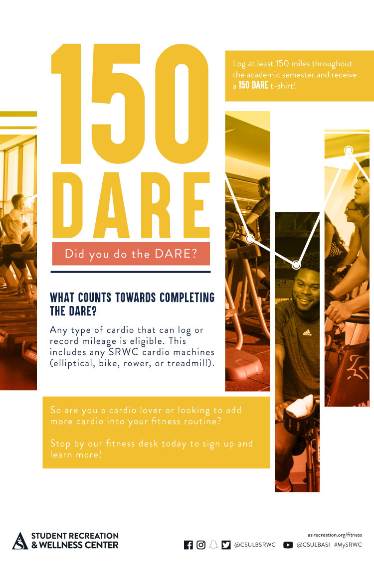
LAST-MODIFIED:20191211T192021Z
X-ACCESS:1
X-HITS:0
X-URL:
X-COLOR:007DAA
END:VEVENT
BEGIN:VEVENT
DTSTART;VALUE=DATE:20200121
DTEND;VALUE=DATE:20200122
RRULE:FREQ=MONTHLY;BYDAY=1MO,-1MO;INTERVAL=1;UNTIL=20200516T235900Z
EXDATE:20200127,20200203,20200224,20200302,20200330,20200406,20200427,20200504
UID:E0796772-7643-4DDD-B16A-742A5021F8AE
SUMMARY:Mile High Challenge
DTSTAMP:20191212T002808Z
DESCRIPTION:\N	\N		\N			\N				\N					\N						\N							\N								\N									Date\N									January 21 - May 16\N								\N								\N									Location\N									At Home\N								\N								\N							\N							\N								\N									Description\N									\N                                        Complete the Mile High Challenge from home and try our unique climbing challenges. You can find more information at: asirecreation.org/rock-outdoor/featured-events\N									\N								\N							\N						\N					\N				\N			\N		\N\N        \N	\N
X-ALT-DESC;FMTTYPE=text/html:<div class="container-fluid">	<div class="row">		<div class="col-md-6">			<div class="container-fluid module_round_box-gray" style="padding: 40px 15px;">				<div class="row">					<div class="col-md-12">						<div class="container-fluid">							<div class="row">								<div class="col-md-4" itemprop="startDate" content="2020-01-21">									<small>Date</small>									<p style="font-weight: 500; font-size: 1.2em;">January 21 - May 16</p>								</div>								<div class="col-md-4" itemprop="location" itemscope itemtype="http://schema.org/Place">									<small itemprop="address" itemscope itemtype="http://schema.org/PostalAddress">Location</small>									<p style="font-weight: 500; font-size: 1.2em;" itemprop="name">At Home</p>								</div>															</div>							<div class="row">								<div class="col-md-12">									<small>Description</small>									<div itemprop="description">                                        <p>Complete the Mile High Challenge from home and try our unique climbing challenges. You can find more information at: <a href="https://asirecreation.org/rock-outdoor/featured-events"><strong>asirecreation.org/rock-outdoor/featured-events</strong></a></p>									</div>								</div>							</div>						</div>					</div>				</div>			</div>		</div>        <div class="col-md-6"><img src="images/enjoy/calendar/spring-2020/virtual-mile-high-challenge-poster.jpg"            alt="srwc mile high challenge poster" /></div>	</div></div>
LOCATION:
GEO:33.78520800;-118.10846500
LAST-MODIFIED:20200423T005110Z
X-ACCESS:1
X-HITS:0
X-URL:
X-COLOR:007DAA
END:VEVENT
BEGIN:VEVENT
DTSTART;VALUE=DATE:20200121
DTEND;VALUE=DATE:20200122
RRULE:FREQ=WEEKLY;BYDAY=MO;INTERVAL=1;UNTIL=20200515T235900Z
EXDATE:20200127,20200203,20200210,20200217,20200224,20200302,20200309,20200316,20200323,20200330,20200406,20200413,20200420,20200427,20200504,20200511
UID:678348BE-8C4E-441C-AAAA-5F6C7DB26ACA
SUMMARY:Meditation Events Spring 2020
DTSTAMP:20200123T235758Z
DESCRIPTION:\N    \N        \N            \N                \N                    \N                        \N                            \N                                Date\N                                    Spring 2020\N                                \N                                Location\N                                    Zoom\N                                \N                                Time\N                                    Varies\N                                \N                            \N                            \N                                Description\N                                    \N                                        Every Monday of the semester.\N                                        Guided meditation from 4-5PM.\N                                        Zoom Meeting ID: 217 458 156\N                                        Password: meditation\N                                        Zoom Link\N                                    \N                                \N                            \N                        \N                    \N                \N            \N        \N        \N    \N
X-ALT-DESC;FMTTYPE=text/html:<div class="container-fluid">    <div class="row">        <div class="col-md-6">            <div class="container-fluid module_round_box-gray" style="padding: 40px 15px;">                <div class="row">                    <div class="col-md-12">                        <div class="container-fluid">                            <div class="row">                                <div class="col-md-4" itemprop="startDate" content="2020-01-21T0000"><small>Date</small>                                    <p style="font-weight: 500; font-size: 1.2em;">Spring 2020</p>                                </div>                                <div class="col-md-4" itemprop="location" itemscope="itemscope" itemtype="http://schema.org/Place"><small                                        itemprop="address" itemscope="itemscope" itemtype="http://schema.org/PostalAddress">Location</small>                                    <p style="font-weight: 500; font-size: 1.2em;" itemprop="name">Zoom</p>                                </div>                                <div class="col-md-4" itemprop="endDate" content="2020-05-15T0000"><small>Time</small>                                    <p style="font-weight: 500; font-size: 1.2em;">Varies</p>                                </div>                            </div>                            <div class="row">                                <div class="col-md-12"><small>Description</small>                                    <div itemprop="description">                                        <p>Every Monday of the semester.</p>                                        <p>Guided meditation from 4-5PM.</p>                                        <p>Zoom Meeting ID: 217 458 156</p>                                        <p>Password: meditation</p>                                        <p><a href="https://join.zoom.us/"><strong>Zoom Link</strong></a></p>                                    </div>                                </div>                            </div>                        </div>                    </div>                </div>            </div>        </div>        <div class="col-md-6"><img src="images/enjoy/calendar/spring-2020/meditation-events-zoom.jpg" alt="meditation events poster" /></div>    </div></div>
LAST-MODIFIED:20200402T194940Z
X-ACCESS:1
X-HITS:0
X-URL:
X-COLOR:007DAA
END:VEVENT
BEGIN:VEVENT
DTSTART;TZID=America/Los_Angeles:20200121T060000
DTEND;TZID=America/Los_Angeles:20200121T210000
RRULE:FREQ=WEEKLY;BYDAY=TU;INTERVAL=2;UNTIL=20200229T235900Z
EXDATE:20200204T140000Z,20200218T140000Z
UID:7EA72EC2-24FF-4303-8B1D-0F244E6B7754
SUMMARY:SRWC Go
DTSTAMP:20200110T200504Z
DESCRIPTION:\N	\N		\N			\N				\N					\N						\N							\N								\N									Date\N									Jan 21\N								\N								\N									Location\N									SRWC Front Desk\N								\N								\N									Time\N									6AM–9PM\N								\N							\N							\N								\N									Description\N									\N                                        Complete your "SRWC GO!" registration at the front desk to be entered to win a 3G bike, a free massage, a free peronal training session, and more!\N                                        Registration Deadline: Feb. 29. Open to all SRWC members\N                                        \N                                            Membership Renewal\N                                            Locker Renewal\N                                            Intramural Sports\N                                            CPR/First Aid/AED\N                                            Instructional Fitness Classes\N                                            Outdoor Adventure\N                                        \N\N									\N								\N							\N						\N					\N				\N			\N		\N\N        \N	\N
X-ALT-DESC;FMTTYPE=text/html:<div class="container-fluid">	<div class="row">		<div class="col-md-6">			<div class="container-fluid module_round_box-gray" style="padding: 40px 15px;">				<div class="row">					<div class="col-md-12">						<div class="container-fluid">							<div class="row">								<div class="col-md-4" itemprop="startDate" content="2020-01-21">									<small>Date</small>									<p style="font-weight: 500; font-size: 1.2em;">Jan 21</p>								</div>								<div class="col-md-4" itemprop="location" itemscope itemtype="http://schema.org/Place">									<small itemprop="address" itemscope itemtype="http://schema.org/PostalAddress">Location</small>									<p style="font-weight: 500; font-size: 1.2em;" itemprop="name">SRWC Front Desk</p>								</div>								<div class="col-md-4" itemprop="endDate" content="2020-01-21">									<small>Time</small>									<p style="font-weight: 500; font-size: 1.2em;">6AM–9PM</p>								</div>							</div>							<div class="row">								<div class="col-md-12">									<small>Description</small>									<div itemprop="description">                                        <p>Complete your "SRWC GO!" registration at the front desk to be entered to win a 3G bike, a free massage, a free peronal training session, and more!</p>                                        <p><strong>Registration Deadline: Feb. 29.</strong> Open to all SRWC members</p>                                        <ul>                                            <li>Membership Renewal</li>                                            <li>Locker Renewal</li>                                            <li>Intramural Sports</li>                                            <li>CPR/First Aid/AED</li>                                            <li>Instructional Fitness Classes</li>                                            <li>Outdoor Adventure</li>                                        </ul>									</div>								</div>							</div>						</div>					</div>				</div>			</div>		</div>        <div class="col-md-6"><img src="images/enjoy/calendar/spring-2020/srwc-go-poster.jpg"            alt="SRWC Go poster" /></div>	</div></div>
LOCATION:
GEO:0.00000000;0.00000000
LAST-MODIFIED:20200110T200921Z
X-ACCESS:1
X-HITS:16
X-URL:
X-COLOR:007DAA
END:VEVENT
BEGIN:VEVENT
DTSTART;TZID=America/Los_Angeles:20200121T100000
DTEND;TZID=America/Los_Angeles:20200121T180000
RRULE:FREQ=WEEKLY;BYDAY=TU;INTERVAL=2;UNTIL=20200515T235900Z
EXDATE:20200204T180000Z,20200218T180000Z,20200303T180000Z,20200317T170000Z,20200331T170000Z,20200414T170000Z,20200428T170000Z,20200512T170000Z
UID:CC2516D9-8E49-45B9-BE7B-6B86E2552F16
SUMMARY:Relaxation Station
DTSTAMP:20200123T210948Z
DESCRIPTION:\N    \N        \N            \N                \N                    \N                        \N                            \N                                Date\N                                    January 21\N                                \N                                Location\N                                    USU 309\N                                \N                                Time\N                                    Varies\N                                \N                            \N                            \N                                Description\N                                    \N                                        The USU Beach Balance office offers a centralized location for your\N                                            relaxation needs! The relaxation includes\N                                            self-guided meditation, hammocks, health and wellness reading materials,\N                                            and art therapy during its hours\N                                            of operation. Stop by today and relax!\N                                    \N                                \N                            \N                        \N                    \N                \N            \N        \N        \N    \N
X-ALT-DESC;FMTTYPE=text/html:<div class="container-fluid">    <div class="row">        <div class="col-md-6">            <div class="container-fluid module_round_box-gray" style="padding: 40px 15px;">                <div class="row">                    <div class="col-md-12">                        <div class="container-fluid">                            <div class="row">                                <div class="col-md-4" itemprop="startDate" content="2020-01-21T0000"><small>Date</small>                                    <p style="font-weight: 500; font-size: 1.2em;">January 21</p>                                </div>                                <div class="col-md-4" itemprop="location" itemscope="itemscope" itemtype="http://schema.org/Place"><small                                        itemprop="address" itemscope="itemscope" itemtype="http://schema.org/PostalAddress">Location</small>                                    <p style="font-weight: 500; font-size: 1.2em;" itemprop="name">USU 309</p>                                </div>                                <div class="col-md-4" itemprop="endDate" content="2020-05-15T0000"><small>Time</small>                                    <p style="font-weight: 500; font-size: 1.2em;">Varies</p>                                </div>                            </div>                            <div class="row">                                <div class="col-md-12"><small>Description</small>                                    <div itemprop="description">                                        <p>The USU Beach Balance office offers a centralized location for your                                            relaxation needs! The relaxation includes                                            self-guided meditation, hammocks, health and wellness reading materials,                                            and art therapy during its hours                                            of operation. Stop by today and relax!</p>                                    </div>                                </div>                            </div>                        </div>                    </div>                </div>            </div>        </div>        <div class="col-md-6"><img src="images/enjoy/calendar/spring-2020/relaxation-station-poster.jpg" alt="Relaxation Station poster" /></div>    </div></div>
LAST-MODIFIED:20200123T211942Z
X-ACCESS:1
X-HITS:0
X-URL:
X-COLOR:007DAA
END:VEVENT
BEGIN:VEVENT
DTSTART;TZID=America/Los_Angeles:20200124T130000
DTEND;TZID=America/Los_Angeles:20200124T150000
RRULE:FREQ=MONTHLY;BYDAY=1FR,2FR,3FR,4FR,5FR;INTERVAL=1;UNTIL=20200509T235900Z
EXDATE:20200131T210000Z,20200207T210000Z,20200214T210000Z,20200221T210000Z,20200228T210000Z,20200306T210000Z,20200313T200000Z,20200320T200000Z,20200327T200000Z,20200403T200000Z,20200410T200000Z,20200417T200000Z,20200424T200000Z,20200501T200000Z,20200508T200000Z
UID:8CB60AA2-EC36-4F0E-919B-2FC07588A1C8
SUMMARY:Rock Climbing Classes
DTSTAMP:20190617T214559Z
DESCRIPTION:\N	\N		\N			\N				\N					\N						\N							\N								\N									Date\N                                    January 24 \N								\N								\N									Location\N                                    SRWC Rock Wall\N								\N								\N									Time\N                                    2PM - 3PM\N								\N							\N							\N								\N									Description\N									\N                                            CLIMBING 101:Intro To Movement\N                                                2 - 3PM | Jan. 24, Feb. 28, March 27, May 8 \N                                                Discover proper footwork, body positioning techniques, and energy-conversing tips to help improve your climbing.\N                                            \N                                            CLIMBING 201:Belay Basics\N                                                1 - 3PM | Jan. 31, Feb. 7 & 14, March 6 & 13, April 10 & 17, May 1 \N                                               Learn all about the basics of top rope climbing, including equipment, knots, and all techniques and knowledge needed to belay.\N                                            \N                                            CLIMBING 301:Learn to lead\N                                                1 - 3PM | Feb. 21, March 20, April 24 \N                                             Improve upon your climbing knowledge by learning how to lead climb and lead belay in an indoor setting. Must be top-rope belay certified\N                                             with SRWC to attend.\N                                            \N\N                                             CUSTOM/ADVANCED CLIMBING CLASSES\N                                                 UPON REQUEST | $17 STUDENT  $20 NON-STUDENT\N                                            \N                                            Register online through SRWC GO, or in-person, at the rock wall and outdoor shop! \N\N									\N								\N							\N						\N					\N				\N			\N		\N        \N	\N
X-ALT-DESC;FMTTYPE=text/html:<div class="container-fluid">	<div class="row">		<div class="col-md-6">			<div class="container-fluid module_round_box-gray" style="padding: 40px 15px;">				<div class="row">					<div class="col-md-12">						<div class="container-fluid">							<div class="row">								<div class="col-md-4" itemprop="startDate" content="2020-01-24T14:00">									<small>Date</small>                                    <p style="font-weight: 500; font-size: 1.2em;">January 24 </p>								</div>								<div class="col-md-4" itemprop="location" itemscope itemtype="http://schema.org/Place">									<small itemprop="address" itemscope itemtype="http://schema.org/PostalAddress">Location</small>                                    <p style="font-weight: 500; font-size: 1.2em;">SRWC Rock Wall</p>								</div>								<div class="col-md-4" itemprop="endDate" content="2020-01-24T15:00">									<small>Time</small>                                    <p style="font-weight: 500; font-size: 1.2em;">2PM - 3PM</p>								</div>							</div>							<div class="row">								<div class="col-md-12">									<small>Description</small>									<div itemprop="description">                                            <p><strong>CLIMBING 101:</strong>Intro To Movement<br>                                                2 - 3PM | Jan. 24, Feb. 28, March 27, May 8 <br>                                                Discover proper footwork, body positioning techniques, and energy-conversing tips to help improve your climbing.                                            </p><br>                                            <p><strong>CLIMBING 201:</strong>Belay Basics<br>                                                1 - 3PM | Jan. 31, Feb. 7 & 14, March 6 & 13, April 10 & 17, May 1 <br>                                               Learn all about the basics of top rope climbing, including equipment, knots, and all techniques and knowledge needed to belay.                                            </p><br>                                            <p><strong>CLIMBING 301:</strong>Learn to lead<br>                                                1 - 3PM | Feb. 21, March 20, April 24 <br>                                             Improve upon your climbing knowledge by learning how to lead climb and lead belay in an indoor setting. Must be top-rope belay certified                                             with SRWC to attend.                                            </p><br>                                            <p> <strong>CUSTOM/ADVANCED CLIMBING CLASSES</strong><br>                                                <strong> UPON REQUEST | $17 STUDENT  $20 NON-STUDENT</strong>                                            </p><br>                                            <p>Register online through SRWC GO, or in-person, at the rock wall and outdoor shop! </p>									</div>								</div>							</div>						</div>					</div>				</div>			</div>		</div>        <div class="col-md-6"><img src="images/enjoy/calendar//spring-2020/rock-climbing-classes-poster.jpg" alt="A rock climbing classes for this spring 2020." /></div>	</div></div>
LOCATION:
GEO:33.78520800;-118.10846500
LAST-MODIFIED:20191114T191412Z
X-ACCESS:1
X-HITS:2
X-URL:
X-COLOR:007DAA
END:VEVENT
BEGIN:VEVENT
DTSTART;VALUE=DATE:20200128
DTEND;VALUE=DATE:20200129
RRULE:FREQ=WEEKLY;BYDAY=TU;INTERVAL=1;UNTIL=20200512T235900Z
EXDATE:20200204,20200211,20200218,20200225,20200303,20200310,20200317,20200324,20200331,20200407,20200414,20200421,20200428,20200505,20200512
UID:1A3FAFB3-A7BB-4585-A5E6-9DEFDF499EB8
SUMMARY:Beach Balance Weekly Programs
DTSTAMP:20200107T203425Z
DESCRIPTION:\N	\N		\N			\N				\N					\N						\N							\N								\N									Date\N									Spring 2020\N								\N								\N									Location\N									SRWC 203\N								\N								\N									Time\N									Varies\N								\N							\N							\N								\N									Description\N									\N										\N										\N											\N											  Title\N											  SRWC Time\N											  Description\N											\N											\N											  Meditation Monday\N											  5-6PM\N											  Take some time for yourself to de-stress and relax through meditation every Monday during Beach Balance hours of operation.\N											\N											\N											  Spa Water Tuesday\N											  10AM-8PM\N											  Bring your water bottle for free, fruity-infused iced water!\N											\N											\N											  Art Therapy Tuesday\N											  10AM-8PM\N											  De-stress and unleach your creative side with our various coloring pages, paints, markers and even Play-Doh!\N											\N											\N											  Well-Rested Wednesday\N											  10AM-8PM\N											  Take a nap in our hammocks in the wellness room where it is dark, air-conditioned and serene.\N											\N											\N											  Thoughtful Thursday\N											  10AM-8PM\N											  Take time for yourself and enjoy our various health and wellness books and resources in our Beach Balance Wellness room! This is great time to rest, recharge and reflect.\N											\N											\N											  Free Chair Massage\N											  4-6PM\N											  Release some tension with a FREE 5-10 munute chair massage.\N											\N											\N											  Foam Rolling Friday\N											  10AM-6PM\N											  Come visit our wellness rooms for a quiet place to strech and use our therapy canes, foam rollers and muscle roller sticks\N											\N										  \N										\N										*Some weekly events are not offered during holidays in the fall and spring semesters. Winter and summer may have reduced offerings.\N\N									\N								\N							\N						\N					\N				\N			\N		\N\N        \N	\N
X-ALT-DESC;FMTTYPE=text/html:<div class="container-fluid">	<div class="row">		<div class="col-md-6">			<div class="container-fluid module_round_box-gray" style="padding: 40px 15px;">				<div class="row">					<div class="col-md-12">						<div class="container-fluid">							<div class="row">								<div class="col-md-4" itemprop="startDate" content="2020-02-03">									<small>Date</small>									<p style="font-weight: 500; font-size: 1.2em;">Spring 2020</p>								</div>								<div class="col-md-4" itemprop="location" itemscope itemtype="http://schema.org/Place">									<small itemprop="address" itemscope itemtype="http://schema.org/PostalAddress">Location</small>									<p style="font-weight: 500; font-size: 1.2em;" itemprop="name">SRWC 203</p>								</div>								<div class="col-md-4" itemprop="endDate" content="2020-02-03">									<small>Time</small>									<p style="font-weight: 500; font-size: 1.2em;">Varies</p>								</div>							</div>							<div class="row">								<div class="col-md-12">									<small>Description</small>									<div itemprop="description">										<div class="table-responsive">										<table class="table table-striped table-bordered">											<tr>											  <th>Title</th>											  <th>SRWC Time</th>											  <th>Description</th>											</tr>											<tr>											  <td>Meditation Monday</td>											  <td>5-6PM</td>											  <td>Take some time for yourself to de-stress and relax through meditation every Monday during Beach Balance hours of operation.</td>											</tr>											<tr>											  <td>Spa Water Tuesday</td>											  <td>10AM-8PM</td>											  <td>Bring your water bottle for free, fruity-infused iced water!</td>											</tr>											<tr>											  <td>Art Therapy Tuesday</td>											  <td>10AM-8PM</td>											  <td>De-stress and unleach your creative side with our various coloring pages, paints, markers and even Play-Doh!</td>											</tr>											<tr>											  <td>Well-Rested Wednesday</td>											  <td>10AM-8PM</td>											  <td>Take a nap in our hammocks in the wellness room where it is dark, air-conditioned and serene.</td>											</tr>											<tr>											  <td>Thoughtful Thursday</td>											  <td>10AM-8PM</td>											  <td>Take time for yourself and enjoy our various health and wellness books and resources in our Beach Balance Wellness room! This is great time to rest, recharge and reflect.</td>											</tr>											<tr>											  <td>Free Chair Massage</td>											  <td>4-6PM</td>											  <td>Release some tension with a FREE 5-10 munute chair massage.</td>											</tr>											<tr>											  <td>Foam Rolling Friday</td>											  <td>10AM-6PM</td>											  <td>Come visit our wellness rooms for a quiet place to strech and use our therapy canes, foam rollers and muscle roller sticks</td>											</tr>										  </table>										</div>										<p>*Some weekly events are not offered during holidays in the fall and spring semesters. Winter and summer may have reduced offerings.</p>									</div>								</div>							</div>						</div>					</div>				</div>			</div>		</div>        <div class="col-md-6"><img src="images/enjoy/calendar/spring-2020/beach-balance-weekly-event-poster.jpg"            alt="Beach Balance weekly events poster" /></div>	</div></div>
LOCATION:
GEO:0.00000000;0.00000000
LAST-MODIFIED:20200123T182910Z
X-ACCESS:1
X-HITS:0
X-URL:
X-COLOR:007DAA
END:VEVENT
BEGIN:VEVENT
DTSTART;TZID=America/Los_Angeles:20200128T100000
DTEND;TZID=America/Los_Angeles:20200128T200000
RRULE:FREQ=MONTHLY;BYDAY=1MO,3MO;INTERVAL=1;UNTIL=20200515T235900Z
EXDATE:20200203T180000Z,20200217T180000Z,20200302T180000Z,20200316T170000Z,20200406T170000Z,20200420T170000Z,20200504T170000Z
UID:79A3C92A-DE43-413F-8D8E-B69FC22E837C
SUMMARY:Peer Nutrition Counseling
DTSTAMP:20200128T175842Z
DESCRIPTION:\N    \N        \N            \N                \N                    \N                        \N                            \N                                Date\N                                    Spring 2020\N                                \N                                Location\N                                    SRWC 203\N                                \N                                Time\N                                    Varies\N                                \N                            \N                            \N                                Description\N                                    \N                                        Free 30 min. - 1 hr peer nutrition counselling for SRWC members.\N                                        Our nutrition counselors will work one-on-one with you to set individualized\N                                            goals and figure out methods to improve your diet\N                                        Appointments available during beach balance hours of operation. Stop by the\N                                            office for more information or to\N                                            schedule your session today!\N                                        \N                                    \N                                \N                            \N                        \N                    \N                \N            \N        \N        \N    \N
X-ALT-DESC;FMTTYPE=text/html:<div class="container-fluid">    <div class="row">        <div class="col-md-6">            <div class="container-fluid module_round_box-gray" style="padding: 40px 15px;">                <div class="row">                    <div class="col-md-12">                        <div class="container-fluid">                            <div class="row">                                <div class="col-md-4" itemprop="startDate" content="2020-01-21T0000"><small>Date</small>                                    <p style="font-weight: 500; font-size: 1.2em;">Spring 2020</p>                                </div>                                <div class="col-md-4" itemprop="location" itemscope="itemscope" itemtype="http://schema.org/Place"><small                                        itemprop="address" itemscope="itemscope" itemtype="http://schema.org/PostalAddress">Location</small>                                    <p style="font-weight: 500; font-size: 1.2em;" itemprop="name">SRWC 203</p>                                </div>                                <div class="col-md-4" itemprop="endDate" content="2020-05-15T0000"><small>Time</small>                                    <p style="font-weight: 500; font-size: 1.2em;">Varies</p>                                </div>                            </div>                            <div class="row">                                <div class="col-md-12"><small>Description</small>                                    <div itemprop="description">                                        <p>Free 30 min. - 1 hr peer nutrition counselling for SRWC members.</p>                                        <p>Our nutrition counselors will work one-on-one with you to set individualized                                            goals and figure out methods to improve your diet</p>                                        <p>Appointments available during beach balance hours of operation. Stop by the                                            office for more information or to                                            schedule your session today!                                        </p>                                    </div>                                </div>                            </div>                        </div>                    </div>                </div>            </div>        </div>        <div class="col-md-6"><img src="images/enjoy/calendar/spring-2020/peer-nutrition-conseling-poster.jpg" alt="peer nutrition counseling poster" /></div>    </div></div>
LOCATION:
GEO:0.00000000;0.00000000
LAST-MODIFIED:20200128T180132Z
X-ACCESS:1
X-HITS:0
X-URL:
X-COLOR:007DAA
END:VEVENT
BEGIN:VEVENT
DTSTART;TZID=America/Los_Angeles:20200128T180000
DTEND;TZID=America/Los_Angeles:20200128T190000
RRULE:FREQ=MONTHLY;BYDAY=4TU;INTERVAL=1;UNTIL=20200429T235900Z
EXDATE:20200226T020000Z,20200325T010000Z,20200429T010000Z
UID:3546408B-2C99-4278-9FDE-F870F6AB0606
SUMMARY:Aromatherapy
DTSTAMP:20200107T185033Z
DESCRIPTION:\N	\N		\N			\N				\N					\N						\N							\N								\N									Date\N									Jan 28\N								\N								\N									Location\N									SRWC 203C\N								\N								\N									Time\N									6-7 PM\N								\N							\N							\N								\N									Description\N									\N										Come to our Aromatherapy workshops each month where you will learn about the therapeutic benefits\N                                            of essential oils and how to make different aromatherapy products! \N										\N										\N										\N											table {\N											  font-family: arial, sans-serif;\N											  border-collapse: collapse;\N											  width: 100%;\N											}\N											\N											td, th {\N											  border: 1px solid #dddddd;\N											  text-align: left;\N											  padding: 8px;\N											}\N											\N											tr:nth-child(even) {\N											  background-color: #dddddd;\N											}\N											\N                                        \N											\N											  Date\N											  Aromatherapy\N											  Location\N											  Time\N											\N											\N											  Jan 28\N											  Scrubs\N											  SRWC 203C\N											  6-7 PM\N											\N											\N											  Feb 25\N											  Bath Bombs\N											  USU 306\N											  5-6 PM\N											\N											\N											 March 24\N											  Candles\N											  SRWC 203C\N											  6-7 PM\N											\N											\N											  April 28\N											  Roller Balls\N											  USU 306\N											  5-6 PM\N											\N										  \N									\N								\N							\N						\N					\N				\N			\N		\N\N        \N	\N
X-ALT-DESC;FMTTYPE=text/html:<div class="container-fluid">	<div class="row">		<div class="col-md-6">			<div class="container-fluid module_round_box-gray" style="padding: 40px 15px;">				<div class="row">					<div class="col-md-12">						<div class="container-fluid">							<div class="row">								<div class="col-md-4" itemprop="startDate" content="2020-01-28T18:00">									<small>Date</small>									<p style="font-weight: 500; font-size: 1.2em;">Jan 28</p>								</div>								<div class="col-md-4" itemprop="location" itemscope itemtype="http://schema.org/Place">									<small itemprop="address" itemscope itemtype="http://schema.org/PostalAddress">Location</small>									<p style="font-weight: 500; font-size: 1.2em;" itemprop="name">SRWC 203C</p>								</div>								<div class="col-md-4" itemprop="endDate" content="2020-01-28T19:00">									<small>Time</small>									<p style="font-weight: 500; font-size: 1.2em;">6-7 PM</p>								</div>							</div>							<div class="row">								<div class="col-md-12">									<small>Description</small>									<div itemprop="description">										<p>Come to our Aromatherapy workshops each month where you will learn about the therapeutic benefits                                            of essential oils and how to make different aromatherapy products! 										</p>																				<style>											table {											  font-family: arial, sans-serif;											  border-collapse: collapse;											  width: 100%;											}																						td, th {											  border: 1px solid #dddddd;											  text-align: left;											  padding: 8px;											}																						tr:nth-child(even) {											  background-color: #dddddd;											}											</style>                                        <table>											<tr>											  <th>Date</th>											  <th>Aromatherapy</th>											  <th>Location</th>											  <th>Time</th>											</tr>											<tr>											  <td>Jan 28</td>											  <td>Scrubs</td>											  <td>SRWC 203C</td>											  <td>6-7 PM</td>											</tr>											<tr>											  <td>Feb 25</td>											  <td>Bath Bombs</td>											  <td>USU 306</td>											  <td>5-6 PM</td>											</tr>											<tr>											 <td>March 24</td>											  <td>Candles</td>											  <td>SRWC 203C</td>											  <td>6-7 PM</td>											</tr>											<tr>											  <td>April 28</td>											  <td>Roller Balls</td>											  <td>USU 306</td>											  <td>5-6 PM</td>											</tr>										  </table>									</div>								</div>							</div>						</div>					</div>				</div>			</div>		</div>        <div class="col-md-6"><img src="images/enjoy/calendar/spring-2020/aromatherapy-poster.jpg"            alt="Aromatherapy poster"/></div>	</div></div>
LOCATION:
GEO:0.00000000;0.00000000
LAST-MODIFIED:20200107T190554Z
X-ACCESS:1
X-HITS:0
X-URL:
X-COLOR:007DAA
END:VEVENT
BEGIN:VEVENT
DTSTART;VALUE=DATE:20200203
DTEND;VALUE=DATE:20200204
RRULE:FREQ=WEEKLY;BYDAY=MO;INTERVAL=1;UNTIL=20200211T235900Z
EXDATE:20200210
UID:E15E9208-D3BD-4419-96AC-39381694AD25
SUMMARY:Instructional Classes
DTSTAMP:20200114T214809Z
DESCRIPTION:\N	\N		\N			\N				\N					\N						\N							\N								\N									Date\N									Feb 3\N								\N								\N									Location\N									SRWC\N								\N								\N									Time\N									All Day\N								\N							\N							\N								\N									Description\N									\N\N\NSession One: Feb. 10 - March 20\NSession Two: March 23 - May 8\N\N\N                                        \N  \N    Title\N    Day/Time\N    Location\N    Price\N  \N  \N    Trx-Mix\N    Mon. Wed. 6:45-7:45pm\N    Fitness Room B\N    Students: $42/session | Non-students $47/session\N  \N  \N    Total Body Shred\N    Tue. Thur. 6:45-7:45pm\N    Strength Floor\N    Students: $65/session | Non-students $70/session\N  \N  \N    Boxing 101\N    Mon. Wed. 5:30-6:30pm | Friday 12-2pm\N    Fitness Room B\N    Students: $35 | Non-students $40 *wrist bands are required and may be purchased at the fitness desk for $10\N  \N  \N    Muay Thai\N    Tue. Thur. 7:30-8:30pm\N    Fitness Room B\N    Students: $35 | Non-students $40\N  \N  \N    Lyft with Lydia\N    Wed. 5-6pm\N    Strength Floor\N    Students: $20 | Non-students $25\N  \N  \N    Pilates Reformer\N     Tue./Thur. 12-1pm | 5-6pm (INT) | 6-7pm  Wed./Fri. 5-6pm\N    Fitness Room B\N    Students: $90 | Non-students $95\N  \N\N									\N								\N							\N						\N					\N				\N			\N		\N\N        \N	\N
X-ALT-DESC;FMTTYPE=text/html:<div class="container-fluid">	<div class="row">		<div class="col-md-6">			<div class="container-fluid module_round_box-gray" style="padding: 40px 15px;">				<div class="row">					<div class="col-md-12">						<div class="container-fluid">							<div class="row">								<div class="col-md-4" itemprop="startDate" content="2020-02-03">									<small>Date</small>									<p style="font-weight: 500; font-size: 1.2em;">Feb 3</p>								</div>								<div class="col-md-4" itemprop="location" itemscope itemtype="http://schema.org/Place">									<small itemprop="address" itemscope itemtype="http://schema.org/PostalAddress">Location</small>									<p style="font-weight: 500; font-size: 1.2em;" itemprop="name">SRWC</p>								</div>								<div class="col-md-4" itemprop="endDate" content="2020-02-03">									<small>Time</small>									<p style="font-weight: 500; font-size: 1.2em;">All Day</p>								</div>							</div>							<div class="row">								<div class="col-md-12">									<small>Description</small>									<div itemprop="description"><br><ul style="list-style-type:none"><li><strong>Session One: Feb. 10 - March 20</strong></li><li><strong>Session Two: March 23 - May 8</strong></li><ul><br>                                        <table class="table table-striped">  <tr>    <th>Title</th>    <th>Day/Time</th>    <th>Location</th>    <th>Price</th>  </tr>  <tr>    <td>Trx-Mix</td>    <td>Mon. Wed. 6:45-7:45pm</td>    <td>Fitness Room B</td>    <td>Students: $42/session | Non-students $47/session</td>  </tr>  <tr>    <td>Total Body Shred</td>    <td>Tue. Thur. 6:45-7:45pm</td>    <td>Strength Floor</td>    <td>Students: $65/session | Non-students $70/session</td>  </tr>  <tr>    <td>Boxing 101</td>    <td>Mon. Wed. 5:30-6:30pm | Friday 12-2pm</td>    <td>Fitness Room B</td>    <td>Students: $35 | Non-students $40 <br><small>*wrist bands are required and may be purchased at the fitness desk for $10</small></td>  </tr>  <tr>    <td>Muay Thai</td>    <td>Tue. Thur. 7:30-8:30pm</td>    <td>Fitness Room B</td>    <td>Students: $35 | Non-students $40</td>  </tr>  <tr>    <td>Lyft with Lydia</td>    <td>Wed. 5-6pm</td>    <td>Strength Floor</td>    <td>Students: $20 | Non-students $25</td>  </tr>  <tr>    <td>Pilates Reformer</td>    <td> Tue./Thur. 12-1pm | 5-6pm (INT) | 6-7pm <br> Wed./Fri. 5-6pm</td>    <td>Fitness Room B</td>    <td>Students: $90 | Non-students $95</td>  </tr></table>									</div>								</div>							</div>						</div>					</div>				</div>			</div>		</div>        <div class="col-md-6"><img src="images/enjoy/calendar/spring-2020/instructional-classes-poster.jpg" alt="Instructional classes poster" /></div>	</div></div>
LOCATION:\;
GEO:0.00000000;0.00000000
LAST-MODIFIED:20200114T220457Z
X-ACCESS:1
X-HITS:9
X-URL:
X-COLOR:007DAA
END:VEVENT
BEGIN:VEVENT
DTSTART;TZID=America/Los_Angeles:20200204T170000
DTEND;TZID=America/Los_Angeles:20200204T180000
RRULE:FREQ=MONTHLY;BYDAY=1TU;INTERVAL=2;UNTIL=20200408T235900Z
EXDATE:20200408T000000Z
UID:31C9D6C7-081B-46BB-B65A-02B44FF94BE1
SUMMARY:Guided Art Class
DTSTAMP:20200128T190238Z
DESCRIPTION:\N    \N        \N            \N                \N                    \N                        \N                            \N                                Date\N                                    Feb. 4 & Apr. 7\N                                \N                                Location\N                                    SRWC Room 203C\N                                \N                                Time\N                                    5 - 6PM\N                                \N                            \N                            \N                                Description\N                                    \N                                        Have you ever wanted to take an art class for fun?\N                                        Beach Balance is offering a new guided art class where an instructor will\N                                            break down the steps to create a different piece of art for each workshop.\N                                    \N                                \N                            \N                        \N                    \N                \N            \N        \N        \N    \N
X-ALT-DESC;FMTTYPE=text/html:<div class="container-fluid">    <div class="row">        <div class="col-md-6">            <div class="container-fluid module_round_box-gray" style="padding: 40px 15px;">                <div class="row">                    <div class="col-md-12">                        <div class="container-fluid">                            <div class="row">                                <div class="col-md-4" itemprop="startDate" content="2020-02-04T1700"><small>Date</small>                                    <p style="font-weight: 500; font-size: 1.2em;">Feb. 4 & Apr. 7</p>                                </div>                                <div class="col-md-4" itemprop="location" itemscope="itemscope" itemtype="http://schema.org/Place"><small                                        itemprop="address" itemscope="itemscope" itemtype="http://schema.org/PostalAddress">Location</small>                                    <p style="font-weight: 500; font-size: 1.2em;" itemprop="name">SRWC Room 203C</p>                                </div>                                <div class="col-md-4" itemprop="endDate" content="2020-04-07T1800"><small>Time</small>                                    <p style="font-weight: 500; font-size: 1.2em;">5 - 6PM</p>                                </div>                            </div>                            <div class="row">                                <div class="col-md-12"><small>Description</small>                                    <div itemprop="description">                                        <p>Have you ever wanted to take an art class for fun?</p>                                        <p>Beach Balance is offering a new guided art class where an instructor will                                            break down the steps to create a different piece of art for each workshop.</p>                                    </div>                                </div>                            </div>                        </div>                    </div>                </div>            </div>        </div>        <div class="col-md-6"><img src="images/enjoy/calendar/spring-2020/guided-art-therapy-poster.jpg" alt="guided art class poster" /></div>    </div></div>
LOCATION:
GEO:0.00000000;0.00000000
LAST-MODIFIED:20200128T190637Z
X-ACCESS:1
X-HITS:0
X-URL:
X-COLOR:007DAA
END:VEVENT
BEGIN:VEVENT
DTSTART;TZID=America/Los_Angeles:20200205T110000
DTEND;TZID=America/Los_Angeles:20200205T140000
RRULE:FREQ=MONTHLY;BYDAY=1WE;INTERVAL=1;UNTIL=20200507T235900Z
EXDATE:20200304T190000Z,20200401T180000Z,20200506T180000Z
UID:BB73B170-031B-41EF-8C69-10D0B07C2B96
SUMMARY:Project Chill
DTSTAMP:20200115T205326Z
DESCRIPTION:\N	\N		\N			\N				\N					\N						\N							\N								\N									Date\N									Feb 5\N								\N								\N									Location\N									USU North Lawn\N								\N								\N									Time\N									11AM - 2PM\N								\N							\N							\N								\N									Description\N									\N										Ready to relax? Hang loose and take a breather in our outdoor hammocks at project chill.\N										\N											Feb 5\N											March 4\N											April 8\N											May 6\N										\N										In collaboration with Beach Balance, Student Health Services and Rock & Outdoor Adventure.\N									\N								\N							\N						\N					\N				\N			\N		\N\N		\N	\N
X-ALT-DESC;FMTTYPE=text/html:<div class="container-fluid">	<div class="row">		<div class="col-md-6">			<div class="container-fluid module_round_box-gray" style="padding: 40px 15px;">				<div class="row">					<div class="col-md-12">						<div class="container-fluid">							<div class="row">								<div class="col-md-4" itemprop="startDate" content="2020-02-05T1100">									<small>Date</small>									<p style="font-weight: 500; font-size: 1.2em;">Feb 5</p>								</div>								<div class="col-md-4" itemprop="location" itemscope itemtype="http://schema.org/Place">									<small itemprop="address" itemscope itemtype="http://schema.org/PostalAddress">Location</small>									<p style="font-weight: 500; font-size: 1.2em;" itemprop="name">USU North Lawn</p>								</div>								<div class="col-md-4" itemprop="endDate" content="2020-02-05T1400">									<small>Time</small>									<p style="font-weight: 500; font-size: 1.2em;">11AM - 2PM</p>								</div>							</div>							<div class="row">								<div class="col-md-12">									<small>Description</small>									<div itemprop="description">										<p>Ready to relax? Hang loose and take a breather in our outdoor hammocks at project chill.</p>										<ul>											<li>Feb 5</li>											<li>March 4</li>											<li>April 8</li>											<li>May 6</li>										</ul>										<p>In collaboration with Beach Balance, Student Health Services and Rock & Outdoor Adventure.</p>									</div>								</div>							</div>						</div>					</div>				</div>			</div>		</div>		<div class="col-md-6"><img src="images/enjoy/calendar/spring-2020/project-chill-poster.jpg" alt="project chill poster" /></div>	</div></div>
LOCATION:
GEO:0.00000000;0.00000000
LAST-MODIFIED:20200115T205634Z
X-ACCESS:1
X-HITS:0
X-URL:
X-COLOR:007DAA
END:VEVENT
BEGIN:VEVENT
DTSTART;TZID=America/Los_Angeles:20200206T160000
DTEND;TZID=America/Los_Angeles:20200206T163000
RRULE:FREQ=MONTHLY;BYDAY=1TH;INTERVAL=1;UNTIL=20200507T235900Z
EXDATE:20200306T000000Z,20200402T230000Z,20200507T230000Z
UID:97453F05-7818-49F8-9387-A77BE5265F25
SUMMARY:Wellness Workshops
DTSTAMP:20200123T231208Z
DESCRIPTION:\N    \N        \N            \N                \N                    \N                        \N                            \N                                \N                                    Date\N                                    Spring 2020\N                                \N                                \N                                    Location\N                                    SRWC Beach Balance\N                                \N                                \N                                    Time\N                                    Varies\N                                \N                            \N                            \N                                \N                                    Description\N                                    \N                                        In collaboration with the office of wellness and health promotion and caps, we\N                                        will be hosting a series of wellness workshops\N                                        on various topics. Check them out!\N                                        \N                                            \N                                                \N                                                    Title\N                                                    Date & Time\N                                                    Description\N                                                \N                                                \N                                                    Understanding Your Food Relationship\N                                                     Feb. 6 4-4:30PM\N                                                    Learn methods to establish a more positive relationship with\N                                                        food and reject the diet mentality.\N                                                \N                                                \N                                                    Staying Healthy And Active In College\N                                                    March 5 4-4:30PM\N                                                    Tips on how to increase physical activity and time management\N                                                        while busy in college.\N                                                \N                                                \N                                                    Tips To Improve Your Sleep Habits\N                                                    April 9 4-4:30PM\N                                                    Learn about ways to improve your sleep quality and catch more\N                                                        zzzz's.\N                                                \N                                                \N                                                    Embodied Emotion\N                                                    May 7 4-4:45PM\N                                                    Explore your body's role in experiencing and coping with\N                                                        emotion by learning about\N                                                        and engaging in guided meditation, gentle movement, and other\N                                                        experiential activities.\N                                                    \N                                                \N                                            \N                                        \N                                    \N                                \N                            \N                        \N                    \N                \N            \N        \N\N        \N    \N
X-ALT-DESC;FMTTYPE=text/html:<div class="container-fluid">    <div class="row">        <div class="col-md-6">            <div class="container-fluid module_round_box-gray" style="padding: 40px 15px;">                <div class="row">                    <div class="col-md-12">                        <div class="container-fluid">                            <div class="row">                                <div class="col-md-4" itemprop="startDate" content="2020-02-06">                                    <small>Date</small>                                    <p style="font-weight: 500; font-size: 1.2em;">Spring 2020</p>                                </div>                                <div class="col-md-4" itemprop="location" itemscope itemtype="http://schema.org/Place">                                    <small itemprop="address" itemscope itemtype="http://schema.org/PostalAddress">Location</small>                                    <p style="font-weight: 500; font-size: 1.2em;" itemprop="name">SRWC Beach Balance</p>                                </div>                                <div class="col-md-4" itemprop="endDate" content="2020-05-07">                                    <small>Time</small>                                    <p style="font-weight: 500; font-size: 1.2em;">Varies</p>                                </div>                            </div>                            <div class="row">                                <div class="col-md-12">                                    <small>Description</small>                                    <div itemprop="description">                                        In collaboration with the office of wellness and health promotion and caps, we                                        will be hosting a series of wellness workshops                                        on various topics. Check them out!                                        <div class="table-responsive">                                            <table class="table table-striped table-bordered">                                                <tr>                                                    <th>Title</th>                                                    <th>Date & Time</th>                                                    <th>Description</th>                                                </tr>                                                <tr>                                                    <td>Understanding Your Food Relationship</td>                                                    <td> Feb. 6 4-4:30PM</td>                                                    <td>Learn methods to establish a more positive relationship with                                                        food and reject the diet mentality.</td>                                                </tr>                                                <tr>                                                    <td>Staying Healthy And Active In College</td>                                                    <td>March 5 4-4:30PM</td>                                                    <td>Tips on how to increase physical activity and time management                                                        while busy in college.</td>                                                </tr>                                                <tr>                                                    <td>Tips To Improve Your Sleep Habits</td>                                                    <td>April 9 4-4:30PM</td>                                                    <td>Learn about ways to improve your sleep quality and catch more                                                        zzzz's.</td>                                                </tr>                                                <tr>                                                    <td>Embodied Emotion</td>                                                    <td>May 7 4-4:45PM</td>                                                    <td>Explore your body's role in experiencing and coping with                                                        emotion by learning about                                                        and engaging in guided meditation, gentle movement, and other                                                        experiential activities.                                                    </td>                                                </tr>                                            </table>                                        </div>                                    </div>                                </div>                            </div>                        </div>                    </div>                </div>            </div>        </div>        <div class="col-md-6"><img src="images/enjoy/calendar/spring-2020/wellness-workshop-poster.jpg" alt="wellness workshop poster" /></div>    </div></div>
LAST-MODIFIED:20200123T232537Z
X-ACCESS:1
X-HITS:0
X-URL:
X-COLOR:007DAA
END:VEVENT
BEGIN:VEVENT
DTSTART;VALUE=DATE:20200207
DTEND;VALUE=DATE:20200208
RRULE:FREQ=WEEKLY;BYDAY=FR;INTERVAL=1;UNTIL=20200229T235900Z
EXDATE:20200214,20200221,20200228
UID:309B7BF6-CB64-4FF2-BA55-54EE6222B259
SUMMARY:Friday Game Night
DTSTAMP:20200115T220638Z
DESCRIPTION:\N	\N		\N			\N				\N					\N						\N							\N								\N									Date\N									Feb 7\N								\N								\N									Location\N									SRWC Rock Wall\N								\N								\N									Time\N									\N								\N							\N							\N								\N									Description\N									\N											Join us for rock-climbing Twister, Add-on, Ninja Ball, Noodle Labyrinth and tons of other fun games! Every Friday during the month of February @ The Rock Wall. \N									\N								\N							\N						\N					\N				\N			\N		\N\N        \N	\N
X-ALT-DESC;FMTTYPE=text/html:<div class="container-fluid">	<div class="row">		<div class="col-md-6">			<div class="container-fluid module_round_box-gray" style="padding: 40px 15px;">				<div class="row">					<div class="col-md-12">						<div class="container-fluid">							<div class="row">								<div class="col-md-4" itemprop="startDate" content="2020-02-07">									<small>Date</small>									<p style="font-weight: 500; font-size: 1.2em;">Feb 7</p>								</div>								<div class="col-md-4" itemprop="location" itemscope itemtype="http://schema.org/Place">									<small itemprop="address" itemscope itemtype="http://schema.org/PostalAddress">Location</small>									<p style="font-weight: 500; font-size: 1.2em;" itemprop="name">SRWC Rock Wall</p>								</div>								<div class="col-md-4" itemprop="endDate" content="2020-02-07">									<small>Time</small>									<p style="font-weight: 500; font-size: 1.2em;"></p>								</div>							</div>							<div class="row">								<div class="col-md-12">									<small>Description</small>									<div itemprop="description">											<p>Join us for rock-climbing Twister, Add-on, Ninja Ball, Noodle Labyrinth and tons of other fun games! Every Friday during the month of February @ The Rock Wall. </p>									</div>								</div>							</div>						</div>					</div>				</div>			</div>		</div>        <div class="col-md-6"><img src="images/enjoy/calendar/spring-2020/friday-game-nights-poster.jpg" alt="Friday game nights poster" /></div>	</div></div>
LOCATION:
GEO:33.78520800;-118.10846500
LAST-MODIFIED:20200115T221028Z
X-ACCESS:1
X-HITS:0
X-URL:
X-COLOR:007DAA
END:VEVENT
BEGIN:VEVENT
DTSTART;TZID=America/Los_Angeles:20200211T100000
DTEND;TZID=America/Los_Angeles:20200211T140000
RRULE:FREQ=MONTHLY;BYDAY=2TU;INTERVAL=1;UNTIL=20200415T235900Z
EXDATE:20200310T170000Z,20200414T170000Z
UID:30E50595-F6F8-4CCD-8DB0-6D64A8D17245
SUMMARY:Deadlift & Donuts
DTSTAMP:20191209T204508Z
DESCRIPTION:\N\N\N\N\N\N\N\NDate\NFeb. 11\N\NLocation\NSRWC Strength Floor\N\NTime\N10AM-2PM\N\N\N\NDescription\N\NLearn the basics of deadlifts, squats, and bench press & gain more confidence in your workouts! Small area will be closed for instruction durning the program.\N\N    Deadlift & Donuts: Fed. 11\N    Squats & Sandwiches: March 10\N    Bench & Bagels: Fed. 11\N\N\N\N\N\N\N\N\N\N\N\N
X-ALT-DESC;FMTTYPE=text/html:<div class="container-fluid"><div class="row"><div class="col-md-6"><div class="container-fluid module_round_box-gray" style="padding: 40px 15px;"><div class="row"><div class="col-md-12"><div class="container-fluid"><div class="row"><div class="col-md-4" itemprop="startDate" content="2020-02-11T1000"><small>Date</small><p style="font-weight: 500; font-size: 1.2em;">Feb. 11</p></div><div class="col-md-4" itemprop="location" itemscope="itemscope" itemtype="http://schema.org/Place"><small itemprop="address" itemscope="itemscope" itemtype="http://schema.org/PostalAddress">Location</small><p style="font-weight: 500; font-size: 1.2em;" itemprop="name">SRWC Strength Floor</p></div><div class="col-md-4" itemprop="endDate" content="2020-02-11T1400"><small>Time</small><p style="font-weight: 500; font-size: 1.2em;">10AM-2PM</p></div></div><div class="row"><div class="col-md-12"><small>Description</small><div itemprop="description"><p>Learn the basics of deadlifts, squats, and bench press & gain more confidence in your workouts! Small area will be closed for instruction durning the program.</p><ul>    <li>Deadlift & Donuts: Fed. 11</li>    <li>Squats & Sandwiches: March 10</li>    <li>Bench & Bagels: Fed. 11</li></ul></div></div></div></div></div></div></div></div><div class="col-md-6"><img src="images/enjoy/calendar/spring-2020/learn-to-lift-poster.jpg" alt="SRWC learn to lift poster" /></div></div></div>
LOCATION:
GEO:0.00000000;0.00000000
LAST-MODIFIED:20191209T204839Z
X-ACCESS:1
X-HITS:0
X-URL:
X-COLOR:007DAA
END:VEVENT
BEGIN:VEVENT
DTSTART;TZID=America/Los_Angeles:20200213T170000
DTEND;TZID=America/Los_Angeles:20200213T180000
RRULE:FREQ=MONTHLY;BYDAY=2TH;INTERVAL=1;UNTIL=20200417T235900Z
EXDATE:20200313T000000Z,20200410T000000Z
UID:0B66AAB3-9C9C-46FB-99F6-C44ADF2D1CB4
SUMMARY:DIY Wellness Hour: Face Masks
DTSTAMP:20200115T211523Z
DESCRIPTION:\N	\N		\N			\N				\N					\N						\N							\N								\N									Date\N									Feb 13\N								\N								\N									Location\N									SRWC 203C\N								\N								\N									Time\N									5-6 PM\N								\N							\N							\N								\N									Description\N									\N										Join us at our newest self-care event where you can learn how to make DIY skincare and wellness products with supplies you can find at home! The best part is you will have something to take home and you'll be able to make more when you run out\N											\N												Feb 13: Face Masks at Farber Fitness\N												March 12: Stress Putty at SRWC 203C\N												April 16: Lotion Bars at SRWC 203C\N											\N									\N								\N							\N						\N					\N				\N			\N		\N\N		\N	\N
X-ALT-DESC;FMTTYPE=text/html:<div class="container-fluid">	<div class="row">		<div class="col-md-6">			<div class="container-fluid module_round_box-gray" style="padding: 40px 15px;">				<div class="row">					<div class="col-md-12">						<div class="container-fluid">							<div class="row">								<div class="col-md-4" itemprop="startDate" content="2020-02-13T1700">									<small>Date</small>									<p style="font-weight: 500; font-size: 1.2em;">Feb 13</p>								</div>								<div class="col-md-4" itemprop="location" itemscope itemtype="http://schema.org/Place">									<small itemprop="address" itemscope itemtype="http://schema.org/PostalAddress">Location</small>									<p style="font-weight: 500; font-size: 1.2em;" itemprop="name">SRWC 203C</p>								</div>								<div class="col-md-4" itemprop="endDate" content="2020-02-13T1800">									<small>Time</small>									<p style="font-weight: 500; font-size: 1.2em;">5-6 PM</p>								</div>							</div>							<div class="row">								<div class="col-md-12">									<small>Description</small>									<div itemprop="description">										<p>Join us at our newest self-care event where you can learn how to make DIY skincare and wellness products with supplies you can find at home! The best part is you will have something to take home and you'll be able to make more when you run out</p>											<ul>												<li>Feb 13: Face Masks at Farber Fitness</li>												<li>March 12: Stress Putty at SRWC 203C</li>												<li>April 16: Lotion Bars at SRWC 203C</li>											</ul>									</div>								</div>							</div>						</div>					</div>				</div>			</div>		</div>		<div class="col-md-6"><img src="images/enjoy/calendar/spring-2020/diy-wellness-hour-poster.jpg" alt="DIY wellness hour poster" /></div>	</div></div>
LOCATION:
GEO:0.00000000;0.00000000
LAST-MODIFIED:20200115T211804Z
X-ACCESS:1
X-HITS:0
X-URL:
X-COLOR:007DAA
END:VEVENT
BEGIN:VEVENT
DTSTART;TZID=America/Los_Angeles:20200214T091500
DTEND;TZID=America/Los_Angeles:20200214T114500
RRULE:FREQ=MONTHLY;BYDAY=2MO,2FR,2SA;INTERVAL=1;UNTIL=20200517T235900Z
EXDATE:20200309T161500Z,20200313T161500Z,20200314T161500Z,20200410T161500Z,20200411T161500Z,20200413T161500Z,20200508T161500Z,20200509T161500Z,20200511T161500Z
UID:868D4CD5-38A5-4B91-90BD-D7D600E9C081
SUMMARY:Aquatics And Safety
DTSTAMP:20191203T002808Z
DESCRIPTION:\N	\N		\N			\N				\N					\N						\N							\N								\N									Date\N									Feb 14\N								\N								\N									Location\N									SRWC Aquatics Center\N								\N								\N									Time\N									9:15AM - 11:45AM\N								\N							\N							\N								\N									Description\N									\N										\N                                          American Red Cross Lifegaurd Certification.\N                                          \N                                                STUDENTS | MEMBERS | NON-MEMBERS\N                                                $167 | $197 | $278\N                                                April 11 - May 2\N                                                Location: SRWC Aquatics Center\N                                          \N                                          Blended Learning FA/CPR/AED Certification\N                                          Pricing starts at $76. All classes go from 9:15 to 11:45 a.m. at the SRWC, Farber Fitness Room A. \N                                          Certificate Dates:\N                                          \N                                            2/14, 2/15, 3/13, 3/14, 4/17, 4/18, 5/1, 5/16\N                                            STUDENTS | MEMBERS | NON-MEMBERS\N                                            $76 | $118 | $134\N                                          \N                                          Learn to Swim \N                                                Group Swim lessons \N                                         \N                                         \N                                             STUDENTS | MEMBERS | NON-MEMBERS\N                                             $70 | $84 | $97\N                                             April 10 - May 1 | 12 - 1 PM\N                                         \N                                          Private Swim Lessons \N                                         \N                                         \N                                            Students: 1 session $35 | 5 session $150 \N                                            Members: 1 session $42 | 5 session $180 \N                                            Non-Members: 1 session $48 | 5 session $207 \N\N                                         \N                                          \N									\N								\N							\N						\N					\N				\N			\N		\N\N        \N	\N
X-ALT-DESC;FMTTYPE=text/html:<div class="container-fluid">	<div class="row">		<div class="col-md-6">			<div class="container-fluid module_round_box-gray" style="padding: 40px 15px;">				<div class="row">					<div class="col-md-12">						<div class="container-fluid">							<div class="row">								<div class="col-md-4" itemprop="startDate" content="2020-02-14T9:15">									<small>Date</small>									<p style="font-weight: 500; font-size: 1.2em;">Feb 14</p>								</div>								<div class="col-md-4" itemprop="location" itemscope itemtype="http://schema.org/Place">									<small itemprop="address" itemscope itemtype="http://schema.org/PostalAddress">Location</small>									<p style="font-weight: 500; font-size: 1.2em;" itemprop="name">SRWC Aquatics Center</p>								</div>								<div class="col-md-4" itemprop="endDate" content="2020-02-14T11:45">									<small>Time</small>									<p style="font-weight: 500; font-size: 1.2em;">9:15AM - 11:45AM</p>								</div>							</div>							<div class="row">								<div class="col-md-12">									<small>Description</small>									<div itemprop="description">										<p>                                          American Red Cross Lifegaurd Certification.                                          <ul>                                                <li>STUDENTS | MEMBERS | NON-MEMBERS</li>                                                <li>$167 | $197 | $278</li>                                                <li>April 11 - May 2</li>                                                <li>Location: SRWC Aquatics Center</li>                                          </ul>                                          Blended Learning FA/CPR/AED Certification                                          <p>Pricing starts at $76. All classes go from 9:15 to 11:45 a.m. at the <strong>SRWC, Farber Fitness Room A.</strong> </p>                                          Certificate Dates:                                          <ul>                                            <li>2/14, 2/15, 3/13, 3/14, 4/17, 4/18, 5/1, 5/16</li>                                            <li>STUDENTS | MEMBERS | NON-MEMBERS</li>                                            <li>$76 | $118 | $134</li>                                          </ul>                                         <p> <strong>Learn to Swim <br>                                                Group Swim lessons </strong>                                         </p>                                         <ul>                                             <li>STUDENTS | MEMBERS | NON-MEMBERS</li>                                             <li>$70 | $84 | $97</li>                                             <li>April 10 - May 1 | 12 - 1 PM</li>                                         </ul>                                         <p> <strong>Private Swim Lessons</strong>                                          </p>                                         <ul>                                            <li><strong>Students:</strong> 1 session $35 | 5 session $150 </li>                                            <li><strong>Members:</strong> 1 session $42 | 5 session $180 </li>                                            <li><strong>Non-Members:</strong> 1 session $48 | 5 session $207 </li>                                         </ul>                                          </p>									</div>								</div>							</div>						</div>					</div>				</div>			</div>		</div>        <div class="col-md-6"><img src="images/enjoy/calendar/summer-2019/lip-sync-or-swim-poster.jpg"            alt="srwc lip sync or swim poster" /></div>	</div></div>
LOCATION:
GEO:0.00000000;0.00000000
LAST-MODIFIED:20191202T204620Z
X-ACCESS:1
X-HITS:0
X-URL:
X-COLOR:007DAA
END:VEVENT
BEGIN:VEVENT
DTSTART;TZID=America/Los_Angeles:20200218T170000
DTEND;TZID=America/Los_Angeles:20200218T180000
RRULE:FREQ=MONTHLY;INTERVAL=2;UNTIL=20200422T235900Z
EXDATE:20200419T000000Z
UID:6CA63531-ED33-4E98-8EF3-256476F17698
SUMMARY:Plant a Plant
DTSTAMP:20200115T210611Z
DESCRIPTION:\N	\N		\N			\N				\N					\N						\N							\N								\N									Date\N									Feb 18\N								\N								\N									Location\N									USU Courtyard\N								\N								\N									Time\N									5-6 PM\N								\N							\N							\N								\N									Description\N									\N										Come plant some herbs and vegetables. We will be providing free materials, seeds, and soil, brought to you\N											by Beach Balance and Sustain U!\N										\N											Feb. 18 5-6 PM, USU Courtyard\N											April 21 5-6 PM, In front of SRWC\N										\N									\N								\N							\N						\N					\N				\N			\N		\N\N		\N	\N
X-ALT-DESC;FMTTYPE=text/html:<div class="container-fluid">	<div class="row">		<div class="col-md-6">			<div class="container-fluid module_round_box-gray" style="padding: 40px 15px;">				<div class="row">					<div class="col-md-12">						<div class="container-fluid">							<div class="row">								<div class="col-md-4" itemprop="startDate" content="2020-02-18T1700">									<small>Date</small>									<p style="font-weight: 500; font-size: 1.2em;">Feb 18</p>								</div>								<div class="col-md-4" itemprop="location" itemscope itemtype="http://schema.org/Place">									<small itemprop="address" itemscope itemtype="http://schema.org/PostalAddress">Location</small>									<p style="font-weight: 500; font-size: 1.2em;" itemprop="name">USU Courtyard</p>								</div>								<div class="col-md-4" itemprop="endDate" content="2020-02-18T1800">									<small>Time</small>									<p style="font-weight: 500; font-size: 1.2em;">5-6 PM</p>								</div>							</div>							<div class="row">								<div class="col-md-12">									<small>Description</small>									<div itemprop="description">										<p>Come plant some herbs and vegetables. We will be providing free materials, seeds, and soil, brought to you											by Beach Balance and Sustain U!</p>										<ul>											<li>Feb. 18 5-6 PM, USU Courtyard</li>											<li>April 21 5-6 PM, In front of SRWC</li>										</ul>									</div>								</div>							</div>						</div>					</div>				</div>			</div>		</div>		<div class="col-md-6"><img src="images/enjoy/calendar/spring-2020/plant-a-plant-poster.jpg" alt="Plant-a-plant poster" /></div>	</div></div>
LOCATION:
GEO:0.00000000;0.00000000
LAST-MODIFIED:20200115T210946Z
X-ACCESS:1
X-HITS:0
X-URL:
X-COLOR:007DAA
END:VEVENT
BEGIN:VEVENT
DTSTART;VALUE=DATE:20200302
DTEND;VALUE=DATE:20200303
RRULE:FREQ=WEEKLY;BYDAY=MO;INTERVAL=1;UNTIL=20200331T235900Z
EXDATE:20200309,20200316,20200323,20200330
UID:129782C1-3488-4378-9785-6A8E6CB9DCAD
SUMMARY:(Canceled) March Mini Challenge Series
DTSTAMP:20191127T203903Z
DESCRIPTION:\N	\N		\N			\N				\N					\N						\N							\N								\N									Date\N									March 3\N								\N								\N									Location\N									SRWC\N								\N								\N									Time\N									Rock Wall\N								\N							\N							\N								\N									Description\N									\N                                       Everyday this March at the rock wallLove a good challenge?\N                                       Try our favorite mini-challenges! Compete against your peers all month in trials of speed, strength, endurance and problem solving.\N									\N								\N							\N						\N					\N				\N			\N		\N\N		\N            \N\N                CANCELED\N\N		\N	\N
X-ALT-DESC;FMTTYPE=text/html:<div class="container-fluid">	<div class="row">		<div class="col-md-6">			<div class="container-fluid module_round_box-gray" style="padding: 40px 15px;">				<div class="row">					<div class="col-md-12">						<div class="container-fluid">							<div class="row">								<div class="col-md-4" itemprop="startDate" content="2019-03-02">									<small>Date</small>									<p style="font-weight: 500; font-size: 1.2em;">March 3</p>								</div>								<div class="col-md-4" itemprop="location" itemscope itemtype="http://schema.org/Place">									<small itemprop="address" itemscope itemtype="http://schema.org/PostalAddress">Location</small>									<p style="font-weight: 500; font-size: 1.2em;" itemprop="name">SRWC</p>								</div>								<div class="col-md-4" itemprop="endDate" content="2019-03-02">									<small>Time</small>									<p style="font-weight: 500; font-size: 1.2em;">Rock Wall</p>								</div>							</div>							<div class="row">								<div class="col-md-12">									<small>Description</small>									<div itemprop="description">                                       <p><strong>Everyday this March at the rock wall</strong><br>Love a good challenge?</p>                                       <p><small>Try our favorite mini-challenges! Compete against your peers all month in trials of speed, strength, endurance and problem solving.</small></p>									</div>								</div>							</div>						</div>					</div>				</div>			</div>		</div>		<div class="col-md-6 overlay-image">            <img src="images/enjoy/calendar/spring-2020/srwc-march-mini-challenge-poster.jpg" alt="March mini challenge series rock climbing poster" /><div class="hover">                <div class="text">CANCELED</div></div>		</div>	</div></div>
LAST-MODIFIED:20200312T193543Z
X-ACCESS:1
X-HITS:0
X-URL:
X-COLOR:007DAA
END:VEVENT
BEGIN:VEVENT
DTSTART;VALUE=DATE:20200316
DTEND;VALUE=DATE:20200317
RRULE:FREQ=WEEKLY;BYDAY=MO;INTERVAL=1;UNTIL=20200324T235900Z
EXDATE:20200323
UID:19209F2F-2C16-41B8-A4FD-38FE492978AA
SUMMARY:Instructional Classes
DTSTAMP:20200114T220800Z
DESCRIPTION:\N	\N		\N			\N				\N					\N						\N							\N								\N									Date\N									March 16\N								\N								\N									Location\N									SRWC\N								\N								\N									Time\N									All Day\N								\N							\N							\N								\N									Description\N									\N\N\NSession One: Feb. 10 - March 20\NSession Two: March 23 - May 8\N\N\N                                        \N  \N    Title\N    Day/Time\N    Location\N    Price\N  \N  \N    Trx-Mix\N    Mon. Wed. 6:45-7:45pm\N    Fitness Room B\N    Students: $42/session | Non-students $47/session\N  \N  \N    Total Body Shred\N    Tue. Thur. 6:45-7:45pm\N    Strength Floor\N    Students: $65/session | Non-students $70/session\N  \N  \N    Boxing 101\N    Mon. Wed. 5:30-6:30pm | Friday 12-2pm\N    Fitness Room B\N    Students: $35 | Non-students $40 *wrist bands are required and may be purchased at the fitness desk for $10\N  \N  \N    Muay Thai\N    Tue. Thur. 7:30-8:30pm\N    Fitness Room B\N    Students: $35 | Non-students $40\N  \N  \N    Lyft with Lydia\N    Wed. 5-6pm\N    Strength Floor\N    Students: $20 | Non-students $25\N  \N  \N    Pilates Reformer\N     Tue./Thur. 12-1pm | 5-6pm (INT) | 6-7pm  Wed./Fri. 5-6pm\N    Fitness Room B\N    Students: $90 | Non-students $95\N  \N\N									\N								\N							\N						\N					\N				\N			\N		\N\N        \N	\N
X-ALT-DESC;FMTTYPE=text/html:<div class="container-fluid">	<div class="row">		<div class="col-md-6">			<div class="container-fluid module_round_box-gray" style="padding: 40px 15px;">				<div class="row">					<div class="col-md-12">						<div class="container-fluid">							<div class="row">								<div class="col-md-4" itemprop="startDate" content="2020-03-16">									<small>Date</small>									<p style="font-weight: 500; font-size: 1.2em;">March 16</p>								</div>								<div class="col-md-4" itemprop="location" itemscope itemtype="http://schema.org/Place">									<small itemprop="address" itemscope itemtype="http://schema.org/PostalAddress">Location</small>									<p style="font-weight: 500; font-size: 1.2em;" itemprop="name">SRWC</p>								</div>								<div class="col-md-4" itemprop="endDate" content="2020-02-16">									<small>Time</small>									<p style="font-weight: 500; font-size: 1.2em;">All Day</p>								</div>							</div>							<div class="row">								<div class="col-md-12">									<small>Description</small>									<div itemprop="description"><br><ul style="list-style-type:none"><li><strong>Session One: Feb. 10 - March 20</strong></li><li><strong>Session Two: March 23 - May 8</strong></li><ul><br>                                        <table class="table table-striped">  <tr>    <th>Title</th>    <th>Day/Time</th>    <th>Location</th>    <th>Price</th>  </tr>  <tr>    <td>Trx-Mix</td>    <td>Mon. Wed. 6:45-7:45pm</td>    <td>Fitness Room B</td>    <td>Students: $42/session | Non-students $47/session</td>  </tr>  <tr>    <td>Total Body Shred</td>    <td>Tue. Thur. 6:45-7:45pm</td>    <td>Strength Floor</td>    <td>Students: $65/session | Non-students $70/session</td>  </tr>  <tr>    <td>Boxing 101</td>    <td>Mon. Wed. 5:30-6:30pm | Friday 12-2pm</td>    <td>Fitness Room B</td>    <td>Students: $35 | Non-students $40 <br><small>*wrist bands are required and may be purchased at the fitness desk for $10</small></td>  </tr>  <tr>    <td>Muay Thai</td>    <td>Tue. Thur. 7:30-8:30pm</td>    <td>Fitness Room B</td>    <td>Students: $35 | Non-students $40</td>  </tr>  <tr>    <td>Lyft with Lydia</td>    <td>Wed. 5-6pm</td>    <td>Strength Floor</td>    <td>Students: $20 | Non-students $25</td>  </tr>  <tr>    <td>Pilates Reformer</td>    <td> Tue./Thur. 12-1pm | 5-6pm (INT) | 6-7pm <br> Wed./Fri. 5-6pm</td>    <td>Fitness Room B</td>    <td>Students: $90 | Non-students $95</td>  </tr></table>									</div>								</div>							</div>						</div>					</div>				</div>			</div>		</div>        <div class="col-md-6"><img src="images/enjoy/calendar/spring-2020/instructional-classes-poster.jpg" alt="Instructional classes poster" /></div>	</div></div>
LOCATION:\;
GEO:0.00000000;0.00000000
LAST-MODIFIED:20200114T220916Z
X-ACCESS:1
X-HITS:0
X-URL:
X-COLOR:007DAA
END:VEVENT
BEGIN:VEVENT
DTSTART;TZID=America/Los_Angeles:20200317T160000
DTEND;TZID=America/Los_Angeles:20200317T170000
RRULE:FREQ=MONTHLY;BYDAY=3TU;INTERVAL=1;UNTIL=20200422T235900Z
EXDATE:20200421T230000Z
UID:10A02C48-E2C1-4315-BD15-163FA6DB6E76
SUMMARY:(Canceled) Dog Therapy
DTSTAMP:20200115T213235Z
DESCRIPTION:\N	\N		\N			\N				\N					\N						\N							\N								\N									Date\N									March 17\N								\N								\N									Location\N									In front of SRWC\N								\N								\N									Time\N									4-6 PM\N								\N							\N							\N								\N									Description\N									\N											Relieve your stress with therapy dogs! They are cute, cuddly, and excited to have you pet them!\N											Where: In front of the SRWCWhen:\N												\N													March 17 4-6 PM\N													April 15 4-6 PM\N												\N											\N									\N								\N							\N						\N					\N				\N			\N		\N\N        \N\N                CANCELED\N\N\N	\N
X-ALT-DESC;FMTTYPE=text/html:<div class="container-fluid">	<div class="row">		<div class="col-md-6">			<div class="container-fluid module_round_box-gray" style="padding: 40px 15px;">				<div class="row">					<div class="col-md-12">						<div class="container-fluid">							<div class="row">								<div class="col-md-4" itemprop="startDate" content="2020-03-17T1600">									<small>Date</small>									<p style="font-weight: 500; font-size: 1.2em;">March 17</p>								</div>								<div class="col-md-4" itemprop="location" itemscope itemtype="http://schema.org/Place">									<small itemprop="address" itemscope itemtype="http://schema.org/PostalAddress">Location</small>									<p style="font-weight: 500; font-size: 1.2em;" itemprop="name">In front of SRWC</p>								</div>								<div class="col-md-4" itemprop="endDate" content="2020-03-17T1800">									<small>Time</small>									<p style="font-weight: 500; font-size: 1.2em;">4-6 PM</p>								</div>							</div>							<div class="row">								<div class="col-md-12">									<small>Description</small>									<div itemprop="description">											<p>Relieve your stress with therapy dogs! They are cute, cuddly, and excited to have you pet them!</p>											<p>Where: In front of the SRWC<br>When:												<ul>													<li>March 17 4-6 PM</li>													<li>April 15 4-6 PM</li>												</ul>											</p>									</div>								</div>							</div>						</div>					</div>				</div>			</div>		</div>        <div class="col-md-6 overlay-image"><img src="images/enjoy/calendar/spring-2020/dog-therapy-poster.jpg" alt="Dog therapy poster" /><div class="hover">                <div class="text">CANCELED</div></div></div>	</div></div>
LOCATION:
GEO:0.00000000;0.00000000
LAST-MODIFIED:20200312T193753Z
X-ACCESS:1
X-HITS:0
X-URL:
X-COLOR:007DAA
END:VEVENT
BEGIN:VEVENT
DTSTART;TZID=America/Los_Angeles:20200401T150000
DTEND;TZID=America/Los_Angeles:20200401T220000
RRULE:FREQ=WEEKLY;BYDAY=TU;INTERVAL=1;UNTIL=20200430T235900Z
EXDATE:20200407T220000Z,20200414T220000Z,20200421T220000Z,20200428T220000Z
UID:041D9E96-2D81-4595-8AF6-1E37DEADA97C
SUMMARY:(Canceled) Slack Line Tuesdays
DTSTAMP:20200303T080000Z
DESCRIPTION:\N    \N        \N            \N                \N                    \N                        \N                            \N                                Date\N                                    Every Tuesday in April\N                                \N                                Location\N                                     SRWC East Lawn \N                                \N                                Time\N                                    3 - 10PM\N                                \N                            \N                            \N                                Description\N                                    \N                                        \N                                            Join us at the SRWC East Lawn, behind the rock wall!\N                                        \N                                        \N                                            Learn to slackline while playing yard games with the Rock & Outdoor\N                                            Adventure Staff!\N                                        \N                                    \N                                \N                            \N                        \N                    \N                \N            \N        \N        \N\N                CANCELED\N\N\N\N    \N
X-ALT-DESC;FMTTYPE=text/html:<div class="container-fluid">    <div class="row">        <div class="col-md-6">            <div class="container-fluid module_round_box-gray" style="padding: 40px 15px;">                <div class="row">                    <div class="col-md-12">                        <div class="container-fluid">                            <div class="row">                                <div class="col-md-4" itemprop="startDate" content="2020-04-01T0000"><small>Date</small>                                    <p style="font-weight: 500; font-size: 1.2em;">Every Tuesday in April</p>                                </div>                                <div class="col-md-4" itemprop="location" itemscope="itemscope" itemtype="http://schema.org/Place"><small                                        itemprop="address" itemscope="itemscope" itemtype="http://schema.org/PostalAddress">Location</small>                                    <p style="font-weight: 500; font-size: 1.2em;" itemprop="name"> SRWC East Lawn </p>                                </div>                                <div class="col-md-4" itemprop="endDate" content="2020-04-30T0000"><small>Time</small>                                    <p style="font-weight: 500; font-size: 1.2em;">3 - 10PM</p>                                </div>                            </div>                            <div class="row">                                <div class="col-md-12"><small>Description</small>                                    <div itemprop="description">                                        <p>                                            Join us at the SRWC East Lawn, behind the rock wall!                                        </p>                                        <p>                                            Learn to slackline while playing yard games with the Rock & Outdoor                                            Adventure Staff!                                        </p>                                    </div>                                </div>                            </div>                        </div>                    </div>                </div>            </div>        </div>        <div class="col-md-6 overlay-image"><img src="images/enjoy/calendar/spring-2020/slackline-tuesdays-poster.jpg" alt="slackline tuesdays Poster" /><div class="hover">                <div class="text">CANCELED</div></div></div>    </div></div>
LOCATION:
GEO:33.78506600;-118.10841400
LAST-MODIFIED:20200312T195453Z
X-ACCESS:1
X-HITS:0
X-URL:
X-COLOR:007DAA
END:VEVENT
BEGIN:VEVENT
DTSTART;VALUE=DATE:20200417
DTEND;VALUE=DATE:20200418
RRULE:FREQ=WEEKLY;BYDAY=FR;INTERVAL=1;UNTIL=20200501T235900Z
EXDATE:20200424,20200501
UID:D7FD5703-932D-4489-8ABB-FDA4B5C8246C
SUMMARY:First Aid Fridays
DTSTAMP:20200408T175400Z
DESCRIPTION:\N    \N        \N            \N                \N                    \N                        \N                            \N                                Date\N                                    April 17\N                                \N                                Location\N                                    Zoom\N                                \N                                Time\N                                    7-9:30PM\N                                \N                            \N                            \N                                Description\N                                    \N                                        Ask questions and learn what to do in an emergency in a live interactive zoom\N                                            chat.\N                                        April 17: Ask a lifeguard instructor\N                                        April 24 and May 1: First Aid Basics\N                                        Meeting ID: 896-050-073\N                                        Password: SRWCAQUA\N                                        Zoom Link\N                                            \N                                    \N                                \N                            \N                        \N                    \N                \N            \N        \N        \N    \N
X-ALT-DESC;FMTTYPE=text/html:<div class="container-fluid">    <div class="row">        <div class="col-md-6">            <div class="container-fluid module_round_box-gray" style="padding: 40px 15px;">                <div class="row">                    <div class="col-md-12">                        <div class="container-fluid">                            <div class="row">                                <div class="col-md-4" itemprop="startDate" content="2020-04-09T1900"><small>Date</small>                                    <p style="font-weight: 500; font-size: 1.2em;">April 17</p>                                </div>                                <div class="col-md-4" itemprop="location" itemscope="itemscope"                                    itemtype="http://schema.org/Place"><small itemprop="address" itemscope="itemscope"                                        itemtype="http://schema.org/PostalAddress">Location</small>                                    <p style="font-weight: 500; font-size: 1.2em;" itemprop="name">Zoom</p>                                </div>                                <div class="col-md-4" itemprop="endDate" content="2020-04-08T2100"><small>Time</small>                                    <p style="font-weight: 500; font-size: 1.2em;">7-9:30PM</p>                                </div>                            </div>                            <div class="row">                                <div class="col-md-12"><small>Description</small>                                    <div itemprop="description">                                        <p>Ask questions and learn what to do in an emergency in a live interactive zoom                                            chat.</p>                                        <p><strong>April 17:</strong> Ask a lifeguard instructor</p>                                        <p><strong>April 24 and May 1:</strong> First Aid Basics</p>                                        <p>Meeting ID: 896-050-073</p>                                        <p>Password: SRWCAQUA</p>                                        <strong><a href="https://join.zoom.us/">Zoom Link</a></strong>                                                                                </div>                                </div>                            </div>                        </div>                    </div>                </div>            </div>        </div>        <div class="col-md-6"><img src="images/enjoy/calendar/spring-2020/first-aid-fridays-poster.jpg"                alt="poets lounge poster" /></div>    </div></div>
LAST-MODIFIED:20200408T175421Z
X-ACCESS:1
X-HITS:0
X-URL:
X-COLOR:007DAA
END:VEVENT
BEGIN:VEVENT
DTSTART;TZID=America/Los_Angeles:20200608T160000
DTEND;TZID=America/Los_Angeles:20200608T170000
RRULE:FREQ=WEEKLY;INTERVAL=2;UNTIL=20200721T235900Z
EXDATE:20200622T230000Z,20200706T230000Z,20200720T230000Z
UID:ED3EAA87-1CC1-450C-B785-5D571F21F6D3
SUMMARY:Guided Meditation
DTSTAMP:20200522T232627Z
DESCRIPTION:\N    \N        \N            \N                \N                    \N                        \N                            \N                                Date\N                                    June 16\N                                \N                                Location\N                                    Zoom\N                                \N                                Time\N                                    6-7PM\N                                \N                            \N                            \N                                Description\N                                    \N                                        \N                                        Take time to clear your mind and focus on your breathing with our \N                                            Guided Meditations, offered on select Mondays starting in June.\N                                             Meeting ID: 879-0404-1633\N                                             Password: meditation\N                                             Zoom Link\N                                        \N                                    \N                                \N                            \N                        \N                    \N                \N            \N        \N        \N    \N
X-ALT-DESC;FMTTYPE=text/html:<div class="container-fluid">    <div class="row">        <div class="col-md-6">            <div class="container-fluid module_round_box-gray" style="padding: 40px 15px;">                <div class="row">                    <div class="col-md-12">                        <div class="container-fluid">                            <div class="row">                                <div class="col-md-4" itemprop="startDate" content="2020-06-08T1600"><small>Date</small>                                    <p style="font-weight: 500; font-size: 1.2em;">June 16</p>                                </div>                                <div class="col-md-4" itemprop="location" itemscope="itemscope"                                    itemtype="http://schema.org/Place"><small itemprop="address" itemscope="itemscope"                                        itemtype="http://schema.org/PostalAddress">Location</small>                                    <p style="font-weight: 500; font-size: 1.2em;" itemprop="name">Zoom</p>                                </div>                                <div class="col-md-4" itemprop="endDate" content="2020-06-08T1700"><small>Time</small>                                    <p style="font-weight: 500; font-size: 1.2em;">6-7PM</p>                                </div>                            </div>                            <div class="row">                                <div class="col-md-12"><small>Description</small>                                    <div itemprop="description">                                                                                <p>Take time to clear your mind and focus on your breathing with our                                             Guided Meditations, offered on select Mondays starting in June.</p>                                             <strong><p>Meeting ID:</strong> 879-0404-1633</p>                                             <strong><p>Password:</strong> meditation</p>                                             <a href="https//join.zoom.us">Zoom Link</a>                                                                            </div>                                </div>                            </div>                        </div>                    </div>                </div>            </div>        </div>        <div class="col-md-6"><img src="images/enjoy/calendar/summer-2020/guided-meditation-poster-1.jpg"                alt="guided meditation poster" /></div>    </div></div>
X-ACCESS:1
X-HITS:19
X-URL:
X-COLOR:007DAA
END:VEVENT
BEGIN:VEVENT
DTSTART;TZID=America/Los_Angeles:20200831T160000
DTEND;TZID=America/Los_Angeles:20200831T170000
RRULE:FREQ=WEEKLY;INTERVAL=2;UNTIL=20201208T235900Z
EXDATE:20200914T230000Z,20200928T230000Z,20201012T230000Z,20201026T230000Z,20201110T000000Z,20201124T000000Z,20201208T000000Z
UID:004F2D09-988A-49E2-8826-E9500CDF2818
SUMMARY:Guided Meditation
DTSTAMP:20200813T222410Z
DESCRIPTION:\N\N\N\N\N\N\N\NDate\NAugust 31\N\NLocation\NInstagram Live\N\NTime\N4-5PM\N\N\N\NDescription\N\NTake time to clear your mind and focus on your breathing with our Guided Meditations, offered every other Monday on Instagram Live from 4-5pm.\NThis event will be offered via Instagram Live @CSULBSRWC.\NFind more information at asirecreation.org/calendar\N\N\N\N\N\N\N\N\N\N\N
X-ALT-DESC;FMTTYPE=text/html:<div class="container-fluid"><div class="row"><div class="col-md-6"><div class="container-fluid module_round_box-gray" style="padding: 40px 15px;"><div class="row"><div class="col-md-12"><div class="container-fluid"><div class="row"><div class="col-md-4" itemprop="startDate" content="2020-09-31T1600"><small>Date</small><p style="font-weight: 500; font-size: 1.2em;">August 31</p></div><div class="col-md-4" itemprop="location" itemscope="itemscope" itemtype="http://schema.org/Place"><small itemprop="address" itemscope="itemscope" itemtype="http://schema.org/PostalAddress">Location</small><p style="font-weight: 500; font-size: 1.2em;" itemprop="name">Instagram Live</p></div><div class="col-md-4" itemprop="endDate" content="2020-09-31T1700"><small>Time</small><p style="font-weight: 500; font-size: 1.2em;">4-5PM</p></div></div><div class="row"><div class="col-md-12"><small>Description</small><div itemprop="description"><p>Take time to clear your mind and focus on your breathing with our Guided Meditations, offered every other Monday on Instagram Live from 4-5pm.</p><p>This event will be offered via Instagram Live <a href="https://www.instagram.com/csulbsrwc/" target="_blank" rel="noopener">@CSULBSRWC.</a></p><p>Find more information at <a href="https://asirecreation.org/calendar" target="_blank" rel="noopener">asirecreation.org/calendar</a></p></div></div></div></div></div></div></div></div><div class="col-md-6"><img src="images/enjoy/calendar/fall-2020/guided-meditation-poster.jpg" alt="guided meditation poster" /></div></div></div>
LAST-MODIFIED:20200828T223448Z
X-ACCESS:1
X-HITS:4
X-URL:
X-COLOR:007DAA
END:VEVENT
BEGIN:VEVENT
DTSTART;VALUE=DATE:20200904
DTEND;VALUE=DATE:20200905
RRULE:FREQ=WEEKLY;BYDAY=SU;INTERVAL=1;UNTIL=20210520T235900Z
EXDATE:20200906,20200913,20200920,20200927,20201004,20201011,20201018,20201025,20201101,20201108,20201115,20201122,20201129,20201206,20201213,20201220,20201227,20210103,20210110,20210117,20210124,20210131,20210207,20210214,20210221,20210228,20210307,20210314,20210321,20210328,20210404,20210411,20210418,20210425,20210502,20210509,20210516
UID:5D2758F0-145F-4B17-A6F0-9C553426357D
SUMMARY:Virtual Owen's Condition for Tuition
DTSTAMP:20190828T174956Z
DESCRIPTION:\N    \N        \N            \N                \N                    \N                        \N                            \N                                Date\N                                    Fall/Spring\N                                \N                                Location\N                                    Workout How you like!\N                                    \N                                \N                                Time\N                                    All Day\N                                \N                            \N                            \N                                Description\N                                    \N                                        Log points for exercising your way, cooking healthy meals, taking time for health and wellness or participating in a virtual SRWC program.\N                                        Visit www.asirecreation.org/owens\N                                        \N                                    \N                                \N                            \N                        \N                    \N                \N            \N        \N        \N    \N
X-ALT-DESC;FMTTYPE=text/html:<div class="container-fluid">    <div class="row">        <div class="col-md-6">            <div class="container-fluid module_round_box-gray" style="padding: 40px 15px;">                <div class="row">                    <div class="col-md-12">                        <div class="container-fluid">                            <div class="row">                                <div class="col-md-4" itemprop="startDate" content="2020-09-5"><small>Date</small>                                    <p style="font-weight: 500; font-size: 1.2em;">Fall/Spring</p>                                </div>                                <div class="col-md-4" itemprop="location" itemscope="itemscope"                                    itemtype="http://schema.org/Place"><small itemprop="address" itemscope="itemscope"                                        itemtype="http://schema.org/PostalAddress">Location</small>                                    <p style="font-weight: 500; font-size: 1.2em;" itemprop="name">Workout How you like!                                    </p>                                </div>                                <div class="col-md-4" itemprop="endDate" content="2020-09-5"><small>Time</small>                                    <p style="font-weight: 500; font-size: 1.2em;">All Day</p>                                </div>                            </div>                            <div class="row">                                <div class="col-md-12"><small>Description</small>                                    <div itemprop="description">                                        <p>Log points for exercising your way, cooking healthy meals, taking time for health and wellness or participating in a virtual SRWC program.</p>                                        <p>Visit <a                                                href="https://www.asirecreation.org/owens-condition-for-tuition">www.asirecreation.org/owens</a>                                        </p>                                    </div>                                </div>                            </div>                        </div>                    </div>                </div>            </div>        </div>        <div class="col-md-6"><img src="images/enjoy/calendar/fall-2020/owens-condition-for-tuition-new-poster.jpg"                alt="Owens Condition For Tuition Poster" /></div>    </div></div>
LAST-MODIFIED:20201106T212002Z
X-ACCESS:1
X-HITS:0
X-URL:
X-COLOR:007DAA
END:VEVENT
BEGIN:VEVENT
DTSTART;TZID=America/Los_Angeles:20200904T160000
DTEND;TZID=America/Los_Angeles:20200904T170000
RRULE:FREQ=MONTHLY;BYDAY=1FR;INTERVAL=1;UNTIL=20201205T235900Z
EXDATE:20201002T230000Z,20201107T000000Z,20201205T000000Z
UID:91422436-CE84-4981-9C15-ED29FD764E95
SUMMARY:First Aid Fridays
DTSTAMP:20200703T014041Z
DESCRIPTION:\N    \N        \N            \N                \N                    \N                        \N                            \N                                Date\N                                    July 21\N                                \N                                Location\N                                    Instagram Live\N                                \N                                Time\N                                    4 PM\N                                \N                            \N                            \N                                Description\N                                    \N                                        We answer your questions and review what can be done before and during an emergency. Join us on Instagram Live at 4 PM.\N                                    \N                                \N                            \N                        \N                    \N                \N            \N        \N        \N    \N
X-ALT-DESC;FMTTYPE=text/html:<div class="container-fluid">    <div class="row">        <div class="col-md-6">            <div class="container-fluid module_round_box-gray" style="padding: 40px 15px;">                <div class="row">                    <div class="col-md-12">                        <div class="container-fluid">                            <div class="row">                                <div class="col-md-4" itemprop="startDate" content="2020-09-04T1600"><small>Date</small>                                    <p style="font-weight: 500; font-size: 1.2em;">July 21</p>                                </div>                                <div class="col-md-4" itemprop="location" itemscope="itemscope"                                    itemtype="http://schema.org/Place"><small itemprop="address" itemscope="itemscope"                                        itemtype="http://schema.org/PostalAddress">Location</small>                                    <p style="font-weight: 500; font-size: 1.2em;" itemprop="name">Instagram Live</p>                                </div>                                <div class="col-md-4" itemprop="endDate" content="2020-09-04T1700"><small>Time</small>                                    <p style="font-weight: 500; font-size: 1.2em;">4 PM</p>                                </div>                            </div>                            <div class="row">                                <div class="col-md-12"><small>Description</small>                                    <div itemprop="description">                                        <p>We answer your questions and review what can be done before and during an emergency. Join us on Instagram Live at 4 PM.</p>                                    </div>                                </div>                            </div>                        </div>                    </div>                </div>            </div>        </div>        <div class="col-md-6"><img src="images/enjoy/calendar/summer-2020/first-aid-fridays-poster.jpg"                alt="first aid fridays poster" /></div>    </div></div>
LAST-MODIFIED:20200813T165237Z
X-ACCESS:1
X-HITS:7
X-URL:
X-COLOR:007DAA
END:VEVENT
BEGIN:VEVENT
DTSTART;VALUE=DATE:20200928
DTEND;VALUE=DATE:20200929
RRULE:FREQ=WEEKLY;BYDAY=MO;INTERVAL=1;UNTIL=20201204T235900Z
EXDATE:20201005,20201012,20201019,20201026,20201102,20201109,20201116,20201123,20201130
UID:D05186B6-26CD-4CCC-8D96-834FE713E290
SUMMARY:Virtual Peer Nutrition Counseling
DTSTAMP:20200911T171731Z
DESCRIPTION:\N    \N        \N            \N                \N                    \N                        \N                            \N                                Date\N                                    September 28th - December 4th\N                                \N                                Location\N                                    Zoom\N                                \N                                Time\N                                    By appointment\N                                \N                            \N                            \N                                Description\N                                    \N                                        Looking to adopt a healthier lifestyle through nutrition? Then sign-up for a\N                                            1-on-1 experience with a Peer Nutrition Counselor. Our peer nutrition\N                                            counselors will work with you to discover eating habits that best suit your\N                                            lifestyle, dietary preferences and individualized goals.\N                                        Free 30min - 1 hr sessions for SRWC members\N                                        For more information, visit https://asirecreation.org/beach-balance/nutrition-counseling\N                                        \NThe last day to register for Virtual Nutrition Counseling sessions is November 24th.\N                                        If a client requires more detailed peer nutrition counseling on an\N                                                ongoing basis, they will be referred to the Student Health Services,\N                                                Health Resource Center\N\N                                    \N                                \N                            \N                        \N                    \N                \N            \N        \N        \N    \N
X-ALT-DESC;FMTTYPE=text/html:<div class="container-fluid">    <div class="row">        <div class="col-md-6">            <div class="container-fluid module_round_box-gray" style="padding: 40px 15px;">                <div class="row">                    <div class="col-md-12">                        <div class="container-fluid">                            <div class="row">                                <div class="col-md-4" itemprop="startDate" content="2020-09-16T1800"><small>Date</small>                                    <p style="font-weight: 500; font-size: 1.2em;">September 28th - December 4th</p>                                </div>                                <div class="col-md-4" itemprop="location" itemscope="itemscope"                                    itemtype="http://schema.org/Place"><small itemprop="address" itemscope="itemscope"                                        itemtype="http://schema.org/PostalAddress">Location</small>                                    <p style="font-weight: 500; font-size: 1.2em;" itemprop="name">Zoom</p>                                </div>                                <div class="col-md-4" itemprop="endDate" content="2020-09-16T1900"><small>Time</small>                                    <p style="font-weight: 500; font-size: 1.2em;">By appointment</p>                                </div>                            </div>                            <div class="row">                                <div class="col-md-12"><small>Description</small>                                    <div itemprop="description">                                        <p>Looking to adopt a healthier lifestyle through nutrition? Then sign-up for a                                            1-on-1 experience with a Peer Nutrition Counselor. Our peer nutrition                                            counselors will work with you to discover eating habits that best suit your                                            lifestyle, dietary preferences and individualized goals.</p>                                        <p>Free 30min - 1 hr sessions for SRWC members</p>                                        <p>For more information, visit <a                                                href="https://asirecreation.org/beach-balance/nutrition-counseling"                                                target="_blank">https://asirecreation.org/beach-balance/nutrition-counseling</a>                                        </p><p>The last day to register for Virtual Nutrition Counseling sessions is November 24th.</p>                                        <p><small>If a client requires more detailed peer nutrition counseling on an                                                ongoing basis, they will be referred to the Student Health Services,                                                Health Resource Center</small></p>                                    </div>                                </div>                            </div>                        </div>                    </div>                </div>            </div>        </div>        <div class="col-md-6"><img src="images/enjoy/calendar/fall-2020/peer-nutrition-counseling-poster.jpg"                alt="peer nutrition counseling poster" /></div>    </div></div>
LAST-MODIFIED:20201114T010428Z
X-ACCESS:1
X-HITS:0
X-URL:
X-COLOR:007DAA
END:VEVENT
BEGIN:VEVENT
DTSTART;VALUE=DATE:20201006
DTEND;VALUE=DATE:20201007
RRULE:FREQ=WEEKLY;BYDAY=MO,FR,SU;INTERVAL=1;UNTIL=20201018T235900Z
EXDATE:20201009,20201011,20201012,20201016,20201018
UID:3E9644F6-03F8-489C-AAD7-31E0ACC3A6C0
SUMMARY:Intramural Leagues Sign Up
DTSTAMP:20201006T183849Z
DESCRIPTION:\N    \N        \N            \N                \N                    \N                        \N                            \N                                Sign-Up\N                                        Deadline\N                                    October 18\N                                \N                                !-- Location\N                                    Zoom\N                                 -->\N                                Start\N                                        Date\N                                    October 19\N                                \N                            \N                            \N                                Description\N                                    \N                                        \N                                            Season will begin the week of OCT.19 \N                                        Madden 20, NBA 2K and FIFA 20 leagues are available to join on both Xbox One and\N                                        PS4.\N                                        \N                                        \N                                            Sign up at asirecreation.org/intramurals\N                                        \N                                    \N                                \N                            \N                        \N                    \N                \N            \N        \N        \N    \N
X-ALT-DESC;FMTTYPE=text/html:<div class="container-fluid">    <div class="row">        <div class="col-md-6">            <div class="container-fluid module_round_box-gray" style="padding: 40px 15px;">                <div class="row">                    <div class="col-md-12">                        <div class="container-fluid">                            <div class="row">                                <div class="col-md-4" itemprop="startDate" content="2020-10-18T2400"><small>Sign-Up                                        Deadline</small>                                    <p style="font-weight: 500; font-size: 1.2em;">October 18</p>                                </div>                                <!-- <div class="col-md-4" itemprop="location" itemscope="itemscope"                                    itemtype="http://schema.org/Place"><small itemprop="address" itemscope="itemscope"                                        itemtype="http://schema.org/PostalAddress">Location</small>                                    <p style="font-weight: 500; font-size: 1.2em;" itemprop="name">Zoom</p>                                </div> -->                                <div class="col-md-4" itemprop="endDate" content="2020-10-18T2400"><small>Start                                        Date</small>                                    <p style="font-weight: 500; font-size: 1.2em;">October 19</p>                                </div>                            </div>                            <div class="row">                                <div class="col-md-12"><small>Description</small>                                    <div itemprop="description">                                        <p>                                            <strong>Season will begin the week of OCT.19 </strong></br>                                        Madden 20, NBA 2K and FIFA 20 leagues are available to join on both Xbox One and                                        PS4.                                        </p>                                        <p>                                            Sign up at <a href="https://www.asirecreation.org/intramurals/leagues"                                                target="_blank">asirecreation.org/intramurals</a>                                        </p>                                    </div>                                </div>                            </div>                        </div>                    </div>                </div>            </div>        </div>        <div class="col-md-6"><img src="images/enjoy/calendar/fall-2020/intramural-leagues.jpg"                alt="Intramural Leagues Banner" /></div>    </div></div>
LAST-MODIFIED:20201006T172837Z
X-ACCESS:1
X-HITS:13
X-URL:
X-COLOR:007DAA
END:VEVENT
BEGIN:VEVENT
DTSTART;VALUE=DATE:20210119
DTEND;VALUE=DATE:20210120
RRULE:FREQ=WEEKLY;BYDAY=TU;INTERVAL=1;UNTIL=20210521T235900Z
EXDATE:20210126,20210202,20210209,20210216,20210223,20210302,20210309,20210316,20210323,20210330,20210406,20210413,20210420,20210427,20210504,20210511,20210518
UID:54DDC6DE-7579-4297-B5AA-F05025CC4C33
SUMMARY:Hiking Challenge
DTSTAMP:20201118T235717Z
DESCRIPTION:\N    \N        \N            \N                \N                    \N                        \N                            \N                                Date\N                                    January 19 - May 21\N                                \N                                Location\N                                    Online\N                                \N                                Time\N                                    All day\N                                \N                            \N                            \N                                Description\N                                    \NJoin the SRWC Hiking Challenge and get rewarded for getting outside, exercising and exploring the great outdoors!\N                                        To start the challenge, create your own Strava account and join the 'SRWC Hiking Challenge' club on Strava. You'll be able to track your hikes through the phone app or on another GPS tracking device. Hikes must be tracked through the GPS function to count toward total mileage. We have several recommended hikes in Southern California, but other hikes are welcome!\NThe top three competitors with the highest completed hiking mileage by May 21 will win a free outdoor care package, courtesy of Columbia Sportswear!\N*Must be a currently enrolled LBSU student to win a prize*\N                                    \N                                \N                            \N                        \N                    \N                \N            \N        \N        \N    \N\N\N
X-ALT-DESC;FMTTYPE=text/html:<div class="container-fluid">    <div class="row">        <div class="col-md-6">            <div class="container-fluid module_round_box-gray" style="padding: 40px 15px;">                <div class="row">                    <div class="col-md-12">                        <div class="container-fluid">                            <div class="row">                                <div class="col-md-4" itemprop="startDate" content="2021-02-23"><small>Date</small>                                    <p style="font-weight: 500; font-size: 1.2em;">January 19 - May 21</p>                                </div>                                <div class="col-md-4" itemprop="location" itemscope="itemscope"                                    itemtype="http://schema.org/Place"><small itemprop="address" itemscope="itemscope"                                        itemtype="http://schema.org/PostalAddress">Location</small>                                    <p style="font-weight: 500; font-size: 1.2em;" itemprop="name">Online</p>                                </div>                                <div class="col-md-4" itemprop="endDate" content="2021-02-23"><small>Time</small>                                    <p style="font-weight: 500; font-size: 1.2em;">All day</p>                                </div>                            </div>                            <div class="row">                                <div class="col-md-12"><small>Description</small>                                    <div itemprop="description"><p>Join the SRWC Hiking Challenge and get rewarded for getting outside, exercising and exploring the great outdoors!</p>                                        <p>To start the challenge, create your own Strava account and join the 'SRWC Hiking Challenge' club on Strava. You'll be able to track your hikes through the phone app or on another GPS tracking device. Hikes must be tracked through the GPS function to count toward total mileage. We have several recommended hikes in Southern California, but other hikes are welcome!</p><p>The top three competitors with the highest completed hiking mileage by May 21 will win a free outdoor care package, courtesy of Columbia Sportswear!</p><p><small>*Must be a currently enrolled LBSU student to win a prize*</small></p>                                    </div>                                </div>                            </div>                        </div>                    </div>                </div>            </div>        </div>        <div class="col-md-6"><img src="images/enjoy/calendar/spring-2021/srwc-hiking-challenge-poster.jpg"      alt="Hiking Challenge poster" /></div>    </div></div>
LAST-MODIFIED:20210217T163612Z
X-ACCESS:1
X-HITS:0
X-URL:
X-COLOR:007DAA
END:VEVENT
BEGIN:VEVENT
DTSTART;TZID=America/Los_Angeles:20210125T160000
DTEND;TZID=America/Los_Angeles:20210125T164500
RRULE:FREQ=WEEKLY;BYDAY=MO;INTERVAL=1;UNTIL=20210503T235900Z
EXDATE:20210202T000000Z,20210209T000000Z,20210216T000000Z,20210223T000000Z,20210302T000000Z,20210309T000000Z,20210315T230000Z,20210322T230000Z,20210329T230000Z,20210405T230000Z,20210412T230000Z,20210419T230000Z,20210426T230000Z,20210503T230000Z
UID:E741A991-3C92-4E6A-8AA1-563C56D365D9
SUMMARY:Mindful Meditations
DTSTAMP:20200829T000417Z
DESCRIPTION:\Ntd{\Nwidth:50%;\Npadding:1%;\N}\N\N\N\N\N\N\N\N\N\NDate\NJanuary 25-May 3\N\NLocation\NZoom\N\NTime\N4-4:45PM\N\N\N\NDescription\N\NBREATHE. RELAX. RECOGNIZE. GROW.\NJoin us weekly to learn mindfulness techniques and wellbeing tips that renew and inspire self-awareness. Each class features a 30-minute guided meditation and a 10min discussion on a unique wellbeing topic.\NMeeting Id:899 8464 5459\NPassword:Spring2021\NZoom Link\NFind more information at asirecreation.org/calendar.\N\N\N\N\N\N\N\N\N\N\N
X-ALT-DESC;FMTTYPE=text/html:<style>td{width:50%;padding:1%;}</style><div class="container-fluid"><div class="row"><div class="col-md-6"><div class="container-fluid module_round_box-gray" style="padding: 40px 15px;"><div class="row"><div class="col-md-12"><div class="container-fluid"><div class="row"><div class="col-md-4" itemprop="startDate" content="2021-01-25T1600"><small>Date</small><p style="font-weight: 500; font-size: 1.2em;">January 25-May 3</p></div><div class="col-md-4" itemprop="location" itemscope="itemscope" itemtype="http://schema.org/Place"><small itemprop="address" itemscope="itemscope" itemtype="http://schema.org/PostalAddress">Location</small><p style="font-weight: 500; font-size: 1.2em;" itemprop="name">Zoom</p></div><div class="col-md-4" itemprop="endDate" content="2021-01-25T1645"><small>Time</small><p style="font-weight: 500; font-size: 1.2em;">4-4:45PM</p></div></div><div class="row"><div class="col-md-12"><small>Description</small><div itemprop="description"><p>BREATHE. RELAX. RECOGNIZE. GROW.</p><p>Join us weekly to learn mindfulness techniques and wellbeing tips that renew and inspire self-awareness. Each class features a 30-minute guided meditation and a 10min discussion on a unique wellbeing topic.</p><p><b>Meeting Id:</b>899 8464 5459</p><p><b>Password:</b>Spring2021</p><p><a href="https://csulb-hipaa.zoom.us/j/89984645459?pwd=TmY5Vkx1V2F6UXNiSjU5RVl3VmxGZz09" target="_blank">Zoom Link</a></p><p><small>Find more information at <a href="https://asirecreation.org/calendar" target="_blank">asirecreation.org/calendar</a>.</small></p></div></div></div></div></div></div></div></div><div class="col-md-6"><img src="images/enjoy/calendar/spring-2021/mindful-meditation-poster.jpg" alt="Mindful Meditations Poster" /></div></div></div>
LAST-MODIFIED:20210218T193519Z
X-ACCESS:1
X-HITS:0
X-URL:
X-COLOR:007DAA
END:VEVENT
BEGIN:VEVENT
DTSTART;VALUE=DATE:20210215
DTEND;VALUE=DATE:20210216
RRULE:FREQ=WEEKLY;BYDAY=MO;INTERVAL=1;UNTIL=20210430T235900Z
EXDATE:20210222,20210301,20210308,20210315,20210322,20210329,20210405,20210412,20210419,20210426
UID:8206FC9C-DF4C-4256-8074-685E75B6C48B
SUMMARY:Virtual Peer Nutrition Counseling
DTSTAMP:20200911T171731Z
DESCRIPTION:\N    \N        \N            \N                \N                    \N                        \N                            \N                                Date\N                                    February 15 - April 30\N                                \N                                Location\N                                    Zoom\N                                \N                                Time\N                                    By appointment\N                                \N                            \N                            \N                                Description\N                                    \N                                        Looking to adopt a healthier lifestyle through nutrition? Our peer nutrition counselors will work with you one-on-one to discover eating habits that best suit your lifestyle, dietary preferences and individualized goals.\NComplete two sessions and be entered in a drawing to win an Instant Pot! \N                                        Free 30min - 1 hr sessions for SRWC members\N                                        For more information, visit https://asirecreation.org/beach-balance/nutrition-counseling\N                                        \NRegistration Period:  February 15 - April 30\N                                        **Clients seeking counseling for an eating disorder or complex medical condition will be referred to Student Health Services\N                                    \N                                \N                            \N                        \N                    \N                \N            \N        \N        \N    \N
X-ALT-DESC;FMTTYPE=text/html:<div class="container-fluid">    <div class="row">        <div class="col-md-6">            <div class="container-fluid module_round_box-gray" style="padding: 40px 15px;">                <div class="row">                    <div class="col-md-12">                        <div class="container-fluid">                            <div class="row">                                <div class="col-md-4" itemprop="startDate" content="2021-02-15T1800"><small>Date</small>                                    <p style="font-weight: 500; font-size: 1.2em;">February 15 - April 30</p>                                </div>                                <div class="col-md-4" itemprop="location" itemscope="itemscope"                                    itemtype="http://schema.org/Place"><small itemprop="address" itemscope="itemscope"                                        itemtype="http://schema.org/PostalAddress">Location</small>                                    <p style="font-weight: 500; font-size: 1.2em;" itemprop="name">Zoom</p>                                </div>                                <div class="col-md-4" itemprop="endDate" content="2021-02-15T1900"><small>Time</small>                                    <p style="font-weight: 500; font-size: 1.2em;">By appointment</p>                                </div>                            </div>                            <div class="row">                                <div class="col-md-12"><small>Description</small>                                    <div itemprop="description">                                        <p>Looking to adopt a healthier lifestyle through nutrition? Our peer nutrition counselors will work with you one-on-one to discover eating habits that best suit your lifestyle, dietary preferences and individualized goals.</p><p>Complete two sessions and be entered in a drawing to win an Instant Pot! </p>                                        <p>Free 30min - 1 hr sessions for SRWC members</p>                                        <p>For more information, visit <a href="https://asirecreation.org/beach-balance/nutrition-counseling" target="_blank">https://asirecreation.org/beach-balance/nutrition-counseling</a>                                        </p><p><b>Registration Period: <br/> February 15 - April 30</b></p>                                        <p><small>**Clients seeking counseling for an eating disorder or complex medical condition will be referred to Student Health Services</small></p>                                    </div>                                </div>                            </div>                        </div>                    </div>                </div>            </div>        </div>        <div class="col-md-6"><img src="images/enjoy/calendar/spring-2021/virtual-peer-nutrition-counselling-poster.jpg" alt="peer nutrition counseling poster" /></div>    </div></div>
LAST-MODIFIED:20210210T182947Z
X-ACCESS:1
X-HITS:0
X-URL:
X-COLOR:007DAA
END:VEVENT
BEGIN:VEVENT
DTSTART;VALUE=DATE:20210524
DTEND;VALUE=DATE:20210525
RRULE:FREQ=WEEKLY;BYDAY=TU;INTERVAL=1;UNTIL=20210816T235900Z
EXDATE:20210525,20210601,20210608,20210615,20210622,20210629,20210706,20210713,20210720,20210727,20210803,20210810
UID:6627F17C-F415-42F8-9FB3-BF22008951E9
SUMMARY:Summer Hiking Challenge
DTSTAMP:20201118T235717Z
DESCRIPTION:\N    \N        \N            \N                \N                    \N                        \N                            \N                                Date\N                                    May 24 - Aug. 13\N                                \N                                Location\N                                    Online\N                                \N                                Time\N                                    All day\N                                \N                            \N                            \N                                Description\N                                    \NJoin the SRWC Hiking Challenge and get rewarded for getting outside, exercising and exploring the great outdoors!\NTo start the challenge, create your own Strava account and join the 'SRWC Hiking Challenge' club on Strava. You'll be able to track your hikes through the phone app or on another GPS tracking device. Hikes must be tracked through the GPS function to count toward total mileage. We have several recommended hikes in Southern California, but other hikes are welcome!\NThe top three competitors with the highest completed hiking mileage by August 13 will win a free outdoor care package, courtesy of Columbia Sportswear! \N*Must be a currently enrolled LBSU student to win a prize*\N                                    \N                                \N                            \N                        \N                    \N                \N            \N        \N        \N    \N\N\N
X-ALT-DESC;FMTTYPE=text/html:<div class="container-fluid">    <div class="row">        <div class="col-md-6">            <div class="container-fluid module_round_box-gray" style="padding: 40px 15px;">                <div class="row">                    <div class="col-md-12">                        <div class="container-fluid">                            <div class="row">                                <div class="col-md-4" itemprop="startDate" content="2021-02-23"><small>Date</small>                                    <p style="font-weight: 500; font-size: 1.2em;">May 24 - Aug. 13</p>                                </div>                                <div class="col-md-4" itemprop="location" itemscope="itemscope"                                    itemtype="http://schema.org/Place"><small itemprop="address" itemscope="itemscope"                                        itemtype="http://schema.org/PostalAddress">Location</small>                                    <p style="font-weight: 500; font-size: 1.2em;" itemprop="name">Online</p>                                </div>                                <div class="col-md-4" itemprop="endDate" content="2021-02-23"><small>Time</small>                                    <p style="font-weight: 500; font-size: 1.2em;">All day</p>                                </div>                            </div>                            <div class="row">                                <div class="col-md-12"><small>Description</small>                                    <div itemprop="description"><p>Join the SRWC Hiking Challenge and get rewarded for getting outside, exercising and exploring the great outdoors!</p><p>To start the challenge, create your own Strava account and join the 'SRWC Hiking Challenge' club on Strava. You'll be able to track your hikes through the phone app or on another GPS tracking device. Hikes must be tracked through the GPS function to count toward total mileage. We have several recommended hikes in Southern California, but other hikes are welcome!</p><p>The top three competitors with the highest completed hiking mileage by August 13 will win a free outdoor care package, courtesy of Columbia Sportswear! </p><p><small>*Must be a currently enrolled LBSU student to win a prize*</small></p>                                    </div>                                </div>                            </div>                        </div>                    </div>                </div>            </div>        </div>        <div class="col-md-6"><img src="images/enjoy/calendar/summer-2021/summer-hiking-challenge-poster.jpg"      alt="Hiking Challenge poster" /></div>    </div></div>
LAST-MODIFIED:20210922T222039Z
X-ACCESS:1
X-HITS:0
X-URL:
X-COLOR:007DAA
END:VEVENT
BEGIN:VEVENT
DTSTART;VALUE=DATE:20210531
DTEND;VALUE=DATE:20210601
RRULE:FREQ=WEEKLY;BYDAY=MO,TU,WE,TH,FR;INTERVAL=1;UNTIL=20210731T235900Z
EXDATE:20210601,20210602,20210603,20210604,20210607,20210608,20210609,20210610,20210611,20210614,20210615,20210616,20210617,20210618,20210621,20210622,20210623,20210624,20210625,20210628,20210629,20210630,20210701,20210702,20210705,20210706,20210707,20210708,20210709,20210712,20210713,20210714,20210715,20210716,20210719,20210720,20210721,20210722,20210723,20210726,20210727,20210728,20210729,20210730
UID:5AA1C68D-163B-411E-A6F1-97D4A952EF5B
SUMMARY:Run Club
DTSTAMP:20201118T235717Z
DESCRIPTION:\N    \N        \N            \N                \N                    \N                        \N                            \N                                Date\N                                    May 31 - July 31\N                                \N                                Location\N                                    Online\N                                \N                                Time\N                                    All day\N                                \N                            \N                            \N                                Description\N                                    \NJoin the SRWC Run Club and get in on the fun! Runners that complete 100 miles this summer are entered into a chance to win prizes including a Garmin watch.\NTo start the challenge, create your own Strava account and join the 'SRWC Run Club' on Strava. You'll be able to track your runs through the phone app!\NOpen to active members of the SRWC and track your progress here.\N                                    \N                                \N                            \N                        \N                    \N                \N            \N        \N        \N    \N\N\N
X-ALT-DESC;FMTTYPE=text/html:<div class="container-fluid">    <div class="row">        <div class="col-md-6">            <div class="container-fluid module_round_box-gray" style="padding: 40px 15px;">                <div class="row">                    <div class="col-md-12">                        <div class="container-fluid">                            <div class="row">                                <div class="col-md-4" itemprop="startDate" content="2021-05-31"><small>Date</small>                                    <p style="font-weight: 500; font-size: 1.2em;">May 31 - July 31</p>                                </div>                                <div class="col-md-4" itemprop="location" itemscope="itemscope"                                    itemtype="http://schema.org/Place"><small itemprop="address" itemscope="itemscope"                                        itemtype="http://schema.org/PostalAddress">Location</small>                                    <p style="font-weight: 500; font-size: 1.2em;" itemprop="name">Online</p>                                </div>                                <div class="col-md-4" itemprop="endDate" content="2021-05-31"><small>Time</small>                                    <p style="font-weight: 500; font-size: 1.2em;">All day</p>                                </div>                            </div>                            <div class="row">                                <div class="col-md-12"><small>Description</small>                                    <div itemprop="description"><p>Join the SRWC Run Club and get in on the fun! Runners that complete 100 miles this summer are entered into a chance to win prizes including a Garmin watch.</p><p>To start the challenge, create your own Strava account and join the 'SRWC Run Club' on Strava. You'll be able to track your runs through the phone app!</p><p>Open to active members of the SRWC and track your progress <a href="https://www.strava.com/clubs/srwc-run-club-935130" target="_blank">here</a>.</p>                                    </div>                                </div>                            </div>                        </div>                    </div>                </div>            </div>        </div>        <div class="col-md-6"><img src="images/enjoy/calendar/summer-2021/run-club-poster.jpg"   alt="Run Club Poster" /></div>    </div></div>
LAST-MODIFIED:20210527T194957Z
X-ACCESS:1
X-HITS:0
X-URL:
X-COLOR:007DAA
END:VEVENT
BEGIN:VEVENT
DTSTART;TZID=America/Los_Angeles:20210614T160000
DTEND;TZID=America/Los_Angeles:20210614T164500
RRULE:FREQ=WEEKLY;BYDAY=MO;INTERVAL=2;UNTIL=20210730T235900Z
EXDATE:20210628T230000Z,20210712T230000Z,20210726T230000Z
UID:8978D50D-58DC-41E6-9401-15DA9AF14432
SUMMARY:Mindful Meditations
DTSTAMP:20200829T000417Z
DESCRIPTION:\N\N\N\N\N\N\N\NDate\NJune 25\N\NLocation\NZoom\N\NTime\N4-4:45PM\N\N\N\NDescription\N\NBREATHE. RELAX. RECOGNIZE. GROW.\NJoin us weekly to learn mindfulness techniques and wellbeing tips that renew and inspire self-awareness. Each class features a 30-minute guided meditation and a 10min discussion on a unique wellbeing topic.\N!--Meeting Id:899 8464 5459\NPassword:Spring2021\NZoom Link-->\NFind more information at asirecreation.org/calendar.\N\N\N\N\N\N\N\N\N\N\N
X-ALT-DESC;FMTTYPE=text/html:<div class="container-fluid"><div class="row"><div class="col-md-6"><div class="container-fluid module_round_box-gray" style="padding: 40px 15px;"><div class="row"><div class="col-md-12"><div class="container-fluid"><div class="row"><div class="col-md-4" itemprop="startDate" content="2021-06-25T1600"><small>Date</small><p style="font-weight: 500; font-size: 1.2em;">June 25</p></div><div class="col-md-4" itemprop="location" itemscope="itemscope" itemtype="http://schema.org/Place"><small itemprop="address" itemscope="itemscope" itemtype="http://schema.org/PostalAddress">Location</small><p style="font-weight: 500; font-size: 1.2em;" itemprop="name">Zoom</p></div><div class="col-md-4" itemprop="endDate" content="2021-06-25T1645"><small>Time</small><p style="font-weight: 500; font-size: 1.2em;">4-4:45PM</p></div></div><div class="row"><div class="col-md-12"><small>Description</small><div itemprop="description"><p>BREATHE. RELAX. RECOGNIZE. GROW.</p><p>Join us weekly to learn mindfulness techniques and wellbeing tips that renew and inspire self-awareness. Each class features a 30-minute guided meditation and a 10min discussion on a unique wellbeing topic.</p><!--<p><b>Meeting Id:</b>899 8464 5459</p><p><b>Password:</b>Spring2021</p><p><a href="https://csulb-hipaa.zoom.us/j/89984645459?pwd=TmY5Vkx1V2F6UXNiSjU5RVl3VmxGZz09" target="_blank">Zoom Link</a></p>--><p><small>Find more information at <a href="https://asirecreation.org/calendar" target="_blank">asirecreation.org/calendar</a>.</small></p></div></div></div></div></div></div></div></div><div class="col-md-6"><img src="images/enjoy/calendar/summer-2021/mindful-meditation-poster.jpg" alt="Mindful Meditations Poster" /></div></div></div>
LAST-MODIFIED:20210514T223634Z
X-ACCESS:1
X-HITS:0
X-URL:
X-COLOR:007DAA
END:VEVENT
BEGIN:VEVENT
DTSTART;VALUE=DATE:20210823
DTEND;VALUE=DATE:20210824
RRULE:FREQ=WEEKLY;BYDAY=MO;INTERVAL=2;UNTIL=20211013T235900Z
EXDATE:20210906,20210920,20211004
UID:ECD502AD-2664-4EF4-9643-080732E24C25
SUMMARY:Swim Into Shape
DTSTAMP:20201118T235717Z
DESCRIPTION:\N    \N        \N            \N                \N                    \N                        \N                            \N                                Date\N                                    Aug. 23 - Dec. 3\N                                \N                                Location\N                                    Online\N                                \N                                Time\N                                    \N                                \N                            \N                            \N                                Description\N                                    \NJoin our Swim into Shape program from Aug. 23 through Dec. 3, complete 20 miles of swimming to earn a free T-shirt! \NTo register, participants can sign up with staff member at the SRWC Aquatics Center during regular pool hours.\N                                    \N                                \N                            \N                        \N                    \N                \N            \N        \N        \N    \N\N\N
X-ALT-DESC;FMTTYPE=text/html:<div class="container-fluid">    <div class="row">        <div class="col-md-6">            <div class="container-fluid module_round_box-gray" style="padding: 40px 15px;">                <div class="row">                    <div class="col-md-12">                        <div class="container-fluid">                            <div class="row">                                <div class="col-md-4" itemprop="startDate" content="2021-08-23"><small>Date</small>                                    <p style="font-weight: 500; font-size: 1.2em;">Aug. 23 - Dec. 3</p>                                </div>                                <div class="col-md-4" itemprop="location" itemscope="itemscope"                                    itemtype="http://schema.org/Place"><small itemprop="address" itemscope="itemscope"                                        itemtype="http://schema.org/PostalAddress">Location</small>                                    <p style="font-weight: 500; font-size: 1.2em;" itemprop="name">Online</p>                                </div>                                <div class="col-md-4" itemprop="endDate" content="2021-08-23"><small>Time</small>                                    <p style="font-weight: 500; font-size: 1.2em;"></p>                                </div>                            </div>                            <div class="row">                                <div class="col-md-12"><small>Description</small>                                    <div itemprop="description"><p>Join our Swim into Shape program from Aug. 23 through Dec. 3, complete 20 miles of swimming to earn a free T-shirt! </p><p>To register, participants can sign up with staff member at the SRWC Aquatics Center during regular pool hours.</p>                                    </div>                                </div>                            </div>                        </div>                    </div>                </div>            </div>        </div>        <div class="col-md-6"><img src="images/enjoy/calendar/fall-2021/swim-into-shape-poster.jpg"      alt="Swim Into Shape poster" /></div>    </div></div>
LAST-MODIFIED:20210922T222424Z
X-ACCESS:1
X-HITS:0
X-URL:
X-COLOR:007DAA
END:VEVENT
BEGIN:VEVENT
DTSTART;VALUE=DATE:20210823
DTEND;VALUE=DATE:20210824
RRULE:FREQ=WEEKLY;BYDAY=SU;INTERVAL=2;UNTIL=20211217T235900Z
EXDATE:20210829,20210912,20210926,20211010,20211024,20211107,20211121,20211205
UID:928A59FD-7F33-4CA7-A64B-2CA0F05A1D3D
SUMMARY:Belay a Mile Challenge
DTSTAMP:20201118T235717Z
DESCRIPTION:\N    \N        \N            \N                \N                    \N                        \N                            \N                                Date\N                                    Aug. 23 to Dec. 17\N                                \N                                Location\N                                    Online\N                                \N                                Time\N                                    \N                                \N                            \N                            \N                                Description\N                                    \NBecome the ultimate belayer! Belay your friends on 211 climbs at the SRWC Rock Wall for an opportunity to win an awesome prize! Participants must be belay-certified through the SRWC Rock Wall to compete. Begin the challenge and log your belays at the SRWC Rock Wall, any time during open hours.\NMonday-Thursday: 3:00pm – 10:00pm\NFridays: 3:00pm – 8:30pm\NSaturdays/Sundays: 12:00pm – 5:00pm\N                                    \N                                \N                            \N                        \N                    \N                \N            \N        \N        \N    \N\N\N
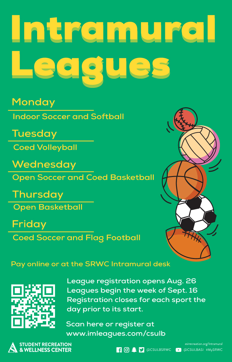
X-ALT-DESC;FMTTYPE=text/html:<div class="container-fluid">    <div class="row">        <div class="col-md-6">            <div class="container-fluid module_round_box-gray" style="padding: 40px 15px;">                <div class="row">                    <div class="col-md-12">                        <div class="container-fluid">                            <div class="row">                                <div class="col-md-4" itemprop="startDate" content="2021-08-23"><small>Date</small>                                    <p style="font-weight: 500; font-size: 1.2em;">Aug. 23 to Dec. 17</p>                                </div>                                <div class="col-md-4" itemprop="location" itemscope="itemscope"                                    itemtype="http://schema.org/Place"><small itemprop="address" itemscope="itemscope"                                        itemtype="http://schema.org/PostalAddress">Location</small>                                    <p style="font-weight: 500; font-size: 1.2em;" itemprop="name">Online</p>                                </div>                                <div class="col-md-4" itemprop="endDate" content="2021-08-23"><small>Time</small>                                    <p style="font-weight: 500; font-size: 1.2em;"></p>                                </div>                            </div>                            <div class="row">                                <div class="col-md-12"><small>Description</small>                                    <div itemprop="description"><p>Become the ultimate belayer! Belay your friends on 211 climbs at the SRWC Rock Wall for an opportunity to win an awesome prize! Participants must be belay-certified through the SRWC Rock Wall to compete. Begin the challenge and log your belays at the SRWC Rock Wall, any time during open hours.</p><p>Monday-Thursday: 3:00pm – 10:00pm</p><p>Fridays: 3:00pm – 8:30pm</p><p>Saturdays/Sundays: 12:00pm – 5:00pm</p>                                    </div>                                </div>                            </div>                        </div>                    </div>                </div>            </div>        </div>        <div class="col-md-6"><img src="images/enjoy/calendar/fall-2021/belay-a-mile-poster.jpg"      alt="Belay A Mile poster" /></div>    </div></div>
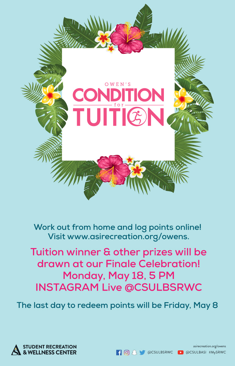
LAST-MODIFIED:20211008T220711Z
X-ACCESS:1
X-HITS:10
X-URL:
X-COLOR:007DAA
END:VEVENT
BEGIN:VEVENT
DTSTART;VALUE=DATE:20210823
DTEND;VALUE=DATE:20210824
RRULE:FREQ=WEEKLY;BYDAY=SA;INTERVAL=1;UNTIL=20211002T235900Z
EXDATE:20210828,20210904,20210911,20210918,20210925,20211002
UID:B39320D3-DCA6-485B-8D0A-96BE2CB2BCCA
SUMMARY:Intramural Leagues
DTSTAMP:20201118T235717Z
DESCRIPTION:\N    \N        \N            \N                \N                    \N                        \N                            \N                                Date\N                                    August 23 - October 1\N                                \N                                Location\N                                    \N                                \N                                Time\N                                    All day\N                                \N                            \N                            \N                                Description\N                                    \NSRWC Intramural Sports offers opportunities to participate in sports activities on a recreational level. League play requires a one-time fee of $10. After paying the fee, you are eligible to participate in all leagues.\NJoin today for a chance to be crowned champion. Sign up here.\N Tuesday - Sand Volleyball League\N Wednesday - Open Soccer League \N Friday - Coed Soccer League\NFor more info visit here between August 23 to October 1.\N                                    \N                                \N                            \N                        \N                    \N                \N            \N        \N        \N    \N\N\N
X-ALT-DESC;FMTTYPE=text/html:<div class="container-fluid">    <div class="row">        <div class="col-md-6">            <div class="container-fluid module_round_box-gray" style="padding: 40px 15px;">                <div class="row">                    <div class="col-md-12">                        <div class="container-fluid">                            <div class="row">                                <div class="col-md-4" itemprop="startDate" content="2021-08-23"><small>Date</small>                                    <p style="font-weight: 500; font-size: 1.2em;">August 23 - October 1</p>                                </div>                                <div class="col-md-4" itemprop="location" itemscope="itemscope"                                    itemtype="http://schema.org/Place"><small itemprop="address" itemscope="itemscope"                                        itemtype="http://schema.org/PostalAddress">Location</small>                                    <p style="font-weight: 500; font-size: 1.2em;" itemprop="name"></p>                                </div>                                <div class="col-md-4" itemprop="endDate" content="2021-08-23"><small>Time</small>                                    <p style="font-weight: 500; font-size: 1.2em;">All day</p>                                </div>                            </div>                            <div class="row">                                <div class="col-md-12"><small>Description</small>                                    <div itemprop="description"><p>SRWC Intramural Sports offers opportunities to participate in sports activities on a recreational level. League play requires a one-time fee of $10. After paying the fee, you are eligible to participate in all leagues.<p><p>Join today for a chance to be crowned champion. Sign up <a href="https://www.imleagues.com/spa/intramural/2f9efab7f7474f0781886c03203622c1/home" target="_blank">here</a>.</p><p><b> Tuesday - Sand Volleyball League</b></p><p><b> Wednesday - Open Soccer League </b></p><p><b> Friday - Coed Soccer League</b></p><p>For more info visit <a href="https://www.imleagues.com/spa/intramural/2f9efab7f7474f0781886c03203622c1/home" target="_blank">here</a> between August 23 to October 1.</p>                                    </div>                                </div>                            </div>                        </div>                    </div>                </div>            </div>        </div>        <div class="col-md-6"><img src="images/enjoy/calendar/fall-2021/intramural-league-poster.jpg"   alt="Intramural Leagues Poster" /></div>    </div></div>
LAST-MODIFIED:20210922T191346Z
X-ACCESS:1
X-HITS:0
X-URL:
X-COLOR:007DAA
END:VEVENT
BEGIN:VEVENT
DTSTART;VALUE=DATE:20210825
DTEND;VALUE=DATE:20210826
RRULE:FREQ=WEEKLY;BYDAY=SA;INTERVAL=1;UNTIL=20211217T235900Z
EXDATE:20210828,20210904,20210911,20210918,20210925,20211002,20211009,20211016,20211023,20211030,20211106,20211113,20211120,20211127,20211204,20211211
UID:7E953FDB-C511-4560-955B-B0C080F2FB11
SUMMARY:Mile High Challenge
DTSTAMP:20201118T235717Z
DESCRIPTION:\N    \N        \N            \N                \N                    \N                        \N                            \N                                Date\N                                    Aug. 25 to Dec. 17\N                                \N                                Location\N                                    SRWC\N                                \N                                Time\N                                    See Below\N                                \N                            \N                            \N                                Description\N                                    \N5280 feet, 211 climbs, 1 mile. Do you have what it takes to complete the Mile High Challenge? Come explore new heights and challenge yourself at the SRWC Rock Wall! Our staff will provide you with all the gear and guidance you need, totally free! Begin the challenge and log your climbs at the SRWC Rock Wall, any time during open hours.\NMonday-Thursday: 3:00pm – 10:00pm\NFridays: 3:00pm – 8:30pm\NSaturday/Sundays: 12:00pm – 5:00pm\N                                    \N                                \N                            \N                        \N                    \N                \N            \N        \N        \N    \N\N\N
X-ALT-DESC;FMTTYPE=text/html:<div class="container-fluid">    <div class="row">        <div class="col-md-6">            <div class="container-fluid module_round_box-gray" style="padding: 40px 15px;">                <div class="row">                    <div class="col-md-12">                        <div class="container-fluid">                            <div class="row">                                <div class="col-md-4" itemprop="startDate" content="2021-08-25"><small>Date</small>                                    <p style="font-weight: 500; font-size: 1.2em;">Aug. 25 to Dec. 17</p>                                </div>                                <div class="col-md-4" itemprop="location" itemscope="itemscope"                                    itemtype="http://schema.org/Place"><small itemprop="address" itemscope="itemscope"                                        itemtype="http://schema.org/PostalAddress">Location</small>                                    <p style="font-weight: 500; font-size: 1.2em;" itemprop="name">SRWC</p>                                </div>                                <div class="col-md-4" itemprop="endDate" content="2021-08-25"><small>Time</small>                                    <p style="font-weight: 500; font-size: 1.2em;">See Below</p>                                </div>                            </div>                            <div class="row">                                <div class="col-md-12"><small>Description</small>                                    <div itemprop="description"><p>5280 feet, 211 climbs, 1 mile. Do you have what it takes to complete the Mile High Challenge? Come explore new heights and challenge yourself at the SRWC Rock Wall! Our staff will provide you with all the gear and guidance you need, totally free! Begin the challenge and log your climbs at the SRWC Rock Wall, any time during open hours.</p><p>Monday-Thursday: 3:00pm – 10:00pm</p><p>Fridays: 3:00pm – 8:30pm</p><p>Saturday/Sundays: 12:00pm – 5:00pm</p>                                    </div>                                </div>                            </div>                        </div>                    </div>                </div>            </div>        </div>        <div class="col-md-6"><img src="images/enjoy/calendar/fall-2021/mile-high-poster.jpg"      alt="Mile High Challenge poster" /></div>    </div></div>
LAST-MODIFIED:20211021T171509Z
X-ACCESS:1
X-HITS:0
X-URL:
X-COLOR:007DAA
END:VEVENT
BEGIN:VEVENT
DTSTART;TZID=America/Los_Angeles:20210830T160000
DTEND;TZID=America/Los_Angeles:20210830T170000
RRULE:FREQ=WEEKLY;BYDAY=MO;INTERVAL=2;UNTIL=20211130T235900Z
EXDATE:20210913T230000Z,20210927T230000Z,20211011T230000Z,20211025T230000Z,20211109T000000Z,20211123T000000Z
UID:D0B5DBC6-F94D-460A-9E3E-26E7ECE0034F
SUMMARY:Mindful Meditations
DTSTAMP:20200829T000417Z
DESCRIPTION:\N\N\N\N\N\N\N\NDate\NAugust 30\N\NLocation\NZoom\N\NTime\N4-5PM\N\N\N\NDescription\N\NColor on SRWC Calendar: Purple - Virtual Wellness\NBREATHE. RELAX. RECOGNIZE. GROW.\NJoin us to learn mindfulness techniques and tips that renew energy and inspire self-awareness.\NEach class features a 40-minute guided meditation and a 10-minute discussion on a well-being topic.\N!-- Meeting Id: \NPassword:\NZoom Link-->\N\N\N\N\N\N\N\N\N\N\N
X-ALT-DESC;FMTTYPE=text/html:<div class="container-fluid"><div class="row"><div class="col-md-6"><div class="container-fluid module_round_box-gray" style="padding: 40px 15px;"><div class="row"><div class="col-md-12"><div class="container-fluid"><div class="row"><div class="col-md-4" itemprop="startDate" content="2021-08-30T1600"><small>Date</small><p style="font-weight: 500; font-size: 1.2em;">August 30</p></div><div class="col-md-4" itemprop="location" itemscope="itemscope" itemtype="http://schema.org/Place"><small itemprop="address" itemscope="itemscope" itemtype="http://schema.org/PostalAddress">Location</small><p style="font-weight: 500; font-size: 1.2em;" itemprop="name">Zoom</p></div><div class="col-md-4" itemprop="endDate" content="2021-08-30T1700"><small>Time</small><p style="font-weight: 500; font-size: 1.2em;">4-5PM</p></div></div><div class="row"><div class="col-md-12"><small>Description</small><div itemprop="description"><p>Color on SRWC Calendar: Purple - Virtual Wellness</p><p>BREATHE. RELAX. RECOGNIZE. GROW.</p><p>Join us to learn mindfulness techniques and tips that renew energy and inspire self-awareness.</p><p>Each class features a 40-minute guided meditation and a 10-minute discussion on a well-being topic.</p><!--<p><b> Meeting Id:</b> </p><p><b>Password:</b></p><p><a href="" target="_blank">Zoom Link</a></p>--></div></div></div></div></div></div></div></div><div class="col-md-6"><img src="images/enjoy/calendar/fall-2021/mindful-meditation-poster.jpg" alt="Mindful Meditations Poster" /></div></div></div>
LAST-MODIFIED:20210817T183539Z
X-ACCESS:1
X-HITS:0
X-URL:
X-COLOR:007DAA
END:VEVENT
BEGIN:VEVENT
DTSTART;VALUE=DATE:20210831
DTEND;VALUE=DATE:20210901
RRULE:FREQ=WEEKLY;BYDAY=FR;INTERVAL=1;UNTIL=20211218T235900Z
EXDATE:20210903,20210910,20210917,20210924,20211001,20211008,20211015,20211022,20211029,20211105,20211112,20211119,20211126,20211203,20211210,20211217
UID:92508E13-5A5D-437D-BDB6-1A449FEA3DA0
SUMMARY:Aquatic Center Net Days & Poolside Games
DTSTAMP:20201118T235717Z
DESCRIPTION:\N    \N        \N            \N                \N                    \N                        \N                            \N                                Date\N                                    Aug. 31 to Dec. 18\N                                \N                                Location\N                                    SRWC Aquatic Area\N                                \N                                Time\N                                    All day\N                                \N                            \N                            \N                                Description\N                                    \NBring your friends and unwind Monday through Friday with a variety of net-based sports all semester long.\NSchedule:\N\NWater Volleyball on Mondays and Tuesdays all day.\NInnertube Water Polo on Wednesdays and Thursdays all day.\NAqua Golf  and special events Fridays!\N\N\NPoolside Games:\NJoin us at the SRWC Aquatics Center the first Friday of every month as we put out giant versions of your favorite games such Jenga, Connect Four and Checkers or lounge in the pool or on our Rolling Log.\NFree refreshments provided as well. So please join us Sept. 3, Oct. 1, Nov. 5 and Dec. 3 from 7 a.m. until 5 p.m.!\N                                    \N                                \N                            \N                        \N                    \N                \N            \N        \N        \N    \N\N\N
X-ALT-DESC;FMTTYPE=text/html:<div class="container-fluid">    <div class="row">        <div class="col-md-6">            <div class="container-fluid module_round_box-gray" style="padding: 40px 15px;">                <div class="row">                    <div class="col-md-12">                        <div class="container-fluid">                            <div class="row">                                <div class="col-md-4" itemprop="startDate" content="2021-08-31"><small>Date</small>                                    <p style="font-weight: 500; font-size: 1.2em;">Aug. 31 to Dec. 18</p>                                </div>                                <div class="col-md-4" itemprop="location" itemscope="itemscope"                                    itemtype="http://schema.org/Place"><small itemprop="address" itemscope="itemscope"                                        itemtype="http://schema.org/PostalAddress">Location</small>                                    <p style="font-weight: 500; font-size: 1.2em;" itemprop="name">SRWC Aquatic Area</p>                                </div>                                <div class="col-md-4" itemprop="endDate" content="2021-08-31"><small>Time</small>                                    <p style="font-weight: 500; font-size: 1.2em;">All day</p>                                </div>                            </div>                            <div class="row">                                <div class="col-md-12"><small>Description</small>                                    <div itemprop="description"><p>Bring your friends and unwind Monday through Friday with a variety of net-based sports all semester long.</p><p><b>Schedule:</b><br/><ul><li>Water Volleyball on Mondays and Tuesdays all day.</li><li>Innertube Water Polo on Wednesdays and Thursdays all day.</li><li>Aqua Golf  and special events Fridays!</li></ul></p><p><b>Poolside Games:</b><p><p>Join us at the SRWC Aquatics Center the first Friday of every month as we put out giant versions of your favorite games such Jenga, Connect Four and Checkers or lounge in the pool or on our Rolling Log.</p><p>Free refreshments provided as well. So please join us Sept. 3, Oct. 1, Nov. 5 and Dec. 3 from 7 a.m. until 5 p.m.!</p>                                    </div>                                </div>                            </div>                        </div>                    </div>                </div>            </div>        </div>        <div class="col-md-6"><img src="images/enjoy/calendar/fall-2021/aquatic-center-net-night-poster.jpg"   alt="Aquatic Center Net Days & Poolside Games Poster" /></div>    </div></div>
LOCATION:
GEO:0.00000000;0.00000000
LAST-MODIFIED:20211021T180022Z
X-ACCESS:1
X-HITS:0
X-URL:
X-COLOR:007DAA
END:VEVENT
BEGIN:VEVENT
DTSTART;VALUE=DATE:20210907
DTEND;VALUE=DATE:20210908
RRULE:FREQ=WEEKLY;BYDAY=SU;INTERVAL=1;UNTIL=20211112T235900Z
EXDATE:20210912,20210919,20210926,20211003,20211010,20211017,20211024,20211031,20211107
UID:77173BCF-9291-451D-8736-55DA4C452E61
SUMMARY:Run Challenge
DTSTAMP:20201118T235717Z
DESCRIPTION:\N    \N        \N            \N                \N                    \N                        \N                            \N                                Date\N                                    Sept. 7 to Nov. 12\N                                \N                                Location\N                                    Online\N                                \N                                Time\N                                    All day\N                                \N                            \N                            \N                                Description\N                                    \NThe Run Challenge is an opportunity for students to win some prizes while getting in some exercise. Those who complete 80 miles are automatically entered in an opportunity drawing to win prizes. Join the SRWC Run Challenge on Strava by visiting here.\NJoin the challenge between Sept. 7 to Nov. 12.\N                                    \N                                \N                            \N                        \N                    \N                \N            \N        \N        \N    \N\N\N
X-ALT-DESC;FMTTYPE=text/html:<div class="container-fluid">    <div class="row">        <div class="col-md-6">            <div class="container-fluid module_round_box-gray" style="padding: 40px 15px;">                <div class="row">                    <div class="col-md-12">                        <div class="container-fluid">                            <div class="row">                                <div class="col-md-4" itemprop="startDate" content="2021-09-07"><small>Date</small>                                    <p style="font-weight: 500; font-size: 1.2em;">Sept. 7 to Nov. 12</p>                                </div>                                <div class="col-md-4" itemprop="location" itemscope="itemscope"                                    itemtype="http://schema.org/Place"><small itemprop="address" itemscope="itemscope"                                        itemtype="http://schema.org/PostalAddress">Location</small>                                    <p style="font-weight: 500; font-size: 1.2em;" itemprop="name">Online</p>                                </div>                                <div class="col-md-4" itemprop="endDate" content="2021-09-07"><small>Time</small>                                    <p style="font-weight: 500; font-size: 1.2em;">All day</p>                                </div>                            </div>                            <div class="row">                                <div class="col-md-12"><small>Description</small>                                    <div itemprop="description"><p>The Run Challenge is an opportunity for students to win some prizes while getting in some exercise. Those who complete 80 miles are automatically entered in an opportunity drawing to win prizes. Join the SRWC Run Challenge on Strava by visiting <a href="https://www.strava.com/clubs/srwc-run-club-935130" target="_blank">here</a>.</p><p>Join the challenge between Sept. 7 to Nov. 12.</p>                                    </div>                                </div>                            </div>                        </div>                    </div>                </div>            </div>        </div>        <div class="col-md-6"><img src="images/enjoy/calendar/fall-2021/run-challenge-poster.jpg"   alt="Run Challenge Poster" /></div>    </div></div>
LAST-MODIFIED:20210923T172506Z
X-ACCESS:1
X-HITS:0
X-URL:
X-COLOR:007DAA
END:VEVENT
BEGIN:VEVENT
DTSTART;TZID=America/Los_Angeles:20210907T150000
DTEND;TZID=America/Los_Angeles:20210907T200000
RRULE:FREQ=WEEKLY;BYDAY=TU;INTERVAL=1;UNTIL=20210929T235900Z
EXDATE:20210914T220000Z,20210921T220000Z,20210928T220000Z
UID:E018EEE5-5D07-43D5-A53C-FEAC88895CAE
SUMMARY:Slackline Tuesdays
DTSTAMP:20201118T235717Z
DESCRIPTION:\N    \N        \N            \N                \N                    \N                        \N                            \N                                Date\N                                    Sept. 7 - Sept. 28\N                                \N                                Location\N                                    SRWC\N                                \N                                Time\N                                    3 p.m. to 8 p.m.\N                                \N                            \N                            \N                                Description\N                                    \NVisit the SRWC Rock Wall and test your balance on outdoor slacklines! Slacklines and yard games are set up outside, every Tuesday in September, from 3 to 8 p.m. Try them out while the weather is nice!\N                                    \N                                \N                            \N                        \N                    \N                \N            \N        \N        \N    \N\N\N
X-ALT-DESC;FMTTYPE=text/html:<div class="container-fluid">    <div class="row">        <div class="col-md-6">            <div class="container-fluid module_round_box-gray" style="padding: 40px 15px;">                <div class="row">                    <div class="col-md-12">                        <div class="container-fluid">                            <div class="row">                                <div class="col-md-4" itemprop="startDate" content="2021-09-07"><small>Date</small>                                    <p style="font-weight: 500; font-size: 1.2em;">Sept. 7 - Sept. 28</p>                                </div>                                <div class="col-md-4" itemprop="location" itemscope="itemscope"                                    itemtype="http://schema.org/Place"><small itemprop="address" itemscope="itemscope"                                        itemtype="http://schema.org/PostalAddress">Location</small>                                    <p style="font-weight: 500; font-size: 1.2em;" itemprop="name">SRWC</p>                                </div>                                <div class="col-md-4" itemprop="endDate" content="2021-09-07"><small>Time</small>                                    <p style="font-weight: 500; font-size: 1.2em;">3 p.m. to 8 p.m.</p>                                </div>                            </div>                            <div class="row">                                <div class="col-md-12"><small>Description</small>                                    <div itemprop="description"><p>Visit the SRWC Rock Wall and test your balance on outdoor slacklines! Slacklines and yard games are set up outside, every Tuesday in September, from 3 to 8 p.m. Try them out while the weather is nice!</p>                                    </div>                                </div>                            </div>                        </div>                    </div>                </div>            </div>        </div>        <div class="col-md-6"><img src="images/enjoy/calendar/fall-2021/slackline-tuesday-poster.jpg"      alt="Slackline Tuesday poster" /></div>    </div></div>
LAST-MODIFIED:20210922T221400Z
X-ACCESS:1
X-HITS:20
X-URL:
X-COLOR:007DAA
END:VEVENT
BEGIN:VEVENT
DTSTART;VALUE=DATE:20210910
DTEND;VALUE=DATE:20210911
RRULE:FREQ=WEEKLY;BYDAY=SA;INTERVAL=2;UNTIL=20211114T235900Z
EXDATE:20210911,20210925,20211009,20211023,20211106
UID:35114DC7-A7A1-431A-8573-642327A4E517
SUMMARY:Outdoor Adventure Trips
DTSTAMP:20201118T235717Z
DESCRIPTION:\N    \N        \N            \N                \N                    \N                        \N                            \N                                Date\N                                    Sept. 11 - Nov. 13\N                                \N                                Location\N                                    \N                                \N                                Time\N                                    \N                                \N                            \N                            \N                                Description\N                                    \NOutdoor Adventure Trips are designed to give Long Beach State students fun and unforgettable experiences at various must-see destinations. Activities include but are not limited to hiking, rock climbing, backpacking, surfing and paddleboarding. Participants are required to transport themselves to and from trip locations this fall. Lunch and equipment will be provided. Join the SRWC and sign up for a trip through the SRWC Go app!\N                                    \N                                \N                            \N                        \N                    \N                \N            \N        \N        \N    \N\N\N
X-ALT-DESC;FMTTYPE=text/html:<div class="container-fluid">    <div class="row">        <div class="col-md-6">            <div class="container-fluid module_round_box-gray" style="padding: 40px 15px;">                <div class="row">                    <div class="col-md-12">                        <div class="container-fluid">                            <div class="row">                                <div class="col-md-4" itemprop="startDate" content="2021-09-11"><small>Date</small>                                    <p style="font-weight: 500; font-size: 1.2em;">Sept. 11 - Nov. 13</p>                                </div>                                <div class="col-md-4" itemprop="location" itemscope="itemscope"                                    itemtype="http://schema.org/Place"><small itemprop="address" itemscope="itemscope"                                        itemtype="http://schema.org/PostalAddress">Location</small>                                    <p style="font-weight: 500; font-size: 1.2em;" itemprop="name"></p>                                </div>                                <div class="col-md-4" itemprop="endDate" content="2021-09-11"><small>Time</small>                                    <p style="font-weight: 500; font-size: 1.2em;"></p>                                </div>                            </div>                            <div class="row">                                <div class="col-md-12"><small>Description</small>                                    <div itemprop="description"><p>Outdoor Adventure Trips are designed to give Long Beach State students fun and unforgettable experiences at various must-see destinations. Activities include but are not limited to hiking, rock climbing, backpacking, surfing and paddleboarding. Participants are required to transport themselves to and from trip locations this fall. Lunch and equipment will be provided. Join the SRWC and sign up for a trip through the SRWC Go app!</p>                                    </div>                                </div>                            </div>                        </div>                    </div>                </div>            </div>        </div>        <div class="col-md-6"><img src="images/enjoy/calendar/fall-2021/outdoor-adventure-poster.jpg"      alt="Outdoor Adventure Trips poster" /></div>    </div></div>
LAST-MODIFIED:20210922T224450Z
X-ACCESS:1
X-HITS:0
X-URL:
X-COLOR:007DAA
END:VEVENT
BEGIN:VEVENT
DTSTART;VALUE=DATE:20210920
DTEND;VALUE=DATE:20210921
RRULE:FREQ=WEEKLY;BYDAY=SA;INTERVAL=1;UNTIL=20211203T235900Z
EXDATE:20210925,20211002,20211009,20211016,20211023,20211030,20211106,20211113,20211120,20211127
UID:DAC0A905-BF34-431A-8837-F04703E9FB62
SUMMARY:Peer Nutrition Counseling
DTSTAMP:20201118T235717Z
DESCRIPTION:\N    \N        \N            \N                \N                    \N                        \N                            \N                                Date\N                                    Sept. 20 - Dec. 3\N                                \N                                Location\N                                    \N                                \N                                Time\N                                    By Appointment\N                                \N                            \N                            \N                                Description\N                                    \NSchedule a Nutrition Counseling Appointment\NFall 2021 Registration Period: Sept. 20 – Dec. 3\NLooking to adopt a healthier lifestyle through nutrition? Work with a peer nutrition counselor to discover eating habits that best fit your lifestyle, dietary preferences and individualized goals. Virtual and in-person options are available. All Nutrition Counseling appointments are FREE of charge.\NRequest an appointment beginning Sept. 20, to schedule a nutrition counseling session. A Beach Balance staff member will contact you to confirm the appointment. Appointments must be made 72 hours in advance. A completed intake form must be submitted prior to scheduling an appointment.\NComplete two sessions and be entered into an opportunity drawing for special prizes!\N**Clients seeking counseling for an eating disorder, or complex medical condition will be referred to the university's Student Health Services.\N                                    \N                                \N                            \N                        \N                    \N                \N            \N        \N        \N    \N\N\N
X-ALT-DESC;FMTTYPE=text/html:<div class="container-fluid">    <div class="row">        <div class="col-md-6">            <div class="container-fluid module_round_box-gray" style="padding: 40px 15px;">                <div class="row">                    <div class="col-md-12">                        <div class="container-fluid">                            <div class="row">                                <div class="col-md-4" itemprop="startDate" content="2021-09-20"><small>Date</small>                                    <p style="font-weight: 500; font-size: 1.2em;">Sept. 20 - Dec. 3</p>                                </div>                                <div class="col-md-4" itemprop="location" itemscope="itemscope"                                    itemtype="http://schema.org/Place"><small itemprop="address" itemscope="itemscope"                                        itemtype="http://schema.org/PostalAddress">Location</small>                                    <p style="font-weight: 500; font-size: 1.2em;" itemprop="name"></p>                                </div>                                <div class="col-md-4" itemprop="endDate" content="2021-09-20"><small>Time</small>                                    <p style="font-weight: 500; font-size: 1.2em;">By Appointment</p>                                </div>                            </div>                            <div class="row">                                <div class="col-md-12"><small>Description</small>                                    <div itemprop="description"><p><b>Schedule a Nutrition Counseling Appointment</b></p><p><b>Fall 2021 Registration Period: </b>Sept. 20 – Dec. 3</p><p>Looking to adopt a healthier lifestyle through nutrition? Work with a peer nutrition counselor to discover eating habits that best fit your lifestyle, dietary preferences and individualized goals. Virtual and in-person options are available. All Nutrition Counseling appointments are FREE of charge.</p><p>Request an appointment beginning Sept. 20, to schedule a nutrition counseling session. A Beach Balance staff member will contact you to confirm the appointment. Appointments must be made 72 hours in advance. A completed intake form must be submitted prior to scheduling an appointment.</p><p>Complete two sessions and be entered into an <b>opportunity drawing</b> for <b>special prizes!</b></p><p><small>**Clients seeking counseling for an eating disorder, or complex medical condition will be referred to the university's Student Health Services.</small></p>                                    </div>                                </div>                            </div>                        </div>                    </div>                </div>            </div>        </div>        <div class="col-md-6"><img src="images/enjoy/calendar/fall-2021/nutrition-counseling-poster.jpg"      alt="Nutrition Counselling poster" /></div>    </div></div>
LAST-MODIFIED:20210913T164815Z
X-ACCESS:1
X-HITS:0
X-URL:
X-COLOR:007DAA
END:VEVENT
BEGIN:VEVENT
DTSTART;VALUE=DATE:20211001
DTEND;VALUE=DATE:20211002
RRULE:FREQ=WEEKLY;BYDAY=SA;INTERVAL=1;UNTIL=20211031T235900Z
EXDATE:20211002,20211009,20211016,20211023,20211030
UID:6656B22E-8DF9-46BC-9AB5-4FEBF20AD0C0
SUMMARY:Rocktober Mini Challenge Series
DTSTAMP:20201118T235717Z
DESCRIPTION:\N    \N        \N            \N                \N                    \N                        \N                            \N                                Date\N                                    Oct. 1 to Oct. 31\N                                \N                                Location\N                                    SRWC\N                                \N                                Time\N                                    \N                                \N                            \N                            \N                                Description\N                                    \NCompete in rock-climbing challenges all October! Our five varying challenges will focus on strength, speed, endurance and skill. Will you climb to the top of the leaderboard? View your standing on the Rock and Outdoor Adventure whiteboard. \NTop two competitors for each category will win great outdoor prizes.\N                                    \N                                \N                            \N                        \N                    \N                \N            \N        \N        \N    \N\N\N
X-ALT-DESC;FMTTYPE=text/html:<div class="container-fluid">    <div class="row">        <div class="col-md-6">            <div class="container-fluid module_round_box-gray" style="padding: 40px 15px;">                <div class="row">                    <div class="col-md-12">                        <div class="container-fluid">                            <div class="row">                                <div class="col-md-4" itemprop="startDate" content="2021-10-01"><small>Date</small>                                    <p style="font-weight: 500; font-size: 1.2em;">Oct. 1 to Oct. 31</p>                                </div>                                <div class="col-md-4" itemprop="location" itemscope="itemscope"                                    itemtype="http://schema.org/Place"><small itemprop="address" itemscope="itemscope"                                        itemtype="http://schema.org/PostalAddress">Location</small>                                    <p style="font-weight: 500; font-size: 1.2em;" itemprop="name">SRWC</p>                                </div>                                <div class="col-md-4" itemprop="endDate" content="2021-10-01"><small>Time</small>                                    <p style="font-weight: 500; font-size: 1.2em;"></p>                                </div>                            </div>                            <div class="row">                                <div class="col-md-12"><small>Description</small>                                    <div itemprop="description"><p>Compete in rock-climbing challenges all October! Our five varying challenges will focus on strength, speed, endurance and skill. Will you climb to the top of the leaderboard? View your standing on the Rock and Outdoor Adventure whiteboard. </p><p>Top two competitors for each category will win great outdoor prizes.</p>                                    </div>                                </div>                            </div>                        </div>                    </div>                </div>            </div>        </div>        <div class="col-md-6"><img src="images/enjoy/calendar/fall-2021/rocktober-challenge-poster.jpg"      alt="Roctober Series Challenge poster" /></div>    </div></div>
LOCATION:
GEO:33.78520800;-118.10846500
LAST-MODIFIED:20211019T203131Z
X-ACCESS:1
X-HITS:0
X-URL:
X-COLOR:007DAA
END:VEVENT
BEGIN:VEVENT
DTSTART;VALUE=DATE:20211206
DTEND;VALUE=DATE:20211207
RRULE:FREQ=WEEKLY;BYDAY=SA;INTERVAL=1;UNTIL=20220527T235900Z
EXDATE:20211211,20211218,20211225,20220108,20220115,20220122,20220129,20220205,20220212,20220219,20220226,20220305,20220312,20220319,20220326,20220402,20220409,20220416,20220423,20220430,20220507,20220514,20220521
UID:2927CCDC-53C0-48F6-82C6-5FD23D002714
SUMMARY:Private Swim Lessons
DTSTAMP:20201118T235717Z
DESCRIPTION:\N    \N        \N            \N                \N                    \N                        \N                            \N                                Date\N                                    Dec. 6 to May 26\N                                \N                                Location\N                                    Aquatics Center\N                                \N                                Time\N                                    \N                                \N                            \N                            \N                                Description\N                                    \NPrivate swim lessons are currently offered all year long. Lessons are open to student and affiliate members. Sessions come in 15, 30 and 60-minute time increments and are tailored to client goals. \N CLIENT INTEREST FORM \N\N                                    \N                                \N                            \N                        \N                    \N                \N            \N        \N        \N    \N\N\N
X-ALT-DESC;FMTTYPE=text/html:<div class="container-fluid">    <div class="row">        <div class="col-md-6">            <div class="container-fluid module_round_box-gray" style="padding: 40px 15px;">                <div class="row">                    <div class="col-md-12">                        <div class="container-fluid">                            <div class="row">                                <div class="col-md-4" itemprop="startDate" content="2021-12-06"><small>Date</small>                                    <p style="font-weight: 500; font-size: 1.2em;">Dec. 6 to May 26</p>                                </div>                                <div class="col-md-4" itemprop="location" itemscope="itemscope"                                    itemtype="http://schema.org/Place"><small itemprop="address" itemscope="itemscope"                                        itemtype="http://schema.org/PostalAddress">Location</small>                                    <p style="font-weight: 500; font-size: 1.2em;" itemprop="name">Aquatics Center</p>                                </div>                                <div class="col-md-4" itemprop="endDate" content="2021-12-06"><small>Time</small>                                    <p style="font-weight: 500; font-size: 1.2em;"></p>                                </div>                            </div>                            <div class="row">                                <div class="col-md-12"><small>Description</small>                                    <div itemprop="description"><p>Private swim lessons are currently offered all year long. Lessons are open to student and affiliate members. Sessions come in 15, 30 and 60-minute time increments and are tailored to client goals. </p><p><a class="btn btn-primary" href="https://www.connect2mycloud.com/OnlineModules/PublicForm/FillOutPublicForm?formCode=605ceb8e-a8ec-4beb-ba07-c7e7d9e69c49" target="_blank" rel="noopener noreferrer"> CLIENT INTEREST FORM </a></p>                                    </div>                                </div>                            </div>                        </div>                    </div>                </div>            </div>        </div>        <div class="col-md-6"><img src="images/enjoy/calendar/fall-2021/private-swim-lessons-poster.jpg"      alt="Private Swim Lessons poster" /></div>    </div></div>
LAST-MODIFIED:20220223T202419Z
X-ACCESS:1
X-HITS:0
X-URL:
X-COLOR:007DAA
END:VEVENT
BEGIN:VEVENT
DTSTART;VALUE=DATE:20220122
DTEND;VALUE=DATE:20220123
RRULE:FREQ=WEEKLY;BYDAY=SA;INTERVAL=1;UNTIL=20220513T235900Z
EXDATE:20220129,20220205,20220212,20220219,20220226,20220305,20220312,20220319,20220326,20220402,20220409,20220416,20220423,20220430,20220507
UID:C672DEBB-6EEA-4004-BA16-F8441EA59C21
SUMMARY:Mile High Challenge
DTSTAMP:20201118T235717Z
DESCRIPTION:\N    \N        \N            \N                \N                    \N                        \N                            \N                                Date\N                                    Jan. 20 to May. 13\N                                \N                                Location\N                                    SRWC Rock Wall\N                                \N                                Time\N                                    SRWC Rock Wall Hours\N                                \N                            \N                            \N                                Description\N                                    \N5280 FEET. 211 CLIMBS. 1 MILE.\NDo you have what it takes to complete the Mile High Challenge this spring? Explore new heights and challenge yourself to new climbs at the Student Recreation and Wellness Center's (SRWC) indoor Rock Wall. Finish the challenge to win this year's custom Mile High Challenge t-shirt. Supplies are limited, so start early!\NSRWC staff will provide all the gear and guidance you need––totally free! Make sure to wear athletic clothing you can move around in. Visit the SRWC Rock Wall any time during open hours to begin the challenge.\NDid you complete the challenge in fall? Do it again and try new routes!\N                                    \N                                \N                            \N                        \N                    \N                \N            \N        \N        \N    \N\N\N
X-ALT-DESC;FMTTYPE=text/html:<div class="container-fluid">    <div class="row">        <div class="col-md-6">            <div class="container-fluid module_round_box-gray" style="padding: 40px 15px;">                <div class="row">                    <div class="col-md-12">                        <div class="container-fluid">                            <div class="row">                                <div class="col-md-4" itemprop="startDate" content="2022-01-20"><small>Date</small>                                    <p style="font-weight: 500; font-size: 1.2em;">Jan. 20 to May. 13</p>                                </div>                                <div class="col-md-4" itemprop="location" itemscope="itemscope"                                    itemtype="http://schema.org/Place"><small itemprop="address" itemscope="itemscope"                                        itemtype="http://schema.org/PostalAddress">Location</small>                                    <p style="font-weight: 500; font-size: 1.2em;" itemprop="name">SRWC Rock Wall</p>                                </div>                                <div class="col-md-4" itemprop="endDate" content="2022-01-20"><small>Time</small>                                    <p style="font-weight: 500; font-size: 1.2em;">SRWC Rock Wall Hours</p>                                </div>                            </div>                            <div class="row">                                <div class="col-md-12"><small>Description</small>                                    <div itemprop="description"><p>5280 FEET. 211 CLIMBS. 1 MILE.</p><p>Do you have what it takes to complete the Mile High Challenge this spring? Explore new heights and challenge yourself to new climbs at the Student Recreation and Wellness Center's (SRWC) indoor Rock Wall. Finish the challenge to win this year's custom Mile High Challenge t-shirt. Supplies are limited, so start early!</p><p>SRWC staff will provide all the gear and guidance you need––totally free! Make sure to wear athletic clothing you can move around in. Visit the SRWC Rock Wall any time during open hours to begin the challenge.</p><p>Did you complete the challenge in fall? Do it again and try new routes!</p>                                    </div>                                </div>                            </div>                        </div>                    </div>                </div>            </div>        </div>        <div class="col-md-6"><img src="images/enjoy/calendar/spring-2022/mile-high-challenge-poster.jpg"      alt="Mile High Challenge poster" /></div>    </div></div>
LAST-MODIFIED:20220112T180427Z
X-ACCESS:1
X-HITS:0
X-URL:
X-COLOR:007DAA
END:VEVENT
BEGIN:VEVENT
DTSTART;VALUE=DATE:20220122
DTEND;VALUE=DATE:20220123
RRULE:FREQ=WEEKLY;BYDAY=SA;INTERVAL=1;UNTIL=20220513T235900Z
EXDATE:20220129,20220205,20220212,20220219,20220226,20220305,20220312,20220319,20220326,20220402,20220409,20220416,20220423,20220430,20220507
UID:CF1AFB0C-6809-44F9-8018-AB754708187F
SUMMARY:Swim Into Shape
DTSTAMP:20201118T235717Z
DESCRIPTION:\N    \N        \N            \N                \N                    \N                        \N                            \N                                Date\N                                    Jan. 20 - May. 13\N                                \N                                Location\N                                    SRWC Aquatics\N                                \N                                Time\N                                    Rec Center Hours\N                                \N                            \N                            \N                                Description\N                                    \NJoin our Swim into Shape program from Jan. 20 through May 13. Complete 20 miles of swimming and earn a free t-shirt! To register, participants can sign up with an Aquatic staff member during pool hours of operation.\N                                    \N                                \N                            \N                        \N                    \N                \N            \N        \N        \N    \N\N\N
X-ALT-DESC;FMTTYPE=text/html:<div class="container-fluid">    <div class="row">        <div class="col-md-6">            <div class="container-fluid module_round_box-gray" style="padding: 40px 15px;">                <div class="row">                    <div class="col-md-12">                        <div class="container-fluid">                            <div class="row">                                <div class="col-md-4" itemprop="startDate" content="2022-01-20"><small>Date</small>                                    <p style="font-weight: 500; font-size: 1.2em;">Jan. 20 - May. 13</p>                                </div>                                <div class="col-md-4" itemprop="location" itemscope="itemscope"                                    itemtype="http://schema.org/Place"><small itemprop="address" itemscope="itemscope"                                        itemtype="http://schema.org/PostalAddress">Location</small>                                    <p style="font-weight: 500; font-size: 1.2em;" itemprop="name">SRWC Aquatics</p>                                </div>                                <div class="col-md-4" itemprop="endDate" content="2021-08-23"><small>Time</small>                                    <p style="font-weight: 500; font-size: 1.2em;">Rec Center Hours</p>                                </div>                            </div>                            <div class="row">                                <div class="col-md-12"><small>Description</small>                                    <div itemprop="description"><p>Join our Swim into Shape program from Jan. 20 through May 13. Complete 20 miles of swimming and earn a free t-shirt! To register, participants can sign up with an Aquatic staff member during pool hours of operation.</p>                                    </div>                                </div>                            </div>                        </div>                    </div>                </div>            </div>        </div>        <div class="col-md-6"><img src="images/enjoy/calendar/spring-2022/swim-into-shape-poster.jpg"      alt="Swim Into Shape poster" /></div>    </div></div>
LAST-MODIFIED:20220112T180602Z
X-ACCESS:1
X-HITS:0
X-URL:
X-COLOR:007DAA
END:VEVENT
BEGIN:VEVENT
DTSTART;VALUE=DATE:20220122
DTEND;VALUE=DATE:20220123
RRULE:FREQ=WEEKLY;BYDAY=SA;INTERVAL=1;UNTIL=20220513T235900Z
EXDATE:20220129,20220205,20220212,20220219,20220226,20220305,20220312,20220319,20220326,20220402,20220409,20220416,20220423,20220430,20220507
UID:9A407413-505B-4FC6-A605-9C3B0D743B9C
SUMMARY:Intramural League
DTSTAMP:20220121T155717Z
DESCRIPTION:\N    \N        \N            \N                \N                    \N                        \N                            \N                                Date\N                                    Jan. 20 to May 13\N                                \N                                Location\N                                    \N                                \N                                Time\N                                    \N                                \N                            \N                            \N                                Description\N                                    \NJoin in on the fun! SRWC members can sign up on imleagues.com/csulb for as many leagues as they want for $10. Grab some friends and compete for a chance to be crowned as an Intramural Champion.\N                                    \N                                \N                            \N                        \N                    \N                \N            \N        \N        \N    \N\N\N
X-ALT-DESC;FMTTYPE=text/html:<div class="container-fluid">    <div class="row">        <div class="col-md-6">            <div class="container-fluid module_round_box-gray" style="padding: 40px 15px;">                <div class="row">                    <div class="col-md-12">                        <div class="container-fluid">                            <div class="row">                                <div class="col-md-4" itemprop="startDate" content="2022-01-23"><small>Date</small>                                    <p style="font-weight: 500; font-size: 1.2em;">Jan. 20 to May 13</p>                                </div>                                <div class="col-md-4" itemprop="location" itemscope="itemscope"                                    itemtype="http://schema.org/Place"><small itemprop="address" itemscope="itemscope"                                        itemtype="http://schema.org/PostalAddress">Location</small>                                    <p style="font-weight: 500; font-size: 1.2em;" itemprop="name"></p>                                </div>                                <div class="col-md-4" itemprop="endDate" content="2022-01-23"><small>Time</small>                                    <p style="font-weight: 500; font-size: 1.2em;"></p>                                </div>                            </div>                            <div class="row">                                <div class="col-md-12"><small>Description</small>                                    <div itemprop="description"><p>Join in on the fun! SRWC members can sign up on <a href="https://imleagues.com/spa/intramural/2f9efab7f7474f0781886c03203622c1/home" target="_blank">imleagues.com/csulb</a> for as many leagues as they want for $10. Grab some friends and compete for a chance to be crowned as an Intramural Champion.</p>                                    </div>                                </div>                            </div>                        </div>                    </div>                </div>            </div>        </div>        <div class="col-md-6"><img src="images/enjoy/calendar/spring-2022/intramural-league-poster.jpg"      alt="Intramural League poster" /></div>    </div></div>
LAST-MODIFIED:20220121T183853Z
X-ACCESS:1
X-HITS:0
X-URL:
X-COLOR:007DAA
END:VEVENT
BEGIN:VEVENT
DTSTART;VALUE=DATE:20220123
DTEND;VALUE=DATE:20220124
RRULE:FREQ=WEEKLY;BYDAY=SU;INTERVAL=1;UNTIL=20220513T235900Z
EXDATE:20220130,20220206,20220213,20220220,20220227,20220306,20220313,20220320,20220327,20220403,20220410,20220417,20220424,20220501,20220508
UID:4565C33A-7CB0-4A1F-BBFC-C97634AE48BD
SUMMARY:Run Challenge
DTSTAMP:20220121T155717Z
DESCRIPTION:\N    \N        \N            \N                \N                    \N                        \N                            \N                                Date\N                                    Jan. 20 to May 13\N                                \N                                Location\N                                    \N                                \N                                Time\N                                    \N                                \N                            \N                            \N                                Description\N                                    \NJoin the SRWC's Run Challenge and run towards some epic prizes. Students must log 80 miles during the spring 2022 semester.  Miles can be completed anywhere, anytime - not only at the SRWC - just remember to log them in your Strava account! Don't forget to take advantage of the awesome indoor track at the SRWC too.  All participants who complete the challenge will be entered into an opportunity drawing for a chance to win a Garmin watch and gift cards!\NThe challenge runs from Jan. 20 through May 13.  For more information and to join, visit strava.com/clubs/srwc-run.\N                                    \N                                \N                            \N                        \N                    \N                \N            \N        \N        \N    \N\N\N
X-ALT-DESC;FMTTYPE=text/html:<div class="container-fluid">    <div class="row">        <div class="col-md-6">            <div class="container-fluid module_round_box-gray" style="padding: 40px 15px;">                <div class="row">                    <div class="col-md-12">                        <div class="container-fluid">                            <div class="row">                                <div class="col-md-4" itemprop="startDate" content="2022-01-23"><small>Date</small>                                    <p style="font-weight: 500; font-size: 1.2em;">Jan. 20 to May 13</p>                                </div>                                <div class="col-md-4" itemprop="location" itemscope="itemscope"                                    itemtype="http://schema.org/Place"><small itemprop="address" itemscope="itemscope"                                        itemtype="http://schema.org/PostalAddress">Location</small>                                    <p style="font-weight: 500; font-size: 1.2em;" itemprop="name"></p>                                </div>                                <div class="col-md-4" itemprop="endDate" content="2022-01-23"><small>Time</small>                                    <p style="font-weight: 500; font-size: 1.2em;"></p>                                </div>                            </div>                            <div class="row">                                <div class="col-md-12"><small>Description</small>                                    <div itemprop="description"><p>Join the SRWC's Run Challenge and run towards some epic prizes. Students must log 80 miles during the spring 2022 semester.  Miles can be completed anywhere, anytime - not only at the SRWC - just remember to log them in your Strava account! Don't forget to take advantage of the awesome indoor track at the SRWC too.  All participants who complete the challenge will be entered into an opportunity drawing for a chance to win a Garmin watch and gift cards!</p><p>The challenge runs from Jan. 20 through May 13.  For more information and to join, visit <a href="https://www.strava.com/clubs/935130" target="_blank">strava.com/clubs/srwc-run</a>.</p>                                    </div>                                </div>                            </div>                        </div>                    </div>                </div>            </div>        </div>        <div class="col-md-6"><img src="images/enjoy/calendar/spring-2022/run-challenge-poster.jpg"      alt="Run Challenge poster" /></div>    </div></div>
LAST-MODIFIED:20220121T183034Z
X-ACCESS:1
X-HITS:0
X-URL:
X-COLOR:007DAA
END:VEVENT
BEGIN:VEVENT
DTSTART;VALUE=DATE:20220123
DTEND;VALUE=DATE:20220124
RRULE:FREQ=WEEKLY;BYDAY=SU;INTERVAL=1;UNTIL=20220513T235900Z
EXDATE:20220130,20220206,20220213,20220220,20220227,20220306,20220313,20220320,20220327,20220403,20220410,20220417,20220424,20220501,20220508
UID:56223232-88D0-4188-AA63-D07911FBA92C
SUMMARY:Mega Challenge
DTSTAMP:20211231T155717Z
DESCRIPTION:\N    \N        \N            \N                \N                    \N                        \N                            \N                                Date\N                                    Jan. 20 to May 13\N                                \N                                Location\N                                    SRWC Rock Wall\N                                \N                                Time\N                                    SRWC Hours\N                                \N                            \N                            \N                                Description\N                                    \NWant to take your fitness challenges to the next level? Join the SRWC Mega Challenge! Sign up, compete and complete the Aquatic Swim into Shape Challenge, the Rock and Outdoor Adventure (ROA) Mile High Challenge, and the Intramurals Run Challenge to earn a medal.\NSwim into Shape is a 20-mile swimming challenge, the Mile High Challenge is a one-mile indoor rock climbing challenge, and the Run Challenge is an 80-mile running challenge.\NYou will automatically be entered into the Mega Challenge if you sign up for all three individual challenges. You can register for the challenges in the following ways:\N\NRun Challenge, visit strava.com/clubs/srwc-run\NSwim into Shape Challenge, visit a staff member in person at the Aquatic Center during regular hours\NMile High Challenge, visit a staff member in person at the Rock Wall during regular hours\N\NAll three challenges must be started and completed by their respective deadlines within the spring 2022 semester. The Mega Challenge is open to all members of the SRWC.\NBecome an ultimate swimming, climbing and running champion today!\N                                    \N                                \N                            \N                        \N                    \N                \N            \N        \N        \N    \N\N\N
X-ALT-DESC;FMTTYPE=text/html:<div class="container-fluid">    <div class="row">        <div class="col-md-6">            <div class="container-fluid module_round_box-gray" style="padding: 40px 15px;">                <div class="row">                    <div class="col-md-12">                        <div class="container-fluid">                            <div class="row">                                <div class="col-md-4" itemprop="startDate" content="2022-01-23"><small>Date</small>                                    <p style="font-weight: 500; font-size: 1.2em;">Jan. 20 to May 13</p>                                </div>                                <div class="col-md-4" itemprop="location" itemscope="itemscope"                                    itemtype="http://schema.org/Place"><small itemprop="address" itemscope="itemscope"                                        itemtype="http://schema.org/PostalAddress">Location</small>                                    <p style="font-weight: 500; font-size: 1.2em;" itemprop="name">SRWC Rock Wall</p>                                </div>                                <div class="col-md-4" itemprop="endDate" content="2022-01-23"><small>Time</small>                                    <p style="font-weight: 500; font-size: 1.2em;">SRWC Hours</p>                                </div>                            </div>                            <div class="row">                                <div class="col-md-12"><small>Description</small>                                    <div itemprop="description"><p>Want to take your fitness challenges to the next level? Join the SRWC Mega Challenge! Sign up, compete and complete the Aquatic Swim into Shape Challenge, the Rock and Outdoor Adventure (ROA) Mile High Challenge, and the Intramurals Run Challenge to earn a medal.</p><p>Swim into Shape is a 20-mile swimming challenge, the Mile High Challenge is a one-mile indoor rock climbing challenge, and the Run Challenge is an 80-mile running challenge.</p><p>You will automatically be entered into the Mega Challenge if you sign up for all three individual challenges. You can register for the challenges in the following ways:</p><ul><li>Run Challenge, visit <a href="https://www.strava.com/clubs/935130" target="_blank">strava.com/clubs/srwc-run</a></li><li>Swim into Shape Challenge, visit a staff member in person at the Aquatic Center during regular hours</li><li>Mile High Challenge, visit a staff member in person at the Rock Wall during regular hours</li></ul><p>All three challenges must be started and completed by their respective deadlines within the spring 2022 semester. The Mega Challenge is open to all members of the SRWC.</p><p>Become an ultimate swimming, climbing and running champion today!</p>                                    </div>                                </div>                            </div>                        </div>                    </div>                </div>            </div>        </div>        <div class="col-md-6"><img src="images/enjoy/calendar/spring-2022/mega-challenge-poster.jpg"      alt="Mega Challenge poster" /></div>    </div></div>
LAST-MODIFIED:20220112T181247Z
X-ACCESS:1
X-HITS:0
X-URL:
X-COLOR:007DAA
END:VEVENT
BEGIN:VEVENT
DTSTART;VALUE=DATE:20220123
DTEND;VALUE=DATE:20220124
RRULE:FREQ=WEEKLY;BYDAY=SU;INTERVAL=2;UNTIL=20220513T235900Z
EXDATE:20220206,20220220,20220306,20220320,20220403,20220417,20220501
UID:FC35CD2A-CEB0-4FC7-B8A0-D5CDCB59D672
SUMMARY:Belay a Mile
DTSTAMP:20211231T155717Z
DESCRIPTION:\N    \N        \N            \N                \N                    \N                        \N                            \N                                Date\N                                    Jan. 20 to May 13\N                                \N                                Location\N                                    SRWC Rock Wall\N                                \N                                Time\N                                    SRWC Hours\N                                \N                            \N                            \N                                Description\N                                    \NBecome the ultimate belayer in our Belay a Mile Challenge! The Rock Wall at the Student Recreation and Wellness Center (SRWC) has 211 different climbing routes for you to try out. Challenge your friends and reach new heights for an opportunity to win an awesome prize! Participants must be belay-certified through the SRWC Rock Wall to compete. \N                                    \N                                \N                            \N                        \N                    \N                \N            \N        \N        \N    \N\N\N
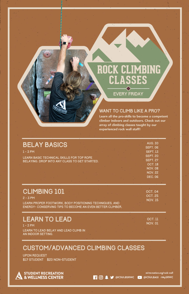
X-ALT-DESC;FMTTYPE=text/html:<div class="container-fluid">    <div class="row">        <div class="col-md-6">            <div class="container-fluid module_round_box-gray" style="padding: 40px 15px;">                <div class="row">                    <div class="col-md-12">                        <div class="container-fluid">                            <div class="row">                                <div class="col-md-4" itemprop="startDate" content="2022-01-23"><small>Date</small>                                    <p style="font-weight: 500; font-size: 1.2em;">Jan. 20 to May 13</p>                                </div>                                <div class="col-md-4" itemprop="location" itemscope="itemscope"                                    itemtype="http://schema.org/Place"><small itemprop="address" itemscope="itemscope"                                        itemtype="http://schema.org/PostalAddress">Location</small>                                    <p style="font-weight: 500; font-size: 1.2em;" itemprop="name">SRWC Rock Wall</p>                                </div>                                <div class="col-md-4" itemprop="endDate" content="2022-01-23"><small>Time</small>                                    <p style="font-weight: 500; font-size: 1.2em;">SRWC Hours</p>                                </div>                            </div>                            <div class="row">                                <div class="col-md-12"><small>Description</small>                                    <div itemprop="description"><p>Become the ultimate belayer in our Belay a Mile Challenge! The Rock Wall at the Student Recreation and Wellness Center (SRWC) has 211 different climbing routes for you to try out. Challenge your friends and reach new heights for an opportunity to win an awesome prize! Participants must be belay-certified through the SRWC Rock Wall to compete. </p>                                    </div>                                </div>                            </div>                        </div>                    </div>                </div>            </div>        </div>        <div class="col-md-6"><img src="images/enjoy/calendar/spring-2022/belay-mile-poster.jpg"      alt="Belay A Mile poster" /></div>    </div></div>
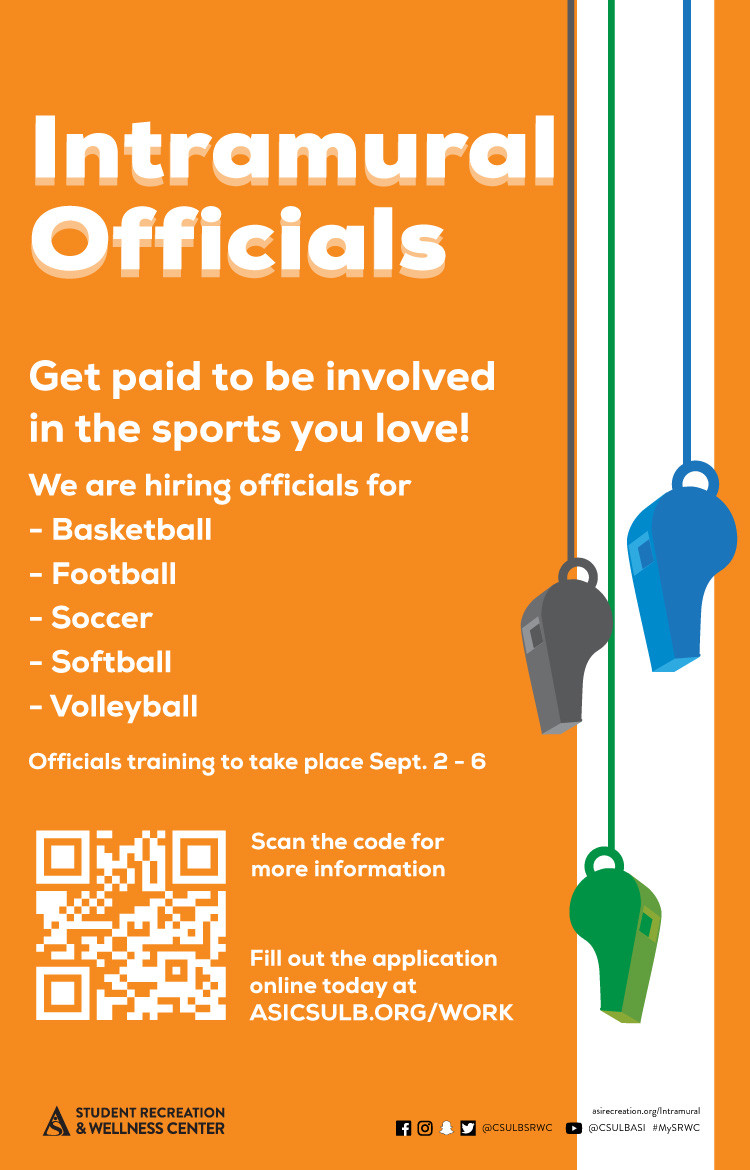
LAST-MODIFIED:20220112T181227Z
X-ACCESS:1
X-HITS:0
X-URL:
X-COLOR:007DAA
END:VEVENT
BEGIN:VEVENT
DTSTART;TZID=America/Los_Angeles:20220126T170000
DTEND;TZID=America/Los_Angeles:20220126T180000
RRULE:FREQ=WEEKLY;BYDAY=TH;INTERVAL=1;UNTIL=20220518T235900Z
EXDATE:20220128T010000Z,20220204T010000Z,20220211T010000Z,20220218T010000Z,20220225T010000Z,20220304T010000Z,20220311T010000Z,20220318T000000Z,20220325T000000Z,20220401T000000Z,20220408T000000Z,20220415T000000Z,20220422T000000Z,20220429T000000Z,20220506T000000Z,20220513T000000Z
UID:8A8A5CF1-4385-4F11-A0BE-3008C991E040
SUMMARY:Yoga for Mental Health
DTSTAMP:20220126T230140Z
DESCRIPTION:\N    \N        \N            \N                \N                    \N                        \N                            \N                                Date\N                                    Thursdays\N                                \N                                Location\N                                    SRWC Farber Fitness\N                                \N                                Time\N                                    5 p.m. to 6 p.m.\N                                \N                            \N                            \N                                Description\N                                    \NLearn yoga and meditation practices that improve mental health, boost emotional well-being and promote academic success! Each class includes physical yoga practice, breathing exercises and guided meditation. Our meditations and breathing exercises will stimulate your parasympathetic nervous system to help you relax and stay focused on your coursework, while our yoga flows will help improve your posture. Return each week to learn about new mindfulness philosophies such as affirmations and visualization techniques.\NConsistent attendance is strongly encouraged! Attend two, six and 10 consecutive classes to receive a FREE giveaway. After each class, attendees will also be entered into an opportunity drawing.  At the end of the semester, three winners will be selected to win: a yoga bundle, a $25 49er Shops gift card and a $10 Shake Smart gift card. The more classes you attend, the more entries you receive!\N\N                                \N                            \N                        \N                    \N                \N            \N        \N        \N    \N
X-ALT-DESC;FMTTYPE=text/html:<div class="container-fluid">    <div class="row">        <div class="col-md-6">            <div class="container-fluid module_round_box-gray" style="padding: 40px 15px;">                <div class="row">                    <div class="col-md-12">                        <div class="container-fluid">                            <div class="row">                                <div class="col-md-4" itemprop="startDate" content="2022-01-20"><small>Date</small>                                    <p style="font-weight: 500; font-size: 1.2em;">Thursdays</p>                                </div>                                <div class="col-md-4" itemprop="location" itemscope="itemscope"                                    itemtype="http://schema.org/Place"><small itemprop="address" itemscope="itemscope"                                        itemtype="http://schema.org/PostalAddress">Location</small>                                    <p style="font-weight: 500; font-size: 1.2em;" itemprop="name">SRWC Farber Fitness</p>                                </div>                                <div class="col-md-4" itemprop="endDate" content="2021-08-23"><small>Time</small>                                    <p style="font-weight: 500; font-size: 1.2em;">5 p.m. to 6 p.m.</p>                                </div>                            </div>                            <div class="row">                                <div class="col-md-12"><small>Description</small>                                    <div itemprop="description"><p>Learn yoga and meditation practices that improve mental health, boost emotional well-being and promote academic success! Each class includes physical yoga practice, breathing exercises and guided meditation. Our meditations and breathing exercises will stimulate your parasympathetic nervous system to help you relax and stay focused on your coursework, while our yoga flows will help improve your posture. Return each week to learn about new mindfulness philosophies such as affirmations and visualization techniques.</p><p>Consistent attendance is strongly encouraged! Attend two, six and 10 consecutive classes to receive a FREE giveaway. After each class, attendees will also be entered into an opportunity drawing.  At the end of the semester, three winners will be selected to win: a yoga bundle, a $25 49er Shops gift card and a $10 Shake Smart gift card. The more classes you attend, the more entries you receive!</p></div>                                </div>                            </div>                        </div>                    </div>                </div>            </div>        </div>        <div class="col-md-6"><img src="images/enjoy/calendar/spring-2022/yoga-mental-health-poster.jpg" alt="yoga for mental health poster" /></div>    </div></div>
LAST-MODIFIED:20220126T231536Z
X-ACCESS:1
X-HITS:0
X-URL:
X-COLOR:007DAA
END:VEVENT
BEGIN:VEVENT
DTSTART;TZID=America/Los_Angeles:20220211T170000
DTEND;TZID=America/Los_Angeles:20220211T190000
RRULE:FREQ=WEEKLY;BYDAY=FR;INTERVAL=1;COUNT=3;UNTIL=20220404T235900Z
EXDATE:20220219T010000Z,20220226T010000Z
UID:DBD5822B-D096-44F8-9CD4-380EA66EF1EC
SUMMARY:Friday Game Night
DTSTAMP:20220204T205100Z
DESCRIPTION:\N    \N        \N            \N                \N                    \N                        \N                            \N                                Date\N                                    Feb. 11\N                                \N                                Location\N                                    Zoom\N                                \N                                Time\N                                    5 p.m.\N                                \N                            \N                            \N                                Description\N                                    \N                                        Rock and Outdoor Adventure is hosting Friday Game Nights at the SRWC Rock Wall! Join our staff in playing a number of interactive rock climbing games such as Climbing Twister, Add-on, Noodle Labyrinth, Chair Bouldering, Climbing Limbo and Ninja Ball.\N                                        Bring a group of friends and spend your evening reaching new heights! No prior rock climbing experience is needed.\N                                        For tips on how to play, check out our Rock & Outdoor Adventure story highlights on Instagram @csulbsrwc!\N                                    \N                                \N                            \N                        \N                    \N                \N            \N        \N        \N    \N\N\N
X-ALT-DESC;FMTTYPE=text/html:<div class="container-fluid">    <div class="row">        <div class="col-md-6">            <div class="container-fluid module_round_box-gray" style="padding: 40px 15px;">                <div class="row">                    <div class="col-md-12">                        <div class="container-fluid">                            <div class="row">                                <div class="col-md-4" itemprop="startDate" content="2022-02-07"><small>Date</small>                                    <p style="font-weight: 500; font-size: 1.2em;">Feb. 11</p>                                </div>                                <div class="col-md-4" itemprop="location" itemscope="itemscope"                                    itemtype="http://schema.org/Place"><small itemprop="address" itemscope="itemscope"                                        itemtype="http://schema.org/PostalAddress">Location</small>                                    <p style="font-weight: 500; font-size: 1.2em;" itemprop="name">Zoom</p>                                </div>                                <div class="col-md-4" itemprop="endDate" content="2022-02-07"><small>Time</small>                                    <p style="font-weight: 500; font-size: 1.2em;">5 p.m.</p>                                </div>                            </div>                            <div class="row">                                <div class="col-md-12"><small>Description</small>                                    <div itemprop="description">                                        <p>Rock and Outdoor Adventure is hosting Friday Game Nights at the SRWC Rock Wall! Join our staff in playing a number of interactive rock climbing games such as Climbing Twister, Add-on, Noodle Labyrinth, Chair Bouldering, Climbing Limbo and Ninja Ball.</p>                                        <p>Bring a group of friends and spend your evening reaching new heights! No prior rock climbing experience is needed.</p>                                        <p>For tips on how to play, check out our Rock & Outdoor Adventure story highlights on Instagram <a href="https://www.instagram.com/stories/highlights/17875299262249304/" target="_blank">@csulbsrwc</a>!</p>                                    </div>                                </div>                            </div>                        </div>                    </div>                </div>            </div>        </div>        <div class="col-md-6"><img src="images/enjoy/calendar/spring-2022/friday-game-night-poster.jpg"      alt="friday-game-night-poster" /></div>    </div></div>
X-ACCESS:1
X-HITS:0
X-URL:
X-COLOR:007DAA
END:VEVENT
BEGIN:VEVENT
DTSTART;VALUE=DATE:20220214
DTEND;VALUE=DATE:20220215
RRULE:FREQ=WEEKLY;BYDAY=SA;INTERVAL=1;UNTIL=20220429T235900Z
EXDATE:20220219,20220226,20220305,20220312,20220319,20220326,20220402,20220409,20220416,20220423
UID:45C2E782-56E6-47BB-AB92-5723E2C1E635
SUMMARY:Peer Nutrition Counseling
DTSTAMP:20201118T235717Z
DESCRIPTION:\N    \N        \N            \N                \N                    \N                        \N                            \N                                Date\N                                    Feb. 14 - Apr. 29\N                                \N                                Location\N                                    \N                                \N                                Time\N                                    By Appointment\N                                \N                            \N                            \N                                Description\N                                    \NSpring 2022 \N                                        Registration Period: Feb. 14 – Apr. 29\N                                        Looking to adopt a healthier lifestyle through nutrition? Work with a peer nutrition counselor to discover eating habits that best fit your lifestyle, dietary preferences and individualized goals. Virtual and in-person options are available. All nutrition counseling appointments are FREE of charge.\N                                        Request a nutrition counseling appointment at the link below. A Beach Balance staff member will contact you to confirm your time slot. Appointments must be made 72 hours in advance. A completed intake form must be submitted prior to scheduling.\N                                        Receive a set of reusable utensils after completing two sessions!\N\N                                        REQUEST AN APPOINTMENT\N                                        **Clients seeking counseling for an eating disorder, or complex medical condition will be referred to the university's Student Health Services.\N                                    \N                                \N                            \N                        \N                    \N                \N            \N        \N        \N    \N\N
X-ALT-DESC;FMTTYPE=text/html:<div class="container-fluid">    <div class="row">        <div class="col-md-6">            <div class="container-fluid module_round_box-gray" style="padding: 40px 15px;">                <div class="row">                    <div class="col-md-12">                        <div class="container-fluid">                            <div class="row">                                <div class="col-md-4" itemprop="startDate" content="2021-09-20"><small>Date</small>                                    <p style="font-weight: 500; font-size: 1.2em;">Feb. 14 - Apr. 29</p>                                </div>                                <div class="col-md-4" itemprop="location" itemscope="itemscope" itemtype="http://schema.org/Place"><small itemprop="address" itemscope="itemscope" itemtype="http://schema.org/PostalAddress">Location</small>                                    <p style="font-weight: 500; font-size: 1.2em;" itemprop="name"></p>                                </div>                                <div class="col-md-4" itemprop="endDate" content="2021-09-20"><small>Time</small>                                    <p style="font-weight: 500; font-size: 1.2em;">By Appointment</p>                                </div>                            </div>                            <div class="row">                                <div class="col-md-12"><small>Description</small>                                    <div itemprop="description"><p><b>Spring 2022 </b></p>                                        <p><b>Registration Period: </b>Feb. 14 – Apr. 29</p>                                        <p>Looking to adopt a healthier lifestyle through nutrition? Work with a peer nutrition counselor to discover eating habits that best fit your lifestyle, dietary preferences and individualized goals. Virtual and in-person options are available. All nutrition counseling appointments are FREE of charge.</p>                                        <p>Request a nutrition counseling appointment at the link below. A Beach Balance staff member will contact you to confirm your time slot. Appointments must be made 72 hours in advance. A completed intake form must be submitted prior to scheduling.</p>                                        <p>Receive a set of reusable utensils after completing two sessions!</p>                                        <p><b><a href="https://na3.docusign.net/Member/PowerFormSigning.aspx?PowerFormId=52633b33-080f-4b7b-80c8-37cd746b93c3&env=na3&acct=713450e5-2dd0-4676-a3cb-609115e008d7&v=2" target="_blank">REQUEST AN APPOINTMENT</a></b></p>                                        <p><small>**Clients seeking counseling for an eating disorder, or complex medical condition will be referred to the university's Student Health Services.</small></p>                                    </div>                                </div>                            </div>                        </div>                    </div>                </div>            </div>        </div>        <div class="col-md-6"><img src="images/enjoy/calendar/spring-2022/nutrition-counseling-poster.jpg" alt="Nutrition Counseling poster" /></div>    </div></div>
LAST-MODIFIED:20220210T003041Z
X-ACCESS:1
X-HITS:0
X-URL:
X-COLOR:007DAA
END:VEVENT
BEGIN:VEVENT
DTSTART;TZID=America/Los_Angeles:20220405T150000
DTEND;TZID=America/Los_Angeles:20220405T200000
RRULE:FREQ=WEEKLY;BYDAY=TU;INTERVAL=1;UNTIL=20220426T235900Z
EXDATE:20220412T220000Z,20220419T220000Z,20220426T220000Z
UID:B45D211A-C722-4387-B7CB-00ACDB8D8677
SUMMARY:Slackline Tuesdays
DTSTAMP:20201118T235717Z
DESCRIPTION:\N    \N        \N            \N                \N                    \N                        \N                            \N                                Date\N                                    Every Tuesday in April\N                                \N                                Location\N                                    SRWC East Lawn\N                                \N                                Time\N                                    3 p.m. - 8 p.m.\N                                \N                            \N                            \N                                Description\N                                    \N                                        Curious about how good your balance is? Visit the SRWC East Lawn to try out our outdoor slackline setup. Similar to tightrope walking, slacklining is an excellent test of both balance and focus. We will provide guidance, tips and equipment for individuals of all skills levels. After you're done, feel free to hang out and play some yard games while the sun is shining!\N                                        Slacklines and yard games will be set up outside, every Tuesday in April, from 3 to 8 p.m. at the SRWC. Try them out before the weather gets too warm.\N                                    \N                                \N                            \N                        \N                    \N                \N            \N        \N        \N    \N\N
X-ALT-DESC;FMTTYPE=text/html:<div class="container-fluid">    <div class="row">        <div class="col-md-6">            <div class="container-fluid module_round_box-gray" style="padding: 40px 15px;">                <div class="row">                    <div class="col-md-12">                        <div class="container-fluid">                            <div class="row">                                <div class="col-md-4" itemprop="startDate" content="2022-04-07T1400"><small>Date</small>                                    <p style="font-weight: 500; font-size: 1.2em;">Every Tuesday in April</p>                                </div>                                <div class="col-md-4" itemprop="location" itemscope="itemscope" itemtype="http://schema.org/Place"><small itemprop="address" itemscope="itemscope" itemtype="http://schema.org/PostalAddress">Location</small>                                    <p style="font-weight: 500; font-size: 1.2em;" itemprop="name">SRWC East Lawn</p>                                </div>                                <div class="col-md-4" itemprop="endDate" content="2022-04-07T1500"><small>Time</small>                                    <p style="font-weight: 500; font-size: 1.2em;">3 p.m. - 8 p.m.</p>                                </div>                            </div>                            <div class="row">                                <div class="col-md-12"><small>Description</small>                                    <div itemprop="description">                                        <p>Curious about how good your balance is? Visit the SRWC East Lawn to try out our outdoor slackline setup. Similar to tightrope walking, slacklining is an excellent test of both balance and focus. We will provide guidance, tips and equipment for individuals of all skills levels. After you're done, feel free to hang out and play some yard games while the sun is shining!</p>                                        <p>Slacklines and yard games will be set up outside, every Tuesday in April, from 3 to 8 p.m. at the SRWC. Try them out before the weather gets too warm.</p>                                    </div>                                </div>                            </div>                        </div>                    </div>                </div>            </div>        </div>        <div class="col-md-6"><img src="images/enjoy/calendar/spring-2022/slackline-tuesday-poster.jpg" alt="Slackline Tuesday poster" /></div>    </div></div>
LAST-MODIFIED:20220407T185930Z
X-ACCESS:1
X-HITS:0
X-URL:
X-COLOR:007DAA
END:VEVENT
BEGIN:VEVENT
DTSTART;TZID=America/Los_Angeles:20220408T080000
DTEND;TZID=America/Los_Angeles:20220408T130000
RRULE:FREQ=WEEKLY;BYDAY=FR;INTERVAL=1;UNTIL=20220430T235900Z
EXDATE:20220415T150000Z,20220422T150000Z,20220429T150000Z
UID:136D5800-52E6-4FEB-BCC5-94EF4F23DA40
SUMMARY:Group Swim Lessons
DTSTAMP:20211207T184047Z
DESCRIPTION:\N    \N        \N            \N                \N                    \N                        \N                            \N                                \N                                    Date\N                                    \N                                        Apr. 8\N                                    \N                                \N                                \N                                    Location\N                                    SRWC Pool Deck\N                                \N                                \N                                    Time\N                                    12 p.m. to 2:15 p.m.\N                                \N                            \N                            \N                                \N                                    Description\N                                    \N                                        Group swim lessons are currently offered to SRWC members in the spring and fall semesters. These lessons are a great way to get to have fun with peers while learning lifelong aquatic skills. Group swim lessons are a 4-week class*.\N                                        The classes will occur on April 8, April 15, April 22, and April 29.  There are two class time options offered for spring 2022:\N                                        \N                                            12 p.m. to 1 p.m.\N                                            1:15 p.m. to 2:15 p.m.\N                                        \N                                        *Class size must have at least six participants to be hosted. No scheduled make-ups for any missed sessions. \N                                        Visit SRWC GO, to view pricing and to register. The deadline to register is April 6 at 10 p.m.\N                                         \N                                        \N                                            Register Here\N                                        \N                                         \N                                        The first swim lesson will consist of a skills check, pool rules, and necessary water safety information. Depending on course size and group needs, instructors may break down the large group into sub groups for specific instruction for the remaining three weeks. See below for objectives of possible sub groups.\N                                        Group I - Water Exploration\N                                        The focus of this group is to allow participants to feel comfortable in the water and to enjoy the pool safely. Participants will learn basic aquatic skills such as breathing control, assisted floating, glides, and kicking. \N                                        Group II - Primary Skills\N                                        The focus this group is to work on movement based water skills. This involves floating without support, orienting to an upright position, retrieving objects from the bottom of a shallow pool, and the introduction of swimming strokes. \N                                        Group III - Stroke Preparation\N                                        The focus in this group is to learn how to coordinate swimming strokes. Participants will further improve skills in the front crawl, back crawl, backstroke, and in treading water. Those skills will be refined for participants to be able to do them with ease, efficiency, and power over greater distances and time.\N                                    \N                                \N                            \N                        \N                    \N                \N            \N        \N        \N            \N        \N    \N\N
X-ALT-DESC;FMTTYPE=text/html:<div class="container-fluid">    <div class="row">        <div class="col-md-6">            <div class="container-fluid module_round_box-gray" style="padding: 40px 15px;">                <div class="row">                    <div class="col-md-12">                        <div class="container-fluid">                            <div class="row">                                <div class="col-md-4" itemprop="startDate" content="2021-12-08T1800">                                    <small>Date</small>                                    <p style="font-weight: 500; font-size: 1.2em;">                                        Apr. 8                                    </p>                                </div>                                <div class="col-md-4" itemprop="location" itemscope="itemscope" itemtype="http://schema.org/Place">                                    <small itemprop="address" itemscope="itemscope" itemtype="http://schema.org/PostalAddress">Location</small>                                    <p style="font-weight: 500; font-size: 1.2em;" itemprop="name">SRWC Pool Deck</p>                                </div>                                <div class="col-md-4" itemprop="endDate" content="2021-12-08T2000">                                    <small>Time</small>                                    <p style="font-weight: 500; font-size: 1.2em;">12 p.m. to 2:15 p.m.</p>                                </div>                            </div>                            <div class="row">                                <div class="col-md-12">                                    <small>Description</small>                                    <div itemprop="description">                                        <p>Group swim lessons are currently offered to SRWC members in the spring and fall semesters. These lessons are a great way to get to have fun with peers while learning lifelong aquatic skills. Group swim lessons are a 4-week class*.</p>                                        <p>The classes will occur on April 8, April 15, April 22, and April 29.  There are two class time options offered for spring 2022:</p>                                        <ul>                                            <li>12 p.m. to 1 p.m.</li>                                            <li>1:15 p.m. to 2:15 p.m.</li>                                        </ul>                                        <p>*<i>Class size must have at least six participants to be hosted. No scheduled make-ups for any missed sessions. </i></p>                                        <p>Visit <a href="https://shop.asi.csulb.edu/Program/GetProgramDetails?courseId=3515c0e6-ede9-483b-8680-53493a954b8b&semesterId=da03e3c7-4236-4b80-9ee4-47146d6767f4" target="_blank">SRWC GO</a>, to view pricing and to register. The deadline to register is April 6 at 10 p.m.</p>                                        &nbsp;                                        <a href="https://shop.asi.csulb.edu/Program/GetProgramDetails?courseId=3515c0e6-ede9-483b-8680-53493a954b8b&semesterId=da03e3c7-4236-4b80-9ee4-47146d6767f4" target="_blank">                                            <button type="button" class="btn btn-primary">Register Here</button>                                        </a>                                        &nbsp;                                        <p>The first swim lesson will consist of a skills check, pool rules, and necessary water safety information. Depending on course size and group needs, instructors may break down the large group into sub groups for specific instruction for the remaining three weeks. See below for objectives of possible sub groups.</p>                                        <h3>Group I - Water Exploration</h3>                                        <p>The focus of this group is to allow participants to feel comfortable in the water and to enjoy the pool safely. Participants will learn basic aquatic skills such as breathing control, assisted floating, glides, and kicking. </p>                                        <h3>Group II - Primary Skills</h3>                                        <p>The focus this group is to work on movement based water skills. This involves floating without support, orienting to an upright position, retrieving objects from the bottom of a shallow pool, and the introduction of swimming strokes. </p>                                        <h3>Group III - Stroke Preparation</h3>                                        <p>The focus in this group is to learn how to coordinate swimming strokes. Participants will further improve skills in the front crawl, back crawl, backstroke, and in treading water. Those skills will be refined for participants to be able to do them with ease, efficiency, and power over greater distances and time.</p>                                    </div>                                </div>                            </div>                        </div>                    </div>                </div>            </div>        </div>        <div class="col-md-6">            <img src="images/enjoy/calendar/spring-2022/april-aquatics-poster.jpg" alt="April Aquatics Poster" />        </div>    </div></div>
LOCATION:
GEO:0.00000000;0.00000000
LAST-MODIFIED:20220311T223535Z
X-ACCESS:1
X-HITS:10
X-URL:
X-COLOR:007DAA
END:VEVENT
BEGIN:VEVENT
DTSTART;TZID=America/Los_Angeles:20220408T080000
DTEND;TZID=America/Los_Angeles:20220408T130000
RRULE:FREQ=WEEKLY;BYDAY=FR;INTERVAL=1;UNTIL=20220430T235900Z
EXDATE:20220415T150000Z,20220422T150000Z,20220429T150000Z
UID:2F9F0DE0-F9A6-45B8-A50E-642627B63A52
SUMMARY:American Red Cross - Lifeguard Certification
DTSTAMP:20211207T185828Z
DESCRIPTION:\N	\N		\N			\N					\N						\N							\N								\N									Date\N									\N										Apr. 8\N									\N								\N								\N									Time\N									8 a.m. to 1 p.m.\N								\N							\N							\N								\N									Description\N									\N                                        Prerequisites\N                                        \N                                            For the session to run, we need a minimum of 4 lifeguard candidates and no more than 10.\N                                            Be at least 18 years old on or before the first day of the instructor course.\N                                            Swim 300 yards continuously, demonstrating breath control and rhythmic breathing.\N                                            Tread water for 2 minutes using only the legs.\N                                            Retrieve a 10 pound object from a depth of 6 feet within 1 minute and 40 seconds.\N                                        \N                                         \N                                        Requirements\N                                        \N                                            All participants must attend every class. (Any participant that misses a class will not receive certification. No exceptions, no refunds.)\N                                            Must receive an 80% on both multiple choice exams.\N                                            All participants must successfully complete all physical requirements with respect to lifeguarding skills.\N                                            All participants must exhibit professionalism at all times during the course.\N                                        \N                                        ** Any participant that misses a class will not receive certification. No exceptions, no refunds\N                                         Reserve Now \N                                    \N								\N							\N						\N					\N				\N			\N		\N		\N			img\N				src="images/enjoy/calendar/spring-2022/april-aquatics-poster.jpg&quot;\N				alt=&quot;April Aquatics Poster&quot;\N			/&gt;\N		&lt;/div&gt;\N	&lt;/div&gt;\N&lt;/div&gt;\N"
X-ALT-DESC;FMTTYPE=text/html:<div class="container-fluid">	<div class="row">		<div class="col-md-6">			<div				class="container-fluid module_round_box-gray"				style="padding: 40px 15px;"			>				<div class="row">					<div class="col-md-12">						<div class="container-fluid">							<div class="row">								<div class="col-md-4" itemprop="startDate" content="2021-12-08T1800">									<small>Date</small>									<p style="font-weight: 500; font-size: 1.2em;">										Apr. 8									</p>								</div>								<div									class="col-md-4"									itemprop="location"									itemscope="itemscope"									itemtype="http://schema.org/Place"								>									<small										itemprop="address"										itemscope="itemscope"										itemtype="http://schema.org/PostalAddress"										>Location</small									>									<p										style="font-weight: 500; font-size: 1.2em;"										itemprop="name"									>SRWC Pool Deck</p>								</div>								<div class="col-md-4" itemprop="endDate" content="2021-12-08T2000">									<small>Time</small>									<p style="font-weight: 500; font-size: 1.2em;">8 a.m. to 1 p.m.</p>								</div>							</div>							<div class="row">								<div class="col-md-12">									<small>Description</small>									<div itemprop="description">                                        <p><strong>Prerequisites</strong></p>                                        <ul>                                            <li>For the session to run, we need a minimum of 4 lifeguard candidates and no more than 10.</li>                                            <li>Be at least 18 years old on or before the first day of the instructor course.</li>                                            <li>Swim 300 yards continuously, demonstrating breath control and rhythmic breathing.</li>                                            <li>Tread water for 2 minutes using only the legs.</li>                                            <li>Retrieve a 10 pound object from a depth of 6 feet within 1 minute and 40 seconds.</li>                                        </ul>                                        <p>&nbsp;</p>                                        <p><strong>Requirements</strong></p>                                        <ul>                                            <li>All participants must attend every class.<br /> (<em>Any participant that misses a class will not receive certification. No exceptions, <strong>no refunds.</strong></em>)</li>                                            <li>Must receive an 80% on both multiple choice exams.</li>                                            <li>All participants must successfully complete all physical requirements with respect to lifeguarding skills.</li>                                            <li>All participants must exhibit professionalism at all times during the course.</li>                                        </ul>                                        <p><strong>** Any participant that misses a class will not receive certification. No exceptions, no refunds</strong></p>                                        <p><a class="btn btn-primary" href="https://shop.asi.csulb.edu/Program/GetProgramDetails?courseId=efe0ca11-8e3d-4d2c-908d-1fc3b284b958&semesterId=da03e3c7-4236-4b80-9ee4-47146d6767f4" target="_blank" rel="noopener noreferrer"> Reserve Now </a></p>                                    </div>								</div>							</div>						</div>					</div>				</div>			</div>		</div>		<div class="col-md-6">			<img				src="images/enjoy/calendar/spring-2022/april-aquatics-poster.jpg"				alt="April Aquatics Poster"			/>		</div>	</div></div>
LOCATION:
GEO:0.00000000;0.00000000
LAST-MODIFIED:20220223T202248Z
X-ACCESS:1
X-HITS:0
X-URL:
X-COLOR:007DAA
END:VEVENT
BEGIN:VEVENT
DTSTART;VALUE=DATE:20220515
DTEND;VALUE=DATE:20220516
RRULE:FREQ=WEEKLY;BYDAY=SU;INTERVAL=1;UNTIL=20220822T235900Z
EXDATE:20220522,20220529,20220605,20220612,20220619,20220626,20220703,20220710,20220717,20220724,20220731,20220807,20220814,20220821
UID:C970A121-33C6-464E-AFC1-348CD4838841
SUMMARY:SRWC Summer Memberships
DTSTAMP:20220518T002925Z
DESCRIPTION:\N    \N        \N            \N                    \N                        \N                            \N                                \N                                \N                                    Description\N                                    \N                                        \N    Students enrolled in any of the summer sessions have access to the Student\N    Recreation and Wellness Center (SRWC) through their summer tuition. Any\N    students not enrolled in summer courses, but were an enrolled student in the\N    previous spring semester are eligible to purchase a summer membership at the\N    prorated rate of $94 (first day of summer session through the last day of\N    summer session).\N\N\N    Purchase your SRWC summer student membership at the front desk starting\N    Saturday, May 21 through Sunday, Aug. 21. This membership is only eligible\N    for students who were enrolled in spring 2022 and continuing in fall 2022.\N\N                                    \N                                \N                            \N                        \N                    \N                \N            \N        \N        \N            img\N                src="images/enjoy/calendar/summer-2022/SM22_SRWC_Summer-Membership_dgtl-CalEvent.jpg&quot;\N                alt=&quot;SRWC Summer Membership&quot;\N            /&gt;\N        &lt;/div&gt;\N    &lt;/div&gt;\N&lt;/div&gt;\N"
X-ALT-DESC;FMTTYPE=text/html:<div class="container-fluid">    <div class="row">        <div class="col-md-6">            <div                class="container-fluid module_round_box-gray"                style="padding: 40px 15px"            >                <div class="row">                    <div class="col-md-12">                        <div class="container-fluid">                            <div class="row">                                <div                                    class="col-md-4"                                    itemprop="startDate"                                    content="2022-05-21"                                >                                    <small>Date</small>                                    <p                                        style="                                            font-weight: 500;                                            font-size: 1.2em;                                        "                                    >                                        May 21 - August 21                                    </p>                                </div>                                <div                                    class="col-md-4"                                    itemprop="location"                                    itemscope="itemscope"                                    itemtype="http://schema.org/Place"                                >                                    <small                                        itemprop="address"                                        itemscope="itemscope"                                        itemtype="http://schema.org/PostalAddress"                                        >Location</small                                    >                                    <p                                        style="                                            font-weight: 500;                                            font-size: 1.2em;                                        "                                        itemprop="name"                                    >                                        SRWC                                    </p>                                </div>                                <div                                    class="col-md-4"                                    itemprop="endDate"                                    content="2022-08-21"                                >                                    <small>Time</small>                                    <p                                        style="                                            font-weight: 500;                                            font-size: 1.2em;                                        "                                    >                                        All Day                                    </p>                                </div>                            </div>                            <div class="row">                                <div class="col-md-12">                                    <small>Description</small>                                    <div itemprop="description">                                        <p>    Students enrolled in any of the summer sessions have access to the Student    Recreation and Wellness Center (SRWC) through their summer tuition. Any    students not enrolled in summer courses, but were an enrolled student in the    previous spring semester are eligible to purchase a summer membership at the    prorated rate of $94 (first day of summer session through the last day of    summer session).</p><p>    Purchase your SRWC summer student membership at the front desk starting    Saturday, May 21 through Sunday, Aug. 21. This membership is only eligible    for students who were enrolled in spring 2022 and continuing in fall 2022.</p>                                    </div>                                </div>                            </div>                        </div>                    </div>                </div>            </div>        </div>        <div class="col-md-6">            <img                src="images/enjoy/calendar/summer-2022/SM22_SRWC_Summer-Membership_dgtl-CalEvent.jpg"                alt="SRWC Summer Membership"            />        </div>    </div></div>
LAST-MODIFIED:20220802T200524Z
X-ACCESS:1
X-HITS:0
X-URL:
X-COLOR:007DAA
END:VEVENT
BEGIN:VEVENT
DTSTART;TZID=America/Los_Angeles:20220902T170000
DTEND;TZID=America/Los_Angeles:20220902T200000
RRULE:FREQ=MONTHLY;BYDAY=1FR;INTERVAL=1;UNTIL=20221203T235900Z
EXDATE:20221008T000000Z,20221105T000000Z,20221203T010000Z
UID:41BF9EB8-DE95-46B7-A0B9-0C8ED4F1C062
SUMMARY:Rock Wall Game Nights
DTSTAMP:20220824T142122Z
DESCRIPTION:\N\N\N    \N        \N            \N                \N                    \N                        \N                            \N                                \N                                \N                                    Date\N                                    \N                                    Sept. 2 through Dec. 2\N                                \N                                \N                                    Location\N                                    \N                                    \N                                        SRWC Rock Wall\N                                    \N                                \N                                \N                                    Time\N                                    \N                                    \N                                        5 p.m.\N                                    \N                                \N                            \N                            \N                                \N                                    Description\N                                    \N                                    \N                            \N\NRock and Outdoor Adventure is hosting Game Nights at the SRWC Rock Wall! Join our staff and play a number of interactive rock climbing games such as Add-On, Chair Bouldering, Climbing Limbo, Climbing Twister, Ninja Ball and Noodle Labyrinth.\N\NBring a group of friends and spend your evening reaching new heights! No prior rock climbing experience is needed.\N    \NFor tips on how to play, check out our Rock and Outdoor Adventure story highlights on Instagram @csulbsrwc.\N\N                                    \N                                \N                            \N                        \N                    \N                \N            \N        \N        \N        \N            \N        \N    \N
X-ALT-DESC;FMTTYPE=text/html:<!-- basic template for all events --><div class="container-fluid">    <div class="row">        <div class="col-md-6">            <div class="container-fluid module_round_box-gray" style="padding: 40px 15px">                <div class="row">                    <div class="col-md-12">                        <div class="container-fluid">                            <div class="row">                                <!-- Edit date -->                                <div class="col-md-4" itemprop="startDate" content="2022-04-11">                                    <small>Date</small>                                    <!-- Update the date per each event -->                                    <p style="font-weight: 500; font-size: 1.2em">Sept. 2 through Dec. 2</p>                                </div>                                <div class="col-md-4" itemprop="location" itemscope="itemscope"                                    itemtype="http://schema.org/Place">                                    <small itemprop="address" itemscope="itemscope"                                        itemtype="http://schema.org/PostalAddress">Location</small>                                    <!-- Update the name of the location per event -->                                    <p style="font-weight: 500; font-size: 1.2em" itemprop="name">                                        SRWC Rock Wall                                    </p>                                </div>                                <div class="col-md-4" itemprop="endDate" content="2022-05-09">                                    <small>Time</small>                                    <!-- MUST INCLUDE "." IN A.M./P.M. -->                                    <p style="font-weight: 500; font-size: 1.2em">                                        5 p.m.                                    </p>                                </div>                            </div>                            <div class="row">                                <div class="col-md-12">                                    <small>Description</small>                                    <!-- Place all elements of description within their own p tags -->                                    <div itemprop="description">                            <p>Rock and Outdoor Adventure is hosting Game Nights at the SRWC Rock Wall! Join our staff and play a number of interactive rock climbing games such as Add-On, Chair Bouldering, Climbing Limbo, Climbing Twister, Ninja Ball and Noodle Labyrinth.</p><p>Bring a group of friends and spend your evening reaching new heights! No prior rock climbing experience is needed.</p>    <p>For tips on how to play, check out our Rock and Outdoor Adventure story highlights on Instagram <a href="https://www.instagram.com/stories/highlights/17875299262249304/" target="_blank" rel="noopener noreferrer">@csulbsrwc.</a></p>                                    </div>                                </div>                            </div>                        </div>                    </div>                </div>            </div>        </div>        <!-- Upload largest image to server via Joomla or FileZilla and copy path usually images/enjoy/calander/spring-2022-->        <div class="col-md-6">            <img src="/corporate/images/cal/F22_SRWC_Friday-Game-Nights_dgtl-CalEvent.jpg"                alt="Its Friday, Friday                Gotta get down on Friday                Everybodys lookin forward to the weekend, weekend" />        </div>    </div></div>
LAST-MODIFIED:20220829T171039Z
X-ACCESS:1
X-HITS:0
X-URL:
X-COLOR:007DAA
END:VEVENT
BEGIN:VEVENT
DTSTART;TZID=America/Los_Angeles:20221008T080000
DTEND;TZID=America/Los_Angeles:20221008T180000
RRULE:FREQ=WEEKLY;BYDAY=SA,SU;INTERVAL=1;UNTIL=20221009T235900Z
EXDATE:20221009T150000Z
UID:1F059091-32FE-493B-AC10-9C33FB0D2D45
SUMMARY:American Red Cross  Lifeguard Certification
DTSTAMP:20220818T202845Z
DESCRIPTION:\N\N\N    \N        \N            \N                \N                    \N                        \N                            \N                                \N                                \N                                    Date\N                                    \N                                    Oct 8 - Oct 9\N                                \N                                \N                                    Location\N                                    \N                                    \N                                        SRWC Aquatic Center\N                                    \N                                \N                                \N                                    Time\N                                    \N                                    \N                                        8 a.m. - 6 p.m.\N                                    \N                                \N                            \N                            \N                                \N                                    Description\N                                    \N                                    \N                                        \N                                            The SRWC American Red Cross Lifeguarding certification\N                                            classes empower students to recognize and respond to a\N                                            wide range of emergencies that may occur during aquatic\N                                            activities, like swimming, boating, and diving. With the\N                                            knowledge and experience needed to provide care until\N                                            medical professionals arrive, our lifeguard training can\N                                            help you save a life. Please visit our link below for\N                                            information on price and prerequisites. Class takes place\N                                            Saturday and Sunday 10/8/2022-10/9/2022. Deadline to sign\N                                            up: 10/6/22 10 pm\N                                        \N                                        \N                                            Register\N                                                Here!\N                                        \N                                    \N                                \N                            \N                        \N                    \N                \N            \N        \N        \N        !-- \N            \N         -->\N    \N
X-ALT-DESC;FMTTYPE=text/html:<!-- basic template for all events --><div class="container-fluid">    <div class="row">        <div class="col-md-6">            <div class="container-fluid module_round_box-gray" style="padding: 40px 15px">                <div class="row">                    <div class="col-md-12">                        <div class="container-fluid">                            <div class="row">                                <!-- Edit date -->                                <div class="col-md-4" itemprop="startDate" content="2022-04-11">                                    <small>Date</small>                                    <!-- Update the date per each event -->                                    <p style="font-weight: 500; font-size: 1.2em">Oct 8 - Oct 9</p>                                </div>                                <div class="col-md-4" itemprop="location" itemscope="itemscope"                                    itemtype="http://schema.org/Place">                                    <small itemprop="address" itemscope="itemscope"                                        itemtype="http://schema.org/PostalAddress">Location</small>                                    <!-- Update the name of the location per event -->                                    <p style="font-weight: 500; font-size: 1.2em" itemprop="name">                                        SRWC Aquatic Center                                    </p>                                </div>                                <div class="col-md-4" itemprop="endDate" content="2022-05-09">                                    <small>Time</small>                                    <!-- MUST INCLUDE "." IN A.M./P.M. -->                                    <p style="font-weight: 500; font-size: 1.2em">                                        8 a.m. - 6 p.m.                                    </p>                                </div>                            </div>                            <div class="row">                                <div class="col-md-12">                                    <small>Description</small>                                    <!-- Place all elements of description within their own p tags -->                                    <div itemprop="description">                                        <p>                                            The SRWC American Red Cross Lifeguarding certification                                            classes empower students to recognize and respond to a                                            wide range of emergencies that may occur during aquatic                                            activities, like swimming, boating, and diving. With the                                            knowledge and experience needed to provide care until                                            medical professionals arrive, our lifeguard training can                                            help you save a life. Please visit our link below for                                            information on price and prerequisites. Class takes place                                            Saturday and Sunday 10/8/2022-10/9/2022. Deadline to sign                                            up: 10/6/22 10 pm                                        </p>                                        <p>                                            <a                                                href="https://shop.asi.csulb.edu/Program/GetProgramDetails?courseId=efe0ca11-8e3d-4d2c-908d-1fc3b284b958&semesterId=735751d3-f884-40fd-a252-616c459d2d3a">Register                                                Here!</a>                                        </p>                                    </div>                                </div>                            </div>                        </div>                    </div>                </div>            </div>        </div>        <!-- Upload largest image to server via Joomla or FileZilla and copy path usually images/enjoy/calander/spring-2022-->        <!-- <div class="col-md-6">            <img src="images/enjoy/calendar/summer-2022/F22_SustainU_Going-Zero-Waste_dgtl-CalEvent.jpg"                alt="student leadership poster" />        </div> -->    </div></div>
LOCATION:
GEO:0.00000000;0.00000000
LAST-MODIFIED:20220818T203054Z
X-ACCESS:1
X-HITS:13
X-URL:
X-COLOR:007DAA
END:VEVENT
BEGIN:VEVENT
DTSTART;VALUE=DATE:20221205
DTEND;VALUE=DATE:20221206
RRULE:FREQ=WEEKLY;BYDAY=FR;INTERVAL=1;UNTIL=20230211T235900Z
EXDATE:20221209,20221216,20221223,20221230,20230106,20230113,20230120,20230127,20230203,20230210
UID:B21A5B97-0CFC-4710-BCD5-B477530B7C91
SUMMARY:The Future U Project Survey
DTSTAMP:20221209T020537Z
DESCRIPTION:\N    \N        \N            \N                    \N                        \N                            \N                                \N                                \N                                    Description\N                                    \N                                        \N                                            Associated Students, Inc. (ASI)\N                                            wants your feedback for The Future U\N                                            Project. The Future U Project is a\N                                            year-long student involvement\N                                            campaign to connect, engage and\N                                            listen to what students need in a\N                                            possible renovation and expansion of\N                                            the University Student Union (USU).\N                                            The USU is owned and operated by\N                                            students, and nothing happens in the\N                                            facility without your input. Any\N                                            renovation or expansion cannot and\N                                            will not happen without your\N                                            involvement. To ensure student needs\N                                            are heard, your participation in\N                                            this survey, and this campaign, is\N                                            vital. Now is your chance to "Create\N                                            Tomorrow Today." For more\N                                            information on the project, visit\N                                            \N            img\N                src="images/enjoy/calendar/spring-2023/F22_USU_Project-Events-Survey_dgtl-CalEvent.jpg&quot;\N                alt=&quot;The Future U Project Survey Dec. 5 to Feb. 10 Poster&quot;\N            /&gt;\N        &lt;/div&gt;\N    &lt;/div&gt;\N&lt;/div&gt;"
X-ALT-DESC;FMTTYPE=text/html:<div class="container-fluid">    <div class="row">        <div class="col-md-6">            <div                class="container-fluid module_round_box-gray"                style="padding: 40px 15px"            >                <div class="row">                    <div class="col-md-12">                        <div class="container-fluid">                            <div class="row">                                <div                                    class="col-md-4"                                    itemprop="startDate"                                    content="2021-12-08T19:00"                                >                                    <small>Date</small>                                    <p                                        style="                                            font-weight: 500;                                            font-size: 1.2em;                                        "                                    >                                        Dec. 5 to Feb. 10                                    </p>                                </div>                                <div                                    class="col-md-4"                                    itemprop="location"                                    itemscope="itemscope"                                    itemtype="http://schema.org/Place"                                >                                    <small                                        itemprop="address"                                        itemscope="itemscope"                                        itemtype="http://schema.org/PostalAddress"                                        >Location</small                                    >                                    <p                                        style="                                            font-weight: 500;                                            font-size: 1.2em;                                        "                                        itemprop="name"                                    >                                        Online                                    </p>                                </div>                                <!-- <div                                    class="col-md-4"                                    itemprop="endDate"                                    content="2022-12-08T21:00"                                >                                    <small>Time</small>                                    <p                                        style="                                            font-weight: 500;                                            font-size: 1.2em;                                        "                                    >                                        7 to 9 p.m.                                    </p>                                </div> -->                            </div>                            <div class="row">                                <div class="col-md-12">                                    <small>Description</small>                                    <div itemprop="description">                                        <p>                                            Associated Students, Inc. (ASI)                                            wants your feedback for The Future U                                            Project. The Future U Project is a                                            year-long student involvement                                            campaign to connect, engage and                                            listen to what students need in a                                            possible renovation and expansion of                                            the University Student Union (USU).                                            The USU is owned and operated by                                            students, and nothing happens in the                                            facility without your input. Any                                            renovation or expansion cannot and                                            will not happen without your                                            involvement. To ensure student needs                                            are heard, your participation in                                            this survey, and this campaign, is                                            vital. Now is your chance to "Create                                            Tomorrow Today." For more                                            information on the project, visit                                            <a                                                href="asicsulb.org/futureu"                                                target="_blank"                                                rel="noopener noreferrer"                                            >                                                asicsulb.org/futureu</a                                            >.                                        </p>                                        <p>                                            Take The Future U Project survey for                                            a chance to win a $50 Amazon gift                                            card, a Southwest travel gift card,                                            or a 50” Roku TV between now and                                            Feb. 10, 2023!                                        </p>                                        <!-- center aligned div -->                                        <div                                            style="                                                display: flex;                                                justify-content: center;                                            "                                        >                                            <a                                                href="https://www.csulb.edu/associated-students/the-future-u-project-survey"                                                target="_blank"                                                rel="noopener noreferrer"                                                class="btn btn-primary"                                                >The Future U Project survey</a                                            >                                        </div>                                    </div>                                </div>                            </div>                        </div>                    </div>                </div>            </div>        </div>        <div class="col-md-6">            <img                src="images/enjoy/calendar/spring-2023/F22_USU_Project-Events-Survey_dgtl-CalEvent.jpg"                alt="The Future U Project Survey Dec. 5 to Feb. 10 Poster"            />        </div>    </div></div>
LAST-MODIFIED:20230123T224026Z
X-ACCESS:1
X-HITS:0
X-URL:
X-COLOR:007DAA
END:VEVENT
BEGIN:VEVENT
DTSTART;VALUE=DATE:20230119
DTEND;VALUE=DATE:20230120
RRULE:FREQ=WEEKLY;BYDAY=SU;INTERVAL=1;UNTIL=20230227T235900Z
EXDATE:20230122,20230129,20230205,20230212,20230219,20230226
UID:5F6A8F41-6824-43F6-A820-2928D358FC32
SUMMARY:Intramural Leagues
DTSTAMP:20221215T001541Z
DESCRIPTION:\N\N\N\N    \N        \N            \N                \N                    \N                        \N                            \N                                \N                                \N                                    Date\N                                    \N                                    Jan. 19 - Feb. 27\N                                \N                                \N                                    Location\N                                    \N                                    \N                                        Various Locations \N                                    \N                                \N                                \N                                    Time\N                                    \N                                    \N                                        Various\N                                    \N                                \N                            \N                            \N                                \N                                    Description\N                                    \N                                    \N                                        Are you the next football champion or basketball star? Do you have what it takes to take home the trophy? Then join the Student Recreation & Wellness Center (SRWC) this spring for Intramural Leagues! From soccer to flag football, all are welcome to join. Registration opens Jan. 19 at 8 a.m. and ends Feb. 24. Preseason starts Feb. 20 and official league play begins Feb. 27.\N                                        \N                                        If participating in one tournament is not enough for a star-studded athlete like you, then join as many leagues as you like for a one-time fee of $20!\N                                        \N                                        For more information, dates, and to register, visit www.imleagues.com/csulb.\N                                        \N                                        See below for scheduled Intramural League tournament days:\N                                        \N                                        \N                                            Monday: Indoor Soccer\N                                            \N                                            Tuesday: Flag Football and coed Volleyball\N                                            \N                                            Wednesday: Coed Basketball and Open Soccer\N                                            \N                                            Thursday: Open Basketball\N                                            \N                                            Friday: Open 6v6 Soccer\N                                            \N                                        \N                                    \N                                \N                            \N                        \N                    \N                \N            \N        \N        \N        \N            \N        \N    \N
X-ALT-DESC;FMTTYPE=text/html:<!-- basic template for all events --><div class="container-fluid">    <div class="row">        <div class="col-md-6">            <div class="container-fluid module_round_box-gray" style="padding: 40px 15px">                <div class="row">                    <div class="col-md-12">                        <div class="container-fluid">                            <div class="row">                                <!-- Edit date -->                                <div class="col-md-4" itemprop="startDate" content="2022-04-11">                                    <small>Date</small>                                    <!-- Update the date per each event -->                                    <p style="font-weight: 500; font-size: 1.2em">Jan. 19 - Feb. 27</p>                                </div>                                <div class="col-md-4" itemprop="location" itemscope="itemscope"                                    itemtype="http://schema.org/Place">                                    <small itemprop="address" itemscope="itemscope"                                        itemtype="http://schema.org/PostalAddress">Location</small>                                    <!-- Update the name of the location per event -->                                    <p style="font-weight: 500; font-size: 1.2em" itemprop="name">                                        Various Locations </p>                                    </p>                                </div>                                <div class="col-md-4" itemprop="endDate" content="2022-05-09">                                    <small>Time</small>                                    <!-- MUST INCLUDE "." IN A.M./P.M. -->                                    <p style="font-weight: 500; font-size: 1.2em">                                        Various                                    </p>                                </div>                            </div>                            <div class="row">                                <div class="col-md-12">                                    <small>Description</small>                                    <!-- Place all elements of description within their own p tags -->                                    <div itemprop="description">                                        <p>Are you the next football champion or basketball star? Do you have what it takes to take home the trophy? Then join the Student Recreation & Wellness Center (SRWC) this spring for Intramural Leagues! From soccer to flag football, all are welcome to join. Registration opens Jan. 19 at 8 a.m. and ends Feb. 24. Preseason starts Feb. 20 and official league play begins Feb. 27.                                        </p>                                        <p>If participating in one tournament is not enough for a star-studded athlete like you, then join as many leagues as you like for a one-time fee of $20!                                        </p>                                        <p>For more information, dates, and to register, visit <a href="http://www.imleagues.com/csulb">www.imleagues.com/csulb</a>.                                        </p>                                        <p>See below for scheduled Intramural League tournament days:                                        </p>                                        <p><ul>                                            <li>Monday: Indoor Soccer                                            </li>                                            <li>Tuesday: Flag Football and coed Volleyball                                            </li>                                            <li>Wednesday: Coed Basketball and Open Soccer                                            </li>                                            <li>Thursday: Open Basketball                                            </li>                                            <li>Friday: Open 6v6 Soccer                                            </li>                                        </ul></p>                                    </div>                                </div>                            </div>                        </div>                    </div>                </div>            </div>        </div>        <!-- Upload largest image to server via Joomla or FileZilla and copy path usually images/enjoy/calander/spring-2022-->        <div class="col-md-6">            <img src="images/enjoy/calendar/fall-2022/SP23_SRWC_Intramural-Leagues_dgtl-CalEvent.jpg"                alt="intramural banner" />        </div>    </div></div>
LOCATION:
GEO:0.00000000;0.00000000
X-ACCESS:1
X-HITS:0
X-URL:
X-COLOR:007DAA
END:VEVENT
BEGIN:VEVENT
DTSTART;VALUE=DATE:20230119
DTEND;VALUE=DATE:20230120
RRULE:FREQ=WEEKLY;BYDAY=TH;INTERVAL=1;UNTIL=20230519T235900Z
EXDATE:20230126,20230202,20230209,20230216,20230223,20230302,20230309,20230316,20230323,20230330,20230406,20230413,20230420,20230427,20230504,20230511,20230518
UID:C34DDC09-EC69-4B6A-A039-CAC04CEC68D1
SUMMARY:Run Challenge
DTSTAMP:20230106T021150Z
DESCRIPTION:\N\N\N\N    \N        \N            \N                \N                    \N                        \N                            \N                                \N                                \N                                    Date\N                                    \N                                    Jan. 19 - May 19\N                                \N                                \N                                    Location\N                                    \N                                    \N                                        Various Locations\N                                    \N                                \N                                \N                                    Time\N                                    \N                                    \N                                    All Day\N                                    \N                                \N                            \N                            \N                                \N                                    Description\N                                    \N                                    \N                                        \N                                            Are you someone with an appetite for running? Or maybe you've never really been into it, but are looking to start? Well, look no further than the SRWC's Run Challenge! This challenge is perfect for both our seasoned and novice runners. When you get in on the fun and join the Run Challenge, you'll gain more than just a great workout. Students who complete a total of 80 miles during the spring semester will be entered into a drawing for a chance to win prizes! To join the challenge and start wracking up the miles, download the Strava app and search for the SRWC run challenge. \N                                    \N                                \N                            \N                        \N                    \N                \N            \N        \N        \N        \N            \N        \N    \N
X-ALT-DESC;FMTTYPE=text/html:<!-- basic template for all events --><div class="container-fluid">    <div class="row">        <div class="col-md-6">            <div class="container-fluid module_round_box-gray" style="padding: 40px 15px">                <div class="row">                    <div class="col-md-12">                        <div class="container-fluid">                            <div class="row">                                <!-- Edit date -->                                <div class="col-md-4" itemprop="startDate" content="2022-04-11">                                    <small>Date</small>                                    <!-- Update the date per each event -->                                    <p style="font-weight: 500; font-size: 1.2em">Jan. 19 - May 19</p>                                </div>                                <div class="col-md-4" itemprop="location" itemscope="itemscope"                                    itemtype="http://schema.org/Place">                                    <small itemprop="address" itemscope="itemscope"                                        itemtype="http://schema.org/PostalAddress">Location</small>                                    <!-- Update the name of the location per event -->                                    <p style="font-weight: 500; font-size: 1.2em" itemprop="name">                                        Various Locations</p>                                    </p>                                </div>                                <div class="col-md-4" itemprop="endDate" content="2022-05-09">                                    <small>Time</small>                                    <!-- MUST INCLUDE "." IN A.M./P.M. -->                                    <p style="font-weight: 500; font-size: 1.2em">                                    All Day                                    </p>                                </div>                            </div>                            <div class="row">                                <div class="col-md-12">                                    <small>Description</small>                                    <!-- Place all elements of description within their own p tags -->                                    <div itemprop="description">                                        <p>                                            Are you someone with an appetite for running? Or maybe you've never really been into it, but are looking to start? Well, look no further than the SRWC's Run Challenge! This challenge is perfect for both our seasoned and novice runners. When you get in on the fun and join the Run Challenge, you'll gain more than just a great workout. Students who complete a total of 80 miles during the spring semester will be entered into a drawing for a chance to win prizes! To join the challenge and start wracking up the miles, download the Strava app and search for the <a href="https://www.strava.com/clubs/935130" target="_blank">SRWC run challenge</a>. </p>                                    </div>                                </div>                            </div>                        </div>                    </div>                </div>            </div>        </div>        <!-- Upload largest image to server via Joomla or FileZilla and copy path usually images/enjoy/calander/spring-2022-->        <div class="col-md-6">            <img src="images/enjoy/calendar/fall-2022/SP23_RunChallenge.jpg"            alt="Run challenge poster"/>        </div>    </div></div>
LOCATION:
GEO:0.00000000;0.00000000
LAST-MODIFIED:20230106T030647Z
X-ACCESS:1
X-HITS:0
X-URL:
X-COLOR:007DAA
END:VEVENT
BEGIN:VEVENT
DTSTART;VALUE=DATE:20230119
DTEND;VALUE=DATE:20230120
RRULE:FREQ=WEEKLY;BYDAY=TH;INTERVAL=1;UNTIL=20230512T235900Z
EXDATE:20230126,20230202,20230209,20230216,20230223,20230302,20230309,20230316,20230323,20230330,20230406,20230413,20230420,20230427,20230504,20230511
UID:EA70765B-D19E-4C1F-AE96-136D6CD5A491
SUMMARY:Mile High Challenge
DTSTAMP:20230106T031421Z
DESCRIPTION:\N\N\N\N    \N        \N            \N                \N                    \N                        \N                            \N                                \N                                \N                                    Date\N                                    \N                                    Jan. 19 - May 12\N                                \N                                \N                                    Location\N                                    \N                                    \N                                        SRWC Rock Wall \N                                    \N                                \N                                \N                                    Time\N                                    \N                                    \N                                        All Day\N                                    \N                                \N                            \N                            \N                                \N                                    Description\N                                    \N                                    \N                                        5280 FEET. 211 CLIMBS. 1 MILE.\N                                        Do you have what it takes to complete the Mile High Challenge? Explore new heights and challenge yourself to new climbs at the Student Recreation & Wellness Center's (SRWC) indoor Rock Wall. Complete 211 climbs during the course of the semester to win this year's custom Mile High Challenge t-shirt. Supplies are limited, so start early!\N                                        SRWC Rock Wall staff will provide all the gear and guidance you need at no cost! Make sure to wear athletic clothing you can move around in. Visit the SRWC Rock Wall any time during open hours to begin the challenge. Challenge begins Jan. 19 and ends May 12.\N                                        Are you an avid climber? Have you completed the Mile High Challenge more than once? Ask any staff member at the Rock Wall about our secret unexplored Mt. Everest Challenge!\N                                    \N                                \N                            \N                        \N                    \N                \N            \N        \N        \N        \N            \N        \N    \N
X-ALT-DESC;FMTTYPE=text/html:<!-- basic template for all events --><div class="container-fluid">    <div class="row">        <div class="col-md-6">            <div class="container-fluid module_round_box-gray" style="padding: 40px 15px">                <div class="row">                    <div class="col-md-12">                        <div class="container-fluid">                            <div class="row">                                <!-- Edit date -->                                <div class="col-md-4" itemprop="startDate" content="2022-04-11">                                    <small>Date</small>                                    <!-- Update the date per each event -->                                    <p style="font-weight: 500; font-size: 1.2em">Jan. 19 - May 12</p>                                </div>                                <div class="col-md-4" itemprop="location" itemscope="itemscope"                                    itemtype="http://schema.org/Place">                                    <small itemprop="address" itemscope="itemscope"                                        itemtype="http://schema.org/PostalAddress">Location</small>                                    <!-- Update the name of the location per event -->                                    <p style="font-weight: 500; font-size: 1.2em" itemprop="name">                                        SRWC Rock Wall </p>                                    </p>                                </div>                                <div class="col-md-4" itemprop="endDate" content="2022-05-09">                                    <small>Time</small>                                    <!-- MUST INCLUDE "." IN A.M./P.M. -->                                    <p style="font-weight: 500; font-size: 1.2em">                                        All Day                                    </p>                                </div>                            </div>                            <div class="row">                                <div class="col-md-12">                                    <small>Description</small>                                    <!-- Place all elements of description within their own p tags -->                                    <div itemprop="description">                                        <p>5280 FEET. 211 CLIMBS. 1 MILE.</p>                                        <p>Do you have what it takes to complete the Mile High Challenge? Explore new heights and challenge yourself to new climbs at the Student Recreation & Wellness Center's (SRWC) indoor Rock Wall. Complete 211 climbs during the course of the semester to win this year's custom Mile High Challenge t-shirt. Supplies are limited, so start early!</p>                                        <p>SRWC Rock Wall staff will provide all the gear and guidance you need at no cost! Make sure to wear athletic clothing you can move around in. Visit the SRWC Rock Wall any time during open hours to begin the challenge. Challenge begins Jan. 19 and ends May 12.</p>                                        <p>Are you an avid climber? Have you completed the Mile High Challenge more than once? Ask any staff member at the Rock Wall about our secret unexplored Mt. Everest Challenge!</p>                                    </div>                                </div>                            </div>                        </div>                    </div>                </div>            </div>        </div>        <!-- Upload largest image to server via Joomla or FileZilla and copy path usually images/enjoy/calander/spring-2022-->        <div class="col-md-6">            <img src="images/enjoy/calendar/fall-2022/SP23_SRWC_Mile-High-Challenge_dgtl-CalEvent.jpg"                alt="mile high challenge poster" />        </div>    </div></div>
LOCATION:
GEO:33.78520800;-118.10846500
LAST-MODIFIED:20230106T031527Z
X-ACCESS:1
X-HITS:22
X-URL:
X-COLOR:007DAA
END:VEVENT
BEGIN:VEVENT
DTSTART;VALUE=DATE:20230119
DTEND;VALUE=DATE:20230120
RRULE:FREQ=WEEKLY;BYDAY=TH;INTERVAL=1;UNTIL=20230512T235900Z
EXDATE:20230126,20230202,20230209,20230216,20230223,20230302,20230309,20230316,20230323,20230330,20230406,20230413,20230420,20230427,20230504,20230511
UID:B207B271-B69A-43B7-A8D3-FB15030EF3E0
SUMMARY:Belay a Mile
DTSTAMP:20230106T032135Z
DESCRIPTION:\N\N\N\N    \N        \N            \N                \N                    \N                        \N                            \N                                \N                                \N                                    Date\N                                    \N                                    Jan. 19 - May 12\N                                \N                                \N                                    Location\N                                    \N                                    \N                                        SRWC Rock Wall \N                                    \N                                \N                                \N                                    Time\N                                    \N                                    \N                                        All Day\N                                    \N                                \N                            \N                            \N                                \N                                    Description\N                                    \N                                    \N                                        Become the ultimate belayer in our Belay a Mile Challenge! The Rock Wall at the Student Recreation & Wellness Center (SRWC) has many different climbing routes for you and your friends to attempt. Belay with a partner for 211 climbs (5280 ft.) by May 12 and earn your very own chalk bag! To sign up for the challenge, visit the SRWC Rock Wall any time during open hours.\N                                        Participants must be belay-certified through the SRWC Rock Wall to compete. For information about our Belay Basics climbing classes, visit SRWC GO.\N                                    \N                                \N                            \N                        \N                    \N                \N            \N        \N        \N        \N            \N        \N    \N
X-ALT-DESC;FMTTYPE=text/html:<!-- basic template for all events --><div class="container-fluid">    <div class="row">        <div class="col-md-6">            <div class="container-fluid module_round_box-gray" style="padding: 40px 15px">                <div class="row">                    <div class="col-md-12">                        <div class="container-fluid">                            <div class="row">                                <!-- Edit date -->                                <div class="col-md-4" itemprop="startDate" content="2022-04-11">                                    <small>Date</small>                                    <!-- Update the date per each event -->                                    <p style="font-weight: 500; font-size: 1.2em">Jan. 19 - May 12</p>                                </div>                                <div class="col-md-4" itemprop="location" itemscope="itemscope"                                    itemtype="http://schema.org/Place">                                    <small itemprop="address" itemscope="itemscope"                                        itemtype="http://schema.org/PostalAddress">Location</small>                                    <!-- Update the name of the location per event -->                                    <p style="font-weight: 500; font-size: 1.2em" itemprop="name">                                        SRWC Rock Wall </p>                                    </p>                                </div>                                <div class="col-md-4" itemprop="endDate" content="2022-05-09">                                    <small>Time</small>                                    <!-- MUST INCLUDE "." IN A.M./P.M. -->                                    <p style="font-weight: 500; font-size: 1.2em">                                        All Day                                    </p>                                </div>                            </div>                            <div class="row">                                <div class="col-md-12">                                    <small>Description</small>                                    <!-- Place all elements of description within their own p tags -->                                    <div itemprop="description">                                        <p>Become the ultimate belayer in our Belay a Mile Challenge! The Rock Wall at the Student Recreation & Wellness Center (SRWC) has many different climbing routes for you and your friends to attempt. Belay with a partner for 211 climbs (5280 ft.) by May 12 and earn your very own chalk bag! To sign up for the challenge, visit the SRWC Rock Wall any time during open hours.</p>                                        <p>Participants must be belay-certified through the SRWC Rock Wall to compete. For information about our Belay Basics climbing classes, visit <a href="https://shop.asi.csulb.edu/Program/GetProducts?classification=4987f075-d8ff-413b-978f-144a1ff84b2c" target="_blank">SRWC GO</a>.</p>                                    </div>                                </div>                            </div>                        </div>                    </div>                </div>            </div>        </div>        <!-- Upload largest image to server via Joomla or FileZilla and copy path usually images/enjoy/calander/spring-2022-->        <div class="col-md-6">            <img src="images/enjoy/calendar/fall-2022/SP23_SRWC_Belay-a-Mile_dgtl-CalEvent.jpg"                alt="belay a mile challenge poster" />        </div>    </div></div>
LOCATION:
GEO:33.78520800;-118.10846500
LAST-MODIFIED:20230106T032219Z
X-ACCESS:1
X-HITS:6
X-URL:
X-COLOR:007DAA
END:VEVENT
BEGIN:VEVENT
DTSTART;TZID=America/Los_Angeles:20230209T170000
DTEND;TZID=America/Los_Angeles:20230209T174500
RRULE:FREQ=WEEKLY;BYDAY=TH;INTERVAL=1;UNTIL=20230505T235900Z
EXDATE:20230217T010000Z,20230224T010000Z,20230303T010000Z,20230310T010000Z,20230317T000000Z,20230324T000000Z,20230331T000000Z,20230407T000000Z,20230414T000000Z,20230421T000000Z,20230428T000000Z,20230505T000000Z
UID:B22BCFFD-4D74-4381-831D-28BA551678A2
SUMMARY:Mental Health Meditation
DTSTAMP:20230201T210537Z
DESCRIPTION:\N    \N        \N            \N                    \N                        \N                            \N                                \N                                \N                                    Description\N                                    \N                                        \N                                            The Student Recreation and Wellness\N                                            Center (SRWC) is proud to present\N                                            Mental Health Meditation Thursdays!\N                                            Learn yoga and various meditation\N                                            practices that will improve your\N                                            mental health, emotional well-being\N                                            and overall academic success. Each\N                                            session includes instructional-led\N                                            yoga, breathing training and guided\N                                            meditation and is FREE for all Long\N                                            Beach State University (LBSU)\N                                            students every Thursday from 5 to\N                                            5:45 p.m.\N                                        \N                                        \N                                            Join to learn how meditation and\N                                            breathing stimulate the\N                                            parasympathetic nervous system,\N                                            ultimately promoting relaxation and\N                                            focus. Additionally, explore how\N                                            carefully crafted yoga assists with\N                                            poor posture correction and overall\N                                            well-being. Lastly, discover how you\N                                            can give your health a boost with\N                                            mindfulness philosophies, such as\N                                            affirmations and visualization\N                                            techniques.\N                                        \N                                    \N                                \N                            \N                        \N                    \N                \N            \N        \N        \N            img\N                src="images/enjoy/calendar/spring-2023/SP23_SRWC_Mental-Health-Meditation_dgtl-CalEvent.jpg&quot;\N                alt=&quot;Mental Health Meditation Poster&quot;\N            /&gt;\N        &lt;/div&gt;\N    &lt;/div&gt;\N&lt;/div&gt;"
X-ALT-DESC;FMTTYPE=text/html:<div class="container-fluid">    <div class="row">        <div class="col-md-6">            <div                class="container-fluid module_round_box-gray"                style="padding: 40px 15px"            >                <div class="row">                    <div class="col-md-12">                        <div class="container-fluid">                            <div class="row">                                <div                                    class="col-md-4"                                    itemprop="startDate"                                    content="2021-12-08T19:00"                                >                                    <small>Date</small>                                    <p                                        style="                                            font-weight: 500;                                            font-size: 1.2em;                                        "                                    >                                        Thursdays                                    </p>                                </div>                                <div                                    class="col-md-4"                                    itemprop="location"                                    itemscope="itemscope"                                    itemtype="http://schema.org/Place"                                >                                    <small                                        itemprop="address"                                        itemscope="itemscope"                                        itemtype="http://schema.org/PostalAddress"                                        >Location</small                                    >                                    <p                                        style="                                            font-weight: 500;                                            font-size: 1.2em;                                        "                                        itemprop="name"                                    >                                        SRWC Farber Fitness                                    </p>                                </div>                                <div                                    class="col-md-4"                                    itemprop="endDate"                                    content="2022-12-08T21:00"                                >                                    <small>Time</small>                                    <p                                        style="                                            font-weight: 500;                                            font-size: 1.2em;                                        "                                    >                                        5 - 5:45 p.m.                                    </p>                                </div>                            </div>                            <div class="row">                                <div class="col-md-12">                                    <small>Description</small>                                    <div itemprop="description">                                        <p>                                            The Student Recreation and Wellness                                            Center (SRWC) is proud to present                                            Mental Health Meditation Thursdays!                                            Learn yoga and various meditation                                            practices that will improve your                                            mental health, emotional well-being                                            and overall academic success. Each                                            session includes instructional-led                                            yoga, breathing training and guided                                            meditation and is FREE for all Long                                            Beach State University (LBSU)                                            students every Thursday from 5 to                                            5:45 p.m.                                        </p>                                        <p>                                            Join to learn how meditation and                                            breathing stimulate the                                            parasympathetic nervous system,                                            ultimately promoting relaxation and                                            focus. Additionally, explore how                                            carefully crafted yoga assists with                                            poor posture correction and overall                                            well-being. Lastly, discover how you                                            can give your health a boost with                                            mindfulness philosophies, such as                                            affirmations and visualization                                            techniques.                                        </p>                                    </div>                                </div>                            </div>                        </div>                    </div>                </div>            </div>        </div>        <div class="col-md-6">            <img                src="images/enjoy/calendar/spring-2023/SP23_SRWC_Mental-Health-Meditation_dgtl-CalEvent.jpg"                alt="Mental Health Meditation Poster"            />        </div>    </div></div>
LOCATION:
GEO:0.00000000;0.00000000
LAST-MODIFIED:20230201T210639Z
X-ACCESS:1
X-HITS:0
X-URL:
X-COLOR:007DAA
END:VEVENT
BEGIN:VEVENT
DTSTART;VALUE=DATE:20230213
DTEND;VALUE=DATE:20230214
RRULE:FREQ=WEEKLY;BYDAY=MO;INTERVAL=1;UNTIL=20230428T235900Z
EXDATE:20230220,20230227,20230306,20230313,20230320,20230327,20230403,20230410,20230417,20230424
UID:46896791-C5A3-4291-870F-7ADAB33C9CB3
SUMMARY:Nutrition Counseling
DTSTAMP:20230123T193811Z
DESCRIPTION:\N\N    h4 {\N        font-weight: bold;\N    }\N\N    .panel-body p a {\N        color: blue !important;\N        text-decoration: underline !important;\N    }\N\N    .br {\N        display: block;\N        margin-bottom: 0em;\N    }\N\N\N    \N        \N            \N                \N                    \N                        \N                            \N                                \N                                \N                                    Date\N                                    \N                                    Registration Period: Feb. 13 -  April 28\N                                \N                                \N                                    Location\N                                    \N                                    \N                                        SRWC Beach Balance and Virtual\N                                    \N                                \N                                \N                                    Time\N                                    \N                                    \N                                        By Appointment\N                                    \N                                \N                            \N                            \N                                \N                                    Description\N                                    \N                                    \N                                        Looking to adopt a healthier lifestyle through nutrition? Look no further than the Student Recreation & Wellness Center's (SRWC) Nutrition Counseling. Work with a peer nutrition counselor to discover eating habits that best fit your lifestyle, dietary preferences and individualized goals. Virtual and in-person options are available. All Nutrition Counseling appointments are FREE of charge.    \N                                        Schedule an appointment with Acuity Scheduling by Squarespace. Appointments must be made 72 hours in advance. A completed intake form, which will be sent to you via email, must be submitted within 24 hours to finalize scheduling.    \N                                        Visit, app.squarespacescheduling to schedule your appointment today!  \N                                        **Clients seeking counseling for an eating disorder, or complex medical condition, will be referred to Student Health Services.                               \N                                    \N                                \N                            \N                        \N                    \N                \N            \N        \N        \N        \N            \N        \N    \N
X-ALT-DESC;FMTTYPE=text/html:<!-- basic template for all events --><style>    h4 {        font-weight: bold;    }    .panel-body p a {        color: blue !important;        text-decoration: underline !important;    }    .br {        display: block;        margin-bottom: 0em;    }</style><div class="container-fluid">    <div class="row">        <div class="col-md-6">            <div class="container-fluid module_round_box-gray" style="padding: 40px 15px">                <div class="row">                    <div class="col-md-12">                        <div class="container-fluid">                            <div class="row">                                <!-- Edit date -->                                <div class="col-md-4" itemprop="startDate" content="2022-04-11">                                    <small>Date</small>                                    <!-- Update the date per each event -->                                    <p style="font-weight: 500; font-size: 1.2em">Registration Period: Feb. 13 -  April 28</p>                                </div>                                <div class="col-md-4" itemprop="location" itemscope="itemscope"                                    itemtype="http://schema.org/Place">                                    <small itemprop="address" itemscope="itemscope"                                        itemtype="http://schema.org/PostalAddress">Location</small>                                    <!-- Update the name of the location per event -->                                    <p style="font-weight: 500; font-size: 1.2em" itemprop="name">                                        SRWC Beach Balance and Virtual                                    </p>                                </div>                                <div class="col-md-4" itemprop="endDate" content="2022-05-09">                                    <small>Time</small>                                    <!-- MUST INCLUDE "." IN A.M./P.M. -->                                    <p style="font-weight: 500; font-size: 1.2em">                                        By Appointment                                    </p>                                </div>                            </div>                            <div class="row">                                <div class="col-md-12">                                    <small>Description</small>                                    <!-- Place all elements of description within their own p tags -->                                    <div itemprop="description">                                        <p>Looking to adopt a healthier lifestyle through nutrition? Look no further than the Student Recreation & Wellness Center's (SRWC) Nutrition Counseling. Work with a peer nutrition counselor to discover eating habits that best fit your lifestyle, dietary preferences and individualized goals. Virtual and in-person options are available. All Nutrition Counseling appointments are FREE of charge. </p>                                           <p>Schedule an appointment with Acuity Scheduling by Squarespace. Appointments must be made 72 hours in advance. A completed intake form, which will be sent to you via email, must be submitted within 24 hours to finalize scheduling.</p>                                            <p>Visit, <a href="https://app.squarespacescheduling.com/schedule.php?owner=26704703">app.squarespacescheduling</a> to schedule your appointment today!</p>                                          <p>**Clients seeking counseling for an eating disorder, or complex medical condition, will be referred to Student Health Services.</p>                                                                   </div>                                </div>                            </div>                        </div>                    </div>                </div>            </div>        </div>        <!-- Upload largest image to server via Joomla or FileZilla and copy path usually images/enjoy/calander/spring-2022-->        <div class="col-md-6">            <img src="/corporate/images/enjoy/calendar/spring-2023/SP23_SRWC_Nutrition-Counseling_SRWC_dgtl-CalEvent_updated.jpg"                alt="Nutrition counseling poster" />        </div>    </div></div>
LOCATION:
GEO:0.00000000;0.00000000
LAST-MODIFIED:20230206T192547Z
X-ACCESS:1
X-HITS:0
X-URL:
X-COLOR:007DAA
END:VEVENT
BEGIN:VEVENT
DTSTART;TZID=America/Los_Angeles:20230404T150000
DTEND;TZID=America/Los_Angeles:20230404T200000
RRULE:FREQ=WEEKLY;BYDAY=TU,TH;INTERVAL=1;UNTIL=20230428T235900Z
EXDATE:20230406T220000Z,20230411T220000Z,20230413T220000Z,20230418T220000Z,20230420T220000Z,20230425T220000Z,20230427T220000Z
UID:5A20A49B-4805-4432-9476-79E4939E98B2
SUMMARY:Hammock Town
DTSTAMP:20230316T191403Z
DESCRIPTION:\N\N\N    \N        \N            \N                \N                    \N                        \N                            \N                                Date\N                                    \N                                    Tuesdays and Thursdays in April\N                                \N                                Location\N                                    \N                                    SRWC East Lawn \N                                \N                                Time\N                                    \N                                    3 to 8 p.m.\N                                \N                            \N                            \N                                Description\N                                    \N                                    \N\N                                        \N                                            Spend an afternoon relaxing and unwinding in a hammock! Stop by the SRWC East Lawn any Tuesday or Thursday in April* from 3 p.m. to sunset, to study, take a nap or  just chill. We'll have yard games, slack lines, hammocks and inflatable couches, so there's something for everyone! \N*There will be no Hammock Town, Thursday, April 13, due to an event conflict. \N                                    \N                                \N                            \N                        \N                    \N                \N            \N        \N        \N        \N            \N\N        \N    \N
X-ALT-DESC;FMTTYPE=text/html:<!-- basic template for all events --><div class="container-fluid">    <div class="row">        <div class="col-md-6">            <div class="container-fluid module_round_box-gray" style="padding: 40px 15px;">                <div class="row">                    <div class="col-md-12">                        <div class="container-fluid">                            <div class="row">                                <div class="col-md-4" itemprop="startDate" content="2022-01-20"><small>Date</small>                                    <!-- Update the date per each event -->                                    <p style="font-weight: 500; font-size: 1.2em;">Tuesdays and Thursdays in April</p>                                </div>                                <div class="col-md-4" itemprop="location" itemscope="itemscope" itemtype="http://schema.org/Place"><small itemprop="address" itemscope="itemscope" itemtype="http://schema.org/PostalAddress">Location</small>                                    <!-- Update the name of the location per event -->                                    <p style="font-weight: 500; font-size: 1.2em;" itemprop="name">SRWC East Lawn </p>                                </div>                                <div class="col-md-4" itemprop="endDate" content="2021-08-23"><small>Time</small>                                    <!-- MUST INCLUDE "." IN a.m. and p.m. (MUST BE LOWERCASE) -->                                    <p style="font-weight: 500; font-size: 1.2em;">3 to 8 p.m.</p>                                </div>                            </div>                            <div class="row">                                <div class="col-md-12"><small>Description</small>                                    <!-- Place all elements of description within their own p tags -->                                    <div itemprop="description">                                        <p>                                            Spend an afternoon relaxing and unwinding in a hammock! Stop by the SRWC East Lawn any Tuesday or Thursday in April* from 3 p.m. to sunset, to study, take a nap or  just chill. We'll have yard games, slack lines, hammocks and inflatable couches, so there's something for everyone! </p><p>*There will be no Hammock Town, Thursday, April 13, due to an event conflict. </p>                                    </div>                                </div>                            </div>                        </div>                    </div>                </div>            </div>        </div>        <!-- Upload largest image to server via Joomla or FileZilla and copy path usually images/enjoy/calendar/spring-2023THEN, select smaller image in first image selection box below-->        <div class="col-md-6">            <img src="images/enjoy/calendar/spring-2023/SP23_SRWC_Hammock Town Series_dgtl-CalEvent.jpg" alt="hammock town poster" />        </div>    </div></div>
LOCATION:
GEO:0.00000000;0.00000000
LAST-MODIFIED:20230316T191737Z
X-ACCESS:1
X-HITS:0
X-URL:
X-COLOR:007DAA
END:VEVENT
BEGIN:VEVENT
DTSTART;TZID=America/Los_Angeles:20230408T110000
DTEND;TZID=America/Los_Angeles:20230408T120000
RRULE:FREQ=WEEKLY;BYDAY=SA;INTERVAL=1;UNTIL=20230430T235900Z
EXDATE:20230415T180000Z,20230422T180000Z,20230429T180000Z
UID:1DCC58E0-9425-45C9-9EF6-CEE28F49D788
SUMMARY:Group Swim
DTSTAMP:20230112T212730Z
DESCRIPTION:\N    \N        \N            \N                    \N                        \N                            \N                                \N                                \N                                    Description\N                                    \N                                        \N                                            Have fun with your peers as you\N                                            learn lifelong aquatic skills!\N                                            Through a four-week class, you'll\N                                            learn valuable abilities as you\N                                            navigate the water, learn the basics\N                                            and explore swimming techniques.\N                                            Join the Student Recreation &\N                                            Wellness Center (SRWC) Saturdays in\N                                            April from 11 a.m. to 12 p.m. Visit\N                                            \N            img\N                src="images/enjoy/calendar/spring-2023/F22_SRWC_Group-Swim_dgtl-CalEvent.jpg&quot;\N                alt=&quot;Group Swim Poster&quot;\N            /&gt;\N        &lt;/div&gt;\N    &lt;/div&gt;\N&lt;/div&gt;"
X-ALT-DESC;FMTTYPE=text/html:<div class="container-fluid">    <div class="row">        <div class="col-md-6">            <div                class="container-fluid module_round_box-gray"                style="padding: 40px 15px"            >                <div class="row">                    <div class="col-md-12">                        <div class="container-fluid">                            <div class="row">                                <div                                    class="col-md-4"                                    itemprop="startDate"                                    content="2021-12-08T11:00"                                >                                    <small>Date</small>                                    <p                                        style="                                            font-weight: 500;                                            font-size: 1.2em;                                        "                                    >                                        Apr. 8                                    </p>                                </div>                                <div                                    class="col-md-4"                                    itemprop="location"                                    itemscope="itemscope"                                    itemtype="http://schema.org/Place"                                >                                    <small                                        itemprop="address"                                        itemscope="itemscope"                                        itemtype="http://schema.org/PostalAddress"                                        >Location</small                                    >                                    <p                                        style="                                            font-weight: 500;                                            font-size: 1.2em;                                        "                                        itemprop="name"                                    >                                        SRWC Aquatic Center                                    </p>                                </div>                                <div                                    class="col-md-4"                                    itemprop="endDate"                                    content="2022-12-08T12:00"                                >                                    <small>Time</small>                                    <p                                        style="                                            font-weight: 500;                                            font-size: 1.2em;                                        "                                    >                                        11 a.m. to 12 p.m.                                    </p>                                </div>                            </div>                            <div class="row">                                <div class="col-md-12">                                    <small>Description</small>                                    <div itemprop="description">                                        <p>                                            Have fun with your peers as you                                            learn lifelong aquatic skills!                                            Through a four-week class, you'll                                            learn valuable abilities as you                                            navigate the water, learn the basics                                            and explore swimming techniques.                                            Join the Student Recreation &                                            Wellness Center (SRWC) Saturdays in                                            April from 11 a.m. to 12 p.m. Visit                                            <a                                                href="https://shop.asi.csulb.edu"                                                target="_blank"                                                rel="noopener noreferrer"                                                >shop.asi.csulb.edu</a                                            >                                            to register!                                        </p>                                        <p>                                            Interested in learning through a                                            more private and one-on-one setting?                                            The SRWC also offers private lessons                                            to those who desire a more intimate                                            session that will meet their needs                                            in an in-depth and personal class                                            experience. Visit                                            <a                                                href="https://www.connect2mycloud.com/OnlineModules/PublicForm/FillOutPublicForm?formCode=605ceb8e-a8ec-4beb-ba07-c7e7d9e69c49"                                                target="_blank"                                                rel="noopener noreferrer"                                                >connect2mycloud</a                                            >                                            to take the private lesson survey                                            and a staff member will reach out as                                            soon as possible.                                        </p>                                    </div>                                </div>                            </div>                        </div>                    </div>                </div>            </div>        </div>        <div class="col-md-6">            <img                src="images/enjoy/calendar/spring-2023/F22_SRWC_Group-Swim_dgtl-CalEvent.jpg"                alt="Group Swim Poster"            />        </div>    </div></div>
LAST-MODIFIED:20230112T232711Z
X-ACCESS:1
X-HITS:0
X-URL:
X-COLOR:007DAA
END:VEVENT
BEGIN:VEVENT
DTSTART;VALUE=DATE:20230520
DTEND;VALUE=DATE:20230521
RRULE:FREQ=WEEKLY;BYDAY=MO;INTERVAL=1;UNTIL=20230620T235900Z
EXDATE:20230522,20230529,20230605,20230612,20230619
UID:0E6BB012-4E94-4E2E-A9F6-73486191A93C
SUMMARY:SRWC Summer Memberships
DTSTAMP:20230420T180800Z
DESCRIPTION:\N    \N        \N            \N                    \N                        \N                            \N                                \N                                \N                                    Description\N                                    \N                                        Students enrolled in any of the summer sessions have access to the Student Recreation & Wellness Center (SRWC) through their summer tuition. Any students not enrolled in summer courses but are returning for fall 2023 are eligible to purchase a summer membership at the prorated rate of $94 (first day of summer session through the last day of summer session).\N                                    Purchase your SRWC summer student membership at the front desk starting Saturday, May 20 through Sunday, Aug. 20.\N                                   *This membership is only eligible for students who were enrolled in spring 2023 and continuing in fall 2023.\N                                \N                                \N                            \N                        \N                    \N                \N            \N        \N        \N            img\N                src="images/enjoy/calendar/spring-2023/SP23_SRWC_Summer-Membership_dgtl-CalEvent.jpg&quot;\N                alt=&quot;summer membership poster&quot;\N            /&gt;\N        &lt;/div&gt;\N    &lt;/div&gt;\N&lt;/div&gt;"
X-ALT-DESC;FMTTYPE=text/html:<div class="container-fluid">    <div class="row">        <div class="col-md-6">            <div                class="container-fluid module_round_box-gray"                style="padding: 40px 15px"            >                <div class="row">                    <div class="col-md-12">                        <div class="container-fluid">                            <div class="row">                                <div                                    class="col-md-4"                                    itemprop="startDate"                                    content="2023-04-18T19:00"                                >                                    <small>Date</small>                                    <p                                        style="                                            font-weight: 500;                                            font-size: 1.2em;                                        "                                    >                                        May 20 - Aug. 20                                    </p>                                </div>                                <div                                    class="col-md-4"                                    itemprop="location"                                    itemscope="itemscope"                                    itemtype="http://schema.org/Place"                                >                                    <small                                        itemprop="address"                                        itemscope="itemscope"                                        itemtype="http://schema.org/PostalAddress"                                        >Location</small                                    >                                    <p                                        style="                                            font-weight: 500;                                            font-size: 1.2em;                                        "                                        itemprop="name"                                    >                                    SRWC Front Desk                                    </p>                                </div>                                <!-- <div                                    class="col-md-4"                                    itemprop="endDate"                                    content="2023-04-18T21:00"                                >                                    <small>Time</small>                                    <p                                        style="                                            font-weight: 500;                                            font-size: 1.2em;                                        "                                    >                                    12 to 2 p.m.                                    </p>                                </div> -->                            </div>                            <div class="row">                                <div class="col-md-12">                                    <small>Description</small>                                    <div itemprop="description">                                        <p>Students enrolled in any of the summer sessions have access to the Student Recreation & Wellness Center (SRWC) through their summer tuition. Any students not enrolled in summer courses but are returning for fall 2023 are eligible to purchase a summer membership at the prorated rate of $94 (first day of summer session through the last day of summer session).</p>                                    <p>Purchase your SRWC summer student membership at the front desk starting Saturday, May 20 through Sunday, Aug. 20.</p>                                   <p><b>*This membership is only eligible for students who were enrolled in spring 2023 and continuing in fall 2023.</b></p>                                </div>                                </div>                            </div>                        </div>                    </div>                </div>            </div>        </div>        <div class="col-md-6">            <img                src="images/enjoy/calendar/spring-2023/SP23_SRWC_Summer-Membership_dgtl-CalEvent.jpg"                alt="summer membership poster"            />        </div>    </div></div>
X-ACCESS:1
X-HITS:24
X-URL:
X-COLOR:007DAA
END:VEVENT
BEGIN:VEVENT
DTSTART;VALUE=DATE:20230601
DTEND;VALUE=DATE:20230602
RRULE:FREQ=WEEKLY;BYDAY=MO;INTERVAL=1;UNTIL=20230820T235900Z
EXDATE:20230605,20230612,20230619,20230626,20230703,20230710,20230717,20230724,20230731,20230807,20230814
UID:4DB0A5E0-0D41-47B3-95EF-A3692627C99B
SUMMARY:SRWC Summer Wellness Program
DTSTAMP:20230421T220001Z
DESCRIPTION:\N\N\N\N    \N        \N            \N                \N                    \N                        \N                            \N                                \N                                \N                                    Date\N                                    \N                                    June 1 - Aug. 20\N                                \N                                \N                                    Location\N                                    \N                                    \N                                        SRWC \N                                    \N                                \N                                !-- \N                                    Time\N                                    \N                                        See Below\N                                    \N                                 -->\N                            \N                            \N                                \N                                    Description\N                                    \N                                    \N                                        Calling all Long Beach State University (LBSU) alumni, faculty and staff! Receive the chance to win a FREE Student Recreation & Wellness Center (SRWC) membership when you work out anytime between June 1 through Aug. 20, during SRWC business hours.\N                                        \N                                        \N                                            Claim up to 25 points throughout the summer to win a finisher prize! Those who complete the challenge will be entered into a drawing to win one of two free SRWC annual memberships at the end of the summer session!\N                                        \N                                    \N                                \N                            \N                        \N                    \N                \N            \N        \N        \N        \N            \N        \N    \N
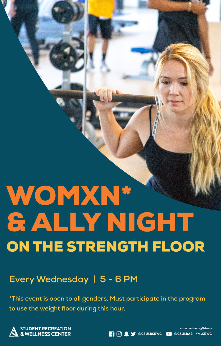
X-ALT-DESC;FMTTYPE=text/html:<!-- basic template for all events --><div class="container-fluid">    <div class="row">        <div class="col-md-6">            <div class="container-fluid module_round_box-gray" style="padding: 40px 15px">                <div class="row">                    <div class="col-md-12">                        <div class="container-fluid">                            <div class="row">                                <!-- Edit date -->                                <div class="col-md-4" itemprop="startDate" content="2022-04-11">                                    <small>Date</small>                                    <!-- Update the date per each event -->                                    <p style="font-weight: 500; font-size: 1.2em">June 1 - Aug. 20</p>                                </div>                                <div class="col-md-4" itemprop="location" itemscope="itemscope"                                    itemtype="http://schema.org/Place">                                    <small itemprop="address" itemscope="itemscope"                                        itemtype="http://schema.org/PostalAddress">Location</small>                                    <!-- Update the name of the location per event -->                                    <p style="font-weight: 500; font-size: 1.2em" itemprop="name">                                        SRWC </p>                                    </p>                                </div>                                <!-- <div class="col-md-4" itemprop="endDate" content="2022-05-09">                                    <small>Time</small>                                    <p style="font-weight: 500; font-size: 1.2em">                                        See Below                                    </p>                                </div> -->                            </div>                            <div class="row">                                <div class="col-md-12">                                    <small>Description</small>                                    <!-- Place all elements of description within their own p tags -->                                    <div itemprop="description">                                        <p>Calling all Long Beach State University (LBSU) alumni, faculty and staff! Receive the chance to win a FREE Student Recreation & Wellness Center (SRWC) membership when you work out anytime between June 1 through Aug. 20, during SRWC business hours.                                        </p>                                        <p>                                            Claim up to 25 points throughout the summer to win a finisher prize! Those who complete the challenge will be entered into a drawing to win one of two free SRWC annual memberships at the end of the summer session!                                        </p>                                    </div>                                </div>                            </div>                        </div>                    </div>                </div>            </div>        </div>        <!-- Upload largest image to server via Joomla or FileZilla and copy path usually images/enjoy/calander/spring-2022-->        <div class="col-md-6">            <img src="images/enjoy/calendar/spring-2023/SP23_SRWC_Summer-Wellness-Program_Series_dgtl-CalEvent.jpg"                alt="Instructional classes sp-23" />        </div>    </div></div>
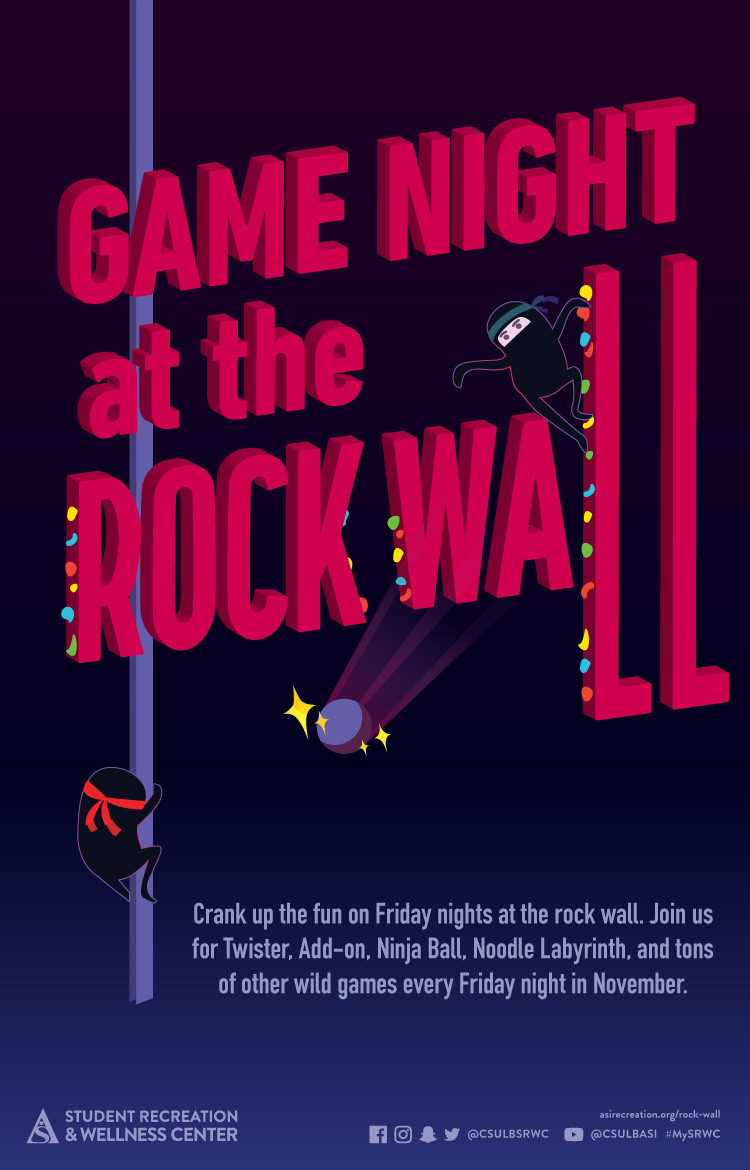
X-ACCESS:1
X-HITS:7
X-URL:
X-COLOR:007DAA
END:VEVENT
BEGIN:VEVENT
DTSTART;VALUE=DATE:20230626
DTEND;VALUE=DATE:20230627
RRULE:FREQ=WEEKLY;BYDAY=MO;INTERVAL=1;UNTIL=20230804T235900Z
EXDATE:20230703,20230710,20230717,20230724,20230731
UID:BEE708BE-79B3-4684-8C66-4847888B9208
SUMMARY:Summer Instructional Classes - Pilates Reformer
DTSTAMP:20230505T212940Z
DESCRIPTION:\N\N\N  \N    \N      \N          \N            \N              \N                \N                  Date\N                  \N                  \N                    June 26 to Aug. 4\N                  \N                \N                \N                    SRWC\N                  \N                \N                \N                  Time\N                  \N                  \N                    See Below\N                  \N                \N              \N              \N                \N                  Description\N                  \N                  \N                    \N                    \N                      Elevate your fitness this summer with the Student Recreation & Wellness Center's (SRWC) Summer Instructional Classes! Led by expert instructors, these specialized classes offer a personalized experience for participants to progress and achieve their fitness goals.\N                    \N                    \N                      Get ready to revamp your workout routine this summer with Pilates Reformer! This mind-body exercise uses spring resistance equipment to tone and strengthen the entire body, leading to improved posture, balance and flexibility. Experience the benefits of Pilates Reformer firsthand and transform your body from the inside out!\N                    \N                    \N                      Secure your spot in this exclusive class now by signing up through the SRWC GO app! As the class size is limited to just five (5) participants, don't miss out on the opportunity to join and enjoy the benefits throughout the summer!\N                    \N                    \N                      \N                        See below for class dates, times and pricing:\N                      \N                      \N                        Mondays / Wednesdays:\N                        4 to 5 p.m. | 5 to 6 p.m.\N                      \N                      \N                        Tuesdays / Thursdays:\N                        5 to 6 p.m.\N                      \N                      \N                        Students: $90/session | Non-Students: $95/session (12 classes)\N                      \N                  \N                \N              \N            \N          \N        \N      \N    \N    \N    \N      img\N        src="images/enjoy/calendar/spring-2023/SP23_SRWC_Instructional Classes_dgtl-CalEvent.jpg&quot;\N        alt=&quot;Instructional classes poster summer 2023&quot;\N      /&gt;{loadmoduleid 368}\N    &lt;/div&gt;\N  &lt;/div&gt;\N&lt;/div&gt;\N"
X-ALT-DESC;FMTTYPE=text/html:<!-- basic template for all events --><div class="container-fluid">  <div class="row">    <div class="col-md-6">      <div        class="container-fluid module_round_box-gray"        style="padding: 40px 15px"      >        <div class="row">          <div class="col-md-12">            <div class="container-fluid">              <div class="row">                <div class="col-md-4" itemprop="startDate" content="2022-01-20">                  <small>Date</small>                  <!-- Update the date per each event -->                  <p style="font-weight: 500; font-size: 1.2em">                    June 26 to Aug. 4                  </p>                </div>                <div                  class="col-md-4"                  itemprop="location"                  itemscope="itemscope"                  itemtype="http://schema.org/Place"                >                  <small                    itemprop="address"                    itemscope="itemscope"                    itemtype="http://schema.org/PostalAddress"                    >Location</small                  >                  <!-- Update the name of the location per event -->                  <p style="font-weight: 500; font-size: 1.2em" itemprop="name">                    SRWC                  </p>                </div>                <div class="col-md-4" itemprop="endDate" content="2021-08-23">                  <small>Time</small>                  <!-- MUST INCLUDE "." IN a.m. and p.m. (MUST BE LOWERCASE) -->                  <p style="font-weight: 500; font-size: 1.2em">                    See Below                  </p>                </div>              </div>              <div class="row">                <div class="col-md-12">                  <small>Description</small>                  <!-- Place all elements of description within their own p tags -->                  <div itemprop="description">                    <!-- Elevate your fitness this summer with the Student Recreation & Wellness Center's (SRWC) Summer Instructional Classes! Led by expert instructors, these specialized classes offer a personalized experience for participants to progress and achieve their fitness goals.Get ready to revamp your workout routine this summer with Pilates Reformer! This mind-body exercise uses spring resistance equipment to tone and strengthen the entire body, leading to improved posture, balance and flexibility. Experience the benefits of Pilates Reformer firsthand and transform your body from the inside out!Secure your spot in this exclusive class now by signing up through the SRWC GO app! As the class size is limited to just five (5) participants, don't miss out on the opportunity to join and enjoy the benefits throughout the summer! -->                    <p>                      Elevate your fitness this summer with the Student Recreation & Wellness Center's (SRWC) Summer Instructional Classes! Led by expert instructors, these specialized classes offer a personalized experience for participants to progress and achieve their fitness goals.                    </p>                    <p>                      Get ready to revamp your workout routine this summer with Pilates Reformer! This mind-body exercise uses spring resistance equipment to tone and strengthen the entire body, leading to improved posture, balance and flexibility. Experience the benefits of Pilates Reformer firsthand and transform your body from the inside out!                    </p>                    <p>                      Secure your spot in this exclusive class now by signing up through the SRWC GO app! As the class size is limited to just five (5) participants, don't miss out on the opportunity to join and enjoy the benefits throughout the summer!                    </p>                    <!-- See below for class dates, times and pricing:Mondays / Wednesdays:4 to 5 p.m. | 5 to 6 p.m.Tuesdays / Thursdays:5 to 6 p.m.Students: $90/session | Non-Students: $95/session (12 classes) -->                      <p><b>                        See below for class dates, times and pricing:                      </b></p>                      <p>                        Mondays / Wednesdays:<br>                        4 to 5 p.m. | 5 to 6 p.m.                      </p>                      <p>                        Tuesdays / Thursdays:<br>                        5 to 6 p.m.                      </p>                      <p>                        Students: $90/session | Non-Students: $95/session (12 classes)                      </p>                  </div>                </div>              </div>            </div>          </div>        </div>      </div>    </div>    <!-- Upload largest image to server via Joomla or FileZilla and copy path usually images/enjoy/calendar/spring-2023THEN, select smaller image in first image selection box below-->    <div class="col-md-6">      <img        src="images/enjoy/calendar/spring-2023/SP23_SRWC_Instructional Classes_dgtl-CalEvent.jpg"        alt="Instructional classes poster summer 2023"      />{loadmoduleid 368}    </div>  </div></div>
LOCATION:
GEO:0.00000000;0.00000000
LAST-MODIFIED:20230906T225056Z
X-ACCESS:1
X-HITS:100
X-URL:
X-COLOR:007DAA
END:VEVENT
BEGIN:VEVENT
DTSTART;VALUE=DATE:20230817
DTEND;VALUE=DATE:20230818
RRULE:FREQ=WEEKLY;BYDAY=SU;INTERVAL=1;UNTIL=20231222T235900Z
EXDATE:20230820,20230827,20230903,20230910,20230917,20230924,20231001,20231008,20231015,20231022,20231029,20231105,20231112,20231119,20231126,20231203,20231210,20231217
UID:FD3966B2-1D5D-4106-B4AC-924EF38C90C4
SUMMARY:Weekly Wellness Programs
DTSTAMP:20230801T230717Z
DESCRIPTION:\N\N\N\N    \N        \N            \N                \N                    \N                        \N                            \N                                \N                                \N\N                                    Date\N                                    \N                                    Aug. 17 through Dec. 22\N                                \N                                \N\N                                    Location\N                                    \N                                    \N                                        SRWC Beach Balance\N                                    \N                                \N                                \N\N                                    Time\N                                    \N                                    \N                                        See Below\N                                    \N                                \N                            \N\N                            \N                                \N                                    Description\N                                    \N                                    \N                                        \N                                            Elevate your campus experience by developing a regular wellness practice with ASI's Beach Balance. Explore a world of holistic well-being through our FREE weekly programs. You can find these nourishing services at the SRWC Beach Balance location during their hours of operation throughout the academic semester. These programs are designed to enhance your well-being and cater to your mind, body and spirit.\N                                              \N                                        See below for our scheduled Weekly Wellness Programs activities:  \N                                        \N                                        \N                                            Meal Prep Monday: \N                                            \N                                            Head to the SRWC Beach Balance for free, fruit-infused water and a snack*. Don’t forget your reusable water bottle!\N                                        \N                                        *While supplies last.\N                                        \N                                        \N                                            Tranquil Tuesday: \N                                            \N                                            Let the sounds of meditative music calm your nerves as you cuddle with a warm blanket and sway in a cozy hammock.\N                                        \N                                        \N                                        \N                                            Well-being Wednesday:\N                                            \N                                            De-stress and unleash your creative side with our various coloring pages, markers and Play-Doh!\N                                        \N                                        \N                                        \N                                            Therapeutic Thursday:\N                                            \N                                            Take a new approach to self-care with sand therapy. Create miniature designs in Zen Garden trays with sand stamps, rakes and garden figurines. Free 10-minute chair massages provided on select days.\N                                        \N                                        \N                                        \N                                            Fitness Friday:\N                                            \N                                            Stretch out your muscles and release any tight knots with our foam rollers, Thera Cane massagers and massage sticks. Expand your fitness repertoire with our fitness and yoga move of the week!\N                                        \N                                        \N                                        \N                                            Please note that certain weekly programs may not be available during holiday breaks. For additional details, please visit asirecreation.org/beach-balance.\N                                        \N\N                                        \N                                        \N\N                                        \N                                        !-- \N                                        Registration Portal\N                                         -->\N                                        \N                                                                                                                                                                \N                                    \N                                \N                            \N                        \N                    \N                \N            \N        \N\N        \N        \N            \N        \N\N{loadmoduleid 368}\N\N\N\N   \N
X-ALT-DESC;FMTTYPE=text/html:<!-- basic template for all events --><div class="container-fluid">    <div class="row">        <div class="col-md-6">            <div class="container-fluid module_round_box-gray" style="padding: 40px 15px">                <div class="row">                    <div class="col-md-12">                        <div class="container-fluid">                            <div class="row" style="background-color: white;    border-radius: 20px;    box-shadow: rgba(0, 0, 0, 0.15) 1.95px 1.95px 2.6px; margin-bottom: 20px;">                                <!-- Edit date -->                                <div class="col-md-4" itemprop="startDate" content="2022-04-11" ><div style=" margin-top:6px; display: flex; justify-content:left;"><img src="images/enjoy/beachpride/QR_Code_WOW-F23/calendar.png" style="height:20px; width: 25px;"></img></div>                                    <p style=" font-weight:bold; font-size:20px; color: darkgoldenrod;">Date</p>                                    <!-- Update the date per each event -->                                    <p style="font-weight: 500; font-size: 15px; line-height:17px; font-weight:bold;">Aug. 17 through Dec. 22</p>                                </div>                                <div class="col-md-4" itemprop="location" itemscope="itemscope"                                    itemtype="http://schema.org/Place" ><div style=" margin-top:6px; display: flex; justify-content:left;"><img src="images/enjoy/beachpride/QR_Code_WOW-F23/location.png" style="height:20px; width: 25px;"></img></div>                                    <p itemprop="address" itemscope="itemscope"                                        itemtype="http://schema.org/PostalAddress" style=" font-weight:bold; font-size:20px; color: darkgoldenrod;">Location</p>                                    <!-- Update the name of the location per event -->                                    <p style="font-weight: 500;  font-size: 15px; line-height:17px; font-weight:bold;" itemprop="name">                                        SRWC Beach Balance</p>                                    </p>                                </div>                                <div class="col-md-4" itemprop="endDate" content="2022-05-09" ><div style=" margin-top:6px; display: flex; justify-content:left;"><img src="images/enjoy/beachpride/QR_Code_WOW-F23/time.png" style="height:20px; width: 25px;"></img></div>                                    <p style=" font-weight:bold; font-size:20px; color: darkgoldenrod;">Time</p>                                    <!-- MUST INCLUDE "." IN A.M./P.M. -->                                    <p style="font-weight: 500;  font-size: 15px; line-height:17px; font-weight:bold;">                                        See Below                                    </p>                                </div>                            </div>                            <div class="row" style="background-color: white;    border-radius: 20px;    box-shadow: rgba(0, 0, 0, 0.15) 1.95px 1.95px 2.6px;">                                <div class="col-md-12">                                    <p style=" font-weight:bold; font-size:20px; color: darkgoldenrod;">Description</p>                                    <!-- Place all elements of description within their own p tags -->                                    <div itemprop="description">                                        <p>                                            Elevate your campus experience by developing a regular wellness practice with ASI's Beach Balance. Explore a world of holistic well-being through our FREE weekly programs. You can find these nourishing services at the SRWC Beach Balance location during their hours of operation throughout the academic semester. These programs are designed to enhance your well-being and cater to your mind, body and spirit.                                        </p>                                              <p>See below for our scheduled Weekly Wellness Programs activities:</p>                                                                                  <p>                                            <b>Meal Prep Monday: </b>                                            <br>                                            Head to the SRWC Beach Balance for free, fruit-infused water and a snack*. Don’t forget your reusable water bottle!                                        </p>                                        <p>*While supplies last.</p>                                                                                <p>                                            <b>Tranquil Tuesday: </b>                                            <br>                                            Let the sounds of meditative music calm your nerves as you cuddle with a warm blanket and sway in a cozy hammock.                                        </p>                                                                                <p>                                            <b>Well-being Wednesday:</b>                                            <br>                                            De-stress and unleash your creative side with our various coloring pages, markers and Play-Doh!                                        </p>                                                                                <p>                                            <b>Therapeutic Thursday:</b>                                            <br>                                            Take a new approach to self-care with sand therapy. Create miniature designs in Zen Garden trays with sand stamps, rakes and garden figurines. Free 10-minute chair massages provided on select days.                                        </p>                                                                                <p>                                            <b>Fitness Friday:</b>                                            <br>                                            Stretch out your muscles and release any tight knots with our foam rollers, Thera Cane massagers and massage sticks. Expand your fitness repertoire with our fitness and yoga move of the week!                                        </p>                                                                                <p>                                            <b>Please note that certain weekly programs may not be available during holiday breaks. For additional details, please visit <a href="https://asirecreation.org/beach-balance">asirecreation.org/beach-balance</a>.</b>                                        </p>                                        <!-- On the event page, after the text "...for detailed information about registering for a table at the event, please visit the registration portal!" create a button that says "Registration Portal" then hyperlink the button to the registration portal page. -->                                        <!-- so here lets add the button and make sure its centered-->                                                                                <!-- <p>                                        <a href="https://www.asicsulb.org/corporate/resources/week-of-welcome"                                            class="btn btn-primary" role="button">Registration Portal</a>                                        </p> -->                                        <!-- add register here button primary -->                                                                                                                                                                                                    </div>                                </div>                            </div>                        </div>                    </div>                </div>            </div>        </div>        <!-- Upload largest image to server via Joomla or FileZilla and copy path usually images/enjoy/calander/spring-2022-->        <div class="col-md-6">            <img style="width:100%;" src="images/enjoy/calendar/summer-2023/SM23_SRWC_Weekly-Wellness_SRWC_dgtl-CalEvent.jpg"                alt="wow banner" />        {loadmoduleid 368}</div></div>   </div>
LOCATION:
GEO:0.00000000;0.00000000
LAST-MODIFIED:20230908T190407Z
X-ACCESS:1
X-HITS:6
X-URL:
X-COLOR:007DAA
END:VEVENT
BEGIN:VEVENT
DTSTART;VALUE=DATE:20230817
DTEND;VALUE=DATE:20230818
RRULE:FREQ=WEEKLY;BYDAY=SU;INTERVAL=1;UNTIL=20231218T235900Z
EXDATE:20230820,20230827,20230903,20230910,20230917,20230924,20231001,20231008,20231015,20231022,20231029,20231105,20231112,20231119,20231126,20231203,20231210,20231217
UID:F018E6D9-95F0-452E-B77F-ED4BC5588119
SUMMARY:Swim Into Shape
DTSTAMP:20230817T142548Z
DESCRIPTION:\N\N\N  .event-title-head {\N    font-weight: bold;\N    font-size: 20px;\N    color: darkgoldenrod;\N  }\N  .event-title-text {\N    font-weight: 500;\N    font-size: 15px;\N    line-height: 17px;\N    font-weight: bold;\N  }\N  .event-title-icon {\N    margin-top: 6px;\N    display: flex;\N    justify-content: left;\N  }\N  .event-video-main {\N    display: flex;\N    justify-content: center;\N    margin-bottom: 20px;\N  }\N\N\N\N  \N    \N    \N      \N          \N            \N              \N                  \N                    Date\N                  \N                  Aug.22 - Dec. 18\N                \N\N                \N                \N                  \N                      Location\N                    \N                    SRWC Aquatic Center\N                  \N                \N\N                \N                \N                  \N                    Time\N                  \N                  Daily\N                \N              \N\N              \N              \N                  Description\N                  \N                  \N                    \N                      Join our Swim into Shape program from Aug. 22 through Dec.\N                      18. Swim 20 miles and win a free t-shirt!\N                    \N                    \N                      To register, participants can sign up with staff members\N                      at the SRWC Aquatic Center during hours of operation.\N                    \N                  \N\N                  \N                  \N                \N                \N              \N              \N            \N            \N          \N          \N        \N        \N      \N      \N    \N    \N\N    \N    \N      img\N        style="width: 100%&quot;\N        src=&quot;images/cal/Fall-2023/SM23_SRWC_Swim-Into-Shape_dgtl-ASICalEvent.jpg&quot;\N        alt=&quot;Swim into shape flier&quot;\N      /&gt;\N\N      {loadmoduleid 368}\N    &lt;/div&gt;\N    &lt;!-- Technically end of right side --&gt;\N  &lt;/div&gt;\N&lt;/div&gt;\N"
X-ALT-DESC;FMTTYPE=text/html:<!-- basic template for all events  --><!-- Updated July 2023 --><style>  .event-title-head {    font-weight: bold;    font-size: 20px;    color: darkgoldenrod;  }  .event-title-text {    font-weight: 500;    font-size: 15px;    line-height: 17px;    font-weight: bold;  }  .event-title-icon {    margin-top: 6px;    display: flex;    justify-content: left;  }  .event-video-main {    display: flex;    justify-content: center;    margin-bottom: 20px;  }</style><div class="container-fluid">  <div class="row">    <!-- --------------------               START OF LEFT SIDE           --------------------- -->    <div class="col-md-6">      <div        class="container-fluid module_round_box-gray"        style="padding: 40px 15px"      >        <div class="row">          <div class="col-md-12">            <div class="container-fluid">              <div                class="row"                style="                  background-color: white;                  border-radius: 20px;                  box-shadow: rgba(0, 0, 0, 0.15) 1.95px 1.95px 2.6px;                  margin-bottom: 20px;                "              >                <!-- DATE -->                <div class="col-md-4" itemprop="startDate" content="2022-08-22">                  <div class="event-title-icon">                    <img                      src="images/enjoy/beachpride/QR_Code_WOW-F23/calendar.png"                      style="height: 20px; width: 25px"                    />                  </div>                  <p class="event-title-head">Date</p>                  <!-- Update the date per each event -->                  <p class="event-title-text">Aug.22 - Dec. 18</p>                </div>                <!-- LOCATION -->                <div>                  <div                    class="col-md-4"                    itemprop="location"                    itemscope="itemscope"                    itemtype="http://schema.org/Place"                  >                    <div class="event-title-icon">                      <img                        src="images/enjoy/beachpride/QR_Code_WOW-F23/location.png"                        style="height: 20px; width: 25px"                      />                    </div>                    <p class="event-title-head">Location</p>                    <!-- Update the date per each event -->                    <p class="event-title-text">SRWC Aquatic Center</p>                  </div>                </div>                <!-- Time -->                <div class="col-md-4" itemprop="endDate" content="2022-12-18">                  <div class="event-title-icon">                    <img                      src="images/enjoy/beachpride/QR_Code_WOW-F23/time.png"                      style="height: 20px; width: 25px"                    />                  </div>                  <p class="event-title-head">Time</p>                  <!-- MUST INCLUDE "." IN A.M./P.M. -->                  <p class="event-title-text">Daily</p>                </div>              </div>              <!-- Event Description and Content -->              <div                class="row"                style="                  background-color: white;                  border-radius: 20px;                  box-shadow: rgba(0, 0, 0, 0.15) 1.95px 1.95px 2.6px;                "              >                <div class="col-md-12">                  <p class="event-title-head">Description</p>                  <!-- Place all elements of description within their own p tags -->                  <div itemprop="description">                    <p>                      Join our Swim into Shape program from Aug. 22 through Dec.                      18. Swim 20 miles and win a free t-shirt!                    </p>                    <p>                      To register, participants can sign up with staff members                      at the SRWC Aquatic Center during hours of operation.                    </p>                  </div>                  <!-- TEchnically the end of the accordion -->                  <!-- Technically the end of the "description" -->                </div>                <!-- md12 end -->              </div>              <!-- End event Description and content -->            </div>            <!-- end container fluid -->          </div>          <!-- end mdcol12 -->        </div>        <!-- End row -->      </div>      <!-- End of Grey box -->    </div>    <!-- end of left side -->    <!-- -------------------              START OF RIGHT SIDE          --------------------- -->    <div class="col-md-6">      <img        style="width: 100%"        src="images/cal/Fall-2023/SM23_SRWC_Swim-Into-Shape_dgtl-ASICalEvent.jpg"        alt="Swim into shape flier"      />      {loadmoduleid 368}    </div>    <!-- Technically end of right side -->  </div></div>
LOCATION:
GEO:0.00000000;0.00000000
LAST-MODIFIED:20230906T225158Z
X-ACCESS:1
X-HITS:5
X-URL:
X-COLOR:007DAA
END:VEVENT
BEGIN:VEVENT
DTSTART;VALUE=DATE:20230820
DTEND;VALUE=DATE:20230821
RRULE:FREQ=WEEKLY;BYDAY=SU;INTERVAL=1;UNTIL=20230922T235900Z
EXDATE:20230827,20230903,20230910,20230917
UID:7C3AB456-C0FF-4708-BA1E-E9835A0E2725
SUMMARY:Intramural Leagues
DTSTAMP:20230622T180546Z
DESCRIPTION:\N\N\N  .event-title-head {\N    font-weight: bold;\N    font-size: 20px;\N    color: darkgoldenrod;\N  }\N  .event-title-text {\N    font-weight: 500;\N    font-size: 15px;\N    line-height: 17px;\N    font-weight: bold;\N  }\N  .event-title-icon {\N    margin-top: 6px;\N    display: flex;\N    justify-content: left;\N  }\N  .event-video-main {\N    display: flex;\N    justify-content: center;\N    margin-bottom: 20px;\N  }\N\N\N\N  \N    \N    \N      \N          \N            \N              \N                  \N                    Date\N                  \N                  Aug. 22 to Nov. 13\N                \N\N                \N                \N                  \N                      Location\N                    \N                    See Below\N                  \N                \N\N                \N                \N                  \N                    Time\N                  \N                  See Below\N                \N              \N\N              \N              \N                  Registration: Aug. 22 – Sept. 22!\N                  Description\N                  \N                  \N                    \N                      Are you the next football champion or basketball star? Do\N                      you have what it takes to take home the trophy? Then join\N                      the Student Recreation & Wellness Center (SRWC) this fall\N                      for Intramural Leagues! From soccer to flag football, all\N                      are welcome to join. Registration opens Aug. 22 at 8 a.m.\N                      and ends Sept. 22. Preseason starts Sept. 17 and official\N                      league play begins Sept. 24.\N                    \N                    \N                      If participating in one tournament is not enough for a\N                      star-studded athlete like you, then join as many leagues\N                      as you like for a one-time fee of $20!\N                    \N                    \N                      See below for scheduled Intramural League tournament days:\N                    \N\N                    \N                      Monday: Indoor Soccer\N                      Tuesday: Flag Football and coed Volleyball\N                      Wednesday: Coed Basketball and Open Soccer\N                      Thursday: Open Basketball\N                      Friday: Open 6v6 Soccer\N                    \N\N                    \N                      For more information, dates and to register, visit\N                      \N                        www.imleagues.com/csulb.\N                    \N                    \N                      Are you the next football champion or basketball star? Do\N                      you have what it takes to take home the trophy? Then join\N                      the Student Recreation & Wellness Center (SRWC) this fall\N                      for Intramural Leagues! From soccer to flag football, all\N                      are welcome to join. Registration opens Aug. 22 at 8 a.m.\N                      and ends Sept. 22. Preseason starts Sept. 17 and official\N                      league play begins Sept. 24.\N                    \N                    \N                      If participating in one tournament is not enough for a\N                      star-studded athlete like you, then join as many leagues\N                      as you like for a one-time fee of $20!\N                    \N                    \N                      See below for scheduled Intramural League tournament days:\N                    \N\N                    \N                      Monday: Indoor Soccer\N                      Tuesday: Flag Football and coed Volleyball\N                      Wednesday: Coed Basketball and Open Soccer\N                      Thursday: Open Basketball\N                      Friday: Open 6v6 Soccer\N                    \N\N                    \N                      For more information, dates and to register, visit\N                      \N                        www.imleagues.com/csulb.\N                    \N                  \N                  \N                \N              \N            \N          \N        \N      \N      \N    \N    \N\N    \N    \N      img\N        style="width: 100%&quot;\N        src=&quot;images/enjoy/calendar/spring-2023/SM23_SRWC_Intramural-Leagues_dgtl-CalEvent.jpg&quot;\N        alt=&quot;Intramural Leagues poster summer 2023&quot;\N      /&gt;\N\N      {loadmoduleid 368}\N    &lt;/div&gt;\N    &lt;!-- Technically end of right side --&gt;\N  &lt;/div&gt;\N&lt;/div&gt;\N"
X-ALT-DESC;FMTTYPE=text/html:<!-- basic template for all events  --><!-- Updated July 2023 --><style>  .event-title-head {    font-weight: bold;    font-size: 20px;    color: darkgoldenrod;  }  .event-title-text {    font-weight: 500;    font-size: 15px;    line-height: 17px;    font-weight: bold;  }  .event-title-icon {    margin-top: 6px;    display: flex;    justify-content: left;  }  .event-video-main {    display: flex;    justify-content: center;    margin-bottom: 20px;  }</style><div class="container-fluid">  <div class="row">    <!-- --------------------           START OF LEFT SIDE       --------------------- -->    <div class="col-md-6">      <div        class="container-fluid module_round_box-gray"        style="padding: 40px 15px"      >        <div class="row">          <div class="col-md-12">            <div class="container-fluid">              <div                class="row"                style="                  background-color: white;                  border-radius: 20px;                  box-shadow: rgba(0, 0, 0, 0.15) 1.95px 1.95px 2.6px;                  margin-bottom: 20px;                "              >                <!-- DATE -->                <div class="col-md-4" itemprop="startDate" content="2022-09-08">                  <div class="event-title-icon">                    <img                      src="images/enjoy/beachpride/QR_Code_WOW-F23/calendar.png"                      style="height: 20px; width: 25px"                    />                  </div>                  <p class="event-title-head">Date</p>                  <!-- Update the date per each event -->                  <p class="event-title-text">Aug. 22 to Nov. 13</p>                </div>                <!-- LOCATION -->                <div>                  <div                    class="col-md-4"                    itemprop="location"                    itemscope="itemscope"                    itemtype="http://schema.org/Place"                  >                    <div class="event-title-icon">                      <img                        src="images/enjoy/beachpride/QR_Code_WOW-F23/location.png"                        style="height: 20px; width: 25px"                      />                    </div>                    <p class="event-title-head">Location</p>                    <!-- Update the date per each event -->                    <p class="event-title-text">See Below</p>                  </div>                </div>                <!-- Time -->                <div class="col-md-4" itemprop="endDate" content="2022-09-08">                  <div class="event-title-icon">                    <img                      src="images/enjoy/beachpride/QR_Code_WOW-F23/time.png"                      style="height: 20px; width: 25px"                    />                  </div>                  <p class="event-title-head">Time</p>                  <!-- MUST INCLUDE "." IN A.M./P.M. -->                  <p class="event-title-text">See Below</p>                </div>              </div>              <!-- Event Description and Content -->              <div                class="row"                style="                  background-color: white;                  border-radius: 20px;                  box-shadow: rgba(0, 0, 0, 0.15) 1.95px 1.95px 2.6px;                "              >                <div class="col-md-12">                  <h2>Registration: Aug. 22 – Sept. 22!</h2>                  <p class="event-title-head">Description</p>                  <!-- Place all elements of description within their own p tags -->                  <div itemprop="description">                    <p>                      Are you the next football champion or basketball star? Do                      you have what it takes to take home the trophy? Then join                      the Student Recreation & Wellness Center (SRWC) this fall                      for Intramural Leagues! From soccer to flag football, all                      are welcome to join. Registration opens Aug. 22 at 8 a.m.                      and ends Sept. 22. Preseason starts Sept. 17 and official                      league play begins Sept. 24.                    </p>                    <p>                      If participating in one tournament is not enough for a                      star-studded athlete like you, then join as many leagues                      as you like for a one-time fee of $20!                    </p>                    <p>                      See below for scheduled Intramural League tournament days:                    </p>                    <ul>                      <li>Monday: Indoor Soccer</li>                      <li>Tuesday: Flag Football and coed Volleyball</li>                      <li>Wednesday: Coed Basketball and Open Soccer</li>                      <li>Thursday: Open Basketball</li>                      <li>Friday: Open 6v6 Soccer</li>                    </ul>                    <p>                      For more information, dates and to register, visit                      <a href="http://www.imleagues.com/csulb">                        <b>www.imleagues.com/csulb</b></a                      >.                    </p>                    <p>                      Are you the next football champion or basketball star? Do                      you have what it takes to take home the trophy? Then join                      the Student Recreation & Wellness Center (SRWC) this fall                      for Intramural Leagues! From soccer to flag football, all                      are welcome to join. Registration opens Aug. 22 at 8 a.m.                      and ends Sept. 22. Preseason starts Sept. 17 and official                      league play begins Sept. 24.                    </p>                    <p>                      If participating in one tournament is not enough for a                      star-studded athlete like you, then join as many leagues                      as you like for a one-time fee of $20!                    </p>                    <p>                      See below for scheduled Intramural League tournament days:                    </p>                    <ul>                      <li>Monday: Indoor Soccer</li>                      <li>Tuesday: Flag Football and coed Volleyball</li>                      <li>Wednesday: Coed Basketball and Open Soccer</li>                      <li>Thursday: Open Basketball</li>                      <li>Friday: Open 6v6 Soccer</li>                    </ul>                    <p>                      For more information, dates and to register, visit                      <a href="http://www.imleagues.com/csulb">                        <b>www.imleagues.com/csulb</b></a                      >.                    </p>                  </div>                  <!-- Technically the end of the "description" -->                </div>              </div>            </div>          </div>        </div>      </div>      <!-- End of Grey box -->    </div>    <!-- end of left side -->    <!-- -------------------          START OF RIGHT SIDE      --------------------- -->    <div class="col-md-6">      <img        style="width: 100%"        src="images/enjoy/calendar/spring-2023/SM23_SRWC_Intramural-Leagues_dgtl-CalEvent.jpg"        alt="Intramural Leagues poster summer 2023"      />      {loadmoduleid 368}    </div>    <!-- Technically end of right side -->  </div></div>
LOCATION:
GEO:0.00000000;0.00000000
LAST-MODIFIED:20230908T190849Z
X-ACCESS:1
X-HITS:11
X-URL:
X-COLOR:007DAA
END:VEVENT
BEGIN:VEVENT
DTSTART;VALUE=DATE:20230820
DTEND;VALUE=DATE:20230821
RRULE:FREQ=WEEKLY;BYDAY=SU;INTERVAL=1;UNTIL=20231218T235900Z
EXDATE:20230827,20230903,20230910,20230917,20230924,20231001,20231008,20231015,20231022,20231029,20231105,20231112,20231119,20231126,20231203,20231210,20231217
UID:B4913B98-F32B-4BF5-87DE-246A15911EF9
SUMMARY:Net Days
DTSTAMP:20230802T173338Z
DESCRIPTION:\N\N\N\N    \N        \N            \N                \N                    \N                        \N                            \N                                \N                                \N\N                                    Date\N                                    \N                                    See Below\N                                \N                                \N\N                                    Location\N                                    \N                                    \N                                        See Below\N                                    \N                                \N                                \N\N                                    Time\N                                    \N                                    \N                                        See Below\N                                    \N                                \N                            \N\N                            \N                                \N                                    Description\N                                    \N                                    \N                                        \N                                            Relax with friends with SRWC Net Days! Unwind Monday through Friday from 7 a.m. - 7 p.m. with a variety of net-based sports all semester long.\N                                        \N                                        \N                                            Cool off and get moving with Aqua Volleyball on Mondays and Tuesdays. Looking for some more action? Join us for Innertube Water Polo on Wednesdays and Thursdays. Maybe you want something more low-key? Stop by for Aqua Basketball on Fridays! Don't forget key log rolling is available every day at the Aquatic Center.\N                                        \N                                        \N                                        \N                                            Visit an Aquatic Center staff member for any questions or assistance.\N                                        \N\N                                        \N                                        \N\N                                        \N                                        !-- \N                                        Registration Portal\N                                         -->\N                                        \N                                                                                                                                                                \N                                    \N                                \N                            \N                        \N                    \N                \N            \N        \N\N        \N        \N            \N        \N\N{loadmoduleid 368}\N\N\N\N\N   \N
X-ALT-DESC;FMTTYPE=text/html:<!-- basic template for all events --><div class="container-fluid">    <div class="row">        <div class="col-md-6">            <div class="container-fluid module_round_box-gray" style="padding: 40px 15px">                <div class="row">                    <div class="col-md-12">                        <div class="container-fluid">                            <div class="row" style="background-color: white;    border-radius: 20px;    box-shadow: rgba(0, 0, 0, 0.15) 1.95px 1.95px 2.6px; margin-bottom: 20px;">                                <!-- Edit date -->                                <div class="col-md-4" itemprop="startDate" content="2022-04-11" ><div style=" margin-top:6px; display: flex; justify-content:left;"><img src="images/enjoy/beachpride/QR_Code_WOW-F23/calendar.png" style="height:20px; width: 25px;"></img></div>                                    <p style=" font-weight:bold; font-size:20px; color: darkgoldenrod;">Date</p>                                    <!-- Update the date per each event -->                                    <p style="font-weight: 500; font-size: 15px; line-height:17px; font-weight:bold;">See Below</p>                                </div>                                <div class="col-md-4" itemprop="location" itemscope="itemscope"                                    itemtype="http://schema.org/Place" ><div style=" margin-top:6px; display: flex; justify-content:left;"><img src="images/enjoy/beachpride/QR_Code_WOW-F23/location.png" style="height:20px; width: 25px;"></img></div>                                    <p itemprop="address" itemscope="itemscope"                                        itemtype="http://schema.org/PostalAddress" style=" font-weight:bold; font-size:20px; color: darkgoldenrod;">Location</p>                                    <!-- Update the name of the location per event -->                                    <p style="font-weight: 500;  font-size: 15px; line-height:17px; font-weight:bold;" itemprop="name">                                        See Below</p>                                    </p>                                </div>                                <div class="col-md-4" itemprop="endDate" content="2022-05-09" ><div style=" margin-top:6px; display: flex; justify-content:left;"><img src="images/enjoy/beachpride/QR_Code_WOW-F23/time.png" style="height:20px; width: 25px;"></img></div>                                    <p style=" font-weight:bold; font-size:20px; color: darkgoldenrod;">Time</p>                                    <!-- MUST INCLUDE "." IN A.M./P.M. -->                                    <p style="font-weight: 500;  font-size: 15px; line-height:17px; font-weight:bold;">                                        See Below                                    </p>                                </div>                            </div>                            <div class="row" style="background-color: white;    border-radius: 20px;    box-shadow: rgba(0, 0, 0, 0.15) 1.95px 1.95px 2.6px;">                                <div class="col-md-12">                                    <p style=" font-weight:bold; font-size:20px; color: darkgoldenrod;">Description</p>                                    <!-- Place all elements of description within their own p tags -->                                    <div itemprop="description">                                        <p>                                            Relax with friends with SRWC Net Days! Unwind Monday through Friday from 7 a.m. - 7 p.m. with a variety of net-based sports all semester long.                                        </p>                                        <p>                                            Cool off and get moving with Aqua Volleyball on Mondays and Tuesdays. Looking for some more action? Join us for Innertube Water Polo on Wednesdays and Thursdays. Maybe you want something more low-key? Stop by for Aqua Basketball on Fridays! Don't forget key log rolling is available every day at the Aquatic Center.                                        </p>                                                                                <p>                                            Visit an Aquatic Center staff member for any questions or assistance.                                        </p>                                        <!-- On the event page, after the text "...for detailed information about registering for a table at the event, please visit the registration portal!" create a button that says "Registration Portal" then hyperlink the button to the registration portal page. -->                                        <!-- so here lets add the button and make sure its centered-->                                                                                <!-- <p>                                        <a href="https://www.asicsulb.org/corporate/resources/week-of-welcome"                                            class="btn btn-primary" role="button">Registration Portal</a>                                        </p> -->                                        <!-- add register here button primary -->                                                                                                                                                                                                    </div>                                </div>                            </div>                        </div>                    </div>                </div>            </div>        </div>        <!-- Upload largest image to server via Joomla or FileZilla and copy path usually images/enjoy/calander/spring-2022-->        <div class="col-md-6">            <img style="width:100%;" src="images/enjoy/calendar/summer-2023/SM23_SRWC_Net-Days_dgtl-ASICalEvent.jpg"                alt="wow banner" />        {loadmoduleid 368}</div></div>   </div>
LOCATION:
GEO:0.00000000;0.00000000
LAST-MODIFIED:20230906T222644Z
X-ACCESS:1
X-HITS:1
X-URL:
X-COLOR:007DAA
END:VEVENT
BEGIN:VEVENT
DTSTART;VALUE=DATE:20230822
DTEND;VALUE=DATE:20230823
RRULE:FREQ=WEEKLY;BYDAY=SU;INTERVAL=1;UNTIL=20231218T235900Z
EXDATE:20230827,20230903,20230910,20230917,20230924,20231001,20231008,20231015,20231022,20231029,20231105,20231112,20231119,20231126,20231203,20231210,20231217
UID:B82EDED4-E067-4F06-B2B5-56BAADB2CB74
SUMMARY:Belay A Mile
DTSTAMP:20230822T200141Z
DESCRIPTION:\N\N\N\N    \N        \N            \N                \N                    \N                        \N                            \N                                \N                                \N\N                                    Date\N                                    \N                                    Aug. 17 through Dec. 22\N                                \N                                \N\N                                    Location\N                                    \N                                    \N                                        SRWC Rock Wall\N                                    \N                                \N                                \N\N                                    Time\N                                    \N                                    \N                                        See Below\N                                    \N                                \N                            \N\N                            \N                                \N                                    Description\N                                    \N                                    \N                                        \N                                           Become the ultimate belayer in our Belay a Mile Challenge! The Rock Wall at the Student Recreation & Wellness Center (SRWC) has many different climbing routes for you and your friends to attempt. Belay a partner on 211 climbs (5280 ft.) by Dec. 18 and earn yourself a free chalk bag, courtesy of Prana & Columbia Sportswear! To sign up for the challenge, visit the SRWC Rock Wall any time during open hours.\N                                              \N                                        Participants must be belay-certified through the SRWC Rock Wall to compete. For information about our Belay Basics climbing classes, visit SRWC GO.  \N                                        \N                                      \N                                                                                                                                                                \N                                    \N                                \N                            \N                        \N                    \N                \N            \N        \N\N        \N        \N            \N        \N{loadmoduleid 368}\N\N\N\N   \N
X-ALT-DESC;FMTTYPE=text/html:<!-- basic template for all events --><div class="container-fluid">    <div class="row">        <div class="col-md-6">            <div class="container-fluid module_round_box-gray" style="padding: 40px 15px">                <div class="row">                    <div class="col-md-12">                        <div class="container-fluid">                            <div class="row" style="background-color: white;    border-radius: 20px;    box-shadow: rgba(0, 0, 0, 0.15) 1.95px 1.95px 2.6px; margin-bottom: 20px;">                                <!-- Edit date -->                                <div class="col-md-4" itemprop="startDate" content="2022-04-11" ><div style=" margin-top:6px; display: flex; justify-content:left;"><img src="images/enjoy/beachpride/QR_Code_WOW-F23/calendar.png" style="height:20px; width: 25px;"></img></div>                                    <p style=" font-weight:bold; font-size:20px; color: darkgoldenrod;">Date</p>                                    <!-- Update the date per each event -->                                    <p style="font-weight: 500; font-size: 15px; line-height:17px; font-weight:bold;">Aug. 17 through Dec. 22</p>                                </div>                                <div class="col-md-4" itemprop="location" itemscope="itemscope"                                    itemtype="http://schema.org/Place" ><div style=" margin-top:6px; display: flex; justify-content:left;"><img src="images/enjoy/beachpride/QR_Code_WOW-F23/location.png" style="height:20px; width: 25px;"></img></div>                                    <p itemprop="address" itemscope="itemscope"                                        itemtype="http://schema.org/PostalAddress" style=" font-weight:bold; font-size:20px; color: darkgoldenrod;">Location</p>                                    <!-- Update the name of the location per event -->                                    <p style="font-weight: 500;  font-size: 15px; line-height:17px; font-weight:bold;" itemprop="name">                                        SRWC Rock Wall</p>                                    </p>                                </div>                                <div class="col-md-4" itemprop="endDate" content="2022-05-09" ><div style=" margin-top:6px; display: flex; justify-content:left;"><img src="images/enjoy/beachpride/QR_Code_WOW-F23/time.png" style="height:20px; width: 25px;"></img></div>                                    <p style=" font-weight:bold; font-size:20px; color: darkgoldenrod;">Time</p>                                    <!-- MUST INCLUDE "." IN A.M./P.M. -->                                    <p style="font-weight: 500;  font-size: 15px; line-height:17px; font-weight:bold;">                                        See Below                                    </p>                                </div>                            </div>                            <div class="row" style="background-color: white;    border-radius: 20px;    box-shadow: rgba(0, 0, 0, 0.15) 1.95px 1.95px 2.6px;">                                <div class="col-md-12">                                    <p style=" font-weight:bold; font-size:20px; color: darkgoldenrod;">Description</p>                                    <!-- Place all elements of description within their own p tags -->                                    <div itemprop="description">                                        <p>                                           Become the ultimate belayer in our Belay a Mile Challenge! The Rock Wall at the Student Recreation & Wellness Center (SRWC) has many different climbing routes for you and your friends to attempt. Belay a partner on 211 climbs (5280 ft.) by Dec. 18 and earn yourself a free chalk bag, courtesy of Prana & Columbia Sportswear! To sign up for the challenge, visit the SRWC Rock Wall any time during open hours.                                        </p>                                              <p>Participants must be belay-certified through the SRWC Rock Wall to compete. For information about our Belay Basics climbing classes, visit <a href="https://shop.asi.csulb.edu/Program/GetProducts?classification=4987f075-d8ff-413b-978f-144a1ff84b2c">SRWC GO.</a></p>                                                                                                                                                                                                                                                                                    </div>                                </div>                            </div>                        </div>                    </div>                </div>            </div>        </div>        <!-- Upload largest image to server via Joomla or FileZilla and copy path usually images/enjoy/calander/spring-2022-->        <div class="col-md-6">            <img style="width:100%;" src="images/enjoy/calendar/fall-2023/SM23_SRWC_Belay-A-Mile_dgtl-CalEvent_2.jpg"                alt="wow banner" />        {loadmoduleid 368}</div></div>   </div>
LAST-MODIFIED:20230906T234507Z
X-ACCESS:1
X-HITS:0
X-URL:
X-COLOR:007DAA
END:VEVENT
BEGIN:VEVENT
DTSTART;VALUE=DATE:20230822
DTEND;VALUE=DATE:20230823
RRULE:FREQ=WEEKLY;BYDAY=SU;INTERVAL=1;UNTIL=20231218T235900Z
EXDATE:20230827,20230903,20230910,20230917,20230924,20231001,20231008,20231015,20231022,20231029,20231105,20231112,20231119,20231126,20231203,20231210,20231217
UID:E5DF9917-89FD-4E93-8633-4C76EB8A7F4C
SUMMARY:Mile High Challenge
DTSTAMP:20230822T201650Z
DESCRIPTION:\N\N\N\N    \N        \N            \N                \N                    \N                        \N                            \N                                \N                                \N\N                                    Date\N                                    \N                                    Aug. 22 through Dec. 18\N                                \N                                \N\N                                    Location\N                                    \N                                    \N                                        SRWC Rock Wall\N                                    \N                                \N                                \N\N                                    Time\N                                    \N                                    \N                                        All Day\N                                    \N                                \N                            \N\N                            \N                                \N                                    Description\N                                    \N                                    \N\N                                        \N                                            5280 FEET. 211 CLIMBS. 1 MILE.\N                                        \N                                                                               \N                                        \N                                            Do you have what it takes to complete the Mile High Challenge? Explore new heights and challenge yourself to new climbs at the Student Recreation & Wellness Center's (SRWC) indoor Rock Wall. Complete 211 climbs during the course of the semester to win this year's custom Mile High Challenge t-shirt. Supplies are limited, so start early!\N                                        \N                                        \N                                            No gear? No worries! The SRWC Rock Wall staff will provide all the gear and guidance you need at no cost, just make sure you show up wearing your most comfortable athletic apparel! Visit the SRWC Rock Wall during open hours and begin your adventure anytime from Aug. 22 to Dec. 18., while the challenge lasts!\N                                        \N                                        \N                                            Are you an avid climber? Have you completed the Mile High Challenge more than once and are looking for something a little more stimulating? Ask any of our Rock Wall staff about our secret unexplored Mt. Everest Challenge!\N                                                                \N                                                                                                                      \N                                        \N                                        \N\N                                        \N                                        !-- \N                                        Registration Portal\N                                         -->\N                                        \N                                                                                                                                                                \N                                    \N                                \N                            \N                        \N                    \N                \N            \N        \N\N        \N        \N            \N        \N{loadmoduleid 368}\N\N\N\N\N   \N
X-ALT-DESC;FMTTYPE=text/html:<!-- basic template for all events --><div class="container-fluid">    <div class="row">        <div class="col-md-6">            <div class="container-fluid module_round_box-gray" style="padding: 40px 15px">                <div class="row">                    <div class="col-md-12">                        <div class="container-fluid">                            <div class="row" style="background-color: white;    border-radius: 20px;    box-shadow: rgba(0, 0, 0, 0.15) 1.95px 1.95px 2.6px; margin-bottom: 20px;">                                <!-- Edit date -->                                <div class="col-md-4" itemprop="startDate" content="2022-04-11" ><div style=" margin-top:6px; display: flex; justify-content:left;"><img src="images/enjoy/beachpride/QR_Code_WOW-F23/calendar.png" style="height:20px; width: 25px;"></img></div>                                    <p style=" font-weight:bold; font-size:20px; color: darkgoldenrod;">Date</p>                                    <!-- Update the date per each event -->                                    <p style="font-weight: 500; font-size: 15px; line-height:17px; font-weight:bold;">Aug. 22 through Dec. 18</p>                                </div>                                <div class="col-md-4" itemprop="location" itemscope="itemscope"                                    itemtype="http://schema.org/Place" ><div style=" margin-top:6px; display: flex; justify-content:left;"><img src="images/enjoy/beachpride/QR_Code_WOW-F23/location.png" style="height:20px; width: 25px;"></img></div>                                    <p itemprop="address" itemscope="itemscope"                                        itemtype="http://schema.org/PostalAddress" style=" font-weight:bold; font-size:20px; color: darkgoldenrod;">Location</p>                                    <!-- Update the name of the location per event -->                                    <p style="font-weight: 500;  font-size: 15px; line-height:17px; font-weight:bold;" itemprop="name">                                        SRWC Rock Wall</p>                                    </p>                                </div>                                <div class="col-md-4" itemprop="endDate" content="2022-05-09" ><div style=" margin-top:6px; display: flex; justify-content:left;"><img src="images/enjoy/beachpride/QR_Code_WOW-F23/time.png" style="height:20px; width: 25px;"></img></div>                                    <p style=" font-weight:bold; font-size:20px; color: darkgoldenrod;">Time</p>                                    <!-- MUST INCLUDE "." IN A.M./P.M. -->                                    <p style="font-weight: 500;  font-size: 15px; line-height:17px; font-weight:bold;">                                        All Day                                    </p>                                </div>                            </div>                            <div class="row" style="background-color: white;    border-radius: 20px;    box-shadow: rgba(0, 0, 0, 0.15) 1.95px 1.95px 2.6px;">                                <div class="col-md-12">                                    <p style=" font-weight:bold; font-size:20px; color: darkgoldenrod;">Description</p>                                    <!-- Place all elements of description within their own p tags -->                                    <div itemprop="description">                                        <p>                                            5280 FEET. 211 CLIMBS. 1 MILE.                                        </p>                                                                                                                       <p>                                            Do you have what it takes to complete the Mile High Challenge? Explore new heights and challenge yourself to new climbs at the Student Recreation & Wellness Center's (SRWC) indoor Rock Wall. Complete 211 climbs during the course of the semester to win this year's custom Mile High Challenge t-shirt. Supplies are limited, so start early!                                        </p>                                        <p>                                            No gear? No worries! The SRWC Rock Wall staff will provide all the gear and guidance you need at no cost, just make sure you show up wearing your most comfortable athletic apparel! Visit the SRWC Rock Wall during open hours and begin your adventure anytime from Aug. 22 to Dec. 18., while the challenge lasts!                                        </p>                                        <p>                                            Are you an avid climber? Have you completed the Mile High Challenge more than once and are looking for something a little more stimulating? Ask any of our Rock Wall staff about our secret unexplored Mt. Everest Challenge!                                        </p>                                                                                                                                                                                      <!-- On the event page, after the text "...for detailed information about registering for a table at the event, please visit the registration portal!" create a button that says "Registration Portal" then hyperlink the button to the registration portal page. -->                                        <!-- so here lets add the button and make sure its centered-->                                                                                <!-- <p>                                        <a href="https://www.asicsulb.org/corporate/resources/week-of-welcome"                                            class="btn btn-primary" role="button">Registration Portal</a>                                        </p> -->                                        <!-- add register here button primary -->                                                                                                                                                                                                    </div>                                </div>                            </div>                        </div>                    </div>                </div>            </div>        </div>        <!-- Upload largest image to server via Joomla or FileZilla and copy path usually images/enjoy/calander/spring-2022-->        <div class="col-md-6">            <img style="width:100%;" src="images/enjoy/calendar/summer-2023/SM23_SRWC_Mile-High-Challenge_dgtl-CalEvent.jpg"                alt="wow banner" />        {loadmoduleid 368}</div></div>   </div>
LAST-MODIFIED:20230906T222325Z
X-ACCESS:1
X-HITS:2
X-URL:
X-COLOR:007DAA
END:VEVENT
BEGIN:VEVENT
DTSTART;VALUE=DATE:20230911
DTEND;VALUE=DATE:20230912
RRULE:FREQ=WEEKLY;BYDAY=SU;INTERVAL=1;UNTIL=20231208T235900Z
EXDATE:20230917,20230924,20231001,20231008,20231015,20231022,20231029,20231105,20231112,20231119,20231126,20231203
UID:F1705A8C-1460-4E40-8393-E9E9F17A402D
SUMMARY:Instructional Classes
DTSTAMP:20230815T233556Z
DESCRIPTION:\N\N\N\N    \N        \N            \N                \N                    \N                        \N                            \N                                \N                                \N\N                                    Date\N                                    \N                                    See Below\N                                \N                                \N\N                                    Location\N                                    \N                                    \N                                        SRWC\N                                    \N                                \N                                \N\N                                    Time\N                                    \N                                    \N                                        See Below \N                                    \N                                \N                            \N\N                            \N                                \N                                    Description\N                                    \N                                    \N                                                                               \N                                        \N                                            Instructional Classes at the SRWC are specialized fitness classes taught by professionals in the industry who may have more trainings and certifications than other instructors. These classes are reduced to a limited number of participants to create an environment that facilitates a learning outcome. Instructional classes range from boxing to popular fitness regimes like the Total Body Work, and are offered to SRWC members only at a nominal fee.\N                                        \N                                        \N                                            Registration opens Aug. 22 and classes begin the week of Sept. 11.\N                                        \N                                        There are two six-week sessions each semester for all classes except for Weightlifting 101, which will have three four-week sessions. See information below.\N\N                                        Session One - 9/11 - 10/20; Session Two - 10/23 - 12/8\N\N                                        Total Body Work- T/TH 5:30 - 6:30 p.m.\N                                        Shred your lazy habits and jumpstart your fitness with this 6-week group training session. Workout with a certified personal trainer in a small group setting. Limited to 8 participants. \N                                        Students: $45/session; Non-students: $50/session \N                                            \N                                            Limit 8 participants\N\N\N                                        Boxing 101: T/TH 6:00 - 7:00 p.m.\N                                        Learn basic punches, correct footwork, and fundamental patterns of movement. Improve your cardiovascular endurance, and your overall health and fitness.\N                                        Students: $35; Non-students: $40 \N                                             20 participants\N                                         **Wrist bands are required and may be purchased at the pro shop for $10**\N\N\N                                        Pilates Reformer: M/W 4:00 - 5:00 p.m., 5:00 - 6:00 p.m. & 6:00 - 7:00 p.m.\N                                        This class utilizes the Pilates Reformer in a group setting. The reformer is one of the main pieces of pilates equipment that offers spring resistance to further strengthen the body as a whole. Improve your posture and bring balance to your body. Many of the same exercises done in a pilates mat class are performed on the reformer to increase flexibility, strength, and control without adding bulk.  \N\N                                        Students: $90/session, Non-Students: $95/session  Limit 5 participants\N\N\N                                        Weightlifting 101: Three Sessions\N                                        \N                                            (9/11 - 10/6) T/TH 12 - 1 p.m.\N                                            (10/9 - 11/3) T/TH 12 - 1 p.m.  \N                                            (11/6 - 12/8) T/TH 12 - 1 p.m.\N                                        \N\N\N                                        Weightlifting 101 is designed for participants to learn, understand, and develop the basics of weightlifting. Taught by Certified Personal Trainers, this class will break down strength training through a variety of movements, using dumbbells, barbells and machines. When completing a full session of Weightlifting 101, you will feel confident in the gym, have proper form, and know how to design a strength workout routine. *No experience necessary* \N\N                                        Students: $10; Non-students: $15 \N                                            Limit 8 participants\N\N\N                                        *No classes the week of 11/20 - 11/24*\N                                                                                                                      \N                                        \N                                        \N\N                                        \N                                        !-- \N                                        Registration Portal\N                                         -->\N                                        \N                                                                                                                                                                \N                                    \N                                \N                            \N                        \N                    \N                \N            \N        \N\N        \N        \N            \N        \N{loadmoduleid 368}\N\N\N\N   \N
X-ALT-DESC;FMTTYPE=text/html:<!-- basic template for all events --><div class="container-fluid">    <div class="row">        <div class="col-md-6">            <div class="container-fluid module_round_box-gray" style="padding: 40px 15px">                <div class="row">                    <div class="col-md-12">                        <div class="container-fluid">                            <div class="row" style="background-color: white;    border-radius: 20px;    box-shadow: rgba(0, 0, 0, 0.15) 1.95px 1.95px 2.6px; margin-bottom: 20px;">                                <!-- Edit date -->                                <div class="col-md-4" itemprop="startDate" content="2022-04-11" ><div style=" margin-top:6px; display: flex; justify-content:left;"><img src="images/enjoy/beachpride/QR_Code_WOW-F23/calendar.png" style="height:20px; width: 25px;"></img></div>                                    <p style=" font-weight:bold; font-size:20px; color: darkgoldenrod;">Date</p>                                    <!-- Update the date per each event -->                                    <p style="font-weight: 500; font-size: 15px; line-height:17px; font-weight:bold;">See Below</p>                                </div>                                <div class="col-md-4" itemprop="location" itemscope="itemscope"                                    itemtype="http://schema.org/Place" ><div style=" margin-top:6px; display: flex; justify-content:left;"><img src="images/enjoy/beachpride/QR_Code_WOW-F23/location.png" style="height:20px; width: 25px;"></img></div>                                    <p itemprop="address" itemscope="itemscope"                                        itemtype="http://schema.org/PostalAddress" style=" font-weight:bold; font-size:20px; color: darkgoldenrod;">Location</p>                                    <!-- Update the name of the location per event -->                                    <p style="font-weight: 500;  font-size: 15px; line-height:17px; font-weight:bold;" itemprop="name">                                        SRWC</p>                                    </p>                                </div>                                <div class="col-md-4" itemprop="endDate" content="2022-05-09" ><div style=" margin-top:6px; display: flex; justify-content:left;"><img src="images/enjoy/beachpride/QR_Code_WOW-F23/time.png" style="height:20px; width: 25px;"></img></div>                                    <p style=" font-weight:bold; font-size:20px; color: darkgoldenrod;">Time</p>                                    <!-- MUST INCLUDE "." IN A.M./P.M. -->                                    <p style="font-weight: 500;  font-size: 15px; line-height:17px; font-weight:bold;">                                        See Below                                     </p>                                </div>                            </div>                            <div class="row" style="background-color: white;    border-radius: 20px;    box-shadow: rgba(0, 0, 0, 0.15) 1.95px 1.95px 2.6px;">                                <div class="col-md-12">                                    <p style=" font-weight:bold; font-size:20px; color: darkgoldenrod;">Description</p>                                    <!-- Place all elements of description within their own p tags -->                                    <div itemprop="description">                                                                                                                       <p>                                            Instructional Classes at the SRWC are specialized fitness classes taught by professionals in the industry who may have more trainings and certifications than other instructors. These classes are reduced to a limited number of participants to create an environment that facilitates a learning outcome. Instructional classes range from boxing to popular fitness regimes like the Total Body Work, and are offered to SRWC members only at a nominal fee.                                        </p>                                        <p>                                            Registration opens Aug. 22 and classes begin the week of Sept. 11.                                        </p>                                        <p><i>There are two six-week sessions each semester for all classes except for Weightlifting 101, which will have three four-week sessions. See information below.</i></p>                                        <p><b>Session One - 9/11 - 10/20; Session Two - 10/23 - 12/8</b></p>                                        <h3>Total Body Work- T/TH 5:30 - 6:30 p.m.</h3>                                        <p>Shred your lazy habits and jumpstart your fitness with this 6-week group training session. Workout with a certified personal trainer in a small group setting. Limited to 8 participants. </p>                                        <p>Students: $45/session; Non-students: $50/session                                             <br>                                            Limit 8 participants</p>                                        <h3>Boxing 101: T/TH 6:00 - 7:00 p.m.</h3>                                        <p>Learn basic punches, correct footwork, and fundamental patterns of movement. Improve your cardiovascular endurance, and your overall health and fitness.</p>                                        <p>Students: $35; Non-students: $40 <br>                                             20 participants</p>                                        <p><b> **Wrist bands are required and may be purchased at the pro shop for $10**</b></p>                                        <h3>Pilates Reformer: M/W 4:00 - 5:00 p.m., 5:00 - 6:00 p.m. & 6:00 - 7:00 p.m.</h3>                                        <p>This class utilizes the Pilates Reformer in a group setting. The reformer is one of the main pieces of pilates equipment that offers spring resistance to further strengthen the body as a whole. Improve your posture and bring balance to your body. Many of the same exercises done in a pilates mat class are performed on the reformer to increase flexibility, strength, and control without adding bulk.  </p>                                        <p>Students: $90/session, Non-Students: $95/session <br> Limit 5 participants</p>                                        <h3>Weightlifting 101: Three Sessions</h3>                                        <ul>                                            <li><b>(9/11 - 10/6) T/TH 12 - 1 p.m.</b></li>                                            <li><b>(10/9 - 11/3) T/TH 12 - 1 p.m.  </b></li>                                            <li><b>(11/6 - 12/8) T/TH 12 - 1 p.m.</b></li>                                        </ul>                                        <p>Weightlifting 101 is designed for participants to learn, understand, and develop the basics of weightlifting. Taught by Certified Personal Trainers, this class will break down strength training through a variety of movements, using dumbbells, barbells and machines. When completing a full session of Weightlifting 101, you will feel confident in the gym, have proper form, and know how to design a strength workout routine. <b>*No experience necessary*</b></p>                                         <p>Students: $10; Non-students: $15 <br>                                            Limit 8 participants</p>                                        <p><b>*No classes the week of 11/20 - 11/24*</b></p>                                                                                                                                                              <!-- On the event page, after the text "...for detailed information about registering for a table at the event, please visit the registration portal!" create a button that says "Registration Portal" then hyperlink the button to the registration portal page. -->                                        <!-- so here lets add the button and make sure its centered-->                                                                                <!-- <p>                                        <a href="https://www.asicsulb.org/corporate/resources/week-of-welcome"                                            class="btn btn-primary" role="button">Registration Portal</a>                                        </p> -->                                        <!-- add register here button primary -->                                                                                                                                                                                                    </div>                                </div>                            </div>                        </div>                    </div>                </div>            </div>        </div>        <!-- Upload largest image to server via Joomla or FileZilla and copy path usually images/enjoy/calander/spring-2022-->        <div class="col-md-6">            <img style="width:100%;" src="images/enjoy/calendar/summer-2023/SM23_SRWC_Instructional-Classes_dgtl-CalEvent.jpg"                alt="wow banner" />        {loadmoduleid 368}</div></div>   </div>
LOCATION:
GEO:0.00000000;0.00000000
LAST-MODIFIED:20230906T235507Z
X-ACCESS:1
X-HITS:0
X-URL:
X-COLOR:007DAA
END:VEVENT
BEGIN:VEVENT
DTSTART;TZID=America/Los_Angeles:20230914T150000
DTEND;TZID=America/Los_Angeles:20230914T190000
RRULE:FREQ=WEEKLY;BYDAY=TU,TH;INTERVAL=1;UNTIL=20230930T235900Z
EXDATE:20230919T220000Z,20230921T220000Z,20230926T220000Z,20230928T220000Z
UID:191271E3-2A53-48D9-B38D-EDEF2603974F
SUMMARY:Hammock Town
DTSTAMP:20230822T202932Z
DESCRIPTION:\N\N\N\N    \N        \N            \N                \N                    \N                        \N                            \N                                \N                                \N\N                                    Date\N                                    \N                                    Tuesdays & Thursdays\N                                \N                                \N\N                                    Location\N                                    \N                                    \N                                        SRWC East Lawn\N                                    \N                                \N                                \N\N                                    Time\N                                    \N                                    \N                                        See Below\N                                    \N                                \N                            \N\N                            \N                                \N                                    Description\N                                    \N                                    \N                                        \N                                       The SRWC Rock Wall has monthly programs catered to folks of all skill and ability levels. Come by and try something new! Whether that's relaxing in a hammock during Hammock Town or pushing your limits during our Rocktober Mini Challenges! Our staff are friendly, welcoming and eager to show you the ropes!\N\N                                              \N                                       Spend an afternoon relaxing and unwinding in a hammock! Beginning Sept. 14, stop by the SRWC East Lawn any Tuesday or Thursday in September* from 3 p.m. to sunset, to study, take a nap or just chill. We'll have yard games, slack lines, hammocks and inflatable couches, so there's something for everyone! \N\N  \N*Hammock Town will only occur Tuesdays/Thursdays in September beginning Sept. 14.\N                                        \N                                      \N                                                                                                                                                                \N                                    \N                                \N                            \N                        \N                    \N                \N            \N        \N\N        \N        \N            \N        \N{loadmoduleid 368}\N\N\N\N   \N
X-ALT-DESC;FMTTYPE=text/html:<!-- basic template for all events --><div class="container-fluid">    <div class="row">        <div class="col-md-6">            <div class="container-fluid module_round_box-gray" style="padding: 40px 15px">                <div class="row">                    <div class="col-md-12">                        <div class="container-fluid">                            <div class="row" style="background-color: white;    border-radius: 20px;    box-shadow: rgba(0, 0, 0, 0.15) 1.95px 1.95px 2.6px; margin-bottom: 20px;">                                <!-- Edit date -->                                <div class="col-md-4" itemprop="startDate" content="2022-04-11" ><div style=" margin-top:6px; display: flex; justify-content:left;"><img src="images/enjoy/beachpride/QR_Code_WOW-F23/calendar.png" style="height:20px; width: 25px;"></img></div>                                    <p style=" font-weight:bold; font-size:20px; color: darkgoldenrod;">Date</p>                                    <!-- Update the date per each event -->                                    <p style="font-weight: 500; font-size: 15px; line-height:17px; font-weight:bold;">Tuesdays & Thursdays</p>                                </div>                                <div class="col-md-4" itemprop="location" itemscope="itemscope"                                    itemtype="http://schema.org/Place" ><div style=" margin-top:6px; display: flex; justify-content:left;"><img src="images/enjoy/beachpride/QR_Code_WOW-F23/location.png" style="height:20px; width: 25px;"></img></div>                                    <p itemprop="address" itemscope="itemscope"                                        itemtype="http://schema.org/PostalAddress" style=" font-weight:bold; font-size:20px; color: darkgoldenrod;">Location</p>                                    <!-- Update the name of the location per event -->                                    <p style="font-weight: 500;  font-size: 15px; line-height:17px; font-weight:bold;" itemprop="name">                                        SRWC East Lawn</p>                                    </p>                                </div>                                <div class="col-md-4" itemprop="endDate" content="2022-05-09" ><div style=" margin-top:6px; display: flex; justify-content:left;"><img src="images/enjoy/beachpride/QR_Code_WOW-F23/time.png" style="height:20px; width: 25px;"></img></div>                                    <p style=" font-weight:bold; font-size:20px; color: darkgoldenrod;">Time</p>                                    <!-- MUST INCLUDE "." IN A.M./P.M. -->                                    <p style="font-weight: 500;  font-size: 15px; line-height:17px; font-weight:bold;">                                        See Below                                    </p>                                </div>                            </div>                            <div class="row" style="background-color: white;    border-radius: 20px;    box-shadow: rgba(0, 0, 0, 0.15) 1.95px 1.95px 2.6px;">                                <div class="col-md-12">                                    <p style=" font-weight:bold; font-size:20px; color: darkgoldenrod;">Description</p>                                    <!-- Place all elements of description within their own p tags -->                                    <div itemprop="description">                                        <p>                                       The SRWC Rock Wall has monthly programs catered to folks of all skill and ability levels. Come by and try something new! Whether that's relaxing in a hammock during Hammock Town or pushing your limits during our Rocktober Mini Challenges! Our staff are friendly, welcoming and eager to show you the ropes!                                        </p>                                             Spend an afternoon relaxing and unwinding in a hammock! Beginning Sept. 14, stop by the SRWC East Lawn any Tuesday or Thursday in September* from 3 p.m. to sunset, to study, take a nap or just chill. We'll have yard games, slack lines, hammocks and inflatable couches, so there's something for everyone! </p>  <p><b>*Hammock Town will only occur Tuesdays/Thursdays in September beginning Sept. 14.</b></p>                                                                                                                                                                                                                                                                                  </div>                                </div>                            </div>                        </div>                    </div>                </div>            </div>        </div>        <!-- Upload largest image to server via Joomla or FileZilla and copy path usually images/enjoy/calander/spring-2022-->        <div class="col-md-6">            <img style="width:100%;" src="images/enjoy/calendar/fall-2023/SM23_SRWC_ROMP_Hammock_Town-dglt-calevent_BPE_dgtl-CalEvent_copy_6_1_1.jpg"                alt="wow banner" />        {loadmoduleid 368}</div></div>   </div>
LOCATION:
GEO:0.00000000;0.00000000
LAST-MODIFIED:20230920T174603Z
X-ACCESS:1
X-HITS:36
X-URL:
X-COLOR:007DAA
END:VEVENT
BEGIN:VEVENT
DTSTART;VALUE=DATE:20230917
DTEND;VALUE=DATE:20230918
RRULE:FREQ=WEEKLY;BYDAY=SU;INTERVAL=1;UNTIL=20231201T235900Z
EXDATE:20230924,20231001,20231008,20231015,20231022,20231029,20231105,20231112,20231119,20231126
UID:12066205-71D7-4983-939D-E1A279307549
SUMMARY:Nutrition Counseling
DTSTAMP:20230822T223158Z
DESCRIPTION:\N\N\N  .event-title-head {\N    font-weight: bold;\N    font-size: 20px;\N    color: darkgoldenrod;\N  }\N  .event-title-text {\N    font-weight: 500;\N    font-size: 15px;\N    line-height: 17px;\N    font-weight: bold;\N  }\N  .event-title-icon {\N    margin-top: 6px;\N    display: flex;\N    justify-content: left;\N  }\N  .event-video-main {\N    display: flex;\N    justify-content: center;\N    margin-bottom: 20px;\N  }\N\N\N\N  \N    \N    \N      \N          \N            \N              \N                  \N                    Date\N                  \N                  Sep. 17 - Dec. 1\N                \N\N                \N                \N                  \N                      Location\N                    \N                    SRWC Beach Balance\N                  \N                \N\N                \N                \N                  \N                    Time\N                  \N                  See Below\N                \N              \N\N              \N              \N                  Description\N\N                  \N                  \N                   FALL 2023\NRegistration Period: Sept. 17 – Dec. 1\N                    \N                    \NLooking to adopt a healthier lifestyle through nutrition? Work with a peer nutrition counselor to discover eating habits that best fit your lifestyle, dietary preferences and individualized goals. Virtual and in-person options are available. All nutrition counseling appointments are FREE of charge. \N                    \NAppointments can be booked online through Acuity, in-person, or over the phone at (562) 985 – 4794 during Beach Balance operating hours. Appointments must be made 4 days in advance. A completed intake form must be submitted by the end of the next business day to finalize scheduling. ** \N \N                      SCHEDULE AN APPOINTMENT\N                    \NFor more information about our peer nutrition counseling services, please contact SS-BeachBalance@csulb.edu. \N**Clients seeking counseling for an eating disorder, or complex medical condition will be referred to the university’s Student Health Services.\N                  \N\N                  \N                  \N                \N                \N              \N              \N            \N            \N          \N          \N        \N        \N      \N      \N    \N    \N\N    \N    \N      img\N        style="width: 100%&quot;\N        src=&quot;images/enjoy/srwc/SM23_SRWC_Nutrition-Counseling_SRWC_dgtl-CalEvent_1.jpg&quot;\N        alt=&quot;Swim into shape flier&quot;\N      /&gt;\N\N\N{loadmoduleid 368}\N\N\N    &lt;/div&gt;\N    &lt;!-- Technically end of right side --&gt;\N  &lt;/div&gt;\N&lt;/div&gt;\N"
X-ALT-DESC;FMTTYPE=text/html:<!-- basic template for all events  --><!-- Updated July 2023 --><style>  .event-title-head {    font-weight: bold;    font-size: 20px;    color: darkgoldenrod;  }  .event-title-text {    font-weight: 500;    font-size: 15px;    line-height: 17px;    font-weight: bold;  }  .event-title-icon {    margin-top: 6px;    display: flex;    justify-content: left;  }  .event-video-main {    display: flex;    justify-content: center;    margin-bottom: 20px;  }</style><div class="container-fluid">  <div class="row">    <!-- --------------------               START OF LEFT SIDE           --------------------- -->    <div class="col-md-6">      <div        class="container-fluid module_round_box-gray"        style="padding: 40px 15px"      >        <div class="row">          <div class="col-md-12">            <div class="container-fluid">              <div                class="row"                style="                  background-color: white;                  border-radius: 20px;                  box-shadow: rgba(0, 0, 0, 0.15) 1.95px 1.95px 2.6px;                  margin-bottom: 20px;                "              >                <!-- DATE -->                <div class="col-md-4" itemprop="startDate" content="2022-08-22">                  <div class="event-title-icon">                    <img                      src="images/enjoy/beachpride/QR_Code_WOW-F23/calendar.png"                      style="height: 20px; width: 25px"                    />                  </div>                  <p class="event-title-head">Date</p>                  <!-- Update the date per each event -->                  <p class="event-title-text">Sep. 17 - Dec. 1</p>                </div>                <!-- LOCATION -->                <div>                  <div                    class="col-md-4"                    itemprop="location"                    itemscope="itemscope"                    itemtype="http://schema.org/Place"                  >                    <div class="event-title-icon">                      <img                        src="images/enjoy/beachpride/QR_Code_WOW-F23/location.png"                        style="height: 20px; width: 25px"                      />                    </div>                    <p class="event-title-head">Location</p>                    <!-- Update the date per each event -->                    <p class="event-title-text">SRWC Beach Balance</p>                  </div>                </div>                <!-- Time -->                <div class="col-md-4" itemprop="endDate" content="2022-12-18">                  <div class="event-title-icon">                    <img                      src="images/enjoy/beachpride/QR_Code_WOW-F23/time.png"                      style="height: 20px; width: 25px"                    />                  </div>                  <p class="event-title-head">Time</p>                  <!-- MUST INCLUDE "." IN A.M./P.M. -->                  <p class="event-title-text">See Below</p>                </div>              </div>              <!-- Event Description and Content -->              <div                class="row"                style="                  background-color: white;                  border-radius: 20px;                  box-shadow: rgba(0, 0, 0, 0.15) 1.95px 1.95px 2.6px;                "              >                <div class="col-md-12">                  <p class="event-title-head">Description</p>                  <!-- Place all elements of description within their own p tags -->                  <div itemprop="description">                   <p><b>FALL 2023</b></p><p><b>Registration Period: </b>Sept. 17 – Dec. 1</p>                    <p>                    Looking to adopt a healthier lifestyle through nutrition? Work with a peer nutrition counselor to discover eating habits that best fit your lifestyle, dietary preferences and individualized goals. Virtual and in-person options are available. All nutrition counseling appointments are FREE of charge.                     </p><p>Appointments can be booked online through Acuity, in-person, or over the phone at (562) 985 – 4794 during Beach Balance operating hours. Appointments must be made 4 days in advance. A completed intake form must be submitted by the end of the next business day to finalize scheduling. ** </p> <p>                      <a href="https://app.acuityscheduling.com/schedule.php?owner=26704703">SCHEDULE AN APPOINTMENT</a>                    </p><p>For more information about our peer nutrition counseling services, please contact <a href="mailto:SS-BeachBalance@csulb.edu">SS-BeachBalance@csulb.edu.</a> </p><p>**Clients seeking counseling for an eating disorder, or complex medical condition will be referred to the university’s Student Health Services.</p>                  </div>                  <!-- TEchnically the end of the accordion -->                  <!-- Technically the end of the "description" -->                </div>                <!-- md12 end -->              </div>              <!-- End event Description and content -->            </div>            <!-- end container fluid -->          </div>          <!-- end mdcol12 -->        </div>        <!-- End row -->      </div>      <!-- End of Grey box -->    </div>    <!-- end of left side -->    <!-- -------------------              START OF RIGHT SIDE          --------------------- -->    <div class="col-md-6">      <img        style="width: 100%"        src="images/enjoy/srwc/SM23_SRWC_Nutrition-Counseling_SRWC_dgtl-CalEvent_1.jpg"        alt="Swim into shape flier"      />{loadmoduleid 368}    </div>    <!-- Technically end of right side -->  </div></div>
LOCATION:
GEO:0.00000000;0.00000000
LAST-MODIFIED:20230906T223005Z
X-ACCESS:1
X-HITS:2
X-URL:
X-COLOR:007DAA
END:VEVENT
BEGIN:VEVENT
DTSTART;VALUE=DATE:20231001
DTEND;VALUE=DATE:20231002
RRULE:FREQ=WEEKLY;BYDAY=SU;INTERVAL=1;UNTIL=20231031T235900Z
EXDATE:20231008,20231015,20231022,20231029
UID:2D7FA957-6E8D-41BE-80DE-F4214208373B
SUMMARY:Rocktober mini challenges
DTSTAMP:20230817T223229Z
DESCRIPTION:\N\N\N  .event-title-head {\N    font-weight: bold;\N    font-size: 20px;\N    color: darkgoldenrod;\N  }\N  .event-title-text {\N    font-weight: 500;\N    font-size: 15px;\N    line-height: 17px;\N    font-weight: bold;\N  }\N  .event-title-icon {\N    margin-top: 6px;\N    display: flex;\N    justify-content: left;\N  }\N  .event-video-main {\N    display: flex;\N    justify-content: center;\N    margin-bottom: 20px;\N  }\N\N\N\N  \N    \N    \N      \N          \N            \N              \N                  \N                    Date\N                  \N                  Oct. 1 to 31\N                \N\N                \N                \N                  \N                      Location\N                    \N                    See Flier\N                  \N                \N\N                \N                \N                  \N                    Time\N                  \N                  See Flier\N                \N              \N\N              \N              \N                  !-- Registration: Aug. 22 – Sept. 22! -->\N                  Description\N                  \N                  \N                    \N                      Compete in rock-climbing challenges all October! Our five\N                      varying challenges will focus on strength, speed,\N                      endurance and skill. Will you climb to the top of the\N                      leaderboard? View your standing on the Rock and Outdoor\N                      Adventure whiteboard.\N                    \N                    \N                      Top two competitors for each category will win great\N                      outdoor prizes.\N                    \N                    \N                      For tips on how to play, check out our Rock & Outdoor\N                      Adventure story highlights on Instagram @csulbsrwc!\N                    \N                  \N                  \N                \N              \N            \N          \N        \N      \N      \N    \N    \N\N    \N    \N      img\N        style="width: 100%&quot;\N        src=&quot;images/menu/SM23_SRWC_ROMP_Rocktober_Mini_Challenge-dglt-Cal-event_BPE_dgtl-CalEvent_copy_11_1.jpg&quot;\N        alt=&quot;Intramural Leagues poster summer 2023&quot;\N      /&gt;\N\N      {loadmoduleid 368}\N    &lt;/div&gt;\N    &lt;!-- Technically end of right side --&gt;\N  &lt;/div&gt;\N&lt;/div&gt;\N"
X-ALT-DESC;FMTTYPE=text/html:<!-- basic template for all events  --><!-- Updated July 2023 --><style>  .event-title-head {    font-weight: bold;    font-size: 20px;    color: darkgoldenrod;  }  .event-title-text {    font-weight: 500;    font-size: 15px;    line-height: 17px;    font-weight: bold;  }  .event-title-icon {    margin-top: 6px;    display: flex;    justify-content: left;  }  .event-video-main {    display: flex;    justify-content: center;    margin-bottom: 20px;  }</style><div class="container-fluid">  <div class="row">    <!-- --------------------             START OF LEFT SIDE         --------------------- -->    <div class="col-md-6">      <div        class="container-fluid module_round_box-gray"        style="padding: 40px 15px"      >        <div class="row">          <div class="col-md-12">            <div class="container-fluid">              <div                class="row"                style="                  background-color: white;                  border-radius: 20px;                  box-shadow: rgba(0, 0, 0, 0.15) 1.95px 1.95px 2.6px;                  margin-bottom: 20px;                "              >                <!-- DATE -->                <div class="col-md-4" itemprop="startDate" content="2022-09-08">                  <div class="event-title-icon">                    <img                      src="images/enjoy/beachpride/QR_Code_WOW-F23/calendar.png"                      style="height: 20px; width: 25px"                    />                  </div>                  <p class="event-title-head">Date</p>                  <!-- Update the date per each event -->                  <p class="event-title-text">Oct. 1 to 31</p>                </div>                <!-- LOCATION -->                <div>                  <div                    class="col-md-4"                    itemprop="location"                    itemscope="itemscope"                    itemtype="http://schema.org/Place"                  >                    <div class="event-title-icon">                      <img                        src="images/enjoy/beachpride/QR_Code_WOW-F23/location.png"                        style="height: 20px; width: 25px"                      />                    </div>                    <p class="event-title-head">Location</p>                    <!-- Update the date per each event -->                    <p class="event-title-text">See Flier</p>                  </div>                </div>                <!-- Time -->                <div class="col-md-4" itemprop="endDate" content="2022-09-08">                  <div class="event-title-icon">                    <img                      src="images/enjoy/beachpride/QR_Code_WOW-F23/time.png"                      style="height: 20px; width: 25px"                    />                  </div>                  <p class="event-title-head">Time</p>                  <!-- MUST INCLUDE "." IN A.M./P.M. -->                  <p class="event-title-text">See Flier</p>                </div>              </div>              <!-- Event Description and Content -->              <div                class="row"                style="                  background-color: white;                  border-radius: 20px;                  box-shadow: rgba(0, 0, 0, 0.15) 1.95px 1.95px 2.6px;                "              >                <div class="col-md-12">                  <!-- <h2>Registration: Aug. 22 – Sept. 22!</h2> -->                  <p class="event-title-head">Description</p>                  <!-- Place all elements of description within their own p tags -->                  <div itemprop="description">                    <p>                      Compete in rock-climbing challenges all October! Our five                      varying challenges will focus on strength, speed,                      endurance and skill. Will you climb to the top of the                      leaderboard? View your standing on the Rock and Outdoor                      Adventure whiteboard.                    </p>                    <p>                      Top two competitors for each category will win great                      outdoor prizes.                    </p>                    <p>                      For tips on how to play, check out our Rock & Outdoor                      Adventure story highlights on Instagram @csulbsrwc!                    </p>                  </div>                  <!-- Technically the end of the "description" -->                </div>              </div>            </div>          </div>        </div>      </div>      <!-- End of Grey box -->    </div>    <!-- end of left side -->    <!-- -------------------            START OF RIGHT SIDE        --------------------- -->    <div class="col-md-6">      <img        style="width: 100%"        src="images/menu/SM23_SRWC_ROMP_Rocktober_Mini_Challenge-dglt-Cal-event_BPE_dgtl-CalEvent_copy_11_1.jpg"        alt="Intramural Leagues poster summer 2023"      />      {loadmoduleid 368}    </div>    <!-- Technically end of right side -->  </div></div>
LAST-MODIFIED:20231004T175816Z
X-ACCESS:1
X-HITS:21
X-URL:
X-COLOR:007DAA
END:VEVENT
BEGIN:VEVENT
DTSTART;TZID=America/Los_Angeles:20231007T110000
DTEND;TZID=America/Los_Angeles:20231007T120000
RRULE:FREQ=WEEKLY;BYDAY=SA;INTERVAL=1;UNTIL=20231028T235900Z
EXDATE:20231014T180000Z,20231021T180000Z,20231028T180000Z
UID:089AB615-1A3B-4FDA-9D2C-2E15D421148D
SUMMARY:Group Swim
DTSTAMP:20230808T171943Z
DESCRIPTION:\N\N\N\N    \N        \N            \N                \N                    \N                        \N                            \N                                \N                                \N\N                                    Date\N                                    \N                                    Oct. 7, 14, 21 & 28\N                                \N                                \N\N                                    Location\N                                    \N                                    \N                                        SRWC Aquatic Center\N                                    \N                                \N                                \N\N                                    Time\N                                    \N                                    \N                                        11 AM - 12 PM\N                                    \N                                \N                            \N\N                            \N                                \N                                    Description\N                                    \N                                    \N\N                                        \N                                            Have fun with your peers as you learn lifelong aquatic abilities. In this four-week group swim class, you'll learn valuable skills to navigate the water. To learn swimming basics and explore techniques, join the Student Recreation & Wellness Center (SRWC) Saturdays in October from 11 a.m. to 12 p.m. Visit shop.asi.csulb.edu to register! Registration is for all 4 sessions.\N                                        \N                                        \N                                            Interested in learning through a more private, one-on-one setting? The SRWC also offers private lessons to those who desire an in-depth and personal class experience. Visit connect2mycloud to take the private lesson survey and a staff member will reach out as soon as possible.\N                                        \N\N\N                                        \N                                        \N\N                                        \N                                        !-- \N                                        Registration Portal\N                                         -->\N                                        \N                                                                                                                                                                \N                                    \N                                \N                            \N                        \N                    \N                \N            \N        \N\N        \N        \N            \N        \N{loadmoduleid 368}\N\N\N   \N
X-ALT-DESC;FMTTYPE=text/html:<!-- basic template for all events --><div class="container-fluid">    <div class="row">        <div class="col-md-6">            <div class="container-fluid module_round_box-gray" style="padding: 40px 15px">                <div class="row">                    <div class="col-md-12">                        <div class="container-fluid">                            <div class="row" style="background-color: white;    border-radius: 20px;    box-shadow: rgba(0, 0, 0, 0.15) 1.95px 1.95px 2.6px; margin-bottom: 20px;">                                <!-- Edit date -->                                <div class="col-md-4" itemprop="startDate" content="2022-04-11" ><div style=" margin-top:6px; display: flex; justify-content:left;"><img src="images/enjoy/beachpride/QR_Code_WOW-F23/calendar.png" style="height:20px; width: 25px;"></img></div>                                    <p style=" font-weight:bold; font-size:20px; color: darkgoldenrod;">Date</p>                                    <!-- Update the date per each event -->                                    <p style="font-weight: 500; font-size: 15px; line-height:17px; font-weight:bold;">Oct. 7, 14, 21 & 28</p>                                </div>                                <div class="col-md-4" itemprop="location" itemscope="itemscope"                                    itemtype="http://schema.org/Place" ><div style=" margin-top:6px; display: flex; justify-content:left;"><img src="images/enjoy/beachpride/QR_Code_WOW-F23/location.png" style="height:20px; width: 25px;"></img></div>                                    <p itemprop="address" itemscope="itemscope"                                        itemtype="http://schema.org/PostalAddress" style=" font-weight:bold; font-size:20px; color: darkgoldenrod;">Location</p>                                    <!-- Update the name of the location per event -->                                    <p style="font-weight: 500;  font-size: 15px; line-height:17px; font-weight:bold;" itemprop="name">                                        SRWC Aquatic Center</p>                                    </p>                                </div>                                <div class="col-md-4" itemprop="endDate" content="2022-05-09" ><div style=" margin-top:6px; display: flex; justify-content:left;"><img src="images/enjoy/beachpride/QR_Code_WOW-F23/time.png" style="height:20px; width: 25px;"></img></div>                                    <p style=" font-weight:bold; font-size:20px; color: darkgoldenrod;">Time</p>                                    <!-- MUST INCLUDE "." IN A.M./P.M. -->                                    <p style="font-weight: 500;  font-size: 15px; line-height:17px; font-weight:bold;">                                        11 AM - 12 PM                                    </p>                                </div>                            </div>                            <div class="row" style="background-color: white;    border-radius: 20px;    box-shadow: rgba(0, 0, 0, 0.15) 1.95px 1.95px 2.6px;">                                <div class="col-md-12">                                    <p style=" font-weight:bold; font-size:20px; color: darkgoldenrod;">Description</p>                                    <!-- Place all elements of description within their own p tags -->                                    <div itemprop="description">                                        <p>                                            Have fun with your peers as you learn lifelong aquatic abilities. In this four-week group swim class, you'll learn valuable skills to navigate the water. To learn swimming basics and explore techniques, join the Student Recreation & Wellness Center (SRWC) Saturdays in October from 11 a.m. to 12 p.m. Visit <a href="https://shop.asi.csulb.edu/Program/GetProgramDetails?courseId=3515c0e6-ede9-483b-8680-53493a954b8b&semesterId=f472fc86-e753-4d7b-b483-6f85505e55ca">shop.asi.csulb.edu</a> to register! Registration is for all 4 sessions.                                        </p>                                        <p>                                            Interested in learning through a more private, one-on-one setting? The SRWC also offers private lessons to those who desire an in-depth and personal class experience. Visit <a href="https://www.connect2mycloud.com/OnlineModules/PublicForm/FillOutPublicForm?formCode=605ceb8e-a8ec-4beb-ba07-c7e7d9e69c49">connect2mycloud</a> to take the private lesson survey and a staff member will reach out as soon as possible.                                        </p>                                        <!-- On the event page, after the text "...for detailed information about registering for a table at the event, please visit the registration portal!" create a button that says "Registration Portal" then hyperlink the button to the registration portal page. -->                                        <!-- so here lets add the button and make sure its centered-->                                                                                <!-- <p>                                        <a href="https://www.asicsulb.org/corporate/resources/week-of-welcome"                                            class="btn btn-primary" role="button">Registration Portal</a>                                        </p> -->                                        <!-- add register here button primary -->                                                                                                                                                                                                    </div>                                </div>                            </div>                        </div>                    </div>                </div>            </div>        </div>        <!-- Upload largest image to server via Joomla or FileZilla and copy path usually images/enjoy/calander/spring-2022-->        <div class="col-md-6">            <img style="width:100%;" src="images/enjoy/calendar/summer-2023/SM23_SRWC_Group-Swim_dgtl-CalEvent.jpg"                alt="wow banner" />        {loadmoduleid 368}</div></div>   </div>
LOCATION:
GEO:0.00000000;0.00000000
LAST-MODIFIED:20230921T181653Z
X-ACCESS:1
X-HITS:19
X-URL:
X-COLOR:007DAA
END:VEVENT
BEGIN:VEVENT
DTSTART;TZID=America/Los_Angeles:20231017T170000
DTEND;TZID=America/Los_Angeles:20231017T190000
RRULE:FREQ=WEEKLY;BYDAY=SU;INTERVAL=1;UNTIL=20231114T235900Z
EXDATE:20231023T000000Z,20231030T000000Z,20231106T010000Z,20231113T010000Z
UID:F90E8430-8667-47DC-B253-58208B4F9238
SUMMARY:Dark Climb
DTSTAMP:20230918T170620Z
DESCRIPTION:\N\N\N    .event-title-head {\N      font-weight: bold;\N      font-size: 20px;\N      color: darkgoldenrod;\N    }\N    .event-title-text {\N      font-weight: 500;\N      font-size: 15px;\N      line-height: 17px;\N      font-weight: bold;\N    }\N    .event-title-icon {\N      margin-top: 6px;\N      display: flex;\N      justify-content: left;\N    }\N    .event-video-main {\N      display: flex;\N      justify-content: center;\N      margin-bottom: 20px;\N    }\N  \N  \N  \N    \N      \N      \N        \N            \N              \N                \N                    \N                      Date\N                    \N                    Oct. 17 & Nov. 14\N                  \N  \N                  \N                  \N                    \N                        Location\N                      \N                      SRWC Rock Wall\N                    \N                  \N  \N                  \N                  \N                    \N                      Time\N                    \N                    5 to 7 p.m.\N                  \N                \N  \N                \N                \N                    Description\N                    \N                    \N                      \N                        Are you ready to embark on the ultimate adventure? Gather your squad and join us for the Student Recreation & Wellness Center's (SRWC) Dark Climb! This event will be an unforgettable fusion of boundary-pushing activities, camaraderie and pure rockin' fun as you confront challenges head-on. Experience the pinnacle of teamwork alongside one courageous climber and an exceptional coach.\N                      \N                      \N                        Join us at the SRWC Rock Wall Oct. 17 and Nov. 14 from 5 to 7 p.m. to test your limits! Trust, coordination and adrenaline will be your secret weapons to win big as you race against the clock and other opponents to claim the victory.\N                        \N                      \N                        Proud Partner: SRWC Department of Inclusive Recreation\N                        \N                        We believe in inclusion for all! Dark Climb proudly partners with the SRWC to ensure everyone can experience the thrill of the climb! For more information on Inclusive Recreation at the SRWC, visit asirecreation.org/inclusive.\N                                                                               \N                      \N                    \N  \N                    \N                    \N                  \N                  \N                \N                \N              \N              \N            \N            \N          \N          \N        \N        \N      \N      \N  \N      \N      \N        img\N          style="width: 100%&quot;\N          src=&quot;images/enjoy/calendar/summer-2023/SM23_SRWC_Dark-Climb_dgtl-CalEvent.jpg&quot;\N          alt=&quot;Astronomy Night flier&quot;\N        /&gt;\N  \N        {loadmoduleid 368}\N      &lt;/div&gt;\N      &lt;!-- Technically end of right side --&gt;\N    &lt;/div&gt;\N  &lt;/div&gt;\N  "
X-ALT-DESC;FMTTYPE=text/html:<!-- basic template for all events  --><!-- Updated July 2023 --><style>    .event-title-head {      font-weight: bold;      font-size: 20px;      color: darkgoldenrod;    }    .event-title-text {      font-weight: 500;      font-size: 15px;      line-height: 17px;      font-weight: bold;    }    .event-title-icon {      margin-top: 6px;      display: flex;      justify-content: left;    }    .event-video-main {      display: flex;      justify-content: center;      margin-bottom: 20px;    }  </style>    <div class="container-fluid">    <div class="row">      <!-- --------------------                 START OF LEFT SIDE             --------------------- -->      <div class="col-md-6">        <div          class="container-fluid module_round_box-gray"          style="padding: 40px 15px"        >          <div class="row">            <div class="col-md-12">              <div class="container-fluid">                <div                  class="row"                  style="                    background-color: white;                    border-radius: 20px;                    box-shadow: rgba(0, 0, 0, 0.15) 1.95px 1.95px 2.6px;                    margin-bottom: 20px;                  "                >                  <!-- DATE -->                  <div class="col-md-4" itemprop="startDate" content="2022-08-22">                    <div class="event-title-icon">                      <img                        src="images/enjoy/beachpride/QR_Code_WOW-F23/calendar.png"                        style="height: 20px; width: 25px"                      />                    </div>                    <p class="event-title-head">Date</p>                    <!-- Update the date per each event -->                    <p class="event-title-text">Oct. 17 & Nov. 14</p>                  </div>                    <!-- LOCATION -->                  <div>                    <div                      class="col-md-4"                      itemprop="location"                      itemscope="itemscope"                      itemtype="http://schema.org/Place"                    >                      <div class="event-title-icon">                        <img                          src="images/enjoy/beachpride/QR_Code_WOW-F23/location.png"                          style="height: 20px; width: 25px"                        />                      </div>                      <p class="event-title-head">Location</p>                      <!-- Update the date per each event -->                      <p class="event-title-text">SRWC Rock Wall</p>                    </div>                  </div>                    <!-- Time -->                  <div class="col-md-4" itemprop="endDate" content="2022-12-18">                    <div class="event-title-icon">                      <img                        src="images/enjoy/beachpride/QR_Code_WOW-F23/time.png"                        style="height: 20px; width: 25px"                      />                    </div>                    <p class="event-title-head">Time</p>                    <!-- MUST INCLUDE "." IN A.M./P.M. -->                    <p class="event-title-text">5 to 7 p.m.</p>                  </div>                </div>                  <!-- Event Description and Content -->                <div                  class="row"                  style="                    background-color: white;                    border-radius: 20px;                    box-shadow: rgba(0, 0, 0, 0.15) 1.95px 1.95px 2.6px;                  "                >                  <div class="col-md-12">                    <p class="event-title-head">Description</p>                    <!-- Place all elements of description within their own p tags -->                    <div itemprop="description">                      <p>                        Are you ready to embark on the ultimate adventure? Gather your squad and join us for the Student Recreation & Wellness Center's (SRWC) Dark Climb! This event will be an unforgettable fusion of boundary-pushing activities, camaraderie and pure rockin' fun as you confront challenges head-on. Experience the pinnacle of teamwork alongside one courageous climber and an exceptional coach.                      </p>                      <p>                        Join us at the SRWC Rock Wall Oct. 17 and Nov. 14 from 5 to 7 p.m. to test your limits! Trust, coordination and adrenaline will be your secret weapons to win big as you race against the clock and other opponents to claim the victory.                      </p>                        <p>                        Proud Partner: SRWC Department of Inclusive Recreation                        <br>                        We believe in inclusion for all! Dark Climb proudly partners with the SRWC to ensure everyone can experience the thrill of the climb! For more information on Inclusive Recreation at the SRWC, visit <a href="https://www.asirecreation.org/inclusive/about-inclusive" target="_blank">asirecreation.org/inclusive</a>.                      </p>                                                                                                   </div>                      <!-- TEchnically the end of the accordion -->                    <!-- Technically the end of the "description" -->                  </div>                  <!-- md12 end -->                </div>                <!-- End event Description and content -->              </div>              <!-- end container fluid -->            </div>            <!-- end mdcol12 -->          </div>          <!-- End row -->        </div>        <!-- End of Grey box -->      </div>      <!-- end of left side -->        <!-- -------------------                START OF RIGHT SIDE            --------------------- -->      <div class="col-md-6">        <img          style="width: 100%"          src="images/enjoy/calendar/summer-2023/SM23_SRWC_Dark-Climb_dgtl-CalEvent.jpg"          alt="Astronomy Night flier"        />          {loadmoduleid 368}      </div>      <!-- Technically end of right side -->    </div>  </div>  
LOCATION:
GEO:0.00000000;0.00000000
X-ACCESS:1
X-HITS:17
X-URL:
X-COLOR:007DAA
END:VEVENT
BEGIN:VEVENT
DTSTART;VALUE=DATE:20240121
DTEND;VALUE=DATE:20240122
RRULE:FREQ=WEEKLY;BYDAY=SU;INTERVAL=1;UNTIL=20240519T235900Z
UID:6286FA2E-7BB6-4BB4-A7F8-D7DDC91E64EE
SUMMARY:Belay a Mile Challenge
DTSTAMP:20240111T233715Z
DESCRIPTION:\N\N\N  .event-title-head {\N    font-weight: bold;\N    font-size: 20px;\N    color: darkgoldenrod;\N  }\N\N  .event-title-text {\N    font-weight: 500;\N    font-size: 15px;\N    line-height: 17px;\N    font-weight: bold;\N  }\N\N  .event-title-icon {\N    margin-top: 6px;\N    display: flex;\N    justify-content: left;\N  }\N\N  .event-video-main {\N    display: flex;\N    justify-content: center;\N    margin-bottom: 20px;\N  }\N\N  .history-btn {\N    display: flex;\N    justify-content: center;\N  }\N\N  .button-71 {\N    background-color: #007daa;\N    border: 0;\N    border-radius: 56px;\N    color: #fff;\N    cursor: pointer;\N    display: inline-block;\N    /* font-family: system-ui,-apple-system,system-ui,"Segoe UI",Roboto,Ubuntu,"Helvetica Neue",sans-serif; */\N    font-size: 18px;\N    font-weight: 600;\N    outline: 0;\N    padding: 16px 21px;\N    position: relative;\N    text-align: center;\N    text-decoration: none;\N    transition: all 0.3s;\N    user-select: none;\N    -webkit-user-select: none;\N    touch-action: manipulation;\N  }\N\N  .button-71:before {\N    background-color: initial;\N    background-image: linear-gradient(#fff 0, rgba(255, 255, 255, 0) 100%);\N    border-radius: 125px;\N    content: "";\N    height: 50%;\N    left: 4%;\N    opacity: 0.5;\N    position: absolute;\N    top: 0;\N    transition: all 0.3s;\N    width: 92%;\N  }\N\N  .button-71:hover {\N    box-shadow: rgba(255, 255, 255, 0.2) 0 3px 15px inset,\N      rgba(0, 0, 0, 0.1) 0 3px 5px, rgba(0, 0, 0, 0.1) 0 10px 13px;\N    transform: scale(1.05);\N  }\N\N\N  \N    \N    \N      \N          \N            \N              \N                  \N                    Date\N                  \N                  Jan. 22 through May 24\N                \N\N                \N                \N                  \N                      Location\N                    \N                    SRWC Rock Wall\N                  \N                \N\N                \N                \N                  \N                    Time\N                  \N                  All Day\N                \N              \N\N              \N              \N                  Description\N                  \N                  \N                    \N                      Become the ultimate belayer in our Belay a Mile Challenge!\N                      The Rock Wall at the Student Recreation & Wellness Center\N                      (SRWC) has many different climbing routes for you and your\N                      friends to attempt. Belay a partner on 211 climbs (5280\N                      ft.) by May 24 and earn yourself a free chalk bag,\N                      courtesy of Prana & Columbia Sportswear! To sign up for\N                      the challenge, visit the SRWC Rock Wall any time during\N                      open hours.\N                    \N                    \N                        Participants must be belay-certified through the SRWC Rock Wall to compete. For information about our Belay Basics climbing classes, visit SRWC GO.\N                    \N\N                  \N\N                  \N                  \N                \N                \N              \N              \N            \N            \N          \N          \N        \N        \N      \N      \N    \N    \N\N    \N    \N      img\N        style="width: 100%&quot;\N        src=&quot;images/cal/Spring24/SP24_SRWC_Belay_A_Mile_dgtl-CalEvent_BPE_dgtl-CalEvent.jpg&quot;\N        alt=&quot;Belay a mile&quot;\N      /&gt;\N\N      {loadmoduleid 368}\N    &lt;/div&gt;\N    &lt;!-- Technically end of right side --&gt;\N  &lt;/div&gt;\N&lt;/div&gt;\N"
X-ALT-DESC;FMTTYPE=text/html:<!-- basic template for all events  --><!-- Updated July 2023 --><style>  .event-title-head {    font-weight: bold;    font-size: 20px;    color: darkgoldenrod;  }  .event-title-text {    font-weight: 500;    font-size: 15px;    line-height: 17px;    font-weight: bold;  }  .event-title-icon {    margin-top: 6px;    display: flex;    justify-content: left;  }  .event-video-main {    display: flex;    justify-content: center;    margin-bottom: 20px;  }  .history-btn {    display: flex;    justify-content: center;  }  .button-71 {    background-color: #007daa;    border: 0;    border-radius: 56px;    color: #fff;    cursor: pointer;    display: inline-block;    /* font-family: system-ui,-apple-system,system-ui,"Segoe UI",Roboto,Ubuntu,"Helvetica Neue",sans-serif; */    font-size: 18px;    font-weight: 600;    outline: 0;    padding: 16px 21px;    position: relative;    text-align: center;    text-decoration: none;    transition: all 0.3s;    user-select: none;    -webkit-user-select: none;    touch-action: manipulation;  }  .button-71:before {    background-color: initial;    background-image: linear-gradient(#fff 0, rgba(255, 255, 255, 0) 100%);    border-radius: 125px;    content: "";    height: 50%;    left: 4%;    opacity: 0.5;    position: absolute;    top: 0;    transition: all 0.3s;    width: 92%;  }  .button-71:hover {    box-shadow: rgba(255, 255, 255, 0.2) 0 3px 15px inset,      rgba(0, 0, 0, 0.1) 0 3px 5px, rgba(0, 0, 0, 0.1) 0 10px 13px;    transform: scale(1.05);  }</style><div class="container-fluid">  <div class="row">    <!-- --------------------                           START OF LEFT SIDE                       --------------------- -->    <div class="col-md-6">      <div        class="container-fluid module_round_box-gray"        style="padding: 40px 15px"      >        <div class="row">          <div class="col-md-12">            <div class="container-fluid">              <div                class="row"                style="                  background-color: white;                  border-radius: 20px;                  box-shadow: rgba(0, 0, 0, 0.15) 1.95px 1.95px 2.6px;                  margin-bottom: 20px;                "              >                <!-- DATE -->                <div class="col-md-4" itemprop="startDate" content="2024-05-2">                  <div class="event-title-icon">                    <img                      src="images/enjoy/beachpride/QR_Code_WOW-F23/calendar.png"                      style="height: 20px; width: 25px"                    />                  </div>                  <p class="event-title-head">Date</p>                  <!-- Update the date per each event -->                  <p class="event-title-text">Jan. 22 through May 24</p>                </div>                <!-- LOCATION -->                <div>                  <div                    class="col-md-4"                    itemprop="location"                    itemscope="itemscope"                    itemtype="http://schema.org/Place"                  >                    <div class="event-title-icon">                      <img                        src="images/enjoy/beachpride/QR_Code_WOW-F23/location.png"                        style="height: 20px; width: 25px"                      />                    </div>                    <p class="event-title-head">Location</p>                    <!-- Update the date per each event -->                    <p class="event-title-text">SRWC Rock Wall</p>                  </div>                </div>                <!-- Time -->                <div class="col-md-4" itemprop="endDate" content="2024-5-2">                  <div class="event-title-icon">                    <img                      src="images/enjoy/beachpride/QR_Code_WOW-F23/time.png"                      style="height: 20px; width: 25px"                    />                  </div>                  <p class="event-title-head">Time</p>                  <!-- MUST INCLUDE "." IN A.M./P.M. -->                  <p class="event-title-text">All Day</p>                </div>              </div>              <!-- Event Description and Content -->              <div                class="row"                style="                  background-color: white;                  border-radius: 20px;                  box-shadow: rgba(0, 0, 0, 0.15) 1.95px 1.95px 2.6px;                "              >                <div class="col-md-12">                  <p class="event-title-head">Description</p>                  <!-- Place all elements of description within their own p tags -->                  <div itemprop="description">                    <p>                      Become the ultimate belayer in our Belay a Mile Challenge!                      The Rock Wall at the Student Recreation & Wellness Center                      (SRWC) has many different climbing routes for you and your                      friends to attempt. Belay a partner on 211 climbs (5280                      ft.) by May 24 and earn yourself a free chalk bag,                      courtesy of Prana & Columbia Sportswear! To sign up for                      the challenge, visit the SRWC Rock Wall any time during                      open hours.                    </p>                    <p>                        Participants must be belay-certified through the SRWC Rock Wall to compete. For information about our Belay Basics climbing classes, visit <a href="https://shop.asi.csulb.edu/Program/GetProducts?classification=4987f075-d8ff-413b-978f-144a1ff84b2c">SRWC GO</a>.                    </p>                  </div>                  <!-- TEchnically the end of the accordion -->                  <!-- Technically the end of the "description" -->                </div>                <!-- md12 end -->              </div>              <!-- End event Description and content -->            </div>            <!-- end container fluid -->          </div>          <!-- end mdcol12 -->        </div>        <!-- End row -->      </div>      <!-- End of Grey box -->    </div>    <!-- end of left side -->    <!-- -------------------                          START OF RIGHT SIDE                      --------------------- -->    <div class="col-md-6">      <img        style="width: 100%"        src="images/cal/Spring24/SP24_SRWC_Belay_A_Mile_dgtl-CalEvent_BPE_dgtl-CalEvent.jpg"        alt="Belay a mile"      />      {loadmoduleid 368}    </div>    <!-- Technically end of right side -->  </div></div>
LOCATION:
GEO:0.00000000;0.00000000
LAST-MODIFIED:20240111T233833Z
X-ACCESS:1
X-HITS:10
X-URL:
X-COLOR:007DAA
END:VEVENT
BEGIN:VEVENT
DTSTART;VALUE=DATE:20240121
DTEND;VALUE=DATE:20240122
RRULE:FREQ=WEEKLY;BYDAY=SU;UNTIL=20240317T235900Z
UID:F77FE23E-4E60-46F1-9A66-A9562F8C316C
SUMMARY:Intramural Leagues 
DTSTAMP:20240119T202100Z
DESCRIPTION:\N\N\N    .event-title-head {\N      font-weight: bold;\N      font-size: 20px;\N      color: darkgoldenrod;\N    }\N  \N    .event-title-text {\N      font-weight: 500;\N      font-size: 15px;\N      line-height: 17px;\N      font-weight: bold;\N    }\N  \N    .event-title-icon {\N      margin-top: 6px;\N      display: flex;\N      justify-content: left;\N    }\N  \N    .event-video-main {\N      display: flex;\N      justify-content: center;\N      margin-bottom: 20px;\N    }\N  \N    .history-btn {\N      display: flex;\N      justify-content: center;\N    }\N  \N    .button-71 {\N      background-color: #007daa;\N      border: 0;\N      border-radius: 56px;\N      color: #fff;\N      cursor: pointer;\N      display: inline-block;\N      /* font-family: system-ui,-apple-system,system-ui,"Segoe UI",Roboto,Ubuntu,"Helvetica Neue",sans-serif; */\N      font-size: 18px;\N      font-weight: 600;\N      outline: 0;\N      padding: 16px 21px;\N      position: relative;\N      text-align: center;\N      text-decoration: none;\N      transition: all 0.3s;\N      user-select: none;\N      -webkit-user-select: none;\N      touch-action: manipulation;\N    }\N  \N    .button-71:before {\N      background-color: initial;\N      background-image: linear-gradient(#fff 0, rgba(255, 255, 255, 0) 100%);\N      border-radius: 125px;\N      content: "";\N      height: 50%;\N      left: 4%;\N      opacity: 0.5;\N      position: absolute;\N      top: 0;\N      transition: all 0.3s;\N      width: 92%;\N    }\N  \N    .button-71:hover {\N      box-shadow: rgba(255, 255, 255, 0.2) 0 3px 15px inset,\N        rgba(0, 0, 0, 0.1) 0 3px 5px, rgba(0, 0, 0, 0.1) 0 10px 13px;\N      transform: scale(1.05);\N    }\N  \N  \N    \N      \N      \N        \N            \N              \N                \N                    \N                      Date\N                    \N                    Jan. 22 through March 22\N                  \N  \N                  \N                  \N                    \N                        Location\N                      \N                      SRWC\N                    \N                  \N  \N                  \N                  \N                    \N                      Time\N                    \N                    See event page details below\N                  \N                \N  \N                \N                \N                    Description\N                    \N                    \N                      \N                        Are you the next football champion or basketball star? Do you have what it takes to take home the trophy? Then join the Student Recreation & Wellness Center (SRWC) this spring for Intramural Leagues! From soccer to flag football, all are welcome to join. Registration opens Jan. 22 at 8 a.m. and ends Mar. 22. Preseason starts Feb. 19 and official league play begins Feb. 26.\N                      \N                      \N                        If participating in one league is not enough for a star-studded athlete like you, then join as many leagues as you like for a one-time fee of $20!\N                      \N                      \N                        See below for scheduled Intramural League days:\N                      \N                      \N                        Monday: Indoor Soccer\N                        \N                        Tuesday: Flag Football and Coed Volleyball\N                        \N                        Wednesday: Coed Basketball and Open Soccer\N                        \N                        Thursday: Open Basketball\N                        \N                        Friday: Open 6v6 Soccer\N                        \N                      \N                      For more information, dates and to register, visit www.imleagues.com/csulb.\N                    \N  \N                    \N                    \N                  \N                  \N                \N                \N              \N              \N            \N            \N          \N          \N        \N        \N      \N      \N  \N      \N      \N        img\N          style="width: 100%&quot;\N          src=&quot;images/cal/Spring24/SP24_SRWC_Intramural_Leagues_dgtl-CalEvent.jpg&quot;\N          alt=&quot;Intramural League&quot;\N        /&gt;\N  \N        {loadmoduleid 368}\N      &lt;/div&gt;\N      &lt;!-- Technically end of right side --&gt;\N    &lt;/div&gt;\N  &lt;/div&gt;\N  "
X-ALT-DESC;FMTTYPE=text/html:<!-- basic template for all events  --><!-- Updated July 2023 --><style>    .event-title-head {      font-weight: bold;      font-size: 20px;      color: darkgoldenrod;    }      .event-title-text {      font-weight: 500;      font-size: 15px;      line-height: 17px;      font-weight: bold;    }      .event-title-icon {      margin-top: 6px;      display: flex;      justify-content: left;    }      .event-video-main {      display: flex;      justify-content: center;      margin-bottom: 20px;    }      .history-btn {      display: flex;      justify-content: center;    }      .button-71 {      background-color: #007daa;      border: 0;      border-radius: 56px;      color: #fff;      cursor: pointer;      display: inline-block;      /* font-family: system-ui,-apple-system,system-ui,"Segoe UI",Roboto,Ubuntu,"Helvetica Neue",sans-serif; */      font-size: 18px;      font-weight: 600;      outline: 0;      padding: 16px 21px;      position: relative;      text-align: center;      text-decoration: none;      transition: all 0.3s;      user-select: none;      -webkit-user-select: none;      touch-action: manipulation;    }      .button-71:before {      background-color: initial;      background-image: linear-gradient(#fff 0, rgba(255, 255, 255, 0) 100%);      border-radius: 125px;      content: "";      height: 50%;      left: 4%;      opacity: 0.5;      position: absolute;      top: 0;      transition: all 0.3s;      width: 92%;    }      .button-71:hover {      box-shadow: rgba(255, 255, 255, 0.2) 0 3px 15px inset,        rgba(0, 0, 0, 0.1) 0 3px 5px, rgba(0, 0, 0, 0.1) 0 10px 13px;      transform: scale(1.05);    }  </style>  <div class="container-fluid">    <div class="row">      <!-- --------------------                               START OF LEFT SIDE                           --------------------- -->      <div class="col-md-6">        <div          class="container-fluid module_round_box-gray"          style="padding: 40px 15px"        >          <div class="row">            <div class="col-md-12">              <div class="container-fluid">                <div                  class="row"                  style="                    background-color: white;                    border-radius: 20px;                    box-shadow: rgba(0, 0, 0, 0.15) 1.95px 1.95px 2.6px;                    margin-bottom: 20px;                  "                >                  <!-- DATE -->                  <div class="col-md-4" itemprop="startDate" content="2024-05-2">                    <div class="event-title-icon">                      <img                        src="images/enjoy/beachpride/QR_Code_WOW-F23/calendar.png"                        style="height: 20px; width: 25px"                      />                    </div>                    <p class="event-title-head">Date</p>                    <!-- Update the date per each event -->                    <p class="event-title-text">Jan. 22 through March 22</p>                  </div>                    <!-- LOCATION -->                  <div>                    <div                      class="col-md-4"                      itemprop="location"                      itemscope="itemscope"                      itemtype="http://schema.org/Place"                    >                      <div class="event-title-icon">                        <img                          src="images/enjoy/beachpride/QR_Code_WOW-F23/location.png"                          style="height: 20px; width: 25px"                        />                      </div>                      <p class="event-title-head">Location</p>                      <!-- Update the date per each event -->                      <p class="event-title-text">SRWC</p>                    </div>                  </div>                    <!-- Time -->                  <div class="col-md-4" itemprop="endDate" content="2024-5-2">                    <div class="event-title-icon">                      <img                        src="images/enjoy/beachpride/QR_Code_WOW-F23/time.png"                        style="height: 20px; width: 25px"                      />                    </div>                    <p class="event-title-head">Time</p>                    <!-- MUST INCLUDE "." IN A.M./P.M. -->                    <p class="event-title-text">See event page details below</p>                  </div>                </div>                  <!-- Event Description and Content -->                <div                  class="row"                  style="                    background-color: white;                    border-radius: 20px;                    box-shadow: rgba(0, 0, 0, 0.15) 1.95px 1.95px 2.6px;                  "                >                  <div class="col-md-12">                    <p class="event-title-head">Description</p>                    <!-- Place all elements of description within their own p tags -->                    <div itemprop="description">                      <p>                        Are you the next football champion or basketball star? Do you have what it takes to take home the trophy? Then join the Student Recreation & Wellness Center (SRWC) this spring for Intramural Leagues! From soccer to flag football, all are welcome to join. Registration opens Jan. 22 at 8 a.m. and ends Mar. 22. Preseason starts Feb. 19 and official league play begins Feb. 26.                      </p>                      <p>                        If participating in one league is not enough for a star-studded athlete like you, then join as many leagues as you like for a one-time fee of $20!                      </p>                      <p>                        <small                          >See below for scheduled Intramural League days:</small                        >                      </p>                      <ul>                        <li><b>Monday:</b> Indoor Soccer                        </li>                        <li><b>Tuesday:</b> Flag Football and Coed Volleyball                        </li>                        <li><b>Wednesday:</b> Coed Basketball and Open Soccer                        </li>                        <li><b>Thursday:</b> Open Basketball                        </li>                        <li><b>Friday:</b> Open 6v6 Soccer                        </li>                      </ul>                      <p>For more information, dates and to register, visit <a href="https://www.imleagues.com/spa/intramural/2f9efab7f7474f0781886c03203622c1/home" target="_blank"><b>www.imleagues.com/csulb</b></a>.</p>                    </div>                      <!-- TEchnically the end of the accordion -->                    <!-- Technically the end of the "description" -->                  </div>                  <!-- md12 end -->                </div>                <!-- End event Description and content -->              </div>              <!-- end container fluid -->            </div>            <!-- end mdcol12 -->          </div>          <!-- End row -->        </div>        <!-- End of Grey box -->      </div>      <!-- end of left side -->        <!-- -------------------                              START OF RIGHT SIDE                          --------------------- -->      <div class="col-md-6">        <img          style="width: 100%"          src="images/cal/Spring24/SP24_SRWC_Intramural_Leagues_dgtl-CalEvent.jpg"          alt="Intramural League"        />          {loadmoduleid 368}      </div>      <!-- Technically end of right side -->    </div>  </div>  
LOCATION:
GEO:0.00000000;0.00000000
LAST-MODIFIED:20240129T143346Z
X-ACCESS:1
X-HITS:28
X-URL:
X-COLOR:007DAA
END:VEVENT
BEGIN:VEVENT
DTSTART;VALUE=DATE:20240121
DTEND;VALUE=DATE:20240122
RRULE:FREQ=WEEKLY;BYDAY=SU;INTERVAL=1;UNTIL=20240317T235900Z
UID:D6582DAA-5981-4003-B99F-F503B6232029
SUMMARY:Mile High Challenge
DTSTAMP:20240119T204918Z
DESCRIPTION:\N\N\N    .event-title-head {\N      font-weight: bold;\N      font-size: 20px;\N      color: darkgoldenrod;\N    }\N  \N    .event-title-text {\N      font-weight: 500;\N      font-size: 15px;\N      line-height: 17px;\N      font-weight: bold;\N    }\N  \N    .event-title-icon {\N      margin-top: 6px;\N      display: flex;\N      justify-content: left;\N    }\N  \N    .event-video-main {\N      display: flex;\N      justify-content: center;\N      margin-bottom: 20px;\N    }\N  \N    .history-btn {\N      display: flex;\N      justify-content: center;\N    }\N  \N    .button-71 {\N      background-color: #007daa;\N      border: 0;\N      border-radius: 56px;\N      color: #fff;\N      cursor: pointer;\N      display: inline-block;\N      /* font-family: system-ui,-apple-system,system-ui,"Segoe UI",Roboto,Ubuntu,"Helvetica Neue",sans-serif; */\N      font-size: 18px;\N      font-weight: 600;\N      outline: 0;\N      padding: 16px 21px;\N      position: relative;\N      text-align: center;\N      text-decoration: none;\N      transition: all 0.3s;\N      user-select: none;\N      -webkit-user-select: none;\N      touch-action: manipulation;\N    }\N  \N    .button-71:before {\N      background-color: initial;\N      background-image: linear-gradient(#fff 0, rgba(255, 255, 255, 0) 100%);\N      border-radius: 125px;\N      content: "";\N      height: 50%;\N      left: 4%;\N      opacity: 0.5;\N      position: absolute;\N      top: 0;\N      transition: all 0.3s;\N      width: 92%;\N    }\N  \N    .button-71:hover {\N      box-shadow: rgba(255, 255, 255, 0.2) 0 3px 15px inset,\N        rgba(0, 0, 0, 0.1) 0 3px 5px, rgba(0, 0, 0, 0.1) 0 10px 13px;\N      transform: scale(1.05);\N    }\N  \N  \N    \N      \N      \N        \N            \N              \N                \N                    \N                      Date\N                    \N                    Jan. 22 through May 24\N                  \N  \N                  \N                  \N                    \N                        Location\N                      \N                      SRWC Rock Wall\N                    \N                  \N  \N                  \N                  \N                    \N                      Time\N                    \N                    All Day\N                  \N                \N  \N                \N                \N                    Description\N                    \N                    \N                        \N                  \N                  \N                \N                \N              \N              \N            \N            \N          \N          \N        \N        \N      \N      \N  \N      \N      \N        img\N          style="width: 100%&quot;\N          src=&quot;images/cal/Spring24/SP24_SRWC_Mile_High_Challenge_dgtl-CalEvent_BPE_dgtl-CalEvent.jpg&quot;\N          alt=&quot;Mile High Challenge&quot;\N        /&gt;\N  \N        {loadmoduleid 368}\N      &lt;/div&gt;\N      &lt;!-- Technically end of right side --&gt;\N    &lt;/div&gt;\N  &lt;/div&gt;\N  "
X-ALT-DESC;FMTTYPE=text/html:<!-- basic template for all events  --><!-- Updated July 2023 --><style>    .event-title-head {      font-weight: bold;      font-size: 20px;      color: darkgoldenrod;    }      .event-title-text {      font-weight: 500;      font-size: 15px;      line-height: 17px;      font-weight: bold;    }      .event-title-icon {      margin-top: 6px;      display: flex;      justify-content: left;    }      .event-video-main {      display: flex;      justify-content: center;      margin-bottom: 20px;    }      .history-btn {      display: flex;      justify-content: center;    }      .button-71 {      background-color: #007daa;      border: 0;      border-radius: 56px;      color: #fff;      cursor: pointer;      display: inline-block;      /* font-family: system-ui,-apple-system,system-ui,"Segoe UI",Roboto,Ubuntu,"Helvetica Neue",sans-serif; */      font-size: 18px;      font-weight: 600;      outline: 0;      padding: 16px 21px;      position: relative;      text-align: center;      text-decoration: none;      transition: all 0.3s;      user-select: none;      -webkit-user-select: none;      touch-action: manipulation;    }      .button-71:before {      background-color: initial;      background-image: linear-gradient(#fff 0, rgba(255, 255, 255, 0) 100%);      border-radius: 125px;      content: "";      height: 50%;      left: 4%;      opacity: 0.5;      position: absolute;      top: 0;      transition: all 0.3s;      width: 92%;    }      .button-71:hover {      box-shadow: rgba(255, 255, 255, 0.2) 0 3px 15px inset,        rgba(0, 0, 0, 0.1) 0 3px 5px, rgba(0, 0, 0, 0.1) 0 10px 13px;      transform: scale(1.05);    }  </style>  <div class="container-fluid">    <div class="row">      <!-- --------------------                             START OF LEFT SIDE                         --------------------- -->      <div class="col-md-6">        <div          class="container-fluid module_round_box-gray"          style="padding: 40px 15px"        >          <div class="row">            <div class="col-md-12">              <div class="container-fluid">                <div                  class="row"                  style="                    background-color: white;                    border-radius: 20px;                    box-shadow: rgba(0, 0, 0, 0.15) 1.95px 1.95px 2.6px;                    margin-bottom: 20px;                  "                >                  <!-- DATE -->                  <div class="col-md-4" itemprop="startDate" content="2024-05-2">                    <div class="event-title-icon">                      <img                        src="images/enjoy/beachpride/QR_Code_WOW-F23/calendar.png"                        style="height: 20px; width: 25px"                      />                    </div>                    <p class="event-title-head">Date</p>                    <!-- Update the date per each event -->                    <p class="event-title-text">Jan. 22 through May 24</p>                  </div>                    <!-- LOCATION -->                  <div>                    <div                      class="col-md-4"                      itemprop="location"                      itemscope="itemscope"                      itemtype="http://schema.org/Place"                    >                      <div class="event-title-icon">                        <img                          src="images/enjoy/beachpride/QR_Code_WOW-F23/location.png"                          style="height: 20px; width: 25px"                        />                      </div>                      <p class="event-title-head">Location</p>                      <!-- Update the date per each event -->                      <p class="event-title-text">SRWC Rock Wall</p>                    </div>                  </div>                    <!-- Time -->                  <div class="col-md-4" itemprop="endDate" content="2024-5-2">                    <div class="event-title-icon">                      <img                        src="images/enjoy/beachpride/QR_Code_WOW-F23/time.png"                        style="height: 20px; width: 25px"                      />                    </div>                    <p class="event-title-head">Time</p>                    <!-- MUST INCLUDE "." IN A.M./P.M. -->                    <p class="event-title-text">All Day</p>                  </div>                </div>                  <!-- Event Description and Content -->                <div                  class="row"                  style="                    background-color: white;                    border-radius: 20px;                    box-shadow: rgba(0, 0, 0, 0.15) 1.95px 1.95px 2.6px;                  "                >                  <div class="col-md-12">                    <p class="event-title-head">Description</p>                    <!-- Place all elements of description within their own p tags -->                    <div itemprop="description">                        <div                        style="                          padding: 15px;                          font-size: 1.7rem;                          color: #007daa;                          text-align: center;                          border: 1px solid #007daa;                          border-radius: 10px;                          margin: 10px auto;                          width: 60%;                          font-weight: 700;                        "                      >                        5280 FEET. 211 CLIMBS. 1 MILE.                      </div>                      <p>                        Do you have what it takes to complete the Mile High Challenge? Explore new                        heights and challenge yourself to new climbs at the Student Recreation and                        Wellness Center's (SRWC) indoor Rock Wall. Complete 211 climbs during the                        course of the semester to win this year's custom Mile High Challenge t-shirt.                        Supplies are limited, so start early!                      </p>                      <p>                        SRWC Rock Wall staff will provide all the gear and guidance you need at no                        cost! Make sure to wear athletic clothing you can move around in. Visit the                        SRWC Rock Wall any time during open hours to begin the challenge. Challenge                        begins Jan. 22 and ends May 24.                      </p>                      <p>                        Are you an avid climber? Have you completed the Mile High Challenge more than                        once? Ask any staff member at the Rock Wall about our secret unexplored Mt.                        Everest Challenge!                      </p>                      <p>                        For information on how to sign up, visit the <b>SRWC Rock Wall</b> during open                        hours!                      </p>                    </div>                      <!-- TEchnically the end of the accordion -->                    <!-- Technically the end of the "description" -->                  </div>                  <!-- md12 end -->                </div>                <!-- End event Description and content -->              </div>              <!-- end container fluid -->            </div>            <!-- end mdcol12 -->          </div>          <!-- End row -->        </div>        <!-- End of Grey box -->      </div>      <!-- end of left side -->        <!-- -------------------                            START OF RIGHT SIDE                        --------------------- -->      <div class="col-md-6">        <img          style="width: 100%"          src="images/cal/Spring24/SP24_SRWC_Mile_High_Challenge_dgtl-CalEvent_BPE_dgtl-CalEvent.jpg"          alt="Mile High Challenge"        />          {loadmoduleid 368}      </div>      <!-- Technically end of right side -->    </div>  </div>  
LOCATION:
GEO:0.00000000;0.00000000
LAST-MODIFIED:20240119T205138Z
X-ACCESS:1
X-HITS:21
X-URL:
X-COLOR:007DAA
END:VEVENT
BEGIN:VEVENT
DTSTART;VALUE=DATE:20240122
DTEND;VALUE=DATE:20240123
UID:05047DC8-154A-42F6-8F23-06478958562A
SUMMARY:Intramural Leagues (OPENS)
DTSTAMP:20240119T202100Z
DESCRIPTION:\N\N\N    .event-title-head {\N      font-weight: bold;\N      font-size: 20px;\N      color: darkgoldenrod;\N    }\N  \N    .event-title-text {\N      font-weight: 500;\N      font-size: 15px;\N      line-height: 17px;\N      font-weight: bold;\N    }\N  \N    .event-title-icon {\N      margin-top: 6px;\N      display: flex;\N      justify-content: left;\N    }\N  \N    .event-video-main {\N      display: flex;\N      justify-content: center;\N      margin-bottom: 20px;\N    }\N  \N    .history-btn {\N      display: flex;\N      justify-content: center;\N    }\N  \N    .button-71 {\N      background-color: #007daa;\N      border: 0;\N      border-radius: 56px;\N      color: #fff;\N      cursor: pointer;\N      display: inline-block;\N      /* font-family: system-ui,-apple-system,system-ui,"Segoe UI",Roboto,Ubuntu,"Helvetica Neue",sans-serif; */\N      font-size: 18px;\N      font-weight: 600;\N      outline: 0;\N      padding: 16px 21px;\N      position: relative;\N      text-align: center;\N      text-decoration: none;\N      transition: all 0.3s;\N      user-select: none;\N      -webkit-user-select: none;\N      touch-action: manipulation;\N    }\N  \N    .button-71:before {\N      background-color: initial;\N      background-image: linear-gradient(#fff 0, rgba(255, 255, 255, 0) 100%);\N      border-radius: 125px;\N      content: "";\N      height: 50%;\N      left: 4%;\N      opacity: 0.5;\N      position: absolute;\N      top: 0;\N      transition: all 0.3s;\N      width: 92%;\N    }\N  \N    .button-71:hover {\N      box-shadow: rgba(255, 255, 255, 0.2) 0 3px 15px inset,\N        rgba(0, 0, 0, 0.1) 0 3px 5px, rgba(0, 0, 0, 0.1) 0 10px 13px;\N      transform: scale(1.05);\N    }\N  \N  \N    \N      \N      \N        \N            \N              \N                \N                    \N                      Date\N                    \N                    Jan. 22 through March 22\N                  \N  \N                  \N                  \N                    \N                        Location\N                      \N                      SRWC\N                    \N                  \N  \N                  \N                  \N                    \N                      Time\N                    \N                    See event page details below\N                  \N                \N  \N                \N                \N                    Description\N                    \N                    \N                      \N                        Are you the next football champion or basketball star? Do you have what it takes to take home the trophy? Then join the Student Recreation & Wellness Center (SRWC) this spring for Intramural Leagues! From soccer to flag football, all are welcome to join. Registration opens Jan. 22 at 8 a.m. and ends Mar. 22. Preseason starts Feb. 19 and official league play begins Feb. 26.\N                      \N                      \N                        If participating in one league is not enough for a star-studded athlete like you, then join as many leagues as you like for a one-time fee of $20!\N                      \N                      \N                        See below for scheduled Intramural League days:\N                      \N                      \N                        Monday: Indoor Soccer\N                        \N                        Tuesday: Flag Football and Coed Volleyball\N                        \N                        Wednesday: Coed Basketball and Open Soccer\N                        \N                        Thursday: Open Basketball\N                        \N                        Friday: Open 6v6 Soccer\N                        \N                      \N                      For more information, dates and to register, visit www.imleagues.com/csulb.\N                    \N  \N                    \N                    \N                  \N                  \N                \N                \N              \N              \N            \N            \N          \N          \N        \N        \N      \N      \N  \N      \N      \N        img\N          style="width: 100%&quot;\N          src=&quot;images/cal/Spring24/SP24_SRWC_Intramural_Leagues_dgtl-CalEvent.jpg&quot;\N          alt=&quot;Intramural League&quot;\N        /&gt;\N  \N        {loadmoduleid 368}\N      &lt;/div&gt;\N      &lt;!-- Technically end of right side --&gt;\N    &lt;/div&gt;\N  &lt;/div&gt;\N  "
X-ALT-DESC;FMTTYPE=text/html:<!-- basic template for all events  --><!-- Updated July 2023 --><style>    .event-title-head {      font-weight: bold;      font-size: 20px;      color: darkgoldenrod;    }      .event-title-text {      font-weight: 500;      font-size: 15px;      line-height: 17px;      font-weight: bold;    }      .event-title-icon {      margin-top: 6px;      display: flex;      justify-content: left;    }      .event-video-main {      display: flex;      justify-content: center;      margin-bottom: 20px;    }      .history-btn {      display: flex;      justify-content: center;    }      .button-71 {      background-color: #007daa;      border: 0;      border-radius: 56px;      color: #fff;      cursor: pointer;      display: inline-block;      /* font-family: system-ui,-apple-system,system-ui,"Segoe UI",Roboto,Ubuntu,"Helvetica Neue",sans-serif; */      font-size: 18px;      font-weight: 600;      outline: 0;      padding: 16px 21px;      position: relative;      text-align: center;      text-decoration: none;      transition: all 0.3s;      user-select: none;      -webkit-user-select: none;      touch-action: manipulation;    }      .button-71:before {      background-color: initial;      background-image: linear-gradient(#fff 0, rgba(255, 255, 255, 0) 100%);      border-radius: 125px;      content: "";      height: 50%;      left: 4%;      opacity: 0.5;      position: absolute;      top: 0;      transition: all 0.3s;      width: 92%;    }      .button-71:hover {      box-shadow: rgba(255, 255, 255, 0.2) 0 3px 15px inset,        rgba(0, 0, 0, 0.1) 0 3px 5px, rgba(0, 0, 0, 0.1) 0 10px 13px;      transform: scale(1.05);    }  </style>  <div class="container-fluid">    <div class="row">      <!-- --------------------                               START OF LEFT SIDE                           --------------------- -->      <div class="col-md-6">        <div          class="container-fluid module_round_box-gray"          style="padding: 40px 15px"        >          <div class="row">            <div class="col-md-12">              <div class="container-fluid">                <div                  class="row"                  style="                    background-color: white;                    border-radius: 20px;                    box-shadow: rgba(0, 0, 0, 0.15) 1.95px 1.95px 2.6px;                    margin-bottom: 20px;                  "                >                  <!-- DATE -->                  <div class="col-md-4" itemprop="startDate" content="2024-05-2">                    <div class="event-title-icon">                      <img                        src="images/enjoy/beachpride/QR_Code_WOW-F23/calendar.png"                        style="height: 20px; width: 25px"                      />                    </div>                    <p class="event-title-head">Date</p>                    <!-- Update the date per each event -->                    <p class="event-title-text">Jan. 22 through March 22</p>                  </div>                    <!-- LOCATION -->                  <div>                    <div                      class="col-md-4"                      itemprop="location"                      itemscope="itemscope"                      itemtype="http://schema.org/Place"                    >                      <div class="event-title-icon">                        <img                          src="images/enjoy/beachpride/QR_Code_WOW-F23/location.png"                          style="height: 20px; width: 25px"                        />                      </div>                      <p class="event-title-head">Location</p>                      <!-- Update the date per each event -->                      <p class="event-title-text">SRWC</p>                    </div>                  </div>                    <!-- Time -->                  <div class="col-md-4" itemprop="endDate" content="2024-5-2">                    <div class="event-title-icon">                      <img                        src="images/enjoy/beachpride/QR_Code_WOW-F23/time.png"                        style="height: 20px; width: 25px"                      />                    </div>                    <p class="event-title-head">Time</p>                    <!-- MUST INCLUDE "." IN A.M./P.M. -->                    <p class="event-title-text">See event page details below</p>                  </div>                </div>                  <!-- Event Description and Content -->                <div                  class="row"                  style="                    background-color: white;                    border-radius: 20px;                    box-shadow: rgba(0, 0, 0, 0.15) 1.95px 1.95px 2.6px;                  "                >                  <div class="col-md-12">                    <p class="event-title-head">Description</p>                    <!-- Place all elements of description within their own p tags -->                    <div itemprop="description">                      <p>                        Are you the next football champion or basketball star? Do you have what it takes to take home the trophy? Then join the Student Recreation & Wellness Center (SRWC) this spring for Intramural Leagues! From soccer to flag football, all are welcome to join. Registration opens Jan. 22 at 8 a.m. and ends Mar. 22. Preseason starts Feb. 19 and official league play begins Feb. 26.                      </p>                      <p>                        If participating in one league is not enough for a star-studded athlete like you, then join as many leagues as you like for a one-time fee of $20!                      </p>                      <p>                        <small                          >See below for scheduled Intramural League days:</small                        >                      </p>                      <ul>                        <li><b>Monday:</b> Indoor Soccer                        </li>                        <li><b>Tuesday:</b> Flag Football and Coed Volleyball                        </li>                        <li><b>Wednesday:</b> Coed Basketball and Open Soccer                        </li>                        <li><b>Thursday:</b> Open Basketball                        </li>                        <li><b>Friday:</b> Open 6v6 Soccer                        </li>                      </ul>                      <p>For more information, dates and to register, visit <a href="https://www.imleagues.com/spa/intramural/2f9efab7f7474f0781886c03203622c1/home"><b>www.imleagues.com/csulb</b></a>.</p>                    </div>                      <!-- TEchnically the end of the accordion -->                    <!-- Technically the end of the "description" -->                  </div>                  <!-- md12 end -->                </div>                <!-- End event Description and content -->              </div>              <!-- end container fluid -->            </div>            <!-- end mdcol12 -->          </div>          <!-- End row -->        </div>        <!-- End of Grey box -->      </div>      <!-- end of left side -->        <!-- -------------------                              START OF RIGHT SIDE                          --------------------- -->      <div class="col-md-6">        <img          style="width: 100%"          src="images/cal/Spring24/SP24_SRWC_Intramural_Leagues_dgtl-CalEvent.jpg"          alt="Intramural League"        />          {loadmoduleid 368}      </div>      <!-- Technically end of right side -->    </div>  </div>  
LOCATION:
GEO:0.00000000;0.00000000
LAST-MODIFIED:20240119T202448Z
X-ACCESS:1
X-HITS:916
X-URL:
X-COLOR:007DAA
END:VEVENT
BEGIN:VEVENT
DTSTART;VALUE=DATE:20240122
DTEND;VALUE=DATE:20240123
UID:7FD6AD92-AD11-46ED-85DB-1E441BCF722E
SUMMARY:Mile High Challenge (OPEN)
DTSTAMP:20240119T204918Z
DESCRIPTION:\N\N\N    .event-title-head {\N      font-weight: bold;\N      font-size: 20px;\N      color: darkgoldenrod;\N    }\N  \N    .event-title-text {\N      font-weight: 500;\N      font-size: 15px;\N      line-height: 17px;\N      font-weight: bold;\N    }\N  \N    .event-title-icon {\N      margin-top: 6px;\N      display: flex;\N      justify-content: left;\N    }\N  \N    .event-video-main {\N      display: flex;\N      justify-content: center;\N      margin-bottom: 20px;\N    }\N  \N    .history-btn {\N      display: flex;\N      justify-content: center;\N    }\N  \N    .button-71 {\N      background-color: #007daa;\N      border: 0;\N      border-radius: 56px;\N      color: #fff;\N      cursor: pointer;\N      display: inline-block;\N      /* font-family: system-ui,-apple-system,system-ui,"Segoe UI",Roboto,Ubuntu,"Helvetica Neue",sans-serif; */\N      font-size: 18px;\N      font-weight: 600;\N      outline: 0;\N      padding: 16px 21px;\N      position: relative;\N      text-align: center;\N      text-decoration: none;\N      transition: all 0.3s;\N      user-select: none;\N      -webkit-user-select: none;\N      touch-action: manipulation;\N    }\N  \N    .button-71:before {\N      background-color: initial;\N      background-image: linear-gradient(#fff 0, rgba(255, 255, 255, 0) 100%);\N      border-radius: 125px;\N      content: "";\N      height: 50%;\N      left: 4%;\N      opacity: 0.5;\N      position: absolute;\N      top: 0;\N      transition: all 0.3s;\N      width: 92%;\N    }\N  \N    .button-71:hover {\N      box-shadow: rgba(255, 255, 255, 0.2) 0 3px 15px inset,\N        rgba(0, 0, 0, 0.1) 0 3px 5px, rgba(0, 0, 0, 0.1) 0 10px 13px;\N      transform: scale(1.05);\N    }\N  \N  \N    \N      \N      \N        \N            \N              \N                \N                    \N                      Date\N                    \N                    Jan. 22 through May 24\N                  \N  \N                  \N                  \N                    \N                        Location\N                      \N                      SRWC Rock Wall\N                    \N                  \N  \N                  \N                  \N                    \N                      Time\N                    \N                    All Day\N                  \N                \N  \N                \N                \N                    Description\N                    \N                    \N                        \N                  \N                  \N                \N                \N              \N              \N            \N            \N          \N          \N        \N        \N      \N      \N  \N      \N      \N        img\N          style="width: 100%&quot;\N          src=&quot;images/cal/Spring24/SP24_SRWC_Mile_High_Challenge_dgtl-CalEvent_BPE_dgtl-CalEvent.jpg&quot;\N          alt=&quot;Mile High Challenge&quot;\N        /&gt;\N  \N        {loadmoduleid 368}\N      &lt;/div&gt;\N      &lt;!-- Technically end of right side --&gt;\N    &lt;/div&gt;\N  &lt;/div&gt;\N  "
X-ALT-DESC;FMTTYPE=text/html:<!-- basic template for all events  --><!-- Updated July 2023 --><style>    .event-title-head {      font-weight: bold;      font-size: 20px;      color: darkgoldenrod;    }      .event-title-text {      font-weight: 500;      font-size: 15px;      line-height: 17px;      font-weight: bold;    }      .event-title-icon {      margin-top: 6px;      display: flex;      justify-content: left;    }      .event-video-main {      display: flex;      justify-content: center;      margin-bottom: 20px;    }      .history-btn {      display: flex;      justify-content: center;    }      .button-71 {      background-color: #007daa;      border: 0;      border-radius: 56px;      color: #fff;      cursor: pointer;      display: inline-block;      /* font-family: system-ui,-apple-system,system-ui,"Segoe UI",Roboto,Ubuntu,"Helvetica Neue",sans-serif; */      font-size: 18px;      font-weight: 600;      outline: 0;      padding: 16px 21px;      position: relative;      text-align: center;      text-decoration: none;      transition: all 0.3s;      user-select: none;      -webkit-user-select: none;      touch-action: manipulation;    }      .button-71:before {      background-color: initial;      background-image: linear-gradient(#fff 0, rgba(255, 255, 255, 0) 100%);      border-radius: 125px;      content: "";      height: 50%;      left: 4%;      opacity: 0.5;      position: absolute;      top: 0;      transition: all 0.3s;      width: 92%;    }      .button-71:hover {      box-shadow: rgba(255, 255, 255, 0.2) 0 3px 15px inset,        rgba(0, 0, 0, 0.1) 0 3px 5px, rgba(0, 0, 0, 0.1) 0 10px 13px;      transform: scale(1.05);    }  </style>  <div class="container-fluid">    <div class="row">      <!-- --------------------                             START OF LEFT SIDE                         --------------------- -->      <div class="col-md-6">        <div          class="container-fluid module_round_box-gray"          style="padding: 40px 15px"        >          <div class="row">            <div class="col-md-12">              <div class="container-fluid">                <div                  class="row"                  style="                    background-color: white;                    border-radius: 20px;                    box-shadow: rgba(0, 0, 0, 0.15) 1.95px 1.95px 2.6px;                    margin-bottom: 20px;                  "                >                  <!-- DATE -->                  <div class="col-md-4" itemprop="startDate" content="2024-05-2">                    <div class="event-title-icon">                      <img                        src="images/enjoy/beachpride/QR_Code_WOW-F23/calendar.png"                        style="height: 20px; width: 25px"                      />                    </div>                    <p class="event-title-head">Date</p>                    <!-- Update the date per each event -->                    <p class="event-title-text">Jan. 22 through May 24</p>                  </div>                    <!-- LOCATION -->                  <div>                    <div                      class="col-md-4"                      itemprop="location"                      itemscope="itemscope"                      itemtype="http://schema.org/Place"                    >                      <div class="event-title-icon">                        <img                          src="images/enjoy/beachpride/QR_Code_WOW-F23/location.png"                          style="height: 20px; width: 25px"                        />                      </div>                      <p class="event-title-head">Location</p>                      <!-- Update the date per each event -->                      <p class="event-title-text">SRWC Rock Wall</p>                    </div>                  </div>                    <!-- Time -->                  <div class="col-md-4" itemprop="endDate" content="2024-5-2">                    <div class="event-title-icon">                      <img                        src="images/enjoy/beachpride/QR_Code_WOW-F23/time.png"                        style="height: 20px; width: 25px"                      />                    </div>                    <p class="event-title-head">Time</p>                    <!-- MUST INCLUDE "." IN A.M./P.M. -->                    <p class="event-title-text">All Day</p>                  </div>                </div>                  <!-- Event Description and Content -->                <div                  class="row"                  style="                    background-color: white;                    border-radius: 20px;                    box-shadow: rgba(0, 0, 0, 0.15) 1.95px 1.95px 2.6px;                  "                >                  <div class="col-md-12">                    <p class="event-title-head">Description</p>                    <!-- Place all elements of description within their own p tags -->                    <div itemprop="description">                        <div                        style="                          padding: 15px;                          font-size: 1.7rem;                          color: #007daa;                          text-align: center;                          border: 1px solid #007daa;                          border-radius: 10px;                          margin: 10px auto;                          width: 60%;                          font-weight: 700;                        "                      >                        5280 FEET. 211 CLIMBS. 1 MILE.                      </div>                      <p>                        Do you have what it takes to complete the Mile High Challenge? Explore new                        heights and challenge yourself to new climbs at the Student Recreation and                        Wellness Center's (SRWC) indoor Rock Wall. Complete 211 climbs during the                        course of the semester to win this year's custom Mile High Challenge t-shirt.                        Supplies are limited, so start early!                      </p>                      <p>                        SRWC Rock Wall staff will provide all the gear and guidance you need at no                        cost! Make sure to wear athletic clothing you can move around in. Visit the                        SRWC Rock Wall any time during open hours to begin the challenge. Challenge                        begins Jan. 22 and ends May 24.                      </p>                      <p>                        Are you an avid climber? Have you completed the Mile High Challenge more than                        once? Ask any staff member at the Rock Wall about our secret unexplored Mt.                        Everest Challenge!                      </p>                      <p>                        For information on how to sign up, visit the <b>SRWC Rock Wall</b> during open                        hours!                      </p>                    </div>                      <!-- TEchnically the end of the accordion -->                    <!-- Technically the end of the "description" -->                  </div>                  <!-- md12 end -->                </div>                <!-- End event Description and content -->              </div>              <!-- end container fluid -->            </div>            <!-- end mdcol12 -->          </div>          <!-- End row -->        </div>        <!-- End of Grey box -->      </div>      <!-- end of left side -->        <!-- -------------------                            START OF RIGHT SIDE                        --------------------- -->      <div class="col-md-6">        <img          style="width: 100%"          src="images/cal/Spring24/SP24_SRWC_Mile_High_Challenge_dgtl-CalEvent_BPE_dgtl-CalEvent.jpg"          alt="Mile High Challenge"        />          {loadmoduleid 368}      </div>      <!-- Technically end of right side -->    </div>  </div>  
LOCATION:
GEO:0.00000000;0.00000000
LAST-MODIFIED:20240119T205054Z
X-ACCESS:1
X-HITS:717
X-URL:
X-COLOR:007DAA
END:VEVENT
BEGIN:VEVENT
DTSTART;VALUE=DATE:20240128
DTEND;VALUE=DATE:20240129
RRULE:FREQ=WEEKLY;BYDAY=SU;INTERVAL=1;UNTIL=20240517T235900Z
UID:14F7EBC2-C08B-4F03-B1DA-69ADCAE7E89C
SUMMARY:Beach Balance Daily Programming
DTSTAMP:20240131T210129Z
DESCRIPTION:\N\N\N  .event-title-head {\N    font-weight: bold;\N    font-size: 20px;\N    color: darkgoldenrod;\N  }\N  .event-title-text {\N    font-weight: 500;\N    font-size: 15px;\N    line-height: 17px;\N    font-weight: bold;\N  }\N  .event-title-icon {\N    margin-top: 6px;\N    display: flex;\N    justify-content: left;\N  }\N  .event-video-main {\N    display: flex;\N    justify-content: center;\N    margin-bottom: 20px;\N  }\N  .event-video-main {\N    display: flex;\N    justify-content: center;\N    margin-bottom: 20px;\N  }\N\N\N\N  \N    \N    \N      \N          \N            \N              \N                  \N                    Date\N                  \N                  Spring Semester\N                \N\N                \N                \N                  \N                      Location\N                    \N                    SRWC\N                  \N                \N\N                \N                \N                  \N                    Time\N                  \N                  Beach Balance Hours of Operation\N                \N              \N\N              \N              \N                  !-- Early Giving Opens Sept. 14, 2023 -->\N                  Description\N\N                  \N                  !-- \N                          \N                    \N                      Take a break from the stress of class and cater to your\N                      mind, body and spirit with the Student Recreation &\N                      Wellness Center's (SRWC) Beach Balance Daily Programming.\N                      Elevate your campus experience and explore a world of\N                      holistic well-being with FREE daily programs. Enhance your\N                      well-being this semester when you visit the SRWC's Beach\N                      Balance during their hours of operation.\N                    \N                    \N                      See below for upcoming Beach Balance Daily Programming\N                      activities:\N                    \N\N                    \N                      .program-container {\N                        box-shadow: rgba(0, 0, 0, 0.05) 0px 6px 24px 0px,\N                          rgba(0, 0, 0, 0.08) 0px 0px 0px 1px;\N                        padding: 10px;\N                        border-radius: 10px;\N                        margin: 20px 0;\N                      }\N                      .program-header {\N                        font-size: 2rem;\N                        font-weight: 600;\N                        margin: 10px 0;\N                      }\N                      .program-text {\N                        font-size: 1.75rem;\N                        margin: 10px 0;\N                        line-height: 1.25;\N                      }\N                    \N                    \N                    \N                      Mindful Mondays\N                      \N                        Learn all about mindfulness as you put it into practice.\N                      \N                    \N                    \N                    \N                      Tasty Tuesdays\N                      \N                        Stop by for fruit-infused water and refreshments while\N                        supplies last. Help us stay eco-friendly when you bring\N                        your reusable water bottle.\N                      \N                    \N                    \N                    \N                      Wind Down Wednesdays\N                      \N                        Enjoy a midweek reset as you relax in one of our\N                        hammocks with calming music and aromatherapy.\N                      \N                    \N                    \N                    \N                      Thankful Thursdays\N                      \N                        Take time for thoughtful reflection and learn how you\N                        can grow in your gratitude.\N                      \N                    \N                    \N                    \N                      Fun Fridays\N                      \N                        End your week on a high note by joining us to unwind and\N                        alleviate stress through enjoyable activities, including\N                        games and more. Experience something fresh and\N                        entertaining every week.\N                      \N                    \N\N                    \N                  \N                  \N                \N              \N            \N          \N        \N      \N      \N    \N    \N\N    \N    \N      img\N        style="width: 100%&quot;\N        src=&quot;images/cal/Spring24/SP24_SRWC_Beach_Balance_Daily_Wellness_Activities_dgtl-CalEvent_BPE_dgtl-CalEvent_copy_2.jpg&quot;\N        alt=&quot;Beach Balance Daily Programming&quot;\N      /&gt;\N\N      {loadmoduleid 368}\N      &lt;!-- Technically end of right side --&gt;\N    &lt;/div&gt;\N  &lt;/div&gt;\N&lt;/div&gt;\N"
X-ALT-DESC;FMTTYPE=text/html:<!-- basic template for all events  --><!-- Updated July 2023 --><style>  .event-title-head {    font-weight: bold;    font-size: 20px;    color: darkgoldenrod;  }  .event-title-text {    font-weight: 500;    font-size: 15px;    line-height: 17px;    font-weight: bold;  }  .event-title-icon {    margin-top: 6px;    display: flex;    justify-content: left;  }  .event-video-main {    display: flex;    justify-content: center;    margin-bottom: 20px;  }  .event-video-main {    display: flex;    justify-content: center;    margin-bottom: 20px;  }</style><div class="container-fluid">  <div class="row">    <!-- --------------------                   START OF LEFT SIDE               --------------------- -->    <div class="col-md-6">      <div        class="container-fluid module_round_box-gray"        style="padding: 40px 15px"      >        <div class="row">          <div class="col-md-12">            <div class="container-fluid">              <div                class="row"                style="                  background-color: white;                  border-radius: 20px;                  box-shadow: rgba(0, 0, 0, 0.15) 1.95px 1.95px 2.6px;                  margin-bottom: 20px;                "              >                <!-- DATE -->                <div class="col-md-4" itemprop="startDate" content="2024-01-31">                  <div class="event-title-icon">                    <img                      src="images/enjoy/beachpride/QR_Code_WOW-F23/calendar.png"                      style="height: 20px; width: 25px"                    />                  </div>                  <p class="event-title-head">Date</p>                  <!-- Update the date per each event -->                  <p class="event-title-text">Spring Semester</p>                </div>                <!-- LOCATION -->                <div>                  <div                    class="col-md-4"                    itemprop="location"                    itemscope="itemscope"                    itemtype="http://schema.org/Place"                  >                    <div class="event-title-icon">                      <img                        src="images/enjoy/beachpride/QR_Code_WOW-F23/location.png"                        style="height: 20px; width: 25px"                      />                    </div>                    <p class="event-title-head">Location</p>                    <!-- Update the date per each event -->                    <p class="event-title-text">SRWC</p>                  </div>                </div>                <!-- Time -->                <div class="col-md-4" itemprop="endDate" content="2024-06-19">                  <div class="event-title-icon">                    <img                      src="images/enjoy/beachpride/QR_Code_WOW-F23/time.png"                      style="height: 20px; width: 25px"                    />                  </div>                  <p class="event-title-head">Time</p>                  <!-- MUST INCLUDE "." IN A.M./P.M. -->                  <p class="event-title-text">Beach Balance Hours of Operation</p>                </div>              </div>              <!-- Event Description and Content -->              <div                class="row"                style="                  background-color: white;                  border-radius: 20px;                  box-shadow: rgba(0, 0, 0, 0.15) 1.95px 1.95px 2.6px;                "              >                <div class="col-md-12">                  <!-- <h2>Early Giving Opens Sept. 14, 2023</h2> -->                  <p class="event-title-head">Description</p>                  <!-- VIDEO LINK -->                  <!-- <div class="event-video-main">                          <iframe                            width="560"                            height="315"                            src="https://www.youtube.com/embed/tMydvJKaqKU?si=HAaV0mrBcTy62TWM"                            title="YouTube video player"                            frameborder="0"                            allow="accelerometer; autoplay; clipboard-write; encrypted-media; gyroscope; picture-in-picture; web-share"                            allowfullscreen                            style="border-radius: 12px"                          ></iframe>                        </div> -->                  <!-- Place all elements of description within their own p tags -->                  <div itemprop="description">                    <p>                      Take a break from the stress of class and cater to your                      mind, body and spirit with the Student Recreation &                      Wellness Center's (SRWC) Beach Balance Daily Programming.                      Elevate your campus experience and explore a world of                      holistic well-being with FREE daily programs. Enhance your                      well-being this semester when you visit the SRWC's Beach                      Balance during their hours of operation.                    </p>                    <h4>                      See below for upcoming Beach Balance Daily Programming                      activities:                    </h4>                    <style>                      .program-container {                        box-shadow: rgba(0, 0, 0, 0.05) 0px 6px 24px 0px,                          rgba(0, 0, 0, 0.08) 0px 0px 0px 1px;                        padding: 10px;                        border-radius: 10px;                        margin: 20px 0;                      }                      .program-header {                        font-size: 2rem;                        font-weight: 600;                        margin: 10px 0;                      }                      .program-text {                        font-size: 1.75rem;                        margin: 10px 0;                        line-height: 1.25;                      }                    </style>                    <!-- Mindful Mondays -->                    <div class="program-container">                      <div class="program-header">Mindful Mondays</div>                      <div class="program-text">                        Learn all about mindfulness as you put it into practice.                      </div>                    </div>                    <!-- Tasty Tuesdays -->                    <div class="program-container">                      <div class="program-header">Tasty Tuesdays</div>                      <div class="program-text">                        Stop by for fruit-infused water and refreshments while                        supplies last. Help us stay eco-friendly when you bring                        your reusable water bottle.                      </div>                    </div>                    <!-- Wind Down Wednesdays -->                    <div class="program-container">                      <div class="program-header">Wind Down Wednesdays</div>                      <div class="program-text">                        Enjoy a midweek reset as you relax in one of our                        hammocks with calming music and aromatherapy.                      </div>                    </div>                    <!-- Thankful Thursdays -->                    <div class="program-container">                      <div class="program-header">Thankful Thursdays</div>                      <div class="program-text">                        Take time for thoughtful reflection and learn how you                        can grow in your gratitude.                      </div>                    </div>                    <!-- Fun Fridays -->                    <div class="program-container">                      <div class="program-header">Fun Fridays</div>                      <div class="program-text">                        End your week on a high note by joining us to unwind and                        alleviate stress through enjoyable activities, including                        games and more. Experience something fresh and                        entertaining every week.                      </div>                    </div>                    <!-- -- -->                  </div>                  <!-- Technically the end of the "description" -->                </div>              </div>            </div>          </div>        </div>      </div>      <!-- End of Grey box -->    </div>    <!-- end of left side -->    <!-- -------------------                  START OF RIGHT SIDE              --------------------- -->    <div class="col-md-6">      <img        style="width: 100%"        src="images/cal/Spring24/SP24_SRWC_Beach_Balance_Daily_Wellness_Activities_dgtl-CalEvent_BPE_dgtl-CalEvent_copy_2.jpg"        alt="Beach Balance Daily Programming"      />      {loadmoduleid 368}      <!-- Technically end of right side -->    </div>  </div></div>
LOCATION:
GEO:0.00000000;0.00000000
LAST-MODIFIED:20250212T152230Z
X-ACCESS:1
X-HITS:24
X-URL:
X-COLOR:007DAA
END:VEVENT
BEGIN:VEVENT
DTSTART;TZID=America/Los_Angeles:20240201T130000
DTEND;TZID=America/Los_Angeles:20240201T140000
UID:EC71DC1F-068C-4465-BC54-07124121F301
SUMMARY:test event
DTSTAMP:20240318T200400Z
DESCRIPTION:\N\N\N\N  .event-title-head {\N    font-weight: bold;\N    font-size: 20px;\N    color: darkgoldenrod;\N  }\N\N  .event-title-text {\N    font-weight: 500;\N    font-size: 15px;\N    line-height: 17px;\N    font-weight: bold;\N  }\N\N  .event-title-icon {\N    margin-top: 6px;\N    display: flex;\N    justify-content: left;\N  }\N\N  .event-video-main {\N    display: flex;\N    justify-content: center;\N    margin-bottom: 20px;\N  }\N\N  .history-btn {\N    display: flex;\N    justify-content: center;\N  }\N\N  .button-71 {\N    background-color: #007daa;\N    border: 0;\N    border-radius: 56px;\N    color: #fff;\N    cursor: pointer;\N    display: inline-block;\N    /* font-family: system-ui,-apple-system,system-ui,"Segoe UI",Roboto,Ubuntu,"Helvetica Neue",sans-serif; */\N    font-size: 18px;\N    font-weight: 600;\N    outline: 0;\N    padding: 16px 21px;\N    position: relative;\N    text-align: center;\N    text-decoration: none;\N    transition: all 0.3s;\N    user-select: none;\N    -webkit-user-select: none;\N    touch-action: manipulation;\N  }\N\N  .button-71:before {\N    background-color: initial;\N    background-image: linear-gradient(#fff 0, rgba(255, 255, 255, 0) 100%);\N    border-radius: 125px;\N    content: "";\N    height: 50%;\N    left: 4%;\N    opacity: 0.5;\N    position: absolute;\N    top: 0;\N    transition: all 0.3s;\N    width: 92%;\N  }\N\N  .button-71:hover {\N    box-shadow: rgba(255, 255, 255, 0.2) 0 3px 15px inset,\N      rgba(0, 0, 0, 0.1) 0 3px 5px, rgba(0, 0, 0, 0.1) 0 10px 13px;\N    transform: scale(1.05);\N  }\N  .event-container {\N    display: flex;\N    gap: 20px;    \N  }\N  .event-left,\N  .event-right {\N    width: 50%;\N  }\N  .event-location,\N  .event-time,\N  .event-date {\N    display: flex;\N    gap: 10px;\N  }\N  .date-icon,\N  .time-icon,\N  .location-icon {\N    height: 25px !important;\N  }\N  .event-dtl {\N    display: flex;\N    justify-content: space-between;\N  }\N  .event-announcement {\N    color: #e54268;\N    text-align: center;\N    font-size: 1.8rem;\N    width: 80%;\N    padding: 20px;\N    border: 1px solid #e54268;\N    border-radius: 20px;\N    margin: 15px auto;\N    box-shadow: rgba(99, 99, 99, 0.2) 0px 2px 8px 0px;\N  }\N  .event-dtl-container {\N    background-color: white;\N    border-radius: 20px;\N    box-shadow: rgba(99, 99, 99, 0.2) 0px 2px 8px 0px;\N    margin-bottom: 20px;\N    padding: 20px;\N  }\N  .event-description {\N    background-color: white;\N    border-radius: 20px;\N    box-shadow: rgba(99, 99, 99, 0.2) 0px 2px 8px 0px;\N  }\N\N  @media (max-width: 850px) {\N    .event-container {\N      flex-direction: column;\N      margin-left: -10px;\N      margin-right: -10px;\N    }\N    .event-left,\N    .event-right {\N      width: 100%;\N    }\N  }\N  @media (max-width: 700px) {\N    .event-location,\N    .event-time,\N    .event-date {\N      flex-direction: column;\N      justify-content: center;\N    }\N  }\N  @media (max-width: 650px) {\N    .event-dtl {\N      /* display: flex; */\N      flex-direction: column;\N      justify-content: center;\N      text-align: center;\N    }\N    .date-icon,\N    .time-icon,\N    .location-icon {\N      margin: 0 auto;\N    }\N    .event-title-text-line {\N      border-bottom: 2px solid rgba(0, 0, 0, 0.086);\N    }\N  }\N\N\N\N  \N\N  \N  \N    \N      \N        \N        \N          \N            \N              Date\N          \N          Feb. 6\N        \N\N        \N        \N          \N            \N                Location\N            \N            \N              USU Beach Ballroom\N            \N          \N        \N\N        \N        \N          \N            \N              Time\N          \N          11 a.m. to 1 p.m.\N        \N      \N    \N\N    \N    \N      \N        Description\N        \N          \N          Lorem ipsum dolor sit amet.\N          \N          \N            Lorem ipsum dolor sit amet consectetur adipisicing elit. Cumque\N            soluta quae incidunt illo voluptas culpa?\N          \N        \N      \N    \N  \N\N  \N  \N    \N      img\N        style="width: 100%; margin-bottom: 20px&quot;\N        src=&quot;images/cal/Spring24/SP24_BPE_Cupid_at_the_Beach_dgtl-CalEvent.jpg&quot;\N        alt=&quot;Cupid at the Beach&quot;\N      /&gt;\N\N      {loadmoduleid 368}\N    &lt;/div&gt;\N  &lt;/div&gt;\N&lt;/div&gt;\N"
X-ALT-DESC;FMTTYPE=text/html:<!-- basic template for all events  --><!-- Updated March 18, 2024 --><style>  .event-title-head {    font-weight: bold;    font-size: 20px;    color: darkgoldenrod;  }  .event-title-text {    font-weight: 500;    font-size: 15px;    line-height: 17px;    font-weight: bold;  }  .event-title-icon {    margin-top: 6px;    display: flex;    justify-content: left;  }  .event-video-main {    display: flex;    justify-content: center;    margin-bottom: 20px;  }  .history-btn {    display: flex;    justify-content: center;  }  .button-71 {    background-color: #007daa;    border: 0;    border-radius: 56px;    color: #fff;    cursor: pointer;    display: inline-block;    /* font-family: system-ui,-apple-system,system-ui,"Segoe UI",Roboto,Ubuntu,"Helvetica Neue",sans-serif; */    font-size: 18px;    font-weight: 600;    outline: 0;    padding: 16px 21px;    position: relative;    text-align: center;    text-decoration: none;    transition: all 0.3s;    user-select: none;    -webkit-user-select: none;    touch-action: manipulation;  }  .button-71:before {    background-color: initial;    background-image: linear-gradient(#fff 0, rgba(255, 255, 255, 0) 100%);    border-radius: 125px;    content: "";    height: 50%;    left: 4%;    opacity: 0.5;    position: absolute;    top: 0;    transition: all 0.3s;    width: 92%;  }  .button-71:hover {    box-shadow: rgba(255, 255, 255, 0.2) 0 3px 15px inset,      rgba(0, 0, 0, 0.1) 0 3px 5px, rgba(0, 0, 0, 0.1) 0 10px 13px;    transform: scale(1.05);  }  .event-container {    display: flex;    gap: 20px;      }  .event-left,  .event-right {    width: 50%;  }  .event-location,  .event-time,  .event-date {    display: flex;    gap: 10px;  }  .date-icon,  .time-icon,  .location-icon {    height: 25px !important;  }  .event-dtl {    display: flex;    justify-content: space-between;  }  .event-announcement {    color: #e54268;    text-align: center;    font-size: 1.8rem;    width: 80%;    padding: 20px;    border: 1px solid #e54268;    border-radius: 20px;    margin: 15px auto;    box-shadow: rgba(99, 99, 99, 0.2) 0px 2px 8px 0px;  }  .event-dtl-container {    background-color: white;    border-radius: 20px;    box-shadow: rgba(99, 99, 99, 0.2) 0px 2px 8px 0px;    margin-bottom: 20px;    padding: 20px;  }  .event-description {    background-color: white;    border-radius: 20px;    box-shadow: rgba(99, 99, 99, 0.2) 0px 2px 8px 0px;  }  @media (max-width: 850px) {    .event-container {      flex-direction: column;      margin-left: -10px;      margin-right: -10px;    }    .event-left,    .event-right {      width: 100%;    }  }  @media (max-width: 700px) {    .event-location,    .event-time,    .event-date {      flex-direction: column;      justify-content: center;    }  }  @media (max-width: 650px) {    .event-dtl {      /* display: flex; */      flex-direction: column;      justify-content: center;      text-align: center;    }    .date-icon,    .time-icon,    .location-icon {      margin: 0 auto;    }    .event-title-text-line {      border-bottom: 2px solid rgba(0, 0, 0, 0.086);    }  }</style><div class="event-container">  <!-- *********************    START OF LEFT SIDE********************** -->  <!-- *** DATE, TIME, LOCATION *** -->  <div class="event-left">    <div class="event-dtl-container">      <div class="event-dtl">        <!-- DATE -->        <div itemprop="startDate" content="2024-05-2">          <div class="event-date">            <div class="event-title-icon">              <img                src="images/enjoy/beachpride/QR_Code_WOW-F23/calendar.png"                class="date-icon"              />            </div>            <p class="event-title-head">Date</p>          </div>          <p class="event-title-text event-title-text-line">Feb. 6</p>        </div>        <!-- LOCATION -->        <div>          <div>            <div              itemprop="location"              itemscope="itemscope"              itemtype="http://schema.org/Place"              class="event-location"            >              <div class="event-title-icon">                <img                  src="images/enjoy/beachpride/QR_Code_WOW-F23/location.png"                  class="location-icon"                />              </div>              <p class="event-title-head">Location</p>            </div>            <p class="event-title-text event-title-text-line">              USU Beach Ballroom            </p>          </div>        </div>        <!-- Time -->        <div itemprop="endDate" content="2024-5-2">          <div style="display: flex; gap: 10px" class="event-time">            <div class="event-title-icon">              <img                src="images/enjoy/beachpride/QR_Code_WOW-F23/time.png"                class="time-icon"              />            </div>            <p class="event-title-head">Time</p>          </div>          <p class="event-title-text">11 a.m. to 1 p.m.</p>        </div>      </div>    </div>    <!-- ***  EVENT DESCRIPTION  *** -->    <div class="event-description">      <div style="padding: 20px">        <p class="event-title-head">Description</p>        <div itemprop="description">          <!-- Special Announcement if needed -->          <div class="event-announcement">Lorem ipsum dolor sit amet.</div>          <!-- EVENT CONTENT -->          <p>            Lorem ipsum dolor sit amet consectetur adipisicing elit. Cumque            soluta quae incidunt illo voluptas culpa?          </p>        </div>      </div>    </div>  </div>  <!-- *********************    START OF RIGHT SIDE********************** -->  <div class="event-right">    <div>      <img        style="width: 100%; margin-bottom: 20px"        src="images/cal/Spring24/SP24_BPE_Cupid_at_the_Beach_dgtl-CalEvent.jpg"        alt="Cupid at the Beach"      />      {loadmoduleid 368}    </div>  </div></div>
LOCATION:
GEO:33.78112505;-118.11376656
LAST-MODIFIED:20240318T221017Z
X-ACCESS:1
X-HITS:70
X-URL:
X-COLOR:007DAA
END:VEVENT
BEGIN:VEVENT
DTSTART;TZID=America/Los_Angeles:20240202T170000
DTEND;TZID=America/Los_Angeles:20240202T203000
RRULE:FREQ=WEEKLY;BYDAY=FR;INTERVAL=1;UNTIL=20240223T235900Z
UID:32A594C3-A0CB-48CE-B55E-5DDAAAAF9A70
SUMMARY:Rock & Outdoor Monthly Programs: Rock Wall Game Nights
DTSTAMP:20240126T174716Z
DESCRIPTION:\N\N\N    .event-title-head {\N      font-weight: bold;\N      font-size: 20px;\N      color: darkgoldenrod;\N    }\N  \N    .event-title-text {\N      font-weight: 500;\N      font-size: 15px;\N      line-height: 17px;\N      font-weight: bold;\N    }\N  \N    .event-title-icon {\N      margin-top: 6px;\N      display: flex;\N      justify-content: left;\N    }\N  \N    .event-video-main {\N      display: flex;\N      justify-content: center;\N      margin-bottom: 20px;\N    }\N  \N    .history-btn {\N      display: flex;\N      justify-content: center;\N    }\N  \N    .button-71 {\N      background-color: #007daa;\N      border: 0;\N      border-radius: 56px;\N      color: #fff;\N      cursor: pointer;\N      display: inline-block;\N      /* font-family: system-ui,-apple-system,system-ui,"Segoe UI",Roboto,Ubuntu,"Helvetica Neue",sans-serif; */\N      font-size: 18px;\N      font-weight: 600;\N      outline: 0;\N      padding: 16px 21px;\N      position: relative;\N      text-align: center;\N      text-decoration: none;\N      transition: all 0.3s;\N      user-select: none;\N      -webkit-user-select: none;\N      touch-action: manipulation;\N    }\N  \N    .button-71:before {\N      background-color: initial;\N      background-image: linear-gradient(#fff 0, rgba(255, 255, 255, 0) 100%);\N      border-radius: 125px;\N      content: "";\N      height: 50%;\N      left: 4%;\N      opacity: 0.5;\N      position: absolute;\N      top: 0;\N      transition: all 0.3s;\N      width: 92%;\N    }\N  \N    .button-71:hover {\N      box-shadow: rgba(255, 255, 255, 0.2) 0 3px 15px inset,\N        rgba(0, 0, 0, 0.1) 0 3px 5px, rgba(0, 0, 0, 0.1) 0 10px 13px;\N      transform: scale(1.05);\N    }\N  \N  \N    \N      \N      \N        \N            \N              \N                \N                    \N                      Date\N                    \N                    February every Friday\N                  \N  \N                  \N                  \N                    \N                        Location\N                      \N                      SRWC\N                    \N                  \N  \N                  \N                  \N                    \N                      Time\N                    \N                    5:00 p.m. to 8:30 p.m.\N                  \N                \N  \N                \N                \N                    Description\N                    \N                    \N                      \N                   Join the Rock & Outdoor Adventure (ROA) monthly programs that are catered to folks of all skill and ability levels. Join our staff every Friday in February as you play a number of interactive rock climbing games such as Climbing Twister, Add-On, Noodle Labyrinth, Chair Bouldering, Climbing Limbo and Ninja Ball! Bring a group of friends or ride solo and spend your evening reach new heights!\N\N                      \N                      \N                    Participation is first-come, first-served!\N                      \N\N                 \N                   \N                    \N  \N                    \N                    \N                  \N                  \N                \N                \N              \N              \N            \N            \N          \N          \N        \N        \N      \N      \N  \N      \N      \N        img\N          style="width: 100%&quot;\N          src=&quot;images/enjoy/beachpride/SP24_SRWC_ROMP_Rock_Wall_Game_Night_BPE_dgtl-CalEvent_copy_11.jpg&quot;\N          alt=&quot;Intramural League&quot;\N        /&gt;\N  \N        {loadmoduleid 368}\N      &lt;/div&gt;\N      &lt;!-- Technically end of right side --&gt;\N    &lt;/div&gt;\N  &lt;/div&gt;\N  "
X-ALT-DESC;FMTTYPE=text/html:<!-- basic template for all events  --><!-- Updated July 2023 --><style>    .event-title-head {      font-weight: bold;      font-size: 20px;      color: darkgoldenrod;    }      .event-title-text {      font-weight: 500;      font-size: 15px;      line-height: 17px;      font-weight: bold;    }      .event-title-icon {      margin-top: 6px;      display: flex;      justify-content: left;    }      .event-video-main {      display: flex;      justify-content: center;      margin-bottom: 20px;    }      .history-btn {      display: flex;      justify-content: center;    }      .button-71 {      background-color: #007daa;      border: 0;      border-radius: 56px;      color: #fff;      cursor: pointer;      display: inline-block;      /* font-family: system-ui,-apple-system,system-ui,"Segoe UI",Roboto,Ubuntu,"Helvetica Neue",sans-serif; */      font-size: 18px;      font-weight: 600;      outline: 0;      padding: 16px 21px;      position: relative;      text-align: center;      text-decoration: none;      transition: all 0.3s;      user-select: none;      -webkit-user-select: none;      touch-action: manipulation;    }      .button-71:before {      background-color: initial;      background-image: linear-gradient(#fff 0, rgba(255, 255, 255, 0) 100%);      border-radius: 125px;      content: "";      height: 50%;      left: 4%;      opacity: 0.5;      position: absolute;      top: 0;      transition: all 0.3s;      width: 92%;    }      .button-71:hover {      box-shadow: rgba(255, 255, 255, 0.2) 0 3px 15px inset,        rgba(0, 0, 0, 0.1) 0 3px 5px, rgba(0, 0, 0, 0.1) 0 10px 13px;      transform: scale(1.05);    }  </style>  <div class="container-fluid">    <div class="row">      <!-- --------------------                               START OF LEFT SIDE                           --------------------- -->      <div class="col-md-6">        <div          class="container-fluid module_round_box-gray"          style="padding: 40px 15px"        >          <div class="row">            <div class="col-md-12">              <div class="container-fluid">                <div                  class="row"                  style="                    background-color: white;                    border-radius: 20px;                    box-shadow: rgba(0, 0, 0, 0.15) 1.95px 1.95px 2.6px;                    margin-bottom: 20px;                  "                >                  <!-- DATE -->                  <div class="col-md-4" itemprop="startDate" content="2024-05-2">                    <div class="event-title-icon">                      <img                        src="images/enjoy/beachpride/QR_Code_WOW-F23/calendar.png"                        style="height: 20px; width: 25px"                      />                    </div>                    <p class="event-title-head">Date</p>                    <!-- Update the date per each event -->                    <p class="event-title-text">February every Friday</p>                  </div>                    <!-- LOCATION -->                  <div>                    <div                      class="col-md-4"                      itemprop="location"                      itemscope="itemscope"                      itemtype="http://schema.org/Place"                    >                      <div class="event-title-icon">                        <img                          src="images/enjoy/beachpride/QR_Code_WOW-F23/location.png"                          style="height: 20px; width: 25px"                        />                      </div>                      <p class="event-title-head">Location</p>                      <!-- Update the date per each event -->                      <p class="event-title-text">SRWC</p>                    </div>                  </div>                    <!-- Time -->                  <div class="col-md-4" itemprop="endDate" content="2024-5-2">                    <div class="event-title-icon">                      <img                        src="images/enjoy/beachpride/QR_Code_WOW-F23/time.png"                        style="height: 20px; width: 25px"                      />                    </div>                    <p class="event-title-head">Time</p>                    <!-- MUST INCLUDE "." IN A.M./P.M. -->                    <p class="event-title-text">5:00 p.m. to 8:30 p.m.</p>                  </div>                </div>                  <!-- Event Description and Content -->                <div                  class="row"                  style="                    background-color: white;                    border-radius: 20px;                    box-shadow: rgba(0, 0, 0, 0.15) 1.95px 1.95px 2.6px;                  "                >                  <div class="col-md-12">                    <p class="event-title-head">Description</p>                    <!-- Place all elements of description within their own p tags -->                    <div itemprop="description">                      <p>                   Join the Rock & Outdoor Adventure (ROA) monthly programs that are catered to folks of all skill and ability levels. Join our staff every Friday in February as you play a number of interactive rock climbing games such as Climbing Twister, Add-On, Noodle Labyrinth, Chair Bouldering, Climbing Limbo and Ninja Ball! Bring a group of friends or ride solo and spend your evening reach new heights!                      </p>                      <p>                    Participation is first-come, first-served!                      </p>                                                        </div>                      <!-- TEchnically the end of the accordion -->                    <!-- Technically the end of the "description" -->                  </div>                  <!-- md12 end -->                </div>                <!-- End event Description and content -->              </div>              <!-- end container fluid -->            </div>            <!-- end mdcol12 -->          </div>          <!-- End row -->        </div>        <!-- End of Grey box -->      </div>      <!-- end of left side -->        <!-- -------------------                              START OF RIGHT SIDE                          --------------------- -->      <div class="col-md-6">        <img          style="width: 100%"          src="images/enjoy/beachpride/SP24_SRWC_ROMP_Rock_Wall_Game_Night_BPE_dgtl-CalEvent_copy_11.jpg"          alt="Intramural League"        />          {loadmoduleid 368}      </div>      <!-- Technically end of right side -->    </div>  </div>  
LAST-MODIFIED:20240126T174840Z
X-ACCESS:1
X-HITS:0
X-URL:
X-COLOR:007DAA
END:VEVENT
BEGIN:VEVENT
DTSTART;TZID=America/Los_Angeles:20240209T170000
DTEND;TZID=America/Los_Angeles:20240209T203000
UID:7A135D06-EA8F-485E-AA5A-9C0DB960A418
SUMMARY:Rock & Outdoor Monthly Programs: Rock Wall Game Nights (2)
DTSTAMP:20240126T174716Z
DESCRIPTION:\N\N\N    .event-title-head {\N      font-weight: bold;\N      font-size: 20px;\N      color: darkgoldenrod;\N    }\N  \N    .event-title-text {\N      font-weight: 500;\N      font-size: 15px;\N      line-height: 17px;\N      font-weight: bold;\N    }\N  \N    .event-title-icon {\N      margin-top: 6px;\N      display: flex;\N      justify-content: left;\N    }\N  \N    .event-video-main {\N      display: flex;\N      justify-content: center;\N      margin-bottom: 20px;\N    }\N  \N    .history-btn {\N      display: flex;\N      justify-content: center;\N    }\N  \N    .button-71 {\N      background-color: #007daa;\N      border: 0;\N      border-radius: 56px;\N      color: #fff;\N      cursor: pointer;\N      display: inline-block;\N      /* font-family: system-ui,-apple-system,system-ui,"Segoe UI",Roboto,Ubuntu,"Helvetica Neue",sans-serif; */\N      font-size: 18px;\N      font-weight: 600;\N      outline: 0;\N      padding: 16px 21px;\N      position: relative;\N      text-align: center;\N      text-decoration: none;\N      transition: all 0.3s;\N      user-select: none;\N      -webkit-user-select: none;\N      touch-action: manipulation;\N    }\N  \N    .button-71:before {\N      background-color: initial;\N      background-image: linear-gradient(#fff 0, rgba(255, 255, 255, 0) 100%);\N      border-radius: 125px;\N      content: "";\N      height: 50%;\N      left: 4%;\N      opacity: 0.5;\N      position: absolute;\N      top: 0;\N      transition: all 0.3s;\N      width: 92%;\N    }\N  \N    .button-71:hover {\N      box-shadow: rgba(255, 255, 255, 0.2) 0 3px 15px inset,\N        rgba(0, 0, 0, 0.1) 0 3px 5px, rgba(0, 0, 0, 0.1) 0 10px 13px;\N      transform: scale(1.05);\N    }\N  \N  \N    \N      \N      \N        \N            \N              \N                \N                    \N                      Date\N                    \N                    February every Friday\N                  \N  \N                  \N                  \N                    \N                        Location\N                      \N                      SRWC\N                    \N                  \N  \N                  \N                  \N                    \N                      Time\N                    \N                    5:00 p.m. to 8:30 p.m.\N                  \N                \N  \N                \N                \N                    Description\N                    \N                    \N                      \N                   Join the Rock & Outdoor Adventure (ROA) monthly programs that are catered to folks of all skill and ability levels. Join our staff every Friday in February as you play a number of interactive rock climbing games such as Climbing Twister, Add-On, Noodle Labyrinth, Chair Bouldering, Climbing Limbo and Ninja Ball! Bring a group of friends or ride solo and spend your evening reach new heights!\N\N                      \N                      \N                    Participation is first-come, first-served!\N                      \N\N                 \N                   \N                    \N  \N                    \N                    \N                  \N                  \N                \N                \N              \N              \N            \N            \N          \N          \N        \N        \N      \N      \N  \N      \N      \N        img\N          style="width: 100%&quot;\N          src=&quot;images/enjoy/beachpride/SP24_SRWC_ROMP_Rock_Wall_Game_Night_BPE_dgtl-CalEvent_copy_11.jpg&quot;\N          alt=&quot;Intramural League&quot;\N        /&gt;\N  \N        {loadmoduleid 368}\N      &lt;/div&gt;\N      &lt;!-- Technically end of right side --&gt;\N    &lt;/div&gt;\N  &lt;/div&gt;\N  "
X-ALT-DESC;FMTTYPE=text/html:<!-- basic template for all events  --><!-- Updated July 2023 --><style>    .event-title-head {      font-weight: bold;      font-size: 20px;      color: darkgoldenrod;    }      .event-title-text {      font-weight: 500;      font-size: 15px;      line-height: 17px;      font-weight: bold;    }      .event-title-icon {      margin-top: 6px;      display: flex;      justify-content: left;    }      .event-video-main {      display: flex;      justify-content: center;      margin-bottom: 20px;    }      .history-btn {      display: flex;      justify-content: center;    }      .button-71 {      background-color: #007daa;      border: 0;      border-radius: 56px;      color: #fff;      cursor: pointer;      display: inline-block;      /* font-family: system-ui,-apple-system,system-ui,"Segoe UI",Roboto,Ubuntu,"Helvetica Neue",sans-serif; */      font-size: 18px;      font-weight: 600;      outline: 0;      padding: 16px 21px;      position: relative;      text-align: center;      text-decoration: none;      transition: all 0.3s;      user-select: none;      -webkit-user-select: none;      touch-action: manipulation;    }      .button-71:before {      background-color: initial;      background-image: linear-gradient(#fff 0, rgba(255, 255, 255, 0) 100%);      border-radius: 125px;      content: "";      height: 50%;      left: 4%;      opacity: 0.5;      position: absolute;      top: 0;      transition: all 0.3s;      width: 92%;    }      .button-71:hover {      box-shadow: rgba(255, 255, 255, 0.2) 0 3px 15px inset,        rgba(0, 0, 0, 0.1) 0 3px 5px, rgba(0, 0, 0, 0.1) 0 10px 13px;      transform: scale(1.05);    }  </style>  <div class="container-fluid">    <div class="row">      <!-- --------------------                               START OF LEFT SIDE                           --------------------- -->      <div class="col-md-6">        <div          class="container-fluid module_round_box-gray"          style="padding: 40px 15px"        >          <div class="row">            <div class="col-md-12">              <div class="container-fluid">                <div                  class="row"                  style="                    background-color: white;                    border-radius: 20px;                    box-shadow: rgba(0, 0, 0, 0.15) 1.95px 1.95px 2.6px;                    margin-bottom: 20px;                  "                >                  <!-- DATE -->                  <div class="col-md-4" itemprop="startDate" content="2024-05-2">                    <div class="event-title-icon">                      <img                        src="images/enjoy/beachpride/QR_Code_WOW-F23/calendar.png"                        style="height: 20px; width: 25px"                      />                    </div>                    <p class="event-title-head">Date</p>                    <!-- Update the date per each event -->                    <p class="event-title-text">February every Friday</p>                  </div>                    <!-- LOCATION -->                  <div>                    <div                      class="col-md-4"                      itemprop="location"                      itemscope="itemscope"                      itemtype="http://schema.org/Place"                    >                      <div class="event-title-icon">                        <img                          src="images/enjoy/beachpride/QR_Code_WOW-F23/location.png"                          style="height: 20px; width: 25px"                        />                      </div>                      <p class="event-title-head">Location</p>                      <!-- Update the date per each event -->                      <p class="event-title-text">SRWC</p>                    </div>                  </div>                    <!-- Time -->                  <div class="col-md-4" itemprop="endDate" content="2024-5-2">                    <div class="event-title-icon">                      <img                        src="images/enjoy/beachpride/QR_Code_WOW-F23/time.png"                        style="height: 20px; width: 25px"                      />                    </div>                    <p class="event-title-head">Time</p>                    <!-- MUST INCLUDE "." IN A.M./P.M. -->                    <p class="event-title-text">5:00 p.m. to 8:30 p.m.</p>                  </div>                </div>                  <!-- Event Description and Content -->                <div                  class="row"                  style="                    background-color: white;                    border-radius: 20px;                    box-shadow: rgba(0, 0, 0, 0.15) 1.95px 1.95px 2.6px;                  "                >                  <div class="col-md-12">                    <p class="event-title-head">Description</p>                    <!-- Place all elements of description within their own p tags -->                    <div itemprop="description">                      <p>                   Join the Rock & Outdoor Adventure (ROA) monthly programs that are catered to folks of all skill and ability levels. Join our staff every Friday in February as you play a number of interactive rock climbing games such as Climbing Twister, Add-On, Noodle Labyrinth, Chair Bouldering, Climbing Limbo and Ninja Ball! Bring a group of friends or ride solo and spend your evening reach new heights!                      </p>                      <p>                    Participation is first-come, first-served!                      </p>                                                        </div>                      <!-- TEchnically the end of the accordion -->                    <!-- Technically the end of the "description" -->                  </div>                  <!-- md12 end -->                </div>                <!-- End event Description and content -->              </div>              <!-- end container fluid -->            </div>            <!-- end mdcol12 -->          </div>          <!-- End row -->        </div>        <!-- End of Grey box -->      </div>      <!-- end of left side -->        <!-- -------------------                              START OF RIGHT SIDE                          --------------------- -->      <div class="col-md-6">        <img          style="width: 100%"          src="images/enjoy/beachpride/SP24_SRWC_ROMP_Rock_Wall_Game_Night_BPE_dgtl-CalEvent_copy_11.jpg"          alt="Intramural League"        />          {loadmoduleid 368}      </div>      <!-- Technically end of right side -->    </div>  </div>  
LAST-MODIFIED:20240126T174840Z
X-ACCESS:1
X-HITS:19
X-URL:
X-COLOR:007DAA
END:VEVENT
BEGIN:VEVENT
DTSTART;TZID=America/Los_Angeles:20240209T180000
DTEND;TZID=America/Los_Angeles:20240209T180000
UID:E7E7FE14-D74D-49F5-B2CB-988461AEF82D
SUMMARY:Esports Tournament: Super Smash Brothers Ultimate
DTSTAMP:20240205T182534Z
DESCRIPTION:\N\N\N    .event-title-head {\N      font-weight: bold;\N      font-size: 20px;\N      color: darkgoldenrod;\N    }\N  \N    .event-title-text {\N      font-weight: 500;\N      font-size: 15px;\N      line-height: 17px;\N      font-weight: bold;\N    }\N  \N    .event-title-icon {\N      margin-top: 6px;\N      display: flex;\N      justify-content: left;\N    }\N  \N    .event-video-main {\N      display: flex;\N      justify-content: center;\N      margin-bottom: 20px;\N    }\N  \N    .history-btn {\N      display: flex;\N      justify-content: center;\N    }\N  \N    .button-71 {\N      background-color: #007daa;\N      border: 0;\N      border-radius: 56px;\N      color: #fff;\N      cursor: pointer;\N      display: inline-block;\N      /* font-family: system-ui,-apple-system,system-ui,"Segoe UI",Roboto,Ubuntu,"Helvetica Neue",sans-serif; */\N      font-size: 18px;\N      font-weight: 600;\N      outline: 0;\N      padding: 16px 21px;\N      position: relative;\N      text-align: center;\N      text-decoration: none;\N      transition: all 0.3s;\N      user-select: none;\N      -webkit-user-select: none;\N      touch-action: manipulation;\N    }\N  \N    .button-71:before {\N      background-color: initial;\N      background-image: linear-gradient(#fff 0, rgba(255, 255, 255, 0) 100%);\N      border-radius: 125px;\N      content: "";\N      height: 50%;\N      left: 4%;\N      opacity: 0.5;\N      position: absolute;\N      top: 0;\N      transition: all 0.3s;\N      width: 92%;\N    }\N  \N    .button-71:hover {\N      box-shadow: rgba(255, 255, 255, 0.2) 0 3px 15px inset,\N        rgba(0, 0, 0, 0.1) 0 3px 5px, rgba(0, 0, 0, 0.1) 0 10px 13px;\N      transform: scale(1.05);\N    }\N  \N  \N    \N      \N      \N        \N            \N              \N                \N                    \N                      Date\N                    \N                    Feb. 9\N                  \N  \N                  \N                  \N                    \N                        Location\N                      \N                      USU Esports Lounge\N                    \N                  \N  \N                  \N                  \N                    \N                      Time\N                    \N                    6 p.m.\N                  \N                \N  \N                \N                \N                    Description\N                    \N                    \N                      \N                      \N                        Calling all gamers! In collaboration with the Student Recreation & Wellness Center's (SRWC) Intramural Sports and the USU Games Center, we're inviting all Long Beach State University (LBSU) students to sign up for FREE and compete for a chance to win prizes and be crowned the next Esport Champion!\N                      \N                      \N                        Get ready for an epic showdown when you join us Feb. 9 at 6 p.m. in the USU Esports Lounge for ASI's Super Smash Brothers Ultimate Esports Tournament! Whether you're a seasoned warrior or just leveling up, enter into the arena and see if you got what it takes to win the ultimate championship!\N                      \N\N                    \N  \N                    \N                    \N                  \N                  \N                \N                \N              \N              \N            \N            \N          \N          \N        \N        \N      \N      \N  \N      \N      \N        img\N          style="width: 100%&quot;\N          src=&quot;images/cal/Spring24/SP24_SRWC_EsportsTournament-SSBU-dgtl-CalEvent.jpg&quot;\N          alt=&quot;EsportsTournament&quot;\N        /&gt;\N  \N        {loadmoduleid 368}\N      &lt;/div&gt;\N      &lt;!-- Technically end of right side --&gt;\N    &lt;/div&gt;\N  &lt;/div&gt;\N  "
X-ALT-DESC;FMTTYPE=text/html:<!-- basic template for all events  --><!-- Updated July 2023 --><style>    .event-title-head {      font-weight: bold;      font-size: 20px;      color: darkgoldenrod;    }      .event-title-text {      font-weight: 500;      font-size: 15px;      line-height: 17px;      font-weight: bold;    }      .event-title-icon {      margin-top: 6px;      display: flex;      justify-content: left;    }      .event-video-main {      display: flex;      justify-content: center;      margin-bottom: 20px;    }      .history-btn {      display: flex;      justify-content: center;    }      .button-71 {      background-color: #007daa;      border: 0;      border-radius: 56px;      color: #fff;      cursor: pointer;      display: inline-block;      /* font-family: system-ui,-apple-system,system-ui,"Segoe UI",Roboto,Ubuntu,"Helvetica Neue",sans-serif; */      font-size: 18px;      font-weight: 600;      outline: 0;      padding: 16px 21px;      position: relative;      text-align: center;      text-decoration: none;      transition: all 0.3s;      user-select: none;      -webkit-user-select: none;      touch-action: manipulation;    }      .button-71:before {      background-color: initial;      background-image: linear-gradient(#fff 0, rgba(255, 255, 255, 0) 100%);      border-radius: 125px;      content: "";      height: 50%;      left: 4%;      opacity: 0.5;      position: absolute;      top: 0;      transition: all 0.3s;      width: 92%;    }      .button-71:hover {      box-shadow: rgba(255, 255, 255, 0.2) 0 3px 15px inset,        rgba(0, 0, 0, 0.1) 0 3px 5px, rgba(0, 0, 0, 0.1) 0 10px 13px;      transform: scale(1.05);    }  </style>  <div class="container-fluid">    <div class="row">      <!-- --------------------                               START OF LEFT SIDE                           --------------------- -->      <div class="col-md-6">        <div          class="container-fluid module_round_box-gray"          style="padding: 40px 15px"        >          <div class="row">            <div class="col-md-12">              <div class="container-fluid">                <div                  class="row"                  style="                    background-color: white;                    border-radius: 20px;                    box-shadow: rgba(0, 0, 0, 0.15) 1.95px 1.95px 2.6px;                    margin-bottom: 20px;                  "                >                  <!-- DATE -->                  <div class="col-md-4" itemprop="startDate" content="2024-02-09">                    <div class="event-title-icon">                      <img                        src="images/enjoy/beachpride/QR_Code_WOW-F23/calendar.png"                        style="height: 20px; width: 25px"                      />                    </div>                    <p class="event-title-head">Date</p>                    <!-- Update the date per each event -->                    <p class="event-title-text">Feb. 9</p>                  </div>                    <!-- LOCATION -->                  <div>                    <div                      class="col-md-4"                      itemprop="location"                      itemscope="itemscope"                      itemtype="http://schema.org/Place"                    >                      <div class="event-title-icon">                        <img                          src="images/enjoy/beachpride/QR_Code_WOW-F23/location.png"                          style="height: 20px; width: 25px"                        />                      </div>                      <p class="event-title-head">Location</p>                      <!-- Update the date per each event -->                      <p class="event-title-text">USU Esports Lounge</p>                    </div>                  </div>                    <!-- Time -->                  <div class="col-md-4" itemprop="endDate" content="2024-02-09">                    <div class="event-title-icon">                      <img                        src="images/enjoy/beachpride/QR_Code_WOW-F23/time.png"                        style="height: 20px; width: 25px"                      />                    </div>                    <p class="event-title-head">Time</p>                    <!-- MUST INCLUDE "." IN A.M./P.M. -->                    <p class="event-title-text">6 p.m.</p>                  </div>                </div>                  <!-- Event Description and Content -->                <div                  class="row"                  style="                    background-color: white;                    border-radius: 20px;                    box-shadow: rgba(0, 0, 0, 0.15) 1.95px 1.95px 2.6px;                  "                >                  <div class="col-md-12">                    <p class="event-title-head">Description</p>                    <!-- Place all elements of description within their own p tags -->                    <div itemprop="description">                                            <p>                        Calling all gamers! In collaboration with the Student Recreation & Wellness Center's (SRWC) Intramural Sports and the USU Games Center, we're inviting all Long Beach State University (LBSU) students to sign up for FREE and compete for a chance to win prizes and be crowned the next Esport Champion!                      </p>                      <p>                        Get ready for an epic showdown when you join us Feb. 9 at 6 p.m. in the USU Esports Lounge for ASI's Super Smash Brothers Ultimate Esports Tournament! Whether you're a seasoned warrior or just leveling up, enter into the arena and see if you got what it takes to win the ultimate championship!                      </p>                    </div>                      <!-- TEchnically the end of the accordion -->                    <!-- Technically the end of the "description" -->                  </div>                  <!-- md12 end -->                </div>                <!-- End event Description and content -->              </div>              <!-- end container fluid -->            </div>            <!-- end mdcol12 -->          </div>          <!-- End row -->        </div>        <!-- End of Grey box -->      </div>      <!-- end of left side -->        <!-- -------------------                              START OF RIGHT SIDE                          --------------------- -->      <div class="col-md-6">        <img          style="width: 100%"          src="images/cal/Spring24/SP24_SRWC_EsportsTournament-SSBU-dgtl-CalEvent.jpg"          alt="EsportsTournament"        />          {loadmoduleid 368}      </div>      <!-- Technically end of right side -->    </div>  </div>  
LOCATION:90840 Long Beach\, Los Angeles\, United States
GEO:0.00000000;0.00000000
LAST-MODIFIED:20240206T214521Z
X-ACCESS:1
X-HITS:978
X-URL:
X-COLOR:007DAA
END:VEVENT
BEGIN:VEVENT
DTSTART;TZID=America/Los_Angeles:20240210T080000
DTEND;TZID=America/Los_Angeles:20240210T210000
UID:C6605937-469F-47E3-ACC6-61A4D8198935
SUMMARY:Overlook Malibu Day Hiking
DTSTAMP:20240125T225030Z
DESCRIPTION:\N\N\N  .event-title-head {\N    font-weight: bold;\N    font-size: 20px;\N    color: darkgoldenrod;\N  }\N\N  .event-title-text {\N    font-weight: 500;\N    font-size: 15px;\N    line-height: 17px;\N    font-weight: bold;\N  }\N\N  .event-title-icon {\N    margin-top: 6px;\N    display: flex;\N    justify-content: left;\N  }\N\N  .event-video-main {\N    display: flex;\N    justify-content: center;\N    margin-bottom: 20px;\N  }\N\N  .history-btn {\N    display: flex;\N    justify-content: center;\N  }\N\N  .button-71 {\N    background-color: #007daa;\N    border: 0;\N    border-radius: 56px;\N    color: #fff;\N    cursor: pointer;\N    display: inline-block;\N    /* font-family: system-ui,-apple-system,system-ui,"Segoe UI",Roboto,Ubuntu,"Helvetica Neue",sans-serif; */\N    font-size: 18px;\N    font-weight: 600;\N    outline: 0;\N    padding: 16px 21px;\N    position: relative;\N    text-align: center;\N    text-decoration: none;\N    transition: all 0.3s;\N    user-select: none;\N    -webkit-user-select: none;\N    touch-action: manipulation;\N  }\N\N  .button-71:before {\N    background-color: initial;\N    background-image: linear-gradient(#fff 0, rgba(255, 255, 255, 0) 100%);\N    border-radius: 125px;\N    content: "";\N    height: 50%;\N    left: 4%;\N    opacity: 0.5;\N    position: absolute;\N    top: 0;\N    transition: all 0.3s;\N    width: 92%;\N  }\N\N  .button-71:hover {\N    box-shadow: rgba(255, 255, 255, 0.2) 0 3px 15px inset,\N      rgba(0, 0, 0, 0.1) 0 3px 5px, rgba(0, 0, 0, 0.1) 0 10px 13px;\N    transform: scale(1.05);\N  }\N\N\N  \N    \N    \N      \N          \N            \N              \N                  \N                    Date\N                  \N                  Feb.10\N                \N\N                \N                \N                  \N                      Location\N                    \N                    Parker-Mesa Overlook\N                  \N                \N\N                \N                \N                  \N                    Time\N                  \N                  8 a.m. through the evening\N                \N              \N\N              \N              \N                  Description\N                  \N                  \N                    Hiking difficulty level: Moderate\N                    Price: $35/Student, $70/Non-Student\N                    \N                      Register by Feb. 5 at 10 p.m.\N                    \N                    \N                      Explore the Parker-Mesa Overlook in Malibu on this\N                      5.5-mile hike! Traverse through scenic oak groves and\N                      vibrant wildflowers while enjoying beautiful panoramic\N                      views of canyons, the ocean and Catalina Island. Lunch and\N                      transportation are included in the cost.\N                    \N                    \N                      Outdoor Adventure Trips are designed to give Long Beach\N                      State students fun and unforgettable experiences at\N                      various must-see destinations in the greater Southern\N                      California area. Activities include, but are not limited\N                      to, hiking, rock climbing, backpacking, surfing and\N                      paddleboarding.\N                    \N                    \N                      For more information or to sign up for a trip, visit the\N                      Student Recreation & Wellness Center (SRWC) Rock Wall or\N                      the\N                      \N                \N                \N              \N              \N            \N            \N          \N          \N        \N        \N      \N      \N    \N    \N\N    \N    \N      img\N        style="width: 100%&quot;\N        src=&quot;images/cal/Spring24/SP24_SRWC_Outdoor-Adventure-Trips_dgtl-ASICalEvent.jpg&quot;\N        alt=&quot;Outdoor Adventure&quot;\N      /&gt;\N\N      {loadmoduleid 368}\N    &lt;/div&gt;\N    &lt;!-- Technically end of right side --&gt;\N  &lt;/div&gt;\N&lt;/div&gt;\N"
X-ALT-DESC;FMTTYPE=text/html:<!-- basic template for all events  --><!-- Updated July 2023 --><style>  .event-title-head {    font-weight: bold;    font-size: 20px;    color: darkgoldenrod;  }  .event-title-text {    font-weight: 500;    font-size: 15px;    line-height: 17px;    font-weight: bold;  }  .event-title-icon {    margin-top: 6px;    display: flex;    justify-content: left;  }  .event-video-main {    display: flex;    justify-content: center;    margin-bottom: 20px;  }  .history-btn {    display: flex;    justify-content: center;  }  .button-71 {    background-color: #007daa;    border: 0;    border-radius: 56px;    color: #fff;    cursor: pointer;    display: inline-block;    /* font-family: system-ui,-apple-system,system-ui,"Segoe UI",Roboto,Ubuntu,"Helvetica Neue",sans-serif; */    font-size: 18px;    font-weight: 600;    outline: 0;    padding: 16px 21px;    position: relative;    text-align: center;    text-decoration: none;    transition: all 0.3s;    user-select: none;    -webkit-user-select: none;    touch-action: manipulation;  }  .button-71:before {    background-color: initial;    background-image: linear-gradient(#fff 0, rgba(255, 255, 255, 0) 100%);    border-radius: 125px;    content: "";    height: 50%;    left: 4%;    opacity: 0.5;    position: absolute;    top: 0;    transition: all 0.3s;    width: 92%;  }  .button-71:hover {    box-shadow: rgba(255, 255, 255, 0.2) 0 3px 15px inset,      rgba(0, 0, 0, 0.1) 0 3px 5px, rgba(0, 0, 0, 0.1) 0 10px 13px;    transform: scale(1.05);  }</style><div class="container-fluid">  <div class="row">    <!-- --------------------                           START OF LEFT SIDE                       --------------------- -->    <div class="col-md-6">      <div        class="container-fluid module_round_box-gray"        style="padding: 40px 15px"      >        <div class="row">          <div class="col-md-12">            <div class="container-fluid">              <div                class="row"                style="                  background-color: white;                  border-radius: 20px;                  box-shadow: rgba(0, 0, 0, 0.15) 1.95px 1.95px 2.6px;                  margin-bottom: 20px;                "              >                <!-- DATE -->                <div class="col-md-4" itemprop="startDate" content="2024-05-2">                  <div class="event-title-icon">                    <img                      src="images/enjoy/beachpride/QR_Code_WOW-F23/calendar.png"                      style="height: 20px; width: 25px"                    />                  </div>                  <p class="event-title-head">Date</p>                  <!-- Update the date per each event -->                  <p class="event-title-text">Feb.10</p>                </div>                <!-- LOCATION -->                <div>                  <div                    class="col-md-4"                    itemprop="location"                    itemscope="itemscope"                    itemtype="http://schema.org/Place"                  >                    <div class="event-title-icon">                      <img                        src="images/enjoy/beachpride/QR_Code_WOW-F23/location.png"                        style="height: 20px; width: 25px"                      />                    </div>                    <p class="event-title-head">Location</p>                    <!-- Update the date per each event -->                    <p class="event-title-text">Parker-Mesa Overlook</p>                  </div>                </div>                <!-- Time -->                <div class="col-md-4" itemprop="endDate" content="2024-5-2">                  <div class="event-title-icon">                    <img                      src="images/enjoy/beachpride/QR_Code_WOW-F23/time.png"                      style="height: 20px; width: 25px"                    />                  </div>                  <p class="event-title-head">Time</p>                  <!-- MUST INCLUDE "." IN A.M./P.M. -->                  <p class="event-title-text">8 a.m. through the evening</p>                </div>              </div>              <!-- Event Description and Content -->              <div                class="row"                style="                  background-color: white;                  border-radius: 20px;                  box-shadow: rgba(0, 0, 0, 0.15) 1.95px 1.95px 2.6px;                "              >                <div class="col-md-12">                  <p class="event-title-head">Description</p>                  <!-- Place all elements of description within their own p tags -->                  <div itemprop="description">                    <div><b>Hiking difficulty level:</b> Moderate</div>                    <div><b>Price:</b> $35/Student, $70/Non-Student</div>                    <div>                      <small><b>Register by Feb. 5 at 10 p.m.</b></small>                    </div>                    <p>                      Explore the Parker-Mesa Overlook in Malibu on this                      5.5-mile hike! Traverse through scenic oak groves and                      vibrant wildflowers while enjoying beautiful panoramic                      views of canyons, the ocean and Catalina Island. Lunch and                      transportation are included in the cost.                    </p>                    <p>                      Outdoor Adventure Trips are designed to give Long Beach                      State students fun and unforgettable experiences at                      various must-see destinations in the greater Southern                      California area. Activities include, but are not limited                      to, hiking, rock climbing, backpacking, surfing and                      paddleboarding.                    </p>                    <p>                      For more information or to sign up for a trip, visit the                      Student Recreation & Wellness Center (SRWC) Rock Wall or                      the                      <a                        href="https://shop.asi.csulb.edu/Program/GetProducts?classification=e6eb4477-47d3-44ee-ac99-421b013690fc"                        ><b>SRWC GO</b></a                      >                      app.                    </p>                  </div>                  <!-- TEchnically the end of the accordion -->                  <!-- Technically the end of the "description" -->                </div>                <!-- md12 end -->              </div>              <!-- End event Description and content -->            </div>            <!-- end container fluid -->          </div>          <!-- end mdcol12 -->        </div>        <!-- End row -->      </div>      <!-- End of Grey box -->    </div>    <!-- end of left side -->    <!-- -------------------                          START OF RIGHT SIDE                      --------------------- -->    <div class="col-md-6">      <img        style="width: 100%"        src="images/cal/Spring24/SP24_SRWC_Outdoor-Adventure-Trips_dgtl-ASICalEvent.jpg"        alt="Outdoor Adventure"      />      {loadmoduleid 368}    </div>    <!-- Technically end of right side -->  </div></div>
LOCATION:
GEO:0.00000000;0.00000000
X-ACCESS:1
X-HITS:1079
X-URL:
X-COLOR:007DAA
END:VEVENT
BEGIN:VEVENT
DTSTART;TZID=America/Los_Angeles:20240213T160000
DTEND;TZID=America/Los_Angeles:20240213T173000
UID:F5E95A36-ABB8-4AD2-9902-1A76D17E5FAC
SUMMARY:Palentine's Meal Prep 
DTSTAMP:20240202T173427Z
DESCRIPTION:\N\N\N  .event-title-head {\N    font-weight: bold;\N    font-size: 20px;\N    color: darkgoldenrod;\N  }\N\N  .event-title-text {\N    font-weight: 500;\N    font-size: 15px;\N    line-height: 17px;\N    font-weight: bold;\N  }\N\N  .event-title-icon {\N    margin-top: 6px;\N    display: flex;\N    justify-content: left;\N  }\N\N  .event-video-main {\N    display: flex;\N    justify-content: center;\N    margin-bottom: 20px;\N  }\N\N  .history-btn {\N    display: flex;\N    justify-content: center;\N  }\N\N  .button-71 {\N    background-color: #007daa;\N    border: 0;\N    border-radius: 56px;\N    color: #fff;\N    cursor: pointer;\N    display: inline-block;\N    /* font-family: system-ui,-apple-system,system-ui,"Segoe UI",Roboto,Ubuntu,"Helvetica Neue",sans-serif; */\N    font-size: 18px;\N    font-weight: 600;\N    outline: 0;\N    padding: 16px 21px;\N    position: relative;\N    text-align: center;\N    text-decoration: none;\N    transition: all 0.3s;\N    user-select: none;\N    -webkit-user-select: none;\N    touch-action: manipulation;\N  }\N\N  .button-71:before {\N    background-color: initial;\N    background-image: linear-gradient(#fff 0, rgba(255, 255, 255, 0) 100%);\N    border-radius: 125px;\N    content: "";\N    height: 50%;\N    left: 4%;\N    opacity: 0.5;\N    position: absolute;\N    top: 0;\N    transition: all 0.3s;\N    width: 92%;\N  }\N\N  .button-71:hover {\N    box-shadow: rgba(255, 255, 255, 0.2) 0 3px 15px inset,\N      rgba(0, 0, 0, 0.1) 0 3px 5px, rgba(0, 0, 0, 0.1) 0 10px 13px;\N    transform: scale(1.05);\N  }\N\N\N  \N    \N    \N      \N          \N            \N              \N                  \N                    Date\N                  \N                  Feb. 13\N                \N\N                \N                \N                  \N                      Location\N                    \N                    ASI Beach Kitchen\N                  \N                \N\N                \N                \N                  \N                    Time\N                  \N                  4 to 5:30 p.m.\N                \N              \N\N              \N              \N                  Description\N                  \N                  \N                    \N                      Embark on a culinary adventure with our hands-on\N                      Palentine's Meal Prep experience! Join us Feb. 13 from 4\N                      to 5:30 p.m. at the ASI Beach Kitchen for a step-by-step\N                      culinary journey, crafting a delicious meal and dessert.\N                      Whether you prefer riding solo or with a friend, this\N                      event is FREE for all Long Beach State University (LBSU)\N                      students, with all materials provided at no extra cost. In\N                      addition, all participants will get the chance to win a\N                      FREE meal prep giveaway prize!\N                    \N                    \N                      Spaces are limited and are on a first-come, first-served\N                      basis. Register your spot through\N                      \N                \N                \N              \N              \N            \N            \N          \N          \N        \N        \N      \N      \N    \N    \N\N    \N    \N      img\N        style="width: 100%&quot;\N        src=&quot;images/enjoy/srwc/SP24_SRWC_Palentines_Meal_Prep_dgtl-CalEvent.jpg&quot;\N        alt=&quot;Belay a mile&quot;\N      /&gt;\N\N      {loadmoduleid 368}\N    &lt;/div&gt;\N    &lt;!-- Technically end of right side --&gt;\N  &lt;/div&gt;\N&lt;/div&gt;\N"
X-ALT-DESC;FMTTYPE=text/html:<!-- basic template for all events  --><!-- Updated July 2023 --><style>  .event-title-head {    font-weight: bold;    font-size: 20px;    color: darkgoldenrod;  }  .event-title-text {    font-weight: 500;    font-size: 15px;    line-height: 17px;    font-weight: bold;  }  .event-title-icon {    margin-top: 6px;    display: flex;    justify-content: left;  }  .event-video-main {    display: flex;    justify-content: center;    margin-bottom: 20px;  }  .history-btn {    display: flex;    justify-content: center;  }  .button-71 {    background-color: #007daa;    border: 0;    border-radius: 56px;    color: #fff;    cursor: pointer;    display: inline-block;    /* font-family: system-ui,-apple-system,system-ui,"Segoe UI",Roboto,Ubuntu,"Helvetica Neue",sans-serif; */    font-size: 18px;    font-weight: 600;    outline: 0;    padding: 16px 21px;    position: relative;    text-align: center;    text-decoration: none;    transition: all 0.3s;    user-select: none;    -webkit-user-select: none;    touch-action: manipulation;  }  .button-71:before {    background-color: initial;    background-image: linear-gradient(#fff 0, rgba(255, 255, 255, 0) 100%);    border-radius: 125px;    content: "";    height: 50%;    left: 4%;    opacity: 0.5;    position: absolute;    top: 0;    transition: all 0.3s;    width: 92%;  }  .button-71:hover {    box-shadow: rgba(255, 255, 255, 0.2) 0 3px 15px inset,      rgba(0, 0, 0, 0.1) 0 3px 5px, rgba(0, 0, 0, 0.1) 0 10px 13px;    transform: scale(1.05);  }</style><div class="container-fluid">  <div class="row">    <!-- --------------------                             START OF LEFT SIDE                         --------------------- -->    <div class="col-md-6">      <div        class="container-fluid module_round_box-gray"        style="padding: 40px 15px"      >        <div class="row">          <div class="col-md-12">            <div class="container-fluid">              <div                class="row"                style="                  background-color: white;                  border-radius: 20px;                  box-shadow: rgba(0, 0, 0, 0.15) 1.95px 1.95px 2.6px;                  margin-bottom: 20px;                "              >                <!-- DATE -->                <div class="col-md-4" itemprop="startDate" content="2024-05-2">                  <div class="event-title-icon">                    <img                      src="images/enjoy/beachpride/QR_Code_WOW-F23/calendar.png"                      style="height: 20px; width: 25px"                    />                  </div>                  <p class="event-title-head">Date</p>                  <!-- Update the date per each event -->                  <p class="event-title-text">Feb. 13</p>                </div>                <!-- LOCATION -->                <div>                  <div                    class="col-md-4"                    itemprop="location"                    itemscope="itemscope"                    itemtype="http://schema.org/Place"                  >                    <div class="event-title-icon">                      <img                        src="images/enjoy/beachpride/QR_Code_WOW-F23/location.png"                        style="height: 20px; width: 25px"                      />                    </div>                    <p class="event-title-head">Location</p>                    <!-- Update the date per each event -->                    <p class="event-title-text">ASI Beach Kitchen</p>                  </div>                </div>                <!-- Time -->                <div class="col-md-4" itemprop="endDate" content="2024-5-2">                  <div class="event-title-icon">                    <img                      src="images/enjoy/beachpride/QR_Code_WOW-F23/time.png"                      style="height: 20px; width: 25px"                    />                  </div>                  <p class="event-title-head">Time</p>                  <!-- MUST INCLUDE "." IN A.M./P.M. -->                  <p class="event-title-text">4 to 5:30 p.m.</p>                </div>              </div>              <!-- Event Description and Content -->              <div                class="row"                style="                  background-color: white;                  border-radius: 20px;                  box-shadow: rgba(0, 0, 0, 0.15) 1.95px 1.95px 2.6px;                "              >                <div class="col-md-12">                  <p class="event-title-head">Description</p>                  <!-- Place all elements of description within their own p tags -->                  <div itemprop="description">                    <p>                      Embark on a culinary adventure with our hands-on                      Palentine's Meal Prep experience! Join us Feb. 13 from 4                      to 5:30 p.m. at the ASI Beach Kitchen for a step-by-step                      culinary journey, crafting a delicious meal and dessert.                      Whether you prefer riding solo or with a friend, this                      event is FREE for all Long Beach State University (LBSU)                      students, with all materials provided at no extra cost. In                      addition, all participants will get the chance to win a                      FREE meal prep giveaway prize!                    </p>                    <p>                      Spaces are limited and are on a first-come, first-served                      basis. Register your spot through                      <a                        href="https://csulb.campuslabs.com/engage/event/9880938"                      >                        Events & Orgs </a                      >to guarantee your place! All registered participants must                      arrive at the ASI Beach Kitchen by 3:50 p.m., or your spot                      will be given to another student. If your plans change,                      please cancel your reservation promptly to allow fellow                      students the opportunity to attend!                    </p>                  </div>                  <!-- TEchnically the end of the accordion -->                  <!-- Technically the end of the "description" -->                </div>                <!-- md12 end -->              </div>              <!-- End event Description and content -->            </div>            <!-- end container fluid -->          </div>          <!-- end mdcol12 -->        </div>        <!-- End row -->      </div>      <!-- End of Grey box -->    </div>    <!-- end of left side -->    <!-- -------------------                            START OF RIGHT SIDE                        --------------------- -->    <div class="col-md-6">      <img        style="width: 100%"        src="images/enjoy/srwc/SP24_SRWC_Palentines_Meal_Prep_dgtl-CalEvent.jpg"        alt="Belay a mile"      />      {loadmoduleid 368}    </div>    <!-- Technically end of right side -->  </div></div>
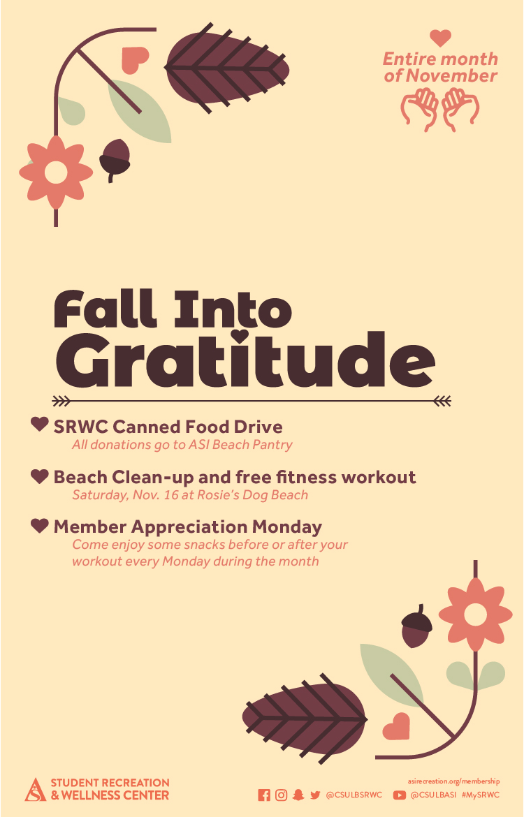
LOCATION:
GEO:33.78112505;-118.11376656
LAST-MODIFIED:20240208T185223Z
X-ACCESS:1
X-HITS:398
X-URL:
X-COLOR:007DAA
END:VEVENT
BEGIN:VEVENT
DTSTART;TZID=America/Los_Angeles:20240213T180000
DTEND;TZID=America/Los_Angeles:20240213T230000
UID:A9AE7EBB-6C24-4D78-B0F5-70801827DDCE
SUMMARY:Intramural Tournament: 3-Point Shootout
DTSTAMP:20240124T155904Z
DESCRIPTION:\N\N\N    .event-title-head {\N      font-weight: bold;\N      font-size: 20px;\N      color: darkgoldenrod;\N    }\N  \N    .event-title-text {\N      font-weight: 500;\N      font-size: 15px;\N      line-height: 17px;\N      font-weight: bold;\N    }\N  \N    .event-title-icon {\N      margin-top: 6px;\N      display: flex;\N      justify-content: left;\N    }\N  \N    .event-video-main {\N      display: flex;\N      justify-content: center;\N      margin-bottom: 20px;\N    }\N  \N    .history-btn {\N      display: flex;\N      justify-content: center;\N    }\N  \N    .button-71 {\N      background-color: #007daa;\N      border: 0;\N      border-radius: 56px;\N      color: #fff;\N      cursor: pointer;\N      display: inline-block;\N      /* font-family: system-ui,-apple-system,system-ui,"Segoe UI",Roboto,Ubuntu,"Helvetica Neue",sans-serif; */\N      font-size: 18px;\N      font-weight: 600;\N      outline: 0;\N      padding: 16px 21px;\N      position: relative;\N      text-align: center;\N      text-decoration: none;\N      transition: all 0.3s;\N      user-select: none;\N      -webkit-user-select: none;\N      touch-action: manipulation;\N    }\N  \N    .button-71:before {\N      background-color: initial;\N      background-image: linear-gradient(#fff 0, rgba(255, 255, 255, 0) 100%);\N      border-radius: 125px;\N      content: "";\N      height: 50%;\N      left: 4%;\N      opacity: 0.5;\N      position: absolute;\N      top: 0;\N      transition: all 0.3s;\N      width: 92%;\N    }\N  \N    .button-71:hover {\N      box-shadow: rgba(255, 255, 255, 0.2) 0 3px 15px inset,\N        rgba(0, 0, 0, 0.1) 0 3px 5px, rgba(0, 0, 0, 0.1) 0 10px 13px;\N      transform: scale(1.05);\N    }\N  \N  \N    \N      \N      \N        \N            \N              \N                \N                    \N                      Date\N                    \N                    Feb. 13\N                  \N  \N                  \N                  \N                    \N                        Location\N                      \N                      SRWC\N                    \N                  \N  \N                  \N                  \N                    \N                      Time\N                    \N                    6: p.m.\N                  \N                \N  \N                \N                \N                    Description\N                    \N                    \N                      \N                    \NGrab some friends and try your best to claim the championship title! Tournaments are open to all Long Beach State University (LBSU) students, staff and faculty, so join us to show off your talent. Free to join for all SRWC members, sign up to practice your skills and possibly win! All winning teams will be awarded prizes for their victory.\N                      \N                      \N                       \NSign up at imleagues.com/csulb.\N                      \N                      \N                        See below for upcoming scheduled Intramural Tournament dates:\N\N                      \N                      \N                        Feb. 13: 3-Point Shootout\N\N\N\N\N                        \N                        Feb. 15: Badminton (Doubles)\N                        \N                        Feb. 22: Pickleball (Doubles)\N                        \N                        March 14: Ping Pong (Doubles)\N                        \N                        \NMarch 21: Cornhole\N                        \NApril 11: Beach Volleyball (2v2)\N\NApril 25: Spikeball\N                      \N                  \N                    \N  \N                    \N                    \N                  \N                  \N                \N                \N              \N              \N            \N            \N          \N          \N        \N        \N      \N      \N  \N      \N      \N        img\N          style="width: 100%&quot;\N          src=&quot;images/enjoy/srwc/SP24_SRWC_Intramural-Tournaments_dgtl-CalEvent.jpg&quot;\N          alt=&quot;Intramural League&quot;\N        /&gt;\N  \N        {loadmoduleid 368}\N      &lt;/div&gt;\N      &lt;!-- Technically end of right side --&gt;\N    &lt;/div&gt;\N  &lt;/div&gt;\N  "
X-ALT-DESC;FMTTYPE=text/html:<!-- basic template for all events  --><!-- Updated July 2023 --><style>    .event-title-head {      font-weight: bold;      font-size: 20px;      color: darkgoldenrod;    }      .event-title-text {      font-weight: 500;      font-size: 15px;      line-height: 17px;      font-weight: bold;    }      .event-title-icon {      margin-top: 6px;      display: flex;      justify-content: left;    }      .event-video-main {      display: flex;      justify-content: center;      margin-bottom: 20px;    }      .history-btn {      display: flex;      justify-content: center;    }      .button-71 {      background-color: #007daa;      border: 0;      border-radius: 56px;      color: #fff;      cursor: pointer;      display: inline-block;      /* font-family: system-ui,-apple-system,system-ui,"Segoe UI",Roboto,Ubuntu,"Helvetica Neue",sans-serif; */      font-size: 18px;      font-weight: 600;      outline: 0;      padding: 16px 21px;      position: relative;      text-align: center;      text-decoration: none;      transition: all 0.3s;      user-select: none;      -webkit-user-select: none;      touch-action: manipulation;    }      .button-71:before {      background-color: initial;      background-image: linear-gradient(#fff 0, rgba(255, 255, 255, 0) 100%);      border-radius: 125px;      content: "";      height: 50%;      left: 4%;      opacity: 0.5;      position: absolute;      top: 0;      transition: all 0.3s;      width: 92%;    }      .button-71:hover {      box-shadow: rgba(255, 255, 255, 0.2) 0 3px 15px inset,        rgba(0, 0, 0, 0.1) 0 3px 5px, rgba(0, 0, 0, 0.1) 0 10px 13px;      transform: scale(1.05);    }  </style>  <div class="container-fluid">    <div class="row">      <!-- --------------------                               START OF LEFT SIDE                           --------------------- -->      <div class="col-md-6">        <div          class="container-fluid module_round_box-gray"          style="padding: 40px 15px"        >          <div class="row">            <div class="col-md-12">              <div class="container-fluid">                <div                  class="row"                  style="                    background-color: white;                    border-radius: 20px;                    box-shadow: rgba(0, 0, 0, 0.15) 1.95px 1.95px 2.6px;                    margin-bottom: 20px;                  "                >                  <!-- DATE -->                  <div class="col-md-4" itemprop="startDate" content="2024-05-2">                    <div class="event-title-icon">                      <img                        src="images/enjoy/beachpride/QR_Code_WOW-F23/calendar.png"                        style="height: 20px; width: 25px"                      />                    </div>                    <p class="event-title-head">Date</p>                    <!-- Update the date per each event -->                    <p class="event-title-text">Feb. 13</p>                  </div>                    <!-- LOCATION -->                  <div>                    <div                      class="col-md-4"                      itemprop="location"                      itemscope="itemscope"                      itemtype="http://schema.org/Place"                    >                      <div class="event-title-icon">                        <img                          src="images/enjoy/beachpride/QR_Code_WOW-F23/location.png"                          style="height: 20px; width: 25px"                        />                      </div>                      <p class="event-title-head">Location</p>                      <!-- Update the date per each event -->                      <p class="event-title-text">SRWC</p>                    </div>                  </div>                    <!-- Time -->                  <div class="col-md-4" itemprop="endDate" content="2024-5-2">                    <div class="event-title-icon">                      <img                        src="images/enjoy/beachpride/QR_Code_WOW-F23/time.png"                        style="height: 20px; width: 25px"                      />                    </div>                    <p class="event-title-head">Time</p>                    <!-- MUST INCLUDE "." IN A.M./P.M. -->                    <p class="event-title-text">6: p.m.</p>                  </div>                </div>                  <!-- Event Description and Content -->                <div                  class="row"                  style="                    background-color: white;                    border-radius: 20px;                    box-shadow: rgba(0, 0, 0, 0.15) 1.95px 1.95px 2.6px;                  "                >                  <div class="col-md-12">                    <p class="event-title-head">Description</p>                    <!-- Place all elements of description within their own p tags -->                    <div itemprop="description">                      <p>                    Grab some friends and try your best to claim the championship title! Tournaments are open to all Long Beach State University (LBSU) students, staff and faculty, so join us to show off your talent. Free to join for all SRWC members, sign up to practice your skills and possibly win! All winning teams will be awarded prizes for their victory.                      </p>                      <p>                       Sign up at <a href="https://imleagues.com/spa/intramural/2f9efab7f7474f0781886c03203622c1/home">imleagues.com/csulb.</a>                      </p>                      <p>                        <small                          >See below for upcoming scheduled Intramural Tournament dates:</small                        >                      </p>                      <ul>                        <li>Feb. 13: 3-Point Shootout                        </li>                        <li>Feb. 15: Badminton (Doubles)                        </li>                        <li>Feb. 22: Pickleball (Doubles)                        </li>                        <li>March 14: Ping Pong (Doubles)                        </li>                        <li>March 21: Cornhole                        </li><li>April 11: Beach Volleyball (2v2)</li><li>April 25: Spikeball</li>                      </ul>                                      </div>                      <!-- TEchnically the end of the accordion -->                    <!-- Technically the end of the "description" -->                  </div>                  <!-- md12 end -->                </div>                <!-- End event Description and content -->              </div>              <!-- end container fluid -->            </div>            <!-- end mdcol12 -->          </div>          <!-- End row -->        </div>        <!-- End of Grey box -->      </div>      <!-- end of left side -->        <!-- -------------------                              START OF RIGHT SIDE                          --------------------- -->      <div class="col-md-6">        <img          style="width: 100%"          src="images/enjoy/srwc/SP24_SRWC_Intramural-Tournaments_dgtl-CalEvent.jpg"          alt="Intramural League"        />          {loadmoduleid 368}      </div>      <!-- Technically end of right side -->    </div>  </div>  
LAST-MODIFIED:20240125T224430Z
X-ACCESS:1
X-HITS:287
X-URL:
X-COLOR:007DAA
END:VEVENT
BEGIN:VEVENT
DTSTART;TZID=America/Los_Angeles:20240214T143000
DTEND;TZID=America/Los_Angeles:20240214T153000
UID:77E6F762-895C-42CF-BA78-D8062FBC8191
SUMMARY:Run Club
DTSTAMP:20230731T174651Z
DESCRIPTION:\N\N\N  .event-title-head {\N    font-weight: bold;\N    font-size: 20px;\N    color: darkgoldenrod;\N  }\N\N  .event-title-text {\N    font-weight: 500;\N    font-size: 15px;\N    line-height: 17px;\N    font-weight: bold;\N  }\N\N  .event-title-icon {\N    margin-top: 6px;\N    display: flex;\N    justify-content: left;\N  }\N\N  .event-video-main {\N    display: flex;\N    justify-content: center;\N    margin-bottom: 20px;\N  }\N\N  .history-btn {\N    display: flex;\N    justify-content: center;\N  }\N\N  .button-71 {\N    background-color: #007daa;\N    border: 0;\N    border-radius: 56px;\N    color: #fff;\N    cursor: pointer;\N    display: inline-block;\N    /* font-family: system-ui,-apple-system,system-ui,"Segoe UI",Roboto,Ubuntu,"Helvetica Neue",sans-serif; */\N    font-size: 18px;\N    font-weight: 600;\N    outline: 0;\N    padding: 16px 21px;\N    position: relative;\N    text-align: center;\N    text-decoration: none;\N    transition: all 0.3s;\N    user-select: none;\N    -webkit-user-select: none;\N    touch-action: manipulation;\N  }\N\N  .button-71:before {\N    background-color: initial;\N    background-image: linear-gradient(#fff 0, rgba(255, 255, 255, 0) 100%);\N    border-radius: 125px;\N    content: "";\N    height: 50%;\N    left: 4%;\N    opacity: 0.5;\N    position: absolute;\N    top: 0;\N    transition: all 0.3s;\N    width: 92%;\N  }\N\N  .button-71:hover {\N    box-shadow: rgba(255, 255, 255, 0.2) 0 3px 15px inset,\N      rgba(0, 0, 0, 0.1) 0 3px 5px, rgba(0, 0, 0, 0.1) 0 10px 13px;\N    transform: scale(1.05);\N  }\N\N\N  \N    \N    \N      \N          \N            \N              \N                  \N                    Date\N                  \N                  See Below\N                \N\N                \N                \N                  \N                      Location\N                    \N                    SRWC Entry Plaza\N                  \N                \N\N                \N                \N                  \N                    Time\N                  \N                  See Below\N                \N              \N\N              \N              \N                  Description\N                  \N                  \N                    Join the SRWC for invigorating runs around campus this spring semester! Whether you're an avid runner or simply looking to spice up your daily routine, then the SRWC Run Club is perfect for you! Experience the thrill of a 3-mile run and be entered into a drawing for a prize! Lace up your shoes and get ready to run at 2:30 p.m. on the second and fourth Wednesday of each month. For more information, visit asirecreation.org.\N\N                    SRWC Run Club dates:\N                    \N                      Feb. 14\N                      Feb. 28\N                      March 13\N                      March 27\N                      April 10\N                      April 24\N                      May 8\N                    \N                  \N\N                  \N                  \N                \N                \N              \N              \N            \N            \N          \N          \N        \N        \N      \N      \N    \N    \N\N    \N    \N      img\N        style="width: 100%&quot;\N        src=&quot;images/cal/Spring24/SP24_Run-Club_dgtl-ASICalEvent.jpg&quot;\N        alt=&quot;Run Club&quot;\N      /&gt;\N\N      {loadmoduleid 368}\N    &lt;/div&gt;\N    &lt;!-- Technically end of right side --&gt;\N  &lt;/div&gt;\N&lt;/div&gt;\N"
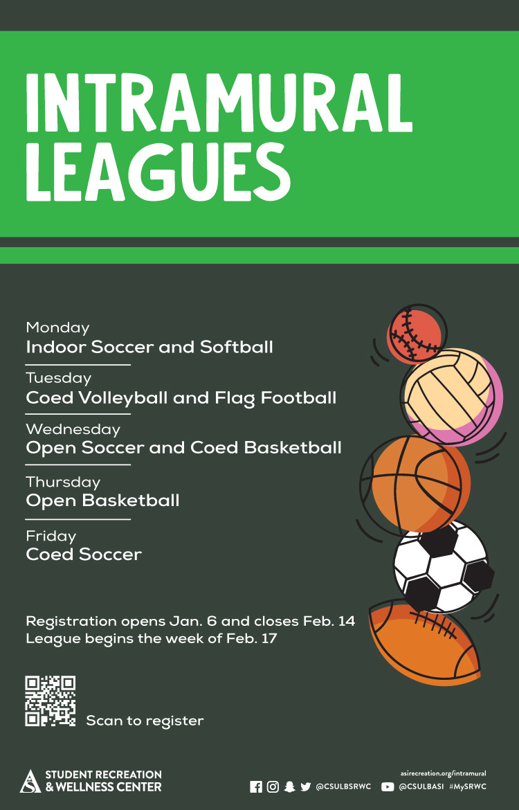
X-ALT-DESC;FMTTYPE=text/html:<!-- basic template for all events  --><!-- Updated July 2023 --><style>  .event-title-head {    font-weight: bold;    font-size: 20px;    color: darkgoldenrod;  }  .event-title-text {    font-weight: 500;    font-size: 15px;    line-height: 17px;    font-weight: bold;  }  .event-title-icon {    margin-top: 6px;    display: flex;    justify-content: left;  }  .event-video-main {    display: flex;    justify-content: center;    margin-bottom: 20px;  }  .history-btn {    display: flex;    justify-content: center;  }  .button-71 {    background-color: #007daa;    border: 0;    border-radius: 56px;    color: #fff;    cursor: pointer;    display: inline-block;    /* font-family: system-ui,-apple-system,system-ui,"Segoe UI",Roboto,Ubuntu,"Helvetica Neue",sans-serif; */    font-size: 18px;    font-weight: 600;    outline: 0;    padding: 16px 21px;    position: relative;    text-align: center;    text-decoration: none;    transition: all 0.3s;    user-select: none;    -webkit-user-select: none;    touch-action: manipulation;  }  .button-71:before {    background-color: initial;    background-image: linear-gradient(#fff 0, rgba(255, 255, 255, 0) 100%);    border-radius: 125px;    content: "";    height: 50%;    left: 4%;    opacity: 0.5;    position: absolute;    top: 0;    transition: all 0.3s;    width: 92%;  }  .button-71:hover {    box-shadow: rgba(255, 255, 255, 0.2) 0 3px 15px inset,      rgba(0, 0, 0, 0.1) 0 3px 5px, rgba(0, 0, 0, 0.1) 0 10px 13px;    transform: scale(1.05);  }</style><div class="container-fluid">  <div class="row">    <!-- --------------------                       START OF LEFT SIDE                   --------------------- -->    <div class="col-md-6">      <div        class="container-fluid module_round_box-gray"        style="padding: 40px 15px"      >        <div class="row">          <div class="col-md-12">            <div class="container-fluid">              <div                class="row"                style="                  background-color: white;                  border-radius: 20px;                  box-shadow: rgba(0, 0, 0, 0.15) 1.95px 1.95px 2.6px;                  margin-bottom: 20px;                "              >                <!-- DATE -->                <div class="col-md-4" itemprop="startDate" content="2022-08-22">                  <div class="event-title-icon">                    <img                      src="images/enjoy/beachpride/QR_Code_WOW-F23/calendar.png"                      style="height: 20px; width: 25px"                    />                  </div>                  <p class="event-title-head">Date</p>                  <!-- Update the date per each event -->                  <p class="event-title-text">See Below</p>                </div>                <!-- LOCATION -->                <div>                  <div                    class="col-md-4"                    itemprop="location"                    itemscope="itemscope"                    itemtype="http://schema.org/Place"                  >                    <div class="event-title-icon">                      <img                        src="images/enjoy/beachpride/QR_Code_WOW-F23/location.png"                        style="height: 20px; width: 25px"                      />                    </div>                    <p class="event-title-head">Location</p>                    <!-- Update the date per each event -->                    <p class="event-title-text">SRWC Entry Plaza</p>                  </div>                </div>                <!-- Time -->                <div class="col-md-4" itemprop="endDate" content="2022-12-18">                  <div class="event-title-icon">                    <img                      src="images/enjoy/beachpride/QR_Code_WOW-F23/time.png"                      style="height: 20px; width: 25px"                    />                  </div>                  <p class="event-title-head">Time</p>                  <!-- MUST INCLUDE "." IN A.M./P.M. -->                  <p class="event-title-text">See Below</p>                </div>              </div>              <!-- Event Description and Content -->              <div                class="row"                style="                  background-color: white;                  border-radius: 20px;                  box-shadow: rgba(0, 0, 0, 0.15) 1.95px 1.95px 2.6px;                "              >                <div class="col-md-12">                  <p class="event-title-head">Description</p>                  <!-- Place all elements of description within their own p tags -->                  <div itemprop="description">                    <p>Join the SRWC for invigorating runs around campus this spring semester! Whether you're an avid runner or simply looking to spice up your daily routine, then the SRWC Run Club is perfect for you! Experience the thrill of a 3-mile run and be entered into a drawing for a prize! Lace up your shoes and get ready to run at 2:30 p.m. on the second and fourth Wednesday of each month. For more information, visit <a href="https://asirecreation.org/recreport/special-feature/606-join-the-srwc-run-club"><b>asirecreation.org</b></a>.</p><br>                    <h3>SRWC Run Club dates:</h3>                    <ul>                      <li>Feb. 14</li>                      <li>Feb. 28</li>                      <li>March 13</li>                      <li>March 27</li>                      <li>April 10</li>                      <li>April 24</li>                      <li>May 8</li>                    </ul>                  </div>                  <!-- TEchnically the end of the accordion -->                  <!-- Technically the end of the "description" -->                </div>                <!-- md12 end -->              </div>              <!-- End event Description and content -->            </div>            <!-- end container fluid -->          </div>          <!-- end mdcol12 -->        </div>        <!-- End row -->      </div>      <!-- End of Grey box -->    </div>    <!-- end of left side -->    <!-- -------------------                      START OF RIGHT SIDE                  --------------------- -->    <div class="col-md-6">      <img        style="width: 100%"        src="images/cal/Spring24/SP24_Run-Club_dgtl-ASICalEvent.jpg"        alt="Run Club"      />      {loadmoduleid 368}    </div>    <!-- Technically end of right side -->  </div></div>
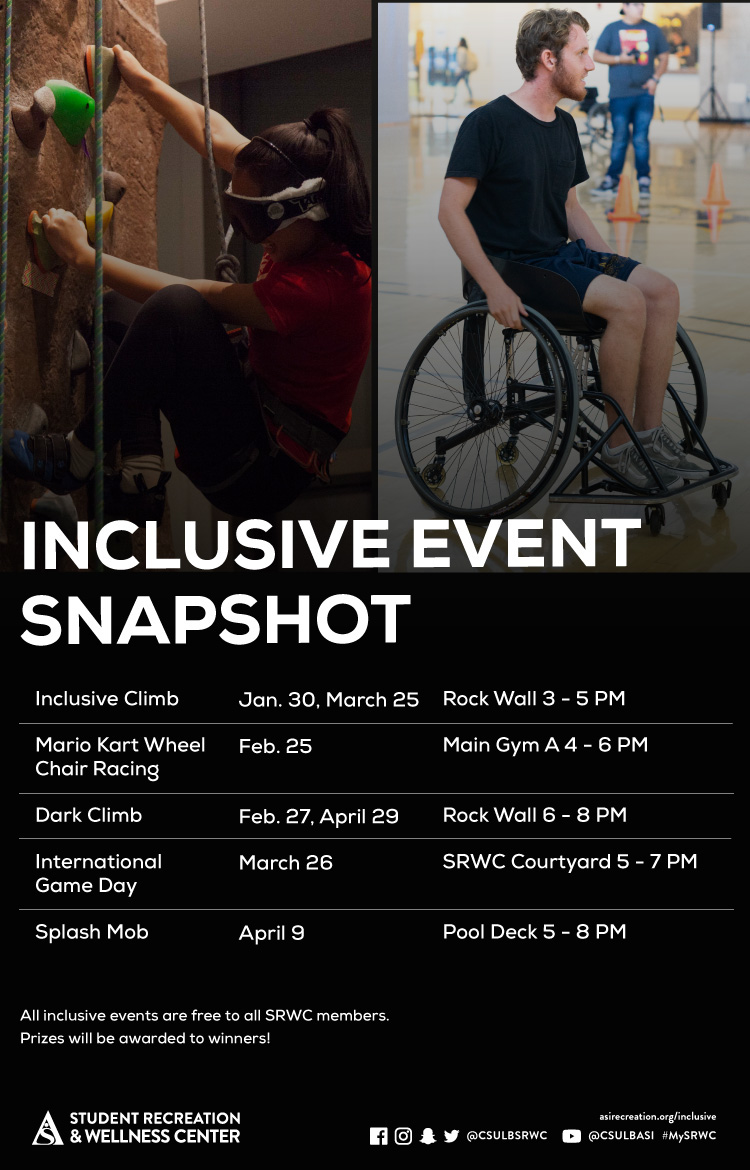
LOCATION:
GEO:0.00000000;0.00000000
LAST-MODIFIED:20240129T231826Z
X-ACCESS:1
X-HITS:891
X-URL:
X-COLOR:007DAA
END:VEVENT
BEGIN:VEVENT
DTSTART;TZID=America/Los_Angeles:20240215T180000
DTEND;TZID=America/Los_Angeles:20240215T230000
UID:F0E7C328-1513-4878-AB2F-567D0DE4D21D
SUMMARY:Intramural Tournaments: Badminton (Doubles)
DTSTAMP:20240124T160011Z
DESCRIPTION:\N\N\N    .event-title-head {\N      font-weight: bold;\N      font-size: 20px;\N      color: darkgoldenrod;\N    }\N  \N    .event-title-text {\N      font-weight: 500;\N      font-size: 15px;\N      line-height: 17px;\N      font-weight: bold;\N    }\N  \N    .event-title-icon {\N      margin-top: 6px;\N      display: flex;\N      justify-content: left;\N    }\N  \N    .event-video-main {\N      display: flex;\N      justify-content: center;\N      margin-bottom: 20px;\N    }\N  \N    .history-btn {\N      display: flex;\N      justify-content: center;\N    }\N  \N    .button-71 {\N      background-color: #007daa;\N      border: 0;\N      border-radius: 56px;\N      color: #fff;\N      cursor: pointer;\N      display: inline-block;\N      /* font-family: system-ui,-apple-system,system-ui,"Segoe UI",Roboto,Ubuntu,"Helvetica Neue",sans-serif; */\N      font-size: 18px;\N      font-weight: 600;\N      outline: 0;\N      padding: 16px 21px;\N      position: relative;\N      text-align: center;\N      text-decoration: none;\N      transition: all 0.3s;\N      user-select: none;\N      -webkit-user-select: none;\N      touch-action: manipulation;\N    }\N  \N    .button-71:before {\N      background-color: initial;\N      background-image: linear-gradient(#fff 0, rgba(255, 255, 255, 0) 100%);\N      border-radius: 125px;\N      content: "";\N      height: 50%;\N      left: 4%;\N      opacity: 0.5;\N      position: absolute;\N      top: 0;\N      transition: all 0.3s;\N      width: 92%;\N    }\N  \N    .button-71:hover {\N      box-shadow: rgba(255, 255, 255, 0.2) 0 3px 15px inset,\N        rgba(0, 0, 0, 0.1) 0 3px 5px, rgba(0, 0, 0, 0.1) 0 10px 13px;\N      transform: scale(1.05);\N    }\N  \N  \N    \N      \N      \N        \N            \N              \N                \N                    \N                      Date\N                    \N                    Feb. 15\N                  \N  \N                  \N                  \N                    \N                        Location\N                      \N                      SRWC\N                    \N                  \N  \N                  \N                  \N                    \N                      Time\N                    \N                    6: p.m.\N                  \N                \N  \N                \N                \N                    Description\N                    \N                    \N                      \N                    \NGrab some friends and try your best to claim the championship title! Tournaments are open to all Long Beach State University (LBSU) students, staff and faculty, so join us to show off your talent. Free to join for all SRWC members, sign up to practice your skills and possibly win! All winning teams will be awarded prizes for their victory.\N                      \N                      \N                       \NSign up at imleagues.com/csulb.\N                      \N                      \N                        See below for upcoming scheduled Intramural Tournament dates:\N\N                      \N                      \N                        Feb. 13: 3-Point Shootout\N\N\N\N\N                        \N                        Feb. 15: Badminton (Doubles)\N                        \N                        Feb. 22: Pickleball (Doubles)\N                        \N                        March 14: Ping Pong (Doubles)\N                        \N                        \NMarch 21: Cornhole\N                        \NApril 11: Beach Volleyball (2v2)\N\NApril 25: Spikeball\N                      \N                  \N                    \N  \N                    \N                    \N                  \N                  \N                \N                \N              \N              \N            \N            \N          \N          \N        \N        \N      \N      \N  \N      \N      \N        img\N          style="width: 100%&quot;\N          src=&quot;images/enjoy/srwc/SP24_SRWC_Intramural-Tournaments_dgtl-CalEvent.jpg&quot;\N          alt=&quot;Intramural League&quot;\N        /&gt;\N  \N        {loadmoduleid 368}\N      &lt;/div&gt;\N      &lt;!-- Technically end of right side --&gt;\N    &lt;/div&gt;\N  &lt;/div&gt;\N  "
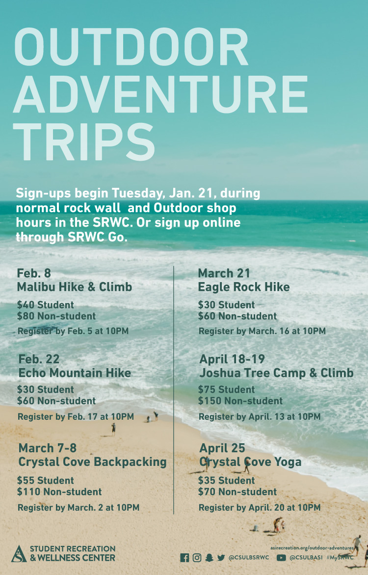
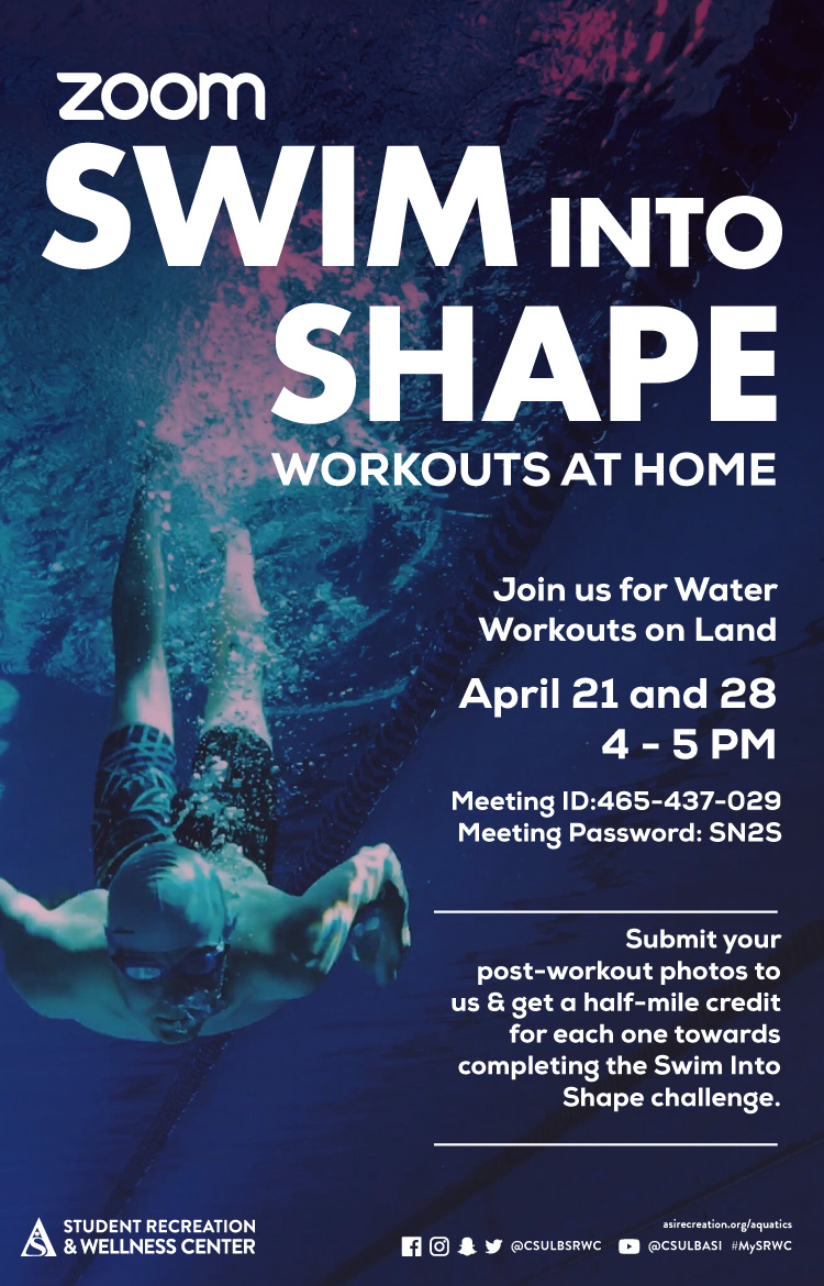
X-ALT-DESC;FMTTYPE=text/html:<!-- basic template for all events  --><!-- Updated July 2023 --><style>    .event-title-head {      font-weight: bold;      font-size: 20px;      color: darkgoldenrod;    }      .event-title-text {      font-weight: 500;      font-size: 15px;      line-height: 17px;      font-weight: bold;    }      .event-title-icon {      margin-top: 6px;      display: flex;      justify-content: left;    }      .event-video-main {      display: flex;      justify-content: center;      margin-bottom: 20px;    }      .history-btn {      display: flex;      justify-content: center;    }      .button-71 {      background-color: #007daa;      border: 0;      border-radius: 56px;      color: #fff;      cursor: pointer;      display: inline-block;      /* font-family: system-ui,-apple-system,system-ui,"Segoe UI",Roboto,Ubuntu,"Helvetica Neue",sans-serif; */      font-size: 18px;      font-weight: 600;      outline: 0;      padding: 16px 21px;      position: relative;      text-align: center;      text-decoration: none;      transition: all 0.3s;      user-select: none;      -webkit-user-select: none;      touch-action: manipulation;    }      .button-71:before {      background-color: initial;      background-image: linear-gradient(#fff 0, rgba(255, 255, 255, 0) 100%);      border-radius: 125px;      content: "";      height: 50%;      left: 4%;      opacity: 0.5;      position: absolute;      top: 0;      transition: all 0.3s;      width: 92%;    }      .button-71:hover {      box-shadow: rgba(255, 255, 255, 0.2) 0 3px 15px inset,        rgba(0, 0, 0, 0.1) 0 3px 5px, rgba(0, 0, 0, 0.1) 0 10px 13px;      transform: scale(1.05);    }  </style>  <div class="container-fluid">    <div class="row">      <!-- --------------------                               START OF LEFT SIDE                           --------------------- -->      <div class="col-md-6">        <div          class="container-fluid module_round_box-gray"          style="padding: 40px 15px"        >          <div class="row">            <div class="col-md-12">              <div class="container-fluid">                <div                  class="row"                  style="                    background-color: white;                    border-radius: 20px;                    box-shadow: rgba(0, 0, 0, 0.15) 1.95px 1.95px 2.6px;                    margin-bottom: 20px;                  "                >                  <!-- DATE -->                  <div class="col-md-4" itemprop="startDate" content="2024-05-2">                    <div class="event-title-icon">                      <img                        src="images/enjoy/beachpride/QR_Code_WOW-F23/calendar.png"                        style="height: 20px; width: 25px"                      />                    </div>                    <p class="event-title-head">Date</p>                    <!-- Update the date per each event -->                    <p class="event-title-text">Feb. 15</p>                  </div>                    <!-- LOCATION -->                  <div>                    <div                      class="col-md-4"                      itemprop="location"                      itemscope="itemscope"                      itemtype="http://schema.org/Place"                    >                      <div class="event-title-icon">                        <img                          src="images/enjoy/beachpride/QR_Code_WOW-F23/location.png"                          style="height: 20px; width: 25px"                        />                      </div>                      <p class="event-title-head">Location</p>                      <!-- Update the date per each event -->                      <p class="event-title-text">SRWC</p>                    </div>                  </div>                    <!-- Time -->                  <div class="col-md-4" itemprop="endDate" content="2024-5-2">                    <div class="event-title-icon">                      <img                        src="images/enjoy/beachpride/QR_Code_WOW-F23/time.png"                        style="height: 20px; width: 25px"                      />                    </div>                    <p class="event-title-head">Time</p>                    <!-- MUST INCLUDE "." IN A.M./P.M. -->                    <p class="event-title-text">6: p.m.</p>                  </div>                </div>                  <!-- Event Description and Content -->                <div                  class="row"                  style="                    background-color: white;                    border-radius: 20px;                    box-shadow: rgba(0, 0, 0, 0.15) 1.95px 1.95px 2.6px;                  "                >                  <div class="col-md-12">                    <p class="event-title-head">Description</p>                    <!-- Place all elements of description within their own p tags -->                    <div itemprop="description">                      <p>                    Grab some friends and try your best to claim the championship title! Tournaments are open to all Long Beach State University (LBSU) students, staff and faculty, so join us to show off your talent. Free to join for all SRWC members, sign up to practice your skills and possibly win! All winning teams will be awarded prizes for their victory.                      </p>                      <p>                       Sign up at <a href="https://imleagues.com/spa/intramural/2f9efab7f7474f0781886c03203622c1/home">imleagues.com/csulb.</a>                      </p>                      <p>                        <small                          >See below for upcoming scheduled Intramural Tournament dates:</small                        >                      </p>                      <ul>                        <li>Feb. 13: 3-Point Shootout                        </li>                        <li>Feb. 15: Badminton (Doubles)                        </li>                        <li>Feb. 22: Pickleball (Doubles)                        </li>                        <li>March 14: Ping Pong (Doubles)                        </li>                        <li>March 21: Cornhole                        </li><li>April 11: Beach Volleyball (2v2)</li><li>April 25: Spikeball</li>                      </ul>                                      </div>                      <!-- TEchnically the end of the accordion -->                    <!-- Technically the end of the "description" -->                  </div>                  <!-- md12 end -->                </div>                <!-- End event Description and content -->              </div>              <!-- end container fluid -->            </div>            <!-- end mdcol12 -->          </div>          <!-- End row -->        </div>        <!-- End of Grey box -->      </div>      <!-- end of left side -->        <!-- -------------------                              START OF RIGHT SIDE                          --------------------- -->      <div class="col-md-6">        <img          style="width: 100%"          src="images/enjoy/srwc/SP24_SRWC_Intramural-Tournaments_dgtl-CalEvent.jpg"          alt="Intramural League"        />          {loadmoduleid 368}      </div>      <!-- Technically end of right side -->    </div>  </div>  
X-ACCESS:1
X-HITS:342
X-URL:
X-COLOR:007DAA
END:VEVENT
BEGIN:VEVENT
DTSTART;TZID=America/Los_Angeles:20240216T133000
DTEND;TZID=America/Los_Angeles:20240216T163000
UID:BDD62437-2A8C-4608-BCD6-DF5CC1E81B31
SUMMARY:American Heart Association Heart Saver First Aid, CPR and AED Certification
DTSTAMP:20240119T192817Z
DESCRIPTION:\N\N\N    .event-title-head {\N      font-weight: bold;\N      font-size: 20px;\N      color: darkgoldenrod;\N    }\N  \N    .event-title-text {\N      font-weight: 500;\N      font-size: 15px;\N      line-height: 17px;\N      font-weight: bold;\N    }\N  \N    .event-title-icon {\N      margin-top: 6px;\N      display: flex;\N      justify-content: left;\N    }\N  \N    .event-video-main {\N      display: flex;\N      justify-content: center;\N      margin-bottom: 20px;\N    }\N  \N    .history-btn {\N      display: flex;\N      justify-content: center;\N    }\N  \N    .button-71 {\N      background-color: #007daa;\N      border: 0;\N      border-radius: 56px;\N      color: #fff;\N      cursor: pointer;\N      display: inline-block;\N      /* font-family: system-ui,-apple-system,system-ui,"Segoe UI",Roboto,Ubuntu,"Helvetica Neue",sans-serif; */\N      font-size: 18px;\N      font-weight: 600;\N      outline: 0;\N      padding: 16px 21px;\N      position: relative;\N      text-align: center;\N      text-decoration: none;\N      transition: all 0.3s;\N      user-select: none;\N      -webkit-user-select: none;\N      touch-action: manipulation;\N    }\N  \N    .button-71:before {\N      background-color: initial;\N      background-image: linear-gradient(#fff 0, rgba(255, 255, 255, 0) 100%);\N      border-radius: 125px;\N      content: "";\N      height: 50%;\N      left: 4%;\N      opacity: 0.5;\N      position: absolute;\N      top: 0;\N      transition: all 0.3s;\N      width: 92%;\N    }\N  \N    .button-71:hover {\N      box-shadow: rgba(255, 255, 255, 0.2) 0 3px 15px inset,\N        rgba(0, 0, 0, 0.1) 0 3px 5px, rgba(0, 0, 0, 0.1) 0 10px 13px;\N      transform: scale(1.05);\N    }\N  \N  \N    \N      \N      \N        \N            \N              \N                \N                    \N                      Date\N                    \N                    Feb 16\N                  \N  \N                  \N                  \N                    \N                        Location\N                      \N                      SRWC\N                    \N                  \N  \N                  \N                  \N                    \N                      Time\N                    \N                    1:30 p.m. to 4:30 p.m.\N                  \N                \N  \N                \N                \N                    Description\N                    \N                    \N                      \N                       If you're searching to add life-saving to your skills, then look no further than the Student Recreation & Wellness Center (SRWC)! The SRWC offers a variety of certifications and classes to teach all Long Beach State University (LBSU) students transformative skills that will last a lifetime.\N                      \N                      \N                        Our American Heart Association First Aid, CPR and AED certification program aims to help participants recognize and respond appropriately to cardiac, breathing and first aid emergencies. Join the SRWC to learn valuable skills that you'll need to know in order to give immediate care to a suddenly injured or ill person until more advanced medical personnel arrive and take over. Open to all LBSU students enrolled at the SRWC, make sure to check out the classes that take place Feb. 16 from 1:30 to 4:30 p.m. at the SRWC. For more information or to register, visitSRWC GO.\N                      \N                    \N                    \N  \N                    \N                    \N                  \N                  \N                \N                \N              \N              \N            \N            \N          \N          \N        \N        \N      \N      \N  \N      \N      \N        img\N          style="width: 100%&quot;\N          src=&quot;images/cal/Spring24/F23_SRWC_Safety_Certifications_dgtl-CalEvent.jpg&quot;\N          alt=&quot;Safety Certification&quot;\N        /&gt;\N  \N        {loadmoduleid 368}\N      &lt;/div&gt;\N      &lt;!-- Technically end of right side --&gt;\N    &lt;/div&gt;\N  &lt;/div&gt;\N  "
X-ALT-DESC;FMTTYPE=text/html:<!-- basic template for all events  --><!-- Updated July 2023 --><style>    .event-title-head {      font-weight: bold;      font-size: 20px;      color: darkgoldenrod;    }      .event-title-text {      font-weight: 500;      font-size: 15px;      line-height: 17px;      font-weight: bold;    }      .event-title-icon {      margin-top: 6px;      display: flex;      justify-content: left;    }      .event-video-main {      display: flex;      justify-content: center;      margin-bottom: 20px;    }      .history-btn {      display: flex;      justify-content: center;    }      .button-71 {      background-color: #007daa;      border: 0;      border-radius: 56px;      color: #fff;      cursor: pointer;      display: inline-block;      /* font-family: system-ui,-apple-system,system-ui,"Segoe UI",Roboto,Ubuntu,"Helvetica Neue",sans-serif; */      font-size: 18px;      font-weight: 600;      outline: 0;      padding: 16px 21px;      position: relative;      text-align: center;      text-decoration: none;      transition: all 0.3s;      user-select: none;      -webkit-user-select: none;      touch-action: manipulation;    }      .button-71:before {      background-color: initial;      background-image: linear-gradient(#fff 0, rgba(255, 255, 255, 0) 100%);      border-radius: 125px;      content: "";      height: 50%;      left: 4%;      opacity: 0.5;      position: absolute;      top: 0;      transition: all 0.3s;      width: 92%;    }      .button-71:hover {      box-shadow: rgba(255, 255, 255, 0.2) 0 3px 15px inset,        rgba(0, 0, 0, 0.1) 0 3px 5px, rgba(0, 0, 0, 0.1) 0 10px 13px;      transform: scale(1.05);    }  </style>  <div class="container-fluid">    <div class="row">      <!-- --------------------                             START OF LEFT SIDE                         --------------------- -->      <div class="col-md-6">        <div          class="container-fluid module_round_box-gray"          style="padding: 40px 15px"        >          <div class="row">            <div class="col-md-12">              <div class="container-fluid">                <div                  class="row"                  style="                    background-color: white;                    border-radius: 20px;                    box-shadow: rgba(0, 0, 0, 0.15) 1.95px 1.95px 2.6px;                    margin-bottom: 20px;                  "                >                  <!-- DATE -->                  <div class="col-md-4" itemprop="startDate" content="2024-05-2">                    <div class="event-title-icon">                      <img                        src="images/enjoy/beachpride/QR_Code_WOW-F23/calendar.png"                        style="height: 20px; width: 25px"                      />                    </div>                    <p class="event-title-head">Date</p>                    <!-- Update the date per each event -->                    <p class="event-title-text">Feb 16</p>                  </div>                    <!-- LOCATION -->                  <div>                    <div                      class="col-md-4"                      itemprop="location"                      itemscope="itemscope"                      itemtype="http://schema.org/Place"                    >                      <div class="event-title-icon">                        <img                          src="images/enjoy/beachpride/QR_Code_WOW-F23/location.png"                          style="height: 20px; width: 25px"                        />                      </div>                      <p class="event-title-head">Location</p>                      <!-- Update the date per each event -->                      <p class="event-title-text">SRWC</p>                    </div>                  </div>                    <!-- Time -->                  <div class="col-md-4" itemprop="endDate" content="2024-5-2">                    <div class="event-title-icon">                      <img                        src="images/enjoy/beachpride/QR_Code_WOW-F23/time.png"                        style="height: 20px; width: 25px"                      />                    </div>                    <p class="event-title-head">Time</p>                    <!-- MUST INCLUDE "." IN A.M./P.M. -->                    <p class="event-title-text">1:30 p.m. to 4:30 p.m.</p>                  </div>                </div>                  <!-- Event Description and Content -->                <div                  class="row"                  style="                    background-color: white;                    border-radius: 20px;                    box-shadow: rgba(0, 0, 0, 0.15) 1.95px 1.95px 2.6px;                  "                >                  <div class="col-md-12">                    <p class="event-title-head">Description</p>                    <!-- Place all elements of description within their own p tags -->                    <div itemprop="description">                      <p>                       If you're searching to add life-saving to your skills, then look no further than the Student Recreation & Wellness Center (SRWC)! The SRWC offers a variety of certifications and classes to teach all Long Beach State University (LBSU) students transformative skills that will last a lifetime.                      </p>                      <p>                        Our American Heart Association First Aid, CPR and AED certification program aims to help participants recognize and respond appropriately to cardiac, breathing and first aid emergencies. Join the SRWC to learn valuable skills that you'll need to know in order to give immediate care to a suddenly injured or ill person until more advanced medical personnel arrive and take over. Open to all LBSU students enrolled at the SRWC, make sure to check out the classes that take place Feb. 16 from 1:30 to 4:30 p.m. at the SRWC. For more information or to register, visit<a href="https://shop.asi.csulb.edu/Program/GetProducts?classification=0ce79494-0fd5-4dd2-a0af-74087ec7200a">SRWC GO</a>.                      </p>                                        </div>                      <!-- TEchnically the end of the accordion -->                    <!-- Technically the end of the "description" -->                  </div>                  <!-- md12 end -->                </div>                <!-- End event Description and content -->              </div>              <!-- end container fluid -->            </div>            <!-- end mdcol12 -->          </div>          <!-- End row -->        </div>        <!-- End of Grey box -->      </div>      <!-- end of left side -->        <!-- -------------------                            START OF RIGHT SIDE                        --------------------- -->      <div class="col-md-6">        <img          style="width: 100%"          src="images/cal/Spring24/F23_SRWC_Safety_Certifications_dgtl-CalEvent.jpg"          alt="Safety Certification"        />          {loadmoduleid 368}      </div>      <!-- Technically end of right side -->    </div>  </div>  
LAST-MODIFIED:20240119T195909Z
X-ACCESS:1
X-HITS:193
X-URL:
X-COLOR:007DAA
END:VEVENT
BEGIN:VEVENT
DTSTART;TZID=America/Los_Angeles:20240222T180000
DTEND;TZID=America/Los_Angeles:20240222T230000
UID:D1CFD8C3-2A9A-4C8C-9B79-38A40C325326
SUMMARY:Intramural Tournaments: Pickleball (Doubles)
DTSTAMP:20240124T160115Z
DESCRIPTION:\N\N\N    .event-title-head {\N      font-weight: bold;\N      font-size: 20px;\N      color: darkgoldenrod;\N    }\N  \N    .event-title-text {\N      font-weight: 500;\N      font-size: 15px;\N      line-height: 17px;\N      font-weight: bold;\N    }\N  \N    .event-title-icon {\N      margin-top: 6px;\N      display: flex;\N      justify-content: left;\N    }\N  \N    .event-video-main {\N      display: flex;\N      justify-content: center;\N      margin-bottom: 20px;\N    }\N  \N    .history-btn {\N      display: flex;\N      justify-content: center;\N    }\N  \N    .button-71 {\N      background-color: #007daa;\N      border: 0;\N      border-radius: 56px;\N      color: #fff;\N      cursor: pointer;\N      display: inline-block;\N      /* font-family: system-ui,-apple-system,system-ui,"Segoe UI",Roboto,Ubuntu,"Helvetica Neue",sans-serif; */\N      font-size: 18px;\N      font-weight: 600;\N      outline: 0;\N      padding: 16px 21px;\N      position: relative;\N      text-align: center;\N      text-decoration: none;\N      transition: all 0.3s;\N      user-select: none;\N      -webkit-user-select: none;\N      touch-action: manipulation;\N    }\N  \N    .button-71:before {\N      background-color: initial;\N      background-image: linear-gradient(#fff 0, rgba(255, 255, 255, 0) 100%);\N      border-radius: 125px;\N      content: "";\N      height: 50%;\N      left: 4%;\N      opacity: 0.5;\N      position: absolute;\N      top: 0;\N      transition: all 0.3s;\N      width: 92%;\N    }\N  \N    .button-71:hover {\N      box-shadow: rgba(255, 255, 255, 0.2) 0 3px 15px inset,\N        rgba(0, 0, 0, 0.1) 0 3px 5px, rgba(0, 0, 0, 0.1) 0 10px 13px;\N      transform: scale(1.05);\N    }\N  \N  \N    \N      \N      \N        \N            \N              \N                \N                    \N                      Date\N                    \N                    Feb. 22\N                  \N  \N                  \N                  \N                    \N                        Location\N                      \N                      SRWC\N                    \N                  \N  \N                  \N                  \N                    \N                      Time\N                    \N                    6: p.m.\N                  \N                \N  \N                \N                \N                    Description\N                    \N                    \N                      \N                    \NGrab some friends and try your best to claim the championship title! Tournaments are open to all Long Beach State University (LBSU) students, staff and faculty, so join us to show off your talent. Free to join for all SRWC members, sign up to practice your skills and possibly win! All winning teams will be awarded prizes for their victory.\N                      \N                      \N                       \NSign up at imleagues.com/csulb.\N                      \N                      \N                        See below for upcoming scheduled Intramural Tournament dates:\N\N                      \N                      \N                        Feb. 13: 3-Point Shootout\N\N\N\N\N                        \N                        Feb. 15: Badminton (Doubles)\N                        \N                        Feb. 22: Pickleball (Doubles)\N                        \N                        March 14: Ping Pong (Doubles)\N                        \N                        \NMarch 21: Cornhole\N                        \NApril 11: Beach Volleyball (2v2)\N\NApril 25: Spikeball\N                      \N                  \N                    \N  \N                    \N                    \N                  \N                  \N                \N                \N              \N              \N            \N            \N          \N          \N        \N        \N      \N      \N  \N      \N      \N        img\N          style="width: 100%&quot;\N          src=&quot;images/enjoy/srwc/SP24_SRWC_Intramural-Tournaments_dgtl-CalEvent.jpg&quot;\N          alt=&quot;Intramural League&quot;\N        /&gt;\N  \N        {loadmoduleid 368}\N      &lt;/div&gt;\N      &lt;!-- Technically end of right side --&gt;\N    &lt;/div&gt;\N  &lt;/div&gt;\N  "
X-ALT-DESC;FMTTYPE=text/html:<!-- basic template for all events  --><!-- Updated July 2023 --><style>    .event-title-head {      font-weight: bold;      font-size: 20px;      color: darkgoldenrod;    }      .event-title-text {      font-weight: 500;      font-size: 15px;      line-height: 17px;      font-weight: bold;    }      .event-title-icon {      margin-top: 6px;      display: flex;      justify-content: left;    }      .event-video-main {      display: flex;      justify-content: center;      margin-bottom: 20px;    }      .history-btn {      display: flex;      justify-content: center;    }      .button-71 {      background-color: #007daa;      border: 0;      border-radius: 56px;      color: #fff;      cursor: pointer;      display: inline-block;      /* font-family: system-ui,-apple-system,system-ui,"Segoe UI",Roboto,Ubuntu,"Helvetica Neue",sans-serif; */      font-size: 18px;      font-weight: 600;      outline: 0;      padding: 16px 21px;      position: relative;      text-align: center;      text-decoration: none;      transition: all 0.3s;      user-select: none;      -webkit-user-select: none;      touch-action: manipulation;    }      .button-71:before {      background-color: initial;      background-image: linear-gradient(#fff 0, rgba(255, 255, 255, 0) 100%);      border-radius: 125px;      content: "";      height: 50%;      left: 4%;      opacity: 0.5;      position: absolute;      top: 0;      transition: all 0.3s;      width: 92%;    }      .button-71:hover {      box-shadow: rgba(255, 255, 255, 0.2) 0 3px 15px inset,        rgba(0, 0, 0, 0.1) 0 3px 5px, rgba(0, 0, 0, 0.1) 0 10px 13px;      transform: scale(1.05);    }  </style>  <div class="container-fluid">    <div class="row">      <!-- --------------------                               START OF LEFT SIDE                           --------------------- -->      <div class="col-md-6">        <div          class="container-fluid module_round_box-gray"          style="padding: 40px 15px"        >          <div class="row">            <div class="col-md-12">              <div class="container-fluid">                <div                  class="row"                  style="                    background-color: white;                    border-radius: 20px;                    box-shadow: rgba(0, 0, 0, 0.15) 1.95px 1.95px 2.6px;                    margin-bottom: 20px;                  "                >                  <!-- DATE -->                  <div class="col-md-4" itemprop="startDate" content="2024-05-2">                    <div class="event-title-icon">                      <img                        src="images/enjoy/beachpride/QR_Code_WOW-F23/calendar.png"                        style="height: 20px; width: 25px"                      />                    </div>                    <p class="event-title-head">Date</p>                    <!-- Update the date per each event -->                    <p class="event-title-text">Feb. 22</p>                  </div>                    <!-- LOCATION -->                  <div>                    <div                      class="col-md-4"                      itemprop="location"                      itemscope="itemscope"                      itemtype="http://schema.org/Place"                    >                      <div class="event-title-icon">                        <img                          src="images/enjoy/beachpride/QR_Code_WOW-F23/location.png"                          style="height: 20px; width: 25px"                        />                      </div>                      <p class="event-title-head">Location</p>                      <!-- Update the date per each event -->                      <p class="event-title-text">SRWC</p>                    </div>                  </div>                    <!-- Time -->                  <div class="col-md-4" itemprop="endDate" content="2024-5-2">                    <div class="event-title-icon">                      <img                        src="images/enjoy/beachpride/QR_Code_WOW-F23/time.png"                        style="height: 20px; width: 25px"                      />                    </div>                    <p class="event-title-head">Time</p>                    <!-- MUST INCLUDE "." IN A.M./P.M. -->                    <p class="event-title-text">6: p.m.</p>                  </div>                </div>                  <!-- Event Description and Content -->                <div                  class="row"                  style="                    background-color: white;                    border-radius: 20px;                    box-shadow: rgba(0, 0, 0, 0.15) 1.95px 1.95px 2.6px;                  "                >                  <div class="col-md-12">                    <p class="event-title-head">Description</p>                    <!-- Place all elements of description within their own p tags -->                    <div itemprop="description">                      <p>                    Grab some friends and try your best to claim the championship title! Tournaments are open to all Long Beach State University (LBSU) students, staff and faculty, so join us to show off your talent. Free to join for all SRWC members, sign up to practice your skills and possibly win! All winning teams will be awarded prizes for their victory.                      </p>                      <p>                       Sign up at <a href="https://imleagues.com/spa/intramural/2f9efab7f7474f0781886c03203622c1/home">imleagues.com/csulb.</a>                      </p>                      <p>                        <small                          >See below for upcoming scheduled Intramural Tournament dates:</small                        >                      </p>                      <ul>                        <li>Feb. 13: 3-Point Shootout                        </li>                        <li>Feb. 15: Badminton (Doubles)                        </li>                        <li>Feb. 22: Pickleball (Doubles)                        </li>                        <li>March 14: Ping Pong (Doubles)                        </li>                        <li>March 21: Cornhole                        </li><li>April 11: Beach Volleyball (2v2)</li><li>April 25: Spikeball</li>                      </ul>                                      </div>                      <!-- TEchnically the end of the accordion -->                    <!-- Technically the end of the "description" -->                  </div>                  <!-- md12 end -->                </div>                <!-- End event Description and content -->              </div>              <!-- end container fluid -->            </div>            <!-- end mdcol12 -->          </div>          <!-- End row -->        </div>        <!-- End of Grey box -->      </div>      <!-- end of left side -->        <!-- -------------------                              START OF RIGHT SIDE                          --------------------- -->      <div class="col-md-6">        <img          style="width: 100%"          src="images/enjoy/srwc/SP24_SRWC_Intramural-Tournaments_dgtl-CalEvent.jpg"          alt="Intramural League"        />          {loadmoduleid 368}      </div>      <!-- Technically end of right side -->    </div>  </div>  
X-ACCESS:1
X-HITS:333
X-URL:
X-COLOR:007DAA
END:VEVENT
BEGIN:VEVENT
DTSTART;TZID=America/Los_Angeles:20240223T180000
DTEND;TZID=America/Los_Angeles:20240223T180000
UID:DA0CD77D-0AD5-4E3C-AAA0-35BCD6FCC37A
SUMMARY:Esports Tournaments: Tekken 8
DTSTAMP:20240205T182806Z
DESCRIPTION:\N\N\N    .event-title-head {\N      font-weight: bold;\N      font-size: 20px;\N      color: darkgoldenrod;\N    }\N  \N    .event-title-text {\N      font-weight: 500;\N      font-size: 15px;\N      line-height: 17px;\N      font-weight: bold;\N    }\N  \N    .event-title-icon {\N      margin-top: 6px;\N      display: flex;\N      justify-content: left;\N    }\N  \N    .event-video-main {\N      display: flex;\N      justify-content: center;\N      margin-bottom: 20px;\N    }\N  \N    .history-btn {\N      display: flex;\N      justify-content: center;\N    }\N  \N    .button-71 {\N      background-color: #007daa;\N      border: 0;\N      border-radius: 56px;\N      color: #fff;\N      cursor: pointer;\N      display: inline-block;\N      /* font-family: system-ui,-apple-system,system-ui,"Segoe UI",Roboto,Ubuntu,"Helvetica Neue",sans-serif; */\N      font-size: 18px;\N      font-weight: 600;\N      outline: 0;\N      padding: 16px 21px;\N      position: relative;\N      text-align: center;\N      text-decoration: none;\N      transition: all 0.3s;\N      user-select: none;\N      -webkit-user-select: none;\N      touch-action: manipulation;\N    }\N  \N    .button-71:before {\N      background-color: initial;\N      background-image: linear-gradient(#fff 0, rgba(255, 255, 255, 0) 100%);\N      border-radius: 125px;\N      content: "";\N      height: 50%;\N      left: 4%;\N      opacity: 0.5;\N      position: absolute;\N      top: 0;\N      transition: all 0.3s;\N      width: 92%;\N    }\N  \N    .button-71:hover {\N      box-shadow: rgba(255, 255, 255, 0.2) 0 3px 15px inset,\N        rgba(0, 0, 0, 0.1) 0 3px 5px, rgba(0, 0, 0, 0.1) 0 10px 13px;\N      transform: scale(1.05);\N    }\N  \N  \N    \N      \N      \N        \N            \N              \N                \N                    \N                      Date\N                    \N                    Feb. 23\N                  \N  \N                  \N                  \N                    \N                        Location\N                      \N                      USU Esports Lounge\N                    \N                  \N  \N                  \N                  \N                    \N                      Time\N                    \N                    6 p.m.\N                  \N                \N  \N                \N                \N                    Description\N                    \N                    \N                      Calling all gamers! In collaboration with the Student Recreation & Wellness Center's (SRWC) Intramural Sports and the USU Games Center, we're inviting all Long Beach State University (LBSU) students to sign up for FREE and compete for a chance to win prizes and be crowned the next Esport Champion!\N\N\NGet ready for to throw down when you join us Feb. 23 at 6 p.m. in the USU Esports Lounge for ASI's Tekken 8 Esports Tournament! Whether you're a seasoned Mishima-style master or just starting your journey, all fighters are welcome to enter the arena and compete for the ultimate championship!\N                    \N  \N                    \N                    \N                  \N                  \N                \N                \N              \N              \N            \N            \N          \N          \N        \N        \N      \N      \N  \N      \N      \N        img\N          style="width: 100%&quot;\N          src=&quot;images/cal/Spring24/SP24_SRWC_ESPORTS-TOURNAMENT-T8-dgtl-CalEvent.jpg&quot;\N          alt=&quot;Tekken 8&quot;\N        /&gt;\N  \N        {loadmoduleid 368}\N      &lt;/div&gt;\N      &lt;!-- Technically end of right side --&gt;\N    &lt;/div&gt;\N  &lt;/div&gt;\N  "
X-ALT-DESC;FMTTYPE=text/html:<!-- basic template for all events  --><!-- Updated July 2023 --><style>    .event-title-head {      font-weight: bold;      font-size: 20px;      color: darkgoldenrod;    }      .event-title-text {      font-weight: 500;      font-size: 15px;      line-height: 17px;      font-weight: bold;    }      .event-title-icon {      margin-top: 6px;      display: flex;      justify-content: left;    }      .event-video-main {      display: flex;      justify-content: center;      margin-bottom: 20px;    }      .history-btn {      display: flex;      justify-content: center;    }      .button-71 {      background-color: #007daa;      border: 0;      border-radius: 56px;      color: #fff;      cursor: pointer;      display: inline-block;      /* font-family: system-ui,-apple-system,system-ui,"Segoe UI",Roboto,Ubuntu,"Helvetica Neue",sans-serif; */      font-size: 18px;      font-weight: 600;      outline: 0;      padding: 16px 21px;      position: relative;      text-align: center;      text-decoration: none;      transition: all 0.3s;      user-select: none;      -webkit-user-select: none;      touch-action: manipulation;    }      .button-71:before {      background-color: initial;      background-image: linear-gradient(#fff 0, rgba(255, 255, 255, 0) 100%);      border-radius: 125px;      content: "";      height: 50%;      left: 4%;      opacity: 0.5;      position: absolute;      top: 0;      transition: all 0.3s;      width: 92%;    }      .button-71:hover {      box-shadow: rgba(255, 255, 255, 0.2) 0 3px 15px inset,        rgba(0, 0, 0, 0.1) 0 3px 5px, rgba(0, 0, 0, 0.1) 0 10px 13px;      transform: scale(1.05);    }  </style>  <div class="container-fluid">    <div class="row">      <!-- --------------------                             START OF LEFT SIDE                         --------------------- -->      <div class="col-md-6">        <div          class="container-fluid module_round_box-gray"          style="padding: 40px 15px"        >          <div class="row">            <div class="col-md-12">              <div class="container-fluid">                <div                  class="row"                  style="                    background-color: white;                    border-radius: 20px;                    box-shadow: rgba(0, 0, 0, 0.15) 1.95px 1.95px 2.6px;                    margin-bottom: 20px;                  "                >                  <!-- DATE -->                  <div class="col-md-4" itemprop="startDate" content="2024-05-2">                    <div class="event-title-icon">                      <img                        src="images/enjoy/beachpride/QR_Code_WOW-F23/calendar.png"                        style="height: 20px; width: 25px"                      />                    </div>                    <p class="event-title-head">Date</p>                    <!-- Update the date per each event -->                    <p class="event-title-text">Feb. 23</p>                  </div>                    <!-- LOCATION -->                  <div>                    <div                      class="col-md-4"                      itemprop="location"                      itemscope="itemscope"                      itemtype="http://schema.org/Place"                    >                      <div class="event-title-icon">                        <img                          src="images/enjoy/beachpride/QR_Code_WOW-F23/location.png"                          style="height: 20px; width: 25px"                        />                      </div>                      <p class="event-title-head">Location</p>                      <!-- Update the date per each event -->                      <p class="event-title-text">USU Esports Lounge</p>                    </div>                  </div>                    <!-- Time -->                  <div class="col-md-4" itemprop="endDate" content="2024-5-2">                    <div class="event-title-icon">                      <img                        src="images/enjoy/beachpride/QR_Code_WOW-F23/time.png"                        style="height: 20px; width: 25px"                      />                    </div>                    <p class="event-title-head">Time</p>                    <!-- MUST INCLUDE "." IN A.M./P.M. -->                    <p class="event-title-text">6 p.m.</p>                  </div>                </div>                  <!-- Event Description and Content -->                <div                  class="row"                  style="                    background-color: white;                    border-radius: 20px;                    box-shadow: rgba(0, 0, 0, 0.15) 1.95px 1.95px 2.6px;                  "                >                  <div class="col-md-12">                    <p class="event-title-head">Description</p>                    <!-- Place all elements of description within their own p tags -->                    <div itemprop="description">                      <p>Calling all gamers! In collaboration with the Student Recreation & Wellness Center's (SRWC) Intramural Sports and the USU Games Center, we're inviting all Long Beach State University (LBSU) students to sign up for FREE and compete for a chance to win prizes and be crowned the next Esport Champion!</p><p>Get ready for to throw down when you join us Feb. 23 at 6 p.m. in the USU Esports Lounge for ASI's Tekken 8 Esports Tournament! Whether you're a seasoned Mishima-style master or just starting your journey, all fighters are welcome to enter the arena and compete for the ultimate championship!</p>                    </div>                      <!-- TEchnically the end of the accordion -->                    <!-- Technically the end of the "description" -->                  </div>                  <!-- md12 end -->                </div>                <!-- End event Description and content -->              </div>              <!-- end container fluid -->            </div>            <!-- end mdcol12 -->          </div>          <!-- End row -->        </div>        <!-- End of Grey box -->      </div>      <!-- end of left side -->        <!-- -------------------                            START OF RIGHT SIDE                        --------------------- -->      <div class="col-md-6">        <img          style="width: 100%"          src="images/cal/Spring24/SP24_SRWC_ESPORTS-TOURNAMENT-T8-dgtl-CalEvent.jpg"          alt="Tekken 8"        />          {loadmoduleid 368}      </div>      <!-- Technically end of right side -->    </div>  </div>  
LOCATION:90840 Long Beach\, Los Angeles\, United States
GEO:0.00000000;0.00000000
LAST-MODIFIED:20240221T011919Z
X-ACCESS:1
X-HITS:2605
X-URL:
X-COLOR:007DAA
END:VEVENT
BEGIN:VEVENT
DTSTART;VALUE=DATE:20240225
DTEND;VALUE=DATE:20240226
RRULE:FREQ=WEEKLY;BYDAY=SU;INTERVAL=1;UNTIL=20240510T235900Z
UID:2E955CDE-4804-458B-AB70-B92FCBFA707B
SUMMARY:Nutrition Counseling
DTSTAMP:20240212T233433Z
DESCRIPTION:\N\N\N  .event-title-head {\N    font-weight: bold;\N    font-size: 20px;\N    color: darkgoldenrod;\N  }\N\N  .event-title-text {\N    font-weight: 500;\N    font-size: 15px;\N    line-height: 17px;\N    font-weight: bold;\N  }\N\N  .event-title-icon {\N    margin-top: 6px;\N    display: flex;\N    justify-content: left;\N  }\N\N  .event-video-main {\N    display: flex;\N    justify-content: center;\N    margin-bottom: 20px;\N  }\N\N  .history-btn {\N    display: flex;\N    justify-content: center;\N  }\N\N  .button-71 {\N    background-color: #007daa;\N    border: 0;\N    border-radius: 56px;\N    color: #fff;\N    cursor: pointer;\N    display: inline-block;\N    /* font-family: system-ui,-apple-system,system-ui,"Segoe UI",Roboto,Ubuntu,"Helvetica Neue",sans-serif; */\N    font-size: 18px;\N    font-weight: 600;\N    outline: 0;\N    padding: 16px 21px;\N    position: relative;\N    text-align: center;\N    text-decoration: none;\N    transition: all 0.3s;\N    user-select: none;\N    -webkit-user-select: none;\N    touch-action: manipulation;\N  }\N\N  .button-71:before {\N    background-color: initial;\N    background-image: linear-gradient(#fff 0, rgba(255, 255, 255, 0) 100%);\N    border-radius: 125px;\N    content: "";\N    height: 50%;\N    left: 4%;\N    opacity: 0.5;\N    position: absolute;\N    top: 0;\N    transition: all 0.3s;\N    width: 92%;\N  }\N\N  .button-71:hover {\N    box-shadow: rgba(255, 255, 255, 0.2) 0 3px 15px inset,\N      rgba(0, 0, 0, 0.1) 0 3px 5px, rgba(0, 0, 0, 0.1) 0 10px 13px;\N    transform: scale(1.05);\N  }\N\N\N  \N    \N    \N      \N          \N            \N              \N                  \N                    Date\N                  \N                  Feb. 26 through May 10\N                \N\N                \N                \N                  \N                      Location\N                    \N                    SRWC Beach Balance\N                  \N                \N\N                \N                \N                  \N                    Time\N                  \N                  All Day \N                \N              \N\N              \N              \N                  Description\N                  \N                  \N                     \N   If you're looking to adopt a healthier lifestyle that is best suited for your needs, then you came to the right place! When it comes to our physical and mental well-being, a balanced diet can play a vital role in improving our health. Visit the Student Recreation & Wellness Center's (SRWC) Beach Balance throughout the spring semester and work one-on-one with a peer nutrition counselor to discover how you can incorporate holistic habits that work with your dietary preferences and individualized goals! Registration opens Feb. 19 and will close May 6. Please note that during spring break, appointments will not be available.   \NAll nutrition counseling appointments* are FREE of charge and can be booked online through Acuity, in-person or over the phone at (562) 985 - 4794 during Beach Balance operating hours. Appointments must be made four days in advance with a completed intake form.\N\N*Clients seeking counseling for an eating disorder or complex medical condition, will be referred to the university's Student Health Services.\N\NFor more information about our peer nutrition counseling services, please contact SS-BeachBalance@csulb.edu.\N                  \N                  \N\N                  \N                  \N                \N                \N              \N              \N            \N            \N          \N          \N        \N        \N      \N      \N    \N    \N\N    \N    \N      img\N        style="width: 100%&quot;\N        src=&quot;images/enjoy/srwc/SP24_SRWC_Nutrition_Counseling_SRWC_dgtl-CalEvent.jpg&quot;\N        alt=&quot;Belay a mile&quot;\N      /&gt;\N\N      {loadmoduleid 368}\N    &lt;/div&gt;\N    &lt;!-- Technically end of right side --&gt;\N  &lt;/div&gt;\N&lt;/div&gt;\N"
X-ALT-DESC;FMTTYPE=text/html:<!-- basic template for all events  --><!-- Updated July 2023 --><style>  .event-title-head {    font-weight: bold;    font-size: 20px;    color: darkgoldenrod;  }  .event-title-text {    font-weight: 500;    font-size: 15px;    line-height: 17px;    font-weight: bold;  }  .event-title-icon {    margin-top: 6px;    display: flex;    justify-content: left;  }  .event-video-main {    display: flex;    justify-content: center;    margin-bottom: 20px;  }  .history-btn {    display: flex;    justify-content: center;  }  .button-71 {    background-color: #007daa;    border: 0;    border-radius: 56px;    color: #fff;    cursor: pointer;    display: inline-block;    /* font-family: system-ui,-apple-system,system-ui,"Segoe UI",Roboto,Ubuntu,"Helvetica Neue",sans-serif; */    font-size: 18px;    font-weight: 600;    outline: 0;    padding: 16px 21px;    position: relative;    text-align: center;    text-decoration: none;    transition: all 0.3s;    user-select: none;    -webkit-user-select: none;    touch-action: manipulation;  }  .button-71:before {    background-color: initial;    background-image: linear-gradient(#fff 0, rgba(255, 255, 255, 0) 100%);    border-radius: 125px;    content: "";    height: 50%;    left: 4%;    opacity: 0.5;    position: absolute;    top: 0;    transition: all 0.3s;    width: 92%;  }  .button-71:hover {    box-shadow: rgba(255, 255, 255, 0.2) 0 3px 15px inset,      rgba(0, 0, 0, 0.1) 0 3px 5px, rgba(0, 0, 0, 0.1) 0 10px 13px;    transform: scale(1.05);  }</style><div class="container-fluid">  <div class="row">    <!-- --------------------                           START OF LEFT SIDE                       --------------------- -->    <div class="col-md-6">      <div        class="container-fluid module_round_box-gray"        style="padding: 40px 15px"      >        <div class="row">          <div class="col-md-12">            <div class="container-fluid">              <div                class="row"                style="                  background-color: white;                  border-radius: 20px;                  box-shadow: rgba(0, 0, 0, 0.15) 1.95px 1.95px 2.6px;                  margin-bottom: 20px;                "              >                <!-- DATE -->                <div class="col-md-4" itemprop="startDate" content="2024-05-2">                  <div class="event-title-icon">                    <img                      src="images/enjoy/beachpride/QR_Code_WOW-F23/calendar.png"                      style="height: 20px; width: 25px"                    />                  </div>                  <p class="event-title-head">Date</p>                  <!-- Update the date per each event -->                  <p class="event-title-text">Feb. 26 through May 10</p>                </div>                <!-- LOCATION -->                <div>                  <div                    class="col-md-4"                    itemprop="location"                    itemscope="itemscope"                    itemtype="http://schema.org/Place"                  >                    <div class="event-title-icon">                      <img                        src="images/enjoy/beachpride/QR_Code_WOW-F23/location.png"                        style="height: 20px; width: 25px"                      />                    </div>                    <p class="event-title-head">Location</p>                    <!-- Update the date per each event -->                    <p class="event-title-text">SRWC Beach Balance</p>                  </div>                </div>                <!-- Time -->                <div class="col-md-4" itemprop="endDate" content="2024-5-2">                  <div class="event-title-icon">                    <img                      src="images/enjoy/beachpride/QR_Code_WOW-F23/time.png"                      style="height: 20px; width: 25px"                    />                  </div>                  <p class="event-title-head">Time</p>                  <!-- MUST INCLUDE "." IN A.M./P.M. -->                  <p class="event-title-text">All Day </p>                </div>              </div>              <!-- Event Description and Content -->              <div                class="row"                style="                  background-color: white;                  border-radius: 20px;                  box-shadow: rgba(0, 0, 0, 0.15) 1.95px 1.95px 2.6px;                "              >                <div class="col-md-12">                  <p class="event-title-head">Description</p>                  <!-- Place all elements of description within their own p tags -->                  <div itemprop="description">                     <p>   If you're looking to adopt a healthier lifestyle that is best suited for your needs, then you came to the right place! When it comes to our physical and mental well-being, a balanced diet can play a vital role in improving our health. Visit the Student Recreation & Wellness Center's (SRWC) Beach Balance throughout the spring semester and work one-on-one with a peer nutrition counselor to discover how you can incorporate holistic habits that work with your dietary preferences and individualized goals! Registration opens Feb. 19 and will close May 6. Please note that during spring break, appointments will not be available.   </p><p>All nutrition counseling appointments* are FREE of charge and can be booked online through <a href="https://app.acuityscheduling.com/schedule/fe8b4d41" target="_blank">Acuity</a>, in-person or over the phone at (562) 985 - 4794 during Beach Balance operating hours. Appointments must be made four days in advance with a completed intake form.</p><p>*Clients seeking counseling for an eating disorder or complex medical condition, will be referred to the university's <a href="https://www.csulb.edu/student-affairs/student-health-services" target="_blank">Student Health Services.</a></p><p>For more information about our peer nutrition counseling services, please contact <a href="mailto:SS-BeachBalance@csulb.edu">SS-BeachBalance@csulb.edu.</a></p>                                    </div>                  <!-- TEchnically the end of the accordion -->                  <!-- Technically the end of the "description" -->                </div>                <!-- md12 end -->              </div>              <!-- End event Description and content -->            </div>            <!-- end container fluid -->          </div>          <!-- end mdcol12 -->        </div>        <!-- End row -->      </div>      <!-- End of Grey box -->    </div>    <!-- end of left side -->    <!-- -------------------                          START OF RIGHT SIDE                      --------------------- -->    <div class="col-md-6">      <img        style="width: 100%"        src="images/enjoy/srwc/SP24_SRWC_Nutrition_Counseling_SRWC_dgtl-CalEvent.jpg"        alt="Belay a mile"      />      {loadmoduleid 368}    </div>    <!-- Technically end of right side -->  </div></div>
LOCATION:
GEO:0.00000000;0.00000000
LAST-MODIFIED:20240213T175525Z
X-ACCESS:1
X-HITS:6
X-URL:
X-COLOR:007DAA
END:VEVENT
BEGIN:VEVENT
DTSTART;TZID=America/Los_Angeles:20240228T143000
DTEND;TZID=America/Los_Angeles:20240228T153000
UID:B288E387-A4B7-4371-AE9F-2CB469297A73
SUMMARY:Run Club
DTSTAMP:20230731T174651Z
DESCRIPTION:\N\N\N  .event-title-head {\N    font-weight: bold;\N    font-size: 20px;\N    color: darkgoldenrod;\N  }\N\N  .event-title-text {\N    font-weight: 500;\N    font-size: 15px;\N    line-height: 17px;\N    font-weight: bold;\N  }\N\N  .event-title-icon {\N    margin-top: 6px;\N    display: flex;\N    justify-content: left;\N  }\N\N  .event-video-main {\N    display: flex;\N    justify-content: center;\N    margin-bottom: 20px;\N  }\N\N  .history-btn {\N    display: flex;\N    justify-content: center;\N  }\N\N  .button-71 {\N    background-color: #007daa;\N    border: 0;\N    border-radius: 56px;\N    color: #fff;\N    cursor: pointer;\N    display: inline-block;\N    /* font-family: system-ui,-apple-system,system-ui,"Segoe UI",Roboto,Ubuntu,"Helvetica Neue",sans-serif; */\N    font-size: 18px;\N    font-weight: 600;\N    outline: 0;\N    padding: 16px 21px;\N    position: relative;\N    text-align: center;\N    text-decoration: none;\N    transition: all 0.3s;\N    user-select: none;\N    -webkit-user-select: none;\N    touch-action: manipulation;\N  }\N\N  .button-71:before {\N    background-color: initial;\N    background-image: linear-gradient(#fff 0, rgba(255, 255, 255, 0) 100%);\N    border-radius: 125px;\N    content: "";\N    height: 50%;\N    left: 4%;\N    opacity: 0.5;\N    position: absolute;\N    top: 0;\N    transition: all 0.3s;\N    width: 92%;\N  }\N\N  .button-71:hover {\N    box-shadow: rgba(255, 255, 255, 0.2) 0 3px 15px inset,\N      rgba(0, 0, 0, 0.1) 0 3px 5px, rgba(0, 0, 0, 0.1) 0 10px 13px;\N    transform: scale(1.05);\N  }\N\N\N  \N    \N    \N      \N          \N            \N              \N                  \N                    Date\N                  \N                  See Below\N                \N\N                \N                \N                  \N                      Location\N                    \N                    SRWC Entry Plaza\N                  \N                \N\N                \N                \N                  \N                    Time\N                  \N                  See Below\N                \N              \N\N              \N              \N                  Description\N                  \N                  \N                    Join the SRWC for invigorating runs around campus this spring semester! Whether you're an avid runner or simply looking to spice up your daily routine, then the SRWC Run Club is perfect for you! Experience the thrill of a 3-mile run and be entered into a drawing for a prize! Lace up your shoes and get ready to run at 2:30 p.m. on the second and fourth Wednesday of each month. For more information, visit asirecreation.org.\N\N                    SRWC Run Club dates:\N                    \N                      Feb. 14\N                      Feb. 28\N                      March 13\N                      March 27\N                      April 10\N                      April 24\N                      May 8\N                    \N                  \N\N                  \N                  \N                \N                \N              \N              \N            \N            \N          \N          \N        \N        \N      \N      \N    \N    \N\N    \N    \N      img\N        style="width: 100%&quot;\N        src=&quot;images/cal/Spring24/SP24_Run-Club_dgtl-ASICalEvent.jpg&quot;\N        alt=&quot;Run Club&quot;\N      /&gt;\N\N      {loadmoduleid 368}\N    &lt;/div&gt;\N    &lt;!-- Technically end of right side --&gt;\N  &lt;/div&gt;\N&lt;/div&gt;\N"
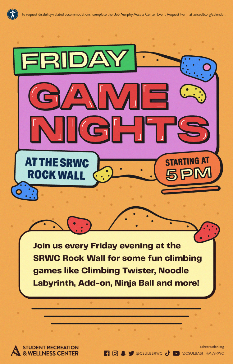
X-ALT-DESC;FMTTYPE=text/html:<!-- basic template for all events  --><!-- Updated July 2023 --><style>  .event-title-head {    font-weight: bold;    font-size: 20px;    color: darkgoldenrod;  }  .event-title-text {    font-weight: 500;    font-size: 15px;    line-height: 17px;    font-weight: bold;  }  .event-title-icon {    margin-top: 6px;    display: flex;    justify-content: left;  }  .event-video-main {    display: flex;    justify-content: center;    margin-bottom: 20px;  }  .history-btn {    display: flex;    justify-content: center;  }  .button-71 {    background-color: #007daa;    border: 0;    border-radius: 56px;    color: #fff;    cursor: pointer;    display: inline-block;    /* font-family: system-ui,-apple-system,system-ui,"Segoe UI",Roboto,Ubuntu,"Helvetica Neue",sans-serif; */    font-size: 18px;    font-weight: 600;    outline: 0;    padding: 16px 21px;    position: relative;    text-align: center;    text-decoration: none;    transition: all 0.3s;    user-select: none;    -webkit-user-select: none;    touch-action: manipulation;  }  .button-71:before {    background-color: initial;    background-image: linear-gradient(#fff 0, rgba(255, 255, 255, 0) 100%);    border-radius: 125px;    content: "";    height: 50%;    left: 4%;    opacity: 0.5;    position: absolute;    top: 0;    transition: all 0.3s;    width: 92%;  }  .button-71:hover {    box-shadow: rgba(255, 255, 255, 0.2) 0 3px 15px inset,      rgba(0, 0, 0, 0.1) 0 3px 5px, rgba(0, 0, 0, 0.1) 0 10px 13px;    transform: scale(1.05);  }</style><div class="container-fluid">  <div class="row">    <!-- --------------------                       START OF LEFT SIDE                   --------------------- -->    <div class="col-md-6">      <div        class="container-fluid module_round_box-gray"        style="padding: 40px 15px"      >        <div class="row">          <div class="col-md-12">            <div class="container-fluid">              <div                class="row"                style="                  background-color: white;                  border-radius: 20px;                  box-shadow: rgba(0, 0, 0, 0.15) 1.95px 1.95px 2.6px;                  margin-bottom: 20px;                "              >                <!-- DATE -->                <div class="col-md-4" itemprop="startDate" content="2022-08-22">                  <div class="event-title-icon">                    <img                      src="images/enjoy/beachpride/QR_Code_WOW-F23/calendar.png"                      style="height: 20px; width: 25px"                    />                  </div>                  <p class="event-title-head">Date</p>                  <!-- Update the date per each event -->                  <p class="event-title-text">See Below</p>                </div>                <!-- LOCATION -->                <div>                  <div                    class="col-md-4"                    itemprop="location"                    itemscope="itemscope"                    itemtype="http://schema.org/Place"                  >                    <div class="event-title-icon">                      <img                        src="images/enjoy/beachpride/QR_Code_WOW-F23/location.png"                        style="height: 20px; width: 25px"                      />                    </div>                    <p class="event-title-head">Location</p>                    <!-- Update the date per each event -->                    <p class="event-title-text">SRWC Entry Plaza</p>                  </div>                </div>                <!-- Time -->                <div class="col-md-4" itemprop="endDate" content="2022-12-18">                  <div class="event-title-icon">                    <img                      src="images/enjoy/beachpride/QR_Code_WOW-F23/time.png"                      style="height: 20px; width: 25px"                    />                  </div>                  <p class="event-title-head">Time</p>                  <!-- MUST INCLUDE "." IN A.M./P.M. -->                  <p class="event-title-text">See Below</p>                </div>              </div>              <!-- Event Description and Content -->              <div                class="row"                style="                  background-color: white;                  border-radius: 20px;                  box-shadow: rgba(0, 0, 0, 0.15) 1.95px 1.95px 2.6px;                "              >                <div class="col-md-12">                  <p class="event-title-head">Description</p>                  <!-- Place all elements of description within their own p tags -->                  <div itemprop="description">                    <p>Join the SRWC for invigorating runs around campus this spring semester! Whether you're an avid runner or simply looking to spice up your daily routine, then the SRWC Run Club is perfect for you! Experience the thrill of a 3-mile run and be entered into a drawing for a prize! Lace up your shoes and get ready to run at 2:30 p.m. on the second and fourth Wednesday of each month. For more information, visit <a href="https://asirecreation.org/recreport/special-feature/606-join-the-srwc-run-club"><b>asirecreation.org</b></a>.</p><br>                    <h3>SRWC Run Club dates:</h3>                    <ul>                      <li>Feb. 14</li>                      <li>Feb. 28</li>                      <li>March 13</li>                      <li>March 27</li>                      <li>April 10</li>                      <li>April 24</li>                      <li>May 8</li>                    </ul>                  </div>                  <!-- TEchnically the end of the accordion -->                  <!-- Technically the end of the "description" -->                </div>                <!-- md12 end -->              </div>              <!-- End event Description and content -->            </div>            <!-- end container fluid -->          </div>          <!-- end mdcol12 -->        </div>        <!-- End row -->      </div>      <!-- End of Grey box -->    </div>    <!-- end of left side -->    <!-- -------------------                      START OF RIGHT SIDE                  --------------------- -->    <div class="col-md-6">      <img        style="width: 100%"        src="images/cal/Spring24/SP24_Run-Club_dgtl-ASICalEvent.jpg"        alt="Run Club"      />      {loadmoduleid 368}    </div>    <!-- Technically end of right side -->  </div></div>

LOCATION:
GEO:0.00000000;0.00000000
LAST-MODIFIED:20240129T231829Z
X-ACCESS:1
X-HITS:817
X-URL:
X-COLOR:007DAA
END:VEVENT
BEGIN:VEVENT
DTSTART;TZID=America/Los_Angeles:20240313T143000
DTEND;TZID=America/Los_Angeles:20240313T150000
UID:60833C4E-F954-41BC-9A5C-C522FE512B8F
SUMMARY:Run Club
DTSTAMP:20230731T174651Z
DESCRIPTION:\N\N\N  .event-title-head {\N    font-weight: bold;\N    font-size: 20px;\N    color: darkgoldenrod;\N  }\N\N  .event-title-text {\N    font-weight: 500;\N    font-size: 15px;\N    line-height: 17px;\N    font-weight: bold;\N  }\N\N  .event-title-icon {\N    margin-top: 6px;\N    display: flex;\N    justify-content: left;\N  }\N\N  .event-video-main {\N    display: flex;\N    justify-content: center;\N    margin-bottom: 20px;\N  }\N\N  .history-btn {\N    display: flex;\N    justify-content: center;\N  }\N\N  .button-71 {\N    background-color: #007daa;\N    border: 0;\N    border-radius: 56px;\N    color: #fff;\N    cursor: pointer;\N    display: inline-block;\N    /* font-family: system-ui,-apple-system,system-ui,"Segoe UI",Roboto,Ubuntu,"Helvetica Neue",sans-serif; */\N    font-size: 18px;\N    font-weight: 600;\N    outline: 0;\N    padding: 16px 21px;\N    position: relative;\N    text-align: center;\N    text-decoration: none;\N    transition: all 0.3s;\N    user-select: none;\N    -webkit-user-select: none;\N    touch-action: manipulation;\N  }\N\N  .button-71:before {\N    background-color: initial;\N    background-image: linear-gradient(#fff 0, rgba(255, 255, 255, 0) 100%);\N    border-radius: 125px;\N    content: "";\N    height: 50%;\N    left: 4%;\N    opacity: 0.5;\N    position: absolute;\N    top: 0;\N    transition: all 0.3s;\N    width: 92%;\N  }\N\N  .button-71:hover {\N    box-shadow: rgba(255, 255, 255, 0.2) 0 3px 15px inset,\N      rgba(0, 0, 0, 0.1) 0 3px 5px, rgba(0, 0, 0, 0.1) 0 10px 13px;\N    transform: scale(1.05);\N  }\N\N\N  \N    \N    \N      \N          \N            \N              \N                  \N                    Date\N                  \N                  See Below\N                \N\N                \N                \N                  \N                      Location\N                    \N                    SRWC Entry Plaza\N                  \N                \N\N                \N                \N                  \N                    Time\N                  \N                  See Below\N                \N              \N\N              \N              \N                  Description\N                  \N                  \N                    Join the SRWC for invigorating runs around campus this spring semester! Whether you're an avid runner or simply looking to spice up your daily routine, then the SRWC Run Club is perfect for you! Experience the thrill of a 3-mile run and be entered into a drawing for a prize! Lace up your shoes and get ready to run at 2:30 p.m. on the second and fourth Wednesday of each month. For more information, visit asirecreation.org.\N\N                    SRWC Run Club dates:\N                    \N                      Feb. 14\N                      Feb. 28\N                      March 13\N                      March 27\N                      April 10\N                      April 24\N                      May 8\N                    \N                  \N\N                  \N                  \N                \N                \N              \N              \N            \N            \N          \N          \N        \N        \N      \N      \N    \N    \N\N    \N    \N      img\N        style="width: 100%&quot;\N        src=&quot;images/cal/Spring24/SP24_Run-Club_dgtl-ASICalEvent.jpg&quot;\N        alt=&quot;Run Club&quot;\N      /&gt;\N\N      {loadmoduleid 368}\N    &lt;/div&gt;\N    &lt;!-- Technically end of right side --&gt;\N  &lt;/div&gt;\N&lt;/div&gt;\N"
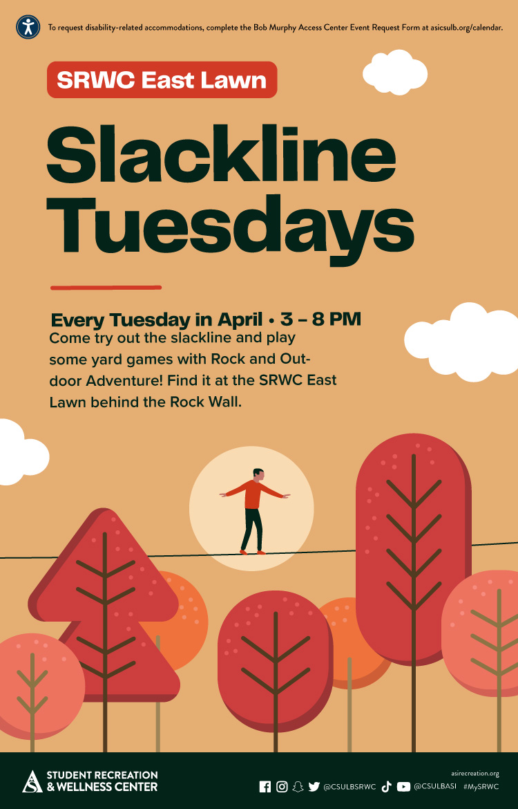
X-ALT-DESC;FMTTYPE=text/html:<!-- basic template for all events  --><!-- Updated July 2023 --><style>  .event-title-head {    font-weight: bold;    font-size: 20px;    color: darkgoldenrod;  }  .event-title-text {    font-weight: 500;    font-size: 15px;    line-height: 17px;    font-weight: bold;  }  .event-title-icon {    margin-top: 6px;    display: flex;    justify-content: left;  }  .event-video-main {    display: flex;    justify-content: center;    margin-bottom: 20px;  }  .history-btn {    display: flex;    justify-content: center;  }  .button-71 {    background-color: #007daa;    border: 0;    border-radius: 56px;    color: #fff;    cursor: pointer;    display: inline-block;    /* font-family: system-ui,-apple-system,system-ui,"Segoe UI",Roboto,Ubuntu,"Helvetica Neue",sans-serif; */    font-size: 18px;    font-weight: 600;    outline: 0;    padding: 16px 21px;    position: relative;    text-align: center;    text-decoration: none;    transition: all 0.3s;    user-select: none;    -webkit-user-select: none;    touch-action: manipulation;  }  .button-71:before {    background-color: initial;    background-image: linear-gradient(#fff 0, rgba(255, 255, 255, 0) 100%);    border-radius: 125px;    content: "";    height: 50%;    left: 4%;    opacity: 0.5;    position: absolute;    top: 0;    transition: all 0.3s;    width: 92%;  }  .button-71:hover {    box-shadow: rgba(255, 255, 255, 0.2) 0 3px 15px inset,      rgba(0, 0, 0, 0.1) 0 3px 5px, rgba(0, 0, 0, 0.1) 0 10px 13px;    transform: scale(1.05);  }</style><div class="container-fluid">  <div class="row">    <!-- --------------------                       START OF LEFT SIDE                   --------------------- -->    <div class="col-md-6">      <div        class="container-fluid module_round_box-gray"        style="padding: 40px 15px"      >        <div class="row">          <div class="col-md-12">            <div class="container-fluid">              <div                class="row"                style="                  background-color: white;                  border-radius: 20px;                  box-shadow: rgba(0, 0, 0, 0.15) 1.95px 1.95px 2.6px;                  margin-bottom: 20px;                "              >                <!-- DATE -->                <div class="col-md-4" itemprop="startDate" content="2022-08-22">                  <div class="event-title-icon">                    <img                      src="images/enjoy/beachpride/QR_Code_WOW-F23/calendar.png"                      style="height: 20px; width: 25px"                    />                  </div>                  <p class="event-title-head">Date</p>                  <!-- Update the date per each event -->                  <p class="event-title-text">See Below</p>                </div>                <!-- LOCATION -->                <div>                  <div                    class="col-md-4"                    itemprop="location"                    itemscope="itemscope"                    itemtype="http://schema.org/Place"                  >                    <div class="event-title-icon">                      <img                        src="images/enjoy/beachpride/QR_Code_WOW-F23/location.png"                        style="height: 20px; width: 25px"                      />                    </div>                    <p class="event-title-head">Location</p>                    <!-- Update the date per each event -->                    <p class="event-title-text">SRWC Entry Plaza</p>                  </div>                </div>                <!-- Time -->                <div class="col-md-4" itemprop="endDate" content="2022-12-18">                  <div class="event-title-icon">                    <img                      src="images/enjoy/beachpride/QR_Code_WOW-F23/time.png"                      style="height: 20px; width: 25px"                    />                  </div>                  <p class="event-title-head">Time</p>                  <!-- MUST INCLUDE "." IN A.M./P.M. -->                  <p class="event-title-text">See Below</p>                </div>              </div>              <!-- Event Description and Content -->              <div                class="row"                style="                  background-color: white;                  border-radius: 20px;                  box-shadow: rgba(0, 0, 0, 0.15) 1.95px 1.95px 2.6px;                "              >                <div class="col-md-12">                  <p class="event-title-head">Description</p>                  <!-- Place all elements of description within their own p tags -->                  <div itemprop="description">                    <p>Join the SRWC for invigorating runs around campus this spring semester! Whether you're an avid runner or simply looking to spice up your daily routine, then the SRWC Run Club is perfect for you! Experience the thrill of a 3-mile run and be entered into a drawing for a prize! Lace up your shoes and get ready to run at 2:30 p.m. on the second and fourth Wednesday of each month. For more information, visit <a href="https://asirecreation.org/recreport/special-feature/606-join-the-srwc-run-club"><b>asirecreation.org</b></a>.</p><br>                    <h3>SRWC Run Club dates:</h3>                    <ul>                      <li>Feb. 14</li>                      <li>Feb. 28</li>                      <li>March 13</li>                      <li>March 27</li>                      <li>April 10</li>                      <li>April 24</li>                      <li>May 8</li>                    </ul>                  </div>                  <!-- TEchnically the end of the accordion -->                  <!-- Technically the end of the "description" -->                </div>                <!-- md12 end -->              </div>              <!-- End event Description and content -->            </div>            <!-- end container fluid -->          </div>          <!-- end mdcol12 -->        </div>        <!-- End row -->      </div>      <!-- End of Grey box -->    </div>    <!-- end of left side -->    <!-- -------------------                      START OF RIGHT SIDE                  --------------------- -->    <div class="col-md-6">      <img        style="width: 100%"        src="images/cal/Spring24/SP24_Run-Club_dgtl-ASICalEvent.jpg"        alt="Run Club"      />      {loadmoduleid 368}    </div>    <!-- Technically end of right side -->  </div></div>
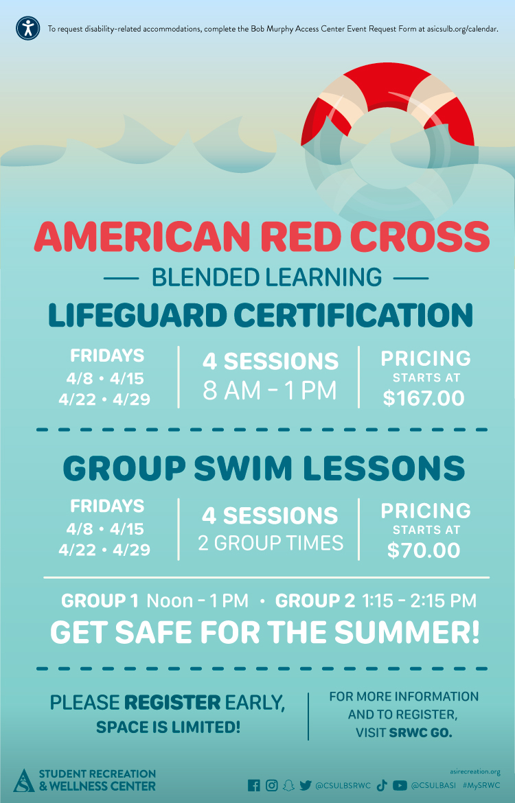
LOCATION:
GEO:0.00000000;0.00000000
LAST-MODIFIED:20240129T231833Z
X-ACCESS:1
X-HITS:796
X-URL:
X-COLOR:007DAA
END:VEVENT
BEGIN:VEVENT
DTSTART;TZID=America/Los_Angeles:20240314T180000
DTEND;TZID=America/Los_Angeles:20240314T183000
UID:2DD6BAF5-3803-48DE-AD03-77C0B9F346AE
SUMMARY:Intramural Tournaments: Ping Pong (Doubles)
DTSTAMP:20240124T160213Z
DESCRIPTION:\N\N\N    .event-title-head {\N      font-weight: bold;\N      font-size: 20px;\N      color: darkgoldenrod;\N    }\N  \N    .event-title-text {\N      font-weight: 500;\N      font-size: 15px;\N      line-height: 17px;\N      font-weight: bold;\N    }\N  \N    .event-title-icon {\N      margin-top: 6px;\N      display: flex;\N      justify-content: left;\N    }\N  \N    .event-video-main {\N      display: flex;\N      justify-content: center;\N      margin-bottom: 20px;\N    }\N  \N    .history-btn {\N      display: flex;\N      justify-content: center;\N    }\N  \N    .button-71 {\N      background-color: #007daa;\N      border: 0;\N      border-radius: 56px;\N      color: #fff;\N      cursor: pointer;\N      display: inline-block;\N      /* font-family: system-ui,-apple-system,system-ui,"Segoe UI",Roboto,Ubuntu,"Helvetica Neue",sans-serif; */\N      font-size: 18px;\N      font-weight: 600;\N      outline: 0;\N      padding: 16px 21px;\N      position: relative;\N      text-align: center;\N      text-decoration: none;\N      transition: all 0.3s;\N      user-select: none;\N      -webkit-user-select: none;\N      touch-action: manipulation;\N    }\N  \N    .button-71:before {\N      background-color: initial;\N      background-image: linear-gradient(#fff 0, rgba(255, 255, 255, 0) 100%);\N      border-radius: 125px;\N      content: "";\N      height: 50%;\N      left: 4%;\N      opacity: 0.5;\N      position: absolute;\N      top: 0;\N      transition: all 0.3s;\N      width: 92%;\N    }\N  \N    .button-71:hover {\N      box-shadow: rgba(255, 255, 255, 0.2) 0 3px 15px inset,\N        rgba(0, 0, 0, 0.1) 0 3px 5px, rgba(0, 0, 0, 0.1) 0 10px 13px;\N      transform: scale(1.05);\N    }\N  \N  \N    \N      \N      \N        \N            \N              \N                \N                    \N                      Date\N                    \N                    March 14\N                  \N  \N                  \N                  \N                    \N                        Location\N                      \N                      SRWC\N                    \N                  \N  \N                  \N                  \N                    \N                      Time\N                    \N                    6: p.m.\N                  \N                \N  \N                \N                \N                    Description\N                    \N                    \N                      \N                    \NGrab some friends and try your best to claim the championship title! Tournaments are open to all Long Beach State University (LBSU) students, staff and faculty, so join us to show off your talent. Free to join for all SRWC members, sign up to practice your skills and possibly win! All winning teams will be awarded prizes for their victory.\N                      \N                      \N                       \NSign up at imleagues.com/csulb.\N                      \N                      \N                        See below for upcoming scheduled Intramural Tournament dates:\N\N                      \N                      \N                        Feb. 13: 3-Point Shootout\N\N\N\N\N                        \N                        Feb. 15: Badminton (Doubles)\N                        \N                        Feb. 22: Pickleball (Doubles)\N                        \N                        March 14: Ping Pong (Doubles)\N                        \N                        \NMarch 21: Cornhole\N                        \NApril 11: Beach Volleyball (2v2)\N\NApril 25: Spikeball\N                      \N                  \N                    \N  \N                    \N                    \N                  \N                  \N                \N                \N              \N              \N            \N            \N          \N          \N        \N        \N      \N      \N  \N      \N      \N        img\N          style="width: 100%&quot;\N          src=&quot;images/enjoy/srwc/SP24_SRWC_Intramural-Tournaments_dgtl-CalEvent.jpg&quot;\N          alt=&quot;Intramural League&quot;\N        /&gt;\N  \N        {loadmoduleid 368}\N      &lt;/div&gt;\N      &lt;!-- Technically end of right side --&gt;\N    &lt;/div&gt;\N  &lt;/div&gt;\N  "
X-ALT-DESC;FMTTYPE=text/html:<!-- basic template for all events  --><!-- Updated July 2023 --><style>    .event-title-head {      font-weight: bold;      font-size: 20px;      color: darkgoldenrod;    }      .event-title-text {      font-weight: 500;      font-size: 15px;      line-height: 17px;      font-weight: bold;    }      .event-title-icon {      margin-top: 6px;      display: flex;      justify-content: left;    }      .event-video-main {      display: flex;      justify-content: center;      margin-bottom: 20px;    }      .history-btn {      display: flex;      justify-content: center;    }      .button-71 {      background-color: #007daa;      border: 0;      border-radius: 56px;      color: #fff;      cursor: pointer;      display: inline-block;      /* font-family: system-ui,-apple-system,system-ui,"Segoe UI",Roboto,Ubuntu,"Helvetica Neue",sans-serif; */      font-size: 18px;      font-weight: 600;      outline: 0;      padding: 16px 21px;      position: relative;      text-align: center;      text-decoration: none;      transition: all 0.3s;      user-select: none;      -webkit-user-select: none;      touch-action: manipulation;    }      .button-71:before {      background-color: initial;      background-image: linear-gradient(#fff 0, rgba(255, 255, 255, 0) 100%);      border-radius: 125px;      content: "";      height: 50%;      left: 4%;      opacity: 0.5;      position: absolute;      top: 0;      transition: all 0.3s;      width: 92%;    }      .button-71:hover {      box-shadow: rgba(255, 255, 255, 0.2) 0 3px 15px inset,        rgba(0, 0, 0, 0.1) 0 3px 5px, rgba(0, 0, 0, 0.1) 0 10px 13px;      transform: scale(1.05);    }  </style>  <div class="container-fluid">    <div class="row">      <!-- --------------------                               START OF LEFT SIDE                           --------------------- -->      <div class="col-md-6">        <div          class="container-fluid module_round_box-gray"          style="padding: 40px 15px"        >          <div class="row">            <div class="col-md-12">              <div class="container-fluid">                <div                  class="row"                  style="                    background-color: white;                    border-radius: 20px;                    box-shadow: rgba(0, 0, 0, 0.15) 1.95px 1.95px 2.6px;                    margin-bottom: 20px;                  "                >                  <!-- DATE -->                  <div class="col-md-4" itemprop="startDate" content="2024-05-2">                    <div class="event-title-icon">                      <img                        src="images/enjoy/beachpride/QR_Code_WOW-F23/calendar.png"                        style="height: 20px; width: 25px"                      />                    </div>                    <p class="event-title-head">Date</p>                    <!-- Update the date per each event -->                    <p class="event-title-text">March 14</p>                  </div>                    <!-- LOCATION -->                  <div>                    <div                      class="col-md-4"                      itemprop="location"                      itemscope="itemscope"                      itemtype="http://schema.org/Place"                    >                      <div class="event-title-icon">                        <img                          src="images/enjoy/beachpride/QR_Code_WOW-F23/location.png"                          style="height: 20px; width: 25px"                        />                      </div>                      <p class="event-title-head">Location</p>                      <!-- Update the date per each event -->                      <p class="event-title-text">SRWC</p>                    </div>                  </div>                    <!-- Time -->                  <div class="col-md-4" itemprop="endDate" content="2024-5-2">                    <div class="event-title-icon">                      <img                        src="images/enjoy/beachpride/QR_Code_WOW-F23/time.png"                        style="height: 20px; width: 25px"                      />                    </div>                    <p class="event-title-head">Time</p>                    <!-- MUST INCLUDE "." IN A.M./P.M. -->                    <p class="event-title-text">6: p.m.</p>                  </div>                </div>                  <!-- Event Description and Content -->                <div                  class="row"                  style="                    background-color: white;                    border-radius: 20px;                    box-shadow: rgba(0, 0, 0, 0.15) 1.95px 1.95px 2.6px;                  "                >                  <div class="col-md-12">                    <p class="event-title-head">Description</p>                    <!-- Place all elements of description within their own p tags -->                    <div itemprop="description">                      <p>                    Grab some friends and try your best to claim the championship title! Tournaments are open to all Long Beach State University (LBSU) students, staff and faculty, so join us to show off your talent. Free to join for all SRWC members, sign up to practice your skills and possibly win! All winning teams will be awarded prizes for their victory.                      </p>                      <p>                       Sign up at <a href="https://imleagues.com/spa/intramural/2f9efab7f7474f0781886c03203622c1/home">imleagues.com/csulb.</a>                      </p>                      <p>                        <small                          >See below for upcoming scheduled Intramural Tournament dates:</small                        >                      </p>                      <ul>                        <li>Feb. 13: 3-Point Shootout                        </li>                        <li>Feb. 15: Badminton (Doubles)                        </li>                        <li>Feb. 22: Pickleball (Doubles)                        </li>                        <li>March 14: Ping Pong (Doubles)                        </li>                        <li>March 21: Cornhole                        </li><li>April 11: Beach Volleyball (2v2)</li><li>April 25: Spikeball</li>                      </ul>                                      </div>                      <!-- TEchnically the end of the accordion -->                    <!-- Technically the end of the "description" -->                  </div>                  <!-- md12 end -->                </div>                <!-- End event Description and content -->              </div>              <!-- end container fluid -->            </div>            <!-- end mdcol12 -->          </div>          <!-- End row -->        </div>        <!-- End of Grey box -->      </div>      <!-- end of left side -->        <!-- -------------------                              START OF RIGHT SIDE                          --------------------- -->      <div class="col-md-6">        <img          style="width: 100%"          src="images/enjoy/srwc/SP24_SRWC_Intramural-Tournaments_dgtl-CalEvent.jpg"          alt="Intramural League"        />          {loadmoduleid 368}      </div>      <!-- Technically end of right side -->    </div>  </div>  
X-ACCESS:1
X-HITS:499
X-URL:
X-COLOR:007DAA
END:VEVENT
BEGIN:VEVENT
DTSTART;TZID=America/Los_Angeles:20240319T170000
DTEND;TZID=America/Los_Angeles:20240319T173000
UID:BEC4EDEC-FBE4-443B-96C6-6B160A16AEC7
SUMMARY:Dark Climb
DTSTAMP:20240103T193519Z
DESCRIPTION:\N\N\N  .event-title-head {\N    font-weight: bold;\N    font-size: 20px;\N    color: darkgoldenrod;\N  }\N\N  .event-title-text {\N    font-weight: 500;\N    font-size: 15px;\N    line-height: 17px;\N    font-weight: bold;\N  }\N\N  .event-title-icon {\N    margin-top: 6px;\N    display: flex;\N    justify-content: left;\N  }\N\N  .event-video-main {\N    display: flex;\N    justify-content: center;\N    margin-bottom: 20px;\N  }\N\N  .history-btn {\N    display: flex;\N    justify-content: center;\N  }\N\N  .button-71 {\N    background-color: #007daa;\N    border: 0;\N    border-radius: 56px;\N    color: #fff;\N    cursor: pointer;\N    display: inline-block;\N    /* font-family: system-ui,-apple-system,system-ui,"Segoe UI",Roboto,Ubuntu,"Helvetica Neue",sans-serif; */\N    font-size: 18px;\N    font-weight: 600;\N    outline: 0;\N    padding: 16px 21px;\N    position: relative;\N    text-align: center;\N    text-decoration: none;\N    transition: all 0.3s;\N    user-select: none;\N    -webkit-user-select: none;\N    touch-action: manipulation;\N  }\N\N  .button-71:before {\N    background-color: initial;\N    background-image: linear-gradient(#fff 0, rgba(255, 255, 255, 0) 100%);\N    border-radius: 125px;\N    content: "";\N    height: 50%;\N    left: 4%;\N    opacity: 0.5;\N    position: absolute;\N    top: 0;\N    transition: all 0.3s;\N    width: 92%;\N  }\N\N  .button-71:hover {\N    box-shadow: rgba(255, 255, 255, 0.2) 0 3px 15px inset,\N      rgba(0, 0, 0, 0.1) 0 3px 5px, rgba(0, 0, 0, 0.1) 0 10px 13px;\N    transform: scale(1.05);\N  }\N\N\N  \N    \N    \N      \N          \N            \N              \N                  \N                    Date\N                  \N                  March 19\N                \N\N                \N                \N                  \N                      Location\N                    \N                    SRWC Rock Wall\N                  \N                \N\N                \N                \N                  \N                    Time\N                  \N                  5 to 7 p.m.\N                \N              \N\N              \N              \N                  Description\N                  \N                  \N                    \N                      Are you ready to embark on the ultimate adventure? Gather\N                      your squad and join us for the Student Recreation &\N                      Wellness Center's (SRWC) Dark Climb! This event will be an\N                      unforgettable fusion of boundary-pushing activities,\N                      camaraderie, and pure rockin' fun as you confront\N                      challenges head-on. Experience the pinnacle of teamwork\N                      while you and your partner each play the roles of the\N                      courageous blindfolded climber and an effective\N                      directional coach.\N                    \N                    \N                      Join us at the SRWC Rock Wall March 19 and May 2 from 5 to\N                      7 p.m. to test your limits! Trust, coordination, and\N                      adrenaline will be your secret weapons to win big as you\N                      climb blindfolded against the clock to claim the victory.\N                    \N                    \N                      Proud Partnership: SRWC Rock and Outdoor Adventure x SRWC\N                      Inclusive Recreation! We believe in inclusion for all!\N                      Dark Climb is a collaborative event to ensure everyone can\N                      experience the thrill of the climb! For more information\N                      on Inclusive Recreation at the SRWC, visit\N                      \N                \N                \N              \N              \N            \N            \N          \N          \N        \N        \N      \N      \N    \N    \N\N    \N    \N      img\N        style="width: 100%&quot;\N        src=&quot;images/cal/Spring24/SP24_SRWC_Self-Care-Celebration_dgtl-CalEvent.jpg&quot;\N        alt=&quot;Dark Climb&quot;\N      /&gt;\N\N      {loadmoduleid 368}\N    &lt;/div&gt;\N    &lt;!-- Technically end of right side --&gt;\N  &lt;/div&gt;\N&lt;/div&gt;\N"
X-ALT-DESC;FMTTYPE=text/html:<!-- basic template for all events  --><!-- Updated July 2023 --><style>  .event-title-head {    font-weight: bold;    font-size: 20px;    color: darkgoldenrod;  }  .event-title-text {    font-weight: 500;    font-size: 15px;    line-height: 17px;    font-weight: bold;  }  .event-title-icon {    margin-top: 6px;    display: flex;    justify-content: left;  }  .event-video-main {    display: flex;    justify-content: center;    margin-bottom: 20px;  }  .history-btn {    display: flex;    justify-content: center;  }  .button-71 {    background-color: #007daa;    border: 0;    border-radius: 56px;    color: #fff;    cursor: pointer;    display: inline-block;    /* font-family: system-ui,-apple-system,system-ui,"Segoe UI",Roboto,Ubuntu,"Helvetica Neue",sans-serif; */    font-size: 18px;    font-weight: 600;    outline: 0;    padding: 16px 21px;    position: relative;    text-align: center;    text-decoration: none;    transition: all 0.3s;    user-select: none;    -webkit-user-select: none;    touch-action: manipulation;  }  .button-71:before {    background-color: initial;    background-image: linear-gradient(#fff 0, rgba(255, 255, 255, 0) 100%);    border-radius: 125px;    content: "";    height: 50%;    left: 4%;    opacity: 0.5;    position: absolute;    top: 0;    transition: all 0.3s;    width: 92%;  }  .button-71:hover {    box-shadow: rgba(255, 255, 255, 0.2) 0 3px 15px inset,      rgba(0, 0, 0, 0.1) 0 3px 5px, rgba(0, 0, 0, 0.1) 0 10px 13px;    transform: scale(1.05);  }</style><div class="container-fluid">  <div class="row">    <!-- --------------------                         START OF LEFT SIDE                     --------------------- -->    <div class="col-md-6">      <div        class="container-fluid module_round_box-gray"        style="padding: 40px 15px"      >        <div class="row">          <div class="col-md-12">            <div class="container-fluid">              <div                class="row"                style="                  background-color: white;                  border-radius: 20px;                  box-shadow: rgba(0, 0, 0, 0.15) 1.95px 1.95px 2.6px;                  margin-bottom: 20px;                "              >                <!-- DATE -->                <div class="col-md-4" itemprop="startDate" content="2024-03-19">                  <div class="event-title-icon">                    <img                      src="images/enjoy/beachpride/QR_Code_WOW-F23/calendar.png"                      style="height: 20px; width: 25px"                    />                  </div>                  <p class="event-title-head">Date</p>                  <!-- Update the date per each event -->                  <p class="event-title-text">March 19</p>                </div>                <!-- LOCATION -->                <div>                  <div                    class="col-md-4"                    itemprop="location"                    itemscope="itemscope"                    itemtype="http://schema.org/Place"                  >                    <div class="event-title-icon">                      <img                        src="images/enjoy/beachpride/QR_Code_WOW-F23/location.png"                        style="height: 20px; width: 25px"                      />                    </div>                    <p class="event-title-head">Location</p>                    <!-- Update the date per each event -->                    <p class="event-title-text">SRWC Rock Wall</p>                  </div>                </div>                <!-- Time -->                <div class="col-md-4" itemprop="endDate" content="2024-3-19">                  <div class="event-title-icon">                    <img                      src="images/enjoy/beachpride/QR_Code_WOW-F23/time.png"                      style="height: 20px; width: 25px"                    />                  </div>                  <p class="event-title-head">Time</p>                  <!-- MUST INCLUDE "." IN A.M./P.M. -->                  <p class="event-title-text">5 to 7 p.m.</p>                </div>              </div>              <!-- Event Description and Content -->              <div                class="row"                style="                  background-color: white;                  border-radius: 20px;                  box-shadow: rgba(0, 0, 0, 0.15) 1.95px 1.95px 2.6px;                "              >                <div class="col-md-12">                  <p class="event-title-head">Description</p>                  <!-- Place all elements of description within their own p tags -->                  <div itemprop="description">                    <p>                      Are you ready to embark on the ultimate adventure? Gather                      your squad and join us for the Student Recreation &                      Wellness Center's (SRWC) Dark Climb! This event will be an                      unforgettable fusion of boundary-pushing activities,                      camaraderie, and pure rockin' fun as you confront                      challenges head-on. Experience the pinnacle of teamwork                      while you and your partner each play the roles of the                      courageous blindfolded climber and an effective                      directional coach.                    </p>                    <p>                      Join us at the SRWC Rock Wall March 19 and May 2 from 5 to                      7 p.m. to test your limits! Trust, coordination, and                      adrenaline will be your secret weapons to win big as you                      climb blindfolded against the clock to claim the victory.                    </p>                    <p>                      Proud Partnership: SRWC Rock and Outdoor Adventure x SRWC                      Inclusive Recreation! We believe in inclusion for all!                      Dark Climb is a collaborative event to ensure everyone can                      experience the thrill of the climb! For more information                      on Inclusive Recreation at the SRWC, visit                      <a                        href="https://www.asirecreation.org/inclusive/about-inclusive"                        >asirecreation.org/inclusive</a                      >.                    </p>                  </div>                  <!-- TEchnically the end of the accordion -->                  <!-- Technically the end of the "description" -->                </div>                <!-- md12 end -->              </div>              <!-- End event Description and content -->            </div>            <!-- end container fluid -->          </div>          <!-- end mdcol12 -->        </div>        <!-- End row -->      </div>      <!-- End of Grey box -->    </div>    <!-- end of left side -->    <!-- -------------------                        START OF RIGHT SIDE                    --------------------- -->    <div class="col-md-6">      <img        style="width: 100%"        src="images/cal/Spring24/SP24_SRWC_Self-Care-Celebration_dgtl-CalEvent.jpg"        alt="Dark Climb"      />      {loadmoduleid 368}    </div>    <!-- Technically end of right side -->  </div></div>
LOCATION:
GEO:0.00000000;0.00000000
LAST-MODIFIED:20240103T194353Z
X-ACCESS:1
X-HITS:992
X-URL:
X-COLOR:007DAA
END:VEVENT
BEGIN:VEVENT
DTSTART;TZID=America/Los_Angeles:20240320T160000
DTEND;TZID=America/Los_Angeles:20240320T173000
UID:829A9BD9-A645-4BE2-98AE-3BDC4AE8CBCC
SUMMARY:Night at the Japanese Garden
DTSTAMP:20240223T055150Z
DESCRIPTION:\N\N\N    .event-title-head {\N      font-weight: bold;\N      font-size: 20px;\N      color: darkgoldenrod;\N    }\N  \N    .event-title-text {\N      font-weight: 500;\N      font-size: 15px;\N      line-height: 17px;\N      font-weight: bold;\N    }\N  \N    .event-title-icon {\N      margin-top: 6px;\N      display: flex;\N      justify-content: left;\N    }\N  \N    .event-video-main {\N      display: flex;\N      justify-content: center;\N      margin-bottom: 20px;\N    }\N  \N    .history-btn {\N      display: flex;\N      justify-content: center;\N    }\N  \N    .button-71 {\N      background-color: #007daa;\N      border: 0;\N      border-radius: 56px;\N      color: #fff;\N      cursor: pointer;\N      display: inline-block;\N      /* font-family: system-ui,-apple-system,system-ui,"Segoe UI",Roboto,Ubuntu,"Helvetica Neue",sans-serif; */\N      font-size: 18px;\N      font-weight: 600;\N      outline: 0;\N      padding: 16px 21px;\N      position: relative;\N      text-align: center;\N      text-decoration: none;\N      transition: all 0.3s;\N      user-select: none;\N      -webkit-user-select: none;\N      touch-action: manipulation;\N    }\N  \N    .button-71:before {\N      background-color: initial;\N      background-image: linear-gradient(#fff 0, rgba(255, 255, 255, 0) 100%);\N      border-radius: 125px;\N      content: "";\N      height: 50%;\N      left: 4%;\N      opacity: 0.5;\N      position: absolute;\N      top: 0;\N      transition: all 0.3s;\N      width: 92%;\N    }\N  \N    .button-71:hover {\N      box-shadow: rgba(255, 255, 255, 0.2) 0 3px 15px inset,\N        rgba(0, 0, 0, 0.1) 0 3px 5px, rgba(0, 0, 0, 0.1) 0 10px 13px;\N      transform: scale(1.05);\N    }\N  \N  \N    \N      \N      \N        \N            \N              \N                \N                    \N                      Date\N                    \N                    March 20\N                  \N  \N                  \N                  \N                    \N                        Location\N                      \N                      \N                        Earl Burns Miller Japanese Garden\N                      \N                    \N                  \N  \N                  \N                  \N                    \N                      Time\N                    \N                    4 to 5:30 p.m.\N                  \N                \N  \N                \N                \N                    Description\N                    \N                    \N                      \N                        Experience the beauty of Japan with Night at the Japanese Garden. Beach Balance is proud to partner with a local guide to bring you the ultimate experience March 20 from 4 to 5:30 p.m. at the Earl Burns Miller Japanese Garden. Start the night by warming up your mind, body and spirit with Taiso warm-ups and stretching. Then let loose as you follow step-by-step instructions to learn the art of Ondo, a traditional Japanese dance. Finally, end off the night by channeling your focus into the art of craft making! Free for all Long Beach State University (LBSU) students, refreshments and supplies will be included at no cost. But wait, there's more! The first 20 participants to attend will also be given a free gift!\N                      \N                      Spots are limited, so be sure to RSVP on Events & Orgs.\N                      Those who signed up, but are no longer able to attend, we ask that you cancel your reservation to allow your peers the opportunity to enjoy the event.\N                    \N  \N                    \N                    \N                  \N                  \N                \N                \N              \N              \N            \N            \N          \N          \N        \N        \N      \N      \N  \N      \N      \N        img\N          style="width: 100%&quot;\N          src=&quot;images/cal/Spring24/SP24_SRWC_Night_at_the_Japanese_Garden_dgtl-CalEvent.jpg&quot;\N          alt=&quot;Japanese Garden event&quot;\N        /&gt;\N  \N        {loadmoduleid 368}\N      &lt;/div&gt;\N      &lt;!-- Technically end of right side --&gt;\N    &lt;/div&gt;\N  &lt;/div&gt;\N  "
X-ALT-DESC;FMTTYPE=text/html:<!-- basic template for all events  --><!-- Updated July 2023 --><style>    .event-title-head {      font-weight: bold;      font-size: 20px;      color: darkgoldenrod;    }      .event-title-text {      font-weight: 500;      font-size: 15px;      line-height: 17px;      font-weight: bold;    }      .event-title-icon {      margin-top: 6px;      display: flex;      justify-content: left;    }      .event-video-main {      display: flex;      justify-content: center;      margin-bottom: 20px;    }      .history-btn {      display: flex;      justify-content: center;    }      .button-71 {      background-color: #007daa;      border: 0;      border-radius: 56px;      color: #fff;      cursor: pointer;      display: inline-block;      /* font-family: system-ui,-apple-system,system-ui,"Segoe UI",Roboto,Ubuntu,"Helvetica Neue",sans-serif; */      font-size: 18px;      font-weight: 600;      outline: 0;      padding: 16px 21px;      position: relative;      text-align: center;      text-decoration: none;      transition: all 0.3s;      user-select: none;      -webkit-user-select: none;      touch-action: manipulation;    }      .button-71:before {      background-color: initial;      background-image: linear-gradient(#fff 0, rgba(255, 255, 255, 0) 100%);      border-radius: 125px;      content: "";      height: 50%;      left: 4%;      opacity: 0.5;      position: absolute;      top: 0;      transition: all 0.3s;      width: 92%;    }      .button-71:hover {      box-shadow: rgba(255, 255, 255, 0.2) 0 3px 15px inset,        rgba(0, 0, 0, 0.1) 0 3px 5px, rgba(0, 0, 0, 0.1) 0 10px 13px;      transform: scale(1.05);    }  </style>  <div class="container-fluid">    <div class="row">      <!-- --------------------                               START OF LEFT SIDE                           --------------------- -->      <div class="col-md-6">        <div          class="container-fluid module_round_box-gray"          style="padding: 40px 15px"        >          <div class="row">            <div class="col-md-12">              <div class="container-fluid">                <div                  class="row"                  style="                    background-color: white;                    border-radius: 20px;                    box-shadow: rgba(0, 0, 0, 0.15) 1.95px 1.95px 2.6px;                    margin-bottom: 20px;                  "                >                  <!-- DATE -->                  <div class="col-md-4" itemprop="startDate" content="2024-04-20">                    <div class="event-title-icon">                      <img                        src="images/enjoy/beachpride/QR_Code_WOW-F23/calendar.png"                        style="height: 20px; width: 25px"                      />                    </div>                    <p class="event-title-head">Date</p>                    <!-- Update the date per each event -->                    <p class="event-title-text">March 20</p>                  </div>                    <!-- LOCATION -->                  <div>                    <div                      class="col-md-4"                      itemprop="location"                      itemscope="itemscope"                      itemtype="http://schema.org/Place"                    >                      <div class="event-title-icon">                        <img                          src="images/enjoy/beachpride/QR_Code_WOW-F23/location.png"                          style="height: 20px; width: 25px"                        />                      </div>                      <p class="event-title-head">Location</p>                      <!-- Update the date per each event -->                      <p class="event-title-text">                        Earl Burns Miller Japanese Garden                      </p>                    </div>                  </div>                    <!-- Time -->                  <div class="col-md-4" itemprop="endDate" content="2024-04-20">                    <div class="event-title-icon">                      <img                        src="images/enjoy/beachpride/QR_Code_WOW-F23/time.png"                        style="height: 20px; width: 25px"                      />                    </div>                    <p class="event-title-head">Time</p>                    <!-- MUST INCLUDE "." IN A.M./P.M. -->                    <p class="event-title-text">4 to 5:30 p.m.</p>                  </div>                </div>                  <!-- Event Description and Content -->                <div                  class="row"                  style="                    background-color: white;                    border-radius: 20px;                    box-shadow: rgba(0, 0, 0, 0.15) 1.95px 1.95px 2.6px;                  "                >                  <div class="col-md-12">                    <p class="event-title-head">Description</p>                    <!-- Place all elements of description within their own p tags -->                    <div itemprop="description">                      <p>                        Experience the beauty of Japan with Night at the Japanese Garden. Beach Balance is proud to partner with a local guide to bring you the ultimate experience March 20 from 4 to 5:30 p.m. at the Earl Burns Miller Japanese Garden. Start the night by warming up your mind, body and spirit with Taiso warm-ups and stretching. Then let loose as you follow step-by-step instructions to learn the art of Ondo, a traditional Japanese dance. Finally, end off the night by channeling your focus into the art of craft making! Free for all Long Beach State University (LBSU) students, refreshments and supplies will be included at no cost. But wait, there's more! The first 20 participants to attend will also be given a free gift!                      </p>                      <p>Spots are limited, so be sure to RSVP on Events & Orgs.</p>                      <p><b><i>Those who signed up, but are no longer able to attend, we ask that you cancel your reservation to allow your peers the opportunity to enjoy the event.</i></b></p>                    </div>                      <!-- TEchnically the end of the accordion -->                    <!-- Technically the end of the "description" -->                  </div>                  <!-- md12 end -->                </div>                <!-- End event Description and content -->              </div>              <!-- end container fluid -->            </div>            <!-- end mdcol12 -->          </div>          <!-- End row -->        </div>        <!-- End of Grey box -->      </div>      <!-- end of left side -->        <!-- -------------------                              START OF RIGHT SIDE                          --------------------- -->      <div class="col-md-6">        <img          style="width: 100%"          src="images/cal/Spring24/SP24_SRWC_Night_at_the_Japanese_Garden_dgtl-CalEvent.jpg"          alt="Japanese Garden event"        />          {loadmoduleid 368}      </div>      <!-- Technically end of right side -->    </div>  </div>  
LOCATION:
GEO:0.00000000;0.00000000
X-ACCESS:1
X-HITS:178
X-URL:
X-COLOR:007DAA
END:VEVENT
BEGIN:VEVENT
DTSTART;VALUE=DATE:20240322
DTEND;VALUE=DATE:20240323
UID:5C3480BC-9E00-4301-A73D-7838EF600A67
SUMMARY:Intramural Leagues (CLOSES)
DTSTAMP:20240119T202100Z
DESCRIPTION:\N\N\N    .event-title-head {\N      font-weight: bold;\N      font-size: 20px;\N      color: darkgoldenrod;\N    }\N  \N    .event-title-text {\N      font-weight: 500;\N      font-size: 15px;\N      line-height: 17px;\N      font-weight: bold;\N    }\N  \N    .event-title-icon {\N      margin-top: 6px;\N      display: flex;\N      justify-content: left;\N    }\N  \N    .event-video-main {\N      display: flex;\N      justify-content: center;\N      margin-bottom: 20px;\N    }\N  \N    .history-btn {\N      display: flex;\N      justify-content: center;\N    }\N  \N    .button-71 {\N      background-color: #007daa;\N      border: 0;\N      border-radius: 56px;\N      color: #fff;\N      cursor: pointer;\N      display: inline-block;\N      /* font-family: system-ui,-apple-system,system-ui,"Segoe UI",Roboto,Ubuntu,"Helvetica Neue",sans-serif; */\N      font-size: 18px;\N      font-weight: 600;\N      outline: 0;\N      padding: 16px 21px;\N      position: relative;\N      text-align: center;\N      text-decoration: none;\N      transition: all 0.3s;\N      user-select: none;\N      -webkit-user-select: none;\N      touch-action: manipulation;\N    }\N  \N    .button-71:before {\N      background-color: initial;\N      background-image: linear-gradient(#fff 0, rgba(255, 255, 255, 0) 100%);\N      border-radius: 125px;\N      content: "";\N      height: 50%;\N      left: 4%;\N      opacity: 0.5;\N      position: absolute;\N      top: 0;\N      transition: all 0.3s;\N      width: 92%;\N    }\N  \N    .button-71:hover {\N      box-shadow: rgba(255, 255, 255, 0.2) 0 3px 15px inset,\N        rgba(0, 0, 0, 0.1) 0 3px 5px, rgba(0, 0, 0, 0.1) 0 10px 13px;\N      transform: scale(1.05);\N    }\N  \N  \N    \N      \N      \N        \N            \N              \N                \N                    \N                      Date\N                    \N                    Jan. 22 through March 22\N                  \N  \N                  \N                  \N                    \N                        Location\N                      \N                      SRWC\N                    \N                  \N  \N                  \N                  \N                    \N                      Time\N                    \N                    See event page details below\N                  \N                \N  \N                \N                \N                    Description\N                    \N                    \N                      \N                        Are you the next football champion or basketball star? Do you have what it takes to take home the trophy? Then join the Student Recreation & Wellness Center (SRWC) this spring for Intramural Leagues! From soccer to flag football, all are welcome to join. Registration opens Jan. 22 at 8 a.m. and ends Mar. 22. Preseason starts Feb. 19 and official league play begins Feb. 26.\N                      \N                      \N                        If participating in one league is not enough for a star-studded athlete like you, then join as many leagues as you like for a one-time fee of $20!\N                      \N                      \N                        See below for scheduled Intramural League days:\N                      \N                      \N                        Monday: Indoor Soccer\N                        \N                        Tuesday: Flag Football and Coed Volleyball\N                        \N                        Wednesday: Coed Basketball and Open Soccer\N                        \N                        Thursday: Open Basketball\N                        \N                        Friday: Open 6v6 Soccer\N                        \N                      \N                      For more information, dates and to register, visit www.imleagues.com/csulb.\N                    \N  \N                    \N                    \N                  \N                  \N                \N                \N              \N              \N            \N            \N          \N          \N        \N        \N      \N      \N  \N      \N      \N        img\N          style="width: 100%&quot;\N          src=&quot;images/cal/Spring24/SP24_SRWC_Intramural_Leagues_dgtl-CalEvent.jpg&quot;\N          alt=&quot;Intramural League&quot;\N        /&gt;\N  \N        {loadmoduleid 368}\N      &lt;/div&gt;\N      &lt;!-- Technically end of right side --&gt;\N    &lt;/div&gt;\N  &lt;/div&gt;\N  "
X-ALT-DESC;FMTTYPE=text/html:<!-- basic template for all events  --><!-- Updated July 2023 --><style>    .event-title-head {      font-weight: bold;      font-size: 20px;      color: darkgoldenrod;    }      .event-title-text {      font-weight: 500;      font-size: 15px;      line-height: 17px;      font-weight: bold;    }      .event-title-icon {      margin-top: 6px;      display: flex;      justify-content: left;    }      .event-video-main {      display: flex;      justify-content: center;      margin-bottom: 20px;    }      .history-btn {      display: flex;      justify-content: center;    }      .button-71 {      background-color: #007daa;      border: 0;      border-radius: 56px;      color: #fff;      cursor: pointer;      display: inline-block;      /* font-family: system-ui,-apple-system,system-ui,"Segoe UI",Roboto,Ubuntu,"Helvetica Neue",sans-serif; */      font-size: 18px;      font-weight: 600;      outline: 0;      padding: 16px 21px;      position: relative;      text-align: center;      text-decoration: none;      transition: all 0.3s;      user-select: none;      -webkit-user-select: none;      touch-action: manipulation;    }      .button-71:before {      background-color: initial;      background-image: linear-gradient(#fff 0, rgba(255, 255, 255, 0) 100%);      border-radius: 125px;      content: "";      height: 50%;      left: 4%;      opacity: 0.5;      position: absolute;      top: 0;      transition: all 0.3s;      width: 92%;    }      .button-71:hover {      box-shadow: rgba(255, 255, 255, 0.2) 0 3px 15px inset,        rgba(0, 0, 0, 0.1) 0 3px 5px, rgba(0, 0, 0, 0.1) 0 10px 13px;      transform: scale(1.05);    }  </style>  <div class="container-fluid">    <div class="row">      <!-- --------------------                               START OF LEFT SIDE                           --------------------- -->      <div class="col-md-6">        <div          class="container-fluid module_round_box-gray"          style="padding: 40px 15px"        >          <div class="row">            <div class="col-md-12">              <div class="container-fluid">                <div                  class="row"                  style="                    background-color: white;                    border-radius: 20px;                    box-shadow: rgba(0, 0, 0, 0.15) 1.95px 1.95px 2.6px;                    margin-bottom: 20px;                  "                >                  <!-- DATE -->                  <div class="col-md-4" itemprop="startDate" content="2024-05-2">                    <div class="event-title-icon">                      <img                        src="images/enjoy/beachpride/QR_Code_WOW-F23/calendar.png"                        style="height: 20px; width: 25px"                      />                    </div>                    <p class="event-title-head">Date</p>                    <!-- Update the date per each event -->                    <p class="event-title-text">Jan. 22 through March 22</p>                  </div>                    <!-- LOCATION -->                  <div>                    <div                      class="col-md-4"                      itemprop="location"                      itemscope="itemscope"                      itemtype="http://schema.org/Place"                    >                      <div class="event-title-icon">                        <img                          src="images/enjoy/beachpride/QR_Code_WOW-F23/location.png"                          style="height: 20px; width: 25px"                        />                      </div>                      <p class="event-title-head">Location</p>                      <!-- Update the date per each event -->                      <p class="event-title-text">SRWC</p>                    </div>                  </div>                    <!-- Time -->                  <div class="col-md-4" itemprop="endDate" content="2024-5-2">                    <div class="event-title-icon">                      <img                        src="images/enjoy/beachpride/QR_Code_WOW-F23/time.png"                        style="height: 20px; width: 25px"                      />                    </div>                    <p class="event-title-head">Time</p>                    <!-- MUST INCLUDE "." IN A.M./P.M. -->                    <p class="event-title-text">See event page details below</p>                  </div>                </div>                  <!-- Event Description and Content -->                <div                  class="row"                  style="                    background-color: white;                    border-radius: 20px;                    box-shadow: rgba(0, 0, 0, 0.15) 1.95px 1.95px 2.6px;                  "                >                  <div class="col-md-12">                    <p class="event-title-head">Description</p>                    <!-- Place all elements of description within their own p tags -->                    <div itemprop="description">                      <p>                        Are you the next football champion or basketball star? Do you have what it takes to take home the trophy? Then join the Student Recreation & Wellness Center (SRWC) this spring for Intramural Leagues! From soccer to flag football, all are welcome to join. Registration opens Jan. 22 at 8 a.m. and ends Mar. 22. Preseason starts Feb. 19 and official league play begins Feb. 26.                      </p>                      <p>                        If participating in one league is not enough for a star-studded athlete like you, then join as many leagues as you like for a one-time fee of $20!                      </p>                      <p>                        <small                          >See below for scheduled Intramural League days:</small                        >                      </p>                      <ul>                        <li><b>Monday:</b> Indoor Soccer                        </li>                        <li><b>Tuesday:</b> Flag Football and Coed Volleyball                        </li>                        <li><b>Wednesday:</b> Coed Basketball and Open Soccer                        </li>                        <li><b>Thursday:</b> Open Basketball                        </li>                        <li><b>Friday:</b> Open 6v6 Soccer                        </li>                      </ul>                      <p>For more information, dates and to register, visit <a href="https://www.imleagues.com/spa/intramural/2f9efab7f7474f0781886c03203622c1/home"><b>www.imleagues.com/csulb</b></a>.</p>                    </div>                      <!-- TEchnically the end of the accordion -->                    <!-- Technically the end of the "description" -->                  </div>                  <!-- md12 end -->                </div>                <!-- End event Description and content -->              </div>              <!-- end container fluid -->            </div>            <!-- end mdcol12 -->          </div>          <!-- End row -->        </div>        <!-- End of Grey box -->      </div>      <!-- end of left side -->        <!-- -------------------                              START OF RIGHT SIDE                          --------------------- -->      <div class="col-md-6">        <img          style="width: 100%"          src="images/cal/Spring24/SP24_SRWC_Intramural_Leagues_dgtl-CalEvent.jpg"          alt="Intramural League"        />          {loadmoduleid 368}      </div>      <!-- Technically end of right side -->    </div>  </div>  
LOCATION:
GEO:0.00000000;0.00000000
LAST-MODIFIED:20240119T202525Z
X-ACCESS:1
X-HITS:860
X-URL:
X-COLOR:007DAA
END:VEVENT
BEGIN:VEVENT
DTSTART;TZID=America/Los_Angeles:20240321T180000
DTEND;TZID=America/Los_Angeles:20240321T230000
UID:44942E50-DEF2-4B20-8A1C-9CE2AE400E8C
SUMMARY:Intramural Tournaments: Cornhole
DTSTAMP:20240124T160317Z
DESCRIPTION:\N\N\N    .event-title-head {\N      font-weight: bold;\N      font-size: 20px;\N      color: darkgoldenrod;\N    }\N  \N    .event-title-text {\N      font-weight: 500;\N      font-size: 15px;\N      line-height: 17px;\N      font-weight: bold;\N    }\N  \N    .event-title-icon {\N      margin-top: 6px;\N      display: flex;\N      justify-content: left;\N    }\N  \N    .event-video-main {\N      display: flex;\N      justify-content: center;\N      margin-bottom: 20px;\N    }\N  \N    .history-btn {\N      display: flex;\N      justify-content: center;\N    }\N  \N    .button-71 {\N      background-color: #007daa;\N      border: 0;\N      border-radius: 56px;\N      color: #fff;\N      cursor: pointer;\N      display: inline-block;\N      /* font-family: system-ui,-apple-system,system-ui,"Segoe UI",Roboto,Ubuntu,"Helvetica Neue",sans-serif; */\N      font-size: 18px;\N      font-weight: 600;\N      outline: 0;\N      padding: 16px 21px;\N      position: relative;\N      text-align: center;\N      text-decoration: none;\N      transition: all 0.3s;\N      user-select: none;\N      -webkit-user-select: none;\N      touch-action: manipulation;\N    }\N  \N    .button-71:before {\N      background-color: initial;\N      background-image: linear-gradient(#fff 0, rgba(255, 255, 255, 0) 100%);\N      border-radius: 125px;\N      content: "";\N      height: 50%;\N      left: 4%;\N      opacity: 0.5;\N      position: absolute;\N      top: 0;\N      transition: all 0.3s;\N      width: 92%;\N    }\N  \N    .button-71:hover {\N      box-shadow: rgba(255, 255, 255, 0.2) 0 3px 15px inset,\N        rgba(0, 0, 0, 0.1) 0 3px 5px, rgba(0, 0, 0, 0.1) 0 10px 13px;\N      transform: scale(1.05);\N    }\N  \N  \N    \N      \N      \N        \N            \N              \N                \N                    \N                      Date\N                    \N                    March 21\N                  \N  \N                  \N                  \N                    \N                        Location\N                      \N                      SRWC\N                    \N                  \N  \N                  \N                  \N                    \N                      Time\N                    \N                    6: p.m.\N                  \N                \N  \N                \N                \N                    Description\N                    \N                    \N                      \N                    \NGrab some friends and try your best to claim the championship title! Tournaments are open to all Long Beach State University (LBSU) students, staff and faculty, so join us to show off your talent. Free to join for all SRWC members, sign up to practice your skills and possibly win! All winning teams will be awarded prizes for their victory.\N                      \N                      \N                       \NSign up at imleagues.com/csulb.\N                      \N                      \N                        See below for upcoming scheduled Intramural Tournament dates:\N\N                      \N                      \N                        Feb. 13: 3-Point Shootout\N\N\N\N\N                        \N                        Feb. 15: Badminton (Doubles)\N                        \N                        Feb. 22: Pickleball (Doubles)\N                        \N                        March 14: Ping Pong (Doubles)\N                        \N                        \NMarch 21: Cornhole\N                        \NApril 11: Beach Volleyball (2v2)\N\NApril 25: Spikeball\N                      \N                  \N                    \N  \N                    \N                    \N                  \N                  \N                \N                \N              \N              \N            \N            \N          \N          \N        \N        \N      \N      \N  \N      \N      \N        img\N          style="width: 100%&quot;\N          src=&quot;images/enjoy/srwc/SP24_SRWC_Intramural-Tournaments_dgtl-CalEvent.jpg&quot;\N          alt=&quot;Intramural League&quot;\N        /&gt;\N  \N        {loadmoduleid 368}\N      &lt;/div&gt;\N      &lt;!-- Technically end of right side --&gt;\N    &lt;/div&gt;\N  &lt;/div&gt;\N  "
X-ALT-DESC;FMTTYPE=text/html:<!-- basic template for all events  --><!-- Updated July 2023 --><style>    .event-title-head {      font-weight: bold;      font-size: 20px;      color: darkgoldenrod;    }      .event-title-text {      font-weight: 500;      font-size: 15px;      line-height: 17px;      font-weight: bold;    }      .event-title-icon {      margin-top: 6px;      display: flex;      justify-content: left;    }      .event-video-main {      display: flex;      justify-content: center;      margin-bottom: 20px;    }      .history-btn {      display: flex;      justify-content: center;    }      .button-71 {      background-color: #007daa;      border: 0;      border-radius: 56px;      color: #fff;      cursor: pointer;      display: inline-block;      /* font-family: system-ui,-apple-system,system-ui,"Segoe UI",Roboto,Ubuntu,"Helvetica Neue",sans-serif; */      font-size: 18px;      font-weight: 600;      outline: 0;      padding: 16px 21px;      position: relative;      text-align: center;      text-decoration: none;      transition: all 0.3s;      user-select: none;      -webkit-user-select: none;      touch-action: manipulation;    }      .button-71:before {      background-color: initial;      background-image: linear-gradient(#fff 0, rgba(255, 255, 255, 0) 100%);      border-radius: 125px;      content: "";      height: 50%;      left: 4%;      opacity: 0.5;      position: absolute;      top: 0;      transition: all 0.3s;      width: 92%;    }      .button-71:hover {      box-shadow: rgba(255, 255, 255, 0.2) 0 3px 15px inset,        rgba(0, 0, 0, 0.1) 0 3px 5px, rgba(0, 0, 0, 0.1) 0 10px 13px;      transform: scale(1.05);    }  </style>  <div class="container-fluid">    <div class="row">      <!-- --------------------                               START OF LEFT SIDE                           --------------------- -->      <div class="col-md-6">        <div          class="container-fluid module_round_box-gray"          style="padding: 40px 15px"        >          <div class="row">            <div class="col-md-12">              <div class="container-fluid">                <div                  class="row"                  style="                    background-color: white;                    border-radius: 20px;                    box-shadow: rgba(0, 0, 0, 0.15) 1.95px 1.95px 2.6px;                    margin-bottom: 20px;                  "                >                  <!-- DATE -->                  <div class="col-md-4" itemprop="startDate" content="2024-05-2">                    <div class="event-title-icon">                      <img                        src="images/enjoy/beachpride/QR_Code_WOW-F23/calendar.png"                        style="height: 20px; width: 25px"                      />                    </div>                    <p class="event-title-head">Date</p>                    <!-- Update the date per each event -->                    <p class="event-title-text">March 21</p>                  </div>                    <!-- LOCATION -->                  <div>                    <div                      class="col-md-4"                      itemprop="location"                      itemscope="itemscope"                      itemtype="http://schema.org/Place"                    >                      <div class="event-title-icon">                        <img                          src="images/enjoy/beachpride/QR_Code_WOW-F23/location.png"                          style="height: 20px; width: 25px"                        />                      </div>                      <p class="event-title-head">Location</p>                      <!-- Update the date per each event -->                      <p class="event-title-text">SRWC</p>                    </div>                  </div>                    <!-- Time -->                  <div class="col-md-4" itemprop="endDate" content="2024-5-2">                    <div class="event-title-icon">                      <img                        src="images/enjoy/beachpride/QR_Code_WOW-F23/time.png"                        style="height: 20px; width: 25px"                      />                    </div>                    <p class="event-title-head">Time</p>                    <!-- MUST INCLUDE "." IN A.M./P.M. -->                    <p class="event-title-text">6: p.m.</p>                  </div>                </div>                  <!-- Event Description and Content -->                <div                  class="row"                  style="                    background-color: white;                    border-radius: 20px;                    box-shadow: rgba(0, 0, 0, 0.15) 1.95px 1.95px 2.6px;                  "                >                  <div class="col-md-12">                    <p class="event-title-head">Description</p>                    <!-- Place all elements of description within their own p tags -->                    <div itemprop="description">                      <p>                    Grab some friends and try your best to claim the championship title! Tournaments are open to all Long Beach State University (LBSU) students, staff and faculty, so join us to show off your talent. Free to join for all SRWC members, sign up to practice your skills and possibly win! All winning teams will be awarded prizes for their victory.                      </p>                      <p>                       Sign up at <a href="https://imleagues.com/spa/intramural/2f9efab7f7474f0781886c03203622c1/home">imleagues.com/csulb.</a>                      </p>                      <p>                        <small                          >See below for upcoming scheduled Intramural Tournament dates:</small                        >                      </p>                      <ul>                        <li>Feb. 13: 3-Point Shootout                        </li>                        <li>Feb. 15: Badminton (Doubles)                        </li>                        <li>Feb. 22: Pickleball (Doubles)                        </li>                        <li>March 14: Ping Pong (Doubles)                        </li>                        <li>March 21: Cornhole                        </li><li>April 11: Beach Volleyball (2v2)</li><li>April 25: Spikeball</li>                      </ul>                                      </div>                      <!-- TEchnically the end of the accordion -->                    <!-- Technically the end of the "description" -->                  </div>                  <!-- md12 end -->                </div>                <!-- End event Description and content -->              </div>              <!-- end container fluid -->            </div>            <!-- end mdcol12 -->          </div>          <!-- End row -->        </div>        <!-- End of Grey box -->      </div>      <!-- end of left side -->        <!-- -------------------                              START OF RIGHT SIDE                          --------------------- -->      <div class="col-md-6">        <img          style="width: 100%"          src="images/enjoy/srwc/SP24_SRWC_Intramural-Tournaments_dgtl-CalEvent.jpg"          alt="Intramural League"        />          {loadmoduleid 368}      </div>      <!-- Technically end of right side -->    </div>  </div>  
X-ACCESS:1
X-HITS:33
X-URL:
X-COLOR:007DAA
END:VEVENT
BEGIN:VEVENT
DTSTART;TZID=America/Los_Angeles:20240322T133000
DTEND;TZID=America/Los_Angeles:20240322T163000
UID:47FFA89B-BD12-4CD1-B2B7-C5AEAFD5071D
SUMMARY:American Heart Association Heart Saver First Aid, CPR and AED Certification
DTSTAMP:20240119T193012Z
DESCRIPTION:\N\N\N    .event-title-head {\N      font-weight: bold;\N      font-size: 20px;\N      color: darkgoldenrod;\N    }\N  \N    .event-title-text {\N      font-weight: 500;\N      font-size: 15px;\N      line-height: 17px;\N      font-weight: bold;\N    }\N  \N    .event-title-icon {\N      margin-top: 6px;\N      display: flex;\N      justify-content: left;\N    }\N  \N    .event-video-main {\N      display: flex;\N      justify-content: center;\N      margin-bottom: 20px;\N    }\N  \N    .history-btn {\N      display: flex;\N      justify-content: center;\N    }\N  \N    .button-71 {\N      background-color: #007daa;\N      border: 0;\N      border-radius: 56px;\N      color: #fff;\N      cursor: pointer;\N      display: inline-block;\N      /* font-family: system-ui,-apple-system,system-ui,"Segoe UI",Roboto,Ubuntu,"Helvetica Neue",sans-serif; */\N      font-size: 18px;\N      font-weight: 600;\N      outline: 0;\N      padding: 16px 21px;\N      position: relative;\N      text-align: center;\N      text-decoration: none;\N      transition: all 0.3s;\N      user-select: none;\N      -webkit-user-select: none;\N      touch-action: manipulation;\N    }\N  \N    .button-71:before {\N      background-color: initial;\N      background-image: linear-gradient(#fff 0, rgba(255, 255, 255, 0) 100%);\N      border-radius: 125px;\N      content: "";\N      height: 50%;\N      left: 4%;\N      opacity: 0.5;\N      position: absolute;\N      top: 0;\N      transition: all 0.3s;\N      width: 92%;\N    }\N  \N    .button-71:hover {\N      box-shadow: rgba(255, 255, 255, 0.2) 0 3px 15px inset,\N        rgba(0, 0, 0, 0.1) 0 3px 5px, rgba(0, 0, 0, 0.1) 0 10px 13px;\N      transform: scale(1.05);\N    }\N  \N  \N    \N      \N      \N        \N            \N              \N                \N                    \N                      Date\N                    \N                    March 22\N                  \N  \N                  \N                  \N                    \N                        Location\N                      \N                      SRWC\N                    \N                  \N  \N                  \N                  \N                    \N                      Time\N                    \N                    1:30 p.m. to 4:30 p.m.\N                  \N                \N  \N                \N                \N                    Description\N                    \N                    \N                      \N                        If you're searching to add life-saving to your skills, then look no further than the Student Recreation & Wellness Center (SRWC)! The SRWC offers a variety of certifications and classes to teach all Long Beach State University (LBSU) students transformative skills that will last a lifetime.\N                      \N                      \N                        Our American Heart Association First Aid, CPR and AED certification program aims to help participants recognize and respond appropriately to cardiac, breathing and first aid emergencies. Join the SRWC to learn valuable skills that you'll need to know in order to give immediate care to a suddenly injured or ill person until more advanced medical personnel arrive and take over. Open to all LBSU students enrolled at the SRWC, make sure to check out the classes that take place March 22 from 1:30 to 4:30 p.m. at the SRWC. For more information or to register, visitSRWC GO.\N                      \N                  \N                    \N  \N                    \N                    \N                  \N                  \N                \N                \N              \N              \N            \N            \N          \N          \N        \N        \N      \N      \N  \N      \N      \N        img\N          style="width: 100%&quot;\N          src=&quot;images/cal/Spring24/F23_SRWC_Safety_Certifications_dgtl-CalEvent.jpg&quot;\N          alt=&quot;Safety Certification&quot;\N        /&gt;\N  \N        {loadmoduleid 368}\N      &lt;/div&gt;\N      &lt;!-- Technically end of right side --&gt;\N    &lt;/div&gt;\N  &lt;/div&gt;\N  "
X-ALT-DESC;FMTTYPE=text/html:<!-- basic template for all events  --><!-- Updated July 2023 --><style>    .event-title-head {      font-weight: bold;      font-size: 20px;      color: darkgoldenrod;    }      .event-title-text {      font-weight: 500;      font-size: 15px;      line-height: 17px;      font-weight: bold;    }      .event-title-icon {      margin-top: 6px;      display: flex;      justify-content: left;    }      .event-video-main {      display: flex;      justify-content: center;      margin-bottom: 20px;    }      .history-btn {      display: flex;      justify-content: center;    }      .button-71 {      background-color: #007daa;      border: 0;      border-radius: 56px;      color: #fff;      cursor: pointer;      display: inline-block;      /* font-family: system-ui,-apple-system,system-ui,"Segoe UI",Roboto,Ubuntu,"Helvetica Neue",sans-serif; */      font-size: 18px;      font-weight: 600;      outline: 0;      padding: 16px 21px;      position: relative;      text-align: center;      text-decoration: none;      transition: all 0.3s;      user-select: none;      -webkit-user-select: none;      touch-action: manipulation;    }      .button-71:before {      background-color: initial;      background-image: linear-gradient(#fff 0, rgba(255, 255, 255, 0) 100%);      border-radius: 125px;      content: "";      height: 50%;      left: 4%;      opacity: 0.5;      position: absolute;      top: 0;      transition: all 0.3s;      width: 92%;    }      .button-71:hover {      box-shadow: rgba(255, 255, 255, 0.2) 0 3px 15px inset,        rgba(0, 0, 0, 0.1) 0 3px 5px, rgba(0, 0, 0, 0.1) 0 10px 13px;      transform: scale(1.05);    }  </style>  <div class="container-fluid">    <div class="row">      <!-- --------------------                             START OF LEFT SIDE                         --------------------- -->      <div class="col-md-6">        <div          class="container-fluid module_round_box-gray"          style="padding: 40px 15px"        >          <div class="row">            <div class="col-md-12">              <div class="container-fluid">                <div                  class="row"                  style="                    background-color: white;                    border-radius: 20px;                    box-shadow: rgba(0, 0, 0, 0.15) 1.95px 1.95px 2.6px;                    margin-bottom: 20px;                  "                >                  <!-- DATE -->                  <div class="col-md-4" itemprop="startDate" content="2024-05-2">                    <div class="event-title-icon">                      <img                        src="images/enjoy/beachpride/QR_Code_WOW-F23/calendar.png"                        style="height: 20px; width: 25px"                      />                    </div>                    <p class="event-title-head">Date</p>                    <!-- Update the date per each event -->                    <p class="event-title-text">March 22</p>                  </div>                    <!-- LOCATION -->                  <div>                    <div                      class="col-md-4"                      itemprop="location"                      itemscope="itemscope"                      itemtype="http://schema.org/Place"                    >                      <div class="event-title-icon">                        <img                          src="images/enjoy/beachpride/QR_Code_WOW-F23/location.png"                          style="height: 20px; width: 25px"                        />                      </div>                      <p class="event-title-head">Location</p>                      <!-- Update the date per each event -->                      <p class="event-title-text">SRWC</p>                    </div>                  </div>                    <!-- Time -->                  <div class="col-md-4" itemprop="endDate" content="2024-5-2">                    <div class="event-title-icon">                      <img                        src="images/enjoy/beachpride/QR_Code_WOW-F23/time.png"                        style="height: 20px; width: 25px"                      />                    </div>                    <p class="event-title-head">Time</p>                    <!-- MUST INCLUDE "." IN A.M./P.M. -->                    <p class="event-title-text">1:30 p.m. to 4:30 p.m.</p>                  </div>                </div>                  <!-- Event Description and Content -->                <div                  class="row"                  style="                    background-color: white;                    border-radius: 20px;                    box-shadow: rgba(0, 0, 0, 0.15) 1.95px 1.95px 2.6px;                  "                >                  <div class="col-md-12">                    <p class="event-title-head">Description</p>                    <!-- Place all elements of description within their own p tags -->                    <div itemprop="description">                      <p>                        If you're searching to add life-saving to your skills, then look no further than the Student Recreation & Wellness Center (SRWC)! The SRWC offers a variety of certifications and classes to teach all Long Beach State University (LBSU) students transformative skills that will last a lifetime.                      </p>                      <p>                        Our American Heart Association First Aid, CPR and AED certification program aims to help participants recognize and respond appropriately to cardiac, breathing and first aid emergencies. Join the SRWC to learn valuable skills that you'll need to know in order to give immediate care to a suddenly injured or ill person until more advanced medical personnel arrive and take over. Open to all LBSU students enrolled at the SRWC, make sure to check out the classes that take place March 22 from 1:30 to 4:30 p.m. at the SRWC. For more information or to register, visit<a href="https://shop.asi.csulb.edu/Program/GetProducts?classification=0ce79494-0fd5-4dd2-a0af-74087ec7200a">SRWC GO</a>.                      </p>                                      </div>                      <!-- TEchnically the end of the accordion -->                    <!-- Technically the end of the "description" -->                  </div>                  <!-- md12 end -->                </div>                <!-- End event Description and content -->              </div>              <!-- end container fluid -->            </div>            <!-- end mdcol12 -->          </div>          <!-- End row -->        </div>        <!-- End of Grey box -->      </div>      <!-- end of left side -->        <!-- -------------------                            START OF RIGHT SIDE                        --------------------- -->      <div class="col-md-6">        <img          style="width: 100%"          src="images/cal/Spring24/F23_SRWC_Safety_Certifications_dgtl-CalEvent.jpg"          alt="Safety Certification"        />          {loadmoduleid 368}      </div>      <!-- Technically end of right side -->    </div>  </div>  
LOCATION:
GEO:0.00000000;0.00000000
LAST-MODIFIED:20240119T195845Z
X-ACCESS:1
X-HITS:170
X-URL:
X-COLOR:007DAA
END:VEVENT
BEGIN:VEVENT
DTSTART;TZID=America/Los_Angeles:20240322T180000
DTEND;TZID=America/Los_Angeles:20240322T180000
UID:27F77149-8330-4940-B74E-0DBB8547612E
SUMMARY:Esports Tournament: Overwatch 2
DTSTAMP:20240229T174000Z
DESCRIPTION:\N\N\N  .event-title-head {\N    font-weight: bold;\N    font-size: 20px;\N    color: darkgoldenrod;\N  }\N\N  .event-title-text {\N    font-weight: 500;\N    font-size: 15px;\N    line-height: 17px;\N    font-weight: bold;\N  }\N\N  .event-title-icon {\N    margin-top: 6px;\N    display: flex;\N    justify-content: left;\N  }\N\N  .event-video-main {\N    display: flex;\N    justify-content: center;\N    margin-bottom: 20px;\N  }\N\N  .history-btn {\N    display: flex;\N    justify-content: center;\N  }\N\N  .button-71 {\N    background-color: #007daa;\N    border: 0;\N    border-radius: 56px;\N    color: #fff;\N    cursor: pointer;\N    display: inline-block;\N    /* font-family: system-ui,-apple-system,system-ui,"Segoe UI",Roboto,Ubuntu,"Helvetica Neue",sans-serif; */\N    font-size: 18px;\N    font-weight: 600;\N    outline: 0;\N    padding: 16px 21px;\N    position: relative;\N    text-align: center;\N    text-decoration: none;\N    transition: all 0.3s;\N    user-select: none;\N    -webkit-user-select: none;\N    touch-action: manipulation;\N  }\N\N  .button-71:before {\N    background-color: initial;\N    background-image: linear-gradient(#fff 0, rgba(255, 255, 255, 0) 100%);\N    border-radius: 125px;\N    content: "";\N    height: 50%;\N    left: 4%;\N    opacity: 0.5;\N    position: absolute;\N    top: 0;\N    transition: all 0.3s;\N    width: 92%;\N  }\N\N  .button-71:hover {\N    box-shadow: rgba(255, 255, 255, 0.2) 0 3px 15px inset,\N      rgba(0, 0, 0, 0.1) 0 3px 5px, rgba(0, 0, 0, 0.1) 0 10px 13px;\N    transform: scale(1.05);\N  }\N\N\N  \N    \N    \N      \N          \N            \N              \N                  \N                    Date\N                  \N                  March 22\N                \N\N                \N                \N                  \N                      Location\N                    \N                    USU Esports Lounge\N                  \N                \N\N                \N                \N                  \N                    Time\N                  \N                  6 p.m.\N                \N              \N\N              \N              \N                  Description\N                  \N                  \N                    \N                    Calling all gamers! In collaboration with the Student Recreation & Wellness Center's (SRWC) Intramural Sports and the USU Games Center, we're inviting all Long Beach State University (LBSU) students to sign up for FREE and compete for a chance to win prizes and be crowned the next Esport Champion!\N\N                    \N                    \N                       Gear up for an epic clash of heroes when you join us March 22 at 6 p.m. in the USU Esports Lounge for ASI's Overwatch 2 Esports Tournament! Whether you're a seasoned support, tank expert or damage dealer, all heroes are called to compete for the ultimate glory!\N\N                    \N*Please note that participation in these activities requires students to qualify beforehand. Qualifiers begin March 15. For more information, please refer to IM leagues at imleagues.com/csulb.\N\N                  \N\N                  \N                  \N                \N                \N              \N              \N            \N            \N          \N          \N        \N        \N      \N      \N    \N    \N\N    \N    \N      img\N        style="width: 100%&quot;\N        src=&quot;images/enjoy/calendar/Spring24/SP24_SRWC_Esports_Tournament_OW2-dgtl-HallwaySRWC.jpg&quot;\N        alt=&quot;Belay a mile&quot;\N      /&gt;\N\N      {loadmoduleid 368}\N    &lt;/div&gt;\N    &lt;!-- Technically end of right side --&gt;\N  &lt;/div&gt;\N&lt;/div&gt;\N"
X-ALT-DESC;FMTTYPE=text/html:<!-- basic template for all events  --><!-- Updated July 2023 --><style>  .event-title-head {    font-weight: bold;    font-size: 20px;    color: darkgoldenrod;  }  .event-title-text {    font-weight: 500;    font-size: 15px;    line-height: 17px;    font-weight: bold;  }  .event-title-icon {    margin-top: 6px;    display: flex;    justify-content: left;  }  .event-video-main {    display: flex;    justify-content: center;    margin-bottom: 20px;  }  .history-btn {    display: flex;    justify-content: center;  }  .button-71 {    background-color: #007daa;    border: 0;    border-radius: 56px;    color: #fff;    cursor: pointer;    display: inline-block;    /* font-family: system-ui,-apple-system,system-ui,"Segoe UI",Roboto,Ubuntu,"Helvetica Neue",sans-serif; */    font-size: 18px;    font-weight: 600;    outline: 0;    padding: 16px 21px;    position: relative;    text-align: center;    text-decoration: none;    transition: all 0.3s;    user-select: none;    -webkit-user-select: none;    touch-action: manipulation;  }  .button-71:before {    background-color: initial;    background-image: linear-gradient(#fff 0, rgba(255, 255, 255, 0) 100%);    border-radius: 125px;    content: "";    height: 50%;    left: 4%;    opacity: 0.5;    position: absolute;    top: 0;    transition: all 0.3s;    width: 92%;  }  .button-71:hover {    box-shadow: rgba(255, 255, 255, 0.2) 0 3px 15px inset,      rgba(0, 0, 0, 0.1) 0 3px 5px, rgba(0, 0, 0, 0.1) 0 10px 13px;    transform: scale(1.05);  }</style><div class="container-fluid">  <div class="row">    <!-- --------------------                           START OF LEFT SIDE                       --------------------- -->    <div class="col-md-6">      <div        class="container-fluid module_round_box-gray"        style="padding: 40px 15px"      >        <div class="row">          <div class="col-md-12">            <div class="container-fluid">              <div                class="row"                style="                  background-color: white;                  border-radius: 20px;                  box-shadow: rgba(0, 0, 0, 0.15) 1.95px 1.95px 2.6px;                  margin-bottom: 20px;                "              >                <!-- DATE -->                <div class="col-md-4" itemprop="startDate" content="2024-05-2">                  <div class="event-title-icon">                    <img                      src="images/enjoy/beachpride/QR_Code_WOW-F23/calendar.png"                      style="height: 20px; width: 25px"                    />                  </div>                  <p class="event-title-head">Date</p>                  <!-- Update the date per each event -->                  <p class="event-title-text">March 22</p>                </div>                <!-- LOCATION -->                <div>                  <div                    class="col-md-4"                    itemprop="location"                    itemscope="itemscope"                    itemtype="http://schema.org/Place"                  >                    <div class="event-title-icon">                      <img                        src="images/enjoy/beachpride/QR_Code_WOW-F23/location.png"                        style="height: 20px; width: 25px"                      />                    </div>                    <p class="event-title-head">Location</p>                    <!-- Update the date per each event -->                    <p class="event-title-text">USU Esports Lounge</p>                  </div>                </div>                <!-- Time -->                <div class="col-md-4" itemprop="endDate" content="2024-5-2">                  <div class="event-title-icon">                    <img                      src="images/enjoy/beachpride/QR_Code_WOW-F23/time.png"                      style="height: 20px; width: 25px"                    />                  </div>                  <p class="event-title-head">Time</p>                  <!-- MUST INCLUDE "." IN A.M./P.M. -->                  <p class="event-title-text">6 p.m.</p>                </div>              </div>              <!-- Event Description and Content -->              <div                class="row"                style="                  background-color: white;                  border-radius: 20px;                  box-shadow: rgba(0, 0, 0, 0.15) 1.95px 1.95px 2.6px;                "              >                <div class="col-md-12">                  <p class="event-title-head">Description</p>                  <!-- Place all elements of description within their own p tags -->                  <div itemprop="description">                    <p>                    Calling all gamers! In collaboration with the Student Recreation & Wellness Center's (SRWC) Intramural Sports and the USU Games Center, we're inviting all Long Beach State University (LBSU) students to sign up for FREE and compete for a chance to win prizes and be crowned the next Esport Champion!                    </p>                    <p>                       Gear up for an epic clash of heroes when you join us March 22 at 6 p.m. in the USU Esports Lounge for ASI's Overwatch 2 Esports Tournament! Whether you're a seasoned support, tank expert or damage dealer, all heroes are called to compete for the ultimate glory!                    </p><p>*Please note that participation in these activities requires students to qualify beforehand. Qualifiers begin March 15. For more information, please refer to IM leagues at <a href="https://www.imleagues.com/spa/intramural/2f9efab7f7474f0781886c03203622c1/home">imleagues.com/csulb.</a></p>                  </div>                  <!-- TEchnically the end of the accordion -->                  <!-- Technically the end of the "description" -->                </div>                <!-- md12 end -->              </div>              <!-- End event Description and content -->            </div>            <!-- end container fluid -->          </div>          <!-- end mdcol12 -->        </div>        <!-- End row -->      </div>      <!-- End of Grey box -->    </div>    <!-- end of left side -->    <!-- -------------------                          START OF RIGHT SIDE                      --------------------- -->    <div class="col-md-6">      <img        style="width: 100%"        src="images/enjoy/calendar/Spring24/SP24_SRWC_Esports_Tournament_OW2-dgtl-HallwaySRWC.jpg"        alt="Belay a mile"      />      {loadmoduleid 368}    </div>    <!-- Technically end of right side -->  </div></div>
LOCATION:90840 Long Beach\, Los Angeles\, United States
GEO:0.00000000;0.00000000
LAST-MODIFIED:20240229T174530Z
X-ACCESS:1
X-HITS:1018
X-URL:
X-COLOR:007DAA
END:VEVENT
BEGIN:VEVENT
DTSTART;VALUE=DATE:20240324
DTEND;VALUE=DATE:20240325
UID:C4FADC5F-9DAF-4180-9F4B-5F8B5F8BC623
SUMMARY:Mile High Challenge (CLOSE)
DTSTAMP:20240119T204918Z
DESCRIPTION:\N\N\N    .event-title-head {\N      font-weight: bold;\N      font-size: 20px;\N      color: darkgoldenrod;\N    }\N  \N    .event-title-text {\N      font-weight: 500;\N      font-size: 15px;\N      line-height: 17px;\N      font-weight: bold;\N    }\N  \N    .event-title-icon {\N      margin-top: 6px;\N      display: flex;\N      justify-content: left;\N    }\N  \N    .event-video-main {\N      display: flex;\N      justify-content: center;\N      margin-bottom: 20px;\N    }\N  \N    .history-btn {\N      display: flex;\N      justify-content: center;\N    }\N  \N    .button-71 {\N      background-color: #007daa;\N      border: 0;\N      border-radius: 56px;\N      color: #fff;\N      cursor: pointer;\N      display: inline-block;\N      /* font-family: system-ui,-apple-system,system-ui,"Segoe UI",Roboto,Ubuntu,"Helvetica Neue",sans-serif; */\N      font-size: 18px;\N      font-weight: 600;\N      outline: 0;\N      padding: 16px 21px;\N      position: relative;\N      text-align: center;\N      text-decoration: none;\N      transition: all 0.3s;\N      user-select: none;\N      -webkit-user-select: none;\N      touch-action: manipulation;\N    }\N  \N    .button-71:before {\N      background-color: initial;\N      background-image: linear-gradient(#fff 0, rgba(255, 255, 255, 0) 100%);\N      border-radius: 125px;\N      content: "";\N      height: 50%;\N      left: 4%;\N      opacity: 0.5;\N      position: absolute;\N      top: 0;\N      transition: all 0.3s;\N      width: 92%;\N    }\N  \N    .button-71:hover {\N      box-shadow: rgba(255, 255, 255, 0.2) 0 3px 15px inset,\N        rgba(0, 0, 0, 0.1) 0 3px 5px, rgba(0, 0, 0, 0.1) 0 10px 13px;\N      transform: scale(1.05);\N    }\N  \N  \N    \N      \N      \N        \N            \N              \N                \N                    \N                      Date\N                    \N                    Jan. 22 through May 24\N                  \N  \N                  \N                  \N                    \N                        Location\N                      \N                      SRWC Rock Wall\N                    \N                  \N  \N                  \N                  \N                    \N                      Time\N                    \N                    All Day\N                  \N                \N  \N                \N                \N                    Description\N                    \N                    \N                        \N                  \N                  \N                \N                \N              \N              \N            \N            \N          \N          \N        \N        \N      \N      \N  \N      \N      \N        img\N          style="width: 100%&quot;\N          src=&quot;images/cal/Spring24/SP24_SRWC_Mile_High_Challenge_dgtl-CalEvent_BPE_dgtl-CalEvent.jpg&quot;\N          alt=&quot;Mile High Challenge&quot;\N        /&gt;\N  \N        {loadmoduleid 368}\N      &lt;/div&gt;\N      &lt;!-- Technically end of right side --&gt;\N    &lt;/div&gt;\N  &lt;/div&gt;\N  "
X-ALT-DESC;FMTTYPE=text/html:<!-- basic template for all events  --><!-- Updated July 2023 --><style>    .event-title-head {      font-weight: bold;      font-size: 20px;      color: darkgoldenrod;    }      .event-title-text {      font-weight: 500;      font-size: 15px;      line-height: 17px;      font-weight: bold;    }      .event-title-icon {      margin-top: 6px;      display: flex;      justify-content: left;    }      .event-video-main {      display: flex;      justify-content: center;      margin-bottom: 20px;    }      .history-btn {      display: flex;      justify-content: center;    }      .button-71 {      background-color: #007daa;      border: 0;      border-radius: 56px;      color: #fff;      cursor: pointer;      display: inline-block;      /* font-family: system-ui,-apple-system,system-ui,"Segoe UI",Roboto,Ubuntu,"Helvetica Neue",sans-serif; */      font-size: 18px;      font-weight: 600;      outline: 0;      padding: 16px 21px;      position: relative;      text-align: center;      text-decoration: none;      transition: all 0.3s;      user-select: none;      -webkit-user-select: none;      touch-action: manipulation;    }      .button-71:before {      background-color: initial;      background-image: linear-gradient(#fff 0, rgba(255, 255, 255, 0) 100%);      border-radius: 125px;      content: "";      height: 50%;      left: 4%;      opacity: 0.5;      position: absolute;      top: 0;      transition: all 0.3s;      width: 92%;    }      .button-71:hover {      box-shadow: rgba(255, 255, 255, 0.2) 0 3px 15px inset,        rgba(0, 0, 0, 0.1) 0 3px 5px, rgba(0, 0, 0, 0.1) 0 10px 13px;      transform: scale(1.05);    }  </style>  <div class="container-fluid">    <div class="row">      <!-- --------------------                             START OF LEFT SIDE                         --------------------- -->      <div class="col-md-6">        <div          class="container-fluid module_round_box-gray"          style="padding: 40px 15px"        >          <div class="row">            <div class="col-md-12">              <div class="container-fluid">                <div                  class="row"                  style="                    background-color: white;                    border-radius: 20px;                    box-shadow: rgba(0, 0, 0, 0.15) 1.95px 1.95px 2.6px;                    margin-bottom: 20px;                  "                >                  <!-- DATE -->                  <div class="col-md-4" itemprop="startDate" content="2024-05-2">                    <div class="event-title-icon">                      <img                        src="images/enjoy/beachpride/QR_Code_WOW-F23/calendar.png"                        style="height: 20px; width: 25px"                      />                    </div>                    <p class="event-title-head">Date</p>                    <!-- Update the date per each event -->                    <p class="event-title-text">Jan. 22 through May 24</p>                  </div>                    <!-- LOCATION -->                  <div>                    <div                      class="col-md-4"                      itemprop="location"                      itemscope="itemscope"                      itemtype="http://schema.org/Place"                    >                      <div class="event-title-icon">                        <img                          src="images/enjoy/beachpride/QR_Code_WOW-F23/location.png"                          style="height: 20px; width: 25px"                        />                      </div>                      <p class="event-title-head">Location</p>                      <!-- Update the date per each event -->                      <p class="event-title-text">SRWC Rock Wall</p>                    </div>                  </div>                    <!-- Time -->                  <div class="col-md-4" itemprop="endDate" content="2024-5-2">                    <div class="event-title-icon">                      <img                        src="images/enjoy/beachpride/QR_Code_WOW-F23/time.png"                        style="height: 20px; width: 25px"                      />                    </div>                    <p class="event-title-head">Time</p>                    <!-- MUST INCLUDE "." IN A.M./P.M. -->                    <p class="event-title-text">All Day</p>                  </div>                </div>                  <!-- Event Description and Content -->                <div                  class="row"                  style="                    background-color: white;                    border-radius: 20px;                    box-shadow: rgba(0, 0, 0, 0.15) 1.95px 1.95px 2.6px;                  "                >                  <div class="col-md-12">                    <p class="event-title-head">Description</p>                    <!-- Place all elements of description within their own p tags -->                    <div itemprop="description">                        <div                        style="                          padding: 15px;                          font-size: 1.7rem;                          color: #007daa;                          text-align: center;                          border: 1px solid #007daa;                          border-radius: 10px;                          margin: 10px auto;                          width: 60%;                          font-weight: 700;                        "                      >                        5280 FEET. 211 CLIMBS. 1 MILE.                      </div>                      <p>                        Do you have what it takes to complete the Mile High Challenge? Explore new                        heights and challenge yourself to new climbs at the Student Recreation and                        Wellness Center's (SRWC) indoor Rock Wall. Complete 211 climbs during the                        course of the semester to win this year's custom Mile High Challenge t-shirt.                        Supplies are limited, so start early!                      </p>                      <p>                        SRWC Rock Wall staff will provide all the gear and guidance you need at no                        cost! Make sure to wear athletic clothing you can move around in. Visit the                        SRWC Rock Wall any time during open hours to begin the challenge. Challenge                        begins Jan. 22 and ends May 24.                      </p>                      <p>                        Are you an avid climber? Have you completed the Mile High Challenge more than                        once? Ask any staff member at the Rock Wall about our secret unexplored Mt.                        Everest Challenge!                      </p>                      <p>                        For information on how to sign up, visit the <b>SRWC Rock Wall</b> during open                        hours!                      </p>                    </div>                      <!-- TEchnically the end of the accordion -->                    <!-- Technically the end of the "description" -->                  </div>                  <!-- md12 end -->                </div>                <!-- End event Description and content -->              </div>              <!-- end container fluid -->            </div>            <!-- end mdcol12 -->          </div>          <!-- End row -->        </div>        <!-- End of Grey box -->      </div>      <!-- end of left side -->        <!-- -------------------                            START OF RIGHT SIDE                        --------------------- -->      <div class="col-md-6">        <img          style="width: 100%"          src="images/cal/Spring24/SP24_SRWC_Mile_High_Challenge_dgtl-CalEvent_BPE_dgtl-CalEvent.jpg"          alt="Mile High Challenge"        />          {loadmoduleid 368}      </div>      <!-- Technically end of right side -->    </div>  </div>  
LOCATION:
GEO:0.00000000;0.00000000
LAST-MODIFIED:20240119T205112Z
X-ACCESS:1
X-HITS:749
X-URL:
X-COLOR:007DAA
END:VEVENT
BEGIN:VEVENT
DTSTART;TZID=America/Los_Angeles:20240326T170000
DTEND;TZID=America/Los_Angeles:20240326T190000
UID:3738BB14-3607-4F34-BB48-9706A449ADB9
SUMMARY:Mario Kart Wheelchair Race
DTSTAMP:20240312T184811Z
DESCRIPTION:\N\N\N  .event-title-head {\N    font-weight: bold;\N    font-size: 20px;\N    color: darkgoldenrod;\N  }\N\N  .event-title-text {\N    font-weight: 500;\N    font-size: 15px;\N    line-height: 17px;\N    font-weight: bold;\N  }\N\N  .event-title-icon {\N    margin-top: 6px;\N    display: flex;\N    justify-content: left;\N  }\N\N  .event-video-main {\N    display: flex;\N    justify-content: center;\N    margin-bottom: 20px;\N  }\N\N  .history-btn {\N    display: flex;\N    justify-content: center;\N  }\N\N  .button-71 {\N    background-color: #007daa;\N    border: 0;\N    border-radius: 56px;\N    color: #fff;\N    cursor: pointer;\N    display: inline-block;\N    /* font-family: system-ui,-apple-system,system-ui,"Segoe UI",Roboto,Ubuntu,"Helvetica Neue",sans-serif; */\N    font-size: 18px;\N    font-weight: 600;\N    outline: 0;\N    padding: 16px 21px;\N    position: relative;\N    text-align: center;\N    text-decoration: none;\N    transition: all 0.3s;\N    user-select: none;\N    -webkit-user-select: none;\N    touch-action: manipulation;\N  }\N\N  .button-71:before {\N    background-color: initial;\N    background-image: linear-gradient(#fff 0, rgba(255, 255, 255, 0) 100%);\N    border-radius: 125px;\N    content: "";\N    height: 50%;\N    left: 4%;\N    opacity: 0.5;\N    position: absolute;\N    top: 0;\N    transition: all 0.3s;\N    width: 92%;\N  }\N\N  .button-71:hover {\N    box-shadow: rgba(255, 255, 255, 0.2) 0 3px 15px inset,\N      rgba(0, 0, 0, 0.1) 0 3px 5px, rgba(0, 0, 0, 0.1) 0 10px 13px;\N    transform: scale(1.05);\N  }\N\N\N  \N    \N    \N      \N          \N            \N              \N                  \N                    Date\N                  \N                  March 26\N                \N\N                \N                \N                  \N                      Location\N                    \N                    \N                    SRWC Main Gym\N                    \N                  \N                \N\N                \N                \N                  \N                    Time\N                  \N                  5 to 7 p.m.\N                \N              \N\N              \N              \N                  Description\N                  \N                  \N                    \N                    If you love Nintendo's best-selling game, Mario Kart, then you won't want to miss out on this opportunity. Join the Student Recreation & Wellness Center's (SRWC) Inclusive Recreation as you play a rendition of this fan-favorite video game but with an inclusive twist! Race around the SRWC with wheelchairs and various upgrades as you triumph over your competitors March 26 from 5 to 7 p.m. at the SRWC Main Gym.\N                    \N\N                    \N                    Want to take this game to the next level? Come dressed up as your favorite Mario Kart character as you compete for 1st place! Members who finish with the fastest times will win FREE prizes. Free for all Long Beach State University (LBSU) students, no registration required.\N                    \N\N                  \N\N                  \N                  \N                \N                \N              \N              \N            \N            \N          \N          \N        \N        \N      \N      \N    \N    \N\N    \N    \N      img\N        style="width: 100%&quot;\N        src=&quot;images/enjoy/calendar/Spring24/SP24_SRWC_Mario_Kart_Wheelchair_Race_dgtl-CalEvent.jpg&quot;\N        alt=&quot;Blossom and Bloom&quot;\N      /&gt;\N\N      {loadmoduleid 368}\N    &lt;/div&gt;\N    &lt;!-- Technically end of right side --&gt;\N  &lt;/div&gt;\N&lt;/div&gt;\N"
X-ALT-DESC;FMTTYPE=text/html:<!-- basic template for all events  --><!-- Updated July 2023 --><style>  .event-title-head {    font-weight: bold;    font-size: 20px;    color: darkgoldenrod;  }  .event-title-text {    font-weight: 500;    font-size: 15px;    line-height: 17px;    font-weight: bold;  }  .event-title-icon {    margin-top: 6px;    display: flex;    justify-content: left;  }  .event-video-main {    display: flex;    justify-content: center;    margin-bottom: 20px;  }  .history-btn {    display: flex;    justify-content: center;  }  .button-71 {    background-color: #007daa;    border: 0;    border-radius: 56px;    color: #fff;    cursor: pointer;    display: inline-block;    /* font-family: system-ui,-apple-system,system-ui,"Segoe UI",Roboto,Ubuntu,"Helvetica Neue",sans-serif; */    font-size: 18px;    font-weight: 600;    outline: 0;    padding: 16px 21px;    position: relative;    text-align: center;    text-decoration: none;    transition: all 0.3s;    user-select: none;    -webkit-user-select: none;    touch-action: manipulation;  }  .button-71:before {    background-color: initial;    background-image: linear-gradient(#fff 0, rgba(255, 255, 255, 0) 100%);    border-radius: 125px;    content: "";    height: 50%;    left: 4%;    opacity: 0.5;    position: absolute;    top: 0;    transition: all 0.3s;    width: 92%;  }  .button-71:hover {    box-shadow: rgba(255, 255, 255, 0.2) 0 3px 15px inset,      rgba(0, 0, 0, 0.1) 0 3px 5px, rgba(0, 0, 0, 0.1) 0 10px 13px;    transform: scale(1.05);  }</style><div class="container-fluid">  <div class="row">    <!-- --------------------                               START OF LEFT SIDE                           --------------------- -->    <div class="col-md-6">      <div        class="container-fluid module_round_box-gray"        style="padding: 40px 15px"      >        <div class="row">          <div class="col-md-12">            <div class="container-fluid">              <div                class="row"                style="                  background-color: white;                  border-radius: 20px;                  box-shadow: rgba(0, 0, 0, 0.15) 1.95px 1.95px 2.6px;                  margin-bottom: 20px;                "              >                <!-- DATE -->                <div class="col-md-4" itemprop="startDate" content="2024-03-13">                  <div class="event-title-icon">                    <img                      src="images/enjoy/beachpride/QR_Code_WOW-F23/calendar.png"                      style="height: 20px; width: 25px"                    />                  </div>                  <p class="event-title-head">Date</p>                  <!-- Update the date per each event -->                  <p class="event-title-text">March 26</p>                </div>                <!-- LOCATION -->                <div>                  <div                    class="col-md-4"                    itemprop="location"                    itemscope="itemscope"                    itemtype="http://schema.org/Place"                  >                    <div class="event-title-icon">                      <img                        src="images/enjoy/beachpride/QR_Code_WOW-F23/location.png"                        style="height: 20px; width: 25px"                      />                    </div>                    <p class="event-title-head">Location</p>                    <!-- Update the date per each event -->                    <p class="event-title-text">                    SRWC Main Gym                    </p>                  </div>                </div>                <!-- Time -->                <div class="col-md-4" itemprop="endDate" content="2024-03-13">                  <div class="event-title-icon">                    <img                      src="images/enjoy/beachpride/QR_Code_WOW-F23/time.png"                      style="height: 20px; width: 25px"                    />                  </div>                  <p class="event-title-head">Time</p>                  <!-- MUST INCLUDE "." IN A.M./P.M. -->                  <p class="event-title-text">5 to 7 p.m.</p>                </div>              </div>              <!-- Event Description and Content -->              <div                class="row"                style="                  background-color: white;                  border-radius: 20px;                  box-shadow: rgba(0, 0, 0, 0.15) 1.95px 1.95px 2.6px;                "              >                <div class="col-md-12">                  <p class="event-title-head">Description</p>                  <!-- Place all elements of description within their own p tags -->                  <div itemprop="description">                    <p>                    If you love Nintendo's best-selling game, Mario Kart, then you won't want to miss out on this opportunity. Join the Student Recreation & Wellness Center's (SRWC) Inclusive Recreation as you play a rendition of this fan-favorite video game but with an inclusive twist! Race around the SRWC with wheelchairs and various upgrades as you triumph over your competitors March 26 from 5 to 7 p.m. at the SRWC Main Gym.                    </p>                    <p>                    Want to take this game to the next level? Come dressed up as your favorite Mario Kart character as you compete for 1st place! Members who finish with the fastest times will win FREE prizes. Free for all Long Beach State University (LBSU) students, no registration required.                    </p>                  </div>                  <!-- TEchnically the end of the accordion -->                  <!-- Technically the end of the "description" -->                </div>                <!-- md12 end -->              </div>              <!-- End event Description and content -->            </div>            <!-- end container fluid -->          </div>          <!-- end mdcol12 -->        </div>        <!-- End row -->      </div>      <!-- End of Grey box -->    </div>    <!-- end of left side -->    <!-- -------------------                              START OF RIGHT SIDE                          --------------------- -->    <div class="col-md-6">      <img        style="width: 100%"        src="images/enjoy/calendar/Spring24/SP24_SRWC_Mario_Kart_Wheelchair_Race_dgtl-CalEvent.jpg"        alt="Blossom and Bloom"      />      {loadmoduleid 368}    </div>    <!-- Technically end of right side -->  </div></div>
LOCATION:
GEO:0.00000000;0.00000000
X-ACCESS:1
X-HITS:1426
X-URL:
X-COLOR:007DAA
END:VEVENT
BEGIN:VEVENT
DTSTART;TZID=America/Los_Angeles:20240327T143000
DTEND;TZID=America/Los_Angeles:20240327T150000
UID:61ABDB6A-03E3-4F1B-8D2B-7F4592DF8C27
SUMMARY:Run Club
DTSTAMP:20230731T174651Z
DESCRIPTION:\N\N\N  .event-title-head {\N    font-weight: bold;\N    font-size: 20px;\N    color: darkgoldenrod;\N  }\N\N  .event-title-text {\N    font-weight: 500;\N    font-size: 15px;\N    line-height: 17px;\N    font-weight: bold;\N  }\N\N  .event-title-icon {\N    margin-top: 6px;\N    display: flex;\N    justify-content: left;\N  }\N\N  .event-video-main {\N    display: flex;\N    justify-content: center;\N    margin-bottom: 20px;\N  }\N\N  .history-btn {\N    display: flex;\N    justify-content: center;\N  }\N\N  .button-71 {\N    background-color: #007daa;\N    border: 0;\N    border-radius: 56px;\N    color: #fff;\N    cursor: pointer;\N    display: inline-block;\N    /* font-family: system-ui,-apple-system,system-ui,"Segoe UI",Roboto,Ubuntu,"Helvetica Neue",sans-serif; */\N    font-size: 18px;\N    font-weight: 600;\N    outline: 0;\N    padding: 16px 21px;\N    position: relative;\N    text-align: center;\N    text-decoration: none;\N    transition: all 0.3s;\N    user-select: none;\N    -webkit-user-select: none;\N    touch-action: manipulation;\N  }\N\N  .button-71:before {\N    background-color: initial;\N    background-image: linear-gradient(#fff 0, rgba(255, 255, 255, 0) 100%);\N    border-radius: 125px;\N    content: "";\N    height: 50%;\N    left: 4%;\N    opacity: 0.5;\N    position: absolute;\N    top: 0;\N    transition: all 0.3s;\N    width: 92%;\N  }\N\N  .button-71:hover {\N    box-shadow: rgba(255, 255, 255, 0.2) 0 3px 15px inset,\N      rgba(0, 0, 0, 0.1) 0 3px 5px, rgba(0, 0, 0, 0.1) 0 10px 13px;\N    transform: scale(1.05);\N  }\N\N\N  \N    \N    \N      \N          \N            \N              \N                  \N                    Date\N                  \N                  See Below\N                \N\N                \N                \N                  \N                      Location\N                    \N                    SRWC Entry Plaza\N                  \N                \N\N                \N                \N                  \N                    Time\N                  \N                  See Below\N                \N              \N\N              \N              \N                  Description\N                  \N                  \N                    Join the SRWC for invigorating runs around campus this spring semester! Whether you're an avid runner or simply looking to spice up your daily routine, then the SRWC Run Club is perfect for you! Experience the thrill of a 3-mile run and be entered into a drawing for a prize! Lace up your shoes and get ready to run at 2:30 p.m. on the second and fourth Wednesday of each month. For more information, visit asirecreation.org.\N\N                    SRWC Run Club dates:\N                    \N                      Feb. 14\N                      Feb. 28\N                      March 13\N                      March 27\N                      April 10\N                      April 24\N                      May 8\N                    \N                  \N\N                  \N                  \N                \N                \N              \N              \N            \N            \N          \N          \N        \N        \N      \N      \N    \N    \N\N    \N    \N      img\N        style="width: 100%&quot;\N        src=&quot;images/cal/Spring24/SP24_Run-Club_dgtl-ASICalEvent.jpg&quot;\N        alt=&quot;Run Club&quot;\N      /&gt;\N\N      {loadmoduleid 368}\N    &lt;/div&gt;\N    &lt;!-- Technically end of right side --&gt;\N  &lt;/div&gt;\N&lt;/div&gt;\N"
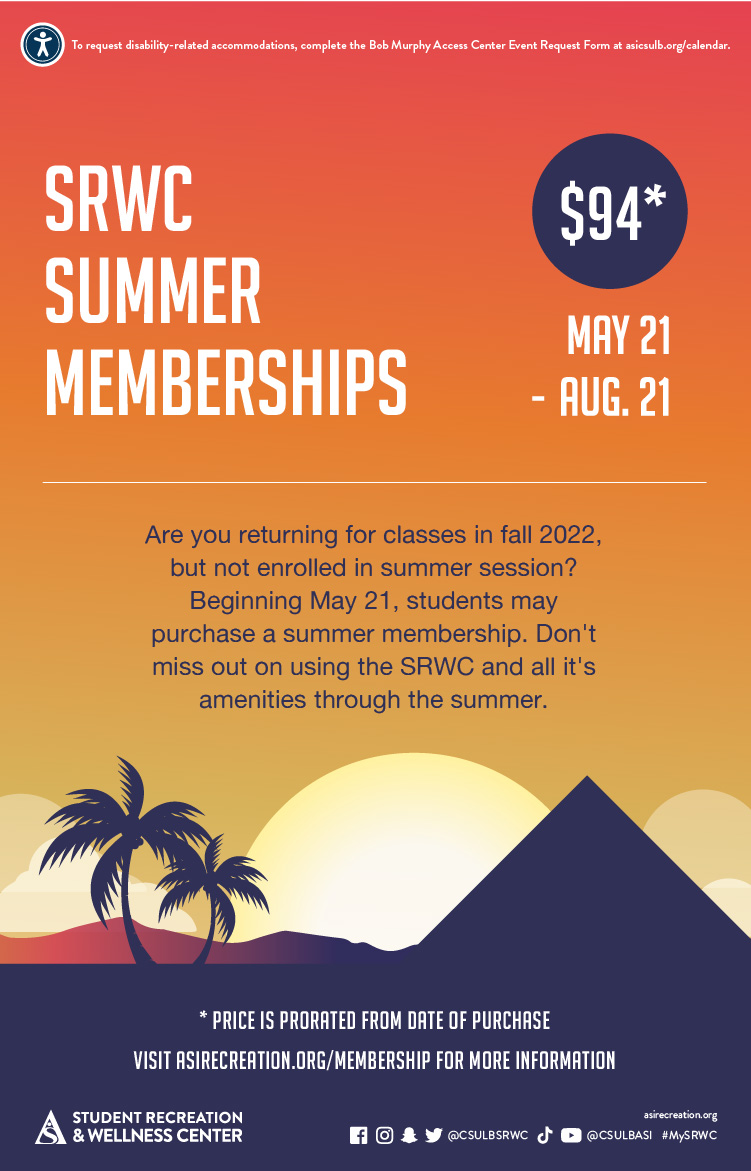
X-ALT-DESC;FMTTYPE=text/html:<!-- basic template for all events  --><!-- Updated July 2023 --><style>  .event-title-head {    font-weight: bold;    font-size: 20px;    color: darkgoldenrod;  }  .event-title-text {    font-weight: 500;    font-size: 15px;    line-height: 17px;    font-weight: bold;  }  .event-title-icon {    margin-top: 6px;    display: flex;    justify-content: left;  }  .event-video-main {    display: flex;    justify-content: center;    margin-bottom: 20px;  }  .history-btn {    display: flex;    justify-content: center;  }  .button-71 {    background-color: #007daa;    border: 0;    border-radius: 56px;    color: #fff;    cursor: pointer;    display: inline-block;    /* font-family: system-ui,-apple-system,system-ui,"Segoe UI",Roboto,Ubuntu,"Helvetica Neue",sans-serif; */    font-size: 18px;    font-weight: 600;    outline: 0;    padding: 16px 21px;    position: relative;    text-align: center;    text-decoration: none;    transition: all 0.3s;    user-select: none;    -webkit-user-select: none;    touch-action: manipulation;  }  .button-71:before {    background-color: initial;    background-image: linear-gradient(#fff 0, rgba(255, 255, 255, 0) 100%);    border-radius: 125px;    content: "";    height: 50%;    left: 4%;    opacity: 0.5;    position: absolute;    top: 0;    transition: all 0.3s;    width: 92%;  }  .button-71:hover {    box-shadow: rgba(255, 255, 255, 0.2) 0 3px 15px inset,      rgba(0, 0, 0, 0.1) 0 3px 5px, rgba(0, 0, 0, 0.1) 0 10px 13px;    transform: scale(1.05);  }</style><div class="container-fluid">  <div class="row">    <!-- --------------------                       START OF LEFT SIDE                   --------------------- -->    <div class="col-md-6">      <div        class="container-fluid module_round_box-gray"        style="padding: 40px 15px"      >        <div class="row">          <div class="col-md-12">            <div class="container-fluid">              <div                class="row"                style="                  background-color: white;                  border-radius: 20px;                  box-shadow: rgba(0, 0, 0, 0.15) 1.95px 1.95px 2.6px;                  margin-bottom: 20px;                "              >                <!-- DATE -->                <div class="col-md-4" itemprop="startDate" content="2022-08-22">                  <div class="event-title-icon">                    <img                      src="images/enjoy/beachpride/QR_Code_WOW-F23/calendar.png"                      style="height: 20px; width: 25px"                    />                  </div>                  <p class="event-title-head">Date</p>                  <!-- Update the date per each event -->                  <p class="event-title-text">See Below</p>                </div>                <!-- LOCATION -->                <div>                  <div                    class="col-md-4"                    itemprop="location"                    itemscope="itemscope"                    itemtype="http://schema.org/Place"                  >                    <div class="event-title-icon">                      <img                        src="images/enjoy/beachpride/QR_Code_WOW-F23/location.png"                        style="height: 20px; width: 25px"                      />                    </div>                    <p class="event-title-head">Location</p>                    <!-- Update the date per each event -->                    <p class="event-title-text">SRWC Entry Plaza</p>                  </div>                </div>                <!-- Time -->                <div class="col-md-4" itemprop="endDate" content="2022-12-18">                  <div class="event-title-icon">                    <img                      src="images/enjoy/beachpride/QR_Code_WOW-F23/time.png"                      style="height: 20px; width: 25px"                    />                  </div>                  <p class="event-title-head">Time</p>                  <!-- MUST INCLUDE "." IN A.M./P.M. -->                  <p class="event-title-text">See Below</p>                </div>              </div>              <!-- Event Description and Content -->              <div                class="row"                style="                  background-color: white;                  border-radius: 20px;                  box-shadow: rgba(0, 0, 0, 0.15) 1.95px 1.95px 2.6px;                "              >                <div class="col-md-12">                  <p class="event-title-head">Description</p>                  <!-- Place all elements of description within their own p tags -->                  <div itemprop="description">                    <p>Join the SRWC for invigorating runs around campus this spring semester! Whether you're an avid runner or simply looking to spice up your daily routine, then the SRWC Run Club is perfect for you! Experience the thrill of a 3-mile run and be entered into a drawing for a prize! Lace up your shoes and get ready to run at 2:30 p.m. on the second and fourth Wednesday of each month. For more information, visit <a href="https://asirecreation.org/recreport/special-feature/606-join-the-srwc-run-club"><b>asirecreation.org</b></a>.</p><br>                    <h3>SRWC Run Club dates:</h3>                    <ul>                      <li>Feb. 14</li>                      <li>Feb. 28</li>                      <li>March 13</li>                      <li>March 27</li>                      <li>April 10</li>                      <li>April 24</li>                      <li>May 8</li>                    </ul>                  </div>                  <!-- TEchnically the end of the accordion -->                  <!-- Technically the end of the "description" -->                </div>                <!-- md12 end -->              </div>              <!-- End event Description and content -->            </div>            <!-- end container fluid -->          </div>          <!-- end mdcol12 -->        </div>        <!-- End row -->      </div>      <!-- End of Grey box -->    </div>    <!-- end of left side -->    <!-- -------------------                      START OF RIGHT SIDE                  --------------------- -->    <div class="col-md-6">      <img        style="width: 100%"        src="images/cal/Spring24/SP24_Run-Club_dgtl-ASICalEvent.jpg"        alt="Run Club"      />      {loadmoduleid 368}    </div>    <!-- Technically end of right side -->  </div></div>
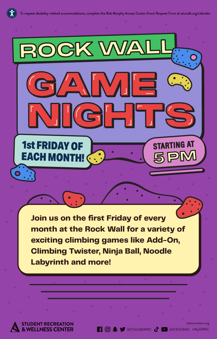
LOCATION:
GEO:0.00000000;0.00000000
LAST-MODIFIED:20240129T231837Z
X-ACCESS:1
X-HITS:811
X-URL:
X-COLOR:007DAA
END:VEVENT
BEGIN:VEVENT
DTSTART;TZID=America/Los_Angeles:20240410T143000
DTEND;TZID=America/Los_Angeles:20240410T150000
UID:C8007BA7-AA6E-44EE-B7D1-2252E9916995
SUMMARY:Run Club 
DTSTAMP:20230731T174651Z
DESCRIPTION:\N\N\N  .event-title-head {\N    font-weight: bold;\N    font-size: 20px;\N    color: darkgoldenrod;\N  }\N\N  .event-title-text {\N    font-weight: 500;\N    font-size: 15px;\N    line-height: 17px;\N    font-weight: bold;\N  }\N\N  .event-title-icon {\N    margin-top: 6px;\N    display: flex;\N    justify-content: left;\N  }\N\N  .event-video-main {\N    display: flex;\N    justify-content: center;\N    margin-bottom: 20px;\N  }\N\N  .history-btn {\N    display: flex;\N    justify-content: center;\N  }\N\N  .button-71 {\N    background-color: #007daa;\N    border: 0;\N    border-radius: 56px;\N    color: #fff;\N    cursor: pointer;\N    display: inline-block;\N    /* font-family: system-ui,-apple-system,system-ui,"Segoe UI",Roboto,Ubuntu,"Helvetica Neue",sans-serif; */\N    font-size: 18px;\N    font-weight: 600;\N    outline: 0;\N    padding: 16px 21px;\N    position: relative;\N    text-align: center;\N    text-decoration: none;\N    transition: all 0.3s;\N    user-select: none;\N    -webkit-user-select: none;\N    touch-action: manipulation;\N  }\N\N  .button-71:before {\N    background-color: initial;\N    background-image: linear-gradient(#fff 0, rgba(255, 255, 255, 0) 100%);\N    border-radius: 125px;\N    content: "";\N    height: 50%;\N    left: 4%;\N    opacity: 0.5;\N    position: absolute;\N    top: 0;\N    transition: all 0.3s;\N    width: 92%;\N  }\N\N  .button-71:hover {\N    box-shadow: rgba(255, 255, 255, 0.2) 0 3px 15px inset,\N      rgba(0, 0, 0, 0.1) 0 3px 5px, rgba(0, 0, 0, 0.1) 0 10px 13px;\N    transform: scale(1.05);\N  }\N\N\N  \N    \N    \N      \N          \N            \N              \N                  \N                    Date\N                  \N                  See Below\N                \N\N                \N                \N                  \N                      Location\N                    \N                    SRWC Entry Plaza\N                  \N                \N\N                \N                \N                  \N                    Time\N                  \N                  See Below\N                \N              \N\N              \N              \N                  Description\N                  \N                  \N                    Join the SRWC for invigorating runs around campus this spring semester! Whether you're an avid runner or simply looking to spice up your daily routine, then the SRWC Run Club is perfect for you! Experience the thrill of a 3-mile run and be entered into a drawing for a prize! Lace up your shoes and get ready to run at 2:30 p.m. on the second and fourth Wednesday of each month. For more information, visit asirecreation.org.\N\N                    SRWC Run Club dates:\N                    \N                      Feb. 14\N                      Feb. 28\N                      March 13\N                      March 27\N                      April 10\N                      April 24\N                      May 8\N                    \N                  \N\N                  \N                  \N                \N                \N              \N              \N            \N            \N          \N          \N        \N        \N      \N      \N    \N    \N\N    \N    \N      img\N        style="width: 100%&quot;\N        src=&quot;images/cal/Spring24/SP24_Run-Club_dgtl-ASICalEvent.jpg&quot;\N        alt=&quot;Run Club&quot;\N      /&gt;\N\N      {loadmoduleid 368}\N    &lt;/div&gt;\N    &lt;!-- Technically end of right side --&gt;\N  &lt;/div&gt;\N&lt;/div&gt;\N"

X-ALT-DESC;FMTTYPE=text/html:<!-- basic template for all events  --><!-- Updated July 2023 --><style>  .event-title-head {    font-weight: bold;    font-size: 20px;    color: darkgoldenrod;  }  .event-title-text {    font-weight: 500;    font-size: 15px;    line-height: 17px;    font-weight: bold;  }  .event-title-icon {    margin-top: 6px;    display: flex;    justify-content: left;  }  .event-video-main {    display: flex;    justify-content: center;    margin-bottom: 20px;  }  .history-btn {    display: flex;    justify-content: center;  }  .button-71 {    background-color: #007daa;    border: 0;    border-radius: 56px;    color: #fff;    cursor: pointer;    display: inline-block;    /* font-family: system-ui,-apple-system,system-ui,"Segoe UI",Roboto,Ubuntu,"Helvetica Neue",sans-serif; */    font-size: 18px;    font-weight: 600;    outline: 0;    padding: 16px 21px;    position: relative;    text-align: center;    text-decoration: none;    transition: all 0.3s;    user-select: none;    -webkit-user-select: none;    touch-action: manipulation;  }  .button-71:before {    background-color: initial;    background-image: linear-gradient(#fff 0, rgba(255, 255, 255, 0) 100%);    border-radius: 125px;    content: "";    height: 50%;    left: 4%;    opacity: 0.5;    position: absolute;    top: 0;    transition: all 0.3s;    width: 92%;  }  .button-71:hover {    box-shadow: rgba(255, 255, 255, 0.2) 0 3px 15px inset,      rgba(0, 0, 0, 0.1) 0 3px 5px, rgba(0, 0, 0, 0.1) 0 10px 13px;    transform: scale(1.05);  }</style><div class="container-fluid">  <div class="row">    <!-- --------------------                       START OF LEFT SIDE                   --------------------- -->    <div class="col-md-6">      <div        class="container-fluid module_round_box-gray"        style="padding: 40px 15px"      >        <div class="row">          <div class="col-md-12">            <div class="container-fluid">              <div                class="row"                style="                  background-color: white;                  border-radius: 20px;                  box-shadow: rgba(0, 0, 0, 0.15) 1.95px 1.95px 2.6px;                  margin-bottom: 20px;                "              >                <!-- DATE -->                <div class="col-md-4" itemprop="startDate" content="2022-08-22">                  <div class="event-title-icon">                    <img                      src="images/enjoy/beachpride/QR_Code_WOW-F23/calendar.png"                      style="height: 20px; width: 25px"                    />                  </div>                  <p class="event-title-head">Date</p>                  <!-- Update the date per each event -->                  <p class="event-title-text">See Below</p>                </div>                <!-- LOCATION -->                <div>                  <div                    class="col-md-4"                    itemprop="location"                    itemscope="itemscope"                    itemtype="http://schema.org/Place"                  >                    <div class="event-title-icon">                      <img                        src="images/enjoy/beachpride/QR_Code_WOW-F23/location.png"                        style="height: 20px; width: 25px"                      />                    </div>                    <p class="event-title-head">Location</p>                    <!-- Update the date per each event -->                    <p class="event-title-text">SRWC Entry Plaza</p>                  </div>                </div>                <!-- Time -->                <div class="col-md-4" itemprop="endDate" content="2022-12-18">                  <div class="event-title-icon">                    <img                      src="images/enjoy/beachpride/QR_Code_WOW-F23/time.png"                      style="height: 20px; width: 25px"                    />                  </div>                  <p class="event-title-head">Time</p>                  <!-- MUST INCLUDE "." IN A.M./P.M. -->                  <p class="event-title-text">See Below</p>                </div>              </div>              <!-- Event Description and Content -->              <div                class="row"                style="                  background-color: white;                  border-radius: 20px;                  box-shadow: rgba(0, 0, 0, 0.15) 1.95px 1.95px 2.6px;                "              >                <div class="col-md-12">                  <p class="event-title-head">Description</p>                  <!-- Place all elements of description within their own p tags -->                  <div itemprop="description">                    <p>Join the SRWC for invigorating runs around campus this spring semester! Whether you're an avid runner or simply looking to spice up your daily routine, then the SRWC Run Club is perfect for you! Experience the thrill of a 3-mile run and be entered into a drawing for a prize! Lace up your shoes and get ready to run at 2:30 p.m. on the second and fourth Wednesday of each month. For more information, visit <a href="https://asirecreation.org/recreport/special-feature/606-join-the-srwc-run-club"><b>asirecreation.org</b></a>.</p><br>                    <h3>SRWC Run Club dates:</h3>                    <ul>                      <li>Feb. 14</li>                      <li>Feb. 28</li>                      <li>March 13</li>                      <li>March 27</li>                      <li>April 10</li>                      <li>April 24</li>                      <li>May 8</li>                    </ul>                  </div>                  <!-- TEchnically the end of the accordion -->                  <!-- Technically the end of the "description" -->                </div>                <!-- md12 end -->              </div>              <!-- End event Description and content -->            </div>            <!-- end container fluid -->          </div>          <!-- end mdcol12 -->        </div>        <!-- End row -->      </div>      <!-- End of Grey box -->    </div>    <!-- end of left side -->    <!-- -------------------                      START OF RIGHT SIDE                  --------------------- -->    <div class="col-md-6">      <img        style="width: 100%"        src="images/cal/Spring24/SP24_Run-Club_dgtl-ASICalEvent.jpg"        alt="Run Club"      />      {loadmoduleid 368}    </div>    <!-- Technically end of right side -->  </div></div>
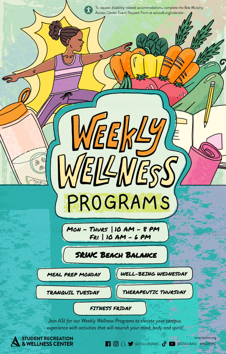
LOCATION:
GEO:0.00000000;0.00000000
LAST-MODIFIED:20240129T231841Z
X-ACCESS:1
X-HITS:688
X-URL:
X-COLOR:007DAA
END:VEVENT
BEGIN:VEVENT
DTSTART;TZID=America/Los_Angeles:20240411T180000
DTEND;TZID=America/Los_Angeles:20240411T230000
UID:8F30BFB0-D117-46B6-BC60-0881C104CE7C
SUMMARY:Intramural Tournaments: Beach Volleyball (2v2)
DTSTAMP:20240124T160445Z
DESCRIPTION:\N\N\N    .event-title-head {\N      font-weight: bold;\N      font-size: 20px;\N      color: darkgoldenrod;\N    }\N  \N    .event-title-text {\N      font-weight: 500;\N      font-size: 15px;\N      line-height: 17px;\N      font-weight: bold;\N    }\N  \N    .event-title-icon {\N      margin-top: 6px;\N      display: flex;\N      justify-content: left;\N    }\N  \N    .event-video-main {\N      display: flex;\N      justify-content: center;\N      margin-bottom: 20px;\N    }\N  \N    .history-btn {\N      display: flex;\N      justify-content: center;\N    }\N  \N    .button-71 {\N      background-color: #007daa;\N      border: 0;\N      border-radius: 56px;\N      color: #fff;\N      cursor: pointer;\N      display: inline-block;\N      /* font-family: system-ui,-apple-system,system-ui,"Segoe UI",Roboto,Ubuntu,"Helvetica Neue",sans-serif; */\N      font-size: 18px;\N      font-weight: 600;\N      outline: 0;\N      padding: 16px 21px;\N      position: relative;\N      text-align: center;\N      text-decoration: none;\N      transition: all 0.3s;\N      user-select: none;\N      -webkit-user-select: none;\N      touch-action: manipulation;\N    }\N  \N    .button-71:before {\N      background-color: initial;\N      background-image: linear-gradient(#fff 0, rgba(255, 255, 255, 0) 100%);\N      border-radius: 125px;\N      content: "";\N      height: 50%;\N      left: 4%;\N      opacity: 0.5;\N      position: absolute;\N      top: 0;\N      transition: all 0.3s;\N      width: 92%;\N    }\N  \N    .button-71:hover {\N      box-shadow: rgba(255, 255, 255, 0.2) 0 3px 15px inset,\N        rgba(0, 0, 0, 0.1) 0 3px 5px, rgba(0, 0, 0, 0.1) 0 10px 13px;\N      transform: scale(1.05);\N    }\N  \N  \N    \N      \N      \N        \N            \N              \N                \N                    \N                      Date\N                    \N                    April 11\N                  \N  \N                  \N                  \N                    \N                        Location\N                      \N                      SRWC\N                    \N                  \N  \N                  \N                  \N                    \N                      Time\N                    \N                    6: p.m.\N                  \N                \N  \N                \N                \N                    Description\N                    \N                    \N                      \N                    \NGrab some friends and try your best to claim the championship title! Tournaments are open to all Long Beach State University (LBSU) students, staff and faculty, so join us to show off your talent. Free to join for all SRWC members, sign up to practice your skills and possibly win! All winning teams will be awarded prizes for their victory.\N                      \N                      \N                       \NSign up at imleagues.com/csulb.\N                      \N                      \N                        See below for upcoming scheduled Intramural Tournament dates:\N\N                      \N                      \N                        Feb. 13: 3-Point Shootout\N\N\N\N\N                        \N                        Feb. 15: Badminton (Doubles)\N                        \N                        Feb. 22: Pickleball (Doubles)\N                        \N                        March 14: Ping Pong (Doubles)\N                        \N                        \NMarch 21: Cornhole\N                        \NApril 11: Beach Volleyball (2v2)\N\NApril 25: Spikeball\N                      \N                  \N                    \N  \N                    \N                    \N                  \N                  \N                \N                \N              \N              \N            \N            \N          \N          \N        \N        \N      \N      \N  \N      \N      \N        img\N          style="width: 100%&quot;\N          src=&quot;images/enjoy/srwc/SP24_SRWC_Intramural-Tournaments_dgtl-CalEvent.jpg&quot;\N          alt=&quot;Intramural League&quot;\N        /&gt;\N  \N        {loadmoduleid 368}\N      &lt;/div&gt;\N      &lt;!-- Technically end of right side --&gt;\N    &lt;/div&gt;\N  &lt;/div&gt;\N  "
X-ALT-DESC;FMTTYPE=text/html:<!-- basic template for all events  --><!-- Updated July 2023 --><style>    .event-title-head {      font-weight: bold;      font-size: 20px;      color: darkgoldenrod;    }      .event-title-text {      font-weight: 500;      font-size: 15px;      line-height: 17px;      font-weight: bold;    }      .event-title-icon {      margin-top: 6px;      display: flex;      justify-content: left;    }      .event-video-main {      display: flex;      justify-content: center;      margin-bottom: 20px;    }      .history-btn {      display: flex;      justify-content: center;    }      .button-71 {      background-color: #007daa;      border: 0;      border-radius: 56px;      color: #fff;      cursor: pointer;      display: inline-block;      /* font-family: system-ui,-apple-system,system-ui,"Segoe UI",Roboto,Ubuntu,"Helvetica Neue",sans-serif; */      font-size: 18px;      font-weight: 600;      outline: 0;      padding: 16px 21px;      position: relative;      text-align: center;      text-decoration: none;      transition: all 0.3s;      user-select: none;      -webkit-user-select: none;      touch-action: manipulation;    }      .button-71:before {      background-color: initial;      background-image: linear-gradient(#fff 0, rgba(255, 255, 255, 0) 100%);      border-radius: 125px;      content: "";      height: 50%;      left: 4%;      opacity: 0.5;      position: absolute;      top: 0;      transition: all 0.3s;      width: 92%;    }      .button-71:hover {      box-shadow: rgba(255, 255, 255, 0.2) 0 3px 15px inset,        rgba(0, 0, 0, 0.1) 0 3px 5px, rgba(0, 0, 0, 0.1) 0 10px 13px;      transform: scale(1.05);    }  </style>  <div class="container-fluid">    <div class="row">      <!-- --------------------                               START OF LEFT SIDE                           --------------------- -->      <div class="col-md-6">        <div          class="container-fluid module_round_box-gray"          style="padding: 40px 15px"        >          <div class="row">            <div class="col-md-12">              <div class="container-fluid">                <div                  class="row"                  style="                    background-color: white;                    border-radius: 20px;                    box-shadow: rgba(0, 0, 0, 0.15) 1.95px 1.95px 2.6px;                    margin-bottom: 20px;                  "                >                  <!-- DATE -->                  <div class="col-md-4" itemprop="startDate" content="2024-05-2">                    <div class="event-title-icon">                      <img                        src="images/enjoy/beachpride/QR_Code_WOW-F23/calendar.png"                        style="height: 20px; width: 25px"                      />                    </div>                    <p class="event-title-head">Date</p>                    <!-- Update the date per each event -->                    <p class="event-title-text">April 11</p>                  </div>                    <!-- LOCATION -->                  <div>                    <div                      class="col-md-4"                      itemprop="location"                      itemscope="itemscope"                      itemtype="http://schema.org/Place"                    >                      <div class="event-title-icon">                        <img                          src="images/enjoy/beachpride/QR_Code_WOW-F23/location.png"                          style="height: 20px; width: 25px"                        />                      </div>                      <p class="event-title-head">Location</p>                      <!-- Update the date per each event -->                      <p class="event-title-text">SRWC</p>                    </div>                  </div>                    <!-- Time -->                  <div class="col-md-4" itemprop="endDate" content="2024-5-2">                    <div class="event-title-icon">                      <img                        src="images/enjoy/beachpride/QR_Code_WOW-F23/time.png"                        style="height: 20px; width: 25px"                      />                    </div>                    <p class="event-title-head">Time</p>                    <!-- MUST INCLUDE "." IN A.M./P.M. -->                    <p class="event-title-text">6: p.m.</p>                  </div>                </div>                  <!-- Event Description and Content -->                <div                  class="row"                  style="                    background-color: white;                    border-radius: 20px;                    box-shadow: rgba(0, 0, 0, 0.15) 1.95px 1.95px 2.6px;                  "                >                  <div class="col-md-12">                    <p class="event-title-head">Description</p>                    <!-- Place all elements of description within their own p tags -->                    <div itemprop="description">                      <p>                    Grab some friends and try your best to claim the championship title! Tournaments are open to all Long Beach State University (LBSU) students, staff and faculty, so join us to show off your talent. Free to join for all SRWC members, sign up to practice your skills and possibly win! All winning teams will be awarded prizes for their victory.                      </p>                      <p>                       Sign up at <a href="https://imleagues.com/spa/intramural/2f9efab7f7474f0781886c03203622c1/home">imleagues.com/csulb.</a>                      </p>                      <p>                        <small                          >See below for upcoming scheduled Intramural Tournament dates:</small                        >                      </p>                      <ul>                        <li>Feb. 13: 3-Point Shootout                        </li>                        <li>Feb. 15: Badminton (Doubles)                        </li>                        <li>Feb. 22: Pickleball (Doubles)                        </li>                        <li>March 14: Ping Pong (Doubles)                        </li>                        <li>March 21: Cornhole                        </li><li>April 11: Beach Volleyball (2v2)</li><li>April 25: Spikeball</li>                      </ul>                                      </div>                      <!-- TEchnically the end of the accordion -->                    <!-- Technically the end of the "description" -->                  </div>                  <!-- md12 end -->                </div>                <!-- End event Description and content -->              </div>              <!-- end container fluid -->            </div>            <!-- end mdcol12 -->          </div>          <!-- End row -->        </div>        <!-- End of Grey box -->      </div>      <!-- end of left side -->        <!-- -------------------                              START OF RIGHT SIDE                          --------------------- -->      <div class="col-md-6">        <img          style="width: 100%"          src="images/enjoy/srwc/SP24_SRWC_Intramural-Tournaments_dgtl-CalEvent.jpg"          alt="Intramural League"        />          {loadmoduleid 368}      </div>      <!-- Technically end of right side -->    </div>  </div>  
X-ACCESS:1
X-HITS:783
X-URL:
X-COLOR:007DAA
END:VEVENT
BEGIN:VEVENT
DTSTART;TZID=America/Los_Angeles:20240412T133000
DTEND;TZID=America/Los_Angeles:20240412T140000
UID:7EFA1D7F-8C08-45CF-8188-5E3FDEE304BB
SUMMARY:American Heart Association Heart Saver First Aid, CPR and AED Certification
DTSTAMP:20240119T193342Z
DESCRIPTION:\N\N\N    .event-title-head {\N      font-weight: bold;\N      font-size: 20px;\N      color: darkgoldenrod;\N    }\N  \N    .event-title-text {\N      font-weight: 500;\N      font-size: 15px;\N      line-height: 17px;\N      font-weight: bold;\N    }\N  \N    .event-title-icon {\N      margin-top: 6px;\N      display: flex;\N      justify-content: left;\N    }\N  \N    .event-video-main {\N      display: flex;\N      justify-content: center;\N      margin-bottom: 20px;\N    }\N  \N    .history-btn {\N      display: flex;\N      justify-content: center;\N    }\N  \N    .button-71 {\N      background-color: #007daa;\N      border: 0;\N      border-radius: 56px;\N      color: #fff;\N      cursor: pointer;\N      display: inline-block;\N      /* font-family: system-ui,-apple-system,system-ui,"Segoe UI",Roboto,Ubuntu,"Helvetica Neue",sans-serif; */\N      font-size: 18px;\N      font-weight: 600;\N      outline: 0;\N      padding: 16px 21px;\N      position: relative;\N      text-align: center;\N      text-decoration: none;\N      transition: all 0.3s;\N      user-select: none;\N      -webkit-user-select: none;\N      touch-action: manipulation;\N    }\N  \N    .button-71:before {\N      background-color: initial;\N      background-image: linear-gradient(#fff 0, rgba(255, 255, 255, 0) 100%);\N      border-radius: 125px;\N      content: "";\N      height: 50%;\N      left: 4%;\N      opacity: 0.5;\N      position: absolute;\N      top: 0;\N      transition: all 0.3s;\N      width: 92%;\N    }\N  \N    .button-71:hover {\N      box-shadow: rgba(255, 255, 255, 0.2) 0 3px 15px inset,\N        rgba(0, 0, 0, 0.1) 0 3px 5px, rgba(0, 0, 0, 0.1) 0 10px 13px;\N      transform: scale(1.05);\N    }\N  \N  \N    \N      \N      \N        \N            \N              \N                \N                    \N                      Date\N                    \N                    April 12\N                  \N  \N                  \N                  \N                    \N                        Location\N                      \N                      SRWC\N                    \N                  \N  \N                  \N                  \N                    \N                      Time\N                    \N                    1:30 p.m. to 4:30 p.m.\N                  \N                \N  \N                \N                \N                    Description\N                    \N                    \N                      \N                      \NIf you're searching to add life-saving to your skills, then look no further than the Student Recreation & Wellness Center (SRWC)! The SRWC offers a variety of certifications and classes to teach all Long Beach State University (LBSU) students transformative skills that will last a lifetime.\N                      \N                      \N                        Our American Heart Association First Aid, CPR and AED certification program aims to help participants recognize and respond appropriately to cardiac, breathing and first aid emergencies. Join the SRWC to learn valuable skills that you'll need to know in order to give immediate care to a suddenly injured or ill person until more advanced medical personnel arrive and take over. Open to all LBSU students enrolled at the SRWC, make sure to check out the classes that take place April 12 from 1:30 to 4:30 p.m. at the SRWC. For more information or to register, visit SRWC GO.\N                      \N                     \N                    \N  \N                    \N                    \N                  \N                  \N                \N                \N              \N              \N            \N            \N          \N          \N        \N        \N      \N      \N  \N      \N      \N        img\N          style="width: 100%&quot;\N          src=&quot;images/cal/Spring24/F23_SRWC_Safety_Certifications_dgtl-CalEvent.jpg&quot;\N          alt=&quot;Safety Certification&quot;\N        /&gt;\N  \N        {loadmoduleid 368}\N      &lt;/div&gt;\N      &lt;!-- Technically end of right side --&gt;\N    &lt;/div&gt;\N  &lt;/div&gt;\N  "
X-ALT-DESC;FMTTYPE=text/html:<!-- basic template for all events  --><!-- Updated July 2023 --><style>    .event-title-head {      font-weight: bold;      font-size: 20px;      color: darkgoldenrod;    }      .event-title-text {      font-weight: 500;      font-size: 15px;      line-height: 17px;      font-weight: bold;    }      .event-title-icon {      margin-top: 6px;      display: flex;      justify-content: left;    }      .event-video-main {      display: flex;      justify-content: center;      margin-bottom: 20px;    }      .history-btn {      display: flex;      justify-content: center;    }      .button-71 {      background-color: #007daa;      border: 0;      border-radius: 56px;      color: #fff;      cursor: pointer;      display: inline-block;      /* font-family: system-ui,-apple-system,system-ui,"Segoe UI",Roboto,Ubuntu,"Helvetica Neue",sans-serif; */      font-size: 18px;      font-weight: 600;      outline: 0;      padding: 16px 21px;      position: relative;      text-align: center;      text-decoration: none;      transition: all 0.3s;      user-select: none;      -webkit-user-select: none;      touch-action: manipulation;    }      .button-71:before {      background-color: initial;      background-image: linear-gradient(#fff 0, rgba(255, 255, 255, 0) 100%);      border-radius: 125px;      content: "";      height: 50%;      left: 4%;      opacity: 0.5;      position: absolute;      top: 0;      transition: all 0.3s;      width: 92%;    }      .button-71:hover {      box-shadow: rgba(255, 255, 255, 0.2) 0 3px 15px inset,        rgba(0, 0, 0, 0.1) 0 3px 5px, rgba(0, 0, 0, 0.1) 0 10px 13px;      transform: scale(1.05);    }  </style>  <div class="container-fluid">    <div class="row">      <!-- --------------------                             START OF LEFT SIDE                         --------------------- -->      <div class="col-md-6">        <div          class="container-fluid module_round_box-gray"          style="padding: 40px 15px"        >          <div class="row">            <div class="col-md-12">              <div class="container-fluid">                <div                  class="row"                  style="                    background-color: white;                    border-radius: 20px;                    box-shadow: rgba(0, 0, 0, 0.15) 1.95px 1.95px 2.6px;                    margin-bottom: 20px;                  "                >                  <!-- DATE -->                  <div class="col-md-4" itemprop="startDate" content="2024-05-2">                    <div class="event-title-icon">                      <img                        src="images/enjoy/beachpride/QR_Code_WOW-F23/calendar.png"                        style="height: 20px; width: 25px"                      />                    </div>                    <p class="event-title-head">Date</p>                    <!-- Update the date per each event -->                    <p class="event-title-text">April 12</p>                  </div>                    <!-- LOCATION -->                  <div>                    <div                      class="col-md-4"                      itemprop="location"                      itemscope="itemscope"                      itemtype="http://schema.org/Place"                    >                      <div class="event-title-icon">                        <img                          src="images/enjoy/beachpride/QR_Code_WOW-F23/location.png"                          style="height: 20px; width: 25px"                        />                      </div>                      <p class="event-title-head">Location</p>                      <!-- Update the date per each event -->                      <p class="event-title-text">SRWC</p>                    </div>                  </div>                    <!-- Time -->                  <div class="col-md-4" itemprop="endDate" content="2024-5-2">                    <div class="event-title-icon">                      <img                        src="images/enjoy/beachpride/QR_Code_WOW-F23/time.png"                        style="height: 20px; width: 25px"                      />                    </div>                    <p class="event-title-head">Time</p>                    <!-- MUST INCLUDE "." IN A.M./P.M. -->                    <p class="event-title-text">1:30 p.m. to 4:30 p.m.</p>                  </div>                </div>                  <!-- Event Description and Content -->                <div                  class="row"                  style="                    background-color: white;                    border-radius: 20px;                    box-shadow: rgba(0, 0, 0, 0.15) 1.95px 1.95px 2.6px;                  "                >                  <div class="col-md-12">                    <p class="event-title-head">Description</p>                    <!-- Place all elements of description within their own p tags -->                    <div itemprop="description">                      <p>                      If you're searching to add life-saving to your skills, then look no further than the Student Recreation & Wellness Center (SRWC)! The SRWC offers a variety of certifications and classes to teach all Long Beach State University (LBSU) students transformative skills that will last a lifetime.                      </p>                      <p>                        Our American Heart Association First Aid, CPR and AED certification program aims to help participants recognize and respond appropriately to cardiac, breathing and first aid emergencies. Join the SRWC to learn valuable skills that you'll need to know in order to give immediate care to a suddenly injured or ill person until more advanced medical personnel arrive and take over. Open to all LBSU students enrolled at the SRWC, make sure to check out the classes that take place April 12 from 1:30 to 4:30 p.m. at the SRWC. For more information or to register, visit <a href="https://shop.asi.csulb.edu/Program/GetProducts?classification=0ce79494-0fd5-4dd2-a0af-74087ec7200a">SRWC GO</a>.                      </p>                                         </div>                      <!-- TEchnically the end of the accordion -->                    <!-- Technically the end of the "description" -->                  </div>                  <!-- md12 end -->                </div>                <!-- End event Description and content -->              </div>              <!-- end container fluid -->            </div>            <!-- end mdcol12 -->          </div>          <!-- End row -->        </div>        <!-- End of Grey box -->      </div>      <!-- end of left side -->        <!-- -------------------                            START OF RIGHT SIDE                        --------------------- -->      <div class="col-md-6">        <img          style="width: 100%"          src="images/cal/Spring24/F23_SRWC_Safety_Certifications_dgtl-CalEvent.jpg"          alt="Safety Certification"        />          {loadmoduleid 368}      </div>      <!-- Technically end of right side -->    </div>  </div>  
LOCATION:
GEO:0.00000000;0.00000000
LAST-MODIFIED:20240119T195830Z
X-ACCESS:1
X-HITS:114
X-URL:
X-COLOR:007DAA
END:VEVENT
BEGIN:VEVENT
DTSTART;TZID=America/Los_Angeles:20240413T080000
DTEND;TZID=America/Los_Angeles:20240413T083000
RRULE:FREQ=DAILY;INTERVAL=1;COUNT=2;UNTIL=20240321T235900Z
UID:A9F8A906-5838-4CB9-BA6D-C42F2ADC474C
SUMMARY:American Red Cross Lifeguard Certification
DTSTAMP:20240119T190958Z
DESCRIPTION:\N\N\N    .event-title-head {\N      font-weight: bold;\N      font-size: 20px;\N      color: darkgoldenrod;\N    }\N  \N    .event-title-text {\N      font-weight: 500;\N      font-size: 15px;\N      line-height: 17px;\N      font-weight: bold;\N    }\N  \N    .event-title-icon {\N      margin-top: 6px;\N      display: flex;\N      justify-content: left;\N    }\N  \N    .event-video-main {\N      display: flex;\N      justify-content: center;\N      margin-bottom: 20px;\N    }\N  \N    .history-btn {\N      display: flex;\N      justify-content: center;\N    }\N  \N    .button-71 {\N      background-color: #007daa;\N      border: 0;\N      border-radius: 56px;\N      color: #fff;\N      cursor: pointer;\N      display: inline-block;\N      /* font-family: system-ui,-apple-system,system-ui,"Segoe UI",Roboto,Ubuntu,"Helvetica Neue",sans-serif; */\N      font-size: 18px;\N      font-weight: 600;\N      outline: 0;\N      padding: 16px 21px;\N      position: relative;\N      text-align: center;\N      text-decoration: none;\N      transition: all 0.3s;\N      user-select: none;\N      -webkit-user-select: none;\N      touch-action: manipulation;\N    }\N  \N    .button-71:before {\N      background-color: initial;\N      background-image: linear-gradient(#fff 0, rgba(255, 255, 255, 0) 100%);\N      border-radius: 125px;\N      content: "";\N      height: 50%;\N      left: 4%;\N      opacity: 0.5;\N      position: absolute;\N      top: 0;\N      transition: all 0.3s;\N      width: 92%;\N    }\N  \N    .button-71:hover {\N      box-shadow: rgba(255, 255, 255, 0.2) 0 3px 15px inset,\N        rgba(0, 0, 0, 0.1) 0 3px 5px, rgba(0, 0, 0, 0.1) 0 10px 13px;\N      transform: scale(1.05);\N    }\N  \N  \N    \N      \N      \N        \N            \N              \N                \N                    \N                      Date\N                    \N                    April 13 to April 14\N                  \N  \N                  \N                  \N                    \N                        Location\N                      \N                      SRWC\N                    \N                  \N  \N                  \N                  \N                    \N                      Time\N                    \N                    8 a.m. to 6 p.m.\N                  \N                \N  \N                \N                \N                    Description\N                    \N                    \N                      \N                        If you're searching to add life-saving to your skills, then look no further than the Student Recreation & Wellness Center (SRWC)! The SRWC offers a variety of certifications and classes to teach all Long Beach State University (LBSU) students transformative skills that will last a lifetime.\N                      \N                      \N                        The SRWC is proud to partner with the American Red Cross to offer lifeguarding certification classes! These classes empower our students to recognize and respond to various emergencies that may occur during aquatic activities such as swimming, boating and diving. Join the SRWC April 13 and 14* from 8 a.m. to 6 p.m. to learn how you can help save a life as you wait for medical professionals to arrive at the scene. Sign up by April 10 at 10 p.m. to ensure your spot in the class! For more information on prices and prerequisites, or to register, visit SRWC GO.\N                      \N                      *Participants must attend both days to be fully certified.\N                    \N  \N                    \N                    \N                  \N                  \N                \N                \N              \N              \N            \N            \N          \N          \N        \N        \N      \N      \N  \N      \N      \N        img\N          style="width: 100%&quot;\N          src=&quot;images/cal/Spring24/F23_SRWC_Safety_Certifications_dgtl-CalEvent.jpg&quot;\N          alt=&quot;Safety Certification&quot;\N        /&gt;\N  \N        {loadmoduleid 368}\N      &lt;/div&gt;\N      &lt;!-- Technically end of right side --&gt;\N    &lt;/div&gt;\N  &lt;/div&gt;\N  "
X-ALT-DESC;FMTTYPE=text/html:<!-- basic template for all events  --><!-- Updated July 2023 --><style>    .event-title-head {      font-weight: bold;      font-size: 20px;      color: darkgoldenrod;    }      .event-title-text {      font-weight: 500;      font-size: 15px;      line-height: 17px;      font-weight: bold;    }      .event-title-icon {      margin-top: 6px;      display: flex;      justify-content: left;    }      .event-video-main {      display: flex;      justify-content: center;      margin-bottom: 20px;    }      .history-btn {      display: flex;      justify-content: center;    }      .button-71 {      background-color: #007daa;      border: 0;      border-radius: 56px;      color: #fff;      cursor: pointer;      display: inline-block;      /* font-family: system-ui,-apple-system,system-ui,"Segoe UI",Roboto,Ubuntu,"Helvetica Neue",sans-serif; */      font-size: 18px;      font-weight: 600;      outline: 0;      padding: 16px 21px;      position: relative;      text-align: center;      text-decoration: none;      transition: all 0.3s;      user-select: none;      -webkit-user-select: none;      touch-action: manipulation;    }      .button-71:before {      background-color: initial;      background-image: linear-gradient(#fff 0, rgba(255, 255, 255, 0) 100%);      border-radius: 125px;      content: "";      height: 50%;      left: 4%;      opacity: 0.5;      position: absolute;      top: 0;      transition: all 0.3s;      width: 92%;    }      .button-71:hover {      box-shadow: rgba(255, 255, 255, 0.2) 0 3px 15px inset,        rgba(0, 0, 0, 0.1) 0 3px 5px, rgba(0, 0, 0, 0.1) 0 10px 13px;      transform: scale(1.05);    }  </style>  <div class="container-fluid">    <div class="row">      <!-- --------------------                             START OF LEFT SIDE                         --------------------- -->      <div class="col-md-6">        <div          class="container-fluid module_round_box-gray"          style="padding: 40px 15px"        >          <div class="row">            <div class="col-md-12">              <div class="container-fluid">                <div                  class="row"                  style="                    background-color: white;                    border-radius: 20px;                    box-shadow: rgba(0, 0, 0, 0.15) 1.95px 1.95px 2.6px;                    margin-bottom: 20px;                  "                >                  <!-- DATE -->                  <div class="col-md-4" itemprop="startDate" content="2024-05-2">                    <div class="event-title-icon">                      <img                        src="images/enjoy/beachpride/QR_Code_WOW-F23/calendar.png"                        style="height: 20px; width: 25px"                      />                    </div>                    <p class="event-title-head">Date</p>                    <!-- Update the date per each event -->                    <p class="event-title-text">April 13 to April 14</p>                  </div>                    <!-- LOCATION -->                  <div>                    <div                      class="col-md-4"                      itemprop="location"                      itemscope="itemscope"                      itemtype="http://schema.org/Place"                    >                      <div class="event-title-icon">                        <img                          src="images/enjoy/beachpride/QR_Code_WOW-F23/location.png"                          style="height: 20px; width: 25px"                        />                      </div>                      <p class="event-title-head">Location</p>                      <!-- Update the date per each event -->                      <p class="event-title-text">SRWC</p>                    </div>                  </div>                    <!-- Time -->                  <div class="col-md-4" itemprop="endDate" content="2024-5-2">                    <div class="event-title-icon">                      <img                        src="images/enjoy/beachpride/QR_Code_WOW-F23/time.png"                        style="height: 20px; width: 25px"                      />                    </div>                    <p class="event-title-head">Time</p>                    <!-- MUST INCLUDE "." IN A.M./P.M. -->                    <p class="event-title-text">8 a.m. to 6 p.m.</p>                  </div>                </div>                  <!-- Event Description and Content -->                <div                  class="row"                  style="                    background-color: white;                    border-radius: 20px;                    box-shadow: rgba(0, 0, 0, 0.15) 1.95px 1.95px 2.6px;                  "                >                  <div class="col-md-12">                    <p class="event-title-head">Description</p>                    <!-- Place all elements of description within their own p tags -->                    <div itemprop="description">                      <p>                        If you're searching to add life-saving to your skills, then look no further than the Student Recreation & Wellness Center (SRWC)! The SRWC offers a variety of certifications and classes to teach all Long Beach State University (LBSU) students transformative skills that will last a lifetime.                      </p>                      <p>                        The SRWC is proud to partner with the American Red Cross to offer lifeguarding certification classes! These classes empower our students to recognize and respond to various emergencies that may occur during aquatic activities such as swimming, boating and diving. Join the SRWC April 13 and 14* from 8 a.m. to 6 p.m. to learn how you can help save a life as you wait for medical professionals to arrive at the scene. Sign up by April 10 at 10 p.m. to ensure your spot in the class! For more information on prices and prerequisites, or to register, visit <a href="https://shop.asi.csulb.edu/Program/GetProducts?classification=0ce79494-0fd5-4dd2-a0af-74087ec7200a">SRWC GO</a>.                      </p>                      <p><small>*Participants must attend both days to be fully certified.</small></p>                    </div>                      <!-- TEchnically the end of the accordion -->                    <!-- Technically the end of the "description" -->                  </div>                  <!-- md12 end -->                </div>                <!-- End event Description and content -->              </div>              <!-- end container fluid -->            </div>            <!-- end mdcol12 -->          </div>          <!-- End row -->        </div>        <!-- End of Grey box -->      </div>      <!-- end of left side -->        <!-- -------------------                            START OF RIGHT SIDE                        --------------------- -->      <div class="col-md-6">        <img          style="width: 100%"          src="images/cal/Spring24/F23_SRWC_Safety_Certifications_dgtl-CalEvent.jpg"          alt="Safety Certification"        />          {loadmoduleid 368}      </div>      <!-- Technically end of right side -->    </div>  </div>  
LOCATION:
GEO:0.00000000;0.00000000
LAST-MODIFIED:20240119T191207Z
X-ACCESS:1
X-HITS:0
X-URL:
X-COLOR:007DAA
END:VEVENT
BEGIN:VEVENT
DTSTART;TZID=America/Los_Angeles:20240413T110000
DTEND;TZID=America/Los_Angeles:20240413T113000
RRULE:FREQ=WEEKLY;BYDAY=SA;INTERVAL=1;UNTIL=20240504T235900Z
UID:ECAF1FD7-5B06-4E7E-B74D-82027C858D98
SUMMARY:Group Swim
DTSTAMP:20240116T212711Z
DESCRIPTION:\N\N\N    .event-title-head {\N      font-weight: bold;\N      font-size: 20px;\N      color: darkgoldenrod;\N    }\N  \N    .event-title-text {\N      font-weight: 500;\N      font-size: 15px;\N      line-height: 17px;\N      font-weight: bold;\N    }\N  \N    .event-title-icon {\N      margin-top: 6px;\N      display: flex;\N      justify-content: left;\N    }\N  \N    .event-video-main {\N      display: flex;\N      justify-content: center;\N      margin-bottom: 20px;\N    }\N  \N    .history-btn {\N      display: flex;\N      justify-content: center;\N    }\N  \N    .button-71 {\N      background-color: #007daa;\N      border: 0;\N      border-radius: 56px;\N      color: #fff;\N      cursor: pointer;\N      display: inline-block;\N      /* font-family: system-ui,-apple-system,system-ui,"Segoe UI",Roboto,Ubuntu,"Helvetica Neue",sans-serif; */\N      font-size: 18px;\N      font-weight: 600;\N      outline: 0;\N      padding: 16px 21px;\N      position: relative;\N      text-align: center;\N      text-decoration: none;\N      transition: all 0.3s;\N      user-select: none;\N      -webkit-user-select: none;\N      touch-action: manipulation;\N    }\N  \N    .button-71:before {\N      background-color: initial;\N      background-image: linear-gradient(#fff 0, rgba(255, 255, 255, 0) 100%);\N      border-radius: 125px;\N      content: "";\N      height: 50%;\N      left: 4%;\N      opacity: 0.5;\N      position: absolute;\N      top: 0;\N      transition: all 0.3s;\N      width: 92%;\N    }\N  \N    .button-71:hover {\N      box-shadow: rgba(255, 255, 255, 0.2) 0 3px 15px inset,\N        rgba(0, 0, 0, 0.1) 0 3px 5px, rgba(0, 0, 0, 0.1) 0 10px 13px;\N      transform: scale(1.05);\N    }\N  \N  \N    \N      \N      \N        \N            \N              \N                \N                    \N                      Date\N                    \N                    Varies\N                  \N  \N                  \N                  \N                    \N                        Location\N                      \N                      SRWC Aquatic Center\N                    \N                  \N  \N                  \N                  \N                    \N                      Time\N                    \N                    11 a.m. to 12 p.m.\N                  \N                \N  \N                \N                \N                    Description\N                    \N                    \N                      \N                        Gain lifelong aquatic abilities at Group Swim! During this four-week class, you'll learn valuable skills to swim safely with friends. Master the basics and explore techniques by joining us at the Student Recreation & Wellness Center (SRWC) every Saturday from April 13 to May 4 from 11 a.m. to 12 p.m. To register, visit SRWC GO!\N                      \N                      \N                        Interested in learning through a more private, one-on-one setting? The SRWC also offers private lessons to those who desire an in-depth and personal class experience. Visit the SRWC's Private Swim Lesson Client Needs Assessment to take the private lesson survey and a staff member will reach out as soon as possible.\N                      \N                    \N  \N                    \N                    \N                  \N                  \N                \N                \N              \N              \N            \N            \N          \N          \N        \N        \N      \N      \N  \N      \N      \N        img\N          style="width: 100%&quot;\N          src=&quot;images/cal/Spring24/F24_SRWC_Group-Swim_dgtl-CalEvent.jpg&quot;\N          alt=&quot;Group Swim&quot;\N        /&gt;\N  \N        {loadmoduleid 368}\N      &lt;/div&gt;\N      &lt;!-- Technically end of right side --&gt;\N    &lt;/div&gt;\N  &lt;/div&gt;\N  "
X-ALT-DESC;FMTTYPE=text/html:<!-- basic template for all events  --><!-- Updated July 2023 --><style>    .event-title-head {      font-weight: bold;      font-size: 20px;      color: darkgoldenrod;    }      .event-title-text {      font-weight: 500;      font-size: 15px;      line-height: 17px;      font-weight: bold;    }      .event-title-icon {      margin-top: 6px;      display: flex;      justify-content: left;    }      .event-video-main {      display: flex;      justify-content: center;      margin-bottom: 20px;    }      .history-btn {      display: flex;      justify-content: center;    }      .button-71 {      background-color: #007daa;      border: 0;      border-radius: 56px;      color: #fff;      cursor: pointer;      display: inline-block;      /* font-family: system-ui,-apple-system,system-ui,"Segoe UI",Roboto,Ubuntu,"Helvetica Neue",sans-serif; */      font-size: 18px;      font-weight: 600;      outline: 0;      padding: 16px 21px;      position: relative;      text-align: center;      text-decoration: none;      transition: all 0.3s;      user-select: none;      -webkit-user-select: none;      touch-action: manipulation;    }      .button-71:before {      background-color: initial;      background-image: linear-gradient(#fff 0, rgba(255, 255, 255, 0) 100%);      border-radius: 125px;      content: "";      height: 50%;      left: 4%;      opacity: 0.5;      position: absolute;      top: 0;      transition: all 0.3s;      width: 92%;    }      .button-71:hover {      box-shadow: rgba(255, 255, 255, 0.2) 0 3px 15px inset,        rgba(0, 0, 0, 0.1) 0 3px 5px, rgba(0, 0, 0, 0.1) 0 10px 13px;      transform: scale(1.05);    }  </style>  <div class="container-fluid">    <div class="row">      <!-- --------------------                             START OF LEFT SIDE                         --------------------- -->      <div class="col-md-6">        <div          class="container-fluid module_round_box-gray"          style="padding: 40px 15px"        >          <div class="row">            <div class="col-md-12">              <div class="container-fluid">                <div                  class="row"                  style="                    background-color: white;                    border-radius: 20px;                    box-shadow: rgba(0, 0, 0, 0.15) 1.95px 1.95px 2.6px;                    margin-bottom: 20px;                  "                >                  <!-- DATE -->                  <div class="col-md-4" itemprop="startDate" content="2024-05-2">                    <div class="event-title-icon">                      <img                        src="images/enjoy/beachpride/QR_Code_WOW-F23/calendar.png"                        style="height: 20px; width: 25px"                      />                    </div>                    <p class="event-title-head">Date</p>                    <!-- Update the date per each event -->                    <p class="event-title-text">Varies</p>                  </div>                    <!-- LOCATION -->                  <div>                    <div                      class="col-md-4"                      itemprop="location"                      itemscope="itemscope"                      itemtype="http://schema.org/Place"                    >                      <div class="event-title-icon">                        <img                          src="images/enjoy/beachpride/QR_Code_WOW-F23/location.png"                          style="height: 20px; width: 25px"                        />                      </div>                      <p class="event-title-head">Location</p>                      <!-- Update the date per each event -->                      <p class="event-title-text">SRWC Aquatic Center</p>                    </div>                  </div>                    <!-- Time -->                  <div class="col-md-4" itemprop="endDate" content="2024-5-2">                    <div class="event-title-icon">                      <img                        src="images/enjoy/beachpride/QR_Code_WOW-F23/time.png"                        style="height: 20px; width: 25px"                      />                    </div>                    <p class="event-title-head">Time</p>                    <!-- MUST INCLUDE "." IN A.M./P.M. -->                    <p class="event-title-text">11 a.m. to 12 p.m.</p>                  </div>                </div>                  <!-- Event Description and Content -->                <div                  class="row"                  style="                    background-color: white;                    border-radius: 20px;                    box-shadow: rgba(0, 0, 0, 0.15) 1.95px 1.95px 2.6px;                  "                >                  <div class="col-md-12">                    <p class="event-title-head">Description</p>                    <!-- Place all elements of description within their own p tags -->                    <div itemprop="description">                      <p>                        Gain lifelong aquatic abilities at Group Swim! During this four-week class, you'll learn valuable skills to swim safely with friends. Master the basics and explore techniques by joining us at the Student Recreation & Wellness Center (SRWC) every Saturday from April 13 to May 4 from 11 a.m. to 12 p.m. To register, visit <a href="https://shop.asi.csulb.edu/Program/GetProgramDetails?courseId=3515c0e6-ede9-483b-8680-53493a954b8b&semesterId=f472fc86-e753-4d7b-b483-6f85505e55ca">SRWC GO</a>!                      </p>                      <p>                        Interested in learning through a more private, one-on-one setting? The SRWC also offers private lessons to those who desire an in-depth and personal class experience. Visit the SRWC's <a href="https://www.connect2mycloud.com/OnlineModules/PublicForm/FillOutPublicForm?formCode=605ceb8e-a8ec-4beb-ba07-c7e7d9e69c49">Private Swim Lesson Client Needs Assessment</a> to take the private lesson survey and a staff member will reach out as soon as possible.                      </p>                    </div>                      <!-- TEchnically the end of the accordion -->                    <!-- Technically the end of the "description" -->                  </div>                  <!-- md12 end -->                </div>                <!-- End event Description and content -->              </div>              <!-- end container fluid -->            </div>            <!-- end mdcol12 -->          </div>          <!-- End row -->        </div>        <!-- End of Grey box -->      </div>      <!-- end of left side -->        <!-- -------------------                            START OF RIGHT SIDE                        --------------------- -->      <div class="col-md-6">        <img          style="width: 100%"          src="images/cal/Spring24/F24_SRWC_Group-Swim_dgtl-CalEvent.jpg"          alt="Group Swim"        />          {loadmoduleid 368}      </div>      <!-- Technically end of right side -->    </div>  </div>  
LOCATION:
GEO:0.00000000;0.00000000
LAST-MODIFIED:20240116T212748Z
X-ACCESS:1
X-HITS:5
X-URL:
X-COLOR:007DAA
END:VEVENT
BEGIN:VEVENT
DTSTART;VALUE=DATE:20240415
DTEND;VALUE=DATE:20240416
RRULE:FREQ=WEEKLY;BYDAY=MO,TU,WE,TH;INTERVAL=1;UNTIL=20240418T235900Z
UID:4ED4360F-ADE2-43D6-967E-25A9D935D079
SUMMARY:Love Your Body Week
DTSTAMP:20240402T184719Z
DESCRIPTION:\N\N\N\N    .event-title-head {\N      font-weight: bold;\N      font-size: 20px;\N      color: darkgoldenrod;\N    }\N  \N    .event-title-text {\N      font-weight: 500;\N      font-size: 15px;\N      line-height: 17px;\N      font-weight: bold;\N    }\N  \N    .event-title-icon {\N      margin-top: 6px;\N      display: flex;\N      justify-content: left;\N    }\N  \N    .event-video-main {\N      display: flex;\N      justify-content: center;\N      margin-bottom: 20px;\N    }\N  \N    .history-btn {\N      display: flex;\N      justify-content: center;\N    }\N  \N    .button-71 {\N      background-color: #007daa;\N      border: 0;\N      border-radius: 56px;\N      color: #fff;\N      cursor: pointer;\N      display: inline-block;\N      /* font-family: system-ui,-apple-system,system-ui,"Segoe UI",Roboto,Ubuntu,"Helvetica Neue",sans-serif; */\N      font-size: 18px;\N      font-weight: 600;\N      outline: 0;\N      padding: 16px 21px;\N      position: relative;\N      text-align: center;\N      text-decoration: none;\N      transition: all 0.3s;\N      user-select: none;\N      -webkit-user-select: none;\N      touch-action: manipulation;\N    }\N  \N    .button-71:before {\N      background-color: initial;\N      background-image: linear-gradient(#fff 0, rgba(255, 255, 255, 0) 100%);\N      border-radius: 125px;\N      content: "";\N      height: 50%;\N      left: 4%;\N      opacity: 0.5;\N      position: absolute;\N      top: 0;\N      transition: all 0.3s;\N      width: 92%;\N    }\N  \N    .button-71:hover {\N      box-shadow: rgba(255, 255, 255, 0.2) 0 3px 15px inset,\N        rgba(0, 0, 0, 0.1) 0 3px 5px, rgba(0, 0, 0, 0.1) 0 10px 13px;\N      transform: scale(1.05);\N    }\N    .event-container {\N      display: flex;\N      gap: 20px;\N    }\N    .event-left,\N    .event-right {\N      width: 50%;\N    }\N    .event-location,\N    .event-time,\N    .event-date {\N      display: flex;\N      gap: 10px;\N    }\N    .date-icon,\N    .time-icon,\N    .location-icon {\N      height: 25px !important;\N    }\N    .event-dtl {\N      display: flex;\N      justify-content: space-between;\N    }\N    .event-announcement {\N      color: #e54268;\N      text-align: center;\N      font-size: 1.8rem;\N      width: 80%;\N      padding: 20px;\N      border: 1px solid #e54268;\N      border-radius: 20px;\N      margin: 15px auto;\N      box-shadow: rgba(99, 99, 99, 0.2) 0px 2px 8px 0px;\N    }\N    .event-dtl-container {\N      background-color: white;\N      border-radius: 20px;\N      box-shadow: rgba(99, 99, 99, 0.2) 0px 2px 8px 0px;\N      margin-bottom: 20px;\N      padding: 20px;\N    }\N    .event-description {\N      background-color: white;\N      border-radius: 20px;\N      box-shadow: rgba(99, 99, 99, 0.2) 0px 2px 8px 0px;\N    }\N  \N    @media (max-width: 850px) {\N      .event-container {\N        flex-direction: column;\N        margin-left: -10px;\N        margin-right: -10px;\N      }\N      .event-left,\N      .event-right {\N        width: 100%;\N      }\N    }\N    @media (max-width: 700px) {\N      .event-location,\N      .event-time,\N      .event-date {\N        flex-direction: column;\N        justify-content: center;\N      }\N    }\N    @media (max-width: 650px) {\N      .event-dtl {\N        /* display: flex; */\N        flex-direction: column;\N        justify-content: center;\N        text-align: center;\N      }\N      .date-icon,\N      .time-icon,\N      .location-icon {\N        margin: 0 auto;\N      }\N      .event-title-text-line {\N        border-bottom: 2px solid rgba(0, 0, 0, 0.086);\N      }\N    }\N\N   /* _____________Accordian Section CSS+_______________ */\N\N   .acco .acco-item {\N    border-bottom: 1px solid #007daa79;\N  }\N\N  .acco button {\N    position: relative;\N    display: block;\N    text-align: left;\N    width: 100%;\N    padding: 1em 0;\N    color: #00374b;\N    border: none;\N    background: none;\N    outline: none;\N  }\N\N  .acco button:hover,\N  .acco button:focus {\N    cursor: pointer;\N    color: white !important;\N    background-color: #007DAA !important;\N  }\N\N  .acco button:hover .icon,\N  .acco button:focus .icon {\N    cursor: pointer;\N    color: white;\N    border: 1px solid white !important;\N  }\N\N  .acco .acco-title {\N    padding: 1em 1.5em 1em 1em;\N    font-weight: 500;\N  }\N\N  .acco .icon {\N    display: inline-block;\N    position: absolute;\N    top: 18px;\N    right: 20px;\N    width: 22px;\N    height: 22px;\N    border: 1px solid;\N    border-radius: 22px;\N  }\N\N  .acco .icon::before,\N  .acco .icon::after {\N    display: block;\N    position: absolute;\N    content: "";\N    background: currentColor;\N  }\N\N  .acco .icon::before {\N    top: 9px;\N    left: 5px;\N    width: 10px;\N    height: 2px;\N  }\N\N  .acco .icon::after {\N    top: 5px;\N    left: 9px;\N    width: 2px;\N    height: 10px;\N  }\N\N  .acco button[aria-expanded="true"] {\N    color: #00374b;\N    border-bottom: 1px solid #007DAA;\N    /* background-color: #8700ad; */\N  }\N\N  .acco button[aria-expanded="true"] .icon::after {\N    width: 0;\N  }\N\N  .acco button[aria-expanded="true"] + .acco-content {\N    opacity: 1;\N    max-height: 9em;\N    transition: all 200ms linear;\N    /* overflow: scroll; */\N  }\N\N  #HistoryOfUniversity .acco button[aria-expanded="true"] + .acco-content {\N    opacity: 1;\N    max-height: 100%;\N    transition: all 200ms linear;\N    /* overflow: scroll; */\N    border-left: 2px solid #007daa79;\N    border-right: 2px solid #007daa79;\N  }\N\N  .acco .acco-content {\N    opacity: 0;\N    max-height: 0;\N    overflow: hidden;\N    transition: opacity 200ms linear, max-height 200ms linear;\N  }\N\N  .acco .acco-content p {\N    /* font-size: 1rem; */\N    font-weight: 300;\N    margin: 0;\N  }\N  /* ______________Accordian CSS Ends__________ */\N  \N  \N  \N    \N  \N    \N    \N      \N        \N          \N          \N            \N              \N                Date\N            \N            April 15 through April 18\N          \N  \N          \N          \N            \N              \N                  Location\N              \N              \N                SRWC\N              \N            \N          \N  \N          \N          \N            \N              \N                Time\N            \N            Daily\N          \N        \N      \N  \N      \N      \N        \N          Description\N          \N            \N            !-- Love Your Body Week -->\N            \N            \N                The Student Recreation & Wellness Center (SRWC) presents Love Your Body Week!\N                Join us for activities dedicated to celebrating you, your body and all that it\N                can do.\N              \N              \N              \N              \N                See upcoming Love Your Body Week events below:\N              \N\N              \N\N    \N      \N      \N        \N          \N        \N        \N          \N            \N              April 1510 a.m. to 12 p.m.SRWC Pura Vida Room\N              \N                Step into a journey of self-discovery and empowerment. Embark on a\N                transformative journey of self-discovery and empowerment. Explore\N                the tools to navigate through challenges related to body image and\N                eating. Embrace Your Truth and embark on a path to a healthier,\N                happier you!\N              \N            \N          \N        \N      \N  \N      \N      \N        \N          \N        \N        \N          \N            \N              April 152 to 3 p.m.SRWC Farber Fitness\N              \N                Make 2024 your body-positive era! Discover the tools to kick-start\N                your self-love journey. Learn how you can reclaim your health,\N                practice intuitive self-care, nurturing self-love, celebrate your\N                authentic beauty and build a supportive community!\N              \N            \N          \N        \N      \N  \N      \N      \N        \N          Deadlifts and Donuts\N          \N        \N        \N          \N            \N              April 154 to 6 p.m.SRWC Strength Floor\N              \N                Looking for something to sweeten up your night? Master your\N                deadlift technique and get a free doughnut!\N              \N            \N          \N        \N      \N  \N      \N      \N        \N          Treat Yo Self! with Beach Pride Events\N          \N        \N        \N          \N            \N              April 1611 a.m. to 1 p.m.USU Southwest Terrace\N              \N                Take a break in between class and treat your body to some\N                well-deserved love! Join Beach Pride Events (BPE) and indulge in a\N                moment of joy with nourishing food, uplifting music and empowering\N                self-affirmation activities crafted to strengthen and celebrate\N                self-love.\N              \N            \N          \N        \N      \N  \N      \N      \N        \N          Total Body Care with Beach Balance\N          \N        \N        \N          \N            \N              April 164 to 6 p.m.SRWC Pool Deck\N              \N                Celebrate YOU and immerse yourself in a revitalizing session with\N                guided active recovery, create a personalized celebratory board\N                and enjoy delicious mocktails!\N              \N            \N          \N        \N      \N  \N      \N      \N        \N          Smash the Scale\N          \N        \N        \N          \N            \N              April 175 to 7 p.m.SRWC Entry Plaza\N              \N                Obliterate those negative vibes and enjoy an evening filled with\N                games, lively vendors, arts and crafts, delicious snacks and more.\N                But wait, the fun doesn't end there! Grab a hammer and take a\N                swing at a scale and automatically be entered into an opportunity\N                drawing for the chance to win a prize!\N              \N            \N          \N        \N      \N  \N      \N      \N        \N          SRWC Pool Party\N          \N        \N        \N          \N            \N              April 186 to 10 p.m.SRWC Pool\N              \N                End Love Your Body Week right with a night of food, fun,\N                competition, Aqua-Zumba and more! Let your inner mer-person let\N                loose as we watch\N                \N    \N      Does your schedule make it hard for you to fully enjoy Love Your Body Week?\N      Have no fear, because the SRWC is here! Drop by the SRWC's Beach Balance\N      anytime from 10 a.m. to 8 p.m. throughout the week and partake in any of the\N      following events below!\N    \N    \N      Mindful Monday\N      Tasty Tuesday\N      Wind Down Wednesday\N      Thankful Thursday\N    \N  \N          \N        \N      \N    \N  \N    \N    \N      \N        img\N          style="width: 100%; margin-bottom: 20px&quot;\N          src=&quot;images/cal/Spring24/SP24_SRWC_LYBW_dgtl-CalEvent.jpg&quot;\N          alt=&quot;Love Body Week&quot;\N        /&gt;\N  \N        {loadmoduleid 368}\N      &lt;/div&gt;\N    &lt;/div&gt;\N  &lt;/div&gt;\N  &lt;script&gt;\N    document.addEventListener(&quot;DOMContentLoaded&quot;, function () {\N      document\N        .querySelectorAll(&quot;#HistoryOfUniversity .acco button&quot;)\N        .forEach((item) =&gt; item.addEventListener(&quot;click&quot;, toggleacco));\N  \N      function toggleacco() {\N        const parentAcco = this.closest(&quot;.acco&quot;);\N        const itemsInThisAcco = parentAcco.querySelectorAll(&quot;button&quot;);\N        const currentStatus = this.getAttribute(&quot;aria-expanded&quot;);\N  \N        if (currentStatus == &quot;false&quot;) {\N          // Close all other items\N          // for (let i = 0; i &lt; itemsInThisAcco.length; i++) {\N          //   itemsInThisAcco[i].setAttribute(&quot;aria-expanded&quot;, &quot;false&quot;);\N          // }\N          // Open the clicked item\N          this.setAttribute(&quot;aria-expanded&quot;, &quot;true&quot;);\N        } else {\N          // Close the clicked item\N          this.setAttribute(&quot;aria-expanded&quot;, &quot;false&quot;);\N        }\N      }\N    });\N  &lt;/script&gt;"
X-ALT-DESC;FMTTYPE=text/html:<!-- basic template for all events  --><!-- Updated March 18, 2024 --><style>    .event-title-head {      font-weight: bold;      font-size: 20px;      color: darkgoldenrod;    }      .event-title-text {      font-weight: 500;      font-size: 15px;      line-height: 17px;      font-weight: bold;    }      .event-title-icon {      margin-top: 6px;      display: flex;      justify-content: left;    }      .event-video-main {      display: flex;      justify-content: center;      margin-bottom: 20px;    }      .history-btn {      display: flex;      justify-content: center;    }      .button-71 {      background-color: #007daa;      border: 0;      border-radius: 56px;      color: #fff;      cursor: pointer;      display: inline-block;      /* font-family: system-ui,-apple-system,system-ui,"Segoe UI",Roboto,Ubuntu,"Helvetica Neue",sans-serif; */      font-size: 18px;      font-weight: 600;      outline: 0;      padding: 16px 21px;      position: relative;      text-align: center;      text-decoration: none;      transition: all 0.3s;      user-select: none;      -webkit-user-select: none;      touch-action: manipulation;    }      .button-71:before {      background-color: initial;      background-image: linear-gradient(#fff 0, rgba(255, 255, 255, 0) 100%);      border-radius: 125px;      content: "";      height: 50%;      left: 4%;      opacity: 0.5;      position: absolute;      top: 0;      transition: all 0.3s;      width: 92%;    }      .button-71:hover {      box-shadow: rgba(255, 255, 255, 0.2) 0 3px 15px inset,        rgba(0, 0, 0, 0.1) 0 3px 5px, rgba(0, 0, 0, 0.1) 0 10px 13px;      transform: scale(1.05);    }    .event-container {      display: flex;      gap: 20px;    }    .event-left,    .event-right {      width: 50%;    }    .event-location,    .event-time,    .event-date {      display: flex;      gap: 10px;    }    .date-icon,    .time-icon,    .location-icon {      height: 25px !important;    }    .event-dtl {      display: flex;      justify-content: space-between;    }    .event-announcement {      color: #e54268;      text-align: center;      font-size: 1.8rem;      width: 80%;      padding: 20px;      border: 1px solid #e54268;      border-radius: 20px;      margin: 15px auto;      box-shadow: rgba(99, 99, 99, 0.2) 0px 2px 8px 0px;    }    .event-dtl-container {      background-color: white;      border-radius: 20px;      box-shadow: rgba(99, 99, 99, 0.2) 0px 2px 8px 0px;      margin-bottom: 20px;      padding: 20px;    }    .event-description {      background-color: white;      border-radius: 20px;      box-shadow: rgba(99, 99, 99, 0.2) 0px 2px 8px 0px;    }      @media (max-width: 850px) {      .event-container {        flex-direction: column;        margin-left: -10px;        margin-right: -10px;      }      .event-left,      .event-right {        width: 100%;      }    }    @media (max-width: 700px) {      .event-location,      .event-time,      .event-date {        flex-direction: column;        justify-content: center;      }    }    @media (max-width: 650px) {      .event-dtl {        /* display: flex; */        flex-direction: column;        justify-content: center;        text-align: center;      }      .date-icon,      .time-icon,      .location-icon {        margin: 0 auto;      }      .event-title-text-line {        border-bottom: 2px solid rgba(0, 0, 0, 0.086);      }    }   /* _____________Accordian Section CSS+_______________ */   .acco .acco-item {    border-bottom: 1px solid #007daa79;  }  .acco button {    position: relative;    display: block;    text-align: left;    width: 100%;    padding: 1em 0;    color: #00374b;    border: none;    background: none;    outline: none;  }  .acco button:hover,  .acco button:focus {    cursor: pointer;    color: white !important;    background-color: #007DAA !important;  }  .acco button:hover .icon,  .acco button:focus .icon {    cursor: pointer;    color: white;    border: 1px solid white !important;  }  .acco .acco-title {    padding: 1em 1.5em 1em 1em;    font-weight: 500;  }  .acco .icon {    display: inline-block;    position: absolute;    top: 18px;    right: 20px;    width: 22px;    height: 22px;    border: 1px solid;    border-radius: 22px;  }  .acco .icon::before,  .acco .icon::after {    display: block;    position: absolute;    content: "";    background: currentColor;  }  .acco .icon::before {    top: 9px;    left: 5px;    width: 10px;    height: 2px;  }  .acco .icon::after {    top: 5px;    left: 9px;    width: 2px;    height: 10px;  }  .acco button[aria-expanded="true"] {    color: #00374b;    border-bottom: 1px solid #007DAA;    /* background-color: #8700ad; */  }  .acco button[aria-expanded="true"] .icon::after {    width: 0;  }  .acco button[aria-expanded="true"] + .acco-content {    opacity: 1;    max-height: 9em;    transition: all 200ms linear;    /* overflow: scroll; */  }  #HistoryOfUniversity .acco button[aria-expanded="true"] + .acco-content {    opacity: 1;    max-height: 100%;    transition: all 200ms linear;    /* overflow: scroll; */    border-left: 2px solid #007daa79;    border-right: 2px solid #007daa79;  }  .acco .acco-content {    opacity: 0;    max-height: 0;    overflow: hidden;    transition: opacity 200ms linear, max-height 200ms linear;  }  .acco .acco-content p {    /* font-size: 1rem; */    font-weight: 300;    margin: 0;  }  /* ______________Accordian CSS Ends__________ */  </style>    <div class="event-container">    <!-- *********************        START OF LEFT SIDE    ********************** -->      <!-- *** DATE, TIME, LOCATION *** -->    <div class="event-left">      <div class="event-dtl-container">        <div class="event-dtl">          <!-- DATE -->          <div itemprop="startDate" content="2024-05-2">            <div class="event-date">              <div class="event-title-icon">                <img                  src="images/enjoy/beachpride/QR_Code_WOW-F23/calendar.png"                  class="date-icon"                  alt=""                />              </div>              <p class="event-title-head">Date</p>            </div>            <p class="event-title-text event-title-text-line">April 15 through April 18</p>          </div>            <!-- LOCATION -->          <div>            <div>              <div                itemprop="location"                itemscope="itemscope"                itemtype="http://schema.org/Place"                class="event-location"              >                <div class="event-title-icon">                  <img                    src="images/enjoy/beachpride/QR_Code_WOW-F23/location.png"                    class="location-icon"                    alt=""                  />                </div>                <p class="event-title-head">Location</p>              </div>              <p class="event-title-text event-title-text-line">                SRWC              </p>            </div>          </div>            <!-- Time -->          <div itemprop="endDate" content="2024-5-2">            <div style="display: flex; gap: 10px" class="event-time">              <div class="event-title-icon">                <img                  src="images/enjoy/beachpride/QR_Code_WOW-F23/time.png"                  class="time-icon"                  alt=""                />              </div>              <p class="event-title-head">Time</p>            </div>            <p class="event-title-text">Daily</p>          </div>        </div>      </div>        <!-- ***  EVENT DESCRIPTION  *** -->      <div class="event-description">        <div style="padding: 20px">          <p class="event-title-head">Description</p>          <div itemprop="description">            <!-- Special Announcement if needed -->            <!-- <div class="event-announcement">Love Your Body Week</div> -->            <!-- EVENT CONTENT -->            <p>                The Student Recreation & Wellness Center (SRWC) presents Love Your Body Week!                Join us for activities dedicated to celebrating you, your body and all that it                can do.              </p>                            <!-- ACCORDION AND PLATFORMS SECTION -->              <h5 style="font-weight: 600; margin-bottom: 20px">                See upcoming Love Your Body Week events below:              </h5>              <!-- START OF ACCORDION --><div id="HistoryOfUniversity">    <div class="acco">      <!-- April 15  -->      <div class="acco-item" style="margin-bottom: 10px">        <button id="embrace-truth" aria-expanded="false">          <span class="acco-title"            >Embrace Your Truth: Navigating Body Image and Eating Disorder            Awareness          </span>          <span class="icon" aria-hidden="true"></span>        </button>        <div class="acco-content">          <div class="col-md-12 col-xs-12">            <div class="panel-body">              <p>April 15<br />10 a.m. to 12 p.m.<br />SRWC Pura Vida Room</p>              <p>                Step into a journey of self-discovery and empowerment. Embark on a                transformative journey of self-discovery and empowerment. Explore                the tools to navigate through challenges related to body image and                eating. Embrace Your Truth and embark on a path to a healthier,                happier you!              </p>            </div>          </div>        </div>      </div>        <!-- April 15  -->      <div class="acco-item">        <button id="a-taste-of" aria-expanded="false">          <span class="acco-title"            >A Taste of Body Positivity: Kickstart Your Self-love Journey          </span>          <span class="icon" aria-hidden="true"></span>        </button>        <div class="acco-content">          <div class="col-md-12 col-xs-12">            <div class="panel-body">              <p>April 15<br />2 to 3 p.m.<br />SRWC Farber Fitness</p>              <p>                Make 2024 your body-positive era! Discover the tools to kick-start                your self-love journey. Learn how you can reclaim your health,                practice intuitive self-care, nurturing self-love, celebrate your                authentic beauty and build a supportive community!              </p>            </div>          </div>        </div>      </div>        <!-- April 15  -->      <div class="acco-item">        <button id="deadlifts-and" aria-expanded="false">          <span class="acco-title">Deadlifts and Donuts</span>          <span class="icon" aria-hidden="true"></span>        </button>        <div class="acco-content">          <div class="col-md-12 col-xs-12">            <div class="panel-body">              <p>April 15<br />4 to 6 p.m.<br />SRWC Strength Floor</p>              <p>                Looking for something to sweeten up your night? Master your                deadlift technique and get a free doughnut!              </p>            </div>          </div>        </div>      </div>        <!-- April 15  -->      <div class="acco-item">        <button id="treat-yo" aria-expanded="false">          <span class="acco-title">Treat Yo Self! with Beach Pride Events</span>          <span class="icon" aria-hidden="true"></span>        </button>        <div class="acco-content">          <div class="col-md-12 col-xs-12">            <div class="panel-body">              <p>April 16<br />11 a.m. to 1 p.m.<br />USU Southwest Terrace</p>              <p>                Take a break in between class and treat your body to some                well-deserved love! Join Beach Pride Events (BPE) and indulge in a                moment of joy with nourishing food, uplifting music and empowering                self-affirmation activities crafted to strengthen and celebrate                self-love.              </p>            </div>          </div>        </div>      </div>        <!-- April 15  -->      <div class="acco-item">        <button id="total-bod" aria-expanded="false">          <span class="acco-title">Total Body Care with Beach Balance</span>          <span class="icon" aria-hidden="true"></span>        </button>        <div class="acco-content">          <div class="col-md-12 col-xs-12">            <div class="panel-body">              <p>April 16<br />4 to 6 p.m.<br />SRWC Pool Deck</p>              <p>                Celebrate YOU and immerse yourself in a revitalizing session with                guided active recovery, create a personalized celebratory board                and enjoy delicious mocktails!              </p>            </div>          </div>        </div>      </div>        <!-- April 15  -->      <div class="acco-item">        <button id="smash" aria-expanded="false">          <span class="acco-title">Smash the Scale</span>          <span class="icon" aria-hidden="true"></span>        </button>        <div class="acco-content">          <div class="col-md-12 col-xs-12">            <div class="panel-body">              <p>April 17<br />5 to 7 p.m.<br />SRWC Entry Plaza</p>              <p>                Obliterate those negative vibes and enjoy an evening filled with                games, lively vendors, arts and crafts, delicious snacks and more.                But wait, the fun doesn't end there! Grab a hammer and take a                swing at a scale and automatically be entered into an opportunity                drawing for the chance to win a prize!              </p>            </div>          </div>        </div>      </div>        <!-- April 15  -->      <div class="acco-item">        <button id="pool-party" aria-expanded="false">          <span class="acco-title">SRWC Pool Party</span>          <span class="icon" aria-hidden="true"></span>        </button>        <div class="acco-content">          <div class="col-md-12 col-xs-12">            <div class="panel-body">              <p>April 18<br />6 to 10 p.m.<br />SRWC Pool</p>              <p>                End Love Your Body Week right with a night of food, fun,                competition, Aqua-Zumba and more! Let your inner mer-person let                loose as we watch                <a                  href="https://youtu.be/FV3bqvOHRQo?feature=shared"                  target="_blank"                  rel="noopener noreferrer"                  >"Aquaman and the Lost Kingdom."</a                >              </p>            </div>          </div>        </div>      </div>        <!-- Teresa Falcon -->        <!-- End of Candidates accordion -->    </div>  </div>  <!-- END OF ACCORDION SECTION -->  <div style="margin-top: 20px">    <p>      Does your schedule make it hard for you to fully enjoy Love Your Body Week?      Have no fear, because the SRWC is here! Drop by the SRWC's Beach Balance      anytime from 10 a.m. to 8 p.m. throughout the week and partake in any of the      following events below!    </p>    <ul>      <li>Mindful Monday</li>      <li>Tasty Tuesday</li>      <li>Wind Down Wednesday</li>      <li>Thankful Thursday</li>    </ul>  </div>          </div>        </div>      </div>    </div>      <!-- *********************        START OF RIGHT SIDE    ********************** -->    <div class="event-right">      <div>        <img          style="width: 100%; margin-bottom: 20px"          src="images/cal/Spring24/SP24_SRWC_LYBW_dgtl-CalEvent.jpg"          alt="Love Body Week"        />          {loadmoduleid 368}      </div>    </div>  </div>  <script>    document.addEventListener("DOMContentLoaded", function () {      document        .querySelectorAll("#HistoryOfUniversity .acco button")        .forEach((item) => item.addEventListener("click", toggleacco));        function toggleacco() {        const parentAcco = this.closest(".acco");        const itemsInThisAcco = parentAcco.querySelectorAll("button");        const currentStatus = this.getAttribute("aria-expanded");          if (currentStatus == "false") {          // Close all other items          // for (let i = 0; i < itemsInThisAcco.length; i++) {          //   itemsInThisAcco[i].setAttribute("aria-expanded", "false");          // }          // Open the clicked item          this.setAttribute("aria-expanded", "true");        } else {          // Close the clicked item          this.setAttribute("aria-expanded", "false");        }      }    });  </script>
LOCATION:
GEO:0.00000000;0.00000000
LAST-MODIFIED:20240403T183734Z
X-ACCESS:1
X-HITS:11
X-URL:
X-COLOR:007DAA
END:VEVENT
BEGIN:VEVENT
DTSTART;TZID=America/Los_Angeles:20240419T180000
DTEND;TZID=America/Los_Angeles:20240419T180000
UID:A3EA997A-5FF8-4302-BC70-A616D9934FDB
SUMMARY:Esports Tournament: Call of Duty: Modern Warfare 3
DTSTAMP:20240329T164950Z
DESCRIPTION:\N\N\N\N    .event-title-head {\N      font-weight: bold;\N      font-size: 20px;\N      color: darkgoldenrod;\N    }\N  \N    .event-title-text {\N      font-weight: 500;\N      font-size: 15px;\N      line-height: 17px;\N      font-weight: bold;\N    }\N  \N    .event-title-icon {\N      margin-top: 6px;\N      display: flex;\N      justify-content: left;\N    }\N  \N    .event-video-main {\N      display: flex;\N      justify-content: center;\N      margin-bottom: 20px;\N    }\N  \N    .history-btn {\N      display: flex;\N      justify-content: center;\N    }\N  \N    .button-71 {\N      background-color: #007daa;\N      border: 0;\N      border-radius: 56px;\N      color: #fff;\N      cursor: pointer;\N      display: inline-block;\N      /* font-family: system-ui,-apple-system,system-ui,"Segoe UI",Roboto,Ubuntu,"Helvetica Neue",sans-serif; */\N      font-size: 18px;\N      font-weight: 600;\N      outline: 0;\N      padding: 16px 21px;\N      position: relative;\N      text-align: center;\N      text-decoration: none;\N      transition: all 0.3s;\N      user-select: none;\N      -webkit-user-select: none;\N      touch-action: manipulation;\N    }\N  \N    .button-71:before {\N      background-color: initial;\N      background-image: linear-gradient(#fff 0, rgba(255, 255, 255, 0) 100%);\N      border-radius: 125px;\N      content: "";\N      height: 50%;\N      left: 4%;\N      opacity: 0.5;\N      position: absolute;\N      top: 0;\N      transition: all 0.3s;\N      width: 92%;\N    }\N  \N    .button-71:hover {\N      box-shadow: rgba(255, 255, 255, 0.2) 0 3px 15px inset,\N        rgba(0, 0, 0, 0.1) 0 3px 5px, rgba(0, 0, 0, 0.1) 0 10px 13px;\N      transform: scale(1.05);\N    }\N    .event-container {\N      display: flex;\N      gap: 20px;\N    }\N    .event-left,\N    .event-right {\N      width: 50%;\N    }\N    .event-location,\N    .event-time,\N    .event-date {\N      display: flex;\N      gap: 10px;\N    }\N    .date-icon,\N    .time-icon,\N    .location-icon {\N      height: 25px !important;\N    }\N    .event-dtl {\N      display: flex;\N      justify-content: space-between;\N    }\N    .event-announcement {\N      color: #e54268;\N      text-align: center;\N      font-size: 1.8rem;\N      width: 80%;\N      padding: 20px;\N      border: 1px solid #e54268;\N      border-radius: 20px;\N      margin: 15px auto;\N      box-shadow: rgba(99, 99, 99, 0.2) 0px 2px 8px 0px;\N    }\N    .event-dtl-container {\N      background-color: white;\N      border-radius: 20px;\N      box-shadow: rgba(99, 99, 99, 0.2) 0px 2px 8px 0px;\N      margin-bottom: 20px;\N      padding: 20px;\N    }\N    .event-description {\N      background-color: white;\N      border-radius: 20px;\N      box-shadow: rgba(99, 99, 99, 0.2) 0px 2px 8px 0px;\N    }\N  \N    @media (max-width: 850px) {\N      .event-container {\N        flex-direction: column;\N        margin-left: -10px;\N        margin-right: -10px;\N      }\N      .event-left,\N      .event-right {\N        width: 100%;\N      }\N    }\N    @media (max-width: 700px) {\N      .event-location,\N      .event-time,\N      .event-date {\N        flex-direction: column;\N        justify-content: center;\N      }\N    }\N    @media (max-width: 650px) {\N      .event-dtl {\N        /* display: flex; */\N        flex-direction: column;\N        justify-content: center;\N        text-align: center;\N      }\N      .date-icon,\N      .time-icon,\N      .location-icon {\N        margin: 0 auto;\N      }\N      .event-title-text-line {\N        border-bottom: 2px solid rgba(0, 0, 0, 0.086);\N      }\N    }\N  \N  \N  \N    \N  \N    \N    \N      \N        \N          \N          \N            \N              \N                Date\N            \N            April 19\N          \N  \N          \N          \N            \N              \N                  Location\N              \N              \N                USU Esports Lounge\N              \N            \N          \N  \N          \N          \N            \N              \N                Time\N            \N            6 p.m.\N          \N        \N      \N  \N      \N      \N        \N          Description\N          \N            \N            !-- Lorem ipsum dolor sit amet. -->\N            \N            \N                Calling all gamers! In collaboration with the Student Recreation & Wellness Center's (SRWC) Intramural Sports and the USU Games Center, we're inviting all Long Beach State University (LBSU) students to sign up for FREE and compete for a chance to win prizes and be crowned the next Esport Champion!\N\N            \N            Prepare for intense warfare when you join us April 19 at 6 p.m. in the USU Esports Lounge for ASI's Call of Duty: Modern Warfare 3* Esports Tournament! Whether you're a seasoned veteran or a fresh recruit, all soldiers are summoned to engage in this high-octane battle for the ultimate championship!\N            \N            *Please note that participation in these activities requires students to qualify beforehand. Qualifiers begin April 12. For more information, please refer to IM leagues at imleagues.com/csulb.\N          \N        \N      \N    \N  \N    \N    \N      \N        img\N          style="width: 100%; margin-bottom: 20px&quot;\N          src=&quot;images/enjoy/calendar/Spring24/SP24_SRWC_EsportsTournament-OW2-dgtl-CalEvent_new.jpg&quot;\N          alt=&quot;EsportTournament COD - April 19 - Esport Lounge&quot;\N        /&gt;\N  \N        {loadmoduleid 368}\N      &lt;/div&gt;\N    &lt;/div&gt;\N  &lt;/div&gt;\N  "
X-ALT-DESC;FMTTYPE=text/html:<!-- basic template for all events  --><!-- Updated March 18, 2024 --><style>    .event-title-head {      font-weight: bold;      font-size: 20px;      color: darkgoldenrod;    }      .event-title-text {      font-weight: 500;      font-size: 15px;      line-height: 17px;      font-weight: bold;    }      .event-title-icon {      margin-top: 6px;      display: flex;      justify-content: left;    }      .event-video-main {      display: flex;      justify-content: center;      margin-bottom: 20px;    }      .history-btn {      display: flex;      justify-content: center;    }      .button-71 {      background-color: #007daa;      border: 0;      border-radius: 56px;      color: #fff;      cursor: pointer;      display: inline-block;      /* font-family: system-ui,-apple-system,system-ui,"Segoe UI",Roboto,Ubuntu,"Helvetica Neue",sans-serif; */      font-size: 18px;      font-weight: 600;      outline: 0;      padding: 16px 21px;      position: relative;      text-align: center;      text-decoration: none;      transition: all 0.3s;      user-select: none;      -webkit-user-select: none;      touch-action: manipulation;    }      .button-71:before {      background-color: initial;      background-image: linear-gradient(#fff 0, rgba(255, 255, 255, 0) 100%);      border-radius: 125px;      content: "";      height: 50%;      left: 4%;      opacity: 0.5;      position: absolute;      top: 0;      transition: all 0.3s;      width: 92%;    }      .button-71:hover {      box-shadow: rgba(255, 255, 255, 0.2) 0 3px 15px inset,        rgba(0, 0, 0, 0.1) 0 3px 5px, rgba(0, 0, 0, 0.1) 0 10px 13px;      transform: scale(1.05);    }    .event-container {      display: flex;      gap: 20px;    }    .event-left,    .event-right {      width: 50%;    }    .event-location,    .event-time,    .event-date {      display: flex;      gap: 10px;    }    .date-icon,    .time-icon,    .location-icon {      height: 25px !important;    }    .event-dtl {      display: flex;      justify-content: space-between;    }    .event-announcement {      color: #e54268;      text-align: center;      font-size: 1.8rem;      width: 80%;      padding: 20px;      border: 1px solid #e54268;      border-radius: 20px;      margin: 15px auto;      box-shadow: rgba(99, 99, 99, 0.2) 0px 2px 8px 0px;    }    .event-dtl-container {      background-color: white;      border-radius: 20px;      box-shadow: rgba(99, 99, 99, 0.2) 0px 2px 8px 0px;      margin-bottom: 20px;      padding: 20px;    }    .event-description {      background-color: white;      border-radius: 20px;      box-shadow: rgba(99, 99, 99, 0.2) 0px 2px 8px 0px;    }      @media (max-width: 850px) {      .event-container {        flex-direction: column;        margin-left: -10px;        margin-right: -10px;      }      .event-left,      .event-right {        width: 100%;      }    }    @media (max-width: 700px) {      .event-location,      .event-time,      .event-date {        flex-direction: column;        justify-content: center;      }    }    @media (max-width: 650px) {      .event-dtl {        /* display: flex; */        flex-direction: column;        justify-content: center;        text-align: center;      }      .date-icon,      .time-icon,      .location-icon {        margin: 0 auto;      }      .event-title-text-line {        border-bottom: 2px solid rgba(0, 0, 0, 0.086);      }    }  </style>    <div class="event-container">    <!-- *********************      START OF LEFT SIDE  ********************** -->      <!-- *** DATE, TIME, LOCATION *** -->    <div class="event-left">      <div class="event-dtl-container">        <div class="event-dtl">          <!-- DATE -->          <div itemprop="startDate" content="2024-05-2">            <div class="event-date">              <div class="event-title-icon">                <img                  src="images/enjoy/beachpride/QR_Code_WOW-F23/calendar.png"                  class="date-icon"                />              </div>              <p class="event-title-head">Date</p>            </div>            <p class="event-title-text event-title-text-line">April 19</p>          </div>            <!-- LOCATION -->          <div>            <div>              <div                itemprop="location"                itemscope="itemscope"                itemtype="http://schema.org/Place"                class="event-location"              >                <div class="event-title-icon">                  <img                    src="images/enjoy/beachpride/QR_Code_WOW-F23/location.png"                    class="location-icon"                  />                </div>                <p class="event-title-head">Location</p>              </div>              <p class="event-title-text event-title-text-line">                USU Esports Lounge              </p>            </div>          </div>            <!-- Time -->          <div itemprop="endDate" content="2024-5-2">            <div style="display: flex; gap: 10px" class="event-time">              <div class="event-title-icon">                <img                  src="images/enjoy/beachpride/QR_Code_WOW-F23/time.png"                  class="time-icon"                />              </div>              <p class="event-title-head">Time</p>            </div>            <p class="event-title-text">6 p.m.</p>          </div>        </div>      </div>        <!-- ***  EVENT DESCRIPTION  *** -->      <div class="event-description">        <div style="padding: 20px">          <p class="event-title-head">Description</p>          <div itemprop="description">            <!-- Special Announcement if needed -->            <!-- <div class="event-announcement">Lorem ipsum dolor sit amet.</div> -->            <!-- EVENT CONTENT -->            <p>                Calling all gamers! In collaboration with the Student Recreation & Wellness Center's (SRWC) Intramural Sports and the USU Games Center, we're inviting all Long Beach State University (LBSU) students to sign up for FREE and compete for a chance to win prizes and be crowned the next Esport Champion!            </p>            <p>Prepare for intense warfare when you join us April 19 at 6 p.m. in the USU Esports Lounge for ASI's Call of Duty: Modern Warfare 3* Esports Tournament! Whether you're a seasoned veteran or a fresh recruit, all soldiers are summoned to engage in this high-octane battle for the ultimate championship!            </p>            <p><em>*Please note that participation in these activities requires students to qualify beforehand. Qualifiers begin April 12. For more information, please refer to IM leagues at <a href="https://www.imleagues.com/spa/intramural/2f9efab7f7474f0781886c03203622c1/home" target="_blank" rel="noopener noreferrer">imleagues.com/csulb</a>.</em></p>          </div>        </div>      </div>    </div>      <!-- *********************      START OF RIGHT SIDE  ********************** -->    <div class="event-right">      <div>        <img          style="width: 100%; margin-bottom: 20px"          src="images/enjoy/calendar/Spring24/SP24_SRWC_EsportsTournament-OW2-dgtl-CalEvent_new.jpg"          alt="EsportTournament COD - April 19 - Esport Lounge"        />          {loadmoduleid 368}      </div>    </div>  </div>  
LOCATION:90840 Long Beach\, Los Angeles\, United States
GEO:0.00000000;0.00000000
LAST-MODIFIED:20240402T164231Z
X-ACCESS:1
X-HITS:1872
X-URL:
X-COLOR:007DAA
END:VEVENT
BEGIN:VEVENT
DTSTART;TZID=America/Los_Angeles:20240425T180000
DTEND;TZID=America/Los_Angeles:20240425T230000
UID:C6E8F83A-06BF-451F-BED5-9266777D1D2D
SUMMARY:Intramural Tournaments: Spikeball
DTSTAMP:20240124T160852Z
DESCRIPTION:\N\N\N    .event-title-head {\N      font-weight: bold;\N      font-size: 20px;\N      color: darkgoldenrod;\N    }\N  \N    .event-title-text {\N      font-weight: 500;\N      font-size: 15px;\N      line-height: 17px;\N      font-weight: bold;\N    }\N  \N    .event-title-icon {\N      margin-top: 6px;\N      display: flex;\N      justify-content: left;\N    }\N  \N    .event-video-main {\N      display: flex;\N      justify-content: center;\N      margin-bottom: 20px;\N    }\N  \N    .history-btn {\N      display: flex;\N      justify-content: center;\N    }\N  \N    .button-71 {\N      background-color: #007daa;\N      border: 0;\N      border-radius: 56px;\N      color: #fff;\N      cursor: pointer;\N      display: inline-block;\N      /* font-family: system-ui,-apple-system,system-ui,"Segoe UI",Roboto,Ubuntu,"Helvetica Neue",sans-serif; */\N      font-size: 18px;\N      font-weight: 600;\N      outline: 0;\N      padding: 16px 21px;\N      position: relative;\N      text-align: center;\N      text-decoration: none;\N      transition: all 0.3s;\N      user-select: none;\N      -webkit-user-select: none;\N      touch-action: manipulation;\N    }\N  \N    .button-71:before {\N      background-color: initial;\N      background-image: linear-gradient(#fff 0, rgba(255, 255, 255, 0) 100%);\N      border-radius: 125px;\N      content: "";\N      height: 50%;\N      left: 4%;\N      opacity: 0.5;\N      position: absolute;\N      top: 0;\N      transition: all 0.3s;\N      width: 92%;\N    }\N  \N    .button-71:hover {\N      box-shadow: rgba(255, 255, 255, 0.2) 0 3px 15px inset,\N        rgba(0, 0, 0, 0.1) 0 3px 5px, rgba(0, 0, 0, 0.1) 0 10px 13px;\N      transform: scale(1.05);\N    }\N  \N  \N    \N      \N      \N        \N            \N              \N                \N                    \N                      Date\N                    \N                    April 25\N                  \N  \N                  \N                  \N                    \N                        Location\N                      \N                      SRWC\N                    \N                  \N  \N                  \N                  \N                    \N                      Time\N                    \N                    6: p.m.\N                  \N                \N  \N                \N                \N                    Description\N                    \N                    \N                      \N                    \NGrab some friends and try your best to claim the championship title! Tournaments are open to all Long Beach State University (LBSU) students, staff and faculty, so join us to show off your talent. Free to join for all SRWC members, sign up to practice your skills and possibly win! All winning teams will be awarded prizes for their victory.\N                      \N                      \N                       \NSign up at imleagues.com/csulb.\N                      \N                      \N                        See below for upcoming scheduled Intramural Tournament dates:\N\N                      \N                      \N                        Feb. 13: 3-Point Shootout\N\N\N\N\N                        \N                        Feb. 15: Badminton (Doubles)\N                        \N                        Feb. 22: Pickleball (Doubles)\N                        \N                        March 14: Ping Pong (Doubles)\N                        \N                        \NMarch 21: Cornhole\N                        \NApril 11: Beach Volleyball (2v2)\N\NApril 25: Spikeball\N                      \N                  \N                    \N  \N                    \N                    \N                  \N                  \N                \N                \N              \N              \N            \N            \N          \N          \N        \N        \N      \N      \N  \N      \N      \N        img\N          style="width: 100%&quot;\N          src=&quot;images/enjoy/srwc/SP24_SRWC_Intramural-Tournaments_dgtl-CalEvent.jpg&quot;\N          alt=&quot;Intramural League&quot;\N        /&gt;\N  \N        {loadmoduleid 368}\N      &lt;/div&gt;\N      &lt;!-- Technically end of right side --&gt;\N    &lt;/div&gt;\N  &lt;/div&gt;\N  "
X-ALT-DESC;FMTTYPE=text/html:<!-- basic template for all events  --><!-- Updated July 2023 --><style>    .event-title-head {      font-weight: bold;      font-size: 20px;      color: darkgoldenrod;    }      .event-title-text {      font-weight: 500;      font-size: 15px;      line-height: 17px;      font-weight: bold;    }      .event-title-icon {      margin-top: 6px;      display: flex;      justify-content: left;    }      .event-video-main {      display: flex;      justify-content: center;      margin-bottom: 20px;    }      .history-btn {      display: flex;      justify-content: center;    }      .button-71 {      background-color: #007daa;      border: 0;      border-radius: 56px;      color: #fff;      cursor: pointer;      display: inline-block;      /* font-family: system-ui,-apple-system,system-ui,"Segoe UI",Roboto,Ubuntu,"Helvetica Neue",sans-serif; */      font-size: 18px;      font-weight: 600;      outline: 0;      padding: 16px 21px;      position: relative;      text-align: center;      text-decoration: none;      transition: all 0.3s;      user-select: none;      -webkit-user-select: none;      touch-action: manipulation;    }      .button-71:before {      background-color: initial;      background-image: linear-gradient(#fff 0, rgba(255, 255, 255, 0) 100%);      border-radius: 125px;      content: "";      height: 50%;      left: 4%;      opacity: 0.5;      position: absolute;      top: 0;      transition: all 0.3s;      width: 92%;    }      .button-71:hover {      box-shadow: rgba(255, 255, 255, 0.2) 0 3px 15px inset,        rgba(0, 0, 0, 0.1) 0 3px 5px, rgba(0, 0, 0, 0.1) 0 10px 13px;      transform: scale(1.05);    }  </style>  <div class="container-fluid">    <div class="row">      <!-- --------------------                               START OF LEFT SIDE                           --------------------- -->      <div class="col-md-6">        <div          class="container-fluid module_round_box-gray"          style="padding: 40px 15px"        >          <div class="row">            <div class="col-md-12">              <div class="container-fluid">                <div                  class="row"                  style="                    background-color: white;                    border-radius: 20px;                    box-shadow: rgba(0, 0, 0, 0.15) 1.95px 1.95px 2.6px;                    margin-bottom: 20px;                  "                >                  <!-- DATE -->                  <div class="col-md-4" itemprop="startDate" content="2024-05-2">                    <div class="event-title-icon">                      <img                        src="images/enjoy/beachpride/QR_Code_WOW-F23/calendar.png"                        style="height: 20px; width: 25px"                      />                    </div>                    <p class="event-title-head">Date</p>                    <!-- Update the date per each event -->                    <p class="event-title-text">April 25</p>                  </div>                    <!-- LOCATION -->                  <div>                    <div                      class="col-md-4"                      itemprop="location"                      itemscope="itemscope"                      itemtype="http://schema.org/Place"                    >                      <div class="event-title-icon">                        <img                          src="images/enjoy/beachpride/QR_Code_WOW-F23/location.png"                          style="height: 20px; width: 25px"                        />                      </div>                      <p class="event-title-head">Location</p>                      <!-- Update the date per each event -->                      <p class="event-title-text">SRWC</p>                    </div>                  </div>                    <!-- Time -->                  <div class="col-md-4" itemprop="endDate" content="2024-5-2">                    <div class="event-title-icon">                      <img                        src="images/enjoy/beachpride/QR_Code_WOW-F23/time.png"                        style="height: 20px; width: 25px"                      />                    </div>                    <p class="event-title-head">Time</p>                    <!-- MUST INCLUDE "." IN A.M./P.M. -->                    <p class="event-title-text">6: p.m.</p>                  </div>                </div>                  <!-- Event Description and Content -->                <div                  class="row"                  style="                    background-color: white;                    border-radius: 20px;                    box-shadow: rgba(0, 0, 0, 0.15) 1.95px 1.95px 2.6px;                  "                >                  <div class="col-md-12">                    <p class="event-title-head">Description</p>                    <!-- Place all elements of description within their own p tags -->                    <div itemprop="description">                      <p>                    Grab some friends and try your best to claim the championship title! Tournaments are open to all Long Beach State University (LBSU) students, staff and faculty, so join us to show off your talent. Free to join for all SRWC members, sign up to practice your skills and possibly win! All winning teams will be awarded prizes for their victory.                      </p>                      <p>                       Sign up at <a href="https://imleagues.com/spa/intramural/2f9efab7f7474f0781886c03203622c1/home">imleagues.com/csulb.</a>                      </p>                      <p>                        <small                          >See below for upcoming scheduled Intramural Tournament dates:</small                        >                      </p>                      <ul>                        <li>Feb. 13: 3-Point Shootout                        </li>                        <li>Feb. 15: Badminton (Doubles)                        </li>                        <li>Feb. 22: Pickleball (Doubles)                        </li>                        <li>March 14: Ping Pong (Doubles)                        </li>                        <li>March 21: Cornhole                        </li><li>April 11: Beach Volleyball (2v2)</li><li>April 25: Spikeball</li>                      </ul>                                      </div>                      <!-- TEchnically the end of the accordion -->                    <!-- Technically the end of the "description" -->                  </div>                  <!-- md12 end -->                </div>                <!-- End event Description and content -->              </div>              <!-- end container fluid -->            </div>            <!-- end mdcol12 -->          </div>          <!-- End row -->        </div>        <!-- End of Grey box -->      </div>      <!-- end of left side -->        <!-- -------------------                              START OF RIGHT SIDE                          --------------------- -->      <div class="col-md-6">        <img          style="width: 100%"          src="images/enjoy/srwc/SP24_SRWC_Intramural-Tournaments_dgtl-CalEvent.jpg"          alt="Intramural League"        />          {loadmoduleid 368}      </div>      <!-- Technically end of right side -->    </div>  </div>  
X-ACCESS:1
X-HITS:563
X-URL:
X-COLOR:007DAA
END:VEVENT
BEGIN:VEVENT
DTSTART;TZID=America/Los_Angeles:20240426T133000
DTEND;TZID=America/Los_Angeles:20240426T170000
UID:82A7CE1C-F7A3-40AC-B52B-42BB2828D1F8
SUMMARY:American Heart Association Basic Life Support Certification
DTSTAMP:20240119T192433Z
DESCRIPTION:\N\N\N    .event-title-head {\N      font-weight: bold;\N      font-size: 20px;\N      color: darkgoldenrod;\N    }\N  \N    .event-title-text {\N      font-weight: 500;\N      font-size: 15px;\N      line-height: 17px;\N      font-weight: bold;\N    }\N  \N    .event-title-icon {\N      margin-top: 6px;\N      display: flex;\N      justify-content: left;\N    }\N  \N    .event-video-main {\N      display: flex;\N      justify-content: center;\N      margin-bottom: 20px;\N    }\N  \N    .history-btn {\N      display: flex;\N      justify-content: center;\N    }\N  \N    .button-71 {\N      background-color: #007daa;\N      border: 0;\N      border-radius: 56px;\N      color: #fff;\N      cursor: pointer;\N      display: inline-block;\N      /* font-family: system-ui,-apple-system,system-ui,"Segoe UI",Roboto,Ubuntu,"Helvetica Neue",sans-serif; */\N      font-size: 18px;\N      font-weight: 600;\N      outline: 0;\N      padding: 16px 21px;\N      position: relative;\N      text-align: center;\N      text-decoration: none;\N      transition: all 0.3s;\N      user-select: none;\N      -webkit-user-select: none;\N      touch-action: manipulation;\N    }\N  \N    .button-71:before {\N      background-color: initial;\N      background-image: linear-gradient(#fff 0, rgba(255, 255, 255, 0) 100%);\N      border-radius: 125px;\N      content: "";\N      height: 50%;\N      left: 4%;\N      opacity: 0.5;\N      position: absolute;\N      top: 0;\N      transition: all 0.3s;\N      width: 92%;\N    }\N  \N    .button-71:hover {\N      box-shadow: rgba(255, 255, 255, 0.2) 0 3px 15px inset,\N        rgba(0, 0, 0, 0.1) 0 3px 5px, rgba(0, 0, 0, 0.1) 0 10px 13px;\N      transform: scale(1.05);\N    }\N  \N  \N    \N      \N      \N        \N            \N              \N                \N                    \N                      Date\N                    \N                    April 26\N                  \N  \N                  \N                  \N                    \N                        Location\N                      \N                      SRWC\N                    \N                  \N  \N                  \N                  \N                    \N                      Time\N                    \N                    1:30 p.m. to 5 p.m.\N                  \N                \N  \N                \N                \N                    Description\N                    \N                    \N                      \N                        If you're searching to add life-saving to your skills, then look no further than the Student Recreation & Wellness Center (SRWC)! The SRWC offers a variety of certifications and classes to teach all Long Beach State University (LBSU) students transformative skills that will last a lifetime.\N                      \N                      \N                        Join the SRWC to earn the American Heart Association Basic Life Support for Healthcare Providers (BLS) certification! Using a scenario-based approach, you'll develop the critical thinking and problem-solving skills that drive better patient outcomes. Consistent with AHA Guidelines for CPR/ECC, this program will cover breathing and cardiac emergency methods, including CPR, AED and obstructed airway techniques for adult, child and infant patients. Join the SRWC from April 26 from 1:30 to 5 p.m. at the SRWC. You won't want to miss out on this opportunity! For more information, or to register, visit SRWC GO.\N                      \N               \N                    \N  \N                    \N                    \N                  \N                  \N                \N                \N              \N              \N            \N            \N          \N          \N        \N        \N      \N      \N  \N      \N      \N        img\N          style="width: 100%&quot;\N          src=&quot;images/cal/Spring24/F23_SRWC_Safety_Certifications_dgtl-CalEvent.jpg&quot;\N          alt=&quot;Safety Certification&quot;\N        /&gt;\N  \N        {loadmoduleid 368}\N      &lt;/div&gt;\N      &lt;!-- Technically end of right side --&gt;\N    &lt;/div&gt;\N  &lt;/div&gt;\N  "
X-ALT-DESC;FMTTYPE=text/html:<!-- basic template for all events  --><!-- Updated July 2023 --><style>    .event-title-head {      font-weight: bold;      font-size: 20px;      color: darkgoldenrod;    }      .event-title-text {      font-weight: 500;      font-size: 15px;      line-height: 17px;      font-weight: bold;    }      .event-title-icon {      margin-top: 6px;      display: flex;      justify-content: left;    }      .event-video-main {      display: flex;      justify-content: center;      margin-bottom: 20px;    }      .history-btn {      display: flex;      justify-content: center;    }      .button-71 {      background-color: #007daa;      border: 0;      border-radius: 56px;      color: #fff;      cursor: pointer;      display: inline-block;      /* font-family: system-ui,-apple-system,system-ui,"Segoe UI",Roboto,Ubuntu,"Helvetica Neue",sans-serif; */      font-size: 18px;      font-weight: 600;      outline: 0;      padding: 16px 21px;      position: relative;      text-align: center;      text-decoration: none;      transition: all 0.3s;      user-select: none;      -webkit-user-select: none;      touch-action: manipulation;    }      .button-71:before {      background-color: initial;      background-image: linear-gradient(#fff 0, rgba(255, 255, 255, 0) 100%);      border-radius: 125px;      content: "";      height: 50%;      left: 4%;      opacity: 0.5;      position: absolute;      top: 0;      transition: all 0.3s;      width: 92%;    }      .button-71:hover {      box-shadow: rgba(255, 255, 255, 0.2) 0 3px 15px inset,        rgba(0, 0, 0, 0.1) 0 3px 5px, rgba(0, 0, 0, 0.1) 0 10px 13px;      transform: scale(1.05);    }  </style>  <div class="container-fluid">    <div class="row">      <!-- --------------------                             START OF LEFT SIDE                         --------------------- -->      <div class="col-md-6">        <div          class="container-fluid module_round_box-gray"          style="padding: 40px 15px"        >          <div class="row">            <div class="col-md-12">              <div class="container-fluid">                <div                  class="row"                  style="                    background-color: white;                    border-radius: 20px;                    box-shadow: rgba(0, 0, 0, 0.15) 1.95px 1.95px 2.6px;                    margin-bottom: 20px;                  "                >                  <!-- DATE -->                  <div class="col-md-4" itemprop="startDate" content="2024-05-2">                    <div class="event-title-icon">                      <img                        src="images/enjoy/beachpride/QR_Code_WOW-F23/calendar.png"                        style="height: 20px; width: 25px"                      />                    </div>                    <p class="event-title-head">Date</p>                    <!-- Update the date per each event -->                    <p class="event-title-text">April 26</p>                  </div>                    <!-- LOCATION -->                  <div>                    <div                      class="col-md-4"                      itemprop="location"                      itemscope="itemscope"                      itemtype="http://schema.org/Place"                    >                      <div class="event-title-icon">                        <img                          src="images/enjoy/beachpride/QR_Code_WOW-F23/location.png"                          style="height: 20px; width: 25px"                        />                      </div>                      <p class="event-title-head">Location</p>                      <!-- Update the date per each event -->                      <p class="event-title-text">SRWC</p>                    </div>                  </div>                    <!-- Time -->                  <div class="col-md-4" itemprop="endDate" content="2024-5-2">                    <div class="event-title-icon">                      <img                        src="images/enjoy/beachpride/QR_Code_WOW-F23/time.png"                        style="height: 20px; width: 25px"                      />                    </div>                    <p class="event-title-head">Time</p>                    <!-- MUST INCLUDE "." IN A.M./P.M. -->                    <p class="event-title-text">1:30 p.m. to 5 p.m.</p>                  </div>                </div>                  <!-- Event Description and Content -->                <div                  class="row"                  style="                    background-color: white;                    border-radius: 20px;                    box-shadow: rgba(0, 0, 0, 0.15) 1.95px 1.95px 2.6px;                  "                >                  <div class="col-md-12">                    <p class="event-title-head">Description</p>                    <!-- Place all elements of description within their own p tags -->                    <div itemprop="description">                      <p>                        If you're searching to add life-saving to your skills, then look no further than the Student Recreation & Wellness Center (SRWC)! The SRWC offers a variety of certifications and classes to teach all Long Beach State University (LBSU) students transformative skills that will last a lifetime.                      </p>                      <p>                        Join the SRWC to earn the American Heart Association Basic Life Support for Healthcare Providers (BLS) certification! Using a scenario-based approach, you'll develop the critical thinking and problem-solving skills that drive better patient outcomes. Consistent with AHA Guidelines for CPR/ECC, this program will cover breathing and cardiac emergency methods, including CPR, AED and obstructed airway techniques for adult, child and infant patients. Join the SRWC from April 26 from 1:30 to 5 p.m. at the SRWC. You won't want to miss out on this opportunity! For more information, or to register, visit <a href="https://shop.asi.csulb.edu/Program/GetProducts?classification=0ce79494-0fd5-4dd2-a0af-74087ec7200a">SRWC GO</a>.                      </p>                                   </div>                      <!-- TEchnically the end of the accordion -->                    <!-- Technically the end of the "description" -->                  </div>                  <!-- md12 end -->                </div>                <!-- End event Description and content -->              </div>              <!-- end container fluid -->            </div>            <!-- end mdcol12 -->          </div>          <!-- End row -->        </div>        <!-- End of Grey box -->      </div>      <!-- end of left side -->        <!-- -------------------                            START OF RIGHT SIDE                        --------------------- -->      <div class="col-md-6">        <img          style="width: 100%"          src="images/cal/Spring24/F23_SRWC_Safety_Certifications_dgtl-CalEvent.jpg"          alt="Safety Certification"        />          {loadmoduleid 368}      </div>      <!-- Technically end of right side -->    </div>  </div>  
LOCATION:
GEO:0.00000000;0.00000000
LAST-MODIFIED:20240119T195813Z
X-ACCESS:1
X-HITS:115
X-URL:
X-COLOR:007DAA
END:VEVENT
BEGIN:VEVENT
DTSTART;TZID=America/Los_Angeles:20240426T133000
DTEND;TZID=America/Los_Angeles:20240426T170000
UID:7301EE8D-E876-4063-983E-B4C9955D363E
SUMMARY:American Heart Association Basic Life Support Certification (2)
DTSTAMP:20240119T192433Z
DESCRIPTION:\N\N\N    .event-title-head {\N      font-weight: bold;\N      font-size: 20px;\N      color: darkgoldenrod;\N    }\N  \N    .event-title-text {\N      font-weight: 500;\N      font-size: 15px;\N      line-height: 17px;\N      font-weight: bold;\N    }\N  \N    .event-title-icon {\N      margin-top: 6px;\N      display: flex;\N      justify-content: left;\N    }\N  \N    .event-video-main {\N      display: flex;\N      justify-content: center;\N      margin-bottom: 20px;\N    }\N  \N    .history-btn {\N      display: flex;\N      justify-content: center;\N    }\N  \N    .button-71 {\N      background-color: #007daa;\N      border: 0;\N      border-radius: 56px;\N      color: #fff;\N      cursor: pointer;\N      display: inline-block;\N      /* font-family: system-ui,-apple-system,system-ui,"Segoe UI",Roboto,Ubuntu,"Helvetica Neue",sans-serif; */\N      font-size: 18px;\N      font-weight: 600;\N      outline: 0;\N      padding: 16px 21px;\N      position: relative;\N      text-align: center;\N      text-decoration: none;\N      transition: all 0.3s;\N      user-select: none;\N      -webkit-user-select: none;\N      touch-action: manipulation;\N    }\N  \N    .button-71:before {\N      background-color: initial;\N      background-image: linear-gradient(#fff 0, rgba(255, 255, 255, 0) 100%);\N      border-radius: 125px;\N      content: "";\N      height: 50%;\N      left: 4%;\N      opacity: 0.5;\N      position: absolute;\N      top: 0;\N      transition: all 0.3s;\N      width: 92%;\N    }\N  \N    .button-71:hover {\N      box-shadow: rgba(255, 255, 255, 0.2) 0 3px 15px inset,\N        rgba(0, 0, 0, 0.1) 0 3px 5px, rgba(0, 0, 0, 0.1) 0 10px 13px;\N      transform: scale(1.05);\N    }\N  \N  \N    \N      \N      \N        \N            \N              \N                \N                    \N                      Date\N                    \N                    April 26\N                  \N  \N                  \N                  \N                    \N                        Location\N                      \N                      SRWC\N                    \N                  \N  \N                  \N                  \N                    \N                      Time\N                    \N                    1:30 p.m. to 5 p.m.\N                  \N                \N  \N                \N                \N                    Description\N                    \N                    \N                      \N                        If you're searching to add life-saving to your skills, then look no further than the Student Recreation & Wellness Center (SRWC)! The SRWC offers a variety of certifications and classes to teach all Long Beach State University (LBSU) students transformative skills that will last a lifetime.\N                      \N                      \N                        Join the SRWC to earn the American Heart Association Basic Life Support for Healthcare Providers (BLS) certification! Using a scenario-based approach, you'll develop the critical thinking and problem-solving skills that drive better patient outcomes. Consistent with AHA Guidelines for CPR/ECC, this program will cover breathing and cardiac emergency methods, including CPR, AED and obstructed airway techniques for adult, child and infant patients. Join the SRWC from April 26 from 1:30 to 5 p.m. at the SRWC. You won't want to miss out on this opportunity! For more information, or to register, visit SRWC GO.\N                      \N               \N                    \N  \N                    \N                    \N                  \N                  \N                \N                \N              \N              \N            \N            \N          \N          \N        \N        \N      \N      \N  \N      \N      \N        img\N          style="width: 100%&quot;\N          src=&quot;images/cal/Spring24/F23_SRWC_Safety_Certifications_dgtl-CalEvent.jpg&quot;\N          alt=&quot;Safety Certification&quot;\N        /&gt;\N  \N        {loadmoduleid 368}\N      &lt;/div&gt;\N      &lt;!-- Technically end of right side --&gt;\N    &lt;/div&gt;\N  &lt;/div&gt;\N  "
X-ALT-DESC;FMTTYPE=text/html:<!-- basic template for all events  --><!-- Updated July 2023 --><style>    .event-title-head {      font-weight: bold;      font-size: 20px;      color: darkgoldenrod;    }      .event-title-text {      font-weight: 500;      font-size: 15px;      line-height: 17px;      font-weight: bold;    }      .event-title-icon {      margin-top: 6px;      display: flex;      justify-content: left;    }      .event-video-main {      display: flex;      justify-content: center;      margin-bottom: 20px;    }      .history-btn {      display: flex;      justify-content: center;    }      .button-71 {      background-color: #007daa;      border: 0;      border-radius: 56px;      color: #fff;      cursor: pointer;      display: inline-block;      /* font-family: system-ui,-apple-system,system-ui,"Segoe UI",Roboto,Ubuntu,"Helvetica Neue",sans-serif; */      font-size: 18px;      font-weight: 600;      outline: 0;      padding: 16px 21px;      position: relative;      text-align: center;      text-decoration: none;      transition: all 0.3s;      user-select: none;      -webkit-user-select: none;      touch-action: manipulation;    }      .button-71:before {      background-color: initial;      background-image: linear-gradient(#fff 0, rgba(255, 255, 255, 0) 100%);      border-radius: 125px;      content: "";      height: 50%;      left: 4%;      opacity: 0.5;      position: absolute;      top: 0;      transition: all 0.3s;      width: 92%;    }      .button-71:hover {      box-shadow: rgba(255, 255, 255, 0.2) 0 3px 15px inset,        rgba(0, 0, 0, 0.1) 0 3px 5px, rgba(0, 0, 0, 0.1) 0 10px 13px;      transform: scale(1.05);    }  </style>  <div class="container-fluid">    <div class="row">      <!-- --------------------                             START OF LEFT SIDE                         --------------------- -->      <div class="col-md-6">        <div          class="container-fluid module_round_box-gray"          style="padding: 40px 15px"        >          <div class="row">            <div class="col-md-12">              <div class="container-fluid">                <div                  class="row"                  style="                    background-color: white;                    border-radius: 20px;                    box-shadow: rgba(0, 0, 0, 0.15) 1.95px 1.95px 2.6px;                    margin-bottom: 20px;                  "                >                  <!-- DATE -->                  <div class="col-md-4" itemprop="startDate" content="2024-05-2">                    <div class="event-title-icon">                      <img                        src="images/enjoy/beachpride/QR_Code_WOW-F23/calendar.png"                        style="height: 20px; width: 25px"                      />                    </div>                    <p class="event-title-head">Date</p>                    <!-- Update the date per each event -->                    <p class="event-title-text">April 26</p>                  </div>                    <!-- LOCATION -->                  <div>                    <div                      class="col-md-4"                      itemprop="location"                      itemscope="itemscope"                      itemtype="http://schema.org/Place"                    >                      <div class="event-title-icon">                        <img                          src="images/enjoy/beachpride/QR_Code_WOW-F23/location.png"                          style="height: 20px; width: 25px"                        />                      </div>                      <p class="event-title-head">Location</p>                      <!-- Update the date per each event -->                      <p class="event-title-text">SRWC</p>                    </div>                  </div>                    <!-- Time -->                  <div class="col-md-4" itemprop="endDate" content="2024-5-2">                    <div class="event-title-icon">                      <img                        src="images/enjoy/beachpride/QR_Code_WOW-F23/time.png"                        style="height: 20px; width: 25px"                      />                    </div>                    <p class="event-title-head">Time</p>                    <!-- MUST INCLUDE "." IN A.M./P.M. -->                    <p class="event-title-text">1:30 p.m. to 5 p.m.</p>                  </div>                </div>                  <!-- Event Description and Content -->                <div                  class="row"                  style="                    background-color: white;                    border-radius: 20px;                    box-shadow: rgba(0, 0, 0, 0.15) 1.95px 1.95px 2.6px;                  "                >                  <div class="col-md-12">                    <p class="event-title-head">Description</p>                    <!-- Place all elements of description within their own p tags -->                    <div itemprop="description">                      <p>                        If you're searching to add life-saving to your skills, then look no further than the Student Recreation & Wellness Center (SRWC)! The SRWC offers a variety of certifications and classes to teach all Long Beach State University (LBSU) students transformative skills that will last a lifetime.                      </p>                      <p>                        Join the SRWC to earn the American Heart Association Basic Life Support for Healthcare Providers (BLS) certification! Using a scenario-based approach, you'll develop the critical thinking and problem-solving skills that drive better patient outcomes. Consistent with AHA Guidelines for CPR/ECC, this program will cover breathing and cardiac emergency methods, including CPR, AED and obstructed airway techniques for adult, child and infant patients. Join the SRWC from April 26 from 1:30 to 5 p.m. at the SRWC. You won't want to miss out on this opportunity! For more information, or to register, visit <a href="https://shop.asi.csulb.edu/Program/GetProducts?classification=0ce79494-0fd5-4dd2-a0af-74087ec7200a">SRWC GO</a>.                      </p>                                   </div>                      <!-- TEchnically the end of the accordion -->                    <!-- Technically the end of the "description" -->                  </div>                  <!-- md12 end -->                </div>                <!-- End event Description and content -->              </div>              <!-- end container fluid -->            </div>            <!-- end mdcol12 -->          </div>          <!-- End row -->        </div>        <!-- End of Grey box -->      </div>      <!-- end of left side -->        <!-- -------------------                            START OF RIGHT SIDE                        --------------------- -->      <div class="col-md-6">        <img          style="width: 100%"          src="images/cal/Spring24/F23_SRWC_Safety_Certifications_dgtl-CalEvent.jpg"          alt="Safety Certification"        />          {loadmoduleid 368}      </div>      <!-- Technically end of right side -->    </div>  </div>  
LOCATION:
GEO:0.00000000;0.00000000
LAST-MODIFIED:20240119T195813Z
X-ACCESS:1
X-HITS:0
X-URL:
X-COLOR:007DAA
END:VEVENT
BEGIN:VEVENT
DTSTART;TZID=America/Los_Angeles:20240508T143000
DTEND;TZID=America/Los_Angeles:20240508T150000
UID:9F909DB6-3434-43B8-87A4-E53623A7A55F
SUMMARY:Run Club 
DTSTAMP:20230731T174651Z
DESCRIPTION:\N\N\N  .event-title-head {\N    font-weight: bold;\N    font-size: 20px;\N    color: darkgoldenrod;\N  }\N\N  .event-title-text {\N    font-weight: 500;\N    font-size: 15px;\N    line-height: 17px;\N    font-weight: bold;\N  }\N\N  .event-title-icon {\N    margin-top: 6px;\N    display: flex;\N    justify-content: left;\N  }\N\N  .event-video-main {\N    display: flex;\N    justify-content: center;\N    margin-bottom: 20px;\N  }\N\N  .history-btn {\N    display: flex;\N    justify-content: center;\N  }\N\N  .button-71 {\N    background-color: #007daa;\N    border: 0;\N    border-radius: 56px;\N    color: #fff;\N    cursor: pointer;\N    display: inline-block;\N    /* font-family: system-ui,-apple-system,system-ui,"Segoe UI",Roboto,Ubuntu,"Helvetica Neue",sans-serif; */\N    font-size: 18px;\N    font-weight: 600;\N    outline: 0;\N    padding: 16px 21px;\N    position: relative;\N    text-align: center;\N    text-decoration: none;\N    transition: all 0.3s;\N    user-select: none;\N    -webkit-user-select: none;\N    touch-action: manipulation;\N  }\N\N  .button-71:before {\N    background-color: initial;\N    background-image: linear-gradient(#fff 0, rgba(255, 255, 255, 0) 100%);\N    border-radius: 125px;\N    content: "";\N    height: 50%;\N    left: 4%;\N    opacity: 0.5;\N    position: absolute;\N    top: 0;\N    transition: all 0.3s;\N    width: 92%;\N  }\N\N  .button-71:hover {\N    box-shadow: rgba(255, 255, 255, 0.2) 0 3px 15px inset,\N      rgba(0, 0, 0, 0.1) 0 3px 5px, rgba(0, 0, 0, 0.1) 0 10px 13px;\N    transform: scale(1.05);\N  }\N\N\N  \N    \N    \N      \N          \N            \N              \N                  \N                    Date\N                  \N                  See Below\N                \N\N                \N                \N                  \N                      Location\N                    \N                    SRWC Entry Plaza\N                  \N                \N\N                \N                \N                  \N                    Time\N                  \N                  See Below\N                \N              \N\N              \N              \N                  Description\N                  \N                  \N                    Join the SRWC for invigorating runs around campus this spring semester! Whether you're an avid runner or simply looking to spice up your daily routine, then the SRWC Run Club is perfect for you! Experience the thrill of a 3-mile run and be entered into a drawing for a prize! Lace up your shoes and get ready to run at 2:30 p.m. on the second and fourth Wednesday of each month. For more information, visit asirecreation.org.\N\N                    SRWC Run Club dates:\N                    \N                      Feb. 14\N                      Feb. 28\N                      March 13\N                      March 27\N                      April 10\N                      April 24\N                      May 8\N                    \N                  \N\N                  \N                  \N                \N                \N              \N              \N            \N            \N          \N          \N        \N        \N      \N      \N    \N    \N\N    \N    \N      img\N        style="width: 100%&quot;\N        src=&quot;images/cal/Spring24/SP24_Run-Club_dgtl-ASICalEvent.jpg&quot;\N        alt=&quot;Run Club&quot;\N      /&gt;\N\N      {loadmoduleid 368}\N    &lt;/div&gt;\N    &lt;!-- Technically end of right side --&gt;\N  &lt;/div&gt;\N&lt;/div&gt;\N"
X-ALT-DESC;FMTTYPE=text/html:<!-- basic template for all events  --><!-- Updated July 2023 --><style>  .event-title-head {    font-weight: bold;    font-size: 20px;    color: darkgoldenrod;  }  .event-title-text {    font-weight: 500;    font-size: 15px;    line-height: 17px;    font-weight: bold;  }  .event-title-icon {    margin-top: 6px;    display: flex;    justify-content: left;  }  .event-video-main {    display: flex;    justify-content: center;    margin-bottom: 20px;  }  .history-btn {    display: flex;    justify-content: center;  }  .button-71 {    background-color: #007daa;    border: 0;    border-radius: 56px;    color: #fff;    cursor: pointer;    display: inline-block;    /* font-family: system-ui,-apple-system,system-ui,"Segoe UI",Roboto,Ubuntu,"Helvetica Neue",sans-serif; */    font-size: 18px;    font-weight: 600;    outline: 0;    padding: 16px 21px;    position: relative;    text-align: center;    text-decoration: none;    transition: all 0.3s;    user-select: none;    -webkit-user-select: none;    touch-action: manipulation;  }  .button-71:before {    background-color: initial;    background-image: linear-gradient(#fff 0, rgba(255, 255, 255, 0) 100%);    border-radius: 125px;    content: "";    height: 50%;    left: 4%;    opacity: 0.5;    position: absolute;    top: 0;    transition: all 0.3s;    width: 92%;  }  .button-71:hover {    box-shadow: rgba(255, 255, 255, 0.2) 0 3px 15px inset,      rgba(0, 0, 0, 0.1) 0 3px 5px, rgba(0, 0, 0, 0.1) 0 10px 13px;    transform: scale(1.05);  }</style><div class="container-fluid">  <div class="row">    <!-- --------------------                       START OF LEFT SIDE                   --------------------- -->    <div class="col-md-6">      <div        class="container-fluid module_round_box-gray"        style="padding: 40px 15px"      >        <div class="row">          <div class="col-md-12">            <div class="container-fluid">              <div                class="row"                style="                  background-color: white;                  border-radius: 20px;                  box-shadow: rgba(0, 0, 0, 0.15) 1.95px 1.95px 2.6px;                  margin-bottom: 20px;                "              >                <!-- DATE -->                <div class="col-md-4" itemprop="startDate" content="2022-08-22">                  <div class="event-title-icon">                    <img                      src="images/enjoy/beachpride/QR_Code_WOW-F23/calendar.png"                      style="height: 20px; width: 25px"                    />                  </div>                  <p class="event-title-head">Date</p>                  <!-- Update the date per each event -->                  <p class="event-title-text">See Below</p>                </div>                <!-- LOCATION -->                <div>                  <div                    class="col-md-4"                    itemprop="location"                    itemscope="itemscope"                    itemtype="http://schema.org/Place"                  >                    <div class="event-title-icon">                      <img                        src="images/enjoy/beachpride/QR_Code_WOW-F23/location.png"                        style="height: 20px; width: 25px"                      />                    </div>                    <p class="event-title-head">Location</p>                    <!-- Update the date per each event -->                    <p class="event-title-text">SRWC Entry Plaza</p>                  </div>                </div>                <!-- Time -->                <div class="col-md-4" itemprop="endDate" content="2022-12-18">                  <div class="event-title-icon">                    <img                      src="images/enjoy/beachpride/QR_Code_WOW-F23/time.png"                      style="height: 20px; width: 25px"                    />                  </div>                  <p class="event-title-head">Time</p>                  <!-- MUST INCLUDE "." IN A.M./P.M. -->                  <p class="event-title-text">See Below</p>                </div>              </div>              <!-- Event Description and Content -->              <div                class="row"                style="                  background-color: white;                  border-radius: 20px;                  box-shadow: rgba(0, 0, 0, 0.15) 1.95px 1.95px 2.6px;                "              >                <div class="col-md-12">                  <p class="event-title-head">Description</p>                  <!-- Place all elements of description within their own p tags -->                  <div itemprop="description">                    <p>Join the SRWC for invigorating runs around campus this spring semester! Whether you're an avid runner or simply looking to spice up your daily routine, then the SRWC Run Club is perfect for you! Experience the thrill of a 3-mile run and be entered into a drawing for a prize! Lace up your shoes and get ready to run at 2:30 p.m. on the second and fourth Wednesday of each month. For more information, visit <a href="https://asirecreation.org/recreport/special-feature/606-join-the-srwc-run-club"><b>asirecreation.org</b></a>.</p><br>                    <h3>SRWC Run Club dates:</h3>                    <ul>                      <li>Feb. 14</li>                      <li>Feb. 28</li>                      <li>March 13</li>                      <li>March 27</li>                      <li>April 10</li>                      <li>April 24</li>                      <li>May 8</li>                    </ul>                  </div>                  <!-- TEchnically the end of the accordion -->                  <!-- Technically the end of the "description" -->                </div>                <!-- md12 end -->              </div>              <!-- End event Description and content -->            </div>            <!-- end container fluid -->          </div>          <!-- end mdcol12 -->        </div>        <!-- End row -->      </div>      <!-- End of Grey box -->    </div>    <!-- end of left side -->    <!-- -------------------                      START OF RIGHT SIDE                  --------------------- -->    <div class="col-md-6">      <img        style="width: 100%"        src="images/cal/Spring24/SP24_Run-Club_dgtl-ASICalEvent.jpg"        alt="Run Club"      />      {loadmoduleid 368}    </div>    <!-- Technically end of right side -->  </div></div>
LOCATION:
GEO:0.00000000;0.00000000
LAST-MODIFIED:20240129T231844Z
X-ACCESS:1
X-HITS:607
X-URL:
X-COLOR:007DAA
END:VEVENT
BEGIN:VEVENT
DTSTART;TZID=America/Los_Angeles:20240509T170000
DTEND;TZID=America/Los_Angeles:20240509T190000
UID:99F7EE77-22F6-42C5-9B8C-FBE13687CD0D
SUMMARY:Owen's Condition for Tuition Celebration
DTSTAMP:20240429T163623Z
DESCRIPTION:\N\N\N\N  .event-title-head {\N    font-weight: bold;\N    font-size: 20px;\N    color: darkgoldenrod;\N  }\N\N  .event-title-text {\N    font-weight: 500;\N    font-size: 15px;\N    line-height: 17px;\N    font-weight: bold;\N  }\N\N  .event-title-icon {\N    margin-top: 6px;\N    display: flex;\N    justify-content: left;\N  }\N\N  .event-video-main {\N    display: flex;\N    justify-content: center;\N    margin-bottom: 20px;\N  }\N\N  .history-btn {\N    display: flex;\N    justify-content: center;\N  }\N\N  .button-71 {\N    background-color: #007daa;\N    border: 0;\N    border-radius: 56px;\N    color: #fff;\N    cursor: pointer;\N    display: inline-block;\N    /* font-family: system-ui,-apple-system,system-ui,"Segoe UI",Roboto,Ubuntu,"Helvetica Neue",sans-serif; */\N    font-size: 18px;\N    font-weight: 600;\N    outline: 0;\N    padding: 16px 21px;\N    position: relative;\N    text-align: center;\N    text-decoration: none;\N    transition: all 0.3s;\N    user-select: none;\N    -webkit-user-select: none;\N    touch-action: manipulation;\N  }\N\N  .button-71:before {\N    background-color: initial;\N    background-image: linear-gradient(#fff 0, rgba(255, 255, 255, 0) 100%);\N    border-radius: 125px;\N    content: "";\N    height: 50%;\N    left: 4%;\N    opacity: 0.5;\N    position: absolute;\N    top: 0;\N    transition: all 0.3s;\N    width: 92%;\N  }\N\N  .button-71:hover {\N    box-shadow: rgba(255, 255, 255, 0.2) 0 3px 15px inset,\N      rgba(0, 0, 0, 0.1) 0 3px 5px, rgba(0, 0, 0, 0.1) 0 10px 13px;\N    transform: scale(1.05);\N  }\N\N  .event-container {\N    display: flex;\N    gap: 20px;\N  }\N\N  .event-left,\N  .event-right {\N    width: 50%;\N  }\N\N  .event-location,\N  .event-time,\N  .event-date {\N    display: flex;\N    gap: 10px;\N  }\N\N  .date-icon,\N  .time-icon,\N  .location-icon {\N    height: 25px !important;\N  }\N\N  .event-dtl {\N    display: flex;\N    justify-content: space-between;\N  }\N\N  .event-announcement {\N    color: #e54268;\N    text-align: center;\N    font-size: 1.8rem;\N    width: 80%;\N    padding: 20px;\N    border: 1px solid #e54268;\N    border-radius: 20px;\N    margin: 15px auto;\N    box-shadow: rgba(99, 99, 99, 0.2) 0px 2px 8px 0px;\N  }\N\N  .event-dtl-container {\N    background-color: white;\N    border-radius: 20px;\N    box-shadow: rgba(99, 99, 99, 0.2) 0px 2px 8px 0px;\N    margin-bottom: 20px;\N    padding: 20px;\N  }\N\N  .event-description {\N    background-color: white;\N    border-radius: 20px;\N    box-shadow: rgba(99, 99, 99, 0.2) 0px 2px 8px 0px;\N  }\N\N  @media (max-width: 850px) {\N    .event-container {\N      flex-direction: column;\N      margin-left: -10px;\N      margin-right: -10px;\N    }\N\N    .event-left,\N    .event-right {\N      width: 100%;\N    }\N  }\N\N  @media (max-width: 700px) {\N\N    .event-location,\N    .event-time,\N    .event-date {\N      flex-direction: column;\N      justify-content: center;\N    }\N  }\N\N  @media (max-width: 650px) {\N    .event-dtl {\N      /* display: flex; */\N      flex-direction: column;\N      justify-content: center;\N      text-align: center;\N    }\N\N    .date-icon,\N    .time-icon,\N    .location-icon {\N      margin: 0 auto;\N    }\N\N    .event-title-text-line {\N      border-bottom: 2px solid rgba(0, 0, 0, 0.086);\N    }\N  }\N\N\N\N  \N\N  \N  \N    \N      \N        \N        \N          \N            \N              \N            \N            Date\N          \N          May 9\N          \N        \N\N        \N        \N          \N            \N              \N                \N              \N              Location\N            \N            \N\N              SRWC Entry Plaza\N            \N          \N        \N\N        \N        \N          \N            \N              \N            \N            Time\N          \N          5 to 7 p.m.\N        \N      \N    \N\N    \N    \N      \N        Description\N        \N          \N          !-- Lorem ipsum dolor sit amet. -->\N          \N          \N            Whether you've achieved one point, or conquered all 50, the Student Recreation & Wellness Center (SRWC) invites you to revel in your commitment to wellness at Owen's Condition for Tuition Celebration (OCFT)! Join us May 9 from 5 to 7 p.m. at the SRWC Entry Plaza for an evening filled with food, activities and more!\N\N\N          \N           \N            Whether you're rolling with your crew or flying solo, treat yourself to a feast of complimentary delights, from mouthwatering food to chilled shaved ice, shakes and a tempting assortment of snacks.\N          \N          \N            Dive headfirst into the electric atmosphere, with music, activities, inflatables and a special performance from Hawaiian dancers. Let your imagination run wild and adorn yourself with intricate henna and airbrush tattoos, see your favorite animal created from thin air with our balloon artist or immortalize the moment with caricature drawings and a photo booth!\N\N          \N          \N            But wait, there's more! Exciting prizes await, ranging from gift cards to paddle boards or even the chance to win a semester of tuition, exclusively for those who've completed the program with all 50 points.\N\N          \N          \N            What better way to wrap up the semester? We can't wait to see you there! Pura Vida!\N\N          \N        \N        \N      \N    \N  \N\N  \N  \N    \N      \N\N      {loadmoduleid 368}\N    \N  \N
X-ALT-DESC;FMTTYPE=text/html:<!-- basic template for all events  --><!-- Updated March 18, 2024 --><style>  .event-title-head {    font-weight: bold;    font-size: 20px;    color: darkgoldenrod;  }  .event-title-text {    font-weight: 500;    font-size: 15px;    line-height: 17px;    font-weight: bold;  }  .event-title-icon {    margin-top: 6px;    display: flex;    justify-content: left;  }  .event-video-main {    display: flex;    justify-content: center;    margin-bottom: 20px;  }  .history-btn {    display: flex;    justify-content: center;  }  .button-71 {    background-color: #007daa;    border: 0;    border-radius: 56px;    color: #fff;    cursor: pointer;    display: inline-block;    /* font-family: system-ui,-apple-system,system-ui,"Segoe UI",Roboto,Ubuntu,"Helvetica Neue",sans-serif; */    font-size: 18px;    font-weight: 600;    outline: 0;    padding: 16px 21px;    position: relative;    text-align: center;    text-decoration: none;    transition: all 0.3s;    user-select: none;    -webkit-user-select: none;    touch-action: manipulation;  }  .button-71:before {    background-color: initial;    background-image: linear-gradient(#fff 0, rgba(255, 255, 255, 0) 100%);    border-radius: 125px;    content: "";    height: 50%;    left: 4%;    opacity: 0.5;    position: absolute;    top: 0;    transition: all 0.3s;    width: 92%;  }  .button-71:hover {    box-shadow: rgba(255, 255, 255, 0.2) 0 3px 15px inset,      rgba(0, 0, 0, 0.1) 0 3px 5px, rgba(0, 0, 0, 0.1) 0 10px 13px;    transform: scale(1.05);  }  .event-container {    display: flex;    gap: 20px;  }  .event-left,  .event-right {    width: 50%;  }  .event-location,  .event-time,  .event-date {    display: flex;    gap: 10px;  }  .date-icon,  .time-icon,  .location-icon {    height: 25px !important;  }  .event-dtl {    display: flex;    justify-content: space-between;  }  .event-announcement {    color: #e54268;    text-align: center;    font-size: 1.8rem;    width: 80%;    padding: 20px;    border: 1px solid #e54268;    border-radius: 20px;    margin: 15px auto;    box-shadow: rgba(99, 99, 99, 0.2) 0px 2px 8px 0px;  }  .event-dtl-container {    background-color: white;    border-radius: 20px;    box-shadow: rgba(99, 99, 99, 0.2) 0px 2px 8px 0px;    margin-bottom: 20px;    padding: 20px;  }  .event-description {    background-color: white;    border-radius: 20px;    box-shadow: rgba(99, 99, 99, 0.2) 0px 2px 8px 0px;  }  @media (max-width: 850px) {    .event-container {      flex-direction: column;      margin-left: -10px;      margin-right: -10px;    }    .event-left,    .event-right {      width: 100%;    }  }  @media (max-width: 700px) {    .event-location,    .event-time,    .event-date {      flex-direction: column;      justify-content: center;    }  }  @media (max-width: 650px) {    .event-dtl {      /* display: flex; */      flex-direction: column;      justify-content: center;      text-align: center;    }    .date-icon,    .time-icon,    .location-icon {      margin: 0 auto;    }    .event-title-text-line {      border-bottom: 2px solid rgba(0, 0, 0, 0.086);    }  }</style><div class="event-container">  <!-- *********************      START OF LEFT SIDE  ********************** -->  <!-- *** DATE, TIME, LOCATION *** -->  <div class="event-left">    <div class="event-dtl-container">      <div class="event-dtl">        <!-- DATE -->        <div itemprop="startDate" content="2024-05-2">          <div class="event-date">            <div class="event-title-icon">              <img src="images/enjoy/beachpride/QR_Code_WOW-F23/calendar.png" class="date-icon" />            </div>            <p class="event-title-head">Date</p>          </div>          <p class="event-title-text event-title-text-line">May 9          </p>        </div>        <!-- LOCATION -->        <div>          <div>            <div itemprop="location" itemscope="itemscope" itemtype="http://schema.org/Place" class="event-location">              <div class="event-title-icon">                <img src="images/enjoy/beachpride/QR_Code_WOW-F23/location.png" class="location-icon" />              </div>              <p class="event-title-head">Location</p>            </div>            <p class="event-title-text event-title-text-line">              SRWC Entry Plaza            </p>          </div>        </div>        <!-- Time -->        <div itemprop="endDate" content="2024-5-2">          <div style="display: flex; gap: 10px" class="event-time">            <div class="event-title-icon">              <img src="images/enjoy/beachpride/QR_Code_WOW-F23/time.png" class="time-icon" />            </div>            <p class="event-title-head">Time</p>          </div>          <p class="event-title-text">5 to 7 p.m.</p>        </div>      </div>    </div>    <!-- ***  EVENT DESCRIPTION  *** -->    <div class="event-description">      <div style="padding: 20px">        <p class="event-title-head">Description</p>        <div itemprop="description">          <!-- Special Announcement if needed -->          <!-- <div class="event-announcement">Lorem ipsum dolor sit amet.</div> -->          <!-- EVENT CONTENT -->          <p>            Whether you've achieved one point, or conquered all 50, the Student Recreation & Wellness Center (SRWC) invites you to revel in your commitment to wellness at Owen's Condition for Tuition Celebration (OCFT)! Join us May 9 from 5 to 7 p.m. at the SRWC Entry Plaza for an evening filled with food, activities and more!          </p>          <p>             Whether you're rolling with your crew or flying solo, treat yourself to a feast of complimentary delights, from mouthwatering food to chilled shaved ice, shakes and a tempting assortment of snacks.          </p>          <p>            Dive headfirst into the electric atmosphere, with music, activities, inflatables and a special performance from Hawaiian dancers. Let your imagination run wild and adorn yourself with intricate henna and airbrush tattoos, see your favorite animal created from thin air with our balloon artist or immortalize the moment with caricature drawings and a photo booth!          </p>          <p>            But wait, there's more! Exciting prizes await, ranging from gift cards to paddle boards or even the chance to win a semester of tuition, exclusively for those who've completed the program with all 50 points.          </p>          <p>            What better way to wrap up the semester? We can't wait to see you there! Pura Vida!          </p>                </div>      </div>    </div>  </div>  <!-- *********************      START OF RIGHT SIDE  ********************** -->  <div class="event-right">    <div>      <img style="width: 100%; margin-bottom: 20px"        src="images/enjoy/calendar/Spring24/SP24_SRWC_Owens_dgtl-CalEvent.jpg"        alt="Rec Center Event - May 9 - Owen's Condition for Tuition Celebration" />      {loadmoduleid 368}    </div>  </div></div>
LOCATION:
GEO:0.00000000;0.00000000
X-ACCESS:1
X-HITS:814
X-URL:
X-COLOR:007DAA
END:VEVENT
BEGIN:VEVENT
DTSTART;VALUE=DATE:20240525
DTEND;VALUE=DATE:20240526
RRULE:FREQ=WEEKLY;BYDAY=MO;INTERVAL=1;UNTIL=20240825T235900Z
UID:0B7A9396-88D9-40B3-9DDC-EC7844C737ED
SUMMARY:SRWC Summer Memberships
DTSTAMP:20240510T154028Z
DESCRIPTION:\N\N\N\N    .event-title-head {\N      font-weight: bold;\N      font-size: 20px;\N      color: darkgoldenrod;\N    }\N  \N    .event-title-text {\N      font-weight: 500;\N      font-size: 15px;\N      line-height: 17px;\N      font-weight: bold;\N    }\N  \N    .event-title-icon {\N      margin-top: 6px;\N      display: flex;\N      justify-content: left;\N    }\N  \N    .event-video-main {\N      display: flex;\N      justify-content: center;\N      margin-bottom: 20px;\N    }\N  \N    .history-btn {\N      display: flex;\N      justify-content: center;\N    }\N  \N    .button-71 {\N      background-color: #007daa;\N      border: 0;\N      border-radius: 56px;\N      color: #fff;\N      cursor: pointer;\N      display: inline-block;\N      /* font-family: system-ui,-apple-system,system-ui,"Segoe UI",Roboto,Ubuntu,"Helvetica Neue",sans-serif; */\N      font-size: 18px;\N      font-weight: 600;\N      outline: 0;\N      padding: 16px 21px;\N      position: relative;\N      text-align: center;\N      text-decoration: none;\N      transition: all 0.3s;\N      user-select: none;\N      -webkit-user-select: none;\N      touch-action: manipulation;\N    }\N  \N    .button-71:before {\N      background-color: initial;\N      background-image: linear-gradient(#fff 0, rgba(255, 255, 255, 0) 100%);\N      border-radius: 125px;\N      content: "";\N      height: 50%;\N      left: 4%;\N      opacity: 0.5;\N      position: absolute;\N      top: 0;\N      transition: all 0.3s;\N      width: 92%;\N    }\N  \N    .button-71:hover {\N      box-shadow: rgba(255, 255, 255, 0.2) 0 3px 15px inset,\N        rgba(0, 0, 0, 0.1) 0 3px 5px, rgba(0, 0, 0, 0.1) 0 10px 13px;\N      transform: scale(1.05);\N    }\N  \N    .event-container {\N      display: flex;\N      gap: 20px;\N    }\N  \N    .event-left,\N    .event-right {\N      width: 50%;\N    }\N  \N    .event-location,\N    .event-time,\N    .event-date {\N      display: flex;\N      gap: 10px;\N    }\N  \N    .date-icon,\N    .time-icon,\N    .location-icon {\N      height: 25px !important;\N    }\N  \N    .event-dtl {\N      display: flex;\N      justify-content: space-between;\N    }\N  \N    .event-announcement {\N      color: #e54268;\N      text-align: center;\N      font-size: 1.8rem;\N      width: 80%;\N      padding: 20px;\N      border: 1px solid #e54268;\N      border-radius: 20px;\N      margin: 15px auto;\N      box-shadow: rgba(99, 99, 99, 0.2) 0px 2px 8px 0px;\N    }\N  \N    .event-dtl-container {\N      background-color: white;\N      border-radius: 20px;\N      box-shadow: rgba(99, 99, 99, 0.2) 0px 2px 8px 0px;\N      margin-bottom: 20px;\N      padding: 20px;\N    }\N  \N    .event-description {\N      background-color: white;\N      border-radius: 20px;\N      box-shadow: rgba(99, 99, 99, 0.2) 0px 2px 8px 0px;\N    }\N  \N    @media (max-width: 850px) {\N      .event-container {\N        flex-direction: column;\N        margin-left: -10px;\N        margin-right: -10px;\N      }\N  \N      .event-left,\N      .event-right {\N        width: 100%;\N      }\N    }\N  \N    @media (max-width: 700px) {\N  \N      .event-location,\N      .event-time,\N      .event-date {\N        flex-direction: column;\N        justify-content: center;\N      }\N    }\N  \N    @media (max-width: 650px) {\N      .event-dtl {\N        /* display: flex; */\N        flex-direction: column;\N        justify-content: center;\N        text-align: center;\N      }\N  \N      .date-icon,\N      .time-icon,\N      .location-icon {\N        margin: 0 auto;\N      }\N  \N      .event-title-text-line {\N        border-bottom: 2px solid rgba(0, 0, 0, 0.086);\N      }\N    }\N  \N  \N  \N    \N  \N    \N    \N      \N        \N          \N          \N            \N              \N                \N              \N              Date\N            \N            May 25 through Aug. 25\N            \N          \N  \N          \N          \N            \N              \N                \N                  \N                \N                Location\N              \N              \N  \N                SRWC\N              \N            \N          \N  \N          \N          \N            \N              \N                \N              \N              Time\N            \N            All Day\N          \N        \N      \N  \N      \N      \N        \N          Description\N          \N            \N            !-- Lorem ipsum dolor sit amet. -->\N            \N            \N                Interested in continuing your recreational journey this summer?! Even if you're not enrolled in any summer classes, you can still enjoy access to the Student Recreation and Wellness Center (SRWC)! Any student who was enrolled in spring 2024 courses and is returning for fall 2024 can seize the opportunity to purchase a one-time membership for $94, granting access to the SRWC from May 25 to Aug. 25. The membership fee is prorated based on the date of purchase and is non-refundable. \N            \N            Purchase your SRWC summer student membership at the front desk starting May 25.\N            \N          \N        \N      \N    \N  \N    \N    \N      \N        \N  \N        {loadmoduleid 368}\N      \N    \N  
X-ALT-DESC;FMTTYPE=text/html:<!-- basic template for all events  --><!-- Updated March 18, 2024 --><style>    .event-title-head {      font-weight: bold;      font-size: 20px;      color: darkgoldenrod;    }      .event-title-text {      font-weight: 500;      font-size: 15px;      line-height: 17px;      font-weight: bold;    }      .event-title-icon {      margin-top: 6px;      display: flex;      justify-content: left;    }      .event-video-main {      display: flex;      justify-content: center;      margin-bottom: 20px;    }      .history-btn {      display: flex;      justify-content: center;    }      .button-71 {      background-color: #007daa;      border: 0;      border-radius: 56px;      color: #fff;      cursor: pointer;      display: inline-block;      /* font-family: system-ui,-apple-system,system-ui,"Segoe UI",Roboto,Ubuntu,"Helvetica Neue",sans-serif; */      font-size: 18px;      font-weight: 600;      outline: 0;      padding: 16px 21px;      position: relative;      text-align: center;      text-decoration: none;      transition: all 0.3s;      user-select: none;      -webkit-user-select: none;      touch-action: manipulation;    }      .button-71:before {      background-color: initial;      background-image: linear-gradient(#fff 0, rgba(255, 255, 255, 0) 100%);      border-radius: 125px;      content: "";      height: 50%;      left: 4%;      opacity: 0.5;      position: absolute;      top: 0;      transition: all 0.3s;      width: 92%;    }      .button-71:hover {      box-shadow: rgba(255, 255, 255, 0.2) 0 3px 15px inset,        rgba(0, 0, 0, 0.1) 0 3px 5px, rgba(0, 0, 0, 0.1) 0 10px 13px;      transform: scale(1.05);    }      .event-container {      display: flex;      gap: 20px;    }      .event-left,    .event-right {      width: 50%;    }      .event-location,    .event-time,    .event-date {      display: flex;      gap: 10px;    }      .date-icon,    .time-icon,    .location-icon {      height: 25px !important;    }      .event-dtl {      display: flex;      justify-content: space-between;    }      .event-announcement {      color: #e54268;      text-align: center;      font-size: 1.8rem;      width: 80%;      padding: 20px;      border: 1px solid #e54268;      border-radius: 20px;      margin: 15px auto;      box-shadow: rgba(99, 99, 99, 0.2) 0px 2px 8px 0px;    }      .event-dtl-container {      background-color: white;      border-radius: 20px;      box-shadow: rgba(99, 99, 99, 0.2) 0px 2px 8px 0px;      margin-bottom: 20px;      padding: 20px;    }      .event-description {      background-color: white;      border-radius: 20px;      box-shadow: rgba(99, 99, 99, 0.2) 0px 2px 8px 0px;    }      @media (max-width: 850px) {      .event-container {        flex-direction: column;        margin-left: -10px;        margin-right: -10px;      }        .event-left,      .event-right {        width: 100%;      }    }      @media (max-width: 700px) {        .event-location,      .event-time,      .event-date {        flex-direction: column;        justify-content: center;      }    }      @media (max-width: 650px) {      .event-dtl {        /* display: flex; */        flex-direction: column;        justify-content: center;        text-align: center;      }        .date-icon,      .time-icon,      .location-icon {        margin: 0 auto;      }        .event-title-text-line {        border-bottom: 2px solid rgba(0, 0, 0, 0.086);      }    }  </style>    <div class="event-container">    <!-- *********************        START OF LEFT SIDE    ********************** -->      <!-- *** DATE, TIME, LOCATION *** -->    <div class="event-left">      <div class="event-dtl-container">        <div class="event-dtl">          <!-- DATE -->          <div itemprop="startDate" content="2024-05-2">            <div class="event-date">              <div class="event-title-icon">                <img src="images/enjoy/beachpride/QR_Code_WOW-F23/calendar.png" class="date-icon" />              </div>              <p class="event-title-head">Date</p>            </div>            <p class="event-title-text event-title-text-line">May 25 through Aug. 25            </p>          </div>            <!-- LOCATION -->          <div>            <div>              <div itemprop="location" itemscope="itemscope" itemtype="http://schema.org/Place" class="event-location">                <div class="event-title-icon">                  <img src="images/enjoy/beachpride/QR_Code_WOW-F23/location.png" class="location-icon" />                </div>                <p class="event-title-head">Location</p>              </div>              <p class="event-title-text event-title-text-line">                  SRWC              </p>            </div>          </div>            <!-- Time -->          <div itemprop="endDate" content="2024-5-2">            <div style="display: flex; gap: 10px" class="event-time">              <div class="event-title-icon">                <img src="images/enjoy/beachpride/QR_Code_WOW-F23/time.png" class="time-icon" />              </div>              <p class="event-title-head">Time</p>            </div>            <p class="event-title-text">All Day</p>          </div>        </div>      </div>        <!-- ***  EVENT DESCRIPTION  *** -->      <div class="event-description">        <div style="padding: 20px">          <p class="event-title-head">Description</p>          <div itemprop="description">            <!-- Special Announcement if needed -->            <!-- <div class="event-announcement">Lorem ipsum dolor sit amet.</div> -->            <!-- EVENT CONTENT -->            <p>                Interested in continuing your recreational journey this summer?! Even if you're not enrolled in any summer classes, you can still enjoy access to the Student Recreation and Wellness Center (SRWC)! Any student who was enrolled in spring 2024 courses and is returning for fall 2024 can seize the opportunity to purchase a one-time membership for $94, granting access to the SRWC from May 25 to Aug. 25. The membership fee is prorated based on the date of purchase and is non-refundable.             </p>            <p>Purchase your SRWC summer student membership at the front desk starting May 25.            </p>          </div>        </div>      </div>    </div>      <!-- *********************        START OF RIGHT SIDE    ********************** -->    <div class="event-right">      <div>        <img style="width: 100%; margin-bottom: 20px"          src="images/enjoy/calendar/Spring24/SP24_SRWC_Summer-Membership_dgtl-CalEvent.jpg"          alt="SRWC Summer Memberships - May 25 through Aug. 25" />          {loadmoduleid 368}      </div>    </div>  </div>
LOCATION:
GEO:0.00000000;0.00000000
LAST-MODIFIED:20240618T195051Z
X-ACCESS:1
X-HITS:29
X-URL:
X-COLOR:007DAA
END:VEVENT
BEGIN:VEVENT
DTSTART;VALUE=DATE:20240601
DTEND;VALUE=DATE:20240602
RRULE:FREQ=WEEKLY;BYDAY=SU;INTERVAL=1;UNTIL=20240825T235900Z
UID:65E53101-B13D-4617-9362-2032C05BC0FA
SUMMARY:SRWC Summer Wellness Program
DTSTAMP:20240513T163254Z
DESCRIPTION:\N\N\N  .event-title-head {\N    font-weight: bold;\N    font-size: 20px;\N    color: darkgoldenrod;\N  }\N\N  .event-title-text {\N    font-weight: 500;\N    font-size: 15px;\N    line-height: 17px;\N    font-weight: bold;\N  }\N\N  .event-title-icon {\N    margin-top: 6px;\N    display: flex;\N    justify-content: left;\N  }\N\N  .event-video-main {\N    display: flex;\N    justify-content: center;\N    margin-bottom: 20px;\N  }\N\N  .history-btn {\N    display: flex;\N    justify-content: center;\N  }\N\N  .button-71 {\N    background-color: #007daa;\N    border: 0;\N    border-radius: 56px;\N    color: #fff;\N    cursor: pointer;\N    display: inline-block;\N    /* font-family: system-ui,-apple-system,system-ui,"Segoe UI",Roboto,Ubuntu,"Helvetica Neue",sans-serif; */\N    font-size: 18px;\N    font-weight: 600;\N    outline: 0;\N    padding: 16px 21px;\N    position: relative;\N    text-align: center;\N    text-decoration: none;\N    transition: all 0.3s;\N    user-select: none;\N    -webkit-user-select: none;\N    touch-action: manipulation;\N  }\N\N  .button-71:before {\N    background-color: initial;\N    background-image: linear-gradient(#fff 0, rgba(255, 255, 255, 0) 100%);\N    border-radius: 125px;\N    content: "";\N    height: 50%;\N    left: 4%;\N    opacity: 0.5;\N    position: absolute;\N    top: 0;\N    transition: all 0.3s;\N    width: 92%;\N  }\N\N  .button-71:hover {\N    box-shadow: rgba(255, 255, 255, 0.2) 0 3px 15px inset,\N      rgba(0, 0, 0, 0.1) 0 3px 5px, rgba(0, 0, 0, 0.1) 0 10px 13px;\N    transform: scale(1.05);\N  }\N\N\N  \N    \N    \N      \N          \N            \N              \N                  \N                    Date\N                  \N                  June 1 through Aug. 25\N                \N\N                \N                \N                  \N                      Location\N                    \N                    SRWC\N                  \N                \N\N                \N                \N                  \N                    Time\N                  \N                  All Day\N                \N              \N\N              \N              \N                  Description\N                  \N                  \N                    !-- SRWC GO portal. \NLog in to your account.\NNavigate to 'Multi-Visit Passes' on the left-hand side of your screen. \NCheck your progress!\N\NYou can also check your points at the front desk.\NFor any questions, please email Leiana.Armendariz@csulb.edu.\N                                       \N\N                  \N                  \N                \N                \N              \N              \N            \N            \N          \N          \N        \N        \N      \N      \N    \N    \N\N    \N    \N      img\N        style="width: 100%&quot;\N        src=&quot;images/SP24_SRWC_Summer-Wellness-Program_dgtl-CalEvent.jpg&quot;\N        alt=&quot;Weekly Farmers Market&quot;\N      /&gt;\N\N      {loadmoduleid 368}\N    &lt;/div&gt;\N    &lt;!-- Technically end of right side --&gt;\N  &lt;/div&gt;\N&lt;/div&gt;\N"
X-ALT-DESC;FMTTYPE=text/html:<!-- basic template for all events  --><!-- Updated July 2023 --><style>  .event-title-head {    font-weight: bold;    font-size: 20px;    color: darkgoldenrod;  }  .event-title-text {    font-weight: 500;    font-size: 15px;    line-height: 17px;    font-weight: bold;  }  .event-title-icon {    margin-top: 6px;    display: flex;    justify-content: left;  }  .event-video-main {    display: flex;    justify-content: center;    margin-bottom: 20px;  }  .history-btn {    display: flex;    justify-content: center;  }  .button-71 {    background-color: #007daa;    border: 0;    border-radius: 56px;    color: #fff;    cursor: pointer;    display: inline-block;    /* font-family: system-ui,-apple-system,system-ui,"Segoe UI",Roboto,Ubuntu,"Helvetica Neue",sans-serif; */    font-size: 18px;    font-weight: 600;    outline: 0;    padding: 16px 21px;    position: relative;    text-align: center;    text-decoration: none;    transition: all 0.3s;    user-select: none;    -webkit-user-select: none;    touch-action: manipulation;  }  .button-71:before {    background-color: initial;    background-image: linear-gradient(#fff 0, rgba(255, 255, 255, 0) 100%);    border-radius: 125px;    content: "";    height: 50%;    left: 4%;    opacity: 0.5;    position: absolute;    top: 0;    transition: all 0.3s;    width: 92%;  }  .button-71:hover {    box-shadow: rgba(255, 255, 255, 0.2) 0 3px 15px inset,      rgba(0, 0, 0, 0.1) 0 3px 5px, rgba(0, 0, 0, 0.1) 0 10px 13px;    transform: scale(1.05);  }</style><div class="container-fluid">  <div class="row">    <!-- --------------------                           START OF LEFT SIDE                       --------------------- -->    <div class="col-md-6">      <div        class="container-fluid module_round_box-gray"        style="padding: 40px 15px"      >        <div class="row">          <div class="col-md-12">            <div class="container-fluid">              <div                class="row"                style="                  background-color: white;                  border-radius: 20px;                  box-shadow: rgba(0, 0, 0, 0.15) 1.95px 1.95px 2.6px;                  margin-bottom: 20px;                "              >                <!-- DATE -->                <div class="col-md-4" itemprop="startDate" content="2024-1-22">                  <div class="event-title-icon">                    <img                      src="images/enjoy/beachpride/QR_Code_WOW-F23/calendar.png"                      style="height: 20px; width: 25px"                    />                  </div>                  <p class="event-title-head">Date</p>                  <!-- Update the date per each event -->                  <p class="event-title-text">June 1 through Aug. 25</p>                </div>                <!-- LOCATION -->                <div>                  <div                    class="col-md-4"                    itemprop="location"                    itemscope="itemscope"                    itemtype="http://schema.org/Place"                  >                    <div class="event-title-icon">                      <img                        src="images/enjoy/beachpride/QR_Code_WOW-F23/location.png"                        style="height: 20px; width: 25px"                      />                    </div>                    <p class="event-title-head">Location</p>                    <!-- Update the date per each event -->                    <p class="event-title-text">SRWC</p>                  </div>                </div>                <!-- Time -->                <div class="col-md-4" itemprop="endDate" content="2024-5-24">                  <div class="event-title-icon">                    <img                      src="images/enjoy/beachpride/QR_Code_WOW-F23/time.png"                      style="height: 20px; width: 25px"                    />                  </div>                  <p class="event-title-head">Time</p>                  <!-- MUST INCLUDE "." IN A.M./P.M. -->                  <p class="event-title-text">All Day</p>                </div>              </div>              <!-- Event Description and Content -->              <div                class="row"                style="                  background-color: white;                  border-radius: 20px;                  box-shadow: rgba(0, 0, 0, 0.15) 1.95px 1.95px 2.6px;                "              >                <div class="col-md-12">                  <p class="event-title-head">Description</p>                  <!-- Place all elements of description within their own p tags -->                  <div itemprop="description">                    <!-- <div                      style="                        color: #e54268;                        text-align: center;                        font-size: 1.8rem;                        width: 80%;                        padding: 20px;                        border: 1px solid #e54268;                        border-radius: 20px;                        margin: 15px auto;                        box-shadow: rgba(99, 99, 99, 0.2) 0px 2px 8px 0px;                      "                    >                      Location moved to University Student Union Beach Ballroom                      2nd Floor due to weather.                    </div> -->                    <p>                 Calling all alumni, staff and faculty, start your summer off right with the Summer Wellness Program at the Student Recreation and Wellness Center (SRWC)! Use the SRWC 25 times from June 1 to Aug. 25 to qualify for a finisher prize. Additionally, you'll have the opportunity to win prizes through a drawing, including the chance to secure a free annual membership to the SRWC!                     </p><p>To sign up, simply visit the front desk at the SRWC. However, here are a few rules to follow:</p><ul><li>You may only claim up to 5 points a week (Sunday through Saturday).</li><li>You may only claim 1 point a day after completing a workout.</li><li>To claim a point, ensure your workout or wellness-related activity lasts at least 30 minutes. </li><li>Have fun!</li></ul><p>Winners will be selected after the conclusion of the challenge and notified by email between Aug. 26 and Aug. 30. For sign-ups, point redemption and additional information, please visit the SRWC front desk. </p><p><b>Double check your points using the SRWC GO portal!</b></p><p>Here's how:</p><ol><li>Visit the <a href="https://shop.asi.csulb.edu/home/signin?redirect=%252Fmemberdetails">SRWC GO </a>portal. </li><li>Log in to your account.</li><li>Navigate to 'Multi-Visit Passes' on the left-hand side of your screen. </li><li>Check your progress!</li></ol><p>You can also check your points at the front desk.</p><p>For any questions, please email <a href="mailto:Leiana.Armendariz@csulb.edu">Leiana.Armendariz@csulb.edu.</a></p>                                       </div>                  <!-- TEchnically the end of the accordion -->                  <!-- Technically the end of the "description" -->                </div>                <!-- md12 end -->              </div>              <!-- End event Description and content -->            </div>            <!-- end container fluid -->          </div>          <!-- end mdcol12 -->        </div>        <!-- End row -->      </div>      <!-- End of Grey box -->    </div>    <!-- end of left side -->    <!-- -------------------                          START OF RIGHT SIDE                      --------------------- -->    <div class="col-md-6">      <img        style="width: 100%"        src="images/SP24_SRWC_Summer-Wellness-Program_dgtl-CalEvent.jpg"        alt="Weekly Farmers Market"      />      {loadmoduleid 368}    </div>    <!-- Technically end of right side -->  </div></div>
LOCATION:
GEO:0.00000000;0.00000000
LAST-MODIFIED:20240513T215709Z
X-ACCESS:1
X-HITS:22
X-URL:
X-COLOR:007DAA
END:VEVENT
BEGIN:VEVENT
DTSTART;VALUE=DATE:20240609
DTEND;VALUE=DATE:20240610
UID:65E53101-B13D-4617-9362-2032C05BC0FA
RECURRENCE-ID;VALUE=DATE:20240609
SUMMARY:SRWC Summer Wellness Program
DTSTAMP:20240513T163254Z
DESCRIPTION:\N\N\N  .event-title-head {\N    font-weight: bold;\N    font-size: 20px;\N    color: darkgoldenrod;\N  }\N\N  .event-title-text {\N    font-weight: 500;\N    font-size: 15px;\N    line-height: 17px;\N    font-weight: bold;\N  }\N\N  .event-title-icon {\N    margin-top: 6px;\N    display: flex;\N    justify-content: left;\N  }\N\N  .event-video-main {\N    display: flex;\N    justify-content: center;\N    margin-bottom: 20px;\N  }\N\N  .history-btn {\N    display: flex;\N    justify-content: center;\N  }\N\N  .button-71 {\N    background-color: #007daa;\N    border: 0;\N    border-radius: 56px;\N    color: #fff;\N    cursor: pointer;\N    display: inline-block;\N    /* font-family: system-ui,-apple-system,system-ui,"Segoe UI",Roboto,Ubuntu,"Helvetica Neue",sans-serif; */\N    font-size: 18px;\N    font-weight: 600;\N    outline: 0;\N    padding: 16px 21px;\N    position: relative;\N    text-align: center;\N    text-decoration: none;\N    transition: all 0.3s;\N    user-select: none;\N    -webkit-user-select: none;\N    touch-action: manipulation;\N  }\N\N  .button-71:before {\N    background-color: initial;\N    background-image: linear-gradient(#fff 0, rgba(255, 255, 255, 0) 100%);\N    border-radius: 125px;\N    content: "";\N    height: 50%;\N    left: 4%;\N    opacity: 0.5;\N    position: absolute;\N    top: 0;\N    transition: all 0.3s;\N    width: 92%;\N  }\N\N  .button-71:hover {\N    box-shadow: rgba(255, 255, 255, 0.2) 0 3px 15px inset,\N      rgba(0, 0, 0, 0.1) 0 3px 5px, rgba(0, 0, 0, 0.1) 0 10px 13px;\N    transform: scale(1.05);\N  }\N\N\N  \N    \N    \N      \N          \N            \N              \N                  \N                    Date\N                  \N                  June 1 through Aug. 25\N                \N\N                \N                \N                  \N                      Location\N                    \N                    SRWC\N                  \N                \N\N                \N                \N                  \N                    Time\N                  \N                  All Day\N                \N              \N\N              \N              \N                  Description\N                  \N                  \N                    !-- SRWC GO portal. \NLog in to your account.\NNavigate to 'Multi-Visit Passes' on the left-hand side of your screen. \NCheck your progress!\N\NYou can also check your points at the front desk.\NFor any questions, please email Leiana.Armendariz@csulb.edu.\N                                       \N\N                  \N                  \N                \N                \N              \N              \N            \N            \N          \N          \N        \N        \N      \N      \N    \N    \N\N    \N    \N      img\N        style="width: 100%&quot;\N        src=&quot;images/SP24_SRWC_Summer-Wellness-Program_dgtl-CalEvent.jpg&quot;\N        alt=&quot;Weekly Farmers Market&quot;\N      /&gt;\N\N      {loadmoduleid 368}\N    &lt;/div&gt;\N    &lt;!-- Technically end of right side --&gt;\N  &lt;/div&gt;\N&lt;/div&gt;\N"
X-ALT-DESC;FMTTYPE=text/html:<!-- basic template for all events     --><!-- Updated July 2023 --><style>  .event-title-head {    font-weight: bold;    font-size: 20px;    color: darkgoldenrod;  }  .event-title-text {    font-weight: 500;    font-size: 15px;    line-height: 17px;    font-weight: bold;  }  .event-title-icon {    margin-top: 6px;    display: flex;    justify-content: left;  }  .event-video-main {    display: flex;    justify-content: center;    margin-bottom: 20px;  }  .history-btn {    display: flex;    justify-content: center;  }  .button-71 {    background-color: #007daa;    border: 0;    border-radius: 56px;    color: #fff;    cursor: pointer;    display: inline-block;    /* font-family: system-ui,-apple-system,system-ui,"Segoe UI",Roboto,Ubuntu,"Helvetica Neue",sans-serif; */    font-size: 18px;    font-weight: 600;    outline: 0;    padding: 16px 21px;    position: relative;    text-align: center;    text-decoration: none;    transition: all 0.3s;    user-select: none;    -webkit-user-select: none;    touch-action: manipulation;  }  .button-71:before {    background-color: initial;    background-image: linear-gradient(#fff 0, rgba(255, 255, 255, 0) 100%);    border-radius: 125px;    content: "";    height: 50%;    left: 4%;    opacity: 0.5;    position: absolute;    top: 0;    transition: all 0.3s;    width: 92%;  }  .button-71:hover {    box-shadow: rgba(255, 255, 255, 0.2) 0 3px 15px inset,      rgba(0, 0, 0, 0.1) 0 3px 5px, rgba(0, 0, 0, 0.1) 0 10px 13px;    transform: scale(1.05);  }</style><div class="container-fluid">  <div class="row">    <!-- --------------------                           START OF LEFT SIDE                       --------------------- -->    <div class="col-md-6">      <div        class="container-fluid module_round_box-gray"        style="padding: 40px 15px"      >        <div class="row">          <div class="col-md-12">            <div class="container-fluid">              <div                class="row"                style="                  background-color: white;                  border-radius: 20px;                  box-shadow: rgba(0, 0, 0, 0.15) 1.95px 1.95px 2.6px;                  margin-bottom: 20px;                "              >                <!-- DATE -->                <div class="col-md-4" itemprop="startDate" content="2024-1-22">                  <div class="event-title-icon">                    <img                      src="images/enjoy/beachpride/QR_Code_WOW-F23/calendar.png"                      style="height: 20px; width: 25px"                    />                  </div>                  <p class="event-title-head">Date</p>                  <!-- Update the date per each event -->                  <p class="event-title-text">June 1 through Aug. 25</p>                </div>                <!-- LOCATION -->                <div>                  <div                    class="col-md-4"                    itemprop="location"                    itemscope="itemscope"                    itemtype="http://schema.org/Place"                  >                    <div class="event-title-icon">                      <img                        src="images/enjoy/beachpride/QR_Code_WOW-F23/location.png"                        style="height: 20px; width: 25px"                      />                    </div>                    <p class="event-title-head">Location</p>                    <!-- Update the date per each event -->                    <p class="event-title-text">SRWC</p>                  </div>                </div>                <!-- Time -->                <div class="col-md-4" itemprop="endDate" content="2024-5-24">                  <div class="event-title-icon">                    <img                      src="images/enjoy/beachpride/QR_Code_WOW-F23/time.png"                      style="height: 20px; width: 25px"                    />                  </div>                  <p class="event-title-head">Time</p>                  <!-- MUST INCLUDE "." IN A.M./P.M. -->                  <p class="event-title-text">All Day</p>                </div>              </div>              <!-- Event Description and Content -->              <div                class="row"                style="                  background-color: white;                  border-radius: 20px;                  box-shadow: rgba(0, 0, 0, 0.15) 1.95px 1.95px 2.6px;                "              >                <div class="col-md-12">                  <p class="event-title-head">Description</p>                  <!-- Place all elements of description within their own p tags -->                  <div itemprop="description">                    <!-- <div                      style="                        color: #e54268;                        text-align: center;                        font-size: 1.8rem;                        width: 80%;                        padding: 20px;                        border: 1px solid #e54268;                        border-radius: 20px;                        margin: 15px auto;                        box-shadow: rgba(99, 99, 99, 0.2) 0px 2px 8px 0px;                      "                    >                      Location moved to University Student Union Beach Ballroom                      2nd Floor due to weather.                    </div> -->                    <p>                 Calling all alumni, staff and faculty, start your summer off right with the Summer Wellness Program at the Student Recreation and Wellness Center (SRWC)! Use the SRWC 25 times from June 1 to Aug. 25 to qualify for a finisher prize. Additionally, you'll have the opportunity to win prizes through a drawing, including the chance to secure a free annual membership to the SRWC!                     </p><p>To sign up, simply visit the front desk at the SRWC. However, here are a few rules to follow:</p><ul><li>You may only claim up to 5 points a week (Sunday through Saturday).</li><li>You may only claim 1 point a day after completing a workout.</li><li>To claim a point, ensure your workout or wellness-related activity lasts at least 30 minutes. </li><li>Have fun!</li></ul><p>Winners will be selected after the conclusion of the challenge and notified by email between Aug. 26 and Aug. 30. For sign-ups, point redemption and additional information, please visit the SRWC front desk. </p><p><b>Double check your points using the SRWC GO portal!</b></p><p>Here's how:</p><ol><li>Visit the <a href="https://shop.asi.csulb.edu/home/signin?redirect=%252Fmemberdetails">SRWC GO </a>portal. </li><li>Log in to your account.</li><li>Navigate to 'Multi-Visit Passes' on the left-hand side of your screen. </li><li>Check your progress!</li></ol><p>You can also check your points at the front desk.</p><p>For any questions, please email <a href="mailto:Leiana.Armendariz@csulb.edu">Leiana.Armendariz@csulb.edu.</a></p>                                       </div>                  <!-- TEchnically the end of the accordion -->                  <!-- Technically the end of the "description" -->                </div>                <!-- md12 end -->              </div>              <!-- End event Description and content -->            </div>            <!-- end container fluid -->          </div>          <!-- end mdcol12 -->        </div>        <!-- End row -->      </div>      <!-- End of Grey box -->    </div>    <!-- end of left side -->    <!-- -------------------                          START OF RIGHT SIDE                      --------------------- -->    <div class="col-md-6">      <img        style="width: 100%"        src="images/SP24_SRWC_Summer-Wellness-Program_dgtl-CalEvent.jpg"        alt="Weekly Farmers Market"      />      {loadmoduleid 368}    </div>    <!-- Technically end of right side -->  </div></div>
LOCATION:
GEO:0.00000000;0.00000000
LAST-MODIFIED:20240606T163741Z
X-ACCESS:1
X-HITS:1027
X-URL:
X-COLOR:007DAA
END:VEVENT
BEGIN:VEVENT
DTSTART;VALUE=DATE:20240624
DTEND;VALUE=DATE:20240625
RRULE:FREQ=WEEKLY;BYDAY=MO;INTERVAL=1;UNTIL=20240807T235900Z
UID:002796B3-BEBB-44CB-B680-104D3C97C90F
SUMMARY:Summer Instructional Classes
DTSTAMP:20240618T191335Z
DESCRIPTION:\N\N\N\N  .event-title-head {\N    font-weight: bold;\N    font-size: 20px;\N    color: darkgoldenrod;\N  }\N\N  .event-title-text {\N    font-weight: 500;\N    font-size: 15px;\N    line-height: 17px;\N    font-weight: bold;\N  }\N\N  .event-title-icon {\N    margin-top: 6px;\N    display: flex;\N    justify-content: left;\N  }\N\N  .event-video-main {\N    display: flex;\N    justify-content: center;\N    margin-bottom: 20px;\N  }\N\N  .history-btn {\N    display: flex;\N    justify-content: center;\N  }\N\N  .button-71 {\N    background-color: #007daa;\N    border: 0;\N    border-radius: 56px;\N    color: #fff;\N    cursor: pointer;\N    display: inline-block;\N    /* font-family: system-ui,-apple-system,system-ui,"Segoe UI",Roboto,Ubuntu,"Helvetica Neue",sans-serif; */\N    font-size: 18px;\N    font-weight: 600;\N    outline: 0;\N    padding: 16px 21px;\N    position: relative;\N    text-align: center;\N    text-decoration: none;\N    transition: all 0.3s;\N    user-select: none;\N    -webkit-user-select: none;\N    touch-action: manipulation;\N  }\N\N  .button-71:before {\N    background-color: initial;\N    background-image: linear-gradient(#fff 0, rgba(255, 255, 255, 0) 100%);\N    border-radius: 125px;\N    content: "";\N    height: 50%;\N    left: 4%;\N    opacity: 0.5;\N    position: absolute;\N    top: 0;\N    transition: all 0.3s;\N    width: 92%;\N  }\N\N  .button-71:hover {\N    box-shadow: rgba(255, 255, 255, 0.2) 0 3px 15px inset,\N      rgba(0, 0, 0, 0.1) 0 3px 5px, rgba(0, 0, 0, 0.1) 0 10px 13px;\N    transform: scale(1.05);\N  }\N\N  .event-container {\N    display: flex;\N    gap: 20px;\N  }\N\N  .event-left,\N  .event-right {\N    width: 50%;\N  }\N\N  .event-location,\N  .event-time,\N  .event-date {\N    display: flex;\N    gap: 10px;\N  }\N\N  .date-icon,\N  .time-icon,\N  .location-icon {\N    height: 25px !important;\N  }\N\N  .event-dtl {\N    display: flex;\N    justify-content: space-between;\N  }\N\N  .event-announcement {\N    color: #e54268;\N    text-align: center;\N    font-size: 1.8rem;\N    width: 80%;\N    padding: 20px;\N    border: 1px solid #e54268;\N    border-radius: 20px;\N    margin: 15px auto;\N    box-shadow: rgba(99, 99, 99, 0.2) 0px 2px 8px 0px;\N  }\N\N  .event-dtl-container {\N    background-color: white;\N    border-radius: 20px;\N    box-shadow: rgba(99, 99, 99, 0.2) 0px 2px 8px 0px;\N    margin-bottom: 20px;\N    padding: 20px;\N  }\N\N  .event-description {\N    background-color: white;\N    border-radius: 20px;\N    box-shadow: rgba(99, 99, 99, 0.2) 0px 2px 8px 0px;\N  }\N\N  @media (max-width: 850px) {\N    .event-container {\N      flex-direction: column;\N      margin-left: -10px;\N      margin-right: -10px;\N    }\N\N    .event-left,\N    .event-right {\N      width: 100%;\N    }\N  }\N\N  @media (max-width: 700px) {\N    .event-location,\N    .event-time,\N    .event-date {\N      flex-direction: column;\N      justify-content: center;\N    }\N  }\N\N  @media (max-width: 650px) {\N    .event-dtl {\N      /* display: flex; */\N      flex-direction: column;\N      justify-content: center;\N      text-align: center;\N    }\N\N    .date-icon,\N    .time-icon,\N    .location-icon {\N      margin: 0 auto;\N    }\N\N    .event-title-text-line {\N      border-bottom: 2px solid rgba(0, 0, 0, 0.086);\N    }\N  }\N\N\N\N  \N\N  \N  \N    \N      \N        \N        \N          \N            \N              Date\N          \N          \N            June 24 through Aug. 7\N          \N        \N\N        \N        \N          \N            \N                Location\N            \N            SRWC\N          \N        \N\N        \N        \N          \N            \N              Time\N          \N          All Day\N        \N      \N    \N\N    \N    \N      \N        Description\N        \N          \N          !-- Lorem ipsum dolor sit amet. -->\N          \N          \N            Instructional Classes at the SRWC are specialized fitness classes\N            taught by industry professionals, who may have more trainings and\N            certifications than other instructors. These small-sized classes aim\N            to create an environment that facilitates a learning outcome.\N            Instructional classes range from boxing to popular fitness regimes\N            like Pilates Reformer, and are offered to SRWC members only at a\N            nominal fee.\N          \N          \N          Pilates Reformer\N          M/W 4 - 5 PM | 5 - 6 PM | 6 - 7 PM\N          T/TH 5 - 6 PM\N          \N            Strengthen your core with the SRWC's Pilates Reformer! Dive deeper\N            into movements that improve flexibility and build muscle with mat or\N            reformer exercises. Reformer is one of the main pieces of Pilates\N            equipment that offers spring resistance to strengthen the body while\N            refining posture and balance. Stretch your way to the top!\N          \N          Students: $90/session\N          \N          \N            Non-Students:  $95/session Instructor:  Heidi\N          \N          \N          Boxing 101\N          T/TH 6:30 - 7:30 PM\N          \N            Knock out your fitness regime with Boxing 101! Learn the correct\N            footwork, basic punches and movement patterns with certified boxing\N            experts. See significant changes in your health and wellness\N            journey! To participate, wristbands are required and are available\N            for purchase at the Pro Shop for $10.\N          \N          Students: $35 Non-Students:  $40 Instructor:\N          \N          Dominic\N        \N      \N    \N  \N\N  \N  \N    \N      img\N        style="width: 100%; margin-bottom: 20px&quot;\N        src=&quot;images/enjoy/calendar/Summer-24/SM24_SRWC_Instructional_Classes_dgtl-CalEvent_SRWC_dgtl-CalEvent.jpg&quot;\N        alt=&quot;SRWC Summer Instructional Classes June 24 through Aug. 7&quot;\N      /&gt;\N      {loadmoduleid 368}\N    &lt;/div&gt;\N  &lt;/div&gt;\N&lt;/div&gt;\N"
X-ALT-DESC;FMTTYPE=text/html:<!-- basic template for all events  --><!-- Updated March 18, 2024 --><style>  .event-title-head {    font-weight: bold;    font-size: 20px;    color: darkgoldenrod;  }  .event-title-text {    font-weight: 500;    font-size: 15px;    line-height: 17px;    font-weight: bold;  }  .event-title-icon {    margin-top: 6px;    display: flex;    justify-content: left;  }  .event-video-main {    display: flex;    justify-content: center;    margin-bottom: 20px;  }  .history-btn {    display: flex;    justify-content: center;  }  .button-71 {    background-color: #007daa;    border: 0;    border-radius: 56px;    color: #fff;    cursor: pointer;    display: inline-block;    /* font-family: system-ui,-apple-system,system-ui,"Segoe UI",Roboto,Ubuntu,"Helvetica Neue",sans-serif; */    font-size: 18px;    font-weight: 600;    outline: 0;    padding: 16px 21px;    position: relative;    text-align: center;    text-decoration: none;    transition: all 0.3s;    user-select: none;    -webkit-user-select: none;    touch-action: manipulation;  }  .button-71:before {    background-color: initial;    background-image: linear-gradient(#fff 0, rgba(255, 255, 255, 0) 100%);    border-radius: 125px;    content: "";    height: 50%;    left: 4%;    opacity: 0.5;    position: absolute;    top: 0;    transition: all 0.3s;    width: 92%;  }  .button-71:hover {    box-shadow: rgba(255, 255, 255, 0.2) 0 3px 15px inset,      rgba(0, 0, 0, 0.1) 0 3px 5px, rgba(0, 0, 0, 0.1) 0 10px 13px;    transform: scale(1.05);  }  .event-container {    display: flex;    gap: 20px;  }  .event-left,  .event-right {    width: 50%;  }  .event-location,  .event-time,  .event-date {    display: flex;    gap: 10px;  }  .date-icon,  .time-icon,  .location-icon {    height: 25px !important;  }  .event-dtl {    display: flex;    justify-content: space-between;  }  .event-announcement {    color: #e54268;    text-align: center;    font-size: 1.8rem;    width: 80%;    padding: 20px;    border: 1px solid #e54268;    border-radius: 20px;    margin: 15px auto;    box-shadow: rgba(99, 99, 99, 0.2) 0px 2px 8px 0px;  }  .event-dtl-container {    background-color: white;    border-radius: 20px;    box-shadow: rgba(99, 99, 99, 0.2) 0px 2px 8px 0px;    margin-bottom: 20px;    padding: 20px;  }  .event-description {    background-color: white;    border-radius: 20px;    box-shadow: rgba(99, 99, 99, 0.2) 0px 2px 8px 0px;  }  @media (max-width: 850px) {    .event-container {      flex-direction: column;      margin-left: -10px;      margin-right: -10px;    }    .event-left,    .event-right {      width: 100%;    }  }  @media (max-width: 700px) {    .event-location,    .event-time,    .event-date {      flex-direction: column;      justify-content: center;    }  }  @media (max-width: 650px) {    .event-dtl {      /* display: flex; */      flex-direction: column;      justify-content: center;      text-align: center;    }    .date-icon,    .time-icon,    .location-icon {      margin: 0 auto;    }    .event-title-text-line {      border-bottom: 2px solid rgba(0, 0, 0, 0.086);    }  }</style><div class="event-container">  <!-- *********************        START OF LEFT SIDE    ********************** -->  <!-- *** DATE, TIME, LOCATION *** -->  <div class="event-left">    <div class="event-dtl-container">      <div class="event-dtl">        <!-- DATE -->        <div itemprop="startDate" content="2024-05-2">          <div class="event-date">            <div class="event-title-icon">              <img                src="images/enjoy/beachpride/QR_Code_WOW-F23/calendar.png"                class="date-icon"              />            </div>            <p class="event-title-head">Date</p>          </div>          <p class="event-title-text event-title-text-line">            June 24 through Aug. 7          </p>        </div>        <!-- LOCATION -->        <div>          <div>            <div              itemprop="location"              itemscope="itemscope"              itemtype="http://schema.org/Place"              class="event-location"            >              <div class="event-title-icon">                <img                  src="images/enjoy/beachpride/QR_Code_WOW-F23/location.png"                  class="location-icon"                />              </div>              <p class="event-title-head">Location</p>            </div>            <p class="event-title-text event-title-text-line">SRWC</p>          </div>        </div>        <!-- Time -->        <div itemprop="endDate" content="2024-5-2">          <div style="display: flex; gap: 10px" class="event-time">            <div class="event-title-icon">              <img                src="images/enjoy/beachpride/QR_Code_WOW-F23/time.png"                class="time-icon"              />            </div>            <p class="event-title-head">Time</p>          </div>          <p class="event-title-text">All Day</p>        </div>      </div>    </div>    <!-- ***  EVENT DESCRIPTION  *** -->    <div class="event-description">      <div style="padding: 20px">        <p class="event-title-head">Description</p>        <div itemprop="description">          <!-- Special Announcement if needed -->          <!-- <div class="event-announcement">Lorem ipsum dolor sit amet.</div> -->          <!-- EVENT CONTENT -->          <p>            Instructional Classes at the SRWC are specialized fitness classes            taught by industry professionals, who may have more trainings and            certifications than other instructors. These small-sized classes aim            to create an environment that facilitates a learning outcome.            Instructional classes range from boxing to popular fitness regimes            like Pilates Reformer, and are offered to SRWC members only at a            nominal fee.          </p>          <br />          <h4>Pilates Reformer</h4>          <p>M/W 4 - 5 PM | 5 - 6 PM | 6 - 7 PM</p>          <p>T/TH 5 - 6 PM</p>          <p>            Strengthen your core with the SRWC's Pilates Reformer! Dive deeper            into movements that improve flexibility and build muscle with mat or            reformer exercises. Reformer is one of the main pieces of Pilates            equipment that offers spring resistance to strengthen the body while            refining posture and balance. Stretch your way to the top!          </p>          <b>Students:</b> $90/session          <br />          <p>            <b>Non-Students: </b> $95/session <br /><b>Instructor: </b> Heidi          </p>          <br />          <h4>Boxing 101</h4>          <p>T/TH 6:30 - 7:30 PM</p>          <p>            Knock out your fitness regime with Boxing 101! Learn the correct            footwork, basic punches and movement patterns with certified boxing            experts. See significant changes in your health and wellness            journey! To participate, wristbands are required and are available            for purchase at the Pro Shop for $10.          </p>          <b>Students:</b> $35 <br /><b>Non-Students: </b> $40 <br /><b            >Instructor:          </b>          Dominic        </div>      </div>    </div>  </div>  <!-- *********************        START OF RIGHT SIDE    ********************** -->  <div class="event-right">    <div>      <img        style="width: 100%; margin-bottom: 20px"        src="images/enjoy/calendar/Summer-24/SM24_SRWC_Instructional_Classes_dgtl-CalEvent_SRWC_dgtl-CalEvent.jpg"        alt="SRWC Summer Instructional Classes June 24 through Aug. 7"      />      {loadmoduleid 368}    </div>  </div></div>
LOCATION:
GEO:0.00000000;0.00000000
LAST-MODIFIED:20240618T200226Z
X-ACCESS:1
X-HITS:0
X-URL:
X-COLOR:007DAA
END:VEVENT
BEGIN:VEVENT
DTSTART;VALUE=DATE:20240826
DTEND;VALUE=DATE:20240827
RRULE:FREQ=WEEKLY;BYDAY=SU;INTERVAL=1;UNTIL=20241211T235900Z
UID:7D42A2BA-4ABB-4EC3-A592-51D2C0E9246D
SUMMARY:Beach Balance Wellness Challenge
DTSTAMP:20240906T193517Z
DESCRIPTION:\N\N\N\N    .event-title-head {\N      font-weight: bold;\N      font-size: 20px;\N      color: darkgoldenrod;\N    }\N  \N    .event-title-text {\N      font-weight: 500;\N      font-size: 15px;\N      line-height: 17px;\N      font-weight: bold;\N    }\N  \N    .event-title-icon {\N      margin-top: 6px;\N      display: flex;\N      justify-content: left;\N    }\N  \N    .event-video-main {\N      display: flex;\N      justify-content: center;\N      margin-bottom: 20px;\N    }\N  \N    .history-btn {\N      display: flex;\N      justify-content: center;\N    }\N  \N    .button-71 {\N      background-color: #007daa;\N      border: 0;\N      border-radius: 56px;\N      color: #fff;\N      cursor: pointer;\N      display: inline-block;\N      /* font-family: system-ui,-apple-system,system-ui,"Segoe UI",Roboto,Ubuntu,"Helvetica Neue",sans-serif; */\N      font-size: 18px;\N      font-weight: 600;\N      outline: 0;\N      padding: 16px 21px;\N      position: relative;\N      text-align: center;\N      text-decoration: none;\N      transition: all 0.3s;\N      user-select: none;\N      -webkit-user-select: none;\N      touch-action: manipulation;\N    }\N  \N    .button-71:before {\N      background-color: initial;\N      background-image: linear-gradient(#fff 0, rgba(255, 255, 255, 0) 100%);\N      border-radius: 125px;\N      content: "";\N      height: 50%;\N      left: 4%;\N      opacity: 0.5;\N      position: absolute;\N      top: 0;\N      transition: all 0.3s;\N      width: 92%;\N    }\N  \N    .button-71:hover {\N      box-shadow: rgba(255, 255, 255, 0.2) 0 3px 15px inset,\N        rgba(0, 0, 0, 0.1) 0 3px 5px, rgba(0, 0, 0, 0.1) 0 10px 13px;\N      transform: scale(1.05);\N    }\N  \N    .event-container {\N      display: flex;\N      gap: 20px;\N    }\N  \N    .event-left,\N    .event-right {\N      width: 50%;\N    }\N  \N    .event-location,\N    .event-time,\N    .event-date {\N      display: flex;\N      gap: 10px;\N    }\N  \N    .date-icon,\N    .time-icon,\N    .location-icon {\N      height: 25px !important;\N    }\N  \N    .event-dtl {\N      display: flex;\N      justify-content: space-between;\N    }\N  \N    .event-announcement {\N      color: #e54268;\N      text-align: center;\N      font-size: 1.8rem;\N      width: 80%;\N      padding: 20px;\N      border: 1px solid #e54268;\N      border-radius: 20px;\N      margin: 15px auto;\N      box-shadow: rgba(99, 99, 99, 0.2) 0px 2px 8px 0px;\N    }\N  \N    .event-dtl-container {\N      background-color: white;\N      border-radius: 20px;\N      box-shadow: rgba(99, 99, 99, 0.2) 0px 2px 8px 0px;\N      margin-bottom: 20px;\N      padding: 20px;\N    }\N  \N    .event-description {\N      background-color: white;\N      border-radius: 20px;\N      box-shadow: rgba(99, 99, 99, 0.2) 0px 2px 8px 0px;\N    }\N  \N    @media (max-width: 850px) {\N      .event-container {\N        flex-direction: column;\N        margin-left: -10px;\N        margin-right: -10px;\N      }\N  \N      .event-left,\N      .event-right {\N        width: 100%;\N      }\N    }\N  \N    @media (max-width: 700px) {\N  \N      .event-location,\N      .event-time,\N      .event-date {\N        flex-direction: column;\N        justify-content: center;\N      }\N    }\N  \N    @media (max-width: 650px) {\N      .event-dtl {\N        /* display: flex; */\N        flex-direction: column;\N        justify-content: center;\N        text-align: center;\N      }\N  \N      .date-icon,\N      .time-icon,\N      .location-icon {\N        margin: 0 auto;\N      }\N  \N      .event-title-text-line {\N        border-bottom: 2px solid rgba(0, 0, 0, 0.086);\N      }\N    }\N  \N  \N  \N    \N  \N    \N    \N      \N        \N          \N          \N            \N              \N                \N              \N              Date\N            \N            Aug. 26 to Dec. 11\N\N            \N          \N  \N          \N          \N            \N              \N                \N                  \N                \N                Location\N              \N              \N  \N                SRWC and USU Beach Balance\N              \N            \N          \N  \N          \N          \N            \N              \N                \N              \N              Time\N            \N            Any\N          \N        \N      \N  \N      \N      \N        \N          Description\N          \N            \N            !-- Lorem ipsum dolor sit amet. -->\N            \N            \N                Take part in our Beach Balance Wellness Challenge this semester and make self-care a priority! By participating, you'll not only improve your well-being but also earn points for great rewards. Here's how it works:\N\N            \N            \N                \N                    Earn Points for Wellness: Every time you visit one of our Beach Balance locations at the SRWC or USU and participate in any of our programs or services, you earn 1 point. Attend one of our larger Beach Balance events listed in Events and Orgs to earn 4 points!\N                    \N                \N                \N                    \N                        Track Your Progress: Points are tracked by our Beach Balance staff, so all you need to do is show up and focus on your wellness. Sign up for the challenge at either of our Beach Balance locations to get started.\N                    \N                \N                \N                    \N                        Get Rewarded: Reach 20 points during the semester, and you'll receive an exclusive Beach Balance t-shirt! \N                    \N                \N            \N            Take the first step towards a healthier, happier you by joining the Beach Balance Wellness Challenge today!\N            \N          \N          \N        \N      \N    \N  \N    \N    \N      \N        \N  \N        {loadmoduleid 368}\N      \N    \N  
X-ALT-DESC;FMTTYPE=text/html:<!-- basic template for all events  --><!-- Updated March 18, 2024 --><style>    .event-title-head {      font-weight: bold;      font-size: 20px;      color: darkgoldenrod;    }      .event-title-text {      font-weight: 500;      font-size: 15px;      line-height: 17px;      font-weight: bold;    }      .event-title-icon {      margin-top: 6px;      display: flex;      justify-content: left;    }      .event-video-main {      display: flex;      justify-content: center;      margin-bottom: 20px;    }      .history-btn {      display: flex;      justify-content: center;    }      .button-71 {      background-color: #007daa;      border: 0;      border-radius: 56px;      color: #fff;      cursor: pointer;      display: inline-block;      /* font-family: system-ui,-apple-system,system-ui,"Segoe UI",Roboto,Ubuntu,"Helvetica Neue",sans-serif; */      font-size: 18px;      font-weight: 600;      outline: 0;      padding: 16px 21px;      position: relative;      text-align: center;      text-decoration: none;      transition: all 0.3s;      user-select: none;      -webkit-user-select: none;      touch-action: manipulation;    }      .button-71:before {      background-color: initial;      background-image: linear-gradient(#fff 0, rgba(255, 255, 255, 0) 100%);      border-radius: 125px;      content: "";      height: 50%;      left: 4%;      opacity: 0.5;      position: absolute;      top: 0;      transition: all 0.3s;      width: 92%;    }      .button-71:hover {      box-shadow: rgba(255, 255, 255, 0.2) 0 3px 15px inset,        rgba(0, 0, 0, 0.1) 0 3px 5px, rgba(0, 0, 0, 0.1) 0 10px 13px;      transform: scale(1.05);    }      .event-container {      display: flex;      gap: 20px;    }      .event-left,    .event-right {      width: 50%;    }      .event-location,    .event-time,    .event-date {      display: flex;      gap: 10px;    }      .date-icon,    .time-icon,    .location-icon {      height: 25px !important;    }      .event-dtl {      display: flex;      justify-content: space-between;    }      .event-announcement {      color: #e54268;      text-align: center;      font-size: 1.8rem;      width: 80%;      padding: 20px;      border: 1px solid #e54268;      border-radius: 20px;      margin: 15px auto;      box-shadow: rgba(99, 99, 99, 0.2) 0px 2px 8px 0px;    }      .event-dtl-container {      background-color: white;      border-radius: 20px;      box-shadow: rgba(99, 99, 99, 0.2) 0px 2px 8px 0px;      margin-bottom: 20px;      padding: 20px;    }      .event-description {      background-color: white;      border-radius: 20px;      box-shadow: rgba(99, 99, 99, 0.2) 0px 2px 8px 0px;    }      @media (max-width: 850px) {      .event-container {        flex-direction: column;        margin-left: -10px;        margin-right: -10px;      }        .event-left,      .event-right {        width: 100%;      }    }      @media (max-width: 700px) {        .event-location,      .event-time,      .event-date {        flex-direction: column;        justify-content: center;      }    }      @media (max-width: 650px) {      .event-dtl {        /* display: flex; */        flex-direction: column;        justify-content: center;        text-align: center;      }        .date-icon,      .time-icon,      .location-icon {        margin: 0 auto;      }        .event-title-text-line {        border-bottom: 2px solid rgba(0, 0, 0, 0.086);      }    }  </style>    <div class="event-container">    <!-- *********************        START OF LEFT SIDE    ********************** -->      <!-- *** DATE, TIME, LOCATION *** -->    <div class="event-left">      <div class="event-dtl-container">        <div class="event-dtl">          <!-- DATE -->          <div itemprop="startDate" content="2024-05-2">            <div class="event-date">              <div class="event-title-icon">                <img src="images/enjoy/beachpride/QR_Code_WOW-F23/calendar.png" class="date-icon" />              </div>              <p class="event-title-head">Date</p>            </div>            <p class="event-title-text event-title-text-line">Aug. 26 to Dec. 11            </p>          </div>            <!-- LOCATION -->          <div>            <div>              <div itemprop="location" itemscope="itemscope" itemtype="http://schema.org/Place" class="event-location">                <div class="event-title-icon">                  <img src="images/enjoy/beachpride/QR_Code_WOW-F23/location.png" class="location-icon" />                </div>                <p class="event-title-head">Location</p>              </div>              <p class="event-title-text event-title-text-line">                  SRWC and USU Beach Balance              </p>            </div>          </div>            <!-- Time -->          <div itemprop="endDate" content="2024-5-2">            <div style="display: flex; gap: 10px" class="event-time">              <div class="event-title-icon">                <img src="images/enjoy/beachpride/QR_Code_WOW-F23/time.png" class="time-icon" />              </div>              <p class="event-title-head">Time</p>            </div>            <p class="event-title-text">Any</p>          </div>        </div>      </div>        <!-- ***  EVENT DESCRIPTION  *** -->      <div class="event-description">        <div style="padding: 20px">          <p class="event-title-head">Description</p>          <div itemprop="description">            <!-- Special Announcement if needed -->            <!-- <div class="event-announcement">Lorem ipsum dolor sit amet.</div> -->            <!-- EVENT CONTENT -->            <p>                Take part in our Beach Balance Wellness Challenge this semester and make self-care a priority! By participating, you'll not only improve your well-being but also earn points for great rewards. Here's how it works:            </p>            <ol>                <li>                    <p>Earn Points for Wellness: Every time you visit one of our Beach Balance locations at the SRWC or USU and participate in any of our programs or services, you earn <b>1 point</b>. Attend one of our larger Beach Balance events listed in Events and Orgs to earn <b>4 points</b>!                    </p>                </li>                <li>                    <p>                        Track Your Progress: Points are tracked by our Beach Balance staff, so all you need to do is show up and focus on your wellness. Sign up for the challenge at either of our Beach Balance locations to get started.                    </p>                </li>                <li>                    <p>                        Get Rewarded: Reach <b>20 points</b> during the semester, and you'll receive an exclusive Beach Balance t-shirt!                     </p>                </li>            </ol>            <p>Take the first step towards a healthier, happier you by joining the Beach Balance Wellness Challenge today!            </p>                    </div>        </div>      </div>    </div>      <!-- *********************        START OF RIGHT SIDE    ********************** -->    <div class="event-right">      <div>        <img style="width: 100%; margin-bottom: 20px"          src="images/enjoy/calendar/FALL24/F24_SRWC_Beach-Balance-Wellness-Challenge_dgtl-CalEvent.jpg"          alt="Beach Balance Wellness Challenge - Aug. 26 to Dec. 11" />          {loadmoduleid 368}      </div>    </div>  </div>
LOCATION:\;
GEO:0.00000000;0.00000000
LAST-MODIFIED:20240909T204854Z
X-ACCESS:1
X-HITS:20
X-URL:
X-COLOR:007DAA
END:VEVENT
BEGIN:VEVENT
DTSTART;TZID=America/Los_Angeles:20240906T170000
DTEND;TZID=America/Los_Angeles:20240906T190000
UID:F4672EA5-1AEC-474C-9FF1-A0C1B9557095
SUMMARY:Rec Fest
DTSTAMP:20220822T202952Z
DESCRIPTION:\N\N\N    /* .event-title-head {\N      font-weight: bold;\N      font-size: 20px;\N      color: darkgoldenrod;\N    }\N    .event-title-text {\N      font-weight: 500;\N      font-size: 15px;\N      line-height: 17px;\N      font-weight: bold;\N    }\N    .event-title-icon {\N      margin-top: 6px;\N      display: flex;\N      justify-content: left;\N    } */\N    .event-video-main {\N      display: flex;\N      justify-content: center;\N      margin-bottom: 20px;\N    }\N  \N\N\N\N    \N        \N            \N                \N                    \N                        \N                            \N                                \N                                \N                                    \N                                    Date\N                                    \N                                    \N                                        Sept. 6\N                                \N                                \N                                    \N                                    Location\N                                    \N                                    \N                                        Student Recreation and Wellness Center Entry Plaza\N                                    \N                                \N                                \N                                    \N                                    Time\N                                    \N                                    \N                                        5 - 7 p.m.\N                                    \N                                \N                            \N\N                            \N                                \N              \N              !-- \N                Description\N                                    \N                                    \N\N\N\N\N                                        \N                                            Come visit the Student Recreation and Wellness Center (SRWC) as we celebrate everything REC! Start this year on a high note and join us for carnival games, food, music, prizes and fun-filled activities. Don't miss out on our henna tattoo artist, caricature artists, photo booth, eye-catching balloon creations and more!\N                                        \N                                        \NLet loose, try something new and get in on the FREE FOOD like cotton candy, popcorn, ice cream and much more. Did we also mention that we have special prizes? You won't want to miss out on this event Sept. 6 from 5 to 7 p.m. at the SRWC Entry Plaza! \N                                    \N                                        \N                                        \N\N\N                                        !-- \N                                        Registration Portal\N                                         -->\N                                        \N\N                                    \N                                \N                            \N                        \N                    \N                \N            \N        \N\N        \N        \N            \N\N\N{loadmoduleid 368}\N\N\N        \N    \N\N\N
X-ALT-DESC;FMTTYPE=text/html:<!-- basic template for all events  --><!-- Updated July 2023 --><style>    /* .event-title-head {      font-weight: bold;      font-size: 20px;      color: darkgoldenrod;    }    .event-title-text {      font-weight: 500;      font-size: 15px;      line-height: 17px;      font-weight: bold;    }    .event-title-icon {      margin-top: 6px;      display: flex;      justify-content: left;    } */    .event-video-main {      display: flex;      justify-content: center;      margin-bottom: 20px;    }  </style><div class="container-fluid">    <div class="row">        <div class="col-md-6">            <div class="container-fluid module_round_box-gray" style="padding: 40px 15px">                <div class="row">                    <div class="col-md-12">                        <div class="container-fluid">                            <div class="row" style="background-color: white;    border-radius: 20px;    box-shadow: rgba(0, 0, 0, 0.15) 1.95px 1.95px 2.6px; margin-bottom: 20px;">                                <!-- Edit date -->                                <div class="col-md-4" itemprop="startDate" content="2022-04-11">                                    <div style=" margin-top:6px; display: flex; justify-content:left;"><img                                            src="images/enjoy/beachpride/QR_Code_WOW-F23/calendar.png"                                            style="height:20px; width: 25px;"></img></div>                                    <p style=" font-weight:bold; font-size:20px; color: darkgoldenrod;">Date</p>                                    <!-- Update the date per each event -->                                    <p style="font-weight: 500; font-size: 15px; line-height:17px; font-weight:bold;">                                        Sept. 6</p>                                </div>                                <div class="col-md-4" itemprop="location" itemscope="itemscope"                                    itemtype="http://schema.org/Place">                                    <div style=" margin-top:6px; display: flex; justify-content:left;"><img                                            src="images/enjoy/beachpride/QR_Code_WOW-F23/location.png"                                            style="height:20px; width: 25px;"></img></div>                                    <p itemprop="address" itemscope="itemscope"                                        itemtype="http://schema.org/PostalAddress"                                        style=" font-weight:bold; font-size:20px; color: darkgoldenrod;">Location</p>                                    <!-- Update the name of the location per event -->                                    <p style="font-weight: 500;  font-size: 15px; line-height:17px; font-weight:bold;"                                        itemprop="name">                                        Student Recreation and Wellness Center Entry Plaza</p>                                    </p>                                </div>                                <div class="col-md-4" itemprop="endDate" content="2022-05-09">                                    <div style=" margin-top:6px; display: flex; justify-content:left;"><img                                            src="images/enjoy/beachpride/QR_Code_WOW-F23/time.png"                                            style="height:20px; width: 25px;"></img></div>                                    <p style=" font-weight:bold; font-size:20px; color: darkgoldenrod;">Time</p>                                    <!-- MUST INCLUDE "." IN A.M./P.M. -->                                    <p style="font-weight: 500;  font-size: 15px; line-height:17px; font-weight:bold;">                                        5 - 7 p.m.                                    </p>                                </div>                            </div>                            <div class="row" style="background-color: white;    border-radius: 20px;    box-shadow: rgba(0, 0, 0, 0.15) 1.95px 1.95px 2.6px;">                                <div class="col-md-12">              <!-- VIDEO LINK -->              <!-- <div class="event-video-main">                <iframe                  width="560"                  height="315"                  src="https://www.youtube.com/embed/em54PuYHcYY?si=zKD7E-qTmdoQKoJa"                  title="YouTube video player"                  frameborder="0"                  allow="accelerometer; autoplay; clipboard-write; encrypted-media; gyroscope; picture-in-picture; web-share"                  allowfullscreen                  style="border-radius: 12px; margin-top: 20px;"                ></iframe>              </div> -->                                    <p style=" font-weight:bold; font-size:20px; color: darkgoldenrod;">Description</p>                                    <!-- Place all elements of description within their own p tags -->                                    <div itemprop="description">                                        <p>                                            Come visit the Student Recreation and Wellness Center (SRWC) as we celebrate everything REC! Start this year on a high note and join us for carnival games, food, music, prizes and fun-filled activities. Don't miss out on our henna tattoo artist, caricature artists, photo booth, eye-catching balloon creations and more!                                        </p>                                        <p>Let loose, try something new and get in on the FREE FOOD like cotton candy, popcorn, ice cream and much more. Did we also mention that we have special prizes? You won't want to miss out on this event Sept. 6 from 5 to 7 p.m. at the SRWC Entry Plaza! </p>                                                                            <!-- On the event page, after the text "...for detailed information about registering for a table at the event, please visit the registration portal!" create a button that says "Registration Portal" then hyperlink the button to the registration portal page. -->                                        <!-- so here lets add the button and make sure its centered-->                                        <!-- <p>                                        <a href="https://www.asicsulb.org/corporate/resources/week-of-welcome"                                            class="btn btn-primary" role="button">Registration Portal</a>                                        </p> -->                                        <!-- add register here button primary -->                                    </div>                                </div>                            </div>                        </div>                    </div>                </div>            </div>        </div>        <!-- Upload largest image to server via Joomla or FileZilla and copy path usually images/enjoy/calander/spring-2022-->        <div class="col-md-6">            <img style="width:100%;"                src="images/Summer24/SM24_SRWC_dgtl-CalEvent_BPE_dgtl-CalEvent_org.jpg"                alt="Rec Fest" />{loadmoduleid 368}        </div>    </div></div>
LOCATION:
GEO:0.00000000;0.00000000
LAST-MODIFIED:20240724T211720Z
X-ACCESS:1
X-HITS:5643
X-URL:
X-COLOR:007DAA
END:VEVENT
BEGIN:VEVENT
DTSTART;TZID=America/Los_Angeles:20240918T160000
DTEND;TZID=America/Los_Angeles:20240918T180000
UID:84999C4C-C434-47BD-88F9-F5CBCF332F31
SUMMARY:Fall Equinox Semester Prep
DTSTAMP:20240829T221856Z
DESCRIPTION:\N\N\N    .event-title-head {\N      font-weight: bold;\N      font-size: 20px;\N      color: darkgoldenrod;\N    }\N  \N    .event-title-text {\N      font-weight: 500;\N      font-size: 15px;\N      line-height: 17px;\N      font-weight: bold;\N    }\N  \N    .event-title-icon {\N      margin-top: 6px;\N      display: flex;\N      justify-content: left;\N    }\N  \N    .event-video-main {\N      display: flex;\N      justify-content: center;\N      margin-bottom: 20px;\N    }\N  \N    .history-btn {\N      display: flex;\N      justify-content: center;\N    }\N  \N    .button-71 {\N      background-color: #007daa;\N      border: 0;\N      border-radius: 56px;\N      color: #fff;\N      cursor: pointer;\N      display: inline-block;\N      /* font-family: system-ui,-apple-system,system-ui,"Segoe UI",Roboto,Ubuntu,"Helvetica Neue",sans-serif; */\N      font-size: 18px;\N      font-weight: 600;\N      outline: 0;\N      padding: 16px 21px;\N      position: relative;\N      text-align: center;\N      text-decoration: none;\N      transition: all 0.3s;\N      user-select: none;\N      -webkit-user-select: none;\N      touch-action: manipulation;\N    }\N  \N    .button-71:before {\N      background-color: initial;\N      background-image: linear-gradient(#fff 0, rgba(255, 255, 255, 0) 100%);\N      border-radius: 125px;\N      content: "";\N      height: 50%;\N      left: 4%;\N      opacity: 0.5;\N      position: absolute;\N      top: 0;\N      transition: all 0.3s;\N      width: 92%;\N    }\N  \N    .button-71:hover {\N      box-shadow: rgba(255, 255, 255, 0.2) 0 3px 15px inset,\N        rgba(0, 0, 0, 0.1) 0 3px 5px, rgba(0, 0, 0, 0.1) 0 10px 13px;\N      transform: scale(1.05);\N    }\N  \N  \N    \N      \N      \N        \N            \N              \N                \N                    \N                      Date\N                    \N                    Sept. 18\N                  \N  \N                  \N                  \N                    \N                        Location\N                      \N                      SRWC East Lawn\N                    \N                  \N  \N                  \N                  \N                    \N                      Time\N                    \N                    4 to 6 p.m.\N                  \N                \N  \N                \N                \N                    Description\N                    \N                    \N                      \N                        Beach Balance is excited to  help you prepare for the semester with a relaxing evening of guided journaling, goal setting and stress reducing breathing techniques. Join us Sept. 18 from 4 to 6 p.m. to set your goals for the semester! Come by the SRWC East Lawn and learn how to care for your emotional health. Enjoy light refreshments while you expand your mind and destress. Registration is FREE and all supplies are included. All registered students will receive their own goal-setting journal to take home to continue their goal-setting journey!\N                    \N    \N      Be sure to reserve your spot on Events & Orgs. If you signed up but are\N      unable to attend, please cancel your reservation to allow other students\N      the opportunity to attend.\N    \N                      Those who book a reservation will need to be at the SRWC East Lawn by 4:10 p.m., or your spot will be given to a student in the stand-by line.\N                    \N  \N                    \N                    \N                  \N                  \N                \N                \N              \N              \N            \N            \N          \N          \N        \N        \N      \N      \N  \N      \N      \N        img\N          style="width: 100%&quot;\N          src=&quot;images/cal/Fall-2024/F24_SRWC_dgtl-CalEvent.jpg&quot;\N          alt=&quot;Fall Equinox Sept 18 from 4 to 6 pm on SRWC East Lawn&quot;\N        /&gt;\N  \N        {loadmoduleid 368}\N      &lt;/div&gt;\N      &lt;!-- Technically end of right side --&gt;\N    &lt;/div&gt;\N  &lt;/div&gt;\N  "
X-ALT-DESC;FMTTYPE=text/html:<!-- basic template for all events  --><!-- Updated July 2023 --><style>    .event-title-head {      font-weight: bold;      font-size: 20px;      color: darkgoldenrod;    }      .event-title-text {      font-weight: 500;      font-size: 15px;      line-height: 17px;      font-weight: bold;    }      .event-title-icon {      margin-top: 6px;      display: flex;      justify-content: left;    }      .event-video-main {      display: flex;      justify-content: center;      margin-bottom: 20px;    }      .history-btn {      display: flex;      justify-content: center;    }      .button-71 {      background-color: #007daa;      border: 0;      border-radius: 56px;      color: #fff;      cursor: pointer;      display: inline-block;      /* font-family: system-ui,-apple-system,system-ui,"Segoe UI",Roboto,Ubuntu,"Helvetica Neue",sans-serif; */      font-size: 18px;      font-weight: 600;      outline: 0;      padding: 16px 21px;      position: relative;      text-align: center;      text-decoration: none;      transition: all 0.3s;      user-select: none;      -webkit-user-select: none;      touch-action: manipulation;    }      .button-71:before {      background-color: initial;      background-image: linear-gradient(#fff 0, rgba(255, 255, 255, 0) 100%);      border-radius: 125px;      content: "";      height: 50%;      left: 4%;      opacity: 0.5;      position: absolute;      top: 0;      transition: all 0.3s;      width: 92%;    }      .button-71:hover {      box-shadow: rgba(255, 255, 255, 0.2) 0 3px 15px inset,        rgba(0, 0, 0, 0.1) 0 3px 5px, rgba(0, 0, 0, 0.1) 0 10px 13px;      transform: scale(1.05);    }  </style>  <div class="container-fluid">    <div class="row">      <!-- --------------------           START OF LEFT SIDE           --------------------- -->      <div class="col-md-6">        <div          class="container-fluid module_round_box-gray"          style="padding: 40px 15px"        >          <div class="row">            <div class="col-md-12">              <div class="container-fluid">                <div                  class="row"                  style="                    background-color: white;                    border-radius: 20px;                    box-shadow: rgba(0, 0, 0, 0.15) 1.95px 1.95px 2.6px;                    margin-bottom: 20px;                  "                >                  <!-- DATE -->                  <div class="col-md-4" itemprop="startDate" content="2024-03-13">                    <div class="event-title-icon">                      <img                        src="images/enjoy/beachpride/QR_Code_WOW-F23/calendar.png"                        style="height: 20px; width: 25px"                      />                    </div>                    <p class="event-title-head">Date</p>                    <!-- Update the date per each event -->                    <p class="event-title-text">Sept. 18</p>                  </div>                    <!-- LOCATION -->                  <div>                    <div                      class="col-md-4"                      itemprop="location"                      itemscope="itemscope"                      itemtype="http://schema.org/Place"                    >                      <div class="event-title-icon">                        <img                          src="images/enjoy/beachpride/QR_Code_WOW-F23/location.png"                          style="height: 20px; width: 25px"                        />                      </div>                      <p class="event-title-head">Location</p>                      <!-- Update the date per each event -->                      <p class="event-title-text">SRWC East Lawn</p>                    </div>                  </div>                    <!-- TIME -->                  <div class="col-md-4" itemprop="endDate" content="2024-03-13">                    <div class="event-title-icon">                      <img                        src="images/enjoy/beachpride/QR_Code_WOW-F23/time.png"                        style="height: 20px; width: 25px"                      />                    </div>                    <p class="event-title-head">Time</p>                    <!-- MUST INCLUDE "." IN A.M./P.M. -->                    <p class="event-title-text">4 to 6 p.m.</p>                  </div>                </div>                  <!-- EVENT DESCRIPTION -->                <div                  class="row"                  style="                    background-color: white;                    border-radius: 20px;                    box-shadow: rgba(0, 0, 0, 0.15) 1.95px 1.95px 2.6px;                  "                >                  <div class="col-md-12">                    <p class="event-title-head">Description</p>                    <!-- Place all elements of description within their own p tags -->                    <div itemprop="description">                      <p>                        Beach Balance is excited to  help you prepare for the semester with a relaxing evening of guided journaling, goal setting and stress reducing breathing techniques. Join us Sept. 18 from 4 to 6 p.m. to set your goals for the semester! Come by the SRWC East Lawn and learn how to care for your emotional health. Enjoy light refreshments while you expand your mind and destress. Registration is FREE and all supplies are included. All registered students will receive their own goal-setting journal to take home to continue their goal-setting journey!                    </p>    <p>      Be sure to reserve your spot on <a href="https://csulb.campuslabs.com/engage/event/10456384" target="_blank" rel="noopener noreferrer"><b>Events & Orgs</b></a>. If you signed up but are      unable to attend, please cancel your reservation to allow other students      the opportunity to attend.    </p>                      <p>Those who book a reservation will need to be at the SRWC East Lawn by 4:10 p.m., or your spot will be given to a student in the stand-by line.</p>                    </div>                      <!-- TEchnically the end of the accordion -->                    <!-- Technically the end of the "description" -->                  </div>                  <!-- md12 end -->                </div>                <!-- End event Description and content -->              </div>              <!-- end container fluid -->            </div>            <!-- end mdcol12 -->          </div>          <!-- End row -->        </div>        <!-- End of Grey box -->      </div>      <!-- end of left side -->        <!-- -------------------          START OF RIGHT SIDE      --------------------- -->      <div class="col-md-6">        <img          style="width: 100%"          src="images/cal/Fall-2024/F24_SRWC_dgtl-CalEvent.jpg"          alt="Fall Equinox Sept 18 from 4 to 6 pm on SRWC East Lawn"        />          {loadmoduleid 368}      </div>      <!-- Technically end of right side -->    </div>  </div>  
LOCATION:
GEO:0.00000000;0.00000000
LAST-MODIFIED:20240916T224255Z
X-ACCESS:1
X-HITS:1162
X-URL:
X-COLOR:007DAA
END:VEVENT
BEGIN:VEVENT
DTSTART;TZID=America/Los_Angeles:20240920T180000
DTEND;TZID=America/Los_Angeles:20240920T220000
UID:0EA906A5-9080-4561-B00F-59C15A20FC8E
SUMMARY:Esports Tournament: Super Smash Bros
DTSTAMP:20240205T183647Z
DESCRIPTION:\N\N\N    .event-title-head {\N      font-weight: bold;\N      font-size: 20px;\N      color: darkgoldenrod;\N    }\N  \N    .event-title-text {\N      font-weight: 500;\N      font-size: 15px;\N      line-height: 17px;\N      font-weight: bold;\N    }\N  \N    .event-title-icon {\N      margin-top: 6px;\N      display: flex;\N      justify-content: left;\N    }\N  \N    .event-video-main {\N      display: flex;\N      justify-content: center;\N      margin-bottom: 20px;\N    }\N  \N    .history-btn {\N      display: flex;\N      justify-content: center;\N    }\N  \N    .button-71 {\N      background-color: #007daa;\N      border: 0;\N      border-radius: 56px;\N      color: #fff;\N      cursor: pointer;\N      display: inline-block;\N      /* font-family: system-ui,-apple-system,system-ui,"Segoe UI",Roboto,Ubuntu,"Helvetica Neue",sans-serif; */\N      font-size: 18px;\N      font-weight: 600;\N      outline: 0;\N      padding: 16px 21px;\N      position: relative;\N      text-align: center;\N      text-decoration: none;\N      transition: all 0.3s;\N      user-select: none;\N      -webkit-user-select: none;\N      touch-action: manipulation;\N    }\N  \N    .button-71:before {\N      background-color: initial;\N      background-image: linear-gradient(#fff 0, rgba(255, 255, 255, 0) 100%);\N      border-radius: 125px;\N      content: "";\N      height: 50%;\N      left: 4%;\N      opacity: 0.5;\N      position: absolute;\N      top: 0;\N      transition: all 0.3s;\N      width: 92%;\N    }\N  \N    .button-71:hover {\N      box-shadow: rgba(255, 255, 255, 0.2) 0 3px 15px inset,\N        rgba(0, 0, 0, 0.1) 0 3px 5px, rgba(0, 0, 0, 0.1) 0 10px 13px;\N      transform: scale(1.05);\N    }\N  \N  \N    \N      \N      \N        \N            \N              \N                \N                    \N                      Date\N                    \N                    Sept. 20\N                  \N  \N                  \N                  \N                    \N                        Location\N                      \N                      USU Esports Lounge\N                    \N                  \N  \N                  \N                  \N                    \N                      Time\N                    \N                    6 p.m.\N                  \N                \N  \N                \N                \N                    Description\N                    \N                    \N                      \NReady to prove you’re the best on campus? Join us for the Super Smash Bros Esports Tournament! Super Smash Bros Ultimate is the ultimate crossover fighting game, featuring an all-star lineup of your favorite characters from Nintendo and beyond. Whether you're a fan of Mario, Link, Pikachu, or even non-Nintendo icons like Sonic and Pac-Man, there's a character for everyone. Battle it out in fast-paced, action-packed matches where only the strongest will survive.\N\NCheck-in: 5:30 p.m.\NTournament start: 6 p.m.\NFREE for all LBSU students!\N\N\N\N\NWhether you're a seasoned pro or just looking to have some fun, this tournament is the perfect opportunity to show off your skills, meet other players and compete for glory. Bring your game face and get ready for some serious competition!\N\N                    \N  \N                    \N                    \N                  \N                  \N                \N                \N              \N              \N            \N            \N          \N          \N        \N        \N      \N      \N  \N      \N      \N        img\N          style="width: 100%&quot;\N          src=&quot;images/enjoy/srwc/Fall-24/F24_SRWC_ESPORTS24-ssb-CALEVENT.jpg&quot;\N          alt=&quot;Esports Tournament: Super Smash Bros&quot;\N        /&gt;\N        {loadmoduleid 368}\N      &lt;/div&gt;\N      &lt;!-- Technically end of right side --&gt;\N    &lt;/div&gt;\N  &lt;/div&gt;\N  "
X-ALT-DESC;FMTTYPE=text/html:<!-- basic template for all events  --><!-- Updated July 2023 --><style>    .event-title-head {      font-weight: bold;      font-size: 20px;      color: darkgoldenrod;    }      .event-title-text {      font-weight: 500;      font-size: 15px;      line-height: 17px;      font-weight: bold;    }      .event-title-icon {      margin-top: 6px;      display: flex;      justify-content: left;    }      .event-video-main {      display: flex;      justify-content: center;      margin-bottom: 20px;    }      .history-btn {      display: flex;      justify-content: center;    }      .button-71 {      background-color: #007daa;      border: 0;      border-radius: 56px;      color: #fff;      cursor: pointer;      display: inline-block;      /* font-family: system-ui,-apple-system,system-ui,"Segoe UI",Roboto,Ubuntu,"Helvetica Neue",sans-serif; */      font-size: 18px;      font-weight: 600;      outline: 0;      padding: 16px 21px;      position: relative;      text-align: center;      text-decoration: none;      transition: all 0.3s;      user-select: none;      -webkit-user-select: none;      touch-action: manipulation;    }      .button-71:before {      background-color: initial;      background-image: linear-gradient(#fff 0, rgba(255, 255, 255, 0) 100%);      border-radius: 125px;      content: "";      height: 50%;      left: 4%;      opacity: 0.5;      position: absolute;      top: 0;      transition: all 0.3s;      width: 92%;    }      .button-71:hover {      box-shadow: rgba(255, 255, 255, 0.2) 0 3px 15px inset,        rgba(0, 0, 0, 0.1) 0 3px 5px, rgba(0, 0, 0, 0.1) 0 10px 13px;      transform: scale(1.05);    }  </style>  <div class="container-fluid">    <div class="row">      <!-- --------------------                             START OF LEFT SIDE                         --------------------- -->      <div class="col-md-6">        <div          class="container-fluid module_round_box-gray"          style="padding: 40px 15px"        >          <div class="row">            <div class="col-md-12">              <div class="container-fluid">                <div                  class="row"                  style="                    background-color: white;                    border-radius: 20px;                    box-shadow: rgba(0, 0, 0, 0.15) 1.95px 1.95px 2.6px;                    margin-bottom: 20px;                  "                >                  <!-- DATE -->                  <div class="col-md-4" itemprop="startDate" content="2024-05-2">                    <div class="event-title-icon">                      <img                        src="images/enjoy/beachpride/QR_Code_WOW-F23/calendar.png"                        style="height: 20px; width: 25px"                      />                    </div>                    <p class="event-title-head">Date</p>                    <!-- Update the date per each event -->                    <p class="event-title-text">Sept. 20</p>                  </div>                    <!-- LOCATION -->                  <div>                    <div                      class="col-md-4"                      itemprop="location"                      itemscope="itemscope"                      itemtype="http://schema.org/Place"                    >                      <div class="event-title-icon">                        <img                          src="images/enjoy/beachpride/QR_Code_WOW-F23/location.png"                          style="height: 20px; width: 25px"                        />                      </div>                      <p class="event-title-head">Location</p>                      <!-- Update the date per each event -->                      <p class="event-title-text">USU Esports Lounge</p>                    </div>                  </div>                    <!-- Time -->                  <div class="col-md-4" itemprop="endDate" content="2024-5-2">                    <div class="event-title-icon">                      <img                        src="images/enjoy/beachpride/QR_Code_WOW-F23/time.png"                        style="height: 20px; width: 25px"                      />                    </div>                    <p class="event-title-head">Time</p>                    <!-- MUST INCLUDE "." IN A.M./P.M. -->                    <p class="event-title-text">6 p.m.</p>                  </div>                </div>                  <!-- Event Description and Content -->                <div                  class="row"                  style="                    background-color: white;                    border-radius: 20px;                    box-shadow: rgba(0, 0, 0, 0.15) 1.95px 1.95px 2.6px;                  "                >                  <div class="col-md-12">                    <p class="event-title-head">Description</p>                    <!-- Place all elements of description within their own p tags -->                    <div itemprop="description">                      <p>Ready to prove you’re the best on campus? Join us for the Super Smash Bros Esports Tournament! Super Smash Bros Ultimate is the ultimate crossover fighting game, featuring an all-star lineup of your favorite characters from Nintendo and beyond. Whether you're a fan of Mario, Link, Pikachu, or even non-Nintendo icons like Sonic and Pac-Man, there's a character for everyone. Battle it out in fast-paced, action-packed matches where only the strongest will survive.</p><ul><li><b>Check-in: </b>5:30 p.m.</li><li><b>Tournament start: </b>6 p.m.</li><li><b>FREE for all LBSU students!</b></li></ul><p>Whether you're a seasoned pro or just looking to have some fun, this tournament is the perfect opportunity to show off your skills, meet other players and compete for glory. Bring your game face and get ready for some serious competition!</p>                    </div>                      <!-- TEchnically the end of the accordion -->                    <!-- Technically the end of the "description" -->                  </div>                  <!-- md12 end -->                </div>                <!-- End event Description and content -->              </div>              <!-- end container fluid -->            </div>            <!-- end mdcol12 -->          </div>          <!-- End row -->        </div>        <!-- End of Grey box -->      </div>      <!-- end of left side -->        <!-- -------------------                            START OF RIGHT SIDE                        --------------------- -->      <div class="col-md-6">        <img          style="width: 100%"          src="images/enjoy/srwc/Fall-24/F24_SRWC_ESPORTS24-ssb-CALEVENT.jpg"          alt="Esports Tournament: Super Smash Bros"        />        {loadmoduleid 368}      </div>      <!-- Technically end of right side -->    </div>  </div>  
LOCATION:90840 Long Beach\, Los Angeles\, United States
GEO:0.00000000;0.00000000
LAST-MODIFIED:20240919T164733Z
X-ACCESS:1
X-HITS:943
X-URL:
X-COLOR:007DAA
END:VEVENT
BEGIN:VEVENT
DTSTART;VALUE=DATE:20240930
DTEND;VALUE=DATE:20241001
RRULE:FREQ=WEEKLY;BYDAY=SU;INTERVAL=1;UNTIL=20241206T235900Z
UID:536F9732-E704-4ACC-BB9F-B57BA9CE9CB7
SUMMARY:Nutrition Counseling
DTSTAMP:20240909T211953Z
DESCRIPTION:\N\N\N\N    .event-title-head {\N      font-weight: bold;\N      font-size: 20px;\N      color: darkgoldenrod;\N    }\N  \N    .event-title-text {\N      font-weight: 500;\N      font-size: 15px;\N      line-height: 17px;\N      font-weight: bold;\N    }\N  \N    .event-title-icon {\N      margin-top: 6px;\N      display: flex;\N      justify-content: left;\N    }\N  \N    .event-video-main {\N      display: flex;\N      justify-content: center;\N      margin-bottom: 20px;\N    }\N  \N    .history-btn {\N      display: flex;\N      justify-content: center;\N    }\N  \N    .button-71 {\N      background-color: #007daa;\N      border: 0;\N      border-radius: 56px;\N      color: #fff;\N      cursor: pointer;\N      display: inline-block;\N      /* font-family: system-ui,-apple-system,system-ui,"Segoe UI",Roboto,Ubuntu,"Helvetica Neue",sans-serif; */\N      font-size: 18px;\N      font-weight: 600;\N      outline: 0;\N      padding: 16px 21px;\N      position: relative;\N      text-align: center;\N      text-decoration: none;\N      transition: all 0.3s;\N      user-select: none;\N      -webkit-user-select: none;\N      touch-action: manipulation;\N    }\N  \N    .button-71:before {\N      background-color: initial;\N      background-image: linear-gradient(#fff 0, rgba(255, 255, 255, 0) 100%);\N      border-radius: 125px;\N      content: "";\N      height: 50%;\N      left: 4%;\N      opacity: 0.5;\N      position: absolute;\N      top: 0;\N      transition: all 0.3s;\N      width: 92%;\N    }\N  \N    .button-71:hover {\N      box-shadow: rgba(255, 255, 255, 0.2) 0 3px 15px inset,\N        rgba(0, 0, 0, 0.1) 0 3px 5px, rgba(0, 0, 0, 0.1) 0 10px 13px;\N      transform: scale(1.05);\N    }\N  \N    .event-container {\N      display: flex;\N      gap: 20px;\N    }\N  \N    .event-left,\N    .event-right {\N      width: 50%;\N    }\N  \N    .event-location,\N    .event-time,\N    .event-date {\N      display: flex;\N      gap: 10px;\N    }\N  \N    .date-icon,\N    .time-icon,\N    .location-icon {\N      height: 25px !important;\N    }\N  \N    .event-dtl {\N      display: flex;\N      justify-content: space-between;\N    }\N  \N    .event-announcement {\N      color: #e54268;\N      text-align: center;\N      font-size: 1.8rem;\N      width: 80%;\N      padding: 20px;\N      border: 1px solid #e54268;\N      border-radius: 20px;\N      margin: 15px auto;\N      box-shadow: rgba(99, 99, 99, 0.2) 0px 2px 8px 0px;\N    }\N  \N    .event-dtl-container {\N      background-color: white;\N      border-radius: 20px;\N      box-shadow: rgba(99, 99, 99, 0.2) 0px 2px 8px 0px;\N      margin-bottom: 20px;\N      padding: 20px;\N    }\N  \N    .event-description {\N      background-color: white;\N      border-radius: 20px;\N      box-shadow: rgba(99, 99, 99, 0.2) 0px 2px 8px 0px;\N    }\N  \N    @media (max-width: 850px) {\N      .event-container {\N        flex-direction: column;\N        margin-left: -10px;\N        margin-right: -10px;\N      }\N  \N      .event-left,\N      .event-right {\N        width: 100%;\N      }\N    }\N  \N    @media (max-width: 700px) {\N  \N      .event-location,\N      .event-time,\N      .event-date {\N        flex-direction: column;\N        justify-content: center;\N      }\N    }\N  \N    @media (max-width: 650px) {\N      .event-dtl {\N        /* display: flex; */\N        flex-direction: column;\N        justify-content: center;\N        text-align: center;\N      }\N  \N      .date-icon,\N      .time-icon,\N      .location-icon {\N        margin: 0 auto;\N      }\N  \N      .event-title-text-line {\N        border-bottom: 2px solid rgba(0, 0, 0, 0.086);\N      }\N    }\N  \N  \N  \N    \N  \N    \N    \N      \N        \N          \N          \N            \N              \N                \N              \N              Date\N            \N            Sept. 30 - Dec. 6\N            \N          \N  \N          \N          \N            \N              \N                \N                  \N                \N                Location\N              \N              \N  \N                SRWC Beach Balance\N              \N            \N          \N  \N          \N          \N            \N              \N                \N              \N              Time\N            \N            By Appointment\N          \N        \N      \N  \N      \N      \N        \N          Description\N          \N            \N            !-- Lorem ipsum dolor sit amet. -->\N            \N            \N                A well-balanced diet plays an important role in maintaining our health. Healthy diets not only allow our bodies to function, they can also help us reach and maintain a healthy bodyweight, reduce our risk of developing chronic disease and improve our mood and mental wellbeing.\N\N            \N            Beach Balance’s nutrition counseling program is a collaboration with the Long Beach State University (LBSU) Family and Consumer Science Department. They provide dietetic students the opportunity to share their nutrition knowledge with members one-on-one. Sessions are FREE of charge, range from 30-60 minutes and are aimed at helping students discover ways to improve their diet.\N            \N            Our peer nutrition counselors can provide information on:\N            \N            \N                Basic nutrition concepts, such as macronutrients and how to read food labels.\N                \N                Dieting for weight loss or weight gain.\N                \N                Eating for improved sports performance.\N                \N                Dietary suggestions for medical conditions such as cholesterol or high blood pressure.\N                \N            \N            Scheduling an Appointment\N            \N            Looking to adopt a healthier lifestyle through nutrition? Work with a peer nutrition counselor to discover eating habits that best fit your lifestyle, dietary preferences and individualized goals. Virtual and in-person options are available. All nutrition counseling appointments are FREE of charge!\N            \N            Appointments can be booked online, in-person or over the phone at (562) 985–4794 during Beach Balance operating hours. Appointments must be made 4 days in advance. A completed intake form must be submitted by the end of the next business day to finalize scheduling. **\N            \N            All clients must first schedule a 60 minute initial consultation appointment. After the first appointment, clients can schedule 30 minute follow up sessions.\N            \N            For more information about our peer nutrition counseling services, please contact asi-beachbalance@csulb.edu.\N            \N            **Clients seeking counseling for an eating disorder, or complex medical condition, will be referred to the university’s Student Health Services.\N          \N        \N      \N    \N  \N    \N    \N      \N        \N  \N        {loadmoduleid 368}\N      \N    \N  
X-ALT-DESC;FMTTYPE=text/html:<!-- basic template for all events  --><!-- Updated March 18, 2024 --><style>    .event-title-head {      font-weight: bold;      font-size: 20px;      color: darkgoldenrod;    }      .event-title-text {      font-weight: 500;      font-size: 15px;      line-height: 17px;      font-weight: bold;    }      .event-title-icon {      margin-top: 6px;      display: flex;      justify-content: left;    }      .event-video-main {      display: flex;      justify-content: center;      margin-bottom: 20px;    }      .history-btn {      display: flex;      justify-content: center;    }      .button-71 {      background-color: #007daa;      border: 0;      border-radius: 56px;      color: #fff;      cursor: pointer;      display: inline-block;      /* font-family: system-ui,-apple-system,system-ui,"Segoe UI",Roboto,Ubuntu,"Helvetica Neue",sans-serif; */      font-size: 18px;      font-weight: 600;      outline: 0;      padding: 16px 21px;      position: relative;      text-align: center;      text-decoration: none;      transition: all 0.3s;      user-select: none;      -webkit-user-select: none;      touch-action: manipulation;    }      .button-71:before {      background-color: initial;      background-image: linear-gradient(#fff 0, rgba(255, 255, 255, 0) 100%);      border-radius: 125px;      content: "";      height: 50%;      left: 4%;      opacity: 0.5;      position: absolute;      top: 0;      transition: all 0.3s;      width: 92%;    }      .button-71:hover {      box-shadow: rgba(255, 255, 255, 0.2) 0 3px 15px inset,        rgba(0, 0, 0, 0.1) 0 3px 5px, rgba(0, 0, 0, 0.1) 0 10px 13px;      transform: scale(1.05);    }      .event-container {      display: flex;      gap: 20px;    }      .event-left,    .event-right {      width: 50%;    }      .event-location,    .event-time,    .event-date {      display: flex;      gap: 10px;    }      .date-icon,    .time-icon,    .location-icon {      height: 25px !important;    }      .event-dtl {      display: flex;      justify-content: space-between;    }      .event-announcement {      color: #e54268;      text-align: center;      font-size: 1.8rem;      width: 80%;      padding: 20px;      border: 1px solid #e54268;      border-radius: 20px;      margin: 15px auto;      box-shadow: rgba(99, 99, 99, 0.2) 0px 2px 8px 0px;    }      .event-dtl-container {      background-color: white;      border-radius: 20px;      box-shadow: rgba(99, 99, 99, 0.2) 0px 2px 8px 0px;      margin-bottom: 20px;      padding: 20px;    }      .event-description {      background-color: white;      border-radius: 20px;      box-shadow: rgba(99, 99, 99, 0.2) 0px 2px 8px 0px;    }      @media (max-width: 850px) {      .event-container {        flex-direction: column;        margin-left: -10px;        margin-right: -10px;      }        .event-left,      .event-right {        width: 100%;      }    }      @media (max-width: 700px) {        .event-location,      .event-time,      .event-date {        flex-direction: column;        justify-content: center;      }    }      @media (max-width: 650px) {      .event-dtl {        /* display: flex; */        flex-direction: column;        justify-content: center;        text-align: center;      }        .date-icon,      .time-icon,      .location-icon {        margin: 0 auto;      }        .event-title-text-line {        border-bottom: 2px solid rgba(0, 0, 0, 0.086);      }    }  </style>    <div class="event-container">    <!-- *********************        START OF LEFT SIDE    ********************** -->      <!-- *** DATE, TIME, LOCATION *** -->    <div class="event-left">      <div class="event-dtl-container">        <div class="event-dtl">          <!-- DATE -->          <div itemprop="startDate" content="2024-05-2">            <div class="event-date">              <div class="event-title-icon">                <img src="images/enjoy/beachpride/QR_Code_WOW-F23/calendar.png" class="date-icon" />              </div>              <p class="event-title-head">Date</p>            </div>            <p class="event-title-text event-title-text-line">Sept. 30 - Dec. 6            </p>          </div>            <!-- LOCATION -->          <div>            <div>              <div itemprop="location" itemscope="itemscope" itemtype="http://schema.org/Place" class="event-location">                <div class="event-title-icon">                  <img src="images/enjoy/beachpride/QR_Code_WOW-F23/location.png" class="location-icon" />                </div>                <p class="event-title-head">Location</p>              </div>              <p class="event-title-text event-title-text-line">                  SRWC Beach Balance              </p>            </div>          </div>            <!-- Time -->          <div itemprop="endDate" content="2024-5-2">            <div style="display: flex; gap: 10px" class="event-time">              <div class="event-title-icon">                <img src="images/enjoy/beachpride/QR_Code_WOW-F23/time.png" class="time-icon" />              </div>              <p class="event-title-head">Time</p>            </div>            <p class="event-title-text">By Appointment</p>          </div>        </div>      </div>        <!-- ***  EVENT DESCRIPTION  *** -->      <div class="event-description">        <div style="padding: 20px">          <p class="event-title-head">Description</p>          <div itemprop="description">            <!-- Special Announcement if needed -->            <!-- <div class="event-announcement">Lorem ipsum dolor sit amet.</div> -->            <!-- EVENT CONTENT -->            <p>                A well-balanced diet plays an important role in maintaining our health. Healthy diets not only allow our bodies to function, they can also help us reach and maintain a healthy bodyweight, reduce our risk of developing chronic disease and improve our mood and mental wellbeing.            </p>            <p>Beach Balance’s nutrition counseling program is a collaboration with the Long Beach State University (LBSU) Family and Consumer Science Department. They provide dietetic students the opportunity to share their nutrition knowledge with members one-on-one. Sessions are FREE of charge, range from 30-60 minutes and are aimed at helping students discover ways to improve their diet.            </p>            <p>Our peer nutrition counselors can provide information on:            </p>            <ul>                <li>Basic nutrition concepts, such as macronutrients and how to read food labels.                </li>                <li>Dieting for weight loss or weight gain.                </li>                <li>Eating for improved sports performance.                </li>                <li>Dietary suggestions for medical conditions such as cholesterol or high blood pressure.                </li>            </ul>            <h4>Scheduling an Appointment            </h4>            <p>Looking to adopt a healthier lifestyle through nutrition? Work with a peer nutrition counselor to discover eating habits that best fit your lifestyle, dietary preferences and individualized goals. Virtual and in-person options are available. All nutrition counseling appointments are FREE of charge!            </p>            <p>Appointments can be booked online, in-person or over the phone at (562) 985–4794 during Beach Balance operating hours. Appointments must be made 4 days in advance. A completed intake form must be submitted by the end of the next business day to finalize scheduling. **            </p>            <p>All clients must first schedule a 60 minute initial consultation appointment. After the first appointment, clients can schedule 30 minute follow up sessions.            </p>            <p>For more information about our peer nutrition counseling services, please contact <a href="mailto:asi-beachbalance@csulb.edu">asi-beachbalance@csulb.edu</a>.            </p>            <em>**Clients seeking counseling for an eating disorder, or complex medical condition, will be referred to the university’s Student Health Services.</em>          </div>        </div>      </div>    </div>      <!-- *********************        START OF RIGHT SIDE    ********************** -->    <div class="event-right">      <div>        <img style="width: 100%; margin-bottom: 20px"          src="images/enjoy/calendar/FALL24/F24_SRWC_Nutrition-Counseling_SRWC_dgtl-CalEvent.jpg"          alt="Nutrition Counseling- Sept. 30 - Dec. 6 - SRWC Beach Balance" />          {loadmoduleid 368}      </div>    </div>  </div>
LOCATION:
GEO:0.00000000;0.00000000
LAST-MODIFIED:20240909T212158Z
X-ACCESS:1
X-HITS:5
X-URL:
X-COLOR:007DAA
END:VEVENT
BEGIN:VEVENT
DTSTART;TZID=America/Los_Angeles:20241008T150000
DTEND;TZID=America/Los_Angeles:20241008T170000
UID:7F61D05E-2F70-4DF1-ACE4-1CF1F6082A47
SUMMARY:Fall Flavors Meal Prep 
DTSTAMP:20240927T205944Z
DESCRIPTION:\N\N\N\N    .event-title-head {\N      font-weight: bold;\N      font-size: 20px;\N      color: darkgoldenrod;\N    }\N  \N    .event-title-text {\N      font-weight: 500;\N      font-size: 15px;\N      line-height: 17px;\N      font-weight: bold;\N    }\N  \N    .event-title-icon {\N      margin-top: 6px;\N      display: flex;\N      justify-content: left;\N    }\N  \N    .event-video-main {\N      display: flex;\N      justify-content: center;\N      margin-bottom: 20px;\N    }\N  \N    .history-btn {\N      display: flex;\N      justify-content: center;\N    }\N  \N    .button-71 {\N      background-color: #007daa;\N      border: 0;\N      border-radius: 56px;\N      color: #fff;\N      cursor: pointer;\N      display: inline-block;\N      /* font-family: system-ui,-apple-system,system-ui,"Segoe UI",Roboto,Ubuntu,"Helvetica Neue",sans-serif; */\N      font-size: 18px;\N      font-weight: 600;\N      outline: 0;\N      padding: 16px 21px;\N      position: relative;\N      text-align: center;\N      text-decoration: none;\N      transition: all 0.3s;\N      user-select: none;\N      -webkit-user-select: none;\N      touch-action: manipulation;\N    }\N  \N    .button-71:before {\N      background-color: initial;\N      background-image: linear-gradient(#fff 0, rgba(255, 255, 255, 0) 100%);\N      border-radius: 125px;\N      content: "";\N      height: 50%;\N      left: 4%;\N      opacity: 0.5;\N      position: absolute;\N      top: 0;\N      transition: all 0.3s;\N      width: 92%;\N    }\N  \N    .button-71:hover {\N      box-shadow: rgba(255, 255, 255, 0.2) 0 3px 15px inset,\N        rgba(0, 0, 0, 0.1) 0 3px 5px, rgba(0, 0, 0, 0.1) 0 10px 13px;\N      transform: scale(1.05);\N    }\N  \N    .event-container {\N      display: flex;\N      gap: 20px;\N    }\N  \N    .event-left,\N    .event-right {\N      width: 50%;\N    }\N  \N    .event-location,\N    .event-time,\N    .event-date {\N      display: flex;\N      gap: 10px;\N    }\N  \N    .date-icon,\N    .time-icon,\N    .location-icon {\N      height: 25px !important;\N    }\N  \N    .event-dtl {\N      display: flex;\N      justify-content: space-between;\N    }\N  \N    .event-announcement {\N      color: #e54268;\N      text-align: center;\N      font-size: 1.8rem;\N      width: 80%;\N      padding: 20px;\N      border: 1px solid #e54268;\N      border-radius: 20px;\N      margin: 15px auto;\N      box-shadow: rgba(99, 99, 99, 0.2) 0px 2px 8px 0px;\N    }\N  \N    .event-dtl-container {\N      background-color: white;\N      border-radius: 20px;\N      box-shadow: rgba(99, 99, 99, 0.2) 0px 2px 8px 0px;\N      margin-bottom: 20px;\N      padding: 20px;\N    }\N  \N    .event-description {\N      background-color: white;\N      border-radius: 20px;\N      box-shadow: rgba(99, 99, 99, 0.2) 0px 2px 8px 0px;\N    }\N  \N    @media (max-width: 850px) {\N      .event-container {\N        flex-direction: column;\N        margin-left: -10px;\N        margin-right: -10px;\N      }\N  \N      .event-left,\N      .event-right {\N        width: 100%;\N      }\N    }\N  \N    @media (max-width: 700px) {\N  \N      .event-location,\N      .event-time,\N      .event-date {\N        flex-direction: column;\N        justify-content: center;\N      }\N    }\N  \N    @media (max-width: 650px) {\N      .event-dtl {\N        /* display: flex; */\N        flex-direction: column;\N        justify-content: center;\N        text-align: center;\N      }\N  \N      .date-icon,\N      .time-icon,\N      .location-icon {\N        margin: 0 auto;\N      }\N  \N      .event-title-text-line {\N        border-bottom: 2px solid rgba(0, 0, 0, 0.086);\N      }\N    }\N  \N  \N  \N    \N  \N    \N    \N      \N        \N          \N          \N            \N              \N                \N              \N              Date\N            \N            Oct. 8\N            \N          \N  \N          \N          \N            \N              \N                \N                  \N                \N                Location\N              \N              \N  \N                ASI Beach Kitchen \N              \N            \N          \N  \N          \N          \N            \N              \N                \N              \N              Time\N            \N            3 to 5 p.m.\N          \N        \N      \N  \N      \N      \N        \N          Description\N          \N            \N            !-- Lorem ipsum dolor sit amet. -->\N            \N            \N                Autumn is finally upon us! Beach Balance and the ASI Beach Kitchen are proud to present a fun meal prep event to celebrate fall flavors. Join us in making delicious pumpkin pancakes and enjoy a pumpkin bread kit for baking at home! Registration is FREE and all supplies are included. \N\N            \N            Spots are limited to the first 24 students, so be sure to reserve your spot on Events & Orgs. These students will be able to take home a special giveaway prize! If you signed up but are unable to attend, please cancel your reservation to allow other students the opportunity to attend.\N            \N            Those who book a reservation will need to be at the Beach Kitchen by 3:10 p.m., or your spot will be given to a student in the stand-by line.\N            \N          \N        \N      \N    \N  \N    \N    \N      \N        \N  \N        {loadmoduleid 368}\N      \N    \N  
X-ALT-DESC;FMTTYPE=text/html:<!-- basic template for all events  --><!-- Updated March 18, 2024 --><style>    .event-title-head {      font-weight: bold;      font-size: 20px;      color: darkgoldenrod;    }      .event-title-text {      font-weight: 500;      font-size: 15px;      line-height: 17px;      font-weight: bold;    }      .event-title-icon {      margin-top: 6px;      display: flex;      justify-content: left;    }      .event-video-main {      display: flex;      justify-content: center;      margin-bottom: 20px;    }      .history-btn {      display: flex;      justify-content: center;    }      .button-71 {      background-color: #007daa;      border: 0;      border-radius: 56px;      color: #fff;      cursor: pointer;      display: inline-block;      /* font-family: system-ui,-apple-system,system-ui,"Segoe UI",Roboto,Ubuntu,"Helvetica Neue",sans-serif; */      font-size: 18px;      font-weight: 600;      outline: 0;      padding: 16px 21px;      position: relative;      text-align: center;      text-decoration: none;      transition: all 0.3s;      user-select: none;      -webkit-user-select: none;      touch-action: manipulation;    }      .button-71:before {      background-color: initial;      background-image: linear-gradient(#fff 0, rgba(255, 255, 255, 0) 100%);      border-radius: 125px;      content: "";      height: 50%;      left: 4%;      opacity: 0.5;      position: absolute;      top: 0;      transition: all 0.3s;      width: 92%;    }      .button-71:hover {      box-shadow: rgba(255, 255, 255, 0.2) 0 3px 15px inset,        rgba(0, 0, 0, 0.1) 0 3px 5px, rgba(0, 0, 0, 0.1) 0 10px 13px;      transform: scale(1.05);    }      .event-container {      display: flex;      gap: 20px;    }      .event-left,    .event-right {      width: 50%;    }      .event-location,    .event-time,    .event-date {      display: flex;      gap: 10px;    }      .date-icon,    .time-icon,    .location-icon {      height: 25px !important;    }      .event-dtl {      display: flex;      justify-content: space-between;    }      .event-announcement {      color: #e54268;      text-align: center;      font-size: 1.8rem;      width: 80%;      padding: 20px;      border: 1px solid #e54268;      border-radius: 20px;      margin: 15px auto;      box-shadow: rgba(99, 99, 99, 0.2) 0px 2px 8px 0px;    }      .event-dtl-container {      background-color: white;      border-radius: 20px;      box-shadow: rgba(99, 99, 99, 0.2) 0px 2px 8px 0px;      margin-bottom: 20px;      padding: 20px;    }      .event-description {      background-color: white;      border-radius: 20px;      box-shadow: rgba(99, 99, 99, 0.2) 0px 2px 8px 0px;    }      @media (max-width: 850px) {      .event-container {        flex-direction: column;        margin-left: -10px;        margin-right: -10px;      }        .event-left,      .event-right {        width: 100%;      }    }      @media (max-width: 700px) {        .event-location,      .event-time,      .event-date {        flex-direction: column;        justify-content: center;      }    }      @media (max-width: 650px) {      .event-dtl {        /* display: flex; */        flex-direction: column;        justify-content: center;        text-align: center;      }        .date-icon,      .time-icon,      .location-icon {        margin: 0 auto;      }        .event-title-text-line {        border-bottom: 2px solid rgba(0, 0, 0, 0.086);      }    }  </style>    <div class="event-container">    <!-- *********************        START OF LEFT SIDE    ********************** -->      <!-- *** DATE, TIME, LOCATION *** -->    <div class="event-left">      <div class="event-dtl-container">        <div class="event-dtl">          <!-- DATE -->          <div itemprop="startDate" content="2024-05-2">            <div class="event-date">              <div class="event-title-icon">                <img src="images/enjoy/beachpride/QR_Code_WOW-F23/calendar.png" class="date-icon" />              </div>              <p class="event-title-head">Date</p>            </div>            <p class="event-title-text event-title-text-line">Oct. 8            </p>          </div>            <!-- LOCATION -->          <div>            <div>              <div itemprop="location" itemscope="itemscope" itemtype="http://schema.org/Place" class="event-location">                <div class="event-title-icon">                  <img src="images/enjoy/beachpride/QR_Code_WOW-F23/location.png" class="location-icon" />                </div>                <p class="event-title-head">Location</p>              </div>              <p class="event-title-text event-title-text-line">                  ASI Beach Kitchen               </p>            </div>          </div>            <!-- Time -->          <div itemprop="endDate" content="2024-5-2">            <div style="display: flex; gap: 10px" class="event-time">              <div class="event-title-icon">                <img src="images/enjoy/beachpride/QR_Code_WOW-F23/time.png" class="time-icon" />              </div>              <p class="event-title-head">Time</p>            </div>            <p class="event-title-text">3 to 5 p.m.</p>          </div>        </div>      </div>        <!-- ***  EVENT DESCRIPTION  *** -->      <div class="event-description">        <div style="padding: 20px">          <p class="event-title-head">Description</p>          <div itemprop="description">            <!-- Special Announcement if needed -->            <!-- <div class="event-announcement">Lorem ipsum dolor sit amet.</div> -->            <!-- EVENT CONTENT -->            <p>                Autumn is finally upon us! Beach Balance and the ASI Beach Kitchen are proud to present a fun meal prep event to celebrate fall flavors. Join us in making delicious pumpkin pancakes and enjoy a pumpkin bread kit for baking at home! Registration is FREE and all supplies are included.             </p>            <p>Spots are limited to the first 24 students, so be sure to reserve your spot on <a href="https://csulb.campuslabs.com/engage/event/10509943" target="_blank" rel="noopener noreferrer">Events & Orgs</a>. These students will be able to take home a special giveaway prize! If you signed up but are unable to attend, please cancel your reservation to allow other students the opportunity to attend.            </p>            <p>Those who book a reservation will need to be at the Beach Kitchen by 3:10 p.m., or your spot will be given to a student in the stand-by line.            </p>          </div>        </div>      </div>    </div>      <!-- *********************        START OF RIGHT SIDE    ********************** -->    <div class="event-right">      <div>        <img style="width: 100%; margin-bottom: 20px"          src="images/enjoy/calendar/FALL24/F24_SRWC_FALL-FLAVORS-MEAL-PREP-calevent.jpg"          alt="Fall Flavors Meal Prep Event" />          {loadmoduleid 368}      </div>    </div>  </div>
LOCATION:
GEO:33.78112505;-118.11376656
X-ACCESS:1
X-HITS:911
X-URL:
X-COLOR:007DAA
END:VEVENT
BEGIN:VEVENT
DTSTART;TZID=America/Los_Angeles:20241009T170000
DTEND;TZID=America/Los_Angeles:20241009T190000
RRULE:FREQ=MONTHLY;BYMONTHDAY=6,9;COUNT=2;UNTIL=20241107T235900Z
UID:A5E2AF61-55EF-4627-8BFC-14319F07637A
SUMMARY:Dark Climb
DTSTAMP:20240103T193519Z
DESCRIPTION:\N\N\N  .event-title-head {\N    font-weight: bold;\N    font-size: 20px;\N    color: darkgoldenrod;\N  }\N\N  .event-title-text {\N    font-weight: 500;\N    font-size: 15px;\N    line-height: 17px;\N    font-weight: bold;\N  }\N\N  .event-title-icon {\N    margin-top: 6px;\N    display: flex;\N    justify-content: left;\N  }\N\N  .event-video-main {\N    display: flex;\N    justify-content: center;\N    margin-bottom: 20px;\N  }\N\N  .history-btn {\N    display: flex;\N    justify-content: center;\N  }\N\N  .button-71 {\N    background-color: #007daa;\N    border: 0;\N    border-radius: 56px;\N    color: #fff;\N    cursor: pointer;\N    display: inline-block;\N    /* font-family: system-ui,-apple-system,system-ui,"Segoe UI",Roboto,Ubuntu,"Helvetica Neue",sans-serif; */\N    font-size: 18px;\N    font-weight: 600;\N    outline: 0;\N    padding: 16px 21px;\N    position: relative;\N    text-align: center;\N    text-decoration: none;\N    transition: all 0.3s;\N    user-select: none;\N    -webkit-user-select: none;\N    touch-action: manipulation;\N  }\N\N  .button-71:before {\N    background-color: initial;\N    background-image: linear-gradient(#fff 0, rgba(255, 255, 255, 0) 100%);\N    border-radius: 125px;\N    content: "";\N    height: 50%;\N    left: 4%;\N    opacity: 0.5;\N    position: absolute;\N    top: 0;\N    transition: all 0.3s;\N    width: 92%;\N  }\N\N  .button-71:hover {\N    box-shadow: rgba(255, 255, 255, 0.2) 0 3px 15px inset,\N      rgba(0, 0, 0, 0.1) 0 3px 5px, rgba(0, 0, 0, 0.1) 0 10px 13px;\N    transform: scale(1.05);\N  }\N\N\N  \N    \N    \N      \N          \N            \N              \N                  \N                    Date\N                  \N                  Oct. 9 and Nov. 6\N                \N\N                \N                \N                  \N                      Location\N                    \N                    SRWC Rock Wall\N                  \N                \N\N                \N                \N                  \N                    Time\N                  \N                  5 to 7 p.m.\N                \N              \N\N              \N              \N                  Description\N                  \N                  \N                    \N                      Are you ready to embark on the ultimate adventure? Gather\N                      your squad and join us for the Student Recreation &\N                      Wellness Center's (SRWC) Dark Climb! This event will be an\N                      unforgettable fusion of boundary-pushing activities,\N                      camaraderie and pure rockin' fun as you confront\N                      challenges head-on. Experience the pinnacle of teamwork\N                      while you and your partner each play the roles of the\N                      courageous blindfolded climber and directional coach.\N                    \N                    \N                      Join us at the SRWC Rock Wall Oct. 9 and Nov. 6 to test\N                      your limits! From 5 to 7 p.m., trust, coordination and\N                      adrenaline will be your secret weapons to climb against\N                      the clock and claim victory. The fastest teams will win\N                      awesome swag, courtesy of Mountain Hardwear and Columbia\N                      Sportswear!\N                    \N                    \N                      SRWC Rock and Outdoor Adventure x SRWC Inclusive\N                      Recreation! We believe in inclusion for all! Dark Climb is\N                      a collaborative event to ensure everyone can experience\N                      the thrill of the climb! For more information on Inclusive\N                      Recreation at the SRWC visit\N                      \N                \N                \N              \N              \N            \N            \N          \N          \N        \N        \N      \N      \N    \N    \N\N    \N    \N      img\N        style="width: 100%&quot;\N        src=&quot;images/cal/Fall-2024/F24_SRWC_Dark_Climb_dgtl-CalEvent.jpg&quot;\N        alt=&quot;Dark Climb&quot;\N      /&gt;\N\N      {loadmoduleid 368}\N    &lt;/div&gt;\N    &lt;!-- Technically end of right side --&gt;\N  &lt;/div&gt;\N&lt;/div&gt;\N"
X-ALT-DESC;FMTTYPE=text/html:<!-- basic template for all events  --><!-- Updated July 2023 --><style>  .event-title-head {    font-weight: bold;    font-size: 20px;    color: darkgoldenrod;  }  .event-title-text {    font-weight: 500;    font-size: 15px;    line-height: 17px;    font-weight: bold;  }  .event-title-icon {    margin-top: 6px;    display: flex;    justify-content: left;  }  .event-video-main {    display: flex;    justify-content: center;    margin-bottom: 20px;  }  .history-btn {    display: flex;    justify-content: center;  }  .button-71 {    background-color: #007daa;    border: 0;    border-radius: 56px;    color: #fff;    cursor: pointer;    display: inline-block;    /* font-family: system-ui,-apple-system,system-ui,"Segoe UI",Roboto,Ubuntu,"Helvetica Neue",sans-serif; */    font-size: 18px;    font-weight: 600;    outline: 0;    padding: 16px 21px;    position: relative;    text-align: center;    text-decoration: none;    transition: all 0.3s;    user-select: none;    -webkit-user-select: none;    touch-action: manipulation;  }  .button-71:before {    background-color: initial;    background-image: linear-gradient(#fff 0, rgba(255, 255, 255, 0) 100%);    border-radius: 125px;    content: "";    height: 50%;    left: 4%;    opacity: 0.5;    position: absolute;    top: 0;    transition: all 0.3s;    width: 92%;  }  .button-71:hover {    box-shadow: rgba(255, 255, 255, 0.2) 0 3px 15px inset,      rgba(0, 0, 0, 0.1) 0 3px 5px, rgba(0, 0, 0, 0.1) 0 10px 13px;    transform: scale(1.05);  }</style><div class="container-fluid">  <div class="row">    <!-- --------------------                         START OF LEFT SIDE                     --------------------- -->    <div class="col-md-6">      <div        class="container-fluid module_round_box-gray"        style="padding: 40px 15px"      >        <div class="row">          <div class="col-md-12">            <div class="container-fluid">              <div                class="row"                style="                  background-color: white;                  border-radius: 20px;                  box-shadow: rgba(0, 0, 0, 0.15) 1.95px 1.95px 2.6px;                  margin-bottom: 20px;                "              >                <!-- DATE -->                <div class="col-md-4" itemprop="startDate" content="2024-05-2">                  <div class="event-title-icon">                    <img                      src="images/enjoy/beachpride/QR_Code_WOW-F23/calendar.png"                      style="height: 20px; width: 25px"                    />                  </div>                  <p class="event-title-head">Date</p>                  <!-- Update the date per each event -->                  <p class="event-title-text">Oct. 9 and Nov. 6</p>                </div>                <!-- LOCATION -->                <div>                  <div                    class="col-md-4"                    itemprop="location"                    itemscope="itemscope"                    itemtype="http://schema.org/Place"                  >                    <div class="event-title-icon">                      <img                        src="images/enjoy/beachpride/QR_Code_WOW-F23/location.png"                        style="height: 20px; width: 25px"                      />                    </div>                    <p class="event-title-head">Location</p>                    <!-- Update the date per each event -->                    <p class="event-title-text">SRWC Rock Wall</p>                  </div>                </div>                <!-- Time -->                <div class="col-md-4" itemprop="endDate" content="2024-5-2">                  <div class="event-title-icon">                    <img                      src="images/enjoy/beachpride/QR_Code_WOW-F23/time.png"                      style="height: 20px; width: 25px"                    />                  </div>                  <p class="event-title-head">Time</p>                  <!-- MUST INCLUDE "." IN A.M./P.M. -->                  <p class="event-title-text">5 to 7 p.m.</p>                </div>              </div>              <!-- Event Description and Content -->              <div                class="row"                style="                  background-color: white;                  border-radius: 20px;                  box-shadow: rgba(0, 0, 0, 0.15) 1.95px 1.95px 2.6px;                "              >                <div class="col-md-12">                  <p class="event-title-head">Description</p>                  <!-- Place all elements of description within their own p tags -->                  <div itemprop="description">                    <p>                      Are you ready to embark on the ultimate adventure? Gather                      your squad and join us for the Student Recreation &                      Wellness Center's (SRWC) Dark Climb! This event will be an                      unforgettable fusion of boundary-pushing activities,                      camaraderie and pure rockin' fun as you confront                      challenges head-on. Experience the pinnacle of teamwork                      while you and your partner each play the roles of the                      courageous blindfolded climber and directional coach.                    </p>                    <p>                      Join us at the SRWC Rock Wall Oct. 9 and Nov. 6 to test                      your limits! From 5 to 7 p.m., trust, coordination and                      adrenaline will be your secret weapons to climb against                      the clock and claim victory. The fastest teams will win                      awesome swag, courtesy of Mountain Hardwear and Columbia                      Sportswear!                    </p>                    <p>                      SRWC Rock and Outdoor Adventure x SRWC Inclusive                      Recreation! We believe in inclusion for all! Dark Climb is                      a collaborative event to ensure everyone can experience                      the thrill of the climb! For more information on Inclusive                      Recreation at the SRWC visit                      <a                        href="https://www.asirecreation.org/inclusive/about-inclusive"                        >asirecreation.org/inclusive</a                      >.                    </p>                  </div>                  <!-- TEchnically the end of the accordion -->                  <!-- Technically the end of the "description" -->                </div>                <!-- md12 end -->              </div>              <!-- End event Description and content -->            </div>            <!-- end container fluid -->          </div>          <!-- end mdcol12 -->        </div>        <!-- End row -->      </div>      <!-- End of Grey box -->    </div>    <!-- end of left side -->    <!-- -------------------                        START OF RIGHT SIDE                    --------------------- -->    <div class="col-md-6">      <img        style="width: 100%"        src="images/cal/Fall-2024/F24_SRWC_Dark_Climb_dgtl-CalEvent.jpg"        alt="Dark Climb"      />      {loadmoduleid 368}    </div>    <!-- Technically end of right side -->  </div></div>
LOCATION:
GEO:0.00000000;0.00000000
LAST-MODIFIED:20240911T191545Z
X-ACCESS:1
X-HITS:1097
X-URL:
X-COLOR:007DAA
END:VEVENT
BEGIN:VEVENT
DTSTART;TZID=America/Los_Angeles:20241016T170000
DTEND;TZID=America/Los_Angeles:20241016T180000
UID:5C219E02-1A8B-4DA6-B49D-2396CAD12FD6
SUMMARY:Fitness Combine
DTSTAMP:20240925T225135Z
DESCRIPTION:\N\N\N\N    .event-title-head {\N      font-weight: bold;\N      font-size: 20px;\N      color: darkgoldenrod;\N    }\N  \N    .event-title-text {\N      font-weight: 500;\N      font-size: 15px;\N      line-height: 17px;\N      font-weight: bold;\N    }\N  \N    .event-title-icon {\N      margin-top: 6px;\N      display: flex;\N      justify-content: left;\N    }\N  \N    .event-video-main {\N      display: flex;\N      justify-content: center;\N      margin-bottom: 20px;\N    }\N  \N    .history-btn {\N      display: flex;\N      justify-content: center;\N    }\N  \N    .button-71 {\N      background-color: #007daa;\N      border: 0;\N      border-radius: 56px;\N      color: #fff;\N      cursor: pointer;\N      display: inline-block;\N      /* font-family: system-ui,-apple-system,system-ui,"Segoe UI",Roboto,Ubuntu,"Helvetica Neue",sans-serif; */\N      font-size: 18px;\N      font-weight: 600;\N      outline: 0;\N      padding: 16px 21px;\N      position: relative;\N      text-align: center;\N      text-decoration: none;\N      transition: all 0.3s;\N      user-select: none;\N      -webkit-user-select: none;\N      touch-action: manipulation;\N    }\N  \N    .button-71:before {\N      background-color: initial;\N      background-image: linear-gradient(#fff 0, rgba(255, 255, 255, 0) 100%);\N      border-radius: 125px;\N      content: "";\N      height: 50%;\N      left: 4%;\N      opacity: 0.5;\N      position: absolute;\N      top: 0;\N      transition: all 0.3s;\N      width: 92%;\N    }\N  \N    .button-71:hover {\N      box-shadow: rgba(255, 255, 255, 0.2) 0 3px 15px inset,\N        rgba(0, 0, 0, 0.1) 0 3px 5px, rgba(0, 0, 0, 0.1) 0 10px 13px;\N      transform: scale(1.05);\N    }\N  \N    .event-container {\N      display: flex;\N      gap: 20px;\N    }\N  \N    .event-left,\N    .event-right {\N      width: 50%;\N    }\N  \N    .event-location,\N    .event-time,\N    .event-date {\N      display: flex;\N      gap: 10px;\N    }\N  \N    .date-icon,\N    .time-icon,\N    .location-icon {\N      height: 25px !important;\N    }\N  \N    .event-dtl {\N      display: flex;\N      justify-content: space-between;\N    }\N  \N    .event-announcement {\N      color: #e54268;\N      text-align: center;\N      font-size: 1.8rem;\N      width: 80%;\N      padding: 20px;\N      border: 1px solid #e54268;\N      border-radius: 20px;\N      margin: 15px auto;\N      box-shadow: rgba(99, 99, 99, 0.2) 0px 2px 8px 0px;\N    }\N  \N    .event-dtl-container {\N      background-color: white;\N      border-radius: 20px;\N      box-shadow: rgba(99, 99, 99, 0.2) 0px 2px 8px 0px;\N      margin-bottom: 20px;\N      padding: 20px;\N    }\N  \N    .event-description {\N      background-color: white;\N      border-radius: 20px;\N      box-shadow: rgba(99, 99, 99, 0.2) 0px 2px 8px 0px;\N    }\N  \N    @media (max-width: 850px) {\N      .event-container {\N        flex-direction: column;\N        margin-left: -10px;\N        margin-right: -10px;\N      }\N  \N      .event-left,\N      .event-right {\N        width: 100%;\N      }\N    }\N  \N    @media (max-width: 700px) {\N  \N      .event-location,\N      .event-time,\N      .event-date {\N        flex-direction: column;\N        justify-content: center;\N      }\N    }\N  \N    @media (max-width: 650px) {\N      .event-dtl {\N        /* display: flex; */\N        flex-direction: column;\N        justify-content: center;\N        text-align: center;\N      }\N  \N      .date-icon,\N      .time-icon,\N      .location-icon {\N        margin: 0 auto;\N      }\N  \N      .event-title-text-line {\N        border-bottom: 2px solid rgba(0, 0, 0, 0.086);\N      }\N    }\N  \N  \N  \N    \N  \N    \N    \N      \N        \N          \N          \N            \N              \N                \N              \N              Date\N            \N            Oct. 16\N            \N          \N  \N          \N          \N            \N              \N                \N                  \N                \N                Location\N              \N              \N  \N                SRWC Main Gyms A & B\N              \N            \N          \N  \N          \N          \N            \N              \N                \N              \N              Time\N            \N            5 to 6 p.m.\N          \N        \N      \N  \N      \N      \N        \N          Description\N          \N            \N            !-- Lorem ipsum dolor sit amet. -->\N            \N            \N                Do you have what it takes to be crowned the Student Recreation & Wellness Center's (SRWC) top athlete? Join us Oct. 16 to compete in our Fitness Combine molded around the NFL Combine, an event that evaluates college football players for the NFL Draft. Test your skills in our event with activities like the 40 yard dash, vertical jump, broad jump, bench press and medicine ball throw. Prizes will be awarded for first, second and third place in both the Men's and Women's Divisions. Sign up for this awesome event on the SRWC GO app. \N\N            \N          \N          \N        \N      \N    \N  \N    \N    \N      \N        \N  \N        {loadmoduleid 368}\N      \N    \N  
X-ALT-DESC;FMTTYPE=text/html:<!-- basic template for all events  --><!-- Updated March 18, 2024 --><style>    .event-title-head {      font-weight: bold;      font-size: 20px;      color: darkgoldenrod;    }      .event-title-text {      font-weight: 500;      font-size: 15px;      line-height: 17px;      font-weight: bold;    }      .event-title-icon {      margin-top: 6px;      display: flex;      justify-content: left;    }      .event-video-main {      display: flex;      justify-content: center;      margin-bottom: 20px;    }      .history-btn {      display: flex;      justify-content: center;    }      .button-71 {      background-color: #007daa;      border: 0;      border-radius: 56px;      color: #fff;      cursor: pointer;      display: inline-block;      /* font-family: system-ui,-apple-system,system-ui,"Segoe UI",Roboto,Ubuntu,"Helvetica Neue",sans-serif; */      font-size: 18px;      font-weight: 600;      outline: 0;      padding: 16px 21px;      position: relative;      text-align: center;      text-decoration: none;      transition: all 0.3s;      user-select: none;      -webkit-user-select: none;      touch-action: manipulation;    }      .button-71:before {      background-color: initial;      background-image: linear-gradient(#fff 0, rgba(255, 255, 255, 0) 100%);      border-radius: 125px;      content: "";      height: 50%;      left: 4%;      opacity: 0.5;      position: absolute;      top: 0;      transition: all 0.3s;      width: 92%;    }      .button-71:hover {      box-shadow: rgba(255, 255, 255, 0.2) 0 3px 15px inset,        rgba(0, 0, 0, 0.1) 0 3px 5px, rgba(0, 0, 0, 0.1) 0 10px 13px;      transform: scale(1.05);    }      .event-container {      display: flex;      gap: 20px;    }      .event-left,    .event-right {      width: 50%;    }      .event-location,    .event-time,    .event-date {      display: flex;      gap: 10px;    }      .date-icon,    .time-icon,    .location-icon {      height: 25px !important;    }      .event-dtl {      display: flex;      justify-content: space-between;    }      .event-announcement {      color: #e54268;      text-align: center;      font-size: 1.8rem;      width: 80%;      padding: 20px;      border: 1px solid #e54268;      border-radius: 20px;      margin: 15px auto;      box-shadow: rgba(99, 99, 99, 0.2) 0px 2px 8px 0px;    }      .event-dtl-container {      background-color: white;      border-radius: 20px;      box-shadow: rgba(99, 99, 99, 0.2) 0px 2px 8px 0px;      margin-bottom: 20px;      padding: 20px;    }      .event-description {      background-color: white;      border-radius: 20px;      box-shadow: rgba(99, 99, 99, 0.2) 0px 2px 8px 0px;    }      @media (max-width: 850px) {      .event-container {        flex-direction: column;        margin-left: -10px;        margin-right: -10px;      }        .event-left,      .event-right {        width: 100%;      }    }      @media (max-width: 700px) {        .event-location,      .event-time,      .event-date {        flex-direction: column;        justify-content: center;      }    }      @media (max-width: 650px) {      .event-dtl {        /* display: flex; */        flex-direction: column;        justify-content: center;        text-align: center;      }        .date-icon,      .time-icon,      .location-icon {        margin: 0 auto;      }        .event-title-text-line {        border-bottom: 2px solid rgba(0, 0, 0, 0.086);      }    }  </style>    <div class="event-container">    <!-- *********************        START OF LEFT SIDE    ********************** -->      <!-- *** DATE, TIME, LOCATION *** -->    <div class="event-left">      <div class="event-dtl-container">        <div class="event-dtl">          <!-- DATE -->          <div itemprop="startDate" content="2024-05-2">            <div class="event-date">              <div class="event-title-icon">                <img src="images/enjoy/beachpride/QR_Code_WOW-F23/calendar.png" class="date-icon" />              </div>              <p class="event-title-head">Date</p>            </div>            <p class="event-title-text event-title-text-line">Oct. 16            </p>          </div>            <!-- LOCATION -->          <div>            <div>              <div itemprop="location" itemscope="itemscope" itemtype="http://schema.org/Place" class="event-location">                <div class="event-title-icon">                  <img src="images/enjoy/beachpride/QR_Code_WOW-F23/location.png" class="location-icon" />                </div>                <p class="event-title-head">Location</p>              </div>              <p class="event-title-text event-title-text-line">                  SRWC Main Gyms A & B              </p>            </div>          </div>            <!-- Time -->          <div itemprop="endDate" content="2024-5-2">            <div style="display: flex; gap: 10px" class="event-time">              <div class="event-title-icon">                <img src="images/enjoy/beachpride/QR_Code_WOW-F23/time.png" class="time-icon" />              </div>              <p class="event-title-head">Time</p>            </div>            <p class="event-title-text">5 to 6 p.m.</p>          </div>        </div>      </div>        <!-- ***  EVENT DESCRIPTION  *** -->      <div class="event-description">        <div style="padding: 20px">          <p class="event-title-head">Description</p>          <div itemprop="description">            <!-- Special Announcement if needed -->            <!-- <div class="event-announcement">Lorem ipsum dolor sit amet.</div> -->            <!-- EVENT CONTENT -->            <p>                Do you have what it takes to be crowned the Student Recreation & Wellness Center's (SRWC) top athlete? Join us Oct. 16 to compete in our Fitness Combine molded around the NFL Combine, an event that evaluates college football players for the NFL Draft. Test your skills in our event with activities like the 40 yard dash, vertical jump, broad jump, bench press and medicine ball throw. Prizes will be awarded for first, second and third place in both the Men's and Women's Divisions. Sign up for this awesome event on the <a href="https://shop.asi.csulb.edu/program/GetProgramDetails?courseId=b5655f45-3cc4-4f94-8c62-95ab9231584b" target="_blank" rel="noopener noreferrer">SRWC GO app</a>.             </p>                    </div>        </div>      </div>    </div>      <!-- *********************        START OF RIGHT SIDE    ********************** -->    <div class="event-right">      <div>        <img style="width: 100%; margin-bottom: 20px"          src="images/enjoy/calendar/FALL24/F24_SRWC_dgtl-CalEvent.jpg"          alt="Fitness Combine Event Oct 16" />          {loadmoduleid 368}      </div>    </div>  </div>
LOCATION:\;
GEO:0.00000000;0.00000000
X-ACCESS:1
X-HITS:1185
X-URL:
X-COLOR:007DAA
END:VEVENT
BEGIN:VEVENT
DTSTART;TZID=America/Los_Angeles:20241017T130000
DTEND;TZID=America/Los_Angeles:20241017T140000
UID:0FDA38E6-3FDF-41EC-9370-6C23DDCD7191
SUMMARY:Nutrition for Fitness Training
DTSTAMP:20240924T160416Z
DESCRIPTION:\N\N\N    .event-title-head {\N      font-weight: bold;\N      font-size: 20px;\N      color: darkgoldenrod;\N    }\N  \N    .event-title-text {\N      font-weight: 500;\N      font-size: 15px;\N      line-height: 17px;\N      font-weight: bold;\N    }\N  \N    .event-title-icon {\N      margin-top: 6px;\N      display: flex;\N      justify-content: left;\N    }\N  \N    .event-video-main {\N      display: flex;\N      justify-content: center;\N      margin-bottom: 20px;\N    }\N  \N    .history-btn {\N      display: flex;\N      justify-content: center;\N    }\N  \N    .button-71 {\N      background-color: #007daa;\N      border: 0;\N      border-radius: 56px;\N      color: #fff;\N      cursor: pointer;\N      display: inline-block;\N      /* font-family: system-ui,-apple-system,system-ui,"Segoe UI",Roboto,Ubuntu,"Helvetica Neue",sans-serif; */\N      font-size: 18px;\N      font-weight: 600;\N      outline: 0;\N      padding: 16px 21px;\N      position: relative;\N      text-align: center;\N      text-decoration: none;\N      transition: all 0.3s;\N      user-select: none;\N      -webkit-user-select: none;\N      touch-action: manipulation;\N    }\N  \N    .button-71:before {\N      background-color: initial;\N      background-image: linear-gradient(#fff 0, rgba(255, 255, 255, 0) 100%);\N      border-radius: 125px;\N      content: "";\N      height: 50%;\N      left: 4%;\N      opacity: 0.5;\N      position: absolute;\N      top: 0;\N      transition: all 0.3s;\N      width: 92%;\N    }\N  \N    .button-71:hover {\N      box-shadow: rgba(255, 255, 255, 0.2) 0 3px 15px inset,\N        rgba(0, 0, 0, 0.1) 0 3px 5px, rgba(0, 0, 0, 0.1) 0 10px 13px;\N      transform: scale(1.05);\N    }\N  \N  \N    \N      \N      \N        \N            \N              \N                \N                    \N                      Date\N                    \N                    Oct. 17\N                  \N  \N                  \N                  \N                    \N                        Location\N                      \N                      SRWC Fitness Room B\N                    \N                  \N  \N                  \N                  \N                    \N                      Time\N                    \N                    1 to 2 p.m.\N                  \N                \N  \N                \N                \N                    Description\N                    \N                    \N                      \N                        Beach Balance is excited to partner with Student Health Services and their Registered Dietician on Oct. 17, from 1 to 2 p.m. Learn how to use nutrition to support your performance and recovery goals! Registration is FREE. \N                      \N                      Spots are limited to the first 20 guests, so please reserve your spot on Events & Orgs. If you signed up but are unable to attend, please cancel your reservation to allow other students the opportunity to attend.\N                      Those who book a reservation will need to be at the SRWC Fitness Room B by 1:10 p.m., or your spot will be given to a student in the stand-by line.\N                    \N  \N                    \N                    \N                  \N                  \N                \N                \N              \N              \N            \N            \N          \N          \N        \N        \N      \N      \N  \N      \N      \N        img\N          style="width: 100%&quot;\N          src=&quot;images/cal/Fall-2024/F24_SRWC_Nutrition_Speaker_Series_dgtl-CalEvent_BPE_dgtl-CalEvent.jpg&quot;\N          alt=&quot;Nutrition for Fitness Training Oct. 17 from 1 to 2pm in SRWC Fitness Room B&quot;\N        /&gt;\N  \N        {loadmoduleid 368}\N      &lt;/div&gt;\N      &lt;!-- Technically end of right side --&gt;\N    &lt;/div&gt;\N  &lt;/div&gt;\N  "
X-ALT-DESC;FMTTYPE=text/html:<!-- basic template for all events  --><!-- Updated July 2023 --><style>    .event-title-head {      font-weight: bold;      font-size: 20px;      color: darkgoldenrod;    }      .event-title-text {      font-weight: 500;      font-size: 15px;      line-height: 17px;      font-weight: bold;    }      .event-title-icon {      margin-top: 6px;      display: flex;      justify-content: left;    }      .event-video-main {      display: flex;      justify-content: center;      margin-bottom: 20px;    }      .history-btn {      display: flex;      justify-content: center;    }      .button-71 {      background-color: #007daa;      border: 0;      border-radius: 56px;      color: #fff;      cursor: pointer;      display: inline-block;      /* font-family: system-ui,-apple-system,system-ui,"Segoe UI",Roboto,Ubuntu,"Helvetica Neue",sans-serif; */      font-size: 18px;      font-weight: 600;      outline: 0;      padding: 16px 21px;      position: relative;      text-align: center;      text-decoration: none;      transition: all 0.3s;      user-select: none;      -webkit-user-select: none;      touch-action: manipulation;    }      .button-71:before {      background-color: initial;      background-image: linear-gradient(#fff 0, rgba(255, 255, 255, 0) 100%);      border-radius: 125px;      content: "";      height: 50%;      left: 4%;      opacity: 0.5;      position: absolute;      top: 0;      transition: all 0.3s;      width: 92%;    }      .button-71:hover {      box-shadow: rgba(255, 255, 255, 0.2) 0 3px 15px inset,        rgba(0, 0, 0, 0.1) 0 3px 5px, rgba(0, 0, 0, 0.1) 0 10px 13px;      transform: scale(1.05);    }  </style>  <div class="container-fluid">    <div class="row">      <!-- --------------------                 START OF LEFT SIDE                 --------------------- -->      <div class="col-md-6">        <div          class="container-fluid module_round_box-gray"          style="padding: 40px 15px"        >          <div class="row">            <div class="col-md-12">              <div class="container-fluid">                <div                  class="row"                  style="                    background-color: white;                    border-radius: 20px;                    box-shadow: rgba(0, 0, 0, 0.15) 1.95px 1.95px 2.6px;                    margin-bottom: 20px;                  "                >                  <!-- DATE -->                  <div class="col-md-4" itemprop="startDate" content="2024-03-13">                    <div class="event-title-icon">                      <img                        src="images/enjoy/beachpride/QR_Code_WOW-F23/calendar.png"                        style="height: 20px; width: 25px"                      />                    </div>                    <p class="event-title-head">Date</p>                    <!-- Update the date per each event -->                    <p class="event-title-text">Oct. 17</p>                  </div>                    <!-- LOCATION -->                  <div>                    <div                      class="col-md-4"                      itemprop="location"                      itemscope="itemscope"                      itemtype="http://schema.org/Place"                    >                      <div class="event-title-icon">                        <img                          src="images/enjoy/beachpride/QR_Code_WOW-F23/location.png"                          style="height: 20px; width: 25px"                        />                      </div>                      <p class="event-title-head">Location</p>                      <!-- Update the date per each event -->                      <p class="event-title-text">SRWC Fitness Room B</p>                    </div>                  </div>                    <!-- TIME -->                  <div class="col-md-4" itemprop="endDate" content="2024-03-13">                    <div class="event-title-icon">                      <img                        src="images/enjoy/beachpride/QR_Code_WOW-F23/time.png"                        style="height: 20px; width: 25px"                      />                    </div>                    <p class="event-title-head">Time</p>                    <!-- MUST INCLUDE "." IN A.M./P.M. -->                    <p class="event-title-text">1 to 2 p.m.</p>                  </div>                </div>                  <!-- EVENT DESCRIPTION -->                <div                  class="row"                  style="                    background-color: white;                    border-radius: 20px;                    box-shadow: rgba(0, 0, 0, 0.15) 1.95px 1.95px 2.6px;                  "                >                  <div class="col-md-12">                    <p class="event-title-head">Description</p>                    <!-- Place all elements of description within their own p tags -->                    <div itemprop="description">                      <p>                        Beach Balance is excited to partner with Student Health Services and their Registered Dietician on Oct. 17, from 1 to 2 p.m. Learn how to use nutrition to support your performance and recovery goals! <b>Registration is FREE</b>.                       </p>                      <p>Spots are limited to the first 20 guests, so please reserve your spot on <a href="https://csulb.campuslabs.com/engage/event/10519583"><b>Events & Orgs</b></a>. If you signed up but are unable to attend, please cancel your reservation to allow other students the opportunity to attend.</p>                      <p>Those who book a reservation will need to be at the SRWC Fitness Room B by 1:10 p.m., or your spot will be given to a student in the stand-by line.</p>                    </div>                      <!-- TEchnically the end of the accordion -->                    <!-- Technically the end of the "description" -->                  </div>                  <!-- md12 end -->                </div>                <!-- End event Description and content -->              </div>              <!-- end container fluid -->            </div>            <!-- end mdcol12 -->          </div>          <!-- End row -->        </div>        <!-- End of Grey box -->      </div>      <!-- end of left side -->        <!-- -------------------                START OF RIGHT SIDE            --------------------- -->      <div class="col-md-6">        <img          style="width: 100%"          src="images/cal/Fall-2024/F24_SRWC_Nutrition_Speaker_Series_dgtl-CalEvent_BPE_dgtl-CalEvent.jpg"          alt="Nutrition for Fitness Training Oct. 17 from 1 to 2pm in SRWC Fitness Room B"        />          {loadmoduleid 368}      </div>      <!-- Technically end of right side -->    </div>  </div>  
LOCATION:
GEO:0.00000000;0.00000000
X-ACCESS:1
X-HITS:733
X-URL:
X-COLOR:007DAA
END:VEVENT
BEGIN:VEVENT
DTSTART;TZID=America/Los_Angeles:20241113T150000
DTEND;TZID=America/Los_Angeles:20241113T170000
UID:1A2C33F7-5D50-44F2-AEA4-D6D5258D5AE9
SUMMARY:Friendsgiving Meal Prep for Small Gatherings
DTSTAMP:20241023T164853Z
DESCRIPTION:\N\N\N  .event-title-head {\N    font-weight: bold;\N    font-size: 20px;\N    color: darkgoldenrod;\N  }\N\N  .event-title-text {\N    font-weight: 500;\N    font-size: 15px;\N    line-height: 17px;\N    font-weight: bold;\N  }\N\N  .event-title-icon {\N    margin-top: 6px;\N    display: flex;\N    justify-content: left;\N  }\N\N  .event-video-main {\N    display: flex;\N    justify-content: center;\N    margin-bottom: 20px;\N  }\N\N  .history-btn {\N    display: flex;\N    justify-content: center;\N  }\N\N  .button-71 {\N    background-color: #007daa;\N    border: 0;\N    border-radius: 56px;\N    color: #fff;\N    cursor: pointer;\N    display: inline-block;\N    /* font-family: system-ui,-apple-system,system-ui,"Segoe UI",Roboto,Ubuntu,"Helvetica Neue",sans-serif; */\N    font-size: 18px;\N    font-weight: 600;\N    outline: 0;\N    padding: 16px 21px;\N    position: relative;\N    text-align: center;\N    text-decoration: none;\N    transition: all 0.3s;\N    user-select: none;\N    -webkit-user-select: none;\N    touch-action: manipulation;\N  }\N\N  .button-71:before {\N    background-color: initial;\N    background-image: linear-gradient(#fff 0, rgba(255, 255, 255, 0) 100%);\N    border-radius: 125px;\N    content: "";\N    height: 50%;\N    left: 4%;\N    opacity: 0.5;\N    position: absolute;\N    top: 0;\N    transition: all 0.3s;\N    width: 92%;\N  }\N\N  .button-71:hover {\N    box-shadow: rgba(255, 255, 255, 0.2) 0 3px 15px inset,\N      rgba(0, 0, 0, 0.1) 0 3px 5px, rgba(0, 0, 0, 0.1) 0 10px 13px;\N    transform: scale(1.05);\N  }\N\N\N  \N    \N    \N      \N          \N            \N              \N                  \N                    Date\N                  \N                  Nov. 13\N                \N\N                \N                \N                  \N                      Location\N                    \N                    ASI Beach Kitchen\N                  \N                \N\N                \N                \N                  \N                    Time\N                  \N                  3 to 5 p.m.\N                \N              \N\N              \N              \N                  Description\N                  \N                  \N                    \N                      Learn how to prepare a delicious small meal for yourself\N                      or to enjoy with a friend or two. Beach Balance is excited\N                      to partner with ASI Beach Kitchen on Nov. 13, from 3 to 5\N                      p.m. We'll prepare a well-balanced meal with protein,\N                      carbs and fat. The event is FREE for students. All\N                      supplies will be included at no cost. Those who attend\N                      will also be given an awesome giveaway to add to your\N                      kitchen!\N                    \N                    \N                      Spots are limited to the first 24 students, so be sure to\N                      reserve your space on Events & Orgs. If you signed up but\N                      are unable to attend, please cancel your reservation to\N                      allow other students the opportunity to attend.\N                    \N                    \N                      Those who book a reservation will need to be at the Beach\N                      Kitchen by 3:10 p.m., or your spot will be given to a\N                      student in the stand-by line.\N                    \N                  \N\N                  \N                  \N                \N                \N              \N              \N            \N            \N          \N          \N        \N        \N      \N      \N    \N    \N\N    \N    \N      img\N        style="width: 100%&quot;\N        src=&quot;images/cal/Fall-2024/F24_SRWC_Friendsgiving_Meal_Prep_for_Small_Gatherings_dgtl-CalEvent_BPE_dgtl-CalEvent_BPE_dgtl-CalEvent.jpg&quot;\N        alt=&quot;Friendsgiving Meal Prep for Small Gatherings&quot;\N      /&gt;\N      {loadmoduleid 368}\N    &lt;/div&gt;\N    &lt;!-- Technically end of right side --&gt;\N  &lt;/div&gt;\N&lt;/div&gt;\N"
X-ALT-DESC;FMTTYPE=text/html:<!-- basic template for all events  --><!-- Updated July 2023 --><style>  .event-title-head {    font-weight: bold;    font-size: 20px;    color: darkgoldenrod;  }  .event-title-text {    font-weight: 500;    font-size: 15px;    line-height: 17px;    font-weight: bold;  }  .event-title-icon {    margin-top: 6px;    display: flex;    justify-content: left;  }  .event-video-main {    display: flex;    justify-content: center;    margin-bottom: 20px;  }  .history-btn {    display: flex;    justify-content: center;  }  .button-71 {    background-color: #007daa;    border: 0;    border-radius: 56px;    color: #fff;    cursor: pointer;    display: inline-block;    /* font-family: system-ui,-apple-system,system-ui,"Segoe UI",Roboto,Ubuntu,"Helvetica Neue",sans-serif; */    font-size: 18px;    font-weight: 600;    outline: 0;    padding: 16px 21px;    position: relative;    text-align: center;    text-decoration: none;    transition: all 0.3s;    user-select: none;    -webkit-user-select: none;    touch-action: manipulation;  }  .button-71:before {    background-color: initial;    background-image: linear-gradient(#fff 0, rgba(255, 255, 255, 0) 100%);    border-radius: 125px;    content: "";    height: 50%;    left: 4%;    opacity: 0.5;    position: absolute;    top: 0;    transition: all 0.3s;    width: 92%;  }  .button-71:hover {    box-shadow: rgba(255, 255, 255, 0.2) 0 3px 15px inset,      rgba(0, 0, 0, 0.1) 0 3px 5px, rgba(0, 0, 0, 0.1) 0 10px 13px;    transform: scale(1.05);  }</style><div class="container-fluid">  <div class="row">    <!-- --------------------           START OF LEFT SIDE           --------------------- -->    <div class="col-md-6">      <div        class="container-fluid module_round_box-gray"        style="padding: 40px 15px"      >        <div class="row">          <div class="col-md-12">            <div class="container-fluid">              <div                class="row"                style="                  background-color: white;                  border-radius: 20px;                  box-shadow: rgba(0, 0, 0, 0.15) 1.95px 1.95px 2.6px;                  margin-bottom: 20px;                "              >                <!-- DATE -->                <div class="col-md-4" itemprop="startDate" content="2024-03-13">                  <div class="event-title-icon">                    <img                      src="images/enjoy/beachpride/QR_Code_WOW-F23/calendar.png"                      style="height: 20px; width: 25px"                    />                  </div>                  <p class="event-title-head">Date</p>                  <!-- Update the date per each event -->                  <p class="event-title-text">Nov. 13</p>                </div>                <!-- LOCATION -->                <div>                  <div                    class="col-md-4"                    itemprop="location"                    itemscope="itemscope"                    itemtype="http://schema.org/Place"                  >                    <div class="event-title-icon">                      <img                        src="images/enjoy/beachpride/QR_Code_WOW-F23/location.png"                        style="height: 20px; width: 25px"                      />                    </div>                    <p class="event-title-head">Location</p>                    <!-- Update the date per each event -->                    <p class="event-title-text">ASI Beach Kitchen</p>                  </div>                </div>                <!-- TIME -->                <div class="col-md-4" itemprop="endDate" content="2024-03-13">                  <div class="event-title-icon">                    <img                      src="images/enjoy/beachpride/QR_Code_WOW-F23/time.png"                      style="height: 20px; width: 25px"                    />                  </div>                  <p class="event-title-head">Time</p>                  <!-- MUST INCLUDE "." IN A.M./P.M. -->                  <p class="event-title-text">3 to 5 p.m.</p>                </div>              </div>              <!-- EVENT DESCRIPTION -->              <div                class="row"                style="                  background-color: white;                  border-radius: 20px;                  box-shadow: rgba(0, 0, 0, 0.15) 1.95px 1.95px 2.6px;                "              >                <div class="col-md-12">                  <p class="event-title-head">Description</p>                  <!-- Place all elements of description within their own p tags -->                  <div itemprop="description">                    <p>                      Learn how to prepare a delicious small meal for yourself                      or to enjoy with a friend or two. Beach Balance is excited                      to partner with ASI Beach Kitchen on Nov. 13, from 3 to 5                      p.m. We'll prepare a well-balanced meal with protein,                      carbs and fat. The event is FREE for students. All                      supplies will be included at no cost. Those who attend                      will also be given an awesome giveaway to add to your                      kitchen!                    </p>                    <p>                      Spots are limited to the first 24 students, so be sure to                      reserve your space on Events & Orgs. If you signed up but                      are unable to attend, please cancel your reservation to                      allow other students the opportunity to attend.                    </p>                    <p>                      Those who book a reservation will need to be at the Beach                      Kitchen by 3:10 p.m., or your spot will be given to a                      student in the stand-by line.                    </p>                  </div>                  <!-- TEchnically the end of the accordion -->                  <!-- Technically the end of the "description" -->                </div>                <!-- md12 end -->              </div>              <!-- End event Description and content -->            </div>            <!-- end container fluid -->          </div>          <!-- end mdcol12 -->        </div>        <!-- End row -->      </div>      <!-- End of Grey box -->    </div>    <!-- end of left side -->    <!-- -------------------          START OF RIGHT SIDE      --------------------- -->    <div class="col-md-6">      <img        style="width: 100%"        src="images/cal/Fall-2024/F24_SRWC_Friendsgiving_Meal_Prep_for_Small_Gatherings_dgtl-CalEvent_BPE_dgtl-CalEvent_BPE_dgtl-CalEvent.jpg"        alt="Friendsgiving Meal Prep for Small Gatherings"      />      {loadmoduleid 368}    </div>    <!-- Technically end of right side -->  </div></div>
LOCATION:
GEO:33.78112505;-118.11376656
LAST-MODIFIED:20241023T165411Z
X-ACCESS:1
X-HITS:859
X-URL:
X-COLOR:007DAA
END:VEVENT
BEGIN:VEVENT
DTSTART;TZID=America/Los_Angeles:20241113T170000
DTEND;TZID=America/Los_Angeles:20241113T183000
UID:744F4547-0D41-422F-9071-4161406FE852
SUMMARY:SRWC Adaptive Sports Challenge
DTSTAMP:20241023T171226Z
DESCRIPTION:\N\N\N  .event-title-head {\N    font-weight: bold;\N    font-size: 20px;\N    color: darkgoldenrod;\N  }\N\N  .event-title-text {\N    font-weight: 500;\N    font-size: 15px;\N    line-height: 17px;\N    font-weight: bold;\N  }\N\N  .event-title-icon {\N    margin-top: 6px;\N    display: flex;\N    justify-content: left;\N  }\N\N  .event-video-main {\N    display: flex;\N    justify-content: center;\N    margin-bottom: 20px;\N  }\N\N  .history-btn {\N    display: flex;\N    justify-content: center;\N  }\N\N  .button-71 {\N    background-color: #007daa;\N    border: 0;\N    border-radius: 56px;\N    color: #fff;\N    cursor: pointer;\N    display: inline-block;\N    /* font-family: system-ui,-apple-system,system-ui,"Segoe UI",Roboto,Ubuntu,"Helvetica Neue",sans-serif; */\N    font-size: 18px;\N    font-weight: 600;\N    outline: 0;\N    padding: 16px 21px;\N    position: relative;\N    text-align: center;\N    text-decoration: none;\N    transition: all 0.3s;\N    user-select: none;\N    -webkit-user-select: none;\N    touch-action: manipulation;\N  }\N\N  .button-71:before {\N    background-color: initial;\N    background-image: linear-gradient(#fff 0, rgba(255, 255, 255, 0) 100%);\N    border-radius: 125px;\N    content: "";\N    height: 50%;\N    left: 4%;\N    opacity: 0.5;\N    position: absolute;\N    top: 0;\N    transition: all 0.3s;\N    width: 92%;\N  }\N\N  .button-71:hover {\N    box-shadow: rgba(255, 255, 255, 0.2) 0 3px 15px inset,\N      rgba(0, 0, 0, 0.1) 0 3px 5px, rgba(0, 0, 0, 0.1) 0 10px 13px;\N    transform: scale(1.05);\N  }\N\N\N  \N    \N    \N      \N          \N            \N              \N                  \N                    Date\N                  \N                  Nov. 13\N                \N\N                \N                \N                  \N                      Location\N                    \N                    SRWC\N                  \N                \N\N                \N                \N                  \N                    Time\N                  \N                  5 to 6:30 p.m.\N                \N              \N\N              \N              \N                  Description\N                  \N                  \N                    \N                      Embrace inclusivity and put your athletic skills to the\N                      test in ways you never thought of before! Join the Student\N                      Recreation & Wellness Center (SRWC) for our Adaptive\N                      Sports Challenge! Experience the thrill of\N                      Paralympic-inspired games when you try your hand at\N                      wheelchair agility, shot put, basketball and so much more!\N                    \N                    \N                      The goal is simple: visit each competition area, complete\N                      the challenges and earn raffle tickets for a shot at\N                      winning incredible prizes! Join us Nov.13 from 5 to 6:30\N                      p.m. at various locations in the SRWC, such as the SRWC\N                      Entry Plaza, Pool Deck and East Lawn. Showcase your\N                      sporting prowess! No RSVP required!\N                    \N                  \N\N                  \N                  \N                \N                \N              \N              \N            \N            \N          \N          \N        \N        \N      \N      \N    \N    \N\N    \N    \N      img\N        style="width: 100%&quot;\N        src=&quot;images/cal/Fall-2024/F24_SRWC_Adaptive-Sports-Challenge_dgtl-CalEvent.jpg&quot;\N        alt=&quot;SRWC Adaptive Sports Challenge&quot;\N      /&gt;\N\N      {loadmoduleid 368}\N    &lt;/div&gt;\N    &lt;!-- Technically end of right side --&gt;\N  &lt;/div&gt;\N&lt;/div&gt;\N"
X-ALT-DESC;FMTTYPE=text/html:<!-- basic template for all events  --><!-- Updated July 2023 --><style>  .event-title-head {    font-weight: bold;    font-size: 20px;    color: darkgoldenrod;  }  .event-title-text {    font-weight: 500;    font-size: 15px;    line-height: 17px;    font-weight: bold;  }  .event-title-icon {    margin-top: 6px;    display: flex;    justify-content: left;  }  .event-video-main {    display: flex;    justify-content: center;    margin-bottom: 20px;  }  .history-btn {    display: flex;    justify-content: center;  }  .button-71 {    background-color: #007daa;    border: 0;    border-radius: 56px;    color: #fff;    cursor: pointer;    display: inline-block;    /* font-family: system-ui,-apple-system,system-ui,"Segoe UI",Roboto,Ubuntu,"Helvetica Neue",sans-serif; */    font-size: 18px;    font-weight: 600;    outline: 0;    padding: 16px 21px;    position: relative;    text-align: center;    text-decoration: none;    transition: all 0.3s;    user-select: none;    -webkit-user-select: none;    touch-action: manipulation;  }  .button-71:before {    background-color: initial;    background-image: linear-gradient(#fff 0, rgba(255, 255, 255, 0) 100%);    border-radius: 125px;    content: "";    height: 50%;    left: 4%;    opacity: 0.5;    position: absolute;    top: 0;    transition: all 0.3s;    width: 92%;  }  .button-71:hover {    box-shadow: rgba(255, 255, 255, 0.2) 0 3px 15px inset,      rgba(0, 0, 0, 0.1) 0 3px 5px, rgba(0, 0, 0, 0.1) 0 10px 13px;    transform: scale(1.05);  }</style><div class="container-fluid">  <div class="row">    <!-- --------------------           START OF LEFT SIDE           --------------------- -->    <div class="col-md-6">      <div        class="container-fluid module_round_box-gray"        style="padding: 40px 15px"      >        <div class="row">          <div class="col-md-12">            <div class="container-fluid">              <div                class="row"                style="                  background-color: white;                  border-radius: 20px;                  box-shadow: rgba(0, 0, 0, 0.15) 1.95px 1.95px 2.6px;                  margin-bottom: 20px;                "              >                <!-- DATE -->                <div class="col-md-4" itemprop="startDate" content="2024-03-13">                  <div class="event-title-icon">                    <img                      src="images/enjoy/beachpride/QR_Code_WOW-F23/calendar.png"                      style="height: 20px; width: 25px"                    />                  </div>                  <p class="event-title-head">Date</p>                  <!-- Update the date per each event -->                  <p class="event-title-text">Nov. 13</p>                </div>                <!-- LOCATION -->                <div>                  <div                    class="col-md-4"                    itemprop="location"                    itemscope="itemscope"                    itemtype="http://schema.org/Place"                  >                    <div class="event-title-icon">                      <img                        src="images/enjoy/beachpride/QR_Code_WOW-F23/location.png"                        style="height: 20px; width: 25px"                      />                    </div>                    <p class="event-title-head">Location</p>                    <!-- Update the date per each event -->                    <p class="event-title-text">SRWC</p>                  </div>                </div>                <!-- TIME -->                <div class="col-md-4" itemprop="endDate" content="2024-03-13">                  <div class="event-title-icon">                    <img                      src="images/enjoy/beachpride/QR_Code_WOW-F23/time.png"                      style="height: 20px; width: 25px"                    />                  </div>                  <p class="event-title-head">Time</p>                  <!-- MUST INCLUDE "." IN A.M./P.M. -->                  <p class="event-title-text">5 to 6:30 p.m.</p>                </div>              </div>              <!-- EVENT DESCRIPTION -->              <div                class="row"                style="                  background-color: white;                  border-radius: 20px;                  box-shadow: rgba(0, 0, 0, 0.15) 1.95px 1.95px 2.6px;                "              >                <div class="col-md-12">                  <p class="event-title-head">Description</p>                  <!-- Place all elements of description within their own p tags -->                  <div itemprop="description">                    <p>                      Embrace inclusivity and put your athletic skills to the                      test in ways you never thought of before! Join the Student                      Recreation & Wellness Center (SRWC) for our Adaptive                      Sports Challenge! Experience the thrill of                      Paralympic-inspired games when you try your hand at                      wheelchair agility, shot put, basketball and so much more!                    </p>                    <p>                      The goal is simple: visit each competition area, complete                      the challenges and earn raffle tickets for a shot at                      winning incredible prizes! Join us Nov.13 from 5 to 6:30                      p.m. at various locations in the SRWC, such as the SRWC                      Entry Plaza, Pool Deck and East Lawn. Showcase your                      sporting prowess! No RSVP required!                    </p>                  </div>                  <!-- TEchnically the end of the accordion -->                  <!-- Technically the end of the "description" -->                </div>                <!-- md12 end -->              </div>              <!-- End event Description and content -->            </div>            <!-- end container fluid -->          </div>          <!-- end mdcol12 -->        </div>        <!-- End row -->      </div>      <!-- End of Grey box -->    </div>    <!-- end of left side -->    <!-- -------------------          START OF RIGHT SIDEEvents.html      --------------------- -->    <div class="col-md-6">      <img        style="width: 100%"        src="images/cal/Fall-2024/F24_SRWC_Adaptive-Sports-Challenge_dgtl-CalEvent.jpg"        alt="SRWC Adaptive Sports Challenge"      />      {loadmoduleid 368}    </div>    <!-- Technically end of right side -->  </div></div>
X-ACCESS:1
X-HITS:260
X-URL:
X-COLOR:007DAA
END:VEVENT
BEGIN:VEVENT
DTSTART;TZID=America/Los_Angeles:20241114T163000
DTEND;TZID=America/Los_Angeles:20241114T180000
UID:461E7713-3DB1-47B5-8CAE-CB79BE5A415D
SUMMARY:Beach Balance Book Club
DTSTAMP:20240923T180613Z
DESCRIPTION:\N\N\N\N    .event-title-head {\N      font-weight: bold;\N      font-size: 20px;\N      color: darkgoldenrod;\N    }\N  \N    .event-title-text {\N      font-weight: 500;\N      font-size: 15px;\N      line-height: 17px;\N      font-weight: bold;\N    }\N  \N    .event-title-icon {\N      margin-top: 6px;\N      display: flex;\N      justify-content: left;\N    }\N  \N    .event-video-main {\N      display: flex;\N      justify-content: center;\N      margin-bottom: 20px;\N    }\N  \N    .history-btn {\N      display: flex;\N      justify-content: center;\N    }\N  \N    .button-71 {\N      background-color: #007daa;\N      border: 0;\N      border-radius: 56px;\N      color: #fff;\N      cursor: pointer;\N      display: inline-block;\N      /* font-family: system-ui,-apple-system,system-ui,"Segoe UI",Roboto,Ubuntu,"Helvetica Neue",sans-serif; */\N      font-size: 18px;\N      font-weight: 600;\N      outline: 0;\N      padding: 16px 21px;\N      position: relative;\N      text-align: center;\N      text-decoration: none;\N      transition: all 0.3s;\N      user-select: none;\N      -webkit-user-select: none;\N      touch-action: manipulation;\N    }\N  \N    .button-71:before {\N      background-color: initial;\N      background-image: linear-gradient(#fff 0, rgba(255, 255, 255, 0) 100%);\N      border-radius: 125px;\N      content: "";\N      height: 50%;\N      left: 4%;\N      opacity: 0.5;\N      position: absolute;\N      top: 0;\N      transition: all 0.3s;\N      width: 92%;\N    }\N  \N    .button-71:hover {\N      box-shadow: rgba(255, 255, 255, 0.2) 0 3px 15px inset,\N        rgba(0, 0, 0, 0.1) 0 3px 5px, rgba(0, 0, 0, 0.1) 0 10px 13px;\N      transform: scale(1.05);\N    }\N  \N    .event-container {\N      display: flex;\N      gap: 20px;\N    }\N  \N    .event-left,\N    .event-right {\N      width: 50%;\N    }\N  \N    .event-location,\N    .event-time,\N    .event-date {\N      display: flex;\N      gap: 10px;\N    }\N  \N    .date-icon,\N    .time-icon,\N    .location-icon {\N      height: 25px !important;\N    }\N  \N    .event-dtl {\N      display: flex;\N      justify-content: space-between;\N    }\N  \N    .event-announcement {\N      color: #e54268;\N      text-align: center;\N      font-size: 1.8rem;\N      width: 80%;\N      padding: 20px;\N      border: 1px solid #e54268;\N      border-radius: 20px;\N      margin: 15px auto;\N      box-shadow: rgba(99, 99, 99, 0.2) 0px 2px 8px 0px;\N    }\N  \N    .event-dtl-container {\N      background-color: white;\N      border-radius: 20px;\N      box-shadow: rgba(99, 99, 99, 0.2) 0px 2px 8px 0px;\N      margin-bottom: 20px;\N      padding: 20px;\N    }\N  \N    .event-description {\N      background-color: white;\N      border-radius: 20px;\N      box-shadow: rgba(99, 99, 99, 0.2) 0px 2px 8px 0px;\N    }\N  \N    @media (max-width: 850px) {\N      .event-container {\N        flex-direction: column;\N        margin-left: -10px;\N        margin-right: -10px;\N      }\N  \N      .event-left,\N      .event-right {\N        width: 100%;\N      }\N    }\N  \N    @media (max-width: 700px) {\N  \N      .event-location,\N      .event-time,\N      .event-date {\N        flex-direction: column;\N        justify-content: center;\N      }\N    }\N  \N    @media (max-width: 650px) {\N      .event-dtl {\N        /* display: flex; */\N        flex-direction: column;\N        justify-content: center;\N        text-align: center;\N      }\N  \N      .date-icon,\N      .time-icon,\N      .location-icon {\N        margin: 0 auto;\N      }\N  \N      .event-title-text-line {\N        border-bottom: 2px solid rgba(0, 0, 0, 0.086);\N      }\N    }\N  \N  \N  \N    \N  \N    \N    \N      \N        \N          \N          \N            \N              \N                \N              \N              Date\N            \N            Nov. 14\N            \N          \N  \N          \N          \N            \N              \N                \N                  \N                \N                Location\N              \N              \N  \N                SRWC East Lawn\N              \N            \N          \N  \N          \N          \N            \N              \N                \N              \N              Time\N            \N            4:30 to 6 p.m.\N          \N        \N      \N  \N      \N      \N        \N          Description\N          \N            \N            !-- Lorem ipsum dolor sit amet. -->\N            \N            \N            Beach Balance is excited to launch their wellness book club this semester! Join us to read Emotional Agility by Dr. Susan David and engage in a community discussion. Registration is FREE, and a copy of the book will be included for the first 20 participants who respond to our interest form via QR code and can attend the meeting on 11/14.\N            \N            If you are unsure or unable to attend the meeting, you can still participate by acquiring the book on your own and joining our book club communication and check-ins. If you receive a free book but are unable to attend the meeting, you must return the book by Friday, 11/15, to avoid an “equipment hold” on your SRWC account. To remove the hold, you will need to return the book or pay the cost of the book.\N            \N            If you signed up and are no longer interested in participating, we kindly ask that you return the book as soon as possible so another reader can benefit.\N            \N            To reserve your spot, sign up on Events & Orgs! Those with a reservation must be at the SRWC East Lawn by 4:40 p.m., or your spot will be given to a student in the stand-by line.\N            \N          \N        \N      \N    \N  \N    \N    \N      \N        \N  \N  \N        {loadmoduleid 368}\N      \N    \N  
X-ALT-DESC;FMTTYPE=text/html:<!-- basic template for all events  --><!-- Updated March 18, 2024 --><style>    .event-title-head {      font-weight: bold;      font-size: 20px;      color: darkgoldenrod;    }      .event-title-text {      font-weight: 500;      font-size: 15px;      line-height: 17px;      font-weight: bold;    }      .event-title-icon {      margin-top: 6px;      display: flex;      justify-content: left;    }      .event-video-main {      display: flex;      justify-content: center;      margin-bottom: 20px;    }      .history-btn {      display: flex;      justify-content: center;    }      .button-71 {      background-color: #007daa;      border: 0;      border-radius: 56px;      color: #fff;      cursor: pointer;      display: inline-block;      /* font-family: system-ui,-apple-system,system-ui,"Segoe UI",Roboto,Ubuntu,"Helvetica Neue",sans-serif; */      font-size: 18px;      font-weight: 600;      outline: 0;      padding: 16px 21px;      position: relative;      text-align: center;      text-decoration: none;      transition: all 0.3s;      user-select: none;      -webkit-user-select: none;      touch-action: manipulation;    }      .button-71:before {      background-color: initial;      background-image: linear-gradient(#fff 0, rgba(255, 255, 255, 0) 100%);      border-radius: 125px;      content: "";      height: 50%;      left: 4%;      opacity: 0.5;      position: absolute;      top: 0;      transition: all 0.3s;      width: 92%;    }      .button-71:hover {      box-shadow: rgba(255, 255, 255, 0.2) 0 3px 15px inset,        rgba(0, 0, 0, 0.1) 0 3px 5px, rgba(0, 0, 0, 0.1) 0 10px 13px;      transform: scale(1.05);    }      .event-container {      display: flex;      gap: 20px;    }      .event-left,    .event-right {      width: 50%;    }      .event-location,    .event-time,    .event-date {      display: flex;      gap: 10px;    }      .date-icon,    .time-icon,    .location-icon {      height: 25px !important;    }      .event-dtl {      display: flex;      justify-content: space-between;    }      .event-announcement {      color: #e54268;      text-align: center;      font-size: 1.8rem;      width: 80%;      padding: 20px;      border: 1px solid #e54268;      border-radius: 20px;      margin: 15px auto;      box-shadow: rgba(99, 99, 99, 0.2) 0px 2px 8px 0px;    }      .event-dtl-container {      background-color: white;      border-radius: 20px;      box-shadow: rgba(99, 99, 99, 0.2) 0px 2px 8px 0px;      margin-bottom: 20px;      padding: 20px;    }      .event-description {      background-color: white;      border-radius: 20px;      box-shadow: rgba(99, 99, 99, 0.2) 0px 2px 8px 0px;    }      @media (max-width: 850px) {      .event-container {        flex-direction: column;        margin-left: -10px;        margin-right: -10px;      }        .event-left,      .event-right {        width: 100%;      }    }      @media (max-width: 700px) {        .event-location,      .event-time,      .event-date {        flex-direction: column;        justify-content: center;      }    }      @media (max-width: 650px) {      .event-dtl {        /* display: flex; */        flex-direction: column;        justify-content: center;        text-align: center;      }        .date-icon,      .time-icon,      .location-icon {        margin: 0 auto;      }        .event-title-text-line {        border-bottom: 2px solid rgba(0, 0, 0, 0.086);      }    }  </style>    <div class="event-container">    <!-- *********************        START OF LEFT SIDE    ********************** -->      <!-- *** DATE, TIME, LOCATION *** -->    <div class="event-left">      <div class="event-dtl-container">        <div class="event-dtl">          <!-- DATE -->          <div itemprop="startDate" content="2024-05-2">            <div class="event-date">              <div class="event-title-icon">                <img src="images/enjoy/beachpride/QR_Code_WOW-F23/calendar.png" class="date-icon" />              </div>              <p class="event-title-head">Date</p>            </div>            <p class="event-title-text event-title-text-line">Nov. 14            </p>          </div>            <!-- LOCATION -->          <div>            <div>              <div itemprop="location" itemscope="itemscope" itemtype="http://schema.org/Place" class="event-location">                <div class="event-title-icon">                  <img src="images/enjoy/beachpride/QR_Code_WOW-F23/location.png" class="location-icon" />                </div>                <p class="event-title-head">Location</p>              </div>              <p class="event-title-text event-title-text-line">                  SRWC East Lawn              </p>            </div>          </div>            <!-- Time -->          <div itemprop="endDate" content="2024-5-2">            <div style="display: flex; gap: 10px" class="event-time">              <div class="event-title-icon">                <img src="images/enjoy/beachpride/QR_Code_WOW-F23/time.png" class="time-icon" />              </div>              <p class="event-title-head">Time</p>            </div>            <p class="event-title-text">4:30 to 6 p.m.</p>          </div>        </div>      </div>        <!-- ***  EVENT DESCRIPTION  *** -->      <div class="event-description">        <div style="padding: 20px">          <p class="event-title-head">Description</p>          <div itemprop="description">            <!-- Special Announcement if needed -->            <!-- <div class="event-announcement">Lorem ipsum dolor sit amet.</div> -->            <!-- EVENT CONTENT -->            <p>            Beach Balance is excited to launch their wellness book club this semester! Join us to read <em>Emotional Agility</em> by Dr. Susan David and engage in a community discussion. Registration is FREE, and a copy of the book will be included for the first 20 participants who respond to our interest form via QR code and can attend the meeting on 11/14.            </p>            <p>If you are unsure or unable to attend the meeting, you can still participate by acquiring the book on your own and joining our book club communication and check-ins. If you receive a free book but are unable to attend the meeting, you must return the book by Friday, 11/15, to avoid an “equipment hold” on your SRWC account. To remove the hold, you will need to return the book or pay the cost of the book.            </p>            <p>If you signed up and are no longer interested in participating, we kindly ask that you return the book as soon as possible so another reader can benefit.            </p>            <p>To reserve your spot, sign up on <a href="https://csulb.campuslabs.com/engage/event/10518359" target="_blank" rel="noopener noreferrer">Events & Orgs</a>! Those with a reservation must be at the SRWC East Lawn by 4:40 p.m., or your spot will be given to a student in the stand-by line.            </p>          </div>        </div>      </div>    </div>      <!-- *********************        START OF RIGHT SIDE    ********************** -->    <div class="event-right">      <div>        <img style="width: 100%; margin-bottom: 20px"          src="images/enjoy/calendar/FALL24/SP24_SRWC_Beach-Balance-Book-Club_dgtl-CalEvent.jpg"          alt="Beach Balance Book Club Event Poster" />            {loadmoduleid 368}      </div>    </div>  </div>
LOCATION:
GEO:0.00000000;0.00000000
LAST-MODIFIED:20240923T194900Z
X-ACCESS:1
X-HITS:769
X-URL:
X-COLOR:007DAA
END:VEVENT
BEGIN:VEVENT
DTSTART;TZID=America/Los_Angeles:20241120T133000
DTEND;TZID=America/Los_Angeles:20241120T143000
UID:B5A8C0BC-1650-41BE-AE28-9D5A14E065BA
SUMMARY:Nutrition for Fitness Training
DTSTAMP:20241030T162726Z
DESCRIPTION:\N\N\N  .event-title-head {\N    font-weight: bold;\N    font-size: 20px;\N    color: darkgoldenrod;\N  }\N\N  .event-title-text {\N    font-weight: 500;\N    font-size: 15px;\N    line-height: 17px;\N    font-weight: bold;\N  }\N\N  .event-title-icon {\N    margin-top: 6px;\N    display: flex;\N    justify-content: left;\N  }\N\N  .event-video-main {\N    display: flex;\N    justify-content: center;\N    margin-bottom: 20px;\N  }\N\N  .history-btn {\N    display: flex;\N    justify-content: center;\N  }\N\N  .button-71 {\N    background-color: #007daa;\N    border: 0;\N    border-radius: 56px;\N    color: #fff;\N    cursor: pointer;\N    display: inline-block;\N    /* font-family: system-ui,-apple-system,system-ui,"Segoe UI",Roboto,Ubuntu,"Helvetica Neue",sans-serif; */\N    font-size: 18px;\N    font-weight: 600;\N    outline: 0;\N    padding: 16px 21px;\N    position: relative;\N    text-align: center;\N    text-decoration: none;\N    transition: all 0.3s;\N    user-select: none;\N    -webkit-user-select: none;\N    touch-action: manipulation;\N  }\N\N  .button-71:before {\N    background-color: initial;\N    background-image: linear-gradient(#fff 0, rgba(255, 255, 255, 0) 100%);\N    border-radius: 125px;\N    content: "";\N    height: 50%;\N    left: 4%;\N    opacity: 0.5;\N    position: absolute;\N    top: 0;\N    transition: all 0.3s;\N    width: 92%;\N  }\N\N  .button-71:hover {\N    box-shadow: rgba(255, 255, 255, 0.2) 0 3px 15px inset,\N      rgba(0, 0, 0, 0.1) 0 3px 5px, rgba(0, 0, 0, 0.1) 0 10px 13px;\N    transform: scale(1.05);\N  }\N\N\N  \N    \N    \N      \N          \N            \N              \N                  \N                    Date\N                  \N                  Nov. 20\N                \N\N                \N                \N                  \N                      Location\N                    \N                    SRWC Pura Vida Room\N                  \N                \N\N                \N                \N                  \N                    Time\N                  \N                  1:30 to 2:30 p.m.\N                \N              \N\N              \N              \N                  Description\N                  \N                  \N                    \N                      If you missed our first speaker event, don't worry! We've\N                      scheduled another talk just for you. Beach Balance is\N                      excited to partner with Student Health Services and their\N                      Registered Dietician on Nov. 20, from 1:30 to 2:30 p.m.\N                      Learn how to use nutrition to support your performance and\N                      recovery goals! Registration is FREE.\N                    \N                    \N                      Spots are limited to the first 20 guests, so please\N                      reserve your spot on Events & Orgs. If you signed up but\N                      are unable to attend, please cancel your reservation to\N                      allow other students the opportunity to attend.\N                    \N                    \N                      Those who book a reservation will need to be at the SRWC\N                      Pura Vida Room by 1:40 p.m., or your spot will be given to\N                      a student in the stand-by line.\N                    \N                  \N\N                  \N                  \N                \N                \N              \N              \N            \N            \N          \N          \N        \N        \N      \N      \N    \N    \N\N    \N    \N      img\N        style="width: 100%&quot;\N        src=&quot;images/cal/Fall-2024/SRWC_dgtl-CalEvent_BPE_dgtl-CalEvent_new.jpg&quot;\N        alt=&quot;Nutrition for Fitness Training\N&quot;\N      /&gt;\N      {loadmoduleid 368}\N    &lt;/div&gt;\N    &lt;!-- Technically end of right side --&gt;\N  &lt;/div&gt;\N&lt;/div&gt;\N"
X-ALT-DESC;FMTTYPE=text/html:<!-- basic template for all events  --><!-- Updated July 2023 --><style>  .event-title-head {    font-weight: bold;    font-size: 20px;    color: darkgoldenrod;  }  .event-title-text {    font-weight: 500;    font-size: 15px;    line-height: 17px;    font-weight: bold;  }  .event-title-icon {    margin-top: 6px;    display: flex;    justify-content: left;  }  .event-video-main {    display: flex;    justify-content: center;    margin-bottom: 20px;  }  .history-btn {    display: flex;    justify-content: center;  }  .button-71 {    background-color: #007daa;    border: 0;    border-radius: 56px;    color: #fff;    cursor: pointer;    display: inline-block;    /* font-family: system-ui,-apple-system,system-ui,"Segoe UI",Roboto,Ubuntu,"Helvetica Neue",sans-serif; */    font-size: 18px;    font-weight: 600;    outline: 0;    padding: 16px 21px;    position: relative;    text-align: center;    text-decoration: none;    transition: all 0.3s;    user-select: none;    -webkit-user-select: none;    touch-action: manipulation;  }  .button-71:before {    background-color: initial;    background-image: linear-gradient(#fff 0, rgba(255, 255, 255, 0) 100%);    border-radius: 125px;    content: "";    height: 50%;    left: 4%;    opacity: 0.5;    position: absolute;    top: 0;    transition: all 0.3s;    width: 92%;  }  .button-71:hover {    box-shadow: rgba(255, 255, 255, 0.2) 0 3px 15px inset,      rgba(0, 0, 0, 0.1) 0 3px 5px, rgba(0, 0, 0, 0.1) 0 10px 13px;    transform: scale(1.05);  }</style><div class="container-fluid">  <div class="row">    <!-- --------------------           START OF LEFT SIDE           --------------------- -->    <div class="col-md-6">      <div        class="container-fluid module_round_box-gray"        style="padding: 40px 15px"      >        <div class="row">          <div class="col-md-12">            <div class="container-fluid">              <div                class="row"                style="                  background-color: white;                  border-radius: 20px;                  box-shadow: rgba(0, 0, 0, 0.15) 1.95px 1.95px 2.6px;                  margin-bottom: 20px;                "              >                <!-- DATE -->                <div class="col-md-4" itemprop="startDate" content="2024-03-13">                  <div class="event-title-icon">                    <img                      src="images/enjoy/beachpride/QR_Code_WOW-F23/calendar.png"                      style="height: 20px; width: 25px"                    />                  </div>                  <p class="event-title-head">Date</p>                  <!-- Update the date per each event -->                  <p class="event-title-text">Nov. 20</p>                </div>                <!-- LOCATION -->                <div>                  <div                    class="col-md-4"                    itemprop="location"                    itemscope="itemscope"                    itemtype="http://schema.org/Place"                  >                    <div class="event-title-icon">                      <img                        src="images/enjoy/beachpride/QR_Code_WOW-F23/location.png"                        style="height: 20px; width: 25px"                      />                    </div>                    <p class="event-title-head">Location</p>                    <!-- Update the date per each event -->                    <p class="event-title-text">SRWC Pura Vida Room</p>                  </div>                </div>                <!-- TIME -->                <div class="col-md-4" itemprop="endDate" content="2024-03-13">                  <div class="event-title-icon">                    <img                      src="images/enjoy/beachpride/QR_Code_WOW-F23/time.png"                      style="height: 20px; width: 25px"                    />                  </div>                  <p class="event-title-head">Time</p>                  <!-- MUST INCLUDE "." IN A.M./P.M. -->                  <p class="event-title-text">1:30 to 2:30 p.m.</p>                </div>              </div>              <!-- EVENT DESCRIPTION -->              <div                class="row"                style="                  background-color: white;                  border-radius: 20px;                  box-shadow: rgba(0, 0, 0, 0.15) 1.95px 1.95px 2.6px;                "              >                <div class="col-md-12">                  <p class="event-title-head">Description</p>                  <!-- Place all elements of description within their own p tags -->                  <div itemprop="description">                    <p>                      If you missed our first speaker event, don't worry! We've                      scheduled another talk just for you. Beach Balance is                      excited to partner with Student Health Services and their                      Registered Dietician on Nov. 20, from 1:30 to 2:30 p.m.                      Learn how to use nutrition to support your performance and                      recovery goals! Registration is FREE.                    </p>                    <p>                      Spots are limited to the first 20 guests, so please                      reserve your spot on Events & Orgs. If you signed up but                      are unable to attend, please cancel your reservation to                      allow other students the opportunity to attend.                    </p>                    <p>                      Those who book a reservation will need to be at the SRWC                      Pura Vida Room by 1:40 p.m., or your spot will be given to                      a student in the stand-by line.                    </p>                  </div>                  <!-- Technically the end of the accordion -->                  <!-- Technically the end of the "description" -->                </div>                <!-- md12 end -->              </div>              <!-- End event Description and content -->            </div>            <!-- end container fluid -->          </div>          <!-- end mdcol12 -->        </div>        <!-- End row -->      </div>      <!-- End of Grey box -->    </div>    <!-- end of left side -->    <!-- -------------------          START OF RIGHT SIDEEvents.html      --------------------- -->    <div class="col-md-6">      <img        style="width: 100%"        src="images/cal/Fall-2024/SRWC_dgtl-CalEvent_BPE_dgtl-CalEvent_new.jpg"        alt="Nutrition for Fitness Training"      />      {loadmoduleid 368}    </div>    <!-- Technically end of right side -->  </div></div>
LAST-MODIFIED:20241030T163906Z
X-ACCESS:1
X-HITS:807
X-URL:
X-COLOR:007DAA
END:VEVENT
BEGIN:VEVENT
DTSTART;TZID=America/Los_Angeles:20241210T150000
DTEND;TZID=America/Los_Angeles:20241210T170000
UID:28F58A90-7424-42B1-9173-B757916C9060
SUMMARY:SRWC Winter Wonderland
DTSTAMP:20241009T180234Z
DESCRIPTION:\N\N\N\N  .event-title-head {\N    font-weight: bold;\N    font-size: 20px;\N    color: darkgoldenrod;\N  }\N\N  .event-title-text {\N    font-weight: 500;\N    font-size: 15px;\N    line-height: 17px;\N    font-weight: bold;\N  }\N\N  .event-title-icon {\N    margin-top: 6px;\N    display: flex;\N    justify-content: left;\N  }\N\N  .event-video-main {\N    display: flex;\N    justify-content: center;\N    margin-bottom: 20px;\N  }\N\N  .history-btn {\N    display: flex;\N    justify-content: center;\N  }\N\N  .button-71 {\N    background-color: #007daa;\N    border: 0;\N    border-radius: 56px;\N    color: #fff;\N    cursor: pointer;\N    display: inline-block;\N    /* font-family: system-ui,-apple-system,system-ui,"Segoe UI",Roboto,Ubuntu,"Helvetica Neue",sans-serif; */\N    font-size: 18px;\N    font-weight: 600;\N    outline: 0;\N    padding: 16px 21px;\N    position: relative;\N    text-align: center;\N    text-decoration: none;\N    transition: all 0.3s;\N    user-select: none;\N    -webkit-user-select: none;\N    touch-action: manipulation;\N  }\N\N  .button-71:before {\N    background-color: initial;\N    background-image: linear-gradient(#fff 0, rgba(255, 255, 255, 0) 100%);\N    border-radius: 125px;\N    content: "";\N    height: 50%;\N    left: 4%;\N    opacity: 0.5;\N    position: absolute;\N    top: 0;\N    transition: all 0.3s;\N    width: 92%;\N  }\N\N  .button-71:hover {\N    box-shadow: rgba(255, 255, 255, 0.2) 0 3px 15px inset,\N      rgba(0, 0, 0, 0.1) 0 3px 5px, rgba(0, 0, 0, 0.1) 0 10px 13px;\N    transform: scale(1.05);\N  }\N\N  .event-container {\N    display: flex;\N    gap: 20px;\N  }\N\N  .event-left,\N  .event-right {\N    width: 50%;\N  }\N\N  .event-location,\N  .event-time,\N  .event-date {\N    display: flex;\N    gap: 10px;\N  }\N\N  .date-icon,\N  .time-icon,\N  .location-icon {\N    height: 25px !important;\N  }\N\N  .event-dtl {\N    display: flex;\N    justify-content: space-between;\N  }\N\N  .event-announcement {\N    color: #e54268;\N    text-align: center;\N    font-size: 1.8rem;\N    width: 80%;\N    padding: 20px;\N    border: 1px solid #e54268;\N    border-radius: 20px;\N    margin: 15px auto;\N    box-shadow: rgba(99, 99, 99, 0.2) 0px 2px 8px 0px;\N  }\N\N  .event-dtl-container {\N    background-color: white;\N    border-radius: 20px;\N    box-shadow: rgba(99, 99, 99, 0.2) 0px 2px 8px 0px;\N    margin-bottom: 20px;\N    padding: 20px;\N  }\N\N  .event-description {\N    background-color: white;\N    border-radius: 20px;\N    box-shadow: rgba(99, 99, 99, 0.2) 0px 2px 8px 0px;\N  }\N\N  @media (max-width: 850px) {\N    .event-container {\N      flex-direction: column;\N      margin-left: -10px;\N      margin-right: -10px;\N    }\N\N    .event-left,\N    .event-right {\N      width: 100%;\N    }\N  }\N\N  @media (max-width: 700px) {\N\N    .event-location,\N    .event-time,\N    .event-date {\N      flex-direction: column;\N      justify-content: center;\N    }\N  }\N\N  @media (max-width: 650px) {\N    .event-dtl {\N      /* display: flex; */\N      flex-direction: column;\N      justify-content: center;\N      text-align: center;\N    }\N\N    .date-icon,\N    .time-icon,\N    .location-icon {\N      margin: 0 auto;\N    }\N\N    .event-title-text-line {\N      border-bottom: 2px solid rgba(0, 0, 0, 0.086);\N    }\N  }\N\N\N\N  \N\N  \N  \N    \N      \N        \N        \N          \N            \N              \N            \N            Date\N          \N          Dec. 10\N          \N        \N\N        \N        \N          \N            \N              \N                \N              \N              Location\N            \N            \N\N              SWRC Entry Plaza\N            \N          \N        \N\N        \N        \N          \N            \N              \N            \N            Time\N          \N          3 to 5 p.m.\N        \N      \N    \N\N    \N    \N      \N        Description\N        \N          \N          !-- Lorem ipsum dolor sit amet. -->\N          \N          \N            Come visit the Student Recreation & Wellness Center (SRWC) for Winter Wonderland! Enjoy an afternoon at the\N            SRWC Entry Plaza filled with sledding, snow play, food and music. Don't miss out on the henna tattoo,\N            caricature and airbrush artists to bring color into the winter season. From 3 to 5 p.m., indulge in your\N            favorite snowy snacks and bond with your friends. Take cool pictures in the photo booth or get eye-catching\N            balloon creations Dec. 10!\N          \N\N        \N      \N    \N  \N\N  \N  \N    \N      \N\N      {loadmoduleid 368}\N    \N  \N
X-ALT-DESC;FMTTYPE=text/html:<!-- basic template for all events  --><!-- Updated March 18, 2024 --><style>  .event-title-head {    font-weight: bold;    font-size: 20px;    color: darkgoldenrod;  }  .event-title-text {    font-weight: 500;    font-size: 15px;    line-height: 17px;    font-weight: bold;  }  .event-title-icon {    margin-top: 6px;    display: flex;    justify-content: left;  }  .event-video-main {    display: flex;    justify-content: center;    margin-bottom: 20px;  }  .history-btn {    display: flex;    justify-content: center;  }  .button-71 {    background-color: #007daa;    border: 0;    border-radius: 56px;    color: #fff;    cursor: pointer;    display: inline-block;    /* font-family: system-ui,-apple-system,system-ui,"Segoe UI",Roboto,Ubuntu,"Helvetica Neue",sans-serif; */    font-size: 18px;    font-weight: 600;    outline: 0;    padding: 16px 21px;    position: relative;    text-align: center;    text-decoration: none;    transition: all 0.3s;    user-select: none;    -webkit-user-select: none;    touch-action: manipulation;  }  .button-71:before {    background-color: initial;    background-image: linear-gradient(#fff 0, rgba(255, 255, 255, 0) 100%);    border-radius: 125px;    content: "";    height: 50%;    left: 4%;    opacity: 0.5;    position: absolute;    top: 0;    transition: all 0.3s;    width: 92%;  }  .button-71:hover {    box-shadow: rgba(255, 255, 255, 0.2) 0 3px 15px inset,      rgba(0, 0, 0, 0.1) 0 3px 5px, rgba(0, 0, 0, 0.1) 0 10px 13px;    transform: scale(1.05);  }  .event-container {    display: flex;    gap: 20px;  }  .event-left,  .event-right {    width: 50%;  }  .event-location,  .event-time,  .event-date {    display: flex;    gap: 10px;  }  .date-icon,  .time-icon,  .location-icon {    height: 25px !important;  }  .event-dtl {    display: flex;    justify-content: space-between;  }  .event-announcement {    color: #e54268;    text-align: center;    font-size: 1.8rem;    width: 80%;    padding: 20px;    border: 1px solid #e54268;    border-radius: 20px;    margin: 15px auto;    box-shadow: rgba(99, 99, 99, 0.2) 0px 2px 8px 0px;  }  .event-dtl-container {    background-color: white;    border-radius: 20px;    box-shadow: rgba(99, 99, 99, 0.2) 0px 2px 8px 0px;    margin-bottom: 20px;    padding: 20px;  }  .event-description {    background-color: white;    border-radius: 20px;    box-shadow: rgba(99, 99, 99, 0.2) 0px 2px 8px 0px;  }  @media (max-width: 850px) {    .event-container {      flex-direction: column;      margin-left: -10px;      margin-right: -10px;    }    .event-left,    .event-right {      width: 100%;    }  }  @media (max-width: 700px) {    .event-location,    .event-time,    .event-date {      flex-direction: column;      justify-content: center;    }  }  @media (max-width: 650px) {    .event-dtl {      /* display: flex; */      flex-direction: column;      justify-content: center;      text-align: center;    }    .date-icon,    .time-icon,    .location-icon {      margin: 0 auto;    }    .event-title-text-line {      border-bottom: 2px solid rgba(0, 0, 0, 0.086);    }  }</style><div class="event-container">  <!-- *********************        START OF LEFT SIDE    ********************** -->  <!-- *** DATE, TIME, LOCATION *** -->  <div class="event-left">    <div class="event-dtl-container">      <div class="event-dtl">        <!-- DATE -->        <div itemprop="startDate" content="2024-05-2">          <div class="event-date">            <div class="event-title-icon">              <img src="images/enjoy/beachpride/QR_Code_WOW-F23/calendar.png" class="date-icon" />            </div>            <p class="event-title-head">Date</p>          </div>          <p class="event-title-text event-title-text-line">Dec. 10          </p>        </div>        <!-- LOCATION -->        <div>          <div>            <div itemprop="location" itemscope="itemscope" itemtype="http://schema.org/Place" class="event-location">              <div class="event-title-icon">                <img src="images/enjoy/beachpride/QR_Code_WOW-F23/location.png" class="location-icon" />              </div>              <p class="event-title-head">Location</p>            </div>            <p class="event-title-text event-title-text-line">              SWRC Entry Plaza            </p>          </div>        </div>        <!-- Time -->        <div itemprop="endDate" content="2024-5-2">          <div style="display: flex; gap: 10px" class="event-time">            <div class="event-title-icon">              <img src="images/enjoy/beachpride/QR_Code_WOW-F23/time.png" class="time-icon" />            </div>            <p class="event-title-head">Time</p>          </div>          <p class="event-title-text">3 to 5 p.m.</p>        </div>      </div>    </div>    <!-- ***  EVENT DESCRIPTION  *** -->    <div class="event-description">      <div style="padding: 20px">        <p class="event-title-head">Description</p>        <div itemprop="description">          <!-- Special Announcement if needed -->          <!-- <div class="event-announcement">Lorem ipsum dolor sit amet.</div> -->          <!-- EVENT CONTENT -->          <p>            Come visit the Student Recreation & Wellness Center (SRWC) for Winter Wonderland! Enjoy an afternoon at the            SRWC Entry Plaza filled with sledding, snow play, food and music. Don't miss out on the henna tattoo,            caricature and airbrush artists to bring color into the winter season. From 3 to 5 p.m., indulge in your            favorite snowy snacks and bond with your friends. Take cool pictures in the photo booth or get eye-catching            balloon creations Dec. 10!          </p>        </div>      </div>    </div>  </div>  <!-- *********************        START OF RIGHT SIDE    ********************** -->  <div class="event-right">    <div>      <img style="width: 100%; margin-bottom: 20px"        src="images/enjoy/calendar/FALL24/F24_SRWC_SRWC-Winter-Wonderland_dgtl-CalEvent.jpg"        alt="SRWC Winter Wonderland Event" />      {loadmoduleid 368}    </div>  </div></div>
LOCATION:
GEO:0.00000000;0.00000000
X-ACCESS:1
X-HITS:2012
X-URL:
X-COLOR:007DAA
END:VEVENT
BEGIN:VEVENT
DTSTART;TZID=America/Los_Angeles:20241211T180000
DTEND;TZID=America/Los_Angeles:20241211T200000
UID:2B3B9CD6-1C79-482D-8D46-D8046E09D6A5
SUMMARY:Night of Relaxation
DTSTAMP:20221129T233610Z
DESCRIPTION:\N\N\N\N    .event-title-head {\N      font-weight: bold;\N      font-size: 20px;\N      color: darkgoldenrod;\N    }\N  \N    .event-title-text {\N      font-weight: 500;\N      font-size: 15px;\N      line-height: 17px;\N      font-weight: bold;\N    }\N  \N    .event-title-icon {\N      margin-top: 6px;\N      display: flex;\N      justify-content: left;\N    }\N  \N    .event-video-main {\N      display: flex;\N      justify-content: center;\N      margin-bottom: 20px;\N    }\N  \N    .history-btn {\N      display: flex;\N      justify-content: center;\N    }\N  \N    .button-71 {\N      background-color: #007daa;\N      border: 0;\N      border-radius: 56px;\N      color: #fff;\N      cursor: pointer;\N      display: inline-block;\N      /* font-family: system-ui,-apple-system,system-ui,"Segoe UI",Roboto,Ubuntu,"Helvetica Neue",sans-serif; */\N      font-size: 18px;\N      font-weight: 600;\N      outline: 0;\N      padding: 16px 21px;\N      position: relative;\N      text-align: center;\N      text-decoration: none;\N      transition: all 0.3s;\N      user-select: none;\N      -webkit-user-select: none;\N      touch-action: manipulation;\N    }\N  \N    .button-71:before {\N      background-color: initial;\N      background-image: linear-gradient(#fff 0, rgba(255, 255, 255, 0) 100%);\N      border-radius: 125px;\N      content: "";\N      height: 50%;\N      left: 4%;\N      opacity: 0.5;\N      position: absolute;\N      top: 0;\N      transition: all 0.3s;\N      width: 92%;\N    }\N  \N    .button-71:hover {\N      box-shadow: rgba(255, 255, 255, 0.2) 0 3px 15px inset,\N        rgba(0, 0, 0, 0.1) 0 3px 5px, rgba(0, 0, 0, 0.1) 0 10px 13px;\N      transform: scale(1.05);\N    }\N  \N    .event-container {\N      display: flex;\N      gap: 20px;\N    }\N  \N    .event-left,\N    .event-right {\N      width: 50%;\N    }\N  \N    .event-location,\N    .event-time,\N    .event-date {\N      display: flex;\N      gap: 10px;\N    }\N  \N    .date-icon,\N    .time-icon,\N    .location-icon {\N      height: 25px !important;\N    }\N  \N    .event-dtl {\N      display: flex;\N      justify-content: space-between;\N    }\N  \N    .event-announcement {\N      color: #e54268;\N      text-align: center;\N      font-size: 1.8rem;\N      width: 80%;\N      padding: 20px;\N      border: 1px solid #e54268;\N      border-radius: 20px;\N      margin: 15px auto;\N      box-shadow: rgba(99, 99, 99, 0.2) 0px 2px 8px 0px;\N    }\N  \N    .event-dtl-container {\N      background-color: white;\N      border-radius: 20px;\N      box-shadow: rgba(99, 99, 99, 0.2) 0px 2px 8px 0px;\N      margin-bottom: 20px;\N      padding: 20px;\N    }\N  \N    .event-description {\N      background-color: white;\N      border-radius: 20px;\N      box-shadow: rgba(99, 99, 99, 0.2) 0px 2px 8px 0px;\N    }\N  \N    @media (max-width: 850px) {\N      .event-container {\N        flex-direction: column;\N        margin-left: -10px;\N        margin-right: -10px;\N      }\N  \N      .event-left,\N      .event-right {\N        width: 100%;\N      }\N    }\N  \N    @media (max-width: 700px) {\N  \N      .event-location,\N      .event-time,\N      .event-date {\N        flex-direction: column;\N        justify-content: center;\N      }\N    }\N  \N    @media (max-width: 650px) {\N      .event-dtl {\N        /* display: flex; */\N        flex-direction: column;\N        justify-content: center;\N        text-align: center;\N      }\N  \N      .date-icon,\N      .time-icon,\N      .location-icon {\N        margin: 0 auto;\N      }\N  \N      .event-title-text-line {\N        border-bottom: 2px solid rgba(0, 0, 0, 0.086);\N      }\N    }\N  \N  \N  \N    \N  \N    \N    \N      \N        \N          \N          \N            \N              \N                \N              \N              Date\N            \N            Dec. 11\N\N            \N          \N  \N          \N          \N            \N              \N                \N                  \N                \N                Location\N              \N              \N  \N                SRWC MAC Gym\N\N              \N            \N          \N  \N          \N          \N            \N              \N                \N              \N              Time\N            \N            6 to 8 p.m.\N            \N          \N        \N      \N  \N      \N      \N        \N          Description\N          \N            \N            !-- Lorem ipsum dolor sit amet. -->\N            \N            \N              Practice wellness modalities from around the world with this Night of Relaxation event. Beach Balance is excited to showcase a variety of wellness practices for you to learn and use on your own. Join us Dec. 11, from 6 to 8 p.m. in the SRWC MAC Gym. The first 50 attendees will receive a special gift! Registration is FREE and most supplies are included. Don't forget to bring a yoga mat! \N\N            \N            Spots are limited so be sure to reserve your space on Events & Orgs. If you signed up but are unable to attend, please cancel your reservation to allow other students the opportunity to attend.\N            \N            Those who book a reservation will need to be at the SRWC MAC Gym by 6:10 p.m., or your spot will be given to a student in the stand-by line.\N            \N          \N          \N        \N      \N    \N  \N    \N    \N      \N        \N  \N        {loadmoduleid 368}\N      \N    \N  
X-ALT-DESC;FMTTYPE=text/html:<!-- basic template for all events  --><!-- Updated March 18, 2024 --><style>    .event-title-head {      font-weight: bold;      font-size: 20px;      color: darkgoldenrod;    }      .event-title-text {      font-weight: 500;      font-size: 15px;      line-height: 17px;      font-weight: bold;    }      .event-title-icon {      margin-top: 6px;      display: flex;      justify-content: left;    }      .event-video-main {      display: flex;      justify-content: center;      margin-bottom: 20px;    }      .history-btn {      display: flex;      justify-content: center;    }      .button-71 {      background-color: #007daa;      border: 0;      border-radius: 56px;      color: #fff;      cursor: pointer;      display: inline-block;      /* font-family: system-ui,-apple-system,system-ui,"Segoe UI",Roboto,Ubuntu,"Helvetica Neue",sans-serif; */      font-size: 18px;      font-weight: 600;      outline: 0;      padding: 16px 21px;      position: relative;      text-align: center;      text-decoration: none;      transition: all 0.3s;      user-select: none;      -webkit-user-select: none;      touch-action: manipulation;    }      .button-71:before {      background-color: initial;      background-image: linear-gradient(#fff 0, rgba(255, 255, 255, 0) 100%);      border-radius: 125px;      content: "";      height: 50%;      left: 4%;      opacity: 0.5;      position: absolute;      top: 0;      transition: all 0.3s;      width: 92%;    }      .button-71:hover {      box-shadow: rgba(255, 255, 255, 0.2) 0 3px 15px inset,        rgba(0, 0, 0, 0.1) 0 3px 5px, rgba(0, 0, 0, 0.1) 0 10px 13px;      transform: scale(1.05);    }      .event-container {      display: flex;      gap: 20px;    }      .event-left,    .event-right {      width: 50%;    }      .event-location,    .event-time,    .event-date {      display: flex;      gap: 10px;    }      .date-icon,    .time-icon,    .location-icon {      height: 25px !important;    }      .event-dtl {      display: flex;      justify-content: space-between;    }      .event-announcement {      color: #e54268;      text-align: center;      font-size: 1.8rem;      width: 80%;      padding: 20px;      border: 1px solid #e54268;      border-radius: 20px;      margin: 15px auto;      box-shadow: rgba(99, 99, 99, 0.2) 0px 2px 8px 0px;    }      .event-dtl-container {      background-color: white;      border-radius: 20px;      box-shadow: rgba(99, 99, 99, 0.2) 0px 2px 8px 0px;      margin-bottom: 20px;      padding: 20px;    }      .event-description {      background-color: white;      border-radius: 20px;      box-shadow: rgba(99, 99, 99, 0.2) 0px 2px 8px 0px;    }      @media (max-width: 850px) {      .event-container {        flex-direction: column;        margin-left: -10px;        margin-right: -10px;      }        .event-left,      .event-right {        width: 100%;      }    }      @media (max-width: 700px) {        .event-location,      .event-time,      .event-date {        flex-direction: column;        justify-content: center;      }    }      @media (max-width: 650px) {      .event-dtl {        /* display: flex; */        flex-direction: column;        justify-content: center;        text-align: center;      }        .date-icon,      .time-icon,      .location-icon {        margin: 0 auto;      }        .event-title-text-line {        border-bottom: 2px solid rgba(0, 0, 0, 0.086);      }    }  </style>    <div class="event-container">    <!-- *********************        START OF LEFT SIDE    ********************** -->      <!-- *** DATE, TIME, LOCATION *** -->    <div class="event-left">      <div class="event-dtl-container">        <div class="event-dtl">          <!-- DATE -->          <div itemprop="startDate" content="2024-05-2">            <div class="event-date">              <div class="event-title-icon">                <img src="images/enjoy/beachpride/QR_Code_WOW-F23/calendar.png" class="date-icon" />              </div>              <p class="event-title-head">Date</p>            </div>            <p class="event-title-text event-title-text-line">Dec. 11            </p>          </div>            <!-- LOCATION -->          <div>            <div>              <div itemprop="location" itemscope="itemscope" itemtype="http://schema.org/Place" class="event-location">                <div class="event-title-icon">                  <img src="images/enjoy/beachpride/QR_Code_WOW-F23/location.png" class="location-icon" />                </div>                <p class="event-title-head">Location</p>              </div>              <p class="event-title-text event-title-text-line">                  SRWC MAC Gym              </p>            </div>          </div>            <!-- Time -->          <div itemprop="endDate" content="2024-5-2">            <div style="display: flex; gap: 10px" class="event-time">              <div class="event-title-icon">                <img src="images/enjoy/beachpride/QR_Code_WOW-F23/time.png" class="time-icon" />              </div>              <p class="event-title-head">Time</p>            </div>            <p class="event-title-text">6 to 8 p.m.            </p>          </div>        </div>      </div>        <!-- ***  EVENT DESCRIPTION  *** -->      <div class="event-description">        <div style="padding: 20px">          <p class="event-title-head">Description</p>          <div itemprop="description">            <!-- Special Announcement if needed -->            <!-- <div class="event-announcement">Lorem ipsum dolor sit amet.</div> -->            <!-- EVENT CONTENT -->            <p>              Practice wellness modalities from around the world with this Night of Relaxation event. Beach Balance is excited to showcase a variety of wellness practices for you to learn and use on your own. Join us Dec. 11, from 6 to 8 p.m. in the SRWC MAC Gym. The first 50 attendees will receive a special gift! Registration is FREE and most supplies are included. Don't forget to bring a yoga mat!             </p>            <p>Spots are limited so be sure to reserve your space on Events & Orgs. If you signed up but are unable to attend, please cancel your reservation to allow other students the opportunity to attend.            </p>            <p>Those who book a reservation will need to be at the SRWC MAC Gym by 6:10 p.m., or your spot will be given to a student in the stand-by line.            </p>                    </div>        </div>      </div>    </div>      <!-- *********************        START OF RIGHT SIDE    ********************** -->    <div class="event-right">      <div>        <img style="width: 100%; margin-bottom: 20px"          src="images/enjoy/calendar/FALL24/F24_SRWC_Night-of-Relaxation_dgtl-CalEvent.jpg"            alt="Night of Relaxation Event Banner" />          {loadmoduleid 368}      </div>    </div>  </div>
LOCATION:
GEO:0.00000000;0.00000000
LAST-MODIFIED:20241030T233313Z
X-ACCESS:1
X-HITS:1461
X-URL:
X-COLOR:007DAA
END:VEVENT
BEGIN:VEVENT
DTSTART;VALUE=DATE:20250119
DTEND;VALUE=DATE:20250120
RRULE:FREQ=WEEKLY;BYDAY=SU;INTERVAL=1;UNTIL=20250427T235900Z
UID:99B8106B-9116-415F-BE71-606E81DAB8C5
SUMMARY:Spring 2025 Instructional Classes
DTSTAMP:20250128T160813Z
DESCRIPTION:\N\N\N  .event-title-head {\N    font-weight: bold;\N    font-size: 20px;\N    color: darkgoldenrod;\N  }\N\N  .event-title-text {\N    font-weight: 500;\N    font-size: 15px;\N    line-height: 17px;\N    font-weight: bold;\N  }\N\N  .event-title-icon {\N    margin-top: 6px;\N    display: flex;\N    justify-content: left;\N  }\N\N  .event-video-main {\N    display: flex;\N    justify-content: center;\N    margin-bottom: 20px;\N  }\N\N  .history-btn {\N    display: flex;\N    justify-content: center;\N  }\N\N  .button-71 {\N    background-color: #007daa;\N    border: 0;\N    border-radius: 56px;\N    color: #fff;\N    cursor: pointer;\N    display: inline-block;\N    /* font-family: system-ui,-apple-system,system-ui,"Segoe UI",Roboto,Ubuntu,"Helvetica Neue",sans-serif; */\N    font-size: 18px;\N    font-weight: 600;\N    outline: 0;\N    padding: 16px 21px;\N    position: relative;\N    text-align: center;\N    text-decoration: none;\N    transition: all 0.3s;\N    user-select: none;\N    -webkit-user-select: none;\N    touch-action: manipulation;\N  }\N\N  .button-71:before {\N    background-color: initial;\N    background-image: linear-gradient(#fff 0, rgba(255, 255, 255, 0) 100%);\N    border-radius: 125px;\N    content: "";\N    height: 50%;\N    left: 4%;\N    opacity: 0.5;\N    position: absolute;\N    top: 0;\N    transition: all 0.3s;\N    width: 92%;\N  }\N\N  .button-71:hover {\N    box-shadow: rgba(255, 255, 255, 0.2) 0 3px 15px inset,\N      rgba(0, 0, 0, 0.1) 0 3px 5px, rgba(0, 0, 0, 0.1) 0 10px 13px;\N    transform: scale(1.05);\N  }\N  /* _____________Accordian Section CSS+_______________ */\N\N  .acco .acco-item {\N    border-bottom: 1px solid #e5e5e5;\N  }\N\N  .acco button {\N    position: relative;\N    display: block;\N    text-align: left;\N    width: 100%;\N    padding: 1em 0;\N    color: #8800ad;\N    border: none;\N    background: none;\N    outline: none;\N  }\N\N  .acco button:hover,\N  .acco button:focus {\N    cursor: pointer;\N    color: white !important;\N    background-color: #8700ad !important;\N  }\N\N  .acco button:hover .icon,\N  .acco button:focus .icon {\N    cursor: pointer;\N    color: white;\N    border: 1px solid white !important;\N  }\N\N  .acco .acco-title {\N    padding: 1em 1.5em 1em 1em;\N  }\N\N  .acco .icon {\N    display: inline-block;\N    position: absolute;\N    top: 18px;\N    right: 20px;\N    width: 22px;\N    height: 22px;\N    border: 1px solid;\N    border-radius: 22px;\N  }\N\N  .acco .icon::before,\N  .acco .icon::after {\N    display: block;\N    position: absolute;\N    content: "";\N    background: currentColor;\N  }\N\N  .acco .icon::before {\N    top: 9px;\N    left: 5px;\N    width: 10px;\N    height: 2px;\N  }\N\N  .acco .icon::after {\N    top: 5px;\N    left: 9px;\N    width: 2px;\N    height: 10px;\N  }\N\N  .acco button[aria-expanded="true"] {\N    color: #8800ad;\N    border-bottom: 1px solid #8800ad;\N    /* background-color: #8700ad; */\N  }\N\N  .acco button[aria-expanded="true"] .icon::after {\N    width: 0;\N  }\N\N  .acco button[aria-expanded="true"] + .acco-content {\N    opacity: 1;\N    max-height: 9em;\N    transition: all 200ms linear;\N    /* overflow: scroll; */\N  }\N\N  #HistoryOfUniversity .acco button[aria-expanded="true"] + .acco-content {\N    opacity: 1;\N    max-height: 100%;\N    transition: all 200ms linear;\N    /* overflow: scroll; */\N    border-left: 2px solid #8800ad3f;\N    border-right: 2px solid #8800ad3f;\N  }\N\N  .acco .acco-content {\N    opacity: 0;\N    max-height: 0;\N    overflow: hidden;\N    transition: opacity 200ms linear, max-height 200ms linear;\N  }\N\N  .acco .acco-content p {\N    /* font-size: 1rem; */\N    font-weight: 300;\N    margin: 0;\N  }\N  /* ______________Accordian CSS Ends__________ */\N  .main-container {\N    display: flex;\N    gap: 10px;\N    max-width: 1600px;\N    margin: 0 auto;\N  }\N  .left-container {\N    width: 50%;\N  }\N  .right-container {\N    width: 50%;\N  }\N  .event-dtl {\N    background-color: white;\N    border-radius: 20px;\N    box-shadow: rgba(99, 99, 99, 0.2) 0px 2px 8px 0px;\N    margin-bottom: 20px;\N    padding: 10px 20px;\N    display: flex;\N    justify-content: space-between;\N  }\N  .event-description {\N    background-color: white;\N    border-radius: 20px;\N    box-shadow: rgba(99, 99, 99, 0.2) 0px 2px 8px 0px;\N    padding: 10px 20px;\N  }\N  @media (max-width: 960px) {\N    .main-container {\N      flex-direction: column;\N    }\N    .left-container {\N      width: 100%;\N      width: 10px -20px;\N    }\N    .right-container {\N      width: 100%;\N    }\N  }\N  @media (max-width: 500px) {\N    .event-dtl {\N      flex-direction: column;\N      text-align: center;\N    }\N    .event-title-icon {\N      justify-content: center;\N    }\N  }\N\N\N\N  \N  \N    \N      \N      \N        \N          Date\N        \N        Various\N      \N\N      \N      \N        \N            Location\N          \N          SRWC\N        \N      \N\N      \N      \N        \N          Time\N        \N        Various\N      \N    \N\N    \N    \N      \N        Description\N        \N        \N          \N            Instructional Classes at the SRWC are specialized fitness classes\N            taught by professionals in the industry who may have more trainings\N            and certifications than other instructors. These classes are reduced\N            to a limited number of participants to create an environment that\N            facilitates a learning outcome. Instructional classes range from\N            boxing to popular fitness regimes like the Pilates Reformer, and are\N            offered to SRWC members only at a nominal fee.\N          \N          \N            Session One: Feb. 10 - March 6\N            Registration begins Jan. 21 at 8 a.m.\N          \N          \N            Session Two: March 24 - May 1\N            Registration begins Feb. 24 at 8 a.m.\N          \N          \N            No classes during Spring Break (3/31 - 4/4).\N          \N\N          \N            Sign up on the\N            \N            \N                Register For a Class!!\N              \N            \N          \N        \N        \N      \N    \N    \N  \N  \N\N  \N  \N    img\N      style="width: 100%&quot;\N      src=&quot;images/cal/Spring25/SP25_SRWC_Instructional-Classes_dgtl-CalEvent.jpg&quot;\N      alt=&quot;Spring 2025 Instructional Classes&quot;\N    /&gt;\N\N    {loadmoduleid 368}\N  &lt;/div&gt;\N  &lt;!-- Technically end of right side --&gt;\N&lt;/div&gt;\N&lt;!-- End of main-container --&gt;\N\N&lt;!-- Accordion Test --&gt;\N&lt;script&gt;\N  document.addEventListener(&quot;DOMContentLoaded&quot;, function () {\N    document\N      .querySelectorAll(&quot;#HistoryOfUniversity .acco button&quot;)\N      .forEach((item) =&gt; item.addEventListener(&quot;click&quot;, toggleacco));\N\N    function toggleacco() {\N      const parentAcco = this.closest(&quot;.acco&quot;);\N      const itemsInThisAcco = parentAcco.querySelectorAll(&quot;button&quot;);\N      const currentStatus = this.getAttribute(&quot;aria-expanded&quot;);\N\N      if (currentStatus == &quot;false&quot;) {\N        // Close all other items\N        // for (let i = 0; i &lt; itemsInThisAcco.length; i++) {\N        //   itemsInThisAcco[i].setAttribute(&quot;aria-expanded&quot;, &quot;false&quot;);\N        // }\N        // Open the clicked item\N        this.setAttribute(&quot;aria-expanded&quot;, &quot;true&quot;);\N      } else {\N        // Close the clicked item\N        this.setAttribute(&quot;aria-expanded&quot;, &quot;false&quot;);\N      }\N    }\N  });\N&lt;/script&gt;\N"
X-ALT-DESC;FMTTYPE=text/html:<!-- basic template for all events  --><!-- Updated July 2023 --><style>  .event-title-head {    font-weight: bold;    font-size: 20px;    color: darkgoldenrod;  }  .event-title-text {    font-weight: 500;    font-size: 15px;    line-height: 17px;    font-weight: bold;  }  .event-title-icon {    margin-top: 6px;    display: flex;    justify-content: left;  }  .event-video-main {    display: flex;    justify-content: center;    margin-bottom: 20px;  }  .history-btn {    display: flex;    justify-content: center;  }  .button-71 {    background-color: #007daa;    border: 0;    border-radius: 56px;    color: #fff;    cursor: pointer;    display: inline-block;    /* font-family: system-ui,-apple-system,system-ui,"Segoe UI",Roboto,Ubuntu,"Helvetica Neue",sans-serif; */    font-size: 18px;    font-weight: 600;    outline: 0;    padding: 16px 21px;    position: relative;    text-align: center;    text-decoration: none;    transition: all 0.3s;    user-select: none;    -webkit-user-select: none;    touch-action: manipulation;  }  .button-71:before {    background-color: initial;    background-image: linear-gradient(#fff 0, rgba(255, 255, 255, 0) 100%);    border-radius: 125px;    content: "";    height: 50%;    left: 4%;    opacity: 0.5;    position: absolute;    top: 0;    transition: all 0.3s;    width: 92%;  }  .button-71:hover {    box-shadow: rgba(255, 255, 255, 0.2) 0 3px 15px inset,      rgba(0, 0, 0, 0.1) 0 3px 5px, rgba(0, 0, 0, 0.1) 0 10px 13px;    transform: scale(1.05);  }  /* _____________Accordian Section CSS+_______________ */  .acco .acco-item {    border-bottom: 1px solid #e5e5e5;  }  .acco button {    position: relative;    display: block;    text-align: left;    width: 100%;    padding: 1em 0;    color: #8800ad;    border: none;    background: none;    outline: none;  }  .acco button:hover,  .acco button:focus {    cursor: pointer;    color: white !important;    background-color: #8700ad !important;  }  .acco button:hover .icon,  .acco button:focus .icon {    cursor: pointer;    color: white;    border: 1px solid white !important;  }  .acco .acco-title {    padding: 1em 1.5em 1em 1em;  }  .acco .icon {    display: inline-block;    position: absolute;    top: 18px;    right: 20px;    width: 22px;    height: 22px;    border: 1px solid;    border-radius: 22px;  }  .acco .icon::before,  .acco .icon::after {    display: block;    position: absolute;    content: "";    background: currentColor;  }  .acco .icon::before {    top: 9px;    left: 5px;    width: 10px;    height: 2px;  }  .acco .icon::after {    top: 5px;    left: 9px;    width: 2px;    height: 10px;  }  .acco button[aria-expanded="true"] {    color: #8800ad;    border-bottom: 1px solid #8800ad;    /* background-color: #8700ad; */  }  .acco button[aria-expanded="true"] .icon::after {    width: 0;  }  .acco button[aria-expanded="true"] + .acco-content {    opacity: 1;    max-height: 9em;    transition: all 200ms linear;    /* overflow: scroll; */  }  #HistoryOfUniversity .acco button[aria-expanded="true"] + .acco-content {    opacity: 1;    max-height: 100%;    transition: all 200ms linear;    /* overflow: scroll; */    border-left: 2px solid #8800ad3f;    border-right: 2px solid #8800ad3f;  }  .acco .acco-content {    opacity: 0;    max-height: 0;    overflow: hidden;    transition: opacity 200ms linear, max-height 200ms linear;  }  .acco .acco-content p {    /* font-size: 1rem; */    font-weight: 300;    margin: 0;  }  /* ______________Accordian CSS Ends__________ */  .main-container {    display: flex;    gap: 10px;    max-width: 1600px;    margin: 0 auto;  }  .left-container {    width: 50%;  }  .right-container {    width: 50%;  }  .event-dtl {    background-color: white;    border-radius: 20px;    box-shadow: rgba(99, 99, 99, 0.2) 0px 2px 8px 0px;    margin-bottom: 20px;    padding: 10px 20px;    display: flex;    justify-content: space-between;  }  .event-description {    background-color: white;    border-radius: 20px;    box-shadow: rgba(99, 99, 99, 0.2) 0px 2px 8px 0px;    padding: 10px 20px;  }  @media (max-width: 960px) {    .main-container {      flex-direction: column;    }    .left-container {      width: 100%;      width: 10px -20px;    }    .right-container {      width: 100%;    }  }  @media (max-width: 500px) {    .event-dtl {      flex-direction: column;      text-align: center;    }    .event-title-icon {      justify-content: center;    }  }</style><div class="main-container">  <!-- --------------------         START OF LEFT SIDE        --------------------- -->  <div class="left-container">    <div class="event-dtl">      <!-- DATE -->      <div itemprop="startDate" content="2024-03-13">        <div class="event-title-icon">          <img            src="images/enjoy/beachpride/QR_Code_WOW-F23/calendar.png"            style="height: 20px; width: 25px"          />        </div>        <p class="event-title-head">Date</p>        <!-- Update the date per each event -->        <p class="event-title-text">Various</p>      </div>      <!-- LOCATION -->      <div>        <div          itemprop="location"          itemscope="itemscope"          itemtype="http://schema.org/Place"        >          <div class="event-title-icon">            <img              src="images/enjoy/beachpride/QR_Code_WOW-F23/location.png"              style="height: 20px; width: 25px"            />          </div>          <p class="event-title-head">Location</p>          <!-- Update the date per each event -->          <p class="event-title-text">SRWC</p>        </div>      </div>      <!-- TIME -->      <div itemprop="endDate" content="2024-03-13">        <div class="event-title-icon">          <img            src="images/enjoy/beachpride/QR_Code_WOW-F23/time.png"            style="height: 20px; width: 25px"          />        </div>        <p class="event-title-head">Time</p>        <!-- MUST INCLUDE "." IN A.M./P.M. -->        <p class="event-title-text">Various</p>      </div>    </div>    <!-- EVENT DESCRIPTION -->    <div class="event-description">      <div>        <p class="event-title-head">Description</p>        <!-- ***************************************                ** Place all elements of description HERE **                **************************************** -->        <div itemprop="description">          <p style="text-align: justify; font-size: 1.15rem">            Instructional Classes at the SRWC are specialized fitness classes            taught by professionals in the industry who may have more trainings            and certifications than other instructors. These classes are reduced            to a limited number of participants to create an environment that            facilitates a learning outcome. Instructional classes range from            boxing to popular fitness regimes like the Pilates Reformer, and are            offered to SRWC members only at a nominal fee.          </p>          <p style="font-weight: bold">            Session One: Feb. 10 - March 6<br />            Registration begins Jan. 21 at 8 a.m.          </p>          <p style="font-weight: bold">            Session Two: March 24 - May 1<br />            Registration begins Feb. 24 at 8 a.m.          </p>          <p style="font-style: italic">            No classes during Spring Break (3/31 - 4/4).          </p>          <p>            Sign up on the            <a              href="https://shop.asi.csulb.edu/program?classificationId=00000000-0000-0000-0000-000000026001"              ><b>SRWC GO App</b></a            >!          </p>          <h3>Functional Fitness</h3>          <p>            This class is designed to give your entire body an awesome workout.            Tone and strengthen your body with a variety of dumbbell, barbell,            resistance band and core exercises, along with a cardio workout set            to music.          </p>          <p>            TU/TH: 6:15 - 7:15 AM<br />            Functional Training Area<br />            Students $45 | Non-student $50          </p>          <h3>Pilates Reformer</h3>          <p>            Elevate your fitness journey when you dive deeper into movements            that improve flexibility and strength! Pilates Reformer is one of            the main pieces of Pilates equipment that offers spring resistance            to strengthen the body, all the while refining posture and balance.            Incorporating both mat and reformer exercises, this class will            amplify the extreme benefits of Pilates.          </p>          <p>            M/W: 4 - 5 PM | 5 - 6 PM | 6 - 7 PM<br />            TU/TH: 4 - 5 PM | 5 - 6 PM<br />            Fitness Room B<br />            Students $95 | Non-student $100          </p>          <h3>Boxing 101 (Beginner Boxing Class)</h3>          <p>            Embark on a journey to master the fundamentals of boxing with Boxing            101! With expert trainers to guide you through each step, you'll not            only learn the basic punches, correct footwork and essential            patterns of movement, but you'll see significant changes in your            overall health and fitness. To participate, hand wraps are required            and are available for purchase at the Pro Shop for $10.          </p>          <p>            TU/TH: 6 - 7 PM<br />            Fitness Room B<br />            Students $35 | Non-student $40          </p>          <h3>Intermediate Boxing 101 (Intermediate Boxing Class)</h3>          <p>            This class is designed for individuals who have a basic            understanding of boxing and are looking to take their skills to the            next level.          </p>          <p>            In this intermediate boxing class, you will build on the            foundational skills you've learned in beginner classes, such as            basic punches (jab, cross, hook, uppercut) and defensive maneuvers            (slip, duck, parry).          </p>          <p>            TU/TH: 7:15 - 8:15 PM<br />            Fitness Room B<br />            Students $40 | Non-student $45          </p>          <p>            <i              >*For classes that offer multiple session times, members can only              register for one class.</i            >          </p>          <div class="history-btn">            <a              href="https://shop.asi.csulb.edu/program?classificationId=00000000-0000-0000-0000-000000026001"              target="_blank"              rel="noopener noreferrer"            >              <button class="button-71" role="button">                Register For a Class!!              </button>            </a>          </div>        </div>        <!-- Technically the end of the "description" -->      </div>    </div>    <!-- End of Event Description -->  </div>  <!-- end of left-container -->  <!-- -------------------            START OF RIGHT SIDE        --------------------- -->  <div class="right-container">    <img      style="width: 100%"      src="images/cal/Spring25/SP25_SRWC_Instructional-Classes_dgtl-CalEvent.jpg"      alt="Spring 2025 Instructional Classes"    />    {loadmoduleid 368}  </div>  <!-- Technically end of right side --></div><!-- End of main-container --><!-- Accordion Test --><script>  document.addEventListener("DOMContentLoaded", function () {    document      .querySelectorAll("#HistoryOfUniversity .acco button")      .forEach((item) => item.addEventListener("click", toggleacco));    function toggleacco() {      const parentAcco = this.closest(".acco");      const itemsInThisAcco = parentAcco.querySelectorAll("button");      const currentStatus = this.getAttribute("aria-expanded");      if (currentStatus == "false") {        // Close all other items        // for (let i = 0; i < itemsInThisAcco.length; i++) {        //   itemsInThisAcco[i].setAttribute("aria-expanded", "false");        // }        // Open the clicked item        this.setAttribute("aria-expanded", "true");      } else {        // Close the clicked item        this.setAttribute("aria-expanded", "false");      }    }  });</script>
LOCATION:
GEO:0.00000000;0.00000000
LAST-MODIFIED:20250128T171247Z
X-ACCESS:1
X-HITS:0
X-URL:
X-COLOR:007DAA
END:VEVENT
BEGIN:VEVENT
DTSTART;VALUE=DATE:20250121
DTEND;VALUE=DATE:20250122
UID:CD12CD5A-981A-4CD6-BB51-4089576E87A8
SUMMARY:Spring 2025 Instructional Classes- Session 1 Registration Opens
DTSTAMP:20250128T171358Z
DESCRIPTION:\N\N\N  .event-title-head {\N    font-weight: bold;\N    font-size: 20px;\N    color: darkgoldenrod;\N  }\N\N  .event-title-text {\N    font-weight: 500;\N    font-size: 15px;\N    line-height: 17px;\N    font-weight: bold;\N  }\N\N  .event-title-icon {\N    margin-top: 6px;\N    display: flex;\N    justify-content: left;\N  }\N\N  .event-video-main {\N    display: flex;\N    justify-content: center;\N    margin-bottom: 20px;\N  }\N\N  .history-btn {\N    display: flex;\N    justify-content: center;\N  }\N\N  .button-71 {\N    background-color: #007daa;\N    border: 0;\N    border-radius: 56px;\N    color: #fff;\N    cursor: pointer;\N    display: inline-block;\N    /* font-family: system-ui,-apple-system,system-ui,"Segoe UI",Roboto,Ubuntu,"Helvetica Neue",sans-serif; */\N    font-size: 18px;\N    font-weight: 600;\N    outline: 0;\N    padding: 16px 21px;\N    position: relative;\N    text-align: center;\N    text-decoration: none;\N    transition: all 0.3s;\N    user-select: none;\N    -webkit-user-select: none;\N    touch-action: manipulation;\N  }\N\N  .button-71:before {\N    background-color: initial;\N    background-image: linear-gradient(#fff 0, rgba(255, 255, 255, 0) 100%);\N    border-radius: 125px;\N    content: "";\N    height: 50%;\N    left: 4%;\N    opacity: 0.5;\N    position: absolute;\N    top: 0;\N    transition: all 0.3s;\N    width: 92%;\N  }\N\N  .button-71:hover {\N    box-shadow: rgba(255, 255, 255, 0.2) 0 3px 15px inset,\N      rgba(0, 0, 0, 0.1) 0 3px 5px, rgba(0, 0, 0, 0.1) 0 10px 13px;\N    transform: scale(1.05);\N  }\N  /* _____________Accordian Section CSS+_______________ */\N\N  .acco .acco-item {\N    border-bottom: 1px solid #e5e5e5;\N  }\N\N  .acco button {\N    position: relative;\N    display: block;\N    text-align: left;\N    width: 100%;\N    padding: 1em 0;\N    color: #8800ad;\N    border: none;\N    background: none;\N    outline: none;\N  }\N\N  .acco button:hover,\N  .acco button:focus {\N    cursor: pointer;\N    color: white !important;\N    background-color: #8700ad !important;\N  }\N\N  .acco button:hover .icon,\N  .acco button:focus .icon {\N    cursor: pointer;\N    color: white;\N    border: 1px solid white !important;\N  }\N\N  .acco .acco-title {\N    padding: 1em 1.5em 1em 1em;\N  }\N\N  .acco .icon {\N    display: inline-block;\N    position: absolute;\N    top: 18px;\N    right: 20px;\N    width: 22px;\N    height: 22px;\N    border: 1px solid;\N    border-radius: 22px;\N  }\N\N  .acco .icon::before,\N  .acco .icon::after {\N    display: block;\N    position: absolute;\N    content: "";\N    background: currentColor;\N  }\N\N  .acco .icon::before {\N    top: 9px;\N    left: 5px;\N    width: 10px;\N    height: 2px;\N  }\N\N  .acco .icon::after {\N    top: 5px;\N    left: 9px;\N    width: 2px;\N    height: 10px;\N  }\N\N  .acco button[aria-expanded="true"] {\N    color: #8800ad;\N    border-bottom: 1px solid #8800ad;\N    /* background-color: #8700ad; */\N  }\N\N  .acco button[aria-expanded="true"] .icon::after {\N    width: 0;\N  }\N\N  .acco button[aria-expanded="true"] + .acco-content {\N    opacity: 1;\N    max-height: 9em;\N    transition: all 200ms linear;\N    /* overflow: scroll; */\N  }\N\N  #HistoryOfUniversity .acco button[aria-expanded="true"] + .acco-content {\N    opacity: 1;\N    max-height: 100%;\N    transition: all 200ms linear;\N    /* overflow: scroll; */\N    border-left: 2px solid #8800ad3f;\N    border-right: 2px solid #8800ad3f;\N  }\N\N  .acco .acco-content {\N    opacity: 0;\N    max-height: 0;\N    overflow: hidden;\N    transition: opacity 200ms linear, max-height 200ms linear;\N  }\N\N  .acco .acco-content p {\N    /* font-size: 1rem; */\N    font-weight: 300;\N    margin: 0;\N  }\N  /* ______________Accordian CSS Ends__________ */\N  .main-container {\N    display: flex;\N    gap: 10px;\N    max-width: 1600px;\N    margin: 0 auto;\N  }\N  .left-container {\N    width: 50%;\N  }\N  .right-container {\N    width: 50%;\N  }\N  .event-dtl {\N    background-color: white;\N    border-radius: 20px;\N    box-shadow: rgba(99, 99, 99, 0.2) 0px 2px 8px 0px;\N    margin-bottom: 20px;\N    padding: 10px 20px;\N    display: flex;\N    justify-content: space-between;\N  }\N  .event-description {\N    background-color: white;\N    border-radius: 20px;\N    box-shadow: rgba(99, 99, 99, 0.2) 0px 2px 8px 0px;\N    padding: 10px 20px;\N  }\N  @media (max-width: 960px) {\N    .main-container {\N      flex-direction: column;\N    }\N    .left-container {\N      width: 100%;\N      width: 10px -20px;\N    }\N    .right-container {\N      width: 100%;\N    }\N  }\N  @media (max-width: 500px) {\N    .event-dtl {\N      flex-direction: column;\N      text-align: center;\N    }\N    .event-title-icon {\N      justify-content: center;\N    }\N  }\N\N\N\N  \N  \N    \N      \N      \N        \N          Date\N        \N        Various\N      \N\N      \N      \N        \N            Location\N          \N          SRWC\N        \N      \N\N      \N      \N        \N          Time\N        \N        Various\N      \N    \N\N    \N    \N      \N        Description\N        \N        \N          \N            Instructional Classes at the SRWC are specialized fitness classes\N            taught by professionals in the industry who may have more trainings\N            and certifications than other instructors. These classes are reduced\N            to a limited number of participants to create an environment that\N            facilitates a learning outcome. Instructional classes range from\N            boxing to popular fitness regimes like the Pilates Reformer, and are\N            offered to SRWC members only at a nominal fee.\N          \N          \N            Session One: Feb. 10 - March 6\N            Registration begins Jan. 21 at 8 a.m.\N          \N          \N            Session Two: March 24 - May 1\N            Registration begins Feb. 24 at 8 a.m.\N          \N          \N            No classes during Spring Break (3/31 - 4/4).\N          \N\N          \N            Sign up on the\N            \N            \N                Register For a Class!!\N              \N            \N          \N        \N        \N      \N    \N    \N  \N  \N\N  \N  \N    img\N      style="width: 100%&quot;\N      src=&quot;images/cal/Spring25/SP25_SRWC_Instructional-Classes_dgtl-CalEvent.jpg&quot;\N      alt=&quot;Spring 2025 Instructional Classes&quot;\N    /&gt;\N\N    {loadmoduleid 368}\N  &lt;/div&gt;\N  &lt;!-- Technically end of right side --&gt;\N&lt;/div&gt;\N&lt;!-- End of main-container --&gt;\N\N&lt;!-- Accordion Test --&gt;\N&lt;script&gt;\N  document.addEventListener(&quot;DOMContentLoaded&quot;, function () {\N    document\N      .querySelectorAll(&quot;#HistoryOfUniversity .acco button&quot;)\N      .forEach((item) =&gt; item.addEventListener(&quot;click&quot;, toggleacco));\N\N    function toggleacco() {\N      const parentAcco = this.closest(&quot;.acco&quot;);\N      const itemsInThisAcco = parentAcco.querySelectorAll(&quot;button&quot;);\N      const currentStatus = this.getAttribute(&quot;aria-expanded&quot;);\N\N      if (currentStatus == &quot;false&quot;) {\N        // Close all other items\N        // for (let i = 0; i &lt; itemsInThisAcco.length; i++) {\N        //   itemsInThisAcco[i].setAttribute(&quot;aria-expanded&quot;, &quot;false&quot;);\N        // }\N        // Open the clicked item\N        this.setAttribute(&quot;aria-expanded&quot;, &quot;true&quot;);\N      } else {\N        // Close the clicked item\N        this.setAttribute(&quot;aria-expanded&quot;, &quot;false&quot;);\N      }\N    }\N  });\N&lt;/script&gt;\N"
X-ALT-DESC;FMTTYPE=text/html:<!-- basic template for all events  --><!-- Updated July 2023 --><style>  .event-title-head {    font-weight: bold;    font-size: 20px;    color: darkgoldenrod;  }  .event-title-text {    font-weight: 500;    font-size: 15px;    line-height: 17px;    font-weight: bold;  }  .event-title-icon {    margin-top: 6px;    display: flex;    justify-content: left;  }  .event-video-main {    display: flex;    justify-content: center;    margin-bottom: 20px;  }  .history-btn {    display: flex;    justify-content: center;  }  .button-71 {    background-color: #007daa;    border: 0;    border-radius: 56px;    color: #fff;    cursor: pointer;    display: inline-block;    /* font-family: system-ui,-apple-system,system-ui,"Segoe UI",Roboto,Ubuntu,"Helvetica Neue",sans-serif; */    font-size: 18px;    font-weight: 600;    outline: 0;    padding: 16px 21px;    position: relative;    text-align: center;    text-decoration: none;    transition: all 0.3s;    user-select: none;    -webkit-user-select: none;    touch-action: manipulation;  }  .button-71:before {    background-color: initial;    background-image: linear-gradient(#fff 0, rgba(255, 255, 255, 0) 100%);    border-radius: 125px;    content: "";    height: 50%;    left: 4%;    opacity: 0.5;    position: absolute;    top: 0;    transition: all 0.3s;    width: 92%;  }  .button-71:hover {    box-shadow: rgba(255, 255, 255, 0.2) 0 3px 15px inset,      rgba(0, 0, 0, 0.1) 0 3px 5px, rgba(0, 0, 0, 0.1) 0 10px 13px;    transform: scale(1.05);  }  /* _____________Accordian Section CSS+_______________ */  .acco .acco-item {    border-bottom: 1px solid #e5e5e5;  }  .acco button {    position: relative;    display: block;    text-align: left;    width: 100%;    padding: 1em 0;    color: #8800ad;    border: none;    background: none;    outline: none;  }  .acco button:hover,  .acco button:focus {    cursor: pointer;    color: white !important;    background-color: #8700ad !important;  }  .acco button:hover .icon,  .acco button:focus .icon {    cursor: pointer;    color: white;    border: 1px solid white !important;  }  .acco .acco-title {    padding: 1em 1.5em 1em 1em;  }  .acco .icon {    display: inline-block;    position: absolute;    top: 18px;    right: 20px;    width: 22px;    height: 22px;    border: 1px solid;    border-radius: 22px;  }  .acco .icon::before,  .acco .icon::after {    display: block;    position: absolute;    content: "";    background: currentColor;  }  .acco .icon::before {    top: 9px;    left: 5px;    width: 10px;    height: 2px;  }  .acco .icon::after {    top: 5px;    left: 9px;    width: 2px;    height: 10px;  }  .acco button[aria-expanded="true"] {    color: #8800ad;    border-bottom: 1px solid #8800ad;    /* background-color: #8700ad; */  }  .acco button[aria-expanded="true"] .icon::after {    width: 0;  }  .acco button[aria-expanded="true"] + .acco-content {    opacity: 1;    max-height: 9em;    transition: all 200ms linear;    /* overflow: scroll; */  }  #HistoryOfUniversity .acco button[aria-expanded="true"] + .acco-content {    opacity: 1;    max-height: 100%;    transition: all 200ms linear;    /* overflow: scroll; */    border-left: 2px solid #8800ad3f;    border-right: 2px solid #8800ad3f;  }  .acco .acco-content {    opacity: 0;    max-height: 0;    overflow: hidden;    transition: opacity 200ms linear, max-height 200ms linear;  }  .acco .acco-content p {    /* font-size: 1rem; */    font-weight: 300;    margin: 0;  }  /* ______________Accordian CSS Ends__________ */  .main-container {    display: flex;    gap: 10px;    max-width: 1600px;    margin: 0 auto;  }  .left-container {    width: 50%;  }  .right-container {    width: 50%;  }  .event-dtl {    background-color: white;    border-radius: 20px;    box-shadow: rgba(99, 99, 99, 0.2) 0px 2px 8px 0px;    margin-bottom: 20px;    padding: 10px 20px;    display: flex;    justify-content: space-between;  }  .event-description {    background-color: white;    border-radius: 20px;    box-shadow: rgba(99, 99, 99, 0.2) 0px 2px 8px 0px;    padding: 10px 20px;  }  @media (max-width: 960px) {    .main-container {      flex-direction: column;    }    .left-container {      width: 100%;      width: 10px -20px;    }    .right-container {      width: 100%;    }  }  @media (max-width: 500px) {    .event-dtl {      flex-direction: column;      text-align: center;    }    .event-title-icon {      justify-content: center;    }  }</style><div class="main-container">  <!-- --------------------         START OF LEFT SIDE        --------------------- -->  <div class="left-container">    <div class="event-dtl">      <!-- DATE -->      <div itemprop="startDate" content="2024-03-13">        <div class="event-title-icon">          <img            src="images/enjoy/beachpride/QR_Code_WOW-F23/calendar.png"            style="height: 20px; width: 25px"          />        </div>        <p class="event-title-head">Date</p>        <!-- Update the date per each event -->        <p class="event-title-text">Various</p>      </div>      <!-- LOCATION -->      <div>        <div          itemprop="location"          itemscope="itemscope"          itemtype="http://schema.org/Place"        >          <div class="event-title-icon">            <img              src="images/enjoy/beachpride/QR_Code_WOW-F23/location.png"              style="height: 20px; width: 25px"            />          </div>          <p class="event-title-head">Location</p>          <!-- Update the date per each event -->          <p class="event-title-text">SRWC</p>        </div>      </div>      <!-- TIME -->      <div itemprop="endDate" content="2024-03-13">        <div class="event-title-icon">          <img            src="images/enjoy/beachpride/QR_Code_WOW-F23/time.png"            style="height: 20px; width: 25px"          />        </div>        <p class="event-title-head">Time</p>        <!-- MUST INCLUDE "." IN A.M./P.M. -->        <p class="event-title-text">Various</p>      </div>    </div>    <!-- EVENT DESCRIPTION -->    <div class="event-description">      <div>        <p class="event-title-head">Description</p>        <!-- ***************************************                ** Place all elements of description HERE **                **************************************** -->        <div itemprop="description">          <p style="text-align: justify; font-size: 1.15rem">            Instructional Classes at the SRWC are specialized fitness classes            taught by professionals in the industry who may have more trainings            and certifications than other instructors. These classes are reduced            to a limited number of participants to create an environment that            facilitates a learning outcome. Instructional classes range from            boxing to popular fitness regimes like the Pilates Reformer, and are            offered to SRWC members only at a nominal fee.          </p>          <p style="font-weight: bold">            Session One: Feb. 10 - March 6<br />            Registration begins Jan. 21 at 8 a.m.          </p>          <p style="font-weight: bold">            Session Two: March 24 - May 1<br />            Registration begins Feb. 24 at 8 a.m.          </p>          <p style="font-style: italic">            No classes during Spring Break (3/31 - 4/4).          </p>          <p>            Sign up on the            <a              href="https://shop.asi.csulb.edu/program?classificationId=00000000-0000-0000-0000-000000026001"              ><b>SRWC GO App</b></a            >!          </p>          <h3>Functional Fitness</h3>          <p>            This class is designed to give your entire body an awesome workout.            Tone and strengthen your body with a variety of dumbbell, barbell,            resistance band and core exercises, along with a cardio workout set            to music.          </p>          <p>            TU/TH: 6:15 - 7:15 AM<br />            Functional Training Area<br />            Students $45 | Non-student $50          </p>          <h3>Pilates Reformer</h3>          <p>            Elevate your fitness journey when you dive deeper into movements            that improve flexibility and strength! Pilates Reformer is one of            the main pieces of Pilates equipment that offers spring resistance            to strengthen the body, all the while refining posture and balance.            Incorporating both mat and reformer exercises, this class will            amplify the extreme benefits of Pilates.          </p>          <p>            M/W: 4 - 5 PM | 5 - 6 PM | 6 - 7 PM<br />            TU/TH: 4 - 5 PM | 5 - 6 PM<br />            Fitness Room B<br />            Students $95 | Non-student $100          </p>          <h3>Boxing 101 (Beginner Boxing Class)</h3>          <p>            Embark on a journey to master the fundamentals of boxing with Boxing            101! With expert trainers to guide you through each step, you'll not            only learn the basic punches, correct footwork and essential            patterns of movement, but you'll see significant changes in your            overall health and fitness. To participate, hand wraps are required            and are available for purchase at the Pro Shop for $10.          </p>          <p>            TU/TH: 6 - 7 PM<br />            Fitness Room B<br />            Students $35 | Non-student $40          </p>          <h3>Intermediate Boxing 101 (Intermediate Boxing Class)</h3>          <p>            This class is designed for individuals who have a basic            understanding of boxing and are looking to take their skills to the            next level.          </p>          <p>            In this intermediate boxing class, you will build on the            foundational skills you've learned in beginner classes, such as            basic punches (jab, cross, hook, uppercut) and defensive maneuvers            (slip, duck, parry).          </p>          <p>            TU/TH: 7:15 - 8:15 PM<br />            Fitness Room B<br />            Students $40 | Non-student $45          </p>          <p>            <i              >*For classes that offer multiple session times, members can only              register for one class.</i            >          </p>          <div class="history-btn">            <a              href="https://shop.asi.csulb.edu/program?classificationId=00000000-0000-0000-0000-000000026001"              target="_blank"              rel="noopener noreferrer"            >              <button class="button-71" role="button">                Register For a Class!!              </button>            </a>          </div>        </div>        <!-- Technically the end of the "description" -->      </div>    </div>    <!-- End of Event Description -->  </div>  <!-- end of left-container -->  <!-- -------------------            START OF RIGHT SIDE        --------------------- -->  <div class="right-container">    <img      style="width: 100%"      src="images/cal/Spring25/SP25_SRWC_Instructional-Classes_dgtl-CalEvent.jpg"      alt="Spring 2025 Instructional Classes"    />    {loadmoduleid 368}  </div>  <!-- Technically end of right side --></div><!-- End of main-container --><!-- Accordion Test --><script>  document.addEventListener("DOMContentLoaded", function () {    document      .querySelectorAll("#HistoryOfUniversity .acco button")      .forEach((item) => item.addEventListener("click", toggleacco));    function toggleacco() {      const parentAcco = this.closest(".acco");      const itemsInThisAcco = parentAcco.querySelectorAll("button");      const currentStatus = this.getAttribute("aria-expanded");      if (currentStatus == "false") {        // Close all other items        // for (let i = 0; i < itemsInThisAcco.length; i++) {        //   itemsInThisAcco[i].setAttribute("aria-expanded", "false");        // }        // Open the clicked item        this.setAttribute("aria-expanded", "true");      } else {        // Close the clicked item        this.setAttribute("aria-expanded", "false");      }    }  });</script>
LOCATION:
GEO:0.00000000;0.00000000
LAST-MODIFIED:20250128T171432Z
X-ACCESS:1
X-HITS:19
X-URL:
X-COLOR:007DAA
END:VEVENT
BEGIN:VEVENT
DTSTART;VALUE=DATE:20250209
DTEND;VALUE=DATE:20250210
RRULE:FREQ=WEEKLY;BYDAY=SU;INTERVAL=1;UNTIL=20250316T235900Z
UID:54AD84A3-19E6-4B2C-930F-D5BDEAB636F0
SUMMARY:Group Challenge X
DTSTAMP:20250210T173048Z
DESCRIPTION:\N\N\N  .event-title-head {\N    font-weight: bold;\N    font-size: 20px;\N    color: darkgoldenrod;\N  }\N\N  .event-title-text {\N    font-weight: 500;\N    font-size: 15px;\N    line-height: 17px;\N    font-weight: bold;\N  }\N\N  .event-title-icon {\N    margin-top: 6px;\N    display: flex;\N    justify-content: left;\N  }\N\N  .event-video-main {\N    display: flex;\N    justify-content: center;\N    margin-bottom: 20px;\N  }\N\N  .history-btn {\N    display: flex;\N    justify-content: center;\N  }\N\N  .button-71 {\N    background-color: #007daa;\N    border: 0;\N    border-radius: 56px;\N    color: #fff;\N    cursor: pointer;\N    display: inline-block;\N    /* font-family: system-ui,-apple-system,system-ui,"Segoe UI",Roboto,Ubuntu,"Helvetica Neue",sans-serif; */\N    font-size: 18px;\N    font-weight: 600;\N    outline: 0;\N    padding: 16px 21px;\N    position: relative;\N    text-align: center;\N    text-decoration: none;\N    transition: all 0.3s;\N    user-select: none;\N    -webkit-user-select: none;\N    touch-action: manipulation;\N  }\N\N  .button-71:before {\N    background-color: initial;\N    background-image: linear-gradient(#fff 0, rgba(255, 255, 255, 0) 100%);\N    border-radius: 125px;\N    content: "";\N    height: 50%;\N    left: 4%;\N    opacity: 0.5;\N    position: absolute;\N    top: 0;\N    transition: all 0.3s;\N    width: 92%;\N  }\N\N  .button-71:hover {\N    box-shadow: rgba(255, 255, 255, 0.2) 0 3px 15px inset,\N      rgba(0, 0, 0, 0.1) 0 3px 5px, rgba(0, 0, 0, 0.1) 0 10px 13px;\N    transform: scale(1.05);\N  }\N  /* _____________Accordian Section CSS+_______________ */\N\N  .acco .acco-item {\N    border-bottom: 1px solid #e5e5e5;\N  }\N\N  .acco button {\N    position: relative;\N    display: block;\N    text-align: left;\N    width: 100%;\N    padding: 1em 0;\N    color: #8800ad;\N    border: none;\N    background: none;\N    outline: none;\N  }\N\N  .acco button:hover,\N  .acco button:focus {\N    cursor: pointer;\N    color: white !important;\N    background-color: #8700ad !important;\N  }\N\N  .acco button:hover .icon,\N  .acco button:focus .icon {\N    cursor: pointer;\N    color: white;\N    border: 1px solid white !important;\N  }\N\N  .acco .acco-title {\N    padding: 1em 1.5em 1em 1em;\N  }\N\N  .acco .icon {\N    display: inline-block;\N    position: absolute;\N    top: 18px;\N    right: 20px;\N    width: 22px;\N    height: 22px;\N    border: 1px solid;\N    border-radius: 22px;\N  }\N\N  .acco .icon::before,\N  .acco .icon::after {\N    display: block;\N    position: absolute;\N    content: "";\N    background: currentColor;\N  }\N\N  .acco .icon::before {\N    top: 9px;\N    left: 5px;\N    width: 10px;\N    height: 2px;\N  }\N\N  .acco .icon::after {\N    top: 5px;\N    left: 9px;\N    width: 2px;\N    height: 10px;\N  }\N\N  .acco button[aria-expanded="true"] {\N    color: #8800ad;\N    border-bottom: 1px solid #8800ad;\N    /* background-color: #8700ad; */\N  }\N\N  .acco button[aria-expanded="true"] .icon::after {\N    width: 0;\N  }\N\N  .acco button[aria-expanded="true"] + .acco-content {\N    opacity: 1;\N    max-height: 9em;\N    transition: all 200ms linear;\N    /* overflow: scroll; */\N  }\N\N  #HistoryOfUniversity .acco button[aria-expanded="true"] + .acco-content {\N    opacity: 1;\N    max-height: 100%;\N    transition: all 200ms linear;\N    /* overflow: scroll; */\N    border-left: 2px solid #8800ad3f;\N    border-right: 2px solid #8800ad3f;\N  }\N\N  .acco .acco-content {\N    opacity: 0;\N    max-height: 0;\N    overflow: hidden;\N    transition: opacity 200ms linear, max-height 200ms linear;\N  }\N\N  .acco .acco-content p {\N    /* font-size: 1rem; */\N    font-weight: 300;\N    margin: 0;\N  }\N  /* ______________Accordian CSS Ends__________ */\N  .main-container {\N    display: flex;\N    gap: 10px;\N    max-width: 1600px;\N    margin: 0 auto;\N  }\N  .left-container {\N    width: 50%;\N  }\N  .right-container {\N    width: 50%;\N  }\N  .event-dtl {\N    background-color: white;\N    border-radius: 10px;\N    box-shadow: rgba(0, 0, 0, 0.16) 0px 1px 4px;\N    margin-bottom: 20px;\N    padding: 10px 20px;\N    display: flex;\N    justify-content: space-between;\N  }\N  .event-description {\N    background-color: white;\N    border-radius: 10px;\N    box-shadow: rgba(0, 0, 0, 0.16) 0px 1px 4px;\N    padding: 10px 20px;\N  }\N  .event-img {\N    width: 100%;\N    box-shadow: rgba(0, 0, 0, 0.16) 0px 1px 4px;\N    border-radius: 10px;\N  }\N  @media (max-width: 960px) {\N    .main-container {\N      flex-direction: column;\N    }\N    .left-container {\N      width: 100%;\N      width: 10px -20px;\N    }\N    .right-container {\N      width: 100%;\N    }\N  }\N  @media (max-width: 500px) {\N    .event-dtl {\N      flex-direction: column;\N      text-align: center;\N    }\N    .event-title-icon {\N      justify-content: center;\N    }\N  }\N\N\N\N  \N  \N    \N      \N      \N        \N          Date\N        \N        All Semester Long\N      \N\N      \N      \N        \N            Location\N          \N          SRWC\N        \N      \N\N      \N      \N        \N          Time\N        \N        All Day\N      \N    \N\N    \N    \N      \N        Description\N        \N        \N          \N            Members of the SRWC can earn tallies for each Group Fitness class\N            attended and qualify for prizes after attending 6, 12 or 24 classes.\N            To schedule a session, make sure you register through the SRWC GO\N            app before attending. The member with the highest attendance will\N            receive the top prize of Beats Pro Earbuds! Don't wait and join a\N            fitness class today to win! For more information visit,\N            \N      \N    \N    \N  \N  \N\N  \N  \N    img\N      class="event-img&quot;\N      src=&quot;images/cal/Spring25/SP25_SRWC_GroupXChallenge-calbutton.jpg&quot;\N      alt=&quot;Group Challenge X\N      All Semester Long\N      SRWC&quot;\N    /&gt;\N\N    {loadmoduleid 368}\N  &lt;/div&gt;\N  &lt;!-- Technically end of right side --&gt;\N&lt;/div&gt;\N&lt;!-- End of main-container --&gt;\N\N&lt;!-- Accordion Test --&gt;\N&lt;script&gt;\N  document.addEventListener(&quot;DOMContentLoaded&quot;, function () {\N    document\N      .querySelectorAll(&quot;#HistoryOfUniversity .acco button&quot;)\N      .forEach((item) =&gt; item.addEventListener(&quot;click&quot;, toggleacco));\N\N    function toggleacco() {\N      const parentAcco = this.closest(&quot;.acco&quot;);\N      const itemsInThisAcco = parentAcco.querySelectorAll(&quot;button&quot;);\N      const currentStatus = this.getAttribute(&quot;aria-expanded&quot;);\N\N      if (currentStatus == &quot;false&quot;) {\N        // Close all other items\N        // for (let i = 0; i &lt; itemsInThisAcco.length; i++) {\N        //   itemsInThisAcco[i].setAttribute(&quot;aria-expanded&quot;, &quot;false&quot;);\N        // }\N        // Open the clicked item\N        this.setAttribute(&quot;aria-expanded&quot;, &quot;true&quot;);\N      } else {\N        // Close the clicked item\N        this.setAttribute(&quot;aria-expanded&quot;, &quot;false&quot;);\N      }\N    }\N  });\N&lt;/script&gt;\N"
X-ALT-DESC;FMTTYPE=text/html:<!-- basic template for all events  --><!-- Updated July 2023 --><style>  .event-title-head {    font-weight: bold;    font-size: 20px;    color: darkgoldenrod;  }  .event-title-text {    font-weight: 500;    font-size: 15px;    line-height: 17px;    font-weight: bold;  }  .event-title-icon {    margin-top: 6px;    display: flex;    justify-content: left;  }  .event-video-main {    display: flex;    justify-content: center;    margin-bottom: 20px;  }  .history-btn {    display: flex;    justify-content: center;  }  .button-71 {    background-color: #007daa;    border: 0;    border-radius: 56px;    color: #fff;    cursor: pointer;    display: inline-block;    /* font-family: system-ui,-apple-system,system-ui,"Segoe UI",Roboto,Ubuntu,"Helvetica Neue",sans-serif; */    font-size: 18px;    font-weight: 600;    outline: 0;    padding: 16px 21px;    position: relative;    text-align: center;    text-decoration: none;    transition: all 0.3s;    user-select: none;    -webkit-user-select: none;    touch-action: manipulation;  }  .button-71:before {    background-color: initial;    background-image: linear-gradient(#fff 0, rgba(255, 255, 255, 0) 100%);    border-radius: 125px;    content: "";    height: 50%;    left: 4%;    opacity: 0.5;    position: absolute;    top: 0;    transition: all 0.3s;    width: 92%;  }  .button-71:hover {    box-shadow: rgba(255, 255, 255, 0.2) 0 3px 15px inset,      rgba(0, 0, 0, 0.1) 0 3px 5px, rgba(0, 0, 0, 0.1) 0 10px 13px;    transform: scale(1.05);  }  /* _____________Accordian Section CSS+_______________ */  .acco .acco-item {    border-bottom: 1px solid #e5e5e5;  }  .acco button {    position: relative;    display: block;    text-align: left;    width: 100%;    padding: 1em 0;    color: #8800ad;    border: none;    background: none;    outline: none;  }  .acco button:hover,  .acco button:focus {    cursor: pointer;    color: white !important;    background-color: #8700ad !important;  }  .acco button:hover .icon,  .acco button:focus .icon {    cursor: pointer;    color: white;    border: 1px solid white !important;  }  .acco .acco-title {    padding: 1em 1.5em 1em 1em;  }  .acco .icon {    display: inline-block;    position: absolute;    top: 18px;    right: 20px;    width: 22px;    height: 22px;    border: 1px solid;    border-radius: 22px;  }  .acco .icon::before,  .acco .icon::after {    display: block;    position: absolute;    content: "";    background: currentColor;  }  .acco .icon::before {    top: 9px;    left: 5px;    width: 10px;    height: 2px;  }  .acco .icon::after {    top: 5px;    left: 9px;    width: 2px;    height: 10px;  }  .acco button[aria-expanded="true"] {    color: #8800ad;    border-bottom: 1px solid #8800ad;    /* background-color: #8700ad; */  }  .acco button[aria-expanded="true"] .icon::after {    width: 0;  }  .acco button[aria-expanded="true"] + .acco-content {    opacity: 1;    max-height: 9em;    transition: all 200ms linear;    /* overflow: scroll; */  }  #HistoryOfUniversity .acco button[aria-expanded="true"] + .acco-content {    opacity: 1;    max-height: 100%;    transition: all 200ms linear;    /* overflow: scroll; */    border-left: 2px solid #8800ad3f;    border-right: 2px solid #8800ad3f;  }  .acco .acco-content {    opacity: 0;    max-height: 0;    overflow: hidden;    transition: opacity 200ms linear, max-height 200ms linear;  }  .acco .acco-content p {    /* font-size: 1rem; */    font-weight: 300;    margin: 0;  }  /* ______________Accordian CSS Ends__________ */  .main-container {    display: flex;    gap: 10px;    max-width: 1600px;    margin: 0 auto;  }  .left-container {    width: 50%;  }  .right-container {    width: 50%;  }  .event-dtl {    background-color: white;    border-radius: 10px;    box-shadow: rgba(0, 0, 0, 0.16) 0px 1px 4px;    margin-bottom: 20px;    padding: 10px 20px;    display: flex;    justify-content: space-between;  }  .event-description {    background-color: white;    border-radius: 10px;    box-shadow: rgba(0, 0, 0, 0.16) 0px 1px 4px;    padding: 10px 20px;  }  .event-img {    width: 100%;    box-shadow: rgba(0, 0, 0, 0.16) 0px 1px 4px;    border-radius: 10px;  }  @media (max-width: 960px) {    .main-container {      flex-direction: column;    }    .left-container {      width: 100%;      width: 10px -20px;    }    .right-container {      width: 100%;    }  }  @media (max-width: 500px) {    .event-dtl {      flex-direction: column;      text-align: center;    }    .event-title-icon {      justify-content: center;    }  }</style><div class="main-container">  <!-- --------------------       START OF LEFT SIDE     --------------------- -->  <div class="left-container">    <div class="event-dtl">      <!-- DATE -->      <div itemprop="startDate" content="2024-03-13">        <div class="event-title-icon">          <img            src="images/enjoy/beachpride/QR_Code_WOW-F23/calendar.png"            style="height: 20px; width: 25px"          />        </div>        <p class="event-title-head">Date</p>        <!-- Update the date per each event -->        <p class="event-title-text">All Semester Long</p>      </div>      <!-- LOCATION -->      <div>        <div          itemprop="location"          itemscope="itemscope"          itemtype="http://schema.org/Place"        >          <div class="event-title-icon">            <img              src="images/enjoy/beachpride/QR_Code_WOW-F23/location.png"              style="height: 20px; width: 25px"            />          </div>          <p class="event-title-head">Location</p>          <!-- Update the date per each event -->          <p class="event-title-text">SRWC</p>        </div>      </div>      <!-- TIME -->      <div itemprop="endDate" content="2024-03-13">        <div class="event-title-icon">          <img            src="images/enjoy/beachpride/QR_Code_WOW-F23/time.png"            style="height: 20px; width: 25px"          />        </div>        <p class="event-title-head">Time</p>        <!-- MUST INCLUDE "." IN A.M./P.M. -->        <p class="event-title-text">All Day</p>      </div>    </div>    <!-- EVENT DESCRIPTION -->    <div class="event-description">      <div>        <p class="event-title-head">Description</p>        <!-- ***************************************          ** Place all elements of description HERE **          **************************************** -->        <div itemprop="description">          <p>            Members of the SRWC can earn tallies for each Group Fitness class            attended and qualify for prizes after attending 6, 12 or 24 classes.            To schedule a session, make sure you register through the SRWC GO            app before attending. The member with the highest attendance will            receive the top prize of Beats Pro Earbuds! Don't wait and join a            fitness class today to win! For more information visit,            <a href="https://www.asirecreation.org/fitness/group-fitness"              ><b>asirecreation.org/fitness/group-fitness</b></a            >.          </p>          <p>            <b>Here is a list of some of the Group Fitness Classes we offer:</b>          </p>          <ul>            <li>Flow Yoga</li>            <li>Restorative Yoga</li>            <li>Guided Meditation</li>            <li>H.I.T. (Highntensity Training)</li>            <li>HIIT 30</li>            <li>Latin Dance Cardio</li>            <li>Pilates Mat</li>            <li>Pop Dance Cardio</li>            <li>Spin</li>            <li>Much more!</li>          </ul>        </div>        <!-- Technically the end of the "description" -->      </div>    </div>    <!-- End of Event Description -->  </div>  <!-- end of left-container -->  <!-- -------------------        START OF RIGHT SIDE    --------------------- -->  <div class="right-container">    <img      class="event-img"      src="images/cal/Spring25/SP25_SRWC_GroupXChallenge-calbutton.jpg"      alt="Group Challenge X      All Semester Long      SRWC"    />    {loadmoduleid 368}  </div>  <!-- Technically end of right side --></div><!-- End of main-container --><!-- Accordion Test --><script>  document.addEventListener("DOMContentLoaded", function () {    document      .querySelectorAll("#HistoryOfUniversity .acco button")      .forEach((item) => item.addEventListener("click", toggleacco));    function toggleacco() {      const parentAcco = this.closest(".acco");      const itemsInThisAcco = parentAcco.querySelectorAll("button");      const currentStatus = this.getAttribute("aria-expanded");      if (currentStatus == "false") {        // Close all other items        // for (let i = 0; i < itemsInThisAcco.length; i++) {        //   itemsInThisAcco[i].setAttribute("aria-expanded", "false");        // }        // Open the clicked item        this.setAttribute("aria-expanded", "true");      } else {        // Close the clicked item        this.setAttribute("aria-expanded", "false");      }    }  });</script>
LOCATION:
GEO:0.00000000;0.00000000
LAST-MODIFIED:20250325T155934Z
X-ACCESS:1
X-HITS:8
X-URL:
X-COLOR:007DAA
END:VEVENT
BEGIN:VEVENT
DTSTART;TZID=America/Los_Angeles:20250211T170000
DTEND;TZID=America/Los_Angeles:20250211T180000
UID:12D6937F-21C1-4CBB-A13F-33F23D42C2BE
SUMMARY:Dynamic Duos
DTSTAMP:20250210T164716Z
DESCRIPTION:\N\N\N    .event-title-head {\N      font-weight: bold;\N      font-size: 20px;\N      color: darkgoldenrod;\N    }\N  \N    .event-title-text {\N      font-weight: 500;\N      font-size: 15px;\N      line-height: 17px;\N      font-weight: bold;\N    }\N  \N    .event-title-icon {\N      margin-top: 6px;\N      display: flex;\N      justify-content: left;\N    }\N  \N    .event-video-main {\N      display: flex;\N      justify-content: center;\N      margin-bottom: 20px;\N    }\N  \N    .history-btn {\N      display: flex;\N      justify-content: center;\N    }\N  \N    .button-71 {\N      background-color: #007daa;\N      border: 0;\N      border-radius: 56px;\N      color: #fff;\N      cursor: pointer;\N      display: inline-block;\N      /* font-family: system-ui,-apple-system,system-ui,"Segoe UI",Roboto,Ubuntu,"Helvetica Neue",sans-serif; */\N      font-size: 18px;\N      font-weight: 600;\N      outline: 0;\N      padding: 16px 21px;\N      position: relative;\N      text-align: center;\N      text-decoration: none;\N      transition: all 0.3s;\N      user-select: none;\N      -webkit-user-select: none;\N      touch-action: manipulation;\N    }\N  \N    .button-71:before {\N      background-color: initial;\N      background-image: linear-gradient(#fff 0, rgba(255, 255, 255, 0) 100%);\N      border-radius: 125px;\N      content: "";\N      height: 50%;\N      left: 4%;\N      opacity: 0.5;\N      position: absolute;\N      top: 0;\N      transition: all 0.3s;\N      width: 92%;\N    }\N  \N    .button-71:hover {\N      box-shadow: rgba(255, 255, 255, 0.2) 0 3px 15px inset,\N        rgba(0, 0, 0, 0.1) 0 3px 5px, rgba(0, 0, 0, 0.1) 0 10px 13px;\N      transform: scale(1.05);\N    }\N    /* _____________Accordian Section CSS+_______________ */\N  \N    .acco .acco-item {\N      border-bottom: 1px solid #e5e5e5;\N    }\N  \N    .acco button {\N      position: relative;\N      display: block;\N      text-align: left;\N      width: 100%;\N      padding: 1em 0;\N      color: #8800ad;\N      border: none;\N      background: none;\N      outline: none;\N    }\N  \N    .acco button:hover,\N    .acco button:focus {\N      cursor: pointer;\N      color: white !important;\N      background-color: #8700ad !important;\N    }\N  \N    .acco button:hover .icon,\N    .acco button:focus .icon {\N      cursor: pointer;\N      color: white;\N      border: 1px solid white !important;\N    }\N  \N    .acco .acco-title {\N      padding: 1em 1.5em 1em 1em;\N    }\N  \N    .acco .icon {\N      display: inline-block;\N      position: absolute;\N      top: 18px;\N      right: 20px;\N      width: 22px;\N      height: 22px;\N      border: 1px solid;\N      border-radius: 22px;\N    }\N  \N    .acco .icon::before,\N    .acco .icon::after {\N      display: block;\N      position: absolute;\N      content: "";\N      background: currentColor;\N    }\N  \N    .acco .icon::before {\N      top: 9px;\N      left: 5px;\N      width: 10px;\N      height: 2px;\N    }\N  \N    .acco .icon::after {\N      top: 5px;\N      left: 9px;\N      width: 2px;\N      height: 10px;\N    }\N  \N    .acco button[aria-expanded="true"] {\N      color: #8800ad;\N      border-bottom: 1px solid #8800ad;\N      /* background-color: #8700ad; */\N    }\N  \N    .acco button[aria-expanded="true"] .icon::after {\N      width: 0;\N    }\N  \N    .acco button[aria-expanded="true"] + .acco-content {\N      opacity: 1;\N      max-height: 9em;\N      transition: all 200ms linear;\N      /* overflow: scroll; */\N    }\N  \N    #HistoryOfUniversity .acco button[aria-expanded="true"] + .acco-content {\N      opacity: 1;\N      max-height: 100%;\N      transition: all 200ms linear;\N      /* overflow: scroll; */\N      border-left: 2px solid #8800ad3f;\N      border-right: 2px solid #8800ad3f;\N    }\N  \N    .acco .acco-content {\N      opacity: 0;\N      max-height: 0;\N      overflow: hidden;\N      transition: opacity 200ms linear, max-height 200ms linear;\N    }\N  \N    .acco .acco-content p {\N      /* font-size: 1rem; */\N      font-weight: 300;\N      margin: 0;\N    }\N    /* ______________Accordian CSS Ends__________ */\N    .main-container {\N      display: flex;\N      gap: 10px;\N      max-width: 1600px;\N      margin: 0 auto;\N    }\N    .left-container {\N      width: 50%;\N    }\N    .right-container {\N      width: 50%;\N      \N    }\N    .event-dtl {\N      background-color: white;\N      border-radius: 10px;\N      box-shadow: rgba(0, 0, 0, 0.16) 0px 1px 4px;\N      margin-bottom: 20px;\N      padding: 10px 20px;\N      display: flex;\N      justify-content: space-between;\N    }\N    .event-description {\N      background-color: white;\N      border-radius: 10px;\N      box-shadow: rgba(0, 0, 0, 0.16) 0px 1px 4px;\N      padding: 10px 20px;\N    }\N    .event-img {\N        width: 100%; \N        box-shadow: rgba(0, 0, 0, 0.16) 0px 1px 4px;\N        border-radius: 10px;\N    }\N    @media (max-width: 960px) {\N      .main-container {\N        flex-direction: column;\N      }\N      .left-container {\N        width: 100%;\N        width: 10px -20px;\N      }\N      .right-container {\N        width: 100%;\N      }\N    }\N    @media (max-width: 500px) {\N      .event-dtl {\N        flex-direction: column;\N        text-align: center;\N      }\N      .event-title-icon {\N        justify-content: center;\N      }\N    }\N  \N  \N  \N    \N    \N      \N        \N        \N          \N            Date\N          \N          Feb. 11\N        \N  \N        \N        \N          \N              Location\N            \N            SRWC Main Court A\N          \N        \N  \N        \N        \N          \N            Time\N          \N          5 to 6 p.m.\N        \N      \N  \N      \N      \N        \N          Description\N          \N          \N            Grab a buddy and challenge each other's fitness levels in this Valentine partner themed event! Located at Main Court A, compete with other duos to claim your partnership victory. Winners of the entire competition will receive a trophy that is sure to strengthen their bond! \N          \N          \N        \N      \N      \N    \N    \N  \N    \N    \N      \N  \N      {loadmoduleid 368}\N    \N    \N  \N  \N  \N  \N  \N    document.addEventListener("DOMContentLoaded", function () {\N      document\N        .querySelectorAll("#HistoryOfUniversity .acco button")\N        .forEach((item) => item.addEventListener("click", toggleacco));\N  \N      function toggleacco() {\N        const parentAcco = this.closest(".acco");\N        const itemsInThisAcco = parentAcco.querySelectorAll("button");\N        const currentStatus = this.getAttribute("aria-expanded");\N  \N        if (currentStatus == "false") {\N          // Close all other items\N          // for (let i = 0; i  itemsInThisAcco.length; i++) {\N          //   itemsInThisAcco[i].setAttribute("aria-expanded", "false");\N          // }\N          // Open the clicked item\N          this.setAttribute("aria-expanded", "true");\N        } else {\N          // Close the clicked item\N          this.setAttribute("aria-expanded", "false");\N        }\N      }\N    });\N  \N  
X-ALT-DESC;FMTTYPE=text/html:<!-- basic template for all events  --><!-- Updated July 2023 --><style>    .event-title-head {      font-weight: bold;      font-size: 20px;      color: darkgoldenrod;    }      .event-title-text {      font-weight: 500;      font-size: 15px;      line-height: 17px;      font-weight: bold;    }      .event-title-icon {      margin-top: 6px;      display: flex;      justify-content: left;    }      .event-video-main {      display: flex;      justify-content: center;      margin-bottom: 20px;    }      .history-btn {      display: flex;      justify-content: center;    }      .button-71 {      background-color: #007daa;      border: 0;      border-radius: 56px;      color: #fff;      cursor: pointer;      display: inline-block;      /* font-family: system-ui,-apple-system,system-ui,"Segoe UI",Roboto,Ubuntu,"Helvetica Neue",sans-serif; */      font-size: 18px;      font-weight: 600;      outline: 0;      padding: 16px 21px;      position: relative;      text-align: center;      text-decoration: none;      transition: all 0.3s;      user-select: none;      -webkit-user-select: none;      touch-action: manipulation;    }      .button-71:before {      background-color: initial;      background-image: linear-gradient(#fff 0, rgba(255, 255, 255, 0) 100%);      border-radius: 125px;      content: "";      height: 50%;      left: 4%;      opacity: 0.5;      position: absolute;      top: 0;      transition: all 0.3s;      width: 92%;    }      .button-71:hover {      box-shadow: rgba(255, 255, 255, 0.2) 0 3px 15px inset,        rgba(0, 0, 0, 0.1) 0 3px 5px, rgba(0, 0, 0, 0.1) 0 10px 13px;      transform: scale(1.05);    }    /* _____________Accordian Section CSS+_______________ */      .acco .acco-item {      border-bottom: 1px solid #e5e5e5;    }      .acco button {      position: relative;      display: block;      text-align: left;      width: 100%;      padding: 1em 0;      color: #8800ad;      border: none;      background: none;      outline: none;    }      .acco button:hover,    .acco button:focus {      cursor: pointer;      color: white !important;      background-color: #8700ad !important;    }      .acco button:hover .icon,    .acco button:focus .icon {      cursor: pointer;      color: white;      border: 1px solid white !important;    }      .acco .acco-title {      padding: 1em 1.5em 1em 1em;    }      .acco .icon {      display: inline-block;      position: absolute;      top: 18px;      right: 20px;      width: 22px;      height: 22px;      border: 1px solid;      border-radius: 22px;    }      .acco .icon::before,    .acco .icon::after {      display: block;      position: absolute;      content: "";      background: currentColor;    }      .acco .icon::before {      top: 9px;      left: 5px;      width: 10px;      height: 2px;    }      .acco .icon::after {      top: 5px;      left: 9px;      width: 2px;      height: 10px;    }      .acco button[aria-expanded="true"] {      color: #8800ad;      border-bottom: 1px solid #8800ad;      /* background-color: #8700ad; */    }      .acco button[aria-expanded="true"] .icon::after {      width: 0;    }      .acco button[aria-expanded="true"] + .acco-content {      opacity: 1;      max-height: 9em;      transition: all 200ms linear;      /* overflow: scroll; */    }      #HistoryOfUniversity .acco button[aria-expanded="true"] + .acco-content {      opacity: 1;      max-height: 100%;      transition: all 200ms linear;      /* overflow: scroll; */      border-left: 2px solid #8800ad3f;      border-right: 2px solid #8800ad3f;    }      .acco .acco-content {      opacity: 0;      max-height: 0;      overflow: hidden;      transition: opacity 200ms linear, max-height 200ms linear;    }      .acco .acco-content p {      /* font-size: 1rem; */      font-weight: 300;      margin: 0;    }    /* ______________Accordian CSS Ends__________ */    .main-container {      display: flex;      gap: 10px;      max-width: 1600px;      margin: 0 auto;    }    .left-container {      width: 50%;    }    .right-container {      width: 50%;          }    .event-dtl {      background-color: white;      border-radius: 10px;      box-shadow: rgba(0, 0, 0, 0.16) 0px 1px 4px;      margin-bottom: 20px;      padding: 10px 20px;      display: flex;      justify-content: space-between;    }    .event-description {      background-color: white;      border-radius: 10px;      box-shadow: rgba(0, 0, 0, 0.16) 0px 1px 4px;      padding: 10px 20px;    }    .event-img {        width: 100%;         box-shadow: rgba(0, 0, 0, 0.16) 0px 1px 4px;        border-radius: 10px;    }    @media (max-width: 960px) {      .main-container {        flex-direction: column;      }      .left-container {        width: 100%;        width: 10px -20px;      }      .right-container {        width: 100%;      }    }    @media (max-width: 500px) {      .event-dtl {        flex-direction: column;        text-align: center;      }      .event-title-icon {        justify-content: center;      }    }  </style>    <div class="main-container">    <!-- --------------------       START OF LEFT SIDE     --------------------- -->    <div class="left-container">      <div class="event-dtl">        <!-- DATE -->        <div itemprop="startDate" content="2024-03-13">          <div class="event-title-icon">            <img              src="images/enjoy/beachpride/QR_Code_WOW-F23/calendar.png"              style="height: 20px; width: 25px"            />          </div>          <p class="event-title-head">Date</p>          <!-- Update the date per each event -->          <p class="event-title-text">Feb. 11</p>        </div>          <!-- LOCATION -->        <div>          <div            itemprop="location"            itemscope="itemscope"            itemtype="http://schema.org/Place"          >            <div class="event-title-icon">              <img                src="images/enjoy/beachpride/QR_Code_WOW-F23/location.png"                style="height: 20px; width: 25px"              />            </div>            <p class="event-title-head">Location</p>            <!-- Update the date per each event -->            <p class="event-title-text">SRWC Main Court A</p>          </div>        </div>          <!-- TIME -->        <div itemprop="endDate" content="2024-03-13">          <div class="event-title-icon">            <img              src="images/enjoy/beachpride/QR_Code_WOW-F23/time.png"              style="height: 20px; width: 25px"            />          </div>          <p class="event-title-head">Time</p>          <!-- MUST INCLUDE "." IN A.M./P.M. -->          <p class="event-title-text">5 to 6 p.m.</p>        </div>      </div>        <!-- EVENT DESCRIPTION -->      <div class="event-description">        <div>          <p class="event-title-head">Description</p>          <!-- ***************************************          ** Place all elements of description HERE **          **************************************** -->          <div itemprop="description">            <p>Grab a buddy and challenge each other's fitness levels in this Valentine partner themed event! Located at Main Court A, compete with other duos to claim your partnership victory. Winners of the entire competition will receive a trophy that is sure to strengthen their bond! </p>          </div>          <!-- Technically the end of the "description" -->        </div>      </div>      <!-- End of Event Description -->    </div>    <!-- end of left-container -->      <!-- -------------------        START OF RIGHT SIDE    --------------------- -->    <div class="right-container">      <img class="event-img" src="images/cal/Spring25/SP25_SRWC_Dynamic_Duos_dgtl-CalEvent_BPE_dgtl-CalEvent.jpg" alt="Dynamic Duos      Feb. 11      5 to 6 p.m.      SRWC Main Court A"  />        {loadmoduleid 368}    </div>    <!-- Technically end of right side -->  </div>  <!-- End of main-container -->    <!-- Accordion Test -->  <script>    document.addEventListener("DOMContentLoaded", function () {      document        .querySelectorAll("#HistoryOfUniversity .acco button")        .forEach((item) => item.addEventListener("click", toggleacco));        function toggleacco() {        const parentAcco = this.closest(".acco");        const itemsInThisAcco = parentAcco.querySelectorAll("button");        const currentStatus = this.getAttribute("aria-expanded");          if (currentStatus == "false") {          // Close all other items          // for (let i = 0; i < itemsInThisAcco.length; i++) {          //   itemsInThisAcco[i].setAttribute("aria-expanded", "false");          // }          // Open the clicked item          this.setAttribute("aria-expanded", "true");        } else {          // Close the clicked item          this.setAttribute("aria-expanded", "false");        }      }    });  </script>  
LOCATION:
GEO:0.00000000;0.00000000
LAST-MODIFIED:20250210T165545Z
X-ACCESS:1
X-HITS:842
X-URL:
X-COLOR:007DAA
END:VEVENT
BEGIN:VEVENT
DTSTART;TZID=America/Los_Angeles:20250213T150000
DTEND;TZID=America/Los_Angeles:20250213T170000
UID:E974E9DF-59DF-4EC1-8DB7-E876D97248EF
SUMMARY:Palentine's Meal Prep 
DTSTAMP:20240827T172923Z
DESCRIPTION:\N\N\N    .event-title-head {\N      font-weight: bold;\N      font-size: 20px;\N      color: darkgoldenrod;\N    }\N  \N    .event-title-text {\N      font-weight: 500;\N      font-size: 15px;\N      line-height: 17px;\N      font-weight: bold;\N    }\N  \N    .event-title-icon {\N      margin-top: 6px;\N      display: flex;\N      justify-content: left;\N    }\N  \N    .event-video-main {\N      display: flex;\N      justify-content: center;\N      margin-bottom: 20px;\N    }\N  \N    .history-btn {\N      display: flex;\N      justify-content: center;\N    }\N  \N    .button-71 {\N      background-color: #007daa;\N      border: 0;\N      border-radius: 56px;\N      color: #fff;\N      cursor: pointer;\N      display: inline-block;\N      /* font-family: system-ui,-apple-system,system-ui,"Segoe UI",Roboto,Ubuntu,"Helvetica Neue",sans-serif; */\N      font-size: 18px;\N      font-weight: 600;\N      outline: 0;\N      padding: 16px 21px;\N      position: relative;\N      text-align: center;\N      text-decoration: none;\N      transition: all 0.3s;\N      user-select: none;\N      -webkit-user-select: none;\N      touch-action: manipulation;\N    }\N  \N    .button-71:before {\N      background-color: initial;\N      background-image: linear-gradient(#fff 0, rgba(255, 255, 255, 0) 100%);\N      border-radius: 125px;\N      content: "";\N      height: 50%;\N      left: 4%;\N      opacity: 0.5;\N      position: absolute;\N      top: 0;\N      transition: all 0.3s;\N      width: 92%;\N    }\N  \N    .button-71:hover {\N      box-shadow: rgba(255, 255, 255, 0.2) 0 3px 15px inset,\N        rgba(0, 0, 0, 0.1) 0 3px 5px, rgba(0, 0, 0, 0.1) 0 10px 13px;\N      transform: scale(1.05);\N    }\N  \N  \N    \N      \N      \N        \N            \N              \N                \N                    \N                      Date\N                    \N                    Feb. 13\N                  \N  \N                  \N                  \N                    \N                        Location\N                      \N                      ASI Beach Kitchen\N                    \N                  \N  \N                  \N                  \N                    \N                      Time\N                    \N                    3 to 5 p.m.\N                  \N                \N  \N                \N                \N                    Description\N                    \N                    \N                      \N                        Embark on a culinary adventure with our hands-on Palentine's Meal Prep experience! Join us Feb. 13 from 3 to 5 p.m. at the ASI Beach Kitchen for a step-by-step culinary journey, crafting a delicious meal and dessert. Whether you prefer riding solo or with a friend, this event is FREE for all Long Beach State University (LBSU) students, with all materials provided at no extra cost. In addition, all participants will get the chance to win a FREE meal prep giveaway prize!\N                      \N                      Spaces are limited and are on a first-come, first-served basis. Register your spot through Events & Orgs to guarantee your place! All registered participants must arrive at the ASI Beach Kitchen by 3:10 p.m., or your spot will be given to another student. If your plans change, please cancel your reservation promptly to allow fellow students the opportunity to attend!\N                      \N                    \N  \N                    \N                    \N                  \N                  \N                \N                \N              \N              \N            \N            \N          \N          \N        \N        \N      \N      \N  \N      \N      \N        img\N          style="width: 100%&quot;\N          src=&quot;images/cal/Spring25/SP25_SRWC_Palentines-Meal-Prep_dgtl-CalEvent.jpg&quot;\N          alt=&quot;Palentine's Meal Prep&quot;\N        /&gt;\N  \N        {loadmoduleid 368}\N      &lt;/div&gt;\N      &lt;!-- Technically end of right side --&gt;\N    &lt;/div&gt;\N  &lt;/div&gt;\N  "
X-ALT-DESC;FMTTYPE=text/html:<!-- basic template for all events  --><!-- Updated July 2023 --><style>    .event-title-head {      font-weight: bold;      font-size: 20px;      color: darkgoldenrod;    }      .event-title-text {      font-weight: 500;      font-size: 15px;      line-height: 17px;      font-weight: bold;    }      .event-title-icon {      margin-top: 6px;      display: flex;      justify-content: left;    }      .event-video-main {      display: flex;      justify-content: center;      margin-bottom: 20px;    }      .history-btn {      display: flex;      justify-content: center;    }      .button-71 {      background-color: #007daa;      border: 0;      border-radius: 56px;      color: #fff;      cursor: pointer;      display: inline-block;      /* font-family: system-ui,-apple-system,system-ui,"Segoe UI",Roboto,Ubuntu,"Helvetica Neue",sans-serif; */      font-size: 18px;      font-weight: 600;      outline: 0;      padding: 16px 21px;      position: relative;      text-align: center;      text-decoration: none;      transition: all 0.3s;      user-select: none;      -webkit-user-select: none;      touch-action: manipulation;    }      .button-71:before {      background-color: initial;      background-image: linear-gradient(#fff 0, rgba(255, 255, 255, 0) 100%);      border-radius: 125px;      content: "";      height: 50%;      left: 4%;      opacity: 0.5;      position: absolute;      top: 0;      transition: all 0.3s;      width: 92%;    }      .button-71:hover {      box-shadow: rgba(255, 255, 255, 0.2) 0 3px 15px inset,        rgba(0, 0, 0, 0.1) 0 3px 5px, rgba(0, 0, 0, 0.1) 0 10px 13px;      transform: scale(1.05);    }  </style>  <div class="container-fluid">    <div class="row">      <!-- --------------------           START OF LEFT SIDE           --------------------- -->      <div class="col-md-6">        <div          class="container-fluid module_round_box-gray"          style="padding: 40px 15px"        >          <div class="row">            <div class="col-md-12">              <div class="container-fluid">                <div                  class="row"                  style="                    background-color: white;                    border-radius: 20px;                    box-shadow: rgba(0, 0, 0, 0.15) 1.95px 1.95px 2.6px;                    margin-bottom: 20px;                  "                >                  <!-- DATE -->                  <div class="col-md-4" itemprop="startDate" content="2024-03-13">                    <div class="event-title-icon">                      <img                        src="images/enjoy/beachpride/QR_Code_WOW-F23/calendar.png"                        style="height: 20px; width: 25px"                      />                    </div>                    <p class="event-title-head">Date</p>                    <!-- Update the date per each event -->                    <p class="event-title-text">Feb. 13</p>                  </div>                    <!-- LOCATION -->                  <div>                    <div                      class="col-md-4"                      itemprop="location"                      itemscope="itemscope"                      itemtype="http://schema.org/Place"                    >                      <div class="event-title-icon">                        <img                          src="images/enjoy/beachpride/QR_Code_WOW-F23/location.png"                          style="height: 20px; width: 25px"                        />                      </div>                      <p class="event-title-head">Location</p>                      <!-- Update the date per each event -->                      <p class="event-title-text">ASI Beach Kitchen</p>                    </div>                  </div>                    <!-- TIME -->                  <div class="col-md-4" itemprop="endDate" content="2024-03-13">                    <div class="event-title-icon">                      <img                        src="images/enjoy/beachpride/QR_Code_WOW-F23/time.png"                        style="height: 20px; width: 25px"                      />                    </div>                    <p class="event-title-head">Time</p>                    <!-- MUST INCLUDE "." IN A.M./P.M. -->                    <p class="event-title-text">3 to 5 p.m.</p>                  </div>                </div>                  <!-- EVENT DESCRIPTION -->                <div                  class="row"                  style="                    background-color: white;                    border-radius: 20px;                    box-shadow: rgba(0, 0, 0, 0.15) 1.95px 1.95px 2.6px;                  "                >                  <div class="col-md-12">                    <p class="event-title-head">Description</p>                    <!-- Place all elements of description within their own p tags -->                    <div itemprop="description">                      <p>                        Embark on a culinary adventure with our hands-on Palentine's Meal Prep experience! Join us Feb. 13 from 3 to 5 p.m. at the ASI Beach Kitchen for a step-by-step culinary journey, crafting a delicious meal and dessert. Whether you prefer riding solo or with a friend, this event is FREE for all Long Beach State University (LBSU) students, with all materials provided at no extra cost. In addition, all participants will get the chance to win a FREE meal prep giveaway prize!                      </p>                      <p>Spaces are limited and are on a first-come, first-served basis. Register your spot through Events & Orgs to guarantee your place! All registered participants must arrive at the ASI Beach Kitchen by 3:10 p.m., or your spot will be given to another student. If your plans change, please cancel your reservation promptly to allow fellow students the opportunity to attend!</p>                                          </div>                      <!-- TEchnically the end of the accordion -->                    <!-- Technically the end of the "description" -->                  </div>                  <!-- md12 end -->                </div>                <!-- End event Description and content -->              </div>              <!-- end container fluid -->            </div>            <!-- end mdcol12 -->          </div>          <!-- End row -->        </div>        <!-- End of Grey box -->      </div>      <!-- end of left side -->        <!-- -------------------          START OF RIGHT SIDE      --------------------- -->      <div class="col-md-6">        <img          style="width: 100%"          src="images/cal/Spring25/SP25_SRWC_Palentines-Meal-Prep_dgtl-CalEvent.jpg"          alt="Palentine's Meal Prep"        />          {loadmoduleid 368}      </div>      <!-- Technically end of right side -->    </div>  </div>  
LOCATION:
GEO:0.00000000;0.00000000
LAST-MODIFIED:20250127T181931Z
X-ACCESS:1
X-HITS:946
X-URL:
X-COLOR:007DAA
END:VEVENT
BEGIN:VEVENT
DTSTART;TZID=America/Los_Angeles:20250221T133000
DTEND;TZID=America/Los_Angeles:20250221T160000
RRULE:FREQ=MONTHLY;BYMONTHDAY=21;INTERVAL=1;UNTIL=20250322T235900Z
UID:0CA7F090-340A-4B78-894A-6A813D73C893
SUMMARY:Heartsaver First Aid, CPR and AED Certification
DTSTAMP:20250114T182426Z
DESCRIPTION:\N\N\N .apply-button {\N            display: inline-block;\N            padding: 5px 10px;\N            font-size: 16px;\N            color: white;\N            background-color:#9205b8;\N            text-decoration: none;\N            border: none;\N            border-radius: 5px;\N            cursor: pointer;\N            text-align: center;\N            transition: background-color 0.3s ease;\N        }\N.apply-button:hover,\N        .apply-button:focus,\N        .apply-button:active{\N            background-color: #9205b8;\N            color: white;\N        }\N        \N    .event-title-head {\N      font-weight: bold;\N      font-size: 20px;\N      color: darkgoldenrod;\N    }\N  \N    .event-title-text {\N      font-weight: 500;\N      font-size: 15px;\N      line-height: 17px;\N      font-weight: bold;\N    }\N  \N    .event-title-icon {\N      margin-top: 6px;\N      display: flex;\N      justify-content: left;\N    }\N  \N    .event-video-main {\N      display: flex;\N      justify-content: center;\N      margin-bottom: 20px;\N    }\N  \N    .history-btn {\N      display: flex;\N      justify-content: center;\N    }\N  \N    .button-71 {\N      background-color: #007daa;\N      border: 0;\N      border-radius: 56px;\N      color: #fff;\N      cursor: pointer;\N      display: inline-block;\N      /* font-family: system-ui,-apple-system,system-ui,"Segoe UI",Roboto,Ubuntu,"Helvetica Neue",sans-serif; */\N      font-size: 18px;\N      font-weight: 600;\N      outline: 0;\N      padding: 16px 21px;\N      position: relative;\N      text-align: center;\N      text-decoration: none;\N      transition: all 0.3s;\N      user-select: none;\N      -webkit-user-select: none;\N      touch-action: manipulation;\N    }\N  \N    .button-71:before {\N      background-color: initial;\N      background-image: linear-gradient(#fff 0, rgba(255, 255, 255, 0) 100%);\N      border-radius: 125px;\N      content: "";\N      height: 50%;\N      left: 4%;\N      opacity: 0.5;\N      position: absolute;\N      top: 0;\N      transition: all 0.3s;\N      width: 92%;\N    }\N  \N    .button-71:hover {\N      box-shadow: rgba(255, 255, 255, 0.2) 0 3px 15px inset,\N        rgba(0, 0, 0, 0.1) 0 3px 5px, rgba(0, 0, 0, 0.1) 0 10px 13px;\N      transform: scale(1.05);\N    }\N  \N  \N    \N      \N      \N        \N            \N              \N                \N                    \N                      Date\N                    \N                    Feb. 21, March 21, April 18\N\N                  \N  \N                  \N                  \N                    \N                        Location\N                      \N                      SRWC\N\N\N                    \N                  \N  \N                  \N                  \N                    \N                      Time\N                    \N                    1:30 p.m. - 4 p.m.\N\N                  \N                \N  \N                \N                \N                    Description\N                    \N                    \N                      \N                       Our American Heart Association First Aid, CPR and AED certification program aims to help participants recognize and respond appropriately to cardiac, breathing and first aid emergencies. Join the SRWC to learn valuable skills that you'll need to know in order to give immediate care to a suddenly injured or ill person until more advanced medical personnel arrive and take over. Participants must register by Feb. 18 at 5 p.m. Open to all LBSU students enrolled at the SRWC.  For more information or to register, visit SRWC GO.\N        \N    \N                    \N  \N                    \N                    \N                  \N                  \N                \N                \N              \N              \N            \N            \N          \N          \N        \N        \N      \N      \N  \N      \N      \N        img\N          style="width: 100%&quot;\N          src=&quot;images/cal/Spring25/SP25_SRWC_AHA-Heartsaver_SRWCHallway.jpg&quot;\N          alt=&quot;Heartsaver First Aid, CPR and AED Certification&quot;\N        /&gt;\N  \N        {loadmoduleid 368}\N      &lt;/div&gt;\N      &lt;!-- Technically end of right side --&gt;\N    &lt;/div&gt;\N  &lt;/div&gt;\N  "
X-ALT-DESC;FMTTYPE=text/html:<!-- basic template for all events  --><!-- Updated July 2023 --><style> .apply-button {            display: inline-block;            padding: 5px 10px;            font-size: 16px;            color: white;            background-color:#9205b8;            text-decoration: none;            border: none;            border-radius: 5px;            cursor: pointer;            text-align: center;            transition: background-color 0.3s ease;        }.apply-button:hover,        .apply-button:focus,        .apply-button:active{            background-color: #9205b8;            color: white;        }            .event-title-head {      font-weight: bold;      font-size: 20px;      color: darkgoldenrod;    }      .event-title-text {      font-weight: 500;      font-size: 15px;      line-height: 17px;      font-weight: bold;    }      .event-title-icon {      margin-top: 6px;      display: flex;      justify-content: left;    }      .event-video-main {      display: flex;      justify-content: center;      margin-bottom: 20px;    }      .history-btn {      display: flex;      justify-content: center;    }      .button-71 {      background-color: #007daa;      border: 0;      border-radius: 56px;      color: #fff;      cursor: pointer;      display: inline-block;      /* font-family: system-ui,-apple-system,system-ui,"Segoe UI",Roboto,Ubuntu,"Helvetica Neue",sans-serif; */      font-size: 18px;      font-weight: 600;      outline: 0;      padding: 16px 21px;      position: relative;      text-align: center;      text-decoration: none;      transition: all 0.3s;      user-select: none;      -webkit-user-select: none;      touch-action: manipulation;    }      .button-71:before {      background-color: initial;      background-image: linear-gradient(#fff 0, rgba(255, 255, 255, 0) 100%);      border-radius: 125px;      content: "";      height: 50%;      left: 4%;      opacity: 0.5;      position: absolute;      top: 0;      transition: all 0.3s;      width: 92%;    }      .button-71:hover {      box-shadow: rgba(255, 255, 255, 0.2) 0 3px 15px inset,        rgba(0, 0, 0, 0.1) 0 3px 5px, rgba(0, 0, 0, 0.1) 0 10px 13px;      transform: scale(1.05);    }  </style>  <div class="container-fluid">    <div class="row">      <!-- --------------------           START OF LEFT SIDE           --------------------- -->      <div class="col-md-6">        <div          class="container-fluid module_round_box-gray"          style="padding: 40px 15px"        >          <div class="row">            <div class="col-md-12">              <div class="container-fluid">                <div                  class="row"                  style="                    background-color: white;                    border-radius: 20px;                    box-shadow: rgba(0, 0, 0, 0.15) 1.95px 1.95px 2.6px;                    margin-bottom: 20px;                  "                >                  <!-- DATE -->                  <div class="col-md-4" itemprop="startDate" content="2024-03-13">                    <div class="event-title-icon">                      <img                        src="images/enjoy/beachpride/QR_Code_WOW-F23/calendar.png"                        style="height: 20px; width: 25px"                      />                    </div>                    <p class="event-title-head">Date</p>                    <!-- Update the date per each event -->                    <p class="event-title-text">Feb. 21, March 21, April 18</p>                  </div>                    <!-- LOCATION -->                  <div>                    <div                      class="col-md-4"                      itemprop="location"                      itemscope="itemscope"                      itemtype="http://schema.org/Place"                    >                      <div class="event-title-icon">                        <img                          src="images/enjoy/beachpride/QR_Code_WOW-F23/location.png"                          style="height: 20px; width: 25px"                        />                      </div>                      <p class="event-title-head">Location</p>                      <!-- Update the date per each event -->                      <p class="event-title-text">SRWC</p>                    </div>                  </div>                    <!-- TIME -->                  <div class="col-md-4" itemprop="endDate" content="2024-03-13">                    <div class="event-title-icon">                      <img                        src="images/enjoy/beachpride/QR_Code_WOW-F23/time.png"                        style="height: 20px; width: 25px"                      />                    </div>                    <p class="event-title-head">Time</p>                    <!-- MUST INCLUDE "." IN A.M./P.M. -->                    <p class="event-title-text">1:30 p.m. - 4 p.m.</p>                  </div>                </div>                  <!-- EVENT DESCRIPTION -->                <div                  class="row"                  style="                    background-color: white;                    border-radius: 20px;                    box-shadow: rgba(0, 0, 0, 0.15) 1.95px 1.95px 2.6px;                  "                >                  <div class="col-md-12">                    <p class="event-title-head">Description</p>                    <!-- Place all elements of description within their own p tags -->                    <div itemprop="description">                      <p>                       Our American Heart Association First Aid, CPR and AED certification program aims to help participants recognize and respond appropriately to cardiac, breathing and first aid emergencies. Join the SRWC to learn valuable skills that you'll need to know in order to give immediate care to a suddenly injured or ill person until more advanced medical personnel arrive and take over. Participants must register by Feb. 18 at 5 p.m. Open to all LBSU students enrolled at the SRWC.  For more information or to register, visit <a href="https://shop.asi.csulb.edu/Program/GetProducts?classification=0ce79494-0fd5-4dd2-a0af-74087ec7200a" target="_blank">SRWC GO</a>.            </p>                    </div>                      <!-- TEchnically the end of the accordion -->                    <!-- Technically the end of the "description" -->                  </div>                  <!-- md12 end -->                </div>                <!-- End event Description and content -->              </div>              <!-- end container fluid -->            </div>            <!-- end mdcol12 -->          </div>          <!-- End row -->        </div>        <!-- End of Grey box -->      </div>      <!-- end of left side -->        <!-- -------------------          START OF RIGHT SIDE      --------------------- -->      <div class="col-md-6">        <img          style="width: 100%"          src="images/cal/Spring25/SP25_SRWC_AHA-Heartsaver_SRWCHallway.jpg"          alt="Heartsaver First Aid, CPR and AED Certification"        />          {loadmoduleid 368}      </div>      <!-- Technically end of right side -->    </div>  </div>  
LOCATION:
GEO:0.00000000;0.00000000
LAST-MODIFIED:20250114T185417Z
X-ACCESS:1
X-HITS:18
X-URL:
X-COLOR:007DAA
END:VEVENT
BEGIN:VEVENT
DTSTART;VALUE=DATE:20250223
DTEND;VALUE=DATE:20250224
RRULE:FREQ=WEEKLY;BYDAY=SU;INTERVAL=1;UNTIL=20250511T235900Z
UID:E7D3A2B7-8C2C-4520-9D1C-3B1F81B3646C
SUMMARY:Nutrition Counseling
DTSTAMP:20250108T204801Z
DESCRIPTION:\N\N\N    .event-title-head {\N      font-weight: bold;\N      font-size: 20px;\N      color: darkgoldenrod;\N    }\N  \N    .event-title-text {\N      font-weight: 500;\N      font-size: 15px;\N      line-height: 17px;\N      font-weight: bold;\N    }\N  \N    .event-title-icon {\N      margin-top: 6px;\N      display: flex;\N      justify-content: left;\N    }\N  \N    .event-video-main {\N      display: flex;\N      justify-content: center;\N      margin-bottom: 20px;\N    }\N  \N    .history-btn {\N      display: flex;\N      justify-content: center;\N    }\N  \N    .button-71 {\N      background-color: #007daa;\N      border: 0;\N      border-radius: 56px;\N      color: #fff;\N      cursor: pointer;\N      display: inline-block;\N      /* font-family: system-ui,-apple-system,system-ui,"Segoe UI",Roboto,Ubuntu,"Helvetica Neue",sans-serif; */\N      font-size: 18px;\N      font-weight: 600;\N      outline: 0;\N      padding: 16px 21px;\N      position: relative;\N      text-align: center;\N      text-decoration: none;\N      transition: all 0.3s;\N      user-select: none;\N      -webkit-user-select: none;\N      touch-action: manipulation;\N    }\N  \N    .button-71:before {\N      background-color: initial;\N      background-image: linear-gradient(#fff 0, rgba(255, 255, 255, 0) 100%);\N      border-radius: 125px;\N      content: "";\N      height: 50%;\N      left: 4%;\N      opacity: 0.5;\N      position: absolute;\N      top: 0;\N      transition: all 0.3s;\N      width: 92%;\N    }\N  \N    .button-71:hover {\N      box-shadow: rgba(255, 255, 255, 0.2) 0 3px 15px inset,\N        rgba(0, 0, 0, 0.1) 0 3px 5px, rgba(0, 0, 0, 0.1) 0 10px 13px;\N      transform: scale(1.05);\N    }\N  \N  \N    \N      \N      \N        \N            \N              \N                \N                    \N                      Date\N                    \N                    Feb. 24 to May 9\N                  \N  \N                  \N                  \N                    \N                        Location\N                      \N                      SRWC Beach Balance\N                    \N                  \N  \N                  \N                  \N                    \N                      Time\N                    \N                    By Appointment\N\N                  \N                \N\N              \N              \N                  Description\N                  \N                    \N                      A well-balanced diet plays an important role in maintaining our health. Healthy diets not only allow our bodies to function, they can also help us reach and maintain a healthy bodyweight, reduce our risk of developing chronic disease, and improve our mood and mental wellbeing.\N                    \N                    \N                      Beach Balance’s Nutrition Counseling program is a collaboration with Long Beach State University's (LBSU) Family and Consumer Science Department. They provide dietetic students the opportunity to share their nutrition knowledge with members one-on-one. Sessions are FREE of charge, range from 30-60 minutes, and are aimed at helping all SRWC members discover ways to improve their diet.\N                    \N                    Our Nutrition Counselors Can Provide Information On:\N                    \N                      Basic nutrition concepts, such as macronutrients and how to read food labels\N                      Dieting for weight loss or weight gain\N                      Eating for improved sports performance\N                      Dietary suggestions for medical conditions such as cholesterol or high blood pressure\N                    \N                    Scheduling an Appointment\N                    \N                      Looking to adopt a healthier lifestyle through nutrition? Work with a peer nutrition counselor to discover eating habits that best fit your lifestyle, dietary preferences, and individualized goals. Virtual and in-person options are available. All nutrition counseling appointments are FREE of charge!\N                    \N                    \N                      Appointments can be booked online through Bookings, in-person, or over the phone at (562) 985–4794 during Beach Balance operating hours. Appointments must be made 4 days in advance. A completed intake form must be submitted by the end of the next business day to finalize scheduling.**\N                    \N                    \N                      All clients must first schedule a 60-minute initial consultation appointment. After the first appointment, clients can schedule 30-minute follow-up sessions.\N                    \N                    \N                      For more information about our peer nutrition counseling services, please contact asi-beachbalance@csulb.edu.\N                    \N                    \N                      **Clients seeking counseling for an eating disorder or complex medical condition will be referred to the university’s Student Health Services.\N                    \N                  \N                \N              \N            \N          \N        \N      \N    \N\N    \N    \N      img\N        style="width: 100%&quot;\N        src=&quot;images/cal/Spring25/SP25_SRWC_Nutrition-Counseling_SRWC_dgtl-SRWCHallway.jpg&quot;\N        alt=&quot;Nutrition Counseling at SRWC Beach Balance&quot;\N      /&gt;\N      {loadmoduleid 368}\N    &lt;/div&gt;\N  &lt;/div&gt;\N&lt;/div&gt;\N"
X-ALT-DESC;FMTTYPE=text/html:<!-- basic template for all events  --><!-- Updated July 2023 --><style>    .event-title-head {      font-weight: bold;      font-size: 20px;      color: darkgoldenrod;    }      .event-title-text {      font-weight: 500;      font-size: 15px;      line-height: 17px;      font-weight: bold;    }      .event-title-icon {      margin-top: 6px;      display: flex;      justify-content: left;    }      .event-video-main {      display: flex;      justify-content: center;      margin-bottom: 20px;    }      .history-btn {      display: flex;      justify-content: center;    }      .button-71 {      background-color: #007daa;      border: 0;      border-radius: 56px;      color: #fff;      cursor: pointer;      display: inline-block;      /* font-family: system-ui,-apple-system,system-ui,"Segoe UI",Roboto,Ubuntu,"Helvetica Neue",sans-serif; */      font-size: 18px;      font-weight: 600;      outline: 0;      padding: 16px 21px;      position: relative;      text-align: center;      text-decoration: none;      transition: all 0.3s;      user-select: none;      -webkit-user-select: none;      touch-action: manipulation;    }      .button-71:before {      background-color: initial;      background-image: linear-gradient(#fff 0, rgba(255, 255, 255, 0) 100%);      border-radius: 125px;      content: "";      height: 50%;      left: 4%;      opacity: 0.5;      position: absolute;      top: 0;      transition: all 0.3s;      width: 92%;    }      .button-71:hover {      box-shadow: rgba(255, 255, 255, 0.2) 0 3px 15px inset,        rgba(0, 0, 0, 0.1) 0 3px 5px, rgba(0, 0, 0, 0.1) 0 10px 13px;      transform: scale(1.05);    }  </style>  <div class="container-fluid">    <div class="row">      <!-- --------------------           START OF LEFT SIDE           --------------------- -->      <div class="col-md-6">        <div          class="container-fluid module_round_box-gray"          style="padding: 40px 15px"        >          <div class="row">            <div class="col-md-12">              <div class="container-fluid">                <div                  class="row"                  style="                    background-color: white;                    border-radius: 20px;                    box-shadow: rgba(0, 0, 0, 0.15) 1.95px 1.95px 2.6px;                    margin-bottom: 20px;                  "                >                  <!-- DATE -->                  <div class="col-md-4" itemprop="startDate" content="2024-03-13">                    <div class="event-title-icon">                      <img                        src="images/enjoy/beachpride/QR_Code_WOW-F23/calendar.png"                        style="height: 20px; width: 25px"                      />                    </div>                    <p class="event-title-head">Date</p>                    <!-- Update the date per each event -->                    <p class="event-title-text">Feb. 24 to May 9</p>                  </div>                    <!-- LOCATION -->                  <div>                    <div                      class="col-md-4"                      itemprop="location"                      itemscope="itemscope"                      itemtype="http://schema.org/Place"                    >                      <div class="event-title-icon">                        <img                          src="images/enjoy/beachpride/QR_Code_WOW-F23/location.png"                          style="height: 20px; width: 25px"                        />                      </div>                      <p class="event-title-head">Location</p>                      <!-- Update the date per each event -->                      <p class="event-title-text">SRWC Beach Balance</p>                    </div>                  </div>                    <!-- TIME -->                  <div class="col-md-4" itemprop="endDate" content="2024-03-13">                    <div class="event-title-icon">                      <img                        src="images/enjoy/beachpride/QR_Code_WOW-F23/time.png"                        style="height: 20px; width: 25px"                      />                    </div>                    <p class="event-title-head">Time</p>                    <!-- MUST INCLUDE "." IN A.M./P.M. -->                    <p class="event-title-text">By Appointment</p>                  </div>                </div>              <!-- EVENT DESCRIPTION -->              <div                class="row"                style="                  background-color: white;                  border-radius: 20px;                  box-shadow: rgba(0, 0, 0, 0.15) 1.95px 1.95px 2.6px;                "              >                <div class="col-md-12">                  <p class="event-title-head">Description</p>                  <div itemprop="description">                    <p>                      A well-balanced diet plays an important role in maintaining our health. Healthy diets not only allow our bodies to function, they can also help us reach and maintain a healthy bodyweight, reduce our risk of developing chronic disease, and improve our mood and mental wellbeing.                    </p>                    <p>                      Beach Balance’s Nutrition Counseling program is a collaboration with Long Beach State University's (LBSU) Family and Consumer Science Department. They provide dietetic students the opportunity to share their nutrition knowledge with members one-on-one. Sessions are FREE of charge, range from 30-60 minutes, and are aimed at helping all SRWC members discover ways to improve their diet.                    </p>                    <h4>Our Nutrition Counselors Can Provide Information On:</h4>                    <ul>                      <li>Basic nutrition concepts, such as macronutrients and how to read food labels</li>                      <li>Dieting for weight loss or weight gain</li>                      <li>Eating for improved sports performance</li>                      <li>Dietary suggestions for medical conditions such as cholesterol or high blood pressure</li>                    </ul>                    <h4>Scheduling an Appointment</h4>                    <p>                      Looking to adopt a healthier lifestyle through nutrition? Work with a peer nutrition counselor to discover eating habits that best fit your lifestyle, dietary preferences, and individualized goals. Virtual and in-person options are available. All nutrition counseling appointments are FREE of charge!                    </p>                    <p>                      Appointments can be booked online through Bookings, in-person, or over the phone at (562) 985–4794 during Beach Balance operating hours. Appointments must be made 4 days in advance. A completed intake form must be submitted by the end of the next business day to finalize scheduling.**                    </p>                    <p>                      All clients must first schedule a 60-minute initial consultation appointment. After the first appointment, clients can schedule 30-minute follow-up sessions.                    </p>                    <p>                      For more information about our peer nutrition counseling services, please contact <a href="mailto:asi-beachbalance@csulb.edu">asi-beachbalance@csulb.edu</a>.                    </p>                    <p>                      **Clients seeking counseling for an eating disorder or complex medical condition will be referred to the university’s Student Health Services.                    </p>                  </div>                </div>              </div>            </div>          </div>        </div>      </div>    </div>    <!-- Right Side -->    <div class="col-md-6">      <img        style="width: 100%"        src="images/cal/Spring25/SP25_SRWC_Nutrition-Counseling_SRWC_dgtl-SRWCHallway.jpg"        alt="Nutrition Counseling at SRWC Beach Balance"      />      {loadmoduleid 368}    </div>  </div></div>
LOCATION:
GEO:0.00000000;0.00000000
LAST-MODIFIED:20250108T205032Z
X-ACCESS:1
X-HITS:9
X-URL:
X-COLOR:007DAA
END:VEVENT
BEGIN:VEVENT
DTSTART;VALUE=DATE:20250224
DTEND;VALUE=DATE:20250225
UID:5787EC7A-BBB9-4C13-B669-28DD40DE1B73
SUMMARY:Spring 2025 Instructional Classes- Session 2 Registration Opens
DTSTAMP:20250128T171358Z
DESCRIPTION:\N\N\N  .event-title-head {\N    font-weight: bold;\N    font-size: 20px;\N    color: darkgoldenrod;\N  }\N\N  .event-title-text {\N    font-weight: 500;\N    font-size: 15px;\N    line-height: 17px;\N    font-weight: bold;\N  }\N\N  .event-title-icon {\N    margin-top: 6px;\N    display: flex;\N    justify-content: left;\N  }\N\N  .event-video-main {\N    display: flex;\N    justify-content: center;\N    margin-bottom: 20px;\N  }\N\N  .history-btn {\N    display: flex;\N    justify-content: center;\N  }\N\N  .button-71 {\N    background-color: #007daa;\N    border: 0;\N    border-radius: 56px;\N    color: #fff;\N    cursor: pointer;\N    display: inline-block;\N    /* font-family: system-ui,-apple-system,system-ui,"Segoe UI",Roboto,Ubuntu,"Helvetica Neue",sans-serif; */\N    font-size: 18px;\N    font-weight: 600;\N    outline: 0;\N    padding: 16px 21px;\N    position: relative;\N    text-align: center;\N    text-decoration: none;\N    transition: all 0.3s;\N    user-select: none;\N    -webkit-user-select: none;\N    touch-action: manipulation;\N  }\N\N  .button-71:before {\N    background-color: initial;\N    background-image: linear-gradient(#fff 0, rgba(255, 255, 255, 0) 100%);\N    border-radius: 125px;\N    content: "";\N    height: 50%;\N    left: 4%;\N    opacity: 0.5;\N    position: absolute;\N    top: 0;\N    transition: all 0.3s;\N    width: 92%;\N  }\N\N  .button-71:hover {\N    box-shadow: rgba(255, 255, 255, 0.2) 0 3px 15px inset,\N      rgba(0, 0, 0, 0.1) 0 3px 5px, rgba(0, 0, 0, 0.1) 0 10px 13px;\N    transform: scale(1.05);\N  }\N  /* _____________Accordian Section CSS+_______________ */\N\N  .acco .acco-item {\N    border-bottom: 1px solid #e5e5e5;\N  }\N\N  .acco button {\N    position: relative;\N    display: block;\N    text-align: left;\N    width: 100%;\N    padding: 1em 0;\N    color: #8800ad;\N    border: none;\N    background: none;\N    outline: none;\N  }\N\N  .acco button:hover,\N  .acco button:focus {\N    cursor: pointer;\N    color: white !important;\N    background-color: #8700ad !important;\N  }\N\N  .acco button:hover .icon,\N  .acco button:focus .icon {\N    cursor: pointer;\N    color: white;\N    border: 1px solid white !important;\N  }\N\N  .acco .acco-title {\N    padding: 1em 1.5em 1em 1em;\N  }\N\N  .acco .icon {\N    display: inline-block;\N    position: absolute;\N    top: 18px;\N    right: 20px;\N    width: 22px;\N    height: 22px;\N    border: 1px solid;\N    border-radius: 22px;\N  }\N\N  .acco .icon::before,\N  .acco .icon::after {\N    display: block;\N    position: absolute;\N    content: "";\N    background: currentColor;\N  }\N\N  .acco .icon::before {\N    top: 9px;\N    left: 5px;\N    width: 10px;\N    height: 2px;\N  }\N\N  .acco .icon::after {\N    top: 5px;\N    left: 9px;\N    width: 2px;\N    height: 10px;\N  }\N\N  .acco button[aria-expanded="true"] {\N    color: #8800ad;\N    border-bottom: 1px solid #8800ad;\N    /* background-color: #8700ad; */\N  }\N\N  .acco button[aria-expanded="true"] .icon::after {\N    width: 0;\N  }\N\N  .acco button[aria-expanded="true"] + .acco-content {\N    opacity: 1;\N    max-height: 9em;\N    transition: all 200ms linear;\N    /* overflow: scroll; */\N  }\N\N  #HistoryOfUniversity .acco button[aria-expanded="true"] + .acco-content {\N    opacity: 1;\N    max-height: 100%;\N    transition: all 200ms linear;\N    /* overflow: scroll; */\N    border-left: 2px solid #8800ad3f;\N    border-right: 2px solid #8800ad3f;\N  }\N\N  .acco .acco-content {\N    opacity: 0;\N    max-height: 0;\N    overflow: hidden;\N    transition: opacity 200ms linear, max-height 200ms linear;\N  }\N\N  .acco .acco-content p {\N    /* font-size: 1rem; */\N    font-weight: 300;\N    margin: 0;\N  }\N  /* ______________Accordian CSS Ends__________ */\N  .main-container {\N    display: flex;\N    gap: 10px;\N    max-width: 1600px;\N    margin: 0 auto;\N  }\N  .left-container {\N    width: 50%;\N  }\N  .right-container {\N    width: 50%;\N  }\N  .event-dtl {\N    background-color: white;\N    border-radius: 20px;\N    box-shadow: rgba(99, 99, 99, 0.2) 0px 2px 8px 0px;\N    margin-bottom: 20px;\N    padding: 10px 20px;\N    display: flex;\N    justify-content: space-between;\N  }\N  .event-description {\N    background-color: white;\N    border-radius: 20px;\N    box-shadow: rgba(99, 99, 99, 0.2) 0px 2px 8px 0px;\N    padding: 10px 20px;\N  }\N  @media (max-width: 960px) {\N    .main-container {\N      flex-direction: column;\N    }\N    .left-container {\N      width: 100%;\N      width: 10px -20px;\N    }\N    .right-container {\N      width: 100%;\N    }\N  }\N  @media (max-width: 500px) {\N    .event-dtl {\N      flex-direction: column;\N      text-align: center;\N    }\N    .event-title-icon {\N      justify-content: center;\N    }\N  }\N\N\N\N  \N  \N    \N      \N      \N        \N          Date\N        \N        Various\N      \N\N      \N      \N        \N            Location\N          \N          SRWC\N        \N      \N\N      \N      \N        \N          Time\N        \N        Various\N      \N    \N\N    \N    \N      \N        Description\N        \N        \N          \N            Instructional Classes at the SRWC are specialized fitness classes\N            taught by professionals in the industry who may have more trainings\N            and certifications than other instructors. These classes are reduced\N            to a limited number of participants to create an environment that\N            facilitates a learning outcome. Instructional classes range from\N            boxing to popular fitness regimes like the Pilates Reformer, and are\N            offered to SRWC members only at a nominal fee.\N          \N          \N            Session One: Feb. 10 - March 6\N            Registration begins Jan. 21 at 8 a.m.\N          \N          \N            Session Two: March 24 - May 1\N            Registration begins Feb. 24 at 8 a.m.\N          \N          \N            No classes during Spring Break (3/31 - 4/4).\N          \N\N          \N            Sign up on the\N            \N            \N                Register For a Class!!\N              \N            \N          \N        \N        \N      \N    \N    \N  \N  \N\N  \N  \N    img\N      style="width: 100%&quot;\N      src=&quot;images/cal/Spring25/SP25_SRWC_Instructional-Classes_dgtl-CalEvent.jpg&quot;\N      alt=&quot;Spring 2025 Instructional Classes&quot;\N    /&gt;\N\N    {loadmoduleid 368}\N  &lt;/div&gt;\N  &lt;!-- Technically end of right side --&gt;\N&lt;/div&gt;\N&lt;!-- End of main-container --&gt;\N\N&lt;!-- Accordion Test --&gt;\N&lt;script&gt;\N  document.addEventListener(&quot;DOMContentLoaded&quot;, function () {\N    document\N      .querySelectorAll(&quot;#HistoryOfUniversity .acco button&quot;)\N      .forEach((item) =&gt; item.addEventListener(&quot;click&quot;, toggleacco));\N\N    function toggleacco() {\N      const parentAcco = this.closest(&quot;.acco&quot;);\N      const itemsInThisAcco = parentAcco.querySelectorAll(&quot;button&quot;);\N      const currentStatus = this.getAttribute(&quot;aria-expanded&quot;);\N\N      if (currentStatus == &quot;false&quot;) {\N        // Close all other items\N        // for (let i = 0; i &lt; itemsInThisAcco.length; i++) {\N        //   itemsInThisAcco[i].setAttribute(&quot;aria-expanded&quot;, &quot;false&quot;);\N        // }\N        // Open the clicked item\N        this.setAttribute(&quot;aria-expanded&quot;, &quot;true&quot;);\N      } else {\N        // Close the clicked item\N        this.setAttribute(&quot;aria-expanded&quot;, &quot;false&quot;);\N      }\N    }\N  });\N&lt;/script&gt;\N"
X-ALT-DESC;FMTTYPE=text/html:<!-- basic template for all events  --><!-- Updated July 2023 --><style>  .event-title-head {    font-weight: bold;    font-size: 20px;    color: darkgoldenrod;  }  .event-title-text {    font-weight: 500;    font-size: 15px;    line-height: 17px;    font-weight: bold;  }  .event-title-icon {    margin-top: 6px;    display: flex;    justify-content: left;  }  .event-video-main {    display: flex;    justify-content: center;    margin-bottom: 20px;  }  .history-btn {    display: flex;    justify-content: center;  }  .button-71 {    background-color: #007daa;    border: 0;    border-radius: 56px;    color: #fff;    cursor: pointer;    display: inline-block;    /* font-family: system-ui,-apple-system,system-ui,"Segoe UI",Roboto,Ubuntu,"Helvetica Neue",sans-serif; */    font-size: 18px;    font-weight: 600;    outline: 0;    padding: 16px 21px;    position: relative;    text-align: center;    text-decoration: none;    transition: all 0.3s;    user-select: none;    -webkit-user-select: none;    touch-action: manipulation;  }  .button-71:before {    background-color: initial;    background-image: linear-gradient(#fff 0, rgba(255, 255, 255, 0) 100%);    border-radius: 125px;    content: "";    height: 50%;    left: 4%;    opacity: 0.5;    position: absolute;    top: 0;    transition: all 0.3s;    width: 92%;  }  .button-71:hover {    box-shadow: rgba(255, 255, 255, 0.2) 0 3px 15px inset,      rgba(0, 0, 0, 0.1) 0 3px 5px, rgba(0, 0, 0, 0.1) 0 10px 13px;    transform: scale(1.05);  }  /* _____________Accordian Section CSS+_______________ */  .acco .acco-item {    border-bottom: 1px solid #e5e5e5;  }  .acco button {    position: relative;    display: block;    text-align: left;    width: 100%;    padding: 1em 0;    color: #8800ad;    border: none;    background: none;    outline: none;  }  .acco button:hover,  .acco button:focus {    cursor: pointer;    color: white !important;    background-color: #8700ad !important;  }  .acco button:hover .icon,  .acco button:focus .icon {    cursor: pointer;    color: white;    border: 1px solid white !important;  }  .acco .acco-title {    padding: 1em 1.5em 1em 1em;  }  .acco .icon {    display: inline-block;    position: absolute;    top: 18px;    right: 20px;    width: 22px;    height: 22px;    border: 1px solid;    border-radius: 22px;  }  .acco .icon::before,  .acco .icon::after {    display: block;    position: absolute;    content: "";    background: currentColor;  }  .acco .icon::before {    top: 9px;    left: 5px;    width: 10px;    height: 2px;  }  .acco .icon::after {    top: 5px;    left: 9px;    width: 2px;    height: 10px;  }  .acco button[aria-expanded="true"] {    color: #8800ad;    border-bottom: 1px solid #8800ad;    /* background-color: #8700ad; */  }  .acco button[aria-expanded="true"] .icon::after {    width: 0;  }  .acco button[aria-expanded="true"] + .acco-content {    opacity: 1;    max-height: 9em;    transition: all 200ms linear;    /* overflow: scroll; */  }  #HistoryOfUniversity .acco button[aria-expanded="true"] + .acco-content {    opacity: 1;    max-height: 100%;    transition: all 200ms linear;    /* overflow: scroll; */    border-left: 2px solid #8800ad3f;    border-right: 2px solid #8800ad3f;  }  .acco .acco-content {    opacity: 0;    max-height: 0;    overflow: hidden;    transition: opacity 200ms linear, max-height 200ms linear;  }  .acco .acco-content p {    /* font-size: 1rem; */    font-weight: 300;    margin: 0;  }  /* ______________Accordian CSS Ends__________ */  .main-container {    display: flex;    gap: 10px;    max-width: 1600px;    margin: 0 auto;  }  .left-container {    width: 50%;  }  .right-container {    width: 50%;  }  .event-dtl {    background-color: white;    border-radius: 20px;    box-shadow: rgba(99, 99, 99, 0.2) 0px 2px 8px 0px;    margin-bottom: 20px;    padding: 10px 20px;    display: flex;    justify-content: space-between;  }  .event-description {    background-color: white;    border-radius: 20px;    box-shadow: rgba(99, 99, 99, 0.2) 0px 2px 8px 0px;    padding: 10px 20px;  }  @media (max-width: 960px) {    .main-container {      flex-direction: column;    }    .left-container {      width: 100%;      width: 10px -20px;    }    .right-container {      width: 100%;    }  }  @media (max-width: 500px) {    .event-dtl {      flex-direction: column;      text-align: center;    }    .event-title-icon {      justify-content: center;    }  }</style><div class="main-container">  <!-- --------------------         START OF LEFT SIDE        --------------------- -->  <div class="left-container">    <div class="event-dtl">      <!-- DATE -->      <div itemprop="startDate" content="2024-03-13">        <div class="event-title-icon">          <img            src="images/enjoy/beachpride/QR_Code_WOW-F23/calendar.png"            style="height: 20px; width: 25px"          />        </div>        <p class="event-title-head">Date</p>        <!-- Update the date per each event -->        <p class="event-title-text">Various</p>      </div>      <!-- LOCATION -->      <div>        <div          itemprop="location"          itemscope="itemscope"          itemtype="http://schema.org/Place"        >          <div class="event-title-icon">            <img              src="images/enjoy/beachpride/QR_Code_WOW-F23/location.png"              style="height: 20px; width: 25px"            />          </div>          <p class="event-title-head">Location</p>          <!-- Update the date per each event -->          <p class="event-title-text">SRWC</p>        </div>      </div>      <!-- TIME -->      <div itemprop="endDate" content="2024-03-13">        <div class="event-title-icon">          <img            src="images/enjoy/beachpride/QR_Code_WOW-F23/time.png"            style="height: 20px; width: 25px"          />        </div>        <p class="event-title-head">Time</p>        <!-- MUST INCLUDE "." IN A.M./P.M. -->        <p class="event-title-text">Various</p>      </div>    </div>    <!-- EVENT DESCRIPTION -->    <div class="event-description">      <div>        <p class="event-title-head">Description</p>        <!-- ***************************************                ** Place all elements of description HERE **                **************************************** -->        <div itemprop="description">          <p style="text-align: justify; font-size: 1.15rem">            Instructional Classes at the SRWC are specialized fitness classes            taught by professionals in the industry who may have more trainings            and certifications than other instructors. These classes are reduced            to a limited number of participants to create an environment that            facilitates a learning outcome. Instructional classes range from            boxing to popular fitness regimes like the Pilates Reformer, and are            offered to SRWC members only at a nominal fee.          </p>          <p style="font-weight: bold">            Session One: Feb. 10 - March 6<br />            Registration begins Jan. 21 at 8 a.m.          </p>          <p style="font-weight: bold">            Session Two: March 24 - May 1<br />            Registration begins Feb. 24 at 8 a.m.          </p>          <p style="font-style: italic">            No classes during Spring Break (3/31 - 4/4).          </p>          <p>            Sign up on the            <a              href="https://shop.asi.csulb.edu/program?classificationId=00000000-0000-0000-0000-000000026001"              ><b>SRWC GO App</b></a            >!          </p>          <h3>Functional Fitness</h3>          <p>            This class is designed to give your entire body an awesome workout.            Tone and strengthen your body with a variety of dumbbell, barbell,            resistance band and core exercises, along with a cardio workout set            to music.          </p>          <p>            TU/TH: 6:15 - 7:15 AM<br />            Functional Training Area<br />            Students $45 | Non-student $50          </p>          <h3>Pilates Reformer</h3>          <p>            Elevate your fitness journey when you dive deeper into movements            that improve flexibility and strength! Pilates Reformer is one of            the main pieces of Pilates equipment that offers spring resistance            to strengthen the body, all the while refining posture and balance.            Incorporating both mat and reformer exercises, this class will            amplify the extreme benefits of Pilates.          </p>          <p>            M/W: 4 - 5 PM | 5 - 6 PM | 6 - 7 PM<br />            TU/TH: 4 - 5 PM | 5 - 6 PM<br />            Fitness Room B<br />            Students $95 | Non-student $100          </p>          <h3>Boxing 101 (Beginner Boxing Class)</h3>          <p>            Embark on a journey to master the fundamentals of boxing with Boxing            101! With expert trainers to guide you through each step, you'll not            only learn the basic punches, correct footwork and essential            patterns of movement, but you'll see significant changes in your            overall health and fitness. To participate, hand wraps are required            and are available for purchase at the Pro Shop for $10.          </p>          <p>            TU/TH: 6 - 7 PM<br />            Fitness Room B<br />            Students $35 | Non-student $40          </p>          <h3>Intermediate Boxing 101 (Intermediate Boxing Class)</h3>          <p>            This class is designed for individuals who have a basic            understanding of boxing and are looking to take their skills to the            next level.          </p>          <p>            In this intermediate boxing class, you will build on the            foundational skills you've learned in beginner classes, such as            basic punches (jab, cross, hook, uppercut) and defensive maneuvers            (slip, duck, parry).          </p>          <p>            TU/TH: 7:15 - 8:15 PM<br />            Fitness Room B<br />            Students $40 | Non-student $45          </p>          <p>            <i              >*For classes that offer multiple session times, members can only              register for one class.</i            >          </p>          <div class="history-btn">            <a              href="https://shop.asi.csulb.edu/program?classificationId=00000000-0000-0000-0000-000000026001"              target="_blank"              rel="noopener noreferrer"            >              <button class="button-71" role="button">                Register For a Class!!              </button>            </a>          </div>        </div>        <!-- Technically the end of the "description" -->      </div>    </div>    <!-- End of Event Description -->  </div>  <!-- end of left-container -->  <!-- -------------------            START OF RIGHT SIDE        --------------------- -->  <div class="right-container">    <img      style="width: 100%"      src="images/cal/Spring25/SP25_SRWC_Instructional-Classes_dgtl-CalEvent.jpg"      alt="Spring 2025 Instructional Classes"    />    {loadmoduleid 368}  </div>  <!-- Technically end of right side --></div><!-- End of main-container --><!-- Accordion Test --><script>  document.addEventListener("DOMContentLoaded", function () {    document      .querySelectorAll("#HistoryOfUniversity .acco button")      .forEach((item) => item.addEventListener("click", toggleacco));    function toggleacco() {      const parentAcco = this.closest(".acco");      const itemsInThisAcco = parentAcco.querySelectorAll("button");      const currentStatus = this.getAttribute("aria-expanded");      if (currentStatus == "false") {        // Close all other items        // for (let i = 0; i < itemsInThisAcco.length; i++) {        //   itemsInThisAcco[i].setAttribute("aria-expanded", "false");        // }        // Open the clicked item        this.setAttribute("aria-expanded", "true");      } else {        // Close the clicked item        this.setAttribute("aria-expanded", "false");      }    }  });</script>
LOCATION:
GEO:0.00000000;0.00000000
LAST-MODIFIED:20250128T171453Z
X-ACCESS:1
X-HITS:908
X-URL:
X-COLOR:007DAA
END:VEVENT
BEGIN:VEVENT
DTSTART;TZID=America/Los_Angeles:20250301T090000
DTEND;TZID=America/Los_Angeles:20250301T110000
UID:BFC4FE64-EB05-4634-B22E-3746D2D49E81
SUMMARY:Coffee and Climb
DTSTAMP:20250206T155403Z
DESCRIPTION:\N\N\N    .event-title-head {\N      font-weight: bold;\N      font-size: 20px;\N      color: darkgoldenrod;\N    }\N  \N    .event-title-text {\N      font-weight: 500;\N      font-size: 15px;\N      line-height: 17px;\N      font-weight: bold;\N    }\N  \N    .event-title-icon {\N      margin-top: 6px;\N      display: flex;\N      justify-content: left;\N    }\N  \N    .event-video-main {\N      display: flex;\N      justify-content: center;\N      margin-bottom: 20px;\N    }\N  \N    .history-btn {\N      display: flex;\N      justify-content: center;\N    }\N  \N    .button-71 {\N      background-color: #007daa;\N      border: 0;\N      border-radius: 56px;\N      color: #fff;\N      cursor: pointer;\N      display: inline-block;\N      /* font-family: system-ui,-apple-system,system-ui,"Segoe UI",Roboto,Ubuntu,"Helvetica Neue",sans-serif; */\N      font-size: 18px;\N      font-weight: 600;\N      outline: 0;\N      padding: 16px 21px;\N      position: relative;\N      text-align: center;\N      text-decoration: none;\N      transition: all 0.3s;\N      user-select: none;\N      -webkit-user-select: none;\N      touch-action: manipulation;\N    }\N  \N    .button-71:before {\N      background-color: initial;\N      background-image: linear-gradient(#fff 0, rgba(255, 255, 255, 0) 100%);\N      border-radius: 125px;\N      content: "";\N      height: 50%;\N      left: 4%;\N      opacity: 0.5;\N      position: absolute;\N      top: 0;\N      transition: all 0.3s;\N      width: 92%;\N    }\N  \N    .button-71:hover {\N      box-shadow: rgba(255, 255, 255, 0.2) 0 3px 15px inset,\N        rgba(0, 0, 0, 0.1) 0 3px 5px, rgba(0, 0, 0, 0.1) 0 10px 13px;\N      transform: scale(1.05);\N    }\N    /* _____________Accordian Section CSS+_______________ */\N  \N    .acco .acco-item {\N      border-bottom: 1px solid #e5e5e5;\N    }\N  \N    .acco button {\N      position: relative;\N      display: block;\N      text-align: left;\N      width: 100%;\N      padding: 1em 0;\N      color: #8800ad;\N      border: none;\N      background: none;\N      outline: none;\N    }\N  \N    .acco button:hover,\N    .acco button:focus {\N      cursor: pointer;\N      color: white !important;\N      background-color: #8700ad !important;\N    }\N  \N    .acco button:hover .icon,\N    .acco button:focus .icon {\N      cursor: pointer;\N      color: white;\N      border: 1px solid white !important;\N    }\N  \N    .acco .acco-title {\N      padding: 1em 1.5em 1em 1em;\N    }\N  \N    .acco .icon {\N      display: inline-block;\N      position: absolute;\N      top: 18px;\N      right: 20px;\N      width: 22px;\N      height: 22px;\N      border: 1px solid;\N      border-radius: 22px;\N    }\N  \N    .acco .icon::before,\N    .acco .icon::after {\N      display: block;\N      position: absolute;\N      content: "";\N      background: currentColor;\N    }\N  \N    .acco .icon::before {\N      top: 9px;\N      left: 5px;\N      width: 10px;\N      height: 2px;\N    }\N  \N    .acco .icon::after {\N      top: 5px;\N      left: 9px;\N      width: 2px;\N      height: 10px;\N    }\N  \N    .acco button[aria-expanded="true"] {\N      color: #8800ad;\N      border-bottom: 1px solid #8800ad;\N      /* background-color: #8700ad; */\N    }\N  \N    .acco button[aria-expanded="true"] .icon::after {\N      width: 0;\N    }\N  \N    .acco button[aria-expanded="true"] + .acco-content {\N      opacity: 1;\N      max-height: 9em;\N      transition: all 200ms linear;\N      /* overflow: scroll; */\N    }\N  \N    #HistoryOfUniversity .acco button[aria-expanded="true"] + .acco-content {\N      opacity: 1;\N      max-height: 100%;\N      transition: all 200ms linear;\N      /* overflow: scroll; */\N      border-left: 2px solid #8800ad3f;\N      border-right: 2px solid #8800ad3f;\N    }\N  \N    .acco .acco-content {\N      opacity: 0;\N      max-height: 0;\N      overflow: hidden;\N      transition: opacity 200ms linear, max-height 200ms linear;\N    }\N  \N    .acco .acco-content p {\N      /* font-size: 1rem; */\N      font-weight: 300;\N      margin: 0;\N    }\N    /* ______________Accordian CSS Ends__________ */\N    .main-container {\N      display: flex;\N      gap: 10px;\N      max-width: 1600px;\N      margin: 0 auto;\N    }\N    .left-container {\N      width: 50%;\N    }\N    .right-container {\N      width: 50%;\N    }\N    .event-dtl {\N      background-color: white;\N      border-radius: 20px;\N      box-shadow: rgba(99, 99, 99, 0.2) 0px 2px 8px 0px;\N      margin-bottom: 20px;\N      padding: 10px 20px;\N      display: flex;\N      justify-content: space-between;\N    }\N    .event-description {\N      background-color: white;\N      border-radius: 20px;\N      box-shadow: rgba(99, 99, 99, 0.2) 0px 2px 8px 0px;\N      padding: 10px 20px;\N    }\N    @media (max-width: 960px) {\N      .main-container {\N        flex-direction: column;\N      }\N      .left-container {\N        width: 100%;\N        width: 10px -20px;\N      }\N      .right-container {\N        width: 100%;\N      }\N    }\N    @media (max-width: 500px) {\N      .event-dtl {\N        flex-direction: column;\N        text-align: center;\N      }\N      .event-title-icon {\N        justify-content: center;\N      }\N    }\N  \N  \N  \N    \N    \N      \N        \N        \N          \N            Date\N          \N          March 1 \N        \N  \N        \N        \N          \N              Location\N            \N            SRWC Rock Wall\N          \N        \N  \N        \N        \N          \N            Time\N          \N          \N            9 to 11 a.m.\N          \N        \N      \N  \N      \N      \N        \N          Description\N          \N          \N            \N                Join us for Coffee and Climb, one of Rock & Outdoor Adventure's (ROA) monthly programs for folks of all skill and ability levels! Start your day with FREE coffee and a social climbing session at our Rock Wall. Whether you are new to climbing or an experienced climber, it's a great way to meet fellow adventurers and energize your morning. Participation is on a first-come, first-served basis!\N            \N          \N          \N        \N      \N      \N    \N    \N  \N    \N    \N      img\N        style="width: 100%&quot;\N        src=&quot;images/cal/Spring25/F24_SRWC_Coffee_and_Climb_dgtl-CalEvent.jpg&quot;\N        alt=&quot;Coffee and Climb\N        March 1 \N        9 to 11 a.m.\N        SRWC Rock Wall&quot;\N      /&gt;\N  \N      {loadmoduleid 368}\N    &lt;/div&gt;\N    &lt;!-- Technically end of right side --&gt;\N  &lt;/div&gt;\N  &lt;!-- End of main-container --&gt;\N  \N  &lt;!-- Accordion Test --&gt;\N  &lt;script&gt;\N    document.addEventListener(&quot;DOMContentLoaded&quot;, function () {\N      document\N        .querySelectorAll(&quot;#HistoryOfUniversity .acco button&quot;)\N        .forEach((item) =&gt; item.addEventListener(&quot;click&quot;, toggleacco));\N  \N      function toggleacco() {\N        const parentAcco = this.closest(&quot;.acco&quot;);\N        const itemsInThisAcco = parentAcco.querySelectorAll(&quot;button&quot;);\N        const currentStatus = this.getAttribute(&quot;aria-expanded&quot;);\N  \N        if (currentStatus == &quot;false&quot;) {\N          // Close all other items\N          // for (let i = 0; i &lt; itemsInThisAcco.length; i++) {\N          //   itemsInThisAcco[i].setAttribute(&quot;aria-expanded&quot;, &quot;false&quot;);\N          // }\N          // Open the clicked item\N          this.setAttribute(&quot;aria-expanded&quot;, &quot;true&quot;);\N        } else {\N          // Close the clicked item\N          this.setAttribute(&quot;aria-expanded&quot;, &quot;false&quot;);\N        }\N      }\N    });\N  &lt;/script&gt;\N  "
X-ALT-DESC;FMTTYPE=text/html:<!-- basic template for all events  --><!-- Updated July 2023 --><style>    .event-title-head {      font-weight: bold;      font-size: 20px;      color: darkgoldenrod;    }      .event-title-text {      font-weight: 500;      font-size: 15px;      line-height: 17px;      font-weight: bold;    }      .event-title-icon {      margin-top: 6px;      display: flex;      justify-content: left;    }      .event-video-main {      display: flex;      justify-content: center;      margin-bottom: 20px;    }      .history-btn {      display: flex;      justify-content: center;    }      .button-71 {      background-color: #007daa;      border: 0;      border-radius: 56px;      color: #fff;      cursor: pointer;      display: inline-block;      /* font-family: system-ui,-apple-system,system-ui,"Segoe UI",Roboto,Ubuntu,"Helvetica Neue",sans-serif; */      font-size: 18px;      font-weight: 600;      outline: 0;      padding: 16px 21px;      position: relative;      text-align: center;      text-decoration: none;      transition: all 0.3s;      user-select: none;      -webkit-user-select: none;      touch-action: manipulation;    }      .button-71:before {      background-color: initial;      background-image: linear-gradient(#fff 0, rgba(255, 255, 255, 0) 100%);      border-radius: 125px;      content: "";      height: 50%;      left: 4%;      opacity: 0.5;      position: absolute;      top: 0;      transition: all 0.3s;      width: 92%;    }      .button-71:hover {      box-shadow: rgba(255, 255, 255, 0.2) 0 3px 15px inset,        rgba(0, 0, 0, 0.1) 0 3px 5px, rgba(0, 0, 0, 0.1) 0 10px 13px;      transform: scale(1.05);    }    /* _____________Accordian Section CSS+_______________ */      .acco .acco-item {      border-bottom: 1px solid #e5e5e5;    }      .acco button {      position: relative;      display: block;      text-align: left;      width: 100%;      padding: 1em 0;      color: #8800ad;      border: none;      background: none;      outline: none;    }      .acco button:hover,    .acco button:focus {      cursor: pointer;      color: white !important;      background-color: #8700ad !important;    }      .acco button:hover .icon,    .acco button:focus .icon {      cursor: pointer;      color: white;      border: 1px solid white !important;    }      .acco .acco-title {      padding: 1em 1.5em 1em 1em;    }      .acco .icon {      display: inline-block;      position: absolute;      top: 18px;      right: 20px;      width: 22px;      height: 22px;      border: 1px solid;      border-radius: 22px;    }      .acco .icon::before,    .acco .icon::after {      display: block;      position: absolute;      content: "";      background: currentColor;    }      .acco .icon::before {      top: 9px;      left: 5px;      width: 10px;      height: 2px;    }      .acco .icon::after {      top: 5px;      left: 9px;      width: 2px;      height: 10px;    }      .acco button[aria-expanded="true"] {      color: #8800ad;      border-bottom: 1px solid #8800ad;      /* background-color: #8700ad; */    }      .acco button[aria-expanded="true"] .icon::after {      width: 0;    }      .acco button[aria-expanded="true"] + .acco-content {      opacity: 1;      max-height: 9em;      transition: all 200ms linear;      /* overflow: scroll; */    }      #HistoryOfUniversity .acco button[aria-expanded="true"] + .acco-content {      opacity: 1;      max-height: 100%;      transition: all 200ms linear;      /* overflow: scroll; */      border-left: 2px solid #8800ad3f;      border-right: 2px solid #8800ad3f;    }      .acco .acco-content {      opacity: 0;      max-height: 0;      overflow: hidden;      transition: opacity 200ms linear, max-height 200ms linear;    }      .acco .acco-content p {      /* font-size: 1rem; */      font-weight: 300;      margin: 0;    }    /* ______________Accordian CSS Ends__________ */    .main-container {      display: flex;      gap: 10px;      max-width: 1600px;      margin: 0 auto;    }    .left-container {      width: 50%;    }    .right-container {      width: 50%;    }    .event-dtl {      background-color: white;      border-radius: 20px;      box-shadow: rgba(99, 99, 99, 0.2) 0px 2px 8px 0px;      margin-bottom: 20px;      padding: 10px 20px;      display: flex;      justify-content: space-between;    }    .event-description {      background-color: white;      border-radius: 20px;      box-shadow: rgba(99, 99, 99, 0.2) 0px 2px 8px 0px;      padding: 10px 20px;    }    @media (max-width: 960px) {      .main-container {        flex-direction: column;      }      .left-container {        width: 100%;        width: 10px -20px;      }      .right-container {        width: 100%;      }    }    @media (max-width: 500px) {      .event-dtl {        flex-direction: column;        text-align: center;      }      .event-title-icon {        justify-content: center;      }    }  </style>    <div class="main-container">    <!-- --------------------             START OF LEFT SIDE            --------------------- -->    <div class="left-container">      <div class="event-dtl">        <!-- DATE -->        <div itemprop="startDate" content="2024-03-13">          <div class="event-title-icon">            <img              src="images/enjoy/beachpride/QR_Code_WOW-F23/calendar.png"              style="height: 20px; width: 25px"            />          </div>          <p class="event-title-head">Date</p>          <!-- Update the date per each event -->          <p class="event-title-text">March 1 </p>        </div>          <!-- LOCATION -->        <div>          <div            itemprop="location"            itemscope="itemscope"            itemtype="http://schema.org/Place"          >            <div class="event-title-icon">              <img                src="images/enjoy/beachpride/QR_Code_WOW-F23/location.png"                style="height: 20px; width: 25px"              />            </div>            <p class="event-title-head">Location</p>            <!-- Update the date per each event -->            <p class="event-title-text">SRWC Rock Wall</p>          </div>        </div>          <!-- TIME -->        <div itemprop="endDate" content="2024-03-13">          <div class="event-title-icon">            <img              src="images/enjoy/beachpride/QR_Code_WOW-F23/time.png"              style="height: 20px; width: 25px"            />          </div>          <p class="event-title-head">Time</p>          <!-- MUST INCLUDE "." IN A.M./P.M. -->          <p class="event-title-text">            9 to 11 a.m.          </p>        </div>      </div>        <!-- EVENT DESCRIPTION -->      <div class="event-description">        <div>          <p class="event-title-head">Description</p>          <!-- ***************************************                    ** Place all elements of description HERE **                    **************************************** -->          <div itemprop="description">            <p>                Join us for Coffee and Climb, one of Rock & Outdoor Adventure's (ROA) monthly programs for folks of all skill and ability levels! Start your day with FREE coffee and a social climbing session at our Rock Wall. Whether you are new to climbing or an experienced climber, it's a great way to meet fellow adventurers and energize your morning. Participation is on a first-come, first-served basis!            </p>          </div>          <!-- Technically the end of the "description" -->        </div>      </div>      <!-- End of Event Description -->    </div>    <!-- end of left-container -->      <!-- -------------------                START OF RIGHT SIDE            --------------------- -->    <div class="right-container">      <img        style="width: 100%"        src="images/cal/Spring25/F24_SRWC_Coffee_and_Climb_dgtl-CalEvent.jpg"        alt="Coffee and Climb        March 1         9 to 11 a.m.        SRWC Rock Wall"      />        {loadmoduleid 368}    </div>    <!-- Technically end of right side -->  </div>  <!-- End of main-container -->    <!-- Accordion Test -->  <script>    document.addEventListener("DOMContentLoaded", function () {      document        .querySelectorAll("#HistoryOfUniversity .acco button")        .forEach((item) => item.addEventListener("click", toggleacco));        function toggleacco() {        const parentAcco = this.closest(".acco");        const itemsInThisAcco = parentAcco.querySelectorAll("button");        const currentStatus = this.getAttribute("aria-expanded");          if (currentStatus == "false") {          // Close all other items          // for (let i = 0; i < itemsInThisAcco.length; i++) {          //   itemsInThisAcco[i].setAttribute("aria-expanded", "false");          // }          // Open the clicked item          this.setAttribute("aria-expanded", "true");        } else {          // Close the clicked item          this.setAttribute("aria-expanded", "false");        }      }    });  </script>  
LOCATION:
GEO:0.00000000;0.00000000
LAST-MODIFIED:20250206T155450Z
X-ACCESS:1
X-HITS:1216
X-URL:
X-COLOR:007DAA
END:VEVENT
BEGIN:VEVENT
DTSTART;TZID=America/Los_Angeles:20250301T173000
DTEND;TZID=America/Los_Angeles:20250301T220000
UID:F8CB9120-631E-4178-ADA2-065ADD9E2EA7
SUMMARY:Esports Tournament: Marvel Rivals
DTSTAMP:20250228T184925Z
DESCRIPTION:\N\N\N  .event-title-head {\N    font-weight: bold;\N    font-size: 20px;\N    color: darkgoldenrod;\N    margin-top: 5px;\N    margin-bottom: 0;\N  }\N \N  .event-title-text {\N    font-weight: 500;\N    font-size: 15px;\N    line-height: 17px;\N    font-weight: bold;\N  }\N \N  .event-title-icon {\N    margin-top: 6px;\N    display: flex;\N    justify-content: left;\N  }\N \N  .event-video-main {\N    display: flex;\N    justify-content: center;\N    margin-bottom: 20px;\N  }\N \N  .history-btn {\N    display: flex;\N    justify-content: center;\N  }\N \N  .button-71 {\N    background-color: #007daa;\N    border: 0;\N    border-radius: 56px;\N    color: #fff;\N    cursor: pointer;\N    display: inline-block;\N    /* font-family: system-ui,-apple-system,system-ui,"Segoe UI",Roboto,Ubuntu,"Helvetica Neue",sans-serif; */\N    font-size: 18px;\N    font-weight: 600;\N    outline: 0;\N    padding: 16px 21px;\N    position: relative;\N    text-align: center;\N    text-decoration: none;\N    transition: all 0.3s;\N    user-select: none;\N    -webkit-user-select: none;\N    touch-action: manipulation;\N  }\N \N  .button-71:before {\N    background-color: initial;\N    background-image: linear-gradient(#fff 0, rgba(255, 255, 255, 0) 100%);\N    border-radius: 125px;\N    content: "";\N    height: 50%;\N    left: 4%;\N    opacity: 0.5;\N    position: absolute;\N    top: 0;\N    transition: all 0.3s;\N    width: 92%;\N  }\N \N  .button-71:hover {\N    box-shadow: rgba(255, 255, 255, 0.2) 0 3px 15px inset,\N      rgba(0, 0, 0, 0.1) 0 3px 5px, rgba(0, 0, 0, 0.1) 0 10px 13px;\N    transform: scale(1.05);\N  }\N  /* _____________Accordian Section CSS+_______________ */\N \N  .acco .acco-item {\N    border-bottom: 1px solid #e5e5e5;\N  }\N \N  .acco button {\N    position: relative;\N    display: block;\N    text-align: left;\N    width: 100%;\N    padding: 1em 0;\N    color: #8800ad;\N    border: none;\N    background: none;\N    outline: none;\N  }\N \N  .acco button:hover,\N  .acco button:focus {\N    cursor: pointer;\N    color: white !important;\N    background-color: #8700ad !important;\N  }\N \N  .acco button:hover .icon,\N  .acco button:focus .icon {\N    cursor: pointer;\N    color: white;\N    border: 1px solid white !important;\N  }\N \N  .acco .acco-title {\N    padding: 1em 1.5em 1em 1em;\N  }\N \N  .acco .icon {\N    display: inline-block;\N    position: absolute;\N    top: 18px;\N    right: 20px;\N    width: 22px;\N    height: 22px;\N    border: 1px solid;\N    border-radius: 22px;\N  }\N \N  .acco .icon::before,\N  .acco .icon::after {\N    display: block;\N    position: absolute;\N    content: "";\N    background: currentColor;\N  }\N \N  .acco .icon::before {\N    top: 9px;\N    left: 5px;\N    width: 10px;\N    height: 2px;\N  }\N \N  .acco .icon::after {\N    top: 5px;\N    left: 9px;\N    width: 2px;\N    height: 10px;\N  }\N \N  .acco button[aria-expanded="true"] {\N    color: #8800ad;\N    border-bottom: 1px solid #8800ad;\N    /* background-color: #8700ad; */\N  }\N \N  .acco button[aria-expanded="true"] .icon::after {\N    width: 0;\N  }\N \N  .acco button[aria-expanded="true"] + .acco-content {\N    opacity: 1;\N    max-height: 9em;\N    transition: all 200ms linear;\N    /* overflow: scroll; */\N  }\N \N  #HistoryOfUniversity .acco button[aria-expanded="true"] + .acco-content {\N    opacity: 1;\N    max-height: 100%;\N    transition: all 200ms linear;\N    /* overflow: scroll; */\N    border-left: 2px solid #8800ad3f;\N    border-right: 2px solid #8800ad3f;\N  }\N \N  .acco .acco-content {\N    opacity: 0;\N    max-height: 0;\N    overflow: hidden;\N    transition: opacity 200ms linear, max-height 200ms linear;\N  }\N \N  .acco .acco-content p {\N    /* font-size: 1rem; */\N    font-weight: 300;\N    margin: 0;\N  }\N  /* ______________Accordian CSS Ends__________ */\N  .main-container {\N    display: flex;\N    gap: 20px;\N    max-width: 1600px;\N    margin: 0 auto;\N  }\N  .left-container {\N    width: 50%;\N  }\N  .right-container {\N    width: 50%;\N  }\N  .event-dtl {\N    background-color: white;\N    border-radius: 10px;\N    box-shadow: rgba(0, 0, 0, 0.16) 0px 1px 4px;\N    margin-bottom: 20px;\N    padding: 10px 20px;\N    display: flex;\N    justify-content: space-between;\N  }\N  .event-description {\N    background-color: white;\N    border-radius: 10px;\N    box-shadow: rgba(0, 0, 0, 0.16) 0px 1px 4px;\N    padding: 10px 20px;\N  }\N  .event-img {\N    width: 100%;\N    box-shadow: rgba(0, 0, 0, 0.16) 0px 1px 4px;\N    border-radius: 10px;\N  }\N  @media (max-width: 960px) {\N    .main-container {\N      flex-direction: column;\N    }\N    .left-container {\N      width: 100%;\N      width: 10px -20px;\N    }\N    .right-container {\N      width: 100%;\N    }\N  }\N  @media (max-width: 500px) {\N    .event-dtl {\N      flex-direction: column;\N      text-align: center;\N    }\N    .event-title-icon {\N      justify-content: center;\N    }\N  }\N\N \N\N  \N  \N    \N      \N      \N        \N          Date\N        \N        March 1\N      \N \N      \N      \N        \N            Location\N          \N          Online Qualifier\N        \N      \N \N      \N      \N        \N          Time\N        \N        5:30 p.m.\N      \N    \N \N    \N    \N      \N        Description\N        \N        \N          \N            Are you a true gamer? Show off your skills at the Esports Tournament Series! Bring your friends to compete or support The Beach gaming community. Bring the heat at this collab event with the USU Games Center and Student Recreation & Wellness Center (SRWC).\N\N            Free for all LBSU students! Player check-in begins at 5:30 p.m. and the tournaments start at 6 p.m. Check out IMLEAGUES for more information.\N\N        \N        \N      \N    \N    \N  \N  \N \N  \N  \N    img\N      class="event-img&quot;\N      src=&quot;images/cal/Spring25/SP25_SRWC_EsportsTournament-MR-dgtl-CalEvent.jpg&quot;\N      alt=&quot;Esports Tournament: Marvel Rivals\N      Online Qualifier\N      March 1\N      5:30 p.m.\N      &quot;\N    /&gt;\N \N    {loadmoduleid 368}\N  &lt;/div&gt;\N  &lt;!-- Technically end of right side --&gt;\N&lt;/div&gt;\N&lt;!-- End of main-container --&gt;\N \N&lt;!-- Accordion Test --&gt;\N&lt;script&gt;\N  document.addEventListener(&quot;DOMContentLoaded&quot;, function () {\N    document\N      .querySelectorAll(&quot;#HistoryOfUniversity .acco button&quot;)\N      .forEach((item) =&gt; item.addEventListener(&quot;click&quot;, toggleacco));\N \N    function toggleacco() {\N      const parentAcco = this.closest(&quot;.acco&quot;);\N      const itemsInThisAcco = parentAcco.querySelectorAll(&quot;button&quot;);\N      const currentStatus = this.getAttribute(&quot;aria-expanded&quot;);\N \N      if (currentStatus == &quot;false&quot;) {\N        // Close all other items\N        // for (let i = 0; i &lt; itemsInThisAcco.length; i++) {\N        //   itemsInThisAcco[i].setAttribute(&quot;aria-expanded&quot;, &quot;false&quot;);\N        // }\N        // Open the clicked item\N        this.setAttribute(&quot;aria-expanded&quot;, &quot;true&quot;);\N      } else {\N        // Close the clicked item\N        this.setAttribute(&quot;aria-expanded&quot;, &quot;false&quot;);\N      }\N    }\N  });\N&lt;/script&gt;\N "
X-ALT-DESC;FMTTYPE=text/html:<!-- basic template for all events  --><!-- Updated July 2023 --><style>  .event-title-head {    font-weight: bold;    font-size: 20px;    color: darkgoldenrod;    margin-top: 5px;    margin-bottom: 0;  }   .event-title-text {    font-weight: 500;    font-size: 15px;    line-height: 17px;    font-weight: bold;  }   .event-title-icon {    margin-top: 6px;    display: flex;    justify-content: left;  }   .event-video-main {    display: flex;    justify-content: center;    margin-bottom: 20px;  }   .history-btn {    display: flex;    justify-content: center;  }   .button-71 {    background-color: #007daa;    border: 0;    border-radius: 56px;    color: #fff;    cursor: pointer;    display: inline-block;    /* font-family: system-ui,-apple-system,system-ui,"Segoe UI",Roboto,Ubuntu,"Helvetica Neue",sans-serif; */    font-size: 18px;    font-weight: 600;    outline: 0;    padding: 16px 21px;    position: relative;    text-align: center;    text-decoration: none;    transition: all 0.3s;    user-select: none;    -webkit-user-select: none;    touch-action: manipulation;  }   .button-71:before {    background-color: initial;    background-image: linear-gradient(#fff 0, rgba(255, 255, 255, 0) 100%);    border-radius: 125px;    content: "";    height: 50%;    left: 4%;    opacity: 0.5;    position: absolute;    top: 0;    transition: all 0.3s;    width: 92%;  }   .button-71:hover {    box-shadow: rgba(255, 255, 255, 0.2) 0 3px 15px inset,      rgba(0, 0, 0, 0.1) 0 3px 5px, rgba(0, 0, 0, 0.1) 0 10px 13px;    transform: scale(1.05);  }  /* _____________Accordian Section CSS+_______________ */   .acco .acco-item {    border-bottom: 1px solid #e5e5e5;  }   .acco button {    position: relative;    display: block;    text-align: left;    width: 100%;    padding: 1em 0;    color: #8800ad;    border: none;    background: none;    outline: none;  }   .acco button:hover,  .acco button:focus {    cursor: pointer;    color: white !important;    background-color: #8700ad !important;  }   .acco button:hover .icon,  .acco button:focus .icon {    cursor: pointer;    color: white;    border: 1px solid white !important;  }   .acco .acco-title {    padding: 1em 1.5em 1em 1em;  }   .acco .icon {    display: inline-block;    position: absolute;    top: 18px;    right: 20px;    width: 22px;    height: 22px;    border: 1px solid;    border-radius: 22px;  }   .acco .icon::before,  .acco .icon::after {    display: block;    position: absolute;    content: "";    background: currentColor;  }   .acco .icon::before {    top: 9px;    left: 5px;    width: 10px;    height: 2px;  }   .acco .icon::after {    top: 5px;    left: 9px;    width: 2px;    height: 10px;  }   .acco button[aria-expanded="true"] {    color: #8800ad;    border-bottom: 1px solid #8800ad;    /* background-color: #8700ad; */  }   .acco button[aria-expanded="true"] .icon::after {    width: 0;  }   .acco button[aria-expanded="true"] + .acco-content {    opacity: 1;    max-height: 9em;    transition: all 200ms linear;    /* overflow: scroll; */  }   #HistoryOfUniversity .acco button[aria-expanded="true"] + .acco-content {    opacity: 1;    max-height: 100%;    transition: all 200ms linear;    /* overflow: scroll; */    border-left: 2px solid #8800ad3f;    border-right: 2px solid #8800ad3f;  }   .acco .acco-content {    opacity: 0;    max-height: 0;    overflow: hidden;    transition: opacity 200ms linear, max-height 200ms linear;  }   .acco .acco-content p {    /* font-size: 1rem; */    font-weight: 300;    margin: 0;  }  /* ______________Accordian CSS Ends__________ */  .main-container {    display: flex;    gap: 20px;    max-width: 1600px;    margin: 0 auto;  }  .left-container {    width: 50%;  }  .right-container {    width: 50%;  }  .event-dtl {    background-color: white;    border-radius: 10px;    box-shadow: rgba(0, 0, 0, 0.16) 0px 1px 4px;    margin-bottom: 20px;    padding: 10px 20px;    display: flex;    justify-content: space-between;  }  .event-description {    background-color: white;    border-radius: 10px;    box-shadow: rgba(0, 0, 0, 0.16) 0px 1px 4px;    padding: 10px 20px;  }  .event-img {    width: 100%;    box-shadow: rgba(0, 0, 0, 0.16) 0px 1px 4px;    border-radius: 10px;  }  @media (max-width: 960px) {    .main-container {      flex-direction: column;    }    .left-container {      width: 100%;      width: 10px -20px;    }    .right-container {      width: 100%;    }  }  @media (max-width: 500px) {    .event-dtl {      flex-direction: column;      text-align: center;    }    .event-title-icon {      justify-content: center;    }  }</style> <div class="main-container">  <!-- --------------------    START OF LEFT SIDE  --------------------- -->  <div class="left-container">    <div class="event-dtl">      <!-- DATE -->      <div itemprop="startDate" content="2024-03-13">        <div class="event-title-icon">          <img            src="images/enjoy/beachpride/QR_Code_WOW-F23/calendar.png"            style="height: 20px; width: 25px"          />        </div>        <h3 class="event-title-head">Date</h3>        <!-- Update the date per each event -->        <p class="event-title-text">March 1</p>      </div>       <!-- LOCATION -->      <div>        <div          itemprop="location"          itemscope="itemscope"          itemtype="http://schema.org/Place"        >          <div class="event-title-icon">            <img              src="images/enjoy/beachpride/QR_Code_WOW-F23/location.png"              style="height: 20px; width: 25px"            />          </div>          <h3 class="event-title-head">Location</h3>          <!-- Update the date per each event -->          <p class="event-title-text">Online Qualifier</p>        </div>      </div>       <!-- TIME -->      <div itemprop="endDate" content="2024-03-13">        <div class="event-title-icon">          <img            src="images/enjoy/beachpride/QR_Code_WOW-F23/time.png"            style="height: 20px; width: 25px"          />        </div>        <h3 class="event-title-head">Time</h3>        <!-- MUST INCLUDE "." IN A.M./P.M. -->        <p class="event-title-text">5:30 p.m.</p>      </div>    </div>     <!-- EVENT DESCRIPTION -->    <div class="event-description">      <div>        <p class="event-title-head">Description</p>        <!-- ***************************************        ** Place all elements of description HERE **        **************************************** -->        <div itemprop="description">          <p>            Are you a true gamer? Show off your skills at the Esports Tournament Series! Bring your friends to compete or support The Beach gaming community. Bring the heat at this collab event with the USU Games Center and Student Recreation & Wellness Center (SRWC).</p>            <p>Free for all LBSU students! Player check-in begins at 5:30 p.m. and the tournaments start at 6 p.m. Check out <a target="_blank" href="https://www.imleagues.com/spa/intramural/2f9efab7f7474f0781886c03203622c1/home">IMLEAGUES</a> for more information.</p>        </div>        <!-- Technically the end of the "description" -->      </div>    </div>    <!-- End of Event Description -->  </div>  <!-- end of left-container -->   <!-- -------------------      START OF RIGHT SIDE  --------------------- -->  <div class="right-container">    <img      class="event-img"      src="images/cal/Spring25/SP25_SRWC_EsportsTournament-MR-dgtl-CalEvent.jpg"      alt="Esports Tournament: Marvel Rivals      Online Qualifier      March 1      5:30 p.m.      "    />     {loadmoduleid 368}  </div>  <!-- Technically end of right side --></div><!-- End of main-container --> <!-- Accordion Test --><script>  document.addEventListener("DOMContentLoaded", function () {    document      .querySelectorAll("#HistoryOfUniversity .acco button")      .forEach((item) => item.addEventListener("click", toggleacco));     function toggleacco() {      const parentAcco = this.closest(".acco");      const itemsInThisAcco = parentAcco.querySelectorAll("button");      const currentStatus = this.getAttribute("aria-expanded");       if (currentStatus == "false") {        // Close all other items        // for (let i = 0; i < itemsInThisAcco.length; i++) {        //   itemsInThisAcco[i].setAttribute("aria-expanded", "false");        // }        // Open the clicked item        this.setAttribute("aria-expanded", "true");      } else {        // Close the clicked item        this.setAttribute("aria-expanded", "false");      }    }  });</script> 
X-ACCESS:1
X-HITS:1679
X-URL:
X-COLOR:007DAA
END:VEVENT
BEGIN:VEVENT
DTSTART;TZID=America/Los_Angeles:20250312T170000
DTEND;TZID=America/Los_Angeles:20250312T180000
UID:2F9F89B1-B863-4927-A72D-8862CF4955B7
SUMMARY:Womxn and Ally Night
DTSTAMP:20250228T180710Z
DESCRIPTION:\N\N\N  .event-title-head {\N    font-weight: bold;\N    font-size: 20px;\N    color: darkgoldenrod;\N    margin-top: 5px;\N    margin-bottom: 0;\N  }\N\N  .event-title-text {\N    font-weight: 500;\N    font-size: 15px;\N    line-height: 17px;\N    font-weight: bold;\N  }\N\N  .event-title-icon {\N    margin-top: 6px;\N    display: flex;\N    justify-content: left;\N  }\N\N  .event-video-main {\N    display: flex;\N    justify-content: center;\N    margin-bottom: 20px;\N  }\N\N  .history-btn {\N    display: flex;\N    justify-content: center;\N  }\N\N  .button-71 {\N    background-color: #007daa;\N    border: 0;\N    border-radius: 56px;\N    color: #fff;\N    cursor: pointer;\N    display: inline-block;\N    /* font-family: system-ui,-apple-system,system-ui,"Segoe UI",Roboto,Ubuntu,"Helvetica Neue",sans-serif; */\N    font-size: 18px;\N    font-weight: 600;\N    outline: 0;\N    padding: 16px 21px;\N    position: relative;\N    text-align: center;\N    text-decoration: none;\N    transition: all 0.3s;\N    user-select: none;\N    -webkit-user-select: none;\N    touch-action: manipulation;\N  }\N\N  .button-71:before {\N    background-color: initial;\N    background-image: linear-gradient(#fff 0, rgba(255, 255, 255, 0) 100%);\N    border-radius: 125px;\N    content: "";\N    height: 50%;\N    left: 4%;\N    opacity: 0.5;\N    position: absolute;\N    top: 0;\N    transition: all 0.3s;\N    width: 92%;\N  }\N\N  .button-71:hover {\N    box-shadow: rgba(255, 255, 255, 0.2) 0 3px 15px inset,\N      rgba(0, 0, 0, 0.1) 0 3px 5px, rgba(0, 0, 0, 0.1) 0 10px 13px;\N    transform: scale(1.05);\N  }\N  /* _____________Accordian Section CSS+_______________ */\N\N  .acco .acco-item {\N    border-bottom: 1px solid #e5e5e5;\N  }\N\N  .acco button {\N    position: relative;\N    display: block;\N    text-align: left;\N    width: 100%;\N    padding: 1em 0;\N    color: #8800ad;\N    border: none;\N    background: none;\N    outline: none;\N  }\N\N  .acco button:hover,\N  .acco button:focus {\N    cursor: pointer;\N    color: white !important;\N    background-color: #8700ad !important;\N  }\N\N  .acco button:hover .icon,\N  .acco button:focus .icon {\N    cursor: pointer;\N    color: white;\N    border: 1px solid white !important;\N  }\N\N  .acco .acco-title {\N    padding: 1em 1.5em 1em 1em;\N  }\N\N  .acco .icon {\N    display: inline-block;\N    position: absolute;\N    top: 18px;\N    right: 20px;\N    width: 22px;\N    height: 22px;\N    border: 1px solid;\N    border-radius: 22px;\N  }\N\N  .acco .icon::before,\N  .acco .icon::after {\N    display: block;\N    position: absolute;\N    content: "";\N    background: currentColor;\N  }\N\N  .acco .icon::before {\N    top: 9px;\N    left: 5px;\N    width: 10px;\N    height: 2px;\N  }\N\N  .acco .icon::after {\N    top: 5px;\N    left: 9px;\N    width: 2px;\N    height: 10px;\N  }\N\N  .acco button[aria-expanded="true"] {\N    color: #8800ad;\N    border-bottom: 1px solid #8800ad;\N    /* background-color: #8700ad; */\N  }\N\N  .acco button[aria-expanded="true"] .icon::after {\N    width: 0;\N  }\N\N  .acco button[aria-expanded="true"] + .acco-content {\N    opacity: 1;\N    max-height: 9em;\N    transition: all 200ms linear;\N    /* overflow: scroll; */\N  }\N\N  #HistoryOfUniversity .acco button[aria-expanded="true"] + .acco-content {\N    opacity: 1;\N    max-height: 100%;\N    transition: all 200ms linear;\N    /* overflow: scroll; */\N    border-left: 2px solid #8800ad3f;\N    border-right: 2px solid #8800ad3f;\N  }\N\N  .acco .acco-content {\N    opacity: 0;\N    max-height: 0;\N    overflow: hidden;\N    transition: opacity 200ms linear, max-height 200ms linear;\N  }\N\N  .acco .acco-content p {\N    /* font-size: 1rem; */\N    font-weight: 300;\N    margin: 0;\N  }\N  /* ______________Accordian CSS Ends__________ */\N  .main-container {\N    display: flex;\N    gap: 20px;\N    max-width: 1600px;\N    margin: 0 auto;\N  }\N  .left-container {\N    width: 50%;\N  }\N  .right-container {\N    width: 50%;\N  }\N  .event-dtl {\N    background-color: white;\N    border-radius: 10px;\N    box-shadow: rgba(0, 0, 0, 0.16) 0px 1px 4px;\N    margin-bottom: 20px;\N    padding: 10px 20px;\N    display: flex;\N    justify-content: space-between;\N  }\N  .event-description {\N    background-color: white;\N    border-radius: 10px;\N    box-shadow: rgba(0, 0, 0, 0.16) 0px 1px 4px;\N    padding: 10px 20px;\N  }\N  .event-img {\N    width: 100%;\N    box-shadow: rgba(0, 0, 0, 0.16) 0px 1px 4px;\N    border-radius: 10px;\N  }\N  @media (max-width: 960px) {\N    .main-container {\N      flex-direction: column;\N    }\N    .left-container {\N      width: 100%;\N      width: 10px -20px;\N    }\N    .right-container {\N      width: 100%;\N    }\N  }\N  @media (max-width: 500px) {\N    .event-dtl {\N      flex-direction: column;\N      text-align: center;\N    }\N    .event-title-icon {\N      justify-content: center;\N    }\N  }\N\N\N\N  \N  \N    \N      \N      \N        \N          Date\N        \N        March 12\N      \N\N      \N      \N        \N            Location\N          \N          SRWC Strength Floor\N        \N      \N\N      \N      \N        \N          Time\N        \N        5 to 6 p.m.\N      \N    \N\N    \N    \N      \N        Description\N        \N        \N          \N            Join the Student Recreation & Wellness Center (SRWC) for Womxn and\N            Ally Night! Come to the Main Strength Floor to get started! This\N            event focuses on promoting confidence, diversity and inclusion for\N            the inexperienced and unsure. The first 50 attendees get a free\N            t-shirt! This is an inclusive event and is open to all gender\N            identities.\N          \N        \N        \N      \N    \N    \N  \N  \N\N  \N  \N    img\N      class="event-img&quot;\N      src=&quot;images/cal/Spring25/SP25_SRWC_WomxnandAllyNight_dgtl-SRWCHallway.jpg&quot;\N      alt=&quot;Womxn and Ally Night\NMarch 12\N5 to 6 p.m.\NSRWC Strength Floor&quot;\N    /&gt;\N\N    {loadmoduleid 368}\N  &lt;/div&gt;\N  &lt;!-- Technically end of right side --&gt;\N&lt;/div&gt;\N&lt;!-- End of main-container --&gt;\N\N&lt;!-- Accordion Test --&gt;\N&lt;script&gt;\N  document.addEventListener(&quot;DOMContentLoaded&quot;, function () {\N    document\N      .querySelectorAll(&quot;#HistoryOfUniversity .acco button&quot;)\N      .forEach((item) =&gt; item.addEventListener(&quot;click&quot;, toggleacco));\N\N    function toggleacco() {\N      const parentAcco = this.closest(&quot;.acco&quot;);\N      const itemsInThisAcco = parentAcco.querySelectorAll(&quot;button&quot;);\N      const currentStatus = this.getAttribute(&quot;aria-expanded&quot;);\N\N      if (currentStatus == &quot;false&quot;) {\N        // Close all other items\N        // for (let i = 0; i &lt; itemsInThisAcco.length; i++) {\N        //   itemsInThisAcco[i].setAttribute(&quot;aria-expanded&quot;, &quot;false&quot;);\N        // }\N        // Open the clicked item\N        this.setAttribute(&quot;aria-expanded&quot;, &quot;true&quot;);\N      } else {\N        // Close the clicked item\N        this.setAttribute(&quot;aria-expanded&quot;, &quot;false&quot;);\N      }\N    }\N  });\N&lt;/script&gt;\N"
X-ALT-DESC;FMTTYPE=text/html:<!-- basic template for all events  --><!-- Updated July 2023 --><style>  .event-title-head {    font-weight: bold;    font-size: 20px;    color: darkgoldenrod;    margin-top: 5px;    margin-bottom: 0;  }  .event-title-text {    font-weight: 500;    font-size: 15px;    line-height: 17px;    font-weight: bold;  }  .event-title-icon {    margin-top: 6px;    display: flex;    justify-content: left;  }  .event-video-main {    display: flex;    justify-content: center;    margin-bottom: 20px;  }  .history-btn {    display: flex;    justify-content: center;  }  .button-71 {    background-color: #007daa;    border: 0;    border-radius: 56px;    color: #fff;    cursor: pointer;    display: inline-block;    /* font-family: system-ui,-apple-system,system-ui,"Segoe UI",Roboto,Ubuntu,"Helvetica Neue",sans-serif; */    font-size: 18px;    font-weight: 600;    outline: 0;    padding: 16px 21px;    position: relative;    text-align: center;    text-decoration: none;    transition: all 0.3s;    user-select: none;    -webkit-user-select: none;    touch-action: manipulation;  }  .button-71:before {    background-color: initial;    background-image: linear-gradient(#fff 0, rgba(255, 255, 255, 0) 100%);    border-radius: 125px;    content: "";    height: 50%;    left: 4%;    opacity: 0.5;    position: absolute;    top: 0;    transition: all 0.3s;    width: 92%;  }  .button-71:hover {    box-shadow: rgba(255, 255, 255, 0.2) 0 3px 15px inset,      rgba(0, 0, 0, 0.1) 0 3px 5px, rgba(0, 0, 0, 0.1) 0 10px 13px;    transform: scale(1.05);  }  /* _____________Accordian Section CSS+_______________ */  .acco .acco-item {    border-bottom: 1px solid #e5e5e5;  }  .acco button {    position: relative;    display: block;    text-align: left;    width: 100%;    padding: 1em 0;    color: #8800ad;    border: none;    background: none;    outline: none;  }  .acco button:hover,  .acco button:focus {    cursor: pointer;    color: white !important;    background-color: #8700ad !important;  }  .acco button:hover .icon,  .acco button:focus .icon {    cursor: pointer;    color: white;    border: 1px solid white !important;  }  .acco .acco-title {    padding: 1em 1.5em 1em 1em;  }  .acco .icon {    display: inline-block;    position: absolute;    top: 18px;    right: 20px;    width: 22px;    height: 22px;    border: 1px solid;    border-radius: 22px;  }  .acco .icon::before,  .acco .icon::after {    display: block;    position: absolute;    content: "";    background: currentColor;  }  .acco .icon::before {    top: 9px;    left: 5px;    width: 10px;    height: 2px;  }  .acco .icon::after {    top: 5px;    left: 9px;    width: 2px;    height: 10px;  }  .acco button[aria-expanded="true"] {    color: #8800ad;    border-bottom: 1px solid #8800ad;    /* background-color: #8700ad; */  }  .acco button[aria-expanded="true"] .icon::after {    width: 0;  }  .acco button[aria-expanded="true"] + .acco-content {    opacity: 1;    max-height: 9em;    transition: all 200ms linear;    /* overflow: scroll; */  }  #HistoryOfUniversity .acco button[aria-expanded="true"] + .acco-content {    opacity: 1;    max-height: 100%;    transition: all 200ms linear;    /* overflow: scroll; */    border-left: 2px solid #8800ad3f;    border-right: 2px solid #8800ad3f;  }  .acco .acco-content {    opacity: 0;    max-height: 0;    overflow: hidden;    transition: opacity 200ms linear, max-height 200ms linear;  }  .acco .acco-content p {    /* font-size: 1rem; */    font-weight: 300;    margin: 0;  }  /* ______________Accordian CSS Ends__________ */  .main-container {    display: flex;    gap: 20px;    max-width: 1600px;    margin: 0 auto;  }  .left-container {    width: 50%;  }  .right-container {    width: 50%;  }  .event-dtl {    background-color: white;    border-radius: 10px;    box-shadow: rgba(0, 0, 0, 0.16) 0px 1px 4px;    margin-bottom: 20px;    padding: 10px 20px;    display: flex;    justify-content: space-between;  }  .event-description {    background-color: white;    border-radius: 10px;    box-shadow: rgba(0, 0, 0, 0.16) 0px 1px 4px;    padding: 10px 20px;  }  .event-img {    width: 100%;    box-shadow: rgba(0, 0, 0, 0.16) 0px 1px 4px;    border-radius: 10px;  }  @media (max-width: 960px) {    .main-container {      flex-direction: column;    }    .left-container {      width: 100%;      width: 10px -20px;    }    .right-container {      width: 100%;    }  }  @media (max-width: 500px) {    .event-dtl {      flex-direction: column;      text-align: center;    }    .event-title-icon {      justify-content: center;    }  }</style><div class="main-container">  <!-- --------------------     START OF LEFT SIDE   --------------------- -->  <div class="left-container">    <div class="event-dtl">      <!-- DATE -->      <div itemprop="startDate" content="2024-03-13">        <div class="event-title-icon">          <img            src="images/enjoy/beachpride/QR_Code_WOW-F23/calendar.png"            style="height: 20px; width: 25px"          />        </div>        <h3 class="event-title-head">Date</h3>        <!-- Update the date per each event -->        <p class="event-title-text">March 12</p>      </div>      <!-- LOCATION -->      <div>        <div          itemprop="location"          itemscope="itemscope"          itemtype="http://schema.org/Place"        >          <div class="event-title-icon">            <img              src="images/enjoy/beachpride/QR_Code_WOW-F23/location.png"              style="height: 20px; width: 25px"            />          </div>          <h3 class="event-title-head">Location</h3>          <!-- Update the date per each event -->          <p class="event-title-text">SRWC Strength Floor</p>        </div>      </div>      <!-- TIME -->      <div itemprop="endDate" content="2024-03-13">        <div class="event-title-icon">          <img            src="images/enjoy/beachpride/QR_Code_WOW-F23/time.png"            style="height: 20px; width: 25px"          />        </div>        <h3 class="event-title-head">Time</h3>        <!-- MUST INCLUDE "." IN A.M./P.M. -->        <p class="event-title-text">5 to 6 p.m.</p>      </div>    </div>    <!-- EVENT DESCRIPTION -->    <div class="event-description">      <div>        <p class="event-title-head">Description</p>        <!-- ***************************************        ** Place all elements of description HERE **        **************************************** -->        <div itemprop="description">          <p>            Join the Student Recreation & Wellness Center (SRWC) for Womxn and            Ally Night! Come to the Main Strength Floor to get started! This            event focuses on promoting confidence, diversity and inclusion for            the inexperienced and unsure. The first 50 attendees get a <b>free            t-shirt!</b> This is an inclusive event and is open to all gender            identities.          </p>        </div>        <!-- Technically the end of the "description" -->      </div>    </div>    <!-- End of Event Description -->  </div>  <!-- end of left-container -->  <!-- -------------------      START OF RIGHT SIDE  --------------------- -->  <div class="right-container">    <img      class="event-img"      src="images/cal/Spring25/SP25_SRWC_WomxnandAllyNight_dgtl-SRWCHallway.jpg"      alt="Womxn and Ally NightMarch 125 to 6 p.m.SRWC Strength Floor"    />    {loadmoduleid 368}  </div>  <!-- Technically end of right side --></div><!-- End of main-container --><!-- Accordion Test --><script>  document.addEventListener("DOMContentLoaded", function () {    document      .querySelectorAll("#HistoryOfUniversity .acco button")      .forEach((item) => item.addEventListener("click", toggleacco));    function toggleacco() {      const parentAcco = this.closest(".acco");      const itemsInThisAcco = parentAcco.querySelectorAll("button");      const currentStatus = this.getAttribute("aria-expanded");      if (currentStatus == "false") {        // Close all other items        // for (let i = 0; i < itemsInThisAcco.length; i++) {        //   itemsInThisAcco[i].setAttribute("aria-expanded", "false");        // }        // Open the clicked item        this.setAttribute("aria-expanded", "true");      } else {        // Close the clicked item        this.setAttribute("aria-expanded", "false");      }    }  });</script>
LOCATION:
GEO:0.00000000;0.00000000
LAST-MODIFIED:20250228T180919Z
X-ACCESS:1
X-HITS:783
X-URL:
X-COLOR:007DAA
END:VEVENT
BEGIN:VEVENT
DTSTART;TZID=America/Los_Angeles:20250314T173000
DTEND;TZID=America/Los_Angeles:20250314T180000
UID:6850E54D-248E-4106-BE98-4A6EFE584FC0
SUMMARY:Esports Tournament: Rivals
DTSTAMP:20250228T184925Z
DESCRIPTION:\N\N\N  .event-title-head {\N    font-weight: bold;\N    font-size: 20px;\N    color: darkgoldenrod;\N    margin-top: 5px;\N    margin-bottom: 0;\N  }\N \N  .event-title-text {\N    font-weight: 500;\N    font-size: 15px;\N    line-height: 17px;\N    font-weight: bold;\N  }\N \N  .event-title-icon {\N    margin-top: 6px;\N    display: flex;\N    justify-content: left;\N  }\N \N  .event-video-main {\N    display: flex;\N    justify-content: center;\N    margin-bottom: 20px;\N  }\N \N  .history-btn {\N    display: flex;\N    justify-content: center;\N  }\N \N  .button-71 {\N    background-color: #007daa;\N    border: 0;\N    border-radius: 56px;\N    color: #fff;\N    cursor: pointer;\N    display: inline-block;\N    /* font-family: system-ui,-apple-system,system-ui,"Segoe UI",Roboto,Ubuntu,"Helvetica Neue",sans-serif; */\N    font-size: 18px;\N    font-weight: 600;\N    outline: 0;\N    padding: 16px 21px;\N    position: relative;\N    text-align: center;\N    text-decoration: none;\N    transition: all 0.3s;\N    user-select: none;\N    -webkit-user-select: none;\N    touch-action: manipulation;\N  }\N \N  .button-71:before {\N    background-color: initial;\N    background-image: linear-gradient(#fff 0, rgba(255, 255, 255, 0) 100%);\N    border-radius: 125px;\N    content: "";\N    height: 50%;\N    left: 4%;\N    opacity: 0.5;\N    position: absolute;\N    top: 0;\N    transition: all 0.3s;\N    width: 92%;\N  }\N \N  .button-71:hover {\N    box-shadow: rgba(255, 255, 255, 0.2) 0 3px 15px inset,\N      rgba(0, 0, 0, 0.1) 0 3px 5px, rgba(0, 0, 0, 0.1) 0 10px 13px;\N    transform: scale(1.05);\N  }\N  /* _____________Accordian Section CSS+_______________ */\N \N  .acco .acco-item {\N    border-bottom: 1px solid #e5e5e5;\N  }\N \N  .acco button {\N    position: relative;\N    display: block;\N    text-align: left;\N    width: 100%;\N    padding: 1em 0;\N    color: #8800ad;\N    border: none;\N    background: none;\N    outline: none;\N  }\N \N  .acco button:hover,\N  .acco button:focus {\N    cursor: pointer;\N    color: white !important;\N    background-color: #8700ad !important;\N  }\N \N  .acco button:hover .icon,\N  .acco button:focus .icon {\N    cursor: pointer;\N    color: white;\N    border: 1px solid white !important;\N  }\N \N  .acco .acco-title {\N    padding: 1em 1.5em 1em 1em;\N  }\N \N  .acco .icon {\N    display: inline-block;\N    position: absolute;\N    top: 18px;\N    right: 20px;\N    width: 22px;\N    height: 22px;\N    border: 1px solid;\N    border-radius: 22px;\N  }\N \N  .acco .icon::before,\N  .acco .icon::after {\N    display: block;\N    position: absolute;\N    content: "";\N    background: currentColor;\N  }\N \N  .acco .icon::before {\N    top: 9px;\N    left: 5px;\N    width: 10px;\N    height: 2px;\N  }\N \N  .acco .icon::after {\N    top: 5px;\N    left: 9px;\N    width: 2px;\N    height: 10px;\N  }\N \N  .acco button[aria-expanded="true"] {\N    color: #8800ad;\N    border-bottom: 1px solid #8800ad;\N    /* background-color: #8700ad; */\N  }\N \N  .acco button[aria-expanded="true"] .icon::after {\N    width: 0;\N  }\N \N  .acco button[aria-expanded="true"] + .acco-content {\N    opacity: 1;\N    max-height: 9em;\N    transition: all 200ms linear;\N    /* overflow: scroll; */\N  }\N \N  #HistoryOfUniversity .acco button[aria-expanded="true"] + .acco-content {\N    opacity: 1;\N    max-height: 100%;\N    transition: all 200ms linear;\N    /* overflow: scroll; */\N    border-left: 2px solid #8800ad3f;\N    border-right: 2px solid #8800ad3f;\N  }\N \N  .acco .acco-content {\N    opacity: 0;\N    max-height: 0;\N    overflow: hidden;\N    transition: opacity 200ms linear, max-height 200ms linear;\N  }\N \N  .acco .acco-content p {\N    /* font-size: 1rem; */\N    font-weight: 300;\N    margin: 0;\N  }\N  /* ______________Accordian CSS Ends__________ */\N  .main-container {\N    display: flex;\N    gap: 20px;\N    max-width: 1600px;\N    margin: 0 auto;\N  }\N  .left-container {\N    width: 50%;\N  }\N  .right-container {\N    width: 50%;\N  }\N  .event-dtl {\N    background-color: white;\N    border-radius: 10px;\N    box-shadow: rgba(0, 0, 0, 0.16) 0px 1px 4px;\N    margin-bottom: 20px;\N    padding: 10px 20px;\N    display: flex;\N    justify-content: space-between;\N  }\N  .event-description {\N    background-color: white;\N    border-radius: 10px;\N    box-shadow: rgba(0, 0, 0, 0.16) 0px 1px 4px;\N    padding: 10px 20px;\N  }\N  .event-img {\N    width: 100%;\N    box-shadow: rgba(0, 0, 0, 0.16) 0px 1px 4px;\N    border-radius: 10px;\N  }\N  @media (max-width: 960px) {\N    .main-container {\N      flex-direction: column;\N    }\N    .left-container {\N      width: 100%;\N      width: 10px -20px;\N    }\N    .right-container {\N      width: 100%;\N    }\N  }\N  @media (max-width: 500px) {\N    .event-dtl {\N      flex-direction: column;\N      text-align: center;\N    }\N    .event-title-icon {\N      justify-content: center;\N    }\N  }\N\N \N\N  \N  \N    \N      \N      \N        \N          Date\N        \N        March 14\N      \N \N      \N      \N        \N            Location\N          \N          Esports Lounge\N        \N      \N \N      \N      \N        \N          Time\N        \N        5:30 p.m.\N      \N    \N \N    \N    \N      \N        Description\N        \N        \N          \N            Are you a true gamer? Show off your skills at the Esports Tournament Series! Bring your friends to compete or support The Beach gaming community. Bring the heat at this collab event with the USU Games Center and Student Recreation & Wellness Center (SRWC).\N\N            Free for all LBSU students! Player check-in begins at 5:30 p.m. and the tournaments start at 6 p.m. Check out IMLEAGUES for more information.\N\N        \N        \N      \N    \N    \N  \N  \N \N  \N  \N    img\N      class="event-img&quot;\N      src=&quot;images/cal/Spring25/SP25_SRWC_EsportsTournament-MR-dgtl-CalEvent.jpg&quot;\N      alt=&quot;Tournament\NMarch 14\NTournament Check In: 5:30 p.m.\NEsports Lounge\N      &quot;\N    /&gt;\N \N    {loadmoduleid 368}\N  &lt;/div&gt;\N  &lt;!-- Technically end of right side --&gt;\N&lt;/div&gt;\N&lt;!-- End of main-container --&gt;\N \N&lt;!-- Accordion Test --&gt;\N&lt;script&gt;\N  document.addEventListener(&quot;DOMContentLoaded&quot;, function () {\N    document\N      .querySelectorAll(&quot;#HistoryOfUniversity .acco button&quot;)\N      .forEach((item) =&gt; item.addEventListener(&quot;click&quot;, toggleacco));\N \N    function toggleacco() {\N      const parentAcco = this.closest(&quot;.acco&quot;);\N      const itemsInThisAcco = parentAcco.querySelectorAll(&quot;button&quot;);\N      const currentStatus = this.getAttribute(&quot;aria-expanded&quot;);\N \N      if (currentStatus == &quot;false&quot;) {\N        // Close all other items\N        // for (let i = 0; i &lt; itemsInThisAcco.length; i++) {\N        //   itemsInThisAcco[i].setAttribute(&quot;aria-expanded&quot;, &quot;false&quot;);\N        // }\N        // Open the clicked item\N        this.setAttribute(&quot;aria-expanded&quot;, &quot;true&quot;);\N      } else {\N        // Close the clicked item\N        this.setAttribute(&quot;aria-expanded&quot;, &quot;false&quot;);\N      }\N    }\N  });\N&lt;/script&gt;\N "
X-ALT-DESC;FMTTYPE=text/html:<!-- basic template for all events  --><!-- Updated July 2023 --><style>  .event-title-head {    font-weight: bold;    font-size: 20px;    color: darkgoldenrod;    margin-top: 5px;    margin-bottom: 0;  }   .event-title-text {    font-weight: 500;    font-size: 15px;    line-height: 17px;    font-weight: bold;  }   .event-title-icon {    margin-top: 6px;    display: flex;    justify-content: left;  }   .event-video-main {    display: flex;    justify-content: center;    margin-bottom: 20px;  }   .history-btn {    display: flex;    justify-content: center;  }   .button-71 {    background-color: #007daa;    border: 0;    border-radius: 56px;    color: #fff;    cursor: pointer;    display: inline-block;    /* font-family: system-ui,-apple-system,system-ui,"Segoe UI",Roboto,Ubuntu,"Helvetica Neue",sans-serif; */    font-size: 18px;    font-weight: 600;    outline: 0;    padding: 16px 21px;    position: relative;    text-align: center;    text-decoration: none;    transition: all 0.3s;    user-select: none;    -webkit-user-select: none;    touch-action: manipulation;  }   .button-71:before {    background-color: initial;    background-image: linear-gradient(#fff 0, rgba(255, 255, 255, 0) 100%);    border-radius: 125px;    content: "";    height: 50%;    left: 4%;    opacity: 0.5;    position: absolute;    top: 0;    transition: all 0.3s;    width: 92%;  }   .button-71:hover {    box-shadow: rgba(255, 255, 255, 0.2) 0 3px 15px inset,      rgba(0, 0, 0, 0.1) 0 3px 5px, rgba(0, 0, 0, 0.1) 0 10px 13px;    transform: scale(1.05);  }  /* _____________Accordian Section CSS+_______________ */   .acco .acco-item {    border-bottom: 1px solid #e5e5e5;  }   .acco button {    position: relative;    display: block;    text-align: left;    width: 100%;    padding: 1em 0;    color: #8800ad;    border: none;    background: none;    outline: none;  }   .acco button:hover,  .acco button:focus {    cursor: pointer;    color: white !important;    background-color: #8700ad !important;  }   .acco button:hover .icon,  .acco button:focus .icon {    cursor: pointer;    color: white;    border: 1px solid white !important;  }   .acco .acco-title {    padding: 1em 1.5em 1em 1em;  }   .acco .icon {    display: inline-block;    position: absolute;    top: 18px;    right: 20px;    width: 22px;    height: 22px;    border: 1px solid;    border-radius: 22px;  }   .acco .icon::before,  .acco .icon::after {    display: block;    position: absolute;    content: "";    background: currentColor;  }   .acco .icon::before {    top: 9px;    left: 5px;    width: 10px;    height: 2px;  }   .acco .icon::after {    top: 5px;    left: 9px;    width: 2px;    height: 10px;  }   .acco button[aria-expanded="true"] {    color: #8800ad;    border-bottom: 1px solid #8800ad;    /* background-color: #8700ad; */  }   .acco button[aria-expanded="true"] .icon::after {    width: 0;  }   .acco button[aria-expanded="true"] + .acco-content {    opacity: 1;    max-height: 9em;    transition: all 200ms linear;    /* overflow: scroll; */  }   #HistoryOfUniversity .acco button[aria-expanded="true"] + .acco-content {    opacity: 1;    max-height: 100%;    transition: all 200ms linear;    /* overflow: scroll; */    border-left: 2px solid #8800ad3f;    border-right: 2px solid #8800ad3f;  }   .acco .acco-content {    opacity: 0;    max-height: 0;    overflow: hidden;    transition: opacity 200ms linear, max-height 200ms linear;  }   .acco .acco-content p {    /* font-size: 1rem; */    font-weight: 300;    margin: 0;  }  /* ______________Accordian CSS Ends__________ */  .main-container {    display: flex;    gap: 20px;    max-width: 1600px;    margin: 0 auto;  }  .left-container {    width: 50%;  }  .right-container {    width: 50%;  }  .event-dtl {    background-color: white;    border-radius: 10px;    box-shadow: rgba(0, 0, 0, 0.16) 0px 1px 4px;    margin-bottom: 20px;    padding: 10px 20px;    display: flex;    justify-content: space-between;  }  .event-description {    background-color: white;    border-radius: 10px;    box-shadow: rgba(0, 0, 0, 0.16) 0px 1px 4px;    padding: 10px 20px;  }  .event-img {    width: 100%;    box-shadow: rgba(0, 0, 0, 0.16) 0px 1px 4px;    border-radius: 10px;  }  @media (max-width: 960px) {    .main-container {      flex-direction: column;    }    .left-container {      width: 100%;      width: 10px -20px;    }    .right-container {      width: 100%;    }  }  @media (max-width: 500px) {    .event-dtl {      flex-direction: column;      text-align: center;    }    .event-title-icon {      justify-content: center;    }  }</style> <div class="main-container">  <!-- --------------------    START OF LEFT SIDE  --------------------- -->  <div class="left-container">    <div class="event-dtl">      <!-- DATE -->      <div itemprop="startDate" content="2024-03-13">        <div class="event-title-icon">          <img            src="images/enjoy/beachpride/QR_Code_WOW-F23/calendar.png"            style="height: 20px; width: 25px"          />        </div>        <h3 class="event-title-head">Date</h3>        <!-- Update the date per each event -->        <p class="event-title-text">March 14</p>      </div>       <!-- LOCATION -->      <div>        <div          itemprop="location"          itemscope="itemscope"          itemtype="http://schema.org/Place"        >          <div class="event-title-icon">            <img              src="images/enjoy/beachpride/QR_Code_WOW-F23/location.png"              style="height: 20px; width: 25px"            />          </div>          <h3 class="event-title-head">Location</h3>          <!-- Update the date per each event -->          <p class="event-title-text">Esports Lounge</p>        </div>      </div>       <!-- TIME -->      <div itemprop="endDate" content="2024-03-13">        <div class="event-title-icon">          <img            src="images/enjoy/beachpride/QR_Code_WOW-F23/time.png"            style="height: 20px; width: 25px"          />        </div>        <h3 class="event-title-head">Time</h3>        <!-- MUST INCLUDE "." IN A.M./P.M. -->        <p class="event-title-text">5:30 p.m.</p>      </div>    </div>     <!-- EVENT DESCRIPTION -->    <div class="event-description">      <div>        <p class="event-title-head">Description</p>        <!-- ***************************************        ** Place all elements of description HERE **        **************************************** -->        <div itemprop="description">          <p>            Are you a true gamer? Show off your skills at the Esports Tournament Series! Bring your friends to compete or support The Beach gaming community. Bring the heat at this collab event with the USU Games Center and Student Recreation & Wellness Center (SRWC).</p>            <p>Free for all LBSU students! Player check-in begins at 5:30 p.m. and the tournaments start at 6 p.m. Check out <a target="_blank" href="https://www.imleagues.com/spa/intramural/2f9efab7f7474f0781886c03203622c1/home">IMLEAGUES</a> for more information.</p>        </div>        <!-- Technically the end of the "description" -->      </div>    </div>    <!-- End of Event Description -->  </div>  <!-- end of left-container -->   <!-- -------------------      START OF RIGHT SIDE  --------------------- -->  <div class="right-container">    <img      class="event-img"      src="images/cal/Spring25/SP25_SRWC_EsportsTournament-MR-dgtl-CalEvent.jpg"      alt="TournamentMarch 14Tournament Check In: 5:30 p.m.Esports Lounge      "    />     {loadmoduleid 368}  </div>  <!-- Technically end of right side --></div><!-- End of main-container --> <!-- Accordion Test --><script>  document.addEventListener("DOMContentLoaded", function () {    document      .querySelectorAll("#HistoryOfUniversity .acco button")      .forEach((item) => item.addEventListener("click", toggleacco));     function toggleacco() {      const parentAcco = this.closest(".acco");      const itemsInThisAcco = parentAcco.querySelectorAll("button");      const currentStatus = this.getAttribute("aria-expanded");       if (currentStatus == "false") {        // Close all other items        // for (let i = 0; i < itemsInThisAcco.length; i++) {        //   itemsInThisAcco[i].setAttribute("aria-expanded", "false");        // }        // Open the clicked item        this.setAttribute("aria-expanded", "true");      } else {        // Close the clicked item        this.setAttribute("aria-expanded", "false");      }    }  });</script> 
LOCATION:90840 Long Beach\, Los Angeles\, United States
GEO:0.00000000;0.00000000
LAST-MODIFIED:20250313T144649Z
X-ACCESS:1
X-HITS:815
X-URL:
X-COLOR:007DAA
END:VEVENT
BEGIN:VEVENT
DTSTART;TZID=America/Los_Angeles:20250318T170000
DTEND;TZID=America/Los_Angeles:20250318T183000
UID:0AF191BA-BA2B-4CA7-9DD1-636661309F5E
SUMMARY:Mario Kart Wheelchair Race
DTSTAMP:20250311T172902Z
DESCRIPTION:\N\N\N    .event-title-head {\N      font-weight: bold;\N      font-size: 20px;\N      color: darkgoldenrod;\N      margin-top: 5px;\N      margin-bottom: 0;\N    }\N  \N    .event-title-text {\N      font-weight: 500;\N      font-size: 15px;\N      line-height: 17px;\N      font-weight: bold;\N    }\N  \N    .event-title-icon {\N      margin-top: 6px;\N      display: flex;\N      justify-content: left;\N    }\N  \N    .event-video-main {\N      display: flex;\N      justify-content: center;\N      margin-bottom: 20px;\N    }\N  \N    .history-btn {\N      display: flex;\N      justify-content: center;\N    }\N  \N    .button-71 {\N      background-color: #007daa;\N      border: 0;\N      border-radius: 56px;\N      color: #fff;\N      cursor: pointer;\N      display: inline-block;\N      /* font-family: system-ui,-apple-system,system-ui,"Segoe UI",Roboto,Ubuntu,"Helvetica Neue",sans-serif; */\N      font-size: 18px;\N      font-weight: 600;\N      outline: 0;\N      padding: 16px 21px;\N      position: relative;\N      text-align: center;\N      text-decoration: none;\N      transition: all 0.3s;\N      user-select: none;\N      -webkit-user-select: none;\N      touch-action: manipulation;\N    }\N  \N    .button-71:before {\N      background-color: initial;\N      background-image: linear-gradient(#fff 0, rgba(255, 255, 255, 0) 100%);\N      border-radius: 125px;\N      content: "";\N      height: 50%;\N      left: 4%;\N      opacity: 0.5;\N      position: absolute;\N      top: 0;\N      transition: all 0.3s;\N      width: 92%;\N    }\N  \N    .button-71:hover {\N      box-shadow: rgba(255, 255, 255, 0.2) 0 3px 15px inset,\N        rgba(0, 0, 0, 0.1) 0 3px 5px, rgba(0, 0, 0, 0.1) 0 10px 13px;\N      transform: scale(1.05);\N    }\N    /* _____________Accordian Section CSS+_______________ */\N  \N    .acco .acco-item {\N      border-bottom: 1px solid #e5e5e5;\N    }\N  \N    .acco button {\N      position: relative;\N      display: block;\N      text-align: left;\N      width: 100%;\N      padding: 1em 0;\N      color: #8800ad;\N      border: none;\N      background: none;\N      outline: none;\N    }\N  \N    .acco button:hover,\N    .acco button:focus {\N      cursor: pointer;\N      color: white !important;\N      background-color: #8700ad !important;\N    }\N  \N    .acco button:hover .icon,\N    .acco button:focus .icon {\N      cursor: pointer;\N      color: white;\N      border: 1px solid white !important;\N    }\N  \N    .acco .acco-title {\N      padding: 1em 1.5em 1em 1em;\N    }\N  \N    .acco .icon {\N      display: inline-block;\N      position: absolute;\N      top: 18px;\N      right: 20px;\N      width: 22px;\N      height: 22px;\N      border: 1px solid;\N      border-radius: 22px;\N    }\N  \N    .acco .icon::before,\N    .acco .icon::after {\N      display: block;\N      position: absolute;\N      content: "";\N      background: currentColor;\N    }\N  \N    .acco .icon::before {\N      top: 9px;\N      left: 5px;\N      width: 10px;\N      height: 2px;\N    }\N  \N    .acco .icon::after {\N      top: 5px;\N      left: 9px;\N      width: 2px;\N      height: 10px;\N    }\N  \N    .acco button[aria-expanded="true"] {\N      color: #8800ad;\N      border-bottom: 1px solid #8800ad;\N      /* background-color: #8700ad; */\N    }\N  \N    .acco button[aria-expanded="true"] .icon::after {\N      width: 0;\N    }\N  \N    .acco button[aria-expanded="true"] + .acco-content {\N      opacity: 1;\N      max-height: 9em;\N      transition: all 200ms linear;\N      /* overflow: scroll; */\N    }\N  \N    #HistoryOfUniversity .acco button[aria-expanded="true"] + .acco-content {\N      opacity: 1;\N      max-height: 100%;\N      transition: all 200ms linear;\N      /* overflow: scroll; */\N      border-left: 2px solid #8800ad3f;\N      border-right: 2px solid #8800ad3f;\N    }\N  \N    .acco .acco-content {\N      opacity: 0;\N      max-height: 0;\N      overflow: hidden;\N      transition: opacity 200ms linear, max-height 200ms linear;\N    }\N  \N    .acco .acco-content p {\N      /* font-size: 1rem; */\N      font-weight: 300;\N      margin: 0;\N    }\N    /* ______________Accordian CSS Ends__________ */\N    .main-container {\N      display: flex;\N      gap: 20px;\N      max-width: 1600px;\N      margin: 0 auto;\N    }\N    .left-container {\N      width: 50%;\N    }\N    .right-container {\N      width: 50%;\N    }\N    .event-dtl {\N      background-color: white;\N      border-radius: 10px;\N      box-shadow: rgba(0, 0, 0, 0.16) 0px 1px 4px;\N      margin-bottom: 20px;\N      padding: 10px 20px;\N      display: flex;\N      justify-content: space-between;\N    }\N    .event-description {\N      background-color: white;\N      border-radius: 10px;\N      box-shadow: rgba(0, 0, 0, 0.16) 0px 1px 4px;\N      padding: 10px 20px;\N    }\N    .event-img {\N      width: 100%;\N      box-shadow: rgba(0, 0, 0, 0.16) 0px 1px 4px;\N      border-radius: 10px;\N    }\N    @media (max-width: 960px) {\N      .main-container {\N        flex-direction: column;\N      }\N      .left-container {\N        width: 100%;\N        width: 10px -20px;\N      }\N      .right-container {\N        width: 100%;\N      }\N    }\N    @media (max-width: 500px) {\N      .event-dtl {\N        flex-direction: column;\N        text-align: center;\N      }\N      .event-title-icon {\N        justify-content: center;\N      }\N    }\N  \N  \N  \N    \N    \N      \N        \N        \N          \N            Date\N          \N          March 18\N        \N  \N        \N        \N          \N              Location\N            \N            SRWC Main Gym\N          \N        \N  \N        \N        \N          \N            Time\N          \N          5 to 6:30 p.m.\N        \N      \N  \N      \N      \N        \N          Description\N          \N          \N            If you love Nintendo's best-selling game, Mario Kart, then you won't want to miss out on this opportunity. Join the Student Recreation & Wellness Center's (SRWC) Inclusive Recreation as you play a rendition of this fan-favorite video game but with an inclusive twist! Race around the SRWC with wheelchairs and various upgrades as you triumph over your competitors March 18 from 5 to 6:30 p.m. at the SRWC Main Gym.\N\NWant to take this game to the next level? Come dressed up as your favorite Mario Kart character as you compete for 1st place! Members who finish with the fastest times will win FREE prizes. Free for all Long Beach State University (LBSU) students, no registration required.\N\N          \N          \N        \N      \N      \N    \N    \N  \N    \N    \N      \N  \N      {loadmoduleid 368}\N    \N    \N  \N  \N  \N  \N  \N    document.addEventListener("DOMContentLoaded", function () {\N      document\N        .querySelectorAll("#HistoryOfUniversity .acco button")\N        .forEach((item) => item.addEventListener("click", toggleacco));\N  \N      function toggleacco() {\N        const parentAcco = this.closest(".acco");\N        const itemsInThisAcco = parentAcco.querySelectorAll("button");\N        const currentStatus = this.getAttribute("aria-expanded");\N  \N        if (currentStatus == "false") {\N          // Close all other items\N          // for (let i = 0; i  itemsInThisAcco.length; i++) {\N          //   itemsInThisAcco[i].setAttribute("aria-expanded", "false");\N          // }\N          // Open the clicked item\N          this.setAttribute("aria-expanded", "true");\N        } else {\N          // Close the clicked item\N          this.setAttribute("aria-expanded", "false");\N        }\N      }\N    });\N  \N  
X-ALT-DESC;FMTTYPE=text/html:<!-- basic template for all events  --><!-- Updated July 2023 --><style>    .event-title-head {      font-weight: bold;      font-size: 20px;      color: darkgoldenrod;      margin-top: 5px;      margin-bottom: 0;    }      .event-title-text {      font-weight: 500;      font-size: 15px;      line-height: 17px;      font-weight: bold;    }      .event-title-icon {      margin-top: 6px;      display: flex;      justify-content: left;    }      .event-video-main {      display: flex;      justify-content: center;      margin-bottom: 20px;    }      .history-btn {      display: flex;      justify-content: center;    }      .button-71 {      background-color: #007daa;      border: 0;      border-radius: 56px;      color: #fff;      cursor: pointer;      display: inline-block;      /* font-family: system-ui,-apple-system,system-ui,"Segoe UI",Roboto,Ubuntu,"Helvetica Neue",sans-serif; */      font-size: 18px;      font-weight: 600;      outline: 0;      padding: 16px 21px;      position: relative;      text-align: center;      text-decoration: none;      transition: all 0.3s;      user-select: none;      -webkit-user-select: none;      touch-action: manipulation;    }      .button-71:before {      background-color: initial;      background-image: linear-gradient(#fff 0, rgba(255, 255, 255, 0) 100%);      border-radius: 125px;      content: "";      height: 50%;      left: 4%;      opacity: 0.5;      position: absolute;      top: 0;      transition: all 0.3s;      width: 92%;    }      .button-71:hover {      box-shadow: rgba(255, 255, 255, 0.2) 0 3px 15px inset,        rgba(0, 0, 0, 0.1) 0 3px 5px, rgba(0, 0, 0, 0.1) 0 10px 13px;      transform: scale(1.05);    }    /* _____________Accordian Section CSS+_______________ */      .acco .acco-item {      border-bottom: 1px solid #e5e5e5;    }      .acco button {      position: relative;      display: block;      text-align: left;      width: 100%;      padding: 1em 0;      color: #8800ad;      border: none;      background: none;      outline: none;    }      .acco button:hover,    .acco button:focus {      cursor: pointer;      color: white !important;      background-color: #8700ad !important;    }      .acco button:hover .icon,    .acco button:focus .icon {      cursor: pointer;      color: white;      border: 1px solid white !important;    }      .acco .acco-title {      padding: 1em 1.5em 1em 1em;    }      .acco .icon {      display: inline-block;      position: absolute;      top: 18px;      right: 20px;      width: 22px;      height: 22px;      border: 1px solid;      border-radius: 22px;    }      .acco .icon::before,    .acco .icon::after {      display: block;      position: absolute;      content: "";      background: currentColor;    }      .acco .icon::before {      top: 9px;      left: 5px;      width: 10px;      height: 2px;    }      .acco .icon::after {      top: 5px;      left: 9px;      width: 2px;      height: 10px;    }      .acco button[aria-expanded="true"] {      color: #8800ad;      border-bottom: 1px solid #8800ad;      /* background-color: #8700ad; */    }      .acco button[aria-expanded="true"] .icon::after {      width: 0;    }      .acco button[aria-expanded="true"] + .acco-content {      opacity: 1;      max-height: 9em;      transition: all 200ms linear;      /* overflow: scroll; */    }      #HistoryOfUniversity .acco button[aria-expanded="true"] + .acco-content {      opacity: 1;      max-height: 100%;      transition: all 200ms linear;      /* overflow: scroll; */      border-left: 2px solid #8800ad3f;      border-right: 2px solid #8800ad3f;    }      .acco .acco-content {      opacity: 0;      max-height: 0;      overflow: hidden;      transition: opacity 200ms linear, max-height 200ms linear;    }      .acco .acco-content p {      /* font-size: 1rem; */      font-weight: 300;      margin: 0;    }    /* ______________Accordian CSS Ends__________ */    .main-container {      display: flex;      gap: 20px;      max-width: 1600px;      margin: 0 auto;    }    .left-container {      width: 50%;    }    .right-container {      width: 50%;    }    .event-dtl {      background-color: white;      border-radius: 10px;      box-shadow: rgba(0, 0, 0, 0.16) 0px 1px 4px;      margin-bottom: 20px;      padding: 10px 20px;      display: flex;      justify-content: space-between;    }    .event-description {      background-color: white;      border-radius: 10px;      box-shadow: rgba(0, 0, 0, 0.16) 0px 1px 4px;      padding: 10px 20px;    }    .event-img {      width: 100%;      box-shadow: rgba(0, 0, 0, 0.16) 0px 1px 4px;      border-radius: 10px;    }    @media (max-width: 960px) {      .main-container {        flex-direction: column;      }      .left-container {        width: 100%;        width: 10px -20px;      }      .right-container {        width: 100%;      }    }    @media (max-width: 500px) {      .event-dtl {        flex-direction: column;        text-align: center;      }      .event-title-icon {        justify-content: center;      }    }  </style>    <div class="main-container">    <!-- --------------------       START OF LEFT SIDE     --------------------- -->    <div class="left-container">      <div class="event-dtl">        <!-- DATE -->        <div itemprop="startDate" content="2024-03-13">          <div class="event-title-icon">            <img              src="images/enjoy/beachpride/QR_Code_WOW-F23/calendar.png"              style="height: 20px; width: 25px"            />          </div>          <h3 class="event-title-head">Date</h3>          <!-- Update the date per each event -->          <p class="event-title-text">March 18</p>        </div>          <!-- LOCATION -->        <div>          <div            itemprop="location"            itemscope="itemscope"            itemtype="http://schema.org/Place"          >            <div class="event-title-icon">              <img                src="images/enjoy/beachpride/QR_Code_WOW-F23/location.png"                style="height: 20px; width: 25px"              />            </div>            <h3 class="event-title-head">Location</h3>            <!-- Update the date per each event -->            <p class="event-title-text">SRWC Main Gym</p>          </div>        </div>          <!-- TIME -->        <div itemprop="endDate" content="2024-03-13">          <div class="event-title-icon">            <img              src="images/enjoy/beachpride/QR_Code_WOW-F23/time.png"              style="height: 20px; width: 25px"            />          </div>          <h3 class="event-title-head">Time</h3>          <!-- MUST INCLUDE "." IN A.M./P.M. -->          <p class="event-title-text">5 to 6:30 p.m.</p>        </div>      </div>        <!-- EVENT DESCRIPTION -->      <div class="event-description">        <div>          <p class="event-title-head">Description</p>          <!-- ***************************************          ** Place all elements of description HERE **          **************************************** -->          <div itemprop="description">            <p>If you love Nintendo's best-selling game, Mario Kart, then you won't want to miss out on this opportunity. Join the Student Recreation & Wellness Center's (SRWC) Inclusive Recreation as you play a rendition of this fan-favorite video game but with an inclusive twist! Race around the SRWC with wheelchairs and various upgrades as you triumph over your competitors March 18 from 5 to 6:30 p.m. at the SRWC Main Gym.</p><p>Want to take this game to the next level? Come dressed up as your favorite Mario Kart character as you compete for 1st place! Members who finish with the fastest times will win FREE prizes. Free for all Long Beach State University (LBSU) students, no registration required.</p>          </div>          <!-- Technically the end of the "description" -->        </div>      </div>      <!-- End of Event Description -->    </div>    <!-- end of left-container -->      <!-- -------------------        START OF RIGHT SIDE    --------------------- -->    <div class="right-container">      <img class="event-img" src="images/cal/Spring25/SP25_SRWC_Mario_Kart_Wheelchair_Race_dgtl-CalEvent_1.jpg" alt="Women's Law Career Panel     Mario Kart Wheelchair RaceMarch 185 to 6:30 p.m.SRWC Main Gym" />        {loadmoduleid 368}    </div>    <!-- Technically end of right side -->  </div>  <!-- End of main-container -->    <!-- Accordion Test -->  <script>    document.addEventListener("DOMContentLoaded", function () {      document        .querySelectorAll("#HistoryOfUniversity .acco button")        .forEach((item) => item.addEventListener("click", toggleacco));        function toggleacco() {        const parentAcco = this.closest(".acco");        const itemsInThisAcco = parentAcco.querySelectorAll("button");        const currentStatus = this.getAttribute("aria-expanded");          if (currentStatus == "false") {          // Close all other items          // for (let i = 0; i < itemsInThisAcco.length; i++) {          //   itemsInThisAcco[i].setAttribute("aria-expanded", "false");          // }          // Open the clicked item          this.setAttribute("aria-expanded", "true");        } else {          // Close the clicked item          this.setAttribute("aria-expanded", "false");        }      }    });  </script>  
LOCATION:
GEO:0.00000000;0.00000000
LAST-MODIFIED:20250314T224656Z
X-ACCESS:1
X-HITS:1076
X-URL:
X-COLOR:007DAA
END:VEVENT
BEGIN:VEVENT
DTSTART;TZID=America/Los_Angeles:20250320T170000
DTEND;TZID=America/Los_Angeles:20250320T190000
UID:8374CA50-3703-4B57-81DB-77EB4147FB8B
SUMMARY:SRWC Pool Party
DTSTAMP:20250311T150757Z
DESCRIPTION:\N\N\N  .event-title-head {\N    font-weight: bold;\N    font-size: 20px;\N    color: darkgoldenrod;\N    margin-top: 5px;\N    margin-bottom: 0;\N  }\N \N  .event-title-text {\N    font-weight: 500;\N    font-size: 15px;\N    line-height: 17px;\N    font-weight: bold;\N  }\N \N  .event-title-icon {\N    margin-top: 6px;\N    display: flex;\N    justify-content: left;\N  }\N \N  .event-video-main {\N    display: flex;\N    justify-content: center;\N    margin-bottom: 20px;\N  }\N \N  .history-btn {\N    display: flex;\N    justify-content: center;\N  }\N \N  .button-71 {\N    background-color: #007daa;\N    border: 0;\N    border-radius: 56px;\N    color: #fff;\N    cursor: pointer;\N    display: inline-block;\N    /* font-family: system-ui,-apple-system,system-ui,"Segoe UI",Roboto,Ubuntu,"Helvetica Neue",sans-serif; */\N    font-size: 18px;\N    font-weight: 600;\N    outline: 0;\N    padding: 16px 21px;\N    position: relative;\N    text-align: center;\N    text-decoration: none;\N    transition: all 0.3s;\N    user-select: none;\N    -webkit-user-select: none;\N    touch-action: manipulation;\N  }\N \N  .button-71:before {\N    background-color: initial;\N    background-image: linear-gradient(#fff 0, rgba(255, 255, 255, 0) 100%);\N    border-radius: 125px;\N    content: "";\N    height: 50%;\N    left: 4%;\N    opacity: 0.5;\N    position: absolute;\N    top: 0;\N    transition: all 0.3s;\N    width: 92%;\N  }\N \N  .button-71:hover {\N    box-shadow: rgba(255, 255, 255, 0.2) 0 3px 15px inset,\N      rgba(0, 0, 0, 0.1) 0 3px 5px, rgba(0, 0, 0, 0.1) 0 10px 13px;\N    transform: scale(1.05);\N  }\N  /* _____________Accordian Section CSS+_______________ */\N \N  .acco .acco-item {\N    border-bottom: 1px solid #e5e5e5;\N  }\N \N  .acco button {\N    position: relative;\N    display: block;\N    text-align: left;\N    width: 100%;\N    padding: 1em 0;\N    color: #8800ad;\N    border: none;\N    background: none;\N    outline: none;\N  }\N \N  .acco button:hover,\N  .acco button:focus {\N    cursor: pointer;\N    color: white !important;\N    background-color: #8700ad !important;\N  }\N \N  .acco button:hover .icon,\N  .acco button:focus .icon {\N    cursor: pointer;\N    color: white;\N    border: 1px solid white !important;\N  }\N \N  .acco .acco-title {\N    padding: 1em 1.5em 1em 1em;\N  }\N \N  .acco .icon {\N    display: inline-block;\N    position: absolute;\N    top: 18px;\N    right: 20px;\N    width: 22px;\N    height: 22px;\N    border: 1px solid;\N    border-radius: 22px;\N  }\N \N  .acco .icon::before,\N  .acco .icon::after {\N    display: block;\N    position: absolute;\N    content: "";\N    background: currentColor;\N  }\N \N  .acco .icon::before {\N    top: 9px;\N    left: 5px;\N    width: 10px;\N    height: 2px;\N  }\N \N  .acco .icon::after {\N    top: 5px;\N    left: 9px;\N    width: 2px;\N    height: 10px;\N  }\N \N  .acco button[aria-expanded="true"] {\N    color: #8800ad;\N    border-bottom: 1px solid #8800ad;\N    /* background-color: #8700ad; */\N  }\N \N  .acco button[aria-expanded="true"] .icon::after {\N    width: 0;\N  }\N \N  .acco button[aria-expanded="true"] + .acco-content {\N    opacity: 1;\N    max-height: 9em;\N    transition: all 200ms linear;\N    /* overflow: scroll; */\N  }\N \N  #HistoryOfUniversity .acco button[aria-expanded="true"] + .acco-content {\N    opacity: 1;\N    max-height: 100%;\N    transition: all 200ms linear;\N    /* overflow: scroll; */\N    border-left: 2px solid #8800ad3f;\N    border-right: 2px solid #8800ad3f;\N  }\N \N  .acco .acco-content {\N    opacity: 0;\N    max-height: 0;\N    overflow: hidden;\N    transition: opacity 200ms linear, max-height 200ms linear;\N  }\N \N  .acco .acco-content p {\N    /* font-size: 1rem; */\N    font-weight: 300;\N    margin: 0;\N  }\N  /* ______________Accordian CSS Ends__________ */\N  .main-container {\N    display: flex;\N    gap: 20px;\N    max-width: 1600px;\N    margin: 0 auto;\N  }\N  .left-container {\N    width: 50%;\N  }\N  .right-container {\N    width: 50%;\N  }\N  .event-dtl {\N    background-color: white;\N    border-radius: 10px;\N    box-shadow: rgba(0, 0, 0, 0.16) 0px 1px 4px;\N    margin-bottom: 20px;\N    padding: 10px 20px;\N    display: flex;\N    justify-content: space-between;\N  }\N  .event-description {\N    background-color: white;\N    border-radius: 10px;\N    box-shadow: rgba(0, 0, 0, 0.16) 0px 1px 4px;\N    padding: 10px 20px;\N  }\N  .event-img {\N    width: 100%;\N    box-shadow: rgba(0, 0, 0, 0.16) 0px 1px 4px;\N    border-radius: 10px;\N  }\N  @media (max-width: 960px) {\N    .main-container {\N      flex-direction: column;\N    }\N    .left-container {\N      width: 100%;\N      width: 10px -20px;\N    }\N    .right-container {\N      width: 100%;\N    }\N  }\N  @media (max-width: 500px) {\N    .event-dtl {\N      flex-direction: column;\N      text-align: center;\N    }\N    .event-title-icon {\N      justify-content: center;\N    }\N  }\N\N \N\N  \N  \N    \N      \N      \N        \N          Date\N        \N        Mach 20\N      \N \N      \N      \N        \N            Location\N          \N          SRWC Aquatics Center\N        \N      \N \N      \N      \N        \N          Time\N        \N        5 to 7 p.m.\N      \N    \N \N    \N    \N      \N        Description\N        \N        \N\N          \N            Looking to make a splash this spring semester? Stop by the Student Recreation & Wellness Center (SRWC) Pool Party March 20! From 5 to 7 p.m., hang out or swim with friends. If you're not much of swimmer, there is still plenty to do! Enjoy free Coney Island Hot Dogs, games, a live DJ and loads more when you visit this exciting event. Don't miss out on this water-filled party!\N          \N\N            \N        \N        \N      \N    \N    \N  \N  \N \N  \N  \N    img\N      class="event-img&quot;\N      src=&quot;images/cal/Spring25/SP25_SRWC_Pool-Party_dgtl-CalEvent_1.jpg&quot;\N      alt=&quot;SRWC Pool Party\N      Mach 20\N      5 to 7 p.m.\N      SRWC Aquatics Center&quot;\N    /&gt;\N \N    {loadmoduleid 368}\N  &lt;/div&gt;\N  &lt;!-- Technically end of right side --&gt;\N&lt;/div&gt;\N&lt;!-- End of main-container --&gt;\N \N&lt;!-- Accordion Test --&gt;\N&lt;script&gt;\N  document.addEventListener(&quot;DOMContentLoaded&quot;, function () {\N    document\N      .querySelectorAll(&quot;#HistoryOfUniversity .acco button&quot;)\N      .forEach((item) =&gt; item.addEventListener(&quot;click&quot;, toggleacco));\N \N    function toggleacco() {\N      const parentAcco = this.closest(&quot;.acco&quot;);\N      const itemsInThisAcco = parentAcco.querySelectorAll(&quot;button&quot;);\N      const currentStatus = this.getAttribute(&quot;aria-expanded&quot;);\N \N      if (currentStatus == &quot;false&quot;) {\N        // Close all other items\N        // for (let i = 0; i &lt; itemsInThisAcco.length; i++) {\N        //   itemsInThisAcco[i].setAttribute(&quot;aria-expanded&quot;, &quot;false&quot;);\N        // }\N        // Open the clicked item\N        this.setAttribute(&quot;aria-expanded&quot;, &quot;true&quot;);\N      } else {\N        // Close the clicked item\N        this.setAttribute(&quot;aria-expanded&quot;, &quot;false&quot;);\N      }\N    }\N  });\N&lt;/script&gt;\N "
X-ALT-DESC;FMTTYPE=text/html:<!-- basic template for all events  --><!-- Updated July 2023 --><style>  .event-title-head {    font-weight: bold;    font-size: 20px;    color: darkgoldenrod;    margin-top: 5px;    margin-bottom: 0;  }   .event-title-text {    font-weight: 500;    font-size: 15px;    line-height: 17px;    font-weight: bold;  }   .event-title-icon {    margin-top: 6px;    display: flex;    justify-content: left;  }   .event-video-main {    display: flex;    justify-content: center;    margin-bottom: 20px;  }   .history-btn {    display: flex;    justify-content: center;  }   .button-71 {    background-color: #007daa;    border: 0;    border-radius: 56px;    color: #fff;    cursor: pointer;    display: inline-block;    /* font-family: system-ui,-apple-system,system-ui,"Segoe UI",Roboto,Ubuntu,"Helvetica Neue",sans-serif; */    font-size: 18px;    font-weight: 600;    outline: 0;    padding: 16px 21px;    position: relative;    text-align: center;    text-decoration: none;    transition: all 0.3s;    user-select: none;    -webkit-user-select: none;    touch-action: manipulation;  }   .button-71:before {    background-color: initial;    background-image: linear-gradient(#fff 0, rgba(255, 255, 255, 0) 100%);    border-radius: 125px;    content: "";    height: 50%;    left: 4%;    opacity: 0.5;    position: absolute;    top: 0;    transition: all 0.3s;    width: 92%;  }   .button-71:hover {    box-shadow: rgba(255, 255, 255, 0.2) 0 3px 15px inset,      rgba(0, 0, 0, 0.1) 0 3px 5px, rgba(0, 0, 0, 0.1) 0 10px 13px;    transform: scale(1.05);  }  /* _____________Accordian Section CSS+_______________ */   .acco .acco-item {    border-bottom: 1px solid #e5e5e5;  }   .acco button {    position: relative;    display: block;    text-align: left;    width: 100%;    padding: 1em 0;    color: #8800ad;    border: none;    background: none;    outline: none;  }   .acco button:hover,  .acco button:focus {    cursor: pointer;    color: white !important;    background-color: #8700ad !important;  }   .acco button:hover .icon,  .acco button:focus .icon {    cursor: pointer;    color: white;    border: 1px solid white !important;  }   .acco .acco-title {    padding: 1em 1.5em 1em 1em;  }   .acco .icon {    display: inline-block;    position: absolute;    top: 18px;    right: 20px;    width: 22px;    height: 22px;    border: 1px solid;    border-radius: 22px;  }   .acco .icon::before,  .acco .icon::after {    display: block;    position: absolute;    content: "";    background: currentColor;  }   .acco .icon::before {    top: 9px;    left: 5px;    width: 10px;    height: 2px;  }   .acco .icon::after {    top: 5px;    left: 9px;    width: 2px;    height: 10px;  }   .acco button[aria-expanded="true"] {    color: #8800ad;    border-bottom: 1px solid #8800ad;    /* background-color: #8700ad; */  }   .acco button[aria-expanded="true"] .icon::after {    width: 0;  }   .acco button[aria-expanded="true"] + .acco-content {    opacity: 1;    max-height: 9em;    transition: all 200ms linear;    /* overflow: scroll; */  }   #HistoryOfUniversity .acco button[aria-expanded="true"] + .acco-content {    opacity: 1;    max-height: 100%;    transition: all 200ms linear;    /* overflow: scroll; */    border-left: 2px solid #8800ad3f;    border-right: 2px solid #8800ad3f;  }   .acco .acco-content {    opacity: 0;    max-height: 0;    overflow: hidden;    transition: opacity 200ms linear, max-height 200ms linear;  }   .acco .acco-content p {    /* font-size: 1rem; */    font-weight: 300;    margin: 0;  }  /* ______________Accordian CSS Ends__________ */  .main-container {    display: flex;    gap: 20px;    max-width: 1600px;    margin: 0 auto;  }  .left-container {    width: 50%;  }  .right-container {    width: 50%;  }  .event-dtl {    background-color: white;    border-radius: 10px;    box-shadow: rgba(0, 0, 0, 0.16) 0px 1px 4px;    margin-bottom: 20px;    padding: 10px 20px;    display: flex;    justify-content: space-between;  }  .event-description {    background-color: white;    border-radius: 10px;    box-shadow: rgba(0, 0, 0, 0.16) 0px 1px 4px;    padding: 10px 20px;  }  .event-img {    width: 100%;    box-shadow: rgba(0, 0, 0, 0.16) 0px 1px 4px;    border-radius: 10px;  }  @media (max-width: 960px) {    .main-container {      flex-direction: column;    }    .left-container {      width: 100%;      width: 10px -20px;    }    .right-container {      width: 100%;    }  }  @media (max-width: 500px) {    .event-dtl {      flex-direction: column;      text-align: center;    }    .event-title-icon {      justify-content: center;    }  }</style> <div class="main-container">  <!-- --------------------    START OF LEFT SIDE  --------------------- -->  <div class="left-container">    <div class="event-dtl">      <!-- DATE -->      <div itemprop="startDate" content="2024-03-13">        <div class="event-title-icon">          <img            src="images/enjoy/beachpride/QR_Code_WOW-F23/calendar.png"            style="height: 20px; width: 25px"          />        </div>        <h3 class="event-title-head">Date</h3>        <!-- Update the date per each event -->        <p class="event-title-text">Mach 20</p>      </div>       <!-- LOCATION -->      <div>        <div          itemprop="location"          itemscope="itemscope"          itemtype="http://schema.org/Place"        >          <div class="event-title-icon">            <img              src="images/enjoy/beachpride/QR_Code_WOW-F23/location.png"              style="height: 20px; width: 25px"            />          </div>          <h3 class="event-title-head">Location</h3>          <!-- Update the date per each event -->          <p class="event-title-text">SRWC Aquatics Center</p>        </div>      </div>       <!-- TIME -->      <div itemprop="endDate" content="2024-03-13">        <div class="event-title-icon">          <img            src="images/enjoy/beachpride/QR_Code_WOW-F23/time.png"            style="height: 20px; width: 25px"          />        </div>        <h3 class="event-title-head">Time</h3>        <!-- MUST INCLUDE "." IN A.M./P.M. -->        <p class="event-title-text">5 to 7 p.m.</p>      </div>    </div>     <!-- EVENT DESCRIPTION -->    <div class="event-description">      <div>        <p class="event-title-head">Description</p>        <!-- ***************************************        ** Place all elements of description HERE **        **************************************** -->        <div itemprop="description">          <p>            Looking to make a splash this spring semester? Stop by the Student Recreation & Wellness Center (SRWC) Pool Party March 20! From 5 to 7 p.m., hang out or swim with friends. If you're not much of swimmer, there is still plenty to do! Enjoy free Coney Island Hot Dogs, games, a live DJ and loads more when you visit this exciting event. Don't miss out on this water-filled party!          </p>                    </div>        <!-- Technically the end of the "description" -->      </div>    </div>    <!-- End of Event Description -->  </div>  <!-- end of left-container -->   <!-- -------------------      START OF RIGHT SIDE  --------------------- -->  <div class="right-container">    <img      class="event-img"      src="images/cal/Spring25/SP25_SRWC_Pool-Party_dgtl-CalEvent_1.jpg"      alt="SRWC Pool Party      Mach 20      5 to 7 p.m.      SRWC Aquatics Center"    />     {loadmoduleid 368}  </div>  <!-- Technically end of right side --></div><!-- End of main-container --> <!-- Accordion Test --><script>  document.addEventListener("DOMContentLoaded", function () {    document      .querySelectorAll("#HistoryOfUniversity .acco button")      .forEach((item) => item.addEventListener("click", toggleacco));     function toggleacco() {      const parentAcco = this.closest(".acco");      const itemsInThisAcco = parentAcco.querySelectorAll("button");      const currentStatus = this.getAttribute("aria-expanded");       if (currentStatus == "false") {        // Close all other items        // for (let i = 0; i < itemsInThisAcco.length; i++) {        //   itemsInThisAcco[i].setAttribute("aria-expanded", "false");        // }        // Open the clicked item        this.setAttribute("aria-expanded", "true");      } else {        // Close the clicked item        this.setAttribute("aria-expanded", "false");      }    }  });</script> 
LOCATION:
GEO:0.00000000;0.00000000
LAST-MODIFIED:20250311T151051Z
X-ACCESS:1
X-HITS:799
X-URL:
X-COLOR:007DAA
END:VEVENT
BEGIN:VEVENT
DTSTART;TZID=America/Los_Angeles:20250325T090000
DTEND;TZID=America/Los_Angeles:20250325T130000
UID:B454AD38-BEA1-4292-9D65-6FD542EE85B1
SUMMARY:Garage Sale
DTSTAMP:20250314T161919Z
DESCRIPTION:\N\N\N    .event-title-head {\N      font-weight: bold;\N      font-size: 20px;\N      color: darkgoldenrod;\N      margin-top: 5px;\N      margin-bottom: 0;\N    }\N  \N    .event-title-text {\N      font-weight: 500;\N      font-size: 15px;\N      line-height: 17px;\N      font-weight: bold;\N    }\N  \N    .event-title-icon {\N      margin-top: 6px;\N      display: flex;\N      justify-content: left;\N    }\N  \N    .event-video-main {\N      display: flex;\N      justify-content: center;\N      margin-bottom: 20px;\N    }\N  \N    .history-btn {\N      display: flex;\N      justify-content: center;\N    }\N  \N    .button-71 {\N      background-color: #007daa;\N      border: 0;\N      border-radius: 56px;\N      color: #fff;\N      cursor: pointer;\N      display: inline-block;\N      /* font-family: system-ui,-apple-system,system-ui,"Segoe UI",Roboto,Ubuntu,"Helvetica Neue",sans-serif; */\N      font-size: 18px;\N      font-weight: 600;\N      outline: 0;\N      padding: 16px 21px;\N      position: relative;\N      text-align: center;\N      text-decoration: none;\N      transition: all 0.3s;\N      user-select: none;\N      -webkit-user-select: none;\N      touch-action: manipulation;\N    }\N  \N    .button-71:before {\N      background-color: initial;\N      background-image: linear-gradient(#fff 0, rgba(255, 255, 255, 0) 100%);\N      border-radius: 125px;\N      content: "";\N      height: 50%;\N      left: 4%;\N      opacity: 0.5;\N      position: absolute;\N      top: 0;\N      transition: all 0.3s;\N      width: 92%;\N    }\N  \N    .button-71:hover {\N      box-shadow: rgba(255, 255, 255, 0.2) 0 3px 15px inset,\N        rgba(0, 0, 0, 0.1) 0 3px 5px, rgba(0, 0, 0, 0.1) 0 10px 13px;\N      transform: scale(1.05);\N    }\N    /* _____________Accordian Section CSS+_______________ */\N  \N    .acco .acco-item {\N      border-bottom: 1px solid #e5e5e5;\N    }\N  \N    .acco button {\N      position: relative;\N      display: block;\N      text-align: left;\N      width: 100%;\N      padding: 1em 0;\N      color: #8800ad;\N      border: none;\N      background: none;\N      outline: none;\N    }\N  \N    .acco button:hover,\N    .acco button:focus {\N      cursor: pointer;\N      color: white !important;\N      background-color: #8700ad !important;\N    }\N  \N    .acco button:hover .icon,\N    .acco button:focus .icon {\N      cursor: pointer;\N      color: white;\N      border: 1px solid white !important;\N    }\N  \N    .acco .acco-title {\N      padding: 1em 1.5em 1em 1em;\N    }\N  \N    .acco .icon {\N      display: inline-block;\N      position: absolute;\N      top: 18px;\N      right: 20px;\N      width: 22px;\N      height: 22px;\N      border: 1px solid;\N      border-radius: 22px;\N    }\N  \N    .acco .icon::before,\N    .acco .icon::after {\N      display: block;\N      position: absolute;\N      content: "";\N      background: currentColor;\N    }\N  \N    .acco .icon::before {\N      top: 9px;\N      left: 5px;\N      width: 10px;\N      height: 2px;\N    }\N  \N    .acco .icon::after {\N      top: 5px;\N      left: 9px;\N      width: 2px;\N      height: 10px;\N    }\N  \N    .acco button[aria-expanded="true"] {\N      color: #8800ad;\N      border-bottom: 1px solid #8800ad;\N      /* background-color: #8700ad; */\N    }\N  \N    .acco button[aria-expanded="true"] .icon::after {\N      width: 0;\N    }\N  \N    .acco button[aria-expanded="true"] + .acco-content {\N      opacity: 1;\N      max-height: 9em;\N      transition: all 200ms linear;\N      /* overflow: scroll; */\N    }\N  \N    #HistoryOfUniversity .acco button[aria-expanded="true"] + .acco-content {\N      opacity: 1;\N      max-height: 100%;\N      transition: all 200ms linear;\N      /* overflow: scroll; */\N      border-left: 2px solid #8800ad3f;\N      border-right: 2px solid #8800ad3f;\N    }\N  \N    .acco .acco-content {\N      opacity: 0;\N      max-height: 0;\N      overflow: hidden;\N      transition: opacity 200ms linear, max-height 200ms linear;\N    }\N  \N    .acco .acco-content p {\N      /* font-size: 1rem; */\N      font-weight: 300;\N      margin: 0;\N    }\N    /* ______________Accordian CSS Ends__________ */\N    .main-container {\N      display: flex;\N      gap: 20px;\N      max-width: 1600px;\N      margin: 0 auto;\N    }\N    .left-container {\N      width: 50%;\N    }\N    .right-container {\N      width: 50%;\N    }\N    .event-dtl {\N      background-color: white;\N      border-radius: 10px;\N      box-shadow: rgba(0, 0, 0, 0.16) 0px 1px 4px;\N      margin-bottom: 20px;\N      padding: 10px 20px;\N      display: flex;\N      justify-content: space-between;\N    }\N    .event-description {\N      background-color: white;\N      border-radius: 10px;\N      box-shadow: rgba(0, 0, 0, 0.16) 0px 1px 4px;\N      padding: 10px 20px;\N    }\N    .event-img {\N      width: 100%;\N      box-shadow: rgba(0, 0, 0, 0.16) 0px 1px 4px;\N      border-radius: 10px;\N    }\N    @media (max-width: 960px) {\N      .main-container {\N        flex-direction: column;\N      }\N      .left-container {\N        width: 100%;\N        width: 10px -20px;\N      }\N      .right-container {\N        width: 100%;\N      }\N    }\N    @media (max-width: 500px) {\N      .event-dtl {\N        flex-direction: column;\N        text-align: center;\N      }\N      .event-title-icon {\N        justify-content: center;\N      }\N    }\N  \N  \N  \N    \N    \N      \N        \N        \N          \N            Date\N          \N          March 25\N        \N  \N        \N        \N          \N              Location\N            \N            SRWC Entry Plaza\N            \N          \N        \N  \N        \N        \N          \N            Time\N          \N          9 a.m. to 1 p.m.\N        \N        \N      \N  \N      \N      \N        \N          Description\N          \N          \N            Swing by the Student Recreation & Wellness Center (SRWC) Garage Sale! Score amazing gear or clothing like tents, sleeping bags, balls, yoga mats and so much more. Items are sold "as-is," and all sales are final. Cash payment is preferred, but card payments will be available. The SRWC is here to help with all your recreation and wellness needs! \N          \N          \N        \N      \N      \N    \N    \N  \N    \N    \N      \N  \N      {loadmoduleid 368}\N    \N    \N  \N  \N  \N  \N  \N    document.addEventListener("DOMContentLoaded", function () {\N      document\N        .querySelectorAll("#HistoryOfUniversity .acco button")\N        .forEach((item) => item.addEventListener("click", toggleacco));\N  \N      function toggleacco() {\N        const parentAcco = this.closest(".acco");\N        const itemsInThisAcco = parentAcco.querySelectorAll("button");\N        const currentStatus = this.getAttribute("aria-expanded");\N  \N        if (currentStatus == "false") {\N          // Close all other items\N          // for (let i = 0; i  itemsInThisAcco.length; i++) {\N          //   itemsInThisAcco[i].setAttribute("aria-expanded", "false");\N          // }\N          // Open the clicked item\N          this.setAttribute("aria-expanded", "true");\N        } else {\N          // Close the clicked item\N          this.setAttribute("aria-expanded", "false");\N        }\N      }\N    });\N  \N  
X-ALT-DESC;FMTTYPE=text/html:<!-- basic template for all events  --><!-- Updated July 2023 --><style>    .event-title-head {      font-weight: bold;      font-size: 20px;      color: darkgoldenrod;      margin-top: 5px;      margin-bottom: 0;    }      .event-title-text {      font-weight: 500;      font-size: 15px;      line-height: 17px;      font-weight: bold;    }      .event-title-icon {      margin-top: 6px;      display: flex;      justify-content: left;    }      .event-video-main {      display: flex;      justify-content: center;      margin-bottom: 20px;    }      .history-btn {      display: flex;      justify-content: center;    }      .button-71 {      background-color: #007daa;      border: 0;      border-radius: 56px;      color: #fff;      cursor: pointer;      display: inline-block;      /* font-family: system-ui,-apple-system,system-ui,"Segoe UI",Roboto,Ubuntu,"Helvetica Neue",sans-serif; */      font-size: 18px;      font-weight: 600;      outline: 0;      padding: 16px 21px;      position: relative;      text-align: center;      text-decoration: none;      transition: all 0.3s;      user-select: none;      -webkit-user-select: none;      touch-action: manipulation;    }      .button-71:before {      background-color: initial;      background-image: linear-gradient(#fff 0, rgba(255, 255, 255, 0) 100%);      border-radius: 125px;      content: "";      height: 50%;      left: 4%;      opacity: 0.5;      position: absolute;      top: 0;      transition: all 0.3s;      width: 92%;    }      .button-71:hover {      box-shadow: rgba(255, 255, 255, 0.2) 0 3px 15px inset,        rgba(0, 0, 0, 0.1) 0 3px 5px, rgba(0, 0, 0, 0.1) 0 10px 13px;      transform: scale(1.05);    }    /* _____________Accordian Section CSS+_______________ */      .acco .acco-item {      border-bottom: 1px solid #e5e5e5;    }      .acco button {      position: relative;      display: block;      text-align: left;      width: 100%;      padding: 1em 0;      color: #8800ad;      border: none;      background: none;      outline: none;    }      .acco button:hover,    .acco button:focus {      cursor: pointer;      color: white !important;      background-color: #8700ad !important;    }      .acco button:hover .icon,    .acco button:focus .icon {      cursor: pointer;      color: white;      border: 1px solid white !important;    }      .acco .acco-title {      padding: 1em 1.5em 1em 1em;    }      .acco .icon {      display: inline-block;      position: absolute;      top: 18px;      right: 20px;      width: 22px;      height: 22px;      border: 1px solid;      border-radius: 22px;    }      .acco .icon::before,    .acco .icon::after {      display: block;      position: absolute;      content: "";      background: currentColor;    }      .acco .icon::before {      top: 9px;      left: 5px;      width: 10px;      height: 2px;    }      .acco .icon::after {      top: 5px;      left: 9px;      width: 2px;      height: 10px;    }      .acco button[aria-expanded="true"] {      color: #8800ad;      border-bottom: 1px solid #8800ad;      /* background-color: #8700ad; */    }      .acco button[aria-expanded="true"] .icon::after {      width: 0;    }      .acco button[aria-expanded="true"] + .acco-content {      opacity: 1;      max-height: 9em;      transition: all 200ms linear;      /* overflow: scroll; */    }      #HistoryOfUniversity .acco button[aria-expanded="true"] + .acco-content {      opacity: 1;      max-height: 100%;      transition: all 200ms linear;      /* overflow: scroll; */      border-left: 2px solid #8800ad3f;      border-right: 2px solid #8800ad3f;    }      .acco .acco-content {      opacity: 0;      max-height: 0;      overflow: hidden;      transition: opacity 200ms linear, max-height 200ms linear;    }      .acco .acco-content p {      /* font-size: 1rem; */      font-weight: 300;      margin: 0;    }    /* ______________Accordian CSS Ends__________ */    .main-container {      display: flex;      gap: 20px;      max-width: 1600px;      margin: 0 auto;    }    .left-container {      width: 50%;    }    .right-container {      width: 50%;    }    .event-dtl {      background-color: white;      border-radius: 10px;      box-shadow: rgba(0, 0, 0, 0.16) 0px 1px 4px;      margin-bottom: 20px;      padding: 10px 20px;      display: flex;      justify-content: space-between;    }    .event-description {      background-color: white;      border-radius: 10px;      box-shadow: rgba(0, 0, 0, 0.16) 0px 1px 4px;      padding: 10px 20px;    }    .event-img {      width: 100%;      box-shadow: rgba(0, 0, 0, 0.16) 0px 1px 4px;      border-radius: 10px;    }    @media (max-width: 960px) {      .main-container {        flex-direction: column;      }      .left-container {        width: 100%;        width: 10px -20px;      }      .right-container {        width: 100%;      }    }    @media (max-width: 500px) {      .event-dtl {        flex-direction: column;        text-align: center;      }      .event-title-icon {        justify-content: center;      }    }  </style>    <div class="main-container">    <!-- --------------------       START OF LEFT SIDE     --------------------- -->    <div class="left-container">      <div class="event-dtl">        <!-- DATE -->        <div itemprop="startDate" content="2024-03-13">          <div class="event-title-icon">            <img              src="images/enjoy/beachpride/QR_Code_WOW-F23/calendar.png"              style="height: 20px; width: 25px"            />          </div>          <h3 class="event-title-head">Date</h3>          <!-- Update the date per each event -->          <p class="event-title-text">March 25</p>        </div>          <!-- LOCATION -->        <div>          <div            itemprop="location"            itemscope="itemscope"            itemtype="http://schema.org/Place"          >            <div class="event-title-icon">              <img                src="images/enjoy/beachpride/QR_Code_WOW-F23/location.png"                style="height: 20px; width: 25px"              />            </div>            <h3 class="event-title-head">Location</h3>            <!-- Update the date per each event -->            <p class="event-title-text">SRWC Entry Plaza            </p>          </div>        </div>          <!-- TIME -->        <div itemprop="endDate" content="2024-03-13">          <div class="event-title-icon">            <img              src="images/enjoy/beachpride/QR_Code_WOW-F23/time.png"              style="height: 20px; width: 25px"            />          </div>          <h3 class="event-title-head">Time</h3>          <!-- MUST INCLUDE "." IN A.M./P.M. -->          <p class="event-title-text">9 a.m. to 1 p.m.        </p>        </div>      </div>        <!-- EVENT DESCRIPTION -->      <div class="event-description">        <div>          <p class="event-title-head">Description</p>          <!-- ***************************************          ** Place all elements of description HERE **          **************************************** -->          <div itemprop="description">            <p>Swing by the Student Recreation & Wellness Center (SRWC) Garage Sale! Score amazing gear or clothing like tents, sleeping bags, balls, yoga mats and so much more. Items are sold "as-is," and all sales are final. Cash payment is preferred, but card payments will be available. The SRWC is here to help with all your recreation and wellness needs! </p>          </div>          <!-- Technically the end of the "description" -->        </div>      </div>      <!-- End of Event Description -->    </div>    <!-- end of left-container -->      <!-- -------------------        START OF RIGHT SIDE    --------------------- -->    <div class="right-container">      <img class="event-img" src="images//cal/Spring25/SP25_SRWC_Garage-Sale_CalEvent.jpg" alt="Event Flier" />        {loadmoduleid 368}    </div>    <!-- Technically end of right side -->  </div>  <!-- End of main-container -->    <!-- Accordion Test -->  <script>    document.addEventListener("DOMContentLoaded", function () {      document        .querySelectorAll("#HistoryOfUniversity .acco button")        .forEach((item) => item.addEventListener("click", toggleacco));        function toggleacco() {        const parentAcco = this.closest(".acco");        const itemsInThisAcco = parentAcco.querySelectorAll("button");        const currentStatus = this.getAttribute("aria-expanded");          if (currentStatus == "false") {          // Close all other items          // for (let i = 0; i < itemsInThisAcco.length; i++) {          //   itemsInThisAcco[i].setAttribute("aria-expanded", "false");          // }          // Open the clicked item          this.setAttribute("aria-expanded", "true");        } else {          // Close the clicked item          this.setAttribute("aria-expanded", "false");        }      }    });  </script>  
LOCATION:
GEO:0.00000000;0.00000000
X-ACCESS:1
X-HITS:1125
X-URL:
X-COLOR:007DAA
END:VEVENT
BEGIN:VEVENT
DTSTART;TZID=America/Los_Angeles:20250326T160000
DTEND;TZID=America/Los_Angeles:20250326T170000
UID:BFC298AA-7401-4BDE-8DEB-C07CB4F971EB
SUMMARY:Nutrition & Fitness Training
DTSTAMP:20250310T201317Z
DESCRIPTION:\N\N\N  .event-title-head {\N    font-weight: bold;\N    font-size: 20px;\N    color: darkgoldenrod;\N    margin-top: 5px;\N    margin-bottom: 0;\N  }\N \N  .event-title-text {\N    font-weight: 500;\N    font-size: 15px;\N    line-height: 17px;\N    font-weight: bold;\N  }\N \N  .event-title-icon {\N    margin-top: 6px;\N    display: flex;\N    justify-content: left;\N  }\N \N  .event-video-main {\N    display: flex;\N    justify-content: center;\N    margin-bottom: 20px;\N  }\N \N  .history-btn {\N    display: flex;\N    justify-content: center;\N  }\N \N  .button-71 {\N    background-color: #007daa;\N    border: 0;\N    border-radius: 56px;\N    color: #fff;\N    cursor: pointer;\N    display: inline-block;\N    /* font-family: system-ui,-apple-system,system-ui,"Segoe UI",Roboto,Ubuntu,"Helvetica Neue",sans-serif; */\N    font-size: 18px;\N    font-weight: 600;\N    outline: 0;\N    padding: 16px 21px;\N    position: relative;\N    text-align: center;\N    text-decoration: none;\N    transition: all 0.3s;\N    user-select: none;\N    -webkit-user-select: none;\N    touch-action: manipulation;\N  }\N \N  .button-71:before {\N    background-color: initial;\N    background-image: linear-gradient(#fff 0, rgba(255, 255, 255, 0) 100%);\N    border-radius: 125px;\N    content: "";\N    height: 50%;\N    left: 4%;\N    opacity: 0.5;\N    position: absolute;\N    top: 0;\N    transition: all 0.3s;\N    width: 92%;\N  }\N \N  .button-71:hover {\N    box-shadow: rgba(255, 255, 255, 0.2) 0 3px 15px inset,\N      rgba(0, 0, 0, 0.1) 0 3px 5px, rgba(0, 0, 0, 0.1) 0 10px 13px;\N    transform: scale(1.05);\N  }\N  /* _____________Accordian Section CSS+_______________ */\N \N  .acco .acco-item {\N    border-bottom: 1px solid #e5e5e5;\N  }\N \N  .acco button {\N    position: relative;\N    display: block;\N    text-align: left;\N    width: 100%;\N    padding: 1em 0;\N    color: #8800ad;\N    border: none;\N    background: none;\N    outline: none;\N  }\N \N  .acco button:hover,\N  .acco button:focus {\N    cursor: pointer;\N    color: white !important;\N    background-color: #8700ad !important;\N  }\N \N  .acco button:hover .icon,\N  .acco button:focus .icon {\N    cursor: pointer;\N    color: white;\N    border: 1px solid white !important;\N  }\N \N  .acco .acco-title {\N    padding: 1em 1.5em 1em 1em;\N  }\N \N  .acco .icon {\N    display: inline-block;\N    position: absolute;\N    top: 18px;\N    right: 20px;\N    width: 22px;\N    height: 22px;\N    border: 1px solid;\N    border-radius: 22px;\N  }\N \N  .acco .icon::before,\N  .acco .icon::after {\N    display: block;\N    position: absolute;\N    content: "";\N    background: currentColor;\N  }\N \N  .acco .icon::before {\N    top: 9px;\N    left: 5px;\N    width: 10px;\N    height: 2px;\N  }\N \N  .acco .icon::after {\N    top: 5px;\N    left: 9px;\N    width: 2px;\N    height: 10px;\N  }\N \N  .acco button[aria-expanded="true"] {\N    color: #8800ad;\N    border-bottom: 1px solid #8800ad;\N    /* background-color: #8700ad; */\N  }\N \N  .acco button[aria-expanded="true"] .icon::after {\N    width: 0;\N  }\N \N  .acco button[aria-expanded="true"] + .acco-content {\N    opacity: 1;\N    max-height: 9em;\N    transition: all 200ms linear;\N    /* overflow: scroll; */\N  }\N \N  #HistoryOfUniversity .acco button[aria-expanded="true"] + .acco-content {\N    opacity: 1;\N    max-height: 100%;\N    transition: all 200ms linear;\N    /* overflow: scroll; */\N    border-left: 2px solid #8800ad3f;\N    border-right: 2px solid #8800ad3f;\N  }\N \N  .acco .acco-content {\N    opacity: 0;\N    max-height: 0;\N    overflow: hidden;\N    transition: opacity 200ms linear, max-height 200ms linear;\N  }\N \N  .acco .acco-content p {\N    /* font-size: 1rem; */\N    font-weight: 300;\N    margin: 0;\N  }\N  /* ______________Accordian CSS Ends__________ */\N  .main-container {\N    display: flex;\N    gap: 20px;\N    max-width: 1600px;\N    margin: 0 auto;\N  }\N  .left-container {\N    width: 50%;\N  }\N  .right-container {\N    width: 50%;\N  }\N  .event-dtl {\N    background-color: white;\N    border-radius: 10px;\N    box-shadow: rgba(0, 0, 0, 0.16) 0px 1px 4px;\N    margin-bottom: 20px;\N    padding: 10px 20px;\N    display: flex;\N    justify-content: space-between;\N  }\N  .event-description {\N    background-color: white;\N    border-radius: 10px;\N    box-shadow: rgba(0, 0, 0, 0.16) 0px 1px 4px;\N    padding: 10px 20px;\N  }\N  .event-img {\N    width: 100%;\N    box-shadow: rgba(0, 0, 0, 0.16) 0px 1px 4px;\N    border-radius: 10px;\N  }\N  @media (max-width: 960px) {\N    .main-container {\N      flex-direction: column;\N    }\N    .left-container {\N      width: 100%;\N      width: 10px -20px;\N    }\N    .right-container {\N      width: 100%;\N    }\N  }\N  @media (max-width: 500px) {\N    .event-dtl {\N      flex-direction: column;\N      text-align: center;\N    }\N    .event-title-icon {\N      justify-content: center;\N    }\N  }\N\N \N\N  \N  \N    \N      \N      \N        \N          Date\N        \N        March 26\N      \N \N      \N      \N        \N            Location\N          \N          SRWC Main Gym, Court A\N        \N      \N \N      \N      \N        \N          Time\N        \N        4 to 5 p.m.\N      \N    \N \N    \N    \N      \N        Description\N        \N        \N\N          \N            Beach Balance is excited to partner with Student Health Services and their Registered Dietician on March 26, from 4 to 5 p.m. Learn how to use nutrition to support your performance and recovery goals while participating in a fun, full-body workout! Registration is FREE and pre- and post-workout fuel will be provided. \N          \N          \N            Spots are limited so please reserve your spot on Events & Orgs. If you signed up but are unable to attend, please cancel your reservation to allow other students the opportunity to attend.\N          \N          \N            Those who book a reservation will need to be at the SRWC Main Gym by 4:10 p.m., or your spot will be given to a student in the stand-by line.\N          \N            \N        \N        \N      \N    \N    \N  \N  \N \N  \N  \N    img\N      class="event-img&quot;\N      src=&quot;images/cal/Spring25/SP25_SRWC_Nutrition-and-Fitness-Training_dgtl-CalEvent_1.jpg&quot;\N      alt=&quot;Nutrition & Fitness Training\N      March 26\N      4 to 5 p.m.\N      SRWC Main Gym, Court A&quot;\N    /&gt;\N \N    {loadmoduleid 368}\N  &lt;/div&gt;\N  &lt;!-- Technically end of right side --&gt;\N&lt;/div&gt;\N&lt;!-- End of main-container --&gt;\N \N&lt;!-- Accordion Test --&gt;\N&lt;script&gt;\N  document.addEventListener(&quot;DOMContentLoaded&quot;, function () {\N    document\N      .querySelectorAll(&quot;#HistoryOfUniversity .acco button&quot;)\N      .forEach((item) =&gt; item.addEventListener(&quot;click&quot;, toggleacco));\N \N    function toggleacco() {\N      const parentAcco = this.closest(&quot;.acco&quot;);\N      const itemsInThisAcco = parentAcco.querySelectorAll(&quot;button&quot;);\N      const currentStatus = this.getAttribute(&quot;aria-expanded&quot;);\N \N      if (currentStatus == &quot;false&quot;) {\N        // Close all other items\N        // for (let i = 0; i &lt; itemsInThisAcco.length; i++) {\N        //   itemsInThisAcco[i].setAttribute(&quot;aria-expanded&quot;, &quot;false&quot;);\N        // }\N        // Open the clicked item\N        this.setAttribute(&quot;aria-expanded&quot;, &quot;true&quot;);\N      } else {\N        // Close the clicked item\N        this.setAttribute(&quot;aria-expanded&quot;, &quot;false&quot;);\N      }\N    }\N  });\N&lt;/script&gt;\N "
X-ALT-DESC;FMTTYPE=text/html:<!-- basic template for all events  --><!-- Updated July 2023 --><style>  .event-title-head {    font-weight: bold;    font-size: 20px;    color: darkgoldenrod;    margin-top: 5px;    margin-bottom: 0;  }   .event-title-text {    font-weight: 500;    font-size: 15px;    line-height: 17px;    font-weight: bold;  }   .event-title-icon {    margin-top: 6px;    display: flex;    justify-content: left;  }   .event-video-main {    display: flex;    justify-content: center;    margin-bottom: 20px;  }   .history-btn {    display: flex;    justify-content: center;  }   .button-71 {    background-color: #007daa;    border: 0;    border-radius: 56px;    color: #fff;    cursor: pointer;    display: inline-block;    /* font-family: system-ui,-apple-system,system-ui,"Segoe UI",Roboto,Ubuntu,"Helvetica Neue",sans-serif; */    font-size: 18px;    font-weight: 600;    outline: 0;    padding: 16px 21px;    position: relative;    text-align: center;    text-decoration: none;    transition: all 0.3s;    user-select: none;    -webkit-user-select: none;    touch-action: manipulation;  }   .button-71:before {    background-color: initial;    background-image: linear-gradient(#fff 0, rgba(255, 255, 255, 0) 100%);    border-radius: 125px;    content: "";    height: 50%;    left: 4%;    opacity: 0.5;    position: absolute;    top: 0;    transition: all 0.3s;    width: 92%;  }   .button-71:hover {    box-shadow: rgba(255, 255, 255, 0.2) 0 3px 15px inset,      rgba(0, 0, 0, 0.1) 0 3px 5px, rgba(0, 0, 0, 0.1) 0 10px 13px;    transform: scale(1.05);  }  /* _____________Accordian Section CSS+_______________ */   .acco .acco-item {    border-bottom: 1px solid #e5e5e5;  }   .acco button {    position: relative;    display: block;    text-align: left;    width: 100%;    padding: 1em 0;    color: #8800ad;    border: none;    background: none;    outline: none;  }   .acco button:hover,  .acco button:focus {    cursor: pointer;    color: white !important;    background-color: #8700ad !important;  }   .acco button:hover .icon,  .acco button:focus .icon {    cursor: pointer;    color: white;    border: 1px solid white !important;  }   .acco .acco-title {    padding: 1em 1.5em 1em 1em;  }   .acco .icon {    display: inline-block;    position: absolute;    top: 18px;    right: 20px;    width: 22px;    height: 22px;    border: 1px solid;    border-radius: 22px;  }   .acco .icon::before,  .acco .icon::after {    display: block;    position: absolute;    content: "";    background: currentColor;  }   .acco .icon::before {    top: 9px;    left: 5px;    width: 10px;    height: 2px;  }   .acco .icon::after {    top: 5px;    left: 9px;    width: 2px;    height: 10px;  }   .acco button[aria-expanded="true"] {    color: #8800ad;    border-bottom: 1px solid #8800ad;    /* background-color: #8700ad; */  }   .acco button[aria-expanded="true"] .icon::after {    width: 0;  }   .acco button[aria-expanded="true"] + .acco-content {    opacity: 1;    max-height: 9em;    transition: all 200ms linear;    /* overflow: scroll; */  }   #HistoryOfUniversity .acco button[aria-expanded="true"] + .acco-content {    opacity: 1;    max-height: 100%;    transition: all 200ms linear;    /* overflow: scroll; */    border-left: 2px solid #8800ad3f;    border-right: 2px solid #8800ad3f;  }   .acco .acco-content {    opacity: 0;    max-height: 0;    overflow: hidden;    transition: opacity 200ms linear, max-height 200ms linear;  }   .acco .acco-content p {    /* font-size: 1rem; */    font-weight: 300;    margin: 0;  }  /* ______________Accordian CSS Ends__________ */  .main-container {    display: flex;    gap: 20px;    max-width: 1600px;    margin: 0 auto;  }  .left-container {    width: 50%;  }  .right-container {    width: 50%;  }  .event-dtl {    background-color: white;    border-radius: 10px;    box-shadow: rgba(0, 0, 0, 0.16) 0px 1px 4px;    margin-bottom: 20px;    padding: 10px 20px;    display: flex;    justify-content: space-between;  }  .event-description {    background-color: white;    border-radius: 10px;    box-shadow: rgba(0, 0, 0, 0.16) 0px 1px 4px;    padding: 10px 20px;  }  .event-img {    width: 100%;    box-shadow: rgba(0, 0, 0, 0.16) 0px 1px 4px;    border-radius: 10px;  }  @media (max-width: 960px) {    .main-container {      flex-direction: column;    }    .left-container {      width: 100%;      width: 10px -20px;    }    .right-container {      width: 100%;    }  }  @media (max-width: 500px) {    .event-dtl {      flex-direction: column;      text-align: center;    }    .event-title-icon {      justify-content: center;    }  }</style> <div class="main-container">  <!-- --------------------    START OF LEFT SIDE  --------------------- -->  <div class="left-container">    <div class="event-dtl">      <!-- DATE -->      <div itemprop="startDate" content="2024-03-13">        <div class="event-title-icon">          <img            src="images/enjoy/beachpride/QR_Code_WOW-F23/calendar.png"            style="height: 20px; width: 25px"          />        </div>        <h3 class="event-title-head">Date</h3>        <!-- Update the date per each event -->        <p class="event-title-text">March 26</p>      </div>       <!-- LOCATION -->      <div>        <div          itemprop="location"          itemscope="itemscope"          itemtype="http://schema.org/Place"        >          <div class="event-title-icon">            <img              src="images/enjoy/beachpride/QR_Code_WOW-F23/location.png"              style="height: 20px; width: 25px"            />          </div>          <h3 class="event-title-head">Location</h3>          <!-- Update the date per each event -->          <p class="event-title-text">SRWC Main Gym, Court A</p>        </div>      </div>       <!-- TIME -->      <div itemprop="endDate" content="2024-03-13">        <div class="event-title-icon">          <img            src="images/enjoy/beachpride/QR_Code_WOW-F23/time.png"            style="height: 20px; width: 25px"          />        </div>        <h3 class="event-title-head">Time</h3>        <!-- MUST INCLUDE "." IN A.M./P.M. -->        <p class="event-title-text">4 to 5 p.m.</p>      </div>    </div>     <!-- EVENT DESCRIPTION -->    <div class="event-description">      <div>        <p class="event-title-head">Description</p>        <!-- ***************************************        ** Place all elements of description HERE **        **************************************** -->        <div itemprop="description">          <p>            Beach Balance is excited to partner with Student Health Services and their Registered Dietician on March 26, from 4 to 5 p.m. Learn how to use nutrition to support your performance and recovery goals while participating in a fun, full-body workout! Registration is FREE and pre- and post-workout fuel will be provided.           </p>          <p>            Spots are limited so please reserve your spot on Events & Orgs. If you signed up but are unable to attend, please cancel your reservation to allow other students the opportunity to attend.          </p>          <p>            Those who book a reservation will need to be at the SRWC Main Gym by 4:10 p.m., or your spot will be given to a student in the stand-by line.          </p>                    </div>        <!-- Technically the end of the "description" -->      </div>    </div>    <!-- End of Event Description -->  </div>  <!-- end of left-container -->   <!-- -------------------      START OF RIGHT SIDE  --------------------- -->  <div class="right-container">    <img      class="event-img"      src="images/cal/Spring25/SP25_SRWC_Nutrition-and-Fitness-Training_dgtl-CalEvent_1.jpg"      alt="Nutrition & Fitness Training      March 26      4 to 5 p.m.      SRWC Main Gym, Court A"    />     {loadmoduleid 368}  </div>  <!-- Technically end of right side --></div><!-- End of main-container --> <!-- Accordion Test --><script>  document.addEventListener("DOMContentLoaded", function () {    document      .querySelectorAll("#HistoryOfUniversity .acco button")      .forEach((item) => item.addEventListener("click", toggleacco));     function toggleacco() {      const parentAcco = this.closest(".acco");      const itemsInThisAcco = parentAcco.querySelectorAll("button");      const currentStatus = this.getAttribute("aria-expanded");       if (currentStatus == "false") {        // Close all other items        // for (let i = 0; i < itemsInThisAcco.length; i++) {        //   itemsInThisAcco[i].setAttribute("aria-expanded", "false");        // }        // Open the clicked item        this.setAttribute("aria-expanded", "true");      } else {        // Close the clicked item        this.setAttribute("aria-expanded", "false");      }    }  });</script> 
LOCATION:
GEO:0.00000000;0.00000000
LAST-MODIFIED:20250310T202624Z
X-ACCESS:1
X-HITS:940
X-URL:
X-COLOR:007DAA
END:VEVENT
BEGIN:VEVENT
DTSTART;TZID=America/Los_Angeles:20250327T170000
DTEND;TZID=America/Los_Angeles:20250327T173000
UID:6B3527FE-ADD4-4678-BE93-7C1F5B8AA540
SUMMARY:Dark Climb
DTSTAMP:20250214T185550Z
DESCRIPTION:\N\N\N    .event-title-head {\N      font-weight: bold;\N      font-size: 20px;\N      color: darkgoldenrod;\N    }\N  \N    .event-title-text {\N      font-weight: 500;\N      font-size: 15px;\N      line-height: 17px;\N      font-weight: bold;\N    }\N  \N    .event-title-icon {\N      margin-top: 6px;\N      display: flex;\N      justify-content: left;\N    }\N  \N    .event-video-main {\N      display: flex;\N      justify-content: center;\N      margin-bottom: 20px;\N    }\N  \N    .history-btn {\N      display: flex;\N      justify-content: center;\N    }\N  \N    .button-71 {\N      background-color: #007daa;\N      border: 0;\N      border-radius: 56px;\N      color: #fff;\N      cursor: pointer;\N      display: inline-block;\N      /* font-family: system-ui,-apple-system,system-ui,"Segoe UI",Roboto,Ubuntu,"Helvetica Neue",sans-serif; */\N      font-size: 18px;\N      font-weight: 600;\N      outline: 0;\N      padding: 16px 21px;\N      position: relative;\N      text-align: center;\N      text-decoration: none;\N      transition: all 0.3s;\N      user-select: none;\N      -webkit-user-select: none;\N      touch-action: manipulation;\N    }\N  \N    .button-71:before {\N      background-color: initial;\N      background-image: linear-gradient(#fff 0, rgba(255, 255, 255, 0) 100%);\N      border-radius: 125px;\N      content: "";\N      height: 50%;\N      left: 4%;\N      opacity: 0.5;\N      position: absolute;\N      top: 0;\N      transition: all 0.3s;\N      width: 92%;\N    }\N  \N    .button-71:hover {\N      box-shadow: rgba(255, 255, 255, 0.2) 0 3px 15px inset,\N        rgba(0, 0, 0, 0.1) 0 3px 5px, rgba(0, 0, 0, 0.1) 0 10px 13px;\N      transform: scale(1.05);\N    }\N    /* _____________Accordian Section CSS+_______________ */\N  \N    .acco .acco-item {\N      border-bottom: 1px solid #e5e5e5;\N    }\N  \N    .acco button {\N      position: relative;\N      display: block;\N      text-align: left;\N      width: 100%;\N      padding: 1em 0;\N      color: #8800ad;\N      border: none;\N      background: none;\N      outline: none;\N    }\N  \N    .acco button:hover,\N    .acco button:focus {\N      cursor: pointer;\N      color: white !important;\N      background-color: #8700ad !important;\N    }\N  \N    .acco button:hover .icon,\N    .acco button:focus .icon {\N      cursor: pointer;\N      color: white;\N      border: 1px solid white !important;\N    }\N  \N    .acco .acco-title {\N      padding: 1em 1.5em 1em 1em;\N    }\N  \N    .acco .icon {\N      display: inline-block;\N      position: absolute;\N      top: 18px;\N      right: 20px;\N      width: 22px;\N      height: 22px;\N      border: 1px solid;\N      border-radius: 22px;\N    }\N  \N    .acco .icon::before,\N    .acco .icon::after {\N      display: block;\N      position: absolute;\N      content: "";\N      background: currentColor;\N    }\N  \N    .acco .icon::before {\N      top: 9px;\N      left: 5px;\N      width: 10px;\N      height: 2px;\N    }\N  \N    .acco .icon::after {\N      top: 5px;\N      left: 9px;\N      width: 2px;\N      height: 10px;\N    }\N  \N    .acco button[aria-expanded="true"] {\N      color: #8800ad;\N      border-bottom: 1px solid #8800ad;\N      /* background-color: #8700ad; */\N    }\N  \N    .acco button[aria-expanded="true"] .icon::after {\N      width: 0;\N    }\N  \N    .acco button[aria-expanded="true"] + .acco-content {\N      opacity: 1;\N      max-height: 9em;\N      transition: all 200ms linear;\N      /* overflow: scroll; */\N    }\N  \N    #HistoryOfUniversity .acco button[aria-expanded="true"] + .acco-content {\N      opacity: 1;\N      max-height: 100%;\N      transition: all 200ms linear;\N      /* overflow: scroll; */\N      border-left: 2px solid #8800ad3f;\N      border-right: 2px solid #8800ad3f;\N    }\N  \N    .acco .acco-content {\N      opacity: 0;\N      max-height: 0;\N      overflow: hidden;\N      transition: opacity 200ms linear, max-height 200ms linear;\N    }\N  \N    .acco .acco-content p {\N      /* font-size: 1rem; */\N      font-weight: 300;\N      margin: 0;\N    }\N    /* ______________Accordian CSS Ends__________ */\N    .main-container {\N      display: flex;\N      gap: 10px;\N      max-width: 1600px;\N      margin: 0 auto;\N    }\N    .left-container {\N      width: 50%;\N    }\N    .right-container {\N      width: 50%;\N    }\N    .event-dtl {\N      background-color: white;\N      border-radius: 10px;\N      box-shadow: rgba(0, 0, 0, 0.16) 0px 1px 4px;\N      margin-bottom: 20px;\N      padding: 10px 20px;\N      display: flex;\N      justify-content: space-between;\N    }\N    .event-description {\N      background-color: white;\N      border-radius: 10px;\N      box-shadow: rgba(0, 0, 0, 0.16) 0px 1px 4px;\N      padding: 10px 20px;\N    }\N    .event-img {\N      width: 100%;\N      box-shadow: rgba(0, 0, 0, 0.16) 0px 1px 4px;\N      border-radius: 10px;\N    }\N    @media (max-width: 960px) {\N      .main-container {\N        flex-direction: column;\N      }\N      .left-container {\N        width: 100%;\N        width: 10px -20px;\N      }\N      .right-container {\N        width: 100%;\N      }\N    }\N    @media (max-width: 500px) {\N      .event-dtl {\N        flex-direction: column;\N        text-align: center;\N      }\N      .event-title-icon {\N        justify-content: center;\N      }\N    }\N  \N  \N  \N    \N    \N      \N        \N        \N          \N            Date\N          \N          March 27\N        \N  \N        \N        \N          \N              Location\N            \N            SRWC Rock Wall\N          \N        \N  \N        \N        \N          \N            Time\N          \N          5 to 7 p.m.\N        \N      \N  \N      \N      \N        \N          Description\N          \N          \N            Are you ready to embark on the ultimate adventure? Gather your squad and join us for the Student Recreation & Wellness Center's (SRWC) Dark Climb! This event will be an unforgettable fusion of boundary-pushing activities, camaraderie, and pure rockin' fun as you confront challenges head-on. Experience the pinnacle of teamwork while you and your partner each play the roles of the courageous blindfolded climber and directional coach.\N            Join us at the SRWC Rock Wall to test your limits! Trust, coordination and adrenaline will be your secret weapons to climb against the clock to claim your victory. Each team has a chance to win awesome swag, courtesy of Mountain Hardwear and Columbia Sportswear!\N            At Rock and Outdoor Adventure and Inclusive Recreation we believe in inclusion for all! Dark Climb is a collaborative event to ensure everyone can experience the thrill of the climb! For more information on Inclusive Recreation at the SRWC, visit asirecreation.org/inclusive.\N          \N          \N        \N      \N      \N    \N    \N  \N    \N    \N      \N  \N      {loadmoduleid 368}\N    \N    \N  \N  \N  \N  \N  \N    document.addEventListener("DOMContentLoaded", function () {\N      document\N        .querySelectorAll("#HistoryOfUniversity .acco button")\N        .forEach((item) => item.addEventListener("click", toggleacco));\N  \N      function toggleacco() {\N        const parentAcco = this.closest(".acco");\N        const itemsInThisAcco = parentAcco.querySelectorAll("button");\N        const currentStatus = this.getAttribute("aria-expanded");\N  \N        if (currentStatus == "false") {\N          // Close all other items\N          // for (let i = 0; i  itemsInThisAcco.length; i++) {\N          //   itemsInThisAcco[i].setAttribute("aria-expanded", "false");\N          // }\N          // Open the clicked item\N          this.setAttribute("aria-expanded", "true");\N        } else {\N          // Close the clicked item\N          this.setAttribute("aria-expanded", "false");\N        }\N      }\N    });\N  \N  
X-ALT-DESC;FMTTYPE=text/html:<!-- basic template for all events  --><!-- Updated July 2023 --><style>    .event-title-head {      font-weight: bold;      font-size: 20px;      color: darkgoldenrod;    }      .event-title-text {      font-weight: 500;      font-size: 15px;      line-height: 17px;      font-weight: bold;    }      .event-title-icon {      margin-top: 6px;      display: flex;      justify-content: left;    }      .event-video-main {      display: flex;      justify-content: center;      margin-bottom: 20px;    }      .history-btn {      display: flex;      justify-content: center;    }      .button-71 {      background-color: #007daa;      border: 0;      border-radius: 56px;      color: #fff;      cursor: pointer;      display: inline-block;      /* font-family: system-ui,-apple-system,system-ui,"Segoe UI",Roboto,Ubuntu,"Helvetica Neue",sans-serif; */      font-size: 18px;      font-weight: 600;      outline: 0;      padding: 16px 21px;      position: relative;      text-align: center;      text-decoration: none;      transition: all 0.3s;      user-select: none;      -webkit-user-select: none;      touch-action: manipulation;    }      .button-71:before {      background-color: initial;      background-image: linear-gradient(#fff 0, rgba(255, 255, 255, 0) 100%);      border-radius: 125px;      content: "";      height: 50%;      left: 4%;      opacity: 0.5;      position: absolute;      top: 0;      transition: all 0.3s;      width: 92%;    }      .button-71:hover {      box-shadow: rgba(255, 255, 255, 0.2) 0 3px 15px inset,        rgba(0, 0, 0, 0.1) 0 3px 5px, rgba(0, 0, 0, 0.1) 0 10px 13px;      transform: scale(1.05);    }    /* _____________Accordian Section CSS+_______________ */      .acco .acco-item {      border-bottom: 1px solid #e5e5e5;    }      .acco button {      position: relative;      display: block;      text-align: left;      width: 100%;      padding: 1em 0;      color: #8800ad;      border: none;      background: none;      outline: none;    }      .acco button:hover,    .acco button:focus {      cursor: pointer;      color: white !important;      background-color: #8700ad !important;    }      .acco button:hover .icon,    .acco button:focus .icon {      cursor: pointer;      color: white;      border: 1px solid white !important;    }      .acco .acco-title {      padding: 1em 1.5em 1em 1em;    }      .acco .icon {      display: inline-block;      position: absolute;      top: 18px;      right: 20px;      width: 22px;      height: 22px;      border: 1px solid;      border-radius: 22px;    }      .acco .icon::before,    .acco .icon::after {      display: block;      position: absolute;      content: "";      background: currentColor;    }      .acco .icon::before {      top: 9px;      left: 5px;      width: 10px;      height: 2px;    }      .acco .icon::after {      top: 5px;      left: 9px;      width: 2px;      height: 10px;    }      .acco button[aria-expanded="true"] {      color: #8800ad;      border-bottom: 1px solid #8800ad;      /* background-color: #8700ad; */    }      .acco button[aria-expanded="true"] .icon::after {      width: 0;    }      .acco button[aria-expanded="true"] + .acco-content {      opacity: 1;      max-height: 9em;      transition: all 200ms linear;      /* overflow: scroll; */    }      #HistoryOfUniversity .acco button[aria-expanded="true"] + .acco-content {      opacity: 1;      max-height: 100%;      transition: all 200ms linear;      /* overflow: scroll; */      border-left: 2px solid #8800ad3f;      border-right: 2px solid #8800ad3f;    }      .acco .acco-content {      opacity: 0;      max-height: 0;      overflow: hidden;      transition: opacity 200ms linear, max-height 200ms linear;    }      .acco .acco-content p {      /* font-size: 1rem; */      font-weight: 300;      margin: 0;    }    /* ______________Accordian CSS Ends__________ */    .main-container {      display: flex;      gap: 10px;      max-width: 1600px;      margin: 0 auto;    }    .left-container {      width: 50%;    }    .right-container {      width: 50%;    }    .event-dtl {      background-color: white;      border-radius: 10px;      box-shadow: rgba(0, 0, 0, 0.16) 0px 1px 4px;      margin-bottom: 20px;      padding: 10px 20px;      display: flex;      justify-content: space-between;    }    .event-description {      background-color: white;      border-radius: 10px;      box-shadow: rgba(0, 0, 0, 0.16) 0px 1px 4px;      padding: 10px 20px;    }    .event-img {      width: 100%;      box-shadow: rgba(0, 0, 0, 0.16) 0px 1px 4px;      border-radius: 10px;    }    @media (max-width: 960px) {      .main-container {        flex-direction: column;      }      .left-container {        width: 100%;        width: 10px -20px;      }      .right-container {        width: 100%;      }    }    @media (max-width: 500px) {      .event-dtl {        flex-direction: column;        text-align: center;      }      .event-title-icon {        justify-content: center;      }    }  </style>    <div class="main-container">    <!-- --------------------       START OF LEFT SIDE     --------------------- -->    <div class="left-container">      <div class="event-dtl">        <!-- DATE -->        <div itemprop="startDate" content="2024-03-13">          <div class="event-title-icon">            <img              src="images/enjoy/beachpride/QR_Code_WOW-F23/calendar.png"              style="height: 20px; width: 25px"            />          </div>          <p class="event-title-head">Date</p>          <!-- Update the date per each event -->          <p class="event-title-text">March 27</p>        </div>          <!-- LOCATION -->        <div>          <div            itemprop="location"            itemscope="itemscope"            itemtype="http://schema.org/Place"          >            <div class="event-title-icon">              <img                src="images/enjoy/beachpride/QR_Code_WOW-F23/location.png"                style="height: 20px; width: 25px"              />            </div>            <p class="event-title-head">Location</p>            <!-- Update the date per each event -->            <p class="event-title-text">SRWC Rock Wall</p>          </div>        </div>          <!-- TIME -->        <div itemprop="endDate" content="2024-03-13">          <div class="event-title-icon">            <img              src="images/enjoy/beachpride/QR_Code_WOW-F23/time.png"              style="height: 20px; width: 25px"            />          </div>          <p class="event-title-head">Time</p>          <!-- MUST INCLUDE "." IN A.M./P.M. -->          <p class="event-title-text">5 to 7 p.m.</p>        </div>      </div>        <!-- EVENT DESCRIPTION -->      <div class="event-description">        <div>          <p class="event-title-head">Description</p>          <!-- ***************************************          ** Place all elements of description HERE **          **************************************** -->          <div itemprop="description">            <p>Are you ready to embark on the ultimate adventure? Gather your squad and join us for the Student Recreation & Wellness Center's (SRWC) Dark Climb! This event will be an unforgettable fusion of boundary-pushing activities, camaraderie, and pure rockin' fun as you confront challenges head-on. Experience the pinnacle of teamwork while you and your partner each play the roles of the courageous blindfolded climber and directional coach.</p>            <p>Join us at the SRWC Rock Wall to test your limits! Trust, coordination and adrenaline will be your secret weapons to climb against the clock to claim your victory. Each team has a chance to win awesome swag, courtesy of Mountain Hardwear and Columbia Sportswear!</p>            <p>At Rock and Outdoor Adventure and Inclusive Recreation we believe in inclusion for all! Dark Climb is a collaborative event to ensure everyone can experience the thrill of the climb! For more information on Inclusive Recreation at the SRWC, visit <a href="https://www.asirecreation.org/inclusive/about-inclusive"><b>asirecreation.org/inclusive</b></a>.</p>          </div>          <!-- Technically the end of the "description" -->        </div>      </div>      <!-- End of Event Description -->    </div>    <!-- end of left-container -->      <!-- -------------------        START OF RIGHT SIDE    --------------------- -->    <div class="right-container">      <img class="event-img" src="images/cal/Spring25/SP25_SRWC_Dark-Climb__SRWC_dgtl-CalEvent.jpg" alt="Dark Climb      March 27      5 to 7 p.m.      SRWC Rock Wall" />        {loadmoduleid 368}    </div>    <!-- Technically end of right side -->  </div>  <!-- End of main-container -->    <!-- Accordion Test -->  <script>    document.addEventListener("DOMContentLoaded", function () {      document        .querySelectorAll("#HistoryOfUniversity .acco button")        .forEach((item) => item.addEventListener("click", toggleacco));        function toggleacco() {        const parentAcco = this.closest(".acco");        const itemsInThisAcco = parentAcco.querySelectorAll("button");        const currentStatus = this.getAttribute("aria-expanded");          if (currentStatus == "false") {          // Close all other items          // for (let i = 0; i < itemsInThisAcco.length; i++) {          //   itemsInThisAcco[i].setAttribute("aria-expanded", "false");          // }          // Open the clicked item          this.setAttribute("aria-expanded", "true");        } else {          // Close the clicked item          this.setAttribute("aria-expanded", "false");        }      }    });  </script>  
LOCATION:
GEO:0.00000000;0.00000000
X-ACCESS:1
X-HITS:874
X-URL:
X-COLOR:007DAA
END:VEVENT
BEGIN:VEVENT
DTSTART;TZID=America/Los_Angeles:20250416T163000
DTEND;TZID=America/Los_Angeles:20250416T170000
UID:D559E764-9143-4D8D-BF8F-2EA1650C407F
SUMMARY:Beach Balance Book Club
DTSTAMP:20250121T164518Z
DESCRIPTION:\N\N\N  .event-title-head {\N    font-weight: bold;\N    font-size: 20px;\N    color: darkgoldenrod;\N  }\N\N  .event-title-text {\N    font-weight: 500;\N    font-size: 15px;\N    line-height: 17px;\N    font-weight: bold;\N  }\N\N  .event-title-icon {\N    margin-top: 6px;\N    display: flex;\N    justify-content: left;\N  }\N\N  .event-video-main {\N    display: flex;\N    justify-content: center;\N    margin-bottom: 20px;\N  }\N\N  .history-btn {\N    display: flex;\N    justify-content: center;\N  }\N\N  .button-71 {\N    background-color: #007daa;\N    border: 0;\N    border-radius: 56px;\N    color: #fff;\N    cursor: pointer;\N    display: inline-block;\N    /* font-family: system-ui,-apple-system,system-ui,"Segoe UI",Roboto,Ubuntu,"Helvetica Neue",sans-serif; */\N    font-size: 18px;\N    font-weight: 600;\N    outline: 0;\N    padding: 16px 21px;\N    position: relative;\N    text-align: center;\N    text-decoration: none;\N    transition: all 0.3s;\N    user-select: none;\N    -webkit-user-select: none;\N    touch-action: manipulation;\N  }\N\N  .button-71:before {\N    background-color: initial;\N    background-image: linear-gradient(#fff 0, rgba(255, 255, 255, 0) 100%);\N    border-radius: 125px;\N    content: "";\N    height: 50%;\N    left: 4%;\N    opacity: 0.5;\N    position: absolute;\N    top: 0;\N    transition: all 0.3s;\N    width: 92%;\N  }\N\N  .button-71:hover {\N    box-shadow: rgba(255, 255, 255, 0.2) 0 3px 15px inset,\N      rgba(0, 0, 0, 0.1) 0 3px 5px, rgba(0, 0, 0, 0.1) 0 10px 13px;\N    transform: scale(1.05);\N  }\N  /* _____________Accordian Section CSS+_______________ */\N\N  .acco .acco-item {\N    border-bottom: 1px solid #e5e5e5;\N  }\N\N  .acco button {\N    position: relative;\N    display: block;\N    text-align: left;\N    width: 100%;\N    padding: 1em 0;\N    color: #8800ad;\N    border: none;\N    background: none;\N    outline: none;\N  }\N\N  .acco button:hover,\N  .acco button:focus {\N    cursor: pointer;\N    color: white !important;\N    background-color: #8700ad !important;\N  }\N\N  .acco button:hover .icon,\N  .acco button:focus .icon {\N    cursor: pointer;\N    color: white;\N    border: 1px solid white !important;\N  }\N\N  .acco .acco-title {\N    padding: 1em 1.5em 1em 1em;\N  }\N\N  .acco .icon {\N    display: inline-block;\N    position: absolute;\N    top: 18px;\N    right: 20px;\N    width: 22px;\N    height: 22px;\N    border: 1px solid;\N    border-radius: 22px;\N  }\N\N  .acco .icon::before,\N  .acco .icon::after {\N    display: block;\N    position: absolute;\N    content: "";\N    background: currentColor;\N  }\N\N  .acco .icon::before {\N    top: 9px;\N    left: 5px;\N    width: 10px;\N    height: 2px;\N  }\N\N  .acco .icon::after {\N    top: 5px;\N    left: 9px;\N    width: 2px;\N    height: 10px;\N  }\N\N  .acco button[aria-expanded="true"] {\N    color: #8800ad;\N    border-bottom: 1px solid #8800ad;\N    /* background-color: #8700ad; */\N  }\N\N  .acco button[aria-expanded="true"] .icon::after {\N    width: 0;\N  }\N\N  .acco button[aria-expanded="true"] + .acco-content {\N    opacity: 1;\N    max-height: 9em;\N    transition: all 200ms linear;\N    /* overflow: scroll; */\N  }\N\N  #HistoryOfUniversity .acco button[aria-expanded="true"] + .acco-content {\N    opacity: 1;\N    max-height: 100%;\N    transition: all 200ms linear;\N    /* overflow: scroll; */\N    border-left: 2px solid #8800ad3f;\N    border-right: 2px solid #8800ad3f;\N  }\N\N  .acco .acco-content {\N    opacity: 0;\N    max-height: 0;\N    overflow: hidden;\N    transition: opacity 200ms linear, max-height 200ms linear;\N  }\N\N  .acco .acco-content p {\N    /* font-size: 1rem; */\N    font-weight: 300;\N    margin: 0;\N  }\N  /* ______________Accordian CSS Ends__________ */\N  .main-container {\N    display: flex;\N    gap: 10px;\N    max-width: 1600px;\N    margin: 0 auto;\N  }\N  .left-container {\N    width: 50%;\N  }\N  .right-container {\N    width: 50%;\N  }\N  .event-dtl {\N    background-color: white;\N    border-radius: 20px;\N    box-shadow: rgba(99, 99, 99, 0.2) 0px 2px 8px 0px;\N    margin-bottom: 20px;\N    padding: 10px 20px;\N    display: flex;\N    justify-content: space-between;\N  }\N  .event-description {\N    background-color: white;\N    border-radius: 20px;\N    box-shadow: rgba(99, 99, 99, 0.2) 0px 2px 8px 0px;\N    padding: 10px 20px;\N  }\N  @media (max-width: 960px) {\N    .main-container {\N      flex-direction: column;\N    }\N    .left-container {\N      width: 100%;\N      width: 10px -20px;\N    }\N    .right-container {\N      width: 100%;\N    }\N  }\N  @media (max-width: 500px) {\N    .event-dtl {\N      flex-direction: column;\N      text-align: center;\N    }\N    .event-title-icon {\N      justify-content: center;\N    }\N  }\N\N\N\N  \N  \N    \N      \N      \N        \N          Date\N        \N        April 16\N      \N\N      \N      \N        \N            Location\N          \N          SRWC Pool Deck\N        \N        \N      \N\N      \N      \N        \N          Time\N        \N        4:30 to 5:30 p.m.\N      \N    \N\N    \N    \N      \N        Description\N        \N        \N          \N            Join our Spring Wellness Book Club! Read "The Gifts of Imperfection" by Brene Brown with us and engage in a community discussion!\N          \N          Starting on Jan. 21, scan our QR code, or click on this link, to reserve your spot through an interest form. If selected, you have 7 days to pick up the book from the SRWC Beach Balance location and pay a $5 deposit. If the book is not picked up within 7 days, the spot will be given to the next person on the list.\N          You will receive your deposit back on April 17, after attending our book club meeting on April 16, and the book will be yours to keep! With only 20 spots available, don't miss your chance to be part of this enriching experience.\N        \N        \N      \N    \N    \N  \N  \N\N  \N  \N    img\N      style="width: 100%&quot;\N      src=&quot;images/cal/Spring25/SP25_SRWC_Beach_Balance_Book_Club_dgtl-CalEvent-v4.jpg&quot;\N      alt=&quot;Beach Balance Book Club, LYBW Edition\N        April 16\N        4:30 to 5:30 p.m.\N        SRWC East Lawn&quot;\N    /&gt;\N\N    {loadmoduleid 368}\N  &lt;/div&gt;\N  &lt;!-- Technically end of right side --&gt;\N&lt;/div&gt;\N&lt;!-- End of main-container --&gt;\N\N&lt;!-- Accordion Test --&gt;\N&lt;script&gt;\N  document.addEventListener(&quot;DOMContentLoaded&quot;, function () {\N    document\N      .querySelectorAll(&quot;#HistoryOfUniversity .acco button&quot;)\N      .forEach((item) =&gt; item.addEventListener(&quot;click&quot;, toggleacco));\N\N    function toggleacco() {\N      const parentAcco = this.closest(&quot;.acco&quot;);\N      const itemsInThisAcco = parentAcco.querySelectorAll(&quot;button&quot;);\N      const currentStatus = this.getAttribute(&quot;aria-expanded&quot;);\N\N      if (currentStatus == &quot;false&quot;) {\N        // Close all other items\N        // for (let i = 0; i &lt; itemsInThisAcco.length; i++) {\N        //   itemsInThisAcco[i].setAttribute(&quot;aria-expanded&quot;, &quot;false&quot;);\N        // }\N        // Open the clicked item\N        this.setAttribute(&quot;aria-expanded&quot;, &quot;true&quot;);\N      } else {\N        // Close the clicked item\N        this.setAttribute(&quot;aria-expanded&quot;, &quot;false&quot;);\N      }\N    }\N  });\N&lt;/script&gt;\N"
X-ALT-DESC;FMTTYPE=text/html:<!-- basic template for all events  --><!-- Updated July 2023 --><style>  .event-title-head {    font-weight: bold;    font-size: 20px;    color: darkgoldenrod;  }  .event-title-text {    font-weight: 500;    font-size: 15px;    line-height: 17px;    font-weight: bold;  }  .event-title-icon {    margin-top: 6px;    display: flex;    justify-content: left;  }  .event-video-main {    display: flex;    justify-content: center;    margin-bottom: 20px;  }  .history-btn {    display: flex;    justify-content: center;  }  .button-71 {    background-color: #007daa;    border: 0;    border-radius: 56px;    color: #fff;    cursor: pointer;    display: inline-block;    /* font-family: system-ui,-apple-system,system-ui,"Segoe UI",Roboto,Ubuntu,"Helvetica Neue",sans-serif; */    font-size: 18px;    font-weight: 600;    outline: 0;    padding: 16px 21px;    position: relative;    text-align: center;    text-decoration: none;    transition: all 0.3s;    user-select: none;    -webkit-user-select: none;    touch-action: manipulation;  }  .button-71:before {    background-color: initial;    background-image: linear-gradient(#fff 0, rgba(255, 255, 255, 0) 100%);    border-radius: 125px;    content: "";    height: 50%;    left: 4%;    opacity: 0.5;    position: absolute;    top: 0;    transition: all 0.3s;    width: 92%;  }  .button-71:hover {    box-shadow: rgba(255, 255, 255, 0.2) 0 3px 15px inset,      rgba(0, 0, 0, 0.1) 0 3px 5px, rgba(0, 0, 0, 0.1) 0 10px 13px;    transform: scale(1.05);  }  /* _____________Accordian Section CSS+_______________ */  .acco .acco-item {    border-bottom: 1px solid #e5e5e5;  }  .acco button {    position: relative;    display: block;    text-align: left;    width: 100%;    padding: 1em 0;    color: #8800ad;    border: none;    background: none;    outline: none;  }  .acco button:hover,  .acco button:focus {    cursor: pointer;    color: white !important;    background-color: #8700ad !important;  }  .acco button:hover .icon,  .acco button:focus .icon {    cursor: pointer;    color: white;    border: 1px solid white !important;  }  .acco .acco-title {    padding: 1em 1.5em 1em 1em;  }  .acco .icon {    display: inline-block;    position: absolute;    top: 18px;    right: 20px;    width: 22px;    height: 22px;    border: 1px solid;    border-radius: 22px;  }  .acco .icon::before,  .acco .icon::after {    display: block;    position: absolute;    content: "";    background: currentColor;  }  .acco .icon::before {    top: 9px;    left: 5px;    width: 10px;    height: 2px;  }  .acco .icon::after {    top: 5px;    left: 9px;    width: 2px;    height: 10px;  }  .acco button[aria-expanded="true"] {    color: #8800ad;    border-bottom: 1px solid #8800ad;    /* background-color: #8700ad; */  }  .acco button[aria-expanded="true"] .icon::after {    width: 0;  }  .acco button[aria-expanded="true"] + .acco-content {    opacity: 1;    max-height: 9em;    transition: all 200ms linear;    /* overflow: scroll; */  }  #HistoryOfUniversity .acco button[aria-expanded="true"] + .acco-content {    opacity: 1;    max-height: 100%;    transition: all 200ms linear;    /* overflow: scroll; */    border-left: 2px solid #8800ad3f;    border-right: 2px solid #8800ad3f;  }  .acco .acco-content {    opacity: 0;    max-height: 0;    overflow: hidden;    transition: opacity 200ms linear, max-height 200ms linear;  }  .acco .acco-content p {    /* font-size: 1rem; */    font-weight: 300;    margin: 0;  }  /* ______________Accordian CSS Ends__________ */  .main-container {    display: flex;    gap: 10px;    max-width: 1600px;    margin: 0 auto;  }  .left-container {    width: 50%;  }  .right-container {    width: 50%;  }  .event-dtl {    background-color: white;    border-radius: 20px;    box-shadow: rgba(99, 99, 99, 0.2) 0px 2px 8px 0px;    margin-bottom: 20px;    padding: 10px 20px;    display: flex;    justify-content: space-between;  }  .event-description {    background-color: white;    border-radius: 20px;    box-shadow: rgba(99, 99, 99, 0.2) 0px 2px 8px 0px;    padding: 10px 20px;  }  @media (max-width: 960px) {    .main-container {      flex-direction: column;    }    .left-container {      width: 100%;      width: 10px -20px;    }    .right-container {      width: 100%;    }  }  @media (max-width: 500px) {    .event-dtl {      flex-direction: column;      text-align: center;    }    .event-title-icon {      justify-content: center;    }  }</style><div class="main-container">  <!-- --------------------         START OF LEFT SIDE        --------------------- -->  <div class="left-container">    <div class="event-dtl">      <!-- DATE -->      <div itemprop="startDate" content="2024-03-13">        <div class="event-title-icon">          <img            src="images/enjoy/beachpride/QR_Code_WOW-F23/calendar.png"            style="height: 20px; width: 25px"          />        </div>        <p class="event-title-head">Date</p>        <!-- Update the date per each event -->        <p class="event-title-text">April 16</p>      </div>      <!-- LOCATION -->      <div>        <div          itemprop="location"          itemscope="itemscope"          itemtype="http://schema.org/Place"        >          <div class="event-title-icon">            <img              src="images/enjoy/beachpride/QR_Code_WOW-F23/location.png"              style="height: 20px; width: 25px"            />          </div>          <p class="event-title-head">Location</p>          <!-- Update the date per each event -->          <p class="event-title-text">SRWC Pool Deck        </p>        </div>      </div>      <!-- TIME -->      <div itemprop="endDate" content="2024-03-13">        <div class="event-title-icon">          <img            src="images/enjoy/beachpride/QR_Code_WOW-F23/time.png"            style="height: 20px; width: 25px"          />        </div>        <p class="event-title-head">Time</p>        <!-- MUST INCLUDE "." IN A.M./P.M. -->        <p class="event-title-text">4:30 to 5:30 p.m.</p>      </div>    </div>    <!-- EVENT DESCRIPTION -->    <div class="event-description">      <div>        <p class="event-title-head">Description</p>        <!-- ***************************************                ** Place all elements of description HERE **                **************************************** -->        <div itemprop="description">          <p>            Join our Spring Wellness Book Club! Read "The Gifts of Imperfection" by Brene Brown with us and engage in a community discussion!          </p>          <p>Starting on Jan. 21, scan our QR code, or click on this <a href="https://csulb.qualtrics.com/jfe/form/SV_bEeUleLsTBApjn0"><b>link</b></a>, to reserve your spot through an interest form. If selected, you have 7 days to pick up the book from the SRWC Beach Balance location and pay a $5 deposit. If the book is not picked up within 7 days, the spot will be given to the next person on the list.</p>          <p>You will receive your deposit back on April 17, after attending our book club meeting on April 16, and the book will be yours to keep! With only 20 spots available, don't miss your chance to be part of this enriching experience.</p>        </div>        <!-- Technically the end of the "description" -->      </div>    </div>    <!-- End of Event Description -->  </div>  <!-- end of left-container -->  <!-- -------------------            START OF RIGHT SIDE        --------------------- -->  <div class="right-container">    <img      style="width: 100%"      src="images/cal/Spring25/SP25_SRWC_Beach_Balance_Book_Club_dgtl-CalEvent-v4.jpg"      alt="Beach Balance Book Club, LYBW Edition        April 16        4:30 to 5:30 p.m.        SRWC East Lawn"    />    {loadmoduleid 368}  </div>  <!-- Technically end of right side --></div><!-- End of main-container --><!-- Accordion Test --><script>  document.addEventListener("DOMContentLoaded", function () {    document      .querySelectorAll("#HistoryOfUniversity .acco button")      .forEach((item) => item.addEventListener("click", toggleacco));    function toggleacco() {      const parentAcco = this.closest(".acco");      const itemsInThisAcco = parentAcco.querySelectorAll("button");      const currentStatus = this.getAttribute("aria-expanded");      if (currentStatus == "false") {        // Close all other items        // for (let i = 0; i < itemsInThisAcco.length; i++) {        //   itemsInThisAcco[i].setAttribute("aria-expanded", "false");        // }        // Open the clicked item        this.setAttribute("aria-expanded", "true");      } else {        // Close the clicked item        this.setAttribute("aria-expanded", "false");      }    }  });</script>
LOCATION:
GEO:0.00000000;0.00000000
LAST-MODIFIED:20250206T163903Z
X-ACCESS:1
X-HITS:747
X-URL:
X-COLOR:007DAA
END:VEVENT
BEGIN:VEVENT
DTSTART;TZID=America/Los_Angeles:20250418T133000
DTEND;TZID=America/Los_Angeles:20250418T160000
UID:2A47B14D-4D9D-49D1-A47E-C7AB483E2A40
SUMMARY:Heartsaver First Aid, CPR and AED Certification
DTSTAMP:20250114T182426Z
DESCRIPTION:\N\N\N .apply-button {\N            display: inline-block;\N            padding: 5px 10px;\N            font-size: 16px;\N            color: white;\N            background-color:#9205b8;\N            text-decoration: none;\N            border: none;\N            border-radius: 5px;\N            cursor: pointer;\N            text-align: center;\N            transition: background-color 0.3s ease;\N        }\N.apply-button:hover,\N        .apply-button:focus,\N        .apply-button:active{\N            background-color: #9205b8;\N            color: white;\N        }\N        \N    .event-title-head {\N      font-weight: bold;\N      font-size: 20px;\N      color: darkgoldenrod;\N    }\N  \N    .event-title-text {\N      font-weight: 500;\N      font-size: 15px;\N      line-height: 17px;\N      font-weight: bold;\N    }\N  \N    .event-title-icon {\N      margin-top: 6px;\N      display: flex;\N      justify-content: left;\N    }\N  \N    .event-video-main {\N      display: flex;\N      justify-content: center;\N      margin-bottom: 20px;\N    }\N  \N    .history-btn {\N      display: flex;\N      justify-content: center;\N    }\N  \N    .button-71 {\N      background-color: #007daa;\N      border: 0;\N      border-radius: 56px;\N      color: #fff;\N      cursor: pointer;\N      display: inline-block;\N      /* font-family: system-ui,-apple-system,system-ui,"Segoe UI",Roboto,Ubuntu,"Helvetica Neue",sans-serif; */\N      font-size: 18px;\N      font-weight: 600;\N      outline: 0;\N      padding: 16px 21px;\N      position: relative;\N      text-align: center;\N      text-decoration: none;\N      transition: all 0.3s;\N      user-select: none;\N      -webkit-user-select: none;\N      touch-action: manipulation;\N    }\N  \N    .button-71:before {\N      background-color: initial;\N      background-image: linear-gradient(#fff 0, rgba(255, 255, 255, 0) 100%);\N      border-radius: 125px;\N      content: "";\N      height: 50%;\N      left: 4%;\N      opacity: 0.5;\N      position: absolute;\N      top: 0;\N      transition: all 0.3s;\N      width: 92%;\N    }\N  \N    .button-71:hover {\N      box-shadow: rgba(255, 255, 255, 0.2) 0 3px 15px inset,\N        rgba(0, 0, 0, 0.1) 0 3px 5px, rgba(0, 0, 0, 0.1) 0 10px 13px;\N      transform: scale(1.05);\N    }\N  \N  \N    \N      \N      \N        \N            \N              \N                \N                    \N                      Date\N                    \N                    Feb. 21, March 21, April 18\N\N                  \N  \N                  \N                  \N                    \N                        Location\N                      \N                      SRWC\N\N\N                    \N                  \N  \N                  \N                  \N                    \N                      Time\N                    \N                    1:30 p.m. - 4 p.m.\N\N                  \N                \N  \N                \N                \N                    Description\N                    \N                    \N                      \N                       Our American Heart Association First Aid, CPR and AED certification program aims to help participants recognize and respond appropriately to cardiac, breathing and first aid emergencies. Join the SRWC to learn valuable skills that you'll need to know in order to give immediate care to a suddenly injured or ill person until more advanced medical personnel arrive and take over. Participants must register by Feb. 18 at 5 p.m. Open to all LBSU students enrolled at the SRWC.  For more information or to register, visit SRWC GO.\N        \N    \N                    \N  \N                    \N                    \N                  \N                  \N                \N                \N              \N              \N            \N            \N          \N          \N        \N        \N      \N      \N  \N      \N      \N        img\N          style="width: 100%&quot;\N          src=&quot;images/cal/Spring25/SP25_SRWC_AHA-Heartsaver_SRWCHallway.jpg&quot;\N          alt=&quot;Heartsaver First Aid, CPR and AED Certification&quot;\N        /&gt;\N  \N        {loadmoduleid 368}\N      &lt;/div&gt;\N      &lt;!-- Technically end of right side --&gt;\N    &lt;/div&gt;\N  &lt;/div&gt;\N  "
X-ALT-DESC;FMTTYPE=text/html:<!-- basic template for all events  --><!-- Updated July 2023 --><style> .apply-button {            display: inline-block;            padding: 5px 10px;            font-size: 16px;            color: white;            background-color:#9205b8;            text-decoration: none;            border: none;            border-radius: 5px;            cursor: pointer;            text-align: center;            transition: background-color 0.3s ease;        }.apply-button:hover,        .apply-button:focus,        .apply-button:active{            background-color: #9205b8;            color: white;        }            .event-title-head {      font-weight: bold;      font-size: 20px;      color: darkgoldenrod;    }      .event-title-text {      font-weight: 500;      font-size: 15px;      line-height: 17px;      font-weight: bold;    }      .event-title-icon {      margin-top: 6px;      display: flex;      justify-content: left;    }      .event-video-main {      display: flex;      justify-content: center;      margin-bottom: 20px;    }      .history-btn {      display: flex;      justify-content: center;    }      .button-71 {      background-color: #007daa;      border: 0;      border-radius: 56px;      color: #fff;      cursor: pointer;      display: inline-block;      /* font-family: system-ui,-apple-system,system-ui,"Segoe UI",Roboto,Ubuntu,"Helvetica Neue",sans-serif; */      font-size: 18px;      font-weight: 600;      outline: 0;      padding: 16px 21px;      position: relative;      text-align: center;      text-decoration: none;      transition: all 0.3s;      user-select: none;      -webkit-user-select: none;      touch-action: manipulation;    }      .button-71:before {      background-color: initial;      background-image: linear-gradient(#fff 0, rgba(255, 255, 255, 0) 100%);      border-radius: 125px;      content: "";      height: 50%;      left: 4%;      opacity: 0.5;      position: absolute;      top: 0;      transition: all 0.3s;      width: 92%;    }      .button-71:hover {      box-shadow: rgba(255, 255, 255, 0.2) 0 3px 15px inset,        rgba(0, 0, 0, 0.1) 0 3px 5px, rgba(0, 0, 0, 0.1) 0 10px 13px;      transform: scale(1.05);    }  </style>  <div class="container-fluid">    <div class="row">      <!-- --------------------           START OF LEFT SIDE           --------------------- -->      <div class="col-md-6">        <div          class="container-fluid module_round_box-gray"          style="padding: 40px 15px"        >          <div class="row">            <div class="col-md-12">              <div class="container-fluid">                <div                  class="row"                  style="                    background-color: white;                    border-radius: 20px;                    box-shadow: rgba(0, 0, 0, 0.15) 1.95px 1.95px 2.6px;                    margin-bottom: 20px;                  "                >                  <!-- DATE -->                  <div class="col-md-4" itemprop="startDate" content="2024-03-13">                    <div class="event-title-icon">                      <img                        src="images/enjoy/beachpride/QR_Code_WOW-F23/calendar.png"                        style="height: 20px; width: 25px"                      />                    </div>                    <p class="event-title-head">Date</p>                    <!-- Update the date per each event -->                    <p class="event-title-text">Feb. 21, March 21, April 18</p>                  </div>                    <!-- LOCATION -->                  <div>                    <div                      class="col-md-4"                      itemprop="location"                      itemscope="itemscope"                      itemtype="http://schema.org/Place"                    >                      <div class="event-title-icon">                        <img                          src="images/enjoy/beachpride/QR_Code_WOW-F23/location.png"                          style="height: 20px; width: 25px"                        />                      </div>                      <p class="event-title-head">Location</p>                      <!-- Update the date per each event -->                      <p class="event-title-text">SRWC</p>                    </div>                  </div>                    <!-- TIME -->                  <div class="col-md-4" itemprop="endDate" content="2024-03-13">                    <div class="event-title-icon">                      <img                        src="images/enjoy/beachpride/QR_Code_WOW-F23/time.png"                        style="height: 20px; width: 25px"                      />                    </div>                    <p class="event-title-head">Time</p>                    <!-- MUST INCLUDE "." IN A.M./P.M. -->                    <p class="event-title-text">1:30 p.m. - 4 p.m.</p>                  </div>                </div>                  <!-- EVENT DESCRIPTION -->                <div                  class="row"                  style="                    background-color: white;                    border-radius: 20px;                    box-shadow: rgba(0, 0, 0, 0.15) 1.95px 1.95px 2.6px;                  "                >                  <div class="col-md-12">                    <p class="event-title-head">Description</p>                    <!-- Place all elements of description within their own p tags -->                    <div itemprop="description">                      <p>                       Our American Heart Association First Aid, CPR and AED certification program aims to help participants recognize and respond appropriately to cardiac, breathing and first aid emergencies. Join the SRWC to learn valuable skills that you'll need to know in order to give immediate care to a suddenly injured or ill person until more advanced medical personnel arrive and take over. Participants must register by Feb. 18 at 5 p.m. Open to all LBSU students enrolled at the SRWC.  For more information or to register, visit <a href="https://shop.asi.csulb.edu/Program/GetProducts?classification=0ce79494-0fd5-4dd2-a0af-74087ec7200a" target="_blank">SRWC GO</a>.            </p>                    </div>                      <!-- TEchnically the end of the accordion -->                    <!-- Technically the end of the "description" -->                  </div>                  <!-- md12 end -->                </div>                <!-- End event Description and content -->              </div>              <!-- end container fluid -->            </div>            <!-- end mdcol12 -->          </div>          <!-- End row -->        </div>        <!-- End of Grey box -->      </div>      <!-- end of left side -->        <!-- -------------------          START OF RIGHT SIDE      --------------------- -->      <div class="col-md-6">        <img          style="width: 100%"          src="images/cal/Spring25/SP25_SRWC_AHA-Heartsaver_SRWCHallway.jpg"          alt="Heartsaver First Aid, CPR and AED Certification"        />          {loadmoduleid 368}      </div>      <!-- Technically end of right side -->    </div>  </div>  
LOCATION:
GEO:0.00000000;0.00000000
LAST-MODIFIED:20250114T185402Z
X-ACCESS:1
X-HITS:729
X-URL:
X-COLOR:007DAA
END:VEVENT
BEGIN:VEVENT
DTSTART;TZID=America/Los_Angeles:20250426T080000
DTEND;TZID=America/Los_Angeles:20250426T180000
RRULE:FREQ=WEEKLY;BYDAY=MO,TU,WE,TH,FR,SA,SU;INTERVAL=1;UNTIL=20250427T235900Z
UID:B79AF858-EBAC-4A83-A360-425C7B71D4C1
SUMMARY:Lifeguard Certification
DTSTAMP:20250114T183203Z
DESCRIPTION:\N\N\N .apply-button {\N            display: inline-block;\N            padding: 5px 10px;\N            font-size: 16px;\N            color: white;\N            background-color:#9205b8;\N            text-decoration: none;\N            border: none;\N            border-radius: 5px;\N            cursor: pointer;\N            text-align: center;\N            transition: background-color 0.3s ease;\N        }\N.apply-button:hover,\N        .apply-button:focus,\N        .apply-button:active{\N            background-color: #9205b8;\N            color: white;\N        }\N        \N    .event-title-head {\N      font-weight: bold;\N      font-size: 20px;\N      color: darkgoldenrod;\N    }\N  \N    .event-title-text {\N      font-weight: 500;\N      font-size: 15px;\N      line-height: 17px;\N      font-weight: bold;\N    }\N  \N    .event-title-icon {\N      margin-top: 6px;\N      display: flex;\N      justify-content: left;\N    }\N  \N    .event-video-main {\N      display: flex;\N      justify-content: center;\N      margin-bottom: 20px;\N    }\N  \N    .history-btn {\N      display: flex;\N      justify-content: center;\N    }\N  \N    .button-71 {\N      background-color: #007daa;\N      border: 0;\N      border-radius: 56px;\N      color: #fff;\N      cursor: pointer;\N      display: inline-block;\N      /* font-family: system-ui,-apple-system,system-ui,"Segoe UI",Roboto,Ubuntu,"Helvetica Neue",sans-serif; */\N      font-size: 18px;\N      font-weight: 600;\N      outline: 0;\N      padding: 16px 21px;\N      position: relative;\N      text-align: center;\N      text-decoration: none;\N      transition: all 0.3s;\N      user-select: none;\N      -webkit-user-select: none;\N      touch-action: manipulation;\N    }\N  \N    .button-71:before {\N      background-color: initial;\N      background-image: linear-gradient(#fff 0, rgba(255, 255, 255, 0) 100%);\N      border-radius: 125px;\N      content: "";\N      height: 50%;\N      left: 4%;\N      opacity: 0.5;\N      position: absolute;\N      top: 0;\N      transition: all 0.3s;\N      width: 92%;\N    }\N  \N    .button-71:hover {\N      box-shadow: rgba(255, 255, 255, 0.2) 0 3px 15px inset,\N        rgba(0, 0, 0, 0.1) 0 3px 5px, rgba(0, 0, 0, 0.1) 0 10px 13px;\N      transform: scale(1.05);\N    }\N  \N  \N    \N      \N      \N        \N            \N              \N                \N                    \N                      Date\N                    \N                    April 26 - 27\N\N                  \N  \N                  \N                  \N                    \N                        Location\N                      \N                      SRWC Aquatics Center\N\N\N                    \N                  \N  \N                  \N                  \N                    \N                      Time\N                    \N                    8 a.m. - 6 p.m.\N\N                  \N                \N  \N                \N                \N                    Description\N                    \N                    \N                      \N                       \NThe SRWC is proud to partner with the American Red Cross to offer lifeguarding certification classes! These classes empower our students to recognize and respond to emergencies that may occur during aquatic activities such as swimming, boating and diving. Join the SRWC on April 26 and 27 to learn how you can help save a life as you wait for medical professionals to arrive at the scene. Sign up by April 18 at 5 p.m. to ensure your spot in the class! For more information on prices and prerequisites, or to register, visit shop.asi.csulb.edu.\N   \N*Participants must attend both days to be fully certified.\N\N                    \N  \N                    \N                    \N                  \N                  \N                \N                \N              \N              \N            \N            \N          \N          \N        \N        \N      \N      \N  \N      \N      \N        img\N          style="width: 100%&quot;\N          src=&quot;images/cal/Spring25/SP25_SRWC_AHA-Heartsaver_SRWCHallway.jpg&quot;\N          alt=&quot;Heartsaver First Aid, CPR and AED Certification&quot;\N        /&gt;\N  \N        {loadmoduleid 368}\N      &lt;/div&gt;\N      &lt;!-- Technically end of right side --&gt;\N    &lt;/div&gt;\N  &lt;/div&gt;\N  "
X-ALT-DESC;FMTTYPE=text/html:<!-- basic template for all events  --><!-- Updated July 2023 --><style> .apply-button {            display: inline-block;            padding: 5px 10px;            font-size: 16px;            color: white;            background-color:#9205b8;            text-decoration: none;            border: none;            border-radius: 5px;            cursor: pointer;            text-align: center;            transition: background-color 0.3s ease;        }.apply-button:hover,        .apply-button:focus,        .apply-button:active{            background-color: #9205b8;            color: white;        }            .event-title-head {      font-weight: bold;      font-size: 20px;      color: darkgoldenrod;    }      .event-title-text {      font-weight: 500;      font-size: 15px;      line-height: 17px;      font-weight: bold;    }      .event-title-icon {      margin-top: 6px;      display: flex;      justify-content: left;    }      .event-video-main {      display: flex;      justify-content: center;      margin-bottom: 20px;    }      .history-btn {      display: flex;      justify-content: center;    }      .button-71 {      background-color: #007daa;      border: 0;      border-radius: 56px;      color: #fff;      cursor: pointer;      display: inline-block;      /* font-family: system-ui,-apple-system,system-ui,"Segoe UI",Roboto,Ubuntu,"Helvetica Neue",sans-serif; */      font-size: 18px;      font-weight: 600;      outline: 0;      padding: 16px 21px;      position: relative;      text-align: center;      text-decoration: none;      transition: all 0.3s;      user-select: none;      -webkit-user-select: none;      touch-action: manipulation;    }      .button-71:before {      background-color: initial;      background-image: linear-gradient(#fff 0, rgba(255, 255, 255, 0) 100%);      border-radius: 125px;      content: "";      height: 50%;      left: 4%;      opacity: 0.5;      position: absolute;      top: 0;      transition: all 0.3s;      width: 92%;    }      .button-71:hover {      box-shadow: rgba(255, 255, 255, 0.2) 0 3px 15px inset,        rgba(0, 0, 0, 0.1) 0 3px 5px, rgba(0, 0, 0, 0.1) 0 10px 13px;      transform: scale(1.05);    }  </style>  <div class="container-fluid">    <div class="row">      <!-- --------------------           START OF LEFT SIDE           --------------------- -->      <div class="col-md-6">        <div          class="container-fluid module_round_box-gray"          style="padding: 40px 15px"        >          <div class="row">            <div class="col-md-12">              <div class="container-fluid">                <div                  class="row"                  style="                    background-color: white;                    border-radius: 20px;                    box-shadow: rgba(0, 0, 0, 0.15) 1.95px 1.95px 2.6px;                    margin-bottom: 20px;                  "                >                  <!-- DATE -->                  <div class="col-md-4" itemprop="startDate" content="2024-03-13">                    <div class="event-title-icon">                      <img                        src="images/enjoy/beachpride/QR_Code_WOW-F23/calendar.png"                        style="height: 20px; width: 25px"                      />                    </div>                    <p class="event-title-head">Date</p>                    <!-- Update the date per each event -->                    <p class="event-title-text">April 26 - 27</p>                  </div>                    <!-- LOCATION -->                  <div>                    <div                      class="col-md-4"                      itemprop="location"                      itemscope="itemscope"                      itemtype="http://schema.org/Place"                    >                      <div class="event-title-icon">                        <img                          src="images/enjoy/beachpride/QR_Code_WOW-F23/location.png"                          style="height: 20px; width: 25px"                        />                      </div>                      <p class="event-title-head">Location</p>                      <!-- Update the date per each event -->                      <p class="event-title-text">SRWC Aquatics Center</p>                    </div>                  </div>                    <!-- TIME -->                  <div class="col-md-4" itemprop="endDate" content="2024-03-13">                    <div class="event-title-icon">                      <img                        src="images/enjoy/beachpride/QR_Code_WOW-F23/time.png"                        style="height: 20px; width: 25px"                      />                    </div>                    <p class="event-title-head">Time</p>                    <!-- MUST INCLUDE "." IN A.M./P.M. -->                    <p class="event-title-text">8 a.m. - 6 p.m.</p>                  </div>                </div>                  <!-- EVENT DESCRIPTION -->                <div                  class="row"                  style="                    background-color: white;                    border-radius: 20px;                    box-shadow: rgba(0, 0, 0, 0.15) 1.95px 1.95px 2.6px;                  "                >                  <div class="col-md-12">                    <p class="event-title-head">Description</p>                    <!-- Place all elements of description within their own p tags -->                    <div itemprop="description">                      <p>                       The SRWC is proud to partner with the American Red Cross to offer lifeguarding certification classes! These classes empower our students to recognize and respond to emergencies that may occur during aquatic activities such as swimming, boating and diving. Join the SRWC on April 26 and 27 to learn how you can help save a life as you wait for medical professionals to arrive at the scene. Sign up by April 18 at 5 p.m. to ensure your spot in the class! For more information on prices and prerequisites, or to register, visit <a href="https://shop.asi.csulb.edu/Program/GetProducts?classification=0ce79494-0fd5-4dd2-a0af-74087ec7200a" target="_blank">shop.asi.csulb.edu</a>.   </p><p>*Participants must attend both days to be fully certified.</p>                    </div>                      <!-- TEchnically the end of the accordion -->                    <!-- Technically the end of the "description" -->                  </div>                  <!-- md12 end -->                </div>                <!-- End event Description and content -->              </div>              <!-- end container fluid -->            </div>            <!-- end mdcol12 -->          </div>          <!-- End row -->        </div>        <!-- End of Grey box -->      </div>      <!-- end of left side -->        <!-- -------------------          START OF RIGHT SIDE      --------------------- -->      <div class="col-md-6">        <img          style="width: 100%"          src="images/cal/Spring25/SP25_SRWC_AHA-Heartsaver_SRWCHallway.jpg"          alt="Heartsaver First Aid, CPR and AED Certification"        />          {loadmoduleid 368}      </div>      <!-- Technically end of right side -->    </div>  </div>  
LOCATION:
GEO:0.00000000;0.00000000
LAST-MODIFIED:20250114T185245Z
X-ACCESS:1
X-HITS:25
X-URL:
X-COLOR:007DAA
END:VEVENT
BEGIN:VEVENT
DTSTART;TZID=America/Los_Angeles:20250429T170000
DTEND;TZID=America/Los_Angeles:20250429T190000
UID:B33C9673-4762-40F5-B0A8-A998EA47447A
SUMMARY:Owen's Condition for Tuition Celebration
DTSTAMP:20240429T163623Z
DESCRIPTION:\N\N\N\N  .event-title-head {\N    font-weight: bold;\N    font-size: 20px;\N    color: darkgoldenrod;\N  }\N\N  .event-title-text {\N    font-weight: 500;\N    font-size: 15px;\N    line-height: 17px;\N    font-weight: bold;\N  }\N\N  .event-title-icon {\N    margin-top: 6px;\N    display: flex;\N    justify-content: left;\N  }\N\N  .event-video-main {\N    display: flex;\N    justify-content: center;\N    margin-bottom: 20px;\N  }\N\N  .history-btn {\N    display: flex;\N    justify-content: center;\N  }\N\N  .button-71 {\N    background-color: #007daa;\N    border: 0;\N    border-radius: 56px;\N    color: #fff;\N    cursor: pointer;\N    display: inline-block;\N    /* font-family: system-ui,-apple-system,system-ui,"Segoe UI",Roboto,Ubuntu,"Helvetica Neue",sans-serif; */\N    font-size: 18px;\N    font-weight: 600;\N    outline: 0;\N    padding: 16px 21px;\N    position: relative;\N    text-align: center;\N    text-decoration: none;\N    transition: all 0.3s;\N    user-select: none;\N    -webkit-user-select: none;\N    touch-action: manipulation;\N  }\N\N  .button-71:before {\N    background-color: initial;\N    background-image: linear-gradient(#fff 0, rgba(255, 255, 255, 0) 100%);\N    border-radius: 125px;\N    content: "";\N    height: 50%;\N    left: 4%;\N    opacity: 0.5;\N    position: absolute;\N    top: 0;\N    transition: all 0.3s;\N    width: 92%;\N  }\N\N  .button-71:hover {\N    box-shadow: rgba(255, 255, 255, 0.2) 0 3px 15px inset,\N      rgba(0, 0, 0, 0.1) 0 3px 5px, rgba(0, 0, 0, 0.1) 0 10px 13px;\N    transform: scale(1.05);\N  }\N\N  .event-container {\N    display: flex;\N    gap: 20px;\N  }\N\N  .event-left,\N  .event-right {\N    width: 50%;\N  }\N\N  .event-location,\N  .event-time,\N  .event-date {\N    display: flex;\N    gap: 10px;\N  }\N\N  .date-icon,\N  .time-icon,\N  .location-icon {\N    height: 25px !important;\N  }\N\N  .event-dtl {\N    display: flex;\N    justify-content: space-between;\N  }\N\N  .event-announcement {\N    color: #e54268;\N    text-align: center;\N    font-size: 1.8rem;\N    width: 80%;\N    padding: 20px;\N    border: 1px solid #e54268;\N    border-radius: 20px;\N    margin: 15px auto;\N    box-shadow: rgba(99, 99, 99, 0.2) 0px 2px 8px 0px;\N  }\N\N  .event-dtl-container {\N    background-color: white;\N    border-radius: 20px;\N    box-shadow: rgba(99, 99, 99, 0.2) 0px 2px 8px 0px;\N    margin-bottom: 20px;\N    padding: 20px;\N  }\N\N  .event-description {\N    background-color: white;\N    border-radius: 20px;\N    box-shadow: rgba(99, 99, 99, 0.2) 0px 2px 8px 0px;\N  }\N\N  @media (max-width: 850px) {\N    .event-container {\N      flex-direction: column;\N      margin-left: -10px;\N      margin-right: -10px;\N    }\N\N    .event-left,\N    .event-right {\N      width: 100%;\N    }\N  }\N\N  @media (max-width: 700px) {\N\N    .event-location,\N    .event-time,\N    .event-date {\N      flex-direction: column;\N      justify-content: center;\N    }\N  }\N\N  @media (max-width: 650px) {\N    .event-dtl {\N      /* display: flex; */\N      flex-direction: column;\N      justify-content: center;\N      text-align: center;\N    }\N\N    .date-icon,\N    .time-icon,\N    .location-icon {\N      margin: 0 auto;\N    }\N\N    .event-title-text-line {\N      border-bottom: 2px solid rgba(0, 0, 0, 0.086);\N    }\N  }\N\N\N\N  \N\N  \N  \N    \N      \N        \N        \N          \N            \N              \N            \N            Date\N          \N          April 29\N          \N        \N\N        \N        \N          \N            \N              \N                \N              \N              Location\N            \N            \N\N              SRWC Entry Plaza\N            \N          \N        \N\N        \N        \N          \N            \N              \N            \N            Time\N          \N          5 to 7 p.m.\N        \N      \N    \N\N    \N    \N      \N        Description\N        \N          \N          !-- Lorem ipsum dolor sit amet. -->\N          \N          \N            Whether you've achieved one point, or conquered all 50, the Student Recreation & Wellness Center (SRWC) invites you to revel in your commitment to wellness at Owen's Condition for Tuition Celebration (OCFT)! Join us for an evening filled with food, activities and more!\N\N          \N           \N            Whether you're rolling with your crew or flying solo, treat yourself to a feast of complimentary delights, from mouthwatering food to chilled shaved ice, shakes and a tempting assortment of snacks.\N          \N            Dive headfirst into the electric atmosphere, with music, activities, inflatables and a special performance from Hawaiian dancers. Let your imagination run wild and adorn yourself with intricate henna and airbrush tattoos, see your favorite animal created from thin air with our balloon artist or immortalize the moment with caricature drawings and a photo booth!\N          \N          \N            But wait, there's more! Exciting prizes await, ranging from gift cards to paddle boards or even the chance to win a semester of tuition, exclusively for those who've completed the program with all 50 points.\N\N          \N          \N            What better way to wrap up the semester? We can't wait to see you there! Pura Vida!\N          \N        \N        \N      \N    \N  \N\N  \N  \N    \N      \N      {loadmoduleid 368}\N    \N  \N
X-ALT-DESC;FMTTYPE=text/html:<!-- basic template for all events  --><!-- Updated March 18, 2024 --><style>  .event-title-head {    font-weight: bold;    font-size: 20px;    color: darkgoldenrod;  }  .event-title-text {    font-weight: 500;    font-size: 15px;    line-height: 17px;    font-weight: bold;  }  .event-title-icon {    margin-top: 6px;    display: flex;    justify-content: left;  }  .event-video-main {    display: flex;    justify-content: center;    margin-bottom: 20px;  }  .history-btn {    display: flex;    justify-content: center;  }  .button-71 {    background-color: #007daa;    border: 0;    border-radius: 56px;    color: #fff;    cursor: pointer;    display: inline-block;    /* font-family: system-ui,-apple-system,system-ui,"Segoe UI",Roboto,Ubuntu,"Helvetica Neue",sans-serif; */    font-size: 18px;    font-weight: 600;    outline: 0;    padding: 16px 21px;    position: relative;    text-align: center;    text-decoration: none;    transition: all 0.3s;    user-select: none;    -webkit-user-select: none;    touch-action: manipulation;  }  .button-71:before {    background-color: initial;    background-image: linear-gradient(#fff 0, rgba(255, 255, 255, 0) 100%);    border-radius: 125px;    content: "";    height: 50%;    left: 4%;    opacity: 0.5;    position: absolute;    top: 0;    transition: all 0.3s;    width: 92%;  }  .button-71:hover {    box-shadow: rgba(255, 255, 255, 0.2) 0 3px 15px inset,      rgba(0, 0, 0, 0.1) 0 3px 5px, rgba(0, 0, 0, 0.1) 0 10px 13px;    transform: scale(1.05);  }  .event-container {    display: flex;    gap: 20px;  }  .event-left,  .event-right {    width: 50%;  }  .event-location,  .event-time,  .event-date {    display: flex;    gap: 10px;  }  .date-icon,  .time-icon,  .location-icon {    height: 25px !important;  }  .event-dtl {    display: flex;    justify-content: space-between;  }  .event-announcement {    color: #e54268;    text-align: center;    font-size: 1.8rem;    width: 80%;    padding: 20px;    border: 1px solid #e54268;    border-radius: 20px;    margin: 15px auto;    box-shadow: rgba(99, 99, 99, 0.2) 0px 2px 8px 0px;  }  .event-dtl-container {    background-color: white;    border-radius: 20px;    box-shadow: rgba(99, 99, 99, 0.2) 0px 2px 8px 0px;    margin-bottom: 20px;    padding: 20px;  }  .event-description {    background-color: white;    border-radius: 20px;    box-shadow: rgba(99, 99, 99, 0.2) 0px 2px 8px 0px;  }  @media (max-width: 850px) {    .event-container {      flex-direction: column;      margin-left: -10px;      margin-right: -10px;    }    .event-left,    .event-right {      width: 100%;    }  }  @media (max-width: 700px) {    .event-location,    .event-time,    .event-date {      flex-direction: column;      justify-content: center;    }  }  @media (max-width: 650px) {    .event-dtl {      /* display: flex; */      flex-direction: column;      justify-content: center;      text-align: center;    }    .date-icon,    .time-icon,    .location-icon {      margin: 0 auto;    }    .event-title-text-line {      border-bottom: 2px solid rgba(0, 0, 0, 0.086);    }  }</style><div class="event-container">  <!-- *********************      START OF LEFT SIDE  ********************** -->  <!-- *** DATE, TIME, LOCATION *** -->  <div class="event-left">    <div class="event-dtl-container">      <div class="event-dtl">        <!-- DATE -->        <div itemprop="startDate" content="2024-05-2">          <div class="event-date">            <div class="event-title-icon">              <img src="images/enjoy/beachpride/QR_Code_WOW-F23/calendar.png" class="date-icon" />            </div>            <p class="event-title-head">Date</p>          </div>          <p class="event-title-text event-title-text-line">April 29          </p>        </div>        <!-- LOCATION -->        <div>          <div>            <div itemprop="location" itemscope="itemscope" itemtype="http://schema.org/Place" class="event-location">              <div class="event-title-icon">                <img src="images/enjoy/beachpride/QR_Code_WOW-F23/location.png" class="location-icon" />              </div>              <p class="event-title-head">Location</p>            </div>            <p class="event-title-text event-title-text-line">              SRWC Entry Plaza            </p>          </div>        </div>        <!-- Time -->        <div itemprop="endDate" content="2024-5-2">          <div style="display: flex; gap: 10px" class="event-time">            <div class="event-title-icon">              <img src="images/enjoy/beachpride/QR_Code_WOW-F23/time.png" class="time-icon" />            </div>            <p class="event-title-head">Time</p>          </div>          <p class="event-title-text">5 to 7 p.m.</p>        </div>      </div>    </div>    <!-- ***  EVENT DESCRIPTION  *** -->    <div class="event-description">      <div style="padding: 20px">        <p class="event-title-head">Description</p>        <div itemprop="description">          <!-- Special Announcement if needed -->          <!-- <div class="event-announcement">Lorem ipsum dolor sit amet.</div> -->          <!-- EVENT CONTENT -->          <p>            Whether you've achieved one point, or conquered all 50, the Student Recreation & Wellness Center (SRWC) invites you to revel in your commitment to wellness at Owen's Condition for Tuition Celebration (OCFT)! Join us for an evening filled with food, activities and more!          </p>          <p>             Whether you're rolling with your crew or flying solo, treat yourself to a feast of complimentary delights, from mouthwatering food to chilled shaved ice, shakes and a tempting assortment of snacks.</p>          <p>            Dive headfirst into the electric atmosphere, with music, activities, inflatables and a special performance from Hawaiian dancers. Let your imagination run wild and adorn yourself with intricate henna and airbrush tattoos, see your favorite animal created from thin air with our balloon artist or immortalize the moment with caricature drawings and a photo booth!          </p>          <p>            But wait, there's more! Exciting prizes await, ranging from gift cards to paddle boards or even the chance to win a semester of tuition, exclusively for those who've completed the program with all 50 points.          </p>          <p>            What better way to wrap up the semester? We can't wait to see you there! Pura Vida!          </p>                </div>      </div>    </div>  </div>  <!-- *********************      START OF RIGHT SIDE  ********************** -->  <div class="event-right">    <div>      <img style="width: 100%; margin-bottom: 20px"        src="images/enjoy/calendar/Spring24/SP25_SRWC_OCFT-Celebration-dgtl-CalEvent_2.jpg"        alt="Owen's Condition for Tuition CelebrationApril 295 to 7 p.m.SRWC Entry Plaza" />      {loadmoduleid 368}    </div>  </div></div>
LOCATION:
GEO:0.00000000;0.00000000
LAST-MODIFIED:20250429T153650Z
X-ACCESS:1
X-HITS:528
X-URL:
X-COLOR:007DAA
END:VEVENT
BEGIN:VEVENT
DTSTART;TZID=America/Los_Angeles:20250501T183000
DTEND;TZID=America/Los_Angeles:20250501T200000
UID:47121916-6853-481F-9123-44A345E76606
SUMMARY:Night of Relaxation
DTSTAMP:20250317T213045Z
DESCRIPTION:\N\N\N  .event-title-head {\N    font-weight: bold;\N    font-size: 20px;\N    color: darkgoldenrod;\N    margin-top: 5px;\N    margin-bottom: 0;\N  }\N\N  .event-title-text {\N    font-weight: 500;\N    font-size: 15px;\N    line-height: 17px;\N    font-weight: bold;\N  }\N\N  .event-title-icon {\N    margin-top: 6px;\N    display: flex;\N    justify-content: left;\N  }\N\N  .event-video-main {\N    display: flex;\N    justify-content: center;\N    margin-bottom: 20px;\N  }\N\N  .history-btn {\N    display: flex;\N    justify-content: center;\N  }\N\N  .button-71 {\N    background-color: #007daa;\N    border: 0;\N    border-radius: 56px;\N    color: #fff;\N    cursor: pointer;\N    display: inline-block;\N    /* font-family: system-ui,-apple-system,system-ui,"Segoe UI",Roboto,Ubuntu,"Helvetica Neue",sans-serif; */\N    font-size: 18px;\N    font-weight: 600;\N    outline: 0;\N    padding: 16px 21px;\N    position: relative;\N    text-align: center;\N    text-decoration: none;\N    transition: all 0.3s;\N    user-select: none;\N    -webkit-user-select: none;\N    touch-action: manipulation;\N  }\N\N  .button-71:before {\N    background-color: initial;\N    background-image: linear-gradient(#fff 0, rgba(255, 255, 255, 0) 100%);\N    border-radius: 125px;\N    content: "";\N    height: 50%;\N    left: 4%;\N    opacity: 0.5;\N    position: absolute;\N    top: 0;\N    transition: all 0.3s;\N    width: 92%;\N  }\N\N  .button-71:hover {\N    box-shadow: rgba(255, 255, 255, 0.2) 0 3px 15px inset,\N      rgba(0, 0, 0, 0.1) 0 3px 5px, rgba(0, 0, 0, 0.1) 0 10px 13px;\N    transform: scale(1.05);\N  }\N  /* _____________Accordian Section CSS+_______________ */\N\N  .acco .acco-item {\N    border-bottom: 1px solid #e5e5e5;\N  }\N\N  .acco button {\N    position: relative;\N    display: block;\N    text-align: left;\N    width: 100%;\N    padding: 1em 0;\N    color: #8800ad;\N    border: none;\N    background: none;\N    outline: none;\N  }\N\N  .acco button:hover,\N  .acco button:focus {\N    cursor: pointer;\N    color: white !important;\N    background-color: #8700ad !important;\N  }\N\N  .acco button:hover .icon,\N  .acco button:focus .icon {\N    cursor: pointer;\N    color: white;\N    border: 1px solid white !important;\N  }\N\N  .acco .acco-title {\N    padding: 1em 1.5em 1em 1em;\N  }\N\N  .acco .icon {\N    display: inline-block;\N    position: absolute;\N    top: 18px;\N    right: 20px;\N    width: 22px;\N    height: 22px;\N    border: 1px solid;\N    border-radius: 22px;\N  }\N\N  .acco .icon::before,\N  .acco .icon::after {\N    display: block;\N    position: absolute;\N    content: "";\N    background: currentColor;\N  }\N\N  .acco .icon::before {\N    top: 9px;\N    left: 5px;\N    width: 10px;\N    height: 2px;\N  }\N\N  .acco .icon::after {\N    top: 5px;\N    left: 9px;\N    width: 2px;\N    height: 10px;\N  }\N\N  .acco button[aria-expanded="true"] {\N    color: #8800ad;\N    border-bottom: 1px solid #8800ad;\N    /* background-color: #8700ad; */\N  }\N\N  .acco button[aria-expanded="true"] .icon::after {\N    width: 0;\N  }\N\N  .acco button[aria-expanded="true"] + .acco-content {\N    opacity: 1;\N    max-height: 9em;\N    transition: all 200ms linear;\N    /* overflow: scroll; */\N  }\N\N  #HistoryOfUniversity .acco button[aria-expanded="true"] + .acco-content {\N    opacity: 1;\N    max-height: 100%;\N    transition: all 200ms linear;\N    /* overflow: scroll; */\N    border-left: 2px solid #8800ad3f;\N    border-right: 2px solid #8800ad3f;\N  }\N\N  .acco .acco-content {\N    opacity: 0;\N    max-height: 0;\N    overflow: hidden;\N    transition: opacity 200ms linear, max-height 200ms linear;\N  }\N\N  .acco .acco-content p {\N    /* font-size: 1rem; */\N    font-weight: 300;\N    margin: 0;\N  }\N  /* ______________Accordian CSS Ends__________ */\N  .main-container {\N    display: flex;\N    gap: 20px;\N    max-width: 1600px;\N    margin: 0 auto;\N  }\N  .left-container {\N    width: 50%;\N  }\N  .right-container {\N    width: 50%;\N  }\N  .event-dtl {\N    background-color: white;\N    border-radius: 10px;\N    box-shadow: rgba(0, 0, 0, 0.16) 0px 1px 4px;\N    margin-bottom: 20px;\N    padding: 10px 20px;\N    display: flex;\N    justify-content: space-between;\N  }\N  .event-description {\N    background-color: white;\N    border-radius: 10px;\N    box-shadow: rgba(0, 0, 0, 0.16) 0px 1px 4px;\N    padding: 10px 20px;\N  }\N  .event-img {\N    width: 100%;\N    box-shadow: rgba(0, 0, 0, 0.16) 0px 1px 4px;\N    border-radius: 10px;\N  }\N  @media (max-width: 960px) {\N    .main-container {\N      flex-direction: column;\N    }\N    .left-container {\N      width: 100%;\N      width: 10px -20px;\N    }\N    .right-container {\N      width: 100%;\N    }\N  }\N  @media (max-width: 500px) {\N    .event-dtl {\N      flex-direction: column;\N      text-align: center;\N    }\N    .event-title-icon {\N      justify-content: center;\N    }\N  }\N\N\N\N  \N  \N    \N      \N      \N        \N          Date\N        \N        May 1\N      \N\N      \N      \N        \N            Location\N          \N          SRWC Pool Deck\N        \N      \N\N      \N      \N        \N          Time\N        \N        6:30 to 8 p.m.\N      \N    \N\N    \N    \N      \N        Description\N        \N        \N          \N            Practice wellness modalities from around the world with this Night\N            of Relaxation event. Beach Balance is excited to showcase a variety\N            of wellness practices for you to learn and use on your own. Join us\N            May 1, from 6:30 to 8 p.m. in the SRWC Pool Deck. The first 50\N            attendees will receive a special gift! Registration is FREE and most\N            supplies are included. Don't forget to bring a yoga mat!\N          \N          \N            Spots are limited so be sure to reserve your space on Events & Orgs.\N            If you signed up but are unable to attend, please cancel your\N            reservation to allow other students the opportunity to attend.\N          \N          \N            Those who book a reservation will need to be at the SRWC Pool Deck\N            by 6:40 p.m., or your spot will be given to a student in the\N            stand-by line.\N          \N        \N        \N      \N    \N    \N  \N  \N\N  \N  \N    img\N      class="event-img&quot;\N      src=&quot;images/cal/Spring25/SP25_SRWC_Night_of_Relaxation_dgtl-CalEvent.jpg&quot;\N      alt=&quot;Paint & Sip\NNight of Relaxation\NMay 1\N6:30 to 8 p.m.\NSRWC Pool Deck\N&quot;\N    /&gt;\N\N    {loadmoduleid 368}\N  &lt;/div&gt;\N  &lt;!-- Technically end of right side --&gt;\N&lt;/div&gt;\N&lt;!-- End of main-container --&gt;\N\N&lt;!-- Accordion Test --&gt;\N&lt;script&gt;\N  document.addEventListener(&quot;DOMContentLoaded&quot;, function () {\N    document\N      .querySelectorAll(&quot;#HistoryOfUniversity .acco button&quot;)\N      .forEach((item) =&gt; item.addEventListener(&quot;click&quot;, toggleacco));\N\N    function toggleacco() {\N      const parentAcco = this.closest(&quot;.acco&quot;);\N      const itemsInThisAcco = parentAcco.querySelectorAll(&quot;button&quot;);\N      const currentStatus = this.getAttribute(&quot;aria-expanded&quot;);\N\N      if (currentStatus == &quot;false&quot;) {\N        // Close all other items\N        // for (let i = 0; i &lt; itemsInThisAcco.length; i++) {\N        //   itemsInThisAcco[i].setAttribute(&quot;aria-expanded&quot;, &quot;false&quot;);\N        // }\N        // Open the clicked item\N        this.setAttribute(&quot;aria-expanded&quot;, &quot;true&quot;);\N      } else {\N        // Close the clicked item\N        this.setAttribute(&quot;aria-expanded&quot;, &quot;false&quot;);\N      }\N    }\N  });\N&lt;/script&gt;\N"
X-ALT-DESC;FMTTYPE=text/html:<!-- basic template for all events  --><!-- Updated July 2023 --><style>  .event-title-head {    font-weight: bold;    font-size: 20px;    color: darkgoldenrod;    margin-top: 5px;    margin-bottom: 0;  }  .event-title-text {    font-weight: 500;    font-size: 15px;    line-height: 17px;    font-weight: bold;  }  .event-title-icon {    margin-top: 6px;    display: flex;    justify-content: left;  }  .event-video-main {    display: flex;    justify-content: center;    margin-bottom: 20px;  }  .history-btn {    display: flex;    justify-content: center;  }  .button-71 {    background-color: #007daa;    border: 0;    border-radius: 56px;    color: #fff;    cursor: pointer;    display: inline-block;    /* font-family: system-ui,-apple-system,system-ui,"Segoe UI",Roboto,Ubuntu,"Helvetica Neue",sans-serif; */    font-size: 18px;    font-weight: 600;    outline: 0;    padding: 16px 21px;    position: relative;    text-align: center;    text-decoration: none;    transition: all 0.3s;    user-select: none;    -webkit-user-select: none;    touch-action: manipulation;  }  .button-71:before {    background-color: initial;    background-image: linear-gradient(#fff 0, rgba(255, 255, 255, 0) 100%);    border-radius: 125px;    content: "";    height: 50%;    left: 4%;    opacity: 0.5;    position: absolute;    top: 0;    transition: all 0.3s;    width: 92%;  }  .button-71:hover {    box-shadow: rgba(255, 255, 255, 0.2) 0 3px 15px inset,      rgba(0, 0, 0, 0.1) 0 3px 5px, rgba(0, 0, 0, 0.1) 0 10px 13px;    transform: scale(1.05);  }  /* _____________Accordian Section CSS+_______________ */  .acco .acco-item {    border-bottom: 1px solid #e5e5e5;  }  .acco button {    position: relative;    display: block;    text-align: left;    width: 100%;    padding: 1em 0;    color: #8800ad;    border: none;    background: none;    outline: none;  }  .acco button:hover,  .acco button:focus {    cursor: pointer;    color: white !important;    background-color: #8700ad !important;  }  .acco button:hover .icon,  .acco button:focus .icon {    cursor: pointer;    color: white;    border: 1px solid white !important;  }  .acco .acco-title {    padding: 1em 1.5em 1em 1em;  }  .acco .icon {    display: inline-block;    position: absolute;    top: 18px;    right: 20px;    width: 22px;    height: 22px;    border: 1px solid;    border-radius: 22px;  }  .acco .icon::before,  .acco .icon::after {    display: block;    position: absolute;    content: "";    background: currentColor;  }  .acco .icon::before {    top: 9px;    left: 5px;    width: 10px;    height: 2px;  }  .acco .icon::after {    top: 5px;    left: 9px;    width: 2px;    height: 10px;  }  .acco button[aria-expanded="true"] {    color: #8800ad;    border-bottom: 1px solid #8800ad;    /* background-color: #8700ad; */  }  .acco button[aria-expanded="true"] .icon::after {    width: 0;  }  .acco button[aria-expanded="true"] + .acco-content {    opacity: 1;    max-height: 9em;    transition: all 200ms linear;    /* overflow: scroll; */  }  #HistoryOfUniversity .acco button[aria-expanded="true"] + .acco-content {    opacity: 1;    max-height: 100%;    transition: all 200ms linear;    /* overflow: scroll; */    border-left: 2px solid #8800ad3f;    border-right: 2px solid #8800ad3f;  }  .acco .acco-content {    opacity: 0;    max-height: 0;    overflow: hidden;    transition: opacity 200ms linear, max-height 200ms linear;  }  .acco .acco-content p {    /* font-size: 1rem; */    font-weight: 300;    margin: 0;  }  /* ______________Accordian CSS Ends__________ */  .main-container {    display: flex;    gap: 20px;    max-width: 1600px;    margin: 0 auto;  }  .left-container {    width: 50%;  }  .right-container {    width: 50%;  }  .event-dtl {    background-color: white;    border-radius: 10px;    box-shadow: rgba(0, 0, 0, 0.16) 0px 1px 4px;    margin-bottom: 20px;    padding: 10px 20px;    display: flex;    justify-content: space-between;  }  .event-description {    background-color: white;    border-radius: 10px;    box-shadow: rgba(0, 0, 0, 0.16) 0px 1px 4px;    padding: 10px 20px;  }  .event-img {    width: 100%;    box-shadow: rgba(0, 0, 0, 0.16) 0px 1px 4px;    border-radius: 10px;  }  @media (max-width: 960px) {    .main-container {      flex-direction: column;    }    .left-container {      width: 100%;      width: 10px -20px;    }    .right-container {      width: 100%;    }  }  @media (max-width: 500px) {    .event-dtl {      flex-direction: column;      text-align: center;    }    .event-title-icon {      justify-content: center;    }  }</style><div class="main-container">  <!-- --------------------     START OF LEFT SIDE   --------------------- -->  <div class="left-container">    <div class="event-dtl">      <!-- DATE -->      <div itemprop="startDate" content="2024-03-13">        <div class="event-title-icon">          <img            src="images/enjoy/beachpride/QR_Code_WOW-F23/calendar.png"            style="height: 20px; width: 25px"          />        </div>        <h3 class="event-title-head">Date</h3>        <!-- Update the date per each event -->        <p class="event-title-text">May 1</p>      </div>      <!-- LOCATION -->      <div>        <div          itemprop="location"          itemscope="itemscope"          itemtype="http://schema.org/Place"        >          <div class="event-title-icon">            <img              src="images/enjoy/beachpride/QR_Code_WOW-F23/location.png"              style="height: 20px; width: 25px"            />          </div>          <h3 class="event-title-head">Location</h3>          <!-- Update the date per each event -->          <p class="event-title-text">SRWC Pool Deck</p>        </div>      </div>      <!-- TIME -->      <div itemprop="endDate" content="2024-03-13">        <div class="event-title-icon">          <img            src="images/enjoy/beachpride/QR_Code_WOW-F23/time.png"            style="height: 20px; width: 25px"          />        </div>        <h3 class="event-title-head">Time</h3>        <!-- MUST INCLUDE "." IN A.M./P.M. -->        <p class="event-title-text">6:30 to 8 p.m.</p>      </div>    </div>    <!-- EVENT DESCRIPTION -->    <div class="event-description">      <div>        <p class="event-title-head">Description</p>        <!-- ***************************************        ** Place all elements of description HERE **        **************************************** -->        <div itemprop="description">          <p>            Practice wellness modalities from around the world with this Night            of Relaxation event. Beach Balance is excited to showcase a variety            of wellness practices for you to learn and use on your own. Join us            May 1, from 6:30 to 8 p.m. in the SRWC Pool Deck. The first 50            attendees will receive a special gift! Registration is FREE and most            supplies are included. Don't forget to bring a yoga mat!          </p>          <p>            Spots are limited so be sure to reserve your space on Events & Orgs.            If you signed up but are unable to attend, please cancel your            reservation to allow other students the opportunity to attend.          </p>          <p>            Those who book a reservation will need to be at the SRWC Pool Deck            by 6:40 p.m., or your spot will be given to a student in the            stand-by line.          </p>        </div>        <!-- Technically the end of the "description" -->      </div>    </div>    <!-- End of Event Description -->  </div>  <!-- end of left-container -->  <!-- -------------------      START OF RIGHT SIDE  --------------------- -->  <div class="right-container">    <img      class="event-img"      src="images/cal/Spring25/SP25_SRWC_Night_of_Relaxation_dgtl-CalEvent.jpg"      alt="Paint & SipNight of RelaxationMay 16:30 to 8 p.m.SRWC Pool Deck"    />    {loadmoduleid 368}  </div>  <!-- Technically end of right side --></div><!-- End of main-container --><!-- Accordion Test --><script>  document.addEventListener("DOMContentLoaded", function () {    document      .querySelectorAll("#HistoryOfUniversity .acco button")      .forEach((item) => item.addEventListener("click", toggleacco));    function toggleacco() {      const parentAcco = this.closest(".acco");      const itemsInThisAcco = parentAcco.querySelectorAll("button");      const currentStatus = this.getAttribute("aria-expanded");      if (currentStatus == "false") {        // Close all other items        // for (let i = 0; i < itemsInThisAcco.length; i++) {        //   itemsInThisAcco[i].setAttribute("aria-expanded", "false");        // }        // Open the clicked item        this.setAttribute("aria-expanded", "true");      } else {        // Close the clicked item        this.setAttribute("aria-expanded", "false");      }    }  });</script>
LOCATION:
GEO:0.00000000;0.00000000
X-ACCESS:1
X-HITS:1102
X-URL:
X-COLOR:007DAA
END:VEVENT
BEGIN:VEVENT
DTSTART;VALUE=DATE:20250504
DTEND;VALUE=DATE:20250505
RRULE:FREQ=WEEKLY;BYDAY=SU;INTERVAL=1;UNTIL=20250602T235900Z
UID:3DA061DB-3F0B-4AB9-B188-08EBC605D7AF
SUMMARY:Student Recreation & Wellness Center Satisfaction Survey
DTSTAMP:20250515T170409Z
DESCRIPTION:\N\N\N  .event-title-head {\N    font-weight: bold;\N    font-size: 20px;\N    color: darkgoldenrod;\N    margin-top: 5px;\N    margin-bottom: 0;\N  }\N\N  .event-title-text {\N    font-weight: 500;\N    font-size: 15px;\N    line-height: 17px;\N    font-weight: bold;\N  }\N\N  .event-title-icon {\N    margin-top: 6px;\N    display: flex;\N    justify-content: left;\N  }\N\N  .event-video-main {\N    display: flex;\N    justify-content: center;\N    margin-bottom: 20px;\N  }\N\N  .history-btn {\N    display: flex;\N    justify-content: center;\N  }\N\N  .button-71 {\N    background-color: #007daa;\N    border: 0;\N    border-radius: 56px;\N    color: #fff;\N    cursor: pointer;\N    display: inline-block;\N    /* font-family: system-ui,-apple-system,system-ui,"Segoe UI",Roboto,Ubuntu,"Helvetica Neue",sans-serif; */\N    font-size: 18px;\N    font-weight: 600;\N    outline: 0;\N    padding: 16px 21px;\N    position: relative;\N    text-align: center;\N    text-decoration: none;\N    transition: all 0.3s;\N    user-select: none;\N    -webkit-user-select: none;\N    touch-action: manipulation;\N  }\N\N  .button-71:before {\N    background-color: initial;\N    background-image: linear-gradient(#fff 0, rgba(255, 255, 255, 0) 100%);\N    border-radius: 125px;\N    content: "";\N    height: 50%;\N    left: 4%;\N    opacity: 0.5;\N    position: absolute;\N    top: 0;\N    transition: all 0.3s;\N    width: 92%;\N  }\N\N  .button-71:hover {\N    box-shadow: rgba(255, 255, 255, 0.2) 0 3px 15px inset,\N      rgba(0, 0, 0, 0.1) 0 3px 5px, rgba(0, 0, 0, 0.1) 0 10px 13px;\N    transform: scale(1.05);\N  }\N  /* _____________Accordian Section CSS+_______________ */\N\N  .acco .acco-item {\N    border-bottom: 1px solid #e5e5e5;\N  }\N\N  .acco button {\N    position: relative;\N    display: block;\N    text-align: left;\N    width: 100%;\N    padding: 1em 0;\N    color: #8800ad;\N    border: none;\N    background: none;\N    outline: none;\N  }\N\N  .acco button:hover,\N  .acco button:focus {\N    cursor: pointer;\N    color: white !important;\N    background-color: #8700ad !important;\N  }\N\N  .acco button:hover .icon,\N  .acco button:focus .icon {\N    cursor: pointer;\N    color: white;\N    border: 1px solid white !important;\N  }\N\N  .acco .acco-title {\N    padding: 1em 1.5em 1em 1em;\N  }\N\N  .acco .icon {\N    display: inline-block;\N    position: absolute;\N    top: 18px;\N    right: 20px;\N    width: 22px;\N    height: 22px;\N    border: 1px solid;\N    border-radius: 22px;\N  }\N\N  .acco .icon::before,\N  .acco .icon::after {\N    display: block;\N    position: absolute;\N    content: "";\N    background: currentColor;\N  }\N\N  .acco .icon::before {\N    top: 9px;\N    left: 5px;\N    width: 10px;\N    height: 2px;\N  }\N\N  .acco .icon::after {\N    top: 5px;\N    left: 9px;\N    width: 2px;\N    height: 10px;\N  }\N\N  .acco button[aria-expanded="true"] {\N    color: #8800ad;\N    border-bottom: 1px solid #8800ad;\N    /* background-color: #8700ad; */\N  }\N\N  .acco button[aria-expanded="true"] .icon::after {\N    width: 0;\N  }\N\N  .acco button[aria-expanded="true"] + .acco-content {\N    opacity: 1;\N    max-height: 9em;\N    transition: all 200ms linear;\N    /* overflow: scroll; */\N  }\N\N  #HistoryOfUniversity .acco button[aria-expanded="true"] + .acco-content {\N    opacity: 1;\N    max-height: 100%;\N    transition: all 200ms linear;\N    /* overflow: scroll; */\N    border-left: 2px solid #8800ad3f;\N    border-right: 2px solid #8800ad3f;\N  }\N\N  .acco .acco-content {\N    opacity: 0;\N    max-height: 0;\N    overflow: hidden;\N    transition: opacity 200ms linear, max-height 200ms linear;\N  }\N\N  .acco .acco-content p {\N    /* font-size: 1rem; */\N    font-weight: 300;\N    margin: 0;\N  }\N  /* ______________Accordian CSS Ends__________ */\N  .main-container {\N    display: flex;\N    gap: 20px;\N    max-width: 1600px;\N    margin: 0 auto;\N  }\N  .left-container {\N    width: 50%;\N  }\N  .right-container {\N    width: 50%;\N  }\N  .event-dtl {\N    background-color: white;\N    border-radius: 10px;\N    box-shadow: rgba(0, 0, 0, 0.16) 0px 1px 4px;\N    margin-bottom: 20px;\N    padding: 10px 20px;\N    display: flex;\N    justify-content: space-between;\N  }\N  .event-description {\N    background-color: white;\N    border-radius: 10px;\N    box-shadow: rgba(0, 0, 0, 0.16) 0px 1px 4px;\N    padding: 10px 20px;\N  }\N  .event-img {\N    width: 100%;\N    box-shadow: rgba(0, 0, 0, 0.16) 0px 1px 4px;\N    border-radius: 10px;\N  }\N  @media (max-width: 960px) {\N    .main-container {\N      flex-direction: column;\N    }\N    .left-container {\N      width: 100%;\N      width: 10px -20px;\N    }\N    .right-container {\N      width: 100%;\N    }\N  }\N  @media (max-width: 500px) {\N    .event-dtl {\N      flex-direction: column;\N      text-align: center;\N    }\N    .event-title-icon {\N      justify-content: center;\N    }\N  }\N\N\N\N  \N  \N    \N      \N      \N        \N          Date\N        \N        May 9 to June 2\N      \N\N      \N      \N        \N            Location\N          \N          Online\N        \N      \N\N      \N      \N        \N          Time\N        \N        All Day\N      \N    \N\N    \N    \N      \N        Description\N        \N        \NYour Voice Matters! \N          \N            Take this survey today and make your voice heard! Complete our\N            Student Recreation & Wellness Center (SRWC) Satisfaction Survey and\N            let us know how our facility, programs and services have impacted\N            your college experience. Your feedback is crucial in shaping the\N            future of the SRWC.\N          \N          Why Participate? \N          \N            Share your valuable feedback\N            Help us improve our offerings\N            Make a difference in your community\N          \N          \N            Don't Miss Out! Enter for the chance to win fantastic prizes like\N              an iPad, Nintendo Switch, TV and so much more. Thank you for your\N              participation and support!\N          \N          \N              Take the Survey Now!\N            \N        \N        \N      \N    \N    \N  \N  \N\N  \N  \N    img\N      class="event-img&quot;\N      src=&quot;images/cal/Summer25/SP25_SRWC-Assessment-Survey_dgtl-CalButton.jpg&quot;\N      alt=&quot;Student Recreation & Wellness Center Satisfaction Survey\NMay 9 to June 2\NOnline\NAll Day\N&quot;\N    /&gt;\N\N    {loadmoduleid 368}\N  &lt;/div&gt;\N  &lt;!-- Technically end of right side --&gt;\N&lt;/div&gt;\N&lt;!-- End of main-container --&gt;\N\N&lt;!-- Accordion Test --&gt;\N&lt;script&gt;\N  document.addEventListener(&quot;DOMContentLoaded&quot;, function () {\N    document\N      .querySelectorAll(&quot;#HistoryOfUniversity .acco button&quot;)\N      .forEach((item) =&gt; item.addEventListener(&quot;click&quot;, toggleacco));\N\N    function toggleacco() {\N      const parentAcco = this.closest(&quot;.acco&quot;);\N      const itemsInThisAcco = parentAcco.querySelectorAll(&quot;button&quot;);\N      const currentStatus = this.getAttribute(&quot;aria-expanded&quot;);\N\N      if (currentStatus == &quot;false&quot;) {\N        // Close all other items\N        // for (let i = 0; i &lt; itemsInThisAcco.length; i++) {\N        //   itemsInThisAcco[i].setAttribute(&quot;aria-expanded&quot;, &quot;false&quot;);\N        // }\N        // Open the clicked item\N        this.setAttribute(&quot;aria-expanded&quot;, &quot;true&quot;);\N      } else {\N        // Close the clicked item\N        this.setAttribute(&quot;aria-expanded&quot;, &quot;false&quot;);\N      }\N    }\N  });\N&lt;/script&gt;\N"
X-ALT-DESC;FMTTYPE=text/html:<!-- basic template for all events  --><!-- Updated July 2023 --><style>  .event-title-head {    font-weight: bold;    font-size: 20px;    color: darkgoldenrod;    margin-top: 5px;    margin-bottom: 0;  }  .event-title-text {    font-weight: 500;    font-size: 15px;    line-height: 17px;    font-weight: bold;  }  .event-title-icon {    margin-top: 6px;    display: flex;    justify-content: left;  }  .event-video-main {    display: flex;    justify-content: center;    margin-bottom: 20px;  }  .history-btn {    display: flex;    justify-content: center;  }  .button-71 {    background-color: #007daa;    border: 0;    border-radius: 56px;    color: #fff;    cursor: pointer;    display: inline-block;    /* font-family: system-ui,-apple-system,system-ui,"Segoe UI",Roboto,Ubuntu,"Helvetica Neue",sans-serif; */    font-size: 18px;    font-weight: 600;    outline: 0;    padding: 16px 21px;    position: relative;    text-align: center;    text-decoration: none;    transition: all 0.3s;    user-select: none;    -webkit-user-select: none;    touch-action: manipulation;  }  .button-71:before {    background-color: initial;    background-image: linear-gradient(#fff 0, rgba(255, 255, 255, 0) 100%);    border-radius: 125px;    content: "";    height: 50%;    left: 4%;    opacity: 0.5;    position: absolute;    top: 0;    transition: all 0.3s;    width: 92%;  }  .button-71:hover {    box-shadow: rgba(255, 255, 255, 0.2) 0 3px 15px inset,      rgba(0, 0, 0, 0.1) 0 3px 5px, rgba(0, 0, 0, 0.1) 0 10px 13px;    transform: scale(1.05);  }  /* _____________Accordian Section CSS+_______________ */  .acco .acco-item {    border-bottom: 1px solid #e5e5e5;  }  .acco button {    position: relative;    display: block;    text-align: left;    width: 100%;    padding: 1em 0;    color: #8800ad;    border: none;    background: none;    outline: none;  }  .acco button:hover,  .acco button:focus {    cursor: pointer;    color: white !important;    background-color: #8700ad !important;  }  .acco button:hover .icon,  .acco button:focus .icon {    cursor: pointer;    color: white;    border: 1px solid white !important;  }  .acco .acco-title {    padding: 1em 1.5em 1em 1em;  }  .acco .icon {    display: inline-block;    position: absolute;    top: 18px;    right: 20px;    width: 22px;    height: 22px;    border: 1px solid;    border-radius: 22px;  }  .acco .icon::before,  .acco .icon::after {    display: block;    position: absolute;    content: "";    background: currentColor;  }  .acco .icon::before {    top: 9px;    left: 5px;    width: 10px;    height: 2px;  }  .acco .icon::after {    top: 5px;    left: 9px;    width: 2px;    height: 10px;  }  .acco button[aria-expanded="true"] {    color: #8800ad;    border-bottom: 1px solid #8800ad;    /* background-color: #8700ad; */  }  .acco button[aria-expanded="true"] .icon::after {    width: 0;  }  .acco button[aria-expanded="true"] + .acco-content {    opacity: 1;    max-height: 9em;    transition: all 200ms linear;    /* overflow: scroll; */  }  #HistoryOfUniversity .acco button[aria-expanded="true"] + .acco-content {    opacity: 1;    max-height: 100%;    transition: all 200ms linear;    /* overflow: scroll; */    border-left: 2px solid #8800ad3f;    border-right: 2px solid #8800ad3f;  }  .acco .acco-content {    opacity: 0;    max-height: 0;    overflow: hidden;    transition: opacity 200ms linear, max-height 200ms linear;  }  .acco .acco-content p {    /* font-size: 1rem; */    font-weight: 300;    margin: 0;  }  /* ______________Accordian CSS Ends__________ */  .main-container {    display: flex;    gap: 20px;    max-width: 1600px;    margin: 0 auto;  }  .left-container {    width: 50%;  }  .right-container {    width: 50%;  }  .event-dtl {    background-color: white;    border-radius: 10px;    box-shadow: rgba(0, 0, 0, 0.16) 0px 1px 4px;    margin-bottom: 20px;    padding: 10px 20px;    display: flex;    justify-content: space-between;  }  .event-description {    background-color: white;    border-radius: 10px;    box-shadow: rgba(0, 0, 0, 0.16) 0px 1px 4px;    padding: 10px 20px;  }  .event-img {    width: 100%;    box-shadow: rgba(0, 0, 0, 0.16) 0px 1px 4px;    border-radius: 10px;  }  @media (max-width: 960px) {    .main-container {      flex-direction: column;    }    .left-container {      width: 100%;      width: 10px -20px;    }    .right-container {      width: 100%;    }  }  @media (max-width: 500px) {    .event-dtl {      flex-direction: column;      text-align: center;    }    .event-title-icon {      justify-content: center;    }  }</style><div class="main-container">  <!-- --------------------     START OF LEFT SIDE   --------------------- -->  <div class="left-container">    <div class="event-dtl">      <!-- DATE -->      <div itemprop="startDate" content="2024-03-13">        <div class="event-title-icon">          <img            src="images/enjoy/beachpride/QR_Code_WOW-F23/calendar.png"            style="height: 20px; width: 25px"          />        </div>        <h3 class="event-title-head">Date</h3>        <!-- Update the date per each event -->        <p class="event-title-text">May 9 to June 2</p>      </div>      <!-- LOCATION -->      <div>        <div          itemprop="location"          itemscope="itemscope"          itemtype="http://schema.org/Place"        >          <div class="event-title-icon">            <img              src="images/enjoy/beachpride/QR_Code_WOW-F23/location.png"              style="height: 20px; width: 25px"            />          </div>          <h3 class="event-title-head">Location</h3>          <!-- Update the date per each event -->          <p class="event-title-text">Online</p>        </div>      </div>      <!-- TIME -->      <div itemprop="endDate" content="2024-03-13">        <div class="event-title-icon">          <img            src="images/enjoy/beachpride/QR_Code_WOW-F23/time.png"            style="height: 20px; width: 25px"          />        </div>        <h3 class="event-title-head">Time</h3>        <!-- MUST INCLUDE "." IN A.M./P.M. -->        <p class="event-title-text">All Day</p>      </div>    </div>    <!-- EVENT DESCRIPTION -->    <div class="event-description">      <div>        <h3 class="event-title-head">Description</h3>        <!-- ***************************************        ** Place all elements of description HERE **        **************************************** -->        <div itemprop="description"><h4>Your Voice Matters! </h4>          <p>            Take this survey today and make your voice heard! Complete our            Student Recreation & Wellness Center (SRWC) Satisfaction Survey and            let us know how our facility, programs and services have impacted            your college experience. Your feedback is crucial in shaping the            future of the SRWC.          </p>          <p><b>Why Participate? </b></p>          <ul>            <li>Share your valuable feedback</li>            <li>Help us improve our offerings</li>            <li>Make a difference in your community</li>          </ul>          <p>            <em              >Don't Miss Out! Enter for the chance to win fantastic prizes like              an iPad, Nintendo Switch, TV and so much more. Thank you for your              participation and support!</em            >          </p>          <a            href="https://wess.webebi.com/wess/anon.aspx?CALIFO2054655:54655&rs=1"            target="_blank"            rel="noopener noreferrer"            ><button class="button-71" role="button" style="font-size: 2.15rem">              Take the Survey Now!            </button></a          >        </div>        <!-- Technically the end of the "description" -->      </div>    </div>    <!-- End of Event Description -->  </div>  <!-- end of left-container -->  <!-- -------------------      START OF RIGHT SIDE  --------------------- -->  <div class="right-container">    <img      class="event-img"      src="images/cal/Summer25/SP25_SRWC-Assessment-Survey_dgtl-CalButton.jpg"      alt="Student Recreation & Wellness Center Satisfaction SurveyMay 9 to June 2OnlineAll Day"    />    {loadmoduleid 368}  </div>  <!-- Technically end of right side --></div><!-- End of main-container --><!-- Accordion Test --><script>  document.addEventListener("DOMContentLoaded", function () {    document      .querySelectorAll("#HistoryOfUniversity .acco button")      .forEach((item) => item.addEventListener("click", toggleacco));    function toggleacco() {      const parentAcco = this.closest(".acco");      const itemsInThisAcco = parentAcco.querySelectorAll("button");      const currentStatus = this.getAttribute("aria-expanded");      if (currentStatus == "false") {        // Close all other items        // for (let i = 0; i < itemsInThisAcco.length; i++) {        //   itemsInThisAcco[i].setAttribute("aria-expanded", "false");        // }        // Open the clicked item        this.setAttribute("aria-expanded", "true");      } else {        // Close the clicked item        this.setAttribute("aria-expanded", "false");      }    }  });</script>
LOCATION:
GEO:0.00000000;0.00000000
LAST-MODIFIED:20250515T170839Z
X-ACCESS:1
X-HITS:16
X-URL:
X-COLOR:007DAA
END:VEVENT
BEGIN:VEVENT
DTSTART;VALUE=DATE:20250525
DTEND;VALUE=DATE:20250526
RRULE:FREQ=WEEKLY;BYDAY=SU;INTERVAL=1;UNTIL=20250824T235900Z
UID:B1C74E1F-BA5B-4D3F-A885-A55B3516C6EE
SUMMARY:SRWC Summer Membership
DTSTAMP:20250501T205342Z
DESCRIPTION:\N\N\N    .event-title-head {\N      font-weight: bold;\N      font-size: 20px;\N      color: darkgoldenrod;\N      margin-top: 5px;\N      margin-bottom: 0;\N    }\N  \N    .event-title-text {\N      font-weight: 500;\N      font-size: 15px;\N      line-height: 17px;\N      font-weight: bold;\N    }\N  \N    .event-title-icon {\N      margin-top: 6px;\N      display: flex;\N      justify-content: left;\N    }\N  \N    .event-video-main {\N      display: flex;\N      justify-content: center;\N      margin-bottom: 20px;\N    }\N  \N    .history-btn {\N      display: flex;\N      justify-content: center;\N    }\N  \N    .button-71 {\N      background-color: #007daa;\N      border: 0;\N      border-radius: 56px;\N      color: #fff;\N      cursor: pointer;\N      display: inline-block;\N      /* font-family: system-ui,-apple-system,system-ui,"Segoe UI",Roboto,Ubuntu,"Helvetica Neue",sans-serif; */\N      font-size: 18px;\N      font-weight: 600;\N      outline: 0;\N      padding: 16px 21px;\N      position: relative;\N      text-align: center;\N      text-decoration: none;\N      transition: all 0.3s;\N      user-select: none;\N      -webkit-user-select: none;\N      touch-action: manipulation;\N    }\N  \N    .button-71:before {\N      background-color: initial;\N      background-image: linear-gradient(#fff 0, rgba(255, 255, 255, 0) 100%);\N      border-radius: 125px;\N      content: "";\N      height: 50%;\N      left: 4%;\N      opacity: 0.5;\N      position: absolute;\N      top: 0;\N      transition: all 0.3s;\N      width: 92%;\N    }\N  \N    .button-71:hover {\N      box-shadow: rgba(255, 255, 255, 0.2) 0 3px 15px inset,\N        rgba(0, 0, 0, 0.1) 0 3px 5px, rgba(0, 0, 0, 0.1) 0 10px 13px;\N      transform: scale(1.05);\N    }\N    /* _____________Accordian Section CSS+_______________ */\N  \N    .acco .acco-item {\N      border-bottom: 1px solid #e5e5e5;\N    }\N  \N    .acco button {\N      position: relative;\N      display: block;\N      text-align: left;\N      width: 100%;\N      padding: 1em 0;\N      color: #8800ad;\N      border: none;\N      background: none;\N      outline: none;\N    }\N  \N    .acco button:hover,\N    .acco button:focus {\N      cursor: pointer;\N      color: white !important;\N      background-color: #8700ad !important;\N    }\N  \N    .acco button:hover .icon,\N    .acco button:focus .icon {\N      cursor: pointer;\N      color: white;\N      border: 1px solid white !important;\N    }\N  \N    .acco .acco-title {\N      padding: 1em 1.5em 1em 1em;\N    }\N  \N    .acco .icon {\N      display: inline-block;\N      position: absolute;\N      top: 18px;\N      right: 20px;\N      width: 22px;\N      height: 22px;\N      border: 1px solid;\N      border-radius: 22px;\N    }\N  \N    .acco .icon::before,\N    .acco .icon::after {\N      display: block;\N      position: absolute;\N      content: "";\N      background: currentColor;\N    }\N  \N    .acco .icon::before {\N      top: 9px;\N      left: 5px;\N      width: 10px;\N      height: 2px;\N    }\N  \N    .acco .icon::after {\N      top: 5px;\N      left: 9px;\N      width: 2px;\N      height: 10px;\N    }\N  \N    .acco button[aria-expanded="true"] {\N      color: #8800ad;\N      border-bottom: 1px solid #8800ad;\N      /* background-color: #8700ad; */\N    }\N  \N    .acco button[aria-expanded="true"] .icon::after {\N      width: 0;\N    }\N  \N    .acco button[aria-expanded="true"] + .acco-content {\N      opacity: 1;\N      max-height: 9em;\N      transition: all 200ms linear;\N      /* overflow: scroll; */\N    }\N  \N    #HistoryOfUniversity .acco button[aria-expanded="true"] + .acco-content {\N      opacity: 1;\N      max-height: 100%;\N      transition: all 200ms linear;\N      /* overflow: scroll; */\N      border-left: 2px solid #8800ad3f;\N      border-right: 2px solid #8800ad3f;\N    }\N  \N    .acco .acco-content {\N      opacity: 0;\N      max-height: 0;\N      overflow: hidden;\N      transition: opacity 200ms linear, max-height 200ms linear;\N    }\N  \N    .acco .acco-content p {\N      /* font-size: 1rem; */\N      font-weight: 300;\N      margin: 0;\N    }\N    /* ______________Accordian CSS Ends__________ */\N    .main-container {\N      display: flex;\N      gap: 20px;\N      max-width: 1600px;\N      margin: 0 auto;\N    }\N    .left-container {\N      width: 50%;\N    }\N    .right-container {\N      width: 50%;\N    }\N    .event-dtl {\N      background-color: white;\N      border-radius: 10px;\N      box-shadow: rgba(0, 0, 0, 0.16) 0px 1px 4px;\N      margin-bottom: 20px;\N      padding: 10px 20px;\N      display: flex;\N      justify-content: space-between;\N    }\N    .event-description {\N      background-color: white;\N      border-radius: 10px;\N      box-shadow: rgba(0, 0, 0, 0.16) 0px 1px 4px;\N      padding: 10px 20px;\N    }\N    .event-img {\N      width: 100%;\N      box-shadow: rgba(0, 0, 0, 0.16) 0px 1px 4px;\N      border-radius: 10px;\N    }\N    @media (max-width: 960px) {\N      .main-container {\N        flex-direction: column;\N      }\N      .left-container {\N        width: 100%;\N        width: 10px -20px;\N      }\N      .right-container {\N        width: 100%;\N      }\N    }\N    @media (max-width: 500px) {\N      .event-dtl {\N        flex-direction: column;\N        text-align: center;\N      }\N      .event-title-icon {\N        justify-content: center;\N      }\N    }\N  \N  \N  \N    \N    \N      \N        \N        \N          \N            Date\N          \N          May 27 through Aug. 24\N        \N  \N        \N        \N          \N              Location\N            \N            SRWC\N          \N        \N  \N        \N        \N          \N            Time\N          \N          All Day\N        \N      \N  \N      \N      \N        \N          Description\N          \N          \N            Interested in continuing your recreational journey this summer?! Even if you're not enrolled in any summer classes, you can still enjoy access to the Student Recreation & Wellness Center (SRWC)! Any student who was enrolled in spring 2025 courses and is returning for fall 2025 can seize the opportunity to purchase a one-time membership for $94, granting access to the SRWC from May 27 to Aug. 24. The membership fee is prorated based on the date of purchase and is non-refundable.\N            Purchase your SRWC summer student membership at the front desk starting May 27.\N          \N          \N        \N      \N      \N    \N    \N  \N    \N    \N      \N  \N      {loadmoduleid 368}\N    \N    \N  \N  \N  \N  \N  \N    document.addEventListener("DOMContentLoaded", function () {\N      document\N        .querySelectorAll("#HistoryOfUniversity .acco button")\N        .forEach((item) => item.addEventListener("click", toggleacco));\N  \N      function toggleacco() {\N        const parentAcco = this.closest(".acco");\N        const itemsInThisAcco = parentAcco.querySelectorAll("button");\N        const currentStatus = this.getAttribute("aria-expanded");\N  \N        if (currentStatus == "false") {\N          // Close all other items\N          // for (let i = 0; i  itemsInThisAcco.length; i++) {\N          //   itemsInThisAcco[i].setAttribute("aria-expanded", "false");\N          // }\N          // Open the clicked item\N          this.setAttribute("aria-expanded", "true");\N        } else {\N          // Close the clicked item\N          this.setAttribute("aria-expanded", "false");\N        }\N      }\N    });\N  \N  
X-ALT-DESC;FMTTYPE=text/html:<!-- basic template for all events  --><!-- Updated July 2023 --><style>    .event-title-head {      font-weight: bold;      font-size: 20px;      color: darkgoldenrod;      margin-top: 5px;      margin-bottom: 0;    }      .event-title-text {      font-weight: 500;      font-size: 15px;      line-height: 17px;      font-weight: bold;    }      .event-title-icon {      margin-top: 6px;      display: flex;      justify-content: left;    }      .event-video-main {      display: flex;      justify-content: center;      margin-bottom: 20px;    }      .history-btn {      display: flex;      justify-content: center;    }      .button-71 {      background-color: #007daa;      border: 0;      border-radius: 56px;      color: #fff;      cursor: pointer;      display: inline-block;      /* font-family: system-ui,-apple-system,system-ui,"Segoe UI",Roboto,Ubuntu,"Helvetica Neue",sans-serif; */      font-size: 18px;      font-weight: 600;      outline: 0;      padding: 16px 21px;      position: relative;      text-align: center;      text-decoration: none;      transition: all 0.3s;      user-select: none;      -webkit-user-select: none;      touch-action: manipulation;    }      .button-71:before {      background-color: initial;      background-image: linear-gradient(#fff 0, rgba(255, 255, 255, 0) 100%);      border-radius: 125px;      content: "";      height: 50%;      left: 4%;      opacity: 0.5;      position: absolute;      top: 0;      transition: all 0.3s;      width: 92%;    }      .button-71:hover {      box-shadow: rgba(255, 255, 255, 0.2) 0 3px 15px inset,        rgba(0, 0, 0, 0.1) 0 3px 5px, rgba(0, 0, 0, 0.1) 0 10px 13px;      transform: scale(1.05);    }    /* _____________Accordian Section CSS+_______________ */      .acco .acco-item {      border-bottom: 1px solid #e5e5e5;    }      .acco button {      position: relative;      display: block;      text-align: left;      width: 100%;      padding: 1em 0;      color: #8800ad;      border: none;      background: none;      outline: none;    }      .acco button:hover,    .acco button:focus {      cursor: pointer;      color: white !important;      background-color: #8700ad !important;    }      .acco button:hover .icon,    .acco button:focus .icon {      cursor: pointer;      color: white;      border: 1px solid white !important;    }      .acco .acco-title {      padding: 1em 1.5em 1em 1em;    }      .acco .icon {      display: inline-block;      position: absolute;      top: 18px;      right: 20px;      width: 22px;      height: 22px;      border: 1px solid;      border-radius: 22px;    }      .acco .icon::before,    .acco .icon::after {      display: block;      position: absolute;      content: "";      background: currentColor;    }      .acco .icon::before {      top: 9px;      left: 5px;      width: 10px;      height: 2px;    }      .acco .icon::after {      top: 5px;      left: 9px;      width: 2px;      height: 10px;    }      .acco button[aria-expanded="true"] {      color: #8800ad;      border-bottom: 1px solid #8800ad;      /* background-color: #8700ad; */    }      .acco button[aria-expanded="true"] .icon::after {      width: 0;    }      .acco button[aria-expanded="true"] + .acco-content {      opacity: 1;      max-height: 9em;      transition: all 200ms linear;      /* overflow: scroll; */    }      #HistoryOfUniversity .acco button[aria-expanded="true"] + .acco-content {      opacity: 1;      max-height: 100%;      transition: all 200ms linear;      /* overflow: scroll; */      border-left: 2px solid #8800ad3f;      border-right: 2px solid #8800ad3f;    }      .acco .acco-content {      opacity: 0;      max-height: 0;      overflow: hidden;      transition: opacity 200ms linear, max-height 200ms linear;    }      .acco .acco-content p {      /* font-size: 1rem; */      font-weight: 300;      margin: 0;    }    /* ______________Accordian CSS Ends__________ */    .main-container {      display: flex;      gap: 20px;      max-width: 1600px;      margin: 0 auto;    }    .left-container {      width: 50%;    }    .right-container {      width: 50%;    }    .event-dtl {      background-color: white;      border-radius: 10px;      box-shadow: rgba(0, 0, 0, 0.16) 0px 1px 4px;      margin-bottom: 20px;      padding: 10px 20px;      display: flex;      justify-content: space-between;    }    .event-description {      background-color: white;      border-radius: 10px;      box-shadow: rgba(0, 0, 0, 0.16) 0px 1px 4px;      padding: 10px 20px;    }    .event-img {      width: 100%;      box-shadow: rgba(0, 0, 0, 0.16) 0px 1px 4px;      border-radius: 10px;    }    @media (max-width: 960px) {      .main-container {        flex-direction: column;      }      .left-container {        width: 100%;        width: 10px -20px;      }      .right-container {        width: 100%;      }    }    @media (max-width: 500px) {      .event-dtl {        flex-direction: column;        text-align: center;      }      .event-title-icon {        justify-content: center;      }    }  </style>    <div class="main-container">    <!-- --------------------       START OF LEFT SIDE     --------------------- -->    <div class="left-container">      <div class="event-dtl">        <!-- DATE -->        <div itemprop="startDate" content="2024-03-13">          <div class="event-title-icon">            <img              src="images/enjoy/beachpride/QR_Code_WOW-F23/calendar.png"              style="height: 20px; width: 25px"            />          </div>          <h3 class="event-title-head">Date</h3>          <!-- Update the date per each event -->          <p class="event-title-text">May 27 through Aug. 24</p>        </div>          <!-- LOCATION -->        <div>          <div            itemprop="location"            itemscope="itemscope"            itemtype="http://schema.org/Place"          >            <div class="event-title-icon">              <img                src="images/enjoy/beachpride/QR_Code_WOW-F23/location.png"                style="height: 20px; width: 25px"              />            </div>            <h3 class="event-title-head">Location</h3>            <!-- Update the date per each event -->            <p class="event-title-text">SRWC</p>          </div>        </div>          <!-- TIME -->        <div itemprop="endDate" content="2024-03-13">          <div class="event-title-icon">            <img              src="images/enjoy/beachpride/QR_Code_WOW-F23/time.png"              style="height: 20px; width: 25px"            />          </div>          <h3 class="event-title-head">Time</h3>          <!-- MUST INCLUDE "." IN A.M./P.M. -->          <p class="event-title-text">All Day</p>        </div>      </div>        <!-- EVENT DESCRIPTION -->      <div class="event-description">        <div>          <h3 class="event-title-head">Description</h3>          <!-- ***************************************          ** Place all elements of description HERE **          **************************************** -->          <div itemprop="description">            <p>Interested in continuing your recreational journey this summer?! Even if you're not enrolled in any summer classes, you can still enjoy access to the Student Recreation & Wellness Center (SRWC)! Any student who was enrolled in spring 2025 courses and is returning for fall 2025 can seize the opportunity to purchase a one-time membership for $94, granting access to the SRWC from May 27 to Aug. 24. The membership fee is prorated based on the date of purchase and is non-refundable.</p>            <p>Purchase your SRWC summer student membership at the front desk starting May 27.</p>          </div>          <!-- Technically the end of the "description" -->        </div>      </div>      <!-- End of Event Description -->    </div>    <!-- end of left-container -->      <!-- -------------------        START OF RIGHT SIDE    --------------------- -->    <div class="right-container">      <img class="event-img" src="images/cal/Summer25/SP25_SRWC_Summer_Membership_SRWC_dgtl-CalEvent.jpg" alt="SRWC Summer Membership      May 27 through Aug. 24      SRWC      All Day      " />        {loadmoduleid 368}    </div>    <!-- Technically end of right side -->  </div>  <!-- End of main-container -->    <!-- Accordion Test -->  <script>    document.addEventListener("DOMContentLoaded", function () {      document        .querySelectorAll("#HistoryOfUniversity .acco button")        .forEach((item) => item.addEventListener("click", toggleacco));        function toggleacco() {        const parentAcco = this.closest(".acco");        const itemsInThisAcco = parentAcco.querySelectorAll("button");        const currentStatus = this.getAttribute("aria-expanded");          if (currentStatus == "false") {          // Close all other items          // for (let i = 0; i < itemsInThisAcco.length; i++) {          //   itemsInThisAcco[i].setAttribute("aria-expanded", "false");          // }          // Open the clicked item          this.setAttribute("aria-expanded", "true");        } else {          // Close the clicked item          this.setAttribute("aria-expanded", "false");        }      }    });  </script>  
LOCATION:
GEO:0.00000000;0.00000000
LAST-MODIFIED:20250501T205356Z
X-ACCESS:1
X-HITS:0
X-URL:
X-COLOR:007DAA
END:VEVENT
BEGIN:VEVENT
DTSTART;VALUE=DATE:20250601
DTEND;VALUE=DATE:20250602
RRULE:FREQ=WEEKLY;BYDAY=SU;INTERVAL=1;UNTIL=20250824T235900Z
UID:F5049EE8-E3BB-491D-BDD1-D62355960A86
SUMMARY:Summer Wellness Program
DTSTAMP:20240429T163623Z
DESCRIPTION:\N\N\N\N  .event-title-head {\N    font-weight: bold;\N    font-size: 20px;\N    color: darkgoldenrod;\N  }\N\N  .event-title-text {\N    font-weight: 500;\N    font-size: 15px;\N    line-height: 17px;\N    font-weight: bold;\N  }\N\N  .event-title-icon {\N    margin-top: 6px;\N    display: flex;\N    justify-content: left;\N  }\N\N  .event-video-main {\N    display: flex;\N    justify-content: center;\N    margin-bottom: 20px;\N  }\N\N  .history-btn {\N    display: flex;\N    justify-content: center;\N  }\N\N  .button-71 {\N    background-color: #007daa;\N    border: 0;\N    border-radius: 56px;\N    color: #fff;\N    cursor: pointer;\N    display: inline-block;\N    /* font-family: system-ui,-apple-system,system-ui,"Segoe UI",Roboto,Ubuntu,"Helvetica Neue",sans-serif; */\N    font-size: 18px;\N    font-weight: 600;\N    outline: 0;\N    padding: 16px 21px;\N    position: relative;\N    text-align: center;\N    text-decoration: none;\N    transition: all 0.3s;\N    user-select: none;\N    -webkit-user-select: none;\N    touch-action: manipulation;\N  }\N\N  .button-71:before {\N    background-color: initial;\N    background-image: linear-gradient(#fff 0, rgba(255, 255, 255, 0) 100%);\N    border-radius: 125px;\N    content: "";\N    height: 50%;\N    left: 4%;\N    opacity: 0.5;\N    position: absolute;\N    top: 0;\N    transition: all 0.3s;\N    width: 92%;\N  }\N\N  .button-71:hover {\N    box-shadow: rgba(255, 255, 255, 0.2) 0 3px 15px inset,\N      rgba(0, 0, 0, 0.1) 0 3px 5px, rgba(0, 0, 0, 0.1) 0 10px 13px;\N    transform: scale(1.05);\N  }\N\N  .event-container {\N    display: flex;\N    gap: 20px;\N  }\N\N  .event-left,\N  .event-right {\N    width: 50%;\N  }\N\N  .event-location,\N  .event-time,\N  .event-date {\N    display: flex;\N    gap: 10px;\N  }\N\N  .date-icon,\N  .time-icon,\N  .location-icon {\N    height: 25px !important;\N  }\N\N  .event-dtl {\N    display: flex;\N    justify-content: space-between;\N  }\N\N  .event-announcement {\N    color: #e54268;\N    text-align: center;\N    font-size: 1.8rem;\N    width: 80%;\N    padding: 20px;\N    border: 1px solid #e54268;\N    border-radius: 20px;\N    margin: 15px auto;\N    box-shadow: rgba(99, 99, 99, 0.2) 0px 2px 8px 0px;\N  }\N\N  .event-dtl-container {\N    background-color: white;\N    border-radius: 20px;\N    box-shadow: rgba(99, 99, 99, 0.2) 0px 2px 8px 0px;\N    margin-bottom: 20px;\N    padding: 20px;\N  }\N\N  .event-description {\N    background-color: white;\N    border-radius: 20px;\N    box-shadow: rgba(99, 99, 99, 0.2) 0px 2px 8px 0px;\N  }\N\N  @media (max-width: 850px) {\N    .event-container {\N      flex-direction: column;\N      margin-left: -10px;\N      margin-right: -10px;\N    }\N\N    .event-left,\N    .event-right {\N      width: 100%;\N    }\N  }\N\N  @media (max-width: 700px) {\N\N    .event-location,\N    .event-time,\N    .event-date {\N      flex-direction: column;\N      justify-content: center;\N    }\N  }\N\N  @media (max-width: 650px) {\N    .event-dtl {\N      /* display: flex; */\N      flex-direction: column;\N      justify-content: center;\N      text-align: center;\N    }\N\N    .date-icon,\N    .time-icon,\N    .location-icon {\N      margin: 0 auto;\N    }\N\N    .event-title-text-line {\N      border-bottom: 2px solid rgba(0, 0, 0, 0.086);\N    }\N  }\N\N\N\N  \N\N  \N  \N    \N      \N        \N        \N          \N            \N              \N            \N            Date\N          \N          June 1 to Aug. 24\N          \N        \N\N        \N        \N          \N            \N              \N                \N              \N              Location\N            \N            \N\N              SRWC\N            \N          \N        \N\N        \N        \N          \N            \N              \N            \N            Time\N          \N          All day\N        \N      \N    \N\N    \N    \N      \N        Description\N        \N          \N          !-- Lorem ipsum dolor sit amet. -->\N          \N          \N            Calling all alumni, staff and faculty, start your summer off right with the Summer Wellness Program at the Student Recreation & Wellness Center (SRWC)! Use the SRWC 25 times from June 1 to Aug. 24 to qualify for a finisher prize. Additionally, you'll have the opportunity to win prizes through a drawing, including the chance to secure a free annual membership to the SRWC!\N          \N          \N          \N            To sign up, simply visit the front desk at the SRWC. However, here are a few rules to follow:\N          \N          \N          \N            You may only claim up to 5 points a week (Sunday through Saturday).\N            You may only claim 1 point a day after completing a workout.\N            To claim a point, ensure your workout or wellness-related activity lasts at least 30 minutes.\N            Have fun!\N          \N          \N          \N            Winners will be selected after the conclusion of the challenge and notified via email. For sign-ups, point redemption and additional information, please visit the SRWC front desk.\N          \N          \N          Double check your points using the SRWC GO app!\N          \N          Here's how:\N          \N          \N            Visit the SRWC GO app.\N            Log in to your account.\N            Navigate to 'Multi-Visit Passes' on the left-hand side of your screen.\N            Check your progress!\N          \N          \N          You can also check your points at the front desk.\N          \N          \N            For any questions, please email \N            Leiana.Armendariz@csulb.edu.\N          \N        \N        \N      \N    \N  \N\N  \N  \N    \N      \N      {loadmoduleid 368}\N    \N  \N
X-ALT-DESC;FMTTYPE=text/html:<!-- basic template for all events  --><!-- Updated March 18, 2024 --><style>  .event-title-head {    font-weight: bold;    font-size: 20px;    color: darkgoldenrod;  }  .event-title-text {    font-weight: 500;    font-size: 15px;    line-height: 17px;    font-weight: bold;  }  .event-title-icon {    margin-top: 6px;    display: flex;    justify-content: left;  }  .event-video-main {    display: flex;    justify-content: center;    margin-bottom: 20px;  }  .history-btn {    display: flex;    justify-content: center;  }  .button-71 {    background-color: #007daa;    border: 0;    border-radius: 56px;    color: #fff;    cursor: pointer;    display: inline-block;    /* font-family: system-ui,-apple-system,system-ui,"Segoe UI",Roboto,Ubuntu,"Helvetica Neue",sans-serif; */    font-size: 18px;    font-weight: 600;    outline: 0;    padding: 16px 21px;    position: relative;    text-align: center;    text-decoration: none;    transition: all 0.3s;    user-select: none;    -webkit-user-select: none;    touch-action: manipulation;  }  .button-71:before {    background-color: initial;    background-image: linear-gradient(#fff 0, rgba(255, 255, 255, 0) 100%);    border-radius: 125px;    content: "";    height: 50%;    left: 4%;    opacity: 0.5;    position: absolute;    top: 0;    transition: all 0.3s;    width: 92%;  }  .button-71:hover {    box-shadow: rgba(255, 255, 255, 0.2) 0 3px 15px inset,      rgba(0, 0, 0, 0.1) 0 3px 5px, rgba(0, 0, 0, 0.1) 0 10px 13px;    transform: scale(1.05);  }  .event-container {    display: flex;    gap: 20px;  }  .event-left,  .event-right {    width: 50%;  }  .event-location,  .event-time,  .event-date {    display: flex;    gap: 10px;  }  .date-icon,  .time-icon,  .location-icon {    height: 25px !important;  }  .event-dtl {    display: flex;    justify-content: space-between;  }  .event-announcement {    color: #e54268;    text-align: center;    font-size: 1.8rem;    width: 80%;    padding: 20px;    border: 1px solid #e54268;    border-radius: 20px;    margin: 15px auto;    box-shadow: rgba(99, 99, 99, 0.2) 0px 2px 8px 0px;  }  .event-dtl-container {    background-color: white;    border-radius: 20px;    box-shadow: rgba(99, 99, 99, 0.2) 0px 2px 8px 0px;    margin-bottom: 20px;    padding: 20px;  }  .event-description {    background-color: white;    border-radius: 20px;    box-shadow: rgba(99, 99, 99, 0.2) 0px 2px 8px 0px;  }  @media (max-width: 850px) {    .event-container {      flex-direction: column;      margin-left: -10px;      margin-right: -10px;    }    .event-left,    .event-right {      width: 100%;    }  }  @media (max-width: 700px) {    .event-location,    .event-time,    .event-date {      flex-direction: column;      justify-content: center;    }  }  @media (max-width: 650px) {    .event-dtl {      /* display: flex; */      flex-direction: column;      justify-content: center;      text-align: center;    }    .date-icon,    .time-icon,    .location-icon {      margin: 0 auto;    }    .event-title-text-line {      border-bottom: 2px solid rgba(0, 0, 0, 0.086);    }  }</style><div class="event-container">  <!-- *********************      START OF LEFT SIDE  ********************** -->  <!-- *** DATE, TIME, LOCATION *** -->  <div class="event-left">    <div class="event-dtl-container">      <div class="event-dtl">        <!-- DATE -->        <div itemprop="startDate" content="2024-05-2">          <div class="event-date">            <div class="event-title-icon">              <img src="images/enjoy/beachpride/QR_Code_WOW-F23/calendar.png" class="date-icon" />            </div>            <p class="event-title-head">Date</p>          </div>          <p class="event-title-text event-title-text-line">June 1 to Aug. 24          </p>        </div>        <!-- LOCATION -->        <div>          <div>            <div itemprop="location" itemscope="itemscope" itemtype="http://schema.org/Place" class="event-location">              <div class="event-title-icon">                <img src="images/enjoy/beachpride/QR_Code_WOW-F23/location.png" class="location-icon" />              </div>              <p class="event-title-head">Location</p>            </div>            <p class="event-title-text event-title-text-line">              SRWC            </p>          </div>        </div>        <!-- Time -->        <div itemprop="endDate" content="2024-5-2">          <div style="display: flex; gap: 10px" class="event-time">            <div class="event-title-icon">              <img src="images/enjoy/beachpride/QR_Code_WOW-F23/time.png" class="time-icon" />            </div>            <p class="event-title-head">Time</p>          </div>          <p class="event-title-text">All day</p>        </div>      </div>    </div>    <!-- ***  EVENT DESCRIPTION  *** -->    <div class="event-description">      <div style="padding: 20px">        <p class="event-title-head">Description</p>        <div itemprop="description">          <!-- Special Announcement if needed -->          <!-- <div class="event-announcement">Lorem ipsum dolor sit amet.</div> -->          <!-- EVENT CONTENT -->          <p>            Calling all alumni, staff and faculty, start your summer off right with the Summer Wellness Program at the Student Recreation & Wellness Center (SRWC)! Use the SRWC 25 times from June 1 to Aug. 24 to qualify for a finisher prize. Additionally, you'll have the opportunity to win prizes through a drawing, including the chance to secure a free annual membership to the SRWC!          </p>                    <p>            To sign up, simply visit the front desk at the SRWC. However, here are a few rules to follow:          </p>                    <ul style="padding-left: 20px;">            <li>You may only claim up to 5 points a week (Sunday through Saturday).</li>            <li>You may only claim 1 point a day after completing a workout.</li>            <li>To claim a point, ensure your workout or wellness-related activity lasts at least 30 minutes.</li>            <li>Have fun!</li>          </ul>                    <p>            Winners will be selected after the conclusion of the challenge and notified via email. For sign-ups, point redemption and additional information, please visit the SRWC front desk.          </p>                    <strong>Double check your points using the SRWC GO app!</strong>                    <p>Here's how:</p>                    <ol style="padding-left: 20px;">            <li>Visit the <a href="https://shop.asi.csulb.edu/home/signin?redirect=%252Fmemberdetails" target="_blank">SRWC GO</a> app.</li>            <li>Log in to your account.</li>            <li>Navigate to 'Multi-Visit Passes' on the left-hand side of your screen.</li>            <li>Check your progress!</li>          </ol>                    <p>You can also check your points at the front desk.</p>                    <p>            For any questions, please email             <a href="mailto:Leiana.Armendariz@csulb.edu">Leiana.Armendariz@csulb.edu</a>.          </p>                </div>      </div>    </div>  </div>  <!-- *********************      START OF RIGHT SIDE  ********************** -->  <div class="event-right">    <div>      <img style="width: 100%; margin-bottom: 20px"        src="images/enjoy/calendar/Spring25/SP25_SRWC_Summer-Wellness-Challenge-20252026_dgtl-CalEvent_1.jpg"        alt="Summer Wellness Program        June 1 to Aug. 24        SRWC        All day" />      {loadmoduleid 368}    </div>  </div></div>
LOCATION:
GEO:0.00000000;0.00000000
LAST-MODIFIED:20250512T163028Z
X-ACCESS:1
X-HITS:13
X-URL:
X-COLOR:007DAA
END:VEVENT
BEGIN:VEVENT
DTSTART;TZID=America/Los_Angeles:20250609T160000
DTEND;TZID=America/Los_Angeles:20250609T190000
RRULE:FREQ=WEEKLY;BYDAY=MO,WE;INTERVAL=1;UNTIL=20250709T235900Z
UID:F34EDCCA-8E7D-4AB6-888E-630A4D3B6AC7
SUMMARY:Summer Instructional Fitness: Pilates Reformer
DTSTAMP:20250128T160813Z
DESCRIPTION:\N\N\N    .event-title-head {\N      font-weight: bold;\N      font-size: 20px;\N      color: darkgoldenrod;\N      margin-top: 5px;\N      margin-bottom: 0;\N    }\N  \N    .event-title-text {\N      font-weight: 500;\N      font-size: 15px;\N      line-height: 17px;\N      font-weight: bold;\N    }\N  \N    .event-title-icon {\N      margin-top: 6px;\N      display: flex;\N      justify-content: left;\N    }\N  \N    .event-video-main {\N      display: flex;\N      justify-content: center;\N      margin-bottom: 20px;\N    }\N  \N    .history-btn {\N      display: flex;\N      justify-content: center;\N    }\N  \N    .button-71 {\N      background-color: #007daa;\N      border: 0;\N      border-radius: 56px;\N      color: #fff;\N      cursor: pointer;\N      display: inline-block;\N      /* font-family: system-ui,-apple-system,system-ui,"Segoe UI",Roboto,Ubuntu,"Helvetica Neue",sans-serif; */\N      font-size: 18px;\N      font-weight: 600;\N      outline: 0;\N      padding: 16px 21px;\N      position: relative;\N      text-align: center;\N      text-decoration: none;\N      transition: all 0.3s;\N      user-select: none;\N      -webkit-user-select: none;\N      touch-action: manipulation;\N    }\N  \N    .button-71:before {\N      background-color: initial;\N      background-image: linear-gradient(#fff 0, rgba(255, 255, 255, 0) 100%);\N      border-radius: 125px;\N      content: "";\N      height: 50%;\N      left: 4%;\N      opacity: 0.5;\N      position: absolute;\N      top: 0;\N      transition: all 0.3s;\N      width: 92%;\N    }\N  \N    .button-71:hover {\N      box-shadow: rgba(255, 255, 255, 0.2) 0 3px 15px inset,\N        rgba(0, 0, 0, 0.1) 0 3px 5px, rgba(0, 0, 0, 0.1) 0 10px 13px;\N      transform: scale(1.05);\N    }\N    /* _____________Accordian Section CSS+_______________ */\N  \N    .acco .acco-item {\N      border-bottom: 1px solid #e5e5e5;\N    }\N  \N    .acco button {\N      position: relative;\N      display: block;\N      text-align: left;\N      width: 100%;\N      padding: 1em 0;\N      color: #8800ad;\N      border: none;\N      background: none;\N      outline: none;\N    }\N  \N    .acco button:hover,\N    .acco button:focus {\N      cursor: pointer;\N      color: white !important;\N      background-color: #8700ad !important;\N    }\N  \N    .acco button:hover .icon,\N    .acco button:focus .icon {\N      cursor: pointer;\N      color: white;\N      border: 1px solid white !important;\N    }\N  \N    .acco .acco-title {\N      padding: 1em 1.5em 1em 1em;\N    }\N  \N    .acco .icon {\N      display: inline-block;\N      position: absolute;\N      top: 18px;\N      right: 20px;\N      width: 22px;\N      height: 22px;\N      border: 1px solid;\N      border-radius: 22px;\N    }\N  \N    .acco .icon::before,\N    .acco .icon::after {\N      display: block;\N      position: absolute;\N      content: "";\N      background: currentColor;\N    }\N  \N    .acco .icon::before {\N      top: 9px;\N      left: 5px;\N      width: 10px;\N      height: 2px;\N    }\N  \N    .acco .icon::after {\N      top: 5px;\N      left: 9px;\N      width: 2px;\N      height: 10px;\N    }\N  \N    .acco button[aria-expanded="true"] {\N      color: #8800ad;\N      border-bottom: 1px solid #8800ad;\N      /* background-color: #8700ad; */\N    }\N  \N    .acco button[aria-expanded="true"] .icon::after {\N      width: 0;\N    }\N  \N    .acco button[aria-expanded="true"] + .acco-content {\N      opacity: 1;\N      max-height: 9em;\N      transition: all 200ms linear;\N      /* overflow: scroll; */\N    }\N  \N    #HistoryOfUniversity .acco button[aria-expanded="true"] + .acco-content {\N      opacity: 1;\N      max-height: 100%;\N      transition: all 200ms linear;\N      /* overflow: scroll; */\N      border-left: 2px solid #8800ad3f;\N      border-right: 2px solid #8800ad3f;\N    }\N  \N    .acco .acco-content {\N      opacity: 0;\N      max-height: 0;\N      overflow: hidden;\N      transition: opacity 200ms linear, max-height 200ms linear;\N    }\N  \N    .acco .acco-content p {\N      /* font-size: 1rem; */\N      font-weight: 300;\N      margin: 0;\N    }\N    /* ______________Accordian CSS Ends__________ */\N    .main-container {\N      display: flex;\N      gap: 20px;\N      max-width: 1600px;\N      margin: 0 auto;\N    }\N    .left-container {\N      width: 50%;\N    }\N    .right-container {\N      width: 50%;\N    }\N    .event-dtl {\N      background-color: white;\N      border-radius: 10px;\N      box-shadow: rgba(0, 0, 0, 0.16) 0px 1px 4px;\N      margin-bottom: 20px;\N      padding: 10px 20px;\N      display: flex;\N      justify-content: space-between;\N    }\N    .event-description {\N      background-color: white;\N      border-radius: 10px;\N      box-shadow: rgba(0, 0, 0, 0.16) 0px 1px 4px;\N      padding: 10px 20px;\N    }\N    .event-img {\N      width: 100%;\N      box-shadow: rgba(0, 0, 0, 0.16) 0px 1px 4px;\N      border-radius: 10px;\N    }\N    @media (max-width: 960px) {\N      .main-container {\N        flex-direction: column;\N      }\N      .left-container {\N        width: 100%;\N        width: 10px -20px;\N      }\N      .right-container {\N        width: 100%;\N      }\N    }\N    @media (max-width: 500px) {\N      .event-dtl {\N        flex-direction: column;\N        text-align: center;\N      }\N      .event-title-icon {\N        justify-content: center;\N      }\N    }\N    \N\N  \N  \N  \N    \N    \N      \N        \N        \N          \N            Date\N          \N          Jun 9, 2025 through July 9, 2025\N        \N  \N        \N        \N          \N              Location\N            \N            SRWC Fitness Room B\N            \N          \N        \N  \N        \N        \N          \N            Time\N          \N          4pm - 7pm\N        \N      \N  \N      \N      \N        \N          Description\N          \N         Summer Instructional Fitness: Pilates Reformer\N\NVarious Dates\NVarious Times\NSRWC Fitness Room B\N\NSession 1:\N\N  June 9 - July 9\N  SRWC Fitness Room B\N  M/W\N  4 - 5 PM\N  5 - 6 PM\N  6 - 7 PM\N  Registration opens May 19\N\N\NSession 2:\N\N  July 14 - Aug. 14\N  SRWC Fitness Room B\N  M/W\N  4 - 5 PM\N  5 - 6 PM\N  6 - 7 PM\N  Registration opens June 16\N\N\NStrengthen, Lengthen, and Align with Pilates Reformer\NDiscover the transformative power of Pilates Reformer—a low-impact, full-body workout that builds strength, improves flexibility and enhances posture. Whether you’re a beginner or experienced, our certified instructor will guide you through dynamic resistance-based movements tailored to your individual fitness level. Using the Reformer machine, you’ll engage your core, sculpt long lean muscles, and improve your balance and coordination.\N\NWhy Reformer Pilates?\N\N  Improves core strength and stability\N  Enhances flexibility and mobility\N  Supports joint health and injury prevention\N  Ideal for all fitness levels\N\N\NJoin us in a supportive, energizing environment that helps you feel strong, centered and recharged.\N\NLimited spots available—sign up today and feel the difference!\N  \N      \N        \N      \N      \N    \N    \N  \N    \N    \N      \N  \N      {loadmoduleid 368}\N    \N    \N  \N  \N  \N  \N  \N    document.addEventListener("DOMContentLoaded", function () {\N      document\N        .querySelectorAll("#HistoryOfUniversity .acco button")\N        .forEach((item) => item.addEventListener("click", toggleacco));\N  \N      function toggleacco() {\N        const parentAcco = this.closest(".acco");\N        const itemsInThisAcco = parentAcco.querySelectorAll("button");\N        const currentStatus = this.getAttribute("aria-expanded");\N  \N        if (currentStatus == "false") {\N          // Close all other items\N          // for (let i = 0; i  itemsInThisAcco.length; i++) {\N          //   itemsInThisAcco[i].setAttribute("aria-expanded", "false");\N          // }\N          // Open the clicked item\N          this.setAttribute("aria-expanded", "true");\N        } else {\N          // Close the clicked item\N          this.setAttribute("aria-expanded", "false");\N        }\N      }\N    });\N  \N  
X-ALT-DESC;FMTTYPE=text/html:<!-- basic template for all events  --><!-- Updated July 2023 --><style>    .event-title-head {      font-weight: bold;      font-size: 20px;      color: darkgoldenrod;      margin-top: 5px;      margin-bottom: 0;    }      .event-title-text {      font-weight: 500;      font-size: 15px;      line-height: 17px;      font-weight: bold;    }      .event-title-icon {      margin-top: 6px;      display: flex;      justify-content: left;    }      .event-video-main {      display: flex;      justify-content: center;      margin-bottom: 20px;    }      .history-btn {      display: flex;      justify-content: center;    }      .button-71 {      background-color: #007daa;      border: 0;      border-radius: 56px;      color: #fff;      cursor: pointer;      display: inline-block;      /* font-family: system-ui,-apple-system,system-ui,"Segoe UI",Roboto,Ubuntu,"Helvetica Neue",sans-serif; */      font-size: 18px;      font-weight: 600;      outline: 0;      padding: 16px 21px;      position: relative;      text-align: center;      text-decoration: none;      transition: all 0.3s;      user-select: none;      -webkit-user-select: none;      touch-action: manipulation;    }      .button-71:before {      background-color: initial;      background-image: linear-gradient(#fff 0, rgba(255, 255, 255, 0) 100%);      border-radius: 125px;      content: "";      height: 50%;      left: 4%;      opacity: 0.5;      position: absolute;      top: 0;      transition: all 0.3s;      width: 92%;    }      .button-71:hover {      box-shadow: rgba(255, 255, 255, 0.2) 0 3px 15px inset,        rgba(0, 0, 0, 0.1) 0 3px 5px, rgba(0, 0, 0, 0.1) 0 10px 13px;      transform: scale(1.05);    }    /* _____________Accordian Section CSS+_______________ */      .acco .acco-item {      border-bottom: 1px solid #e5e5e5;    }      .acco button {      position: relative;      display: block;      text-align: left;      width: 100%;      padding: 1em 0;      color: #8800ad;      border: none;      background: none;      outline: none;    }      .acco button:hover,    .acco button:focus {      cursor: pointer;      color: white !important;      background-color: #8700ad !important;    }      .acco button:hover .icon,    .acco button:focus .icon {      cursor: pointer;      color: white;      border: 1px solid white !important;    }      .acco .acco-title {      padding: 1em 1.5em 1em 1em;    }      .acco .icon {      display: inline-block;      position: absolute;      top: 18px;      right: 20px;      width: 22px;      height: 22px;      border: 1px solid;      border-radius: 22px;    }      .acco .icon::before,    .acco .icon::after {      display: block;      position: absolute;      content: "";      background: currentColor;    }      .acco .icon::before {      top: 9px;      left: 5px;      width: 10px;      height: 2px;    }      .acco .icon::after {      top: 5px;      left: 9px;      width: 2px;      height: 10px;    }      .acco button[aria-expanded="true"] {      color: #8800ad;      border-bottom: 1px solid #8800ad;      /* background-color: #8700ad; */    }      .acco button[aria-expanded="true"] .icon::after {      width: 0;    }      .acco button[aria-expanded="true"] + .acco-content {      opacity: 1;      max-height: 9em;      transition: all 200ms linear;      /* overflow: scroll; */    }      #HistoryOfUniversity .acco button[aria-expanded="true"] + .acco-content {      opacity: 1;      max-height: 100%;      transition: all 200ms linear;      /* overflow: scroll; */      border-left: 2px solid #8800ad3f;      border-right: 2px solid #8800ad3f;    }      .acco .acco-content {      opacity: 0;      max-height: 0;      overflow: hidden;      transition: opacity 200ms linear, max-height 200ms linear;    }      .acco .acco-content p {      /* font-size: 1rem; */      font-weight: 300;      margin: 0;    }    /* ______________Accordian CSS Ends__________ */    .main-container {      display: flex;      gap: 20px;      max-width: 1600px;      margin: 0 auto;    }    .left-container {      width: 50%;    }    .right-container {      width: 50%;    }    .event-dtl {      background-color: white;      border-radius: 10px;      box-shadow: rgba(0, 0, 0, 0.16) 0px 1px 4px;      margin-bottom: 20px;      padding: 10px 20px;      display: flex;      justify-content: space-between;    }    .event-description {      background-color: white;      border-radius: 10px;      box-shadow: rgba(0, 0, 0, 0.16) 0px 1px 4px;      padding: 10px 20px;    }    .event-img {      width: 100%;      box-shadow: rgba(0, 0, 0, 0.16) 0px 1px 4px;      border-radius: 10px;    }    @media (max-width: 960px) {      .main-container {        flex-direction: column;      }      .left-container {        width: 100%;        width: 10px -20px;      }      .right-container {        width: 100%;      }    }    @media (max-width: 500px) {      .event-dtl {        flex-direction: column;        text-align: center;      }      .event-title-icon {        justify-content: center;      }    }      </style>    <div class="main-container">    <!-- --------------------       START OF LEFT SIDE     --------------------- -->    <div class="left-container">      <div class="event-dtl">        <!-- DATE -->        <div itemprop="startDate" content="2025-08-25">          <div class="event-title-icon">            <img              src="images/enjoy/beachpride/QR_Code_WOW-F23/calendar.png"              style="height: 20px; width: 25px"            />          </div>          <h3 class="event-title-head">Date</h3>          <!-- Update the date per each event -->          <p class="event-title-text">Jun 9, 2025 through July 9, 2025</p>        </div>          <!-- LOCATION -->        <div>          <div            itemprop="location"            itemscope="itemscope"            itemtype="http://schema.org/Place"          >            <div class="event-title-icon">              <img                src="images/enjoy/beachpride/QR_Code_WOW-F23/location.png"                style="height: 20px; width: 25px"              />            </div>            <h3 class="event-title-head">Location</h3>            <!-- Update the date per each event -->            <p class="event-title-text">SRWC Fitness Room B            </p>          </div>        </div>          <!-- TIME -->        <div itemprop="endDate" content="2024-03-13">          <div class="event-title-icon">            <img              src="images/enjoy/beachpride/QR_Code_WOW-F23/time.png"              style="height: 20px; width: 25px"            />          </div>          <h3 class="event-title-head">Time</h3>          <!-- MUST INCLUDE "." IN A.M./P.M. -->          <p class="event-title-text">4pm - 7pm</p>        </div>      </div>        <!-- EVENT DESCRIPTION -->      <div class="event-description">        <div>          <h3 class="event-title-head">Description</h3>          <!-- ***************************************          ** Place all elements of description HERE **          **************************************** -->         <h2><strong>Summer Instructional Fitness: Pilates Reformer</strong></h2><p>Various Dates<br>Various Times<br>SRWC Fitness Room B</p><h3><strong>Session 1:</strong></h3><ul>  <li>June 9 - July 9</li>  <li>SRWC Fitness Room B</li>  <li>M/W</li>  <li>4 - 5 PM</li>  <li>5 - 6 PM</li>  <li>6 - 7 PM</li>  <li>Registration opens May 19</li></ul><h3><strong>Session 2:</strong></h3><ul>  <li>July 14 - Aug. 14</li>  <li>SRWC Fitness Room B</li>  <li>M/W</li>  <li>4 - 5 PM</li>  <li>5 - 6 PM</li>  <li>6 - 7 PM</li>  <li>Registration opens June 16</li></ul><h3><strong>Strengthen, Lengthen, and Align with Pilates Reformer</strong></h3><p>Discover the transformative power of Pilates Reformer—a low-impact, full-body workout that builds strength, improves flexibility and enhances posture. Whether you’re a beginner or experienced, our certified instructor will guide you through dynamic resistance-based movements tailored to your individual fitness level. Using the Reformer machine, you’ll engage your core, sculpt long lean muscles, and improve your balance and coordination.</p><h3><strong>Why Reformer Pilates?</strong></h3><ul>  <li>Improves core strength and stability</li>  <li>Enhances flexibility and mobility</li>  <li>Supports joint health and injury prevention</li>  <li>Ideal for all fitness levels</li></ul><p>Join us in a supportive, energizing environment that helps you feel strong, centered and recharged.</p><p><strong>Limited spots available—sign up today and feel the difference!</strong></p>        <!-- Technically the end of the "description" -->        </div>      </div>      <!-- End of Event Description -->    </div>    <!-- end of left-container -->      <!-- -------------------        START OF RIGHT SIDE    --------------------- -->    <div class="right-container">      <img class="event-img" src="images/cal/Summer25/SM25_SRWC_Summer-Instructional-Fitness_dgtl-CalEvent_1.jpg" alt="Daily Wellness Activities Aug 25,2025 to May 25,2026 at SRWC Beach Balance" />        {loadmoduleid 368}    </div>    <!-- Technically end of right side -->  </div>  <!-- End of main-container -->    <!-- Accordion Test -->  <script>    document.addEventListener("DOMContentLoaded", function () {      document        .querySelectorAll("#HistoryOfUniversity .acco button")        .forEach((item) => item.addEventListener("click", toggleacco));        function toggleacco() {        const parentAcco = this.closest(".acco");        const itemsInThisAcco = parentAcco.querySelectorAll("button");        const currentStatus = this.getAttribute("aria-expanded");          if (currentStatus == "false") {          // Close all other items          // for (let i = 0; i < itemsInThisAcco.length; i++) {          //   itemsInThisAcco[i].setAttribute("aria-expanded", "false");          // }          // Open the clicked item          this.setAttribute("aria-expanded", "true");        } else {          // Close the clicked item          this.setAttribute("aria-expanded", "false");        }      }    });  </script>  
LOCATION:
GEO:0.00000000;0.00000000
LAST-MODIFIED:20250701T151334Z
X-ACCESS:1
X-HITS:0
X-URL:
X-COLOR:007DAA
END:VEVENT
BEGIN:VEVENT
DTSTART;TZID=America/Los_Angeles:20250714T160000
DTEND;TZID=America/Los_Angeles:20250714T190000
RRULE:FREQ=WEEKLY;BYDAY=MO,WE;INTERVAL=1;UNTIL=20250814T235900Z
UID:201B997E-7BF2-4514-969C-028D634B203D
SUMMARY:Summer Instructional Fitness: Pilates Reformer
DTSTAMP:20250128T160813Z
DESCRIPTION:\N\N\N    .event-title-head {\N      font-weight: bold;\N      font-size: 20px;\N      color: darkgoldenrod;\N      margin-top: 5px;\N      margin-bottom: 0;\N    }\N  \N    .event-title-text {\N      font-weight: 500;\N      font-size: 15px;\N      line-height: 17px;\N      font-weight: bold;\N    }\N  \N    .event-title-icon {\N      margin-top: 6px;\N      display: flex;\N      justify-content: left;\N    }\N  \N    .event-video-main {\N      display: flex;\N      justify-content: center;\N      margin-bottom: 20px;\N    }\N  \N    .history-btn {\N      display: flex;\N      justify-content: center;\N    }\N  \N    .button-71 {\N      background-color: #007daa;\N      border: 0;\N      border-radius: 56px;\N      color: #fff;\N      cursor: pointer;\N      display: inline-block;\N      /* font-family: system-ui,-apple-system,system-ui,"Segoe UI",Roboto,Ubuntu,"Helvetica Neue",sans-serif; */\N      font-size: 18px;\N      font-weight: 600;\N      outline: 0;\N      padding: 16px 21px;\N      position: relative;\N      text-align: center;\N      text-decoration: none;\N      transition: all 0.3s;\N      user-select: none;\N      -webkit-user-select: none;\N      touch-action: manipulation;\N    }\N  \N    .button-71:before {\N      background-color: initial;\N      background-image: linear-gradient(#fff 0, rgba(255, 255, 255, 0) 100%);\N      border-radius: 125px;\N      content: "";\N      height: 50%;\N      left: 4%;\N      opacity: 0.5;\N      position: absolute;\N      top: 0;\N      transition: all 0.3s;\N      width: 92%;\N    }\N  \N    .button-71:hover {\N      box-shadow: rgba(255, 255, 255, 0.2) 0 3px 15px inset,\N        rgba(0, 0, 0, 0.1) 0 3px 5px, rgba(0, 0, 0, 0.1) 0 10px 13px;\N      transform: scale(1.05);\N    }\N    /* _____________Accordian Section CSS+_______________ */\N  \N    .acco .acco-item {\N      border-bottom: 1px solid #e5e5e5;\N    }\N  \N    .acco button {\N      position: relative;\N      display: block;\N      text-align: left;\N      width: 100%;\N      padding: 1em 0;\N      color: #8800ad;\N      border: none;\N      background: none;\N      outline: none;\N    }\N  \N    .acco button:hover,\N    .acco button:focus {\N      cursor: pointer;\N      color: white !important;\N      background-color: #8700ad !important;\N    }\N  \N    .acco button:hover .icon,\N    .acco button:focus .icon {\N      cursor: pointer;\N      color: white;\N      border: 1px solid white !important;\N    }\N  \N    .acco .acco-title {\N      padding: 1em 1.5em 1em 1em;\N    }\N  \N    .acco .icon {\N      display: inline-block;\N      position: absolute;\N      top: 18px;\N      right: 20px;\N      width: 22px;\N      height: 22px;\N      border: 1px solid;\N      border-radius: 22px;\N    }\N  \N    .acco .icon::before,\N    .acco .icon::after {\N      display: block;\N      position: absolute;\N      content: "";\N      background: currentColor;\N    }\N  \N    .acco .icon::before {\N      top: 9px;\N      left: 5px;\N      width: 10px;\N      height: 2px;\N    }\N  \N    .acco .icon::after {\N      top: 5px;\N      left: 9px;\N      width: 2px;\N      height: 10px;\N    }\N  \N    .acco button[aria-expanded="true"] {\N      color: #8800ad;\N      border-bottom: 1px solid #8800ad;\N      /* background-color: #8700ad; */\N    }\N  \N    .acco button[aria-expanded="true"] .icon::after {\N      width: 0;\N    }\N  \N    .acco button[aria-expanded="true"] + .acco-content {\N      opacity: 1;\N      max-height: 9em;\N      transition: all 200ms linear;\N      /* overflow: scroll; */\N    }\N  \N    #HistoryOfUniversity .acco button[aria-expanded="true"] + .acco-content {\N      opacity: 1;\N      max-height: 100%;\N      transition: all 200ms linear;\N      /* overflow: scroll; */\N      border-left: 2px solid #8800ad3f;\N      border-right: 2px solid #8800ad3f;\N    }\N  \N    .acco .acco-content {\N      opacity: 0;\N      max-height: 0;\N      overflow: hidden;\N      transition: opacity 200ms linear, max-height 200ms linear;\N    }\N  \N    .acco .acco-content p {\N      /* font-size: 1rem; */\N      font-weight: 300;\N      margin: 0;\N    }\N    /* ______________Accordian CSS Ends__________ */\N    .main-container {\N      display: flex;\N      gap: 20px;\N      max-width: 1600px;\N      margin: 0 auto;\N    }\N    .left-container {\N      width: 50%;\N    }\N    .right-container {\N      width: 50%;\N    }\N    .event-dtl {\N      background-color: white;\N      border-radius: 10px;\N      box-shadow: rgba(0, 0, 0, 0.16) 0px 1px 4px;\N      margin-bottom: 20px;\N      padding: 10px 20px;\N      display: flex;\N      justify-content: space-between;\N    }\N    .event-description {\N      background-color: white;\N      border-radius: 10px;\N      box-shadow: rgba(0, 0, 0, 0.16) 0px 1px 4px;\N      padding: 10px 20px;\N    }\N    .event-img {\N      width: 100%;\N      box-shadow: rgba(0, 0, 0, 0.16) 0px 1px 4px;\N      border-radius: 10px;\N    }\N    @media (max-width: 960px) {\N      .main-container {\N        flex-direction: column;\N      }\N      .left-container {\N        width: 100%;\N        width: 10px -20px;\N      }\N      .right-container {\N        width: 100%;\N      }\N    }\N    @media (max-width: 500px) {\N      .event-dtl {\N        flex-direction: column;\N        text-align: center;\N      }\N      .event-title-icon {\N        justify-content: center;\N      }\N    }\N    \N\N  \N  \N  \N    \N    \N      \N        \N        \N          \N            Date\N          \N          July 14, 2025 through Aug 14, 2025\N        \N  \N        \N        \N          \N              Location\N            \N            SRWC Fitness Room B\N            \N          \N        \N  \N        \N        \N          \N            Time\N          \N          4pm - 7pm\N        \N      \N  \N      \N      \N        \N          Description\N          \N         Summer Instructional Fitness: Pilates Reformer\N\NVarious Dates\NVarious Times\NSRWC Fitness Room B\N\NSession 1:\N\N  June 9 - July 9\N  SRWC Fitness Room B\N  M/W\N  4 - 5 PM\N  5 - 6 PM\N  6 - 7 PM\N  Registration opens May 19\N\N\NSession 2:\N\N  July 14 - Aug. 14\N  SRWC Fitness Room B\N  M/W\N  4 - 5 PM\N  5 - 6 PM\N  6 - 7 PM\N  Registration opens June 16\N\N\NStrengthen, Lengthen, and Align with Pilates Reformer\NDiscover the transformative power of Pilates Reformer—a low-impact, full-body workout that builds strength, improves flexibility and enhances posture. Whether you’re a beginner or experienced, our certified instructor will guide you through dynamic resistance-based movements tailored to your individual fitness level. Using the Reformer machine, you’ll engage your core, sculpt long lean muscles, and improve your balance and coordination.\N\NWhy Reformer Pilates?\N\N  Improves core strength and stability\N  Enhances flexibility and mobility\N  Supports joint health and injury prevention\N  Ideal for all fitness levels\N\N\NJoin us in a supportive, energizing environment that helps you feel strong, centered and recharged.\N\NLimited spots available—sign up today and feel the difference!\N  \N      \N        \N      \N      \N    \N    \N  \N    \N    \N      \N  \N      {loadmoduleid 368}\N    \N    \N  \N  \N  \N  \N  \N    document.addEventListener("DOMContentLoaded", function () {\N      document\N        .querySelectorAll("#HistoryOfUniversity .acco button")\N        .forEach((item) => item.addEventListener("click", toggleacco));\N  \N      function toggleacco() {\N        const parentAcco = this.closest(".acco");\N        const itemsInThisAcco = parentAcco.querySelectorAll("button");\N        const currentStatus = this.getAttribute("aria-expanded");\N  \N        if (currentStatus == "false") {\N          // Close all other items\N          // for (let i = 0; i  itemsInThisAcco.length; i++) {\N          //   itemsInThisAcco[i].setAttribute("aria-expanded", "false");\N          // }\N          // Open the clicked item\N          this.setAttribute("aria-expanded", "true");\N        } else {\N          // Close the clicked item\N          this.setAttribute("aria-expanded", "false");\N        }\N      }\N    });\N  \N  
X-ALT-DESC;FMTTYPE=text/html:<!-- basic template for all events  --><!-- Updated July 2023 --><style>    .event-title-head {      font-weight: bold;      font-size: 20px;      color: darkgoldenrod;      margin-top: 5px;      margin-bottom: 0;    }      .event-title-text {      font-weight: 500;      font-size: 15px;      line-height: 17px;      font-weight: bold;    }      .event-title-icon {      margin-top: 6px;      display: flex;      justify-content: left;    }      .event-video-main {      display: flex;      justify-content: center;      margin-bottom: 20px;    }      .history-btn {      display: flex;      justify-content: center;    }      .button-71 {      background-color: #007daa;      border: 0;      border-radius: 56px;      color: #fff;      cursor: pointer;      display: inline-block;      /* font-family: system-ui,-apple-system,system-ui,"Segoe UI",Roboto,Ubuntu,"Helvetica Neue",sans-serif; */      font-size: 18px;      font-weight: 600;      outline: 0;      padding: 16px 21px;      position: relative;      text-align: center;      text-decoration: none;      transition: all 0.3s;      user-select: none;      -webkit-user-select: none;      touch-action: manipulation;    }      .button-71:before {      background-color: initial;      background-image: linear-gradient(#fff 0, rgba(255, 255, 255, 0) 100%);      border-radius: 125px;      content: "";      height: 50%;      left: 4%;      opacity: 0.5;      position: absolute;      top: 0;      transition: all 0.3s;      width: 92%;    }      .button-71:hover {      box-shadow: rgba(255, 255, 255, 0.2) 0 3px 15px inset,        rgba(0, 0, 0, 0.1) 0 3px 5px, rgba(0, 0, 0, 0.1) 0 10px 13px;      transform: scale(1.05);    }    /* _____________Accordian Section CSS+_______________ */      .acco .acco-item {      border-bottom: 1px solid #e5e5e5;    }      .acco button {      position: relative;      display: block;      text-align: left;      width: 100%;      padding: 1em 0;      color: #8800ad;      border: none;      background: none;      outline: none;    }      .acco button:hover,    .acco button:focus {      cursor: pointer;      color: white !important;      background-color: #8700ad !important;    }      .acco button:hover .icon,    .acco button:focus .icon {      cursor: pointer;      color: white;      border: 1px solid white !important;    }      .acco .acco-title {      padding: 1em 1.5em 1em 1em;    }      .acco .icon {      display: inline-block;      position: absolute;      top: 18px;      right: 20px;      width: 22px;      height: 22px;      border: 1px solid;      border-radius: 22px;    }      .acco .icon::before,    .acco .icon::after {      display: block;      position: absolute;      content: "";      background: currentColor;    }      .acco .icon::before {      top: 9px;      left: 5px;      width: 10px;      height: 2px;    }      .acco .icon::after {      top: 5px;      left: 9px;      width: 2px;      height: 10px;    }      .acco button[aria-expanded="true"] {      color: #8800ad;      border-bottom: 1px solid #8800ad;      /* background-color: #8700ad; */    }      .acco button[aria-expanded="true"] .icon::after {      width: 0;    }      .acco button[aria-expanded="true"] + .acco-content {      opacity: 1;      max-height: 9em;      transition: all 200ms linear;      /* overflow: scroll; */    }      #HistoryOfUniversity .acco button[aria-expanded="true"] + .acco-content {      opacity: 1;      max-height: 100%;      transition: all 200ms linear;      /* overflow: scroll; */      border-left: 2px solid #8800ad3f;      border-right: 2px solid #8800ad3f;    }      .acco .acco-content {      opacity: 0;      max-height: 0;      overflow: hidden;      transition: opacity 200ms linear, max-height 200ms linear;    }      .acco .acco-content p {      /* font-size: 1rem; */      font-weight: 300;      margin: 0;    }    /* ______________Accordian CSS Ends__________ */    .main-container {      display: flex;      gap: 20px;      max-width: 1600px;      margin: 0 auto;    }    .left-container {      width: 50%;    }    .right-container {      width: 50%;    }    .event-dtl {      background-color: white;      border-radius: 10px;      box-shadow: rgba(0, 0, 0, 0.16) 0px 1px 4px;      margin-bottom: 20px;      padding: 10px 20px;      display: flex;      justify-content: space-between;    }    .event-description {      background-color: white;      border-radius: 10px;      box-shadow: rgba(0, 0, 0, 0.16) 0px 1px 4px;      padding: 10px 20px;    }    .event-img {      width: 100%;      box-shadow: rgba(0, 0, 0, 0.16) 0px 1px 4px;      border-radius: 10px;    }    @media (max-width: 960px) {      .main-container {        flex-direction: column;      }      .left-container {        width: 100%;        width: 10px -20px;      }      .right-container {        width: 100%;      }    }    @media (max-width: 500px) {      .event-dtl {        flex-direction: column;        text-align: center;      }      .event-title-icon {        justify-content: center;      }    }      </style>    <div class="main-container">    <!-- --------------------       START OF LEFT SIDE     --------------------- -->    <div class="left-container">      <div class="event-dtl">        <!-- DATE -->        <div itemprop="startDate" content="2025-08-25">          <div class="event-title-icon">            <img              src="images/enjoy/beachpride/QR_Code_WOW-F23/calendar.png"              style="height: 20px; width: 25px"            />          </div>          <h3 class="event-title-head">Date</h3>          <!-- Update the date per each event -->          <p class="event-title-text">July 14, 2025 through Aug 14, 2025</p>        </div>          <!-- LOCATION -->        <div>          <div            itemprop="location"            itemscope="itemscope"            itemtype="http://schema.org/Place"          >            <div class="event-title-icon">              <img                src="images/enjoy/beachpride/QR_Code_WOW-F23/location.png"                style="height: 20px; width: 25px"              />            </div>            <h3 class="event-title-head">Location</h3>            <!-- Update the date per each event -->            <p class="event-title-text">SRWC Fitness Room B            </p>          </div>        </div>          <!-- TIME -->        <div itemprop="endDate" content="2024-03-13">          <div class="event-title-icon">            <img              src="images/enjoy/beachpride/QR_Code_WOW-F23/time.png"              style="height: 20px; width: 25px"            />          </div>          <h3 class="event-title-head">Time</h3>          <!-- MUST INCLUDE "." IN A.M./P.M. -->          <p class="event-title-text">4pm - 7pm</p>        </div>      </div>        <!-- EVENT DESCRIPTION -->      <div class="event-description">        <div>          <h3 class="event-title-head">Description</h3>          <!-- ***************************************          ** Place all elements of description HERE **          **************************************** -->         <h2><strong>Summer Instructional Fitness: Pilates Reformer</strong></h2><p>Various Dates<br>Various Times<br>SRWC Fitness Room B</p><h3><strong>Session 1:</strong></h3><ul>  <li>June 9 - July 9</li>  <li>SRWC Fitness Room B</li>  <li>M/W</li>  <li>4 - 5 PM</li>  <li>5 - 6 PM</li>  <li>6 - 7 PM</li>  <li>Registration opens May 19</li></ul><h3><strong>Session 2:</strong></h3><ul>  <li>July 14 - Aug. 14</li>  <li>SRWC Fitness Room B</li>  <li>M/W</li>  <li>4 - 5 PM</li>  <li>5 - 6 PM</li>  <li>6 - 7 PM</li>  <li>Registration opens June 16</li></ul><h3><strong>Strengthen, Lengthen, and Align with Pilates Reformer</strong></h3><p>Discover the transformative power of Pilates Reformer—a low-impact, full-body workout that builds strength, improves flexibility and enhances posture. Whether you’re a beginner or experienced, our certified instructor will guide you through dynamic resistance-based movements tailored to your individual fitness level. Using the Reformer machine, you’ll engage your core, sculpt long lean muscles, and improve your balance and coordination.</p><h3><strong>Why Reformer Pilates?</strong></h3><ul>  <li>Improves core strength and stability</li>  <li>Enhances flexibility and mobility</li>  <li>Supports joint health and injury prevention</li>  <li>Ideal for all fitness levels</li></ul><p>Join us in a supportive, energizing environment that helps you feel strong, centered and recharged.</p><p><strong>Limited spots available—sign up today and feel the difference!</strong></p>        <!-- Technically the end of the "description" -->        </div>      </div>      <!-- End of Event Description -->    </div>    <!-- end of left-container -->      <!-- -------------------        START OF RIGHT SIDE    --------------------- -->    <div class="right-container">      <img class="event-img" src="images/cal/Summer25/SM25_SRWC_Summer-Instructional-Fitness_dgtl-CalEvent_1.jpg" alt="Daily Wellness Activities Aug 25,2025 to May 25,2026 at SRWC Beach Balance" />        {loadmoduleid 368}    </div>    <!-- Technically end of right side -->  </div>  <!-- End of main-container -->    <!-- Accordion Test -->  <script>    document.addEventListener("DOMContentLoaded", function () {      document        .querySelectorAll("#HistoryOfUniversity .acco button")        .forEach((item) => item.addEventListener("click", toggleacco));        function toggleacco() {        const parentAcco = this.closest(".acco");        const itemsInThisAcco = parentAcco.querySelectorAll("button");        const currentStatus = this.getAttribute("aria-expanded");          if (currentStatus == "false") {          // Close all other items          // for (let i = 0; i < itemsInThisAcco.length; i++) {          //   itemsInThisAcco[i].setAttribute("aria-expanded", "false");          // }          // Open the clicked item          this.setAttribute("aria-expanded", "true");        } else {          // Close the clicked item          this.setAttribute("aria-expanded", "false");        }      }    });  </script>  
LOCATION:
GEO:0.00000000;0.00000000
LAST-MODIFIED:20250701T151040Z
X-ACCESS:1
X-HITS:0
X-URL:
X-COLOR:007DAA
END:VEVENT
BEGIN:VEVENT
DTSTART;TZID=America/Los_Angeles:20250829T113000
DTEND;TZID=America/Los_Angeles:20250829T210000
UID:879B4C88-F783-4F91-B742-8DAE01F3C93F
SUMMARY:Popsicles & Pool Play
DTSTAMP:20241120T225324Z
DESCRIPTION:\N\N\N  .event-title-head {\N    font-weight: bold;\N    font-size: 20px;\N    color: darkgoldenrod;\N    margin-top: 5px;\N    margin-bottom: 0;\N  }\N \N  .event-title-text {\N    font-weight: 500;\N    font-size: 15px;\N    line-height: 17px;\N    font-weight: bold;\N  }\N \N  .event-title-icon {\N    margin-top: 6px;\N    display: flex;\N    justify-content: left;\N  }\N \N  .event-video-main {\N    display: flex;\N    justify-content: center;\N    margin-bottom: 20px;\N  }\N \N  .history-btn {\N    display: flex;\N    justify-content: center;\N  }\N \N  .button-71 {\N    background-color: #007daa;\N    border: 0;\N    border-radius: 56px;\N    color: #fff;\N    cursor: pointer;\N    display: inline-block;\N    /* font-family: system-ui,-apple-system,system-ui,"Segoe UI",Roboto,Ubuntu,"Helvetica Neue",sans-serif; */\N    font-size: 18px;\N    font-weight: 600;\N    outline: 0;\N    padding: 16px 21px;\N    position: relative;\N    text-align: center;\N    text-decoration: none;\N    transition: all 0.3s;\N    user-select: none;\N    -webkit-user-select: none;\N    touch-action: manipulation;\N  }\N \N  .button-71:before {\N    background-color: initial;\N    background-image: linear-gradient(#fff 0, rgba(255, 255, 255, 0) 100%);\N    border-radius: 125px;\N    content: "";\N    height: 50%;\N    left: 4%;\N    opacity: 0.5;\N    position: absolute;\N    top: 0;\N    transition: all 0.3s;\N    width: 92%;\N  }\N \N  .button-71:hover {\N    box-shadow: rgba(255, 255, 255, 0.2) 0 3px 15px inset,\N      rgba(0, 0, 0, 0.1) 0 3px 5px, rgba(0, 0, 0, 0.1) 0 10px 13px;\N    transform: scale(1.05);\N  }\N  /* _____________Accordian Section CSS+_______________ */\N \N  .acco .acco-item {\N    border-bottom: 1px solid #e5e5e5;\N  }\N \N  .acco button {\N    position: relative;\N    display: block;\N    text-align: left;\N    width: 100%;\N    padding: 1em 0;\N    color: #8800ad;\N    border: none;\N    background: none;\N    outline: none;\N  }\N \N  .acco button:hover,\N  .acco button:focus {\N    cursor: pointer;\N    color: white !important;\N    background-color: #8700ad !important;\N  }\N \N  .acco button:hover .icon,\N  .acco button:focus .icon {\N    cursor: pointer;\N    color: white;\N    border: 1px solid white !important;\N  }\N \N  .acco .acco-title {\N    padding: 1em 1.5em 1em 1em;\N  }\N \N  .acco .icon {\N    display: inline-block;\N    position: absolute;\N    top: 18px;\N    right: 20px;\N    width: 22px;\N    height: 22px;\N    border: 1px solid;\N    border-radius: 22px;\N  }\N \N  .acco .icon::before,\N  .acco .icon::after {\N    display: block;\N    position: absolute;\N    content: "";\N    background: currentColor;\N  }\N \N  .acco .icon::before {\N    top: 9px;\N    left: 5px;\N    width: 10px;\N    height: 2px;\N  }\N \N  .acco .icon::after {\N    top: 5px;\N    left: 9px;\N    width: 2px;\N    height: 10px;\N  }\N \N  .acco button[aria-expanded="true"] {\N    color: #8800ad;\N    border-bottom: 1px solid #8800ad;\N    /* background-color: #8700ad; */\N  }\N \N  .acco button[aria-expanded="true"] .icon::after {\N    width: 0;\N  }\N \N  .acco button[aria-expanded="true"] + .acco-content {\N    opacity: 1;\N    max-height: 9em;\N    transition: all 200ms linear;\N    /* overflow: scroll; */\N  }\N \N  #HistoryOfUniversity .acco button[aria-expanded="true"] + .acco-content {\N    opacity: 1;\N    max-height: 100%;\N    transition: all 200ms linear;\N    /* overflow: scroll; */\N    border-left: 2px solid #8800ad3f;\N    border-right: 2px solid #8800ad3f;\N  }\N \N  .acco .acco-content {\N    opacity: 0;\N    max-height: 0;\N    overflow: hidden;\N    transition: opacity 200ms linear, max-height 200ms linear;\N  }\N \N  .acco .acco-content p {\N    /* font-size: 1rem; */\N    font-weight: 300;\N    margin: 0;\N  }\N  /* ______________Accordian CSS Ends__________ */\N  .main-container {\N    display: flex;\N    gap: 20px;\N    max-width: 1600px;\N    margin: 0 auto;\N  }\N  .left-container {\N    width: 50%;\N  }\N  .right-container {\N    width: 50%;\N  }\N  .event-dtl {\N    background-color: white;\N    border-radius: 10px;\N    box-shadow: rgba(0, 0, 0, 0.16) 0px 1px 4px;\N    margin-bottom: 20px;\N    padding: 10px 20px;\N    display: flex;\N    justify-content: space-between;\N  }\N  .event-description {\N    background-color: white;\N    border-radius: 10px;\N    box-shadow: rgba(0, 0, 0, 0.16) 0px 1px 4px;\N    padding: 10px 20px;\N  }\N  .event-img {\N    width: 100%;\N    box-shadow: rgba(0, 0, 0, 0.16) 0px 1px 4px;\N    border-radius: 10px;\N  }\N  @media (max-width: 960px) {\N    .main-container {\N      flex-direction: column;\N    }\N    .left-container {\N      width: 100%;\N      width: 10px -20px;\N    }\N    .right-container {\N      width: 100%;\N    }\N  }\N  @media (max-width: 500px) {\N    .event-dtl {\N      flex-direction: column;\N      text-align: center;\N    }\N    .event-title-icon {\N      justify-content: center;\N    }\N  }\N\N \N\N  \N  \N    \N      \N      \N        \N          Date\N        \N        Aug. 29 & Sept. 26\N      \N \N      \N      \N        \N            Location\N          \N          SRWC Aquatics Center\N        \N      \N \N      \N      \N        \N          Time\N        \N        11:30 a.m. until supplies last.\N      \N    \N \N    \N    \N      \N        Description\N        \N        \N          \N            Kick off the start of the school year with Popsicles & Pool Play! Combat the early autumn heat at the SRWC Aquatics Center with a sweet treat and splash in the pool. No reservation or sign-up required, just bring your appetite and sunscreen! Grab a FREE popsicle, until supplies last, and celebrate another amazing year at The Beach!\N          \N        \N        \N      \N    \N    \N  \N  \N \N  \N  \N    img\N      class="event-img&quot;\N      src=&quot;images/enjoy/calendar/Fall2025/F25_SRWC_Popsicles-and-Pool-Play_dgtl-ASICalEvent.jpg&quot;\N      alt=&quot;Popsicles & Pool Play\NAug. 29 & Sept. 26\N11:30 a.m. until supplies last\NSRWC Aquatics Center\N&quot;\N    /&gt;\N \N    {loadmoduleid 368}\N  &lt;/div&gt;\N  &lt;!-- Technically end of right side --&gt;\N&lt;/div&gt;\N&lt;!-- End of main-container --&gt;\N \N&lt;!-- Accordion Test --&gt;\N&lt;script&gt;\N  document.addEventListener(&quot;DOMContentLoaded&quot;, function () {\N    document\N      .querySelectorAll(&quot;#HistoryOfUniversity .acco button&quot;)\N      .forEach((item) =&gt; item.addEventListener(&quot;click&quot;, toggleacco));\N \N    function toggleacco() {\N      const parentAcco = this.closest(&quot;.acco&quot;);\N      const itemsInThisAcco = parentAcco.querySelectorAll(&quot;button&quot;);\N      const currentStatus = this.getAttribute(&quot;aria-expanded&quot;);\N \N      if (currentStatus == &quot;false&quot;) {\N        // Close all other items\N        // for (let i = 0; i &lt; itemsInThisAcco.length; i++) {\N        //   itemsInThisAcco[i].setAttribute(&quot;aria-expanded&quot;, &quot;false&quot;);\N        // }\N        // Open the clicked item\N        this.setAttribute(&quot;aria-expanded&quot;, &quot;true&quot;);\N      } else {\N        // Close the clicked item\N        this.setAttribute(&quot;aria-expanded&quot;, &quot;false&quot;);\N      }\N    }\N  });\N&lt;/script&gt;\N "
X-ALT-DESC;FMTTYPE=text/html:<!-- basic template for all events  --><!-- Updated July 2023 --><style>  .event-title-head {    font-weight: bold;    font-size: 20px;    color: darkgoldenrod;    margin-top: 5px;    margin-bottom: 0;  }   .event-title-text {    font-weight: 500;    font-size: 15px;    line-height: 17px;    font-weight: bold;  }   .event-title-icon {    margin-top: 6px;    display: flex;    justify-content: left;  }   .event-video-main {    display: flex;    justify-content: center;    margin-bottom: 20px;  }   .history-btn {    display: flex;    justify-content: center;  }   .button-71 {    background-color: #007daa;    border: 0;    border-radius: 56px;    color: #fff;    cursor: pointer;    display: inline-block;    /* font-family: system-ui,-apple-system,system-ui,"Segoe UI",Roboto,Ubuntu,"Helvetica Neue",sans-serif; */    font-size: 18px;    font-weight: 600;    outline: 0;    padding: 16px 21px;    position: relative;    text-align: center;    text-decoration: none;    transition: all 0.3s;    user-select: none;    -webkit-user-select: none;    touch-action: manipulation;  }   .button-71:before {    background-color: initial;    background-image: linear-gradient(#fff 0, rgba(255, 255, 255, 0) 100%);    border-radius: 125px;    content: "";    height: 50%;    left: 4%;    opacity: 0.5;    position: absolute;    top: 0;    transition: all 0.3s;    width: 92%;  }   .button-71:hover {    box-shadow: rgba(255, 255, 255, 0.2) 0 3px 15px inset,      rgba(0, 0, 0, 0.1) 0 3px 5px, rgba(0, 0, 0, 0.1) 0 10px 13px;    transform: scale(1.05);  }  /* _____________Accordian Section CSS+_______________ */   .acco .acco-item {    border-bottom: 1px solid #e5e5e5;  }   .acco button {    position: relative;    display: block;    text-align: left;    width: 100%;    padding: 1em 0;    color: #8800ad;    border: none;    background: none;    outline: none;  }   .acco button:hover,  .acco button:focus {    cursor: pointer;    color: white !important;    background-color: #8700ad !important;  }   .acco button:hover .icon,  .acco button:focus .icon {    cursor: pointer;    color: white;    border: 1px solid white !important;  }   .acco .acco-title {    padding: 1em 1.5em 1em 1em;  }   .acco .icon {    display: inline-block;    position: absolute;    top: 18px;    right: 20px;    width: 22px;    height: 22px;    border: 1px solid;    border-radius: 22px;  }   .acco .icon::before,  .acco .icon::after {    display: block;    position: absolute;    content: "";    background: currentColor;  }   .acco .icon::before {    top: 9px;    left: 5px;    width: 10px;    height: 2px;  }   .acco .icon::after {    top: 5px;    left: 9px;    width: 2px;    height: 10px;  }   .acco button[aria-expanded="true"] {    color: #8800ad;    border-bottom: 1px solid #8800ad;    /* background-color: #8700ad; */  }   .acco button[aria-expanded="true"] .icon::after {    width: 0;  }   .acco button[aria-expanded="true"] + .acco-content {    opacity: 1;    max-height: 9em;    transition: all 200ms linear;    /* overflow: scroll; */  }   #HistoryOfUniversity .acco button[aria-expanded="true"] + .acco-content {    opacity: 1;    max-height: 100%;    transition: all 200ms linear;    /* overflow: scroll; */    border-left: 2px solid #8800ad3f;    border-right: 2px solid #8800ad3f;  }   .acco .acco-content {    opacity: 0;    max-height: 0;    overflow: hidden;    transition: opacity 200ms linear, max-height 200ms linear;  }   .acco .acco-content p {    /* font-size: 1rem; */    font-weight: 300;    margin: 0;  }  /* ______________Accordian CSS Ends__________ */  .main-container {    display: flex;    gap: 20px;    max-width: 1600px;    margin: 0 auto;  }  .left-container {    width: 50%;  }  .right-container {    width: 50%;  }  .event-dtl {    background-color: white;    border-radius: 10px;    box-shadow: rgba(0, 0, 0, 0.16) 0px 1px 4px;    margin-bottom: 20px;    padding: 10px 20px;    display: flex;    justify-content: space-between;  }  .event-description {    background-color: white;    border-radius: 10px;    box-shadow: rgba(0, 0, 0, 0.16) 0px 1px 4px;    padding: 10px 20px;  }  .event-img {    width: 100%;    box-shadow: rgba(0, 0, 0, 0.16) 0px 1px 4px;    border-radius: 10px;  }  @media (max-width: 960px) {    .main-container {      flex-direction: column;    }    .left-container {      width: 100%;      width: 10px -20px;    }    .right-container {      width: 100%;    }  }  @media (max-width: 500px) {    .event-dtl {      flex-direction: column;      text-align: center;    }    .event-title-icon {      justify-content: center;    }  }</style> <div class="main-container">  <!-- --------------------    START OF LEFT SIDE  --------------------- -->  <div class="left-container">    <div class="event-dtl">      <!-- DATE -->      <div itemprop="startDate" content="2024-03-13">        <div class="event-title-icon">          <img            src="images/enjoy/beachpride/QR_Code_WOW-F23/calendar.png"            style="height: 20px; width: 25px"          />        </div>        <h3 class="event-title-head">Date</h3>        <!-- Update the date per each event -->        <p class="event-title-text">Aug. 29 & Sept. 26</p>      </div>       <!-- LOCATION -->      <div>        <div          itemprop="location"          itemscope="itemscope"          itemtype="http://schema.org/Place"        >          <div class="event-title-icon">            <img              src="images/enjoy/beachpride/QR_Code_WOW-F23/location.png"              style="height: 20px; width: 25px"            />          </div>          <h3 class="event-title-head">Location</h3>          <!-- Update the date per each event -->          <p class="event-title-text">SRWC Aquatics Center</p>        </div>      </div>       <!-- TIME -->      <div itemprop="endDate" content="2024-03-13">        <div class="event-title-icon">          <img            src="images/enjoy/beachpride/QR_Code_WOW-F23/time.png"            style="height: 20px; width: 25px"          />        </div>        <h3 class="event-title-head">Time</h3>        <!-- MUST INCLUDE "." IN A.M./P.M. -->        <p class="event-title-text">11:30 a.m. until supplies last.</p>      </div>    </div>     <!-- EVENT DESCRIPTION -->    <div class="event-description">      <div>        <p class="event-title-head">Description</p>        <!-- ***************************************        ** Place all elements of description HERE **        **************************************** -->        <div itemprop="description">          <p>            Kick off the start of the school year with Popsicles & Pool Play! Combat the early autumn heat at the SRWC Aquatics Center with a sweet treat and splash in the pool. No reservation or sign-up required, just bring your appetite and sunscreen! Grab a FREE popsicle, until supplies last, and celebrate another amazing year at The Beach!          </p>        </div>        <!-- Technically the end of the "description" -->      </div>    </div>    <!-- End of Event Description -->  </div>  <!-- end of left-container -->   <!-- -------------------      START OF RIGHT SIDE  --------------------- -->  <div class="right-container">    <img      class="event-img"      src="images/enjoy/calendar/Fall2025/F25_SRWC_Popsicles-and-Pool-Play_dgtl-ASICalEvent.jpg"      alt="Popsicles & Pool PlayAug. 29 & Sept. 2611:30 a.m. until supplies lastSRWC Aquatics Center"    />     {loadmoduleid 368}  </div>  <!-- Technically end of right side --></div><!-- End of main-container --> <!-- Accordion Test --><script>  document.addEventListener("DOMContentLoaded", function () {    document      .querySelectorAll("#HistoryOfUniversity .acco button")      .forEach((item) => item.addEventListener("click", toggleacco));     function toggleacco() {      const parentAcco = this.closest(".acco");      const itemsInThisAcco = parentAcco.querySelectorAll("button");      const currentStatus = this.getAttribute("aria-expanded");       if (currentStatus == "false") {        // Close all other items        // for (let i = 0; i < itemsInThisAcco.length; i++) {        //   itemsInThisAcco[i].setAttribute("aria-expanded", "false");        // }        // Open the clicked item        this.setAttribute("aria-expanded", "true");      } else {        // Close the clicked item        this.setAttribute("aria-expanded", "false");      }    }  });</script> 
LOCATION:
GEO:0.00000000;0.00000000
LAST-MODIFIED:20250806T214903Z
X-ACCESS:1
X-HITS:1168
X-URL:
X-COLOR:007DAA
END:VEVENT
BEGIN:VEVENT
DTSTART;TZID=America/Los_Angeles:20250902T150000
DTEND;TZID=America/Los_Angeles:20250902T200000
RRULE:FREQ=WEEKLY;BYDAY=TU,TH;INTERVAL=1;UNTIL=20250930T235900Z
UID:E145563C-EC58-4755-A6B1-09C0C64846D3
SUMMARY:Hammock Town
DTSTAMP:20230822T202932Z
DESCRIPTION:\N\N\N  .event-title-head {\N    font-weight: bold;\N    font-size: 20px;\N    color: darkgoldenrod;\N    margin-top: 5px;\N    margin-bottom: 0;\N  }\N \N  .event-title-text {\N    font-weight: 500;\N    font-size: 15px;\N    line-height: 17px;\N    font-weight: bold;\N  }\N \N  .event-title-icon {\N    margin-top: 6px;\N    display: flex;\N    justify-content: left;\N  }\N \N  .event-video-main {\N    display: flex;\N    justify-content: center;\N    margin-bottom: 20px;\N  }\N \N  .history-btn {\N    display: flex;\N    justify-content: center;\N  }\N \N  .button-71 {\N    background-color: #007daa;\N    border: 0;\N    border-radius: 56px;\N    color: #fff;\N    cursor: pointer;\N    display: inline-block;\N    /* font-family: system-ui,-apple-system,system-ui,"Segoe UI",Roboto,Ubuntu,"Helvetica Neue",sans-serif; */\N    font-size: 18px;\N    font-weight: 600;\N    outline: 0;\N    padding: 16px 21px;\N    position: relative;\N    text-align: center;\N    text-decoration: none;\N    transition: all 0.3s;\N    user-select: none;\N    -webkit-user-select: none;\N    touch-action: manipulation;\N  }\N \N  .button-71:before {\N    background-color: initial;\N    background-image: linear-gradient(#fff 0, rgba(255, 255, 255, 0) 100%);\N    border-radius: 125px;\N    content: "";\N    height: 50%;\N    left: 4%;\N    opacity: 0.5;\N    position: absolute;\N    top: 0;\N    transition: all 0.3s;\N    width: 92%;\N  }\N \N  .button-71:hover {\N    box-shadow: rgba(255, 255, 255, 0.2) 0 3px 15px inset,\N      rgba(0, 0, 0, 0.1) 0 3px 5px, rgba(0, 0, 0, 0.1) 0 10px 13px;\N    transform: scale(1.05);\N  }\N  /* _____________Accordian Section CSS+_______________ */\N \N  .acco .acco-item {\N    border-bottom: 1px solid #e5e5e5;\N  }\N \N  .acco button {\N    position: relative;\N    display: block;\N    text-align: left;\N    width: 100%;\N    padding: 1em 0;\N    color: #8800ad;\N    border: none;\N    background: none;\N    outline: none;\N  }\N \N  .acco button:hover,\N  .acco button:focus {\N    cursor: pointer;\N    color: white !important;\N    background-color: #8700ad !important;\N  }\N \N  .acco button:hover .icon,\N  .acco button:focus .icon {\N    cursor: pointer;\N    color: white;\N    border: 1px solid white !important;\N  }\N \N  .acco .acco-title {\N    padding: 1em 1.5em 1em 1em;\N  }\N \N  .acco .icon {\N    display: inline-block;\N    position: absolute;\N    top: 18px;\N    right: 20px;\N    width: 22px;\N    height: 22px;\N    border: 1px solid;\N    border-radius: 22px;\N  }\N \N  .acco .icon::before,\N  .acco .icon::after {\N    display: block;\N    position: absolute;\N    content: "";\N    background: currentColor;\N  }\N \N  .acco .icon::before {\N    top: 9px;\N    left: 5px;\N    width: 10px;\N    height: 2px;\N  }\N \N  .acco .icon::after {\N    top: 5px;\N    left: 9px;\N    width: 2px;\N    height: 10px;\N  }\N \N  .acco button[aria-expanded="true"] {\N    color: #8800ad;\N    border-bottom: 1px solid #8800ad;\N    /* background-color: #8700ad; */\N  }\N \N  .acco button[aria-expanded="true"] .icon::after {\N    width: 0;\N  }\N \N  .acco button[aria-expanded="true"] + .acco-content {\N    opacity: 1;\N    max-height: 9em;\N    transition: all 200ms linear;\N    /* overflow: scroll; */\N  }\N \N  #HistoryOfUniversity .acco button[aria-expanded="true"] + .acco-content {\N    opacity: 1;\N    max-height: 100%;\N    transition: all 200ms linear;\N    /* overflow: scroll; */\N    border-left: 2px solid #8800ad3f;\N    border-right: 2px solid #8800ad3f;\N  }\N \N  .acco .acco-content {\N    opacity: 0;\N    max-height: 0;\N    overflow: hidden;\N    transition: opacity 200ms linear, max-height 200ms linear;\N  }\N \N  .acco .acco-content p {\N    /* font-size: 1rem; */\N    font-weight: 300;\N    margin: 0;\N  }\N  /* ______________Accordian CSS Ends__________ */\N  .main-container {\N    display: flex;\N    gap: 20px;\N    max-width: 1600px;\N    margin: 0 auto;\N  }\N  .left-container {\N    width: 50%;\N  }\N  .right-container {\N    width: 50%;\N  }\N  .event-dtl {\N    background-color: white;\N    border-radius: 10px;\N    box-shadow: rgba(0, 0, 0, 0.16) 0px 1px 4px;\N    margin-bottom: 20px;\N    padding: 10px 20px;\N    display: flex;\N    justify-content: space-between;\N  }\N  .event-description {\N    background-color: white;\N    border-radius: 10px;\N    box-shadow: rgba(0, 0, 0, 0.16) 0px 1px 4px;\N    padding: 10px 20px;\N  }\N  .event-img {\N    width: 100%;\N    box-shadow: rgba(0, 0, 0, 0.16) 0px 1px 4px;\N    border-radius: 10px;\N  }\N  @media (max-width: 960px) {\N    .main-container {\N      flex-direction: column;\N    }\N    .left-container {\N      width: 100%;\N      width: 10px -20px;\N    }\N    .right-container {\N      width: 100%;\N    }\N  }\N  @media (max-width: 500px) {\N    .event-dtl {\N      flex-direction: column;\N      text-align: center;\N    }\N    .event-title-icon {\N      justify-content: center;\N    }\N  }\N\N \N\N  \N  \N    \N      \N      \N        \N          Date\N        \N        Tuesdays and Thursdays in September\N      \N \N      \N      \N        \N            Location\N          \N          SRWC East Lawn\N        \N      \N \N      \N      \N        \N          Time\N        \N        3 to 8 p.m.\N      \N    \N \N    \N    \N      \N        Description\N        \N        \N          \N            Check out the Rock & Outdoor Adventure (ROA) monthly programs throughout the semester! These wellness events are catered to folks of all skill and ability levels. Unwind and relax in your very own hammock! Whether you come to grab a snack, take a nap, or catch up on homework, take the time to focus on yourself. If hammocks aren't your vibe, try out our yard games, slacklining or camping chairs. See you there! \N          \N        \N        \N      \N    \N    \N  \N  \N \N  \N  \N    img\N      class="event-img&quot;\N      src=&quot;images/cal/Fall-2025/FA25_SRWC_Hammock_Town_Cal-event.jpg&quot;\N      alt=&quot;Hammock Town\NTuesdays and Thursdays in September\N3 to 8 p.m.\NSRWC East Lawn\N&quot;\N    /&gt;\N \N    {loadmoduleid 368}\N  &lt;/div&gt;\N  &lt;!-- Technically end of right side --&gt;\N&lt;/div&gt;\N&lt;!-- End of main-container --&gt;\N \N&lt;!-- Accordion Test --&gt;\N&lt;script&gt;\N  document.addEventListener(&quot;DOMContentLoaded&quot;, function () {\N    document\N      .querySelectorAll(&quot;#HistoryOfUniversity .acco button&quot;)\N      .forEach((item) =&gt; item.addEventListener(&quot;click&quot;, toggleacco));\N \N    function toggleacco() {\N      const parentAcco = this.closest(&quot;.acco&quot;);\N      const itemsInThisAcco = parentAcco.querySelectorAll(&quot;button&quot;);\N      const currentStatus = this.getAttribute(&quot;aria-expanded&quot;);\N \N      if (currentStatus == &quot;false&quot;) {\N        // Close all other items\N        // for (let i = 0; i &lt; itemsInThisAcco.length; i++) {\N        //   itemsInThisAcco[i].setAttribute(&quot;aria-expanded&quot;, &quot;false&quot;);\N        // }\N        // Open the clicked item\N        this.setAttribute(&quot;aria-expanded&quot;, &quot;true&quot;);\N      } else {\N        // Close the clicked item\N        this.setAttribute(&quot;aria-expanded&quot;, &quot;false&quot;);\N      }\N    }\N  });\N&lt;/script&gt;\N "
X-ALT-DESC;FMTTYPE=text/html:<!-- basic template for all events  --><!-- Updated July 2023 --><style>  .event-title-head {    font-weight: bold;    font-size: 20px;    color: darkgoldenrod;    margin-top: 5px;    margin-bottom: 0;  }   .event-title-text {    font-weight: 500;    font-size: 15px;    line-height: 17px;    font-weight: bold;  }   .event-title-icon {    margin-top: 6px;    display: flex;    justify-content: left;  }   .event-video-main {    display: flex;    justify-content: center;    margin-bottom: 20px;  }   .history-btn {    display: flex;    justify-content: center;  }   .button-71 {    background-color: #007daa;    border: 0;    border-radius: 56px;    color: #fff;    cursor: pointer;    display: inline-block;    /* font-family: system-ui,-apple-system,system-ui,"Segoe UI",Roboto,Ubuntu,"Helvetica Neue",sans-serif; */    font-size: 18px;    font-weight: 600;    outline: 0;    padding: 16px 21px;    position: relative;    text-align: center;    text-decoration: none;    transition: all 0.3s;    user-select: none;    -webkit-user-select: none;    touch-action: manipulation;  }   .button-71:before {    background-color: initial;    background-image: linear-gradient(#fff 0, rgba(255, 255, 255, 0) 100%);    border-radius: 125px;    content: "";    height: 50%;    left: 4%;    opacity: 0.5;    position: absolute;    top: 0;    transition: all 0.3s;    width: 92%;  }   .button-71:hover {    box-shadow: rgba(255, 255, 255, 0.2) 0 3px 15px inset,      rgba(0, 0, 0, 0.1) 0 3px 5px, rgba(0, 0, 0, 0.1) 0 10px 13px;    transform: scale(1.05);  }  /* _____________Accordian Section CSS+_______________ */   .acco .acco-item {    border-bottom: 1px solid #e5e5e5;  }   .acco button {    position: relative;    display: block;    text-align: left;    width: 100%;    padding: 1em 0;    color: #8800ad;    border: none;    background: none;    outline: none;  }   .acco button:hover,  .acco button:focus {    cursor: pointer;    color: white !important;    background-color: #8700ad !important;  }   .acco button:hover .icon,  .acco button:focus .icon {    cursor: pointer;    color: white;    border: 1px solid white !important;  }   .acco .acco-title {    padding: 1em 1.5em 1em 1em;  }   .acco .icon {    display: inline-block;    position: absolute;    top: 18px;    right: 20px;    width: 22px;    height: 22px;    border: 1px solid;    border-radius: 22px;  }   .acco .icon::before,  .acco .icon::after {    display: block;    position: absolute;    content: "";    background: currentColor;  }   .acco .icon::before {    top: 9px;    left: 5px;    width: 10px;    height: 2px;  }   .acco .icon::after {    top: 5px;    left: 9px;    width: 2px;    height: 10px;  }   .acco button[aria-expanded="true"] {    color: #8800ad;    border-bottom: 1px solid #8800ad;    /* background-color: #8700ad; */  }   .acco button[aria-expanded="true"] .icon::after {    width: 0;  }   .acco button[aria-expanded="true"] + .acco-content {    opacity: 1;    max-height: 9em;    transition: all 200ms linear;    /* overflow: scroll; */  }   #HistoryOfUniversity .acco button[aria-expanded="true"] + .acco-content {    opacity: 1;    max-height: 100%;    transition: all 200ms linear;    /* overflow: scroll; */    border-left: 2px solid #8800ad3f;    border-right: 2px solid #8800ad3f;  }   .acco .acco-content {    opacity: 0;    max-height: 0;    overflow: hidden;    transition: opacity 200ms linear, max-height 200ms linear;  }   .acco .acco-content p {    /* font-size: 1rem; */    font-weight: 300;    margin: 0;  }  /* ______________Accordian CSS Ends__________ */  .main-container {    display: flex;    gap: 20px;    max-width: 1600px;    margin: 0 auto;  }  .left-container {    width: 50%;  }  .right-container {    width: 50%;  }  .event-dtl {    background-color: white;    border-radius: 10px;    box-shadow: rgba(0, 0, 0, 0.16) 0px 1px 4px;    margin-bottom: 20px;    padding: 10px 20px;    display: flex;    justify-content: space-between;  }  .event-description {    background-color: white;    border-radius: 10px;    box-shadow: rgba(0, 0, 0, 0.16) 0px 1px 4px;    padding: 10px 20px;  }  .event-img {    width: 100%;    box-shadow: rgba(0, 0, 0, 0.16) 0px 1px 4px;    border-radius: 10px;  }  @media (max-width: 960px) {    .main-container {      flex-direction: column;    }    .left-container {      width: 100%;      width: 10px -20px;    }    .right-container {      width: 100%;    }  }  @media (max-width: 500px) {    .event-dtl {      flex-direction: column;      text-align: center;    }    .event-title-icon {      justify-content: center;    }  }</style> <div class="main-container">  <!-- --------------------    START OF LEFT SIDE  --------------------- -->  <div class="left-container">    <div class="event-dtl">      <!-- DATE -->      <div itemprop="startDate" content="2024-03-13">        <div class="event-title-icon">          <img            src="images/enjoy/beachpride/QR_Code_WOW-F23/calendar.png"            style="height: 20px; width: 25px"          />        </div>        <h3 class="event-title-head">Date</h3>        <!-- Update the date per each event -->        <p class="event-title-text">Tuesdays and Thursdays in September</p>      </div>       <!-- LOCATION -->      <div>        <div          itemprop="location"          itemscope="itemscope"          itemtype="http://schema.org/Place"        >          <div class="event-title-icon">            <img              src="images/enjoy/beachpride/QR_Code_WOW-F23/location.png"              style="height: 20px; width: 25px"            />          </div>          <h3 class="event-title-head">Location</h3>          <!-- Update the date per each event -->          <p class="event-title-text">SRWC East Lawn</p>        </div>      </div>       <!-- TIME -->      <div itemprop="endDate" content="2024-03-13">        <div class="event-title-icon">          <img            src="images/enjoy/beachpride/QR_Code_WOW-F23/time.png"            style="height: 20px; width: 25px"          />        </div>        <h3 class="event-title-head">Time</h3>        <!-- MUST INCLUDE "." IN A.M./P.M. -->        <p class="event-title-text">3 to 8 p.m.</p>      </div>    </div>     <!-- EVENT DESCRIPTION -->    <div class="event-description">      <div>        <p class="event-title-head">Description</p>        <!-- ***************************************        ** Place all elements of description HERE **        **************************************** -->        <div itemprop="description">          <p>            Check out the Rock & Outdoor Adventure (ROA) monthly programs throughout the semester! These wellness events are catered to folks of all skill and ability levels. Unwind and relax in your very own hammock! Whether you come to grab a snack, take a nap, or catch up on homework, take the time to focus on yourself. If hammocks aren't your vibe, try out our yard games, slacklining or camping chairs. See you there!           </p>        </div>        <!-- Technically the end of the "description" -->      </div>    </div>    <!-- End of Event Description -->  </div>  <!-- end of left-container -->   <!-- -------------------      START OF RIGHT SIDE  --------------------- -->  <div class="right-container">    <img      class="event-img"      src="images/cal/Fall-2025/FA25_SRWC_Hammock_Town_Cal-event.jpg"      alt="Hammock TownTuesdays and Thursdays in September3 to 8 p.m.SRWC East Lawn"    />     {loadmoduleid 368}  </div>  <!-- Technically end of right side --></div><!-- End of main-container --> <!-- Accordion Test --><script>  document.addEventListener("DOMContentLoaded", function () {    document      .querySelectorAll("#HistoryOfUniversity .acco button")      .forEach((item) => item.addEventListener("click", toggleacco));     function toggleacco() {      const parentAcco = this.closest(".acco");      const itemsInThisAcco = parentAcco.querySelectorAll("button");      const currentStatus = this.getAttribute("aria-expanded");       if (currentStatus == "false") {        // Close all other items        // for (let i = 0; i < itemsInThisAcco.length; i++) {        //   itemsInThisAcco[i].setAttribute("aria-expanded", "false");        // }        // Open the clicked item        this.setAttribute("aria-expanded", "true");      } else {        // Close the clicked item        this.setAttribute("aria-expanded", "false");      }    }  });</script> 
LOCATION:
GEO:0.00000000;0.00000000
LAST-MODIFIED:20250814T155359Z
X-ACCESS:1
X-HITS:8
X-URL:
X-COLOR:007DAA
END:VEVENT
BEGIN:VEVENT
DTSTART;TZID=America/Los_Angeles:20250904T170000
DTEND;TZID=America/Los_Angeles:20250904T173000
UID:A99A344F-909B-40C4-853C-0544F94C6476
SUMMARY:Rec Fest
DTSTAMP:20241120T225324Z
DESCRIPTION:\N\N\N  .event-title-head {\N    font-weight: bold;\N    font-size: 20px;\N    color: darkgoldenrod;\N    margin-top: 5px;\N    margin-bottom: 0;\N  }\N \N  .event-title-text {\N    font-weight: 500;\N    font-size: 15px;\N    line-height: 17px;\N    font-weight: bold;\N  }\N \N  .event-title-icon {\N    margin-top: 6px;\N    display: flex;\N    justify-content: left;\N  }\N \N  .event-video-main {\N    display: flex;\N    justify-content: center;\N    margin-bottom: 20px;\N  }\N \N  .history-btn {\N    display: flex;\N    justify-content: center;\N  }\N \N  .button-71 {\N    background-color: #007daa;\N    border: 0;\N    border-radius: 56px;\N    color: #fff;\N    cursor: pointer;\N    display: inline-block;\N    /* font-family: system-ui,-apple-system,system-ui,"Segoe UI",Roboto,Ubuntu,"Helvetica Neue",sans-serif; */\N    font-size: 18px;\N    font-weight: 600;\N    outline: 0;\N    padding: 16px 21px;\N    position: relative;\N    text-align: center;\N    text-decoration: none;\N    transition: all 0.3s;\N    user-select: none;\N    -webkit-user-select: none;\N    touch-action: manipulation;\N  }\N \N  .button-71:before {\N    background-color: initial;\N    background-image: linear-gradient(#fff 0, rgba(255, 255, 255, 0) 100%);\N    border-radius: 125px;\N    content: "";\N    height: 50%;\N    left: 4%;\N    opacity: 0.5;\N    position: absolute;\N    top: 0;\N    transition: all 0.3s;\N    width: 92%;\N  }\N \N  .button-71:hover {\N    box-shadow: rgba(255, 255, 255, 0.2) 0 3px 15px inset,\N      rgba(0, 0, 0, 0.1) 0 3px 5px, rgba(0, 0, 0, 0.1) 0 10px 13px;\N    transform: scale(1.05);\N  }\N  /* _____________Accordian Section CSS+_______________ */\N \N  .acco .acco-item {\N    border-bottom: 1px solid #e5e5e5;\N  }\N \N  .acco button {\N    position: relative;\N    display: block;\N    text-align: left;\N    width: 100%;\N    padding: 1em 0;\N    color: #8800ad;\N    border: none;\N    background: none;\N    outline: none;\N  }\N \N  .acco button:hover,\N  .acco button:focus {\N    cursor: pointer;\N    color: white !important;\N    background-color: #8700ad !important;\N  }\N \N  .acco button:hover .icon,\N  .acco button:focus .icon {\N    cursor: pointer;\N    color: white;\N    border: 1px solid white !important;\N  }\N \N  .acco .acco-title {\N    padding: 1em 1.5em 1em 1em;\N  }\N \N  .acco .icon {\N    display: inline-block;\N    position: absolute;\N    top: 18px;\N    right: 20px;\N    width: 22px;\N    height: 22px;\N    border: 1px solid;\N    border-radius: 22px;\N  }\N \N  .acco .icon::before,\N  .acco .icon::after {\N    display: block;\N    position: absolute;\N    content: "";\N    background: currentColor;\N  }\N \N  .acco .icon::before {\N    top: 9px;\N    left: 5px;\N    width: 10px;\N    height: 2px;\N  }\N \N  .acco .icon::after {\N    top: 5px;\N    left: 9px;\N    width: 2px;\N    height: 10px;\N  }\N \N  .acco button[aria-expanded="true"] {\N    color: #8800ad;\N    border-bottom: 1px solid #8800ad;\N    /* background-color: #8700ad; */\N  }\N \N  .acco button[aria-expanded="true"] .icon::after {\N    width: 0;\N  }\N \N  .acco button[aria-expanded="true"] + .acco-content {\N    opacity: 1;\N    max-height: 9em;\N    transition: all 200ms linear;\N    /* overflow: scroll; */\N  }\N \N  #HistoryOfUniversity .acco button[aria-expanded="true"] + .acco-content {\N    opacity: 1;\N    max-height: 100%;\N    transition: all 200ms linear;\N    /* overflow: scroll; */\N    border-left: 2px solid #8800ad3f;\N    border-right: 2px solid #8800ad3f;\N  }\N \N  .acco .acco-content {\N    opacity: 0;\N    max-height: 0;\N    overflow: hidden;\N    transition: opacity 200ms linear, max-height 200ms linear;\N  }\N \N  .acco .acco-content p {\N    /* font-size: 1rem; */\N    font-weight: 300;\N    margin: 0;\N  }\N  /* ______________Accordian CSS Ends__________ */\N  .main-container {\N    display: flex;\N    gap: 20px;\N    max-width: 1600px;\N    margin: 0 auto;\N  }\N  .left-container {\N    width: 50%;\N  }\N  .right-container {\N    width: 50%;\N  }\N  .event-dtl {\N    background-color: white;\N    border-radius: 10px;\N    box-shadow: rgba(0, 0, 0, 0.16) 0px 1px 4px;\N    margin-bottom: 20px;\N    padding: 10px 20px;\N    display: flex;\N    justify-content: space-between;\N  }\N  .event-description {\N    background-color: white;\N    border-radius: 10px;\N    box-shadow: rgba(0, 0, 0, 0.16) 0px 1px 4px;\N    padding: 10px 20px;\N  }\N  .event-img {\N    width: 100%;\N    box-shadow: rgba(0, 0, 0, 0.16) 0px 1px 4px;\N    border-radius: 10px;\N  }\N  @media (max-width: 960px) {\N    .main-container {\N      flex-direction: column;\N    }\N    .left-container {\N      width: 100%;\N      width: 10px -20px;\N    }\N    .right-container {\N      width: 100%;\N    }\N  }\N  @media (max-width: 500px) {\N    .event-dtl {\N      flex-direction: column;\N      text-align: center;\N    }\N    .event-title-icon {\N      justify-content: center;\N    }\N  }\N\N \N\N  \N  \N    \N      \N      \N        \N          Date\N        \N        Sept. 4\N      \N \N      \N      \N        \N            Location\N          \N          SRWC Entry Plaza\N        \N      \N \N      \N      \N        \N          Time\N        \N        5 to 7 p.m.\N      \N    \N \N    \N    \N      \N        Description\N        \N        \N          \N            Join Us for Rec Fest to celebrate 15 years of the Student Recreation & Wellness Center (SRWC)! Kick off the year with fun, food and festivities at the SRWC as we celebrate all things REC. \N          \N          \N            Enjoy an evening filled with carnival games, music, prizes and more exciting activities. Don’t miss out on popular attractions like henna tattoos, caricature artists, a photo booth and eye-catching balloon creations. Come hungry—free food will be served, including burgers, popcorn, ice cream and more. Plus, you could win special prizes like a surfboard or Bluetooth speakers!\N          \N          \N            Bring your friends, try something new and make unforgettable memories. We’ll see you there! \N          \N        \N        \N      \N    \N    \N  \N  \N \N  \N  \N    img\N      class="event-img&quot;\N      src=&quot;images/enjoy/calendar/Fall2025/SP25_SRWC_REC-Fest_dgtl-CalEvent.jpg&quot;\N      alt=&quot;Rec Fest \NSept. 4\N5 to 7 p.m. \NSRWC Entry Plaza \N&quot;\N    /&gt;\N \N    {loadmoduleid 368}\N  &lt;/div&gt;\N  &lt;!-- Technically end of right side --&gt;\N&lt;/div&gt;\N&lt;!-- End of main-container --&gt;\N \N&lt;!-- Accordion Test --&gt;\N&lt;script&gt;\N  document.addEventListener(&quot;DOMContentLoaded&quot;, function () {\N    document\N      .querySelectorAll(&quot;#HistoryOfUniversity .acco button&quot;)\N      .forEach((item) =&gt; item.addEventListener(&quot;click&quot;, toggleacco));\N \N    function toggleacco() {\N      const parentAcco = this.closest(&quot;.acco&quot;);\N      const itemsInThisAcco = parentAcco.querySelectorAll(&quot;button&quot;);\N      const currentStatus = this.getAttribute(&quot;aria-expanded&quot;);\N \N      if (currentStatus == &quot;false&quot;) {\N        // Close all other items\N        // for (let i = 0; i &lt; itemsInThisAcco.length; i++) {\N        //   itemsInThisAcco[i].setAttribute(&quot;aria-expanded&quot;, &quot;false&quot;);\N        // }\N        // Open the clicked item\N        this.setAttribute(&quot;aria-expanded&quot;, &quot;true&quot;);\N      } else {\N        // Close the clicked item\N        this.setAttribute(&quot;aria-expanded&quot;, &quot;false&quot;);\N      }\N    }\N  });\N&lt;/script&gt;\N "
X-ALT-DESC;FMTTYPE=text/html:<!-- basic template for all events  --><!-- Updated July 2023 --><style>  .event-title-head {    font-weight: bold;    font-size: 20px;    color: darkgoldenrod;    margin-top: 5px;    margin-bottom: 0;  }   .event-title-text {    font-weight: 500;    font-size: 15px;    line-height: 17px;    font-weight: bold;  }   .event-title-icon {    margin-top: 6px;    display: flex;    justify-content: left;  }   .event-video-main {    display: flex;    justify-content: center;    margin-bottom: 20px;  }   .history-btn {    display: flex;    justify-content: center;  }   .button-71 {    background-color: #007daa;    border: 0;    border-radius: 56px;    color: #fff;    cursor: pointer;    display: inline-block;    /* font-family: system-ui,-apple-system,system-ui,"Segoe UI",Roboto,Ubuntu,"Helvetica Neue",sans-serif; */    font-size: 18px;    font-weight: 600;    outline: 0;    padding: 16px 21px;    position: relative;    text-align: center;    text-decoration: none;    transition: all 0.3s;    user-select: none;    -webkit-user-select: none;    touch-action: manipulation;  }   .button-71:before {    background-color: initial;    background-image: linear-gradient(#fff 0, rgba(255, 255, 255, 0) 100%);    border-radius: 125px;    content: "";    height: 50%;    left: 4%;    opacity: 0.5;    position: absolute;    top: 0;    transition: all 0.3s;    width: 92%;  }   .button-71:hover {    box-shadow: rgba(255, 255, 255, 0.2) 0 3px 15px inset,      rgba(0, 0, 0, 0.1) 0 3px 5px, rgba(0, 0, 0, 0.1) 0 10px 13px;    transform: scale(1.05);  }  /* _____________Accordian Section CSS+_______________ */   .acco .acco-item {    border-bottom: 1px solid #e5e5e5;  }   .acco button {    position: relative;    display: block;    text-align: left;    width: 100%;    padding: 1em 0;    color: #8800ad;    border: none;    background: none;    outline: none;  }   .acco button:hover,  .acco button:focus {    cursor: pointer;    color: white !important;    background-color: #8700ad !important;  }   .acco button:hover .icon,  .acco button:focus .icon {    cursor: pointer;    color: white;    border: 1px solid white !important;  }   .acco .acco-title {    padding: 1em 1.5em 1em 1em;  }   .acco .icon {    display: inline-block;    position: absolute;    top: 18px;    right: 20px;    width: 22px;    height: 22px;    border: 1px solid;    border-radius: 22px;  }   .acco .icon::before,  .acco .icon::after {    display: block;    position: absolute;    content: "";    background: currentColor;  }   .acco .icon::before {    top: 9px;    left: 5px;    width: 10px;    height: 2px;  }   .acco .icon::after {    top: 5px;    left: 9px;    width: 2px;    height: 10px;  }   .acco button[aria-expanded="true"] {    color: #8800ad;    border-bottom: 1px solid #8800ad;    /* background-color: #8700ad; */  }   .acco button[aria-expanded="true"] .icon::after {    width: 0;  }   .acco button[aria-expanded="true"] + .acco-content {    opacity: 1;    max-height: 9em;    transition: all 200ms linear;    /* overflow: scroll; */  }   #HistoryOfUniversity .acco button[aria-expanded="true"] + .acco-content {    opacity: 1;    max-height: 100%;    transition: all 200ms linear;    /* overflow: scroll; */    border-left: 2px solid #8800ad3f;    border-right: 2px solid #8800ad3f;  }   .acco .acco-content {    opacity: 0;    max-height: 0;    overflow: hidden;    transition: opacity 200ms linear, max-height 200ms linear;  }   .acco .acco-content p {    /* font-size: 1rem; */    font-weight: 300;    margin: 0;  }  /* ______________Accordian CSS Ends__________ */  .main-container {    display: flex;    gap: 20px;    max-width: 1600px;    margin: 0 auto;  }  .left-container {    width: 50%;  }  .right-container {    width: 50%;  }  .event-dtl {    background-color: white;    border-radius: 10px;    box-shadow: rgba(0, 0, 0, 0.16) 0px 1px 4px;    margin-bottom: 20px;    padding: 10px 20px;    display: flex;    justify-content: space-between;  }  .event-description {    background-color: white;    border-radius: 10px;    box-shadow: rgba(0, 0, 0, 0.16) 0px 1px 4px;    padding: 10px 20px;  }  .event-img {    width: 100%;    box-shadow: rgba(0, 0, 0, 0.16) 0px 1px 4px;    border-radius: 10px;  }  @media (max-width: 960px) {    .main-container {      flex-direction: column;    }    .left-container {      width: 100%;      width: 10px -20px;    }    .right-container {      width: 100%;    }  }  @media (max-width: 500px) {    .event-dtl {      flex-direction: column;      text-align: center;    }    .event-title-icon {      justify-content: center;    }  }</style> <div class="main-container">  <!-- --------------------    START OF LEFT SIDE  --------------------- -->  <div class="left-container">    <div class="event-dtl">      <!-- DATE -->      <div itemprop="startDate" content="2024-03-13">        <div class="event-title-icon">          <img            src="images/enjoy/beachpride/QR_Code_WOW-F23/calendar.png"            style="height: 20px; width: 25px"          />        </div>        <h3 class="event-title-head">Date</h3>        <!-- Update the date per each event -->        <p class="event-title-text">Sept. 4</p>      </div>       <!-- LOCATION -->      <div>        <div          itemprop="location"          itemscope="itemscope"          itemtype="http://schema.org/Place"        >          <div class="event-title-icon">            <img              src="images/enjoy/beachpride/QR_Code_WOW-F23/location.png"              style="height: 20px; width: 25px"            />          </div>          <h3 class="event-title-head">Location</h3>          <!-- Update the date per each event -->          <p class="event-title-text">SRWC Entry Plaza</p>        </div>      </div>       <!-- TIME -->      <div itemprop="endDate" content="2024-03-13">        <div class="event-title-icon">          <img            src="images/enjoy/beachpride/QR_Code_WOW-F23/time.png"            style="height: 20px; width: 25px"          />        </div>        <h3 class="event-title-head">Time</h3>        <!-- MUST INCLUDE "." IN A.M./P.M. -->        <p class="event-title-text">5 to 7 p.m.</p>      </div>    </div>     <!-- EVENT DESCRIPTION -->    <div class="event-description">      <div>        <p class="event-title-head">Description</p>        <!-- ***************************************        ** Place all elements of description HERE **        **************************************** -->        <div itemprop="description">          <p>            Join Us for Rec Fest to celebrate 15 years of the Student Recreation & Wellness Center (SRWC)! Kick off the year with fun, food and festivities at the SRWC as we celebrate all things REC.           </p>          <p>            Enjoy an evening filled with carnival games, music, prizes and more exciting activities. Don’t miss out on popular attractions like henna tattoos, caricature artists, a photo booth and eye-catching balloon creations. Come hungry—free food will be served, including burgers, popcorn, ice cream and more. Plus, you could win special prizes like a surfboard or Bluetooth speakers!          </p>          <p>            Bring your friends, try something new and make unforgettable memories. We’ll see you there!           </p>        </div>        <!-- Technically the end of the "description" -->      </div>    </div>    <!-- End of Event Description -->  </div>  <!-- end of left-container -->   <!-- -------------------      START OF RIGHT SIDE  --------------------- -->  <div class="right-container">    <img      class="event-img"      src="images/enjoy/calendar/Fall2025/SP25_SRWC_REC-Fest_dgtl-CalEvent.jpg"      alt="Rec Fest Sept. 45 to 7 p.m. SRWC Entry Plaza "    />     {loadmoduleid 368}  </div>  <!-- Technically end of right side --></div><!-- End of main-container --> <!-- Accordion Test --><script>  document.addEventListener("DOMContentLoaded", function () {    document      .querySelectorAll("#HistoryOfUniversity .acco button")      .forEach((item) => item.addEventListener("click", toggleacco));     function toggleacco() {      const parentAcco = this.closest(".acco");      const itemsInThisAcco = parentAcco.querySelectorAll("button");      const currentStatus = this.getAttribute("aria-expanded");       if (currentStatus == "false") {        // Close all other items        // for (let i = 0; i < itemsInThisAcco.length; i++) {        //   itemsInThisAcco[i].setAttribute("aria-expanded", "false");        // }        // Open the clicked item        this.setAttribute("aria-expanded", "true");      } else {        // Close the clicked item        this.setAttribute("aria-expanded", "false");      }    }  });</script> 
LOCATION:
GEO:0.00000000;0.00000000
LAST-MODIFIED:20250806T224105Z
X-ACCESS:1
X-HITS:1403
X-URL:
X-COLOR:007DAA
END:VEVENT
BEGIN:VEVENT
DTSTART;TZID=America/Los_Angeles:20250906T090000
DTEND;TZID=America/Los_Angeles:20250906T110000
UID:7C523030-A168-4E0C-B467-946EF5D9B0DC
SUMMARY:Coffee and Climb
DTSTAMP:20250718T162652Z
DESCRIPTION:\N\N\N  .event-title-head {\N    font-weight: bold;\N    font-size: 20px;\N    color: darkgoldenrod;\N    margin-top: 5px;\N    margin-bottom: 0;\N  }\N\N  .event-title-text {\N    font-weight: 500;\N    font-size: 15px;\N    line-height: 17px;\N    font-weight: bold;\N  }\N\N  .event-title-icon {\N    margin-top: 6px;\N    display: flex;\N    justify-content: left;\N  }\N\N  .event-video-main {\N    display: flex;\N    justify-content: center;\N    margin-bottom: 20px;\N  }\N\N  .history-btn {\N    display: flex;\N    justify-content: center;\N  }\N\N  .button-71 {\N    background-color: #007daa;\N    border: 0;\N    border-radius: 56px;\N    color: #fff;\N    cursor: pointer;\N    display: inline-block;\N    /* font-family: system-ui,-apple-system,system-ui,"Segoe UI",Roboto,Ubuntu,"Helvetica Neue",sans-serif; */\N    font-size: 18px;\N    font-weight: 600;\N    outline: 0;\N    padding: 16px 21px;\N    position: relative;\N    text-align: center;\N    text-decoration: none;\N    transition: all 0.3s;\N    user-select: none;\N    -webkit-user-select: none;\N    touch-action: manipulation;\N  }\N\N  .button-71:before {\N    background-color: initial;\N    background-image: linear-gradient(#fff 0, rgba(255, 255, 255, 0) 100%);\N    border-radius: 125px;\N    content: "";\N    height: 50%;\N    left: 4%;\N    opacity: 0.5;\N    position: absolute;\N    top: 0;\N    transition: all 0.3s;\N    width: 92%;\N  }\N\N  .button-71:hover {\N    box-shadow: rgba(255, 255, 255, 0.2) 0 3px 15px inset,\N      rgba(0, 0, 0, 0.1) 0 3px 5px, rgba(0, 0, 0, 0.1) 0 10px 13px;\N    transform: scale(1.05);\N  }\N  /* _____________Accordian Section CSS+_______________ */\N\N  .acco .acco-item {\N    border-bottom: 1px solid #e5e5e5;\N  }\N\N  .acco button {\N    position: relative;\N    display: block;\N    text-align: left;\N    width: 100%;\N    padding: 1em 0;\N    color: #8800ad;\N    border: none;\N    background: none;\N    outline: none;\N  }\N\N  .acco button:hover,\N  .acco button:focus {\N    cursor: pointer;\N    color: white !important;\N    background-color: #8700ad !important;\N  }\N\N  .acco button:hover .icon,\N  .acco button:focus .icon {\N    cursor: pointer;\N    color: white;\N    border: 1px solid white !important;\N  }\N\N  .acco .acco-title {\N    padding: 1em 1.5em 1em 1em;\N  }\N\N  .acco .icon {\N    display: inline-block;\N    position: absolute;\N    top: 18px;\N    right: 20px;\N    width: 22px;\N    height: 22px;\N    border: 1px solid;\N    border-radius: 22px;\N  }\N\N  .acco .icon::before,\N  .acco .icon::after {\N    display: block;\N    position: absolute;\N    content: "";\N    background: currentColor;\N  }\N\N  .acco .icon::before {\N    top: 9px;\N    left: 5px;\N    width: 10px;\N    height: 2px;\N  }\N\N  .acco .icon::after {\N    top: 5px;\N    left: 9px;\N    width: 2px;\N    height: 10px;\N  }\N\N  .acco button[aria-expanded="true"] {\N    color: #8800ad;\N    border-bottom: 1px solid #8800ad;\N    /* background-color: #8700ad; */\N  }\N\N  .acco button[aria-expanded="true"] .icon::after {\N    width: 0;\N  }\N\N  .acco button[aria-expanded="true"] + .acco-content {\N    opacity: 1;\N    max-height: 9em;\N    transition: all 200ms linear;\N    /* overflow: scroll; */\N  }\N\N  #HistoryOfUniversity .acco button[aria-expanded="true"] + .acco-content {\N    opacity: 1;\N    max-height: 100%;\N    transition: all 200ms linear;\N    /* overflow: scroll; */\N    border-left: 2px solid #8800ad3f;\N    border-right: 2px solid #8800ad3f;\N  }\N\N  .acco .acco-content {\N    opacity: 0;\N    max-height: 0;\N    overflow: hidden;\N    transition: opacity 200ms linear, max-height 200ms linear;\N  }\N\N  .acco .acco-content p {\N    /* font-size: 1rem; */\N    font-weight: 300;\N    margin: 0;\N  }\N  /* ______________Accordian CSS Ends__________ */\N  .main-container {\N    display: flex;\N    gap: 20px;\N    max-width: 1600px;\N    margin: 0 auto;\N  }\N  .left-container {\N    width: 50%;\N  }\N  .right-container {\N    width: 50%;\N  }\N  .event-dtl {\N    background-color: white;\N    border-radius: 10px;\N    box-shadow: rgba(0, 0, 0, 0.16) 0px 1px 4px;\N    margin-bottom: 20px;\N    padding: 10px 20px;\N    display: flex;\N    justify-content: space-between;\N  }\N  .event-description {\N    background-color: white;\N    border-radius: 10px;\N    box-shadow: rgba(0, 0, 0, 0.16) 0px 1px 4px;\N    padding: 10px 20px;\N  }\N  .event-img {\N    width: 100%;\N    box-shadow: rgba(0, 0, 0, 0.16) 0px 1px 4px;\N    border-radius: 10px;\N  }\N  @media (max-width: 960px) {\N    .main-container {\N      flex-direction: column;\N    }\N    .left-container {\N      width: 100%;\N      width: 10px -20px;\N    }\N    .right-container {\N      width: 100%;\N    }\N  }\N  @media (max-width: 500px) {\N    .event-dtl {\N      flex-direction: column;\N      text-align: center;\N    }\N    .event-title-icon {\N      justify-content: center;\N    }\N  }\N\N\N\N  \N  \N    \N      \N      \N        \N          Date\N        \N        Sept. 6\N      \N\N      \N      \N        \N            Location\N          \N          SRWC Rock Wall\N        \N      \N\N      \N      \N        \N          Time\N        \N        9 to 11 a.m.\N      \N    \N\N    \N    \N      \N        Description\N        \N        \N          Start your morning right at Coffee and Climb, a monthly program hosted by Rock & Outdoor Adventure (ROA) that welcomes climbers of every experience level! We'll fuel your adventure with complimentary coffee while you tackle the SRWC Rock Wall! It's the perfect opportunity to connect with like-minded outdoor enthusiasts and start your day off energized. Space is limited and available on a first-come, first-served basis. Please arrive early to secure your spot.\N        \N        \N      \N    \N    \N  \N  \N\N  \N  \N    \N\N    {loadmoduleid 368}\N  \N  \N\N\N\N\N\N  document.addEventListener("DOMContentLoaded", function () {\N    document\N      .querySelectorAll("#HistoryOfUniversity .acco button")\N      .forEach((item) => item.addEventListener("click", toggleacco));\N\N    function toggleacco() {\N      const parentAcco = this.closest(".acco");\N      const itemsInThisAcco = parentAcco.querySelectorAll("button");\N      const currentStatus = this.getAttribute("aria-expanded");\N\N      if (currentStatus == "false") {\N        // Close all other items\N        // for (let i = 0; i  itemsInThisAcco.length; i++) {\N        //   itemsInThisAcco[i].setAttribute("aria-expanded", "false");\N        // }\N        // Open the clicked item\N        this.setAttribute("aria-expanded", "true");\N      } else {\N        // Close the clicked item\N        this.setAttribute("aria-expanded", "false");\N      }\N    }\N  });\N\N
X-ALT-DESC;FMTTYPE=text/html:<!-- basic template for all events  --><!-- Updated July 2023 --><style>  .event-title-head {    font-weight: bold;    font-size: 20px;    color: darkgoldenrod;    margin-top: 5px;    margin-bottom: 0;  }  .event-title-text {    font-weight: 500;    font-size: 15px;    line-height: 17px;    font-weight: bold;  }  .event-title-icon {    margin-top: 6px;    display: flex;    justify-content: left;  }  .event-video-main {    display: flex;    justify-content: center;    margin-bottom: 20px;  }  .history-btn {    display: flex;    justify-content: center;  }  .button-71 {    background-color: #007daa;    border: 0;    border-radius: 56px;    color: #fff;    cursor: pointer;    display: inline-block;    /* font-family: system-ui,-apple-system,system-ui,"Segoe UI",Roboto,Ubuntu,"Helvetica Neue",sans-serif; */    font-size: 18px;    font-weight: 600;    outline: 0;    padding: 16px 21px;    position: relative;    text-align: center;    text-decoration: none;    transition: all 0.3s;    user-select: none;    -webkit-user-select: none;    touch-action: manipulation;  }  .button-71:before {    background-color: initial;    background-image: linear-gradient(#fff 0, rgba(255, 255, 255, 0) 100%);    border-radius: 125px;    content: "";    height: 50%;    left: 4%;    opacity: 0.5;    position: absolute;    top: 0;    transition: all 0.3s;    width: 92%;  }  .button-71:hover {    box-shadow: rgba(255, 255, 255, 0.2) 0 3px 15px inset,      rgba(0, 0, 0, 0.1) 0 3px 5px, rgba(0, 0, 0, 0.1) 0 10px 13px;    transform: scale(1.05);  }  /* _____________Accordian Section CSS+_______________ */  .acco .acco-item {    border-bottom: 1px solid #e5e5e5;  }  .acco button {    position: relative;    display: block;    text-align: left;    width: 100%;    padding: 1em 0;    color: #8800ad;    border: none;    background: none;    outline: none;  }  .acco button:hover,  .acco button:focus {    cursor: pointer;    color: white !important;    background-color: #8700ad !important;  }  .acco button:hover .icon,  .acco button:focus .icon {    cursor: pointer;    color: white;    border: 1px solid white !important;  }  .acco .acco-title {    padding: 1em 1.5em 1em 1em;  }  .acco .icon {    display: inline-block;    position: absolute;    top: 18px;    right: 20px;    width: 22px;    height: 22px;    border: 1px solid;    border-radius: 22px;  }  .acco .icon::before,  .acco .icon::after {    display: block;    position: absolute;    content: "";    background: currentColor;  }  .acco .icon::before {    top: 9px;    left: 5px;    width: 10px;    height: 2px;  }  .acco .icon::after {    top: 5px;    left: 9px;    width: 2px;    height: 10px;  }  .acco button[aria-expanded="true"] {    color: #8800ad;    border-bottom: 1px solid #8800ad;    /* background-color: #8700ad; */  }  .acco button[aria-expanded="true"] .icon::after {    width: 0;  }  .acco button[aria-expanded="true"] + .acco-content {    opacity: 1;    max-height: 9em;    transition: all 200ms linear;    /* overflow: scroll; */  }  #HistoryOfUniversity .acco button[aria-expanded="true"] + .acco-content {    opacity: 1;    max-height: 100%;    transition: all 200ms linear;    /* overflow: scroll; */    border-left: 2px solid #8800ad3f;    border-right: 2px solid #8800ad3f;  }  .acco .acco-content {    opacity: 0;    max-height: 0;    overflow: hidden;    transition: opacity 200ms linear, max-height 200ms linear;  }  .acco .acco-content p {    /* font-size: 1rem; */    font-weight: 300;    margin: 0;  }  /* ______________Accordian CSS Ends__________ */  .main-container {    display: flex;    gap: 20px;    max-width: 1600px;    margin: 0 auto;  }  .left-container {    width: 50%;  }  .right-container {    width: 50%;  }  .event-dtl {    background-color: white;    border-radius: 10px;    box-shadow: rgba(0, 0, 0, 0.16) 0px 1px 4px;    margin-bottom: 20px;    padding: 10px 20px;    display: flex;    justify-content: space-between;  }  .event-description {    background-color: white;    border-radius: 10px;    box-shadow: rgba(0, 0, 0, 0.16) 0px 1px 4px;    padding: 10px 20px;  }  .event-img {    width: 100%;    box-shadow: rgba(0, 0, 0, 0.16) 0px 1px 4px;    border-radius: 10px;  }  @media (max-width: 960px) {    .main-container {      flex-direction: column;    }    .left-container {      width: 100%;      width: 10px -20px;    }    .right-container {      width: 100%;    }  }  @media (max-width: 500px) {    .event-dtl {      flex-direction: column;      text-align: center;    }    .event-title-icon {      justify-content: center;    }  }</style><div class="main-container">  <!-- --------------------     START OF LEFT SIDE   --------------------- -->  <div class="left-container">    <div class="event-dtl">      <!-- DATE -->      <div itemprop="startDate" content="2024-03-13">        <div class="event-title-icon">          <img            src="images/enjoy/beachpride/QR_Code_WOW-F23/calendar.png"            style="height: 20px; width: 25px"          />        </div>        <h3 class="event-title-head">Date</h3>        <!-- Update the date per each event -->        <p class="event-title-text">Sept. 6</p>      </div>      <!-- LOCATION -->      <div>        <div          itemprop="location"          itemscope="itemscope"          itemtype="http://schema.org/Place"        >          <div class="event-title-icon">            <img              src="images/enjoy/beachpride/QR_Code_WOW-F23/location.png"              style="height: 20px; width: 25px"            />          </div>          <h3 class="event-title-head">Location</h3>          <!-- Update the date per each event -->          <p class="event-title-text">SRWC Rock Wall</p>        </div>      </div>      <!-- TIME -->      <div itemprop="endDate" content="2024-03-13">        <div class="event-title-icon">          <img            src="images/enjoy/beachpride/QR_Code_WOW-F23/time.png"            style="height: 20px; width: 25px"          />        </div>        <h3 class="event-title-head">Time</h3>        <!-- MUST INCLUDE "." IN A.M./P.M. -->        <p class="event-title-text">9 to 11 a.m.</p>      </div>    </div>    <!-- EVENT DESCRIPTION -->    <div class="event-description">      <div>        <h3 class="event-title-head">Description</h3>        <!-- ***************************************        ** Place all elements of description HERE **        **************************************** -->        <div itemprop="description">          <p>Start your morning right at Coffee and Climb, a monthly program hosted by Rock & Outdoor Adventure (ROA) that welcomes climbers of every experience level! We'll fuel your adventure with complimentary coffee while you tackle the SRWC Rock Wall! It's the perfect opportunity to connect with like-minded outdoor enthusiasts and start your day off energized. Space is limited and available on a first-come, first-served basis. Please arrive early to secure your spot.</p>        </div>        <!-- Technically the end of the "description" -->      </div>    </div>    <!-- End of Event Description -->  </div>  <!-- end of left-container -->  <!-- -------------------      START OF RIGHT SIDE  --------------------- -->  <div class="right-container">    <img class="event-img" src="images/cal/Fall-2025/F25_SRWC_Coffee-and-Climb_dgtl-CalEvent.jpg" alt="Event Flier" />    {loadmoduleid 368}  </div>  <!-- Technically end of right side --></div><!-- End of main-container --><!-- Accordion Test --><script>  document.addEventListener("DOMContentLoaded", function () {    document      .querySelectorAll("#HistoryOfUniversity .acco button")      .forEach((item) => item.addEventListener("click", toggleacco));    function toggleacco() {      const parentAcco = this.closest(".acco");      const itemsInThisAcco = parentAcco.querySelectorAll("button");      const currentStatus = this.getAttribute("aria-expanded");      if (currentStatus == "false") {        // Close all other items        // for (let i = 0; i < itemsInThisAcco.length; i++) {        //   itemsInThisAcco[i].setAttribute("aria-expanded", "false");        // }        // Open the clicked item        this.setAttribute("aria-expanded", "true");      } else {        // Close the clicked item        this.setAttribute("aria-expanded", "false");      }    }  });</script>
LOCATION:
GEO:0.00000000;0.00000000
LAST-MODIFIED:20250903T190510Z
X-ACCESS:1
X-HITS:1063
X-URL:
X-COLOR:007DAA
END:VEVENT
BEGIN:VEVENT
DTSTART;TZID=America/Los_Angeles:20250910T170000
DTEND;TZID=America/Los_Angeles:20250910T190000
UID:4BDD5A6F-3843-4C23-921E-DD64210F77B2
SUMMARY:Dark Climb
DTSTAMP:20250814T191624Z
DESCRIPTION:\N\N\N  .event-title-head {\N    font-weight: bold;\N    font-size: 20px;\N    color: darkgoldenrod;\N    margin-top: 5px;\N    margin-bottom: 0;\N  }\N \N  .event-title-text {\N    font-weight: 500;\N    font-size: 15px;\N    line-height: 17px;\N    font-weight: bold;\N  }\N \N  .event-title-icon {\N    margin-top: 6px;\N    display: flex;\N    justify-content: left;\N  }\N \N  .event-video-main {\N    display: flex;\N    justify-content: center;\N    margin-bottom: 20px;\N  }\N \N  .history-btn {\N    display: flex;\N    justify-content: center;\N  }\N \N  .button-71 {\N    background-color: #007daa;\N    border: 0;\N    border-radius: 56px;\N    color: #fff;\N    cursor: pointer;\N    display: inline-block;\N    /* font-family: system-ui,-apple-system,system-ui,"Segoe UI",Roboto,Ubuntu,"Helvetica Neue",sans-serif; */\N    font-size: 18px;\N    font-weight: 600;\N    outline: 0;\N    padding: 16px 21px;\N    position: relative;\N    text-align: center;\N    text-decoration: none;\N    transition: all 0.3s;\N    user-select: none;\N    -webkit-user-select: none;\N    touch-action: manipulation;\N  }\N \N  .button-71:before {\N    background-color: initial;\N    background-image: linear-gradient(#fff 0, rgba(255, 255, 255, 0) 100%);\N    border-radius: 125px;\N    content: "";\N    height: 50%;\N    left: 4%;\N    opacity: 0.5;\N    position: absolute;\N    top: 0;\N    transition: all 0.3s;\N    width: 92%;\N  }\N \N  .button-71:hover {\N    box-shadow: rgba(255, 255, 255, 0.2) 0 3px 15px inset,\N      rgba(0, 0, 0, 0.1) 0 3px 5px, rgba(0, 0, 0, 0.1) 0 10px 13px;\N    transform: scale(1.05);\N  }\N  /* _____________Accordian Section CSS+_______________ */\N \N  .acco .acco-item {\N    border-bottom: 1px solid #e5e5e5;\N  }\N \N  .acco button {\N    position: relative;\N    display: block;\N    text-align: left;\N    width: 100%;\N    padding: 1em 0;\N    color: #8800ad;\N    border: none;\N    background: none;\N    outline: none;\N  }\N \N  .acco button:hover,\N  .acco button:focus {\N    cursor: pointer;\N    color: white !important;\N    background-color: #8700ad !important;\N  }\N \N  .acco button:hover .icon,\N  .acco button:focus .icon {\N    cursor: pointer;\N    color: white;\N    border: 1px solid white !important;\N  }\N \N  .acco .acco-title {\N    padding: 1em 1.5em 1em 1em;\N  }\N \N  .acco .icon {\N    display: inline-block;\N    position: absolute;\N    top: 18px;\N    right: 20px;\N    width: 22px;\N    height: 22px;\N    border: 1px solid;\N    border-radius: 22px;\N  }\N \N  .acco .icon::before,\N  .acco .icon::after {\N    display: block;\N    position: absolute;\N    content: "";\N    background: currentColor;\N  }\N \N  .acco .icon::before {\N    top: 9px;\N    left: 5px;\N    width: 10px;\N    height: 2px;\N  }\N \N  .acco .icon::after {\N    top: 5px;\N    left: 9px;\N    width: 2px;\N    height: 10px;\N  }\N \N  .acco button[aria-expanded="true"] {\N    color: #8800ad;\N    border-bottom: 1px solid #8800ad;\N    /* background-color: #8700ad; */\N  }\N \N  .acco button[aria-expanded="true"] .icon::after {\N    width: 0;\N  }\N \N  .acco button[aria-expanded="true"] + .acco-content {\N    opacity: 1;\N    max-height: 9em;\N    transition: all 200ms linear;\N    /* overflow: scroll; */\N  }\N \N  #HistoryOfUniversity .acco button[aria-expanded="true"] + .acco-content {\N    opacity: 1;\N    max-height: 100%;\N    transition: all 200ms linear;\N    /* overflow: scroll; */\N    border-left: 2px solid #8800ad3f;\N    border-right: 2px solid #8800ad3f;\N  }\N \N  .acco .acco-content {\N    opacity: 0;\N    max-height: 0;\N    overflow: hidden;\N    transition: opacity 200ms linear, max-height 200ms linear;\N  }\N \N  .acco .acco-content p {\N    /* font-size: 1rem; */\N    font-weight: 300;\N    margin: 0;\N  }\N  /* ______________Accordian CSS Ends__________ */\N  .main-container {\N    display: flex;\N    gap: 20px;\N    max-width: 1600px;\N    margin: 0 auto;\N  }\N  .left-container {\N    width: 50%;\N  }\N  .right-container {\N    width: 50%;\N  }\N  .event-dtl {\N    background-color: white;\N    border-radius: 10px;\N    box-shadow: rgba(0, 0, 0, 0.16) 0px 1px 4px;\N    margin-bottom: 20px;\N    padding: 10px 20px;\N    display: flex;\N    justify-content: space-between;\N  }\N  .event-description {\N    background-color: white;\N    border-radius: 10px;\N    box-shadow: rgba(0, 0, 0, 0.16) 0px 1px 4px;\N    padding: 10px 20px;\N  }\N  .event-img {\N    width: 100%;\N    box-shadow: rgba(0, 0, 0, 0.16) 0px 1px 4px;\N    border-radius: 10px;\N  }\N  @media (max-width: 960px) {\N    .main-container {\N      flex-direction: column;\N    }\N    .left-container {\N      width: 100%;\N      width: 10px -20px;\N    }\N    .right-container {\N      width: 100%;\N    }\N  }\N  @media (max-width: 500px) {\N    .event-dtl {\N      flex-direction: column;\N      text-align: center;\N    }\N    .event-title-icon {\N      justify-content: center;\N    }\N  }\N\N \N\N  \N  \N    \N      \N      \N        \N          Date\N        \N        Sept. 10 & Oct. 8\N      \N \N      \N      \N        \N            Location\N          \N          SRWC Rock Wall\N        \N      \N \N      \N      \N        \N          Time\N        \N        5 to 7 p.m.\N      \N    \N \N    \N    \N      \N        Description\N        \N        \N          \N            Ready to embark on the ultimate adventure? Gather your squad and join us for the Student Recreation & Wellness Center's (SRWC) Dark Climb! This event will be an unforgettable fusion of boundary-pushing activities, camaraderie and fun. \N          \N          \N            Experience the pinnacle of teamwork while you and your partner each play the roles of the courageous blindfolded climber and directional coach at the SRWC Rock Wall.\N          \N          \N            Test your limits! Trust, coordination and adrenaline will be your secret weapons to climb against the clock to claim your victory. Each team has a chance to win awesome swag, courtesy of Mountain Hardwear and Columbia Sportswear!\N          \N          \N            At Rock and Outdoor Adventure (ROA) and Inclusive Recreation we believe in inclusion for all! Dark Climb is a collaborative event to ensure everyone can experience the thrill of the climb! For more information on Inclusive Recreation at the SRWC, visit asirecreation.org/inclusive.\N          \N        \N        \N      \N    \N    \N  \N  \N \N  \N  \N    img\N      class="event-img&quot;\N      src=&quot;images/cal/Fall-2025/F25_SRWC_Dark_Climb_dgtl-CalEvent.jpg&quot;\N      alt=&quot;Dark Climb\NSept. 10 & Oct. 8\N5 to 7 p.m.\NSRWC Rock Wall\N\N&quot;\N    /&gt;\N \N    {loadmoduleid 368}\N  &lt;/div&gt;\N  &lt;!-- Technically end of right side --&gt;\N&lt;/div&gt;\N&lt;!-- End of main-container --&gt;\N \N&lt;!-- Accordion Test --&gt;\N&lt;script&gt;\N  document.addEventListener(&quot;DOMContentLoaded&quot;, function () {\N    document\N      .querySelectorAll(&quot;#HistoryOfUniversity .acco button&quot;)\N      .forEach((item) =&gt; item.addEventListener(&quot;click&quot;, toggleacco));\N \N    function toggleacco() {\N      const parentAcco = this.closest(&quot;.acco&quot;);\N      const itemsInThisAcco = parentAcco.querySelectorAll(&quot;button&quot;);\N      const currentStatus = this.getAttribute(&quot;aria-expanded&quot;);\N \N      if (currentStatus == &quot;false&quot;) {\N        // Close all other items\N        // for (let i = 0; i &lt; itemsInThisAcco.length; i++) {\N        //   itemsInThisAcco[i].setAttribute(&quot;aria-expanded&quot;, &quot;false&quot;);\N        // }\N        // Open the clicked item\N        this.setAttribute(&quot;aria-expanded&quot;, &quot;true&quot;);\N      } else {\N        // Close the clicked item\N        this.setAttribute(&quot;aria-expanded&quot;, &quot;false&quot;);\N      }\N    }\N  });\N&lt;/script&gt;\N "
X-ALT-DESC;FMTTYPE=text/html:<!-- basic template for all events  --><!-- Updated July 2023 --><style>  .event-title-head {    font-weight: bold;    font-size: 20px;    color: darkgoldenrod;    margin-top: 5px;    margin-bottom: 0;  }   .event-title-text {    font-weight: 500;    font-size: 15px;    line-height: 17px;    font-weight: bold;  }   .event-title-icon {    margin-top: 6px;    display: flex;    justify-content: left;  }   .event-video-main {    display: flex;    justify-content: center;    margin-bottom: 20px;  }   .history-btn {    display: flex;    justify-content: center;  }   .button-71 {    background-color: #007daa;    border: 0;    border-radius: 56px;    color: #fff;    cursor: pointer;    display: inline-block;    /* font-family: system-ui,-apple-system,system-ui,"Segoe UI",Roboto,Ubuntu,"Helvetica Neue",sans-serif; */    font-size: 18px;    font-weight: 600;    outline: 0;    padding: 16px 21px;    position: relative;    text-align: center;    text-decoration: none;    transition: all 0.3s;    user-select: none;    -webkit-user-select: none;    touch-action: manipulation;  }   .button-71:before {    background-color: initial;    background-image: linear-gradient(#fff 0, rgba(255, 255, 255, 0) 100%);    border-radius: 125px;    content: "";    height: 50%;    left: 4%;    opacity: 0.5;    position: absolute;    top: 0;    transition: all 0.3s;    width: 92%;  }   .button-71:hover {    box-shadow: rgba(255, 255, 255, 0.2) 0 3px 15px inset,      rgba(0, 0, 0, 0.1) 0 3px 5px, rgba(0, 0, 0, 0.1) 0 10px 13px;    transform: scale(1.05);  }  /* _____________Accordian Section CSS+_______________ */   .acco .acco-item {    border-bottom: 1px solid #e5e5e5;  }   .acco button {    position: relative;    display: block;    text-align: left;    width: 100%;    padding: 1em 0;    color: #8800ad;    border: none;    background: none;    outline: none;  }   .acco button:hover,  .acco button:focus {    cursor: pointer;    color: white !important;    background-color: #8700ad !important;  }   .acco button:hover .icon,  .acco button:focus .icon {    cursor: pointer;    color: white;    border: 1px solid white !important;  }   .acco .acco-title {    padding: 1em 1.5em 1em 1em;  }   .acco .icon {    display: inline-block;    position: absolute;    top: 18px;    right: 20px;    width: 22px;    height: 22px;    border: 1px solid;    border-radius: 22px;  }   .acco .icon::before,  .acco .icon::after {    display: block;    position: absolute;    content: "";    background: currentColor;  }   .acco .icon::before {    top: 9px;    left: 5px;    width: 10px;    height: 2px;  }   .acco .icon::after {    top: 5px;    left: 9px;    width: 2px;    height: 10px;  }   .acco button[aria-expanded="true"] {    color: #8800ad;    border-bottom: 1px solid #8800ad;    /* background-color: #8700ad; */  }   .acco button[aria-expanded="true"] .icon::after {    width: 0;  }   .acco button[aria-expanded="true"] + .acco-content {    opacity: 1;    max-height: 9em;    transition: all 200ms linear;    /* overflow: scroll; */  }   #HistoryOfUniversity .acco button[aria-expanded="true"] + .acco-content {    opacity: 1;    max-height: 100%;    transition: all 200ms linear;    /* overflow: scroll; */    border-left: 2px solid #8800ad3f;    border-right: 2px solid #8800ad3f;  }   .acco .acco-content {    opacity: 0;    max-height: 0;    overflow: hidden;    transition: opacity 200ms linear, max-height 200ms linear;  }   .acco .acco-content p {    /* font-size: 1rem; */    font-weight: 300;    margin: 0;  }  /* ______________Accordian CSS Ends__________ */  .main-container {    display: flex;    gap: 20px;    max-width: 1600px;    margin: 0 auto;  }  .left-container {    width: 50%;  }  .right-container {    width: 50%;  }  .event-dtl {    background-color: white;    border-radius: 10px;    box-shadow: rgba(0, 0, 0, 0.16) 0px 1px 4px;    margin-bottom: 20px;    padding: 10px 20px;    display: flex;    justify-content: space-between;  }  .event-description {    background-color: white;    border-radius: 10px;    box-shadow: rgba(0, 0, 0, 0.16) 0px 1px 4px;    padding: 10px 20px;  }  .event-img {    width: 100%;    box-shadow: rgba(0, 0, 0, 0.16) 0px 1px 4px;    border-radius: 10px;  }  @media (max-width: 960px) {    .main-container {      flex-direction: column;    }    .left-container {      width: 100%;      width: 10px -20px;    }    .right-container {      width: 100%;    }  }  @media (max-width: 500px) {    .event-dtl {      flex-direction: column;      text-align: center;    }    .event-title-icon {      justify-content: center;    }  }</style> <div class="main-container">  <!-- --------------------    START OF LEFT SIDE  --------------------- -->  <div class="left-container">    <div class="event-dtl">      <!-- DATE -->      <div itemprop="startDate" content="2024-03-13">        <div class="event-title-icon">          <img            src="images/enjoy/beachpride/QR_Code_WOW-F23/calendar.png"            style="height: 20px; width: 25px"          />        </div>        <h3 class="event-title-head">Date</h3>        <!-- Update the date per each event -->        <p class="event-title-text">Sept. 10 & Oct. 8</p>      </div>       <!-- LOCATION -->      <div>        <div          itemprop="location"          itemscope="itemscope"          itemtype="http://schema.org/Place"        >          <div class="event-title-icon">            <img              src="images/enjoy/beachpride/QR_Code_WOW-F23/location.png"              style="height: 20px; width: 25px"            />          </div>          <h3 class="event-title-head">Location</h3>          <!-- Update the date per each event -->          <p class="event-title-text">SRWC Rock Wall</p>        </div>      </div>       <!-- TIME -->      <div itemprop="endDate" content="2024-03-13">        <div class="event-title-icon">          <img            src="images/enjoy/beachpride/QR_Code_WOW-F23/time.png"            style="height: 20px; width: 25px"          />        </div>        <h3 class="event-title-head">Time</h3>        <!-- MUST INCLUDE "." IN A.M./P.M. -->        <p class="event-title-text">5 to 7 p.m.</p>      </div>    </div>     <!-- EVENT DESCRIPTION -->    <div class="event-description">      <div>        <p class="event-title-head">Description</p>        <!-- ***************************************        ** Place all elements of description HERE **        **************************************** -->        <div itemprop="description">          <p>            Ready to embark on the ultimate adventure? Gather your squad and join us for the Student Recreation & Wellness Center's (SRWC) Dark Climb! This event will be an unforgettable fusion of boundary-pushing activities, camaraderie and fun.           </p>          <p>            Experience the pinnacle of teamwork while you and your partner each play the roles of the courageous blindfolded climber and directional coach at the SRWC Rock Wall.          </p>          <p>            Test your limits! Trust, coordination and adrenaline will be your secret weapons to climb against the clock to claim your victory. Each team has a chance to win awesome swag, courtesy of Mountain Hardwear and Columbia Sportswear!          </p>          <p>            At Rock and Outdoor Adventure (ROA) and Inclusive Recreation we believe in inclusion for all! Dark Climb is a collaborative event to ensure everyone can experience the thrill of the climb! For more information on Inclusive Recreation at the SRWC, visit <a href="https://www.asirecreation.org/inclusive/about-inclusive">asirecreation.org/inclusive</a>.          </p>        </div>        <!-- Technically the end of the "description" -->      </div>    </div>    <!-- End of Event Description -->  </div>  <!-- end of left-container -->   <!-- -------------------      START OF RIGHT SIDE  --------------------- -->  <div class="right-container">    <img      class="event-img"      src="images/cal/Fall-2025/F25_SRWC_Dark_Climb_dgtl-CalEvent.jpg"      alt="Dark ClimbSept. 10 & Oct. 85 to 7 p.m.SRWC Rock Wall"    />     {loadmoduleid 368}  </div>  <!-- Technically end of right side --></div><!-- End of main-container --> <!-- Accordion Test --><script>  document.addEventListener("DOMContentLoaded", function () {    document      .querySelectorAll("#HistoryOfUniversity .acco button")      .forEach((item) => item.addEventListener("click", toggleacco));     function toggleacco() {      const parentAcco = this.closest(".acco");      const itemsInThisAcco = parentAcco.querySelectorAll("button");      const currentStatus = this.getAttribute("aria-expanded");       if (currentStatus == "false") {        // Close all other items        // for (let i = 0; i < itemsInThisAcco.length; i++) {        //   itemsInThisAcco[i].setAttribute("aria-expanded", "false");        // }        // Open the clicked item        this.setAttribute("aria-expanded", "true");      } else {        // Close the clicked item        this.setAttribute("aria-expanded", "false");      }    }  });</script> 
LOCATION:
GEO:33.78506600;-118.10841400
X-ACCESS:1
X-HITS:656
X-URL:
X-COLOR:007DAA
END:VEVENT
BEGIN:VEVENT
DTSTART;VALUE=DATE:20250913
DTEND;VALUE=DATE:20250915
UID:EF6EB5BB-026F-4D2C-AD92-18BC95F8D4B3
SUMMARY:Outdoor Adventures Trip:Joshua Tree Hike & Camp
DTSTAMP:20250114T200511Z
DESCRIPTION:\N\N\N .apply-button {\N            display: inline-block;\N            padding: 5px 10px;\N            font-size: 16px;\N            color: white;\N            background-color:#9205b8;\N            text-decoration: none;\N            border: none;\N            border-radius: 5px;\N            cursor: pointer;\N            text-align: center;\N            transition: background-color 0.3s ease;\N        }\N.apply-button:hover,\N        .apply-button:focus,\N        .apply-button:active{\N            background-color: #9205b8;\N            color: white;\N        }\N        \N    .event-title-head {\N      font-weight: bold;\N      font-size: 20px;\N      color: darkgoldenrod;\N    }\N  \N    .event-title-text {\N      font-weight: 500;\N      font-size: 15px;\N      line-height: 17px;\N      font-weight: bold;\N    }\N  \N    .event-title-icon {\N      margin-top: 6px;\N      display: flex;\N      justify-content: left;\N    }\N  \N    .event-video-main {\N      display: flex;\N      justify-content: center;\N      margin-bottom: 20px;\N    }\N  \N    .history-btn {\N      display: flex;\N      justify-content: center;\N    }\N  \N    .button-71 {\N      background-color: #007daa;\N      border: 0;\N      border-radius: 56px;\N      color: #fff;\N      cursor: pointer;\N      display: inline-block;\N      /* font-family: system-ui,-apple-system,system-ui,"Segoe UI",Roboto,Ubuntu,"Helvetica Neue",sans-serif; */\N      font-size: 18px;\N      font-weight: 600;\N      outline: 0;\N      padding: 16px 21px;\N      position: relative;\N      text-align: center;\N      text-decoration: none;\N      transition: all 0.3s;\N      user-select: none;\N      -webkit-user-select: none;\N      touch-action: manipulation;\N    }\N  \N    .button-71:before {\N      background-color: initial;\N      background-image: linear-gradient(#fff 0, rgba(255, 255, 255, 0) 100%);\N      border-radius: 125px;\N      content: "";\N      height: 50%;\N      left: 4%;\N      opacity: 0.5;\N      position: absolute;\N      top: 0;\N      transition: all 0.3s;\N      width: 92%;\N    }\N  \N    .button-71:hover {\N      box-shadow: rgba(255, 255, 255, 0.2) 0 3px 15px inset,\N        rgba(0, 0, 0, 0.1) 0 3px 5px, rgba(0, 0, 0, 0.1) 0 10px 13px;\N      transform: scale(1.05);\N    }\N  \N  \N    \N      \N      \N        \N            \N              \N                \N                    \N                      Date\N                    \N                    Sept. 13 to 14\N                  \N  \N                  \N                  \N                    \N                        Location\N                      \N                      SRWC\N\N\N                    \N                  \N  \N                  \N                  \N                    \N                      Time\N                    \N                    8 a.m. - Evening (Overnight)\N                  \N                \N  \N                \N                \N                    Description\N                    \N                    \N                       \N    About:Explore the iconic landscape of Joshua Tree National Park on this overnight adventure! Experience two days of scenic hiking, unique rock formations and unforgettable desert sunsets. Hikes range from moderate to easy. Food, transportation and equipment will be provided..\NCost: Student: $60 // Non-student: $120\N    Time: 8 a.m. to evening\N    *Sign-up deadline: Sept. 7 at 11:59 p.m.\N\N*Mandatory pre-trip meeting: Sept. 10 at 6 p.m.\N\N                    \N  \N                    \N                    \N                  \N                  \N                \N                \N              \N              \N            \N            \N          \N          \N        \N        \N      \N      \N  \N      \N      \N        img\N          style="width: 100%&quot;\N          src=&quot;images/cal/Fall-2025/F25_SRWC_Outdoor-Adventure-Trips_dgtl-CalEvent_1.jpg&quot;\N          alt=&quot;SRWC Outdoor Adventures&quot;\N        /&gt;\N      \N  \N        {loadmoduleid 368}\N      &lt;/div&gt;\N      &lt;!-- Technically end of right side --&gt;\N    &lt;/div&gt;\N  &lt;/div&gt;\N  "
X-ALT-DESC;FMTTYPE=text/html:<!-- basic template for all events  --><!-- Updated July 2023 --><style> .apply-button {            display: inline-block;            padding: 5px 10px;            font-size: 16px;            color: white;            background-color:#9205b8;            text-decoration: none;            border: none;            border-radius: 5px;            cursor: pointer;            text-align: center;            transition: background-color 0.3s ease;        }.apply-button:hover,        .apply-button:focus,        .apply-button:active{            background-color: #9205b8;            color: white;        }            .event-title-head {      font-weight: bold;      font-size: 20px;      color: darkgoldenrod;    }      .event-title-text {      font-weight: 500;      font-size: 15px;      line-height: 17px;      font-weight: bold;    }      .event-title-icon {      margin-top: 6px;      display: flex;      justify-content: left;    }      .event-video-main {      display: flex;      justify-content: center;      margin-bottom: 20px;    }      .history-btn {      display: flex;      justify-content: center;    }      .button-71 {      background-color: #007daa;      border: 0;      border-radius: 56px;      color: #fff;      cursor: pointer;      display: inline-block;      /* font-family: system-ui,-apple-system,system-ui,"Segoe UI",Roboto,Ubuntu,"Helvetica Neue",sans-serif; */      font-size: 18px;      font-weight: 600;      outline: 0;      padding: 16px 21px;      position: relative;      text-align: center;      text-decoration: none;      transition: all 0.3s;      user-select: none;      -webkit-user-select: none;      touch-action: manipulation;    }      .button-71:before {      background-color: initial;      background-image: linear-gradient(#fff 0, rgba(255, 255, 255, 0) 100%);      border-radius: 125px;      content: "";      height: 50%;      left: 4%;      opacity: 0.5;      position: absolute;      top: 0;      transition: all 0.3s;      width: 92%;    }      .button-71:hover {      box-shadow: rgba(255, 255, 255, 0.2) 0 3px 15px inset,        rgba(0, 0, 0, 0.1) 0 3px 5px, rgba(0, 0, 0, 0.1) 0 10px 13px;      transform: scale(1.05);    }  </style>  <div class="container-fluid">    <div class="row">      <!-- --------------------           START OF LEFT SIDE           --------------------- -->      <div class="col-md-6">        <div          class="container-fluid module_round_box-gray"          style="padding: 40px 15px"        >          <div class="row">            <div class="col-md-12">              <div class="container-fluid">                <div                  class="row"                  style="                    background-color: white;                    border-radius: 20px;                    box-shadow: rgba(0, 0, 0, 0.15) 1.95px 1.95px 2.6px;                    margin-bottom: 20px;                  "                >                  <!-- DATE -->                  <div class="col-md-4" itemprop="startDate" content="2025-09-13">                    <div class="event-title-icon">                      <img                        src="images/enjoy/beachpride/QR_Code_WOW-F23/calendar.png"                        style="height: 20px; width: 25px"                      />                    </div>                    <p class="event-title-head">Date</p>                    <!-- Update the date per each event -->                    <p class="event-title-text">Sept. 13 to 14</p>                  </div>                    <!-- LOCATION -->                  <div>                    <div                      class="col-md-4"                      itemprop="location"                      itemscope="itemscope"                      itemtype="http://schema.org/Place"                    >                      <div class="event-title-icon">                        <img                          src="images/enjoy/beachpride/QR_Code_WOW-F23/location.png"                          style="height: 20px; width: 25px"                        />                      </div>                      <p class="event-title-head">Location</p>                      <!-- Update the date per each event -->                      <p class="event-title-text">SRWC</p>                    </div>                  </div>                    <!-- TIME -->                  <div class="col-md-4" itemprop="endDate" content="2024-03-13">                    <div class="event-title-icon">                      <img                        src="images/enjoy/beachpride/QR_Code_WOW-F23/time.png"                        style="height: 20px; width: 25px"                      />                    </div>                    <p class="event-title-head">Time</p>                    <!-- MUST INCLUDE "." IN A.M./P.M. -->                    <p class="event-title-text">8 a.m. - Evening (Overnight)</p>                  </div>                </div>                  <!-- EVENT DESCRIPTION -->                <div                  class="row"                  style="                    background-color: white;                    border-radius: 20px;                    box-shadow: rgba(0, 0, 0, 0.15) 1.95px 1.95px 2.6px;                  "                >                  <div class="col-md-12">                    <p class="event-title-head">Description</p>                    <!-- Place all elements of description within their own p tags -->                    <div itemprop="description">                           <p><b>About</b>:Explore the iconic landscape of Joshua Tree National Park on this overnight adventure! Experience two days of scenic hiking, unique rock formations and unforgettable desert sunsets. Hikes range from moderate to easy. Food, transportation and equipment will be provided..<br/><b>Cost<b>: Student: $60 // Non-student: $120</br>    <b>Time<b>: 8 a.m. to evening<br></p>    <p>*Sign-up deadline: Sept. 7 at 11:59 p.m.</br>*Mandatory pre-trip meeting: Sept. 10 at 6 p.m.</p>                    </div>                      <!-- TEchnically the end of the accordion -->                    <!-- Technically the end of the "description" -->                  </div>                  <!-- md12 end -->                </div>                <!-- End event Description and content -->              </div>              <!-- end container fluid -->            </div>            <!-- end mdcol12 -->          </div>          <!-- End row -->        </div>        <!-- End of Grey box -->      </div>      <!-- end of left side -->        <!-- -------------------          START OF RIGHT SIDE      --------------------- -->      <div class="col-md-6">        <img          style="width: 100%"          src="images/cal/Fall-2025/F25_SRWC_Outdoor-Adventure-Trips_dgtl-CalEvent_1.jpg"          alt="SRWC Outdoor Adventures"        />                {loadmoduleid 368}      </div>      <!-- Technically end of right side -->    </div>  </div>  
LOCATION:
GEO:0.00000000;0.00000000
LAST-MODIFIED:20250813T171420Z
X-ACCESS:1
X-HITS:654
X-URL:
X-COLOR:007DAA
END:VEVENT
BEGIN:VEVENT
DTSTART;TZID=America/Los_Angeles:20250916T173000
DTEND;TZID=America/Los_Angeles:20250916T183000
UID:CBD74C7C-0A81-4347-8821-EB7BD80024C7
SUMMARY:Animation for Everyone
DTSTAMP:20250825T165803Z
DESCRIPTION:\N\N\N  .event-title-head {\N    font-weight: bold;\N    font-size: 20px;\N    color: darkgoldenrod;\N    margin-top: 5px;\N    margin-bottom: 0;\N  }\N\N  .event-title-text {\N    font-weight: 500;\N    font-size: 15px;\N    line-height: 17px;\N    font-weight: bold;\N  }\N\N  .event-title-icon {\N    margin-top: 6px;\N    display: flex;\N    justify-content: left;\N  }\N\N  .event-video-main {\N    display: flex;\N    justify-content: center;\N    margin-bottom: 20px;\N  }\N\N  .history-btn {\N    display: flex;\N    justify-content: center;\N  }\N\N  .button-71 {\N    background-color: #007daa;\N    border: 0;\N    border-radius: 56px;\N    color: #fff;\N    cursor: pointer;\N    display: inline-block;\N    /* font-family: system-ui,-apple-system,system-ui,"Segoe UI",Roboto,Ubuntu,"Helvetica Neue",sans-serif; */\N    font-size: 18px;\N    font-weight: 600;\N    outline: 0;\N    padding: 16px 21px;\N    position: relative;\N    text-align: center;\N    text-decoration: none;\N    transition: all 0.3s;\N    user-select: none;\N    -webkit-user-select: none;\N    touch-action: manipulation;\N  }\N\N  .button-71:before {\N    background-color: initial;\N    background-image: linear-gradient(#fff 0, rgba(255, 255, 255, 0) 100%);\N    border-radius: 125px;\N    content: "";\N    height: 50%;\N    left: 4%;\N    opacity: 0.5;\N    position: absolute;\N    top: 0;\N    transition: all 0.3s;\N    width: 92%;\N  }\N\N  .button-71:hover {\N    box-shadow: rgba(255, 255, 255, 0.2) 0 3px 15px inset,\N      rgba(0, 0, 0, 0.1) 0 3px 5px, rgba(0, 0, 0, 0.1) 0 10px 13px;\N    transform: scale(1.05);\N  }\N  /* _____________Accordian Section CSS+_______________ */\N\N  .acco .acco-item {\N    border-bottom: 1px solid #e5e5e5;\N  }\N\N  .acco button {\N    position: relative;\N    display: block;\N    text-align: left;\N    width: 100%;\N    padding: 1em 0;\N    color: #8800ad;\N    border: none;\N    background: none;\N    outline: none;\N  }\N\N  .acco button:hover,\N  .acco button:focus {\N    cursor: pointer;\N    color: white !important;\N    background-color: #8700ad !important;\N  }\N\N  .acco button:hover .icon,\N  .acco button:focus .icon {\N    cursor: pointer;\N    color: white;\N    border: 1px solid white !important;\N  }\N\N  .acco .acco-title {\N    padding: 1em 1.5em 1em 1em;\N  }\N\N  .acco .icon {\N    display: inline-block;\N    position: absolute;\N    top: 18px;\N    right: 20px;\N    width: 22px;\N    height: 22px;\N    border: 1px solid;\N    border-radius: 22px;\N  }\N\N  .acco .icon::before,\N  .acco .icon::after {\N    display: block;\N    position: absolute;\N    content: "";\N    background: currentColor;\N  }\N\N  .acco .icon::before {\N    top: 9px;\N    left: 5px;\N    width: 10px;\N    height: 2px;\N  }\N\N  .acco .icon::after {\N    top: 5px;\N    left: 9px;\N    width: 2px;\N    height: 10px;\N  }\N\N  .acco button[aria-expanded="true"] {\N    color: #8800ad;\N    border-bottom: 1px solid #8800ad;\N    /* background-color: #8700ad; */\N  }\N\N  .acco button[aria-expanded="true"] .icon::after {\N    width: 0;\N  }\N\N  .acco button[aria-expanded="true"] + .acco-content {\N    opacity: 1;\N    max-height: 9em;\N    transition: all 200ms linear;\N    /* overflow: scroll; */\N  }\N\N  #HistoryOfUniversity .acco button[aria-expanded="true"] + .acco-content {\N    opacity: 1;\N    max-height: 100%;\N    transition: all 200ms linear;\N    /* overflow: scroll; */\N    border-left: 2px solid #8800ad3f;\N    border-right: 2px solid #8800ad3f;\N  }\N\N  .acco .acco-content {\N    opacity: 0;\N    max-height: 0;\N    overflow: hidden;\N    transition: opacity 200ms linear, max-height 200ms linear;\N  }\N\N  .acco .acco-content p {\N    /* font-size: 1rem; */\N    font-weight: 300;\N    margin: 0;\N  }\N  /* ______________Accordian CSS Ends__________ */\N  .main-container {\N    display: flex;\N    gap: 20px;\N    max-width: 1600px;\N    margin: 0 auto;\N  }\N  .left-container {\N    width: 50%;\N  }\N  .right-container {\N    width: 50%;\N  }\N  .event-dtl {\N    background-color: white;\N    border-radius: 10px;\N    box-shadow: rgba(0, 0, 0, 0.16) 0px 1px 4px;\N    margin-bottom: 20px;\N    padding: 10px 20px;\N    display: flex;\N    justify-content: space-between;\N  }\N  .event-description {\N    background-color: white;\N    border-radius: 10px;\N    box-shadow: rgba(0, 0, 0, 0.16) 0px 1px 4px;\N    padding: 10px 20px;\N  }\N  .event-img {\N    width: 100%;\N    box-shadow: rgba(0, 0, 0, 0.16) 0px 1px 4px;\N    border-radius: 10px;\N  }\N  @media (max-width: 960px) {\N    .main-container {\N      flex-direction: column;\N    }\N    .left-container {\N      width: 100%;\N      width: 10px -20px;\N    }\N    .right-container {\N      width: 100%;\N    }\N  }\N  @media (max-width: 500px) {\N    .event-dtl {\N      flex-direction: column;\N      text-align: center;\N    }\N    .event-title-icon {\N      justify-content: center;\N    }\N  }\N\N\N\N  \N  \N    \N      \N      \N        \N          Date\N        \N        Sept 16\N      \N\N      \N      \N        \N            Location\N          \N          SRWC East Lawn\N        \N      \N\N      \N      \N        \N          Time\N        \N        5:30 p.m to 6:30 p.m\N      \N    \N\N    \N    \N      \N        Description\N        \N        \N          Learn how to illustrate a beloved animated character and unleash your inner artist! SRWC members can register for FREE. Secure your spot on Events & Orgs or by scanning the QR code on this flyer.\N          Spaces are limited to the first 40 students, so make sure to reserve your spot on the SRWC GO app. If you have signed up but cannot attend, please cancel your reservation to give others a chance to join.\N          Those with a reservation must arrive at the SRWC East Lawn by 5:35 p.m., or their spot will be offered to a student waiting in line.\N        \N        \N      \N    \N    \N  \N  \N\N  \N  \N    \N\N    {loadmoduleid 368}\N  \N  \N\N\N\N\N\N  document.addEventListener("DOMContentLoaded", function () {\N    document\N      .querySelectorAll("#HistoryOfUniversity .acco button")\N      .forEach((item) => item.addEventListener("click", toggleacco));\N\N    function toggleacco() {\N      const parentAcco = this.closest(".acco");\N      const itemsInThisAcco = parentAcco.querySelectorAll("button");\N      const currentStatus = this.getAttribute("aria-expanded");\N\N      if (currentStatus == "false") {\N        // Close all other items\N        // for (let i = 0; i  itemsInThisAcco.length; i++) {\N        //   itemsInThisAcco[i].setAttribute("aria-expanded", "false");\N        // }\N        // Open the clicked item\N        this.setAttribute("aria-expanded", "true");\N      } else {\N        // Close the clicked item\N        this.setAttribute("aria-expanded", "false");\N      }\N    }\N  });\N\N
X-ALT-DESC;FMTTYPE=text/html:<!-- basic template for all events  --><!-- Updated July 2023 --><style>  .event-title-head {    font-weight: bold;    font-size: 20px;    color: darkgoldenrod;    margin-top: 5px;    margin-bottom: 0;  }  .event-title-text {    font-weight: 500;    font-size: 15px;    line-height: 17px;    font-weight: bold;  }  .event-title-icon {    margin-top: 6px;    display: flex;    justify-content: left;  }  .event-video-main {    display: flex;    justify-content: center;    margin-bottom: 20px;  }  .history-btn {    display: flex;    justify-content: center;  }  .button-71 {    background-color: #007daa;    border: 0;    border-radius: 56px;    color: #fff;    cursor: pointer;    display: inline-block;    /* font-family: system-ui,-apple-system,system-ui,"Segoe UI",Roboto,Ubuntu,"Helvetica Neue",sans-serif; */    font-size: 18px;    font-weight: 600;    outline: 0;    padding: 16px 21px;    position: relative;    text-align: center;    text-decoration: none;    transition: all 0.3s;    user-select: none;    -webkit-user-select: none;    touch-action: manipulation;  }  .button-71:before {    background-color: initial;    background-image: linear-gradient(#fff 0, rgba(255, 255, 255, 0) 100%);    border-radius: 125px;    content: "";    height: 50%;    left: 4%;    opacity: 0.5;    position: absolute;    top: 0;    transition: all 0.3s;    width: 92%;  }  .button-71:hover {    box-shadow: rgba(255, 255, 255, 0.2) 0 3px 15px inset,      rgba(0, 0, 0, 0.1) 0 3px 5px, rgba(0, 0, 0, 0.1) 0 10px 13px;    transform: scale(1.05);  }  /* _____________Accordian Section CSS+_______________ */  .acco .acco-item {    border-bottom: 1px solid #e5e5e5;  }  .acco button {    position: relative;    display: block;    text-align: left;    width: 100%;    padding: 1em 0;    color: #8800ad;    border: none;    background: none;    outline: none;  }  .acco button:hover,  .acco button:focus {    cursor: pointer;    color: white !important;    background-color: #8700ad !important;  }  .acco button:hover .icon,  .acco button:focus .icon {    cursor: pointer;    color: white;    border: 1px solid white !important;  }  .acco .acco-title {    padding: 1em 1.5em 1em 1em;  }  .acco .icon {    display: inline-block;    position: absolute;    top: 18px;    right: 20px;    width: 22px;    height: 22px;    border: 1px solid;    border-radius: 22px;  }  .acco .icon::before,  .acco .icon::after {    display: block;    position: absolute;    content: "";    background: currentColor;  }  .acco .icon::before {    top: 9px;    left: 5px;    width: 10px;    height: 2px;  }  .acco .icon::after {    top: 5px;    left: 9px;    width: 2px;    height: 10px;  }  .acco button[aria-expanded="true"] {    color: #8800ad;    border-bottom: 1px solid #8800ad;    /* background-color: #8700ad; */  }  .acco button[aria-expanded="true"] .icon::after {    width: 0;  }  .acco button[aria-expanded="true"] + .acco-content {    opacity: 1;    max-height: 9em;    transition: all 200ms linear;    /* overflow: scroll; */  }  #HistoryOfUniversity .acco button[aria-expanded="true"] + .acco-content {    opacity: 1;    max-height: 100%;    transition: all 200ms linear;    /* overflow: scroll; */    border-left: 2px solid #8800ad3f;    border-right: 2px solid #8800ad3f;  }  .acco .acco-content {    opacity: 0;    max-height: 0;    overflow: hidden;    transition: opacity 200ms linear, max-height 200ms linear;  }  .acco .acco-content p {    /* font-size: 1rem; */    font-weight: 300;    margin: 0;  }  /* ______________Accordian CSS Ends__________ */  .main-container {    display: flex;    gap: 20px;    max-width: 1600px;    margin: 0 auto;  }  .left-container {    width: 50%;  }  .right-container {    width: 50%;  }  .event-dtl {    background-color: white;    border-radius: 10px;    box-shadow: rgba(0, 0, 0, 0.16) 0px 1px 4px;    margin-bottom: 20px;    padding: 10px 20px;    display: flex;    justify-content: space-between;  }  .event-description {    background-color: white;    border-radius: 10px;    box-shadow: rgba(0, 0, 0, 0.16) 0px 1px 4px;    padding: 10px 20px;  }  .event-img {    width: 100%;    box-shadow: rgba(0, 0, 0, 0.16) 0px 1px 4px;    border-radius: 10px;  }  @media (max-width: 960px) {    .main-container {      flex-direction: column;    }    .left-container {      width: 100%;      width: 10px -20px;    }    .right-container {      width: 100%;    }  }  @media (max-width: 500px) {    .event-dtl {      flex-direction: column;      text-align: center;    }    .event-title-icon {      justify-content: center;    }  }</style><div class="main-container">  <!-- --------------------     START OF LEFT SIDE   --------------------- -->  <div class="left-container">    <div class="event-dtl">      <!-- DATE -->      <div itemprop="startDate" content="2024-03-13">        <div class="event-title-icon">          <img            src="images/enjoy/beachpride/QR_Code_WOW-F23/calendar.png"            style="height: 20px; width: 25px"          />        </div>        <h3 class="event-title-head">Date</h3>        <!-- Update the date per each event -->        <p class="event-title-text">Sept 16</p>      </div>      <!-- LOCATION -->      <div>        <div          itemprop="location"          itemscope="itemscope"          itemtype="http://schema.org/Place"        >          <div class="event-title-icon">            <img              src="images/enjoy/beachpride/QR_Code_WOW-F23/location.png"              style="height: 20px; width: 25px"            />          </div>          <h3 class="event-title-head">Location</h3>          <!-- Update the date per each event -->          <p class="event-title-text">SRWC East Lawn</p>        </div>      </div>      <!-- TIME -->      <div itemprop="endDate" content="2024-03-13">        <div class="event-title-icon">          <img            src="images/enjoy/beachpride/QR_Code_WOW-F23/time.png"            style="height: 20px; width: 25px"          />        </div>        <h3 class="event-title-head">Time</h3>        <!-- MUST INCLUDE "." IN A.M./P.M. -->        <p class="event-title-text">5:30 p.m to 6:30 p.m</p>      </div>    </div>    <!-- EVENT DESCRIPTION -->    <div class="event-description">      <div>        <h3 class="event-title-head">Description</h3>        <!-- ***************************************        ** Place all elements of description HERE **        **************************************** -->        <div itemprop="description">          <p>Learn how to illustrate a beloved animated character and unleash your inner artist! SRWC members can register for FREE. Secure your spot on Events & Orgs or by scanning the QR code on this flyer.</p>          <p>Spaces are limited to the first 40 students, so make sure to reserve your spot on the <a href="https://csulb.innosoftfusion.com/Program/GetProgramDetails?courseId=6b8450f7-86b6-4e8a-a7ca-7b5e4d660ce6">SRWC GO app</a>. If you have signed up but cannot attend, please cancel your reservation to give others a chance to join.</p>          <p>Those with a reservation must arrive at the SRWC East Lawn by 5:35 p.m., or their spot will be offered to a student waiting in line.</p>        </div>        <!-- Technically the end of the "description" -->      </div>    </div>    <!-- End of Event Description -->  </div>  <!-- end of left-container -->  <!-- -------------------      START OF RIGHT SIDE  --------------------- -->  <div class="right-container">    <img class="event-img" src="images/enjoy/calendar/Fall2025/SM25_SRWC_Animation-for-Everyone_dgtl-CalEvent.jpg" alt="Event Flier" />    {loadmoduleid 368}  </div>  <!-- Technically end of right side --></div><!-- End of main-container --><!-- Accordion Test --><script>  document.addEventListener("DOMContentLoaded", function () {    document      .querySelectorAll("#HistoryOfUniversity .acco button")      .forEach((item) => item.addEventListener("click", toggleacco));    function toggleacco() {      const parentAcco = this.closest(".acco");      const itemsInThisAcco = parentAcco.querySelectorAll("button");      const currentStatus = this.getAttribute("aria-expanded");      if (currentStatus == "false") {        // Close all other items        // for (let i = 0; i < itemsInThisAcco.length; i++) {        //   itemsInThisAcco[i].setAttribute("aria-expanded", "false");        // }        // Open the clicked item        this.setAttribute("aria-expanded", "true");      } else {        // Close the clicked item        this.setAttribute("aria-expanded", "false");      }    }  });</script>
LOCATION:
GEO:0.00000000;0.00000000
X-ACCESS:1
X-HITS:633
X-URL:
X-COLOR:007DAA
END:VEVENT
BEGIN:VEVENT
DTSTART;TZID=America/Los_Angeles:20250919T093000
DTEND;TZID=America/Los_Angeles:20250919T123000
UID:D1CB1D2C-2CAA-4F49-B4D9-E42E453B0FB8
SUMMARY:Future U Groundbreaking Ceremony
DTSTAMP:20250825T172044Z
DESCRIPTION:\N\N\N  .event-title-head {\N    font-weight: bold;\N    font-size: 20px;\N    color: darkgoldenrod;\N    margin-top: 5px;\N    margin-bottom: 0;\N  }\N\N  .event-title-text {\N    font-weight: 500;\N    font-size: 15px;\N    line-height: 17px;\N    font-weight: bold;\N  }\N\N  .event-title-icon {\N    margin-top: 6px;\N    display: flex;\N    justify-content: left;\N  }\N\N  .event-video-main {\N    display: flex;\N    justify-content: center;\N    margin-bottom: 20px;\N  }\N\N  .history-btn {\N    display: flex;\N    justify-content: center;\N  }\N\N  .button-71 {\N    background-color: #007daa;\N    border: 0;\N    border-radius: 56px;\N    color: #fff;\N    cursor: pointer;\N    display: inline-block;\N    /* font-family: system-ui,-apple-system,system-ui,"Segoe UI",Roboto,Ubuntu,"Helvetica Neue",sans-serif; */\N    font-size: 18px;\N    font-weight: 600;\N    outline: 0;\N    padding: 16px 21px;\N    position: relative;\N    text-align: center;\N    text-decoration: none;\N    transition: all 0.3s;\N    user-select: none;\N    -webkit-user-select: none;\N    touch-action: manipulation;\N  }\N\N  .button-71:before {\N    background-color: initial;\N    background-image: linear-gradient(#fff 0, rgba(255, 255, 255, 0) 100%);\N    border-radius: 125px;\N    content: "";\N    height: 50%;\N    left: 4%;\N    opacity: 0.5;\N    position: absolute;\N    top: 0;\N    transition: all 0.3s;\N    width: 92%;\N  }\N\N  .button-71:hover {\N    box-shadow: rgba(255, 255, 255, 0.2) 0 3px 15px inset,\N      rgba(0, 0, 0, 0.1) 0 3px 5px, rgba(0, 0, 0, 0.1) 0 10px 13px;\N    transform: scale(1.05);\N  }\N  /* _____________Accordian Section CSS+_______________ */\N\N  .acco .acco-item {\N    border-bottom: 1px solid #e5e5e5;\N  }\N\N  .acco button {\N    position: relative;\N    display: block;\N    text-align: left;\N    width: 100%;\N    padding: 1em 0;\N    color: #8800ad;\N    border: none;\N    background: none;\N    outline: none;\N  }\N\N  .acco button:hover,\N  .acco button:focus {\N    cursor: pointer;\N    color: white !important;\N    background-color: #8700ad !important;\N  }\N\N  .acco button:hover .icon,\N  .acco button:focus .icon {\N    cursor: pointer;\N    color: white;\N    border: 1px solid white !important;\N  }\N\N  .acco .acco-title {\N    padding: 1em 1.5em 1em 1em;\N  }\N\N  .acco .icon {\N    display: inline-block;\N    position: absolute;\N    top: 18px;\N    right: 20px;\N    width: 22px;\N    height: 22px;\N    border: 1px solid;\N    border-radius: 22px;\N  }\N\N  .acco .icon::before,\N  .acco .icon::after {\N    display: block;\N    position: absolute;\N    content: "";\N    background: currentColor;\N  }\N\N  .acco .icon::before {\N    top: 9px;\N    left: 5px;\N    width: 10px;\N    height: 2px;\N  }\N\N  .acco .icon::after {\N    top: 5px;\N    left: 9px;\N    width: 2px;\N    height: 10px;\N  }\N\N  .acco button[aria-expanded="true"] {\N    color: #8800ad;\N    border-bottom: 1px solid #8800ad;\N    /* background-color: #8700ad; */\N  }\N\N  .acco button[aria-expanded="true"] .icon::after {\N    width: 0;\N  }\N\N  .acco button[aria-expanded="true"] + .acco-content {\N    opacity: 1;\N    max-height: 9em;\N    transition: all 200ms linear;\N    /* overflow: scroll; */\N  }\N\N  #HistoryOfUniversity .acco button[aria-expanded="true"] + .acco-content {\N    opacity: 1;\N    max-height: 100%;\N    transition: all 200ms linear;\N    /* overflow: scroll; */\N    border-left: 2px solid #8800ad3f;\N    border-right: 2px solid #8800ad3f;\N  }\N\N  .acco .acco-content {\N    opacity: 0;\N    max-height: 0;\N    overflow: hidden;\N    transition: opacity 200ms linear, max-height 200ms linear;\N  }\N\N  .acco .acco-content p {\N    /* font-size: 1rem; */\N    font-weight: 300;\N    margin: 0;\N  }\N  /* ______________Accordian CSS Ends__________ */\N  .main-container {\N    display: flex;\N    gap: 20px;\N    max-width: 1600px;\N    margin: 0 auto;\N  }\N  .left-container {\N    width: 50%;\N  }\N  .right-container {\N    width: 50%;\N  }\N  .event-dtl {\N    background-color: white;\N    border-radius: 10px;\N    box-shadow: rgba(0, 0, 0, 0.16) 0px 1px 4px;\N    margin-bottom: 20px;\N    padding: 10px 20px;\N    display: flex;\N    justify-content: space-between;\N  }\N  .event-description {\N    background-color: white;\N    border-radius: 10px;\N    box-shadow: rgba(0, 0, 0, 0.16) 0px 1px 4px;\N    padding: 10px 20px;\N  }\N  .event-img {\N    width: 100%;\N    box-shadow: rgba(0, 0, 0, 0.16) 0px 1px 4px;\N    border-radius: 10px;\N  }\N  @media (max-width: 960px) {\N    .main-container {\N      flex-direction: column;\N    }\N    .left-container {\N      width: 100%;\N      width: 10px -20px;\N    }\N    .right-container {\N      width: 100%;\N    }\N  }\N  @media (max-width: 500px) {\N    .event-dtl {\N      flex-direction: column;\N      text-align: center;\N    }\N    .event-title-icon {\N      justify-content: center;\N    }\N  }\N  ul {\N      padding-left: 2.5%;\N  }\N\N\N\N  \N  \N    \N      \N      \N        \N          Date\N        \N        Sept 19\N      \N\N      \N      \N        \N            Location\N          \N          Speaker's Platform\N        \N      \N\N      \N      \N        \N          Time\N        \N        9:30 a.m. to 12:30 p.m\N      \N    \N\N    \N    \N      \N        Description\N        \N        \N          The next chapter of The Beach begins now!\N          Join us for the official Future U Groundbreaking Ceremony, celebrating the start of the largest renovation and expansion project in CSU history—the transformation of the University Student Union (USU). This monumental event marks more than a decade of vision, leadership and student advocacy.\N          Event Highlights:\N          \N              Free food and refreshments\N              Live activities and student engagement\N              Featured Guest Speakers\N              Commemorative giveaway item\N              Photo ops and sneak peeks at the new USU design\N          \N          This is more than a groundbreaking; it's a celebration of student leadership, campus progress and the future of Long Beach State. All students, staff, faculty, alumni and community members are welcome!\N          Let’s Create Tomorrow, Today, and be a part of LBSU Building Legacy.\N        \N        \N      \N    \N    \N  \N  \N\N  \N  \N    \N\N    {loadmoduleid 368}\N  \N  \N\N\N\N\N\N  document.addEventListener("DOMContentLoaded", function () {\N    document\N      .querySelectorAll("#HistoryOfUniversity .acco button")\N      .forEach((item) => item.addEventListener("click", toggleacco));\N\N    function toggleacco() {\N      const parentAcco = this.closest(".acco");\N      const itemsInThisAcco = parentAcco.querySelectorAll("button");\N      const currentStatus = this.getAttribute("aria-expanded");\N\N      if (currentStatus == "false") {\N        // Close all other items\N        // for (let i = 0; i  itemsInThisAcco.length; i++) {\N        //   itemsInThisAcco[i].setAttribute("aria-expanded", "false");\N        // }\N        // Open the clicked item\N        this.setAttribute("aria-expanded", "true");\N      } else {\N        // Close the clicked item\N        this.setAttribute("aria-expanded", "false");\N      }\N    }\N  });\N\N
X-ALT-DESC;FMTTYPE=text/html:<!-- basic template for all events  --><!-- Updated July 2023 --><style>  .event-title-head {    font-weight: bold;    font-size: 20px;    color: darkgoldenrod;    margin-top: 5px;    margin-bottom: 0;  }  .event-title-text {    font-weight: 500;    font-size: 15px;    line-height: 17px;    font-weight: bold;  }  .event-title-icon {    margin-top: 6px;    display: flex;    justify-content: left;  }  .event-video-main {    display: flex;    justify-content: center;    margin-bottom: 20px;  }  .history-btn {    display: flex;    justify-content: center;  }  .button-71 {    background-color: #007daa;    border: 0;    border-radius: 56px;    color: #fff;    cursor: pointer;    display: inline-block;    /* font-family: system-ui,-apple-system,system-ui,"Segoe UI",Roboto,Ubuntu,"Helvetica Neue",sans-serif; */    font-size: 18px;    font-weight: 600;    outline: 0;    padding: 16px 21px;    position: relative;    text-align: center;    text-decoration: none;    transition: all 0.3s;    user-select: none;    -webkit-user-select: none;    touch-action: manipulation;  }  .button-71:before {    background-color: initial;    background-image: linear-gradient(#fff 0, rgba(255, 255, 255, 0) 100%);    border-radius: 125px;    content: "";    height: 50%;    left: 4%;    opacity: 0.5;    position: absolute;    top: 0;    transition: all 0.3s;    width: 92%;  }  .button-71:hover {    box-shadow: rgba(255, 255, 255, 0.2) 0 3px 15px inset,      rgba(0, 0, 0, 0.1) 0 3px 5px, rgba(0, 0, 0, 0.1) 0 10px 13px;    transform: scale(1.05);  }  /* _____________Accordian Section CSS+_______________ */  .acco .acco-item {    border-bottom: 1px solid #e5e5e5;  }  .acco button {    position: relative;    display: block;    text-align: left;    width: 100%;    padding: 1em 0;    color: #8800ad;    border: none;    background: none;    outline: none;  }  .acco button:hover,  .acco button:focus {    cursor: pointer;    color: white !important;    background-color: #8700ad !important;  }  .acco button:hover .icon,  .acco button:focus .icon {    cursor: pointer;    color: white;    border: 1px solid white !important;  }  .acco .acco-title {    padding: 1em 1.5em 1em 1em;  }  .acco .icon {    display: inline-block;    position: absolute;    top: 18px;    right: 20px;    width: 22px;    height: 22px;    border: 1px solid;    border-radius: 22px;  }  .acco .icon::before,  .acco .icon::after {    display: block;    position: absolute;    content: "";    background: currentColor;  }  .acco .icon::before {    top: 9px;    left: 5px;    width: 10px;    height: 2px;  }  .acco .icon::after {    top: 5px;    left: 9px;    width: 2px;    height: 10px;  }  .acco button[aria-expanded="true"] {    color: #8800ad;    border-bottom: 1px solid #8800ad;    /* background-color: #8700ad; */  }  .acco button[aria-expanded="true"] .icon::after {    width: 0;  }  .acco button[aria-expanded="true"] + .acco-content {    opacity: 1;    max-height: 9em;    transition: all 200ms linear;    /* overflow: scroll; */  }  #HistoryOfUniversity .acco button[aria-expanded="true"] + .acco-content {    opacity: 1;    max-height: 100%;    transition: all 200ms linear;    /* overflow: scroll; */    border-left: 2px solid #8800ad3f;    border-right: 2px solid #8800ad3f;  }  .acco .acco-content {    opacity: 0;    max-height: 0;    overflow: hidden;    transition: opacity 200ms linear, max-height 200ms linear;  }  .acco .acco-content p {    /* font-size: 1rem; */    font-weight: 300;    margin: 0;  }  /* ______________Accordian CSS Ends__________ */  .main-container {    display: flex;    gap: 20px;    max-width: 1600px;    margin: 0 auto;  }  .left-container {    width: 50%;  }  .right-container {    width: 50%;  }  .event-dtl {    background-color: white;    border-radius: 10px;    box-shadow: rgba(0, 0, 0, 0.16) 0px 1px 4px;    margin-bottom: 20px;    padding: 10px 20px;    display: flex;    justify-content: space-between;  }  .event-description {    background-color: white;    border-radius: 10px;    box-shadow: rgba(0, 0, 0, 0.16) 0px 1px 4px;    padding: 10px 20px;  }  .event-img {    width: 100%;    box-shadow: rgba(0, 0, 0, 0.16) 0px 1px 4px;    border-radius: 10px;  }  @media (max-width: 960px) {    .main-container {      flex-direction: column;    }    .left-container {      width: 100%;      width: 10px -20px;    }    .right-container {      width: 100%;    }  }  @media (max-width: 500px) {    .event-dtl {      flex-direction: column;      text-align: center;    }    .event-title-icon {      justify-content: center;    }  }  ul {      padding-left: 2.5%;  }</style><div class="main-container">  <!-- --------------------     START OF LEFT SIDE   --------------------- -->  <div class="left-container">    <div class="event-dtl">      <!-- DATE -->      <div itemprop="startDate" content="2024-03-13">        <div class="event-title-icon">          <img            src="images/enjoy/beachpride/QR_Code_WOW-F23/calendar.png"            style="height: 20px; width: 25px"          />        </div>        <h3 class="event-title-head">Date</h3>        <!-- Update the date per each event -->        <p class="event-title-text">Sept 19</p>      </div>      <!-- LOCATION -->      <div>        <div          itemprop="location"          itemscope="itemscope"          itemtype="http://schema.org/Place"        >          <div class="event-title-icon">            <img              src="images/enjoy/beachpride/QR_Code_WOW-F23/location.png"              style="height: 20px; width: 25px"            />          </div>          <h3 class="event-title-head">Location</h3>          <!-- Update the date per each event -->          <p class="event-title-text">Speaker's Platform</p>        </div>      </div>      <!-- TIME -->      <div itemprop="endDate" content="2024-03-13">        <div class="event-title-icon">          <img            src="images/enjoy/beachpride/QR_Code_WOW-F23/time.png"            style="height: 20px; width: 25px"          />        </div>        <h3 class="event-title-head">Time</h3>        <!-- MUST INCLUDE "." IN A.M./P.M. -->        <p class="event-title-text">9:30 a.m. to 12:30 p.m</p>      </div>    </div>    <!-- EVENT DESCRIPTION -->    <div class="event-description">      <div>        <h3 class="event-title-head">Description</h3>        <!-- ***************************************        ** Place all elements of description HERE **        **************************************** -->        <div itemprop="description">          <p>The next chapter of The Beach begins now!</p>          <p>Join us for the official <b>Future U Groundbreaking Ceremony</b>, celebrating the start of the largest renovation and expansion project in CSU history—the transformation of the University Student Union (USU). This monumental event marks more than a decade of vision, leadership and student advocacy.</p>          <b>Event Highlights:</b>          <ul>              <li>Free food and refreshments</li>              <li>Live activities and student engagement</li>              <li>Featured Guest Speakers</li>              <li>Commemorative giveaway item</li>              <li>Photo ops and sneak peeks at the new USU design</li>          </ul>          <p>This is more than a groundbreaking; it's a celebration of student leadership, campus progress and the future of Long Beach State. All students, staff, faculty, alumni and community members are welcome!</p>          <b>Let’s Create Tomorrow, Today, and be a part of LBSU Building Legacy.</b>        </div>        <!-- Technically the end of the "description" -->      </div>    </div>    <!-- End of Event Description -->  </div>  <!-- end of left-container -->  <!-- -------------------      START OF RIGHT SIDE  --------------------- -->  <div class="right-container">    <img class="event-img" src="images/cal/Fall-2025/F25_Future-U_Future-U-Groundbreaking-Ceremony_dgtl-CalEvent_BPE_dgtl-CalEvent.jpg" alt="Event Flier" />    {loadmoduleid 368}  </div>  <!-- Technically end of right side --></div><!-- End of main-container --><!-- Accordion Test --><script>  document.addEventListener("DOMContentLoaded", function () {    document      .querySelectorAll("#HistoryOfUniversity .acco button")      .forEach((item) => item.addEventListener("click", toggleacco));    function toggleacco() {      const parentAcco = this.closest(".acco");      const itemsInThisAcco = parentAcco.querySelectorAll("button");      const currentStatus = this.getAttribute("aria-expanded");      if (currentStatus == "false") {        // Close all other items        // for (let i = 0; i < itemsInThisAcco.length; i++) {        //   itemsInThisAcco[i].setAttribute("aria-expanded", "false");        // }        // Open the clicked item        this.setAttribute("aria-expanded", "true");      } else {        // Close the clicked item        this.setAttribute("aria-expanded", "false");      }    }  });</script>
LOCATION:
GEO:0.00000000;0.00000000
LAST-MODIFIED:20250825T173023Z
X-ACCESS:1
X-HITS:2051
X-URL:
X-COLOR:007DAA
END:VEVENT
BEGIN:VEVENT
DTSTART;TZID=America/Los_Angeles:20250920T090000
DTEND;TZID=America/Los_Angeles:20250920T170000
UID:EAFEC2DC-B671-4593-B22B-17E7595EA0FF
SUMMARY:Outdoor Adventures Trips:Naples Paddleboarding
DTSTAMP:20250114T200511Z
DESCRIPTION:\N\N\N .apply-button {\N            display: inline-block;\N            padding: 5px 10px;\N            font-size: 16px;\N            color: white;\N            background-color:#9205b8;\N            text-decoration: none;\N            border: none;\N            border-radius: 5px;\N            cursor: pointer;\N            text-align: center;\N            transition: background-color 0.3s ease;\N        }\N.apply-button:hover,\N        .apply-button:focus,\N        .apply-button:active{\N            background-color: #9205b8;\N            color: white;\N        }\N        \N    .event-title-head {\N      font-weight: bold;\N      font-size: 20px;\N      color: darkgoldenrod;\N    }\N  \N    .event-title-text {\N      font-weight: 500;\N      font-size: 15px;\N      line-height: 17px;\N      font-weight: bold;\N    }\N  \N    .event-title-icon {\N      margin-top: 6px;\N      display: flex;\N      justify-content: left;\N    }\N  \N    .event-video-main {\N      display: flex;\N      justify-content: center;\N      margin-bottom: 20px;\N    }\N  \N    .history-btn {\N      display: flex;\N      justify-content: center;\N    }\N  \N    .button-71 {\N      background-color: #007daa;\N      border: 0;\N      border-radius: 56px;\N      color: #fff;\N      cursor: pointer;\N      display: inline-block;\N      /* font-family: system-ui,-apple-system,system-ui,"Segoe UI",Roboto,Ubuntu,"Helvetica Neue",sans-serif; */\N      font-size: 18px;\N      font-weight: 600;\N      outline: 0;\N      padding: 16px 21px;\N      position: relative;\N      text-align: center;\N      text-decoration: none;\N      transition: all 0.3s;\N      user-select: none;\N      -webkit-user-select: none;\N      touch-action: manipulation;\N    }\N  \N    .button-71:before {\N      background-color: initial;\N      background-image: linear-gradient(#fff 0, rgba(255, 255, 255, 0) 100%);\N      border-radius: 125px;\N      content: "";\N      height: 50%;\N      left: 4%;\N      opacity: 0.5;\N      position: absolute;\N      top: 0;\N      transition: all 0.3s;\N      width: 92%;\N    }\N  \N    .button-71:hover {\N      box-shadow: rgba(255, 255, 255, 0.2) 0 3px 15px inset,\N        rgba(0, 0, 0, 0.1) 0 3px 5px, rgba(0, 0, 0, 0.1) 0 10px 13px;\N      transform: scale(1.05);\N    }\N  \N  \N    \N      \N      \N        \N            \N              \N                \N                    \N                      Date\N                    \N                    Sept. 20\N                  \N  \N                  \N                  \N                    \N                        Location\N                      \N                      SRWC\N\N\N                    \N                  \N  \N                  \N                  \N                    \N                      Time\N                    \N                    8 a.m. - Evening (Overnight)\N                  \N                \N  \N                \N                \N                    Description\N                    \N                    \N                       \N      Time: 9 a.m. to evening\NAbout:Glide through the calm waters of Naples Canals on a stand-up paddleboard! This beginner-friendly trip is a relaxing way to enjoy the sun and beautiful Long Beach scenery. Food, transportation and equipment will be provided. Must be able to swim to attend.\N\N    cost: Student: $35 || Non-student: $70.\N  \N*Sign-up deadline: Sept. 14 at 11:59 p.m..\N\N                    \N  \N\N\N\N                    \N                    \N                  \N                  \N                \N                \N              \N              \N            \N            \N          \N          \N        \N        \N      \N      \N  \N      \N      \N        img\N          style="width: 100%&quot;\N          src=&quot;images/cal/Fall-2025/F25_SRWC_Outdoor-Adventure-Trips_dgtl-CalEvent_1.jpg&quot;\N          alt=&quot;SRWC Outdoor Adventures&quot;\N        /&gt;\N      \N  \N        {loadmoduleid 368}\N      &lt;/div&gt;\N      &lt;!-- Technically end of right side --&gt;\N    &lt;/div&gt;\N  &lt;/div&gt;\N  "
X-ALT-DESC;FMTTYPE=text/html:<!-- basic template for all events  --><!-- Updated July 2023 --><style> .apply-button {            display: inline-block;            padding: 5px 10px;            font-size: 16px;            color: white;            background-color:#9205b8;            text-decoration: none;            border: none;            border-radius: 5px;            cursor: pointer;            text-align: center;            transition: background-color 0.3s ease;        }.apply-button:hover,        .apply-button:focus,        .apply-button:active{            background-color: #9205b8;            color: white;        }            .event-title-head {      font-weight: bold;      font-size: 20px;      color: darkgoldenrod;    }      .event-title-text {      font-weight: 500;      font-size: 15px;      line-height: 17px;      font-weight: bold;    }      .event-title-icon {      margin-top: 6px;      display: flex;      justify-content: left;    }      .event-video-main {      display: flex;      justify-content: center;      margin-bottom: 20px;    }      .history-btn {      display: flex;      justify-content: center;    }      .button-71 {      background-color: #007daa;      border: 0;      border-radius: 56px;      color: #fff;      cursor: pointer;      display: inline-block;      /* font-family: system-ui,-apple-system,system-ui,"Segoe UI",Roboto,Ubuntu,"Helvetica Neue",sans-serif; */      font-size: 18px;      font-weight: 600;      outline: 0;      padding: 16px 21px;      position: relative;      text-align: center;      text-decoration: none;      transition: all 0.3s;      user-select: none;      -webkit-user-select: none;      touch-action: manipulation;    }      .button-71:before {      background-color: initial;      background-image: linear-gradient(#fff 0, rgba(255, 255, 255, 0) 100%);      border-radius: 125px;      content: "";      height: 50%;      left: 4%;      opacity: 0.5;      position: absolute;      top: 0;      transition: all 0.3s;      width: 92%;    }      .button-71:hover {      box-shadow: rgba(255, 255, 255, 0.2) 0 3px 15px inset,        rgba(0, 0, 0, 0.1) 0 3px 5px, rgba(0, 0, 0, 0.1) 0 10px 13px;      transform: scale(1.05);    }  </style>  <div class="container-fluid">    <div class="row">      <!-- --------------------           START OF LEFT SIDE           --------------------- -->      <div class="col-md-6">        <div          class="container-fluid module_round_box-gray"          style="padding: 40px 15px"        >          <div class="row">            <div class="col-md-12">              <div class="container-fluid">                <div                  class="row"                  style="                    background-color: white;                    border-radius: 20px;                    box-shadow: rgba(0, 0, 0, 0.15) 1.95px 1.95px 2.6px;                    margin-bottom: 20px;                  "                >                  <!-- DATE -->                  <div class="col-md-4" itemprop="startDate" content="2025-09-13">                    <div class="event-title-icon">                      <img                        src="images/enjoy/beachpride/QR_Code_WOW-F23/calendar.png"                        style="height: 20px; width: 25px"                      />                    </div>                    <p class="event-title-head">Date</p>                    <!-- Update the date per each event -->                    <p class="event-title-text">Sept. 20</p>                  </div>                    <!-- LOCATION -->                  <div>                    <div                      class="col-md-4"                      itemprop="location"                      itemscope="itemscope"                      itemtype="http://schema.org/Place"                    >                      <div class="event-title-icon">                        <img                          src="images/enjoy/beachpride/QR_Code_WOW-F23/location.png"                          style="height: 20px; width: 25px"                        />                      </div>                      <p class="event-title-head">Location</p>                      <!-- Update the date per each event -->                      <p class="event-title-text">SRWC</p>                    </div>                  </div>                    <!-- TIME -->                  <div class="col-md-4" itemprop="endDate" content="2024-03-13">                    <div class="event-title-icon">                      <img                        src="images/enjoy/beachpride/QR_Code_WOW-F23/time.png"                        style="height: 20px; width: 25px"                      />                    </div>                    <p class="event-title-head">Time</p>                    <!-- MUST INCLUDE "." IN A.M./P.M. -->                    <p class="event-title-text">8 a.m. - Evening (Overnight)</p>                  </div>                </div>                  <!-- EVENT DESCRIPTION -->                <div                  class="row"                  style="                    background-color: white;                    border-radius: 20px;                    box-shadow: rgba(0, 0, 0, 0.15) 1.95px 1.95px 2.6px;                  "                >                  <div class="col-md-12">                    <p class="event-title-head">Description</p>                    <!-- Place all elements of description within their own p tags -->                    <div itemprop="description">                           <p> <b> Time: 9 a.m. to evening<br></b><b>About:</b>Glide through the calm waters of Naples Canals on a stand-up paddleboard! This beginner-friendly trip is a relaxing way to enjoy the sun and beautiful Long Beach scenery. Food, transportation and equipment will be provided. Must be able to swim to attend.</p>    <p><b>cost: Student: $35 || Non-student: $70.</b><br>  <b>*Sign-up deadline: Sept. 14 at 11:59 p.m..</p><b>                    </div>                      <!-- TEchnically the end of the accordion -->                    <!-- Technically the end of the "description" -->                  </div>                  <!-- md12 end -->                </div>                <!-- End event Description and content -->              </div>              <!-- end container fluid -->            </div>            <!-- end mdcol12 -->          </div>          <!-- End row -->        </div>        <!-- End of Grey box -->      </div>      <!-- end of left side -->        <!-- -------------------          START OF RIGHT SIDE      --------------------- -->      <div class="col-md-6">        <img          style="width: 100%"          src="images/cal/Fall-2025/F25_SRWC_Outdoor-Adventure-Trips_dgtl-CalEvent_1.jpg"          alt="SRWC Outdoor Adventures"        />                {loadmoduleid 368}      </div>      <!-- Technically end of right side -->    </div>  </div>  
LOCATION:
GEO:0.00000000;0.00000000
LAST-MODIFIED:20250813T172015Z
X-ACCESS:1
X-HITS:704
X-URL:
X-COLOR:007DAA
END:VEVENT
BEGIN:VEVENT
DTSTART;TZID=America/Los_Angeles:20250925T170000
DTEND;TZID=America/Los_Angeles:20250925T193000
UID:9AA3FB70-B6E7-4A21-B1A1-F86F9EF201A3
SUMMARY:Inner Tube Water Polo Inclusive Event
DTSTAMP:20250903T220551Z
DESCRIPTION:\N\N\N  .event-title-head {\N    font-weight: bold;\N    font-size: 20px;\N    color: darkgoldenrod;\N    margin-top: 5px;\N    margin-bottom: 0;\N  }\N\N  .event-title-text {\N    font-weight: 500;\N    font-size: 15px;\N    line-height: 17px;\N    font-weight: bold;\N  }\N\N  .event-title-icon {\N    margin-top: 6px;\N    display: flex;\N    justify-content: left;\N  }\N\N  .event-video-main {\N    display: flex;\N    justify-content: center;\N    margin-bottom: 20px;\N  }\N\N  .history-btn {\N    display: flex;\N    justify-content: center;\N  }\N\N  .button-71 {\N    background-color: #007daa;\N    border: 0;\N    border-radius: 56px;\N    color: #fff;\N    cursor: pointer;\N    display: inline-block;\N    /* font-family: system-ui,-apple-system,system-ui,"Segoe UI",Roboto,Ubuntu,"Helvetica Neue",sans-serif; */\N    font-size: 18px;\N    font-weight: 600;\N    outline: 0;\N    padding: 16px 21px;\N    position: relative;\N    text-align: center;\N    text-decoration: none;\N    transition: all 0.3s;\N    user-select: none;\N    -webkit-user-select: none;\N    touch-action: manipulation;\N  }\N\N  .button-71:before {\N    background-color: initial;\N    background-image: linear-gradient(#fff 0, rgba(255, 255, 255, 0) 100%);\N    border-radius: 125px;\N    content: "";\N    height: 50%;\N    left: 4%;\N    opacity: 0.5;\N    position: absolute;\N    top: 0;\N    transition: all 0.3s;\N    width: 92%;\N  }\N\N  .button-71:hover {\N    box-shadow: rgba(255, 255, 255, 0.2) 0 3px 15px inset,\N      rgba(0, 0, 0, 0.1) 0 3px 5px, rgba(0, 0, 0, 0.1) 0 10px 13px;\N    transform: scale(1.05);\N  }\N  /* _____________Accordian Section CSS+_______________ */\N\N  .acco .acco-item {\N    border-bottom: 1px solid #e5e5e5;\N  }\N\N  .acco button {\N    position: relative;\N    display: block;\N    text-align: left;\N    width: 100%;\N    padding: 1em 0;\N    color: #8800ad;\N    border: none;\N    background: none;\N    outline: none;\N  }\N\N  .acco button:hover,\N  .acco button:focus {\N    cursor: pointer;\N    color: white !important;\N    background-color: #8700ad !important;\N  }\N\N  .acco button:hover .icon,\N  .acco button:focus .icon {\N    cursor: pointer;\N    color: white;\N    border: 1px solid white !important;\N  }\N\N  .acco .acco-title {\N    padding: 1em 1.5em 1em 1em;\N  }\N\N  .acco .icon {\N    display: inline-block;\N    position: absolute;\N    top: 18px;\N    right: 20px;\N    width: 22px;\N    height: 22px;\N    border: 1px solid;\N    border-radius: 22px;\N  }\N\N  .acco .icon::before,\N  .acco .icon::after {\N    display: block;\N    position: absolute;\N    content: "";\N    background: currentColor;\N  }\N\N  .acco .icon::before {\N    top: 9px;\N    left: 5px;\N    width: 10px;\N    height: 2px;\N  }\N\N  .acco .icon::after {\N    top: 5px;\N    left: 9px;\N    width: 2px;\N    height: 10px;\N  }\N\N  .acco button[aria-expanded="true"] {\N    color: #8800ad;\N    border-bottom: 1px solid #8800ad;\N    /* background-color: #8700ad; */\N  }\N\N  .acco button[aria-expanded="true"] .icon::after {\N    width: 0;\N  }\N\N  .acco button[aria-expanded="true"] + .acco-content {\N    opacity: 1;\N    max-height: 9em;\N    transition: all 200ms linear;\N    /* overflow: scroll; */\N  }\N\N  #HistoryOfUniversity .acco button[aria-expanded="true"] + .acco-content {\N    opacity: 1;\N    max-height: 100%;\N    transition: all 200ms linear;\N    /* overflow: scroll; */\N    border-left: 2px solid #8800ad3f;\N    border-right: 2px solid #8800ad3f;\N  }\N\N  .acco .acco-content {\N    opacity: 0;\N    max-height: 0;\N    overflow: hidden;\N    transition: opacity 200ms linear, max-height 200ms linear;\N  }\N\N  .acco .acco-content p {\N    /* font-size: 1rem; */\N    font-weight: 300;\N    margin: 0;\N  }\N  /* ______________Accordian CSS Ends__________ */\N  .main-container {\N    display: flex;\N    gap: 20px;\N    max-width: 1600px;\N    margin: 0 auto;\N  }\N  .left-container {\N    width: 50%;\N  }\N  .right-container {\N    width: 50%;\N  }\N  .event-dtl {\N    background-color: white;\N    border-radius: 10px;\N    box-shadow: rgba(0, 0, 0, 0.16) 0px 1px 4px;\N    margin-bottom: 20px;\N    padding: 10px 20px;\N    display: flex;\N    justify-content: space-between;\N  }\N  .event-description {\N    background-color: white;\N    border-radius: 10px;\N    box-shadow: rgba(0, 0, 0, 0.16) 0px 1px 4px;\N    padding: 10px 20px;\N  }\N  .event-img {\N    width: 100%;\N    box-shadow: rgba(0, 0, 0, 0.16) 0px 1px 4px;\N    border-radius: 10px;\N  }\N  @media (max-width: 960px) {\N    .main-container {\N      flex-direction: column;\N    }\N    .left-container {\N      width: 100%;\N      width: 10px -20px;\N    }\N    .right-container {\N      width: 100%;\N    }\N  }\N  @media (max-width: 500px) {\N    .event-dtl {\N      flex-direction: column;\N      text-align: center;\N    }\N    .event-title-icon {\N      justify-content: center;\N    }\N  }\N\N\N\N  \N  \N    \N      \N      \N        \N          Date\N        \N        Sept. 25\N\N      \N\N      \N      \N        \N            Location\N          \N          SRWC Aquatics Center\N\N        \N      \N\N      \N      \N        \N          Time\N        \N        5 p.m.\N\N      \N    \N\N    \N    \N      \N        Description\N        \N        \N          Dive into the fun with Inner Tube Water Polo, where floating meets competition in the most relaxed way possible! This inclusive twist on the traditional sport is all about enjoyment over intensity, making it perfect for players of any skill or ability level. \N\NThe winning team takes home prizes, registration won't cost you a dime, and Student Recreation & Wellness Center (SRWC) members can easily sign up on Events & Orgs. Come ready to splash around and have a great time on the water!\N        \N        \N      \N    \N    \N  \N  \N\N  \N  \N    \N\N    {loadmoduleid 368}\N  \N  \N\N\N\N\N\N  document.addEventListener("DOMContentLoaded", function () {\N    document\N      .querySelectorAll("#HistoryOfUniversity .acco button")\N      .forEach((item) => item.addEventListener("click", toggleacco));\N\N    function toggleacco() {\N      const parentAcco = this.closest(".acco");\N      const itemsInThisAcco = parentAcco.querySelectorAll("button");\N      const currentStatus = this.getAttribute("aria-expanded");\N\N      if (currentStatus == "false") {\N        // Close all other items\N        // for (let i = 0; i  itemsInThisAcco.length; i++) {\N        //   itemsInThisAcco[i].setAttribute("aria-expanded", "false");\N        // }\N        // Open the clicked item\N        this.setAttribute("aria-expanded", "true");\N      } else {\N        // Close the clicked item\N        this.setAttribute("aria-expanded", "false");\N      }\N    }\N  });\N\N
X-ALT-DESC;FMTTYPE=text/html:<!-- basic template for all events  --><!-- Updated July 2023 --><style>  .event-title-head {    font-weight: bold;    font-size: 20px;    color: darkgoldenrod;    margin-top: 5px;    margin-bottom: 0;  }  .event-title-text {    font-weight: 500;    font-size: 15px;    line-height: 17px;    font-weight: bold;  }  .event-title-icon {    margin-top: 6px;    display: flex;    justify-content: left;  }  .event-video-main {    display: flex;    justify-content: center;    margin-bottom: 20px;  }  .history-btn {    display: flex;    justify-content: center;  }  .button-71 {    background-color: #007daa;    border: 0;    border-radius: 56px;    color: #fff;    cursor: pointer;    display: inline-block;    /* font-family: system-ui,-apple-system,system-ui,"Segoe UI",Roboto,Ubuntu,"Helvetica Neue",sans-serif; */    font-size: 18px;    font-weight: 600;    outline: 0;    padding: 16px 21px;    position: relative;    text-align: center;    text-decoration: none;    transition: all 0.3s;    user-select: none;    -webkit-user-select: none;    touch-action: manipulation;  }  .button-71:before {    background-color: initial;    background-image: linear-gradient(#fff 0, rgba(255, 255, 255, 0) 100%);    border-radius: 125px;    content: "";    height: 50%;    left: 4%;    opacity: 0.5;    position: absolute;    top: 0;    transition: all 0.3s;    width: 92%;  }  .button-71:hover {    box-shadow: rgba(255, 255, 255, 0.2) 0 3px 15px inset,      rgba(0, 0, 0, 0.1) 0 3px 5px, rgba(0, 0, 0, 0.1) 0 10px 13px;    transform: scale(1.05);  }  /* _____________Accordian Section CSS+_______________ */  .acco .acco-item {    border-bottom: 1px solid #e5e5e5;  }  .acco button {    position: relative;    display: block;    text-align: left;    width: 100%;    padding: 1em 0;    color: #8800ad;    border: none;    background: none;    outline: none;  }  .acco button:hover,  .acco button:focus {    cursor: pointer;    color: white !important;    background-color: #8700ad !important;  }  .acco button:hover .icon,  .acco button:focus .icon {    cursor: pointer;    color: white;    border: 1px solid white !important;  }  .acco .acco-title {    padding: 1em 1.5em 1em 1em;  }  .acco .icon {    display: inline-block;    position: absolute;    top: 18px;    right: 20px;    width: 22px;    height: 22px;    border: 1px solid;    border-radius: 22px;  }  .acco .icon::before,  .acco .icon::after {    display: block;    position: absolute;    content: "";    background: currentColor;  }  .acco .icon::before {    top: 9px;    left: 5px;    width: 10px;    height: 2px;  }  .acco .icon::after {    top: 5px;    left: 9px;    width: 2px;    height: 10px;  }  .acco button[aria-expanded="true"] {    color: #8800ad;    border-bottom: 1px solid #8800ad;    /* background-color: #8700ad; */  }  .acco button[aria-expanded="true"] .icon::after {    width: 0;  }  .acco button[aria-expanded="true"] + .acco-content {    opacity: 1;    max-height: 9em;    transition: all 200ms linear;    /* overflow: scroll; */  }  #HistoryOfUniversity .acco button[aria-expanded="true"] + .acco-content {    opacity: 1;    max-height: 100%;    transition: all 200ms linear;    /* overflow: scroll; */    border-left: 2px solid #8800ad3f;    border-right: 2px solid #8800ad3f;  }  .acco .acco-content {    opacity: 0;    max-height: 0;    overflow: hidden;    transition: opacity 200ms linear, max-height 200ms linear;  }  .acco .acco-content p {    /* font-size: 1rem; */    font-weight: 300;    margin: 0;  }  /* ______________Accordian CSS Ends__________ */  .main-container {    display: flex;    gap: 20px;    max-width: 1600px;    margin: 0 auto;  }  .left-container {    width: 50%;  }  .right-container {    width: 50%;  }  .event-dtl {    background-color: white;    border-radius: 10px;    box-shadow: rgba(0, 0, 0, 0.16) 0px 1px 4px;    margin-bottom: 20px;    padding: 10px 20px;    display: flex;    justify-content: space-between;  }  .event-description {    background-color: white;    border-radius: 10px;    box-shadow: rgba(0, 0, 0, 0.16) 0px 1px 4px;    padding: 10px 20px;  }  .event-img {    width: 100%;    box-shadow: rgba(0, 0, 0, 0.16) 0px 1px 4px;    border-radius: 10px;  }  @media (max-width: 960px) {    .main-container {      flex-direction: column;    }    .left-container {      width: 100%;      width: 10px -20px;    }    .right-container {      width: 100%;    }  }  @media (max-width: 500px) {    .event-dtl {      flex-direction: column;      text-align: center;    }    .event-title-icon {      justify-content: center;    }  }</style><div class="main-container">  <!-- --------------------     START OF LEFT SIDE   --------------------- -->  <div class="left-container">    <div class="event-dtl">      <!-- DATE -->      <div itemprop="startDate" content="2024-03-13">        <div class="event-title-icon">          <img            src="images/enjoy/beachpride/QR_Code_WOW-F23/calendar.png"            style="height: 20px; width: 25px"          />        </div>        <h3 class="event-title-head">Date</h3>        <!-- Update the date per each event -->        <p class="event-title-text">Sept. 25</p>      </div>      <!-- LOCATION -->      <div>        <div          itemprop="location"          itemscope="itemscope"          itemtype="http://schema.org/Place"        >          <div class="event-title-icon">            <img              src="images/enjoy/beachpride/QR_Code_WOW-F23/location.png"              style="height: 20px; width: 25px"            />          </div>          <h3 class="event-title-head">Location</h3>          <!-- Update the date per each event -->          <p class="event-title-text">SRWC Aquatics Center</p>        </div>      </div>      <!-- TIME -->      <div itemprop="endDate" content="2024-03-13">        <div class="event-title-icon">          <img            src="images/enjoy/beachpride/QR_Code_WOW-F23/time.png"            style="height: 20px; width: 25px"          />        </div>        <h3 class="event-title-head">Time</h3>        <!-- MUST INCLUDE "." IN A.M./P.M. -->        <p class="event-title-text">5 p.m.</p>      </div>    </div>    <!-- EVENT DESCRIPTION -->    <div class="event-description">      <div>        <h3 class="event-title-head">Description</h3>        <!-- ***************************************        ** Place all elements of description HERE **        **************************************** -->        <div itemprop="description">          <p>Dive into the fun with Inner Tube Water Polo, where floating meets competition in the most relaxed way possible! This inclusive twist on the traditional sport is all about enjoyment over intensity, making it perfect for players of any skill or ability level. </p><p>The winning team takes home prizes, registration won't cost you a dime, and Student Recreation & Wellness Center (SRWC) members can easily sign up on Events & Orgs. Come ready to splash around and have a great time on the water!</p>        </div>        <!-- Technically the end of the "description" -->      </div>    </div>    <!-- End of Event Description -->  </div>  <!-- end of left-container -->  <!-- -------------------      START OF RIGHT SIDE  --------------------- -->  <div class="right-container">    <img class="event-img" src="images/cal/Fall-2025/F25_SRWC_Innertube-Water-Polo-Inclusive-Event_dgtl-CalEvent_1.jpg" alt="Inner Tube Water Polo Inclusive EventSept. 255 p.m.SRWC Aquatics Center" />    {loadmoduleid 368}  </div>  <!-- Technically end of right side --></div><!-- End of main-container --><!-- Accordion Test --><script>  document.addEventListener("DOMContentLoaded", function () {    document      .querySelectorAll("#HistoryOfUniversity .acco button")      .forEach((item) => item.addEventListener("click", toggleacco));    function toggleacco() {      const parentAcco = this.closest(".acco");      const itemsInThisAcco = parentAcco.querySelectorAll("button");      const currentStatus = this.getAttribute("aria-expanded");      if (currentStatus == "false") {        // Close all other items        // for (let i = 0; i < itemsInThisAcco.length; i++) {        //   itemsInThisAcco[i].setAttribute("aria-expanded", "false");        // }        // Open the clicked item        this.setAttribute("aria-expanded", "true");      } else {        // Close the clicked item        this.setAttribute("aria-expanded", "false");      }    }  });</script>
LOCATION:
GEO:0.00000000;0.00000000
LAST-MODIFIED:20250923T181340Z
X-ACCESS:1
X-HITS:667
X-URL:
X-COLOR:007DAA
END:VEVENT
BEGIN:VEVENT
DTSTART;TZID=America/Los_Angeles:20250927T080000
DTEND;TZID=America/Los_Angeles:20250928T170000
UID:A76DA1EE-5D9B-4FCC-985C-5D85C2552D1D
SUMMARY:Outdoor Adventures Trips: Valley Forge Backpacking
DTSTAMP:20250114T200511Z
DESCRIPTION:\N\N\N    .apply-button {\N        display: inline-block;\N        padding: 5px 10px;\N        font-size: 16px;\N        color: white;\N        background-color: #9205b8;\N        text-decoration: none;\N        border: none;\N        border-radius: 5px;\N        cursor: pointer;\N        text-align: center;\N        transition: background-color 0.3s ease;\N    }\N\N    .apply-button:hover,\N    .apply-button:focus,\N    .apply-button:active {\N        background-color: #9205b8;\N        color: white;\N    }\N\N    .event-title-head {\N        font-weight: bold;\N        font-size: 20px;\N        color: darkgoldenrod;\N    }\N\N    .event-title-text {\N        font-weight: 500;\N        font-size: 15px;\N        line-height: 17px;\N        font-weight: bold;\N    }\N\N    .event-title-icon {\N        margin-top: 6px;\N        display: flex;\N        justify-content: left;\N    }\N\N    .event-video-main {\N        display: flex;\N        justify-content: center;\N        margin-bottom: 20px;\N    }\N\N    .history-btn {\N        display: flex;\N        justify-content: center;\N    }\N\N    .button-71 {\N        background-color: #007daa;\N        border: 0;\N        border-radius: 56px;\N        color: #fff;\N        cursor: pointer;\N        display: inline-block;\N        /* font-family: system-ui,-apple-system,system-ui,"Segoe UI",Roboto,Ubuntu,"Helvetica Neue",sans-serif; */\N        font-size: 18px;\N        font-weight: 600;\N        outline: 0;\N        padding: 16px 21px;\N        position: relative;\N        text-align: center;\N        text-decoration: none;\N        transition: all 0.3s;\N        user-select: none;\N        -webkit-user-select: none;\N        touch-action: manipulation;\N    }\N\N    .button-71:before {\N        background-color: initial;\N        background-image: linear-gradient(#fff 0, rgba(255, 255, 255, 0) 100%);\N        border-radius: 125px;\N        content: "";\N        height: 50%;\N        left: 4%;\N        opacity: 0.5;\N        position: absolute;\N        top: 0;\N        transition: all 0.3s;\N        width: 92%;\N    }\N\N    .button-71:hover {\N        box-shadow: rgba(255, 255, 255, 0.2) 0 3px 15px inset,\N            rgba(0, 0, 0, 0.1) 0 3px 5px, rgba(0, 0, 0, 0.1) 0 10px 13px;\N        transform: scale(1.05);\N    }\N\N\N    \N        \N        \N            \N                \N                    \N                        \N                            \N                                \N                                \N                                    \N                                        \N                                    \N                                    Date\N                                    \N                                    Sept. 20\N                                \N\N                                \N                                \N                                    \N                                        \N                                            \N                                        \N                                        Location\N                                        \N                                        SRWC\N\N                                        \N                                    \N                                \N\N                                \N                                \N                                    \N                                        \N                                    \N                                    Time\N                                    \N                                    8 a.m. - Evening (Overnight)\N                                \N                            \N\N                            \N                            \N                                \N                                    Description\N                                    \N                                    \N                                        Time: 8 a.m. to evening(Over Night) \N                                        About:Join Rock & Outdoor Adventure (ROA) on a guided backpacking trip into the Los Angeles National Forest! This will be a moderate level overnight trip into the San Gabriel Wilderness, where you can enjoy the sounds of nature and a good  workout. Food, transportation and equipment will be provided.\N                                        Cost:Student: $60 || Non-student: $120.\N\N                                            *Sign-up deadline: Sept. 14 at 11:59 p.m..\N\N                                    \N\N                                    \N                                    \N                                \N                                \N                            \N                            \N                        \N                        \N                    \N                    \N                \N                \N            \N            \N        \N        \N\N        \N        \N            \N\N\N            {loadmoduleid 368}\N        \N        \N    \N
X-ALT-DESC;FMTTYPE=text/html:<!-- basic template for all events  --><!-- Updated July 2023 --><style>    .apply-button {        display: inline-block;        padding: 5px 10px;        font-size: 16px;        color: white;        background-color: #9205b8;        text-decoration: none;        border: none;        border-radius: 5px;        cursor: pointer;        text-align: center;        transition: background-color 0.3s ease;    }    .apply-button:hover,    .apply-button:focus,    .apply-button:active {        background-color: #9205b8;        color: white;    }    .event-title-head {        font-weight: bold;        font-size: 20px;        color: darkgoldenrod;    }    .event-title-text {        font-weight: 500;        font-size: 15px;        line-height: 17px;        font-weight: bold;    }    .event-title-icon {        margin-top: 6px;        display: flex;        justify-content: left;    }    .event-video-main {        display: flex;        justify-content: center;        margin-bottom: 20px;    }    .history-btn {        display: flex;        justify-content: center;    }    .button-71 {        background-color: #007daa;        border: 0;        border-radius: 56px;        color: #fff;        cursor: pointer;        display: inline-block;        /* font-family: system-ui,-apple-system,system-ui,"Segoe UI",Roboto,Ubuntu,"Helvetica Neue",sans-serif; */        font-size: 18px;        font-weight: 600;        outline: 0;        padding: 16px 21px;        position: relative;        text-align: center;        text-decoration: none;        transition: all 0.3s;        user-select: none;        -webkit-user-select: none;        touch-action: manipulation;    }    .button-71:before {        background-color: initial;        background-image: linear-gradient(#fff 0, rgba(255, 255, 255, 0) 100%);        border-radius: 125px;        content: "";        height: 50%;        left: 4%;        opacity: 0.5;        position: absolute;        top: 0;        transition: all 0.3s;        width: 92%;    }    .button-71:hover {        box-shadow: rgba(255, 255, 255, 0.2) 0 3px 15px inset,            rgba(0, 0, 0, 0.1) 0 3px 5px, rgba(0, 0, 0, 0.1) 0 10px 13px;        transform: scale(1.05);    }</style><div class="container-fluid">    <div class="row">        <!-- --------------------           START OF LEFT SIDE           --------------------- -->        <div class="col-md-6">            <div class="container-fluid module_round_box-gray" style="padding: 40px 15px">                <div class="row">                    <div class="col-md-12">                        <div class="container-fluid">                            <div class="row" style="                    background-color: white;                    border-radius: 20px;                    box-shadow: rgba(0, 0, 0, 0.15) 1.95px 1.95px 2.6px;                    margin-bottom: 20px;                  ">                                <!-- DATE -->                                <div class="col-md-4" itemprop="startDate" content="2025-09-13">                                    <div class="event-title-icon">                                        <img src="images/enjoy/beachpride/QR_Code_WOW-F23/calendar.png"                                            style="height: 20px; width: 25px" />                                    </div>                                    <p class="event-title-head">Date</p>                                    <!-- Update the date per each event -->                                    <p class="event-title-text">Sept. 20</p>                                </div>                                <!-- LOCATION -->                                <div>                                    <div class="col-md-4" itemprop="location" itemscope="itemscope"                                        itemtype="http://schema.org/Place">                                        <div class="event-title-icon">                                            <img src="images/enjoy/beachpride/QR_Code_WOW-F23/location.png"                                                style="height: 20px; width: 25px" />                                        </div>                                        <p class="event-title-head">Location</p>                                        <!-- Update the date per each event -->                                        <p class="event-title-text">SRWC                                        </p>                                    </div>                                </div>                                <!-- TIME -->                                <div class="col-md-4" itemprop="endDate" content="2024-03-13">                                    <div class="event-title-icon">                                        <img src="images/enjoy/beachpride/QR_Code_WOW-F23/time.png"                                            style="height: 20px; width: 25px" />                                    </div>                                    <p class="event-title-head">Time</p>                                    <!-- MUST INCLUDE "." IN A.M./P.M. -->                                    <p class="event-title-text">8 a.m. - Evening (Overnight)</p>                                </div>                            </div>                            <!-- EVENT DESCRIPTION -->                            <div class="row" style="                    background-color: white;                    border-radius: 20px;                    box-shadow: rgba(0, 0, 0, 0.15) 1.95px 1.95px 2.6px;                  ">                                <div class="col-md-12">                                    <p class="event-title-head">Description</p>                                    <!-- Place all elements of description within their own p tags -->                                    <div itemprop="description">                                        <b><p>Time: 8 a.m. to evening(Over Night)<br> </p></b>                                        <p><b>About:</b>Join Rock & Outdoor Adventure (ROA) on a guided backpacking trip into the Los Angeles National Forest! This will be a moderate level overnight trip into the San Gabriel Wilderness, where you can enjoy the sounds of nature and a good  workout. Food, transportation and equipment will be provided.</p>                                        <p><b>Cost:Student: $60 || Non-student: $120.<br>                                            *Sign-up deadline: Sept. 14 at 11:59 p.m..</p>                                    </div>                                    <!-- TEchnically the end of the accordion -->                                    <!-- Technically the end of the "description" -->                                </div>                                <!-- md12 end -->                            </div>                            <!-- End event Description and content -->                        </div>                        <!-- end container fluid -->                    </div>                    <!-- end mdcol12 -->                </div>                <!-- End row -->            </div>            <!-- End of Grey box -->        </div>        <!-- end of left side -->        <!-- -------------------          START OF RIGHT SIDE      --------------------- -->        <div class="col-md-6">            <img style="width: 100%" src="images/cal/Fall-2025/F25_SRWC_Outdoor-Adventure-Trips_dgtl-CalEvent_1.jpg"                alt="SRWC Outdoor Adventures" />            {loadmoduleid 368}        </div>        <!-- Technically end of right side -->    </div></div>
LOCATION:
GEO:0.00000000;0.00000000
LAST-MODIFIED:20250813T172214Z
X-ACCESS:1
X-HITS:607
X-URL:
X-COLOR:007DAA
END:VEVENT
BEGIN:VEVENT
DTSTART;TZID=America/Los_Angeles:20251004T090000
DTEND;TZID=America/Los_Angeles:20251004T110000
UID:F82EECE1-9C81-4B78-A259-455EF8CD5295
SUMMARY:Coffee and Climb
DTSTAMP:20250718T162652Z
DESCRIPTION:\N\N\N  .event-title-head {\N    font-weight: bold;\N    font-size: 20px;\N    color: darkgoldenrod;\N    margin-top: 5px;\N    margin-bottom: 0;\N  }\N\N  .event-title-text {\N    font-weight: 500;\N    font-size: 15px;\N    line-height: 17px;\N    font-weight: bold;\N  }\N\N  .event-title-icon {\N    margin-top: 6px;\N    display: flex;\N    justify-content: left;\N  }\N\N  .event-video-main {\N    display: flex;\N    justify-content: center;\N    margin-bottom: 20px;\N  }\N\N  .history-btn {\N    display: flex;\N    justify-content: center;\N  }\N\N  .button-71 {\N    background-color: #007daa;\N    border: 0;\N    border-radius: 56px;\N    color: #fff;\N    cursor: pointer;\N    display: inline-block;\N    /* font-family: system-ui,-apple-system,system-ui,"Segoe UI",Roboto,Ubuntu,"Helvetica Neue",sans-serif; */\N    font-size: 18px;\N    font-weight: 600;\N    outline: 0;\N    padding: 16px 21px;\N    position: relative;\N    text-align: center;\N    text-decoration: none;\N    transition: all 0.3s;\N    user-select: none;\N    -webkit-user-select: none;\N    touch-action: manipulation;\N  }\N\N  .button-71:before {\N    background-color: initial;\N    background-image: linear-gradient(#fff 0, rgba(255, 255, 255, 0) 100%);\N    border-radius: 125px;\N    content: "";\N    height: 50%;\N    left: 4%;\N    opacity: 0.5;\N    position: absolute;\N    top: 0;\N    transition: all 0.3s;\N    width: 92%;\N  }\N\N  .button-71:hover {\N    box-shadow: rgba(255, 255, 255, 0.2) 0 3px 15px inset,\N      rgba(0, 0, 0, 0.1) 0 3px 5px, rgba(0, 0, 0, 0.1) 0 10px 13px;\N    transform: scale(1.05);\N  }\N  /* _____________Accordian Section CSS+_______________ */\N\N  .acco .acco-item {\N    border-bottom: 1px solid #e5e5e5;\N  }\N\N  .acco button {\N    position: relative;\N    display: block;\N    text-align: left;\N    width: 100%;\N    padding: 1em 0;\N    color: #8800ad;\N    border: none;\N    background: none;\N    outline: none;\N  }\N\N  .acco button:hover,\N  .acco button:focus {\N    cursor: pointer;\N    color: white !important;\N    background-color: #8700ad !important;\N  }\N\N  .acco button:hover .icon,\N  .acco button:focus .icon {\N    cursor: pointer;\N    color: white;\N    border: 1px solid white !important;\N  }\N\N  .acco .acco-title {\N    padding: 1em 1.5em 1em 1em;\N  }\N\N  .acco .icon {\N    display: inline-block;\N    position: absolute;\N    top: 18px;\N    right: 20px;\N    width: 22px;\N    height: 22px;\N    border: 1px solid;\N    border-radius: 22px;\N  }\N\N  .acco .icon::before,\N  .acco .icon::after {\N    display: block;\N    position: absolute;\N    content: "";\N    background: currentColor;\N  }\N\N  .acco .icon::before {\N    top: 9px;\N    left: 5px;\N    width: 10px;\N    height: 2px;\N  }\N\N  .acco .icon::after {\N    top: 5px;\N    left: 9px;\N    width: 2px;\N    height: 10px;\N  }\N\N  .acco button[aria-expanded="true"] {\N    color: #8800ad;\N    border-bottom: 1px solid #8800ad;\N    /* background-color: #8700ad; */\N  }\N\N  .acco button[aria-expanded="true"] .icon::after {\N    width: 0;\N  }\N\N  .acco button[aria-expanded="true"] + .acco-content {\N    opacity: 1;\N    max-height: 9em;\N    transition: all 200ms linear;\N    /* overflow: scroll; */\N  }\N\N  #HistoryOfUniversity .acco button[aria-expanded="true"] + .acco-content {\N    opacity: 1;\N    max-height: 100%;\N    transition: all 200ms linear;\N    /* overflow: scroll; */\N    border-left: 2px solid #8800ad3f;\N    border-right: 2px solid #8800ad3f;\N  }\N\N  .acco .acco-content {\N    opacity: 0;\N    max-height: 0;\N    overflow: hidden;\N    transition: opacity 200ms linear, max-height 200ms linear;\N  }\N\N  .acco .acco-content p {\N    /* font-size: 1rem; */\N    font-weight: 300;\N    margin: 0;\N  }\N  /* ______________Accordian CSS Ends__________ */\N  .main-container {\N    display: flex;\N    gap: 20px;\N    max-width: 1600px;\N    margin: 0 auto;\N  }\N  .left-container {\N    width: 50%;\N  }\N  .right-container {\N    width: 50%;\N  }\N  .event-dtl {\N    background-color: white;\N    border-radius: 10px;\N    box-shadow: rgba(0, 0, 0, 0.16) 0px 1px 4px;\N    margin-bottom: 20px;\N    padding: 10px 20px;\N    display: flex;\N    justify-content: space-between;\N  }\N  .event-description {\N    background-color: white;\N    border-radius: 10px;\N    box-shadow: rgba(0, 0, 0, 0.16) 0px 1px 4px;\N    padding: 10px 20px;\N  }\N  .event-img {\N    width: 100%;\N    box-shadow: rgba(0, 0, 0, 0.16) 0px 1px 4px;\N    border-radius: 10px;\N  }\N  @media (max-width: 960px) {\N    .main-container {\N      flex-direction: column;\N    }\N    .left-container {\N      width: 100%;\N      width: 10px -20px;\N    }\N    .right-container {\N      width: 100%;\N    }\N  }\N  @media (max-width: 500px) {\N    .event-dtl {\N      flex-direction: column;\N      text-align: center;\N    }\N    .event-title-icon {\N      justify-content: center;\N    }\N  }\N\N\N\N  \N  \N    \N      \N      \N        \N          Date\N        \N        Sept. 6\N      \N\N      \N      \N        \N            Location\N          \N          SRWC Rock Wall\N        \N      \N\N      \N      \N        \N          Time\N        \N        9 to 11 a.m.\N      \N    \N\N    \N    \N      \N        Description\N        \N        \N          Start your morning right at Coffee and Climb, a monthly program hosted by Rock & Outdoor Adventure (ROA) that welcomes climbers of every experience level! We'll fuel your adventure with complimentary coffee while you tackle the SRWC Rock Wall! It's the perfect opportunity to connect with like-minded outdoor enthusiasts and start your day off energized. Space is limited and available on a first-come, first-served basis. Please arrive early to secure your spot.\N        \N        \N      \N    \N    \N  \N  \N\N  \N  \N    \N\N    {loadmoduleid 368}\N  \N  \N\N\N\N\N\N  document.addEventListener("DOMContentLoaded", function () {\N    document\N      .querySelectorAll("#HistoryOfUniversity .acco button")\N      .forEach((item) => item.addEventListener("click", toggleacco));\N\N    function toggleacco() {\N      const parentAcco = this.closest(".acco");\N      const itemsInThisAcco = parentAcco.querySelectorAll("button");\N      const currentStatus = this.getAttribute("aria-expanded");\N\N      if (currentStatus == "false") {\N        // Close all other items\N        // for (let i = 0; i  itemsInThisAcco.length; i++) {\N        //   itemsInThisAcco[i].setAttribute("aria-expanded", "false");\N        // }\N        // Open the clicked item\N        this.setAttribute("aria-expanded", "true");\N      } else {\N        // Close the clicked item\N        this.setAttribute("aria-expanded", "false");\N      }\N    }\N  });\N\N
X-ALT-DESC;FMTTYPE=text/html:<!-- basic template for all events  --><!-- Updated July 2023 --><style>  .event-title-head {    font-weight: bold;    font-size: 20px;    color: darkgoldenrod;    margin-top: 5px;    margin-bottom: 0;  }  .event-title-text {    font-weight: 500;    font-size: 15px;    line-height: 17px;    font-weight: bold;  }  .event-title-icon {    margin-top: 6px;    display: flex;    justify-content: left;  }  .event-video-main {    display: flex;    justify-content: center;    margin-bottom: 20px;  }  .history-btn {    display: flex;    justify-content: center;  }  .button-71 {    background-color: #007daa;    border: 0;    border-radius: 56px;    color: #fff;    cursor: pointer;    display: inline-block;    /* font-family: system-ui,-apple-system,system-ui,"Segoe UI",Roboto,Ubuntu,"Helvetica Neue",sans-serif; */    font-size: 18px;    font-weight: 600;    outline: 0;    padding: 16px 21px;    position: relative;    text-align: center;    text-decoration: none;    transition: all 0.3s;    user-select: none;    -webkit-user-select: none;    touch-action: manipulation;  }  .button-71:before {    background-color: initial;    background-image: linear-gradient(#fff 0, rgba(255, 255, 255, 0) 100%);    border-radius: 125px;    content: "";    height: 50%;    left: 4%;    opacity: 0.5;    position: absolute;    top: 0;    transition: all 0.3s;    width: 92%;  }  .button-71:hover {    box-shadow: rgba(255, 255, 255, 0.2) 0 3px 15px inset,      rgba(0, 0, 0, 0.1) 0 3px 5px, rgba(0, 0, 0, 0.1) 0 10px 13px;    transform: scale(1.05);  }  /* _____________Accordian Section CSS+_______________ */  .acco .acco-item {    border-bottom: 1px solid #e5e5e5;  }  .acco button {    position: relative;    display: block;    text-align: left;    width: 100%;    padding: 1em 0;    color: #8800ad;    border: none;    background: none;    outline: none;  }  .acco button:hover,  .acco button:focus {    cursor: pointer;    color: white !important;    background-color: #8700ad !important;  }  .acco button:hover .icon,  .acco button:focus .icon {    cursor: pointer;    color: white;    border: 1px solid white !important;  }  .acco .acco-title {    padding: 1em 1.5em 1em 1em;  }  .acco .icon {    display: inline-block;    position: absolute;    top: 18px;    right: 20px;    width: 22px;    height: 22px;    border: 1px solid;    border-radius: 22px;  }  .acco .icon::before,  .acco .icon::after {    display: block;    position: absolute;    content: "";    background: currentColor;  }  .acco .icon::before {    top: 9px;    left: 5px;    width: 10px;    height: 2px;  }  .acco .icon::after {    top: 5px;    left: 9px;    width: 2px;    height: 10px;  }  .acco button[aria-expanded="true"] {    color: #8800ad;    border-bottom: 1px solid #8800ad;    /* background-color: #8700ad; */  }  .acco button[aria-expanded="true"] .icon::after {    width: 0;  }  .acco button[aria-expanded="true"] + .acco-content {    opacity: 1;    max-height: 9em;    transition: all 200ms linear;    /* overflow: scroll; */  }  #HistoryOfUniversity .acco button[aria-expanded="true"] + .acco-content {    opacity: 1;    max-height: 100%;    transition: all 200ms linear;    /* overflow: scroll; */    border-left: 2px solid #8800ad3f;    border-right: 2px solid #8800ad3f;  }  .acco .acco-content {    opacity: 0;    max-height: 0;    overflow: hidden;    transition: opacity 200ms linear, max-height 200ms linear;  }  .acco .acco-content p {    /* font-size: 1rem; */    font-weight: 300;    margin: 0;  }  /* ______________Accordian CSS Ends__________ */  .main-container {    display: flex;    gap: 20px;    max-width: 1600px;    margin: 0 auto;  }  .left-container {    width: 50%;  }  .right-container {    width: 50%;  }  .event-dtl {    background-color: white;    border-radius: 10px;    box-shadow: rgba(0, 0, 0, 0.16) 0px 1px 4px;    margin-bottom: 20px;    padding: 10px 20px;    display: flex;    justify-content: space-between;  }  .event-description {    background-color: white;    border-radius: 10px;    box-shadow: rgba(0, 0, 0, 0.16) 0px 1px 4px;    padding: 10px 20px;  }  .event-img {    width: 100%;    box-shadow: rgba(0, 0, 0, 0.16) 0px 1px 4px;    border-radius: 10px;  }  @media (max-width: 960px) {    .main-container {      flex-direction: column;    }    .left-container {      width: 100%;      width: 10px -20px;    }    .right-container {      width: 100%;    }  }  @media (max-width: 500px) {    .event-dtl {      flex-direction: column;      text-align: center;    }    .event-title-icon {      justify-content: center;    }  }</style><div class="main-container">  <!-- --------------------     START OF LEFT SIDE   --------------------- -->  <div class="left-container">    <div class="event-dtl">      <!-- DATE -->      <div itemprop="startDate" content="2024-03-13">        <div class="event-title-icon">          <img            src="images/enjoy/beachpride/QR_Code_WOW-F23/calendar.png"            style="height: 20px; width: 25px"          />        </div>        <h3 class="event-title-head">Date</h3>        <!-- Update the date per each event -->        <p class="event-title-text">Sept. 6</p>      </div>      <!-- LOCATION -->      <div>        <div          itemprop="location"          itemscope="itemscope"          itemtype="http://schema.org/Place"        >          <div class="event-title-icon">            <img              src="images/enjoy/beachpride/QR_Code_WOW-F23/location.png"              style="height: 20px; width: 25px"            />          </div>          <h3 class="event-title-head">Location</h3>          <!-- Update the date per each event -->          <p class="event-title-text">SRWC Rock Wall</p>        </div>      </div>      <!-- TIME -->      <div itemprop="endDate" content="2024-03-13">        <div class="event-title-icon">          <img            src="images/enjoy/beachpride/QR_Code_WOW-F23/time.png"            style="height: 20px; width: 25px"          />        </div>        <h3 class="event-title-head">Time</h3>        <!-- MUST INCLUDE "." IN A.M./P.M. -->        <p class="event-title-text">9 to 11 a.m.</p>      </div>    </div>    <!-- EVENT DESCRIPTION -->    <div class="event-description">      <div>        <h3 class="event-title-head">Description</h3>        <!-- ***************************************        ** Place all elements of description HERE **        **************************************** -->        <div itemprop="description">          <p>Start your morning right at Coffee and Climb, a monthly program hosted by Rock & Outdoor Adventure (ROA) that welcomes climbers of every experience level! We'll fuel your adventure with complimentary coffee while you tackle the SRWC Rock Wall! It's the perfect opportunity to connect with like-minded outdoor enthusiasts and start your day off energized. Space is limited and available on a first-come, first-served basis. Please arrive early to secure your spot.</p>        </div>        <!-- Technically the end of the "description" -->      </div>    </div>    <!-- End of Event Description -->  </div>  <!-- end of left-container -->  <!-- -------------------      START OF RIGHT SIDE  --------------------- -->  <div class="right-container">    <img class="event-img" src="images/cal/Fall-2025/F25_SRWC_Coffee-and-Climb_dgtl-CalEvent.jpg" alt="Event Flier" />    {loadmoduleid 368}  </div>  <!-- Technically end of right side --></div><!-- End of main-container --><!-- Accordion Test --><script>  document.addEventListener("DOMContentLoaded", function () {    document      .querySelectorAll("#HistoryOfUniversity .acco button")      .forEach((item) => item.addEventListener("click", toggleacco));    function toggleacco() {      const parentAcco = this.closest(".acco");      const itemsInThisAcco = parentAcco.querySelectorAll("button");      const currentStatus = this.getAttribute("aria-expanded");      if (currentStatus == "false") {        // Close all other items        // for (let i = 0; i < itemsInThisAcco.length; i++) {        //   itemsInThisAcco[i].setAttribute("aria-expanded", "false");        // }        // Open the clicked item        this.setAttribute("aria-expanded", "true");      } else {        // Close the clicked item        this.setAttribute("aria-expanded", "false");      }    }  });</script>
LOCATION:
GEO:0.00000000;0.00000000
LAST-MODIFIED:20250903T190525Z
X-ACCESS:1
X-HITS:770
X-URL:
X-COLOR:007DAA
END:VEVENT
BEGIN:VEVENT
DTSTART;TZID=America/Los_Angeles:20251007T123000
DTEND;TZID=America/Los_Angeles:20251007T180000
UID:805E3A82-1E4B-4B00-B2A1-5FB26E38D9E0
SUMMARY:TRiO Midterm Study Session
DTSTAMP:20251007T190130Z
DESCRIPTION:\N\N\N  .event-title-head {\N    font-weight: bold;\N    font-size: 20px;\N    color: darkgoldenrod;\N    margin-top: 5px;\N    margin-bottom: 0;\N  }\N\N  .event-title-text {\N    font-weight: 500;\N    font-size: 15px;\N    line-height: 17px;\N    font-weight: bold;\N  }\N\N  .event-title-icon {\N    margin-top: 6px;\N    display: flex;\N    justify-content: left;\N  }\N\N  .event-video-main {\N    display: flex;\N    justify-content: center;\N    margin-bottom: 20px;\N  }\N\N  .history-btn {\N    display: flex;\N    justify-content: center;\N  }\N\N  .button-71 {\N    background-color: #007daa;\N    border: 0;\N    border-radius: 56px;\N    color: #fff;\N    cursor: pointer;\N    display: inline-block;\N    /* font-family: system-ui,-apple-system,system-ui,"Segoe UI",Roboto,Ubuntu,"Helvetica Neue",sans-serif; */\N    font-size: 18px;\N    font-weight: 600;\N    outline: 0;\N    padding: 16px 21px;\N    position: relative;\N    text-align: center;\N    text-decoration: none;\N    transition: all 0.3s;\N    user-select: none;\N    -webkit-user-select: none;\N    touch-action: manipulation;\N  }\N\N  .button-71:before {\N    background-color: initial;\N    background-image: linear-gradient(#fff 0, rgba(255, 255, 255, 0) 100%);\N    border-radius: 125px;\N    content: "";\N    height: 50%;\N    left: 4%;\N    opacity: 0.5;\N    position: absolute;\N    top: 0;\N    transition: all 0.3s;\N    width: 92%;\N  }\N\N  .button-71:hover {\N    box-shadow: rgba(255, 255, 255, 0.2) 0 3px 15px inset,\N      rgba(0, 0, 0, 0.1) 0 3px 5px, rgba(0, 0, 0, 0.1) 0 10px 13px;\N    transform: scale(1.05);\N  }\N  /* _____________Accordian Section CSS+_______________ */\N\N  .acco .acco-item {\N    border-bottom: 1px solid #e5e5e5;\N  }\N\N  .acco button {\N    position: relative;\N    display: block;\N    text-align: left;\N    width: 100%;\N    padding: 1em 0;\N    color: #8800ad;\N    border: none;\N    background: none;\N    outline: none;\N  }\N\N  .acco button:hover,\N  .acco button:focus {\N    cursor: pointer;\N    color: white !important;\N    background-color: #8700ad !important;\N  }\N\N  .acco button:hover .icon,\N  .acco button:focus .icon {\N    cursor: pointer;\N    color: white;\N    border: 1px solid white !important;\N  }\N\N  .acco .acco-title {\N    padding: 1em 1.5em 1em 1em;\N  }\N\N  .acco .icon {\N    display: inline-block;\N    position: absolute;\N    top: 18px;\N    right: 20px;\N    width: 22px;\N    height: 22px;\N    border: 1px solid;\N    border-radius: 22px;\N  }\N\N  .acco .icon::before,\N  .acco .icon::after {\N    display: block;\N    position: absolute;\N    content: "";\N    background: currentColor;\N  }\N\N  .acco .icon::before {\N    top: 9px;\N    left: 5px;\N    width: 10px;\N    height: 2px;\N  }\N\N  .acco .icon::after {\N    top: 5px;\N    left: 9px;\N    width: 2px;\N    height: 10px;\N  }\N\N  .acco button[aria-expanded="true"] {\N    color: #8800ad;\N    border-bottom: 1px solid #8800ad;\N    /* background-color: #8700ad; */\N  }\N\N  .acco button[aria-expanded="true"] .icon::after {\N    width: 0;\N  }\N\N  .acco button[aria-expanded="true"] + .acco-content {\N    opacity: 1;\N    max-height: 9em;\N    transition: all 200ms linear;\N    /* overflow: scroll; */\N  }\N\N  #HistoryOfUniversity .acco button[aria-expanded="true"] + .acco-content {\N    opacity: 1;\N    max-height: 100%;\N    transition: all 200ms linear;\N    /* overflow: scroll; */\N    border-left: 2px solid #8800ad3f;\N    border-right: 2px solid #8800ad3f;\N  }\N\N  .acco .acco-content {\N    opacity: 0;\N    max-height: 0;\N    overflow: hidden;\N    transition: opacity 200ms linear, max-height 200ms linear;\N  }\N\N  .acco .acco-content p {\N    /* font-size: 1rem; */\N    font-weight: 300;\N    margin: 0;\N  }\N  /* ______________Accordian CSS Ends__________ */\N  .main-container {\N    display: flex;\N    gap: 20px;\N    max-width: 1600px;\N    margin: 0 auto;\N  }\N  .left-container {\N    width: 50%;\N  }\N  .right-container {\N    width: 50%;\N  }\N  .event-dtl {\N    background-color: white;\N    border-radius: 10px;\N    box-shadow: rgba(0, 0, 0, 0.16) 0px 1px 4px;\N    margin-bottom: 20px;\N    padding: 10px 20px;\N    display: flex;\N    justify-content: space-between;\N  }\N  .event-description {\N    background-color: white;\N    border-radius: 10px;\N    box-shadow: rgba(0, 0, 0, 0.16) 0px 1px 4px;\N    padding: 10px 20px;\N  }\N  .event-img {\N    width: 100%;\N    box-shadow: rgba(0, 0, 0, 0.16) 0px 1px 4px;\N    border-radius: 10px;\N  }\N  @media (max-width: 960px) {\N    .main-container {\N      flex-direction: column;\N    }\N    .left-container {\N      width: 100%;\N      width: 10px -20px;\N    }\N    .right-container {\N      width: 100%;\N    }\N  }\N  @media (max-width: 500px) {\N    .event-dtl {\N      flex-direction: column;\N      text-align: center;\N    }\N    .event-title-icon {\N      justify-content: center;\N    }\N  }\N\N\N\N  \N  \N    \N      \N      \N        \N          Date\N        Oct. 7\N      \N\N      \N      \N        \N            Location\N          PH1 101\N        \N      \N\N      \N      \N        \N          Time\N        12:30 p.m.\N      \N    \N\N    \N    \N      \N        Description\N        \N        \N          \N            Open to all students who are interested in upholding the mission and vision of the TRiO Student Support Services program at Long Beach State University (LBSU). These events are developed to support students who are low-income, first-generation to college, or have a documented disability; whom seek to foster a sense of community and belonging for all members, particularly first-generation, low-income, and students. The goal is to foster a culture which will in-turn allow students to organize social, and cultural events that promote social integration, and holistic development.\N          \N\N          \N           Find more events and register today on Events & Orgs. \N          \N\N        \N        \N      \N    \N    \N  \N  \N\N  \N  \N    \N\N    {loadmoduleid 368}\N  \N  \N\N\N\N\N\N  document.addEventListener("DOMContentLoaded", function () {\N    document\N      .querySelectorAll("#HistoryOfUniversity .acco button")\N      .forEach((item) => item.addEventListener("click", toggleacco));\N\N    function toggleacco() {\N      const parentAcco = this.closest(".acco");\N      const itemsInThisAcco = parentAcco.querySelectorAll("button");\N      const currentStatus = this.getAttribute("aria-expanded");\N\N      if (currentStatus == "false") {\N        // Close all other items\N        // for (let i = 0; i  itemsInThisAcco.length; i++) {\N        //   itemsInThisAcco[i].setAttribute("aria-expanded", "false");\N        // }\N        // Open the clicked item\N        this.setAttribute("aria-expanded", "true");\N      } else {\N        // Close the clicked item\N        this.setAttribute("aria-expanded", "false");\N      }\N    }\N  });\N\N
X-ALT-DESC;FMTTYPE=text/html:<!-- basic template for all events  --><!-- Updated July 2023 --><style>  .event-title-head {    font-weight: bold;    font-size: 20px;    color: darkgoldenrod;    margin-top: 5px;    margin-bottom: 0;  }  .event-title-text {    font-weight: 500;    font-size: 15px;    line-height: 17px;    font-weight: bold;  }  .event-title-icon {    margin-top: 6px;    display: flex;    justify-content: left;  }  .event-video-main {    display: flex;    justify-content: center;    margin-bottom: 20px;  }  .history-btn {    display: flex;    justify-content: center;  }  .button-71 {    background-color: #007daa;    border: 0;    border-radius: 56px;    color: #fff;    cursor: pointer;    display: inline-block;    /* font-family: system-ui,-apple-system,system-ui,"Segoe UI",Roboto,Ubuntu,"Helvetica Neue",sans-serif; */    font-size: 18px;    font-weight: 600;    outline: 0;    padding: 16px 21px;    position: relative;    text-align: center;    text-decoration: none;    transition: all 0.3s;    user-select: none;    -webkit-user-select: none;    touch-action: manipulation;  }  .button-71:before {    background-color: initial;    background-image: linear-gradient(#fff 0, rgba(255, 255, 255, 0) 100%);    border-radius: 125px;    content: "";    height: 50%;    left: 4%;    opacity: 0.5;    position: absolute;    top: 0;    transition: all 0.3s;    width: 92%;  }  .button-71:hover {    box-shadow: rgba(255, 255, 255, 0.2) 0 3px 15px inset,      rgba(0, 0, 0, 0.1) 0 3px 5px, rgba(0, 0, 0, 0.1) 0 10px 13px;    transform: scale(1.05);  }  /* _____________Accordian Section CSS+_______________ */  .acco .acco-item {    border-bottom: 1px solid #e5e5e5;  }  .acco button {    position: relative;    display: block;    text-align: left;    width: 100%;    padding: 1em 0;    color: #8800ad;    border: none;    background: none;    outline: none;  }  .acco button:hover,  .acco button:focus {    cursor: pointer;    color: white !important;    background-color: #8700ad !important;  }  .acco button:hover .icon,  .acco button:focus .icon {    cursor: pointer;    color: white;    border: 1px solid white !important;  }  .acco .acco-title {    padding: 1em 1.5em 1em 1em;  }  .acco .icon {    display: inline-block;    position: absolute;    top: 18px;    right: 20px;    width: 22px;    height: 22px;    border: 1px solid;    border-radius: 22px;  }  .acco .icon::before,  .acco .icon::after {    display: block;    position: absolute;    content: "";    background: currentColor;  }  .acco .icon::before {    top: 9px;    left: 5px;    width: 10px;    height: 2px;  }  .acco .icon::after {    top: 5px;    left: 9px;    width: 2px;    height: 10px;  }  .acco button[aria-expanded="true"] {    color: #8800ad;    border-bottom: 1px solid #8800ad;    /* background-color: #8700ad; */  }  .acco button[aria-expanded="true"] .icon::after {    width: 0;  }  .acco button[aria-expanded="true"] + .acco-content {    opacity: 1;    max-height: 9em;    transition: all 200ms linear;    /* overflow: scroll; */  }  #HistoryOfUniversity .acco button[aria-expanded="true"] + .acco-content {    opacity: 1;    max-height: 100%;    transition: all 200ms linear;    /* overflow: scroll; */    border-left: 2px solid #8800ad3f;    border-right: 2px solid #8800ad3f;  }  .acco .acco-content {    opacity: 0;    max-height: 0;    overflow: hidden;    transition: opacity 200ms linear, max-height 200ms linear;  }  .acco .acco-content p {    /* font-size: 1rem; */    font-weight: 300;    margin: 0;  }  /* ______________Accordian CSS Ends__________ */  .main-container {    display: flex;    gap: 20px;    max-width: 1600px;    margin: 0 auto;  }  .left-container {    width: 50%;  }  .right-container {    width: 50%;  }  .event-dtl {    background-color: white;    border-radius: 10px;    box-shadow: rgba(0, 0, 0, 0.16) 0px 1px 4px;    margin-bottom: 20px;    padding: 10px 20px;    display: flex;    justify-content: space-between;  }  .event-description {    background-color: white;    border-radius: 10px;    box-shadow: rgba(0, 0, 0, 0.16) 0px 1px 4px;    padding: 10px 20px;  }  .event-img {    width: 100%;    box-shadow: rgba(0, 0, 0, 0.16) 0px 1px 4px;    border-radius: 10px;  }  @media (max-width: 960px) {    .main-container {      flex-direction: column;    }    .left-container {      width: 100%;      width: 10px -20px;    }    .right-container {      width: 100%;    }  }  @media (max-width: 500px) {    .event-dtl {      flex-direction: column;      text-align: center;    }    .event-title-icon {      justify-content: center;    }  }</style><div class="main-container">  <!-- --------------------     START OF LEFT SIDE   --------------------- -->  <div class="left-container">    <div class="event-dtl">      <!-- DATE -->      <div itemprop="startDate" content="2024-03-13">        <div class="event-title-icon">          <img            src="images/enjoy/beachpride/QR_Code_WOW-F23/calendar.png"            style="height: 20px; width: 25px"          />        </div>        <h3 class="event-title-head">Date</h3>        <p class="event-title-text">Oct. 7</p>      </div>      <!-- LOCATION -->      <div>        <div          itemprop="location"          itemscope="itemscope"          itemtype="http://schema.org/Place"        >          <div class="event-title-icon">            <img              src="images/enjoy/beachpride/QR_Code_WOW-F23/location.png"              style="height: 20px; width: 25px"            />          </div>          <h3 class="event-title-head">Location</h3>          <p class="event-title-text">PH1 101</p>        </div>      </div>      <!-- TIME -->      <div itemprop="endDate" content="2024-03-13">        <div class="event-title-icon">          <img            src="images/enjoy/beachpride/QR_Code_WOW-F23/time.png"            style="height: 20px; width: 25px"          />        </div>        <h3 class="event-title-head">Time</h3>        <p class="event-title-text">12:30 p.m.</p>      </div>    </div>    <!-- EVENT DESCRIPTION -->    <div class="event-description">      <div>        <h3 class="event-title-head">Description</h3>        <!-- ***************************************        ** Place all elements of description HERE **        **************************************** -->        <div itemprop="description">          <p>            Open to all students who are interested in upholding the mission and vision of the TRiO Student Support Services program at Long Beach State University (LBSU). These events are developed to support students who are low-income, first-generation to college, or have a documented disability; whom seek to foster a sense of community and belonging for all members, particularly first-generation, low-income, and students. The goal is to foster a culture which will in-turn allow students to organize social, and cultural events that promote social integration, and holistic development.          </p>          <p>           Find more events and register today on <a href="https://csulb.campuslabs.com/engage/event/11369019" target="_blank">Events & Orgs</a>.           </p>        </div>        <!-- Technically the end of the "description" -->      </div>    </div>    <!-- End of Event Description -->  </div>  <!-- end of left-container -->  <!-- -------------------      START OF RIGHT SIDE  --------------------- -->  <div class="right-container">    <img class="event-img" src="images/cal/Fall-2025/trio_SSS_social_series.jpg" alt="TRiO Midterm Study SessionOct. 712:30 p.m.PH1 101" />    {loadmoduleid 368}  </div>  <!-- Technically end of right side --></div><!-- End of main-container --><!-- Accordion Test --><script>  document.addEventListener("DOMContentLoaded", function () {    document      .querySelectorAll("#HistoryOfUniversity .acco button")      .forEach((item) => item.addEventListener("click", toggleacco));    function toggleacco() {      const parentAcco = this.closest(".acco");      const itemsInThisAcco = parentAcco.querySelectorAll("button");      const currentStatus = this.getAttribute("aria-expanded");      if (currentStatus == "false") {        // Close all other items        // for (let i = 0; i < itemsInThisAcco.length; i++) {        //   itemsInThisAcco[i].setAttribute("aria-expanded", "false");        // }        // Open the clicked item        this.setAttribute("aria-expanded", "true");      } else {        // Close the clicked item        this.setAttribute("aria-expanded", "false");      }    }  });</script>
LOCATION:
GEO:0.00000000;0.00000000
LAST-MODIFIED:20251007T191223Z
X-ACCESS:1
X-HITS:33
X-URL:
X-COLOR:007DAA
END:VEVENT
BEGIN:VEVENT
DTSTART;TZID=America/Los_Angeles:20251008T170000
DTEND;TZID=America/Los_Angeles:20251008T190000
UID:F76A4712-0D6A-40BD-8729-504477FDE1B7
SUMMARY:Dark Climb
DTSTAMP:20250814T191624Z
DESCRIPTION:\N\N\N  .event-title-head {\N    font-weight: bold;\N    font-size: 20px;\N    color: darkgoldenrod;\N    margin-top: 5px;\N    margin-bottom: 0;\N  }\N \N  .event-title-text {\N    font-weight: 500;\N    font-size: 15px;\N    line-height: 17px;\N    font-weight: bold;\N  }\N \N  .event-title-icon {\N    margin-top: 6px;\N    display: flex;\N    justify-content: left;\N  }\N \N  .event-video-main {\N    display: flex;\N    justify-content: center;\N    margin-bottom: 20px;\N  }\N \N  .history-btn {\N    display: flex;\N    justify-content: center;\N  }\N \N  .button-71 {\N    background-color: #007daa;\N    border: 0;\N    border-radius: 56px;\N    color: #fff;\N    cursor: pointer;\N    display: inline-block;\N    /* font-family: system-ui,-apple-system,system-ui,"Segoe UI",Roboto,Ubuntu,"Helvetica Neue",sans-serif; */\N    font-size: 18px;\N    font-weight: 600;\N    outline: 0;\N    padding: 16px 21px;\N    position: relative;\N    text-align: center;\N    text-decoration: none;\N    transition: all 0.3s;\N    user-select: none;\N    -webkit-user-select: none;\N    touch-action: manipulation;\N  }\N \N  .button-71:before {\N    background-color: initial;\N    background-image: linear-gradient(#fff 0, rgba(255, 255, 255, 0) 100%);\N    border-radius: 125px;\N    content: "";\N    height: 50%;\N    left: 4%;\N    opacity: 0.5;\N    position: absolute;\N    top: 0;\N    transition: all 0.3s;\N    width: 92%;\N  }\N \N  .button-71:hover {\N    box-shadow: rgba(255, 255, 255, 0.2) 0 3px 15px inset,\N      rgba(0, 0, 0, 0.1) 0 3px 5px, rgba(0, 0, 0, 0.1) 0 10px 13px;\N    transform: scale(1.05);\N  }\N  /* _____________Accordian Section CSS+_______________ */\N \N  .acco .acco-item {\N    border-bottom: 1px solid #e5e5e5;\N  }\N \N  .acco button {\N    position: relative;\N    display: block;\N    text-align: left;\N    width: 100%;\N    padding: 1em 0;\N    color: #8800ad;\N    border: none;\N    background: none;\N    outline: none;\N  }\N \N  .acco button:hover,\N  .acco button:focus {\N    cursor: pointer;\N    color: white !important;\N    background-color: #8700ad !important;\N  }\N \N  .acco button:hover .icon,\N  .acco button:focus .icon {\N    cursor: pointer;\N    color: white;\N    border: 1px solid white !important;\N  }\N \N  .acco .acco-title {\N    padding: 1em 1.5em 1em 1em;\N  }\N \N  .acco .icon {\N    display: inline-block;\N    position: absolute;\N    top: 18px;\N    right: 20px;\N    width: 22px;\N    height: 22px;\N    border: 1px solid;\N    border-radius: 22px;\N  }\N \N  .acco .icon::before,\N  .acco .icon::after {\N    display: block;\N    position: absolute;\N    content: "";\N    background: currentColor;\N  }\N \N  .acco .icon::before {\N    top: 9px;\N    left: 5px;\N    width: 10px;\N    height: 2px;\N  }\N \N  .acco .icon::after {\N    top: 5px;\N    left: 9px;\N    width: 2px;\N    height: 10px;\N  }\N \N  .acco button[aria-expanded="true"] {\N    color: #8800ad;\N    border-bottom: 1px solid #8800ad;\N    /* background-color: #8700ad; */\N  }\N \N  .acco button[aria-expanded="true"] .icon::after {\N    width: 0;\N  }\N \N  .acco button[aria-expanded="true"] + .acco-content {\N    opacity: 1;\N    max-height: 9em;\N    transition: all 200ms linear;\N    /* overflow: scroll; */\N  }\N \N  #HistoryOfUniversity .acco button[aria-expanded="true"] + .acco-content {\N    opacity: 1;\N    max-height: 100%;\N    transition: all 200ms linear;\N    /* overflow: scroll; */\N    border-left: 2px solid #8800ad3f;\N    border-right: 2px solid #8800ad3f;\N  }\N \N  .acco .acco-content {\N    opacity: 0;\N    max-height: 0;\N    overflow: hidden;\N    transition: opacity 200ms linear, max-height 200ms linear;\N  }\N \N  .acco .acco-content p {\N    /* font-size: 1rem; */\N    font-weight: 300;\N    margin: 0;\N  }\N  /* ______________Accordian CSS Ends__________ */\N  .main-container {\N    display: flex;\N    gap: 20px;\N    max-width: 1600px;\N    margin: 0 auto;\N  }\N  .left-container {\N    width: 50%;\N  }\N  .right-container {\N    width: 50%;\N  }\N  .event-dtl {\N    background-color: white;\N    border-radius: 10px;\N    box-shadow: rgba(0, 0, 0, 0.16) 0px 1px 4px;\N    margin-bottom: 20px;\N    padding: 10px 20px;\N    display: flex;\N    justify-content: space-between;\N  }\N  .event-description {\N    background-color: white;\N    border-radius: 10px;\N    box-shadow: rgba(0, 0, 0, 0.16) 0px 1px 4px;\N    padding: 10px 20px;\N  }\N  .event-img {\N    width: 100%;\N    box-shadow: rgba(0, 0, 0, 0.16) 0px 1px 4px;\N    border-radius: 10px;\N  }\N  @media (max-width: 960px) {\N    .main-container {\N      flex-direction: column;\N    }\N    .left-container {\N      width: 100%;\N      width: 10px -20px;\N    }\N    .right-container {\N      width: 100%;\N    }\N  }\N  @media (max-width: 500px) {\N    .event-dtl {\N      flex-direction: column;\N      text-align: center;\N    }\N    .event-title-icon {\N      justify-content: center;\N    }\N  }\N\N \N\N  \N  \N    \N      \N      \N        \N          Date\N        \N        Sept. 10 & Oct. 8\N      \N \N      \N      \N        \N            Location\N          \N          SRWC Rock Wall\N        \N      \N \N      \N      \N        \N          Time\N        \N        5 to 7 p.m.\N      \N    \N \N    \N    \N      \N        Description\N        \N        \N          \N            Ready to embark on the ultimate adventure? Gather your squad and join us for the Student Recreation & Wellness Center's (SRWC) Dark Climb! This event will be an unforgettable fusion of boundary-pushing activities, camaraderie and fun. \N          \N          \N            Experience the pinnacle of teamwork while you and your partner each play the roles of the courageous blindfolded climber and directional coach at the SRWC Rock Wall.\N          \N          \N            Test your limits! Trust, coordination and adrenaline will be your secret weapons to climb against the clock to claim your victory. Each team has a chance to win awesome swag, courtesy of Mountain Hardwear and Columbia Sportswear!\N          \N          \N            At Rock and Outdoor Adventure (ROA) and Inclusive Recreation we believe in inclusion for all! Dark Climb is a collaborative event to ensure everyone can experience the thrill of the climb! For more information on Inclusive Recreation at the SRWC, visit asirecreation.org/inclusive.\N          \N        \N        \N      \N    \N    \N  \N  \N \N  \N  \N    img\N      class="event-img&quot;\N      src=&quot;images/cal/Fall-2025/F25_SRWC_Dark_Climb_dgtl-CalEvent.jpg&quot;\N      alt=&quot;Dark Climb\NSept. 10 & Oct. 8\N5 to 7 p.m.\NSRWC Rock Wall\N\N&quot;\N    /&gt;\N \N    {loadmoduleid 368}\N  &lt;/div&gt;\N  &lt;!-- Technically end of right side --&gt;\N&lt;/div&gt;\N&lt;!-- End of main-container --&gt;\N \N&lt;!-- Accordion Test --&gt;\N&lt;script&gt;\N  document.addEventListener(&quot;DOMContentLoaded&quot;, function () {\N    document\N      .querySelectorAll(&quot;#HistoryOfUniversity .acco button&quot;)\N      .forEach((item) =&gt; item.addEventListener(&quot;click&quot;, toggleacco));\N \N    function toggleacco() {\N      const parentAcco = this.closest(&quot;.acco&quot;);\N      const itemsInThisAcco = parentAcco.querySelectorAll(&quot;button&quot;);\N      const currentStatus = this.getAttribute(&quot;aria-expanded&quot;);\N \N      if (currentStatus == &quot;false&quot;) {\N        // Close all other items\N        // for (let i = 0; i &lt; itemsInThisAcco.length; i++) {\N        //   itemsInThisAcco[i].setAttribute(&quot;aria-expanded&quot;, &quot;false&quot;);\N        // }\N        // Open the clicked item\N        this.setAttribute(&quot;aria-expanded&quot;, &quot;true&quot;);\N      } else {\N        // Close the clicked item\N        this.setAttribute(&quot;aria-expanded&quot;, &quot;false&quot;);\N      }\N    }\N  });\N&lt;/script&gt;\N "
X-ALT-DESC;FMTTYPE=text/html:<!-- basic template for all events  --><!-- Updated July 2023 --><style>  .event-title-head {    font-weight: bold;    font-size: 20px;    color: darkgoldenrod;    margin-top: 5px;    margin-bottom: 0;  }   .event-title-text {    font-weight: 500;    font-size: 15px;    line-height: 17px;    font-weight: bold;  }   .event-title-icon {    margin-top: 6px;    display: flex;    justify-content: left;  }   .event-video-main {    display: flex;    justify-content: center;    margin-bottom: 20px;  }   .history-btn {    display: flex;    justify-content: center;  }   .button-71 {    background-color: #007daa;    border: 0;    border-radius: 56px;    color: #fff;    cursor: pointer;    display: inline-block;    /* font-family: system-ui,-apple-system,system-ui,"Segoe UI",Roboto,Ubuntu,"Helvetica Neue",sans-serif; */    font-size: 18px;    font-weight: 600;    outline: 0;    padding: 16px 21px;    position: relative;    text-align: center;    text-decoration: none;    transition: all 0.3s;    user-select: none;    -webkit-user-select: none;    touch-action: manipulation;  }   .button-71:before {    background-color: initial;    background-image: linear-gradient(#fff 0, rgba(255, 255, 255, 0) 100%);    border-radius: 125px;    content: "";    height: 50%;    left: 4%;    opacity: 0.5;    position: absolute;    top: 0;    transition: all 0.3s;    width: 92%;  }   .button-71:hover {    box-shadow: rgba(255, 255, 255, 0.2) 0 3px 15px inset,      rgba(0, 0, 0, 0.1) 0 3px 5px, rgba(0, 0, 0, 0.1) 0 10px 13px;    transform: scale(1.05);  }  /* _____________Accordian Section CSS+_______________ */   .acco .acco-item {    border-bottom: 1px solid #e5e5e5;  }   .acco button {    position: relative;    display: block;    text-align: left;    width: 100%;    padding: 1em 0;    color: #8800ad;    border: none;    background: none;    outline: none;  }   .acco button:hover,  .acco button:focus {    cursor: pointer;    color: white !important;    background-color: #8700ad !important;  }   .acco button:hover .icon,  .acco button:focus .icon {    cursor: pointer;    color: white;    border: 1px solid white !important;  }   .acco .acco-title {    padding: 1em 1.5em 1em 1em;  }   .acco .icon {    display: inline-block;    position: absolute;    top: 18px;    right: 20px;    width: 22px;    height: 22px;    border: 1px solid;    border-radius: 22px;  }   .acco .icon::before,  .acco .icon::after {    display: block;    position: absolute;    content: "";    background: currentColor;  }   .acco .icon::before {    top: 9px;    left: 5px;    width: 10px;    height: 2px;  }   .acco .icon::after {    top: 5px;    left: 9px;    width: 2px;    height: 10px;  }   .acco button[aria-expanded="true"] {    color: #8800ad;    border-bottom: 1px solid #8800ad;    /* background-color: #8700ad; */  }   .acco button[aria-expanded="true"] .icon::after {    width: 0;  }   .acco button[aria-expanded="true"] + .acco-content {    opacity: 1;    max-height: 9em;    transition: all 200ms linear;    /* overflow: scroll; */  }   #HistoryOfUniversity .acco button[aria-expanded="true"] + .acco-content {    opacity: 1;    max-height: 100%;    transition: all 200ms linear;    /* overflow: scroll; */    border-left: 2px solid #8800ad3f;    border-right: 2px solid #8800ad3f;  }   .acco .acco-content {    opacity: 0;    max-height: 0;    overflow: hidden;    transition: opacity 200ms linear, max-height 200ms linear;  }   .acco .acco-content p {    /* font-size: 1rem; */    font-weight: 300;    margin: 0;  }  /* ______________Accordian CSS Ends__________ */  .main-container {    display: flex;    gap: 20px;    max-width: 1600px;    margin: 0 auto;  }  .left-container {    width: 50%;  }  .right-container {    width: 50%;  }  .event-dtl {    background-color: white;    border-radius: 10px;    box-shadow: rgba(0, 0, 0, 0.16) 0px 1px 4px;    margin-bottom: 20px;    padding: 10px 20px;    display: flex;    justify-content: space-between;  }  .event-description {    background-color: white;    border-radius: 10px;    box-shadow: rgba(0, 0, 0, 0.16) 0px 1px 4px;    padding: 10px 20px;  }  .event-img {    width: 100%;    box-shadow: rgba(0, 0, 0, 0.16) 0px 1px 4px;    border-radius: 10px;  }  @media (max-width: 960px) {    .main-container {      flex-direction: column;    }    .left-container {      width: 100%;      width: 10px -20px;    }    .right-container {      width: 100%;    }  }  @media (max-width: 500px) {    .event-dtl {      flex-direction: column;      text-align: center;    }    .event-title-icon {      justify-content: center;    }  }</style> <div class="main-container">  <!-- --------------------    START OF LEFT SIDE  --------------------- -->  <div class="left-container">    <div class="event-dtl">      <!-- DATE -->      <div itemprop="startDate" content="2024-03-13">        <div class="event-title-icon">          <img            src="images/enjoy/beachpride/QR_Code_WOW-F23/calendar.png"            style="height: 20px; width: 25px"          />        </div>        <h3 class="event-title-head">Date</h3>        <!-- Update the date per each event -->        <p class="event-title-text">Sept. 10 & Oct. 8</p>      </div>       <!-- LOCATION -->      <div>        <div          itemprop="location"          itemscope="itemscope"          itemtype="http://schema.org/Place"        >          <div class="event-title-icon">            <img              src="images/enjoy/beachpride/QR_Code_WOW-F23/location.png"              style="height: 20px; width: 25px"            />          </div>          <h3 class="event-title-head">Location</h3>          <!-- Update the date per each event -->          <p class="event-title-text">SRWC Rock Wall</p>        </div>      </div>       <!-- TIME -->      <div itemprop="endDate" content="2024-03-13">        <div class="event-title-icon">          <img            src="images/enjoy/beachpride/QR_Code_WOW-F23/time.png"            style="height: 20px; width: 25px"          />        </div>        <h3 class="event-title-head">Time</h3>        <!-- MUST INCLUDE "." IN A.M./P.M. -->        <p class="event-title-text">5 to 7 p.m.</p>      </div>    </div>     <!-- EVENT DESCRIPTION -->    <div class="event-description">      <div>        <p class="event-title-head">Description</p>        <!-- ***************************************        ** Place all elements of description HERE **        **************************************** -->        <div itemprop="description">          <p>            Ready to embark on the ultimate adventure? Gather your squad and join us for the Student Recreation & Wellness Center's (SRWC) Dark Climb! This event will be an unforgettable fusion of boundary-pushing activities, camaraderie and fun.           </p>          <p>            Experience the pinnacle of teamwork while you and your partner each play the roles of the courageous blindfolded climber and directional coach at the SRWC Rock Wall.          </p>          <p>            Test your limits! Trust, coordination and adrenaline will be your secret weapons to climb against the clock to claim your victory. Each team has a chance to win awesome swag, courtesy of Mountain Hardwear and Columbia Sportswear!          </p>          <p>            At Rock and Outdoor Adventure (ROA) and Inclusive Recreation we believe in inclusion for all! Dark Climb is a collaborative event to ensure everyone can experience the thrill of the climb! For more information on Inclusive Recreation at the SRWC, visit <a href="https://www.asirecreation.org/inclusive/about-inclusive">asirecreation.org/inclusive</a>.          </p>        </div>        <!-- Technically the end of the "description" -->      </div>    </div>    <!-- End of Event Description -->  </div>  <!-- end of left-container -->   <!-- -------------------      START OF RIGHT SIDE  --------------------- -->  <div class="right-container">    <img      class="event-img"      src="images/cal/Fall-2025/F25_SRWC_Dark_Climb_dgtl-CalEvent.jpg"      alt="Dark ClimbSept. 10 & Oct. 85 to 7 p.m.SRWC Rock Wall"    />     {loadmoduleid 368}  </div>  <!-- Technically end of right side --></div><!-- End of main-container --> <!-- Accordion Test --><script>  document.addEventListener("DOMContentLoaded", function () {    document      .querySelectorAll("#HistoryOfUniversity .acco button")      .forEach((item) => item.addEventListener("click", toggleacco));     function toggleacco() {      const parentAcco = this.closest(".acco");      const itemsInThisAcco = parentAcco.querySelectorAll("button");      const currentStatus = this.getAttribute("aria-expanded");       if (currentStatus == "false") {        // Close all other items        // for (let i = 0; i < itemsInThisAcco.length; i++) {        //   itemsInThisAcco[i].setAttribute("aria-expanded", "false");        // }        // Open the clicked item        this.setAttribute("aria-expanded", "true");      } else {        // Close the clicked item        this.setAttribute("aria-expanded", "false");      }    }  });</script> 
LOCATION:
GEO:33.78506600;-118.10841400
LAST-MODIFIED:20250814T191729Z
X-ACCESS:1
X-HITS:698
X-URL:
X-COLOR:007DAA
END:VEVENT
BEGIN:VEVENT
DTSTART;TZID=America/Los_Angeles:20251011T070000
DTEND;TZID=America/Los_Angeles:20251011T160000
UID:C29EA946-C759-4ECF-9D86-C66EB5B367D4
SUMMARY:Outdoor Adventures Trips: Stoney Point Climbing Trip
DTSTAMP:20250114T200511Z
DESCRIPTION:\N\N\N    .apply-button {\N        display: inline-block;\N        padding: 5px 10px;\N        font-size: 16px;\N        color: white;\N        background-color: #9205b8;\N        text-decoration: none;\N        border: none;\N        border-radius: 5px;\N        cursor: pointer;\N        text-align: center;\N        transition: background-color 0.3s ease;\N    }\N\N    .apply-button:hover,\N    .apply-button:focus,\N    .apply-button:active {\N        background-color: #9205b8;\N        color: white;\N    }\N\N    .event-title-head {\N        font-weight: bold;\N        font-size: 20px;\N        color: darkgoldenrod;\N    }\N\N    .event-title-text {\N        font-weight: 500;\N        font-size: 15px;\N        line-height: 17px;\N        font-weight: bold;\N    }\N\N    .event-title-icon {\N        margin-top: 6px;\N        display: flex;\N        justify-content: left;\N    }\N\N    .event-video-main {\N        display: flex;\N        justify-content: center;\N        margin-bottom: 20px;\N    }\N\N    .history-btn {\N        display: flex;\N        justify-content: center;\N    }\N\N    .button-71 {\N        background-color: #007daa;\N        border: 0;\N        border-radius: 56px;\N        color: #fff;\N        cursor: pointer;\N        display: inline-block;\N        /* font-family: system-ui,-apple-system,system-ui,"Segoe UI",Roboto,Ubuntu,"Helvetica Neue",sans-serif; */\N        font-size: 18px;\N        font-weight: 600;\N        outline: 0;\N        padding: 16px 21px;\N        position: relative;\N        text-align: center;\N        text-decoration: none;\N        transition: all 0.3s;\N        user-select: none;\N        -webkit-user-select: none;\N        touch-action: manipulation;\N    }\N\N    .button-71:before {\N        background-color: initial;\N        background-image: linear-gradient(#fff 0, rgba(255, 255, 255, 0) 100%);\N        border-radius: 125px;\N        content: "";\N        height: 50%;\N        left: 4%;\N        opacity: 0.5;\N        position: absolute;\N        top: 0;\N        transition: all 0.3s;\N        width: 92%;\N    }\N\N    .button-71:hover {\N        box-shadow: rgba(255, 255, 255, 0.2) 0 3px 15px inset,\N            rgba(0, 0, 0, 0.1) 0 3px 5px, rgba(0, 0, 0, 0.1) 0 10px 13px;\N        transform: scale(1.05);\N    }\N\N\N    \N        \N        \N            \N                \N                    \N                        \N                            \N                                \N                                \N                                    \N                                        \N                                    \N                                    Date\N                                    \N                                    Oct 11\N                                \N\N                                \N                                \N                                    \N                                        \N                                            \N                                        \N                                        Location\N                                        \N                                        SRWC\N\N                                        \N                                    \N                                \N\N                                \N                                \N                                    \N                                        \N                                    \N                                    Time\N                                    \N                                    7 a.m. - Evening (Overnight)\N                                \N                            \N\N                            \N                            \N                                \N                                    Description\N                                    \N                                    \N                                        Time: 7 a.m. to evening(Over Night) \N                                        Cost:Student: $50 || Non-student: $100.\N                                        About:Climb the iconic sandstone boulders of Stoney Point! This trip is great for those looking to transition from gym climbing to outdoor routes, with options for all skill levels. Food, transportation and equipment will be provided.\N                                            *Sign-up deadline: Oct 5 at 11:59 p.m..\N\N                                    \N\N                                    \N                                    \N                                \N                                \N                            \N                            \N                        \N                        \N                    \N                    \N                \N                \N            \N            \N        \N        \N\N        \N        \N            \N\N\N            {loadmoduleid 368}\N        \N        \N    \N
X-ALT-DESC;FMTTYPE=text/html:<!-- basic template for all events  --><!-- Updated July 2023 --><style>    .apply-button {        display: inline-block;        padding: 5px 10px;        font-size: 16px;        color: white;        background-color: #9205b8;        text-decoration: none;        border: none;        border-radius: 5px;        cursor: pointer;        text-align: center;        transition: background-color 0.3s ease;    }    .apply-button:hover,    .apply-button:focus,    .apply-button:active {        background-color: #9205b8;        color: white;    }    .event-title-head {        font-weight: bold;        font-size: 20px;        color: darkgoldenrod;    }    .event-title-text {        font-weight: 500;        font-size: 15px;        line-height: 17px;        font-weight: bold;    }    .event-title-icon {        margin-top: 6px;        display: flex;        justify-content: left;    }    .event-video-main {        display: flex;        justify-content: center;        margin-bottom: 20px;    }    .history-btn {        display: flex;        justify-content: center;    }    .button-71 {        background-color: #007daa;        border: 0;        border-radius: 56px;        color: #fff;        cursor: pointer;        display: inline-block;        /* font-family: system-ui,-apple-system,system-ui,"Segoe UI",Roboto,Ubuntu,"Helvetica Neue",sans-serif; */        font-size: 18px;        font-weight: 600;        outline: 0;        padding: 16px 21px;        position: relative;        text-align: center;        text-decoration: none;        transition: all 0.3s;        user-select: none;        -webkit-user-select: none;        touch-action: manipulation;    }    .button-71:before {        background-color: initial;        background-image: linear-gradient(#fff 0, rgba(255, 255, 255, 0) 100%);        border-radius: 125px;        content: "";        height: 50%;        left: 4%;        opacity: 0.5;        position: absolute;        top: 0;        transition: all 0.3s;        width: 92%;    }    .button-71:hover {        box-shadow: rgba(255, 255, 255, 0.2) 0 3px 15px inset,            rgba(0, 0, 0, 0.1) 0 3px 5px, rgba(0, 0, 0, 0.1) 0 10px 13px;        transform: scale(1.05);    }</style><div class="container-fluid">    <div class="row">        <!-- --------------------           START OF LEFT SIDE           --------------------- -->        <div class="col-md-6">            <div class="container-fluid module_round_box-gray" style="padding: 40px 15px">                <div class="row">                    <div class="col-md-12">                        <div class="container-fluid">                            <div class="row" style="                    background-color: white;                    border-radius: 20px;                    box-shadow: rgba(0, 0, 0, 0.15) 1.95px 1.95px 2.6px;                    margin-bottom: 20px;                  ">                                <!-- DATE -->                                <div class="col-md-4" itemprop="startDate" content="2025-09-13">                                    <div class="event-title-icon">                                        <img src="images/enjoy/beachpride/QR_Code_WOW-F23/calendar.png"                                            style="height: 20px; width: 25px" />                                    </div>                                    <p class="event-title-head">Date</p>                                    <!-- Update the date per each event -->                                    <p class="event-title-text">Oct 11</p>                                </div>                                <!-- LOCATION -->                                <div>                                    <div class="col-md-4" itemprop="location" itemscope="itemscope"                                        itemtype="http://schema.org/Place">                                        <div class="event-title-icon">                                            <img src="images/enjoy/beachpride/QR_Code_WOW-F23/location.png"                                                style="height: 20px; width: 25px" />                                        </div>                                        <p class="event-title-head">Location</p>                                        <!-- Update the date per each event -->                                        <p class="event-title-text">SRWC                                        </p>                                    </div>                                </div>                                <!-- TIME -->                                <div class="col-md-4" itemprop="endDate" content="2024-03-13">                                    <div class="event-title-icon">                                        <img src="images/enjoy/beachpride/QR_Code_WOW-F23/time.png"                                            style="height: 20px; width: 25px" />                                    </div>                                    <p class="event-title-head">Time</p>                                    <!-- MUST INCLUDE "." IN A.M./P.M. -->                                    <p class="event-title-text">7 a.m. - Evening (Overnight)</p>                                </div>                            </div>                            <!-- EVENT DESCRIPTION -->                            <div class="row" style="                    background-color: white;                    border-radius: 20px;                    box-shadow: rgba(0, 0, 0, 0.15) 1.95px 1.95px 2.6px;                  ">                                <div class="col-md-12">                                    <p class="event-title-head">Description</p>                                    <!-- Place all elements of description within their own p tags -->                                    <div itemprop="description">                                        <p>Time: 7 a.m. to evening(Over Night)<br> </p>                                        <p>Cost:Student: $50 || Non-student: $100.<br>                                        <p>About:Climb the iconic sandstone boulders of Stoney Point! This trip is great for those looking to transition from gym climbing to outdoor routes, with options for all skill levels. Food, transportation and equipment will be provided.</p>                                            *Sign-up deadline: Oct 5 at 11:59 p.m..</p>                                    </div>                                    <!-- TEchnically the end of the accordion -->                                    <!-- Technically the end of the "description" -->                                </div>                                <!-- md12 end -->                            </div>                            <!-- End event Description and content -->                        </div>                        <!-- end container fluid -->                    </div>                    <!-- end mdcol12 -->                </div>                <!-- End row -->            </div>            <!-- End of Grey box -->        </div>        <!-- end of left side -->        <!-- -------------------          START OF RIGHT SIDE      --------------------- -->        <div class="col-md-6">            <img style="width: 100%" src="images/cal/Fall-2025/F25_SRWC_Outdoor-Adventure-Trips_dgtl-CalEvent_1.jpg"                alt="SRWC Outdoor Adventures" />            {loadmoduleid 368}        </div>        <!-- Technically end of right side -->    </div></div>
LOCATION:
GEO:0.00000000;0.00000000
LAST-MODIFIED:20250813T155800Z
X-ACCESS:1
X-HITS:589
X-URL:
X-COLOR:007DAA
END:VEVENT
BEGIN:VEVENT
DTSTART;TZID=America/Los_Angeles:20251014T180000
DTEND;TZID=America/Los_Angeles:20251014T200000
UID:1A736FD5-288C-47C9-87D7-C583B9A2FC87
SUMMARY:Night of Narratives
DTSTAMP:20250926T184838Z
DESCRIPTION:\N\N\N  .event-title-head {\N    font-weight: bold;\N    font-size: 20px;\N    color: darkgoldenrod;\N    margin-top: 5px;\N    margin-bottom: 0;\N  }\N \N  .event-title-text {\N    font-weight: 500;\N    font-size: 15px;\N    line-height: 17px;\N    font-weight: bold;\N  }\N \N  .event-title-icon {\N    margin-top: 6px;\N    display: flex;\N    justify-content: left;\N  }\N \N  .event-video-main {\N    display: flex;\N    justify-content: center;\N    margin-bottom: 20px;\N  }\N \N  .history-btn {\N    display: flex;\N    justify-content: center;\N  }\N \N  .button-71 {\N    background-color: #007daa;\N    border: 0;\N    border-radius: 56px;\N    color: #fff;\N    cursor: pointer;\N    display: inline-block;\N    /* font-family: system-ui,-apple-system,system-ui,"Segoe UI",Roboto,Ubuntu,"Helvetica Neue",sans-serif; */\N    font-size: 18px;\N    font-weight: 600;\N    outline: 0;\N    padding: 16px 21px;\N    position: relative;\N    text-align: center;\N    text-decoration: none;\N    transition: all 0.3s;\N    user-select: none;\N    -webkit-user-select: none;\N    touch-action: manipulation;\N  }\N \N  .button-71:before {\N    background-color: initial;\N    background-image: linear-gradient(#fff 0, rgba(255, 255, 255, 0) 100%);\N    border-radius: 125px;\N    content: "";\N    height: 50%;\N    left: 4%;\N    opacity: 0.5;\N    position: absolute;\N    top: 0;\N    transition: all 0.3s;\N    width: 92%;\N  }\N \N  .button-71:hover {\N    box-shadow: rgba(255, 255, 255, 0.2) 0 3px 15px inset,\N      rgba(0, 0, 0, 0.1) 0 3px 5px, rgba(0, 0, 0, 0.1) 0 10px 13px;\N    transform: scale(1.05);\N  }\N  /* _____________Accordian Section CSS+_______________ */\N \N  .acco .acco-item {\N    border-bottom: 1px solid #e5e5e5;\N  }\N \N  .acco button {\N    position: relative;\N    display: block;\N    text-align: left;\N    width: 100%;\N    padding: 1em 0;\N    color: #8800ad;\N    border: none;\N    background: none;\N    outline: none;\N  }\N \N  .acco button:hover,\N  .acco button:focus {\N    cursor: pointer;\N    color: white !important;\N    background-color: #8700ad !important;\N  }\N \N  .acco button:hover .icon,\N  .acco button:focus .icon {\N    cursor: pointer;\N    color: white;\N    border: 1px solid white !important;\N  }\N \N  .acco .acco-title {\N    padding: 1em 1.5em 1em 1em;\N  }\N \N  .acco .icon {\N    display: inline-block;\N    position: absolute;\N    top: 18px;\N    right: 20px;\N    width: 22px;\N    height: 22px;\N    border: 1px solid;\N    border-radius: 22px;\N  }\N \N  .acco .icon::before,\N  .acco .icon::after {\N    display: block;\N    position: absolute;\N    content: "";\N    background: currentColor;\N  }\N \N  .acco .icon::before {\N    top: 9px;\N    left: 5px;\N    width: 10px;\N    height: 2px;\N  }\N \N  .acco .icon::after {\N    top: 5px;\N    left: 9px;\N    width: 2px;\N    height: 10px;\N  }\N \N  .acco button[aria-expanded="true"] {\N    color: #8800ad;\N    border-bottom: 1px solid #8800ad;\N    /* background-color: #8700ad; */\N  }\N \N  .acco button[aria-expanded="true"] .icon::after {\N    width: 0;\N  }\N \N  .acco button[aria-expanded="true"] + .acco-content {\N    opacity: 1;\N    max-height: 9em;\N    transition: all 200ms linear;\N    /* overflow: scroll; */\N  }\N \N  #HistoryOfUniversity .acco button[aria-expanded="true"] + .acco-content {\N    opacity: 1;\N    max-height: 100%;\N    transition: all 200ms linear;\N    /* overflow: scroll; */\N    border-left: 2px solid #8800ad3f;\N    border-right: 2px solid #8800ad3f;\N  }\N \N  .acco .acco-content {\N    opacity: 0;\N    max-height: 0;\N    overflow: hidden;\N    transition: opacity 200ms linear, max-height 200ms linear;\N  }\N \N  .acco .acco-content p {\N    /* font-size: 1rem; */\N    font-weight: 300;\N    margin: 0;\N  }\N  /* ______________Accordian CSS Ends__________ */\N  .main-container {\N    display: flex;\N    gap: 20px;\N    max-width: 1600px;\N    margin: 0 auto;\N  }\N  .left-container {\N    width: 50%;\N  }\N  .right-container {\N    width: 50%;\N  }\N  .event-dtl {\N    background-color: white;\N    border-radius: 10px;\N    box-shadow: rgba(0, 0, 0, 0.16) 0px 1px 4px;\N    margin-bottom: 20px;\N    padding: 10px 20px;\N    display: flex;\N    justify-content: space-between;\N  }\N  .event-description {\N    background-color: white;\N    border-radius: 10px;\N    box-shadow: rgba(0, 0, 0, 0.16) 0px 1px 4px;\N    padding: 10px 20px;\N  }\N  .event-img {\N    width: 100%;\N    box-shadow: rgba(0, 0, 0, 0.16) 0px 1px 4px;\N    border-radius: 10px;\N  }\N  @media (max-width: 960px) {\N    .main-container {\N      flex-direction: column;\N    }\N    .left-container {\N      width: 100%;\N      width: 10px -20px;\N    }\N    .right-container {\N      width: 100%;\N    }\N  }\N  @media (max-width: 500px) {\N    .event-dtl {\N      flex-direction: column;\N      text-align: center;\N    }\N    .event-title-icon {\N      justify-content: center;\N    }\N  }\N\N \N\N  \N  \N    \N      \N      \N        \N          Date\N        \N        Oct. 14\N      \N \N      \N      \N        \N            Location\N          \N          PH1 141\N        \N      \N \N      \N      \N        \N          Time\N        \N        6 to 8 p.m.\N      \N    \N \N    \N    \N      \N        Description\N        \N        \N          \N            Step into an evening of creativity and connection at Night of Narratives! Join us for a cozy, coffeehouse-style event where students take the stage to share stories, poetry, music, comedy and other mediums of self-expression.\N          \N          \N            Students who’d like to perform at the event can sign up by filling out a short form that will be available at the sign-in table. Student performers are welcome to do spoken word, music, comedy and tell stories at a relaxed outdoor setting under the evening sky.\N\N          \N            There will also be opportunity drawings, snacks, giveaways and the chance to make friends at this unique storytelling event!\N          \N          \N            Whether you’re performing or simply enjoying the show, this event offers a welcoming space to relax, de-stress and be inspired by the voices of your peers. Bring your friends, or come solo and leave with new ones! Night of Narratives is a FREE event open to all Long Beach State students!\N          \N        \N        \N      \N    \N    \N  \N  \N \N  \N  \N    img\N      class="event-img&quot;\N      src=&quot;images/cal/Fall-2025/F25_BPE_Night-of-Narrative_dgtl-CalEvent.jpg&quot;\N      alt=&quot;Night of Narratives\NOct. 14\N6 to 8 p.m.\NSRWC East Lawn\N&quot;\N    /&gt;\N \N    {loadmoduleid 368}\N  &lt;/div&gt;\N  &lt;!-- Technically end of right side --&gt;\N&lt;/div&gt;\N&lt;!-- End of main-container --&gt;\N \N&lt;!-- Accordion Test --&gt;\N&lt;script&gt;\N  document.addEventListener(&quot;DOMContentLoaded&quot;, function () {\N    document\N      .querySelectorAll(&quot;#HistoryOfUniversity .acco button&quot;)\N      .forEach((item) =&gt; item.addEventListener(&quot;click&quot;, toggleacco));\N \N    function toggleacco() {\N      const parentAcco = this.closest(&quot;.acco&quot;);\N      const itemsInThisAcco = parentAcco.querySelectorAll(&quot;button&quot;);\N      const currentStatus = this.getAttribute(&quot;aria-expanded&quot;);\N \N      if (currentStatus == &quot;false&quot;) {\N        // Close all other items\N        // for (let i = 0; i &lt; itemsInThisAcco.length; i++) {\N        //   itemsInThisAcco[i].setAttribute(&quot;aria-expanded&quot;, &quot;false&quot;);\N        // }\N        // Open the clicked item\N        this.setAttribute(&quot;aria-expanded&quot;, &quot;true&quot;);\N      } else {\N        // Close the clicked item\N        this.setAttribute(&quot;aria-expanded&quot;, &quot;false&quot;);\N      }\N    }\N  });\N&lt;/script&gt;\N "
X-ALT-DESC;FMTTYPE=text/html:<!-- basic template for all events  --><!-- Updated July 2023 --><style>  .event-title-head {    font-weight: bold;    font-size: 20px;    color: darkgoldenrod;    margin-top: 5px;    margin-bottom: 0;  }   .event-title-text {    font-weight: 500;    font-size: 15px;    line-height: 17px;    font-weight: bold;  }   .event-title-icon {    margin-top: 6px;    display: flex;    justify-content: left;  }   .event-video-main {    display: flex;    justify-content: center;    margin-bottom: 20px;  }   .history-btn {    display: flex;    justify-content: center;  }   .button-71 {    background-color: #007daa;    border: 0;    border-radius: 56px;    color: #fff;    cursor: pointer;    display: inline-block;    /* font-family: system-ui,-apple-system,system-ui,"Segoe UI",Roboto,Ubuntu,"Helvetica Neue",sans-serif; */    font-size: 18px;    font-weight: 600;    outline: 0;    padding: 16px 21px;    position: relative;    text-align: center;    text-decoration: none;    transition: all 0.3s;    user-select: none;    -webkit-user-select: none;    touch-action: manipulation;  }   .button-71:before {    background-color: initial;    background-image: linear-gradient(#fff 0, rgba(255, 255, 255, 0) 100%);    border-radius: 125px;    content: "";    height: 50%;    left: 4%;    opacity: 0.5;    position: absolute;    top: 0;    transition: all 0.3s;    width: 92%;  }   .button-71:hover {    box-shadow: rgba(255, 255, 255, 0.2) 0 3px 15px inset,      rgba(0, 0, 0, 0.1) 0 3px 5px, rgba(0, 0, 0, 0.1) 0 10px 13px;    transform: scale(1.05);  }  /* _____________Accordian Section CSS+_______________ */   .acco .acco-item {    border-bottom: 1px solid #e5e5e5;  }   .acco button {    position: relative;    display: block;    text-align: left;    width: 100%;    padding: 1em 0;    color: #8800ad;    border: none;    background: none;    outline: none;  }   .acco button:hover,  .acco button:focus {    cursor: pointer;    color: white !important;    background-color: #8700ad !important;  }   .acco button:hover .icon,  .acco button:focus .icon {    cursor: pointer;    color: white;    border: 1px solid white !important;  }   .acco .acco-title {    padding: 1em 1.5em 1em 1em;  }   .acco .icon {    display: inline-block;    position: absolute;    top: 18px;    right: 20px;    width: 22px;    height: 22px;    border: 1px solid;    border-radius: 22px;  }   .acco .icon::before,  .acco .icon::after {    display: block;    position: absolute;    content: "";    background: currentColor;  }   .acco .icon::before {    top: 9px;    left: 5px;    width: 10px;    height: 2px;  }   .acco .icon::after {    top: 5px;    left: 9px;    width: 2px;    height: 10px;  }   .acco button[aria-expanded="true"] {    color: #8800ad;    border-bottom: 1px solid #8800ad;    /* background-color: #8700ad; */  }   .acco button[aria-expanded="true"] .icon::after {    width: 0;  }   .acco button[aria-expanded="true"] + .acco-content {    opacity: 1;    max-height: 9em;    transition: all 200ms linear;    /* overflow: scroll; */  }   #HistoryOfUniversity .acco button[aria-expanded="true"] + .acco-content {    opacity: 1;    max-height: 100%;    transition: all 200ms linear;    /* overflow: scroll; */    border-left: 2px solid #8800ad3f;    border-right: 2px solid #8800ad3f;  }   .acco .acco-content {    opacity: 0;    max-height: 0;    overflow: hidden;    transition: opacity 200ms linear, max-height 200ms linear;  }   .acco .acco-content p {    /* font-size: 1rem; */    font-weight: 300;    margin: 0;  }  /* ______________Accordian CSS Ends__________ */  .main-container {    display: flex;    gap: 20px;    max-width: 1600px;    margin: 0 auto;  }  .left-container {    width: 50%;  }  .right-container {    width: 50%;  }  .event-dtl {    background-color: white;    border-radius: 10px;    box-shadow: rgba(0, 0, 0, 0.16) 0px 1px 4px;    margin-bottom: 20px;    padding: 10px 20px;    display: flex;    justify-content: space-between;  }  .event-description {    background-color: white;    border-radius: 10px;    box-shadow: rgba(0, 0, 0, 0.16) 0px 1px 4px;    padding: 10px 20px;  }  .event-img {    width: 100%;    box-shadow: rgba(0, 0, 0, 0.16) 0px 1px 4px;    border-radius: 10px;  }  @media (max-width: 960px) {    .main-container {      flex-direction: column;    }    .left-container {      width: 100%;      width: 10px -20px;    }    .right-container {      width: 100%;    }  }  @media (max-width: 500px) {    .event-dtl {      flex-direction: column;      text-align: center;    }    .event-title-icon {      justify-content: center;    }  }</style> <div class="main-container">  <!-- --------------------    START OF LEFT SIDE  --------------------- -->  <div class="left-container">    <div class="event-dtl">      <!-- DATE -->      <div itemprop="startDate" content="2024-03-13">        <div class="event-title-icon">          <img            src="images/enjoy/beachpride/QR_Code_WOW-F23/calendar.png"            style="height: 20px; width: 25px"          />        </div>        <h3 class="event-title-head">Date</h3>        <!-- Update the date per each event -->        <p class="event-title-text">Oct. 14</p>      </div>       <!-- LOCATION -->      <div>        <div          itemprop="location"          itemscope="itemscope"          itemtype="http://schema.org/Place"        >          <div class="event-title-icon">            <img              src="images/enjoy/beachpride/QR_Code_WOW-F23/location.png"              style="height: 20px; width: 25px"            />          </div>          <h3 class="event-title-head">Location</h3>          <!-- Update the date per each event -->          <p class="event-title-text">PH1 141</p>        </div>      </div>       <!-- TIME -->      <div itemprop="endDate" content="2024-03-13">        <div class="event-title-icon">          <img            src="images/enjoy/beachpride/QR_Code_WOW-F23/time.png"            style="height: 20px; width: 25px"          />        </div>        <h3 class="event-title-head">Time</h3>        <!-- MUST INCLUDE "." IN A.M./P.M. -->        <p class="event-title-text">6 to 8 p.m.</p>      </div>    </div>     <!-- EVENT DESCRIPTION -->    <div class="event-description">      <div>        <p class="event-title-head">Description</p>        <!-- ***************************************        ** Place all elements of description HERE **        **************************************** -->        <div itemprop="description">          <p>            Step into an evening of creativity and connection at Night of Narratives! Join us for a cozy, coffeehouse-style event where students take the stage to share stories, poetry, music, comedy and other mediums of self-expression.          </p>          <p>            Students who’d like to perform at the event can sign up by filling out a short form that will be available at the sign-in table. Student performers are welcome to do spoken word, music, comedy and tell stories at a relaxed outdoor setting under the evening sky.</p>          <p>            There will also be opportunity drawings, snacks, giveaways and the chance to make friends at this unique storytelling event!          </p>          <p>            Whether you’re performing or simply enjoying the show, this event offers a welcoming space to relax, de-stress and be inspired by the voices of your peers. Bring your friends, or come solo and leave with new ones! Night of Narratives is a FREE event open to all Long Beach State students!          </p>        </div>        <!-- Technically the end of the "description" -->      </div>    </div>    <!-- End of Event Description -->  </div>  <!-- end of left-container -->   <!-- -------------------      START OF RIGHT SIDE  --------------------- -->  <div class="right-container">    <img      class="event-img"      src="images/cal/Fall-2025/F25_BPE_Night-of-Narrative_dgtl-CalEvent.jpg"      alt="Night of NarrativesOct. 146 to 8 p.m.SRWC East Lawn"    />     {loadmoduleid 368}  </div>  <!-- Technically end of right side --></div><!-- End of main-container --> <!-- Accordion Test --><script>  document.addEventListener("DOMContentLoaded", function () {    document      .querySelectorAll("#HistoryOfUniversity .acco button")      .forEach((item) => item.addEventListener("click", toggleacco));     function toggleacco() {      const parentAcco = this.closest(".acco");      const itemsInThisAcco = parentAcco.querySelectorAll("button");      const currentStatus = this.getAttribute("aria-expanded");       if (currentStatus == "false") {        // Close all other items        // for (let i = 0; i < itemsInThisAcco.length; i++) {        //   itemsInThisAcco[i].setAttribute("aria-expanded", "false");        // }        // Open the clicked item        this.setAttribute("aria-expanded", "true");      } else {        // Close the clicked item        this.setAttribute("aria-expanded", "false");      }    }  });</script> 
LOCATION:
GEO:0.00000000;0.00000000
LAST-MODIFIED:20251014T151801Z
X-ACCESS:1
X-HITS:876
X-URL:
X-COLOR:007DAA
END:VEVENT
BEGIN:VEVENT
DTSTART;TZID=America/Los_Angeles:20251015T170000
DTEND;TZID=America/Los_Angeles:20251015T190000
UID:81E833BB-FE99-411C-B11D-BB8A9FB4AA31
SUMMARY:Fitness Combine
DTSTAMP:20250924T163849Z
DESCRIPTION:\N\N\N  .event-title-head {\N    font-weight: bold;\N    font-size: 20px;\N    color: darkgoldenrod;\N    margin-top: 5px;\N    margin-bottom: 0;\N  }\N \N  .event-title-text {\N    font-weight: 500;\N    font-size: 15px;\N    line-height: 17px;\N    font-weight: bold;\N  }\N \N  .event-title-icon {\N    margin-top: 6px;\N    display: flex;\N    justify-content: left;\N  }\N \N  .event-video-main {\N    display: flex;\N    justify-content: center;\N    margin-bottom: 20px;\N  }\N \N  .history-btn {\N    display: flex;\N    justify-content: center;\N  }\N \N  .button-71 {\N    background-color: #007daa;\N    border: 0;\N    border-radius: 56px;\N    color: #fff;\N    cursor: pointer;\N    display: inline-block;\N    /* font-family: system-ui,-apple-system,system-ui,"Segoe UI",Roboto,Ubuntu,"Helvetica Neue",sans-serif; */\N    font-size: 18px;\N    font-weight: 600;\N    outline: 0;\N    padding: 16px 21px;\N    position: relative;\N    text-align: center;\N    text-decoration: none;\N    transition: all 0.3s;\N    user-select: none;\N    -webkit-user-select: none;\N    touch-action: manipulation;\N  }\N \N  .button-71:before {\N    background-color: initial;\N    background-image: linear-gradient(#fff 0, rgba(255, 255, 255, 0) 100%);\N    border-radius: 125px;\N    content: "";\N    height: 50%;\N    left: 4%;\N    opacity: 0.5;\N    position: absolute;\N    top: 0;\N    transition: all 0.3s;\N    width: 92%;\N  }\N \N  .button-71:hover {\N    box-shadow: rgba(255, 255, 255, 0.2) 0 3px 15px inset,\N      rgba(0, 0, 0, 0.1) 0 3px 5px, rgba(0, 0, 0, 0.1) 0 10px 13px;\N    transform: scale(1.05);\N  }\N  /* _____________Accordian Section CSS+_______________ */\N \N  .acco .acco-item {\N    border-bottom: 1px solid #e5e5e5;\N  }\N \N  .acco button {\N    position: relative;\N    display: block;\N    text-align: left;\N    width: 100%;\N    padding: 1em 0;\N    color: #8800ad;\N    border: none;\N    background: none;\N    outline: none;\N  }\N \N  .acco button:hover,\N  .acco button:focus {\N    cursor: pointer;\N    color: white !important;\N    background-color: #8700ad !important;\N  }\N \N  .acco button:hover .icon,\N  .acco button:focus .icon {\N    cursor: pointer;\N    color: white;\N    border: 1px solid white !important;\N  }\N \N  .acco .acco-title {\N    padding: 1em 1.5em 1em 1em;\N  }\N \N  .acco .icon {\N    display: inline-block;\N    position: absolute;\N    top: 18px;\N    right: 20px;\N    width: 22px;\N    height: 22px;\N    border: 1px solid;\N    border-radius: 22px;\N  }\N \N  .acco .icon::before,\N  .acco .icon::after {\N    display: block;\N    position: absolute;\N    content: "";\N    background: currentColor;\N  }\N \N  .acco .icon::before {\N    top: 9px;\N    left: 5px;\N    width: 10px;\N    height: 2px;\N  }\N \N  .acco .icon::after {\N    top: 5px;\N    left: 9px;\N    width: 2px;\N    height: 10px;\N  }\N \N  .acco button[aria-expanded="true"] {\N    color: #8800ad;\N    border-bottom: 1px solid #8800ad;\N    /* background-color: #8700ad; */\N  }\N \N  .acco button[aria-expanded="true"] .icon::after {\N    width: 0;\N  }\N \N  .acco button[aria-expanded="true"] + .acco-content {\N    opacity: 1;\N    max-height: 9em;\N    transition: all 200ms linear;\N    /* overflow: scroll; */\N  }\N \N  #HistoryOfUniversity .acco button[aria-expanded="true"] + .acco-content {\N    opacity: 1;\N    max-height: 100%;\N    transition: all 200ms linear;\N    /* overflow: scroll; */\N    border-left: 2px solid #8800ad3f;\N    border-right: 2px solid #8800ad3f;\N  }\N \N  .acco .acco-content {\N    opacity: 0;\N    max-height: 0;\N    overflow: hidden;\N    transition: opacity 200ms linear, max-height 200ms linear;\N  }\N \N  .acco .acco-content p {\N    /* font-size: 1rem; */\N    font-weight: 300;\N    margin: 0;\N  }\N  /* ______________Accordian CSS Ends__________ */\N  .main-container {\N    display: flex;\N    gap: 20px;\N    max-width: 1600px;\N    margin: 0 auto;\N  }\N  .left-container {\N    width: 50%;\N  }\N  .right-container {\N    width: 50%;\N  }\N  .event-dtl {\N    background-color: white;\N    border-radius: 10px;\N    box-shadow: rgba(0, 0, 0, 0.16) 0px 1px 4px;\N    margin-bottom: 20px;\N    padding: 10px 20px;\N    display: flex;\N    justify-content: space-between;\N  }\N  .event-description {\N    background-color: white;\N    border-radius: 10px;\N    box-shadow: rgba(0, 0, 0, 0.16) 0px 1px 4px;\N    padding: 10px 20px;\N  }\N  .event-img {\N    width: 100%;\N    box-shadow: rgba(0, 0, 0, 0.16) 0px 1px 4px;\N    border-radius: 10px;\N  }\N  @media (max-width: 960px) {\N    .main-container {\N      flex-direction: column;\N    }\N    .left-container {\N      width: 100%;\N      width: 10px -20px;\N    }\N    .right-container {\N      width: 100%;\N    }\N  }\N  @media (max-width: 500px) {\N    .event-dtl {\N      flex-direction: column;\N      text-align: center;\N    }\N    .event-title-icon {\N      justify-content: center;\N    }\N  }\N\N \N\N  \N  \N    \N      \N      \N        \N          Date\N        \N        Oct. 15\N      \N \N      \N      \N        \N            Location\N          \N          Mac Gym\N        \N      \N \N      \N      \N        \N          Time\N        \N        5 to 7 p.m.\N      \N    \N \N    \N    \N      \N        Description\N        \N        \N          \N            Do you have what it takes to be one of the SRWC's top athletes? Then join us on Wednesday, Oct. 16 to compete in an event inspired by the NFL Combine! Test your skills in the 40-Yard Dash, Vertical Jump, Broad Jump, Bench Press and Pull Ups. Prizes will be awarded for first, second and third place in both the men's and women's divisions. Make sure to register through the SRWC GO app to ensure your spot!\N          \N        \N        \N      \N    \N    \N  \N  \N \N  \N  \N    img\N      class="event-img&quot;\N      src=&quot;images/cal/Fall-2025/F25_SRWC_Fitness-Combine_SRWC_dgtl-CalEvent.jpg&quot;\N      alt=&quot;Fitness Combine\NOct. 15\N5 to 7 p.m.\NMac Gym\N&quot;\N    /&gt;\N \N    {loadmoduleid 368}\N  &lt;/div&gt;\N  &lt;!-- Technically end of right side --&gt;\N&lt;/div&gt;\N&lt;!-- End of main-container --&gt;\N \N&lt;!-- Accordion Test --&gt;\N&lt;script&gt;\N  document.addEventListener(&quot;DOMContentLoaded&quot;, function () {\N    document\N      .querySelectorAll(&quot;#HistoryOfUniversity .acco button&quot;)\N      .forEach((item) =&gt; item.addEventListener(&quot;click&quot;, toggleacco));\N \N    function toggleacco() {\N      const parentAcco = this.closest(&quot;.acco&quot;);\N      const itemsInThisAcco = parentAcco.querySelectorAll(&quot;button&quot;);\N      const currentStatus = this.getAttribute(&quot;aria-expanded&quot;);\N \N      if (currentStatus == &quot;false&quot;) {\N        // Close all other items\N        // for (let i = 0; i &lt; itemsInThisAcco.length; i++) {\N        //   itemsInThisAcco[i].setAttribute(&quot;aria-expanded&quot;, &quot;false&quot;);\N        // }\N        // Open the clicked item\N        this.setAttribute(&quot;aria-expanded&quot;, &quot;true&quot;);\N      } else {\N        // Close the clicked item\N        this.setAttribute(&quot;aria-expanded&quot;, &quot;false&quot;);\N      }\N    }\N  });\N&lt;/script&gt;\N "
X-ALT-DESC;FMTTYPE=text/html:<!-- basic template for all events  --><!-- Updated July 2023 --><style>  .event-title-head {    font-weight: bold;    font-size: 20px;    color: darkgoldenrod;    margin-top: 5px;    margin-bottom: 0;  }   .event-title-text {    font-weight: 500;    font-size: 15px;    line-height: 17px;    font-weight: bold;  }   .event-title-icon {    margin-top: 6px;    display: flex;    justify-content: left;  }   .event-video-main {    display: flex;    justify-content: center;    margin-bottom: 20px;  }   .history-btn {    display: flex;    justify-content: center;  }   .button-71 {    background-color: #007daa;    border: 0;    border-radius: 56px;    color: #fff;    cursor: pointer;    display: inline-block;    /* font-family: system-ui,-apple-system,system-ui,"Segoe UI",Roboto,Ubuntu,"Helvetica Neue",sans-serif; */    font-size: 18px;    font-weight: 600;    outline: 0;    padding: 16px 21px;    position: relative;    text-align: center;    text-decoration: none;    transition: all 0.3s;    user-select: none;    -webkit-user-select: none;    touch-action: manipulation;  }   .button-71:before {    background-color: initial;    background-image: linear-gradient(#fff 0, rgba(255, 255, 255, 0) 100%);    border-radius: 125px;    content: "";    height: 50%;    left: 4%;    opacity: 0.5;    position: absolute;    top: 0;    transition: all 0.3s;    width: 92%;  }   .button-71:hover {    box-shadow: rgba(255, 255, 255, 0.2) 0 3px 15px inset,      rgba(0, 0, 0, 0.1) 0 3px 5px, rgba(0, 0, 0, 0.1) 0 10px 13px;    transform: scale(1.05);  }  /* _____________Accordian Section CSS+_______________ */   .acco .acco-item {    border-bottom: 1px solid #e5e5e5;  }   .acco button {    position: relative;    display: block;    text-align: left;    width: 100%;    padding: 1em 0;    color: #8800ad;    border: none;    background: none;    outline: none;  }   .acco button:hover,  .acco button:focus {    cursor: pointer;    color: white !important;    background-color: #8700ad !important;  }   .acco button:hover .icon,  .acco button:focus .icon {    cursor: pointer;    color: white;    border: 1px solid white !important;  }   .acco .acco-title {    padding: 1em 1.5em 1em 1em;  }   .acco .icon {    display: inline-block;    position: absolute;    top: 18px;    right: 20px;    width: 22px;    height: 22px;    border: 1px solid;    border-radius: 22px;  }   .acco .icon::before,  .acco .icon::after {    display: block;    position: absolute;    content: "";    background: currentColor;  }   .acco .icon::before {    top: 9px;    left: 5px;    width: 10px;    height: 2px;  }   .acco .icon::after {    top: 5px;    left: 9px;    width: 2px;    height: 10px;  }   .acco button[aria-expanded="true"] {    color: #8800ad;    border-bottom: 1px solid #8800ad;    /* background-color: #8700ad; */  }   .acco button[aria-expanded="true"] .icon::after {    width: 0;  }   .acco button[aria-expanded="true"] + .acco-content {    opacity: 1;    max-height: 9em;    transition: all 200ms linear;    /* overflow: scroll; */  }   #HistoryOfUniversity .acco button[aria-expanded="true"] + .acco-content {    opacity: 1;    max-height: 100%;    transition: all 200ms linear;    /* overflow: scroll; */    border-left: 2px solid #8800ad3f;    border-right: 2px solid #8800ad3f;  }   .acco .acco-content {    opacity: 0;    max-height: 0;    overflow: hidden;    transition: opacity 200ms linear, max-height 200ms linear;  }   .acco .acco-content p {    /* font-size: 1rem; */    font-weight: 300;    margin: 0;  }  /* ______________Accordian CSS Ends__________ */  .main-container {    display: flex;    gap: 20px;    max-width: 1600px;    margin: 0 auto;  }  .left-container {    width: 50%;  }  .right-container {    width: 50%;  }  .event-dtl {    background-color: white;    border-radius: 10px;    box-shadow: rgba(0, 0, 0, 0.16) 0px 1px 4px;    margin-bottom: 20px;    padding: 10px 20px;    display: flex;    justify-content: space-between;  }  .event-description {    background-color: white;    border-radius: 10px;    box-shadow: rgba(0, 0, 0, 0.16) 0px 1px 4px;    padding: 10px 20px;  }  .event-img {    width: 100%;    box-shadow: rgba(0, 0, 0, 0.16) 0px 1px 4px;    border-radius: 10px;  }  @media (max-width: 960px) {    .main-container {      flex-direction: column;    }    .left-container {      width: 100%;      width: 10px -20px;    }    .right-container {      width: 100%;    }  }  @media (max-width: 500px) {    .event-dtl {      flex-direction: column;      text-align: center;    }    .event-title-icon {      justify-content: center;    }  }</style> <div class="main-container">  <!-- --------------------    START OF LEFT SIDE  --------------------- -->  <div class="left-container">    <div class="event-dtl">      <!-- DATE -->      <div itemprop="startDate" content="2024-03-13">        <div class="event-title-icon">          <img            src="images/enjoy/beachpride/QR_Code_WOW-F23/calendar.png"            style="height: 20px; width: 25px"          />        </div>        <h3 class="event-title-head">Date</h3>        <!-- Update the date per each event -->        <p class="event-title-text">Oct. 15</p>      </div>       <!-- LOCATION -->      <div>        <div          itemprop="location"          itemscope="itemscope"          itemtype="http://schema.org/Place"        >          <div class="event-title-icon">            <img              src="images/enjoy/beachpride/QR_Code_WOW-F23/location.png"              style="height: 20px; width: 25px"            />          </div>          <h3 class="event-title-head">Location</h3>          <!-- Update the date per each event -->          <p class="event-title-text">Mac Gym</p>        </div>      </div>       <!-- TIME -->      <div itemprop="endDate" content="2024-03-13">        <div class="event-title-icon">          <img            src="images/enjoy/beachpride/QR_Code_WOW-F23/time.png"            style="height: 20px; width: 25px"          />        </div>        <h3 class="event-title-head">Time</h3>        <!-- MUST INCLUDE "." IN A.M./P.M. -->        <p class="event-title-text">5 to 7 p.m.</p>      </div>    </div>     <!-- EVENT DESCRIPTION -->    <div class="event-description">      <div>        <p class="event-title-head">Description</p>        <!-- ***************************************        ** Place all elements of description HERE **        **************************************** -->        <div itemprop="description">          <p>            Do you have what it takes to be one of the SRWC's top athletes? Then join us on Wednesday, Oct. 16 to compete in an event inspired by the NFL Combine! Test your skills in the 40-Yard Dash, Vertical Jump, Broad Jump, Bench Press and Pull Ups. Prizes will be awarded for first, second and third place in both the men's and women's divisions. Make sure to register through the SRWC GO app to ensure your spot!          </p>        </div>        <!-- Technically the end of the "description" -->      </div>    </div>    <!-- End of Event Description -->  </div>  <!-- end of left-container -->   <!-- -------------------      START OF RIGHT SIDE  --------------------- -->  <div class="right-container">    <img      class="event-img"      src="images/cal/Fall-2025/F25_SRWC_Fitness-Combine_SRWC_dgtl-CalEvent.jpg"      alt="Fitness CombineOct. 155 to 7 p.m.Mac Gym"    />     {loadmoduleid 368}  </div>  <!-- Technically end of right side --></div><!-- End of main-container --> <!-- Accordion Test --><script>  document.addEventListener("DOMContentLoaded", function () {    document      .querySelectorAll("#HistoryOfUniversity .acco button")      .forEach((item) => item.addEventListener("click", toggleacco));     function toggleacco() {      const parentAcco = this.closest(".acco");      const itemsInThisAcco = parentAcco.querySelectorAll("button");      const currentStatus = this.getAttribute("aria-expanded");       if (currentStatus == "false") {        // Close all other items        // for (let i = 0; i < itemsInThisAcco.length; i++) {        //   itemsInThisAcco[i].setAttribute("aria-expanded", "false");        // }        // Open the clicked item        this.setAttribute("aria-expanded", "true");      } else {        // Close the clicked item        this.setAttribute("aria-expanded", "false");      }    }  });</script> 
LOCATION:
GEO:0.00000000;0.00000000
LAST-MODIFIED:20250924T173145Z
X-ACCESS:1
X-HITS:766
X-URL:
X-COLOR:007DAA
END:VEVENT
BEGIN:VEVENT
DTSTART;TZID=America/Los_Angeles:20251017T130000
DTEND;TZID=America/Los_Angeles:20251017T170000
UID:95773F2E-06AD-4D91-A9C6-5AB9692F55B4
SUMMARY:American Heart Association Heartsaver
DTSTAMP:20240119T192433Z
DESCRIPTION:\N\N\N    .event-title-head {\N      font-weight: bold;\N      font-size: 20px;\N      color: darkgoldenrod;\N    }\N  \N    .event-title-text {\N      font-weight: 500;\N      font-size: 15px;\N      line-height: 17px;\N      font-weight: bold;\N    }\N  \N    .event-title-icon {\N      margin-top: 6px;\N      display: flex;\N      justify-content: left;\N    }\N  \N    .event-video-main {\N      display: flex;\N      justify-content: center;\N      margin-bottom: 20px;\N    }\N  \N    .history-btn {\N      display: flex;\N      justify-content: center;\N    }\N  \N    .button-71 {\N      background-color: #007daa;\N      border: 0;\N      border-radius: 56px;\N      color: #fff;\N      cursor: pointer;\N      display: inline-block;\N      /* font-family: system-ui,-apple-system,system-ui,"Segoe UI",Roboto,Ubuntu,"Helvetica Neue",sans-serif; */\N      font-size: 18px;\N      font-weight: 600;\N      outline: 0;\N      padding: 16px 21px;\N      position: relative;\N      text-align: center;\N      text-decoration: none;\N      transition: all 0.3s;\N      user-select: none;\N      -webkit-user-select: none;\N      touch-action: manipulation;\N    }\N  \N    .button-71:before {\N      background-color: initial;\N      background-image: linear-gradient(#fff 0, rgba(255, 255, 255, 0) 100%);\N      border-radius: 125px;\N      content: "";\N      height: 50%;\N      left: 4%;\N      opacity: 0.5;\N      position: absolute;\N      top: 0;\N      transition: all 0.3s;\N      width: 92%;\N    }\N  \N    .button-71:hover {\N      box-shadow: rgba(255, 255, 255, 0.2) 0 3px 15px inset,\N        rgba(0, 0, 0, 0.1) 0 3px 5px, rgba(0, 0, 0, 0.1) 0 10px 13px;\N      transform: scale(1.05);\N    }\N  \N  \N    \N      \N      \N        \N            \N              \N                \N                    \N                      Date\N                    \N                    Oct 17\N                  \N  \N                  \N                  \N                    \N                        Location\N                      \N                      SRWC\N                    \N                  \N  \N                  \N                  \N                    \N                      Time\N                    \N                    1 p.m. to 5 p.m.\N                  \N                \N  \N                \N                \N                    Description\N                    \N                    \N                      \N                        Save a heart, and save a life! Our American Heart Association Heartsaver program aims to help participants recognize and respond appropriately to cardiac, breathing and first aid emergencies. Learn valuable skills that you'll need to know in order to give immediate care to a suddenly injured or ill person until more advanced medical personnel arrive and take over.\N                      \N                      \N                        All registration starts on Aug. 25 through the SRWC GO app. However, the last day to sign up varies by date. The first session's registration ends on Oct.10, the second session's registration ends on Nov. 7, and the final session's registration ends on Nov. 28.\N                      \N               \N                    \N  \N                    \N                    \N                  \N                  \N                \N                \N              \N              \N            \N            \N          \N          \N        \N        \N      \N      \N  \N      \N      \N        img\N          style="width: 100%&quot;\N          src=&quot;images/cal/Fall-2025/F25_SRWC_AHA-Heartsaver-CPR_dgtl-CalEvent.jpg&quot;\N          alt=&quot;Heartsaver CPR&quot;\N        /&gt;\N  \N        {loadmoduleid 368}\N      &lt;/div&gt;\N      &lt;!-- Technically end of right side --&gt;\N    &lt;/div&gt;\N  &lt;/div&gt;\N  "
X-ALT-DESC;FMTTYPE=text/html:<!-- basic template for all events  --><!-- Updated July 2023 --><style>    .event-title-head {      font-weight: bold;      font-size: 20px;      color: darkgoldenrod;    }      .event-title-text {      font-weight: 500;      font-size: 15px;      line-height: 17px;      font-weight: bold;    }      .event-title-icon {      margin-top: 6px;      display: flex;      justify-content: left;    }      .event-video-main {      display: flex;      justify-content: center;      margin-bottom: 20px;    }      .history-btn {      display: flex;      justify-content: center;    }      .button-71 {      background-color: #007daa;      border: 0;      border-radius: 56px;      color: #fff;      cursor: pointer;      display: inline-block;      /* font-family: system-ui,-apple-system,system-ui,"Segoe UI",Roboto,Ubuntu,"Helvetica Neue",sans-serif; */      font-size: 18px;      font-weight: 600;      outline: 0;      padding: 16px 21px;      position: relative;      text-align: center;      text-decoration: none;      transition: all 0.3s;      user-select: none;      -webkit-user-select: none;      touch-action: manipulation;    }      .button-71:before {      background-color: initial;      background-image: linear-gradient(#fff 0, rgba(255, 255, 255, 0) 100%);      border-radius: 125px;      content: "";      height: 50%;      left: 4%;      opacity: 0.5;      position: absolute;      top: 0;      transition: all 0.3s;      width: 92%;    }      .button-71:hover {      box-shadow: rgba(255, 255, 255, 0.2) 0 3px 15px inset,        rgba(0, 0, 0, 0.1) 0 3px 5px, rgba(0, 0, 0, 0.1) 0 10px 13px;      transform: scale(1.05);    }  </style>  <div class="container-fluid">    <div class="row">      <!-- --------------------                             START OF LEFT SIDE                         --------------------- -->      <div class="col-md-6">        <div          class="container-fluid module_round_box-gray"          style="padding: 40px 15px"        >          <div class="row">            <div class="col-md-12">              <div class="container-fluid">                <div                  class="row"                  style="                    background-color: white;                    border-radius: 20px;                    box-shadow: rgba(0, 0, 0, 0.15) 1.95px 1.95px 2.6px;                    margin-bottom: 20px;                  "                >                  <!-- DATE -->                  <div class="col-md-4" itemprop="startDate" content="2024-05-2">                    <div class="event-title-icon">                      <img                        src="images/enjoy/beachpride/QR_Code_WOW-F23/calendar.png"                        style="height: 20px; width: 25px"                      />                    </div>                    <p class="event-title-head">Date</p>                    <!-- Update the date per each event -->                    <p class="event-title-text">Oct 17</p>                  </div>                    <!-- LOCATION -->                  <div>                    <div                      class="col-md-4"                      itemprop="location"                      itemscope="itemscope"                      itemtype="http://schema.org/Place"                    >                      <div class="event-title-icon">                        <img                          src="images/enjoy/beachpride/QR_Code_WOW-F23/location.png"                          style="height: 20px; width: 25px"                        />                      </div>                      <p class="event-title-head">Location</p>                      <!-- Update the date per each event -->                      <p class="event-title-text">SRWC</p>                    </div>                  </div>                    <!-- Time -->                  <div class="col-md-4" itemprop="endDate" content="2024-5-2">                    <div class="event-title-icon">                      <img                        src="images/enjoy/beachpride/QR_Code_WOW-F23/time.png"                        style="height: 20px; width: 25px"                      />                    </div>                    <p class="event-title-head">Time</p>                    <!-- MUST INCLUDE "." IN A.M./P.M. -->                    <p class="event-title-text">1 p.m. to 5 p.m.</p>                  </div>                </div>                  <!-- Event Description and Content -->                <div                  class="row"                  style="                    background-color: white;                    border-radius: 20px;                    box-shadow: rgba(0, 0, 0, 0.15) 1.95px 1.95px 2.6px;                  "                >                  <div class="col-md-12">                    <p class="event-title-head">Description</p>                    <!-- Place all elements of description within their own p tags -->                    <div itemprop="description">                      <p>                        Save a heart, and save a life! Our American Heart Association Heartsaver program aims to help participants recognize and respond appropriately to cardiac, breathing and first aid emergencies. Learn valuable skills that you'll need to know in order to give immediate care to a suddenly injured or ill person until more advanced medical personnel arrive and take over.                      </p>                      <p>                        All registration starts on Aug. 25 through the SRWC GO app. However, the last day to sign up varies by date. The first session's registration ends on Oct.10, the second session's registration ends on Nov. 7, and the final session's registration ends on Nov. 28.                      </p>                                   </div>                      <!-- TEchnically the end of the accordion -->                    <!-- Technically the end of the "description" -->                  </div>                  <!-- md12 end -->                </div>                <!-- End event Description and content -->              </div>              <!-- end container fluid -->            </div>            <!-- end mdcol12 -->          </div>          <!-- End row -->        </div>        <!-- End of Grey box -->      </div>      <!-- end of left side -->        <!-- -------------------                            START OF RIGHT SIDE                        --------------------- -->      <div class="col-md-6">        <img          style="width: 100%"          src="images/cal/Fall-2025/F25_SRWC_AHA-Heartsaver-CPR_dgtl-CalEvent.jpg"          alt="Heartsaver CPR"        />          {loadmoduleid 368}      </div>      <!-- Technically end of right side -->    </div>  </div>  
LOCATION:
GEO:0.00000000;0.00000000
LAST-MODIFIED:20250825T162207Z
X-ACCESS:1
X-HITS:604
X-URL:
X-COLOR:007DAA
END:VEVENT
BEGIN:VEVENT
DTSTART;TZID=America/Los_Angeles:20251020T180000
DTEND;TZID=America/Los_Angeles:20251020T193000
UID:0BAB49AA-BFEC-418B-9A1D-40A816C37799
SUMMARY:Moving Meditation and Matcha
DTSTAMP:20251007T183134Z
DESCRIPTION:\N\N\N  .event-title-head {\N    font-weight: bold;\N    font-size: 20px;\N    color: darkgoldenrod;\N    margin-top: 5px;\N    margin-bottom: 0;\N  }\N\N  .event-title-text {\N    font-weight: 500;\N    font-size: 15px;\N    line-height: 17px;\N    font-weight: bold;\N  }\N\N  .event-title-icon {\N    margin-top: 6px;\N    display: flex;\N    justify-content: left;\N  }\N\N  .event-video-main {\N    display: flex;\N    justify-content: center;\N    margin-bottom: 20px;\N  }\N\N  .history-btn {\N    display: flex;\N    justify-content: center;\N  }\N\N  .button-71 {\N    background-color: #007daa;\N    border: 0;\N    border-radius: 56px;\N    color: #fff;\N    cursor: pointer;\N    display: inline-block;\N    /* font-family: system-ui,-apple-system,system-ui,"Segoe UI",Roboto,Ubuntu,"Helvetica Neue",sans-serif; */\N    font-size: 18px;\N    font-weight: 600;\N    outline: 0;\N    padding: 16px 21px;\N    position: relative;\N    text-align: center;\N    text-decoration: none;\N    transition: all 0.3s;\N    user-select: none;\N    -webkit-user-select: none;\N    touch-action: manipulation;\N  }\N\N  .button-71:before {\N    background-color: initial;\N    background-image: linear-gradient(#fff 0, rgba(255, 255, 255, 0) 100%);\N    border-radius: 125px;\N    content: "";\N    height: 50%;\N    left: 4%;\N    opacity: 0.5;\N    position: absolute;\N    top: 0;\N    transition: all 0.3s;\N    width: 92%;\N  }\N\N  .button-71:hover {\N    box-shadow: rgba(255, 255, 255, 0.2) 0 3px 15px inset,\N      rgba(0, 0, 0, 0.1) 0 3px 5px, rgba(0, 0, 0, 0.1) 0 10px 13px;\N    transform: scale(1.05);\N  }\N  /* _____________Accordian Section CSS+_______________ */\N\N  .acco .acco-item {\N    border-bottom: 1px solid #e5e5e5;\N  }\N\N  .acco button {\N    position: relative;\N    display: block;\N    text-align: left;\N    width: 100%;\N    padding: 1em 0;\N    color: #8800ad;\N    border: none;\N    background: none;\N    outline: none;\N  }\N\N  .acco button:hover,\N  .acco button:focus {\N    cursor: pointer;\N    color: white !important;\N    background-color: #8700ad !important;\N  }\N\N  .acco button:hover .icon,\N  .acco button:focus .icon {\N    cursor: pointer;\N    color: white;\N    border: 1px solid white !important;\N  }\N\N  .acco .acco-title {\N    padding: 1em 1.5em 1em 1em;\N  }\N\N  .acco .icon {\N    display: inline-block;\N    position: absolute;\N    top: 18px;\N    right: 20px;\N    width: 22px;\N    height: 22px;\N    border: 1px solid;\N    border-radius: 22px;\N  }\N\N  .acco .icon::before,\N  .acco .icon::after {\N    display: block;\N    position: absolute;\N    content: "";\N    background: currentColor;\N  }\N\N  .acco .icon::before {\N    top: 9px;\N    left: 5px;\N    width: 10px;\N    height: 2px;\N  }\N\N  .acco .icon::after {\N    top: 5px;\N    left: 9px;\N    width: 2px;\N    height: 10px;\N  }\N\N  .acco button[aria-expanded="true"] {\N    color: #8800ad;\N    border-bottom: 1px solid #8800ad;\N    /* background-color: #8700ad; */\N  }\N\N  .acco button[aria-expanded="true"] .icon::after {\N    width: 0;\N  }\N\N  .acco button[aria-expanded="true"] + .acco-content {\N    opacity: 1;\N    max-height: 9em;\N    transition: all 200ms linear;\N    /* overflow: scroll; */\N  }\N\N  #HistoryOfUniversity .acco button[aria-expanded="true"] + .acco-content {\N    opacity: 1;\N    max-height: 100%;\N    transition: all 200ms linear;\N    /* overflow: scroll; */\N    border-left: 2px solid #8800ad3f;\N    border-right: 2px solid #8800ad3f;\N  }\N\N  .acco .acco-content {\N    opacity: 0;\N    max-height: 0;\N    overflow: hidden;\N    transition: opacity 200ms linear, max-height 200ms linear;\N  }\N\N  .acco .acco-content p {\N    /* font-size: 1rem; */\N    font-weight: 300;\N    margin: 0;\N  }\N  /* ______________Accordian CSS Ends__________ */\N  .main-container {\N    display: flex;\N    gap: 20px;\N    max-width: 1600px;\N    margin: 0 auto;\N  }\N  .left-container {\N    width: 50%;\N  }\N  .right-container {\N    width: 50%;\N  }\N  .event-dtl {\N    background-color: white;\N    border-radius: 10px;\N    box-shadow: rgba(0, 0, 0, 0.16) 0px 1px 4px;\N    margin-bottom: 20px;\N    padding: 10px 20px;\N    display: flex;\N    justify-content: space-between;\N  }\N  .event-description {\N    background-color: white;\N    border-radius: 10px;\N    box-shadow: rgba(0, 0, 0, 0.16) 0px 1px 4px;\N    padding: 10px 20px;\N  }\N  .event-img {\N    width: 100%;\N    box-shadow: rgba(0, 0, 0, 0.16) 0px 1px 4px;\N    border-radius: 10px;\N  }\N  @media (max-width: 960px) {\N    .main-container {\N      flex-direction: column;\N    }\N    .left-container {\N      width: 100%;\N      width: 10px -20px;\N    }\N    .right-container {\N      width: 100%;\N    }\N  }\N  @media (max-width: 500px) {\N    .event-dtl {\N      flex-direction: column;\N      text-align: center;\N    }\N    .event-title-icon {\N      justify-content: center;\N    }\N  }\N\N\N\N  \N  \N    \N      \N      \N        \N          Date\N        Oct. 20\N      \N\N      \N      \N        \N            Location\N          Earl Burns Miller Japanese Garden\N        \N      \N\N      \N      \N        \N          Time\N        6 to 7:30 p.m.\N      \N    \N\N    \N    \N      \N        Description\N        \N        \N          \N            Experience the Chinese practice of Qigong and allow it to calm and center you.\N            Enjoy this moving meditation while admiring the beauty of our Japanese Garden\N            over a cup of matcha. The first 50 participants will receive a FREE mug!\N          \N\N          \N            Please arrive by 6 p.m. if you wish to participate in the 20-minute qigong\N            practice; otherwise, your spot will be given to a student in the standby line.\N            Late arrivals will be granted access to the garden once the qigong portion of the event has concluded.\N          \N\N          \N            Registration is FREE through the SRWC GO app or by using the QR code on this poster.\N            Spots are limited to the first 60 students who register. If you signed up but cannot attend,\N            please cancel your reservation to give other students the chance to participate.\N          \N\N        \N        \N      \N    \N    \N  \N  \N\N  \N  \N    \N\N    {loadmoduleid 368}\N  \N  \N\N\N\N\N\N  document.addEventListener("DOMContentLoaded", function () {\N    document\N      .querySelectorAll("#HistoryOfUniversity .acco button")\N      .forEach((item) => item.addEventListener("click", toggleacco));\N\N    function toggleacco() {\N      const parentAcco = this.closest(".acco");\N      const itemsInThisAcco = parentAcco.querySelectorAll("button");\N      const currentStatus = this.getAttribute("aria-expanded");\N\N      if (currentStatus == "false") {\N        // Close all other items\N        // for (let i = 0; i  itemsInThisAcco.length; i++) {\N        //   itemsInThisAcco[i].setAttribute("aria-expanded", "false");\N        // }\N        // Open the clicked item\N        this.setAttribute("aria-expanded", "true");\N      } else {\N        // Close the clicked item\N        this.setAttribute("aria-expanded", "false");\N      }\N    }\N  });\N\N
X-ALT-DESC;FMTTYPE=text/html:<!-- basic template for all events  --><!-- Updated July 2023 --><style>  .event-title-head {    font-weight: bold;    font-size: 20px;    color: darkgoldenrod;    margin-top: 5px;    margin-bottom: 0;  }  .event-title-text {    font-weight: 500;    font-size: 15px;    line-height: 17px;    font-weight: bold;  }  .event-title-icon {    margin-top: 6px;    display: flex;    justify-content: left;  }  .event-video-main {    display: flex;    justify-content: center;    margin-bottom: 20px;  }  .history-btn {    display: flex;    justify-content: center;  }  .button-71 {    background-color: #007daa;    border: 0;    border-radius: 56px;    color: #fff;    cursor: pointer;    display: inline-block;    /* font-family: system-ui,-apple-system,system-ui,"Segoe UI",Roboto,Ubuntu,"Helvetica Neue",sans-serif; */    font-size: 18px;    font-weight: 600;    outline: 0;    padding: 16px 21px;    position: relative;    text-align: center;    text-decoration: none;    transition: all 0.3s;    user-select: none;    -webkit-user-select: none;    touch-action: manipulation;  }  .button-71:before {    background-color: initial;    background-image: linear-gradient(#fff 0, rgba(255, 255, 255, 0) 100%);    border-radius: 125px;    content: "";    height: 50%;    left: 4%;    opacity: 0.5;    position: absolute;    top: 0;    transition: all 0.3s;    width: 92%;  }  .button-71:hover {    box-shadow: rgba(255, 255, 255, 0.2) 0 3px 15px inset,      rgba(0, 0, 0, 0.1) 0 3px 5px, rgba(0, 0, 0, 0.1) 0 10px 13px;    transform: scale(1.05);  }  /* _____________Accordian Section CSS+_______________ */  .acco .acco-item {    border-bottom: 1px solid #e5e5e5;  }  .acco button {    position: relative;    display: block;    text-align: left;    width: 100%;    padding: 1em 0;    color: #8800ad;    border: none;    background: none;    outline: none;  }  .acco button:hover,  .acco button:focus {    cursor: pointer;    color: white !important;    background-color: #8700ad !important;  }  .acco button:hover .icon,  .acco button:focus .icon {    cursor: pointer;    color: white;    border: 1px solid white !important;  }  .acco .acco-title {    padding: 1em 1.5em 1em 1em;  }  .acco .icon {    display: inline-block;    position: absolute;    top: 18px;    right: 20px;    width: 22px;    height: 22px;    border: 1px solid;    border-radius: 22px;  }  .acco .icon::before,  .acco .icon::after {    display: block;    position: absolute;    content: "";    background: currentColor;  }  .acco .icon::before {    top: 9px;    left: 5px;    width: 10px;    height: 2px;  }  .acco .icon::after {    top: 5px;    left: 9px;    width: 2px;    height: 10px;  }  .acco button[aria-expanded="true"] {    color: #8800ad;    border-bottom: 1px solid #8800ad;    /* background-color: #8700ad; */  }  .acco button[aria-expanded="true"] .icon::after {    width: 0;  }  .acco button[aria-expanded="true"] + .acco-content {    opacity: 1;    max-height: 9em;    transition: all 200ms linear;    /* overflow: scroll; */  }  #HistoryOfUniversity .acco button[aria-expanded="true"] + .acco-content {    opacity: 1;    max-height: 100%;    transition: all 200ms linear;    /* overflow: scroll; */    border-left: 2px solid #8800ad3f;    border-right: 2px solid #8800ad3f;  }  .acco .acco-content {    opacity: 0;    max-height: 0;    overflow: hidden;    transition: opacity 200ms linear, max-height 200ms linear;  }  .acco .acco-content p {    /* font-size: 1rem; */    font-weight: 300;    margin: 0;  }  /* ______________Accordian CSS Ends__________ */  .main-container {    display: flex;    gap: 20px;    max-width: 1600px;    margin: 0 auto;  }  .left-container {    width: 50%;  }  .right-container {    width: 50%;  }  .event-dtl {    background-color: white;    border-radius: 10px;    box-shadow: rgba(0, 0, 0, 0.16) 0px 1px 4px;    margin-bottom: 20px;    padding: 10px 20px;    display: flex;    justify-content: space-between;  }  .event-description {    background-color: white;    border-radius: 10px;    box-shadow: rgba(0, 0, 0, 0.16) 0px 1px 4px;    padding: 10px 20px;  }  .event-img {    width: 100%;    box-shadow: rgba(0, 0, 0, 0.16) 0px 1px 4px;    border-radius: 10px;  }  @media (max-width: 960px) {    .main-container {      flex-direction: column;    }    .left-container {      width: 100%;      width: 10px -20px;    }    .right-container {      width: 100%;    }  }  @media (max-width: 500px) {    .event-dtl {      flex-direction: column;      text-align: center;    }    .event-title-icon {      justify-content: center;    }  }</style><div class="main-container">  <!-- --------------------     START OF LEFT SIDE   --------------------- -->  <div class="left-container">    <div class="event-dtl">      <!-- DATE -->      <div itemprop="startDate" content="2024-03-13">        <div class="event-title-icon">          <img            src="images/enjoy/beachpride/QR_Code_WOW-F23/calendar.png"            style="height: 20px; width: 25px"          />        </div>        <h3 class="event-title-head">Date</h3>        <p class="event-title-text">Oct. 20</p>      </div>      <!-- LOCATION -->      <div>        <div          itemprop="location"          itemscope="itemscope"          itemtype="http://schema.org/Place"        >          <div class="event-title-icon">            <img              src="images/enjoy/beachpride/QR_Code_WOW-F23/location.png"              style="height: 20px; width: 25px"            />          </div>          <h3 class="event-title-head">Location</h3>          <p class="event-title-text">Earl Burns Miller Japanese Garden</p>        </div>      </div>      <!-- TIME -->      <div itemprop="endDate" content="2024-03-13">        <div class="event-title-icon">          <img            src="images/enjoy/beachpride/QR_Code_WOW-F23/time.png"            style="height: 20px; width: 25px"          />        </div>        <h3 class="event-title-head">Time</h3>        <p class="event-title-text">6 to 7:30 p.m.</p>      </div>    </div>    <!-- EVENT DESCRIPTION -->    <div class="event-description">      <div>        <h3 class="event-title-head">Description</h3>        <!-- ***************************************        ** Place all elements of description HERE **        **************************************** -->        <div itemprop="description">          <p>            Experience the Chinese practice of Qigong and allow it to calm and center you.            Enjoy this moving meditation while admiring the beauty of our Japanese Garden            over a cup of matcha. The first 50 participants will receive a FREE mug!          </p>          <p>            Please arrive by 6 p.m. if you wish to participate in the 20-minute qigong            practice; otherwise, your spot will be given to a student in the standby line.            Late arrivals will be granted access to the garden once the qigong portion of the event has concluded.          </p>          <p>            Registration is FREE through the <a href="https://csulb.innosoftfusion.com/Program/GetProgramDetails?courseId=7104257c-8cae-4bb4-b062-d8d33860b17e" target="_blank">SRWC GO app</a> or by using the QR code on this poster.            Spots are limited to the first 60 students who register. If you signed up but cannot attend,            please cancel your reservation to give other students the chance to participate.          </p>        </div>        <!-- Technically the end of the "description" -->      </div>    </div>    <!-- End of Event Description -->  </div>  <!-- end of left-container -->  <!-- -------------------      START OF RIGHT SIDE  --------------------- -->  <div class="right-container">    <img class="event-img" src="images/cal/Fall-2025/F25_ASI_MovingMeditationandMatcha_dgtl-CalEvent.jpg" alt="Moving Meditation and MatchaOct. 206 to 7:30 p.m.Earl Burns Miller Japanese Garden" />    {loadmoduleid 368}  </div>  <!-- Technically end of right side --></div><!-- End of main-container --><!-- Accordion Test --><script>  document.addEventListener("DOMContentLoaded", function () {    document      .querySelectorAll("#HistoryOfUniversity .acco button")      .forEach((item) => item.addEventListener("click", toggleacco));    function toggleacco() {      const parentAcco = this.closest(".acco");      const itemsInThisAcco = parentAcco.querySelectorAll("button");      const currentStatus = this.getAttribute("aria-expanded");      if (currentStatus == "false") {        // Close all other items        // for (let i = 0; i < itemsInThisAcco.length; i++) {        //   itemsInThisAcco[i].setAttribute("aria-expanded", "false");        // }        // Open the clicked item        this.setAttribute("aria-expanded", "true");      } else {        // Close the clicked item        this.setAttribute("aria-expanded", "false");      }    }  });</script>
LOCATION:
GEO:0.00000000;0.00000000
LAST-MODIFIED:20251020T153359Z
X-ACCESS:1
X-HITS:1290
X-URL:
X-COLOR:007DAA
END:VEVENT
BEGIN:VEVENT
DTSTART;TZID=America/Los_Angeles:20251024T130000
DTEND;TZID=America/Los_Angeles:20251024T170000
UID:52F92E49-AF5B-4816-A2E1-B1632DB88526
SUMMARY:American Heart Association Basic Life Support
DTSTAMP:20250827T164828Z
DESCRIPTION:\N\N\N  .event-title-head {\N    font-weight: bold;\N    font-size: 20px;\N    color: darkgoldenrod;\N    margin-top: 5px;\N    margin-bottom: 0;\N  }\N\N  .event-title-text {\N    font-weight: 500;\N    font-size: 15px;\N    line-height: 17px;\N    font-weight: bold;\N  }\N\N  .event-title-icon {\N    margin-top: 6px;\N    display: flex;\N    justify-content: left;\N  }\N\N  .event-video-main {\N    display: flex;\N    justify-content: center;\N    margin-bottom: 20px;\N  }\N\N  .history-btn {\N    display: flex;\N    justify-content: center;\N  }\N\N  .button-71 {\N    background-color: #007daa;\N    border: 0;\N    border-radius: 56px;\N    color: #fff;\N    cursor: pointer;\N    display: inline-block;\N    /* font-family: system-ui,-apple-system,system-ui,"Segoe UI",Roboto,Ubuntu,"Helvetica Neue",sans-serif; */\N    font-size: 18px;\N    font-weight: 600;\N    outline: 0;\N    padding: 16px 21px;\N    position: relative;\N    text-align: center;\N    text-decoration: none;\N    transition: all 0.3s;\N    user-select: none;\N    -webkit-user-select: none;\N    touch-action: manipulation;\N  }\N\N  .button-71:before {\N    background-color: initial;\N    background-image: linear-gradient(#fff 0, rgba(255, 255, 255, 0) 100%);\N    border-radius: 125px;\N    content: "";\N    height: 50%;\N    left: 4%;\N    opacity: 0.5;\N    position: absolute;\N    top: 0;\N    transition: all 0.3s;\N    width: 92%;\N  }\N\N  .button-71:hover {\N    box-shadow: rgba(255, 255, 255, 0.2) 0 3px 15px inset,\N      rgba(0, 0, 0, 0.1) 0 3px 5px, rgba(0, 0, 0, 0.1) 0 10px 13px;\N    transform: scale(1.05);\N  }\N  /* _____________Accordian Section CSS+_______________ */\N\N  .acco .acco-item {\N    border-bottom: 1px solid #e5e5e5;\N  }\N\N  .acco button {\N    position: relative;\N    display: block;\N    text-align: left;\N    width: 100%;\N    padding: 1em 0;\N    color: #8800ad;\N    border: none;\N    background: none;\N    outline: none;\N  }\N\N  .acco button:hover,\N  .acco button:focus {\N    cursor: pointer;\N    color: white !important;\N    background-color: #8700ad !important;\N  }\N\N  .acco button:hover .icon,\N  .acco button:focus .icon {\N    cursor: pointer;\N    color: white;\N    border: 1px solid white !important;\N  }\N\N  .acco .acco-title {\N    padding: 1em 1.5em 1em 1em;\N  }\N\N  .acco .icon {\N    display: inline-block;\N    position: absolute;\N    top: 18px;\N    right: 20px;\N    width: 22px;\N    height: 22px;\N    border: 1px solid;\N    border-radius: 22px;\N  }\N\N  .acco .icon::before,\N  .acco .icon::after {\N    display: block;\N    position: absolute;\N    content: "";\N    background: currentColor;\N  }\N\N  .acco .icon::before {\N    top: 9px;\N    left: 5px;\N    width: 10px;\N    height: 2px;\N  }\N\N  .acco .icon::after {\N    top: 5px;\N    left: 9px;\N    width: 2px;\N    height: 10px;\N  }\N\N  .acco button[aria-expanded="true"] {\N    color: #8800ad;\N    border-bottom: 1px solid #8800ad;\N    /* background-color: #8700ad; */\N  }\N\N  .acco button[aria-expanded="true"] .icon::after {\N    width: 0;\N  }\N\N  .acco button[aria-expanded="true"] + .acco-content {\N    opacity: 1;\N    max-height: 9em;\N    transition: all 200ms linear;\N    /* overflow: scroll; */\N  }\N\N  #HistoryOfUniversity .acco button[aria-expanded="true"] + .acco-content {\N    opacity: 1;\N    max-height: 100%;\N    transition: all 200ms linear;\N    /* overflow: scroll; */\N    border-left: 2px solid #8800ad3f;\N    border-right: 2px solid #8800ad3f;\N  }\N\N  .acco .acco-content {\N    opacity: 0;\N    max-height: 0;\N    overflow: hidden;\N    transition: opacity 200ms linear, max-height 200ms linear;\N  }\N\N  .acco .acco-content p {\N    /* font-size: 1rem; */\N    font-weight: 300;\N    margin: 0;\N  }\N  /* ______________Accordian CSS Ends__________ */\N  .main-container {\N    display: flex;\N    gap: 20px;\N    max-width: 1600px;\N    margin: 0 auto;\N  }\N  .left-container {\N    width: 50%;\N  }\N  .right-container {\N    width: 50%;\N  }\N  .event-dtl {\N    background-color: white;\N    border-radius: 10px;\N    box-shadow: rgba(0, 0, 0, 0.16) 0px 1px 4px;\N    margin-bottom: 20px;\N    padding: 10px 20px;\N    display: flex;\N    justify-content: space-between;\N  }\N  .event-description {\N    background-color: white;\N    border-radius: 10px;\N    box-shadow: rgba(0, 0, 0, 0.16) 0px 1px 4px;\N    padding: 10px 20px;\N  }\N  .event-img {\N    width: 100%;\N    box-shadow: rgba(0, 0, 0, 0.16) 0px 1px 4px;\N    border-radius: 10px;\N  }\N  @media (max-width: 960px) {\N    .main-container {\N      flex-direction: column;\N    }\N    .left-container {\N      width: 100%;\N      width: 10px -20px;\N    }\N    .right-container {\N      width: 100%;\N    }\N  }\N  @media (max-width: 500px) {\N    .event-dtl {\N      flex-direction: column;\N      text-align: center;\N    }\N    .event-title-icon {\N      justify-content: center;\N    }\N  }\N\N\N\N  \N  \N    \N      \N      \N        \N          Date\N        \N        Oct. 24\N      \N\N      \N      \N        \N            Location\N          \N          SRWC\N        \N      \N\N      \N      \N        \N          Time\N        \N        1 to 5 p.m.\N      \N    \N\N    \N    \N      \N        Description\N        \N        \N          Join the SRWC to earn the American Heart Association Basic Life Support for Healthcare Providers (BLS) certification! Using a scenario-based approach, you'll develop the critical thinking and problem-solving skills that drive better patient outcomes. Consistent with AHA Guidelines for CPR/ECC, this program will cover breathing and cardiac emergency methods, including CPR, AED and obstructed airway techniques for adult, child and infant patients.\N          Registration begins Aug. 25 and ends Oct. 17 at 10 p.m. Open to all students enrolled at the SRWC. For more information or to register, please visit the SRWC GO app.\N        \N        \N      \N    \N    \N  \N  \N\N  \N  \N    \N\N    {loadmoduleid 368}\N  \N  \N\N\N\N\N\N  document.addEventListener("DOMContentLoaded", function () {\N    document\N      .querySelectorAll("#HistoryOfUniversity .acco button")\N      .forEach((item) => item.addEventListener("click", toggleacco));\N\N    function toggleacco() {\N      const parentAcco = this.closest(".acco");\N      const itemsInThisAcco = parentAcco.querySelectorAll("button");\N      const currentStatus = this.getAttribute("aria-expanded");\N\N      if (currentStatus == "false") {\N        // Close all other items\N        // for (let i = 0; i  itemsInThisAcco.length; i++) {\N        //   itemsInThisAcco[i].setAttribute("aria-expanded", "false");\N        // }\N        // Open the clicked item\N        this.setAttribute("aria-expanded", "true");\N      } else {\N        // Close the clicked item\N        this.setAttribute("aria-expanded", "false");\N      }\N    }\N  });\N\N
X-ALT-DESC;FMTTYPE=text/html:<!-- basic template for all events  --><!-- Updated July 2023 --><style>  .event-title-head {    font-weight: bold;    font-size: 20px;    color: darkgoldenrod;    margin-top: 5px;    margin-bottom: 0;  }  .event-title-text {    font-weight: 500;    font-size: 15px;    line-height: 17px;    font-weight: bold;  }  .event-title-icon {    margin-top: 6px;    display: flex;    justify-content: left;  }  .event-video-main {    display: flex;    justify-content: center;    margin-bottom: 20px;  }  .history-btn {    display: flex;    justify-content: center;  }  .button-71 {    background-color: #007daa;    border: 0;    border-radius: 56px;    color: #fff;    cursor: pointer;    display: inline-block;    /* font-family: system-ui,-apple-system,system-ui,"Segoe UI",Roboto,Ubuntu,"Helvetica Neue",sans-serif; */    font-size: 18px;    font-weight: 600;    outline: 0;    padding: 16px 21px;    position: relative;    text-align: center;    text-decoration: none;    transition: all 0.3s;    user-select: none;    -webkit-user-select: none;    touch-action: manipulation;  }  .button-71:before {    background-color: initial;    background-image: linear-gradient(#fff 0, rgba(255, 255, 255, 0) 100%);    border-radius: 125px;    content: "";    height: 50%;    left: 4%;    opacity: 0.5;    position: absolute;    top: 0;    transition: all 0.3s;    width: 92%;  }  .button-71:hover {    box-shadow: rgba(255, 255, 255, 0.2) 0 3px 15px inset,      rgba(0, 0, 0, 0.1) 0 3px 5px, rgba(0, 0, 0, 0.1) 0 10px 13px;    transform: scale(1.05);  }  /* _____________Accordian Section CSS+_______________ */  .acco .acco-item {    border-bottom: 1px solid #e5e5e5;  }  .acco button {    position: relative;    display: block;    text-align: left;    width: 100%;    padding: 1em 0;    color: #8800ad;    border: none;    background: none;    outline: none;  }  .acco button:hover,  .acco button:focus {    cursor: pointer;    color: white !important;    background-color: #8700ad !important;  }  .acco button:hover .icon,  .acco button:focus .icon {    cursor: pointer;    color: white;    border: 1px solid white !important;  }  .acco .acco-title {    padding: 1em 1.5em 1em 1em;  }  .acco .icon {    display: inline-block;    position: absolute;    top: 18px;    right: 20px;    width: 22px;    height: 22px;    border: 1px solid;    border-radius: 22px;  }  .acco .icon::before,  .acco .icon::after {    display: block;    position: absolute;    content: "";    background: currentColor;  }  .acco .icon::before {    top: 9px;    left: 5px;    width: 10px;    height: 2px;  }  .acco .icon::after {    top: 5px;    left: 9px;    width: 2px;    height: 10px;  }  .acco button[aria-expanded="true"] {    color: #8800ad;    border-bottom: 1px solid #8800ad;    /* background-color: #8700ad; */  }  .acco button[aria-expanded="true"] .icon::after {    width: 0;  }  .acco button[aria-expanded="true"] + .acco-content {    opacity: 1;    max-height: 9em;    transition: all 200ms linear;    /* overflow: scroll; */  }  #HistoryOfUniversity .acco button[aria-expanded="true"] + .acco-content {    opacity: 1;    max-height: 100%;    transition: all 200ms linear;    /* overflow: scroll; */    border-left: 2px solid #8800ad3f;    border-right: 2px solid #8800ad3f;  }  .acco .acco-content {    opacity: 0;    max-height: 0;    overflow: hidden;    transition: opacity 200ms linear, max-height 200ms linear;  }  .acco .acco-content p {    /* font-size: 1rem; */    font-weight: 300;    margin: 0;  }  /* ______________Accordian CSS Ends__________ */  .main-container {    display: flex;    gap: 20px;    max-width: 1600px;    margin: 0 auto;  }  .left-container {    width: 50%;  }  .right-container {    width: 50%;  }  .event-dtl {    background-color: white;    border-radius: 10px;    box-shadow: rgba(0, 0, 0, 0.16) 0px 1px 4px;    margin-bottom: 20px;    padding: 10px 20px;    display: flex;    justify-content: space-between;  }  .event-description {    background-color: white;    border-radius: 10px;    box-shadow: rgba(0, 0, 0, 0.16) 0px 1px 4px;    padding: 10px 20px;  }  .event-img {    width: 100%;    box-shadow: rgba(0, 0, 0, 0.16) 0px 1px 4px;    border-radius: 10px;  }  @media (max-width: 960px) {    .main-container {      flex-direction: column;    }    .left-container {      width: 100%;      width: 10px -20px;    }    .right-container {      width: 100%;    }  }  @media (max-width: 500px) {    .event-dtl {      flex-direction: column;      text-align: center;    }    .event-title-icon {      justify-content: center;    }  }</style><div class="main-container">  <!-- --------------------     START OF LEFT SIDE   --------------------- -->  <div class="left-container">    <div class="event-dtl">      <!-- DATE -->      <div itemprop="startDate" content="2024-03-13">        <div class="event-title-icon">          <img            src="images/enjoy/beachpride/QR_Code_WOW-F23/calendar.png"            style="height: 20px; width: 25px"          />        </div>        <h3 class="event-title-head">Date</h3>        <!-- Update the date per each event -->        <p class="event-title-text">Oct. 24</p>      </div>      <!-- LOCATION -->      <div>        <div          itemprop="location"          itemscope="itemscope"          itemtype="http://schema.org/Place"        >          <div class="event-title-icon">            <img              src="images/enjoy/beachpride/QR_Code_WOW-F23/location.png"              style="height: 20px; width: 25px"            />          </div>          <h3 class="event-title-head">Location</h3>          <!-- Update the date per each event -->          <p class="event-title-text">SRWC</p>        </div>      </div>      <!-- TIME -->      <div itemprop="endDate" content="2024-03-13">        <div class="event-title-icon">          <img            src="images/enjoy/beachpride/QR_Code_WOW-F23/time.png"            style="height: 20px; width: 25px"          />        </div>        <h3 class="event-title-head">Time</h3>        <!-- MUST INCLUDE "." IN A.M./P.M. -->        <p class="event-title-text">1 to 5 p.m.</p>      </div>    </div>    <!-- EVENT DESCRIPTION -->    <div class="event-description">      <div>        <h3 class="event-title-head">Description</h3>        <!-- ***************************************        ** Place all elements of description HERE **        **************************************** -->        <div itemprop="description">          <p>Join the SRWC to earn the American Heart Association Basic Life Support for Healthcare Providers (BLS) certification! Using a scenario-based approach, you'll develop the critical thinking and problem-solving skills that drive better patient outcomes. Consistent with AHA Guidelines for CPR/ECC, this program will cover breathing and cardiac emergency methods, including CPR, AED and obstructed airway techniques for adult, child and infant patients.</p>          <p>Registration begins Aug. 25 and ends Oct. 17 at 10 p.m. Open to all students enrolled at the SRWC. For more information or to register, please visit the <a href="https://shop.asi.csulb.edu/Program/GetProducts?classification=0ce79494-0fd5-4dd2-a0af-74087ec7200a">SRWC GO</a> app.</p>        </div>        <!-- Technically the end of the "description" -->      </div>    </div>    <!-- End of Event Description -->  </div>  <!-- end of left-container -->  <!-- -------------------      START OF RIGHT SIDE  --------------------- -->  <div class="right-container">    <img class="event-img" src="images/cal/Fall-2025/F25_SRWC_Safety-Certifications_dgtl-CalEvent.jpg" alt="Event Flier" />    {loadmoduleid 368}  </div>  <!-- Technically end of right side --></div><!-- End of main-container --><!-- Accordion Test --><script>  document.addEventListener("DOMContentLoaded", function () {    document      .querySelectorAll("#HistoryOfUniversity .acco button")      .forEach((item) => item.addEventListener("click", toggleacco));    function toggleacco() {      const parentAcco = this.closest(".acco");      const itemsInThisAcco = parentAcco.querySelectorAll("button");      const currentStatus = this.getAttribute("aria-expanded");      if (currentStatus == "false") {        // Close all other items        // for (let i = 0; i < itemsInThisAcco.length; i++) {        //   itemsInThisAcco[i].setAttribute("aria-expanded", "false");        // }        // Open the clicked item        this.setAttribute("aria-expanded", "true");      } else {        // Close the clicked item        this.setAttribute("aria-expanded", "false");      }    }  });</script>
LOCATION:
GEO:0.00000000;0.00000000
X-ACCESS:1
X-HITS:566
X-URL:
X-COLOR:007DAA
END:VEVENT
BEGIN:VEVENT
DTSTART;TZID=America/Los_Angeles:20251025T090000
DTEND;TZID=America/Los_Angeles:20251025T170000
UID:73025C95-6E1B-4C6A-A737-39D68D587579
SUMMARY:Outdoor Adventures Trips: El Dorado Yoga & Nature Walk
DTSTAMP:20250114T200511Z
DESCRIPTION:\N\N\N    .apply-button {\N        display: inline-block;\N        padding: 5px 10px;\N        font-size: 16px;\N        color: white;\N        background-color: #9205b8;\N        text-decoration: none;\N        border: none;\N        border-radius: 5px;\N        cursor: pointer;\N        text-align: center;\N        transition: background-color 0.3s ease;\N    }\N\N    .apply-button:hover,\N    .apply-button:focus,\N    .apply-button:active {\N        background-color: #9205b8;\N        color: white;\N    }\N\N    .event-title-head {\N        font-weight: bold;\N        font-size: 20px;\N        color: darkgoldenrod;\N    }\N\N    .event-title-text {\N        font-weight: 500;\N        font-size: 15px;\N        line-height: 17px;\N        font-weight: bold;\N    }\N\N    .event-title-icon {\N        margin-top: 6px;\N        display: flex;\N        justify-content: left;\N    }\N\N    .event-video-main {\N        display: flex;\N        justify-content: center;\N        margin-bottom: 20px;\N    }\N\N    .history-btn {\N        display: flex;\N        justify-content: center;\N    }\N\N    .button-71 {\N        background-color: #007daa;\N        border: 0;\N        border-radius: 56px;\N        color: #fff;\N        cursor: pointer;\N        display: inline-block;\N        /* font-family: system-ui,-apple-system,system-ui,"Segoe UI",Roboto,Ubuntu,"Helvetica Neue",sans-serif; */\N        font-size: 18px;\N        font-weight: 600;\N        outline: 0;\N        padding: 16px 21px;\N        position: relative;\N        text-align: center;\N        text-decoration: none;\N        transition: all 0.3s;\N        user-select: none;\N        -webkit-user-select: none;\N        touch-action: manipulation;\N    }\N\N    .button-71:before {\N        background-color: initial;\N        background-image: linear-gradient(#fff 0, rgba(255, 255, 255, 0) 100%);\N        border-radius: 125px;\N        content: "";\N        height: 50%;\N        left: 4%;\N        opacity: 0.5;\N        position: absolute;\N        top: 0;\N        transition: all 0.3s;\N        width: 92%;\N    }\N\N    .button-71:hover {\N        box-shadow: rgba(255, 255, 255, 0.2) 0 3px 15px inset,\N            rgba(0, 0, 0, 0.1) 0 3px 5px, rgba(0, 0, 0, 0.1) 0 10px 13px;\N        transform: scale(1.05);\N    }\N\N\N    \N        \N        \N            \N                \N                    \N                        \N                            \N                                \N                                \N                                    \N                                        \N                                    \N                                    Date\N                                    \N                                    Oct 25\N                                \N\N                                \N                                \N                                    \N                                        \N                                            \N                                        \N                                        Location\N                                        \N                                        SRWC\N\N                                        \N                                    \N                                \N\N                                \N                                \N                                    \N                                        \N                                    \N                                    Time\N                                    \N                                    9 a.m. - Evening(overnight) \N                                \N                            \N\N                            \N                            \N                                \N                                    Description\N                                    \N                                    \N                                        Time: 9 a.m. to Evening \N                                            Cost:Student: $30 || Non-student: $60.\N                                            About:Reset with a peaceful yoga session followed by a relaxing nature walk through El Dorado Park. No experience needed—just bring your breath and enjoy the green space. Food, transportation and equipment will be provided.\N\N                                            *Sign-up deadline: Oct 19. at 11:59 p.m..\N\N                                    \N\N                                    \N                                    \N                                \N                                \N                            \N                            \N                        \N                        \N                    \N                    \N                \N                \N            \N            \N        \N        \N\N        \N        \N            \N\N\N            {loadmoduleid 368}\N        \N        \N    \N
X-ALT-DESC;FMTTYPE=text/html:<!-- basic template for all events  --><!-- Updated July 2023 --><style>    .apply-button {        display: inline-block;        padding: 5px 10px;        font-size: 16px;        color: white;        background-color: #9205b8;        text-decoration: none;        border: none;        border-radius: 5px;        cursor: pointer;        text-align: center;        transition: background-color 0.3s ease;    }    .apply-button:hover,    .apply-button:focus,    .apply-button:active {        background-color: #9205b8;        color: white;    }    .event-title-head {        font-weight: bold;        font-size: 20px;        color: darkgoldenrod;    }    .event-title-text {        font-weight: 500;        font-size: 15px;        line-height: 17px;        font-weight: bold;    }    .event-title-icon {        margin-top: 6px;        display: flex;        justify-content: left;    }    .event-video-main {        display: flex;        justify-content: center;        margin-bottom: 20px;    }    .history-btn {        display: flex;        justify-content: center;    }    .button-71 {        background-color: #007daa;        border: 0;        border-radius: 56px;        color: #fff;        cursor: pointer;        display: inline-block;        /* font-family: system-ui,-apple-system,system-ui,"Segoe UI",Roboto,Ubuntu,"Helvetica Neue",sans-serif; */        font-size: 18px;        font-weight: 600;        outline: 0;        padding: 16px 21px;        position: relative;        text-align: center;        text-decoration: none;        transition: all 0.3s;        user-select: none;        -webkit-user-select: none;        touch-action: manipulation;    }    .button-71:before {        background-color: initial;        background-image: linear-gradient(#fff 0, rgba(255, 255, 255, 0) 100%);        border-radius: 125px;        content: "";        height: 50%;        left: 4%;        opacity: 0.5;        position: absolute;        top: 0;        transition: all 0.3s;        width: 92%;    }    .button-71:hover {        box-shadow: rgba(255, 255, 255, 0.2) 0 3px 15px inset,            rgba(0, 0, 0, 0.1) 0 3px 5px, rgba(0, 0, 0, 0.1) 0 10px 13px;        transform: scale(1.05);    }</style><div class="container-fluid">    <div class="row">        <!-- --------------------           START OF LEFT SIDE           --------------------- -->        <div class="col-md-6">            <div class="container-fluid module_round_box-gray" style="padding: 40px 15px">                <div class="row">                    <div class="col-md-12">                        <div class="container-fluid">                            <div class="row" style="                    background-color: white;                    border-radius: 20px;                    box-shadow: rgba(0, 0, 0, 0.15) 1.95px 1.95px 2.6px;                    margin-bottom: 20px;                  ">                                <!-- DATE -->                                <div class="col-md-4" itemprop="startDate" content="2025-09-13">                                    <div class="event-title-icon">                                        <img src="images/enjoy/beachpride/QR_Code_WOW-F23/calendar.png"                                            style="height: 20px; width: 25px" />                                    </div>                                    <p class="event-title-head">Date</p>                                    <!-- Update the date per each event -->                                    <p class="event-title-text">Oct 25</p>                                </div>                                <!-- LOCATION -->                                <div>                                    <div class="col-md-4" itemprop="location" itemscope="itemscope"                                        itemtype="http://schema.org/Place">                                        <div class="event-title-icon">                                            <img src="images/enjoy/beachpride/QR_Code_WOW-F23/location.png"                                                style="height: 20px; width: 25px" />                                        </div>                                        <p class="event-title-head">Location</p>                                        <!-- Update the date per each event -->                                        <p class="event-title-text">SRWC                                        </p>                                    </div>                                </div>                                <!-- TIME -->                                <div class="col-md-4" itemprop="endDate" content="2024-03-13">                                    <div class="event-title-icon">                                        <img src="images/enjoy/beachpride/QR_Code_WOW-F23/time.png"                                            style="height: 20px; width: 25px" />                                    </div>                                    <p class="event-title-head">Time</p>                                    <!-- MUST INCLUDE "." IN A.M./P.M. -->                                    <p class="event-title-text">9 a.m. - Evening(overnight) </p>                                </div>                            </div>                            <!-- EVENT DESCRIPTION -->                            <div class="row" style="                    background-color: white;                    border-radius: 20px;                    box-shadow: rgba(0, 0, 0, 0.15) 1.95px 1.95px 2.6px;                  ">                                <div class="col-md-12">                                    <p class="event-title-head">Description</p>                                    <!-- Place all elements of description within their own p tags -->                                    <div itemprop="description">                                        <p><b>Time</b>: 9 a.m. to Evening </br>                                            <b>Cost:Student: $30 || Non-student: $60.</br></b>                                            <b>About:</b>Reset with a peaceful yoga session followed by a relaxing nature walk through El Dorado Park. No experience needed—just bring your breath and enjoy the green space. Food, transportation and equipment will be provided.</p>                                            *Sign-up deadline: Oct 19. at 11:59 p.m..</p>                                    </div>                                    <!-- TEchnically the end of the accordion -->                                    <!-- Technically the end of the "description" -->                                </div>                                <!-- md12 end -->                            </div>                            <!-- End event Description and content -->                        </div>                        <!-- end container fluid -->                    </div>                    <!-- end mdcol12 -->                </div>                <!-- End row -->            </div>            <!-- End of Grey box -->        </div>        <!-- end of left side -->        <!-- -------------------          START OF RIGHT SIDE      --------------------- -->        <div class="col-md-6">            <img style="width: 100%" src="images/cal/Fall-2025/F25_SRWC_Outdoor-Adventure-Trips_dgtl-CalEvent_1.jpg"                alt="SRWC Outdoor Adventures" />            {loadmoduleid 368}        </div>        <!-- Technically end of right side -->    </div></div>
LOCATION:
GEO:0.00000000;0.00000000
LAST-MODIFIED:20250813T174030Z
X-ACCESS:1
X-HITS:510
X-URL:
X-COLOR:007DAA
END:VEVENT
BEGIN:VEVENT
DTSTART;TZID=America/Los_Angeles:20251030T173000
DTEND;TZID=America/Los_Angeles:20251030T193000
UID:BBA0A59F-4183-48E8-9914-938649A94ACC
SUMMARY:Trunk or Treat
DTSTAMP:20250926T191344Z
DESCRIPTION:\N\N\N  .event-title-head {\N    font-weight: bold;\N    font-size: 20px;\N    color: darkgoldenrod;\N    margin-top: 5px;\N    margin-bottom: 0;\N  }\N \N  .event-title-text {\N    font-weight: 500;\N    font-size: 15px;\N    line-height: 17px;\N    font-weight: bold;\N  }\N \N  .event-title-icon {\N    margin-top: 6px;\N    display: flex;\N    justify-content: left;\N  }\N \N  .event-video-main {\N    display: flex;\N    justify-content: center;\N    margin-bottom: 20px;\N  }\N \N  .history-btn {\N    display: flex;\N    justify-content: center;\N  }\N \N  .button-71 {\N    background-color: #007daa;\N    border: 0;\N    border-radius: 56px;\N    color: #fff;\N    cursor: pointer;\N    display: inline-block;\N    /* font-family: system-ui,-apple-system,system-ui,"Segoe UI",Roboto,Ubuntu,"Helvetica Neue",sans-serif; */\N    font-size: 18px;\N    font-weight: 600;\N    outline: 0;\N    padding: 16px 21px;\N    position: relative;\N    text-align: center;\N    text-decoration: none;\N    transition: all 0.3s;\N    user-select: none;\N    -webkit-user-select: none;\N    touch-action: manipulation;\N  }\N \N  .button-71:before {\N    background-color: initial;\N    background-image: linear-gradient(#fff 0, rgba(255, 255, 255, 0) 100%);\N    border-radius: 125px;\N    content: "";\N    height: 50%;\N    left: 4%;\N    opacity: 0.5;\N    position: absolute;\N    top: 0;\N    transition: all 0.3s;\N    width: 92%;\N  }\N \N  .button-71:hover {\N    box-shadow: rgba(255, 255, 255, 0.2) 0 3px 15px inset,\N      rgba(0, 0, 0, 0.1) 0 3px 5px, rgba(0, 0, 0, 0.1) 0 10px 13px;\N    transform: scale(1.05);\N  }\N  /* _____________Accordian Section CSS+_______________ */\N \N  .acco .acco-item {\N    border-bottom: 1px solid #e5e5e5;\N  }\N \N  .acco button {\N    position: relative;\N    display: block;\N    text-align: left;\N    width: 100%;\N    padding: 1em 0;\N    color: #8800ad;\N    border: none;\N    background: none;\N    outline: none;\N  }\N \N  .acco button:hover,\N  .acco button:focus {\N    cursor: pointer;\N    color: white !important;\N    background-color: #8700ad !important;\N  }\N \N  .acco button:hover .icon,\N  .acco button:focus .icon {\N    cursor: pointer;\N    color: white;\N    border: 1px solid white !important;\N  }\N \N  .acco .acco-title {\N    padding: 1em 1.5em 1em 1em;\N  }\N \N  .acco .icon {\N    display: inline-block;\N    position: absolute;\N    top: 18px;\N    right: 20px;\N    width: 22px;\N    height: 22px;\N    border: 1px solid;\N    border-radius: 22px;\N  }\N \N  .acco .icon::before,\N  .acco .icon::after {\N    display: block;\N    position: absolute;\N    content: "";\N    background: currentColor;\N  }\N \N  .acco .icon::before {\N    top: 9px;\N    left: 5px;\N    width: 10px;\N    height: 2px;\N  }\N \N  .acco .icon::after {\N    top: 5px;\N    left: 9px;\N    width: 2px;\N    height: 10px;\N  }\N \N  .acco button[aria-expanded="true"] {\N    color: #8800ad;\N    border-bottom: 1px solid #8800ad;\N    /* background-color: #8700ad; */\N  }\N \N  .acco button[aria-expanded="true"] .icon::after {\N    width: 0;\N  }\N \N  .acco button[aria-expanded="true"] + .acco-content {\N    opacity: 1;\N    max-height: 9em;\N    transition: all 200ms linear;\N    /* overflow: scroll; */\N  }\N \N  #HistoryOfUniversity .acco button[aria-expanded="true"] + .acco-content {\N    opacity: 1;\N    max-height: 100%;\N    transition: all 200ms linear;\N    /* overflow: scroll; */\N    border-left: 2px solid #8800ad3f;\N    border-right: 2px solid #8800ad3f;\N  }\N \N  .acco .acco-content {\N    opacity: 0;\N    max-height: 0;\N    overflow: hidden;\N    transition: opacity 200ms linear, max-height 200ms linear;\N  }\N \N  .acco .acco-content p {\N    /* font-size: 1rem; */\N    font-weight: 300;\N    margin: 0;\N  }\N  /* ______________Accordian CSS Ends__________ */\N  .main-container {\N    display: flex;\N    gap: 20px;\N    max-width: 1600px;\N    margin: 0 auto;\N  }\N  .left-container {\N    width: 50%;\N  }\N  .right-container {\N    width: 50%;\N  }\N  .event-dtl {\N    background-color: white;\N    border-radius: 10px;\N    box-shadow: rgba(0, 0, 0, 0.16) 0px 1px 4px;\N    margin-bottom: 20px;\N    padding: 10px 20px;\N    display: flex;\N    justify-content: space-between;\N  }\N  .event-description {\N    background-color: white;\N    border-radius: 10px;\N    box-shadow: rgba(0, 0, 0, 0.16) 0px 1px 4px;\N    padding: 10px 20px;\N  }\N  .event-img {\N    width: 100%;\N    box-shadow: rgba(0, 0, 0, 0.16) 0px 1px 4px;\N    border-radius: 10px;\N  }\N  @media (max-width: 960px) {\N    .main-container {\N      flex-direction: column;\N    }\N    .left-container {\N      width: 100%;\N      width: 10px -20px;\N    }\N    .right-container {\N      width: 100%;\N    }\N  }\N  @media (max-width: 500px) {\N    .event-dtl {\N      flex-direction: column;\N      text-align: center;\N    }\N    .event-title-icon {\N      justify-content: center;\N    }\N  }\N\N \N\N  \N  \N    \N      \N      \N        \N          Date\N        \N        Oct. 30\N      \N \N      \N      \N        \N            Location\N          \N          SRWC Aquatics Center\N        \N      \N \N      \N      \N        \N          Time\N        \N        5:30 to 7:30 p.m.\N      \N    \N \N    \N    \N      \N        Description\N        \N        \N          Student Recreation & Wellness Center (SRWC) Trunk or Treat: Take a Plunge into Spooky Fun! Join us at the SRWC for a Halloween-themed evening full of thrills and treats. Costumes are encouraged (no masks, please), and no RSVP is required. Just bring a friend and get ready for:\N\N\N  FREE food & games\N  An opportunity drawing\N  Caricatures\N  Popcorn\N\NIt’s the perfect way to celebrate Halloween with a mix of fun, friends and festivities. Don't miss it!\N        \N        \N      \N    \N    \N  \N  \N \N  \N  \N    img\N      class="event-img&quot;\N      src=&quot;images/cal/Fall-2025/F25_SRWC_Trunk-or-Treat_dgtl-CalEvent.jpg&quot;\N      alt=&quot;Trunk or Treat\NOct. 30\N5:30 to 7:30 p.m.\NSRWC Aquatics Center\N&quot;\N    /&gt;\N \N    {loadmoduleid 368}\N  &lt;/div&gt;\N  &lt;!-- Technically end of right side --&gt;\N&lt;/div&gt;\N&lt;!-- End of main-container --&gt;\N \N&lt;!-- Accordion Test --&gt;\N&lt;script&gt;\N  document.addEventListener(&quot;DOMContentLoaded&quot;, function () {\N    document\N      .querySelectorAll(&quot;#HistoryOfUniversity .acco button&quot;)\N      .forEach((item) =&gt; item.addEventListener(&quot;click&quot;, toggleacco));\N \N    function toggleacco() {\N      const parentAcco = this.closest(&quot;.acco&quot;);\N      const itemsInThisAcco = parentAcco.querySelectorAll(&quot;button&quot;);\N      const currentStatus = this.getAttribute(&quot;aria-expanded&quot;);\N \N      if (currentStatus == &quot;false&quot;) {\N        // Close all other items\N        // for (let i = 0; i &lt; itemsInThisAcco.length; i++) {\N        //   itemsInThisAcco[i].setAttribute(&quot;aria-expanded&quot;, &quot;false&quot;);\N        // }\N        // Open the clicked item\N        this.setAttribute(&quot;aria-expanded&quot;, &quot;true&quot;);\N      } else {\N        // Close the clicked item\N        this.setAttribute(&quot;aria-expanded&quot;, &quot;false&quot;);\N      }\N    }\N  });\N&lt;/script&gt;\N "
X-ALT-DESC;FMTTYPE=text/html:<!-- basic template for all events  --><!-- Updated July 2023 --><style>  .event-title-head {    font-weight: bold;    font-size: 20px;    color: darkgoldenrod;    margin-top: 5px;    margin-bottom: 0;  }   .event-title-text {    font-weight: 500;    font-size: 15px;    line-height: 17px;    font-weight: bold;  }   .event-title-icon {    margin-top: 6px;    display: flex;    justify-content: left;  }   .event-video-main {    display: flex;    justify-content: center;    margin-bottom: 20px;  }   .history-btn {    display: flex;    justify-content: center;  }   .button-71 {    background-color: #007daa;    border: 0;    border-radius: 56px;    color: #fff;    cursor: pointer;    display: inline-block;    /* font-family: system-ui,-apple-system,system-ui,"Segoe UI",Roboto,Ubuntu,"Helvetica Neue",sans-serif; */    font-size: 18px;    font-weight: 600;    outline: 0;    padding: 16px 21px;    position: relative;    text-align: center;    text-decoration: none;    transition: all 0.3s;    user-select: none;    -webkit-user-select: none;    touch-action: manipulation;  }   .button-71:before {    background-color: initial;    background-image: linear-gradient(#fff 0, rgba(255, 255, 255, 0) 100%);    border-radius: 125px;    content: "";    height: 50%;    left: 4%;    opacity: 0.5;    position: absolute;    top: 0;    transition: all 0.3s;    width: 92%;  }   .button-71:hover {    box-shadow: rgba(255, 255, 255, 0.2) 0 3px 15px inset,      rgba(0, 0, 0, 0.1) 0 3px 5px, rgba(0, 0, 0, 0.1) 0 10px 13px;    transform: scale(1.05);  }  /* _____________Accordian Section CSS+_______________ */   .acco .acco-item {    border-bottom: 1px solid #e5e5e5;  }   .acco button {    position: relative;    display: block;    text-align: left;    width: 100%;    padding: 1em 0;    color: #8800ad;    border: none;    background: none;    outline: none;  }   .acco button:hover,  .acco button:focus {    cursor: pointer;    color: white !important;    background-color: #8700ad !important;  }   .acco button:hover .icon,  .acco button:focus .icon {    cursor: pointer;    color: white;    border: 1px solid white !important;  }   .acco .acco-title {    padding: 1em 1.5em 1em 1em;  }   .acco .icon {    display: inline-block;    position: absolute;    top: 18px;    right: 20px;    width: 22px;    height: 22px;    border: 1px solid;    border-radius: 22px;  }   .acco .icon::before,  .acco .icon::after {    display: block;    position: absolute;    content: "";    background: currentColor;  }   .acco .icon::before {    top: 9px;    left: 5px;    width: 10px;    height: 2px;  }   .acco .icon::after {    top: 5px;    left: 9px;    width: 2px;    height: 10px;  }   .acco button[aria-expanded="true"] {    color: #8800ad;    border-bottom: 1px solid #8800ad;    /* background-color: #8700ad; */  }   .acco button[aria-expanded="true"] .icon::after {    width: 0;  }   .acco button[aria-expanded="true"] + .acco-content {    opacity: 1;    max-height: 9em;    transition: all 200ms linear;    /* overflow: scroll; */  }   #HistoryOfUniversity .acco button[aria-expanded="true"] + .acco-content {    opacity: 1;    max-height: 100%;    transition: all 200ms linear;    /* overflow: scroll; */    border-left: 2px solid #8800ad3f;    border-right: 2px solid #8800ad3f;  }   .acco .acco-content {    opacity: 0;    max-height: 0;    overflow: hidden;    transition: opacity 200ms linear, max-height 200ms linear;  }   .acco .acco-content p {    /* font-size: 1rem; */    font-weight: 300;    margin: 0;  }  /* ______________Accordian CSS Ends__________ */  .main-container {    display: flex;    gap: 20px;    max-width: 1600px;    margin: 0 auto;  }  .left-container {    width: 50%;  }  .right-container {    width: 50%;  }  .event-dtl {    background-color: white;    border-radius: 10px;    box-shadow: rgba(0, 0, 0, 0.16) 0px 1px 4px;    margin-bottom: 20px;    padding: 10px 20px;    display: flex;    justify-content: space-between;  }  .event-description {    background-color: white;    border-radius: 10px;    box-shadow: rgba(0, 0, 0, 0.16) 0px 1px 4px;    padding: 10px 20px;  }  .event-img {    width: 100%;    box-shadow: rgba(0, 0, 0, 0.16) 0px 1px 4px;    border-radius: 10px;  }  @media (max-width: 960px) {    .main-container {      flex-direction: column;    }    .left-container {      width: 100%;      width: 10px -20px;    }    .right-container {      width: 100%;    }  }  @media (max-width: 500px) {    .event-dtl {      flex-direction: column;      text-align: center;    }    .event-title-icon {      justify-content: center;    }  }</style> <div class="main-container">  <!-- --------------------    START OF LEFT SIDE  --------------------- -->  <div class="left-container">    <div class="event-dtl">      <!-- DATE -->      <div itemprop="startDate" content="2024-03-13">        <div class="event-title-icon">          <img            src="images/enjoy/beachpride/QR_Code_WOW-F23/calendar.png"            style="height: 20px; width: 25px"          />        </div>        <h3 class="event-title-head">Date</h3>        <!-- Update the date per each event -->        <p class="event-title-text">Oct. 30</p>      </div>       <!-- LOCATION -->      <div>        <div          itemprop="location"          itemscope="itemscope"          itemtype="http://schema.org/Place"        >          <div class="event-title-icon">            <img              src="images/enjoy/beachpride/QR_Code_WOW-F23/location.png"              style="height: 20px; width: 25px"            />          </div>          <h3 class="event-title-head">Location</h3>          <!-- Update the date per each event -->          <p class="event-title-text">SRWC Aquatics Center</p>        </div>      </div>       <!-- TIME -->      <div itemprop="endDate" content="2024-03-13">        <div class="event-title-icon">          <img            src="images/enjoy/beachpride/QR_Code_WOW-F23/time.png"            style="height: 20px; width: 25px"          />        </div>        <h3 class="event-title-head">Time</h3>        <!-- MUST INCLUDE "." IN A.M./P.M. -->        <p class="event-title-text">5:30 to 7:30 p.m.</p>      </div>    </div>     <!-- EVENT DESCRIPTION -->    <div class="event-description">      <div>        <p class="event-title-head">Description</p>        <!-- ***************************************        ** Place all elements of description HERE **        **************************************** -->        <div itemprop="description">          <p>Student Recreation & Wellness Center (SRWC) Trunk or Treat: Take a Plunge into Spooky Fun! Join us at the SRWC for a Halloween-themed evening full of thrills and treats. Costumes are encouraged (no masks, please), and no RSVP is required. Just bring a friend and get ready for:</p><ul>  <li>FREE food & games</li>  <li>An opportunity drawing</li>  <li>Caricatures</li>  <li>Popcorn</li></ul><p>It’s the perfect way to celebrate Halloween with a mix of fun, friends and festivities. Don't miss it!</p>        </div>        <!-- Technically the end of the "description" -->      </div>    </div>    <!-- End of Event Description -->  </div>  <!-- end of left-container -->   <!-- -------------------      START OF RIGHT SIDE  --------------------- -->  <div class="right-container">    <img      class="event-img"      src="images/cal/Fall-2025/F25_SRWC_Trunk-or-Treat_dgtl-CalEvent.jpg"      alt="Trunk or TreatOct. 305:30 to 7:30 p.m.SRWC Aquatics Center"    />     {loadmoduleid 368}  </div>  <!-- Technically end of right side --></div><!-- End of main-container --> <!-- Accordion Test --><script>  document.addEventListener("DOMContentLoaded", function () {    document      .querySelectorAll("#HistoryOfUniversity .acco button")      .forEach((item) => item.addEventListener("click", toggleacco));     function toggleacco() {      const parentAcco = this.closest(".acco");      const itemsInThisAcco = parentAcco.querySelectorAll("button");      const currentStatus = this.getAttribute("aria-expanded");       if (currentStatus == "false") {        // Close all other items        // for (let i = 0; i < itemsInThisAcco.length; i++) {        //   itemsInThisAcco[i].setAttribute("aria-expanded", "false");        // }        // Open the clicked item        this.setAttribute("aria-expanded", "true");      } else {        // Close the clicked item        this.setAttribute("aria-expanded", "false");      }    }  });</script> 
LOCATION:
GEO:0.00000000;0.00000000
X-ACCESS:1
X-HITS:925
X-URL:
X-COLOR:007DAA
END:VEVENT
BEGIN:VEVENT
DTSTART;TZID=America/Los_Angeles:20251101T090000
DTEND;TZID=America/Los_Angeles:20251101T110000
UID:F0A43CA5-7129-40FE-A7C5-04E3334CF873
SUMMARY:Coffee and Climb
DTSTAMP:20250718T162652Z
DESCRIPTION:\N\N\N  .event-title-head {\N    font-weight: bold;\N    font-size: 20px;\N    color: darkgoldenrod;\N    margin-top: 5px;\N    margin-bottom: 0;\N  }\N\N  .event-title-text {\N    font-weight: 500;\N    font-size: 15px;\N    line-height: 17px;\N    font-weight: bold;\N  }\N\N  .event-title-icon {\N    margin-top: 6px;\N    display: flex;\N    justify-content: left;\N  }\N\N  .event-video-main {\N    display: flex;\N    justify-content: center;\N    margin-bottom: 20px;\N  }\N\N  .history-btn {\N    display: flex;\N    justify-content: center;\N  }\N\N  .button-71 {\N    background-color: #007daa;\N    border: 0;\N    border-radius: 56px;\N    color: #fff;\N    cursor: pointer;\N    display: inline-block;\N    /* font-family: system-ui,-apple-system,system-ui,"Segoe UI",Roboto,Ubuntu,"Helvetica Neue",sans-serif; */\N    font-size: 18px;\N    font-weight: 600;\N    outline: 0;\N    padding: 16px 21px;\N    position: relative;\N    text-align: center;\N    text-decoration: none;\N    transition: all 0.3s;\N    user-select: none;\N    -webkit-user-select: none;\N    touch-action: manipulation;\N  }\N\N  .button-71:before {\N    background-color: initial;\N    background-image: linear-gradient(#fff 0, rgba(255, 255, 255, 0) 100%);\N    border-radius: 125px;\N    content: "";\N    height: 50%;\N    left: 4%;\N    opacity: 0.5;\N    position: absolute;\N    top: 0;\N    transition: all 0.3s;\N    width: 92%;\N  }\N\N  .button-71:hover {\N    box-shadow: rgba(255, 255, 255, 0.2) 0 3px 15px inset,\N      rgba(0, 0, 0, 0.1) 0 3px 5px, rgba(0, 0, 0, 0.1) 0 10px 13px;\N    transform: scale(1.05);\N  }\N  /* _____________Accordian Section CSS+_______________ */\N\N  .acco .acco-item {\N    border-bottom: 1px solid #e5e5e5;\N  }\N\N  .acco button {\N    position: relative;\N    display: block;\N    text-align: left;\N    width: 100%;\N    padding: 1em 0;\N    color: #8800ad;\N    border: none;\N    background: none;\N    outline: none;\N  }\N\N  .acco button:hover,\N  .acco button:focus {\N    cursor: pointer;\N    color: white !important;\N    background-color: #8700ad !important;\N  }\N\N  .acco button:hover .icon,\N  .acco button:focus .icon {\N    cursor: pointer;\N    color: white;\N    border: 1px solid white !important;\N  }\N\N  .acco .acco-title {\N    padding: 1em 1.5em 1em 1em;\N  }\N\N  .acco .icon {\N    display: inline-block;\N    position: absolute;\N    top: 18px;\N    right: 20px;\N    width: 22px;\N    height: 22px;\N    border: 1px solid;\N    border-radius: 22px;\N  }\N\N  .acco .icon::before,\N  .acco .icon::after {\N    display: block;\N    position: absolute;\N    content: "";\N    background: currentColor;\N  }\N\N  .acco .icon::before {\N    top: 9px;\N    left: 5px;\N    width: 10px;\N    height: 2px;\N  }\N\N  .acco .icon::after {\N    top: 5px;\N    left: 9px;\N    width: 2px;\N    height: 10px;\N  }\N\N  .acco button[aria-expanded="true"] {\N    color: #8800ad;\N    border-bottom: 1px solid #8800ad;\N    /* background-color: #8700ad; */\N  }\N\N  .acco button[aria-expanded="true"] .icon::after {\N    width: 0;\N  }\N\N  .acco button[aria-expanded="true"] + .acco-content {\N    opacity: 1;\N    max-height: 9em;\N    transition: all 200ms linear;\N    /* overflow: scroll; */\N  }\N\N  #HistoryOfUniversity .acco button[aria-expanded="true"] + .acco-content {\N    opacity: 1;\N    max-height: 100%;\N    transition: all 200ms linear;\N    /* overflow: scroll; */\N    border-left: 2px solid #8800ad3f;\N    border-right: 2px solid #8800ad3f;\N  }\N\N  .acco .acco-content {\N    opacity: 0;\N    max-height: 0;\N    overflow: hidden;\N    transition: opacity 200ms linear, max-height 200ms linear;\N  }\N\N  .acco .acco-content p {\N    /* font-size: 1rem; */\N    font-weight: 300;\N    margin: 0;\N  }\N  /* ______________Accordian CSS Ends__________ */\N  .main-container {\N    display: flex;\N    gap: 20px;\N    max-width: 1600px;\N    margin: 0 auto;\N  }\N  .left-container {\N    width: 50%;\N  }\N  .right-container {\N    width: 50%;\N  }\N  .event-dtl {\N    background-color: white;\N    border-radius: 10px;\N    box-shadow: rgba(0, 0, 0, 0.16) 0px 1px 4px;\N    margin-bottom: 20px;\N    padding: 10px 20px;\N    display: flex;\N    justify-content: space-between;\N  }\N  .event-description {\N    background-color: white;\N    border-radius: 10px;\N    box-shadow: rgba(0, 0, 0, 0.16) 0px 1px 4px;\N    padding: 10px 20px;\N  }\N  .event-img {\N    width: 100%;\N    box-shadow: rgba(0, 0, 0, 0.16) 0px 1px 4px;\N    border-radius: 10px;\N  }\N  @media (max-width: 960px) {\N    .main-container {\N      flex-direction: column;\N    }\N    .left-container {\N      width: 100%;\N      width: 10px -20px;\N    }\N    .right-container {\N      width: 100%;\N    }\N  }\N  @media (max-width: 500px) {\N    .event-dtl {\N      flex-direction: column;\N      text-align: center;\N    }\N    .event-title-icon {\N      justify-content: center;\N    }\N  }\N\N\N\N  \N  \N    \N      \N      \N        \N          Date\N        \N        Sept. 6\N      \N\N      \N      \N        \N            Location\N          \N          SRWC Rock Wall\N        \N      \N\N      \N      \N        \N          Time\N        \N        9 to 11 a.m.\N      \N    \N\N    \N    \N      \N        Description\N        \N        \N          Start your morning right at Coffee and Climb, a monthly program hosted by Rock & Outdoor Adventure (ROA) that welcomes climbers of every experience level! We'll fuel your adventure with complimentary coffee while you tackle the SRWC Rock Wall! It's the perfect opportunity to connect with like-minded outdoor enthusiasts and start your day off energized. Space is limited and available on a first-come, first-served basis. Please arrive early to secure your spot.\N        \N        \N      \N    \N    \N  \N  \N\N  \N  \N    \N\N    {loadmoduleid 368}\N  \N  \N\N\N\N\N\N  document.addEventListener("DOMContentLoaded", function () {\N    document\N      .querySelectorAll("#HistoryOfUniversity .acco button")\N      .forEach((item) => item.addEventListener("click", toggleacco));\N\N    function toggleacco() {\N      const parentAcco = this.closest(".acco");\N      const itemsInThisAcco = parentAcco.querySelectorAll("button");\N      const currentStatus = this.getAttribute("aria-expanded");\N\N      if (currentStatus == "false") {\N        // Close all other items\N        // for (let i = 0; i  itemsInThisAcco.length; i++) {\N        //   itemsInThisAcco[i].setAttribute("aria-expanded", "false");\N        // }\N        // Open the clicked item\N        this.setAttribute("aria-expanded", "true");\N      } else {\N        // Close the clicked item\N        this.setAttribute("aria-expanded", "false");\N      }\N    }\N  });\N\N
X-ALT-DESC;FMTTYPE=text/html:<!-- basic template for all events  --><!-- Updated July 2023 --><style>  .event-title-head {    font-weight: bold;    font-size: 20px;    color: darkgoldenrod;    margin-top: 5px;    margin-bottom: 0;  }  .event-title-text {    font-weight: 500;    font-size: 15px;    line-height: 17px;    font-weight: bold;  }  .event-title-icon {    margin-top: 6px;    display: flex;    justify-content: left;  }  .event-video-main {    display: flex;    justify-content: center;    margin-bottom: 20px;  }  .history-btn {    display: flex;    justify-content: center;  }  .button-71 {    background-color: #007daa;    border: 0;    border-radius: 56px;    color: #fff;    cursor: pointer;    display: inline-block;    /* font-family: system-ui,-apple-system,system-ui,"Segoe UI",Roboto,Ubuntu,"Helvetica Neue",sans-serif; */    font-size: 18px;    font-weight: 600;    outline: 0;    padding: 16px 21px;    position: relative;    text-align: center;    text-decoration: none;    transition: all 0.3s;    user-select: none;    -webkit-user-select: none;    touch-action: manipulation;  }  .button-71:before {    background-color: initial;    background-image: linear-gradient(#fff 0, rgba(255, 255, 255, 0) 100%);    border-radius: 125px;    content: "";    height: 50%;    left: 4%;    opacity: 0.5;    position: absolute;    top: 0;    transition: all 0.3s;    width: 92%;  }  .button-71:hover {    box-shadow: rgba(255, 255, 255, 0.2) 0 3px 15px inset,      rgba(0, 0, 0, 0.1) 0 3px 5px, rgba(0, 0, 0, 0.1) 0 10px 13px;    transform: scale(1.05);  }  /* _____________Accordian Section CSS+_______________ */  .acco .acco-item {    border-bottom: 1px solid #e5e5e5;  }  .acco button {    position: relative;    display: block;    text-align: left;    width: 100%;    padding: 1em 0;    color: #8800ad;    border: none;    background: none;    outline: none;  }  .acco button:hover,  .acco button:focus {    cursor: pointer;    color: white !important;    background-color: #8700ad !important;  }  .acco button:hover .icon,  .acco button:focus .icon {    cursor: pointer;    color: white;    border: 1px solid white !important;  }  .acco .acco-title {    padding: 1em 1.5em 1em 1em;  }  .acco .icon {    display: inline-block;    position: absolute;    top: 18px;    right: 20px;    width: 22px;    height: 22px;    border: 1px solid;    border-radius: 22px;  }  .acco .icon::before,  .acco .icon::after {    display: block;    position: absolute;    content: "";    background: currentColor;  }  .acco .icon::before {    top: 9px;    left: 5px;    width: 10px;    height: 2px;  }  .acco .icon::after {    top: 5px;    left: 9px;    width: 2px;    height: 10px;  }  .acco button[aria-expanded="true"] {    color: #8800ad;    border-bottom: 1px solid #8800ad;    /* background-color: #8700ad; */  }  .acco button[aria-expanded="true"] .icon::after {    width: 0;  }  .acco button[aria-expanded="true"] + .acco-content {    opacity: 1;    max-height: 9em;    transition: all 200ms linear;    /* overflow: scroll; */  }  #HistoryOfUniversity .acco button[aria-expanded="true"] + .acco-content {    opacity: 1;    max-height: 100%;    transition: all 200ms linear;    /* overflow: scroll; */    border-left: 2px solid #8800ad3f;    border-right: 2px solid #8800ad3f;  }  .acco .acco-content {    opacity: 0;    max-height: 0;    overflow: hidden;    transition: opacity 200ms linear, max-height 200ms linear;  }  .acco .acco-content p {    /* font-size: 1rem; */    font-weight: 300;    margin: 0;  }  /* ______________Accordian CSS Ends__________ */  .main-container {    display: flex;    gap: 20px;    max-width: 1600px;    margin: 0 auto;  }  .left-container {    width: 50%;  }  .right-container {    width: 50%;  }  .event-dtl {    background-color: white;    border-radius: 10px;    box-shadow: rgba(0, 0, 0, 0.16) 0px 1px 4px;    margin-bottom: 20px;    padding: 10px 20px;    display: flex;    justify-content: space-between;  }  .event-description {    background-color: white;    border-radius: 10px;    box-shadow: rgba(0, 0, 0, 0.16) 0px 1px 4px;    padding: 10px 20px;  }  .event-img {    width: 100%;    box-shadow: rgba(0, 0, 0, 0.16) 0px 1px 4px;    border-radius: 10px;  }  @media (max-width: 960px) {    .main-container {      flex-direction: column;    }    .left-container {      width: 100%;      width: 10px -20px;    }    .right-container {      width: 100%;    }  }  @media (max-width: 500px) {    .event-dtl {      flex-direction: column;      text-align: center;    }    .event-title-icon {      justify-content: center;    }  }</style><div class="main-container">  <!-- --------------------     START OF LEFT SIDE   --------------------- -->  <div class="left-container">    <div class="event-dtl">      <!-- DATE -->      <div itemprop="startDate" content="2024-03-13">        <div class="event-title-icon">          <img            src="images/enjoy/beachpride/QR_Code_WOW-F23/calendar.png"            style="height: 20px; width: 25px"          />        </div>        <h3 class="event-title-head">Date</h3>        <!-- Update the date per each event -->        <p class="event-title-text">Sept. 6</p>      </div>      <!-- LOCATION -->      <div>        <div          itemprop="location"          itemscope="itemscope"          itemtype="http://schema.org/Place"        >          <div class="event-title-icon">            <img              src="images/enjoy/beachpride/QR_Code_WOW-F23/location.png"              style="height: 20px; width: 25px"            />          </div>          <h3 class="event-title-head">Location</h3>          <!-- Update the date per each event -->          <p class="event-title-text">SRWC Rock Wall</p>        </div>      </div>      <!-- TIME -->      <div itemprop="endDate" content="2024-03-13">        <div class="event-title-icon">          <img            src="images/enjoy/beachpride/QR_Code_WOW-F23/time.png"            style="height: 20px; width: 25px"          />        </div>        <h3 class="event-title-head">Time</h3>        <!-- MUST INCLUDE "." IN A.M./P.M. -->        <p class="event-title-text">9 to 11 a.m.</p>      </div>    </div>    <!-- EVENT DESCRIPTION -->    <div class="event-description">      <div>        <h3 class="event-title-head">Description</h3>        <!-- ***************************************        ** Place all elements of description HERE **        **************************************** -->        <div itemprop="description">          <p>Start your morning right at Coffee and Climb, a monthly program hosted by Rock & Outdoor Adventure (ROA) that welcomes climbers of every experience level! We'll fuel your adventure with complimentary coffee while you tackle the SRWC Rock Wall! It's the perfect opportunity to connect with like-minded outdoor enthusiasts and start your day off energized. Space is limited and available on a first-come, first-served basis. Please arrive early to secure your spot.</p>        </div>        <!-- Technically the end of the "description" -->      </div>    </div>    <!-- End of Event Description -->  </div>  <!-- end of left-container -->  <!-- -------------------      START OF RIGHT SIDE  --------------------- -->  <div class="right-container">    <img class="event-img" src="images/cal/Fall-2025/F25_SRWC_Coffee-and-Climb_dgtl-CalEvent.jpg" alt="Event Flier" />    {loadmoduleid 368}  </div>  <!-- Technically end of right side --></div><!-- End of main-container --><!-- Accordion Test --><script>  document.addEventListener("DOMContentLoaded", function () {    document      .querySelectorAll("#HistoryOfUniversity .acco button")      .forEach((item) => item.addEventListener("click", toggleacco));    function toggleacco() {      const parentAcco = this.closest(".acco");      const itemsInThisAcco = parentAcco.querySelectorAll("button");      const currentStatus = this.getAttribute("aria-expanded");      if (currentStatus == "false") {        // Close all other items        // for (let i = 0; i < itemsInThisAcco.length; i++) {        //   itemsInThisAcco[i].setAttribute("aria-expanded", "false");        // }        // Open the clicked item        this.setAttribute("aria-expanded", "true");      } else {        // Close the clicked item        this.setAttribute("aria-expanded", "false");      }    }  });</script>
LOCATION:
GEO:0.00000000;0.00000000
LAST-MODIFIED:20250903T190544Z
X-ACCESS:1
X-HITS:645
X-URL:
X-COLOR:007DAA
END:VEVENT
BEGIN:VEVENT
DTSTART;TZID=America/Los_Angeles:20251104T180000
DTEND;TZID=America/Los_Angeles:20251104T210000
UID:BEB30472-3D0F-4AE0-AAAF-704D25D55A26
SUMMARY:Intramural Tournament: 3-Point Contest and Skills Challenge
DTSTAMP:20251028T160414Z
DESCRIPTION:\N\N\N  .event-title-head {\N    font-weight: bold;\N    font-size: 20px;\N    color: darkgoldenrod;\N    margin-top: 5px;\N    margin-bottom: 0;\N  }\N\N  .event-title-text {\N    font-weight: 500;\N    font-size: 15px;\N    line-height: 17px;\N    font-weight: bold;\N  }\N\N  .event-title-icon {\N    margin-top: 6px;\N    display: flex;\N    justify-content: left;\N  }\N\N  .event-video-main {\N    display: flex;\N    justify-content: center;\N    margin-bottom: 20px;\N  }\N\N  .history-btn {\N    display: flex;\N    justify-content: center;\N  }\N\N  .button-71 {\N    background-color: #007daa;\N    border: 0;\N    border-radius: 56px;\N    color: #fff;\N    cursor: pointer;\N    display: inline-block;\N    /* font-family: system-ui,-apple-system,system-ui,"Segoe UI",Roboto,Ubuntu,"Helvetica Neue",sans-serif; */\N    font-size: 18px;\N    font-weight: 600;\N    outline: 0;\N    padding: 16px 21px;\N    position: relative;\N    text-align: center;\N    text-decoration: none;\N    transition: all 0.3s;\N    user-select: none;\N    -webkit-user-select: none;\N    touch-action: manipulation;\N  }\N\N  .button-71:before {\N    background-color: initial;\N    background-image: linear-gradient(#fff 0, rgba(255, 255, 255, 0) 100%);\N    border-radius: 125px;\N    content: "";\N    height: 50%;\N    left: 4%;\N    opacity: 0.5;\N    position: absolute;\N    top: 0;\N    transition: all 0.3s;\N    width: 92%;\N  }\N\N  .button-71:hover {\N    box-shadow: rgba(255, 255, 255, 0.2) 0 3px 15px inset,\N      rgba(0, 0, 0, 0.1) 0 3px 5px, rgba(0, 0, 0, 0.1) 0 10px 13px;\N    transform: scale(1.05);\N  }\N  /* _____________Accordian Section CSS+_______________ */\N\N  .acco .acco-item {\N    border-bottom: 1px solid #e5e5e5;\N  }\N\N  .acco button {\N    position: relative;\N    display: block;\N    text-align: left;\N    width: 100%;\N    padding: 1em 0;\N    color: #8800ad;\N    border: none;\N    background: none;\N    outline: none;\N  }\N\N  .acco button:hover,\N  .acco button:focus {\N    cursor: pointer;\N    color: white !important;\N    background-color: #8700ad !important;\N  }\N\N  .acco button:hover .icon,\N  .acco button:focus .icon {\N    cursor: pointer;\N    color: white;\N    border: 1px solid white !important;\N  }\N\N  .acco .acco-title {\N    padding: 1em 1.5em 1em 1em;\N  }\N\N  .acco .icon {\N    display: inline-block;\N    position: absolute;\N    top: 18px;\N    right: 20px;\N    width: 22px;\N    height: 22px;\N    border: 1px solid;\N    border-radius: 22px;\N  }\N\N  .acco .icon::before,\N  .acco .icon::after {\N    display: block;\N    position: absolute;\N    content: "";\N    background: currentColor;\N  }\N\N  .acco .icon::before {\N    top: 9px;\N    left: 5px;\N    width: 10px;\N    height: 2px;\N  }\N\N  .acco .icon::after {\N    top: 5px;\N    left: 9px;\N    width: 2px;\N    height: 10px;\N  }\N\N  .acco button[aria-expanded="true"] {\N    color: #8800ad;\N    border-bottom: 1px solid #8800ad;\N    /* background-color: #8700ad; */\N  }\N\N  .acco button[aria-expanded="true"] .icon::after {\N    width: 0;\N  }\N\N  .acco button[aria-expanded="true"] + .acco-content {\N    opacity: 1;\N    max-height: 9em;\N    transition: all 200ms linear;\N    /* overflow: scroll; */\N  }\N\N  #HistoryOfUniversity .acco button[aria-expanded="true"] + .acco-content {\N    opacity: 1;\N    max-height: 100%;\N    transition: all 200ms linear;\N    /* overflow: scroll; */\N    border-left: 2px solid #8800ad3f;\N    border-right: 2px solid #8800ad3f;\N  }\N\N  .acco .acco-content {\N    opacity: 0;\N    max-height: 0;\N    overflow: hidden;\N    transition: opacity 200ms linear, max-height 200ms linear;\N  }\N\N  .acco .acco-content p {\N    /* font-size: 1rem; */\N    font-weight: 300;\N    margin: 0;\N  }\N  /* ______________Accordian CSS Ends__________ */\N  .main-container {\N    display: flex;\N    gap: 20px;\N    max-width: 1600px;\N    margin: 0 auto;\N  }\N  .left-container {\N    width: 50%;\N  }\N  .right-container {\N    width: 50%;\N  }\N  .event-dtl {\N    background-color: white;\N    border-radius: 10px;\N    box-shadow: rgba(0, 0, 0, 0.16) 0px 1px 4px;\N    margin-bottom: 20px;\N    padding: 10px 20px;\N    display: flex;\N    justify-content: space-between;\N  }\N  .event-description {\N    background-color: white;\N    border-radius: 10px;\N    box-shadow: rgba(0, 0, 0, 0.16) 0px 1px 4px;\N    padding: 10px 20px;\N  }\N  .event-img {\N    width: 100%;\N    box-shadow: rgba(0, 0, 0, 0.16) 0px 1px 4px;\N    border-radius: 10px;\N  }\N  @media (max-width: 960px) {\N    .main-container {\N      flex-direction: column;\N    }\N    .left-container {\N      width: 100%;\N      width: 10px -20px;\N    }\N    .right-container {\N      width: 100%;\N    }\N  }\N  @media (max-width: 500px) {\N    .event-dtl {\N      flex-direction: column;\N      text-align: center;\N    }\N    .event-title-icon {\N      justify-content: center;\N    }\N  }\N\N\N\N  \N  \N    \N      \N      \N        \N          Date\N        Nov. 4\N      \N\N      \N      \N        \N            Location\N          SRWC Main Gym\N        \N      \N\N      \N      \N        \N          Time\N        6 p.m.\N      \N    \N\N    \N    \N      \N        Description\N        \N        \N              Think you’ve got game?\N              \N                Inspired by NBA All-Star Weekend, our 3-Point Contest and Skills Challenge bring that same high-energy competition to Long Beach State. Show off your shooting accuracy and all-around skills in two events designed to test the best, just like the pros.\N              \N              Prizes for the winners. Free to register. Open to LBSU students and SRWC members.\N              Spots are limited, so don’t wait. Register now through Fusion Play and bring your A-game!\N\N        \N        \N      \N    \N    \N  \N  \N\N  \N  \N    \N\N    {loadmoduleid 368}\N  \N  \N\N\N\N\N\N  document.addEventListener("DOMContentLoaded", function () {\N    document\N      .querySelectorAll("#HistoryOfUniversity .acco button")\N      .forEach((item) => item.addEventListener("click", toggleacco));\N\N    function toggleacco() {\N      const parentAcco = this.closest(".acco");\N      const itemsInThisAcco = parentAcco.querySelectorAll("button");\N      const currentStatus = this.getAttribute("aria-expanded");\N\N      if (currentStatus == "false") {\N        // Close all other items\N        // for (let i = 0; i  itemsInThisAcco.length; i++) {\N        //   itemsInThisAcco[i].setAttribute("aria-expanded", "false");\N        // }\N        // Open the clicked item\N        this.setAttribute("aria-expanded", "true");\N      } else {\N        // Close the clicked item\N        this.setAttribute("aria-expanded", "false");\N      }\N    }\N  });\N\N
X-ALT-DESC;FMTTYPE=text/html:<!-- basic template for all events  --><!-- Updated July 2023 --><style>  .event-title-head {    font-weight: bold;    font-size: 20px;    color: darkgoldenrod;    margin-top: 5px;    margin-bottom: 0;  }  .event-title-text {    font-weight: 500;    font-size: 15px;    line-height: 17px;    font-weight: bold;  }  .event-title-icon {    margin-top: 6px;    display: flex;    justify-content: left;  }  .event-video-main {    display: flex;    justify-content: center;    margin-bottom: 20px;  }  .history-btn {    display: flex;    justify-content: center;  }  .button-71 {    background-color: #007daa;    border: 0;    border-radius: 56px;    color: #fff;    cursor: pointer;    display: inline-block;    /* font-family: system-ui,-apple-system,system-ui,"Segoe UI",Roboto,Ubuntu,"Helvetica Neue",sans-serif; */    font-size: 18px;    font-weight: 600;    outline: 0;    padding: 16px 21px;    position: relative;    text-align: center;    text-decoration: none;    transition: all 0.3s;    user-select: none;    -webkit-user-select: none;    touch-action: manipulation;  }  .button-71:before {    background-color: initial;    background-image: linear-gradient(#fff 0, rgba(255, 255, 255, 0) 100%);    border-radius: 125px;    content: "";    height: 50%;    left: 4%;    opacity: 0.5;    position: absolute;    top: 0;    transition: all 0.3s;    width: 92%;  }  .button-71:hover {    box-shadow: rgba(255, 255, 255, 0.2) 0 3px 15px inset,      rgba(0, 0, 0, 0.1) 0 3px 5px, rgba(0, 0, 0, 0.1) 0 10px 13px;    transform: scale(1.05);  }  /* _____________Accordian Section CSS+_______________ */  .acco .acco-item {    border-bottom: 1px solid #e5e5e5;  }  .acco button {    position: relative;    display: block;    text-align: left;    width: 100%;    padding: 1em 0;    color: #8800ad;    border: none;    background: none;    outline: none;  }  .acco button:hover,  .acco button:focus {    cursor: pointer;    color: white !important;    background-color: #8700ad !important;  }  .acco button:hover .icon,  .acco button:focus .icon {    cursor: pointer;    color: white;    border: 1px solid white !important;  }  .acco .acco-title {    padding: 1em 1.5em 1em 1em;  }  .acco .icon {    display: inline-block;    position: absolute;    top: 18px;    right: 20px;    width: 22px;    height: 22px;    border: 1px solid;    border-radius: 22px;  }  .acco .icon::before,  .acco .icon::after {    display: block;    position: absolute;    content: "";    background: currentColor;  }  .acco .icon::before {    top: 9px;    left: 5px;    width: 10px;    height: 2px;  }  .acco .icon::after {    top: 5px;    left: 9px;    width: 2px;    height: 10px;  }  .acco button[aria-expanded="true"] {    color: #8800ad;    border-bottom: 1px solid #8800ad;    /* background-color: #8700ad; */  }  .acco button[aria-expanded="true"] .icon::after {    width: 0;  }  .acco button[aria-expanded="true"] + .acco-content {    opacity: 1;    max-height: 9em;    transition: all 200ms linear;    /* overflow: scroll; */  }  #HistoryOfUniversity .acco button[aria-expanded="true"] + .acco-content {    opacity: 1;    max-height: 100%;    transition: all 200ms linear;    /* overflow: scroll; */    border-left: 2px solid #8800ad3f;    border-right: 2px solid #8800ad3f;  }  .acco .acco-content {    opacity: 0;    max-height: 0;    overflow: hidden;    transition: opacity 200ms linear, max-height 200ms linear;  }  .acco .acco-content p {    /* font-size: 1rem; */    font-weight: 300;    margin: 0;  }  /* ______________Accordian CSS Ends__________ */  .main-container {    display: flex;    gap: 20px;    max-width: 1600px;    margin: 0 auto;  }  .left-container {    width: 50%;  }  .right-container {    width: 50%;  }  .event-dtl {    background-color: white;    border-radius: 10px;    box-shadow: rgba(0, 0, 0, 0.16) 0px 1px 4px;    margin-bottom: 20px;    padding: 10px 20px;    display: flex;    justify-content: space-between;  }  .event-description {    background-color: white;    border-radius: 10px;    box-shadow: rgba(0, 0, 0, 0.16) 0px 1px 4px;    padding: 10px 20px;  }  .event-img {    width: 100%;    box-shadow: rgba(0, 0, 0, 0.16) 0px 1px 4px;    border-radius: 10px;  }  @media (max-width: 960px) {    .main-container {      flex-direction: column;    }    .left-container {      width: 100%;      width: 10px -20px;    }    .right-container {      width: 100%;    }  }  @media (max-width: 500px) {    .event-dtl {      flex-direction: column;      text-align: center;    }    .event-title-icon {      justify-content: center;    }  }</style><div class="main-container">  <!-- --------------------     START OF LEFT SIDE   --------------------- -->  <div class="left-container">    <div class="event-dtl">      <!-- DATE -->      <div itemprop="startDate" content="2024-03-13">        <div class="event-title-icon">          <img            src="images/enjoy/beachpride/QR_Code_WOW-F23/calendar.png"            style="height: 20px; width: 25px"          />        </div>        <h3 class="event-title-head">Date</h3>        <p class="event-title-text">Nov. 4</p>      </div>      <!-- LOCATION -->      <div>        <div          itemprop="location"          itemscope="itemscope"          itemtype="http://schema.org/Place"        >          <div class="event-title-icon">            <img              src="images/enjoy/beachpride/QR_Code_WOW-F23/location.png"              style="height: 20px; width: 25px"            />          </div>          <h3 class="event-title-head">Location</h3>          <p class="event-title-text">SRWC Main Gym</p>        </div>      </div>      <!-- TIME -->      <div itemprop="endDate" content="2024-03-13">        <div class="event-title-icon">          <img            src="images/enjoy/beachpride/QR_Code_WOW-F23/time.png"            style="height: 20px; width: 25px"          />        </div>        <h3 class="event-title-head">Time</h3>        <p class="event-title-text">6 p.m.</p>      </div>    </div>    <!-- EVENT DESCRIPTION -->    <div class="event-description">      <div>        <h3 class="event-title-head">Description</h3>        <!-- ***************************************        ** Place all elements of description HERE **        **************************************** -->        <div itemprop="description">              <p>Think you’ve got game?</p>              <p>                Inspired by NBA All-Star Weekend, our 3-Point Contest and Skills Challenge bring that same high-energy competition to Long Beach State. Show off your shooting accuracy and all-around skills in two events designed to test the best, just like the pros.              </p>              <p>Prizes for the winners. Free to register. Open to LBSU students and SRWC members.</p>              <p>Spots are limited, so don’t wait. Register now through Fusion Play and bring your A-game!</p>        </div>        <!-- Technically the end of the "description" -->      </div>    </div>    <!-- End of Event Description -->  </div>  <!-- end of left-container -->  <!-- -------------------      START OF RIGHT SIDE  --------------------- -->  <div class="right-container">    <img class="event-img" src="images/cal/Fall-2025/F25_SRWC_Intramural-Tournament-3-Point-Contest-and-Skills_dgtl-CalEvent.jpg" alt="Intramural Tournament: 3-Point Contest and Skills ChallengeNov. 46 p.m.SRWC Main Gym" />    {loadmoduleid 368}  </div>  <!-- Technically end of right side --></div><!-- End of main-container --><!-- Accordion Test --><script>  document.addEventListener("DOMContentLoaded", function () {    document      .querySelectorAll("#HistoryOfUniversity .acco button")      .forEach((item) => item.addEventListener("click", toggleacco));    function toggleacco() {      const parentAcco = this.closest(".acco");      const itemsInThisAcco = parentAcco.querySelectorAll("button");      const currentStatus = this.getAttribute("aria-expanded");      if (currentStatus == "false") {        // Close all other items        // for (let i = 0; i < itemsInThisAcco.length; i++) {        //   itemsInThisAcco[i].setAttribute("aria-expanded", "false");        // }        // Open the clicked item        this.setAttribute("aria-expanded", "true");      } else {        // Close the clicked item        this.setAttribute("aria-expanded", "false");      }    }  });</script>
LOCATION:
GEO:0.00000000;0.00000000
LAST-MODIFIED:20251028T160425Z
X-ACCESS:1
X-HITS:707
X-URL:
X-COLOR:007DAA
END:VEVENT
BEGIN:VEVENT
DTSTART;TZID=America/Los_Angeles:20251105T110000
DTEND;TZID=America/Los_Angeles:20251105T140000
UID:7E7D4FEB-540C-41AE-9298-7529DD8E0E9F
SUMMARY:Wellness Walk
DTSTAMP:20250917T164221Z
DESCRIPTION:\N\N\N  .event-title-head {\N    font-weight: bold;\N    font-size: 20px;\N    color: darkgoldenrod;\N    margin-top: 5px;\N    margin-bottom: 0;\N  }\N \N  .event-title-text {\N    font-weight: 500;\N    font-size: 15px;\N    line-height: 17px;\N    font-weight: bold;\N  }\N \N  .event-title-icon {\N    margin-top: 6px;\N    display: flex;\N    justify-content: left;\N  }\N \N  .event-video-main {\N    display: flex;\N    justify-content: center;\N    margin-bottom: 20px;\N  }\N \N  .history-btn {\N    display: flex;\N    justify-content: center;\N  }\N \N  .button-71 {\N    background-color: #007daa;\N    border: 0;\N    border-radius: 56px;\N    color: #fff;\N    cursor: pointer;\N    display: inline-block;\N    /* font-family: system-ui,-apple-system,system-ui,"Segoe UI",Roboto,Ubuntu,"Helvetica Neue",sans-serif; */\N    font-size: 18px;\N    font-weight: 600;\N    outline: 0;\N    padding: 16px 21px;\N    position: relative;\N    text-align: center;\N    text-decoration: none;\N    transition: all 0.3s;\N    user-select: none;\N    -webkit-user-select: none;\N    touch-action: manipulation;\N  }\N \N  .button-71:before {\N    background-color: initial;\N    background-image: linear-gradient(#fff 0, rgba(255, 255, 255, 0) 100%);\N    border-radius: 125px;\N    content: "";\N    height: 50%;\N    left: 4%;\N    opacity: 0.5;\N    position: absolute;\N    top: 0;\N    transition: all 0.3s;\N    width: 92%;\N  }\N \N  .button-71:hover {\N    box-shadow: rgba(255, 255, 255, 0.2) 0 3px 15px inset,\N      rgba(0, 0, 0, 0.1) 0 3px 5px, rgba(0, 0, 0, 0.1) 0 10px 13px;\N    transform: scale(1.05);\N  }\N  /* _____________Accordian Section CSS+_______________ */\N \N  .acco .acco-item {\N    border-bottom: 1px solid #e5e5e5;\N  }\N \N  .acco button {\N    position: relative;\N    display: block;\N    text-align: left;\N    width: 100%;\N    padding: 1em 0;\N    color: #8800ad;\N    border: none;\N    background: none;\N    outline: none;\N  }\N \N  .acco button:hover,\N  .acco button:focus {\N    cursor: pointer;\N    color: white !important;\N    background-color: #8700ad !important;\N  }\N \N  .acco button:hover .icon,\N  .acco button:focus .icon {\N    cursor: pointer;\N    color: white;\N    border: 1px solid white !important;\N  }\N \N  .acco .acco-title {\N    padding: 1em 1.5em 1em 1em;\N  }\N \N  .acco .icon {\N    display: inline-block;\N    position: absolute;\N    top: 18px;\N    right: 20px;\N    width: 22px;\N    height: 22px;\N    border: 1px solid;\N    border-radius: 22px;\N  }\N \N  .acco .icon::before,\N  .acco .icon::after {\N    display: block;\N    position: absolute;\N    content: "";\N    background: currentColor;\N  }\N \N  .acco .icon::before {\N    top: 9px;\N    left: 5px;\N    width: 10px;\N    height: 2px;\N  }\N \N  .acco .icon::after {\N    top: 5px;\N    left: 9px;\N    width: 2px;\N    height: 10px;\N  }\N \N  .acco button[aria-expanded="true"] {\N    color: #8800ad;\N    border-bottom: 1px solid #8800ad;\N    /* background-color: #8700ad; */\N  }\N \N  .acco button[aria-expanded="true"] .icon::after {\N    width: 0;\N  }\N \N  .acco button[aria-expanded="true"] + .acco-content {\N    opacity: 1;\N    max-height: 9em;\N    transition: all 200ms linear;\N    /* overflow: scroll; */\N  }\N \N  #HistoryOfUniversity .acco button[aria-expanded="true"] + .acco-content {\N    opacity: 1;\N    max-height: 100%;\N    transition: all 200ms linear;\N    /* overflow: scroll; */\N    border-left: 2px solid #8800ad3f;\N    border-right: 2px solid #8800ad3f;\N  }\N \N  .acco .acco-content {\N    opacity: 0;\N    max-height: 0;\N    overflow: hidden;\N    transition: opacity 200ms linear, max-height 200ms linear;\N  }\N \N  .acco .acco-content p {\N    /* font-size: 1rem; */\N    font-weight: 300;\N    margin: 0;\N  }\N  /* ______________Accordian CSS Ends__________ */\N  .main-container {\N    display: flex;\N    gap: 20px;\N    max-width: 1600px;\N    margin: 0 auto;\N  }\N  .left-container {\N    width: 50%;\N  }\N  .right-container {\N    width: 50%;\N  }\N  .event-dtl {\N    background-color: white;\N    border-radius: 10px;\N    box-shadow: rgba(0, 0, 0, 0.16) 0px 1px 4px;\N    margin-bottom: 20px;\N    padding: 10px 20px;\N    display: flex;\N    justify-content: space-between;\N  }\N  .event-description {\N    background-color: white;\N    border-radius: 10px;\N    box-shadow: rgba(0, 0, 0, 0.16) 0px 1px 4px;\N    padding: 10px 20px;\N  }\N  .event-img {\N    width: 100%;\N    box-shadow: rgba(0, 0, 0, 0.16) 0px 1px 4px;\N    border-radius: 10px;\N  }\N  @media (max-width: 960px) {\N    .main-container {\N      flex-direction: column;\N    }\N    .left-container {\N      width: 100%;\N      width: 10px -20px;\N    }\N    .right-container {\N      width: 100%;\N    }\N  }\N  @media (max-width: 500px) {\N    .event-dtl {\N      flex-direction: column;\N      text-align: center;\N    }\N    .event-title-icon {\N      justify-content: center;\N    }\N  }\N\N \N\N  \N  \N    \N      \N      \N        \N          Date\N        \N        Nov. 5\N      \N \N      \N      \N        \N            Location\N          \N          GO BEACH Sign\N        \N      \N \N      \N      \N        \N          Time\N        \N        11 a.m.\N      \N    \N \N    \N    \N      \N        Description\N        \N        \N          \N            Bring your team or come solo for a one-mile walk through campus with three heats leaving the GO BEACH sign at 11 a.m., 11:30 a.m. and 12 p.m.\NWhile on your stroll, look out for the three wellness stations along the way to celebrate your milestones with wellness activities and spend time outdoors!\N          \N          \N            The route ends at the SRWC Entry Plaza with a celebratory treat. The first 60 participants will receive a FREE Beach Balance hat! Registration is FREE. Be sure to reserve your spot on the SRWC GO app or by using the QR code on this poster. \N          \N          If you signed up but are unable to attend, please cancel your reservation to allow other students the opportunity to join.\N        \N        \N      \N    \N    \N  \N  \N \N  \N  \N    img\N      class="event-img&quot;\N      src=&quot;images/cal/Fall-2025/F25_SRWC_Wellness-Walk_dgtl-CalEvent.jpg&quot;\N      alt=&quot;Wellness Walk\NNov. 5\N11 a.m.\NGO BEACH Sign\N&quot;\N    /&gt;\N \N    {loadmoduleid 368}\N  &lt;/div&gt;\N  &lt;!-- Technically end of right side --&gt;\N&lt;/div&gt;\N&lt;!-- End of main-container --&gt;\N \N&lt;!-- Accordion Test --&gt;\N&lt;script&gt;\N  document.addEventListener(&quot;DOMContentLoaded&quot;, function () {\N    document\N      .querySelectorAll(&quot;#HistoryOfUniversity .acco button&quot;)\N      .forEach((item) =&gt; item.addEventListener(&quot;click&quot;, toggleacco));\N \N    function toggleacco() {\N      const parentAcco = this.closest(&quot;.acco&quot;);\N      const itemsInThisAcco = parentAcco.querySelectorAll(&quot;button&quot;);\N      const currentStatus = this.getAttribute(&quot;aria-expanded&quot;);\N \N      if (currentStatus == &quot;false&quot;) {\N        // Close all other items\N        // for (let i = 0; i &lt; itemsInThisAcco.length; i++) {\N        //   itemsInThisAcco[i].setAttribute(&quot;aria-expanded&quot;, &quot;false&quot;);\N        // }\N        // Open the clicked item\N        this.setAttribute(&quot;aria-expanded&quot;, &quot;true&quot;);\N      } else {\N        // Close the clicked item\N        this.setAttribute(&quot;aria-expanded&quot;, &quot;false&quot;);\N      }\N    }\N  });\N&lt;/script&gt;\N "
X-ALT-DESC;FMTTYPE=text/html:<!-- basic template for all events  --><!-- Updated July 2023 --><style>  .event-title-head {    font-weight: bold;    font-size: 20px;    color: darkgoldenrod;    margin-top: 5px;    margin-bottom: 0;  }   .event-title-text {    font-weight: 500;    font-size: 15px;    line-height: 17px;    font-weight: bold;  }   .event-title-icon {    margin-top: 6px;    display: flex;    justify-content: left;  }   .event-video-main {    display: flex;    justify-content: center;    margin-bottom: 20px;  }   .history-btn {    display: flex;    justify-content: center;  }   .button-71 {    background-color: #007daa;    border: 0;    border-radius: 56px;    color: #fff;    cursor: pointer;    display: inline-block;    /* font-family: system-ui,-apple-system,system-ui,"Segoe UI",Roboto,Ubuntu,"Helvetica Neue",sans-serif; */    font-size: 18px;    font-weight: 600;    outline: 0;    padding: 16px 21px;    position: relative;    text-align: center;    text-decoration: none;    transition: all 0.3s;    user-select: none;    -webkit-user-select: none;    touch-action: manipulation;  }   .button-71:before {    background-color: initial;    background-image: linear-gradient(#fff 0, rgba(255, 255, 255, 0) 100%);    border-radius: 125px;    content: "";    height: 50%;    left: 4%;    opacity: 0.5;    position: absolute;    top: 0;    transition: all 0.3s;    width: 92%;  }   .button-71:hover {    box-shadow: rgba(255, 255, 255, 0.2) 0 3px 15px inset,      rgba(0, 0, 0, 0.1) 0 3px 5px, rgba(0, 0, 0, 0.1) 0 10px 13px;    transform: scale(1.05);  }  /* _____________Accordian Section CSS+_______________ */   .acco .acco-item {    border-bottom: 1px solid #e5e5e5;  }   .acco button {    position: relative;    display: block;    text-align: left;    width: 100%;    padding: 1em 0;    color: #8800ad;    border: none;    background: none;    outline: none;  }   .acco button:hover,  .acco button:focus {    cursor: pointer;    color: white !important;    background-color: #8700ad !important;  }   .acco button:hover .icon,  .acco button:focus .icon {    cursor: pointer;    color: white;    border: 1px solid white !important;  }   .acco .acco-title {    padding: 1em 1.5em 1em 1em;  }   .acco .icon {    display: inline-block;    position: absolute;    top: 18px;    right: 20px;    width: 22px;    height: 22px;    border: 1px solid;    border-radius: 22px;  }   .acco .icon::before,  .acco .icon::after {    display: block;    position: absolute;    content: "";    background: currentColor;  }   .acco .icon::before {    top: 9px;    left: 5px;    width: 10px;    height: 2px;  }   .acco .icon::after {    top: 5px;    left: 9px;    width: 2px;    height: 10px;  }   .acco button[aria-expanded="true"] {    color: #8800ad;    border-bottom: 1px solid #8800ad;    /* background-color: #8700ad; */  }   .acco button[aria-expanded="true"] .icon::after {    width: 0;  }   .acco button[aria-expanded="true"] + .acco-content {    opacity: 1;    max-height: 9em;    transition: all 200ms linear;    /* overflow: scroll; */  }   #HistoryOfUniversity .acco button[aria-expanded="true"] + .acco-content {    opacity: 1;    max-height: 100%;    transition: all 200ms linear;    /* overflow: scroll; */    border-left: 2px solid #8800ad3f;    border-right: 2px solid #8800ad3f;  }   .acco .acco-content {    opacity: 0;    max-height: 0;    overflow: hidden;    transition: opacity 200ms linear, max-height 200ms linear;  }   .acco .acco-content p {    /* font-size: 1rem; */    font-weight: 300;    margin: 0;  }  /* ______________Accordian CSS Ends__________ */  .main-container {    display: flex;    gap: 20px;    max-width: 1600px;    margin: 0 auto;  }  .left-container {    width: 50%;  }  .right-container {    width: 50%;  }  .event-dtl {    background-color: white;    border-radius: 10px;    box-shadow: rgba(0, 0, 0, 0.16) 0px 1px 4px;    margin-bottom: 20px;    padding: 10px 20px;    display: flex;    justify-content: space-between;  }  .event-description {    background-color: white;    border-radius: 10px;    box-shadow: rgba(0, 0, 0, 0.16) 0px 1px 4px;    padding: 10px 20px;  }  .event-img {    width: 100%;    box-shadow: rgba(0, 0, 0, 0.16) 0px 1px 4px;    border-radius: 10px;  }  @media (max-width: 960px) {    .main-container {      flex-direction: column;    }    .left-container {      width: 100%;      width: 10px -20px;    }    .right-container {      width: 100%;    }  }  @media (max-width: 500px) {    .event-dtl {      flex-direction: column;      text-align: center;    }    .event-title-icon {      justify-content: center;    }  }</style> <div class="main-container">  <!-- --------------------    START OF LEFT SIDE  --------------------- -->  <div class="left-container">    <div class="event-dtl">      <!-- DATE -->      <div itemprop="startDate" content="2024-03-13">        <div class="event-title-icon">          <img            src="images/enjoy/beachpride/QR_Code_WOW-F23/calendar.png"            style="height: 20px; width: 25px"          />        </div>        <h3 class="event-title-head">Date</h3>        <!-- Update the date per each event -->        <p class="event-title-text">Nov. 5</p>      </div>       <!-- LOCATION -->      <div>        <div          itemprop="location"          itemscope="itemscope"          itemtype="http://schema.org/Place"        >          <div class="event-title-icon">            <img              src="images/enjoy/beachpride/QR_Code_WOW-F23/location.png"              style="height: 20px; width: 25px"            />          </div>          <h3 class="event-title-head">Location</h3>          <!-- Update the date per each event -->          <p class="event-title-text">GO BEACH Sign</p>        </div>      </div>       <!-- TIME -->      <div itemprop="endDate" content="2024-03-13">        <div class="event-title-icon">          <img            src="images/enjoy/beachpride/QR_Code_WOW-F23/time.png"            style="height: 20px; width: 25px"          />        </div>        <h3 class="event-title-head">Time</h3>        <!-- MUST INCLUDE "." IN A.M./P.M. -->        <p class="event-title-text">11 a.m.</p>      </div>    </div>     <!-- EVENT DESCRIPTION -->    <div class="event-description">      <div>        <p class="event-title-head">Description</p>        <!-- ***************************************        ** Place all elements of description HERE **        **************************************** -->        <div itemprop="description">          <p>            Bring your team or come solo for a one-mile walk through campus with three heats leaving the GO BEACH sign at 11 a.m., 11:30 a.m. and 12 p.m.While on your stroll, look out for the three wellness stations along the way to celebrate your milestones with wellness activities and spend time outdoors!          </p>          <p>            The route ends at the SRWC Entry Plaza with a celebratory treat. The first 60 participants will receive a FREE Beach Balance hat! Registration is FREE. Be sure to reserve your spot on the <a href="https://csulb.innosoftfusion.com/Program/GetProgramDetails?courseId=41dcda88-81b1-43c3-9f35-6347ba9c4f77">SRWC GO app</a> or by using the QR code on this poster.           </p>          <p>If you signed up but are unable to attend, please cancel your reservation to allow other students the opportunity to join.</p>        </div>        <!-- Technically the end of the "description" -->      </div>    </div>    <!-- End of Event Description -->  </div>  <!-- end of left-container -->   <!-- -------------------      START OF RIGHT SIDE  --------------------- -->  <div class="right-container">    <img      class="event-img"      src="images/cal/Fall-2025/F25_SRWC_Wellness-Walk_dgtl-CalEvent.jpg"      alt="Wellness WalkNov. 511 a.m.GO BEACH Sign"    />     {loadmoduleid 368}  </div>  <!-- Technically end of right side --></div><!-- End of main-container --> <!-- Accordion Test --><script>  document.addEventListener("DOMContentLoaded", function () {    document      .querySelectorAll("#HistoryOfUniversity .acco button")      .forEach((item) => item.addEventListener("click", toggleacco));     function toggleacco() {      const parentAcco = this.closest(".acco");      const itemsInThisAcco = parentAcco.querySelectorAll("button");      const currentStatus = this.getAttribute("aria-expanded");       if (currentStatus == "false") {        // Close all other items        // for (let i = 0; i < itemsInThisAcco.length; i++) {        //   itemsInThisAcco[i].setAttribute("aria-expanded", "false");        // }        // Open the clicked item        this.setAttribute("aria-expanded", "true");      } else {        // Close the clicked item        this.setAttribute("aria-expanded", "false");      }    }  });</script> 
LOCATION:1250 Bellflower Blvd\, 90840 Long Beach\, Los Angeles\, United States
GEO:0.00000000;0.00000000
X-ACCESS:1
X-HITS:889
X-URL:
X-COLOR:007DAA
END:VEVENT
BEGIN:VEVENT
DTSTART;VALUE=DATE:20251108
DTEND;VALUE=DATE:20251109
UID:05A663E8-2AD6-47D5-A9BE-66B21482C80A
SUMMARY:Outdoor Adventures Trips: Red Rock Day Hike
DTSTAMP:20250114T200511Z
DESCRIPTION:\N\N\N    .apply-button {\N        display: inline-block;\N        padding: 5px 10px;\N        font-size: 16px;\N        color: white;\N        background-color: #9205b8;\N        text-decoration: none;\N        border: none;\N        border-radius: 5px;\N        cursor: pointer;\N        text-align: center;\N        transition: background-color 0.3s ease;\N    }\N\N    .apply-button:hover,\N    .apply-button:focus,\N    .apply-button:active {\N        background-color: #9205b8;\N        color: white;\N    }\N\N    .event-title-head {\N        font-weight: bold;\N        font-size: 20px;\N        color: darkgoldenrod;\N    }\N\N    .event-title-text {\N        font-weight: 500;\N        font-size: 15px;\N        line-height: 17px;\N        font-weight: bold;\N    }\N\N    .event-title-icon {\N        margin-top: 6px;\N        display: flex;\N        justify-content: left;\N    }\N\N    .event-video-main {\N        display: flex;\N        justify-content: center;\N        margin-bottom: 20px;\N    }\N\N    .history-btn {\N        display: flex;\N        justify-content: center;\N    }\N\N    .button-71 {\N        background-color: #007daa;\N        border: 0;\N        border-radius: 56px;\N        color: #fff;\N        cursor: pointer;\N        display: inline-block;\N        /* font-family: system-ui,-apple-system,system-ui,"Segoe UI",Roboto,Ubuntu,"Helvetica Neue",sans-serif; */\N        font-size: 18px;\N        font-weight: 600;\N        outline: 0;\N        padding: 16px 21px;\N        position: relative;\N        text-align: center;\N        text-decoration: none;\N        transition: all 0.3s;\N        user-select: none;\N        -webkit-user-select: none;\N        touch-action: manipulation;\N    }\N\N    .button-71:before {\N        background-color: initial;\N        background-image: linear-gradient(#fff 0, rgba(255, 255, 255, 0) 100%);\N        border-radius: 125px;\N        content: "";\N        height: 50%;\N        left: 4%;\N        opacity: 0.5;\N        position: absolute;\N        top: 0;\N        transition: all 0.3s;\N        width: 92%;\N    }\N\N    .button-71:hover {\N        box-shadow: rgba(255, 255, 255, 0.2) 0 3px 15px inset,\N            rgba(0, 0, 0, 0.1) 0 3px 5px, rgba(0, 0, 0, 0.1) 0 10px 13px;\N        transform: scale(1.05);\N    }\N\N\N    \N        \N        \N            \N                \N                    \N                        \N                            \N                                \N                                \N                                    \N                                        \N                                    \N                                    Date\N                                    \N                                    Nov 8\N                                \N\N                                \N                                \N                                    \N                                        \N                                            \N                                        \N                                        Location\N                                        \N                                        SRWC\N\N                                        \N                                    \N                                \N\N                                \N                                \N                                    \N                                        \N                                    \N                                    Time\N                                    \N                                    9 a.m. - Evening \N                                \N                            \N\N                            \N                            \N                                \N                                    Description\N                                    \N                                    \N                                        \N                                            Cost:Student: $35 || Non-student: $70.\N                                             About:Experience the breathtaking terrain of Red Rock Canyon! This day hike offers dramatic desert views, colorful rock layers and a satisfying trail challenge. Food, transportation and equipment will be provided.\N\N                                            *Sign-up deadline: Nov 2. at 11:59 p.m..\N\N                                    \N\N                                    \N                                    \N                                \N                                \N                            \N                            \N                        \N                        \N                    \N                    \N                \N                \N            \N            \N        \N        \N\N        \N        \N            \N\N\N            {loadmoduleid 368}\N        \N        \N    \N
X-ALT-DESC;FMTTYPE=text/html:<!-- basic template for all events  --><!-- Updated July 2023 --><style>    .apply-button {        display: inline-block;        padding: 5px 10px;        font-size: 16px;        color: white;        background-color: #9205b8;        text-decoration: none;        border: none;        border-radius: 5px;        cursor: pointer;        text-align: center;        transition: background-color 0.3s ease;    }    .apply-button:hover,    .apply-button:focus,    .apply-button:active {        background-color: #9205b8;        color: white;    }    .event-title-head {        font-weight: bold;        font-size: 20px;        color: darkgoldenrod;    }    .event-title-text {        font-weight: 500;        font-size: 15px;        line-height: 17px;        font-weight: bold;    }    .event-title-icon {        margin-top: 6px;        display: flex;        justify-content: left;    }    .event-video-main {        display: flex;        justify-content: center;        margin-bottom: 20px;    }    .history-btn {        display: flex;        justify-content: center;    }    .button-71 {        background-color: #007daa;        border: 0;        border-radius: 56px;        color: #fff;        cursor: pointer;        display: inline-block;        /* font-family: system-ui,-apple-system,system-ui,"Segoe UI",Roboto,Ubuntu,"Helvetica Neue",sans-serif; */        font-size: 18px;        font-weight: 600;        outline: 0;        padding: 16px 21px;        position: relative;        text-align: center;        text-decoration: none;        transition: all 0.3s;        user-select: none;        -webkit-user-select: none;        touch-action: manipulation;    }    .button-71:before {        background-color: initial;        background-image: linear-gradient(#fff 0, rgba(255, 255, 255, 0) 100%);        border-radius: 125px;        content: "";        height: 50%;        left: 4%;        opacity: 0.5;        position: absolute;        top: 0;        transition: all 0.3s;        width: 92%;    }    .button-71:hover {        box-shadow: rgba(255, 255, 255, 0.2) 0 3px 15px inset,            rgba(0, 0, 0, 0.1) 0 3px 5px, rgba(0, 0, 0, 0.1) 0 10px 13px;        transform: scale(1.05);    }</style><div class="container-fluid">    <div class="row">        <!-- --------------------           START OF LEFT SIDE           --------------------- -->        <div class="col-md-6">            <div class="container-fluid module_round_box-gray" style="padding: 40px 15px">                <div class="row">                    <div class="col-md-12">                        <div class="container-fluid">                            <div class="row" style="                    background-color: white;                    border-radius: 20px;                    box-shadow: rgba(0, 0, 0, 0.15) 1.95px 1.95px 2.6px;                    margin-bottom: 20px;                  ">                                <!-- DATE -->                                <div class="col-md-4" itemprop="startDate" content="2025-09-13">                                    <div class="event-title-icon">                                        <img src="images/enjoy/beachpride/QR_Code_WOW-F23/calendar.png"                                            style="height: 20px; width: 25px" />                                    </div>                                    <p class="event-title-head">Date</p>                                    <!-- Update the date per each event -->                                    <p class="event-title-text">Nov 8</p>                                </div>                                <!-- LOCATION -->                                <div>                                    <div class="col-md-4" itemprop="location" itemscope="itemscope"                                        itemtype="http://schema.org/Place">                                        <div class="event-title-icon">                                            <img src="images/enjoy/beachpride/QR_Code_WOW-F23/location.png"                                                style="height: 20px; width: 25px" />                                        </div>                                        <p class="event-title-head">Location</p>                                        <!-- Update the date per each event -->                                        <p class="event-title-text">SRWC                                        </p>                                    </div>                                </div>                                <!-- TIME -->                                <div class="col-md-4" itemprop="endDate" content="2024-03-13">                                    <div class="event-title-icon">                                        <img src="images/enjoy/beachpride/QR_Code_WOW-F23/time.png"                                            style="height: 20px; width: 25px" />                                    </div>                                    <p class="event-title-head">Time</p>                                    <!-- MUST INCLUDE "." IN A.M./P.M. -->                                    <p class="event-title-text">9 a.m. - Evening </p>                                </div>                            </div>                            <!-- EVENT DESCRIPTION -->                            <div class="row" style="                    background-color: white;                    border-radius: 20px;                    box-shadow: rgba(0, 0, 0, 0.15) 1.95px 1.95px 2.6px;                  ">                                <div class="col-md-12">                                    <p class="event-title-head">Description</p>                                    <!-- Place all elements of description within their own p tags -->                                    <div itemprop="description">                                        <p>                                            Cost:Student: $35 || Non-student: $70.</br>                                             About:Experience the breathtaking terrain of Red Rock Canyon! This day hike offers dramatic desert views, colorful rock layers and a satisfying trail challenge. Food, transportation and equipment will be provided.</p>                                            *Sign-up deadline: Nov 2. at 11:59 p.m..</p>                                    </div>                                    <!-- TEchnically the end of the accordion -->                                    <!-- Technically the end of the "description" -->                                </div>                                <!-- md12 end -->                            </div>                            <!-- End event Description and content -->                        </div>                        <!-- end container fluid -->                    </div>                    <!-- end mdcol12 -->                </div>                <!-- End row -->            </div>            <!-- End of Grey box -->        </div>        <!-- end of left side -->        <!-- -------------------          START OF RIGHT SIDE      --------------------- -->        <div class="col-md-6">            <img style="width: 100%" src="images/cal/Fall-2025/F25_SRWC_Outdoor-Adventure-Trips_dgtl-CalEvent_1.jpg"                alt="SRWC Outdoor Adventures" />            {loadmoduleid 368}        </div>        <!-- Technically end of right side -->    </div></div>
LOCATION:
GEO:0.00000000;0.00000000
LAST-MODIFIED:20250813T163002Z
X-ACCESS:1
X-HITS:592
X-URL:
X-COLOR:007DAA
END:VEVENT
BEGIN:VEVENT
DTSTART;TZID=America/Los_Angeles:20251110T160000
DTEND;TZID=America/Los_Angeles:20251110T170000
UID:68402654-3AEB-4B17-B1B8-C91A8CB603B5
SUMMARY:Technique Workshops
DTSTAMP:20251024T212819Z
DESCRIPTION:\N\N\N  .event-title-head {\N    font-weight: bold;\N    font-size: 20px;\N    color: darkgoldenrod;\N    margin-top: 5px;\N    margin-bottom: 0;\N  }\N\N  .event-title-text {\N    font-weight: 500;\N    font-size: 15px;\N    line-height: 17px;\N    font-weight: bold;\N  }\N\N  .event-title-icon {\N    margin-top: 6px;\N    display: flex;\N    justify-content: left;\N  }\N\N  .event-video-main {\N    display: flex;\N    justify-content: center;\N    margin-bottom: 20px;\N  }\N\N  .history-btn {\N    display: flex;\N    justify-content: center;\N  }\N\N  .button-71 {\N    background-color: #007daa;\N    border: 0;\N    border-radius: 56px;\N    color: #fff;\N    cursor: pointer;\N    display: inline-block;\N    /* font-family: system-ui,-apple-system,system-ui,"Segoe UI",Roboto,Ubuntu,"Helvetica Neue",sans-serif; */\N    font-size: 18px;\N    font-weight: 600;\N    outline: 0;\N    padding: 16px 21px;\N    position: relative;\N    text-align: center;\N    text-decoration: none;\N    transition: all 0.3s;\N    user-select: none;\N    -webkit-user-select: none;\N    touch-action: manipulation;\N  }\N\N  .button-71:before {\N    background-color: initial;\N    background-image: linear-gradient(#fff 0, rgba(255, 255, 255, 0) 100%);\N    border-radius: 125px;\N    content: "";\N    height: 50%;\N    left: 4%;\N    opacity: 0.5;\N    position: absolute;\N    top: 0;\N    transition: all 0.3s;\N    width: 92%;\N  }\N\N  .button-71:hover {\N    box-shadow: rgba(255, 255, 255, 0.2) 0 3px 15px inset,\N      rgba(0, 0, 0, 0.1) 0 3px 5px, rgba(0, 0, 0, 0.1) 0 10px 13px;\N    transform: scale(1.05);\N  }\N  /* _____________Accordian Section CSS+_______________ */\N\N  .acco .acco-item {\N    border-bottom: 1px solid #e5e5e5;\N  }\N\N  .acco button {\N    position: relative;\N    display: block;\N    text-align: left;\N    width: 100%;\N    padding: 1em 0;\N    color: #8800ad;\N    border: none;\N    background: none;\N    outline: none;\N  }\N\N  .acco button:hover,\N  .acco button:focus {\N    cursor: pointer;\N    color: white !important;\N    background-color: #8700ad !important;\N  }\N\N  .acco button:hover .icon,\N  .acco button:focus .icon {\N    cursor: pointer;\N    color: white;\N    border: 1px solid white !important;\N  }\N\N  .acco .acco-title {\N    padding: 1em 1.5em 1em 1em;\N  }\N\N  .acco .icon {\N    display: inline-block;\N    position: absolute;\N    top: 18px;\N    right: 20px;\N    width: 22px;\N    height: 22px;\N    border: 1px solid;\N    border-radius: 22px;\N  }\N\N  .acco .icon::before,\N  .acco .icon::after {\N    display: block;\N    position: absolute;\N    content: "";\N    background: currentColor;\N  }\N\N  .acco .icon::before {\N    top: 9px;\N    left: 5px;\N    width: 10px;\N    height: 2px;\N  }\N\N  .acco .icon::after {\N    top: 5px;\N    left: 9px;\N    width: 2px;\N    height: 10px;\N  }\N\N  .acco button[aria-expanded="true"] {\N    color: #8800ad;\N    border-bottom: 1px solid #8800ad;\N    /* background-color: #8700ad; */\N  }\N\N  .acco button[aria-expanded="true"] .icon::after {\N    width: 0;\N  }\N\N  .acco button[aria-expanded="true"] + .acco-content {\N    opacity: 1;\N    max-height: 9em;\N    transition: all 200ms linear;\N    /* overflow: scroll; */\N  }\N\N  #HistoryOfUniversity .acco button[aria-expanded="true"] + .acco-content {\N    opacity: 1;\N    max-height: 100%;\N    transition: all 200ms linear;\N    /* overflow: scroll; */\N    border-left: 2px solid #8800ad3f;\N    border-right: 2px solid #8800ad3f;\N  }\N\N  .acco .acco-content {\N    opacity: 0;\N    max-height: 0;\N    overflow: hidden;\N    transition: opacity 200ms linear, max-height 200ms linear;\N  }\N\N  .acco .acco-content p {\N    /* font-size: 1rem; */\N    font-weight: 300;\N    margin: 0;\N  }\N  /* ______________Accordian CSS Ends__________ */\N  .main-container {\N    display: flex;\N    gap: 20px;\N    max-width: 1600px;\N    margin: 0 auto;\N  }\N  .left-container {\N    width: 50%;\N  }\N  .right-container {\N    width: 50%;\N  }\N  .event-dtl {\N    background-color: white;\N    border-radius: 10px;\N    box-shadow: rgba(0, 0, 0, 0.16) 0px 1px 4px;\N    margin-bottom: 20px;\N    padding: 10px 20px;\N    display: flex;\N    justify-content: space-between;\N  }\N  .event-description {\N    background-color: white;\N    border-radius: 10px;\N    box-shadow: rgba(0, 0, 0, 0.16) 0px 1px 4px;\N    padding: 10px 20px;\N  }\N  .event-img {\N    width: 100%;\N    box-shadow: rgba(0, 0, 0, 0.16) 0px 1px 4px;\N    border-radius: 10px;\N  }\N  @media (max-width: 960px) {\N    .main-container {\N      flex-direction: column;\N    }\N    .left-container {\N      width: 100%;\N      width: 10px -20px;\N    }\N    .right-container {\N      width: 100%;\N    }\N  }\N  @media (max-width: 500px) {\N    .event-dtl {\N      flex-direction: column;\N      text-align: center;\N    }\N    .event-title-icon {\N      justify-content: center;\N    }\N  }\N\N\N\N  \N  \N    \N      \N      \N        \N          Date\N        Nov. 10 to 13\N      \N\N      \N      \N        \N            Location\N          SRWC Strength Floor\N        \N      \N\N      \N      \N        \N          Time\N        4 to 5 p.m.\N      \N    \N\N    \N    \N      \N        Description\N        \N        \N          \N            Join us for an empowering journey through the foundational pillars\N            of strength training in our exclusive Bench, Squat and Deadlift\N            Workshop Series. Whether you’re a beginner eager to learn the ropes\N            or an experienced lifter looking to refine your technique, this\N            series is your gateway to mastering the Big 3!\N          \N          Series Breakdown:\N          \N            \N              Bench Press Master takes place on Monday, Nov. 10,\N              located at the SRWC Strength Floor Bench Press Area. This workshop\N              will unlock the secrets to a stronger upper body with techniques\N              that enhance your bench press prowess.\N            \N            \N              Squat Strength Strategies take place on\N              Wednesday, Nov. 12, located at the SRWC Strength Floor\N              Squat Rack Area. This workshop builds a rock-solid lower body\N              foundation with squat variations tailored to your goals and\N              abilities.\N            \N            \N              Deadlift Dynamics takes place on Thursday, Nov. 13,\N              located at the SRWC Strength Floor Deadlift Platform Area. This\N              workshop will teach you to engage your entire body effectively\N              with the deadlift, the ultimate test of total-body strength.\N            \N          \N          \N            Why Join the Workshop? The Big 3 lifts are more than just\N            exercises; they’re a testament to your overall strength and\N            functional ability. By focusing on these compound movements, you’ll\N            develop a well-balanced physique, improve your athletic performance.\N          \N          \N            Don’t miss this accredited program to transform your training and\N            elevate your strength to new heights. Secure your spot in our Bench,\N            Squat and Deadlift Workshop Series and start your journey to peak\N            performance. Drop-ins are welcome!\N          \N        \N        \N      \N    \N    \N  \N  \N\N  \N  \N    img\N      class="event-img&quot;\N      src=&quot;images/cal/Fall-2025/F25_SRWC_Technique_Workshops_dgtl-CalEvent_1.jpg&quot;\N      alt=&quot;Technique Workshops\NNov. 10 to 13\N4 to 5 p.m.\NSRWC Strength Floor\N&quot;\N    /&gt;\N\N    {loadmoduleid 368}\N  &lt;/div&gt;\N  &lt;!-- Technically end of right side --&gt;\N&lt;/div&gt;\N&lt;!-- End of main-container --&gt;\N\N&lt;!-- Accordion Test --&gt;\N&lt;script&gt;\N  document.addEventListener(&quot;DOMContentLoaded&quot;, function () {\N    document\N      .querySelectorAll(&quot;#HistoryOfUniversity .acco button&quot;)\N      .forEach((item) =&gt; item.addEventListener(&quot;click&quot;, toggleacco));\N\N    function toggleacco() {\N      const parentAcco = this.closest(&quot;.acco&quot;);\N      const itemsInThisAcco = parentAcco.querySelectorAll(&quot;button&quot;);\N      const currentStatus = this.getAttribute(&quot;aria-expanded&quot;);\N\N      if (currentStatus == &quot;false&quot;) {\N        // Close all other items\N        // for (let i = 0; i &lt; itemsInThisAcco.length; i++) {\N        //   itemsInThisAcco[i].setAttribute(&quot;aria-expanded&quot;, &quot;false&quot;);\N        // }\N        // Open the clicked item\N        this.setAttribute(&quot;aria-expanded&quot;, &quot;true&quot;);\N      } else {\N        // Close the clicked item\N        this.setAttribute(&quot;aria-expanded&quot;, &quot;false&quot;);\N      }\N    }\N  });\N&lt;/script&gt;\N"
X-ALT-DESC;FMTTYPE=text/html:<!-- basic template for all events  --><!-- Updated July 2023 --><style>  .event-title-head {    font-weight: bold;    font-size: 20px;    color: darkgoldenrod;    margin-top: 5px;    margin-bottom: 0;  }  .event-title-text {    font-weight: 500;    font-size: 15px;    line-height: 17px;    font-weight: bold;  }  .event-title-icon {    margin-top: 6px;    display: flex;    justify-content: left;  }  .event-video-main {    display: flex;    justify-content: center;    margin-bottom: 20px;  }  .history-btn {    display: flex;    justify-content: center;  }  .button-71 {    background-color: #007daa;    border: 0;    border-radius: 56px;    color: #fff;    cursor: pointer;    display: inline-block;    /* font-family: system-ui,-apple-system,system-ui,"Segoe UI",Roboto,Ubuntu,"Helvetica Neue",sans-serif; */    font-size: 18px;    font-weight: 600;    outline: 0;    padding: 16px 21px;    position: relative;    text-align: center;    text-decoration: none;    transition: all 0.3s;    user-select: none;    -webkit-user-select: none;    touch-action: manipulation;  }  .button-71:before {    background-color: initial;    background-image: linear-gradient(#fff 0, rgba(255, 255, 255, 0) 100%);    border-radius: 125px;    content: "";    height: 50%;    left: 4%;    opacity: 0.5;    position: absolute;    top: 0;    transition: all 0.3s;    width: 92%;  }  .button-71:hover {    box-shadow: rgba(255, 255, 255, 0.2) 0 3px 15px inset,      rgba(0, 0, 0, 0.1) 0 3px 5px, rgba(0, 0, 0, 0.1) 0 10px 13px;    transform: scale(1.05);  }  /* _____________Accordian Section CSS+_______________ */  .acco .acco-item {    border-bottom: 1px solid #e5e5e5;  }  .acco button {    position: relative;    display: block;    text-align: left;    width: 100%;    padding: 1em 0;    color: #8800ad;    border: none;    background: none;    outline: none;  }  .acco button:hover,  .acco button:focus {    cursor: pointer;    color: white !important;    background-color: #8700ad !important;  }  .acco button:hover .icon,  .acco button:focus .icon {    cursor: pointer;    color: white;    border: 1px solid white !important;  }  .acco .acco-title {    padding: 1em 1.5em 1em 1em;  }  .acco .icon {    display: inline-block;    position: absolute;    top: 18px;    right: 20px;    width: 22px;    height: 22px;    border: 1px solid;    border-radius: 22px;  }  .acco .icon::before,  .acco .icon::after {    display: block;    position: absolute;    content: "";    background: currentColor;  }  .acco .icon::before {    top: 9px;    left: 5px;    width: 10px;    height: 2px;  }  .acco .icon::after {    top: 5px;    left: 9px;    width: 2px;    height: 10px;  }  .acco button[aria-expanded="true"] {    color: #8800ad;    border-bottom: 1px solid #8800ad;    /* background-color: #8700ad; */  }  .acco button[aria-expanded="true"] .icon::after {    width: 0;  }  .acco button[aria-expanded="true"] + .acco-content {    opacity: 1;    max-height: 9em;    transition: all 200ms linear;    /* overflow: scroll; */  }  #HistoryOfUniversity .acco button[aria-expanded="true"] + .acco-content {    opacity: 1;    max-height: 100%;    transition: all 200ms linear;    /* overflow: scroll; */    border-left: 2px solid #8800ad3f;    border-right: 2px solid #8800ad3f;  }  .acco .acco-content {    opacity: 0;    max-height: 0;    overflow: hidden;    transition: opacity 200ms linear, max-height 200ms linear;  }  .acco .acco-content p {    /* font-size: 1rem; */    font-weight: 300;    margin: 0;  }  /* ______________Accordian CSS Ends__________ */  .main-container {    display: flex;    gap: 20px;    max-width: 1600px;    margin: 0 auto;  }  .left-container {    width: 50%;  }  .right-container {    width: 50%;  }  .event-dtl {    background-color: white;    border-radius: 10px;    box-shadow: rgba(0, 0, 0, 0.16) 0px 1px 4px;    margin-bottom: 20px;    padding: 10px 20px;    display: flex;    justify-content: space-between;  }  .event-description {    background-color: white;    border-radius: 10px;    box-shadow: rgba(0, 0, 0, 0.16) 0px 1px 4px;    padding: 10px 20px;  }  .event-img {    width: 100%;    box-shadow: rgba(0, 0, 0, 0.16) 0px 1px 4px;    border-radius: 10px;  }  @media (max-width: 960px) {    .main-container {      flex-direction: column;    }    .left-container {      width: 100%;      width: 10px -20px;    }    .right-container {      width: 100%;    }  }  @media (max-width: 500px) {    .event-dtl {      flex-direction: column;      text-align: center;    }    .event-title-icon {      justify-content: center;    }  }</style><div class="main-container">  <!-- --------------------     START OF LEFT SIDE   --------------------- -->  <div class="left-container">    <div class="event-dtl">      <!-- DATE -->      <div itemprop="startDate" content="2024-03-13">        <div class="event-title-icon">          <img            src="images/enjoy/beachpride/QR_Code_WOW-F23/calendar.png"            style="height: 20px; width: 25px"          />        </div>        <h3 class="event-title-head">Date</h3>        <p class="event-title-text">Nov. 10 to 13</p>      </div>      <!-- LOCATION -->      <div>        <div          itemprop="location"          itemscope="itemscope"          itemtype="http://schema.org/Place"        >          <div class="event-title-icon">            <img              src="images/enjoy/beachpride/QR_Code_WOW-F23/location.png"              style="height: 20px; width: 25px"            />          </div>          <h3 class="event-title-head">Location</h3>          <p class="event-title-text">SRWC Strength Floor</p>        </div>      </div>      <!-- TIME -->      <div itemprop="endDate" content="2024-03-13">        <div class="event-title-icon">          <img            src="images/enjoy/beachpride/QR_Code_WOW-F23/time.png"            style="height: 20px; width: 25px"          />        </div>        <h3 class="event-title-head">Time</h3>        <p class="event-title-text">4 to 5 p.m.</p>      </div>    </div>    <!-- EVENT DESCRIPTION -->    <div class="event-description">      <div>        <h3 class="event-title-head">Description</h3>        <!-- ***************************************        ** Place all elements of description HERE **        **************************************** -->        <div itemprop="description">          <p>            Join us for an empowering journey through the foundational pillars            of strength training in our exclusive Bench, Squat and Deadlift            Workshop Series. Whether you’re a beginner eager to learn the ropes            or an experienced lifter looking to refine your technique, this            series is your gateway to mastering the Big 3!          </p>          <p><b>Series Breakdown:</b></p>          <ol>            <li>              <b>Bench Press Master</b> takes place on <b>Monday, Nov. 10</b>,              located at the SRWC Strength Floor Bench Press Area. This workshop              will unlock the secrets to a stronger upper body with techniques              that enhance your bench press prowess.            </li>            <li>              <b>Squat Strength Strategies</b> take place on              <b>Wednesday, Nov. 12</b>, located at the SRWC Strength Floor              Squat Rack Area. This workshop builds a rock-solid lower body              foundation with squat variations tailored to your goals and              abilities.            </li>            <li>              <b>Deadlift Dynamics</b> takes place on <b>Thursday, Nov. 13</b>,              located at the SRWC Strength Floor Deadlift Platform Area. This              workshop will teach you to engage your entire body effectively              with the deadlift, the ultimate test of total-body strength.            </li>          </ol>          <p>            <b>Why Join the Workshop?</b> The Big 3 lifts are more than just            exercises; they’re a testament to your overall strength and            functional ability. By focusing on these compound movements, you’ll            develop a well-balanced physique, improve your athletic performance.          </p>          <p>            Don’t miss this accredited program to transform your training and            elevate your strength to new heights. Secure your spot in our Bench,            Squat and Deadlift Workshop Series and start your journey to peak            performance. Drop-ins are welcome!          </p>        </div>        <!-- Technically the end of the "description" -->      </div>    </div>    <!-- End of Event Description -->  </div>  <!-- end of left-container -->  <!-- -------------------      START OF RIGHT SIDE  --------------------- -->  <div class="right-container">    <img      class="event-img"      src="images/cal/Fall-2025/F25_SRWC_Technique_Workshops_dgtl-CalEvent_1.jpg"      alt="Technique WorkshopsNov. 10 to 134 to 5 p.m.SRWC Strength Floor"    />    {loadmoduleid 368}  </div>  <!-- Technically end of right side --></div><!-- End of main-container --><!-- Accordion Test --><script>  document.addEventListener("DOMContentLoaded", function () {    document      .querySelectorAll("#HistoryOfUniversity .acco button")      .forEach((item) => item.addEventListener("click", toggleacco));    function toggleacco() {      const parentAcco = this.closest(".acco");      const itemsInThisAcco = parentAcco.querySelectorAll("button");      const currentStatus = this.getAttribute("aria-expanded");      if (currentStatus == "false") {        // Close all other items        // for (let i = 0; i < itemsInThisAcco.length; i++) {        //   itemsInThisAcco[i].setAttribute("aria-expanded", "false");        // }        // Open the clicked item        this.setAttribute("aria-expanded", "true");      } else {        // Close the clicked item        this.setAttribute("aria-expanded", "false");      }    }  });</script>
LOCATION:
GEO:0.00000000;0.00000000
LAST-MODIFIED:20251024T212858Z
X-ACCESS:1
X-HITS:659
X-URL:
X-COLOR:007DAA
END:VEVENT
BEGIN:VEVENT
DTSTART;TZID=America/Los_Angeles:20251112T160000
DTEND;TZID=America/Los_Angeles:20251112T170000
UID:F61B7109-BC6A-4EC6-8244-2B6689563456
SUMMARY:Technique Workshops
DTSTAMP:20251024T212819Z
DESCRIPTION:\N\N\N  .event-title-head {\N    font-weight: bold;\N    font-size: 20px;\N    color: darkgoldenrod;\N    margin-top: 5px;\N    margin-bottom: 0;\N  }\N\N  .event-title-text {\N    font-weight: 500;\N    font-size: 15px;\N    line-height: 17px;\N    font-weight: bold;\N  }\N\N  .event-title-icon {\N    margin-top: 6px;\N    display: flex;\N    justify-content: left;\N  }\N\N  .event-video-main {\N    display: flex;\N    justify-content: center;\N    margin-bottom: 20px;\N  }\N\N  .history-btn {\N    display: flex;\N    justify-content: center;\N  }\N\N  .button-71 {\N    background-color: #007daa;\N    border: 0;\N    border-radius: 56px;\N    color: #fff;\N    cursor: pointer;\N    display: inline-block;\N    /* font-family: system-ui,-apple-system,system-ui,"Segoe UI",Roboto,Ubuntu,"Helvetica Neue",sans-serif; */\N    font-size: 18px;\N    font-weight: 600;\N    outline: 0;\N    padding: 16px 21px;\N    position: relative;\N    text-align: center;\N    text-decoration: none;\N    transition: all 0.3s;\N    user-select: none;\N    -webkit-user-select: none;\N    touch-action: manipulation;\N  }\N\N  .button-71:before {\N    background-color: initial;\N    background-image: linear-gradient(#fff 0, rgba(255, 255, 255, 0) 100%);\N    border-radius: 125px;\N    content: "";\N    height: 50%;\N    left: 4%;\N    opacity: 0.5;\N    position: absolute;\N    top: 0;\N    transition: all 0.3s;\N    width: 92%;\N  }\N\N  .button-71:hover {\N    box-shadow: rgba(255, 255, 255, 0.2) 0 3px 15px inset,\N      rgba(0, 0, 0, 0.1) 0 3px 5px, rgba(0, 0, 0, 0.1) 0 10px 13px;\N    transform: scale(1.05);\N  }\N  /* _____________Accordian Section CSS+_______________ */\N\N  .acco .acco-item {\N    border-bottom: 1px solid #e5e5e5;\N  }\N\N  .acco button {\N    position: relative;\N    display: block;\N    text-align: left;\N    width: 100%;\N    padding: 1em 0;\N    color: #8800ad;\N    border: none;\N    background: none;\N    outline: none;\N  }\N\N  .acco button:hover,\N  .acco button:focus {\N    cursor: pointer;\N    color: white !important;\N    background-color: #8700ad !important;\N  }\N\N  .acco button:hover .icon,\N  .acco button:focus .icon {\N    cursor: pointer;\N    color: white;\N    border: 1px solid white !important;\N  }\N\N  .acco .acco-title {\N    padding: 1em 1.5em 1em 1em;\N  }\N\N  .acco .icon {\N    display: inline-block;\N    position: absolute;\N    top: 18px;\N    right: 20px;\N    width: 22px;\N    height: 22px;\N    border: 1px solid;\N    border-radius: 22px;\N  }\N\N  .acco .icon::before,\N  .acco .icon::after {\N    display: block;\N    position: absolute;\N    content: "";\N    background: currentColor;\N  }\N\N  .acco .icon::before {\N    top: 9px;\N    left: 5px;\N    width: 10px;\N    height: 2px;\N  }\N\N  .acco .icon::after {\N    top: 5px;\N    left: 9px;\N    width: 2px;\N    height: 10px;\N  }\N\N  .acco button[aria-expanded="true"] {\N    color: #8800ad;\N    border-bottom: 1px solid #8800ad;\N    /* background-color: #8700ad; */\N  }\N\N  .acco button[aria-expanded="true"] .icon::after {\N    width: 0;\N  }\N\N  .acco button[aria-expanded="true"] + .acco-content {\N    opacity: 1;\N    max-height: 9em;\N    transition: all 200ms linear;\N    /* overflow: scroll; */\N  }\N\N  #HistoryOfUniversity .acco button[aria-expanded="true"] + .acco-content {\N    opacity: 1;\N    max-height: 100%;\N    transition: all 200ms linear;\N    /* overflow: scroll; */\N    border-left: 2px solid #8800ad3f;\N    border-right: 2px solid #8800ad3f;\N  }\N\N  .acco .acco-content {\N    opacity: 0;\N    max-height: 0;\N    overflow: hidden;\N    transition: opacity 200ms linear, max-height 200ms linear;\N  }\N\N  .acco .acco-content p {\N    /* font-size: 1rem; */\N    font-weight: 300;\N    margin: 0;\N  }\N  /* ______________Accordian CSS Ends__________ */\N  .main-container {\N    display: flex;\N    gap: 20px;\N    max-width: 1600px;\N    margin: 0 auto;\N  }\N  .left-container {\N    width: 50%;\N  }\N  .right-container {\N    width: 50%;\N  }\N  .event-dtl {\N    background-color: white;\N    border-radius: 10px;\N    box-shadow: rgba(0, 0, 0, 0.16) 0px 1px 4px;\N    margin-bottom: 20px;\N    padding: 10px 20px;\N    display: flex;\N    justify-content: space-between;\N  }\N  .event-description {\N    background-color: white;\N    border-radius: 10px;\N    box-shadow: rgba(0, 0, 0, 0.16) 0px 1px 4px;\N    padding: 10px 20px;\N  }\N  .event-img {\N    width: 100%;\N    box-shadow: rgba(0, 0, 0, 0.16) 0px 1px 4px;\N    border-radius: 10px;\N  }\N  @media (max-width: 960px) {\N    .main-container {\N      flex-direction: column;\N    }\N    .left-container {\N      width: 100%;\N      width: 10px -20px;\N    }\N    .right-container {\N      width: 100%;\N    }\N  }\N  @media (max-width: 500px) {\N    .event-dtl {\N      flex-direction: column;\N      text-align: center;\N    }\N    .event-title-icon {\N      justify-content: center;\N    }\N  }\N\N\N\N  \N  \N    \N      \N      \N        \N          Date\N        Nov. 10 to 13\N      \N\N      \N      \N        \N            Location\N          SRWC Strength Floor\N        \N      \N\N      \N      \N        \N          Time\N        4 to 5 p.m.\N      \N    \N\N    \N    \N      \N        Description\N        \N        \N          \N            Join us for an empowering journey through the foundational pillars\N            of strength training in our exclusive Bench, Squat and Deadlift\N            Workshop Series. Whether you’re a beginner eager to learn the ropes\N            or an experienced lifter looking to refine your technique, this\N            series is your gateway to mastering the Big 3!\N          \N          Series Breakdown:\N          \N            \N              Bench Press Master takes place on Monday, Nov. 10,\N              located at the SRWC Strength Floor Bench Press Area. This workshop\N              will unlock the secrets to a stronger upper body with techniques\N              that enhance your bench press prowess.\N            \N            \N              Squat Strength Strategies take place on\N              Wednesday, Nov. 12, located at the SRWC Strength Floor\N              Squat Rack Area. This workshop builds a rock-solid lower body\N              foundation with squat variations tailored to your goals and\N              abilities.\N            \N            \N              Deadlift Dynamics takes place on Thursday, Nov. 13,\N              located at the SRWC Strength Floor Deadlift Platform Area. This\N              workshop will teach you to engage your entire body effectively\N              with the deadlift, the ultimate test of total-body strength.\N            \N          \N          \N            Why Join the Workshop? The Big 3 lifts are more than just\N            exercises; they’re a testament to your overall strength and\N            functional ability. By focusing on these compound movements, you’ll\N            develop a well-balanced physique, improve your athletic performance.\N          \N          \N            Don’t miss this accredited program to transform your training and\N            elevate your strength to new heights. Secure your spot in our Bench,\N            Squat and Deadlift Workshop Series and start your journey to peak\N            performance. Drop-ins are welcome!\N          \N        \N        \N      \N    \N    \N  \N  \N\N  \N  \N    img\N      class="event-img&quot;\N      src=&quot;images/cal/Fall-2025/F25_SRWC_Technique_Workshops_dgtl-CalEvent_1.jpg&quot;\N      alt=&quot;Technique Workshops\NNov. 10 to 13\N4 to 5 p.m.\NSRWC Strength Floor\N&quot;\N    /&gt;\N\N    {loadmoduleid 368}\N  &lt;/div&gt;\N  &lt;!-- Technically end of right side --&gt;\N&lt;/div&gt;\N&lt;!-- End of main-container --&gt;\N\N&lt;!-- Accordion Test --&gt;\N&lt;script&gt;\N  document.addEventListener(&quot;DOMContentLoaded&quot;, function () {\N    document\N      .querySelectorAll(&quot;#HistoryOfUniversity .acco button&quot;)\N      .forEach((item) =&gt; item.addEventListener(&quot;click&quot;, toggleacco));\N\N    function toggleacco() {\N      const parentAcco = this.closest(&quot;.acco&quot;);\N      const itemsInThisAcco = parentAcco.querySelectorAll(&quot;button&quot;);\N      const currentStatus = this.getAttribute(&quot;aria-expanded&quot;);\N\N      if (currentStatus == &quot;false&quot;) {\N        // Close all other items\N        // for (let i = 0; i &lt; itemsInThisAcco.length; i++) {\N        //   itemsInThisAcco[i].setAttribute(&quot;aria-expanded&quot;, &quot;false&quot;);\N        // }\N        // Open the clicked item\N        this.setAttribute(&quot;aria-expanded&quot;, &quot;true&quot;);\N      } else {\N        // Close the clicked item\N        this.setAttribute(&quot;aria-expanded&quot;, &quot;false&quot;);\N      }\N    }\N  });\N&lt;/script&gt;\N"
X-ALT-DESC;FMTTYPE=text/html:<!-- basic template for all events  --><!-- Updated July 2023 --><style>  .event-title-head {    font-weight: bold;    font-size: 20px;    color: darkgoldenrod;    margin-top: 5px;    margin-bottom: 0;  }  .event-title-text {    font-weight: 500;    font-size: 15px;    line-height: 17px;    font-weight: bold;  }  .event-title-icon {    margin-top: 6px;    display: flex;    justify-content: left;  }  .event-video-main {    display: flex;    justify-content: center;    margin-bottom: 20px;  }  .history-btn {    display: flex;    justify-content: center;  }  .button-71 {    background-color: #007daa;    border: 0;    border-radius: 56px;    color: #fff;    cursor: pointer;    display: inline-block;    /* font-family: system-ui,-apple-system,system-ui,"Segoe UI",Roboto,Ubuntu,"Helvetica Neue",sans-serif; */    font-size: 18px;    font-weight: 600;    outline: 0;    padding: 16px 21px;    position: relative;    text-align: center;    text-decoration: none;    transition: all 0.3s;    user-select: none;    -webkit-user-select: none;    touch-action: manipulation;  }  .button-71:before {    background-color: initial;    background-image: linear-gradient(#fff 0, rgba(255, 255, 255, 0) 100%);    border-radius: 125px;    content: "";    height: 50%;    left: 4%;    opacity: 0.5;    position: absolute;    top: 0;    transition: all 0.3s;    width: 92%;  }  .button-71:hover {    box-shadow: rgba(255, 255, 255, 0.2) 0 3px 15px inset,      rgba(0, 0, 0, 0.1) 0 3px 5px, rgba(0, 0, 0, 0.1) 0 10px 13px;    transform: scale(1.05);  }  /* _____________Accordian Section CSS+_______________ */  .acco .acco-item {    border-bottom: 1px solid #e5e5e5;  }  .acco button {    position: relative;    display: block;    text-align: left;    width: 100%;    padding: 1em 0;    color: #8800ad;    border: none;    background: none;    outline: none;  }  .acco button:hover,  .acco button:focus {    cursor: pointer;    color: white !important;    background-color: #8700ad !important;  }  .acco button:hover .icon,  .acco button:focus .icon {    cursor: pointer;    color: white;    border: 1px solid white !important;  }  .acco .acco-title {    padding: 1em 1.5em 1em 1em;  }  .acco .icon {    display: inline-block;    position: absolute;    top: 18px;    right: 20px;    width: 22px;    height: 22px;    border: 1px solid;    border-radius: 22px;  }  .acco .icon::before,  .acco .icon::after {    display: block;    position: absolute;    content: "";    background: currentColor;  }  .acco .icon::before {    top: 9px;    left: 5px;    width: 10px;    height: 2px;  }  .acco .icon::after {    top: 5px;    left: 9px;    width: 2px;    height: 10px;  }  .acco button[aria-expanded="true"] {    color: #8800ad;    border-bottom: 1px solid #8800ad;    /* background-color: #8700ad; */  }  .acco button[aria-expanded="true"] .icon::after {    width: 0;  }  .acco button[aria-expanded="true"] + .acco-content {    opacity: 1;    max-height: 9em;    transition: all 200ms linear;    /* overflow: scroll; */  }  #HistoryOfUniversity .acco button[aria-expanded="true"] + .acco-content {    opacity: 1;    max-height: 100%;    transition: all 200ms linear;    /* overflow: scroll; */    border-left: 2px solid #8800ad3f;    border-right: 2px solid #8800ad3f;  }  .acco .acco-content {    opacity: 0;    max-height: 0;    overflow: hidden;    transition: opacity 200ms linear, max-height 200ms linear;  }  .acco .acco-content p {    /* font-size: 1rem; */    font-weight: 300;    margin: 0;  }  /* ______________Accordian CSS Ends__________ */  .main-container {    display: flex;    gap: 20px;    max-width: 1600px;    margin: 0 auto;  }  .left-container {    width: 50%;  }  .right-container {    width: 50%;  }  .event-dtl {    background-color: white;    border-radius: 10px;    box-shadow: rgba(0, 0, 0, 0.16) 0px 1px 4px;    margin-bottom: 20px;    padding: 10px 20px;    display: flex;    justify-content: space-between;  }  .event-description {    background-color: white;    border-radius: 10px;    box-shadow: rgba(0, 0, 0, 0.16) 0px 1px 4px;    padding: 10px 20px;  }  .event-img {    width: 100%;    box-shadow: rgba(0, 0, 0, 0.16) 0px 1px 4px;    border-radius: 10px;  }  @media (max-width: 960px) {    .main-container {      flex-direction: column;    }    .left-container {      width: 100%;      width: 10px -20px;    }    .right-container {      width: 100%;    }  }  @media (max-width: 500px) {    .event-dtl {      flex-direction: column;      text-align: center;    }    .event-title-icon {      justify-content: center;    }  }</style><div class="main-container">  <!-- --------------------     START OF LEFT SIDE   --------------------- -->  <div class="left-container">    <div class="event-dtl">      <!-- DATE -->      <div itemprop="startDate" content="2024-03-13">        <div class="event-title-icon">          <img            src="images/enjoy/beachpride/QR_Code_WOW-F23/calendar.png"            style="height: 20px; width: 25px"          />        </div>        <h3 class="event-title-head">Date</h3>        <p class="event-title-text">Nov. 10 to 13</p>      </div>      <!-- LOCATION -->      <div>        <div          itemprop="location"          itemscope="itemscope"          itemtype="http://schema.org/Place"        >          <div class="event-title-icon">            <img              src="images/enjoy/beachpride/QR_Code_WOW-F23/location.png"              style="height: 20px; width: 25px"            />          </div>          <h3 class="event-title-head">Location</h3>          <p class="event-title-text">SRWC Strength Floor</p>        </div>      </div>      <!-- TIME -->      <div itemprop="endDate" content="2024-03-13">        <div class="event-title-icon">          <img            src="images/enjoy/beachpride/QR_Code_WOW-F23/time.png"            style="height: 20px; width: 25px"          />        </div>        <h3 class="event-title-head">Time</h3>        <p class="event-title-text">4 to 5 p.m.</p>      </div>    </div>    <!-- EVENT DESCRIPTION -->    <div class="event-description">      <div>        <h3 class="event-title-head">Description</h3>        <!-- ***************************************        ** Place all elements of description HERE **        **************************************** -->        <div itemprop="description">          <p>            Join us for an empowering journey through the foundational pillars            of strength training in our exclusive Bench, Squat and Deadlift            Workshop Series. Whether you’re a beginner eager to learn the ropes            or an experienced lifter looking to refine your technique, this            series is your gateway to mastering the Big 3!          </p>          <p><b>Series Breakdown:</b></p>          <ol>            <li>              <b>Bench Press Master</b> takes place on <b>Monday, Nov. 10</b>,              located at the SRWC Strength Floor Bench Press Area. This workshop              will unlock the secrets to a stronger upper body with techniques              that enhance your bench press prowess.            </li>            <li>              <b>Squat Strength Strategies</b> take place on              <b>Wednesday, Nov. 12</b>, located at the SRWC Strength Floor              Squat Rack Area. This workshop builds a rock-solid lower body              foundation with squat variations tailored to your goals and              abilities.            </li>            <li>              <b>Deadlift Dynamics</b> takes place on <b>Thursday, Nov. 13</b>,              located at the SRWC Strength Floor Deadlift Platform Area. This              workshop will teach you to engage your entire body effectively              with the deadlift, the ultimate test of total-body strength.            </li>          </ol>          <p>            <b>Why Join the Workshop?</b> The Big 3 lifts are more than just            exercises; they’re a testament to your overall strength and            functional ability. By focusing on these compound movements, you’ll            develop a well-balanced physique, improve your athletic performance.          </p>          <p>            Don’t miss this accredited program to transform your training and            elevate your strength to new heights. Secure your spot in our Bench,            Squat and Deadlift Workshop Series and start your journey to peak            performance. Drop-ins are welcome!          </p>        </div>        <!-- Technically the end of the "description" -->      </div>    </div>    <!-- End of Event Description -->  </div>  <!-- end of left-container -->  <!-- -------------------      START OF RIGHT SIDE  --------------------- -->  <div class="right-container">    <img      class="event-img"      src="images/cal/Fall-2025/F25_SRWC_Technique_Workshops_dgtl-CalEvent_1.jpg"      alt="Technique WorkshopsNov. 10 to 134 to 5 p.m.SRWC Strength Floor"    />    {loadmoduleid 368}  </div>  <!-- Technically end of right side --></div><!-- End of main-container --><!-- Accordion Test --><script>  document.addEventListener("DOMContentLoaded", function () {    document      .querySelectorAll("#HistoryOfUniversity .acco button")      .forEach((item) => item.addEventListener("click", toggleacco));    function toggleacco() {      const parentAcco = this.closest(".acco");      const itemsInThisAcco = parentAcco.querySelectorAll("button");      const currentStatus = this.getAttribute("aria-expanded");      if (currentStatus == "false") {        // Close all other items        // for (let i = 0; i < itemsInThisAcco.length; i++) {        //   itemsInThisAcco[i].setAttribute("aria-expanded", "false");        // }        // Open the clicked item        this.setAttribute("aria-expanded", "true");      } else {        // Close the clicked item        this.setAttribute("aria-expanded", "false");      }    }  });</script>
LOCATION:
GEO:0.00000000;0.00000000
LAST-MODIFIED:20251024T212918Z
X-ACCESS:1
X-HITS:444
X-URL:
X-COLOR:007DAA
END:VEVENT
BEGIN:VEVENT
DTSTART;TZID=America/Los_Angeles:20251113T160000
DTEND;TZID=America/Los_Angeles:20251113T170000
UID:20723B5B-7BD7-44FD-BF2C-6C4A4F63D73E
SUMMARY:Technique Workshops
DTSTAMP:20251024T212819Z
DESCRIPTION:\N\N\N  .event-title-head {\N    font-weight: bold;\N    font-size: 20px;\N    color: darkgoldenrod;\N    margin-top: 5px;\N    margin-bottom: 0;\N  }\N\N  .event-title-text {\N    font-weight: 500;\N    font-size: 15px;\N    line-height: 17px;\N    font-weight: bold;\N  }\N\N  .event-title-icon {\N    margin-top: 6px;\N    display: flex;\N    justify-content: left;\N  }\N\N  .event-video-main {\N    display: flex;\N    justify-content: center;\N    margin-bottom: 20px;\N  }\N\N  .history-btn {\N    display: flex;\N    justify-content: center;\N  }\N\N  .button-71 {\N    background-color: #007daa;\N    border: 0;\N    border-radius: 56px;\N    color: #fff;\N    cursor: pointer;\N    display: inline-block;\N    /* font-family: system-ui,-apple-system,system-ui,"Segoe UI",Roboto,Ubuntu,"Helvetica Neue",sans-serif; */\N    font-size: 18px;\N    font-weight: 600;\N    outline: 0;\N    padding: 16px 21px;\N    position: relative;\N    text-align: center;\N    text-decoration: none;\N    transition: all 0.3s;\N    user-select: none;\N    -webkit-user-select: none;\N    touch-action: manipulation;\N  }\N\N  .button-71:before {\N    background-color: initial;\N    background-image: linear-gradient(#fff 0, rgba(255, 255, 255, 0) 100%);\N    border-radius: 125px;\N    content: "";\N    height: 50%;\N    left: 4%;\N    opacity: 0.5;\N    position: absolute;\N    top: 0;\N    transition: all 0.3s;\N    width: 92%;\N  }\N\N  .button-71:hover {\N    box-shadow: rgba(255, 255, 255, 0.2) 0 3px 15px inset,\N      rgba(0, 0, 0, 0.1) 0 3px 5px, rgba(0, 0, 0, 0.1) 0 10px 13px;\N    transform: scale(1.05);\N  }\N  /* _____________Accordian Section CSS+_______________ */\N\N  .acco .acco-item {\N    border-bottom: 1px solid #e5e5e5;\N  }\N\N  .acco button {\N    position: relative;\N    display: block;\N    text-align: left;\N    width: 100%;\N    padding: 1em 0;\N    color: #8800ad;\N    border: none;\N    background: none;\N    outline: none;\N  }\N\N  .acco button:hover,\N  .acco button:focus {\N    cursor: pointer;\N    color: white !important;\N    background-color: #8700ad !important;\N  }\N\N  .acco button:hover .icon,\N  .acco button:focus .icon {\N    cursor: pointer;\N    color: white;\N    border: 1px solid white !important;\N  }\N\N  .acco .acco-title {\N    padding: 1em 1.5em 1em 1em;\N  }\N\N  .acco .icon {\N    display: inline-block;\N    position: absolute;\N    top: 18px;\N    right: 20px;\N    width: 22px;\N    height: 22px;\N    border: 1px solid;\N    border-radius: 22px;\N  }\N\N  .acco .icon::before,\N  .acco .icon::after {\N    display: block;\N    position: absolute;\N    content: "";\N    background: currentColor;\N  }\N\N  .acco .icon::before {\N    top: 9px;\N    left: 5px;\N    width: 10px;\N    height: 2px;\N  }\N\N  .acco .icon::after {\N    top: 5px;\N    left: 9px;\N    width: 2px;\N    height: 10px;\N  }\N\N  .acco button[aria-expanded="true"] {\N    color: #8800ad;\N    border-bottom: 1px solid #8800ad;\N    /* background-color: #8700ad; */\N  }\N\N  .acco button[aria-expanded="true"] .icon::after {\N    width: 0;\N  }\N\N  .acco button[aria-expanded="true"] + .acco-content {\N    opacity: 1;\N    max-height: 9em;\N    transition: all 200ms linear;\N    /* overflow: scroll; */\N  }\N\N  #HistoryOfUniversity .acco button[aria-expanded="true"] + .acco-content {\N    opacity: 1;\N    max-height: 100%;\N    transition: all 200ms linear;\N    /* overflow: scroll; */\N    border-left: 2px solid #8800ad3f;\N    border-right: 2px solid #8800ad3f;\N  }\N\N  .acco .acco-content {\N    opacity: 0;\N    max-height: 0;\N    overflow: hidden;\N    transition: opacity 200ms linear, max-height 200ms linear;\N  }\N\N  .acco .acco-content p {\N    /* font-size: 1rem; */\N    font-weight: 300;\N    margin: 0;\N  }\N  /* ______________Accordian CSS Ends__________ */\N  .main-container {\N    display: flex;\N    gap: 20px;\N    max-width: 1600px;\N    margin: 0 auto;\N  }\N  .left-container {\N    width: 50%;\N  }\N  .right-container {\N    width: 50%;\N  }\N  .event-dtl {\N    background-color: white;\N    border-radius: 10px;\N    box-shadow: rgba(0, 0, 0, 0.16) 0px 1px 4px;\N    margin-bottom: 20px;\N    padding: 10px 20px;\N    display: flex;\N    justify-content: space-between;\N  }\N  .event-description {\N    background-color: white;\N    border-radius: 10px;\N    box-shadow: rgba(0, 0, 0, 0.16) 0px 1px 4px;\N    padding: 10px 20px;\N  }\N  .event-img {\N    width: 100%;\N    box-shadow: rgba(0, 0, 0, 0.16) 0px 1px 4px;\N    border-radius: 10px;\N  }\N  @media (max-width: 960px) {\N    .main-container {\N      flex-direction: column;\N    }\N    .left-container {\N      width: 100%;\N      width: 10px -20px;\N    }\N    .right-container {\N      width: 100%;\N    }\N  }\N  @media (max-width: 500px) {\N    .event-dtl {\N      flex-direction: column;\N      text-align: center;\N    }\N    .event-title-icon {\N      justify-content: center;\N    }\N  }\N\N\N\N  \N  \N    \N      \N      \N        \N          Date\N        Nov. 10 to 13\N      \N\N      \N      \N        \N            Location\N          SRWC Strength Floor\N        \N      \N\N      \N      \N        \N          Time\N        4 to 5 p.m.\N      \N    \N\N    \N    \N      \N        Description\N        \N        \N          \N            Join us for an empowering journey through the foundational pillars\N            of strength training in our exclusive Bench, Squat and Deadlift\N            Workshop Series. Whether you’re a beginner eager to learn the ropes\N            or an experienced lifter looking to refine your technique, this\N            series is your gateway to mastering the Big 3!\N          \N          Series Breakdown:\N          \N            \N              Bench Press Master takes place on Monday, Nov. 10,\N              located at the SRWC Strength Floor Bench Press Area. This workshop\N              will unlock the secrets to a stronger upper body with techniques\N              that enhance your bench press prowess.\N            \N            \N              Squat Strength Strategies take place on\N              Wednesday, Nov. 12, located at the SRWC Strength Floor\N              Squat Rack Area. This workshop builds a rock-solid lower body\N              foundation with squat variations tailored to your goals and\N              abilities.\N            \N            \N              Deadlift Dynamics takes place on Thursday, Nov. 13,\N              located at the SRWC Strength Floor Deadlift Platform Area. This\N              workshop will teach you to engage your entire body effectively\N              with the deadlift, the ultimate test of total-body strength.\N            \N          \N          \N            Why Join the Workshop? The Big 3 lifts are more than just\N            exercises; they’re a testament to your overall strength and\N            functional ability. By focusing on these compound movements, you’ll\N            develop a well-balanced physique, improve your athletic performance.\N          \N          \N            Don’t miss this accredited program to transform your training and\N            elevate your strength to new heights. Secure your spot in our Bench,\N            Squat and Deadlift Workshop Series and start your journey to peak\N            performance. Drop-ins are welcome!\N          \N        \N        \N      \N    \N    \N  \N  \N\N  \N  \N    img\N      class="event-img&quot;\N      src=&quot;images/cal/Fall-2025/F25_SRWC_Technique_Workshops_dgtl-CalEvent_1.jpg&quot;\N      alt=&quot;Technique Workshops\NNov. 10 to 13\N4 to 5 p.m.\NSRWC Strength Floor\N&quot;\N    /&gt;\N\N    {loadmoduleid 368}\N  &lt;/div&gt;\N  &lt;!-- Technically end of right side --&gt;\N&lt;/div&gt;\N&lt;!-- End of main-container --&gt;\N\N&lt;!-- Accordion Test --&gt;\N&lt;script&gt;\N  document.addEventListener(&quot;DOMContentLoaded&quot;, function () {\N    document\N      .querySelectorAll(&quot;#HistoryOfUniversity .acco button&quot;)\N      .forEach((item) =&gt; item.addEventListener(&quot;click&quot;, toggleacco));\N\N    function toggleacco() {\N      const parentAcco = this.closest(&quot;.acco&quot;);\N      const itemsInThisAcco = parentAcco.querySelectorAll(&quot;button&quot;);\N      const currentStatus = this.getAttribute(&quot;aria-expanded&quot;);\N\N      if (currentStatus == &quot;false&quot;) {\N        // Close all other items\N        // for (let i = 0; i &lt; itemsInThisAcco.length; i++) {\N        //   itemsInThisAcco[i].setAttribute(&quot;aria-expanded&quot;, &quot;false&quot;);\N        // }\N        // Open the clicked item\N        this.setAttribute(&quot;aria-expanded&quot;, &quot;true&quot;);\N      } else {\N        // Close the clicked item\N        this.setAttribute(&quot;aria-expanded&quot;, &quot;false&quot;);\N      }\N    }\N  });\N&lt;/script&gt;\N"
X-ALT-DESC;FMTTYPE=text/html:<!-- basic template for all events  --><!-- Updated July 2023 --><style>  .event-title-head {    font-weight: bold;    font-size: 20px;    color: darkgoldenrod;    margin-top: 5px;    margin-bottom: 0;  }  .event-title-text {    font-weight: 500;    font-size: 15px;    line-height: 17px;    font-weight: bold;  }  .event-title-icon {    margin-top: 6px;    display: flex;    justify-content: left;  }  .event-video-main {    display: flex;    justify-content: center;    margin-bottom: 20px;  }  .history-btn {    display: flex;    justify-content: center;  }  .button-71 {    background-color: #007daa;    border: 0;    border-radius: 56px;    color: #fff;    cursor: pointer;    display: inline-block;    /* font-family: system-ui,-apple-system,system-ui,"Segoe UI",Roboto,Ubuntu,"Helvetica Neue",sans-serif; */    font-size: 18px;    font-weight: 600;    outline: 0;    padding: 16px 21px;    position: relative;    text-align: center;    text-decoration: none;    transition: all 0.3s;    user-select: none;    -webkit-user-select: none;    touch-action: manipulation;  }  .button-71:before {    background-color: initial;    background-image: linear-gradient(#fff 0, rgba(255, 255, 255, 0) 100%);    border-radius: 125px;    content: "";    height: 50%;    left: 4%;    opacity: 0.5;    position: absolute;    top: 0;    transition: all 0.3s;    width: 92%;  }  .button-71:hover {    box-shadow: rgba(255, 255, 255, 0.2) 0 3px 15px inset,      rgba(0, 0, 0, 0.1) 0 3px 5px, rgba(0, 0, 0, 0.1) 0 10px 13px;    transform: scale(1.05);  }  /* _____________Accordian Section CSS+_______________ */  .acco .acco-item {    border-bottom: 1px solid #e5e5e5;  }  .acco button {    position: relative;    display: block;    text-align: left;    width: 100%;    padding: 1em 0;    color: #8800ad;    border: none;    background: none;    outline: none;  }  .acco button:hover,  .acco button:focus {    cursor: pointer;    color: white !important;    background-color: #8700ad !important;  }  .acco button:hover .icon,  .acco button:focus .icon {    cursor: pointer;    color: white;    border: 1px solid white !important;  }  .acco .acco-title {    padding: 1em 1.5em 1em 1em;  }  .acco .icon {    display: inline-block;    position: absolute;    top: 18px;    right: 20px;    width: 22px;    height: 22px;    border: 1px solid;    border-radius: 22px;  }  .acco .icon::before,  .acco .icon::after {    display: block;    position: absolute;    content: "";    background: currentColor;  }  .acco .icon::before {    top: 9px;    left: 5px;    width: 10px;    height: 2px;  }  .acco .icon::after {    top: 5px;    left: 9px;    width: 2px;    height: 10px;  }  .acco button[aria-expanded="true"] {    color: #8800ad;    border-bottom: 1px solid #8800ad;    /* background-color: #8700ad; */  }  .acco button[aria-expanded="true"] .icon::after {    width: 0;  }  .acco button[aria-expanded="true"] + .acco-content {    opacity: 1;    max-height: 9em;    transition: all 200ms linear;    /* overflow: scroll; */  }  #HistoryOfUniversity .acco button[aria-expanded="true"] + .acco-content {    opacity: 1;    max-height: 100%;    transition: all 200ms linear;    /* overflow: scroll; */    border-left: 2px solid #8800ad3f;    border-right: 2px solid #8800ad3f;  }  .acco .acco-content {    opacity: 0;    max-height: 0;    overflow: hidden;    transition: opacity 200ms linear, max-height 200ms linear;  }  .acco .acco-content p {    /* font-size: 1rem; */    font-weight: 300;    margin: 0;  }  /* ______________Accordian CSS Ends__________ */  .main-container {    display: flex;    gap: 20px;    max-width: 1600px;    margin: 0 auto;  }  .left-container {    width: 50%;  }  .right-container {    width: 50%;  }  .event-dtl {    background-color: white;    border-radius: 10px;    box-shadow: rgba(0, 0, 0, 0.16) 0px 1px 4px;    margin-bottom: 20px;    padding: 10px 20px;    display: flex;    justify-content: space-between;  }  .event-description {    background-color: white;    border-radius: 10px;    box-shadow: rgba(0, 0, 0, 0.16) 0px 1px 4px;    padding: 10px 20px;  }  .event-img {    width: 100%;    box-shadow: rgba(0, 0, 0, 0.16) 0px 1px 4px;    border-radius: 10px;  }  @media (max-width: 960px) {    .main-container {      flex-direction: column;    }    .left-container {      width: 100%;      width: 10px -20px;    }    .right-container {      width: 100%;    }  }  @media (max-width: 500px) {    .event-dtl {      flex-direction: column;      text-align: center;    }    .event-title-icon {      justify-content: center;    }  }</style><div class="main-container">  <!-- --------------------     START OF LEFT SIDE   --------------------- -->  <div class="left-container">    <div class="event-dtl">      <!-- DATE -->      <div itemprop="startDate" content="2024-03-13">        <div class="event-title-icon">          <img            src="images/enjoy/beachpride/QR_Code_WOW-F23/calendar.png"            style="height: 20px; width: 25px"          />        </div>        <h3 class="event-title-head">Date</h3>        <p class="event-title-text">Nov. 10 to 13</p>      </div>      <!-- LOCATION -->      <div>        <div          itemprop="location"          itemscope="itemscope"          itemtype="http://schema.org/Place"        >          <div class="event-title-icon">            <img              src="images/enjoy/beachpride/QR_Code_WOW-F23/location.png"              style="height: 20px; width: 25px"            />          </div>          <h3 class="event-title-head">Location</h3>          <p class="event-title-text">SRWC Strength Floor</p>        </div>      </div>      <!-- TIME -->      <div itemprop="endDate" content="2024-03-13">        <div class="event-title-icon">          <img            src="images/enjoy/beachpride/QR_Code_WOW-F23/time.png"            style="height: 20px; width: 25px"          />        </div>        <h3 class="event-title-head">Time</h3>        <p class="event-title-text">4 to 5 p.m.</p>      </div>    </div>    <!-- EVENT DESCRIPTION -->    <div class="event-description">      <div>        <h3 class="event-title-head">Description</h3>        <!-- ***************************************        ** Place all elements of description HERE **        **************************************** -->        <div itemprop="description">          <p>            Join us for an empowering journey through the foundational pillars            of strength training in our exclusive Bench, Squat and Deadlift            Workshop Series. Whether you’re a beginner eager to learn the ropes            or an experienced lifter looking to refine your technique, this            series is your gateway to mastering the Big 3!          </p>          <p><b>Series Breakdown:</b></p>          <ol>            <li>              <b>Bench Press Master</b> takes place on <b>Monday, Nov. 10</b>,              located at the SRWC Strength Floor Bench Press Area. This workshop              will unlock the secrets to a stronger upper body with techniques              that enhance your bench press prowess.            </li>            <li>              <b>Squat Strength Strategies</b> take place on              <b>Wednesday, Nov. 12</b>, located at the SRWC Strength Floor              Squat Rack Area. This workshop builds a rock-solid lower body              foundation with squat variations tailored to your goals and              abilities.            </li>            <li>              <b>Deadlift Dynamics</b> takes place on <b>Thursday, Nov. 13</b>,              located at the SRWC Strength Floor Deadlift Platform Area. This              workshop will teach you to engage your entire body effectively              with the deadlift, the ultimate test of total-body strength.            </li>          </ol>          <p>            <b>Why Join the Workshop?</b> The Big 3 lifts are more than just            exercises; they’re a testament to your overall strength and            functional ability. By focusing on these compound movements, you’ll            develop a well-balanced physique, improve your athletic performance.          </p>          <p>            Don’t miss this accredited program to transform your training and            elevate your strength to new heights. Secure your spot in our Bench,            Squat and Deadlift Workshop Series and start your journey to peak            performance. Drop-ins are welcome!          </p>        </div>        <!-- Technically the end of the "description" -->      </div>    </div>    <!-- End of Event Description -->  </div>  <!-- end of left-container -->  <!-- -------------------      START OF RIGHT SIDE  --------------------- -->  <div class="right-container">    <img      class="event-img"      src="images/cal/Fall-2025/F25_SRWC_Technique_Workshops_dgtl-CalEvent_1.jpg"      alt="Technique WorkshopsNov. 10 to 134 to 5 p.m.SRWC Strength Floor"    />    {loadmoduleid 368}  </div>  <!-- Technically end of right side --></div><!-- End of main-container --><!-- Accordion Test --><script>  document.addEventListener("DOMContentLoaded", function () {    document      .querySelectorAll("#HistoryOfUniversity .acco button")      .forEach((item) => item.addEventListener("click", toggleacco));    function toggleacco() {      const parentAcco = this.closest(".acco");      const itemsInThisAcco = parentAcco.querySelectorAll("button");      const currentStatus = this.getAttribute("aria-expanded");      if (currentStatus == "false") {        // Close all other items        // for (let i = 0; i < itemsInThisAcco.length; i++) {        //   itemsInThisAcco[i].setAttribute("aria-expanded", "false");        // }        // Open the clicked item        this.setAttribute("aria-expanded", "true");      } else {        // Close the clicked item        this.setAttribute("aria-expanded", "false");      }    }  });</script>
LOCATION:
GEO:0.00000000;0.00000000
LAST-MODIFIED:20251024T212926Z
X-ACCESS:1
X-HITS:455
X-URL:
X-COLOR:007DAA
END:VEVENT
BEGIN:VEVENT
DTSTART;TZID=America/Los_Angeles:20251113T170000
DTEND;TZID=America/Los_Angeles:20251113T183000
UID:7F643C1E-DC02-483E-8891-DBA923A66019
SUMMARY:SRWC Adaptive Sports Challenge
DTSTAMP:20241023T171226Z
DESCRIPTION:\N\N\N  .event-title-head {\N    font-weight: bold;\N    font-size: 20px;\N    color: darkgoldenrod;\N  }\N\N  .event-title-text {\N    font-weight: 500;\N    font-size: 15px;\N    line-height: 17px;\N    font-weight: bold;\N  }\N\N  .event-title-icon {\N    margin-top: 6px;\N    display: flex;\N    justify-content: left;\N  }\N\N  .event-video-main {\N    display: flex;\N    justify-content: center;\N    margin-bottom: 20px;\N  }\N\N  .history-btn {\N    display: flex;\N    justify-content: center;\N  }\N\N  .button-71 {\N    background-color: #007daa;\N    border: 0;\N    border-radius: 56px;\N    color: #fff;\N    cursor: pointer;\N    display: inline-block;\N    /* font-family: system-ui,-apple-system,system-ui,"Segoe UI",Roboto,Ubuntu,"Helvetica Neue",sans-serif; */\N    font-size: 18px;\N    font-weight: 600;\N    outline: 0;\N    padding: 16px 21px;\N    position: relative;\N    text-align: center;\N    text-decoration: none;\N    transition: all 0.3s;\N    user-select: none;\N    -webkit-user-select: none;\N    touch-action: manipulation;\N  }\N\N  .button-71:before {\N    background-color: initial;\N    background-image: linear-gradient(#fff 0, rgba(255, 255, 255, 0) 100%);\N    border-radius: 125px;\N    content: "";\N    height: 50%;\N    left: 4%;\N    opacity: 0.5;\N    position: absolute;\N    top: 0;\N    transition: all 0.3s;\N    width: 92%;\N  }\N\N  .button-71:hover {\N    box-shadow: rgba(255, 255, 255, 0.2) 0 3px 15px inset,\N      rgba(0, 0, 0, 0.1) 0 3px 5px, rgba(0, 0, 0, 0.1) 0 10px 13px;\N    transform: scale(1.05);\N  }\N\N\N  \N    \N    \N      \N        \N          \N            \N              \N                \N                \N                  \N                    \N                  \N                  Date\N                  \N                  Nov. 13\N                \N\N                \N                \N                  \N                    \N                      \N                    \N                    Location\N                    \N                    SRWC MAC Gym\N                  \N                \N\N                \N                \N                  \N                    \N                  \N                  Time\N                  \N                  5 to 6:30 p.m.\N                \N              \N\N              \N              \N                \N                  Description\N                  \N                  \N                    \N                      Celebrate ability, resilience and competition at our Adaptive Sports Challenge! This inclusive\N                      event is inspired by the spirit of the Paralympics, where athletes of all abilities compete in\N                      skill-based challenges designed to highlight strength, strategy and determination.\N                    \N                    \N                      This free, inclusive event is open to all SRWC members, prizes will be given away for\N                      participation. RSVP through Events & Orgs to secure spot today! \N                    \N                  \N\N                  \N                  \N                \N                \N              \N              \N            \N            \N          \N          \N        \N        \N      \N      \N    \N    \N\N    \N    \N      \N\N      {loadmoduleid 368}\N    \N    \N  \N
X-ALT-DESC;FMTTYPE=text/html:<!-- basic template for all events  --><!-- Updated July 2025 --><style>  .event-title-head {    font-weight: bold;    font-size: 20px;    color: darkgoldenrod;  }  .event-title-text {    font-weight: 500;    font-size: 15px;    line-height: 17px;    font-weight: bold;  }  .event-title-icon {    margin-top: 6px;    display: flex;    justify-content: left;  }  .event-video-main {    display: flex;    justify-content: center;    margin-bottom: 20px;  }  .history-btn {    display: flex;    justify-content: center;  }  .button-71 {    background-color: #007daa;    border: 0;    border-radius: 56px;    color: #fff;    cursor: pointer;    display: inline-block;    /* font-family: system-ui,-apple-system,system-ui,"Segoe UI",Roboto,Ubuntu,"Helvetica Neue",sans-serif; */    font-size: 18px;    font-weight: 600;    outline: 0;    padding: 16px 21px;    position: relative;    text-align: center;    text-decoration: none;    transition: all 0.3s;    user-select: none;    -webkit-user-select: none;    touch-action: manipulation;  }  .button-71:before {    background-color: initial;    background-image: linear-gradient(#fff 0, rgba(255, 255, 255, 0) 100%);    border-radius: 125px;    content: "";    height: 50%;    left: 4%;    opacity: 0.5;    position: absolute;    top: 0;    transition: all 0.3s;    width: 92%;  }  .button-71:hover {    box-shadow: rgba(255, 255, 255, 0.2) 0 3px 15px inset,      rgba(0, 0, 0, 0.1) 0 3px 5px, rgba(0, 0, 0, 0.1) 0 10px 13px;    transform: scale(1.05);  }</style><div class="container-fluid">  <div class="row">    <!-- --------------------           START OF LEFT SIDE           --------------------- -->    <div class="col-md-6">      <div class="container-fluid module_round_box-gray" style="padding: 40px 15px">        <div class="row">          <div class="col-md-12">            <div class="container-fluid">              <div class="row" style="                  background-color: white;                  border-radius: 20px;                  box-shadow: rgba(0, 0, 0, 0.15) 1.95px 1.95px 2.6px;                  margin-bottom: 20px;                ">                <!-- DATE -->                <div class="col-md-4" itemprop="startDate" content="2024-03-13">                  <div class="event-title-icon">                    <img src="images/enjoy/beachpride/QR_Code_WOW-F23/calendar.png" style="height: 20px; width: 25px" />                  </div>                  <p class="event-title-head">Date</p>                  <!-- Update the date per each event -->                  <p class="event-title-text">Nov. 13</p>                </div>                <!-- LOCATION -->                <div>                  <div class="col-md-4" itemprop="location" itemscope="itemscope" itemtype="http://schema.org/Place">                    <div class="event-title-icon">                      <img src="images/enjoy/beachpride/QR_Code_WOW-F23/location.png"                        style="height: 20px; width: 25px" />                    </div>                    <p class="event-title-head">Location</p>                    <!-- Update the date per each event -->                    <p class="event-title-text">SRWC MAC Gym</p>                  </div>                </div>                <!-- TIME -->                <div class="col-md-4" itemprop="endDate" content="2025-11-13">                  <div class="event-title-icon">                    <img src="images/enjoy/beachpride/QR_Code_WOW-F23/time.png" style="height: 20px; width: 25px" />                  </div>                  <p class="event-title-head">Time</p>                  <!-- MUST INCLUDE "." IN A.M./P.M. -->                  <p class="event-title-text">5 to 6:30 p.m.</p>                </div>              </div>              <!-- EVENT DESCRIPTION -->              <div class="row" style="                  background-color: white;                  border-radius: 20px;                  box-shadow: rgba(0, 0, 0, 0.15) 1.95px 1.95px 2.6px;                ">                <div class="col-md-12">                  <p class="event-title-head">Description</p>                  <!-- Place all elements of description within their own p tags -->                  <div itemprop="description">                    <p>                      Celebrate ability, resilience and competition at our Adaptive Sports Challenge! This inclusive                      event is inspired by the spirit of the Paralympics, where athletes of all abilities compete in                      skill-based challenges designed to highlight strength, strategy and determination.                    </p>                    <p>                      This free, inclusive event is open to all SRWC members, prizes will be given away for                      participation. RSVP through Events & Orgs to secure spot today!                     </p>                  </div>                  <!-- TEchnically the end of the accordion -->                  <!-- Technically the end of the "description" -->                </div>                <!-- md12 end -->              </div>              <!-- End event Description and content -->            </div>            <!-- end container fluid -->          </div>          <!-- end mdcol12 -->        </div>        <!-- End row -->      </div>      <!-- End of Grey box -->    </div>    <!-- end of left side -->    <!-- -------------------          START OF RIGHT SIDEEvents.html      --------------------- -->    <div class="col-md-6">      <img style="width: 100%" src="images/cal/Fall-2025/F25_SRWC_Adaptive-Sports-Challenge_dgtl-CalEvent_1.jpg"        alt="SRWC Adaptive Sports Challenge" />      {loadmoduleid 368}    </div>    <!-- Technically end of right side -->  </div></div>
LAST-MODIFIED:20250730T164022Z
X-ACCESS:1
X-HITS:63
X-URL:
X-COLOR:007DAA
END:VEVENT
BEGIN:VEVENT
DTSTART;TZID=America/Los_Angeles:20251114T130000
DTEND;TZID=America/Los_Angeles:20251114T170000
UID:48C3BCDD-EE6E-4622-B88F-F39E90D9932D
SUMMARY:American Heart Association Heartsaver
DTSTAMP:20240119T192433Z
DESCRIPTION:\N\N\N    .event-title-head {\N      font-weight: bold;\N      font-size: 20px;\N      color: darkgoldenrod;\N    }\N  \N    .event-title-text {\N      font-weight: 500;\N      font-size: 15px;\N      line-height: 17px;\N      font-weight: bold;\N    }\N  \N    .event-title-icon {\N      margin-top: 6px;\N      display: flex;\N      justify-content: left;\N    }\N  \N    .event-video-main {\N      display: flex;\N      justify-content: center;\N      margin-bottom: 20px;\N    }\N  \N    .history-btn {\N      display: flex;\N      justify-content: center;\N    }\N  \N    .button-71 {\N      background-color: #007daa;\N      border: 0;\N      border-radius: 56px;\N      color: #fff;\N      cursor: pointer;\N      display: inline-block;\N      /* font-family: system-ui,-apple-system,system-ui,"Segoe UI",Roboto,Ubuntu,"Helvetica Neue",sans-serif; */\N      font-size: 18px;\N      font-weight: 600;\N      outline: 0;\N      padding: 16px 21px;\N      position: relative;\N      text-align: center;\N      text-decoration: none;\N      transition: all 0.3s;\N      user-select: none;\N      -webkit-user-select: none;\N      touch-action: manipulation;\N    }\N  \N    .button-71:before {\N      background-color: initial;\N      background-image: linear-gradient(#fff 0, rgba(255, 255, 255, 0) 100%);\N      border-radius: 125px;\N      content: "";\N      height: 50%;\N      left: 4%;\N      opacity: 0.5;\N      position: absolute;\N      top: 0;\N      transition: all 0.3s;\N      width: 92%;\N    }\N  \N    .button-71:hover {\N      box-shadow: rgba(255, 255, 255, 0.2) 0 3px 15px inset,\N        rgba(0, 0, 0, 0.1) 0 3px 5px, rgba(0, 0, 0, 0.1) 0 10px 13px;\N      transform: scale(1.05);\N    }\N  \N  \N    \N      \N      \N        \N            \N              \N                \N                    \N                      Date\N                    \N                    Nov 14\N                  \N  \N                  \N                  \N                    \N                        Location\N                      \N                      SRWC\N                    \N                  \N  \N                  \N                  \N                    \N                      Time\N                    \N                    1 p.m. to 5 p.m.\N                  \N                \N  \N                \N                \N                    Description\N                    \N                    \N                      \N                        Save a heart, and save a life! Our American Heart Association Heartsaver program aims to help participants recognize and respond appropriately to cardiac, breathing and first aid emergencies. Learn valuable skills that you'll need to know in order to give immediate care to a suddenly injured or ill person until more advanced medical personnel arrive and take over.\N                      \N                      \N                        All registration starts on Aug. 25 through the SRWC GO app. However, the last day to sign up varies by date. The first session's registration ends on Oct.10, the second session's registration ends on Nov. 7, and the final session's registration ends on Nov. 28.\N                      \N               \N                    \N  \N                    \N                    \N                  \N                  \N                \N                \N              \N              \N            \N            \N          \N          \N        \N        \N      \N      \N  \N      \N      \N        img\N          style="width: 100%&quot;\N          src=&quot;images/cal/Fall-2025/F25_SRWC_AHA-Heartsaver-CPR_dgtl-CalEvent.jpg&quot;\N          alt=&quot;Heartsaver CPR&quot;\N        /&gt;\N  \N        {loadmoduleid 368}\N      &lt;/div&gt;\N      &lt;!-- Technically end of right side --&gt;\N    &lt;/div&gt;\N  &lt;/div&gt;\N  "
X-ALT-DESC;FMTTYPE=text/html:<!-- basic template for all events  --><!-- Updated July 2023 --><style>    .event-title-head {      font-weight: bold;      font-size: 20px;      color: darkgoldenrod;    }      .event-title-text {      font-weight: 500;      font-size: 15px;      line-height: 17px;      font-weight: bold;    }      .event-title-icon {      margin-top: 6px;      display: flex;      justify-content: left;    }      .event-video-main {      display: flex;      justify-content: center;      margin-bottom: 20px;    }      .history-btn {      display: flex;      justify-content: center;    }      .button-71 {      background-color: #007daa;      border: 0;      border-radius: 56px;      color: #fff;      cursor: pointer;      display: inline-block;      /* font-family: system-ui,-apple-system,system-ui,"Segoe UI",Roboto,Ubuntu,"Helvetica Neue",sans-serif; */      font-size: 18px;      font-weight: 600;      outline: 0;      padding: 16px 21px;      position: relative;      text-align: center;      text-decoration: none;      transition: all 0.3s;      user-select: none;      -webkit-user-select: none;      touch-action: manipulation;    }      .button-71:before {      background-color: initial;      background-image: linear-gradient(#fff 0, rgba(255, 255, 255, 0) 100%);      border-radius: 125px;      content: "";      height: 50%;      left: 4%;      opacity: 0.5;      position: absolute;      top: 0;      transition: all 0.3s;      width: 92%;    }      .button-71:hover {      box-shadow: rgba(255, 255, 255, 0.2) 0 3px 15px inset,        rgba(0, 0, 0, 0.1) 0 3px 5px, rgba(0, 0, 0, 0.1) 0 10px 13px;      transform: scale(1.05);    }  </style>  <div class="container-fluid">    <div class="row">      <!-- --------------------                             START OF LEFT SIDE                         --------------------- -->      <div class="col-md-6">        <div          class="container-fluid module_round_box-gray"          style="padding: 40px 15px"        >          <div class="row">            <div class="col-md-12">              <div class="container-fluid">                <div                  class="row"                  style="                    background-color: white;                    border-radius: 20px;                    box-shadow: rgba(0, 0, 0, 0.15) 1.95px 1.95px 2.6px;                    margin-bottom: 20px;                  "                >                  <!-- DATE -->                  <div class="col-md-4" itemprop="startDate" content="2024-05-2">                    <div class="event-title-icon">                      <img                        src="images/enjoy/beachpride/QR_Code_WOW-F23/calendar.png"                        style="height: 20px; width: 25px"                      />                    </div>                    <p class="event-title-head">Date</p>                    <!-- Update the date per each event -->                    <p class="event-title-text">Nov 14</p>                  </div>                    <!-- LOCATION -->                  <div>                    <div                      class="col-md-4"                      itemprop="location"                      itemscope="itemscope"                      itemtype="http://schema.org/Place"                    >                      <div class="event-title-icon">                        <img                          src="images/enjoy/beachpride/QR_Code_WOW-F23/location.png"                          style="height: 20px; width: 25px"                        />                      </div>                      <p class="event-title-head">Location</p>                      <!-- Update the date per each event -->                      <p class="event-title-text">SRWC</p>                    </div>                  </div>                    <!-- Time -->                  <div class="col-md-4" itemprop="endDate" content="2024-5-2">                    <div class="event-title-icon">                      <img                        src="images/enjoy/beachpride/QR_Code_WOW-F23/time.png"                        style="height: 20px; width: 25px"                      />                    </div>                    <p class="event-title-head">Time</p>                    <!-- MUST INCLUDE "." IN A.M./P.M. -->                    <p class="event-title-text">1 p.m. to 5 p.m.</p>                  </div>                </div>                  <!-- Event Description and Content -->                <div                  class="row"                  style="                    background-color: white;                    border-radius: 20px;                    box-shadow: rgba(0, 0, 0, 0.15) 1.95px 1.95px 2.6px;                  "                >                  <div class="col-md-12">                    <p class="event-title-head">Description</p>                    <!-- Place all elements of description within their own p tags -->                    <div itemprop="description">                      <p>                        Save a heart, and save a life! Our American Heart Association Heartsaver program aims to help participants recognize and respond appropriately to cardiac, breathing and first aid emergencies. Learn valuable skills that you'll need to know in order to give immediate care to a suddenly injured or ill person until more advanced medical personnel arrive and take over.                      </p>                      <p>                        All registration starts on Aug. 25 through the SRWC GO app. However, the last day to sign up varies by date. The first session's registration ends on Oct.10, the second session's registration ends on Nov. 7, and the final session's registration ends on Nov. 28.                      </p>                                   </div>                      <!-- TEchnically the end of the accordion -->                    <!-- Technically the end of the "description" -->                  </div>                  <!-- md12 end -->                </div>                <!-- End event Description and content -->              </div>              <!-- end container fluid -->            </div>            <!-- end mdcol12 -->          </div>          <!-- End row -->        </div>        <!-- End of Grey box -->      </div>      <!-- end of left side -->        <!-- -------------------                            START OF RIGHT SIDE                        --------------------- -->      <div class="col-md-6">        <img          style="width: 100%"          src="images/cal/Fall-2025/F25_SRWC_AHA-Heartsaver-CPR_dgtl-CalEvent.jpg"          alt="Heartsaver CPR"        />          {loadmoduleid 368}      </div>      <!-- Technically end of right side -->    </div>  </div>  
LOCATION:
GEO:0.00000000;0.00000000
LAST-MODIFIED:20250825T162434Z
X-ACCESS:1
X-HITS:462
X-URL:
X-COLOR:007DAA
END:VEVENT
BEGIN:VEVENT
DTSTART;TZID=America/Los_Angeles:20251115T080000
DTEND;TZID=America/Los_Angeles:20251116T170000
UID:94A97736-28B2-433E-A758-20A9750359BD
SUMMARY:Outdoor Adventures Trips: Joshua Tree Hike & Camp
DTSTAMP:20250114T200511Z
DESCRIPTION:\N\N\N    .apply-button {\N        display: inline-block;\N        padding: 5px 10px;\N        font-size: 16px;\N        color: white;\N        background-color: #9205b8;\N        text-decoration: none;\N        border: none;\N        border-radius: 5px;\N        cursor: pointer;\N        text-align: center;\N        transition: background-color 0.3s ease;\N    }\N\N    .apply-button:hover,\N    .apply-button:focus,\N    .apply-button:active {\N        background-color: #9205b8;\N        color: white;\N    }\N\N    .event-title-head {\N        font-weight: bold;\N        font-size: 20px;\N        color: darkgoldenrod;\N    }\N\N    .event-title-text {\N        font-weight: 500;\N        font-size: 15px;\N        line-height: 17px;\N        font-weight: bold;\N    }\N\N    .event-title-icon {\N        margin-top: 6px;\N        display: flex;\N        justify-content: left;\N    }\N\N    .event-video-main {\N        display: flex;\N        justify-content: center;\N        margin-bottom: 20px;\N    }\N\N    .history-btn {\N        display: flex;\N        justify-content: center;\N    }\N\N    .button-71 {\N        background-color: #007daa;\N        border: 0;\N        border-radius: 56px;\N        color: #fff;\N        cursor: pointer;\N        display: inline-block;\N        /* font-family: system-ui,-apple-system,system-ui,"Segoe UI",Roboto,Ubuntu,"Helvetica Neue",sans-serif; */\N        font-size: 18px;\N        font-weight: 600;\N        outline: 0;\N        padding: 16px 21px;\N        position: relative;\N        text-align: center;\N        text-decoration: none;\N        transition: all 0.3s;\N        user-select: none;\N        -webkit-user-select: none;\N        touch-action: manipulation;\N    }\N\N    .button-71:before {\N        background-color: initial;\N        background-image: linear-gradient(#fff 0, rgba(255, 255, 255, 0) 100%);\N        border-radius: 125px;\N        content: "";\N        height: 50%;\N        left: 4%;\N        opacity: 0.5;\N        position: absolute;\N        top: 0;\N        transition: all 0.3s;\N        width: 92%;\N    }\N\N    .button-71:hover {\N        box-shadow: rgba(255, 255, 255, 0.2) 0 3px 15px inset,\N            rgba(0, 0, 0, 0.1) 0 3px 5px, rgba(0, 0, 0, 0.1) 0 10px 13px;\N        transform: scale(1.05);\N    }\N\N\N    \N        \N        \N            \N                \N                    \N                        \N                            \N                                \N                                \N                                    \N                                        \N                                    \N                                    Date\N                                    \N                                    Nov. 15 to 16\N                                \N\N                                \N                                \N                                    \N                                        \N                                            \N                                        \N                                        Location\N                                        \N                                        SRWC\N\N                                        \N                                    \N                                \N\N                                \N                                \N                                    \N                                        \N                                    \N                                    Time\N                                    \N                                    8 a.m. - Evening(overnight) \N                                \N                            \N\N                            \N                            \N                                \N                                    Description\N                                    \N                                    \N                                        Time: 8 a.m. to Evening (Overnight)\N                                            Cost:Student: $75 || Non-student: $150.\N                                            About:Enjoy another overnight adventure at Joshua Tree National Park! Experience two days of scenic hiking, unique rock formations and unforgettable desert sunsets. Hikes range from moderate to easy. Food, transportation and equipment will be provided.\N\N                                            *Sign-up deadline: Nov 9. at 11:59 p.m..\N\N                                    \N\N                                    \N                                    \N                                \N                                \N                            \N                            \N                        \N                        \N                    \N                    \N                \N                \N            \N            \N        \N        \N\N        \N        \N            \N\N\N            {loadmoduleid 368}\N        \N        \N    \N
X-ALT-DESC;FMTTYPE=text/html:<!-- basic template for all events  --><!-- Updated July 2023 --><style>    .apply-button {        display: inline-block;        padding: 5px 10px;        font-size: 16px;        color: white;        background-color: #9205b8;        text-decoration: none;        border: none;        border-radius: 5px;        cursor: pointer;        text-align: center;        transition: background-color 0.3s ease;    }    .apply-button:hover,    .apply-button:focus,    .apply-button:active {        background-color: #9205b8;        color: white;    }    .event-title-head {        font-weight: bold;        font-size: 20px;        color: darkgoldenrod;    }    .event-title-text {        font-weight: 500;        font-size: 15px;        line-height: 17px;        font-weight: bold;    }    .event-title-icon {        margin-top: 6px;        display: flex;        justify-content: left;    }    .event-video-main {        display: flex;        justify-content: center;        margin-bottom: 20px;    }    .history-btn {        display: flex;        justify-content: center;    }    .button-71 {        background-color: #007daa;        border: 0;        border-radius: 56px;        color: #fff;        cursor: pointer;        display: inline-block;        /* font-family: system-ui,-apple-system,system-ui,"Segoe UI",Roboto,Ubuntu,"Helvetica Neue",sans-serif; */        font-size: 18px;        font-weight: 600;        outline: 0;        padding: 16px 21px;        position: relative;        text-align: center;        text-decoration: none;        transition: all 0.3s;        user-select: none;        -webkit-user-select: none;        touch-action: manipulation;    }    .button-71:before {        background-color: initial;        background-image: linear-gradient(#fff 0, rgba(255, 255, 255, 0) 100%);        border-radius: 125px;        content: "";        height: 50%;        left: 4%;        opacity: 0.5;        position: absolute;        top: 0;        transition: all 0.3s;        width: 92%;    }    .button-71:hover {        box-shadow: rgba(255, 255, 255, 0.2) 0 3px 15px inset,            rgba(0, 0, 0, 0.1) 0 3px 5px, rgba(0, 0, 0, 0.1) 0 10px 13px;        transform: scale(1.05);    }</style><div class="container-fluid">    <div class="row">        <!-- --------------------           START OF LEFT SIDE           --------------------- -->        <div class="col-md-6">            <div class="container-fluid module_round_box-gray" style="padding: 40px 15px">                <div class="row">                    <div class="col-md-12">                        <div class="container-fluid">                            <div class="row" style="                    background-color: white;                    border-radius: 20px;                    box-shadow: rgba(0, 0, 0, 0.15) 1.95px 1.95px 2.6px;                    margin-bottom: 20px;                  ">                                <!-- DATE -->                                <div class="col-md-4" itemprop="startDate" content="2025-09-13">                                    <div class="event-title-icon">                                        <img src="images/enjoy/beachpride/QR_Code_WOW-F23/calendar.png"                                            style="height: 20px; width: 25px" />                                    </div>                                    <p class="event-title-head">Date</p>                                    <!-- Update the date per each event -->                                    <p class="event-title-text">Nov. 15 to 16</p>                                </div>                                <!-- LOCATION -->                                <div>                                    <div class="col-md-4" itemprop="location" itemscope="itemscope"                                        itemtype="http://schema.org/Place">                                        <div class="event-title-icon">                                            <img src="images/enjoy/beachpride/QR_Code_WOW-F23/location.png"                                                style="height: 20px; width: 25px" />                                        </div>                                        <p class="event-title-head">Location</p>                                        <!-- Update the date per each event -->                                        <p class="event-title-text">SRWC                                        </p>                                    </div>                                </div>                                <!-- TIME -->                                <div class="col-md-4" itemprop="endDate" content="2024-03-13">                                    <div class="event-title-icon">                                        <img src="images/enjoy/beachpride/QR_Code_WOW-F23/time.png"                                            style="height: 20px; width: 25px" />                                    </div>                                    <p class="event-title-head">Time</p>                                    <!-- MUST INCLUDE "." IN A.M./P.M. -->                                    <p class="event-title-text">8 a.m. - Evening(overnight) </p>                                </div>                            </div>                            <!-- EVENT DESCRIPTION -->                            <div class="row" style="                    background-color: white;                    border-radius: 20px;                    box-shadow: rgba(0, 0, 0, 0.15) 1.95px 1.95px 2.6px;                  ">                                <div class="col-md-12">                                    <p class="event-title-head">Description</p>                                    <!-- Place all elements of description within their own p tags -->                                    <div itemprop="description">                                        <p><b>Time</b>: 8 a.m. to Evening (Overnight)</br>                                            <b>Cost:Student: $75 || Non-student: $150.</br></b>                                            <b>About:</b>Enjoy another overnight adventure at Joshua Tree National Park! Experience two days of scenic hiking, unique rock formations and unforgettable desert sunsets. Hikes range from moderate to easy. Food, transportation and equipment will be provided.</p>                                            *Sign-up deadline: Nov 9. at 11:59 p.m..</p>                                    </div>                                    <!-- TEchnically the end of the accordion -->                                    <!-- Technically the end of the "description" -->                                </div>                                <!-- md12 end -->                            </div>                            <!-- End event Description and content -->                        </div>                        <!-- end container fluid -->                    </div>                    <!-- end mdcol12 -->                </div>                <!-- End row -->            </div>            <!-- End of Grey box -->        </div>        <!-- end of left side -->        <!-- -------------------          START OF RIGHT SIDE      --------------------- -->        <div class="col-md-6">            <img style="width: 100%" src="images/cal/Fall-2025/F25_SRWC_Outdoor-Adventure-Trips_dgtl-CalEvent_1.jpg"                alt="SRWC Outdoor Adventures" />            {loadmoduleid 368}        </div>        <!-- Technically end of right side -->    </div></div>
LOCATION:
GEO:0.00000000;0.00000000
LAST-MODIFIED:20250813T173254Z
X-ACCESS:1
X-HITS:570
X-URL:
X-COLOR:007DAA
END:VEVENT
BEGIN:VEVENT
DTSTART;TZID=America/Los_Angeles:20251203T160000
DTEND;TZID=America/Los_Angeles:20251203T180000
UID:4A33135A-E5AB-43F1-94CD-725A1D3AF02B
SUMMARY:SRWC Winter Wonderland 
DTSTAMP:20240827T172923Z
DESCRIPTION:\N\N\N  .event-title-head {\N    font-weight: bold;\N    font-size: 20px;\N    color: darkgoldenrod;\N    margin-top: 5px;\N    margin-bottom: 0;\N  }\N\N  .event-title-text {\N    font-weight: 500;\N    font-size: 15px;\N    line-height: 17px;\N    font-weight: bold;\N  }\N\N  .event-title-icon {\N    margin-top: 6px;\N    display: flex;\N    justify-content: left;\N  }\N\N  .event-video-main {\N    display: flex;\N    justify-content: center;\N    margin-bottom: 20px;\N  }\N\N  .history-btn {\N    display: flex;\N    justify-content: center;\N  }\N\N  .button-71 {\N    background-color: #007daa;\N    border: 0;\N    border-radius: 56px;\N    color: #fff;\N    cursor: pointer;\N    display: inline-block;\N    /* font-family: system-ui,-apple-system,system-ui,"Segoe UI",Roboto,Ubuntu,"Helvetica Neue",sans-serif; */\N    font-size: 18px;\N    font-weight: 600;\N    outline: 0;\N    padding: 16px 21px;\N    position: relative;\N    text-align: center;\N    text-decoration: none;\N    transition: all 0.3s;\N    user-select: none;\N    -webkit-user-select: none;\N    touch-action: manipulation;\N  }\N\N  .button-71:before {\N    background-color: initial;\N    background-image: linear-gradient(#fff 0, rgba(255, 255, 255, 0) 100%);\N    border-radius: 125px;\N    content: "";\N    height: 50%;\N    left: 4%;\N    opacity: 0.5;\N    position: absolute;\N    top: 0;\N    transition: all 0.3s;\N    width: 92%;\N  }\N\N  .button-71:hover {\N    box-shadow: rgba(255, 255, 255, 0.2) 0 3px 15px inset,\N      rgba(0, 0, 0, 0.1) 0 3px 5px, rgba(0, 0, 0, 0.1) 0 10px 13px;\N    transform: scale(1.05);\N  }\N\N  /* _____________Accordian Section CSS+_______________ */\N\N  .acco .acco-item {\N    border-bottom: 1px solid #e5e5e5;\N  }\N\N  .acco button {\N    position: relative;\N    display: block;\N    text-align: left;\N    width: 100%;\N    padding: 1em 0;\N    color: #8800ad;\N    border: none;\N    background: none;\N    outline: none;\N  }\N\N  .acco button:hover,\N  .acco button:focus {\N    cursor: pointer;\N    color: white !important;\N    background-color: #8700ad !important;\N  }\N\N  .acco button:hover .icon,\N  .acco button:focus .icon {\N    cursor: pointer;\N    color: white;\N    border: 1px solid white !important;\N  }\N\N  .acco .acco-title {\N    padding: 1em 1.5em 1em 1em;\N  }\N\N  .acco .icon {\N    display: inline-block;\N    position: absolute;\N    top: 18px;\N    right: 20px;\N    width: 22px;\N    height: 22px;\N    border: 1px solid;\N    border-radius: 22px;\N  }\N\N  .acco .icon::before,\N  .acco .icon::after {\N    display: block;\N    position: absolute;\N    content: "";\N    background: currentColor;\N  }\N\N  .acco .icon::before {\N    top: 9px;\N    left: 5px;\N    width: 10px;\N    height: 2px;\N  }\N\N  .acco .icon::after {\N    top: 5px;\N    left: 9px;\N    width: 2px;\N    height: 10px;\N  }\N\N  .acco button[aria-expanded="true"] {\N    color: #8800ad;\N    border-bottom: 1px solid #8800ad;\N    /* background-color: #8700ad; */\N  }\N\N  .acco button[aria-expanded="true"] .icon::after {\N    width: 0;\N  }\N\N  .acco button[aria-expanded="true"]+.acco-content {\N    opacity: 1;\N    max-height: 9em;\N    transition: all 200ms linear;\N    /* overflow: scroll; */\N  }\N\N  #HistoryOfUniversity .acco button[aria-expanded="true"]+.acco-content {\N    opacity: 1;\N    max-height: 100%;\N    transition: all 200ms linear;\N    /* overflow: scroll; */\N    border-left: 2px solid #8800ad3f;\N    border-right: 2px solid #8800ad3f;\N  }\N\N  .acco .acco-content {\N    opacity: 0;\N    max-height: 0;\N    overflow: hidden;\N    transition: opacity 200ms linear, max-height 200ms linear;\N  }\N\N  .acco .acco-content p {\N    /* font-size: 1rem; */\N    font-weight: 300;\N    margin: 0;\N  }\N\N  /* ______________Accordian CSS Ends__________ */\N  .main-container {\N    display: flex;\N    gap: 20px;\N    max-width: 1600px;\N    margin: 0 auto;\N  }\N\N  .left-container {\N    width: 50%;\N  }\N\N  .right-container {\N    width: 50%;\N  }\N\N  .event-dtl {\N    background-color: white;\N    border-radius: 10px;\N    box-shadow: rgba(0, 0, 0, 0.16) 0px 1px 4px;\N    margin-bottom: 20px;\N    padding: 10px 20px;\N    display: flex;\N    justify-content: space-between;\N  }\N\N  .event-description {\N    background-color: white;\N    border-radius: 10px;\N    box-shadow: rgba(0, 0, 0, 0.16) 0px 1px 4px;\N    padding: 10px 20px;\N  }\N\N  .event-img {\N    width: 100%;\N    box-shadow: rgba(0, 0, 0, 0.16) 0px 1px 4px;\N    border-radius: 10px;\N  }\N\N  @media (max-width: 960px) {\N    .main-container {\N      flex-direction: column;\N    }\N\N    .left-container {\N      width: 100%;\N      width: 10px -20px;\N    }\N\N    .right-container {\N      width: 100%;\N    }\N  }\N\N  @media (max-width: 500px) {\N    .event-dtl {\N      flex-direction: column;\N      text-align: center;\N    }\N\N    .event-title-icon {\N      justify-content: center;\N    }\N  }\N\N\N\N  \N  \N    \N      \N      \N        \N          \N        \N        Date\N        Dec. 3\N      \N\N      \N      \N        \N          \N            \N          \N          Location\N          SRWC ENTRY PLAZA\N        \N      \N\N      \N      \N        \N          \N        \N        Time\N        4 to 6 p.m.\N      \N    \N\N    \N    \N      \N        Description\N        \N        \N          \N            Step into a snowy celebration at the Student Recreation & Wellness Center’s (SRWC) Winter Wonderland! Join us for an afternoon of sledding, snow play, music and delicious winter treats. \N\N          \NAdd some color to the season with henna tattoos, caricatures and airbrush art. Snap fun photos in the photo-booth and take home a whimsical balloon creation. Enjoy the festive vibes and make memories with friends! \N\NDon’t miss this magical winter experience—Dec. 3, from 3 to 5 p.m. at the SRWC Entry Plaza! \N\N        \N        \N      \N    \N    \N  \N  \N\N  \N  \N    \N\N    {loadmoduleid 368}\N  \N  \N\N\N\N\N\N  document.addEventListener("DOMContentLoaded", function () {\N    document\N      .querySelectorAll("#HistoryOfUniversity .acco button")\N      .forEach((item) => item.addEventListener("click", toggleacco));\N\N    function toggleacco() {\N      const parentAcco = this.closest(".acco");\N      const itemsInThisAcco = parentAcco.querySelectorAll("button");\N      const currentStatus = this.getAttribute("aria-expanded");\N\N      if (currentStatus == "false") {\N        // Close all other items\N        // for (let i = 0; i  itemsInThisAcco.length; i++) {\N        //   itemsInThisAcco[i].setAttribute("aria-expanded", "false");\N        // }\N        // Open the clicked item\N        this.setAttribute("aria-expanded", "true");\N      } else {\N        // Close the clicked item\N        this.setAttribute("aria-expanded", "false");\N      }\N    }\N  });\N
X-ALT-DESC;FMTTYPE=text/html:<!-- basic template for all events  --><!-- Updated July 2023 --><style>  .event-title-head {    font-weight: bold;    font-size: 20px;    color: darkgoldenrod;    margin-top: 5px;    margin-bottom: 0;  }  .event-title-text {    font-weight: 500;    font-size: 15px;    line-height: 17px;    font-weight: bold;  }  .event-title-icon {    margin-top: 6px;    display: flex;    justify-content: left;  }  .event-video-main {    display: flex;    justify-content: center;    margin-bottom: 20px;  }  .history-btn {    display: flex;    justify-content: center;  }  .button-71 {    background-color: #007daa;    border: 0;    border-radius: 56px;    color: #fff;    cursor: pointer;    display: inline-block;    /* font-family: system-ui,-apple-system,system-ui,"Segoe UI",Roboto,Ubuntu,"Helvetica Neue",sans-serif; */    font-size: 18px;    font-weight: 600;    outline: 0;    padding: 16px 21px;    position: relative;    text-align: center;    text-decoration: none;    transition: all 0.3s;    user-select: none;    -webkit-user-select: none;    touch-action: manipulation;  }  .button-71:before {    background-color: initial;    background-image: linear-gradient(#fff 0, rgba(255, 255, 255, 0) 100%);    border-radius: 125px;    content: "";    height: 50%;    left: 4%;    opacity: 0.5;    position: absolute;    top: 0;    transition: all 0.3s;    width: 92%;  }  .button-71:hover {    box-shadow: rgba(255, 255, 255, 0.2) 0 3px 15px inset,      rgba(0, 0, 0, 0.1) 0 3px 5px, rgba(0, 0, 0, 0.1) 0 10px 13px;    transform: scale(1.05);  }  /* _____________Accordian Section CSS+_______________ */  .acco .acco-item {    border-bottom: 1px solid #e5e5e5;  }  .acco button {    position: relative;    display: block;    text-align: left;    width: 100%;    padding: 1em 0;    color: #8800ad;    border: none;    background: none;    outline: none;  }  .acco button:hover,  .acco button:focus {    cursor: pointer;    color: white !important;    background-color: #8700ad !important;  }  .acco button:hover .icon,  .acco button:focus .icon {    cursor: pointer;    color: white;    border: 1px solid white !important;  }  .acco .acco-title {    padding: 1em 1.5em 1em 1em;  }  .acco .icon {    display: inline-block;    position: absolute;    top: 18px;    right: 20px;    width: 22px;    height: 22px;    border: 1px solid;    border-radius: 22px;  }  .acco .icon::before,  .acco .icon::after {    display: block;    position: absolute;    content: "";    background: currentColor;  }  .acco .icon::before {    top: 9px;    left: 5px;    width: 10px;    height: 2px;  }  .acco .icon::after {    top: 5px;    left: 9px;    width: 2px;    height: 10px;  }  .acco button[aria-expanded="true"] {    color: #8800ad;    border-bottom: 1px solid #8800ad;    /* background-color: #8700ad; */  }  .acco button[aria-expanded="true"] .icon::after {    width: 0;  }  .acco button[aria-expanded="true"]+.acco-content {    opacity: 1;    max-height: 9em;    transition: all 200ms linear;    /* overflow: scroll; */  }  #HistoryOfUniversity .acco button[aria-expanded="true"]+.acco-content {    opacity: 1;    max-height: 100%;    transition: all 200ms linear;    /* overflow: scroll; */    border-left: 2px solid #8800ad3f;    border-right: 2px solid #8800ad3f;  }  .acco .acco-content {    opacity: 0;    max-height: 0;    overflow: hidden;    transition: opacity 200ms linear, max-height 200ms linear;  }  .acco .acco-content p {    /* font-size: 1rem; */    font-weight: 300;    margin: 0;  }  /* ______________Accordian CSS Ends__________ */  .main-container {    display: flex;    gap: 20px;    max-width: 1600px;    margin: 0 auto;  }  .left-container {    width: 50%;  }  .right-container {    width: 50%;  }  .event-dtl {    background-color: white;    border-radius: 10px;    box-shadow: rgba(0, 0, 0, 0.16) 0px 1px 4px;    margin-bottom: 20px;    padding: 10px 20px;    display: flex;    justify-content: space-between;  }  .event-description {    background-color: white;    border-radius: 10px;    box-shadow: rgba(0, 0, 0, 0.16) 0px 1px 4px;    padding: 10px 20px;  }  .event-img {    width: 100%;    box-shadow: rgba(0, 0, 0, 0.16) 0px 1px 4px;    border-radius: 10px;  }  @media (max-width: 960px) {    .main-container {      flex-direction: column;    }    .left-container {      width: 100%;      width: 10px -20px;    }    .right-container {      width: 100%;    }  }  @media (max-width: 500px) {    .event-dtl {      flex-direction: column;      text-align: center;    }    .event-title-icon {      justify-content: center;    }  }</style><div class="main-container">  <!-- --------------------     START OF LEFT SIDE   --------------------- -->  <div class="left-container">    <div class="event-dtl">      <!-- DATE -->      <div itemprop="startDate" content="2024-03-13">        <div class="event-title-icon">          <img src="images/enjoy/beachpride/QR_Code_WOW-F23/calendar.png" style="height: 20px; width: 25px" />        </div>        <h3 class="event-title-head">Date</h3>        <p class="event-title-text">Dec. 3</p>      </div>      <!-- LOCATION -->      <div>        <div itemprop="location" itemscope="itemscope" itemtype="http://schema.org/Place">          <div class="event-title-icon">            <img src="images/enjoy/beachpride/QR_Code_WOW-F23/location.png" style="height: 20px; width: 25px" />          </div>          <h3 class="event-title-head">Location</h3>          <p class="event-title-text">SRWC ENTRY PLAZA</p>        </div>      </div>      <!-- TIME -->      <div itemprop="endDate" content="2024-03-13">        <div class="event-title-icon">          <img src="images/enjoy/beachpride/QR_Code_WOW-F23/time.png" style="height: 20px; width: 25px" />        </div>        <h3 class="event-title-head">Time</h3>        <p class="event-title-text">4 to 6 p.m.</p>      </div>    </div>    <!-- EVENT DESCRIPTION -->    <div class="event-description">      <div>        <h3 class="event-title-head">Description</h3>        <!-- ***************************************        ** Place all elements of description HERE **        **************************************** -->        <div itemprop="description">          <p>            Step into a snowy celebration at the Student Recreation & Wellness Center’s (SRWC) Winter Wonderland! Join us for an afternoon of sledding, snow play, music and delicious winter treats.           </p><p>Add some color to the season with henna tattoos, caricatures and airbrush art. Snap fun photos in the photo-booth and take home a whimsical balloon creation. Enjoy the festive vibes and make memories with friends! </p><p>Don’t miss this magical winter experience—Dec. 3, from 3 to 5 p.m. at the SRWC Entry Plaza! </p>        </div>        <!-- Technically the end of the "description" -->      </div>    </div>    <!-- End of Event Description -->  </div>  <!-- end of left-container -->  <!-- -------------------      START OF RIGHT SIDE  --------------------- -->  <div class="right-container">    <img class="event-img" src="images/cal/Fall-2025/F25_SRWC_SRWC-Winter-Wonderland_dgtl-CalEvent_1.jpg" />    {loadmoduleid 368}  </div>  <!-- Technically end of right side --></div><!-- End of main-container --><!-- Accordion Test --><script>  document.addEventListener("DOMContentLoaded", function () {    document      .querySelectorAll("#HistoryOfUniversity .acco button")      .forEach((item) => item.addEventListener("click", toggleacco));    function toggleacco() {      const parentAcco = this.closest(".acco");      const itemsInThisAcco = parentAcco.querySelectorAll("button");      const currentStatus = this.getAttribute("aria-expanded");      if (currentStatus == "false") {        // Close all other items        // for (let i = 0; i < itemsInThisAcco.length; i++) {        //   itemsInThisAcco[i].setAttribute("aria-expanded", "false");        // }        // Open the clicked item        this.setAttribute("aria-expanded", "true");      } else {        // Close the clicked item        this.setAttribute("aria-expanded", "false");      }    }  });</script>
LOCATION:
GEO:0.00000000;0.00000000
LAST-MODIFIED:20251125T165804Z
X-ACCESS:1
X-HITS:1691
X-URL:
X-COLOR:007DAA
END:VEVENT
BEGIN:VEVENT
DTSTART;TZID=America/Los_Angeles:20251204T183000
DTEND;TZID=America/Los_Angeles:20251204T200000
UID:DE4EF154-9624-47BB-96FE-A67DD8B6A4FD
SUMMARY:Night of Relaxation
DTSTAMP:20240827T172923Z
DESCRIPTION:\N\N\N  .event-title-head {\N    font-weight: bold;\N    font-size: 20px;\N    color: darkgoldenrod;\N    margin-top: 5px;\N    margin-bottom: 0;\N  }\N\N  .event-title-text {\N    font-weight: 500;\N    font-size: 15px;\N    line-height: 17px;\N    font-weight: bold;\N  }\N\N  .event-title-icon {\N    margin-top: 6px;\N    display: flex;\N    justify-content: left;\N  }\N\N  .event-video-main {\N    display: flex;\N    justify-content: center;\N    margin-bottom: 20px;\N  }\N\N  .history-btn {\N    display: flex;\N    justify-content: center;\N  }\N\N  .button-71 {\N    background-color: #007daa;\N    border: 0;\N    border-radius: 56px;\N    color: #fff;\N    cursor: pointer;\N    display: inline-block;\N    /* font-family: system-ui,-apple-system,system-ui,"Segoe UI",Roboto,Ubuntu,"Helvetica Neue",sans-serif; */\N    font-size: 18px;\N    font-weight: 600;\N    outline: 0;\N    padding: 16px 21px;\N    position: relative;\N    text-align: center;\N    text-decoration: none;\N    transition: all 0.3s;\N    user-select: none;\N    -webkit-user-select: none;\N    touch-action: manipulation;\N  }\N\N  .button-71:before {\N    background-color: initial;\N    background-image: linear-gradient(#fff 0, rgba(255, 255, 255, 0) 100%);\N    border-radius: 125px;\N    content: "";\N    height: 50%;\N    left: 4%;\N    opacity: 0.5;\N    position: absolute;\N    top: 0;\N    transition: all 0.3s;\N    width: 92%;\N  }\N\N  .button-71:hover {\N    box-shadow: rgba(255, 255, 255, 0.2) 0 3px 15px inset,\N      rgba(0, 0, 0, 0.1) 0 3px 5px, rgba(0, 0, 0, 0.1) 0 10px 13px;\N    transform: scale(1.05);\N  }\N\N  /* _____________Accordian Section CSS+_______________ */\N\N  .acco .acco-item {\N    border-bottom: 1px solid #e5e5e5;\N  }\N\N  .acco button {\N    position: relative;\N    display: block;\N    text-align: left;\N    width: 100%;\N    padding: 1em 0;\N    color: #8800ad;\N    border: none;\N    background: none;\N    outline: none;\N  }\N\N  .acco button:hover,\N  .acco button:focus {\N    cursor: pointer;\N    color: white !important;\N    background-color: #8700ad !important;\N  }\N\N  .acco button:hover .icon,\N  .acco button:focus .icon {\N    cursor: pointer;\N    color: white;\N    border: 1px solid white !important;\N  }\N\N  .acco .acco-title {\N    padding: 1em 1.5em 1em 1em;\N  }\N\N  .acco .icon {\N    display: inline-block;\N    position: absolute;\N    top: 18px;\N    right: 20px;\N    width: 22px;\N    height: 22px;\N    border: 1px solid;\N    border-radius: 22px;\N  }\N\N  .acco .icon::before,\N  .acco .icon::after {\N    display: block;\N    position: absolute;\N    content: "";\N    background: currentColor;\N  }\N\N  .acco .icon::before {\N    top: 9px;\N    left: 5px;\N    width: 10px;\N    height: 2px;\N  }\N\N  .acco .icon::after {\N    top: 5px;\N    left: 9px;\N    width: 2px;\N    height: 10px;\N  }\N\N  .acco button[aria-expanded="true"] {\N    color: #8800ad;\N    border-bottom: 1px solid #8800ad;\N    /* background-color: #8700ad; */\N  }\N\N  .acco button[aria-expanded="true"] .icon::after {\N    width: 0;\N  }\N\N  .acco button[aria-expanded="true"]+.acco-content {\N    opacity: 1;\N    max-height: 9em;\N    transition: all 200ms linear;\N    /* overflow: scroll; */\N  }\N\N  #HistoryOfUniversity .acco button[aria-expanded="true"]+.acco-content {\N    opacity: 1;\N    max-height: 100%;\N    transition: all 200ms linear;\N    /* overflow: scroll; */\N    border-left: 2px solid #8800ad3f;\N    border-right: 2px solid #8800ad3f;\N  }\N\N  .acco .acco-content {\N    opacity: 0;\N    max-height: 0;\N    overflow: hidden;\N    transition: opacity 200ms linear, max-height 200ms linear;\N  }\N\N  .acco .acco-content p {\N    /* font-size: 1rem; */\N    font-weight: 300;\N    margin: 0;\N  }\N\N  /* ______________Accordian CSS Ends__________ */\N  .main-container {\N    display: flex;\N    gap: 20px;\N    max-width: 1600px;\N    margin: 0 auto;\N  }\N\N  .left-container {\N    width: 50%;\N  }\N\N  .right-container {\N    width: 50%;\N  }\N\N  .event-dtl {\N    background-color: white;\N    border-radius: 10px;\N    box-shadow: rgba(0, 0, 0, 0.16) 0px 1px 4px;\N    margin-bottom: 20px;\N    padding: 10px 20px;\N    display: flex;\N    justify-content: space-between;\N  }\N\N  .event-description {\N    background-color: white;\N    border-radius: 10px;\N    box-shadow: rgba(0, 0, 0, 0.16) 0px 1px 4px;\N    padding: 10px 20px;\N  }\N\N  .event-img {\N    width: 100%;\N    box-shadow: rgba(0, 0, 0, 0.16) 0px 1px 4px;\N    border-radius: 10px;\N  }\N\N  @media (max-width: 960px) {\N    .main-container {\N      flex-direction: column;\N    }\N\N    .left-container {\N      width: 100%;\N      width: 10px -20px;\N    }\N\N    .right-container {\N      width: 100%;\N    }\N  }\N\N  @media (max-width: 500px) {\N    .event-dtl {\N      flex-direction: column;\N      text-align: center;\N    }\N\N    .event-title-icon {\N      justify-content: center;\N    }\N  }\N\N\N\N  \N  \N    \N      \N      \N        \N          \N        \N        Date\N        Dec. 4\N      \N\N      \N      \N        \N          \N            \N          \N          Location\N          SRWC Mac Gym\N        \N      \N\N      \N      \N        \N          \N        \N        Time\N        6:30 to 8 p.m.\N      \N    \N\N    \N    \N      \N        Description\N        \N        \N\N\N          \N           Practice wellness modalities with this Night of Relaxation event. Beach Balance is excited to showcase a variety of wellness practices for you to learn and use on your own.    Join us Dec. 4, from 6:30 to 8 p.m. in the SRWC Mac Gym. The first 50 attendees will receive a wearable fleece gift! Registration is FREE and most supplies are included. Don't forget to bring a yoga mat! \N          \N\N          \N           Please reserve your space on the SRWC GO app.  If you signed up but are unable to attend, please cancel your reservation to allow other students the opportunity to attend.\N\N          \N          \N            Astronomy crafts will be provided for students to make and take home as memorabilia. Telescopes will be\N            provided for students to look into the wonders of the night sky to enjoy a beautiful scenery that's so far\N            and yet so close.\N          \N        \N        \N      \N    \N    \N  \N  \N\N  \N  \N    \N\N    {loadmoduleid 368}\N  \N  \N\N\N\N\N\N  document.addEventListener("DOMContentLoaded", function () {\N    document\N      .querySelectorAll("#HistoryOfUniversity .acco button")\N      .forEach((item) => item.addEventListener("click", toggleacco));\N\N    function toggleacco() {\N      const parentAcco = this.closest(".acco");\N      const itemsInThisAcco = parentAcco.querySelectorAll("button");\N      const currentStatus = this.getAttribute("aria-expanded");\N\N      if (currentStatus == "false") {\N        // Close all other items\N        // for (let i = 0; i  itemsInThisAcco.length; i++) {\N        //   itemsInThisAcco[i].setAttribute("aria-expanded", "false");\N        // }\N        // Open the clicked item\N        this.setAttribute("aria-expanded", "true");\N      } else {\N        // Close the clicked item\N        this.setAttribute("aria-expanded", "false");\N      }\N    }\N  });\N
X-ALT-DESC;FMTTYPE=text/html:<!-- basic template for all events  --><!-- Updated July 2023 --><style>  .event-title-head {    font-weight: bold;    font-size: 20px;    color: darkgoldenrod;    margin-top: 5px;    margin-bottom: 0;  }  .event-title-text {    font-weight: 500;    font-size: 15px;    line-height: 17px;    font-weight: bold;  }  .event-title-icon {    margin-top: 6px;    display: flex;    justify-content: left;  }  .event-video-main {    display: flex;    justify-content: center;    margin-bottom: 20px;  }  .history-btn {    display: flex;    justify-content: center;  }  .button-71 {    background-color: #007daa;    border: 0;    border-radius: 56px;    color: #fff;    cursor: pointer;    display: inline-block;    /* font-family: system-ui,-apple-system,system-ui,"Segoe UI",Roboto,Ubuntu,"Helvetica Neue",sans-serif; */    font-size: 18px;    font-weight: 600;    outline: 0;    padding: 16px 21px;    position: relative;    text-align: center;    text-decoration: none;    transition: all 0.3s;    user-select: none;    -webkit-user-select: none;    touch-action: manipulation;  }  .button-71:before {    background-color: initial;    background-image: linear-gradient(#fff 0, rgba(255, 255, 255, 0) 100%);    border-radius: 125px;    content: "";    height: 50%;    left: 4%;    opacity: 0.5;    position: absolute;    top: 0;    transition: all 0.3s;    width: 92%;  }  .button-71:hover {    box-shadow: rgba(255, 255, 255, 0.2) 0 3px 15px inset,      rgba(0, 0, 0, 0.1) 0 3px 5px, rgba(0, 0, 0, 0.1) 0 10px 13px;    transform: scale(1.05);  }  /* _____________Accordian Section CSS+_______________ */  .acco .acco-item {    border-bottom: 1px solid #e5e5e5;  }  .acco button {    position: relative;    display: block;    text-align: left;    width: 100%;    padding: 1em 0;    color: #8800ad;    border: none;    background: none;    outline: none;  }  .acco button:hover,  .acco button:focus {    cursor: pointer;    color: white !important;    background-color: #8700ad !important;  }  .acco button:hover .icon,  .acco button:focus .icon {    cursor: pointer;    color: white;    border: 1px solid white !important;  }  .acco .acco-title {    padding: 1em 1.5em 1em 1em;  }  .acco .icon {    display: inline-block;    position: absolute;    top: 18px;    right: 20px;    width: 22px;    height: 22px;    border: 1px solid;    border-radius: 22px;  }  .acco .icon::before,  .acco .icon::after {    display: block;    position: absolute;    content: "";    background: currentColor;  }  .acco .icon::before {    top: 9px;    left: 5px;    width: 10px;    height: 2px;  }  .acco .icon::after {    top: 5px;    left: 9px;    width: 2px;    height: 10px;  }  .acco button[aria-expanded="true"] {    color: #8800ad;    border-bottom: 1px solid #8800ad;    /* background-color: #8700ad; */  }  .acco button[aria-expanded="true"] .icon::after {    width: 0;  }  .acco button[aria-expanded="true"]+.acco-content {    opacity: 1;    max-height: 9em;    transition: all 200ms linear;    /* overflow: scroll; */  }  #HistoryOfUniversity .acco button[aria-expanded="true"]+.acco-content {    opacity: 1;    max-height: 100%;    transition: all 200ms linear;    /* overflow: scroll; */    border-left: 2px solid #8800ad3f;    border-right: 2px solid #8800ad3f;  }  .acco .acco-content {    opacity: 0;    max-height: 0;    overflow: hidden;    transition: opacity 200ms linear, max-height 200ms linear;  }  .acco .acco-content p {    /* font-size: 1rem; */    font-weight: 300;    margin: 0;  }  /* ______________Accordian CSS Ends__________ */  .main-container {    display: flex;    gap: 20px;    max-width: 1600px;    margin: 0 auto;  }  .left-container {    width: 50%;  }  .right-container {    width: 50%;  }  .event-dtl {    background-color: white;    border-radius: 10px;    box-shadow: rgba(0, 0, 0, 0.16) 0px 1px 4px;    margin-bottom: 20px;    padding: 10px 20px;    display: flex;    justify-content: space-between;  }  .event-description {    background-color: white;    border-radius: 10px;    box-shadow: rgba(0, 0, 0, 0.16) 0px 1px 4px;    padding: 10px 20px;  }  .event-img {    width: 100%;    box-shadow: rgba(0, 0, 0, 0.16) 0px 1px 4px;    border-radius: 10px;  }  @media (max-width: 960px) {    .main-container {      flex-direction: column;    }    .left-container {      width: 100%;      width: 10px -20px;    }    .right-container {      width: 100%;    }  }  @media (max-width: 500px) {    .event-dtl {      flex-direction: column;      text-align: center;    }    .event-title-icon {      justify-content: center;    }  }</style><div class="main-container">  <!-- --------------------     START OF LEFT SIDE   --------------------- -->  <div class="left-container">    <div class="event-dtl">      <!-- DATE -->      <div itemprop="startDate" content="2024-03-13">        <div class="event-title-icon">          <img src="images/enjoy/beachpride/QR_Code_WOW-F23/calendar.png" style="height: 20px; width: 25px" />        </div>        <h3 class="event-title-head">Date</h3>        <p class="event-title-text">Dec. 4</p>      </div>      <!-- LOCATION -->      <div>        <div itemprop="location" itemscope="itemscope" itemtype="http://schema.org/Place">          <div class="event-title-icon">            <img src="images/enjoy/beachpride/QR_Code_WOW-F23/location.png" style="height: 20px; width: 25px" />          </div>          <h3 class="event-title-head">Location</h3>          <p class="event-title-text">SRWC Mac Gym</p>        </div>      </div>      <!-- TIME -->      <div itemprop="endDate" content="2024-03-13">        <div class="event-title-icon">          <img src="images/enjoy/beachpride/QR_Code_WOW-F23/time.png" style="height: 20px; width: 25px" />        </div>        <h3 class="event-title-head">Time</h3>        <p class="event-title-text">6:30 to 8 p.m.</p>      </div>    </div>    <!-- EVENT DESCRIPTION -->    <div class="event-description">      <div>        <h3 class="event-title-head">Description</h3>        <!-- ***************************************        ** Place all elements of description HERE **        **************************************** -->        <div itemprop="description">          <p>           Practice wellness modalities with this Night of Relaxation event. Beach Balance is excited to showcase a variety of wellness practices for you to learn and use on your own.    Join us Dec. 4, from 6:30 to 8 p.m. in the SRWC Mac Gym. The first 50 attendees will receive a wearable fleece gift! Registration is FREE and most supplies are included. Don't forget to bring a yoga mat!           </p>          <p>           Please reserve your space on the <a href = "https://csulb.innosoftfusion.com/Program/GetProgramDetails?courseId=b4d7e61d-53a1-485b-a69b-63a7c6883a30">SRWC GO app. </a> If you signed up but are unable to attend, please cancel your reservation to allow other students the opportunity to attend.          </p>          <p>            Astronomy crafts will be provided for students to make and take home as memorabilia. Telescopes will be            provided for students to look into the wonders of the night sky to enjoy a beautiful scenery that's so far            and yet so close.          </p>        </div>        <!-- Technically the end of the "description" -->      </div>    </div>    <!-- End of Event Description -->  </div>  <!-- end of left-container -->  <!-- -------------------      START OF RIGHT SIDE  --------------------- -->  <div class="right-container">    <img class="event-img" src="images/cal/Fall-2025/F25_SRWC_Night_of_Relaxation_dgtl-CalEvent_1.jpg" alt="Astronomy Night" />    {loadmoduleid 368}  </div>  <!-- Technically end of right side --></div><!-- End of main-container --><!-- Accordion Test --><script>  document.addEventListener("DOMContentLoaded", function () {    document      .querySelectorAll("#HistoryOfUniversity .acco button")      .forEach((item) => item.addEventListener("click", toggleacco));    function toggleacco() {      const parentAcco = this.closest(".acco");      const itemsInThisAcco = parentAcco.querySelectorAll("button");      const currentStatus = this.getAttribute("aria-expanded");      if (currentStatus == "false") {        // Close all other items        // for (let i = 0; i < itemsInThisAcco.length; i++) {        //   itemsInThisAcco[i].setAttribute("aria-expanded", "false");        // }        // Open the clicked item        this.setAttribute("aria-expanded", "true");      } else {        // Close the clicked item        this.setAttribute("aria-expanded", "false");      }    }  });</script>
LOCATION:
GEO:0.00000000;0.00000000
LAST-MODIFIED:20251105T231258Z
X-ACCESS:1
X-HITS:1170
X-URL:
X-COLOR:007DAA
END:VEVENT
BEGIN:VEVENT
DTSTART;TZID=America/Los_Angeles:20251205T130000
DTEND;TZID=America/Los_Angeles:20251205T170000
UID:B8E53D94-0F20-4D3B-A08B-FC552C66573F
SUMMARY:American Heart Association Heartsaver
DTSTAMP:20240119T192433Z
DESCRIPTION:\N\N\N    .event-title-head {\N      font-weight: bold;\N      font-size: 20px;\N      color: darkgoldenrod;\N    }\N  \N    .event-title-text {\N      font-weight: 500;\N      font-size: 15px;\N      line-height: 17px;\N      font-weight: bold;\N    }\N  \N    .event-title-icon {\N      margin-top: 6px;\N      display: flex;\N      justify-content: left;\N    }\N  \N    .event-video-main {\N      display: flex;\N      justify-content: center;\N      margin-bottom: 20px;\N    }\N  \N    .history-btn {\N      display: flex;\N      justify-content: center;\N    }\N  \N    .button-71 {\N      background-color: #007daa;\N      border: 0;\N      border-radius: 56px;\N      color: #fff;\N      cursor: pointer;\N      display: inline-block;\N      /* font-family: system-ui,-apple-system,system-ui,"Segoe UI",Roboto,Ubuntu,"Helvetica Neue",sans-serif; */\N      font-size: 18px;\N      font-weight: 600;\N      outline: 0;\N      padding: 16px 21px;\N      position: relative;\N      text-align: center;\N      text-decoration: none;\N      transition: all 0.3s;\N      user-select: none;\N      -webkit-user-select: none;\N      touch-action: manipulation;\N    }\N  \N    .button-71:before {\N      background-color: initial;\N      background-image: linear-gradient(#fff 0, rgba(255, 255, 255, 0) 100%);\N      border-radius: 125px;\N      content: "";\N      height: 50%;\N      left: 4%;\N      opacity: 0.5;\N      position: absolute;\N      top: 0;\N      transition: all 0.3s;\N      width: 92%;\N    }\N  \N    .button-71:hover {\N      box-shadow: rgba(255, 255, 255, 0.2) 0 3px 15px inset,\N        rgba(0, 0, 0, 0.1) 0 3px 5px, rgba(0, 0, 0, 0.1) 0 10px 13px;\N      transform: scale(1.05);\N    }\N  \N  \N    \N      \N      \N        \N            \N              \N                \N                    \N                      Date\N                    \N                    Dec 5\N                  \N  \N                  \N                  \N                    \N                        Location\N                      \N                      SRWC\N                    \N                  \N  \N                  \N                  \N                    \N                      Time\N                    \N                    1 p.m. to 5 p.m.\N                  \N                \N  \N                \N                \N                    Description\N                    \N                    \N                      \N                        Save a heart, and save a life! Our American Heart Association Heartsaver program aims to help participants recognize and respond appropriately to cardiac, breathing and first aid emergencies. Learn valuable skills that you'll need to know in order to give immediate care to a suddenly injured or ill person until more advanced medical personnel arrive and take over.\N                      \N                      \N                        All registration starts on Aug. 25 through the SRWC GO app. However, the last day to sign up varies by date. The first session's registration ends on Oct.10, the second session's registration ends on Nov. 7, and the final session's registration ends on Nov. 28.\N                      \N               \N                    \N  \N                    \N                    \N                  \N                  \N                \N                \N              \N              \N            \N            \N          \N          \N        \N        \N      \N      \N  \N      \N      \N        img\N          style="width: 100%&quot;\N          src=&quot;images/cal/Fall-2025/F25_SRWC_AHA-Heartsaver-CPR_dgtl-CalEvent.jpg&quot;\N          alt=&quot;Heartsaver CPR&quot;\N        /&gt;\N  \N        {loadmoduleid 368}\N      &lt;/div&gt;\N      &lt;!-- Technically end of right side --&gt;\N    &lt;/div&gt;\N  &lt;/div&gt;\N  "
X-ALT-DESC;FMTTYPE=text/html:<!-- basic template for all events  --><!-- Updated July 2023 --><style>    .event-title-head {      font-weight: bold;      font-size: 20px;      color: darkgoldenrod;    }      .event-title-text {      font-weight: 500;      font-size: 15px;      line-height: 17px;      font-weight: bold;    }      .event-title-icon {      margin-top: 6px;      display: flex;      justify-content: left;    }      .event-video-main {      display: flex;      justify-content: center;      margin-bottom: 20px;    }      .history-btn {      display: flex;      justify-content: center;    }      .button-71 {      background-color: #007daa;      border: 0;      border-radius: 56px;      color: #fff;      cursor: pointer;      display: inline-block;      /* font-family: system-ui,-apple-system,system-ui,"Segoe UI",Roboto,Ubuntu,"Helvetica Neue",sans-serif; */      font-size: 18px;      font-weight: 600;      outline: 0;      padding: 16px 21px;      position: relative;      text-align: center;      text-decoration: none;      transition: all 0.3s;      user-select: none;      -webkit-user-select: none;      touch-action: manipulation;    }      .button-71:before {      background-color: initial;      background-image: linear-gradient(#fff 0, rgba(255, 255, 255, 0) 100%);      border-radius: 125px;      content: "";      height: 50%;      left: 4%;      opacity: 0.5;      position: absolute;      top: 0;      transition: all 0.3s;      width: 92%;    }      .button-71:hover {      box-shadow: rgba(255, 255, 255, 0.2) 0 3px 15px inset,        rgba(0, 0, 0, 0.1) 0 3px 5px, rgba(0, 0, 0, 0.1) 0 10px 13px;      transform: scale(1.05);    }  </style>  <div class="container-fluid">    <div class="row">      <!-- --------------------                             START OF LEFT SIDE                         --------------------- -->      <div class="col-md-6">        <div          class="container-fluid module_round_box-gray"          style="padding: 40px 15px"        >          <div class="row">            <div class="col-md-12">              <div class="container-fluid">                <div                  class="row"                  style="                    background-color: white;                    border-radius: 20px;                    box-shadow: rgba(0, 0, 0, 0.15) 1.95px 1.95px 2.6px;                    margin-bottom: 20px;                  "                >                  <!-- DATE -->                  <div class="col-md-4" itemprop="startDate" content="2024-05-2">                    <div class="event-title-icon">                      <img                        src="images/enjoy/beachpride/QR_Code_WOW-F23/calendar.png"                        style="height: 20px; width: 25px"                      />                    </div>                    <p class="event-title-head">Date</p>                    <!-- Update the date per each event -->                    <p class="event-title-text">Dec 5</p>                  </div>                    <!-- LOCATION -->                  <div>                    <div                      class="col-md-4"                      itemprop="location"                      itemscope="itemscope"                      itemtype="http://schema.org/Place"                    >                      <div class="event-title-icon">                        <img                          src="images/enjoy/beachpride/QR_Code_WOW-F23/location.png"                          style="height: 20px; width: 25px"                        />                      </div>                      <p class="event-title-head">Location</p>                      <!-- Update the date per each event -->                      <p class="event-title-text">SRWC</p>                    </div>                  </div>                    <!-- Time -->                  <div class="col-md-4" itemprop="endDate" content="2024-5-2">                    <div class="event-title-icon">                      <img                        src="images/enjoy/beachpride/QR_Code_WOW-F23/time.png"                        style="height: 20px; width: 25px"                      />                    </div>                    <p class="event-title-head">Time</p>                    <!-- MUST INCLUDE "." IN A.M./P.M. -->                    <p class="event-title-text">1 p.m. to 5 p.m.</p>                  </div>                </div>                  <!-- Event Description and Content -->                <div                  class="row"                  style="                    background-color: white;                    border-radius: 20px;                    box-shadow: rgba(0, 0, 0, 0.15) 1.95px 1.95px 2.6px;                  "                >                  <div class="col-md-12">                    <p class="event-title-head">Description</p>                    <!-- Place all elements of description within their own p tags -->                    <div itemprop="description">                      <p>                        Save a heart, and save a life! Our American Heart Association Heartsaver program aims to help participants recognize and respond appropriately to cardiac, breathing and first aid emergencies. Learn valuable skills that you'll need to know in order to give immediate care to a suddenly injured or ill person until more advanced medical personnel arrive and take over.                      </p>                      <p>                        All registration starts on Aug. 25 through the SRWC GO app. However, the last day to sign up varies by date. The first session's registration ends on Oct.10, the second session's registration ends on Nov. 7, and the final session's registration ends on Nov. 28.                      </p>                                   </div>                      <!-- TEchnically the end of the accordion -->                    <!-- Technically the end of the "description" -->                  </div>                  <!-- md12 end -->                </div>                <!-- End event Description and content -->              </div>              <!-- end container fluid -->            </div>            <!-- end mdcol12 -->          </div>          <!-- End row -->        </div>        <!-- End of Grey box -->      </div>      <!-- end of left side -->        <!-- -------------------                            START OF RIGHT SIDE                        --------------------- -->      <div class="col-md-6">        <img          style="width: 100%"          src="images/cal/Fall-2025/F25_SRWC_AHA-Heartsaver-CPR_dgtl-CalEvent.jpg"          alt="Heartsaver CPR"        />          {loadmoduleid 368}      </div>      <!-- Technically end of right side -->    </div>  </div>  
LOCATION:
GEO:0.00000000;0.00000000
LAST-MODIFIED:20250825T162510Z
X-ACCESS:1
X-HITS:670
X-URL:
X-COLOR:007DAA
END:VEVENT
BEGIN:VEVENT
DTSTART;TZID=America/Los_Angeles:20251206T080000
DTEND;TZID=America/Los_Angeles:20251206T170000
UID:70223F72-53E1-461E-8D7C-4FD3891EEF25
SUMMARY:Outdoor Adventures Trips: Big Bend Day Hike
DTSTAMP:20250114T200511Z
DESCRIPTION:\N\N\N    .apply-button {\N        display: inline-block;\N        padding: 5px 10px;\N        font-size: 16px;\N        color: white;\N        background-color: #9205b8;\N        text-decoration: none;\N        border: none;\N        border-radius: 5px;\N        cursor: pointer;\N        text-align: center;\N        transition: background-color 0.3s ease;\N    }\N\N    .apply-button:hover,\N    .apply-button:focus,\N    .apply-button:active {\N        background-color: #9205b8;\N        color: white;\N    }\N\N    .event-title-head {\N        font-weight: bold;\N        font-size: 20px;\N        color: darkgoldenrod;\N    }\N\N    .event-title-text {\N        font-weight: 500;\N        font-size: 15px;\N        line-height: 17px;\N        font-weight: bold;\N    }\N\N    .event-title-icon {\N        margin-top: 6px;\N        display: flex;\N        justify-content: left;\N    }\N\N    .event-video-main {\N        display: flex;\N        justify-content: center;\N        margin-bottom: 20px;\N    }\N\N    .history-btn {\N        display: flex;\N        justify-content: center;\N    }\N\N    .button-71 {\N        background-color: #007daa;\N        border: 0;\N        border-radius: 56px;\N        color: #fff;\N        cursor: pointer;\N        display: inline-block;\N        /* font-family: system-ui,-apple-system,system-ui,"Segoe UI",Roboto,Ubuntu,"Helvetica Neue",sans-serif; */\N        font-size: 18px;\N        font-weight: 600;\N        outline: 0;\N        padding: 16px 21px;\N        position: relative;\N        text-align: center;\N        text-decoration: none;\N        transition: all 0.3s;\N        user-select: none;\N        -webkit-user-select: none;\N        touch-action: manipulation;\N    }\N\N    .button-71:before {\N        background-color: initial;\N        background-image: linear-gradient(#fff 0, rgba(255, 255, 255, 0) 100%);\N        border-radius: 125px;\N        content: "";\N        height: 50%;\N        left: 4%;\N        opacity: 0.5;\N        position: absolute;\N        top: 0;\N        transition: all 0.3s;\N        width: 92%;\N    }\N\N    .button-71:hover {\N        box-shadow: rgba(255, 255, 255, 0.2) 0 3px 15px inset,\N            rgba(0, 0, 0, 0.1) 0 3px 5px, rgba(0, 0, 0, 0.1) 0 10px 13px;\N        transform: scale(1.05);\N    }\N\N\N    \N        \N        \N            \N                \N                    \N                        \N                            \N                                \N                                \N                                    \N                                        \N                                    \N                                    Date\N                                    \N                                    Dec. 6\N                                \N\N                                \N                                \N                                    \N                                        \N                                            \N                                        \N                                        Location\N                                        \N                                        SRWC\N\N                                        \N                                    \N                                \N\N                                \N                                \N                                    \N                                        \N                                    \N                                    Time\N                                    \N                                    8 a.m. - Evening \N                                \N                            \N\N                            \N                            \N                                \N                                    Description\N                                    \N                                    \N                                        \N                                            Cost:Student: $35 || Non-student: $70.\N                                            About:Take a well-earned break before finals with this rewarding hike in Big Bend. Enjoy views, nature and good company on this moderate, photo-worthy trail. Food, transportation and equipment will be provided.\N\N                                            *Sign-up deadline: Nov 30. at 11:59 p.m..\N\N                                    \N\N                                    \N                                    \N                                \N                                \N                            \N                            \N                        \N                        \N                    \N                    \N                \N                \N            \N            \N        \N        \N\N        \N        \N            \N\N\N            {loadmoduleid 368}\N        \N        \N    \N
X-ALT-DESC;FMTTYPE=text/html:<!-- basic template for all events  --><!-- Updated July 2023 --><style>    .apply-button {        display: inline-block;        padding: 5px 10px;        font-size: 16px;        color: white;        background-color: #9205b8;        text-decoration: none;        border: none;        border-radius: 5px;        cursor: pointer;        text-align: center;        transition: background-color 0.3s ease;    }    .apply-button:hover,    .apply-button:focus,    .apply-button:active {        background-color: #9205b8;        color: white;    }    .event-title-head {        font-weight: bold;        font-size: 20px;        color: darkgoldenrod;    }    .event-title-text {        font-weight: 500;        font-size: 15px;        line-height: 17px;        font-weight: bold;    }    .event-title-icon {        margin-top: 6px;        display: flex;        justify-content: left;    }    .event-video-main {        display: flex;        justify-content: center;        margin-bottom: 20px;    }    .history-btn {        display: flex;        justify-content: center;    }    .button-71 {        background-color: #007daa;        border: 0;        border-radius: 56px;        color: #fff;        cursor: pointer;        display: inline-block;        /* font-family: system-ui,-apple-system,system-ui,"Segoe UI",Roboto,Ubuntu,"Helvetica Neue",sans-serif; */        font-size: 18px;        font-weight: 600;        outline: 0;        padding: 16px 21px;        position: relative;        text-align: center;        text-decoration: none;        transition: all 0.3s;        user-select: none;        -webkit-user-select: none;        touch-action: manipulation;    }    .button-71:before {        background-color: initial;        background-image: linear-gradient(#fff 0, rgba(255, 255, 255, 0) 100%);        border-radius: 125px;        content: "";        height: 50%;        left: 4%;        opacity: 0.5;        position: absolute;        top: 0;        transition: all 0.3s;        width: 92%;    }    .button-71:hover {        box-shadow: rgba(255, 255, 255, 0.2) 0 3px 15px inset,            rgba(0, 0, 0, 0.1) 0 3px 5px, rgba(0, 0, 0, 0.1) 0 10px 13px;        transform: scale(1.05);    }</style><div class="container-fluid">    <div class="row">        <!-- --------------------           START OF LEFT SIDE           --------------------- -->        <div class="col-md-6">            <div class="container-fluid module_round_box-gray" style="padding: 40px 15px">                <div class="row">                    <div class="col-md-12">                        <div class="container-fluid">                            <div class="row" style="                    background-color: white;                    border-radius: 20px;                    box-shadow: rgba(0, 0, 0, 0.15) 1.95px 1.95px 2.6px;                    margin-bottom: 20px;                  ">                                <!-- DATE -->                                <div class="col-md-4" itemprop="startDate" content="2025-09-13">                                    <div class="event-title-icon">                                        <img src="images/enjoy/beachpride/QR_Code_WOW-F23/calendar.png"                                            style="height: 20px; width: 25px" />                                    </div>                                    <p class="event-title-head">Date</p>                                    <!-- Update the date per each event -->                                    <p class="event-title-text">Dec. 6</p>                                </div>                                <!-- LOCATION -->                                <div>                                    <div class="col-md-4" itemprop="location" itemscope="itemscope"                                        itemtype="http://schema.org/Place">                                        <div class="event-title-icon">                                            <img src="images/enjoy/beachpride/QR_Code_WOW-F23/location.png"                                                style="height: 20px; width: 25px" />                                        </div>                                        <p class="event-title-head">Location</p>                                        <!-- Update the date per each event -->                                        <p class="event-title-text">SRWC                                        </p>                                    </div>                                </div>                                <!-- TIME -->                                <div class="col-md-4" itemprop="endDate" content="2024-03-13">                                    <div class="event-title-icon">                                        <img src="images/enjoy/beachpride/QR_Code_WOW-F23/time.png"                                            style="height: 20px; width: 25px" />                                    </div>                                    <p class="event-title-head">Time</p>                                    <!-- MUST INCLUDE "." IN A.M./P.M. -->                                    <p class="event-title-text">8 a.m. - Evening </p>                                </div>                            </div>                            <!-- EVENT DESCRIPTION -->                            <div class="row" style="                    background-color: white;                    border-radius: 20px;                    box-shadow: rgba(0, 0, 0, 0.15) 1.95px 1.95px 2.6px;                  ">                                <div class="col-md-12">                                    <p class="event-title-head">Description</p>                                    <!-- Place all elements of description within their own p tags -->                                    <div itemprop="description">                                        <p>                                            Cost:Student: $35 || Non-student: $70.</br>                                            About:Take a well-earned break before finals with this rewarding hike in Big Bend. Enjoy views, nature and good company on this moderate, photo-worthy trail. Food, transportation and equipment will be provided.</p>                                            *Sign-up deadline: Nov 30. at 11:59 p.m..</p>                                    </div>                                    <!-- TEchnically the end of the accordion -->                                    <!-- Technically the end of the "description" -->                                </div>                                <!-- md12 end -->                            </div>                            <!-- End event Description and content -->                        </div>                        <!-- end container fluid -->                    </div>                    <!-- end mdcol12 -->                </div>                <!-- End row -->            </div>            <!-- End of Grey box -->        </div>        <!-- end of left side -->        <!-- -------------------          START OF RIGHT SIDE      --------------------- -->        <div class="col-md-6">            <img style="width: 100%" src="images/cal/Fall-2025/F25_SRWC_Outdoor-Adventure-Trips_dgtl-CalEvent_1.jpg"                alt="SRWC Outdoor Adventures" />            {loadmoduleid 368}        </div>        <!-- Technically end of right side -->    </div></div>
LOCATION:
GEO:0.00000000;0.00000000
LAST-MODIFIED:20250813T170016Z
X-ACCESS:1
X-HITS:768
X-URL:
X-COLOR:007DAA
END:VEVENT
BEGIN:VEVENT
DTSTART;VALUE=DATE:20260203
DTEND;VALUE=DATE:20260204
RRULE:FREQ=WEEKLY;BYDAY=SU;INTERVAL=1;UNTIL=20260430T235900Z
UID:FEE207F4-F43B-47DB-99F6-01C73477386A
SUMMARY:Intramural Tournaments
DTSTAMP:20260106T185416Z
DESCRIPTION:\N\N\N  .event-title-head {\N    font-weight: bold;\N    font-size: 20px;\N    color: darkgoldenrod;\N    margin-top: 5px;\N    margin-bottom: 0;\N  }\N\N  .event-title-text {\N    font-weight: 500;\N    font-size: 15px;\N    line-height: 17px;\N    font-weight: bold;\N  }\N\N  .event-title-icon {\N    margin-top: 6px;\N    display: flex;\N    justify-content: left;\N  }\N\N  .event-video-main {\N    display: flex;\N    justify-content: center;\N    margin-bottom: 20px;\N  }\N\N  .history-btn {\N    display: flex;\N    justify-content: center;\N  }\N\N  .button-71 {\N    background-color: #007daa;\N    border: 0;\N    border-radius: 56px;\N    color: #fff;\N    cursor: pointer;\N    display: inline-block;\N    /* font-family: system-ui,-apple-system,system-ui,"Segoe UI",Roboto,Ubuntu,"Helvetica Neue",sans-serif; */\N    font-size: 18px;\N    font-weight: 600;\N    outline: 0;\N    padding: 16px 21px;\N    position: relative;\N    text-align: center;\N    text-decoration: none;\N    transition: all 0.3s;\N    user-select: none;\N    -webkit-user-select: none;\N    touch-action: manipulation;\N  }\N\N  .button-71:before {\N    background-color: initial;\N    background-image: linear-gradient(#fff 0, rgba(255, 255, 255, 0) 100%);\N    border-radius: 125px;\N    content: "";\N    height: 50%;\N    left: 4%;\N    opacity: 0.5;\N    position: absolute;\N    top: 0;\N    transition: all 0.3s;\N    width: 92%;\N  }\N\N  .button-71:hover {\N    box-shadow: rgba(255, 255, 255, 0.2) 0 3px 15px inset,\N      rgba(0, 0, 0, 0.1) 0 3px 5px, rgba(0, 0, 0, 0.1) 0 10px 13px;\N    transform: scale(1.05);\N  }\N\N  /* _____________Accordian Section CSS+_______________ */\N\N  .acco .acco-item {\N    border-bottom: 1px solid #e5e5e5;\N  }\N\N  .acco button {\N    position: relative;\N    display: block;\N    text-align: left;\N    width: 100%;\N    padding: 1em 0;\N    color: #8800ad;\N    border: none;\N    background: none;\N    outline: none;\N  }\N\N  .acco button:hover,\N  .acco button:focus {\N    cursor: pointer;\N    color: white !important;\N    background-color: #8700ad !important;\N  }\N\N  .acco button:hover .icon,\N  .acco button:focus .icon {\N    cursor: pointer;\N    color: white;\N    border: 1px solid white !important;\N  }\N\N  .acco .acco-title {\N    padding: 1em 1.5em 1em 1em;\N  }\N\N  .acco .icon {\N    display: inline-block;\N    position: absolute;\N    top: 18px;\N    right: 20px;\N    width: 22px;\N    height: 22px;\N    border: 1px solid;\N    border-radius: 22px;\N  }\N\N  .acco .icon::before,\N  .acco .icon::after {\N    display: block;\N    position: absolute;\N    content: "";\N    background: currentColor;\N  }\N\N  .acco .icon::before {\N    top: 9px;\N    left: 5px;\N    width: 10px;\N    height: 2px;\N  }\N\N  .acco .icon::after {\N    top: 5px;\N    left: 9px;\N    width: 2px;\N    height: 10px;\N  }\N\N  .acco button[aria-expanded="true"] {\N    color: #8800ad;\N    border-bottom: 1px solid #8800ad;\N    /* background-color: #8700ad; */\N  }\N\N  .acco button[aria-expanded="true"] .icon::after {\N    width: 0;\N  }\N\N  .acco button[aria-expanded="true"]+.acco-content {\N    opacity: 1;\N    max-height: 9em;\N    transition: all 200ms linear;\N    /* overflow: scroll; */\N  }\N\N  #HistoryOfUniversity .acco button[aria-expanded="true"]+.acco-content {\N    opacity: 1;\N    max-height: 100%;\N    transition: all 200ms linear;\N    /* overflow: scroll; */\N    border-left: 2px solid #8800ad3f;\N    border-right: 2px solid #8800ad3f;\N  }\N\N  .acco .acco-content {\N    opacity: 0;\N    max-height: 0;\N    overflow: hidden;\N    transition: opacity 200ms linear, max-height 200ms linear;\N  }\N\N  .acco .acco-content p {\N    /* font-size: 1rem; */\N    font-weight: 300;\N    margin: 0;\N  }\N\N  /* ______________Accordian CSS Ends__________ */\N  .main-container {\N    display: flex;\N    gap: 20px;\N    max-width: 1600px;\N    margin: 0 auto;\N  }\N\N  .left-container {\N    width: 50%;\N  }\N\N  .right-container {\N    width: 50%;\N  }\N\N  .event-dtl {\N    background-color: white;\N    border-radius: 10px;\N    box-shadow: rgba(0, 0, 0, 0.16) 0px 1px 4px;\N    margin-bottom: 20px;\N    padding: 10px 20px;\N    display: flex;\N    justify-content: space-between;\N  }\N\N  .event-description {\N    background-color: white;\N    border-radius: 10px;\N    box-shadow: rgba(0, 0, 0, 0.16) 0px 1px 4px;\N    padding: 10px 20px;\N  }\N\N  .event-img {\N    width: 100%;\N    box-shadow: rgba(0, 0, 0, 0.16) 0px 1px 4px;\N    border-radius: 10px;\N  }\N\N  @media (max-width: 960px) {\N    .main-container {\N      flex-direction: column;\N    }\N\N    .left-container {\N      width: 100%;\N      width: 10px -20px;\N    }\N\N    .right-container {\N      width: 100%;\N    }\N  }\N\N  @media (max-width: 500px) {\N    .event-dtl {\N      flex-direction: column;\N      text-align: center;\N    }\N\N    .event-title-icon {\N      justify-content: center;\N    }\N  }\N\N\N\N  \N  \N    \N      \N      \N        \N          \N        \N        Date\N        Feb. 3 - April 30\N      \N\N      \N      \N        \N          \N            \N          \N          Location\N           Various Locations\N\N        \N      \N\N      \N      \N        \N          \N        \N        Time\N        Various Times\N      \N    \N\N    \N    \N      \N        Description\N        \N        \NGet ready for an exciting semester of sports and friendly competition! Our Spring 2026 intramural tournaments include something for everyone—whether you're into Pickleball, Badminton, 3v3 Basketball, Spikeball, Beach Volleyball, Softball, Women's Flag Football, Soccer Tennis or Golf!\N\NEvents run from February through April across campus facilities—no matter your skill level, come out, play hard and meet new people. Sign-up solo or with friends and be part of the action on the Fusion Play App!\N\NCheck out the dates and locations of this semester's tournaments below:\N\N\N  Feb. 3 | MAC Gym | Pickleball\N  Feb. 5 | MAC Gym | Badminton\N  March 10 | Main Court | 3v3 Basketball\N  March 18 | Beach Volleyball Court | Spikeball\N  March 25 | LBSU Athletics Beach Volleyball Court | Beach Volleyball\N  April 9 | LBSU Athletics Baseball Field | Softball\N  April 16 | LBSU Rugby Field | Women's Flag Football\N  April 28 | LBSU Athletics Tennis Courts | Soccer Tennis\N  April 30 | Heartwell Golf Course | Golf\N\N\NVisit asirecreation.org/intramurals to sign up today!\N        \N        \N      \N    \N    \N  \N  \N\N  \N  \N    \N\N    {loadmoduleid 368}\N  \N  \N\N\N\N\N\N  document.addEventListener("DOMContentLoaded", function () {\N    document\N      .querySelectorAll("#HistoryOfUniversity .acco button")\N      .forEach((item) => item.addEventListener("click", toggleacco));\N\N    function toggleacco() {\N      const parentAcco = this.closest(".acco");\N      const itemsInThisAcco = parentAcco.querySelectorAll("button");\N      const currentStatus = this.getAttribute("aria-expanded");\N\N      if (currentStatus == "false") {\N        // Close all other items\N        // for (let i = 0; i  itemsInThisAcco.length; i++) {\N        //   itemsInThisAcco[i].setAttribute("aria-expanded", "false");\N        // }\N        // Open the clicked item\N        this.setAttribute("aria-expanded", "true");\N      } else {\N        // Close the clicked item\N        this.setAttribute("aria-expanded", "false");\N      }\N    }\N  });\N
X-ALT-DESC;FMTTYPE=text/html:<!-- basic template for all events  --><!-- Updated July 2023 --><style>  .event-title-head {    font-weight: bold;    font-size: 20px;    color: darkgoldenrod;    margin-top: 5px;    margin-bottom: 0;  }  .event-title-text {    font-weight: 500;    font-size: 15px;    line-height: 17px;    font-weight: bold;  }  .event-title-icon {    margin-top: 6px;    display: flex;    justify-content: left;  }  .event-video-main {    display: flex;    justify-content: center;    margin-bottom: 20px;  }  .history-btn {    display: flex;    justify-content: center;  }  .button-71 {    background-color: #007daa;    border: 0;    border-radius: 56px;    color: #fff;    cursor: pointer;    display: inline-block;    /* font-family: system-ui,-apple-system,system-ui,"Segoe UI",Roboto,Ubuntu,"Helvetica Neue",sans-serif; */    font-size: 18px;    font-weight: 600;    outline: 0;    padding: 16px 21px;    position: relative;    text-align: center;    text-decoration: none;    transition: all 0.3s;    user-select: none;    -webkit-user-select: none;    touch-action: manipulation;  }  .button-71:before {    background-color: initial;    background-image: linear-gradient(#fff 0, rgba(255, 255, 255, 0) 100%);    border-radius: 125px;    content: "";    height: 50%;    left: 4%;    opacity: 0.5;    position: absolute;    top: 0;    transition: all 0.3s;    width: 92%;  }  .button-71:hover {    box-shadow: rgba(255, 255, 255, 0.2) 0 3px 15px inset,      rgba(0, 0, 0, 0.1) 0 3px 5px, rgba(0, 0, 0, 0.1) 0 10px 13px;    transform: scale(1.05);  }  /* _____________Accordian Section CSS+_______________ */  .acco .acco-item {    border-bottom: 1px solid #e5e5e5;  }  .acco button {    position: relative;    display: block;    text-align: left;    width: 100%;    padding: 1em 0;    color: #8800ad;    border: none;    background: none;    outline: none;  }  .acco button:hover,  .acco button:focus {    cursor: pointer;    color: white !important;    background-color: #8700ad !important;  }  .acco button:hover .icon,  .acco button:focus .icon {    cursor: pointer;    color: white;    border: 1px solid white !important;  }  .acco .acco-title {    padding: 1em 1.5em 1em 1em;  }  .acco .icon {    display: inline-block;    position: absolute;    top: 18px;    right: 20px;    width: 22px;    height: 22px;    border: 1px solid;    border-radius: 22px;  }  .acco .icon::before,  .acco .icon::after {    display: block;    position: absolute;    content: "";    background: currentColor;  }  .acco .icon::before {    top: 9px;    left: 5px;    width: 10px;    height: 2px;  }  .acco .icon::after {    top: 5px;    left: 9px;    width: 2px;    height: 10px;  }  .acco button[aria-expanded="true"] {    color: #8800ad;    border-bottom: 1px solid #8800ad;    /* background-color: #8700ad; */  }  .acco button[aria-expanded="true"] .icon::after {    width: 0;  }  .acco button[aria-expanded="true"]+.acco-content {    opacity: 1;    max-height: 9em;    transition: all 200ms linear;    /* overflow: scroll; */  }  #HistoryOfUniversity .acco button[aria-expanded="true"]+.acco-content {    opacity: 1;    max-height: 100%;    transition: all 200ms linear;    /* overflow: scroll; */    border-left: 2px solid #8800ad3f;    border-right: 2px solid #8800ad3f;  }  .acco .acco-content {    opacity: 0;    max-height: 0;    overflow: hidden;    transition: opacity 200ms linear, max-height 200ms linear;  }  .acco .acco-content p {    /* font-size: 1rem; */    font-weight: 300;    margin: 0;  }  /* ______________Accordian CSS Ends__________ */  .main-container {    display: flex;    gap: 20px;    max-width: 1600px;    margin: 0 auto;  }  .left-container {    width: 50%;  }  .right-container {    width: 50%;  }  .event-dtl {    background-color: white;    border-radius: 10px;    box-shadow: rgba(0, 0, 0, 0.16) 0px 1px 4px;    margin-bottom: 20px;    padding: 10px 20px;    display: flex;    justify-content: space-between;  }  .event-description {    background-color: white;    border-radius: 10px;    box-shadow: rgba(0, 0, 0, 0.16) 0px 1px 4px;    padding: 10px 20px;  }  .event-img {    width: 100%;    box-shadow: rgba(0, 0, 0, 0.16) 0px 1px 4px;    border-radius: 10px;  }  @media (max-width: 960px) {    .main-container {      flex-direction: column;    }    .left-container {      width: 100%;      width: 10px -20px;    }    .right-container {      width: 100%;    }  }  @media (max-width: 500px) {    .event-dtl {      flex-direction: column;      text-align: center;    }    .event-title-icon {      justify-content: center;    }  }</style><div class="main-container">  <!-- --------------------     START OF LEFT SIDE   --------------------- -->  <div class="left-container">    <div class="event-dtl">      <!-- DATE -->      <div itemprop="startDate" content="2024-03-13">        <div class="event-title-icon">          <img src="images/enjoy/beachpride/QR_Code_WOW-F23/calendar.png" style="height: 20px; width: 25px" />        </div>        <h3 class="event-title-head">Date</h3>        <p class="event-title-text">Feb. 3 - April 30</p>      </div>      <!-- LOCATION -->      <div>        <div itemprop="location" itemscope="itemscope" itemtype="http://schema.org/Place">          <div class="event-title-icon">            <img src="images/enjoy/beachpride/QR_Code_WOW-F23/location.png" style="height: 20px; width: 25px" />          </div>          <h3 class="event-title-head">Location</h3>          <p class="event-title-text"> Various Locations</p>        </div>      </div>      <!-- TIME -->      <div itemprop="endDate" content="2024-03-13">        <div class="event-title-icon">          <img src="images/enjoy/beachpride/QR_Code_WOW-F23/time.png" style="height: 20px; width: 25px" />        </div>        <h3 class="event-title-head">Time</h3>        <p class="event-title-text">Various Times</p>      </div>    </div>    <!-- EVENT DESCRIPTION -->    <div class="event-description">      <div>        <h3 class="event-title-head">Description</h3>        <!-- ***************************************        ** Place all elements of description HERE **        **************************************** -->        <div itemprop="description"><p>Get ready for an exciting semester of sports and friendly competition! Our Spring 2026 intramural tournaments include something for everyone—whether you're into Pickleball, Badminton, 3v3 Basketball, Spikeball, Beach Volleyball, Softball, Women's Flag Football, Soccer Tennis or Golf!</p><p>Events run from February through April across campus facilities—no matter your skill level, come out, play hard and meet new people. Sign-up solo or with friends and be part of the action on the Fusion Play App!</p><p>Check out the dates and locations of this semester's tournaments below:</p><ul>  <li>Feb. 3 | MAC Gym | Pickleball</li>  <li>Feb. 5 | MAC Gym | Badminton</li>  <li>March 10 | Main Court | 3v3 Basketball</li>  <li>March 18 | Beach Volleyball Court | Spikeball</li>  <li>March 25 | LBSU Athletics Beach Volleyball Court | Beach Volleyball</li>  <li>April 9 | LBSU Athletics Baseball Field | Softball</li>  <li>April 16 | LBSU Rugby Field | Women's Flag Football</li>  <li>April 28 | LBSU Athletics Tennis Courts | Soccer Tennis</li>  <li>April 30 | Heartwell Golf Course | Golf</li></ul><p>Visit <a href="https://asirecreation.org/intramurals">asirecreation.org/intramurals</a> to sign up today!</p>        </div>        <!-- Technically the end of the "description" -->      </div>    </div>    <!-- End of Event Description -->  </div>  <!-- end of left-container -->  <!-- -------------------      START OF RIGHT SIDE  --------------------- -->  <div class="right-container">    <img class="event-img" src="images/cal/Spring26/SP26_SRWC_Intramural-Tournaments_dgtl-CalEvent.jpg" alt="Event Flier" />    {loadmoduleid 368}  </div>  <!-- Technically end of right side --></div><!-- End of main-container --><!-- Accordion Test --><script>  document.addEventListener("DOMContentLoaded", function () {    document      .querySelectorAll("#HistoryOfUniversity .acco button")      .forEach((item) => item.addEventListener("click", toggleacco));    function toggleacco() {      const parentAcco = this.closest(".acco");      const itemsInThisAcco = parentAcco.querySelectorAll("button");      const currentStatus = this.getAttribute("aria-expanded");      if (currentStatus == "false") {        // Close all other items        // for (let i = 0; i < itemsInThisAcco.length; i++) {        //   itemsInThisAcco[i].setAttribute("aria-expanded", "false");        // }        // Open the clicked item        this.setAttribute("aria-expanded", "true");      } else {        // Close the clicked item        this.setAttribute("aria-expanded", "false");      }    }  });</script>
LOCATION:
GEO:0.00000000;0.00000000
LAST-MODIFIED:20260127T171131Z
X-ACCESS:1
X-HITS:2
X-URL:
X-COLOR:007DAA
END:VEVENT
BEGIN:VEVENT
DTSTART;TZID=America/Los_Angeles:20260206T170000
DTEND;TZID=America/Los_Angeles:20260206T200000
RRULE:FREQ=MONTHLY;INTERVAL=1;UNTIL=20260228T235900Z
UID:AC5A1586-9E8A-43BD-8DA8-7F7E33560A66
SUMMARY:Rock Wall Game Nights
DTSTAMP:20260106T185416Z
DESCRIPTION:\N\N\N  .event-title-head {\N    font-weight: bold;\N    font-size: 20px;\N    color: darkgoldenrod;\N    margin-top: 5px;\N    margin-bottom: 0;\N  }\N\N  .event-title-text {\N    font-weight: 500;\N    font-size: 15px;\N    line-height: 17px;\N    font-weight: bold;\N  }\N\N  .event-title-icon {\N    margin-top: 6px;\N    display: flex;\N    justify-content: left;\N  }\N\N  .event-video-main {\N    display: flex;\N    justify-content: center;\N    margin-bottom: 20px;\N  }\N\N  .history-btn {\N    display: flex;\N    justify-content: center;\N  }\N\N  .button-71 {\N    background-color: #007daa;\N    border: 0;\N    border-radius: 56px;\N    color: #fff;\N    cursor: pointer;\N    display: inline-block;\N    /* font-family: system-ui,-apple-system,system-ui,"Segoe UI",Roboto,Ubuntu,"Helvetica Neue",sans-serif; */\N    font-size: 18px;\N    font-weight: 600;\N    outline: 0;\N    padding: 16px 21px;\N    position: relative;\N    text-align: center;\N    text-decoration: none;\N    transition: all 0.3s;\N    user-select: none;\N    -webkit-user-select: none;\N    touch-action: manipulation;\N  }\N\N  .button-71:before {\N    background-color: initial;\N    background-image: linear-gradient(#fff 0, rgba(255, 255, 255, 0) 100%);\N    border-radius: 125px;\N    content: "";\N    height: 50%;\N    left: 4%;\N    opacity: 0.5;\N    position: absolute;\N    top: 0;\N    transition: all 0.3s;\N    width: 92%;\N  }\N\N  .button-71:hover {\N    box-shadow: rgba(255, 255, 255, 0.2) 0 3px 15px inset,\N      rgba(0, 0, 0, 0.1) 0 3px 5px, rgba(0, 0, 0, 0.1) 0 10px 13px;\N    transform: scale(1.05);\N  }\N\N  /* _____________Accordian Section CSS+_______________ */\N\N  .acco .acco-item {\N    border-bottom: 1px solid #e5e5e5;\N  }\N\N  .acco button {\N    position: relative;\N    display: block;\N    text-align: left;\N    width: 100%;\N    padding: 1em 0;\N    color: #8800ad;\N    border: none;\N    background: none;\N    outline: none;\N  }\N\N  .acco button:hover,\N  .acco button:focus {\N    cursor: pointer;\N    color: white !important;\N    background-color: #8700ad !important;\N  }\N\N  .acco button:hover .icon,\N  .acco button:focus .icon {\N    cursor: pointer;\N    color: white;\N    border: 1px solid white !important;\N  }\N\N  .acco .acco-title {\N    padding: 1em 1.5em 1em 1em;\N  }\N\N  .acco .icon {\N    display: inline-block;\N    position: absolute;\N    top: 18px;\N    right: 20px;\N    width: 22px;\N    height: 22px;\N    border: 1px solid;\N    border-radius: 22px;\N  }\N\N  .acco .icon::before,\N  .acco .icon::after {\N    display: block;\N    position: absolute;\N    content: "";\N    background: currentColor;\N  }\N\N  .acco .icon::before {\N    top: 9px;\N    left: 5px;\N    width: 10px;\N    height: 2px;\N  }\N\N  .acco .icon::after {\N    top: 5px;\N    left: 9px;\N    width: 2px;\N    height: 10px;\N  }\N\N  .acco button[aria-expanded="true"] {\N    color: #8800ad;\N    border-bottom: 1px solid #8800ad;\N    /* background-color: #8700ad; */\N  }\N\N  .acco button[aria-expanded="true"] .icon::after {\N    width: 0;\N  }\N\N  .acco button[aria-expanded="true"]+.acco-content {\N    opacity: 1;\N    max-height: 9em;\N    transition: all 200ms linear;\N    /* overflow: scroll; */\N  }\N\N  #HistoryOfUniversity .acco button[aria-expanded="true"]+.acco-content {\N    opacity: 1;\N    max-height: 100%;\N    transition: all 200ms linear;\N    /* overflow: scroll; */\N    border-left: 2px solid #8800ad3f;\N    border-right: 2px solid #8800ad3f;\N  }\N\N  .acco .acco-content {\N    opacity: 0;\N    max-height: 0;\N    overflow: hidden;\N    transition: opacity 200ms linear, max-height 200ms linear;\N  }\N\N  .acco .acco-content p {\N    /* font-size: 1rem; */\N    font-weight: 300;\N    margin: 0;\N  }\N\N  /* ______________Accordian CSS Ends__________ */\N  .main-container {\N    display: flex;\N    gap: 20px;\N    max-width: 1600px;\N    margin: 0 auto;\N  }\N\N  .left-container {\N    width: 50%;\N  }\N\N  .right-container {\N    width: 50%;\N  }\N\N  .event-dtl {\N    background-color: white;\N    border-radius: 10px;\N    box-shadow: rgba(0, 0, 0, 0.16) 0px 1px 4px;\N    margin-bottom: 20px;\N    padding: 10px 20px;\N    display: flex;\N    justify-content: space-between;\N  }\N\N  .event-description {\N    background-color: white;\N    border-radius: 10px;\N    box-shadow: rgba(0, 0, 0, 0.16) 0px 1px 4px;\N    padding: 10px 20px;\N  }\N\N  .event-img {\N    width: 100%;\N    box-shadow: rgba(0, 0, 0, 0.16) 0px 1px 4px;\N    border-radius: 10px;\N  }\N\N  @media (max-width: 960px) {\N    .main-container {\N      flex-direction: column;\N    }\N\N    .left-container {\N      width: 100%;\N      width: 10px -20px;\N    }\N\N    .right-container {\N      width: 100%;\N    }\N  }\N\N  @media (max-width: 500px) {\N    .event-dtl {\N      flex-direction: column;\N      text-align: center;\N    }\N\N    .event-title-icon {\N      justify-content: center;\N    }\N  }\N\N\N\N  \N  \N    \N      \N      \N        \N          \N        \N        Date\N        March 18\N      \N\N      \N      \N        \N          \N            \N          \N          Location\N          SWRC Rock Wall\N\N        \N      \N\N      \N      \N        \N          \N        \N        Time\N        5 to 8 p.m..\N      \N    \N\N    \N    \N      \N        Description\N        \N        \N          Clear your schedules because Rock Wall Game Nights is here all February long! Brought to you by Rock & Outdoor Adventure (ROA), every Friday, all LBSU students of every skill and ability level will be able to participate in fun interactive activities such as Climbing Twister, Ninja Ball, Add-on, Noodle Labyrinth and more!\N          \N        \N        \N      \N    \N    \N  \N  \N\N  \N  \N    \N\N    {loadmoduleid 368}\N  \N  \N\N\N\N\N\N  document.addEventListener("DOMContentLoaded", function () {\N    document\N      .querySelectorAll("#HistoryOfUniversity .acco button")\N      .forEach((item) => item.addEventListener("click", toggleacco));\N\N    function toggleacco() {\N      const parentAcco = this.closest(".acco");\N      const itemsInThisAcco = parentAcco.querySelectorAll("button");\N      const currentStatus = this.getAttribute("aria-expanded");\N\N      if (currentStatus == "false") {\N        // Close all other items\N        // for (let i = 0; i  itemsInThisAcco.length; i++) {\N        //   itemsInThisAcco[i].setAttribute("aria-expanded", "false");\N        // }\N        // Open the clicked item\N        this.setAttribute("aria-expanded", "true");\N      } else {\N        // Close the clicked item\N        this.setAttribute("aria-expanded", "false");\N      }\N    }\N  });\N
X-ALT-DESC;FMTTYPE=text/html:<!-- basic template for all events  --><!-- Updated July 2023 --><style>  .event-title-head {    font-weight: bold;    font-size: 20px;    color: darkgoldenrod;    margin-top: 5px;    margin-bottom: 0;  }  .event-title-text {    font-weight: 500;    font-size: 15px;    line-height: 17px;    font-weight: bold;  }  .event-title-icon {    margin-top: 6px;    display: flex;    justify-content: left;  }  .event-video-main {    display: flex;    justify-content: center;    margin-bottom: 20px;  }  .history-btn {    display: flex;    justify-content: center;  }  .button-71 {    background-color: #007daa;    border: 0;    border-radius: 56px;    color: #fff;    cursor: pointer;    display: inline-block;    /* font-family: system-ui,-apple-system,system-ui,"Segoe UI",Roboto,Ubuntu,"Helvetica Neue",sans-serif; */    font-size: 18px;    font-weight: 600;    outline: 0;    padding: 16px 21px;    position: relative;    text-align: center;    text-decoration: none;    transition: all 0.3s;    user-select: none;    -webkit-user-select: none;    touch-action: manipulation;  }  .button-71:before {    background-color: initial;    background-image: linear-gradient(#fff 0, rgba(255, 255, 255, 0) 100%);    border-radius: 125px;    content: "";    height: 50%;    left: 4%;    opacity: 0.5;    position: absolute;    top: 0;    transition: all 0.3s;    width: 92%;  }  .button-71:hover {    box-shadow: rgba(255, 255, 255, 0.2) 0 3px 15px inset,      rgba(0, 0, 0, 0.1) 0 3px 5px, rgba(0, 0, 0, 0.1) 0 10px 13px;    transform: scale(1.05);  }  /* _____________Accordian Section CSS+_______________ */  .acco .acco-item {    border-bottom: 1px solid #e5e5e5;  }  .acco button {    position: relative;    display: block;    text-align: left;    width: 100%;    padding: 1em 0;    color: #8800ad;    border: none;    background: none;    outline: none;  }  .acco button:hover,  .acco button:focus {    cursor: pointer;    color: white !important;    background-color: #8700ad !important;  }  .acco button:hover .icon,  .acco button:focus .icon {    cursor: pointer;    color: white;    border: 1px solid white !important;  }  .acco .acco-title {    padding: 1em 1.5em 1em 1em;  }  .acco .icon {    display: inline-block;    position: absolute;    top: 18px;    right: 20px;    width: 22px;    height: 22px;    border: 1px solid;    border-radius: 22px;  }  .acco .icon::before,  .acco .icon::after {    display: block;    position: absolute;    content: "";    background: currentColor;  }  .acco .icon::before {    top: 9px;    left: 5px;    width: 10px;    height: 2px;  }  .acco .icon::after {    top: 5px;    left: 9px;    width: 2px;    height: 10px;  }  .acco button[aria-expanded="true"] {    color: #8800ad;    border-bottom: 1px solid #8800ad;    /* background-color: #8700ad; */  }  .acco button[aria-expanded="true"] .icon::after {    width: 0;  }  .acco button[aria-expanded="true"]+.acco-content {    opacity: 1;    max-height: 9em;    transition: all 200ms linear;    /* overflow: scroll; */  }  #HistoryOfUniversity .acco button[aria-expanded="true"]+.acco-content {    opacity: 1;    max-height: 100%;    transition: all 200ms linear;    /* overflow: scroll; */    border-left: 2px solid #8800ad3f;    border-right: 2px solid #8800ad3f;  }  .acco .acco-content {    opacity: 0;    max-height: 0;    overflow: hidden;    transition: opacity 200ms linear, max-height 200ms linear;  }  .acco .acco-content p {    /* font-size: 1rem; */    font-weight: 300;    margin: 0;  }  /* ______________Accordian CSS Ends__________ */  .main-container {    display: flex;    gap: 20px;    max-width: 1600px;    margin: 0 auto;  }  .left-container {    width: 50%;  }  .right-container {    width: 50%;  }  .event-dtl {    background-color: white;    border-radius: 10px;    box-shadow: rgba(0, 0, 0, 0.16) 0px 1px 4px;    margin-bottom: 20px;    padding: 10px 20px;    display: flex;    justify-content: space-between;  }  .event-description {    background-color: white;    border-radius: 10px;    box-shadow: rgba(0, 0, 0, 0.16) 0px 1px 4px;    padding: 10px 20px;  }  .event-img {    width: 100%;    box-shadow: rgba(0, 0, 0, 0.16) 0px 1px 4px;    border-radius: 10px;  }  @media (max-width: 960px) {    .main-container {      flex-direction: column;    }    .left-container {      width: 100%;      width: 10px -20px;    }    .right-container {      width: 100%;    }  }  @media (max-width: 500px) {    .event-dtl {      flex-direction: column;      text-align: center;    }    .event-title-icon {      justify-content: center;    }  }</style><div class="main-container">  <!-- --------------------     START OF LEFT SIDE   --------------------- -->  <div class="left-container">    <div class="event-dtl">      <!-- DATE -->      <div itemprop="startDate" content="2024-03-13">        <div class="event-title-icon">          <img src="images/enjoy/beachpride/QR_Code_WOW-F23/calendar.png" style="height: 20px; width: 25px" />        </div>        <h3 class="event-title-head">Date</h3>        <p class="event-title-text">March 18</p>      </div>      <!-- LOCATION -->      <div>        <div itemprop="location" itemscope="itemscope" itemtype="http://schema.org/Place">          <div class="event-title-icon">            <img src="images/enjoy/beachpride/QR_Code_WOW-F23/location.png" style="height: 20px; width: 25px" />          </div>          <h3 class="event-title-head">Location</h3>          <p class="event-title-text">SWRC Rock Wall</p>        </div>      </div>      <!-- TIME -->      <div itemprop="endDate" content="2024-03-13">        <div class="event-title-icon">          <img src="images/enjoy/beachpride/QR_Code_WOW-F23/time.png" style="height: 20px; width: 25px" />        </div>        <h3 class="event-title-head">Time</h3>        <p class="event-title-text">5 to 8 p.m..</p>      </div>    </div>    <!-- EVENT DESCRIPTION -->    <div class="event-description">      <div>        <h3 class="event-title-head">Description</h3>        <!-- ***************************************        ** Place all elements of description HERE **        **************************************** -->        <div itemprop="description">          <p>Clear your schedules because Rock Wall Game Nights is here all February long! Brought to you by Rock & Outdoor Adventure (ROA), every Friday, all LBSU students of every skill and ability level will be able to participate in fun interactive activities such as Climbing Twister, Ninja Ball, Add-on, Noodle Labyrinth and more!          </p>        </div>        <!-- Technically the end of the "description" -->      </div>    </div>    <!-- End of Event Description -->  </div>  <!-- end of left-container -->  <!-- -------------------      START OF RIGHT SIDE  --------------------- -->  <div class="right-container">    <img class="event-img" src="images/cal/Spring26/SP26_SRWC_Rockwall-Game-Night-dgtl-promo-portrait_1.jpg" alt="Event Flier" />    {loadmoduleid 368}  </div>  <!-- Technically end of right side --></div><!-- End of main-container --><!-- Accordion Test --><script>  document.addEventListener("DOMContentLoaded", function () {    document      .querySelectorAll("#HistoryOfUniversity .acco button")      .forEach((item) => item.addEventListener("click", toggleacco));    function toggleacco() {      const parentAcco = this.closest(".acco");      const itemsInThisAcco = parentAcco.querySelectorAll("button");      const currentStatus = this.getAttribute("aria-expanded");      if (currentStatus == "false") {        // Close all other items        // for (let i = 0; i < itemsInThisAcco.length; i++) {        //   itemsInThisAcco[i].setAttribute("aria-expanded", "false");        // }        // Open the clicked item        this.setAttribute("aria-expanded", "true");      } else {        // Close the clicked item        this.setAttribute("aria-expanded", "false");      }    }  });</script>
LOCATION:
GEO:0.00000000;0.00000000
LAST-MODIFIED:20260106T174635Z
X-ACCESS:1
X-HITS:0
X-URL:
X-COLOR:007DAA
END:VEVENT
BEGIN:VEVENT
DTSTART;TZID=America/Los_Angeles:20260207T090000
DTEND;TZID=America/Los_Angeles:20260207T110000
RRULE:FREQ=MONTHLY;BYMONTHDAY=7;INTERVAL=1;UNTIL=20260307T235900Z
UID:60C2DA18-8F8C-4678-AC31-2C6946CE66F8
SUMMARY:Coffee and Climb
DTSTAMP:20260106T185416Z
DESCRIPTION:\N\N\N  .event-title-head {\N    font-weight: bold;\N    font-size: 20px;\N    color: darkgoldenrod;\N    margin-top: 5px;\N    margin-bottom: 0;\N  }\N\N  .event-title-text {\N    font-weight: 500;\N    font-size: 15px;\N    line-height: 17px;\N    font-weight: bold;\N  }\N\N  .event-title-icon {\N    margin-top: 6px;\N    display: flex;\N    justify-content: left;\N  }\N\N  .event-video-main {\N    display: flex;\N    justify-content: center;\N    margin-bottom: 20px;\N  }\N\N  .history-btn {\N    display: flex;\N    justify-content: center;\N  }\N\N  .button-71 {\N    background-color: #007daa;\N    border: 0;\N    border-radius: 56px;\N    color: #fff;\N    cursor: pointer;\N    display: inline-block;\N    /* font-family: system-ui,-apple-system,system-ui,"Segoe UI",Roboto,Ubuntu,"Helvetica Neue",sans-serif; */\N    font-size: 18px;\N    font-weight: 600;\N    outline: 0;\N    padding: 16px 21px;\N    position: relative;\N    text-align: center;\N    text-decoration: none;\N    transition: all 0.3s;\N    user-select: none;\N    -webkit-user-select: none;\N    touch-action: manipulation;\N  }\N\N  .button-71:before {\N    background-color: initial;\N    background-image: linear-gradient(#fff 0, rgba(255, 255, 255, 0) 100%);\N    border-radius: 125px;\N    content: "";\N    height: 50%;\N    left: 4%;\N    opacity: 0.5;\N    position: absolute;\N    top: 0;\N    transition: all 0.3s;\N    width: 92%;\N  }\N\N  .button-71:hover {\N    box-shadow: rgba(255, 255, 255, 0.2) 0 3px 15px inset,\N      rgba(0, 0, 0, 0.1) 0 3px 5px, rgba(0, 0, 0, 0.1) 0 10px 13px;\N    transform: scale(1.05);\N  }\N\N  /* _____________Accordian Section CSS+_______________ */\N\N  .acco .acco-item {\N    border-bottom: 1px solid #e5e5e5;\N  }\N\N  .acco button {\N    position: relative;\N    display: block;\N    text-align: left;\N    width: 100%;\N    padding: 1em 0;\N    color: #8800ad;\N    border: none;\N    background: none;\N    outline: none;\N  }\N\N  .acco button:hover,\N  .acco button:focus {\N    cursor: pointer;\N    color: white !important;\N    background-color: #8700ad !important;\N  }\N\N  .acco button:hover .icon,\N  .acco button:focus .icon {\N    cursor: pointer;\N    color: white;\N    border: 1px solid white !important;\N  }\N\N  .acco .acco-title {\N    padding: 1em 1.5em 1em 1em;\N  }\N\N  .acco .icon {\N    display: inline-block;\N    position: absolute;\N    top: 18px;\N    right: 20px;\N    width: 22px;\N    height: 22px;\N    border: 1px solid;\N    border-radius: 22px;\N  }\N\N  .acco .icon::before,\N  .acco .icon::after {\N    display: block;\N    position: absolute;\N    content: "";\N    background: currentColor;\N  }\N\N  .acco .icon::before {\N    top: 9px;\N    left: 5px;\N    width: 10px;\N    height: 2px;\N  }\N\N  .acco .icon::after {\N    top: 5px;\N    left: 9px;\N    width: 2px;\N    height: 10px;\N  }\N\N  .acco button[aria-expanded="true"] {\N    color: #8800ad;\N    border-bottom: 1px solid #8800ad;\N    /* background-color: #8700ad; */\N  }\N\N  .acco button[aria-expanded="true"] .icon::after {\N    width: 0;\N  }\N\N  .acco button[aria-expanded="true"]+.acco-content {\N    opacity: 1;\N    max-height: 9em;\N    transition: all 200ms linear;\N    /* overflow: scroll; */\N  }\N\N  #HistoryOfUniversity .acco button[aria-expanded="true"]+.acco-content {\N    opacity: 1;\N    max-height: 100%;\N    transition: all 200ms linear;\N    /* overflow: scroll; */\N    border-left: 2px solid #8800ad3f;\N    border-right: 2px solid #8800ad3f;\N  }\N\N  .acco .acco-content {\N    opacity: 0;\N    max-height: 0;\N    overflow: hidden;\N    transition: opacity 200ms linear, max-height 200ms linear;\N  }\N\N  .acco .acco-content p {\N    /* font-size: 1rem; */\N    font-weight: 300;\N    margin: 0;\N  }\N\N  /* ______________Accordian CSS Ends__________ */\N  .main-container {\N    display: flex;\N    gap: 20px;\N    max-width: 1600px;\N    margin: 0 auto;\N  }\N\N  .left-container {\N    width: 50%;\N  }\N\N  .right-container {\N    width: 50%;\N  }\N\N  .event-dtl {\N    background-color: white;\N    border-radius: 10px;\N    box-shadow: rgba(0, 0, 0, 0.16) 0px 1px 4px;\N    margin-bottom: 20px;\N    padding: 10px 20px;\N    display: flex;\N    justify-content: space-between;\N  }\N\N  .event-description {\N    background-color: white;\N    border-radius: 10px;\N    box-shadow: rgba(0, 0, 0, 0.16) 0px 1px 4px;\N    padding: 10px 20px;\N  }\N\N  .event-img {\N    width: 100%;\N    box-shadow: rgba(0, 0, 0, 0.16) 0px 1px 4px;\N    border-radius: 10px;\N  }\N\N  @media (max-width: 960px) {\N    .main-container {\N      flex-direction: column;\N    }\N\N    .left-container {\N      width: 100%;\N      width: 10px -20px;\N    }\N\N    .right-container {\N      width: 100%;\N    }\N  }\N\N  @media (max-width: 500px) {\N    .event-dtl {\N      flex-direction: column;\N      text-align: center;\N    }\N\N    .event-title-icon {\N      justify-content: center;\N    }\N  }\N\N\N\N  \N  \N    \N      \N      \N        \N          \N        \N        Date\N        Feb. 7 & March 7 \N      \N\N      \N      \N        \N          \N            \N          \N          Location\N          SRWC Rock Wall\N\N\N        \N      \N\N      \N      \N        \N          \N        \N        Time\N        9 to 11 a.m.\N      \N    \N\N    \N    \N      \N        Description\N        \N        \N          Let's get energized and connect with climbers at Coffee and Climb, a monthly program hosted by Rock & Outdoor Adventure (ROA) that welcomes climbers of every experience level! We'll fuel your adventure with complimentary coffee and donuts while you tackle the SRWC Rock Wall! \N\N\N          It's the perfect opportunity to start your morning right! Space is limited and available on a first-come, first-served basis. Please arrive early to secure your spot.\N          \N        \N        \N      \N    \N    \N  \N  \N\N  \N  \N    \N\N    {loadmoduleid 368}\N  \N  \N\N\N\N\N\N  document.addEventListener("DOMContentLoaded", function () {\N    document\N      .querySelectorAll("#HistoryOfUniversity .acco button")\N      .forEach((item) => item.addEventListener("click", toggleacco));\N\N    function toggleacco() {\N      const parentAcco = this.closest(".acco");\N      const itemsInThisAcco = parentAcco.querySelectorAll("button");\N      const currentStatus = this.getAttribute("aria-expanded");\N\N      if (currentStatus == "false") {\N        // Close all other items\N        // for (let i = 0; i  itemsInThisAcco.length; i++) {\N        //   itemsInThisAcco[i].setAttribute("aria-expanded", "false");\N        // }\N        // Open the clicked item\N        this.setAttribute("aria-expanded", "true");\N      } else {\N        // Close the clicked item\N        this.setAttribute("aria-expanded", "false");\N      }\N    }\N  });\N
X-ALT-DESC;FMTTYPE=text/html:<!-- basic template for all events  --><!-- Updated July 2023 --><style>  .event-title-head {    font-weight: bold;    font-size: 20px;    color: darkgoldenrod;    margin-top: 5px;    margin-bottom: 0;  }  .event-title-text {    font-weight: 500;    font-size: 15px;    line-height: 17px;    font-weight: bold;  }  .event-title-icon {    margin-top: 6px;    display: flex;    justify-content: left;  }  .event-video-main {    display: flex;    justify-content: center;    margin-bottom: 20px;  }  .history-btn {    display: flex;    justify-content: center;  }  .button-71 {    background-color: #007daa;    border: 0;    border-radius: 56px;    color: #fff;    cursor: pointer;    display: inline-block;    /* font-family: system-ui,-apple-system,system-ui,"Segoe UI",Roboto,Ubuntu,"Helvetica Neue",sans-serif; */    font-size: 18px;    font-weight: 600;    outline: 0;    padding: 16px 21px;    position: relative;    text-align: center;    text-decoration: none;    transition: all 0.3s;    user-select: none;    -webkit-user-select: none;    touch-action: manipulation;  }  .button-71:before {    background-color: initial;    background-image: linear-gradient(#fff 0, rgba(255, 255, 255, 0) 100%);    border-radius: 125px;    content: "";    height: 50%;    left: 4%;    opacity: 0.5;    position: absolute;    top: 0;    transition: all 0.3s;    width: 92%;  }  .button-71:hover {    box-shadow: rgba(255, 255, 255, 0.2) 0 3px 15px inset,      rgba(0, 0, 0, 0.1) 0 3px 5px, rgba(0, 0, 0, 0.1) 0 10px 13px;    transform: scale(1.05);  }  /* _____________Accordian Section CSS+_______________ */  .acco .acco-item {    border-bottom: 1px solid #e5e5e5;  }  .acco button {    position: relative;    display: block;    text-align: left;    width: 100%;    padding: 1em 0;    color: #8800ad;    border: none;    background: none;    outline: none;  }  .acco button:hover,  .acco button:focus {    cursor: pointer;    color: white !important;    background-color: #8700ad !important;  }  .acco button:hover .icon,  .acco button:focus .icon {    cursor: pointer;    color: white;    border: 1px solid white !important;  }  .acco .acco-title {    padding: 1em 1.5em 1em 1em;  }  .acco .icon {    display: inline-block;    position: absolute;    top: 18px;    right: 20px;    width: 22px;    height: 22px;    border: 1px solid;    border-radius: 22px;  }  .acco .icon::before,  .acco .icon::after {    display: block;    position: absolute;    content: "";    background: currentColor;  }  .acco .icon::before {    top: 9px;    left: 5px;    width: 10px;    height: 2px;  }  .acco .icon::after {    top: 5px;    left: 9px;    width: 2px;    height: 10px;  }  .acco button[aria-expanded="true"] {    color: #8800ad;    border-bottom: 1px solid #8800ad;    /* background-color: #8700ad; */  }  .acco button[aria-expanded="true"] .icon::after {    width: 0;  }  .acco button[aria-expanded="true"]+.acco-content {    opacity: 1;    max-height: 9em;    transition: all 200ms linear;    /* overflow: scroll; */  }  #HistoryOfUniversity .acco button[aria-expanded="true"]+.acco-content {    opacity: 1;    max-height: 100%;    transition: all 200ms linear;    /* overflow: scroll; */    border-left: 2px solid #8800ad3f;    border-right: 2px solid #8800ad3f;  }  .acco .acco-content {    opacity: 0;    max-height: 0;    overflow: hidden;    transition: opacity 200ms linear, max-height 200ms linear;  }  .acco .acco-content p {    /* font-size: 1rem; */    font-weight: 300;    margin: 0;  }  /* ______________Accordian CSS Ends__________ */  .main-container {    display: flex;    gap: 20px;    max-width: 1600px;    margin: 0 auto;  }  .left-container {    width: 50%;  }  .right-container {    width: 50%;  }  .event-dtl {    background-color: white;    border-radius: 10px;    box-shadow: rgba(0, 0, 0, 0.16) 0px 1px 4px;    margin-bottom: 20px;    padding: 10px 20px;    display: flex;    justify-content: space-between;  }  .event-description {    background-color: white;    border-radius: 10px;    box-shadow: rgba(0, 0, 0, 0.16) 0px 1px 4px;    padding: 10px 20px;  }  .event-img {    width: 100%;    box-shadow: rgba(0, 0, 0, 0.16) 0px 1px 4px;    border-radius: 10px;  }  @media (max-width: 960px) {    .main-container {      flex-direction: column;    }    .left-container {      width: 100%;      width: 10px -20px;    }    .right-container {      width: 100%;    }  }  @media (max-width: 500px) {    .event-dtl {      flex-direction: column;      text-align: center;    }    .event-title-icon {      justify-content: center;    }  }</style><div class="main-container">  <!-- --------------------     START OF LEFT SIDE   --------------------- -->  <div class="left-container">    <div class="event-dtl">      <!-- DATE -->      <div itemprop="startDate" content="2024-03-13">        <div class="event-title-icon">          <img src="images/enjoy/beachpride/QR_Code_WOW-F23/calendar.png" style="height: 20px; width: 25px" />        </div>        <h3 class="event-title-head">Date</h3>        <p class="event-title-text">Feb. 7 & March 7 </p>      </div>      <!-- LOCATION -->      <div>        <div itemprop="location" itemscope="itemscope" itemtype="http://schema.org/Place">          <div class="event-title-icon">            <img src="images/enjoy/beachpride/QR_Code_WOW-F23/location.png" style="height: 20px; width: 25px" />          </div>          <h3 class="event-title-head">Location</h3>          <p class="event-title-text">SRWC Rock Wall</p>        </div>      </div>      <!-- TIME -->      <div itemprop="endDate" content="2024-03-13">        <div class="event-title-icon">          <img src="images/enjoy/beachpride/QR_Code_WOW-F23/time.png" style="height: 20px; width: 25px" />        </div>        <h3 class="event-title-head">Time</h3>        <p class="event-title-text">9 to 11 a.m.</p>      </div>    </div>    <!-- EVENT DESCRIPTION -->    <div class="event-description">      <div>        <h3 class="event-title-head">Description</h3>        <!-- ***************************************        ** Place all elements of description HERE **        **************************************** -->        <div itemprop="description">          <p>Let's get energized and connect with climbers at Coffee and Climb, a monthly program hosted by Rock & Outdoor Adventure (ROA) that welcomes climbers of every experience level! We'll fuel your adventure with complimentary coffee and donuts while you tackle the SRWC Rock Wall! </p>          <p>It's the perfect opportunity to start your morning right! Space is limited and available on a first-come, first-served basis. Please arrive early to secure your spot.</p>          </p>        </div>        <!-- Technically the end of the "description" -->      </div>    </div>    <!-- End of Event Description -->  </div>  <!-- end of left-container -->  <!-- -------------------      START OF RIGHT SIDE  --------------------- -->  <div class="right-container">    <img class="event-img" src="images/cal/Spring26/SP26_SRWC_Coffee_and_Climb_dgtl-CalEvent_1.jpg" alt="Event Flier" />    {loadmoduleid 368}  </div>  <!-- Technically end of right side --></div><!-- End of main-container --><!-- Accordion Test --><script>  document.addEventListener("DOMContentLoaded", function () {    document      .querySelectorAll("#HistoryOfUniversity .acco button")      .forEach((item) => item.addEventListener("click", toggleacco));    function toggleacco() {      const parentAcco = this.closest(".acco");      const itemsInThisAcco = parentAcco.querySelectorAll("button");      const currentStatus = this.getAttribute("aria-expanded");      if (currentStatus == "false") {        // Close all other items        // for (let i = 0; i < itemsInThisAcco.length; i++) {        //   itemsInThisAcco[i].setAttribute("aria-expanded", "false");        // }        // Open the clicked item        this.setAttribute("aria-expanded", "true");      } else {        // Close the clicked item        this.setAttribute("aria-expanded", "false");      }    }  });</script>
LOCATION:
GEO:0.00000000;0.00000000
LAST-MODIFIED:20260106T165905Z
X-ACCESS:1
X-HITS:682
X-URL:
X-COLOR:007DAA
END:VEVENT
BEGIN:VEVENT
DTSTART;TZID=America/Los_Angeles:20260207T090000
DTEND;TZID=America/Los_Angeles:20260207T110000
RRULE:FREQ=MONTHLY;BYMONTHDAY=7;INTERVAL=1;UNTIL=20260307T235900Z
EXDATE:20260307T170000Z
UID:07495F7E-B8FB-426E-850A-7007DD9C8753
SUMMARY:Coffee and Climb (2)
DTSTAMP:20260106T185416Z
DESCRIPTION:\N\N\N  .event-title-head {\N    font-weight: bold;\N    font-size: 20px;\N    color: darkgoldenrod;\N    margin-top: 5px;\N    margin-bottom: 0;\N  }\N\N  .event-title-text {\N    font-weight: 500;\N    font-size: 15px;\N    line-height: 17px;\N    font-weight: bold;\N  }\N\N  .event-title-icon {\N    margin-top: 6px;\N    display: flex;\N    justify-content: left;\N  }\N\N  .event-video-main {\N    display: flex;\N    justify-content: center;\N    margin-bottom: 20px;\N  }\N\N  .history-btn {\N    display: flex;\N    justify-content: center;\N  }\N\N  .button-71 {\N    background-color: #007daa;\N    border: 0;\N    border-radius: 56px;\N    color: #fff;\N    cursor: pointer;\N    display: inline-block;\N    /* font-family: system-ui,-apple-system,system-ui,"Segoe UI",Roboto,Ubuntu,"Helvetica Neue",sans-serif; */\N    font-size: 18px;\N    font-weight: 600;\N    outline: 0;\N    padding: 16px 21px;\N    position: relative;\N    text-align: center;\N    text-decoration: none;\N    transition: all 0.3s;\N    user-select: none;\N    -webkit-user-select: none;\N    touch-action: manipulation;\N  }\N\N  .button-71:before {\N    background-color: initial;\N    background-image: linear-gradient(#fff 0, rgba(255, 255, 255, 0) 100%);\N    border-radius: 125px;\N    content: "";\N    height: 50%;\N    left: 4%;\N    opacity: 0.5;\N    position: absolute;\N    top: 0;\N    transition: all 0.3s;\N    width: 92%;\N  }\N\N  .button-71:hover {\N    box-shadow: rgba(255, 255, 255, 0.2) 0 3px 15px inset,\N      rgba(0, 0, 0, 0.1) 0 3px 5px, rgba(0, 0, 0, 0.1) 0 10px 13px;\N    transform: scale(1.05);\N  }\N\N  /* _____________Accordian Section CSS+_______________ */\N\N  .acco .acco-item {\N    border-bottom: 1px solid #e5e5e5;\N  }\N\N  .acco button {\N    position: relative;\N    display: block;\N    text-align: left;\N    width: 100%;\N    padding: 1em 0;\N    color: #8800ad;\N    border: none;\N    background: none;\N    outline: none;\N  }\N\N  .acco button:hover,\N  .acco button:focus {\N    cursor: pointer;\N    color: white !important;\N    background-color: #8700ad !important;\N  }\N\N  .acco button:hover .icon,\N  .acco button:focus .icon {\N    cursor: pointer;\N    color: white;\N    border: 1px solid white !important;\N  }\N\N  .acco .acco-title {\N    padding: 1em 1.5em 1em 1em;\N  }\N\N  .acco .icon {\N    display: inline-block;\N    position: absolute;\N    top: 18px;\N    right: 20px;\N    width: 22px;\N    height: 22px;\N    border: 1px solid;\N    border-radius: 22px;\N  }\N\N  .acco .icon::before,\N  .acco .icon::after {\N    display: block;\N    position: absolute;\N    content: "";\N    background: currentColor;\N  }\N\N  .acco .icon::before {\N    top: 9px;\N    left: 5px;\N    width: 10px;\N    height: 2px;\N  }\N\N  .acco .icon::after {\N    top: 5px;\N    left: 9px;\N    width: 2px;\N    height: 10px;\N  }\N\N  .acco button[aria-expanded="true"] {\N    color: #8800ad;\N    border-bottom: 1px solid #8800ad;\N    /* background-color: #8700ad; */\N  }\N\N  .acco button[aria-expanded="true"] .icon::after {\N    width: 0;\N  }\N\N  .acco button[aria-expanded="true"]+.acco-content {\N    opacity: 1;\N    max-height: 9em;\N    transition: all 200ms linear;\N    /* overflow: scroll; */\N  }\N\N  #HistoryOfUniversity .acco button[aria-expanded="true"]+.acco-content {\N    opacity: 1;\N    max-height: 100%;\N    transition: all 200ms linear;\N    /* overflow: scroll; */\N    border-left: 2px solid #8800ad3f;\N    border-right: 2px solid #8800ad3f;\N  }\N\N  .acco .acco-content {\N    opacity: 0;\N    max-height: 0;\N    overflow: hidden;\N    transition: opacity 200ms linear, max-height 200ms linear;\N  }\N\N  .acco .acco-content p {\N    /* font-size: 1rem; */\N    font-weight: 300;\N    margin: 0;\N  }\N\N  /* ______________Accordian CSS Ends__________ */\N  .main-container {\N    display: flex;\N    gap: 20px;\N    max-width: 1600px;\N    margin: 0 auto;\N  }\N\N  .left-container {\N    width: 50%;\N  }\N\N  .right-container {\N    width: 50%;\N  }\N\N  .event-dtl {\N    background-color: white;\N    border-radius: 10px;\N    box-shadow: rgba(0, 0, 0, 0.16) 0px 1px 4px;\N    margin-bottom: 20px;\N    padding: 10px 20px;\N    display: flex;\N    justify-content: space-between;\N  }\N\N  .event-description {\N    background-color: white;\N    border-radius: 10px;\N    box-shadow: rgba(0, 0, 0, 0.16) 0px 1px 4px;\N    padding: 10px 20px;\N  }\N\N  .event-img {\N    width: 100%;\N    box-shadow: rgba(0, 0, 0, 0.16) 0px 1px 4px;\N    border-radius: 10px;\N  }\N\N  @media (max-width: 960px) {\N    .main-container {\N      flex-direction: column;\N    }\N\N    .left-container {\N      width: 100%;\N      width: 10px -20px;\N    }\N\N    .right-container {\N      width: 100%;\N    }\N  }\N\N  @media (max-width: 500px) {\N    .event-dtl {\N      flex-direction: column;\N      text-align: center;\N    }\N\N    .event-title-icon {\N      justify-content: center;\N    }\N  }\N\N\N\N  \N  \N    \N      \N      \N        \N          \N        \N        Date\N        Feb. 7 & March 7 \N      \N\N      \N      \N        \N          \N            \N          \N          Location\N          SRWC Rock Wall\N\N\N        \N      \N\N      \N      \N        \N          \N        \N        Time\N        9 to 11 a.m.\N      \N    \N\N    \N    \N      \N        Description\N        \N        \N          Let's get energized and connect with climbers at Coffee and Climb, a monthly program hosted by Rock & Outdoor Adventure (ROA) that welcomes climbers of every experience level! We'll fuel your adventure with complimentary coffee and donuts while you tackle the SRWC Rock Wall! \N\N\N          It's the perfect opportunity to start your morning right! Space is limited and available on a first-come, first-served basis. Please arrive early to secure your spot.\N          \N        \N        \N      \N    \N    \N  \N  \N\N  \N  \N    \N\N    {loadmoduleid 368}\N  \N  \N\N\N\N\N\N  document.addEventListener("DOMContentLoaded", function () {\N    document\N      .querySelectorAll("#HistoryOfUniversity .acco button")\N      .forEach((item) => item.addEventListener("click", toggleacco));\N\N    function toggleacco() {\N      const parentAcco = this.closest(".acco");\N      const itemsInThisAcco = parentAcco.querySelectorAll("button");\N      const currentStatus = this.getAttribute("aria-expanded");\N\N      if (currentStatus == "false") {\N        // Close all other items\N        // for (let i = 0; i  itemsInThisAcco.length; i++) {\N        //   itemsInThisAcco[i].setAttribute("aria-expanded", "false");\N        // }\N        // Open the clicked item\N        this.setAttribute("aria-expanded", "true");\N      } else {\N        // Close the clicked item\N        this.setAttribute("aria-expanded", "false");\N      }\N    }\N  });\N
X-ALT-DESC;FMTTYPE=text/html:<!-- basic template for all events  --><!-- Updated July 2023 --><style>  .event-title-head {    font-weight: bold;    font-size: 20px;    color: darkgoldenrod;    margin-top: 5px;    margin-bottom: 0;  }  .event-title-text {    font-weight: 500;    font-size: 15px;    line-height: 17px;    font-weight: bold;  }  .event-title-icon {    margin-top: 6px;    display: flex;    justify-content: left;  }  .event-video-main {    display: flex;    justify-content: center;    margin-bottom: 20px;  }  .history-btn {    display: flex;    justify-content: center;  }  .button-71 {    background-color: #007daa;    border: 0;    border-radius: 56px;    color: #fff;    cursor: pointer;    display: inline-block;    /* font-family: system-ui,-apple-system,system-ui,"Segoe UI",Roboto,Ubuntu,"Helvetica Neue",sans-serif; */    font-size: 18px;    font-weight: 600;    outline: 0;    padding: 16px 21px;    position: relative;    text-align: center;    text-decoration: none;    transition: all 0.3s;    user-select: none;    -webkit-user-select: none;    touch-action: manipulation;  }  .button-71:before {    background-color: initial;    background-image: linear-gradient(#fff 0, rgba(255, 255, 255, 0) 100%);    border-radius: 125px;    content: "";    height: 50%;    left: 4%;    opacity: 0.5;    position: absolute;    top: 0;    transition: all 0.3s;    width: 92%;  }  .button-71:hover {    box-shadow: rgba(255, 255, 255, 0.2) 0 3px 15px inset,      rgba(0, 0, 0, 0.1) 0 3px 5px, rgba(0, 0, 0, 0.1) 0 10px 13px;    transform: scale(1.05);  }  /* _____________Accordian Section CSS+_______________ */  .acco .acco-item {    border-bottom: 1px solid #e5e5e5;  }  .acco button {    position: relative;    display: block;    text-align: left;    width: 100%;    padding: 1em 0;    color: #8800ad;    border: none;    background: none;    outline: none;  }  .acco button:hover,  .acco button:focus {    cursor: pointer;    color: white !important;    background-color: #8700ad !important;  }  .acco button:hover .icon,  .acco button:focus .icon {    cursor: pointer;    color: white;    border: 1px solid white !important;  }  .acco .acco-title {    padding: 1em 1.5em 1em 1em;  }  .acco .icon {    display: inline-block;    position: absolute;    top: 18px;    right: 20px;    width: 22px;    height: 22px;    border: 1px solid;    border-radius: 22px;  }  .acco .icon::before,  .acco .icon::after {    display: block;    position: absolute;    content: "";    background: currentColor;  }  .acco .icon::before {    top: 9px;    left: 5px;    width: 10px;    height: 2px;  }  .acco .icon::after {    top: 5px;    left: 9px;    width: 2px;    height: 10px;  }  .acco button[aria-expanded="true"] {    color: #8800ad;    border-bottom: 1px solid #8800ad;    /* background-color: #8700ad; */  }  .acco button[aria-expanded="true"] .icon::after {    width: 0;  }  .acco button[aria-expanded="true"]+.acco-content {    opacity: 1;    max-height: 9em;    transition: all 200ms linear;    /* overflow: scroll; */  }  #HistoryOfUniversity .acco button[aria-expanded="true"]+.acco-content {    opacity: 1;    max-height: 100%;    transition: all 200ms linear;    /* overflow: scroll; */    border-left: 2px solid #8800ad3f;    border-right: 2px solid #8800ad3f;  }  .acco .acco-content {    opacity: 0;    max-height: 0;    overflow: hidden;    transition: opacity 200ms linear, max-height 200ms linear;  }  .acco .acco-content p {    /* font-size: 1rem; */    font-weight: 300;    margin: 0;  }  /* ______________Accordian CSS Ends__________ */  .main-container {    display: flex;    gap: 20px;    max-width: 1600px;    margin: 0 auto;  }  .left-container {    width: 50%;  }  .right-container {    width: 50%;  }  .event-dtl {    background-color: white;    border-radius: 10px;    box-shadow: rgba(0, 0, 0, 0.16) 0px 1px 4px;    margin-bottom: 20px;    padding: 10px 20px;    display: flex;    justify-content: space-between;  }  .event-description {    background-color: white;    border-radius: 10px;    box-shadow: rgba(0, 0, 0, 0.16) 0px 1px 4px;    padding: 10px 20px;  }  .event-img {    width: 100%;    box-shadow: rgba(0, 0, 0, 0.16) 0px 1px 4px;    border-radius: 10px;  }  @media (max-width: 960px) {    .main-container {      flex-direction: column;    }    .left-container {      width: 100%;      width: 10px -20px;    }    .right-container {      width: 100%;    }  }  @media (max-width: 500px) {    .event-dtl {      flex-direction: column;      text-align: center;    }    .event-title-icon {      justify-content: center;    }  }</style><div class="main-container">  <!-- --------------------     START OF LEFT SIDE   --------------------- -->  <div class="left-container">    <div class="event-dtl">      <!-- DATE -->      <div itemprop="startDate" content="2024-03-13">        <div class="event-title-icon">          <img src="images/enjoy/beachpride/QR_Code_WOW-F23/calendar.png" style="height: 20px; width: 25px" />        </div>        <h3 class="event-title-head">Date</h3>        <p class="event-title-text">Feb. 7 & March 7 </p>      </div>      <!-- LOCATION -->      <div>        <div itemprop="location" itemscope="itemscope" itemtype="http://schema.org/Place">          <div class="event-title-icon">            <img src="images/enjoy/beachpride/QR_Code_WOW-F23/location.png" style="height: 20px; width: 25px" />          </div>          <h3 class="event-title-head">Location</h3>          <p class="event-title-text">SRWC Rock Wall</p>        </div>      </div>      <!-- TIME -->      <div itemprop="endDate" content="2024-03-13">        <div class="event-title-icon">          <img src="images/enjoy/beachpride/QR_Code_WOW-F23/time.png" style="height: 20px; width: 25px" />        </div>        <h3 class="event-title-head">Time</h3>        <p class="event-title-text">9 to 11 a.m.</p>      </div>    </div>    <!-- EVENT DESCRIPTION -->    <div class="event-description">      <div>        <h3 class="event-title-head">Description</h3>        <!-- ***************************************        ** Place all elements of description HERE **        **************************************** -->        <div itemprop="description">          <p>Let's get energized and connect with climbers at Coffee and Climb, a monthly program hosted by Rock & Outdoor Adventure (ROA) that welcomes climbers of every experience level! We'll fuel your adventure with complimentary coffee and donuts while you tackle the SRWC Rock Wall! </p>          <p>It's the perfect opportunity to start your morning right! Space is limited and available on a first-come, first-served basis. Please arrive early to secure your spot.</p>          </p>        </div>        <!-- Technically the end of the "description" -->      </div>    </div>    <!-- End of Event Description -->  </div>  <!-- end of left-container -->  <!-- -------------------      START OF RIGHT SIDE  --------------------- -->  <div class="right-container">    <img class="event-img" src="images/cal/Spring26/SP26_SRWC_Coffee_and_Climb_dgtl-CalEvent_1.jpg" alt="Event Flier" />    {loadmoduleid 368}  </div>  <!-- Technically end of right side --></div><!-- End of main-container --><!-- Accordion Test --><script>  document.addEventListener("DOMContentLoaded", function () {    document      .querySelectorAll("#HistoryOfUniversity .acco button")      .forEach((item) => item.addEventListener("click", toggleacco));    function toggleacco() {      const parentAcco = this.closest(".acco");      const itemsInThisAcco = parentAcco.querySelectorAll("button");      const currentStatus = this.getAttribute("aria-expanded");      if (currentStatus == "false") {        // Close all other items        // for (let i = 0; i < itemsInThisAcco.length; i++) {        //   itemsInThisAcco[i].setAttribute("aria-expanded", "false");        // }        // Open the clicked item        this.setAttribute("aria-expanded", "true");      } else {        // Close the clicked item        this.setAttribute("aria-expanded", "false");      }    }  });</script>
LOCATION:
GEO:0.00000000;0.00000000
LAST-MODIFIED:20260106T165905Z
X-ACCESS:1
X-HITS:13
X-URL:
X-COLOR:007DAA
END:VEVENT
BEGIN:VEVENT
DTSTART;TZID=America/Los_Angeles:20260210T170000
DTEND;TZID=America/Los_Angeles:20260210T180000
UID:AE060841-6FF2-4FAB-B13F-52F525D9C57A
SUMMARY:Dynamic Duos
DTSTAMP:20260106T185416Z
DESCRIPTION:\N\N\N  .event-title-head {\N    font-weight: bold;\N    font-size: 20px;\N    color: darkgoldenrod;\N    margin-top: 5px;\N    margin-bottom: 0;\N  }\N\N  .event-title-text {\N    font-weight: 500;\N    font-size: 15px;\N    line-height: 17px;\N    font-weight: bold;\N  }\N\N  .event-title-icon {\N    margin-top: 6px;\N    display: flex;\N    justify-content: left;\N  }\N\N  .event-video-main {\N    display: flex;\N    justify-content: center;\N    margin-bottom: 20px;\N  }\N\N  .history-btn {\N    display: flex;\N    justify-content: center;\N  }\N\N  .button-71 {\N    background-color: #007daa;\N    border: 0;\N    border-radius: 56px;\N    color: #fff;\N    cursor: pointer;\N    display: inline-block;\N    /* font-family: system-ui,-apple-system,system-ui,"Segoe UI",Roboto,Ubuntu,"Helvetica Neue",sans-serif; */\N    font-size: 18px;\N    font-weight: 600;\N    outline: 0;\N    padding: 16px 21px;\N    position: relative;\N    text-align: center;\N    text-decoration: none;\N    transition: all 0.3s;\N    user-select: none;\N    -webkit-user-select: none;\N    touch-action: manipulation;\N  }\N\N  .button-71:before {\N    background-color: initial;\N    background-image: linear-gradient(#fff 0, rgba(255, 255, 255, 0) 100%);\N    border-radius: 125px;\N    content: "";\N    height: 50%;\N    left: 4%;\N    opacity: 0.5;\N    position: absolute;\N    top: 0;\N    transition: all 0.3s;\N    width: 92%;\N  }\N\N  .button-71:hover {\N    box-shadow: rgba(255, 255, 255, 0.2) 0 3px 15px inset,\N      rgba(0, 0, 0, 0.1) 0 3px 5px, rgba(0, 0, 0, 0.1) 0 10px 13px;\N    transform: scale(1.05);\N  }\N\N  /* _____________Accordian Section CSS+_______________ */\N\N  .acco .acco-item {\N    border-bottom: 1px solid #e5e5e5;\N  }\N\N  .acco button {\N    position: relative;\N    display: block;\N    text-align: left;\N    width: 100%;\N    padding: 1em 0;\N    color: #8800ad;\N    border: none;\N    background: none;\N    outline: none;\N  }\N\N  .acco button:hover,\N  .acco button:focus {\N    cursor: pointer;\N    color: white !important;\N    background-color: #8700ad !important;\N  }\N\N  .acco button:hover .icon,\N  .acco button:focus .icon {\N    cursor: pointer;\N    color: white;\N    border: 1px solid white !important;\N  }\N\N  .acco .acco-title {\N    padding: 1em 1.5em 1em 1em;\N  }\N\N  .acco .icon {\N    display: inline-block;\N    position: absolute;\N    top: 18px;\N    right: 20px;\N    width: 22px;\N    height: 22px;\N    border: 1px solid;\N    border-radius: 22px;\N  }\N\N  .acco .icon::before,\N  .acco .icon::after {\N    display: block;\N    position: absolute;\N    content: "";\N    background: currentColor;\N  }\N\N  .acco .icon::before {\N    top: 9px;\N    left: 5px;\N    width: 10px;\N    height: 2px;\N  }\N\N  .acco .icon::after {\N    top: 5px;\N    left: 9px;\N    width: 2px;\N    height: 10px;\N  }\N\N  .acco button[aria-expanded="true"] {\N    color: #8800ad;\N    border-bottom: 1px solid #8800ad;\N    /* background-color: #8700ad; */\N  }\N\N  .acco button[aria-expanded="true"] .icon::after {\N    width: 0;\N  }\N\N  .acco button[aria-expanded="true"]+.acco-content {\N    opacity: 1;\N    max-height: 9em;\N    transition: all 200ms linear;\N    /* overflow: scroll; */\N  }\N\N  #HistoryOfUniversity .acco button[aria-expanded="true"]+.acco-content {\N    opacity: 1;\N    max-height: 100%;\N    transition: all 200ms linear;\N    /* overflow: scroll; */\N    border-left: 2px solid #8800ad3f;\N    border-right: 2px solid #8800ad3f;\N  }\N\N  .acco .acco-content {\N    opacity: 0;\N    max-height: 0;\N    overflow: hidden;\N    transition: opacity 200ms linear, max-height 200ms linear;\N  }\N\N  .acco .acco-content p {\N    /* font-size: 1rem; */\N    font-weight: 300;\N    margin: 0;\N  }\N\N  /* ______________Accordian CSS Ends__________ */\N  .main-container {\N    display: flex;\N    gap: 20px;\N    max-width: 1600px;\N    margin: 0 auto;\N  }\N\N  .left-container {\N    width: 50%;\N  }\N\N  .right-container {\N    width: 50%;\N  }\N\N  .event-dtl {\N    background-color: white;\N    border-radius: 10px;\N    box-shadow: rgba(0, 0, 0, 0.16) 0px 1px 4px;\N    margin-bottom: 20px;\N    padding: 10px 20px;\N    display: flex;\N    justify-content: space-between;\N  }\N\N  .event-description {\N    background-color: white;\N    border-radius: 10px;\N    box-shadow: rgba(0, 0, 0, 0.16) 0px 1px 4px;\N    padding: 10px 20px;\N  }\N\N  .event-img {\N    width: 100%;\N    box-shadow: rgba(0, 0, 0, 0.16) 0px 1px 4px;\N    border-radius: 10px;\N  }\N\N  @media (max-width: 960px) {\N    .main-container {\N      flex-direction: column;\N    }\N\N    .left-container {\N      width: 100%;\N      width: 10px -20px;\N    }\N\N    .right-container {\N      width: 100%;\N    }\N  }\N\N  @media (max-width: 500px) {\N    .event-dtl {\N      flex-direction: column;\N      text-align: center;\N    }\N\N    .event-title-icon {\N      justify-content: center;\N    }\N  }\N\N\N\N  \N  \N    \N      \N      \N        \N          \N        \N        Date\N        Feb. 10\N      \N\N      \N      \N        \N          \N            \N          \N          Location\N           SRWC Main Court A\N\N        \N      \N\N      \N      \N        \N          \N        \N        Time\N        5 p.m. to 6 p.m..\N      \N    \N\N    \N    \N      \N        Description\N        \N        \N        \NGrab a buddy and challenge each other's fitness levels in this Valentine's partner-themed event! Located at Main Court A, compete with other duos to claim your partnership victory. Winners of the entire competition will receive a trophy that is sure to strengthen their bond!\N\NWant to know what you and your partner are in for? Take a look below to see if you have what it takes in this fun-filled partner challenge.\N\NDuos will rotate through stations every five minutes.\N\NTempo Goblet Squat\NDescription: Perform controlled squats while holding a weight. Men use a 25-pound plate and women use a 10-pound plate. Focus on proper form and tempo.\NScoring: Based on the number of clean repetitions completed within the time limit.\N\NBench Press (YMCA Style)\NDescription: Perform as many bench presses as possible. Men use 135 pounds and women use 75 pounds. Proper spotting and technique are required.\NScoring: Points are awarded based on the total number of repetitions completed as a team.\N\NMedicine Ball Throw\NDescription: Test your power by throwing a medicine ball—12 pounds for men and 8 pounds for women—for maximum distance.\NScoring: Points are based on the combined throw distances of both partners.\N\NRelay Race: Kettlebell Carry\NDescription: Carry kettlebells—35 pounds for men and 25 pounds for women—across a designated course in a relay format. Speed and teamwork are key.\NScoring: Based on the total time taken to complete the course.\N\NPartner Russian Twists\NDescription: Seated back-to-back, partners pass a 6-pound medicine ball to each other while twisting.\NScoring: Points are awarded for the number of successful passes completed within the time limit.\N\NPartner Wall Sits With Weighted Walks\NDescription: One partner holds a wall sit while the other walks a designated distance carrying a plate—45 pounds for men and 25 pounds for women. Partners switch roles halfway through the station.\N\N\N        \N        \N      \N    \N    \N  \N  \N\N  \N  \N    \N\N    {loadmoduleid 368}\N  \N  \N\N\N\N\N\N  document.addEventListener("DOMContentLoaded", function () {\N    document\N      .querySelectorAll("#HistoryOfUniversity .acco button")\N      .forEach((item) => item.addEventListener("click", toggleacco));\N\N    function toggleacco() {\N      const parentAcco = this.closest(".acco");\N      const itemsInThisAcco = parentAcco.querySelectorAll("button");\N      const currentStatus = this.getAttribute("aria-expanded");\N\N      if (currentStatus == "false") {\N        // Close all other items\N        // for (let i = 0; i  itemsInThisAcco.length; i++) {\N        //   itemsInThisAcco[i].setAttribute("aria-expanded", "false");\N        // }\N        // Open the clicked item\N        this.setAttribute("aria-expanded", "true");\N      } else {\N        // Close the clicked item\N        this.setAttribute("aria-expanded", "false");\N      }\N    }\N  });\N
X-ALT-DESC;FMTTYPE=text/html:<!-- basic template for all events  --><!-- Updated July 2023 --><style>  .event-title-head {    font-weight: bold;    font-size: 20px;    color: darkgoldenrod;    margin-top: 5px;    margin-bottom: 0;  }  .event-title-text {    font-weight: 500;    font-size: 15px;    line-height: 17px;    font-weight: bold;  }  .event-title-icon {    margin-top: 6px;    display: flex;    justify-content: left;  }  .event-video-main {    display: flex;    justify-content: center;    margin-bottom: 20px;  }  .history-btn {    display: flex;    justify-content: center;  }  .button-71 {    background-color: #007daa;    border: 0;    border-radius: 56px;    color: #fff;    cursor: pointer;    display: inline-block;    /* font-family: system-ui,-apple-system,system-ui,"Segoe UI",Roboto,Ubuntu,"Helvetica Neue",sans-serif; */    font-size: 18px;    font-weight: 600;    outline: 0;    padding: 16px 21px;    position: relative;    text-align: center;    text-decoration: none;    transition: all 0.3s;    user-select: none;    -webkit-user-select: none;    touch-action: manipulation;  }  .button-71:before {    background-color: initial;    background-image: linear-gradient(#fff 0, rgba(255, 255, 255, 0) 100%);    border-radius: 125px;    content: "";    height: 50%;    left: 4%;    opacity: 0.5;    position: absolute;    top: 0;    transition: all 0.3s;    width: 92%;  }  .button-71:hover {    box-shadow: rgba(255, 255, 255, 0.2) 0 3px 15px inset,      rgba(0, 0, 0, 0.1) 0 3px 5px, rgba(0, 0, 0, 0.1) 0 10px 13px;    transform: scale(1.05);  }  /* _____________Accordian Section CSS+_______________ */  .acco .acco-item {    border-bottom: 1px solid #e5e5e5;  }  .acco button {    position: relative;    display: block;    text-align: left;    width: 100%;    padding: 1em 0;    color: #8800ad;    border: none;    background: none;    outline: none;  }  .acco button:hover,  .acco button:focus {    cursor: pointer;    color: white !important;    background-color: #8700ad !important;  }  .acco button:hover .icon,  .acco button:focus .icon {    cursor: pointer;    color: white;    border: 1px solid white !important;  }  .acco .acco-title {    padding: 1em 1.5em 1em 1em;  }  .acco .icon {    display: inline-block;    position: absolute;    top: 18px;    right: 20px;    width: 22px;    height: 22px;    border: 1px solid;    border-radius: 22px;  }  .acco .icon::before,  .acco .icon::after {    display: block;    position: absolute;    content: "";    background: currentColor;  }  .acco .icon::before {    top: 9px;    left: 5px;    width: 10px;    height: 2px;  }  .acco .icon::after {    top: 5px;    left: 9px;    width: 2px;    height: 10px;  }  .acco button[aria-expanded="true"] {    color: #8800ad;    border-bottom: 1px solid #8800ad;    /* background-color: #8700ad; */  }  .acco button[aria-expanded="true"] .icon::after {    width: 0;  }  .acco button[aria-expanded="true"]+.acco-content {    opacity: 1;    max-height: 9em;    transition: all 200ms linear;    /* overflow: scroll; */  }  #HistoryOfUniversity .acco button[aria-expanded="true"]+.acco-content {    opacity: 1;    max-height: 100%;    transition: all 200ms linear;    /* overflow: scroll; */    border-left: 2px solid #8800ad3f;    border-right: 2px solid #8800ad3f;  }  .acco .acco-content {    opacity: 0;    max-height: 0;    overflow: hidden;    transition: opacity 200ms linear, max-height 200ms linear;  }  .acco .acco-content p {    /* font-size: 1rem; */    font-weight: 300;    margin: 0;  }  /* ______________Accordian CSS Ends__________ */  .main-container {    display: flex;    gap: 20px;    max-width: 1600px;    margin: 0 auto;  }  .left-container {    width: 50%;  }  .right-container {    width: 50%;  }  .event-dtl {    background-color: white;    border-radius: 10px;    box-shadow: rgba(0, 0, 0, 0.16) 0px 1px 4px;    margin-bottom: 20px;    padding: 10px 20px;    display: flex;    justify-content: space-between;  }  .event-description {    background-color: white;    border-radius: 10px;    box-shadow: rgba(0, 0, 0, 0.16) 0px 1px 4px;    padding: 10px 20px;  }  .event-img {    width: 100%;    box-shadow: rgba(0, 0, 0, 0.16) 0px 1px 4px;    border-radius: 10px;  }  @media (max-width: 960px) {    .main-container {      flex-direction: column;    }    .left-container {      width: 100%;      width: 10px -20px;    }    .right-container {      width: 100%;    }  }  @media (max-width: 500px) {    .event-dtl {      flex-direction: column;      text-align: center;    }    .event-title-icon {      justify-content: center;    }  }</style><div class="main-container">  <!-- --------------------     START OF LEFT SIDE   --------------------- -->  <div class="left-container">    <div class="event-dtl">      <!-- DATE -->      <div itemprop="startDate" content="2024-03-13">        <div class="event-title-icon">          <img src="images/enjoy/beachpride/QR_Code_WOW-F23/calendar.png" style="height: 20px; width: 25px" />        </div>        <h3 class="event-title-head">Date</h3>        <p class="event-title-text">Feb. 10</p>      </div>      <!-- LOCATION -->      <div>        <div itemprop="location" itemscope="itemscope" itemtype="http://schema.org/Place">          <div class="event-title-icon">            <img src="images/enjoy/beachpride/QR_Code_WOW-F23/location.png" style="height: 20px; width: 25px" />          </div>          <h3 class="event-title-head">Location</h3>          <p class="event-title-text"> SRWC Main Court A</p>        </div>      </div>      <!-- TIME -->      <div itemprop="endDate" content="2024-03-13">        <div class="event-title-icon">          <img src="images/enjoy/beachpride/QR_Code_WOW-F23/time.png" style="height: 20px; width: 25px" />        </div>        <h3 class="event-title-head">Time</h3>        <p class="event-title-text">5 p.m. to 6 p.m..</p>      </div>    </div>    <!-- EVENT DESCRIPTION -->    <div class="event-description">      <div>        <h3 class="event-title-head">Description</h3>        <!-- ***************************************        ** Place all elements of description HERE **        **************************************** -->        <div itemprop="description">        <p>Grab a buddy and challenge each other's fitness levels in this Valentine's partner-themed event! Located at Main Court A, compete with other duos to claim your partnership victory. Winners of the entire competition will receive a trophy that is sure to strengthen their bond!</p><p><strong>Want to know what you and your partner are in for?</strong> Take a look below to see if you have what it takes in this fun-filled partner challenge.</p><p>Duos will rotate through stations every five minutes.</p><p><strong>Tempo Goblet Squat</strong><br><em>Description:</em> Perform controlled squats while holding a weight. Men use a 25-pound plate and women use a 10-pound plate. Focus on proper form and tempo.<br><em>Scoring:</em> Based on the number of clean repetitions completed within the time limit.</p><p><strong>Bench Press (YMCA Style)</strong><br><em>Description:</em> Perform as many bench presses as possible. Men use 135 pounds and women use 75 pounds. Proper spotting and technique are required.<br><em>Scoring:</em> Points are awarded based on the total number of repetitions completed as a team.</p><p><strong>Medicine Ball Throw</strong><br><em>Description:</em> Test your power by throwing a medicine ball—12 pounds for men and 8 pounds for women—for maximum distance.<br><em>Scoring:</em> Points are based on the combined throw distances of both partners.</p><p><strong>Relay Race: Kettlebell Carry</strong><br><em>Description:</em> Carry kettlebells—35 pounds for men and 25 pounds for women—across a designated course in a relay format. Speed and teamwork are key.<br><em>Scoring:</em> Based on the total time taken to complete the course.</p><p><strong>Partner Russian Twists</strong><br><em>Description:</em> Seated back-to-back, partners pass a 6-pound medicine ball to each other while twisting.<br><em>Scoring:</em> Points are awarded for the number of successful passes completed within the time limit.</p><p><strong>Partner Wall Sits With Weighted Walks</strong><br><em>Description:</em> One partner holds a wall sit while the other walks a designated distance carrying a plate—45 pounds for men and 25 pounds for women. Partners switch roles halfway through the station.</p>        </div>        <!-- Technically the end of the "description" -->      </div>    </div>    <!-- End of Event Description -->  </div>  <!-- end of left-container -->  <!-- -------------------      START OF RIGHT SIDE  --------------------- -->  <div class="right-container">    <img class="event-img" src="images/cal/Spring26/SP26_SRWC_Dynamic_Duos_dgtl-CalEvent_1.jpg" alt="Event Flier" />    {loadmoduleid 368}  </div>  <!-- Technically end of right side --></div><!-- End of main-container --><!-- Accordion Test --><script>  document.addEventListener("DOMContentLoaded", function () {    document      .querySelectorAll("#HistoryOfUniversity .acco button")      .forEach((item) => item.addEventListener("click", toggleacco));    function toggleacco() {      const parentAcco = this.closest(".acco");      const itemsInThisAcco = parentAcco.querySelectorAll("button");      const currentStatus = this.getAttribute("aria-expanded");      if (currentStatus == "false") {        // Close all other items        // for (let i = 0; i < itemsInThisAcco.length; i++) {        //   itemsInThisAcco[i].setAttribute("aria-expanded", "false");        // }        // Open the clicked item        this.setAttribute("aria-expanded", "true");      } else {        // Close the clicked item        this.setAttribute("aria-expanded", "false");      }    }  });</script>
LOCATION:
GEO:0.00000000;0.00000000
LAST-MODIFIED:20260127T165530Z
X-ACCESS:1
X-HITS:665
X-URL:
X-COLOR:007DAA
END:VEVENT
BEGIN:VEVENT
DTSTART;TZID=America/Los_Angeles:20260211T170000
DTEND;TZID=America/Los_Angeles:20260211T190000
UID:7B52A52D-7FF8-4037-A2DB-CD284C8A82E2
SUMMARY:Dark Climb
DTSTAMP:20260205T211037Z
DESCRIPTION:\N\N\N  .event-title-head {\N    font-weight: bold;\N    font-size: 20px;\N    color: darkgoldenrod;\N    margin-top: 5px;\N    margin-bottom: 0;\N  }\N\N  .event-title-text {\N    font-weight: 500;\N    font-size: 15px;\N    line-height: 17px;\N    font-weight: bold;\N  }\N\N  .event-title-icon {\N    margin-top: 6px;\N    display: flex;\N    justify-content: left;\N  }\N\N  .event-video-main {\N    display: flex;\N    justify-content: center;\N    margin-bottom: 20px;\N  }\N\N  .history-btn {\N    display: flex;\N    justify-content: center;\N  }\N\N  .button-71 {\N    background-color: #007daa;\N    border: 0;\N    border-radius: 56px;\N    color: #fff;\N    cursor: pointer;\N    display: inline-block;\N    /* font-family: system-ui,-apple-system,system-ui,"Segoe UI",Roboto,Ubuntu,"Helvetica Neue",sans-serif; */\N    font-size: 18px;\N    font-weight: 600;\N    outline: 0;\N    padding: 16px 21px;\N    position: relative;\N    text-align: center;\N    text-decoration: none;\N    transition: all 0.3s;\N    user-select: none;\N    -webkit-user-select: none;\N    touch-action: manipulation;\N  }\N\N  .button-71:before {\N    background-color: initial;\N    background-image: linear-gradient(#fff 0, rgba(255, 255, 255, 0) 100%);\N    border-radius: 125px;\N    content: "";\N    height: 50%;\N    left: 4%;\N    opacity: 0.5;\N    position: absolute;\N    top: 0;\N    transition: all 0.3s;\N    width: 92%;\N  }\N\N  .button-71:hover {\N    box-shadow: rgba(255, 255, 255, 0.2) 0 3px 15px inset,\N      rgba(0, 0, 0, 0.1) 0 3px 5px, rgba(0, 0, 0, 0.1) 0 10px 13px;\N    transform: scale(1.05);\N  }\N  /* _____________Accordian Section CSS+_______________ */\N\N  .acco .acco-item {\N    border-bottom: 1px solid #e5e5e5;\N  }\N\N  .acco button {\N    position: relative;\N    display: block;\N    text-align: left;\N    width: 100%;\N    padding: 1em 0;\N    color: #8800ad;\N    border: none;\N    background: none;\N    outline: none;\N  }\N\N  .acco button:hover,\N  .acco button:focus {\N    cursor: pointer;\N    color: white !important;\N    background-color: #8700ad !important;\N  }\N\N  .acco button:hover .icon,\N  .acco button:focus .icon {\N    cursor: pointer;\N    color: white;\N    border: 1px solid white !important;\N  }\N\N  .acco .acco-title {\N    padding: 1em 1.5em 1em 1em;\N  }\N\N  .acco .icon {\N    display: inline-block;\N    position: absolute;\N    top: 18px;\N    right: 20px;\N    width: 22px;\N    height: 22px;\N    border: 1px solid;\N    border-radius: 22px;\N  }\N\N  .acco .icon::before,\N  .acco .icon::after {\N    display: block;\N    position: absolute;\N    content: "";\N    background: currentColor;\N  }\N\N  .acco .icon::before {\N    top: 9px;\N    left: 5px;\N    width: 10px;\N    height: 2px;\N  }\N\N  .acco .icon::after {\N    top: 5px;\N    left: 9px;\N    width: 2px;\N    height: 10px;\N  }\N\N  .acco button[aria-expanded="true"] {\N    color: #8800ad;\N    border-bottom: 1px solid #8800ad;\N    /* background-color: #8700ad; */\N  }\N\N  .acco button[aria-expanded="true"] .icon::after {\N    width: 0;\N  }\N\N  .acco button[aria-expanded="true"] + .acco-content {\N    opacity: 1;\N    max-height: 9em;\N    transition: all 200ms linear;\N    /* overflow: scroll; */\N  }\N\N  #HistoryOfUniversity .acco button[aria-expanded="true"] + .acco-content {\N    opacity: 1;\N    max-height: 100%;\N    transition: all 200ms linear;\N    /* overflow: scroll; */\N    border-left: 2px solid #8800ad3f;\N    border-right: 2px solid #8800ad3f;\N  }\N\N  .acco .acco-content {\N    opacity: 0;\N    max-height: 0;\N    overflow: hidden;\N    transition: opacity 200ms linear, max-height 200ms linear;\N  }\N\N  .acco .acco-content p {\N    /* font-size: 1rem; */\N    font-weight: 300;\N    margin: 0;\N  }\N  /* ______________Accordian CSS Ends__________ */\N  .main-container {\N    display: flex;\N    gap: 20px;\N    max-width: 1600px;\N    margin: 0 auto;\N  }\N  .left-container {\N    width: 50%;\N  }\N  .right-container {\N    width: 50%;\N  }\N  .event-dtl {\N    background-color: white;\N    border-radius: 10px;\N    box-shadow: rgba(0, 0, 0, 0.16) 0px 1px 4px;\N    margin-bottom: 20px;\N    padding: 10px 20px;\N    display: flex;\N    justify-content: space-between;\N  }\N  .event-description {\N    background-color: white;\N    border-radius: 10px;\N    box-shadow: rgba(0, 0, 0, 0.16) 0px 1px 4px;\N    padding: 10px 20px;\N  }\N  .event-img {\N    width: 100%;\N    box-shadow: rgba(0, 0, 0, 0.16) 0px 1px 4px;\N    border-radius: 10px;\N  }\N  @media (max-width: 960px) {\N    .main-container {\N      flex-direction: column;\N    }\N    .left-container {\N      width: 100%;\N      width: 10px -20px;\N    }\N    .right-container {\N      width: 100%;\N    }\N  }\N  @media (max-width: 500px) {\N    .event-dtl {\N      flex-direction: column;\N      text-align: center;\N    }\N    .event-title-icon {\N      justify-content: center;\N    }\N  }\N\N\N\N  \N  \N    \N      \N      \N        \N          Date\N        Feb. 11 & March 26\N      \N\N      \N      \N        \N            Location\N          SRWC Rock Wall\N        \N      \N\N      \N      \N        \N          Time\N        5 to 7 p.m.\N      \N    \N\N    \N    \N      \N        Description\N        \N        \N              Gather your squad and join us for the Student Recreation & Wellness Center's (SRWC) Dark Climb to embark on the ultimate adventure! This unforgettable fusion of boundary-pushing activities, camaraderie and pure rockin' fun as you confront rock climbing challenges head-on.\N\N              Experience the pinnacle of teamwork while you and your partner each play the roles of the courageous, blindfolded climber and directional coach.\N\N              Test your limits through trust, coordination and adrenaline will be your secret weapons to climb against the clock to claim your victory. Each team has a chance to win outdoor prizes from Mountain Hardwear and Columbia Sportswear!\N\N              At Rock and Outdoor Adventure (ROA) and Inclusive Recreation, we believe in inclusion for all! Dark Climb is a collaborative event to ensure everyone can experience the thrill of the climb! For more information on Inclusive Recreation at the SRWC, visit asirecreation.org/inclusive.\N\N        \N        \N      \N    \N    \N  \N  \N\N  \N  \N    \N\N    {loadmoduleid 368}\N  \N  \N\N\N\N\N\N  document.addEventListener("DOMContentLoaded", function () {\N    document\N      .querySelectorAll("#HistoryOfUniversity .acco button")\N      .forEach((item) => item.addEventListener("click", toggleacco));\N\N    function toggleacco() {\N      const parentAcco = this.closest(".acco");\N      const itemsInThisAcco = parentAcco.querySelectorAll("button");\N      const currentStatus = this.getAttribute("aria-expanded");\N\N      if (currentStatus == "false") {\N        // Close all other items\N        // for (let i = 0; i  itemsInThisAcco.length; i++) {\N        //   itemsInThisAcco[i].setAttribute("aria-expanded", "false");\N        // }\N        // Open the clicked item\N        this.setAttribute("aria-expanded", "true");\N      } else {\N        // Close the clicked item\N        this.setAttribute("aria-expanded", "false");\N      }\N    }\N  });\N\N
X-ALT-DESC;FMTTYPE=text/html:<!-- basic template for all events  --><!-- Updated July 2023 --><style>  .event-title-head {    font-weight: bold;    font-size: 20px;    color: darkgoldenrod;    margin-top: 5px;    margin-bottom: 0;  }  .event-title-text {    font-weight: 500;    font-size: 15px;    line-height: 17px;    font-weight: bold;  }  .event-title-icon {    margin-top: 6px;    display: flex;    justify-content: left;  }  .event-video-main {    display: flex;    justify-content: center;    margin-bottom: 20px;  }  .history-btn {    display: flex;    justify-content: center;  }  .button-71 {    background-color: #007daa;    border: 0;    border-radius: 56px;    color: #fff;    cursor: pointer;    display: inline-block;    /* font-family: system-ui,-apple-system,system-ui,"Segoe UI",Roboto,Ubuntu,"Helvetica Neue",sans-serif; */    font-size: 18px;    font-weight: 600;    outline: 0;    padding: 16px 21px;    position: relative;    text-align: center;    text-decoration: none;    transition: all 0.3s;    user-select: none;    -webkit-user-select: none;    touch-action: manipulation;  }  .button-71:before {    background-color: initial;    background-image: linear-gradient(#fff 0, rgba(255, 255, 255, 0) 100%);    border-radius: 125px;    content: "";    height: 50%;    left: 4%;    opacity: 0.5;    position: absolute;    top: 0;    transition: all 0.3s;    width: 92%;  }  .button-71:hover {    box-shadow: rgba(255, 255, 255, 0.2) 0 3px 15px inset,      rgba(0, 0, 0, 0.1) 0 3px 5px, rgba(0, 0, 0, 0.1) 0 10px 13px;    transform: scale(1.05);  }  /* _____________Accordian Section CSS+_______________ */  .acco .acco-item {    border-bottom: 1px solid #e5e5e5;  }  .acco button {    position: relative;    display: block;    text-align: left;    width: 100%;    padding: 1em 0;    color: #8800ad;    border: none;    background: none;    outline: none;  }  .acco button:hover,  .acco button:focus {    cursor: pointer;    color: white !important;    background-color: #8700ad !important;  }  .acco button:hover .icon,  .acco button:focus .icon {    cursor: pointer;    color: white;    border: 1px solid white !important;  }  .acco .acco-title {    padding: 1em 1.5em 1em 1em;  }  .acco .icon {    display: inline-block;    position: absolute;    top: 18px;    right: 20px;    width: 22px;    height: 22px;    border: 1px solid;    border-radius: 22px;  }  .acco .icon::before,  .acco .icon::after {    display: block;    position: absolute;    content: "";    background: currentColor;  }  .acco .icon::before {    top: 9px;    left: 5px;    width: 10px;    height: 2px;  }  .acco .icon::after {    top: 5px;    left: 9px;    width: 2px;    height: 10px;  }  .acco button[aria-expanded="true"] {    color: #8800ad;    border-bottom: 1px solid #8800ad;    /* background-color: #8700ad; */  }  .acco button[aria-expanded="true"] .icon::after {    width: 0;  }  .acco button[aria-expanded="true"] + .acco-content {    opacity: 1;    max-height: 9em;    transition: all 200ms linear;    /* overflow: scroll; */  }  #HistoryOfUniversity .acco button[aria-expanded="true"] + .acco-content {    opacity: 1;    max-height: 100%;    transition: all 200ms linear;    /* overflow: scroll; */    border-left: 2px solid #8800ad3f;    border-right: 2px solid #8800ad3f;  }  .acco .acco-content {    opacity: 0;    max-height: 0;    overflow: hidden;    transition: opacity 200ms linear, max-height 200ms linear;  }  .acco .acco-content p {    /* font-size: 1rem; */    font-weight: 300;    margin: 0;  }  /* ______________Accordian CSS Ends__________ */  .main-container {    display: flex;    gap: 20px;    max-width: 1600px;    margin: 0 auto;  }  .left-container {    width: 50%;  }  .right-container {    width: 50%;  }  .event-dtl {    background-color: white;    border-radius: 10px;    box-shadow: rgba(0, 0, 0, 0.16) 0px 1px 4px;    margin-bottom: 20px;    padding: 10px 20px;    display: flex;    justify-content: space-between;  }  .event-description {    background-color: white;    border-radius: 10px;    box-shadow: rgba(0, 0, 0, 0.16) 0px 1px 4px;    padding: 10px 20px;  }  .event-img {    width: 100%;    box-shadow: rgba(0, 0, 0, 0.16) 0px 1px 4px;    border-radius: 10px;  }  @media (max-width: 960px) {    .main-container {      flex-direction: column;    }    .left-container {      width: 100%;      width: 10px -20px;    }    .right-container {      width: 100%;    }  }  @media (max-width: 500px) {    .event-dtl {      flex-direction: column;      text-align: center;    }    .event-title-icon {      justify-content: center;    }  }</style><div class="main-container">  <!-- --------------------     START OF LEFT SIDE   --------------------- -->  <div class="left-container">    <div class="event-dtl">      <!-- DATE -->      <div itemprop="startDate" content="2024-03-13">        <div class="event-title-icon">          <img            src="images/enjoy/beachpride/QR_Code_WOW-F23/calendar.png"            style="height: 20px; width: 25px"          />        </div>        <h3 class="event-title-head">Date</h3>        <p class="event-title-text">Feb. 11 & March 26</p>      </div>      <!-- LOCATION -->      <div>        <div          itemprop="location"          itemscope="itemscope"          itemtype="http://schema.org/Place"        >          <div class="event-title-icon">            <img              src="images/enjoy/beachpride/QR_Code_WOW-F23/location.png"              style="height: 20px; width: 25px"            />          </div>          <h3 class="event-title-head">Location</h3>          <p class="event-title-text">SRWC Rock Wall</p>        </div>      </div>      <!-- TIME -->      <div itemprop="endDate" content="2024-03-13">        <div class="event-title-icon">          <img            src="images/enjoy/beachpride/QR_Code_WOW-F23/time.png"            style="height: 20px; width: 25px"          />        </div>        <h3 class="event-title-head">Time</h3>        <p class="event-title-text">5 to 7 p.m.</p>      </div>    </div>    <!-- EVENT DESCRIPTION -->    <div class="event-description">      <div>        <h3 class="event-title-head">Description</h3>        <!-- ***************************************        ** Place all elements of description HERE **        **************************************** -->        <div itemprop="description">              <p>Gather your squad and join us for the Student Recreation & Wellness Center's (SRWC) Dark Climb to embark on the ultimate adventure! This unforgettable fusion of boundary-pushing activities, camaraderie and pure rockin' fun as you confront rock climbing challenges head-on.</p>              <p>Experience the pinnacle of teamwork while you and your partner each play the roles of the courageous, blindfolded climber and directional coach.</p>              <p>Test your limits through trust, coordination and adrenaline will be your secret weapons to climb against the clock to claim your victory. Each team has a chance to win outdoor prizes from Mountain Hardwear and Columbia Sportswear!</p>              <p>At Rock and Outdoor Adventure (ROA) and Inclusive Recreation, we believe in inclusion for all! Dark Climb is a collaborative event to ensure everyone can experience the thrill of the climb! For more information on Inclusive Recreation at the SRWC, visit <a href="https://www.asirecreation.org/inclusive/about-inclusive" target="_blank">asirecreation.org/inclusive</a>.</p>        </div>        <!-- Technically the end of the "description" -->      </div>    </div>    <!-- End of Event Description -->  </div>  <!-- end of left-container -->  <!-- -------------------      START OF RIGHT SIDE  --------------------- -->  <div class="right-container">    <img class="event-img" src="images/cal/Spring26/SP26_SRWC_Dark_Climb_dgtl-CalEvent_1.jpg"     alt="Dark ClimbFeb. 11 & March 265 to 7 p.m.SRWC Rock Wall" />    {loadmoduleid 368}  </div>  <!-- Technically end of right side --></div><!-- End of main-container --><!-- Accordion Test --><script>  document.addEventListener("DOMContentLoaded", function () {    document      .querySelectorAll("#HistoryOfUniversity .acco button")      .forEach((item) => item.addEventListener("click", toggleacco));    function toggleacco() {      const parentAcco = this.closest(".acco");      const itemsInThisAcco = parentAcco.querySelectorAll("button");      const currentStatus = this.getAttribute("aria-expanded");      if (currentStatus == "false") {        // Close all other items        // for (let i = 0; i < itemsInThisAcco.length; i++) {        //   itemsInThisAcco[i].setAttribute("aria-expanded", "false");        // }        // Open the clicked item        this.setAttribute("aria-expanded", "true");      } else {        // Close the clicked item        this.setAttribute("aria-expanded", "false");      }    }  });</script>
LOCATION:
GEO:33.78506600;-118.10841400
LAST-MODIFIED:20260205T211447Z
X-ACCESS:1
X-HITS:411
X-URL:
X-COLOR:007DAA
END:VEVENT
BEGIN:VEVENT
DTSTART;TZID=America/Los_Angeles:20260212T090000
DTEND;TZID=America/Los_Angeles:20260212T100000
UID:3494FED4-E3B4-4631-A387-A5772B36BD93
SUMMARY:Beach Pride Nights
DTSTAMP:20260212T171228Z
DESCRIPTION:\N\N\N  .event-title-head {\N    font-weight: bold;\N    font-size: 20px;\N    color: darkgoldenrod;\N    margin-top: 5px;\N    margin-bottom: 0;\N  }\N\N  .event-title-text {\N    font-weight: 500;\N    font-size: 15px;\N    line-height: 17px;\N    font-weight: bold;\N  }\N\N  .event-title-icon {\N    margin-top: 6px;\N    display: flex;\N    justify-content: left;\N  }\N\N  .event-video-main {\N    display: flex;\N    justify-content: center;\N    margin-bottom: 20px;\N  }\N\N  .history-btn {\N    display: flex;\N    justify-content: center;\N  }\N\N  .button-71 {\N    background-color: #007daa;\N    border: 0;\N    border-radius: 56px;\N    color: #fff;\N    cursor: pointer;\N    display: inline-block;\N    /* font-family: system-ui,-apple-system,system-ui,"Segoe UI",Roboto,Ubuntu,"Helvetica Neue",sans-serif; */\N    font-size: 18px;\N    font-weight: 600;\N    outline: 0;\N    padding: 16px 21px;\N    position: relative;\N    text-align: center;\N    text-decoration: none;\N    transition: all 0.3s;\N    user-select: none;\N    -webkit-user-select: none;\N    touch-action: manipulation;\N  }\N\N  .button-71:before {\N    background-color: initial;\N    background-image: linear-gradient(#fff 0, rgba(255, 255, 255, 0) 100%);\N    border-radius: 125px;\N    content: "";\N    height: 50%;\N    left: 4%;\N    opacity: 0.5;\N    position: absolute;\N    top: 0;\N    transition: all 0.3s;\N    width: 92%;\N  }\N\N  .button-71:hover {\N    box-shadow: rgba(255, 255, 255, 0.2) 0 3px 15px inset,\N      rgba(0, 0, 0, 0.1) 0 3px 5px, rgba(0, 0, 0, 0.1) 0 10px 13px;\N    transform: scale(1.05);\N  }\N  /* _____________Accordian Section CSS+_______________ */\N\N  .acco .acco-item {\N    border-bottom: 1px solid #e5e5e5;\N  }\N\N  .acco button {\N    position: relative;\N    display: block;\N    text-align: left;\N    width: 100%;\N    padding: 1em 0;\N    color: #8800ad;\N    border: none;\N    background: none;\N    outline: none;\N  }\N\N  .acco button:hover,\N  .acco button:focus {\N    cursor: pointer;\N    color: white !important;\N    background-color: #8700ad !important;\N  }\N\N  .acco button:hover .icon,\N  .acco button:focus .icon {\N    cursor: pointer;\N    color: white;\N    border: 1px solid white !important;\N  }\N\N  .acco .acco-title {\N    padding: 1em 1.5em 1em 1em;\N  }\N\N  .acco .icon {\N    display: inline-block;\N    position: absolute;\N    top: 18px;\N    right: 20px;\N    width: 22px;\N    height: 22px;\N    border: 1px solid;\N    border-radius: 22px;\N  }\N\N  .acco .icon::before,\N  .acco .icon::after {\N    display: block;\N    position: absolute;\N    content: "";\N    background: currentColor;\N  }\N\N  .acco .icon::before {\N    top: 9px;\N    left: 5px;\N    width: 10px;\N    height: 2px;\N  }\N\N  .acco .icon::after {\N    top: 5px;\N    left: 9px;\N    width: 2px;\N    height: 10px;\N  }\N\N  .acco button[aria-expanded="true"] {\N    color: #8800ad;\N    border-bottom: 1px solid #8800ad;\N    /* background-color: #8700ad; */\N  }\N\N  .acco button[aria-expanded="true"] .icon::after {\N    width: 0;\N  }\N\N  .acco button[aria-expanded="true"] + .acco-content {\N    opacity: 1;\N    max-height: 9em;\N    transition: all 200ms linear;\N    /* overflow: scroll; */\N  }\N\N  #HistoryOfUniversity .acco button[aria-expanded="true"] + .acco-content {\N    opacity: 1;\N    max-height: 100%;\N    transition: all 200ms linear;\N    /* overflow: scroll; */\N    border-left: 2px solid #8800ad3f;\N    border-right: 2px solid #8800ad3f;\N  }\N\N  .acco .acco-content {\N    opacity: 0;\N    max-height: 0;\N    overflow: hidden;\N    transition: opacity 200ms linear, max-height 200ms linear;\N  }\N\N  .acco .acco-content p {\N    /* font-size: 1rem; */\N    font-weight: 300;\N    margin: 0;\N  }\N  /* ______________Accordian CSS Ends__________ */\N  .main-container {\N    display: flex;\N    gap: 20px;\N    max-width: 1600px;\N    margin: 0 auto;\N  }\N  .left-container {\N    width: 50%;\N  }\N  .right-container {\N    width: 50%;\N  }\N  .event-dtl {\N    background-color: white;\N    border-radius: 10px;\N    box-shadow: rgba(0, 0, 0, 0.16) 0px 1px 4px;\N    margin-bottom: 20px;\N    padding: 10px 20px;\N    display: flex;\N    justify-content: space-between;\N  }\N  .event-description {\N    background-color: white;\N    border-radius: 10px;\N    box-shadow: rgba(0, 0, 0, 0.16) 0px 1px 4px;\N    padding: 10px 20px;\N  }\N  .event-img {\N    width: 100%;\N    box-shadow: rgba(0, 0, 0, 0.16) 0px 1px 4px;\N    border-radius: 10px;\N  }\N  @media (max-width: 960px) {\N    .main-container {\N      flex-direction: column;\N    }\N    .left-container {\N      width: 100%;\N      width: 10px -20px;\N    }\N    .right-container {\N      width: 100%;\N    }\N  }\N  @media (max-width: 500px) {\N    .event-dtl {\N      flex-direction: column;\N      text-align: center;\N    }\N    .event-title-icon {\N      justify-content: center;\N    }\N  }\N\N\N\N  \N  \N    \N      \N      \N        \N          Date\N        Feb. 25 \N      \N\N      \N      \N        \N            Location\N          Sports Basement\N2100 N. Bellflower Blvd. \N        \N      \N\N      \N      \N        \N          Time\N        4 to 7 p.m.\N      \N    \N\N    \N    \N      \N        Description\N        \N        \N              \N                Looking for a fun hangout spot after class? Join us for Beach Pride Nights at Sports Basement, the new home for FREE billiards and student-only activities!\NThis time around, we’ll be hosting an array of arts and crafts while supplies last. There will be a guided painting class, tote bag decorating, scrapbooking and more! Do not miss out on an opportunity to create fun memories with your peers. Bring your friends and unwind —just a few minutes from campus!\N\N              \N                All Long Beach State University (LBSU) students welcome all for FREE with just a student ID and an RSVP from Events & Orgs! Please don't forget to keep yourself hydrated by bringing your own water or drinks!\N              \N\N              \N                Need a ride? visit Events & Orgs to RSVP to take a shuttle from campus to Sports Basement.\N              \N\N        \N        \N      \N    \N    \N  \N  \N\N  \N  \N    \N\N    {loadmoduleid 368}\N  \N  \N\N\N\N\N\N  document.addEventListener("DOMContentLoaded", function () {\N    document\N      .querySelectorAll("#HistoryOfUniversity .acco button")\N      .forEach((item) => item.addEventListener("click", toggleacco));\N\N    function toggleacco() {\N      const parentAcco = this.closest(".acco");\N      const itemsInThisAcco = parentAcco.querySelectorAll("button");\N      const currentStatus = this.getAttribute("aria-expanded");\N\N      if (currentStatus == "false") {\N        // Close all other items\N        // for (let i = 0; i  itemsInThisAcco.length; i++) {\N        //   itemsInThisAcco[i].setAttribute("aria-expanded", "false");\N        // }\N        // Open the clicked item\N        this.setAttribute("aria-expanded", "true");\N      } else {\N        // Close the clicked item\N        this.setAttribute("aria-expanded", "false");\N      }\N    }\N  });\N\N
X-ALT-DESC;FMTTYPE=text/html:<!-- basic template for all events  --><!-- Updated July 2023 --><style>  .event-title-head {    font-weight: bold;    font-size: 20px;    color: darkgoldenrod;    margin-top: 5px;    margin-bottom: 0;  }  .event-title-text {    font-weight: 500;    font-size: 15px;    line-height: 17px;    font-weight: bold;  }  .event-title-icon {    margin-top: 6px;    display: flex;    justify-content: left;  }  .event-video-main {    display: flex;    justify-content: center;    margin-bottom: 20px;  }  .history-btn {    display: flex;    justify-content: center;  }  .button-71 {    background-color: #007daa;    border: 0;    border-radius: 56px;    color: #fff;    cursor: pointer;    display: inline-block;    /* font-family: system-ui,-apple-system,system-ui,"Segoe UI",Roboto,Ubuntu,"Helvetica Neue",sans-serif; */    font-size: 18px;    font-weight: 600;    outline: 0;    padding: 16px 21px;    position: relative;    text-align: center;    text-decoration: none;    transition: all 0.3s;    user-select: none;    -webkit-user-select: none;    touch-action: manipulation;  }  .button-71:before {    background-color: initial;    background-image: linear-gradient(#fff 0, rgba(255, 255, 255, 0) 100%);    border-radius: 125px;    content: "";    height: 50%;    left: 4%;    opacity: 0.5;    position: absolute;    top: 0;    transition: all 0.3s;    width: 92%;  }  .button-71:hover {    box-shadow: rgba(255, 255, 255, 0.2) 0 3px 15px inset,      rgba(0, 0, 0, 0.1) 0 3px 5px, rgba(0, 0, 0, 0.1) 0 10px 13px;    transform: scale(1.05);  }  /* _____________Accordian Section CSS+_______________ */  .acco .acco-item {    border-bottom: 1px solid #e5e5e5;  }  .acco button {    position: relative;    display: block;    text-align: left;    width: 100%;    padding: 1em 0;    color: #8800ad;    border: none;    background: none;    outline: none;  }  .acco button:hover,  .acco button:focus {    cursor: pointer;    color: white !important;    background-color: #8700ad !important;  }  .acco button:hover .icon,  .acco button:focus .icon {    cursor: pointer;    color: white;    border: 1px solid white !important;  }  .acco .acco-title {    padding: 1em 1.5em 1em 1em;  }  .acco .icon {    display: inline-block;    position: absolute;    top: 18px;    right: 20px;    width: 22px;    height: 22px;    border: 1px solid;    border-radius: 22px;  }  .acco .icon::before,  .acco .icon::after {    display: block;    position: absolute;    content: "";    background: currentColor;  }  .acco .icon::before {    top: 9px;    left: 5px;    width: 10px;    height: 2px;  }  .acco .icon::after {    top: 5px;    left: 9px;    width: 2px;    height: 10px;  }  .acco button[aria-expanded="true"] {    color: #8800ad;    border-bottom: 1px solid #8800ad;    /* background-color: #8700ad; */  }  .acco button[aria-expanded="true"] .icon::after {    width: 0;  }  .acco button[aria-expanded="true"] + .acco-content {    opacity: 1;    max-height: 9em;    transition: all 200ms linear;    /* overflow: scroll; */  }  #HistoryOfUniversity .acco button[aria-expanded="true"] + .acco-content {    opacity: 1;    max-height: 100%;    transition: all 200ms linear;    /* overflow: scroll; */    border-left: 2px solid #8800ad3f;    border-right: 2px solid #8800ad3f;  }  .acco .acco-content {    opacity: 0;    max-height: 0;    overflow: hidden;    transition: opacity 200ms linear, max-height 200ms linear;  }  .acco .acco-content p {    /* font-size: 1rem; */    font-weight: 300;    margin: 0;  }  /* ______________Accordian CSS Ends__________ */  .main-container {    display: flex;    gap: 20px;    max-width: 1600px;    margin: 0 auto;  }  .left-container {    width: 50%;  }  .right-container {    width: 50%;  }  .event-dtl {    background-color: white;    border-radius: 10px;    box-shadow: rgba(0, 0, 0, 0.16) 0px 1px 4px;    margin-bottom: 20px;    padding: 10px 20px;    display: flex;    justify-content: space-between;  }  .event-description {    background-color: white;    border-radius: 10px;    box-shadow: rgba(0, 0, 0, 0.16) 0px 1px 4px;    padding: 10px 20px;  }  .event-img {    width: 100%;    box-shadow: rgba(0, 0, 0, 0.16) 0px 1px 4px;    border-radius: 10px;  }  @media (max-width: 960px) {    .main-container {      flex-direction: column;    }    .left-container {      width: 100%;      width: 10px -20px;    }    .right-container {      width: 100%;    }  }  @media (max-width: 500px) {    .event-dtl {      flex-direction: column;      text-align: center;    }    .event-title-icon {      justify-content: center;    }  }</style><div class="main-container">  <!-- --------------------     START OF LEFT SIDE   --------------------- -->  <div class="left-container">    <div class="event-dtl">      <!-- DATE -->      <div itemprop="startDate" content="2024-03-13">        <div class="event-title-icon">          <img            src="images/enjoy/beachpride/QR_Code_WOW-F23/calendar.png"            style="height: 20px; width: 25px"          />        </div>        <h3 class="event-title-head">Date</h3>        <p class="event-title-text">Feb. 25 </p>      </div>      <!-- LOCATION -->      <div>        <div          itemprop="location"          itemscope="itemscope"          itemtype="http://schema.org/Place"        >          <div class="event-title-icon">            <img              src="images/enjoy/beachpride/QR_Code_WOW-F23/location.png"              style="height: 20px; width: 25px"            />          </div>          <h3 class="event-title-head">Location</h3>          <p class="event-title-text">Sports Basement2100 N. Bellflower Blvd. </p>        </div>      </div>      <!-- TIME -->      <div itemprop="endDate" content="2024-03-13">        <div class="event-title-icon">          <img            src="images/enjoy/beachpride/QR_Code_WOW-F23/time.png"            style="height: 20px; width: 25px"          />        </div>        <h3 class="event-title-head">Time</h3>        <p class="event-title-text">4 to 7 p.m.</p>      </div>    </div>    <!-- EVENT DESCRIPTION -->    <div class="event-description">      <div>        <h3 class="event-title-head">Description</h3>        <!-- ***************************************        ** Place all elements of description HERE **        **************************************** -->        <div itemprop="description">              <p>                Looking for a fun hangout spot after class? Join us for Beach Pride Nights at Sports Basement, the new home for FREE billiards and student-only activities!This time around, we’ll be hosting an array of arts and crafts while supplies last. There will be a guided painting class, tote bag decorating, scrapbooking and more! Do not miss out on an opportunity to create fun memories with your peers. Bring your friends and unwind —just a few minutes from campus!</p>              <p>                All Long Beach State University (LBSU) students welcome all for FREE with just a student ID and an RSVP from <a href="https://csulb.campuslabs.com/engage/organization/asi-beach-pride-events" target="_blank">Events & Orgs</a>! Please don't forget to keep yourself hydrated by bringing your own water or drinks!              </p>              <p>                Need a ride? visit Events & Orgs to RSVP to take a shuttle from campus to Sports Basement.              </p>        </div>        <!-- Technically the end of the "description" -->      </div>    </div>    <!-- End of Event Description -->  </div>  <!-- end of left-container -->  <!-- -------------------      START OF RIGHT SIDE  --------------------- -->  <div class="right-container">    <img class="event-img" src="images/cal/Spring26/SP26_BPE_Beach-Pride-Nights_dgtl-CalEvent_1.jpg"     alt="Beach Pride NightsFeb. 25 4 to 7 p.m.Sports Basement2100 N. Bellflower Blvd. " />    {loadmoduleid 368}  </div>  <!-- Technically end of right side --></div><!-- End of main-container --><!-- Accordion Test --><script>  document.addEventListener("DOMContentLoaded", function () {    document      .querySelectorAll("#HistoryOfUniversity .acco button")      .forEach((item) => item.addEventListener("click", toggleacco));    function toggleacco() {      const parentAcco = this.closest(".acco");      const itemsInThisAcco = parentAcco.querySelectorAll("button");      const currentStatus = this.getAttribute("aria-expanded");      if (currentStatus == "false") {        // Close all other items        // for (let i = 0; i < itemsInThisAcco.length; i++) {        //   itemsInThisAcco[i].setAttribute("aria-expanded", "false");        // }        // Open the clicked item        this.setAttribute("aria-expanded", "true");      } else {        // Close the clicked item        this.setAttribute("aria-expanded", "false");      }    }  });</script>
LOCATION:2100 N Bellflower Blvd\, 90815 Long Beach\, Los Angeles\, United States
GEO:0.00000000;0.00000000
X-ACCESS:1
X-HITS:23
X-URL:
X-COLOR:007DAA
END:VEVENT
BEGIN:VEVENT
DTSTART;TZID=America/Los_Angeles:20260212T180000
DTEND;TZID=America/Los_Angeles:20260212T193000
UID:9BF9211C-B1B8-4EBC-8ACB-8094687363DF
SUMMARY:Cozy Trivia & Trail Mix
DTSTAMP:20251027T185232Z
DESCRIPTION:\N\N\N  .event-title-head {\N    font-weight: bold;\N    font-size: 20px;\N    color: darkgoldenrod;\N    margin-top: 5px;\N    margin-bottom: 0;\N  }\N\N  .event-title-text {\N    font-weight: 500;\N    font-size: 15px;\N    line-height: 17px;\N    font-weight: bold;\N  }\N\N  .event-title-icon {\N    margin-top: 6px;\N    display: flex;\N    justify-content: left;\N  }\N\N  .event-video-main {\N    display: flex;\N    justify-content: center;\N    margin-bottom: 20px;\N  }\N\N  .history-btn {\N    display: flex;\N    justify-content: center;\N  }\N\N  .button-71 {\N    background-color: #007daa;\N    border: 0;\N    border-radius: 56px;\N    color: #fff;\N    cursor: pointer;\N    display: inline-block;\N    /* font-family: system-ui,-apple-system,system-ui,"Segoe UI",Roboto,Ubuntu,"Helvetica Neue",sans-serif; */\N    font-size: 18px;\N    font-weight: 600;\N    outline: 0;\N    padding: 16px 21px;\N    position: relative;\N    text-align: center;\N    text-decoration: none;\N    transition: all 0.3s;\N    user-select: none;\N    -webkit-user-select: none;\N    touch-action: manipulation;\N  }\N\N  .button-71:before {\N    background-color: initial;\N    background-image: linear-gradient(#fff 0, rgba(255, 255, 255, 0) 100%);\N    border-radius: 125px;\N    content: "";\N    height: 50%;\N    left: 4%;\N    opacity: 0.5;\N    position: absolute;\N    top: 0;\N    transition: all 0.3s;\N    width: 92%;\N  }\N\N  .button-71:hover {\N    box-shadow: rgba(255, 255, 255, 0.2) 0 3px 15px inset,\N      rgba(0, 0, 0, 0.1) 0 3px 5px, rgba(0, 0, 0, 0.1) 0 10px 13px;\N    transform: scale(1.05);\N  }\N  /* _____________Accordian Section CSS+_______________ */\N\N  .acco .acco-item {\N    border-bottom: 1px solid #e5e5e5;\N  }\N\N  .acco button {\N    position: relative;\N    display: block;\N    text-align: left;\N    width: 100%;\N    padding: 1em 0;\N    color: #8800ad;\N    border: none;\N    background: none;\N    outline: none;\N  }\N\N  .acco button:hover,\N  .acco button:focus {\N    cursor: pointer;\N    color: white !important;\N    background-color: #8700ad !important;\N  }\N\N  .acco button:hover .icon,\N  .acco button:focus .icon {\N    cursor: pointer;\N    color: white;\N    border: 1px solid white !important;\N  }\N\N  .acco .acco-title {\N    padding: 1em 1.5em 1em 1em;\N  }\N\N  .acco .icon {\N    display: inline-block;\N    position: absolute;\N    top: 18px;\N    right: 20px;\N    width: 22px;\N    height: 22px;\N    border: 1px solid;\N    border-radius: 22px;\N  }\N\N  .acco .icon::before,\N  .acco .icon::after {\N    display: block;\N    position: absolute;\N    content: "";\N    background: currentColor;\N  }\N\N  .acco .icon::before {\N    top: 9px;\N    left: 5px;\N    width: 10px;\N    height: 2px;\N  }\N\N  .acco .icon::after {\N    top: 5px;\N    left: 9px;\N    width: 2px;\N    height: 10px;\N  }\N\N  .acco button[aria-expanded="true"] {\N    color: #8800ad;\N    border-bottom: 1px solid #8800ad;\N    /* background-color: #8700ad; */\N  }\N\N  .acco button[aria-expanded="true"] .icon::after {\N    width: 0;\N  }\N\N  .acco button[aria-expanded="true"] + .acco-content {\N    opacity: 1;\N    max-height: 9em;\N    transition: all 200ms linear;\N    /* overflow: scroll; */\N  }\N\N  #HistoryOfUniversity .acco button[aria-expanded="true"] + .acco-content {\N    opacity: 1;\N    max-height: 100%;\N    transition: all 200ms linear;\N    /* overflow: scroll; */\N    border-left: 2px solid #8800ad3f;\N    border-right: 2px solid #8800ad3f;\N  }\N\N  .acco .acco-content {\N    opacity: 0;\N    max-height: 0;\N    overflow: hidden;\N    transition: opacity 200ms linear, max-height 200ms linear;\N  }\N\N  .acco .acco-content p {\N    /* font-size: 1rem; */\N    font-weight: 300;\N    margin: 0;\N  }\N  /* ______________Accordian CSS Ends__________ */\N  .main-container {\N    display: flex;\N    gap: 20px;\N    max-width: 1600px;\N    margin: 0 auto;\N  }\N  .left-container {\N    width: 50%;\N  }\N  .right-container {\N    width: 50%;\N  }\N  .event-dtl {\N    background-color: white;\N    border-radius: 10px;\N    box-shadow: rgba(0, 0, 0, 0.16) 0px 1px 4px;\N    margin-bottom: 20px;\N    padding: 10px 20px;\N    display: flex;\N    justify-content: space-between;\N  }\N  .event-description {\N    background-color: white;\N    border-radius: 10px;\N    box-shadow: rgba(0, 0, 0, 0.16) 0px 1px 4px;\N    padding: 10px 20px;\N  }\N  .event-img {\N    width: 100%;\N    box-shadow: rgba(0, 0, 0, 0.16) 0px 1px 4px;\N    border-radius: 10px;\N  }\N  @media (max-width: 960px) {\N    .main-container {\N      flex-direction: column;\N    }\N    .left-container {\N      width: 100%;\N      width: 10px -20px;\N    }\N    .right-container {\N      width: 100%;\N    }\N  }\N  @media (max-width: 500px) {\N    .event-dtl {\N      flex-direction: column;\N      text-align: center;\N    }\N    .event-title-icon {\N      justify-content: center;\N    }\N  }\N\N\N\N  \N  \N    \N      \N      \N        \N          Date\N        Feb. 12\N      \N\N      \N      \N        \N            Location\N          Bowlero Cerritos\N          Bob Cole Conservatory of Music, Recital Hall Patio\N        \N      \N\N      \N      \N        \N          Time\N        6 to 7:30 p.m.\N      \N    \N\N    \N    \N      \N        Description\N        \N        \N               Test your knowledge, mix your own custom snack and make a no-sew blanket to keep you warm this winter at Cozy Trivia & Trail Mix! Come join us for a friendly competition, great snacks and the chance to meet new people.\N              The first 40 attendees will also receive a free Beach Balance beanie! Registration is FREE and all supplies are included. RSVP spot on the SRWC GO app!\N        \N        \N      \N    \N    \N  \N  \N\N  \N  \N    \N\N    {loadmoduleid 368}\N  \N  \N\N\N\N\N\N  document.addEventListener("DOMContentLoaded", function () {\N    document\N      .querySelectorAll("#HistoryOfUniversity .acco button")\N      .forEach((item) => item.addEventListener("click", toggleacco));\N\N    function toggleacco() {\N      const parentAcco = this.closest(".acco");\N      const itemsInThisAcco = parentAcco.querySelectorAll("button");\N      const currentStatus = this.getAttribute("aria-expanded");\N\N      if (currentStatus == "false") {\N        // Close all other items\N        // for (let i = 0; i  itemsInThisAcco.length; i++) {\N        //   itemsInThisAcco[i].setAttribute("aria-expanded", "false");\N        // }\N        // Open the clicked item\N        this.setAttribute("aria-expanded", "true");\N      } else {\N        // Close the clicked item\N        this.setAttribute("aria-expanded", "false");\N      }\N    }\N  });\N\N
X-ALT-DESC;FMTTYPE=text/html:<!-- basic template for all events  --><!-- Updated July 2023 --><style>  .event-title-head {    font-weight: bold;    font-size: 20px;    color: darkgoldenrod;    margin-top: 5px;    margin-bottom: 0;  }  .event-title-text {    font-weight: 500;    font-size: 15px;    line-height: 17px;    font-weight: bold;  }  .event-title-icon {    margin-top: 6px;    display: flex;    justify-content: left;  }  .event-video-main {    display: flex;    justify-content: center;    margin-bottom: 20px;  }  .history-btn {    display: flex;    justify-content: center;  }  .button-71 {    background-color: #007daa;    border: 0;    border-radius: 56px;    color: #fff;    cursor: pointer;    display: inline-block;    /* font-family: system-ui,-apple-system,system-ui,"Segoe UI",Roboto,Ubuntu,"Helvetica Neue",sans-serif; */    font-size: 18px;    font-weight: 600;    outline: 0;    padding: 16px 21px;    position: relative;    text-align: center;    text-decoration: none;    transition: all 0.3s;    user-select: none;    -webkit-user-select: none;    touch-action: manipulation;  }  .button-71:before {    background-color: initial;    background-image: linear-gradient(#fff 0, rgba(255, 255, 255, 0) 100%);    border-radius: 125px;    content: "";    height: 50%;    left: 4%;    opacity: 0.5;    position: absolute;    top: 0;    transition: all 0.3s;    width: 92%;  }  .button-71:hover {    box-shadow: rgba(255, 255, 255, 0.2) 0 3px 15px inset,      rgba(0, 0, 0, 0.1) 0 3px 5px, rgba(0, 0, 0, 0.1) 0 10px 13px;    transform: scale(1.05);  }  /* _____________Accordian Section CSS+_______________ */  .acco .acco-item {    border-bottom: 1px solid #e5e5e5;  }  .acco button {    position: relative;    display: block;    text-align: left;    width: 100%;    padding: 1em 0;    color: #8800ad;    border: none;    background: none;    outline: none;  }  .acco button:hover,  .acco button:focus {    cursor: pointer;    color: white !important;    background-color: #8700ad !important;  }  .acco button:hover .icon,  .acco button:focus .icon {    cursor: pointer;    color: white;    border: 1px solid white !important;  }  .acco .acco-title {    padding: 1em 1.5em 1em 1em;  }  .acco .icon {    display: inline-block;    position: absolute;    top: 18px;    right: 20px;    width: 22px;    height: 22px;    border: 1px solid;    border-radius: 22px;  }  .acco .icon::before,  .acco .icon::after {    display: block;    position: absolute;    content: "";    background: currentColor;  }  .acco .icon::before {    top: 9px;    left: 5px;    width: 10px;    height: 2px;  }  .acco .icon::after {    top: 5px;    left: 9px;    width: 2px;    height: 10px;  }  .acco button[aria-expanded="true"] {    color: #8800ad;    border-bottom: 1px solid #8800ad;    /* background-color: #8700ad; */  }  .acco button[aria-expanded="true"] .icon::after {    width: 0;  }  .acco button[aria-expanded="true"] + .acco-content {    opacity: 1;    max-height: 9em;    transition: all 200ms linear;    /* overflow: scroll; */  }  #HistoryOfUniversity .acco button[aria-expanded="true"] + .acco-content {    opacity: 1;    max-height: 100%;    transition: all 200ms linear;    /* overflow: scroll; */    border-left: 2px solid #8800ad3f;    border-right: 2px solid #8800ad3f;  }  .acco .acco-content {    opacity: 0;    max-height: 0;    overflow: hidden;    transition: opacity 200ms linear, max-height 200ms linear;  }  .acco .acco-content p {    /* font-size: 1rem; */    font-weight: 300;    margin: 0;  }  /* ______________Accordian CSS Ends__________ */  .main-container {    display: flex;    gap: 20px;    max-width: 1600px;    margin: 0 auto;  }  .left-container {    width: 50%;  }  .right-container {    width: 50%;  }  .event-dtl {    background-color: white;    border-radius: 10px;    box-shadow: rgba(0, 0, 0, 0.16) 0px 1px 4px;    margin-bottom: 20px;    padding: 10px 20px;    display: flex;    justify-content: space-between;  }  .event-description {    background-color: white;    border-radius: 10px;    box-shadow: rgba(0, 0, 0, 0.16) 0px 1px 4px;    padding: 10px 20px;  }  .event-img {    width: 100%;    box-shadow: rgba(0, 0, 0, 0.16) 0px 1px 4px;    border-radius: 10px;  }  @media (max-width: 960px) {    .main-container {      flex-direction: column;    }    .left-container {      width: 100%;      width: 10px -20px;    }    .right-container {      width: 100%;    }  }  @media (max-width: 500px) {    .event-dtl {      flex-direction: column;      text-align: center;    }    .event-title-icon {      justify-content: center;    }  }</style><div class="main-container">  <!-- --------------------     START OF LEFT SIDE   --------------------- -->  <div class="left-container">    <div class="event-dtl">      <!-- DATE -->      <div itemprop="startDate" content="2024-03-13">        <div class="event-title-icon">          <img            src="images/enjoy/beachpride/QR_Code_WOW-F23/calendar.png"            style="height: 20px; width: 25px"          />        </div>        <h3 class="event-title-head">Date</h3>        <p class="event-title-text">Feb. 12</p>      </div>      <!-- LOCATION -->      <div>        <div          itemprop="location"          itemscope="itemscope"          itemtype="http://schema.org/Place"        >          <div class="event-title-icon">            <img              src="images/enjoy/beachpride/QR_Code_WOW-F23/location.png"              style="height: 20px; width: 25px"            />          </div>          <h3 class="event-title-head">Location</h3>          <p class="event-title-text">Bowlero Cerritos</p>          <p class="event-title-text">Bob Cole Conservatory of Music, Recital Hall Patio</p>        </div>      </div>      <!-- TIME -->      <div itemprop="endDate" content="2024-03-13">        <div class="event-title-icon">          <img            src="images/enjoy/beachpride/QR_Code_WOW-F23/time.png"            style="height: 20px; width: 25px"          />        </div>        <h3 class="event-title-head">Time</h3>        <p class="event-title-text">6 to 7:30 p.m.</p>      </div>    </div>    <!-- EVENT DESCRIPTION -->    <div class="event-description">      <div>        <h3 class="event-title-head">Description</h3>        <!-- ***************************************        ** Place all elements of description HERE **        **************************************** -->        <div itemprop="description">              <p> Test your knowledge, mix your own custom snack and make a no-sew blanket to keep you warm this winter at Cozy Trivia & Trail Mix! Come join us for a friendly competition, great snacks and the chance to meet new people.</p>              <b>The first 40 attendees will also receive a free Beach Balance beanie! Registration is FREE and all supplies are included. RSVP spot on the SRWC GO app!</b>        </div>        <!-- Technically the end of the "description" -->      </div>    </div>    <!-- End of Event Description -->  </div>  <!-- end of left-container -->  <!-- -------------------      START OF RIGHT SIDE  --------------------- -->  <div class="right-container">    <img class="event-img" src="images/cal/Spring26/SP26_SRWC_Cozy-Trivia--Trail-Mix_dgtl-CalEvent_1.jpg" alt="Bowling with the Games CenterNov. 45 to 7 p.m.Bowlero Cerritos18811 Carmenita Rd., Cerritos, CA 90703" />    {loadmoduleid 368}  </div>  <!-- Technically end of right side --></div><!-- End of main-container --><!-- Accordion Test --><script>  document.addEventListener("DOMContentLoaded", function () {    document      .querySelectorAll("#HistoryOfUniversity .acco button")      .forEach((item) => item.addEventListener("click", toggleacco));    function toggleacco() {      const parentAcco = this.closest(".acco");      const itemsInThisAcco = parentAcco.querySelectorAll("button");      const currentStatus = this.getAttribute("aria-expanded");      if (currentStatus == "false") {        // Close all other items        // for (let i = 0; i < itemsInThisAcco.length; i++) {        //   itemsInThisAcco[i].setAttribute("aria-expanded", "false");        // }        // Open the clicked item        this.setAttribute("aria-expanded", "true");      } else {        // Close the clicked item        this.setAttribute("aria-expanded", "false");      }    }  });</script>
LOCATION:
GEO:0.00000000;0.00000000
LAST-MODIFIED:20260115T222540Z
X-ACCESS:1
X-HITS:523
X-URL:
X-COLOR:007DAA
END:VEVENT
BEGIN:VEVENT
DTSTART;TZID=America/Los_Angeles:20260216T170000
DTEND;TZID=America/Los_Angeles:20260216T173000
UID:638A4494-B35B-4762-836D-DFF6CB35D415
SUMMARY:Wellness Coaching
DTSTAMP:20260203T172936Z
DESCRIPTION:\N\N\N  .event-title-head {\N    font-weight: bold;\N    font-size: 20px;\N    color: darkgoldenrod;\N    margin-top: 5px;\N    margin-bottom: 0;\N  }\N\N  .event-title-text {\N    font-weight: 500;\N    font-size: 15px;\N    line-height: 17px;\N    font-weight: bold;\N  }\N\N  .event-title-icon {\N    margin-top: 6px;\N    display: flex;\N    justify-content: left;\N  }\N\N  .event-video-main {\N    display: flex;\N    justify-content: center;\N    margin-bottom: 20px;\N  }\N\N  .history-btn {\N    display: flex;\N    justify-content: center;\N  }\N\N  .button-71 {\N    background-color: #007daa;\N    border: 0;\N    border-radius: 56px;\N    color: #fff;\N    cursor: pointer;\N    display: inline-block;\N    /* font-family: system-ui,-apple-system,system-ui,"Segoe UI",Roboto,Ubuntu,"Helvetica Neue",sans-serif; */\N    font-size: 18px;\N    font-weight: 600;\N    outline: 0;\N    padding: 16px 21px;\N    position: relative;\N    text-align: center;\N    text-decoration: none;\N    transition: all 0.3s;\N    user-select: none;\N    -webkit-user-select: none;\N    touch-action: manipulation;\N  }\N\N  .button-71:before {\N    background-color: initial;\N    background-image: linear-gradient(#fff 0, rgba(255, 255, 255, 0) 100%);\N    border-radius: 125px;\N    content: "";\N    height: 50%;\N    left: 4%;\N    opacity: 0.5;\N    position: absolute;\N    top: 0;\N    transition: all 0.3s;\N    width: 92%;\N  }\N\N  .button-71:hover {\N    box-shadow: rgba(255, 255, 255, 0.2) 0 3px 15px inset,\N      rgba(0, 0, 0, 0.1) 0 3px 5px, rgba(0, 0, 0, 0.1) 0 10px 13px;\N    transform: scale(1.05);\N  }\N  /* _____________Accordian Section CSS+_______________ */\N\N  .acco .acco-item {\N    border-bottom: 1px solid #e5e5e5;\N  }\N\N  .acco button {\N    position: relative;\N    display: block;\N    text-align: left;\N    width: 100%;\N    padding: 1em 0;\N    color: #8800ad;\N    border: none;\N    background: none;\N    outline: none;\N  }\N\N  .acco button:hover,\N  .acco button:focus {\N    cursor: pointer;\N    color: white !important;\N    background-color: #8700ad !important;\N  }\N\N  .acco button:hover .icon,\N  .acco button:focus .icon {\N    cursor: pointer;\N    color: white;\N    border: 1px solid white !important;\N  }\N\N  .acco .acco-title {\N    padding: 1em 1.5em 1em 1em;\N  }\N\N  .acco .icon {\N    display: inline-block;\N    position: absolute;\N    top: 18px;\N    right: 20px;\N    width: 22px;\N    height: 22px;\N    border: 1px solid;\N    border-radius: 22px;\N  }\N\N  .acco .icon::before,\N  .acco .icon::after {\N    display: block;\N    position: absolute;\N    content: "";\N    background: currentColor;\N  }\N\N  .acco .icon::before {\N    top: 9px;\N    left: 5px;\N    width: 10px;\N    height: 2px;\N  }\N\N  .acco .icon::after {\N    top: 5px;\N    left: 9px;\N    width: 2px;\N    height: 10px;\N  }\N\N  .acco button[aria-expanded="true"] {\N    color: #8800ad;\N    border-bottom: 1px solid #8800ad;\N    /* background-color: #8700ad; */\N  }\N\N  .acco button[aria-expanded="true"] .icon::after {\N    width: 0;\N  }\N\N  .acco button[aria-expanded="true"] + .acco-content {\N    opacity: 1;\N    max-height: 9em;\N    transition: all 200ms linear;\N    /* overflow: scroll; */\N  }\N\N  #HistoryOfUniversity .acco button[aria-expanded="true"] + .acco-content {\N    opacity: 1;\N    max-height: 100%;\N    transition: all 200ms linear;\N    /* overflow: scroll; */\N    border-left: 2px solid #8800ad3f;\N    border-right: 2px solid #8800ad3f;\N  }\N\N  .acco .acco-content {\N    opacity: 0;\N    max-height: 0;\N    overflow: hidden;\N    transition: opacity 200ms linear, max-height 200ms linear;\N  }\N\N  .acco .acco-content p {\N    /* font-size: 1rem; */\N    font-weight: 300;\N    margin: 0;\N  }\N  /* ______________Accordian CSS Ends__________ */\N  .main-container {\N    display: flex;\N    gap: 20px;\N    max-width: 1600px;\N    margin: 0 auto;\N  }\N  .left-container {\N    width: 50%;\N  }\N  .right-container {\N    width: 50%;\N  }\N  .event-dtl {\N    background-color: white;\N    border-radius: 10px;\N    box-shadow: rgba(0, 0, 0, 0.16) 0px 1px 4px;\N    margin-bottom: 20px;\N    padding: 10px 20px;\N    display: flex;\N    justify-content: space-between;\N  }\N  .event-description {\N    background-color: white;\N    border-radius: 10px;\N    box-shadow: rgba(0, 0, 0, 0.16) 0px 1px 4px;\N    padding: 10px 20px;\N  }\N  .event-img {\N    width: 100%;\N    box-shadow: rgba(0, 0, 0, 0.16) 0px 1px 4px;\N    border-radius: 10px;\N  }\N  @media (max-width: 960px) {\N    .main-container {\N      flex-direction: column;\N    }\N    .left-container {\N      width: 100%;\N      width: 10px -20px;\N    }\N    .right-container {\N      width: 100%;\N    }\N  }\N  @media (max-width: 500px) {\N    .event-dtl {\N      flex-direction: column;\N      text-align: center;\N    }\N    .event-title-icon {\N      justify-content: center;\N    }\N  }\N\N\N\N  \N  \N    \N      \N      \N        \N          Date\N        Feb 16\N      \N\N      \N      \N        \N            Location\N          SRWC\N        \N      \N\N      \N      \N        \N          Time\N        ALL DAY\N      \N    \N\N    \N    \N      \N        Description\N        \N        \NStarting Feb. 16, students can book a FREE Wellness Coaching session at the Student Recreation & Wellness Center (SRWC).\N\NMeet one-on-one with a trained peer wellness coach to:\N\N\N  Set meaningful personal goals\N  Build and strengthen healthy habits\N  Stay accountable throughout the semester\N  Develop strategies for balance and well-being\N\N\NWhether you're looking to improve time management, reduce stress, enhance fitness routines or create healthier daily habits, Wellness Coaching provides a supportive space to help you succeed.\N\NSessions are available by appointment and are free for currently enrolled students.\N\NReserve your spot through the SRWC GO App or visit the Beach Balance website.\N        \N        \N      \N    \N    \N  \N  \N\N  \N  \N    \N\N    {loadmoduleid 368}\N  \N  \N\N\N\N\N\N  document.addEventListener("DOMContentLoaded", function () {\N    document\N      .querySelectorAll("#HistoryOfUniversity .acco button")\N      .forEach((item) => item.addEventListener("click", toggleacco));\N\N    function toggleacco() {\N      const parentAcco = this.closest(".acco");\N      const itemsInThisAcco = parentAcco.querySelectorAll("button");\N      const currentStatus = this.getAttribute("aria-expanded");\N\N      if (currentStatus == "false") {\N        // Close all other items\N        // for (let i = 0; i  itemsInThisAcco.length; i++) {\N        //   itemsInThisAcco[i].setAttribute("aria-expanded", "false");\N        // }\N        // Open the clicked item\N        this.setAttribute("aria-expanded", "true");\N      } else {\N        // Close the clicked item\N        this.setAttribute("aria-expanded", "false");\N      }\N    }\N  });\N\N
X-ALT-DESC;FMTTYPE=text/html:<!-- basic template for all events  --><!-- Updated July 2023 --><style>  .event-title-head {    font-weight: bold;    font-size: 20px;    color: darkgoldenrod;    margin-top: 5px;    margin-bottom: 0;  }  .event-title-text {    font-weight: 500;    font-size: 15px;    line-height: 17px;    font-weight: bold;  }  .event-title-icon {    margin-top: 6px;    display: flex;    justify-content: left;  }  .event-video-main {    display: flex;    justify-content: center;    margin-bottom: 20px;  }  .history-btn {    display: flex;    justify-content: center;  }  .button-71 {    background-color: #007daa;    border: 0;    border-radius: 56px;    color: #fff;    cursor: pointer;    display: inline-block;    /* font-family: system-ui,-apple-system,system-ui,"Segoe UI",Roboto,Ubuntu,"Helvetica Neue",sans-serif; */    font-size: 18px;    font-weight: 600;    outline: 0;    padding: 16px 21px;    position: relative;    text-align: center;    text-decoration: none;    transition: all 0.3s;    user-select: none;    -webkit-user-select: none;    touch-action: manipulation;  }  .button-71:before {    background-color: initial;    background-image: linear-gradient(#fff 0, rgba(255, 255, 255, 0) 100%);    border-radius: 125px;    content: "";    height: 50%;    left: 4%;    opacity: 0.5;    position: absolute;    top: 0;    transition: all 0.3s;    width: 92%;  }  .button-71:hover {    box-shadow: rgba(255, 255, 255, 0.2) 0 3px 15px inset,      rgba(0, 0, 0, 0.1) 0 3px 5px, rgba(0, 0, 0, 0.1) 0 10px 13px;    transform: scale(1.05);  }  /* _____________Accordian Section CSS+_______________ */  .acco .acco-item {    border-bottom: 1px solid #e5e5e5;  }  .acco button {    position: relative;    display: block;    text-align: left;    width: 100%;    padding: 1em 0;    color: #8800ad;    border: none;    background: none;    outline: none;  }  .acco button:hover,  .acco button:focus {    cursor: pointer;    color: white !important;    background-color: #8700ad !important;  }  .acco button:hover .icon,  .acco button:focus .icon {    cursor: pointer;    color: white;    border: 1px solid white !important;  }  .acco .acco-title {    padding: 1em 1.5em 1em 1em;  }  .acco .icon {    display: inline-block;    position: absolute;    top: 18px;    right: 20px;    width: 22px;    height: 22px;    border: 1px solid;    border-radius: 22px;  }  .acco .icon::before,  .acco .icon::after {    display: block;    position: absolute;    content: "";    background: currentColor;  }  .acco .icon::before {    top: 9px;    left: 5px;    width: 10px;    height: 2px;  }  .acco .icon::after {    top: 5px;    left: 9px;    width: 2px;    height: 10px;  }  .acco button[aria-expanded="true"] {    color: #8800ad;    border-bottom: 1px solid #8800ad;    /* background-color: #8700ad; */  }  .acco button[aria-expanded="true"] .icon::after {    width: 0;  }  .acco button[aria-expanded="true"] + .acco-content {    opacity: 1;    max-height: 9em;    transition: all 200ms linear;    /* overflow: scroll; */  }  #HistoryOfUniversity .acco button[aria-expanded="true"] + .acco-content {    opacity: 1;    max-height: 100%;    transition: all 200ms linear;    /* overflow: scroll; */    border-left: 2px solid #8800ad3f;    border-right: 2px solid #8800ad3f;  }  .acco .acco-content {    opacity: 0;    max-height: 0;    overflow: hidden;    transition: opacity 200ms linear, max-height 200ms linear;  }  .acco .acco-content p {    /* font-size: 1rem; */    font-weight: 300;    margin: 0;  }  /* ______________Accordian CSS Ends__________ */  .main-container {    display: flex;    gap: 20px;    max-width: 1600px;    margin: 0 auto;  }  .left-container {    width: 50%;  }  .right-container {    width: 50%;  }  .event-dtl {    background-color: white;    border-radius: 10px;    box-shadow: rgba(0, 0, 0, 0.16) 0px 1px 4px;    margin-bottom: 20px;    padding: 10px 20px;    display: flex;    justify-content: space-between;  }  .event-description {    background-color: white;    border-radius: 10px;    box-shadow: rgba(0, 0, 0, 0.16) 0px 1px 4px;    padding: 10px 20px;  }  .event-img {    width: 100%;    box-shadow: rgba(0, 0, 0, 0.16) 0px 1px 4px;    border-radius: 10px;  }  @media (max-width: 960px) {    .main-container {      flex-direction: column;    }    .left-container {      width: 100%;      width: 10px -20px;    }    .right-container {      width: 100%;    }  }  @media (max-width: 500px) {    .event-dtl {      flex-direction: column;      text-align: center;    }    .event-title-icon {      justify-content: center;    }  }</style><div class="main-container">  <!-- --------------------     START OF LEFT SIDE   --------------------- -->  <div class="left-container">    <div class="event-dtl">      <!-- DATE -->      <div itemprop="startDate" content="2024-03-13">        <div class="event-title-icon">          <img            src="images/enjoy/beachpride/QR_Code_WOW-F23/calendar.png"            style="height: 20px; width: 25px"          />        </div>        <h3 class="event-title-head">Date</h3>        <p class="event-title-text">Feb 16</p>      </div>      <!-- LOCATION -->      <div>        <div          itemprop="location"          itemscope="itemscope"          itemtype="http://schema.org/Place"        >          <div class="event-title-icon">            <img              src="images/enjoy/beachpride/QR_Code_WOW-F23/location.png"              style="height: 20px; width: 25px"            />          </div>          <h3 class="event-title-head">Location</h3>          <p class="event-title-text">SRWC</p>        </div>      </div>      <!-- TIME -->      <div itemprop="endDate" content="2024-03-13">        <div class="event-title-icon">          <img            src="images/enjoy/beachpride/QR_Code_WOW-F23/time.png"            style="height: 20px; width: 25px"          />        </div>        <h3 class="event-title-head">Time</h3>        <p class="event-title-text">ALL DAY</p>      </div>    </div>    <!-- EVENT DESCRIPTION -->    <div class="event-description">      <div>        <h3 class="event-title-head">Description</h3>        <!-- ***************************************        ** Place all elements of description HERE **        **************************************** -->        <div itemprop="description"><p>Starting Feb. 16, students can book a FREE Wellness Coaching session at the Student Recreation &amp; Wellness Center (SRWC).</p><p>Meet one-on-one with a trained peer wellness coach to:</p><ul>  <li>Set meaningful personal goals</li>  <li>Build and strengthen healthy habits</li>  <li>Stay accountable throughout the semester</li>  <li>Develop strategies for balance and well-being</li></ul><p>Whether you're looking to improve time management, reduce stress, enhance fitness routines or create healthier daily habits, Wellness Coaching provides a supportive space to help you succeed.</p><p>Sessions are available by appointment and are free for currently enrolled students.</p><p>Reserve your spot through the SRWC GO App or visit the Beach Balance website.</p>        </div>        <!-- Technically the end of the "description" -->      </div>    </div>    <!-- End of Event Description -->  </div>  <!-- end of left-container -->  <!-- -------------------      START OF RIGHT SIDE  --------------------- -->  <div class="right-container">    <img class="event-img" src="images/cal/Spring26/SP26_SRWC_Wellness-Coaching_dgtl-CalEvent.jpg" alt="Event Flier" />    {loadmoduleid 368}  </div>  <!-- Technically end of right side --></div><!-- End of main-container --><!-- Accordion Test --><script>  document.addEventListener("DOMContentLoaded", function () {    document      .querySelectorAll("#HistoryOfUniversity .acco button")      .forEach((item) => item.addEventListener("click", toggleacco));    function toggleacco() {      const parentAcco = this.closest(".acco");      const itemsInThisAcco = parentAcco.querySelectorAll("button");      const currentStatus = this.getAttribute("aria-expanded");      if (currentStatus == "false") {        // Close all other items        // for (let i = 0; i < itemsInThisAcco.length; i++) {        //   itemsInThisAcco[i].setAttribute("aria-expanded", "false");        // }        // Open the clicked item        this.setAttribute("aria-expanded", "true");      } else {        // Close the clicked item        this.setAttribute("aria-expanded", "false");      }    }  });</script>
LOCATION:
GEO:0.00000000;0.00000000
LAST-MODIFIED:20260211T213506Z
X-ACCESS:1
X-HITS:559
X-URL:
X-COLOR:007DAA
END:VEVENT
BEGIN:VEVENT
DTSTART;TZID=America/Los_Angeles:20260218T170000
DTEND;TZID=America/Los_Angeles:20260218T190000
UID:9C8D13F9-3124-43D8-A570-A7E8961155A7
SUMMARY:Empower Hour: Meet the Trainers
DTSTAMP:20260209T155834Z
DESCRIPTION:\N\N\N  .event-title-head {\N    font-weight: bold;\N    font-size: 20px;\N    color: darkgoldenrod;\N    margin-top: 5px;\N    margin-bottom: 0;\N  }\N\N  .event-title-text {\N    font-weight: 500;\N    font-size: 15px;\N    line-height: 17px;\N    font-weight: bold;\N  }\N\N  .event-title-icon {\N    margin-top: 6px;\N    display: flex;\N    justify-content: left;\N  }\N\N  .event-video-main {\N    display: flex;\N    justify-content: center;\N    margin-bottom: 20px;\N  }\N\N  .history-btn {\N    display: flex;\N    justify-content: center;\N  }\N\N  .button-71 {\N    background-color: #007daa;\N    border: 0;\N    border-radius: 56px;\N    color: #fff;\N    cursor: pointer;\N    display: inline-block;\N    /* font-family: system-ui,-apple-system,system-ui,"Segoe UI",Roboto,Ubuntu,"Helvetica Neue",sans-serif; */\N    font-size: 18px;\N    font-weight: 600;\N    outline: 0;\N    padding: 16px 21px;\N    position: relative;\N    text-align: center;\N    text-decoration: none;\N    transition: all 0.3s;\N    user-select: none;\N    -webkit-user-select: none;\N    touch-action: manipulation;\N  }\N\N  .button-71:before {\N    background-color: initial;\N    background-image: linear-gradient(#fff 0, rgba(255, 255, 255, 0) 100%);\N    border-radius: 125px;\N    content: "";\N    height: 50%;\N    left: 4%;\N    opacity: 0.5;\N    position: absolute;\N    top: 0;\N    transition: all 0.3s;\N    width: 92%;\N  }\N\N  .button-71:hover {\N    box-shadow: rgba(255, 255, 255, 0.2) 0 3px 15px inset,\N      rgba(0, 0, 0, 0.1) 0 3px 5px, rgba(0, 0, 0, 0.1) 0 10px 13px;\N    transform: scale(1.05);\N  }\N  /* _____________Accordian Section CSS+_______________ */\N\N  .acco .acco-item {\N    border-bottom: 1px solid #e5e5e5;\N  }\N\N  .acco button {\N    position: relative;\N    display: block;\N    text-align: left;\N    width: 100%;\N    padding: 1em 0;\N    color: #8800ad;\N    border: none;\N    background: none;\N    outline: none;\N  }\N\N  .acco button:hover,\N  .acco button:focus {\N    cursor: pointer;\N    color: white !important;\N    background-color: #8700ad !important;\N  }\N\N  .acco button:hover .icon,\N  .acco button:focus .icon {\N    cursor: pointer;\N    color: white;\N    border: 1px solid white !important;\N  }\N\N  .acco .acco-title {\N    padding: 1em 1.5em 1em 1em;\N  }\N\N  .acco .icon {\N    display: inline-block;\N    position: absolute;\N    top: 18px;\N    right: 20px;\N    width: 22px;\N    height: 22px;\N    border: 1px solid;\N    border-radius: 22px;\N  }\N\N  .acco .icon::before,\N  .acco .icon::after {\N    display: block;\N    position: absolute;\N    content: "";\N    background: currentColor;\N  }\N\N  .acco .icon::before {\N    top: 9px;\N    left: 5px;\N    width: 10px;\N    height: 2px;\N  }\N\N  .acco .icon::after {\N    top: 5px;\N    left: 9px;\N    width: 2px;\N    height: 10px;\N  }\N\N  .acco button[aria-expanded="true"] {\N    color: #8800ad;\N    border-bottom: 1px solid #8800ad;\N    /* background-color: #8700ad; */\N  }\N\N  .acco button[aria-expanded="true"] .icon::after {\N    width: 0;\N  }\N\N  .acco button[aria-expanded="true"] + .acco-content {\N    opacity: 1;\N    max-height: 9em;\N    transition: all 200ms linear;\N    /* overflow: scroll; */\N  }\N\N  #HistoryOfUniversity .acco button[aria-expanded="true"] + .acco-content {\N    opacity: 1;\N    max-height: 100%;\N    transition: all 200ms linear;\N    /* overflow: scroll; */\N    border-left: 2px solid #8800ad3f;\N    border-right: 2px solid #8800ad3f;\N  }\N\N  .acco .acco-content {\N    opacity: 0;\N    max-height: 0;\N    overflow: hidden;\N    transition: opacity 200ms linear, max-height 200ms linear;\N  }\N\N  .acco .acco-content p {\N    /* font-size: 1rem; */\N    font-weight: 300;\N    margin: 0;\N  }\N  /* ______________Accordian CSS Ends__________ */\N  .main-container {\N    display: flex;\N    gap: 20px;\N    max-width: 1600px;\N    margin: 0 auto;\N  }\N  .left-container {\N    width: 50%;\N  }\N  .right-container {\N    width: 50%;\N  }\N  .event-dtl {\N    background-color: white;\N    border-radius: 10px;\N    box-shadow: rgba(0, 0, 0, 0.16) 0px 1px 4px;\N    margin-bottom: 20px;\N    padding: 10px 20px;\N    display: flex;\N    justify-content: space-between;\N  }\N  .event-description {\N    background-color: white;\N    border-radius: 10px;\N    box-shadow: rgba(0, 0, 0, 0.16) 0px 1px 4px;\N    padding: 10px 20px;\N  }\N  .event-img {\N    width: 100%;\N    box-shadow: rgba(0, 0, 0, 0.16) 0px 1px 4px;\N    border-radius: 10px;\N  }\N  @media (max-width: 960px) {\N    .main-container {\N      flex-direction: column;\N    }\N    .left-container {\N      width: 100%;\N      width: 10px -20px;\N    }\N    .right-container {\N      width: 100%;\N    }\N  }\N  @media (max-width: 500px) {\N    .event-dtl {\N      flex-direction: column;\N      text-align: center;\N    }\N    .event-title-icon {\N      justify-content: center;\N    }\N  }\N\N\N\N  \N  \N    \N      \N      \N        \N          Date\N        Feb. 18\N      \N\N      \N      \N        \N            Location\N          SRWC Group Exercise Rooms\N        \N      \N\N      \N      \N        \N          Time\N        5 to 7 p.m.\N      \N    \N\N    \N    \N      \N        Description\N        \N        \N            Kickstart your fitness journey &mdash; or take it to the next level!\N          \N            \N              No matter where you are in your fitness journey, you deserve guidance that’s tailored to your goals,\N              your lifestyle and your unique strengths. Whether you're just getting started or ready to push your limits,\N              this is the perfect moment to explore your options and discover the trainer who's the right fit for YOU.\N            \N          \N            \N              Your questions answered. Your goals supported. Your confidence boosted.\N            \N          \N            \N              Choosing the right trainer shouldn’t be confusing. That’s why we’ve created a space where you can:\N            \N          \N            \N              Ask real questions about workouts, nutrition, progress and mindset\N              Learn what type of training approach aligns with your goals\N              Explore programs designed for strength, weight loss, athletic performance or lifestyle wellness\N              Connect with professionals who understand where you want to go &mdash; and how to get you there\N            \N          \N            \N              You’re not just picking a trainer. You’re choosing a partner invested in your success.\N            \N\N        \N        \N      \N    \N    \N  \N  \N\N  \N  \N    \N\N    {loadmoduleid 368}\N  \N  \N\N\N\N\N\N  document.addEventListener("DOMContentLoaded", function () {\N    document\N      .querySelectorAll("#HistoryOfUniversity .acco button")\N      .forEach((item) => item.addEventListener("click", toggleacco));\N\N    function toggleacco() {\N      const parentAcco = this.closest(".acco");\N      const itemsInThisAcco = parentAcco.querySelectorAll("button");\N      const currentStatus = this.getAttribute("aria-expanded");\N\N      if (currentStatus == "false") {\N        // Close all other items\N        // for (let i = 0; i  itemsInThisAcco.length; i++) {\N        //   itemsInThisAcco[i].setAttribute("aria-expanded", "false");\N        // }\N        // Open the clicked item\N        this.setAttribute("aria-expanded", "true");\N      } else {\N        // Close the clicked item\N        this.setAttribute("aria-expanded", "false");\N      }\N    }\N  });\N\N
X-ALT-DESC;FMTTYPE=text/html:<!-- basic template for all events  --><!-- Updated July 2023 --><style>  .event-title-head {    font-weight: bold;    font-size: 20px;    color: darkgoldenrod;    margin-top: 5px;    margin-bottom: 0;  }  .event-title-text {    font-weight: 500;    font-size: 15px;    line-height: 17px;    font-weight: bold;  }  .event-title-icon {    margin-top: 6px;    display: flex;    justify-content: left;  }  .event-video-main {    display: flex;    justify-content: center;    margin-bottom: 20px;  }  .history-btn {    display: flex;    justify-content: center;  }  .button-71 {    background-color: #007daa;    border: 0;    border-radius: 56px;    color: #fff;    cursor: pointer;    display: inline-block;    /* font-family: system-ui,-apple-system,system-ui,"Segoe UI",Roboto,Ubuntu,"Helvetica Neue",sans-serif; */    font-size: 18px;    font-weight: 600;    outline: 0;    padding: 16px 21px;    position: relative;    text-align: center;    text-decoration: none;    transition: all 0.3s;    user-select: none;    -webkit-user-select: none;    touch-action: manipulation;  }  .button-71:before {    background-color: initial;    background-image: linear-gradient(#fff 0, rgba(255, 255, 255, 0) 100%);    border-radius: 125px;    content: "";    height: 50%;    left: 4%;    opacity: 0.5;    position: absolute;    top: 0;    transition: all 0.3s;    width: 92%;  }  .button-71:hover {    box-shadow: rgba(255, 255, 255, 0.2) 0 3px 15px inset,      rgba(0, 0, 0, 0.1) 0 3px 5px, rgba(0, 0, 0, 0.1) 0 10px 13px;    transform: scale(1.05);  }  /* _____________Accordian Section CSS+_______________ */  .acco .acco-item {    border-bottom: 1px solid #e5e5e5;  }  .acco button {    position: relative;    display: block;    text-align: left;    width: 100%;    padding: 1em 0;    color: #8800ad;    border: none;    background: none;    outline: none;  }  .acco button:hover,  .acco button:focus {    cursor: pointer;    color: white !important;    background-color: #8700ad !important;  }  .acco button:hover .icon,  .acco button:focus .icon {    cursor: pointer;    color: white;    border: 1px solid white !important;  }  .acco .acco-title {    padding: 1em 1.5em 1em 1em;  }  .acco .icon {    display: inline-block;    position: absolute;    top: 18px;    right: 20px;    width: 22px;    height: 22px;    border: 1px solid;    border-radius: 22px;  }  .acco .icon::before,  .acco .icon::after {    display: block;    position: absolute;    content: "";    background: currentColor;  }  .acco .icon::before {    top: 9px;    left: 5px;    width: 10px;    height: 2px;  }  .acco .icon::after {    top: 5px;    left: 9px;    width: 2px;    height: 10px;  }  .acco button[aria-expanded="true"] {    color: #8800ad;    border-bottom: 1px solid #8800ad;    /* background-color: #8700ad; */  }  .acco button[aria-expanded="true"] .icon::after {    width: 0;  }  .acco button[aria-expanded="true"] + .acco-content {    opacity: 1;    max-height: 9em;    transition: all 200ms linear;    /* overflow: scroll; */  }  #HistoryOfUniversity .acco button[aria-expanded="true"] + .acco-content {    opacity: 1;    max-height: 100%;    transition: all 200ms linear;    /* overflow: scroll; */    border-left: 2px solid #8800ad3f;    border-right: 2px solid #8800ad3f;  }  .acco .acco-content {    opacity: 0;    max-height: 0;    overflow: hidden;    transition: opacity 200ms linear, max-height 200ms linear;  }  .acco .acco-content p {    /* font-size: 1rem; */    font-weight: 300;    margin: 0;  }  /* ______________Accordian CSS Ends__________ */  .main-container {    display: flex;    gap: 20px;    max-width: 1600px;    margin: 0 auto;  }  .left-container {    width: 50%;  }  .right-container {    width: 50%;  }  .event-dtl {    background-color: white;    border-radius: 10px;    box-shadow: rgba(0, 0, 0, 0.16) 0px 1px 4px;    margin-bottom: 20px;    padding: 10px 20px;    display: flex;    justify-content: space-between;  }  .event-description {    background-color: white;    border-radius: 10px;    box-shadow: rgba(0, 0, 0, 0.16) 0px 1px 4px;    padding: 10px 20px;  }  .event-img {    width: 100%;    box-shadow: rgba(0, 0, 0, 0.16) 0px 1px 4px;    border-radius: 10px;  }  @media (max-width: 960px) {    .main-container {      flex-direction: column;    }    .left-container {      width: 100%;      width: 10px -20px;    }    .right-container {      width: 100%;    }  }  @media (max-width: 500px) {    .event-dtl {      flex-direction: column;      text-align: center;    }    .event-title-icon {      justify-content: center;    }  }</style><div class="main-container">  <!-- --------------------     START OF LEFT SIDE   --------------------- -->  <div class="left-container">    <div class="event-dtl">      <!-- DATE -->      <div itemprop="startDate" content="2024-03-13">        <div class="event-title-icon">          <img            src="images/enjoy/beachpride/QR_Code_WOW-F23/calendar.png"            style="height: 20px; width: 25px"          />        </div>        <h3 class="event-title-head">Date</h3>        <p class="event-title-text">Feb. 18</p>      </div>      <!-- LOCATION -->      <div>        <div          itemprop="location"          itemscope="itemscope"          itemtype="http://schema.org/Place"        >          <div class="event-title-icon">            <img              src="images/enjoy/beachpride/QR_Code_WOW-F23/location.png"              style="height: 20px; width: 25px"            />          </div>          <h3 class="event-title-head">Location</h3>          <p class="event-title-text">SRWC Group Exercise Rooms</p>        </div>      </div>      <!-- TIME -->      <div itemprop="endDate" content="2024-03-13">        <div class="event-title-icon">          <img            src="images/enjoy/beachpride/QR_Code_WOW-F23/time.png"            style="height: 20px; width: 25px"          />        </div>        <h3 class="event-title-head">Time</h3>        <p class="event-title-text">5 to 7 p.m.</p>      </div>    </div>    <!-- EVENT DESCRIPTION -->    <div class="event-description">      <div>        <h3 class="event-title-head">Description</h3>        <!-- ***************************************        ** Place all elements of description HERE **        **************************************** -->        <div itemprop="description">            <p>Kickstart your fitness journey &mdash; or take it to the next level!</p>                      <p>              No matter where you are in your fitness journey, you deserve guidance that’s tailored to your goals,              your lifestyle and your unique strengths. Whether you're just getting started or ready to push your limits,              this is the perfect moment to explore your options and discover the trainer who's the right fit for <strong>YOU</strong>.            </p>                      <p>              Your questions answered. Your goals supported. Your confidence boosted.            </p>                      <p>              Choosing the right trainer shouldn’t be confusing. That’s why we’ve created a space where you can:            </p>                      <ul>              <li>Ask real questions about workouts, nutrition, progress and mindset</li>              <li>Learn what type of training approach aligns with your goals</li>              <li>Explore programs designed for strength, weight loss, athletic performance or lifestyle wellness</li>              <li>Connect with professionals who understand where you want to go &mdash; and how to get you there</li>            </ul>                      <p>              You’re not just picking a trainer. You’re choosing a partner invested in your success.            </p>        </div>        <!-- Technically the end of the "description" -->      </div>    </div>    <!-- End of Event Description -->  </div>  <!-- end of left-container -->  <!-- -------------------      START OF RIGHT SIDE  --------------------- -->  <div class="right-container">    <img class="event-img" src="images/cal/Spring26/SP26_SRWC_Empower_Hour_dgtl-CalEvent-01_1.jpg"     alt="Empower Hour: Meet the TrainersFeb. 185 to 7 p.m.SRWC Group Exercise Rooms" />    {loadmoduleid 368}  </div>  <!-- Technically end of right side --></div><!-- End of main-container --><!-- Accordion Test --><script>  document.addEventListener("DOMContentLoaded", function () {    document      .querySelectorAll("#HistoryOfUniversity .acco button")      .forEach((item) => item.addEventListener("click", toggleacco));    function toggleacco() {      const parentAcco = this.closest(".acco");      const itemsInThisAcco = parentAcco.querySelectorAll("button");      const currentStatus = this.getAttribute("aria-expanded");      if (currentStatus == "false") {        // Close all other items        // for (let i = 0; i < itemsInThisAcco.length; i++) {        //   itemsInThisAcco[i].setAttribute("aria-expanded", "false");        // }        // Open the clicked item        this.setAttribute("aria-expanded", "true");      } else {        // Close the clicked item        this.setAttribute("aria-expanded", "false");      }    }  });</script>
LOCATION:
GEO:0.00000000;0.00000000
LAST-MODIFIED:20260209T161312Z
X-ACCESS:1
X-HITS:518
X-URL:
X-COLOR:007DAA
END:VEVENT
BEGIN:VEVENT
DTSTART;TZID=America/Los_Angeles:20260221T080000
DTEND;TZID=America/Los_Angeles:20260221T170000
UID:268E2D83-8E77-4922-A362-296DB6EE8C83
SUMMARY:Outdoor Adventure Trips:Escondido Falls Day Hike
DTSTAMP:20260106T185416Z
DESCRIPTION:\N\N\N  .event-title-head {\N    font-weight: bold;\N    font-size: 20px;\N    color: darkgoldenrod;\N    margin-top: 5px;\N    margin-bottom: 0;\N  }\N\N  .event-title-text {\N    font-weight: 500;\N    font-size: 15px;\N    line-height: 17px;\N    font-weight: bold;\N  }\N\N  .event-title-icon {\N    margin-top: 6px;\N    display: flex;\N    justify-content: left;\N  }\N\N  .event-video-main {\N    display: flex;\N    justify-content: center;\N    margin-bottom: 20px;\N  }\N\N  .history-btn {\N    display: flex;\N    justify-content: center;\N  }\N\N  .button-71 {\N    background-color: #007daa;\N    border: 0;\N    border-radius: 56px;\N    color: #fff;\N    cursor: pointer;\N    display: inline-block;\N    /* font-family: system-ui,-apple-system,system-ui,"Segoe UI",Roboto,Ubuntu,"Helvetica Neue",sans-serif; */\N    font-size: 18px;\N    font-weight: 600;\N    outline: 0;\N    padding: 16px 21px;\N    position: relative;\N    text-align: center;\N    text-decoration: none;\N    transition: all 0.3s;\N    user-select: none;\N    -webkit-user-select: none;\N    touch-action: manipulation;\N  }\N\N  .button-71:before {\N    background-color: initial;\N    background-image: linear-gradient(#fff 0, rgba(255, 255, 255, 0) 100%);\N    border-radius: 125px;\N    content: "";\N    height: 50%;\N    left: 4%;\N    opacity: 0.5;\N    position: absolute;\N    top: 0;\N    transition: all 0.3s;\N    width: 92%;\N  }\N\N  .button-71:hover {\N    box-shadow: rgba(255, 255, 255, 0.2) 0 3px 15px inset,\N      rgba(0, 0, 0, 0.1) 0 3px 5px, rgba(0, 0, 0, 0.1) 0 10px 13px;\N    transform: scale(1.05);\N  }\N\N  /* _____________Accordian Section CSS+_______________ */\N\N  .acco .acco-item {\N    border-bottom: 1px solid #e5e5e5;\N  }\N\N  .acco button {\N    position: relative;\N    display: block;\N    text-align: left;\N    width: 100%;\N    padding: 1em 0;\N    color: #8800ad;\N    border: none;\N    background: none;\N    outline: none;\N  }\N\N  .acco button:hover,\N  .acco button:focus {\N    cursor: pointer;\N    color: white !important;\N    background-color: #8700ad !important;\N  }\N\N  .acco button:hover .icon,\N  .acco button:focus .icon {\N    cursor: pointer;\N    color: white;\N    border: 1px solid white !important;\N  }\N\N  .acco .acco-title {\N    padding: 1em 1.5em 1em 1em;\N  }\N\N  .acco .icon {\N    display: inline-block;\N    position: absolute;\N    top: 18px;\N    right: 20px;\N    width: 22px;\N    height: 22px;\N    border: 1px solid;\N    border-radius: 22px;\N  }\N\N  .acco .icon::before,\N  .acco .icon::after {\N    display: block;\N    position: absolute;\N    content: "";\N    background: currentColor;\N  }\N\N  .acco .icon::before {\N    top: 9px;\N    left: 5px;\N    width: 10px;\N    height: 2px;\N  }\N\N  .acco .icon::after {\N    top: 5px;\N    left: 9px;\N    width: 2px;\N    height: 10px;\N  }\N\N  .acco button[aria-expanded="true"] {\N    color: #8800ad;\N    border-bottom: 1px solid #8800ad;\N    /* background-color: #8700ad; */\N  }\N\N  .acco button[aria-expanded="true"] .icon::after {\N    width: 0;\N  }\N\N  .acco button[aria-expanded="true"]+.acco-content {\N    opacity: 1;\N    max-height: 9em;\N    transition: all 200ms linear;\N    /* overflow: scroll; */\N  }\N\N  #HistoryOfUniversity .acco button[aria-expanded="true"]+.acco-content {\N    opacity: 1;\N    max-height: 100%;\N    transition: all 200ms linear;\N    /* overflow: scroll; */\N    border-left: 2px solid #8800ad3f;\N    border-right: 2px solid #8800ad3f;\N  }\N\N  .acco .acco-content {\N    opacity: 0;\N    max-height: 0;\N    overflow: hidden;\N    transition: opacity 200ms linear, max-height 200ms linear;\N  }\N\N  .acco .acco-content p {\N    /* font-size: 1rem; */\N    font-weight: 300;\N    margin: 0;\N  }\N\N  /* ______________Accordian CSS Ends__________ */\N  .main-container {\N    display: flex;\N    gap: 20px;\N    max-width: 1600px;\N    margin: 0 auto;\N  }\N\N  .left-container {\N    width: 50%;\N  }\N\N  .right-container {\N    width: 50%;\N  }\N\N  .event-dtl {\N    background-color: white;\N    border-radius: 10px;\N    box-shadow: rgba(0, 0, 0, 0.16) 0px 1px 4px;\N    margin-bottom: 20px;\N    padding: 10px 20px;\N    display: flex;\N    justify-content: space-between;\N  }\N\N  .event-description {\N    background-color: white;\N    border-radius: 10px;\N    box-shadow: rgba(0, 0, 0, 0.16) 0px 1px 4px;\N    padding: 10px 20px;\N  }\N\N  .event-img {\N    width: 100%;\N    box-shadow: rgba(0, 0, 0, 0.16) 0px 1px 4px;\N    border-radius: 10px;\N  }\N\N  @media (max-width: 960px) {\N    .main-container {\N      flex-direction: column;\N    }\N\N    .left-container {\N      width: 100%;\N      width: 10px -20px;\N    }\N\N    .right-container {\N      width: 100%;\N    }\N  }\N\N  @media (max-width: 500px) {\N    .event-dtl {\N      flex-direction: column;\N      text-align: center;\N    }\N\N    .event-title-icon {\N      justify-content: center;\N    }\N  }\N\N\N\N  \N  \N    \N      \N      \N        \N          \N        \N        Date\N        Feb. 21 \N      \N\N      \N      \N        \N          \N            \N          \N          Location\N          SRWC Rock Wall\N\N\N        \N      \N\N      \N      \N        \N          \N        \N        Time\N        9 to 11 a.m.\N      \N    \N\N    \N    \N      \N        Description\N        \N        \N          Outdoor Adventure Trips are designed to give Long Beach State students fun and unforgettable experiences at various must-see destinations in the greater Southern California area. Activities include, but are not limited to, hiking, rock climbing, backpacking, surfing and paddleboarding.\N\NFood, equipment and transportation are provided for all trips at no additional cost. Mandatory pre-trip meetings are required for all overnight trips.\N\NFor more information or to sign up for a trip, visit us in person at the Student Recreation & Wellness Center (SRWC) Rock Wall, or find us on the SRWC GO app.\NEscondido Falls Day Hike\NFeb. 21\N8 a.m. to evening\N\NRegister by Feb. 15 for a fun and refreshing 3.8-mile hike to Escondido Falls in Malibu! This trail offers amazing views of the Pacific Ocean and ends at a stunning waterfall. It’s the perfect way to explore California’s natural beauty with friends. Lunch and transportation are provided.\N\NCost: Student $30 | Non-student $60\NDifficulty: Easy\N        \N        \N      \N    \N    \N  \N  \N\N  \N  \N    \N\N    {loadmoduleid 368}\N  \N  \N\N\N\N\N\N  document.addEventListener("DOMContentLoaded", function () {\N    document\N      .querySelectorAll("#HistoryOfUniversity .acco button")\N      .forEach((item) => item.addEventListener("click", toggleacco));\N\N    function toggleacco() {\N      const parentAcco = this.closest(".acco");\N      const itemsInThisAcco = parentAcco.querySelectorAll("button");\N      const currentStatus = this.getAttribute("aria-expanded");\N\N      if (currentStatus == "false") {\N        // Close all other items\N        // for (let i = 0; i  itemsInThisAcco.length; i++) {\N        //   itemsInThisAcco[i].setAttribute("aria-expanded", "false");\N        // }\N        // Open the clicked item\N        this.setAttribute("aria-expanded", "true");\N      } else {\N        // Close the clicked item\N        this.setAttribute("aria-expanded", "false");\N      }\N    }\N  });\N
X-ALT-DESC;FMTTYPE=text/html:<!-- basic template for all events  --><!-- Updated July 2023 --><style>  .event-title-head {    font-weight: bold;    font-size: 20px;    color: darkgoldenrod;    margin-top: 5px;    margin-bottom: 0;  }  .event-title-text {    font-weight: 500;    font-size: 15px;    line-height: 17px;    font-weight: bold;  }  .event-title-icon {    margin-top: 6px;    display: flex;    justify-content: left;  }  .event-video-main {    display: flex;    justify-content: center;    margin-bottom: 20px;  }  .history-btn {    display: flex;    justify-content: center;  }  .button-71 {    background-color: #007daa;    border: 0;    border-radius: 56px;    color: #fff;    cursor: pointer;    display: inline-block;    /* font-family: system-ui,-apple-system,system-ui,"Segoe UI",Roboto,Ubuntu,"Helvetica Neue",sans-serif; */    font-size: 18px;    font-weight: 600;    outline: 0;    padding: 16px 21px;    position: relative;    text-align: center;    text-decoration: none;    transition: all 0.3s;    user-select: none;    -webkit-user-select: none;    touch-action: manipulation;  }  .button-71:before {    background-color: initial;    background-image: linear-gradient(#fff 0, rgba(255, 255, 255, 0) 100%);    border-radius: 125px;    content: "";    height: 50%;    left: 4%;    opacity: 0.5;    position: absolute;    top: 0;    transition: all 0.3s;    width: 92%;  }  .button-71:hover {    box-shadow: rgba(255, 255, 255, 0.2) 0 3px 15px inset,      rgba(0, 0, 0, 0.1) 0 3px 5px, rgba(0, 0, 0, 0.1) 0 10px 13px;    transform: scale(1.05);  }  /* _____________Accordian Section CSS+_______________ */  .acco .acco-item {    border-bottom: 1px solid #e5e5e5;  }  .acco button {    position: relative;    display: block;    text-align: left;    width: 100%;    padding: 1em 0;    color: #8800ad;    border: none;    background: none;    outline: none;  }  .acco button:hover,  .acco button:focus {    cursor: pointer;    color: white !important;    background-color: #8700ad !important;  }  .acco button:hover .icon,  .acco button:focus .icon {    cursor: pointer;    color: white;    border: 1px solid white !important;  }  .acco .acco-title {    padding: 1em 1.5em 1em 1em;  }  .acco .icon {    display: inline-block;    position: absolute;    top: 18px;    right: 20px;    width: 22px;    height: 22px;    border: 1px solid;    border-radius: 22px;  }  .acco .icon::before,  .acco .icon::after {    display: block;    position: absolute;    content: "";    background: currentColor;  }  .acco .icon::before {    top: 9px;    left: 5px;    width: 10px;    height: 2px;  }  .acco .icon::after {    top: 5px;    left: 9px;    width: 2px;    height: 10px;  }  .acco button[aria-expanded="true"] {    color: #8800ad;    border-bottom: 1px solid #8800ad;    /* background-color: #8700ad; */  }  .acco button[aria-expanded="true"] .icon::after {    width: 0;  }  .acco button[aria-expanded="true"]+.acco-content {    opacity: 1;    max-height: 9em;    transition: all 200ms linear;    /* overflow: scroll; */  }  #HistoryOfUniversity .acco button[aria-expanded="true"]+.acco-content {    opacity: 1;    max-height: 100%;    transition: all 200ms linear;    /* overflow: scroll; */    border-left: 2px solid #8800ad3f;    border-right: 2px solid #8800ad3f;  }  .acco .acco-content {    opacity: 0;    max-height: 0;    overflow: hidden;    transition: opacity 200ms linear, max-height 200ms linear;  }  .acco .acco-content p {    /* font-size: 1rem; */    font-weight: 300;    margin: 0;  }  /* ______________Accordian CSS Ends__________ */  .main-container {    display: flex;    gap: 20px;    max-width: 1600px;    margin: 0 auto;  }  .left-container {    width: 50%;  }  .right-container {    width: 50%;  }  .event-dtl {    background-color: white;    border-radius: 10px;    box-shadow: rgba(0, 0, 0, 0.16) 0px 1px 4px;    margin-bottom: 20px;    padding: 10px 20px;    display: flex;    justify-content: space-between;  }  .event-description {    background-color: white;    border-radius: 10px;    box-shadow: rgba(0, 0, 0, 0.16) 0px 1px 4px;    padding: 10px 20px;  }  .event-img {    width: 100%;    box-shadow: rgba(0, 0, 0, 0.16) 0px 1px 4px;    border-radius: 10px;  }  @media (max-width: 960px) {    .main-container {      flex-direction: column;    }    .left-container {      width: 100%;      width: 10px -20px;    }    .right-container {      width: 100%;    }  }  @media (max-width: 500px) {    .event-dtl {      flex-direction: column;      text-align: center;    }    .event-title-icon {      justify-content: center;    }  }</style><div class="main-container">  <!-- --------------------     START OF LEFT SIDE   --------------------- -->  <div class="left-container">    <div class="event-dtl">      <!-- DATE -->      <div itemprop="startDate" content="2024-03-13">        <div class="event-title-icon">          <img src="images/enjoy/beachpride/QR_Code_WOW-F23/calendar.png" style="height: 20px; width: 25px" />        </div>        <h3 class="event-title-head">Date</h3>        <p class="event-title-text">Feb. 21 </p>      </div>      <!-- LOCATION -->      <div>        <div itemprop="location" itemscope="itemscope" itemtype="http://schema.org/Place">          <div class="event-title-icon">            <img src="images/enjoy/beachpride/QR_Code_WOW-F23/location.png" style="height: 20px; width: 25px" />          </div>          <h3 class="event-title-head">Location</h3>          <p class="event-title-text">SRWC Rock Wall</p>        </div>      </div>      <!-- TIME -->      <div itemprop="endDate" content="2024-03-13">        <div class="event-title-icon">          <img src="images/enjoy/beachpride/QR_Code_WOW-F23/time.png" style="height: 20px; width: 25px" />        </div>        <h3 class="event-title-head">Time</h3>        <p class="event-title-text">9 to 11 a.m.</p>      </div>    </div>    <!-- EVENT DESCRIPTION -->    <div class="event-description">      <div>        <h3 class="event-title-head">Description</h3>        <!-- ***************************************        ** Place all elements of description HERE **        **************************************** -->        <div itemprop="description">          <p>Outdoor Adventure Trips are designed to give Long Beach State students fun and unforgettable experiences at various must-see destinations in the greater Southern California area. Activities include, but are not limited to, hiking, rock climbing, backpacking, surfing and paddleboarding.</p><p>Food, equipment and transportation are provided for all trips at no additional cost. Mandatory pre-trip meetings are required for all overnight trips.</p><p>For more information or to sign up for a trip, visit us in person at the Student Recreation &amp; Wellness Center (SRWC) Rock Wall, or find us on the SRWC GO app.</p><p><strong>Escondido Falls Day Hike</strong><br>Feb. 21<br>8 a.m. to evening</p><p>Register by Feb. 15 for a fun and refreshing 3.8-mile hike to Escondido Falls in Malibu! This trail offers amazing views of the Pacific Ocean and ends at a stunning waterfall. It’s the perfect way to explore California’s natural beauty with friends. Lunch and transportation are provided.</p><p>Cost: Student $30 | Non-student $60<br>Difficulty: Easy</p>        </div>        <!-- Technically the end of the "description" -->      </div>    </div>    <!-- End of Event Description -->  </div>  <!-- end of left-container -->  <!-- -------------------      START OF RIGHT SIDE  --------------------- -->  <div class="right-container">    <img class="event-img" src="images/cal/Spring26/SP26_SRWC_Outdoor-Adventure-Trips_dgtl-CalEvent_1.jpg" alt="Event Flier" />    {loadmoduleid 368}  </div>  <!-- Technically end of right side --></div><!-- End of main-container --><!-- Accordion Test --><script>  document.addEventListener("DOMContentLoaded", function () {    document      .querySelectorAll("#HistoryOfUniversity .acco button")      .forEach((item) => item.addEventListener("click", toggleacco));    function toggleacco() {      const parentAcco = this.closest(".acco");      const itemsInThisAcco = parentAcco.querySelectorAll("button");      const currentStatus = this.getAttribute("aria-expanded");      if (currentStatus == "false") {        // Close all other items        // for (let i = 0; i < itemsInThisAcco.length; i++) {        //   itemsInThisAcco[i].setAttribute("aria-expanded", "false");        // }        // Open the clicked item        this.setAttribute("aria-expanded", "true");      } else {        // Close the clicked item        this.setAttribute("aria-expanded", "false");      }    }  });</script>
LAST-MODIFIED:20260120T224951Z
X-ACCESS:1
X-HITS:446
X-URL:
X-COLOR:007DAA
END:VEVENT
BEGIN:VEVENT
DTSTART;TZID=America/Los_Angeles:20260226T170000
DTEND;TZID=America/Los_Angeles:20260226T183000
UID:FAD48C43-1B92-48BD-8668-A31EECFCBDBD
SUMMARY:Mario Kart Wheelchair Racing
DTSTAMP:20260209T161729Z
DESCRIPTION:\N\N\N  .event-title-head {\N    font-weight: bold;\N    font-size: 20px;\N    color: darkgoldenrod;\N    margin-top: 5px;\N    margin-bottom: 0;\N  }\N\N  .event-title-text {\N    font-weight: 500;\N    font-size: 15px;\N    line-height: 17px;\N    font-weight: bold;\N  }\N\N  .event-title-icon {\N    margin-top: 6px;\N    display: flex;\N    justify-content: left;\N  }\N\N  .event-video-main {\N    display: flex;\N    justify-content: center;\N    margin-bottom: 20px;\N  }\N\N  .history-btn {\N    display: flex;\N    justify-content: center;\N  }\N\N  .button-71 {\N    background-color: #007daa;\N    border: 0;\N    border-radius: 56px;\N    color: #fff;\N    cursor: pointer;\N    display: inline-block;\N    /* font-family: system-ui,-apple-system,system-ui,"Segoe UI",Roboto,Ubuntu,"Helvetica Neue",sans-serif; */\N    font-size: 18px;\N    font-weight: 600;\N    outline: 0;\N    padding: 16px 21px;\N    position: relative;\N    text-align: center;\N    text-decoration: none;\N    transition: all 0.3s;\N    user-select: none;\N    -webkit-user-select: none;\N    touch-action: manipulation;\N  }\N\N  .button-71:before {\N    background-color: initial;\N    background-image: linear-gradient(#fff 0, rgba(255, 255, 255, 0) 100%);\N    border-radius: 125px;\N    content: "";\N    height: 50%;\N    left: 4%;\N    opacity: 0.5;\N    position: absolute;\N    top: 0;\N    transition: all 0.3s;\N    width: 92%;\N  }\N\N  .button-71:hover {\N    box-shadow: rgba(255, 255, 255, 0.2) 0 3px 15px inset,\N      rgba(0, 0, 0, 0.1) 0 3px 5px, rgba(0, 0, 0, 0.1) 0 10px 13px;\N    transform: scale(1.05);\N  }\N  /* _____________Accordian Section CSS+_______________ */\N\N  .acco .acco-item {\N    border-bottom: 1px solid #e5e5e5;\N  }\N\N  .acco button {\N    position: relative;\N    display: block;\N    text-align: left;\N    width: 100%;\N    padding: 1em 0;\N    color: #8800ad;\N    border: none;\N    background: none;\N    outline: none;\N  }\N\N  .acco button:hover,\N  .acco button:focus {\N    cursor: pointer;\N    color: white !important;\N    background-color: #8700ad !important;\N  }\N\N  .acco button:hover .icon,\N  .acco button:focus .icon {\N    cursor: pointer;\N    color: white;\N    border: 1px solid white !important;\N  }\N\N  .acco .acco-title {\N    padding: 1em 1.5em 1em 1em;\N  }\N\N  .acco .icon {\N    display: inline-block;\N    position: absolute;\N    top: 18px;\N    right: 20px;\N    width: 22px;\N    height: 22px;\N    border: 1px solid;\N    border-radius: 22px;\N  }\N\N  .acco .icon::before,\N  .acco .icon::after {\N    display: block;\N    position: absolute;\N    content: "";\N    background: currentColor;\N  }\N\N  .acco .icon::before {\N    top: 9px;\N    left: 5px;\N    width: 10px;\N    height: 2px;\N  }\N\N  .acco .icon::after {\N    top: 5px;\N    left: 9px;\N    width: 2px;\N    height: 10px;\N  }\N\N  .acco button[aria-expanded="true"] {\N    color: #8800ad;\N    border-bottom: 1px solid #8800ad;\N    /* background-color: #8700ad; */\N  }\N\N  .acco button[aria-expanded="true"] .icon::after {\N    width: 0;\N  }\N\N  .acco button[aria-expanded="true"] + .acco-content {\N    opacity: 1;\N    max-height: 9em;\N    transition: all 200ms linear;\N    /* overflow: scroll; */\N  }\N\N  #HistoryOfUniversity .acco button[aria-expanded="true"] + .acco-content {\N    opacity: 1;\N    max-height: 100%;\N    transition: all 200ms linear;\N    /* overflow: scroll; */\N    border-left: 2px solid #8800ad3f;\N    border-right: 2px solid #8800ad3f;\N  }\N\N  .acco .acco-content {\N    opacity: 0;\N    max-height: 0;\N    overflow: hidden;\N    transition: opacity 200ms linear, max-height 200ms linear;\N  }\N\N  .acco .acco-content p {\N    /* font-size: 1rem; */\N    font-weight: 300;\N    margin: 0;\N  }\N  /* ______________Accordian CSS Ends__________ */\N  .main-container {\N    display: flex;\N    gap: 20px;\N    max-width: 1600px;\N    margin: 0 auto;\N  }\N  .left-container {\N    width: 50%;\N  }\N  .right-container {\N    width: 50%;\N  }\N  .event-dtl {\N    background-color: white;\N    border-radius: 10px;\N    box-shadow: rgba(0, 0, 0, 0.16) 0px 1px 4px;\N    margin-bottom: 20px;\N    padding: 10px 20px;\N    display: flex;\N    justify-content: space-between;\N  }\N  .event-description {\N    background-color: white;\N    border-radius: 10px;\N    box-shadow: rgba(0, 0, 0, 0.16) 0px 1px 4px;\N    padding: 10px 20px;\N  }\N  .event-img {\N    width: 100%;\N    box-shadow: rgba(0, 0, 0, 0.16) 0px 1px 4px;\N    border-radius: 10px;\N  }\N  @media (max-width: 960px) {\N    .main-container {\N      flex-direction: column;\N    }\N    .left-container {\N      width: 100%;\N      width: 10px -20px;\N    }\N    .right-container {\N      width: 100%;\N    }\N  }\N  @media (max-width: 500px) {\N    .event-dtl {\N      flex-direction: column;\N      text-align: center;\N    }\N    .event-title-icon {\N      justify-content: center;\N    }\N  }\N\N\N\N  \N  \N    \N      \N      \N        \N          Date\N        Feb. 26\N      \N\N      \N      \N        \N            Location\N          SRWC Main Gym\N        \N      \N\N      \N      \N        \N          Time\N        5 to 6:30 p.m. \N      \N    \N\N    \N    \N      \N        Description\N        \N        \N              Join Inclusive Recreation to race around the Student Recreation & Wellness Center (SRWC) in wheelchairs for an inclusive take on Mario Kart adventure in real life!\N              \N              Prizes will be given to participants! This event is FREE to register on Events & Orgs, open to all SRWC members so grab a friend to try something different!\N        \N        \N      \N    \N    \N  \N  \N\N  \N  \N    \N\N    {loadmoduleid 368}\N  \N  \N\N\N\N\N\N  document.addEventListener("DOMContentLoaded", function () {\N    document\N      .querySelectorAll("#HistoryOfUniversity .acco button")\N      .forEach((item) => item.addEventListener("click", toggleacco));\N\N    function toggleacco() {\N      const parentAcco = this.closest(".acco");\N      const itemsInThisAcco = parentAcco.querySelectorAll("button");\N      const currentStatus = this.getAttribute("aria-expanded");\N\N      if (currentStatus == "false") {\N        // Close all other items\N        // for (let i = 0; i  itemsInThisAcco.length; i++) {\N        //   itemsInThisAcco[i].setAttribute("aria-expanded", "false");\N        // }\N        // Open the clicked item\N        this.setAttribute("aria-expanded", "true");\N      } else {\N        // Close the clicked item\N        this.setAttribute("aria-expanded", "false");\N      }\N    }\N  });\N\N
X-ALT-DESC;FMTTYPE=text/html:<!-- basic template for all events  --><!-- Updated July 2023 --><style>  .event-title-head {    font-weight: bold;    font-size: 20px;    color: darkgoldenrod;    margin-top: 5px;    margin-bottom: 0;  }  .event-title-text {    font-weight: 500;    font-size: 15px;    line-height: 17px;    font-weight: bold;  }  .event-title-icon {    margin-top: 6px;    display: flex;    justify-content: left;  }  .event-video-main {    display: flex;    justify-content: center;    margin-bottom: 20px;  }  .history-btn {    display: flex;    justify-content: center;  }  .button-71 {    background-color: #007daa;    border: 0;    border-radius: 56px;    color: #fff;    cursor: pointer;    display: inline-block;    /* font-family: system-ui,-apple-system,system-ui,"Segoe UI",Roboto,Ubuntu,"Helvetica Neue",sans-serif; */    font-size: 18px;    font-weight: 600;    outline: 0;    padding: 16px 21px;    position: relative;    text-align: center;    text-decoration: none;    transition: all 0.3s;    user-select: none;    -webkit-user-select: none;    touch-action: manipulation;  }  .button-71:before {    background-color: initial;    background-image: linear-gradient(#fff 0, rgba(255, 255, 255, 0) 100%);    border-radius: 125px;    content: "";    height: 50%;    left: 4%;    opacity: 0.5;    position: absolute;    top: 0;    transition: all 0.3s;    width: 92%;  }  .button-71:hover {    box-shadow: rgba(255, 255, 255, 0.2) 0 3px 15px inset,      rgba(0, 0, 0, 0.1) 0 3px 5px, rgba(0, 0, 0, 0.1) 0 10px 13px;    transform: scale(1.05);  }  /* _____________Accordian Section CSS+_______________ */  .acco .acco-item {    border-bottom: 1px solid #e5e5e5;  }  .acco button {    position: relative;    display: block;    text-align: left;    width: 100%;    padding: 1em 0;    color: #8800ad;    border: none;    background: none;    outline: none;  }  .acco button:hover,  .acco button:focus {    cursor: pointer;    color: white !important;    background-color: #8700ad !important;  }  .acco button:hover .icon,  .acco button:focus .icon {    cursor: pointer;    color: white;    border: 1px solid white !important;  }  .acco .acco-title {    padding: 1em 1.5em 1em 1em;  }  .acco .icon {    display: inline-block;    position: absolute;    top: 18px;    right: 20px;    width: 22px;    height: 22px;    border: 1px solid;    border-radius: 22px;  }  .acco .icon::before,  .acco .icon::after {    display: block;    position: absolute;    content: "";    background: currentColor;  }  .acco .icon::before {    top: 9px;    left: 5px;    width: 10px;    height: 2px;  }  .acco .icon::after {    top: 5px;    left: 9px;    width: 2px;    height: 10px;  }  .acco button[aria-expanded="true"] {    color: #8800ad;    border-bottom: 1px solid #8800ad;    /* background-color: #8700ad; */  }  .acco button[aria-expanded="true"] .icon::after {    width: 0;  }  .acco button[aria-expanded="true"] + .acco-content {    opacity: 1;    max-height: 9em;    transition: all 200ms linear;    /* overflow: scroll; */  }  #HistoryOfUniversity .acco button[aria-expanded="true"] + .acco-content {    opacity: 1;    max-height: 100%;    transition: all 200ms linear;    /* overflow: scroll; */    border-left: 2px solid #8800ad3f;    border-right: 2px solid #8800ad3f;  }  .acco .acco-content {    opacity: 0;    max-height: 0;    overflow: hidden;    transition: opacity 200ms linear, max-height 200ms linear;  }  .acco .acco-content p {    /* font-size: 1rem; */    font-weight: 300;    margin: 0;  }  /* ______________Accordian CSS Ends__________ */  .main-container {    display: flex;    gap: 20px;    max-width: 1600px;    margin: 0 auto;  }  .left-container {    width: 50%;  }  .right-container {    width: 50%;  }  .event-dtl {    background-color: white;    border-radius: 10px;    box-shadow: rgba(0, 0, 0, 0.16) 0px 1px 4px;    margin-bottom: 20px;    padding: 10px 20px;    display: flex;    justify-content: space-between;  }  .event-description {    background-color: white;    border-radius: 10px;    box-shadow: rgba(0, 0, 0, 0.16) 0px 1px 4px;    padding: 10px 20px;  }  .event-img {    width: 100%;    box-shadow: rgba(0, 0, 0, 0.16) 0px 1px 4px;    border-radius: 10px;  }  @media (max-width: 960px) {    .main-container {      flex-direction: column;    }    .left-container {      width: 100%;      width: 10px -20px;    }    .right-container {      width: 100%;    }  }  @media (max-width: 500px) {    .event-dtl {      flex-direction: column;      text-align: center;    }    .event-title-icon {      justify-content: center;    }  }</style><div class="main-container">  <!-- --------------------     START OF LEFT SIDE   --------------------- -->  <div class="left-container">    <div class="event-dtl">      <!-- DATE -->      <div itemprop="startDate" content="2024-03-13">        <div class="event-title-icon">          <img            src="images/enjoy/beachpride/QR_Code_WOW-F23/calendar.png"            style="height: 20px; width: 25px"          />        </div>        <h3 class="event-title-head">Date</h3>        <p class="event-title-text">Feb. 26</p>      </div>      <!-- LOCATION -->      <div>        <div          itemprop="location"          itemscope="itemscope"          itemtype="http://schema.org/Place"        >          <div class="event-title-icon">            <img              src="images/enjoy/beachpride/QR_Code_WOW-F23/location.png"              style="height: 20px; width: 25px"            />          </div>          <h3 class="event-title-head">Location</h3>          <p class="event-title-text">SRWC Main Gym</p>        </div>      </div>      <!-- TIME -->      <div itemprop="endDate" content="2024-03-13">        <div class="event-title-icon">          <img            src="images/enjoy/beachpride/QR_Code_WOW-F23/time.png"            style="height: 20px; width: 25px"          />        </div>        <h3 class="event-title-head">Time</h3>        <p class="event-title-text">5 to 6:30 p.m. </p>      </div>    </div>    <!-- EVENT DESCRIPTION -->    <div class="event-description">      <div>        <h3 class="event-title-head">Description</h3>        <!-- ***************************************        ** Place all elements of description HERE **        **************************************** -->        <div itemprop="description">              <p>Join Inclusive Recreation to race around the Student Recreation & Wellness Center (SRWC) in wheelchairs for an inclusive take on Mario Kart adventure in real life!</p>                            <p>Prizes will be given to participants! This event is FREE to register on Events & Orgs, open to all SRWC members so grab a friend to try something different!</p>        </div>        <!-- Technically the end of the "description" -->      </div>    </div>    <!-- End of Event Description -->  </div>  <!-- end of left-container -->  <!-- -------------------      START OF RIGHT SIDE  --------------------- -->  <div class="right-container">    <img class="event-img" src="images/cal/Spring26/SP26_SRWC_Mario_Kart_dgtl-CalEvent_1.jpg"     alt="Mario Kart Wheelchair RacingFeb. 265 to 6:30 p.m. SRWC Main Gym" />    {loadmoduleid 368}  </div>  <!-- Technically end of right side --></div><!-- End of main-container --><!-- Accordion Test --><script>  document.addEventListener("DOMContentLoaded", function () {    document      .querySelectorAll("#HistoryOfUniversity .acco button")      .forEach((item) => item.addEventListener("click", toggleacco));    function toggleacco() {      const parentAcco = this.closest(".acco");      const itemsInThisAcco = parentAcco.querySelectorAll("button");      const currentStatus = this.getAttribute("aria-expanded");      if (currentStatus == "false") {        // Close all other items        // for (let i = 0; i < itemsInThisAcco.length; i++) {        //   itemsInThisAcco[i].setAttribute("aria-expanded", "false");        // }        // Open the clicked item        this.setAttribute("aria-expanded", "true");      } else {        // Close the clicked item        this.setAttribute("aria-expanded", "false");      }    }  });</script>
LOCATION:
GEO:0.00000000;0.00000000
LAST-MODIFIED:20260209T164521Z
X-ACCESS:1
X-HITS:540
X-URL:
X-COLOR:007DAA
END:VEVENT
BEGIN:VEVENT
DTSTART;TZID=America/Los_Angeles:20260228T080000
DTEND;TZID=America/Los_Angeles:20260228T170000
UID:CCBA1150-D8E0-4380-9DA2-4200204D718E
SUMMARY:Outdoor Adventure Trips: Joshua Tree Camp & Hike
DTSTAMP:20260106T185416Z
DESCRIPTION:\N\N\N  .event-title-head {\N    font-weight: bold;\N    font-size: 20px;\N    color: darkgoldenrod;\N    margin-top: 5px;\N    margin-bottom: 0;\N  }\N\N  .event-title-text {\N    font-weight: 500;\N    font-size: 15px;\N    line-height: 17px;\N    font-weight: bold;\N  }\N\N  .event-title-icon {\N    margin-top: 6px;\N    display: flex;\N    justify-content: left;\N  }\N\N  .event-video-main {\N    display: flex;\N    justify-content: center;\N    margin-bottom: 20px;\N  }\N\N  .history-btn {\N    display: flex;\N    justify-content: center;\N  }\N\N  .button-71 {\N    background-color: #007daa;\N    border: 0;\N    border-radius: 56px;\N    color: #fff;\N    cursor: pointer;\N    display: inline-block;\N    /* font-family: system-ui,-apple-system,system-ui,"Segoe UI",Roboto,Ubuntu,"Helvetica Neue",sans-serif; */\N    font-size: 18px;\N    font-weight: 600;\N    outline: 0;\N    padding: 16px 21px;\N    position: relative;\N    text-align: center;\N    text-decoration: none;\N    transition: all 0.3s;\N    user-select: none;\N    -webkit-user-select: none;\N    touch-action: manipulation;\N  }\N\N  .button-71:before {\N    background-color: initial;\N    background-image: linear-gradient(#fff 0, rgba(255, 255, 255, 0) 100%);\N    border-radius: 125px;\N    content: "";\N    height: 50%;\N    left: 4%;\N    opacity: 0.5;\N    position: absolute;\N    top: 0;\N    transition: all 0.3s;\N    width: 92%;\N  }\N\N  .button-71:hover {\N    box-shadow: rgba(255, 255, 255, 0.2) 0 3px 15px inset,\N      rgba(0, 0, 0, 0.1) 0 3px 5px, rgba(0, 0, 0, 0.1) 0 10px 13px;\N    transform: scale(1.05);\N  }\N\N  /* _____________Accordian Section CSS+_______________ */\N\N  .acco .acco-item {\N    border-bottom: 1px solid #e5e5e5;\N  }\N\N  .acco button {\N    position: relative;\N    display: block;\N    text-align: left;\N    width: 100%;\N    padding: 1em 0;\N    color: #8800ad;\N    border: none;\N    background: none;\N    outline: none;\N  }\N\N  .acco button:hover,\N  .acco button:focus {\N    cursor: pointer;\N    color: white !important;\N    background-color: #8700ad !important;\N  }\N\N  .acco button:hover .icon,\N  .acco button:focus .icon {\N    cursor: pointer;\N    color: white;\N    border: 1px solid white !important;\N  }\N\N  .acco .acco-title {\N    padding: 1em 1.5em 1em 1em;\N  }\N\N  .acco .icon {\N    display: inline-block;\N    position: absolute;\N    top: 18px;\N    right: 20px;\N    width: 22px;\N    height: 22px;\N    border: 1px solid;\N    border-radius: 22px;\N  }\N\N  .acco .icon::before,\N  .acco .icon::after {\N    display: block;\N    position: absolute;\N    content: "";\N    background: currentColor;\N  }\N\N  .acco .icon::before {\N    top: 9px;\N    left: 5px;\N    width: 10px;\N    height: 2px;\N  }\N\N  .acco .icon::after {\N    top: 5px;\N    left: 9px;\N    width: 2px;\N    height: 10px;\N  }\N\N  .acco button[aria-expanded="true"] {\N    color: #8800ad;\N    border-bottom: 1px solid #8800ad;\N    /* background-color: #8700ad; */\N  }\N\N  .acco button[aria-expanded="true"] .icon::after {\N    width: 0;\N  }\N\N  .acco button[aria-expanded="true"]+.acco-content {\N    opacity: 1;\N    max-height: 9em;\N    transition: all 200ms linear;\N    /* overflow: scroll; */\N  }\N\N  #HistoryOfUniversity .acco button[aria-expanded="true"]+.acco-content {\N    opacity: 1;\N    max-height: 100%;\N    transition: all 200ms linear;\N    /* overflow: scroll; */\N    border-left: 2px solid #8800ad3f;\N    border-right: 2px solid #8800ad3f;\N  }\N\N  .acco .acco-content {\N    opacity: 0;\N    max-height: 0;\N    overflow: hidden;\N    transition: opacity 200ms linear, max-height 200ms linear;\N  }\N\N  .acco .acco-content p {\N    /* font-size: 1rem; */\N    font-weight: 300;\N    margin: 0;\N  }\N\N  /* ______________Accordian CSS Ends__________ */\N  .main-container {\N    display: flex;\N    gap: 20px;\N    max-width: 1600px;\N    margin: 0 auto;\N  }\N\N  .left-container {\N    width: 50%;\N  }\N\N  .right-container {\N    width: 50%;\N  }\N\N  .event-dtl {\N    background-color: white;\N    border-radius: 10px;\N    box-shadow: rgba(0, 0, 0, 0.16) 0px 1px 4px;\N    margin-bottom: 20px;\N    padding: 10px 20px;\N    display: flex;\N    justify-content: space-between;\N  }\N\N  .event-description {\N    background-color: white;\N    border-radius: 10px;\N    box-shadow: rgba(0, 0, 0, 0.16) 0px 1px 4px;\N    padding: 10px 20px;\N  }\N\N  .event-img {\N    width: 100%;\N    box-shadow: rgba(0, 0, 0, 0.16) 0px 1px 4px;\N    border-radius: 10px;\N  }\N\N  @media (max-width: 960px) {\N    .main-container {\N      flex-direction: column;\N    }\N\N    .left-container {\N      width: 100%;\N      width: 10px -20px;\N    }\N\N    .right-container {\N      width: 100%;\N    }\N  }\N\N  @media (max-width: 500px) {\N    .event-dtl {\N      flex-direction: column;\N      text-align: center;\N    }\N\N    .event-title-icon {\N      justify-content: center;\N    }\N  }\N\N\N\N  \N  \N    \N      \N      \N        \N          \N        \N        Date\N        Feb. 28 & March 1\N      \N\N      \N      \N        \N          \N            \N          \N          Location\N          SRWC\N\N\N        \N      \N\N      \N      \N        \N          \N        \N        Time\N         8 a.m to evening.\N      \N    \N\N    \N    \N      \N        Description\N        \N        \N          Outdoor Adventure Trips are designed to give Long Beach State students fun and unforgettable experiences at various must-see destinations in the greater Southern California area. Activities include, but are not limited to, hiking, rock climbing, backpacking, surfing and paddleboarding.\N\NFood, equipment and transportation are provided for all trips at no additional cost. Mandatory pre-trip meetings are required for all overnight trips.\N\NFor more information or to sign up for a trip, visit us in person at the Student Recreation & Wellness Center (SRWC) Rock Wall, or find us on the SRWC GO app.\NJoshua Tree Camp & Hike\NFeb. 28 & 29\N8 a.m. to evening (Overnight)\N\NRegister by Feb. 22 to spend the weekend hiking around Joshua trees, unique geologic features and remnants of past mining and ranching operations. Then enjoy the evening relaxing, eating a hot meal and taking in the starry desert night sky. Wake up and do it all again. Hikes are all rated as easy-moderate. Food, transportation and equipment will be provided.\N\NMandatory Pre-trip meeting: Feb. 25, 6 to 7:30 p.m.\NCost: Student $75 | Non-student $150\NDifficulty: Easy\N\N        \N        \N      \N    \N    \N  \N  \N\N  \N  \N    \N\N    {loadmoduleid 368}\N  \N  \N\N\N\N\N\N  document.addEventListener("DOMContentLoaded", function () {\N    document\N      .querySelectorAll("#HistoryOfUniversity .acco button")\N      .forEach((item) => item.addEventListener("click", toggleacco));\N\N    function toggleacco() {\N      const parentAcco = this.closest(".acco");\N      const itemsInThisAcco = parentAcco.querySelectorAll("button");\N      const currentStatus = this.getAttribute("aria-expanded");\N\N      if (currentStatus == "false") {\N        // Close all other items\N        // for (let i = 0; i  itemsInThisAcco.length; i++) {\N        //   itemsInThisAcco[i].setAttribute("aria-expanded", "false");\N        // }\N        // Open the clicked item\N        this.setAttribute("aria-expanded", "true");\N      } else {\N        // Close the clicked item\N        this.setAttribute("aria-expanded", "false");\N      }\N    }\N  });\N
X-ALT-DESC;FMTTYPE=text/html:<!-- basic template for all events  --><!-- Updated July 2023 --><style>  .event-title-head {    font-weight: bold;    font-size: 20px;    color: darkgoldenrod;    margin-top: 5px;    margin-bottom: 0;  }  .event-title-text {    font-weight: 500;    font-size: 15px;    line-height: 17px;    font-weight: bold;  }  .event-title-icon {    margin-top: 6px;    display: flex;    justify-content: left;  }  .event-video-main {    display: flex;    justify-content: center;    margin-bottom: 20px;  }  .history-btn {    display: flex;    justify-content: center;  }  .button-71 {    background-color: #007daa;    border: 0;    border-radius: 56px;    color: #fff;    cursor: pointer;    display: inline-block;    /* font-family: system-ui,-apple-system,system-ui,"Segoe UI",Roboto,Ubuntu,"Helvetica Neue",sans-serif; */    font-size: 18px;    font-weight: 600;    outline: 0;    padding: 16px 21px;    position: relative;    text-align: center;    text-decoration: none;    transition: all 0.3s;    user-select: none;    -webkit-user-select: none;    touch-action: manipulation;  }  .button-71:before {    background-color: initial;    background-image: linear-gradient(#fff 0, rgba(255, 255, 255, 0) 100%);    border-radius: 125px;    content: "";    height: 50%;    left: 4%;    opacity: 0.5;    position: absolute;    top: 0;    transition: all 0.3s;    width: 92%;  }  .button-71:hover {    box-shadow: rgba(255, 255, 255, 0.2) 0 3px 15px inset,      rgba(0, 0, 0, 0.1) 0 3px 5px, rgba(0, 0, 0, 0.1) 0 10px 13px;    transform: scale(1.05);  }  /* _____________Accordian Section CSS+_______________ */  .acco .acco-item {    border-bottom: 1px solid #e5e5e5;  }  .acco button {    position: relative;    display: block;    text-align: left;    width: 100%;    padding: 1em 0;    color: #8800ad;    border: none;    background: none;    outline: none;  }  .acco button:hover,  .acco button:focus {    cursor: pointer;    color: white !important;    background-color: #8700ad !important;  }  .acco button:hover .icon,  .acco button:focus .icon {    cursor: pointer;    color: white;    border: 1px solid white !important;  }  .acco .acco-title {    padding: 1em 1.5em 1em 1em;  }  .acco .icon {    display: inline-block;    position: absolute;    top: 18px;    right: 20px;    width: 22px;    height: 22px;    border: 1px solid;    border-radius: 22px;  }  .acco .icon::before,  .acco .icon::after {    display: block;    position: absolute;    content: "";    background: currentColor;  }  .acco .icon::before {    top: 9px;    left: 5px;    width: 10px;    height: 2px;  }  .acco .icon::after {    top: 5px;    left: 9px;    width: 2px;    height: 10px;  }  .acco button[aria-expanded="true"] {    color: #8800ad;    border-bottom: 1px solid #8800ad;    /* background-color: #8700ad; */  }  .acco button[aria-expanded="true"] .icon::after {    width: 0;  }  .acco button[aria-expanded="true"]+.acco-content {    opacity: 1;    max-height: 9em;    transition: all 200ms linear;    /* overflow: scroll; */  }  #HistoryOfUniversity .acco button[aria-expanded="true"]+.acco-content {    opacity: 1;    max-height: 100%;    transition: all 200ms linear;    /* overflow: scroll; */    border-left: 2px solid #8800ad3f;    border-right: 2px solid #8800ad3f;  }  .acco .acco-content {    opacity: 0;    max-height: 0;    overflow: hidden;    transition: opacity 200ms linear, max-height 200ms linear;  }  .acco .acco-content p {    /* font-size: 1rem; */    font-weight: 300;    margin: 0;  }  /* ______________Accordian CSS Ends__________ */  .main-container {    display: flex;    gap: 20px;    max-width: 1600px;    margin: 0 auto;  }  .left-container {    width: 50%;  }  .right-container {    width: 50%;  }  .event-dtl {    background-color: white;    border-radius: 10px;    box-shadow: rgba(0, 0, 0, 0.16) 0px 1px 4px;    margin-bottom: 20px;    padding: 10px 20px;    display: flex;    justify-content: space-between;  }  .event-description {    background-color: white;    border-radius: 10px;    box-shadow: rgba(0, 0, 0, 0.16) 0px 1px 4px;    padding: 10px 20px;  }  .event-img {    width: 100%;    box-shadow: rgba(0, 0, 0, 0.16) 0px 1px 4px;    border-radius: 10px;  }  @media (max-width: 960px) {    .main-container {      flex-direction: column;    }    .left-container {      width: 100%;      width: 10px -20px;    }    .right-container {      width: 100%;    }  }  @media (max-width: 500px) {    .event-dtl {      flex-direction: column;      text-align: center;    }    .event-title-icon {      justify-content: center;    }  }</style><div class="main-container">  <!-- --------------------     START OF LEFT SIDE   --------------------- -->  <div class="left-container">    <div class="event-dtl">      <!-- DATE -->      <div itemprop="startDate" content="2024-03-13">        <div class="event-title-icon">          <img src="images/enjoy/beachpride/QR_Code_WOW-F23/calendar.png" style="height: 20px; width: 25px" />        </div>        <h3 class="event-title-head">Date</h3>        <p class="event-title-text">Feb. 28 & March 1</p>      </div>      <!-- LOCATION -->      <div>        <div itemprop="location" itemscope="itemscope" itemtype="http://schema.org/Place">          <div class="event-title-icon">            <img src="images/enjoy/beachpride/QR_Code_WOW-F23/location.png" style="height: 20px; width: 25px" />          </div>          <h3 class="event-title-head">Location</h3>          <p class="event-title-text">SRWC</p>        </div>      </div>      <!-- TIME -->      <div itemprop="endDate" content="2024-03-13">        <div class="event-title-icon">          <img src="images/enjoy/beachpride/QR_Code_WOW-F23/time.png" style="height: 20px; width: 25px" />        </div>        <h3 class="event-title-head">Time</h3>        <p class="event-title-text"> 8 a.m to evening.</p>      </div>    </div>    <!-- EVENT DESCRIPTION -->    <div class="event-description">      <div>        <h3 class="event-title-head">Description</h3>        <!-- ***************************************        ** Place all elements of description HERE **        **************************************** -->        <div itemprop="description">          <p>Outdoor Adventure Trips are designed to give Long Beach State students fun and unforgettable experiences at various must-see destinations in the greater Southern California area. Activities include, but are not limited to, hiking, rock climbing, backpacking, surfing and paddleboarding.</p><p>Food, equipment and transportation are provided for all trips at no additional cost. Mandatory pre-trip meetings are required for all overnight trips.</p><p>For more information or to sign up for a trip, visit us in person at the Student Recreation &amp; Wellness Center (SRWC) Rock Wall, or find us on the SRWC GO app.</p><p><strong>Joshua Tree Camp &amp; Hike</strong><br>Feb. 28 &amp; 29<br>8 a.m. to evening (Overnight)</p><p>Register by Feb. 22 to spend the weekend hiking around Joshua trees, unique geologic features and remnants of past mining and ranching operations. Then enjoy the evening relaxing, eating a hot meal and taking in the starry desert night sky. Wake up and do it all again. Hikes are all rated as easy-moderate. Food, transportation and equipment will be provided.</p><p>Mandatory Pre-trip meeting: Feb. 25, 6 to 7:30 p.m.<br>Cost: Student $75 | Non-student $150<br>Difficulty: Easy</p>        </div>        <!-- Technically the end of the "description" -->      </div>    </div>    <!-- End of Event Description -->  </div>  <!-- end of left-container -->  <!-- -------------------      START OF RIGHT SIDE  --------------------- -->  <div class="right-container">    <img class="event-img" src="images/cal/Spring26/SP26_SRWC_Outdoor-Adventure-Trips_dgtl-CalEvent_1.jpg" alt="Event Flier" />    {loadmoduleid 368}  </div>  <!-- Technically end of right side --></div><!-- End of main-container --><!-- Accordion Test --><script>  document.addEventListener("DOMContentLoaded", function () {    document      .querySelectorAll("#HistoryOfUniversity .acco button")      .forEach((item) => item.addEventListener("click", toggleacco));    function toggleacco() {      const parentAcco = this.closest(".acco");      const itemsInThisAcco = parentAcco.querySelectorAll("button");      const currentStatus = this.getAttribute("aria-expanded");      if (currentStatus == "false") {        // Close all other items        // for (let i = 0; i < itemsInThisAcco.length; i++) {        //   itemsInThisAcco[i].setAttribute("aria-expanded", "false");        // }        // Open the clicked item        this.setAttribute("aria-expanded", "true");      } else {        // Close the clicked item        this.setAttribute("aria-expanded", "false");      }    }  });</script>
LAST-MODIFIED:20260120T225248Z
X-ACCESS:1
X-HITS:458
X-URL:
X-COLOR:007DAA
END:VEVENT
BEGIN:VEVENT
DTSTART;TZID=America/Los_Angeles:20260303T180000
DTEND;TZID=America/Los_Angeles:20260303T200000
UID:D2BC4C9F-D291-411E-9ADC-E6B4E4E81C8F
SUMMARY:Women and Ally Rec Takeover
DTSTAMP:20250226T182209Z
DESCRIPTION:\N\N\N  .event-title-head {\N    font-weight: bold;\N    font-size: 20px;\N    color: darkgoldenrod;\N    margin-top: 5px;\N    margin-bottom: 0;\N  }\N\N  .event-title-text {\N    font-weight: 500;\N    font-size: 15px;\N    line-height: 17px;\N    font-weight: bold;\N  }\N\N  .event-title-icon {\N    margin-top: 6px;\N    display: flex;\N    justify-content: left;\N  }\N\N  .event-video-main {\N    display: flex;\N    justify-content: center;\N    margin-bottom: 20px;\N  }\N\N  .history-btn {\N    display: flex;\N    justify-content: center;\N  }\N\N  .button-71 {\N    background-color: #007daa;\N    border: 0;\N    border-radius: 56px;\N    color: #fff;\N    cursor: pointer;\N    display: inline-block;\N    /* font-family: system-ui,-apple-system,system-ui,"Segoe UI",Roboto,Ubuntu,"Helvetica Neue",sans-serif; */\N    font-size: 18px;\N    font-weight: 600;\N    outline: 0;\N    padding: 16px 21px;\N    position: relative;\N    text-align: center;\N    text-decoration: none;\N    transition: all 0.3s;\N    user-select: none;\N    -webkit-user-select: none;\N    touch-action: manipulation;\N  }\N\N  .button-71:before {\N    background-color: initial;\N    background-image: linear-gradient(#fff 0, rgba(255, 255, 255, 0) 100%);\N    border-radius: 125px;\N    content: "";\N    height: 50%;\N    left: 4%;\N    opacity: 0.5;\N    position: absolute;\N    top: 0;\N    transition: all 0.3s;\N    width: 92%;\N  }\N\N  .button-71:hover {\N    box-shadow: rgba(255, 255, 255, 0.2) 0 3px 15px inset,\N      rgba(0, 0, 0, 0.1) 0 3px 5px, rgba(0, 0, 0, 0.1) 0 10px 13px;\N    transform: scale(1.05);\N  }\N  /* _____________Accordian Section CSS+_______________ */\N\N  .acco .acco-item {\N    border-bottom: 1px solid #e5e5e5;\N  }\N\N  .acco button {\N    position: relative;\N    display: block;\N    text-align: left;\N    width: 100%;\N    padding: 1em 0;\N    color: #8800ad;\N    border: none;\N    background: none;\N    outline: none;\N  }\N\N  .acco button:hover,\N  .acco button:focus {\N    cursor: pointer;\N    color: white !important;\N    background-color: #8700ad !important;\N  }\N\N  .acco button:hover .icon,\N  .acco button:focus .icon {\N    cursor: pointer;\N    color: white;\N    border: 1px solid white !important;\N  }\N\N  .acco .acco-title {\N    padding: 1em 1.5em 1em 1em;\N  }\N\N  .acco .icon {\N    display: inline-block;\N    position: absolute;\N    top: 18px;\N    right: 20px;\N    width: 22px;\N    height: 22px;\N    border: 1px solid;\N    border-radius: 22px;\N  }\N\N  .acco .icon::before,\N  .acco .icon::after {\N    display: block;\N    position: absolute;\N    content: "";\N    background: currentColor;\N  }\N\N  .acco .icon::before {\N    top: 9px;\N    left: 5px;\N    width: 10px;\N    height: 2px;\N  }\N\N  .acco .icon::after {\N    top: 5px;\N    left: 9px;\N    width: 2px;\N    height: 10px;\N  }\N\N  .acco button[aria-expanded="true"] {\N    color: #8800ad;\N    border-bottom: 1px solid #8800ad;\N    /* background-color: #8700ad; */\N  }\N\N  .acco button[aria-expanded="true"] .icon::after {\N    width: 0;\N  }\N\N  .acco button[aria-expanded="true"] + .acco-content {\N    opacity: 1;\N    max-height: 9em;\N    transition: all 200ms linear;\N    /* overflow: scroll; */\N  }\N\N  #HistoryOfUniversity .acco button[aria-expanded="true"] + .acco-content {\N    opacity: 1;\N    max-height: 100%;\N    transition: all 200ms linear;\N    /* overflow: scroll; */\N    border-left: 2px solid #8800ad3f;\N    border-right: 2px solid #8800ad3f;\N  }\N\N  .acco .acco-content {\N    opacity: 0;\N    max-height: 0;\N    overflow: hidden;\N    transition: opacity 200ms linear, max-height 200ms linear;\N  }\N\N  .acco .acco-content p {\N    /* font-size: 1rem; */\N    font-weight: 300;\N    margin: 0;\N  }\N  /* ______________Accordian CSS Ends__________ */\N  .main-container {\N    display: flex;\N    gap: 20px;\N    max-width: 1600px;\N    margin: 0 auto;\N  }\N  .left-container {\N    width: 50%;\N  }\N  .right-container {\N    width: 50%;\N  }\N  .event-dtl {\N    background-color: white;\N    border-radius: 10px;\N    box-shadow: rgba(0, 0, 0, 0.16) 0px 1px 4px;\N    margin-bottom: 20px;\N    padding: 10px 20px;\N    display: flex;\N    justify-content: space-between;\N  }\N  .event-description {\N    background-color: white;\N    border-radius: 10px;\N    box-shadow: rgba(0, 0, 0, 0.16) 0px 1px 4px;\N    padding: 10px 20px;\N  }\N  .event-img {\N    width: 100%;\N    box-shadow: rgba(0, 0, 0, 0.16) 0px 1px 4px;\N    border-radius: 10px;\N  }\N  @media (max-width: 960px) {\N    .main-container {\N      flex-direction: column;\N    }\N    .left-container {\N      width: 100%;\N      width: 10px -20px;\N    }\N    .right-container {\N      width: 100%;\N    }\N  }\N  @media (max-width: 500px) {\N    .event-dtl {\N      flex-direction: column;\N      text-align: center;\N    }\N    .event-title-icon {\N      justify-content: center;\N    }\N  }\N\N\N\N  \N  \N    \N      \N      \N        \N          Date\N        \N        Mar 3\N      \N\N      \N      \N        \N            Location\N          \N          SRWC\N        \N      \N\N      \N      \N        \N          Time\N        \N        6:00 p.m. to 8 p.m.\N      \N    \N\N    \N    \N      \N        Description\N        \N        \N          Join us for Women and Ally Rec Takeover in celebration of Women’s History Month on Tuesday, March 3, from 6 to 8 p.m. at the Student Recreation and Wellness Center (SRWC)! \N\N\NCome together for an empowering and inclusive evening filled with fun, competition and community! Enjoy open play in basketball, volleyball and indoor soccer—no experience needed, just bring your energy and spirit.\N\N\NWe’ll have FREE food and drinks, prizes and exclusive IM League Pass (valued at $20) giveaways for attendees. Don’t miss this chance to connect, play and celebrate women and allies through the power of sports!\N\N\N        \N        \N      \N    \N    \N  \N  \N\N  \N  \N    img\N      class="event-img&quot;\N      src=&quot;images/cal/Spring26/SP26_SRWC_Womxn--Ally-Night_dgtl-ASICalEvent.jpg&quot;\N      alt=&quot;Event Flier&quot;\N    /&gt;\N\N    {loadmoduleid 368}\N  &lt;/div&gt;\N  &lt;!-- Technically end of right side --&gt;\N&lt;/div&gt;\N&lt;!-- End of main-container --&gt;\N\N&lt;!-- Accordion Test --&gt;\N&lt;script&gt;\N  document.addEventListener(&quot;DOMContentLoaded&quot;, function () {\N    document\N      .querySelectorAll(&quot;#HistoryOfUniversity .acco button&quot;)\N      .forEach((item) =&gt; item.addEventListener(&quot;click&quot;, toggleacco));\N\N    function toggleacco() {\N      const parentAcco = this.closest(&quot;.acco&quot;);\N      const itemsInThisAcco = parentAcco.querySelectorAll(&quot;button&quot;);\N      const currentStatus = this.getAttribute(&quot;aria-expanded&quot;);\N\N      if (currentStatus == &quot;false&quot;) {\N        // Close all other items\N        // for (let i = 0; i &lt; itemsInThisAcco.length; i++) {\N        //   itemsInThisAcco[i].setAttribute(&quot;aria-expanded&quot;, &quot;false&quot;);\N        // }\N        // Open the clicked item\N        this.setAttribute(&quot;aria-expanded&quot;, &quot;true&quot;);\N      } else {\N        // Close the clicked item\N        this.setAttribute(&quot;aria-expanded&quot;, &quot;false&quot;);\N      }\N    }\N  });\N&lt;/script&gt;\N"
X-ALT-DESC;FMTTYPE=text/html:<!-- basic template for all events  --><!-- Updated July 2023 --><style>  .event-title-head {    font-weight: bold;    font-size: 20px;    color: darkgoldenrod;    margin-top: 5px;    margin-bottom: 0;  }  .event-title-text {    font-weight: 500;    font-size: 15px;    line-height: 17px;    font-weight: bold;  }  .event-title-icon {    margin-top: 6px;    display: flex;    justify-content: left;  }  .event-video-main {    display: flex;    justify-content: center;    margin-bottom: 20px;  }  .history-btn {    display: flex;    justify-content: center;  }  .button-71 {    background-color: #007daa;    border: 0;    border-radius: 56px;    color: #fff;    cursor: pointer;    display: inline-block;    /* font-family: system-ui,-apple-system,system-ui,"Segoe UI",Roboto,Ubuntu,"Helvetica Neue",sans-serif; */    font-size: 18px;    font-weight: 600;    outline: 0;    padding: 16px 21px;    position: relative;    text-align: center;    text-decoration: none;    transition: all 0.3s;    user-select: none;    -webkit-user-select: none;    touch-action: manipulation;  }  .button-71:before {    background-color: initial;    background-image: linear-gradient(#fff 0, rgba(255, 255, 255, 0) 100%);    border-radius: 125px;    content: "";    height: 50%;    left: 4%;    opacity: 0.5;    position: absolute;    top: 0;    transition: all 0.3s;    width: 92%;  }  .button-71:hover {    box-shadow: rgba(255, 255, 255, 0.2) 0 3px 15px inset,      rgba(0, 0, 0, 0.1) 0 3px 5px, rgba(0, 0, 0, 0.1) 0 10px 13px;    transform: scale(1.05);  }  /* _____________Accordian Section CSS+_______________ */  .acco .acco-item {    border-bottom: 1px solid #e5e5e5;  }  .acco button {    position: relative;    display: block;    text-align: left;    width: 100%;    padding: 1em 0;    color: #8800ad;    border: none;    background: none;    outline: none;  }  .acco button:hover,  .acco button:focus {    cursor: pointer;    color: white !important;    background-color: #8700ad !important;  }  .acco button:hover .icon,  .acco button:focus .icon {    cursor: pointer;    color: white;    border: 1px solid white !important;  }  .acco .acco-title {    padding: 1em 1.5em 1em 1em;  }  .acco .icon {    display: inline-block;    position: absolute;    top: 18px;    right: 20px;    width: 22px;    height: 22px;    border: 1px solid;    border-radius: 22px;  }  .acco .icon::before,  .acco .icon::after {    display: block;    position: absolute;    content: "";    background: currentColor;  }  .acco .icon::before {    top: 9px;    left: 5px;    width: 10px;    height: 2px;  }  .acco .icon::after {    top: 5px;    left: 9px;    width: 2px;    height: 10px;  }  .acco button[aria-expanded="true"] {    color: #8800ad;    border-bottom: 1px solid #8800ad;    /* background-color: #8700ad; */  }  .acco button[aria-expanded="true"] .icon::after {    width: 0;  }  .acco button[aria-expanded="true"] + .acco-content {    opacity: 1;    max-height: 9em;    transition: all 200ms linear;    /* overflow: scroll; */  }  #HistoryOfUniversity .acco button[aria-expanded="true"] + .acco-content {    opacity: 1;    max-height: 100%;    transition: all 200ms linear;    /* overflow: scroll; */    border-left: 2px solid #8800ad3f;    border-right: 2px solid #8800ad3f;  }  .acco .acco-content {    opacity: 0;    max-height: 0;    overflow: hidden;    transition: opacity 200ms linear, max-height 200ms linear;  }  .acco .acco-content p {    /* font-size: 1rem; */    font-weight: 300;    margin: 0;  }  /* ______________Accordian CSS Ends__________ */  .main-container {    display: flex;    gap: 20px;    max-width: 1600px;    margin: 0 auto;  }  .left-container {    width: 50%;  }  .right-container {    width: 50%;  }  .event-dtl {    background-color: white;    border-radius: 10px;    box-shadow: rgba(0, 0, 0, 0.16) 0px 1px 4px;    margin-bottom: 20px;    padding: 10px 20px;    display: flex;    justify-content: space-between;  }  .event-description {    background-color: white;    border-radius: 10px;    box-shadow: rgba(0, 0, 0, 0.16) 0px 1px 4px;    padding: 10px 20px;  }  .event-img {    width: 100%;    box-shadow: rgba(0, 0, 0, 0.16) 0px 1px 4px;    border-radius: 10px;  }  @media (max-width: 960px) {    .main-container {      flex-direction: column;    }    .left-container {      width: 100%;      width: 10px -20px;    }    .right-container {      width: 100%;    }  }  @media (max-width: 500px) {    .event-dtl {      flex-direction: column;      text-align: center;    }    .event-title-icon {      justify-content: center;    }  }</style><div class="main-container">  <!-- --------------------     START OF LEFT SIDE   --------------------- -->  <div class="left-container">    <div class="event-dtl">      <!-- DATE -->      <div itemprop="startDate" content="2024-03-13">        <div class="event-title-icon">          <img            src="images/enjoy/beachpride/QR_Code_WOW-F23/calendar.png"            style="height: 20px; width: 25px"          />        </div>        <h3 class="event-title-head">Date</h3>        <!-- Update the date per each event -->        <p class="event-title-text">Mar 3</p>      </div>      <!-- LOCATION -->      <div>        <div          itemprop="location"          itemscope="itemscope"          itemtype="http://schema.org/Place"        >          <div class="event-title-icon">            <img              src="images/enjoy/beachpride/QR_Code_WOW-F23/location.png"              style="height: 20px; width: 25px"            />          </div>          <h3 class="event-title-head">Location</h3>          <!-- Update the date per each event -->          <p class="event-title-text">SRWC</p>        </div>      </div>      <!-- TIME -->      <div itemprop="endDate" content="2024-03-13">        <div class="event-title-icon">          <img            src="images/enjoy/beachpride/QR_Code_WOW-F23/time.png"            style="height: 20px; width: 25px"          />        </div>        <h3 class="event-title-head">Time</h3>        <!-- MUST INCLUDE "." IN A.M./P.M. -->        <p class="event-title-text">6:00 p.m. to 8 p.m.</p>      </div>    </div>    <!-- EVENT DESCRIPTION -->    <div class="event-description">      <div>        <p class="event-title-head">Description</p>        <!-- ***************************************        ** Place all elements of description HERE **        **************************************** -->        <div itemprop="description">          <p>Join us for Women and Ally Rec Takeover in celebration of Women’s History Month on Tuesday, March 3, from 6 to 8 p.m. at the Student Recreation and Wellness Center (SRWC)! </p><p>Come together for an empowering and inclusive evening filled with fun, competition and community! Enjoy open play in basketball, volleyball and indoor soccer—no experience needed, just bring your energy and spirit.</p><p>We’ll have FREE food and drinks, prizes and exclusive IM League Pass (valued at $20) giveaways for attendees. Don’t miss this chance to connect, play and celebrate women and allies through the power of sports!</p>        </div>        <!-- Technically the end of the "description" -->      </div>    </div>    <!-- End of Event Description -->  </div>  <!-- end of left-container -->  <!-- -------------------      START OF RIGHT SIDE  --------------------- -->  <div class="right-container">    <img      class="event-img"      src="images/cal/Spring26/SP26_SRWC_Womxn--Ally-Night_dgtl-ASICalEvent.jpg"      alt="Event Flier"    />    {loadmoduleid 368}  </div>  <!-- Technically end of right side --></div><!-- End of main-container --><!-- Accordion Test --><script>  document.addEventListener("DOMContentLoaded", function () {    document      .querySelectorAll("#HistoryOfUniversity .acco button")      .forEach((item) => item.addEventListener("click", toggleacco));    function toggleacco() {      const parentAcco = this.closest(".acco");      const itemsInThisAcco = parentAcco.querySelectorAll("button");      const currentStatus = this.getAttribute("aria-expanded");      if (currentStatus == "false") {        // Close all other items        // for (let i = 0; i < itemsInThisAcco.length; i++) {        //   itemsInThisAcco[i].setAttribute("aria-expanded", "false");        // }        // Open the clicked item        this.setAttribute("aria-expanded", "true");      } else {        // Close the clicked item        this.setAttribute("aria-expanded", "false");      }    }  });</script>
LOCATION:
GEO:0.00000000;0.00000000
LAST-MODIFIED:20260224T161421Z
X-ACCESS:1
X-HITS:546
X-URL:
X-COLOR:007DAA
END:VEVENT
BEGIN:VEVENT
DTSTART;TZID=America/Los_Angeles:20260310T180000
DTEND;TZID=America/Los_Angeles:20260310T183000
UID:F1E5ADF8-7F5A-4EC7-AB77-2A8325DA0FE2
SUMMARY:3v3 Basketball Tournament
DTSTAMP:20260210T224402Z
DESCRIPTION:\N\N\N  .event-title-head {\N    font-weight: bold;\N    font-size: 20px;\N    color: darkgoldenrod;\N    margin-top: 5px;\N    margin-bottom: 0;\N  }\N\N  .event-title-text {\N    font-weight: 500;\N    font-size: 15px;\N    line-height: 17px;\N    font-weight: bold;\N  }\N\N  .event-title-icon {\N    margin-top: 6px;\N    display: flex;\N    justify-content: left;\N  }\N\N  .event-video-main {\N    display: flex;\N    justify-content: center;\N    margin-bottom: 20px;\N  }\N\N  .history-btn {\N    display: flex;\N    justify-content: center;\N  }\N\N  .button-71 {\N    background-color: #007daa;\N    border: 0;\N    border-radius: 56px;\N    color: #fff;\N    cursor: pointer;\N    display: inline-block;\N    /* font-family: system-ui,-apple-system,system-ui,"Segoe UI",Roboto,Ubuntu,"Helvetica Neue",sans-serif; */\N    font-size: 18px;\N    font-weight: 600;\N    outline: 0;\N    padding: 16px 21px;\N    position: relative;\N    text-align: center;\N    text-decoration: none;\N    transition: all 0.3s;\N    user-select: none;\N    -webkit-user-select: none;\N    touch-action: manipulation;\N  }\N\N  .button-71:before {\N    background-color: initial;\N    background-image: linear-gradient(#fff 0, rgba(255, 255, 255, 0) 100%);\N    border-radius: 125px;\N    content: "";\N    height: 50%;\N    left: 4%;\N    opacity: 0.5;\N    position: absolute;\N    top: 0;\N    transition: all 0.3s;\N    width: 92%;\N  }\N\N  .button-71:hover {\N    box-shadow: rgba(255, 255, 255, 0.2) 0 3px 15px inset,\N      rgba(0, 0, 0, 0.1) 0 3px 5px, rgba(0, 0, 0, 0.1) 0 10px 13px;\N    transform: scale(1.05);\N  }\N  /* _____________Accordian Section CSS+_______________ */\N\N  .acco .acco-item {\N    border-bottom: 1px solid #e5e5e5;\N  }\N\N  .acco button {\N    position: relative;\N    display: block;\N    text-align: left;\N    width: 100%;\N    padding: 1em 0;\N    color: #8800ad;\N    border: none;\N    background: none;\N    outline: none;\N  }\N\N  .acco button:hover,\N  .acco button:focus {\N    cursor: pointer;\N    color: white !important;\N    background-color: #8700ad !important;\N  }\N\N  .acco button:hover .icon,\N  .acco button:focus .icon {\N    cursor: pointer;\N    color: white;\N    border: 1px solid white !important;\N  }\N\N  .acco .acco-title {\N    padding: 1em 1.5em 1em 1em;\N  }\N\N  .acco .icon {\N    display: inline-block;\N    position: absolute;\N    top: 18px;\N    right: 20px;\N    width: 22px;\N    height: 22px;\N    border: 1px solid;\N    border-radius: 22px;\N  }\N\N  .acco .icon::before,\N  .acco .icon::after {\N    display: block;\N    position: absolute;\N    content: "";\N    background: currentColor;\N  }\N\N  .acco .icon::before {\N    top: 9px;\N    left: 5px;\N    width: 10px;\N    height: 2px;\N  }\N\N  .acco .icon::after {\N    top: 5px;\N    left: 9px;\N    width: 2px;\N    height: 10px;\N  }\N\N  .acco button[aria-expanded="true"] {\N    color: #8800ad;\N    border-bottom: 1px solid #8800ad;\N    /* background-color: #8700ad; */\N  }\N\N  .acco button[aria-expanded="true"] .icon::after {\N    width: 0;\N  }\N\N  .acco button[aria-expanded="true"] + .acco-content {\N    opacity: 1;\N    max-height: 9em;\N    transition: all 200ms linear;\N    /* overflow: scroll; */\N  }\N\N  #HistoryOfUniversity .acco button[aria-expanded="true"] + .acco-content {\N    opacity: 1;\N    max-height: 100%;\N    transition: all 200ms linear;\N    /* overflow: scroll; */\N    border-left: 2px solid #8800ad3f;\N    border-right: 2px solid #8800ad3f;\N  }\N\N  .acco .acco-content {\N    opacity: 0;\N    max-height: 0;\N    overflow: hidden;\N    transition: opacity 200ms linear, max-height 200ms linear;\N  }\N\N  .acco .acco-content p {\N    /* font-size: 1rem; */\N    font-weight: 300;\N    margin: 0;\N  }\N  /* ______________Accordian CSS Ends__________ */\N  .main-container {\N    display: flex;\N    gap: 20px;\N    max-width: 1600px;\N    margin: 0 auto;\N  }\N  .left-container {\N    width: 50%;\N  }\N  .right-container {\N    width: 50%;\N  }\N  .event-dtl {\N    background-color: white;\N    border-radius: 10px;\N    box-shadow: rgba(0, 0, 0, 0.16) 0px 1px 4px;\N    margin-bottom: 20px;\N    padding: 10px 20px;\N    display: flex;\N    justify-content: space-between;\N  }\N  .event-description {\N    background-color: white;\N    border-radius: 10px;\N    box-shadow: rgba(0, 0, 0, 0.16) 0px 1px 4px;\N    padding: 10px 20px;\N  }\N  .event-img {\N    width: 100%;\N    box-shadow: rgba(0, 0, 0, 0.16) 0px 1px 4px;\N    border-radius: 10px;\N  }\N  @media (max-width: 960px) {\N    .main-container {\N      flex-direction: column;\N    }\N    .left-container {\N      width: 100%;\N      width: 10px -20px;\N    }\N    .right-container {\N      width: 100%;\N    }\N  }\N  @media (max-width: 500px) {\N    .event-dtl {\N      flex-direction: column;\N      text-align: center;\N    }\N    .event-title-icon {\N      justify-content: center;\N    }\N  }\N\N\N\N  \N  \N    \N      \N      \N        \N          Date\N        March 10\N      \N\N      \N      \N        \N            Location\N          SRWC Basketball Courts\N        \N      \N\N      \N      \N        \N          Time\N        6 p.m.\N      \N    \N\N    \N    \N      \N        Description\N        \N        \N          Bring your squad and get ready for a fast-paced night of competition at the SRWC 3v3 Basketball Tournament!\N          This Olympic-style tournament features both Men’s and Women’s divisions competing in an exciting bracket format. Whether you’re here to dominate the court or just enjoy the energy, this is your chance to show off your skills and compete for the championship.\N          Grab your team of three, bring the energy and see who takes home the title!\N          Registration is required through Fusion Play. Spots are limited, so secure your team early.\N          For more information, visit asirecreation.org/intramurals. \N        \N        \N      \N    \N    \N  \N  \N\N  \N  \N    \N\N    {loadmoduleid 368}\N  \N  \N\N\N\N\N\N  document.addEventListener("DOMContentLoaded", function () {\N    document\N      .querySelectorAll("#HistoryOfUniversity .acco button")\N      .forEach((item) => item.addEventListener("click", toggleacco));\N\N    function toggleacco() {\N      const parentAcco = this.closest(".acco");\N      const itemsInThisAcco = parentAcco.querySelectorAll("button");\N      const currentStatus = this.getAttribute("aria-expanded");\N\N      if (currentStatus == "false") {\N        // Close all other items\N        // for (let i = 0; i  itemsInThisAcco.length; i++) {\N        //   itemsInThisAcco[i].setAttribute("aria-expanded", "false");\N        // }\N        // Open the clicked item\N        this.setAttribute("aria-expanded", "true");\N      } else {\N        // Close the clicked item\N        this.setAttribute("aria-expanded", "false");\N      }\N    }\N  });\N\N
X-ALT-DESC;FMTTYPE=text/html:<!-- basic template for all events  --><!-- Updated July 2023 --><style>  .event-title-head {    font-weight: bold;    font-size: 20px;    color: darkgoldenrod;    margin-top: 5px;    margin-bottom: 0;  }  .event-title-text {    font-weight: 500;    font-size: 15px;    line-height: 17px;    font-weight: bold;  }  .event-title-icon {    margin-top: 6px;    display: flex;    justify-content: left;  }  .event-video-main {    display: flex;    justify-content: center;    margin-bottom: 20px;  }  .history-btn {    display: flex;    justify-content: center;  }  .button-71 {    background-color: #007daa;    border: 0;    border-radius: 56px;    color: #fff;    cursor: pointer;    display: inline-block;    /* font-family: system-ui,-apple-system,system-ui,"Segoe UI",Roboto,Ubuntu,"Helvetica Neue",sans-serif; */    font-size: 18px;    font-weight: 600;    outline: 0;    padding: 16px 21px;    position: relative;    text-align: center;    text-decoration: none;    transition: all 0.3s;    user-select: none;    -webkit-user-select: none;    touch-action: manipulation;  }  .button-71:before {    background-color: initial;    background-image: linear-gradient(#fff 0, rgba(255, 255, 255, 0) 100%);    border-radius: 125px;    content: "";    height: 50%;    left: 4%;    opacity: 0.5;    position: absolute;    top: 0;    transition: all 0.3s;    width: 92%;  }  .button-71:hover {    box-shadow: rgba(255, 255, 255, 0.2) 0 3px 15px inset,      rgba(0, 0, 0, 0.1) 0 3px 5px, rgba(0, 0, 0, 0.1) 0 10px 13px;    transform: scale(1.05);  }  /* _____________Accordian Section CSS+_______________ */  .acco .acco-item {    border-bottom: 1px solid #e5e5e5;  }  .acco button {    position: relative;    display: block;    text-align: left;    width: 100%;    padding: 1em 0;    color: #8800ad;    border: none;    background: none;    outline: none;  }  .acco button:hover,  .acco button:focus {    cursor: pointer;    color: white !important;    background-color: #8700ad !important;  }  .acco button:hover .icon,  .acco button:focus .icon {    cursor: pointer;    color: white;    border: 1px solid white !important;  }  .acco .acco-title {    padding: 1em 1.5em 1em 1em;  }  .acco .icon {    display: inline-block;    position: absolute;    top: 18px;    right: 20px;    width: 22px;    height: 22px;    border: 1px solid;    border-radius: 22px;  }  .acco .icon::before,  .acco .icon::after {    display: block;    position: absolute;    content: "";    background: currentColor;  }  .acco .icon::before {    top: 9px;    left: 5px;    width: 10px;    height: 2px;  }  .acco .icon::after {    top: 5px;    left: 9px;    width: 2px;    height: 10px;  }  .acco button[aria-expanded="true"] {    color: #8800ad;    border-bottom: 1px solid #8800ad;    /* background-color: #8700ad; */  }  .acco button[aria-expanded="true"] .icon::after {    width: 0;  }  .acco button[aria-expanded="true"] + .acco-content {    opacity: 1;    max-height: 9em;    transition: all 200ms linear;    /* overflow: scroll; */  }  #HistoryOfUniversity .acco button[aria-expanded="true"] + .acco-content {    opacity: 1;    max-height: 100%;    transition: all 200ms linear;    /* overflow: scroll; */    border-left: 2px solid #8800ad3f;    border-right: 2px solid #8800ad3f;  }  .acco .acco-content {    opacity: 0;    max-height: 0;    overflow: hidden;    transition: opacity 200ms linear, max-height 200ms linear;  }  .acco .acco-content p {    /* font-size: 1rem; */    font-weight: 300;    margin: 0;  }  /* ______________Accordian CSS Ends__________ */  .main-container {    display: flex;    gap: 20px;    max-width: 1600px;    margin: 0 auto;  }  .left-container {    width: 50%;  }  .right-container {    width: 50%;  }  .event-dtl {    background-color: white;    border-radius: 10px;    box-shadow: rgba(0, 0, 0, 0.16) 0px 1px 4px;    margin-bottom: 20px;    padding: 10px 20px;    display: flex;    justify-content: space-between;  }  .event-description {    background-color: white;    border-radius: 10px;    box-shadow: rgba(0, 0, 0, 0.16) 0px 1px 4px;    padding: 10px 20px;  }  .event-img {    width: 100%;    box-shadow: rgba(0, 0, 0, 0.16) 0px 1px 4px;    border-radius: 10px;  }  @media (max-width: 960px) {    .main-container {      flex-direction: column;    }    .left-container {      width: 100%;      width: 10px -20px;    }    .right-container {      width: 100%;    }  }  @media (max-width: 500px) {    .event-dtl {      flex-direction: column;      text-align: center;    }    .event-title-icon {      justify-content: center;    }  }</style><div class="main-container">  <!-- --------------------     START OF LEFT SIDE   --------------------- -->  <div class="left-container">    <div class="event-dtl">      <!-- DATE -->      <div itemprop="startDate" content="2024-03-13">        <div class="event-title-icon">          <img            src="images/enjoy/beachpride/QR_Code_WOW-F23/calendar.png"            style="height: 20px; width: 25px"          />        </div>        <h3 class="event-title-head">Date</h3>        <p class="event-title-text">March 10</p>      </div>      <!-- LOCATION -->      <div>        <div          itemprop="location"          itemscope="itemscope"          itemtype="http://schema.org/Place"        >          <div class="event-title-icon">            <img              src="images/enjoy/beachpride/QR_Code_WOW-F23/location.png"              style="height: 20px; width: 25px"            />          </div>          <h3 class="event-title-head">Location</h3>          <p class="event-title-text">SRWC Basketball Courts</p>        </div>      </div>      <!-- TIME -->      <div itemprop="endDate" content="2024-03-13">        <div class="event-title-icon">          <img            src="images/enjoy/beachpride/QR_Code_WOW-F23/time.png"            style="height: 20px; width: 25px"          />        </div>        <h3 class="event-title-head">Time</h3>        <p class="event-title-text">6 p.m.</p>      </div>    </div>    <!-- EVENT DESCRIPTION -->    <div class="event-description">      <div>        <h3 class="event-title-head">Description</h3>        <!-- ***************************************        ** Place all elements of description HERE **        **************************************** -->        <div itemprop="description">          <p>Bring your squad and get ready for a fast-paced night of competition at the SRWC 3v3 Basketball Tournament!</p>          <p>This Olympic-style tournament features both Men’s and Women’s divisions competing in an exciting bracket format. Whether you’re here to dominate the court or just enjoy the energy, this is your chance to show off your skills and compete for the championship.</p>          <p>Grab your team of three, bring the energy and see who takes home the title!</p>          <p>Registration is required through Fusion Play. Spots are limited, so secure your team early.</p>          <p>For more information, visit <a href="asirecreation.org/intramurals"><b>asirecreation.org/intramurals</b></a>. </p>        </div>        <!-- Technically the end of the "description" -->      </div>    </div>    <!-- End of Event Description -->  </div>  <!-- end of left-container -->  <!-- -------------------      START OF RIGHT SIDE  --------------------- -->  <div class="right-container">    <img class="event-img" src="images/cal/Spring26/SP26_SRWC_3v3-Basketball_calEvent_1.jpg" alt="3v3 Basketball TournamentMarch 106 p.m.SRWC Basketball Courts Flier" />    {loadmoduleid 368}  </div>  <!-- Technically end of right side --></div><!-- End of main-container --><!-- Accordion Test --><script>  document.addEventListener("DOMContentLoaded", function () {    document      .querySelectorAll("#HistoryOfUniversity .acco button")      .forEach((item) => item.addEventListener("click", toggleacco));    function toggleacco() {      const parentAcco = this.closest(".acco");      const itemsInThisAcco = parentAcco.querySelectorAll("button");      const currentStatus = this.getAttribute("aria-expanded");      if (currentStatus == "false") {        // Close all other items        // for (let i = 0; i < itemsInThisAcco.length; i++) {        //   itemsInThisAcco[i].setAttribute("aria-expanded", "false");        // }        // Open the clicked item        this.setAttribute("aria-expanded", "true");      } else {        // Close the clicked item        this.setAttribute("aria-expanded", "false");      }    }  });</script>
LOCATION:
GEO:0.00000000;0.00000000
X-ACCESS:1
X-HITS:500
X-URL:
X-COLOR:007DAA
END:VEVENT
BEGIN:VEVENT
DTSTART;TZID=America/Los_Angeles:20260311T170000
DTEND;TZID=America/Los_Angeles:20260311T173000
UID:D0C86BE8-7F9E-46DB-99FB-D068F2617411
SUMMARY:Womxn and Ally Night
DTSTAMP:20260203T172936Z
DESCRIPTION:\N\N\N  .event-title-head {\N    font-weight: bold;\N    font-size: 20px;\N    color: darkgoldenrod;\N    margin-top: 5px;\N    margin-bottom: 0;\N  }\N\N  .event-title-text {\N    font-weight: 500;\N    font-size: 15px;\N    line-height: 17px;\N    font-weight: bold;\N  }\N\N  .event-title-icon {\N    margin-top: 6px;\N    display: flex;\N    justify-content: left;\N  }\N\N  .event-video-main {\N    display: flex;\N    justify-content: center;\N    margin-bottom: 20px;\N  }\N\N  .history-btn {\N    display: flex;\N    justify-content: center;\N  }\N\N  .button-71 {\N    background-color: #007daa;\N    border: 0;\N    border-radius: 56px;\N    color: #fff;\N    cursor: pointer;\N    display: inline-block;\N    /* font-family: system-ui,-apple-system,system-ui,"Segoe UI",Roboto,Ubuntu,"Helvetica Neue",sans-serif; */\N    font-size: 18px;\N    font-weight: 600;\N    outline: 0;\N    padding: 16px 21px;\N    position: relative;\N    text-align: center;\N    text-decoration: none;\N    transition: all 0.3s;\N    user-select: none;\N    -webkit-user-select: none;\N    touch-action: manipulation;\N  }\N\N  .button-71:before {\N    background-color: initial;\N    background-image: linear-gradient(#fff 0, rgba(255, 255, 255, 0) 100%);\N    border-radius: 125px;\N    content: "";\N    height: 50%;\N    left: 4%;\N    opacity: 0.5;\N    position: absolute;\N    top: 0;\N    transition: all 0.3s;\N    width: 92%;\N  }\N\N  .button-71:hover {\N    box-shadow: rgba(255, 255, 255, 0.2) 0 3px 15px inset,\N      rgba(0, 0, 0, 0.1) 0 3px 5px, rgba(0, 0, 0, 0.1) 0 10px 13px;\N    transform: scale(1.05);\N  }\N  /* _____________Accordian Section CSS+_______________ */\N\N  .acco .acco-item {\N    border-bottom: 1px solid #e5e5e5;\N  }\N\N  .acco button {\N    position: relative;\N    display: block;\N    text-align: left;\N    width: 100%;\N    padding: 1em 0;\N    color: #8800ad;\N    border: none;\N    background: none;\N    outline: none;\N  }\N\N  .acco button:hover,\N  .acco button:focus {\N    cursor: pointer;\N    color: white !important;\N    background-color: #8700ad !important;\N  }\N\N  .acco button:hover .icon,\N  .acco button:focus .icon {\N    cursor: pointer;\N    color: white;\N    border: 1px solid white !important;\N  }\N\N  .acco .acco-title {\N    padding: 1em 1.5em 1em 1em;\N  }\N\N  .acco .icon {\N    display: inline-block;\N    position: absolute;\N    top: 18px;\N    right: 20px;\N    width: 22px;\N    height: 22px;\N    border: 1px solid;\N    border-radius: 22px;\N  }\N\N  .acco .icon::before,\N  .acco .icon::after {\N    display: block;\N    position: absolute;\N    content: "";\N    background: currentColor;\N  }\N\N  .acco .icon::before {\N    top: 9px;\N    left: 5px;\N    width: 10px;\N    height: 2px;\N  }\N\N  .acco .icon::after {\N    top: 5px;\N    left: 9px;\N    width: 2px;\N    height: 10px;\N  }\N\N  .acco button[aria-expanded="true"] {\N    color: #8800ad;\N    border-bottom: 1px solid #8800ad;\N    /* background-color: #8700ad; */\N  }\N\N  .acco button[aria-expanded="true"] .icon::after {\N    width: 0;\N  }\N\N  .acco button[aria-expanded="true"] + .acco-content {\N    opacity: 1;\N    max-height: 9em;\N    transition: all 200ms linear;\N    /* overflow: scroll; */\N  }\N\N  #HistoryOfUniversity .acco button[aria-expanded="true"] + .acco-content {\N    opacity: 1;\N    max-height: 100%;\N    transition: all 200ms linear;\N    /* overflow: scroll; */\N    border-left: 2px solid #8800ad3f;\N    border-right: 2px solid #8800ad3f;\N  }\N\N  .acco .acco-content {\N    opacity: 0;\N    max-height: 0;\N    overflow: hidden;\N    transition: opacity 200ms linear, max-height 200ms linear;\N  }\N\N  .acco .acco-content p {\N    /* font-size: 1rem; */\N    font-weight: 300;\N    margin: 0;\N  }\N  /* ______________Accordian CSS Ends__________ */\N  .main-container {\N    display: flex;\N    gap: 20px;\N    max-width: 1600px;\N    margin: 0 auto;\N  }\N  .left-container {\N    width: 50%;\N  }\N  .right-container {\N    width: 50%;\N  }\N  .event-dtl {\N    background-color: white;\N    border-radius: 10px;\N    box-shadow: rgba(0, 0, 0, 0.16) 0px 1px 4px;\N    margin-bottom: 20px;\N    padding: 10px 20px;\N    display: flex;\N    justify-content: space-between;\N  }\N  .event-description {\N    background-color: white;\N    border-radius: 10px;\N    box-shadow: rgba(0, 0, 0, 0.16) 0px 1px 4px;\N    padding: 10px 20px;\N  }\N  .event-img {\N    width: 100%;\N    box-shadow: rgba(0, 0, 0, 0.16) 0px 1px 4px;\N    border-radius: 10px;\N  }\N  @media (max-width: 960px) {\N    .main-container {\N      flex-direction: column;\N    }\N    .left-container {\N      width: 100%;\N      width: 10px -20px;\N    }\N    .right-container {\N      width: 100%;\N    }\N  }\N  @media (max-width: 500px) {\N    .event-dtl {\N      flex-direction: column;\N      text-align: center;\N    }\N    .event-title-icon {\N      justify-content: center;\N    }\N  }\N\N\N\N  \N  \N    \N      \N      \N        \N          Date\N        March 11\N      \N\N      \N      \N        \N            Location\N          SRWC Strength Floor\N        \N      \N\N      \N      \N        \N          Time\N        5 to 7 p.m.\N      \N    \N\N    \N    \N      \N        Description\N        \N        \N          Join the Student Recreation & Wellness Center (SRWC) for Womxn and Ally Night—an inclusive, supportive space designed to help you build confidence and feel empowered on the Strength Floor.\N          Whether you’re new to strength training or looking to try something different, this event invites students of all gender identities and experience levels to explore fitness in a welcoming, judgment-free environment. Participants will rotate through interactive stations led by SRWC staff, including a barbell station, HIIT station, kettlebell station, and hydration station, offering hands-on guidance and tips along the way.\N          The first 50 attendees will receive a FREE t-shirt, and students who RSVP are guaranteed a shirt. Shirts are also available on a first-come, first-served basis while supplies last.\N\NCome move, learn, and connect with fellow Beach students in a space centered on confidence, community, and inclusion.\N\N        \N        \N      \N    \N    \N  \N  \N\N  \N  \N    \N\N    {loadmoduleid 368}\N  \N  \N\N\N\N\N\N  document.addEventListener("DOMContentLoaded", function () {\N    document\N      .querySelectorAll("#HistoryOfUniversity .acco button")\N      .forEach((item) => item.addEventListener("click", toggleacco));\N\N    function toggleacco() {\N      const parentAcco = this.closest(".acco");\N      const itemsInThisAcco = parentAcco.querySelectorAll("button");\N      const currentStatus = this.getAttribute("aria-expanded");\N\N      if (currentStatus == "false") {\N        // Close all other items\N        // for (let i = 0; i  itemsInThisAcco.length; i++) {\N        //   itemsInThisAcco[i].setAttribute("aria-expanded", "false");\N        // }\N        // Open the clicked item\N        this.setAttribute("aria-expanded", "true");\N      } else {\N        // Close the clicked item\N        this.setAttribute("aria-expanded", "false");\N      }\N    }\N  });\N\N
X-ALT-DESC;FMTTYPE=text/html:<!-- basic template for all events  --><!-- Updated July 2023 --><style>  .event-title-head {    font-weight: bold;    font-size: 20px;    color: darkgoldenrod;    margin-top: 5px;    margin-bottom: 0;  }  .event-title-text {    font-weight: 500;    font-size: 15px;    line-height: 17px;    font-weight: bold;  }  .event-title-icon {    margin-top: 6px;    display: flex;    justify-content: left;  }  .event-video-main {    display: flex;    justify-content: center;    margin-bottom: 20px;  }  .history-btn {    display: flex;    justify-content: center;  }  .button-71 {    background-color: #007daa;    border: 0;    border-radius: 56px;    color: #fff;    cursor: pointer;    display: inline-block;    /* font-family: system-ui,-apple-system,system-ui,"Segoe UI",Roboto,Ubuntu,"Helvetica Neue",sans-serif; */    font-size: 18px;    font-weight: 600;    outline: 0;    padding: 16px 21px;    position: relative;    text-align: center;    text-decoration: none;    transition: all 0.3s;    user-select: none;    -webkit-user-select: none;    touch-action: manipulation;  }  .button-71:before {    background-color: initial;    background-image: linear-gradient(#fff 0, rgba(255, 255, 255, 0) 100%);    border-radius: 125px;    content: "";    height: 50%;    left: 4%;    opacity: 0.5;    position: absolute;    top: 0;    transition: all 0.3s;    width: 92%;  }  .button-71:hover {    box-shadow: rgba(255, 255, 255, 0.2) 0 3px 15px inset,      rgba(0, 0, 0, 0.1) 0 3px 5px, rgba(0, 0, 0, 0.1) 0 10px 13px;    transform: scale(1.05);  }  /* _____________Accordian Section CSS+_______________ */  .acco .acco-item {    border-bottom: 1px solid #e5e5e5;  }  .acco button {    position: relative;    display: block;    text-align: left;    width: 100%;    padding: 1em 0;    color: #8800ad;    border: none;    background: none;    outline: none;  }  .acco button:hover,  .acco button:focus {    cursor: pointer;    color: white !important;    background-color: #8700ad !important;  }  .acco button:hover .icon,  .acco button:focus .icon {    cursor: pointer;    color: white;    border: 1px solid white !important;  }  .acco .acco-title {    padding: 1em 1.5em 1em 1em;  }  .acco .icon {    display: inline-block;    position: absolute;    top: 18px;    right: 20px;    width: 22px;    height: 22px;    border: 1px solid;    border-radius: 22px;  }  .acco .icon::before,  .acco .icon::after {    display: block;    position: absolute;    content: "";    background: currentColor;  }  .acco .icon::before {    top: 9px;    left: 5px;    width: 10px;    height: 2px;  }  .acco .icon::after {    top: 5px;    left: 9px;    width: 2px;    height: 10px;  }  .acco button[aria-expanded="true"] {    color: #8800ad;    border-bottom: 1px solid #8800ad;    /* background-color: #8700ad; */  }  .acco button[aria-expanded="true"] .icon::after {    width: 0;  }  .acco button[aria-expanded="true"] + .acco-content {    opacity: 1;    max-height: 9em;    transition: all 200ms linear;    /* overflow: scroll; */  }  #HistoryOfUniversity .acco button[aria-expanded="true"] + .acco-content {    opacity: 1;    max-height: 100%;    transition: all 200ms linear;    /* overflow: scroll; */    border-left: 2px solid #8800ad3f;    border-right: 2px solid #8800ad3f;  }  .acco .acco-content {    opacity: 0;    max-height: 0;    overflow: hidden;    transition: opacity 200ms linear, max-height 200ms linear;  }  .acco .acco-content p {    /* font-size: 1rem; */    font-weight: 300;    margin: 0;  }  /* ______________Accordian CSS Ends__________ */  .main-container {    display: flex;    gap: 20px;    max-width: 1600px;    margin: 0 auto;  }  .left-container {    width: 50%;  }  .right-container {    width: 50%;  }  .event-dtl {    background-color: white;    border-radius: 10px;    box-shadow: rgba(0, 0, 0, 0.16) 0px 1px 4px;    margin-bottom: 20px;    padding: 10px 20px;    display: flex;    justify-content: space-between;  }  .event-description {    background-color: white;    border-radius: 10px;    box-shadow: rgba(0, 0, 0, 0.16) 0px 1px 4px;    padding: 10px 20px;  }  .event-img {    width: 100%;    box-shadow: rgba(0, 0, 0, 0.16) 0px 1px 4px;    border-radius: 10px;  }  @media (max-width: 960px) {    .main-container {      flex-direction: column;    }    .left-container {      width: 100%;      width: 10px -20px;    }    .right-container {      width: 100%;    }  }  @media (max-width: 500px) {    .event-dtl {      flex-direction: column;      text-align: center;    }    .event-title-icon {      justify-content: center;    }  }</style><div class="main-container">  <!-- --------------------     START OF LEFT SIDE   --------------------- -->  <div class="left-container">    <div class="event-dtl">      <!-- DATE -->      <div itemprop="startDate" content="2024-03-13">        <div class="event-title-icon">          <img            src="images/enjoy/beachpride/QR_Code_WOW-F23/calendar.png"            style="height: 20px; width: 25px"          />        </div>        <h3 class="event-title-head">Date</h3>        <p class="event-title-text">March 11</p>      </div>      <!-- LOCATION -->      <div>        <div          itemprop="location"          itemscope="itemscope"          itemtype="http://schema.org/Place"        >          <div class="event-title-icon">            <img              src="images/enjoy/beachpride/QR_Code_WOW-F23/location.png"              style="height: 20px; width: 25px"            />          </div>          <h3 class="event-title-head">Location</h3>          <p class="event-title-text">SRWC Strength Floor</p>        </div>      </div>      <!-- TIME -->      <div itemprop="endDate" content="2024-03-13">        <div class="event-title-icon">          <img            src="images/enjoy/beachpride/QR_Code_WOW-F23/time.png"            style="height: 20px; width: 25px"          />        </div>        <h3 class="event-title-head">Time</h3>        <p class="event-title-text">5 to 7 p.m.</p>      </div>    </div>    <!-- EVENT DESCRIPTION -->    <div class="event-description">      <div>        <h3 class="event-title-head">Description</h3>        <!-- ***************************************        ** Place all elements of description HERE **        **************************************** -->        <div itemprop="description">          <p>Join the Student Recreation & Wellness Center (SRWC) for Womxn and Ally Night—an inclusive, supportive space designed to help you build confidence and feel empowered on the Strength Floor.</p>          <p>Whether you’re new to strength training or looking to try something different, this event invites students of all gender identities and experience levels to explore fitness in a welcoming, judgment-free environment. Participants will rotate through interactive stations led by SRWC staff, including a barbell station, HIIT station, kettlebell station, and hydration station, offering hands-on guidance and tips along the way.</p>          <p><b>The first 50 attendees will receive a FREE t-shirt</b>, and students who RSVP are guaranteed a shirt. Shirts are also available on a first-come, first-served basis while supplies last.</p><p>Come move, learn, and connect with fellow Beach students in a space centered on confidence, community, and inclusion.</p>        </div>        <!-- Technically the end of the "description" -->      </div>    </div>    <!-- End of Event Description -->  </div>  <!-- end of left-container -->  <!-- -------------------      START OF RIGHT SIDE  --------------------- -->  <div class="right-container">    <img class="event-img" src="images/cal/Spring26/SP26_SRWC_Womxn--Ally-Night_dgtl-ASICalEvent.jpg" alt="Event Flier" />    {loadmoduleid 368}  </div>  <!-- Technically end of right side --></div><!-- End of main-container --><!-- Accordion Test --><script>  document.addEventListener("DOMContentLoaded", function () {    document      .querySelectorAll("#HistoryOfUniversity .acco button")      .forEach((item) => item.addEventListener("click", toggleacco));    function toggleacco() {      const parentAcco = this.closest(".acco");      const itemsInThisAcco = parentAcco.querySelectorAll("button");      const currentStatus = this.getAttribute("aria-expanded");      if (currentStatus == "false") {        // Close all other items        // for (let i = 0; i < itemsInThisAcco.length; i++) {        //   itemsInThisAcco[i].setAttribute("aria-expanded", "false");        // }        // Open the clicked item        this.setAttribute("aria-expanded", "true");      } else {        // Close the clicked item        this.setAttribute("aria-expanded", "false");      }    }  });</script>
LOCATION:
GEO:0.00000000;0.00000000
X-ACCESS:1
X-HITS:445
X-URL:
X-COLOR:007DAA
END:VEVENT
BEGIN:VEVENT
DTSTART;TZID=America/Los_Angeles:20260315T080000
DTEND;TZID=America/Los_Angeles:20260315T170000
UID:09B5567B-429D-4D82-9569-0F32B45409F6
SUMMARY:Outdoor Adventure Trips: Spring Wellness Retreat
DTSTAMP:20260106T185416Z
DESCRIPTION:\N\N\N  .event-title-head {\N    font-weight: bold;\N    font-size: 20px;\N    color: darkgoldenrod;\N    margin-top: 5px;\N    margin-bottom: 0;\N  }\N\N  .event-title-text {\N    font-weight: 500;\N    font-size: 15px;\N    line-height: 17px;\N    font-weight: bold;\N  }\N\N  .event-title-icon {\N    margin-top: 6px;\N    display: flex;\N    justify-content: left;\N  }\N\N  .event-video-main {\N    display: flex;\N    justify-content: center;\N    margin-bottom: 20px;\N  }\N\N  .history-btn {\N    display: flex;\N    justify-content: center;\N  }\N\N  .button-71 {\N    background-color: #007daa;\N    border: 0;\N    border-radius: 56px;\N    color: #fff;\N    cursor: pointer;\N    display: inline-block;\N    /* font-family: system-ui,-apple-system,system-ui,"Segoe UI",Roboto,Ubuntu,"Helvetica Neue",sans-serif; */\N    font-size: 18px;\N    font-weight: 600;\N    outline: 0;\N    padding: 16px 21px;\N    position: relative;\N    text-align: center;\N    text-decoration: none;\N    transition: all 0.3s;\N    user-select: none;\N    -webkit-user-select: none;\N    touch-action: manipulation;\N  }\N\N  .button-71:before {\N    background-color: initial;\N    background-image: linear-gradient(#fff 0, rgba(255, 255, 255, 0) 100%);\N    border-radius: 125px;\N    content: "";\N    height: 50%;\N    left: 4%;\N    opacity: 0.5;\N    position: absolute;\N    top: 0;\N    transition: all 0.3s;\N    width: 92%;\N  }\N\N  .button-71:hover {\N    box-shadow: rgba(255, 255, 255, 0.2) 0 3px 15px inset,\N      rgba(0, 0, 0, 0.1) 0 3px 5px, rgba(0, 0, 0, 0.1) 0 10px 13px;\N    transform: scale(1.05);\N  }\N\N  /* _____________Accordian Section CSS+_______________ */\N\N  .acco .acco-item {\N    border-bottom: 1px solid #e5e5e5;\N  }\N\N  .acco button {\N    position: relative;\N    display: block;\N    text-align: left;\N    width: 100%;\N    padding: 1em 0;\N    color: #8800ad;\N    border: none;\N    background: none;\N    outline: none;\N  }\N\N  .acco button:hover,\N  .acco button:focus {\N    cursor: pointer;\N    color: white !important;\N    background-color: #8700ad !important;\N  }\N\N  .acco button:hover .icon,\N  .acco button:focus .icon {\N    cursor: pointer;\N    color: white;\N    border: 1px solid white !important;\N  }\N\N  .acco .acco-title {\N    padding: 1em 1.5em 1em 1em;\N  }\N\N  .acco .icon {\N    display: inline-block;\N    position: absolute;\N    top: 18px;\N    right: 20px;\N    width: 22px;\N    height: 22px;\N    border: 1px solid;\N    border-radius: 22px;\N  }\N\N  .acco .icon::before,\N  .acco .icon::after {\N    display: block;\N    position: absolute;\N    content: "";\N    background: currentColor;\N  }\N\N  .acco .icon::before {\N    top: 9px;\N    left: 5px;\N    width: 10px;\N    height: 2px;\N  }\N\N  .acco .icon::after {\N    top: 5px;\N    left: 9px;\N    width: 2px;\N    height: 10px;\N  }\N\N  .acco button[aria-expanded="true"] {\N    color: #8800ad;\N    border-bottom: 1px solid #8800ad;\N    /* background-color: #8700ad; */\N  }\N\N  .acco button[aria-expanded="true"] .icon::after {\N    width: 0;\N  }\N\N  .acco button[aria-expanded="true"]+.acco-content {\N    opacity: 1;\N    max-height: 9em;\N    transition: all 200ms linear;\N    /* overflow: scroll; */\N  }\N\N  #HistoryOfUniversity .acco button[aria-expanded="true"]+.acco-content {\N    opacity: 1;\N    max-height: 100%;\N    transition: all 200ms linear;\N    /* overflow: scroll; */\N    border-left: 2px solid #8800ad3f;\N    border-right: 2px solid #8800ad3f;\N  }\N\N  .acco .acco-content {\N    opacity: 0;\N    max-height: 0;\N    overflow: hidden;\N    transition: opacity 200ms linear, max-height 200ms linear;\N  }\N\N  .acco .acco-content p {\N    /* font-size: 1rem; */\N    font-weight: 300;\N    margin: 0;\N  }\N\N  /* ______________Accordian CSS Ends__________ */\N  .main-container {\N    display: flex;\N    gap: 20px;\N    max-width: 1600px;\N    margin: 0 auto;\N  }\N\N  .left-container {\N    width: 50%;\N  }\N\N  .right-container {\N    width: 50%;\N  }\N\N  .event-dtl {\N    background-color: white;\N    border-radius: 10px;\N    box-shadow: rgba(0, 0, 0, 0.16) 0px 1px 4px;\N    margin-bottom: 20px;\N    padding: 10px 20px;\N    display: flex;\N    justify-content: space-between;\N  }\N\N  .event-description {\N    background-color: white;\N    border-radius: 10px;\N    box-shadow: rgba(0, 0, 0, 0.16) 0px 1px 4px;\N    padding: 10px 20px;\N  }\N\N  .event-img {\N    width: 100%;\N    box-shadow: rgba(0, 0, 0, 0.16) 0px 1px 4px;\N    border-radius: 10px;\N  }\N\N  @media (max-width: 960px) {\N    .main-container {\N      flex-direction: column;\N    }\N\N    .left-container {\N      width: 100%;\N      width: 10px -20px;\N    }\N\N    .right-container {\N      width: 100%;\N    }\N  }\N\N  @media (max-width: 500px) {\N    .event-dtl {\N      flex-direction: column;\N      text-align: center;\N    }\N\N    .event-title-icon {\N      justify-content: center;\N    }\N  }\N\N\N\N  \N  \N    \N      \N      \N        \N          \N        \N        Date\N         March 15\N      \N\N      \N      \N        \N          \N            \N          \N          Location\N          SRWC\N\N\N        \N      \N\N      \N      \N        \N          \N        \N        Time\N         8 a.m to evening.\N      \N    \N\N    \N    \N      \N        Description\N        \N        \N          Outdoor Adventure Trips are designed to give Long Beach State students fun and unforgettable experiences at various must-see destinations in the greater Southern California area. Activities include, but are not limited to, hiking, rock climbing, backpacking, surfing and paddleboarding.\N\NFood, equipment and transportation are provided for all trips at no additional cost. Mandatory pre-trip meetings are required for all overnight trips.\N\NFor more information or to sign up for a trip, visit us in person at the Student Recreation & Wellness Center (SRWC) Rock Wall, or find us on the SRWC GO app.\N\NSpring Wellness Retreat\NMarch 15\N8 a.m. to evening\N\NRegister by March 8 to escape the campus routine for a day of rejuvenation at the Spring Wellness Retreat at Lake Gregory with ROA & Beach Balance. The day will include mindful activities like yoga, journaling and a hike around the lake. In the afternoon, we'll end with qigong, reflection and connection. Lunch is provided and a Beach Balance hat will be gifted to all participants!\N\NCost: Student $30 | Non-student $60\NDifficulty: Easy\N\N        \N        \N      \N    \N    \N  \N  \N\N  \N  \N    \N\N    {loadmoduleid 368}\N  \N  \N\N\N\N\N\N  document.addEventListener("DOMContentLoaded", function () {\N    document\N      .querySelectorAll("#HistoryOfUniversity .acco button")\N      .forEach((item) => item.addEventListener("click", toggleacco));\N\N    function toggleacco() {\N      const parentAcco = this.closest(".acco");\N      const itemsInThisAcco = parentAcco.querySelectorAll("button");\N      const currentStatus = this.getAttribute("aria-expanded");\N\N      if (currentStatus == "false") {\N        // Close all other items\N        // for (let i = 0; i  itemsInThisAcco.length; i++) {\N        //   itemsInThisAcco[i].setAttribute("aria-expanded", "false");\N        // }\N        // Open the clicked item\N        this.setAttribute("aria-expanded", "true");\N      } else {\N        // Close the clicked item\N        this.setAttribute("aria-expanded", "false");\N      }\N    }\N  });\N
X-ALT-DESC;FMTTYPE=text/html:<!-- basic template for all events  --><!-- Updated July 2023 --><style>  .event-title-head {    font-weight: bold;    font-size: 20px;    color: darkgoldenrod;    margin-top: 5px;    margin-bottom: 0;  }  .event-title-text {    font-weight: 500;    font-size: 15px;    line-height: 17px;    font-weight: bold;  }  .event-title-icon {    margin-top: 6px;    display: flex;    justify-content: left;  }  .event-video-main {    display: flex;    justify-content: center;    margin-bottom: 20px;  }  .history-btn {    display: flex;    justify-content: center;  }  .button-71 {    background-color: #007daa;    border: 0;    border-radius: 56px;    color: #fff;    cursor: pointer;    display: inline-block;    /* font-family: system-ui,-apple-system,system-ui,"Segoe UI",Roboto,Ubuntu,"Helvetica Neue",sans-serif; */    font-size: 18px;    font-weight: 600;    outline: 0;    padding: 16px 21px;    position: relative;    text-align: center;    text-decoration: none;    transition: all 0.3s;    user-select: none;    -webkit-user-select: none;    touch-action: manipulation;  }  .button-71:before {    background-color: initial;    background-image: linear-gradient(#fff 0, rgba(255, 255, 255, 0) 100%);    border-radius: 125px;    content: "";    height: 50%;    left: 4%;    opacity: 0.5;    position: absolute;    top: 0;    transition: all 0.3s;    width: 92%;  }  .button-71:hover {    box-shadow: rgba(255, 255, 255, 0.2) 0 3px 15px inset,      rgba(0, 0, 0, 0.1) 0 3px 5px, rgba(0, 0, 0, 0.1) 0 10px 13px;    transform: scale(1.05);  }  /* _____________Accordian Section CSS+_______________ */  .acco .acco-item {    border-bottom: 1px solid #e5e5e5;  }  .acco button {    position: relative;    display: block;    text-align: left;    width: 100%;    padding: 1em 0;    color: #8800ad;    border: none;    background: none;    outline: none;  }  .acco button:hover,  .acco button:focus {    cursor: pointer;    color: white !important;    background-color: #8700ad !important;  }  .acco button:hover .icon,  .acco button:focus .icon {    cursor: pointer;    color: white;    border: 1px solid white !important;  }  .acco .acco-title {    padding: 1em 1.5em 1em 1em;  }  .acco .icon {    display: inline-block;    position: absolute;    top: 18px;    right: 20px;    width: 22px;    height: 22px;    border: 1px solid;    border-radius: 22px;  }  .acco .icon::before,  .acco .icon::after {    display: block;    position: absolute;    content: "";    background: currentColor;  }  .acco .icon::before {    top: 9px;    left: 5px;    width: 10px;    height: 2px;  }  .acco .icon::after {    top: 5px;    left: 9px;    width: 2px;    height: 10px;  }  .acco button[aria-expanded="true"] {    color: #8800ad;    border-bottom: 1px solid #8800ad;    /* background-color: #8700ad; */  }  .acco button[aria-expanded="true"] .icon::after {    width: 0;  }  .acco button[aria-expanded="true"]+.acco-content {    opacity: 1;    max-height: 9em;    transition: all 200ms linear;    /* overflow: scroll; */  }  #HistoryOfUniversity .acco button[aria-expanded="true"]+.acco-content {    opacity: 1;    max-height: 100%;    transition: all 200ms linear;    /* overflow: scroll; */    border-left: 2px solid #8800ad3f;    border-right: 2px solid #8800ad3f;  }  .acco .acco-content {    opacity: 0;    max-height: 0;    overflow: hidden;    transition: opacity 200ms linear, max-height 200ms linear;  }  .acco .acco-content p {    /* font-size: 1rem; */    font-weight: 300;    margin: 0;  }  /* ______________Accordian CSS Ends__________ */  .main-container {    display: flex;    gap: 20px;    max-width: 1600px;    margin: 0 auto;  }  .left-container {    width: 50%;  }  .right-container {    width: 50%;  }  .event-dtl {    background-color: white;    border-radius: 10px;    box-shadow: rgba(0, 0, 0, 0.16) 0px 1px 4px;    margin-bottom: 20px;    padding: 10px 20px;    display: flex;    justify-content: space-between;  }  .event-description {    background-color: white;    border-radius: 10px;    box-shadow: rgba(0, 0, 0, 0.16) 0px 1px 4px;    padding: 10px 20px;  }  .event-img {    width: 100%;    box-shadow: rgba(0, 0, 0, 0.16) 0px 1px 4px;    border-radius: 10px;  }  @media (max-width: 960px) {    .main-container {      flex-direction: column;    }    .left-container {      width: 100%;      width: 10px -20px;    }    .right-container {      width: 100%;    }  }  @media (max-width: 500px) {    .event-dtl {      flex-direction: column;      text-align: center;    }    .event-title-icon {      justify-content: center;    }  }</style><div class="main-container">  <!-- --------------------     START OF LEFT SIDE   --------------------- -->  <div class="left-container">    <div class="event-dtl">      <!-- DATE -->      <div itemprop="startDate" content="2024-03-13">        <div class="event-title-icon">          <img src="images/enjoy/beachpride/QR_Code_WOW-F23/calendar.png" style="height: 20px; width: 25px" />        </div>        <h3 class="event-title-head">Date</h3>        <p class="event-title-text"> March 15</p>      </div>      <!-- LOCATION -->      <div>        <div itemprop="location" itemscope="itemscope" itemtype="http://schema.org/Place">          <div class="event-title-icon">            <img src="images/enjoy/beachpride/QR_Code_WOW-F23/location.png" style="height: 20px; width: 25px" />          </div>          <h3 class="event-title-head">Location</h3>          <p class="event-title-text">SRWC</p>        </div>      </div>      <!-- TIME -->      <div itemprop="endDate" content="2024-03-13">        <div class="event-title-icon">          <img src="images/enjoy/beachpride/QR_Code_WOW-F23/time.png" style="height: 20px; width: 25px" />        </div>        <h3 class="event-title-head">Time</h3>        <p class="event-title-text"> 8 a.m to evening.</p>      </div>    </div>    <!-- EVENT DESCRIPTION -->    <div class="event-description">      <div>        <h3 class="event-title-head">Description</h3>        <!-- ***************************************        ** Place all elements of description HERE **        **************************************** -->        <div itemprop="description">          <p>Outdoor Adventure Trips are designed to give Long Beach State students fun and unforgettable experiences at various must-see destinations in the greater Southern California area. Activities include, but are not limited to, hiking, rock climbing, backpacking, surfing and paddleboarding.</p><p>Food, equipment and transportation are provided for all trips at no additional cost. Mandatory pre-trip meetings are required for all overnight trips.</p><p>For more information or to sign up for a trip, visit us in person at the Student Recreation &amp; Wellness Center (SRWC) Rock Wall, or find us on the SRWC GO app.</p><p><strong>Spring Wellness Retreat</strong><br>March 15<br>8 a.m. to evening</p><p>Register by March 8 to escape the campus routine for a day of rejuvenation at the Spring Wellness Retreat at Lake Gregory with ROA &amp; Beach Balance. The day will include mindful activities like yoga, journaling and a hike around the lake. In the afternoon, we'll end with qigong, reflection and connection. Lunch is provided and a Beach Balance hat will be gifted to all participants!</p><p>Cost: Student $30 | Non-student $60<br>Difficulty: Easy</p>        </div>        <!-- Technically the end of the "description" -->      </div>    </div>    <!-- End of Event Description -->  </div>  <!-- end of left-container -->  <!-- -------------------      START OF RIGHT SIDE  --------------------- -->  <div class="right-container">    <img class="event-img" src="images/cal/Spring26/SP26_SRWC_Outdoor-Adventure-Trips_dgtl-CalEvent_1.jpg" alt="Event Flier" />    {loadmoduleid 368}  </div>  <!-- Technically end of right side --></div><!-- End of main-container --><!-- Accordion Test --><script>  document.addEventListener("DOMContentLoaded", function () {    document      .querySelectorAll("#HistoryOfUniversity .acco button")      .forEach((item) => item.addEventListener("click", toggleacco));    function toggleacco() {      const parentAcco = this.closest(".acco");      const itemsInThisAcco = parentAcco.querySelectorAll("button");      const currentStatus = this.getAttribute("aria-expanded");      if (currentStatus == "false") {        // Close all other items        // for (let i = 0; i < itemsInThisAcco.length; i++) {        //   itemsInThisAcco[i].setAttribute("aria-expanded", "false");        // }        // Open the clicked item        this.setAttribute("aria-expanded", "true");      } else {        // Close the clicked item        this.setAttribute("aria-expanded", "false");      }    }  });</script>
LAST-MODIFIED:20260120T225605Z
X-ACCESS:1
X-HITS:410
X-URL:
X-COLOR:007DAA
END:VEVENT
BEGIN:VEVENT
DTSTART;TZID=America/Los_Angeles:20260315T080000
DTEND;TZID=America/Los_Angeles:20260315T163000
UID:3A20F436-53EE-46A1-AD63-5F7F784FE1EF
SUMMARY:Spring Wellness Retreat
DTSTAMP:20260121T163015Z
DESCRIPTION:\N\N\N  .event-title-head {\N    font-weight: bold;\N    font-size: 20px;\N    color: darkgoldenrod;\N    margin-top: 5px;\N    margin-bottom: 0;\N  }\N\N  .event-title-text {\N    font-weight: 500;\N    font-size: 15px;\N    line-height: 17px;\N    font-weight: bold;\N  }\N\N  .event-title-icon {\N    margin-top: 6px;\N    display: flex;\N    justify-content: left;\N  }\N\N  .event-video-main {\N    display: flex;\N    justify-content: center;\N    margin-bottom: 20px;\N  }\N\N  .history-btn {\N    display: flex;\N    justify-content: center;\N  }\N\N  .button-71 {\N    background-color: #007daa;\N    border: 0;\N    border-radius: 56px;\N    color: #fff;\N    cursor: pointer;\N    display: inline-block;\N    /* font-family: system-ui,-apple-system,system-ui,"Segoe UI",Roboto,Ubuntu,"Helvetica Neue",sans-serif; */\N    font-size: 18px;\N    font-weight: 600;\N    outline: 0;\N    padding: 16px 21px;\N    position: relative;\N    text-align: center;\N    text-decoration: none;\N    transition: all 0.3s;\N    user-select: none;\N    -webkit-user-select: none;\N    touch-action: manipulation;\N  }\N\N  .button-71:before {\N    background-color: initial;\N    background-image: linear-gradient(#fff 0, rgba(255, 255, 255, 0) 100%);\N    border-radius: 125px;\N    content: "";\N    height: 50%;\N    left: 4%;\N    opacity: 0.5;\N    position: absolute;\N    top: 0;\N    transition: all 0.3s;\N    width: 92%;\N  }\N\N  .button-71:hover {\N    box-shadow: rgba(255, 255, 255, 0.2) 0 3px 15px inset,\N      rgba(0, 0, 0, 0.1) 0 3px 5px, rgba(0, 0, 0, 0.1) 0 10px 13px;\N    transform: scale(1.05);\N  }\N  /* _____________Accordian Section CSS+_______________ */\N\N  .acco .acco-item {\N    border-bottom: 1px solid #e5e5e5;\N  }\N\N  .acco button {\N    position: relative;\N    display: block;\N    text-align: left;\N    width: 100%;\N    padding: 1em 0;\N    color: #8800ad;\N    border: none;\N    background: none;\N    outline: none;\N  }\N\N  .acco button:hover,\N  .acco button:focus {\N    cursor: pointer;\N    color: white !important;\N    background-color: #8700ad !important;\N  }\N\N  .acco button:hover .icon,\N  .acco button:focus .icon {\N    cursor: pointer;\N    color: white;\N    border: 1px solid white !important;\N  }\N\N  .acco .acco-title {\N    padding: 1em 1.5em 1em 1em;\N  }\N\N  .acco .icon {\N    display: inline-block;\N    position: absolute;\N    top: 18px;\N    right: 20px;\N    width: 22px;\N    height: 22px;\N    border: 1px solid;\N    border-radius: 22px;\N  }\N\N  .acco .icon::before,\N  .acco .icon::after {\N    display: block;\N    position: absolute;\N    content: "";\N    background: currentColor;\N  }\N\N  .acco .icon::before {\N    top: 9px;\N    left: 5px;\N    width: 10px;\N    height: 2px;\N  }\N\N  .acco .icon::after {\N    top: 5px;\N    left: 9px;\N    width: 2px;\N    height: 10px;\N  }\N\N  .acco button[aria-expanded="true"] {\N    color: #8800ad;\N    border-bottom: 1px solid #8800ad;\N    /* background-color: #8700ad; */\N  }\N\N  .acco button[aria-expanded="true"] .icon::after {\N    width: 0;\N  }\N\N  .acco button[aria-expanded="true"] + .acco-content {\N    opacity: 1;\N    max-height: 9em;\N    transition: all 200ms linear;\N    /* overflow: scroll; */\N  }\N\N  #HistoryOfUniversity .acco button[aria-expanded="true"] + .acco-content {\N    opacity: 1;\N    max-height: 100%;\N    transition: all 200ms linear;\N    /* overflow: scroll; */\N    border-left: 2px solid #8800ad3f;\N    border-right: 2px solid #8800ad3f;\N  }\N\N  .acco .acco-content {\N    opacity: 0;\N    max-height: 0;\N    overflow: hidden;\N    transition: opacity 200ms linear, max-height 200ms linear;\N  }\N\N  .acco .acco-content p {\N    /* font-size: 1rem; */\N    font-weight: 300;\N    margin: 0;\N  }\N  /* ______________Accordian CSS Ends__________ */\N  .main-container {\N    display: flex;\N    gap: 20px;\N    max-width: 1600px;\N    margin: 0 auto;\N  }\N  .left-container {\N    width: 50%;\N  }\N  .right-container {\N    width: 50%;\N  }\N  .event-dtl {\N    background-color: white;\N    border-radius: 10px;\N    box-shadow: rgba(0, 0, 0, 0.16) 0px 1px 4px;\N    margin-bottom: 20px;\N    padding: 10px 20px;\N    display: flex;\N    justify-content: space-between;\N  }\N  .event-description {\N    background-color: white;\N    border-radius: 10px;\N    box-shadow: rgba(0, 0, 0, 0.16) 0px 1px 4px;\N    padding: 10px 20px;\N  }\N  .event-img {\N    width: 100%;\N    box-shadow: rgba(0, 0, 0, 0.16) 0px 1px 4px;\N    border-radius: 10px;\N  }\N  @media (max-width: 960px) {\N    .main-container {\N      flex-direction: column;\N    }\N    .left-container {\N      width: 100%;\N      width: 10px -20px;\N    }\N    .right-container {\N      width: 100%;\N    }\N  }\N  @media (max-width: 500px) {\N    .event-dtl {\N      flex-direction: column;\N      text-align: center;\N    }\N    .event-title-icon {\N      justify-content: center;\N    }\N  }\N\N\N\N  \N  \N    \N      \N      \N        \N          Date\N        Mar 15\N      \N\N      \N      \N        \N            Location\N          Spring Wellness Retreat\N        \N      \N\N      \N      \N        \N          Time\N        8 A.M. to 4:30 P.M.\N      \N    \N\N    \N    \N      \N        Description\N        \N        \N        \NEscape the campus routine for a day of rejuvenation at the Spring Wellness Retreat at Lake Gregory. The day will include mindful activities like yoga, journaling and a hike around the lake.\N\NIn the afternoon we'll end with qigong, reflection, and connection. Lunch is provided and a Beach Balance hat will be gifted to all participants! Spots are limited so be sure to reserve your space on SRWC GO app.\N\NThe cost is:\N\N\N  $30 for students\N  $60 for non-student members\N\N\N\N        \N        \N      \N    \N    \N  \N  \N\N  \N  \N    \N\N    {loadmoduleid 368}\N  \N  \N\N\N\N\N\N  document.addEventListener("DOMContentLoaded", function () {\N    document\N      .querySelectorAll("#HistoryOfUniversity .acco button")\N      .forEach((item) => item.addEventListener("click", toggleacco));\N\N    function toggleacco() {\N      const parentAcco = this.closest(".acco");\N      const itemsInThisAcco = parentAcco.querySelectorAll("button");\N      const currentStatus = this.getAttribute("aria-expanded");\N\N      if (currentStatus == "false") {\N        // Close all other items\N        // for (let i = 0; i  itemsInThisAcco.length; i++) {\N        //   itemsInThisAcco[i].setAttribute("aria-expanded", "false");\N        // }\N        // Open the clicked item\N        this.setAttribute("aria-expanded", "true");\N      } else {\N        // Close the clicked item\N        this.setAttribute("aria-expanded", "false");\N      }\N    }\N  });\N\N
X-ALT-DESC;FMTTYPE=text/html:<!-- basic template for all events  --><!-- Updated July 2023 --><style>  .event-title-head {    font-weight: bold;    font-size: 20px;    color: darkgoldenrod;    margin-top: 5px;    margin-bottom: 0;  }  .event-title-text {    font-weight: 500;    font-size: 15px;    line-height: 17px;    font-weight: bold;  }  .event-title-icon {    margin-top: 6px;    display: flex;    justify-content: left;  }  .event-video-main {    display: flex;    justify-content: center;    margin-bottom: 20px;  }  .history-btn {    display: flex;    justify-content: center;  }  .button-71 {    background-color: #007daa;    border: 0;    border-radius: 56px;    color: #fff;    cursor: pointer;    display: inline-block;    /* font-family: system-ui,-apple-system,system-ui,"Segoe UI",Roboto,Ubuntu,"Helvetica Neue",sans-serif; */    font-size: 18px;    font-weight: 600;    outline: 0;    padding: 16px 21px;    position: relative;    text-align: center;    text-decoration: none;    transition: all 0.3s;    user-select: none;    -webkit-user-select: none;    touch-action: manipulation;  }  .button-71:before {    background-color: initial;    background-image: linear-gradient(#fff 0, rgba(255, 255, 255, 0) 100%);    border-radius: 125px;    content: "";    height: 50%;    left: 4%;    opacity: 0.5;    position: absolute;    top: 0;    transition: all 0.3s;    width: 92%;  }  .button-71:hover {    box-shadow: rgba(255, 255, 255, 0.2) 0 3px 15px inset,      rgba(0, 0, 0, 0.1) 0 3px 5px, rgba(0, 0, 0, 0.1) 0 10px 13px;    transform: scale(1.05);  }  /* _____________Accordian Section CSS+_______________ */  .acco .acco-item {    border-bottom: 1px solid #e5e5e5;  }  .acco button {    position: relative;    display: block;    text-align: left;    width: 100%;    padding: 1em 0;    color: #8800ad;    border: none;    background: none;    outline: none;  }  .acco button:hover,  .acco button:focus {    cursor: pointer;    color: white !important;    background-color: #8700ad !important;  }  .acco button:hover .icon,  .acco button:focus .icon {    cursor: pointer;    color: white;    border: 1px solid white !important;  }  .acco .acco-title {    padding: 1em 1.5em 1em 1em;  }  .acco .icon {    display: inline-block;    position: absolute;    top: 18px;    right: 20px;    width: 22px;    height: 22px;    border: 1px solid;    border-radius: 22px;  }  .acco .icon::before,  .acco .icon::after {    display: block;    position: absolute;    content: "";    background: currentColor;  }  .acco .icon::before {    top: 9px;    left: 5px;    width: 10px;    height: 2px;  }  .acco .icon::after {    top: 5px;    left: 9px;    width: 2px;    height: 10px;  }  .acco button[aria-expanded="true"] {    color: #8800ad;    border-bottom: 1px solid #8800ad;    /* background-color: #8700ad; */  }  .acco button[aria-expanded="true"] .icon::after {    width: 0;  }  .acco button[aria-expanded="true"] + .acco-content {    opacity: 1;    max-height: 9em;    transition: all 200ms linear;    /* overflow: scroll; */  }  #HistoryOfUniversity .acco button[aria-expanded="true"] + .acco-content {    opacity: 1;    max-height: 100%;    transition: all 200ms linear;    /* overflow: scroll; */    border-left: 2px solid #8800ad3f;    border-right: 2px solid #8800ad3f;  }  .acco .acco-content {    opacity: 0;    max-height: 0;    overflow: hidden;    transition: opacity 200ms linear, max-height 200ms linear;  }  .acco .acco-content p {    /* font-size: 1rem; */    font-weight: 300;    margin: 0;  }  /* ______________Accordian CSS Ends__________ */  .main-container {    display: flex;    gap: 20px;    max-width: 1600px;    margin: 0 auto;  }  .left-container {    width: 50%;  }  .right-container {    width: 50%;  }  .event-dtl {    background-color: white;    border-radius: 10px;    box-shadow: rgba(0, 0, 0, 0.16) 0px 1px 4px;    margin-bottom: 20px;    padding: 10px 20px;    display: flex;    justify-content: space-between;  }  .event-description {    background-color: white;    border-radius: 10px;    box-shadow: rgba(0, 0, 0, 0.16) 0px 1px 4px;    padding: 10px 20px;  }  .event-img {    width: 100%;    box-shadow: rgba(0, 0, 0, 0.16) 0px 1px 4px;    border-radius: 10px;  }  @media (max-width: 960px) {    .main-container {      flex-direction: column;    }    .left-container {      width: 100%;      width: 10px -20px;    }    .right-container {      width: 100%;    }  }  @media (max-width: 500px) {    .event-dtl {      flex-direction: column;      text-align: center;    }    .event-title-icon {      justify-content: center;    }  }</style><div class="main-container">  <!-- --------------------     START OF LEFT SIDE   --------------------- -->  <div class="left-container">    <div class="event-dtl">      <!-- DATE -->      <div itemprop="startDate" content="2024-03-13">        <div class="event-title-icon">          <img            src="images/enjoy/beachpride/QR_Code_WOW-F23/calendar.png"            style="height: 20px; width: 25px"          />        </div>        <h3 class="event-title-head">Date</h3>        <p class="event-title-text">Mar 15</p>      </div>      <!-- LOCATION -->      <div>        <div          itemprop="location"          itemscope="itemscope"          itemtype="http://schema.org/Place"        >          <div class="event-title-icon">            <img              src="images/enjoy/beachpride/QR_Code_WOW-F23/location.png"              style="height: 20px; width: 25px"            />          </div>          <h3 class="event-title-head">Location</h3>          <p class="event-title-text">Spring Wellness Retreat</p>        </div>      </div>      <!-- TIME -->      <div itemprop="endDate" content="2024-03-13">        <div class="event-title-icon">          <img            src="images/enjoy/beachpride/QR_Code_WOW-F23/time.png"            style="height: 20px; width: 25px"          />        </div>        <h3 class="event-title-head">Time</h3>        <p class="event-title-text">8 A.M. to 4:30 P.M.</p>      </div>    </div>    <!-- EVENT DESCRIPTION -->    <div class="event-description">      <div>        <h3 class="event-title-head">Description</h3>        <!-- ***************************************        ** Place all elements of description HERE **        **************************************** -->        <div itemprop="description">        <p>Escape the campus routine for a day of rejuvenation at the Spring Wellness Retreat at Lake Gregory. The day will include mindful activities like yoga, journaling and a hike around the lake.</p><p>In the afternoon we'll end with qigong, reflection, and connection. Lunch is provided and a Beach Balance hat will be gifted to all participants! Spots are limited so be sure to reserve your space on SRWC GO app.</p><p>The cost is:</p><ul>  <li>$30 for students</li>  <li>$60 for non-student members</li></ul>        </div>        <!-- Technically the end of the "description" -->      </div>    </div>    <!-- End of Event Description -->  </div>  <!-- end of left-container -->  <!-- -------------------      START OF RIGHT SIDE  --------------------- -->  <div class="right-container">    <img class="event-img" src="images/cal/Spring26/SP26_SRWC_Spring-Wellness-Retreat_dgtl-CalEvent_1.jpg" alt="Farmers MarketJan. 20 - May 7Friendship Walk & Central Quad10 AM - 2 PM" />    {loadmoduleid 368}  </div>  <!-- Technically end of right side --></div><!-- End of main-container --><!-- Accordion Test --><script>  document.addEventListener("DOMContentLoaded", function () {    document      .querySelectorAll("#HistoryOfUniversity .acco button")      .forEach((item) => item.addEventListener("click", toggleacco));    function toggleacco() {      const parentAcco = this.closest(".acco");      const itemsInThisAcco = parentAcco.querySelectorAll("button");      const currentStatus = this.getAttribute("aria-expanded");      if (currentStatus == "false") {        // Close all other items        // for (let i = 0; i < itemsInThisAcco.length; i++) {        //   itemsInThisAcco[i].setAttribute("aria-expanded", "false");        // }        // Open the clicked item        this.setAttribute("aria-expanded", "true");      } else {        // Close the clicked item        this.setAttribute("aria-expanded", "false");      }    }  });</script>
LOCATION:
GEO:0.00000000;0.00000000
LAST-MODIFIED:20260122T213431Z
X-ACCESS:1
X-HITS:379
X-URL:
X-COLOR:007DAA
END:VEVENT
BEGIN:VEVENT
DTSTART;TZID=America/Los_Angeles:20260319T170000
DTEND;TZID=America/Los_Angeles:20260319T190000
UID:DD806E14-BA09-499B-B653-3C8B5968C817
SUMMARY:SRWC Pool Party
DTSTAMP:20250226T182209Z
DESCRIPTION:\N\N\N  .event-title-head {\N    font-weight: bold;\N    font-size: 20px;\N    color: darkgoldenrod;\N    margin-top: 5px;\N    margin-bottom: 0;\N  }\N\N  .event-title-text {\N    font-weight: 500;\N    font-size: 15px;\N    line-height: 17px;\N    font-weight: bold;\N  }\N\N  .event-title-icon {\N    margin-top: 6px;\N    display: flex;\N    justify-content: left;\N  }\N\N  .event-video-main {\N    display: flex;\N    justify-content: center;\N    margin-bottom: 20px;\N  }\N\N  .history-btn {\N    display: flex;\N    justify-content: center;\N  }\N\N  .button-71 {\N    background-color: #007daa;\N    border: 0;\N    border-radius: 56px;\N    color: #fff;\N    cursor: pointer;\N    display: inline-block;\N    /* font-family: system-ui,-apple-system,system-ui,"Segoe UI",Roboto,Ubuntu,"Helvetica Neue",sans-serif; */\N    font-size: 18px;\N    font-weight: 600;\N    outline: 0;\N    padding: 16px 21px;\N    position: relative;\N    text-align: center;\N    text-decoration: none;\N    transition: all 0.3s;\N    user-select: none;\N    -webkit-user-select: none;\N    touch-action: manipulation;\N  }\N\N  .button-71:before {\N    background-color: initial;\N    background-image: linear-gradient(#fff 0, rgba(255, 255, 255, 0) 100%);\N    border-radius: 125px;\N    content: "";\N    height: 50%;\N    left: 4%;\N    opacity: 0.5;\N    position: absolute;\N    top: 0;\N    transition: all 0.3s;\N    width: 92%;\N  }\N\N  .button-71:hover {\N    box-shadow: rgba(255, 255, 255, 0.2) 0 3px 15px inset,\N      rgba(0, 0, 0, 0.1) 0 3px 5px, rgba(0, 0, 0, 0.1) 0 10px 13px;\N    transform: scale(1.05);\N  }\N  /* _____________Accordian Section CSS+_______________ */\N\N  .acco .acco-item {\N    border-bottom: 1px solid #e5e5e5;\N  }\N\N  .acco button {\N    position: relative;\N    display: block;\N    text-align: left;\N    width: 100%;\N    padding: 1em 0;\N    color: #8800ad;\N    border: none;\N    background: none;\N    outline: none;\N  }\N\N  .acco button:hover,\N  .acco button:focus {\N    cursor: pointer;\N    color: white !important;\N    background-color: #8700ad !important;\N  }\N\N  .acco button:hover .icon,\N  .acco button:focus .icon {\N    cursor: pointer;\N    color: white;\N    border: 1px solid white !important;\N  }\N\N  .acco .acco-title {\N    padding: 1em 1.5em 1em 1em;\N  }\N\N  .acco .icon {\N    display: inline-block;\N    position: absolute;\N    top: 18px;\N    right: 20px;\N    width: 22px;\N    height: 22px;\N    border: 1px solid;\N    border-radius: 22px;\N  }\N\N  .acco .icon::before,\N  .acco .icon::after {\N    display: block;\N    position: absolute;\N    content: "";\N    background: currentColor;\N  }\N\N  .acco .icon::before {\N    top: 9px;\N    left: 5px;\N    width: 10px;\N    height: 2px;\N  }\N\N  .acco .icon::after {\N    top: 5px;\N    left: 9px;\N    width: 2px;\N    height: 10px;\N  }\N\N  .acco button[aria-expanded="true"] {\N    color: #8800ad;\N    border-bottom: 1px solid #8800ad;\N    /* background-color: #8700ad; */\N  }\N\N  .acco button[aria-expanded="true"] .icon::after {\N    width: 0;\N  }\N\N  .acco button[aria-expanded="true"] + .acco-content {\N    opacity: 1;\N    max-height: 9em;\N    transition: all 200ms linear;\N    /* overflow: scroll; */\N  }\N\N  #HistoryOfUniversity .acco button[aria-expanded="true"] + .acco-content {\N    opacity: 1;\N    max-height: 100%;\N    transition: all 200ms linear;\N    /* overflow: scroll; */\N    border-left: 2px solid #8800ad3f;\N    border-right: 2px solid #8800ad3f;\N  }\N\N  .acco .acco-content {\N    opacity: 0;\N    max-height: 0;\N    overflow: hidden;\N    transition: opacity 200ms linear, max-height 200ms linear;\N  }\N\N  .acco .acco-content p {\N    /* font-size: 1rem; */\N    font-weight: 300;\N    margin: 0;\N  }\N  /* ______________Accordian CSS Ends__________ */\N  .main-container {\N    display: flex;\N    gap: 20px;\N    max-width: 1600px;\N    margin: 0 auto;\N  }\N  .left-container {\N    width: 50%;\N  }\N  .right-container {\N    width: 50%;\N  }\N  .event-dtl {\N    background-color: white;\N    border-radius: 10px;\N    box-shadow: rgba(0, 0, 0, 0.16) 0px 1px 4px;\N    margin-bottom: 20px;\N    padding: 10px 20px;\N    display: flex;\N    justify-content: space-between;\N  }\N  .event-description {\N    background-color: white;\N    border-radius: 10px;\N    box-shadow: rgba(0, 0, 0, 0.16) 0px 1px 4px;\N    padding: 10px 20px;\N  }\N  .event-img {\N    width: 100%;\N    box-shadow: rgba(0, 0, 0, 0.16) 0px 1px 4px;\N    border-radius: 10px;\N  }\N  @media (max-width: 960px) {\N    .main-container {\N      flex-direction: column;\N    }\N    .left-container {\N      width: 100%;\N      width: 10px -20px;\N    }\N    .right-container {\N      width: 100%;\N    }\N  }\N  @media (max-width: 500px) {\N    .event-dtl {\N      flex-direction: column;\N      text-align: center;\N    }\N    .event-title-icon {\N      justify-content: center;\N    }\N  }\N\N\N\N  \N  \N    \N      \N      \N        \N          Date\N        \N        March 19\N      \N\N      \N      \N        \N            Location\N          \N          GO BEACH sign to SRWC Entry Plaza\N        \N      \N\N      \N      \N        \N          Time\N        \N        2 to 3:30 p.m..\N      \N    \N\N    \N    \N      \N        Description\N        \N        \N\N Looking to make a splash this spring semester? Stop by the Student Recreation & Wellness Center (SRWC) Pool Party on March 19! From 5 to 7 p.m., hang out or swim with friends.\N \N \NIf you're not much of a swimmer, there is still plenty to do! Enjoy FREE Coney Island Hot Dogs, games, a live DJ and loads more when you visit this exciting event. Don't miss out on this water-filled party!\N\N\N        \N        \N      \N    \N    \N  \N  \N\N  \N  \N    img\N      class="event-img&quot;\N      src=&quot;images/cal/Spring26/SP26_SRWC_Pool-Party_dgtl-CalEvent_1.jpg&quot;\N      alt=&quot;Event Flier&quot;\N    /&gt;\N\N    {loadmoduleid 368}\N  &lt;/div&gt;\N  &lt;!-- Technically end of right side --&gt;\N&lt;/div&gt;\N&lt;!-- End of main-container --&gt;\N\N&lt;!-- Accordion Test --&gt;\N&lt;script&gt;\N  document.addEventListener(&quot;DOMContentLoaded&quot;, function () {\N    document\N      .querySelectorAll(&quot;#HistoryOfUniversity .acco button&quot;)\N      .forEach((item) =&gt; item.addEventListener(&quot;click&quot;, toggleacco));\N\N    function toggleacco() {\N      const parentAcco = this.closest(&quot;.acco&quot;);\N      const itemsInThisAcco = parentAcco.querySelectorAll(&quot;button&quot;);\N      const currentStatus = this.getAttribute(&quot;aria-expanded&quot;);\N\N      if (currentStatus == &quot;false&quot;) {\N        // Close all other items\N        // for (let i = 0; i &lt; itemsInThisAcco.length; i++) {\N        //   itemsInThisAcco[i].setAttribute(&quot;aria-expanded&quot;, &quot;false&quot;);\N        // }\N        // Open the clicked item\N        this.setAttribute(&quot;aria-expanded&quot;, &quot;true&quot;);\N      } else {\N        // Close the clicked item\N        this.setAttribute(&quot;aria-expanded&quot;, &quot;false&quot;);\N      }\N    }\N  });\N&lt;/script&gt;\N"
X-ALT-DESC;FMTTYPE=text/html:<!-- basic template for all events  --><!-- Updated July 2023 --><style>  .event-title-head {    font-weight: bold;    font-size: 20px;    color: darkgoldenrod;    margin-top: 5px;    margin-bottom: 0;  }  .event-title-text {    font-weight: 500;    font-size: 15px;    line-height: 17px;    font-weight: bold;  }  .event-title-icon {    margin-top: 6px;    display: flex;    justify-content: left;  }  .event-video-main {    display: flex;    justify-content: center;    margin-bottom: 20px;  }  .history-btn {    display: flex;    justify-content: center;  }  .button-71 {    background-color: #007daa;    border: 0;    border-radius: 56px;    color: #fff;    cursor: pointer;    display: inline-block;    /* font-family: system-ui,-apple-system,system-ui,"Segoe UI",Roboto,Ubuntu,"Helvetica Neue",sans-serif; */    font-size: 18px;    font-weight: 600;    outline: 0;    padding: 16px 21px;    position: relative;    text-align: center;    text-decoration: none;    transition: all 0.3s;    user-select: none;    -webkit-user-select: none;    touch-action: manipulation;  }  .button-71:before {    background-color: initial;    background-image: linear-gradient(#fff 0, rgba(255, 255, 255, 0) 100%);    border-radius: 125px;    content: "";    height: 50%;    left: 4%;    opacity: 0.5;    position: absolute;    top: 0;    transition: all 0.3s;    width: 92%;  }  .button-71:hover {    box-shadow: rgba(255, 255, 255, 0.2) 0 3px 15px inset,      rgba(0, 0, 0, 0.1) 0 3px 5px, rgba(0, 0, 0, 0.1) 0 10px 13px;    transform: scale(1.05);  }  /* _____________Accordian Section CSS+_______________ */  .acco .acco-item {    border-bottom: 1px solid #e5e5e5;  }  .acco button {    position: relative;    display: block;    text-align: left;    width: 100%;    padding: 1em 0;    color: #8800ad;    border: none;    background: none;    outline: none;  }  .acco button:hover,  .acco button:focus {    cursor: pointer;    color: white !important;    background-color: #8700ad !important;  }  .acco button:hover .icon,  .acco button:focus .icon {    cursor: pointer;    color: white;    border: 1px solid white !important;  }  .acco .acco-title {    padding: 1em 1.5em 1em 1em;  }  .acco .icon {    display: inline-block;    position: absolute;    top: 18px;    right: 20px;    width: 22px;    height: 22px;    border: 1px solid;    border-radius: 22px;  }  .acco .icon::before,  .acco .icon::after {    display: block;    position: absolute;    content: "";    background: currentColor;  }  .acco .icon::before {    top: 9px;    left: 5px;    width: 10px;    height: 2px;  }  .acco .icon::after {    top: 5px;    left: 9px;    width: 2px;    height: 10px;  }  .acco button[aria-expanded="true"] {    color: #8800ad;    border-bottom: 1px solid #8800ad;    /* background-color: #8700ad; */  }  .acco button[aria-expanded="true"] .icon::after {    width: 0;  }  .acco button[aria-expanded="true"] + .acco-content {    opacity: 1;    max-height: 9em;    transition: all 200ms linear;    /* overflow: scroll; */  }  #HistoryOfUniversity .acco button[aria-expanded="true"] + .acco-content {    opacity: 1;    max-height: 100%;    transition: all 200ms linear;    /* overflow: scroll; */    border-left: 2px solid #8800ad3f;    border-right: 2px solid #8800ad3f;  }  .acco .acco-content {    opacity: 0;    max-height: 0;    overflow: hidden;    transition: opacity 200ms linear, max-height 200ms linear;  }  .acco .acco-content p {    /* font-size: 1rem; */    font-weight: 300;    margin: 0;  }  /* ______________Accordian CSS Ends__________ */  .main-container {    display: flex;    gap: 20px;    max-width: 1600px;    margin: 0 auto;  }  .left-container {    width: 50%;  }  .right-container {    width: 50%;  }  .event-dtl {    background-color: white;    border-radius: 10px;    box-shadow: rgba(0, 0, 0, 0.16) 0px 1px 4px;    margin-bottom: 20px;    padding: 10px 20px;    display: flex;    justify-content: space-between;  }  .event-description {    background-color: white;    border-radius: 10px;    box-shadow: rgba(0, 0, 0, 0.16) 0px 1px 4px;    padding: 10px 20px;  }  .event-img {    width: 100%;    box-shadow: rgba(0, 0, 0, 0.16) 0px 1px 4px;    border-radius: 10px;  }  @media (max-width: 960px) {    .main-container {      flex-direction: column;    }    .left-container {      width: 100%;      width: 10px -20px;    }    .right-container {      width: 100%;    }  }  @media (max-width: 500px) {    .event-dtl {      flex-direction: column;      text-align: center;    }    .event-title-icon {      justify-content: center;    }  }</style><div class="main-container">  <!-- --------------------     START OF LEFT SIDE   --------------------- -->  <div class="left-container">    <div class="event-dtl">      <!-- DATE -->      <div itemprop="startDate" content="2024-03-13">        <div class="event-title-icon">          <img            src="images/enjoy/beachpride/QR_Code_WOW-F23/calendar.png"            style="height: 20px; width: 25px"          />        </div>        <h3 class="event-title-head">Date</h3>        <!-- Update the date per each event -->        <p class="event-title-text">March 19</p>      </div>      <!-- LOCATION -->      <div>        <div          itemprop="location"          itemscope="itemscope"          itemtype="http://schema.org/Place"        >          <div class="event-title-icon">            <img              src="images/enjoy/beachpride/QR_Code_WOW-F23/location.png"              style="height: 20px; width: 25px"            />          </div>          <h3 class="event-title-head">Location</h3>          <!-- Update the date per each event -->          <p class="event-title-text">GO BEACH sign to SRWC Entry Plaza</p>        </div>      </div>      <!-- TIME -->      <div itemprop="endDate" content="2024-03-13">        <div class="event-title-icon">          <img            src="images/enjoy/beachpride/QR_Code_WOW-F23/time.png"            style="height: 20px; width: 25px"          />        </div>        <h3 class="event-title-head">Time</h3>        <!-- MUST INCLUDE "." IN A.M./P.M. -->        <p class="event-title-text">2 to 3:30 p.m..</p>      </div>    </div>    <!-- EVENT DESCRIPTION -->    <div class="event-description">      <div>        <p class="event-title-head">Description</p>        <!-- ***************************************        ** Place all elements of description HERE **        **************************************** -->        <div itemprop="description"><p> Looking to make a splash this spring semester? Stop by the Student Recreation & Wellness Center (SRWC) Pool Party on March 19! From 5 to 7 p.m., hang out or swim with friends. </p> <p>If you're not much of a swimmer, there is still plenty to do! Enjoy FREE Coney Island Hot Dogs, games, a live DJ and loads more when you visit this exciting event. Don't miss out on this water-filled party!</p>        </div>        <!-- Technically the end of the "description" -->      </div>    </div>    <!-- End of Event Description -->  </div>  <!-- end of left-container -->  <!-- -------------------      START OF RIGHT SIDE  --------------------- -->  <div class="right-container">    <img      class="event-img"      src="images/cal/Spring26/SP26_SRWC_Pool-Party_dgtl-CalEvent_1.jpg"      alt="Event Flier"    />    {loadmoduleid 368}  </div>  <!-- Technically end of right side --></div><!-- End of main-container --><!-- Accordion Test --><script>  document.addEventListener("DOMContentLoaded", function () {    document      .querySelectorAll("#HistoryOfUniversity .acco button")      .forEach((item) => item.addEventListener("click", toggleacco));    function toggleacco() {      const parentAcco = this.closest(".acco");      const itemsInThisAcco = parentAcco.querySelectorAll("button");      const currentStatus = this.getAttribute("aria-expanded");      if (currentStatus == "false") {        // Close all other items        // for (let i = 0; i < itemsInThisAcco.length; i++) {        //   itemsInThisAcco[i].setAttribute("aria-expanded", "false");        // }        // Open the clicked item        this.setAttribute("aria-expanded", "true");      } else {        // Close the clicked item        this.setAttribute("aria-expanded", "false");      }    }  });</script>
LOCATION:
GEO:0.00000000;0.00000000
LAST-MODIFIED:20260316T155403Z
X-ACCESS:1
X-HITS:645
X-URL:
X-COLOR:007DAA
END:VEVENT
BEGIN:VEVENT
DTSTART;TZID=America/Los_Angeles:20260321T080000
DTEND;TZID=America/Los_Angeles:20260321T170000
UID:1ED88A08-1706-44F2-B5F6-B3C3B7CE4EE8
SUMMARY:Outdoor Adventure Trips: Hollywood Sign Day Hike
DTSTAMP:20260106T185416Z
DESCRIPTION:\N\N\N  .event-title-head {\N    font-weight: bold;\N    font-size: 20px;\N    color: darkgoldenrod;\N    margin-top: 5px;\N    margin-bottom: 0;\N  }\N\N  .event-title-text {\N    font-weight: 500;\N    font-size: 15px;\N    line-height: 17px;\N    font-weight: bold;\N  }\N\N  .event-title-icon {\N    margin-top: 6px;\N    display: flex;\N    justify-content: left;\N  }\N\N  .event-video-main {\N    display: flex;\N    justify-content: center;\N    margin-bottom: 20px;\N  }\N\N  .history-btn {\N    display: flex;\N    justify-content: center;\N  }\N\N  .button-71 {\N    background-color: #007daa;\N    border: 0;\N    border-radius: 56px;\N    color: #fff;\N    cursor: pointer;\N    display: inline-block;\N    /* font-family: system-ui,-apple-system,system-ui,"Segoe UI",Roboto,Ubuntu,"Helvetica Neue",sans-serif; */\N    font-size: 18px;\N    font-weight: 600;\N    outline: 0;\N    padding: 16px 21px;\N    position: relative;\N    text-align: center;\N    text-decoration: none;\N    transition: all 0.3s;\N    user-select: none;\N    -webkit-user-select: none;\N    touch-action: manipulation;\N  }\N\N  .button-71:before {\N    background-color: initial;\N    background-image: linear-gradient(#fff 0, rgba(255, 255, 255, 0) 100%);\N    border-radius: 125px;\N    content: "";\N    height: 50%;\N    left: 4%;\N    opacity: 0.5;\N    position: absolute;\N    top: 0;\N    transition: all 0.3s;\N    width: 92%;\N  }\N\N  .button-71:hover {\N    box-shadow: rgba(255, 255, 255, 0.2) 0 3px 15px inset,\N      rgba(0, 0, 0, 0.1) 0 3px 5px, rgba(0, 0, 0, 0.1) 0 10px 13px;\N    transform: scale(1.05);\N  }\N\N  /* _____________Accordian Section CSS+_______________ */\N\N  .acco .acco-item {\N    border-bottom: 1px solid #e5e5e5;\N  }\N\N  .acco button {\N    position: relative;\N    display: block;\N    text-align: left;\N    width: 100%;\N    padding: 1em 0;\N    color: #8800ad;\N    border: none;\N    background: none;\N    outline: none;\N  }\N\N  .acco button:hover,\N  .acco button:focus {\N    cursor: pointer;\N    color: white !important;\N    background-color: #8700ad !important;\N  }\N\N  .acco button:hover .icon,\N  .acco button:focus .icon {\N    cursor: pointer;\N    color: white;\N    border: 1px solid white !important;\N  }\N\N  .acco .acco-title {\N    padding: 1em 1.5em 1em 1em;\N  }\N\N  .acco .icon {\N    display: inline-block;\N    position: absolute;\N    top: 18px;\N    right: 20px;\N    width: 22px;\N    height: 22px;\N    border: 1px solid;\N    border-radius: 22px;\N  }\N\N  .acco .icon::before,\N  .acco .icon::after {\N    display: block;\N    position: absolute;\N    content: "";\N    background: currentColor;\N  }\N\N  .acco .icon::before {\N    top: 9px;\N    left: 5px;\N    width: 10px;\N    height: 2px;\N  }\N\N  .acco .icon::after {\N    top: 5px;\N    left: 9px;\N    width: 2px;\N    height: 10px;\N  }\N\N  .acco button[aria-expanded="true"] {\N    color: #8800ad;\N    border-bottom: 1px solid #8800ad;\N    /* background-color: #8700ad; */\N  }\N\N  .acco button[aria-expanded="true"] .icon::after {\N    width: 0;\N  }\N\N  .acco button[aria-expanded="true"]+.acco-content {\N    opacity: 1;\N    max-height: 9em;\N    transition: all 200ms linear;\N    /* overflow: scroll; */\N  }\N\N  #HistoryOfUniversity .acco button[aria-expanded="true"]+.acco-content {\N    opacity: 1;\N    max-height: 100%;\N    transition: all 200ms linear;\N    /* overflow: scroll; */\N    border-left: 2px solid #8800ad3f;\N    border-right: 2px solid #8800ad3f;\N  }\N\N  .acco .acco-content {\N    opacity: 0;\N    max-height: 0;\N    overflow: hidden;\N    transition: opacity 200ms linear, max-height 200ms linear;\N  }\N\N  .acco .acco-content p {\N    /* font-size: 1rem; */\N    font-weight: 300;\N    margin: 0;\N  }\N\N  /* ______________Accordian CSS Ends__________ */\N  .main-container {\N    display: flex;\N    gap: 20px;\N    max-width: 1600px;\N    margin: 0 auto;\N  }\N\N  .left-container {\N    width: 50%;\N  }\N\N  .right-container {\N    width: 50%;\N  }\N\N  .event-dtl {\N    background-color: white;\N    border-radius: 10px;\N    box-shadow: rgba(0, 0, 0, 0.16) 0px 1px 4px;\N    margin-bottom: 20px;\N    padding: 10px 20px;\N    display: flex;\N    justify-content: space-between;\N  }\N\N  .event-description {\N    background-color: white;\N    border-radius: 10px;\N    box-shadow: rgba(0, 0, 0, 0.16) 0px 1px 4px;\N    padding: 10px 20px;\N  }\N\N  .event-img {\N    width: 100%;\N    box-shadow: rgba(0, 0, 0, 0.16) 0px 1px 4px;\N    border-radius: 10px;\N  }\N\N  @media (max-width: 960px) {\N    .main-container {\N      flex-direction: column;\N    }\N\N    .left-container {\N      width: 100%;\N      width: 10px -20px;\N    }\N\N    .right-container {\N      width: 100%;\N    }\N  }\N\N  @media (max-width: 500px) {\N    .event-dtl {\N      flex-direction: column;\N      text-align: center;\N    }\N\N    .event-title-icon {\N      justify-content: center;\N    }\N  }\N\N\N\N  \N  \N    \N      \N      \N        \N          \N        \N        Date\N         March 15\N      \N\N      \N      \N        \N          \N            \N          \N          Location\N          SRWC\N\N\N        \N      \N\N      \N      \N        \N          \N        \N        Time\N         8 a.m to evening.\N      \N    \N\N    \N    \N      \N        Description\N        \N        \N          Outdoor Adventure Trips are designed to give Long Beach State students fun and unforgettable experiences at various must-see destinations in the greater Southern California area. Activities include, but are not limited to, hiking, rock climbing, backpacking, surfing and paddleboarding.\N\NFood, equipment and transportation are provided for all trips at no additional cost. Mandatory pre-trip meetings are required for all overnight trips.\N\NFor more information or to sign up for a trip, visit us in person at the Student Recreation & Wellness Center (SRWC) Rock Wall, or find us on the SRWC GO app.\NHollywood Sign Day Hike\NMarch 21\N8 a.m. to evening\N\NRegister by March 15 to join us for a scenic hike to the iconic Hollywood Sign! We’ll trek roughly 4.5 miles round-trip to reach the top of the sign, so come prepared with comfortable shoes and a good camera. Food, gear, and transportation are all included.\N\NCost: Student $30 | Non-student $60\NDifficulty: Moderate\N\N\N        \N        \N      \N    \N    \N  \N  \N\N  \N  \N    \N\N    {loadmoduleid 368}\N  \N  \N\N\N\N\N\N  document.addEventListener("DOMContentLoaded", function () {\N    document\N      .querySelectorAll("#HistoryOfUniversity .acco button")\N      .forEach((item) => item.addEventListener("click", toggleacco));\N\N    function toggleacco() {\N      const parentAcco = this.closest(".acco");\N      const itemsInThisAcco = parentAcco.querySelectorAll("button");\N      const currentStatus = this.getAttribute("aria-expanded");\N\N      if (currentStatus == "false") {\N        // Close all other items\N        // for (let i = 0; i  itemsInThisAcco.length; i++) {\N        //   itemsInThisAcco[i].setAttribute("aria-expanded", "false");\N        // }\N        // Open the clicked item\N        this.setAttribute("aria-expanded", "true");\N      } else {\N        // Close the clicked item\N        this.setAttribute("aria-expanded", "false");\N      }\N    }\N  });\N
X-ALT-DESC;FMTTYPE=text/html:<!-- basic template for all events  --><!-- Updated July 2023 --><style>  .event-title-head {    font-weight: bold;    font-size: 20px;    color: darkgoldenrod;    margin-top: 5px;    margin-bottom: 0;  }  .event-title-text {    font-weight: 500;    font-size: 15px;    line-height: 17px;    font-weight: bold;  }  .event-title-icon {    margin-top: 6px;    display: flex;    justify-content: left;  }  .event-video-main {    display: flex;    justify-content: center;    margin-bottom: 20px;  }  .history-btn {    display: flex;    justify-content: center;  }  .button-71 {    background-color: #007daa;    border: 0;    border-radius: 56px;    color: #fff;    cursor: pointer;    display: inline-block;    /* font-family: system-ui,-apple-system,system-ui,"Segoe UI",Roboto,Ubuntu,"Helvetica Neue",sans-serif; */    font-size: 18px;    font-weight: 600;    outline: 0;    padding: 16px 21px;    position: relative;    text-align: center;    text-decoration: none;    transition: all 0.3s;    user-select: none;    -webkit-user-select: none;    touch-action: manipulation;  }  .button-71:before {    background-color: initial;    background-image: linear-gradient(#fff 0, rgba(255, 255, 255, 0) 100%);    border-radius: 125px;    content: "";    height: 50%;    left: 4%;    opacity: 0.5;    position: absolute;    top: 0;    transition: all 0.3s;    width: 92%;  }  .button-71:hover {    box-shadow: rgba(255, 255, 255, 0.2) 0 3px 15px inset,      rgba(0, 0, 0, 0.1) 0 3px 5px, rgba(0, 0, 0, 0.1) 0 10px 13px;    transform: scale(1.05);  }  /* _____________Accordian Section CSS+_______________ */  .acco .acco-item {    border-bottom: 1px solid #e5e5e5;  }  .acco button {    position: relative;    display: block;    text-align: left;    width: 100%;    padding: 1em 0;    color: #8800ad;    border: none;    background: none;    outline: none;  }  .acco button:hover,  .acco button:focus {    cursor: pointer;    color: white !important;    background-color: #8700ad !important;  }  .acco button:hover .icon,  .acco button:focus .icon {    cursor: pointer;    color: white;    border: 1px solid white !important;  }  .acco .acco-title {    padding: 1em 1.5em 1em 1em;  }  .acco .icon {    display: inline-block;    position: absolute;    top: 18px;    right: 20px;    width: 22px;    height: 22px;    border: 1px solid;    border-radius: 22px;  }  .acco .icon::before,  .acco .icon::after {    display: block;    position: absolute;    content: "";    background: currentColor;  }  .acco .icon::before {    top: 9px;    left: 5px;    width: 10px;    height: 2px;  }  .acco .icon::after {    top: 5px;    left: 9px;    width: 2px;    height: 10px;  }  .acco button[aria-expanded="true"] {    color: #8800ad;    border-bottom: 1px solid #8800ad;    /* background-color: #8700ad; */  }  .acco button[aria-expanded="true"] .icon::after {    width: 0;  }  .acco button[aria-expanded="true"]+.acco-content {    opacity: 1;    max-height: 9em;    transition: all 200ms linear;    /* overflow: scroll; */  }  #HistoryOfUniversity .acco button[aria-expanded="true"]+.acco-content {    opacity: 1;    max-height: 100%;    transition: all 200ms linear;    /* overflow: scroll; */    border-left: 2px solid #8800ad3f;    border-right: 2px solid #8800ad3f;  }  .acco .acco-content {    opacity: 0;    max-height: 0;    overflow: hidden;    transition: opacity 200ms linear, max-height 200ms linear;  }  .acco .acco-content p {    /* font-size: 1rem; */    font-weight: 300;    margin: 0;  }  /* ______________Accordian CSS Ends__________ */  .main-container {    display: flex;    gap: 20px;    max-width: 1600px;    margin: 0 auto;  }  .left-container {    width: 50%;  }  .right-container {    width: 50%;  }  .event-dtl {    background-color: white;    border-radius: 10px;    box-shadow: rgba(0, 0, 0, 0.16) 0px 1px 4px;    margin-bottom: 20px;    padding: 10px 20px;    display: flex;    justify-content: space-between;  }  .event-description {    background-color: white;    border-radius: 10px;    box-shadow: rgba(0, 0, 0, 0.16) 0px 1px 4px;    padding: 10px 20px;  }  .event-img {    width: 100%;    box-shadow: rgba(0, 0, 0, 0.16) 0px 1px 4px;    border-radius: 10px;  }  @media (max-width: 960px) {    .main-container {      flex-direction: column;    }    .left-container {      width: 100%;      width: 10px -20px;    }    .right-container {      width: 100%;    }  }  @media (max-width: 500px) {    .event-dtl {      flex-direction: column;      text-align: center;    }    .event-title-icon {      justify-content: center;    }  }</style><div class="main-container">  <!-- --------------------     START OF LEFT SIDE   --------------------- -->  <div class="left-container">    <div class="event-dtl">      <!-- DATE -->      <div itemprop="startDate" content="2024-03-13">        <div class="event-title-icon">          <img src="images/enjoy/beachpride/QR_Code_WOW-F23/calendar.png" style="height: 20px; width: 25px" />        </div>        <h3 class="event-title-head">Date</h3>        <p class="event-title-text"> March 15</p>      </div>      <!-- LOCATION -->      <div>        <div itemprop="location" itemscope="itemscope" itemtype="http://schema.org/Place">          <div class="event-title-icon">            <img src="images/enjoy/beachpride/QR_Code_WOW-F23/location.png" style="height: 20px; width: 25px" />          </div>          <h3 class="event-title-head">Location</h3>          <p class="event-title-text">SRWC</p>        </div>      </div>      <!-- TIME -->      <div itemprop="endDate" content="2024-03-13">        <div class="event-title-icon">          <img src="images/enjoy/beachpride/QR_Code_WOW-F23/time.png" style="height: 20px; width: 25px" />        </div>        <h3 class="event-title-head">Time</h3>        <p class="event-title-text"> 8 a.m to evening.</p>      </div>    </div>    <!-- EVENT DESCRIPTION -->    <div class="event-description">      <div>        <h3 class="event-title-head">Description</h3>        <!-- ***************************************        ** Place all elements of description HERE **        **************************************** -->        <div itemprop="description">          <p>Outdoor Adventure Trips are designed to give Long Beach State students fun and unforgettable experiences at various must-see destinations in the greater Southern California area. Activities include, but are not limited to, hiking, rock climbing, backpacking, surfing and paddleboarding.</p><p>Food, equipment and transportation are provided for all trips at no additional cost. Mandatory pre-trip meetings are required for all overnight trips.</p><p>For more information or to sign up for a trip, visit us in person at the Student Recreation &amp; Wellness Center (SRWC) Rock Wall, or find us on the SRWC GO app.</p><p><strong>Hollywood Sign Day Hike</strong><br>March 21<br>8 a.m. to evening</p><p>Register by March 15 to join us for a scenic hike to the iconic Hollywood Sign! We’ll trek roughly 4.5 miles round-trip to reach the top of the sign, so come prepared with comfortable shoes and a good camera. Food, gear, and transportation are all included.</p><p>Cost: Student $30 | Non-student $60<br>Difficulty: Moderate</p>        </div>        <!-- Technically the end of the "description" -->      </div>    </div>    <!-- End of Event Description -->  </div>  <!-- end of left-container -->  <!-- -------------------      START OF RIGHT SIDE  --------------------- -->  <div class="right-container">    <img class="event-img" src="images/cal/Spring26/SP26_SRWC_Outdoor-Adventure-Trips_dgtl-CalEvent_1.jpg" alt="Event Flier" />    {loadmoduleid 368}  </div>  <!-- Technically end of right side --></div><!-- End of main-container --><!-- Accordion Test --><script>  document.addEventListener("DOMContentLoaded", function () {    document      .querySelectorAll("#HistoryOfUniversity .acco button")      .forEach((item) => item.addEventListener("click", toggleacco));    function toggleacco() {      const parentAcco = this.closest(".acco");      const itemsInThisAcco = parentAcco.querySelectorAll("button");      const currentStatus = this.getAttribute("aria-expanded");      if (currentStatus == "false") {        // Close all other items        // for (let i = 0; i < itemsInThisAcco.length; i++) {        //   itemsInThisAcco[i].setAttribute("aria-expanded", "false");        // }        // Open the clicked item        this.setAttribute("aria-expanded", "true");      } else {        // Close the clicked item        this.setAttribute("aria-expanded", "false");      }    }  });</script>
LAST-MODIFIED:20260120T225955Z
X-ACCESS:1
X-HITS:430
X-URL:
X-COLOR:007DAA
END:VEVENT
BEGIN:VEVENT
DTSTART;TZID=America/Los_Angeles:20260324T140000
DTEND;TZID=America/Los_Angeles:20260324T153000
UID:97991E60-F657-452D-B863-E2279053DD03
SUMMARY:Wellness Walk
DTSTAMP:20260212T164823Z
DESCRIPTION:\N\N\N  .event-title-head {\N    font-weight: bold;\N    font-size: 20px;\N    color: darkgoldenrod;\N    margin-top: 5px;\N    margin-bottom: 0;\N  }\N\N  .event-title-text {\N    font-weight: 500;\N    font-size: 15px;\N    line-height: 17px;\N    font-weight: bold;\N  }\N\N  .event-title-icon {\N    margin-top: 6px;\N    display: flex;\N    justify-content: left;\N  }\N\N  .event-video-main {\N    display: flex;\N    justify-content: center;\N    margin-bottom: 20px;\N  }\N\N  .history-btn {\N    display: flex;\N    justify-content: center;\N  }\N\N  .button-71 {\N    background-color: #007daa;\N    border: 0;\N    border-radius: 56px;\N    color: #fff;\N    cursor: pointer;\N    display: inline-block;\N    /* font-family: system-ui,-apple-system,system-ui,"Segoe UI",Roboto,Ubuntu,"Helvetica Neue",sans-serif; */\N    font-size: 18px;\N    font-weight: 600;\N    outline: 0;\N    padding: 16px 21px;\N    position: relative;\N    text-align: center;\N    text-decoration: none;\N    transition: all 0.3s;\N    user-select: none;\N    -webkit-user-select: none;\N    touch-action: manipulation;\N  }\N\N  .button-71:before {\N    background-color: initial;\N    background-image: linear-gradient(#fff 0, rgba(255, 255, 255, 0) 100%);\N    border-radius: 125px;\N    content: "";\N    height: 50%;\N    left: 4%;\N    opacity: 0.5;\N    position: absolute;\N    top: 0;\N    transition: all 0.3s;\N    width: 92%;\N  }\N\N  .button-71:hover {\N    box-shadow: rgba(255, 255, 255, 0.2) 0 3px 15px inset,\N      rgba(0, 0, 0, 0.1) 0 3px 5px, rgba(0, 0, 0, 0.1) 0 10px 13px;\N    transform: scale(1.05);\N  }\N  /* _____________Accordian Section CSS+_______________ */\N\N  .acco .acco-item {\N    border-bottom: 1px solid #e5e5e5;\N  }\N\N  .acco button {\N    position: relative;\N    display: block;\N    text-align: left;\N    width: 100%;\N    padding: 1em 0;\N    color: #8800ad;\N    border: none;\N    background: none;\N    outline: none;\N  }\N\N  .acco button:hover,\N  .acco button:focus {\N    cursor: pointer;\N    color: white !important;\N    background-color: #8700ad !important;\N  }\N\N  .acco button:hover .icon,\N  .acco button:focus .icon {\N    cursor: pointer;\N    color: white;\N    border: 1px solid white !important;\N  }\N\N  .acco .acco-title {\N    padding: 1em 1.5em 1em 1em;\N  }\N\N  .acco .icon {\N    display: inline-block;\N    position: absolute;\N    top: 18px;\N    right: 20px;\N    width: 22px;\N    height: 22px;\N    border: 1px solid;\N    border-radius: 22px;\N  }\N\N  .acco .icon::before,\N  .acco .icon::after {\N    display: block;\N    position: absolute;\N    content: "";\N    background: currentColor;\N  }\N\N  .acco .icon::before {\N    top: 9px;\N    left: 5px;\N    width: 10px;\N    height: 2px;\N  }\N\N  .acco .icon::after {\N    top: 5px;\N    left: 9px;\N    width: 2px;\N    height: 10px;\N  }\N\N  .acco button[aria-expanded="true"] {\N    color: #8800ad;\N    border-bottom: 1px solid #8800ad;\N    /* background-color: #8700ad; */\N  }\N\N  .acco button[aria-expanded="true"] .icon::after {\N    width: 0;\N  }\N\N  .acco button[aria-expanded="true"] + .acco-content {\N    opacity: 1;\N    max-height: 9em;\N    transition: all 200ms linear;\N    /* overflow: scroll; */\N  }\N\N  #HistoryOfUniversity .acco button[aria-expanded="true"] + .acco-content {\N    opacity: 1;\N    max-height: 100%;\N    transition: all 200ms linear;\N    /* overflow: scroll; */\N    border-left: 2px solid #8800ad3f;\N    border-right: 2px solid #8800ad3f;\N  }\N\N  .acco .acco-content {\N    opacity: 0;\N    max-height: 0;\N    overflow: hidden;\N    transition: opacity 200ms linear, max-height 200ms linear;\N  }\N\N  .acco .acco-content p {\N    /* font-size: 1rem; */\N    font-weight: 300;\N    margin: 0;\N  }\N  /* ______________Accordian CSS Ends__________ */\N  .main-container {\N    display: flex;\N    gap: 20px;\N    max-width: 1600px;\N    margin: 0 auto;\N  }\N  .left-container {\N    width: 50%;\N  }\N  .right-container {\N    width: 50%;\N  }\N  .event-dtl {\N    background-color: white;\N    border-radius: 10px;\N    box-shadow: rgba(0, 0, 0, 0.16) 0px 1px 4px;\N    margin-bottom: 20px;\N    padding: 10px 20px;\N    display: flex;\N    justify-content: space-between;\N  }\N  .event-description {\N    background-color: white;\N    border-radius: 10px;\N    box-shadow: rgba(0, 0, 0, 0.16) 0px 1px 4px;\N    padding: 10px 20px;\N  }\N  .event-img {\N    width: 100%;\N    box-shadow: rgba(0, 0, 0, 0.16) 0px 1px 4px;\N    border-radius: 10px;\N  }\N  @media (max-width: 960px) {\N    .main-container {\N      flex-direction: column;\N    }\N    .left-container {\N      width: 100%;\N      width: 10px -20px;\N    }\N    .right-container {\N      width: 100%;\N    }\N  }\N  @media (max-width: 500px) {\N    .event-dtl {\N      flex-direction: column;\N      text-align: center;\N    }\N    .event-title-icon {\N      justify-content: center;\N    }\N  }\N\N\N\N  \N  \N    \N      \N      \N        \N          Date\N        March 24\N\N      \N\N      \N      \N        \N            Location\N          GO BEACH sign to SRWC Entry Plaza\N        \N      \N\N      \N      \N        \N          Time\N        2 to 3:30 p.m.\N      \N    \N\N    \N    \N      \N        Description\N        \N        \N              \N                Bring your team or come solo for a one-mile walk through campus with three heats leaving the GO BEACH sign at 2 p.m., 2:30 p.m., and 3 p.m.\N              \N                \N                Look for the three wellness stations along the way to celebrate your milestones with wellness activities and spend time outdoors!  The route will end in front of the Student Recreation & Wellness Center (SRWC) with a chance to win a Shake Smart smoothie!\N              \N        \N        \N      \N    \N    \N  \N  \N\N  \N  \N    \N\N    {loadmoduleid 368}\N  \N  \N\N\N\N\N\N  document.addEventListener("DOMContentLoaded", function () {\N    document\N      .querySelectorAll("#HistoryOfUniversity .acco button")\N      .forEach((item) => item.addEventListener("click", toggleacco));\N\N    function toggleacco() {\N      const parentAcco = this.closest(".acco");\N      const itemsInThisAcco = parentAcco.querySelectorAll("button");\N      const currentStatus = this.getAttribute("aria-expanded");\N\N      if (currentStatus == "false") {\N        // Close all other items\N        // for (let i = 0; i  itemsInThisAcco.length; i++) {\N        //   itemsInThisAcco[i].setAttribute("aria-expanded", "false");\N        // }\N        // Open the clicked item\N        this.setAttribute("aria-expanded", "true");\N      } else {\N        // Close the clicked item\N        this.setAttribute("aria-expanded", "false");\N      }\N    }\N  });\N\N
X-ALT-DESC;FMTTYPE=text/html:<!-- basic template for all events  --><!-- Updated July 2023 --><style>  .event-title-head {    font-weight: bold;    font-size: 20px;    color: darkgoldenrod;    margin-top: 5px;    margin-bottom: 0;  }  .event-title-text {    font-weight: 500;    font-size: 15px;    line-height: 17px;    font-weight: bold;  }  .event-title-icon {    margin-top: 6px;    display: flex;    justify-content: left;  }  .event-video-main {    display: flex;    justify-content: center;    margin-bottom: 20px;  }  .history-btn {    display: flex;    justify-content: center;  }  .button-71 {    background-color: #007daa;    border: 0;    border-radius: 56px;    color: #fff;    cursor: pointer;    display: inline-block;    /* font-family: system-ui,-apple-system,system-ui,"Segoe UI",Roboto,Ubuntu,"Helvetica Neue",sans-serif; */    font-size: 18px;    font-weight: 600;    outline: 0;    padding: 16px 21px;    position: relative;    text-align: center;    text-decoration: none;    transition: all 0.3s;    user-select: none;    -webkit-user-select: none;    touch-action: manipulation;  }  .button-71:before {    background-color: initial;    background-image: linear-gradient(#fff 0, rgba(255, 255, 255, 0) 100%);    border-radius: 125px;    content: "";    height: 50%;    left: 4%;    opacity: 0.5;    position: absolute;    top: 0;    transition: all 0.3s;    width: 92%;  }  .button-71:hover {    box-shadow: rgba(255, 255, 255, 0.2) 0 3px 15px inset,      rgba(0, 0, 0, 0.1) 0 3px 5px, rgba(0, 0, 0, 0.1) 0 10px 13px;    transform: scale(1.05);  }  /* _____________Accordian Section CSS+_______________ */  .acco .acco-item {    border-bottom: 1px solid #e5e5e5;  }  .acco button {    position: relative;    display: block;    text-align: left;    width: 100%;    padding: 1em 0;    color: #8800ad;    border: none;    background: none;    outline: none;  }  .acco button:hover,  .acco button:focus {    cursor: pointer;    color: white !important;    background-color: #8700ad !important;  }  .acco button:hover .icon,  .acco button:focus .icon {    cursor: pointer;    color: white;    border: 1px solid white !important;  }  .acco .acco-title {    padding: 1em 1.5em 1em 1em;  }  .acco .icon {    display: inline-block;    position: absolute;    top: 18px;    right: 20px;    width: 22px;    height: 22px;    border: 1px solid;    border-radius: 22px;  }  .acco .icon::before,  .acco .icon::after {    display: block;    position: absolute;    content: "";    background: currentColor;  }  .acco .icon::before {    top: 9px;    left: 5px;    width: 10px;    height: 2px;  }  .acco .icon::after {    top: 5px;    left: 9px;    width: 2px;    height: 10px;  }  .acco button[aria-expanded="true"] {    color: #8800ad;    border-bottom: 1px solid #8800ad;    /* background-color: #8700ad; */  }  .acco button[aria-expanded="true"] .icon::after {    width: 0;  }  .acco button[aria-expanded="true"] + .acco-content {    opacity: 1;    max-height: 9em;    transition: all 200ms linear;    /* overflow: scroll; */  }  #HistoryOfUniversity .acco button[aria-expanded="true"] + .acco-content {    opacity: 1;    max-height: 100%;    transition: all 200ms linear;    /* overflow: scroll; */    border-left: 2px solid #8800ad3f;    border-right: 2px solid #8800ad3f;  }  .acco .acco-content {    opacity: 0;    max-height: 0;    overflow: hidden;    transition: opacity 200ms linear, max-height 200ms linear;  }  .acco .acco-content p {    /* font-size: 1rem; */    font-weight: 300;    margin: 0;  }  /* ______________Accordian CSS Ends__________ */  .main-container {    display: flex;    gap: 20px;    max-width: 1600px;    margin: 0 auto;  }  .left-container {    width: 50%;  }  .right-container {    width: 50%;  }  .event-dtl {    background-color: white;    border-radius: 10px;    box-shadow: rgba(0, 0, 0, 0.16) 0px 1px 4px;    margin-bottom: 20px;    padding: 10px 20px;    display: flex;    justify-content: space-between;  }  .event-description {    background-color: white;    border-radius: 10px;    box-shadow: rgba(0, 0, 0, 0.16) 0px 1px 4px;    padding: 10px 20px;  }  .event-img {    width: 100%;    box-shadow: rgba(0, 0, 0, 0.16) 0px 1px 4px;    border-radius: 10px;  }  @media (max-width: 960px) {    .main-container {      flex-direction: column;    }    .left-container {      width: 100%;      width: 10px -20px;    }    .right-container {      width: 100%;    }  }  @media (max-width: 500px) {    .event-dtl {      flex-direction: column;      text-align: center;    }    .event-title-icon {      justify-content: center;    }  }</style><div class="main-container">  <!-- --------------------     START OF LEFT SIDE   --------------------- -->  <div class="left-container">    <div class="event-dtl">      <!-- DATE -->      <div itemprop="startDate" content="2024-03-13">        <div class="event-title-icon">          <img            src="images/enjoy/beachpride/QR_Code_WOW-F23/calendar.png"            style="height: 20px; width: 25px"          />        </div>        <h3 class="event-title-head">Date</h3>        <p class="event-title-text">March 24</p>      </div>      <!-- LOCATION -->      <div>        <div          itemprop="location"          itemscope="itemscope"          itemtype="http://schema.org/Place"        >          <div class="event-title-icon">            <img              src="images/enjoy/beachpride/QR_Code_WOW-F23/location.png"              style="height: 20px; width: 25px"            />          </div>          <h3 class="event-title-head">Location</h3>          <p class="event-title-text">GO BEACH sign to SRWC Entry Plaza</p>        </div>      </div>      <!-- TIME -->      <div itemprop="endDate" content="2024-03-13">        <div class="event-title-icon">          <img            src="images/enjoy/beachpride/QR_Code_WOW-F23/time.png"            style="height: 20px; width: 25px"          />        </div>        <h3 class="event-title-head">Time</h3>        <p class="event-title-text">2 to 3:30 p.m.</p>      </div>    </div>    <!-- EVENT DESCRIPTION -->    <div class="event-description">      <div>        <h3 class="event-title-head">Description</h3>        <!-- ***************************************        ** Place all elements of description HERE **        **************************************** -->        <div itemprop="description">              <p>                Bring your team or come solo for a one-mile walk through campus with three heats leaving the GO BEACH sign at 2 p.m., 2:30 p.m., and 3 p.m.              </p>                <p>                Look for the three wellness stations along the way to celebrate your milestones with wellness activities and spend time outdoors!  The route will end in front of the Student Recreation & Wellness Center (SRWC) with a chance to win a Shake Smart smoothie!              </p>        </div>        <!-- Technically the end of the "description" -->      </div>    </div>    <!-- End of Event Description -->  </div>  <!-- end of left-container -->  <!-- -------------------      START OF RIGHT SIDE  --------------------- -->  <div class="right-container">    <img class="event-img" src="images/cal/Spring26/SP26_SRWC_Wellness-Walk_dgtl-CalEvent_1-v2.jpg"     alt="Wellness WalkFeb. 2511 a.m. to 12:30 p.m.GO BEACH sign to SRWC Entry Plaza" />    {loadmoduleid 368}  </div>  <!-- Technically end of right side --></div><!-- End of main-container --><!-- Accordion Test --><script>  document.addEventListener("DOMContentLoaded", function () {    document      .querySelectorAll("#HistoryOfUniversity .acco button")      .forEach((item) => item.addEventListener("click", toggleacco));    function toggleacco() {      const parentAcco = this.closest(".acco");      const itemsInThisAcco = parentAcco.querySelectorAll("button");      const currentStatus = this.getAttribute("aria-expanded");      if (currentStatus == "false") {        // Close all other items        // for (let i = 0; i < itemsInThisAcco.length; i++) {        //   itemsInThisAcco[i].setAttribute("aria-expanded", "false");        // }        // Open the clicked item        this.setAttribute("aria-expanded", "true");      } else {        // Close the clicked item        this.setAttribute("aria-expanded", "false");      }    }  });</script>
LOCATION:
GEO:0.00000000;0.00000000
LAST-MODIFIED:20260309T221832Z
X-ACCESS:1
X-HITS:433
X-URL:
X-COLOR:007DAA
END:VEVENT
BEGIN:VEVENT
DTSTART;TZID=America/Los_Angeles:20260326T170000
DTEND;TZID=America/Los_Angeles:20260326T190000
UID:B0F52095-51D6-44A4-833F-51727DC9EA6F
SUMMARY:Dark Climb
DTSTAMP:20260205T211037Z
DESCRIPTION:\N\N\N  .event-title-head {\N    font-weight: bold;\N    font-size: 20px;\N    color: darkgoldenrod;\N    margin-top: 5px;\N    margin-bottom: 0;\N  }\N\N  .event-title-text {\N    font-weight: 500;\N    font-size: 15px;\N    line-height: 17px;\N    font-weight: bold;\N  }\N\N  .event-title-icon {\N    margin-top: 6px;\N    display: flex;\N    justify-content: left;\N  }\N\N  .event-video-main {\N    display: flex;\N    justify-content: center;\N    margin-bottom: 20px;\N  }\N\N  .history-btn {\N    display: flex;\N    justify-content: center;\N  }\N\N  .button-71 {\N    background-color: #007daa;\N    border: 0;\N    border-radius: 56px;\N    color: #fff;\N    cursor: pointer;\N    display: inline-block;\N    /* font-family: system-ui,-apple-system,system-ui,"Segoe UI",Roboto,Ubuntu,"Helvetica Neue",sans-serif; */\N    font-size: 18px;\N    font-weight: 600;\N    outline: 0;\N    padding: 16px 21px;\N    position: relative;\N    text-align: center;\N    text-decoration: none;\N    transition: all 0.3s;\N    user-select: none;\N    -webkit-user-select: none;\N    touch-action: manipulation;\N  }\N\N  .button-71:before {\N    background-color: initial;\N    background-image: linear-gradient(#fff 0, rgba(255, 255, 255, 0) 100%);\N    border-radius: 125px;\N    content: "";\N    height: 50%;\N    left: 4%;\N    opacity: 0.5;\N    position: absolute;\N    top: 0;\N    transition: all 0.3s;\N    width: 92%;\N  }\N\N  .button-71:hover {\N    box-shadow: rgba(255, 255, 255, 0.2) 0 3px 15px inset,\N      rgba(0, 0, 0, 0.1) 0 3px 5px, rgba(0, 0, 0, 0.1) 0 10px 13px;\N    transform: scale(1.05);\N  }\N  /* _____________Accordian Section CSS+_______________ */\N\N  .acco .acco-item {\N    border-bottom: 1px solid #e5e5e5;\N  }\N\N  .acco button {\N    position: relative;\N    display: block;\N    text-align: left;\N    width: 100%;\N    padding: 1em 0;\N    color: #8800ad;\N    border: none;\N    background: none;\N    outline: none;\N  }\N\N  .acco button:hover,\N  .acco button:focus {\N    cursor: pointer;\N    color: white !important;\N    background-color: #8700ad !important;\N  }\N\N  .acco button:hover .icon,\N  .acco button:focus .icon {\N    cursor: pointer;\N    color: white;\N    border: 1px solid white !important;\N  }\N\N  .acco .acco-title {\N    padding: 1em 1.5em 1em 1em;\N  }\N\N  .acco .icon {\N    display: inline-block;\N    position: absolute;\N    top: 18px;\N    right: 20px;\N    width: 22px;\N    height: 22px;\N    border: 1px solid;\N    border-radius: 22px;\N  }\N\N  .acco .icon::before,\N  .acco .icon::after {\N    display: block;\N    position: absolute;\N    content: "";\N    background: currentColor;\N  }\N\N  .acco .icon::before {\N    top: 9px;\N    left: 5px;\N    width: 10px;\N    height: 2px;\N  }\N\N  .acco .icon::after {\N    top: 5px;\N    left: 9px;\N    width: 2px;\N    height: 10px;\N  }\N\N  .acco button[aria-expanded="true"] {\N    color: #8800ad;\N    border-bottom: 1px solid #8800ad;\N    /* background-color: #8700ad; */\N  }\N\N  .acco button[aria-expanded="true"] .icon::after {\N    width: 0;\N  }\N\N  .acco button[aria-expanded="true"] + .acco-content {\N    opacity: 1;\N    max-height: 9em;\N    transition: all 200ms linear;\N    /* overflow: scroll; */\N  }\N\N  #HistoryOfUniversity .acco button[aria-expanded="true"] + .acco-content {\N    opacity: 1;\N    max-height: 100%;\N    transition: all 200ms linear;\N    /* overflow: scroll; */\N    border-left: 2px solid #8800ad3f;\N    border-right: 2px solid #8800ad3f;\N  }\N\N  .acco .acco-content {\N    opacity: 0;\N    max-height: 0;\N    overflow: hidden;\N    transition: opacity 200ms linear, max-height 200ms linear;\N  }\N\N  .acco .acco-content p {\N    /* font-size: 1rem; */\N    font-weight: 300;\N    margin: 0;\N  }\N  /* ______________Accordian CSS Ends__________ */\N  .main-container {\N    display: flex;\N    gap: 20px;\N    max-width: 1600px;\N    margin: 0 auto;\N  }\N  .left-container {\N    width: 50%;\N  }\N  .right-container {\N    width: 50%;\N  }\N  .event-dtl {\N    background-color: white;\N    border-radius: 10px;\N    box-shadow: rgba(0, 0, 0, 0.16) 0px 1px 4px;\N    margin-bottom: 20px;\N    padding: 10px 20px;\N    display: flex;\N    justify-content: space-between;\N  }\N  .event-description {\N    background-color: white;\N    border-radius: 10px;\N    box-shadow: rgba(0, 0, 0, 0.16) 0px 1px 4px;\N    padding: 10px 20px;\N  }\N  .event-img {\N    width: 100%;\N    box-shadow: rgba(0, 0, 0, 0.16) 0px 1px 4px;\N    border-radius: 10px;\N  }\N  @media (max-width: 960px) {\N    .main-container {\N      flex-direction: column;\N    }\N    .left-container {\N      width: 100%;\N      width: 10px -20px;\N    }\N    .right-container {\N      width: 100%;\N    }\N  }\N  @media (max-width: 500px) {\N    .event-dtl {\N      flex-direction: column;\N      text-align: center;\N    }\N    .event-title-icon {\N      justify-content: center;\N    }\N  }\N\N\N\N  \N  \N    \N      \N      \N        \N          Date\N        Feb. 11 & March 26\N      \N\N      \N      \N        \N            Location\N          SRWC Rock Wall\N        \N      \N\N      \N      \N        \N          Time\N        5 to 7 p.m.\N      \N    \N\N    \N    \N      \N        Description\N        \N        \N              Gather your squad and join us for the Student Recreation & Wellness Center's (SRWC) Dark Climb to embark on the ultimate adventure! This unforgettable fusion of boundary-pushing activities, camaraderie and pure rockin' fun as you confront rock climbing challenges head-on.\N\N              Experience the pinnacle of teamwork while you and your partner each play the roles of the courageous, blindfolded climber and directional coach.\N\N              Test your limits through trust, coordination and adrenaline will be your secret weapons to climb against the clock to claim your victory. Each team has a chance to win outdoor prizes from Mountain Hardwear and Columbia Sportswear!\N\N              At Rock and Outdoor Adventure (ROA) and Inclusive Recreation, we believe in inclusion for all! Dark Climb is a collaborative event to ensure everyone can experience the thrill of the climb! For more information on Inclusive Recreation at the SRWC, visit asirecreation.org/inclusive.\N\N        \N        \N      \N    \N    \N  \N  \N\N  \N  \N    \N\N    {loadmoduleid 368}\N  \N  \N\N\N\N\N\N  document.addEventListener("DOMContentLoaded", function () {\N    document\N      .querySelectorAll("#HistoryOfUniversity .acco button")\N      .forEach((item) => item.addEventListener("click", toggleacco));\N\N    function toggleacco() {\N      const parentAcco = this.closest(".acco");\N      const itemsInThisAcco = parentAcco.querySelectorAll("button");\N      const currentStatus = this.getAttribute("aria-expanded");\N\N      if (currentStatus == "false") {\N        // Close all other items\N        // for (let i = 0; i  itemsInThisAcco.length; i++) {\N        //   itemsInThisAcco[i].setAttribute("aria-expanded", "false");\N        // }\N        // Open the clicked item\N        this.setAttribute("aria-expanded", "true");\N      } else {\N        // Close the clicked item\N        this.setAttribute("aria-expanded", "false");\N      }\N    }\N  });\N\N
X-ALT-DESC;FMTTYPE=text/html:<!-- basic template for all events  --><!-- Updated July 2023 --><style>  .event-title-head {    font-weight: bold;    font-size: 20px;    color: darkgoldenrod;    margin-top: 5px;    margin-bottom: 0;  }  .event-title-text {    font-weight: 500;    font-size: 15px;    line-height: 17px;    font-weight: bold;  }  .event-title-icon {    margin-top: 6px;    display: flex;    justify-content: left;  }  .event-video-main {    display: flex;    justify-content: center;    margin-bottom: 20px;  }  .history-btn {    display: flex;    justify-content: center;  }  .button-71 {    background-color: #007daa;    border: 0;    border-radius: 56px;    color: #fff;    cursor: pointer;    display: inline-block;    /* font-family: system-ui,-apple-system,system-ui,"Segoe UI",Roboto,Ubuntu,"Helvetica Neue",sans-serif; */    font-size: 18px;    font-weight: 600;    outline: 0;    padding: 16px 21px;    position: relative;    text-align: center;    text-decoration: none;    transition: all 0.3s;    user-select: none;    -webkit-user-select: none;    touch-action: manipulation;  }  .button-71:before {    background-color: initial;    background-image: linear-gradient(#fff 0, rgba(255, 255, 255, 0) 100%);    border-radius: 125px;    content: "";    height: 50%;    left: 4%;    opacity: 0.5;    position: absolute;    top: 0;    transition: all 0.3s;    width: 92%;  }  .button-71:hover {    box-shadow: rgba(255, 255, 255, 0.2) 0 3px 15px inset,      rgba(0, 0, 0, 0.1) 0 3px 5px, rgba(0, 0, 0, 0.1) 0 10px 13px;    transform: scale(1.05);  }  /* _____________Accordian Section CSS+_______________ */  .acco .acco-item {    border-bottom: 1px solid #e5e5e5;  }  .acco button {    position: relative;    display: block;    text-align: left;    width: 100%;    padding: 1em 0;    color: #8800ad;    border: none;    background: none;    outline: none;  }  .acco button:hover,  .acco button:focus {    cursor: pointer;    color: white !important;    background-color: #8700ad !important;  }  .acco button:hover .icon,  .acco button:focus .icon {    cursor: pointer;    color: white;    border: 1px solid white !important;  }  .acco .acco-title {    padding: 1em 1.5em 1em 1em;  }  .acco .icon {    display: inline-block;    position: absolute;    top: 18px;    right: 20px;    width: 22px;    height: 22px;    border: 1px solid;    border-radius: 22px;  }  .acco .icon::before,  .acco .icon::after {    display: block;    position: absolute;    content: "";    background: currentColor;  }  .acco .icon::before {    top: 9px;    left: 5px;    width: 10px;    height: 2px;  }  .acco .icon::after {    top: 5px;    left: 9px;    width: 2px;    height: 10px;  }  .acco button[aria-expanded="true"] {    color: #8800ad;    border-bottom: 1px solid #8800ad;    /* background-color: #8700ad; */  }  .acco button[aria-expanded="true"] .icon::after {    width: 0;  }  .acco button[aria-expanded="true"] + .acco-content {    opacity: 1;    max-height: 9em;    transition: all 200ms linear;    /* overflow: scroll; */  }  #HistoryOfUniversity .acco button[aria-expanded="true"] + .acco-content {    opacity: 1;    max-height: 100%;    transition: all 200ms linear;    /* overflow: scroll; */    border-left: 2px solid #8800ad3f;    border-right: 2px solid #8800ad3f;  }  .acco .acco-content {    opacity: 0;    max-height: 0;    overflow: hidden;    transition: opacity 200ms linear, max-height 200ms linear;  }  .acco .acco-content p {    /* font-size: 1rem; */    font-weight: 300;    margin: 0;  }  /* ______________Accordian CSS Ends__________ */  .main-container {    display: flex;    gap: 20px;    max-width: 1600px;    margin: 0 auto;  }  .left-container {    width: 50%;  }  .right-container {    width: 50%;  }  .event-dtl {    background-color: white;    border-radius: 10px;    box-shadow: rgba(0, 0, 0, 0.16) 0px 1px 4px;    margin-bottom: 20px;    padding: 10px 20px;    display: flex;    justify-content: space-between;  }  .event-description {    background-color: white;    border-radius: 10px;    box-shadow: rgba(0, 0, 0, 0.16) 0px 1px 4px;    padding: 10px 20px;  }  .event-img {    width: 100%;    box-shadow: rgba(0, 0, 0, 0.16) 0px 1px 4px;    border-radius: 10px;  }  @media (max-width: 960px) {    .main-container {      flex-direction: column;    }    .left-container {      width: 100%;      width: 10px -20px;    }    .right-container {      width: 100%;    }  }  @media (max-width: 500px) {    .event-dtl {      flex-direction: column;      text-align: center;    }    .event-title-icon {      justify-content: center;    }  }</style><div class="main-container">  <!-- --------------------     START OF LEFT SIDE   --------------------- -->  <div class="left-container">    <div class="event-dtl">      <!-- DATE -->      <div itemprop="startDate" content="2024-03-13">        <div class="event-title-icon">          <img            src="images/enjoy/beachpride/QR_Code_WOW-F23/calendar.png"            style="height: 20px; width: 25px"          />        </div>        <h3 class="event-title-head">Date</h3>        <p class="event-title-text">Feb. 11 & March 26</p>      </div>      <!-- LOCATION -->      <div>        <div          itemprop="location"          itemscope="itemscope"          itemtype="http://schema.org/Place"        >          <div class="event-title-icon">            <img              src="images/enjoy/beachpride/QR_Code_WOW-F23/location.png"              style="height: 20px; width: 25px"            />          </div>          <h3 class="event-title-head">Location</h3>          <p class="event-title-text">SRWC Rock Wall</p>        </div>      </div>      <!-- TIME -->      <div itemprop="endDate" content="2024-03-13">        <div class="event-title-icon">          <img            src="images/enjoy/beachpride/QR_Code_WOW-F23/time.png"            style="height: 20px; width: 25px"          />        </div>        <h3 class="event-title-head">Time</h3>        <p class="event-title-text">5 to 7 p.m.</p>      </div>    </div>    <!-- EVENT DESCRIPTION -->    <div class="event-description">      <div>        <h3 class="event-title-head">Description</h3>        <!-- ***************************************        ** Place all elements of description HERE **        **************************************** -->        <div itemprop="description">              <p>Gather your squad and join us for the Student Recreation & Wellness Center's (SRWC) Dark Climb to embark on the ultimate adventure! This unforgettable fusion of boundary-pushing activities, camaraderie and pure rockin' fun as you confront rock climbing challenges head-on.</p>              <p>Experience the pinnacle of teamwork while you and your partner each play the roles of the courageous, blindfolded climber and directional coach.</p>              <p>Test your limits through trust, coordination and adrenaline will be your secret weapons to climb against the clock to claim your victory. Each team has a chance to win outdoor prizes from Mountain Hardwear and Columbia Sportswear!</p>              <p>At Rock and Outdoor Adventure (ROA) and Inclusive Recreation, we believe in inclusion for all! Dark Climb is a collaborative event to ensure everyone can experience the thrill of the climb! For more information on Inclusive Recreation at the SRWC, visit <a href="https://www.asirecreation.org/inclusive/about-inclusive" target="_blank">asirecreation.org/inclusive</a>.</p>        </div>        <!-- Technically the end of the "description" -->      </div>    </div>    <!-- End of Event Description -->  </div>  <!-- end of left-container -->  <!-- -------------------      START OF RIGHT SIDE  --------------------- -->  <div class="right-container">    <img class="event-img" src="images/cal/Spring26/SP26_SRWC_Dark_Climb_dgtl-CalEvent_1.jpg"     alt="Dark ClimbFeb. 11 & March 265 to 7 p.m.SRWC Rock Wall" />    {loadmoduleid 368}  </div>  <!-- Technically end of right side --></div><!-- End of main-container --><!-- Accordion Test --><script>  document.addEventListener("DOMContentLoaded", function () {    document      .querySelectorAll("#HistoryOfUniversity .acco button")      .forEach((item) => item.addEventListener("click", toggleacco));    function toggleacco() {      const parentAcco = this.closest(".acco");      const itemsInThisAcco = parentAcco.querySelectorAll("button");      const currentStatus = this.getAttribute("aria-expanded");      if (currentStatus == "false") {        // Close all other items        // for (let i = 0; i < itemsInThisAcco.length; i++) {        //   itemsInThisAcco[i].setAttribute("aria-expanded", "false");        // }        // Open the clicked item        this.setAttribute("aria-expanded", "true");      } else {        // Close the clicked item        this.setAttribute("aria-expanded", "false");      }    }  });</script>
LOCATION:
GEO:33.78506600;-118.10841400
LAST-MODIFIED:20260903T180331Z
X-ACCESS:1
X-HITS:555
X-URL:
X-COLOR:007DAA
END:VEVENT
BEGIN:VEVENT
DTSTART;TZID=America/Los_Angeles:20260328T070000
DTEND;TZID=America/Los_Angeles:20260328T160000
UID:BA328E40-500C-468E-A842-D36E72C7A506
SUMMARY:Outdoor Adventure Trips: Stoney Point Climbing
DTSTAMP:20260106T185416Z
DESCRIPTION:\N\N\N  .event-title-head {\N    font-weight: bold;\N    font-size: 20px;\N    color: darkgoldenrod;\N    margin-top: 5px;\N    margin-bottom: 0;\N  }\N\N  .event-title-text {\N    font-weight: 500;\N    font-size: 15px;\N    line-height: 17px;\N    font-weight: bold;\N  }\N\N  .event-title-icon {\N    margin-top: 6px;\N    display: flex;\N    justify-content: left;\N  }\N\N  .event-video-main {\N    display: flex;\N    justify-content: center;\N    margin-bottom: 20px;\N  }\N\N  .history-btn {\N    display: flex;\N    justify-content: center;\N  }\N\N  .button-71 {\N    background-color: #007daa;\N    border: 0;\N    border-radius: 56px;\N    color: #fff;\N    cursor: pointer;\N    display: inline-block;\N    /* font-family: system-ui,-apple-system,system-ui,"Segoe UI",Roboto,Ubuntu,"Helvetica Neue",sans-serif; */\N    font-size: 18px;\N    font-weight: 600;\N    outline: 0;\N    padding: 16px 21px;\N    position: relative;\N    text-align: center;\N    text-decoration: none;\N    transition: all 0.3s;\N    user-select: none;\N    -webkit-user-select: none;\N    touch-action: manipulation;\N  }\N\N  .button-71:before {\N    background-color: initial;\N    background-image: linear-gradient(#fff 0, rgba(255, 255, 255, 0) 100%);\N    border-radius: 125px;\N    content: "";\N    height: 50%;\N    left: 4%;\N    opacity: 0.5;\N    position: absolute;\N    top: 0;\N    transition: all 0.3s;\N    width: 92%;\N  }\N\N  .button-71:hover {\N    box-shadow: rgba(255, 255, 255, 0.2) 0 3px 15px inset,\N      rgba(0, 0, 0, 0.1) 0 3px 5px, rgba(0, 0, 0, 0.1) 0 10px 13px;\N    transform: scale(1.05);\N  }\N\N  /* _____________Accordian Section CSS+_______________ */\N\N  .acco .acco-item {\N    border-bottom: 1px solid #e5e5e5;\N  }\N\N  .acco button {\N    position: relative;\N    display: block;\N    text-align: left;\N    width: 100%;\N    padding: 1em 0;\N    color: #8800ad;\N    border: none;\N    background: none;\N    outline: none;\N  }\N\N  .acco button:hover,\N  .acco button:focus {\N    cursor: pointer;\N    color: white !important;\N    background-color: #8700ad !important;\N  }\N\N  .acco button:hover .icon,\N  .acco button:focus .icon {\N    cursor: pointer;\N    color: white;\N    border: 1px solid white !important;\N  }\N\N  .acco .acco-title {\N    padding: 1em 1.5em 1em 1em;\N  }\N\N  .acco .icon {\N    display: inline-block;\N    position: absolute;\N    top: 18px;\N    right: 20px;\N    width: 22px;\N    height: 22px;\N    border: 1px solid;\N    border-radius: 22px;\N  }\N\N  .acco .icon::before,\N  .acco .icon::after {\N    display: block;\N    position: absolute;\N    content: "";\N    background: currentColor;\N  }\N\N  .acco .icon::before {\N    top: 9px;\N    left: 5px;\N    width: 10px;\N    height: 2px;\N  }\N\N  .acco .icon::after {\N    top: 5px;\N    left: 9px;\N    width: 2px;\N    height: 10px;\N  }\N\N  .acco button[aria-expanded="true"] {\N    color: #8800ad;\N    border-bottom: 1px solid #8800ad;\N    /* background-color: #8700ad; */\N  }\N\N  .acco button[aria-expanded="true"] .icon::after {\N    width: 0;\N  }\N\N  .acco button[aria-expanded="true"]+.acco-content {\N    opacity: 1;\N    max-height: 9em;\N    transition: all 200ms linear;\N    /* overflow: scroll; */\N  }\N\N  #HistoryOfUniversity .acco button[aria-expanded="true"]+.acco-content {\N    opacity: 1;\N    max-height: 100%;\N    transition: all 200ms linear;\N    /* overflow: scroll; */\N    border-left: 2px solid #8800ad3f;\N    border-right: 2px solid #8800ad3f;\N  }\N\N  .acco .acco-content {\N    opacity: 0;\N    max-height: 0;\N    overflow: hidden;\N    transition: opacity 200ms linear, max-height 200ms linear;\N  }\N\N  .acco .acco-content p {\N    /* font-size: 1rem; */\N    font-weight: 300;\N    margin: 0;\N  }\N\N  /* ______________Accordian CSS Ends__________ */\N  .main-container {\N    display: flex;\N    gap: 20px;\N    max-width: 1600px;\N    margin: 0 auto;\N  }\N\N  .left-container {\N    width: 50%;\N  }\N\N  .right-container {\N    width: 50%;\N  }\N\N  .event-dtl {\N    background-color: white;\N    border-radius: 10px;\N    box-shadow: rgba(0, 0, 0, 0.16) 0px 1px 4px;\N    margin-bottom: 20px;\N    padding: 10px 20px;\N    display: flex;\N    justify-content: space-between;\N  }\N\N  .event-description {\N    background-color: white;\N    border-radius: 10px;\N    box-shadow: rgba(0, 0, 0, 0.16) 0px 1px 4px;\N    padding: 10px 20px;\N  }\N\N  .event-img {\N    width: 100%;\N    box-shadow: rgba(0, 0, 0, 0.16) 0px 1px 4px;\N    border-radius: 10px;\N  }\N\N  @media (max-width: 960px) {\N    .main-container {\N      flex-direction: column;\N    }\N\N    .left-container {\N      width: 100%;\N      width: 10px -20px;\N    }\N\N    .right-container {\N      width: 100%;\N    }\N  }\N\N  @media (max-width: 500px) {\N    .event-dtl {\N      flex-direction: column;\N      text-align: center;\N    }\N\N    .event-title-icon {\N      justify-content: center;\N    }\N  }\N\N\N\N  \N  \N    \N      \N      \N        \N          \N        \N        Date\N         March 28\N      \N\N      \N      \N        \N          \N            \N          \N          Location\N          SRWC\N\N\N        \N      \N\N      \N      \N        \N          \N        \N        Time\N         7 a.m to afternoon.\N      \N    \N\N    \N    \N      \N        Description\N        \N        \N          Outdoor Adventure Trips are designed to give Long Beach State students fun and unforgettable experiences at various must-see destinations in the greater Southern California area. Activities include, but are not limited to, hiking, rock climbing, backpacking, surfing and paddleboarding.\N\NFood, equipment and transportation are provided for all trips at no additional cost. Mandatory pre-trip meetings are required for all overnight trips.\N\NFor more information or to sign up for a trip, visit us in person at the Student Recreation & Wellness Center (SRWC) Rock Wall, or find us on the SRWC GO app.\NStoney Point Climbing\NMarch 28\N7 a.m. to afternoon\N\NRegister by March 22 to climb the iconic sandstone boulders of Stoney Point! This trip is great for those looking to transition from gym climbing to outdoor routes, with options for all skill levels. Food, transportation and equipment will be provided.\N\NCost: Student $50 | Non-student $100\NDifficulty: Easy - Moderate\N\N        \N        \N      \N    \N    \N  \N  \N\N  \N  \N    \N\N    {loadmoduleid 368}\N  \N  \N\N\N\N\N\N  document.addEventListener("DOMContentLoaded", function () {\N    document\N      .querySelectorAll("#HistoryOfUniversity .acco button")\N      .forEach((item) => item.addEventListener("click", toggleacco));\N\N    function toggleacco() {\N      const parentAcco = this.closest(".acco");\N      const itemsInThisAcco = parentAcco.querySelectorAll("button");\N      const currentStatus = this.getAttribute("aria-expanded");\N\N      if (currentStatus == "false") {\N        // Close all other items\N        // for (let i = 0; i  itemsInThisAcco.length; i++) {\N        //   itemsInThisAcco[i].setAttribute("aria-expanded", "false");\N        // }\N        // Open the clicked item\N        this.setAttribute("aria-expanded", "true");\N      } else {\N        // Close the clicked item\N        this.setAttribute("aria-expanded", "false");\N      }\N    }\N  });\N
X-ALT-DESC;FMTTYPE=text/html:<!-- basic template for all events  --><!-- Updated July 2023 --><style>  .event-title-head {    font-weight: bold;    font-size: 20px;    color: darkgoldenrod;    margin-top: 5px;    margin-bottom: 0;  }  .event-title-text {    font-weight: 500;    font-size: 15px;    line-height: 17px;    font-weight: bold;  }  .event-title-icon {    margin-top: 6px;    display: flex;    justify-content: left;  }  .event-video-main {    display: flex;    justify-content: center;    margin-bottom: 20px;  }  .history-btn {    display: flex;    justify-content: center;  }  .button-71 {    background-color: #007daa;    border: 0;    border-radius: 56px;    color: #fff;    cursor: pointer;    display: inline-block;    /* font-family: system-ui,-apple-system,system-ui,"Segoe UI",Roboto,Ubuntu,"Helvetica Neue",sans-serif; */    font-size: 18px;    font-weight: 600;    outline: 0;    padding: 16px 21px;    position: relative;    text-align: center;    text-decoration: none;    transition: all 0.3s;    user-select: none;    -webkit-user-select: none;    touch-action: manipulation;  }  .button-71:before {    background-color: initial;    background-image: linear-gradient(#fff 0, rgba(255, 255, 255, 0) 100%);    border-radius: 125px;    content: "";    height: 50%;    left: 4%;    opacity: 0.5;    position: absolute;    top: 0;    transition: all 0.3s;    width: 92%;  }  .button-71:hover {    box-shadow: rgba(255, 255, 255, 0.2) 0 3px 15px inset,      rgba(0, 0, 0, 0.1) 0 3px 5px, rgba(0, 0, 0, 0.1) 0 10px 13px;    transform: scale(1.05);  }  /* _____________Accordian Section CSS+_______________ */  .acco .acco-item {    border-bottom: 1px solid #e5e5e5;  }  .acco button {    position: relative;    display: block;    text-align: left;    width: 100%;    padding: 1em 0;    color: #8800ad;    border: none;    background: none;    outline: none;  }  .acco button:hover,  .acco button:focus {    cursor: pointer;    color: white !important;    background-color: #8700ad !important;  }  .acco button:hover .icon,  .acco button:focus .icon {    cursor: pointer;    color: white;    border: 1px solid white !important;  }  .acco .acco-title {    padding: 1em 1.5em 1em 1em;  }  .acco .icon {    display: inline-block;    position: absolute;    top: 18px;    right: 20px;    width: 22px;    height: 22px;    border: 1px solid;    border-radius: 22px;  }  .acco .icon::before,  .acco .icon::after {    display: block;    position: absolute;    content: "";    background: currentColor;  }  .acco .icon::before {    top: 9px;    left: 5px;    width: 10px;    height: 2px;  }  .acco .icon::after {    top: 5px;    left: 9px;    width: 2px;    height: 10px;  }  .acco button[aria-expanded="true"] {    color: #8800ad;    border-bottom: 1px solid #8800ad;    /* background-color: #8700ad; */  }  .acco button[aria-expanded="true"] .icon::after {    width: 0;  }  .acco button[aria-expanded="true"]+.acco-content {    opacity: 1;    max-height: 9em;    transition: all 200ms linear;    /* overflow: scroll; */  }  #HistoryOfUniversity .acco button[aria-expanded="true"]+.acco-content {    opacity: 1;    max-height: 100%;    transition: all 200ms linear;    /* overflow: scroll; */    border-left: 2px solid #8800ad3f;    border-right: 2px solid #8800ad3f;  }  .acco .acco-content {    opacity: 0;    max-height: 0;    overflow: hidden;    transition: opacity 200ms linear, max-height 200ms linear;  }  .acco .acco-content p {    /* font-size: 1rem; */    font-weight: 300;    margin: 0;  }  /* ______________Accordian CSS Ends__________ */  .main-container {    display: flex;    gap: 20px;    max-width: 1600px;    margin: 0 auto;  }  .left-container {    width: 50%;  }  .right-container {    width: 50%;  }  .event-dtl {    background-color: white;    border-radius: 10px;    box-shadow: rgba(0, 0, 0, 0.16) 0px 1px 4px;    margin-bottom: 20px;    padding: 10px 20px;    display: flex;    justify-content: space-between;  }  .event-description {    background-color: white;    border-radius: 10px;    box-shadow: rgba(0, 0, 0, 0.16) 0px 1px 4px;    padding: 10px 20px;  }  .event-img {    width: 100%;    box-shadow: rgba(0, 0, 0, 0.16) 0px 1px 4px;    border-radius: 10px;  }  @media (max-width: 960px) {    .main-container {      flex-direction: column;    }    .left-container {      width: 100%;      width: 10px -20px;    }    .right-container {      width: 100%;    }  }  @media (max-width: 500px) {    .event-dtl {      flex-direction: column;      text-align: center;    }    .event-title-icon {      justify-content: center;    }  }</style><div class="main-container">  <!-- --------------------     START OF LEFT SIDE   --------------------- -->  <div class="left-container">    <div class="event-dtl">      <!-- DATE -->      <div itemprop="startDate" content="2024-03-13">        <div class="event-title-icon">          <img src="images/enjoy/beachpride/QR_Code_WOW-F23/calendar.png" style="height: 20px; width: 25px" />        </div>        <h3 class="event-title-head">Date</h3>        <p class="event-title-text"> March 28</p>      </div>      <!-- LOCATION -->      <div>        <div itemprop="location" itemscope="itemscope" itemtype="http://schema.org/Place">          <div class="event-title-icon">            <img src="images/enjoy/beachpride/QR_Code_WOW-F23/location.png" style="height: 20px; width: 25px" />          </div>          <h3 class="event-title-head">Location</h3>          <p class="event-title-text">SRWC</p>        </div>      </div>      <!-- TIME -->      <div itemprop="endDate" content="2024-03-13">        <div class="event-title-icon">          <img src="images/enjoy/beachpride/QR_Code_WOW-F23/time.png" style="height: 20px; width: 25px" />        </div>        <h3 class="event-title-head">Time</h3>        <p class="event-title-text"> 7 a.m to afternoon.</p>      </div>    </div>    <!-- EVENT DESCRIPTION -->    <div class="event-description">      <div>        <h3 class="event-title-head">Description</h3>        <!-- ***************************************        ** Place all elements of description HERE **        **************************************** -->        <div itemprop="description">          <p>Outdoor Adventure Trips are designed to give Long Beach State students fun and unforgettable experiences at various must-see destinations in the greater Southern California area. Activities include, but are not limited to, hiking, rock climbing, backpacking, surfing and paddleboarding.</p><p>Food, equipment and transportation are provided for all trips at no additional cost. Mandatory pre-trip meetings are required for all overnight trips.</p><p>For more information or to sign up for a trip, visit us in person at the Student Recreation &amp; Wellness Center (SRWC) Rock Wall, or find us on the SRWC GO app.</p><p><strong>Stoney Point Climbing</strong><br>March 28<br>7 a.m. to afternoon</p><p>Register by March 22 to climb the iconic sandstone boulders of Stoney Point! This trip is great for those looking to transition from gym climbing to outdoor routes, with options for all skill levels. Food, transportation and equipment will be provided.</p><p>Cost: Student $50 | Non-student $100<br>Difficulty: Easy - Moderate</p>        </div>        <!-- Technically the end of the "description" -->      </div>    </div>    <!-- End of Event Description -->  </div>  <!-- end of left-container -->  <!-- -------------------      START OF RIGHT SIDE  --------------------- -->  <div class="right-container">    <img class="event-img" src="images/cal/Spring26/SP26_SRWC_Outdoor-Adventure-Trips_dgtl-CalEvent_1.jpg" alt="Event Flier" />    {loadmoduleid 368}  </div>  <!-- Technically end of right side --></div><!-- End of main-container --><!-- Accordion Test --><script>  document.addEventListener("DOMContentLoaded", function () {    document      .querySelectorAll("#HistoryOfUniversity .acco button")      .forEach((item) => item.addEventListener("click", toggleacco));    function toggleacco() {      const parentAcco = this.closest(".acco");      const itemsInThisAcco = parentAcco.querySelectorAll("button");      const currentStatus = this.getAttribute("aria-expanded");      if (currentStatus == "false") {        // Close all other items        // for (let i = 0; i < itemsInThisAcco.length; i++) {        //   itemsInThisAcco[i].setAttribute("aria-expanded", "false");        // }        // Open the clicked item        this.setAttribute("aria-expanded", "true");      } else {        // Close the clicked item        this.setAttribute("aria-expanded", "false");      }    }  });</script>
LAST-MODIFIED:20260120T230134Z
X-ACCESS:1
X-HITS:624
X-URL:
X-COLOR:007DAA
END:VEVENT
BEGIN:VEVENT
DTSTART;TZID=America/Los_Angeles:20260409T180000
DTEND;TZID=America/Los_Angeles:20260409T210000
UID:ADA43028-5470-4385-BB34-AFD7DB1F5A8A
SUMMARY:Slow Pitch Softball Tournament
DTSTAMP:20260327T153916Z
DESCRIPTION:\N\N\N  .event-title-head {\N    font-weight: bold;\N    font-size: 20px;\N    color: darkgoldenrod;\N    margin-top: 5px;\N    margin-bottom: 0;\N  }\N\N  .event-title-text {\N    font-weight: 500;\N    font-size: 15px;\N    line-height: 17px;\N    font-weight: bold;\N  }\N\N  .event-title-icon {\N    margin-top: 6px;\N    display: flex;\N    justify-content: left;\N  }\N\N  .event-video-main {\N    display: flex;\N    justify-content: center;\N    margin-bottom: 20px;\N  }\N\N  .history-btn {\N    display: flex;\N    justify-content: center;\N  }\N\N  .button-71 {\N    background-color: #007daa;\N    border: 0;\N    border-radius: 56px;\N    color: #fff;\N    cursor: pointer;\N    display: inline-block;\N    /* font-family: system-ui,-apple-system,system-ui,"Segoe UI",Roboto,Ubuntu,"Helvetica Neue",sans-serif; */\N    font-size: 18px;\N    font-weight: 600;\N    outline: 0;\N    padding: 16px 21px;\N    position: relative;\N    text-align: center;\N    text-decoration: none;\N    transition: all 0.3s;\N    user-select: none;\N    -webkit-user-select: none;\N    touch-action: manipulation;\N  }\N\N  .button-71:before {\N    background-color: initial;\N    background-image: linear-gradient(#fff 0, rgba(255, 255, 255, 0) 100%);\N    border-radius: 125px;\N    content: "";\N    height: 50%;\N    left: 4%;\N    opacity: 0.5;\N    position: absolute;\N    top: 0;\N    transition: all 0.3s;\N    width: 92%;\N  }\N\N  .button-71:hover {\N    box-shadow:\N      rgba(255, 255, 255, 0.2) 0 3px 15px inset,\N      rgba(0, 0, 0, 0.1) 0 3px 5px,\N      rgba(0, 0, 0, 0.1) 0 10px 13px;\N    transform: scale(1.05);\N  }\N  /* _____________Accordian Section CSS+_______________ */\N\N  .acco .acco-item {\N    border-bottom: 1px solid #e5e5e5;\N  }\N\N  .acco button {\N    position: relative;\N    display: block;\N    text-align: left;\N    width: 100%;\N    padding: 1em 0;\N    color: #8800ad;\N    border: none;\N    background: none;\N    outline: none;\N  }\N\N  .acco button:hover,\N  .acco button:focus {\N    cursor: pointer;\N    color: white !important;\N    background-color: #8700ad !important;\N  }\N\N  .acco button:hover .icon,\N  .acco button:focus .icon {\N    cursor: pointer;\N    color: white;\N    border: 1px solid white !important;\N  }\N\N  .acco .acco-title {\N    padding: 1em 1.5em 1em 1em;\N  }\N\N  .acco .icon {\N    display: inline-block;\N    position: absolute;\N    top: 18px;\N    right: 20px;\N    width: 22px;\N    height: 22px;\N    border: 1px solid;\N    border-radius: 22px;\N  }\N\N  .acco .icon::before,\N  .acco .icon::after {\N    display: block;\N    position: absolute;\N    content: "";\N    background: currentColor;\N  }\N\N  .acco .icon::before {\N    top: 9px;\N    left: 5px;\N    width: 10px;\N    height: 2px;\N  }\N\N  .acco .icon::after {\N    top: 5px;\N    left: 9px;\N    width: 2px;\N    height: 10px;\N  }\N\N  .acco button[aria-expanded="true"] {\N    color: #8800ad;\N    border-bottom: 1px solid #8800ad;\N    /* background-color: #8700ad; */\N  }\N\N  .acco button[aria-expanded="true"] .icon::after {\N    width: 0;\N  }\N\N  .acco button[aria-expanded="true"] + .acco-content {\N    opacity: 1;\N    max-height: 9em;\N    transition: all 200ms linear;\N    /* overflow: scroll; */\N  }\N\N  #HistoryOfUniversity .acco button[aria-expanded="true"] + .acco-content {\N    opacity: 1;\N    max-height: 100%;\N    transition: all 200ms linear;\N    /* overflow: scroll; */\N    border-left: 2px solid #8800ad3f;\N    border-right: 2px solid #8800ad3f;\N  }\N\N  .acco .acco-content {\N    opacity: 0;\N    max-height: 0;\N    overflow: hidden;\N    transition:\N      opacity 200ms linear,\N      max-height 200ms linear;\N  }\N\N  .acco .acco-content p {\N    /* font-size: 1rem; */\N    font-weight: 300;\N    margin: 0;\N  }\N  /* ______________Accordian CSS Ends__________ */\N  .main-container {\N    display: flex;\N    gap: 20px;\N    max-width: 1600px;\N    margin: 0 auto;\N  }\N  .left-container {\N    width: 50%;\N  }\N  .right-container {\N    width: 50%;\N  }\N  .event-dtl {\N    background-color: white;\N    border-radius: 10px;\N    box-shadow: rgba(0, 0, 0, 0.16) 0px 1px 4px;\N    margin-bottom: 20px;\N    padding: 10px 20px;\N    display: flex;\N    justify-content: space-between;\N  }\N  .event-description {\N    background-color: white;\N    border-radius: 10px;\N    box-shadow: rgba(0, 0, 0, 0.16) 0px 1px 4px;\N    padding: 10px 20px;\N  }\N  .event-img {\N    width: 100%;\N    box-shadow: rgba(0, 0, 0, 0.16) 0px 1px 4px;\N    border-radius: 10px;\N  }\N  @media (max-width: 960px) {\N    .main-container {\N      flex-direction: column;\N    }\N    .left-container {\N      width: 100%;\N      width: 10px -20px;\N    }\N    .right-container {\N      width: 100%;\N    }\N  }\N  @media (max-width: 500px) {\N    .event-dtl {\N      flex-direction: column;\N      text-align: center;\N    }\N    .event-title-icon {\N      justify-content: center;\N    }\N  }\N\N\N\N  \N  \N    \N      \N      \N        \N          Date\N        April 9\N      \N\N      \N      \N        \N            Location\N          LBSU Athletics Baseball Field\N        \N      \N\N      \N      \N        \N          Time\N        6 p.m.\N      \N    \N\N    \N    \N      \N        Description\N        \N        \N          \N            Get ready for a night of fun and competition! Join us under the\N            lights for the Slow Pitch Softball Tournament on Wednesday, April at\N            6 p.m. at the LBSU Athletics Baseball Field.\N          \N          \N            Show us what you're made of and step up to the plate and show off\N            your swing in this one-night showdown featuring teams from across\N            campus. Whether you’re out to compete or just enjoy the game, this\N            is your chance to hit, field and have some fun on the diamond.\N            Gather your squad, bring your A-game, and get ready for a night of\N            friendly rivalry!\N          \N        \N        \N      \N    \N    \N  \N  \N\N  \N  \N    img\N      class="event-img&quot;\N      src=&quot;images/cal/Spring26/SP26_SRWC_IntramuralSlowPitchSoftballTourn_dgtl-CalEvent_1.jpg&quot;\N      alt=&quot;Slow Pitch Softball Tournament\NApril 9\N6 p.m.\NLBSU Athletics Baseball Field Flier&quot;\N    /&gt;\N\N    {loadmoduleid 368}\N  &lt;/div&gt;\N  &lt;!-- Technically end of right side --&gt;\N&lt;/div&gt;\N&lt;!-- End of main-container --&gt;\N\N&lt;!-- Accordion Test --&gt;\N&lt;script&gt;\N  document.addEventListener(&quot;DOMContentLoaded&quot;, function () {\N    document\N      .querySelectorAll(&quot;#HistoryOfUniversity .acco button&quot;)\N      .forEach((item) =&gt; item.addEventListener(&quot;click&quot;, toggleacco));\N\N    function toggleacco() {\N      const parentAcco = this.closest(&quot;.acco&quot;);\N      const itemsInThisAcco = parentAcco.querySelectorAll(&quot;button&quot;);\N      const currentStatus = this.getAttribute(&quot;aria-expanded&quot;);\N\N      if (currentStatus == &quot;false&quot;) {\N        // Close all other items\N        // for (let i = 0; i &lt; itemsInThisAcco.length; i++) {\N        //   itemsInThisAcco[i].setAttribute(&quot;aria-expanded&quot;, &quot;false&quot;);\N        // }\N        // Open the clicked item\N        this.setAttribute(&quot;aria-expanded&quot;, &quot;true&quot;);\N      } else {\N        // Close the clicked item\N        this.setAttribute(&quot;aria-expanded&quot;, &quot;false&quot;);\N      }\N    }\N  });\N&lt;/script&gt;\N"
X-ALT-DESC;FMTTYPE=text/html:<!-- basic template for all events  --><!-- Updated July 2023 --><style>  .event-title-head {    font-weight: bold;    font-size: 20px;    color: darkgoldenrod;    margin-top: 5px;    margin-bottom: 0;  }  .event-title-text {    font-weight: 500;    font-size: 15px;    line-height: 17px;    font-weight: bold;  }  .event-title-icon {    margin-top: 6px;    display: flex;    justify-content: left;  }  .event-video-main {    display: flex;    justify-content: center;    margin-bottom: 20px;  }  .history-btn {    display: flex;    justify-content: center;  }  .button-71 {    background-color: #007daa;    border: 0;    border-radius: 56px;    color: #fff;    cursor: pointer;    display: inline-block;    /* font-family: system-ui,-apple-system,system-ui,"Segoe UI",Roboto,Ubuntu,"Helvetica Neue",sans-serif; */    font-size: 18px;    font-weight: 600;    outline: 0;    padding: 16px 21px;    position: relative;    text-align: center;    text-decoration: none;    transition: all 0.3s;    user-select: none;    -webkit-user-select: none;    touch-action: manipulation;  }  .button-71:before {    background-color: initial;    background-image: linear-gradient(#fff 0, rgba(255, 255, 255, 0) 100%);    border-radius: 125px;    content: "";    height: 50%;    left: 4%;    opacity: 0.5;    position: absolute;    top: 0;    transition: all 0.3s;    width: 92%;  }  .button-71:hover {    box-shadow:      rgba(255, 255, 255, 0.2) 0 3px 15px inset,      rgba(0, 0, 0, 0.1) 0 3px 5px,      rgba(0, 0, 0, 0.1) 0 10px 13px;    transform: scale(1.05);  }  /* _____________Accordian Section CSS+_______________ */  .acco .acco-item {    border-bottom: 1px solid #e5e5e5;  }  .acco button {    position: relative;    display: block;    text-align: left;    width: 100%;    padding: 1em 0;    color: #8800ad;    border: none;    background: none;    outline: none;  }  .acco button:hover,  .acco button:focus {    cursor: pointer;    color: white !important;    background-color: #8700ad !important;  }  .acco button:hover .icon,  .acco button:focus .icon {    cursor: pointer;    color: white;    border: 1px solid white !important;  }  .acco .acco-title {    padding: 1em 1.5em 1em 1em;  }  .acco .icon {    display: inline-block;    position: absolute;    top: 18px;    right: 20px;    width: 22px;    height: 22px;    border: 1px solid;    border-radius: 22px;  }  .acco .icon::before,  .acco .icon::after {    display: block;    position: absolute;    content: "";    background: currentColor;  }  .acco .icon::before {    top: 9px;    left: 5px;    width: 10px;    height: 2px;  }  .acco .icon::after {    top: 5px;    left: 9px;    width: 2px;    height: 10px;  }  .acco button[aria-expanded="true"] {    color: #8800ad;    border-bottom: 1px solid #8800ad;    /* background-color: #8700ad; */  }  .acco button[aria-expanded="true"] .icon::after {    width: 0;  }  .acco button[aria-expanded="true"] + .acco-content {    opacity: 1;    max-height: 9em;    transition: all 200ms linear;    /* overflow: scroll; */  }  #HistoryOfUniversity .acco button[aria-expanded="true"] + .acco-content {    opacity: 1;    max-height: 100%;    transition: all 200ms linear;    /* overflow: scroll; */    border-left: 2px solid #8800ad3f;    border-right: 2px solid #8800ad3f;  }  .acco .acco-content {    opacity: 0;    max-height: 0;    overflow: hidden;    transition:      opacity 200ms linear,      max-height 200ms linear;  }  .acco .acco-content p {    /* font-size: 1rem; */    font-weight: 300;    margin: 0;  }  /* ______________Accordian CSS Ends__________ */  .main-container {    display: flex;    gap: 20px;    max-width: 1600px;    margin: 0 auto;  }  .left-container {    width: 50%;  }  .right-container {    width: 50%;  }  .event-dtl {    background-color: white;    border-radius: 10px;    box-shadow: rgba(0, 0, 0, 0.16) 0px 1px 4px;    margin-bottom: 20px;    padding: 10px 20px;    display: flex;    justify-content: space-between;  }  .event-description {    background-color: white;    border-radius: 10px;    box-shadow: rgba(0, 0, 0, 0.16) 0px 1px 4px;    padding: 10px 20px;  }  .event-img {    width: 100%;    box-shadow: rgba(0, 0, 0, 0.16) 0px 1px 4px;    border-radius: 10px;  }  @media (max-width: 960px) {    .main-container {      flex-direction: column;    }    .left-container {      width: 100%;      width: 10px -20px;    }    .right-container {      width: 100%;    }  }  @media (max-width: 500px) {    .event-dtl {      flex-direction: column;      text-align: center;    }    .event-title-icon {      justify-content: center;    }  }</style><div class="main-container">  <!-- --------------------     START OF LEFT SIDE   --------------------- -->  <div class="left-container">    <div class="event-dtl">      <!-- DATE -->      <div itemprop="startDate" content="2024-03-13">        <div class="event-title-icon">          <img            src="images/enjoy/beachpride/QR_Code_WOW-F23/calendar.png"            style="height: 20px; width: 25px"          />        </div>        <h3 class="event-title-head">Date</h3>        <p class="event-title-text">April 9</p>      </div>      <!-- LOCATION -->      <div>        <div          itemprop="location"          itemscope="itemscope"          itemtype="http://schema.org/Place"        >          <div class="event-title-icon">            <img              src="images/enjoy/beachpride/QR_Code_WOW-F23/location.png"              style="height: 20px; width: 25px"            />          </div>          <h3 class="event-title-head">Location</h3>          <p class="event-title-text">LBSU Athletics Baseball Field</p>        </div>      </div>      <!-- TIME -->      <div itemprop="endDate" content="2024-03-13">        <div class="event-title-icon">          <img            src="images/enjoy/beachpride/QR_Code_WOW-F23/time.png"            style="height: 20px; width: 25px"          />        </div>        <h3 class="event-title-head">Time</h3>        <p class="event-title-text">6 p.m.</p>      </div>    </div>    <!-- EVENT DESCRIPTION -->    <div class="event-description">      <div>        <h3 class="event-title-head">Description</h3>        <!-- ***************************************        ** Place all elements of description HERE **        **************************************** -->        <div itemprop="description">          <p>            Get ready for a night of fun and competition! Join us under the            lights for the Slow Pitch Softball Tournament on Wednesday, April at            6 p.m. at the LBSU Athletics Baseball Field.          </p>          <p>            Show us what you're made of and step up to the plate and show off            your swing in this one-night showdown featuring teams from across            campus. Whether you’re out to compete or just enjoy the game, this            is your chance to hit, field and have some fun on the diamond.            Gather your squad, bring your A-game, and get ready for a night of            friendly rivalry!          </p>        </div>        <!-- Technically the end of the "description" -->      </div>    </div>    <!-- End of Event Description -->  </div>  <!-- end of left-container -->  <!-- -------------------      START OF RIGHT SIDE  --------------------- -->  <div class="right-container">    <img      class="event-img"      src="images/cal/Spring26/SP26_SRWC_IntramuralSlowPitchSoftballTourn_dgtl-CalEvent_1.jpg"      alt="Slow Pitch Softball TournamentApril 96 p.m.LBSU Athletics Baseball Field Flier"    />    {loadmoduleid 368}  </div>  <!-- Technically end of right side --></div><!-- End of main-container --><!-- Accordion Test --><script>  document.addEventListener("DOMContentLoaded", function () {    document      .querySelectorAll("#HistoryOfUniversity .acco button")      .forEach((item) => item.addEventListener("click", toggleacco));    function toggleacco() {      const parentAcco = this.closest(".acco");      const itemsInThisAcco = parentAcco.querySelectorAll("button");      const currentStatus = this.getAttribute("aria-expanded");      if (currentStatus == "false") {        // Close all other items        // for (let i = 0; i < itemsInThisAcco.length; i++) {        //   itemsInThisAcco[i].setAttribute("aria-expanded", "false");        // }        // Open the clicked item        this.setAttribute("aria-expanded", "true");      } else {        // Close the clicked item        this.setAttribute("aria-expanded", "false");      }    }  });</script>
LOCATION:
GEO:0.00000000;0.00000000
X-ACCESS:1
X-HITS:344
X-URL:
X-COLOR:007DAA
END:VEVENT
BEGIN:VEVENT
DTSTART;TZID=America/Los_Angeles:20260411T080000
DTEND;TZID=America/Los_Angeles:20260411T170000
UID:CE23F639-09D9-46EF-919F-6BAE6C325187
SUMMARY:Outdoor Adventure Trips: Naples Paddleboarding
DTSTAMP:20260106T185416Z
DESCRIPTION:\N\N\N  .event-title-head {\N    font-weight: bold;\N    font-size: 20px;\N    color: darkgoldenrod;\N    margin-top: 5px;\N    margin-bottom: 0;\N  }\N\N  .event-title-text {\N    font-weight: 500;\N    font-size: 15px;\N    line-height: 17px;\N    font-weight: bold;\N  }\N\N  .event-title-icon {\N    margin-top: 6px;\N    display: flex;\N    justify-content: left;\N  }\N\N  .event-video-main {\N    display: flex;\N    justify-content: center;\N    margin-bottom: 20px;\N  }\N\N  .history-btn {\N    display: flex;\N    justify-content: center;\N  }\N\N  .button-71 {\N    background-color: #007daa;\N    border: 0;\N    border-radius: 56px;\N    color: #fff;\N    cursor: pointer;\N    display: inline-block;\N    /* font-family: system-ui,-apple-system,system-ui,"Segoe UI",Roboto,Ubuntu,"Helvetica Neue",sans-serif; */\N    font-size: 18px;\N    font-weight: 600;\N    outline: 0;\N    padding: 16px 21px;\N    position: relative;\N    text-align: center;\N    text-decoration: none;\N    transition: all 0.3s;\N    user-select: none;\N    -webkit-user-select: none;\N    touch-action: manipulation;\N  }\N\N  .button-71:before {\N    background-color: initial;\N    background-image: linear-gradient(#fff 0, rgba(255, 255, 255, 0) 100%);\N    border-radius: 125px;\N    content: "";\N    height: 50%;\N    left: 4%;\N    opacity: 0.5;\N    position: absolute;\N    top: 0;\N    transition: all 0.3s;\N    width: 92%;\N  }\N\N  .button-71:hover {\N    box-shadow: rgba(255, 255, 255, 0.2) 0 3px 15px inset,\N      rgba(0, 0, 0, 0.1) 0 3px 5px, rgba(0, 0, 0, 0.1) 0 10px 13px;\N    transform: scale(1.05);\N  }\N\N  /* _____________Accordian Section CSS+_______________ */\N\N  .acco .acco-item {\N    border-bottom: 1px solid #e5e5e5;\N  }\N\N  .acco button {\N    position: relative;\N    display: block;\N    text-align: left;\N    width: 100%;\N    padding: 1em 0;\N    color: #8800ad;\N    border: none;\N    background: none;\N    outline: none;\N  }\N\N  .acco button:hover,\N  .acco button:focus {\N    cursor: pointer;\N    color: white !important;\N    background-color: #8700ad !important;\N  }\N\N  .acco button:hover .icon,\N  .acco button:focus .icon {\N    cursor: pointer;\N    color: white;\N    border: 1px solid white !important;\N  }\N\N  .acco .acco-title {\N    padding: 1em 1.5em 1em 1em;\N  }\N\N  .acco .icon {\N    display: inline-block;\N    position: absolute;\N    top: 18px;\N    right: 20px;\N    width: 22px;\N    height: 22px;\N    border: 1px solid;\N    border-radius: 22px;\N  }\N\N  .acco .icon::before,\N  .acco .icon::after {\N    display: block;\N    position: absolute;\N    content: "";\N    background: currentColor;\N  }\N\N  .acco .icon::before {\N    top: 9px;\N    left: 5px;\N    width: 10px;\N    height: 2px;\N  }\N\N  .acco .icon::after {\N    top: 5px;\N    left: 9px;\N    width: 2px;\N    height: 10px;\N  }\N\N  .acco button[aria-expanded="true"] {\N    color: #8800ad;\N    border-bottom: 1px solid #8800ad;\N    /* background-color: #8700ad; */\N  }\N\N  .acco button[aria-expanded="true"] .icon::after {\N    width: 0;\N  }\N\N  .acco button[aria-expanded="true"]+.acco-content {\N    opacity: 1;\N    max-height: 9em;\N    transition: all 200ms linear;\N    /* overflow: scroll; */\N  }\N\N  #HistoryOfUniversity .acco button[aria-expanded="true"]+.acco-content {\N    opacity: 1;\N    max-height: 100%;\N    transition: all 200ms linear;\N    /* overflow: scroll; */\N    border-left: 2px solid #8800ad3f;\N    border-right: 2px solid #8800ad3f;\N  }\N\N  .acco .acco-content {\N    opacity: 0;\N    max-height: 0;\N    overflow: hidden;\N    transition: opacity 200ms linear, max-height 200ms linear;\N  }\N\N  .acco .acco-content p {\N    /* font-size: 1rem; */\N    font-weight: 300;\N    margin: 0;\N  }\N\N  /* ______________Accordian CSS Ends__________ */\N  .main-container {\N    display: flex;\N    gap: 20px;\N    max-width: 1600px;\N    margin: 0 auto;\N  }\N\N  .left-container {\N    width: 50%;\N  }\N\N  .right-container {\N    width: 50%;\N  }\N\N  .event-dtl {\N    background-color: white;\N    border-radius: 10px;\N    box-shadow: rgba(0, 0, 0, 0.16) 0px 1px 4px;\N    margin-bottom: 20px;\N    padding: 10px 20px;\N    display: flex;\N    justify-content: space-between;\N  }\N\N  .event-description {\N    background-color: white;\N    border-radius: 10px;\N    box-shadow: rgba(0, 0, 0, 0.16) 0px 1px 4px;\N    padding: 10px 20px;\N  }\N\N  .event-img {\N    width: 100%;\N    box-shadow: rgba(0, 0, 0, 0.16) 0px 1px 4px;\N    border-radius: 10px;\N  }\N\N  @media (max-width: 960px) {\N    .main-container {\N      flex-direction: column;\N    }\N\N    .left-container {\N      width: 100%;\N      width: 10px -20px;\N    }\N\N    .right-container {\N      width: 100%;\N    }\N  }\N\N  @media (max-width: 500px) {\N    .event-dtl {\N      flex-direction: column;\N      text-align: center;\N    }\N\N    .event-title-icon {\N      justify-content: center;\N    }\N  }\N\N\N\N  \N  \N    \N      \N      \N        \N          \N        \N        Date\N         Apr 11\N      \N\N      \N      \N        \N          \N            \N          \N          Location\N          SRWC\N\N\N        \N      \N\N      \N      \N        \N          \N        \N        Time\N         8 a.m to Evening.\N      \N    \N\N    \N    \N      \N        Description\N        \N        \N          Outdoor Adventure Trips are designed to give Long Beach State students fun and unforgettable experiences at various must-see destinations in the greater Southern California area. Activities include, but are not limited to, hiking, rock climbing, backpacking, surfing and paddleboarding.\N\NFood, equipment and transportation are provided for all trips at no additional cost. Mandatory pre-trip meetings are required for all overnight trips.\N\NFor more information or to sign up for a trip, visit us in person at the Student Recreation & Wellness Center (SRWC) Rock Wall, or find us on the SRWC GO app.\NNaples Paddleboarding\NApril 11\N8 a.m. to evening\N\NRegister by April 5 to glide through the calm waters of Naples Canals on a stand-up paddleboard! This beginner-friendly trip is a relaxing way to enjoy the sun and beautiful Long Beach scenery. Food, transportation, and equipment will be provided. *Must be able to swim to attend.\N\NCost: Student $30 | Non-student $60\NDifficulty: Moderate\N        \N        \N      \N    \N    \N  \N  \N\N  \N  \N    \N\N    {loadmoduleid 368}\N  \N  \N\N\N\N\N\N  document.addEventListener("DOMContentLoaded", function () {\N    document\N      .querySelectorAll("#HistoryOfUniversity .acco button")\N      .forEach((item) => item.addEventListener("click", toggleacco));\N\N    function toggleacco() {\N      const parentAcco = this.closest(".acco");\N      const itemsInThisAcco = parentAcco.querySelectorAll("button");\N      const currentStatus = this.getAttribute("aria-expanded");\N\N      if (currentStatus == "false") {\N        // Close all other items\N        // for (let i = 0; i  itemsInThisAcco.length; i++) {\N        //   itemsInThisAcco[i].setAttribute("aria-expanded", "false");\N        // }\N        // Open the clicked item\N        this.setAttribute("aria-expanded", "true");\N      } else {\N        // Close the clicked item\N        this.setAttribute("aria-expanded", "false");\N      }\N    }\N  });\N
X-ALT-DESC;FMTTYPE=text/html:<!-- basic template for all events  --><!-- Updated July 2023 --><style>  .event-title-head {    font-weight: bold;    font-size: 20px;    color: darkgoldenrod;    margin-top: 5px;    margin-bottom: 0;  }  .event-title-text {    font-weight: 500;    font-size: 15px;    line-height: 17px;    font-weight: bold;  }  .event-title-icon {    margin-top: 6px;    display: flex;    justify-content: left;  }  .event-video-main {    display: flex;    justify-content: center;    margin-bottom: 20px;  }  .history-btn {    display: flex;    justify-content: center;  }  .button-71 {    background-color: #007daa;    border: 0;    border-radius: 56px;    color: #fff;    cursor: pointer;    display: inline-block;    /* font-family: system-ui,-apple-system,system-ui,"Segoe UI",Roboto,Ubuntu,"Helvetica Neue",sans-serif; */    font-size: 18px;    font-weight: 600;    outline: 0;    padding: 16px 21px;    position: relative;    text-align: center;    text-decoration: none;    transition: all 0.3s;    user-select: none;    -webkit-user-select: none;    touch-action: manipulation;  }  .button-71:before {    background-color: initial;    background-image: linear-gradient(#fff 0, rgba(255, 255, 255, 0) 100%);    border-radius: 125px;    content: "";    height: 50%;    left: 4%;    opacity: 0.5;    position: absolute;    top: 0;    transition: all 0.3s;    width: 92%;  }  .button-71:hover {    box-shadow: rgba(255, 255, 255, 0.2) 0 3px 15px inset,      rgba(0, 0, 0, 0.1) 0 3px 5px, rgba(0, 0, 0, 0.1) 0 10px 13px;    transform: scale(1.05);  }  /* _____________Accordian Section CSS+_______________ */  .acco .acco-item {    border-bottom: 1px solid #e5e5e5;  }  .acco button {    position: relative;    display: block;    text-align: left;    width: 100%;    padding: 1em 0;    color: #8800ad;    border: none;    background: none;    outline: none;  }  .acco button:hover,  .acco button:focus {    cursor: pointer;    color: white !important;    background-color: #8700ad !important;  }  .acco button:hover .icon,  .acco button:focus .icon {    cursor: pointer;    color: white;    border: 1px solid white !important;  }  .acco .acco-title {    padding: 1em 1.5em 1em 1em;  }  .acco .icon {    display: inline-block;    position: absolute;    top: 18px;    right: 20px;    width: 22px;    height: 22px;    border: 1px solid;    border-radius: 22px;  }  .acco .icon::before,  .acco .icon::after {    display: block;    position: absolute;    content: "";    background: currentColor;  }  .acco .icon::before {    top: 9px;    left: 5px;    width: 10px;    height: 2px;  }  .acco .icon::after {    top: 5px;    left: 9px;    width: 2px;    height: 10px;  }  .acco button[aria-expanded="true"] {    color: #8800ad;    border-bottom: 1px solid #8800ad;    /* background-color: #8700ad; */  }  .acco button[aria-expanded="true"] .icon::after {    width: 0;  }  .acco button[aria-expanded="true"]+.acco-content {    opacity: 1;    max-height: 9em;    transition: all 200ms linear;    /* overflow: scroll; */  }  #HistoryOfUniversity .acco button[aria-expanded="true"]+.acco-content {    opacity: 1;    max-height: 100%;    transition: all 200ms linear;    /* overflow: scroll; */    border-left: 2px solid #8800ad3f;    border-right: 2px solid #8800ad3f;  }  .acco .acco-content {    opacity: 0;    max-height: 0;    overflow: hidden;    transition: opacity 200ms linear, max-height 200ms linear;  }  .acco .acco-content p {    /* font-size: 1rem; */    font-weight: 300;    margin: 0;  }  /* ______________Accordian CSS Ends__________ */  .main-container {    display: flex;    gap: 20px;    max-width: 1600px;    margin: 0 auto;  }  .left-container {    width: 50%;  }  .right-container {    width: 50%;  }  .event-dtl {    background-color: white;    border-radius: 10px;    box-shadow: rgba(0, 0, 0, 0.16) 0px 1px 4px;    margin-bottom: 20px;    padding: 10px 20px;    display: flex;    justify-content: space-between;  }  .event-description {    background-color: white;    border-radius: 10px;    box-shadow: rgba(0, 0, 0, 0.16) 0px 1px 4px;    padding: 10px 20px;  }  .event-img {    width: 100%;    box-shadow: rgba(0, 0, 0, 0.16) 0px 1px 4px;    border-radius: 10px;  }  @media (max-width: 960px) {    .main-container {      flex-direction: column;    }    .left-container {      width: 100%;      width: 10px -20px;    }    .right-container {      width: 100%;    }  }  @media (max-width: 500px) {    .event-dtl {      flex-direction: column;      text-align: center;    }    .event-title-icon {      justify-content: center;    }  }</style><div class="main-container">  <!-- --------------------     START OF LEFT SIDE   --------------------- -->  <div class="left-container">    <div class="event-dtl">      <!-- DATE -->      <div itemprop="startDate" content="2024-03-13">        <div class="event-title-icon">          <img src="images/enjoy/beachpride/QR_Code_WOW-F23/calendar.png" style="height: 20px; width: 25px" />        </div>        <h3 class="event-title-head">Date</h3>        <p class="event-title-text"> Apr 11</p>      </div>      <!-- LOCATION -->      <div>        <div itemprop="location" itemscope="itemscope" itemtype="http://schema.org/Place">          <div class="event-title-icon">            <img src="images/enjoy/beachpride/QR_Code_WOW-F23/location.png" style="height: 20px; width: 25px" />          </div>          <h3 class="event-title-head">Location</h3>          <p class="event-title-text">SRWC</p>        </div>      </div>      <!-- TIME -->      <div itemprop="endDate" content="2024-03-13">        <div class="event-title-icon">          <img src="images/enjoy/beachpride/QR_Code_WOW-F23/time.png" style="height: 20px; width: 25px" />        </div>        <h3 class="event-title-head">Time</h3>        <p class="event-title-text"> 8 a.m to Evening.</p>      </div>    </div>    <!-- EVENT DESCRIPTION -->    <div class="event-description">      <div>        <h3 class="event-title-head">Description</h3>        <!-- ***************************************        ** Place all elements of description HERE **        **************************************** -->        <div itemprop="description">          <p>Outdoor Adventure Trips are designed to give Long Beach State students fun and unforgettable experiences at various must-see destinations in the greater Southern California area. Activities include, but are not limited to, hiking, rock climbing, backpacking, surfing and paddleboarding.</p><p>Food, equipment and transportation are provided for all trips at no additional cost. Mandatory pre-trip meetings are required for all overnight trips.</p><p>For more information or to sign up for a trip, visit us in person at the Student Recreation &amp; Wellness Center (SRWC) Rock Wall, or find us on the SRWC GO app.</p><p><strong>Naples Paddleboarding</strong><br>April 11<br>8 a.m. to evening</p><p>Register by April 5 to glide through the calm waters of Naples Canals on a stand-up paddleboard! This beginner-friendly trip is a relaxing way to enjoy the sun and beautiful Long Beach scenery. Food, transportation, and equipment will be provided. *Must be able to swim to attend.</p><p>Cost: Student $30 | Non-student $60<br>Difficulty: Moderate</p>        </div>        <!-- Technically the end of the "description" -->      </div>    </div>    <!-- End of Event Description -->  </div>  <!-- end of left-container -->  <!-- -------------------      START OF RIGHT SIDE  --------------------- -->  <div class="right-container">    <img class="event-img" src="images/cal/Spring26/SP26_SRWC_Outdoor-Adventure-Trips_dgtl-CalEvent_1.jpg" alt="Event Flier" />    {loadmoduleid 368}  </div>  <!-- Technically end of right side --></div><!-- End of main-container --><!-- Accordion Test --><script>  document.addEventListener("DOMContentLoaded", function () {    document      .querySelectorAll("#HistoryOfUniversity .acco button")      .forEach((item) => item.addEventListener("click", toggleacco));    function toggleacco() {      const parentAcco = this.closest(".acco");      const itemsInThisAcco = parentAcco.querySelectorAll("button");      const currentStatus = this.getAttribute("aria-expanded");      if (currentStatus == "false") {        // Close all other items        // for (let i = 0; i < itemsInThisAcco.length; i++) {        //   itemsInThisAcco[i].setAttribute("aria-expanded", "false");        // }        // Open the clicked item        this.setAttribute("aria-expanded", "true");      } else {        // Close the clicked item        this.setAttribute("aria-expanded", "false");      }    }  });</script>
LAST-MODIFIED:20260120T230320Z
X-ACCESS:1
X-HITS:358
X-URL:
X-COLOR:007DAA
END:VEVENT
BEGIN:VEVENT
DTSTART;TZID=America/Los_Angeles:20260413T180000
DTEND;TZID=America/Los_Angeles:20260413T193000
UID:5C56CAE2-4CB0-47CA-BC02-E42425E601D4
SUMMARY:Spring Serenity
DTSTAMP:20260324T191944Z
DESCRIPTION:\N\N\N  .event-title-head {\N    font-weight: bold;\N    font-size: 20px;\N    color: darkgoldenrod;\N    margin-top: 5px;\N    margin-bottom: 0;\N  }\N\N  .event-title-text {\N    font-weight: 500;\N    font-size: 15px;\N    line-height: 17px;\N    font-weight: bold;\N  }\N\N  .event-title-icon {\N    margin-top: 6px;\N    display: flex;\N    justify-content: left;\N  }\N\N  .event-video-main {\N    display: flex;\N    justify-content: center;\N    margin-bottom: 20px;\N  }\N\N  .history-btn {\N    display: flex;\N    justify-content: center;\N  }\N\N  .button-71 {\N    background-color: #007daa;\N    border: 0;\N    border-radius: 56px;\N    color: #fff;\N    cursor: pointer;\N    display: inline-block;\N    /* font-family: system-ui,-apple-system,system-ui,"Segoe UI",Roboto,Ubuntu,"Helvetica Neue",sans-serif; */\N    font-size: 18px;\N    font-weight: 600;\N    outline: 0;\N    padding: 16px 21px;\N    position: relative;\N    text-align: center;\N    text-decoration: none;\N    transition: all 0.3s;\N    user-select: none;\N    -webkit-user-select: none;\N    touch-action: manipulation;\N  }\N\N  .button-71:before {\N    background-color: initial;\N    background-image: linear-gradient(#fff 0, rgba(255, 255, 255, 0) 100%);\N    border-radius: 125px;\N    content: "";\N    height: 50%;\N    left: 4%;\N    opacity: 0.5;\N    position: absolute;\N    top: 0;\N    transition: all 0.3s;\N    width: 92%;\N  }\N\N  .button-71:hover {\N    box-shadow: rgba(255, 255, 255, 0.2) 0 3px 15px inset,\N      rgba(0, 0, 0, 0.1) 0 3px 5px, rgba(0, 0, 0, 0.1) 0 10px 13px;\N    transform: scale(1.05);\N  }\N  /* _____________Accordian Section CSS+_______________ */\N\N  .acco .acco-item {\N    border-bottom: 1px solid #e5e5e5;\N  }\N\N  .acco button {\N    position: relative;\N    display: block;\N    text-align: left;\N    width: 100%;\N    padding: 1em 0;\N    color: #8800ad;\N    border: none;\N    background: none;\N    outline: none;\N  }\N\N  .acco button:hover,\N  .acco button:focus {\N    cursor: pointer;\N    color: white !important;\N    background-color: #8700ad !important;\N  }\N\N  .acco button:hover .icon,\N  .acco button:focus .icon {\N    cursor: pointer;\N    color: white;\N    border: 1px solid white !important;\N  }\N\N  .acco .acco-title {\N    padding: 1em 1.5em 1em 1em;\N  }\N\N  .acco .icon {\N    display: inline-block;\N    position: absolute;\N    top: 18px;\N    right: 20px;\N    width: 22px;\N    height: 22px;\N    border: 1px solid;\N    border-radius: 22px;\N  }\N\N  .acco .icon::before,\N  .acco .icon::after {\N    display: block;\N    position: absolute;\N    content: "";\N    background: currentColor;\N  }\N\N  .acco .icon::before {\N    top: 9px;\N    left: 5px;\N    width: 10px;\N    height: 2px;\N  }\N\N  .acco .icon::after {\N    top: 5px;\N    left: 9px;\N    width: 2px;\N    height: 10px;\N  }\N\N  .acco button[aria-expanded="true"] {\N    color: #8800ad;\N    border-bottom: 1px solid #8800ad;\N    /* background-color: #8700ad; */\N  }\N\N  .acco button[aria-expanded="true"] .icon::after {\N    width: 0;\N  }\N\N  .acco button[aria-expanded="true"] + .acco-content {\N    opacity: 1;\N    max-height: 9em;\N    transition: all 200ms linear;\N    /* overflow: scroll; */\N  }\N\N  #HistoryOfUniversity .acco button[aria-expanded="true"] + .acco-content {\N    opacity: 1;\N    max-height: 100%;\N    transition: all 200ms linear;\N    /* overflow: scroll; */\N    border-left: 2px solid #8800ad3f;\N    border-right: 2px solid #8800ad3f;\N  }\N\N  .acco .acco-content {\N    opacity: 0;\N    max-height: 0;\N    overflow: hidden;\N    transition: opacity 200ms linear, max-height 200ms linear;\N  }\N\N  .acco .acco-content p {\N    /* font-size: 1rem; */\N    font-weight: 300;\N    margin: 0;\N  }\N  /* ______________Accordian CSS Ends__________ */\N  .main-container {\N    display: flex;\N    gap: 20px;\N    max-width: 1600px;\N    margin: 0 auto;\N  }\N  .left-container {\N    width: 50%;\N  }\N  .right-container {\N    width: 50%;\N  }\N  .event-dtl {\N    background-color: white;\N    border-radius: 10px;\N    box-shadow: rgba(0, 0, 0, 0.16) 0px 1px 4px;\N    margin-bottom: 20px;\N    padding: 10px 20px;\N    display: flex;\N    justify-content: space-between;\N  }\N  .event-description {\N    background-color: white;\N    border-radius: 10px;\N    box-shadow: rgba(0, 0, 0, 0.16) 0px 1px 4px;\N    padding: 10px 20px;\N  }\N  .event-img {\N    width: 100%;\N    box-shadow: rgba(0, 0, 0, 0.16) 0px 1px 4px;\N    border-radius: 10px;\N  }\N  @media (max-width: 960px) {\N    .main-container {\N      flex-direction: column;\N    }\N    .left-container {\N      width: 100%;\N      width: 10px -20px;\N    }\N    .right-container {\N      width: 100%;\N    }\N  }\N  @media (max-width: 500px) {\N    .event-dtl {\N      flex-direction: column;\N      text-align: center;\N    }\N    .event-title-icon {\N      justify-content: center;\N    }\N  }\N\N\N\N  \N  \N    \N      \N      \N        \N          Date\N        April 13\N      \N\N      \N      \N        \N            Location\N          Earl Burns Miller Japanese Garden\N        \N      \N\N      \N      \N        \N          Time\N        6 to 7:30 p.m.\N      \N    \N\N    \N    \N      \N        Description\N        \N        \N              Escape the stress of the semester and step into a beautiful, mindful oasis! Join us for Spring Serenity, a rejuvenating evening hosted at the Earl Burns Miller Japanese Garden, celebrating the Spring Equinox and the beauty of the Cherry Blossom season.\N\N              Practice the Chinese moving meditation of Qigong, plus breathwork to calm our senses. Then we'll make leaf art while we sip a tasty Cherry Blossom mocktail. Light snacks will be provided, and participants will have a chance to win big with an opportunity drawing.\N\N              Reserve your space on the SRWC GO app.\N\N        \N        \N      \N    \N    \N  \N  \N\N  \N  \N    \N\N    {loadmoduleid 368}\N  \N  \N\N\N\N\N\N  document.addEventListener("DOMContentLoaded", function () {\N    document\N      .querySelectorAll("#HistoryOfUniversity .acco button")\N      .forEach((item) => item.addEventListener("click", toggleacco));\N\N    function toggleacco() {\N      const parentAcco = this.closest(".acco");\N      const itemsInThisAcco = parentAcco.querySelectorAll("button");\N      const currentStatus = this.getAttribute("aria-expanded");\N\N      if (currentStatus == "false") {\N        // Close all other items\N        // for (let i = 0; i  itemsInThisAcco.length; i++) {\N        //   itemsInThisAcco[i].setAttribute("aria-expanded", "false");\N        // }\N        // Open the clicked item\N        this.setAttribute("aria-expanded", "true");\N      } else {\N        // Close the clicked item\N        this.setAttribute("aria-expanded", "false");\N      }\N    }\N  });\N\N
X-ALT-DESC;FMTTYPE=text/html:<!-- basic template for all events  --><!-- Updated July 2023 --><style>  .event-title-head {    font-weight: bold;    font-size: 20px;    color: darkgoldenrod;    margin-top: 5px;    margin-bottom: 0;  }  .event-title-text {    font-weight: 500;    font-size: 15px;    line-height: 17px;    font-weight: bold;  }  .event-title-icon {    margin-top: 6px;    display: flex;    justify-content: left;  }  .event-video-main {    display: flex;    justify-content: center;    margin-bottom: 20px;  }  .history-btn {    display: flex;    justify-content: center;  }  .button-71 {    background-color: #007daa;    border: 0;    border-radius: 56px;    color: #fff;    cursor: pointer;    display: inline-block;    /* font-family: system-ui,-apple-system,system-ui,"Segoe UI",Roboto,Ubuntu,"Helvetica Neue",sans-serif; */    font-size: 18px;    font-weight: 600;    outline: 0;    padding: 16px 21px;    position: relative;    text-align: center;    text-decoration: none;    transition: all 0.3s;    user-select: none;    -webkit-user-select: none;    touch-action: manipulation;  }  .button-71:before {    background-color: initial;    background-image: linear-gradient(#fff 0, rgba(255, 255, 255, 0) 100%);    border-radius: 125px;    content: "";    height: 50%;    left: 4%;    opacity: 0.5;    position: absolute;    top: 0;    transition: all 0.3s;    width: 92%;  }  .button-71:hover {    box-shadow: rgba(255, 255, 255, 0.2) 0 3px 15px inset,      rgba(0, 0, 0, 0.1) 0 3px 5px, rgba(0, 0, 0, 0.1) 0 10px 13px;    transform: scale(1.05);  }  /* _____________Accordian Section CSS+_______________ */  .acco .acco-item {    border-bottom: 1px solid #e5e5e5;  }  .acco button {    position: relative;    display: block;    text-align: left;    width: 100%;    padding: 1em 0;    color: #8800ad;    border: none;    background: none;    outline: none;  }  .acco button:hover,  .acco button:focus {    cursor: pointer;    color: white !important;    background-color: #8700ad !important;  }  .acco button:hover .icon,  .acco button:focus .icon {    cursor: pointer;    color: white;    border: 1px solid white !important;  }  .acco .acco-title {    padding: 1em 1.5em 1em 1em;  }  .acco .icon {    display: inline-block;    position: absolute;    top: 18px;    right: 20px;    width: 22px;    height: 22px;    border: 1px solid;    border-radius: 22px;  }  .acco .icon::before,  .acco .icon::after {    display: block;    position: absolute;    content: "";    background: currentColor;  }  .acco .icon::before {    top: 9px;    left: 5px;    width: 10px;    height: 2px;  }  .acco .icon::after {    top: 5px;    left: 9px;    width: 2px;    height: 10px;  }  .acco button[aria-expanded="true"] {    color: #8800ad;    border-bottom: 1px solid #8800ad;    /* background-color: #8700ad; */  }  .acco button[aria-expanded="true"] .icon::after {    width: 0;  }  .acco button[aria-expanded="true"] + .acco-content {    opacity: 1;    max-height: 9em;    transition: all 200ms linear;    /* overflow: scroll; */  }  #HistoryOfUniversity .acco button[aria-expanded="true"] + .acco-content {    opacity: 1;    max-height: 100%;    transition: all 200ms linear;    /* overflow: scroll; */    border-left: 2px solid #8800ad3f;    border-right: 2px solid #8800ad3f;  }  .acco .acco-content {    opacity: 0;    max-height: 0;    overflow: hidden;    transition: opacity 200ms linear, max-height 200ms linear;  }  .acco .acco-content p {    /* font-size: 1rem; */    font-weight: 300;    margin: 0;  }  /* ______________Accordian CSS Ends__________ */  .main-container {    display: flex;    gap: 20px;    max-width: 1600px;    margin: 0 auto;  }  .left-container {    width: 50%;  }  .right-container {    width: 50%;  }  .event-dtl {    background-color: white;    border-radius: 10px;    box-shadow: rgba(0, 0, 0, 0.16) 0px 1px 4px;    margin-bottom: 20px;    padding: 10px 20px;    display: flex;    justify-content: space-between;  }  .event-description {    background-color: white;    border-radius: 10px;    box-shadow: rgba(0, 0, 0, 0.16) 0px 1px 4px;    padding: 10px 20px;  }  .event-img {    width: 100%;    box-shadow: rgba(0, 0, 0, 0.16) 0px 1px 4px;    border-radius: 10px;  }  @media (max-width: 960px) {    .main-container {      flex-direction: column;    }    .left-container {      width: 100%;      width: 10px -20px;    }    .right-container {      width: 100%;    }  }  @media (max-width: 500px) {    .event-dtl {      flex-direction: column;      text-align: center;    }    .event-title-icon {      justify-content: center;    }  }</style><div class="main-container">  <!-- --------------------     START OF LEFT SIDE   --------------------- -->  <div class="left-container">    <div class="event-dtl">      <!-- DATE -->      <div itemprop="startDate" content="2024-03-13">        <div class="event-title-icon">          <img            src="images/enjoy/beachpride/QR_Code_WOW-F23/calendar.png"            style="height: 20px; width: 25px"          />        </div>        <h3 class="event-title-head">Date</h3>        <p class="event-title-text">April 13</p>      </div>      <!-- LOCATION -->      <div>        <div          itemprop="location"          itemscope="itemscope"          itemtype="http://schema.org/Place"        >          <div class="event-title-icon">            <img              src="images/enjoy/beachpride/QR_Code_WOW-F23/location.png"              style="height: 20px; width: 25px"            />          </div>          <h3 class="event-title-head">Location</h3>          <p class="event-title-text">Earl Burns Miller Japanese Garden</p>        </div>      </div>      <!-- TIME -->      <div itemprop="endDate" content="2024-03-13">        <div class="event-title-icon">          <img            src="images/enjoy/beachpride/QR_Code_WOW-F23/time.png"            style="height: 20px; width: 25px"          />        </div>        <h3 class="event-title-head">Time</h3>        <p class="event-title-text">6 to 7:30 p.m.</p>      </div>    </div>    <!-- EVENT DESCRIPTION -->    <div class="event-description">      <div>        <h3 class="event-title-head">Description</h3>        <!-- ***************************************        ** Place all elements of description HERE **        **************************************** -->        <div itemprop="description">              <p>Escape the stress of the semester and step into a beautiful, mindful oasis! Join us for Spring Serenity, a rejuvenating evening hosted at the Earl Burns Miller Japanese Garden, celebrating the Spring Equinox and the beauty of the Cherry Blossom season.</p>              <p>Practice the Chinese moving meditation of Qigong, plus breathwork to calm our senses. Then we'll make leaf art while we sip a tasty Cherry Blossom mocktail. Light snacks will be provided, and participants will have a chance to win big with an opportunity drawing.</p>              <p>Reserve your space on the SRWC GO app.</p>        </div>        <!-- Technically the end of the "description" -->      </div>    </div>    <!-- End of Event Description -->  </div>  <!-- end of left-container -->  <!-- -------------------      START OF RIGHT SIDE  --------------------- -->  <div class="right-container">    <img class="event-img" src="images/cal/Spring26/S26_SRWC_Sprint-Serenity_dgtl-CalEvent_1.jpg"     alt="Spring SerenityApril 136 to 7:30 p.m.Earl Burns Miller Japanese Garden" />    {loadmoduleid 368}  </div>  <!-- Technically end of right side --></div><!-- End of main-container --><!-- Accordion Test --><script>  document.addEventListener("DOMContentLoaded", function () {    document      .querySelectorAll("#HistoryOfUniversity .acco button")      .forEach((item) => item.addEventListener("click", toggleacco));    function toggleacco() {      const parentAcco = this.closest(".acco");      const itemsInThisAcco = parentAcco.querySelectorAll("button");      const currentStatus = this.getAttribute("aria-expanded");      if (currentStatus == "false") {        // Close all other items        // for (let i = 0; i < itemsInThisAcco.length; i++) {        //   itemsInThisAcco[i].setAttribute("aria-expanded", "false");        // }        // Open the clicked item        this.setAttribute("aria-expanded", "true");      } else {        // Close the clicked item        this.setAttribute("aria-expanded", "false");      }    }  });</script>
LOCATION:
GEO:0.00000000;0.00000000
X-ACCESS:1
X-HITS:563
X-URL:
X-COLOR:007DAA
END:VEVENT
BEGIN:VEVENT
DTSTART;TZID=America/Los_Angeles:20260418T080000
DTEND;TZID=America/Los_Angeles:20260418T170000
RRULE:FREQ=WEEKLY;BYDAY=MO,TU,WE,TH,FR;INTERVAL=1;UNTIL=20260419T235900Z
UID:E110D9B4-36AE-4BA2-83E9-F43F7DE556FA
SUMMARY:Outdoor Adventure Trips: Joshua Tree Camp
DTSTAMP:20260106T185416Z
DESCRIPTION:\N\N\N  .event-title-head {\N    font-weight: bold;\N    font-size: 20px;\N    color: darkgoldenrod;\N    margin-top: 5px;\N    margin-bottom: 0;\N  }\N\N  .event-title-text {\N    font-weight: 500;\N    font-size: 15px;\N    line-height: 17px;\N    font-weight: bold;\N  }\N\N  .event-title-icon {\N    margin-top: 6px;\N    display: flex;\N    justify-content: left;\N  }\N\N  .event-video-main {\N    display: flex;\N    justify-content: center;\N    margin-bottom: 20px;\N  }\N\N  .history-btn {\N    display: flex;\N    justify-content: center;\N  }\N\N  .button-71 {\N    background-color: #007daa;\N    border: 0;\N    border-radius: 56px;\N    color: #fff;\N    cursor: pointer;\N    display: inline-block;\N    /* font-family: system-ui,-apple-system,system-ui,"Segoe UI",Roboto,Ubuntu,"Helvetica Neue",sans-serif; */\N    font-size: 18px;\N    font-weight: 600;\N    outline: 0;\N    padding: 16px 21px;\N    position: relative;\N    text-align: center;\N    text-decoration: none;\N    transition: all 0.3s;\N    user-select: none;\N    -webkit-user-select: none;\N    touch-action: manipulation;\N  }\N\N  .button-71:before {\N    background-color: initial;\N    background-image: linear-gradient(#fff 0, rgba(255, 255, 255, 0) 100%);\N    border-radius: 125px;\N    content: "";\N    height: 50%;\N    left: 4%;\N    opacity: 0.5;\N    position: absolute;\N    top: 0;\N    transition: all 0.3s;\N    width: 92%;\N  }\N\N  .button-71:hover {\N    box-shadow: rgba(255, 255, 255, 0.2) 0 3px 15px inset,\N      rgba(0, 0, 0, 0.1) 0 3px 5px, rgba(0, 0, 0, 0.1) 0 10px 13px;\N    transform: scale(1.05);\N  }\N\N  /* _____________Accordian Section CSS+_______________ */\N\N  .acco .acco-item {\N    border-bottom: 1px solid #e5e5e5;\N  }\N\N  .acco button {\N    position: relative;\N    display: block;\N    text-align: left;\N    width: 100%;\N    padding: 1em 0;\N    color: #8800ad;\N    border: none;\N    background: none;\N    outline: none;\N  }\N\N  .acco button:hover,\N  .acco button:focus {\N    cursor: pointer;\N    color: white !important;\N    background-color: #8700ad !important;\N  }\N\N  .acco button:hover .icon,\N  .acco button:focus .icon {\N    cursor: pointer;\N    color: white;\N    border: 1px solid white !important;\N  }\N\N  .acco .acco-title {\N    padding: 1em 1.5em 1em 1em;\N  }\N\N  .acco .icon {\N    display: inline-block;\N    position: absolute;\N    top: 18px;\N    right: 20px;\N    width: 22px;\N    height: 22px;\N    border: 1px solid;\N    border-radius: 22px;\N  }\N\N  .acco .icon::before,\N  .acco .icon::after {\N    display: block;\N    position: absolute;\N    content: "";\N    background: currentColor;\N  }\N\N  .acco .icon::before {\N    top: 9px;\N    left: 5px;\N    width: 10px;\N    height: 2px;\N  }\N\N  .acco .icon::after {\N    top: 5px;\N    left: 9px;\N    width: 2px;\N    height: 10px;\N  }\N\N  .acco button[aria-expanded="true"] {\N    color: #8800ad;\N    border-bottom: 1px solid #8800ad;\N    /* background-color: #8700ad; */\N  }\N\N  .acco button[aria-expanded="true"] .icon::after {\N    width: 0;\N  }\N\N  .acco button[aria-expanded="true"]+.acco-content {\N    opacity: 1;\N    max-height: 9em;\N    transition: all 200ms linear;\N    /* overflow: scroll; */\N  }\N\N  #HistoryOfUniversity .acco button[aria-expanded="true"]+.acco-content {\N    opacity: 1;\N    max-height: 100%;\N    transition: all 200ms linear;\N    /* overflow: scroll; */\N    border-left: 2px solid #8800ad3f;\N    border-right: 2px solid #8800ad3f;\N  }\N\N  .acco .acco-content {\N    opacity: 0;\N    max-height: 0;\N    overflow: hidden;\N    transition: opacity 200ms linear, max-height 200ms linear;\N  }\N\N  .acco .acco-content p {\N    /* font-size: 1rem; */\N    font-weight: 300;\N    margin: 0;\N  }\N\N  /* ______________Accordian CSS Ends__________ */\N  .main-container {\N    display: flex;\N    gap: 20px;\N    max-width: 1600px;\N    margin: 0 auto;\N  }\N\N  .left-container {\N    width: 50%;\N  }\N\N  .right-container {\N    width: 50%;\N  }\N\N  .event-dtl {\N    background-color: white;\N    border-radius: 10px;\N    box-shadow: rgba(0, 0, 0, 0.16) 0px 1px 4px;\N    margin-bottom: 20px;\N    padding: 10px 20px;\N    display: flex;\N    justify-content: space-between;\N  }\N\N  .event-description {\N    background-color: white;\N    border-radius: 10px;\N    box-shadow: rgba(0, 0, 0, 0.16) 0px 1px 4px;\N    padding: 10px 20px;\N  }\N\N  .event-img {\N    width: 100%;\N    box-shadow: rgba(0, 0, 0, 0.16) 0px 1px 4px;\N    border-radius: 10px;\N  }\N\N  @media (max-width: 960px) {\N    .main-container {\N      flex-direction: column;\N    }\N\N    .left-container {\N      width: 100%;\N      width: 10px -20px;\N    }\N\N    .right-container {\N      width: 100%;\N    }\N  }\N\N  @media (max-width: 500px) {\N    .event-dtl {\N      flex-direction: column;\N      text-align: center;\N    }\N\N    .event-title-icon {\N      justify-content: center;\N    }\N  }\N\N\N\N  \N  \N    \N      \N      \N        \N          \N        \N        Date\N         Apr 18 & 19\N      \N\N      \N      \N        \N          \N            \N          \N          Location\N          SRWC\N\N\N        \N      \N\N      \N      \N        \N          \N        \N        Time\N         8 a.m to Evening (Overnight)\N      \N    \N\N    \N    \N      \N        Description\N        \N        \N          Outdoor Adventure Trips are designed to give Long Beach State students fun and unforgettable experiences at various must-see destinations in the greater Southern California area. Activities include, but are not limited to, hiking, rock climbing, backpacking, surfing and paddleboarding.\N\NFood, equipment and transportation are provided for all trips at no additional cost. Mandatory pre-trip meetings are required for all overnight trips.\N\NFor more information or to sign up for a trip, visit us in person at the Student Recreation & Wellness Center (SRWC) Rock Wall, or find us on the SRWC GO app.\NJoshua Tree Camp & Hike\NApril 18 & 19\N8 a.m. to evening (Overnight)\N\NRegister by April 12 to explore the iconic landscape of Joshua Tree National Park on this overnight adventure! Experience two days of scenic hiking, unique rock formations, and unforgettable desert sunsets. Hikes range from easy to moderate. Food, transportation and equipment will be provided.\N\NMandatory pre-trip meeting: April 15, 6 to 7:30 p.m.\NCost: Student $75 | Non-student $150\NDifficulty: Easy - Moderate\N\N        \N        \N      \N    \N    \N  \N  \N\N  \N  \N    \N\N    {loadmoduleid 368}\N  \N  \N\N\N\N\N\N  document.addEventListener("DOMContentLoaded", function () {\N    document\N      .querySelectorAll("#HistoryOfUniversity .acco button")\N      .forEach((item) => item.addEventListener("click", toggleacco));\N\N    function toggleacco() {\N      const parentAcco = this.closest(".acco");\N      const itemsInThisAcco = parentAcco.querySelectorAll("button");\N      const currentStatus = this.getAttribute("aria-expanded");\N\N      if (currentStatus == "false") {\N        // Close all other items\N        // for (let i = 0; i  itemsInThisAcco.length; i++) {\N        //   itemsInThisAcco[i].setAttribute("aria-expanded", "false");\N        // }\N        // Open the clicked item\N        this.setAttribute("aria-expanded", "true");\N      } else {\N        // Close the clicked item\N        this.setAttribute("aria-expanded", "false");\N      }\N    }\N  });\N
X-ALT-DESC;FMTTYPE=text/html:<!-- basic template for all events  --><!-- Updated July 2023 --><style>  .event-title-head {    font-weight: bold;    font-size: 20px;    color: darkgoldenrod;    margin-top: 5px;    margin-bottom: 0;  }  .event-title-text {    font-weight: 500;    font-size: 15px;    line-height: 17px;    font-weight: bold;  }  .event-title-icon {    margin-top: 6px;    display: flex;    justify-content: left;  }  .event-video-main {    display: flex;    justify-content: center;    margin-bottom: 20px;  }  .history-btn {    display: flex;    justify-content: center;  }  .button-71 {    background-color: #007daa;    border: 0;    border-radius: 56px;    color: #fff;    cursor: pointer;    display: inline-block;    /* font-family: system-ui,-apple-system,system-ui,"Segoe UI",Roboto,Ubuntu,"Helvetica Neue",sans-serif; */    font-size: 18px;    font-weight: 600;    outline: 0;    padding: 16px 21px;    position: relative;    text-align: center;    text-decoration: none;    transition: all 0.3s;    user-select: none;    -webkit-user-select: none;    touch-action: manipulation;  }  .button-71:before {    background-color: initial;    background-image: linear-gradient(#fff 0, rgba(255, 255, 255, 0) 100%);    border-radius: 125px;    content: "";    height: 50%;    left: 4%;    opacity: 0.5;    position: absolute;    top: 0;    transition: all 0.3s;    width: 92%;  }  .button-71:hover {    box-shadow: rgba(255, 255, 255, 0.2) 0 3px 15px inset,      rgba(0, 0, 0, 0.1) 0 3px 5px, rgba(0, 0, 0, 0.1) 0 10px 13px;    transform: scale(1.05);  }  /* _____________Accordian Section CSS+_______________ */  .acco .acco-item {    border-bottom: 1px solid #e5e5e5;  }  .acco button {    position: relative;    display: block;    text-align: left;    width: 100%;    padding: 1em 0;    color: #8800ad;    border: none;    background: none;    outline: none;  }  .acco button:hover,  .acco button:focus {    cursor: pointer;    color: white !important;    background-color: #8700ad !important;  }  .acco button:hover .icon,  .acco button:focus .icon {    cursor: pointer;    color: white;    border: 1px solid white !important;  }  .acco .acco-title {    padding: 1em 1.5em 1em 1em;  }  .acco .icon {    display: inline-block;    position: absolute;    top: 18px;    right: 20px;    width: 22px;    height: 22px;    border: 1px solid;    border-radius: 22px;  }  .acco .icon::before,  .acco .icon::after {    display: block;    position: absolute;    content: "";    background: currentColor;  }  .acco .icon::before {    top: 9px;    left: 5px;    width: 10px;    height: 2px;  }  .acco .icon::after {    top: 5px;    left: 9px;    width: 2px;    height: 10px;  }  .acco button[aria-expanded="true"] {    color: #8800ad;    border-bottom: 1px solid #8800ad;    /* background-color: #8700ad; */  }  .acco button[aria-expanded="true"] .icon::after {    width: 0;  }  .acco button[aria-expanded="true"]+.acco-content {    opacity: 1;    max-height: 9em;    transition: all 200ms linear;    /* overflow: scroll; */  }  #HistoryOfUniversity .acco button[aria-expanded="true"]+.acco-content {    opacity: 1;    max-height: 100%;    transition: all 200ms linear;    /* overflow: scroll; */    border-left: 2px solid #8800ad3f;    border-right: 2px solid #8800ad3f;  }  .acco .acco-content {    opacity: 0;    max-height: 0;    overflow: hidden;    transition: opacity 200ms linear, max-height 200ms linear;  }  .acco .acco-content p {    /* font-size: 1rem; */    font-weight: 300;    margin: 0;  }  /* ______________Accordian CSS Ends__________ */  .main-container {    display: flex;    gap: 20px;    max-width: 1600px;    margin: 0 auto;  }  .left-container {    width: 50%;  }  .right-container {    width: 50%;  }  .event-dtl {    background-color: white;    border-radius: 10px;    box-shadow: rgba(0, 0, 0, 0.16) 0px 1px 4px;    margin-bottom: 20px;    padding: 10px 20px;    display: flex;    justify-content: space-between;  }  .event-description {    background-color: white;    border-radius: 10px;    box-shadow: rgba(0, 0, 0, 0.16) 0px 1px 4px;    padding: 10px 20px;  }  .event-img {    width: 100%;    box-shadow: rgba(0, 0, 0, 0.16) 0px 1px 4px;    border-radius: 10px;  }  @media (max-width: 960px) {    .main-container {      flex-direction: column;    }    .left-container {      width: 100%;      width: 10px -20px;    }    .right-container {      width: 100%;    }  }  @media (max-width: 500px) {    .event-dtl {      flex-direction: column;      text-align: center;    }    .event-title-icon {      justify-content: center;    }  }</style><div class="main-container">  <!-- --------------------     START OF LEFT SIDE   --------------------- -->  <div class="left-container">    <div class="event-dtl">      <!-- DATE -->      <div itemprop="startDate" content="2024-03-13">        <div class="event-title-icon">          <img src="images/enjoy/beachpride/QR_Code_WOW-F23/calendar.png" style="height: 20px; width: 25px" />        </div>        <h3 class="event-title-head">Date</h3>        <p class="event-title-text"> Apr 18 & 19</p>      </div>      <!-- LOCATION -->      <div>        <div itemprop="location" itemscope="itemscope" itemtype="http://schema.org/Place">          <div class="event-title-icon">            <img src="images/enjoy/beachpride/QR_Code_WOW-F23/location.png" style="height: 20px; width: 25px" />          </div>          <h3 class="event-title-head">Location</h3>          <p class="event-title-text">SRWC</p>        </div>      </div>      <!-- TIME -->      <div itemprop="endDate" content="2024-03-13">        <div class="event-title-icon">          <img src="images/enjoy/beachpride/QR_Code_WOW-F23/time.png" style="height: 20px; width: 25px" />        </div>        <h3 class="event-title-head">Time</h3>        <p class="event-title-text"> 8 a.m to Evening (Overnight)</p>      </div>    </div>    <!-- EVENT DESCRIPTION -->    <div class="event-description">      <div>        <h3 class="event-title-head">Description</h3>        <!-- ***************************************        ** Place all elements of description HERE **        **************************************** -->        <div itemprop="description">          <p>Outdoor Adventure Trips are designed to give Long Beach State students fun and unforgettable experiences at various must-see destinations in the greater Southern California area. Activities include, but are not limited to, hiking, rock climbing, backpacking, surfing and paddleboarding.</p><p>Food, equipment and transportation are provided for all trips at no additional cost. Mandatory pre-trip meetings are required for all overnight trips.</p><p>For more information or to sign up for a trip, visit us in person at the Student Recreation &amp; Wellness Center (SRWC) Rock Wall, or find us on the SRWC GO app.</p><p><strong>Joshua Tree Camp &amp; Hike</strong><br>April 18 &amp; 19<br>8 a.m. to evening (Overnight)</p><p>Register by April 12 to explore the iconic landscape of Joshua Tree National Park on this overnight adventure! Experience two days of scenic hiking, unique rock formations, and unforgettable desert sunsets. Hikes range from easy to moderate. Food, transportation and equipment will be provided.</p><p>Mandatory pre-trip meeting: April 15, 6 to 7:30 p.m.<br>Cost: Student $75 | Non-student $150<br>Difficulty: Easy - Moderate</p>        </div>        <!-- Technically the end of the "description" -->      </div>    </div>    <!-- End of Event Description -->  </div>  <!-- end of left-container -->  <!-- -------------------      START OF RIGHT SIDE  --------------------- -->  <div class="right-container">    <img class="event-img" src="images/cal/Spring26/SP26_SRWC_Outdoor-Adventure-Trips_dgtl-CalEvent_1.jpg" alt="Event Flier" />    {loadmoduleid 368}  </div>  <!-- Technically end of right side --></div><!-- End of main-container --><!-- Accordion Test --><script>  document.addEventListener("DOMContentLoaded", function () {    document      .querySelectorAll("#HistoryOfUniversity .acco button")      .forEach((item) => item.addEventListener("click", toggleacco));    function toggleacco() {      const parentAcco = this.closest(".acco");      const itemsInThisAcco = parentAcco.querySelectorAll("button");      const currentStatus = this.getAttribute("aria-expanded");      if (currentStatus == "false") {        // Close all other items        // for (let i = 0; i < itemsInThisAcco.length; i++) {        //   itemsInThisAcco[i].setAttribute("aria-expanded", "false");        // }        // Open the clicked item        this.setAttribute("aria-expanded", "true");      } else {        // Close the clicked item        this.setAttribute("aria-expanded", "false");      }    }  });</script>
LAST-MODIFIED:20260120T230531Z
X-ACCESS:1
X-HITS:0
X-URL:
X-COLOR:007DAA
END:VEVENT
BEGIN:VEVENT
DTSTART;TZID=America/Los_Angeles:20260422T150000
DTEND;TZID=America/Los_Angeles:20260422T180000
UID:36DBDBAF-98B0-47A4-A3CF-5B863B1ADF8C
SUMMARY:Plant & Sip
DTSTAMP:20260310T172923Z
DESCRIPTION:\N\N\N    .event-title-head {\N      font-weight: bold;\N      font-size: 20px;\N      color: darkgoldenrod;\N    }\N  \N    .event-title-text {\N      font-weight: 500;\N      font-size: 15px;\N      line-height: 17px;\N      font-weight: bold;\N    }\N  \N    .event-title-icon {\N      margin-top: 6px;\N      display: flex;\N      justify-content: left;\N    }\N  \N    .event-video-main {\N      display: flex;\N      justify-content: center;\N      margin-bottom: 20px;\N    }\N  \N    .history-btn {\N      display: flex;\N      justify-content: center;\N    }\N  \N    .button-71 {\N      background-color: #007daa;\N      border: 0;\N      border-radius: 56px;\N      color: #fff;\N      cursor: pointer;\N      display: inline-block;\N      /* font-family: system-ui,-apple-system,system-ui,"Segoe UI",Roboto,Ubuntu,"Helvetica Neue",sans-serif; */\N      font-size: 18px;\N      font-weight: 600;\N      outline: 0;\N      padding: 16px 21px;\N      position: relative;\N      text-align: center;\N      text-decoration: none;\N      transition: all 0.3s;\N      user-select: none;\N      -webkit-user-select: none;\N      touch-action: manipulation;\N    }\N  \N    .button-71:before {\N      background-color: initial;\N      background-image: linear-gradient(#fff 0, rgba(255, 255, 255, 0) 100%);\N      border-radius: 125px;\N      content: "";\N      height: 50%;\N      left: 4%;\N      opacity: 0.5;\N      position: absolute;\N      top: 0;\N      transition: all 0.3s;\N      width: 92%;\N    }\N  \N    .button-71:hover {\N      box-shadow: rgba(255, 255, 255, 0.2) 0 3px 15px inset,\N        rgba(0, 0, 0, 0.1) 0 3px 5px, rgba(0, 0, 0, 0.1) 0 10px 13px;\N      transform: scale(1.05);\N    }\N  \N  \N    \N      \N      \N        \N            \N              \N                \N                    \N                      Date\N                    \N                    Apr. 22\N                  \N  \N                  \N                  \N                    \N                        Location\N                      \N                      SRWC Entry Plaza\N                    \N                  \N  \N                  \N                  \N                    \N                      Time\N                    \N                    3 p.m to 6 p.m.\N                  \N                \N  \N                \N                \N                    Description\N                    \N                    \N                      \N                 Get your hands dirty at our free terrarium building station! Create your own miniature ecosystem to take home. All materials are provided. It’s the perfect way to bring a little slice of green tranquility to your dorm or apartment. We'll be serving earth elixirs featuring fresh, vibrant ingredients inspired by the colors and flavors of the planet. Light snacks will be provided and participants be have a chance to win big with an opportunity drawing.\N                        \NReserve your space on the SRWC GO app.                \N                    \N  \N                    \N                    \N                  \N                  \N                \N                \N              \N              \N            \N            \N          \N          \N        \N        \N      \N      \N  \N      \N      \N        img\N          style="width: 100%&quot;\N          src=&quot;images/cal/Spring26/SP26_SRWC_Plant_and_Sip_dgtl-CalEvent_1.jpg&quot;\N          alt=&quot;Trash Talkers&quot;\N        /&gt;\N        \N  \N        {loadmoduleid 368}\N      &lt;/div&gt;\N      &lt;!-- Technically end of right side --&gt;\N    &lt;/div&gt;\N  &lt;/div&gt;\N  "
X-ALT-DESC;FMTTYPE=text/html:<!-- basic template for all events  --><!-- Updated July 2023 --><style>    .event-title-head {      font-weight: bold;      font-size: 20px;      color: darkgoldenrod;    }      .event-title-text {      font-weight: 500;      font-size: 15px;      line-height: 17px;      font-weight: bold;    }      .event-title-icon {      margin-top: 6px;      display: flex;      justify-content: left;    }      .event-video-main {      display: flex;      justify-content: center;      margin-bottom: 20px;    }      .history-btn {      display: flex;      justify-content: center;    }      .button-71 {      background-color: #007daa;      border: 0;      border-radius: 56px;      color: #fff;      cursor: pointer;      display: inline-block;      /* font-family: system-ui,-apple-system,system-ui,"Segoe UI",Roboto,Ubuntu,"Helvetica Neue",sans-serif; */      font-size: 18px;      font-weight: 600;      outline: 0;      padding: 16px 21px;      position: relative;      text-align: center;      text-decoration: none;      transition: all 0.3s;      user-select: none;      -webkit-user-select: none;      touch-action: manipulation;    }      .button-71:before {      background-color: initial;      background-image: linear-gradient(#fff 0, rgba(255, 255, 255, 0) 100%);      border-radius: 125px;      content: "";      height: 50%;      left: 4%;      opacity: 0.5;      position: absolute;      top: 0;      transition: all 0.3s;      width: 92%;    }      .button-71:hover {      box-shadow: rgba(255, 255, 255, 0.2) 0 3px 15px inset,        rgba(0, 0, 0, 0.1) 0 3px 5px, rgba(0, 0, 0, 0.1) 0 10px 13px;      transform: scale(1.05);    }  </style>  <div class="container-fluid">    <div class="row">      <!-- --------------------           START OF LEFT SIDE           --------------------- -->      <div class="col-md-6">        <div          class="container-fluid module_round_box-gray"          style="padding: 40px 15px"        >          <div class="row">            <div class="col-md-12">              <div class="container-fluid">                <div                  class="row"                  style="                    background-color: white;                    border-radius: 20px;                    box-shadow: rgba(0, 0, 0, 0.15) 1.95px 1.95px 2.6px;                    margin-bottom: 20px;                  "                >                  <!-- DATE -->                  <div class="col-md-4" itemprop="startDate" content="2024-03-13">                    <div class="event-title-icon">                      <img                        src="images/enjoy/beachpride/QR_Code_WOW-F23/calendar.png"                        style="height: 20px; width: 25px"                      />                    </div>                    <p class="event-title-head">Date</p>                    <!-- Update the date per each event -->                    <p class="event-title-text">Apr. 22</p>                  </div>                    <!-- LOCATION -->                  <div>                    <div                      class="col-md-4"                      itemprop="location"                      itemscope="itemscope"                      itemtype="http://schema.org/Place"                    >                      <div class="event-title-icon">                        <img                          src="images/enjoy/beachpride/QR_Code_WOW-F23/location.png"                          style="height: 20px; width: 25px"                        />                      </div>                      <p class="event-title-head">Location</p>                      <!-- Update the date per each event -->                      <p class="event-title-text">SRWC Entry Plaza</p>                    </div>                  </div>                    <!-- TIME -->                  <div class="col-md-4" itemprop="endDate" content="2024-03-13">                    <div class="event-title-icon">                      <img                        src="images/enjoy/beachpride/QR_Code_WOW-F23/time.png"                        style="height: 20px; width: 25px"                      />                    </div>                    <p class="event-title-head">Time</p>                    <!-- MUST INCLUDE "." IN A.M./P.M. -->                    <p class="event-title-text">3 p.m to 6 p.m.</p>                  </div>                </div>                  <!-- EVENT DESCRIPTION -->                <div                  class="row"                  style="                    background-color: white;                    border-radius: 20px;                    box-shadow: rgba(0, 0, 0, 0.15) 1.95px 1.95px 2.6px;                  "                >                  <div class="col-md-12">                    <p class="event-title-head">Description</p>                    <!-- Place all elements of description within their own p tags -->                    <div itemprop="description">                      <p>                 Get your hands dirty at our free terrarium building station! Create your own miniature ecosystem to take home. All materials are provided. It’s the perfect way to bring a little slice of green tranquility to your dorm or apartment. We'll be serving earth elixirs featuring fresh, vibrant ingredients inspired by the colors and flavors of the planet. Light snacks will be provided and participants be have a chance to win big with an opportunity drawing.                      </p>  <p>Reserve your space on the SRWC GO app.</p>                                    </div>                      <!-- TEchnically the end of the accordion -->                    <!-- Technically the end of the "description" -->                  </div>                  <!-- md12 end -->                </div>                <!-- End event Description and content -->              </div>              <!-- end container fluid -->            </div>            <!-- end mdcol12 -->          </div>          <!-- End row -->        </div>        <!-- End of Grey box -->      </div>      <!-- end of left side -->        <!-- -------------------          START OF RIGHT SIDE      --------------------- -->      <div class="col-md-6">        <img          style="width: 100%"          src="images/cal/Spring26/SP26_SRWC_Plant_and_Sip_dgtl-CalEvent_1.jpg"          alt="Trash Talkers"        />                  {loadmoduleid 368}      </div>      <!-- Technically end of right side -->    </div>  </div>  
LOCATION:
GEO:0.00000000;0.00000000
LAST-MODIFIED:20260310T175353Z
X-ACCESS:1
X-HITS:480
X-URL:
X-COLOR:007DAA
END:VEVENT
BEGIN:VEVENT
DTSTART;TZID=America/Los_Angeles:20260425T080000
DTEND;TZID=America/Los_Angeles:20260425T170000
RRULE:FREQ=WEEKLY;BYDAY=MO,TU,WE,TH,FR;INTERVAL=1;UNTIL=20260426T235900Z
UID:E59D6BB1-5EC6-4127-AB29-879422DDAD03
SUMMARY:Outdoor Adventure Trips: Leo Carrillo Camp 
DTSTAMP:20260106T185416Z
DESCRIPTION:\N\N\N  .event-title-head {\N    font-weight: bold;\N    font-size: 20px;\N    color: darkgoldenrod;\N    margin-top: 5px;\N    margin-bottom: 0;\N  }\N\N  .event-title-text {\N    font-weight: 500;\N    font-size: 15px;\N    line-height: 17px;\N    font-weight: bold;\N  }\N\N  .event-title-icon {\N    margin-top: 6px;\N    display: flex;\N    justify-content: left;\N  }\N\N  .event-video-main {\N    display: flex;\N    justify-content: center;\N    margin-bottom: 20px;\N  }\N\N  .history-btn {\N    display: flex;\N    justify-content: center;\N  }\N\N  .button-71 {\N    background-color: #007daa;\N    border: 0;\N    border-radius: 56px;\N    color: #fff;\N    cursor: pointer;\N    display: inline-block;\N    /* font-family: system-ui,-apple-system,system-ui,"Segoe UI",Roboto,Ubuntu,"Helvetica Neue",sans-serif; */\N    font-size: 18px;\N    font-weight: 600;\N    outline: 0;\N    padding: 16px 21px;\N    position: relative;\N    text-align: center;\N    text-decoration: none;\N    transition: all 0.3s;\N    user-select: none;\N    -webkit-user-select: none;\N    touch-action: manipulation;\N  }\N\N  .button-71:before {\N    background-color: initial;\N    background-image: linear-gradient(#fff 0, rgba(255, 255, 255, 0) 100%);\N    border-radius: 125px;\N    content: "";\N    height: 50%;\N    left: 4%;\N    opacity: 0.5;\N    position: absolute;\N    top: 0;\N    transition: all 0.3s;\N    width: 92%;\N  }\N\N  .button-71:hover {\N    box-shadow: rgba(255, 255, 255, 0.2) 0 3px 15px inset,\N      rgba(0, 0, 0, 0.1) 0 3px 5px, rgba(0, 0, 0, 0.1) 0 10px 13px;\N    transform: scale(1.05);\N  }\N\N  /* _____________Accordian Section CSS+_______________ */\N\N  .acco .acco-item {\N    border-bottom: 1px solid #e5e5e5;\N  }\N\N  .acco button {\N    position: relative;\N    display: block;\N    text-align: left;\N    width: 100%;\N    padding: 1em 0;\N    color: #8800ad;\N    border: none;\N    background: none;\N    outline: none;\N  }\N\N  .acco button:hover,\N  .acco button:focus {\N    cursor: pointer;\N    color: white !important;\N    background-color: #8700ad !important;\N  }\N\N  .acco button:hover .icon,\N  .acco button:focus .icon {\N    cursor: pointer;\N    color: white;\N    border: 1px solid white !important;\N  }\N\N  .acco .acco-title {\N    padding: 1em 1.5em 1em 1em;\N  }\N\N  .acco .icon {\N    display: inline-block;\N    position: absolute;\N    top: 18px;\N    right: 20px;\N    width: 22px;\N    height: 22px;\N    border: 1px solid;\N    border-radius: 22px;\N  }\N\N  .acco .icon::before,\N  .acco .icon::after {\N    display: block;\N    position: absolute;\N    content: "";\N    background: currentColor;\N  }\N\N  .acco .icon::before {\N    top: 9px;\N    left: 5px;\N    width: 10px;\N    height: 2px;\N  }\N\N  .acco .icon::after {\N    top: 5px;\N    left: 9px;\N    width: 2px;\N    height: 10px;\N  }\N\N  .acco button[aria-expanded="true"] {\N    color: #8800ad;\N    border-bottom: 1px solid #8800ad;\N    /* background-color: #8700ad; */\N  }\N\N  .acco button[aria-expanded="true"] .icon::after {\N    width: 0;\N  }\N\N  .acco button[aria-expanded="true"]+.acco-content {\N    opacity: 1;\N    max-height: 9em;\N    transition: all 200ms linear;\N    /* overflow: scroll; */\N  }\N\N  #HistoryOfUniversity .acco button[aria-expanded="true"]+.acco-content {\N    opacity: 1;\N    max-height: 100%;\N    transition: all 200ms linear;\N    /* overflow: scroll; */\N    border-left: 2px solid #8800ad3f;\N    border-right: 2px solid #8800ad3f;\N  }\N\N  .acco .acco-content {\N    opacity: 0;\N    max-height: 0;\N    overflow: hidden;\N    transition: opacity 200ms linear, max-height 200ms linear;\N  }\N\N  .acco .acco-content p {\N    /* font-size: 1rem; */\N    font-weight: 300;\N    margin: 0;\N  }\N\N  /* ______________Accordian CSS Ends__________ */\N  .main-container {\N    display: flex;\N    gap: 20px;\N    max-width: 1600px;\N    margin: 0 auto;\N  }\N\N  .left-container {\N    width: 50%;\N  }\N\N  .right-container {\N    width: 50%;\N  }\N\N  .event-dtl {\N    background-color: white;\N    border-radius: 10px;\N    box-shadow: rgba(0, 0, 0, 0.16) 0px 1px 4px;\N    margin-bottom: 20px;\N    padding: 10px 20px;\N    display: flex;\N    justify-content: space-between;\N  }\N\N  .event-description {\N    background-color: white;\N    border-radius: 10px;\N    box-shadow: rgba(0, 0, 0, 0.16) 0px 1px 4px;\N    padding: 10px 20px;\N  }\N\N  .event-img {\N    width: 100%;\N    box-shadow: rgba(0, 0, 0, 0.16) 0px 1px 4px;\N    border-radius: 10px;\N  }\N\N  @media (max-width: 960px) {\N    .main-container {\N      flex-direction: column;\N    }\N\N    .left-container {\N      width: 100%;\N      width: 10px -20px;\N    }\N\N    .right-container {\N      width: 100%;\N    }\N  }\N\N  @media (max-width: 500px) {\N    .event-dtl {\N      flex-direction: column;\N      text-align: center;\N    }\N\N    .event-title-icon {\N      justify-content: center;\N    }\N  }\N\N\N\N  \N  \N    \N      \N      \N        \N          \N        \N        Date\N         Apr 25 & 26\N      \N\N      \N      \N        \N          \N            \N          \N          Location\N          SRWC\N\N\N        \N      \N\N      \N      \N        \N          \N        \N        Time\N         8 a.m to Evening (Overnight)\N      \N    \N\N    \N    \N      \N        Description\N        \N        \N          Outdoor Adventure Trips are designed to give Long Beach State students fun and unforgettable experiences at various must-see destinations in the greater Southern California area. Activities include, but are not limited to, hiking, rock climbing, backpacking, surfing and paddleboarding.\N\NFood, equipment and transportation are provided for all trips at no additional cost. Mandatory pre-trip meetings are required for all overnight trips.\N\NFor more information or to sign up for a trip, visit us in person at the Student Recreation & Wellness Center (SRWC) Rock Wall, or find us on the SRWC GO app.\NLeo Carrillo Camp & Hike\NApril 25 & 26\NTime: 8 a.m. to evening (overnight)\N\NRegister by April 19 to immerse yourself in the ultimate coastal adventure at Leo Carillo State Park! Join us for a spectacular camping and hiking experience along the stunning California coastline, where you'll explore breathtaking vistas. Food, equipment and transportation provided.\N\NMandatory pre-trip meeting: April 22, 6 to 7:30 p.m.\NCost: Student $60 | Non-student $120\NDifficulty: Easy\N\N\N        \N        \N      \N    \N    \N  \N  \N\N  \N  \N    \N\N    {loadmoduleid 368}\N  \N  \N\N\N\N\N\N  document.addEventListener("DOMContentLoaded", function () {\N    document\N      .querySelectorAll("#HistoryOfUniversity .acco button")\N      .forEach((item) => item.addEventListener("click", toggleacco));\N\N    function toggleacco() {\N      const parentAcco = this.closest(".acco");\N      const itemsInThisAcco = parentAcco.querySelectorAll("button");\N      const currentStatus = this.getAttribute("aria-expanded");\N\N      if (currentStatus == "false") {\N        // Close all other items\N        // for (let i = 0; i  itemsInThisAcco.length; i++) {\N        //   itemsInThisAcco[i].setAttribute("aria-expanded", "false");\N        // }\N        // Open the clicked item\N        this.setAttribute("aria-expanded", "true");\N      } else {\N        // Close the clicked item\N        this.setAttribute("aria-expanded", "false");\N      }\N    }\N  });\N
X-ALT-DESC;FMTTYPE=text/html:<!-- basic template for all events  --><!-- Updated July 2023 --><style>  .event-title-head {    font-weight: bold;    font-size: 20px;    color: darkgoldenrod;    margin-top: 5px;    margin-bottom: 0;  }  .event-title-text {    font-weight: 500;    font-size: 15px;    line-height: 17px;    font-weight: bold;  }  .event-title-icon {    margin-top: 6px;    display: flex;    justify-content: left;  }  .event-video-main {    display: flex;    justify-content: center;    margin-bottom: 20px;  }  .history-btn {    display: flex;    justify-content: center;  }  .button-71 {    background-color: #007daa;    border: 0;    border-radius: 56px;    color: #fff;    cursor: pointer;    display: inline-block;    /* font-family: system-ui,-apple-system,system-ui,"Segoe UI",Roboto,Ubuntu,"Helvetica Neue",sans-serif; */    font-size: 18px;    font-weight: 600;    outline: 0;    padding: 16px 21px;    position: relative;    text-align: center;    text-decoration: none;    transition: all 0.3s;    user-select: none;    -webkit-user-select: none;    touch-action: manipulation;  }  .button-71:before {    background-color: initial;    background-image: linear-gradient(#fff 0, rgba(255, 255, 255, 0) 100%);    border-radius: 125px;    content: "";    height: 50%;    left: 4%;    opacity: 0.5;    position: absolute;    top: 0;    transition: all 0.3s;    width: 92%;  }  .button-71:hover {    box-shadow: rgba(255, 255, 255, 0.2) 0 3px 15px inset,      rgba(0, 0, 0, 0.1) 0 3px 5px, rgba(0, 0, 0, 0.1) 0 10px 13px;    transform: scale(1.05);  }  /* _____________Accordian Section CSS+_______________ */  .acco .acco-item {    border-bottom: 1px solid #e5e5e5;  }  .acco button {    position: relative;    display: block;    text-align: left;    width: 100%;    padding: 1em 0;    color: #8800ad;    border: none;    background: none;    outline: none;  }  .acco button:hover,  .acco button:focus {    cursor: pointer;    color: white !important;    background-color: #8700ad !important;  }  .acco button:hover .icon,  .acco button:focus .icon {    cursor: pointer;    color: white;    border: 1px solid white !important;  }  .acco .acco-title {    padding: 1em 1.5em 1em 1em;  }  .acco .icon {    display: inline-block;    position: absolute;    top: 18px;    right: 20px;    width: 22px;    height: 22px;    border: 1px solid;    border-radius: 22px;  }  .acco .icon::before,  .acco .icon::after {    display: block;    position: absolute;    content: "";    background: currentColor;  }  .acco .icon::before {    top: 9px;    left: 5px;    width: 10px;    height: 2px;  }  .acco .icon::after {    top: 5px;    left: 9px;    width: 2px;    height: 10px;  }  .acco button[aria-expanded="true"] {    color: #8800ad;    border-bottom: 1px solid #8800ad;    /* background-color: #8700ad; */  }  .acco button[aria-expanded="true"] .icon::after {    width: 0;  }  .acco button[aria-expanded="true"]+.acco-content {    opacity: 1;    max-height: 9em;    transition: all 200ms linear;    /* overflow: scroll; */  }  #HistoryOfUniversity .acco button[aria-expanded="true"]+.acco-content {    opacity: 1;    max-height: 100%;    transition: all 200ms linear;    /* overflow: scroll; */    border-left: 2px solid #8800ad3f;    border-right: 2px solid #8800ad3f;  }  .acco .acco-content {    opacity: 0;    max-height: 0;    overflow: hidden;    transition: opacity 200ms linear, max-height 200ms linear;  }  .acco .acco-content p {    /* font-size: 1rem; */    font-weight: 300;    margin: 0;  }  /* ______________Accordian CSS Ends__________ */  .main-container {    display: flex;    gap: 20px;    max-width: 1600px;    margin: 0 auto;  }  .left-container {    width: 50%;  }  .right-container {    width: 50%;  }  .event-dtl {    background-color: white;    border-radius: 10px;    box-shadow: rgba(0, 0, 0, 0.16) 0px 1px 4px;    margin-bottom: 20px;    padding: 10px 20px;    display: flex;    justify-content: space-between;  }  .event-description {    background-color: white;    border-radius: 10px;    box-shadow: rgba(0, 0, 0, 0.16) 0px 1px 4px;    padding: 10px 20px;  }  .event-img {    width: 100%;    box-shadow: rgba(0, 0, 0, 0.16) 0px 1px 4px;    border-radius: 10px;  }  @media (max-width: 960px) {    .main-container {      flex-direction: column;    }    .left-container {      width: 100%;      width: 10px -20px;    }    .right-container {      width: 100%;    }  }  @media (max-width: 500px) {    .event-dtl {      flex-direction: column;      text-align: center;    }    .event-title-icon {      justify-content: center;    }  }</style><div class="main-container">  <!-- --------------------     START OF LEFT SIDE   --------------------- -->  <div class="left-container">    <div class="event-dtl">      <!-- DATE -->      <div itemprop="startDate" content="2024-03-13">        <div class="event-title-icon">          <img src="images/enjoy/beachpride/QR_Code_WOW-F23/calendar.png" style="height: 20px; width: 25px" />        </div>        <h3 class="event-title-head">Date</h3>        <p class="event-title-text"> Apr 25 & 26</p>      </div>      <!-- LOCATION -->      <div>        <div itemprop="location" itemscope="itemscope" itemtype="http://schema.org/Place">          <div class="event-title-icon">            <img src="images/enjoy/beachpride/QR_Code_WOW-F23/location.png" style="height: 20px; width: 25px" />          </div>          <h3 class="event-title-head">Location</h3>          <p class="event-title-text">SRWC</p>        </div>      </div>      <!-- TIME -->      <div itemprop="endDate" content="2024-03-13">        <div class="event-title-icon">          <img src="images/enjoy/beachpride/QR_Code_WOW-F23/time.png" style="height: 20px; width: 25px" />        </div>        <h3 class="event-title-head">Time</h3>        <p class="event-title-text"> 8 a.m to Evening (Overnight)</p>      </div>    </div>    <!-- EVENT DESCRIPTION -->    <div class="event-description">      <div>        <h3 class="event-title-head">Description</h3>        <!-- ***************************************        ** Place all elements of description HERE **        **************************************** -->        <div itemprop="description">          <p>Outdoor Adventure Trips are designed to give Long Beach State students fun and unforgettable experiences at various must-see destinations in the greater Southern California area. Activities include, but are not limited to, hiking, rock climbing, backpacking, surfing and paddleboarding.</p><p>Food, equipment and transportation are provided for all trips at no additional cost. Mandatory pre-trip meetings are required for all overnight trips.</p><p>For more information or to sign up for a trip, visit us in person at the Student Recreation &amp; Wellness Center (SRWC) Rock Wall, or find us on the SRWC GO app.</p><p><strong>Leo Carrillo Camp &amp; Hike</strong><br>April 25 &amp; 26<br>Time: 8 a.m. to evening (overnight)</p><p>Register by April 19 to immerse yourself in the ultimate coastal adventure at Leo Carillo State Park! Join us for a spectacular camping and hiking experience along the stunning California coastline, where you'll explore breathtaking vistas. Food, equipment and transportation provided.</p><p>Mandatory pre-trip meeting: April 22, 6 to 7:30 p.m.<br>Cost: Student $60 | Non-student $120<br>Difficulty: Easy</p>        </div>        <!-- Technically the end of the "description" -->      </div>    </div>    <!-- End of Event Description -->  </div>  <!-- end of left-container -->  <!-- -------------------      START OF RIGHT SIDE  --------------------- -->  <div class="right-container">    <img class="event-img" src="images/cal/Spring26/SP26_SRWC_Outdoor-Adventure-Trips_dgtl-CalEvent_1.jpg" alt="Event Flier" />    {loadmoduleid 368}  </div>  <!-- Technically end of right side --></div><!-- End of main-container --><!-- Accordion Test --><script>  document.addEventListener("DOMContentLoaded", function () {    document      .querySelectorAll("#HistoryOfUniversity .acco button")      .forEach((item) => item.addEventListener("click", toggleacco));    function toggleacco() {      const parentAcco = this.closest(".acco");      const itemsInThisAcco = parentAcco.querySelectorAll("button");      const currentStatus = this.getAttribute("aria-expanded");      if (currentStatus == "false") {        // Close all other items        // for (let i = 0; i < itemsInThisAcco.length; i++) {        //   itemsInThisAcco[i].setAttribute("aria-expanded", "false");        // }        // Open the clicked item        this.setAttribute("aria-expanded", "true");      } else {        // Close the clicked item        this.setAttribute("aria-expanded", "false");      }    }  });</script>
LAST-MODIFIED:20260120T230659Z
X-ACCESS:1
X-HITS:10
X-URL:
X-COLOR:007DAA
END:VEVENT
BEGIN:VEVENT
DTSTART;TZID=America/Los_Angeles:20260425T120000
DTEND;TZID=America/Los_Angeles:20260425T163000
UID:35E1EFD1-4AAA-40D5-A7F5-7DF29AA637F4
SUMMARY:Local Gems: Rancho Los Alamitos Historic Ranch & Gardens
DTSTAMP:20260413T195326Z
DESCRIPTION:\N\N\N  .event-title-head {\N    font-weight: bold;\N    font-size: 20px;\N    color: darkgoldenrod;\N    margin-top: 5px;\N    margin-bottom: 0;\N  }\N\N  .event-title-text {\N    font-weight: 500;\N    font-size: 15px;\N    line-height: 17px;\N    font-weight: bold;\N  }\N\N  .event-title-icon {\N    margin-top: 6px;\N    display: flex;\N    justify-content: left;\N  }\N\N  .event-video-main {\N    display: flex;\N    justify-content: center;\N    margin-bottom: 20px;\N  }\N\N  .history-btn {\N    display: flex;\N    justify-content: center;\N  }\N\N  .button-71 {\N    background-color: #007daa;\N    border: 0;\N    border-radius: 56px;\N    color: #fff;\N    cursor: pointer;\N    display: inline-block;\N    /* font-family: system-ui,-apple-system,system-ui,"Segoe UI",Roboto,Ubuntu,"Helvetica Neue",sans-serif; */\N    font-size: 18px;\N    font-weight: 600;\N    outline: 0;\N    padding: 16px 21px;\N    position: relative;\N    text-align: center;\N    text-decoration: none;\N    transition: all 0.3s;\N    user-select: none;\N    -webkit-user-select: none;\N    touch-action: manipulation;\N  }\N\N  .button-71:before {\N    background-color: initial;\N    background-image: linear-gradient(#fff 0, rgba(255, 255, 255, 0) 100%);\N    border-radius: 125px;\N    content: "";\N    height: 50%;\N    left: 4%;\N    opacity: 0.5;\N    position: absolute;\N    top: 0;\N    transition: all 0.3s;\N    width: 92%;\N  }\N\N  .button-71:hover {\N    box-shadow: rgba(255, 255, 255, 0.2) 0 3px 15px inset,\N      rgba(0, 0, 0, 0.1) 0 3px 5px, rgba(0, 0, 0, 0.1) 0 10px 13px;\N    transform: scale(1.05);\N  }\N  /* _____________Accordian Section CSS+_______________ */\N\N  .acco .acco-item {\N    border-bottom: 1px solid #e5e5e5;\N  }\N\N  .acco button {\N    position: relative;\N    display: block;\N    text-align: left;\N    width: 100%;\N    padding: 1em 0;\N    color: #8800ad;\N    border: none;\N    background: none;\N    outline: none;\N  }\N\N  .acco button:hover,\N  .acco button:focus {\N    cursor: pointer;\N    color: white !important;\N    background-color: #8700ad !important;\N  }\N\N  .acco button:hover .icon,\N  .acco button:focus .icon {\N    cursor: pointer;\N    color: white;\N    border: 1px solid white !important;\N  }\N\N  .acco .acco-title {\N    padding: 1em 1.5em 1em 1em;\N  }\N\N  .acco .icon {\N    display: inline-block;\N    position: absolute;\N    top: 18px;\N    right: 20px;\N    width: 22px;\N    height: 22px;\N    border: 1px solid;\N    border-radius: 22px;\N  }\N\N  .acco .icon::before,\N  .acco .icon::after {\N    display: block;\N    position: absolute;\N    content: "";\N    background: currentColor;\N  }\N\N  .acco .icon::before {\N    top: 9px;\N    left: 5px;\N    width: 10px;\N    height: 2px;\N  }\N\N  .acco .icon::after {\N    top: 5px;\N    left: 9px;\N    width: 2px;\N    height: 10px;\N  }\N\N  .acco button[aria-expanded="true"] {\N    color: #8800ad;\N    border-bottom: 1px solid #8800ad;\N    /* background-color: #8700ad; */\N  }\N\N  .acco button[aria-expanded="true"] .icon::after {\N    width: 0;\N  }\N\N  .acco button[aria-expanded="true"] + .acco-content {\N    opacity: 1;\N    max-height: 9em;\N    transition: all 200ms linear;\N    /* overflow: scroll; */\N  }\N\N  #HistoryOfUniversity .acco button[aria-expanded="true"] + .acco-content {\N    opacity: 1;\N    max-height: 100%;\N    transition: all 200ms linear;\N    /* overflow: scroll; */\N    border-left: 2px solid #8800ad3f;\N    border-right: 2px solid #8800ad3f;\N  }\N\N  .acco .acco-content {\N    opacity: 0;\N    max-height: 0;\N    overflow: hidden;\N    transition: opacity 200ms linear, max-height 200ms linear;\N  }\N\N  .acco .acco-content p {\N    /* font-size: 1rem; */\N    font-weight: 300;\N    margin: 0;\N  }\N  /* ______________Accordian CSS Ends__________ */\N  .main-container {\N    display: flex;\N    gap: 20px;\N    max-width: 1600px;\N    margin: 0 auto;\N  }\N  .left-container {\N    width: 50%;\N  }\N  .right-container {\N    width: 50%;\N  }\N  .event-dtl {\N    background-color: white;\N    border-radius: 10px;\N    box-shadow: rgba(0, 0, 0, 0.16) 0px 1px 4px;\N    margin-bottom: 20px;\N    padding: 10px 20px;\N    display: flex;\N    justify-content: space-between;\N  }\N  .event-description {\N    background-color: white;\N    border-radius: 10px;\N    box-shadow: rgba(0, 0, 0, 0.16) 0px 1px 4px;\N    padding: 10px 20px;\N  }\N  .event-img {\N    width: 100%;\N    box-shadow: rgba(0, 0, 0, 0.16) 0px 1px 4px;\N    border-radius: 10px;\N  }\N  @media (max-width: 960px) {\N    .main-container {\N      flex-direction: column;\N    }\N    .left-container {\N      width: 100%;\N      width: 10px -20px;\N    }\N    .right-container {\N      width: 100%;\N    }\N  }\N  @media (max-width: 500px) {\N    .event-dtl {\N      flex-direction: column;\N      text-align: center;\N    }\N    .event-title-icon {\N      justify-content: center;\N    }\N  }\N\N\N\N  \N  \N    \N      \N      \N        \N          Date\N        April 25 \N      \N\N      \N      \N        \N            Location\N          Rancho Los Alamitos Historic Ranch & Gardens, Long Beach\N        \N      \N\N      \N      \N        \N          Time\N        12 to  4:30 p.m.\N      \N    \N\N    \N    \N      \N        Description\N        \N        \N              \N                Explore one of Long Beach’s most significant historic landmarks, featuring a preserved ranch house and beautifully maintained gardens that reflect California’s layered cultural history.  For $10, enjoy a guided tour of the historic ranch house, time to explore the gardens at your own pace and a relaxing afternoon outdoors. Lunch will be provided.\N              \N\N        \N        \N      \N    \N    \N  \N  \N\N  \N  \N    \N\N    {loadmoduleid 368}\N  \N  \N\N\N\N\N\N  document.addEventListener("DOMContentLoaded", function () {\N    document\N      .querySelectorAll("#HistoryOfUniversity .acco button")\N      .forEach((item) => item.addEventListener("click", toggleacco));\N\N    function toggleacco() {\N      const parentAcco = this.closest(".acco");\N      const itemsInThisAcco = parentAcco.querySelectorAll("button");\N      const currentStatus = this.getAttribute("aria-expanded");\N\N      if (currentStatus == "false") {\N        // Close all other items\N        // for (let i = 0; i  itemsInThisAcco.length; i++) {\N        //   itemsInThisAcco[i].setAttribute("aria-expanded", "false");\N        // }\N        // Open the clicked item\N        this.setAttribute("aria-expanded", "true");\N      } else {\N        // Close the clicked item\N        this.setAttribute("aria-expanded", "false");\N      }\N    }\N  });\N\N
X-ALT-DESC;FMTTYPE=text/html:<!-- basic template for all events  --><!-- Updated July 2023 --><style>  .event-title-head {    font-weight: bold;    font-size: 20px;    color: darkgoldenrod;    margin-top: 5px;    margin-bottom: 0;  }  .event-title-text {    font-weight: 500;    font-size: 15px;    line-height: 17px;    font-weight: bold;  }  .event-title-icon {    margin-top: 6px;    display: flex;    justify-content: left;  }  .event-video-main {    display: flex;    justify-content: center;    margin-bottom: 20px;  }  .history-btn {    display: flex;    justify-content: center;  }  .button-71 {    background-color: #007daa;    border: 0;    border-radius: 56px;    color: #fff;    cursor: pointer;    display: inline-block;    /* font-family: system-ui,-apple-system,system-ui,"Segoe UI",Roboto,Ubuntu,"Helvetica Neue",sans-serif; */    font-size: 18px;    font-weight: 600;    outline: 0;    padding: 16px 21px;    position: relative;    text-align: center;    text-decoration: none;    transition: all 0.3s;    user-select: none;    -webkit-user-select: none;    touch-action: manipulation;  }  .button-71:before {    background-color: initial;    background-image: linear-gradient(#fff 0, rgba(255, 255, 255, 0) 100%);    border-radius: 125px;    content: "";    height: 50%;    left: 4%;    opacity: 0.5;    position: absolute;    top: 0;    transition: all 0.3s;    width: 92%;  }  .button-71:hover {    box-shadow: rgba(255, 255, 255, 0.2) 0 3px 15px inset,      rgba(0, 0, 0, 0.1) 0 3px 5px, rgba(0, 0, 0, 0.1) 0 10px 13px;    transform: scale(1.05);  }  /* _____________Accordian Section CSS+_______________ */  .acco .acco-item {    border-bottom: 1px solid #e5e5e5;  }  .acco button {    position: relative;    display: block;    text-align: left;    width: 100%;    padding: 1em 0;    color: #8800ad;    border: none;    background: none;    outline: none;  }  .acco button:hover,  .acco button:focus {    cursor: pointer;    color: white !important;    background-color: #8700ad !important;  }  .acco button:hover .icon,  .acco button:focus .icon {    cursor: pointer;    color: white;    border: 1px solid white !important;  }  .acco .acco-title {    padding: 1em 1.5em 1em 1em;  }  .acco .icon {    display: inline-block;    position: absolute;    top: 18px;    right: 20px;    width: 22px;    height: 22px;    border: 1px solid;    border-radius: 22px;  }  .acco .icon::before,  .acco .icon::after {    display: block;    position: absolute;    content: "";    background: currentColor;  }  .acco .icon::before {    top: 9px;    left: 5px;    width: 10px;    height: 2px;  }  .acco .icon::after {    top: 5px;    left: 9px;    width: 2px;    height: 10px;  }  .acco button[aria-expanded="true"] {    color: #8800ad;    border-bottom: 1px solid #8800ad;    /* background-color: #8700ad; */  }  .acco button[aria-expanded="true"] .icon::after {    width: 0;  }  .acco button[aria-expanded="true"] + .acco-content {    opacity: 1;    max-height: 9em;    transition: all 200ms linear;    /* overflow: scroll; */  }  #HistoryOfUniversity .acco button[aria-expanded="true"] + .acco-content {    opacity: 1;    max-height: 100%;    transition: all 200ms linear;    /* overflow: scroll; */    border-left: 2px solid #8800ad3f;    border-right: 2px solid #8800ad3f;  }  .acco .acco-content {    opacity: 0;    max-height: 0;    overflow: hidden;    transition: opacity 200ms linear, max-height 200ms linear;  }  .acco .acco-content p {    /* font-size: 1rem; */    font-weight: 300;    margin: 0;  }  /* ______________Accordian CSS Ends__________ */  .main-container {    display: flex;    gap: 20px;    max-width: 1600px;    margin: 0 auto;  }  .left-container {    width: 50%;  }  .right-container {    width: 50%;  }  .event-dtl {    background-color: white;    border-radius: 10px;    box-shadow: rgba(0, 0, 0, 0.16) 0px 1px 4px;    margin-bottom: 20px;    padding: 10px 20px;    display: flex;    justify-content: space-between;  }  .event-description {    background-color: white;    border-radius: 10px;    box-shadow: rgba(0, 0, 0, 0.16) 0px 1px 4px;    padding: 10px 20px;  }  .event-img {    width: 100%;    box-shadow: rgba(0, 0, 0, 0.16) 0px 1px 4px;    border-radius: 10px;  }  @media (max-width: 960px) {    .main-container {      flex-direction: column;    }    .left-container {      width: 100%;      width: 10px -20px;    }    .right-container {      width: 100%;    }  }  @media (max-width: 500px) {    .event-dtl {      flex-direction: column;      text-align: center;    }    .event-title-icon {      justify-content: center;    }  }</style><div class="main-container">  <!-- --------------------     START OF LEFT SIDE   --------------------- -->  <div class="left-container">    <div class="event-dtl">      <!-- DATE -->      <div itemprop="startDate" content="2024-03-13">        <div class="event-title-icon">          <img            src="images/enjoy/beachpride/QR_Code_WOW-F23/calendar.png"            style="height: 20px; width: 25px"          />        </div>        <h3 class="event-title-head">Date</h3>        <p class="event-title-text">April 25 </p>      </div>      <!-- LOCATION -->      <div>        <div          itemprop="location"          itemscope="itemscope"          itemtype="http://schema.org/Place"        >          <div class="event-title-icon">            <img              src="images/enjoy/beachpride/QR_Code_WOW-F23/location.png"              style="height: 20px; width: 25px"            />          </div>          <h3 class="event-title-head">Location</h3>          <p class="event-title-text">Rancho Los Alamitos Historic Ranch & Gardens, Long Beach</p>        </div>      </div>      <!-- TIME -->      <div itemprop="endDate" content="2024-03-13">        <div class="event-title-icon">          <img            src="images/enjoy/beachpride/QR_Code_WOW-F23/time.png"            style="height: 20px; width: 25px"          />        </div>        <h3 class="event-title-head">Time</h3>        <p class="event-title-text">12 to  4:30 p.m.</p>      </div>    </div>    <!-- EVENT DESCRIPTION -->    <div class="event-description">      <div>        <h3 class="event-title-head">Description</h3>        <!-- ***************************************        ** Place all elements of description HERE **        **************************************** -->        <div itemprop="description">              <p>                Explore one of Long Beach’s most significant historic landmarks, featuring a preserved ranch house and beautifully maintained gardens that reflect California’s layered cultural history.  For $10, enjoy a guided tour of the historic ranch house, time to explore the gardens at your own pace and a relaxing afternoon outdoors. Lunch will be provided.              </p>        </div>        <!-- Technically the end of the "description" -->      </div>    </div>    <!-- End of Event Description -->  </div>  <!-- end of left-container -->  <!-- -------------------      START OF RIGHT SIDE  --------------------- -->  <div class="right-container">    <img class="event-img" src="images/cal/Spring26/SP26_SRWC_LocalGems_RanchoLosAlamitosHistoricrRanchandGardens_1.jpg"     alt="Local Gems: Rancho Los Alamitos Historic Ranch & GardensApril 25 12 to  4:30 p.m.Rancho Los Alamitos Historic Ranch & Gardens, Long Beach" />    {loadmoduleid 368}  </div>  <!-- Technically end of right side --></div><!-- End of main-container --><!-- Accordion Test --><script>  document.addEventListener("DOMContentLoaded", function () {    document      .querySelectorAll("#HistoryOfUniversity .acco button")      .forEach((item) => item.addEventListener("click", toggleacco));    function toggleacco() {      const parentAcco = this.closest(".acco");      const itemsInThisAcco = parentAcco.querySelectorAll("button");      const currentStatus = this.getAttribute("aria-expanded");      if (currentStatus == "false") {        // Close all other items        // for (let i = 0; i < itemsInThisAcco.length; i++) {        //   itemsInThisAcco[i].setAttribute("aria-expanded", "false");        // }        // Open the clicked item        this.setAttribute("aria-expanded", "true");      } else {        // Close the clicked item        this.setAttribute("aria-expanded", "false");      }    }  });</script>
LOCATION:
GEO:0.00000000;0.00000000
X-ACCESS:1
X-HITS:428
X-URL:
X-COLOR:007DAA
END:VEVENT
BEGIN:VEVENT
DTSTART;TZID=America/Los_Angeles:20260429T170000
DTEND;TZID=America/Los_Angeles:20260429T190000
UID:5F090D0E-5674-435A-A8D6-6F9AA4E01727
SUMMARY:Owen's Condition for Tuition Celebration
DTSTAMP:20240429T163623Z
DESCRIPTION:\N\N\N\N  .event-title-head {\N    font-weight: bold;\N    font-size: 20px;\N    color: darkgoldenrod;\N  }\N\N  .event-title-text {\N    font-weight: 500;\N    font-size: 15px;\N    line-height: 17px;\N    font-weight: bold;\N  }\N\N  .event-title-icon {\N    margin-top: 6px;\N    display: flex;\N    justify-content: left;\N  }\N\N  .event-video-main {\N    display: flex;\N    justify-content: center;\N    margin-bottom: 20px;\N  }\N\N  .history-btn {\N    display: flex;\N    justify-content: center;\N  }\N\N  .button-71 {\N    background-color: #007daa;\N    border: 0;\N    border-radius: 56px;\N    color: #fff;\N    cursor: pointer;\N    display: inline-block;\N    /* font-family: system-ui,-apple-system,system-ui,"Segoe UI",Roboto,Ubuntu,"Helvetica Neue",sans-serif; */\N    font-size: 18px;\N    font-weight: 600;\N    outline: 0;\N    padding: 16px 21px;\N    position: relative;\N    text-align: center;\N    text-decoration: none;\N    transition: all 0.3s;\N    user-select: none;\N    -webkit-user-select: none;\N    touch-action: manipulation;\N  }\N\N  .button-71:before {\N    background-color: initial;\N    background-image: linear-gradient(#fff 0, rgba(255, 255, 255, 0) 100%);\N    border-radius: 125px;\N    content: "";\N    height: 50%;\N    left: 4%;\N    opacity: 0.5;\N    position: absolute;\N    top: 0;\N    transition: all 0.3s;\N    width: 92%;\N  }\N\N  .button-71:hover {\N    box-shadow: rgba(255, 255, 255, 0.2) 0 3px 15px inset,\N      rgba(0, 0, 0, 0.1) 0 3px 5px, rgba(0, 0, 0, 0.1) 0 10px 13px;\N    transform: scale(1.05);\N  }\N\N  .event-container {\N    display: flex;\N    gap: 20px;\N  }\N\N  .event-left,\N  .event-right {\N    width: 50%;\N  }\N\N  .event-location,\N  .event-time,\N  .event-date {\N    display: flex;\N    gap: 10px;\N  }\N\N  .date-icon,\N  .time-icon,\N  .location-icon {\N    height: 25px !important;\N  }\N\N  .event-dtl {\N    display: flex;\N    justify-content: space-between;\N  }\N\N  .event-announcement {\N    color: #e54268;\N    text-align: center;\N    font-size: 1.8rem;\N    width: 80%;\N    padding: 20px;\N    border: 1px solid #e54268;\N    border-radius: 20px;\N    margin: 15px auto;\N    box-shadow: rgba(99, 99, 99, 0.2) 0px 2px 8px 0px;\N  }\N\N  .event-dtl-container {\N    background-color: white;\N    border-radius: 20px;\N    box-shadow: rgba(99, 99, 99, 0.2) 0px 2px 8px 0px;\N    margin-bottom: 20px;\N    padding: 20px;\N  }\N\N  .event-description {\N    background-color: white;\N    border-radius: 20px;\N    box-shadow: rgba(99, 99, 99, 0.2) 0px 2px 8px 0px;\N  }\N\N  @media (max-width: 850px) {\N    .event-container {\N      flex-direction: column;\N      margin-left: -10px;\N      margin-right: -10px;\N    }\N\N    .event-left,\N    .event-right {\N      width: 100%;\N    }\N  }\N\N  @media (max-width: 700px) {\N\N    .event-location,\N    .event-time,\N    .event-date {\N      flex-direction: column;\N      justify-content: center;\N    }\N  }\N\N  @media (max-width: 650px) {\N    .event-dtl {\N      /* display: flex; */\N      flex-direction: column;\N      justify-content: center;\N      text-align: center;\N    }\N\N    .date-icon,\N    .time-icon,\N    .location-icon {\N      margin: 0 auto;\N    }\N\N    .event-title-text-line {\N      border-bottom: 2px solid rgba(0, 0, 0, 0.086);\N    }\N  }\N\N\N\N  \N\N  \N  \N    \N      \N        \N        \N          \N            \N              \N            \N            Date\N          \N          April 29\N          \N        \N\N        \N        \N          \N            \N              \N                \N              \N              Location\N            \N            \N\N              SRWC Entry Plaza\N            \N          \N        \N\N        \N        \N          \N            \N              \N            \N            Time\N          \N          5 to 7 p.m.\N        \N      \N    \N\N    \N    \N      \N        Description\N        \N          \N          !-- Lorem ipsum dolor sit amet. -->\N          \N          \N            Whether you've achieved one point, or conquered all 50, the Student Recreation & Wellness Center (SRWC) invites you to revel in your commitment to wellness at Owen's Condition for Tuition Celebration (OCFT)! Join us for an evening filled with food, activities and more!\N\N          \N           \N            Whether you're rolling with your crew or flying solo, treat yourself to a feast of complimentary delights, from mouthwatering food to chilled shaved ice, shakes and a tempting assortment of snacks.\N          \N            Dive headfirst into the electric atmosphere, with music, activities, inflatables and a special performance from Hawaiian dancers. Let your imagination run wild and adorn yourself with intricate henna and airbrush tattoos, see your favorite animal created from thin air with our balloon artist or immortalize the moment with caricature drawings and a photo booth!\N          \N          \N            But wait, there's more! Exciting prizes await, ranging from gift cards to paddle boards or even the chance to win a semester of tuition, exclusively for those who've completed the program with all 50 points.\N\N          \N          \N            What better way to wrap up the semester? We can't wait to see you there! Pura Vida!\N          \N        \N        \N      \N    \N  \N\N  \N  \N    \N      \N      {loadmoduleid 368}\N    \N  \N
X-ALT-DESC;FMTTYPE=text/html:<!-- basic template for all events  --><!-- Updated March 18, 2024 --><style>  .event-title-head {    font-weight: bold;    font-size: 20px;    color: darkgoldenrod;  }  .event-title-text {    font-weight: 500;    font-size: 15px;    line-height: 17px;    font-weight: bold;  }  .event-title-icon {    margin-top: 6px;    display: flex;    justify-content: left;  }  .event-video-main {    display: flex;    justify-content: center;    margin-bottom: 20px;  }  .history-btn {    display: flex;    justify-content: center;  }  .button-71 {    background-color: #007daa;    border: 0;    border-radius: 56px;    color: #fff;    cursor: pointer;    display: inline-block;    /* font-family: system-ui,-apple-system,system-ui,"Segoe UI",Roboto,Ubuntu,"Helvetica Neue",sans-serif; */    font-size: 18px;    font-weight: 600;    outline: 0;    padding: 16px 21px;    position: relative;    text-align: center;    text-decoration: none;    transition: all 0.3s;    user-select: none;    -webkit-user-select: none;    touch-action: manipulation;  }  .button-71:before {    background-color: initial;    background-image: linear-gradient(#fff 0, rgba(255, 255, 255, 0) 100%);    border-radius: 125px;    content: "";    height: 50%;    left: 4%;    opacity: 0.5;    position: absolute;    top: 0;    transition: all 0.3s;    width: 92%;  }  .button-71:hover {    box-shadow: rgba(255, 255, 255, 0.2) 0 3px 15px inset,      rgba(0, 0, 0, 0.1) 0 3px 5px, rgba(0, 0, 0, 0.1) 0 10px 13px;    transform: scale(1.05);  }  .event-container {    display: flex;    gap: 20px;  }  .event-left,  .event-right {    width: 50%;  }  .event-location,  .event-time,  .event-date {    display: flex;    gap: 10px;  }  .date-icon,  .time-icon,  .location-icon {    height: 25px !important;  }  .event-dtl {    display: flex;    justify-content: space-between;  }  .event-announcement {    color: #e54268;    text-align: center;    font-size: 1.8rem;    width: 80%;    padding: 20px;    border: 1px solid #e54268;    border-radius: 20px;    margin: 15px auto;    box-shadow: rgba(99, 99, 99, 0.2) 0px 2px 8px 0px;  }  .event-dtl-container {    background-color: white;    border-radius: 20px;    box-shadow: rgba(99, 99, 99, 0.2) 0px 2px 8px 0px;    margin-bottom: 20px;    padding: 20px;  }  .event-description {    background-color: white;    border-radius: 20px;    box-shadow: rgba(99, 99, 99, 0.2) 0px 2px 8px 0px;  }  @media (max-width: 850px) {    .event-container {      flex-direction: column;      margin-left: -10px;      margin-right: -10px;    }    .event-left,    .event-right {      width: 100%;    }  }  @media (max-width: 700px) {    .event-location,    .event-time,    .event-date {      flex-direction: column;      justify-content: center;    }  }  @media (max-width: 650px) {    .event-dtl {      /* display: flex; */      flex-direction: column;      justify-content: center;      text-align: center;    }    .date-icon,    .time-icon,    .location-icon {      margin: 0 auto;    }    .event-title-text-line {      border-bottom: 2px solid rgba(0, 0, 0, 0.086);    }  }</style><div class="event-container">  <!-- *********************      START OF LEFT SIDE  ********************** -->  <!-- *** DATE, TIME, LOCATION *** -->  <div class="event-left">    <div class="event-dtl-container">      <div class="event-dtl">        <!-- DATE -->        <div itemprop="startDate" content="2024-05-2">          <div class="event-date">            <div class="event-title-icon">              <img src="images/enjoy/beachpride/QR_Code_WOW-F23/calendar.png" class="date-icon" />            </div>            <p class="event-title-head">Date</p>          </div>          <p class="event-title-text event-title-text-line">April 29          </p>        </div>        <!-- LOCATION -->        <div>          <div>            <div itemprop="location" itemscope="itemscope" itemtype="http://schema.org/Place" class="event-location">              <div class="event-title-icon">                <img src="images/enjoy/beachpride/QR_Code_WOW-F23/location.png" class="location-icon" />              </div>              <p class="event-title-head">Location</p>            </div>            <p class="event-title-text event-title-text-line">              SRWC Entry Plaza            </p>          </div>        </div>        <!-- Time -->        <div itemprop="endDate" content="2024-5-2">          <div style="display: flex; gap: 10px" class="event-time">            <div class="event-title-icon">              <img src="images/enjoy/beachpride/QR_Code_WOW-F23/time.png" class="time-icon" />            </div>            <p class="event-title-head">Time</p>          </div>          <p class="event-title-text">5 to 7 p.m.</p>        </div>      </div>    </div>    <!-- ***  EVENT DESCRIPTION  *** -->    <div class="event-description">      <div style="padding: 20px">        <p class="event-title-head">Description</p>        <div itemprop="description">          <!-- Special Announcement if needed -->          <!-- <div class="event-announcement">Lorem ipsum dolor sit amet.</div> -->          <!-- EVENT CONTENT -->          <p>            Whether you've achieved one point, or conquered all 50, the Student Recreation & Wellness Center (SRWC) invites you to revel in your commitment to wellness at Owen's Condition for Tuition Celebration (OCFT)! Join us for an evening filled with food, activities and more!          </p>          <p>             Whether you're rolling with your crew or flying solo, treat yourself to a feast of complimentary delights, from mouthwatering food to chilled shaved ice, shakes and a tempting assortment of snacks.</p>          <p>            Dive headfirst into the electric atmosphere, with music, activities, inflatables and a special performance from Hawaiian dancers. Let your imagination run wild and adorn yourself with intricate henna and airbrush tattoos, see your favorite animal created from thin air with our balloon artist or immortalize the moment with caricature drawings and a photo booth!          </p>          <p>            But wait, there's more! Exciting prizes await, ranging from gift cards to paddle boards or even the chance to win a semester of tuition, exclusively for those who've completed the program with all 50 points.          </p>          <p>            What better way to wrap up the semester? We can't wait to see you there! Pura Vida!          </p>                </div>      </div>    </div>  </div>  <!-- *********************      START OF RIGHT SIDE  ********************** -->  <div class="event-right">    <div>      <img style="width: 100%; margin-bottom: 20px"        src="images/cal/Spring26/SP26_SRWC_OCFT_Celebration_dgtl-CalEvent_1.jpg"        alt="Owen's Condition for Tuition CelebrationApril 295 to 7 p.m.SRWC Entry Plaza" />      {loadmoduleid 368}    </div>  </div></div>
LOCATION:
GEO:0.00000000;0.00000000
LAST-MODIFIED:20260316T204640Z
X-ACCESS:1
X-HITS:892
X-URL:
X-COLOR:007DAA
END:VEVENT
BEGIN:VEVENT
DTSTART;TZID=America/Los_Angeles:20260430T170000
DTEND;TZID=America/Los_Angeles:20260430T220000
UID:DE37F783-B380-4172-89EF-1D519F5B4460
SUMMARY:Golf Tournament
DTSTAMP:20250226T182209Z
DESCRIPTION:\N\N\N  .event-title-head {\N    font-weight: bold;\N    font-size: 20px;\N    color: darkgoldenrod;\N    margin-top: 5px;\N    margin-bottom: 0;\N  }\N\N  .event-title-text {\N    font-weight: 500;\N    font-size: 15px;\N    line-height: 17px;\N    font-weight: bold;\N  }\N\N  .event-title-icon {\N    margin-top: 6px;\N    display: flex;\N    justify-content: left;\N  }\N\N  .event-video-main {\N    display: flex;\N    justify-content: center;\N    margin-bottom: 20px;\N  }\N\N  .history-btn {\N    display: flex;\N    justify-content: center;\N  }\N\N  .button-71 {\N    background-color: #007daa;\N    border: 0;\N    border-radius: 56px;\N    color: #fff;\N    cursor: pointer;\N    display: inline-block;\N    /* font-family: system-ui,-apple-system,system-ui,"Segoe UI",Roboto,Ubuntu,"Helvetica Neue",sans-serif; */\N    font-size: 18px;\N    font-weight: 600;\N    outline: 0;\N    padding: 16px 21px;\N    position: relative;\N    text-align: center;\N    text-decoration: none;\N    transition: all 0.3s;\N    user-select: none;\N    -webkit-user-select: none;\N    touch-action: manipulation;\N  }\N\N  .button-71:before {\N    background-color: initial;\N    background-image: linear-gradient(#fff 0, rgba(255, 255, 255, 0) 100%);\N    border-radius: 125px;\N    content: "";\N    height: 50%;\N    left: 4%;\N    opacity: 0.5;\N    position: absolute;\N    top: 0;\N    transition: all 0.3s;\N    width: 92%;\N  }\N\N  .button-71:hover {\N    box-shadow: rgba(255, 255, 255, 0.2) 0 3px 15px inset,\N      rgba(0, 0, 0, 0.1) 0 3px 5px, rgba(0, 0, 0, 0.1) 0 10px 13px;\N    transform: scale(1.05);\N  }\N  /* _____________Accordian Section CSS+_______________ */\N\N  .acco .acco-item {\N    border-bottom: 1px solid #e5e5e5;\N  }\N\N  .acco button {\N    position: relative;\N    display: block;\N    text-align: left;\N    width: 100%;\N    padding: 1em 0;\N    color: #8800ad;\N    border: none;\N    background: none;\N    outline: none;\N  }\N\N  .acco button:hover,\N  .acco button:focus {\N    cursor: pointer;\N    color: white !important;\N    background-color: #8700ad !important;\N  }\N\N  .acco button:hover .icon,\N  .acco button:focus .icon {\N    cursor: pointer;\N    color: white;\N    border: 1px solid white !important;\N  }\N\N  .acco .acco-title {\N    padding: 1em 1.5em 1em 1em;\N  }\N\N  .acco .icon {\N    display: inline-block;\N    position: absolute;\N    top: 18px;\N    right: 20px;\N    width: 22px;\N    height: 22px;\N    border: 1px solid;\N    border-radius: 22px;\N  }\N\N  .acco .icon::before,\N  .acco .icon::after {\N    display: block;\N    position: absolute;\N    content: "";\N    background: currentColor;\N  }\N\N  .acco .icon::before {\N    top: 9px;\N    left: 5px;\N    width: 10px;\N    height: 2px;\N  }\N\N  .acco .icon::after {\N    top: 5px;\N    left: 9px;\N    width: 2px;\N    height: 10px;\N  }\N\N  .acco button[aria-expanded="true"] {\N    color: #8800ad;\N    border-bottom: 1px solid #8800ad;\N    /* background-color: #8700ad; */\N  }\N\N  .acco button[aria-expanded="true"] .icon::after {\N    width: 0;\N  }\N\N  .acco button[aria-expanded="true"] + .acco-content {\N    opacity: 1;\N    max-height: 9em;\N    transition: all 200ms linear;\N    /* overflow: scroll; */\N  }\N\N  #HistoryOfUniversity .acco button[aria-expanded="true"] + .acco-content {\N    opacity: 1;\N    max-height: 100%;\N    transition: all 200ms linear;\N    /* overflow: scroll; */\N    border-left: 2px solid #8800ad3f;\N    border-right: 2px solid #8800ad3f;\N  }\N\N  .acco .acco-content {\N    opacity: 0;\N    max-height: 0;\N    overflow: hidden;\N    transition: opacity 200ms linear, max-height 200ms linear;\N  }\N\N  .acco .acco-content p {\N    /* font-size: 1rem; */\N    font-weight: 300;\N    margin: 0;\N  }\N  /* ______________Accordian CSS Ends__________ */\N  .main-container {\N    display: flex;\N    gap: 20px;\N    max-width: 1600px;\N    margin: 0 auto;\N  }\N  .left-container {\N    width: 50%;\N  }\N  .right-container {\N    width: 50%;\N  }\N  .event-dtl {\N    background-color: white;\N    border-radius: 10px;\N    box-shadow: rgba(0, 0, 0, 0.16) 0px 1px 4px;\N    margin-bottom: 20px;\N    padding: 10px 20px;\N    display: flex;\N    justify-content: space-between;\N  }\N  .event-description {\N    background-color: white;\N    border-radius: 10px;\N    box-shadow: rgba(0, 0, 0, 0.16) 0px 1px 4px;\N    padding: 10px 20px;\N  }\N  .event-img {\N    width: 100%;\N    box-shadow: rgba(0, 0, 0, 0.16) 0px 1px 4px;\N    border-radius: 10px;\N  }\N  @media (max-width: 960px) {\N    .main-container {\N      flex-direction: column;\N    }\N    .left-container {\N      width: 100%;\N      width: 10px -20px;\N    }\N    .right-container {\N      width: 100%;\N    }\N  }\N  @media (max-width: 500px) {\N    .event-dtl {\N      flex-direction: column;\N      text-align: center;\N    }\N    .event-title-icon {\N      justify-content: center;\N    }\N  }\N\N\N\N  \N  \N    \N      \N      \N        \N          Date\N        \N        April 30\N      \N\N      \N      \N        \N            Location\N          \N          Heartwell Golf Course\N        \N      \N\N      \N      \N        \N          Time\N        \N         5:00 p.m.\N      \N    \N\N    \N    \N      \N        Description\N        \N        \N\N\NTee off with the Student Recreation & Wellness Center (SRWC) at the Golf Tournament on April 30 at 5 p.m. at Heartwell Golf Course!\N\N\N\NGrab a partner and join the fun in this 2v2 scramble format — perfect for golfers of all experience levels. The best part? It’s free to play!\N\N\N\NThere will also be a Hole-in-One Challenge, so be sure to bring your best swing for a chance at extra bragging rights.\N\N\N\NAll participants must register on Fusion Play to reserve their spot. Don’t miss this chance to enjoy a relaxing evening on the course with some friendly competition!\N\N\N\N        \N        \N      \N    \N    \N  \N  \N\N  \N  \N    img\N      class="event-img&quot;\N      src=&quot;images/cal/Spring26/F25_SRWC_Golf-Tournament_dgtl-CalEvent-Recovered_1.jpg&quot;\N      alt=&quot;Event Flier&quot;\N    /&gt;\N\N    {loadmoduleid 368}\N  &lt;/div&gt;\N  &lt;!-- Technically end of right side --&gt;\N&lt;/div&gt;\N&lt;!-- End of main-container --&gt;\N\N&lt;!-- Accordion Test --&gt;\N&lt;script&gt;\N  document.addEventListener(&quot;DOMContentLoaded&quot;, function () {\N    document\N      .querySelectorAll(&quot;#HistoryOfUniversity .acco button&quot;)\N      .forEach((item) =&gt; item.addEventListener(&quot;click&quot;, toggleacco));\N\N    function toggleacco() {\N      const parentAcco = this.closest(&quot;.acco&quot;);\N      const itemsInThisAcco = parentAcco.querySelectorAll(&quot;button&quot;);\N      const currentStatus = this.getAttribute(&quot;aria-expanded&quot;);\N\N      if (currentStatus == &quot;false&quot;) {\N        // Close all other items\N        // for (let i = 0; i &lt; itemsInThisAcco.length; i++) {\N        //   itemsInThisAcco[i].setAttribute(&quot;aria-expanded&quot;, &quot;false&quot;);\N        // }\N        // Open the clicked item\N        this.setAttribute(&quot;aria-expanded&quot;, &quot;true&quot;);\N      } else {\N        // Close the clicked item\N        this.setAttribute(&quot;aria-expanded&quot;, &quot;false&quot;);\N      }\N    }\N  });\N&lt;/script&gt;\N"
X-ALT-DESC;FMTTYPE=text/html:<!-- basic template for all events  --><!-- Updated July 2023 --><style>  .event-title-head {    font-weight: bold;    font-size: 20px;    color: darkgoldenrod;    margin-top: 5px;    margin-bottom: 0;  }  .event-title-text {    font-weight: 500;    font-size: 15px;    line-height: 17px;    font-weight: bold;  }  .event-title-icon {    margin-top: 6px;    display: flex;    justify-content: left;  }  .event-video-main {    display: flex;    justify-content: center;    margin-bottom: 20px;  }  .history-btn {    display: flex;    justify-content: center;  }  .button-71 {    background-color: #007daa;    border: 0;    border-radius: 56px;    color: #fff;    cursor: pointer;    display: inline-block;    /* font-family: system-ui,-apple-system,system-ui,"Segoe UI",Roboto,Ubuntu,"Helvetica Neue",sans-serif; */    font-size: 18px;    font-weight: 600;    outline: 0;    padding: 16px 21px;    position: relative;    text-align: center;    text-decoration: none;    transition: all 0.3s;    user-select: none;    -webkit-user-select: none;    touch-action: manipulation;  }  .button-71:before {    background-color: initial;    background-image: linear-gradient(#fff 0, rgba(255, 255, 255, 0) 100%);    border-radius: 125px;    content: "";    height: 50%;    left: 4%;    opacity: 0.5;    position: absolute;    top: 0;    transition: all 0.3s;    width: 92%;  }  .button-71:hover {    box-shadow: rgba(255, 255, 255, 0.2) 0 3px 15px inset,      rgba(0, 0, 0, 0.1) 0 3px 5px, rgba(0, 0, 0, 0.1) 0 10px 13px;    transform: scale(1.05);  }  /* _____________Accordian Section CSS+_______________ */  .acco .acco-item {    border-bottom: 1px solid #e5e5e5;  }  .acco button {    position: relative;    display: block;    text-align: left;    width: 100%;    padding: 1em 0;    color: #8800ad;    border: none;    background: none;    outline: none;  }  .acco button:hover,  .acco button:focus {    cursor: pointer;    color: white !important;    background-color: #8700ad !important;  }  .acco button:hover .icon,  .acco button:focus .icon {    cursor: pointer;    color: white;    border: 1px solid white !important;  }  .acco .acco-title {    padding: 1em 1.5em 1em 1em;  }  .acco .icon {    display: inline-block;    position: absolute;    top: 18px;    right: 20px;    width: 22px;    height: 22px;    border: 1px solid;    border-radius: 22px;  }  .acco .icon::before,  .acco .icon::after {    display: block;    position: absolute;    content: "";    background: currentColor;  }  .acco .icon::before {    top: 9px;    left: 5px;    width: 10px;    height: 2px;  }  .acco .icon::after {    top: 5px;    left: 9px;    width: 2px;    height: 10px;  }  .acco button[aria-expanded="true"] {    color: #8800ad;    border-bottom: 1px solid #8800ad;    /* background-color: #8700ad; */  }  .acco button[aria-expanded="true"] .icon::after {    width: 0;  }  .acco button[aria-expanded="true"] + .acco-content {    opacity: 1;    max-height: 9em;    transition: all 200ms linear;    /* overflow: scroll; */  }  #HistoryOfUniversity .acco button[aria-expanded="true"] + .acco-content {    opacity: 1;    max-height: 100%;    transition: all 200ms linear;    /* overflow: scroll; */    border-left: 2px solid #8800ad3f;    border-right: 2px solid #8800ad3f;  }  .acco .acco-content {    opacity: 0;    max-height: 0;    overflow: hidden;    transition: opacity 200ms linear, max-height 200ms linear;  }  .acco .acco-content p {    /* font-size: 1rem; */    font-weight: 300;    margin: 0;  }  /* ______________Accordian CSS Ends__________ */  .main-container {    display: flex;    gap: 20px;    max-width: 1600px;    margin: 0 auto;  }  .left-container {    width: 50%;  }  .right-container {    width: 50%;  }  .event-dtl {    background-color: white;    border-radius: 10px;    box-shadow: rgba(0, 0, 0, 0.16) 0px 1px 4px;    margin-bottom: 20px;    padding: 10px 20px;    display: flex;    justify-content: space-between;  }  .event-description {    background-color: white;    border-radius: 10px;    box-shadow: rgba(0, 0, 0, 0.16) 0px 1px 4px;    padding: 10px 20px;  }  .event-img {    width: 100%;    box-shadow: rgba(0, 0, 0, 0.16) 0px 1px 4px;    border-radius: 10px;  }  @media (max-width: 960px) {    .main-container {      flex-direction: column;    }    .left-container {      width: 100%;      width: 10px -20px;    }    .right-container {      width: 100%;    }  }  @media (max-width: 500px) {    .event-dtl {      flex-direction: column;      text-align: center;    }    .event-title-icon {      justify-content: center;    }  }</style><div class="main-container">  <!-- --------------------     START OF LEFT SIDE   --------------------- -->  <div class="left-container">    <div class="event-dtl">      <!-- DATE -->      <div itemprop="startDate" content="2024-03-13">        <div class="event-title-icon">          <img            src="images/enjoy/beachpride/QR_Code_WOW-F23/calendar.png"            style="height: 20px; width: 25px"          />        </div>        <h3 class="event-title-head">Date</h3>        <!-- Update the date per each event -->        <p class="event-title-text">April 30</p>      </div>      <!-- LOCATION -->      <div>        <div          itemprop="location"          itemscope="itemscope"          itemtype="http://schema.org/Place"        >          <div class="event-title-icon">            <img              src="images/enjoy/beachpride/QR_Code_WOW-F23/location.png"              style="height: 20px; width: 25px"            />          </div>          <h3 class="event-title-head">Location</h3>          <!-- Update the date per each event -->          <p class="event-title-text">Heartwell Golf Course</p>        </div>      </div>      <!-- TIME -->      <div itemprop="endDate" content="2024-03-13">        <div class="event-title-icon">          <img            src="images/enjoy/beachpride/QR_Code_WOW-F23/time.png"            style="height: 20px; width: 25px"          />        </div>        <h3 class="event-title-head">Time</h3>        <!-- MUST INCLUDE "." IN A.M./P.M. -->        <p class="event-title-text"> 5:00 p.m.</p>      </div>    </div>    <!-- EVENT DESCRIPTION -->    <div class="event-description">      <div>        <p class="event-title-head">Description</p>        <!-- ***************************************        ** Place all elements of description HERE **        **************************************** -->        <div itemprop="description"><p>Tee off with the Student Recreation &amp; Wellness Center (SRWC) at the Golf Tournament on April 30 at 5 p.m. at Heartwell Golf Course!</p><p>Grab a partner and join the fun in this 2v2 scramble format — perfect for golfers of all experience levels. The best part? It’s free to play!</p><p>There will also be a Hole-in-One Challenge, so be sure to bring your best swing for a chance at extra bragging rights.</p><p>All participants must register on Fusion Play to reserve their spot. Don’t miss this chance to enjoy a relaxing evening on the course with some friendly competition!</p>        </div>        <!-- Technically the end of the "description" -->      </div>    </div>    <!-- End of Event Description -->  </div>  <!-- end of left-container -->  <!-- -------------------      START OF RIGHT SIDE  --------------------- -->  <div class="right-container">    <img      class="event-img"      src="images/cal/Spring26/F25_SRWC_Golf-Tournament_dgtl-CalEvent-Recovered_1.jpg"      alt="Event Flier"    />    {loadmoduleid 368}  </div>  <!-- Technically end of right side --></div><!-- End of main-container --><!-- Accordion Test --><script>  document.addEventListener("DOMContentLoaded", function () {    document      .querySelectorAll("#HistoryOfUniversity .acco button")      .forEach((item) => item.addEventListener("click", toggleacco));    function toggleacco() {      const parentAcco = this.closest(".acco");      const itemsInThisAcco = parentAcco.querySelectorAll("button");      const currentStatus = this.getAttribute("aria-expanded");      if (currentStatus == "false") {        // Close all other items        // for (let i = 0; i < itemsInThisAcco.length; i++) {        //   itemsInThisAcco[i].setAttribute("aria-expanded", "false");        // }        // Open the clicked item        this.setAttribute("aria-expanded", "true");      } else {        // Close the clicked item        this.setAttribute("aria-expanded", "false");      }    }  });</script>
LOCATION:
GEO:0.00000000;0.00000000
LAST-MODIFIED:20260327T222953Z
X-ACCESS:1
X-HITS:530
X-URL:
X-COLOR:007DAA
END:VEVENT
BEGIN:VEVENT
DTSTART;TZID=America/Los_Angeles:20260502T080000
DTEND;TZID=America/Los_Angeles:20260502T170000
UID:A92B5F15-948A-46A9-A726-CFF8C2541D6B
SUMMARY:Outdoor Adventure Trips: Bolsa Chica Surfing
DTSTAMP:20260106T185416Z
DESCRIPTION:\N\N\N  .event-title-head {\N    font-weight: bold;\N    font-size: 20px;\N    color: darkgoldenrod;\N    margin-top: 5px;\N    margin-bottom: 0;\N  }\N\N  .event-title-text {\N    font-weight: 500;\N    font-size: 15px;\N    line-height: 17px;\N    font-weight: bold;\N  }\N\N  .event-title-icon {\N    margin-top: 6px;\N    display: flex;\N    justify-content: left;\N  }\N\N  .event-video-main {\N    display: flex;\N    justify-content: center;\N    margin-bottom: 20px;\N  }\N\N  .history-btn {\N    display: flex;\N    justify-content: center;\N  }\N\N  .button-71 {\N    background-color: #007daa;\N    border: 0;\N    border-radius: 56px;\N    color: #fff;\N    cursor: pointer;\N    display: inline-block;\N    /* font-family: system-ui,-apple-system,system-ui,"Segoe UI",Roboto,Ubuntu,"Helvetica Neue",sans-serif; */\N    font-size: 18px;\N    font-weight: 600;\N    outline: 0;\N    padding: 16px 21px;\N    position: relative;\N    text-align: center;\N    text-decoration: none;\N    transition: all 0.3s;\N    user-select: none;\N    -webkit-user-select: none;\N    touch-action: manipulation;\N  }\N\N  .button-71:before {\N    background-color: initial;\N    background-image: linear-gradient(#fff 0, rgba(255, 255, 255, 0) 100%);\N    border-radius: 125px;\N    content: "";\N    height: 50%;\N    left: 4%;\N    opacity: 0.5;\N    position: absolute;\N    top: 0;\N    transition: all 0.3s;\N    width: 92%;\N  }\N\N  .button-71:hover {\N    box-shadow: rgba(255, 255, 255, 0.2) 0 3px 15px inset,\N      rgba(0, 0, 0, 0.1) 0 3px 5px, rgba(0, 0, 0, 0.1) 0 10px 13px;\N    transform: scale(1.05);\N  }\N\N  /* _____________Accordian Section CSS+_______________ */\N\N  .acco .acco-item {\N    border-bottom: 1px solid #e5e5e5;\N  }\N\N  .acco button {\N    position: relative;\N    display: block;\N    text-align: left;\N    width: 100%;\N    padding: 1em 0;\N    color: #8800ad;\N    border: none;\N    background: none;\N    outline: none;\N  }\N\N  .acco button:hover,\N  .acco button:focus {\N    cursor: pointer;\N    color: white !important;\N    background-color: #8700ad !important;\N  }\N\N  .acco button:hover .icon,\N  .acco button:focus .icon {\N    cursor: pointer;\N    color: white;\N    border: 1px solid white !important;\N  }\N\N  .acco .acco-title {\N    padding: 1em 1.5em 1em 1em;\N  }\N\N  .acco .icon {\N    display: inline-block;\N    position: absolute;\N    top: 18px;\N    right: 20px;\N    width: 22px;\N    height: 22px;\N    border: 1px solid;\N    border-radius: 22px;\N  }\N\N  .acco .icon::before,\N  .acco .icon::after {\N    display: block;\N    position: absolute;\N    content: "";\N    background: currentColor;\N  }\N\N  .acco .icon::before {\N    top: 9px;\N    left: 5px;\N    width: 10px;\N    height: 2px;\N  }\N\N  .acco .icon::after {\N    top: 5px;\N    left: 9px;\N    width: 2px;\N    height: 10px;\N  }\N\N  .acco button[aria-expanded="true"] {\N    color: #8800ad;\N    border-bottom: 1px solid #8800ad;\N    /* background-color: #8700ad; */\N  }\N\N  .acco button[aria-expanded="true"] .icon::after {\N    width: 0;\N  }\N\N  .acco button[aria-expanded="true"]+.acco-content {\N    opacity: 1;\N    max-height: 9em;\N    transition: all 200ms linear;\N    /* overflow: scroll; */\N  }\N\N  #HistoryOfUniversity .acco button[aria-expanded="true"]+.acco-content {\N    opacity: 1;\N    max-height: 100%;\N    transition: all 200ms linear;\N    /* overflow: scroll; */\N    border-left: 2px solid #8800ad3f;\N    border-right: 2px solid #8800ad3f;\N  }\N\N  .acco .acco-content {\N    opacity: 0;\N    max-height: 0;\N    overflow: hidden;\N    transition: opacity 200ms linear, max-height 200ms linear;\N  }\N\N  .acco .acco-content p {\N    /* font-size: 1rem; */\N    font-weight: 300;\N    margin: 0;\N  }\N\N  /* ______________Accordian CSS Ends__________ */\N  .main-container {\N    display: flex;\N    gap: 20px;\N    max-width: 1600px;\N    margin: 0 auto;\N  }\N\N  .left-container {\N    width: 50%;\N  }\N\N  .right-container {\N    width: 50%;\N  }\N\N  .event-dtl {\N    background-color: white;\N    border-radius: 10px;\N    box-shadow: rgba(0, 0, 0, 0.16) 0px 1px 4px;\N    margin-bottom: 20px;\N    padding: 10px 20px;\N    display: flex;\N    justify-content: space-between;\N  }\N\N  .event-description {\N    background-color: white;\N    border-radius: 10px;\N    box-shadow: rgba(0, 0, 0, 0.16) 0px 1px 4px;\N    padding: 10px 20px;\N  }\N\N  .event-img {\N    width: 100%;\N    box-shadow: rgba(0, 0, 0, 0.16) 0px 1px 4px;\N    border-radius: 10px;\N  }\N\N  @media (max-width: 960px) {\N    .main-container {\N      flex-direction: column;\N    }\N\N    .left-container {\N      width: 100%;\N      width: 10px -20px;\N    }\N\N    .right-container {\N      width: 100%;\N    }\N  }\N\N  @media (max-width: 500px) {\N    .event-dtl {\N      flex-direction: column;\N      text-align: center;\N    }\N\N    .event-title-icon {\N      justify-content: center;\N    }\N  }\N\N\N\N  \N  \N    \N      \N      \N        \N          \N        \N        Date\N         May 2\N      \N\N      \N      \N        \N          \N            \N          \N          Location\N          SRWC\N\N\N        \N      \N\N      \N      \N        \N          \N        \N        Time\N         8 a.m to Evening \N      \N    \N\N    \N    \N      \N        Description\N        \N        \N          Outdoor Adventure Trips are designed to give Long Beach State students fun and unforgettable experiences at various must-see destinations in the greater Southern California area. Activities include, but are not limited to, hiking, rock climbing, backpacking, surfing and paddleboarding.\N\NFood, equipment and transportation are provided for all trips at no additional cost. Mandatory pre-trip meetings are required for all overnight trips.\N\NFor more information or to sign up for a trip, visit us in person at the Student Recreation & Wellness Center (SRWC) Rock Wall, or find us on the SRWC GO app.\N\NBolsa Chica Surfing\NMay 2\N8 a.m. to evening\NRegister by April 26 to join us for a day along a part of the world-famous 10-mile “Surf City USA” coastline! There will be basic surf lessons in the morning and an afternoon of catching waves and riding tides. Wetsuits, boards, food and transportation will be provided.\N\NCost: Student $30 | Non-student $60\NDifficulty: Moderate\N\N        \N        \N      \N    \N    \N  \N  \N\N  \N  \N    \N\N    {loadmoduleid 368}\N  \N  \N\N\N\N\N\N  document.addEventListener("DOMContentLoaded", function () {\N    document\N      .querySelectorAll("#HistoryOfUniversity .acco button")\N      .forEach((item) => item.addEventListener("click", toggleacco));\N\N    function toggleacco() {\N      const parentAcco = this.closest(".acco");\N      const itemsInThisAcco = parentAcco.querySelectorAll("button");\N      const currentStatus = this.getAttribute("aria-expanded");\N\N      if (currentStatus == "false") {\N        // Close all other items\N        // for (let i = 0; i  itemsInThisAcco.length; i++) {\N        //   itemsInThisAcco[i].setAttribute("aria-expanded", "false");\N        // }\N        // Open the clicked item\N        this.setAttribute("aria-expanded", "true");\N      } else {\N        // Close the clicked item\N        this.setAttribute("aria-expanded", "false");\N      }\N    }\N  });\N
X-ALT-DESC;FMTTYPE=text/html:<!-- basic template for all events  --><!-- Updated July 2023 --><style>  .event-title-head {    font-weight: bold;    font-size: 20px;    color: darkgoldenrod;    margin-top: 5px;    margin-bottom: 0;  }  .event-title-text {    font-weight: 500;    font-size: 15px;    line-height: 17px;    font-weight: bold;  }  .event-title-icon {    margin-top: 6px;    display: flex;    justify-content: left;  }  .event-video-main {    display: flex;    justify-content: center;    margin-bottom: 20px;  }  .history-btn {    display: flex;    justify-content: center;  }  .button-71 {    background-color: #007daa;    border: 0;    border-radius: 56px;    color: #fff;    cursor: pointer;    display: inline-block;    /* font-family: system-ui,-apple-system,system-ui,"Segoe UI",Roboto,Ubuntu,"Helvetica Neue",sans-serif; */    font-size: 18px;    font-weight: 600;    outline: 0;    padding: 16px 21px;    position: relative;    text-align: center;    text-decoration: none;    transition: all 0.3s;    user-select: none;    -webkit-user-select: none;    touch-action: manipulation;  }  .button-71:before {    background-color: initial;    background-image: linear-gradient(#fff 0, rgba(255, 255, 255, 0) 100%);    border-radius: 125px;    content: "";    height: 50%;    left: 4%;    opacity: 0.5;    position: absolute;    top: 0;    transition: all 0.3s;    width: 92%;  }  .button-71:hover {    box-shadow: rgba(255, 255, 255, 0.2) 0 3px 15px inset,      rgba(0, 0, 0, 0.1) 0 3px 5px, rgba(0, 0, 0, 0.1) 0 10px 13px;    transform: scale(1.05);  }  /* _____________Accordian Section CSS+_______________ */  .acco .acco-item {    border-bottom: 1px solid #e5e5e5;  }  .acco button {    position: relative;    display: block;    text-align: left;    width: 100%;    padding: 1em 0;    color: #8800ad;    border: none;    background: none;    outline: none;  }  .acco button:hover,  .acco button:focus {    cursor: pointer;    color: white !important;    background-color: #8700ad !important;  }  .acco button:hover .icon,  .acco button:focus .icon {    cursor: pointer;    color: white;    border: 1px solid white !important;  }  .acco .acco-title {    padding: 1em 1.5em 1em 1em;  }  .acco .icon {    display: inline-block;    position: absolute;    top: 18px;    right: 20px;    width: 22px;    height: 22px;    border: 1px solid;    border-radius: 22px;  }  .acco .icon::before,  .acco .icon::after {    display: block;    position: absolute;    content: "";    background: currentColor;  }  .acco .icon::before {    top: 9px;    left: 5px;    width: 10px;    height: 2px;  }  .acco .icon::after {    top: 5px;    left: 9px;    width: 2px;    height: 10px;  }  .acco button[aria-expanded="true"] {    color: #8800ad;    border-bottom: 1px solid #8800ad;    /* background-color: #8700ad; */  }  .acco button[aria-expanded="true"] .icon::after {    width: 0;  }  .acco button[aria-expanded="true"]+.acco-content {    opacity: 1;    max-height: 9em;    transition: all 200ms linear;    /* overflow: scroll; */  }  #HistoryOfUniversity .acco button[aria-expanded="true"]+.acco-content {    opacity: 1;    max-height: 100%;    transition: all 200ms linear;    /* overflow: scroll; */    border-left: 2px solid #8800ad3f;    border-right: 2px solid #8800ad3f;  }  .acco .acco-content {    opacity: 0;    max-height: 0;    overflow: hidden;    transition: opacity 200ms linear, max-height 200ms linear;  }  .acco .acco-content p {    /* font-size: 1rem; */    font-weight: 300;    margin: 0;  }  /* ______________Accordian CSS Ends__________ */  .main-container {    display: flex;    gap: 20px;    max-width: 1600px;    margin: 0 auto;  }  .left-container {    width: 50%;  }  .right-container {    width: 50%;  }  .event-dtl {    background-color: white;    border-radius: 10px;    box-shadow: rgba(0, 0, 0, 0.16) 0px 1px 4px;    margin-bottom: 20px;    padding: 10px 20px;    display: flex;    justify-content: space-between;  }  .event-description {    background-color: white;    border-radius: 10px;    box-shadow: rgba(0, 0, 0, 0.16) 0px 1px 4px;    padding: 10px 20px;  }  .event-img {    width: 100%;    box-shadow: rgba(0, 0, 0, 0.16) 0px 1px 4px;    border-radius: 10px;  }  @media (max-width: 960px) {    .main-container {      flex-direction: column;    }    .left-container {      width: 100%;      width: 10px -20px;    }    .right-container {      width: 100%;    }  }  @media (max-width: 500px) {    .event-dtl {      flex-direction: column;      text-align: center;    }    .event-title-icon {      justify-content: center;    }  }</style><div class="main-container">  <!-- --------------------     START OF LEFT SIDE   --------------------- -->  <div class="left-container">    <div class="event-dtl">      <!-- DATE -->      <div itemprop="startDate" content="2024-03-13">        <div class="event-title-icon">          <img src="images/enjoy/beachpride/QR_Code_WOW-F23/calendar.png" style="height: 20px; width: 25px" />        </div>        <h3 class="event-title-head">Date</h3>        <p class="event-title-text"> May 2</p>      </div>      <!-- LOCATION -->      <div>        <div itemprop="location" itemscope="itemscope" itemtype="http://schema.org/Place">          <div class="event-title-icon">            <img src="images/enjoy/beachpride/QR_Code_WOW-F23/location.png" style="height: 20px; width: 25px" />          </div>          <h3 class="event-title-head">Location</h3>          <p class="event-title-text">SRWC</p>        </div>      </div>      <!-- TIME -->      <div itemprop="endDate" content="2024-03-13">        <div class="event-title-icon">          <img src="images/enjoy/beachpride/QR_Code_WOW-F23/time.png" style="height: 20px; width: 25px" />        </div>        <h3 class="event-title-head">Time</h3>        <p class="event-title-text"> 8 a.m to Evening </p>      </div>    </div>    <!-- EVENT DESCRIPTION -->    <div class="event-description">      <div>        <h3 class="event-title-head">Description</h3>        <!-- ***************************************        ** Place all elements of description HERE **        **************************************** -->        <div itemprop="description">          <p>Outdoor Adventure Trips are designed to give Long Beach State students fun and unforgettable experiences at various must-see destinations in the greater Southern California area. Activities include, but are not limited to, hiking, rock climbing, backpacking, surfing and paddleboarding.</p><p>Food, equipment and transportation are provided for all trips at no additional cost. Mandatory pre-trip meetings are required for all overnight trips.</p><p>For more information or to sign up for a trip, visit us in person at the Student Recreation &amp; Wellness Center (SRWC) Rock Wall, or find us on the SRWC GO app.</p><p><strong>Bolsa Chica Surfing</strong><br>May 2<br>8 a.m. to evening</p><p>Register by April 26 to join us for a day along a part of the world-famous 10-mile “Surf City USA” coastline! There will be basic surf lessons in the morning and an afternoon of catching waves and riding tides. Wetsuits, boards, food and transportation will be provided.</p><p>Cost: Student $30 | Non-student $60<br>Difficulty: Moderate</p>        </div>        <!-- Technically the end of the "description" -->      </div>    </div>    <!-- End of Event Description -->  </div>  <!-- end of left-container -->  <!-- -------------------      START OF RIGHT SIDE  --------------------- -->  <div class="right-container">    <img class="event-img" src="images/cal/Spring26/SP26_SRWC_Outdoor-Adventure-Trips_dgtl-CalEvent_1.jpg" alt="Event Flier" />    {loadmoduleid 368}  </div>  <!-- Technically end of right side --></div><!-- End of main-container --><!-- Accordion Test --><script>  document.addEventListener("DOMContentLoaded", function () {    document      .querySelectorAll("#HistoryOfUniversity .acco button")      .forEach((item) => item.addEventListener("click", toggleacco));    function toggleacco() {      const parentAcco = this.closest(".acco");      const itemsInThisAcco = parentAcco.querySelectorAll("button");      const currentStatus = this.getAttribute("aria-expanded");      if (currentStatus == "false") {        // Close all other items        // for (let i = 0; i < itemsInThisAcco.length; i++) {        //   itemsInThisAcco[i].setAttribute("aria-expanded", "false");        // }        // Open the clicked item        this.setAttribute("aria-expanded", "true");      } else {        // Close the clicked item        this.setAttribute("aria-expanded", "false");      }    }  });</script>
LAST-MODIFIED:20260120T231713Z
X-ACCESS:1
X-HITS:354
X-URL:
X-COLOR:007DAA
END:VEVENT
BEGIN:VEVENT
DTSTART;TZID=America/Los_Angeles:20260507T190000
DTEND;TZID=America/Los_Angeles:20260507T203000
UID:D76E9036-A24D-4A2C-BB4F-DE97C8AA1B43
SUMMARY:Night of Relaxation
DTSTAMP:20260212T171228Z
DESCRIPTION:\N\N\N  .event-title-head {\N    font-weight: bold;\N    font-size: 20px;\N    color: darkgoldenrod;\N    margin-top: 5px;\N    margin-bottom: 0;\N  }\N\N  .event-title-text {\N    font-weight: 500;\N    font-size: 15px;\N    line-height: 17px;\N    font-weight: bold;\N  }\N\N  .event-title-icon {\N    margin-top: 6px;\N    display: flex;\N    justify-content: left;\N  }\N\N  .event-video-main {\N    display: flex;\N    justify-content: center;\N    margin-bottom: 20px;\N  }\N\N  .history-btn {\N    display: flex;\N    justify-content: center;\N  }\N\N  .button-71 {\N    background-color: #007daa;\N    border: 0;\N    border-radius: 56px;\N    color: #fff;\N    cursor: pointer;\N    display: inline-block;\N    /* font-family: system-ui,-apple-system,system-ui,"Segoe UI",Roboto,Ubuntu,"Helvetica Neue",sans-serif; */\N    font-size: 18px;\N    font-weight: 600;\N    outline: 0;\N    padding: 16px 21px;\N    position: relative;\N    text-align: center;\N    text-decoration: none;\N    transition: all 0.3s;\N    user-select: none;\N    -webkit-user-select: none;\N    touch-action: manipulation;\N  }\N\N  .button-71:before {\N    background-color: initial;\N    background-image: linear-gradient(#fff 0, rgba(255, 255, 255, 0) 100%);\N    border-radius: 125px;\N    content: "";\N    height: 50%;\N    left: 4%;\N    opacity: 0.5;\N    position: absolute;\N    top: 0;\N    transition: all 0.3s;\N    width: 92%;\N  }\N\N  .button-71:hover {\N    box-shadow: rgba(255, 255, 255, 0.2) 0 3px 15px inset,\N      rgba(0, 0, 0, 0.1) 0 3px 5px, rgba(0, 0, 0, 0.1) 0 10px 13px;\N    transform: scale(1.05);\N  }\N  /* _____________Accordian Section CSS+_______________ */\N\N  .acco .acco-item {\N    border-bottom: 1px solid #e5e5e5;\N  }\N\N  .acco button {\N    position: relative;\N    display: block;\N    text-align: left;\N    width: 100%;\N    padding: 1em 0;\N    color: #8800ad;\N    border: none;\N    background: none;\N    outline: none;\N  }\N\N  .acco button:hover,\N  .acco button:focus {\N    cursor: pointer;\N    color: white !important;\N    background-color: #8700ad !important;\N  }\N\N  .acco button:hover .icon,\N  .acco button:focus .icon {\N    cursor: pointer;\N    color: white;\N    border: 1px solid white !important;\N  }\N\N  .acco .acco-title {\N    padding: 1em 1.5em 1em 1em;\N  }\N\N  .acco .icon {\N    display: inline-block;\N    position: absolute;\N    top: 18px;\N    right: 20px;\N    width: 22px;\N    height: 22px;\N    border: 1px solid;\N    border-radius: 22px;\N  }\N\N  .acco .icon::before,\N  .acco .icon::after {\N    display: block;\N    position: absolute;\N    content: "";\N    background: currentColor;\N  }\N\N  .acco .icon::before {\N    top: 9px;\N    left: 5px;\N    width: 10px;\N    height: 2px;\N  }\N\N  .acco .icon::after {\N    top: 5px;\N    left: 9px;\N    width: 2px;\N    height: 10px;\N  }\N\N  .acco button[aria-expanded="true"] {\N    color: #8800ad;\N    border-bottom: 1px solid #8800ad;\N    /* background-color: #8700ad; */\N  }\N\N  .acco button[aria-expanded="true"] .icon::after {\N    width: 0;\N  }\N\N  .acco button[aria-expanded="true"] + .acco-content {\N    opacity: 1;\N    max-height: 9em;\N    transition: all 200ms linear;\N    /* overflow: scroll; */\N  }\N\N  #HistoryOfUniversity .acco button[aria-expanded="true"] + .acco-content {\N    opacity: 1;\N    max-height: 100%;\N    transition: all 200ms linear;\N    /* overflow: scroll; */\N    border-left: 2px solid #8800ad3f;\N    border-right: 2px solid #8800ad3f;\N  }\N\N  .acco .acco-content {\N    opacity: 0;\N    max-height: 0;\N    overflow: hidden;\N    transition: opacity 200ms linear, max-height 200ms linear;\N  }\N\N  .acco .acco-content p {\N    /* font-size: 1rem; */\N    font-weight: 300;\N    margin: 0;\N  }\N  /* ______________Accordian CSS Ends__________ */\N  .main-container {\N    display: flex;\N    gap: 20px;\N    max-width: 1600px;\N    margin: 0 auto;\N  }\N  .left-container {\N    width: 50%;\N  }\N  .right-container {\N    width: 50%;\N  }\N  .event-dtl {\N    background-color: white;\N    border-radius: 10px;\N    box-shadow: rgba(0, 0, 0, 0.16) 0px 1px 4px;\N    margin-bottom: 20px;\N    padding: 10px 20px;\N    display: flex;\N    justify-content: space-between;\N  }\N  .event-description {\N    background-color: white;\N    border-radius: 10px;\N    box-shadow: rgba(0, 0, 0, 0.16) 0px 1px 4px;\N    padding: 10px 20px;\N  }\N  .event-img {\N    width: 100%;\N    box-shadow: rgba(0, 0, 0, 0.16) 0px 1px 4px;\N    border-radius: 10px;\N  }\N  @media (max-width: 960px) {\N    .main-container {\N      flex-direction: column;\N    }\N    .left-container {\N      width: 100%;\N      width: 10px -20px;\N    }\N    .right-container {\N      width: 100%;\N    }\N  }\N  @media (max-width: 500px) {\N    .event-dtl {\N      flex-direction: column;\N      text-align: center;\N    }\N    .event-title-icon {\N      justify-content: center;\N    }\N  }\N\N\N\N  \N  \N    \N      \N      \N        \N          Date\N        May 7 \N      \N\N      \N      \N        \N            Location\N          SRWC Pool Deck\N        \N      \N\N      \N      \N        \N          Time\N        7 to 8:30 p.m..\N      \N    \N\N    \N    \N      \N        Description\N        \N        \N              \N    Find your inner peace and destress before finals at Night of Relaxation, our unique and tranquil experience. This evening will feature a variety of calming, mindful activities, including a floating sound bath, breathwork, water lanterns and bath bombs in the pool for an ultimate relaxation experience.\N\N              \N             The first 40 participants will also receive a free wearable fleece! RSVP through the SRWC GO app.\N              \N\N        \N        \N      \N    \N    \N  \N  \N\N  \N  \N    \N\N    {loadmoduleid 368}\N  \N  \N\N\N\N\N\N  document.addEventListener("DOMContentLoaded", function () {\N    document\N      .querySelectorAll("#HistoryOfUniversity .acco button")\N      .forEach((item) => item.addEventListener("click", toggleacco));\N\N    function toggleacco() {\N      const parentAcco = this.closest(".acco");\N      const itemsInThisAcco = parentAcco.querySelectorAll("button");\N      const currentStatus = this.getAttribute("aria-expanded");\N\N      if (currentStatus == "false") {\N        // Close all other items\N        // for (let i = 0; i  itemsInThisAcco.length; i++) {\N        //   itemsInThisAcco[i].setAttribute("aria-expanded", "false");\N        // }\N        // Open the clicked item\N        this.setAttribute("aria-expanded", "true");\N      } else {\N        // Close the clicked item\N        this.setAttribute("aria-expanded", "false");\N      }\N    }\N  });\N\N
X-ALT-DESC;FMTTYPE=text/html:<!-- basic template for all events  --><!-- Updated July 2023 --><style>  .event-title-head {    font-weight: bold;    font-size: 20px;    color: darkgoldenrod;    margin-top: 5px;    margin-bottom: 0;  }  .event-title-text {    font-weight: 500;    font-size: 15px;    line-height: 17px;    font-weight: bold;  }  .event-title-icon {    margin-top: 6px;    display: flex;    justify-content: left;  }  .event-video-main {    display: flex;    justify-content: center;    margin-bottom: 20px;  }  .history-btn {    display: flex;    justify-content: center;  }  .button-71 {    background-color: #007daa;    border: 0;    border-radius: 56px;    color: #fff;    cursor: pointer;    display: inline-block;    /* font-family: system-ui,-apple-system,system-ui,"Segoe UI",Roboto,Ubuntu,"Helvetica Neue",sans-serif; */    font-size: 18px;    font-weight: 600;    outline: 0;    padding: 16px 21px;    position: relative;    text-align: center;    text-decoration: none;    transition: all 0.3s;    user-select: none;    -webkit-user-select: none;    touch-action: manipulation;  }  .button-71:before {    background-color: initial;    background-image: linear-gradient(#fff 0, rgba(255, 255, 255, 0) 100%);    border-radius: 125px;    content: "";    height: 50%;    left: 4%;    opacity: 0.5;    position: absolute;    top: 0;    transition: all 0.3s;    width: 92%;  }  .button-71:hover {    box-shadow: rgba(255, 255, 255, 0.2) 0 3px 15px inset,      rgba(0, 0, 0, 0.1) 0 3px 5px, rgba(0, 0, 0, 0.1) 0 10px 13px;    transform: scale(1.05);  }  /* _____________Accordian Section CSS+_______________ */  .acco .acco-item {    border-bottom: 1px solid #e5e5e5;  }  .acco button {    position: relative;    display: block;    text-align: left;    width: 100%;    padding: 1em 0;    color: #8800ad;    border: none;    background: none;    outline: none;  }  .acco button:hover,  .acco button:focus {    cursor: pointer;    color: white !important;    background-color: #8700ad !important;  }  .acco button:hover .icon,  .acco button:focus .icon {    cursor: pointer;    color: white;    border: 1px solid white !important;  }  .acco .acco-title {    padding: 1em 1.5em 1em 1em;  }  .acco .icon {    display: inline-block;    position: absolute;    top: 18px;    right: 20px;    width: 22px;    height: 22px;    border: 1px solid;    border-radius: 22px;  }  .acco .icon::before,  .acco .icon::after {    display: block;    position: absolute;    content: "";    background: currentColor;  }  .acco .icon::before {    top: 9px;    left: 5px;    width: 10px;    height: 2px;  }  .acco .icon::after {    top: 5px;    left: 9px;    width: 2px;    height: 10px;  }  .acco button[aria-expanded="true"] {    color: #8800ad;    border-bottom: 1px solid #8800ad;    /* background-color: #8700ad; */  }  .acco button[aria-expanded="true"] .icon::after {    width: 0;  }  .acco button[aria-expanded="true"] + .acco-content {    opacity: 1;    max-height: 9em;    transition: all 200ms linear;    /* overflow: scroll; */  }  #HistoryOfUniversity .acco button[aria-expanded="true"] + .acco-content {    opacity: 1;    max-height: 100%;    transition: all 200ms linear;    /* overflow: scroll; */    border-left: 2px solid #8800ad3f;    border-right: 2px solid #8800ad3f;  }  .acco .acco-content {    opacity: 0;    max-height: 0;    overflow: hidden;    transition: opacity 200ms linear, max-height 200ms linear;  }  .acco .acco-content p {    /* font-size: 1rem; */    font-weight: 300;    margin: 0;  }  /* ______________Accordian CSS Ends__________ */  .main-container {    display: flex;    gap: 20px;    max-width: 1600px;    margin: 0 auto;  }  .left-container {    width: 50%;  }  .right-container {    width: 50%;  }  .event-dtl {    background-color: white;    border-radius: 10px;    box-shadow: rgba(0, 0, 0, 0.16) 0px 1px 4px;    margin-bottom: 20px;    padding: 10px 20px;    display: flex;    justify-content: space-between;  }  .event-description {    background-color: white;    border-radius: 10px;    box-shadow: rgba(0, 0, 0, 0.16) 0px 1px 4px;    padding: 10px 20px;  }  .event-img {    width: 100%;    box-shadow: rgba(0, 0, 0, 0.16) 0px 1px 4px;    border-radius: 10px;  }  @media (max-width: 960px) {    .main-container {      flex-direction: column;    }    .left-container {      width: 100%;      width: 10px -20px;    }    .right-container {      width: 100%;    }  }  @media (max-width: 500px) {    .event-dtl {      flex-direction: column;      text-align: center;    }    .event-title-icon {      justify-content: center;    }  }</style><div class="main-container">  <!-- --------------------     START OF LEFT SIDE   --------------------- -->  <div class="left-container">    <div class="event-dtl">      <!-- DATE -->      <div itemprop="startDate" content="2024-03-13">        <div class="event-title-icon">          <img            src="images/enjoy/beachpride/QR_Code_WOW-F23/calendar.png"            style="height: 20px; width: 25px"          />        </div>        <h3 class="event-title-head">Date</h3>        <p class="event-title-text">May 7 </p>      </div>      <!-- LOCATION -->      <div>        <div          itemprop="location"          itemscope="itemscope"          itemtype="http://schema.org/Place"        >          <div class="event-title-icon">            <img              src="images/enjoy/beachpride/QR_Code_WOW-F23/location.png"              style="height: 20px; width: 25px"            />          </div>          <h3 class="event-title-head">Location</h3>          <p class="event-title-text">SRWC Pool Deck</p>        </div>      </div>      <!-- TIME -->      <div itemprop="endDate" content="2024-03-13">        <div class="event-title-icon">          <img            src="images/enjoy/beachpride/QR_Code_WOW-F23/time.png"            style="height: 20px; width: 25px"          />        </div>        <h3 class="event-title-head">Time</h3>        <p class="event-title-text">7 to 8:30 p.m..</p>      </div>    </div>    <!-- EVENT DESCRIPTION -->    <div class="event-description">      <div>        <h3 class="event-title-head">Description</h3>        <!-- ***************************************        ** Place all elements of description HERE **        **************************************** -->        <div itemprop="description">              <p>    Find your inner peace and destress before finals at Night of Relaxation, our unique and tranquil experience. This evening will feature a variety of calming, mindful activities, including a floating sound bath, breathwork, water lanterns and bath bombs in the pool for an ultimate relaxation experience.</p>              <p>             The first 40 participants will also receive a free wearable fleece! RSVP through the SRWC GO app.              </p>        </div>        <!-- Technically the end of the "description" -->      </div>    </div>    <!-- End of Event Description -->  </div>  <!-- end of left-container -->  <!-- -------------------      START OF RIGHT SIDE  --------------------- -->  <div class="right-container">    <img class="event-img" src="images/cal/Spring26/SP26_SRWC_Night_of_Relaxation_dgtl-CalEvent_1.jpg"     alt="Beach Pride NightsMay. 74 to 7 p.m.Sports Basement2100 N. Bellflower Blvd. " />    {loadmoduleid 368}  </div>  <!-- Technically end of right side --></div><!-- End of main-container --><!-- Accordion Test --><script>  document.addEventListener("DOMContentLoaded", function () {    document      .querySelectorAll("#HistoryOfUniversity .acco button")      .forEach((item) => item.addEventListener("click", toggleacco));    function toggleacco() {      const parentAcco = this.closest(".acco");      const itemsInThisAcco = parentAcco.querySelectorAll("button");      const currentStatus = this.getAttribute("aria-expanded");      if (currentStatus == "false") {        // Close all other items        // for (let i = 0; i < itemsInThisAcco.length; i++) {        //   itemsInThisAcco[i].setAttribute("aria-expanded", "false");        // }        // Open the clicked item        this.setAttribute("aria-expanded", "true");      } else {        // Close the clicked item        this.setAttribute("aria-expanded", "false");      }    }  });</script>
LOCATION:
GEO:0.00000000;0.00000000
LAST-MODIFIED:20260318T195105Z
X-ACCESS:1
X-HITS:655
X-URL:
X-COLOR:007DAA
END:VEVENT
BEGIN:VEVENT
DTSTART;TZID=America/Los_Angeles:20260508T143000
DTEND;TZID=America/Los_Angeles:20260508T200000
UID:929E0846-D74F-4CCE-8F61-9607F1F9DCDF
SUMMARY:Rock Wall Climbing Competition
DTSTAMP:20260325T183832Z
DESCRIPTION:\N\N\N  .event-title-head {\N    font-weight: bold;\N    font-size: 20px;\N    color: darkgoldenrod;\N    margin-top: 5px;\N    margin-bottom: 0;\N  }\N\N  .event-title-text {\N    font-weight: 500;\N    font-size: 15px;\N    line-height: 17px;\N    font-weight: bold;\N  }\N\N  .event-title-icon {\N    margin-top: 6px;\N    display: flex;\N    justify-content: left;\N  }\N\N  .event-video-main {\N    display: flex;\N    justify-content: center;\N    margin-bottom: 20px;\N  }\N\N  .history-btn {\N    display: flex;\N    justify-content: center;\N  }\N\N  .button-71 {\N    background-color: #007daa;\N    border: 0;\N    border-radius: 56px;\N    color: #fff;\N    cursor: pointer;\N    display: inline-block;\N    /* font-family: system-ui,-apple-system,system-ui,"Segoe UI",Roboto,Ubuntu,"Helvetica Neue",sans-serif; */\N    font-size: 18px;\N    font-weight: 600;\N    outline: 0;\N    padding: 16px 21px;\N    position: relative;\N    text-align: center;\N    text-decoration: none;\N    transition: all 0.3s;\N    user-select: none;\N    -webkit-user-select: none;\N    touch-action: manipulation;\N  }\N\N  .button-71:before {\N    background-color: initial;\N    background-image: linear-gradient(#fff 0, rgba(255, 255, 255, 0) 100%);\N    border-radius: 125px;\N    content: "";\N    height: 50%;\N    left: 4%;\N    opacity: 0.5;\N    position: absolute;\N    top: 0;\N    transition: all 0.3s;\N    width: 92%;\N  }\N\N  .button-71:hover {\N    box-shadow: rgba(255, 255, 255, 0.2) 0 3px 15px inset,\N      rgba(0, 0, 0, 0.1) 0 3px 5px, rgba(0, 0, 0, 0.1) 0 10px 13px;\N    transform: scale(1.05);\N  }\N  /* _____________Accordian Section CSS+_______________ */\N\N  .acco .acco-item {\N    border-bottom: 1px solid #e5e5e5;\N  }\N\N  .acco button {\N    position: relative;\N    display: block;\N    text-align: left;\N    width: 100%;\N    padding: 1em 0;\N    color: #8800ad;\N    border: none;\N    background: none;\N    outline: none;\N  }\N\N  .acco button:hover,\N  .acco button:focus {\N    cursor: pointer;\N    color: white !important;\N    background-color: #8700ad !important;\N  }\N\N  .acco button:hover .icon,\N  .acco button:focus .icon {\N    cursor: pointer;\N    color: white;\N    border: 1px solid white !important;\N  }\N\N  .acco .acco-title {\N    padding: 1em 1.5em 1em 1em;\N  }\N\N  .acco .icon {\N    display: inline-block;\N    position: absolute;\N    top: 18px;\N    right: 20px;\N    width: 22px;\N    height: 22px;\N    border: 1px solid;\N    border-radius: 22px;\N  }\N\N  .acco .icon::before,\N  .acco .icon::after {\N    display: block;\N    position: absolute;\N    content: "";\N    background: currentColor;\N  }\N\N  .acco .icon::before {\N    top: 9px;\N    left: 5px;\N    width: 10px;\N    height: 2px;\N  }\N\N  .acco .icon::after {\N    top: 5px;\N    left: 9px;\N    width: 2px;\N    height: 10px;\N  }\N\N  .acco button[aria-expanded="true"] {\N    color: #8800ad;\N    border-bottom: 1px solid #8800ad;\N    /* background-color: #8700ad; */\N  }\N\N  .acco button[aria-expanded="true"] .icon::after {\N    width: 0;\N  }\N\N  .acco button[aria-expanded="true"] + .acco-content {\N    opacity: 1;\N    max-height: 9em;\N    transition: all 200ms linear;\N    /* overflow: scroll; */\N  }\N\N  #HistoryOfUniversity .acco button[aria-expanded="true"] + .acco-content {\N    opacity: 1;\N    max-height: 100%;\N    transition: all 200ms linear;\N    /* overflow: scroll; */\N    border-left: 2px solid #8800ad3f;\N    border-right: 2px solid #8800ad3f;\N  }\N\N  .acco .acco-content {\N    opacity: 0;\N    max-height: 0;\N    overflow: hidden;\N    transition: opacity 200ms linear, max-height 200ms linear;\N  }\N\N  .acco .acco-content p {\N    /* font-size: 1rem; */\N    font-weight: 300;\N    margin: 0;\N  }\N  /* ______________Accordian CSS Ends__________ */\N  .main-container {\N    display: flex;\N    gap: 20px;\N    max-width: 1600px;\N    margin: 0 auto;\N  }\N  .left-container {\N    width: 50%;\N  }\N  .right-container {\N    width: 50%;\N  }\N  .event-dtl {\N    background-color: white;\N    border-radius: 10px;\N    box-shadow: rgba(0, 0, 0, 0.16) 0px 1px 4px;\N    margin-bottom: 20px;\N    padding: 10px 20px;\N    display: flex;\N    justify-content: space-between;\N  }\N  .event-description {\N    background-color: white;\N    border-radius: 10px;\N    box-shadow: rgba(0, 0, 0, 0.16) 0px 1px 4px;\N    padding: 10px 20px;\N  }\N  .event-img {\N    width: 100%;\N    box-shadow: rgba(0, 0, 0, 0.16) 0px 1px 4px;\N    border-radius: 10px;\N  }\N  @media (max-width: 960px) {\N    .main-container {\N      flex-direction: column;\N    }\N    .left-container {\N      width: 100%;\N      width: 10px -20px;\N    }\N    .right-container {\N      width: 100%;\N    }\N  }\N  @media (max-width: 500px) {\N    .event-dtl {\N      flex-direction: column;\N      text-align: center;\N    }\N    .event-title-icon {\N      justify-content: center;\N    }\N  }\N\N\N\N  \N  \N    \N      \N      \N        \N          Date\N        May 8\N      \N\N      \N      \N        \N            Location\N          SRWC Rock Wall\N        \N      \N\N      \N      \N        \N          Time\N        2:30 – 8 p.m.\N      \N    \N\N    \N    \N      \N        Description\N        \N        \N              Ready to test your strength, strategy and climbing skills? Join the Student Recreation & Wellness Center (SRWC) for the Rock Wall Climbing Competition on May 8 at the SRWC Rock Wall.\N\N\N              Push your limits and show off your skills as you compete in the Rock and Outdoor Adventure’s (ROA) first annual climbing competition. Participants will climb a variety of routes and challenges for a chance to earn the title of best boulderer and win fun prizes.\N\N              All participants will also be entered into an opportunity drawing for additional prizes. Whether you are an experienced climber or trying the wall for the first time, this competition is a great way to challenge yourself, meet other climbers and have fun at the SRWC.\N              \N              Register at the SRWC Rock Wall. All current Long Beach State University students are welcome to participate.\N\N        \N        \N      \N    \N    \N  \N  \N\N  \N  \N    \N\N    {loadmoduleid 368}\N  \N  \N\N\N\N\N\N  document.addEventListener("DOMContentLoaded", function () {\N    document\N      .querySelectorAll("#HistoryOfUniversity .acco button")\N      .forEach((item) => item.addEventListener("click", toggleacco));\N\N    function toggleacco() {\N      const parentAcco = this.closest(".acco");\N      const itemsInThisAcco = parentAcco.querySelectorAll("button");\N      const currentStatus = this.getAttribute("aria-expanded");\N\N      if (currentStatus == "false") {\N        // Close all other items\N        // for (let i = 0; i  itemsInThisAcco.length; i++) {\N        //   itemsInThisAcco[i].setAttribute("aria-expanded", "false");\N        // }\N        // Open the clicked item\N        this.setAttribute("aria-expanded", "true");\N      } else {\N        // Close the clicked item\N        this.setAttribute("aria-expanded", "false");\N      }\N    }\N  });\N\N
X-ALT-DESC;FMTTYPE=text/html:<!-- basic template for all events  --><!-- Updated July 2023 --><style>  .event-title-head {    font-weight: bold;    font-size: 20px;    color: darkgoldenrod;    margin-top: 5px;    margin-bottom: 0;  }  .event-title-text {    font-weight: 500;    font-size: 15px;    line-height: 17px;    font-weight: bold;  }  .event-title-icon {    margin-top: 6px;    display: flex;    justify-content: left;  }  .event-video-main {    display: flex;    justify-content: center;    margin-bottom: 20px;  }  .history-btn {    display: flex;    justify-content: center;  }  .button-71 {    background-color: #007daa;    border: 0;    border-radius: 56px;    color: #fff;    cursor: pointer;    display: inline-block;    /* font-family: system-ui,-apple-system,system-ui,"Segoe UI",Roboto,Ubuntu,"Helvetica Neue",sans-serif; */    font-size: 18px;    font-weight: 600;    outline: 0;    padding: 16px 21px;    position: relative;    text-align: center;    text-decoration: none;    transition: all 0.3s;    user-select: none;    -webkit-user-select: none;    touch-action: manipulation;  }  .button-71:before {    background-color: initial;    background-image: linear-gradient(#fff 0, rgba(255, 255, 255, 0) 100%);    border-radius: 125px;    content: "";    height: 50%;    left: 4%;    opacity: 0.5;    position: absolute;    top: 0;    transition: all 0.3s;    width: 92%;  }  .button-71:hover {    box-shadow: rgba(255, 255, 255, 0.2) 0 3px 15px inset,      rgba(0, 0, 0, 0.1) 0 3px 5px, rgba(0, 0, 0, 0.1) 0 10px 13px;    transform: scale(1.05);  }  /* _____________Accordian Section CSS+_______________ */  .acco .acco-item {    border-bottom: 1px solid #e5e5e5;  }  .acco button {    position: relative;    display: block;    text-align: left;    width: 100%;    padding: 1em 0;    color: #8800ad;    border: none;    background: none;    outline: none;  }  .acco button:hover,  .acco button:focus {    cursor: pointer;    color: white !important;    background-color: #8700ad !important;  }  .acco button:hover .icon,  .acco button:focus .icon {    cursor: pointer;    color: white;    border: 1px solid white !important;  }  .acco .acco-title {    padding: 1em 1.5em 1em 1em;  }  .acco .icon {    display: inline-block;    position: absolute;    top: 18px;    right: 20px;    width: 22px;    height: 22px;    border: 1px solid;    border-radius: 22px;  }  .acco .icon::before,  .acco .icon::after {    display: block;    position: absolute;    content: "";    background: currentColor;  }  .acco .icon::before {    top: 9px;    left: 5px;    width: 10px;    height: 2px;  }  .acco .icon::after {    top: 5px;    left: 9px;    width: 2px;    height: 10px;  }  .acco button[aria-expanded="true"] {    color: #8800ad;    border-bottom: 1px solid #8800ad;    /* background-color: #8700ad; */  }  .acco button[aria-expanded="true"] .icon::after {    width: 0;  }  .acco button[aria-expanded="true"] + .acco-content {    opacity: 1;    max-height: 9em;    transition: all 200ms linear;    /* overflow: scroll; */  }  #HistoryOfUniversity .acco button[aria-expanded="true"] + .acco-content {    opacity: 1;    max-height: 100%;    transition: all 200ms linear;    /* overflow: scroll; */    border-left: 2px solid #8800ad3f;    border-right: 2px solid #8800ad3f;  }  .acco .acco-content {    opacity: 0;    max-height: 0;    overflow: hidden;    transition: opacity 200ms linear, max-height 200ms linear;  }  .acco .acco-content p {    /* font-size: 1rem; */    font-weight: 300;    margin: 0;  }  /* ______________Accordian CSS Ends__________ */  .main-container {    display: flex;    gap: 20px;    max-width: 1600px;    margin: 0 auto;  }  .left-container {    width: 50%;  }  .right-container {    width: 50%;  }  .event-dtl {    background-color: white;    border-radius: 10px;    box-shadow: rgba(0, 0, 0, 0.16) 0px 1px 4px;    margin-bottom: 20px;    padding: 10px 20px;    display: flex;    justify-content: space-between;  }  .event-description {    background-color: white;    border-radius: 10px;    box-shadow: rgba(0, 0, 0, 0.16) 0px 1px 4px;    padding: 10px 20px;  }  .event-img {    width: 100%;    box-shadow: rgba(0, 0, 0, 0.16) 0px 1px 4px;    border-radius: 10px;  }  @media (max-width: 960px) {    .main-container {      flex-direction: column;    }    .left-container {      width: 100%;      width: 10px -20px;    }    .right-container {      width: 100%;    }  }  @media (max-width: 500px) {    .event-dtl {      flex-direction: column;      text-align: center;    }    .event-title-icon {      justify-content: center;    }  }</style><div class="main-container">  <!-- --------------------     START OF LEFT SIDE   --------------------- -->  <div class="left-container">    <div class="event-dtl">      <!-- DATE -->      <div itemprop="startDate" content="2024-03-13">        <div class="event-title-icon">          <img            src="images/enjoy/beachpride/QR_Code_WOW-F23/calendar.png"            style="height: 20px; width: 25px"          />        </div>        <h3 class="event-title-head">Date</h3>        <p class="event-title-text">May 8</p>      </div>      <!-- LOCATION -->      <div>        <div          itemprop="location"          itemscope="itemscope"          itemtype="http://schema.org/Place"        >          <div class="event-title-icon">            <img              src="images/enjoy/beachpride/QR_Code_WOW-F23/location.png"              style="height: 20px; width: 25px"            />          </div>          <h3 class="event-title-head">Location</h3>          <p class="event-title-text">SRWC Rock Wall</p>        </div>      </div>      <!-- TIME -->      <div itemprop="endDate" content="2024-03-13">        <div class="event-title-icon">          <img            src="images/enjoy/beachpride/QR_Code_WOW-F23/time.png"            style="height: 20px; width: 25px"          />        </div>        <h3 class="event-title-head">Time</h3>        <p class="event-title-text">2:30 – 8 p.m.</p>      </div>    </div>    <!-- EVENT DESCRIPTION -->    <div class="event-description">      <div>        <h3 class="event-title-head">Description</h3>        <!-- ***************************************        ** Place all elements of description HERE **        **************************************** -->        <div itemprop="description">              <p>Ready to test your strength, strategy and climbing skills? Join the Student Recreation & Wellness Center (SRWC) for the Rock Wall Climbing Competition on May 8 at the SRWC Rock Wall.</p>              <p>Push your limits and show off your skills as you compete in the Rock and Outdoor Adventure’s (ROA) first annual climbing competition. Participants will climb a variety of routes and challenges for a chance to earn the title of best boulderer and win fun prizes.</p>              <p>All participants will also be entered into an opportunity drawing for additional prizes. Whether you are an experienced climber or trying the wall for the first time, this competition is a great way to challenge yourself, meet other climbers and have fun at the SRWC.</p>                            <p>Register at the SRWC Rock Wall. All current Long Beach State University students are welcome to participate.</p>        </div>        <!-- Technically the end of the "description" -->      </div>    </div>    <!-- End of Event Description -->  </div>  <!-- end of left-container -->  <!-- -------------------      START OF RIGHT SIDE  --------------------- -->  <div class="right-container">    <img class="event-img" src="images/cal/Spring26/SP26_SRWC_Rock-Wall-Climbing-Competition_dgtl-CalEvent_1.jpg"     alt="Rock Wall Climbing CompetitionMay 82:30 – 8 p.m.SRWC Rock Wall" />    {loadmoduleid 368}  </div>  <!-- Technically end of right side --></div><!-- End of main-container --><!-- Accordion Test --><script>  document.addEventListener("DOMContentLoaded", function () {    document      .querySelectorAll("#HistoryOfUniversity .acco button")      .forEach((item) => item.addEventListener("click", toggleacco));    function toggleacco() {      const parentAcco = this.closest(".acco");      const itemsInThisAcco = parentAcco.querySelectorAll("button");      const currentStatus = this.getAttribute("aria-expanded");      if (currentStatus == "false") {        // Close all other items        // for (let i = 0; i < itemsInThisAcco.length; i++) {        //   itemsInThisAcco[i].setAttribute("aria-expanded", "false");        // }        // Open the clicked item        this.setAttribute("aria-expanded", "true");      } else {        // Close the clicked item        this.setAttribute("aria-expanded", "false");      }    }  });</script>
LOCATION:
GEO:0.00000000;0.00000000
X-ACCESS:1
X-HITS:640
X-URL:
X-COLOR:007DAA
END:VEVENT
BEGIN:VEVENT
DTSTART;VALUE=DATE:20260526
DTEND;VALUE=DATE:20260527
RRULE:FREQ=WEEKLY;BYDAY=SA,SU;INTERVAL=1;UNTIL=20260823T235900Z
UID:449E55A7-E565-4C0B-865F-4C47FC4E0AD3
SUMMARY:SRWC Summer Membership
DTSTAMP:20250501T205342Z
DESCRIPTION:\N\N\N    .event-title-head {\N      font-weight: bold;\N      font-size: 20px;\N      color: darkgoldenrod;\N      margin-top: 5px;\N      margin-bottom: 0;\N    }\N  \N    .event-title-text {\N      font-weight: 500;\N      font-size: 15px;\N      line-height: 17px;\N      font-weight: bold;\N    }\N  \N    .event-title-icon {\N      margin-top: 6px;\N      display: flex;\N      justify-content: left;\N    }\N  \N    .event-video-main {\N      display: flex;\N      justify-content: center;\N      margin-bottom: 20px;\N    }\N  \N    .history-btn {\N      display: flex;\N      justify-content: center;\N    }\N  \N    .button-71 {\N      background-color: #007daa;\N      border: 0;\N      border-radius: 56px;\N      color: #fff;\N      cursor: pointer;\N      display: inline-block;\N      /* font-family: system-ui,-apple-system,system-ui,"Segoe UI",Roboto,Ubuntu,"Helvetica Neue",sans-serif; */\N      font-size: 18px;\N      font-weight: 600;\N      outline: 0;\N      padding: 16px 21px;\N      position: relative;\N      text-align: center;\N      text-decoration: none;\N      transition: all 0.3s;\N      user-select: none;\N      -webkit-user-select: none;\N      touch-action: manipulation;\N    }\N  \N    .button-71:before {\N      background-color: initial;\N      background-image: linear-gradient(#fff 0, rgba(255, 255, 255, 0) 100%);\N      border-radius: 125px;\N      content: "";\N      height: 50%;\N      left: 4%;\N      opacity: 0.5;\N      position: absolute;\N      top: 0;\N      transition: all 0.3s;\N      width: 92%;\N    }\N  \N    .button-71:hover {\N      box-shadow: rgba(255, 255, 255, 0.2) 0 3px 15px inset,\N        rgba(0, 0, 0, 0.1) 0 3px 5px, rgba(0, 0, 0, 0.1) 0 10px 13px;\N      transform: scale(1.05);\N    }\N    /* _____________Accordian Section CSS+_______________ */\N  \N    .acco .acco-item {\N      border-bottom: 1px solid #e5e5e5;\N    }\N  \N    .acco button {\N      position: relative;\N      display: block;\N      text-align: left;\N      width: 100%;\N      padding: 1em 0;\N      color: #8800ad;\N      border: none;\N      background: none;\N      outline: none;\N    }\N  \N    .acco button:hover,\N    .acco button:focus {\N      cursor: pointer;\N      color: white !important;\N      background-color: #8700ad !important;\N    }\N  \N    .acco button:hover .icon,\N    .acco button:focus .icon {\N      cursor: pointer;\N      color: white;\N      border: 1px solid white !important;\N    }\N  \N    .acco .acco-title {\N      padding: 1em 1.5em 1em 1em;\N    }\N  \N    .acco .icon {\N      display: inline-block;\N      position: absolute;\N      top: 18px;\N      right: 20px;\N      width: 22px;\N      height: 22px;\N      border: 1px solid;\N      border-radius: 22px;\N    }\N  \N    .acco .icon::before,\N    .acco .icon::after {\N      display: block;\N      position: absolute;\N      content: "";\N      background: currentColor;\N    }\N  \N    .acco .icon::before {\N      top: 9px;\N      left: 5px;\N      width: 10px;\N      height: 2px;\N    }\N  \N    .acco .icon::after {\N      top: 5px;\N      left: 9px;\N      width: 2px;\N      height: 10px;\N    }\N  \N    .acco button[aria-expanded="true"] {\N      color: #8800ad;\N      border-bottom: 1px solid #8800ad;\N      /* background-color: #8700ad; */\N    }\N  \N    .acco button[aria-expanded="true"] .icon::after {\N      width: 0;\N    }\N  \N    .acco button[aria-expanded="true"] + .acco-content {\N      opacity: 1;\N      max-height: 9em;\N      transition: all 200ms linear;\N      /* overflow: scroll; */\N    }\N  \N    #HistoryOfUniversity .acco button[aria-expanded="true"] + .acco-content {\N      opacity: 1;\N      max-height: 100%;\N      transition: all 200ms linear;\N      /* overflow: scroll; */\N      border-left: 2px solid #8800ad3f;\N      border-right: 2px solid #8800ad3f;\N    }\N  \N    .acco .acco-content {\N      opacity: 0;\N      max-height: 0;\N      overflow: hidden;\N      transition: opacity 200ms linear, max-height 200ms linear;\N    }\N  \N    .acco .acco-content p {\N      /* font-size: 1rem; */\N      font-weight: 300;\N      margin: 0;\N    }\N    /* ______________Accordian CSS Ends__________ */\N    .main-container {\N      display: flex;\N      gap: 20px;\N      max-width: 1600px;\N      margin: 0 auto;\N    }\N    .left-container {\N      width: 50%;\N    }\N    .right-container {\N      width: 50%;\N    }\N    .event-dtl {\N      background-color: white;\N      border-radius: 10px;\N      box-shadow: rgba(0, 0, 0, 0.16) 0px 1px 4px;\N      margin-bottom: 20px;\N      padding: 10px 20px;\N      display: flex;\N      justify-content: space-between;\N    }\N    .event-description {\N      background-color: white;\N      border-radius: 10px;\N      box-shadow: rgba(0, 0, 0, 0.16) 0px 1px 4px;\N      padding: 10px 20px;\N    }\N    .event-img {\N      width: 100%;\N      box-shadow: rgba(0, 0, 0, 0.16) 0px 1px 4px;\N      border-radius: 10px;\N    }\N    @media (max-width: 960px) {\N      .main-container {\N        flex-direction: column;\N      }\N      .left-container {\N        width: 100%;\N        width: 10px -20px;\N      }\N      .right-container {\N        width: 100%;\N      }\N    }\N    @media (max-width: 500px) {\N      .event-dtl {\N        flex-direction: column;\N        text-align: center;\N      }\N      .event-title-icon {\N        justify-content: center;\N      }\N    }\N  \N  \N  \N    \N    \N      \N        \N        \N          \N            Date\N          \N          May 26 through Aug. 23\N        \N  \N        \N        \N          \N              Location\N            \N            SRWC\N          \N        \N  \N        \N        \N          \N            Time\N          \N          All Day\N        \N      \N  \N      \N      \N        \N          Description\N          \N          \N       \N$94 for the entire summer\N*The price is prorated by date of purchase\N\N\N\NInterested in continuing your fitness journey this summer? Even if you're not enrolled in any summer classes, you can still enjoy access to the Student Recreation & Wellness Center (SRWC)!\N\N\N\NAny student who was enrolled in spring 2026 courses and is returning for fall 2026 can seize the opportunity to purchase a one-time membership for $94, granting access to the SRWC. Purchase your SRWC summer student membership at the front desk starting May 26 and ending Aug. 23.\N\N\N\NThe membership fee is prorated based on the date of purchase and is non-refundable. Students who sign up for the summer membership can redeem a FREE summer edition SRWC mini tote bag!*\N\N\N\N*While supplies last\N\N\N\NFor more information, please visit \Nasirecreation.org/membership.\N\N          \N          \N        \N      \N      \N    \N    \N  \N    \N    \N      \N  \N      {loadmoduleid 368}\N    \N    \N  \N  \N  \N  \N  \N    document.addEventListener("DOMContentLoaded", function () {\N      document\N        .querySelectorAll("#HistoryOfUniversity .acco button")\N        .forEach((item) => item.addEventListener("click", toggleacco));\N  \N      function toggleacco() {\N        const parentAcco = this.closest(".acco");\N        const itemsInThisAcco = parentAcco.querySelectorAll("button");\N        const currentStatus = this.getAttribute("aria-expanded");\N  \N        if (currentStatus == "false") {\N          // Close all other items\N          // for (let i = 0; i  itemsInThisAcco.length; i++) {\N          //   itemsInThisAcco[i].setAttribute("aria-expanded", "false");\N          // }\N          // Open the clicked item\N          this.setAttribute("aria-expanded", "true");\N        } else {\N          // Close the clicked item\N          this.setAttribute("aria-expanded", "false");\N        }\N      }\N    });\N  \N  
X-ALT-DESC;FMTTYPE=text/html:<!-- basic template for all events  --><!-- Updated July 2023 --><style>    .event-title-head {      font-weight: bold;      font-size: 20px;      color: darkgoldenrod;      margin-top: 5px;      margin-bottom: 0;    }      .event-title-text {      font-weight: 500;      font-size: 15px;      line-height: 17px;      font-weight: bold;    }      .event-title-icon {      margin-top: 6px;      display: flex;      justify-content: left;    }      .event-video-main {      display: flex;      justify-content: center;      margin-bottom: 20px;    }      .history-btn {      display: flex;      justify-content: center;    }      .button-71 {      background-color: #007daa;      border: 0;      border-radius: 56px;      color: #fff;      cursor: pointer;      display: inline-block;      /* font-family: system-ui,-apple-system,system-ui,"Segoe UI",Roboto,Ubuntu,"Helvetica Neue",sans-serif; */      font-size: 18px;      font-weight: 600;      outline: 0;      padding: 16px 21px;      position: relative;      text-align: center;      text-decoration: none;      transition: all 0.3s;      user-select: none;      -webkit-user-select: none;      touch-action: manipulation;    }      .button-71:before {      background-color: initial;      background-image: linear-gradient(#fff 0, rgba(255, 255, 255, 0) 100%);      border-radius: 125px;      content: "";      height: 50%;      left: 4%;      opacity: 0.5;      position: absolute;      top: 0;      transition: all 0.3s;      width: 92%;    }      .button-71:hover {      box-shadow: rgba(255, 255, 255, 0.2) 0 3px 15px inset,        rgba(0, 0, 0, 0.1) 0 3px 5px, rgba(0, 0, 0, 0.1) 0 10px 13px;      transform: scale(1.05);    }    /* _____________Accordian Section CSS+_______________ */      .acco .acco-item {      border-bottom: 1px solid #e5e5e5;    }      .acco button {      position: relative;      display: block;      text-align: left;      width: 100%;      padding: 1em 0;      color: #8800ad;      border: none;      background: none;      outline: none;    }      .acco button:hover,    .acco button:focus {      cursor: pointer;      color: white !important;      background-color: #8700ad !important;    }      .acco button:hover .icon,    .acco button:focus .icon {      cursor: pointer;      color: white;      border: 1px solid white !important;    }      .acco .acco-title {      padding: 1em 1.5em 1em 1em;    }      .acco .icon {      display: inline-block;      position: absolute;      top: 18px;      right: 20px;      width: 22px;      height: 22px;      border: 1px solid;      border-radius: 22px;    }      .acco .icon::before,    .acco .icon::after {      display: block;      position: absolute;      content: "";      background: currentColor;    }      .acco .icon::before {      top: 9px;      left: 5px;      width: 10px;      height: 2px;    }      .acco .icon::after {      top: 5px;      left: 9px;      width: 2px;      height: 10px;    }      .acco button[aria-expanded="true"] {      color: #8800ad;      border-bottom: 1px solid #8800ad;      /* background-color: #8700ad; */    }      .acco button[aria-expanded="true"] .icon::after {      width: 0;    }      .acco button[aria-expanded="true"] + .acco-content {      opacity: 1;      max-height: 9em;      transition: all 200ms linear;      /* overflow: scroll; */    }      #HistoryOfUniversity .acco button[aria-expanded="true"] + .acco-content {      opacity: 1;      max-height: 100%;      transition: all 200ms linear;      /* overflow: scroll; */      border-left: 2px solid #8800ad3f;      border-right: 2px solid #8800ad3f;    }      .acco .acco-content {      opacity: 0;      max-height: 0;      overflow: hidden;      transition: opacity 200ms linear, max-height 200ms linear;    }      .acco .acco-content p {      /* font-size: 1rem; */      font-weight: 300;      margin: 0;    }    /* ______________Accordian CSS Ends__________ */    .main-container {      display: flex;      gap: 20px;      max-width: 1600px;      margin: 0 auto;    }    .left-container {      width: 50%;    }    .right-container {      width: 50%;    }    .event-dtl {      background-color: white;      border-radius: 10px;      box-shadow: rgba(0, 0, 0, 0.16) 0px 1px 4px;      margin-bottom: 20px;      padding: 10px 20px;      display: flex;      justify-content: space-between;    }    .event-description {      background-color: white;      border-radius: 10px;      box-shadow: rgba(0, 0, 0, 0.16) 0px 1px 4px;      padding: 10px 20px;    }    .event-img {      width: 100%;      box-shadow: rgba(0, 0, 0, 0.16) 0px 1px 4px;      border-radius: 10px;    }    @media (max-width: 960px) {      .main-container {        flex-direction: column;      }      .left-container {        width: 100%;        width: 10px -20px;      }      .right-container {        width: 100%;      }    }    @media (max-width: 500px) {      .event-dtl {        flex-direction: column;        text-align: center;      }      .event-title-icon {        justify-content: center;      }    }  </style>    <div class="main-container">    <!-- --------------------       START OF LEFT SIDE     --------------------- -->    <div class="left-container">      <div class="event-dtl">        <!-- DATE -->        <div itemprop="startDate" content="2024-03-13">          <div class="event-title-icon">            <img              src="images/enjoy/beachpride/QR_Code_WOW-F23/calendar.png"              style="height: 20px; width: 25px"            />          </div>          <h3 class="event-title-head">Date</h3>          <!-- Update the date per each event -->          <p class="event-title-text">May 26 through Aug. 23</p>        </div>          <!-- LOCATION -->        <div>          <div            itemprop="location"            itemscope="itemscope"            itemtype="http://schema.org/Place"          >            <div class="event-title-icon">              <img                src="images/enjoy/beachpride/QR_Code_WOW-F23/location.png"                style="height: 20px; width: 25px"              />            </div>            <h3 class="event-title-head">Location</h3>            <!-- Update the date per each event -->            <p class="event-title-text">SRWC</p>          </div>        </div>          <!-- TIME -->        <div itemprop="endDate" content="2024-03-13">          <div class="event-title-icon">            <img              src="images/enjoy/beachpride/QR_Code_WOW-F23/time.png"              style="height: 20px; width: 25px"            />          </div>          <h3 class="event-title-head">Time</h3>          <!-- MUST INCLUDE "." IN A.M./P.M. -->          <p class="event-title-text">All Day</p>        </div>      </div>        <!-- EVENT DESCRIPTION -->      <div class="event-description">        <div>          <h3 class="event-title-head">Description</h3>          <!-- ***************************************          ** Place all elements of description HERE **          **************************************** -->          <div itemprop="description">       <p><strong>$94 for the entire summer</strong><br><em>*The price is prorated by date of purchase</em></p><p>Interested in continuing your fitness journey this summer? Even if you're not enrolled in any summer classes, you can still enjoy access to the Student Recreation &amp; Wellness Center (SRWC)!</p><p>Any student who was enrolled in spring 2026 courses and is returning for fall 2026 can seize the opportunity to purchase a one-time membership for $94, granting access to the SRWC. Purchase your SRWC summer student membership at the front desk starting May 26 and ending Aug. 23.</p><p>The membership fee is prorated based on the date of purchase and is non-refundable. Students who sign up for the summer membership can redeem a <strong>FREE summer edition SRWC mini tote bag!</strong>*</p><p><em>*While supplies last</em></p><p>For more information, please visit <a href="https://asirecreation.org/membership" target="_blank">asirecreation.org/membership</a>.</p>          </div>          <!-- Technically the end of the "description" -->        </div>      </div>      <!-- End of Event Description -->    </div>    <!-- end of left-container -->      <!-- -------------------        START OF RIGHT SIDE    --------------------- -->    <div class="right-container">      <img class="event-img" src="images/cal/Spring26/SP26_SRWC_Summer_Membership_dgtl-CalEvent_1.jpg" alt="SRWC Summer Membership      May 27 through Aug. 24      SRWC      All Day      " />        {loadmoduleid 368}    </div>    <!-- Technically end of right side -->  </div>  <!-- End of main-container -->    <!-- Accordion Test -->  <script>    document.addEventListener("DOMContentLoaded", function () {      document        .querySelectorAll("#HistoryOfUniversity .acco button")        .forEach((item) => item.addEventListener("click", toggleacco));        function toggleacco() {        const parentAcco = this.closest(".acco");        const itemsInThisAcco = parentAcco.querySelectorAll("button");        const currentStatus = this.getAttribute("aria-expanded");          if (currentStatus == "false") {          // Close all other items          // for (let i = 0; i < itemsInThisAcco.length; i++) {          //   itemsInThisAcco[i].setAttribute("aria-expanded", "false");          // }          // Open the clicked item          this.setAttribute("aria-expanded", "true");        } else {          // Close the clicked item          this.setAttribute("aria-expanded", "false");        }      }    });  </script>  
LOCATION:
GEO:0.00000000;0.00000000
LAST-MODIFIED:20260420T203732Z
X-ACCESS:1
X-HITS:670
X-URL:
X-COLOR:007DAA
END:VEVENT
BEGIN:VEVENT
DTSTART;VALUE=DATE:20260601
DTEND;VALUE=DATE:20260602
RRULE:FREQ=WEEKLY;BYDAY=SA,SU;INTERVAL=1;UNTIL=20260823T235900Z
UID:B603D07C-44DF-42BA-BDB0-07374A15E270
SUMMARY:Summer Wellness Program 2026
DTSTAMP:20260415T160733Z
DESCRIPTION:\N\N\N  .event-title-head {\N    font-weight: bold;\N    font-size: 20px;\N    color: darkgoldenrod;\N    margin-top: 5px;\N    margin-bottom: 0;\N  }\N\N  .event-title-text {\N    font-weight: 500;\N    font-size: 15px;\N    line-height: 17px;\N    font-weight: bold;\N  }\N\N  .event-title-icon {\N    margin-top: 6px;\N    display: flex;\N    justify-content: left;\N  }\N\N  .event-video-main {\N    display: flex;\N    justify-content: center;\N    margin-bottom: 20px;\N  }\N\N  .history-btn {\N    display: flex;\N    justify-content: center;\N  }\N\N  .button-71 {\N    background-color: #007daa;\N    border: 0;\N    border-radius: 56px;\N    color: #fff;\N    cursor: pointer;\N    display: inline-block;\N    /* font-family: system-ui,-apple-system,system-ui,"Segoe UI",Roboto,Ubuntu,"Helvetica Neue",sans-serif; */\N    font-size: 18px;\N    font-weight: 600;\N    outline: 0;\N    padding: 16px 21px;\N    position: relative;\N    text-align: center;\N    text-decoration: none;\N    transition: all 0.3s;\N    user-select: none;\N    -webkit-user-select: none;\N    touch-action: manipulation;\N  }\N\N  .button-71:before {\N    background-color: initial;\N    background-image: linear-gradient(#fff 0, rgba(255, 255, 255, 0) 100%);\N    border-radius: 125px;\N    content: "";\N    height: 50%;\N    left: 4%;\N    opacity: 0.5;\N    position: absolute;\N    top: 0;\N    transition: all 0.3s;\N    width: 92%;\N  }\N\N  .button-71:hover {\N    box-shadow: rgba(255, 255, 255, 0.2) 0 3px 15px inset,\N      rgba(0, 0, 0, 0.1) 0 3px 5px, rgba(0, 0, 0, 0.1) 0 10px 13px;\N    transform: scale(1.05);\N  }\N  /* _____________Accordian Section CSS+_______________ */\N\N  .acco .acco-item {\N    border-bottom: 1px solid #e5e5e5;\N  }\N\N  .acco button {\N    position: relative;\N    display: block;\N    text-align: left;\N    width: 100%;\N    padding: 1em 0;\N    color: #8800ad;\N    border: none;\N    background: none;\N    outline: none;\N  }\N\N  .acco button:hover,\N  .acco button:focus {\N    cursor: pointer;\N    color: white !important;\N    background-color: #8700ad !important;\N  }\N\N  .acco button:hover .icon,\N  .acco button:focus .icon {\N    cursor: pointer;\N    color: white;\N    border: 1px solid white !important;\N  }\N\N  .acco .acco-title {\N    padding: 1em 1.5em 1em 1em;\N  }\N\N  .acco .icon {\N    display: inline-block;\N    position: absolute;\N    top: 18px;\N    right: 20px;\N    width: 22px;\N    height: 22px;\N    border: 1px solid;\N    border-radius: 22px;\N  }\N\N  .acco .icon::before,\N  .acco .icon::after {\N    display: block;\N    position: absolute;\N    content: "";\N    background: currentColor;\N  }\N\N  .acco .icon::before {\N    top: 9px;\N    left: 5px;\N    width: 10px;\N    height: 2px;\N  }\N\N  .acco .icon::after {\N    top: 5px;\N    left: 9px;\N    width: 2px;\N    height: 10px;\N  }\N\N  .acco button[aria-expanded="true"] {\N    color: #8800ad;\N    border-bottom: 1px solid #8800ad;\N    /* background-color: #8700ad; */\N  }\N\N  .acco button[aria-expanded="true"] .icon::after {\N    width: 0;\N  }\N\N  .acco button[aria-expanded="true"] + .acco-content {\N    opacity: 1;\N    max-height: 9em;\N    transition: all 200ms linear;\N    /* overflow: scroll; */\N  }\N\N  #HistoryOfUniversity .acco button[aria-expanded="true"] + .acco-content {\N    opacity: 1;\N    max-height: 100%;\N    transition: all 200ms linear;\N    /* overflow: scroll; */\N    border-left: 2px solid #8800ad3f;\N    border-right: 2px solid #8800ad3f;\N  }\N\N  .acco .acco-content {\N    opacity: 0;\N    max-height: 0;\N    overflow: hidden;\N    transition: opacity 200ms linear, max-height 200ms linear;\N  }\N\N  .acco .acco-content p {\N    /* font-size: 1rem; */\N    font-weight: 300;\N    margin: 0;\N  }\N  /* ______________Accordian CSS Ends__________ */\N  .main-container {\N    display: flex;\N    gap: 20px;\N    max-width: 1600px;\N    margin: 0 auto;\N  }\N  .left-container {\N    width: 50%;\N  }\N  .right-container {\N    width: 50%;\N  }\N  .event-dtl {\N    background-color: white;\N    border-radius: 10px;\N    box-shadow: rgba(0, 0, 0, 0.16) 0px 1px 4px;\N    margin-bottom: 20px;\N    padding: 10px 20px;\N    display: flex;\N    justify-content: space-between;\N  }\N  .event-description {\N    background-color: white;\N    border-radius: 10px;\N    box-shadow: rgba(0, 0, 0, 0.16) 0px 1px 4px;\N    padding: 10px 20px;\N  }\N  .event-img {\N    width: 100%;\N    box-shadow: rgba(0, 0, 0, 0.16) 0px 1px 4px;\N    border-radius: 10px;\N  }\N  @media (max-width: 960px) {\N    .main-container {\N      flex-direction: column;\N    }\N    .left-container {\N      width: 100%;\N      width: 10px -20px;\N    }\N    .right-container {\N      width: 100%;\N    }\N  }\N  @media (max-width: 500px) {\N    .event-dtl {\N      flex-direction: column;\N      text-align: center;\N    }\N    .event-title-icon {\N      justify-content: center;\N    }\N  }\N\N\N\N  \N  \N    \N      \N      \N        \N          Date\N        June 1 – Aug. 23\N      \N\N      \N      \N        \N            Location\N          SRWC\N        \N      \N\N      \N      \N        \N          Time\N        All Day\N      \N    \N\N    \N    \N      \N        Description\N        \N        \N          \N            Stay active, stay consistent and make the most of your summer with the SRWC's Summer Wellness Program.\N          \N\N          \N            Beginning June 1, alumni, faculty and staff are invited to take part in this free summer challenge designed to build healthy habits and keep you moving all season long. The goal is simple: complete at least 25 visits to the SRWC, with each visit including a minimum of 30 minutes of wellness activity.\N          \N\N          \N            Each visit earns one point when you scan your member ID at the front desk before exiting the facility. Participants who reach 25 points will receive a finisher prize and be entered into an opportunity drawing for a chance to win one of two annual SRWC memberships.\N          \N\N          How it works:\N          \N            Complete at least 30 minutes of a workout or wellness activity per visit\N            Scan your member ID at the front desk to earn 1 point per day\N            Earn up to 5 points per week (Sunday through Saturday)\N            Reach 25 total points to complete the program\N          \N\N          \N            Sign-Up Information:\N            Registration begins June 1 at the SRWC front desk.\N          \N\N          \N            Track Your Progress:\N            Participants can monitor their points through the SRWC GO portal under "Multi Visit Passes," or check in with the front desk.\N          \N\N          \N            This program is FREE and open to all eligible SRWC alumni, faculty and staff members.\N          \N\N          \N            Have questions? Contact Leiana.Armendariz@csulb.edu for more information.\N          \N        \N        \N      \N    \N    \N  \N  \N\N  \N  \N    \N\N    {loadmoduleid 368}\N  \N  \N\N\N\N\N\N  document.addEventListener("DOMContentLoaded", function () {\N    document\N      .querySelectorAll("#HistoryOfUniversity .acco button")\N      .forEach((item) => item.addEventListener("click", toggleacco));\N\N    function toggleacco() {\N      const parentAcco = this.closest(".acco");\N      const itemsInThisAcco = parentAcco.querySelectorAll("button");\N      const currentStatus = this.getAttribute("aria-expanded");\N\N      if (currentStatus == "false") {\N        // Close all other items\N        // for (let i = 0; i  itemsInThisAcco.length; i++) {\N        //   itemsInThisAcco[i].setAttribute("aria-expanded", "false");\N        // }\N        // Open the clicked item\N        this.setAttribute("aria-expanded", "true");\N      } else {\N        // Close the clicked item\N        this.setAttribute("aria-expanded", "false");\N      }\N    }\N  });\N\N
X-ALT-DESC;FMTTYPE=text/html:<!-- basic template for all events  --><!-- Updated July 2023 --><style>  .event-title-head {    font-weight: bold;    font-size: 20px;    color: darkgoldenrod;    margin-top: 5px;    margin-bottom: 0;  }  .event-title-text {    font-weight: 500;    font-size: 15px;    line-height: 17px;    font-weight: bold;  }  .event-title-icon {    margin-top: 6px;    display: flex;    justify-content: left;  }  .event-video-main {    display: flex;    justify-content: center;    margin-bottom: 20px;  }  .history-btn {    display: flex;    justify-content: center;  }  .button-71 {    background-color: #007daa;    border: 0;    border-radius: 56px;    color: #fff;    cursor: pointer;    display: inline-block;    /* font-family: system-ui,-apple-system,system-ui,"Segoe UI",Roboto,Ubuntu,"Helvetica Neue",sans-serif; */    font-size: 18px;    font-weight: 600;    outline: 0;    padding: 16px 21px;    position: relative;    text-align: center;    text-decoration: none;    transition: all 0.3s;    user-select: none;    -webkit-user-select: none;    touch-action: manipulation;  }  .button-71:before {    background-color: initial;    background-image: linear-gradient(#fff 0, rgba(255, 255, 255, 0) 100%);    border-radius: 125px;    content: "";    height: 50%;    left: 4%;    opacity: 0.5;    position: absolute;    top: 0;    transition: all 0.3s;    width: 92%;  }  .button-71:hover {    box-shadow: rgba(255, 255, 255, 0.2) 0 3px 15px inset,      rgba(0, 0, 0, 0.1) 0 3px 5px, rgba(0, 0, 0, 0.1) 0 10px 13px;    transform: scale(1.05);  }  /* _____________Accordian Section CSS+_______________ */  .acco .acco-item {    border-bottom: 1px solid #e5e5e5;  }  .acco button {    position: relative;    display: block;    text-align: left;    width: 100%;    padding: 1em 0;    color: #8800ad;    border: none;    background: none;    outline: none;  }  .acco button:hover,  .acco button:focus {    cursor: pointer;    color: white !important;    background-color: #8700ad !important;  }  .acco button:hover .icon,  .acco button:focus .icon {    cursor: pointer;    color: white;    border: 1px solid white !important;  }  .acco .acco-title {    padding: 1em 1.5em 1em 1em;  }  .acco .icon {    display: inline-block;    position: absolute;    top: 18px;    right: 20px;    width: 22px;    height: 22px;    border: 1px solid;    border-radius: 22px;  }  .acco .icon::before,  .acco .icon::after {    display: block;    position: absolute;    content: "";    background: currentColor;  }  .acco .icon::before {    top: 9px;    left: 5px;    width: 10px;    height: 2px;  }  .acco .icon::after {    top: 5px;    left: 9px;    width: 2px;    height: 10px;  }  .acco button[aria-expanded="true"] {    color: #8800ad;    border-bottom: 1px solid #8800ad;    /* background-color: #8700ad; */  }  .acco button[aria-expanded="true"] .icon::after {    width: 0;  }  .acco button[aria-expanded="true"] + .acco-content {    opacity: 1;    max-height: 9em;    transition: all 200ms linear;    /* overflow: scroll; */  }  #HistoryOfUniversity .acco button[aria-expanded="true"] + .acco-content {    opacity: 1;    max-height: 100%;    transition: all 200ms linear;    /* overflow: scroll; */    border-left: 2px solid #8800ad3f;    border-right: 2px solid #8800ad3f;  }  .acco .acco-content {    opacity: 0;    max-height: 0;    overflow: hidden;    transition: opacity 200ms linear, max-height 200ms linear;  }  .acco .acco-content p {    /* font-size: 1rem; */    font-weight: 300;    margin: 0;  }  /* ______________Accordian CSS Ends__________ */  .main-container {    display: flex;    gap: 20px;    max-width: 1600px;    margin: 0 auto;  }  .left-container {    width: 50%;  }  .right-container {    width: 50%;  }  .event-dtl {    background-color: white;    border-radius: 10px;    box-shadow: rgba(0, 0, 0, 0.16) 0px 1px 4px;    margin-bottom: 20px;    padding: 10px 20px;    display: flex;    justify-content: space-between;  }  .event-description {    background-color: white;    border-radius: 10px;    box-shadow: rgba(0, 0, 0, 0.16) 0px 1px 4px;    padding: 10px 20px;  }  .event-img {    width: 100%;    box-shadow: rgba(0, 0, 0, 0.16) 0px 1px 4px;    border-radius: 10px;  }  @media (max-width: 960px) {    .main-container {      flex-direction: column;    }    .left-container {      width: 100%;      width: 10px -20px;    }    .right-container {      width: 100%;    }  }  @media (max-width: 500px) {    .event-dtl {      flex-direction: column;      text-align: center;    }    .event-title-icon {      justify-content: center;    }  }</style><div class="main-container">  <!-- --------------------     START OF LEFT SIDE   --------------------- -->  <div class="left-container">    <div class="event-dtl">      <!-- DATE -->      <div itemprop="startDate" content="2024-03-13">        <div class="event-title-icon">          <img            src="images/enjoy/beachpride/QR_Code_WOW-F23/calendar.png"            style="height: 20px; width: 25px"          />        </div>        <h3 class="event-title-head">Date</h3>        <p class="event-title-text">June 1 – Aug. 23</p>      </div>      <!-- LOCATION -->      <div>        <div          itemprop="location"          itemscope="itemscope"          itemtype="http://schema.org/Place"        >          <div class="event-title-icon">            <img              src="images/enjoy/beachpride/QR_Code_WOW-F23/location.png"              style="height: 20px; width: 25px"            />          </div>          <h3 class="event-title-head">Location</h3>          <p class="event-title-text">SRWC</p>        </div>      </div>      <!-- TIME -->      <div itemprop="endDate" content="2024-03-13">        <div class="event-title-icon">          <img            src="images/enjoy/beachpride/QR_Code_WOW-F23/time.png"            style="height: 20px; width: 25px"          />        </div>        <h3 class="event-title-head">Time</h3>        <p class="event-title-text">All Day</p>      </div>    </div>    <!-- EVENT DESCRIPTION -->    <div class="event-description">      <div>        <h3 class="event-title-head">Description</h3>        <!-- ***************************************        ** Place all elements of description HERE **        **************************************** -->        <div itemprop="description">          <p>            Stay active, stay consistent and make the most of your summer with the SRWC's Summer Wellness Program.          </p>          <p>            Beginning June 1, alumni, faculty and staff are invited to take part in this free summer challenge designed to build healthy habits and keep you moving all season long. The goal is simple: complete at least 25 visits to the SRWC, with each visit including a minimum of 30 minutes of wellness activity.          </p>          <p>            Each visit earns one point when you scan your member ID at the front desk before exiting the facility. Participants who reach 25 points will receive a finisher prize and be entered into an opportunity drawing for a chance to win one of two annual SRWC memberships.          </p>          <p><strong>How it works:</strong></p>          <ul>            <li>Complete at least 30 minutes of a workout or wellness activity per visit</li>            <li>Scan your member ID at the front desk to earn 1 point per day</li>            <li>Earn up to 5 points per week (Sunday through Saturday)</li>            <li>Reach 25 total points to complete the program</li>          </ul>          <p>            <strong>Sign-Up Information:</strong><br/>            Registration begins June 1 at the SRWC front desk.          </p>          <p>            <strong>Track Your Progress:</strong><br/>            Participants can monitor their points through the SRWC GO portal under "Multi Visit Passes," or check in with the front desk.          </p>          <p>            This program is FREE and open to all eligible SRWC alumni, faculty and staff members.          </p>          <p>            Have questions? Contact <a href="mailto:Leiana.Armendariz@csulb.edu">Leiana.Armendariz@csulb.edu</a> for more information.          </p>        </div>        <!-- Technically the end of the "description" -->      </div>    </div>    <!-- End of Event Description -->  </div>  <!-- end of left-container -->  <!-- -------------------      START OF RIGHT SIDE  --------------------- -->  <div class="right-container">    <img class="event-img" src="images/cal/Spring26/SP26_SRWC_Summer-Wellness-Program_dgtl-CalEvent_1.jpg"     alt="Summer Wellness Program 2026June 1 – Aug. 23SRWC" />    {loadmoduleid 368}  </div>  <!-- Technically end of right side --></div><!-- End of main-container --><!-- Accordion Test --><script>  document.addEventListener("DOMContentLoaded", function () {    document      .querySelectorAll("#HistoryOfUniversity .acco button")      .forEach((item) => item.addEventListener("click", toggleacco));    function toggleacco() {      const parentAcco = this.closest(".acco");      const itemsInThisAcco = parentAcco.querySelectorAll("button");      const currentStatus = this.getAttribute("aria-expanded");      if (currentStatus == "false") {        // Close all other items        // for (let i = 0; i < itemsInThisAcco.length; i++) {        //   itemsInThisAcco[i].setAttribute("aria-expanded", "false");        // }        // Open the clicked item        this.setAttribute("aria-expanded", "true");      } else {        // Close the clicked item        this.setAttribute("aria-expanded", "false");      }    }  });</script>
LOCATION:
GEO:0.00000000;0.00000000
LAST-MODIFIED:20260420T203629Z
X-ACCESS:1
X-HITS:0
X-URL:
X-COLOR:007DAA
END:VEVENT
BEGIN:VEVENT
DTSTART;VALUE=DATE:20260823
DTEND;VALUE=DATE:20260824
RRULE:FREQ=WEEKLY;BYDAY=SU;INTERVAL=1;UNTIL=20261213T235900Z
UID:D47E7BF6-7482-4CFE-B9C7-2B894845825D
SUMMARY:El Capitan Challenge
DTSTAMP:20260818T200206Z
DESCRIPTION:\N\N\N  .event-title-head {\N    font-weight: bold;\N    font-size: 20px;\N    color: darkgoldenrod;\N    margin-top: 5px;\N    margin-bottom: 0;\N  }\N\N  .event-title-text {\N    font-weight: 500;\N    font-size: 15px;\N    line-height: 17px;\N    font-weight: bold;\N  }\N\N  .event-title-icon {\N    margin-top: 6px;\N    display: flex;\N    justify-content: left;\N  }\N\N  .event-video-main {\N    display: flex;\N    justify-content: center;\N    margin-bottom: 20px;\N  }\N\N  .history-btn {\N    display: flex;\N    justify-content: center;\N  }\N\N  .button-71 {\N    background-color: #007daa;\N    border: 0;\N    border-radius: 56px;\N    color: #fff;\N    cursor: pointer;\N    display: inline-block;\N    /* font-family: system-ui,-apple-system,system-ui,"Segoe UI",Roboto,Ubuntu,"Helvetica Neue",sans-serif; */\N    font-size: 18px;\N    font-weight: 600;\N    outline: 0;\N    padding: 16px 21px;\N    position: relative;\N    text-align: center;\N    text-decoration: none;\N    transition: all 0.3s;\N    user-select: none;\N    -webkit-user-select: none;\N    touch-action: manipulation;\N  }\N\N  .button-71:before {\N    background-color: initial;\N    background-image: linear-gradient(#fff 0, rgba(255, 255, 255, 0) 100%);\N    border-radius: 125px;\N    content: "";\N    height: 50%;\N    left: 4%;\N    opacity: 0.5;\N    position: absolute;\N    top: 0;\N    transition: all 0.3s;\N    width: 92%;\N  }\N\N  .button-71:hover {\N    box-shadow:\N      rgba(255, 255, 255, 0.2) 0 3px 15px inset,\N      rgba(0, 0, 0, 0.1) 0 3px 5px,\N      rgba(0, 0, 0, 0.1) 0 10px 13px;\N    transform: scale(1.05);\N  }\N  /* _____________Accordian Section CSS+_______________ */\N\N  .acco .acco-item {\N    border-bottom: 1px solid #e5e5e5;\N  }\N\N  .acco button {\N    position: relative;\N    display: block;\N    text-align: left;\N    width: 100%;\N    padding: 1em 0;\N    color: #8800ad;\N    border: none;\N    background: none;\N    outline: none;\N  }\N\N  .acco button:hover,\N  .acco button:focus {\N    cursor: pointer;\N    color: white !important;\N    background-color: #8700ad !important;\N  }\N\N  .acco button:hover .icon,\N  .acco button:focus .icon {\N    cursor: pointer;\N    color: white;\N    border: 1px solid white !important;\N  }\N\N  .acco .acco-title {\N    padding: 1em 1.5em 1em 1em;\N  }\N\N  .acco .icon {\N    display: inline-block;\N    position: absolute;\N    top: 18px;\N    right: 20px;\N    width: 22px;\N    height: 22px;\N    border: 1px solid;\N    border-radius: 22px;\N  }\N\N  .acco .icon::before,\N  .acco .icon::after {\N    display: block;\N    position: absolute;\N    content: "";\N    background: currentColor;\N  }\N\N  .acco .icon::before {\N    top: 9px;\N    left: 5px;\N    width: 10px;\N    height: 2px;\N  }\N\N  .acco .icon::after {\N    top: 5px;\N    left: 9px;\N    width: 2px;\N    height: 10px;\N  }\N\N  .acco button[aria-expanded="true"] {\N    color: #8800ad;\N    border-bottom: 1px solid #8800ad;\N    /* background-color: #8700ad; */\N  }\N\N  .acco button[aria-expanded="true"] .icon::after {\N    width: 0;\N  }\N\N  .acco button[aria-expanded="true"] + .acco-content {\N    opacity: 1;\N    max-height: 9em;\N    transition: all 200ms linear;\N    /* overflow: scroll; */\N  }\N\N  #HistoryOfUniversity .acco button[aria-expanded="true"] + .acco-content {\N    opacity: 1;\N    max-height: 100%;\N    transition: all 200ms linear;\N    /* overflow: scroll; */\N    border-left: 2px solid #8800ad3f;\N    border-right: 2px solid #8800ad3f;\N  }\N\N  .acco .acco-content {\N    opacity: 0;\N    max-height: 0;\N    overflow: hidden;\N    transition:\N      opacity 200ms linear,\N      max-height 200ms linear;\N  }\N\N  .acco .acco-content p {\N    /* font-size: 1rem; */\N    font-weight: 300;\N    margin: 0;\N  }\N  /* ______________Accordian CSS Ends__________ */\N  .main-container {\N    display: flex;\N    gap: 20px;\N    max-width: 1600px;\N    margin: 0 auto;\N  }\N  .left-container {\N    width: 50%;\N  }\N  .right-container {\N    width: 50%;\N  }\N  .event-dtl {\N    background-color: white;\N    border-radius: 10px;\N    box-shadow: rgba(0, 0, 0, 0.16) 0px 1px 4px;\N    margin-bottom: 20px;\N    padding: 10px 20px;\N    display: flex;\N    justify-content: space-between;\N  }\N  .event-description {\N    background-color: white;\N    border-radius: 10px;\N    box-shadow: rgba(0, 0, 0, 0.16) 0px 1px 4px;\N    padding: 10px 20px;\N  }\N  .event-img {\N    width: 100%;\N    box-shadow: rgba(0, 0, 0, 0.16) 0px 1px 4px;\N    border-radius: 10px;\N  }\N  @media (max-width: 960px) {\N    .main-container {\N      flex-direction: column;\N    }\N    .left-container {\N      width: 100%;\N      width: 10px -20px;\N    }\N    .right-container {\N      width: 100%;\N    }\N  }\N  @media (max-width: 500px) {\N    .event-dtl {\N      flex-direction: column;\N      text-align: center;\N    }\N    .event-title-icon {\N      justify-content: center;\N    }\N  }\N\N\N\N  \N  \N    \N      \N      \N        \N          Date\N        All Semester\N      \N\N      \N      \N        \N            Location\N          SRWC Rock Wall\N        \N      \N\N      \N      \N        \N          Time\N        During open hours\N      \N    \N\N    \N    \N      \N        Description\N        \N        \N          Ready to take on the El Cap Challenge?\N          \N            Named after Yosemite’s iconic granite face, this challenge pushes\N            you to complete 120 climbs at the SRWC Rock Wall throughout the\N            semester. Finish the challenge to earn a free prize.\N          \N          \N            All climbs completed in this challenge also count toward the Mile\N            High Challenge, allowing you to work toward multiple goals at once.\N          \N          \N            The challenge runs all semester, so you can progress at your own\N            pace.\N          \N          Visit the SRWC Rock Wall during open hours to sign up!\N        \N        \N      \N    \N    \N  \N  \N\N  \N  \N    img\N      class="event-img&quot;\N      src=&quot;images/cal/Fall-2026/F26_SRWC_El-Capitan-Challenge_dgtl-CalEvent_1.jpg&quot;\N      alt=&quot;Event Flier&quot;\N    /&gt;\N\N    {loadmoduleid 368}\N  &lt;/div&gt;\N  &lt;!-- Technically end of right side --&gt;\N&lt;/div&gt;\N&lt;!-- End of main-container --&gt;\N\N&lt;!-- Accordion Test --&gt;\N&lt;script&gt;\N  document.addEventListener(&quot;DOMContentLoaded&quot;, function () {\N    document\N      .querySelectorAll(&quot;#HistoryOfUniversity .acco button&quot;)\N      .forEach((item) =&gt; item.addEventListener(&quot;click&quot;, toggleacco));\N\N    function toggleacco() {\N      const parentAcco = this.closest(&quot;.acco&quot;);\N      const itemsInThisAcco = parentAcco.querySelectorAll(&quot;button&quot;);\N      const currentStatus = this.getAttribute(&quot;aria-expanded&quot;);\N\N      if (currentStatus == &quot;false&quot;) {\N        // Close all other items\N        // for (let i = 0; i &lt; itemsInThisAcco.length; i++) {\N        //   itemsInThisAcco[i].setAttribute(&quot;aria-expanded&quot;, &quot;false&quot;);\N        // }\N        // Open the clicked item\N        this.setAttribute(&quot;aria-expanded&quot;, &quot;true&quot;);\N      } else {\N        // Close the clicked item\N        this.setAttribute(&quot;aria-expanded&quot;, &quot;false&quot;);\N      }\N    }\N  });\N&lt;/script&gt;\N"
X-ALT-DESC;FMTTYPE=text/html:<!-- basic template for all events  --><!-- Updated July 2023 --><style>  .event-title-head {    font-weight: bold;    font-size: 20px;    color: darkgoldenrod;    margin-top: 5px;    margin-bottom: 0;  }  .event-title-text {    font-weight: 500;    font-size: 15px;    line-height: 17px;    font-weight: bold;  }  .event-title-icon {    margin-top: 6px;    display: flex;    justify-content: left;  }  .event-video-main {    display: flex;    justify-content: center;    margin-bottom: 20px;  }  .history-btn {    display: flex;    justify-content: center;  }  .button-71 {    background-color: #007daa;    border: 0;    border-radius: 56px;    color: #fff;    cursor: pointer;    display: inline-block;    /* font-family: system-ui,-apple-system,system-ui,"Segoe UI",Roboto,Ubuntu,"Helvetica Neue",sans-serif; */    font-size: 18px;    font-weight: 600;    outline: 0;    padding: 16px 21px;    position: relative;    text-align: center;    text-decoration: none;    transition: all 0.3s;    user-select: none;    -webkit-user-select: none;    touch-action: manipulation;  }  .button-71:before {    background-color: initial;    background-image: linear-gradient(#fff 0, rgba(255, 255, 255, 0) 100%);    border-radius: 125px;    content: "";    height: 50%;    left: 4%;    opacity: 0.5;    position: absolute;    top: 0;    transition: all 0.3s;    width: 92%;  }  .button-71:hover {    box-shadow:      rgba(255, 255, 255, 0.2) 0 3px 15px inset,      rgba(0, 0, 0, 0.1) 0 3px 5px,      rgba(0, 0, 0, 0.1) 0 10px 13px;    transform: scale(1.05);  }  /* _____________Accordian Section CSS+_______________ */  .acco .acco-item {    border-bottom: 1px solid #e5e5e5;  }  .acco button {    position: relative;    display: block;    text-align: left;    width: 100%;    padding: 1em 0;    color: #8800ad;    border: none;    background: none;    outline: none;  }  .acco button:hover,  .acco button:focus {    cursor: pointer;    color: white !important;    background-color: #8700ad !important;  }  .acco button:hover .icon,  .acco button:focus .icon {    cursor: pointer;    color: white;    border: 1px solid white !important;  }  .acco .acco-title {    padding: 1em 1.5em 1em 1em;  }  .acco .icon {    display: inline-block;    position: absolute;    top: 18px;    right: 20px;    width: 22px;    height: 22px;    border: 1px solid;    border-radius: 22px;  }  .acco .icon::before,  .acco .icon::after {    display: block;    position: absolute;    content: "";    background: currentColor;  }  .acco .icon::before {    top: 9px;    left: 5px;    width: 10px;    height: 2px;  }  .acco .icon::after {    top: 5px;    left: 9px;    width: 2px;    height: 10px;  }  .acco button[aria-expanded="true"] {    color: #8800ad;    border-bottom: 1px solid #8800ad;    /* background-color: #8700ad; */  }  .acco button[aria-expanded="true"] .icon::after {    width: 0;  }  .acco button[aria-expanded="true"] + .acco-content {    opacity: 1;    max-height: 9em;    transition: all 200ms linear;    /* overflow: scroll; */  }  #HistoryOfUniversity .acco button[aria-expanded="true"] + .acco-content {    opacity: 1;    max-height: 100%;    transition: all 200ms linear;    /* overflow: scroll; */    border-left: 2px solid #8800ad3f;    border-right: 2px solid #8800ad3f;  }  .acco .acco-content {    opacity: 0;    max-height: 0;    overflow: hidden;    transition:      opacity 200ms linear,      max-height 200ms linear;  }  .acco .acco-content p {    /* font-size: 1rem; */    font-weight: 300;    margin: 0;  }  /* ______________Accordian CSS Ends__________ */  .main-container {    display: flex;    gap: 20px;    max-width: 1600px;    margin: 0 auto;  }  .left-container {    width: 50%;  }  .right-container {    width: 50%;  }  .event-dtl {    background-color: white;    border-radius: 10px;    box-shadow: rgba(0, 0, 0, 0.16) 0px 1px 4px;    margin-bottom: 20px;    padding: 10px 20px;    display: flex;    justify-content: space-between;  }  .event-description {    background-color: white;    border-radius: 10px;    box-shadow: rgba(0, 0, 0, 0.16) 0px 1px 4px;    padding: 10px 20px;  }  .event-img {    width: 100%;    box-shadow: rgba(0, 0, 0, 0.16) 0px 1px 4px;    border-radius: 10px;  }  @media (max-width: 960px) {    .main-container {      flex-direction: column;    }    .left-container {      width: 100%;      width: 10px -20px;    }    .right-container {      width: 100%;    }  }  @media (max-width: 500px) {    .event-dtl {      flex-direction: column;      text-align: center;    }    .event-title-icon {      justify-content: center;    }  }</style><div class="main-container">  <!-- --------------------     START OF LEFT SIDE   --------------------- -->  <div class="left-container">    <div class="event-dtl">      <!-- DATE -->      <div itemprop="startDate" content="2024-03-13">        <div class="event-title-icon">          <img            src="images/enjoy/beachpride/QR_Code_WOW-F23/calendar.png"            style="height: 20px; width: 25px"          />        </div>        <h3 class="event-title-head">Date</h3>        <p class="event-title-text">All Semester</p>      </div>      <!-- LOCATION -->      <div>        <div          itemprop="location"          itemscope="itemscope"          itemtype="http://schema.org/Place"        >          <div class="event-title-icon">            <img              src="images/enjoy/beachpride/QR_Code_WOW-F23/location.png"              style="height: 20px; width: 25px"            />          </div>          <h3 class="event-title-head">Location</h3>          <p class="event-title-text">SRWC Rock Wall</p>        </div>      </div>      <!-- TIME -->      <div itemprop="endDate" content="2024-03-13">        <div class="event-title-icon">          <img            src="images/enjoy/beachpride/QR_Code_WOW-F23/time.png"            style="height: 20px; width: 25px"          />        </div>        <h3 class="event-title-head">Time</h3>        <p class="event-title-text">During open hours</p>      </div>    </div>    <!-- EVENT DESCRIPTION -->    <div class="event-description">      <div>        <h3 class="event-title-head">Description</h3>        <!-- ***************************************        ** Place all elements of description HERE **        **************************************** -->        <div itemprop="description">          <p>Ready to take on the El Cap Challenge?</p>          <p>            Named after Yosemite’s iconic granite face, this challenge pushes            you to complete 120 climbs at the SRWC Rock Wall throughout the            semester. Finish the challenge to earn a free prize.          </p>          <p>            All climbs completed in this challenge also count toward the Mile            High Challenge, allowing you to work toward multiple goals at once.          </p>          <p>            The challenge runs all semester, so you can progress at your own            pace.          </p>          <p>Visit the SRWC Rock Wall during open hours to sign up!</p>        </div>        <!-- Technically the end of the "description" -->      </div>    </div>    <!-- End of Event Description -->  </div>  <!-- end of left-container -->  <!-- -------------------      START OF RIGHT SIDE  --------------------- -->  <div class="right-container">    <img      class="event-img"      src="images/cal/Fall-2026/F26_SRWC_El-Capitan-Challenge_dgtl-CalEvent_1.jpg"      alt="Event Flier"    />    {loadmoduleid 368}  </div>  <!-- Technically end of right side --></div><!-- End of main-container --><!-- Accordion Test --><script>  document.addEventListener("DOMContentLoaded", function () {    document      .querySelectorAll("#HistoryOfUniversity .acco button")      .forEach((item) => item.addEventListener("click", toggleacco));    function toggleacco() {      const parentAcco = this.closest(".acco");      const itemsInThisAcco = parentAcco.querySelectorAll("button");      const currentStatus = this.getAttribute("aria-expanded");      if (currentStatus == "false") {        // Close all other items        // for (let i = 0; i < itemsInThisAcco.length; i++) {        //   itemsInThisAcco[i].setAttribute("aria-expanded", "false");        // }        // Open the clicked item        this.setAttribute("aria-expanded", "true");      } else {        // Close the clicked item        this.setAttribute("aria-expanded", "false");      }    }  });</script>
LOCATION:
GEO:0.00000000;0.00000000
LAST-MODIFIED:20260818T200321Z
X-ACCESS:1
X-HITS:0
X-URL:
X-COLOR:007DAA
END:VEVENT
BEGIN:VEVENT
DTSTART;TZID=America/Los_Angeles:20260903T170000
DTEND;TZID=America/Los_Angeles:20260903T190000
UID:72359DAB-9F8E-4B17-8210-B3F00CA0CFB9
SUMMARY:Rec Fest
DTSTAMP:20260818T220906Z
DESCRIPTION:\N\N\N  .event-title-head {\N    font-weight: bold;\N    font-size: 20px;\N    color: darkgoldenrod;\N    margin-top: 5px;\N    margin-bottom: 0;\N  }\N\N  .event-title-text {\N    font-weight: 500;\N    font-size: 15px;\N    line-height: 17px;\N    font-weight: bold;\N  }\N\N  .event-title-icon {\N    margin-top: 6px;\N    display: flex;\N    justify-content: left;\N  }\N\N  .event-video-main {\N    display: flex;\N    justify-content: center;\N    margin-bottom: 20px;\N  }\N\N  .history-btn {\N    display: flex;\N    justify-content: center;\N  }\N\N  .button-71 {\N    background-color: #007daa;\N    border: 0;\N    border-radius: 56px;\N    color: #fff;\N    cursor: pointer;\N    display: inline-block;\N    /* font-family: system-ui,-apple-system,system-ui,"Segoe UI",Roboto,Ubuntu,"Helvetica Neue",sans-serif; */\N    font-size: 18px;\N    font-weight: 600;\N    outline: 0;\N    padding: 16px 21px;\N    position: relative;\N    text-align: center;\N    text-decoration: none;\N    transition: all 0.3s;\N    user-select: none;\N    -webkit-user-select: none;\N    touch-action: manipulation;\N  }\N\N  .button-71:before {\N    background-color: initial;\N    background-image: linear-gradient(#fff 0, rgba(255, 255, 255, 0) 100%);\N    border-radius: 125px;\N    content: "";\N    height: 50%;\N    left: 4%;\N    opacity: 0.5;\N    position: absolute;\N    top: 0;\N    transition: all 0.3s;\N    width: 92%;\N  }\N\N  .button-71:hover {\N    box-shadow:\N      rgba(255, 255, 255, 0.2) 0 3px 15px inset,\N      rgba(0, 0, 0, 0.1) 0 3px 5px,\N      rgba(0, 0, 0, 0.1) 0 10px 13px;\N    transform: scale(1.05);\N  }\N  /* _____________Accordian Section CSS+_______________ */\N\N  .acco .acco-item {\N    border-bottom: 1px solid #e5e5e5;\N  }\N\N  .acco button {\N    position: relative;\N    display: block;\N    text-align: left;\N    width: 100%;\N    padding: 1em 0;\N    color: #8800ad;\N    border: none;\N    background: none;\N    outline: none;\N  }\N\N  .acco button:hover,\N  .acco button:focus {\N    cursor: pointer;\N    color: white !important;\N    background-color: #8700ad !important;\N  }\N\N  .acco button:hover .icon,\N  .acco button:focus .icon {\N    cursor: pointer;\N    color: white;\N    border: 1px solid white !important;\N  }\N\N  .acco .acco-title {\N    padding: 1em 1.5em 1em 1em;\N  }\N\N  .acco .icon {\N    display: inline-block;\N    position: absolute;\N    top: 18px;\N    right: 20px;\N    width: 22px;\N    height: 22px;\N    border: 1px solid;\N    border-radius: 22px;\N  }\N\N  .acco .icon::before,\N  .acco .icon::after {\N    display: block;\N    position: absolute;\N    content: "";\N    background: currentColor;\N  }\N\N  .acco .icon::before {\N    top: 9px;\N    left: 5px;\N    width: 10px;\N    height: 2px;\N  }\N\N  .acco .icon::after {\N    top: 5px;\N    left: 9px;\N    width: 2px;\N    height: 10px;\N  }\N\N  .acco button[aria-expanded="true"] {\N    color: #8800ad;\N    border-bottom: 1px solid #8800ad;\N    /* background-color: #8700ad; */\N  }\N\N  .acco button[aria-expanded="true"] .icon::after {\N    width: 0;\N  }\N\N  .acco button[aria-expanded="true"] + .acco-content {\N    opacity: 1;\N    max-height: 9em;\N    transition: all 200ms linear;\N    /* overflow: scroll; */\N  }\N\N  #HistoryOfUniversity .acco button[aria-expanded="true"] + .acco-content {\N    opacity: 1;\N    max-height: 100%;\N    transition: all 200ms linear;\N    /* overflow: scroll; */\N    border-left: 2px solid #8800ad3f;\N    border-right: 2px solid #8800ad3f;\N  }\N\N  .acco .acco-content {\N    opacity: 0;\N    max-height: 0;\N    overflow: hidden;\N    transition:\N      opacity 200ms linear,\N      max-height 200ms linear;\N  }\N\N  .acco .acco-content p {\N    /* font-size: 1rem; */\N    font-weight: 300;\N    margin: 0;\N  }\N  /* ______________Accordian CSS Ends__________ */\N  .main-container {\N    display: flex;\N    gap: 20px;\N    max-width: 1600px;\N    margin: 0 auto;\N  }\N  .left-container {\N    width: 50%;\N  }\N  .right-container {\N    width: 50%;\N  }\N  .event-dtl {\N    background-color: white;\N    border-radius: 10px;\N    box-shadow: rgba(0, 0, 0, 0.16) 0px 1px 4px;\N    margin-bottom: 20px;\N    padding: 10px 20px;\N    display: flex;\N    justify-content: space-between;\N  }\N  .event-description {\N    background-color: white;\N    border-radius: 10px;\N    box-shadow: rgba(0, 0, 0, 0.16) 0px 1px 4px;\N    padding: 10px 20px;\N  }\N  .event-img {\N    width: 100%;\N    box-shadow: rgba(0, 0, 0, 0.16) 0px 1px 4px;\N    border-radius: 10px;\N  }\N  @media (max-width: 960px) {\N    .main-container {\N      flex-direction: column;\N    }\N    .left-container {\N      width: 100%;\N      width: 10px -20px;\N    }\N    .right-container {\N      width: 100%;\N    }\N  }\N  @media (max-width: 500px) {\N    .event-dtl {\N      flex-direction: column;\N      text-align: center;\N    }\N    .event-title-icon {\N      justify-content: center;\N    }\N  }\N\N\N\N  \N  \N    \N      \N      \N        \N          Date\N        Sept. 3\N      \N\N      \N      \N        \N            Location\N          SRWC Entry Plaza\N        \N      \N\N      \N      \N        \N          Time\N        5–7 p.m.\N      \N    \N\N    \N    \N      \N        Description\N        \N        \N          \N            Kick off the new school year at Rec Fest, one of the SRWC’s biggest\N            events of the year!\N          \N          \N            We’re taking over the SRWC Entry Plaza for an evening packed with\N            FREE food, carnival games, music, giveaways and more. Whether you’re\N            already an SRWC regular or stepping inside for the first time, Rec\N            Fest is your chance to experience all things recreation and start\N            the semester with some fun.\N          \N          Come hungry and ready to play! Enjoy:\N          \N            FREE tacos, churros and popcorn\N            Aguas frescas\N            Carnival games\N            Airbrush tattoos\N            Balloon creations\N            Music and entertainment\N            Giveaways and prize drawings at 6:50 p.m.\N          \N          \N            Bring your friends, explore what the SRWC has to offer and celebrate\N            the start of a new year at The Beach.\N          \N          Don’t miss one of the SRWC’s biggest celebrations of the year!\N        \N        \N      \N    \N    \N  \N  \N\N  \N  \N    img\N      class="event-img&quot;\N      src=&quot;images/cal/Fall-2026/F26_SRWC_REC-Fest_dgtl-CalEvent_1.jpg&quot;\N      alt=&quot;Event Flier&quot;\N    /&gt;\N\N    {loadmoduleid 368}\N  &lt;/div&gt;\N  &lt;!-- Technically end of right side --&gt;\N&lt;/div&gt;\N&lt;!-- End of main-container --&gt;\N\N&lt;!-- Accordion Test --&gt;\N&lt;script&gt;\N  document.addEventListener(&quot;DOMContentLoaded&quot;, function () {\N    document\N      .querySelectorAll(&quot;#HistoryOfUniversity .acco button&quot;)\N      .forEach((item) =&gt; item.addEventListener(&quot;click&quot;, toggleacco));\N\N    function toggleacco() {\N      const parentAcco = this.closest(&quot;.acco&quot;);\N      const itemsInThisAcco = parentAcco.querySelectorAll(&quot;button&quot;);\N      const currentStatus = this.getAttribute(&quot;aria-expanded&quot;);\N\N      if (currentStatus == &quot;false&quot;) {\N        // Close all other items\N        // for (let i = 0; i &lt; itemsInThisAcco.length; i++) {\N        //   itemsInThisAcco[i].setAttribute(&quot;aria-expanded&quot;, &quot;false&quot;);\N        // }\N        // Open the clicked item\N        this.setAttribute(&quot;aria-expanded&quot;, &quot;true&quot;);\N      } else {\N        // Close the clicked item\N        this.setAttribute(&quot;aria-expanded&quot;, &quot;false&quot;);\N      }\N    }\N  });\N&lt;/script&gt;\N"
X-ALT-DESC;FMTTYPE=text/html:<!-- basic template for all events  --><!-- Updated July 2023 --><style>  .event-title-head {    font-weight: bold;    font-size: 20px;    color: darkgoldenrod;    margin-top: 5px;    margin-bottom: 0;  }  .event-title-text {    font-weight: 500;    font-size: 15px;    line-height: 17px;    font-weight: bold;  }  .event-title-icon {    margin-top: 6px;    display: flex;    justify-content: left;  }  .event-video-main {    display: flex;    justify-content: center;    margin-bottom: 20px;  }  .history-btn {    display: flex;    justify-content: center;  }  .button-71 {    background-color: #007daa;    border: 0;    border-radius: 56px;    color: #fff;    cursor: pointer;    display: inline-block;    /* font-family: system-ui,-apple-system,system-ui,"Segoe UI",Roboto,Ubuntu,"Helvetica Neue",sans-serif; */    font-size: 18px;    font-weight: 600;    outline: 0;    padding: 16px 21px;    position: relative;    text-align: center;    text-decoration: none;    transition: all 0.3s;    user-select: none;    -webkit-user-select: none;    touch-action: manipulation;  }  .button-71:before {    background-color: initial;    background-image: linear-gradient(#fff 0, rgba(255, 255, 255, 0) 100%);    border-radius: 125px;    content: "";    height: 50%;    left: 4%;    opacity: 0.5;    position: absolute;    top: 0;    transition: all 0.3s;    width: 92%;  }  .button-71:hover {    box-shadow:      rgba(255, 255, 255, 0.2) 0 3px 15px inset,      rgba(0, 0, 0, 0.1) 0 3px 5px,      rgba(0, 0, 0, 0.1) 0 10px 13px;    transform: scale(1.05);  }  /* _____________Accordian Section CSS+_______________ */  .acco .acco-item {    border-bottom: 1px solid #e5e5e5;  }  .acco button {    position: relative;    display: block;    text-align: left;    width: 100%;    padding: 1em 0;    color: #8800ad;    border: none;    background: none;    outline: none;  }  .acco button:hover,  .acco button:focus {    cursor: pointer;    color: white !important;    background-color: #8700ad !important;  }  .acco button:hover .icon,  .acco button:focus .icon {    cursor: pointer;    color: white;    border: 1px solid white !important;  }  .acco .acco-title {    padding: 1em 1.5em 1em 1em;  }  .acco .icon {    display: inline-block;    position: absolute;    top: 18px;    right: 20px;    width: 22px;    height: 22px;    border: 1px solid;    border-radius: 22px;  }  .acco .icon::before,  .acco .icon::after {    display: block;    position: absolute;    content: "";    background: currentColor;  }  .acco .icon::before {    top: 9px;    left: 5px;    width: 10px;    height: 2px;  }  .acco .icon::after {    top: 5px;    left: 9px;    width: 2px;    height: 10px;  }  .acco button[aria-expanded="true"] {    color: #8800ad;    border-bottom: 1px solid #8800ad;    /* background-color: #8700ad; */  }  .acco button[aria-expanded="true"] .icon::after {    width: 0;  }  .acco button[aria-expanded="true"] + .acco-content {    opacity: 1;    max-height: 9em;    transition: all 200ms linear;    /* overflow: scroll; */  }  #HistoryOfUniversity .acco button[aria-expanded="true"] + .acco-content {    opacity: 1;    max-height: 100%;    transition: all 200ms linear;    /* overflow: scroll; */    border-left: 2px solid #8800ad3f;    border-right: 2px solid #8800ad3f;  }  .acco .acco-content {    opacity: 0;    max-height: 0;    overflow: hidden;    transition:      opacity 200ms linear,      max-height 200ms linear;  }  .acco .acco-content p {    /* font-size: 1rem; */    font-weight: 300;    margin: 0;  }  /* ______________Accordian CSS Ends__________ */  .main-container {    display: flex;    gap: 20px;    max-width: 1600px;    margin: 0 auto;  }  .left-container {    width: 50%;  }  .right-container {    width: 50%;  }  .event-dtl {    background-color: white;    border-radius: 10px;    box-shadow: rgba(0, 0, 0, 0.16) 0px 1px 4px;    margin-bottom: 20px;    padding: 10px 20px;    display: flex;    justify-content: space-between;  }  .event-description {    background-color: white;    border-radius: 10px;    box-shadow: rgba(0, 0, 0, 0.16) 0px 1px 4px;    padding: 10px 20px;  }  .event-img {    width: 100%;    box-shadow: rgba(0, 0, 0, 0.16) 0px 1px 4px;    border-radius: 10px;  }  @media (max-width: 960px) {    .main-container {      flex-direction: column;    }    .left-container {      width: 100%;      width: 10px -20px;    }    .right-container {      width: 100%;    }  }  @media (max-width: 500px) {    .event-dtl {      flex-direction: column;      text-align: center;    }    .event-title-icon {      justify-content: center;    }  }</style><div class="main-container">  <!-- --------------------     START OF LEFT SIDE   --------------------- -->  <div class="left-container">    <div class="event-dtl">      <!-- DATE -->      <div itemprop="startDate" content="2024-03-13">        <div class="event-title-icon">          <img            src="images/enjoy/beachpride/QR_Code_WOW-F23/calendar.png"            style="height: 20px; width: 25px"          />        </div>        <h3 class="event-title-head">Date</h3>        <p class="event-title-text">Sept. 3</p>      </div>      <!-- LOCATION -->      <div>        <div          itemprop="location"          itemscope="itemscope"          itemtype="http://schema.org/Place"        >          <div class="event-title-icon">            <img              src="images/enjoy/beachpride/QR_Code_WOW-F23/location.png"              style="height: 20px; width: 25px"            />          </div>          <h3 class="event-title-head">Location</h3>          <p class="event-title-text">SRWC Entry Plaza</p>        </div>      </div>      <!-- TIME -->      <div itemprop="endDate" content="2024-03-13">        <div class="event-title-icon">          <img            src="images/enjoy/beachpride/QR_Code_WOW-F23/time.png"            style="height: 20px; width: 25px"          />        </div>        <h3 class="event-title-head">Time</h3>        <p class="event-title-text">5–7 p.m.</p>      </div>    </div>    <!-- EVENT DESCRIPTION -->    <div class="event-description">      <div>        <h3 class="event-title-head">Description</h3>        <!-- ***************************************        ** Place all elements of description HERE **        **************************************** -->        <div itemprop="description">          <p>            Kick off the new school year at Rec Fest, one of the SRWC’s biggest            events of the year!          </p>          <p>            We’re taking over the SRWC Entry Plaza for an evening packed with            FREE food, carnival games, music, giveaways and more. Whether you’re            already an SRWC regular or stepping inside for the first time, Rec            Fest is your chance to experience all things recreation and start            the semester with some fun.          </p>          <p>Come hungry and ready to play! Enjoy:</p>          <ul>            <li>FREE tacos, churros and popcorn</li>            <li>Aguas frescas</li>            <li>Carnival games</li>            <li>Airbrush tattoos</li>            <li>Balloon creations</li>            <li>Music and entertainment</li>            <li>Giveaways and prize drawings at 6:50 p.m.</li>          </ul>          <p>            Bring your friends, explore what the SRWC has to offer and celebrate            the start of a new year at The Beach.          </p>          <p>Don’t miss one of the SRWC’s biggest celebrations of the year!</p>        </div>        <!-- Technically the end of the "description" -->      </div>    </div>    <!-- End of Event Description -->  </div>  <!-- end of left-container -->  <!-- -------------------      START OF RIGHT SIDE  --------------------- -->  <div class="right-container">    <img      class="event-img"      src="images/cal/Fall-2026/F26_SRWC_REC-Fest_dgtl-CalEvent_1.jpg"      alt="Event Flier"    />    {loadmoduleid 368}  </div>  <!-- Technically end of right side --></div><!-- End of main-container --><!-- Accordion Test --><script>  document.addEventListener("DOMContentLoaded", function () {    document      .querySelectorAll("#HistoryOfUniversity .acco button")      .forEach((item) => item.addEventListener("click", toggleacco));    function toggleacco() {      const parentAcco = this.closest(".acco");      const itemsInThisAcco = parentAcco.querySelectorAll("button");      const currentStatus = this.getAttribute("aria-expanded");      if (currentStatus == "false") {        // Close all other items        // for (let i = 0; i < itemsInThisAcco.length; i++) {        //   itemsInThisAcco[i].setAttribute("aria-expanded", "false");        // }        // Open the clicked item        this.setAttribute("aria-expanded", "true");      } else {        // Close the clicked item        this.setAttribute("aria-expanded", "false");      }    }  });</script>
LOCATION:
GEO:0.00000000;0.00000000
X-ACCESS:1
X-HITS:663
X-URL:
X-COLOR:007DAA
END:VEVENT
BEGIN:VEVENT
DTSTART;VALUE=DATE:20260906
DTEND;VALUE=DATE:20260907
RRULE:FREQ=WEEKLY;BYDAY=SU;INTERVAL=1;UNTIL=20261019T235900Z
UID:8DC389CD-5CAD-4970-B1FC-95998EA91D19
SUMMARY:Intramural Tournaments
DTSTAMP:20260819T152855Z
DESCRIPTION:\N\N\N  .event-title-head {\N    font-weight: bold;\N    font-size: 20px;\N    color: darkgoldenrod;\N    margin-top: 5px;\N    margin-bottom: 0;\N  }\N\N  .event-title-text {\N    font-weight: 500;\N    font-size: 15px;\N    line-height: 17px;\N    font-weight: bold;\N  }\N\N  .event-title-icon {\N    margin-top: 6px;\N    display: flex;\N    justify-content: left;\N  }\N\N  .event-video-main {\N    display: flex;\N    justify-content: center;\N    margin-bottom: 20px;\N  }\N\N  .history-btn {\N    display: flex;\N    justify-content: center;\N  }\N\N  .button-71 {\N    background-color: #007daa;\N    border: 0;\N    border-radius: 56px;\N    color: #fff;\N    cursor: pointer;\N    display: inline-block;\N    /* font-family: system-ui,-apple-system,system-ui,"Segoe UI",Roboto,Ubuntu,"Helvetica Neue",sans-serif; */\N    font-size: 18px;\N    font-weight: 600;\N    outline: 0;\N    padding: 16px 21px;\N    position: relative;\N    text-align: center;\N    text-decoration: none;\N    transition: all 0.3s;\N    user-select: none;\N    -webkit-user-select: none;\N    touch-action: manipulation;\N  }\N\N  .button-71:before {\N    background-color: initial;\N    background-image: linear-gradient(#fff 0, rgba(255, 255, 255, 0) 100%);\N    border-radius: 125px;\N    content: "";\N    height: 50%;\N    left: 4%;\N    opacity: 0.5;\N    position: absolute;\N    top: 0;\N    transition: all 0.3s;\N    width: 92%;\N  }\N\N  .button-71:hover {\N    box-shadow:\N      rgba(255, 255, 255, 0.2) 0 3px 15px inset,\N      rgba(0, 0, 0, 0.1) 0 3px 5px,\N      rgba(0, 0, 0, 0.1) 0 10px 13px;\N    transform: scale(1.05);\N  }\N  /* _____________Accordian Section CSS+_______________ */\N\N  .acco .acco-item {\N    border-bottom: 1px solid #e5e5e5;\N  }\N\N  .acco button {\N    position: relative;\N    display: block;\N    text-align: left;\N    width: 100%;\N    padding: 1em 0;\N    color: #8800ad;\N    border: none;\N    background: none;\N    outline: none;\N  }\N\N  .acco button:hover,\N  .acco button:focus {\N    cursor: pointer;\N    color: white !important;\N    background-color: #8700ad !important;\N  }\N\N  .acco button:hover .icon,\N  .acco button:focus .icon {\N    cursor: pointer;\N    color: white;\N    border: 1px solid white !important;\N  }\N\N  .acco .acco-title {\N    padding: 1em 1.5em 1em 1em;\N  }\N\N  .acco .icon {\N    display: inline-block;\N    position: absolute;\N    top: 18px;\N    right: 20px;\N    width: 22px;\N    height: 22px;\N    border: 1px solid;\N    border-radius: 22px;\N  }\N\N  .acco .icon::before,\N  .acco .icon::after {\N    display: block;\N    position: absolute;\N    content: "";\N    background: currentColor;\N  }\N\N  .acco .icon::before {\N    top: 9px;\N    left: 5px;\N    width: 10px;\N    height: 2px;\N  }\N\N  .acco .icon::after {\N    top: 5px;\N    left: 9px;\N    width: 2px;\N    height: 10px;\N  }\N\N  .acco button[aria-expanded="true"] {\N    color: #8800ad;\N    border-bottom: 1px solid #8800ad;\N    /* background-color: #8700ad; */\N  }\N\N  .acco button[aria-expanded="true"] .icon::after {\N    width: 0;\N  }\N\N  .acco button[aria-expanded="true"] + .acco-content {\N    opacity: 1;\N    max-height: 9em;\N    transition: all 200ms linear;\N    /* overflow: scroll; */\N  }\N\N  #HistoryOfUniversity .acco button[aria-expanded="true"] + .acco-content {\N    opacity: 1;\N    max-height: 100%;\N    transition: all 200ms linear;\N    /* overflow: scroll; */\N    border-left: 2px solid #8800ad3f;\N    border-right: 2px solid #8800ad3f;\N  }\N\N  .acco .acco-content {\N    opacity: 0;\N    max-height: 0;\N    overflow: hidden;\N    transition:\N      opacity 200ms linear,\N      max-height 200ms linear;\N  }\N\N  .acco .acco-content p {\N    /* font-size: 1rem; */\N    font-weight: 300;\N    margin: 0;\N  }\N  /* ______________Accordian CSS Ends__________ */\N  .main-container {\N    display: flex;\N    gap: 20px;\N    max-width: 1600px;\N    margin: 0 auto;\N  }\N  .left-container {\N    width: 50%;\N  }\N  .right-container {\N    width: 50%;\N  }\N  .event-dtl {\N    background-color: white;\N    border-radius: 10px;\N    box-shadow: rgba(0, 0, 0, 0.16) 0px 1px 4px;\N    margin-bottom: 20px;\N    padding: 10px 20px;\N    display: flex;\N    justify-content: space-between;\N  }\N  .event-description {\N    background-color: white;\N    border-radius: 10px;\N    box-shadow: rgba(0, 0, 0, 0.16) 0px 1px 4px;\N    padding: 10px 20px;\N  }\N  .event-img {\N    width: 100%;\N    box-shadow: rgba(0, 0, 0, 0.16) 0px 1px 4px;\N    border-radius: 10px;\N  }\N  .intramural-event {\N    padding: 10px 30px;\N    border-radius: 20px;\N    box-shadow: rgba(0, 0, 0, 0.16) 0px 1px 4px;\N  }\N  @media (max-width: 960px) {\N    .main-container {\N      flex-direction: column;\N    }\N    .left-container {\N      width: 100%;\N      width: 10px -20px;\N    }\N    .right-container {\N      width: 100%;\N    }\N  }\N  @media (max-width: 500px) {\N    .event-dtl {\N      flex-direction: column;\N      text-align: center;\N    }\N    .event-title-icon {\N      justify-content: center;\N    }\N  }\N\N\N\N  \N  \N    \N      \N      \N        \N          Date\N        Various Dates\N      \N\N      \N      \N        \N            Location\N          Various Locations\N        \N      \N\N      \N      \N        \N          Time\N        6 p.m.\N      \N    \N\N    \N    \N      \N        Description\N        \N        \N          Ready to compete?\N          \N            Intramural Tournaments are back for fall 2026 with a semester of\N            sports, friendly competition and chances to claim a championship\N            title!\N          \N          \N            With tournaments ranging from pickleball and beach volleyball to\N            dodgeball, kickball and Bubble Royale, there’s something for every\N            kind of competitor. All skill levels are welcome, so sign up with\N            friends or join on your own and get in the game.\N          \N          All tournaments begin at 6 p.m.\N          Fall 2026 Tournament Schedule\N          \N              Pickleball \N              Sept. 10 | SRWC MAC Gym\N            \N\N            \N              Badminton\N              Sept. 15 | SRWC MAC Gym\N            \N            \N              Beach Volleyball \N              Sept. 17 | LBSU Athletics Beach Volleyball Court\N            \N            \N              Dodgeball\N              Oct. 7 | SRWC Main Court A\N            \N            \N              Ping Pong \N              Oct. 15 | SRWC Main Court A\N            \N            \N              Kickball \N              Oct. 22 | LBSU Softball Field\N            \N            \N              \N                3-Point Contest & Skills Challenge \N              \N              Oct. 26 | SRWC Main Court C\N            \N            \N              Bubble Royale \N              Nov. 12 | George Allen Field\N            \N            \N              Soccer Tennis \N              Dec. 1 | LBSU Athletics Tennis Courts\N            \N\N            \N              Ready to play?\N              Register through the Fusion Play app\N              or visit\N              \N      \N    \N    \N  \N  \N\N  \N  \N    \N\N    {loadmoduleid 368}\N  \N  \N\N\N\N\N\N  document.addEventListener("DOMContentLoaded", function () {\N    document\N      .querySelectorAll("#HistoryOfUniversity .acco button")\N      .forEach((item) => item.addEventListener("click", toggleacco));\N\N    function toggleacco() {\N      const parentAcco = this.closest(".acco");\N      const itemsInThisAcco = parentAcco.querySelectorAll("button");\N      const currentStatus = this.getAttribute("aria-expanded");\N\N      if (currentStatus == "false") {\N        // Close all other items\N        // for (let i = 0; i  itemsInThisAcco.length; i++) {\N        //   itemsInThisAcco[i].setAttribute("aria-expanded", "false");\N        // }\N        // Open the clicked item\N        this.setAttribute("aria-expanded", "true");\N      } else {\N        // Close the clicked item\N        this.setAttribute("aria-expanded", "false");\N      }\N    }\N  });\N\N
X-ALT-DESC;FMTTYPE=text/html:<!-- basic template for all events  --><!-- Updated July 2023 --><style>  .event-title-head {    font-weight: bold;    font-size: 20px;    color: darkgoldenrod;    margin-top: 5px;    margin-bottom: 0;  }  .event-title-text {    font-weight: 500;    font-size: 15px;    line-height: 17px;    font-weight: bold;  }  .event-title-icon {    margin-top: 6px;    display: flex;    justify-content: left;  }  .event-video-main {    display: flex;    justify-content: center;    margin-bottom: 20px;  }  .history-btn {    display: flex;    justify-content: center;  }  .button-71 {    background-color: #007daa;    border: 0;    border-radius: 56px;    color: #fff;    cursor: pointer;    display: inline-block;    /* font-family: system-ui,-apple-system,system-ui,"Segoe UI",Roboto,Ubuntu,"Helvetica Neue",sans-serif; */    font-size: 18px;    font-weight: 600;    outline: 0;    padding: 16px 21px;    position: relative;    text-align: center;    text-decoration: none;    transition: all 0.3s;    user-select: none;    -webkit-user-select: none;    touch-action: manipulation;  }  .button-71:before {    background-color: initial;    background-image: linear-gradient(#fff 0, rgba(255, 255, 255, 0) 100%);    border-radius: 125px;    content: "";    height: 50%;    left: 4%;    opacity: 0.5;    position: absolute;    top: 0;    transition: all 0.3s;    width: 92%;  }  .button-71:hover {    box-shadow:      rgba(255, 255, 255, 0.2) 0 3px 15px inset,      rgba(0, 0, 0, 0.1) 0 3px 5px,      rgba(0, 0, 0, 0.1) 0 10px 13px;    transform: scale(1.05);  }  /* _____________Accordian Section CSS+_______________ */  .acco .acco-item {    border-bottom: 1px solid #e5e5e5;  }  .acco button {    position: relative;    display: block;    text-align: left;    width: 100%;    padding: 1em 0;    color: #8800ad;    border: none;    background: none;    outline: none;  }  .acco button:hover,  .acco button:focus {    cursor: pointer;    color: white !important;    background-color: #8700ad !important;  }  .acco button:hover .icon,  .acco button:focus .icon {    cursor: pointer;    color: white;    border: 1px solid white !important;  }  .acco .acco-title {    padding: 1em 1.5em 1em 1em;  }  .acco .icon {    display: inline-block;    position: absolute;    top: 18px;    right: 20px;    width: 22px;    height: 22px;    border: 1px solid;    border-radius: 22px;  }  .acco .icon::before,  .acco .icon::after {    display: block;    position: absolute;    content: "";    background: currentColor;  }  .acco .icon::before {    top: 9px;    left: 5px;    width: 10px;    height: 2px;  }  .acco .icon::after {    top: 5px;    left: 9px;    width: 2px;    height: 10px;  }  .acco button[aria-expanded="true"] {    color: #8800ad;    border-bottom: 1px solid #8800ad;    /* background-color: #8700ad; */  }  .acco button[aria-expanded="true"] .icon::after {    width: 0;  }  .acco button[aria-expanded="true"] + .acco-content {    opacity: 1;    max-height: 9em;    transition: all 200ms linear;    /* overflow: scroll; */  }  #HistoryOfUniversity .acco button[aria-expanded="true"] + .acco-content {    opacity: 1;    max-height: 100%;    transition: all 200ms linear;    /* overflow: scroll; */    border-left: 2px solid #8800ad3f;    border-right: 2px solid #8800ad3f;  }  .acco .acco-content {    opacity: 0;    max-height: 0;    overflow: hidden;    transition:      opacity 200ms linear,      max-height 200ms linear;  }  .acco .acco-content p {    /* font-size: 1rem; */    font-weight: 300;    margin: 0;  }  /* ______________Accordian CSS Ends__________ */  .main-container {    display: flex;    gap: 20px;    max-width: 1600px;    margin: 0 auto;  }  .left-container {    width: 50%;  }  .right-container {    width: 50%;  }  .event-dtl {    background-color: white;    border-radius: 10px;    box-shadow: rgba(0, 0, 0, 0.16) 0px 1px 4px;    margin-bottom: 20px;    padding: 10px 20px;    display: flex;    justify-content: space-between;  }  .event-description {    background-color: white;    border-radius: 10px;    box-shadow: rgba(0, 0, 0, 0.16) 0px 1px 4px;    padding: 10px 20px;  }  .event-img {    width: 100%;    box-shadow: rgba(0, 0, 0, 0.16) 0px 1px 4px;    border-radius: 10px;  }  .intramural-event {    padding: 10px 30px;    border-radius: 20px;    box-shadow: rgba(0, 0, 0, 0.16) 0px 1px 4px;  }  @media (max-width: 960px) {    .main-container {      flex-direction: column;    }    .left-container {      width: 100%;      width: 10px -20px;    }    .right-container {      width: 100%;    }  }  @media (max-width: 500px) {    .event-dtl {      flex-direction: column;      text-align: center;    }    .event-title-icon {      justify-content: center;    }  }</style><div class="main-container">  <!-- --------------------     START OF LEFT SIDE   --------------------- -->  <div class="left-container">    <div class="event-dtl">      <!-- DATE -->      <div itemprop="startDate" content="2024-03-13">        <div class="event-title-icon">          <img            src="images/enjoy/beachpride/QR_Code_WOW-F23/calendar.png"            style="height: 20px; width: 25px"          />        </div>        <h3 class="event-title-head">Date</h3>        <p class="event-title-text">Various Dates</p>      </div>      <!-- LOCATION -->      <div>        <div          itemprop="location"          itemscope="itemscope"          itemtype="http://schema.org/Place"        >          <div class="event-title-icon">            <img              src="images/enjoy/beachpride/QR_Code_WOW-F23/location.png"              style="height: 20px; width: 25px"            />          </div>          <h3 class="event-title-head">Location</h3>          <p class="event-title-text">Various Locations</p>        </div>      </div>      <!-- TIME -->      <div itemprop="endDate" content="2024-03-13">        <div class="event-title-icon">          <img            src="images/enjoy/beachpride/QR_Code_WOW-F23/time.png"            style="height: 20px; width: 25px"          />        </div>        <h3 class="event-title-head">Time</h3>        <p class="event-title-text">6 p.m.</p>      </div>    </div>    <!-- EVENT DESCRIPTION -->    <div class="event-description">      <div>        <h3 class="event-title-head">Description</h3>        <!-- ***************************************        ** Place all elements of description HERE **        **************************************** -->        <div itemprop="description">          <p><b>Ready to compete?</b></p>          <p>            Intramural Tournaments are back for fall 2026 with a semester of            sports, friendly competition and chances to claim a championship            title!          </p>          <p>            With tournaments ranging from pickleball and beach volleyball to            dodgeball, kickball and Bubble Royale, there’s something for every            kind of competitor. All skill levels are welcome, so sign up with            friends or join on your own and get in the game.          </p>          <p style="font-size: 18px"><b>All tournaments begin at 6 p.m.</b></p>          <h3>Fall 2026 Tournament Schedule</h3>          <div            style="              margin: 15px 0;              display: flex;              flex-direction: column;              gap: 15px;            "          >            <div class="intramural-event">              <div style="font-size: 18px"><b>Pickleball </b></div>              <div>Sept. 10 | SRWC MAC Gym</div>            </div>            <div class="intramural-event">              <div style="font-size: 18px"><b>Badminton</b></div>              <div>Sept. 15 | SRWC MAC Gym</div>            </div>            <div class="intramural-event">              <div style="font-size: 18px"><b>Beach Volleyball </b></div>              <div>Sept. 17 | LBSU Athletics Beach Volleyball Court</div>            </div>            <div class="intramural-event">              <div style="font-size: 18px"><b>Dodgeball</b></div>              <div>Oct. 7 | SRWC Main Court A</div>            </div>            <div class="intramural-event">              <div style="font-size: 18px"><b>Ping Pong </b></div>              <div>Oct. 15 | SRWC Main Court A</div>            </div>            <div class="intramural-event">              <div style="font-size: 18px"><b>Kickball </b></div>              <div>Oct. 22 | LBSU Softball Field</div>            </div>            <div class="intramural-event">              <div style="font-size: 18px">                <b>3-Point Contest & Skills Challenge </b>              </div>              <div>Oct. 26 | SRWC Main Court C</div>            </div>            <div class="intramural-event">              <div style="font-size: 18px"><b>Bubble Royale </b></div>              <div>Nov. 12 | George Allen Field</div>            </div>            <div class="intramural-event">              <div style="font-size: 18px"><b>Soccer Tennis </b></div>              <div>Dec. 1 | LBSU Athletics Tennis Courts</div>            </div>            <p>              Ready to play?              <a href="https://csulb.innosoftfusion.com/" target="_blank"                ><b>Register through the Fusion Play app</b></a              >              or visit              <a href="asirecreation.org/intramurals"                ><b>asirecreation.org/intramurals</b></a              >              for more information.            </p>          </div>        </div>        <!-- Technically the end of the "description" -->      </div>    </div>    <!-- End of Event Description -->  </div>  <!-- end of left-container -->  <!-- -------------------      START OF RIGHT SIDE  --------------------- -->  <div class="right-container">    <img class="event-img" src="images/cal/Fall-2026/F26_SRWC_Intramural_Tournament_Graphic_dgtl-CalEvent_1.jpg" alt="Event Flier" />    {loadmoduleid 368}  </div>  <!-- Technically end of right side --></div><!-- End of main-container --><!-- Accordion Test --><script>  document.addEventListener("DOMContentLoaded", function () {    document      .querySelectorAll("#HistoryOfUniversity .acco button")      .forEach((item) => item.addEventListener("click", toggleacco));    function toggleacco() {      const parentAcco = this.closest(".acco");      const itemsInThisAcco = parentAcco.querySelectorAll("button");      const currentStatus = this.getAttribute("aria-expanded");      if (currentStatus == "false") {        // Close all other items        // for (let i = 0; i < itemsInThisAcco.length; i++) {        //   itemsInThisAcco[i].setAttribute("aria-expanded", "false");        // }        // Open the clicked item        this.setAttribute("aria-expanded", "true");      } else {        // Close the clicked item        this.setAttribute("aria-expanded", "false");      }    }  });</script>
LOCATION:
GEO:0.00000000;0.00000000
X-ACCESS:1
X-HITS:5
X-URL:
X-COLOR:007DAA
END:VEVENT
BEGIN:VEVENT
DTSTART;TZID=America/Los_Angeles:20260910T180000
DTEND;TZID=America/Los_Angeles:20260910T210000
UID:CC821F79-3C6A-4D5A-B85D-CB00D55EB186
SUMMARY:Pickleball Tournament
DTSTAMP:20260819T153208Z
DESCRIPTION:\N\N\N  .event-title-head {\N    font-weight: bold;\N    font-size: 20px;\N    color: darkgoldenrod;\N    margin-top: 5px;\N    margin-bottom: 0;\N  }\N\N  .event-title-text {\N    font-weight: 500;\N    font-size: 15px;\N    line-height: 17px;\N    font-weight: bold;\N  }\N\N  .event-title-icon {\N    margin-top: 6px;\N    display: flex;\N    justify-content: left;\N  }\N\N  .event-video-main {\N    display: flex;\N    justify-content: center;\N    margin-bottom: 20px;\N  }\N\N  .history-btn {\N    display: flex;\N    justify-content: center;\N  }\N\N  .button-71 {\N    background-color: #007daa;\N    border: 0;\N    border-radius: 56px;\N    color: #fff;\N    cursor: pointer;\N    display: inline-block;\N    /* font-family: system-ui,-apple-system,system-ui,"Segoe UI",Roboto,Ubuntu,"Helvetica Neue",sans-serif; */\N    font-size: 18px;\N    font-weight: 600;\N    outline: 0;\N    padding: 16px 21px;\N    position: relative;\N    text-align: center;\N    text-decoration: none;\N    transition: all 0.3s;\N    user-select: none;\N    -webkit-user-select: none;\N    touch-action: manipulation;\N  }\N\N  .button-71:before {\N    background-color: initial;\N    background-image: linear-gradient(#fff 0, rgba(255, 255, 255, 0) 100%);\N    border-radius: 125px;\N    content: "";\N    height: 50%;\N    left: 4%;\N    opacity: 0.5;\N    position: absolute;\N    top: 0;\N    transition: all 0.3s;\N    width: 92%;\N  }\N\N  .button-71:hover {\N    box-shadow:\N      rgba(255, 255, 255, 0.2) 0 3px 15px inset,\N      rgba(0, 0, 0, 0.1) 0 3px 5px,\N      rgba(0, 0, 0, 0.1) 0 10px 13px;\N    transform: scale(1.05);\N  }\N  /* _____________Accordian Section CSS+_______________ */\N\N  .acco .acco-item {\N    border-bottom: 1px solid #e5e5e5;\N  }\N\N  .acco button {\N    position: relative;\N    display: block;\N    text-align: left;\N    width: 100%;\N    padding: 1em 0;\N    color: #8800ad;\N    border: none;\N    background: none;\N    outline: none;\N  }\N\N  .acco button:hover,\N  .acco button:focus {\N    cursor: pointer;\N    color: white !important;\N    background-color: #8700ad !important;\N  }\N\N  .acco button:hover .icon,\N  .acco button:focus .icon {\N    cursor: pointer;\N    color: white;\N    border: 1px solid white !important;\N  }\N\N  .acco .acco-title {\N    padding: 1em 1.5em 1em 1em;\N  }\N\N  .acco .icon {\N    display: inline-block;\N    position: absolute;\N    top: 18px;\N    right: 20px;\N    width: 22px;\N    height: 22px;\N    border: 1px solid;\N    border-radius: 22px;\N  }\N\N  .acco .icon::before,\N  .acco .icon::after {\N    display: block;\N    position: absolute;\N    content: "";\N    background: currentColor;\N  }\N\N  .acco .icon::before {\N    top: 9px;\N    left: 5px;\N    width: 10px;\N    height: 2px;\N  }\N\N  .acco .icon::after {\N    top: 5px;\N    left: 9px;\N    width: 2px;\N    height: 10px;\N  }\N\N  .acco button[aria-expanded="true"] {\N    color: #8800ad;\N    border-bottom: 1px solid #8800ad;\N    /* background-color: #8700ad; */\N  }\N\N  .acco button[aria-expanded="true"] .icon::after {\N    width: 0;\N  }\N\N  .acco button[aria-expanded="true"] + .acco-content {\N    opacity: 1;\N    max-height: 9em;\N    transition: all 200ms linear;\N    /* overflow: scroll; */\N  }\N\N  #HistoryOfUniversity .acco button[aria-expanded="true"] + .acco-content {\N    opacity: 1;\N    max-height: 100%;\N    transition: all 200ms linear;\N    /* overflow: scroll; */\N    border-left: 2px solid #8800ad3f;\N    border-right: 2px solid #8800ad3f;\N  }\N\N  .acco .acco-content {\N    opacity: 0;\N    max-height: 0;\N    overflow: hidden;\N    transition:\N      opacity 200ms linear,\N      max-height 200ms linear;\N  }\N\N  .acco .acco-content p {\N    /* font-size: 1rem; */\N    font-weight: 300;\N    margin: 0;\N  }\N  /* ______________Accordian CSS Ends__________ */\N  .main-container {\N    display: flex;\N    gap: 20px;\N    max-width: 1600px;\N    margin: 0 auto;\N  }\N  .left-container {\N    width: 50%;\N  }\N  .right-container {\N    width: 50%;\N  }\N  .event-dtl {\N    background-color: white;\N    border-radius: 10px;\N    box-shadow: rgba(0, 0, 0, 0.16) 0px 1px 4px;\N    margin-bottom: 20px;\N    padding: 10px 20px;\N    display: flex;\N    justify-content: space-between;\N  }\N  .event-description {\N    background-color: white;\N    border-radius: 10px;\N    box-shadow: rgba(0, 0, 0, 0.16) 0px 1px 4px;\N    padding: 10px 20px;\N  }\N  .event-img {\N    width: 100%;\N    box-shadow: rgba(0, 0, 0, 0.16) 0px 1px 4px;\N    border-radius: 10px;\N  }\N  .intramural-event {\N    padding: 10px 30px;\N    border-radius: 10px;\N    box-shadow: rgba(0, 0, 0, 0.16) 0px 1px 4px;\N    margin-bottom: 10px;\N  }\N  @media (max-width: 960px) {\N    .main-container {\N      flex-direction: column;\N    }\N    .left-container {\N      width: 100%;\N      width: 10px -20px;\N    }\N    .right-container {\N      width: 100%;\N    }\N  }\N  @media (max-width: 500px) {\N    .event-dtl {\N      flex-direction: column;\N      text-align: center;\N    }\N    .event-title-icon {\N      justify-content: center;\N    }\N  }\N\N\N\N  \N  \N    \N      \N      \N        \N          Date\N        Sept. 10\N      \N\N      \N      \N        \N            Location\N          SRWC MAC Gym\N        \N      \N\N      \N      \N        \N          Time\N        6 p.m.\N      \N    \N\N    \N    \N      \N        Description\N        \N        \N          Ready to compete?\N          \N            Pickleball \N            Sept. 10 | SRWC MAC Gym\N            Tournament begin at 6 p.m.\N          \N          \N            Intramural Tournaments are back for fall 2026 with a semester of\N            sports, friendly competition and chances to claim a championship\N            title!\N          \N          \N            With tournaments ranging from pickleball and beach volleyball to\N            dodgeball, kickball and Bubble Royale, there’s something for every\N            kind of competitor. All skill levels are welcome, so sign up with\N            friends or join on your own and get in the game.\N          \N          \N          \N            Ready to play?\N            Register through the Fusion Play app\N            or visit\N            \N      \N    \N    \N  \N  \N\N  \N  \N    img\N      class="event-img&quot;\N      src=&quot;images/cal/Fall-2026/F26_SRWC_Intramural_Tournament_Graphic_dgtl-CalEvent_1.jpg&quot;\N      alt=&quot;Event Flier&quot;\N    /&gt;\N\N    {loadmoduleid 368}\N  &lt;/div&gt;\N  &lt;!-- Technically end of right side --&gt;\N&lt;/div&gt;\N&lt;!-- End of main-container --&gt;\N\N&lt;!-- Accordion Test --&gt;\N&lt;script&gt;\N  document.addEventListener(&quot;DOMContentLoaded&quot;, function () {\N    document\N      .querySelectorAll(&quot;#HistoryOfUniversity .acco button&quot;)\N      .forEach((item) =&gt; item.addEventListener(&quot;click&quot;, toggleacco));\N\N    function toggleacco() {\N      const parentAcco = this.closest(&quot;.acco&quot;);\N      const itemsInThisAcco = parentAcco.querySelectorAll(&quot;button&quot;);\N      const currentStatus = this.getAttribute(&quot;aria-expanded&quot;);\N\N      if (currentStatus == &quot;false&quot;) {\N        // Close all other items\N        // for (let i = 0; i &lt; itemsInThisAcco.length; i++) {\N        //   itemsInThisAcco[i].setAttribute(&quot;aria-expanded&quot;, &quot;false&quot;);\N        // }\N        // Open the clicked item\N        this.setAttribute(&quot;aria-expanded&quot;, &quot;true&quot;);\N      } else {\N        // Close the clicked item\N        this.setAttribute(&quot;aria-expanded&quot;, &quot;false&quot;);\N      }\N    }\N  });\N&lt;/script&gt;\N"
X-ALT-DESC;FMTTYPE=text/html:<!-- basic template for all events  --><!-- Updated July 2023 --><style>  .event-title-head {    font-weight: bold;    font-size: 20px;    color: darkgoldenrod;    margin-top: 5px;    margin-bottom: 0;  }  .event-title-text {    font-weight: 500;    font-size: 15px;    line-height: 17px;    font-weight: bold;  }  .event-title-icon {    margin-top: 6px;    display: flex;    justify-content: left;  }  .event-video-main {    display: flex;    justify-content: center;    margin-bottom: 20px;  }  .history-btn {    display: flex;    justify-content: center;  }  .button-71 {    background-color: #007daa;    border: 0;    border-radius: 56px;    color: #fff;    cursor: pointer;    display: inline-block;    /* font-family: system-ui,-apple-system,system-ui,"Segoe UI",Roboto,Ubuntu,"Helvetica Neue",sans-serif; */    font-size: 18px;    font-weight: 600;    outline: 0;    padding: 16px 21px;    position: relative;    text-align: center;    text-decoration: none;    transition: all 0.3s;    user-select: none;    -webkit-user-select: none;    touch-action: manipulation;  }  .button-71:before {    background-color: initial;    background-image: linear-gradient(#fff 0, rgba(255, 255, 255, 0) 100%);    border-radius: 125px;    content: "";    height: 50%;    left: 4%;    opacity: 0.5;    position: absolute;    top: 0;    transition: all 0.3s;    width: 92%;  }  .button-71:hover {    box-shadow:      rgba(255, 255, 255, 0.2) 0 3px 15px inset,      rgba(0, 0, 0, 0.1) 0 3px 5px,      rgba(0, 0, 0, 0.1) 0 10px 13px;    transform: scale(1.05);  }  /* _____________Accordian Section CSS+_______________ */  .acco .acco-item {    border-bottom: 1px solid #e5e5e5;  }  .acco button {    position: relative;    display: block;    text-align: left;    width: 100%;    padding: 1em 0;    color: #8800ad;    border: none;    background: none;    outline: none;  }  .acco button:hover,  .acco button:focus {    cursor: pointer;    color: white !important;    background-color: #8700ad !important;  }  .acco button:hover .icon,  .acco button:focus .icon {    cursor: pointer;    color: white;    border: 1px solid white !important;  }  .acco .acco-title {    padding: 1em 1.5em 1em 1em;  }  .acco .icon {    display: inline-block;    position: absolute;    top: 18px;    right: 20px;    width: 22px;    height: 22px;    border: 1px solid;    border-radius: 22px;  }  .acco .icon::before,  .acco .icon::after {    display: block;    position: absolute;    content: "";    background: currentColor;  }  .acco .icon::before {    top: 9px;    left: 5px;    width: 10px;    height: 2px;  }  .acco .icon::after {    top: 5px;    left: 9px;    width: 2px;    height: 10px;  }  .acco button[aria-expanded="true"] {    color: #8800ad;    border-bottom: 1px solid #8800ad;    /* background-color: #8700ad; */  }  .acco button[aria-expanded="true"] .icon::after {    width: 0;  }  .acco button[aria-expanded="true"] + .acco-content {    opacity: 1;    max-height: 9em;    transition: all 200ms linear;    /* overflow: scroll; */  }  #HistoryOfUniversity .acco button[aria-expanded="true"] + .acco-content {    opacity: 1;    max-height: 100%;    transition: all 200ms linear;    /* overflow: scroll; */    border-left: 2px solid #8800ad3f;    border-right: 2px solid #8800ad3f;  }  .acco .acco-content {    opacity: 0;    max-height: 0;    overflow: hidden;    transition:      opacity 200ms linear,      max-height 200ms linear;  }  .acco .acco-content p {    /* font-size: 1rem; */    font-weight: 300;    margin: 0;  }  /* ______________Accordian CSS Ends__________ */  .main-container {    display: flex;    gap: 20px;    max-width: 1600px;    margin: 0 auto;  }  .left-container {    width: 50%;  }  .right-container {    width: 50%;  }  .event-dtl {    background-color: white;    border-radius: 10px;    box-shadow: rgba(0, 0, 0, 0.16) 0px 1px 4px;    margin-bottom: 20px;    padding: 10px 20px;    display: flex;    justify-content: space-between;  }  .event-description {    background-color: white;    border-radius: 10px;    box-shadow: rgba(0, 0, 0, 0.16) 0px 1px 4px;    padding: 10px 20px;  }  .event-img {    width: 100%;    box-shadow: rgba(0, 0, 0, 0.16) 0px 1px 4px;    border-radius: 10px;  }  .intramural-event {    padding: 10px 30px;    border-radius: 10px;    box-shadow: rgba(0, 0, 0, 0.16) 0px 1px 4px;    margin-bottom: 10px;  }  @media (max-width: 960px) {    .main-container {      flex-direction: column;    }    .left-container {      width: 100%;      width: 10px -20px;    }    .right-container {      width: 100%;    }  }  @media (max-width: 500px) {    .event-dtl {      flex-direction: column;      text-align: center;    }    .event-title-icon {      justify-content: center;    }  }</style><div class="main-container">  <!-- --------------------     START OF LEFT SIDE   --------------------- -->  <div class="left-container">    <div class="event-dtl">      <!-- DATE -->      <div itemprop="startDate" content="2024-03-13">        <div class="event-title-icon">          <img            src="images/enjoy/beachpride/QR_Code_WOW-F23/calendar.png"            style="height: 20px; width: 25px"          />        </div>        <h3 class="event-title-head">Date</h3>        <p class="event-title-text">Sept. 10</p>      </div>      <!-- LOCATION -->      <div>        <div          itemprop="location"          itemscope="itemscope"          itemtype="http://schema.org/Place"        >          <div class="event-title-icon">            <img              src="images/enjoy/beachpride/QR_Code_WOW-F23/location.png"              style="height: 20px; width: 25px"            />          </div>          <h3 class="event-title-head">Location</h3>          <p class="event-title-text">SRWC MAC Gym</p>        </div>      </div>      <!-- TIME -->      <div itemprop="endDate" content="2024-03-13">        <div class="event-title-icon">          <img            src="images/enjoy/beachpride/QR_Code_WOW-F23/time.png"            style="height: 20px; width: 25px"          />        </div>        <h3 class="event-title-head">Time</h3>        <p class="event-title-text">6 p.m.</p>      </div>    </div>    <!-- EVENT DESCRIPTION -->    <div class="event-description">      <div>        <h3 class="event-title-head">Description</h3>        <!-- ***************************************        ** Place all elements of description HERE **        **************************************** -->        <div itemprop="description">          <p><b>Ready to compete?</b></p>          <div class="intramural-event">            <div style="font-size: 18px"><b>Pickleball </b></div>            <div>Sept. 10 | SRWC MAC Gym</div>            <div>Tournament begin at 6 p.m.</div>          </div>          <p>            Intramural Tournaments are back for fall 2026 with a semester of            sports, friendly competition and chances to claim a championship            title!          </p>          <p>            With tournaments ranging from pickleball and beach volleyball to            dodgeball, kickball and Bubble Royale, there’s something for every            kind of competitor. All skill levels are welcome, so sign up with            friends or join on your own and get in the game.          </p>          <hr />          <p style="margin-top: 10px;">            Ready to play?            <a href="https://csulb.innosoftfusion.com/" target="_blank"              ><b>Register through the Fusion Play app</b></a            >            or visit            <a href="asirecreation.org/intramurals"              ><b>asirecreation.org/intramurals</b></a            >            for more information.          </p>        </div>        <!-- Technically the end of the "description" -->      </div>    </div>    <!-- End of Event Description -->  </div>  <!-- end of left-container -->  <!-- -------------------      START OF RIGHT SIDE  --------------------- -->  <div class="right-container">    <img      class="event-img"      src="images/cal/Fall-2026/F26_SRWC_Intramural_Tournament_Graphic_dgtl-CalEvent_1.jpg"      alt="Event Flier"    />    {loadmoduleid 368}  </div>  <!-- Technically end of right side --></div><!-- End of main-container --><!-- Accordion Test --><script>  document.addEventListener("DOMContentLoaded", function () {    document      .querySelectorAll("#HistoryOfUniversity .acco button")      .forEach((item) => item.addEventListener("click", toggleacco));    function toggleacco() {      const parentAcco = this.closest(".acco");      const itemsInThisAcco = parentAcco.querySelectorAll("button");      const currentStatus = this.getAttribute("aria-expanded");      if (currentStatus == "false") {        // Close all other items        // for (let i = 0; i < itemsInThisAcco.length; i++) {        //   itemsInThisAcco[i].setAttribute("aria-expanded", "false");        // }        // Open the clicked item        this.setAttribute("aria-expanded", "true");      } else {        // Close the clicked item        this.setAttribute("aria-expanded", "false");      }    }  });</script>
LOCATION:
GEO:0.00000000;0.00000000
LAST-MODIFIED:20260819T153551Z
X-ACCESS:1
X-HITS:479
X-URL:
X-COLOR:007DAA
END:VEVENT
BEGIN:VEVENT
DTSTART;VALUE=DATE:20260912
DTEND;VALUE=DATE:20260913
UID:9E26228C-62B2-4BCF-9FD0-AB32B467A0D4
SUMMARY:Outdoor Adventure Trips
DTSTAMP:20260818T153841Z
DESCRIPTION:\N\N\N  .event-title-head {\N    font-weight: bold;\N    font-size: 20px;\N    color: darkgoldenrod;\N    margin-top: 5px;\N    margin-bottom: 0;\N  }\N\N  .event-title-text {\N    font-weight: 500;\N    font-size: 15px;\N    line-height: 17px;\N    font-weight: bold;\N  }\N\N  .event-title-icon {\N    margin-top: 6px;\N    display: flex;\N    justify-content: left;\N  }\N\N  .event-video-main {\N    display: flex;\N    justify-content: center;\N    margin-bottom: 20px;\N  }\N\N  .history-btn {\N    display: flex;\N    justify-content: center;\N  }\N\N  .button-71 {\N    background-color: #007daa;\N    border: 0;\N    border-radius: 56px;\N    color: #fff;\N    cursor: pointer;\N    display: inline-block;\N    /* font-family: system-ui,-apple-system,system-ui,"Segoe UI",Roboto,Ubuntu,"Helvetica Neue",sans-serif; */\N    font-size: 18px;\N    font-weight: 600;\N    outline: 0;\N    padding: 16px 21px;\N    position: relative;\N    text-align: center;\N    text-decoration: none;\N    transition: all 0.3s;\N    user-select: none;\N    -webkit-user-select: none;\N    touch-action: manipulation;\N  }\N\N  .button-71:before {\N    background-color: initial;\N    background-image: linear-gradient(#fff 0, rgba(255, 255, 255, 0) 100%);\N    border-radius: 125px;\N    content: "";\N    height: 50%;\N    left: 4%;\N    opacity: 0.5;\N    position: absolute;\N    top: 0;\N    transition: all 0.3s;\N    width: 92%;\N  }\N\N  .button-71:hover {\N    box-shadow:\N      rgba(255, 255, 255, 0.2) 0 3px 15px inset,\N      rgba(0, 0, 0, 0.1) 0 3px 5px,\N      rgba(0, 0, 0, 0.1) 0 10px 13px;\N    transform: scale(1.05);\N  }\N  /* _____________Accordian Section CSS+_______________ */\N\N  .acco .acco-item {\N    border-bottom: 1px solid #e5e5e5;\N  }\N\N  .acco button {\N    position: relative;\N    display: block;\N    text-align: left;\N    width: 100%;\N    padding: 1em 0;\N    color: #8800ad;\N    border: none;\N    background: none;\N    outline: none;\N  }\N\N  .acco button:hover,\N  .acco button:focus {\N    cursor: pointer;\N    color: white !important;\N    background-color: #8700ad !important;\N  }\N\N  .acco button:hover .icon,\N  .acco button:focus .icon {\N    cursor: pointer;\N    color: white;\N    border: 1px solid white !important;\N  }\N\N  .acco .acco-title {\N    padding: 1em 1.5em 1em 1em;\N  }\N\N  .acco .icon {\N    display: inline-block;\N    position: absolute;\N    top: 18px;\N    right: 20px;\N    width: 22px;\N    height: 22px;\N    border: 1px solid;\N    border-radius: 22px;\N  }\N\N  .acco .icon::before,\N  .acco .icon::after {\N    display: block;\N    position: absolute;\N    content: "";\N    background: currentColor;\N  }\N\N  .acco .icon::before {\N    top: 9px;\N    left: 5px;\N    width: 10px;\N    height: 2px;\N  }\N\N  .acco .icon::after {\N    top: 5px;\N    left: 9px;\N    width: 2px;\N    height: 10px;\N  }\N\N  .acco button[aria-expanded="true"] {\N    color: #8800ad;\N    border-bottom: 1px solid #8800ad;\N    /* background-color: #8700ad; */\N  }\N\N  .acco button[aria-expanded="true"] .icon::after {\N    width: 0;\N  }\N\N  .acco button[aria-expanded="true"] + .acco-content {\N    opacity: 1;\N    max-height: 9em;\N    transition: all 200ms linear;\N    /* overflow: scroll; */\N  }\N\N  #HistoryOfUniversity .acco button[aria-expanded="true"] + .acco-content {\N    opacity: 1;\N    max-height: 100%;\N    transition: all 200ms linear;\N    /* overflow: scroll; */\N    border-left: 2px solid #8800ad3f;\N    border-right: 2px solid #8800ad3f;\N  }\N\N  .acco .acco-content {\N    opacity: 0;\N    max-height: 0;\N    overflow: hidden;\N    transition:\N      opacity 200ms linear,\N      max-height 200ms linear;\N  }\N\N  .acco .acco-content p {\N    /* font-size: 1rem; */\N    font-weight: 300;\N    margin: 0;\N  }\N  /* ______________Accordian CSS Ends__________ */\N  .main-container {\N    display: flex;\N    gap: 20px;\N    max-width: 1600px;\N    margin: 0 auto;\N  }\N  .left-container {\N    width: 50%;\N  }\N  .right-container {\N    width: 50%;\N  }\N  .event-dtl {\N    background-color: white;\N    border-radius: 10px;\N    box-shadow: rgba(0, 0, 0, 0.16) 0px 1px 4px;\N    margin-bottom: 20px;\N    padding: 10px 20px;\N    display: flex;\N    justify-content: space-between;\N  }\N  .event-description {\N    background-color: white;\N    border-radius: 10px;\N    box-shadow: rgba(0, 0, 0, 0.16) 0px 1px 4px;\N    padding: 10px 20px;\N  }\N  .event-img {\N    width: 100%;\N    box-shadow: rgba(0, 0, 0, 0.16) 0px 1px 4px;\N    border-radius: 10px;\N  }\N  @media (max-width: 960px) {\N    .main-container {\N      flex-direction: column;\N    }\N    .left-container {\N      width: 100%;\N      width: 10px -20px;\N    }\N    .right-container {\N      width: 100%;\N    }\N  }\N  @media (max-width: 500px) {\N    .event-dtl {\N      flex-direction: column;\N      text-align: center;\N    }\N    .event-title-icon {\N      justify-content: center;\N    }\N  }\N\N\N\N  \N  \N    \N      \N      \N        \N          Date\N        September – November\N      \N\N      \N      \N        \N            Location\N          SRWC\N        \N      \N\N      \N      \N        \N          Time\N        Varies\N      \N    \N\N    \N    \N      \N        Description\N        \N        \N          \N            Get off campus, explore Southern California and try something new\N            with SRWC Outdoor Adventure Trips!\N          \N          \N            Outdoor Adventure Trips give Long Beach State students the\N            opportunity to experience must-see destinations throughout Southern\N            California through hiking, camping, backpacking, surfing,\N            paddleboarding, bouldering and more.\N          \N          \N            Whether you're an experienced adventurer or trying an activity for\N            the first time, there’s a trip for you.\N            Food, equipment and transportation are provided for all trips.\N          \N          \N            Registration is available at the\N            FusionGo app.\N          \N          \N            Please note: Mandatory pre-trip meetings are required for all\N            overnight trips. Participants must be able to swim for\N            paddleboarding and surfing trips.\N          \N          \N          \N          Fall 2026 Trips\N\N          \N          \N      \N    \N    \N  \N  \N\N  \N  \N    \N\N    {loadmoduleid 368}\N  \N  \N\N\N\N\N\N  document.addEventListener("DOMContentLoaded", function () {\N    document\N      .querySelectorAll("#HistoryOfUniversity .acco button")\N      .forEach((item) => item.addEventListener("click", toggleacco));\N\N    function toggleacco() {\N      const parentAcco = this.closest(".acco");\N      const itemsInThisAcco = parentAcco.querySelectorAll("button");\N      const currentStatus = this.getAttribute("aria-expanded");\N\N      if (currentStatus == "false") {\N        // Close all other items\N        // for (let i = 0; i  itemsInThisAcco.length; i++) {\N        //   itemsInThisAcco[i].setAttribute("aria-expanded", "false");\N        // }\N        // Open the clicked item\N        this.setAttribute("aria-expanded", "true");\N      } else {\N        // Close the clicked item\N        this.setAttribute("aria-expanded", "false");\N      }\N    }\N  });\N\N
X-ALT-DESC;FMTTYPE=text/html:<!-- basic template for all events  --><!-- Updated July 2023 --><style>  .event-title-head {    font-weight: bold;    font-size: 20px;    color: darkgoldenrod;    margin-top: 5px;    margin-bottom: 0;  }  .event-title-text {    font-weight: 500;    font-size: 15px;    line-height: 17px;    font-weight: bold;  }  .event-title-icon {    margin-top: 6px;    display: flex;    justify-content: left;  }  .event-video-main {    display: flex;    justify-content: center;    margin-bottom: 20px;  }  .history-btn {    display: flex;    justify-content: center;  }  .button-71 {    background-color: #007daa;    border: 0;    border-radius: 56px;    color: #fff;    cursor: pointer;    display: inline-block;    /* font-family: system-ui,-apple-system,system-ui,"Segoe UI",Roboto,Ubuntu,"Helvetica Neue",sans-serif; */    font-size: 18px;    font-weight: 600;    outline: 0;    padding: 16px 21px;    position: relative;    text-align: center;    text-decoration: none;    transition: all 0.3s;    user-select: none;    -webkit-user-select: none;    touch-action: manipulation;  }  .button-71:before {    background-color: initial;    background-image: linear-gradient(#fff 0, rgba(255, 255, 255, 0) 100%);    border-radius: 125px;    content: "";    height: 50%;    left: 4%;    opacity: 0.5;    position: absolute;    top: 0;    transition: all 0.3s;    width: 92%;  }  .button-71:hover {    box-shadow:      rgba(255, 255, 255, 0.2) 0 3px 15px inset,      rgba(0, 0, 0, 0.1) 0 3px 5px,      rgba(0, 0, 0, 0.1) 0 10px 13px;    transform: scale(1.05);  }  /* _____________Accordian Section CSS+_______________ */  .acco .acco-item {    border-bottom: 1px solid #e5e5e5;  }  .acco button {    position: relative;    display: block;    text-align: left;    width: 100%;    padding: 1em 0;    color: #8800ad;    border: none;    background: none;    outline: none;  }  .acco button:hover,  .acco button:focus {    cursor: pointer;    color: white !important;    background-color: #8700ad !important;  }  .acco button:hover .icon,  .acco button:focus .icon {    cursor: pointer;    color: white;    border: 1px solid white !important;  }  .acco .acco-title {    padding: 1em 1.5em 1em 1em;  }  .acco .icon {    display: inline-block;    position: absolute;    top: 18px;    right: 20px;    width: 22px;    height: 22px;    border: 1px solid;    border-radius: 22px;  }  .acco .icon::before,  .acco .icon::after {    display: block;    position: absolute;    content: "";    background: currentColor;  }  .acco .icon::before {    top: 9px;    left: 5px;    width: 10px;    height: 2px;  }  .acco .icon::after {    top: 5px;    left: 9px;    width: 2px;    height: 10px;  }  .acco button[aria-expanded="true"] {    color: #8800ad;    border-bottom: 1px solid #8800ad;    /* background-color: #8700ad; */  }  .acco button[aria-expanded="true"] .icon::after {    width: 0;  }  .acco button[aria-expanded="true"] + .acco-content {    opacity: 1;    max-height: 9em;    transition: all 200ms linear;    /* overflow: scroll; */  }  #HistoryOfUniversity .acco button[aria-expanded="true"] + .acco-content {    opacity: 1;    max-height: 100%;    transition: all 200ms linear;    /* overflow: scroll; */    border-left: 2px solid #8800ad3f;    border-right: 2px solid #8800ad3f;  }  .acco .acco-content {    opacity: 0;    max-height: 0;    overflow: hidden;    transition:      opacity 200ms linear,      max-height 200ms linear;  }  .acco .acco-content p {    /* font-size: 1rem; */    font-weight: 300;    margin: 0;  }  /* ______________Accordian CSS Ends__________ */  .main-container {    display: flex;    gap: 20px;    max-width: 1600px;    margin: 0 auto;  }  .left-container {    width: 50%;  }  .right-container {    width: 50%;  }  .event-dtl {    background-color: white;    border-radius: 10px;    box-shadow: rgba(0, 0, 0, 0.16) 0px 1px 4px;    margin-bottom: 20px;    padding: 10px 20px;    display: flex;    justify-content: space-between;  }  .event-description {    background-color: white;    border-radius: 10px;    box-shadow: rgba(0, 0, 0, 0.16) 0px 1px 4px;    padding: 10px 20px;  }  .event-img {    width: 100%;    box-shadow: rgba(0, 0, 0, 0.16) 0px 1px 4px;    border-radius: 10px;  }  @media (max-width: 960px) {    .main-container {      flex-direction: column;    }    .left-container {      width: 100%;      width: 10px -20px;    }    .right-container {      width: 100%;    }  }  @media (max-width: 500px) {    .event-dtl {      flex-direction: column;      text-align: center;    }    .event-title-icon {      justify-content: center;    }  }</style><div class="main-container">  <!-- --------------------     START OF LEFT SIDE   --------------------- -->  <div class="left-container">    <div class="event-dtl">      <!-- DATE -->      <div itemprop="startDate" content="2024-03-13">        <div class="event-title-icon">          <img            src="images/enjoy/beachpride/QR_Code_WOW-F23/calendar.png"            style="height: 20px; width: 25px"          />        </div>        <h3 class="event-title-head">Date</h3>        <p class="event-title-text">September – November</p>      </div>      <!-- LOCATION -->      <div>        <div          itemprop="location"          itemscope="itemscope"          itemtype="http://schema.org/Place"        >          <div class="event-title-icon">            <img              src="images/enjoy/beachpride/QR_Code_WOW-F23/location.png"              style="height: 20px; width: 25px"            />          </div>          <h3 class="event-title-head">Location</h3>          <p class="event-title-text">SRWC</p>        </div>      </div>      <!-- TIME -->      <div itemprop="endDate" content="2024-03-13">        <div class="event-title-icon">          <img            src="images/enjoy/beachpride/QR_Code_WOW-F23/time.png"            style="height: 20px; width: 25px"          />        </div>        <h3 class="event-title-head">Time</h3>        <p class="event-title-text">Varies</p>      </div>    </div>    <!-- EVENT DESCRIPTION -->    <div class="event-description">      <div>        <h3 class="event-title-head">Description</h3>        <!-- ***************************************        ** Place all elements of description HERE **        **************************************** -->        <div itemprop="description">          <p>            Get off campus, explore Southern California and try something new            with SRWC Outdoor Adventure Trips!          </p>          <p>            Outdoor Adventure Trips give Long Beach State students the            opportunity to experience must-see destinations throughout Southern            California through hiking, camping, backpacking, surfing,            paddleboarding, bouldering and more.          </p>          <p>            Whether you're an experienced adventurer or trying an activity for            the first time, there’s a trip for you.            <b>Food, equipment and transportation are provided for all trips</b            >.          </p>          <p>            Registration is available at the            <a              href="https://www.asirecreation.org/rock-outdoor/rock-wall"              target="_blank"              ><b>SRWC Rock Wall</b></a            >            or through the            <a href="https://csulb.innosoftfusion.com/" target="_blank"              ><b>FusionGo app</b></a            >.          </p>          <p>            <b>Please note</b>: Mandatory pre-trip meetings are required for all            overnight trips. Participants must be able to swim for            paddleboarding and surfing trips.          </p>          <hr />          <!-- TRIPS -->          <h3>Fall 2026 Trips</h3>          <!-- Trip  -->          <div            style="              padding: 10px;              box-shadow: rgba(0, 0, 0, 0.16) 0px 1px 4px;              border-radius: 10px;              background-color: #f5f5f5;              margin-bottom: 15px;            "          >            <h4>Joshua Tree Camp & Hike</h4>            <div              style="                border-radius: 8px;                padding: 5px;                background-color: #ffffff;              "            >              <div><b>Date:</b> Sept. 12–13 | 8 a.m.–evening | Overnight</div>              <div><b>Difficulty:</b> Easy–moderate</div>              <div><b>Cost:</b> Students $85 | Non-students $170</div>              <div>                <b>Mandatory pre-trip meeting:</b> Sept. 9 | 6–7:30 p.m.              </div>            </div>            <div>              <p>                Spend the weekend exploring Joshua Tree’s iconic desert                landscape, from its namesake trees and unique geological                features to remnants of the area’s mining and ranching history.                After a day of hiking, settle in for a hot meal under the                desert’s starry night sky. Food, transportation and equipment                are provided.              </p>            </div>          </div>          <!-- Trip  -->          <div            style="              padding: 10px;              box-shadow: rgba(0, 0, 0, 0.16) 0px 1px 4px;              border-radius: 10px;              background-color: #f5f5f5;              margin-bottom: 15px;            "          >            <h4>Naples Paddleboarding</h4>            <div              style="                border-radius: 8px;                padding: 5px;                background-color: #ffffff;              "            >              <div><b>Date:</b> Sept. 19 | 7 a.m.–afternoon</div>              <div><b>Difficulty:</b> Moderate</div>              <div><b>Cost:</b> Students $30 | Non-students $60</div>            </div>            <div>              <p>                Glide through the calm waters of the Naples Canals on a stand-up                paddleboard. This beginner-friendly trip offers a relaxing way                to enjoy the sun and Long Beach scenery from the water. Food,                transportation and equipment are provided.              </p>              <p><b>Participants must be able to swim.</b></p>            </div>          </div>          <!-- Trip  -->          <div            style="              padding: 10px;              box-shadow: rgba(0, 0, 0, 0.16) 0px 1px 4px;              border-radius: 10px;              background-color: #f5f5f5;              margin-bottom: 15px;            "          >            <h4>Bolsa Chica Surfing</h4>            <div              style="                border-radius: 8px;                padding: 5px;                background-color: #ffffff;              "            >              <div><b>Date:</b> Sept. 26 | 7 a.m.–afternoon</div>              <div><b>Difficulty:</b> Easy–moderate</div>              <div><b>Cost:</b> Students $40 | Non-students $80</div>            </div>            <div>              <p>                Ready to catch a wave? Spend the day along the famous Surf City                USA coastline with basic surf instruction in the morning                followed by an afternoon of catching waves and practicing your                new skills. Wetsuits, surfboards, food and transportation are                provided.              </p>            </div>            <p><b>Participants must be able to swim.</b></p>          </div>          <!-- Trip  -->          <div            style="              padding: 10px;              box-shadow: rgba(0, 0, 0, 0.16) 0px 1px 4px;              border-radius: 10px;              background-color: #f5f5f5;              margin-bottom: 15px;            "          >            <h4>Joshua Tree Camp & Hike</h4>            <div              style="                border-radius: 8px;                padding: 5px;                background-color: #ffffff;              "            >              <div><b>Date:</b> Oct. 3–4 | 8 a.m.–evening | Overnight</div>              <div><b>Difficulty:</b> Easy–moderate</div>              <div><b>Cost:</b> Students $85 | Non-students $170</div>              <div>                <b>Mandatory pre-trip meeting:</b> Sept. 30 | 6–7:30 p.m.              </div>            </div>            <div>              <p>                Spend the weekend exploring Joshua Tree’s iconic desert                landscape, from its namesake trees and unique geological                features to remnants of the area’s mining and ranching history.                After a day of hiking, settle in for a hot meal under the                desert’s starry night sky. Food, transportation and equipment                are provided.              </p>            </div>          </div>          <!-- Trip  -->          <div            style="              padding: 10px;              box-shadow: rgba(0, 0, 0, 0.16) 0px 1px 4px;              border-radius: 10px;              background-color: #f5f5f5;              margin-bottom: 15px;            "          >            <h4>Malibu Overlook Hike</h4>            <div              style="                border-radius: 8px;                padding: 5px;                background-color: #ffffff;              "            >              <div><b>Date:</b> Oct. 10 | 8 a.m.–evening</div>              <div><b>Difficulty:</b> Moderate</div>              <div><b>Cost:</b> Students $30 | Non-students $60</div>            </div>            <div>              <p>                Hike to the Parker Mesa Overlook in Malibu for sweeping views of                the canyons, Pacific Ocean and, on a clear day, Catalina Island.                This 7-mile hike passes through beautiful coastal scenery before                reaching its breathtaking overlook. Lunch and transportation are                provided.              </p>            </div>          </div>          <!-- Trip  -->          <div            style="              padding: 10px;              box-shadow: rgba(0, 0, 0, 0.16) 0px 1px 4px;              border-radius: 10px;              background-color: #f5f5f5;              margin-bottom: 15px;            "          >            <h4>Strawberry Peak Hike</h4>            <div              style="                border-radius: 8px;                padding: 5px;                background-color: #ffffff;              "            >              <div><b>Date:</b> Oct. 17 | 8 a.m.–evening</div>              <div><b>Difficulty:</b> Moderate</div>              <div><b>Cost:</b> Students $30 | Non-students $60</div>            </div>            <div>              <p>                Lace up your hiking boots for a 7.5-mile trek to Strawberry                Peak, the highest point in the front range of the San Gabriel                Mountains. Take on the climb and enjoy incredible views from the                summit. Food and transportation are provided.              </p>            </div>          </div>          <!-- Trip  -->          <div            style="              padding: 10px;              box-shadow: rgba(0, 0, 0, 0.16) 0px 1px 4px;              border-radius: 10px;              background-color: #f5f5f5;              margin-bottom: 15px;            "          >            <h4>Coastal Wellness Retreat</h4>            <div              style="                border-radius: 8px;                padding: 5px;                background-color: #ffffff;              "            >              <div><b>Date:</b> Oct. 25 | 8 a.m.–evening</div>              <div><b>Difficulty:</b> Easy</div>              <div><b>Cost:</b> Students $35 | Non-students $70</div>            </div>            <div>              <p>                Escape the campus rush and reconnect with yourself and nature.                Guided by the Beach Balance wellness team, this coastal retreat                is designed to help you quiet your mind, reduce stress and                recharge in the outdoors.              </p>            </div>          </div>          <!-- Trip  -->          <div            style="              padding: 10px;              box-shadow: rgba(0, 0, 0, 0.16) 0px 1px 4px;              border-radius: 10px;              background-color: #f5f5f5;              margin-bottom: 15px;            "          >            <h4>Sturdevant Falls Backpacking</h4>            <div              style="                border-radius: 8px;                padding: 5px;                background-color: #ffffff;              "            >              <div><b>Date:</b> Nov. 7–8 | 8 a.m.–evening | Overnight</div>              <div><b>Difficulty:</b> Moderate–difficult</div>              <div><b>Cost:</b> Students $70 | Non-students $140</div>              <div><b>Mandatory pre-trip meeting:</b> Nov. 4 | 6–7:30 p.m.</div>            </div>            <div>              <p>                Head into the San Gabriel Mountains for an overnight backpacking                adventure featuring one of the greater Los Angeles area's most                scenic waterfalls. Continue through shaded oak and alder forests                along Big Santa Anita Creek before setting up camp at Spruce                Grove Campground. Food, transportation and equipment are                provided.              </p>            </div>          </div>          <!-- Trip  -->          <div            style="              padding: 10px;              box-shadow: rgba(0, 0, 0, 0.16) 0px 1px 4px;              border-radius: 10px;              background-color: #f5f5f5;              margin-bottom: 15px;            "          >            <h4>Stoney Point Bouldering</h4>            <div              style="                border-radius: 8px;                padding: 5px;                background-color: #ffffff;              "            >              <div><b>Date:</b> Nov. 14 | 8 a.m.–evening</div>              <div><b>Difficulty:</b> Easy–moderate</div>              <div><b>Cost:</b> Students $35 | Non-students $70</div>            </div>            <div>              <p>                Spend the day climbing the iconic sandstone boulders of Stoney                Point. Whether you're new to bouldering or already have climbing                experience, this trip welcomes all skill levels. Food,                transportation and equipment are provided.              </p>            </div>          </div>          <!-- END OF TRIPS -->          <h3><b>Ready for an Adventure? </b></h3>          <p>            Register for your trip at the SRWC Rock Wall or through the FusionGo            app. Space may be limited, so sign up early!          </p>        </div>        <!-- Technically the end of the "description" -->      </div>    </div>    <!-- End of Event Description -->  </div>  <!-- end of left-container -->  <!-- -------------------      START OF RIGHT SIDE  --------------------- -->  <div class="right-container">    <img class="event-img" src="images/cal/Fall-2026/F26_SRWC_Outdoor-Adventure-Trips_dgtl-CalEvent_1.jpg" alt="Event Flier" />    {loadmoduleid 368}  </div>  <!-- Technically end of right side --></div><!-- End of main-container --><!-- Accordion Test --><script>  document.addEventListener("DOMContentLoaded", function () {    document      .querySelectorAll("#HistoryOfUniversity .acco button")      .forEach((item) => item.addEventListener("click", toggleacco));    function toggleacco() {      const parentAcco = this.closest(".acco");      const itemsInThisAcco = parentAcco.querySelectorAll("button");      const currentStatus = this.getAttribute("aria-expanded");      if (currentStatus == "false") {        // Close all other items        // for (let i = 0; i < itemsInThisAcco.length; i++) {        //   itemsInThisAcco[i].setAttribute("aria-expanded", "false");        // }        // Open the clicked item        this.setAttribute("aria-expanded", "true");      } else {        // Close the clicked item        this.setAttribute("aria-expanded", "false");      }    }  });</script>
LOCATION:
GEO:0.00000000;0.00000000
LAST-MODIFIED:20260818T160932Z
X-ACCESS:1
X-HITS:501
X-URL:
X-COLOR:007DAA
END:VEVENT
BEGIN:VEVENT
DTSTART;TZID=America/Los_Angeles:20260912T080000
DTEND;TZID=America/Los_Angeles:20260913T210000
UID:48D537D3-6B85-4E12-9B1A-EBE012C47ECB
SUMMARY:Joshua Tree Camp and Hike (SOLD OUT)
DTSTAMP:20260818T153841Z
DESCRIPTION:\N\N\N  .event-title-head {\N    font-weight: bold;\N    font-size: 20px;\N    color: darkgoldenrod;\N    margin-top: 5px;\N    margin-bottom: 0;\N  }\N\N  .event-title-text {\N    font-weight: 500;\N    font-size: 15px;\N    line-height: 17px;\N    font-weight: bold;\N  }\N\N  .event-title-icon {\N    margin-top: 6px;\N    display: flex;\N    justify-content: left;\N  }\N\N  .event-video-main {\N    display: flex;\N    justify-content: center;\N    margin-bottom: 20px;\N  }\N\N  .history-btn {\N    display: flex;\N    justify-content: center;\N  }\N\N  .button-71 {\N    background-color: #007daa;\N    border: 0;\N    border-radius: 56px;\N    color: #fff;\N    cursor: pointer;\N    display: inline-block;\N    /* font-family: system-ui,-apple-system,system-ui,"Segoe UI",Roboto,Ubuntu,"Helvetica Neue",sans-serif; */\N    font-size: 18px;\N    font-weight: 600;\N    outline: 0;\N    padding: 16px 21px;\N    position: relative;\N    text-align: center;\N    text-decoration: none;\N    transition: all 0.3s;\N    user-select: none;\N    -webkit-user-select: none;\N    touch-action: manipulation;\N  }\N\N  .button-71:before {\N    background-color: initial;\N    background-image: linear-gradient(#fff 0, rgba(255, 255, 255, 0) 100%);\N    border-radius: 125px;\N    content: "";\N    height: 50%;\N    left: 4%;\N    opacity: 0.5;\N    position: absolute;\N    top: 0;\N    transition: all 0.3s;\N    width: 92%;\N  }\N\N  .button-71:hover {\N    box-shadow:\N      rgba(255, 255, 255, 0.2) 0 3px 15px inset,\N      rgba(0, 0, 0, 0.1) 0 3px 5px,\N      rgba(0, 0, 0, 0.1) 0 10px 13px;\N    transform: scale(1.05);\N  }\N  /* _____________Accordian Section CSS+_______________ */\N\N  .acco .acco-item {\N    border-bottom: 1px solid #e5e5e5;\N  }\N\N  .acco button {\N    position: relative;\N    display: block;\N    text-align: left;\N    width: 100%;\N    padding: 1em 0;\N    color: #8800ad;\N    border: none;\N    background: none;\N    outline: none;\N  }\N\N  .acco button:hover,\N  .acco button:focus {\N    cursor: pointer;\N    color: white !important;\N    background-color: #8700ad !important;\N  }\N\N  .acco button:hover .icon,\N  .acco button:focus .icon {\N    cursor: pointer;\N    color: white;\N    border: 1px solid white !important;\N  }\N\N  .acco .acco-title {\N    padding: 1em 1.5em 1em 1em;\N  }\N\N  .acco .icon {\N    display: inline-block;\N    position: absolute;\N    top: 18px;\N    right: 20px;\N    width: 22px;\N    height: 22px;\N    border: 1px solid;\N    border-radius: 22px;\N  }\N\N  .acco .icon::before,\N  .acco .icon::after {\N    display: block;\N    position: absolute;\N    content: "";\N    background: currentColor;\N  }\N\N  .acco .icon::before {\N    top: 9px;\N    left: 5px;\N    width: 10px;\N    height: 2px;\N  }\N\N  .acco .icon::after {\N    top: 5px;\N    left: 9px;\N    width: 2px;\N    height: 10px;\N  }\N\N  .acco button[aria-expanded="true"] {\N    color: #8800ad;\N    border-bottom: 1px solid #8800ad;\N    /* background-color: #8700ad; */\N  }\N\N  .acco button[aria-expanded="true"] .icon::after {\N    width: 0;\N  }\N\N  .acco button[aria-expanded="true"] + .acco-content {\N    opacity: 1;\N    max-height: 9em;\N    transition: all 200ms linear;\N    /* overflow: scroll; */\N  }\N\N  #HistoryOfUniversity .acco button[aria-expanded="true"] + .acco-content {\N    opacity: 1;\N    max-height: 100%;\N    transition: all 200ms linear;\N    /* overflow: scroll; */\N    border-left: 2px solid #8800ad3f;\N    border-right: 2px solid #8800ad3f;\N  }\N\N  .acco .acco-content {\N    opacity: 0;\N    max-height: 0;\N    overflow: hidden;\N    transition:\N      opacity 200ms linear,\N      max-height 200ms linear;\N  }\N\N  .acco .acco-content p {\N    /* font-size: 1rem; */\N    font-weight: 300;\N    margin: 0;\N  }\N  /* ______________Accordian CSS Ends__________ */\N  .main-container {\N    display: flex;\N    gap: 20px;\N    max-width: 1600px;\N    margin: 0 auto;\N  }\N  .left-container {\N    width: 50%;\N  }\N  .right-container {\N    width: 50%;\N  }\N  .event-dtl {\N    background-color: white;\N    border-radius: 10px;\N    box-shadow: rgba(0, 0, 0, 0.16) 0px 1px 4px;\N    margin-bottom: 20px;\N    padding: 10px 20px;\N    display: flex;\N    justify-content: space-between;\N  }\N  .event-description {\N    background-color: white;\N    border-radius: 10px;\N    box-shadow: rgba(0, 0, 0, 0.16) 0px 1px 4px;\N    padding: 10px 20px;\N  }\N  .event-img {\N    width: 100%;\N    box-shadow: rgba(0, 0, 0, 0.16) 0px 1px 4px;\N    border-radius: 10px;\N  }\N  @media (max-width: 960px) {\N    .main-container {\N      flex-direction: column;\N    }\N    .left-container {\N      width: 100%;\N      width: 10px -20px;\N    }\N    .right-container {\N      width: 100%;\N    }\N  }\N  @media (max-width: 500px) {\N    .event-dtl {\N      flex-direction: column;\N      text-align: center;\N    }\N    .event-title-icon {\N      justify-content: center;\N    }\N  }\N\N\N\N  \N  \N    \N      \N      \N        \N          Date\N        Sept. 12–13\N      \N\N      \N      \N        \N            Location\N          Joshua Tree\N        \N      \N\N      \N      \N        \N          Time\N        8 a.m.–evening | Overnight\N      \N    \N\N    \N    \N      \N        Description\N        \N        \NActivity Is Full\N  There are no remaining spots available for this Outdoor Adventure.\N\N\N          \N            Get off campus, explore Southern California and try something new\N            with SRWC Outdoor Adventure Trips!\N          \N          \N            Outdoor Adventure Trips give Long Beach State students the\N            opportunity to experience must-see destinations throughout Southern\N            California through hiking, camping, backpacking, surfing,\N            paddleboarding, bouldering and more.\N          \N          \N            Whether you're an experienced adventurer or trying an activity for\N            the first time, there’s a trip for you.\N            Food, equipment and transportation are provided for all trips.\N          \N          \N            Registration is available at the\N            FusionGo app.\N          \N          \N            Please note: Mandatory pre-trip meetings are required for all\N            overnight trips. Participants must be able to swim for\N            paddleboarding and surfing trips.\N          \N          \N          \N          Fall 2026 Trips\N\N          \N          FusionGo app. Space may be limited, so sign up early!\N          \N        \N        \N      \N    \N    \N  \N  \N\N  \N  \N    img\N      class="event-img&quot;\N      src=&quot;images/cal/Fall-2026/F26_SRWC_Outdoor-Adventure-Trips_dgtl-CalEvent_1.jpg&quot;\N      alt=&quot;Event Flier&quot;\N    /&gt;\N\N    {loadmoduleid 368}\N  &lt;/div&gt;\N  &lt;!-- Technically end of right side --&gt;\N&lt;/div&gt;\N&lt;!-- End of main-container --&gt;\N\N&lt;!-- Accordion Test --&gt;\N&lt;script&gt;\N  document.addEventListener(&quot;DOMContentLoaded&quot;, function () {\N    document\N      .querySelectorAll(&quot;#HistoryOfUniversity .acco button&quot;)\N      .forEach((item) =&gt; item.addEventListener(&quot;click&quot;, toggleacco));\N\N    function toggleacco() {\N      const parentAcco = this.closest(&quot;.acco&quot;);\N      const itemsInThisAcco = parentAcco.querySelectorAll(&quot;button&quot;);\N      const currentStatus = this.getAttribute(&quot;aria-expanded&quot;);\N\N      if (currentStatus == &quot;false&quot;) {\N        // Close all other items\N        // for (let i = 0; i &lt; itemsInThisAcco.length; i++) {\N        //   itemsInThisAcco[i].setAttribute(&quot;aria-expanded&quot;, &quot;false&quot;);\N        // }\N        // Open the clicked item\N        this.setAttribute(&quot;aria-expanded&quot;, &quot;true&quot;);\N      } else {\N        // Close the clicked item\N        this.setAttribute(&quot;aria-expanded&quot;, &quot;false&quot;);\N      }\N    }\N  });\N&lt;/script&gt;\N"
X-ALT-DESC;FMTTYPE=text/html:<!-- basic template for all events  --><!-- Updated July 2023 --><style>  .event-title-head {    font-weight: bold;    font-size: 20px;    color: darkgoldenrod;    margin-top: 5px;    margin-bottom: 0;  }  .event-title-text {    font-weight: 500;    font-size: 15px;    line-height: 17px;    font-weight: bold;  }  .event-title-icon {    margin-top: 6px;    display: flex;    justify-content: left;  }  .event-video-main {    display: flex;    justify-content: center;    margin-bottom: 20px;  }  .history-btn {    display: flex;    justify-content: center;  }  .button-71 {    background-color: #007daa;    border: 0;    border-radius: 56px;    color: #fff;    cursor: pointer;    display: inline-block;    /* font-family: system-ui,-apple-system,system-ui,"Segoe UI",Roboto,Ubuntu,"Helvetica Neue",sans-serif; */    font-size: 18px;    font-weight: 600;    outline: 0;    padding: 16px 21px;    position: relative;    text-align: center;    text-decoration: none;    transition: all 0.3s;    user-select: none;    -webkit-user-select: none;    touch-action: manipulation;  }  .button-71:before {    background-color: initial;    background-image: linear-gradient(#fff 0, rgba(255, 255, 255, 0) 100%);    border-radius: 125px;    content: "";    height: 50%;    left: 4%;    opacity: 0.5;    position: absolute;    top: 0;    transition: all 0.3s;    width: 92%;  }  .button-71:hover {    box-shadow:      rgba(255, 255, 255, 0.2) 0 3px 15px inset,      rgba(0, 0, 0, 0.1) 0 3px 5px,      rgba(0, 0, 0, 0.1) 0 10px 13px;    transform: scale(1.05);  }  /* _____________Accordian Section CSS+_______________ */  .acco .acco-item {    border-bottom: 1px solid #e5e5e5;  }  .acco button {    position: relative;    display: block;    text-align: left;    width: 100%;    padding: 1em 0;    color: #8800ad;    border: none;    background: none;    outline: none;  }  .acco button:hover,  .acco button:focus {    cursor: pointer;    color: white !important;    background-color: #8700ad !important;  }  .acco button:hover .icon,  .acco button:focus .icon {    cursor: pointer;    color: white;    border: 1px solid white !important;  }  .acco .acco-title {    padding: 1em 1.5em 1em 1em;  }  .acco .icon {    display: inline-block;    position: absolute;    top: 18px;    right: 20px;    width: 22px;    height: 22px;    border: 1px solid;    border-radius: 22px;  }  .acco .icon::before,  .acco .icon::after {    display: block;    position: absolute;    content: "";    background: currentColor;  }  .acco .icon::before {    top: 9px;    left: 5px;    width: 10px;    height: 2px;  }  .acco .icon::after {    top: 5px;    left: 9px;    width: 2px;    height: 10px;  }  .acco button[aria-expanded="true"] {    color: #8800ad;    border-bottom: 1px solid #8800ad;    /* background-color: #8700ad; */  }  .acco button[aria-expanded="true"] .icon::after {    width: 0;  }  .acco button[aria-expanded="true"] + .acco-content {    opacity: 1;    max-height: 9em;    transition: all 200ms linear;    /* overflow: scroll; */  }  #HistoryOfUniversity .acco button[aria-expanded="true"] + .acco-content {    opacity: 1;    max-height: 100%;    transition: all 200ms linear;    /* overflow: scroll; */    border-left: 2px solid #8800ad3f;    border-right: 2px solid #8800ad3f;  }  .acco .acco-content {    opacity: 0;    max-height: 0;    overflow: hidden;    transition:      opacity 200ms linear,      max-height 200ms linear;  }  .acco .acco-content p {    /* font-size: 1rem; */    font-weight: 300;    margin: 0;  }  /* ______________Accordian CSS Ends__________ */  .main-container {    display: flex;    gap: 20px;    max-width: 1600px;    margin: 0 auto;  }  .left-container {    width: 50%;  }  .right-container {    width: 50%;  }  .event-dtl {    background-color: white;    border-radius: 10px;    box-shadow: rgba(0, 0, 0, 0.16) 0px 1px 4px;    margin-bottom: 20px;    padding: 10px 20px;    display: flex;    justify-content: space-between;  }  .event-description {    background-color: white;    border-radius: 10px;    box-shadow: rgba(0, 0, 0, 0.16) 0px 1px 4px;    padding: 10px 20px;  }  .event-img {    width: 100%;    box-shadow: rgba(0, 0, 0, 0.16) 0px 1px 4px;    border-radius: 10px;  }  @media (max-width: 960px) {    .main-container {      flex-direction: column;    }    .left-container {      width: 100%;      width: 10px -20px;    }    .right-container {      width: 100%;    }  }  @media (max-width: 500px) {    .event-dtl {      flex-direction: column;      text-align: center;    }    .event-title-icon {      justify-content: center;    }  }</style><div class="main-container">  <!-- --------------------     START OF LEFT SIDE   --------------------- -->  <div class="left-container">    <div class="event-dtl">      <!-- DATE -->      <div itemprop="startDate" content="2024-03-13">        <div class="event-title-icon">          <img            src="images/enjoy/beachpride/QR_Code_WOW-F23/calendar.png"            style="height: 20px; width: 25px"          />        </div>        <h3 class="event-title-head">Date</h3>        <p class="event-title-text">Sept. 12–13</p>      </div>      <!-- LOCATION -->      <div>        <div          itemprop="location"          itemscope="itemscope"          itemtype="http://schema.org/Place"        >          <div class="event-title-icon">            <img              src="images/enjoy/beachpride/QR_Code_WOW-F23/location.png"              style="height: 20px; width: 25px"            />          </div>          <h3 class="event-title-head">Location</h3>          <p class="event-title-text">Joshua Tree</p>        </div>      </div>      <!-- TIME -->      <div itemprop="endDate" content="2024-03-13">        <div class="event-title-icon">          <img            src="images/enjoy/beachpride/QR_Code_WOW-F23/time.png"            style="height: 20px; width: 25px"          />        </div>        <h3 class="event-title-head">Time</h3>        <p class="event-title-text">8 a.m.–evening | Overnight</p>      </div>    </div>    <!-- EVENT DESCRIPTION -->    <div class="event-description">      <div>        <h3 class="event-title-head">Description</h3>        <!-- ***************************************        ** Place all elements of description HERE **        **************************************** -->        <div itemprop="description"><div  style="    padding: 20px;    border-radius: 10px;    display: flex;    flex-direction: column;    justify-content: center;    box-shadow:      rgba(0, 0, 0, 0.16) 0px 10px 36px 0px,      rgba(0, 0, 0, 0.06) 0px 0px 0px 1px;  ">  <h3 style="color: red">Activity Is Full</h3>  <p>There are no remaining spots available for this Outdoor Adventure.</p></div>          <p>            Get off campus, explore Southern California and try something new            with SRWC Outdoor Adventure Trips!          </p>          <p>            Outdoor Adventure Trips give Long Beach State students the            opportunity to experience must-see destinations throughout Southern            California through hiking, camping, backpacking, surfing,            paddleboarding, bouldering and more.          </p>          <p>            Whether you're an experienced adventurer or trying an activity for            the first time, there’s a trip for you.            <b>Food, equipment and transportation are provided for all trips</b            >.          </p>          <p>            Registration is available at the            <a              href="https://www.asirecreation.org/rock-outdoor/rock-wall"              target="_blank"              ><b>SRWC Rock Wall</b></a            >            or through the            <a href="https://csulb.innosoftfusion.com/" target="_blank"              ><b>FusionGo app</b></a            >.          </p>          <p>            <b>Please note</b>: Mandatory pre-trip meetings are required for all            overnight trips. Participants must be able to swim for            paddleboarding and surfing trips.          </p>          <hr />          <!-- TRIPS -->          <h3>Fall 2026 Trips</h3>          <!-- Trip  -->          <div            style="              padding: 10px;              box-shadow: rgba(0, 0, 0, 0.16) 0px 1px 4px;              border-radius: 10px;              background-color: #f5f5f5;              margin-bottom: 15px;            "          >            <h4>Joshua Tree Camp & Hike</h4>            <div              style="                border-radius: 8px;                padding: 5px;                background-color: #ffffff;              "            >              <div><b>Date:</b> Sept. 12–13 | 8 a.m.–evening | Overnight</div>              <div><b>Difficulty:</b> Easy–moderate</div>              <div><b>Cost:</b> Students $85 | Non-students $170</div>              <div>                <b>Mandatory pre-trip meeting:</b> Sept. 9 | 6–7:30 p.m.              </div>            </div>            <div>              <p>                Spend the weekend exploring Joshua Tree’s iconic desert                landscape, from its namesake trees and unique geological                features to remnants of the area’s mining and ranching history.                After a day of hiking, settle in for a hot meal under the                desert’s starry night sky. Food, transportation and equipment                are provided.              </p>            </div>          </div>          <!-- END OF TRIPS -->          <h3><b>Ready for an Adventure? </b></h3>          <p>            Register for your trip at the            <a              href="https://www.asirecreation.org/rock-outdoor/rock-wall"              target="_blank"              ><b>SRWC Rock Wall</b></a            >            or through the            <a href="https://csulb.innosoftfusion.com/" target="_blank"              ><b>FusionGo app</b></a            >. Space may be limited, so sign up early!          </p>        </div>        <!-- Technically the end of the "description" -->      </div>    </div>    <!-- End of Event Description -->  </div>  <!-- end of left-container -->  <!-- -------------------      START OF RIGHT SIDE  --------------------- -->  <div class="right-container">    <img      class="event-img"      src="images/cal/Fall-2026/F26_SRWC_Outdoor-Adventure-Trips_dgtl-CalEvent_1.jpg"      alt="Event Flier"    />    {loadmoduleid 368}  </div>  <!-- Technically end of right side --></div><!-- End of main-container --><!-- Accordion Test --><script>  document.addEventListener("DOMContentLoaded", function () {    document      .querySelectorAll("#HistoryOfUniversity .acco button")      .forEach((item) => item.addEventListener("click", toggleacco));    function toggleacco() {      const parentAcco = this.closest(".acco");      const itemsInThisAcco = parentAcco.querySelectorAll("button");      const currentStatus = this.getAttribute("aria-expanded");      if (currentStatus == "false") {        // Close all other items        // for (let i = 0; i < itemsInThisAcco.length; i++) {        //   itemsInThisAcco[i].setAttribute("aria-expanded", "false");        // }        // Open the clicked item        this.setAttribute("aria-expanded", "true");      } else {        // Close the clicked item        this.setAttribute("aria-expanded", "false");      }    }  });</script>
LOCATION:
GEO:0.00000000;0.00000000
LAST-MODIFIED:20260908T143517Z
X-ACCESS:1
X-HITS:399
X-URL:
X-COLOR:007DAA
END:VEVENT
BEGIN:VEVENT
DTSTART;TZID=America/Los_Angeles:20260915T180000
DTEND;TZID=America/Los_Angeles:20260915T210000
UID:F0D6CFF8-9816-4D05-951A-3FCA700DE95C
SUMMARY:Badminton
DTSTAMP:20260819T153208Z
DESCRIPTION:\N\N\N  .event-title-head {\N    font-weight: bold;\N    font-size: 20px;\N    color: darkgoldenrod;\N    margin-top: 5px;\N    margin-bottom: 0;\N  }\N\N  .event-title-text {\N    font-weight: 500;\N    font-size: 15px;\N    line-height: 17px;\N    font-weight: bold;\N  }\N\N  .event-title-icon {\N    margin-top: 6px;\N    display: flex;\N    justify-content: left;\N  }\N\N  .event-video-main {\N    display: flex;\N    justify-content: center;\N    margin-bottom: 20px;\N  }\N\N  .history-btn {\N    display: flex;\N    justify-content: center;\N  }\N\N  .button-71 {\N    background-color: #007daa;\N    border: 0;\N    border-radius: 56px;\N    color: #fff;\N    cursor: pointer;\N    display: inline-block;\N    /* font-family: system-ui,-apple-system,system-ui,"Segoe UI",Roboto,Ubuntu,"Helvetica Neue",sans-serif; */\N    font-size: 18px;\N    font-weight: 600;\N    outline: 0;\N    padding: 16px 21px;\N    position: relative;\N    text-align: center;\N    text-decoration: none;\N    transition: all 0.3s;\N    user-select: none;\N    -webkit-user-select: none;\N    touch-action: manipulation;\N  }\N\N  .button-71:before {\N    background-color: initial;\N    background-image: linear-gradient(#fff 0, rgba(255, 255, 255, 0) 100%);\N    border-radius: 125px;\N    content: "";\N    height: 50%;\N    left: 4%;\N    opacity: 0.5;\N    position: absolute;\N    top: 0;\N    transition: all 0.3s;\N    width: 92%;\N  }\N\N  .button-71:hover {\N    box-shadow:\N      rgba(255, 255, 255, 0.2) 0 3px 15px inset,\N      rgba(0, 0, 0, 0.1) 0 3px 5px,\N      rgba(0, 0, 0, 0.1) 0 10px 13px;\N    transform: scale(1.05);\N  }\N  /* _____________Accordian Section CSS+_______________ */\N\N  .acco .acco-item {\N    border-bottom: 1px solid #e5e5e5;\N  }\N\N  .acco button {\N    position: relative;\N    display: block;\N    text-align: left;\N    width: 100%;\N    padding: 1em 0;\N    color: #8800ad;\N    border: none;\N    background: none;\N    outline: none;\N  }\N\N  .acco button:hover,\N  .acco button:focus {\N    cursor: pointer;\N    color: white !important;\N    background-color: #8700ad !important;\N  }\N\N  .acco button:hover .icon,\N  .acco button:focus .icon {\N    cursor: pointer;\N    color: white;\N    border: 1px solid white !important;\N  }\N\N  .acco .acco-title {\N    padding: 1em 1.5em 1em 1em;\N  }\N\N  .acco .icon {\N    display: inline-block;\N    position: absolute;\N    top: 18px;\N    right: 20px;\N    width: 22px;\N    height: 22px;\N    border: 1px solid;\N    border-radius: 22px;\N  }\N\N  .acco .icon::before,\N  .acco .icon::after {\N    display: block;\N    position: absolute;\N    content: "";\N    background: currentColor;\N  }\N\N  .acco .icon::before {\N    top: 9px;\N    left: 5px;\N    width: 10px;\N    height: 2px;\N  }\N\N  .acco .icon::after {\N    top: 5px;\N    left: 9px;\N    width: 2px;\N    height: 10px;\N  }\N\N  .acco button[aria-expanded="true"] {\N    color: #8800ad;\N    border-bottom: 1px solid #8800ad;\N    /* background-color: #8700ad; */\N  }\N\N  .acco button[aria-expanded="true"] .icon::after {\N    width: 0;\N  }\N\N  .acco button[aria-expanded="true"] + .acco-content {\N    opacity: 1;\N    max-height: 9em;\N    transition: all 200ms linear;\N    /* overflow: scroll; */\N  }\N\N  #HistoryOfUniversity .acco button[aria-expanded="true"] + .acco-content {\N    opacity: 1;\N    max-height: 100%;\N    transition: all 200ms linear;\N    /* overflow: scroll; */\N    border-left: 2px solid #8800ad3f;\N    border-right: 2px solid #8800ad3f;\N  }\N\N  .acco .acco-content {\N    opacity: 0;\N    max-height: 0;\N    overflow: hidden;\N    transition:\N      opacity 200ms linear,\N      max-height 200ms linear;\N  }\N\N  .acco .acco-content p {\N    /* font-size: 1rem; */\N    font-weight: 300;\N    margin: 0;\N  }\N  /* ______________Accordian CSS Ends__________ */\N  .main-container {\N    display: flex;\N    gap: 20px;\N    max-width: 1600px;\N    margin: 0 auto;\N  }\N  .left-container {\N    width: 50%;\N  }\N  .right-container {\N    width: 50%;\N  }\N  .event-dtl {\N    background-color: white;\N    border-radius: 10px;\N    box-shadow: rgba(0, 0, 0, 0.16) 0px 1px 4px;\N    margin-bottom: 20px;\N    padding: 10px 20px;\N    display: flex;\N    justify-content: space-between;\N  }\N  .event-description {\N    background-color: white;\N    border-radius: 10px;\N    box-shadow: rgba(0, 0, 0, 0.16) 0px 1px 4px;\N    padding: 10px 20px;\N  }\N  .event-img {\N    width: 100%;\N    box-shadow: rgba(0, 0, 0, 0.16) 0px 1px 4px;\N    border-radius: 10px;\N  }\N  .intramural-event {\N    padding: 10px 30px;\N    border-radius: 10px;\N    box-shadow: rgba(0, 0, 0, 0.16) 0px 1px 4px;\N    margin-bottom: 10px;\N  }\N  @media (max-width: 960px) {\N    .main-container {\N      flex-direction: column;\N    }\N    .left-container {\N      width: 100%;\N      width: 10px -20px;\N    }\N    .right-container {\N      width: 100%;\N    }\N  }\N  @media (max-width: 500px) {\N    .event-dtl {\N      flex-direction: column;\N      text-align: center;\N    }\N    .event-title-icon {\N      justify-content: center;\N    }\N  }\N\N\N\N  \N  \N    \N      \N      \N        \N          Date\N        Sept. 15\N      \N\N      \N      \N        \N            Location\N          SRWC MAC Gym\N        \N      \N\N      \N      \N        \N          Time\N        6 p.m.\N      \N    \N\N    \N    \N      \N        Description\N        \N        \N          Ready to compete?\N          \N            Badminton \N            Sept. 15 | SRWC MAC Gym\N            Tournament begin at 6 p.m.\N          \N          \N            Intramural Tournaments are back for fall 2026 with a semester of\N            sports, friendly competition and chances to claim a championship\N            title!\N          \N          \N            With tournaments ranging from pickleball and beach volleyball to\N            dodgeball, kickball and Bubble Royale, there’s something for every\N            kind of competitor. All skill levels are welcome, so sign up with\N            friends or join on your own and get in the game.\N          \N          \N          \N            Ready to play?\N            Register through the Fusion Play app\N            or visit\N            \N      \N    \N    \N  \N  \N\N  \N  \N    img\N      class="event-img&quot;\N      src=&quot;images/cal/Fall-2026/F26_SRWC_Intramural_Tournament_Graphic_dgtl-CalEvent_1.jpg&quot;\N      alt=&quot;Event Flier&quot;\N    /&gt;\N\N    {loadmoduleid 368}\N  &lt;/div&gt;\N  &lt;!-- Technically end of right side --&gt;\N&lt;/div&gt;\N&lt;!-- End of main-container --&gt;\N\N&lt;!-- Accordion Test --&gt;\N&lt;script&gt;\N  document.addEventListener(&quot;DOMContentLoaded&quot;, function () {\N    document\N      .querySelectorAll(&quot;#HistoryOfUniversity .acco button&quot;)\N      .forEach((item) =&gt; item.addEventListener(&quot;click&quot;, toggleacco));\N\N    function toggleacco() {\N      const parentAcco = this.closest(&quot;.acco&quot;);\N      const itemsInThisAcco = parentAcco.querySelectorAll(&quot;button&quot;);\N      const currentStatus = this.getAttribute(&quot;aria-expanded&quot;);\N\N      if (currentStatus == &quot;false&quot;) {\N        // Close all other items\N        // for (let i = 0; i &lt; itemsInThisAcco.length; i++) {\N        //   itemsInThisAcco[i].setAttribute(&quot;aria-expanded&quot;, &quot;false&quot;);\N        // }\N        // Open the clicked item\N        this.setAttribute(&quot;aria-expanded&quot;, &quot;true&quot;);\N      } else {\N        // Close the clicked item\N        this.setAttribute(&quot;aria-expanded&quot;, &quot;false&quot;);\N      }\N    }\N  });\N&lt;/script&gt;\N"
X-ALT-DESC;FMTTYPE=text/html:<!-- basic template for all events  --><!-- Updated July 2023 --><style>  .event-title-head {    font-weight: bold;    font-size: 20px;    color: darkgoldenrod;    margin-top: 5px;    margin-bottom: 0;  }  .event-title-text {    font-weight: 500;    font-size: 15px;    line-height: 17px;    font-weight: bold;  }  .event-title-icon {    margin-top: 6px;    display: flex;    justify-content: left;  }  .event-video-main {    display: flex;    justify-content: center;    margin-bottom: 20px;  }  .history-btn {    display: flex;    justify-content: center;  }  .button-71 {    background-color: #007daa;    border: 0;    border-radius: 56px;    color: #fff;    cursor: pointer;    display: inline-block;    /* font-family: system-ui,-apple-system,system-ui,"Segoe UI",Roboto,Ubuntu,"Helvetica Neue",sans-serif; */    font-size: 18px;    font-weight: 600;    outline: 0;    padding: 16px 21px;    position: relative;    text-align: center;    text-decoration: none;    transition: all 0.3s;    user-select: none;    -webkit-user-select: none;    touch-action: manipulation;  }  .button-71:before {    background-color: initial;    background-image: linear-gradient(#fff 0, rgba(255, 255, 255, 0) 100%);    border-radius: 125px;    content: "";    height: 50%;    left: 4%;    opacity: 0.5;    position: absolute;    top: 0;    transition: all 0.3s;    width: 92%;  }  .button-71:hover {    box-shadow:      rgba(255, 255, 255, 0.2) 0 3px 15px inset,      rgba(0, 0, 0, 0.1) 0 3px 5px,      rgba(0, 0, 0, 0.1) 0 10px 13px;    transform: scale(1.05);  }  /* _____________Accordian Section CSS+_______________ */  .acco .acco-item {    border-bottom: 1px solid #e5e5e5;  }  .acco button {    position: relative;    display: block;    text-align: left;    width: 100%;    padding: 1em 0;    color: #8800ad;    border: none;    background: none;    outline: none;  }  .acco button:hover,  .acco button:focus {    cursor: pointer;    color: white !important;    background-color: #8700ad !important;  }  .acco button:hover .icon,  .acco button:focus .icon {    cursor: pointer;    color: white;    border: 1px solid white !important;  }  .acco .acco-title {    padding: 1em 1.5em 1em 1em;  }  .acco .icon {    display: inline-block;    position: absolute;    top: 18px;    right: 20px;    width: 22px;    height: 22px;    border: 1px solid;    border-radius: 22px;  }  .acco .icon::before,  .acco .icon::after {    display: block;    position: absolute;    content: "";    background: currentColor;  }  .acco .icon::before {    top: 9px;    left: 5px;    width: 10px;    height: 2px;  }  .acco .icon::after {    top: 5px;    left: 9px;    width: 2px;    height: 10px;  }  .acco button[aria-expanded="true"] {    color: #8800ad;    border-bottom: 1px solid #8800ad;    /* background-color: #8700ad; */  }  .acco button[aria-expanded="true"] .icon::after {    width: 0;  }  .acco button[aria-expanded="true"] + .acco-content {    opacity: 1;    max-height: 9em;    transition: all 200ms linear;    /* overflow: scroll; */  }  #HistoryOfUniversity .acco button[aria-expanded="true"] + .acco-content {    opacity: 1;    max-height: 100%;    transition: all 200ms linear;    /* overflow: scroll; */    border-left: 2px solid #8800ad3f;    border-right: 2px solid #8800ad3f;  }  .acco .acco-content {    opacity: 0;    max-height: 0;    overflow: hidden;    transition:      opacity 200ms linear,      max-height 200ms linear;  }  .acco .acco-content p {    /* font-size: 1rem; */    font-weight: 300;    margin: 0;  }  /* ______________Accordian CSS Ends__________ */  .main-container {    display: flex;    gap: 20px;    max-width: 1600px;    margin: 0 auto;  }  .left-container {    width: 50%;  }  .right-container {    width: 50%;  }  .event-dtl {    background-color: white;    border-radius: 10px;    box-shadow: rgba(0, 0, 0, 0.16) 0px 1px 4px;    margin-bottom: 20px;    padding: 10px 20px;    display: flex;    justify-content: space-between;  }  .event-description {    background-color: white;    border-radius: 10px;    box-shadow: rgba(0, 0, 0, 0.16) 0px 1px 4px;    padding: 10px 20px;  }  .event-img {    width: 100%;    box-shadow: rgba(0, 0, 0, 0.16) 0px 1px 4px;    border-radius: 10px;  }  .intramural-event {    padding: 10px 30px;    border-radius: 10px;    box-shadow: rgba(0, 0, 0, 0.16) 0px 1px 4px;    margin-bottom: 10px;  }  @media (max-width: 960px) {    .main-container {      flex-direction: column;    }    .left-container {      width: 100%;      width: 10px -20px;    }    .right-container {      width: 100%;    }  }  @media (max-width: 500px) {    .event-dtl {      flex-direction: column;      text-align: center;    }    .event-title-icon {      justify-content: center;    }  }</style><div class="main-container">  <!-- --------------------     START OF LEFT SIDE   --------------------- -->  <div class="left-container">    <div class="event-dtl">      <!-- DATE -->      <div itemprop="startDate" content="2024-03-13">        <div class="event-title-icon">          <img            src="images/enjoy/beachpride/QR_Code_WOW-F23/calendar.png"            style="height: 20px; width: 25px"          />        </div>        <h3 class="event-title-head">Date</h3>        <p class="event-title-text">Sept. 15</p>      </div>      <!-- LOCATION -->      <div>        <div          itemprop="location"          itemscope="itemscope"          itemtype="http://schema.org/Place"        >          <div class="event-title-icon">            <img              src="images/enjoy/beachpride/QR_Code_WOW-F23/location.png"              style="height: 20px; width: 25px"            />          </div>          <h3 class="event-title-head">Location</h3>          <p class="event-title-text">SRWC MAC Gym</p>        </div>      </div>      <!-- TIME -->      <div itemprop="endDate" content="2024-03-13">        <div class="event-title-icon">          <img            src="images/enjoy/beachpride/QR_Code_WOW-F23/time.png"            style="height: 20px; width: 25px"          />        </div>        <h3 class="event-title-head">Time</h3>        <p class="event-title-text">6 p.m.</p>      </div>    </div>    <!-- EVENT DESCRIPTION -->    <div class="event-description">      <div>        <h3 class="event-title-head">Description</h3>        <!-- ***************************************        ** Place all elements of description HERE **        **************************************** -->        <div itemprop="description">          <p><b>Ready to compete?</b></p>          <div class="intramural-event">            <div style="font-size: 18px"><b>Badminton </b></div>            <div>Sept. 15 | SRWC MAC Gym</div>            <div>Tournament begin at 6 p.m.</div>          </div>          <p>            Intramural Tournaments are back for fall 2026 with a semester of            sports, friendly competition and chances to claim a championship            title!          </p>          <p>            With tournaments ranging from pickleball and beach volleyball to            dodgeball, kickball and Bubble Royale, there’s something for every            kind of competitor. All skill levels are welcome, so sign up with            friends or join on your own and get in the game.          </p>          <hr />          <p style="margin-top: 10px;">            Ready to play?            <a href="https://csulb.innosoftfusion.com/" target="_blank"              ><b>Register through the Fusion Play app</b></a            >            or visit            <a href="asirecreation.org/intramurals"              ><b>asirecreation.org/intramurals</b></a            >            for more information.          </p>        </div>        <!-- Technically the end of the "description" -->      </div>    </div>    <!-- End of Event Description -->  </div>  <!-- end of left-container -->  <!-- -------------------      START OF RIGHT SIDE  --------------------- -->  <div class="right-container">    <img      class="event-img"      src="images/cal/Fall-2026/F26_SRWC_Intramural_Tournament_Graphic_dgtl-CalEvent_1.jpg"      alt="Event Flier"    />    {loadmoduleid 368}  </div>  <!-- Technically end of right side --></div><!-- End of main-container --><!-- Accordion Test --><script>  document.addEventListener("DOMContentLoaded", function () {    document      .querySelectorAll("#HistoryOfUniversity .acco button")      .forEach((item) => item.addEventListener("click", toggleacco));    function toggleacco() {      const parentAcco = this.closest(".acco");      const itemsInThisAcco = parentAcco.querySelectorAll("button");      const currentStatus = this.getAttribute("aria-expanded");      if (currentStatus == "false") {        // Close all other items        // for (let i = 0; i < itemsInThisAcco.length; i++) {        //   itemsInThisAcco[i].setAttribute("aria-expanded", "false");        // }        // Open the clicked item        this.setAttribute("aria-expanded", "true");      } else {        // Close the clicked item        this.setAttribute("aria-expanded", "false");      }    }  });</script>
LOCATION:
GEO:0.00000000;0.00000000
LAST-MODIFIED:20260819T153943Z
X-ACCESS:1
X-HITS:241
X-URL:
X-COLOR:007DAA
END:VEVENT
BEGIN:VEVENT
DTSTART;TZID=America/Los_Angeles:20260916T150000
DTEND;TZID=America/Los_Angeles:20260916T170000
UID:BD3B40B8-D241-4577-BE8A-7CB88F10E906
SUMMARY:Wellness at the Beach
DTSTAMP:20260721T175033Z
DESCRIPTION:\N\N\N  .event-title-head {\N    font-weight: bold;\N    font-size: 20px;\N    color: darkgoldenrod;\N    margin-top: 5px;\N    margin-bottom: 0;\N  }\N\N  .event-title-text {\N    font-size: 15px;\N    line-height: 20px;\N    font-weight: bold;\N  }\N\N  .event-title-icon {\N    margin-top: 6px;\N    display: flex;\N    justify-content: left;\N  }\N\N  .event-video-main {\N    display: flex;\N    justify-content: center;\N    margin-bottom: 20px;\N  }\N\N  .history-btn {\N    display: flex;\N    justify-content: center;\N  }\N\N  .button-71 {\N    background-color: #007daa;\N    border: 0;\N    border-radius: 56px;\N    color: #fff;\N    cursor: pointer;\N    display: inline-block;\N    font-size: 18px;\N    font-weight: 600;\N    outline: 0;\N    padding: 16px 21px;\N    position: relative;\N    text-align: center;\N    text-decoration: none;\N    transition: all 0.3s;\N    user-select: none;\N    -webkit-user-select: none;\N    touch-action: manipulation;\N  }\N\N  .button-71:before {\N    background-color: initial;\N    background-image: linear-gradient(#fff 0, rgba(255, 255, 255, 0) 100%);\N    border-radius: 125px;\N    content: "";\N    height: 50%;\N    left: 4%;\N    opacity: 0.5;\N    position: absolute;\N    top: 0;\N    transition: all 0.3s;\N    width: 92%;\N  }\N\N  .button-71:hover {\N    box-shadow:\N      rgba(255, 255, 255, 0.2) 0 3px 15px inset,\N      rgba(0, 0, 0, 0.1) 0 3px 5px,\N      rgba(0, 0, 0, 0.1) 0 10px 13px;\N    transform: scale(1.05);\N  }\N\N  /* Accordion section CSS */\N\N  .acco .acco-item {\N    border-bottom: 1px solid #e5e5e5;\N  }\N\N  .acco button {\N    position: relative;\N    display: block;\N    text-align: left;\N    width: 100%;\N    padding: 1em 0;\N    color: #8800ad;\N    border: none;\N    background: none;\N    outline: none;\N  }\N\N  .acco button:hover,\N  .acco button:focus {\N    cursor: pointer;\N    color: white !important;\N    background-color: #8700ad !important;\N  }\N\N  .acco button:hover .icon,\N  .acco button:focus .icon {\N    cursor: pointer;\N    color: white;\N    border: 1px solid white !important;\N  }\N\N  .acco .acco-title {\N    padding: 1em 1.5em 1em 1em;\N  }\N\N  .acco .icon {\N    display: inline-block;\N    position: absolute;\N    top: 18px;\N    right: 20px;\N    width: 22px;\N    height: 22px;\N    border: 1px solid;\N    border-radius: 22px;\N  }\N\N  .acco .icon::before,\N  .acco .icon::after {\N    display: block;\N    position: absolute;\N    content: "";\N    background: currentColor;\N  }\N\N  .acco .icon::before {\N    top: 9px;\N    left: 5px;\N    width: 10px;\N    height: 2px;\N  }\N\N  .acco .icon::after {\N    top: 5px;\N    left: 9px;\N    width: 2px;\N    height: 10px;\N  }\N\N  .acco button[aria-expanded="true"] {\N    color: #8800ad;\N    border-bottom: 1px solid #8800ad;\N  }\N\N  .acco button[aria-expanded="true"] .icon::after {\N    width: 0;\N  }\N\N  .acco button[aria-expanded="true"] + .acco-content {\N    opacity: 1;\N    max-height: 9em;\N    transition: all 200ms linear;\N  }\N\N  #HistoryOfUniversity .acco button[aria-expanded="true"] + .acco-content {\N    opacity: 1;\N    max-height: 100%;\N    transition: all 200ms linear;\N    border-left: 2px solid #8800ad3f;\N    border-right: 2px solid #8800ad3f;\N  }\N\N  .acco .acco-content {\N    opacity: 0;\N    max-height: 0;\N    overflow: hidden;\N    transition:\N      opacity 200ms linear,\N      max-height 200ms linear;\N  }\N\N  .acco .acco-content p {\N    font-weight: 300;\N    margin: 0;\N  }\N\N  /* Main layout */\N\N  .main-container {\N    display: flex;\N    gap: 20px;\N    max-width: 1600px;\N    margin: 0 auto;\N  }\N\N  .left-container {\N    width: 50%;\N  }\N\N  .right-container {\N    width: 50%;\N  }\N\N  .event-dtl {\N    background-color: white;\N    border-radius: 10px;\N    box-shadow: rgba(0, 0, 0, 0.16) 0 1px 4px;\N    margin-bottom: 20px;\N    padding: 10px 20px;\N    display: flex;\N    justify-content: space-between;\N    gap: 20px;\N  }\N\N  .event-dtl > div {\N    flex: 1;\N  }\N\N  .event-description {\N    background-color: white;\N    border-radius: 10px;\N    box-shadow: rgba(0, 0, 0, 0.16) 0 1px 4px;\N    padding: 10px 20px;\N  }\N\N  .event-description p {\N    line-height: 1.6;\N  }\N\N  .event-description li {\N    margin-bottom: 10px;\N    line-height: 1.5;\N  }\N\N  .event-img {\N    display: block;\N    width: 100%;\N    height: auto;\N    box-shadow: rgba(0, 0, 0, 0.16) 0 1px 4px;\N    border-radius: 10px;\N  }\N\N  @media (max-width: 960px) {\N    .main-container {\N      flex-direction: column;\N    }\N\N    .left-container,\N    .right-container {\N      width: 100%;\N    }\N  }\N\N  @media (max-width: 500px) {\N    .event-dtl {\N      flex-direction: column;\N      text-align: center;\N    }\N\N    .event-title-icon {\N      justify-content: center;\N    }\N  }\N\N\N\N    \N      \N\N      \N        \N        \N\N        \N          Date\N\N        Sept. 16\N      \N\N      \N\N      \N          Location\N\N        \N          SRWC Entry Plaza\N        \N      \N\N      \N\N      \N        \N          Time\N\N        3 to 5 p.m.\N      \N    \N\N    \N\N    \N      \N        Description\N\N        \N          \N            Get ready to kick off the fall semester with a glow-up! Join the\N            Beach Balance team at the Student Recreation & Wellness Center\N            (SRWC) Entry Plaza for Wellness at the Beach, our ultimate\N            festival-inspired wellness event designed to help you recharge and\N            connect with your campus community.\N          \N\N          \N            Whether you're looking to de-stress, get creative or just hang out\N            with friends, we've got a space waiting for you! Swing by from 3 to\N            5 p.m. to explore our immersive wellness pop-ups:\N          \N\N          \N            \N              Magic Lamp: Sip on refreshing iced tea while you\N              wait for your personal tarot card reading.\N            \N\N            \N              Studio 49: Unleash your inner artist with rock\N              painting and mindful coloring books.\N            \N\N            \N              Pawn Shop: Get crafty and create your own custom\N              friendship bracelets.\N            \N\N            \N              Speakeasy: Grab a wellness shot or a mocktail and\N              hit the floor! Join us for a hip-hop dance class at 3:30 p.m. or a\N              shuffling dance class at 4:30 p.m.\N            \N\N            \N              Salon: Add a splash of color to your day with\N              self-serve hair chalk, hairspray, tinsel and nail decals.\N            \N\N            \N              Casino: Step into our game café for some friendly\N              competition and relaxation.\N            \N\N            \N              Spa: Take a load off and enjoy a complimentary\N              session in our massage chairs.\N            \N          \N\N          \N            Plus, enjoy FREE snacks and opportunity drawings to\N            win AWESOME prizes, including two one-hour massage\N            certificates, a massage gun, an InBody Scan and a Bluetooth speaker!\N          \N        \N      \N    \N  \N\N  \N\N  \N    img\N      class="event-img&quot;\N      src=&quot;images/cal/Spring26/FA26_SWRC_Wellness-at-the-Beach_dgtl-ASICalEvent_1.jpg&quot;\N      alt=&quot;Wellness at the Beach on Sept. 16 from 3 to 5 p.m. at the SRWC Entry Plaza.&quot;\N      itemprop=&quot;image&quot;\N    /&gt;\N\N    {loadmoduleid 368}\N  &lt;/div&gt;\N&lt;/div&gt;\N\N&lt;!-- Accordion script --&gt;\N\N&lt;script&gt;\N  document.addEventListener(&quot;DOMContentLoaded&quot;, function () {\N    document\N      .querySelectorAll(&quot;#HistoryOfUniversity .acco button&quot;)\N      .forEach(function (item) {\N        item.addEventListener(&quot;click&quot;, toggleacco);\N      });\N\N    function toggleacco() {\N      const currentStatus = this.getAttribute(&quot;aria-expanded&quot;);\N\N      if (currentStatus === &quot;false&quot;) {\N        this.setAttribute(&quot;aria-expanded&quot;, &quot;true&quot;);\N      } else {\N        this.setAttribute(&quot;aria-expanded&quot;, &quot;false&quot;);\N      }\N    }\N  });\N&lt;/script&gt;"
X-ALT-DESC;FMTTYPE=text/html:<!-- basic template for all events --><!-- Updated for Wellness at the Beach --><style>  .event-title-head {    font-weight: bold;    font-size: 20px;    color: darkgoldenrod;    margin-top: 5px;    margin-bottom: 0;  }  .event-title-text {    font-size: 15px;    line-height: 20px;    font-weight: bold;  }  .event-title-icon {    margin-top: 6px;    display: flex;    justify-content: left;  }  .event-video-main {    display: flex;    justify-content: center;    margin-bottom: 20px;  }  .history-btn {    display: flex;    justify-content: center;  }  .button-71 {    background-color: #007daa;    border: 0;    border-radius: 56px;    color: #fff;    cursor: pointer;    display: inline-block;    font-size: 18px;    font-weight: 600;    outline: 0;    padding: 16px 21px;    position: relative;    text-align: center;    text-decoration: none;    transition: all 0.3s;    user-select: none;    -webkit-user-select: none;    touch-action: manipulation;  }  .button-71:before {    background-color: initial;    background-image: linear-gradient(#fff 0, rgba(255, 255, 255, 0) 100%);    border-radius: 125px;    content: "";    height: 50%;    left: 4%;    opacity: 0.5;    position: absolute;    top: 0;    transition: all 0.3s;    width: 92%;  }  .button-71:hover {    box-shadow:      rgba(255, 255, 255, 0.2) 0 3px 15px inset,      rgba(0, 0, 0, 0.1) 0 3px 5px,      rgba(0, 0, 0, 0.1) 0 10px 13px;    transform: scale(1.05);  }  /* Accordion section CSS */  .acco .acco-item {    border-bottom: 1px solid #e5e5e5;  }  .acco button {    position: relative;    display: block;    text-align: left;    width: 100%;    padding: 1em 0;    color: #8800ad;    border: none;    background: none;    outline: none;  }  .acco button:hover,  .acco button:focus {    cursor: pointer;    color: white !important;    background-color: #8700ad !important;  }  .acco button:hover .icon,  .acco button:focus .icon {    cursor: pointer;    color: white;    border: 1px solid white !important;  }  .acco .acco-title {    padding: 1em 1.5em 1em 1em;  }  .acco .icon {    display: inline-block;    position: absolute;    top: 18px;    right: 20px;    width: 22px;    height: 22px;    border: 1px solid;    border-radius: 22px;  }  .acco .icon::before,  .acco .icon::after {    display: block;    position: absolute;    content: "";    background: currentColor;  }  .acco .icon::before {    top: 9px;    left: 5px;    width: 10px;    height: 2px;  }  .acco .icon::after {    top: 5px;    left: 9px;    width: 2px;    height: 10px;  }  .acco button[aria-expanded="true"] {    color: #8800ad;    border-bottom: 1px solid #8800ad;  }  .acco button[aria-expanded="true"] .icon::after {    width: 0;  }  .acco button[aria-expanded="true"] + .acco-content {    opacity: 1;    max-height: 9em;    transition: all 200ms linear;  }  #HistoryOfUniversity .acco button[aria-expanded="true"] + .acco-content {    opacity: 1;    max-height: 100%;    transition: all 200ms linear;    border-left: 2px solid #8800ad3f;    border-right: 2px solid #8800ad3f;  }  .acco .acco-content {    opacity: 0;    max-height: 0;    overflow: hidden;    transition:      opacity 200ms linear,      max-height 200ms linear;  }  .acco .acco-content p {    font-weight: 300;    margin: 0;  }  /* Main layout */  .main-container {    display: flex;    gap: 20px;    max-width: 1600px;    margin: 0 auto;  }  .left-container {    width: 50%;  }  .right-container {    width: 50%;  }  .event-dtl {    background-color: white;    border-radius: 10px;    box-shadow: rgba(0, 0, 0, 0.16) 0 1px 4px;    margin-bottom: 20px;    padding: 10px 20px;    display: flex;    justify-content: space-between;    gap: 20px;  }  .event-dtl > div {    flex: 1;  }  .event-description {    background-color: white;    border-radius: 10px;    box-shadow: rgba(0, 0, 0, 0.16) 0 1px 4px;    padding: 10px 20px;  }  .event-description p {    line-height: 1.6;  }  .event-description li {    margin-bottom: 10px;    line-height: 1.5;  }  .event-img {    display: block;    width: 100%;    height: auto;    box-shadow: rgba(0, 0, 0, 0.16) 0 1px 4px;    border-radius: 10px;  }  @media (max-width: 960px) {    .main-container {      flex-direction: column;    }    .left-container,    .right-container {      width: 100%;    }  }  @media (max-width: 500px) {    .event-dtl {      flex-direction: column;      text-align: center;    }    .event-title-icon {      justify-content: center;    }  }</style><div  class="main-container"  itemscope  itemtype="https://schema.org/Event">  <!-- START OF LEFT SIDE -->  <div class="left-container">    <div class="event-dtl">      <!-- DATE -->      <div>        <meta itemprop="startDate" content="2026-09-16T15:00:00-07:00" />        <meta itemprop="endDate" content="2026-09-16T17:00:00-07:00" />        <div class="event-title-icon">          <img            src="images/enjoy/beachpride/QR_Code_WOW-F23/calendar.png"            style="height: 20px; width: 25px"            alt=""          />        </div>        <h3 class="event-title-head">Date</h3>        <p class="event-title-text">Sept. 16</p>      </div>      <!-- LOCATION -->      <div        itemprop="location"        itemscope        itemtype="https://schema.org/Place"      >        <div class="event-title-icon">          <img            src="images/enjoy/beachpride/QR_Code_WOW-F23/location.png"            style="height: 20px; width: 25px"            alt=""          />        </div>        <h3 class="event-title-head">Location</h3>        <p class="event-title-text" itemprop="name">          SRWC Entry Plaza        </p>      </div>      <!-- TIME -->      <div>        <div class="event-title-icon">          <img            src="images/enjoy/beachpride/QR_Code_WOW-F23/time.png"            style="height: 20px; width: 25px"            alt=""          />        </div>        <h3 class="event-title-head">Time</h3>        <p class="event-title-text">3 to 5 p.m.</p>      </div>    </div>    <!-- EVENT DESCRIPTION -->    <div class="event-description">      <div>        <h3 class="event-title-head">Description</h3>        <div itemprop="description">          <p>            Get ready to kick off the fall semester with a glow-up! Join the            Beach Balance team at the Student Recreation &amp; Wellness Center            (SRWC) Entry Plaza for Wellness at the Beach, our ultimate            festival-inspired wellness event designed to help you recharge and            connect with your campus community.          </p>          <p>            Whether you're looking to de-stress, get creative or just hang out            with friends, we've got a space waiting for you! Swing by from 3 to            5 p.m. to explore our immersive wellness pop-ups:          </p>          <ul>            <li>              <strong>Magic Lamp:</strong> Sip on refreshing iced tea while you              wait for your personal tarot card reading.            </li>            <li>              <strong>Studio 49:</strong> Unleash your inner artist with rock              painting and mindful coloring books.            </li>            <li>              <strong>Pawn Shop:</strong> Get crafty and create your own custom              friendship bracelets.            </li>            <li>              <strong>Speakeasy:</strong> Grab a wellness shot or a mocktail and              hit the floor! Join us for a hip-hop dance class at 3:30 p.m. or a              shuffling dance class at 4:30 p.m.            </li>            <li>              <strong>Salon:</strong> Add a splash of color to your day with              self-serve hair chalk, hairspray, tinsel and nail decals.            </li>            <li>              <strong>Casino:</strong> Step into our game café for some friendly              competition and relaxation.            </li>            <li>              <strong>Spa:</strong> Take a load off and enjoy a complimentary              session in our massage chairs.            </li>          </ul>          <p>            Plus, enjoy <strong>FREE snacks</strong> and opportunity drawings to            win <strong>AWESOME prizes</strong>, including two one-hour massage            certificates, a massage gun, an InBody Scan and a Bluetooth speaker!          </p>        </div>      </div>    </div>  </div>  <!-- START OF RIGHT SIDE -->  <div class="right-container">    <img      class="event-img"      src="images/cal/Spring26/FA26_SWRC_Wellness-at-the-Beach_dgtl-ASICalEvent_1.jpg"      alt="Wellness at the Beach on Sept. 16 from 3 to 5 p.m. at the SRWC Entry Plaza."      itemprop="image"    />    {loadmoduleid 368}  </div></div><!-- Accordion script --><script>  document.addEventListener("DOMContentLoaded", function () {    document      .querySelectorAll("#HistoryOfUniversity .acco button")      .forEach(function (item) {        item.addEventListener("click", toggleacco);      });    function toggleacco() {      const currentStatus = this.getAttribute("aria-expanded");      if (currentStatus === "false") {        this.setAttribute("aria-expanded", "true");      } else {        this.setAttribute("aria-expanded", "false");      }    }  });</script>
LOCATION:
GEO:0.00000000;0.00000000
LAST-MODIFIED:20260914T203533Z
X-ACCESS:1
X-HITS:386
X-URL:
X-COLOR:007DAA
END:VEVENT
BEGIN:VEVENT
DTSTART;TZID=America/Los_Angeles:20260917T180000
DTEND;TZID=America/Los_Angeles:20260917T210000
UID:5224068F-D1A8-427D-BF00-65BAE7A4E0B9
SUMMARY:Beach Volleyball
DTSTAMP:20260819T153208Z
DESCRIPTION:\N\N\N  .event-title-head {\N    font-weight: bold;\N    font-size: 20px;\N    color: darkgoldenrod;\N    margin-top: 5px;\N    margin-bottom: 0;\N  }\N\N  .event-title-text {\N    font-weight: 500;\N    font-size: 15px;\N    line-height: 17px;\N    font-weight: bold;\N  }\N\N  .event-title-icon {\N    margin-top: 6px;\N    display: flex;\N    justify-content: left;\N  }\N\N  .event-video-main {\N    display: flex;\N    justify-content: center;\N    margin-bottom: 20px;\N  }\N\N  .history-btn {\N    display: flex;\N    justify-content: center;\N  }\N\N  .button-71 {\N    background-color: #007daa;\N    border: 0;\N    border-radius: 56px;\N    color: #fff;\N    cursor: pointer;\N    display: inline-block;\N    /* font-family: system-ui,-apple-system,system-ui,"Segoe UI",Roboto,Ubuntu,"Helvetica Neue",sans-serif; */\N    font-size: 18px;\N    font-weight: 600;\N    outline: 0;\N    padding: 16px 21px;\N    position: relative;\N    text-align: center;\N    text-decoration: none;\N    transition: all 0.3s;\N    user-select: none;\N    -webkit-user-select: none;\N    touch-action: manipulation;\N  }\N\N  .button-71:before {\N    background-color: initial;\N    background-image: linear-gradient(#fff 0, rgba(255, 255, 255, 0) 100%);\N    border-radius: 125px;\N    content: "";\N    height: 50%;\N    left: 4%;\N    opacity: 0.5;\N    position: absolute;\N    top: 0;\N    transition: all 0.3s;\N    width: 92%;\N  }\N\N  .button-71:hover {\N    box-shadow:\N      rgba(255, 255, 255, 0.2) 0 3px 15px inset,\N      rgba(0, 0, 0, 0.1) 0 3px 5px,\N      rgba(0, 0, 0, 0.1) 0 10px 13px;\N    transform: scale(1.05);\N  }\N  /* _____________Accordian Section CSS+_______________ */\N\N  .acco .acco-item {\N    border-bottom: 1px solid #e5e5e5;\N  }\N\N  .acco button {\N    position: relative;\N    display: block;\N    text-align: left;\N    width: 100%;\N    padding: 1em 0;\N    color: #8800ad;\N    border: none;\N    background: none;\N    outline: none;\N  }\N\N  .acco button:hover,\N  .acco button:focus {\N    cursor: pointer;\N    color: white !important;\N    background-color: #8700ad !important;\N  }\N\N  .acco button:hover .icon,\N  .acco button:focus .icon {\N    cursor: pointer;\N    color: white;\N    border: 1px solid white !important;\N  }\N\N  .acco .acco-title {\N    padding: 1em 1.5em 1em 1em;\N  }\N\N  .acco .icon {\N    display: inline-block;\N    position: absolute;\N    top: 18px;\N    right: 20px;\N    width: 22px;\N    height: 22px;\N    border: 1px solid;\N    border-radius: 22px;\N  }\N\N  .acco .icon::before,\N  .acco .icon::after {\N    display: block;\N    position: absolute;\N    content: "";\N    background: currentColor;\N  }\N\N  .acco .icon::before {\N    top: 9px;\N    left: 5px;\N    width: 10px;\N    height: 2px;\N  }\N\N  .acco .icon::after {\N    top: 5px;\N    left: 9px;\N    width: 2px;\N    height: 10px;\N  }\N\N  .acco button[aria-expanded="true"] {\N    color: #8800ad;\N    border-bottom: 1px solid #8800ad;\N    /* background-color: #8700ad; */\N  }\N\N  .acco button[aria-expanded="true"] .icon::after {\N    width: 0;\N  }\N\N  .acco button[aria-expanded="true"] + .acco-content {\N    opacity: 1;\N    max-height: 9em;\N    transition: all 200ms linear;\N    /* overflow: scroll; */\N  }\N\N  #HistoryOfUniversity .acco button[aria-expanded="true"] + .acco-content {\N    opacity: 1;\N    max-height: 100%;\N    transition: all 200ms linear;\N    /* overflow: scroll; */\N    border-left: 2px solid #8800ad3f;\N    border-right: 2px solid #8800ad3f;\N  }\N\N  .acco .acco-content {\N    opacity: 0;\N    max-height: 0;\N    overflow: hidden;\N    transition:\N      opacity 200ms linear,\N      max-height 200ms linear;\N  }\N\N  .acco .acco-content p {\N    /* font-size: 1rem; */\N    font-weight: 300;\N    margin: 0;\N  }\N  /* ______________Accordian CSS Ends__________ */\N  .main-container {\N    display: flex;\N    gap: 20px;\N    max-width: 1600px;\N    margin: 0 auto;\N  }\N  .left-container {\N    width: 50%;\N  }\N  .right-container {\N    width: 50%;\N  }\N  .event-dtl {\N    background-color: white;\N    border-radius: 10px;\N    box-shadow: rgba(0, 0, 0, 0.16) 0px 1px 4px;\N    margin-bottom: 20px;\N    padding: 10px 20px;\N    display: flex;\N    justify-content: space-between;\N  }\N  .event-description {\N    background-color: white;\N    border-radius: 10px;\N    box-shadow: rgba(0, 0, 0, 0.16) 0px 1px 4px;\N    padding: 10px 20px;\N  }\N  .event-img {\N    width: 100%;\N    box-shadow: rgba(0, 0, 0, 0.16) 0px 1px 4px;\N    border-radius: 10px;\N  }\N  .intramural-event {\N    padding: 10px 30px;\N    border-radius: 10px;\N    box-shadow: rgba(0, 0, 0, 0.16) 0px 1px 4px;\N    margin-bottom: 10px;\N  }\N  @media (max-width: 960px) {\N    .main-container {\N      flex-direction: column;\N    }\N    .left-container {\N      width: 100%;\N      width: 10px -20px;\N    }\N    .right-container {\N      width: 100%;\N    }\N  }\N  @media (max-width: 500px) {\N    .event-dtl {\N      flex-direction: column;\N      text-align: center;\N    }\N    .event-title-icon {\N      justify-content: center;\N    }\N  }\N\N\N\N  \N  \N    \N      \N      \N        \N          Date\N        Sept. 17\N      \N\N      \N      \N        \N            Location\N          LBSU Athletics Beach Volleyball Court\N        \N      \N\N      \N      \N        \N          Time\N        6 p.m.\N      \N    \N\N    \N    \N      \N        Description\N        \N        \N          Ready to compete?\N          \N            Beach Volleyball\N \N            Sept. 17 | LBSU Athletics Beach Volleyball Court\N            Tournament begin at 6 p.m.\N          \N          \N            Intramural Tournaments are back for fall 2026 with a semester of\N            sports, friendly competition and chances to claim a championship\N            title!\N          \N          \N            With tournaments ranging from pickleball and beach volleyball to\N            dodgeball, kickball and Bubble Royale, there’s something for every\N            kind of competitor. All skill levels are welcome, so sign up with\N            friends or join on your own and get in the game.\N          \N          \N          \N            Ready to play?\N            Register through the Fusion Play app\N            or visit\N            \N      \N    \N    \N  \N  \N\N  \N  \N    img\N      class="event-img&quot;\N      src=&quot;images/cal/Fall-2026/F26_SRWC_Intramural_Tournament_Graphic_dgtl-CalEvent_1.jpg&quot;\N      alt=&quot;Event Flier&quot;\N    /&gt;\N\N    {loadmoduleid 368}\N  &lt;/div&gt;\N  &lt;!-- Technically end of right side --&gt;\N&lt;/div&gt;\N&lt;!-- End of main-container --&gt;\N\N&lt;!-- Accordion Test --&gt;\N&lt;script&gt;\N  document.addEventListener(&quot;DOMContentLoaded&quot;, function () {\N    document\N      .querySelectorAll(&quot;#HistoryOfUniversity .acco button&quot;)\N      .forEach((item) =&gt; item.addEventListener(&quot;click&quot;, toggleacco));\N\N    function toggleacco() {\N      const parentAcco = this.closest(&quot;.acco&quot;);\N      const itemsInThisAcco = parentAcco.querySelectorAll(&quot;button&quot;);\N      const currentStatus = this.getAttribute(&quot;aria-expanded&quot;);\N\N      if (currentStatus == &quot;false&quot;) {\N        // Close all other items\N        // for (let i = 0; i &lt; itemsInThisAcco.length; i++) {\N        //   itemsInThisAcco[i].setAttribute(&quot;aria-expanded&quot;, &quot;false&quot;);\N        // }\N        // Open the clicked item\N        this.setAttribute(&quot;aria-expanded&quot;, &quot;true&quot;);\N      } else {\N        // Close the clicked item\N        this.setAttribute(&quot;aria-expanded&quot;, &quot;false&quot;);\N      }\N    }\N  });\N&lt;/script&gt;\N"
X-ALT-DESC;FMTTYPE=text/html:<!-- basic template for all events  --><!-- Updated July 2023 --><style>  .event-title-head {    font-weight: bold;    font-size: 20px;    color: darkgoldenrod;    margin-top: 5px;    margin-bottom: 0;  }  .event-title-text {    font-weight: 500;    font-size: 15px;    line-height: 17px;    font-weight: bold;  }  .event-title-icon {    margin-top: 6px;    display: flex;    justify-content: left;  }  .event-video-main {    display: flex;    justify-content: center;    margin-bottom: 20px;  }  .history-btn {    display: flex;    justify-content: center;  }  .button-71 {    background-color: #007daa;    border: 0;    border-radius: 56px;    color: #fff;    cursor: pointer;    display: inline-block;    /* font-family: system-ui,-apple-system,system-ui,"Segoe UI",Roboto,Ubuntu,"Helvetica Neue",sans-serif; */    font-size: 18px;    font-weight: 600;    outline: 0;    padding: 16px 21px;    position: relative;    text-align: center;    text-decoration: none;    transition: all 0.3s;    user-select: none;    -webkit-user-select: none;    touch-action: manipulation;  }  .button-71:before {    background-color: initial;    background-image: linear-gradient(#fff 0, rgba(255, 255, 255, 0) 100%);    border-radius: 125px;    content: "";    height: 50%;    left: 4%;    opacity: 0.5;    position: absolute;    top: 0;    transition: all 0.3s;    width: 92%;  }  .button-71:hover {    box-shadow:      rgba(255, 255, 255, 0.2) 0 3px 15px inset,      rgba(0, 0, 0, 0.1) 0 3px 5px,      rgba(0, 0, 0, 0.1) 0 10px 13px;    transform: scale(1.05);  }  /* _____________Accordian Section CSS+_______________ */  .acco .acco-item {    border-bottom: 1px solid #e5e5e5;  }  .acco button {    position: relative;    display: block;    text-align: left;    width: 100%;    padding: 1em 0;    color: #8800ad;    border: none;    background: none;    outline: none;  }  .acco button:hover,  .acco button:focus {    cursor: pointer;    color: white !important;    background-color: #8700ad !important;  }  .acco button:hover .icon,  .acco button:focus .icon {    cursor: pointer;    color: white;    border: 1px solid white !important;  }  .acco .acco-title {    padding: 1em 1.5em 1em 1em;  }  .acco .icon {    display: inline-block;    position: absolute;    top: 18px;    right: 20px;    width: 22px;    height: 22px;    border: 1px solid;    border-radius: 22px;  }  .acco .icon::before,  .acco .icon::after {    display: block;    position: absolute;    content: "";    background: currentColor;  }  .acco .icon::before {    top: 9px;    left: 5px;    width: 10px;    height: 2px;  }  .acco .icon::after {    top: 5px;    left: 9px;    width: 2px;    height: 10px;  }  .acco button[aria-expanded="true"] {    color: #8800ad;    border-bottom: 1px solid #8800ad;    /* background-color: #8700ad; */  }  .acco button[aria-expanded="true"] .icon::after {    width: 0;  }  .acco button[aria-expanded="true"] + .acco-content {    opacity: 1;    max-height: 9em;    transition: all 200ms linear;    /* overflow: scroll; */  }  #HistoryOfUniversity .acco button[aria-expanded="true"] + .acco-content {    opacity: 1;    max-height: 100%;    transition: all 200ms linear;    /* overflow: scroll; */    border-left: 2px solid #8800ad3f;    border-right: 2px solid #8800ad3f;  }  .acco .acco-content {    opacity: 0;    max-height: 0;    overflow: hidden;    transition:      opacity 200ms linear,      max-height 200ms linear;  }  .acco .acco-content p {    /* font-size: 1rem; */    font-weight: 300;    margin: 0;  }  /* ______________Accordian CSS Ends__________ */  .main-container {    display: flex;    gap: 20px;    max-width: 1600px;    margin: 0 auto;  }  .left-container {    width: 50%;  }  .right-container {    width: 50%;  }  .event-dtl {    background-color: white;    border-radius: 10px;    box-shadow: rgba(0, 0, 0, 0.16) 0px 1px 4px;    margin-bottom: 20px;    padding: 10px 20px;    display: flex;    justify-content: space-between;  }  .event-description {    background-color: white;    border-radius: 10px;    box-shadow: rgba(0, 0, 0, 0.16) 0px 1px 4px;    padding: 10px 20px;  }  .event-img {    width: 100%;    box-shadow: rgba(0, 0, 0, 0.16) 0px 1px 4px;    border-radius: 10px;  }  .intramural-event {    padding: 10px 30px;    border-radius: 10px;    box-shadow: rgba(0, 0, 0, 0.16) 0px 1px 4px;    margin-bottom: 10px;  }  @media (max-width: 960px) {    .main-container {      flex-direction: column;    }    .left-container {      width: 100%;      width: 10px -20px;    }    .right-container {      width: 100%;    }  }  @media (max-width: 500px) {    .event-dtl {      flex-direction: column;      text-align: center;    }    .event-title-icon {      justify-content: center;    }  }</style><div class="main-container">  <!-- --------------------     START OF LEFT SIDE   --------------------- -->  <div class="left-container">    <div class="event-dtl">      <!-- DATE -->      <div itemprop="startDate" content="2024-03-13">        <div class="event-title-icon">          <img            src="images/enjoy/beachpride/QR_Code_WOW-F23/calendar.png"            style="height: 20px; width: 25px"          />        </div>        <h3 class="event-title-head">Date</h3>        <p class="event-title-text">Sept. 17</p>      </div>      <!-- LOCATION -->      <div>        <div          itemprop="location"          itemscope="itemscope"          itemtype="http://schema.org/Place"        >          <div class="event-title-icon">            <img              src="images/enjoy/beachpride/QR_Code_WOW-F23/location.png"              style="height: 20px; width: 25px"            />          </div>          <h3 class="event-title-head">Location</h3>          <p class="event-title-text">LBSU Athletics <br>Beach Volleyball Court</p>        </div>      </div>      <!-- TIME -->      <div itemprop="endDate" content="2024-03-13">        <div class="event-title-icon">          <img            src="images/enjoy/beachpride/QR_Code_WOW-F23/time.png"            style="height: 20px; width: 25px"          />        </div>        <h3 class="event-title-head">Time</h3>        <p class="event-title-text">6 p.m.</p>      </div>    </div>    <!-- EVENT DESCRIPTION -->    <div class="event-description">      <div>        <h3 class="event-title-head">Description</h3>        <!-- ***************************************        ** Place all elements of description HERE **        **************************************** -->        <div itemprop="description">          <p><b>Ready to compete?</b></p>          <div class="intramural-event">            <div style="font-size: 18px"><b>Beach Volleyball </b></div>            <div>Sept. 17 | LBSU Athletics Beach Volleyball Court</div>            <div>Tournament begin at 6 p.m.</div>          </div>          <p>            Intramural Tournaments are back for fall 2026 with a semester of            sports, friendly competition and chances to claim a championship            title!          </p>          <p>            With tournaments ranging from pickleball and beach volleyball to            dodgeball, kickball and Bubble Royale, there’s something for every            kind of competitor. All skill levels are welcome, so sign up with            friends or join on your own and get in the game.          </p>          <hr />          <p style="margin-top: 10px">            Ready to play?            <a href="https://csulb.innosoftfusion.com/" target="_blank"              ><b>Register through the Fusion Play app</b></a            >            or visit            <a href="asirecreation.org/intramurals"              ><b>asirecreation.org/intramurals</b></a            >            for more information.          </p>        </div>        <!-- Technically the end of the "description" -->      </div>    </div>    <!-- End of Event Description -->  </div>  <!-- end of left-container -->  <!-- -------------------      START OF RIGHT SIDE  --------------------- -->  <div class="right-container">    <img      class="event-img"      src="images/cal/Fall-2026/F26_SRWC_Intramural_Tournament_Graphic_dgtl-CalEvent_1.jpg"      alt="Event Flier"    />    {loadmoduleid 368}  </div>  <!-- Technically end of right side --></div><!-- End of main-container --><!-- Accordion Test --><script>  document.addEventListener("DOMContentLoaded", function () {    document      .querySelectorAll("#HistoryOfUniversity .acco button")      .forEach((item) => item.addEventListener("click", toggleacco));    function toggleacco() {      const parentAcco = this.closest(".acco");      const itemsInThisAcco = parentAcco.querySelectorAll("button");      const currentStatus = this.getAttribute("aria-expanded");      if (currentStatus == "false") {        // Close all other items        // for (let i = 0; i < itemsInThisAcco.length; i++) {        //   itemsInThisAcco[i].setAttribute("aria-expanded", "false");        // }        // Open the clicked item        this.setAttribute("aria-expanded", "true");      } else {        // Close the clicked item        this.setAttribute("aria-expanded", "false");      }    }  });</script>
LOCATION:
GEO:0.00000000;0.00000000
LAST-MODIFIED:20260819T154111Z
X-ACCESS:1
X-HITS:259
X-URL:
X-COLOR:007DAA
END:VEVENT
BEGIN:VEVENT
DTSTART;TZID=America/Los_Angeles:20260919T070000
DTEND;TZID=America/Los_Angeles:20260919T130000
UID:7C8729E9-214F-4A75-8700-4E21DCA8AE11
SUMMARY:Naples Paddleboarding (SOLD OUT)
DTSTAMP:20260818T153841Z
DESCRIPTION:\N\N\N  .event-title-head {\N    font-weight: bold;\N    font-size: 20px;\N    color: darkgoldenrod;\N    margin-top: 5px;\N    margin-bottom: 0;\N  }\N\N  .event-title-text {\N    font-weight: 500;\N    font-size: 15px;\N    line-height: 17px;\N    font-weight: bold;\N  }\N\N  .event-title-icon {\N    margin-top: 6px;\N    display: flex;\N    justify-content: left;\N  }\N\N  .event-video-main {\N    display: flex;\N    justify-content: center;\N    margin-bottom: 20px;\N  }\N\N  .history-btn {\N    display: flex;\N    justify-content: center;\N  }\N\N  .button-71 {\N    background-color: #007daa;\N    border: 0;\N    border-radius: 56px;\N    color: #fff;\N    cursor: pointer;\N    display: inline-block;\N    /* font-family: system-ui,-apple-system,system-ui,"Segoe UI",Roboto,Ubuntu,"Helvetica Neue",sans-serif; */\N    font-size: 18px;\N    font-weight: 600;\N    outline: 0;\N    padding: 16px 21px;\N    position: relative;\N    text-align: center;\N    text-decoration: none;\N    transition: all 0.3s;\N    user-select: none;\N    -webkit-user-select: none;\N    touch-action: manipulation;\N  }\N\N  .button-71:before {\N    background-color: initial;\N    background-image: linear-gradient(#fff 0, rgba(255, 255, 255, 0) 100%);\N    border-radius: 125px;\N    content: "";\N    height: 50%;\N    left: 4%;\N    opacity: 0.5;\N    position: absolute;\N    top: 0;\N    transition: all 0.3s;\N    width: 92%;\N  }\N\N  .button-71:hover {\N    box-shadow:\N      rgba(255, 255, 255, 0.2) 0 3px 15px inset,\N      rgba(0, 0, 0, 0.1) 0 3px 5px,\N      rgba(0, 0, 0, 0.1) 0 10px 13px;\N    transform: scale(1.05);\N  }\N  /* _____________Accordian Section CSS+_______________ */\N\N  .acco .acco-item {\N    border-bottom: 1px solid #e5e5e5;\N  }\N\N  .acco button {\N    position: relative;\N    display: block;\N    text-align: left;\N    width: 100%;\N    padding: 1em 0;\N    color: #8800ad;\N    border: none;\N    background: none;\N    outline: none;\N  }\N\N  .acco button:hover,\N  .acco button:focus {\N    cursor: pointer;\N    color: white !important;\N    background-color: #8700ad !important;\N  }\N\N  .acco button:hover .icon,\N  .acco button:focus .icon {\N    cursor: pointer;\N    color: white;\N    border: 1px solid white !important;\N  }\N\N  .acco .acco-title {\N    padding: 1em 1.5em 1em 1em;\N  }\N\N  .acco .icon {\N    display: inline-block;\N    position: absolute;\N    top: 18px;\N    right: 20px;\N    width: 22px;\N    height: 22px;\N    border: 1px solid;\N    border-radius: 22px;\N  }\N\N  .acco .icon::before,\N  .acco .icon::after {\N    display: block;\N    position: absolute;\N    content: "";\N    background: currentColor;\N  }\N\N  .acco .icon::before {\N    top: 9px;\N    left: 5px;\N    width: 10px;\N    height: 2px;\N  }\N\N  .acco .icon::after {\N    top: 5px;\N    left: 9px;\N    width: 2px;\N    height: 10px;\N  }\N\N  .acco button[aria-expanded="true"] {\N    color: #8800ad;\N    border-bottom: 1px solid #8800ad;\N    /* background-color: #8700ad; */\N  }\N\N  .acco button[aria-expanded="true"] .icon::after {\N    width: 0;\N  }\N\N  .acco button[aria-expanded="true"] + .acco-content {\N    opacity: 1;\N    max-height: 9em;\N    transition: all 200ms linear;\N    /* overflow: scroll; */\N  }\N\N  #HistoryOfUniversity .acco button[aria-expanded="true"] + .acco-content {\N    opacity: 1;\N    max-height: 100%;\N    transition: all 200ms linear;\N    /* overflow: scroll; */\N    border-left: 2px solid #8800ad3f;\N    border-right: 2px solid #8800ad3f;\N  }\N\N  .acco .acco-content {\N    opacity: 0;\N    max-height: 0;\N    overflow: hidden;\N    transition:\N      opacity 200ms linear,\N      max-height 200ms linear;\N  }\N\N  .acco .acco-content p {\N    /* font-size: 1rem; */\N    font-weight: 300;\N    margin: 0;\N  }\N  /* ______________Accordian CSS Ends__________ */\N  .main-container {\N    display: flex;\N    gap: 20px;\N    max-width: 1600px;\N    margin: 0 auto;\N  }\N  .left-container {\N    width: 50%;\N  }\N  .right-container {\N    width: 50%;\N  }\N  .event-dtl {\N    background-color: white;\N    border-radius: 10px;\N    box-shadow: rgba(0, 0, 0, 0.16) 0px 1px 4px;\N    margin-bottom: 20px;\N    padding: 10px 20px;\N    display: flex;\N    justify-content: space-between;\N  }\N  .event-description {\N    background-color: white;\N    border-radius: 10px;\N    box-shadow: rgba(0, 0, 0, 0.16) 0px 1px 4px;\N    padding: 10px 20px;\N  }\N  .event-img {\N    width: 100%;\N    box-shadow: rgba(0, 0, 0, 0.16) 0px 1px 4px;\N    border-radius: 10px;\N  }\N  @media (max-width: 960px) {\N    .main-container {\N      flex-direction: column;\N    }\N    .left-container {\N      width: 100%;\N      width: 10px -20px;\N    }\N    .right-container {\N      width: 100%;\N    }\N  }\N  @media (max-width: 500px) {\N    .event-dtl {\N      flex-direction: column;\N      text-align: center;\N    }\N    .event-title-icon {\N      justify-content: center;\N    }\N  }\N\N\N\N  \N  \N    \N      \N      \N        \N          Date\N        Sept. 19\N      \N\N      \N      \N        \N            Location\N          Long Beach\N        \N      \N\N      \N      \N        \N          Time\N        7 a.m.–afternoon\N      \N    \N\N    \N    \N      \N        Description\N        \N        \NActivity Is Full\N  There are no remaining spots available for this Outdoor Adventure.\N\N          \N            Get off campus, explore Southern California and try something new\N            with SRWC Outdoor Adventure Trips!\N          \N          \N            Outdoor Adventure Trips give Long Beach State students the\N            opportunity to experience must-see destinations throughout Southern\N            California through hiking, camping, backpacking, surfing,\N            paddleboarding, bouldering and more.\N          \N          \N            Whether you're an experienced adventurer or trying an activity for\N            the first time, there’s a trip for you.\N            Food, equipment and transportation are provided for all trips.\N          \N          \N            Registration is available at the\N            FusionGo app.\N          \N          \N            Please note: Mandatory pre-trip meetings are required for all\N            overnight trips. Participants must be able to swim for\N            paddleboarding and surfing trips.\N          \N          \N          \N          Fall 2026 Trips\N\N          \N          FusionGo app. Space may be limited, so sign up early!\N          \N        \N        \N      \N    \N    \N  \N  \N\N  \N  \N    img\N      class="event-img&quot;\N      src=&quot;images/cal/Fall-2026/F26_SRWC_Outdoor-Adventure-Trips_dgtl-CalEvent_1.jpg&quot;\N      alt=&quot;Event Flier&quot;\N    /&gt;\N\N    {loadmoduleid 368}\N  &lt;/div&gt;\N  &lt;!-- Technically end of right side --&gt;\N&lt;/div&gt;\N&lt;!-- End of main-container --&gt;\N\N&lt;!-- Accordion Test --&gt;\N&lt;script&gt;\N  document.addEventListener(&quot;DOMContentLoaded&quot;, function () {\N    document\N      .querySelectorAll(&quot;#HistoryOfUniversity .acco button&quot;)\N      .forEach((item) =&gt; item.addEventListener(&quot;click&quot;, toggleacco));\N\N    function toggleacco() {\N      const parentAcco = this.closest(&quot;.acco&quot;);\N      const itemsInThisAcco = parentAcco.querySelectorAll(&quot;button&quot;);\N      const currentStatus = this.getAttribute(&quot;aria-expanded&quot;);\N\N      if (currentStatus == &quot;false&quot;) {\N        // Close all other items\N        // for (let i = 0; i &lt; itemsInThisAcco.length; i++) {\N        //   itemsInThisAcco[i].setAttribute(&quot;aria-expanded&quot;, &quot;false&quot;);\N        // }\N        // Open the clicked item\N        this.setAttribute(&quot;aria-expanded&quot;, &quot;true&quot;);\N      } else {\N        // Close the clicked item\N        this.setAttribute(&quot;aria-expanded&quot;, &quot;false&quot;);\N      }\N    }\N  });\N&lt;/script&gt;\N"
X-ALT-DESC;FMTTYPE=text/html:<!-- basic template for all events  --><!-- Updated July 2023 --><style>  .event-title-head {    font-weight: bold;    font-size: 20px;    color: darkgoldenrod;    margin-top: 5px;    margin-bottom: 0;  }  .event-title-text {    font-weight: 500;    font-size: 15px;    line-height: 17px;    font-weight: bold;  }  .event-title-icon {    margin-top: 6px;    display: flex;    justify-content: left;  }  .event-video-main {    display: flex;    justify-content: center;    margin-bottom: 20px;  }  .history-btn {    display: flex;    justify-content: center;  }  .button-71 {    background-color: #007daa;    border: 0;    border-radius: 56px;    color: #fff;    cursor: pointer;    display: inline-block;    /* font-family: system-ui,-apple-system,system-ui,"Segoe UI",Roboto,Ubuntu,"Helvetica Neue",sans-serif; */    font-size: 18px;    font-weight: 600;    outline: 0;    padding: 16px 21px;    position: relative;    text-align: center;    text-decoration: none;    transition: all 0.3s;    user-select: none;    -webkit-user-select: none;    touch-action: manipulation;  }  .button-71:before {    background-color: initial;    background-image: linear-gradient(#fff 0, rgba(255, 255, 255, 0) 100%);    border-radius: 125px;    content: "";    height: 50%;    left: 4%;    opacity: 0.5;    position: absolute;    top: 0;    transition: all 0.3s;    width: 92%;  }  .button-71:hover {    box-shadow:      rgba(255, 255, 255, 0.2) 0 3px 15px inset,      rgba(0, 0, 0, 0.1) 0 3px 5px,      rgba(0, 0, 0, 0.1) 0 10px 13px;    transform: scale(1.05);  }  /* _____________Accordian Section CSS+_______________ */  .acco .acco-item {    border-bottom: 1px solid #e5e5e5;  }  .acco button {    position: relative;    display: block;    text-align: left;    width: 100%;    padding: 1em 0;    color: #8800ad;    border: none;    background: none;    outline: none;  }  .acco button:hover,  .acco button:focus {    cursor: pointer;    color: white !important;    background-color: #8700ad !important;  }  .acco button:hover .icon,  .acco button:focus .icon {    cursor: pointer;    color: white;    border: 1px solid white !important;  }  .acco .acco-title {    padding: 1em 1.5em 1em 1em;  }  .acco .icon {    display: inline-block;    position: absolute;    top: 18px;    right: 20px;    width: 22px;    height: 22px;    border: 1px solid;    border-radius: 22px;  }  .acco .icon::before,  .acco .icon::after {    display: block;    position: absolute;    content: "";    background: currentColor;  }  .acco .icon::before {    top: 9px;    left: 5px;    width: 10px;    height: 2px;  }  .acco .icon::after {    top: 5px;    left: 9px;    width: 2px;    height: 10px;  }  .acco button[aria-expanded="true"] {    color: #8800ad;    border-bottom: 1px solid #8800ad;    /* background-color: #8700ad; */  }  .acco button[aria-expanded="true"] .icon::after {    width: 0;  }  .acco button[aria-expanded="true"] + .acco-content {    opacity: 1;    max-height: 9em;    transition: all 200ms linear;    /* overflow: scroll; */  }  #HistoryOfUniversity .acco button[aria-expanded="true"] + .acco-content {    opacity: 1;    max-height: 100%;    transition: all 200ms linear;    /* overflow: scroll; */    border-left: 2px solid #8800ad3f;    border-right: 2px solid #8800ad3f;  }  .acco .acco-content {    opacity: 0;    max-height: 0;    overflow: hidden;    transition:      opacity 200ms linear,      max-height 200ms linear;  }  .acco .acco-content p {    /* font-size: 1rem; */    font-weight: 300;    margin: 0;  }  /* ______________Accordian CSS Ends__________ */  .main-container {    display: flex;    gap: 20px;    max-width: 1600px;    margin: 0 auto;  }  .left-container {    width: 50%;  }  .right-container {    width: 50%;  }  .event-dtl {    background-color: white;    border-radius: 10px;    box-shadow: rgba(0, 0, 0, 0.16) 0px 1px 4px;    margin-bottom: 20px;    padding: 10px 20px;    display: flex;    justify-content: space-between;  }  .event-description {    background-color: white;    border-radius: 10px;    box-shadow: rgba(0, 0, 0, 0.16) 0px 1px 4px;    padding: 10px 20px;  }  .event-img {    width: 100%;    box-shadow: rgba(0, 0, 0, 0.16) 0px 1px 4px;    border-radius: 10px;  }  @media (max-width: 960px) {    .main-container {      flex-direction: column;    }    .left-container {      width: 100%;      width: 10px -20px;    }    .right-container {      width: 100%;    }  }  @media (max-width: 500px) {    .event-dtl {      flex-direction: column;      text-align: center;    }    .event-title-icon {      justify-content: center;    }  }</style><div class="main-container">  <!-- --------------------     START OF LEFT SIDE   --------------------- -->  <div class="left-container">    <div class="event-dtl">      <!-- DATE -->      <div itemprop="startDate" content="2024-03-13">        <div class="event-title-icon">          <img            src="images/enjoy/beachpride/QR_Code_WOW-F23/calendar.png"            style="height: 20px; width: 25px"          />        </div>        <h3 class="event-title-head">Date</h3>        <p class="event-title-text">Sept. 19</p>      </div>      <!-- LOCATION -->      <div>        <div          itemprop="location"          itemscope="itemscope"          itemtype="http://schema.org/Place"        >          <div class="event-title-icon">            <img              src="images/enjoy/beachpride/QR_Code_WOW-F23/location.png"              style="height: 20px; width: 25px"            />          </div>          <h3 class="event-title-head">Location</h3>          <p class="event-title-text">Long Beach</p>        </div>      </div>      <!-- TIME -->      <div itemprop="endDate" content="2024-03-13">        <div class="event-title-icon">          <img            src="images/enjoy/beachpride/QR_Code_WOW-F23/time.png"            style="height: 20px; width: 25px"          />        </div>        <h3 class="event-title-head">Time</h3>        <p class="event-title-text">7 a.m.–afternoon</p>      </div>    </div>    <!-- EVENT DESCRIPTION -->    <div class="event-description">      <div>        <h3 class="event-title-head">Description</h3>        <!-- ***************************************        ** Place all elements of description HERE **        **************************************** -->        <div itemprop="description"><div  style="    padding: 20px;    border-radius: 10px;    display: flex;    flex-direction: column;    justify-content: center;    box-shadow:      rgba(0, 0, 0, 0.16) 0px 10px 36px 0px,      rgba(0, 0, 0, 0.06) 0px 0px 0px 1px;  ">  <h3 style="color: red">Activity Is Full</h3>  <p>There are no remaining spots available for this Outdoor Adventure.</p></div>          <p>            Get off campus, explore Southern California and try something new            with SRWC Outdoor Adventure Trips!          </p>          <p>            Outdoor Adventure Trips give Long Beach State students the            opportunity to experience must-see destinations throughout Southern            California through hiking, camping, backpacking, surfing,            paddleboarding, bouldering and more.          </p>          <p>            Whether you're an experienced adventurer or trying an activity for            the first time, there’s a trip for you.            <b>Food, equipment and transportation are provided for all trips</b            >.          </p>          <p>            Registration is available at the            <a              href="https://www.asirecreation.org/rock-outdoor/rock-wall"              target="_blank"              ><b>SRWC Rock Wall</b></a            >            or through the            <a href="https://csulb.innosoftfusion.com/" target="_blank"              ><b>FusionGo app</b></a            >.          </p>          <p>            <b>Please note</b>: Mandatory pre-trip meetings are required for all            overnight trips. Participants must be able to swim for            paddleboarding and surfing trips.          </p>          <hr />          <!-- TRIPS -->          <h3>Fall 2026 Trips</h3>          <!-- Trip  -->          <div            style="              padding: 10px;              box-shadow: rgba(0, 0, 0, 0.16) 0px 1px 4px;              border-radius: 10px;              background-color: #f5f5f5;              margin-bottom: 15px;            "          >            <h4>Naples Paddleboarding</h4>            <div              style="                border-radius: 8px;                padding: 5px;                background-color: #ffffff;              "            >              <div><b>Date:</b> Sept. 19 | 7 a.m.–afternoon</div>              <div><b>Difficulty:</b> Moderate</div>              <div><b>Cost:</b> Students $30 | Non-students $60</div>            </div>            <div>              <p>                Glide through the calm waters of the Naples Canals on a stand-up                paddleboard. This beginner-friendly trip offers a relaxing way                to enjoy the sun and Long Beach scenery from the water. Food,                transportation and equipment are provided.              </p>              <p><b>Participants must be able to swim.</b></p>            </div>          </div>          <!-- END OF TRIPS -->          <h3><b>Ready for an Adventure? </b></h3>          <p>            Register for your trip at the            <a              href="https://www.asirecreation.org/rock-outdoor/rock-wall"              target="_blank"              ><b>SRWC Rock Wall</b></a            >            or through the            <a href="https://csulb.innosoftfusion.com/" target="_blank"              ><b>FusionGo app</b></a            >. Space may be limited, so sign up early!          </p>        </div>        <!-- Technically the end of the "description" -->      </div>    </div>    <!-- End of Event Description -->  </div>  <!-- end of left-container -->  <!-- -------------------      START OF RIGHT SIDE  --------------------- -->  <div class="right-container">    <img      class="event-img"      src="images/cal/Fall-2026/F26_SRWC_Outdoor-Adventure-Trips_dgtl-CalEvent_1.jpg"      alt="Event Flier"    />    {loadmoduleid 368}  </div>  <!-- Technically end of right side --></div><!-- End of main-container --><!-- Accordion Test --><script>  document.addEventListener("DOMContentLoaded", function () {    document      .querySelectorAll("#HistoryOfUniversity .acco button")      .forEach((item) => item.addEventListener("click", toggleacco));    function toggleacco() {      const parentAcco = this.closest(".acco");      const itemsInThisAcco = parentAcco.querySelectorAll("button");      const currentStatus = this.getAttribute("aria-expanded");      if (currentStatus == "false") {        // Close all other items        // for (let i = 0; i < itemsInThisAcco.length; i++) {        //   itemsInThisAcco[i].setAttribute("aria-expanded", "false");        // }        // Open the clicked item        this.setAttribute("aria-expanded", "true");      } else {        // Close the clicked item        this.setAttribute("aria-expanded", "false");      }    }  });</script>
LOCATION:
GEO:0.00000000;0.00000000
LAST-MODIFIED:20260908T143526Z
X-ACCESS:1
X-HITS:251
X-URL:
X-COLOR:007DAA
END:VEVENT
BEGIN:VEVENT
DTSTART;TZID=America/Los_Angeles:20260924T160000
DTEND;TZID=America/Los_Angeles:20260924T200000
UID:EA460016-6DA8-41B4-AD58-F76E47C7AC66
SUMMARY:Dark Climb
DTSTAMP:20260205T211037Z
DESCRIPTION:\N\N\N  .event-title-head {\N    font-weight: bold;\N    font-size: 20px;\N    color: darkgoldenrod;\N    margin-top: 5px;\N    margin-bottom: 0;\N  }\N\N  .event-title-text {\N    font-weight: 500;\N    font-size: 15px;\N    line-height: 17px;\N    font-weight: bold;\N  }\N\N  .event-title-icon {\N    margin-top: 6px;\N    display: flex;\N    justify-content: left;\N  }\N\N  .event-video-main {\N    display: flex;\N    justify-content: center;\N    margin-bottom: 20px;\N  }\N\N  .history-btn {\N    display: flex;\N    justify-content: center;\N  }\N\N  .button-71 {\N    background-color: #007daa;\N    border: 0;\N    border-radius: 56px;\N    color: #fff;\N    cursor: pointer;\N    display: inline-block;\N    /* font-family: system-ui,-apple-system,system-ui,"Segoe UI",Roboto,Ubuntu,"Helvetica Neue",sans-serif; */\N    font-size: 18px;\N    font-weight: 600;\N    outline: 0;\N    padding: 16px 21px;\N    position: relative;\N    text-align: center;\N    text-decoration: none;\N    transition: all 0.3s;\N    user-select: none;\N    -webkit-user-select: none;\N    touch-action: manipulation;\N  }\N\N  .button-71:before {\N    background-color: initial;\N    background-image: linear-gradient(#fff 0, rgba(255, 255, 255, 0) 100%);\N    border-radius: 125px;\N    content: "";\N    height: 50%;\N    left: 4%;\N    opacity: 0.5;\N    position: absolute;\N    top: 0;\N    transition: all 0.3s;\N    width: 92%;\N  }\N\N  .button-71:hover {\N    box-shadow: rgba(255, 255, 255, 0.2) 0 3px 15px inset,\N      rgba(0, 0, 0, 0.1) 0 3px 5px, rgba(0, 0, 0, 0.1) 0 10px 13px;\N    transform: scale(1.05);\N  }\N  /* _____________Accordian Section CSS+_______________ */\N\N  .acco .acco-item {\N    border-bottom: 1px solid #e5e5e5;\N  }\N\N  .acco button {\N    position: relative;\N    display: block;\N    text-align: left;\N    width: 100%;\N    padding: 1em 0;\N    color: #8800ad;\N    border: none;\N    background: none;\N    outline: none;\N  }\N\N  .acco button:hover,\N  .acco button:focus {\N    cursor: pointer;\N    color: white !important;\N    background-color: #8700ad !important;\N  }\N\N  .acco button:hover .icon,\N  .acco button:focus .icon {\N    cursor: pointer;\N    color: white;\N    border: 1px solid white !important;\N  }\N\N  .acco .acco-title {\N    padding: 1em 1.5em 1em 1em;\N  }\N\N  .acco .icon {\N    display: inline-block;\N    position: absolute;\N    top: 18px;\N    right: 20px;\N    width: 22px;\N    height: 22px;\N    border: 1px solid;\N    border-radius: 22px;\N  }\N\N  .acco .icon::before,\N  .acco .icon::after {\N    display: block;\N    position: absolute;\N    content: "";\N    background: currentColor;\N  }\N\N  .acco .icon::before {\N    top: 9px;\N    left: 5px;\N    width: 10px;\N    height: 2px;\N  }\N\N  .acco .icon::after {\N    top: 5px;\N    left: 9px;\N    width: 2px;\N    height: 10px;\N  }\N\N  .acco button[aria-expanded="true"] {\N    color: #8800ad;\N    border-bottom: 1px solid #8800ad;\N    /* background-color: #8700ad; */\N  }\N\N  .acco button[aria-expanded="true"] .icon::after {\N    width: 0;\N  }\N\N  .acco button[aria-expanded="true"] + .acco-content {\N    opacity: 1;\N    max-height: 9em;\N    transition: all 200ms linear;\N    /* overflow: scroll; */\N  }\N\N  #HistoryOfUniversity .acco button[aria-expanded="true"] + .acco-content {\N    opacity: 1;\N    max-height: 100%;\N    transition: all 200ms linear;\N    /* overflow: scroll; */\N    border-left: 2px solid #8800ad3f;\N    border-right: 2px solid #8800ad3f;\N  }\N\N  .acco .acco-content {\N    opacity: 0;\N    max-height: 0;\N    overflow: hidden;\N    transition: opacity 200ms linear, max-height 200ms linear;\N  }\N\N  .acco .acco-content p {\N    /* font-size: 1rem; */\N    font-weight: 300;\N    margin: 0;\N  }\N  /* ______________Accordian CSS Ends__________ */\N  .main-container {\N    display: flex;\N    gap: 20px;\N    max-width: 1600px;\N    margin: 0 auto;\N  }\N  .left-container {\N    width: 50%;\N  }\N  .right-container {\N    width: 50%;\N  }\N  .event-dtl {\N    background-color: white;\N    border-radius: 10px;\N    box-shadow: rgba(0, 0, 0, 0.16) 0px 1px 4px;\N    margin-bottom: 20px;\N    padding: 10px 20px;\N    display: flex;\N    justify-content: space-between;\N  }\N  .event-description {\N    background-color: white;\N    border-radius: 10px;\N    box-shadow: rgba(0, 0, 0, 0.16) 0px 1px 4px;\N    padding: 10px 20px;\N  }\N  .event-img {\N    width: 100%;\N    box-shadow: rgba(0, 0, 0, 0.16) 0px 1px 4px;\N    border-radius: 10px;\N  }\N  @media (max-width: 960px) {\N    .main-container {\N      flex-direction: column;\N    }\N    .left-container {\N      width: 100%;\N      width: 10px -20px;\N    }\N    .right-container {\N      width: 100%;\N    }\N  }\N  @media (max-width: 500px) {\N    .event-dtl {\N      flex-direction: column;\N      text-align: center;\N    }\N    .event-title-icon {\N      justify-content: center;\N    }\N  }\N\N\N\N  \N  \N    \N      \N      \N        \N          Date\N        Sep. 24 & Nov 18 \N      \N\N      \N      \N        \N            Location\N          SRWC Rock Wall\N        \N      \N\N      \N      \N        \N          Time\N        4 to 8 p.m.\N      \N    \N\N    \N    \N      \N        Description\N        \N        \N             Step into the unique challenge of climbing blindfolded. Partner up and take turns guiding and climbing as you rely on communication, trust and coordination to reach the top.\N\NBy participating, you will be entered for a chance to win prizes from Columbia Sportswear.\N\NThis collaborative event is hosted in partnership with ROA and Inclusive Recreation to create an accessible and engaging climbing experience for all. Learn more about Inclusive Recreation at the SRWC at asirecreation.org/inclusive.\N        \N        \N      \N    \N    \N  \N  \N\N  \N  \N    \N\N    {loadmoduleid 368}\N  \N  \N\N\N\N\N\N  document.addEventListener("DOMContentLoaded", function () {\N    document\N      .querySelectorAll("#HistoryOfUniversity .acco button")\N      .forEach((item) => item.addEventListener("click", toggleacco));\N\N    function toggleacco() {\N      const parentAcco = this.closest(".acco");\N      const itemsInThisAcco = parentAcco.querySelectorAll("button");\N      const currentStatus = this.getAttribute("aria-expanded");\N\N      if (currentStatus == "false") {\N        // Close all other items\N        // for (let i = 0; i  itemsInThisAcco.length; i++) {\N        //   itemsInThisAcco[i].setAttribute("aria-expanded", "false");\N        // }\N        // Open the clicked item\N        this.setAttribute("aria-expanded", "true");\N      } else {\N        // Close the clicked item\N        this.setAttribute("aria-expanded", "false");\N      }\N    }\N  });\N\N
X-ALT-DESC;FMTTYPE=text/html:<!-- basic template for all events  --><!-- Updated July 2023 --><style>  .event-title-head {    font-weight: bold;    font-size: 20px;    color: darkgoldenrod;    margin-top: 5px;    margin-bottom: 0;  }  .event-title-text {    font-weight: 500;    font-size: 15px;    line-height: 17px;    font-weight: bold;  }  .event-title-icon {    margin-top: 6px;    display: flex;    justify-content: left;  }  .event-video-main {    display: flex;    justify-content: center;    margin-bottom: 20px;  }  .history-btn {    display: flex;    justify-content: center;  }  .button-71 {    background-color: #007daa;    border: 0;    border-radius: 56px;    color: #fff;    cursor: pointer;    display: inline-block;    /* font-family: system-ui,-apple-system,system-ui,"Segoe UI",Roboto,Ubuntu,"Helvetica Neue",sans-serif; */    font-size: 18px;    font-weight: 600;    outline: 0;    padding: 16px 21px;    position: relative;    text-align: center;    text-decoration: none;    transition: all 0.3s;    user-select: none;    -webkit-user-select: none;    touch-action: manipulation;  }  .button-71:before {    background-color: initial;    background-image: linear-gradient(#fff 0, rgba(255, 255, 255, 0) 100%);    border-radius: 125px;    content: "";    height: 50%;    left: 4%;    opacity: 0.5;    position: absolute;    top: 0;    transition: all 0.3s;    width: 92%;  }  .button-71:hover {    box-shadow: rgba(255, 255, 255, 0.2) 0 3px 15px inset,      rgba(0, 0, 0, 0.1) 0 3px 5px, rgba(0, 0, 0, 0.1) 0 10px 13px;    transform: scale(1.05);  }  /* _____________Accordian Section CSS+_______________ */  .acco .acco-item {    border-bottom: 1px solid #e5e5e5;  }  .acco button {    position: relative;    display: block;    text-align: left;    width: 100%;    padding: 1em 0;    color: #8800ad;    border: none;    background: none;    outline: none;  }  .acco button:hover,  .acco button:focus {    cursor: pointer;    color: white !important;    background-color: #8700ad !important;  }  .acco button:hover .icon,  .acco button:focus .icon {    cursor: pointer;    color: white;    border: 1px solid white !important;  }  .acco .acco-title {    padding: 1em 1.5em 1em 1em;  }  .acco .icon {    display: inline-block;    position: absolute;    top: 18px;    right: 20px;    width: 22px;    height: 22px;    border: 1px solid;    border-radius: 22px;  }  .acco .icon::before,  .acco .icon::after {    display: block;    position: absolute;    content: "";    background: currentColor;  }  .acco .icon::before {    top: 9px;    left: 5px;    width: 10px;    height: 2px;  }  .acco .icon::after {    top: 5px;    left: 9px;    width: 2px;    height: 10px;  }  .acco button[aria-expanded="true"] {    color: #8800ad;    border-bottom: 1px solid #8800ad;    /* background-color: #8700ad; */  }  .acco button[aria-expanded="true"] .icon::after {    width: 0;  }  .acco button[aria-expanded="true"] + .acco-content {    opacity: 1;    max-height: 9em;    transition: all 200ms linear;    /* overflow: scroll; */  }  #HistoryOfUniversity .acco button[aria-expanded="true"] + .acco-content {    opacity: 1;    max-height: 100%;    transition: all 200ms linear;    /* overflow: scroll; */    border-left: 2px solid #8800ad3f;    border-right: 2px solid #8800ad3f;  }  .acco .acco-content {    opacity: 0;    max-height: 0;    overflow: hidden;    transition: opacity 200ms linear, max-height 200ms linear;  }  .acco .acco-content p {    /* font-size: 1rem; */    font-weight: 300;    margin: 0;  }  /* ______________Accordian CSS Ends__________ */  .main-container {    display: flex;    gap: 20px;    max-width: 1600px;    margin: 0 auto;  }  .left-container {    width: 50%;  }  .right-container {    width: 50%;  }  .event-dtl {    background-color: white;    border-radius: 10px;    box-shadow: rgba(0, 0, 0, 0.16) 0px 1px 4px;    margin-bottom: 20px;    padding: 10px 20px;    display: flex;    justify-content: space-between;  }  .event-description {    background-color: white;    border-radius: 10px;    box-shadow: rgba(0, 0, 0, 0.16) 0px 1px 4px;    padding: 10px 20px;  }  .event-img {    width: 100%;    box-shadow: rgba(0, 0, 0, 0.16) 0px 1px 4px;    border-radius: 10px;  }  @media (max-width: 960px) {    .main-container {      flex-direction: column;    }    .left-container {      width: 100%;      width: 10px -20px;    }    .right-container {      width: 100%;    }  }  @media (max-width: 500px) {    .event-dtl {      flex-direction: column;      text-align: center;    }    .event-title-icon {      justify-content: center;    }  }</style><div class="main-container">  <!-- --------------------     START OF LEFT SIDE   --------------------- -->  <div class="left-container">    <div class="event-dtl">      <!-- DATE -->      <div itemprop="startDate" content="2024-03-13">        <div class="event-title-icon">          <img            src="images/enjoy/beachpride/QR_Code_WOW-F23/calendar.png"            style="height: 20px; width: 25px"          />        </div>        <h3 class="event-title-head">Date</h3>        <p class="event-title-text">Sep. 24 & Nov 18 </p>      </div>      <!-- LOCATION -->      <div>        <div          itemprop="location"          itemscope="itemscope"          itemtype="http://schema.org/Place"        >          <div class="event-title-icon">            <img              src="images/enjoy/beachpride/QR_Code_WOW-F23/location.png"              style="height: 20px; width: 25px"            />          </div>          <h3 class="event-title-head">Location</h3>          <p class="event-title-text">SRWC Rock Wall</p>        </div>      </div>      <!-- TIME -->      <div itemprop="endDate" content="2024-03-13">        <div class="event-title-icon">          <img            src="images/enjoy/beachpride/QR_Code_WOW-F23/time.png"            style="height: 20px; width: 25px"          />        </div>        <h3 class="event-title-head">Time</h3>        <p class="event-title-text">4 to 8 p.m.</p>      </div>    </div>    <!-- EVENT DESCRIPTION -->    <div class="event-description">      <div>        <h3 class="event-title-head">Description</h3>        <!-- ***************************************        ** Place all elements of description HERE **        **************************************** -->        <div itemprop="description">             <p>Step into the unique challenge of climbing blindfolded. Partner up and take turns guiding and climbing as you rely on communication, trust and coordination to reach the top.</p><p>By participating, you will be entered for a chance to win prizes from Columbia Sportswear.</p><p>This collaborative event is hosted in partnership with ROA and Inclusive Recreation to create an accessible and engaging climbing experience for all. Learn more about Inclusive Recreation at the SRWC at <a href="https://asirecreation.org/inclusive">asirecreation.org/inclusive</a>.</p>        </div>        <!-- Technically the end of the "description" -->      </div>    </div>    <!-- End of Event Description -->  </div>  <!-- end of left-container -->  <!-- -------------------      START OF RIGHT SIDE  --------------------- -->  <div class="right-container">    <img class="event-img" src="images/cal/Fall-2026/F26_SRWC_Dark-Climb_dgtl-CalEvent_1.jpg"     alt="Dark ClimbFeb. 11 & March 265 to 7 p.m.SRWC Rock Wall" />    {loadmoduleid 368}  </div>  <!-- Technically end of right side --></div><!-- End of main-container --><!-- Accordion Test --><script>  document.addEventListener("DOMContentLoaded", function () {    document      .querySelectorAll("#HistoryOfUniversity .acco button")      .forEach((item) => item.addEventListener("click", toggleacco));    function toggleacco() {      const parentAcco = this.closest(".acco");      const itemsInThisAcco = parentAcco.querySelectorAll("button");      const currentStatus = this.getAttribute("aria-expanded");      if (currentStatus == "false") {        // Close all other items        // for (let i = 0; i < itemsInThisAcco.length; i++) {        //   itemsInThisAcco[i].setAttribute("aria-expanded", "false");        // }        // Open the clicked item        this.setAttribute("aria-expanded", "true");      } else {        // Close the clicked item        this.setAttribute("aria-expanded", "false");      }    }  });</script>
LOCATION:
GEO:0.00000000;0.00000000
LAST-MODIFIED:20260903T181342Z
X-ACCESS:1
X-HITS:296
X-URL:
X-COLOR:007DAA
END:VEVENT
BEGIN:VEVENT
DTSTART;TZID=America/Los_Angeles:20260924T170000
DTEND;TZID=America/Los_Angeles:20260924T210000
UID:3CAADE97-EC66-4804-903F-1AAA33531002
SUMMARY:Escape Room with the Games Center
DTSTAMP:20260818T201859Z
DESCRIPTION:\N\N\N  .event-title-head {\N    font-weight: bold;\N    font-size: 20px;\N    color: darkgoldenrod;\N    margin-top: 5px;\N    margin-bottom: 0;\N  }\N\N  .event-title-text {\N    font-weight: 500;\N    font-size: 15px;\N    line-height: 17px;\N    font-weight: bold;\N  }\N\N  .event-title-icon {\N    margin-top: 6px;\N    display: flex;\N    justify-content: left;\N  }\N\N  .event-video-main {\N    display: flex;\N    justify-content: center;\N    margin-bottom: 20px;\N  }\N\N  .history-btn {\N    display: flex;\N    justify-content: center;\N  }\N\N  .button-71 {\N    background-color: #007daa;\N    border: 0;\N    border-radius: 56px;\N    color: #fff;\N    cursor: pointer;\N    display: inline-block;\N    /* font-family: system-ui,-apple-system,system-ui,"Segoe UI",Roboto,Ubuntu,"Helvetica Neue",sans-serif; */\N    font-size: 18px;\N    font-weight: 600;\N    outline: 0;\N    padding: 16px 21px;\N    position: relative;\N    text-align: center;\N    text-decoration: none;\N    transition: all 0.3s;\N    user-select: none;\N    -webkit-user-select: none;\N    touch-action: manipulation;\N  }\N\N  .button-71:before {\N    background-color: initial;\N    background-image: linear-gradient(#fff 0, rgba(255, 255, 255, 0) 100%);\N    border-radius: 125px;\N    content: "";\N    height: 50%;\N    left: 4%;\N    opacity: 0.5;\N    position: absolute;\N    top: 0;\N    transition: all 0.3s;\N    width: 92%;\N  }\N\N  .button-71:hover {\N    box-shadow:\N      rgba(255, 255, 255, 0.2) 0 3px 15px inset,\N      rgba(0, 0, 0, 0.1) 0 3px 5px,\N      rgba(0, 0, 0, 0.1) 0 10px 13px;\N    transform: scale(1.05);\N  }\N  /* _____________Accordian Section CSS+_______________ */\N\N  .acco .acco-item {\N    border-bottom: 1px solid #e5e5e5;\N  }\N\N  .acco button {\N    position: relative;\N    display: block;\N    text-align: left;\N    width: 100%;\N    padding: 1em 0;\N    color: #8800ad;\N    border: none;\N    background: none;\N    outline: none;\N  }\N\N  .acco button:hover,\N  .acco button:focus {\N    cursor: pointer;\N    color: white !important;\N    background-color: #8700ad !important;\N  }\N\N  .acco button:hover .icon,\N  .acco button:focus .icon {\N    cursor: pointer;\N    color: white;\N    border: 1px solid white !important;\N  }\N\N  .acco .acco-title {\N    padding: 1em 1.5em 1em 1em;\N  }\N\N  .acco .icon {\N    display: inline-block;\N    position: absolute;\N    top: 18px;\N    right: 20px;\N    width: 22px;\N    height: 22px;\N    border: 1px solid;\N    border-radius: 22px;\N  }\N\N  .acco .icon::before,\N  .acco .icon::after {\N    display: block;\N    position: absolute;\N    content: "";\N    background: currentColor;\N  }\N\N  .acco .icon::before {\N    top: 9px;\N    left: 5px;\N    width: 10px;\N    height: 2px;\N  }\N\N  .acco .icon::after {\N    top: 5px;\N    left: 9px;\N    width: 2px;\N    height: 10px;\N  }\N\N  .acco button[aria-expanded="true"] {\N    color: #8800ad;\N    border-bottom: 1px solid #8800ad;\N    /* background-color: #8700ad; */\N  }\N\N  .acco button[aria-expanded="true"] .icon::after {\N    width: 0;\N  }\N\N  .acco button[aria-expanded="true"] + .acco-content {\N    opacity: 1;\N    max-height: 9em;\N    transition: all 200ms linear;\N    /* overflow: scroll; */\N  }\N\N  #HistoryOfUniversity .acco button[aria-expanded="true"] + .acco-content {\N    opacity: 1;\N    max-height: 100%;\N    transition: all 200ms linear;\N    /* overflow: scroll; */\N    border-left: 2px solid #8800ad3f;\N    border-right: 2px solid #8800ad3f;\N  }\N\N  .acco .acco-content {\N    opacity: 0;\N    max-height: 0;\N    overflow: hidden;\N    transition:\N      opacity 200ms linear,\N      max-height 200ms linear;\N  }\N\N  .acco .acco-content p {\N    /* font-size: 1rem; */\N    font-weight: 300;\N    margin: 0;\N  }\N  /* ______________Accordian CSS Ends__________ */\N  .main-container {\N    display: flex;\N    gap: 20px;\N    max-width: 1600px;\N    margin: 0 auto;\N  }\N  .left-container {\N    width: 50%;\N  }\N  .right-container {\N    width: 50%;\N  }\N  .event-dtl {\N    background-color: white;\N    border-radius: 10px;\N    box-shadow: rgba(0, 0, 0, 0.16) 0px 1px 4px;\N    margin-bottom: 20px;\N    padding: 10px 20px;\N    display: flex;\N    justify-content: space-between;\N  }\N  .event-description {\N    background-color: white;\N    border-radius: 10px;\N    box-shadow: rgba(0, 0, 0, 0.16) 0px 1px 4px;\N    padding: 10px 20px;\N  }\N  .event-img {\N    width: 100%;\N    box-shadow: rgba(0, 0, 0, 0.16) 0px 1px 4px;\N    border-radius: 10px;\N  }\N  @media (max-width: 960px) {\N    .main-container {\N      flex-direction: column;\N    }\N    .left-container {\N      width: 100%;\N      width: 10px -20px;\N    }\N    .right-container {\N      width: 100%;\N    }\N  }\N  @media (max-width: 500px) {\N    .event-dtl {\N      flex-direction: column;\N      text-align: center;\N    }\N    .event-title-icon {\N      justify-content: center;\N    }\N  }\N\N\N\N  \N  \N    \N      \N      \N        \N          Date\N        Sept. 24\N      \N\N      \N      \N        \N            Location\N          \N            PANIQ Escape Rooms\N            327 Pine Ave., Long Beach, CA 90802\N          \N        \N      \N\N      \N      \N        \N          Time\N        Check-in begins at 5 p.m.\N      \N    \N\N    \N    \N      \N        Description\N        \N        \N          Think you have what it takes to beat the clock?\N          \N            Join the Games Center for an exciting escape room experience at\N            PANIQ Escape Rooms in Downtown Long Beach! Work with your team to\N            solve puzzles, crack codes and uncover clues before time runs out.\N          \N          \N            Bring your Long Beach State University (LBSU) student friends or\N            come on your own and meet new teammates. Whether you’re an escape\N            room expert or trying one for the first time, get ready to put your\N            teamwork, strategy and quick thinking to the test.\N          \N          This event is open to LBSU students only. \N          \N            Space is limited. RSVP through\N            \N      \N    \N    \N  \N  \N\N  \N  \N    \N\N    {loadmoduleid 368}\N  \N  \N\N\N\N\N\N  document.addEventListener("DOMContentLoaded", function () {\N    document\N      .querySelectorAll("#HistoryOfUniversity .acco button")\N      .forEach((item) => item.addEventListener("click", toggleacco));\N\N    function toggleacco() {\N      const parentAcco = this.closest(".acco");\N      const itemsInThisAcco = parentAcco.querySelectorAll("button");\N      const currentStatus = this.getAttribute("aria-expanded");\N\N      if (currentStatus == "false") {\N        // Close all other items\N        // for (let i = 0; i  itemsInThisAcco.length; i++) {\N        //   itemsInThisAcco[i].setAttribute("aria-expanded", "false");\N        // }\N        // Open the clicked item\N        this.setAttribute("aria-expanded", "true");\N      } else {\N        // Close the clicked item\N        this.setAttribute("aria-expanded", "false");\N      }\N    }\N  });\N\N
X-ALT-DESC;FMTTYPE=text/html:<!-- basic template for all events  --><!-- Updated July 2023 --><style>  .event-title-head {    font-weight: bold;    font-size: 20px;    color: darkgoldenrod;    margin-top: 5px;    margin-bottom: 0;  }  .event-title-text {    font-weight: 500;    font-size: 15px;    line-height: 17px;    font-weight: bold;  }  .event-title-icon {    margin-top: 6px;    display: flex;    justify-content: left;  }  .event-video-main {    display: flex;    justify-content: center;    margin-bottom: 20px;  }  .history-btn {    display: flex;    justify-content: center;  }  .button-71 {    background-color: #007daa;    border: 0;    border-radius: 56px;    color: #fff;    cursor: pointer;    display: inline-block;    /* font-family: system-ui,-apple-system,system-ui,"Segoe UI",Roboto,Ubuntu,"Helvetica Neue",sans-serif; */    font-size: 18px;    font-weight: 600;    outline: 0;    padding: 16px 21px;    position: relative;    text-align: center;    text-decoration: none;    transition: all 0.3s;    user-select: none;    -webkit-user-select: none;    touch-action: manipulation;  }  .button-71:before {    background-color: initial;    background-image: linear-gradient(#fff 0, rgba(255, 255, 255, 0) 100%);    border-radius: 125px;    content: "";    height: 50%;    left: 4%;    opacity: 0.5;    position: absolute;    top: 0;    transition: all 0.3s;    width: 92%;  }  .button-71:hover {    box-shadow:      rgba(255, 255, 255, 0.2) 0 3px 15px inset,      rgba(0, 0, 0, 0.1) 0 3px 5px,      rgba(0, 0, 0, 0.1) 0 10px 13px;    transform: scale(1.05);  }  /* _____________Accordian Section CSS+_______________ */  .acco .acco-item {    border-bottom: 1px solid #e5e5e5;  }  .acco button {    position: relative;    display: block;    text-align: left;    width: 100%;    padding: 1em 0;    color: #8800ad;    border: none;    background: none;    outline: none;  }  .acco button:hover,  .acco button:focus {    cursor: pointer;    color: white !important;    background-color: #8700ad !important;  }  .acco button:hover .icon,  .acco button:focus .icon {    cursor: pointer;    color: white;    border: 1px solid white !important;  }  .acco .acco-title {    padding: 1em 1.5em 1em 1em;  }  .acco .icon {    display: inline-block;    position: absolute;    top: 18px;    right: 20px;    width: 22px;    height: 22px;    border: 1px solid;    border-radius: 22px;  }  .acco .icon::before,  .acco .icon::after {    display: block;    position: absolute;    content: "";    background: currentColor;  }  .acco .icon::before {    top: 9px;    left: 5px;    width: 10px;    height: 2px;  }  .acco .icon::after {    top: 5px;    left: 9px;    width: 2px;    height: 10px;  }  .acco button[aria-expanded="true"] {    color: #8800ad;    border-bottom: 1px solid #8800ad;    /* background-color: #8700ad; */  }  .acco button[aria-expanded="true"] .icon::after {    width: 0;  }  .acco button[aria-expanded="true"] + .acco-content {    opacity: 1;    max-height: 9em;    transition: all 200ms linear;    /* overflow: scroll; */  }  #HistoryOfUniversity .acco button[aria-expanded="true"] + .acco-content {    opacity: 1;    max-height: 100%;    transition: all 200ms linear;    /* overflow: scroll; */    border-left: 2px solid #8800ad3f;    border-right: 2px solid #8800ad3f;  }  .acco .acco-content {    opacity: 0;    max-height: 0;    overflow: hidden;    transition:      opacity 200ms linear,      max-height 200ms linear;  }  .acco .acco-content p {    /* font-size: 1rem; */    font-weight: 300;    margin: 0;  }  /* ______________Accordian CSS Ends__________ */  .main-container {    display: flex;    gap: 20px;    max-width: 1600px;    margin: 0 auto;  }  .left-container {    width: 50%;  }  .right-container {    width: 50%;  }  .event-dtl {    background-color: white;    border-radius: 10px;    box-shadow: rgba(0, 0, 0, 0.16) 0px 1px 4px;    margin-bottom: 20px;    padding: 10px 20px;    display: flex;    justify-content: space-between;  }  .event-description {    background-color: white;    border-radius: 10px;    box-shadow: rgba(0, 0, 0, 0.16) 0px 1px 4px;    padding: 10px 20px;  }  .event-img {    width: 100%;    box-shadow: rgba(0, 0, 0, 0.16) 0px 1px 4px;    border-radius: 10px;  }  @media (max-width: 960px) {    .main-container {      flex-direction: column;    }    .left-container {      width: 100%;      width: 10px -20px;    }    .right-container {      width: 100%;    }  }  @media (max-width: 500px) {    .event-dtl {      flex-direction: column;      text-align: center;    }    .event-title-icon {      justify-content: center;    }  }</style><div class="main-container">  <!-- --------------------     START OF LEFT SIDE   --------------------- -->  <div class="left-container">    <div class="event-dtl">      <!-- DATE -->      <div itemprop="startDate" content="2024-03-13">        <div class="event-title-icon">          <img            src="images/enjoy/beachpride/QR_Code_WOW-F23/calendar.png"            style="height: 20px; width: 25px"          />        </div>        <h3 class="event-title-head">Date</h3>        <p class="event-title-text">Sept. 24</p>      </div>      <!-- LOCATION -->      <div>        <div          itemprop="location"          itemscope="itemscope"          itemtype="http://schema.org/Place"        >          <div class="event-title-icon">            <img              src="images/enjoy/beachpride/QR_Code_WOW-F23/location.png"              style="height: 20px; width: 25px"            />          </div>          <h3 class="event-title-head">Location</h3>          <p class="event-title-text">            PANIQ Escape Rooms<br />            327 Pine Ave., Long Beach, CA 90802          </p>        </div>      </div>      <!-- TIME -->      <div itemprop="endDate" content="2024-03-13">        <div class="event-title-icon">          <img            src="images/enjoy/beachpride/QR_Code_WOW-F23/time.png"            style="height: 20px; width: 25px"          />        </div>        <h3 class="event-title-head">Time</h3>        <p class="event-title-text">Check-in begins at 5 p.m.</p>      </div>    </div>    <!-- EVENT DESCRIPTION -->    <div class="event-description">      <div>        <h3 class="event-title-head">Description</h3>        <!-- ***************************************        ** Place all elements of description HERE **        **************************************** -->        <div itemprop="description">          <p>Think you have what it takes to beat the clock?</p>          <p>            Join the Games Center for an exciting escape room experience at            PANIQ Escape Rooms in Downtown Long Beach! Work with your team to            solve puzzles, crack codes and uncover clues before time runs out.          </p>          <p>            Bring your Long Beach State University (LBSU) student friends or            come on your own and meet new teammates. Whether you’re an escape            room expert or trying one for the first time, get ready to put your            teamwork, strategy and quick thinking to the test.          </p>          <p><b>This event is open to LBSU students only. </b></p>          <p>            Space is limited. RSVP through            <a              href="https://csulb.campuslabs.com/engage/organization/maxson-center"              >Events & Orgs</a            >            to reserve your spot.          </p>          <iframe            src="https://www.google.com/maps/embed?pb=!1m18!1m12!1m3!1d6633.193084819702!2d-118.19256770000001!3d33.771090199999996!2m3!1f0!2f0!3f0!3m2!1i1024!2i768!4f13.1!3m3!1m2!1s0x80dd31384722878d%3A0x5b41cc15e66cc405!2s327%20Pine%20Ave%2C%20Long%20Beach%2C%20CA%2090802!5e0!3m2!1sen!2sus!4v1787084267950!5m2!1sen!2sus"            width="600"            height="450"            style="border: 0"            allowfullscreen=""            loading="lazy"            referrerpolicy="strict-origin-when-cross-origin"          ></iframe>        </div>        <!-- Technically the end of the "description" -->      </div>    </div>    <!-- End of Event Description -->  </div>  <!-- end of left-container -->  <!-- -------------------      START OF RIGHT SIDE  --------------------- -->  <div class="right-container">    <img class="event-img" src="images/cal/Fall-2026/F26_Game-Center_Escape-Room-with-the-Games-Center_dgtl-CalEvent_2.jpg" alt="Event Flier" />    {loadmoduleid 368}  </div>  <!-- Technically end of right side --></div><!-- End of main-container --><!-- Accordion Test --><script>  document.addEventListener("DOMContentLoaded", function () {    document      .querySelectorAll("#HistoryOfUniversity .acco button")      .forEach((item) => item.addEventListener("click", toggleacco));    function toggleacco() {      const parentAcco = this.closest(".acco");      const itemsInThisAcco = parentAcco.querySelectorAll("button");      const currentStatus = this.getAttribute("aria-expanded");      if (currentStatus == "false") {        // Close all other items        // for (let i = 0; i < itemsInThisAcco.length; i++) {        //   itemsInThisAcco[i].setAttribute("aria-expanded", "false");        // }        // Open the clicked item        this.setAttribute("aria-expanded", "true");      } else {        // Close the clicked item        this.setAttribute("aria-expanded", "false");      }    }  });</script>
LOCATION:
GEO:0.00000000;0.00000000
LAST-MODIFIED:20260818T201950Z
X-ACCESS:1
X-HITS:408
X-URL:
X-COLOR:007DAA
END:VEVENT
BEGIN:VEVENT
DTSTART;TZID=America/Los_Angeles:20260925T120000
DTEND;TZID=America/Los_Angeles:20260925T133000
UID:0C26E123-A03D-4DF4-85AE-47EE69AA96B7
SUMMARY:Pop-Up Popsicles & Pool Play
DTSTAMP:20241120T225324Z
DESCRIPTION:\N\N\N  .event-title-head {\N    font-weight: bold;\N    font-size: 20px;\N    color: darkgoldenrod;\N    margin-top: 5px;\N    margin-bottom: 0;\N  }\N \N  .event-title-text {\N    font-weight: 500;\N    font-size: 15px;\N    line-height: 17px;\N    font-weight: bold;\N  }\N \N  .event-title-icon {\N    margin-top: 6px;\N    display: flex;\N    justify-content: left;\N  }\N \N  .event-video-main {\N    display: flex;\N    justify-content: center;\N    margin-bottom: 20px;\N  }\N \N  .history-btn {\N    display: flex;\N    justify-content: center;\N  }\N \N  .button-71 {\N    background-color: #007daa;\N    border: 0;\N    border-radius: 56px;\N    color: #fff;\N    cursor: pointer;\N    display: inline-block;\N    /* font-family: system-ui,-apple-system,system-ui,"Segoe UI",Roboto,Ubuntu,"Helvetica Neue",sans-serif; */\N    font-size: 18px;\N    font-weight: 600;\N    outline: 0;\N    padding: 16px 21px;\N    position: relative;\N    text-align: center;\N    text-decoration: none;\N    transition: all 0.3s;\N    user-select: none;\N    -webkit-user-select: none;\N    touch-action: manipulation;\N  }\N \N  .button-71:before {\N    background-color: initial;\N    background-image: linear-gradient(#fff 0, rgba(255, 255, 255, 0) 100%);\N    border-radius: 125px;\N    content: "";\N    height: 50%;\N    left: 4%;\N    opacity: 0.5;\N    position: absolute;\N    top: 0;\N    transition: all 0.3s;\N    width: 92%;\N  }\N \N  .button-71:hover {\N    box-shadow: rgba(255, 255, 255, 0.2) 0 3px 15px inset,\N      rgba(0, 0, 0, 0.1) 0 3px 5px, rgba(0, 0, 0, 0.1) 0 10px 13px;\N    transform: scale(1.05);\N  }\N  /* _____________Accordian Section CSS+_______________ */\N \N  .acco .acco-item {\N    border-bottom: 1px solid #e5e5e5;\N  }\N \N  .acco button {\N    position: relative;\N    display: block;\N    text-align: left;\N    width: 100%;\N    padding: 1em 0;\N    color: #8800ad;\N    border: none;\N    background: none;\N    outline: none;\N  }\N \N  .acco button:hover,\N  .acco button:focus {\N    cursor: pointer;\N    color: white !important;\N    background-color: #8700ad !important;\N  }\N \N  .acco button:hover .icon,\N  .acco button:focus .icon {\N    cursor: pointer;\N    color: white;\N    border: 1px solid white !important;\N  }\N \N  .acco .acco-title {\N    padding: 1em 1.5em 1em 1em;\N  }\N \N  .acco .icon {\N    display: inline-block;\N    position: absolute;\N    top: 18px;\N    right: 20px;\N    width: 22px;\N    height: 22px;\N    border: 1px solid;\N    border-radius: 22px;\N  }\N \N  .acco .icon::before,\N  .acco .icon::after {\N    display: block;\N    position: absolute;\N    content: "";\N    background: currentColor;\N  }\N \N  .acco .icon::before {\N    top: 9px;\N    left: 5px;\N    width: 10px;\N    height: 2px;\N  }\N \N  .acco .icon::after {\N    top: 5px;\N    left: 9px;\N    width: 2px;\N    height: 10px;\N  }\N \N  .acco button[aria-expanded="true"] {\N    color: #8800ad;\N    border-bottom: 1px solid #8800ad;\N    /* background-color: #8700ad; */\N  }\N \N  .acco button[aria-expanded="true"] .icon::after {\N    width: 0;\N  }\N \N  .acco button[aria-expanded="true"] + .acco-content {\N    opacity: 1;\N    max-height: 9em;\N    transition: all 200ms linear;\N    /* overflow: scroll; */\N  }\N \N  #HistoryOfUniversity .acco button[aria-expanded="true"] + .acco-content {\N    opacity: 1;\N    max-height: 100%;\N    transition: all 200ms linear;\N    /* overflow: scroll; */\N    border-left: 2px solid #8800ad3f;\N    border-right: 2px solid #8800ad3f;\N  }\N \N  .acco .acco-content {\N    opacity: 0;\N    max-height: 0;\N    overflow: hidden;\N    transition: opacity 200ms linear, max-height 200ms linear;\N  }\N \N  .acco .acco-content p {\N    /* font-size: 1rem; */\N    font-weight: 300;\N    margin: 0;\N  }\N  /* ______________Accordian CSS Ends__________ */\N  .main-container {\N    display: flex;\N    gap: 20px;\N    max-width: 1600px;\N    margin: 0 auto;\N  }\N  .left-container {\N    width: 50%;\N  }\N  .right-container {\N    width: 50%;\N  }\N  .event-dtl {\N    background-color: white;\N    border-radius: 10px;\N    box-shadow: rgba(0, 0, 0, 0.16) 0px 1px 4px;\N    margin-bottom: 20px;\N    padding: 10px 20px;\N    display: flex;\N    justify-content: space-between;\N  }\N  .event-description {\N    background-color: white;\N    border-radius: 10px;\N    box-shadow: rgba(0, 0, 0, 0.16) 0px 1px 4px;\N    padding: 10px 20px;\N  }\N  .event-img {\N    width: 100%;\N    box-shadow: rgba(0, 0, 0, 0.16) 0px 1px 4px;\N    border-radius: 10px;\N  }\N  @media (max-width: 960px) {\N    .main-container {\N      flex-direction: column;\N    }\N    .left-container {\N      width: 100%;\N      width: 10px -20px;\N    }\N    .right-container {\N      width: 100%;\N    }\N  }\N  @media (max-width: 500px) {\N    .event-dtl {\N      flex-direction: column;\N      text-align: center;\N    }\N    .event-title-icon {\N      justify-content: center;\N    }\N  }\N\N \N\N  \N  \N    \N      \N      \N        \N          Date\N        \N        Sept. 25\N      \N \N      \N      \N        \N            Location\N          \N          SRWC Aquatics Center\N        \N      \N \N      \N      \N        \N          Time\N        \N        12 to 1:30 p.m.\N      \N    \N \N    \N    \N      \N        Description\N        \N        \N          \N            It may be late September, but it still feels like summer at The Beach. Take a break from the heat, get in the pool and grab a free popsicle while you’re there. It’s a free, easy way to spend an afternoon with friends.\N          \N        \N        \N      \N    \N    \N  \N  \N \N  \N  \N    img\N      class="event-img&quot;\N      src=&quot;images/cal/Fall-2026/F26_SRWC_PUPPP_dgtl-promotion-VERTICAL.jpg&quot;\N      alt=&quot;Popsicles & Pool Play\NAug. 29 & Sept. 26\N11:30 a.m. until supplies last\NSRWC Aquatics Center\N&quot;\N    /&gt;\N \N    {loadmoduleid 368}\N  &lt;/div&gt;\N  &lt;!-- Technically end of right side --&gt;\N&lt;/div&gt;\N&lt;!-- End of main-container --&gt;\N \N&lt;!-- Accordion Test --&gt;\N&lt;script&gt;\N  document.addEventListener(&quot;DOMContentLoaded&quot;, function () {\N    document\N      .querySelectorAll(&quot;#HistoryOfUniversity .acco button&quot;)\N      .forEach((item) =&gt; item.addEventListener(&quot;click&quot;, toggleacco));\N \N    function toggleacco() {\N      const parentAcco = this.closest(&quot;.acco&quot;);\N      const itemsInThisAcco = parentAcco.querySelectorAll(&quot;button&quot;);\N      const currentStatus = this.getAttribute(&quot;aria-expanded&quot;);\N \N      if (currentStatus == &quot;false&quot;) {\N        // Close all other items\N        // for (let i = 0; i &lt; itemsInThisAcco.length; i++) {\N        //   itemsInThisAcco[i].setAttribute(&quot;aria-expanded&quot;, &quot;false&quot;);\N        // }\N        // Open the clicked item\N        this.setAttribute(&quot;aria-expanded&quot;, &quot;true&quot;);\N      } else {\N        // Close the clicked item\N        this.setAttribute(&quot;aria-expanded&quot;, &quot;false&quot;);\N      }\N    }\N  });\N&lt;/script&gt;\N "
X-ALT-DESC;FMTTYPE=text/html:<!-- basic template for all events  --><!-- Updated July 2023 --><style>  .event-title-head {    font-weight: bold;    font-size: 20px;    color: darkgoldenrod;    margin-top: 5px;    margin-bottom: 0;  }   .event-title-text {    font-weight: 500;    font-size: 15px;    line-height: 17px;    font-weight: bold;  }   .event-title-icon {    margin-top: 6px;    display: flex;    justify-content: left;  }   .event-video-main {    display: flex;    justify-content: center;    margin-bottom: 20px;  }   .history-btn {    display: flex;    justify-content: center;  }   .button-71 {    background-color: #007daa;    border: 0;    border-radius: 56px;    color: #fff;    cursor: pointer;    display: inline-block;    /* font-family: system-ui,-apple-system,system-ui,"Segoe UI",Roboto,Ubuntu,"Helvetica Neue",sans-serif; */    font-size: 18px;    font-weight: 600;    outline: 0;    padding: 16px 21px;    position: relative;    text-align: center;    text-decoration: none;    transition: all 0.3s;    user-select: none;    -webkit-user-select: none;    touch-action: manipulation;  }   .button-71:before {    background-color: initial;    background-image: linear-gradient(#fff 0, rgba(255, 255, 255, 0) 100%);    border-radius: 125px;    content: "";    height: 50%;    left: 4%;    opacity: 0.5;    position: absolute;    top: 0;    transition: all 0.3s;    width: 92%;  }   .button-71:hover {    box-shadow: rgba(255, 255, 255, 0.2) 0 3px 15px inset,      rgba(0, 0, 0, 0.1) 0 3px 5px, rgba(0, 0, 0, 0.1) 0 10px 13px;    transform: scale(1.05);  }  /* _____________Accordian Section CSS+_______________ */   .acco .acco-item {    border-bottom: 1px solid #e5e5e5;  }   .acco button {    position: relative;    display: block;    text-align: left;    width: 100%;    padding: 1em 0;    color: #8800ad;    border: none;    background: none;    outline: none;  }   .acco button:hover,  .acco button:focus {    cursor: pointer;    color: white !important;    background-color: #8700ad !important;  }   .acco button:hover .icon,  .acco button:focus .icon {    cursor: pointer;    color: white;    border: 1px solid white !important;  }   .acco .acco-title {    padding: 1em 1.5em 1em 1em;  }   .acco .icon {    display: inline-block;    position: absolute;    top: 18px;    right: 20px;    width: 22px;    height: 22px;    border: 1px solid;    border-radius: 22px;  }   .acco .icon::before,  .acco .icon::after {    display: block;    position: absolute;    content: "";    background: currentColor;  }   .acco .icon::before {    top: 9px;    left: 5px;    width: 10px;    height: 2px;  }   .acco .icon::after {    top: 5px;    left: 9px;    width: 2px;    height: 10px;  }   .acco button[aria-expanded="true"] {    color: #8800ad;    border-bottom: 1px solid #8800ad;    /* background-color: #8700ad; */  }   .acco button[aria-expanded="true"] .icon::after {    width: 0;  }   .acco button[aria-expanded="true"] + .acco-content {    opacity: 1;    max-height: 9em;    transition: all 200ms linear;    /* overflow: scroll; */  }   #HistoryOfUniversity .acco button[aria-expanded="true"] + .acco-content {    opacity: 1;    max-height: 100%;    transition: all 200ms linear;    /* overflow: scroll; */    border-left: 2px solid #8800ad3f;    border-right: 2px solid #8800ad3f;  }   .acco .acco-content {    opacity: 0;    max-height: 0;    overflow: hidden;    transition: opacity 200ms linear, max-height 200ms linear;  }   .acco .acco-content p {    /* font-size: 1rem; */    font-weight: 300;    margin: 0;  }  /* ______________Accordian CSS Ends__________ */  .main-container {    display: flex;    gap: 20px;    max-width: 1600px;    margin: 0 auto;  }  .left-container {    width: 50%;  }  .right-container {    width: 50%;  }  .event-dtl {    background-color: white;    border-radius: 10px;    box-shadow: rgba(0, 0, 0, 0.16) 0px 1px 4px;    margin-bottom: 20px;    padding: 10px 20px;    display: flex;    justify-content: space-between;  }  .event-description {    background-color: white;    border-radius: 10px;    box-shadow: rgba(0, 0, 0, 0.16) 0px 1px 4px;    padding: 10px 20px;  }  .event-img {    width: 100%;    box-shadow: rgba(0, 0, 0, 0.16) 0px 1px 4px;    border-radius: 10px;  }  @media (max-width: 960px) {    .main-container {      flex-direction: column;    }    .left-container {      width: 100%;      width: 10px -20px;    }    .right-container {      width: 100%;    }  }  @media (max-width: 500px) {    .event-dtl {      flex-direction: column;      text-align: center;    }    .event-title-icon {      justify-content: center;    }  }</style> <div class="main-container">  <!-- --------------------    START OF LEFT SIDE  --------------------- -->  <div class="left-container">    <div class="event-dtl">      <!-- DATE -->      <div itemprop="startDate" content="2024-03-13">        <div class="event-title-icon">          <img            src="images/enjoy/beachpride/QR_Code_WOW-F23/calendar.png"            style="height: 20px; width: 25px"          />        </div>        <h3 class="event-title-head">Date</h3>        <!-- Update the date per each event -->        <p class="event-title-text">Sept. 25</p>      </div>       <!-- LOCATION -->      <div>        <div          itemprop="location"          itemscope="itemscope"          itemtype="http://schema.org/Place"        >          <div class="event-title-icon">            <img              src="images/enjoy/beachpride/QR_Code_WOW-F23/location.png"              style="height: 20px; width: 25px"            />          </div>          <h3 class="event-title-head">Location</h3>          <!-- Update the date per each event -->          <p class="event-title-text">SRWC Aquatics Center</p>        </div>      </div>       <!-- TIME -->      <div itemprop="endDate" content="2024-03-13">        <div class="event-title-icon">          <img            src="images/enjoy/beachpride/QR_Code_WOW-F23/time.png"            style="height: 20px; width: 25px"          />        </div>        <h3 class="event-title-head">Time</h3>        <!-- MUST INCLUDE "." IN A.M./P.M. -->        <p class="event-title-text">12 to 1:30 p.m.</p>      </div>    </div>     <!-- EVENT DESCRIPTION -->    <div class="event-description">      <div>        <p class="event-title-head">Description</p>        <!-- ***************************************        ** Place all elements of description HERE **        **************************************** -->        <div itemprop="description">          <p>            It may be late September, but it still feels like summer at The Beach. Take a break from the heat, get in the pool and grab a free popsicle while you’re there. It’s a free, easy way to spend an afternoon with friends.          </p>        </div>        <!-- Technically the end of the "description" -->      </div>    </div>    <!-- End of Event Description -->  </div>  <!-- end of left-container -->   <!-- -------------------      START OF RIGHT SIDE  --------------------- -->  <div class="right-container">    <img      class="event-img"      src="images/cal/Fall-2026/F26_SRWC_PUPPP_dgtl-promotion-VERTICAL.jpg"      alt="Popsicles & Pool PlayAug. 29 & Sept. 2611:30 a.m. until supplies lastSRWC Aquatics Center"    />     {loadmoduleid 368}  </div>  <!-- Technically end of right side --></div><!-- End of main-container --> <!-- Accordion Test --><script>  document.addEventListener("DOMContentLoaded", function () {    document      .querySelectorAll("#HistoryOfUniversity .acco button")      .forEach((item) => item.addEventListener("click", toggleacco));     function toggleacco() {      const parentAcco = this.closest(".acco");      const itemsInThisAcco = parentAcco.querySelectorAll("button");      const currentStatus = this.getAttribute("aria-expanded");       if (currentStatus == "false") {        // Close all other items        // for (let i = 0; i < itemsInThisAcco.length; i++) {        //   itemsInThisAcco[i].setAttribute("aria-expanded", "false");        // }        // Open the clicked item        this.setAttribute("aria-expanded", "true");      } else {        // Close the clicked item        this.setAttribute("aria-expanded", "false");      }    }  });</script> 
LOCATION:
GEO:0.00000000;0.00000000
LAST-MODIFIED:20260923T233924Z
X-ACCESS:1
X-HITS:861
X-URL:
X-COLOR:007DAA
END:VEVENT
BEGIN:VEVENT
DTSTART;TZID=America/Los_Angeles:20260926T070000
DTEND;TZID=America/Los_Angeles:20260926T130000
UID:64EEE1EC-0D0B-4BF9-B778-1560AFE4776C
SUMMARY:Bolsa Chica Surfing (SOLD OUT)
DTSTAMP:20260818T153841Z
DESCRIPTION:\N\N\N  .event-title-head {\N    font-weight: bold;\N    font-size: 20px;\N    color: darkgoldenrod;\N    margin-top: 5px;\N    margin-bottom: 0;\N  }\N\N  .event-title-text {\N    font-weight: 500;\N    font-size: 15px;\N    line-height: 17px;\N    font-weight: bold;\N  }\N\N  .event-title-icon {\N    margin-top: 6px;\N    display: flex;\N    justify-content: left;\N  }\N\N  .event-video-main {\N    display: flex;\N    justify-content: center;\N    margin-bottom: 20px;\N  }\N\N  .history-btn {\N    display: flex;\N    justify-content: center;\N  }\N\N  .button-71 {\N    background-color: #007daa;\N    border: 0;\N    border-radius: 56px;\N    color: #fff;\N    cursor: pointer;\N    display: inline-block;\N    /* font-family: system-ui,-apple-system,system-ui,"Segoe UI",Roboto,Ubuntu,"Helvetica Neue",sans-serif; */\N    font-size: 18px;\N    font-weight: 600;\N    outline: 0;\N    padding: 16px 21px;\N    position: relative;\N    text-align: center;\N    text-decoration: none;\N    transition: all 0.3s;\N    user-select: none;\N    -webkit-user-select: none;\N    touch-action: manipulation;\N  }\N\N  .button-71:before {\N    background-color: initial;\N    background-image: linear-gradient(#fff 0, rgba(255, 255, 255, 0) 100%);\N    border-radius: 125px;\N    content: "";\N    height: 50%;\N    left: 4%;\N    opacity: 0.5;\N    position: absolute;\N    top: 0;\N    transition: all 0.3s;\N    width: 92%;\N  }\N\N  .button-71:hover {\N    box-shadow:\N      rgba(255, 255, 255, 0.2) 0 3px 15px inset,\N      rgba(0, 0, 0, 0.1) 0 3px 5px,\N      rgba(0, 0, 0, 0.1) 0 10px 13px;\N    transform: scale(1.05);\N  }\N  /* _____________Accordian Section CSS+_______________ */\N\N  .acco .acco-item {\N    border-bottom: 1px solid #e5e5e5;\N  }\N\N  .acco button {\N    position: relative;\N    display: block;\N    text-align: left;\N    width: 100%;\N    padding: 1em 0;\N    color: #8800ad;\N    border: none;\N    background: none;\N    outline: none;\N  }\N\N  .acco button:hover,\N  .acco button:focus {\N    cursor: pointer;\N    color: white !important;\N    background-color: #8700ad !important;\N  }\N\N  .acco button:hover .icon,\N  .acco button:focus .icon {\N    cursor: pointer;\N    color: white;\N    border: 1px solid white !important;\N  }\N\N  .acco .acco-title {\N    padding: 1em 1.5em 1em 1em;\N  }\N\N  .acco .icon {\N    display: inline-block;\N    position: absolute;\N    top: 18px;\N    right: 20px;\N    width: 22px;\N    height: 22px;\N    border: 1px solid;\N    border-radius: 22px;\N  }\N\N  .acco .icon::before,\N  .acco .icon::after {\N    display: block;\N    position: absolute;\N    content: "";\N    background: currentColor;\N  }\N\N  .acco .icon::before {\N    top: 9px;\N    left: 5px;\N    width: 10px;\N    height: 2px;\N  }\N\N  .acco .icon::after {\N    top: 5px;\N    left: 9px;\N    width: 2px;\N    height: 10px;\N  }\N\N  .acco button[aria-expanded="true"] {\N    color: #8800ad;\N    border-bottom: 1px solid #8800ad;\N    /* background-color: #8700ad; */\N  }\N\N  .acco button[aria-expanded="true"] .icon::after {\N    width: 0;\N  }\N\N  .acco button[aria-expanded="true"] + .acco-content {\N    opacity: 1;\N    max-height: 9em;\N    transition: all 200ms linear;\N    /* overflow: scroll; */\N  }\N\N  #HistoryOfUniversity .acco button[aria-expanded="true"] + .acco-content {\N    opacity: 1;\N    max-height: 100%;\N    transition: all 200ms linear;\N    /* overflow: scroll; */\N    border-left: 2px solid #8800ad3f;\N    border-right: 2px solid #8800ad3f;\N  }\N\N  .acco .acco-content {\N    opacity: 0;\N    max-height: 0;\N    overflow: hidden;\N    transition:\N      opacity 200ms linear,\N      max-height 200ms linear;\N  }\N\N  .acco .acco-content p {\N    /* font-size: 1rem; */\N    font-weight: 300;\N    margin: 0;\N  }\N  /* ______________Accordian CSS Ends__________ */\N  .main-container {\N    display: flex;\N    gap: 20px;\N    max-width: 1600px;\N    margin: 0 auto;\N  }\N  .left-container {\N    width: 50%;\N  }\N  .right-container {\N    width: 50%;\N  }\N  .event-dtl {\N    background-color: white;\N    border-radius: 10px;\N    box-shadow: rgba(0, 0, 0, 0.16) 0px 1px 4px;\N    margin-bottom: 20px;\N    padding: 10px 20px;\N    display: flex;\N    justify-content: space-between;\N  }\N  .event-description {\N    background-color: white;\N    border-radius: 10px;\N    box-shadow: rgba(0, 0, 0, 0.16) 0px 1px 4px;\N    padding: 10px 20px;\N  }\N  .event-img {\N    width: 100%;\N    box-shadow: rgba(0, 0, 0, 0.16) 0px 1px 4px;\N    border-radius: 10px;\N  }\N  @media (max-width: 960px) {\N    .main-container {\N      flex-direction: column;\N    }\N    .left-container {\N      width: 100%;\N      width: 10px -20px;\N    }\N    .right-container {\N      width: 100%;\N    }\N  }\N  @media (max-width: 500px) {\N    .event-dtl {\N      flex-direction: column;\N      text-align: center;\N    }\N    .event-title-icon {\N      justify-content: center;\N    }\N  }\N\N\N\N  \N  \N    \N      \N      \N        \N          Date\N        Sept. 26\N      \N\N      \N      \N        \N            Location\N          Bolsa Chica\N        \N      \N\N      \N      \N        \N          Time\N        7 a.m.–afternoon\N      \N    \N\N    \N    \N      \N        Description\N        \N        \NActivity Is Full\N  There are no remaining spots available for this Outdoor Adventure.\N\N\N          \N            Get off campus, explore Southern California and try something new\N            with SRWC Outdoor Adventure Trips!\N          \N          \N            Outdoor Adventure Trips give Long Beach State students the\N            opportunity to experience must-see destinations throughout Southern\N            California through hiking, camping, backpacking, surfing,\N            paddleboarding, bouldering and more.\N          \N          \N            Whether you're an experienced adventurer or trying an activity for\N            the first time, there’s a trip for you.\N            Food, equipment and transportation are provided for all trips.\N          \N          \N            Registration is available at the\N            FusionGo app.\N          \N          \N            Please note: Mandatory pre-trip meetings are required for all\N            overnight trips. Participants must be able to swim for\N            paddleboarding and surfing trips.\N          \N          \N          \N          Fall 2026 Trips\N\N          \N\N          \N          FusionGo app. Space may be limited, so sign up early!\N          \N        \N        \N      \N    \N    \N  \N  \N\N  \N  \N    img\N      class="event-img&quot;\N      src=&quot;images/cal/Fall-2026/F26_SRWC_Outdoor-Adventure-Trips_dgtl-CalEvent_1.jpg&quot;\N      alt=&quot;Event Flier&quot;\N    /&gt;\N\N    {loadmoduleid 368}\N  &lt;/div&gt;\N  &lt;!-- Technically end of right side --&gt;\N&lt;/div&gt;\N&lt;!-- End of main-container --&gt;\N\N&lt;!-- Accordion Test --&gt;\N&lt;script&gt;\N  document.addEventListener(&quot;DOMContentLoaded&quot;, function () {\N    document\N      .querySelectorAll(&quot;#HistoryOfUniversity .acco button&quot;)\N      .forEach((item) =&gt; item.addEventListener(&quot;click&quot;, toggleacco));\N\N    function toggleacco() {\N      const parentAcco = this.closest(&quot;.acco&quot;);\N      const itemsInThisAcco = parentAcco.querySelectorAll(&quot;button&quot;);\N      const currentStatus = this.getAttribute(&quot;aria-expanded&quot;);\N\N      if (currentStatus == &quot;false&quot;) {\N        // Close all other items\N        // for (let i = 0; i &lt; itemsInThisAcco.length; i++) {\N        //   itemsInThisAcco[i].setAttribute(&quot;aria-expanded&quot;, &quot;false&quot;);\N        // }\N        // Open the clicked item\N        this.setAttribute(&quot;aria-expanded&quot;, &quot;true&quot;);\N      } else {\N        // Close the clicked item\N        this.setAttribute(&quot;aria-expanded&quot;, &quot;false&quot;);\N      }\N    }\N  });\N&lt;/script&gt;\N"
X-ALT-DESC;FMTTYPE=text/html:<!-- basic template for all events  --><!-- Updated July 2023 --><style>  .event-title-head {    font-weight: bold;    font-size: 20px;    color: darkgoldenrod;    margin-top: 5px;    margin-bottom: 0;  }  .event-title-text {    font-weight: 500;    font-size: 15px;    line-height: 17px;    font-weight: bold;  }  .event-title-icon {    margin-top: 6px;    display: flex;    justify-content: left;  }  .event-video-main {    display: flex;    justify-content: center;    margin-bottom: 20px;  }  .history-btn {    display: flex;    justify-content: center;  }  .button-71 {    background-color: #007daa;    border: 0;    border-radius: 56px;    color: #fff;    cursor: pointer;    display: inline-block;    /* font-family: system-ui,-apple-system,system-ui,"Segoe UI",Roboto,Ubuntu,"Helvetica Neue",sans-serif; */    font-size: 18px;    font-weight: 600;    outline: 0;    padding: 16px 21px;    position: relative;    text-align: center;    text-decoration: none;    transition: all 0.3s;    user-select: none;    -webkit-user-select: none;    touch-action: manipulation;  }  .button-71:before {    background-color: initial;    background-image: linear-gradient(#fff 0, rgba(255, 255, 255, 0) 100%);    border-radius: 125px;    content: "";    height: 50%;    left: 4%;    opacity: 0.5;    position: absolute;    top: 0;    transition: all 0.3s;    width: 92%;  }  .button-71:hover {    box-shadow:      rgba(255, 255, 255, 0.2) 0 3px 15px inset,      rgba(0, 0, 0, 0.1) 0 3px 5px,      rgba(0, 0, 0, 0.1) 0 10px 13px;    transform: scale(1.05);  }  /* _____________Accordian Section CSS+_______________ */  .acco .acco-item {    border-bottom: 1px solid #e5e5e5;  }  .acco button {    position: relative;    display: block;    text-align: left;    width: 100%;    padding: 1em 0;    color: #8800ad;    border: none;    background: none;    outline: none;  }  .acco button:hover,  .acco button:focus {    cursor: pointer;    color: white !important;    background-color: #8700ad !important;  }  .acco button:hover .icon,  .acco button:focus .icon {    cursor: pointer;    color: white;    border: 1px solid white !important;  }  .acco .acco-title {    padding: 1em 1.5em 1em 1em;  }  .acco .icon {    display: inline-block;    position: absolute;    top: 18px;    right: 20px;    width: 22px;    height: 22px;    border: 1px solid;    border-radius: 22px;  }  .acco .icon::before,  .acco .icon::after {    display: block;    position: absolute;    content: "";    background: currentColor;  }  .acco .icon::before {    top: 9px;    left: 5px;    width: 10px;    height: 2px;  }  .acco .icon::after {    top: 5px;    left: 9px;    width: 2px;    height: 10px;  }  .acco button[aria-expanded="true"] {    color: #8800ad;    border-bottom: 1px solid #8800ad;    /* background-color: #8700ad; */  }  .acco button[aria-expanded="true"] .icon::after {    width: 0;  }  .acco button[aria-expanded="true"] + .acco-content {    opacity: 1;    max-height: 9em;    transition: all 200ms linear;    /* overflow: scroll; */  }  #HistoryOfUniversity .acco button[aria-expanded="true"] + .acco-content {    opacity: 1;    max-height: 100%;    transition: all 200ms linear;    /* overflow: scroll; */    border-left: 2px solid #8800ad3f;    border-right: 2px solid #8800ad3f;  }  .acco .acco-content {    opacity: 0;    max-height: 0;    overflow: hidden;    transition:      opacity 200ms linear,      max-height 200ms linear;  }  .acco .acco-content p {    /* font-size: 1rem; */    font-weight: 300;    margin: 0;  }  /* ______________Accordian CSS Ends__________ */  .main-container {    display: flex;    gap: 20px;    max-width: 1600px;    margin: 0 auto;  }  .left-container {    width: 50%;  }  .right-container {    width: 50%;  }  .event-dtl {    background-color: white;    border-radius: 10px;    box-shadow: rgba(0, 0, 0, 0.16) 0px 1px 4px;    margin-bottom: 20px;    padding: 10px 20px;    display: flex;    justify-content: space-between;  }  .event-description {    background-color: white;    border-radius: 10px;    box-shadow: rgba(0, 0, 0, 0.16) 0px 1px 4px;    padding: 10px 20px;  }  .event-img {    width: 100%;    box-shadow: rgba(0, 0, 0, 0.16) 0px 1px 4px;    border-radius: 10px;  }  @media (max-width: 960px) {    .main-container {      flex-direction: column;    }    .left-container {      width: 100%;      width: 10px -20px;    }    .right-container {      width: 100%;    }  }  @media (max-width: 500px) {    .event-dtl {      flex-direction: column;      text-align: center;    }    .event-title-icon {      justify-content: center;    }  }</style><div class="main-container">  <!-- --------------------     START OF LEFT SIDE   --------------------- -->  <div class="left-container">    <div class="event-dtl">      <!-- DATE -->      <div itemprop="startDate" content="2024-03-13">        <div class="event-title-icon">          <img            src="images/enjoy/beachpride/QR_Code_WOW-F23/calendar.png"            style="height: 20px; width: 25px"          />        </div>        <h3 class="event-title-head">Date</h3>        <p class="event-title-text">Sept. 26</p>      </div>      <!-- LOCATION -->      <div>        <div          itemprop="location"          itemscope="itemscope"          itemtype="http://schema.org/Place"        >          <div class="event-title-icon">            <img              src="images/enjoy/beachpride/QR_Code_WOW-F23/location.png"              style="height: 20px; width: 25px"            />          </div>          <h3 class="event-title-head">Location</h3>          <p class="event-title-text">Bolsa Chica</p>        </div>      </div>      <!-- TIME -->      <div itemprop="endDate" content="2024-03-13">        <div class="event-title-icon">          <img            src="images/enjoy/beachpride/QR_Code_WOW-F23/time.png"            style="height: 20px; width: 25px"          />        </div>        <h3 class="event-title-head">Time</h3>        <p class="event-title-text">7 a.m.–afternoon</p>      </div>    </div>    <!-- EVENT DESCRIPTION -->    <div class="event-description">      <div>        <h3 class="event-title-head">Description</h3>        <!-- ***************************************        ** Place all elements of description HERE **        **************************************** -->        <div itemprop="description"><div  style="    padding: 20px;    border-radius: 10px;    display: flex;    flex-direction: column;    justify-content: center;    box-shadow:      rgba(0, 0, 0, 0.16) 0px 10px 36px 0px,      rgba(0, 0, 0, 0.06) 0px 0px 0px 1px;  ">  <h3 style="color: red">Activity Is Full</h3>  <p>There are no remaining spots available for this Outdoor Adventure.</p></div>          <p>            Get off campus, explore Southern California and try something new            with SRWC Outdoor Adventure Trips!          </p>          <p>            Outdoor Adventure Trips give Long Beach State students the            opportunity to experience must-see destinations throughout Southern            California through hiking, camping, backpacking, surfing,            paddleboarding, bouldering and more.          </p>          <p>            Whether you're an experienced adventurer or trying an activity for            the first time, there’s a trip for you.            <b>Food, equipment and transportation are provided for all trips</b            >.          </p>          <p>            Registration is available at the            <a              href="https://www.asirecreation.org/rock-outdoor/rock-wall"              target="_blank"              ><b>SRWC Rock Wall</b></a            >            or through the            <a href="https://csulb.innosoftfusion.com/" target="_blank"              ><b>FusionGo app</b></a            >.          </p>          <p>            <b>Please note</b>: Mandatory pre-trip meetings are required for all            overnight trips. Participants must be able to swim for            paddleboarding and surfing trips.          </p>          <hr />          <!-- TRIPS -->          <h3>Fall 2026 Trips</h3>                    <!-- Trip  -->          <div            style="              padding: 10px;              box-shadow: rgba(0, 0, 0, 0.16) 0px 1px 4px;              border-radius: 10px;              background-color: #f5f5f5;              margin-bottom: 15px;            "          >            <h4>Bolsa Chica Surfing</h4>            <div              style="                border-radius: 8px;                padding: 5px;                background-color: #ffffff;              "            >              <div><b>Date:</b> Sept. 26 | 7 a.m.–afternoon</div>              <div><b>Difficulty:</b> Easy–moderate</div>              <div><b>Cost:</b> Students $40 | Non-students $80</div>            </div>            <div>              <p>                Ready to catch a wave? Spend the day along the famous Surf City                USA coastline with basic surf instruction in the morning                followed by an afternoon of catching waves and practicing your                new skills. Wetsuits, surfboards, food and transportation are                provided.              </p>            </div>            <p><b>Participants must be able to swim.</b></p>          </div>                    <!-- END OF TRIPS -->          <h3><b>Ready for an Adventure? </b></h3>          <p>            Register for your trip at the            <a              href="https://www.asirecreation.org/rock-outdoor/rock-wall"              target="_blank"              ><b>SRWC Rock Wall</b></a            >            or through the            <a href="https://csulb.innosoftfusion.com/" target="_blank"              ><b>FusionGo app</b></a            >. Space may be limited, so sign up early!          </p>        </div>        <!-- Technically the end of the "description" -->      </div>    </div>    <!-- End of Event Description -->  </div>  <!-- end of left-container -->  <!-- -------------------      START OF RIGHT SIDE  --------------------- -->  <div class="right-container">    <img      class="event-img"      src="images/cal/Fall-2026/F26_SRWC_Outdoor-Adventure-Trips_dgtl-CalEvent_1.jpg"      alt="Event Flier"    />    {loadmoduleid 368}  </div>  <!-- Technically end of right side --></div><!-- End of main-container --><!-- Accordion Test --><script>  document.addEventListener("DOMContentLoaded", function () {    document      .querySelectorAll("#HistoryOfUniversity .acco button")      .forEach((item) => item.addEventListener("click", toggleacco));    function toggleacco() {      const parentAcco = this.closest(".acco");      const itemsInThisAcco = parentAcco.querySelectorAll("button");      const currentStatus = this.getAttribute("aria-expanded");      if (currentStatus == "false") {        // Close all other items        // for (let i = 0; i < itemsInThisAcco.length; i++) {        //   itemsInThisAcco[i].setAttribute("aria-expanded", "false");        // }        // Open the clicked item        this.setAttribute("aria-expanded", "true");      } else {        // Close the clicked item        this.setAttribute("aria-expanded", "false");      }    }  });</script>
LOCATION:
GEO:0.00000000;0.00000000
LAST-MODIFIED:20260908T143548Z
X-ACCESS:1
X-HITS:257
X-URL:
X-COLOR:007DAA
END:VEVENT
BEGIN:VEVENT
DTSTART;TZID=America/Los_Angeles:20261003T080000
DTEND;TZID=America/Los_Angeles:20261004T210000
UID:EC285649-D25B-4B46-A3E9-7952DABD4421
SUMMARY:Joshua Tree Camp & Hike (SOLD OUT)
DTSTAMP:20260818T153841Z
DESCRIPTION:\N\N\N  .event-title-head {\N    font-weight: bold;\N    font-size: 20px;\N    color: darkgoldenrod;\N    margin-top: 5px;\N    margin-bottom: 0;\N  }\N\N  .event-title-text {\N    font-weight: 500;\N    font-size: 15px;\N    line-height: 17px;\N    font-weight: bold;\N  }\N\N  .event-title-icon {\N    margin-top: 6px;\N    display: flex;\N    justify-content: left;\N  }\N\N  .event-video-main {\N    display: flex;\N    justify-content: center;\N    margin-bottom: 20px;\N  }\N\N  .history-btn {\N    display: flex;\N    justify-content: center;\N  }\N\N  .button-71 {\N    background-color: #007daa;\N    border: 0;\N    border-radius: 56px;\N    color: #fff;\N    cursor: pointer;\N    display: inline-block;\N    /* font-family: system-ui,-apple-system,system-ui,"Segoe UI",Roboto,Ubuntu,"Helvetica Neue",sans-serif; */\N    font-size: 18px;\N    font-weight: 600;\N    outline: 0;\N    padding: 16px 21px;\N    position: relative;\N    text-align: center;\N    text-decoration: none;\N    transition: all 0.3s;\N    user-select: none;\N    -webkit-user-select: none;\N    touch-action: manipulation;\N  }\N\N  .button-71:before {\N    background-color: initial;\N    background-image: linear-gradient(#fff 0, rgba(255, 255, 255, 0) 100%);\N    border-radius: 125px;\N    content: "";\N    height: 50%;\N    left: 4%;\N    opacity: 0.5;\N    position: absolute;\N    top: 0;\N    transition: all 0.3s;\N    width: 92%;\N  }\N\N  .button-71:hover {\N    box-shadow:\N      rgba(255, 255, 255, 0.2) 0 3px 15px inset,\N      rgba(0, 0, 0, 0.1) 0 3px 5px,\N      rgba(0, 0, 0, 0.1) 0 10px 13px;\N    transform: scale(1.05);\N  }\N  /* _____________Accordian Section CSS+_______________ */\N\N  .acco .acco-item {\N    border-bottom: 1px solid #e5e5e5;\N  }\N\N  .acco button {\N    position: relative;\N    display: block;\N    text-align: left;\N    width: 100%;\N    padding: 1em 0;\N    color: #8800ad;\N    border: none;\N    background: none;\N    outline: none;\N  }\N\N  .acco button:hover,\N  .acco button:focus {\N    cursor: pointer;\N    color: white !important;\N    background-color: #8700ad !important;\N  }\N\N  .acco button:hover .icon,\N  .acco button:focus .icon {\N    cursor: pointer;\N    color: white;\N    border: 1px solid white !important;\N  }\N\N  .acco .acco-title {\N    padding: 1em 1.5em 1em 1em;\N  }\N\N  .acco .icon {\N    display: inline-block;\N    position: absolute;\N    top: 18px;\N    right: 20px;\N    width: 22px;\N    height: 22px;\N    border: 1px solid;\N    border-radius: 22px;\N  }\N\N  .acco .icon::before,\N  .acco .icon::after {\N    display: block;\N    position: absolute;\N    content: "";\N    background: currentColor;\N  }\N\N  .acco .icon::before {\N    top: 9px;\N    left: 5px;\N    width: 10px;\N    height: 2px;\N  }\N\N  .acco .icon::after {\N    top: 5px;\N    left: 9px;\N    width: 2px;\N    height: 10px;\N  }\N\N  .acco button[aria-expanded="true"] {\N    color: #8800ad;\N    border-bottom: 1px solid #8800ad;\N    /* background-color: #8700ad; */\N  }\N\N  .acco button[aria-expanded="true"] .icon::after {\N    width: 0;\N  }\N\N  .acco button[aria-expanded="true"] + .acco-content {\N    opacity: 1;\N    max-height: 9em;\N    transition: all 200ms linear;\N    /* overflow: scroll; */\N  }\N\N  #HistoryOfUniversity .acco button[aria-expanded="true"] + .acco-content {\N    opacity: 1;\N    max-height: 100%;\N    transition: all 200ms linear;\N    /* overflow: scroll; */\N    border-left: 2px solid #8800ad3f;\N    border-right: 2px solid #8800ad3f;\N  }\N\N  .acco .acco-content {\N    opacity: 0;\N    max-height: 0;\N    overflow: hidden;\N    transition:\N      opacity 200ms linear,\N      max-height 200ms linear;\N  }\N\N  .acco .acco-content p {\N    /* font-size: 1rem; */\N    font-weight: 300;\N    margin: 0;\N  }\N  /* ______________Accordian CSS Ends__________ */\N  .main-container {\N    display: flex;\N    gap: 20px;\N    max-width: 1600px;\N    margin: 0 auto;\N  }\N  .left-container {\N    width: 50%;\N  }\N  .right-container {\N    width: 50%;\N  }\N  .event-dtl {\N    background-color: white;\N    border-radius: 10px;\N    box-shadow: rgba(0, 0, 0, 0.16) 0px 1px 4px;\N    margin-bottom: 20px;\N    padding: 10px 20px;\N    display: flex;\N    justify-content: space-between;\N  }\N  .event-description {\N    background-color: white;\N    border-radius: 10px;\N    box-shadow: rgba(0, 0, 0, 0.16) 0px 1px 4px;\N    padding: 10px 20px;\N  }\N  .event-img {\N    width: 100%;\N    box-shadow: rgba(0, 0, 0, 0.16) 0px 1px 4px;\N    border-radius: 10px;\N  }\N  @media (max-width: 960px) {\N    .main-container {\N      flex-direction: column;\N    }\N    .left-container {\N      width: 100%;\N      width: 10px -20px;\N    }\N    .right-container {\N      width: 100%;\N    }\N  }\N  @media (max-width: 500px) {\N    .event-dtl {\N      flex-direction: column;\N      text-align: center;\N    }\N    .event-title-icon {\N      justify-content: center;\N    }\N  }\N\N\N\N  \N  \N    \N      \N      \N        \N          Date\N        Oct. 3–4\N      \N\N      \N      \N        \N            Location\N          Joshua Tree\N        \N      \N\N      \N      \N        \N          Time\N        8 a.m.–evening | Overnight\N      \N    \N\N    \N    \N      \N        Description\N        \N        \NActivity Is Full\N  There are no remaining spots available for this Outdoor Adventure.\N\N\N          \N            Get off campus, explore Southern California and try something new\N            with SRWC Outdoor Adventure Trips!\N          \N          \N            Outdoor Adventure Trips give Long Beach State students the\N            opportunity to experience must-see destinations throughout Southern\N            California through hiking, camping, backpacking, surfing,\N            paddleboarding, bouldering and more.\N          \N          \N            Whether you're an experienced adventurer or trying an activity for\N            the first time, there’s a trip for you.\N            Food, equipment and transportation are provided for all trips.\N          \N          \N            Registration is available at the\N            FusionGo app.\N          \N          \N            Please note: Mandatory pre-trip meetings are required for all\N            overnight trips. Participants must be able to swim for\N            paddleboarding and surfing trips.\N          \N          \N          \N          Fall 2026 Trips\N\N          \N          FusionGo app. Space may be limited, so sign up early!\N          \N        \N        \N      \N    \N    \N  \N  \N\N  \N  \N    img\N      class="event-img&quot;\N      src=&quot;images/cal/Fall-2026/F26_SRWC_Outdoor-Adventure-Trips_dgtl-CalEvent_1.jpg&quot;\N      alt=&quot;Event Flier&quot;\N    /&gt;\N\N    {loadmoduleid 368}\N  &lt;/div&gt;\N  &lt;!-- Technically end of right side --&gt;\N&lt;/div&gt;\N&lt;!-- End of main-container --&gt;\N\N&lt;!-- Accordion Test --&gt;\N&lt;script&gt;\N  document.addEventListener(&quot;DOMContentLoaded&quot;, function () {\N    document\N      .querySelectorAll(&quot;#HistoryOfUniversity .acco button&quot;)\N      .forEach((item) =&gt; item.addEventListener(&quot;click&quot;, toggleacco));\N\N    function toggleacco() {\N      const parentAcco = this.closest(&quot;.acco&quot;);\N      const itemsInThisAcco = parentAcco.querySelectorAll(&quot;button&quot;);\N      const currentStatus = this.getAttribute(&quot;aria-expanded&quot;);\N\N      if (currentStatus == &quot;false&quot;) {\N        // Close all other items\N        // for (let i = 0; i &lt; itemsInThisAcco.length; i++) {\N        //   itemsInThisAcco[i].setAttribute(&quot;aria-expanded&quot;, &quot;false&quot;);\N        // }\N        // Open the clicked item\N        this.setAttribute(&quot;aria-expanded&quot;, &quot;true&quot;);\N      } else {\N        // Close the clicked item\N        this.setAttribute(&quot;aria-expanded&quot;, &quot;false&quot;);\N      }\N    }\N  });\N&lt;/script&gt;\N"
X-ALT-DESC;FMTTYPE=text/html:<!-- basic template for all events  --><!-- Updated July 2023 --><style>  .event-title-head {    font-weight: bold;    font-size: 20px;    color: darkgoldenrod;    margin-top: 5px;    margin-bottom: 0;  }  .event-title-text {    font-weight: 500;    font-size: 15px;    line-height: 17px;    font-weight: bold;  }  .event-title-icon {    margin-top: 6px;    display: flex;    justify-content: left;  }  .event-video-main {    display: flex;    justify-content: center;    margin-bottom: 20px;  }  .history-btn {    display: flex;    justify-content: center;  }  .button-71 {    background-color: #007daa;    border: 0;    border-radius: 56px;    color: #fff;    cursor: pointer;    display: inline-block;    /* font-family: system-ui,-apple-system,system-ui,"Segoe UI",Roboto,Ubuntu,"Helvetica Neue",sans-serif; */    font-size: 18px;    font-weight: 600;    outline: 0;    padding: 16px 21px;    position: relative;    text-align: center;    text-decoration: none;    transition: all 0.3s;    user-select: none;    -webkit-user-select: none;    touch-action: manipulation;  }  .button-71:before {    background-color: initial;    background-image: linear-gradient(#fff 0, rgba(255, 255, 255, 0) 100%);    border-radius: 125px;    content: "";    height: 50%;    left: 4%;    opacity: 0.5;    position: absolute;    top: 0;    transition: all 0.3s;    width: 92%;  }  .button-71:hover {    box-shadow:      rgba(255, 255, 255, 0.2) 0 3px 15px inset,      rgba(0, 0, 0, 0.1) 0 3px 5px,      rgba(0, 0, 0, 0.1) 0 10px 13px;    transform: scale(1.05);  }  /* _____________Accordian Section CSS+_______________ */  .acco .acco-item {    border-bottom: 1px solid #e5e5e5;  }  .acco button {    position: relative;    display: block;    text-align: left;    width: 100%;    padding: 1em 0;    color: #8800ad;    border: none;    background: none;    outline: none;  }  .acco button:hover,  .acco button:focus {    cursor: pointer;    color: white !important;    background-color: #8700ad !important;  }  .acco button:hover .icon,  .acco button:focus .icon {    cursor: pointer;    color: white;    border: 1px solid white !important;  }  .acco .acco-title {    padding: 1em 1.5em 1em 1em;  }  .acco .icon {    display: inline-block;    position: absolute;    top: 18px;    right: 20px;    width: 22px;    height: 22px;    border: 1px solid;    border-radius: 22px;  }  .acco .icon::before,  .acco .icon::after {    display: block;    position: absolute;    content: "";    background: currentColor;  }  .acco .icon::before {    top: 9px;    left: 5px;    width: 10px;    height: 2px;  }  .acco .icon::after {    top: 5px;    left: 9px;    width: 2px;    height: 10px;  }  .acco button[aria-expanded="true"] {    color: #8800ad;    border-bottom: 1px solid #8800ad;    /* background-color: #8700ad; */  }  .acco button[aria-expanded="true"] .icon::after {    width: 0;  }  .acco button[aria-expanded="true"] + .acco-content {    opacity: 1;    max-height: 9em;    transition: all 200ms linear;    /* overflow: scroll; */  }  #HistoryOfUniversity .acco button[aria-expanded="true"] + .acco-content {    opacity: 1;    max-height: 100%;    transition: all 200ms linear;    /* overflow: scroll; */    border-left: 2px solid #8800ad3f;    border-right: 2px solid #8800ad3f;  }  .acco .acco-content {    opacity: 0;    max-height: 0;    overflow: hidden;    transition:      opacity 200ms linear,      max-height 200ms linear;  }  .acco .acco-content p {    /* font-size: 1rem; */    font-weight: 300;    margin: 0;  }  /* ______________Accordian CSS Ends__________ */  .main-container {    display: flex;    gap: 20px;    max-width: 1600px;    margin: 0 auto;  }  .left-container {    width: 50%;  }  .right-container {    width: 50%;  }  .event-dtl {    background-color: white;    border-radius: 10px;    box-shadow: rgba(0, 0, 0, 0.16) 0px 1px 4px;    margin-bottom: 20px;    padding: 10px 20px;    display: flex;    justify-content: space-between;  }  .event-description {    background-color: white;    border-radius: 10px;    box-shadow: rgba(0, 0, 0, 0.16) 0px 1px 4px;    padding: 10px 20px;  }  .event-img {    width: 100%;    box-shadow: rgba(0, 0, 0, 0.16) 0px 1px 4px;    border-radius: 10px;  }  @media (max-width: 960px) {    .main-container {      flex-direction: column;    }    .left-container {      width: 100%;      width: 10px -20px;    }    .right-container {      width: 100%;    }  }  @media (max-width: 500px) {    .event-dtl {      flex-direction: column;      text-align: center;    }    .event-title-icon {      justify-content: center;    }  }</style><div class="main-container">  <!-- --------------------     START OF LEFT SIDE   --------------------- -->  <div class="left-container">    <div class="event-dtl">      <!-- DATE -->      <div itemprop="startDate" content="2024-03-13">        <div class="event-title-icon">          <img            src="images/enjoy/beachpride/QR_Code_WOW-F23/calendar.png"            style="height: 20px; width: 25px"          />        </div>        <h3 class="event-title-head">Date</h3>        <p class="event-title-text">Oct. 3–4</p>      </div>      <!-- LOCATION -->      <div>        <div          itemprop="location"          itemscope="itemscope"          itemtype="http://schema.org/Place"        >          <div class="event-title-icon">            <img              src="images/enjoy/beachpride/QR_Code_WOW-F23/location.png"              style="height: 20px; width: 25px"            />          </div>          <h3 class="event-title-head">Location</h3>          <p class="event-title-text">Joshua Tree</p>        </div>      </div>      <!-- TIME -->      <div itemprop="endDate" content="2024-03-13">        <div class="event-title-icon">          <img            src="images/enjoy/beachpride/QR_Code_WOW-F23/time.png"            style="height: 20px; width: 25px"          />        </div>        <h3 class="event-title-head">Time</h3>        <p class="event-title-text">8 a.m.–evening | Overnight</p>      </div>    </div>    <!-- EVENT DESCRIPTION -->    <div class="event-description">      <div>        <h3 class="event-title-head">Description</h3>        <!-- ***************************************        ** Place all elements of description HERE **        **************************************** -->        <div itemprop="description"><div  style="    padding: 20px;    border-radius: 10px;    display: flex;    flex-direction: column;    justify-content: center;    box-shadow:      rgba(0, 0, 0, 0.16) 0px 10px 36px 0px,      rgba(0, 0, 0, 0.06) 0px 0px 0px 1px;  ">  <h3 style="color: red">Activity Is Full</h3>  <p>There are no remaining spots available for this Outdoor Adventure.</p></div>          <p>            Get off campus, explore Southern California and try something new            with SRWC Outdoor Adventure Trips!          </p>          <p>            Outdoor Adventure Trips give Long Beach State students the            opportunity to experience must-see destinations throughout Southern            California through hiking, camping, backpacking, surfing,            paddleboarding, bouldering and more.          </p>          <p>            Whether you're an experienced adventurer or trying an activity for            the first time, there’s a trip for you.            <b>Food, equipment and transportation are provided for all trips</b            >.          </p>          <p>            Registration is available at the            <a              href="https://www.asirecreation.org/rock-outdoor/rock-wall"              target="_blank"              ><b>SRWC Rock Wall</b></a            >            or through the            <a href="https://csulb.innosoftfusion.com/" target="_blank"              ><b>FusionGo app</b></a            >.          </p>          <p>            <b>Please note</b>: Mandatory pre-trip meetings are required for all            overnight trips. Participants must be able to swim for            paddleboarding and surfing trips.          </p>          <hr />          <!-- TRIPS -->          <h3>Fall 2026 Trips</h3>          <!-- Trip  -->          <div            style="              padding: 10px;              box-shadow: rgba(0, 0, 0, 0.16) 0px 1px 4px;              border-radius: 10px;              background-color: #f5f5f5;              margin-bottom: 15px;            "          >            <h4>Joshua Tree Camp & Hike</h4>            <div              style="                border-radius: 8px;                padding: 5px;                background-color: #ffffff;              "            >              <div><b>Date:</b> Oct. 3–4 | 8 a.m.–evening | Overnight</div>              <div><b>Difficulty:</b> Easy–moderate</div>              <div><b>Cost:</b> Students $85 | Non-students $170</div>              <div>                <b>Mandatory pre-trip meeting:</b> Sept. 30 | 6–7:30 p.m.              </div>            </div>            <div>              <p>                Spend the weekend exploring Joshua Tree’s iconic desert                landscape, from its namesake trees and unique geological                features to remnants of the area’s mining and ranching history.                After a day of hiking, settle in for a hot meal under the                desert’s starry night sky. Food, transportation and equipment                are provided.              </p>            </div>          </div>          <!-- END OF TRIPS -->          <h3><b>Ready for an Adventure? </b></h3>          <p>            Register for your trip at the            <a              href="https://www.asirecreation.org/rock-outdoor/rock-wall"              target="_blank"              ><b>SRWC Rock Wall</b></a            >            or through the            <a href="https://csulb.innosoftfusion.com/" target="_blank"              ><b>FusionGo app</b></a            >. Space may be limited, so sign up early!          </p>        </div>        <!-- Technically the end of the "description" -->      </div>    </div>    <!-- End of Event Description -->  </div>  <!-- end of left-container -->  <!-- -------------------      START OF RIGHT SIDE  --------------------- -->  <div class="right-container">    <img      class="event-img"      src="images/cal/Fall-2026/F26_SRWC_Outdoor-Adventure-Trips_dgtl-CalEvent_1.jpg"      alt="Event Flier"    />    {loadmoduleid 368}  </div>  <!-- Technically end of right side --></div><!-- End of main-container --><!-- Accordion Test --><script>  document.addEventListener("DOMContentLoaded", function () {    document      .querySelectorAll("#HistoryOfUniversity .acco button")      .forEach((item) => item.addEventListener("click", toggleacco));    function toggleacco() {      const parentAcco = this.closest(".acco");      const itemsInThisAcco = parentAcco.querySelectorAll("button");      const currentStatus = this.getAttribute("aria-expanded");      if (currentStatus == "false") {        // Close all other items        // for (let i = 0; i < itemsInThisAcco.length; i++) {        //   itemsInThisAcco[i].setAttribute("aria-expanded", "false");        // }        // Open the clicked item        this.setAttribute("aria-expanded", "true");      } else {        // Close the clicked item        this.setAttribute("aria-expanded", "false");      }    }  });</script>
LOCATION:
GEO:0.00000000;0.00000000
LAST-MODIFIED:20260908T143642Z
X-ACCESS:1
X-HITS:309
X-URL:
X-COLOR:007DAA
END:VEVENT
BEGIN:VEVENT
DTSTART;TZID=America/Los_Angeles:20261006T180000
DTEND;TZID=America/Los_Angeles:20261006T193000
UID:0A45DB9D-9379-4FBE-BCB9-C5431A31AB01
SUMMARY:Float Among the Stars
DTSTAMP:20260914T201740Z
DESCRIPTION:\N\N\N  .event-title-head {\N    font-weight: bold;\N    font-size: 20px;\N    color: darkgoldenrod;\N    margin-top: 5px;\N    margin-bottom: 0;\N  }\N\N  .event-title-text {\N    font-weight: 500;\N    font-size: 15px;\N    line-height: 17px;\N    font-weight: bold;\N  }\N\N  .event-title-icon {\N    margin-top: 6px;\N    display: flex;\N    justify-content: left;\N  }\N\N  .event-video-main {\N    display: flex;\N    justify-content: center;\N    margin-bottom: 20px;\N  }\N\N  .history-btn {\N    display: flex;\N    justify-content: center;\N  }\N\N  .button-71 {\N    background-color: #007daa;\N    border: 0;\N    border-radius: 56px;\N    color: #fff;\N    cursor: pointer;\N    display: inline-block;\N    font-size: 18px;\N    font-weight: 600;\N    outline: 0;\N    padding: 16px 21px;\N    position: relative;\N    text-align: center;\N    text-decoration: none;\N    transition: all 0.3s;\N    user-select: none;\N    -webkit-user-select: none;\N    touch-action: manipulation;\N  }\N\N  .button-71:before {\N    background-color: initial;\N    background-image: linear-gradient(#fff 0, rgba(255, 255, 255, 0) 100%);\N    border-radius: 125px;\N    content: "";\N    height: 50%;\N    left: 4%;\N    opacity: 0.5;\N    position: absolute;\N    top: 0;\N    transition: all 0.3s;\N    width: 92%;\N  }\N\N  .button-71:hover {\N    box-shadow: rgba(255, 255, 255, 0.2) 0 3px 15px inset,\N      rgba(0, 0, 0, 0.1) 0 3px 5px,\N      rgba(0, 0, 0, 0.1) 0 10px 13px;\N    transform: scale(1.05);\N  }\N\N  /* _____________Accordian Section CSS+_______________ */\N\N  .acco .acco-item {\N    border-bottom: 1px solid #e5e5e5;\N  }\N\N  .acco button {\N    position: relative;\N    display: block;\N    text-align: left;\N    width: 100%;\N    padding: 1em 0;\N    color: #8800ad;\N    border: none;\N    background: none;\N    outline: none;\N  }\N\N  .acco button:hover,\N  .acco button:focus {\N    cursor: pointer;\N    color: white !important;\N    background-color: #8700ad !important;\N  }\N\N  .acco button:hover .icon,\N  .acco button:focus .icon {\N    cursor: pointer;\N    color: white;\N    border: 1px solid white !important;\N  }\N\N  .acco .acco-title {\N    padding: 1em 1.5em 1em 1em;\N  }\N\N  .acco .icon {\N    display: inline-block;\N    position: absolute;\N    top: 18px;\N    right: 20px;\N    width: 22px;\N    height: 22px;\N    border: 1px solid;\N    border-radius: 22px;\N  }\N\N  .acco .icon::before,\N  .acco .icon::after {\N    display: block;\N    position: absolute;\N    content: "";\N    background: currentColor;\N  }\N\N  .acco .icon::before {\N    top: 9px;\N    left: 5px;\N    width: 10px;\N    height: 2px;\N  }\N\N  .acco .icon::after {\N    top: 5px;\N    left: 9px;\N    width: 2px;\N    height: 10px;\N  }\N\N  .acco button[aria-expanded="true"] {\N    color: #8800ad;\N    border-bottom: 1px solid #8800ad;\N  }\N\N  .acco button[aria-expanded="true"] .icon::after {\N    width: 0;\N  }\N\N  .acco button[aria-expanded="true"] + .acco-content {\N    opacity: 1;\N    max-height: 9em;\N    transition: all 200ms linear;\N  }\N\N  #HistoryOfUniversity .acco button[aria-expanded="true"] + .acco-content {\N    opacity: 1;\N    max-height: 100%;\N    transition: all 200ms linear;\N    border-left: 2px solid #8800ad3f;\N    border-right: 2px solid #8800ad3f;\N  }\N\N  .acco .acco-content {\N    opacity: 0;\N    max-height: 0;\N    overflow: hidden;\N    transition: opacity 200ms linear, max-height 200ms linear;\N  }\N\N  .acco .acco-content p {\N    font-weight: 300;\N    margin: 0;\N  }\N\N  /* ______________Accordian CSS Ends__________ */\N\N  .main-container {\N    display: flex;\N    gap: 20px;\N    max-width: 1600px;\N    margin: 0 auto;\N  }\N\N  .left-container {\N    width: 50%;\N  }\N\N  .right-container {\N    width: 50%;\N  }\N\N  .event-dtl {\N    background-color: white;\N    border-radius: 10px;\N    box-shadow: rgba(0, 0, 0, 0.16) 0px 1px 4px;\N    margin-bottom: 20px;\N    padding: 10px 20px;\N    display: flex;\N    justify-content: space-between;\N  }\N\N  .event-description {\N    background-color: white;\N    border-radius: 10px;\N    box-shadow: rgba(0, 0, 0, 0.16) 0px 1px 4px;\N    padding: 10px 20px;\N  }\N\N  .event-img {\N    width: 100%;\N    box-shadow: rgba(0, 0, 0, 0.16) 0px 1px 4px;\N    border-radius: 10px;\N  }\N\N  @media (max-width: 960px) {\N    .main-container {\N      flex-direction: column;\N    }\N\N    .left-container {\N      width: 100%;\N      width: 10px -20px;\N    }\N\N    .right-container {\N      width: 100%;\N    }\N  }\N\N  @media (max-width: 500px) {\N    .event-dtl {\N      flex-direction: column;\N      text-align: center;\N    }\N\N    .event-title-icon {\N      justify-content: center;\N    }\N  }\N\N\N\N\N\N  \N\N  \N\N    \N\N      \N      \N\N        \N          Date\N\N        \N          Oct. 6\N        \N\N      \N\N\N      \N      \N\N        \N            \N            Location\N          \N\N          \N            iSpace Center\N          \N\N        \N\N      \N\N\N      \N      \N\N        \N          \N          Time\N        \N\N        \N          6 - 7:30 p.m.\N        \N\N      \N\N    \N\N\N    \N    \N\N      \N\N        \N          Description\N        \N\N        \N\N        \N\N          \N            Prepare to drift away at Float Among the Stars,\N            an intimate sound bath experience designed to transport you to\N            another dimension. Held in our immersive 360-degree room, this\N            event invites you to lie back, close your eyes and bathe in a sea\N            of celestial frequencies. Let the vibrations wash over you as you\N            journey through a sonic landscape, perfect for deep relaxation\N            and mental clarity.\N          \N\N          \N            Before or after your sound session, take a moment to ignite your\N            creativity where we’ll be making whimsical pipe cleaner art.\N            It’s the perfect way to ground yourself after your cosmic journey\N            or settle your mind before the sounds begin.\N          \N\N          \N            What to bring:\N          \N\N          \N\N            \N              Comfort:\N              While not required, we highly recommend bringing a yoga mat\N              for the most comfortable experience.\N            \N\N            \N              Vibe:\N              Wear comfy clothes and come ready to relax.\N            \N\N          \N\N          \N            Join us for this unique blend of sonic healing and hands-on\N            creativity—and enjoy light snacks provided during the event!\N          \N\N        \N\N        \N\N      \N\N    \N\N    \N\N  \N\N  \N\N\N  \N\N  \N\Nimg\N  class="event-img&quot;\N  src=&quot;https://www.asicsulb.org/corporate/images/cal/Fall-2026/F26_SRWC_Float_Among_the_Stars_dgtl-CalEvent.jpg&quot;\N  alt=&quot;Float Among the Stars\NOct. 6\N6 - 7:30 p.m.\NiSpace Center&quot;\N/&gt;\N\N    {loadmoduleid 368}\N\N  &lt;/div&gt;\N\N  &lt;!-- Technically end of right side --&gt;\N\N&lt;/div&gt;\N\N&lt;!-- End of main-container --&gt;\N\N\N&lt;!-- Accordion Test --&gt;\N\N&lt;script&gt;\N  document.addEventListener(&quot;DOMContentLoaded&quot;, function () {\N    document\N      .querySelectorAll(&quot;#HistoryOfUniversity .acco button&quot;)\N      .forEach((item) =&gt; item.addEventListener(&quot;click&quot;, toggleacco));\N\N    function toggleacco() {\N\N      const parentAcco = this.closest(&quot;.acco&quot;);\N\N      const itemsInThisAcco =\N        parentAcco.querySelectorAll(&quot;button&quot;);\N\N      const currentStatus =\N        this.getAttribute(&quot;aria-expanded&quot;);\N\N      if (currentStatus == &quot;false&quot;) {\N\N        this.setAttribute(\N          &quot;aria-expanded&quot;,\N          &quot;true&quot;\N        );\N\N      } else {\N\N        this.setAttribute(\N          &quot;aria-expanded&quot;,\N          &quot;false&quot;\N        );\N\N      }\N    }\N  });\N&lt;/script&gt;"
X-ALT-DESC;FMTTYPE=text/html:<!-- basic template for all events  --><!-- Updated July 2023 --><style>  .event-title-head {    font-weight: bold;    font-size: 20px;    color: darkgoldenrod;    margin-top: 5px;    margin-bottom: 0;  }  .event-title-text {    font-weight: 500;    font-size: 15px;    line-height: 17px;    font-weight: bold;  }  .event-title-icon {    margin-top: 6px;    display: flex;    justify-content: left;  }  .event-video-main {    display: flex;    justify-content: center;    margin-bottom: 20px;  }  .history-btn {    display: flex;    justify-content: center;  }  .button-71 {    background-color: #007daa;    border: 0;    border-radius: 56px;    color: #fff;    cursor: pointer;    display: inline-block;    font-size: 18px;    font-weight: 600;    outline: 0;    padding: 16px 21px;    position: relative;    text-align: center;    text-decoration: none;    transition: all 0.3s;    user-select: none;    -webkit-user-select: none;    touch-action: manipulation;  }  .button-71:before {    background-color: initial;    background-image: linear-gradient(#fff 0, rgba(255, 255, 255, 0) 100%);    border-radius: 125px;    content: "";    height: 50%;    left: 4%;    opacity: 0.5;    position: absolute;    top: 0;    transition: all 0.3s;    width: 92%;  }  .button-71:hover {    box-shadow: rgba(255, 255, 255, 0.2) 0 3px 15px inset,      rgba(0, 0, 0, 0.1) 0 3px 5px,      rgba(0, 0, 0, 0.1) 0 10px 13px;    transform: scale(1.05);  }  /* _____________Accordian Section CSS+_______________ */  .acco .acco-item {    border-bottom: 1px solid #e5e5e5;  }  .acco button {    position: relative;    display: block;    text-align: left;    width: 100%;    padding: 1em 0;    color: #8800ad;    border: none;    background: none;    outline: none;  }  .acco button:hover,  .acco button:focus {    cursor: pointer;    color: white !important;    background-color: #8700ad !important;  }  .acco button:hover .icon,  .acco button:focus .icon {    cursor: pointer;    color: white;    border: 1px solid white !important;  }  .acco .acco-title {    padding: 1em 1.5em 1em 1em;  }  .acco .icon {    display: inline-block;    position: absolute;    top: 18px;    right: 20px;    width: 22px;    height: 22px;    border: 1px solid;    border-radius: 22px;  }  .acco .icon::before,  .acco .icon::after {    display: block;    position: absolute;    content: "";    background: currentColor;  }  .acco .icon::before {    top: 9px;    left: 5px;    width: 10px;    height: 2px;  }  .acco .icon::after {    top: 5px;    left: 9px;    width: 2px;    height: 10px;  }  .acco button[aria-expanded="true"] {    color: #8800ad;    border-bottom: 1px solid #8800ad;  }  .acco button[aria-expanded="true"] .icon::after {    width: 0;  }  .acco button[aria-expanded="true"] + .acco-content {    opacity: 1;    max-height: 9em;    transition: all 200ms linear;  }  #HistoryOfUniversity .acco button[aria-expanded="true"] + .acco-content {    opacity: 1;    max-height: 100%;    transition: all 200ms linear;    border-left: 2px solid #8800ad3f;    border-right: 2px solid #8800ad3f;  }  .acco .acco-content {    opacity: 0;    max-height: 0;    overflow: hidden;    transition: opacity 200ms linear, max-height 200ms linear;  }  .acco .acco-content p {    font-weight: 300;    margin: 0;  }  /* ______________Accordian CSS Ends__________ */  .main-container {    display: flex;    gap: 20px;    max-width: 1600px;    margin: 0 auto;  }  .left-container {    width: 50%;  }  .right-container {    width: 50%;  }  .event-dtl {    background-color: white;    border-radius: 10px;    box-shadow: rgba(0, 0, 0, 0.16) 0px 1px 4px;    margin-bottom: 20px;    padding: 10px 20px;    display: flex;    justify-content: space-between;  }  .event-description {    background-color: white;    border-radius: 10px;    box-shadow: rgba(0, 0, 0, 0.16) 0px 1px 4px;    padding: 10px 20px;  }  .event-img {    width: 100%;    box-shadow: rgba(0, 0, 0, 0.16) 0px 1px 4px;    border-radius: 10px;  }  @media (max-width: 960px) {    .main-container {      flex-direction: column;    }    .left-container {      width: 100%;      width: 10px -20px;    }    .right-container {      width: 100%;    }  }  @media (max-width: 500px) {    .event-dtl {      flex-direction: column;      text-align: center;    }    .event-title-icon {      justify-content: center;    }  }</style><div class="main-container">  <!-- --------------------     START OF LEFT SIDE   --------------------- -->  <div class="left-container">    <div class="event-dtl">      <!-- DATE -->      <div itemprop="startDate" content="2026-10-06">        <div class="event-title-icon">          <img            src="images/enjoy/beachpride/QR_Code_WOW-F23/calendar.png"            style="height: 20px; width: 25px"          />        </div>        <h3 class="event-title-head">Date</h3>        <p class="event-title-text">          Oct. 6        </p>      </div>      <!-- LOCATION -->      <div>        <div          itemprop="location"          itemscope="itemscope"          itemtype="http://schema.org/Place"        >          <div class="event-title-icon">            <img              src="images/enjoy/beachpride/QR_Code_WOW-F23/location.png"              style="height: 20px; width: 25px"            />          </div>          <h3 class="event-title-head">            Location          </h3>          <p class="event-title-text">            iSpace Center          </p>        </div>      </div>      <!-- TIME -->      <div itemprop="endDate" content="2026-10-06">        <div class="event-title-icon">          <img            src="images/enjoy/beachpride/QR_Code_WOW-F23/time.png"            style="height: 20px; width: 25px"          />        </div>        <h3 class="event-title-head">          Time        </h3>        <p class="event-title-text">          6 - 7:30 p.m.        </p>      </div>    </div>    <!-- EVENT DESCRIPTION -->    <div class="event-description">      <div>        <h3 class="event-title-head">          Description        </h3>        <!-- ***************************************        ** Place all elements of description HERE **        **************************************** -->        <div itemprop="description">          <p>            Prepare to drift away at <strong>Float Among the Stars</strong>,            an intimate sound bath experience designed to transport you to            another dimension. Held in our immersive 360-degree room, this            event invites you to lie back, close your eyes and bathe in a sea            of celestial frequencies. Let the vibrations wash over you as you            journey through a sonic landscape, perfect for deep relaxation            and mental clarity.          </p>          <p>            Before or after your sound session, take a moment to ignite your            creativity where we’ll be making whimsical pipe cleaner art.            It’s the perfect way to ground yourself after your cosmic journey            or settle your mind before the sounds begin.          </p>          <p>            <strong>What to bring:</strong>          </p>          <ul>            <li>              <strong>Comfort:</strong>              While not required, we highly recommend bringing a yoga mat              for the most comfortable experience.            </li>            <li>              <strong>Vibe:</strong>              Wear comfy clothes and come ready to relax.            </li>          </ul>          <p>            Join us for this unique blend of sonic healing and hands-on            creativity—and enjoy light snacks provided during the event!          </p>        </div>        <!-- Technically the end of the "description" -->      </div>    </div>    <!-- End of Event Description -->  </div>  <!-- end of left-container -->  <!-- -------------------      START OF RIGHT SIDE  --------------------- -->  <div class="right-container"><img  class="event-img"  src="https://www.asicsulb.org/corporate/images/cal/Fall-2026/F26_SRWC_Float_Among_the_Stars_dgtl-CalEvent.jpg"  alt="Float Among the StarsOct. 66 - 7:30 p.m.iSpace Center"/>    {loadmoduleid 368}  </div>  <!-- Technically end of right side --></div><!-- End of main-container --><!-- Accordion Test --><script>  document.addEventListener("DOMContentLoaded", function () {    document      .querySelectorAll("#HistoryOfUniversity .acco button")      .forEach((item) => item.addEventListener("click", toggleacco));    function toggleacco() {      const parentAcco = this.closest(".acco");      const itemsInThisAcco =        parentAcco.querySelectorAll("button");      const currentStatus =        this.getAttribute("aria-expanded");      if (currentStatus == "false") {        this.setAttribute(          "aria-expanded",          "true"        );      } else {        this.setAttribute(          "aria-expanded",          "false"        );      }    }  });</script>
LOCATION:University Library Cal State University\, 90840 Long Beach\, United States
GEO:0.00000000;0.00000000
LAST-MODIFIED:20260914T215304Z
X-ACCESS:1
X-HITS:424
X-URL:
X-COLOR:007DAA
END:VEVENT
BEGIN:VEVENT
DTSTART;TZID=America/Los_Angeles:20261007T110000
DTEND;TZID=America/Los_Angeles:20261007T130000
RRULE:FREQ=WEEKLY;BYDAY=WE;INTERVAL=1;UNTIL=20261028T235900Z
UID:27D1561F-B4A5-4B7F-A25D-6E1E27379ACE
SUMMARY:Coffee and Climb
DTSTAMP:20260106T185416Z
DESCRIPTION:\N\N\N  .event-title-head {\N    font-weight: bold;\N    font-size: 20px;\N    color: darkgoldenrod;\N    margin-top: 5px;\N    margin-bottom: 0;\N  }\N\N  .event-title-text {\N    font-weight: 500;\N    font-size: 15px;\N    line-height: 17px;\N    font-weight: bold;\N  }\N\N  .event-title-icon {\N    margin-top: 6px;\N    display: flex;\N    justify-content: left;\N  }\N\N  .event-video-main {\N    display: flex;\N    justify-content: center;\N    margin-bottom: 20px;\N  }\N\N  .history-btn {\N    display: flex;\N    justify-content: center;\N  }\N\N  .button-71 {\N    background-color: #007daa;\N    border: 0;\N    border-radius: 56px;\N    color: #fff;\N    cursor: pointer;\N    display: inline-block;\N    /* font-family: system-ui,-apple-system,system-ui,"Segoe UI",Roboto,Ubuntu,"Helvetica Neue",sans-serif; */\N    font-size: 18px;\N    font-weight: 600;\N    outline: 0;\N    padding: 16px 21px;\N    position: relative;\N    text-align: center;\N    text-decoration: none;\N    transition: all 0.3s;\N    user-select: none;\N    -webkit-user-select: none;\N    touch-action: manipulation;\N  }\N\N  .button-71:before {\N    background-color: initial;\N    background-image: linear-gradient(#fff 0, rgba(255, 255, 255, 0) 100%);\N    border-radius: 125px;\N    content: "";\N    height: 50%;\N    left: 4%;\N    opacity: 0.5;\N    position: absolute;\N    top: 0;\N    transition: all 0.3s;\N    width: 92%;\N  }\N\N  .button-71:hover {\N    box-shadow: rgba(255, 255, 255, 0.2) 0 3px 15px inset,\N      rgba(0, 0, 0, 0.1) 0 3px 5px, rgba(0, 0, 0, 0.1) 0 10px 13px;\N    transform: scale(1.05);\N  }\N\N  /* _____________Accordian Section CSS+_______________ */\N\N  .acco .acco-item {\N    border-bottom: 1px solid #e5e5e5;\N  }\N\N  .acco button {\N    position: relative;\N    display: block;\N    text-align: left;\N    width: 100%;\N    padding: 1em 0;\N    color: #8800ad;\N    border: none;\N    background: none;\N    outline: none;\N  }\N\N  .acco button:hover,\N  .acco button:focus {\N    cursor: pointer;\N    color: white !important;\N    background-color: #8700ad !important;\N  }\N\N  .acco button:hover .icon,\N  .acco button:focus .icon {\N    cursor: pointer;\N    color: white;\N    border: 1px solid white !important;\N  }\N\N  .acco .acco-title {\N    padding: 1em 1.5em 1em 1em;\N  }\N\N  .acco .icon {\N    display: inline-block;\N    position: absolute;\N    top: 18px;\N    right: 20px;\N    width: 22px;\N    height: 22px;\N    border: 1px solid;\N    border-radius: 22px;\N  }\N\N  .acco .icon::before,\N  .acco .icon::after {\N    display: block;\N    position: absolute;\N    content: "";\N    background: currentColor;\N  }\N\N  .acco .icon::before {\N    top: 9px;\N    left: 5px;\N    width: 10px;\N    height: 2px;\N  }\N\N  .acco .icon::after {\N    top: 5px;\N    left: 9px;\N    width: 2px;\N    height: 10px;\N  }\N\N  .acco button[aria-expanded="true"] {\N    color: #8800ad;\N    border-bottom: 1px solid #8800ad;\N    /* background-color: #8700ad; */\N  }\N\N  .acco button[aria-expanded="true"] .icon::after {\N    width: 0;\N  }\N\N  .acco button[aria-expanded="true"]+.acco-content {\N    opacity: 1;\N    max-height: 9em;\N    transition: all 200ms linear;\N    /* overflow: scroll; */\N  }\N\N  #HistoryOfUniversity .acco button[aria-expanded="true"]+.acco-content {\N    opacity: 1;\N    max-height: 100%;\N    transition: all 200ms linear;\N    /* overflow: scroll; */\N    border-left: 2px solid #8800ad3f;\N    border-right: 2px solid #8800ad3f;\N  }\N\N  .acco .acco-content {\N    opacity: 0;\N    max-height: 0;\N    overflow: hidden;\N    transition: opacity 200ms linear, max-height 200ms linear;\N  }\N\N  .acco .acco-content p {\N    /* font-size: 1rem; */\N    font-weight: 300;\N    margin: 0;\N  }\N\N  /* ______________Accordian CSS Ends__________ */\N  .main-container {\N    display: flex;\N    gap: 20px;\N    max-width: 1600px;\N    margin: 0 auto;\N  }\N\N  .left-container {\N    width: 50%;\N  }\N\N  .right-container {\N    width: 50%;\N  }\N\N  .event-dtl {\N    background-color: white;\N    border-radius: 10px;\N    box-shadow: rgba(0, 0, 0, 0.16) 0px 1px 4px;\N    margin-bottom: 20px;\N    padding: 10px 20px;\N    display: flex;\N    justify-content: space-between;\N  }\N\N  .event-description {\N    background-color: white;\N    border-radius: 10px;\N    box-shadow: rgba(0, 0, 0, 0.16) 0px 1px 4px;\N    padding: 10px 20px;\N  }\N\N  .event-img {\N    width: 100%;\N    box-shadow: rgba(0, 0, 0, 0.16) 0px 1px 4px;\N    border-radius: 10px;\N  }\N\N  @media (max-width: 960px) {\N    .main-container {\N      flex-direction: column;\N    }\N\N    .left-container {\N      width: 100%;\N      width: 10px -20px;\N    }\N\N    .right-container {\N      width: 100%;\N    }\N  }\N\N  @media (max-width: 500px) {\N    .event-dtl {\N      flex-direction: column;\N      text-align: center;\N    }\N\N    .event-title-icon {\N      justify-content: center;\N    }\N  }\N\N\N\N  \N  \N    \N      \N      \N        \N          \N        \N        Date\N        Wednesdays in October\N      \N\N      \N      \N        \N          \N            \N          \N          Location\N          SRWC Rock Wall\N\N\N        \N      \N\N      \N      \N        \N          \N        \N        Time\N        11 a.m. to 1 p.m.\N      \N    \N\N    \N    \N      \N        Description\N        \N        \N            Take a break between classes and recharge at the Rock Wall. Coffee & Climb offers a relaxed, drop-in space to grab a drink, enjoy light snacks and get in a quick climb.\N\N\NWhether you’re new to climbing or a regular at the wall, this is an easy way to unwind, connect with others and stay active during your day. No experience is needed, and staff will be available to help you get started.\N\N\N\NFREE coffee, snacks and climbing gear are provided. Stop by anytime during the event and stay as long as you’d like!\N\N\NFor more events like this, visit https://www.asirecreation.org/calendar.\N\N        \N        \N      \N    \N    \N  \N  \N\N  \N  \N    \N\N    {loadmoduleid 368}\N  \N  \N\N\N\N\N\N  document.addEventListener("DOMContentLoaded", function () {\N    document\N      .querySelectorAll("#HistoryOfUniversity .acco button")\N      .forEach((item) => item.addEventListener("click", toggleacco));\N\N    function toggleacco() {\N      const parentAcco = this.closest(".acco");\N      const itemsInThisAcco = parentAcco.querySelectorAll("button");\N      const currentStatus = this.getAttribute("aria-expanded");\N\N      if (currentStatus == "false") {\N        // Close all other items\N        // for (let i = 0; i  itemsInThisAcco.length; i++) {\N        //   itemsInThisAcco[i].setAttribute("aria-expanded", "false");\N        // }\N        // Open the clicked item\N        this.setAttribute("aria-expanded", "true");\N      } else {\N        // Close the clicked item\N        this.setAttribute("aria-expanded", "false");\N      }\N    }\N  });\N
X-ALT-DESC;FMTTYPE=text/html:<!-- basic template for all events  --><!-- Updated July 2023 --><style>  .event-title-head {    font-weight: bold;    font-size: 20px;    color: darkgoldenrod;    margin-top: 5px;    margin-bottom: 0;  }  .event-title-text {    font-weight: 500;    font-size: 15px;    line-height: 17px;    font-weight: bold;  }  .event-title-icon {    margin-top: 6px;    display: flex;    justify-content: left;  }  .event-video-main {    display: flex;    justify-content: center;    margin-bottom: 20px;  }  .history-btn {    display: flex;    justify-content: center;  }  .button-71 {    background-color: #007daa;    border: 0;    border-radius: 56px;    color: #fff;    cursor: pointer;    display: inline-block;    /* font-family: system-ui,-apple-system,system-ui,"Segoe UI",Roboto,Ubuntu,"Helvetica Neue",sans-serif; */    font-size: 18px;    font-weight: 600;    outline: 0;    padding: 16px 21px;    position: relative;    text-align: center;    text-decoration: none;    transition: all 0.3s;    user-select: none;    -webkit-user-select: none;    touch-action: manipulation;  }  .button-71:before {    background-color: initial;    background-image: linear-gradient(#fff 0, rgba(255, 255, 255, 0) 100%);    border-radius: 125px;    content: "";    height: 50%;    left: 4%;    opacity: 0.5;    position: absolute;    top: 0;    transition: all 0.3s;    width: 92%;  }  .button-71:hover {    box-shadow: rgba(255, 255, 255, 0.2) 0 3px 15px inset,      rgba(0, 0, 0, 0.1) 0 3px 5px, rgba(0, 0, 0, 0.1) 0 10px 13px;    transform: scale(1.05);  }  /* _____________Accordian Section CSS+_______________ */  .acco .acco-item {    border-bottom: 1px solid #e5e5e5;  }  .acco button {    position: relative;    display: block;    text-align: left;    width: 100%;    padding: 1em 0;    color: #8800ad;    border: none;    background: none;    outline: none;  }  .acco button:hover,  .acco button:focus {    cursor: pointer;    color: white !important;    background-color: #8700ad !important;  }  .acco button:hover .icon,  .acco button:focus .icon {    cursor: pointer;    color: white;    border: 1px solid white !important;  }  .acco .acco-title {    padding: 1em 1.5em 1em 1em;  }  .acco .icon {    display: inline-block;    position: absolute;    top: 18px;    right: 20px;    width: 22px;    height: 22px;    border: 1px solid;    border-radius: 22px;  }  .acco .icon::before,  .acco .icon::after {    display: block;    position: absolute;    content: "";    background: currentColor;  }  .acco .icon::before {    top: 9px;    left: 5px;    width: 10px;    height: 2px;  }  .acco .icon::after {    top: 5px;    left: 9px;    width: 2px;    height: 10px;  }  .acco button[aria-expanded="true"] {    color: #8800ad;    border-bottom: 1px solid #8800ad;    /* background-color: #8700ad; */  }  .acco button[aria-expanded="true"] .icon::after {    width: 0;  }  .acco button[aria-expanded="true"]+.acco-content {    opacity: 1;    max-height: 9em;    transition: all 200ms linear;    /* overflow: scroll; */  }  #HistoryOfUniversity .acco button[aria-expanded="true"]+.acco-content {    opacity: 1;    max-height: 100%;    transition: all 200ms linear;    /* overflow: scroll; */    border-left: 2px solid #8800ad3f;    border-right: 2px solid #8800ad3f;  }  .acco .acco-content {    opacity: 0;    max-height: 0;    overflow: hidden;    transition: opacity 200ms linear, max-height 200ms linear;  }  .acco .acco-content p {    /* font-size: 1rem; */    font-weight: 300;    margin: 0;  }  /* ______________Accordian CSS Ends__________ */  .main-container {    display: flex;    gap: 20px;    max-width: 1600px;    margin: 0 auto;  }  .left-container {    width: 50%;  }  .right-container {    width: 50%;  }  .event-dtl {    background-color: white;    border-radius: 10px;    box-shadow: rgba(0, 0, 0, 0.16) 0px 1px 4px;    margin-bottom: 20px;    padding: 10px 20px;    display: flex;    justify-content: space-between;  }  .event-description {    background-color: white;    border-radius: 10px;    box-shadow: rgba(0, 0, 0, 0.16) 0px 1px 4px;    padding: 10px 20px;  }  .event-img {    width: 100%;    box-shadow: rgba(0, 0, 0, 0.16) 0px 1px 4px;    border-radius: 10px;  }  @media (max-width: 960px) {    .main-container {      flex-direction: column;    }    .left-container {      width: 100%;      width: 10px -20px;    }    .right-container {      width: 100%;    }  }  @media (max-width: 500px) {    .event-dtl {      flex-direction: column;      text-align: center;    }    .event-title-icon {      justify-content: center;    }  }</style><div class="main-container">  <!-- --------------------     START OF LEFT SIDE   --------------------- -->  <div class="left-container">    <div class="event-dtl">      <!-- DATE -->      <div itemprop="startDate" content="2024-03-13">        <div class="event-title-icon">          <img src="images/enjoy/beachpride/QR_Code_WOW-F23/calendar.png" style="height: 20px; width: 25px" />        </div>        <h3 class="event-title-head">Date</h3>        <p class="event-title-text">Wednesdays in October</p>      </div>      <!-- LOCATION -->      <div>        <div itemprop="location" itemscope="itemscope" itemtype="http://schema.org/Place">          <div class="event-title-icon">            <img src="images/enjoy/beachpride/QR_Code_WOW-F23/location.png" style="height: 20px; width: 25px" />          </div>          <h3 class="event-title-head">Location</h3>          <p class="event-title-text">SRWC Rock Wall</p>        </div>      </div>      <!-- TIME -->      <div itemprop="endDate" content="2024-03-13">        <div class="event-title-icon">          <img src="images/enjoy/beachpride/QR_Code_WOW-F23/time.png" style="height: 20px; width: 25px" />        </div>        <h3 class="event-title-head">Time</h3>        <p class="event-title-text">11 a.m. to 1 p.m.</p>      </div>    </div>    <!-- EVENT DESCRIPTION -->    <div class="event-description">      <div>        <h3 class="event-title-head">Description</h3>        <!-- ***************************************        ** Place all elements of description HERE **        **************************************** -->        <div itemprop="description">            <p>Take a break between classes and recharge at the Rock Wall. Coffee & Climb offers a relaxed, drop-in space to grab a drink, enjoy light snacks and get in a quick climb.</p><p>Whether you’re new to climbing or a regular at the wall, this is an easy way to unwind, connect with others and stay active during your day. No experience is needed, and staff will be available to help you get started.</p><p>FREE coffee, snacks and climbing gear are provided. Stop by anytime during the event and stay as long as you’d like!</p><p>For more events like this, visit <a href="https://www.asirecreation.org/calendar">https://www.asirecreation.org/calendar</a>.</p>        </div>        <!-- Technically the end of the "description" -->      </div>    </div>    <!-- End of Event Description -->  </div>  <!-- end of left-container -->  <!-- -------------------      START OF RIGHT SIDE  --------------------- -->  <div class="right-container">    <img class="event-img" src="images/cal/Fall-2026/F26_SRWC_Coffee-and-Climb_dgtl-CalEvent_1.jpg" alt="Event Flier" />    {loadmoduleid 368}  </div>  <!-- Technically end of right side --></div><!-- End of main-container --><!-- Accordion Test --><script>  document.addEventListener("DOMContentLoaded", function () {    document      .querySelectorAll("#HistoryOfUniversity .acco button")      .forEach((item) => item.addEventListener("click", toggleacco));    function toggleacco() {      const parentAcco = this.closest(".acco");      const itemsInThisAcco = parentAcco.querySelectorAll("button");      const currentStatus = this.getAttribute("aria-expanded");      if (currentStatus == "false") {        // Close all other items        // for (let i = 0; i < itemsInThisAcco.length; i++) {        //   itemsInThisAcco[i].setAttribute("aria-expanded", "false");        // }        // Open the clicked item        this.setAttribute("aria-expanded", "true");      } else {        // Close the clicked item        this.setAttribute("aria-expanded", "false");      }    }  });</script>
LOCATION:
GEO:0.00000000;0.00000000
LAST-MODIFIED:20261007T210903Z
X-ACCESS:1
X-HITS:1
X-URL:
X-COLOR:007DAA
END:VEVENT
BEGIN:VEVENT
DTSTART;TZID=America/Los_Angeles:20261028T110000
DTEND;TZID=America/Los_Angeles:20261028T130000
UID:27D1561F-B4A5-4B7F-A25D-6E1E27379ACE
RECURRENCE-ID:20261028T180000Z
SUMMARY:Coffee and Climb
DTSTAMP:20260106T185416Z
DESCRIPTION:\N\N\N  .event-title-head {\N    font-weight: bold;\N    font-size: 20px;\N    color: darkgoldenrod;\N    margin-top: 5px;\N    margin-bottom: 0;\N  }\N\N  .event-title-text {\N    font-weight: 500;\N    font-size: 15px;\N    line-height: 17px;\N    font-weight: bold;\N  }\N\N  .event-title-icon {\N    margin-top: 6px;\N    display: flex;\N    justify-content: left;\N  }\N\N  .event-video-main {\N    display: flex;\N    justify-content: center;\N    margin-bottom: 20px;\N  }\N\N  .history-btn {\N    display: flex;\N    justify-content: center;\N  }\N\N  .button-71 {\N    background-color: #007daa;\N    border: 0;\N    border-radius: 56px;\N    color: #fff;\N    cursor: pointer;\N    display: inline-block;\N    /* font-family: system-ui,-apple-system,system-ui,"Segoe UI",Roboto,Ubuntu,"Helvetica Neue",sans-serif; */\N    font-size: 18px;\N    font-weight: 600;\N    outline: 0;\N    padding: 16px 21px;\N    position: relative;\N    text-align: center;\N    text-decoration: none;\N    transition: all 0.3s;\N    user-select: none;\N    -webkit-user-select: none;\N    touch-action: manipulation;\N  }\N\N  .button-71:before {\N    background-color: initial;\N    background-image: linear-gradient(#fff 0, rgba(255, 255, 255, 0) 100%);\N    border-radius: 125px;\N    content: "";\N    height: 50%;\N    left: 4%;\N    opacity: 0.5;\N    position: absolute;\N    top: 0;\N    transition: all 0.3s;\N    width: 92%;\N  }\N\N  .button-71:hover {\N    box-shadow: rgba(255, 255, 255, 0.2) 0 3px 15px inset,\N      rgba(0, 0, 0, 0.1) 0 3px 5px, rgba(0, 0, 0, 0.1) 0 10px 13px;\N    transform: scale(1.05);\N  }\N\N  /* _____________Accordian Section CSS+_______________ */\N\N  .acco .acco-item {\N    border-bottom: 1px solid #e5e5e5;\N  }\N\N  .acco button {\N    position: relative;\N    display: block;\N    text-align: left;\N    width: 100%;\N    padding: 1em 0;\N    color: #8800ad;\N    border: none;\N    background: none;\N    outline: none;\N  }\N\N  .acco button:hover,\N  .acco button:focus {\N    cursor: pointer;\N    color: white !important;\N    background-color: #8700ad !important;\N  }\N\N  .acco button:hover .icon,\N  .acco button:focus .icon {\N    cursor: pointer;\N    color: white;\N    border: 1px solid white !important;\N  }\N\N  .acco .acco-title {\N    padding: 1em 1.5em 1em 1em;\N  }\N\N  .acco .icon {\N    display: inline-block;\N    position: absolute;\N    top: 18px;\N    right: 20px;\N    width: 22px;\N    height: 22px;\N    border: 1px solid;\N    border-radius: 22px;\N  }\N\N  .acco .icon::before,\N  .acco .icon::after {\N    display: block;\N    position: absolute;\N    content: "";\N    background: currentColor;\N  }\N\N  .acco .icon::before {\N    top: 9px;\N    left: 5px;\N    width: 10px;\N    height: 2px;\N  }\N\N  .acco .icon::after {\N    top: 5px;\N    left: 9px;\N    width: 2px;\N    height: 10px;\N  }\N\N  .acco button[aria-expanded="true"] {\N    color: #8800ad;\N    border-bottom: 1px solid #8800ad;\N    /* background-color: #8700ad; */\N  }\N\N  .acco button[aria-expanded="true"] .icon::after {\N    width: 0;\N  }\N\N  .acco button[aria-expanded="true"]+.acco-content {\N    opacity: 1;\N    max-height: 9em;\N    transition: all 200ms linear;\N    /* overflow: scroll; */\N  }\N\N  #HistoryOfUniversity .acco button[aria-expanded="true"]+.acco-content {\N    opacity: 1;\N    max-height: 100%;\N    transition: all 200ms linear;\N    /* overflow: scroll; */\N    border-left: 2px solid #8800ad3f;\N    border-right: 2px solid #8800ad3f;\N  }\N\N  .acco .acco-content {\N    opacity: 0;\N    max-height: 0;\N    overflow: hidden;\N    transition: opacity 200ms linear, max-height 200ms linear;\N  }\N\N  .acco .acco-content p {\N    /* font-size: 1rem; */\N    font-weight: 300;\N    margin: 0;\N  }\N\N  /* ______________Accordian CSS Ends__________ */\N  .main-container {\N    display: flex;\N    gap: 20px;\N    max-width: 1600px;\N    margin: 0 auto;\N  }\N\N  .left-container {\N    width: 50%;\N  }\N\N  .right-container {\N    width: 50%;\N  }\N\N  .event-dtl {\N    background-color: white;\N    border-radius: 10px;\N    box-shadow: rgba(0, 0, 0, 0.16) 0px 1px 4px;\N    margin-bottom: 20px;\N    padding: 10px 20px;\N    display: flex;\N    justify-content: space-between;\N  }\N\N  .event-description {\N    background-color: white;\N    border-radius: 10px;\N    box-shadow: rgba(0, 0, 0, 0.16) 0px 1px 4px;\N    padding: 10px 20px;\N  }\N\N  .event-img {\N    width: 100%;\N    box-shadow: rgba(0, 0, 0, 0.16) 0px 1px 4px;\N    border-radius: 10px;\N  }\N\N  @media (max-width: 960px) {\N    .main-container {\N      flex-direction: column;\N    }\N\N    .left-container {\N      width: 100%;\N      width: 10px -20px;\N    }\N\N    .right-container {\N      width: 100%;\N    }\N  }\N\N  @media (max-width: 500px) {\N    .event-dtl {\N      flex-direction: column;\N      text-align: center;\N    }\N\N    .event-title-icon {\N      justify-content: center;\N    }\N  }\N\N\N\N  \N  \N    \N      \N      \N        \N          \N        \N        Date\N        Wednesdays in October\N      \N\N      \N      \N        \N          \N            \N          \N          Location\N          SRWC Rock Wall\N\N\N        \N      \N\N      \N      \N        \N          \N        \N        Time\N        11 a.m. to 1 p.m.\N      \N    \N\N    \N    \N      \N        Description\N        \N        \N            Take a break between classes and recharge at the Rock Wall. Coffee & Climb offers a relaxed, drop-in space to grab a drink, enjoy light snacks and get in a quick climb.\N\N\NWhether you’re new to climbing or a regular at the wall, this is an easy way to unwind, connect with others and stay active during your day. No experience is needed, and staff will be available to help you get started.\N\N\N\NFREE coffee, snacks and climbing gear are provided. Stop by anytime during the event and stay as long as you’d like!\N\N\NFor more events like this, visit https://www.asirecreation.org/calendar.\N\N        \N        \N      \N    \N    \N  \N  \N\N  \N  \N    \N\N    {loadmoduleid 368}\N  \N  \N\N\N\N\N\N  document.addEventListener("DOMContentLoaded", function () {\N    document\N      .querySelectorAll("#HistoryOfUniversity .acco button")\N      .forEach((item) => item.addEventListener("click", toggleacco));\N\N    function toggleacco() {\N      const parentAcco = this.closest(".acco");\N      const itemsInThisAcco = parentAcco.querySelectorAll("button");\N      const currentStatus = this.getAttribute("aria-expanded");\N\N      if (currentStatus == "false") {\N        // Close all other items\N        // for (let i = 0; i  itemsInThisAcco.length; i++) {\N        //   itemsInThisAcco[i].setAttribute("aria-expanded", "false");\N        // }\N        // Open the clicked item\N        this.setAttribute("aria-expanded", "true");\N      } else {\N        // Close the clicked item\N        this.setAttribute("aria-expanded", "false");\N      }\N    }\N  });\N
X-ALT-DESC;FMTTYPE=text/html:<!-- basic template for all events  --><!-- Updated July 2023 --><style>  .event-title-head {    font-weight: bold;    font-size: 20px;    color: darkgoldenrod;    margin-top: 5px;    margin-bottom: 0;  }  .event-title-text {    font-weight: 500;    font-size: 15px;    line-height: 17px;    font-weight: bold;  }  .event-title-icon {    margin-top: 6px;    display: flex;    justify-content: left;  }  .event-video-main {    display: flex;    justify-content: center;    margin-bottom: 20px;  }  .history-btn {    display: flex;    justify-content: center;  }  .button-71 {    background-color: #007daa;    border: 0;    border-radius: 56px;    color: #fff;    cursor: pointer;    display: inline-block;    /* font-family: system-ui,-apple-system,system-ui,"Segoe UI",Roboto,Ubuntu,"Helvetica Neue",sans-serif; */    font-size: 18px;    font-weight: 600;    outline: 0;    padding: 16px 21px;    position: relative;    text-align: center;    text-decoration: none;    transition: all 0.3s;    user-select: none;    -webkit-user-select: none;    touch-action: manipulation;  }  .button-71:before {    background-color: initial;    background-image: linear-gradient(#fff 0, rgba(255, 255, 255, 0) 100%);    border-radius: 125px;    content: "";    height: 50%;    left: 4%;    opacity: 0.5;    position: absolute;    top: 0;    transition: all 0.3s;    width: 92%;  }  .button-71:hover {    box-shadow: rgba(255, 255, 255, 0.2) 0 3px 15px inset,      rgba(0, 0, 0, 0.1) 0 3px 5px, rgba(0, 0, 0, 0.1) 0 10px 13px;    transform: scale(1.05);  }  /* _____________Accordian Section CSS+_______________ */  .acco .acco-item {    border-bottom: 1px solid #e5e5e5;  }  .acco button {    position: relative;    display: block;    text-align: left;    width: 100%;    padding: 1em 0;    color: #8800ad;    border: none;    background: none;    outline: none;  }  .acco button:hover,  .acco button:focus {    cursor: pointer;    color: white !important;    background-color: #8700ad !important;  }  .acco button:hover .icon,  .acco button:focus .icon {    cursor: pointer;    color: white;    border: 1px solid white !important;  }  .acco .acco-title {    padding: 1em 1.5em 1em 1em;  }  .acco .icon {    display: inline-block;    position: absolute;    top: 18px;    right: 20px;    width: 22px;    height: 22px;    border: 1px solid;    border-radius: 22px;  }  .acco .icon::before,  .acco .icon::after {    display: block;    position: absolute;    content: "";    background: currentColor;  }  .acco .icon::before {    top: 9px;    left: 5px;    width: 10px;    height: 2px;  }  .acco .icon::after {    top: 5px;    left: 9px;    width: 2px;    height: 10px;  }  .acco button[aria-expanded="true"] {    color: #8800ad;    border-bottom: 1px solid #8800ad;    /* background-color: #8700ad; */  }  .acco button[aria-expanded="true"] .icon::after {    width: 0;  }  .acco button[aria-expanded="true"]+.acco-content {    opacity: 1;    max-height: 9em;    transition: all 200ms linear;    /* overflow: scroll; */  }  #HistoryOfUniversity .acco button[aria-expanded="true"]+.acco-content {    opacity: 1;    max-height: 100%;    transition: all 200ms linear;    /* overflow: scroll; */    border-left: 2px solid #8800ad3f;    border-right: 2px solid #8800ad3f;  }  .acco .acco-content {    opacity: 0;    max-height: 0;    overflow: hidden;    transition: opacity 200ms linear, max-height 200ms linear;  }  .acco .acco-content p {    /* font-size: 1rem; */    font-weight: 300;    margin: 0;  }  /* ______________Accordian CSS Ends__________ */  .main-container {    display: flex;    gap: 20px;    max-width: 1600px;    margin: 0 auto;  }  .left-container {    width: 50%;  }  .right-container {    width: 50%;  }  .event-dtl {    background-color: white;    border-radius: 10px;    box-shadow: rgba(0, 0, 0, 0.16) 0px 1px 4px;    margin-bottom: 20px;    padding: 10px 20px;    display: flex;    justify-content: space-between;  }  .event-description {    background-color: white;    border-radius: 10px;    box-shadow: rgba(0, 0, 0, 0.16) 0px 1px 4px;    padding: 10px 20px;  }  .event-img {    width: 100%;    box-shadow: rgba(0, 0, 0, 0.16) 0px 1px 4px;    border-radius: 10px;  }  @media (max-width: 960px) {    .main-container {      flex-direction: column;    }    .left-container {      width: 100%;      width: 10px -20px;    }    .right-container {      width: 100%;    }  }  @media (max-width: 500px) {    .event-dtl {      flex-direction: column;      text-align: center;    }    .event-title-icon {      justify-content: center;    }  }</style><div class="main-container">  <!-- --------------------     START OF LEFT SIDE   --------------------- -->  <div class="left-container">    <div class="event-dtl">      <!-- DATE -->      <div itemprop="startDate" content="2024-03-13">        <div class="event-title-icon">          <img src="images/enjoy/beachpride/QR_Code_WOW-F23/calendar.png" style="height: 20px; width: 25px" />        </div>        <h3 class="event-title-head">Date</h3>        <p class="event-title-text">Wednesdays in October</p>      </div>      <!-- LOCATION -->      <div>        <div itemprop="location" itemscope="itemscope" itemtype="http://schema.org/Place">          <div class="event-title-icon">            <img src="images/enjoy/beachpride/QR_Code_WOW-F23/location.png" style="height: 20px; width: 25px" />          </div>          <h3 class="event-title-head">Location</h3>          <p class="event-title-text">SRWC Rock Wall</p>        </div>      </div>      <!-- TIME -->      <div itemprop="endDate" content="2024-03-13">        <div class="event-title-icon">          <img src="images/enjoy/beachpride/QR_Code_WOW-F23/time.png" style="height: 20px; width: 25px" />        </div>        <h3 class="event-title-head">Time</h3>        <p class="event-title-text">11 a.m. to 1 p.m.</p>      </div>    </div>    <!-- EVENT DESCRIPTION -->    <div class="event-description">      <div>        <h3 class="event-title-head">Description</h3>        <!-- ***************************************        ** Place all elements of description HERE **        **************************************** -->        <div itemprop="description">            <p>Take a break between classes and recharge at the Rock Wall. Coffee & Climb offers a relaxed, drop-in space to grab a drink, enjoy light snacks and get in a quick climb.</p><p>Whether you’re new to climbing or a regular at the wall, this is an easy way to unwind, connect with others and stay active during your day. No experience is needed, and staff will be available to help you get started.</p><p>FREE coffee, snacks and climbing gear are provided. Stop by anytime during the event and stay as long as you’d like!</p><p>For more events like this, visit <a href="https://www.asirecreation.org/calendar">https://www.asirecreation.org/calendar</a>.</p>        </div>        <!-- Technically the end of the "description" -->      </div>    </div>    <!-- End of Event Description -->  </div>  <!-- end of left-container -->  <!-- -------------------      START OF RIGHT SIDE  --------------------- -->  <div class="right-container">    <img class="event-img" src="images/cal/Fall-2026/F26_SRWC_Coffee-and-Climb_dgtl-CalEvent.jpg" alt="Event Flier" />    {loadmoduleid 368}  </div>  <!-- Technically end of right side --></div><!-- End of main-container --><!-- Accordion Test --><script>  document.addEventListener("DOMContentLoaded", function () {    document      .querySelectorAll("#HistoryOfUniversity .acco button")      .forEach((item) => item.addEventListener("click", toggleacco));    function toggleacco() {      const parentAcco = this.closest(".acco");      const itemsInThisAcco = parentAcco.querySelectorAll("button");      const currentStatus = this.getAttribute("aria-expanded");      if (currentStatus == "false") {        // Close all other items        // for (let i = 0; i < itemsInThisAcco.length; i++) {        //   itemsInThisAcco[i].setAttribute("aria-expanded", "false");        // }        // Open the clicked item        this.setAttribute("aria-expanded", "true");      } else {        // Close the clicked item        this.setAttribute("aria-expanded", "false");      }    }  });</script>
LOCATION:
GEO:0.00000000;0.00000000
LAST-MODIFIED:20261026T220151Z
X-ACCESS:1
X-HITS:184
X-URL:
X-COLOR:007DAA
END:VEVENT
BEGIN:VEVENT
DTSTART;TZID=America/Los_Angeles:20261010T080000
DTEND;TZID=America/Los_Angeles:20261010T210000
UID:699DEC9C-0EE5-44BF-BF41-6D1E50B70407
SUMMARY:Malibu Overlook Hike
DTSTAMP:20260818T153841Z
DESCRIPTION:\N\N\N  .event-title-head {\N    font-weight: bold;\N    font-size: 20px;\N    color: darkgoldenrod;\N    margin-top: 5px;\N    margin-bottom: 0;\N  }\N\N  .event-title-text {\N    font-weight: 500;\N    font-size: 15px;\N    line-height: 17px;\N    font-weight: bold;\N  }\N\N  .event-title-icon {\N    margin-top: 6px;\N    display: flex;\N    justify-content: left;\N  }\N\N  .event-video-main {\N    display: flex;\N    justify-content: center;\N    margin-bottom: 20px;\N  }\N\N  .history-btn {\N    display: flex;\N    justify-content: center;\N  }\N\N  .button-71 {\N    background-color: #007daa;\N    border: 0;\N    border-radius: 56px;\N    color: #fff;\N    cursor: pointer;\N    display: inline-block;\N    /* font-family: system-ui,-apple-system,system-ui,"Segoe UI",Roboto,Ubuntu,"Helvetica Neue",sans-serif; */\N    font-size: 18px;\N    font-weight: 600;\N    outline: 0;\N    padding: 16px 21px;\N    position: relative;\N    text-align: center;\N    text-decoration: none;\N    transition: all 0.3s;\N    user-select: none;\N    -webkit-user-select: none;\N    touch-action: manipulation;\N  }\N\N  .button-71:before {\N    background-color: initial;\N    background-image: linear-gradient(#fff 0, rgba(255, 255, 255, 0) 100%);\N    border-radius: 125px;\N    content: "";\N    height: 50%;\N    left: 4%;\N    opacity: 0.5;\N    position: absolute;\N    top: 0;\N    transition: all 0.3s;\N    width: 92%;\N  }\N\N  .button-71:hover {\N    box-shadow:\N      rgba(255, 255, 255, 0.2) 0 3px 15px inset,\N      rgba(0, 0, 0, 0.1) 0 3px 5px,\N      rgba(0, 0, 0, 0.1) 0 10px 13px;\N    transform: scale(1.05);\N  }\N  /* _____________Accordian Section CSS+_______________ */\N\N  .acco .acco-item {\N    border-bottom: 1px solid #e5e5e5;\N  }\N\N  .acco button {\N    position: relative;\N    display: block;\N    text-align: left;\N    width: 100%;\N    padding: 1em 0;\N    color: #8800ad;\N    border: none;\N    background: none;\N    outline: none;\N  }\N\N  .acco button:hover,\N  .acco button:focus {\N    cursor: pointer;\N    color: white !important;\N    background-color: #8700ad !important;\N  }\N\N  .acco button:hover .icon,\N  .acco button:focus .icon {\N    cursor: pointer;\N    color: white;\N    border: 1px solid white !important;\N  }\N\N  .acco .acco-title {\N    padding: 1em 1.5em 1em 1em;\N  }\N\N  .acco .icon {\N    display: inline-block;\N    position: absolute;\N    top: 18px;\N    right: 20px;\N    width: 22px;\N    height: 22px;\N    border: 1px solid;\N    border-radius: 22px;\N  }\N\N  .acco .icon::before,\N  .acco .icon::after {\N    display: block;\N    position: absolute;\N    content: "";\N    background: currentColor;\N  }\N\N  .acco .icon::before {\N    top: 9px;\N    left: 5px;\N    width: 10px;\N    height: 2px;\N  }\N\N  .acco .icon::after {\N    top: 5px;\N    left: 9px;\N    width: 2px;\N    height: 10px;\N  }\N\N  .acco button[aria-expanded="true"] {\N    color: #8800ad;\N    border-bottom: 1px solid #8800ad;\N    /* background-color: #8700ad; */\N  }\N\N  .acco button[aria-expanded="true"] .icon::after {\N    width: 0;\N  }\N\N  .acco button[aria-expanded="true"] + .acco-content {\N    opacity: 1;\N    max-height: 9em;\N    transition: all 200ms linear;\N    /* overflow: scroll; */\N  }\N\N  #HistoryOfUniversity .acco button[aria-expanded="true"] + .acco-content {\N    opacity: 1;\N    max-height: 100%;\N    transition: all 200ms linear;\N    /* overflow: scroll; */\N    border-left: 2px solid #8800ad3f;\N    border-right: 2px solid #8800ad3f;\N  }\N\N  .acco .acco-content {\N    opacity: 0;\N    max-height: 0;\N    overflow: hidden;\N    transition:\N      opacity 200ms linear,\N      max-height 200ms linear;\N  }\N\N  .acco .acco-content p {\N    /* font-size: 1rem; */\N    font-weight: 300;\N    margin: 0;\N  }\N  /* ______________Accordian CSS Ends__________ */\N  .main-container {\N    display: flex;\N    gap: 20px;\N    max-width: 1600px;\N    margin: 0 auto;\N  }\N  .left-container {\N    width: 50%;\N  }\N  .right-container {\N    width: 50%;\N  }\N  .event-dtl {\N    background-color: white;\N    border-radius: 10px;\N    box-shadow: rgba(0, 0, 0, 0.16) 0px 1px 4px;\N    margin-bottom: 20px;\N    padding: 10px 20px;\N    display: flex;\N    justify-content: space-between;\N  }\N  .event-description {\N    background-color: white;\N    border-radius: 10px;\N    box-shadow: rgba(0, 0, 0, 0.16) 0px 1px 4px;\N    padding: 10px 20px;\N  }\N  .event-img {\N    width: 100%;\N    box-shadow: rgba(0, 0, 0, 0.16) 0px 1px 4px;\N    border-radius: 10px;\N  }\N  @media (max-width: 960px) {\N    .main-container {\N      flex-direction: column;\N    }\N    .left-container {\N      width: 100%;\N      width: 10px -20px;\N    }\N    .right-container {\N      width: 100%;\N    }\N  }\N  @media (max-width: 500px) {\N    .event-dtl {\N      flex-direction: column;\N      text-align: center;\N    }\N    .event-title-icon {\N      justify-content: center;\N    }\N  }\N\N\N\N  \N  \N    \N      \N      \N        \N          Date\N        Oct. 10\N      \N\N      \N      \N        \N            Location\N          Malibu\N        \N      \N\N      \N      \N        \N          Time\N        8 a.m.–evening\N      \N    \N\N    \N    \N      \N        Description\N        \N        \N          \N            Get off campus, explore Southern California and try something new\N            with SRWC Outdoor Adventure Trips!\N          \N          \N            Outdoor Adventure Trips give Long Beach State students the\N            opportunity to experience must-see destinations throughout Southern\N            California through hiking, camping, backpacking, surfing,\N            paddleboarding, bouldering and more.\N          \N          \N            Whether you're an experienced adventurer or trying an activity for\N            the first time, there’s a trip for you.\N            Food, equipment and transportation are provided for all trips.\N          \N          \N            Registration is available at the\N            FusionGo app.\N          \N          \N            Please note: Mandatory pre-trip meetings are required for all\N            overnight trips. Participants must be able to swim for\N            paddleboarding and surfing trips.\N          \N          \N          \N          Fall 2026 Trips\N\N          \N\N          \N          FusionGo app. Space may be limited, so sign up early!\N          \N        \N        \N      \N    \N    \N  \N  \N\N  \N  \N    img\N      class="event-img&quot;\N      src=&quot;images/cal/Fall-2026/F26_SRWC_Outdoor-Adventure-Trips_dgtl-CalEvent_1.jpg&quot;\N      alt=&quot;Event Flier&quot;\N    /&gt;\N\N    {loadmoduleid 368}\N  &lt;/div&gt;\N  &lt;!-- Technically end of right side --&gt;\N&lt;/div&gt;\N&lt;!-- End of main-container --&gt;\N\N&lt;!-- Accordion Test --&gt;\N&lt;script&gt;\N  document.addEventListener(&quot;DOMContentLoaded&quot;, function () {\N    document\N      .querySelectorAll(&quot;#HistoryOfUniversity .acco button&quot;)\N      .forEach((item) =&gt; item.addEventListener(&quot;click&quot;, toggleacco));\N\N    function toggleacco() {\N      const parentAcco = this.closest(&quot;.acco&quot;);\N      const itemsInThisAcco = parentAcco.querySelectorAll(&quot;button&quot;);\N      const currentStatus = this.getAttribute(&quot;aria-expanded&quot;);\N\N      if (currentStatus == &quot;false&quot;) {\N        // Close all other items\N        // for (let i = 0; i &lt; itemsInThisAcco.length; i++) {\N        //   itemsInThisAcco[i].setAttribute(&quot;aria-expanded&quot;, &quot;false&quot;);\N        // }\N        // Open the clicked item\N        this.setAttribute(&quot;aria-expanded&quot;, &quot;true&quot;);\N      } else {\N        // Close the clicked item\N        this.setAttribute(&quot;aria-expanded&quot;, &quot;false&quot;);\N      }\N    }\N  });\N&lt;/script&gt;\N"
X-ALT-DESC;FMTTYPE=text/html:<!-- basic template for all events  --><!-- Updated July 2023 --><style>  .event-title-head {    font-weight: bold;    font-size: 20px;    color: darkgoldenrod;    margin-top: 5px;    margin-bottom: 0;  }  .event-title-text {    font-weight: 500;    font-size: 15px;    line-height: 17px;    font-weight: bold;  }  .event-title-icon {    margin-top: 6px;    display: flex;    justify-content: left;  }  .event-video-main {    display: flex;    justify-content: center;    margin-bottom: 20px;  }  .history-btn {    display: flex;    justify-content: center;  }  .button-71 {    background-color: #007daa;    border: 0;    border-radius: 56px;    color: #fff;    cursor: pointer;    display: inline-block;    /* font-family: system-ui,-apple-system,system-ui,"Segoe UI",Roboto,Ubuntu,"Helvetica Neue",sans-serif; */    font-size: 18px;    font-weight: 600;    outline: 0;    padding: 16px 21px;    position: relative;    text-align: center;    text-decoration: none;    transition: all 0.3s;    user-select: none;    -webkit-user-select: none;    touch-action: manipulation;  }  .button-71:before {    background-color: initial;    background-image: linear-gradient(#fff 0, rgba(255, 255, 255, 0) 100%);    border-radius: 125px;    content: "";    height: 50%;    left: 4%;    opacity: 0.5;    position: absolute;    top: 0;    transition: all 0.3s;    width: 92%;  }  .button-71:hover {    box-shadow:      rgba(255, 255, 255, 0.2) 0 3px 15px inset,      rgba(0, 0, 0, 0.1) 0 3px 5px,      rgba(0, 0, 0, 0.1) 0 10px 13px;    transform: scale(1.05);  }  /* _____________Accordian Section CSS+_______________ */  .acco .acco-item {    border-bottom: 1px solid #e5e5e5;  }  .acco button {    position: relative;    display: block;    text-align: left;    width: 100%;    padding: 1em 0;    color: #8800ad;    border: none;    background: none;    outline: none;  }  .acco button:hover,  .acco button:focus {    cursor: pointer;    color: white !important;    background-color: #8700ad !important;  }  .acco button:hover .icon,  .acco button:focus .icon {    cursor: pointer;    color: white;    border: 1px solid white !important;  }  .acco .acco-title {    padding: 1em 1.5em 1em 1em;  }  .acco .icon {    display: inline-block;    position: absolute;    top: 18px;    right: 20px;    width: 22px;    height: 22px;    border: 1px solid;    border-radius: 22px;  }  .acco .icon::before,  .acco .icon::after {    display: block;    position: absolute;    content: "";    background: currentColor;  }  .acco .icon::before {    top: 9px;    left: 5px;    width: 10px;    height: 2px;  }  .acco .icon::after {    top: 5px;    left: 9px;    width: 2px;    height: 10px;  }  .acco button[aria-expanded="true"] {    color: #8800ad;    border-bottom: 1px solid #8800ad;    /* background-color: #8700ad; */  }  .acco button[aria-expanded="true"] .icon::after {    width: 0;  }  .acco button[aria-expanded="true"] + .acco-content {    opacity: 1;    max-height: 9em;    transition: all 200ms linear;    /* overflow: scroll; */  }  #HistoryOfUniversity .acco button[aria-expanded="true"] + .acco-content {    opacity: 1;    max-height: 100%;    transition: all 200ms linear;    /* overflow: scroll; */    border-left: 2px solid #8800ad3f;    border-right: 2px solid #8800ad3f;  }  .acco .acco-content {    opacity: 0;    max-height: 0;    overflow: hidden;    transition:      opacity 200ms linear,      max-height 200ms linear;  }  .acco .acco-content p {    /* font-size: 1rem; */    font-weight: 300;    margin: 0;  }  /* ______________Accordian CSS Ends__________ */  .main-container {    display: flex;    gap: 20px;    max-width: 1600px;    margin: 0 auto;  }  .left-container {    width: 50%;  }  .right-container {    width: 50%;  }  .event-dtl {    background-color: white;    border-radius: 10px;    box-shadow: rgba(0, 0, 0, 0.16) 0px 1px 4px;    margin-bottom: 20px;    padding: 10px 20px;    display: flex;    justify-content: space-between;  }  .event-description {    background-color: white;    border-radius: 10px;    box-shadow: rgba(0, 0, 0, 0.16) 0px 1px 4px;    padding: 10px 20px;  }  .event-img {    width: 100%;    box-shadow: rgba(0, 0, 0, 0.16) 0px 1px 4px;    border-radius: 10px;  }  @media (max-width: 960px) {    .main-container {      flex-direction: column;    }    .left-container {      width: 100%;      width: 10px -20px;    }    .right-container {      width: 100%;    }  }  @media (max-width: 500px) {    .event-dtl {      flex-direction: column;      text-align: center;    }    .event-title-icon {      justify-content: center;    }  }</style><div class="main-container">  <!-- --------------------     START OF LEFT SIDE   --------------------- -->  <div class="left-container">    <div class="event-dtl">      <!-- DATE -->      <div itemprop="startDate" content="2024-03-13">        <div class="event-title-icon">          <img            src="images/enjoy/beachpride/QR_Code_WOW-F23/calendar.png"            style="height: 20px; width: 25px"          />        </div>        <h3 class="event-title-head">Date</h3>        <p class="event-title-text">Oct. 10</p>      </div>      <!-- LOCATION -->      <div>        <div          itemprop="location"          itemscope="itemscope"          itemtype="http://schema.org/Place"        >          <div class="event-title-icon">            <img              src="images/enjoy/beachpride/QR_Code_WOW-F23/location.png"              style="height: 20px; width: 25px"            />          </div>          <h3 class="event-title-head">Location</h3>          <p class="event-title-text">Malibu</p>        </div>      </div>      <!-- TIME -->      <div itemprop="endDate" content="2024-03-13">        <div class="event-title-icon">          <img            src="images/enjoy/beachpride/QR_Code_WOW-F23/time.png"            style="height: 20px; width: 25px"          />        </div>        <h3 class="event-title-head">Time</h3>        <p class="event-title-text">8 a.m.–evening</p>      </div>    </div>    <!-- EVENT DESCRIPTION -->    <div class="event-description">      <div>        <h3 class="event-title-head">Description</h3>        <!-- ***************************************        ** Place all elements of description HERE **        **************************************** -->        <div itemprop="description">          <p>            Get off campus, explore Southern California and try something new            with SRWC Outdoor Adventure Trips!          </p>          <p>            Outdoor Adventure Trips give Long Beach State students the            opportunity to experience must-see destinations throughout Southern            California through hiking, camping, backpacking, surfing,            paddleboarding, bouldering and more.          </p>          <p>            Whether you're an experienced adventurer or trying an activity for            the first time, there’s a trip for you.            <b>Food, equipment and transportation are provided for all trips</b            >.          </p>          <p>            Registration is available at the            <a              href="https://www.asirecreation.org/rock-outdoor/rock-wall"              target="_blank"              ><b>SRWC Rock Wall</b></a            >            or through the            <a href="https://csulb.innosoftfusion.com/" target="_blank"              ><b>FusionGo app</b></a            >.          </p>          <p>            <b>Please note</b>: Mandatory pre-trip meetings are required for all            overnight trips. Participants must be able to swim for            paddleboarding and surfing trips.          </p>          <hr />          <!-- TRIPS -->          <h3>Fall 2026 Trips</h3>          <!-- Trip  -->          <!-- Trip  -->          <div            style="              padding: 10px;              box-shadow: rgba(0, 0, 0, 0.16) 0px 1px 4px;              border-radius: 10px;              background-color: #f5f5f5;              margin-bottom: 15px;            "          >            <h4>Malibu Overlook Hike</h4>            <div              style="                border-radius: 8px;                padding: 5px;                background-color: #ffffff;              "            >              <div><b>Date:</b> Oct. 10 | 8 a.m.–evening</div>              <div><b>Difficulty:</b> Moderate</div>              <div><b>Cost:</b> Students $30 | Non-students $60</div>            </div>            <div>              <p>                Hike to the Parker Mesa Overlook in Malibu for sweeping views of                the canyons, Pacific Ocean and, on a clear day, Catalina Island.                This 7-mile hike passes through beautiful coastal scenery before                reaching its breathtaking overlook. Lunch and transportation are                provided.              </p>            </div>          </div>          <!-- END OF TRIPS -->          <h3><b>Ready for an Adventure? </b></h3>          <p>            Register for your trip at the            <a              href="https://www.asirecreation.org/rock-outdoor/rock-wall"              target="_blank"              ><b>SRWC Rock Wall</b></a            >            or through the            <a href="https://csulb.innosoftfusion.com/" target="_blank"              ><b>FusionGo app</b></a            >. Space may be limited, so sign up early!          </p>        </div>        <!-- Technically the end of the "description" -->      </div>    </div>    <!-- End of Event Description -->  </div>  <!-- end of left-container -->  <!-- -------------------      START OF RIGHT SIDE  --------------------- -->  <div class="right-container">    <img      class="event-img"      src="images/cal/Fall-2026/F26_SRWC_Outdoor-Adventure-Trips_dgtl-CalEvent_1.jpg"      alt="Event Flier"    />    {loadmoduleid 368}  </div>  <!-- Technically end of right side --></div><!-- End of main-container --><!-- Accordion Test --><script>  document.addEventListener("DOMContentLoaded", function () {    document      .querySelectorAll("#HistoryOfUniversity .acco button")      .forEach((item) => item.addEventListener("click", toggleacco));    function toggleacco() {      const parentAcco = this.closest(".acco");      const itemsInThisAcco = parentAcco.querySelectorAll("button");      const currentStatus = this.getAttribute("aria-expanded");      if (currentStatus == "false") {        // Close all other items        // for (let i = 0; i < itemsInThisAcco.length; i++) {        //   itemsInThisAcco[i].setAttribute("aria-expanded", "false");        // }        // Open the clicked item        this.setAttribute("aria-expanded", "true");      } else {        // Close the clicked item        this.setAttribute("aria-expanded", "false");      }    }  });</script>
LOCATION:
GEO:0.00000000;0.00000000
LAST-MODIFIED:20260818T162310Z
X-ACCESS:1
X-HITS:302
X-URL:
X-COLOR:007DAA
END:VEVENT
BEGIN:VEVENT
DTSTART;VALUE=DATE:20261013
DTEND;VALUE=DATE:20261014
RRULE:FREQ=WEEKLY;BYDAY=TU,FR;INTERVAL=1;UNTIL=20261113T235900Z
UID:6D5D31C9-58F6-4C89-84F1-8CCA6C6032E6
SUMMARY:Fall 2026 Instructional Classes
DTSTAMP:20260929T204033Z
DESCRIPTION:\N\N\N  .event-title-head {\NTrash Talkers Mini Fair\N    font-size: 20px;\N    color: darkgoldenrod;\N    margin-top: 5px;\N    margin-bottom: 0;\N  }\N\N  .event-title-text {\N    font-weight: 500;\N    font-size: 15px;\N    line-height: 17px;\N    font-weight: bold;\N  }\N\N  .event-title-icon {\N    margin-top: 6px;\N    display: flex;\N    justify-content: left;\N  }\N\N  .event-video-main {\N    display: flex;\N    justify-content: center;\N    margin-bottom: 20px;\N  }\N\N  .history-btn {\N    display: flex;\N    justify-content: center;\N  }\N\N  .button-71 {\N    background-color: #007daa;\N    border: 0;\N    border-radius: 56px;\N    color: #fff;\N    cursor: pointer;\N    display: inline-block;\N    /* font-family: system-ui,-apple-system,system-ui,"Segoe UI",Roboto,Ubuntu,"Helvetica Neue",sans-serif; */\N    font-size: 18px;\N    font-weight: 600;\N    outline: 0;\N    padding: 16px 21px;\N    position: relative;\N    text-align: center;\N    text-decoration: none;\N    transition: all 0.3s;\N    user-select: none;\N    -webkit-user-select: none;\N    touch-action: manipulation;\N  }\N\N  .button-71:before {\N    background-color: initial;\N    background-image: linear-gradient(#fff 0, rgba(255, 255, 255, 0) 100%);\N    border-radius: 125px;\N    content: "";\N    height: 50%;\N    left: 4%;\N    opacity: 0.5;\N    position: absolute;\N    top: 0;\N    transition: all 0.3s;\N    width: 92%;\N  }\N\N  .button-71:hover {\N    box-shadow: rgba(255, 255, 255, 0.2) 0 3px 15px inset,\N      rgba(0, 0, 0, 0.1) 0 3px 5px, rgba(0, 0, 0, 0.1) 0 10px 13px;\N    transform: scale(1.05);\N  }\N\N  /* _____________Accordian Section CSS+_______________ */\N\N  .acco .acco-item {\N    border-bottom: 1px solid #e5e5e5;\N  }\N\N  .acco button {\N    position: relative;\N    display: block;\N    text-align: left;\N    width: 100%;\N    padding: 1em 0;\N    color: #8800ad;\N    border: none;\N    background: none;\N    outline: none;\N  }\N\N  .acco button:hover,\N  .acco button:focus {\N    cursor: pointer;\N    color: white !important;\N    background-color: #8700ad !important;\N  }\N\N  .acco button:hover .icon,\N  .acco button:focus .icon {\N    cursor: pointer;\N    color: white;\N    border: 1px solid white !important;\N  }\N\N  .acco .acco-title {\N    padding: 1em 1.5em 1em 1em;\N  }\N\N  .acco .icon {\N    display: inline-block;\N    position: absolute;\N    top: 18px;\N    right: 20px;\N    width: 22px;\N    height: 22px;\N    border: 1px solid;\N    border-radius: 22px;\N  }\N\N  .acco .icon::before,\N  .acco .icon::after {\N    display: block;\N    position: absolute;\N    content: "";\N    background: currentColor;\N  }\N\N  .acco .icon::before {\N    top: 9px;\N    left: 5px;\N    width: 10px;\N    height: 2px;\N  }\N\N  .acco .icon::after {\N    top: 5px;\N    left: 9px;\N    width: 2px;\N    height: 10px;\N  }\N\N  .acco button[aria-expanded="true"] {\N    color: #8800ad;\N    border-bottom: 1px solid #8800ad;\N    /* background-color: #8700ad; */\N  }\N\N  .acco button[aria-expanded="true"] .icon::after {\N    width: 0;\N  }\N\N  .acco button[aria-expanded="true"]+.acco-content {\N    opacity: 1;\N    max-height: 9em;\N    transition: all 200ms linear;\N    /* overflow: scroll; */\N  }\N\N  #HistoryOfUniversity .acco button[aria-expanded="true"]+.acco-content {\N    opacity: 1;\N    max-height: 100%;\N    transition: all 200ms linear;\N    /* overflow: scroll; */\N    border-left: 2px solid #8800ad3f;\N    border-right: 2px solid #8800ad3f;\N  }\N\N  .acco .acco-content {\N    opacity: 0;\N    max-height: 0;\N    overflow: hidden;\N    transition: opacity 200ms linear, max-height 200ms linear;\N  }\N\N  .acco .acco-content p {\N    /* font-size: 1rem; */\N    font-weight: 300;\N    margin: 0;\N  }\N\N  /* ______________Accordian CSS Ends__________ */\N  .main-container {\N    display: flex;\N    gap: 20px;\N    max-width: 1600px;\N    margin: 0 auto;\N  }\N\N  .left-container {\N    width: 50%;\N  }\N\N  .right-container {\N    width: 50%;\N  }\N\N  .event-dtl {\N    background-color: white;\N    border-radius: 10px;\N    box-shadow: rgba(0, 0, 0, 0.16) 0px 1px 4px;\N    margin-bottom: 20px;\N    padding: 10px 20px;\N    display: flex;\N    justify-content: space-between;\N  }\N\N  .event-description {\N    background-color: white;\N    border-radius: 10px;\N    box-shadow: rgba(0, 0, 0, 0.16) 0px 1px 4px;\N    padding: 10px 20px;\N    font-size: 16px;\N    line-height: 24px;\N  }\N\N  .event-description p,\N  .event-description li {\N    font-size: 16px !important;\N    line-height: 24px !important;\N    color: #000;\N  }\N\N  .event-description h4 {\N    margin: 24px 0 12px;\N    font-size: 16px !important;\N    line-height: 24px !important;\N    font-weight: 700;\N  }\N\N  .event-description ul {\N    margin: 0 0 20px;\N    padding-left: 20px;\N  }\N\N  .event-description li {\N    margin-bottom: 5px;\N  }\N\N  .event-description p {\N    margin: 0 0 20px;\N  }\N\N  .event-session-details p {\N    margin-bottom: 0;\N  }\N\N  .event-img {\N    width: 100%;\N    box-shadow: rgba(0, 0, 0, 0.16) 0px 1px 4px;\N    border-radius: 10px;\N  }\N\N  @media (max-width: 960px) {\N    .main-container {\N      flex-direction: column;\N    }\N\N    .left-container {\N      width: 100%;\N      width: 10px -20px;\N    }\N\N    .right-container {\N      width: 100%;\N    }\N  }\N\N  @media (max-width: 500px) {\N    .event-dtl {\N      flex-direction: column;\N      text-align: center;\N    }\N\N    .event-title-icon {\N      justify-content: center;\N    }\N  }\N\N\N\N\N  \N  \N    \N      \N      \N        \N          \N        \N        Date\N        Oct. 13 to Dec. 15\N      \N\N      \N      \N        \N          \N            \N          \N          Location\N          SRWC, Fitness Room B\N        \N      \N\N      \N      \N        \N          \N        \N        Time\N        Various Times\N      \N    \N\N    \N    \N      \N        Description\N        \N        \N          \N            Build strength, improve flexibility and get personalized coaching with the SRWC's fall instructional classes! Led by trained fitness professionals, these small-group classes offer focused instruction to help you develop your skills and feel more confident in your movements.\N          \N\N          \N            Instructional classes are available exclusively to SRWC members for an additional fee. Register through the FusionGo app.\N          \N\N          Registration\N          \N            Session One: Registration opens Sept. 29 at 8 a.m.\N            Session Two: Registration opens Nov. 3 at 8 a.m.\N          \N\N          Pilates Reformer\N          \N            Add a new challenge to your fitness routine with Pilates Reformer! Using spring resistance, this class helps strengthen your body while improving flexibility, posture and balance. With a limited number of participants, you'll receive focused coaching as you learn and refine each movement.\N          \N\N          Non-slip socks are required.\N\N          Session One\N          \N            Dates: Oct. 13 to Nov. 13\N            Times: Tuesdays, 4 to 5 p.m. or 5 to 6 p.m.; Fridays, 8 to 9 a.m. or 9 to 10 a.m.\N            Location: Fitness Room B\N            Cost: $47.50 for students; $50 for nonstudent SRWC members per five-class session\N          \N\N          Session Two\N          \N            Dates: Nov. 17 to Dec. 15\N            Times: Tuesdays, 4 to 5 p.m. or 5 to 6 p.m.\N            Location: Fitness Room B\N            Cost: $47.50 for students; $50 for nonstudent SRWC members per five-class session\N          \N\N          \N            Choose your session and register through the FusionGo app!\N          \N        \N        \N      \N    \N    \N  \N  \N\N  \N  \N    \N\N    {loadmoduleid 368}\N  \N  \N\N\N\N\N\N  document.addEventListener("DOMContentLoaded", function () {\N    document\N      .querySelectorAll("#HistoryOfUniversity .acco button")\N      .forEach((item) => item.addEventListener("click", toggleacco));\N\N    function toggleacco() {\N      const parentAcco = this.closest(".acco");\N      const itemsInThisAcco = parentAcco.querySelectorAll("button");\N      const currentStatus = this.getAttribute("aria-expanded");\N\N      if (currentStatus == "false") {\N        // Close all other items\N        // for (let i = 0; i  itemsInThisAcco.length; i++) {\N        //   itemsInThisAcco[i].setAttribute("aria-expanded", "false");\N        // }\N        // Open the clicked item\N        this.setAttribute("aria-expanded", "true");\N      } else {\N        // Close the clicked item\N        this.setAttribute("aria-expanded", "false");\N      }\N    }\N  });\N
X-ALT-DESC;FMTTYPE=text/html:<!-- basic template for all events  --><!-- Updated July 2023 --><style>  .event-title-head {<h2 class="event-title-head" style="margin: 0 0 15px 0; color: #007daa;">Trash Talkers Mini Fair</h2>    font-size: 20px;    color: darkgoldenrod;    margin-top: 5px;    margin-bottom: 0;  }  .event-title-text {    font-weight: 500;    font-size: 15px;    line-height: 17px;    font-weight: bold;  }  .event-title-icon {    margin-top: 6px;    display: flex;    justify-content: left;  }  .event-video-main {    display: flex;    justify-content: center;    margin-bottom: 20px;  }  .history-btn {    display: flex;    justify-content: center;  }  .button-71 {    background-color: #007daa;    border: 0;    border-radius: 56px;    color: #fff;    cursor: pointer;    display: inline-block;    /* font-family: system-ui,-apple-system,system-ui,"Segoe UI",Roboto,Ubuntu,"Helvetica Neue",sans-serif; */    font-size: 18px;    font-weight: 600;    outline: 0;    padding: 16px 21px;    position: relative;    text-align: center;    text-decoration: none;    transition: all 0.3s;    user-select: none;    -webkit-user-select: none;    touch-action: manipulation;  }  .button-71:before {    background-color: initial;    background-image: linear-gradient(#fff 0, rgba(255, 255, 255, 0) 100%);    border-radius: 125px;    content: "";    height: 50%;    left: 4%;    opacity: 0.5;    position: absolute;    top: 0;    transition: all 0.3s;    width: 92%;  }  .button-71:hover {    box-shadow: rgba(255, 255, 255, 0.2) 0 3px 15px inset,      rgba(0, 0, 0, 0.1) 0 3px 5px, rgba(0, 0, 0, 0.1) 0 10px 13px;    transform: scale(1.05);  }  /* _____________Accordian Section CSS+_______________ */  .acco .acco-item {    border-bottom: 1px solid #e5e5e5;  }  .acco button {    position: relative;    display: block;    text-align: left;    width: 100%;    padding: 1em 0;    color: #8800ad;    border: none;    background: none;    outline: none;  }  .acco button:hover,  .acco button:focus {    cursor: pointer;    color: white !important;    background-color: #8700ad !important;  }  .acco button:hover .icon,  .acco button:focus .icon {    cursor: pointer;    color: white;    border: 1px solid white !important;  }  .acco .acco-title {    padding: 1em 1.5em 1em 1em;  }  .acco .icon {    display: inline-block;    position: absolute;    top: 18px;    right: 20px;    width: 22px;    height: 22px;    border: 1px solid;    border-radius: 22px;  }  .acco .icon::before,  .acco .icon::after {    display: block;    position: absolute;    content: "";    background: currentColor;  }  .acco .icon::before {    top: 9px;    left: 5px;    width: 10px;    height: 2px;  }  .acco .icon::after {    top: 5px;    left: 9px;    width: 2px;    height: 10px;  }  .acco button[aria-expanded="true"] {    color: #8800ad;    border-bottom: 1px solid #8800ad;    /* background-color: #8700ad; */  }  .acco button[aria-expanded="true"] .icon::after {    width: 0;  }  .acco button[aria-expanded="true"]+.acco-content {    opacity: 1;    max-height: 9em;    transition: all 200ms linear;    /* overflow: scroll; */  }  #HistoryOfUniversity .acco button[aria-expanded="true"]+.acco-content {    opacity: 1;    max-height: 100%;    transition: all 200ms linear;    /* overflow: scroll; */    border-left: 2px solid #8800ad3f;    border-right: 2px solid #8800ad3f;  }  .acco .acco-content {    opacity: 0;    max-height: 0;    overflow: hidden;    transition: opacity 200ms linear, max-height 200ms linear;  }  .acco .acco-content p {    /* font-size: 1rem; */    font-weight: 300;    margin: 0;  }  /* ______________Accordian CSS Ends__________ */  .main-container {    display: flex;    gap: 20px;    max-width: 1600px;    margin: 0 auto;  }  .left-container {    width: 50%;  }  .right-container {    width: 50%;  }  .event-dtl {    background-color: white;    border-radius: 10px;    box-shadow: rgba(0, 0, 0, 0.16) 0px 1px 4px;    margin-bottom: 20px;    padding: 10px 20px;    display: flex;    justify-content: space-between;  }  .event-description {    background-color: white;    border-radius: 10px;    box-shadow: rgba(0, 0, 0, 0.16) 0px 1px 4px;    padding: 10px 20px;    font-size: 16px;    line-height: 24px;  }  .event-description p,  .event-description li {    font-size: 16px !important;    line-height: 24px !important;    color: #000;  }  .event-description h4 {    margin: 24px 0 12px;    font-size: 16px !important;    line-height: 24px !important;    font-weight: 700;  }  .event-description ul {    margin: 0 0 20px;    padding-left: 20px;  }  .event-description li {    margin-bottom: 5px;  }  .event-description p {    margin: 0 0 20px;  }  .event-session-details p {    margin-bottom: 0;  }  .event-img {    width: 100%;    box-shadow: rgba(0, 0, 0, 0.16) 0px 1px 4px;    border-radius: 10px;  }  @media (max-width: 960px) {    .main-container {      flex-direction: column;    }    .left-container {      width: 100%;      width: 10px -20px;    }    .right-container {      width: 100%;    }  }  @media (max-width: 500px) {    .event-dtl {      flex-direction: column;      text-align: center;    }    .event-title-icon {      justify-content: center;    }  }</style><div class="main-container">  <!-- --------------------     START OF LEFT SIDE   --------------------- -->  <div class="left-container">    <div class="event-dtl">      <!-- DATE -->      <div itemprop="startDate" content="2026-10-13">        <div class="event-title-icon">          <img src="images/enjoy/beachpride/QR_Code_WOW-F23/calendar.png" style="height: 20px; width: 25px" />        </div>        <h3 class="event-title-head">Date</h3>        <p class="event-title-text">Oct. 13 to Dec. 15</p>      </div>      <!-- LOCATION -->      <div>        <div itemprop="location" itemscope="itemscope" itemtype="http://schema.org/Place">          <div class="event-title-icon">            <img src="images/enjoy/beachpride/QR_Code_WOW-F23/location.png" style="height: 20px; width: 25px" />          </div>          <h3 class="event-title-head">Location</h3>          <p class="event-title-text">SRWC, Fitness Room B</p>        </div>      </div>      <!-- TIME -->      <div itemprop="endDate" content="2026-12-15">        <div class="event-title-icon">          <img src="images/enjoy/beachpride/QR_Code_WOW-F23/time.png" style="height: 20px; width: 25px" />        </div>        <h3 class="event-title-head">Time</h3>        <p class="event-title-text">Various Times</p>      </div>    </div>    <!-- EVENT DESCRIPTION -->    <div class="event-description">      <div>        <h3 class="event-title-head">Description</h3>        <!-- ***************************************        ** Place all elements of description HERE **        **************************************** -->        <div itemprop="description">          <p>            Build strength, improve flexibility and get personalized coaching with the SRWC's fall instructional classes! Led by trained fitness professionals, these small-group classes offer focused instruction to help you develop your skills and feel more confident in your movements.          </p>          <p>            Instructional classes are available exclusively to SRWC members for an additional fee. Register through the <a href="https://csulb.innosoftfusion.com/" target="_blank" rel="noopener noreferrer">FusionGo app</a>.          </p>          <h4>Registration</h4>          <ul>            <li><strong>Session One:</strong> Registration opens Sept. 29 at 8 a.m.</li>            <li><strong>Session Two:</strong> Registration opens Nov. 3 at 8 a.m.</li>          </ul>          <h4>Pilates Reformer</h4>          <p>            Add a new challenge to your fitness routine with Pilates Reformer! Using spring resistance, this class helps strengthen your body while improving flexibility, posture and balance. With a limited number of participants, you'll receive focused coaching as you learn and refine each movement.          </p>          <p><strong>Non-slip socks are required.</strong></p>          <h4>Session One</h4>          <div class="event-session-details">            <p><strong>Dates:</strong> Oct. 13 to Nov. 13</p>            <p><strong>Times:</strong> Tuesdays, 4 to 5 p.m. or 5 to 6 p.m.; Fridays, 8 to 9 a.m. or 9 to 10 a.m.</p>            <p><strong>Location:</strong> Fitness Room B</p>            <p><strong>Cost:</strong> $47.50 for students; $50 for nonstudent SRWC members per five-class session</p>          </div>          <h4>Session Two</h4>          <div class="event-session-details">            <p><strong>Dates:</strong> Nov. 17 to Dec. 15</p>            <p><strong>Times:</strong> Tuesdays, 4 to 5 p.m. or 5 to 6 p.m.</p>            <p><strong>Location:</strong> Fitness Room B</p>            <p><strong>Cost:</strong> $47.50 for students; $50 for nonstudent SRWC members per five-class session</p>          </div>          <p>            Choose your session and register through the <a href="https://csulb.innosoftfusion.com/" target="_blank" rel="noopener noreferrer">FusionGo app</a>!          </p>        </div>        <!-- Technically the end of the "description" -->      </div>    </div>    <!-- End of Event Description -->  </div>  <!-- end of left-container -->  <!-- -------------------      START OF RIGHT SIDE  --------------------- -->  <div class="right-container">    <img class="event-img" src="images/cal/Fall-2026/F26_SRWC_Instructional-Classes_dgtl-CalEvent_1.jpg" alt="Fall 2026 Instructional Classes  Oct. 13 to Dec. 15  Various Times  SRWC, Fitness Room B  " />    {loadmoduleid 368}  </div>  <!-- Technically end of right side --></div><!-- End of main-container --><!-- Accordion Test --><script>  document.addEventListener("DOMContentLoaded", function () {    document      .querySelectorAll("#HistoryOfUniversity .acco button")      .forEach((item) => item.addEventListener("click", toggleacco));    function toggleacco() {      const parentAcco = this.closest(".acco");      const itemsInThisAcco = parentAcco.querySelectorAll("button");      const currentStatus = this.getAttribute("aria-expanded");      if (currentStatus == "false") {        // Close all other items        // for (let i = 0; i < itemsInThisAcco.length; i++) {        //   itemsInThisAcco[i].setAttribute("aria-expanded", "false");        // }        // Open the clicked item        this.setAttribute("aria-expanded", "true");      } else {        // Close the clicked item        this.setAttribute("aria-expanded", "false");      }    }  });</script>
LOCATION:
GEO:0.00000000;0.00000000
LAST-MODIFIED:20261019T180017Z
X-ACCESS:1
X-HITS:0
X-URL:
X-COLOR:007DAA
END:VEVENT
BEGIN:VEVENT
DTSTART;TZID=America/Los_Angeles:20261014T180000
DTEND;TZID=America/Los_Angeles:20261014T200000
UID:964061C2-A0C4-4EF9-9D5A-919FC948E7B0
SUMMARY:Fitness Combine
DTSTAMP:20260928T215732Z
DESCRIPTION:\N\N\N  .event-title-head {\NTrash Talkers Mini Fair\N    font-size: 20px;\N    color: darkgoldenrod;\N    margin-top: 5px;\N    margin-bottom: 0;\N  }\N\N  .event-title-text {\N    font-weight: 500;\N    font-size: 15px;\N    line-height: 17px;\N    font-weight: bold;\N  }\N\N  .event-title-icon {\N    margin-top: 6px;\N    display: flex;\N    justify-content: left;\N  }\N\N  .event-video-main {\N    display: flex;\N    justify-content: center;\N    margin-bottom: 20px;\N  }\N\N  .history-btn {\N    display: flex;\N    justify-content: center;\N  }\N\N  .button-71 {\N    background-color: #007daa;\N    border: 0;\N    border-radius: 56px;\N    color: #fff;\N    cursor: pointer;\N    display: inline-block;\N    /* font-family: system-ui,-apple-system,system-ui,"Segoe UI",Roboto,Ubuntu,"Helvetica Neue",sans-serif; */\N    font-size: 18px;\N    font-weight: 600;\N    outline: 0;\N    padding: 16px 21px;\N    position: relative;\N    text-align: center;\N    text-decoration: none;\N    transition: all 0.3s;\N    user-select: none;\N    -webkit-user-select: none;\N    touch-action: manipulation;\N  }\N\N  .button-71:before {\N    background-color: initial;\N    background-image: linear-gradient(#fff 0, rgba(255, 255, 255, 0) 100%);\N    border-radius: 125px;\N    content: "";\N    height: 50%;\N    left: 4%;\N    opacity: 0.5;\N    position: absolute;\N    top: 0;\N    transition: all 0.3s;\N    width: 92%;\N  }\N\N  .button-71:hover {\N    box-shadow: rgba(255, 255, 255, 0.2) 0 3px 15px inset,\N      rgba(0, 0, 0, 0.1) 0 3px 5px, rgba(0, 0, 0, 0.1) 0 10px 13px;\N    transform: scale(1.05);\N  }\N\N  /* _____________Accordian Section CSS+_______________ */\N\N  .acco .acco-item {\N    border-bottom: 1px solid #e5e5e5;\N  }\N\N  .acco button {\N    position: relative;\N    display: block;\N    text-align: left;\N    width: 100%;\N    padding: 1em 0;\N    color: #8800ad;\N    border: none;\N    background: none;\N    outline: none;\N  }\N\N  .acco button:hover,\N  .acco button:focus {\N    cursor: pointer;\N    color: white !important;\N    background-color: #8700ad !important;\N  }\N\N  .acco button:hover .icon,\N  .acco button:focus .icon {\N    cursor: pointer;\N    color: white;\N    border: 1px solid white !important;\N  }\N\N  .acco .acco-title {\N    padding: 1em 1.5em 1em 1em;\N  }\N\N  .acco .icon {\N    display: inline-block;\N    position: absolute;\N    top: 18px;\N    right: 20px;\N    width: 22px;\N    height: 22px;\N    border: 1px solid;\N    border-radius: 22px;\N  }\N\N  .acco .icon::before,\N  .acco .icon::after {\N    display: block;\N    position: absolute;\N    content: "";\N    background: currentColor;\N  }\N\N  .acco .icon::before {\N    top: 9px;\N    left: 5px;\N    width: 10px;\N    height: 2px;\N  }\N\N  .acco .icon::after {\N    top: 5px;\N    left: 9px;\N    width: 2px;\N    height: 10px;\N  }\N\N  .acco button[aria-expanded="true"] {\N    color: #8800ad;\N    border-bottom: 1px solid #8800ad;\N    /* background-color: #8700ad; */\N  }\N\N  .acco button[aria-expanded="true"] .icon::after {\N    width: 0;\N  }\N\N  .acco button[aria-expanded="true"]+.acco-content {\N    opacity: 1;\N    max-height: 9em;\N    transition: all 200ms linear;\N    /* overflow: scroll; */\N  }\N\N  #HistoryOfUniversity .acco button[aria-expanded="true"]+.acco-content {\N    opacity: 1;\N    max-height: 100%;\N    transition: all 200ms linear;\N    /* overflow: scroll; */\N    border-left: 2px solid #8800ad3f;\N    border-right: 2px solid #8800ad3f;\N  }\N\N  .acco .acco-content {\N    opacity: 0;\N    max-height: 0;\N    overflow: hidden;\N    transition: opacity 200ms linear, max-height 200ms linear;\N  }\N\N  .acco .acco-content p {\N    /* font-size: 1rem; */\N    font-weight: 300;\N    margin: 0;\N  }\N\N  /* ______________Accordian CSS Ends__________ */\N  .main-container {\N    display: flex;\N    gap: 20px;\N    max-width: 1600px;\N    margin: 0 auto;\N  }\N\N  .left-container {\N    width: 50%;\N  }\N\N  .right-container {\N    width: 50%;\N  }\N\N  .event-dtl {\N    background-color: white;\N    border-radius: 10px;\N    box-shadow: rgba(0, 0, 0, 0.16) 0px 1px 4px;\N    margin-bottom: 20px;\N    padding: 10px 20px;\N    display: flex;\N    justify-content: space-between;\N  }\N\N  .event-description {\N    background-color: white;\N    border-radius: 10px;\N    box-shadow: rgba(0, 0, 0, 0.16) 0px 1px 4px;\N    padding: 10px 20px;\N  }\N\N  .event-img {\N    width: 100%;\N    box-shadow: rgba(0, 0, 0, 0.16) 0px 1px 4px;\N    border-radius: 10px;\N  }\N\N  @media (max-width: 960px) {\N    .main-container {\N      flex-direction: column;\N    }\N\N    .left-container {\N      width: 100%;\N      width: 10px -20px;\N    }\N\N    .right-container {\N      width: 100%;\N    }\N  }\N\N  @media (max-width: 500px) {\N    .event-dtl {\N      flex-direction: column;\N      text-align: center;\N    }\N\N    .event-title-icon {\N      justify-content: center;\N    }\N  }\N\N\N\N\N  \N  \N    \N      \N      \N        \N          \N        \N        Date\N        Oct. 14\N      \N\N      \N      \N        \N          \N            \N          \N          Location\N          SRWC Main Gym\N        \N      \N\N      \N      \N        \N          \N        \N        Time\N        6 to 8 p.m.\N      \N    \N\N    \N    \N      \N        Description\N        \N        \N          \N            Join us on Oct. 14 to compete in our Fitness Combine centered around the NFL combine, an event that evaluates college football players for the NFL Draft. Events at the SRWC are for everyone, all students are welcome to come out and test their athletic skills.\N          \N\N          \N            Test your skills in strength, power, agility, and speed with activities like the:\N          \N\N          \N            5-10-5 run\N            vertical jump\N            bench press or push-ups\N            medicine ball throw, and more.\N          \N\N          \N            Prizes will be awarded for first, second, and third place in both men and women divisions.\N          \N\N          \N            Need to warm up before the Fitness Combine? Receive up to 3 entries into an opportunity drawing to win gym essentials when participating in mini-challenges like a plank-off, jump rope challenge, and push-up challenge.\N          \N\N          \N            We look forward to members connecting with new gym buddies at this action-packed event!\N          \N\N          \N            Be one of the first 50 people to sign up for the event on the FusionGo app, to receive a gift.\N          \N        \N        \N      \N    \N    \N  \N  \N\N  \N  \N    \N\N    {loadmoduleid 368}\N  \N  \N\N\N\N\N\N  document.addEventListener("DOMContentLoaded", function () {\N    document\N      .querySelectorAll("#HistoryOfUniversity .acco button")\N      .forEach((item) => item.addEventListener("click", toggleacco));\N\N    function toggleacco() {\N      const parentAcco = this.closest(".acco");\N      const itemsInThisAcco = parentAcco.querySelectorAll("button");\N      const currentStatus = this.getAttribute("aria-expanded");\N\N      if (currentStatus == "false") {\N        // Close all other items\N        // for (let i = 0; i  itemsInThisAcco.length; i++) {\N        //   itemsInThisAcco[i].setAttribute("aria-expanded", "false");\N        // }\N        // Open the clicked item\N        this.setAttribute("aria-expanded", "true");\N      } else {\N        // Close the clicked item\N        this.setAttribute("aria-expanded", "false");\N      }\N    }\N  });\N
X-ALT-DESC;FMTTYPE=text/html:<!-- basic template for all events  --><!-- Updated July 2023 --><style>  .event-title-head {<h2 class="event-title-head" style="margin: 0 0 15px 0; color: #007daa;">Trash Talkers Mini Fair</h2>    font-size: 20px;    color: darkgoldenrod;    margin-top: 5px;    margin-bottom: 0;  }  .event-title-text {    font-weight: 500;    font-size: 15px;    line-height: 17px;    font-weight: bold;  }  .event-title-icon {    margin-top: 6px;    display: flex;    justify-content: left;  }  .event-video-main {    display: flex;    justify-content: center;    margin-bottom: 20px;  }  .history-btn {    display: flex;    justify-content: center;  }  .button-71 {    background-color: #007daa;    border: 0;    border-radius: 56px;    color: #fff;    cursor: pointer;    display: inline-block;    /* font-family: system-ui,-apple-system,system-ui,"Segoe UI",Roboto,Ubuntu,"Helvetica Neue",sans-serif; */    font-size: 18px;    font-weight: 600;    outline: 0;    padding: 16px 21px;    position: relative;    text-align: center;    text-decoration: none;    transition: all 0.3s;    user-select: none;    -webkit-user-select: none;    touch-action: manipulation;  }  .button-71:before {    background-color: initial;    background-image: linear-gradient(#fff 0, rgba(255, 255, 255, 0) 100%);    border-radius: 125px;    content: "";    height: 50%;    left: 4%;    opacity: 0.5;    position: absolute;    top: 0;    transition: all 0.3s;    width: 92%;  }  .button-71:hover {    box-shadow: rgba(255, 255, 255, 0.2) 0 3px 15px inset,      rgba(0, 0, 0, 0.1) 0 3px 5px, rgba(0, 0, 0, 0.1) 0 10px 13px;    transform: scale(1.05);  }  /* _____________Accordian Section CSS+_______________ */  .acco .acco-item {    border-bottom: 1px solid #e5e5e5;  }  .acco button {    position: relative;    display: block;    text-align: left;    width: 100%;    padding: 1em 0;    color: #8800ad;    border: none;    background: none;    outline: none;  }  .acco button:hover,  .acco button:focus {    cursor: pointer;    color: white !important;    background-color: #8700ad !important;  }  .acco button:hover .icon,  .acco button:focus .icon {    cursor: pointer;    color: white;    border: 1px solid white !important;  }  .acco .acco-title {    padding: 1em 1.5em 1em 1em;  }  .acco .icon {    display: inline-block;    position: absolute;    top: 18px;    right: 20px;    width: 22px;    height: 22px;    border: 1px solid;    border-radius: 22px;  }  .acco .icon::before,  .acco .icon::after {    display: block;    position: absolute;    content: "";    background: currentColor;  }  .acco .icon::before {    top: 9px;    left: 5px;    width: 10px;    height: 2px;  }  .acco .icon::after {    top: 5px;    left: 9px;    width: 2px;    height: 10px;  }  .acco button[aria-expanded="true"] {    color: #8800ad;    border-bottom: 1px solid #8800ad;    /* background-color: #8700ad; */  }  .acco button[aria-expanded="true"] .icon::after {    width: 0;  }  .acco button[aria-expanded="true"]+.acco-content {    opacity: 1;    max-height: 9em;    transition: all 200ms linear;    /* overflow: scroll; */  }  #HistoryOfUniversity .acco button[aria-expanded="true"]+.acco-content {    opacity: 1;    max-height: 100%;    transition: all 200ms linear;    /* overflow: scroll; */    border-left: 2px solid #8800ad3f;    border-right: 2px solid #8800ad3f;  }  .acco .acco-content {    opacity: 0;    max-height: 0;    overflow: hidden;    transition: opacity 200ms linear, max-height 200ms linear;  }  .acco .acco-content p {    /* font-size: 1rem; */    font-weight: 300;    margin: 0;  }  /* ______________Accordian CSS Ends__________ */  .main-container {    display: flex;    gap: 20px;    max-width: 1600px;    margin: 0 auto;  }  .left-container {    width: 50%;  }  .right-container {    width: 50%;  }  .event-dtl {    background-color: white;    border-radius: 10px;    box-shadow: rgba(0, 0, 0, 0.16) 0px 1px 4px;    margin-bottom: 20px;    padding: 10px 20px;    display: flex;    justify-content: space-between;  }  .event-description {    background-color: white;    border-radius: 10px;    box-shadow: rgba(0, 0, 0, 0.16) 0px 1px 4px;    padding: 10px 20px;  }  .event-img {    width: 100%;    box-shadow: rgba(0, 0, 0, 0.16) 0px 1px 4px;    border-radius: 10px;  }  @media (max-width: 960px) {    .main-container {      flex-direction: column;    }    .left-container {      width: 100%;      width: 10px -20px;    }    .right-container {      width: 100%;    }  }  @media (max-width: 500px) {    .event-dtl {      flex-direction: column;      text-align: center;    }    .event-title-icon {      justify-content: center;    }  }</style><div class="main-container">  <!-- --------------------     START OF LEFT SIDE   --------------------- -->  <div class="left-container">    <div class="event-dtl">      <!-- DATE -->      <div itemprop="startDate" content="2026-10-14">        <div class="event-title-icon">          <img src="images/enjoy/beachpride/QR_Code_WOW-F23/calendar.png" style="height: 20px; width: 25px" />        </div>        <h3 class="event-title-head">Date</h3>        <p class="event-title-text">Oct. 14</p>      </div>      <!-- LOCATION -->      <div>        <div itemprop="location" itemscope="itemscope" itemtype="http://schema.org/Place">          <div class="event-title-icon">            <img src="images/enjoy/beachpride/QR_Code_WOW-F23/location.png" style="height: 20px; width: 25px" />          </div>          <h3 class="event-title-head">Location</h3>          <p class="event-title-text">SRWC Main Gym</p>        </div>      </div>      <!-- TIME -->      <div itemprop="endDate" content="2026-10-14">        <div class="event-title-icon">          <img src="images/enjoy/beachpride/QR_Code_WOW-F23/time.png" style="height: 20px; width: 25px" />        </div>        <h3 class="event-title-head">Time</h3>        <p class="event-title-text">6 to 8 p.m.</p>      </div>    </div>    <!-- EVENT DESCRIPTION -->    <div class="event-description">      <div>        <h3 class="event-title-head">Description</h3>        <!-- ***************************************        ** Place all elements of description HERE **        **************************************** -->        <div itemprop="description">          <p>            Join us on Oct. 14 to compete in our Fitness Combine centered around the NFL combine, an event that evaluates college football players for the NFL Draft. Events at the SRWC are for everyone, all students are welcome to come out and test their athletic skills.          </p>          <p>            Test your skills in strength, power, agility, and speed with activities like the:          </p>          <ul>            <li>5-10-5 run</li>            <li>vertical jump</li>            <li>bench press or push-ups</li>            <li>medicine ball throw, and more.</li>          </ul>          <p>            Prizes will be awarded for first, second, and third place in both men and women divisions.          </p>          <p>            Need to warm up before the Fitness Combine? Receive up to 3 entries into an opportunity drawing to win gym essentials when participating in mini-challenges like a plank-off, jump rope challenge, and push-up challenge.          </p>          <p>            We look forward to members connecting with new gym buddies at this action-packed event!          </p>          <p>            Be one of the first 50 people to sign up for the event on the FusionGo app, to receive a gift.          </p>        </div>        <!-- Technically the end of the "description" -->      </div>    </div>    <!-- End of Event Description -->  </div>  <!-- end of left-container -->  <!-- -------------------      START OF RIGHT SIDE  --------------------- -->  <div class="right-container">    <img class="event-img" src="images/cal/Fall-2026/F26_SRWC_Fitness-Combine_SRWC_dgtl-CalEvent_1.jpg" alt="Fitness Combine  Oct. 14  6 to 8 p.m.  SRWC Main Gym  " />    {loadmoduleid 368}  </div>  <!-- Technically end of right side --></div><!-- End of main-container --><!-- Accordion Test --><script>  document.addEventListener("DOMContentLoaded", function () {    document      .querySelectorAll("#HistoryOfUniversity .acco button")      .forEach((item) => item.addEventListener("click", toggleacco));    function toggleacco() {      const parentAcco = this.closest(".acco");      const itemsInThisAcco = parentAcco.querySelectorAll("button");      const currentStatus = this.getAttribute("aria-expanded");      if (currentStatus == "false") {        // Close all other items        // for (let i = 0; i < itemsInThisAcco.length; i++) {        //   itemsInThisAcco[i].setAttribute("aria-expanded", "false");        // }        // Open the clicked item        this.setAttribute("aria-expanded", "true");      } else {        // Close the clicked item        this.setAttribute("aria-expanded", "false");      }    }  });</script>
LOCATION:
GEO:0.00000000;0.00000000
LAST-MODIFIED:20260928T221134Z
X-ACCESS:1
X-HITS:200
X-URL:
X-COLOR:007DAA
END:VEVENT
BEGIN:VEVENT
DTSTART;TZID=America/Los_Angeles:20261015T180000
DTEND;TZID=America/Los_Angeles:20261015T210000
UID:93EA7CF6-6F0C-45A0-B5DF-FB286D44D7BA
SUMMARY:Ping Pong
DTSTAMP:20260819T153208Z
DESCRIPTION:\N\N\N  .event-title-head {\N    font-weight: bold;\N    font-size: 20px;\N    color: darkgoldenrod;\N    margin-top: 5px;\N    margin-bottom: 0;\N  }\N\N  .event-title-text {\N    font-weight: 500;\N    font-size: 15px;\N    line-height: 17px;\N    font-weight: bold;\N  }\N\N  .event-title-icon {\N    margin-top: 6px;\N    display: flex;\N    justify-content: left;\N  }\N\N  .event-video-main {\N    display: flex;\N    justify-content: center;\N    margin-bottom: 20px;\N  }\N\N  .history-btn {\N    display: flex;\N    justify-content: center;\N  }\N\N  .button-71 {\N    background-color: #007daa;\N    border: 0;\N    border-radius: 56px;\N    color: #fff;\N    cursor: pointer;\N    display: inline-block;\N    /* font-family: system-ui,-apple-system,system-ui,"Segoe UI",Roboto,Ubuntu,"Helvetica Neue",sans-serif; */\N    font-size: 18px;\N    font-weight: 600;\N    outline: 0;\N    padding: 16px 21px;\N    position: relative;\N    text-align: center;\N    text-decoration: none;\N    transition: all 0.3s;\N    user-select: none;\N    -webkit-user-select: none;\N    touch-action: manipulation;\N  }\N\N  .button-71:before {\N    background-color: initial;\N    background-image: linear-gradient(#fff 0, rgba(255, 255, 255, 0) 100%);\N    border-radius: 125px;\N    content: "";\N    height: 50%;\N    left: 4%;\N    opacity: 0.5;\N    position: absolute;\N    top: 0;\N    transition: all 0.3s;\N    width: 92%;\N  }\N\N  .button-71:hover {\N    box-shadow:\N      rgba(255, 255, 255, 0.2) 0 3px 15px inset,\N      rgba(0, 0, 0, 0.1) 0 3px 5px,\N      rgba(0, 0, 0, 0.1) 0 10px 13px;\N    transform: scale(1.05);\N  }\N  /* _____________Accordian Section CSS+_______________ */\N\N  .acco .acco-item {\N    border-bottom: 1px solid #e5e5e5;\N  }\N\N  .acco button {\N    position: relative;\N    display: block;\N    text-align: left;\N    width: 100%;\N    padding: 1em 0;\N    color: #8800ad;\N    border: none;\N    background: none;\N    outline: none;\N  }\N\N  .acco button:hover,\N  .acco button:focus {\N    cursor: pointer;\N    color: white !important;\N    background-color: #8700ad !important;\N  }\N\N  .acco button:hover .icon,\N  .acco button:focus .icon {\N    cursor: pointer;\N    color: white;\N    border: 1px solid white !important;\N  }\N\N  .acco .acco-title {\N    padding: 1em 1.5em 1em 1em;\N  }\N\N  .acco .icon {\N    display: inline-block;\N    position: absolute;\N    top: 18px;\N    right: 20px;\N    width: 22px;\N    height: 22px;\N    border: 1px solid;\N    border-radius: 22px;\N  }\N\N  .acco .icon::before,\N  .acco .icon::after {\N    display: block;\N    position: absolute;\N    content: "";\N    background: currentColor;\N  }\N\N  .acco .icon::before {\N    top: 9px;\N    left: 5px;\N    width: 10px;\N    height: 2px;\N  }\N\N  .acco .icon::after {\N    top: 5px;\N    left: 9px;\N    width: 2px;\N    height: 10px;\N  }\N\N  .acco button[aria-expanded="true"] {\N    color: #8800ad;\N    border-bottom: 1px solid #8800ad;\N    /* background-color: #8700ad; */\N  }\N\N  .acco button[aria-expanded="true"] .icon::after {\N    width: 0;\N  }\N\N  .acco button[aria-expanded="true"] + .acco-content {\N    opacity: 1;\N    max-height: 9em;\N    transition: all 200ms linear;\N    /* overflow: scroll; */\N  }\N\N  #HistoryOfUniversity .acco button[aria-expanded="true"] + .acco-content {\N    opacity: 1;\N    max-height: 100%;\N    transition: all 200ms linear;\N    /* overflow: scroll; */\N    border-left: 2px solid #8800ad3f;\N    border-right: 2px solid #8800ad3f;\N  }\N\N  .acco .acco-content {\N    opacity: 0;\N    max-height: 0;\N    overflow: hidden;\N    transition:\N      opacity 200ms linear,\N      max-height 200ms linear;\N  }\N\N  .acco .acco-content p {\N    /* font-size: 1rem; */\N    font-weight: 300;\N    margin: 0;\N  }\N  /* ______________Accordian CSS Ends__________ */\N  .main-container {\N    display: flex;\N    gap: 20px;\N    max-width: 1600px;\N    margin: 0 auto;\N  }\N  .left-container {\N    width: 50%;\N  }\N  .right-container {\N    width: 50%;\N  }\N  .event-dtl {\N    background-color: white;\N    border-radius: 10px;\N    box-shadow: rgba(0, 0, 0, 0.16) 0px 1px 4px;\N    margin-bottom: 20px;\N    padding: 10px 20px;\N    display: flex;\N    justify-content: space-between;\N  }\N  .event-description {\N    background-color: white;\N    border-radius: 10px;\N    box-shadow: rgba(0, 0, 0, 0.16) 0px 1px 4px;\N    padding: 10px 20px;\N  }\N  .event-img {\N    width: 100%;\N    box-shadow: rgba(0, 0, 0, 0.16) 0px 1px 4px;\N    border-radius: 10px;\N  }\N  .intramural-event {\N    padding: 10px 30px;\N    border-radius: 10px;\N    box-shadow: rgba(0, 0, 0, 0.16) 0px 1px 4px;\N    margin-bottom: 10px;\N  }\N  @media (max-width: 960px) {\N    .main-container {\N      flex-direction: column;\N    }\N    .left-container {\N      width: 100%;\N      width: 10px -20px;\N    }\N    .right-container {\N      width: 100%;\N    }\N  }\N  @media (max-width: 500px) {\N    .event-dtl {\N      flex-direction: column;\N      text-align: center;\N    }\N    .event-title-icon {\N      justify-content: center;\N    }\N  }\N\N\N\N  \N  \N    \N      \N      \N        \N          Date\N        Oct. 15\N      \N\N      \N      \N        \N            Location\N          SRWC Main Court A\N        \N      \N\N      \N      \N        \N          Time\N        6 p.m.\N      \N    \N\N    \N    \N      \N        Description\N        \N        \N          Ready to compete?\N          \N            Ping Pong \N            Oct. 15 | SRWC Main Court A\N            Tournament begin at 6 p.m.\N          \N          \N            Intramural Tournaments are back for fall 2026 with a semester of\N            sports, friendly competition and chances to claim a championship\N            title!\N          \N          \N            With tournaments ranging from pickleball and beach volleyball to\N            dodgeball, kickball and Bubble Royale, there’s something for every\N            kind of competitor. All skill levels are welcome, so sign up with\N            friends or join on your own and get in the game.\N          \N          \N          \N            Ready to play?\N            Register through the Fusion Play app\N            or visit\N            \N      \N    \N    \N  \N  \N\N  \N  \N    img\N      class="event-img&quot;\N      src=&quot;images/cal/Fall-2026/F26_SRWC_Intramural_Tournament_Graphic_dgtl-CalEvent_1.jpg&quot;\N      alt=&quot;Event Flier&quot;\N    /&gt;\N\N    {loadmoduleid 368}\N  &lt;/div&gt;\N  &lt;!-- Technically end of right side --&gt;\N&lt;/div&gt;\N&lt;!-- End of main-container --&gt;\N\N&lt;!-- Accordion Test --&gt;\N&lt;script&gt;\N  document.addEventListener(&quot;DOMContentLoaded&quot;, function () {\N    document\N      .querySelectorAll(&quot;#HistoryOfUniversity .acco button&quot;)\N      .forEach((item) =&gt; item.addEventListener(&quot;click&quot;, toggleacco));\N\N    function toggleacco() {\N      const parentAcco = this.closest(&quot;.acco&quot;);\N      const itemsInThisAcco = parentAcco.querySelectorAll(&quot;button&quot;);\N      const currentStatus = this.getAttribute(&quot;aria-expanded&quot;);\N\N      if (currentStatus == &quot;false&quot;) {\N        // Close all other items\N        // for (let i = 0; i &lt; itemsInThisAcco.length; i++) {\N        //   itemsInThisAcco[i].setAttribute(&quot;aria-expanded&quot;, &quot;false&quot;);\N        // }\N        // Open the clicked item\N        this.setAttribute(&quot;aria-expanded&quot;, &quot;true&quot;);\N      } else {\N        // Close the clicked item\N        this.setAttribute(&quot;aria-expanded&quot;, &quot;false&quot;);\N      }\N    }\N  });\N&lt;/script&gt;\N"
X-ALT-DESC;FMTTYPE=text/html:<!-- basic template for all events  --><!-- Updated July 2023 --><style>  .event-title-head {    font-weight: bold;    font-size: 20px;    color: darkgoldenrod;    margin-top: 5px;    margin-bottom: 0;  }  .event-title-text {    font-weight: 500;    font-size: 15px;    line-height: 17px;    font-weight: bold;  }  .event-title-icon {    margin-top: 6px;    display: flex;    justify-content: left;  }  .event-video-main {    display: flex;    justify-content: center;    margin-bottom: 20px;  }  .history-btn {    display: flex;    justify-content: center;  }  .button-71 {    background-color: #007daa;    border: 0;    border-radius: 56px;    color: #fff;    cursor: pointer;    display: inline-block;    /* font-family: system-ui,-apple-system,system-ui,"Segoe UI",Roboto,Ubuntu,"Helvetica Neue",sans-serif; */    font-size: 18px;    font-weight: 600;    outline: 0;    padding: 16px 21px;    position: relative;    text-align: center;    text-decoration: none;    transition: all 0.3s;    user-select: none;    -webkit-user-select: none;    touch-action: manipulation;  }  .button-71:before {    background-color: initial;    background-image: linear-gradient(#fff 0, rgba(255, 255, 255, 0) 100%);    border-radius: 125px;    content: "";    height: 50%;    left: 4%;    opacity: 0.5;    position: absolute;    top: 0;    transition: all 0.3s;    width: 92%;  }  .button-71:hover {    box-shadow:      rgba(255, 255, 255, 0.2) 0 3px 15px inset,      rgba(0, 0, 0, 0.1) 0 3px 5px,      rgba(0, 0, 0, 0.1) 0 10px 13px;    transform: scale(1.05);  }  /* _____________Accordian Section CSS+_______________ */  .acco .acco-item {    border-bottom: 1px solid #e5e5e5;  }  .acco button {    position: relative;    display: block;    text-align: left;    width: 100%;    padding: 1em 0;    color: #8800ad;    border: none;    background: none;    outline: none;  }  .acco button:hover,  .acco button:focus {    cursor: pointer;    color: white !important;    background-color: #8700ad !important;  }  .acco button:hover .icon,  .acco button:focus .icon {    cursor: pointer;    color: white;    border: 1px solid white !important;  }  .acco .acco-title {    padding: 1em 1.5em 1em 1em;  }  .acco .icon {    display: inline-block;    position: absolute;    top: 18px;    right: 20px;    width: 22px;    height: 22px;    border: 1px solid;    border-radius: 22px;  }  .acco .icon::before,  .acco .icon::after {    display: block;    position: absolute;    content: "";    background: currentColor;  }  .acco .icon::before {    top: 9px;    left: 5px;    width: 10px;    height: 2px;  }  .acco .icon::after {    top: 5px;    left: 9px;    width: 2px;    height: 10px;  }  .acco button[aria-expanded="true"] {    color: #8800ad;    border-bottom: 1px solid #8800ad;    /* background-color: #8700ad; */  }  .acco button[aria-expanded="true"] .icon::after {    width: 0;  }  .acco button[aria-expanded="true"] + .acco-content {    opacity: 1;    max-height: 9em;    transition: all 200ms linear;    /* overflow: scroll; */  }  #HistoryOfUniversity .acco button[aria-expanded="true"] + .acco-content {    opacity: 1;    max-height: 100%;    transition: all 200ms linear;    /* overflow: scroll; */    border-left: 2px solid #8800ad3f;    border-right: 2px solid #8800ad3f;  }  .acco .acco-content {    opacity: 0;    max-height: 0;    overflow: hidden;    transition:      opacity 200ms linear,      max-height 200ms linear;  }  .acco .acco-content p {    /* font-size: 1rem; */    font-weight: 300;    margin: 0;  }  /* ______________Accordian CSS Ends__________ */  .main-container {    display: flex;    gap: 20px;    max-width: 1600px;    margin: 0 auto;  }  .left-container {    width: 50%;  }  .right-container {    width: 50%;  }  .event-dtl {    background-color: white;    border-radius: 10px;    box-shadow: rgba(0, 0, 0, 0.16) 0px 1px 4px;    margin-bottom: 20px;    padding: 10px 20px;    display: flex;    justify-content: space-between;  }  .event-description {    background-color: white;    border-radius: 10px;    box-shadow: rgba(0, 0, 0, 0.16) 0px 1px 4px;    padding: 10px 20px;  }  .event-img {    width: 100%;    box-shadow: rgba(0, 0, 0, 0.16) 0px 1px 4px;    border-radius: 10px;  }  .intramural-event {    padding: 10px 30px;    border-radius: 10px;    box-shadow: rgba(0, 0, 0, 0.16) 0px 1px 4px;    margin-bottom: 10px;  }  @media (max-width: 960px) {    .main-container {      flex-direction: column;    }    .left-container {      width: 100%;      width: 10px -20px;    }    .right-container {      width: 100%;    }  }  @media (max-width: 500px) {    .event-dtl {      flex-direction: column;      text-align: center;    }    .event-title-icon {      justify-content: center;    }  }</style><div class="main-container">  <!-- --------------------     START OF LEFT SIDE   --------------------- -->  <div class="left-container">    <div class="event-dtl">      <!-- DATE -->      <div itemprop="startDate" content="2024-03-13">        <div class="event-title-icon">          <img            src="images/enjoy/beachpride/QR_Code_WOW-F23/calendar.png"            style="height: 20px; width: 25px"          />        </div>        <h3 class="event-title-head">Date</h3>        <p class="event-title-text">Oct. 15</p>      </div>      <!-- LOCATION -->      <div>        <div          itemprop="location"          itemscope="itemscope"          itemtype="http://schema.org/Place"        >          <div class="event-title-icon">            <img              src="images/enjoy/beachpride/QR_Code_WOW-F23/location.png"              style="height: 20px; width: 25px"            />          </div>          <h3 class="event-title-head">Location</h3>          <p class="event-title-text">SRWC Main Court A</p>        </div>      </div>      <!-- TIME -->      <div itemprop="endDate" content="2024-03-13">        <div class="event-title-icon">          <img            src="images/enjoy/beachpride/QR_Code_WOW-F23/time.png"            style="height: 20px; width: 25px"          />        </div>        <h3 class="event-title-head">Time</h3>        <p class="event-title-text">6 p.m.</p>      </div>    </div>    <!-- EVENT DESCRIPTION -->    <div class="event-description">      <div>        <h3 class="event-title-head">Description</h3>        <!-- ***************************************        ** Place all elements of description HERE **        **************************************** -->        <div itemprop="description">          <p><b>Ready to compete?</b></p>          <div class="intramural-event">            <div style="font-size: 18px"><b>Ping Pong </b></div>            <div>Oct. 15 | SRWC Main Court A</div>            <div>Tournament begin at 6 p.m.</div>          </div>          <p>            Intramural Tournaments are back for fall 2026 with a semester of            sports, friendly competition and chances to claim a championship            title!          </p>          <p>            With tournaments ranging from pickleball and beach volleyball to            dodgeball, kickball and Bubble Royale, there’s something for every            kind of competitor. All skill levels are welcome, so sign up with            friends or join on your own and get in the game.          </p>          <hr />          <p style="margin-top: 10px">            Ready to play?            <a href="https://csulb.innosoftfusion.com/" target="_blank"              ><b>Register through the Fusion Play app</b></a            >            or visit            <a href="asirecreation.org/intramurals"              ><b>asirecreation.org/intramurals</b></a            >            for more information.          </p>        </div>        <!-- Technically the end of the "description" -->      </div>    </div>    <!-- End of Event Description -->  </div>  <!-- end of left-container -->  <!-- -------------------      START OF RIGHT SIDE  --------------------- -->  <div class="right-container">    <img      class="event-img"      src="images/cal/Fall-2026/F26_SRWC_Intramural_Tournament_Graphic_dgtl-CalEvent_1.jpg"      alt="Event Flier"    />    {loadmoduleid 368}  </div>  <!-- Technically end of right side --></div><!-- End of main-container --><!-- Accordion Test --><script>  document.addEventListener("DOMContentLoaded", function () {    document      .querySelectorAll("#HistoryOfUniversity .acco button")      .forEach((item) => item.addEventListener("click", toggleacco));    function toggleacco() {      const parentAcco = this.closest(".acco");      const itemsInThisAcco = parentAcco.querySelectorAll("button");      const currentStatus = this.getAttribute("aria-expanded");      if (currentStatus == "false") {        // Close all other items        // for (let i = 0; i < itemsInThisAcco.length; i++) {        //   itemsInThisAcco[i].setAttribute("aria-expanded", "false");        // }        // Open the clicked item        this.setAttribute("aria-expanded", "true");      } else {        // Close the clicked item        this.setAttribute("aria-expanded", "false");      }    }  });</script>
LOCATION:
GEO:0.00000000;0.00000000
LAST-MODIFIED:20260819T154437Z
X-ACCESS:1
X-HITS:267
X-URL:
X-COLOR:007DAA
END:VEVENT
BEGIN:VEVENT
DTSTART;TZID=America/Los_Angeles:20261016T130000
DTEND;TZID=America/Los_Angeles:20261016T170000
UID:6E44290F-A295-4F17-A3C4-F4B4088248A4
SUMMARY:AHA Heartsaver CPR Course
DTSTAMP:20240119T192433Z
DESCRIPTION:\N\N\N    .event-title-head {\N      font-weight: bold;\N      font-size: 20px;\N      color: darkgoldenrod;\N    }\N  \N    .event-title-text {\N      font-weight: 500;\N      font-size: 15px;\N      line-height: 17px;\N      font-weight: bold;\N    }\N  \N    .event-title-icon {\N      margin-top: 6px;\N      display: flex;\N      justify-content: left;\N    }\N  \N    .event-video-main {\N      display: flex;\N      justify-content: center;\N      margin-bottom: 20px;\N    }\N  \N    .history-btn {\N      display: flex;\N      justify-content: center;\N    }\N  \N    .button-71 {\N      background-color: #007daa;\N      border: 0;\N      border-radius: 56px;\N      color: #fff;\N      cursor: pointer;\N      display: inline-block;\N      /* font-family: system-ui,-apple-system,system-ui,"Segoe UI",Roboto,Ubuntu,"Helvetica Neue",sans-serif; */\N      font-size: 18px;\N      font-weight: 600;\N      outline: 0;\N      padding: 16px 21px;\N      position: relative;\N      text-align: center;\N      text-decoration: none;\N      transition: all 0.3s;\N      user-select: none;\N      -webkit-user-select: none;\N      touch-action: manipulation;\N    }\N  \N    .button-71:before {\N      background-color: initial;\N      background-image: linear-gradient(#fff 0, rgba(255, 255, 255, 0) 100%);\N      border-radius: 125px;\N      content: "";\N      height: 50%;\N      left: 4%;\N      opacity: 0.5;\N      position: absolute;\N      top: 0;\N      transition: all 0.3s;\N      width: 92%;\N    }\N  \N    .button-71:hover {\N      box-shadow: rgba(255, 255, 255, 0.2) 0 3px 15px inset,\N        rgba(0, 0, 0, 0.1) 0 3px 5px, rgba(0, 0, 0, 0.1) 0 10px 13px;\N      transform: scale(1.05);\N    }\N  \N  \N    \N      \N      \N        \N            \N              \N                \N                    \N                      Date\N                    \N                    Oct.16\N                  \N  \N                  \N                  \N                    \N                        Location\N                      \N                      Pura Vida Fitness Room, SRWC\N                    \N                  \N  \N                  \N                  \N                    \N                      Time\N                    \N                    1 p.m. to 5 p.m.\N                  \N                \N  \N                \N                \N                    Description\N                    \N                    \N                      \N                        Learn skills that could help you respond in an emergency. This American Heart Association Heartsaver course covers CPR, AED use and first aid, including how to recognize cardiac and breathing emergencies. Participants can receive AHA Heartsaver certification upon completing the course. Registration is $59 for students and $69 for SRWC members through the FusionGo app.\N                      \N               \N                    \N  \N                    \N                    \N                  \N                  \N                \N                \N              \N              \N            \N            \N          \N          \N        \N        \N      \N      \N  \N      \N      \N        img\N          style="width: 100%&quot;\N          src=&quot;images/cal/Fall-2026/F26_SRWC_AHA_Heartsaver_dgtl-CalEvent_1.jpg&quot;\N          alt=&quot;Heartsaver CPR&quot;\N        /&gt;\N  \N        {loadmoduleid 368}\N      &lt;/div&gt;\N      &lt;!-- Technically end of right side --&gt;\N    &lt;/div&gt;\N  &lt;/div&gt;\N  "
X-ALT-DESC;FMTTYPE=text/html:<!-- basic template for all events  --><!-- Updated July 2023 --><style>    .event-title-head {      font-weight: bold;      font-size: 20px;      color: darkgoldenrod;    }      .event-title-text {      font-weight: 500;      font-size: 15px;      line-height: 17px;      font-weight: bold;    }      .event-title-icon {      margin-top: 6px;      display: flex;      justify-content: left;    }      .event-video-main {      display: flex;      justify-content: center;      margin-bottom: 20px;    }      .history-btn {      display: flex;      justify-content: center;    }      .button-71 {      background-color: #007daa;      border: 0;      border-radius: 56px;      color: #fff;      cursor: pointer;      display: inline-block;      /* font-family: system-ui,-apple-system,system-ui,"Segoe UI",Roboto,Ubuntu,"Helvetica Neue",sans-serif; */      font-size: 18px;      font-weight: 600;      outline: 0;      padding: 16px 21px;      position: relative;      text-align: center;      text-decoration: none;      transition: all 0.3s;      user-select: none;      -webkit-user-select: none;      touch-action: manipulation;    }      .button-71:before {      background-color: initial;      background-image: linear-gradient(#fff 0, rgba(255, 255, 255, 0) 100%);      border-radius: 125px;      content: "";      height: 50%;      left: 4%;      opacity: 0.5;      position: absolute;      top: 0;      transition: all 0.3s;      width: 92%;    }      .button-71:hover {      box-shadow: rgba(255, 255, 255, 0.2) 0 3px 15px inset,        rgba(0, 0, 0, 0.1) 0 3px 5px, rgba(0, 0, 0, 0.1) 0 10px 13px;      transform: scale(1.05);    }  </style>  <div class="container-fluid">    <div class="row">      <!-- --------------------                             START OF LEFT SIDE                         --------------------- -->      <div class="col-md-6">        <div          class="container-fluid module_round_box-gray"          style="padding: 40px 15px"        >          <div class="row">            <div class="col-md-12">              <div class="container-fluid">                <div                  class="row"                  style="                    background-color: white;                    border-radius: 20px;                    box-shadow: rgba(0, 0, 0, 0.15) 1.95px 1.95px 2.6px;                    margin-bottom: 20px;                  "                >                  <!-- DATE -->                  <div class="col-md-4" itemprop="startDate" content="2024-05-2">                    <div class="event-title-icon">                      <img                        src="images/enjoy/beachpride/QR_Code_WOW-F23/calendar.png"                        style="height: 20px; width: 25px"                      />                    </div>                    <p class="event-title-head">Date</p>                    <!-- Update the date per each event -->                    <p class="event-title-text">Oct.16</p>                  </div>                    <!-- LOCATION -->                  <div>                    <div                      class="col-md-4"                      itemprop="location"                      itemscope="itemscope"                      itemtype="http://schema.org/Place"                    >                      <div class="event-title-icon">                        <img                          src="images/enjoy/beachpride/QR_Code_WOW-F23/location.png"                          style="height: 20px; width: 25px"                        />                      </div>                      <p class="event-title-head">Location</p>                      <!-- Update the date per each event -->                      <p class="event-title-text">Pura Vida Fitness Room, SRWC</p>                    </div>                  </div>                    <!-- Time -->                  <div class="col-md-4" itemprop="endDate" content="2024-5-2">                    <div class="event-title-icon">                      <img                        src="images/enjoy/beachpride/QR_Code_WOW-F23/time.png"                        style="height: 20px; width: 25px"                      />                    </div>                    <p class="event-title-head">Time</p>                    <!-- MUST INCLUDE "." IN A.M./P.M. -->                    <p class="event-title-text">1 p.m. to 5 p.m.</p>                  </div>                </div>                  <!-- Event Description and Content -->                <div                  class="row"                  style="                    background-color: white;                    border-radius: 20px;                    box-shadow: rgba(0, 0, 0, 0.15) 1.95px 1.95px 2.6px;                  "                >                  <div class="col-md-12">                    <p class="event-title-head">Description</p>                    <!-- Place all elements of description within their own p tags -->                    <div itemprop="description">                      <p>                        Learn skills that could help you respond in an emergency. This American Heart Association Heartsaver course covers CPR, AED use and first aid, including how to recognize cardiac and breathing emergencies. Participants can receive AHA Heartsaver certification upon completing the course. Registration is $59 for students and $69 for SRWC members through the FusionGo app.                      </p>                                   </div>                      <!-- TEchnically the end of the accordion -->                    <!-- Technically the end of the "description" -->                  </div>                  <!-- md12 end -->                </div>                <!-- End event Description and content -->              </div>              <!-- end container fluid -->            </div>            <!-- end mdcol12 -->          </div>          <!-- End row -->        </div>        <!-- End of Grey box -->      </div>      <!-- end of left side -->        <!-- -------------------                            START OF RIGHT SIDE                        --------------------- -->      <div class="col-md-6">        <img          style="width: 100%"          src="images/cal/Fall-2026/F26_SRWC_AHA_Heartsaver_dgtl-CalEvent_1.jpg"          alt="Heartsaver CPR"        />          {loadmoduleid 368}      </div>      <!-- Technically end of right side -->    </div>  </div>  
LOCATION:
GEO:0.00000000;0.00000000
LAST-MODIFIED:20260925T233938Z
X-ACCESS:1
X-HITS:154
X-URL:
X-COLOR:007DAA
END:VEVENT
BEGIN:VEVENT
DTSTART;TZID=America/Los_Angeles:20261017T080000
DTEND;TZID=America/Los_Angeles:20261017T210000
UID:E67E8D35-3908-4C6F-BF06-88714E67B1C8
SUMMARY:Strawberry Peak Hike (SOLD OUT)
DTSTAMP:20260818T153841Z
DESCRIPTION:\N\N\N  .event-title-head {\N    font-weight: bold;\N    font-size: 20px;\N    color: darkgoldenrod;\N    margin-top: 5px;\N    margin-bottom: 0;\N  }\N\N  .event-title-text {\N    font-weight: 500;\N    font-size: 15px;\N    line-height: 17px;\N    font-weight: bold;\N  }\N\N  .event-title-icon {\N    margin-top: 6px;\N    display: flex;\N    justify-content: left;\N  }\N\N  .event-video-main {\N    display: flex;\N    justify-content: center;\N    margin-bottom: 20px;\N  }\N\N  .history-btn {\N    display: flex;\N    justify-content: center;\N  }\N\N  .button-71 {\N    background-color: #007daa;\N    border: 0;\N    border-radius: 56px;\N    color: #fff;\N    cursor: pointer;\N    display: inline-block;\N    /* font-family: system-ui,-apple-system,system-ui,"Segoe UI",Roboto,Ubuntu,"Helvetica Neue",sans-serif; */\N    font-size: 18px;\N    font-weight: 600;\N    outline: 0;\N    padding: 16px 21px;\N    position: relative;\N    text-align: center;\N    text-decoration: none;\N    transition: all 0.3s;\N    user-select: none;\N    -webkit-user-select: none;\N    touch-action: manipulation;\N  }\N\N  .button-71:before {\N    background-color: initial;\N    background-image: linear-gradient(#fff 0, rgba(255, 255, 255, 0) 100%);\N    border-radius: 125px;\N    content: "";\N    height: 50%;\N    left: 4%;\N    opacity: 0.5;\N    position: absolute;\N    top: 0;\N    transition: all 0.3s;\N    width: 92%;\N  }\N\N  .button-71:hover {\N    box-shadow:\N      rgba(255, 255, 255, 0.2) 0 3px 15px inset,\N      rgba(0, 0, 0, 0.1) 0 3px 5px,\N      rgba(0, 0, 0, 0.1) 0 10px 13px;\N    transform: scale(1.05);\N  }\N  /* _____________Accordian Section CSS+_______________ */\N\N  .acco .acco-item {\N    border-bottom: 1px solid #e5e5e5;\N  }\N\N  .acco button {\N    position: relative;\N    display: block;\N    text-align: left;\N    width: 100%;\N    padding: 1em 0;\N    color: #8800ad;\N    border: none;\N    background: none;\N    outline: none;\N  }\N\N  .acco button:hover,\N  .acco button:focus {\N    cursor: pointer;\N    color: white !important;\N    background-color: #8700ad !important;\N  }\N\N  .acco button:hover .icon,\N  .acco button:focus .icon {\N    cursor: pointer;\N    color: white;\N    border: 1px solid white !important;\N  }\N\N  .acco .acco-title {\N    padding: 1em 1.5em 1em 1em;\N  }\N\N  .acco .icon {\N    display: inline-block;\N    position: absolute;\N    top: 18px;\N    right: 20px;\N    width: 22px;\N    height: 22px;\N    border: 1px solid;\N    border-radius: 22px;\N  }\N\N  .acco .icon::before,\N  .acco .icon::after {\N    display: block;\N    position: absolute;\N    content: "";\N    background: currentColor;\N  }\N\N  .acco .icon::before {\N    top: 9px;\N    left: 5px;\N    width: 10px;\N    height: 2px;\N  }\N\N  .acco .icon::after {\N    top: 5px;\N    left: 9px;\N    width: 2px;\N    height: 10px;\N  }\N\N  .acco button[aria-expanded="true"] {\N    color: #8800ad;\N    border-bottom: 1px solid #8800ad;\N    /* background-color: #8700ad; */\N  }\N\N  .acco button[aria-expanded="true"] .icon::after {\N    width: 0;\N  }\N\N  .acco button[aria-expanded="true"] + .acco-content {\N    opacity: 1;\N    max-height: 9em;\N    transition: all 200ms linear;\N    /* overflow: scroll; */\N  }\N\N  #HistoryOfUniversity .acco button[aria-expanded="true"] + .acco-content {\N    opacity: 1;\N    max-height: 100%;\N    transition: all 200ms linear;\N    /* overflow: scroll; */\N    border-left: 2px solid #8800ad3f;\N    border-right: 2px solid #8800ad3f;\N  }\N\N  .acco .acco-content {\N    opacity: 0;\N    max-height: 0;\N    overflow: hidden;\N    transition:\N      opacity 200ms linear,\N      max-height 200ms linear;\N  }\N\N  .acco .acco-content p {\N    /* font-size: 1rem; */\N    font-weight: 300;\N    margin: 0;\N  }\N  /* ______________Accordian CSS Ends__________ */\N  .main-container {\N    display: flex;\N    gap: 20px;\N    max-width: 1600px;\N    margin: 0 auto;\N  }\N  .left-container {\N    width: 50%;\N  }\N  .right-container {\N    width: 50%;\N  }\N  .event-dtl {\N    background-color: white;\N    border-radius: 10px;\N    box-shadow: rgba(0, 0, 0, 0.16) 0px 1px 4px;\N    margin-bottom: 20px;\N    padding: 10px 20px;\N    display: flex;\N    justify-content: space-between;\N  }\N  .event-description {\N    background-color: white;\N    border-radius: 10px;\N    box-shadow: rgba(0, 0, 0, 0.16) 0px 1px 4px;\N    padding: 10px 20px;\N  }\N  .event-img {\N    width: 100%;\N    box-shadow: rgba(0, 0, 0, 0.16) 0px 1px 4px;\N    border-radius: 10px;\N  }\N  @media (max-width: 960px) {\N    .main-container {\N      flex-direction: column;\N    }\N    .left-container {\N      width: 100%;\N      width: 10px -20px;\N    }\N    .right-container {\N      width: 100%;\N    }\N  }\N  @media (max-width: 500px) {\N    .event-dtl {\N      flex-direction: column;\N      text-align: center;\N    }\N    .event-title-icon {\N      justify-content: center;\N    }\N  }\N\N\N\N  \N  \N    \N      \N      \N        \N          Date\N        Oct. 17\N      \N\N      \N      \N        \N            Location\N          San Gabriel Mountains\N        \N      \N\N      \N      \N        \N          Time\N        8 a.m.–evening\N      \N    \N\N    \N    \N      \N        Description\N        \N        \NActivity Is Full\N  There are no remaining spots available for this Outdoor Adventure.\N\N\N          \N            Get off campus, explore Southern California and try something new\N            with SRWC Outdoor Adventure Trips!\N          \N          \N            Outdoor Adventure Trips give Long Beach State students the\N            opportunity to experience must-see destinations throughout Southern\N            California through hiking, camping, backpacking, surfing,\N            paddleboarding, bouldering and more.\N          \N          \N            Whether you're an experienced adventurer or trying an activity for\N            the first time, there’s a trip for you.\N            Food, equipment and transportation are provided for all trips.\N          \N          \N            Registration is available at the\N            FusionGo app.\N          \N          \N            Please note: Mandatory pre-trip meetings are required for all\N            overnight trips. Participants must be able to swim for\N            paddleboarding and surfing trips.\N          \N          \N          \N          Fall 2026 Trips\N\N          \N          FusionGo app. Space may be limited, so sign up early!\N          \N        \N        \N      \N    \N    \N  \N  \N\N  \N  \N    img\N      class="event-img&quot;\N      src=&quot;images/cal/Fall-2026/F26_SRWC_Outdoor-Adventure-Trips_dgtl-CalEvent_1.jpg&quot;\N      alt=&quot;Event Flier&quot;\N    /&gt;\N\N    {loadmoduleid 368}\N  &lt;/div&gt;\N  &lt;!-- Technically end of right side --&gt;\N&lt;/div&gt;\N&lt;!-- End of main-container --&gt;\N\N&lt;!-- Accordion Test --&gt;\N&lt;script&gt;\N  document.addEventListener(&quot;DOMContentLoaded&quot;, function () {\N    document\N      .querySelectorAll(&quot;#HistoryOfUniversity .acco button&quot;)\N      .forEach((item) =&gt; item.addEventListener(&quot;click&quot;, toggleacco));\N\N    function toggleacco() {\N      const parentAcco = this.closest(&quot;.acco&quot;);\N      const itemsInThisAcco = parentAcco.querySelectorAll(&quot;button&quot;);\N      const currentStatus = this.getAttribute(&quot;aria-expanded&quot;);\N\N      if (currentStatus == &quot;false&quot;) {\N        // Close all other items\N        // for (let i = 0; i &lt; itemsInThisAcco.length; i++) {\N        //   itemsInThisAcco[i].setAttribute(&quot;aria-expanded&quot;, &quot;false&quot;);\N        // }\N        // Open the clicked item\N        this.setAttribute(&quot;aria-expanded&quot;, &quot;true&quot;);\N      } else {\N        // Close the clicked item\N        this.setAttribute(&quot;aria-expanded&quot;, &quot;false&quot;);\N      }\N    }\N  });\N&lt;/script&gt;\N"
X-ALT-DESC;FMTTYPE=text/html:<!-- basic template for all events  --><!-- Updated July 2023 --><style>  .event-title-head {    font-weight: bold;    font-size: 20px;    color: darkgoldenrod;    margin-top: 5px;    margin-bottom: 0;  }  .event-title-text {    font-weight: 500;    font-size: 15px;    line-height: 17px;    font-weight: bold;  }  .event-title-icon {    margin-top: 6px;    display: flex;    justify-content: left;  }  .event-video-main {    display: flex;    justify-content: center;    margin-bottom: 20px;  }  .history-btn {    display: flex;    justify-content: center;  }  .button-71 {    background-color: #007daa;    border: 0;    border-radius: 56px;    color: #fff;    cursor: pointer;    display: inline-block;    /* font-family: system-ui,-apple-system,system-ui,"Segoe UI",Roboto,Ubuntu,"Helvetica Neue",sans-serif; */    font-size: 18px;    font-weight: 600;    outline: 0;    padding: 16px 21px;    position: relative;    text-align: center;    text-decoration: none;    transition: all 0.3s;    user-select: none;    -webkit-user-select: none;    touch-action: manipulation;  }  .button-71:before {    background-color: initial;    background-image: linear-gradient(#fff 0, rgba(255, 255, 255, 0) 100%);    border-radius: 125px;    content: "";    height: 50%;    left: 4%;    opacity: 0.5;    position: absolute;    top: 0;    transition: all 0.3s;    width: 92%;  }  .button-71:hover {    box-shadow:      rgba(255, 255, 255, 0.2) 0 3px 15px inset,      rgba(0, 0, 0, 0.1) 0 3px 5px,      rgba(0, 0, 0, 0.1) 0 10px 13px;    transform: scale(1.05);  }  /* _____________Accordian Section CSS+_______________ */  .acco .acco-item {    border-bottom: 1px solid #e5e5e5;  }  .acco button {    position: relative;    display: block;    text-align: left;    width: 100%;    padding: 1em 0;    color: #8800ad;    border: none;    background: none;    outline: none;  }  .acco button:hover,  .acco button:focus {    cursor: pointer;    color: white !important;    background-color: #8700ad !important;  }  .acco button:hover .icon,  .acco button:focus .icon {    cursor: pointer;    color: white;    border: 1px solid white !important;  }  .acco .acco-title {    padding: 1em 1.5em 1em 1em;  }  .acco .icon {    display: inline-block;    position: absolute;    top: 18px;    right: 20px;    width: 22px;    height: 22px;    border: 1px solid;    border-radius: 22px;  }  .acco .icon::before,  .acco .icon::after {    display: block;    position: absolute;    content: "";    background: currentColor;  }  .acco .icon::before {    top: 9px;    left: 5px;    width: 10px;    height: 2px;  }  .acco .icon::after {    top: 5px;    left: 9px;    width: 2px;    height: 10px;  }  .acco button[aria-expanded="true"] {    color: #8800ad;    border-bottom: 1px solid #8800ad;    /* background-color: #8700ad; */  }  .acco button[aria-expanded="true"] .icon::after {    width: 0;  }  .acco button[aria-expanded="true"] + .acco-content {    opacity: 1;    max-height: 9em;    transition: all 200ms linear;    /* overflow: scroll; */  }  #HistoryOfUniversity .acco button[aria-expanded="true"] + .acco-content {    opacity: 1;    max-height: 100%;    transition: all 200ms linear;    /* overflow: scroll; */    border-left: 2px solid #8800ad3f;    border-right: 2px solid #8800ad3f;  }  .acco .acco-content {    opacity: 0;    max-height: 0;    overflow: hidden;    transition:      opacity 200ms linear,      max-height 200ms linear;  }  .acco .acco-content p {    /* font-size: 1rem; */    font-weight: 300;    margin: 0;  }  /* ______________Accordian CSS Ends__________ */  .main-container {    display: flex;    gap: 20px;    max-width: 1600px;    margin: 0 auto;  }  .left-container {    width: 50%;  }  .right-container {    width: 50%;  }  .event-dtl {    background-color: white;    border-radius: 10px;    box-shadow: rgba(0, 0, 0, 0.16) 0px 1px 4px;    margin-bottom: 20px;    padding: 10px 20px;    display: flex;    justify-content: space-between;  }  .event-description {    background-color: white;    border-radius: 10px;    box-shadow: rgba(0, 0, 0, 0.16) 0px 1px 4px;    padding: 10px 20px;  }  .event-img {    width: 100%;    box-shadow: rgba(0, 0, 0, 0.16) 0px 1px 4px;    border-radius: 10px;  }  @media (max-width: 960px) {    .main-container {      flex-direction: column;    }    .left-container {      width: 100%;      width: 10px -20px;    }    .right-container {      width: 100%;    }  }  @media (max-width: 500px) {    .event-dtl {      flex-direction: column;      text-align: center;    }    .event-title-icon {      justify-content: center;    }  }</style><div class="main-container">  <!-- --------------------     START OF LEFT SIDE   --------------------- -->  <div class="left-container">    <div class="event-dtl">      <!-- DATE -->      <div itemprop="startDate" content="2024-03-13">        <div class="event-title-icon">          <img            src="images/enjoy/beachpride/QR_Code_WOW-F23/calendar.png"            style="height: 20px; width: 25px"          />        </div>        <h3 class="event-title-head">Date</h3>        <p class="event-title-text">Oct. 17</p>      </div>      <!-- LOCATION -->      <div>        <div          itemprop="location"          itemscope="itemscope"          itemtype="http://schema.org/Place"        >          <div class="event-title-icon">            <img              src="images/enjoy/beachpride/QR_Code_WOW-F23/location.png"              style="height: 20px; width: 25px"            />          </div>          <h3 class="event-title-head">Location</h3>          <p class="event-title-text">San Gabriel Mountains</p>        </div>      </div>      <!-- TIME -->      <div itemprop="endDate" content="2024-03-13">        <div class="event-title-icon">          <img            src="images/enjoy/beachpride/QR_Code_WOW-F23/time.png"            style="height: 20px; width: 25px"          />        </div>        <h3 class="event-title-head">Time</h3>        <p class="event-title-text">8 a.m.–evening</p>      </div>    </div>    <!-- EVENT DESCRIPTION -->    <div class="event-description">      <div>        <h3 class="event-title-head">Description</h3>        <!-- ***************************************        ** Place all elements of description HERE **        **************************************** -->        <div itemprop="description"><div  style="    padding: 20px;    border-radius: 10px;    display: flex;    flex-direction: column;    justify-content: center;    box-shadow:      rgba(0, 0, 0, 0.16) 0px 10px 36px 0px,      rgba(0, 0, 0, 0.06) 0px 0px 0px 1px;  ">  <h3 style="color: red">Activity Is Full</h3>  <p>There are no remaining spots available for this Outdoor Adventure.</p></div>          <p>            Get off campus, explore Southern California and try something new            with SRWC Outdoor Adventure Trips!          </p>          <p>            Outdoor Adventure Trips give Long Beach State students the            opportunity to experience must-see destinations throughout Southern            California through hiking, camping, backpacking, surfing,            paddleboarding, bouldering and more.          </p>          <p>            Whether you're an experienced adventurer or trying an activity for            the first time, there’s a trip for you.            <b>Food, equipment and transportation are provided for all trips</b            >.          </p>          <p>            Registration is available at the            <a              href="https://www.asirecreation.org/rock-outdoor/rock-wall"              target="_blank"              ><b>SRWC Rock Wall</b></a            >            or through the            <a href="https://csulb.innosoftfusion.com/" target="_blank"              ><b>FusionGo app</b></a            >.          </p>          <p>            <b>Please note</b>: Mandatory pre-trip meetings are required for all            overnight trips. Participants must be able to swim for            paddleboarding and surfing trips.          </p>          <hr />          <!-- TRIPS -->          <h3>Fall 2026 Trips</h3>          <!-- Trip  -->          <div            style="              padding: 10px;              box-shadow: rgba(0, 0, 0, 0.16) 0px 1px 4px;              border-radius: 10px;              background-color: #f5f5f5;              margin-bottom: 15px;            "          >            <h4>Strawberry Peak Hike</h4>            <div              style="                border-radius: 8px;                padding: 5px;                background-color: #ffffff;              "            >              <div><b>Date:</b> Oct. 17 | 8 a.m.–evening</div>              <div><b>Difficulty:</b> Moderate</div>              <div><b>Cost:</b> Students $30 | Non-students $60</div>            </div>            <div>              <p>                Lace up your hiking boots for a 7.5-mile trek to Strawberry                Peak, the highest point in the front range of the San Gabriel                Mountains. Take on the climb and enjoy incredible views from the                summit. Food and transportation are provided.              </p>            </div>          </div>          <!-- END OF TRIPS -->          <h3><b>Ready for an Adventure? </b></h3>          <p>            Register for your trip at the            <a              href="https://www.asirecreation.org/rock-outdoor/rock-wall"              target="_blank"              ><b>SRWC Rock Wall</b></a            >            or through the            <a href="https://csulb.innosoftfusion.com/" target="_blank"              ><b>FusionGo app</b></a            >. Space may be limited, so sign up early!          </p>        </div>        <!-- Technically the end of the "description" -->      </div>    </div>    <!-- End of Event Description -->  </div>  <!-- end of left-container -->  <!-- -------------------      START OF RIGHT SIDE  --------------------- -->  <div class="right-container">    <img      class="event-img"      src="images/cal/Fall-2026/F26_SRWC_Outdoor-Adventure-Trips_dgtl-CalEvent_1.jpg"      alt="Event Flier"    />    {loadmoduleid 368}  </div>  <!-- Technically end of right side --></div><!-- End of main-container --><!-- Accordion Test --><script>  document.addEventListener("DOMContentLoaded", function () {    document      .querySelectorAll("#HistoryOfUniversity .acco button")      .forEach((item) => item.addEventListener("click", toggleacco));    function toggleacco() {      const parentAcco = this.closest(".acco");      const itemsInThisAcco = parentAcco.querySelectorAll("button");      const currentStatus = this.getAttribute("aria-expanded");      if (currentStatus == "false") {        // Close all other items        // for (let i = 0; i < itemsInThisAcco.length; i++) {        //   itemsInThisAcco[i].setAttribute("aria-expanded", "false");        // }        // Open the clicked item        this.setAttribute("aria-expanded", "true");      } else {        // Close the clicked item        this.setAttribute("aria-expanded", "false");      }    }  });</script>
LOCATION:
GEO:0.00000000;0.00000000
LAST-MODIFIED:20260908T143717Z
X-ACCESS:1
X-HITS:191
X-URL:
X-COLOR:007DAA
END:VEVENT
BEGIN:VEVENT
DTSTART;TZID=America/Los_Angeles:20261022T180000
DTEND;TZID=America/Los_Angeles:20261022T210000
UID:678A50C8-4CF5-4C2B-B2C5-D6CBA07AF5BC
SUMMARY:Kickball
DTSTAMP:20260819T153208Z
DESCRIPTION:\N\N\N  .event-title-head {\N    font-weight: bold;\N    font-size: 20px;\N    color: darkgoldenrod;\N    margin-top: 5px;\N    margin-bottom: 0;\N  }\N\N  .event-title-text {\N    font-weight: 500;\N    font-size: 15px;\N    line-height: 17px;\N    font-weight: bold;\N  }\N\N  .event-title-icon {\N    margin-top: 6px;\N    display: flex;\N    justify-content: left;\N  }\N\N  .event-video-main {\N    display: flex;\N    justify-content: center;\N    margin-bottom: 20px;\N  }\N\N  .history-btn {\N    display: flex;\N    justify-content: center;\N  }\N\N  .button-71 {\N    background-color: #007daa;\N    border: 0;\N    border-radius: 56px;\N    color: #fff;\N    cursor: pointer;\N    display: inline-block;\N    /* font-family: system-ui,-apple-system,system-ui,"Segoe UI",Roboto,Ubuntu,"Helvetica Neue",sans-serif; */\N    font-size: 18px;\N    font-weight: 600;\N    outline: 0;\N    padding: 16px 21px;\N    position: relative;\N    text-align: center;\N    text-decoration: none;\N    transition: all 0.3s;\N    user-select: none;\N    -webkit-user-select: none;\N    touch-action: manipulation;\N  }\N\N  .button-71:before {\N    background-color: initial;\N    background-image: linear-gradient(#fff 0, rgba(255, 255, 255, 0) 100%);\N    border-radius: 125px;\N    content: "";\N    height: 50%;\N    left: 4%;\N    opacity: 0.5;\N    position: absolute;\N    top: 0;\N    transition: all 0.3s;\N    width: 92%;\N  }\N\N  .button-71:hover {\N    box-shadow:\N      rgba(255, 255, 255, 0.2) 0 3px 15px inset,\N      rgba(0, 0, 0, 0.1) 0 3px 5px,\N      rgba(0, 0, 0, 0.1) 0 10px 13px;\N    transform: scale(1.05);\N  }\N  /* _____________Accordian Section CSS+_______________ */\N\N  .acco .acco-item {\N    border-bottom: 1px solid #e5e5e5;\N  }\N\N  .acco button {\N    position: relative;\N    display: block;\N    text-align: left;\N    width: 100%;\N    padding: 1em 0;\N    color: #8800ad;\N    border: none;\N    background: none;\N    outline: none;\N  }\N\N  .acco button:hover,\N  .acco button:focus {\N    cursor: pointer;\N    color: white !important;\N    background-color: #8700ad !important;\N  }\N\N  .acco button:hover .icon,\N  .acco button:focus .icon {\N    cursor: pointer;\N    color: white;\N    border: 1px solid white !important;\N  }\N\N  .acco .acco-title {\N    padding: 1em 1.5em 1em 1em;\N  }\N\N  .acco .icon {\N    display: inline-block;\N    position: absolute;\N    top: 18px;\N    right: 20px;\N    width: 22px;\N    height: 22px;\N    border: 1px solid;\N    border-radius: 22px;\N  }\N\N  .acco .icon::before,\N  .acco .icon::after {\N    display: block;\N    position: absolute;\N    content: "";\N    background: currentColor;\N  }\N\N  .acco .icon::before {\N    top: 9px;\N    left: 5px;\N    width: 10px;\N    height: 2px;\N  }\N\N  .acco .icon::after {\N    top: 5px;\N    left: 9px;\N    width: 2px;\N    height: 10px;\N  }\N\N  .acco button[aria-expanded="true"] {\N    color: #8800ad;\N    border-bottom: 1px solid #8800ad;\N    /* background-color: #8700ad; */\N  }\N\N  .acco button[aria-expanded="true"] .icon::after {\N    width: 0;\N  }\N\N  .acco button[aria-expanded="true"] + .acco-content {\N    opacity: 1;\N    max-height: 9em;\N    transition: all 200ms linear;\N    /* overflow: scroll; */\N  }\N\N  #HistoryOfUniversity .acco button[aria-expanded="true"] + .acco-content {\N    opacity: 1;\N    max-height: 100%;\N    transition: all 200ms linear;\N    /* overflow: scroll; */\N    border-left: 2px solid #8800ad3f;\N    border-right: 2px solid #8800ad3f;\N  }\N\N  .acco .acco-content {\N    opacity: 0;\N    max-height: 0;\N    overflow: hidden;\N    transition:\N      opacity 200ms linear,\N      max-height 200ms linear;\N  }\N\N  .acco .acco-content p {\N    /* font-size: 1rem; */\N    font-weight: 300;\N    margin: 0;\N  }\N  /* ______________Accordian CSS Ends__________ */\N  .main-container {\N    display: flex;\N    gap: 20px;\N    max-width: 1600px;\N    margin: 0 auto;\N  }\N  .left-container {\N    width: 50%;\N  }\N  .right-container {\N    width: 50%;\N  }\N  .event-dtl {\N    background-color: white;\N    border-radius: 10px;\N    box-shadow: rgba(0, 0, 0, 0.16) 0px 1px 4px;\N    margin-bottom: 20px;\N    padding: 10px 20px;\N    display: flex;\N    justify-content: space-between;\N  }\N  .event-description {\N    background-color: white;\N    border-radius: 10px;\N    box-shadow: rgba(0, 0, 0, 0.16) 0px 1px 4px;\N    padding: 10px 20px;\N  }\N  .event-img {\N    width: 100%;\N    box-shadow: rgba(0, 0, 0, 0.16) 0px 1px 4px;\N    border-radius: 10px;\N  }\N  .intramural-event {\N    padding: 10px 30px;\N    border-radius: 10px;\N    box-shadow: rgba(0, 0, 0, 0.16) 0px 1px 4px;\N    margin-bottom: 10px;\N  }\N  @media (max-width: 960px) {\N    .main-container {\N      flex-direction: column;\N    }\N    .left-container {\N      width: 100%;\N      width: 10px -20px;\N    }\N    .right-container {\N      width: 100%;\N    }\N  }\N  @media (max-width: 500px) {\N    .event-dtl {\N      flex-direction: column;\N      text-align: center;\N    }\N    .event-title-icon {\N      justify-content: center;\N    }\N  }\N\N\N\N  \N  \N    \N      \N      \N        \N          Date\N        Oct. 22\N      \N\N      \N      \N        \N            Location\N          LBSU Softball Field\N        \N      \N\N      \N      \N        \N          Time\N        6 p.m.\N      \N    \N\N    \N    \N      \N        Description\N        \N        \N          Ready to compete?\N          \N            Kickball\N            Oct. 22 | LBSU Softball Field\N            Tournament begin at 6 p.m.\N          \N          \N            Intramural Tournaments are back for fall 2026 with a semester of\N            sports, friendly competition and chances to claim a championship\N            title!\N          \N          \N            With tournaments ranging from pickleball and beach volleyball to\N            dodgeball, kickball and Bubble Royale, there’s something for every\N            kind of competitor. All skill levels are welcome, so sign up with\N            friends or join on your own and get in the game.\N          \N          \N          \N            Ready to play?\N            Register through the Fusion Play app\N            or visit\N            \N      \N    \N    \N  \N  \N\N  \N  \N    img\N      class="event-img&quot;\N      src=&quot;images/cal/Fall-2026/F26_SRWC_Intramural_Tournament_Graphic_dgtl-CalEvent_1.jpg&quot;\N      alt=&quot;Event Flier&quot;\N    /&gt;\N\N    {loadmoduleid 368}\N  &lt;/div&gt;\N  &lt;!-- Technically end of right side --&gt;\N&lt;/div&gt;\N&lt;!-- End of main-container --&gt;\N\N&lt;!-- Accordion Test --&gt;\N&lt;script&gt;\N  document.addEventListener(&quot;DOMContentLoaded&quot;, function () {\N    document\N      .querySelectorAll(&quot;#HistoryOfUniversity .acco button&quot;)\N      .forEach((item) =&gt; item.addEventListener(&quot;click&quot;, toggleacco));\N\N    function toggleacco() {\N      const parentAcco = this.closest(&quot;.acco&quot;);\N      const itemsInThisAcco = parentAcco.querySelectorAll(&quot;button&quot;);\N      const currentStatus = this.getAttribute(&quot;aria-expanded&quot;);\N\N      if (currentStatus == &quot;false&quot;) {\N        // Close all other items\N        // for (let i = 0; i &lt; itemsInThisAcco.length; i++) {\N        //   itemsInThisAcco[i].setAttribute(&quot;aria-expanded&quot;, &quot;false&quot;);\N        // }\N        // Open the clicked item\N        this.setAttribute(&quot;aria-expanded&quot;, &quot;true&quot;);\N      } else {\N        // Close the clicked item\N        this.setAttribute(&quot;aria-expanded&quot;, &quot;false&quot;);\N      }\N    }\N  });\N&lt;/script&gt;\N"
X-ALT-DESC;FMTTYPE=text/html:<!-- basic template for all events  --><!-- Updated July 2023 --><style>  .event-title-head {    font-weight: bold;    font-size: 20px;    color: darkgoldenrod;    margin-top: 5px;    margin-bottom: 0;  }  .event-title-text {    font-weight: 500;    font-size: 15px;    line-height: 17px;    font-weight: bold;  }  .event-title-icon {    margin-top: 6px;    display: flex;    justify-content: left;  }  .event-video-main {    display: flex;    justify-content: center;    margin-bottom: 20px;  }  .history-btn {    display: flex;    justify-content: center;  }  .button-71 {    background-color: #007daa;    border: 0;    border-radius: 56px;    color: #fff;    cursor: pointer;    display: inline-block;    /* font-family: system-ui,-apple-system,system-ui,"Segoe UI",Roboto,Ubuntu,"Helvetica Neue",sans-serif; */    font-size: 18px;    font-weight: 600;    outline: 0;    padding: 16px 21px;    position: relative;    text-align: center;    text-decoration: none;    transition: all 0.3s;    user-select: none;    -webkit-user-select: none;    touch-action: manipulation;  }  .button-71:before {    background-color: initial;    background-image: linear-gradient(#fff 0, rgba(255, 255, 255, 0) 100%);    border-radius: 125px;    content: "";    height: 50%;    left: 4%;    opacity: 0.5;    position: absolute;    top: 0;    transition: all 0.3s;    width: 92%;  }  .button-71:hover {    box-shadow:      rgba(255, 255, 255, 0.2) 0 3px 15px inset,      rgba(0, 0, 0, 0.1) 0 3px 5px,      rgba(0, 0, 0, 0.1) 0 10px 13px;    transform: scale(1.05);  }  /* _____________Accordian Section CSS+_______________ */  .acco .acco-item {    border-bottom: 1px solid #e5e5e5;  }  .acco button {    position: relative;    display: block;    text-align: left;    width: 100%;    padding: 1em 0;    color: #8800ad;    border: none;    background: none;    outline: none;  }  .acco button:hover,  .acco button:focus {    cursor: pointer;    color: white !important;    background-color: #8700ad !important;  }  .acco button:hover .icon,  .acco button:focus .icon {    cursor: pointer;    color: white;    border: 1px solid white !important;  }  .acco .acco-title {    padding: 1em 1.5em 1em 1em;  }  .acco .icon {    display: inline-block;    position: absolute;    top: 18px;    right: 20px;    width: 22px;    height: 22px;    border: 1px solid;    border-radius: 22px;  }  .acco .icon::before,  .acco .icon::after {    display: block;    position: absolute;    content: "";    background: currentColor;  }  .acco .icon::before {    top: 9px;    left: 5px;    width: 10px;    height: 2px;  }  .acco .icon::after {    top: 5px;    left: 9px;    width: 2px;    height: 10px;  }  .acco button[aria-expanded="true"] {    color: #8800ad;    border-bottom: 1px solid #8800ad;    /* background-color: #8700ad; */  }  .acco button[aria-expanded="true"] .icon::after {    width: 0;  }  .acco button[aria-expanded="true"] + .acco-content {    opacity: 1;    max-height: 9em;    transition: all 200ms linear;    /* overflow: scroll; */  }  #HistoryOfUniversity .acco button[aria-expanded="true"] + .acco-content {    opacity: 1;    max-height: 100%;    transition: all 200ms linear;    /* overflow: scroll; */    border-left: 2px solid #8800ad3f;    border-right: 2px solid #8800ad3f;  }  .acco .acco-content {    opacity: 0;    max-height: 0;    overflow: hidden;    transition:      opacity 200ms linear,      max-height 200ms linear;  }  .acco .acco-content p {    /* font-size: 1rem; */    font-weight: 300;    margin: 0;  }  /* ______________Accordian CSS Ends__________ */  .main-container {    display: flex;    gap: 20px;    max-width: 1600px;    margin: 0 auto;  }  .left-container {    width: 50%;  }  .right-container {    width: 50%;  }  .event-dtl {    background-color: white;    border-radius: 10px;    box-shadow: rgba(0, 0, 0, 0.16) 0px 1px 4px;    margin-bottom: 20px;    padding: 10px 20px;    display: flex;    justify-content: space-between;  }  .event-description {    background-color: white;    border-radius: 10px;    box-shadow: rgba(0, 0, 0, 0.16) 0px 1px 4px;    padding: 10px 20px;  }  .event-img {    width: 100%;    box-shadow: rgba(0, 0, 0, 0.16) 0px 1px 4px;    border-radius: 10px;  }  .intramural-event {    padding: 10px 30px;    border-radius: 10px;    box-shadow: rgba(0, 0, 0, 0.16) 0px 1px 4px;    margin-bottom: 10px;  }  @media (max-width: 960px) {    .main-container {      flex-direction: column;    }    .left-container {      width: 100%;      width: 10px -20px;    }    .right-container {      width: 100%;    }  }  @media (max-width: 500px) {    .event-dtl {      flex-direction: column;      text-align: center;    }    .event-title-icon {      justify-content: center;    }  }</style><div class="main-container">  <!-- --------------------     START OF LEFT SIDE   --------------------- -->  <div class="left-container">    <div class="event-dtl">      <!-- DATE -->      <div itemprop="startDate" content="2024-03-13">        <div class="event-title-icon">          <img            src="images/enjoy/beachpride/QR_Code_WOW-F23/calendar.png"            style="height: 20px; width: 25px"          />        </div>        <h3 class="event-title-head">Date</h3>        <p class="event-title-text">Oct. 22</p>      </div>      <!-- LOCATION -->      <div>        <div          itemprop="location"          itemscope="itemscope"          itemtype="http://schema.org/Place"        >          <div class="event-title-icon">            <img              src="images/enjoy/beachpride/QR_Code_WOW-F23/location.png"              style="height: 20px; width: 25px"            />          </div>          <h3 class="event-title-head">Location</h3>          <p class="event-title-text">LBSU Softball Field</p>        </div>      </div>      <!-- TIME -->      <div itemprop="endDate" content="2024-03-13">        <div class="event-title-icon">          <img            src="images/enjoy/beachpride/QR_Code_WOW-F23/time.png"            style="height: 20px; width: 25px"          />        </div>        <h3 class="event-title-head">Time</h3>        <p class="event-title-text">6 p.m.</p>      </div>    </div>    <!-- EVENT DESCRIPTION -->    <div class="event-description">      <div>        <h3 class="event-title-head">Description</h3>        <!-- ***************************************        ** Place all elements of description HERE **        **************************************** -->        <div itemprop="description">          <p><b>Ready to compete?</b></p>          <div class="intramural-event">            <div style="font-size: 18px"><b>Kickball</b></div>            <div>Oct. 22 | LBSU Softball Field</div>            <div>Tournament begin at 6 p.m.</div>          </div>          <p>            Intramural Tournaments are back for fall 2026 with a semester of            sports, friendly competition and chances to claim a championship            title!          </p>          <p>            With tournaments ranging from pickleball and beach volleyball to            dodgeball, kickball and Bubble Royale, there’s something for every            kind of competitor. All skill levels are welcome, so sign up with            friends or join on your own and get in the game.          </p>          <hr />          <p style="margin-top: 10px">            Ready to play?            <a href="https://csulb.innosoftfusion.com/" target="_blank"              ><b>Register through the Fusion Play app</b></a            >            or visit            <a href="asirecreation.org/intramurals"              ><b>asirecreation.org/intramurals</b></a            >            for more information.          </p>        </div>        <!-- Technically the end of the "description" -->      </div>    </div>    <!-- End of Event Description -->  </div>  <!-- end of left-container -->  <!-- -------------------      START OF RIGHT SIDE  --------------------- -->  <div class="right-container">    <img      class="event-img"      src="images/cal/Fall-2026/F26_SRWC_Intramural_Tournament_Graphic_dgtl-CalEvent_1.jpg"      alt="Event Flier"    />    {loadmoduleid 368}  </div>  <!-- Technically end of right side --></div><!-- End of main-container --><!-- Accordion Test --><script>  document.addEventListener("DOMContentLoaded", function () {    document      .querySelectorAll("#HistoryOfUniversity .acco button")      .forEach((item) => item.addEventListener("click", toggleacco));    function toggleacco() {      const parentAcco = this.closest(".acco");      const itemsInThisAcco = parentAcco.querySelectorAll("button");      const currentStatus = this.getAttribute("aria-expanded");      if (currentStatus == "false") {        // Close all other items        // for (let i = 0; i < itemsInThisAcco.length; i++) {        //   itemsInThisAcco[i].setAttribute("aria-expanded", "false");        // }        // Open the clicked item        this.setAttribute("aria-expanded", "true");      } else {        // Close the clicked item        this.setAttribute("aria-expanded", "false");      }    }  });</script>
LOCATION:
GEO:0.00000000;0.00000000
LAST-MODIFIED:20260819T154546Z
X-ACCESS:1
X-HITS:243
X-URL:
X-COLOR:007DAA
END:VEVENT
BEGIN:VEVENT
DTSTART;TZID=America/Los_Angeles:20261025T080000
DTEND;TZID=America/Los_Angeles:20261025T210000
UID:50603A10-5298-47D3-9914-52CB33BC797A
SUMMARY:Coastal Wellness Retreat
DTSTAMP:20260818T153841Z
DESCRIPTION:\N\N\N  .event-title-head {\N    font-weight: bold;\N    font-size: 20px;\N    color: darkgoldenrod;\N    margin-top: 5px;\N    margin-bottom: 0;\N  }\N\N  .event-title-text {\N    font-weight: 500;\N    font-size: 15px;\N    line-height: 17px;\N    font-weight: bold;\N  }\N\N  .event-title-icon {\N    margin-top: 6px;\N    display: flex;\N    justify-content: left;\N  }\N\N  .event-video-main {\N    display: flex;\N    justify-content: center;\N    margin-bottom: 20px;\N  }\N\N  .history-btn {\N    display: flex;\N    justify-content: center;\N  }\N\N  .button-71 {\N    background-color: #007daa;\N    border: 0;\N    border-radius: 56px;\N    color: #fff;\N    cursor: pointer;\N    display: inline-block;\N    /* font-family: system-ui,-apple-system,system-ui,"Segoe UI",Roboto,Ubuntu,"Helvetica Neue",sans-serif; */\N    font-size: 18px;\N    font-weight: 600;\N    outline: 0;\N    padding: 16px 21px;\N    position: relative;\N    text-align: center;\N    text-decoration: none;\N    transition: all 0.3s;\N    user-select: none;\N    -webkit-user-select: none;\N    touch-action: manipulation;\N  }\N\N  .button-71:before {\N    background-color: initial;\N    background-image: linear-gradient(#fff 0, rgba(255, 255, 255, 0) 100%);\N    border-radius: 125px;\N    content: "";\N    height: 50%;\N    left: 4%;\N    opacity: 0.5;\N    position: absolute;\N    top: 0;\N    transition: all 0.3s;\N    width: 92%;\N  }\N\N  .button-71:hover {\N    box-shadow:\N      rgba(255, 255, 255, 0.2) 0 3px 15px inset,\N      rgba(0, 0, 0, 0.1) 0 3px 5px,\N      rgba(0, 0, 0, 0.1) 0 10px 13px;\N    transform: scale(1.05);\N  }\N  /* _____________Accordian Section CSS+_______________ */\N\N  .acco .acco-item {\N    border-bottom: 1px solid #e5e5e5;\N  }\N\N  .acco button {\N    position: relative;\N    display: block;\N    text-align: left;\N    width: 100%;\N    padding: 1em 0;\N    color: #8800ad;\N    border: none;\N    background: none;\N    outline: none;\N  }\N\N  .acco button:hover,\N  .acco button:focus {\N    cursor: pointer;\N    color: white !important;\N    background-color: #8700ad !important;\N  }\N\N  .acco button:hover .icon,\N  .acco button:focus .icon {\N    cursor: pointer;\N    color: white;\N    border: 1px solid white !important;\N  }\N\N  .acco .acco-title {\N    padding: 1em 1.5em 1em 1em;\N  }\N\N  .acco .icon {\N    display: inline-block;\N    position: absolute;\N    top: 18px;\N    right: 20px;\N    width: 22px;\N    height: 22px;\N    border: 1px solid;\N    border-radius: 22px;\N  }\N\N  .acco .icon::before,\N  .acco .icon::after {\N    display: block;\N    position: absolute;\N    content: "";\N    background: currentColor;\N  }\N\N  .acco .icon::before {\N    top: 9px;\N    left: 5px;\N    width: 10px;\N    height: 2px;\N  }\N\N  .acco .icon::after {\N    top: 5px;\N    left: 9px;\N    width: 2px;\N    height: 10px;\N  }\N\N  .acco button[aria-expanded="true"] {\N    color: #8800ad;\N    border-bottom: 1px solid #8800ad;\N    /* background-color: #8700ad; */\N  }\N\N  .acco button[aria-expanded="true"] .icon::after {\N    width: 0;\N  }\N\N  .acco button[aria-expanded="true"] + .acco-content {\N    opacity: 1;\N    max-height: 9em;\N    transition: all 200ms linear;\N    /* overflow: scroll; */\N  }\N\N  #HistoryOfUniversity .acco button[aria-expanded="true"] + .acco-content {\N    opacity: 1;\N    max-height: 100%;\N    transition: all 200ms linear;\N    /* overflow: scroll; */\N    border-left: 2px solid #8800ad3f;\N    border-right: 2px solid #8800ad3f;\N  }\N\N  .acco .acco-content {\N    opacity: 0;\N    max-height: 0;\N    overflow: hidden;\N    transition:\N      opacity 200ms linear,\N      max-height 200ms linear;\N  }\N\N  .acco .acco-content p {\N    /* font-size: 1rem; */\N    font-weight: 300;\N    margin: 0;\N  }\N  /* ______________Accordian CSS Ends__________ */\N  .main-container {\N    display: flex;\N    gap: 20px;\N    max-width: 1600px;\N    margin: 0 auto;\N  }\N  .left-container {\N    width: 50%;\N  }\N  .right-container {\N    width: 50%;\N  }\N  .event-dtl {\N    background-color: white;\N    border-radius: 10px;\N    box-shadow: rgba(0, 0, 0, 0.16) 0px 1px 4px;\N    margin-bottom: 20px;\N    padding: 10px 20px;\N    display: flex;\N    justify-content: space-between;\N  }\N  .event-description {\N    background-color: white;\N    border-radius: 10px;\N    box-shadow: rgba(0, 0, 0, 0.16) 0px 1px 4px;\N    padding: 10px 20px;\N  }\N  .event-img {\N    width: 100%;\N    box-shadow: rgba(0, 0, 0, 0.16) 0px 1px 4px;\N    border-radius: 10px;\N  }\N  @media (max-width: 960px) {\N    .main-container {\N      flex-direction: column;\N    }\N    .left-container {\N      width: 100%;\N      width: 10px -20px;\N    }\N    .right-container {\N      width: 100%;\N    }\N  }\N  @media (max-width: 500px) {\N    .event-dtl {\N      flex-direction: column;\N      text-align: center;\N    }\N    .event-title-icon {\N      justify-content: center;\N    }\N  }\N\N\N\N  \N  \N    \N      \N      \N        \N          Date\N        Oct. 25\N      \N\N      \N      \N        \N            Location\N          SRWC\N        \N      \N\N      \N      \N        \N          Time\N        8 a.m.–evening\N      \N    \N\N    \N    \N      \N        Description\N        \N        \N          \N            Get off campus, explore Southern California and try something new\N            with SRWC Outdoor Adventure Trips!\N          \N          \N            Outdoor Adventure Trips give Long Beach State students the\N            opportunity to experience must-see destinations throughout Southern\N            California through hiking, camping, backpacking, surfing,\N            paddleboarding, bouldering and more.\N          \N          \N            Whether you're an experienced adventurer or trying an activity for\N            the first time, there’s a trip for you.\N            Food, equipment and transportation are provided for all trips.\N          \N          \N            Registration is available at the\N            FusionGo app.\N          \N          \N            Please note: Mandatory pre-trip meetings are required for all\N            overnight trips. Participants must be able to swim for\N            paddleboarding and surfing trips.\N          \N          \N          \N          Fall 2026 Trips\N\N          \N          FusionGo app. Space may be limited, so sign up early!\N          \N        \N        \N      \N    \N    \N  \N  \N\N  \N  \N    img\N      class="event-img&quot;\N      src=&quot;images/cal/Fall-2026/F26_SRWC_Outdoor-Adventure-Trips_dgtl-CalEvent_1.jpg&quot;\N      alt=&quot;Event Flier&quot;\N    /&gt;\N\N    {loadmoduleid 368}\N  &lt;/div&gt;\N  &lt;!-- Technically end of right side --&gt;\N&lt;/div&gt;\N&lt;!-- End of main-container --&gt;\N\N&lt;!-- Accordion Test --&gt;\N&lt;script&gt;\N  document.addEventListener(&quot;DOMContentLoaded&quot;, function () {\N    document\N      .querySelectorAll(&quot;#HistoryOfUniversity .acco button&quot;)\N      .forEach((item) =&gt; item.addEventListener(&quot;click&quot;, toggleacco));\N\N    function toggleacco() {\N      const parentAcco = this.closest(&quot;.acco&quot;);\N      const itemsInThisAcco = parentAcco.querySelectorAll(&quot;button&quot;);\N      const currentStatus = this.getAttribute(&quot;aria-expanded&quot;);\N\N      if (currentStatus == &quot;false&quot;) {\N        // Close all other items\N        // for (let i = 0; i &lt; itemsInThisAcco.length; i++) {\N        //   itemsInThisAcco[i].setAttribute(&quot;aria-expanded&quot;, &quot;false&quot;);\N        // }\N        // Open the clicked item\N        this.setAttribute(&quot;aria-expanded&quot;, &quot;true&quot;);\N      } else {\N        // Close the clicked item\N        this.setAttribute(&quot;aria-expanded&quot;, &quot;false&quot;);\N      }\N    }\N  });\N&lt;/script&gt;\N"
X-ALT-DESC;FMTTYPE=text/html:<!-- basic template for all events  --><!-- Updated July 2023 --><style>  .event-title-head {    font-weight: bold;    font-size: 20px;    color: darkgoldenrod;    margin-top: 5px;    margin-bottom: 0;  }  .event-title-text {    font-weight: 500;    font-size: 15px;    line-height: 17px;    font-weight: bold;  }  .event-title-icon {    margin-top: 6px;    display: flex;    justify-content: left;  }  .event-video-main {    display: flex;    justify-content: center;    margin-bottom: 20px;  }  .history-btn {    display: flex;    justify-content: center;  }  .button-71 {    background-color: #007daa;    border: 0;    border-radius: 56px;    color: #fff;    cursor: pointer;    display: inline-block;    /* font-family: system-ui,-apple-system,system-ui,"Segoe UI",Roboto,Ubuntu,"Helvetica Neue",sans-serif; */    font-size: 18px;    font-weight: 600;    outline: 0;    padding: 16px 21px;    position: relative;    text-align: center;    text-decoration: none;    transition: all 0.3s;    user-select: none;    -webkit-user-select: none;    touch-action: manipulation;  }  .button-71:before {    background-color: initial;    background-image: linear-gradient(#fff 0, rgba(255, 255, 255, 0) 100%);    border-radius: 125px;    content: "";    height: 50%;    left: 4%;    opacity: 0.5;    position: absolute;    top: 0;    transition: all 0.3s;    width: 92%;  }  .button-71:hover {    box-shadow:      rgba(255, 255, 255, 0.2) 0 3px 15px inset,      rgba(0, 0, 0, 0.1) 0 3px 5px,      rgba(0, 0, 0, 0.1) 0 10px 13px;    transform: scale(1.05);  }  /* _____________Accordian Section CSS+_______________ */  .acco .acco-item {    border-bottom: 1px solid #e5e5e5;  }  .acco button {    position: relative;    display: block;    text-align: left;    width: 100%;    padding: 1em 0;    color: #8800ad;    border: none;    background: none;    outline: none;  }  .acco button:hover,  .acco button:focus {    cursor: pointer;    color: white !important;    background-color: #8700ad !important;  }  .acco button:hover .icon,  .acco button:focus .icon {    cursor: pointer;    color: white;    border: 1px solid white !important;  }  .acco .acco-title {    padding: 1em 1.5em 1em 1em;  }  .acco .icon {    display: inline-block;    position: absolute;    top: 18px;    right: 20px;    width: 22px;    height: 22px;    border: 1px solid;    border-radius: 22px;  }  .acco .icon::before,  .acco .icon::after {    display: block;    position: absolute;    content: "";    background: currentColor;  }  .acco .icon::before {    top: 9px;    left: 5px;    width: 10px;    height: 2px;  }  .acco .icon::after {    top: 5px;    left: 9px;    width: 2px;    height: 10px;  }  .acco button[aria-expanded="true"] {    color: #8800ad;    border-bottom: 1px solid #8800ad;    /* background-color: #8700ad; */  }  .acco button[aria-expanded="true"] .icon::after {    width: 0;  }  .acco button[aria-expanded="true"] + .acco-content {    opacity: 1;    max-height: 9em;    transition: all 200ms linear;    /* overflow: scroll; */  }  #HistoryOfUniversity .acco button[aria-expanded="true"] + .acco-content {    opacity: 1;    max-height: 100%;    transition: all 200ms linear;    /* overflow: scroll; */    border-left: 2px solid #8800ad3f;    border-right: 2px solid #8800ad3f;  }  .acco .acco-content {    opacity: 0;    max-height: 0;    overflow: hidden;    transition:      opacity 200ms linear,      max-height 200ms linear;  }  .acco .acco-content p {    /* font-size: 1rem; */    font-weight: 300;    margin: 0;  }  /* ______________Accordian CSS Ends__________ */  .main-container {    display: flex;    gap: 20px;    max-width: 1600px;    margin: 0 auto;  }  .left-container {    width: 50%;  }  .right-container {    width: 50%;  }  .event-dtl {    background-color: white;    border-radius: 10px;    box-shadow: rgba(0, 0, 0, 0.16) 0px 1px 4px;    margin-bottom: 20px;    padding: 10px 20px;    display: flex;    justify-content: space-between;  }  .event-description {    background-color: white;    border-radius: 10px;    box-shadow: rgba(0, 0, 0, 0.16) 0px 1px 4px;    padding: 10px 20px;  }  .event-img {    width: 100%;    box-shadow: rgba(0, 0, 0, 0.16) 0px 1px 4px;    border-radius: 10px;  }  @media (max-width: 960px) {    .main-container {      flex-direction: column;    }    .left-container {      width: 100%;      width: 10px -20px;    }    .right-container {      width: 100%;    }  }  @media (max-width: 500px) {    .event-dtl {      flex-direction: column;      text-align: center;    }    .event-title-icon {      justify-content: center;    }  }</style><div class="main-container">  <!-- --------------------     START OF LEFT SIDE   --------------------- -->  <div class="left-container">    <div class="event-dtl">      <!-- DATE -->      <div itemprop="startDate" content="2024-03-13">        <div class="event-title-icon">          <img            src="images/enjoy/beachpride/QR_Code_WOW-F23/calendar.png"            style="height: 20px; width: 25px"          />        </div>        <h3 class="event-title-head">Date</h3>        <p class="event-title-text">Oct. 25</p>      </div>      <!-- LOCATION -->      <div>        <div          itemprop="location"          itemscope="itemscope"          itemtype="http://schema.org/Place"        >          <div class="event-title-icon">            <img              src="images/enjoy/beachpride/QR_Code_WOW-F23/location.png"              style="height: 20px; width: 25px"            />          </div>          <h3 class="event-title-head">Location</h3>          <p class="event-title-text">SRWC</p>        </div>      </div>      <!-- TIME -->      <div itemprop="endDate" content="2024-03-13">        <div class="event-title-icon">          <img            src="images/enjoy/beachpride/QR_Code_WOW-F23/time.png"            style="height: 20px; width: 25px"          />        </div>        <h3 class="event-title-head">Time</h3>        <p class="event-title-text">8 a.m.–evening</p>      </div>    </div>    <!-- EVENT DESCRIPTION -->    <div class="event-description">      <div>        <h3 class="event-title-head">Description</h3>        <!-- ***************************************        ** Place all elements of description HERE **        **************************************** -->        <div itemprop="description">          <p>            Get off campus, explore Southern California and try something new            with SRWC Outdoor Adventure Trips!          </p>          <p>            Outdoor Adventure Trips give Long Beach State students the            opportunity to experience must-see destinations throughout Southern            California through hiking, camping, backpacking, surfing,            paddleboarding, bouldering and more.          </p>          <p>            Whether you're an experienced adventurer or trying an activity for            the first time, there’s a trip for you.            <b>Food, equipment and transportation are provided for all trips</b            >.          </p>          <p>            Registration is available at the            <a              href="https://www.asirecreation.org/rock-outdoor/rock-wall"              target="_blank"              ><b>SRWC Rock Wall</b></a            >            or through the            <a href="https://csulb.innosoftfusion.com/" target="_blank"              ><b>FusionGo app</b></a            >.          </p>          <p>            <b>Please note</b>: Mandatory pre-trip meetings are required for all            overnight trips. Participants must be able to swim for            paddleboarding and surfing trips.          </p>          <hr />          <!-- TRIPS -->          <h3>Fall 2026 Trips</h3>          <!-- Trip  -->          <div            style="              padding: 10px;              box-shadow: rgba(0, 0, 0, 0.16) 0px 1px 4px;              border-radius: 10px;              background-color: #f5f5f5;              margin-bottom: 15px;            "          >            <h4>Coastal Wellness Retreat</h4>            <div              style="                border-radius: 8px;                padding: 5px;                background-color: #ffffff;              "            >              <div><b>Date:</b> Oct. 25 | 8 a.m.–evening</div>              <div><b>Difficulty:</b> Easy</div>              <div><b>Cost:</b> Students $35 | Non-students $70</div>            </div>            <div>              <p>                Escape the campus rush and reconnect with yourself and nature.                Guided by the Beach Balance wellness team, this coastal retreat                is designed to help you quiet your mind, reduce stress and                recharge in the outdoors.              </p>            </div>          </div>          <!-- END OF TRIPS -->          <h3><b>Ready for an Adventure? </b></h3>          <p>            Register for your trip at the            <a              href="https://www.asirecreation.org/rock-outdoor/rock-wall"              target="_blank"              ><b>SRWC Rock Wall</b></a            >            or through the            <a href="https://csulb.innosoftfusion.com/" target="_blank"              ><b>FusionGo app</b></a            >. Space may be limited, so sign up early!          </p>        </div>        <!-- Technically the end of the "description" -->      </div>    </div>    <!-- End of Event Description -->  </div>  <!-- end of left-container -->  <!-- -------------------      START OF RIGHT SIDE  --------------------- -->  <div class="right-container">    <img      class="event-img"      src="images/cal/Fall-2026/F26_SRWC_Outdoor-Adventure-Trips_dgtl-CalEvent_1.jpg"      alt="Event Flier"    />    {loadmoduleid 368}  </div>  <!-- Technically end of right side --></div><!-- End of main-container --><!-- Accordion Test --><script>  document.addEventListener("DOMContentLoaded", function () {    document      .querySelectorAll("#HistoryOfUniversity .acco button")      .forEach((item) => item.addEventListener("click", toggleacco));    function toggleacco() {      const parentAcco = this.closest(".acco");      const itemsInThisAcco = parentAcco.querySelectorAll("button");      const currentStatus = this.getAttribute("aria-expanded");      if (currentStatus == "false") {        // Close all other items        // for (let i = 0; i < itemsInThisAcco.length; i++) {        //   itemsInThisAcco[i].setAttribute("aria-expanded", "false");        // }        // Open the clicked item        this.setAttribute("aria-expanded", "true");      } else {        // Close the clicked item        this.setAttribute("aria-expanded", "false");      }    }  });</script>
LOCATION:
GEO:0.00000000;0.00000000
LAST-MODIFIED:20260818T162615Z
X-ACCESS:1
X-HITS:185
X-URL:
X-COLOR:007DAA
END:VEVENT
BEGIN:VEVENT
DTSTART;TZID=America/Los_Angeles:20261025T080000
DTEND;TZID=America/Los_Angeles:20261025T153000
UID:C79A31DA-C3FB-4511-8DC7-110AB32AFE13
SUMMARY:Coastal Wellness Retreat
DTSTAMP:20260908T163856Z
DESCRIPTION:\N\N\N  .event-title-head {\N    font-weight: bold;\N    font-size: 20px;\N    color: darkgoldenrod;\N    margin-top: 5px;\N    margin-bottom: 0;\N  }\N\N  .event-title-text {\N    font-weight: 500;\N    font-size: 15px;\N    line-height: 17px;\N    font-weight: bold;\N  }\N\N  .event-title-icon {\N    margin-top: 6px;\N    display: flex;\N    justify-content: left;\N  }\N\N  .event-video-main {\N    display: flex;\N    justify-content: center;\N    margin-bottom: 20px;\N  }\N\N  .history-btn {\N    display: flex;\N    justify-content: center;\N  }\N\N  .button-71 {\N    background-color: #007daa;\N    border: 0;\N    border-radius: 56px;\N    color: #fff;\N    cursor: pointer;\N    display: inline-block;\N    /* font-family: system-ui,-apple-system,system-ui,"Segoe UI",Roboto,Ubuntu,"Helvetica Neue",sans-serif; */\N    font-size: 18px;\N    font-weight: 600;\N    outline: 0;\N    padding: 16px 21px;\N    position: relative;\N    text-align: center;\N    text-decoration: none;\N    transition: all 0.3s;\N    user-select: none;\N    -webkit-user-select: none;\N    touch-action: manipulation;\N  }\N\N  .button-71:before {\N    background-color: initial;\N    background-image: linear-gradient(#fff 0, rgba(255, 255, 255, 0) 100%);\N    border-radius: 125px;\N    content: "";\N    height: 50%;\N    left: 4%;\N    opacity: 0.5;\N    position: absolute;\N    top: 0;\N    transition: all 0.3s;\N    width: 92%;\N  }\N\N  .button-71:hover {\N    box-shadow: rgba(255, 255, 255, 0.2) 0 3px 15px inset,\N      rgba(0, 0, 0, 0.1) 0 3px 5px, rgba(0, 0, 0, 0.1) 0 10px 13px;\N    transform: scale(1.05);\N  }\N\N  /* _____________Accordian Section CSS+_______________ */\N\N  .acco .acco-item {\N    border-bottom: 1px solid #e5e5e5;\N  }\N\N  .acco button {\N    position: relative;\N    display: block;\N    text-align: left;\N    width: 100%;\N    padding: 1em 0;\N    color: #8800ad;\N    border: none;\N    background: none;\N    outline: none;\N  }\N\N  .acco button:hover,\N  .acco button:focus {\N    cursor: pointer;\N    color: white !important;\N    background-color: #8700ad !important;\N  }\N\N  .acco button:hover .icon,\N  .acco button:focus .icon {\N    cursor: pointer;\N    color: white;\N    border: 1px solid white !important;\N  }\N\N  .acco .acco-title {\N    padding: 1em 1.5em 1em 1em;\N  }\N\N  .acco .icon {\N    display: inline-block;\N    position: absolute;\N    top: 18px;\N    right: 20px;\N    width: 22px;\N    height: 22px;\N    border: 1px solid;\N    border-radius: 22px;\N  }\N\N  .acco .icon::before,\N  .acco .icon::after {\N    display: block;\N    position: absolute;\N    content: "";\N    background: currentColor;\N  }\N\N  .acco .icon::before {\N    top: 9px;\N    left: 5px;\N    width: 10px;\N    height: 2px;\N  }\N\N  .acco .icon::after {\N    top: 5px;\N    left: 9px;\N    width: 2px;\N    height: 10px;\N  }\N\N  .acco button[aria-expanded="true"] {\N    color: #8800ad;\N    border-bottom: 1px solid #8800ad;\N    /* background-color: #8700ad; */\N  }\N\N  .acco button[aria-expanded="true"] .icon::after {\N    width: 0;\N  }\N\N  .acco button[aria-expanded="true"]+.acco-content {\N    opacity: 1;\N    max-height: 9em;\N    transition: all 200ms linear;\N    /* overflow: scroll; */\N  }\N\N  #HistoryOfUniversity .acco button[aria-expanded="true"]+.acco-content {\N    opacity: 1;\N    max-height: 100%;\N    transition: all 200ms linear;\N    /* overflow: scroll; */\N    border-left: 2px solid #8800ad3f;\N    border-right: 2px solid #8800ad3f;\N  }\N\N  .acco .acco-content {\N    opacity: 0;\N    max-height: 0;\N    overflow: hidden;\N    transition: opacity 200ms linear, max-height 200ms linear;\N  }\N\N  .acco .acco-content p {\N    /* font-size: 1rem; */\N    font-weight: 300;\N    margin: 0;\N  }\N\N  /* ______________Accordian CSS Ends__________ */\N  .main-container {\N    display: flex;\N    gap: 20px;\N    max-width: 1600px;\N    margin: 0 auto;\N  }\N\N  .left-container {\N    width: 50%;\N  }\N\N  .right-container {\N    width: 50%;\N  }\N\N  .event-dtl {\N    background-color: white;\N    border-radius: 10px;\N    box-shadow: rgba(0, 0, 0, 0.16) 0px 1px 4px;\N    margin-bottom: 20px;\N    padding: 10px 20px;\N    display: flex;\N    justify-content: space-between;\N  }\N\N  .event-description {\N    background-color: white;\N    border-radius: 10px;\N    box-shadow: rgba(0, 0, 0, 0.16) 0px 1px 4px;\N    padding: 10px 20px;\N  }\N\N  .event-img {\N    width: 100%;\N    box-shadow: rgba(0, 0, 0, 0.16) 0px 1px 4px;\N    border-radius: 10px;\N  }\N\N  @media (max-width: 960px) {\N    .main-container {\N      flex-direction: column;\N    }\N\N    .left-container {\N      width: 100%;\N      width: 10px -20px;\N    }\N\N    .right-container {\N      width: 100%;\N    }\N  }\N\N  @media (max-width: 500px) {\N    .event-dtl {\N      flex-direction: column;\N      text-align: center;\N    }\N\N    .event-title-icon {\N      justify-content: center;\N    }\N  }\N\N\N\N\N  \N  \N    \N      \N      \N        \N          \N        \N        Date\N        Oct. 25\N      \N\N      \N      \N        \N          \N            \N          \N          Location\N          Crystal Cove\N        \N      \N\N      \N      \N        \N          \N        \N        Time\N        8 a.m. to 3:30 p.m.\N      \N    \N\N    \N    \N      \N        Description\N        \N        \N          \N            Need to hit the "reset" button this semester? Join us for an immersive coastal experience led by the Beach Balance wellness team.\N          \N          \N            Let the ocean breeze soothe your senses. We'll practice wellness through mindful movement, self-reflection, and group sharing to build community and create inner peace.\N          \N          \N            RSVP on the FusionGo app today!\N          \N        \N        \N      \N    \N    \N  \N  \N\N  \N  \N    \N\N    {loadmoduleid 368}\N  \N  \N\N\N\N\N\N  document.addEventListener("DOMContentLoaded", function () {\N    document\N      .querySelectorAll("#HistoryOfUniversity .acco button")\N      .forEach((item) => item.addEventListener("click", toggleacco));\N\N    function toggleacco() {\N      const parentAcco = this.closest(".acco");\N      const itemsInThisAcco = parentAcco.querySelectorAll("button");\N      const currentStatus = this.getAttribute("aria-expanded");\N\N      if (currentStatus == "false") {\N        // Close all other items\N        // for (let i = 0; i  itemsInThisAcco.length; i++) {\N        //   itemsInThisAcco[i].setAttribute("aria-expanded", "false");\N        // }\N        // Open the clicked item\N        this.setAttribute("aria-expanded", "true");\N      } else {\N        // Close the clicked item\N        this.setAttribute("aria-expanded", "false");\N      }\N    }\N  });\N
X-ALT-DESC;FMTTYPE=text/html:<!-- basic template for all events  --><!-- Updated July 2023 --><style>  .event-title-head {    font-weight: bold;    font-size: 20px;    color: darkgoldenrod;    margin-top: 5px;    margin-bottom: 0;  }  .event-title-text {    font-weight: 500;    font-size: 15px;    line-height: 17px;    font-weight: bold;  }  .event-title-icon {    margin-top: 6px;    display: flex;    justify-content: left;  }  .event-video-main {    display: flex;    justify-content: center;    margin-bottom: 20px;  }  .history-btn {    display: flex;    justify-content: center;  }  .button-71 {    background-color: #007daa;    border: 0;    border-radius: 56px;    color: #fff;    cursor: pointer;    display: inline-block;    /* font-family: system-ui,-apple-system,system-ui,"Segoe UI",Roboto,Ubuntu,"Helvetica Neue",sans-serif; */    font-size: 18px;    font-weight: 600;    outline: 0;    padding: 16px 21px;    position: relative;    text-align: center;    text-decoration: none;    transition: all 0.3s;    user-select: none;    -webkit-user-select: none;    touch-action: manipulation;  }  .button-71:before {    background-color: initial;    background-image: linear-gradient(#fff 0, rgba(255, 255, 255, 0) 100%);    border-radius: 125px;    content: "";    height: 50%;    left: 4%;    opacity: 0.5;    position: absolute;    top: 0;    transition: all 0.3s;    width: 92%;  }  .button-71:hover {    box-shadow: rgba(255, 255, 255, 0.2) 0 3px 15px inset,      rgba(0, 0, 0, 0.1) 0 3px 5px, rgba(0, 0, 0, 0.1) 0 10px 13px;    transform: scale(1.05);  }  /* _____________Accordian Section CSS+_______________ */  .acco .acco-item {    border-bottom: 1px solid #e5e5e5;  }  .acco button {    position: relative;    display: block;    text-align: left;    width: 100%;    padding: 1em 0;    color: #8800ad;    border: none;    background: none;    outline: none;  }  .acco button:hover,  .acco button:focus {    cursor: pointer;    color: white !important;    background-color: #8700ad !important;  }  .acco button:hover .icon,  .acco button:focus .icon {    cursor: pointer;    color: white;    border: 1px solid white !important;  }  .acco .acco-title {    padding: 1em 1.5em 1em 1em;  }  .acco .icon {    display: inline-block;    position: absolute;    top: 18px;    right: 20px;    width: 22px;    height: 22px;    border: 1px solid;    border-radius: 22px;  }  .acco .icon::before,  .acco .icon::after {    display: block;    position: absolute;    content: "";    background: currentColor;  }  .acco .icon::before {    top: 9px;    left: 5px;    width: 10px;    height: 2px;  }  .acco .icon::after {    top: 5px;    left: 9px;    width: 2px;    height: 10px;  }  .acco button[aria-expanded="true"] {    color: #8800ad;    border-bottom: 1px solid #8800ad;    /* background-color: #8700ad; */  }  .acco button[aria-expanded="true"] .icon::after {    width: 0;  }  .acco button[aria-expanded="true"]+.acco-content {    opacity: 1;    max-height: 9em;    transition: all 200ms linear;    /* overflow: scroll; */  }  #HistoryOfUniversity .acco button[aria-expanded="true"]+.acco-content {    opacity: 1;    max-height: 100%;    transition: all 200ms linear;    /* overflow: scroll; */    border-left: 2px solid #8800ad3f;    border-right: 2px solid #8800ad3f;  }  .acco .acco-content {    opacity: 0;    max-height: 0;    overflow: hidden;    transition: opacity 200ms linear, max-height 200ms linear;  }  .acco .acco-content p {    /* font-size: 1rem; */    font-weight: 300;    margin: 0;  }  /* ______________Accordian CSS Ends__________ */  .main-container {    display: flex;    gap: 20px;    max-width: 1600px;    margin: 0 auto;  }  .left-container {    width: 50%;  }  .right-container {    width: 50%;  }  .event-dtl {    background-color: white;    border-radius: 10px;    box-shadow: rgba(0, 0, 0, 0.16) 0px 1px 4px;    margin-bottom: 20px;    padding: 10px 20px;    display: flex;    justify-content: space-between;  }  .event-description {    background-color: white;    border-radius: 10px;    box-shadow: rgba(0, 0, 0, 0.16) 0px 1px 4px;    padding: 10px 20px;  }  .event-img {    width: 100%;    box-shadow: rgba(0, 0, 0, 0.16) 0px 1px 4px;    border-radius: 10px;  }  @media (max-width: 960px) {    .main-container {      flex-direction: column;    }    .left-container {      width: 100%;      width: 10px -20px;    }    .right-container {      width: 100%;    }  }  @media (max-width: 500px) {    .event-dtl {      flex-direction: column;      text-align: center;    }    .event-title-icon {      justify-content: center;    }  }</style><div class="main-container">  <!-- --------------------     START OF LEFT SIDE   --------------------- -->  <div class="left-container">    <div class="event-dtl">      <!-- DATE -->      <div itemprop="startDate" content="2026-10-25">        <div class="event-title-icon">          <img src="images/enjoy/beachpride/QR_Code_WOW-F23/calendar.png" style="height: 20px; width: 25px" />        </div>        <h3 class="event-title-head">Date</h3>        <p class="event-title-text">Oct. 25</p>      </div>      <!-- LOCATION -->      <div>        <div itemprop="location" itemscope="itemscope" itemtype="http://schema.org/Place">          <div class="event-title-icon">            <img src="images/enjoy/beachpride/QR_Code_WOW-F23/location.png" style="height: 20px; width: 25px" />          </div>          <h3 class="event-title-head">Location</h3>          <p class="event-title-text">Crystal Cove</p>        </div>      </div>      <!-- TIME -->      <div itemprop="endDate" content="2026-10-25">        <div class="event-title-icon">          <img src="images/enjoy/beachpride/QR_Code_WOW-F23/time.png" style="height: 20px; width: 25px" />        </div>        <h3 class="event-title-head">Time</h3>        <p class="event-title-text">8 a.m. to 3:30 p.m.</p>      </div>    </div>    <!-- EVENT DESCRIPTION -->    <div class="event-description">      <div>        <h3 class="event-title-head">Description</h3>        <!-- ***************************************        ** Place all elements of description HERE **        **************************************** -->        <div itemprop="description">          <p>            Need to hit the "reset" button this semester? Join us for an immersive coastal experience led by the Beach Balance wellness team.          </p>          <p>            Let the ocean breeze soothe your senses. We'll practice wellness through mindful movement, self-reflection, and group sharing to build community and create inner peace.          </p>          <p>            <a href="https://csulb.innosoftfusion.com/Program/GetProgramDetails?courseId=6e42c8ab-da7d-4985-b549-7b3090cae162" target="_blank" rel="noopener noreferrer">RSVP on the FusionGo app today!</a>          </p>        </div>        <!-- Technically the end of the "description" -->      </div>    </div>    <!-- End of Event Description -->  </div>  <!-- end of left-container -->  <!-- -------------------      START OF RIGHT SIDE  --------------------- -->  <div class="right-container">    <img class="event-img" src="images/cal/Fall-2026/F26_SRWC_Coastal_Wellness_Retreat_dgtl-CalEvent_1.jpg" alt="Coastal Wellness RetreatOct. 258 a.m. to 3:30 p.m.Crystal Cove" />    {loadmoduleid 368}  </div>  <!-- Technically end of right side --></div><!-- End of main-container --><!-- Accordion Test --><script>  document.addEventListener("DOMContentLoaded", function () {    document      .querySelectorAll("#HistoryOfUniversity .acco button")      .forEach((item) => item.addEventListener("click", toggleacco));    function toggleacco() {      const parentAcco = this.closest(".acco");      const itemsInThisAcco = parentAcco.querySelectorAll("button");      const currentStatus = this.getAttribute("aria-expanded");      if (currentStatus == "false") {        // Close all other items        // for (let i = 0; i < itemsInThisAcco.length; i++) {        //   itemsInThisAcco[i].setAttribute("aria-expanded", "false");        // }        // Open the clicked item        this.setAttribute("aria-expanded", "true");      } else {        // Close the clicked item        this.setAttribute("aria-expanded", "false");      }    }  });</script>
LOCATION:
GEO:0.00000000;0.00000000
LAST-MODIFIED:20260909T233332Z
X-ACCESS:1
X-HITS:153
X-URL:
X-COLOR:007DAA
END:VEVENT
BEGIN:VEVENT
DTSTART;TZID=America/Los_Angeles:20261026T180000
DTEND;TZID=America/Los_Angeles:20261026T210000
UID:AF87B99A-3616-43D3-B217-31A39122104A
SUMMARY: Intramural Tournament: 3-Point Contest and Skills Challenge
DTSTAMP:20261007T221131Z
DESCRIPTION:\N\N\N\N  .event-title-head {\N    font-weight: bold;\N    font-size: 20px;\N    color: darkgoldenrod;\N    margin-top: 5px;\N    margin-bottom: 0;\N  }\N\N  .event-title-text {\N    font-weight: bold;\N    font-size: 15px;\N    line-height: 17px;\N  }\N\N  .event-title-icon {\N    margin-top: 6px;\N    display: flex;\N    justify-content: left;\N  }\N\N  .event-video-main {\N    display: flex;\N    justify-content: center;\N    margin-bottom: 20px;\N  }\N\N  .history-btn {\N    display: flex;\N    justify-content: center;\N  }\N\N  .button-71 {\N    background-color: #007daa;\N    border: 0;\N    border-radius: 56px;\N    color: #fff;\N    cursor: pointer;\N    display: inline-block;\N    font-size: 18px;\N    font-weight: 600;\N    outline: 0;\N    padding: 16px 21px;\N    position: relative;\N    text-align: center;\N    text-decoration: none;\N    transition: all 0.3s;\N    user-select: none;\N    -webkit-user-select: none;\N    touch-action: manipulation;\N  }\N\N  .button-71:before {\N    background-color: initial;\N    background-image: linear-gradient(#fff 0, rgba(255, 255, 255, 0) 100%);\N    border-radius: 125px;\N    content: "";\N    height: 50%;\N    left: 4%;\N    opacity: 0.5;\N    position: absolute;\N    top: 0;\N    transition: all 0.3s;\N    width: 92%;\N  }\N\N  .button-71:hover {\N    box-shadow:\N      rgba(255, 255, 255, 0.2) 0 3px 15px inset,\N      rgba(0, 0, 0, 0.1) 0 3px 5px,\N      rgba(0, 0, 0, 0.1) 0 10px 13px;\N    transform: scale(1.05);\N  }\N\N  .acco .acco-item {\N    border-bottom: 1px solid #e5e5e5;\N  }\N\N  .acco button {\N    position: relative;\N    display: block;\N    text-align: left;\N    width: 100%;\N    padding: 1em 0;\N    color: #8800ad;\N    border: none;\N    background: none;\N    outline: none;\N  }\N\N  .acco button:hover,\N  .acco button:focus {\N    cursor: pointer;\N    color: white !important;\N    background-color: #8700ad !important;\N  }\N\N  .acco button:hover .icon,\N  .acco button:focus .icon {\N    cursor: pointer;\N    color: white;\N    border: 1px solid white !important;\N  }\N\N  .acco .acco-title {\N    padding: 1em 1.5em 1em 1em;\N  }\N\N  .acco .icon {\N    display: inline-block;\N    position: absolute;\N    top: 18px;\N    right: 20px;\N    width: 22px;\N    height: 22px;\N    border: 1px solid;\N    border-radius: 22px;\N  }\N\N  .acco .icon::before,\N  .acco .icon::after {\N    display: block;\N    position: absolute;\N    content: "";\N    background: currentColor;\N  }\N\N  .acco .icon::before {\N    top: 9px;\N    left: 5px;\N    width: 10px;\N    height: 2px;\N  }\N\N  .acco .icon::after {\N    top: 5px;\N    left: 9px;\N    width: 2px;\N    height: 10px;\N  }\N\N  .acco button[aria-expanded="true"] {\N    color: #8800ad;\N    border-bottom: 1px solid #8800ad;\N  }\N\N  .acco button[aria-expanded="true"] .icon::after {\N    width: 0;\N  }\N\N  .acco button[aria-expanded="true"] + .acco-content {\N    opacity: 1;\N    max-height: 9em;\N    transition: all 200ms linear;\N  }\N\N  #HistoryOfUniversity .acco button[aria-expanded="true"] + .acco-content {\N    opacity: 1;\N    max-height: 100%;\N    transition: all 200ms linear;\N    border-left: 2px solid #8800ad3f;\N    border-right: 2px solid #8800ad3f;\N  }\N\N  .acco .acco-content {\N    opacity: 0;\N    max-height: 0;\N    overflow: hidden;\N    transition:\N      opacity 200ms linear,\N      max-height 200ms linear;\N  }\N\N  .acco .acco-content p {\N    font-weight: 300;\N    margin: 0;\N  }\N\N  .main-container {\N    display: flex;\N    gap: 20px;\N    max-width: 1600px;\N    margin: 0 auto;\N  }\N\N  .left-container,\N  .right-container {\N    width: 50%;\N  }\N\N  .event-dtl {\N    background-color: white;\N    border-radius: 10px;\N    box-shadow: rgba(0, 0, 0, 0.16) 0px 1px 4px;\N    margin-bottom: 20px;\N    padding: 10px 20px;\N    display: flex;\N    justify-content: space-between;\N  }\N\N  .event-description {\N    background-color: white;\N    border-radius: 10px;\N    box-shadow: rgba(0, 0, 0, 0.16) 0px 1px 4px;\N    padding: 10px 20px;\N  }\N\N  .event-img {\N    width: 100%;\N    box-shadow: rgba(0, 0, 0, 0.16) 0px 1px 4px;\N    border-radius: 10px;\N  }\N\N  .intramural-event {\N    padding: 10px 30px;\N    border-radius: 10px;\N    box-shadow: rgba(0, 0, 0, 0.16) 0px 1px 4px;\N    margin-bottom: 10px;\N  }\N\N  @media (max-width: 960px) {\N    .main-container {\N      flex-direction: column;\N    }\N\N    .left-container,\N    .right-container {\N      width: 100%;\N    }\N  }\N\N  @media (max-width: 500px) {\N    .event-dtl {\N      flex-direction: column;\N      text-align: center;\N    }\N\N    .event-title-icon {\N      justify-content: center;\N    }\N  }\N\N\N\N  \N  \N    \N      \N      \N        \N          Date\N        Oct. 26\N      \N\N      \N      \N        \N            Location\N          SRWC Main Gym\N        \N      \N\N      \N      \N        \N          Time\N        6 p.m.\N      \N    \N\N    \N    \N      \N        Description\N\N        \N          \N            Intramural Tournament: 3-Point Contest and Skills Challenge\N          \N\N          \N            \N              3-Point Contest and Skills Challenge\N            \N            Oct. 26 | SRWC Main Gym\N            6 p.m.\N          \N\N          Think you’ve got game?\N\N          \N            Inspired by NBA All-Star Weekend, our 3-Point Contest and Skills\N            Challenge bring that same high-energy competition to Long Beach\N            State. Show off your shooting accuracy and all-around skills in two\N            events designed to test the best, just like the pros.\N          \N\N          \N            Prizes for the winners. Free to register. Open to LBSU students and\N            SRWC members.\N          \N\N          \N            Spots are limited, so don’t wait. Register now through FusionPlay\N            and bring your A-game!\N          \N\N          \N\N          \N            Ready to compete?\N            \N    img\N      class="event-img&quot;\N      src=&quot;images/cal/Fall-2026/F26_SRWC_Intramural-Tournament-3-Point-Contest-and-Skills_dgtl-CalEvent.jpg&quot;\N      alt=&quot;Intramural Tournament: 3-Point Contest and Skills Challenge&quot;\N    /&gt;\N  &lt;/div&gt;\N&lt;/div&gt;\N\N&lt;script&gt;\N  document.addEventListener(&quot;DOMContentLoaded&quot;, function () {\N    document\N      .querySelectorAll(&quot;#HistoryOfUniversity .acco button&quot;)\N      .forEach((item) =&gt; item.addEventListener(&quot;click&quot;, toggleacco));\N\N    function toggleacco() {\N      const currentStatus = this.getAttribute(&quot;aria-expanded&quot;);\N\N      if (currentStatus === &quot;false&quot;) {\N        this.setAttribute(&quot;aria-expanded&quot;, &quot;true&quot;);\N      } else {\N        this.setAttribute(&quot;aria-expanded&quot;, &quot;false&quot;);\N      }\N    }\N  });\N&lt;/script&gt;"
X-ALT-DESC;FMTTYPE=text/html:<!-- basic template for all events --><!-- Updated July 2023 --><style>  .event-title-head {    font-weight: bold;    font-size: 20px;    color: darkgoldenrod;    margin-top: 5px;    margin-bottom: 0;  }  .event-title-text {    font-weight: bold;    font-size: 15px;    line-height: 17px;  }  .event-title-icon {    margin-top: 6px;    display: flex;    justify-content: left;  }  .event-video-main {    display: flex;    justify-content: center;    margin-bottom: 20px;  }  .history-btn {    display: flex;    justify-content: center;  }  .button-71 {    background-color: #007daa;    border: 0;    border-radius: 56px;    color: #fff;    cursor: pointer;    display: inline-block;    font-size: 18px;    font-weight: 600;    outline: 0;    padding: 16px 21px;    position: relative;    text-align: center;    text-decoration: none;    transition: all 0.3s;    user-select: none;    -webkit-user-select: none;    touch-action: manipulation;  }  .button-71:before {    background-color: initial;    background-image: linear-gradient(#fff 0, rgba(255, 255, 255, 0) 100%);    border-radius: 125px;    content: "";    height: 50%;    left: 4%;    opacity: 0.5;    position: absolute;    top: 0;    transition: all 0.3s;    width: 92%;  }  .button-71:hover {    box-shadow:      rgba(255, 255, 255, 0.2) 0 3px 15px inset,      rgba(0, 0, 0, 0.1) 0 3px 5px,      rgba(0, 0, 0, 0.1) 0 10px 13px;    transform: scale(1.05);  }  .acco .acco-item {    border-bottom: 1px solid #e5e5e5;  }  .acco button {    position: relative;    display: block;    text-align: left;    width: 100%;    padding: 1em 0;    color: #8800ad;    border: none;    background: none;    outline: none;  }  .acco button:hover,  .acco button:focus {    cursor: pointer;    color: white !important;    background-color: #8700ad !important;  }  .acco button:hover .icon,  .acco button:focus .icon {    cursor: pointer;    color: white;    border: 1px solid white !important;  }  .acco .acco-title {    padding: 1em 1.5em 1em 1em;  }  .acco .icon {    display: inline-block;    position: absolute;    top: 18px;    right: 20px;    width: 22px;    height: 22px;    border: 1px solid;    border-radius: 22px;  }  .acco .icon::before,  .acco .icon::after {    display: block;    position: absolute;    content: "";    background: currentColor;  }  .acco .icon::before {    top: 9px;    left: 5px;    width: 10px;    height: 2px;  }  .acco .icon::after {    top: 5px;    left: 9px;    width: 2px;    height: 10px;  }  .acco button[aria-expanded="true"] {    color: #8800ad;    border-bottom: 1px solid #8800ad;  }  .acco button[aria-expanded="true"] .icon::after {    width: 0;  }  .acco button[aria-expanded="true"] + .acco-content {    opacity: 1;    max-height: 9em;    transition: all 200ms linear;  }  #HistoryOfUniversity .acco button[aria-expanded="true"] + .acco-content {    opacity: 1;    max-height: 100%;    transition: all 200ms linear;    border-left: 2px solid #8800ad3f;    border-right: 2px solid #8800ad3f;  }  .acco .acco-content {    opacity: 0;    max-height: 0;    overflow: hidden;    transition:      opacity 200ms linear,      max-height 200ms linear;  }  .acco .acco-content p {    font-weight: 300;    margin: 0;  }  .main-container {    display: flex;    gap: 20px;    max-width: 1600px;    margin: 0 auto;  }  .left-container,  .right-container {    width: 50%;  }  .event-dtl {    background-color: white;    border-radius: 10px;    box-shadow: rgba(0, 0, 0, 0.16) 0px 1px 4px;    margin-bottom: 20px;    padding: 10px 20px;    display: flex;    justify-content: space-between;  }  .event-description {    background-color: white;    border-radius: 10px;    box-shadow: rgba(0, 0, 0, 0.16) 0px 1px 4px;    padding: 10px 20px;  }  .event-img {    width: 100%;    box-shadow: rgba(0, 0, 0, 0.16) 0px 1px 4px;    border-radius: 10px;  }  .intramural-event {    padding: 10px 30px;    border-radius: 10px;    box-shadow: rgba(0, 0, 0, 0.16) 0px 1px 4px;    margin-bottom: 10px;  }  @media (max-width: 960px) {    .main-container {      flex-direction: column;    }    .left-container,    .right-container {      width: 100%;    }  }  @media (max-width: 500px) {    .event-dtl {      flex-direction: column;      text-align: center;    }    .event-title-icon {      justify-content: center;    }  }</style><div class="main-container">  <!-- START OF LEFT SIDE -->  <div class="left-container">    <div class="event-dtl">      <!-- DATE -->      <div itemprop="startDate" content="2026-10-26">        <div class="event-title-icon">          <img            src="images/enjoy/beachpride/QR_Code_WOW-F23/calendar.png"            style="height: 20px; width: 25px"            alt="Calendar"          />        </div>        <h3 class="event-title-head">Date</h3>        <p class="event-title-text">Oct. 26</p>      </div>      <!-- LOCATION -->      <div>        <div          itemprop="location"          itemscope="itemscope"          itemtype="http://schema.org/Place"        >          <div class="event-title-icon">            <img              src="images/enjoy/beachpride/QR_Code_WOW-F23/location.png"              style="height: 20px; width: 25px"              alt="Location"            />          </div>          <h3 class="event-title-head">Location</h3>          <p class="event-title-text">SRWC Main Gym</p>        </div>      </div>      <!-- TIME -->      <div itemprop="endDate" content="2026-10-26">        <div class="event-title-icon">          <img            src="images/enjoy/beachpride/QR_Code_WOW-F23/time.png"            style="height: 20px; width: 25px"            alt="Time"          />        </div>        <h3 class="event-title-head">Time</h3>        <p class="event-title-text">6 p.m.</p>      </div>    </div>    <!-- EVENT DESCRIPTION -->    <div class="event-description">      <div>        <h3 class="event-title-head">Description</h3>        <div itemprop="description">          <p>            <b>Intramural Tournament: 3-Point Contest and Skills Challenge</b>          </p>          <div class="intramural-event">            <div style="font-size: 18px">              <b>3-Point Contest and Skills Challenge</b>            </div>            <div>Oct. 26 | SRWC Main Gym</div>            <div>6 p.m.</div>          </div>          <p>Think you’ve got game?</p>          <p>            Inspired by NBA All-Star Weekend, our 3-Point Contest and Skills            Challenge bring that same high-energy competition to Long Beach            State. Show off your shooting accuracy and all-around skills in two            events designed to test the best, just like the pros.          </p>          <p>            Prizes for the winners. Free to register. Open to LBSU students and            SRWC members.          </p>          <p>            Spots are limited, so don’t wait. Register now through FusionPlay            and bring your A-game!          </p>          <hr />          <p style="margin-top: 10px">            Ready to compete?            <a              href="https://csulb.innosoftfusion.com/"              target="_blank"              rel="noopener"            >              <b>Register through the FusionPlay app</b>            </a>          </p>        </div>      </div>    </div>  </div>  <!-- START OF RIGHT SIDE -->  <div class="right-container">    <img      class="event-img"      src="images/cal/Fall-2026/F26_SRWC_Intramural-Tournament-3-Point-Contest-and-Skills_dgtl-CalEvent.jpg"      alt="Intramural Tournament: 3-Point Contest and Skills Challenge"    />  </div></div><script>  document.addEventListener("DOMContentLoaded", function () {    document      .querySelectorAll("#HistoryOfUniversity .acco button")      .forEach((item) => item.addEventListener("click", toggleacco));    function toggleacco() {      const currentStatus = this.getAttribute("aria-expanded");      if (currentStatus === "false") {        this.setAttribute("aria-expanded", "true");      } else {        this.setAttribute("aria-expanded", "false");      }    }  });</script>
LOCATION:
GEO:0.00000000;0.00000000
LAST-MODIFIED:20261026T140416Z
X-ACCESS:1
X-HITS:158
X-URL:
X-COLOR:007DAA
END:VEVENT
BEGIN:VEVENT
DTSTART;TZID=America/Los_Angeles:20261029T173000
DTEND;TZID=America/Los_Angeles:20261029T193000
UID:663B2E7C-6801-4D2F-9039-D446566EF60E
SUMMARY:Trunk or Treat
DTSTAMP:20230901T181514Z
DESCRIPTION:\N\N\N  .event-title-head {\N    font-weight: bold;\N    font-size: 20px;\N    color: darkgoldenrod;\N  }\N  .event-title-text {\N    font-weight: 500;\N    font-size: 15px;\N    line-height: 17px;\N    font-weight: bold;\N  }\N  .event-title-icon {\N    margin-top: 6px;\N    display: flex;\N    justify-content: left;\N  }\N  .event-video-main {\N    display: flex;\N    justify-content: center;\N    margin-bottom: 20px;\N  }\N\N\N\N  \N    \N    \N      \N          \N            \N              \N                  \N                    Date\N                  \N                  Oct. 29\N                \N\N                \N                \N                  \N                      Location\N                    \N                    SRWC Aquatic Center\N                  \N                \N\N                \N                \N                  \N                    Time\N                  \N                  5:30 - 7:30 p.m.\N                \N              \N\N              \N              \N                  Description\N                  \N                  \N                    \N               Join us for an evening of spooky fun and haunted vibes at Trunk or Treat as our pool turns into a ghostly graveyard! Grab plenty of candy and enjoy themed food while listening to some spooky music.\N                    \N\NTest your skills with games, show off your creativity with pumpkin painting and compete in our costume contest for a chance to win a prize. Whether you come dressed to impress or ready to jump in with swim attire, we encourage you to bring your friends and embrace the exhilarating Halloween energy!\N\N                 \N              \N                  \N                  \N                \N                \N              \N              \N            \N            \N          \N          \N        \N        \N      \N      \N    \N    \N\N    \N    \N      img\N        style="width: 100%&quot;\N        src=&quot;images/cal/Fall-2026/F26_SRWC_Trunk_or_Treat_dgtl-CalEvent.jpg&quot;\N        alt=&quot;Trunk or Treat&quot;\N      /&gt;\N    &lt;/div&gt;\N    &lt;!-- Technically end of right side --&gt;\N  &lt;/div&gt;\N&lt;/div&gt;\N"
X-ALT-DESC;FMTTYPE=text/html:<!-- basic template for all events  --><!-- Updated July 2023 --><style>  .event-title-head {    font-weight: bold;    font-size: 20px;    color: darkgoldenrod;  }  .event-title-text {    font-weight: 500;    font-size: 15px;    line-height: 17px;    font-weight: bold;  }  .event-title-icon {    margin-top: 6px;    display: flex;    justify-content: left;  }  .event-video-main {    display: flex;    justify-content: center;    margin-bottom: 20px;  }</style><div class="container-fluid">  <div class="row">    <!-- --------------------               START OF LEFT SIDE           --------------------- -->    <div class="col-md-6">      <div        class="container-fluid module_round_box-gray"        style="padding: 40px 15px"      >        <div class="row">          <div class="col-md-12">            <div class="container-fluid">              <div                class="row"                style="                  background-color: white;                  border-radius: 20px;                  box-shadow: rgba(0, 0, 0, 0.15) 1.95px 1.95px 2.6px;                  margin-bottom: 20px;                "              >                <!-- DATE -->                <div class="col-md-4" itemprop="startDate" content="2022-10-26">                  <div class="event-title-icon">                    <img                      src="images/enjoy/beachpride/QR_Code_WOW-F23/calendar.png"                      style="height: 20px; width: 25px"                    />                  </div>                  <p class="event-title-head">Date</p>                  <!-- Update the date per each event -->                  <p class="event-title-text">Oct. 29</p>                </div>                <!-- LOCATION -->                <div>                  <div                    class="col-md-4"                    itemprop="location"                    itemscope="itemscope"                    itemtype="http://schema.org/Place"                  >                    <div class="event-title-icon">                      <img                        src="images/enjoy/beachpride/QR_Code_WOW-F23/location.png"                        style="height: 20px; width: 25px"                      />                    </div>                    <p class="event-title-head">Location</p>                    <!-- Update the date per each event -->                    <p class="event-title-text">SRWC Aquatic Center</p>                  </div>                </div>                <!-- Time -->                <div class="col-md-4" itemprop="endDate" content="2022-10-26">                  <div class="event-title-icon">                    <img                      src="images/enjoy/beachpride/QR_Code_WOW-F23/time.png"                      style="height: 20px; width: 25px"                    />                  </div>                  <p class="event-title-head">Time</p>                  <!-- MUST INCLUDE "." IN A.M./P.M. -->                  <p class="event-title-text">5:30 - 7:30 p.m.</p>                </div>              </div>              <!-- Event Description and Content -->              <div                class="row"                style="                  background-color: white;                  border-radius: 20px;                  box-shadow: rgba(0, 0, 0, 0.15) 1.95px 1.95px 2.6px;                "              >                <div class="col-md-12">                  <p class="event-title-head">Description</p>                  <!-- Place all elements of description within their own p tags -->                  <div itemprop="description">                    <p>               Join us for an evening of spooky fun and haunted vibes at Trunk or Treat as our pool turns into a ghostly graveyard! Grab plenty of candy and enjoy themed food while listening to some spooky music.                    </p><p>Test your skills with games, show off your creativity with pumpkin painting and compete in our costume contest for a chance to win a prize. Whether you come dressed to impress or ready to jump in with swim attire, we encourage you to bring your friends and embrace the exhilarating Halloween energy!</p>                                                 </div>                  <!-- Technically the end of the "description" -->                </div>                <!-- md12 end -->              </div>              <!-- End event Description and content -->            </div>            <!-- end container fluid -->          </div>          <!-- end mdcol12 -->        </div>        <!-- End row -->      </div>      <!-- End of Grey box -->    </div>    <!-- end of left side -->    <!-- -------------------              START OF RIGHT SIDE          --------------------- -->    <div class="col-md-6">      <img        style="width: 100%"        src="images/cal/Fall-2026/F26_SRWC_Trunk_or_Treat_dgtl-CalEvent.jpg"        alt="Trunk or Treat"      />    </div>    <!-- Technically end of right side -->  </div></div>
LOCATION:
GEO:0.00000000;0.00000000
LAST-MODIFIED:20261026T140453Z
X-ACCESS:1
X-HITS:1710
X-URL:
X-COLOR:007DAA
END:VEVENT
BEGIN:VEVENT
DTSTART;TZID=America/Los_Angeles:20261104T110000
DTEND;TZID=America/Los_Angeles:20261104T123000
UID:42D51CAC-5637-48ED-8F10-3EF1E823A80A
SUMMARY:Wellness Walk
DTSTAMP:20260824T220233Z
DESCRIPTION:\N\N\N  .event-title-head {\N    font-weight: bold;\N    font-size: 20px;\N    color: darkgoldenrod;\N    margin-top: 5px;\N    margin-bottom: 0;\N  }\N\N  .event-title-text {\N    font-weight: 500;\N    font-size: 15px;\N    line-height: 17px;\N    font-weight: bold;\N  }\N\N  .event-title-icon {\N    margin-top: 6px;\N    display: flex;\N    justify-content: left;\N  }\N\N  .event-video-main {\N    display: flex;\N    justify-content: center;\N    margin-bottom: 20px;\N  }\N\N  .history-btn {\N    display: flex;\N    justify-content: center;\N  }\N\N  .button-71 {\N    background-color: #007daa;\N    border: 0;\N    border-radius: 56px;\N    color: #fff;\N    cursor: pointer;\N    display: inline-block;\N    /* font-family: system-ui,-apple-system,system-ui,"Segoe UI",Roboto,Ubuntu,"Helvetica Neue",sans-serif; */\N    font-size: 18px;\N    font-weight: 600;\N    outline: 0;\N    padding: 16px 21px;\N    position: relative;\N    text-align: center;\N    text-decoration: none;\N    transition: all 0.3s;\N    user-select: none;\N    -webkit-user-select: none;\N    touch-action: manipulation;\N  }\N\N  .button-71:before {\N    background-color: initial;\N    background-image: linear-gradient(#fff 0, rgba(255, 255, 255, 0) 100%);\N    border-radius: 125px;\N    content: "";\N    height: 50%;\N    left: 4%;\N    opacity: 0.5;\N    position: absolute;\N    top: 0;\N    transition: all 0.3s;\N    width: 92%;\N  }\N\N  .button-71:hover {\N    box-shadow:\N      rgba(255, 255, 255, 0.2) 0 3px 15px inset,\N      rgba(0, 0, 0, 0.1) 0 3px 5px,\N      rgba(0, 0, 0, 0.1) 0 10px 13px;\N    transform: scale(1.05);\N  }\N  /* _____________Accordian Section CSS+_______________ */\N\N  .acco .acco-item {\N    border-bottom: 1px solid #e5e5e5;\N  }\N\N  .acco button {\N    position: relative;\N    display: block;\N    text-align: left;\N    width: 100%;\N    padding: 1em 0;\N    color: #8800ad;\N    border: none;\N    background: none;\N    outline: none;\N  }\N\N  .acco button:hover,\N  .acco button:focus {\N    cursor: pointer;\N    color: white !important;\N    background-color: #8700ad !important;\N  }\N\N  .acco button:hover .icon,\N  .acco button:focus .icon {\N    cursor: pointer;\N    color: white;\N    border: 1px solid white !important;\N  }\N\N  .acco .acco-title {\N    padding: 1em 1.5em 1em 1em;\N  }\N\N  .acco .icon {\N    display: inline-block;\N    position: absolute;\N    top: 18px;\N    right: 20px;\N    width: 22px;\N    height: 22px;\N    border: 1px solid;\N    border-radius: 22px;\N  }\N\N  .acco .icon::before,\N  .acco .icon::after {\N    display: block;\N    position: absolute;\N    content: "";\N    background: currentColor;\N  }\N\N  .acco .icon::before {\N    top: 9px;\N    left: 5px;\N    width: 10px;\N    height: 2px;\N  }\N\N  .acco .icon::after {\N    top: 5px;\N    left: 9px;\N    width: 2px;\N    height: 10px;\N  }\N\N  .acco button[aria-expanded="true"] {\N    color: #8800ad;\N    border-bottom: 1px solid #8800ad;\N    /* background-color: #8700ad; */\N  }\N\N  .acco button[aria-expanded="true"] .icon::after {\N    width: 0;\N  }\N\N  .acco button[aria-expanded="true"] + .acco-content {\N    opacity: 1;\N    max-height: 9em;\N    transition: all 200ms linear;\N    /* overflow: scroll; */\N  }\N\N  #HistoryOfUniversity .acco button[aria-expanded="true"] + .acco-content {\N    opacity: 1;\N    max-height: 100%;\N    transition: all 200ms linear;\N    /* overflow: scroll; */\N    border-left: 2px solid #8800ad3f;\N    border-right: 2px solid #8800ad3f;\N  }\N\N  .acco .acco-content {\N    opacity: 0;\N    max-height: 0;\N    overflow: hidden;\N    transition:\N      opacity 200ms linear,\N      max-height 200ms linear;\N  }\N\N  .acco .acco-content p {\N    /* font-size: 1rem; */\N    font-weight: 300;\N    margin: 0;\N  }\N  /* ______________Accordian CSS Ends__________ */\N  .main-container {\N    display: flex;\N    gap: 20px;\N    max-width: 1600px;\N    margin: 0 auto;\N  }\N  .left-container {\N    width: 50%;\N  }\N  .right-container {\N    width: 50%;\N  }\N  .event-dtl {\N    background-color: white;\N    border-radius: 10px;\N    box-shadow: rgba(0, 0, 0, 0.16) 0px 1px 4px;\N    margin-bottom: 20px;\N    padding: 10px 20px;\N    display: flex;\N    justify-content: space-between;\N  }\N  .event-description {\N    background-color: white;\N    border-radius: 10px;\N    box-shadow: rgba(0, 0, 0, 0.16) 0px 1px 4px;\N    padding: 10px 20px;\N  }\N  .event-img {\N    width: 100%;\N    box-shadow: rgba(0, 0, 0, 0.16) 0px 1px 4px;\N    border-radius: 10px;\N  }\N  @media (max-width: 960px) {\N    .main-container {\N      flex-direction: column;\N    }\N    .left-container {\N      width: 100%;\N      width: 10px -20px;\N    }\N    .right-container {\N      width: 100%;\N    }\N  }\N  @media (max-width: 500px) {\N    .event-dtl {\N      flex-direction: column;\N      text-align: center;\N    }\N    .event-title-icon {\N      justify-content: center;\N    }\N  }\N\N\N\N  \N  \N    \N      \N      \N        \N          Date\N        Nov. 4\N      \N\N      \N      \N        \N            Location\N          SRWC Entry Plaza\N        \N      \N\N      \N      \N        \N          Time\N        11 a.m. to 12:30 p.m.\N      \N    \N\N    \N    \N      \N        Description\N        \N        \N          \N            Are you ready to find the ultimate treasure? Join Beach Balance for\N            a 1-mile journey across campus where the "X" marks the spot to your\N            own health and wellness!\N          \N          \N            Trade the textbooks for a treasure map and embark on a wellness\N            quest! This scavenger hunt designed to help you discover the hidden\N            gems of self-care and balance that are right here on campus.\N          \N          \N            As you follow the map, you’ll stop at interactive checkpoints along\N            our 1-mile route, each offering fun challenges, wellness tips and\N            exclusive giveaways to keep you motivated.\N          \N          \N            Your journey concludes at our "Finish Line Celebration," where you\N            can refuel with a complimentary smoothie.\N          \N          \N            Whether you’re looking to get your steps in, meet new friends or\N            simply take a breather from the academic hustle, this quest is the\N            perfect way to invest in your most valuable treasure: you.\N          \N        \N        \N      \N    \N    \N  \N  \N\N  \N  \N    \N\N    {loadmoduleid 368}\N  \N  \N\N\N\N\N\N  document.addEventListener("DOMContentLoaded", function () {\N    document\N      .querySelectorAll("#HistoryOfUniversity .acco button")\N      .forEach((item) => item.addEventListener("click", toggleacco));\N\N    function toggleacco() {\N      const parentAcco = this.closest(".acco");\N      const itemsInThisAcco = parentAcco.querySelectorAll("button");\N      const currentStatus = this.getAttribute("aria-expanded");\N\N      if (currentStatus == "false") {\N        // Close all other items\N        // for (let i = 0; i  itemsInThisAcco.length; i++) {\N        //   itemsInThisAcco[i].setAttribute("aria-expanded", "false");\N        // }\N        // Open the clicked item\N        this.setAttribute("aria-expanded", "true");\N      } else {\N        // Close the clicked item\N        this.setAttribute("aria-expanded", "false");\N      }\N    }\N  });\N\N
X-ALT-DESC;FMTTYPE=text/html:<!-- basic template for all events  --><!-- Updated July 2023 --><style>  .event-title-head {    font-weight: bold;    font-size: 20px;    color: darkgoldenrod;    margin-top: 5px;    margin-bottom: 0;  }  .event-title-text {    font-weight: 500;    font-size: 15px;    line-height: 17px;    font-weight: bold;  }  .event-title-icon {    margin-top: 6px;    display: flex;    justify-content: left;  }  .event-video-main {    display: flex;    justify-content: center;    margin-bottom: 20px;  }  .history-btn {    display: flex;    justify-content: center;  }  .button-71 {    background-color: #007daa;    border: 0;    border-radius: 56px;    color: #fff;    cursor: pointer;    display: inline-block;    /* font-family: system-ui,-apple-system,system-ui,"Segoe UI",Roboto,Ubuntu,"Helvetica Neue",sans-serif; */    font-size: 18px;    font-weight: 600;    outline: 0;    padding: 16px 21px;    position: relative;    text-align: center;    text-decoration: none;    transition: all 0.3s;    user-select: none;    -webkit-user-select: none;    touch-action: manipulation;  }  .button-71:before {    background-color: initial;    background-image: linear-gradient(#fff 0, rgba(255, 255, 255, 0) 100%);    border-radius: 125px;    content: "";    height: 50%;    left: 4%;    opacity: 0.5;    position: absolute;    top: 0;    transition: all 0.3s;    width: 92%;  }  .button-71:hover {    box-shadow:      rgba(255, 255, 255, 0.2) 0 3px 15px inset,      rgba(0, 0, 0, 0.1) 0 3px 5px,      rgba(0, 0, 0, 0.1) 0 10px 13px;    transform: scale(1.05);  }  /* _____________Accordian Section CSS+_______________ */  .acco .acco-item {    border-bottom: 1px solid #e5e5e5;  }  .acco button {    position: relative;    display: block;    text-align: left;    width: 100%;    padding: 1em 0;    color: #8800ad;    border: none;    background: none;    outline: none;  }  .acco button:hover,  .acco button:focus {    cursor: pointer;    color: white !important;    background-color: #8700ad !important;  }  .acco button:hover .icon,  .acco button:focus .icon {    cursor: pointer;    color: white;    border: 1px solid white !important;  }  .acco .acco-title {    padding: 1em 1.5em 1em 1em;  }  .acco .icon {    display: inline-block;    position: absolute;    top: 18px;    right: 20px;    width: 22px;    height: 22px;    border: 1px solid;    border-radius: 22px;  }  .acco .icon::before,  .acco .icon::after {    display: block;    position: absolute;    content: "";    background: currentColor;  }  .acco .icon::before {    top: 9px;    left: 5px;    width: 10px;    height: 2px;  }  .acco .icon::after {    top: 5px;    left: 9px;    width: 2px;    height: 10px;  }  .acco button[aria-expanded="true"] {    color: #8800ad;    border-bottom: 1px solid #8800ad;    /* background-color: #8700ad; */  }  .acco button[aria-expanded="true"] .icon::after {    width: 0;  }  .acco button[aria-expanded="true"] + .acco-content {    opacity: 1;    max-height: 9em;    transition: all 200ms linear;    /* overflow: scroll; */  }  #HistoryOfUniversity .acco button[aria-expanded="true"] + .acco-content {    opacity: 1;    max-height: 100%;    transition: all 200ms linear;    /* overflow: scroll; */    border-left: 2px solid #8800ad3f;    border-right: 2px solid #8800ad3f;  }  .acco .acco-content {    opacity: 0;    max-height: 0;    overflow: hidden;    transition:      opacity 200ms linear,      max-height 200ms linear;  }  .acco .acco-content p {    /* font-size: 1rem; */    font-weight: 300;    margin: 0;  }  /* ______________Accordian CSS Ends__________ */  .main-container {    display: flex;    gap: 20px;    max-width: 1600px;    margin: 0 auto;  }  .left-container {    width: 50%;  }  .right-container {    width: 50%;  }  .event-dtl {    background-color: white;    border-radius: 10px;    box-shadow: rgba(0, 0, 0, 0.16) 0px 1px 4px;    margin-bottom: 20px;    padding: 10px 20px;    display: flex;    justify-content: space-between;  }  .event-description {    background-color: white;    border-radius: 10px;    box-shadow: rgba(0, 0, 0, 0.16) 0px 1px 4px;    padding: 10px 20px;  }  .event-img {    width: 100%;    box-shadow: rgba(0, 0, 0, 0.16) 0px 1px 4px;    border-radius: 10px;  }  @media (max-width: 960px) {    .main-container {      flex-direction: column;    }    .left-container {      width: 100%;      width: 10px -20px;    }    .right-container {      width: 100%;    }  }  @media (max-width: 500px) {    .event-dtl {      flex-direction: column;      text-align: center;    }    .event-title-icon {      justify-content: center;    }  }</style><div class="main-container">  <!-- --------------------     START OF LEFT SIDE   --------------------- -->  <div class="left-container">    <div class="event-dtl">      <!-- DATE -->      <div itemprop="startDate" content="2024-03-13">        <div class="event-title-icon">          <img            src="images/enjoy/beachpride/QR_Code_WOW-F23/calendar.png"            style="height: 20px; width: 25px"          />        </div>        <h3 class="event-title-head">Date</h3>        <p class="event-title-text">Nov. 4</p>      </div>      <!-- LOCATION -->      <div>        <div          itemprop="location"          itemscope="itemscope"          itemtype="http://schema.org/Place"        >          <div class="event-title-icon">            <img              src="images/enjoy/beachpride/QR_Code_WOW-F23/location.png"              style="height: 20px; width: 25px"            />          </div>          <h3 class="event-title-head">Location</h3>          <p class="event-title-text">SRWC Entry Plaza</p>        </div>      </div>      <!-- TIME -->      <div itemprop="endDate" content="2024-03-13">        <div class="event-title-icon">          <img            src="images/enjoy/beachpride/QR_Code_WOW-F23/time.png"            style="height: 20px; width: 25px"          />        </div>        <h3 class="event-title-head">Time</h3>        <p class="event-title-text">11 a.m. to 12:30 p.m.</p>      </div>    </div>    <!-- EVENT DESCRIPTION -->    <div class="event-description">      <div>        <h3 class="event-title-head">Description</h3>        <!-- ***************************************        ** Place all elements of description HERE **        **************************************** -->        <div itemprop="description">          <p>            Are you ready to find the ultimate treasure? Join Beach Balance for            a 1-mile journey across campus where the "X" marks the spot to your            own health and wellness!          </p>          <p>            Trade the textbooks for a treasure map and embark on a wellness            quest! This scavenger hunt designed to help you discover the hidden            gems of self-care and balance that are right here on campus.          </p>          <p>            As you follow the map, you’ll stop at interactive checkpoints along            our 1-mile route, each offering fun challenges, wellness tips and            exclusive giveaways to keep you motivated.          </p>          <p>            Your journey concludes at our "Finish Line Celebration," where you            can refuel with a complimentary smoothie.          </p>          <p>            Whether you’re looking to get your steps in, meet new friends or            simply take a breather from the academic hustle, this quest is the            perfect way to invest in your most valuable treasure: you.          </p>        </div>        <!-- Technically the end of the "description" -->      </div>    </div>    <!-- End of Event Description -->  </div>  <!-- end of left-container -->  <!-- -------------------      START OF RIGHT SIDE  --------------------- -->  <div class="right-container">    <img class="event-img" src="images/cal/Fall-2026/F26_SRWC_Wellness-Walk_dgtl-CalEvent_1.jpg" alt="Event Flier" />    {loadmoduleid 368}  </div>  <!-- Technically end of right side --></div><!-- End of main-container --><!-- Accordion Test --><script>  document.addEventListener("DOMContentLoaded", function () {    document      .querySelectorAll("#HistoryOfUniversity .acco button")      .forEach((item) => item.addEventListener("click", toggleacco));    function toggleacco() {      const parentAcco = this.closest(".acco");      const itemsInThisAcco = parentAcco.querySelectorAll("button");      const currentStatus = this.getAttribute("aria-expanded");      if (currentStatus == "false") {        // Close all other items        // for (let i = 0; i < itemsInThisAcco.length; i++) {        //   itemsInThisAcco[i].setAttribute("aria-expanded", "false");        // }        // Open the clicked item        this.setAttribute("aria-expanded", "true");      } else {        // Close the clicked item        this.setAttribute("aria-expanded", "false");      }    }  });</script>
LOCATION:
GEO:0.00000000;0.00000000
X-ACCESS:1
X-HITS:178
X-URL:
X-COLOR:007DAA
END:VEVENT
BEGIN:VEVENT
DTSTART;TZID=America/Los_Angeles:20261105T170000
DTEND;TZID=America/Los_Angeles:20261105T183000
UID:DD18FD30-088E-4762-B383-36E1060F5192
SUMMARY:SRWC Adaptive Sports Challenge
DTSTAMP:20241023T171226Z
DESCRIPTION:\N\N\N  .event-title-head {\N    font-weight: bold;\N    font-size: 20px;\N    color: darkgoldenrod;\N  }\N\N  .event-title-text {\N    font-weight: 500;\N    font-size: 15px;\N    line-height: 17px;\N    font-weight: bold;\N  }\N\N  .event-title-icon {\N    margin-top: 6px;\N    display: flex;\N    justify-content: left;\N  }\N\N  .event-video-main {\N    display: flex;\N    justify-content: center;\N    margin-bottom: 20px;\N  }\N\N  .history-btn {\N    display: flex;\N    justify-content: center;\N  }\N\N  .button-71 {\N    background-color: #007daa;\N    border: 0;\N    border-radius: 56px;\N    color: #fff;\N    cursor: pointer;\N    display: inline-block;\N    /* font-family: system-ui,-apple-system,system-ui,"Segoe UI",Roboto,Ubuntu,"Helvetica Neue",sans-serif; */\N    font-size: 18px;\N    font-weight: 600;\N    outline: 0;\N    padding: 16px 21px;\N    position: relative;\N    text-align: center;\N    text-decoration: none;\N    transition: all 0.3s;\N    user-select: none;\N    -webkit-user-select: none;\N    touch-action: manipulation;\N  }\N\N  .button-71:before {\N    background-color: initial;\N    background-image: linear-gradient(#fff 0, rgba(255, 255, 255, 0) 100%);\N    border-radius: 125px;\N    content: "";\N    height: 50%;\N    left: 4%;\N    opacity: 0.5;\N    position: absolute;\N    top: 0;\N    transition: all 0.3s;\N    width: 92%;\N  }\N\N  .button-71:hover {\N    box-shadow: rgba(255, 255, 255, 0.2) 0 3px 15px inset,\N      rgba(0, 0, 0, 0.1) 0 3px 5px, rgba(0, 0, 0, 0.1) 0 10px 13px;\N    transform: scale(1.05);\N  }\N\N\N  \N    \N    \N      \N        \N          \N            \N              \N                \N                \N                  \N                    \N                  \N                  Date\N                  \N                  Nov. 5\N                \N\N                \N                \N                  \N                    \N                      \N                    \N                    Location\N                    \N                    SRWC MAC Gym\N                  \N                \N\N                \N                \N                  \N                    \N                  \N                  Time\N                  \N                  5 to 6:30 p.m.\N                \N              \N\N              \N              \N                \N                  Description\N                  \N                  \N                    \N                      Celebrate ability, resilience and competition at our Adaptive Sports Challenge! This inclusive\N                      event is inspired by the spirit of the Paralympics, where athletes of all abilities compete in\N                      skill-based challenges designed to highlight strength, strategy and determination.\N                    \N                    \N                      This free, inclusive event is open to all SRWC members, prizes will be given away for\N                      participation.\N                    \N                  \N\N                  \N                  \N                \N                \N              \N              \N            \N            \N          \N          \N        \N        \N      \N      \N    \N    \N\N    \N    \N      \N\N      {loadmoduleid 368}\N    \N    \N  \N
X-ALT-DESC;FMTTYPE=text/html:<!-- basic template for all events  --><!-- Updated July 2025 --><style>  .event-title-head {    font-weight: bold;    font-size: 20px;    color: darkgoldenrod;  }  .event-title-text {    font-weight: 500;    font-size: 15px;    line-height: 17px;    font-weight: bold;  }  .event-title-icon {    margin-top: 6px;    display: flex;    justify-content: left;  }  .event-video-main {    display: flex;    justify-content: center;    margin-bottom: 20px;  }  .history-btn {    display: flex;    justify-content: center;  }  .button-71 {    background-color: #007daa;    border: 0;    border-radius: 56px;    color: #fff;    cursor: pointer;    display: inline-block;    /* font-family: system-ui,-apple-system,system-ui,"Segoe UI",Roboto,Ubuntu,"Helvetica Neue",sans-serif; */    font-size: 18px;    font-weight: 600;    outline: 0;    padding: 16px 21px;    position: relative;    text-align: center;    text-decoration: none;    transition: all 0.3s;    user-select: none;    -webkit-user-select: none;    touch-action: manipulation;  }  .button-71:before {    background-color: initial;    background-image: linear-gradient(#fff 0, rgba(255, 255, 255, 0) 100%);    border-radius: 125px;    content: "";    height: 50%;    left: 4%;    opacity: 0.5;    position: absolute;    top: 0;    transition: all 0.3s;    width: 92%;  }  .button-71:hover {    box-shadow: rgba(255, 255, 255, 0.2) 0 3px 15px inset,      rgba(0, 0, 0, 0.1) 0 3px 5px, rgba(0, 0, 0, 0.1) 0 10px 13px;    transform: scale(1.05);  }</style><div class="container-fluid">  <div class="row">    <!-- --------------------           START OF LEFT SIDE           --------------------- -->    <div class="col-md-6">      <div class="container-fluid module_round_box-gray" style="padding: 40px 15px">        <div class="row">          <div class="col-md-12">            <div class="container-fluid">              <div class="row" style="                  background-color: white;                  border-radius: 20px;                  box-shadow: rgba(0, 0, 0, 0.15) 1.95px 1.95px 2.6px;                  margin-bottom: 20px;                ">                <!-- DATE -->                <div class="col-md-4" itemprop="startDate" content="2024-03-13">                  <div class="event-title-icon">                    <img src="images/enjoy/beachpride/QR_Code_WOW-F23/calendar.png" style="height: 20px; width: 25px" />                  </div>                  <p class="event-title-head">Date</p>                  <!-- Update the date per each event -->                  <p class="event-title-text">Nov. 5</p>                </div>                <!-- LOCATION -->                <div>                  <div class="col-md-4" itemprop="location" itemscope="itemscope" itemtype="http://schema.org/Place">                    <div class="event-title-icon">                      <img src="images/enjoy/beachpride/QR_Code_WOW-F23/location.png"                        style="height: 20px; width: 25px" />                    </div>                    <p class="event-title-head">Location</p>                    <!-- Update the date per each event -->                    <p class="event-title-text">SRWC MAC Gym</p>                  </div>                </div>                <!-- TIME -->                <div class="col-md-4" itemprop="endDate" content="2025-11-13">                  <div class="event-title-icon">                    <img src="images/enjoy/beachpride/QR_Code_WOW-F23/time.png" style="height: 20px; width: 25px" />                  </div>                  <p class="event-title-head">Time</p>                  <!-- MUST INCLUDE "." IN A.M./P.M. -->                  <p class="event-title-text">5 to 6:30 p.m.</p>                </div>              </div>              <!-- EVENT DESCRIPTION -->              <div class="row" style="                  background-color: white;                  border-radius: 20px;                  box-shadow: rgba(0, 0, 0, 0.15) 1.95px 1.95px 2.6px;                ">                <div class="col-md-12">                  <p class="event-title-head">Description</p>                  <!-- Place all elements of description within their own p tags -->                  <div itemprop="description">                    <p>                      Celebrate ability, resilience and competition at our Adaptive Sports Challenge! This inclusive                      event is inspired by the spirit of the Paralympics, where athletes of all abilities compete in                      skill-based challenges designed to highlight strength, strategy and determination.                    </p>                    <p>                      This free, inclusive event is open to all SRWC members, prizes will be given away for                      participation.                    </p>                  </div>                  <!-- TEchnically the end of the accordion -->                  <!-- Technically the end of the "description" -->                </div>                <!-- md12 end -->              </div>              <!-- End event Description and content -->            </div>            <!-- end container fluid -->          </div>          <!-- end mdcol12 -->        </div>        <!-- End row -->      </div>      <!-- End of Grey box -->    </div>    <!-- end of left side -->    <!-- -------------------          START OF RIGHT SIDEEvents.html      --------------------- -->    <div class="col-md-6">      <img style="width: 100%" src="images/cal/Fall-2026/F26_SRWC_Adaptive-Sports-Challenge_dgtl-CalEvent.jpg"        alt="SRWC Adaptive Sports Challenge" />      {loadmoduleid 368}    </div>    <!-- Technically end of right side -->  </div></div>
LOCATION:
GEO:0.00000000;0.00000000
LAST-MODIFIED:20261027T181126Z
X-ACCESS:1
X-HITS:68
X-URL:
X-COLOR:007DAA
END:VEVENT
BEGIN:VEVENT
DTSTART;TZID=America/Los_Angeles:20261106T130000
DTEND;TZID=America/Los_Angeles:20261106T170000
UID:C088F732-BCD3-4B0F-A5C5-1E06F3952154
SUMMARY:American Heart Association: Basic Life Support
DTSTAMP:20261005T214008Z
DESCRIPTION:\N\N\N  .event-title-head {\N    font-weight: bold;\N    font-size: 20px;\N    color: darkgoldenrod;\N    margin-top: 5px;\N    margin-bottom: 0;\N  }\N\N  .event-title-text {\N    font-weight: 500;\N    font-size: 15px;\N    line-height: 17px;\N    font-weight: bold;\N  }\N\N  .event-title-icon {\N    margin-top: 6px;\N    display: flex;\N    justify-content: left;\N  }\N\N  .event-video-main {\N    display: flex;\N    justify-content: center;\N    margin-bottom: 20px;\N  }\N\N  .history-btn {\N    display: flex;\N    justify-content: center;\N  }\N\N  .button-71 {\N    background-color: #007daa;\N    border: 0;\N    border-radius: 56px;\N    color: #fff;\N    cursor: pointer;\N    display: inline-block;\N    /* font-family: system-ui,-apple-system,system-ui,"Segoe UI",Roboto,Ubuntu,"Helvetica Neue",sans-serif; */\N    font-size: 18px;\N    font-weight: 600;\N    outline: 0;\N    padding: 16px 21px;\N    position: relative;\N    text-align: center;\N    text-decoration: none;\N    transition: all 0.3s;\N    user-select: none;\N    -webkit-user-select: none;\N    touch-action: manipulation;\N  }\N\N  .button-71:before {\N    background-color: initial;\N    background-image: linear-gradient(#fff 0, rgba(255, 255, 255, 0) 100%);\N    border-radius: 125px;\N    content: "";\N    height: 50%;\N    left: 4%;\N    opacity: 0.5;\N    position: absolute;\N    top: 0;\N    transition: all 0.3s;\N    width: 92%;\N  }\N\N  .button-71:hover {\N    box-shadow:\N      rgba(255, 255, 255, 0.2) 0 3px 15px inset,\N      rgba(0, 0, 0, 0.1) 0 3px 5px,\N      rgba(0, 0, 0, 0.1) 0 10px 13px;\N    transform: scale(1.05);\N  }\N  /* _____________Accordian Section CSS+_______________ */\N\N  .acco .acco-item {\N    border-bottom: 1px solid #e5e5e5;\N  }\N\N  .acco button {\N    position: relative;\N    display: block;\N    text-align: left;\N    width: 100%;\N    padding: 1em 0;\N    color: #8800ad;\N    border: none;\N    background: none;\N    outline: none;\N  }\N\N  .acco button:hover,\N  .acco button:focus {\N    cursor: pointer;\N    color: white !important;\N    background-color: #8700ad !important;\N  }\N\N  .acco button:hover .icon,\N  .acco button:focus .icon {\N    cursor: pointer;\N    color: white;\N    border: 1px solid white !important;\N  }\N\N  .acco .acco-title {\N    padding: 1em 1.5em 1em 1em;\N  }\N\N  .acco .icon {\N    display: inline-block;\N    position: absolute;\N    top: 18px;\N    right: 20px;\N    width: 22px;\N    height: 22px;\N    border: 1px solid;\N    border-radius: 22px;\N  }\N\N  .acco .icon::before,\N  .acco .icon::after {\N    display: block;\N    position: absolute;\N    content: "";\N    background: currentColor;\N  }\N\N  .acco .icon::before {\N    top: 9px;\N    left: 5px;\N    width: 10px;\N    height: 2px;\N  }\N\N  .acco .icon::after {\N    top: 5px;\N    left: 9px;\N    width: 2px;\N    height: 10px;\N  }\N\N  .acco button[aria-expanded="true"] {\N    color: #8800ad;\N    border-bottom: 1px solid #8800ad;\N    /* background-color: #8700ad; */\N  }\N\N  .acco button[aria-expanded="true"] .icon::after {\N    width: 0;\N  }\N\N  .acco button[aria-expanded="true"] + .acco-content {\N    opacity: 1;\N    max-height: 9em;\N    transition: all 200ms linear;\N    /* overflow: scroll; */\N  }\N\N  #HistoryOfUniversity .acco button[aria-expanded="true"] + .acco-content {\N    opacity: 1;\N    max-height: 100%;\N    transition: all 200ms linear;\N    /* overflow: scroll; */\N    border-left: 2px solid #8800ad3f;\N    border-right: 2px solid #8800ad3f;\N  }\N\N  .acco .acco-content {\N    opacity: 0;\N    max-height: 0;\N    overflow: hidden;\N    transition:\N      opacity 200ms linear,\N      max-height 200ms linear;\N  }\N\N  .acco .acco-content p {\N    /* font-size: 1rem; */\N    font-weight: 300;\N    margin: 0;\N  }\N  /* ______________Accordian CSS Ends__________ */\N  .main-container {\N    display: flex;\N    gap: 20px;\N    max-width: 1600px;\N    margin: 0 auto;\N  }\N  .left-container {\N    width: 50%;\N  }\N  .right-container {\N    width: 50%;\N  }\N  .event-dtl {\N    background-color: white;\N    border-radius: 10px;\N    box-shadow: rgba(0, 0, 0, 0.16) 0px 1px 4px;\N    margin-bottom: 20px;\N    padding: 10px 20px;\N    display: flex;\N    justify-content: space-between;\N  }\N  .event-description {\N    background-color: white;\N    border-radius: 10px;\N    box-shadow: rgba(0, 0, 0, 0.16) 0px 1px 4px;\N    padding: 10px 20px;\N  }\N  .event-img {\N    width: 100%;\N    box-shadow: rgba(0, 0, 0, 0.16) 0px 1px 4px;\N    border-radius: 10px;\N  }\N  @media (max-width: 960px) {\N    .main-container {\N      flex-direction: column;\N    }\N    .left-container {\N      width: 100%;\N      width: 10px -20px;\N    }\N    .right-container {\N      width: 100%;\N    }\N  }\N  @media (max-width: 500px) {\N    .event-dtl {\N      flex-direction: column;\N      text-align: center;\N    }\N    .event-title-icon {\N      justify-content: center;\N    }\N  }\N\N\N\N  \N  \N    \N      \N      \N        \N          Date\N        Nov. 6\N      \N\N      \N      \N        \N            Location\N          Pura Vida Fitness Room - SRWC\N        \N      \N\N      \N      \N        \N          Time\N        1 to 5 p.m.\N      \N    \N\N    \N    \N      \N        Description\N        \N        \N          Prices:\N            Students - $65\N            SRWC Members - $75\N          \N          \N            Join the Student Recreation & Wellness Center (SRWC) to earn the\N            American Heart Association Basic Life Support for Healthcare\N            Providers (BLS) certification!\N          \N          \N            Using a scenario-based approach, you'll develop the critical\N            thinking and problem-solving skills that drive better patient\N            outcomes.\N          \N          \N            Consistent with AHA Guidelines for CPR/ECC, this program will cover\N            breathing and cardiac emergency methods, including CPR, AED and\N            obstructed airway techniques for adult, child and infant patients.\N          \N          \N            Learn valuable skills that you'll need to know to give immediate\N            care to a suddenly injured or ill person until more advanced medical\N            personnel arrive and take over.\N          \N          \N            RSVP now through the\N            \N      \N    \N    \N  \N  \N\N  \N  \N    img\N      class="event-img&quot;\N      src=&quot;images/cal/Fall-2026/F26_SRWC_American-Heart-Association-Heartsaver_dgtl-CalEvent_2.jpg&quot;\N      alt=&quot;Event Flier&quot;\N    /&gt;\N\N    {loadmoduleid 368}\N  &lt;/div&gt;\N  &lt;!-- Technically end of right side --&gt;\N&lt;/div&gt;\N&lt;!-- End of main-container --&gt;\N\N&lt;!-- Accordion Test --&gt;\N&lt;script&gt;\N  document.addEventListener(&quot;DOMContentLoaded&quot;, function () {\N    document\N      .querySelectorAll(&quot;#HistoryOfUniversity .acco button&quot;)\N      .forEach((item) =&gt; item.addEventListener(&quot;click&quot;, toggleacco));\N\N    function toggleacco() {\N      const parentAcco = this.closest(&quot;.acco&quot;);\N      const itemsInThisAcco = parentAcco.querySelectorAll(&quot;button&quot;);\N      const currentStatus = this.getAttribute(&quot;aria-expanded&quot;);\N\N      if (currentStatus == &quot;false&quot;) {\N        // Close all other items\N        // for (let i = 0; i &lt; itemsInThisAcco.length; i++) {\N        //   itemsInThisAcco[i].setAttribute(&quot;aria-expanded&quot;, &quot;false&quot;);\N        // }\N        // Open the clicked item\N        this.setAttribute(&quot;aria-expanded&quot;, &quot;true&quot;);\N      } else {\N        // Close the clicked item\N        this.setAttribute(&quot;aria-expanded&quot;, &quot;false&quot;);\N      }\N    }\N  });\N&lt;/script&gt;\N"
X-ALT-DESC;FMTTYPE=text/html:<!-- basic template for all events  --><!-- Updated July 2023 --><style>  .event-title-head {    font-weight: bold;    font-size: 20px;    color: darkgoldenrod;    margin-top: 5px;    margin-bottom: 0;  }  .event-title-text {    font-weight: 500;    font-size: 15px;    line-height: 17px;    font-weight: bold;  }  .event-title-icon {    margin-top: 6px;    display: flex;    justify-content: left;  }  .event-video-main {    display: flex;    justify-content: center;    margin-bottom: 20px;  }  .history-btn {    display: flex;    justify-content: center;  }  .button-71 {    background-color: #007daa;    border: 0;    border-radius: 56px;    color: #fff;    cursor: pointer;    display: inline-block;    /* font-family: system-ui,-apple-system,system-ui,"Segoe UI",Roboto,Ubuntu,"Helvetica Neue",sans-serif; */    font-size: 18px;    font-weight: 600;    outline: 0;    padding: 16px 21px;    position: relative;    text-align: center;    text-decoration: none;    transition: all 0.3s;    user-select: none;    -webkit-user-select: none;    touch-action: manipulation;  }  .button-71:before {    background-color: initial;    background-image: linear-gradient(#fff 0, rgba(255, 255, 255, 0) 100%);    border-radius: 125px;    content: "";    height: 50%;    left: 4%;    opacity: 0.5;    position: absolute;    top: 0;    transition: all 0.3s;    width: 92%;  }  .button-71:hover {    box-shadow:      rgba(255, 255, 255, 0.2) 0 3px 15px inset,      rgba(0, 0, 0, 0.1) 0 3px 5px,      rgba(0, 0, 0, 0.1) 0 10px 13px;    transform: scale(1.05);  }  /* _____________Accordian Section CSS+_______________ */  .acco .acco-item {    border-bottom: 1px solid #e5e5e5;  }  .acco button {    position: relative;    display: block;    text-align: left;    width: 100%;    padding: 1em 0;    color: #8800ad;    border: none;    background: none;    outline: none;  }  .acco button:hover,  .acco button:focus {    cursor: pointer;    color: white !important;    background-color: #8700ad !important;  }  .acco button:hover .icon,  .acco button:focus .icon {    cursor: pointer;    color: white;    border: 1px solid white !important;  }  .acco .acco-title {    padding: 1em 1.5em 1em 1em;  }  .acco .icon {    display: inline-block;    position: absolute;    top: 18px;    right: 20px;    width: 22px;    height: 22px;    border: 1px solid;    border-radius: 22px;  }  .acco .icon::before,  .acco .icon::after {    display: block;    position: absolute;    content: "";    background: currentColor;  }  .acco .icon::before {    top: 9px;    left: 5px;    width: 10px;    height: 2px;  }  .acco .icon::after {    top: 5px;    left: 9px;    width: 2px;    height: 10px;  }  .acco button[aria-expanded="true"] {    color: #8800ad;    border-bottom: 1px solid #8800ad;    /* background-color: #8700ad; */  }  .acco button[aria-expanded="true"] .icon::after {    width: 0;  }  .acco button[aria-expanded="true"] + .acco-content {    opacity: 1;    max-height: 9em;    transition: all 200ms linear;    /* overflow: scroll; */  }  #HistoryOfUniversity .acco button[aria-expanded="true"] + .acco-content {    opacity: 1;    max-height: 100%;    transition: all 200ms linear;    /* overflow: scroll; */    border-left: 2px solid #8800ad3f;    border-right: 2px solid #8800ad3f;  }  .acco .acco-content {    opacity: 0;    max-height: 0;    overflow: hidden;    transition:      opacity 200ms linear,      max-height 200ms linear;  }  .acco .acco-content p {    /* font-size: 1rem; */    font-weight: 300;    margin: 0;  }  /* ______________Accordian CSS Ends__________ */  .main-container {    display: flex;    gap: 20px;    max-width: 1600px;    margin: 0 auto;  }  .left-container {    width: 50%;  }  .right-container {    width: 50%;  }  .event-dtl {    background-color: white;    border-radius: 10px;    box-shadow: rgba(0, 0, 0, 0.16) 0px 1px 4px;    margin-bottom: 20px;    padding: 10px 20px;    display: flex;    justify-content: space-between;  }  .event-description {    background-color: white;    border-radius: 10px;    box-shadow: rgba(0, 0, 0, 0.16) 0px 1px 4px;    padding: 10px 20px;  }  .event-img {    width: 100%;    box-shadow: rgba(0, 0, 0, 0.16) 0px 1px 4px;    border-radius: 10px;  }  @media (max-width: 960px) {    .main-container {      flex-direction: column;    }    .left-container {      width: 100%;      width: 10px -20px;    }    .right-container {      width: 100%;    }  }  @media (max-width: 500px) {    .event-dtl {      flex-direction: column;      text-align: center;    }    .event-title-icon {      justify-content: center;    }  }</style><div class="main-container">  <!-- --------------------     START OF LEFT SIDE   --------------------- -->  <div class="left-container">    <div class="event-dtl">      <!-- DATE -->      <div itemprop="startDate" content="2024-03-13">        <div class="event-title-icon">          <img            src="images/enjoy/beachpride/QR_Code_WOW-F23/calendar.png"            style="height: 20px; width: 25px"          />        </div>        <h3 class="event-title-head">Date</h3>        <p class="event-title-text">Nov. 6</p>      </div>      <!-- LOCATION -->      <div>        <div          itemprop="location"          itemscope="itemscope"          itemtype="http://schema.org/Place"        >          <div class="event-title-icon">            <img              src="images/enjoy/beachpride/QR_Code_WOW-F23/location.png"              style="height: 20px; width: 25px"            />          </div>          <h3 class="event-title-head">Location</h3>          <p class="event-title-text">Pura Vida Fitness Room - SRWC</p>        </div>      </div>      <!-- TIME -->      <div itemprop="endDate" content="2024-03-13">        <div class="event-title-icon">          <img            src="images/enjoy/beachpride/QR_Code_WOW-F23/time.png"            style="height: 20px; width: 25px"          />        </div>        <h3 class="event-title-head">Time</h3>        <p class="event-title-text">1 to 5 p.m.</p>      </div>    </div>    <!-- EVENT DESCRIPTION -->    <div class="event-description">      <div>        <h3 class="event-title-head">Description</h3>        <!-- ***************************************        ** Place all elements of description HERE **        **************************************** -->        <div itemprop="description">          <div            style="              padding: 20px;              border-radius: 10px;              box-shadow: rgba(99, 99, 99, 0.2) 0px 2px 8px 0px;              margin-bottom: 15px;            "          >            <div style="font-size: 1.25rem; font-weight: 700">Prices:</div>            <div>Students - $65</div>            <div>SRWC Members - $75</div>          </div>          <p>            Join the Student Recreation & Wellness Center (SRWC) to earn the            American Heart Association Basic Life Support for Healthcare            Providers (BLS) certification!          </p>          <p>            Using a scenario-based approach, you'll develop the critical            thinking and problem-solving skills that drive better patient            outcomes.          </p>          <p>            Consistent with AHA Guidelines for CPR/ECC, this program will cover            breathing and cardiac emergency methods, including CPR, AED and            obstructed airway techniques for adult, child and infant patients.          </p>          <p>            Learn valuable skills that you'll need to know to give immediate            care to a suddenly injured or ill person until more advanced medical            personnel arrive and take over.          </p>          <p>            RSVP now through the            <a              href="https://csulb.innosoftfusion.com/Program/GetProgramDetails?courseId=e168aa04-2420-48c5-b621-690aed007ece"              target="_blank"              ><b>FusionGO app</b></a            >!          </p>        </div>        <!-- Technically the end of the "description" -->      </div>    </div>    <!-- End of Event Description -->  </div>  <!-- end of left-container -->  <!-- -------------------      START OF RIGHT SIDE  --------------------- -->  <div class="right-container">    <img      class="event-img"      src="images/cal/Fall-2026/F26_SRWC_American-Heart-Association-Heartsaver_dgtl-CalEvent_2.jpg"      alt="Event Flier"    />    {loadmoduleid 368}  </div>  <!-- Technically end of right side --></div><!-- End of main-container --><!-- Accordion Test --><script>  document.addEventListener("DOMContentLoaded", function () {    document      .querySelectorAll("#HistoryOfUniversity .acco button")      .forEach((item) => item.addEventListener("click", toggleacco));    function toggleacco() {      const parentAcco = this.closest(".acco");      const itemsInThisAcco = parentAcco.querySelectorAll("button");      const currentStatus = this.getAttribute("aria-expanded");      if (currentStatus == "false") {        // Close all other items        // for (let i = 0; i < itemsInThisAcco.length; i++) {        //   itemsInThisAcco[i].setAttribute("aria-expanded", "false");        // }        // Open the clicked item        this.setAttribute("aria-expanded", "true");      } else {        // Close the clicked item        this.setAttribute("aria-expanded", "false");      }    }  });</script>
LOCATION:
GEO:0.00000000;0.00000000
LAST-MODIFIED:20261019T174939Z
X-ACCESS:1
X-HITS:46
X-URL:
X-COLOR:007DAA
END:VEVENT
BEGIN:VEVENT
DTSTART;TZID=America/Los_Angeles:20261107T080000
DTEND;TZID=America/Los_Angeles:20261108T210000
UID:8E8798DE-9745-4F2C-9DA4-1427D696E425
SUMMARY:Sturdevant Falls Backpacking (SOLD OUT)
DTSTAMP:20260818T153841Z
DESCRIPTION:\N\N\N  .event-title-head {\N    font-weight: bold;\N    font-size: 20px;\N    color: darkgoldenrod;\N    margin-top: 5px;\N    margin-bottom: 0;\N  }\N\N  .event-title-text {\N    font-weight: 500;\N    font-size: 15px;\N    line-height: 17px;\N    font-weight: bold;\N  }\N\N  .event-title-icon {\N    margin-top: 6px;\N    display: flex;\N    justify-content: left;\N  }\N\N  .event-video-main {\N    display: flex;\N    justify-content: center;\N    margin-bottom: 20px;\N  }\N\N  .history-btn {\N    display: flex;\N    justify-content: center;\N  }\N\N  .button-71 {\N    background-color: #007daa;\N    border: 0;\N    border-radius: 56px;\N    color: #fff;\N    cursor: pointer;\N    display: inline-block;\N    /* font-family: system-ui,-apple-system,system-ui,"Segoe UI",Roboto,Ubuntu,"Helvetica Neue",sans-serif; */\N    font-size: 18px;\N    font-weight: 600;\N    outline: 0;\N    padding: 16px 21px;\N    position: relative;\N    text-align: center;\N    text-decoration: none;\N    transition: all 0.3s;\N    user-select: none;\N    -webkit-user-select: none;\N    touch-action: manipulation;\N  }\N\N  .button-71:before {\N    background-color: initial;\N    background-image: linear-gradient(#fff 0, rgba(255, 255, 255, 0) 100%);\N    border-radius: 125px;\N    content: "";\N    height: 50%;\N    left: 4%;\N    opacity: 0.5;\N    position: absolute;\N    top: 0;\N    transition: all 0.3s;\N    width: 92%;\N  }\N\N  .button-71:hover {\N    box-shadow:\N      rgba(255, 255, 255, 0.2) 0 3px 15px inset,\N      rgba(0, 0, 0, 0.1) 0 3px 5px,\N      rgba(0, 0, 0, 0.1) 0 10px 13px;\N    transform: scale(1.05);\N  }\N  /* _____________Accordian Section CSS+_______________ */\N\N  .acco .acco-item {\N    border-bottom: 1px solid #e5e5e5;\N  }\N\N  .acco button {\N    position: relative;\N    display: block;\N    text-align: left;\N    width: 100%;\N    padding: 1em 0;\N    color: #8800ad;\N    border: none;\N    background: none;\N    outline: none;\N  }\N\N  .acco button:hover,\N  .acco button:focus {\N    cursor: pointer;\N    color: white !important;\N    background-color: #8700ad !important;\N  }\N\N  .acco button:hover .icon,\N  .acco button:focus .icon {\N    cursor: pointer;\N    color: white;\N    border: 1px solid white !important;\N  }\N\N  .acco .acco-title {\N    padding: 1em 1.5em 1em 1em;\N  }\N\N  .acco .icon {\N    display: inline-block;\N    position: absolute;\N    top: 18px;\N    right: 20px;\N    width: 22px;\N    height: 22px;\N    border: 1px solid;\N    border-radius: 22px;\N  }\N\N  .acco .icon::before,\N  .acco .icon::after {\N    display: block;\N    position: absolute;\N    content: "";\N    background: currentColor;\N  }\N\N  .acco .icon::before {\N    top: 9px;\N    left: 5px;\N    width: 10px;\N    height: 2px;\N  }\N\N  .acco .icon::after {\N    top: 5px;\N    left: 9px;\N    width: 2px;\N    height: 10px;\N  }\N\N  .acco button[aria-expanded="true"] {\N    color: #8800ad;\N    border-bottom: 1px solid #8800ad;\N    /* background-color: #8700ad; */\N  }\N\N  .acco button[aria-expanded="true"] .icon::after {\N    width: 0;\N  }\N\N  .acco button[aria-expanded="true"] + .acco-content {\N    opacity: 1;\N    max-height: 9em;\N    transition: all 200ms linear;\N    /* overflow: scroll; */\N  }\N\N  #HistoryOfUniversity .acco button[aria-expanded="true"] + .acco-content {\N    opacity: 1;\N    max-height: 100%;\N    transition: all 200ms linear;\N    /* overflow: scroll; */\N    border-left: 2px solid #8800ad3f;\N    border-right: 2px solid #8800ad3f;\N  }\N\N  .acco .acco-content {\N    opacity: 0;\N    max-height: 0;\N    overflow: hidden;\N    transition:\N      opacity 200ms linear,\N      max-height 200ms linear;\N  }\N\N  .acco .acco-content p {\N    /* font-size: 1rem; */\N    font-weight: 300;\N    margin: 0;\N  }\N  /* ______________Accordian CSS Ends__________ */\N  .main-container {\N    display: flex;\N    gap: 20px;\N    max-width: 1600px;\N    margin: 0 auto;\N  }\N  .left-container {\N    width: 50%;\N  }\N  .right-container {\N    width: 50%;\N  }\N  .event-dtl {\N    background-color: white;\N    border-radius: 10px;\N    box-shadow: rgba(0, 0, 0, 0.16) 0px 1px 4px;\N    margin-bottom: 20px;\N    padding: 10px 20px;\N    display: flex;\N    justify-content: space-between;\N  }\N  .event-description {\N    background-color: white;\N    border-radius: 10px;\N    box-shadow: rgba(0, 0, 0, 0.16) 0px 1px 4px;\N    padding: 10px 20px;\N  }\N  .event-img {\N    width: 100%;\N    box-shadow: rgba(0, 0, 0, 0.16) 0px 1px 4px;\N    border-radius: 10px;\N  }\N  @media (max-width: 960px) {\N    .main-container {\N      flex-direction: column;\N    }\N    .left-container {\N      width: 100%;\N      width: 10px -20px;\N    }\N    .right-container {\N      width: 100%;\N    }\N  }\N  @media (max-width: 500px) {\N    .event-dtl {\N      flex-direction: column;\N      text-align: center;\N    }\N    .event-title-icon {\N      justify-content: center;\N    }\N  }\N\N\N\N  \N  \N    \N      \N      \N        \N          Date\N        Nov. 7–8\N      \N\N      \N      \N        \N            Location\N          San Gabriel Mountains\N        \N      \N\N      \N      \N        \N          Time\N        8 a.m.–evening | Overnight\N      \N    \N\N    \N    \NActivity Is Full\N  There are no remaining spots available for this Outdoor Adventure.\N\N\N      \N        Description\N        \N        \N          \N            Get off campus, explore Southern California and try something new\N            with SRWC Outdoor Adventure Trips!\N          \N          \N            Outdoor Adventure Trips give Long Beach State students the\N            opportunity to experience must-see destinations throughout Southern\N            California through hiking, camping, backpacking, surfing,\N            paddleboarding, bouldering and more.\N          \N          \N            Whether you're an experienced adventurer or trying an activity for\N            the first time, there’s a trip for you.\N            Food, equipment and transportation are provided for all trips.\N          \N          \N            Registration is available at the\N            FusionGo app.\N          \N          \N            Please note: Mandatory pre-trip meetings are required for all\N            overnight trips. Participants must be able to swim for\N            paddleboarding and surfing trips.\N          \N          \N          \N          Fall 2026 Trips\N\N          \N          FusionGo app. Space may be limited, so sign up early!\N          \N        \N        \N      \N    \N    \N  \N  \N\N  \N  \N    img\N      class="event-img&quot;\N      src=&quot;images/cal/Fall-2026/F26_SRWC_Outdoor-Adventure-Trips_dgtl-CalEvent_1.jpg&quot;\N      alt=&quot;Event Flier&quot;\N    /&gt;\N\N    {loadmoduleid 368}\N  &lt;/div&gt;\N  &lt;!-- Technically end of right side --&gt;\N&lt;/div&gt;\N&lt;!-- End of main-container --&gt;\N\N&lt;!-- Accordion Test --&gt;\N&lt;script&gt;\N  document.addEventListener(&quot;DOMContentLoaded&quot;, function () {\N    document\N      .querySelectorAll(&quot;#HistoryOfUniversity .acco button&quot;)\N      .forEach((item) =&gt; item.addEventListener(&quot;click&quot;, toggleacco));\N\N    function toggleacco() {\N      const parentAcco = this.closest(&quot;.acco&quot;);\N      const itemsInThisAcco = parentAcco.querySelectorAll(&quot;button&quot;);\N      const currentStatus = this.getAttribute(&quot;aria-expanded&quot;);\N\N      if (currentStatus == &quot;false&quot;) {\N        // Close all other items\N        // for (let i = 0; i &lt; itemsInThisAcco.length; i++) {\N        //   itemsInThisAcco[i].setAttribute(&quot;aria-expanded&quot;, &quot;false&quot;);\N        // }\N        // Open the clicked item\N        this.setAttribute(&quot;aria-expanded&quot;, &quot;true&quot;);\N      } else {\N        // Close the clicked item\N        this.setAttribute(&quot;aria-expanded&quot;, &quot;false&quot;);\N      }\N    }\N  });\N&lt;/script&gt;\N"
X-ALT-DESC;FMTTYPE=text/html:<!-- basic template for all events  --><!-- Updated July 2023 --><style>  .event-title-head {    font-weight: bold;    font-size: 20px;    color: darkgoldenrod;    margin-top: 5px;    margin-bottom: 0;  }  .event-title-text {    font-weight: 500;    font-size: 15px;    line-height: 17px;    font-weight: bold;  }  .event-title-icon {    margin-top: 6px;    display: flex;    justify-content: left;  }  .event-video-main {    display: flex;    justify-content: center;    margin-bottom: 20px;  }  .history-btn {    display: flex;    justify-content: center;  }  .button-71 {    background-color: #007daa;    border: 0;    border-radius: 56px;    color: #fff;    cursor: pointer;    display: inline-block;    /* font-family: system-ui,-apple-system,system-ui,"Segoe UI",Roboto,Ubuntu,"Helvetica Neue",sans-serif; */    font-size: 18px;    font-weight: 600;    outline: 0;    padding: 16px 21px;    position: relative;    text-align: center;    text-decoration: none;    transition: all 0.3s;    user-select: none;    -webkit-user-select: none;    touch-action: manipulation;  }  .button-71:before {    background-color: initial;    background-image: linear-gradient(#fff 0, rgba(255, 255, 255, 0) 100%);    border-radius: 125px;    content: "";    height: 50%;    left: 4%;    opacity: 0.5;    position: absolute;    top: 0;    transition: all 0.3s;    width: 92%;  }  .button-71:hover {    box-shadow:      rgba(255, 255, 255, 0.2) 0 3px 15px inset,      rgba(0, 0, 0, 0.1) 0 3px 5px,      rgba(0, 0, 0, 0.1) 0 10px 13px;    transform: scale(1.05);  }  /* _____________Accordian Section CSS+_______________ */  .acco .acco-item {    border-bottom: 1px solid #e5e5e5;  }  .acco button {    position: relative;    display: block;    text-align: left;    width: 100%;    padding: 1em 0;    color: #8800ad;    border: none;    background: none;    outline: none;  }  .acco button:hover,  .acco button:focus {    cursor: pointer;    color: white !important;    background-color: #8700ad !important;  }  .acco button:hover .icon,  .acco button:focus .icon {    cursor: pointer;    color: white;    border: 1px solid white !important;  }  .acco .acco-title {    padding: 1em 1.5em 1em 1em;  }  .acco .icon {    display: inline-block;    position: absolute;    top: 18px;    right: 20px;    width: 22px;    height: 22px;    border: 1px solid;    border-radius: 22px;  }  .acco .icon::before,  .acco .icon::after {    display: block;    position: absolute;    content: "";    background: currentColor;  }  .acco .icon::before {    top: 9px;    left: 5px;    width: 10px;    height: 2px;  }  .acco .icon::after {    top: 5px;    left: 9px;    width: 2px;    height: 10px;  }  .acco button[aria-expanded="true"] {    color: #8800ad;    border-bottom: 1px solid #8800ad;    /* background-color: #8700ad; */  }  .acco button[aria-expanded="true"] .icon::after {    width: 0;  }  .acco button[aria-expanded="true"] + .acco-content {    opacity: 1;    max-height: 9em;    transition: all 200ms linear;    /* overflow: scroll; */  }  #HistoryOfUniversity .acco button[aria-expanded="true"] + .acco-content {    opacity: 1;    max-height: 100%;    transition: all 200ms linear;    /* overflow: scroll; */    border-left: 2px solid #8800ad3f;    border-right: 2px solid #8800ad3f;  }  .acco .acco-content {    opacity: 0;    max-height: 0;    overflow: hidden;    transition:      opacity 200ms linear,      max-height 200ms linear;  }  .acco .acco-content p {    /* font-size: 1rem; */    font-weight: 300;    margin: 0;  }  /* ______________Accordian CSS Ends__________ */  .main-container {    display: flex;    gap: 20px;    max-width: 1600px;    margin: 0 auto;  }  .left-container {    width: 50%;  }  .right-container {    width: 50%;  }  .event-dtl {    background-color: white;    border-radius: 10px;    box-shadow: rgba(0, 0, 0, 0.16) 0px 1px 4px;    margin-bottom: 20px;    padding: 10px 20px;    display: flex;    justify-content: space-between;  }  .event-description {    background-color: white;    border-radius: 10px;    box-shadow: rgba(0, 0, 0, 0.16) 0px 1px 4px;    padding: 10px 20px;  }  .event-img {    width: 100%;    box-shadow: rgba(0, 0, 0, 0.16) 0px 1px 4px;    border-radius: 10px;  }  @media (max-width: 960px) {    .main-container {      flex-direction: column;    }    .left-container {      width: 100%;      width: 10px -20px;    }    .right-container {      width: 100%;    }  }  @media (max-width: 500px) {    .event-dtl {      flex-direction: column;      text-align: center;    }    .event-title-icon {      justify-content: center;    }  }</style><div class="main-container">  <!-- --------------------     START OF LEFT SIDE   --------------------- -->  <div class="left-container">    <div class="event-dtl">      <!-- DATE -->      <div itemprop="startDate" content="2024-03-13">        <div class="event-title-icon">          <img            src="images/enjoy/beachpride/QR_Code_WOW-F23/calendar.png"            style="height: 20px; width: 25px"          />        </div>        <h3 class="event-title-head">Date</h3>        <p class="event-title-text">Nov. 7–8</p>      </div>      <!-- LOCATION -->      <div>        <div          itemprop="location"          itemscope="itemscope"          itemtype="http://schema.org/Place"        >          <div class="event-title-icon">            <img              src="images/enjoy/beachpride/QR_Code_WOW-F23/location.png"              style="height: 20px; width: 25px"            />          </div>          <h3 class="event-title-head">Location</h3>          <p class="event-title-text">San Gabriel Mountains</p>        </div>      </div>      <!-- TIME -->      <div itemprop="endDate" content="2024-03-13">        <div class="event-title-icon">          <img            src="images/enjoy/beachpride/QR_Code_WOW-F23/time.png"            style="height: 20px; width: 25px"          />        </div>        <h3 class="event-title-head">Time</h3>        <p class="event-title-text">8 a.m.–evening | Overnight</p>      </div>    </div>    <!-- EVENT DESCRIPTION -->    <div class="event-description"><div  style="    padding: 20px;    border-radius: 10px;    display: flex;    flex-direction: column;    justify-content: center;    box-shadow:      rgba(0, 0, 0, 0.16) 0px 10px 36px 0px,      rgba(0, 0, 0, 0.06) 0px 0px 0px 1px;  ">  <h3 style="color: red">Activity Is Full</h3>  <p>There are no remaining spots available for this Outdoor Adventure.</p></div>      <div>        <h3 class="event-title-head">Description</h3>        <!-- ***************************************        ** Place all elements of description HERE **        **************************************** -->        <div itemprop="description">          <p>            Get off campus, explore Southern California and try something new            with SRWC Outdoor Adventure Trips!          </p>          <p>            Outdoor Adventure Trips give Long Beach State students the            opportunity to experience must-see destinations throughout Southern            California through hiking, camping, backpacking, surfing,            paddleboarding, bouldering and more.          </p>          <p>            Whether you're an experienced adventurer or trying an activity for            the first time, there’s a trip for you.            <b>Food, equipment and transportation are provided for all trips</b            >.          </p>          <p>            Registration is available at the            <a              href="https://www.asirecreation.org/rock-outdoor/rock-wall"              target="_blank"              ><b>SRWC Rock Wall</b></a            >            or through the            <a href="https://csulb.innosoftfusion.com/" target="_blank"              ><b>FusionGo app</b></a            >.          </p>          <p>            <b>Please note</b>: Mandatory pre-trip meetings are required for all            overnight trips. Participants must be able to swim for            paddleboarding and surfing trips.          </p>          <hr />          <!-- TRIPS -->          <h3>Fall 2026 Trips</h3>          <!-- Trip  -->          <div            style="              padding: 10px;              box-shadow: rgba(0, 0, 0, 0.16) 0px 1px 4px;              border-radius: 10px;              background-color: #f5f5f5;              margin-bottom: 15px;            "          >            <h4>Sturdevant Falls Backpacking</h4>            <div              style="                border-radius: 8px;                padding: 5px;                background-color: #ffffff;              "            >              <div><b>Date:</b> Nov. 7–8 | 8 a.m.–evening | Overnight</div>              <div><b>Difficulty:</b> Moderate–difficult</div>              <div><b>Cost:</b> Students $70 | Non-students $140</div>              <div><b>Mandatory pre-trip meeting:</b> Nov. 4 | 6–7:30 p.m.</div>            </div>            <div>              <p>                Head into the San Gabriel Mountains for an overnight backpacking                adventure featuring one of the greater Los Angeles area's most                scenic waterfalls. Continue through shaded oak and alder forests                along Big Santa Anita Creek before setting up camp at Spruce                Grove Campground. Food, transportation and equipment are                provided.              </p>            </div>          </div>          <!-- END OF TRIPS -->          <h3><b>Ready for an Adventure? </b></h3>          <p>            Register for your trip at the            <a              href="https://www.asirecreation.org/rock-outdoor/rock-wall"              target="_blank"              ><b>SRWC Rock Wall</b></a            >            or through the            <a href="https://csulb.innosoftfusion.com/" target="_blank"              ><b>FusionGo app</b></a            >. Space may be limited, so sign up early!          </p>        </div>        <!-- Technically the end of the "description" -->      </div>    </div>    <!-- End of Event Description -->  </div>  <!-- end of left-container -->  <!-- -------------------      START OF RIGHT SIDE  --------------------- -->  <div class="right-container">    <img      class="event-img"      src="images/cal/Fall-2026/F26_SRWC_Outdoor-Adventure-Trips_dgtl-CalEvent_1.jpg"      alt="Event Flier"    />    {loadmoduleid 368}  </div>  <!-- Technically end of right side --></div><!-- End of main-container --><!-- Accordion Test --><script>  document.addEventListener("DOMContentLoaded", function () {    document      .querySelectorAll("#HistoryOfUniversity .acco button")      .forEach((item) => item.addEventListener("click", toggleacco));    function toggleacco() {      const parentAcco = this.closest(".acco");      const itemsInThisAcco = parentAcco.querySelectorAll("button");      const currentStatus = this.getAttribute("aria-expanded");      if (currentStatus == "false") {        // Close all other items        // for (let i = 0; i < itemsInThisAcco.length; i++) {        //   itemsInThisAcco[i].setAttribute("aria-expanded", "false");        // }        // Open the clicked item        this.setAttribute("aria-expanded", "true");      } else {        // Close the clicked item        this.setAttribute("aria-expanded", "false");      }    }  });</script>
LOCATION:
GEO:0.00000000;0.00000000
LAST-MODIFIED:20260908T143756Z
X-ACCESS:1
X-HITS:84
X-URL:
X-COLOR:007DAA
END:VEVENT
BEGIN:VEVENT
DTSTART;TZID=America/Los_Angeles:20261108T170000
DTEND;TZID=America/Los_Angeles:20261108T210000
RRULE:FREQ=MONTHLY;BYMONTHDAY=12,19;INTERVAL=1;UNTIL=20261213T235900Z
UID:FE69674C-66CB-4582-959C-0AF654C84397
SUMMARY:Rock Wall Game Nights
DTSTAMP:20260818T200206Z
DESCRIPTION:\N\N\N  .event-title-head {\N    font-weight: bold;\N    font-size: 20px;\N    color: darkgoldenrod;\N    margin-top: 5px;\N    margin-bottom: 0;\N  }\N\N  .event-title-text {\N    font-weight: 500;\N    font-size: 15px;\N    line-height: 17px;\N    font-weight: bold;\N  }\N\N  .event-title-icon {\N    margin-top: 6px;\N    display: flex;\N    justify-content: left;\N  }\N\N  .event-video-main {\N    display: flex;\N    justify-content: center;\N    margin-bottom: 20px;\N  }\N\N  .history-btn {\N    display: flex;\N    justify-content: center;\N  }\N\N  .button-71 {\N    background-color: #007daa;\N    border: 0;\N    border-radius: 56px;\N    color: #fff;\N    cursor: pointer;\N    display: inline-block;\N    /* font-family: system-ui,-apple-system,system-ui,"Segoe UI",Roboto,Ubuntu,"Helvetica Neue",sans-serif; */\N    font-size: 18px;\N    font-weight: 600;\N    outline: 0;\N    padding: 16px 21px;\N    position: relative;\N    text-align: center;\N    text-decoration: none;\N    transition: all 0.3s;\N    user-select: none;\N    -webkit-user-select: none;\N    touch-action: manipulation;\N  }\N\N  .button-71:before {\N    background-color: initial;\N    background-image: linear-gradient(#fff 0, rgba(255, 255, 255, 0) 100%);\N    border-radius: 125px;\N    content: "";\N    height: 50%;\N    left: 4%;\N    opacity: 0.5;\N    position: absolute;\N    top: 0;\N    transition: all 0.3s;\N    width: 92%;\N  }\N\N  .button-71:hover {\N    box-shadow:\N      rgba(255, 255, 255, 0.2) 0 3px 15px inset,\N      rgba(0, 0, 0, 0.1) 0 3px 5px,\N      rgba(0, 0, 0, 0.1) 0 10px 13px;\N    transform: scale(1.05);\N  }\N\N  /* _____________Accordian Section CSS+_______________ */\N\N  .acco .acco-item {\N    border-bottom: 1px solid #e5e5e5;\N  }\N\N  .acco button {\N    position: relative;\N    display: block;\N    text-align: left;\N    width: 100%;\N    padding: 1em 0;\N    color: #8800ad;\N    border: none;\N    background: none;\N    outline: none;\N  }\N\N  .acco button:hover,\N  .acco button:focus {\N    cursor: pointer;\N    color: white !important;\N    background-color: #8700ad !important;\N  }\N\N  .acco button:hover .icon,\N  .acco button:focus .icon {\N    cursor: pointer;\N    color: white;\N    border: 1px solid white !important;\N  }\N\N  .acco .acco-title {\N    padding: 1em 1.5em 1em 1em;\N  }\N\N  .acco .icon {\N    display: inline-block;\N    position: absolute;\N    top: 18px;\N    right: 20px;\N    width: 22px;\N    height: 22px;\N    border: 1px solid;\N    border-radius: 22px;\N  }\N\N  .acco .icon::before,\N  .acco .icon::after {\N    display: block;\N    position: absolute;\N    content: "";\N    background: currentColor;\N  }\N\N  .acco .icon::before {\N    top: 9px;\N    left: 5px;\N    width: 10px;\N    height: 2px;\N  }\N\N  .acco .icon::after {\N    top: 5px;\N    left: 9px;\N    width: 2px;\N    height: 10px;\N  }\N\N  .acco button[aria-expanded="true"] {\N    color: #8800ad;\N    border-bottom: 1px solid #8800ad;\N    /* background-color: #8700ad; */\N  }\N\N  .acco button[aria-expanded="true"] .icon::after {\N    width: 0;\N  }\N\N  .acco button[aria-expanded="true"] + .acco-content {\N    opacity: 1;\N    max-height: 9em;\N    transition: all 200ms linear;\N    /* overflow: scroll; */\N  }\N\N  #HistoryOfUniversity .acco button[aria-expanded="true"] + .acco-content {\N    opacity: 1;\N    max-height: 100%;\N    transition: all 200ms linear;\N    /* overflow: scroll; */\N    border-left: 2px solid #8800ad3f;\N    border-right: 2px solid #8800ad3f;\N  }\N\N  .acco .acco-content {\N    opacity: 0;\N    max-height: 0;\N    overflow: hidden;\N    transition:\N      opacity 200ms linear,\N      max-height 200ms linear;\N  }\N\N  .acco .acco-content p {\N    /* font-size: 1rem; */\N    font-weight: 300;\N    margin: 0;\N  }\N\N  /* ______________Accordian CSS Ends__________ */\N\N  .main-container {\N    display: flex;\N    gap: 20px;\N    max-width: 1600px;\N    margin: 0 auto;\N  }\N\N  .left-container {\N    width: 50%;\N  }\N\N  .right-container {\N    width: 50%;\N  }\N\N  .event-dtl {\N    background-color: white;\N    border-radius: 10px;\N    box-shadow: rgba(0, 0, 0, 0.16) 0px 1px 4px;\N    margin-bottom: 20px;\N    padding: 10px 20px;\N    display: flex;\N    justify-content: space-between;\N  }\N\N  .event-description {\N    background-color: white;\N    border-radius: 10px;\N    box-shadow: rgba(0, 0, 0, 0.16) 0px 1px 4px;\N    padding: 10px 20px;\N  }\N\N  .event-img {\N    width: 100%;\N    box-shadow: rgba(0, 0, 0, 0.16) 0px 1px 4px;\N    border-radius: 10px;\N  }\N\N  @media (max-width: 960px) {\N    .main-container {\N      flex-direction: column;\N    }\N\N    .left-container {\N      width: 100%;\N      width: 10px -20px;\N    }\N\N    .right-container {\N      width: 100%;\N    }\N  }\N\N  @media (max-width: 500px) {\N    .event-dtl {\N      flex-direction: column;\N      text-align: center;\N    }\N\N    .event-title-icon {\N      justify-content: center;\N    }\N  }\N\N\N\N  \N  \N    \N      \N      \N        \N          Date\N        Nov. 8 | Nov. 12 | Nov. 19\N      \N\N      \N      \N        \N            Location\N          SRWC Rock Wall\N        \N      \N\N      \N      \N        \N          Time\N        5 to 9 p.m.\N      \N    \N\N    \N    \N      Description\N\N      \N\N      Join us for a night of interactive climbing games designed to challenge your creativity and teamwork. Try activities like Climbing Twister, Ninja Ball, Add-On, Noodle Labyrinth, and MORE.\N\N      Game Descriptions:\N\N      \N        Climbing Twister - The game Twister, but you use the rock wall holds instead of a mat.\N        Ninja Ball - All players but one climb up the wall and hold on while the one player is blindfolded and throws foam balls randomly at the wall. The last person not to get hit or fall off wins.\N        Add-on - A group creates a route by having one person choose the starting holds, then the next person chooses the next hold, and so on. Each person has to complete every added step, kind of like Horse in basketball.\N        Noodle Labyrinth - Pool noodles are attached to the rock wall, and you have to climb through and around them.\N      \N\N      These sessions are designed for all skill levels and abilities, creating an inclusive and welcoming space where everyone can participate, have fun, and try something new.\N\N      Bring your friends or meet new ones while enjoying a playful, low-pressure climbing experience you won’t want to miss. For more events like this, visit ASI Recreation Calendar.\N\N      \N    \N  \N  \N\N  \N  \N    img\N      class="event-img&quot;\N      src=&quot;images/cal/Fall-2026/F26_SRWC_Rock_Wall_Game_Night_dgtl-CalEvent_1.jpg&quot;\N      alt=&quot;Event Flier&quot;\N    /&gt;\N\N    {loadmoduleid 368}\N  &lt;/div&gt;\N  &lt;!-- Technically end of right side --&gt;\N&lt;/div&gt;\N&lt;!-- End of main-container --&gt;\N\N&lt;!-- Accordion Test --&gt;\N&lt;script&gt;\N  document.addEventListener(&quot;DOMContentLoaded&quot;, function () {\N    document\N      .querySelectorAll(&quot;#HistoryOfUniversity .acco button&quot;)\N      .forEach((item) =&gt; item.addEventListener(&quot;click&quot;, toggleacco));\N\N    function toggleacco() {\N      const parentAcco = this.closest(&quot;.acco&quot;);\N      const itemsInThisAcco = parentAcco.querySelectorAll(&quot;button&quot;);\N      const currentStatus = this.getAttribute(&quot;aria-expanded&quot;);\N\N      if (currentStatus == &quot;false&quot;) {\N        // Close all other items\N        // for (let i = 0; i &lt; itemsInThisAcco.length; i++) {\N        //   itemsInThisAcco[i].setAttribute(&quot;aria-expanded&quot;, &quot;false&quot;);\N        // }\N        // Open the clicked item\N        this.setAttribute(&quot;aria-expanded&quot;, &quot;true&quot;);\N      } else {\N        // Close the clicked item\N        this.setAttribute(&quot;aria-expanded&quot;, &quot;false&quot;);\N      }\N    }\N  });\N&lt;/script&gt;"
X-ALT-DESC;FMTTYPE=text/html:<!-- basic template for all events  --><!-- Updated July 2023 --><style>  .event-title-head {    font-weight: bold;    font-size: 20px;    color: darkgoldenrod;    margin-top: 5px;    margin-bottom: 0;  }  .event-title-text {    font-weight: 500;    font-size: 15px;    line-height: 17px;    font-weight: bold;  }  .event-title-icon {    margin-top: 6px;    display: flex;    justify-content: left;  }  .event-video-main {    display: flex;    justify-content: center;    margin-bottom: 20px;  }  .history-btn {    display: flex;    justify-content: center;  }  .button-71 {    background-color: #007daa;    border: 0;    border-radius: 56px;    color: #fff;    cursor: pointer;    display: inline-block;    /* font-family: system-ui,-apple-system,system-ui,"Segoe UI",Roboto,Ubuntu,"Helvetica Neue",sans-serif; */    font-size: 18px;    font-weight: 600;    outline: 0;    padding: 16px 21px;    position: relative;    text-align: center;    text-decoration: none;    transition: all 0.3s;    user-select: none;    -webkit-user-select: none;    touch-action: manipulation;  }  .button-71:before {    background-color: initial;    background-image: linear-gradient(#fff 0, rgba(255, 255, 255, 0) 100%);    border-radius: 125px;    content: "";    height: 50%;    left: 4%;    opacity: 0.5;    position: absolute;    top: 0;    transition: all 0.3s;    width: 92%;  }  .button-71:hover {    box-shadow:      rgba(255, 255, 255, 0.2) 0 3px 15px inset,      rgba(0, 0, 0, 0.1) 0 3px 5px,      rgba(0, 0, 0, 0.1) 0 10px 13px;    transform: scale(1.05);  }  /* _____________Accordian Section CSS+_______________ */  .acco .acco-item {    border-bottom: 1px solid #e5e5e5;  }  .acco button {    position: relative;    display: block;    text-align: left;    width: 100%;    padding: 1em 0;    color: #8800ad;    border: none;    background: none;    outline: none;  }  .acco button:hover,  .acco button:focus {    cursor: pointer;    color: white !important;    background-color: #8700ad !important;  }  .acco button:hover .icon,  .acco button:focus .icon {    cursor: pointer;    color: white;    border: 1px solid white !important;  }  .acco .acco-title {    padding: 1em 1.5em 1em 1em;  }  .acco .icon {    display: inline-block;    position: absolute;    top: 18px;    right: 20px;    width: 22px;    height: 22px;    border: 1px solid;    border-radius: 22px;  }  .acco .icon::before,  .acco .icon::after {    display: block;    position: absolute;    content: "";    background: currentColor;  }  .acco .icon::before {    top: 9px;    left: 5px;    width: 10px;    height: 2px;  }  .acco .icon::after {    top: 5px;    left: 9px;    width: 2px;    height: 10px;  }  .acco button[aria-expanded="true"] {    color: #8800ad;    border-bottom: 1px solid #8800ad;    /* background-color: #8700ad; */  }  .acco button[aria-expanded="true"] .icon::after {    width: 0;  }  .acco button[aria-expanded="true"] + .acco-content {    opacity: 1;    max-height: 9em;    transition: all 200ms linear;    /* overflow: scroll; */  }  #HistoryOfUniversity .acco button[aria-expanded="true"] + .acco-content {    opacity: 1;    max-height: 100%;    transition: all 200ms linear;    /* overflow: scroll; */    border-left: 2px solid #8800ad3f;    border-right: 2px solid #8800ad3f;  }  .acco .acco-content {    opacity: 0;    max-height: 0;    overflow: hidden;    transition:      opacity 200ms linear,      max-height 200ms linear;  }  .acco .acco-content p {    /* font-size: 1rem; */    font-weight: 300;    margin: 0;  }  /* ______________Accordian CSS Ends__________ */  .main-container {    display: flex;    gap: 20px;    max-width: 1600px;    margin: 0 auto;  }  .left-container {    width: 50%;  }  .right-container {    width: 50%;  }  .event-dtl {    background-color: white;    border-radius: 10px;    box-shadow: rgba(0, 0, 0, 0.16) 0px 1px 4px;    margin-bottom: 20px;    padding: 10px 20px;    display: flex;    justify-content: space-between;  }  .event-description {    background-color: white;    border-radius: 10px;    box-shadow: rgba(0, 0, 0, 0.16) 0px 1px 4px;    padding: 10px 20px;  }  .event-img {    width: 100%;    box-shadow: rgba(0, 0, 0, 0.16) 0px 1px 4px;    border-radius: 10px;  }  @media (max-width: 960px) {    .main-container {      flex-direction: column;    }    .left-container {      width: 100%;      width: 10px -20px;    }    .right-container {      width: 100%;    }  }  @media (max-width: 500px) {    .event-dtl {      flex-direction: column;      text-align: center;    }    .event-title-icon {      justify-content: center;    }  }</style><div class="main-container">  <!-- --------------------    START OF LEFT SIDE  --------------------- -->  <div class="left-container">    <div class="event-dtl">      <!-- DATE -->      <div itemprop="startDate" content="2024-03-13">        <div class="event-title-icon">          <img            src="images/enjoy/beachpride/QR_Code_WOW-F23/calendar.png"            style="height: 20px; width: 25px"          />        </div>        <h3 class="event-title-head">Date</h3>        <p class="event-title-text">Nov. 8 | Nov. 12 | Nov. 19</p>      </div>      <!-- LOCATION -->      <div>        <div          itemprop="location"          itemscope="itemscope"          itemtype="http://schema.org/Place"        >          <div class="event-title-icon">            <img              src="images/enjoy/beachpride/QR_Code_WOW-F23/location.png"              style="height: 20px; width: 25px"            />          </div>          <h3 class="event-title-head">Location</h3>          <p class="event-title-text">SRWC Rock Wall</p>        </div>      </div>      <!-- TIME -->      <div itemprop="endDate" content="2024-03-13">        <div class="event-title-icon">          <img            src="images/enjoy/beachpride/QR_Code_WOW-F23/time.png"            style="height: 20px; width: 25px"          />        </div>        <h3 class="event-title-head">Time</h3>        <p class="event-title-text">5 to 9 p.m.</p>      </div>    </div>    <!-- EVENT DESCRIPTION -->    <div class="event-description">      <h3 class="event-title-head">Description</h3>      <!-- ***************************************        ** Place all elements of description HERE **        **************************************** -->      <p>Join us for a night of interactive climbing games designed to challenge your creativity and teamwork. Try activities like Climbing Twister, Ninja Ball, Add-On, Noodle Labyrinth, and MORE.</p>      <p><strong>Game Descriptions:</strong></p>      <ul>        <li><strong>Climbing Twister</strong> - The game Twister, but you use the rock wall holds instead of a mat.</li>        <li><strong>Ninja Ball</strong> - All players but one climb up the wall and hold on while the one player is blindfolded and throws foam balls randomly at the wall. The last person not to get hit or fall off wins.</li>        <li><strong>Add-on</strong> - A group creates a route by having one person choose the starting holds, then the next person chooses the next hold, and so on. Each person has to complete every added step, kind of like Horse in basketball.</li>        <li><strong>Noodle Labyrinth</strong> - Pool noodles are attached to the rock wall, and you have to climb through and around them.</li>      </ul>      <p>These sessions are designed for all skill levels and abilities, creating an inclusive and welcoming space where everyone can participate, have fun, and try something new.</p>      <p>Bring your friends or meet new ones while enjoying a playful, low-pressure climbing experience you won’t want to miss. For more events like this, visit <a href="https://www.asirecreation.org/calendar" target="_blank" rel="noopener noreferrer">ASI Recreation Calendar</a>.</p>      <!-- End of Event Description -->    </div>  </div>  <!-- end of left-container -->  <!-- -------------------      START OF RIGHT SIDE  --------------------- -->  <div class="right-container">    <img      class="event-img"      src="images/cal/Fall-2026/F26_SRWC_Rock_Wall_Game_Night_dgtl-CalEvent_1.jpg"      alt="Event Flier"    />    {loadmoduleid 368}  </div>  <!-- Technically end of right side --></div><!-- End of main-container --><!-- Accordion Test --><script>  document.addEventListener("DOMContentLoaded", function () {    document      .querySelectorAll("#HistoryOfUniversity .acco button")      .forEach((item) => item.addEventListener("click", toggleacco));    function toggleacco() {      const parentAcco = this.closest(".acco");      const itemsInThisAcco = parentAcco.querySelectorAll("button");      const currentStatus = this.getAttribute("aria-expanded");      if (currentStatus == "false") {        // Close all other items        // for (let i = 0; i < itemsInThisAcco.length; i++) {        //   itemsInThisAcco[i].setAttribute("aria-expanded", "false");        // }        // Open the clicked item        this.setAttribute("aria-expanded", "true");      } else {        // Close the clicked item        this.setAttribute("aria-expanded", "false");      }    }  });</script>
LOCATION:
GEO:0.00000000;0.00000000
LAST-MODIFIED:20261023T185226Z
X-ACCESS:1
X-HITS:0
X-URL:
X-COLOR:007DAA
END:VEVENT
BEGIN:VEVENT
DTSTART;TZID=America/Los_Angeles:20261110T180000
DTEND;TZID=America/Los_Angeles:20261110T193000
UID:F071D96A-F010-4576-9B1D-427CF43CB02A
SUMMARY:Matcha & Mahjong Game Night
DTSTAMP:20260825T155909Z
DESCRIPTION:\N\N\N  .event-title-head {\N    font-weight: bold;\N    font-size: 20px;\N    color: darkgoldenrod;\N    margin-top: 5px;\N    margin-bottom: 0;\N  }\N\N  .event-title-text {\N    font-weight: 500;\N    font-size: 15px;\N    line-height: 17px;\N    font-weight: bold;\N  }\N\N  .event-title-icon {\N    margin-top: 6px;\N    display: flex;\N    justify-content: left;\N  }\N\N  .event-video-main {\N    display: flex;\N    justify-content: center;\N    margin-bottom: 20px;\N  }\N\N  .history-btn {\N    display: flex;\N    justify-content: center;\N  }\N\N  .button-71 {\N    background-color: #007daa;\N    border: 0;\N    border-radius: 56px;\N    color: #fff;\N    cursor: pointer;\N    display: inline-block;\N    /* font-family: system-ui,-apple-system,system-ui,"Segoe UI",Roboto,Ubuntu,"Helvetica Neue",sans-serif; */\N    font-size: 18px;\N    font-weight: 600;\N    outline: 0;\N    padding: 16px 21px;\N    position: relative;\N    text-align: center;\N    text-decoration: none;\N    transition: all 0.3s;\N    user-select: none;\N    -webkit-user-select: none;\N    touch-action: manipulation;\N  }\N\N  .button-71:before {\N    background-color: initial;\N    background-image: linear-gradient(#fff 0, rgba(255, 255, 255, 0) 100%);\N    border-radius: 125px;\N    content: "";\N    height: 50%;\N    left: 4%;\N    opacity: 0.5;\N    position: absolute;\N    top: 0;\N    transition: all 0.3s;\N    width: 92%;\N  }\N\N  .button-71:hover {\N    box-shadow:\N      rgba(255, 255, 255, 0.2) 0 3px 15px inset,\N      rgba(0, 0, 0, 0.1) 0 3px 5px,\N      rgba(0, 0, 0, 0.1) 0 10px 13px;\N    transform: scale(1.05);\N  }\N  /* _____________Accordian Section CSS+_______________ */\N\N  .acco .acco-item {\N    border-bottom: 1px solid #e5e5e5;\N  }\N\N  .acco button {\N    position: relative;\N    display: block;\N    text-align: left;\N    width: 100%;\N    padding: 1em 0;\N    color: #8800ad;\N    border: none;\N    background: none;\N    outline: none;\N  }\N\N  .acco button:hover,\N  .acco button:focus {\N    cursor: pointer;\N    color: white !important;\N    background-color: #8700ad !important;\N  }\N\N  .acco button:hover .icon,\N  .acco button:focus .icon {\N    cursor: pointer;\N    color: white;\N    border: 1px solid white !important;\N  }\N\N  .acco .acco-title {\N    padding: 1em 1.5em 1em 1em;\N  }\N\N  .acco .icon {\N    display: inline-block;\N    position: absolute;\N    top: 18px;\N    right: 20px;\N    width: 22px;\N    height: 22px;\N    border: 1px solid;\N    border-radius: 22px;\N  }\N\N  .acco .icon::before,\N  .acco .icon::after {\N    display: block;\N    position: absolute;\N    content: "";\N    background: currentColor;\N  }\N\N  .acco .icon::before {\N    top: 9px;\N    left: 5px;\N    width: 10px;\N    height: 2px;\N  }\N\N  .acco .icon::after {\N    top: 5px;\N    left: 9px;\N    width: 2px;\N    height: 10px;\N  }\N\N  .acco button[aria-expanded="true"] {\N    color: #8800ad;\N    border-bottom: 1px solid #8800ad;\N    /* background-color: #8700ad; */\N  }\N\N  .acco button[aria-expanded="true"] .icon::after {\N    width: 0;\N  }\N\N  .acco button[aria-expanded="true"] + .acco-content {\N    opacity: 1;\N    max-height: 9em;\N    transition: all 200ms linear;\N    /* overflow: scroll; */\N  }\N\N  #HistoryOfUniversity .acco button[aria-expanded="true"] + .acco-content {\N    opacity: 1;\N    max-height: 100%;\N    transition: all 200ms linear;\N    /* overflow: scroll; */\N    border-left: 2px solid #8800ad3f;\N    border-right: 2px solid #8800ad3f;\N  }\N\N  .acco .acco-content {\N    opacity: 0;\N    max-height: 0;\N    overflow: hidden;\N    transition:\N      opacity 200ms linear,\N      max-height 200ms linear;\N  }\N\N  .acco .acco-content p {\N    /* font-size: 1rem; */\N    font-weight: 300;\N    margin: 0;\N  }\N  /* ______________Accordian CSS Ends__________ */\N  .main-container {\N    display: flex;\N    gap: 20px;\N    max-width: 1600px;\N    margin: 0 auto;\N  }\N  .left-container {\N    width: 50%;\N  }\N  .right-container {\N    width: 50%;\N  }\N  .event-dtl {\N    background-color: white;\N    border-radius: 10px;\N    box-shadow: rgba(0, 0, 0, 0.16) 0px 1px 4px;\N    margin-bottom: 20px;\N    padding: 10px 20px;\N    display: flex;\N    justify-content: space-between;\N  }\N  .event-description {\N    background-color: white;\N    border-radius: 10px;\N    box-shadow: rgba(0, 0, 0, 0.16) 0px 1px 4px;\N    padding: 10px 20px;\N  }\N  .event-img {\N    width: 100%;\N    box-shadow: rgba(0, 0, 0, 0.16) 0px 1px 4px;\N    border-radius: 10px;\N  }\N  @media (max-width: 960px) {\N    .main-container {\N      flex-direction: column;\N    }\N    .left-container {\N      width: 100%;\N      width: 10px -20px;\N    }\N    .right-container {\N      width: 100%;\N    }\N  }\N  @media (max-width: 500px) {\N    .event-dtl {\N      flex-direction: column;\N      text-align: center;\N    }\N    .event-title-icon {\N      justify-content: center;\N    }\N  }\N\N\N\N  \N  \N    \N      \N      \N        \N          Date\N        Nov. 10\N      \N\N      \N      \N        \N            Location\N          COB North Lawn\N        \N      \N\N      \N      \N        \N          Time\N        6 to 7:30 p.m.\N      \N    \N\N    \N    \N      \N        Description\N        \N        \N          \N            Join us for an evening of friendly competition under the open sky,\N            where you can learn the art of this classic game while sipping on\N            refreshing matcha.\N          \N          \N            Whether you are a seasoned pro or a complete beginner, our game\N            night is the perfect opportunity to sharpen your mind, meet new\N            people and unwind in a whimsical atmosphere.\N          \N          \N            Don't miss out; participants will be included in an opportunity\N            drawing to win a Mahjong set!\N          \N        \N        \N      \N    \N    \N  \N  \N\N  \N  \N    img\N      class="event-img&quot;\N      src=&quot;images/cal/Fall-2026/FA26_SRWC_Matcha--Mahjong-Game-Night_dgtl-CalEvent_1.jpg&quot;\N      alt=&quot;Event Flier&quot;\N    /&gt;\N\N    {loadmoduleid 368}\N  &lt;/div&gt;\N  &lt;!-- Technically end of right side --&gt;\N&lt;/div&gt;\N&lt;!-- End of main-container --&gt;\N\N&lt;!-- Accordion Test --&gt;\N&lt;script&gt;\N  document.addEventListener(&quot;DOMContentLoaded&quot;, function () {\N    document\N      .querySelectorAll(&quot;#HistoryOfUniversity .acco button&quot;)\N      .forEach((item) =&gt; item.addEventListener(&quot;click&quot;, toggleacco));\N\N    function toggleacco() {\N      const parentAcco = this.closest(&quot;.acco&quot;);\N      const itemsInThisAcco = parentAcco.querySelectorAll(&quot;button&quot;);\N      const currentStatus = this.getAttribute(&quot;aria-expanded&quot;);\N\N      if (currentStatus == &quot;false&quot;) {\N        // Close all other items\N        // for (let i = 0; i &lt; itemsInThisAcco.length; i++) {\N        //   itemsInThisAcco[i].setAttribute(&quot;aria-expanded&quot;, &quot;false&quot;);\N        // }\N        // Open the clicked item\N        this.setAttribute(&quot;aria-expanded&quot;, &quot;true&quot;);\N      } else {\N        // Close the clicked item\N        this.setAttribute(&quot;aria-expanded&quot;, &quot;false&quot;);\N      }\N    }\N  });\N&lt;/script&gt;\N"
X-ALT-DESC;FMTTYPE=text/html:<!-- basic template for all events  --><!-- Updated July 2023 --><style>  .event-title-head {    font-weight: bold;    font-size: 20px;    color: darkgoldenrod;    margin-top: 5px;    margin-bottom: 0;  }  .event-title-text {    font-weight: 500;    font-size: 15px;    line-height: 17px;    font-weight: bold;  }  .event-title-icon {    margin-top: 6px;    display: flex;    justify-content: left;  }  .event-video-main {    display: flex;    justify-content: center;    margin-bottom: 20px;  }  .history-btn {    display: flex;    justify-content: center;  }  .button-71 {    background-color: #007daa;    border: 0;    border-radius: 56px;    color: #fff;    cursor: pointer;    display: inline-block;    /* font-family: system-ui,-apple-system,system-ui,"Segoe UI",Roboto,Ubuntu,"Helvetica Neue",sans-serif; */    font-size: 18px;    font-weight: 600;    outline: 0;    padding: 16px 21px;    position: relative;    text-align: center;    text-decoration: none;    transition: all 0.3s;    user-select: none;    -webkit-user-select: none;    touch-action: manipulation;  }  .button-71:before {    background-color: initial;    background-image: linear-gradient(#fff 0, rgba(255, 255, 255, 0) 100%);    border-radius: 125px;    content: "";    height: 50%;    left: 4%;    opacity: 0.5;    position: absolute;    top: 0;    transition: all 0.3s;    width: 92%;  }  .button-71:hover {    box-shadow:      rgba(255, 255, 255, 0.2) 0 3px 15px inset,      rgba(0, 0, 0, 0.1) 0 3px 5px,      rgba(0, 0, 0, 0.1) 0 10px 13px;    transform: scale(1.05);  }  /* _____________Accordian Section CSS+_______________ */  .acco .acco-item {    border-bottom: 1px solid #e5e5e5;  }  .acco button {    position: relative;    display: block;    text-align: left;    width: 100%;    padding: 1em 0;    color: #8800ad;    border: none;    background: none;    outline: none;  }  .acco button:hover,  .acco button:focus {    cursor: pointer;    color: white !important;    background-color: #8700ad !important;  }  .acco button:hover .icon,  .acco button:focus .icon {    cursor: pointer;    color: white;    border: 1px solid white !important;  }  .acco .acco-title {    padding: 1em 1.5em 1em 1em;  }  .acco .icon {    display: inline-block;    position: absolute;    top: 18px;    right: 20px;    width: 22px;    height: 22px;    border: 1px solid;    border-radius: 22px;  }  .acco .icon::before,  .acco .icon::after {    display: block;    position: absolute;    content: "";    background: currentColor;  }  .acco .icon::before {    top: 9px;    left: 5px;    width: 10px;    height: 2px;  }  .acco .icon::after {    top: 5px;    left: 9px;    width: 2px;    height: 10px;  }  .acco button[aria-expanded="true"] {    color: #8800ad;    border-bottom: 1px solid #8800ad;    /* background-color: #8700ad; */  }  .acco button[aria-expanded="true"] .icon::after {    width: 0;  }  .acco button[aria-expanded="true"] + .acco-content {    opacity: 1;    max-height: 9em;    transition: all 200ms linear;    /* overflow: scroll; */  }  #HistoryOfUniversity .acco button[aria-expanded="true"] + .acco-content {    opacity: 1;    max-height: 100%;    transition: all 200ms linear;    /* overflow: scroll; */    border-left: 2px solid #8800ad3f;    border-right: 2px solid #8800ad3f;  }  .acco .acco-content {    opacity: 0;    max-height: 0;    overflow: hidden;    transition:      opacity 200ms linear,      max-height 200ms linear;  }  .acco .acco-content p {    /* font-size: 1rem; */    font-weight: 300;    margin: 0;  }  /* ______________Accordian CSS Ends__________ */  .main-container {    display: flex;    gap: 20px;    max-width: 1600px;    margin: 0 auto;  }  .left-container {    width: 50%;  }  .right-container {    width: 50%;  }  .event-dtl {    background-color: white;    border-radius: 10px;    box-shadow: rgba(0, 0, 0, 0.16) 0px 1px 4px;    margin-bottom: 20px;    padding: 10px 20px;    display: flex;    justify-content: space-between;  }  .event-description {    background-color: white;    border-radius: 10px;    box-shadow: rgba(0, 0, 0, 0.16) 0px 1px 4px;    padding: 10px 20px;  }  .event-img {    width: 100%;    box-shadow: rgba(0, 0, 0, 0.16) 0px 1px 4px;    border-radius: 10px;  }  @media (max-width: 960px) {    .main-container {      flex-direction: column;    }    .left-container {      width: 100%;      width: 10px -20px;    }    .right-container {      width: 100%;    }  }  @media (max-width: 500px) {    .event-dtl {      flex-direction: column;      text-align: center;    }    .event-title-icon {      justify-content: center;    }  }</style><div class="main-container">  <!-- --------------------     START OF LEFT SIDE   --------------------- -->  <div class="left-container">    <div class="event-dtl">      <!-- DATE -->      <div itemprop="startDate" content="2024-03-13">        <div class="event-title-icon">          <img            src="images/enjoy/beachpride/QR_Code_WOW-F23/calendar.png"            style="height: 20px; width: 25px"          />        </div>        <h3 class="event-title-head">Date</h3>        <p class="event-title-text">Nov. 10</p>      </div>      <!-- LOCATION -->      <div>        <div          itemprop="location"          itemscope="itemscope"          itemtype="http://schema.org/Place"        >          <div class="event-title-icon">            <img              src="images/enjoy/beachpride/QR_Code_WOW-F23/location.png"              style="height: 20px; width: 25px"            />          </div>          <h3 class="event-title-head">Location</h3>          <p class="event-title-text">COB North Lawn</p>        </div>      </div>      <!-- TIME -->      <div itemprop="endDate" content="2024-03-13">        <div class="event-title-icon">          <img            src="images/enjoy/beachpride/QR_Code_WOW-F23/time.png"            style="height: 20px; width: 25px"          />        </div>        <h3 class="event-title-head">Time</h3>        <p class="event-title-text">6 to 7:30 p.m.</p>      </div>    </div>    <!-- EVENT DESCRIPTION -->    <div class="event-description">      <div>        <h3 class="event-title-head">Description</h3>        <!-- ***************************************        ** Place all elements of description HERE **        **************************************** -->        <div itemprop="description">          <p>            Join us for an evening of friendly competition under the open sky,            where you can learn the art of this classic game while sipping on            refreshing matcha.          </p>          <p>            Whether you are a seasoned pro or a complete beginner, our game            night is the perfect opportunity to sharpen your mind, meet new            people and unwind in a whimsical atmosphere.          </p>          <p>            Don't miss out; participants will be included in an opportunity            drawing to win a Mahjong set!          </p>        </div>        <!-- Technically the end of the "description" -->      </div>    </div>    <!-- End of Event Description -->  </div>  <!-- end of left-container -->  <!-- -------------------      START OF RIGHT SIDE  --------------------- -->  <div class="right-container">    <img      class="event-img"      src="images/cal/Fall-2026/FA26_SRWC_Matcha--Mahjong-Game-Night_dgtl-CalEvent_1.jpg"      alt="Event Flier"    />    {loadmoduleid 368}  </div>  <!-- Technically end of right side --></div><!-- End of main-container --><!-- Accordion Test --><script>  document.addEventListener("DOMContentLoaded", function () {    document      .querySelectorAll("#HistoryOfUniversity .acco button")      .forEach((item) => item.addEventListener("click", toggleacco));    function toggleacco() {      const parentAcco = this.closest(".acco");      const itemsInThisAcco = parentAcco.querySelectorAll("button");      const currentStatus = this.getAttribute("aria-expanded");      if (currentStatus == "false") {        // Close all other items        // for (let i = 0; i < itemsInThisAcco.length; i++) {        //   itemsInThisAcco[i].setAttribute("aria-expanded", "false");        // }        // Open the clicked item        this.setAttribute("aria-expanded", "true");      } else {        // Close the clicked item        this.setAttribute("aria-expanded", "false");      }    }  });</script>
LOCATION:
GEO:0.00000000;0.00000000
X-ACCESS:1
X-HITS:94
X-URL:
X-COLOR:007DAA
END:VEVENT
BEGIN:VEVENT
DTSTART;TZID=America/Los_Angeles:20261112T180000
DTEND;TZID=America/Los_Angeles:20261112T210000
UID:A8990D58-CE12-4FDB-A2F9-AA27B453AC3D
SUMMARY:Bubble Royale
DTSTAMP:20260928T221345Z
DESCRIPTION:\N\N\N  .event-title-head {\NTrash Talkers Mini Fair\N    font-size: 20px;\N    color: darkgoldenrod;\N    margin-top: 5px;\N    margin-bottom: 0;\N  }\N\N  .event-title-text {\N    font-weight: 500;\N    font-size: 15px;\N    line-height: 17px;\N    font-weight: bold;\N  }\N\N  .event-title-icon {\N    margin-top: 6px;\N    display: flex;\N    justify-content: left;\N  }\N\N  .event-video-main {\N    display: flex;\N    justify-content: center;\N    margin-bottom: 20px;\N  }\N\N  .history-btn {\N    display: flex;\N    justify-content: center;\N  }\N\N  .button-71 {\N    background-color: #007daa;\N    border: 0;\N    border-radius: 56px;\N    color: #fff;\N    cursor: pointer;\N    display: inline-block;\N    /* font-family: system-ui,-apple-system,system-ui,"Segoe UI",Roboto,Ubuntu,"Helvetica Neue",sans-serif; */\N    font-size: 18px;\N    font-weight: 600;\N    outline: 0;\N    padding: 16px 21px;\N    position: relative;\N    text-align: center;\N    text-decoration: none;\N    transition: all 0.3s;\N    user-select: none;\N    -webkit-user-select: none;\N    touch-action: manipulation;\N  }\N\N  .button-71:before {\N    background-color: initial;\N    background-image: linear-gradient(#fff 0, rgba(255, 255, 255, 0) 100%);\N    border-radius: 125px;\N    content: "";\N    height: 50%;\N    left: 4%;\N    opacity: 0.5;\N    position: absolute;\N    top: 0;\N    transition: all 0.3s;\N    width: 92%;\N  }\N\N  .button-71:hover {\N    box-shadow: rgba(255, 255, 255, 0.2) 0 3px 15px inset,\N      rgba(0, 0, 0, 0.1) 0 3px 5px, rgba(0, 0, 0, 0.1) 0 10px 13px;\N    transform: scale(1.05);\N  }\N\N  /* _____________Accordian Section CSS+_______________ */\N\N  .acco .acco-item {\N    border-bottom: 1px solid #e5e5e5;\N  }\N\N  .acco button {\N    position: relative;\N    display: block;\N    text-align: left;\N    width: 100%;\N    padding: 1em 0;\N    color: #8800ad;\N    border: none;\N    background: none;\N    outline: none;\N  }\N\N  .acco button:hover,\N  .acco button:focus {\N    cursor: pointer;\N    color: white !important;\N    background-color: #8700ad !important;\N  }\N\N  .acco button:hover .icon,\N  .acco button:focus .icon {\N    cursor: pointer;\N    color: white;\N    border: 1px solid white !important;\N  }\N\N  .acco .acco-title {\N    padding: 1em 1.5em 1em 1em;\N  }\N\N  .acco .icon {\N    display: inline-block;\N    position: absolute;\N    top: 18px;\N    right: 20px;\N    width: 22px;\N    height: 22px;\N    border: 1px solid;\N    border-radius: 22px;\N  }\N\N  .acco .icon::before,\N  .acco .icon::after {\N    display: block;\N    position: absolute;\N    content: "";\N    background: currentColor;\N  }\N\N  .acco .icon::before {\N    top: 9px;\N    left: 5px;\N    width: 10px;\N    height: 2px;\N  }\N\N  .acco .icon::after {\N    top: 5px;\N    left: 9px;\N    width: 2px;\N    height: 10px;\N  }\N\N  .acco button[aria-expanded="true"] {\N    color: #8800ad;\N    border-bottom: 1px solid #8800ad;\N    /* background-color: #8700ad; */\N  }\N\N  .acco button[aria-expanded="true"] .icon::after {\N    width: 0;\N  }\N\N  .acco button[aria-expanded="true"]+.acco-content {\N    opacity: 1;\N    max-height: 9em;\N    transition: all 200ms linear;\N    /* overflow: scroll; */\N  }\N\N  #HistoryOfUniversity .acco button[aria-expanded="true"]+.acco-content {\N    opacity: 1;\N    max-height: 100%;\N    transition: all 200ms linear;\N    /* overflow: scroll; */\N    border-left: 2px solid #8800ad3f;\N    border-right: 2px solid #8800ad3f;\N  }\N\N  .acco .acco-content {\N    opacity: 0;\N    max-height: 0;\N    overflow: hidden;\N    transition: opacity 200ms linear, max-height 200ms linear;\N  }\N\N  .acco .acco-content p {\N    /* font-size: 1rem; */\N    font-weight: 300;\N    margin: 0;\N  }\N\N  /* ______________Accordian CSS Ends__________ */\N  .main-container {\N    display: flex;\N    gap: 20px;\N    max-width: 1600px;\N    margin: 0 auto;\N  }\N\N  .left-container {\N    width: 50%;\N  }\N\N  .right-container {\N    width: 50%;\N  }\N\N  .event-dtl {\N    background-color: white;\N    border-radius: 10px;\N    box-shadow: rgba(0, 0, 0, 0.16) 0px 1px 4px;\N    margin-bottom: 20px;\N    padding: 10px 20px;\N    display: flex;\N    justify-content: space-between;\N  }\N\N  .event-description {\N    background-color: white;\N    border-radius: 10px;\N    box-shadow: rgba(0, 0, 0, 0.16) 0px 1px 4px;\N    padding: 10px 20px;\N  }\N\N  .event-img {\N    width: 100%;\N    box-shadow: rgba(0, 0, 0, 0.16) 0px 1px 4px;\N    border-radius: 10px;\N  }\N\N  @media (max-width: 960px) {\N    .main-container {\N      flex-direction: column;\N    }\N\N    .left-container {\N      width: 100%;\N      width: 10px -20px;\N    }\N\N    .right-container {\N      width: 100%;\N    }\N  }\N\N  @media (max-width: 500px) {\N    .event-dtl {\N      flex-direction: column;\N      text-align: center;\N    }\N\N    .event-title-icon {\N      justify-content: center;\N    }\N  }\N\N\N\N\N  \N  \N    \N      \N      \N        \N          \N        \N        Date\N        Nov. 12\N      \N\N      \N      \N        \N          \N            \N          \N          Location\N          George Allen Soccer Field\N        \N      \N\N      \N      \N        \N          \N        \N        Time\N        6 p.m.\N      \N    \N\N    \N    \N      \N        Description\N        \N        \N          \N            ç DROP IN. BOUNCE OUT. SURVIVE. ç\N          \N\N          \N            Join your fellow Beach Family, or RIVALS, for some bubble-bumping fun at Bubble Royale! This event is FREE for all Long Beach State University students who register through the Fusion Play app.\N          \N\N          \N            Get ready for one of the wildest events of the semester as players battle it out in GIANT bubble soccer suits through a series of mini-games and elimination challenges such as Last Man Standing!\N          \N\N          \N            Æ Last Man Standing is an elimination-style game where players wear giant, inflatable bubble suits (zorb balls) and charge at each other. The goal is to knock opponents off their feet; if you fall over or step out of bounds, you are out.\N          \N\N          \N            Don't miss out; gather your friends to claim your spot, and prepare for a night of bouncing, dodging and surviving!\N          \N        \N        \N      \N    \N    \N  \N  \N\N  \N  \N    \N\N    {loadmoduleid 368}\N  \N  \N\N\N\N\N\N  document.addEventListener("DOMContentLoaded", function () {\N    document\N      .querySelectorAll("#HistoryOfUniversity .acco button")\N      .forEach((item) => item.addEventListener("click", toggleacco));\N\N    function toggleacco() {\N      const parentAcco = this.closest(".acco");\N      const itemsInThisAcco = parentAcco.querySelectorAll("button");\N      const currentStatus = this.getAttribute("aria-expanded");\N\N      if (currentStatus == "false") {\N        // Close all other items\N        // for (let i = 0; i  itemsInThisAcco.length; i++) {\N        //   itemsInThisAcco[i].setAttribute("aria-expanded", "false");\N        // }\N        // Open the clicked item\N        this.setAttribute("aria-expanded", "true");\N      } else {\N        // Close the clicked item\N        this.setAttribute("aria-expanded", "false");\N      }\N    }\N  });\N
X-ALT-DESC;FMTTYPE=text/html:<!-- basic template for all events  --><!-- Updated July 2023 --><style>  .event-title-head {<h2 class="event-title-head" style="margin: 0 0 15px 0; color: #007daa;">Trash Talkers Mini Fair</h2>    font-size: 20px;    color: darkgoldenrod;    margin-top: 5px;    margin-bottom: 0;  }  .event-title-text {    font-weight: 500;    font-size: 15px;    line-height: 17px;    font-weight: bold;  }  .event-title-icon {    margin-top: 6px;    display: flex;    justify-content: left;  }  .event-video-main {    display: flex;    justify-content: center;    margin-bottom: 20px;  }  .history-btn {    display: flex;    justify-content: center;  }  .button-71 {    background-color: #007daa;    border: 0;    border-radius: 56px;    color: #fff;    cursor: pointer;    display: inline-block;    /* font-family: system-ui,-apple-system,system-ui,"Segoe UI",Roboto,Ubuntu,"Helvetica Neue",sans-serif; */    font-size: 18px;    font-weight: 600;    outline: 0;    padding: 16px 21px;    position: relative;    text-align: center;    text-decoration: none;    transition: all 0.3s;    user-select: none;    -webkit-user-select: none;    touch-action: manipulation;  }  .button-71:before {    background-color: initial;    background-image: linear-gradient(#fff 0, rgba(255, 255, 255, 0) 100%);    border-radius: 125px;    content: "";    height: 50%;    left: 4%;    opacity: 0.5;    position: absolute;    top: 0;    transition: all 0.3s;    width: 92%;  }  .button-71:hover {    box-shadow: rgba(255, 255, 255, 0.2) 0 3px 15px inset,      rgba(0, 0, 0, 0.1) 0 3px 5px, rgba(0, 0, 0, 0.1) 0 10px 13px;    transform: scale(1.05);  }  /* _____________Accordian Section CSS+_______________ */  .acco .acco-item {    border-bottom: 1px solid #e5e5e5;  }  .acco button {    position: relative;    display: block;    text-align: left;    width: 100%;    padding: 1em 0;    color: #8800ad;    border: none;    background: none;    outline: none;  }  .acco button:hover,  .acco button:focus {    cursor: pointer;    color: white !important;    background-color: #8700ad !important;  }  .acco button:hover .icon,  .acco button:focus .icon {    cursor: pointer;    color: white;    border: 1px solid white !important;  }  .acco .acco-title {    padding: 1em 1.5em 1em 1em;  }  .acco .icon {    display: inline-block;    position: absolute;    top: 18px;    right: 20px;    width: 22px;    height: 22px;    border: 1px solid;    border-radius: 22px;  }  .acco .icon::before,  .acco .icon::after {    display: block;    position: absolute;    content: "";    background: currentColor;  }  .acco .icon::before {    top: 9px;    left: 5px;    width: 10px;    height: 2px;  }  .acco .icon::after {    top: 5px;    left: 9px;    width: 2px;    height: 10px;  }  .acco button[aria-expanded="true"] {    color: #8800ad;    border-bottom: 1px solid #8800ad;    /* background-color: #8700ad; */  }  .acco button[aria-expanded="true"] .icon::after {    width: 0;  }  .acco button[aria-expanded="true"]+.acco-content {    opacity: 1;    max-height: 9em;    transition: all 200ms linear;    /* overflow: scroll; */  }  #HistoryOfUniversity .acco button[aria-expanded="true"]+.acco-content {    opacity: 1;    max-height: 100%;    transition: all 200ms linear;    /* overflow: scroll; */    border-left: 2px solid #8800ad3f;    border-right: 2px solid #8800ad3f;  }  .acco .acco-content {    opacity: 0;    max-height: 0;    overflow: hidden;    transition: opacity 200ms linear, max-height 200ms linear;  }  .acco .acco-content p {    /* font-size: 1rem; */    font-weight: 300;    margin: 0;  }  /* ______________Accordian CSS Ends__________ */  .main-container {    display: flex;    gap: 20px;    max-width: 1600px;    margin: 0 auto;  }  .left-container {    width: 50%;  }  .right-container {    width: 50%;  }  .event-dtl {    background-color: white;    border-radius: 10px;    box-shadow: rgba(0, 0, 0, 0.16) 0px 1px 4px;    margin-bottom: 20px;    padding: 10px 20px;    display: flex;    justify-content: space-between;  }  .event-description {    background-color: white;    border-radius: 10px;    box-shadow: rgba(0, 0, 0, 0.16) 0px 1px 4px;    padding: 10px 20px;  }  .event-img {    width: 100%;    box-shadow: rgba(0, 0, 0, 0.16) 0px 1px 4px;    border-radius: 10px;  }  @media (max-width: 960px) {    .main-container {      flex-direction: column;    }    .left-container {      width: 100%;      width: 10px -20px;    }    .right-container {      width: 100%;    }  }  @media (max-width: 500px) {    .event-dtl {      flex-direction: column;      text-align: center;    }    .event-title-icon {      justify-content: center;    }  }</style><div class="main-container">  <!-- --------------------     START OF LEFT SIDE   --------------------- -->  <div class="left-container">    <div class="event-dtl">      <!-- DATE -->      <div itemprop="startDate" content="2026-11-12">        <div class="event-title-icon">          <img src="images/enjoy/beachpride/QR_Code_WOW-F23/calendar.png" style="height: 20px; width: 25px" />        </div>        <h3 class="event-title-head">Date</h3>        <p class="event-title-text">Nov. 12</p>      </div>      <!-- LOCATION -->      <div>        <div itemprop="location" itemscope="itemscope" itemtype="http://schema.org/Place">          <div class="event-title-icon">            <img src="images/enjoy/beachpride/QR_Code_WOW-F23/location.png" style="height: 20px; width: 25px" />          </div>          <h3 class="event-title-head">Location</h3>          <p class="event-title-text">George Allen Soccer Field</p>        </div>      </div>      <!-- TIME -->      <div itemprop="endDate" content="2026-11-12">        <div class="event-title-icon">          <img src="images/enjoy/beachpride/QR_Code_WOW-F23/time.png" style="height: 20px; width: 25px" />        </div>        <h3 class="event-title-head">Time</h3>        <p class="event-title-text">6 p.m.</p>      </div>    </div>    <!-- EVENT DESCRIPTION -->    <div class="event-description">      <div>        <h3 class="event-title-head">Description</h3>        <!-- ***************************************        ** Place all elements of description HERE **        **************************************** -->        <div itemprop="description">          <p>            &#x1FAE7; DROP IN. BOUNCE OUT. SURVIVE. &#x1FAE7;          </p>          <p>            Join your fellow Beach Family, or RIVALS, for some bubble-bumping fun at Bubble Royale! This event is FREE for all Long Beach State University students who register through the Fusion Play app.          </p>          <p>            Get ready for one of the wildest events of the semester as players battle it out in GIANT bubble soccer suits through a series of mini-games and elimination challenges such as Last Man Standing!          </p>          <p>            &#x1F3C6; <strong>Last Man Standing</strong> is an elimination-style game where players wear giant, inflatable bubble suits (zorb balls) and charge at each other. The goal is to knock opponents off their feet; if you fall over or step out of bounds, you are out.          </p>          <p>            Don't miss out; gather your friends to claim your spot, and prepare for a night of bouncing, dodging and surviving!          </p>        </div>        <!-- Technically the end of the "description" -->      </div>    </div>    <!-- End of Event Description -->  </div>  <!-- end of left-container -->  <!-- -------------------      START OF RIGHT SIDE  --------------------- -->  <div class="right-container">    <img class="event-img" src="images/cal/Fall-2026/F26_SRWC_Intramural_Tournament_Graphic_Bubble_Royale_dgtl-CalEvent.jpg" alt="Bubble Royale  Nov. 12  6 p.m.  George Allen Soccer Field  " />    {loadmoduleid 368}  </div>  <!-- Technically end of right side --></div><!-- End of main-container --><!-- Accordion Test --><script>  document.addEventListener("DOMContentLoaded", function () {    document      .querySelectorAll("#HistoryOfUniversity .acco button")      .forEach((item) => item.addEventListener("click", toggleacco));    function toggleacco() {      const parentAcco = this.closest(".acco");      const itemsInThisAcco = parentAcco.querySelectorAll("button");      const currentStatus = this.getAttribute("aria-expanded");      if (currentStatus == "false") {        // Close all other items        // for (let i = 0; i < itemsInThisAcco.length; i++) {        //   itemsInThisAcco[i].setAttribute("aria-expanded", "false");        // }        // Open the clicked item        this.setAttribute("aria-expanded", "true");      } else {        // Close the clicked item        this.setAttribute("aria-expanded", "false");      }    }  });</script>
LOCATION:
GEO:0.00000000;0.00000000
LAST-MODIFIED:20261019T175432Z
X-ACCESS:1
X-HITS:51
X-URL:
X-COLOR:007DAA
END:VEVENT
BEGIN:VEVENT
DTSTART;TZID=America/Los_Angeles:20261113T130000
DTEND;TZID=America/Los_Angeles:20261113T170000
UID:EA8ACB8F-EB7E-499F-B596-29FCD1BBF9BA
SUMMARY:American Heart Association: Basic Life Support
DTSTAMP:20261009T161540Z
DESCRIPTION:\N\N\N  .event-title-head {\N    font-weight: bold;\N    font-size: 20px;\N    color: darkgoldenrod;\N    margin-top: 5px;\N    margin-bottom: 0;\N  }\N\N  .event-title-text {\N    font-weight: 500;\N    font-size: 15px;\N    line-height: 17px;\N    font-weight: bold;\N  }\N\N  .event-title-icon {\N    margin-top: 6px;\N    display: flex;\N    justify-content: left;\N  }\N\N  .event-video-main {\N    display: flex;\N    justify-content: center;\N    margin-bottom: 20px;\N  }\N\N  .history-btn {\N    display: flex;\N    justify-content: center;\N  }\N\N  .button-71 {\N    background-color: #007daa;\N    border: 0;\N    border-radius: 56px;\N    color: #fff;\N    cursor: pointer;\N    display: inline-block;\N    /* font-family: system-ui,-apple-system,system-ui,"Segoe UI",Roboto,Ubuntu,"Helvetica Neue",sans-serif; */\N    font-size: 18px;\N    font-weight: 600;\N    outline: 0;\N    padding: 16px 21px;\N    position: relative;\N    text-align: center;\N    text-decoration: none;\N    transition: all 0.3s;\N    user-select: none;\N    -webkit-user-select: none;\N    touch-action: manipulation;\N  }\N\N  .button-71:before {\N    background-color: initial;\N    background-image: linear-gradient(#fff 0, rgba(255, 255, 255, 0) 100%);\N    border-radius: 125px;\N    content: "";\N    height: 50%;\N    left: 4%;\N    opacity: 0.5;\N    position: absolute;\N    top: 0;\N    transition: all 0.3s;\N    width: 92%;\N  }\N\N  .button-71:hover {\N    box-shadow:\N      rgba(255, 255, 255, 0.2) 0 3px 15px inset,\N      rgba(0, 0, 0, 0.1) 0 3px 5px,\N      rgba(0, 0, 0, 0.1) 0 10px 13px;\N    transform: scale(1.05);\N  }\N  /* _____________Accordian Section CSS+_______________ */\N\N  .acco .acco-item {\N    border-bottom: 1px solid #e5e5e5;\N  }\N\N  .acco button {\N    position: relative;\N    display: block;\N    text-align: left;\N    width: 100%;\N    padding: 1em 0;\N    color: #8800ad;\N    border: none;\N    background: none;\N    outline: none;\N  }\N\N  .acco button:hover,\N  .acco button:focus {\N    cursor: pointer;\N    color: white !important;\N    background-color: #8700ad !important;\N  }\N\N  .acco button:hover .icon,\N  .acco button:focus .icon {\N    cursor: pointer;\N    color: white;\N    border: 1px solid white !important;\N  }\N\N  .acco .acco-title {\N    padding: 1em 1.5em 1em 1em;\N  }\N\N  .acco .icon {\N    display: inline-block;\N    position: absolute;\N    top: 18px;\N    right: 20px;\N    width: 22px;\N    height: 22px;\N    border: 1px solid;\N    border-radius: 22px;\N  }\N\N  .acco .icon::before,\N  .acco .icon::after {\N    display: block;\N    position: absolute;\N    content: "";\N    background: currentColor;\N  }\N\N  .acco .icon::before {\N    top: 9px;\N    left: 5px;\N    width: 10px;\N    height: 2px;\N  }\N\N  .acco .icon::after {\N    top: 5px;\N    left: 9px;\N    width: 2px;\N    height: 10px;\N  }\N\N  .acco button[aria-expanded="true"] {\N    color: #8800ad;\N    border-bottom: 1px solid #8800ad;\N    /* background-color: #8700ad; */\N  }\N\N  .acco button[aria-expanded="true"] .icon::after {\N    width: 0;\N  }\N\N  .acco button[aria-expanded="true"] + .acco-content {\N    opacity: 1;\N    max-height: 9em;\N    transition: all 200ms linear;\N    /* overflow: scroll; */\N  }\N\N  #HistoryOfUniversity .acco button[aria-expanded="true"] + .acco-content {\N    opacity: 1;\N    max-height: 100%;\N    transition: all 200ms linear;\N    /* overflow: scroll; */\N    border-left: 2px solid #8800ad3f;\N    border-right: 2px solid #8800ad3f;\N  }\N\N  .acco .acco-content {\N    opacity: 0;\N    max-height: 0;\N    overflow: hidden;\N    transition:\N      opacity 200ms linear,\N      max-height 200ms linear;\N  }\N\N  .acco .acco-content p {\N    /* font-size: 1rem; */\N    font-weight: 300;\N    margin: 0;\N  }\N  /* ______________Accordian CSS Ends__________ */\N  .main-container {\N    display: flex;\N    gap: 20px;\N    max-width: 1600px;\N    margin: 0 auto;\N  }\N  .left-container {\N    width: 50%;\N  }\N  .right-container {\N    width: 50%;\N  }\N  .event-dtl {\N    background-color: white;\N    border-radius: 10px;\N    box-shadow: rgba(0, 0, 0, 0.16) 0px 1px 4px;\N    margin-bottom: 20px;\N    padding: 10px 20px;\N    display: flex;\N    justify-content: space-between;\N  }\N  .event-description {\N    background-color: white;\N    border-radius: 10px;\N    box-shadow: rgba(0, 0, 0, 0.16) 0px 1px 4px;\N    padding: 10px 20px;\N  }\N  .event-img {\N    width: 100%;\N    box-shadow: rgba(0, 0, 0, 0.16) 0px 1px 4px;\N    border-radius: 10px;\N  }\N  @media (max-width: 960px) {\N    .main-container {\N      flex-direction: column;\N    }\N    .left-container {\N      width: 100%;\N      width: 10px -20px;\N    }\N    .right-container {\N      width: 100%;\N    }\N  }\N  @media (max-width: 500px) {\N    .event-dtl {\N      flex-direction: column;\N      text-align: center;\N    }\N    .event-title-icon {\N      justify-content: center;\N    }\N  }\N\N\N\N  \N  \N    \N      \N      \N        \N          Date\N        Nov. 13\N      \N\N      \N      \N        \N            Location\N          Pura Vida Fitness Room - SRWC\N        \N      \N\N      \N      \N        \N          Time\N        1 to 5 p.m.\N      \N    \N\N    \N    \N      \N        Description\N        \N        \N          Prices:\N            Students - $59\N            SRWC Members - $69\N          \N          \N            Join the Student Recreation & Wellness Center (SRWC) to earn the\N            American Heart Association Basic Life Support for Healthcare\N            Providers (BLS) certification!\N          \N          \N            Using a scenario-based approach, you'll develop the critical\N            thinking and problem-solving skills that drive better patient\N            outcomes.\N          \N          \N            Consistent with AHA Guidelines for CPR/ECC, this program will cover\N            breathing and cardiac emergency methods, including CPR, AED and\N            obstructed airway techniques for adult, child and infant patients.\N          \N          \N            Learn valuable skills that you'll need to know to give immediate\N            care to a suddenly injured or ill person until more advanced medical\N            personnel arrive and take over.\N          \N          \N            RSVP now through the\N            \N      \N    \N    \N  \N  \N\N  \N  \N    img\N      class="event-img&quot;\N      src=&quot;images/cal/Fall-2026/F26_SRWC_American-Heart-Association-Heartsaver_dgtl-CalEvent_2.jpg&quot;\N      alt=&quot;Event Flier&quot;\N    /&gt;\N\N    {loadmoduleid 368}\N  &lt;/div&gt;\N  &lt;!-- Technically end of right side --&gt;\N&lt;/div&gt;\N&lt;!-- End of main-container --&gt;\N\N&lt;!-- Accordion Test --&gt;\N&lt;script&gt;\N  document.addEventListener(&quot;DOMContentLoaded&quot;, function () {\N    document\N      .querySelectorAll(&quot;#HistoryOfUniversity .acco button&quot;)\N      .forEach((item) =&gt; item.addEventListener(&quot;click&quot;, toggleacco));\N\N    function toggleacco() {\N      const parentAcco = this.closest(&quot;.acco&quot;);\N      const itemsInThisAcco = parentAcco.querySelectorAll(&quot;button&quot;);\N      const currentStatus = this.getAttribute(&quot;aria-expanded&quot;);\N\N      if (currentStatus == &quot;false&quot;) {\N        // Close all other items\N        // for (let i = 0; i &lt; itemsInThisAcco.length; i++) {\N        //   itemsInThisAcco[i].setAttribute(&quot;aria-expanded&quot;, &quot;false&quot;);\N        // }\N        // Open the clicked item\N        this.setAttribute(&quot;aria-expanded&quot;, &quot;true&quot;);\N      } else {\N        // Close the clicked item\N        this.setAttribute(&quot;aria-expanded&quot;, &quot;false&quot;);\N      }\N    }\N  });\N&lt;/script&gt;\N"
X-ALT-DESC;FMTTYPE=text/html:<!-- basic template for all events  --><!-- Updated July 2023 --><style>  .event-title-head {    font-weight: bold;    font-size: 20px;    color: darkgoldenrod;    margin-top: 5px;    margin-bottom: 0;  }  .event-title-text {    font-weight: 500;    font-size: 15px;    line-height: 17px;    font-weight: bold;  }  .event-title-icon {    margin-top: 6px;    display: flex;    justify-content: left;  }  .event-video-main {    display: flex;    justify-content: center;    margin-bottom: 20px;  }  .history-btn {    display: flex;    justify-content: center;  }  .button-71 {    background-color: #007daa;    border: 0;    border-radius: 56px;    color: #fff;    cursor: pointer;    display: inline-block;    /* font-family: system-ui,-apple-system,system-ui,"Segoe UI",Roboto,Ubuntu,"Helvetica Neue",sans-serif; */    font-size: 18px;    font-weight: 600;    outline: 0;    padding: 16px 21px;    position: relative;    text-align: center;    text-decoration: none;    transition: all 0.3s;    user-select: none;    -webkit-user-select: none;    touch-action: manipulation;  }  .button-71:before {    background-color: initial;    background-image: linear-gradient(#fff 0, rgba(255, 255, 255, 0) 100%);    border-radius: 125px;    content: "";    height: 50%;    left: 4%;    opacity: 0.5;    position: absolute;    top: 0;    transition: all 0.3s;    width: 92%;  }  .button-71:hover {    box-shadow:      rgba(255, 255, 255, 0.2) 0 3px 15px inset,      rgba(0, 0, 0, 0.1) 0 3px 5px,      rgba(0, 0, 0, 0.1) 0 10px 13px;    transform: scale(1.05);  }  /* _____________Accordian Section CSS+_______________ */  .acco .acco-item {    border-bottom: 1px solid #e5e5e5;  }  .acco button {    position: relative;    display: block;    text-align: left;    width: 100%;    padding: 1em 0;    color: #8800ad;    border: none;    background: none;    outline: none;  }  .acco button:hover,  .acco button:focus {    cursor: pointer;    color: white !important;    background-color: #8700ad !important;  }  .acco button:hover .icon,  .acco button:focus .icon {    cursor: pointer;    color: white;    border: 1px solid white !important;  }  .acco .acco-title {    padding: 1em 1.5em 1em 1em;  }  .acco .icon {    display: inline-block;    position: absolute;    top: 18px;    right: 20px;    width: 22px;    height: 22px;    border: 1px solid;    border-radius: 22px;  }  .acco .icon::before,  .acco .icon::after {    display: block;    position: absolute;    content: "";    background: currentColor;  }  .acco .icon::before {    top: 9px;    left: 5px;    width: 10px;    height: 2px;  }  .acco .icon::after {    top: 5px;    left: 9px;    width: 2px;    height: 10px;  }  .acco button[aria-expanded="true"] {    color: #8800ad;    border-bottom: 1px solid #8800ad;    /* background-color: #8700ad; */  }  .acco button[aria-expanded="true"] .icon::after {    width: 0;  }  .acco button[aria-expanded="true"] + .acco-content {    opacity: 1;    max-height: 9em;    transition: all 200ms linear;    /* overflow: scroll; */  }  #HistoryOfUniversity .acco button[aria-expanded="true"] + .acco-content {    opacity: 1;    max-height: 100%;    transition: all 200ms linear;    /* overflow: scroll; */    border-left: 2px solid #8800ad3f;    border-right: 2px solid #8800ad3f;  }  .acco .acco-content {    opacity: 0;    max-height: 0;    overflow: hidden;    transition:      opacity 200ms linear,      max-height 200ms linear;  }  .acco .acco-content p {    /* font-size: 1rem; */    font-weight: 300;    margin: 0;  }  /* ______________Accordian CSS Ends__________ */  .main-container {    display: flex;    gap: 20px;    max-width: 1600px;    margin: 0 auto;  }  .left-container {    width: 50%;  }  .right-container {    width: 50%;  }  .event-dtl {    background-color: white;    border-radius: 10px;    box-shadow: rgba(0, 0, 0, 0.16) 0px 1px 4px;    margin-bottom: 20px;    padding: 10px 20px;    display: flex;    justify-content: space-between;  }  .event-description {    background-color: white;    border-radius: 10px;    box-shadow: rgba(0, 0, 0, 0.16) 0px 1px 4px;    padding: 10px 20px;  }  .event-img {    width: 100%;    box-shadow: rgba(0, 0, 0, 0.16) 0px 1px 4px;    border-radius: 10px;  }  @media (max-width: 960px) {    .main-container {      flex-direction: column;    }    .left-container {      width: 100%;      width: 10px -20px;    }    .right-container {      width: 100%;    }  }  @media (max-width: 500px) {    .event-dtl {      flex-direction: column;      text-align: center;    }    .event-title-icon {      justify-content: center;    }  }</style><div class="main-container">  <!-- --------------------     START OF LEFT SIDE   --------------------- -->  <div class="left-container">    <div class="event-dtl">      <!-- DATE -->      <div itemprop="startDate" content="2024-03-13">        <div class="event-title-icon">          <img            src="images/enjoy/beachpride/QR_Code_WOW-F23/calendar.png"            style="height: 20px; width: 25px"          />        </div>        <h3 class="event-title-head">Date</h3>        <p class="event-title-text">Nov. 13</p>      </div>      <!-- LOCATION -->      <div>        <div          itemprop="location"          itemscope="itemscope"          itemtype="http://schema.org/Place"        >          <div class="event-title-icon">            <img              src="images/enjoy/beachpride/QR_Code_WOW-F23/location.png"              style="height: 20px; width: 25px"            />          </div>          <h3 class="event-title-head">Location</h3>          <p class="event-title-text">Pura Vida Fitness Room - SRWC</p>        </div>      </div>      <!-- TIME -->      <div itemprop="endDate" content="2024-03-13">        <div class="event-title-icon">          <img            src="images/enjoy/beachpride/QR_Code_WOW-F23/time.png"            style="height: 20px; width: 25px"          />        </div>        <h3 class="event-title-head">Time</h3>        <p class="event-title-text">1 to 5 p.m.</p>      </div>    </div>    <!-- EVENT DESCRIPTION -->    <div class="event-description">      <div>        <h3 class="event-title-head">Description</h3>        <!-- ***************************************        ** Place all elements of description HERE **        **************************************** -->        <div itemprop="description">          <div            style="              padding: 20px;              border-radius: 10px;              box-shadow: rgba(99, 99, 99, 0.2) 0px 2px 8px 0px;              margin-bottom: 15px;            "          >            <div style="font-size: 1.25rem; font-weight: 700">Prices:</div>            <div>Students - $59</div>            <div>SRWC Members - $69</div>          </div>          <p>            Join the Student Recreation & Wellness Center (SRWC) to earn the            American Heart Association Basic Life Support for Healthcare            Providers (BLS) certification!          </p>          <p>            Using a scenario-based approach, you'll develop the critical            thinking and problem-solving skills that drive better patient            outcomes.          </p>          <p>            Consistent with AHA Guidelines for CPR/ECC, this program will cover            breathing and cardiac emergency methods, including CPR, AED and            obstructed airway techniques for adult, child and infant patients.          </p>          <p>            Learn valuable skills that you'll need to know to give immediate            care to a suddenly injured or ill person until more advanced medical            personnel arrive and take over.          </p>          <p>            RSVP now through the            <a              href="https://csulb.innosoftfusion.com/Program/GetProgramDetails?courseId=e168aa04-2420-48c5-b621-690aed007ece"              target="_blank"              ><b>FusionGO app</b></a            >!          </p>        </div>        <!-- Technically the end of the "description" -->      </div>    </div>    <!-- End of Event Description -->  </div>  <!-- end of left-container -->  <!-- -------------------      START OF RIGHT SIDE  --------------------- -->  <div class="right-container">    <img      class="event-img"      src="images/cal/Fall-2026/F26_SRWC_American-Heart-Association-Heartsaver_dgtl-CalEvent_2.jpg"      alt="Event Flier"    />    {loadmoduleid 368}  </div>  <!-- Technically end of right side --></div><!-- End of main-container --><!-- Accordion Test --><script>  document.addEventListener("DOMContentLoaded", function () {    document      .querySelectorAll("#HistoryOfUniversity .acco button")      .forEach((item) => item.addEventListener("click", toggleacco));    function toggleacco() {      const parentAcco = this.closest(".acco");      const itemsInThisAcco = parentAcco.querySelectorAll("button");      const currentStatus = this.getAttribute("aria-expanded");      if (currentStatus == "false") {        // Close all other items        // for (let i = 0; i < itemsInThisAcco.length; i++) {        //   itemsInThisAcco[i].setAttribute("aria-expanded", "false");        // }        // Open the clicked item        this.setAttribute("aria-expanded", "true");      } else {        // Close the clicked item        this.setAttribute("aria-expanded", "false");      }    }  });</script>
LOCATION:
GEO:0.00000000;0.00000000
LAST-MODIFIED:20261019T174957Z
X-ACCESS:1
X-HITS:23
X-URL:
X-COLOR:007DAA
END:VEVENT
BEGIN:VEVENT
DTSTART;TZID=America/Los_Angeles:20261114T080000
DTEND;TZID=America/Los_Angeles:20261114T210000
UID:47AB4E9F-1EC7-43C0-B045-E7E090B18E32
SUMMARY:Stoney Point Bouldering
DTSTAMP:20260818T153841Z
DESCRIPTION:\N\N\N  .event-title-head {\N    font-weight: bold;\N    font-size: 20px;\N    color: darkgoldenrod;\N    margin-top: 5px;\N    margin-bottom: 0;\N  }\N\N  .event-title-text {\N    font-weight: 500;\N    font-size: 15px;\N    line-height: 17px;\N    font-weight: bold;\N  }\N\N  .event-title-icon {\N    margin-top: 6px;\N    display: flex;\N    justify-content: left;\N  }\N\N  .event-video-main {\N    display: flex;\N    justify-content: center;\N    margin-bottom: 20px;\N  }\N\N  .history-btn {\N    display: flex;\N    justify-content: center;\N  }\N\N  .button-71 {\N    background-color: #007daa;\N    border: 0;\N    border-radius: 56px;\N    color: #fff;\N    cursor: pointer;\N    display: inline-block;\N    /* font-family: system-ui,-apple-system,system-ui,"Segoe UI",Roboto,Ubuntu,"Helvetica Neue",sans-serif; */\N    font-size: 18px;\N    font-weight: 600;\N    outline: 0;\N    padding: 16px 21px;\N    position: relative;\N    text-align: center;\N    text-decoration: none;\N    transition: all 0.3s;\N    user-select: none;\N    -webkit-user-select: none;\N    touch-action: manipulation;\N  }\N\N  .button-71:before {\N    background-color: initial;\N    background-image: linear-gradient(#fff 0, rgba(255, 255, 255, 0) 100%);\N    border-radius: 125px;\N    content: "";\N    height: 50%;\N    left: 4%;\N    opacity: 0.5;\N    position: absolute;\N    top: 0;\N    transition: all 0.3s;\N    width: 92%;\N  }\N\N  .button-71:hover {\N    box-shadow:\N      rgba(255, 255, 255, 0.2) 0 3px 15px inset,\N      rgba(0, 0, 0, 0.1) 0 3px 5px,\N      rgba(0, 0, 0, 0.1) 0 10px 13px;\N    transform: scale(1.05);\N  }\N  /* _____________Accordian Section CSS+_______________ */\N\N  .acco .acco-item {\N    border-bottom: 1px solid #e5e5e5;\N  }\N\N  .acco button {\N    position: relative;\N    display: block;\N    text-align: left;\N    width: 100%;\N    padding: 1em 0;\N    color: #8800ad;\N    border: none;\N    background: none;\N    outline: none;\N  }\N\N  .acco button:hover,\N  .acco button:focus {\N    cursor: pointer;\N    color: white !important;\N    background-color: #8700ad !important;\N  }\N\N  .acco button:hover .icon,\N  .acco button:focus .icon {\N    cursor: pointer;\N    color: white;\N    border: 1px solid white !important;\N  }\N\N  .acco .acco-title {\N    padding: 1em 1.5em 1em 1em;\N  }\N\N  .acco .icon {\N    display: inline-block;\N    position: absolute;\N    top: 18px;\N    right: 20px;\N    width: 22px;\N    height: 22px;\N    border: 1px solid;\N    border-radius: 22px;\N  }\N\N  .acco .icon::before,\N  .acco .icon::after {\N    display: block;\N    position: absolute;\N    content: "";\N    background: currentColor;\N  }\N\N  .acco .icon::before {\N    top: 9px;\N    left: 5px;\N    width: 10px;\N    height: 2px;\N  }\N\N  .acco .icon::after {\N    top: 5px;\N    left: 9px;\N    width: 2px;\N    height: 10px;\N  }\N\N  .acco button[aria-expanded="true"] {\N    color: #8800ad;\N    border-bottom: 1px solid #8800ad;\N    /* background-color: #8700ad; */\N  }\N\N  .acco button[aria-expanded="true"] .icon::after {\N    width: 0;\N  }\N\N  .acco button[aria-expanded="true"] + .acco-content {\N    opacity: 1;\N    max-height: 9em;\N    transition: all 200ms linear;\N    /* overflow: scroll; */\N  }\N\N  #HistoryOfUniversity .acco button[aria-expanded="true"] + .acco-content {\N    opacity: 1;\N    max-height: 100%;\N    transition: all 200ms linear;\N    /* overflow: scroll; */\N    border-left: 2px solid #8800ad3f;\N    border-right: 2px solid #8800ad3f;\N  }\N\N  .acco .acco-content {\N    opacity: 0;\N    max-height: 0;\N    overflow: hidden;\N    transition:\N      opacity 200ms linear,\N      max-height 200ms linear;\N  }\N\N  .acco .acco-content p {\N    /* font-size: 1rem; */\N    font-weight: 300;\N    margin: 0;\N  }\N  /* ______________Accordian CSS Ends__________ */\N  .main-container {\N    display: flex;\N    gap: 20px;\N    max-width: 1600px;\N    margin: 0 auto;\N  }\N  .left-container {\N    width: 50%;\N  }\N  .right-container {\N    width: 50%;\N  }\N  .event-dtl {\N    background-color: white;\N    border-radius: 10px;\N    box-shadow: rgba(0, 0, 0, 0.16) 0px 1px 4px;\N    margin-bottom: 20px;\N    padding: 10px 20px;\N    display: flex;\N    justify-content: space-between;\N  }\N  .event-description {\N    background-color: white;\N    border-radius: 10px;\N    box-shadow: rgba(0, 0, 0, 0.16) 0px 1px 4px;\N    padding: 10px 20px;\N  }\N  .event-img {\N    width: 100%;\N    box-shadow: rgba(0, 0, 0, 0.16) 0px 1px 4px;\N    border-radius: 10px;\N  }\N  @media (max-width: 960px) {\N    .main-container {\N      flex-direction: column;\N    }\N    .left-container {\N      width: 100%;\N      width: 10px -20px;\N    }\N    .right-container {\N      width: 100%;\N    }\N  }\N  @media (max-width: 500px) {\N    .event-dtl {\N      flex-direction: column;\N      text-align: center;\N    }\N    .event-title-icon {\N      justify-content: center;\N    }\N  }\N\N\N\N  \N  \N    \N      \N      \N        \N          Date\N        Nov. 14\N      \N\N      \N      \N        \N            Location\N          Stoney Point\N        \N      \N\N      \N      \N        \N          Time\N        8 a.m.–evening\N      \N    \N\N    \N    \N      \N        Description\N        \N        \N          \N            Get off campus, explore Southern California and try something new\N            with SRWC Outdoor Adventure Trips!\N          \N          \N            Outdoor Adventure Trips give Long Beach State students the\N            opportunity to experience must-see destinations throughout Southern\N            California through hiking, camping, backpacking, surfing,\N            paddleboarding, bouldering and more.\N          \N          \N            Whether you're an experienced adventurer or trying an activity for\N            the first time, there’s a trip for you.\N            Food, equipment and transportation are provided for all trips.\N          \N          \N            Registration is available at the\N            FusionGo app.\N          \N          \N            Please note: Mandatory pre-trip meetings are required for all\N            overnight trips. Participants must be able to swim for\N            paddleboarding and surfing trips.\N          \N          \N          \N          Fall 2026 Trips\N\N          \N          FusionGo app. Space may be limited, so sign up early!\N          \N        \N        \N      \N    \N    \N  \N  \N\N  \N  \N    img\N      class="event-img&quot;\N      src=&quot;images/cal/Fall-2026/F26_SRWC_Outdoor-Adventure-Trips_dgtl-CalEvent_1.jpg&quot;\N      alt=&quot;Event Flier&quot;\N    /&gt;\N\N    {loadmoduleid 368}\N  &lt;/div&gt;\N  &lt;!-- Technically end of right side --&gt;\N&lt;/div&gt;\N&lt;!-- End of main-container --&gt;\N\N&lt;!-- Accordion Test --&gt;\N&lt;script&gt;\N  document.addEventListener(&quot;DOMContentLoaded&quot;, function () {\N    document\N      .querySelectorAll(&quot;#HistoryOfUniversity .acco button&quot;)\N      .forEach((item) =&gt; item.addEventListener(&quot;click&quot;, toggleacco));\N\N    function toggleacco() {\N      const parentAcco = this.closest(&quot;.acco&quot;);\N      const itemsInThisAcco = parentAcco.querySelectorAll(&quot;button&quot;);\N      const currentStatus = this.getAttribute(&quot;aria-expanded&quot;);\N\N      if (currentStatus == &quot;false&quot;) {\N        // Close all other items\N        // for (let i = 0; i &lt; itemsInThisAcco.length; i++) {\N        //   itemsInThisAcco[i].setAttribute(&quot;aria-expanded&quot;, &quot;false&quot;);\N        // }\N        // Open the clicked item\N        this.setAttribute(&quot;aria-expanded&quot;, &quot;true&quot;);\N      } else {\N        // Close the clicked item\N        this.setAttribute(&quot;aria-expanded&quot;, &quot;false&quot;);\N      }\N    }\N  });\N&lt;/script&gt;\N"
X-ALT-DESC;FMTTYPE=text/html:<!-- basic template for all events  --><!-- Updated July 2023 --><style>  .event-title-head {    font-weight: bold;    font-size: 20px;    color: darkgoldenrod;    margin-top: 5px;    margin-bottom: 0;  }  .event-title-text {    font-weight: 500;    font-size: 15px;    line-height: 17px;    font-weight: bold;  }  .event-title-icon {    margin-top: 6px;    display: flex;    justify-content: left;  }  .event-video-main {    display: flex;    justify-content: center;    margin-bottom: 20px;  }  .history-btn {    display: flex;    justify-content: center;  }  .button-71 {    background-color: #007daa;    border: 0;    border-radius: 56px;    color: #fff;    cursor: pointer;    display: inline-block;    /* font-family: system-ui,-apple-system,system-ui,"Segoe UI",Roboto,Ubuntu,"Helvetica Neue",sans-serif; */    font-size: 18px;    font-weight: 600;    outline: 0;    padding: 16px 21px;    position: relative;    text-align: center;    text-decoration: none;    transition: all 0.3s;    user-select: none;    -webkit-user-select: none;    touch-action: manipulation;  }  .button-71:before {    background-color: initial;    background-image: linear-gradient(#fff 0, rgba(255, 255, 255, 0) 100%);    border-radius: 125px;    content: "";    height: 50%;    left: 4%;    opacity: 0.5;    position: absolute;    top: 0;    transition: all 0.3s;    width: 92%;  }  .button-71:hover {    box-shadow:      rgba(255, 255, 255, 0.2) 0 3px 15px inset,      rgba(0, 0, 0, 0.1) 0 3px 5px,      rgba(0, 0, 0, 0.1) 0 10px 13px;    transform: scale(1.05);  }  /* _____________Accordian Section CSS+_______________ */  .acco .acco-item {    border-bottom: 1px solid #e5e5e5;  }  .acco button {    position: relative;    display: block;    text-align: left;    width: 100%;    padding: 1em 0;    color: #8800ad;    border: none;    background: none;    outline: none;  }  .acco button:hover,  .acco button:focus {    cursor: pointer;    color: white !important;    background-color: #8700ad !important;  }  .acco button:hover .icon,  .acco button:focus .icon {    cursor: pointer;    color: white;    border: 1px solid white !important;  }  .acco .acco-title {    padding: 1em 1.5em 1em 1em;  }  .acco .icon {    display: inline-block;    position: absolute;    top: 18px;    right: 20px;    width: 22px;    height: 22px;    border: 1px solid;    border-radius: 22px;  }  .acco .icon::before,  .acco .icon::after {    display: block;    position: absolute;    content: "";    background: currentColor;  }  .acco .icon::before {    top: 9px;    left: 5px;    width: 10px;    height: 2px;  }  .acco .icon::after {    top: 5px;    left: 9px;    width: 2px;    height: 10px;  }  .acco button[aria-expanded="true"] {    color: #8800ad;    border-bottom: 1px solid #8800ad;    /* background-color: #8700ad; */  }  .acco button[aria-expanded="true"] .icon::after {    width: 0;  }  .acco button[aria-expanded="true"] + .acco-content {    opacity: 1;    max-height: 9em;    transition: all 200ms linear;    /* overflow: scroll; */  }  #HistoryOfUniversity .acco button[aria-expanded="true"] + .acco-content {    opacity: 1;    max-height: 100%;    transition: all 200ms linear;    /* overflow: scroll; */    border-left: 2px solid #8800ad3f;    border-right: 2px solid #8800ad3f;  }  .acco .acco-content {    opacity: 0;    max-height: 0;    overflow: hidden;    transition:      opacity 200ms linear,      max-height 200ms linear;  }  .acco .acco-content p {    /* font-size: 1rem; */    font-weight: 300;    margin: 0;  }  /* ______________Accordian CSS Ends__________ */  .main-container {    display: flex;    gap: 20px;    max-width: 1600px;    margin: 0 auto;  }  .left-container {    width: 50%;  }  .right-container {    width: 50%;  }  .event-dtl {    background-color: white;    border-radius: 10px;    box-shadow: rgba(0, 0, 0, 0.16) 0px 1px 4px;    margin-bottom: 20px;    padding: 10px 20px;    display: flex;    justify-content: space-between;  }  .event-description {    background-color: white;    border-radius: 10px;    box-shadow: rgba(0, 0, 0, 0.16) 0px 1px 4px;    padding: 10px 20px;  }  .event-img {    width: 100%;    box-shadow: rgba(0, 0, 0, 0.16) 0px 1px 4px;    border-radius: 10px;  }  @media (max-width: 960px) {    .main-container {      flex-direction: column;    }    .left-container {      width: 100%;      width: 10px -20px;    }    .right-container {      width: 100%;    }  }  @media (max-width: 500px) {    .event-dtl {      flex-direction: column;      text-align: center;    }    .event-title-icon {      justify-content: center;    }  }</style><div class="main-container">  <!-- --------------------     START OF LEFT SIDE   --------------------- -->  <div class="left-container">    <div class="event-dtl">      <!-- DATE -->      <div itemprop="startDate" content="2024-03-13">        <div class="event-title-icon">          <img            src="images/enjoy/beachpride/QR_Code_WOW-F23/calendar.png"            style="height: 20px; width: 25px"          />        </div>        <h3 class="event-title-head">Date</h3>        <p class="event-title-text">Nov. 14</p>      </div>      <!-- LOCATION -->      <div>        <div          itemprop="location"          itemscope="itemscope"          itemtype="http://schema.org/Place"        >          <div class="event-title-icon">            <img              src="images/enjoy/beachpride/QR_Code_WOW-F23/location.png"              style="height: 20px; width: 25px"            />          </div>          <h3 class="event-title-head">Location</h3>          <p class="event-title-text">Stoney Point</p>        </div>      </div>      <!-- TIME -->      <div itemprop="endDate" content="2024-03-13">        <div class="event-title-icon">          <img            src="images/enjoy/beachpride/QR_Code_WOW-F23/time.png"            style="height: 20px; width: 25px"          />        </div>        <h3 class="event-title-head">Time</h3>        <p class="event-title-text">8 a.m.–evening</p>      </div>    </div>    <!-- EVENT DESCRIPTION -->    <div class="event-description">      <div>        <h3 class="event-title-head">Description</h3>        <!-- ***************************************        ** Place all elements of description HERE **        **************************************** -->        <div itemprop="description">          <p>            Get off campus, explore Southern California and try something new            with SRWC Outdoor Adventure Trips!          </p>          <p>            Outdoor Adventure Trips give Long Beach State students the            opportunity to experience must-see destinations throughout Southern            California through hiking, camping, backpacking, surfing,            paddleboarding, bouldering and more.          </p>          <p>            Whether you're an experienced adventurer or trying an activity for            the first time, there’s a trip for you.            <b>Food, equipment and transportation are provided for all trips</b            >.          </p>          <p>            Registration is available at the            <a              href="https://www.asirecreation.org/rock-outdoor/rock-wall"              target="_blank"              ><b>SRWC Rock Wall</b></a            >            or through the            <a href="https://csulb.innosoftfusion.com/" target="_blank"              ><b>FusionGo app</b></a            >.          </p>          <p>            <b>Please note</b>: Mandatory pre-trip meetings are required for all            overnight trips. Participants must be able to swim for            paddleboarding and surfing trips.          </p>          <hr />          <!-- TRIPS -->          <h3>Fall 2026 Trips</h3>          <!-- Trip  -->          <div            style="              padding: 10px;              box-shadow: rgba(0, 0, 0, 0.16) 0px 1px 4px;              border-radius: 10px;              background-color: #f5f5f5;              margin-bottom: 15px;            "          >            <h4>Stoney Point Bouldering</h4>            <div              style="                border-radius: 8px;                padding: 5px;                background-color: #ffffff;              "            >              <div><b>Date:</b> Nov. 14 | 8 a.m.–evening</div>              <div><b>Difficulty:</b> Easy–moderate</div>              <div><b>Cost:</b> Students $35 | Non-students $70</div>            </div>            <div>              <p>                Spend the day climbing the iconic sandstone boulders of Stoney                Point. Whether you're new to bouldering or already have climbing                experience, this trip welcomes all skill levels. Food,                transportation and equipment are provided.              </p>            </div>          </div>          <!-- END OF TRIPS -->          <h3><b>Ready for an Adventure? </b></h3>          <p>            Register for your trip at the            <a              href="https://www.asirecreation.org/rock-outdoor/rock-wall"              target="_blank"              ><b>SRWC Rock Wall</b></a            >            or through the            <a href="https://csulb.innosoftfusion.com/" target="_blank"              ><b>FusionGo app</b></a            >. Space may be limited, so sign up early!          </p>        </div>        <!-- Technically the end of the "description" -->      </div>    </div>    <!-- End of Event Description -->  </div>  <!-- end of left-container -->  <!-- -------------------      START OF RIGHT SIDE  --------------------- -->  <div class="right-container">    <img      class="event-img"      src="images/cal/Fall-2026/F26_SRWC_Outdoor-Adventure-Trips_dgtl-CalEvent_1.jpg"      alt="Event Flier"    />    {loadmoduleid 368}  </div>  <!-- Technically end of right side --></div><!-- End of main-container --><!-- Accordion Test --><script>  document.addEventListener("DOMContentLoaded", function () {    document      .querySelectorAll("#HistoryOfUniversity .acco button")      .forEach((item) => item.addEventListener("click", toggleacco));    function toggleacco() {      const parentAcco = this.closest(".acco");      const itemsInThisAcco = parentAcco.querySelectorAll("button");      const currentStatus = this.getAttribute("aria-expanded");      if (currentStatus == "false") {        // Close all other items        // for (let i = 0; i < itemsInThisAcco.length; i++) {        //   itemsInThisAcco[i].setAttribute("aria-expanded", "false");        // }        // Open the clicked item        this.setAttribute("aria-expanded", "true");      } else {        // Close the clicked item        this.setAttribute("aria-expanded", "false");      }    }  });</script>
LOCATION:
GEO:0.00000000;0.00000000
LAST-MODIFIED:20260818T162917Z
X-ACCESS:1
X-HITS:61
X-URL:
X-COLOR:007DAA
END:VEVENT
BEGIN:VEVENT
DTSTART;TZID=America/Los_Angeles:20261117T160000
DTEND;TZID=America/Los_Angeles:20261117T180000
RRULE:FREQ=WEEKLY;BYDAY=TU;INTERVAL=1;UNTIL=20261215T235900Z
UID:5570EDAC-D9C2-405A-A993-1387766D3CC1
SUMMARY:Fall 2026 Instructional Classes
DTSTAMP:20260929T204033Z
DESCRIPTION:\N\N\N  .event-title-head {\NTrash Talkers Mini Fair\N    font-size: 20px;\N    color: darkgoldenrod;\N    margin-top: 5px;\N    margin-bottom: 0;\N  }\N\N  .event-title-text {\N    font-weight: 500;\N    font-size: 15px;\N    line-height: 17px;\N    font-weight: bold;\N  }\N\N  .event-title-icon {\N    margin-top: 6px;\N    display: flex;\N    justify-content: left;\N  }\N\N  .event-video-main {\N    display: flex;\N    justify-content: center;\N    margin-bottom: 20px;\N  }\N\N  .history-btn {\N    display: flex;\N    justify-content: center;\N  }\N\N  .button-71 {\N    background-color: #007daa;\N    border: 0;\N    border-radius: 56px;\N    color: #fff;\N    cursor: pointer;\N    display: inline-block;\N    /* font-family: system-ui,-apple-system,system-ui,"Segoe UI",Roboto,Ubuntu,"Helvetica Neue",sans-serif; */\N    font-size: 18px;\N    font-weight: 600;\N    outline: 0;\N    padding: 16px 21px;\N    position: relative;\N    text-align: center;\N    text-decoration: none;\N    transition: all 0.3s;\N    user-select: none;\N    -webkit-user-select: none;\N    touch-action: manipulation;\N  }\N\N  .button-71:before {\N    background-color: initial;\N    background-image: linear-gradient(#fff 0, rgba(255, 255, 255, 0) 100%);\N    border-radius: 125px;\N    content: "";\N    height: 50%;\N    left: 4%;\N    opacity: 0.5;\N    position: absolute;\N    top: 0;\N    transition: all 0.3s;\N    width: 92%;\N  }\N\N  .button-71:hover {\N    box-shadow: rgba(255, 255, 255, 0.2) 0 3px 15px inset,\N      rgba(0, 0, 0, 0.1) 0 3px 5px, rgba(0, 0, 0, 0.1) 0 10px 13px;\N    transform: scale(1.05);\N  }\N\N  /* _____________Accordian Section CSS+_______________ */\N\N  .acco .acco-item {\N    border-bottom: 1px solid #e5e5e5;\N  }\N\N  .acco button {\N    position: relative;\N    display: block;\N    text-align: left;\N    width: 100%;\N    padding: 1em 0;\N    color: #8800ad;\N    border: none;\N    background: none;\N    outline: none;\N  }\N\N  .acco button:hover,\N  .acco button:focus {\N    cursor: pointer;\N    color: white !important;\N    background-color: #8700ad !important;\N  }\N\N  .acco button:hover .icon,\N  .acco button:focus .icon {\N    cursor: pointer;\N    color: white;\N    border: 1px solid white !important;\N  }\N\N  .acco .acco-title {\N    padding: 1em 1.5em 1em 1em;\N  }\N\N  .acco .icon {\N    display: inline-block;\N    position: absolute;\N    top: 18px;\N    right: 20px;\N    width: 22px;\N    height: 22px;\N    border: 1px solid;\N    border-radius: 22px;\N  }\N\N  .acco .icon::before,\N  .acco .icon::after {\N    display: block;\N    position: absolute;\N    content: "";\N    background: currentColor;\N  }\N\N  .acco .icon::before {\N    top: 9px;\N    left: 5px;\N    width: 10px;\N    height: 2px;\N  }\N\N  .acco .icon::after {\N    top: 5px;\N    left: 9px;\N    width: 2px;\N    height: 10px;\N  }\N\N  .acco button[aria-expanded="true"] {\N    color: #8800ad;\N    border-bottom: 1px solid #8800ad;\N    /* background-color: #8700ad; */\N  }\N\N  .acco button[aria-expanded="true"] .icon::after {\N    width: 0;\N  }\N\N  .acco button[aria-expanded="true"]+.acco-content {\N    opacity: 1;\N    max-height: 9em;\N    transition: all 200ms linear;\N    /* overflow: scroll; */\N  }\N\N  #HistoryOfUniversity .acco button[aria-expanded="true"]+.acco-content {\N    opacity: 1;\N    max-height: 100%;\N    transition: all 200ms linear;\N    /* overflow: scroll; */\N    border-left: 2px solid #8800ad3f;\N    border-right: 2px solid #8800ad3f;\N  }\N\N  .acco .acco-content {\N    opacity: 0;\N    max-height: 0;\N    overflow: hidden;\N    transition: opacity 200ms linear, max-height 200ms linear;\N  }\N\N  .acco .acco-content p {\N    /* font-size: 1rem; */\N    font-weight: 300;\N    margin: 0;\N  }\N\N  /* ______________Accordian CSS Ends__________ */\N  .main-container {\N    display: flex;\N    gap: 20px;\N    max-width: 1600px;\N    margin: 0 auto;\N  }\N\N  .left-container {\N    width: 50%;\N  }\N\N  .right-container {\N    width: 50%;\N  }\N\N  .event-dtl {\N    background-color: white;\N    border-radius: 10px;\N    box-shadow: rgba(0, 0, 0, 0.16) 0px 1px 4px;\N    margin-bottom: 20px;\N    padding: 10px 20px;\N    display: flex;\N    justify-content: space-between;\N  }\N\N  .event-description {\N    background-color: white;\N    border-radius: 10px;\N    box-shadow: rgba(0, 0, 0, 0.16) 0px 1px 4px;\N    padding: 10px 20px;\N    font-size: 16px;\N    line-height: 24px;\N  }\N\N  .event-description p,\N  .event-description li {\N    font-size: 16px !important;\N    line-height: 24px !important;\N    color: #000;\N  }\N\N  .event-description h4 {\N    margin: 24px 0 12px;\N    font-size: 16px !important;\N    line-height: 24px !important;\N    font-weight: 700;\N  }\N\N  .event-description ul {\N    margin: 0 0 20px;\N    padding-left: 20px;\N  }\N\N  .event-description li {\N    margin-bottom: 5px;\N  }\N\N  .event-description p {\N    margin: 0 0 20px;\N  }\N\N  .event-session-details p {\N    margin-bottom: 0;\N  }\N\N  .event-img {\N    width: 100%;\N    box-shadow: rgba(0, 0, 0, 0.16) 0px 1px 4px;\N    border-radius: 10px;\N  }\N\N  @media (max-width: 960px) {\N    .main-container {\N      flex-direction: column;\N    }\N\N    .left-container {\N      width: 100%;\N      width: 10px -20px;\N    }\N\N    .right-container {\N      width: 100%;\N    }\N  }\N\N  @media (max-width: 500px) {\N    .event-dtl {\N      flex-direction: column;\N      text-align: center;\N    }\N\N    .event-title-icon {\N      justify-content: center;\N    }\N  }\N\N\N\N\N  \N  \N    \N      \N      \N        \N          \N        \N        Date\N        Oct. 13 to Dec. 15\N      \N\N      \N      \N        \N          \N            \N          \N          Location\N          SRWC, Fitness Room B\N        \N      \N\N      \N      \N        \N          \N        \N        Time\N        Various Times\N      \N    \N\N    \N    \N      \N        Description\N        \N        \N          \N            Build strength, improve flexibility and get personalized coaching with the SRWC's fall instructional classes! Led by trained fitness professionals, these small-group classes offer focused instruction to help you develop your skills and feel more confident in your movements.\N          \N\N          \N            Instructional classes are available exclusively to SRWC members for an additional fee. Register through the FusionGo app.\N          \N\N          Registration\N          \N            Session One: Registration opens Sept. 29 at 8 a.m.\N            Session Two: Registration opens Nov. 3 at 8 a.m.\N          \N\N          Pilates Reformer\N          \N            Add a new challenge to your fitness routine with Pilates Reformer! Using spring resistance, this class helps strengthen your body while improving flexibility, posture and balance. With a limited number of participants, you'll receive focused coaching as you learn and refine each movement.\N          \N\N          Non-slip socks are required.\N\N          Session One\N          \N            Dates: Oct. 13 to Nov. 13\N            Times: Tuesdays, 4 to 5 p.m. or 5 to 6 p.m.; Fridays, 8 to 9 a.m. or 9 to 10 a.m.\N            Location: Fitness Room B\N            Cost: $47.50 for students; $50 for nonstudent SRWC members per five-class session\N          \N\N          Session Two\N          \N            Dates: Nov. 17 to Dec. 15\N            Times: Tuesdays, 4 to 5 p.m. or 5 to 6 p.m.\N            Location: Fitness Room B\N            Cost: $47.50 for students; $50 for nonstudent SRWC members per five-class session\N          \N\N          \N            Choose your session and register through the FusionGo app!\N          \N        \N        \N      \N    \N    \N  \N  \N\N  \N  \N    \N\N    {loadmoduleid 368}\N  \N  \N\N\N\N\N\N  document.addEventListener("DOMContentLoaded", function () {\N    document\N      .querySelectorAll("#HistoryOfUniversity .acco button")\N      .forEach((item) => item.addEventListener("click", toggleacco));\N\N    function toggleacco() {\N      const parentAcco = this.closest(".acco");\N      const itemsInThisAcco = parentAcco.querySelectorAll("button");\N      const currentStatus = this.getAttribute("aria-expanded");\N\N      if (currentStatus == "false") {\N        // Close all other items\N        // for (let i = 0; i  itemsInThisAcco.length; i++) {\N        //   itemsInThisAcco[i].setAttribute("aria-expanded", "false");\N        // }\N        // Open the clicked item\N        this.setAttribute("aria-expanded", "true");\N      } else {\N        // Close the clicked item\N        this.setAttribute("aria-expanded", "false");\N      }\N    }\N  });\N
X-ALT-DESC;FMTTYPE=text/html:<!-- basic template for all events  --><!-- Updated July 2023 --><style>  .event-title-head {<h2 class="event-title-head" style="margin: 0 0 15px 0; color: #007daa;">Trash Talkers Mini Fair</h2>    font-size: 20px;    color: darkgoldenrod;    margin-top: 5px;    margin-bottom: 0;  }  .event-title-text {    font-weight: 500;    font-size: 15px;    line-height: 17px;    font-weight: bold;  }  .event-title-icon {    margin-top: 6px;    display: flex;    justify-content: left;  }  .event-video-main {    display: flex;    justify-content: center;    margin-bottom: 20px;  }  .history-btn {    display: flex;    justify-content: center;  }  .button-71 {    background-color: #007daa;    border: 0;    border-radius: 56px;    color: #fff;    cursor: pointer;    display: inline-block;    /* font-family: system-ui,-apple-system,system-ui,"Segoe UI",Roboto,Ubuntu,"Helvetica Neue",sans-serif; */    font-size: 18px;    font-weight: 600;    outline: 0;    padding: 16px 21px;    position: relative;    text-align: center;    text-decoration: none;    transition: all 0.3s;    user-select: none;    -webkit-user-select: none;    touch-action: manipulation;  }  .button-71:before {    background-color: initial;    background-image: linear-gradient(#fff 0, rgba(255, 255, 255, 0) 100%);    border-radius: 125px;    content: "";    height: 50%;    left: 4%;    opacity: 0.5;    position: absolute;    top: 0;    transition: all 0.3s;    width: 92%;  }  .button-71:hover {    box-shadow: rgba(255, 255, 255, 0.2) 0 3px 15px inset,      rgba(0, 0, 0, 0.1) 0 3px 5px, rgba(0, 0, 0, 0.1) 0 10px 13px;    transform: scale(1.05);  }  /* _____________Accordian Section CSS+_______________ */  .acco .acco-item {    border-bottom: 1px solid #e5e5e5;  }  .acco button {    position: relative;    display: block;    text-align: left;    width: 100%;    padding: 1em 0;    color: #8800ad;    border: none;    background: none;    outline: none;  }  .acco button:hover,  .acco button:focus {    cursor: pointer;    color: white !important;    background-color: #8700ad !important;  }  .acco button:hover .icon,  .acco button:focus .icon {    cursor: pointer;    color: white;    border: 1px solid white !important;  }  .acco .acco-title {    padding: 1em 1.5em 1em 1em;  }  .acco .icon {    display: inline-block;    position: absolute;    top: 18px;    right: 20px;    width: 22px;    height: 22px;    border: 1px solid;    border-radius: 22px;  }  .acco .icon::before,  .acco .icon::after {    display: block;    position: absolute;    content: "";    background: currentColor;  }  .acco .icon::before {    top: 9px;    left: 5px;    width: 10px;    height: 2px;  }  .acco .icon::after {    top: 5px;    left: 9px;    width: 2px;    height: 10px;  }  .acco button[aria-expanded="true"] {    color: #8800ad;    border-bottom: 1px solid #8800ad;    /* background-color: #8700ad; */  }  .acco button[aria-expanded="true"] .icon::after {    width: 0;  }  .acco button[aria-expanded="true"]+.acco-content {    opacity: 1;    max-height: 9em;    transition: all 200ms linear;    /* overflow: scroll; */  }  #HistoryOfUniversity .acco button[aria-expanded="true"]+.acco-content {    opacity: 1;    max-height: 100%;    transition: all 200ms linear;    /* overflow: scroll; */    border-left: 2px solid #8800ad3f;    border-right: 2px solid #8800ad3f;  }  .acco .acco-content {    opacity: 0;    max-height: 0;    overflow: hidden;    transition: opacity 200ms linear, max-height 200ms linear;  }  .acco .acco-content p {    /* font-size: 1rem; */    font-weight: 300;    margin: 0;  }  /* ______________Accordian CSS Ends__________ */  .main-container {    display: flex;    gap: 20px;    max-width: 1600px;    margin: 0 auto;  }  .left-container {    width: 50%;  }  .right-container {    width: 50%;  }  .event-dtl {    background-color: white;    border-radius: 10px;    box-shadow: rgba(0, 0, 0, 0.16) 0px 1px 4px;    margin-bottom: 20px;    padding: 10px 20px;    display: flex;    justify-content: space-between;  }  .event-description {    background-color: white;    border-radius: 10px;    box-shadow: rgba(0, 0, 0, 0.16) 0px 1px 4px;    padding: 10px 20px;    font-size: 16px;    line-height: 24px;  }  .event-description p,  .event-description li {    font-size: 16px !important;    line-height: 24px !important;    color: #000;  }  .event-description h4 {    margin: 24px 0 12px;    font-size: 16px !important;    line-height: 24px !important;    font-weight: 700;  }  .event-description ul {    margin: 0 0 20px;    padding-left: 20px;  }  .event-description li {    margin-bottom: 5px;  }  .event-description p {    margin: 0 0 20px;  }  .event-session-details p {    margin-bottom: 0;  }  .event-img {    width: 100%;    box-shadow: rgba(0, 0, 0, 0.16) 0px 1px 4px;    border-radius: 10px;  }  @media (max-width: 960px) {    .main-container {      flex-direction: column;    }    .left-container {      width: 100%;      width: 10px -20px;    }    .right-container {      width: 100%;    }  }  @media (max-width: 500px) {    .event-dtl {      flex-direction: column;      text-align: center;    }    .event-title-icon {      justify-content: center;    }  }</style><div class="main-container">  <!-- --------------------     START OF LEFT SIDE   --------------------- -->  <div class="left-container">    <div class="event-dtl">      <!-- DATE -->      <div itemprop="startDate" content="2026-10-13">        <div class="event-title-icon">          <img src="images/enjoy/beachpride/QR_Code_WOW-F23/calendar.png" style="height: 20px; width: 25px" />        </div>        <h3 class="event-title-head">Date</h3>        <p class="event-title-text">Oct. 13 to Dec. 15</p>      </div>      <!-- LOCATION -->      <div>        <div itemprop="location" itemscope="itemscope" itemtype="http://schema.org/Place">          <div class="event-title-icon">            <img src="images/enjoy/beachpride/QR_Code_WOW-F23/location.png" style="height: 20px; width: 25px" />          </div>          <h3 class="event-title-head">Location</h3>          <p class="event-title-text">SRWC, Fitness Room B</p>        </div>      </div>      <!-- TIME -->      <div itemprop="endDate" content="2026-12-15">        <div class="event-title-icon">          <img src="images/enjoy/beachpride/QR_Code_WOW-F23/time.png" style="height: 20px; width: 25px" />        </div>        <h3 class="event-title-head">Time</h3>        <p class="event-title-text">Various Times</p>      </div>    </div>    <!-- EVENT DESCRIPTION -->    <div class="event-description">      <div>        <h3 class="event-title-head">Description</h3>        <!-- ***************************************        ** Place all elements of description HERE **        **************************************** -->        <div itemprop="description">          <p>            Build strength, improve flexibility and get personalized coaching with the SRWC's fall instructional classes! Led by trained fitness professionals, these small-group classes offer focused instruction to help you develop your skills and feel more confident in your movements.          </p>          <p>            Instructional classes are available exclusively to SRWC members for an additional fee. Register through the <a href="https://csulb.innosoftfusion.com/" target="_blank" rel="noopener noreferrer">FusionGo app</a>.          </p>          <h4>Registration</h4>          <ul>            <li><strong>Session One:</strong> Registration opens Sept. 29 at 8 a.m.</li>            <li><strong>Session Two:</strong> Registration opens Nov. 3 at 8 a.m.</li>          </ul>          <h4>Pilates Reformer</h4>          <p>            Add a new challenge to your fitness routine with Pilates Reformer! Using spring resistance, this class helps strengthen your body while improving flexibility, posture and balance. With a limited number of participants, you'll receive focused coaching as you learn and refine each movement.          </p>          <p><strong>Non-slip socks are required.</strong></p>          <h4>Session One</h4>          <div class="event-session-details">            <p><strong>Dates:</strong> Oct. 13 to Nov. 13</p>            <p><strong>Times:</strong> Tuesdays, 4 to 5 p.m. or 5 to 6 p.m.; Fridays, 8 to 9 a.m. or 9 to 10 a.m.</p>            <p><strong>Location:</strong> Fitness Room B</p>            <p><strong>Cost:</strong> $47.50 for students; $50 for nonstudent SRWC members per five-class session</p>          </div>          <h4>Session Two</h4>          <div class="event-session-details">            <p><strong>Dates:</strong> Nov. 17 to Dec. 15</p>            <p><strong>Times:</strong> Tuesdays, 4 to 5 p.m. or 5 to 6 p.m.</p>            <p><strong>Location:</strong> Fitness Room B</p>            <p><strong>Cost:</strong> $47.50 for students; $50 for nonstudent SRWC members per five-class session</p>          </div>          <p>            Choose your session and register through the <a href="https://csulb.innosoftfusion.com/" target="_blank" rel="noopener noreferrer">FusionGo app</a>!          </p>        </div>        <!-- Technically the end of the "description" -->      </div>    </div>    <!-- End of Event Description -->  </div>  <!-- end of left-container -->  <!-- -------------------      START OF RIGHT SIDE  --------------------- -->  <div class="right-container">    <img class="event-img" src="images/cal/Fall-2026/F26_SRWC_Instructional-Classes_dgtl-CalEvent_1.jpg" alt="Fall 2026 Instructional Classes  Oct. 13 to Dec. 15  Various Times  SRWC, Fitness Room B  " />    {loadmoduleid 368}  </div>  <!-- Technically end of right side --></div><!-- End of main-container --><!-- Accordion Test --><script>  document.addEventListener("DOMContentLoaded", function () {    document      .querySelectorAll("#HistoryOfUniversity .acco button")      .forEach((item) => item.addEventListener("click", toggleacco));    function toggleacco() {      const parentAcco = this.closest(".acco");      const itemsInThisAcco = parentAcco.querySelectorAll("button");      const currentStatus = this.getAttribute("aria-expanded");      if (currentStatus == "false") {        // Close all other items        // for (let i = 0; i < itemsInThisAcco.length; i++) {        //   itemsInThisAcco[i].setAttribute("aria-expanded", "false");        // }        // Open the clicked item        this.setAttribute("aria-expanded", "true");      } else {        // Close the clicked item        this.setAttribute("aria-expanded", "false");      }    }  });</script>
LOCATION:
GEO:0.00000000;0.00000000
LAST-MODIFIED:20260929T205715Z
X-ACCESS:1
X-HITS:0
X-URL:
X-COLOR:007DAA
END:VEVENT
BEGIN:VEVENT
DTSTART;TZID=America/Los_Angeles:20261118T160000
DTEND;TZID=America/Los_Angeles:20261118T200000
UID:D39EB358-42DA-48A1-A664-02F1CA604492
SUMMARY:Dark Climb
DTSTAMP:20260205T211037Z
DESCRIPTION:\N\N\N  .event-title-head {\N    font-weight: bold;\N    font-size: 20px;\N    color: darkgoldenrod;\N    margin-top: 5px;\N    margin-bottom: 0;\N  }\N\N  .event-title-text {\N    font-weight: 500;\N    font-size: 15px;\N    line-height: 17px;\N    font-weight: bold;\N  }\N\N  .event-title-icon {\N    margin-top: 6px;\N    display: flex;\N    justify-content: left;\N  }\N\N  .event-video-main {\N    display: flex;\N    justify-content: center;\N    margin-bottom: 20px;\N  }\N\N  .history-btn {\N    display: flex;\N    justify-content: center;\N  }\N\N  .button-71 {\N    background-color: #007daa;\N    border: 0;\N    border-radius: 56px;\N    color: #fff;\N    cursor: pointer;\N    display: inline-block;\N    /* font-family: system-ui,-apple-system,system-ui,"Segoe UI",Roboto,Ubuntu,"Helvetica Neue",sans-serif; */\N    font-size: 18px;\N    font-weight: 600;\N    outline: 0;\N    padding: 16px 21px;\N    position: relative;\N    text-align: center;\N    text-decoration: none;\N    transition: all 0.3s;\N    user-select: none;\N    -webkit-user-select: none;\N    touch-action: manipulation;\N  }\N\N  .button-71:before {\N    background-color: initial;\N    background-image: linear-gradient(#fff 0, rgba(255, 255, 255, 0) 100%);\N    border-radius: 125px;\N    content: "";\N    height: 50%;\N    left: 4%;\N    opacity: 0.5;\N    position: absolute;\N    top: 0;\N    transition: all 0.3s;\N    width: 92%;\N  }\N\N  .button-71:hover {\N    box-shadow: rgba(255, 255, 255, 0.2) 0 3px 15px inset,\N      rgba(0, 0, 0, 0.1) 0 3px 5px, rgba(0, 0, 0, 0.1) 0 10px 13px;\N    transform: scale(1.05);\N  }\N  /* _____________Accordian Section CSS+_______________ */\N\N  .acco .acco-item {\N    border-bottom: 1px solid #e5e5e5;\N  }\N\N  .acco button {\N    position: relative;\N    display: block;\N    text-align: left;\N    width: 100%;\N    padding: 1em 0;\N    color: #8800ad;\N    border: none;\N    background: none;\N    outline: none;\N  }\N\N  .acco button:hover,\N  .acco button:focus {\N    cursor: pointer;\N    color: white !important;\N    background-color: #8700ad !important;\N  }\N\N  .acco button:hover .icon,\N  .acco button:focus .icon {\N    cursor: pointer;\N    color: white;\N    border: 1px solid white !important;\N  }\N\N  .acco .acco-title {\N    padding: 1em 1.5em 1em 1em;\N  }\N\N  .acco .icon {\N    display: inline-block;\N    position: absolute;\N    top: 18px;\N    right: 20px;\N    width: 22px;\N    height: 22px;\N    border: 1px solid;\N    border-radius: 22px;\N  }\N\N  .acco .icon::before,\N  .acco .icon::after {\N    display: block;\N    position: absolute;\N    content: "";\N    background: currentColor;\N  }\N\N  .acco .icon::before {\N    top: 9px;\N    left: 5px;\N    width: 10px;\N    height: 2px;\N  }\N\N  .acco .icon::after {\N    top: 5px;\N    left: 9px;\N    width: 2px;\N    height: 10px;\N  }\N\N  .acco button[aria-expanded="true"] {\N    color: #8800ad;\N    border-bottom: 1px solid #8800ad;\N    /* background-color: #8700ad; */\N  }\N\N  .acco button[aria-expanded="true"] .icon::after {\N    width: 0;\N  }\N\N  .acco button[aria-expanded="true"] + .acco-content {\N    opacity: 1;\N    max-height: 9em;\N    transition: all 200ms linear;\N    /* overflow: scroll; */\N  }\N\N  #HistoryOfUniversity .acco button[aria-expanded="true"] + .acco-content {\N    opacity: 1;\N    max-height: 100%;\N    transition: all 200ms linear;\N    /* overflow: scroll; */\N    border-left: 2px solid #8800ad3f;\N    border-right: 2px solid #8800ad3f;\N  }\N\N  .acco .acco-content {\N    opacity: 0;\N    max-height: 0;\N    overflow: hidden;\N    transition: opacity 200ms linear, max-height 200ms linear;\N  }\N\N  .acco .acco-content p {\N    /* font-size: 1rem; */\N    font-weight: 300;\N    margin: 0;\N  }\N  /* ______________Accordian CSS Ends__________ */\N  .main-container {\N    display: flex;\N    gap: 20px;\N    max-width: 1600px;\N    margin: 0 auto;\N  }\N  .left-container {\N    width: 50%;\N  }\N  .right-container {\N    width: 50%;\N  }\N  .event-dtl {\N    background-color: white;\N    border-radius: 10px;\N    box-shadow: rgba(0, 0, 0, 0.16) 0px 1px 4px;\N    margin-bottom: 20px;\N    padding: 10px 20px;\N    display: flex;\N    justify-content: space-between;\N  }\N  .event-description {\N    background-color: white;\N    border-radius: 10px;\N    box-shadow: rgba(0, 0, 0, 0.16) 0px 1px 4px;\N    padding: 10px 20px;\N  }\N  .event-img {\N    width: 100%;\N    box-shadow: rgba(0, 0, 0, 0.16) 0px 1px 4px;\N    border-radius: 10px;\N  }\N  @media (max-width: 960px) {\N    .main-container {\N      flex-direction: column;\N    }\N    .left-container {\N      width: 100%;\N      width: 10px -20px;\N    }\N    .right-container {\N      width: 100%;\N    }\N  }\N  @media (max-width: 500px) {\N    .event-dtl {\N      flex-direction: column;\N      text-align: center;\N    }\N    .event-title-icon {\N      justify-content: center;\N    }\N  }\N\N\N\N  \N  \N    \N      \N      \N        \N          Date\N        Sep. 24 & Nov 18 \N      \N\N      \N      \N        \N            Location\N          SRWC Rock Wall\N        \N      \N\N      \N      \N        \N          Time\N        4 to 8 p.m.\N      \N    \N\N    \N    \N      \N        Description\N        \N        \N             Step into the unique challenge of climbing blindfolded. Partner up and take turns guiding and climbing as you rely on communication, trust and coordination to reach the top.\N\NBy participating, you will be entered for a chance to win prizes from Columbia Sportswear.\N\NThis collaborative event is hosted in partnership with ROA and Inclusive Recreation to create an accessible and engaging climbing experience for all. Learn more about Inclusive Recreation at the SRWC at asirecreation.org/inclusive.\N        \N        \N      \N    \N    \N  \N  \N\N  \N  \N    \N\N    {loadmoduleid 368}\N  \N  \N\N\N\N\N\N  document.addEventListener("DOMContentLoaded", function () {\N    document\N      .querySelectorAll("#HistoryOfUniversity .acco button")\N      .forEach((item) => item.addEventListener("click", toggleacco));\N\N    function toggleacco() {\N      const parentAcco = this.closest(".acco");\N      const itemsInThisAcco = parentAcco.querySelectorAll("button");\N      const currentStatus = this.getAttribute("aria-expanded");\N\N      if (currentStatus == "false") {\N        // Close all other items\N        // for (let i = 0; i  itemsInThisAcco.length; i++) {\N        //   itemsInThisAcco[i].setAttribute("aria-expanded", "false");\N        // }\N        // Open the clicked item\N        this.setAttribute("aria-expanded", "true");\N      } else {\N        // Close the clicked item\N        this.setAttribute("aria-expanded", "false");\N      }\N    }\N  });\N\N
X-ALT-DESC;FMTTYPE=text/html:<!-- basic template for all events  --><!-- Updated July 2023 --><style>  .event-title-head {    font-weight: bold;    font-size: 20px;    color: darkgoldenrod;    margin-top: 5px;    margin-bottom: 0;  }  .event-title-text {    font-weight: 500;    font-size: 15px;    line-height: 17px;    font-weight: bold;  }  .event-title-icon {    margin-top: 6px;    display: flex;    justify-content: left;  }  .event-video-main {    display: flex;    justify-content: center;    margin-bottom: 20px;  }  .history-btn {    display: flex;    justify-content: center;  }  .button-71 {    background-color: #007daa;    border: 0;    border-radius: 56px;    color: #fff;    cursor: pointer;    display: inline-block;    /* font-family: system-ui,-apple-system,system-ui,"Segoe UI",Roboto,Ubuntu,"Helvetica Neue",sans-serif; */    font-size: 18px;    font-weight: 600;    outline: 0;    padding: 16px 21px;    position: relative;    text-align: center;    text-decoration: none;    transition: all 0.3s;    user-select: none;    -webkit-user-select: none;    touch-action: manipulation;  }  .button-71:before {    background-color: initial;    background-image: linear-gradient(#fff 0, rgba(255, 255, 255, 0) 100%);    border-radius: 125px;    content: "";    height: 50%;    left: 4%;    opacity: 0.5;    position: absolute;    top: 0;    transition: all 0.3s;    width: 92%;  }  .button-71:hover {    box-shadow: rgba(255, 255, 255, 0.2) 0 3px 15px inset,      rgba(0, 0, 0, 0.1) 0 3px 5px, rgba(0, 0, 0, 0.1) 0 10px 13px;    transform: scale(1.05);  }  /* _____________Accordian Section CSS+_______________ */  .acco .acco-item {    border-bottom: 1px solid #e5e5e5;  }  .acco button {    position: relative;    display: block;    text-align: left;    width: 100%;    padding: 1em 0;    color: #8800ad;    border: none;    background: none;    outline: none;  }  .acco button:hover,  .acco button:focus {    cursor: pointer;    color: white !important;    background-color: #8700ad !important;  }  .acco button:hover .icon,  .acco button:focus .icon {    cursor: pointer;    color: white;    border: 1px solid white !important;  }  .acco .acco-title {    padding: 1em 1.5em 1em 1em;  }  .acco .icon {    display: inline-block;    position: absolute;    top: 18px;    right: 20px;    width: 22px;    height: 22px;    border: 1px solid;    border-radius: 22px;  }  .acco .icon::before,  .acco .icon::after {    display: block;    position: absolute;    content: "";    background: currentColor;  }  .acco .icon::before {    top: 9px;    left: 5px;    width: 10px;    height: 2px;  }  .acco .icon::after {    top: 5px;    left: 9px;    width: 2px;    height: 10px;  }  .acco button[aria-expanded="true"] {    color: #8800ad;    border-bottom: 1px solid #8800ad;    /* background-color: #8700ad; */  }  .acco button[aria-expanded="true"] .icon::after {    width: 0;  }  .acco button[aria-expanded="true"] + .acco-content {    opacity: 1;    max-height: 9em;    transition: all 200ms linear;    /* overflow: scroll; */  }  #HistoryOfUniversity .acco button[aria-expanded="true"] + .acco-content {    opacity: 1;    max-height: 100%;    transition: all 200ms linear;    /* overflow: scroll; */    border-left: 2px solid #8800ad3f;    border-right: 2px solid #8800ad3f;  }  .acco .acco-content {    opacity: 0;    max-height: 0;    overflow: hidden;    transition: opacity 200ms linear, max-height 200ms linear;  }  .acco .acco-content p {    /* font-size: 1rem; */    font-weight: 300;    margin: 0;  }  /* ______________Accordian CSS Ends__________ */  .main-container {    display: flex;    gap: 20px;    max-width: 1600px;    margin: 0 auto;  }  .left-container {    width: 50%;  }  .right-container {    width: 50%;  }  .event-dtl {    background-color: white;    border-radius: 10px;    box-shadow: rgba(0, 0, 0, 0.16) 0px 1px 4px;    margin-bottom: 20px;    padding: 10px 20px;    display: flex;    justify-content: space-between;  }  .event-description {    background-color: white;    border-radius: 10px;    box-shadow: rgba(0, 0, 0, 0.16) 0px 1px 4px;    padding: 10px 20px;  }  .event-img {    width: 100%;    box-shadow: rgba(0, 0, 0, 0.16) 0px 1px 4px;    border-radius: 10px;  }  @media (max-width: 960px) {    .main-container {      flex-direction: column;    }    .left-container {      width: 100%;      width: 10px -20px;    }    .right-container {      width: 100%;    }  }  @media (max-width: 500px) {    .event-dtl {      flex-direction: column;      text-align: center;    }    .event-title-icon {      justify-content: center;    }  }</style><div class="main-container">  <!-- --------------------     START OF LEFT SIDE   --------------------- -->  <div class="left-container">    <div class="event-dtl">      <!-- DATE -->      <div itemprop="startDate" content="2024-03-13">        <div class="event-title-icon">          <img            src="images/enjoy/beachpride/QR_Code_WOW-F23/calendar.png"            style="height: 20px; width: 25px"          />        </div>        <h3 class="event-title-head">Date</h3>        <p class="event-title-text">Sep. 24 & Nov 18 </p>      </div>      <!-- LOCATION -->      <div>        <div          itemprop="location"          itemscope="itemscope"          itemtype="http://schema.org/Place"        >          <div class="event-title-icon">            <img              src="images/enjoy/beachpride/QR_Code_WOW-F23/location.png"              style="height: 20px; width: 25px"            />          </div>          <h3 class="event-title-head">Location</h3>          <p class="event-title-text">SRWC Rock Wall</p>        </div>      </div>      <!-- TIME -->      <div itemprop="endDate" content="2024-03-13">        <div class="event-title-icon">          <img            src="images/enjoy/beachpride/QR_Code_WOW-F23/time.png"            style="height: 20px; width: 25px"          />        </div>        <h3 class="event-title-head">Time</h3>        <p class="event-title-text">4 to 8 p.m.</p>      </div>    </div>    <!-- EVENT DESCRIPTION -->    <div class="event-description">      <div>        <h3 class="event-title-head">Description</h3>        <!-- ***************************************        ** Place all elements of description HERE **        **************************************** -->        <div itemprop="description">             <p>Step into the unique challenge of climbing blindfolded. Partner up and take turns guiding and climbing as you rely on communication, trust and coordination to reach the top.</p><p>By participating, you will be entered for a chance to win prizes from Columbia Sportswear.</p><p>This collaborative event is hosted in partnership with ROA and Inclusive Recreation to create an accessible and engaging climbing experience for all. Learn more about Inclusive Recreation at the SRWC at <a href="https://asirecreation.org/inclusive">asirecreation.org/inclusive</a>.</p>        </div>        <!-- Technically the end of the "description" -->      </div>    </div>    <!-- End of Event Description -->  </div>  <!-- end of left-container -->  <!-- -------------------      START OF RIGHT SIDE  --------------------- -->  <div class="right-container">    <img class="event-img" src="images/cal/Fall-2026/F26_SRWC_Dark-Climb_dgtl-CalEvent_1.jpg"     alt="Dark ClimbFeb. 11 & March 265 to 7 p.m.SRWC Rock Wall" />    {loadmoduleid 368}  </div>  <!-- Technically end of right side --></div><!-- End of main-container --><!-- Accordion Test --><script>  document.addEventListener("DOMContentLoaded", function () {    document      .querySelectorAll("#HistoryOfUniversity .acco button")      .forEach((item) => item.addEventListener("click", toggleacco));    function toggleacco() {      const parentAcco = this.closest(".acco");      const itemsInThisAcco = parentAcco.querySelectorAll("button");      const currentStatus = this.getAttribute("aria-expanded");      if (currentStatus == "false") {        // Close all other items        // for (let i = 0; i < itemsInThisAcco.length; i++) {        //   itemsInThisAcco[i].setAttribute("aria-expanded", "false");        // }        // Open the clicked item        this.setAttribute("aria-expanded", "true");      } else {        // Close the clicked item        this.setAttribute("aria-expanded", "false");      }    }  });</script>
LOCATION:
GEO:0.00000000;0.00000000
LAST-MODIFIED:20260903T181440Z
X-ACCESS:1
X-HITS:61
X-URL:
X-COLOR:007DAA
END:VEVENT
BEGIN:VEVENT
DTSTART;TZID=America/Los_Angeles:20261201T180000
DTEND;TZID=America/Los_Angeles:20261201T210000
UID:9A461C9A-22EF-4BAC-9F2C-4B29EBE3F1F5
SUMMARY:Soccer Tennis
DTSTAMP:20260819T153208Z
DESCRIPTION:\N\N\N  .event-title-head {\N    font-weight: bold;\N    font-size: 20px;\N    color: darkgoldenrod;\N    margin-top: 5px;\N    margin-bottom: 0;\N  }\N\N  .event-title-text {\N    font-weight: 500;\N    font-size: 15px;\N    line-height: 17px;\N    font-weight: bold;\N  }\N\N  .event-title-icon {\N    margin-top: 6px;\N    display: flex;\N    justify-content: left;\N  }\N\N  .event-video-main {\N    display: flex;\N    justify-content: center;\N    margin-bottom: 20px;\N  }\N\N  .history-btn {\N    display: flex;\N    justify-content: center;\N  }\N\N  .button-71 {\N    background-color: #007daa;\N    border: 0;\N    border-radius: 56px;\N    color: #fff;\N    cursor: pointer;\N    display: inline-block;\N    /* font-family: system-ui,-apple-system,system-ui,"Segoe UI",Roboto,Ubuntu,"Helvetica Neue",sans-serif; */\N    font-size: 18px;\N    font-weight: 600;\N    outline: 0;\N    padding: 16px 21px;\N    position: relative;\N    text-align: center;\N    text-decoration: none;\N    transition: all 0.3s;\N    user-select: none;\N    -webkit-user-select: none;\N    touch-action: manipulation;\N  }\N\N  .button-71:before {\N    background-color: initial;\N    background-image: linear-gradient(#fff 0, rgba(255, 255, 255, 0) 100%);\N    border-radius: 125px;\N    content: "";\N    height: 50%;\N    left: 4%;\N    opacity: 0.5;\N    position: absolute;\N    top: 0;\N    transition: all 0.3s;\N    width: 92%;\N  }\N\N  .button-71:hover {\N    box-shadow:\N      rgba(255, 255, 255, 0.2) 0 3px 15px inset,\N      rgba(0, 0, 0, 0.1) 0 3px 5px,\N      rgba(0, 0, 0, 0.1) 0 10px 13px;\N    transform: scale(1.05);\N  }\N  /* _____________Accordian Section CSS+_______________ */\N\N  .acco .acco-item {\N    border-bottom: 1px solid #e5e5e5;\N  }\N\N  .acco button {\N    position: relative;\N    display: block;\N    text-align: left;\N    width: 100%;\N    padding: 1em 0;\N    color: #8800ad;\N    border: none;\N    background: none;\N    outline: none;\N  }\N\N  .acco button:hover,\N  .acco button:focus {\N    cursor: pointer;\N    color: white !important;\N    background-color: #8700ad !important;\N  }\N\N  .acco button:hover .icon,\N  .acco button:focus .icon {\N    cursor: pointer;\N    color: white;\N    border: 1px solid white !important;\N  }\N\N  .acco .acco-title {\N    padding: 1em 1.5em 1em 1em;\N  }\N\N  .acco .icon {\N    display: inline-block;\N    position: absolute;\N    top: 18px;\N    right: 20px;\N    width: 22px;\N    height: 22px;\N    border: 1px solid;\N    border-radius: 22px;\N  }\N\N  .acco .icon::before,\N  .acco .icon::after {\N    display: block;\N    position: absolute;\N    content: "";\N    background: currentColor;\N  }\N\N  .acco .icon::before {\N    top: 9px;\N    left: 5px;\N    width: 10px;\N    height: 2px;\N  }\N\N  .acco .icon::after {\N    top: 5px;\N    left: 9px;\N    width: 2px;\N    height: 10px;\N  }\N\N  .acco button[aria-expanded="true"] {\N    color: #8800ad;\N    border-bottom: 1px solid #8800ad;\N    /* background-color: #8700ad; */\N  }\N\N  .acco button[aria-expanded="true"] .icon::after {\N    width: 0;\N  }\N\N  .acco button[aria-expanded="true"] + .acco-content {\N    opacity: 1;\N    max-height: 9em;\N    transition: all 200ms linear;\N    /* overflow: scroll; */\N  }\N\N  #HistoryOfUniversity .acco button[aria-expanded="true"] + .acco-content {\N    opacity: 1;\N    max-height: 100%;\N    transition: all 200ms linear;\N    /* overflow: scroll; */\N    border-left: 2px solid #8800ad3f;\N    border-right: 2px solid #8800ad3f;\N  }\N\N  .acco .acco-content {\N    opacity: 0;\N    max-height: 0;\N    overflow: hidden;\N    transition:\N      opacity 200ms linear,\N      max-height 200ms linear;\N  }\N\N  .acco .acco-content p {\N    /* font-size: 1rem; */\N    font-weight: 300;\N    margin: 0;\N  }\N  /* ______________Accordian CSS Ends__________ */\N  .main-container {\N    display: flex;\N    gap: 20px;\N    max-width: 1600px;\N    margin: 0 auto;\N  }\N  .left-container {\N    width: 50%;\N  }\N  .right-container {\N    width: 50%;\N  }\N  .event-dtl {\N    background-color: white;\N    border-radius: 10px;\N    box-shadow: rgba(0, 0, 0, 0.16) 0px 1px 4px;\N    margin-bottom: 20px;\N    padding: 10px 20px;\N    display: flex;\N    justify-content: space-between;\N  }\N  .event-description {\N    background-color: white;\N    border-radius: 10px;\N    box-shadow: rgba(0, 0, 0, 0.16) 0px 1px 4px;\N    padding: 10px 20px;\N  }\N  .event-img {\N    width: 100%;\N    box-shadow: rgba(0, 0, 0, 0.16) 0px 1px 4px;\N    border-radius: 10px;\N  }\N  .intramural-event {\N    padding: 10px 30px;\N    border-radius: 10px;\N    box-shadow: rgba(0, 0, 0, 0.16) 0px 1px 4px;\N    margin-bottom: 10px;\N  }\N  @media (max-width: 960px) {\N    .main-container {\N      flex-direction: column;\N    }\N    .left-container {\N      width: 100%;\N      width: 10px -20px;\N    }\N    .right-container {\N      width: 100%;\N    }\N  }\N  @media (max-width: 500px) {\N    .event-dtl {\N      flex-direction: column;\N      text-align: center;\N    }\N    .event-title-icon {\N      justify-content: center;\N    }\N  }\N\N\N\N  \N  \N    \N      \N      \N        \N          Date\N        Dec. 1\N      \N\N      \N      \N        \N            Location\N          LBSU Athletics Tennis Courts\N        \N      \N\N      \N      \N        \N          Time\N        6 p.m.\N      \N    \N\N    \N    \N      \N        Description\N        \N        \N          Ready to compete?\N          \N            \N              Soccer Tennis \N            \N            Dec. 1 | LBSU Athletics Tennis Courts\N            Tournament begin at 6 p.m.\N          \N          \N            Intramural Tournaments are back for fall 2026 with a semester of\N            sports, friendly competition and chances to claim a championship\N            title!\N          \N          \N            With tournaments ranging from pickleball and beach volleyball to\N            dodgeball, kickball and Bubble Royale, there’s something for every\N            kind of competitor. All skill levels are welcome, so sign up with\N            friends or join on your own and get in the game.\N          \N          \N          \N            Ready to play?\N            Register through the Fusion Play app\N            or visit\N            \N      \N    \N    \N  \N  \N\N  \N  \N    img\N      class="event-img&quot;\N      src=&quot;images/cal/Fall-2026/F26_SRWC_Intramural_Tournament_Graphic_dgtl-CalEvent_1.jpg&quot;\N      alt=&quot;Event Flier&quot;\N    /&gt;\N\N    {loadmoduleid 368}\N  &lt;/div&gt;\N  &lt;!-- Technically end of right side --&gt;\N&lt;/div&gt;\N&lt;!-- End of main-container --&gt;\N\N&lt;!-- Accordion Test --&gt;\N&lt;script&gt;\N  document.addEventListener(&quot;DOMContentLoaded&quot;, function () {\N    document\N      .querySelectorAll(&quot;#HistoryOfUniversity .acco button&quot;)\N      .forEach((item) =&gt; item.addEventListener(&quot;click&quot;, toggleacco));\N\N    function toggleacco() {\N      const parentAcco = this.closest(&quot;.acco&quot;);\N      const itemsInThisAcco = parentAcco.querySelectorAll(&quot;button&quot;);\N      const currentStatus = this.getAttribute(&quot;aria-expanded&quot;);\N\N      if (currentStatus == &quot;false&quot;) {\N        // Close all other items\N        // for (let i = 0; i &lt; itemsInThisAcco.length; i++) {\N        //   itemsInThisAcco[i].setAttribute(&quot;aria-expanded&quot;, &quot;false&quot;);\N        // }\N        // Open the clicked item\N        this.setAttribute(&quot;aria-expanded&quot;, &quot;true&quot;);\N      } else {\N        // Close the clicked item\N        this.setAttribute(&quot;aria-expanded&quot;, &quot;false&quot;);\N      }\N    }\N  });\N&lt;/script&gt;\N"
X-ALT-DESC;FMTTYPE=text/html:<!-- basic template for all events  --><!-- Updated July 2023 --><style>  .event-title-head {    font-weight: bold;    font-size: 20px;    color: darkgoldenrod;    margin-top: 5px;    margin-bottom: 0;  }  .event-title-text {    font-weight: 500;    font-size: 15px;    line-height: 17px;    font-weight: bold;  }  .event-title-icon {    margin-top: 6px;    display: flex;    justify-content: left;  }  .event-video-main {    display: flex;    justify-content: center;    margin-bottom: 20px;  }  .history-btn {    display: flex;    justify-content: center;  }  .button-71 {    background-color: #007daa;    border: 0;    border-radius: 56px;    color: #fff;    cursor: pointer;    display: inline-block;    /* font-family: system-ui,-apple-system,system-ui,"Segoe UI",Roboto,Ubuntu,"Helvetica Neue",sans-serif; */    font-size: 18px;    font-weight: 600;    outline: 0;    padding: 16px 21px;    position: relative;    text-align: center;    text-decoration: none;    transition: all 0.3s;    user-select: none;    -webkit-user-select: none;    touch-action: manipulation;  }  .button-71:before {    background-color: initial;    background-image: linear-gradient(#fff 0, rgba(255, 255, 255, 0) 100%);    border-radius: 125px;    content: "";    height: 50%;    left: 4%;    opacity: 0.5;    position: absolute;    top: 0;    transition: all 0.3s;    width: 92%;  }  .button-71:hover {    box-shadow:      rgba(255, 255, 255, 0.2) 0 3px 15px inset,      rgba(0, 0, 0, 0.1) 0 3px 5px,      rgba(0, 0, 0, 0.1) 0 10px 13px;    transform: scale(1.05);  }  /* _____________Accordian Section CSS+_______________ */  .acco .acco-item {    border-bottom: 1px solid #e5e5e5;  }  .acco button {    position: relative;    display: block;    text-align: left;    width: 100%;    padding: 1em 0;    color: #8800ad;    border: none;    background: none;    outline: none;  }  .acco button:hover,  .acco button:focus {    cursor: pointer;    color: white !important;    background-color: #8700ad !important;  }  .acco button:hover .icon,  .acco button:focus .icon {    cursor: pointer;    color: white;    border: 1px solid white !important;  }  .acco .acco-title {    padding: 1em 1.5em 1em 1em;  }  .acco .icon {    display: inline-block;    position: absolute;    top: 18px;    right: 20px;    width: 22px;    height: 22px;    border: 1px solid;    border-radius: 22px;  }  .acco .icon::before,  .acco .icon::after {    display: block;    position: absolute;    content: "";    background: currentColor;  }  .acco .icon::before {    top: 9px;    left: 5px;    width: 10px;    height: 2px;  }  .acco .icon::after {    top: 5px;    left: 9px;    width: 2px;    height: 10px;  }  .acco button[aria-expanded="true"] {    color: #8800ad;    border-bottom: 1px solid #8800ad;    /* background-color: #8700ad; */  }  .acco button[aria-expanded="true"] .icon::after {    width: 0;  }  .acco button[aria-expanded="true"] + .acco-content {    opacity: 1;    max-height: 9em;    transition: all 200ms linear;    /* overflow: scroll; */  }  #HistoryOfUniversity .acco button[aria-expanded="true"] + .acco-content {    opacity: 1;    max-height: 100%;    transition: all 200ms linear;    /* overflow: scroll; */    border-left: 2px solid #8800ad3f;    border-right: 2px solid #8800ad3f;  }  .acco .acco-content {    opacity: 0;    max-height: 0;    overflow: hidden;    transition:      opacity 200ms linear,      max-height 200ms linear;  }  .acco .acco-content p {    /* font-size: 1rem; */    font-weight: 300;    margin: 0;  }  /* ______________Accordian CSS Ends__________ */  .main-container {    display: flex;    gap: 20px;    max-width: 1600px;    margin: 0 auto;  }  .left-container {    width: 50%;  }  .right-container {    width: 50%;  }  .event-dtl {    background-color: white;    border-radius: 10px;    box-shadow: rgba(0, 0, 0, 0.16) 0px 1px 4px;    margin-bottom: 20px;    padding: 10px 20px;    display: flex;    justify-content: space-between;  }  .event-description {    background-color: white;    border-radius: 10px;    box-shadow: rgba(0, 0, 0, 0.16) 0px 1px 4px;    padding: 10px 20px;  }  .event-img {    width: 100%;    box-shadow: rgba(0, 0, 0, 0.16) 0px 1px 4px;    border-radius: 10px;  }  .intramural-event {    padding: 10px 30px;    border-radius: 10px;    box-shadow: rgba(0, 0, 0, 0.16) 0px 1px 4px;    margin-bottom: 10px;  }  @media (max-width: 960px) {    .main-container {      flex-direction: column;    }    .left-container {      width: 100%;      width: 10px -20px;    }    .right-container {      width: 100%;    }  }  @media (max-width: 500px) {    .event-dtl {      flex-direction: column;      text-align: center;    }    .event-title-icon {      justify-content: center;    }  }</style><div class="main-container">  <!-- --------------------     START OF LEFT SIDE   --------------------- -->  <div class="left-container">    <div class="event-dtl">      <!-- DATE -->      <div itemprop="startDate" content="2024-03-13">        <div class="event-title-icon">          <img            src="images/enjoy/beachpride/QR_Code_WOW-F23/calendar.png"            style="height: 20px; width: 25px"          />        </div>        <h3 class="event-title-head">Date</h3>        <p class="event-title-text">Dec. 1</p>      </div>      <!-- LOCATION -->      <div>        <div          itemprop="location"          itemscope="itemscope"          itemtype="http://schema.org/Place"        >          <div class="event-title-icon">            <img              src="images/enjoy/beachpride/QR_Code_WOW-F23/location.png"              style="height: 20px; width: 25px"            />          </div>          <h3 class="event-title-head">Location</h3>          <p class="event-title-text">LBSU Athletics Tennis Courts</p>        </div>      </div>      <!-- TIME -->      <div itemprop="endDate" content="2024-03-13">        <div class="event-title-icon">          <img            src="images/enjoy/beachpride/QR_Code_WOW-F23/time.png"            style="height: 20px; width: 25px"          />        </div>        <h3 class="event-title-head">Time</h3>        <p class="event-title-text">6 p.m.</p>      </div>    </div>    <!-- EVENT DESCRIPTION -->    <div class="event-description">      <div>        <h3 class="event-title-head">Description</h3>        <!-- ***************************************        ** Place all elements of description HERE **        **************************************** -->        <div itemprop="description">          <p><b>Ready to compete?</b></p>          <div class="intramural-event">            <div style="font-size: 18px">              <b>Soccer Tennis </b>            </div>            <div>Dec. 1 | LBSU Athletics Tennis Courts</div>            <div>Tournament begin at 6 p.m.</div>          </div>          <p>            Intramural Tournaments are back for fall 2026 with a semester of            sports, friendly competition and chances to claim a championship            title!          </p>          <p>            With tournaments ranging from pickleball and beach volleyball to            dodgeball, kickball and Bubble Royale, there’s something for every            kind of competitor. All skill levels are welcome, so sign up with            friends or join on your own and get in the game.          </p>          <hr />          <p style="margin-top: 10px">            Ready to play?            <a href="https://csulb.innosoftfusion.com/" target="_blank"              ><b>Register through the Fusion Play app</b></a            >            or visit            <a href="asirecreation.org/intramurals"              ><b>asirecreation.org/intramurals</b></a            >            for more information.          </p>        </div>        <!-- Technically the end of the "description" -->      </div>    </div>    <!-- End of Event Description -->  </div>  <!-- end of left-container -->  <!-- -------------------      START OF RIGHT SIDE  --------------------- -->  <div class="right-container">    <img      class="event-img"      src="images/cal/Fall-2026/F26_SRWC_Intramural_Tournament_Graphic_dgtl-CalEvent_1.jpg"      alt="Event Flier"    />    {loadmoduleid 368}  </div>  <!-- Technically end of right side --></div><!-- End of main-container --><!-- Accordion Test --><script>  document.addEventListener("DOMContentLoaded", function () {    document      .querySelectorAll("#HistoryOfUniversity .acco button")      .forEach((item) => item.addEventListener("click", toggleacco));    function toggleacco() {      const parentAcco = this.closest(".acco");      const itemsInThisAcco = parentAcco.querySelectorAll("button");      const currentStatus = this.getAttribute("aria-expanded");      if (currentStatus == "false") {        // Close all other items        // for (let i = 0; i < itemsInThisAcco.length; i++) {        //   itemsInThisAcco[i].setAttribute("aria-expanded", "false");        // }        // Open the clicked item        this.setAttribute("aria-expanded", "true");      } else {        // Close the clicked item        this.setAttribute("aria-expanded", "false");      }    }  });</script>
LOCATION:
GEO:0.00000000;0.00000000
LAST-MODIFIED:20260819T155041Z
X-ACCESS:1
X-HITS:58
X-URL:
X-COLOR:007DAA
END:VEVENT
END:VCALENDAR